Embed Size (px)
DESCRIPTION
Study of letterforms and typography anatomy for Art 051 at Drake University
Citation preview

BY BRIDGET FAHEY
SHADOWSSHADOWS
INTHE

RAW MATERIALS

THE PROCESS
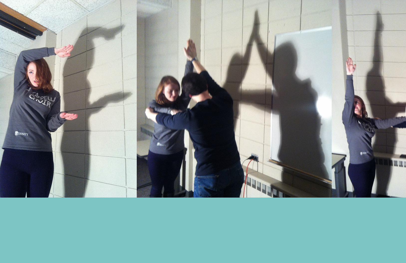
On the right, the step-by-step formation of the letter-forms is depicted from raw form to somewhat refined
to final product. My first tracing of the letterforms
were jagged and followed the shapes created by the
human body exactly. As I moved on to the center and eventually the final
forms, I smoothed out the rough edges and left out
the heads to create more organic letterforms.
On the left, there are close-ups of the three main stages of creating the letterform ‘A’ as I refined its shape.

THE PROCESS


While searching for dif-ferent types and styles of typography anato-my charts, I was most drawn to examples that featured the piece of anatomy in a differ-ent color than the rest of the letterform. The example with the text “Anatomy of Typogra-phy” caught my eye because of its unique approach and funky style and I tried to rec-reate this same vibe in my chart.
MYINSPIRATION

THUMBNAILS AND IDEA DEVELOPMENT

THUMBNAILS AND IDEA DEVELOPMENT

The final product dif-fers from many of my
preliminary works and ideas. As I worked, I
realized that my letter-forms were too bold
and heavy on the page for a bold design to be effective. Instead, I fo-
cused on a delicate design to contrast the
heavy letterforms. The symmetry and geomet-ric nature of the design creates more contrast
between the letterforms and the labels for the
anatomy chart.
FINALPRODUCT


Drake UniversityArt 051 Typography
Spring 2015