Embed Size (px)
Citation preview

ICT 119-Elementary Statistics
For all B.SC.ICT-B & B.SC.ITSStudents
By:
Masoud Amri KomunteDepartment of mathematics and Statistics Studies
(MSS)
Mzumbe UniversityOffice: Block B 209Mobile: 0713227333
Email: [email protected]

Introduction to Statistics
• The systematic and scientific treatment of quantitativemeasurement is precisely known as statistics.
• Statistics may be called as science of counting.• Statistics is concerned with the collection, classification
(or organization), presentation and analysis of data whichare measurable in numerical terms.

Statistical Investigation
What is a statistical investigation ?

statistical investigation
What is a statistical investigation ?The gathering of data and analysing information to helppeople make decisions when faced with uncertainty
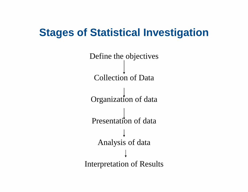
Stages of Statistical Investigation
Define the objectives
Collection of Data
Organization of data
Presentation of data
Analysis of data
Interpretation of Results

Planning For An Investigation
• At the planning stage you have to consider all thestages involved right from the first stage to the laststage.
• The most important stage of all is to clearly define theobjectives of the investigation.
• After defining the objectives of the investigation thenmake sure that only data relevant to the objectives arecollected.
Types Of Statistical Investigation
There are two types:-• General purpose statistical investigation.In this type the objective is to address a number ofproblems in just one investigation these problems may besocial, economic, political etc.• Specific purpose statistical investigation.In this type we try to collect information relevant to aspecific purpose.

Division of Statistics
• It is divided into two major parts: Descriptive andInferential Statistics.
• Descriptive statistics, is a set of methods to describedata that we have collected. i.e. summarization of data.
• Inferential statistics, is a set of methods used to make ageneralization, estimate, prediction or decision. Whenwe want to draw conclusions about a distribution.

Collection of Data
• Data can be collected by two ways:>>> Primary Data CollectionIt is the data collected by a particular person or organizationfor his own use.>>> Secondary Data CollectionIt is the data collected by some other person or organization,but the investigator also get it for his use.

Methods of Primary data collection
• Direct personal interview• Data through questionnaire• Indirect investigationEtc.

Methods of Secondary data collection
• Data collected through newspapers & periodicals.• Data collected from research papers.• Data collected from government officials.• Data collected from various NGO, UN, UNESCO,
WHO, ILO, UNICEF etc.• Other published resources

Questionnaire
A questionnaire is a form in hard/soft copy which asksfor certain information and spaces are provided forrecording responses.• A questionnaire may be self-administered or may be
administered by an interviewer.• A self-administered questionnaire may be sent by
mail or may be delivered in personal.

Mail Questionnaire
• Practicable because it is cheaper to collect theinformation as there are no interviewerinvolved.
• Also practicable when a vast area with very many respondents is to be covered.

Limitations Of Mail Questionnaire
• Need a literate population. That is therespondents should be able to read thequestions and fill in the required responses.
• Need an efficient postal/internet system.

Questionnaire Design
The guiding rules for questionnaire design are basically:-• AppearanceThe questionnaire need to be attractive especially if itis a mail questionnaire.• Length of the questionnaireAs far as possible a questionnaire should be short. Avery long questionnaire will tend to discourage arespondent, especially if it is a mail questionnaire.

Questionnaire Design
The guiding rules• Wording-Simple, clear and precise questions.Avoid ambiguous questions. The respondents should be able to interpret aquestion in one and only one way. A question like “how big is your house?”has an element of ambiguity, some respondents may interpret the question interm of dimension and yet others in terms of number of rooms.
-Questions should be presented in a logical order.If there is a known or established order of things then that order should befollowed.

Questionnaire Design
The guiding rules• Wording-Avoid very personal or sensitive questions.-Avoid leading quetions.-Start with the simplest questions and continue according to the
complexity of the issues.

Classification of data
• Classification is a process of arranging data intosequences and groups according to their commoncharacteristics or separating them into different butrelated parts.
• It is a process of arranging data into varioushomogeneous classes and subclasses according tosome common characteristics.
Scrutiny of data
• Collected data should be checked carefully before they aresubjected to any statistical treatment. For however usefulstatistical method may be when properly applied, then can notgive reliable information from faulty and unreliable data.
• In some cases the errors may be obvious for exampleimpossible values in measurements. If you can see a figure ofsay 200 kilograms for a weight of a school child then that isclearly impossible.

Scrutiny of data
• In some cases number might not be impossible butmay seem very unlikely. If for example it is recordedthat a household of 2 people it consumes 5kgs of ricea day, this should rouse suspicion.

Presentation of Data
• Data should be presented in such a manner, so that it maybe easily understood and grasped, and the conclusion maybe drawn promptly from the data presented. e.g.
>>> Histogram>>> Frequency polygon & curve>>> Pie Chart>>> Ogives>>> Bar Chart>>> etc

Variables
• Discrete Variablee.g. Number of books, table, chairs • Continuous Variablee.g. Height, Weight• Quantitative VariableThat can be measured on a scale, that is, it can be expressed as number• Qualitative VariableThat can not be measured on a scale, that is, it can not be expressed as number but they can be put in categories.

ExampleSuppose you survey potential voters among the people onmain street during lunch to determine their political affiliationand age, as well as their opinion on the ballot measure.Classify the variables as quantitative or qualitative.
23
• Political affiliation is a qualitative variable (categories).• Age is a quantitative variable (numbers).• Opinion on the ballot measure is a qualitative variable
(categories).
Solution

Statistics functions & Uses
• It simplifies complex data• It provides techniques for comparison• It studies relationship• It helps in formulating policies• It helps in forecasting• It is helpful for investigation purpose• A quickest way in decision making since Statistical
methods merges with speed of computer through SPSS, STATA, MATLAB, MINITAB etc.

Scope of Statistics
• In Business Decision Making• In Medical Sciences• In Actuarial Science• In Economic Planning• In Agricultural Sciences• In Banking & Insurance• In Politics & Social Science
Distrust & Misuse of Statistics
• Statistics is like a clay of which one can make a God or Devil.
• Statisticians are the liars of first order.• Statistics can prove or disprove anything.
According to Aaron Levenstein:
“Statistics are like bikinis. What they reveal is suggestive, but what they conceal is vital.”

Descriptive Statistics
• Frequency Distributions and Their Graphs
• More Graphs and Displays
• Measures of Central Tendency
• Measures of Variation
• Measures of Position
27

Frequency Distribution
Frequency Distribution• A table that shows
observations, classes or intervals of data with a count of the number of entries in each class.
• The frequency, f, of a class is the number of data entries in the class.
28
Class Frequency, f1 – 5 56 – 10 8
11 – 15 616 – 20 8
21 – 25 526 – 30 4
Lower classlimits
Upper classlimits
Class width 6 – 1 = 5

Constructing a Frequency Distribution
29
1. Decide on the number of classes. Usually between 5 and 20; otherwise, it may be
difficult to detect any patterns. 2. Find the class width (class size). Determine the range of the data. Divide the range by the number of classes. Round up to the next convenient number.

Constructing a Frequency Distribution
3. Find the class limits. You can use the minimum data entry as the lower
limit of the first class. Find the remaining lower limits (add the class
width to the lower limit of the preceding class). Find the upper limit of the first class. Remember
that classes cannot overlap. Find the remaining upper class limits.
30

Constructing a Frequency Distribution
4. Make a tally mark for each data entry in the row of the appropriate class.
5. Count the tally marks to find the total frequency ffor each class.
31

Example: Constructing a Frequency Distribution
The following sample data set lists the number ofminutes that 50 Internet subscribers spent on theInternet during their most recent session. Construct afrequency distribution that has seven classes.50 40 41 17 11 7 22 44 28 21 19 23 37 51 54 42 8641 78 56 72 56 17 7 69 30 80 56 29 33 46 31 39 2018 29 34 59 73 77 36 39 30 62 54 67 39 31 53 44
32

Solution: Constructing a Frequency Distribution
1. Number of classes = 7 (given) -if not given you may use the following formula; Number of classes=1+3.322log N where N is total number of observation.
2. Find the class width
33
max min 86 7 11.29#classes 7
Round up to 12
50 40 41 17 11 7 22 44 28 21 19 23 37 51 54 42 8641 78 56 72 56 17 7 69 30 80 56 29 33 46 31 39 2018 29 34 59 73 77 36 39 30 62 54 67 39 31 53 44

Solution: Constructing a Frequency Distribution
34
Lower limit
Upper limit
7Class width = 12
3. Use 7 (minimum value) as first lower limit. Add the class width of 12 to get the lower limit of the next class.
7 + 12 = 19Find the remaining lower limits.
193143556779

Solution: Constructing a Frequency Distribution
The upper limit of the first class is 18 (one less than the lower limit of the second class). Add the class width of 12 to get the upper limit of the next class.
18 + 12 = 30Find the remaining upper limits.
35
Lower limit
Upper limit
7193143556779
Class width = 1230
4254667890
18

Solution: Constructing a Frequency Distribution
4. Make a tally mark for each data entry in the row of the appropriate class.
5. Count the tally marks to find the total frequency ffor each class.
36
Class Tally Frequency, f7 – 18 IIII I 6
19 – 30 IIII IIII 1031 – 42 IIII IIII III 1343 – 54 IIII III 855 – 66 IIII 567 – 78 IIII I 679 – 90 II 2
Σf = 50
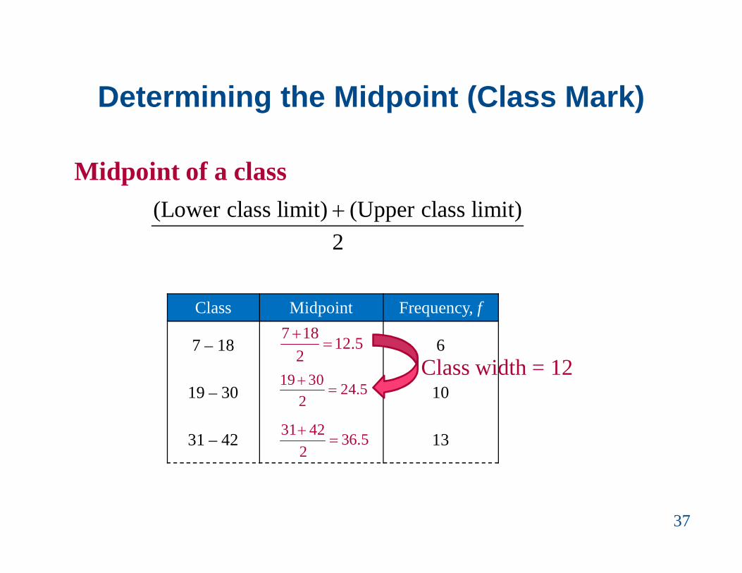
Determining the Midpoint (Class Mark)
Midpoint of a class
37
(Lower class limit) (Upper class limit)2
Class Midpoint Frequency, f
7 – 18 6
19 – 30 10
31 – 42 13
7 18 12.52
19 30 24.52
31 42 36.52
Class width = 12

Determining the Relative FrequencyRelative Frequency of a class • Portion or percentage of the data that falls in a
particular class.
38
nf
sizeSample
frequencyclassfrequencyrelative
Class Frequency, f Relative Frequency
7 – 18 6
19 – 30 10
31 – 42 13
6 0.1250
10 0.2050
13 0.2650
•

Determining the Cumulative Frequency
Cumulative frequency of a class• The sum of the frequency for that class and all
previous classes.
39
Class Frequency, f Cumulative frequency
7 – 18 6
19 – 30 10
31 – 42 13
+
+
6
16
29
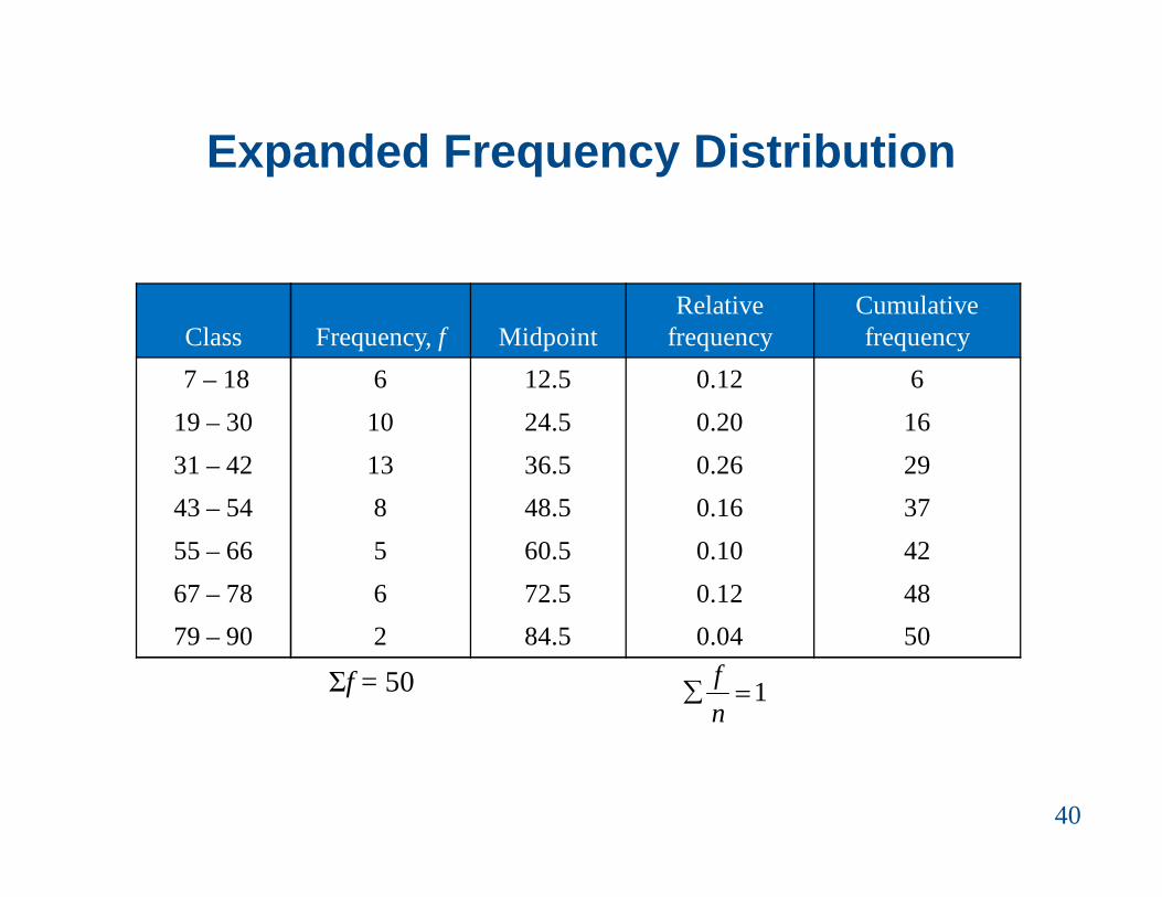
Expanded Frequency Distribution
40
Class Frequency, f MidpointRelative
frequencyCumulative frequency
7 – 18 6 12.5 0.12 619 – 30 10 24.5 0.20 1631 – 42 13 36.5 0.26 2943 – 54 8 48.5 0.16 3755 – 66 5 60.5 0.10 4267 – 78 6 72.5 0.12 4879 – 90 2 84.5 0.04 50
Σf = 50 1nf

Graphs of Frequency Distributions
Frequency Histogram• A bar graph that represents the frequency distribution.• The horizontal scale is quantitative and measures the
data values.• The vertical scale measures the frequencies of the
classes.• Consecutive bars must touch.
41
data valuesfr
eque
ncy

Class BoundariesClass boundaries• The numbers that separate classes without forming
gaps between them.
42
ClassClass
BoundariesFrequency,
f7 – 18 6
19 – 30 1031 – 42 13
• The distance from the upper limit of the first class to the lower limit of the second class is 19 – 18 = 1.
• Half this distance is 0.5.
• First class lower boundary = 7 – 0.5 = 6.5• First class upper boundary = 18 + 0.5 = 18.5
6.5 – 18.5

Class Boundaries
43
ClassClass
boundariesFrequency,
f7 – 18 6.5 – 18.5 6
19 – 30 18.5 – 30.5 1031 – 42 30.5 – 42.5 1343 – 54 42.5 – 54.5 855 – 66 54.5 – 66.5 567 – 78 66.5 – 78.5 679 – 90 78.5 – 90.5 2

Example: Frequency Histogram
Construct a frequency histogram for the Internet usage frequency distribution.
44
ClassClass
boundaries MidpointFrequency,
f7 – 18 6.5 – 18.5 12.5 6
19 – 30 18.5 – 30.5 24.5 1031 – 42 30.5 – 42.5 36.5 1343 – 54 42.5 – 54.5 48.5 855 – 66 54.5 – 66.5 60.5 567 – 78 66.5 – 78.5 72.5 679 – 90 78.5 – 90.5 84.5 2

Solution: Frequency Histogram (using Midpoints)
45

Solution: Frequency Histogram (using class boundaries)
46
6.5 18.5 30.5 42.5 54.5 66.5 78.5 90.5
You can see that more than half of the subscribers spent between 19 and 54 minutes on the Internet during their most recent session.

Graphs of Frequency Distributions
Frequency Polygon• A line graph that emphasizes the continuous change
in frequencies.
47
data values
freq
uenc
y

Example: Frequency Polygon
Construct a frequency polygon for the Internet usage frequency distribution.
48
Class Midpoint Frequency, f7 – 18 12.5 6
19 – 30 24.5 1031 – 42 36.5 1343 – 54 48.5 855 – 66 60.5 567 – 78 72.5 679 – 90 84.5 2

Solution: Frequency Polygon
02468
101214
0.5 12.5 24.5 36.5 48.5 60.5 72.5 84.5 96.5
Freq
uenc
y
Time online (in minutes)
Internet Usage
49
You can see that the frequency of subscribers increases up to 36.5 minutes and then decreases.
The graph should begin and end on the horizontal axis, so extend the left side to one class width before the first class midpoint and extend the right side to one class width after the last class midpoint.
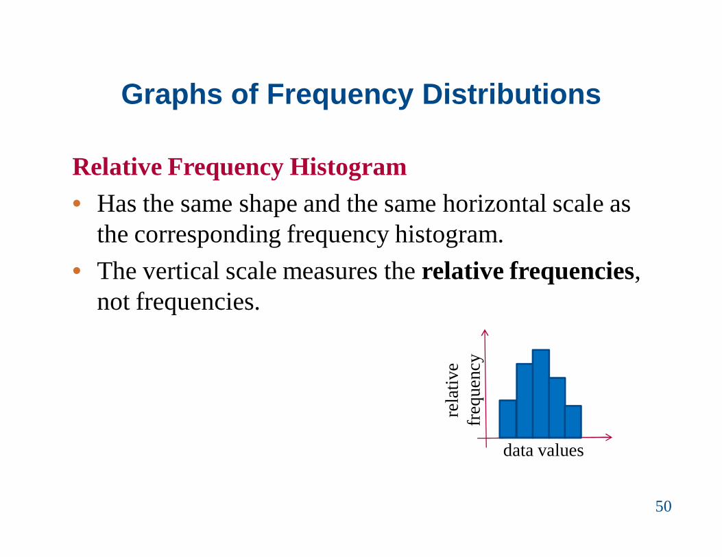
Graphs of Frequency Distributions
Relative Frequency Histogram• Has the same shape and the same horizontal scale as
the corresponding frequency histogram.• The vertical scale measures the relative frequencies,
not frequencies.
50
data valuesre
lativ
e fr
eque
ncy

Example: Relative Frequency Histogram
Construct a relative frequency histogram for the Internet usage frequency distribution.
51
ClassClass
boundariesFrequency,
fRelative
frequency7 – 18 6.5 – 18.5 6 0.12
19 – 30 18.5 – 30.5 10 0.2031 – 42 30.5 – 42.5 13 0.2643 – 54 42.5 – 54.5 8 0.1655 – 66 54.5 – 66.5 5 0.1067 – 78 66.5 – 78.5 6 0.1279 – 90 78.5 – 90.5 2 0.04

Solution: Relative Frequency Histogram
52
6.5 18.5 30.5 42.5 54.5 66.5 78.5 90.5
From this graph you can see that 20% of Internet subscribers spent between 18.5 minutes and 30.5 minutes online.

Graphs of Frequency Distributions
Cumulative Frequency Graph or Ogive• A line graph that displays the cumulative frequency
of each class at its upper class boundary.• The upper boundaries are marked on the horizontal
axis.• The cumulative frequencies are marked on the
vertical axis.
53
data valuescu
mul
ativ
e fr
eque
ncy

Constructing an Ogive
1. Construct a frequency distribution that includes cumulative frequencies as one of the columns.
2. Specify the horizontal and vertical scales. The horizontal scale consists of the upper class
boundaries. The vertical scale measures cumulative
frequencies.3. Plot points that represent the upper class boundaries
and their corresponding cumulative frequencies.
54

Constructing an Ogive
4. Connect the points in order from left to right.5. The graph should start at the lower boundary of the
first class (cumulative frequency is zero) and should end at the upper boundary of the last class (cumulative frequency is equal to the sample size).
55

Example: Ogive
Construct an ogive for the Internet usage frequency distribution.
56
ClassClass
boundariesFrequency,
fCumulative frequency
7 – 18 6.5 – 18.5 6 619 – 30 18.5 – 30.5 10 1631 – 42 30.5 – 42.5 13 2943 – 54 42.5 – 54.5 8 3755 – 66 54.5 – 66.5 5 4267 – 78 66.5 – 78.5 6 4879 – 90 78.5 – 90.5 2 50

Solution: Ogive
0
10
20
30
40
50
60
Cum
ulat
ive f
requ
ency
Time online (in minutes)
Internet Usage
57
6.5 18.5 30.5 42.5 54.5 66.5 78.5 90.5
From the ogive, you can see that about 40 subscribers spent 60 minutes or less online during their last session. The greatest increase in usage occurs between 30.5 minutes and 42.5 minutes.
More Graphs and Displays
• Graph quantitative data using stem-and-leaf plots and dot plots
• Graph qualitative data using pie charts and Pareto charts
• Graph paired data sets using scatter plots and time series charts
58

Graphing Quantitative Data SetsStem-and-leaf plot• Each number is separated into a stem and a leaf.• Similar to a histogram.• Still contains original data values.• For decimals its better to approximate
59
Data: 21, 25, 25, 26, 27, 28, 30, 36, 36, 45
26
2 1 5 5 6 7 83 0 6 6 4 5

Example: Constructing a Stem-and-Leaf Plot
The following are the numbers of text messages sent last month by the cellular phone users on one floor of a college dormitory. Display the data in a stem-and-leaf plot.
60
155 159 144 129 105 145 126 116 130 114 122 112 112 142 126118 118 108 122 121 109 140 126 119 113 117 118 109 109 119139 139 122 78 133 126 123 145 121 134 124 119 132 133 124129 112 126 148 147

Solution: Constructing a Stem-and-Leaf Plot
61
• The data entries go from a low of 78 to a high of 159.• Use the rightmost digit as the leaf. For instance,
78 = 7 | 8 and 159 = 15 | 9• List the stems, 7 to 15, to the left of a vertical line.• For each data entry, list a leaf to the right of its stem.
155 159 144 129 105 145 126 116 130 114 122 112 112 142 126118 118 108 122 121 109 140 126 119 113 117 118 109 109 119139 139 122 78 133 126 123 145 121 134 124 119 132 133 124129 112 126 148 147

Solution: Constructing a Stem-and-Leaf Plot
62
Include a key to identify the values of the data.
From the display, you can conclude that more than 50% of the cellular phone users sent between 110 and 130 text messages.

Graphing Quantitative Data Sets
Dot plot• Each data entry is plotted, using a point, above a
horizontal axis
63
Data: 21, 25, 25, 26, 27, 28, 30, 36, 36, 45
26
20 21 22 23 24 25 26 27 28 29 30 31 32 33 34 35 36 37 38 39 40 41 42 43 44 45
Example: Constructing a Dot Plot
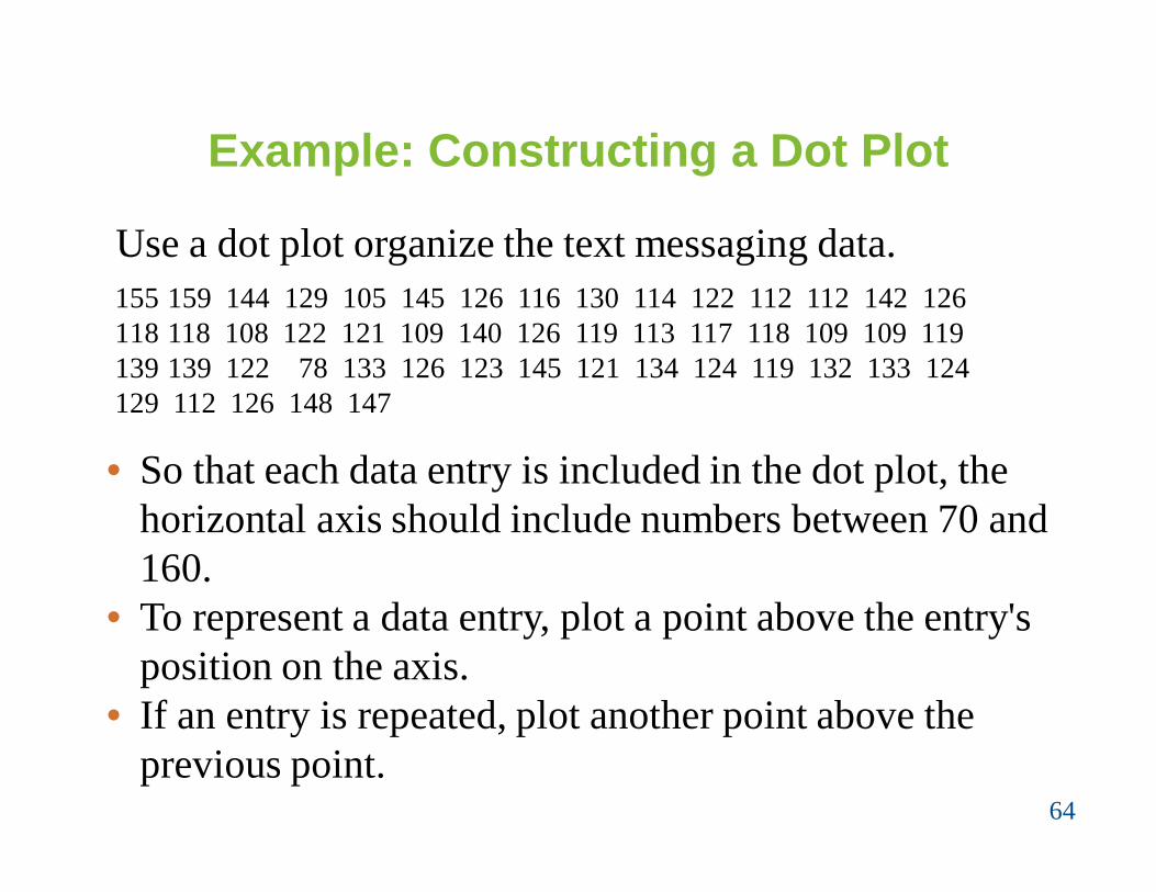
Use a dot plot organize the text messaging data.
64
• So that each data entry is included in the dot plot, the horizontal axis should include numbers between 70 and 160.
• To represent a data entry, plot a point above the entry's position on the axis.
• If an entry is repeated, plot another point above the previous point.
155 159 144 129 105 145 126 116 130 114 122 112 112 142 126118 118 108 122 121 109 140 126 119 113 117 118 109 109 119139 139 122 78 133 126 123 145 121 134 124 119 132 133 124129 112 126 148 147

Solution: Constructing a Dot Plot
65
From the dot plot, you can see that most values cluster between 105 and 148 and the value that occurs the most is 126. You can also see that 78 is an unusual data value.
155 159 144 129 105 145 126 116 130 114 122 112 112 142 126118 118 108 122 121 109 140 126 119 113 117 118 109 109 119139 139 122 78 133 126 123 145 121 134 124 119 132 133 124129 112 126 148 147

Graphing Qualitative Data Sets
Pie Chart• A circle is divided into sectors that represent
categories.• The area of each sector is proportional to the
frequency of each category.
66

Example: Constructing a Pie Chart
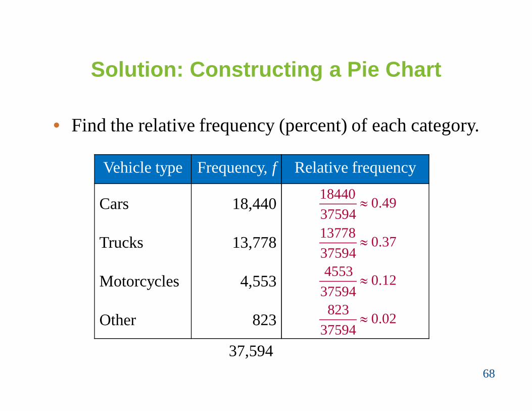
The numbers of motor vehicle occupants killed in crashes in 2005 are shown in the table. Use a pie chart to organize the data.
67
Vehicle type KilledCars 18,440Trucks 13,778Motorcycles 4,553Other 823
Solution: Constructing a Pie Chart
• Find the relative frequency (percent) of each category.
68
Vehicle type Frequency, f Relative frequency
Cars 18,440
Trucks 13,778
Motorcycles 4,553
Other 823
37,594
18440 0.4937594
13778 0.3737594
4553 0.1237594
823 0.0237594

Solution: Constructing a Pie Chart
• Construct the pie chart using the central angle that corresponds to each category. To find the central angle, multiply 360º by the
category's relative frequency. For example, the central angle for cars is
360(0.49) ≈ 176º
69

Solution: Constructing a Pie Chart
70
Vehicle type Frequency, fRelative
frequency Central angle
Cars 18,440 0.49
Trucks 13,778 0.37
Motorcycles 4,553 0.12
Other 823 0.02
360º(0.49)≈176º
360º(0.37)≈133º
360º(0.12)≈43º
360º(0.02)≈7º

Solution: Constructing a Pie Chart
71
Vehicle typeRelative
frequencyCentral angle
Cars 0.49 176ºTrucks 0.37 133ºMotorcycles 0.12 43ºOther 0.02 7º
From the pie chart, you can see that most fatalities in motor vehicle crashes were those involving the occupants of cars.

Graphing Qualitative Data Sets
Pareto Chart• A vertical bar graph in which the height of each bar
represents frequency or relative frequency.• The bars are positioned in order of decreasing height,
with the tallest bar positioned at the left.
72
Categories
Freq
uenc
y

Example: Constructing a Pareto Chart
In a recent year, the retail industry lost $41.0 million ininventory shrinkage. Inventory shrinkage is the loss ofinventory through breakage, pilferage, shoplifting, andso on. The causes of the inventory shrinkage areadministrative error ($7.8 million), employee theft($15.6 million), shoplifting ($14.7 million), and vendorfraud ($2.9 million). Use a Pareto chart to organize thisdata.
73

Solution: Constructing a Pareto Chart
74
Cause $ (million)
Admin. error 7.8Employee theft 15.6
Shoplifting 14.7Vendor fraud 2.9
From the graph, it is easy to see that the causes of inventory shrinkage that should be addressed first are employee theft and shoplifting.

Graphing Paired Data Sets
Paired Data Sets• Each entry in one data set corresponds to one entry in
a second data set.• Graph using a scatter plot. The ordered pairs are graphed as
points in a coordinate plane. Used to show the relationship
between two quantitative variables.
75
x
y

Graphing Paired Data Sets
Time Series• Data set is composed of quantitative entries taken at
regular intervals over a period of time. e.g., The amount of precipitation measured each
day for one month. • Use a time series chart to graph.
76
timeQ
uant
itativ
e da
ta

Example: Constructing a Time Series Chart
The table lists the number of cellulartelephone subscribers (in millions)for the years 1995 through 2005.Construct a time series chart for thenumber of cellular subscribers.
77

Solution: Constructing a Time Series Chart
• Let the horizontal axis represent the years.
• Let the vertical axis represent the number of subscribers (in millions).
• Plot the paired data and connect them with line segments.
78

Solution: Constructing a Time Series Chart
79
The graph shows that the number of subscribers has been increasing since 1995, with greater increases recently.

Measures of Central Tendency
• Determine the mean, median, and mode of apopulation and of a sample
• Determine the weighted mean of a data set and themean of a frequency distribution
• Describe the shape of a distribution as symmetric,uniform, or skewed and compare the mean andmedian for each
80

Measures of Central Tendency
Measure of central tendency• A value that represents a typical, or central, entry of a
data set.• Most common measures of central tendency: Mean Median Mode
81

Measure of Central Tendency: Mean
Mean (average)• The sum of all the data entries divided by the number
of entries.• Sigma notation: Σx = add all of the data entries (x)
in the data set.• Population mean:
• Sample mean:
82
xN
xxn

Example: Finding a Sample Mean
The prices (in dollars) for a sample of roundtrip flightsfrom Dar es salaam to Nairobi, Arusha, Mtwara,Mwanza, Mbeya, Kigoma and Iringa are listed. What isthe mean price of the flights?
872 432 397 427 388 782 397
83

Solution: Finding a Sample Mean
872 432 397 427 388 782 397
84
• The sum of the flight prices isΣx = 872 + 432 + 397 + 427 + 388 + 782 + 397 = 3695
• To find the mean price, divide the sum of the prices by the number of prices in the sample
3695 527.97
xxn
The mean price of the flights is about $527.90.

Measure of Central Tendency: Median
Median• The value that lies in the middle of the data when the
data set is ordered.• Measures the center of an ordered data set by dividing
it into two equal parts.• If the data set has an odd number of entries: median is the middle data
entry. even number of entries: median is the mean of
the two middle data entries.85

Example: Finding the Median
The prices (in dollars) for a sample of roundtrip flightsfrom Dar es salaam to Nairobi, Arusha, Mtwara,Mwanza, Mbeya, Kigoma and Iringa are listed. Find themedian of the flight prices.
872 432 397 427 388 782 397
86

Solution: Finding the Median
872 432 397 427 388 782 397
87
• First order the data.388 397 397 427 432 782 872
• There are seven entries (an odd number), the median is the middle, or fourth, data entry.
The median price of the flights is $427.

Example: Finding the Median
The flight priced at $432 is no longer available. What is the median price of the remaining flights?
872 397 427 388 782 397
88

Solution: Finding the Median
872 397 427 388 782 397
89
• First order the data.388 397 397 427 782 872
• There are six entries (an even number), the median is the mean of the two middle entries.
The median price of the flights is $412.
397 427Median 4122

Measure of Central Tendency: Mode
Mode• The data entry that occurs with the greatest frequency.• If no entry is repeated the data set has no mode.• If two entries occur with the same greatest frequency,
each entry is a mode (bimodal).
90

Example: Finding the ModeThe prices (in dollars) for a sample of roundtrip flightsfrom Dar es salaam to Nairobi, Arusha, Mtwara,Mwanza, Mbeya, Kigoma and Iringa are listed.Find the mode of the flight prices.
872 432 397 427 388 782 397
91
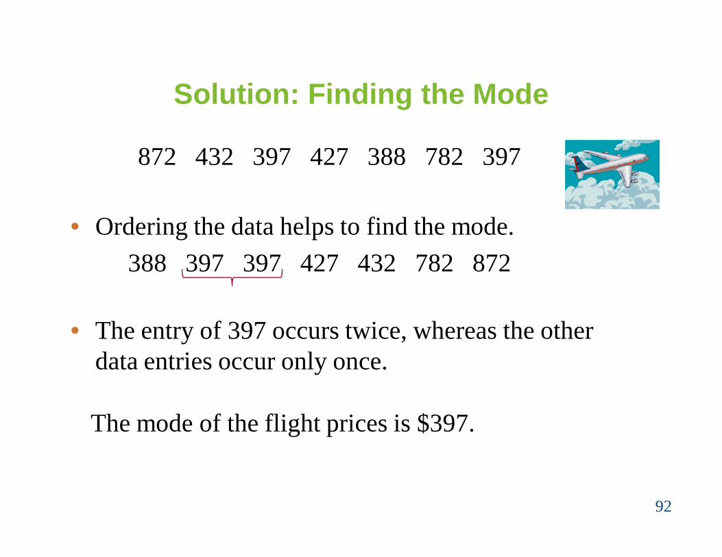
Solution: Finding the Mode
872 432 397 427 388 782 397
92
• Ordering the data helps to find the mode.388 397 397 427 432 782 872
• The entry of 397 occurs twice, whereas the other data entries occur only once.
The mode of the flight prices is $397.

Example: Finding the Mode
At a political debate a sample of audience members was asked to name the political party to which they belong. Their responses are shown in the table. What is the mode of the responses?
93
Political Party Frequency, fCcm 34Chadema 56Other 21Did not respond 9

Solution: Finding the Mode
94
Political Party Frequency, fCcm 34Chadema 56Other 21Did not respond 9
The mode is Chadema (the response occurring with thegreatest frequency). In this sample there were moreChadema people than people of any other single affiliation.

Comparing the Mean, Median, and Mode
• All three measures describe a typical entry of a data set.
• Advantage of using the mean: The mean is a reliable measure because it takes
into account every entry of a data set.• Disadvantage of using the mean: Greatly affected by outliers (a data entry that is far
removed from the other entries in the data set).
95

Example: Comparing the Mean, Median, and Mode
Find the mean, median, and mode of the sample ages of a class shown. Which measure of central tendency best describes a typical entry of this data set? Are there any outliers?
96
Ages in a class20 20 20 20 20 20 2121 21 21 22 22 22 2323 23 23 24 24 65
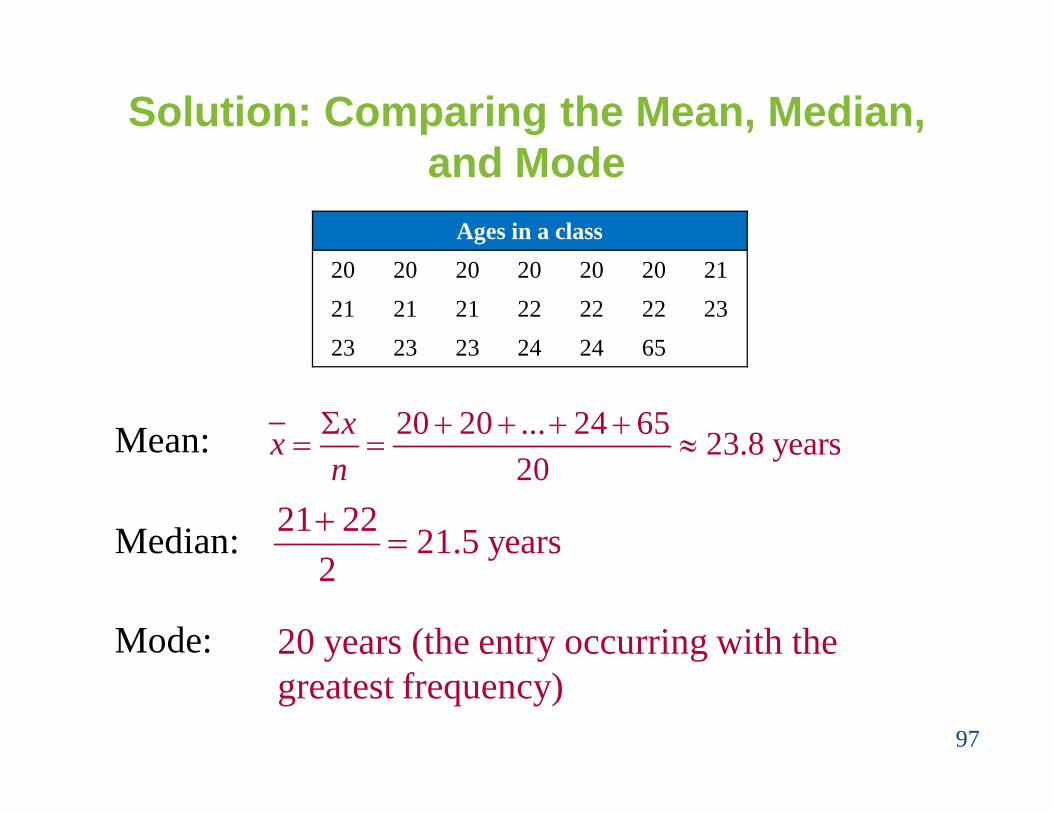
Solution: Comparing the Mean, Median, and Mode
97
Mean: 20 20 ... 24 65 23.8 years20
xxn
Median: 21 22 21.5 years2
20 years (the entry occurring with thegreatest frequency)
Ages in a class20 20 20 20 20 20 2121 21 21 22 22 22 2323 23 23 24 24 65
Mode:
Solution: Comparing the Mean, Median, and Mode
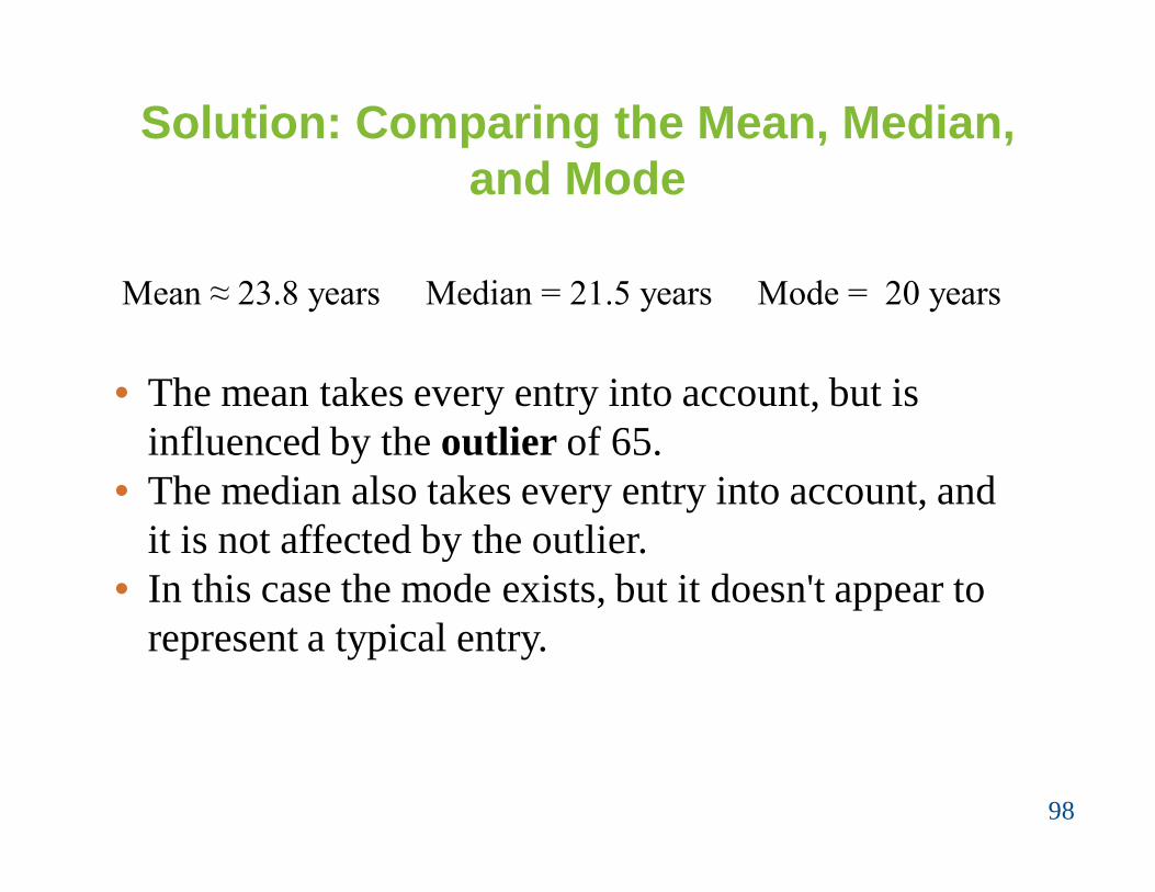
98
Mean ≈ 23.8 years Median = 21.5 years Mode = 20 years
• The mean takes every entry into account, but is influenced by the outlier of 65.
• The median also takes every entry into account, and it is not affected by the outlier.
• In this case the mode exists, but it doesn't appear to represent a typical entry.

Solution: Comparing the Mean, Median, and Mode
99
Sometimes a graphical comparison can help you decide which measure of central tendency best represents a data set.
In this case, it appears that the median best describes the data set.

Weighted Mean
Weighted Mean• The mean of a data set whose entries have varying
weights.
• where w is the weight of each entry x
100
( )x wxw

Example: Finding a Weighted Mean
You are taking a class in which your grade isdetermined from five sources: 50% from your testmean, 15% from your midterm, 20% from your finalexam, 10% from your computer lab work, and 5% fromyour homework. Your scores are 86 (test mean), 96(midterm), 82 (final exam), 98 (computer lab), and 100(homework). What is the weighted mean of yourscores? If the minimum average for an A is 90, did youget an A?
101

Solution: Finding a Weighted Mean
102
Source Score, x Weight, w x∙wTest Mean 86 0.50 86(0.50)= 43.0Midterm 96 0.15 96(0.15) = 14.4Final Exam 82 0.20 82(0.20) = 16.4Computer Lab 98 0.10 98(0.10) = 9.8Homework 100 0.05 100(0.05) = 5.0
Σw = 1 Σ(x∙w) = 88.6
( ) 8 8 .6 8 8 .61
x wxw
Your weighted mean for the course is 88.6. You did not get an A.

Mean of Grouped Data
Mean of a Frequency Distribution• Approximated by
where x and f are the midpoints and frequencies of a class, respectively
103
( )x fx n fn
Note:
Make sure you find out how to find other measures of central tendency for the case of grouped data.

Finding the Mean of a Frequency Distribution
In Words In Symbols
104
( )x fxn
(lower limit)+(upper limit)2
x
( )x f
n f
1. Find the midpoint of each class.
2. Find the sum of the products of the midpoints and the frequencies.
3. Find the sum of the frequencies.
4. Find the mean of the frequency distribution.

Example: Find the Mean of a Frequency Distribution
Use the frequency distribution to approximate the mean number of minutes that a sample of Internet subscribers spent online during their most recent session.
105
Class Midpoint Frequency, f7 – 18 12.5 6
19 – 30 24.5 1031 – 42 36.5 1343 – 54 48.5 855 – 66 60.5 567 – 78 72.5 679 – 90 84.5 2

Solution: Find the Mean of a Frequency Distribution
106
Class Midpoint, x Frequency, f (x∙f)7 – 18 12.5 6 12.5∙6 = 75.0
19 – 30 24.5 10 24.5∙10 = 245.031 – 42 36.5 13 36.5∙13 = 474.543 – 54 48.5 8 48.5∙8 = 388.055 – 66 60.5 5 60.5∙5 = 302.567 – 78 72.5 6 72.5∙6 = 435.079 – 90 84.5 2 84.5∙2 = 169.0
n = 50 Σ(x∙f) = 2089.0
( ) 2089 41.8 minutes50
x fxn

The Shape of Distributions
107
Symmetric Distribution• A vertical line can be drawn through the middle of
a graph of the distribution and the resulting halves are approximately mirror images.

The Shape of Distributions
108
Uniform Distribution (rectangular)• All entries or classes in the distribution have equal
or approximately equal frequencies.• Symmetric.

The Shape of Distributions
109
Skewed Left Distribution (negatively skewed)• The “tail” of the graph elongates more to the left.• The mean is to the left of the median.
The Shape of Distributions
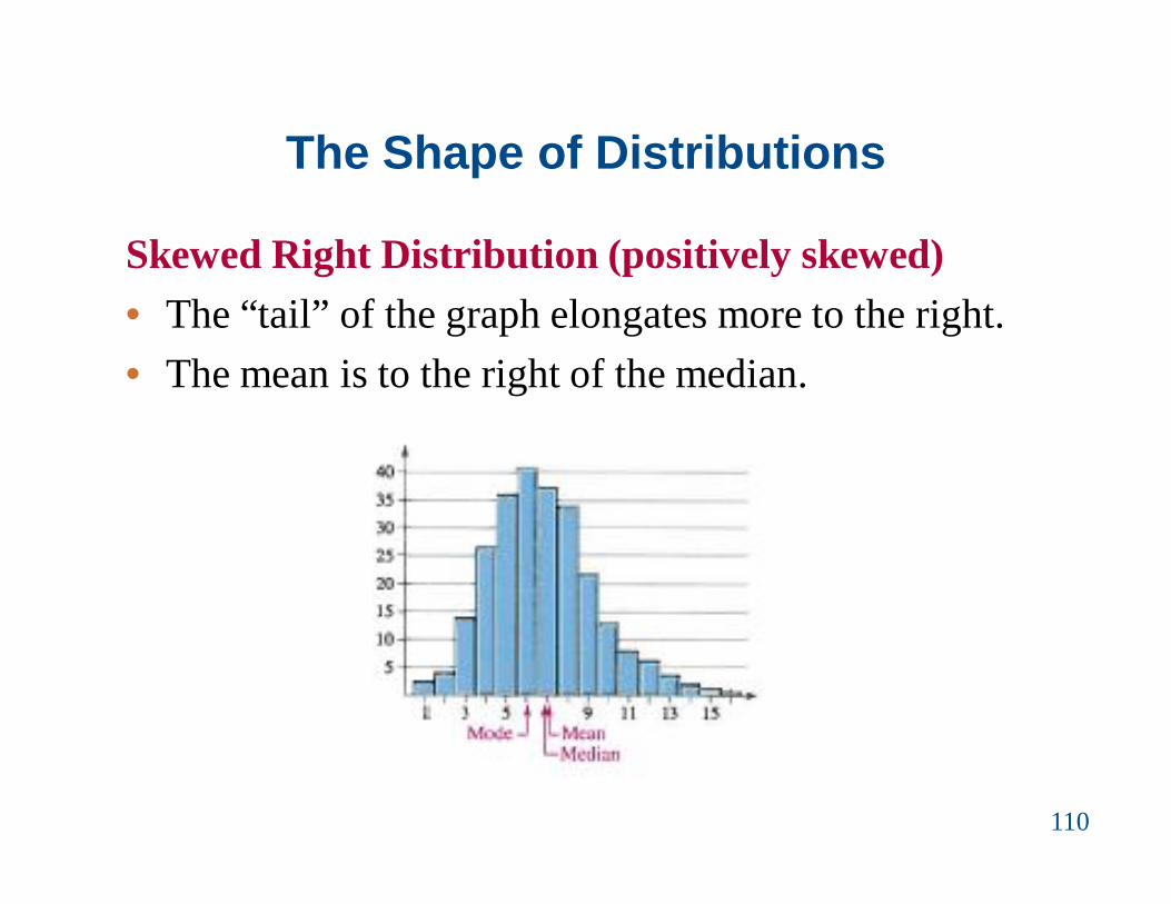
110
Skewed Right Distribution (positively skewed)• The “tail” of the graph elongates more to the right.• The mean is to the right of the median.

Measures of Variation
• Determine the range of a data set• Determine the variance and standard deviation of a
population and of a sample• Use the Empirical Rule and Chebychev’s Theorem to
interpret standard deviation• Approximate the sample standard deviation for
grouped data
111
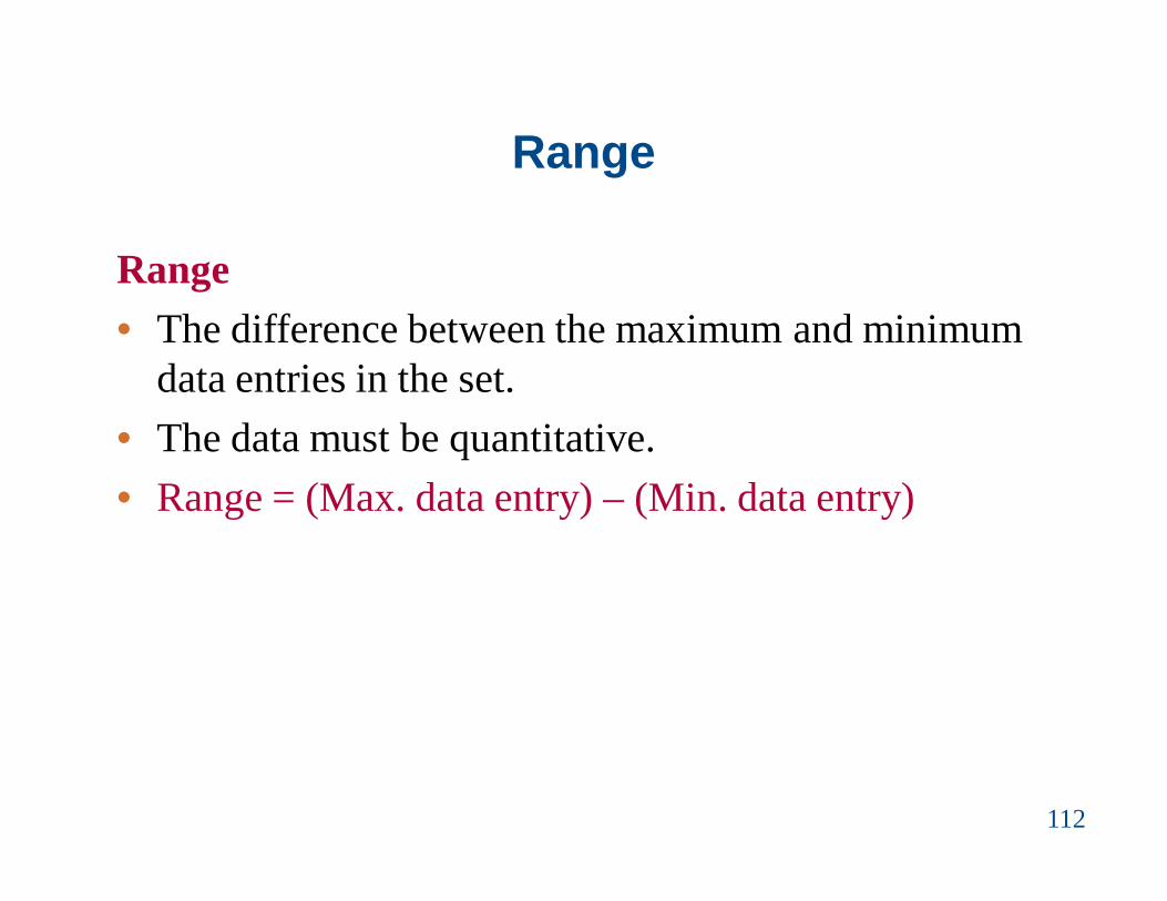
Range
Range• The difference between the maximum and minimum
data entries in the set.• The data must be quantitative.• Range = (Max. data entry) – (Min. data entry)
112
Example: Finding the Range
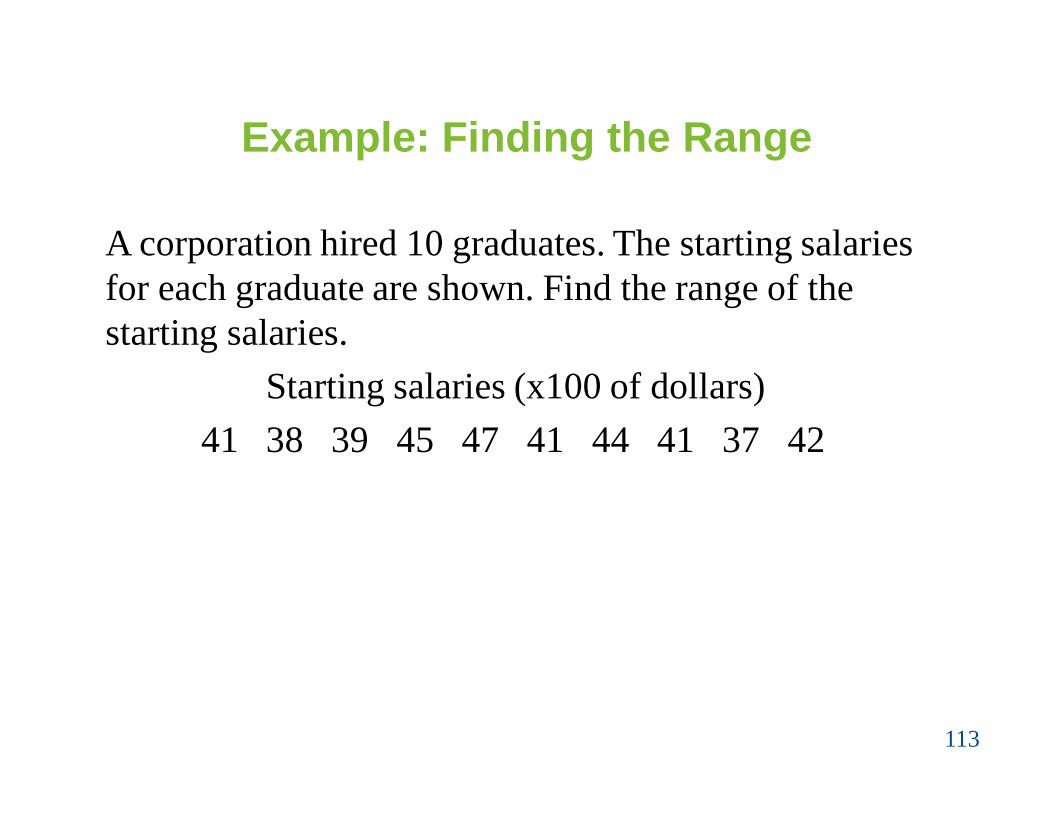
A corporation hired 10 graduates. The starting salaries for each graduate are shown. Find the range of the starting salaries.
Starting salaries (x100 of dollars)41 38 39 45 47 41 44 41 37 42
113

Solution: Finding the Range
• Ordering the data helps to find the least and greatest salaries.
37 38 39 41 41 41 42 44 45 47
• Range = (Max. salary) – (Min. salary)= 47 – 37 = 10
The range of starting salaries is 10 or $10,00.
114
minimum maximum

Deviation, Variance, and Standard Deviation
Deviation• The difference between the data entry, x, and the
mean of the data set.• Population data set:
-Deviation of x = x – μ• Sample data set:
-Deviation of x = x – x
115

Example: Finding the Deviation
A corporation hired 10 graduates. The starting salaries for each graduate are shown. Find the total deviation of the starting salaries.
Starting salaries (x100 of dollars)41 38 39 45 47 41 44 41 37 42
116
Solution:• First determine the mean starting salary.
415 41.510
xN

Solution: Finding the Deviation
117
• Determine the deviation for each data entry.
Salary ($1000s), x Deviation: x – μ41 41 – 41.5 = –0.538 38 – 41.5 = –3.539 39 – 41.5 = –2.545 45 – 41.5 = 3.547 47 – 41.5 = 5.541 41 – 41.5 = –0.544 44 – 41.5 = 2.541 41 – 41.5 = –0.537 37 – 41.5 = –4.542 42 – 41.5 = 0.5
Σx = 415 Σ(x – μ) = 0

Deviation, Variance, and Standard Deviation
Population Variance
•
Population Standard Deviation
•
118
22 ( )x
N
Sum of squares, SSx
22 ( )x
N

Finding the Population Variance & Standard Deviation
In Words In Symbols
119
1. Find the mean of the population data set.
2. Find deviation of each entry.
3. Square each deviation.
4. Add to get the sum of squares.
xN
x – μ
(x – μ)2
SSx = Σ(x – μ)2

Finding the Population Variance & Standard Deviation
120
5. Divide by N to get the population variance.
6. Find the square root to get the population standard deviation.
22 ( )x
N
2( )xN
In Words In Symbols

Example: Finding the Population Standard Deviation
A corporation hired 10 graduates. The starting salaries for each graduate are shown. Find the population variance and standard deviation of the starting salaries.
Starting salaries (x100 of dollars)41 38 39 45 47 41 44 41 37 42
Recall μ = 41.5.
121

Solution: Finding the Population Standard Deviation
122
• Determine SSx
• N = 10Salary, x Deviation: x – μ Squares: (x – μ)2
41 41 – 41.5 = –0.5 (–0.5)2 = 0.2538 38 – 41.5 = –3.5 (–3.5)2 = 12.2539 39 – 41.5 = –2.5 (–2.5)2 = 6.2545 45 – 41.5 = 3.5 (3.5)2 = 12.2547 47 – 41.5 = 5.5 (5.5)2 = 30.2541 41 – 41.5 = –0.5 (–0.5)2 = 0.2544 44 – 41.5 = 2.5 (2.5)2 = 6.2541 41 – 41.5 = –0.5 (–0.5)2 = 0.2537 37 – 41.5 = –4.5 (–4.5)2 = 20.2542 42 – 41.5 = 0.5 (0.5)2 = 0.25
Σ(x – μ) = 0 SSx = 88.5
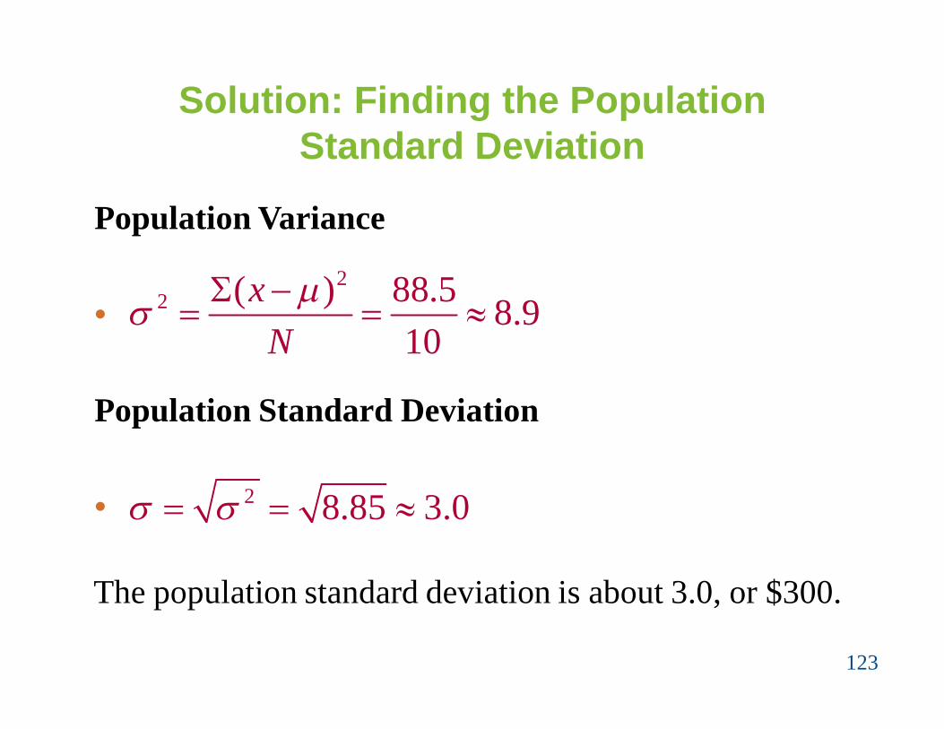
Solution: Finding the Population Standard Deviation
123
Population Variance
•
Population Standard Deviation
•
22 ( ) 88.5 8.9
10x
N
2 8.85 3.0
The population standard deviation is about 3.0, or $300.

Deviation, Variance, and Standard Deviation
Sample Variance
•
Sample Standard Deviation
•
124
22 ( )
1x xsn
22 ( )
1x xs sn

Finding the Sample Variance & Standard Deviation
In Words In Symbols
125
1. Find the mean of the sample data set.
2. Find deviation of each entry.
3. Square each deviation.
4. Add to get the sum of squares.
xxn
2( )xSS x x
2( )x x
x x

Finding the Sample Variance & Standard Deviation
126
5. Divide by n – 1 to get the sample variance.
6. Find the square root to get the sample standard deviation.
In Words In Symbols2
2 ( )1
x xsn
2( )1
x xsn

Example: Finding the Sample Standard Deviation
The starting salaries are for the CRDB branches of aCRDB Bank PLC. The Bank has several other branches,and you plan to use the starting salaries of the CRDBbranches to estimate the starting salaries for the largerpopulation of Banks. Find the sample standarddeviation of the starting salaries.
Starting salaries (x100 of dollars)41 38 39 45 47 41 44 41 37 42
127

Solution: Finding the Sample Standard Deviation
128
• Determine SSx
• n = 10Salary, x Deviation: x – μ Squares: (x – μ)2
41 41 – 41.5 = –0.5 (–0.5)2 = 0.2538 38 – 41.5 = –3.5 (–3.5)2 = 12.2539 39 – 41.5 = –2.5 (–2.5)2 = 6.2545 45 – 41.5 = 3.5 (3.5)2 = 12.2547 47 – 41.5 = 5.5 (5.5)2 = 30.2541 41 – 41.5 = –0.5 (–0.5)2 = 0.2544 44 – 41.5 = 2.5 (2.5)2 = 6.2541 41 – 41.5 = –0.5 (–0.5)2 = 0.2537 37 – 41.5 = –4.5 (–4.5)2 = 20.2542 42 – 41.5 = 0.5 (0.5)2 = 0.25
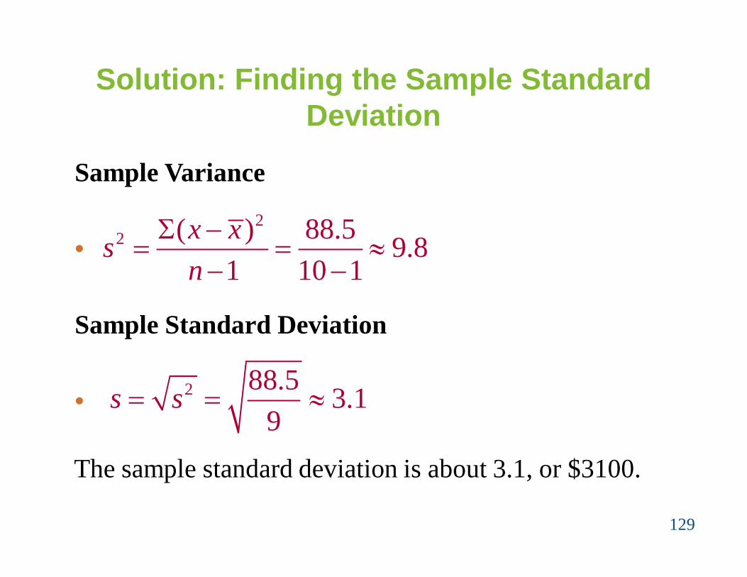
Σ(x – μ) = 0 SSx = 88.5
Solution: Finding the Sample Standard Deviation
129
Sample Variance
•
Sample Standard Deviation
•
22 ( ) 88.5 9.8
1 10 1x xsn
2 88.5 3.19
s s
The sample standard deviation is about 3.1, or $3100.

Example: Using Technology to Find the Standard Deviation
Sample office rental rates (indollars per square foot per year)for Kongo’s business street areshown in the table.(a) find the mean rental rate andthe sample standard deviation.(b)Use a calculator to find themean rental rate and the samplestandard deviation. (try it)
130
Office Rental Rates35.00 33.50 37.0023.75 26.50 31.2536.50 40.00 32.0039.25 37.50 34.7537.75 37.25 36.7527.00 35.75 26.0037.00 29.00 40.5024.50 33.00 38.00

Interpreting Standard Deviation
• Standard deviation is a measure of the typical amount an entry deviates from the mean.
• The more the entries are spread out, the greater the standard deviation.
131
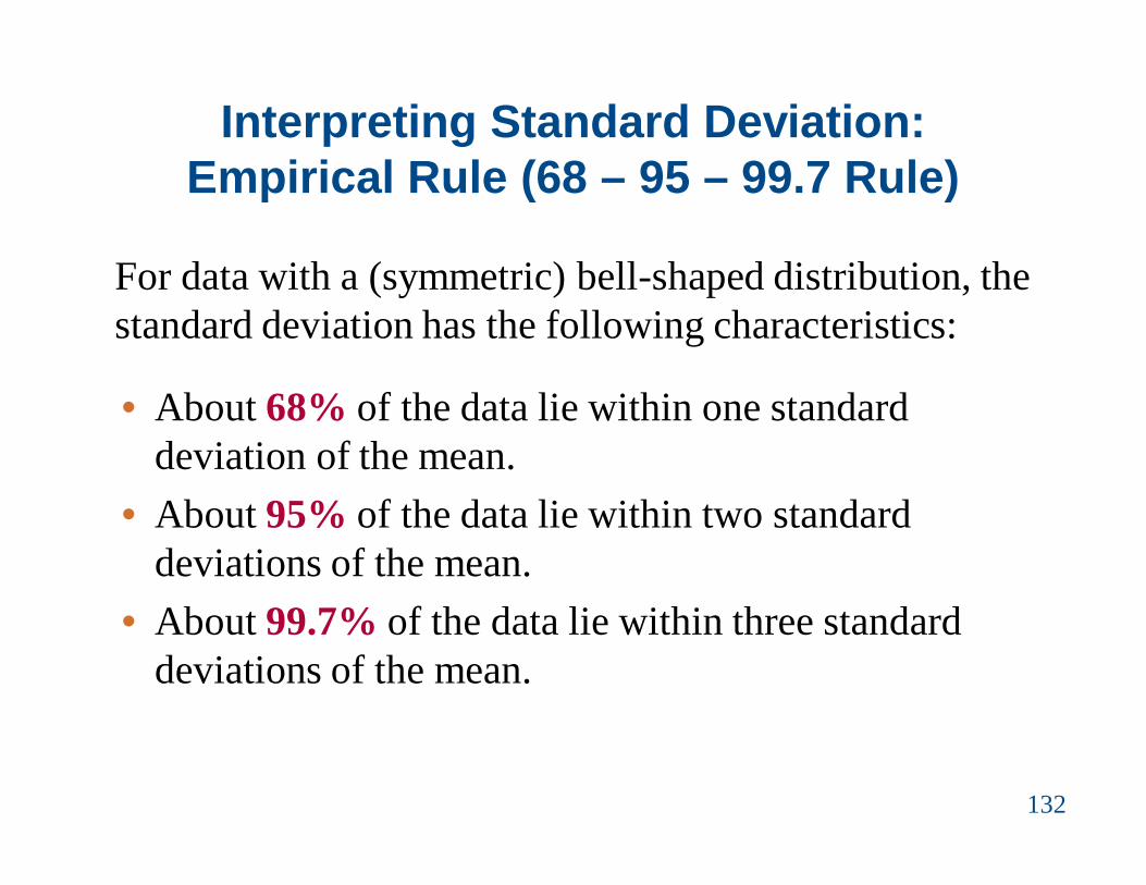
Interpreting Standard Deviation: Empirical Rule (68 – 95 – 99.7 Rule)
For data with a (symmetric) bell-shaped distribution, the standard deviation has the following characteristics:
132
• About 68% of the data lie within one standard deviation of the mean.
• About 95% of the data lie within two standard deviations of the mean.
• About 99.7% of the data lie within three standard deviations of the mean.

Interpreting Standard Deviation: Empirical Rule (68 – 95 – 99.7 Rule)
133
3x s x s 2x s 3x sx s x2x s
68% within 1 standard deviation
34% 34%
99.7% within 3 standard deviations
2.35% 2.35%
95% within 2 standard deviations
13.5% 13.5%

Example: Using the Empirical Rule
In a survey conducted by the National Center for HealthStatistics, the sample mean height of women in Morogoro(ages 20-29) was 64 inches, with a sample standarddeviation of 2.71 inches. Estimate the percent of thewomen whose heights are between 64 inches and 69.42inches.
134

Solution: Using the Empirical Rule
135
3x s x s 2x s 3x sx s x2x s55.87 58.58 61.29 64 66.71 69.42 72.13
34%
13.5%
• Because the distribution is bell-shaped, you can use the Empirical Rule.
34% + 13.5% = 47.5% of women are between 64 and 69.42 inches tall.

Chebychev’s Theorem
• The portion of any data set lying within k standard deviations (k > 1) of the mean is at least:
136
2
11k
• k = 2: In any data set, at least 2
1 31 or 75%2 4
of the data lie within 2 standard deviations of the mean.
• k = 3: In any data set, at least 2
1 81 or 88.9%3 9
of the data lie within 3 standard deviations of the mean.

Example: Using Chebychev’s Theorem
The age distribution for Tabora is shown in the histogram. Apply Chebychev’s Theorem to the data using k = 2. What can you conclude?
137

Solution: Using Chebychev’s Theorem
k = 2: μ – 2σ = 39.2 – 2(24.8) = -10.4 (use 0 since age can’t be negative)
μ + 2σ = 39.2 + 2(24.8) = 88.8
138
At least 75% of the population of Tabora is between 0 and 88.8 years old.

Standard Deviation for Grouped Data
Sample standard deviation for a frequency distribution
•
• When a frequency distribution has classes, estimate the sample mean and standard deviation by using the midpoint of each class.
139
2( )1
x x fsn
where n= Σf (the number of entries in the data set)

Example: Finding the Standard Deviation for Grouped Data
140
You collect a random sample of the number of children per household in a region. Find the sample mean and the sample standard deviation of the data set.
Number of Children in50 Households
1 3 1 1 11 2 2 1 01 1 0 0 01 5 0 3 63 0 3 1 11 1 6 0 13 6 6 1 22 3 0 1 14 1 1 2 20 3 0 2 4

x f xf0 10 0(10) = 01 19 1(19) = 192 7 2(7) = 143 7 3(7) =214 2 4(2) = 85 1 5(1) = 56 4 6(4) = 24
Solution: Finding the Standard Deviation for Grouped Data
• First construct a frequency distribution.
• Find the mean of the frequency distribution.
141
Σf = 50 Σ(xf )= 91
91 1.850
xfxn
The sample mean is about 1.8 children.

Solution: Finding the Standard Deviation for Grouped Data
• Determine the sum of squares.
142
x f0 10 0 – 1.8 = –1.8 (–1.8)2 = 3.24 3.24(10) = 32.401 19 1 – 1.8 = –0.8 (–0.8)2 = 0.64 0.64(19) = 12.162 7 2 – 1.8 = 0.2 (0.2)2 = 0.04 0.04(7) = 0.283 7 3 – 1.8 = 1.2 (1.2)2 = 1.44 1.44(7) = 10.084 2 4 – 1.8 = 2.2 (2.2)2 = 4.84 4.84(2) = 9.685 1 5 – 1.8 = 3.2 (3.2)2 = 10.24 10.24(1) = 10.246 4 6 – 1.8 = 4.2 (4.2)2 = 17.64 17.64(4) = 70.56
x x 2( )x x 2( )x x f
2( ) 145.40x x f

Solution: Finding the Standard Deviation for Grouped Data
• Find the sample standard deviation.
143
x x 2( )x x 2( )x x f2( ) 145.40 1.71 50 1
x x fsn
The standard deviation is about 1.7 children.

Measures of Position
• Determine the quartiles of a data set• Determine the interquartile range of a data set• Create a box-and-whisker plot• Interpret other fractiles such as percentiles• Determine and interpret the standard score (z-score)
144
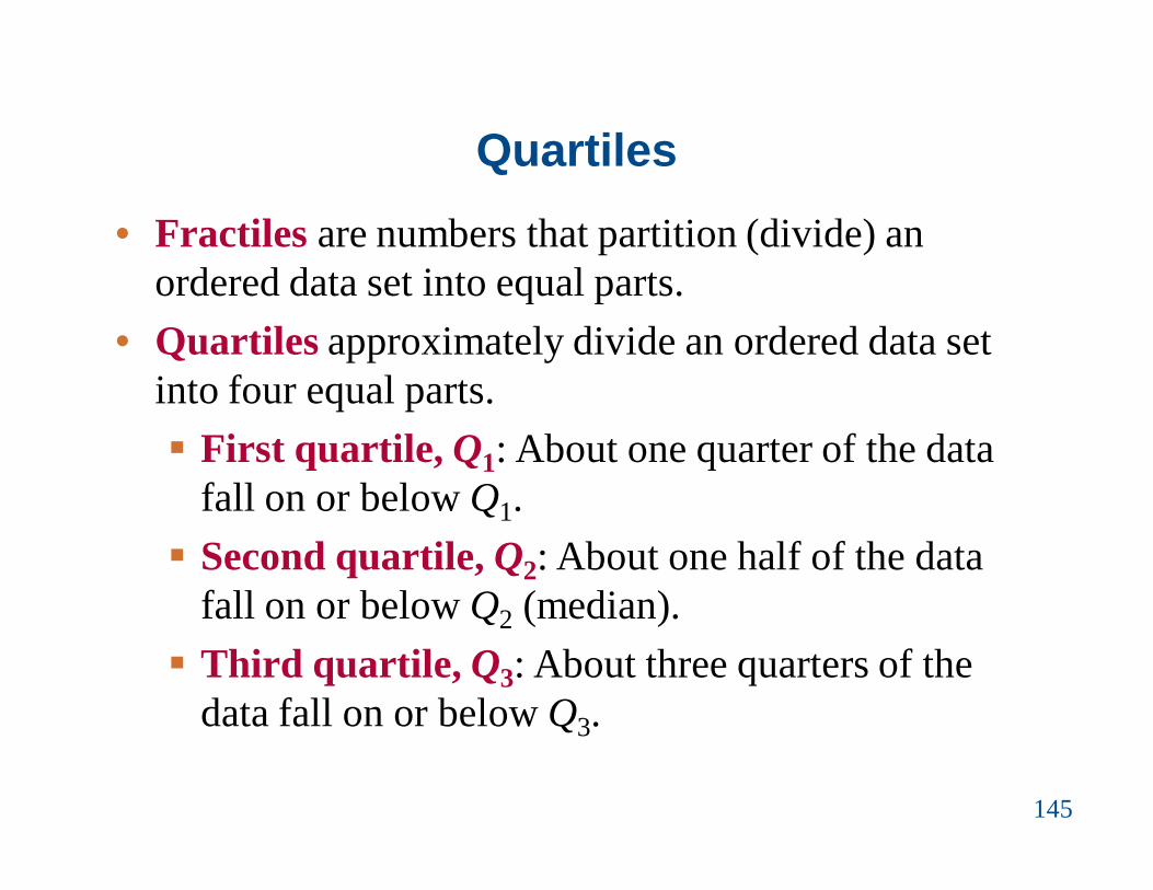
Quartiles• Fractiles are numbers that partition (divide) an
ordered data set into equal parts.• Quartiles approximately divide an ordered data set
into four equal parts. First quartile, Q1: About one quarter of the data
fall on or below Q1. Second quartile, Q2: About one half of the data
fall on or below Q2 (median). Third quartile, Q3: About three quarters of the
data fall on or below Q3.
145

Example: Finding Quartiles
The test scores of 15 employees enrolled in a CPR training course are listed. Find the first, second, and third quartiles of the test scores.13 9 18 15 14 21 7 10 11 20 5 18 37 16 17
146
Solution:• Q2 divides the data set into two halves.
5 7 9 10 11 13 14 15 16 17 18 18 20 21 37
Q2
Lower half Upper half

Solution: Finding Quartiles• The first and third quartiles are the medians of the
lower and upper halves of the data set.
5 7 9 10 11 13 14 15 16 17 18 18 20 21 37
147
Q2
Lower half Upper half
Q1 Q3
About one fourth of the employees scored 10 or less, about one half scored 15 or less; and about three fourths scored 18 or less.

Interquartile Range
Interquartile Range (IQR)• The difference between the third and first quartiles.• IQR = Q3 – Q1
148

Example: Finding the Interquartile Range
Find the interquartile range of the test scores.Recall Q1 = 10, Q2 = 15, and Q3 = 18
149
Solution:• IQR = Q3 – Q1 = 18 – 10 = 8
The test scores in the middle portion of the data set vary by at most 8 points.

Box-and-Whisker Plot
Box-and-whisker plot• Exploratory data analysis tool.• Highlights important features of a data set.• Requires (five-number summary): Minimum entry First quartile Q1
Median Q2
Third quartile Q3
Maximum entry
150

Drawing a Box-and-Whisker Plot
1. Find the five-number summary of the data set.2. Construct a horizontal scale that spans the range of
the data.3. Plot the five numbers above the horizontal scale.4. Draw a box above the horizontal scale from Q1 to Q3
and draw a vertical line in the box at Q2.5. Draw whiskers from the box to the minimum and
maximum entries.
151
Whisker Whisker
Maximum entry
Minimum entry
Box
Median, Q2 Q3Q1

Example: Drawing a Box-and-Whisker Plot
Draw a box-and-whisker plot that represents the 15 test scores. Recall Min = 5 Q1 = 10 Q2 = 15 Q3 = 18 Max = 37
152
5 10 15 18 37
Solution:
About half the scores are between 10 and 18. By looking at the length of the right whisker, you can conclude 37 is a possible outlier.

Percentiles and Other Fractiles
Fractiles Summary SymbolsQuartiles Divides data into 4 equal
partsQ1, Q2, Q3
Deciles Divides data into 10 equal parts
D1, D2, D3,…, D9
Percentiles Divides data into 100 equal parts
P1, P2, P3,…, P99
153

Example: Interpreting Percentiles
The ogive represents the cumulative frequency distribution for SAT test scores of college-bound students in a recent year. What test score represents the 72nd
percentile? How should you interpret this?
154

Solution: Interpreting Percentiles
The 72nd percentile corresponds to a test score of 1700. This means that 72% of the students had an SAT score of 1700 or less.
155

Mean
Median
Mode
Summary Measures
Variation
Variance
Standard Deviation
Range
Location/Position
Maximum Minimum
Central Tendency
Percentile Quartile Decile

The Standard Score
Standard Score (z-score)• Represents the number of standard deviations a given
value x falls from the mean μ.
•
157
value - meanstandard deviation
xz

Example: Comparing z-Scores from Different Data Sets
In 2007, Forest Whitaker won the Best Actor Oscar atage 45 for his role in the movie The Last King ofScotland. Helen Mirren won the Best Actress Oscar atage 61 for her role in The Queen. The mean age of allbest actor winners is 43.7, with a standard deviation of8.8. The mean age of all best actress winners is 36, witha standard deviation of 11.5. Find the z-score thatcorresponds to the age for each actor or actress. Thencompare your results.
158

Solution: Comparing z-Scores from Different Data Sets
159
• Forest Whitaker45 43.7 0.15
8.8xz
• Helen Mirren61 36 2.17
11.5xz
0.15 standard deviations above the mean
2.17 standard deviations above the mean

Solution: Comparing z-Scores from Different Data Sets
160
The z-score corresponding to the age of Helen Mirrenis more than two standard deviations from the mean,so it is considered unusual. Compared to other BestActress winners, she is relatively older, whereas theage of Forest Whitaker is only slightly higher than theaverage age of other Best Actor winners.
z = 0.15 z = 2.17


![[Notes]STAT1 - Elementary Statistics](https://img.pdfslide.us/doc/110x75/577cdbee1a28ab9e78a976c0/notesstat1-elementary-statistics.jpg)