Embed Size (px)
Citation preview

Human Capabilities:Perception, Attention
CS352
Announcements
• Project proposal part 3 due tonight.• Project user data out later today.
2

Where we are…
• Where we are in PRICPE:– Predispositions: Did this in Project Proposal.– RI: Research is in process (studying users), due
mid next week. Should lead to Insights.– CP: Concept and initial (very low-fi) Prototypes.– Evaluate throughout, repeat iteratively!!

Study the User:Some Attributes
• Physical attributes– age, gender, size, reach, visual angles, etc…
• Perceptual abilities– vision, hearing, heat sensitivity…
• Cognitive abilities– memory span, reading level, musical training, math…
• Personality and social traits– likes, dislikes, preferences, patience…
• Cultural and international diversity – languages, reading order…
• Special populations, (dis)abilities

Design Implications/InsightsPopulation Implications
Users 16-80 yrs Range of text sizesRange of grip strength
Some French speakers
Multilingual interface
Astronaut users Extensive training available
Military context Aesthetics less of an issueRuggedness is critical

Perception and the Senses
– Senses: smell, taste, sight, hearing, touch, proprioception (body position awareness), pain, temperature, balance, ...
– Change:• Adaptation: Senses physically react to change.• Absence of change leads us to lose sensitivity.• Eye compensates for this some by shifting around,
but nose can't do that (which is why we become sensitized to a smell).
– But: there is a “just noticeable difference”• eg: Doubling # photons does not double perceived
intensity of a picture.

Perception
• How information is acquired from the world by senses– they are the input devices to the brain– so, if doesn’t make it thru senses => not delivered to brain.
• Obvious implication is to design representations that are readily perceivable
• Q: How can we tell when they are and when they aren’t?– A: see next slides.

Visual perception• Eye: Pupil/lens,
place image on retina. From there, to brain.– Retina has photoreceptor
cells: rods and cones. – Rods: tell us dark vs. light (intensity, shades of
grey). Can detect in very dim light (night vision). Perceive motion. Lots of rods (120M).
– Cones can detect color. But need much light to do this. Only a few cones (6-7M).

Retina
• Center of retina has most of the cones ?– allows for high acuity of objects focused at center
• Edge of retina is dominated by rods ?– allows detecting motion of threats in periphery

Color Sensitivity
• from: http://www.cs.gsu.edu/classes/hypgraph/color/coloreff.htm
64% of cones see red, 32% see green, only 2% see blue insensitivity to short wavelengths cyan to deep-blue

Color Sensitivity
• As we age– lens yellows & absorbs shorter wavelengths
?• sensitivity to blue is even more reduced
– fluid between lens and retina absorbs more light• perceive a lower level of brightness
• Implications?– don’t rely on blue for text or small objects!– older users need brighter colors

Focus
• Different wavelengths of light focused at different distances behind eye’s lens– need for constant refocusing ?
• causes fatigue– be careful about color combinations
• Pure (saturated) colors require more focusing then less pure (desaturated)– don’t use saturated colors in UIs unless you
really need something to stand out (stop sign)
Rods and cones

Components of “Color”: HLS
• Hue (“color”) – eg, Red
• vs. Light– “how much light it reflects” (regardless
of hue)– eg: closeness to black
• vs. Saturation (“how much paint you added”).
Light
Not much light

Contrast – How-to’s
• Choose 1 hue, from light recommended hues, lighten, desaturate
• Choose 2nd hue from dark recommendations, darken, saturate.
And not adjacent colors.
Effective
Not aseffective
Not aseffective

Which is easiest to read and why?
What is the time?
What is the time?
What is the time?
What is the time?
What is the time?

Color Deficiency
• A.k.a. color-blindness, two types• Different photopigment response
– reduces capability to discern small color diffs• particularly those of low brightness
– most common
• Red-green deficiency is best known– lack of either green or red cones ?
• can’t discriminate colors dependent on R & G– 7-8% of males red from green,
0.4% of women.
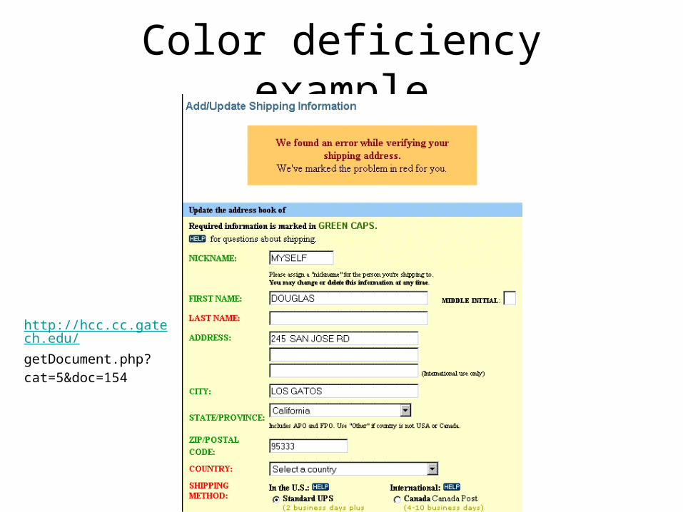
Color deficiency example
http://hcc.cc.gatech.edu/
getDocument.php?
cat=5&doc=154

Color Guidelines
• Avoid simultaneous display of highly saturated, spectrally extreme colors– e.g., no cyans/blues at the same time as reds,
why?• refocusing!
– desaturated combinations are better pastels• Opponent colors go well together
– (red & green) or (yellow & blue)

Color Guidelines
• Size of detectable changes in color varies– hard to detect changes in reds, purples, & greens– easier to detect changes in yellows & blue-greens
• Older users need higher brightness levels to distinguish colors
• Avoid red & green in the periphery - why?– lack of RG cones there -- yellows & blues work in
periphery
• Avoid pure blue for text, lines, & small shapes– blue makes a fine background color– avoid adjacent colors that differ only in blue
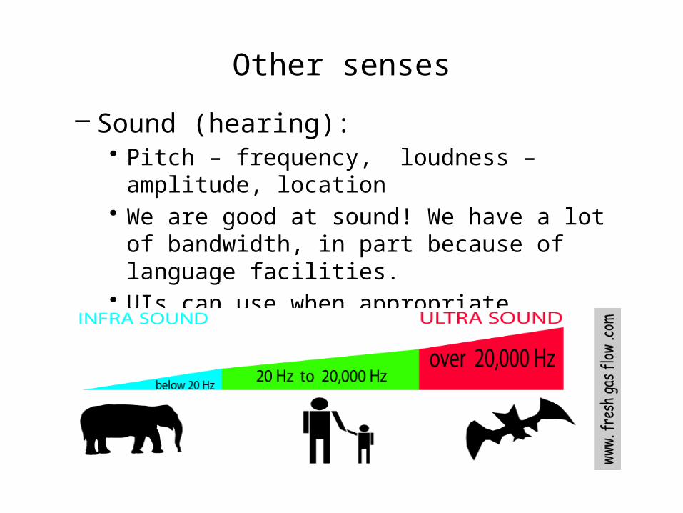
Other senses
– Sound (hearing): • Pitch – frequency, loudness – amplitude, location• We are good at sound! We have a lot of
bandwidth, in part because of language facilities.• UIs can use when appropriate
– but can hog our attention.

Other senses
– Touch: • Pressure, pain, temperature (hot/cold).
– Phone w/ haptic feedback

Perception take-aways 1
• Some UI devices/paradigms leverage more senses than others.– eg: WIMP?– eg: cell phone?– eg: iPhone?– eg: Wii?

Perception take-aways 2
• These are pre-brain! – If you want info to get to/from brain, has to
make it thru senses first.– These are the human UI to the brain.
• Must be: – discernable– distinguishable from similar – if combined with Change, will be more likely to
be perceived, but can steal your attention• eg: banner ad examples

Attention
• Selecting what to focus on, at a point in time, from the range of possibilities.
• Banner ads steal attention pre-brain.• Attention can also be in brain.
• We focus on what we think is relevant to our task.• But if didn’t make it thru senses, not a contender.

Brain attention• Can brain multi-task?
– No. Mostly attend to one thing at once. • Then ...?
– Just like operating systems: Interrupt system, context switch.• Cost of context switch.• Thus, UIs should encourage this with care.
– Hands-free cells while driving? Emails while in talks/meetings?
– Flow?

So...
• Avoid cluttered UI.

Demanding Brain’s Attention:Interruptions
• When COMPUTER decides to call attention to something.
• Four important kinds:– Immediate
• For when MUST pay immediate attention.
– Mediated• Computer decides when to interrupt.
– Scheduled– Negotiated
• Best for productivity AND learning.

Attention Take-aways(Basics for UIs)
• Users can’t attend to everything at once.• If info does not make it thru senses,
– brain can’t attend to it.• Once in brain:
– users attend to what they think is most relevant. (More on this later in course.)
• User has the right to their own attention.– There is a cost to making them switch.– Do not steal it arbitrarily.