Embed Size (px)
Citation preview

http://aimpro.ncl.ac.uk MMG Skills Lecture Series
Introductory concepts:Diagram preparation
Jon Goss

MMG Skills Lecture Series2
Outline
For the purposes of this session, the term diagram refers to any pictorial or graphical representation of data.What is the purpose behind making a diagram?
1. To show something to yourself2. To communicate information to a colleague3. To illustrate a report or paper4. To include in a poster or talk

MMG Skills Lecture Series3
Diagrams: for diagnosis for diagnosis
The classic types of diagram for diagnosis are where we want to understand something about a run. For example:
minimol FORCESETOTHomer

MMG Skills Lecture Series4
Diagrams: for diagnosis for diagnosis

MMG Skills Lecture Series5
Diagrams: for internal consumption for internal consumption
The second class of diagrams are those used to show something to a colleague
On paperElectronically
For example, a bandstructure plot, DoS, …These are typically non-trivial to construct (i.e. not via a single command).However, they are quick and dirty in comparison to something that we’d publish!Nevertheless, the basic skills required are very similar……familiarity with the software!

MMG Skills Lecture Series6
Diagrams: for written reports for written reports
We’ll now look at five types of diagrams typical of AIMPRO papers:
Basic atomistic structures (xbs)Kohn-Sham functions and charge densities (AIMVIEW)Hyperfine tensors (POV-Ray)Band structures (gnuplot)Formation energies (gnuplot)
Each of you should invest some time to learn how to use at least AIMVIEW and gnuplot!Before beginning, you check the following:
Keep all images in a report stylistically similar, so related structures should be viewed from the same direction, and at the same distance.For publications, there may be publisher-defined constraints (e.g. how units are included in graph – in parentheses “(eV)”, or as a division “/eV”).

MMG Skills Lecture Series7
Diagrams: for written reports - xbs for written reports - xbs
“xbs” is a very simple structure plotting package that has the capacity for producing slightly better images than, say, minimol.
(We’ll also look at much more lick-able structures with AIMVIEW and POV-Ray.)
xbs is available on snufkin.It takes as input a relatively simple format which describes the atom species and how they bond, plus a structure (of course).This can be generated automatically from an “xyz” file using “x2bs” (~njpg/bin).The GUI is invoked as “xbs file”…
atom X 0.86294 0.86294 0.81914atom C 2.75763934061345 2.75763934061345 2.75240668935108atom C -0.881961575033624 -0.881961575033624 2.51027987788644atom C -1.0145315223104 2.5906159091129 -0.99306990425811atom C 2.5906159091129 -1.0145315223104 -0.99306990425811atom C 3.63561359381117 3.63561359381117 0.101720170513226atom C 4.53509481848491 4.53509481848491 2.17033706980097atom C 7.58079831961937 7.58079831961937 0.873266945760172atom C 9.23574664110324 9.23574664110324 2.4968004624099atom C 9.13529069727637 5.83342350003411 -0.821401526277635atom C -0.848286657917147 2.50071030548027 5.81240407786314atom C 7.6783648724097 4.20453261020676 4.32568105360856atom C 9.26537565487816 5.86036910290525 5.9141034613905atom C 5.83342350003411 9.13529069727637 -0.821401526277635atom C 4.20453261020676 7.6783648724097 4.32568105360856atom C 5.86036910290525 9.26537565487816 5.9141034613905atom C 2.50071030548027 -0.848286657917147 5.81240407786314atom C 5.77922804840765 2.31987864618118 -1.07273697248462atom C 2.31987864618118 5.77922804840765 -1.07273697248462atom C 6.20109425754999 6.20109425754999 2.88765815780565atom C 4.20916999778273 0.792760839194733 4.20898102518387atom C 5.88873955917179 2.48169777230918 5.89192752691452atom C 0.792760839194733 4.20916999778273 4.20898102518387atom C 2.48169777230918 5.88873955917179 5.89192752691452
spec N 0.750 0.8spec C 0.825 0spec X 0.825 1
bonds N N 0.000 3.000 0.300 0.5bonds N C 0.000 3.180 0.300 0.5bonds C C 0.000 3.80 0.300 0.5bonds C X 0.000 3.80 0.100 1bonds X X 0.000 3.80 0.300 0.5
tmat -0.707 -0.707 0.000 0.000 0.000 1.000 -0.707 0.707 0.000dist 25.000inc 5.000scale 25.000rfac 0.60bfac 0.60pos 10.000 0.000pos 0.000 0.000switches 1 0 1 0 0 1 1 2 1

MMG Skills Lecture Series8
Diagrams: for written reports - xbs for written reports - xbs

MMG Skills Lecture Series9
Diagrams: for written reports - xbs for written reports - xbs
There are some advantages in using this “primitive” software:
It produces simple images which may be much more clear than the shiny atoms we’ll see laterIt produces smaller files
Why is this important?The graphics are vector postscript and therefore scalable
Why is this useful?It is much faster to use (once you’ve got used to it)
But there are also disadvantages:Requires some linux expertise
You should be developing this anyway!
You may need to edit the postscript output
Never a bad thing Can absorb lots of time “fiddling about” if you’re not careful
This is a bad thing!
Goss et al Phys. Rev. B 76, 045203 (2007)

MMG Skills Lecture Series10
Diagrams: for written reports - AIMVIEW for written reports - AIMVIEW
This is not the place to learn how to use AIMVIEW – there is a whole manual provided by Jerry.Therefore, today I’ll assume that you’ll be able to read the manual, and/or collaborate with your peers to view your structure from an AIMVIEW dump file.However, we will look at some important factors in generating the image files.First some guiding principles:
What makes a good or bad illustration for a structure and wave function?

MMG Skills Lecture Series11
Diagrams: for written reports - AIMVIEW for written reports - AIMVIEW
My answer (invert for bad)Important part is centralThere’s minimal additional material (the surroundings)There is a minimisation of anything in the foreground that may eclipse the actionThe sizes, colours and direction of view accentuate the key elements
Remember – you’ve been thinking about your system for weeks or months, but this is new to the reader of the report!

MMG Skills Lecture Series12
Diagrams: for written reports - AIMVIEW for written reports - AIMVIEW
Now for the tricks in creating a high-quality image
1. When choosing the aspect, use a modest quality for the wave functions, atoms, bonds…
2. When you’ve hit on the final view, up the accuracies of these terms
3. Go to the save image 4. Up the resolution of the output5. Save as a “png” (portable network
graphics)6. Open the png file in gimp7. Save it as a jpeg (Joint
Photographic Experts Group)8. If you’re using the file in a power-
point poster or talk, you’re done9. If you’re using LaTeX, then you’ll
want an eps file.10. Use “sam2p” to convert from jpeg
to eps:sam2p -c:jpeg file.jpg EPS: file.eps

MMG Skills Lecture Series13
Diagrams: for written reports - AIMVIEW for written reports - AIMVIEW
Now for the tricks in creating a high-quality image
1. When choosing the aspect, use a modest quality for the wave functions, atoms, bonds…
2. When you’ve hit on the final view, up the accuracies of these terms
3. Go to the save image 4. Up the resolution of the output5. Save as a “png” (portable network
graphics)6. Open the png file in gimp7. Save it as a jpeg (Joint
Photographic Experts Group)8. If you’re using the file in a power-
point poster or talk, you’re done9. If you’re using LaTeX, then you’ll
want an eps file.10. Use “sam2p” to convert from jpeg
to eps:sam2p -c:jpeg file.jpg EPS: file.eps

MMG Skills Lecture Series14
Diagrams: for written reports - AIMVIEW for written reports - AIMVIEW
Now for the tricks in creating a high-quality image
1. When choosing the aspect, use a modest quality for the wave functions, atoms, bonds…
2. When you’ve hit on the final view, up the accuracies of these terms
3. Go to the save image 4. Up the resolution of the output5. Save as a “png” (portable network
graphics)6. Open the png file in gimp7. Save it as a jpeg (Joint
Photographic Experts Group)8. If you’re using the file in a power-
point poster or talk, you’re done9. If you’re using LaTeX, then you’ll
want an eps file.10. Use “sam2p” to convert from jpeg
to eps:sam2p -c:jpeg file.jpg EPS: file.eps

MMG Skills Lecture Series15
Diagrams: for written reports - AIMVIEW for written reports - AIMVIEW
Now for the tricks in creating a high-quality image
1. When choosing the aspect, use a modest quality for the wave functions, atoms, bonds…
2. When you’ve hit on the final view, up the accuracies of these terms
3. Go to the save image 4. Up the resolution of the output5. Save as a “png” (portable network
graphics)6. Open the png file in gimp7. Save it as a jpeg (Joint
Photographic Experts Group)8. If you’re using the file in a power-
point poster or talk, you’re done9. If you’re using LaTeX, then you’ll
want an eps file.10. Use “sam2p” to convert from jpeg
to eps:sam2p -c:jpeg file.jpg EPS: file.eps

MMG Skills Lecture Series16
Diagrams: for written reports - AIMVIEW for written reports - AIMVIEW
Now for the tricks in creating a high-quality image
1. When choosing the aspect, use a modest quality for the wave functions, atoms, bonds…
2. When you’ve hit on the final view, up the accuracies of these terms
3. Go to the save image 4. Up the resolution of the output5. Save as a “png” (portable network
graphics)6. Open the png file in gimp7. Save it as a jpeg (Joint
Photographic Experts Group)8. If you’re using the file in a power-
point poster or talk, you’re done9. If you’re using LaTeX, then you’ll
want an eps file.10. Use “sam2p” to convert from jpeg
to eps:sam2p -c:jpeg file.jpg EPS: file.eps

MMG Skills Lecture Series17
Diagrams: for written reports - AIMVIEW for written reports - AIMVIEW
Now for the tricks in creating a high-quality image
1. When choosing the aspect, use a modest quality for the wave functions, atoms, bonds…
2. When you’ve hit on the final view, up the accuracies of these terms
3. Go to the save image 4. Up the resolution of the output5. Save as a “png” (portable network
graphics)6. Open the png file in gimp7. Save it as a jpeg (Joint
Photographic Experts Group)8. If you’re using the file in a power-
point poster or talk, you’re done9. If you’re using LaTeX, then you’ll
want an eps file.10. Use “sam2p” to convert from jpeg
to eps:sam2p -c:jpeg file.jpg EPS: file.eps

MMG Skills Lecture Series18
Diagrams: for written reports - AIMVIEW for written reports - AIMVIEW
Now for the tricks in creating a high-quality image
1. When choosing the aspect, use a modest quality for the wave functions, atoms, bonds…
2. When you’ve hit on the final view, up the accuracies of these terms
3. Go to the save image 4. Up the resolution of the output5. Save as a “png” (portable network
graphics)6. Open the png file in gimp7. “Save-as” it as a jpeg (Joint
Photographic Experts Group)8. If you’re using the file in a power-
point poster or talk, you’re done9. If you’re using LaTeX, then you’ll
want an eps file.10. Use “sam2p” to convert from jpeg
to eps:sam2p -c:jpeg file.jpg EPS: file.eps

MMG Skills Lecture Series19
Diagrams: for written reports - AIMVIEW for written reports - AIMVIEW
Now for the tricks in creating a high-quality image
1. When choosing the aspect, use a modest quality for the wave functions, atoms, bonds…
2. When you’ve hit on the final view, up the accuracies of these terms
3. Go to the save image 4. Up the resolution of the output5. Save as a “png” (portable network
graphics)6. Open the png file in gimp7. “Save-as” it as a jpeg (Joint
Photographic Experts Group)8. If you’re using the file in a power-
point poster or talk, you’re done9. If you’re using LaTeX, then you’ll
want an eps file.10. Use “sam2p” to convert from jpeg
to eps:sam2p -c:jpeg file.jpg EPS: file.eps

MMG Skills Lecture Series20
Diagrams: for written reports - AIMVIEW for written reports - AIMVIEW
Now for the tricks in creating a high-quality image
1. When choosing the aspect, use a modest quality for the wave functions, atoms, bonds…
2. When you’ve hit on the final view, up the accuracies of these terms
3. Go to the save image 4. Up the resolution of the output5. Save as a “png” (portable network
graphics)6. Open the png file in gimp7. “Save-as” it as a jpeg (Joint
Photographic Experts Group)8. If you’re using the file in a power-
point poster or talk, you’re done9. If you’re using LaTeX, then you’ll
want an eps file.10. Use “sam2p” to convert from jpeg
to eps:sam2p -c:jpeg file.jpg EPS: file.eps

MMG Skills Lecture Series21
Diagrams: for written reports - AIMVIEW for written reports - AIMVIEW
Do not generate the eps directly from gimp!Of course, you can make pictures of structures without wave functions in the same way (c.f. xbs).

MMG Skills Lecture Series22
Diagrams: for written reports - POV-Ray for written reports - POV-Ray
POV-Ray = Persistence of Vision Persistence of Vision ray-tracingray-tracingIt is not trivial, but most of the hard work for the HFI tensors has already been done1. By AIMPRO2. By HFI2POV
"Shorebirds" by Jim Charter (2000)
Wildlife inhabiting the boundary zone between land and sea.
www.POV-Ray.org

MMG Skills Lecture Series23
Diagrams: for written reports - POV-Ray for written reports - POV-Ray
What is a hyperfine interaction?What is a tensor?

MMG Skills Lecture Series24
Diagrams: for written reports - POV-Ray for written reports - POV-Ray
For some molecules, radical and crystal defects there are one or more unpaired electrons that interact with nuclear spins, so that in a magnetic field…The details of the interaction tensor take the form of three magnitudes and three directions (of course). The directions form an orthogonal set, and beyond any symmetry, the magnitudes may take any values.The question is how do you succinctly present this in a report?
A table?A structure?

MMG Skills Lecture Series25
Diagrams: for written reports - POV-Ray for written reports - POV-Ray
I personally favour a combination of table for the numerical values of the tensor elements, but combine it with a figure to help show how the directions relate to the (say) relative positions of radical sites.HFI2POV takes AIMPRO output and generates POV-Ray input.
MMG Skills Lecture Series26
Diagrams: for written reports - POV-Ray for written reports - POV-Ray
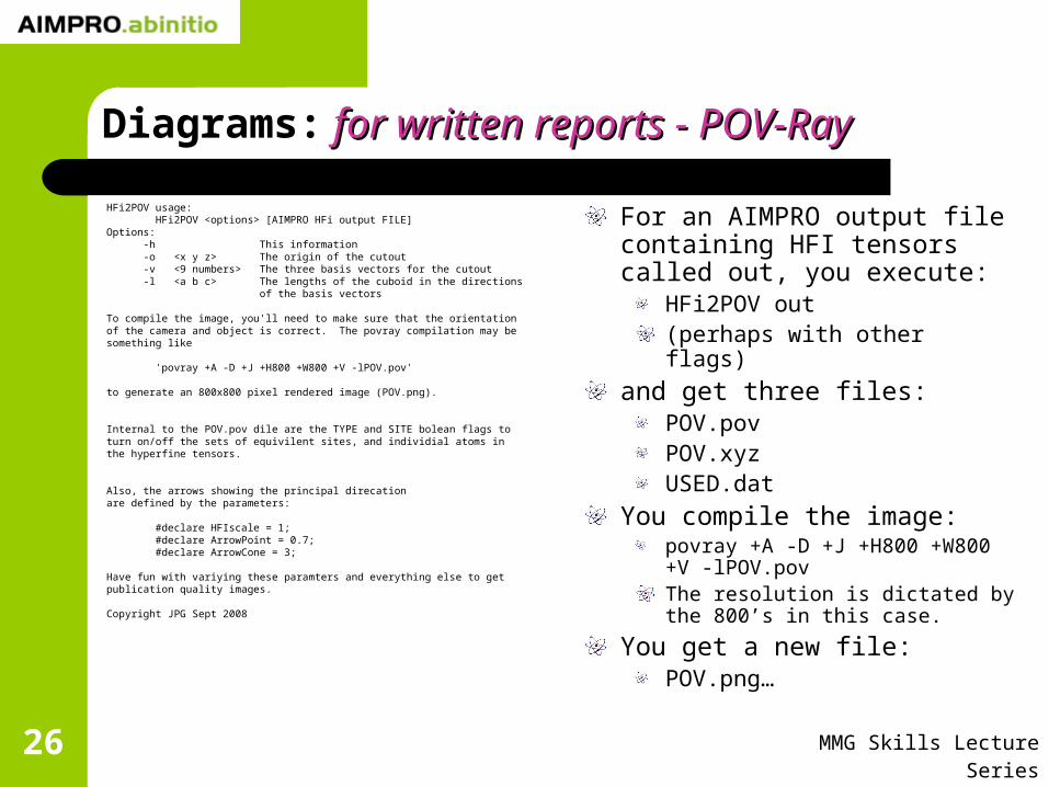
HFi2POV usage: HFi2POV <options> [AIMPRO HFi output FILE]Options: -h This information -o <x y z> The origin of the cutout -v <9 numbers> The three basis vectors for the cutout -l <a b c> The lengths of the cuboid in the directions of the basis vectors
To compile the image, you'll need to make sure that the orientationof the camera and object is correct. The povray compilation may besomething like
'povray +A -D +J +H800 +W800 +V -lPOV.pov'
to generate an 800x800 pixel rendered image (POV.png).
Internal to the POV.pov dile are the TYPE and SITE bolean flags toturn on/off the sets of equivilent sites, and individial atoms inthe hyperfine tensors.
Also, the arrows showing the principal direcationare defined by the parameters:
#declare HFIscale = 1; #declare ArrowPoint = 0.7; #declare ArrowCone = 3;
Have fun with variying these paramters and everything else to getpublication quality images.
Copyright JPG Sept 2008
For an AIMPRO output file containing HFI tensors called out, you execute:
HFi2POV out(perhaps with other flags)
and get three files:POV.povPOV.xyzUSED.dat
You compile the image:povray +A -D +J +H800 +W800 +V -lPOV.povThe resolution is dictated by the 800’s in this case.
You get a new file:POV.png…

MMG Skills Lecture Series27
Diagrams: for written reports - POV-Ray for written reports - POV-Ray
This is the default orientation in the POV.pov fileWe need to do a bit of manipulation to get it rightTherefore we need to know a (very) little POV-RayIn the POV.pov file there are two places you need to update.The first is to add some rotations:
The z-axis is out of the screen (always), the x-axis is horizontal and the y is vertical…

MMG Skills Lecture Series28
Diagrams: for written reports - POV-Ray for written reports - POV-Ray
Look for this in the file:
After it you can add terms like “rotate -45*z” to rotate anti-clockwise by 45°.
/********************************************************************//* End of union: put transformations here... ************************//********************************************************************/

MMG Skills Lecture Series29
Diagrams: for written reports - POV-Ray for written reports - POV-Ray
Now we rotate about the x-axis by 90°

MMG Skills Lecture Series30
Diagrams: for written reports - POV-Ray for written reports - POV-Ray
We can see that the centring is important, so we can translate using “translate <1,1,1>”, or whatever displacement suits…

MMG Skills Lecture Series31
Diagrams: for written reports - POV-Ray for written reports - POV-Ray
And to zoom in, we change something else.Look for “direction” in the camera definition: increasing the value of z effectively moves the camera toward the object…

MMG Skills Lecture Series32
Diagrams: for written reports - POV-Ray for written reports - POV-Ray
But we can’t really see what’s going on here, so we rotate it about y by a small angle…But it’s still pretty difficult to see what’s going on
We don’t need all the arrows,and we can shave off a few atoms in the foreground

MMG Skills Lecture Series33
Diagrams: for written reports - POV-Ray for written reports - POV-Ray
We can either work out which atoms we want to remove, or go back and chop out a different volume using HFi2POV

MMG Skills Lecture Series34
Diagrams: for written reports - POV-Ray for written reports - POV-Ray
The HFi arrows can be turned on and off using parameters set in the POV.pov file:
The species are listed in types and sites: equivalent sites are of the same type
We’ll keep one of each type…

MMG Skills Lecture Series35
Diagrams: for written reports - POV-Ray for written reports - POV-Ray
We can reverse any of the vector directions without affecting the physics
We do this by finding the vector we want in POV.pov and change the sign of the vector

MMG Skills Lecture Series36
Diagrams: for written reports - POV-Ray for written reports - POV-Ray
The HFi arrows can be turned on and off using parameters set in the POV.pov file:
The species are listed in types and sites: equivalent sites are of the same type
We’ll keep one of each type…

MMG Skills Lecture Series37
Diagrams: for written reports - POV-Ray for written reports - POV-Ray
Finally, you may need to annote the figure, in the example to distinguish between the carbon site.This can be done most simply using xfig…

MMG Skills Lecture Series38
Diagrams: for written reports - xfig for written reports - xfig
MMG Skills Lecture Series39
Diagrams: for written reports - xfig for written reports - xfig
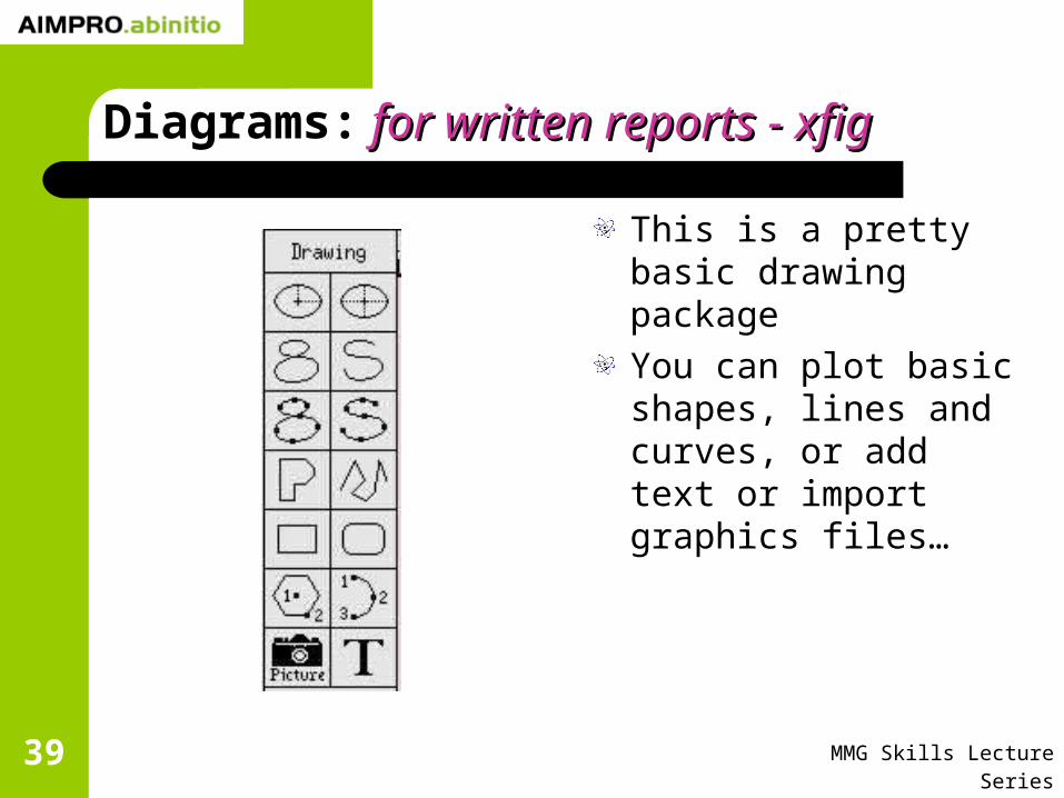
This is a pretty basic drawing packageYou can plot basic shapes, lines and curves, or add text or import graphics files…

MMG Skills Lecture Series40
Diagrams: for written reports - xfig for written reports - xfig
For each of these items, there are user definable qualities such as line thickness, colour, style and so on.The “depth” value allows you to define which elements lie in front or behind others.

MMG Skills Lecture Series41
Diagrams: for written reports - xfig for written reports - xfig
You can edit you figure using a range of tools familiar to most of you…
MoveCopyRotateScale…
Others may be more obscure
you can group and ungroup as in Power pointedit brings up a dialogue box to change settings

MMG Skills Lecture Series42
Diagrams: for written reports - xfig for written reports - xfig
The “File” menu allows you to export your figure to eps or some other image-file type.

MMG Skills Lecture Series43
Diagrams: for written reports - xfig for written reports - xfig
Beware: the text you add to a figure on the screen does not match that produced in an eps file.This may relate to both size and position.For papers, xfig text annotation interfaces well with LaTeX using the “psfrag” package.

MMG Skills Lecture Series44
Diagrams: for written reports - for written reports - psfragpsfrag
The text in the eps file is discarded, and replaced with LaTeX text.This maintains consistency with fonts and font sizesIt means you don’t have to worry about complex notation in xfig.You may have to play around with the location of the text to get the desired finished product.

MMG Skills Lecture Series45
Diagrams: for written reports - for written reports - gnuplotgnuplot
We’ll now look at two examples of using gnuplot to produce publication quality graphs.
A band structureA formation energy
What information are we hoping to show in a band structure plot?

MMG Skills Lecture Series46
Diagrams: for written reports - for written reports - gnuplotgnuplot
Typically we’ll have several data sets to plot on the same graph:
Maybe two spin statesA context, such as the bulk bands as a reference
We need to ensure that they’re all mutually consistent (i.e. basis, sampling, lattice constant etc).I tend to plot the bulk as solid lines, and the analysis for a defect as points
Goss et al Phys. Rev. B 76, 075204 (2007)

MMG Skills Lecture Series47
Diagrams: for written reports - for written reports - gnuplotgnuplot
However, the defaultdefault appearance of a gnuplot graph is pretty poor.Let’s go through some steps to getting a polished image for incorporation in a paper.What’s wrong with the graph shown in the figure?
gnuplot of “sin(x)”

MMG Skills Lecture Series48
Diagrams: for written reports - for written reports - gnuplotgnuplot
The formatting of the numbers:
set format y “%.1f”

MMG Skills Lecture Series49
Diagrams: for written reports - for written reports - gnuplotgnuplot
The lack of labels on the axes:
set xlabel “x”

MMG Skills Lecture Series50
Diagrams: for written reports - for written reports - gnuplotgnuplot
Choose a y-range set yrange [-1.1:1.1]

MMG Skills Lecture Series51
Diagrams: for written reports - for written reports - gnuplotgnuplot
Remove the legend:unset key

MMG Skills Lecture Series52
Diagrams: for written reports - for written reports - gnuplotgnuplot
But these are just screen-shots – we want images (e.g. jpeg, eps, …) When you run gnuplot interactively you are using a “x11” terminal, but we want something else now.
Typically we want eps (encapsulated postscript).
set terminal postscript eps
set output “file.eps”
What’s happened?What’s wrong now? Eps file

MMG Skills Lecture Series53
Diagrams: for written reports - for written reports - gnuplotgnuplot
The font-sizeThe font-typeThe line-thicknessEverything is black and whiteIt also may be that the sampling of the function is not particularly great…

MMG Skills Lecture Series54
Diagrams: for written reports - for written reports - gnuplotgnuplot
Fonts:set terminal postscript eps “Times-Roman” 24
Line thickness:Either in the plot:
plot sin(x) lw 2
Or in the terminalset terminal postscript eps lw 2 “Times-Roman” 24
Black and white to colour:set terminal postscript eps color lw 2 “Times-Roman” 24

MMG Skills Lecture Series55
Diagrams: for written reports - for written reports - gnuplotgnuplot

MMG Skills Lecture Series56
Diagrams: for written reports - for written reports - gnuplotgnuplot
Sampling:When plotting a function, it is “sampled”.The sampling density is defined by the variable “sample”.set sample x, y
“x” is the number of points calculated in our plot.“y” is for surface plots.(See “help sample”.)

MMG Skills Lecture Series57
Diagrams: for written reports - for written reports - gnuplotgnuplot
sample 30

MMG Skills Lecture Series58
Diagrams: for written reports - for written reports - gnuplotgnuplot
sample 80

MMG Skills Lecture Series59
Diagrams: for written reports - for written reports - gnuplotgnuplot
Still in error:The “x” and “y” are maths objects (should be in itallics).Individual terms can be modified in “enhanced” eps:set terminal postscript enhanced eps color lw 2 “Times-Roman” 24
Thenset xlabel “{/Times-Roman-Itallic x} (radians)”set ylabel “{/Times-Roman-Itallic y}”

MMG Skills Lecture Series60
Diagrams: for written reports - for written reports - gnuplotgnuplot

MMG Skills Lecture Series61
Diagrams: for written reports - for written reports - gnuplotgnuplot
The band-structure can be plotted from the bandst.plt.This is a two (or three) column format that gnuplot understands as
X Y (Z)
A quick plot can be generated “ plot ‘file’ ”, (postscript) which generates the basic plot…What’s wrong with this image?

MMG Skills Lecture Series62
Diagrams: for written reports - for written reports - gnuplotgnuplot
MMG Skills Lecture Series63
Diagrams: for written reports - for written reports - gnuplotgnuplot
1. There is too much dataDo all the valence bands need to be included?
2. Which are filled?…and which are empty?
3. Are enough empty bands plotted?What is the test?
4. Should we use symbols or lines?5. Colour?6. Fonts and key?7. What are the x-axis labels?8. This is a spin polarised system – is that evident?
MMG Skills Lecture Series64
Diagrams: for written reports - for written reports - gnuplotgnuplot
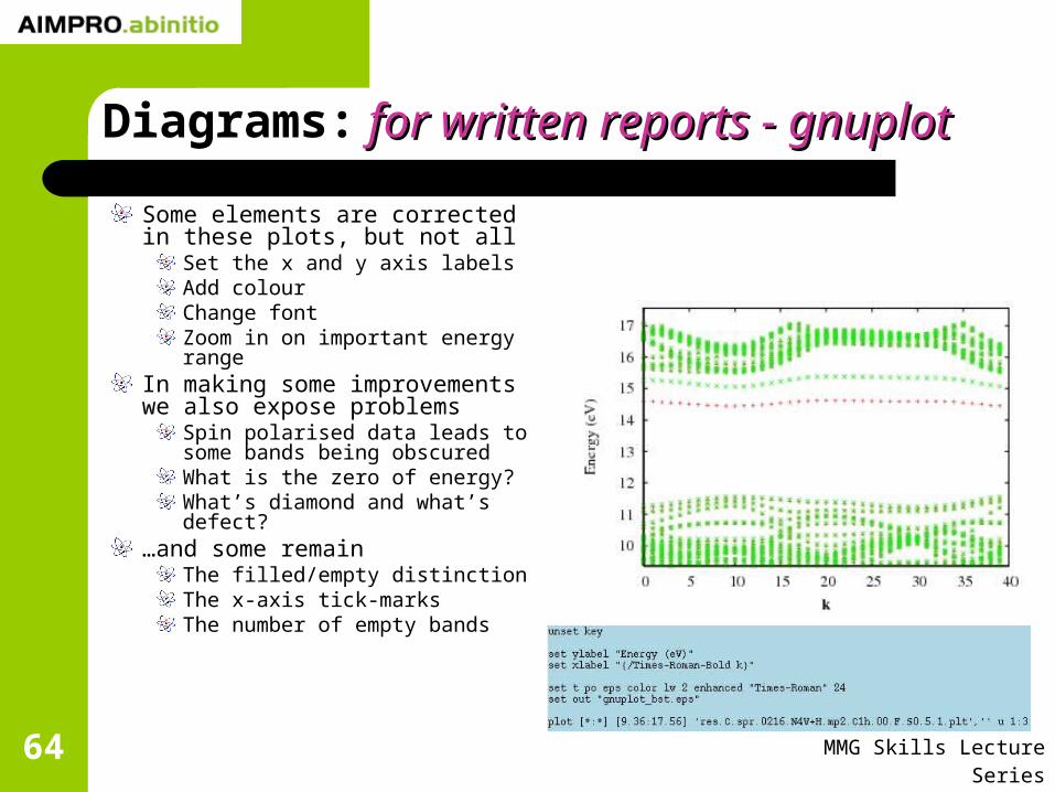
Some elements are corrected in these plots, but not all
Set the x and y axis labelsAdd colourChange fontZoom in on important energy range
In making some improvements we also expose problems
Spin polarised data leads to some bands being obscuredWhat is the zero of energy? What’s diamond and what’s defect?
…and some remainThe filled/empty distinctionThe x-axis tick-marksThe number of empty bands

MMG Skills Lecture Series65
Diagrams: for written reports - for written reports - gnuplotgnuplot
We need to do something which engages our brains a bit more
We need to reformat the data – note there is note there is not just one way to do this!not just one way to do this!We need to consider what information we are trying to communicate……and what achieves this in clearest way.We need to consider the data in context of the physical system.

MMG Skills Lecture Series66
Diagrams: for written reports - for written reports - gnuplotgnuplot
Let’s assume we will persist with the bandst.plt data file.The three columns are “k”, “Energy, spin up”, “Energy, spin down”.Each “band” is separated (for plotting by gnuplot) by a blank line.

MMG Skills Lecture Series67
Diagrams: for written reports - for written reports - gnuplotgnuplot
Let’s assume we will persist with the bandst.plt data file.The three columns are “k”, “Energy, spin up”, “Energy, spin down”.Each “band” is separated (for plotting by gnuplot) by a blank line…This signifies a break in the data and if the points are joined with lines, this step is missed out.If there were two blank lines, this would tell gnuplot that you’ve got a new set of data: these are numbered using the “index” variable.

MMG Skills Lecture Series68
Diagrams: for written reports - for written reports - gnuplotgnuplot
We can use indexes to separate occupied and empty bands.In the example, we know there are 433 occupied up-bands & 432 occupied down-bands.We find the 433rd blank line and double it – we have reformatted the data.Then we use the plot command shownThis only includes spin up: can you see why?

MMG Skills Lecture Series69
Diagrams: for written reports - for written reports - gnuplotgnuplot
We want to show both spin up and spin down, so we need to do something more elaborate.Again, starting with the “bandst.plt” file, we need to treat the up and down separately.
This can be done using indexing, with a two column formatThis can be done using ~njpg/bin/SplitPLT
Up and occupied
Up and empty
Down and occupied
Down and empty

MMG Skills Lecture Series70
Diagrams: for written reports - for written reports - gnuplotgnuplot

MMG Skills Lecture Series71
Diagrams: for written reports - for written reports - gnuplotgnuplot
This is still completely inappropriate for a paper…Lets change the symbols, add more empty bands and set the energy zero at the valence band top…

MMG Skills Lecture Series72
Diagrams: for written reports - for written reports - gnuplotgnuplot

MMG Skills Lecture Series73
Diagrams: for written reports - for written reports - gnuplotgnuplot
We might make life easier by using a “butterfly plot along the x-axis.

MMG Skills Lecture Series74
Diagrams: for written reports - for written reports - gnuplotgnuplot
Now, to place further into context, lets add the bands from the bulk cell of the same basic composition as the defect cell…

MMG Skills Lecture Series75
Diagrams: for written reports - for written reports - gnuplotgnuplot

MMG Skills Lecture Series76
Diagrams: for written reports - for written reports - gnuplotgnuplot
A bit of finesse…Fewer points, larger font…Dividing line…

MMG Skills Lecture Series77
Diagrams: Summary Summary
Making clear diagrams can be very quick…Run-time diagnosticsQuick data analysis
…or very time-consumingPublication quality diagrams
In preparing your thesis, a lot of time is likely to me consumed in the making of diagrams, so adopting a style for consistency and efficiency is very helpful early onearly on.


![United States Patent [191 4,667,290 Goss et al. May …United States Patent [191 Goss et al. [54] COMPILERS USING A UNIVERSAL INTERMEDIATE LANGUAGE [75] Inventors: Clinton Goss, New](https://img.pdfslide.us/doc/110x75/5f1038da7e708231d4480b4b/united-states-patent-191-4667290-goss-et-al-may-united-states-patent-191-goss.jpg)