Embed Size (px)
Citation preview

Copyright LiberatedStockTrader.com – Unauthorized Distribution Prohibited
How to Read Stock Charts & Patterns Definitive Guide
A Step by Step Definitive Guide to How to Read A Stock Chart Covering Stock Charts Types, Indicators, Volume, Patterns & Drawing
Trend-Lines.
LIBERATEDSTOCKTRADER.COM Barry D. Moore MSTA IFTA Market Analyst

Copyright LiberatedStockTrader.com – Unauthorized Distribution Prohibited
Table of Contents
How to Read Stock Charts & Patterns Definitive Guide .............................................................. 3
What is a Stock Chart? ............................................................................................................... 3
Understanding Stock Charts ...................................................................................................... 3
How to Read Stock Charts ......................................................................................................... 4
How to Read a Stock Chart in 6 Steps ..................................................................................... 5
Core Elements of a Stock Chart ................................................................................................ 6
Ticker & Company Name ....................................................................................................... 6
Chart Type ............................................................................................................................... 7
Time Frames ........................................................................................................................... 7
Chart Scaling ........................................................................................................................... 7
Arithmetic Scale. ..................................................................................................................... 8
How to Read Different Stock Charts ......................................................................................... 8
1. Line Stock Chart ................................................................................................................. 8
2. High Low Close Bar Stock Chart (HLC) .......................................................................... 10
3. Open High Low Close Bar Stock Chart (OHLC) ............................................................ 11
4. Japanese Candlestick Charts .......................................................................................... 12
Stock Charts Using Volume .............................................................................................. 13
5. Volume at Price (VAP) Stock Chart ................................................................................ 13
6. EquiVolume Stock Charts ................................................................................................ 14
7. Point and Figure (P&F) Charts ........................................................................................ 16
8. Market Profile Stock Charts ............................................................................................. 17
How to Read Stock Chart Patterns ......................................................................................... 18
Head and Shoulders Pattern ................................................................................................ 18
Megaphone Chart Pattern .................................................................................................... 20
Wedge Chart Pattern ............................................................................................................ 20
Stock Chart Pattern Accuracy .............................................................................................. 21
Gaps in Stock Chart Patterns .............................................................................................. 22
Examples of Stock Chart Gaps ............................................................................................ 24
Stock Chart Continuation Patterns ...................................................................................... 24
How to Read Stock Chart Indicators ....................................................................................... 26
Chart Indicators: Moving Averages ..................................................................................... 26
Chart Indicators: Volume ...................................................................................................... 30
What Does Volume Mean in Stocks? .................................................................................. 30
Volume -- Supply & Demand ............................................................................................... 34

Copyright LiberatedStockTrader.com – Unauthorized Distribution Prohibited
RSI Stock Chart Indicator ..................................................................................................... 35
MACD Stock Chart Indicator ................................................................................................ 38
Fibonacci Stock Chart Indicator ........................................................................................... 42
How to Draw Trend-Lines on Stock Charts ............................................................................ 44
What is a Stock Price Trend? .............................................................................................. 44
Types of stock price trend: ................................................................................................... 45
Types of Stock Trend Time-Frames: ................................................................................... 45
3 Steps to Drawing your First Trend-lines .......................................................................... 46
3. Drawing Trend Lines to Recognise Stock Chart Patterns ............................................. 48
Using Trend-lines to make Buy and Sell Decisions ........................................................... 50
How to Read Stock Charts Summary ..................................................................................... 52

Copyright LiberatedStockTrader.com – Unauthorized Distribution Prohibited
How to Read Stock Charts &
Patterns Definitive Guide Step by Step Definitive Guide to How To Read A Stock Chart Covering
Stock Charts Types, Indicators, Volume, Patterns & Drawing Trend-
Lines
As a financial technical analyst, with the International Federation of
Technical Analysts (IFTA) I am actually certified in how to read stock
charts. So I hope you enjoy this in-depth definitive guide to reading and
understanding stock charts, patterns and indicators.
What is a Stock Chart?
A stock chart is a visual representation of the current and historical stock
prices displayed on an X & Y axis graph. Stock charts allow you to see the
past and present price performance of a company’s shares. Important to
stock charts are volume and price indicators and the ability to see
historical price patterns and trends, to predict future price movement.
Understanding Stock Charts
To understand stock charts, you need to understand how supply and
demand work in a marketplace. This is why the volume indicator and the
stock price movement are the critical elements in interpreting stock charts
effectively. For example, when the price rises on increased trading
volume, you can expect the price to continue higher.
All of this will be covered in the section on volume and supply and
demand.

Copyright LiberatedStockTrader.com – Unauthorized Distribution Prohibited
How to Read Stock Charts & Indicators
How to Read Stock Charts
You can read stock charts using Stock Charting Software that performs
the data collection and calculations for you. You need to understand,
stock prices, timeframes, supply and demand, chart patterns, volumes
and how stock chart indicators are calculated. We cover the 8 different
stock chart types, indicators & patterns in this guide.
This section is all about understanding a basic stock chart. Known
as Technical Analysis or stock chart analysis, chart reading enables us to
visualize a stock not through numbers, but through patterns. It enables
us to get to know the stock, see its history, learn its personality and make
a value judgment on its future.

Copyright LiberatedStockTrader.com – Unauthorized Distribution Prohibited
We will start with a basic price chart and move on to technical indicators
and how to assess their importance and meaning in future sessions.
How to Read a Stock Chart in 6 Steps
1. Choose the chart type you want to use
2. Choose the timeframe, days for short-term trading, weeks for
long-term investing
3. Add relevant indicators e.g. RSI, OBV, MACD
4. Add the Volume indicator
5. Draw trendlines linking price highs & price lows
6. Compare volume and price direction to assess future direction
How to Read a Stock Chart -- 6 Step Process

Copyright LiberatedStockTrader.com – Unauthorized Distribution Prohibited
Core Elements of a Stock Chart
• Ticker & Company Name: What company stock price are you
looking at
• Chart Type: What chart are you using? Bar, Line, Candlestick
• Time Frames: Daily, Weekly, Monthly or Yearly
• Chart Scaling: What scale is price using, Percent, Fixed,
Algorithmic or Logarithmic
• Price Bars: Indicate the Open, High, Low and Close of the price
for the day
This is a historical price chart of Intel Corp. (Ticker: INTC) once you
understand what each of these arrows means you are ready to step
forward into the technical indicators section.
Understanding a Stock Price Chart -- Open, High, Low, Close,
TimeFrame, Ticker & Scaling
TC2000 chart courtesy of Worden Brothers, Inc.
This chart is in the format of a Daily “Open High Low Close” OLHC bar
chart, mapped to the Logarithmic Scale.
Ticker & Company Name

Copyright LiberatedStockTrader.com – Unauthorized Distribution Prohibited
The ticker (INTC) is the unique abbreviated stock reference code, all
stocks have a unique Ticker so they can be easily found and referenced.
Chart Type
There are many different types of charts available to use, this one is
an OLHC Chart which means “Open, High, Low, Close”. OHLC refers to
the bar itself. The opening price is the left-sided dash, High is the top of
the vertical line, Low is the bottom of the line, and Close is the right-sided
horizontal dash. Read more about stock prices
Time Frames
Time-frames are always plotted along the bottom of the chart and can be
anything from 1 minute per bar (intraday) to 1 year per bar. This chart
shows a Daily chart which means each bar equals 1 day.
Chart Scaling
Chart Scaling is very important, most professional chart readers use the
“Logarithmic Scale” meaning each unit along the right-sided Y-Axis, is the
same percentage apart, this makes it very easy for you to see on the
price chart what percentage a stock moves on any given day in history.

Copyright LiberatedStockTrader.com – Unauthorized Distribution Prohibited
If the bottom right-hand side of the chart shows a 2.20%, this is the %
between each of the horizontal Plotlines
Arithmetic Scale.
The other key scale is the “Arithmetic Scale”, which shows a fixed price
in the Vertical Y-Axis, in this example the scale increments every 50
cents, $12.50, $13.00, etc.
How to Read Different Stock Charts
Stock charts come in many shapes and sizes. From the differences in the
bars to the different concepts applied to the chart itself. Here you will
find a reference guide to the many types of charts available with an
overview of their potential uses.
1. Line Stock Chart
Line Stock Chart

Copyright LiberatedStockTrader.com – Unauthorized Distribution Prohibited
This is one of the most basic charts, probably giving the least amount of
information. The line in the top pane is drawn using the close price for
each unit of time. So if this is a daily line chart, the close price for the
day is used. If this is a 5-minute chart, then the close price for every 5
minutes of trading is used.
The Positives of Line Stock Charts
A very simple view of the price movement. Good to use when comparing
the performance of many stocks on the same chart.
The Negatives of Line Stock Charts
It does not show the Price Open / High / Low for the trading period. The
trading range for the day is important in price based decision making as it
indicates bullish or bearish momentum.
Stock Charting Services With Line Charts
• TradingView -- Our Number 1 Stock Charting & Analysis Package
• Stock Rover -- The Best For Value & Dividend Stock Screening
• TC2000 -- Best For US Trading & Stock Analysis
• TrendSpider -- Best For Automated Technical Analysis

Copyright LiberatedStockTrader.com – Unauthorized Distribution Prohibited
2. High Low Close Bar Stock Chart (HLC)
High Low Close Bar
(HLC) Chart
Using bars is a step up from the line chart as is allows us to plot
additional useful data on the chart. Here we have each bar representing
a trading period with the price High, Low and Close represented. Refer to
the diagram.
The Positives of High Low Close Bar Charts
More information is available, showing the range of the days trading,
meaning did the stock price close near it’s high (bullish) or near it’s low
(bearish).
The Negatives of High Low Close Bar Charts
No opening price is reflected in this chart. The opening price is important
as it allows us to immediately see if the price gapped up or down on open,
and also where the closing price is in relation to the opening price.
Stock Charting Services With Line Charts

Copyright LiberatedStockTrader.com – Unauthorized Distribution Prohibited
• TradingView -- Our Number 1 Stock Charting & Analysis Package
• Stock Rover -- The Best For Value & Dividend Stock Screening
• TC2000 -- Best For US Trading & Stock Analysis
• TrendSpider -- Best For Automated Technical Analysis
3. Open High Low Close Bar Stock Chart (OHLC)
The complete bar chart. The chart of choice for those who like to use bar
charts. Here we see the range of the day’s trading including the open
price and the close price.
Open High
Low Close Chart (OHLC)
The Positives of Open High Low Close Bar Charts
We can see instantly if the trading period closed higher or lower than the
open. We can also see the length of the bar, which shows us the volatility
or the strength of the trend.

Copyright LiberatedStockTrader.com – Unauthorized Distribution Prohibited
The Negatives of Open High Low Close Bar Charts
There are few downsides to this chart type and it is used by many
investors and traders. Most chart packages also allow you to color the up
days green and the down days red. For those who prefer even more
information in the price chart, the following charts can also be used.
4. Japanese Candlestick Charts
Used widely in Japan and gaining a strong foothold in the rest of the world
the Japanese Candlestick chart gives an excellent insight into current and
future price movement. Named Candlesticks because they look like
candlesticks with a wick and the main body.
Japanese Candlestick Chart
The Positives of Japanese Candlestick Charts

Copyright LiberatedStockTrader.com – Unauthorized Distribution Prohibited
Gives an excellent view of the Open, High, Low and close of the
price. Pictorially illuminating and easy to see trends. There is a full
reference below of 1 bar to 4 bar patterns which help us to make
judgments on the future direction of price. They connect psychology with
the price pattern.
The Negatives of Japanese Candlestick Charts
Although Candlesticks have many advantages, they can seem like
information overload to the beginner. There are also many Candlestick
patterns to learn.
Further Reading on Japanese Candlesticks.
• Candlestick Charts
• Bullish Candlestick Patterns
• Learn Candlesticks in the Liberated Stock Trader PRO Training
Stock Charting Services With Candlesticks Charts
• TradingView -- Our Number 1 Stock Charting & Analysis Package
• Stock Rover -- The Best For Value & Dividend Stock Screening
• TC2000 -- Best For US Trading & Stock Analysis
• TrendSpider -- Best For Automated Technical Analysis
Stock Charts Using Volume
The use of volume in technical analysis is important as volume allows us
an insight into the supply and demand situation. The following charts
incorporate volume into the price window to provide additional
information.
5. Volume at Price (VAP) Stock Chart

Copyright LiberatedStockTrader.com – Unauthorized Distribution Prohibited
Volume at Price (VAP)
Chart
The price at volume chart is an exciting new development, as instead of
showing volume for a certain time period, it shows us the volume of
trades at a specific price level.
This enables us to see at what price level most of the market participants
believe the stock is fairly priced.
The Positives of the Volume at Price Chart
Innovative and intuitive, this method of charting combined with standard
volume bars can enable you to see market psychology both in time and
price. It is also easy to see volume increasing as price rises, this is a very
bullish sign.
The Negatives of the Volume at Price Chart
Not all stock charting packages offer this type of indicator
Stock Charting Services With Volume at Price Charts
• TradingView -- Our Number 1 Stock Charting & Analysis Package
• TC2000 -- Best For US Trading & Stock Analysis
6. EquiVolume Stock Charts

Copyright LiberatedStockTrader.com – Unauthorized Distribution Prohibited
EquiVolume Stock Chart
EquiVolume Charts attempt to provide the solution of Volume at Price in a
different way. Instead of plotting volume in separate bars, it is in fact
incorporated into the price bars themselves.
The wider the price bar, the more shares were traded during that period.
The Positives of Equivolume Stock Charts
Visually impressive and extremely easy to interpret.
The Negatives of Equivolume Stock Charts
This type of chart can distort the timeline running across the bottom of
the chart. This makes drawing accurate trend lines more
challenging. Few Stock Charting service providers offer EquiVolume. I
would not recommend using EquVolume as a tool.

Copyright LiberatedStockTrader.com – Unauthorized Distribution Prohibited
7. Point and Figure (P&F) Charts
Point & Figure Stock
Chart (P&F)
There are a few other types of charts that you probably have never heard
of before. They are however quite useful and you would be required to
learn them if you wanted to become a Certified Technical Analyst.
Point & Figure Charts are very unusual as they feature no timeline along
the bottom horizontal axis. The Chart is made up only of price
swings. The vertical price bar is arithmetic and shows only units of price.
A “0” is plotted if the price moves down a whole price unit (for example
50 cents). Then when the price changes direction and starts to move
upwards an “X” is marked in each box. This filters out smaller price
moves and enables us to focus on trend quality.
Trend lines are always plotted either horizontally or at 45-degree angles.
The Positives of Point & Figure Stock Charts

Copyright LiberatedStockTrader.com – Unauthorized Distribution Prohibited
An excellent tool for doing price target calculations. Simple to learn and
interpret, few price patterns to learn.
The Negatives of Point & Figure Stock Charts
Learning this type of charting can be easiest when performing the
charting by hand. That means you marking the “X” and “O” on a piece of
paper. This can also be very time-consuming. Few services offer Point
and Figure Charts, however, StockCharts.com offer a free Point and
Figure Charting Service that is well worth investigating.
Stock Charting Services With Line Charts
• TradingView -- Our Number 1 Stock Charting & Analysis Package
8. Market Profile Stock Charts
Market Profile Chart
Old School and Cool
Developed in the
1980s by Chicago
Board Of Trade Pitt
Trader J. Peter
Stiedlmayer. The
letters on the chart
show time
units. “A”
represents the first
30 minutes of

Copyright LiberatedStockTrader.com – Unauthorized Distribution Prohibited
trading, “B” represents the second 30 minutes of trading.
The point of control is the area (price range) at which the most trades
occur during the day.
The value areas are the price range at which 70% of the action
happens. When the price is above and below the value areas this
represents a possible ideal buying or selling point.
The Positives of Market Profile Stock Charts
People who use market profile charts become evangelists to the
cause. They believe it offers unique insights into buy and sell
opportunities. It can be a good option if you are a quick-fire day trader.
The Negatives of Market Profile Stock Charts
It can require quite an effort in order to learn how to use them, and very
few stock chart services offer this type of charting.
• Further Reading: 8 Important Types of Stock Chart + Pro’s
& Cons
How to Read Stock Chart Patterns
The first example in this module will show you the head and shoulders
pattern. We will then discuss the other patters that exist.
Head and Shoulders Pattern
What does a Head and Shoulder Pattern look like? The importance of the
head and shoulders pattern should not be under-estimated. One of the

Copyright LiberatedStockTrader.com – Unauthorized Distribution Prohibited
most reliable patterns in technical analysis yet one of the most
misunderstood.
Here we discuss the famous head and shoulders price pattern. Understood
to be one of the most predictive patterns the Head and Shoulders pattern
has some unique characteristics.
However you do need to know what you are looking for.
A Head & Shoulders Pattern has the following traits.
• Two shoulders.
• A high point, the head, in between the shoulders.
• The volume should confirm the pattern.
So what lessons can we learn from the chart?
1. This is the left shoulder
2. This is the head
3. This is the right shoulder

Copyright LiberatedStockTrader.com – Unauthorized Distribution Prohibited
4. This is the neckline, using a trend-line connect the low from both
sides of the head through the outer price limes.
5. The left shoulder was formed on increasing volume. This is to be
expected.
6. In the forming of the head we see a significant decrease in
volume.
7. In the right shoulder we see also decreasing volume
8. The price failed to exceed the previous peek
All of the above conditions of the Head & Shoulders pattern here are
consistent with text book descriptions. See the classic book Technical
Analysis of the Financial Markets by John J Murphy as a reference.
The Head and Shoulders pattern is said to be confirmed on a break of the
neckline, this is about to occur / has occurred in the final price bar in July.
Megaphone Chart Pattern
Here we have a Megaphone Top. This is a rare pattern that occurs
usually at major tops. You can see that the swings get larger at each
bounce, suggesting uncertainty and volatility until finally, the price breaks
out downward on increased volume.
Wedge Chart Pattern

Copyright LiberatedStockTrader.com – Unauthorized Distribution Prohibited
Wedges have a very different character to triangles in the fact that they
point in the exact opposite direction to the breakout. Both of the edges of
the wedge point in the same direction, either upward or downwards. In
the image below we can see that the falling wedges signify an upward
breakout.
The rising wedge signals a downward break out.
Stock Chart Pattern Accuracy
The following diagram shows us the most common reversal patterns and
their relative probability of accuracy.

Copyright LiberatedStockTrader.com – Unauthorized Distribution Prohibited
Stock Chart Pattern Accuracy -- Graph
Price patterns and trend lines share the same characteristics. The longer
they are, the more important they are. The more a price pattern touches
a trend line and reverses the more important that line is. In this diagram,
we see that the accuracy of a Triple Top is more than that of a Single
Top. Why? Because price touches the resistance level more times.
Gaps in Stock Chart Patterns
Another very important pattern that signals continuation is the “gap.” A
gap occurs when the price of a stock during a given period is significantly
higher or lower than the price range of that stock for the previous
period. The price did not overlap at all over the two periods. This leaves
what is known as a “gap” in the price chart. A “gap up” in the stock price
is a show of strength. This tells us that the demand for the stock was so
strong on the open that it jumped many points higher. The opposite is
true for a “gap down.” This signifies weakness as the stock gaps down
usually due to aggressive selling.

Copyright LiberatedStockTrader.com – Unauthorized Distribution Prohibited
The Breakaway Gap
The Breakaway Gap usually occurs when a stock is moving in a normal
way through a price range or channel, then the demand for the stock
suddenly explodes and the stock “gaps out” of the current trend. This is a
sign of strength and a very bullish sign with a “gap up.” A breakaway gap
to the downside is a sure sign of weakness.
The Continuation Gap
The Continuation Gap is another sign of strength showing that demand is
still strong and the trend will continue, this often confirms the initial
“breakaway gap.”
The Exhaustion Gap
The Exhaustion Gap can be the second or third gap and occurs during a
very strong upsurge in price. This is a warning, as it might signify that
the stock has over extended itself and may be due a change in trend or a
pull back. The opposite is true for an exhaustion gap on the downside
which might signal a bottom is near.

Copyright LiberatedStockTrader.com – Unauthorized Distribution Prohibited
The Island Gap
The Island Gap occurs when demand is so high that price and the market
participants drive the price up to unacceptable levels and the demand
dries up rapidly. This sudden oversupply causes the stock to plummet as
all demand is satiated. Of course, too much supply with no demand
causes falling prices.
Quick Tip: Gaps are important signs of serious shifts in supply and
demand. If surges in demand outstrip the supply, prices rise to convince
people on the sidelines to sell. Downside gaps indicate supply is
outstripping demand, causing prices to fall.
This might seem all very theoretical, so here are gaps in action.
Examples of Stock Chart Gaps
Here we can see clearly how gaps can occur in stocks. STEC provides a
perfect example of how understanding gaps is critical to trading success.
Stock Chart Continuation Patterns

Copyright LiberatedStockTrader.com – Unauthorized Distribution Prohibited
Continuation patterns occur during a price move and are visual
representations of consolidation or periods of rest before price continues
its trend, be that upwards or downwards.
5
Types of Stock Chart Continuation Patterns
Image courtesy of Liberated Stock Trader PRO Training. All rights
reserved
Continuation Patterns Diagram --
Image courtesy of Liberated Stock Trader PRO Training.
All of these triangles are essentially continuation patterns. They should
give you some confidence that the trend will continue. Always be aware
that if the price breaks out in the wrong direction due to a shock (e.g. bad
earnings or bad news) you should be prepared to act.

Copyright LiberatedStockTrader.com – Unauthorized Distribution Prohibited
A very common continuation pattern is the Rectangle, or more commonly
known as a” “channel” or “trading range.” The price should normally
break out in the same direction as the previous trend.
• Further Reading: Liberated Stock Trader PRO -- 16 Hours
of In-depth Video Lessons + Print Book
How to Read Stock Chart Indicators
Indicators are lines that get plotted on a stock chart to make it simpler for
you to understand the history, and perhaps the future direction of a
stock. Stock chart indicators consist of 2 key data points, price, and
volume. However, it is also possible to map fundamental financial data
such as EPS or PE ratio onto a chart.
Indicators may seem like something only Einstein himself can master, but
here everything is within reach, in just a few minutes you will have a solid
understanding of a very important concept.
Chart Indicators: Moving Averages
What are Moving Averages?
Moving averages are the staple diet of any chart reader, and enable you
to visualize changes in trend in price. Moving Averages or “MA” are a
simple mathematical calculation that takes the average price (mean) for a
given period and plots this on a chart.

Copyright LiberatedStockTrader.com – Unauthorized Distribution Prohibited
Moving Average Calculation
Sheet
So the average price for the first 5 days = 3.8.
The key here is when we use 2 or 3 moving averages together we see
visually when the lines cross a stock’s trend is changing and it may be
time to look seriously at buying or selling a given stock.
Using 3 Moving Averages Together
Below you can see a standard chart with 3 moving averages plotted.
MA50 (RED) – this is the moving average of the last 50 periods (in this
case days – it is a daily chart)
MA20 (Yellow) – this is the Moving Average of the last 20 days
MA10 (Orange) – this is the Moving Average of the last 10 days
The secret is the combination of the indicators.
What do you see here? Take a long look!
• Where do the lines cross?
• What happens to the Stock price after the lines cross?
• What happens to the overall trend when the lines cross?

Copyright LiberatedStockTrader.com – Unauthorized Distribution Prohibited
3 Line Moving Average Chart
How to use Moving Averages to signal BUY and SELL opportunities?
Here we are using 3 Moving averages you could use 2, however, 2 is the
minimum. You can set different moving average timeframes, common
ones are :
10:20:50:200 day MA’s
If you are trading more on a short-term use the lower Moving Averages.
If you buy and hold a stock for 6 months or more, use longer averages.

Copyright LiberatedStockTrader.com – Unauthorized Distribution Prohibited
3 Line Moving Average Chart -- 4 Point Analysis
As you can see, when the MA’s cross this is the pivotal point that
signals a change in trend.
Of course, you can backtest the moving averages to see if they work on a
previous timeline (by scrolling backward in the chart). Use them as a
minimum indicator to help you envisage when a stock is going to move in
your favor, or move against you.
Moving averages are an excellent indicator as they are based on price,
and price as we know is the most important of all indicators.
What Did You Learn About Moving Averages?
Moving Averages are the core and most fundamental element of Technical
Stock Chart Analysis. Using one MA is good using 3 a lot better.
Focus on the moving average lines crossing each other and the price
crossing up or down through the moving average lines.

Copyright LiberatedStockTrader.com – Unauthorized Distribution Prohibited
Chart Indicators: Volume
What is the Volume Stock Chart Indicator & Is It Important? How to
Analyze Volume & Interpret Supply & Demand with our Quick Reference
Guide
What does Volume mean in Stocks?
Volume in stocks refers to the total number of shares traded for a
particular period of time. If 2 million shares are traded in a day, the
trading volume for the day is 2 million.
What Does Volume Mean in Stocks?
Volume is usually expressed as a series of vertical bars at the bottom of a
chart. If 20 shares were traded, then the bar will show 20,000. Often a
Volume Chart -- will show Red Bars when the stock price has decreased
for the day, and Green Bars for when the price rises for the day.
Is the Volume Indicator Important?
Yes, Volume indicators in technical analysis are considered important,
second only to stock price itself. When you combine the stock price
movement with the increases or decreases in volume it provides a
fascinating insight into the sentiment of the market.
For example, if the stock price is going up and the volume is going down
that indicates that there fewer people buying at a higher price. This
means a change in demand and a potential change in the direction of the
stock price.
Understanding Trading Volume

Copyright LiberatedStockTrader.com – Unauthorized Distribution Prohibited
Look at the chart below and read further for a description of the key
concepts here. The Chart maps Price, Moving Averages 10 & 30, and
volume (Red for Negative, Green for Positive).
Stock Chart with Volume: How to Read the Stock Chart Volume Indicator
3 Key Steps Referenced in the Volume Chart.
1 -- Price Direction Changes Upwards -- Surge In Volume
Here at point 1, we see a huge change in the direction of price, it was
proceeding in a downward direction, then suddenly there was a spike in
volume over 2 weeks, this is known as a “blow off bottom”.
It indicates, that a key price has been found, where the sellers have lost
enough that they need to sell the stock, and the buyers have seen the
price decrease enough so that they see real value in the Stock. Of course,
other factors contribute, like good news or earnings results. Whatever
happened volume increased!
2 -- Price Direction Change Down -- Surge In Volume

Copyright LiberatedStockTrader.com – Unauthorized Distribution Prohibited
The stock here increases from $20 to $38 in the following 3 months,
a 90% increase, but how would we know this was about to happen.
Well, buying at the time the moving averages crossed over would have
been a good option, it would not have provided the full 90%, but it would
have produced 40%, which by anyone’s reckoning is an excellent
result. However here we see a monster “Blow off Top”, the huge red
Spike, this is a very strong sign, to sell as soon as possible.
From stage 2 we see the stock move in a sideways pattern and eventually
decrease back down to $19, the ride is well and truly over. However, you
would not own the stock, as you would have sold when the moving
averages crossed.
The stock price starts to increase in mid-November 2008, but volume tells
us nothing.
WHY? Indicators do not tell us something 100% of the time, but when
they do we need to recognize it. The moving averages cross at $25, a
good time to buy.
3 -- Huge Volume and Price Increasing
Here we see massive buying; the volume goes through the roof.
Important to note here is we are comparing volume for the stock in
comparison to its history. This is the second biggest volume surge of the
year for Netflix and is significant.
Why did it take off? We should always seek enlightenment!
It reported excellent earnings, and because of the recession, people were
switching from buying bigger ticket items such as Cars and Plasma TV’s to
staying at home and renting Movies. Netflix reported a massive increase
in new members.

Copyright LiberatedStockTrader.com – Unauthorized Distribution Prohibited
In the chart, this note shows that the price “Gapped Up”. What does this
mean? This means that the stock price in extended-hours trading was so
strong that the Opening Price on the following day was significantly higher
than even the High for the previous day, thus showing a gap in the price
pattern in the chart.
Warning: Some volatile stocks show a lot of Gaps in price. While gaps in
price might sound good when they gap upwards, if they gap down against
you then they are very bad. Avoid stocks with any history of strong
negative gapping. As gaps do not give you the opportunity to sell at the
price you want to.
Volume Summary
Volume is important and reading it should become second nature.
Especially when searching for winning stocks, we ideally should look for
stocks with increased volume so we have more chance of a quicker, less
risk win.
• Further Reading: Stock Chart Volume Indicator. 3 Step
Analysis + Guide
Is it Good to Have High Volume in Stocks?
It depends. High volume when the price is decreasing means there is a
large sell-off happening. High volume when the stock price is going up
means there is a rally in the stock price and there a large demand for the
stock.
What is a Good Volume in Stock?
Try to stick to trading stocks with at least $1 million traded per day. That
means (Stock Price * Volume) = $ Volume Traded. There is another easy

Copyright LiberatedStockTrader.com – Unauthorized Distribution Prohibited
way to see if a stock has enough volume. If you see large gaps between
the open and closing price for any stock it means there is not enough
liquidity in the stock. This means not enough volume.
Penny Stocks often do not have enough volume. For example, if the
stock price is $1 and the volume is 5,000 that means only $5000 of
stocks is traded in a single day, that is simply not for a fair and equitable
market.
Volume -- Supply & Demand
There are some important characteristics of volume and price in the
marketplace. It is all about the direction of price movement compared to
the increases or decreases in volume. In short, it is about Buyers and
Sellers.
Price Up–Volume Up Stock Price moves higher on increased volume.
This is bullish as it shows us that more participants are interested in
selling the stock at higher prices and that most importantly more people
are interested in buying the stock at those higher prices. In an uptrend
this signals the trend will continue, in a downtrend, this signals a possible
correction or change in the trend’s short-term direction to upwards.
Price Up-Volume Down in an uptrend this is very bearish as it suggests
that although prices are rising there are fewer participants suggesting
people are backing away from the higher prices. This also infers that the
trend is weakening. In a downtrend, it suggests a continuance of the
downtrend.
Price Down–Volume Up in a downtrend this may signal that a change in
trend is likely, as we saw with the “Blow off bottom” there might be a
huge selling climax, then the trend adjusts from down to sideways or

Copyright LiberatedStockTrader.com – Unauthorized Distribution Prohibited
down to up. In an uptrend, this may indicate a crisis, panic selling or
simply when a stock is going out of favor. The pressure is on the sell-side
and to sell they have to accept lower prices. A strong negative signal!
Price Down–Volume Down in a downtrend this can suggest that the
retreat is slowing or beginning to end as there are fewer people interested
in buying or selling the stock at these prices. In an uptrend, this may
indicate the stock is stopping for breath or due a pullback before
continuing on its upward trajectory. Volume tends to trend in the same
direction as the price trend, so PDVD also suggests a continuation of the
main downtrend, or a pullback and possible continuation of an uptrend.
So you see not only the price but the direction of both price and volume is
important. This is where the Price Volume Indicators play an important
role.
• For the most comprehensive training on all major stock chart
indicators and technical analysis check out our PRO Training
RSI Stock Chart Indicator
Here we have a very popular indicator called Relative Strength Index,
or Wilders RSI. Developed by J Welles Wilder, this indicator measures
the strength of any stock by comparing it’s average net up closing day
prices versus its average net down closing prices, for the period set. It
enables you to see if a stock is overbought or oversold.
How Is Relative Strength Indicator Calculated?
RSI fluctuates between 0 and 100, 0= Oversold, and 100 being
overbought. It is a leading indicator and can be used to predict future
trend changes using positive or negative divergences compared to price.

Copyright LiberatedStockTrader.com – Unauthorized Distribution Prohibited
Divergences are one of the most powerful ways to use most indicators.
The fact that it is a leading indicator, as opposed to Moving Averages
which are lagging, and can thus indicate future directional changes.
Relative Strength 5 Step Detailed Analysis
The chart below is of Smith & Wesson (SWHC), a stock I bought back in
2009, and the chart shows clearly how RSI can be used to clearly predict
future trend changes.
Using RSI on 2 settings shows how shorter and longer-term settings can
show a different line, but the same answer, therefore confirming each
other.
• The shorter-term setting (7 Periods Prices:7 Periods Smoothing)
• The longer-term setting (14 Periods Prices:7 Periods Smoothing
).
Review the chart, and read below the 5 key points explaining usage.

Copyright LiberatedStockTrader.com – Unauthorized Distribution Prohibited
RSI Stock Chart Indicator -- 5 Point Analysis -- Detailed Example Chart
TC2000 chart courtesy of Worden Brothers, Inc.
1. Here you can see the price highs trending downward from the
period November 2008 to February 2009
2. Here we see the price lows trending higher for the same period.
3. So we see the forming of a Price Pennant, but which way will the
Stock price go. Up or Down. For the answer, we refer to the
leading indicator RSI
4. The RSI (7:7) Orange line, tells is as early as the beginning of
January 2009 that we are seeing a stronger upward momentum
in RSI, although this is not reflected in the Price, it is the
underlying action.
5. The RSI (14:7) also confirms the shorter timeframe RSI settings
but gives us a smoother line which can be easier to interpret.
Finally, in mid-February, the stock price bursts through the price

Copyright LiberatedStockTrader.com – Unauthorized Distribution Prohibited
high trend Line (point 1 above) and the stock proceeds to double
in Price (100%) in 5 weeks.
What a great result, and what proof that RSI has real meaning and
application.
However, if RSI is telling you nothing important, then please use other
indicators, or move on to review another stock where the indicators will
tell you something.
To control your investment, your money and your destiny takes hard
work, but the fruit will be sweet. Long live the Liberated thinker, long live
the Liberated Stock Trader.
MACD Stock Chart Indicator
MACD or Moving Average Convergence Divergence is a great way to
assess a stock price direction.
What is MACD?
MACD was developed by Gerald Appel as a means of easily showing the
Moving Averages of a stock in a way that could show the strength of the
difference of the Moving Averages. For example, if the 10 & 20 day
moving averages for a stock, move away from each other as the stock is
going up, this means the stock is gaining strength.

Copyright LiberatedStockTrader.com – Unauthorized Distribution Prohibited
MACD Usage
Short = the shorter Moving Average
e.g 10
Long = the longer moving average
e.g. 20 or 30 etc
Period = the Moving average of the
difference of the Short and Long
above.
Use short MACD configuration for
shorter term trading 5-35-5, or longer
configurations for longer term trading
12-26-9 is popular, also 10-30-5.
Experiment, and also view charts on different timeframes to test if the
indicator is true from different angles.
This could go on and on, however, I will suggest now we move to a more
practical use of MACD viewing it in real life on a real stock.
Please be aware, sometimes MACD does not tell you anything about a
stock, but in many cases it does. As always, if the indicators tell you
nothing there is probably nothing to be told move on and look for other
stocks.
How to Use MACD
Take a look at the Netflix (NFLX) Learning Chart below.

Copyright LiberatedStockTrader.com – Unauthorized Distribution Prohibited
Here we have a MACD configured of 10, 30, 5 Simple, and this is a 2 Day
(per bar) Chart
MACD Detailed Example Chart
TC2000 chart courtesy of Worden Brothers, Inc.
Step 1 -- Price Growing
The stock price is in growth mode almost doubling in the first quarter.
Step 2 -- Negative Divergence
The trick with MACD is to look at the trend it is a powerful indicator when
you compare the direction of the MACD Mountains with the Price
Movement.
Point 2 illustrates, that although the price doubled in 2008 we saw the
MACD make lower lows “negative divergence”.
Copyright LiberatedStockTrader.com – Unauthorized Distribution Prohibited
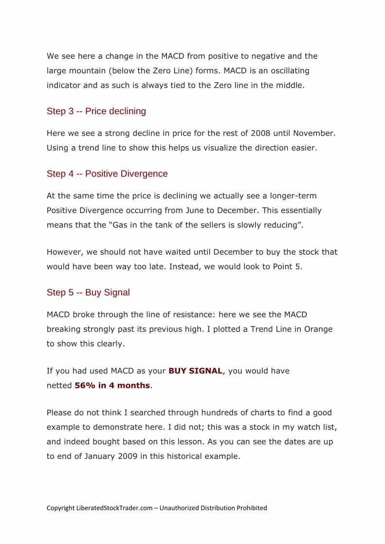
We see here a change in the MACD from positive to negative and the
large mountain (below the Zero Line) forms. MACD is an oscillating
indicator and as such is always tied to the Zero line in the middle.
Step 3 -- Price declining
Here we see a strong decline in price for the rest of 2008 until November.
Using a trend line to show this helps us visualize the direction easier.
Step 4 -- Positive Divergence
At the same time the price is declining we actually see a longer-term
Positive Divergence occurring from June to December. This essentially
means that the “Gas in the tank of the sellers is slowly reducing”.
However, we should not have waited until December to buy the stock that
would have been way too late. Instead, we would look to Point 5.
Step 5 -- Buy Signal
MACD broke through the line of resistance: here we see the MACD
breaking strongly past its previous high. I plotted a Trend Line in Orange
to show this clearly.
If you had used MACD as your BUY SIGNAL, you would have
netted 56% in 4 months.
Please do not think I searched through hundreds of charts to find a good
example to demonstrate here. I did not; this was a stock in my watch list,
and indeed bought based on this lesson. As you can see the dates are up
to end of January 2009 in this historical example.

Copyright LiberatedStockTrader.com – Unauthorized Distribution Prohibited
Fibonacci Stock Chart Indicator
There are many ardent investors who follower the Fibonacci principles
almost religiously across the globe. Indeed, when you take a close look
at the application of these scientific observations you may be compelled
to take it seriously.
For this analysis example, we will use Fibonacci Retracement and apply it
to the 2007 to 2008 Financial Crisis. In fact, we will take a look at the
charts a few years later in 2011.
What are Fibonacci Numbers In the Stock Market?
Fibonacci numbers are revered in mathematics as the numbers that
describe the natural world. The Sequence is simply the sum of any two
numbers equals the next in the sequence.
1,1,2,3,5,8,13,21,34,55,89 etc…..
1+1=2
1+2=3
2+3=5
The theory behind Fibonacci is that this mathematical pattern can be used
to predict the waves of a trend. The most important numbers seem to be
in percentage terms 38, 50, 62.
Therefore, if a trend moves from $1 to 100$, it may retrace (go back
down) to 1 of 3 important levels. $62, $50, $38.
Applying Fibonacci on a Chart

Copyright LiberatedStockTrader.com – Unauthorized Distribution Prohibited
This is a long-term weekly chart of the S&P500, it stretches back 5 years
to 2007 from 2011. This enables us to get some perspective of the
Financial Crisis in 2007, and compare that to what happened later.
SP-500 Market Technical Analysis Fibonacci Retracement
You can use Fibonacci Retracement on any chart by following these
instructions.
• Select the Fibonacci Retracement Tool in your charting package
• Select the Lowest Point on the chart in this case Point 1
• Drag your mouse to the highest point on the chart in the future,
in this case Point 2
You should then see the important Retracement levels are drawn (the
Grey Dotted Lines)
Important Points to Note
1. In the 4.5 years since October 2007, the market has failed to
reach an all-time high of 1,550.
2. In 2008 when the market broke down through 1,100 points, the
market collapsed.

Copyright LiberatedStockTrader.com – Unauthorized Distribution Prohibited
The Market Moves Down
1. The retracement line at 38.2%, is equal to 1,125 points in the
index. This is currently a support line.
2. Any drop through this area could see a further drop to 1,000
points, the 50% retracement line
3. The next drop zone could be 950 points, the 61.8% retracement
line. This maps back to 2009 /2009 perfectly.
The Market Moves Up
We can see that the 21.6% retracement line at circa 1,225 is providing
resistance. A strong move up through this area would be positive.
How to Draw Trend-Lines on Stock Charts
Knowing How to Draw a Stock Chart Trend Line is Critical To Your Success
in Stock Trading.
What is a Stock Price Trend?
If someone asked you today, “Is the stock market in an uptrend,
downtrend or a lateral consolidation”, what would you answer?
Knowing the answer to this key question is important for the stock market
or even an individual stock. Why?
If you buy a stock (go long) in an uptrend you are more likely to make
money on it. There is a simple way to see for yourself if the market is
heading upwards or downwards.
First, let’s examine what types of trend exist:

Copyright LiberatedStockTrader.com – Unauthorized Distribution Prohibited
Types of stock price trend:
• Uptrend: The stock or index is moving up, making new highs or
higher highs
• Downtrend: The stock or index is moving downwards making
lower lows
• Sideways consolidation: neither making significant new highs or
new lows
There are also time-frames to consider in evaluating a trend, for this we
will refer to Charles Dow’s classification in Dow Theory.
Types of Stock Trend Time-Frames:
• Short Term: Days to weeks
• Medium Term: Weeks to months
• Long Term: Months to years
By combining the above terms, you could be specific about the market
trend. For example, you could say the market is in a short-term up-
trend, but a long-term down-trend. But isn’t that contradictory, the
market being in both an uptrend and a downtrend at the same time?
Not really it makes perfect sense.
The Following Examples are an excerpt from the Liberated Stock
Trader Academy Book and Training Course. Chapter 7, Section 2.
Drawing trend lines is one of the most important skills of technical
analysts, trend lines represent important areas of support and
resistance. Once you have this skill, charts come to life and start to
signal their message to you.

Copyright LiberatedStockTrader.com – Unauthorized Distribution Prohibited
3 Steps to Drawing your First Trend-lines
Soho Primary Uptrend 2009 Trend Lines
1. Drawing UpTrends
1. To evaluate an upward trend draw a line joining the highest highs
2. For the floor of the uptrend draw a line connecting the lowest
lows. The price here bounces 3 times off the bottom line but then
proceeds higher.
3. A trend line is drawn to show that price has moved strongly past
the previous high this is a BUY Signal at $35.50.
4. Finally, the price is exhausted and falls through the bottom
resistance line at $51. This break of the upward support line is a
sell signal.
Quick Tip: The more bounces off a trend line the stronger the trend.
Buying and selling based on the trend lines are shown here would have
bagged you a 49% win. Alas, life is never that easy and showing this in
retrospect does mean we have the benefit of hindsight.
2. Drawing Support & Resistance Trend Lines
Copyright LiberatedStockTrader.com – Unauthorized Distribution Prohibited
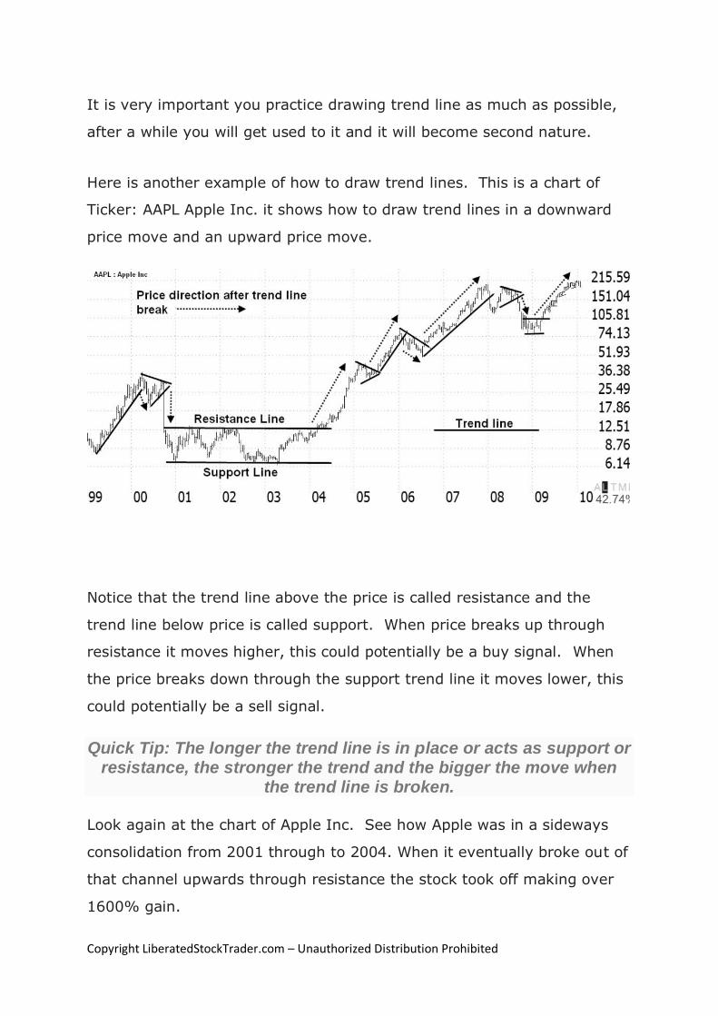
It is very important you practice drawing trend line as much as possible,
after a while you will get used to it and it will become second nature.
Here is another example of how to draw trend lines. This is a chart of
Ticker: AAPL Apple Inc. it shows how to draw trend lines in a downward
price move and an upward price move.
Notice that the trend line above the price is called resistance and the
trend line below price is called support. When price breaks up through
resistance it moves higher, this could potentially be a buy signal. When
the price breaks down through the support trend line it moves lower, this
could potentially be a sell signal.
Quick Tip: The longer the trend line is in place or acts as support or resistance, the stronger the trend and the bigger the move when
the trend line is broken.
Look again at the chart of Apple Inc. See how Apple was in a sideways
consolidation from 2001 through to 2004. When it eventually broke out of
that channel upwards through resistance the stock took off making over
1600% gain.

Copyright LiberatedStockTrader.com – Unauthorized Distribution Prohibited
Chapter 7 of the PRO Training delves deeper into the technical
analysis to enable you to make Buy and Sell decisions using trend
lines, spot the most important patterns and trends, discusses the
importance of Price Gaps, Triangles, and Wedges.
3. Drawing Trend Lines to Recognise Stock Chart Patterns
If you cannot draw a Trend-line you should not invest in the stock
market!
In this example, we will examine how to look at price movement and use
it to evaluate the stock.
Price is known as the most important indicator and so it should be when it
boils down to it the most important thing is the price.
Here we can see a chart of Broadcom (BRCM), one of the darlings of the
tech bubble in 2000.
Where will you draw the trend lines?
Take a look at this Stock Chart, where would you draw the Trend Lines?

Copyright LiberatedStockTrader.com – Unauthorized Distribution Prohibited
Take a moment to think about where you would draw the trend lines
before you scroll down to the chart where I have drawn them.
Support & Resistance and a Double Bottom Pattern Trendlines
A chart can really come alive when we add trend lines. The graphic below
shows BRCM, with trend lines, superimposed.
Follow This Process to Draw the Trend Lines
1. Starting from left to right we see from mid-April to July, the stock
starts to move in a sideways pattern, known as “Channeling”.
2. The two red lines show the “trading range”; this is the range
between which the stock price fluctuates.
3. The upper line is known as the Ceiling or the “Line Of
Resistance”, and the lower the Floor or “Support”. Both lines
show where the number of sellers equals that of buyers.
4. When the stock price falls through the support line it means the
trend has changed, and new market impetus has affected the
stock. If you owned this stock in April and enjoyed the

Copyright LiberatedStockTrader.com – Unauthorized Distribution Prohibited
corresponding price rise this break would be a strong “Sell
Signal” to the trained eye.
5. The stock consequently dropped in 2 days, but also had the good
courtesy to rise again over the following month to give anyone
slow on the uptake another chance to Sell. It broke through the
previous support line, but was not strong enough to make it to
the upper ceiling of the channel. If you had not got out this time
you would have suffered a punishing 50% loss. Enough to make
a grown man weep!
6. The next significant point to note, is in mid-October, when the
stock bounces at about $13, clearly oversold and proceeds to
make a very nice looking “Double Bottom” or “W” bottom.
7. Chartists the world over recognize the double bottom and those
that like to buy on Bottoms would have done. This clearly
happened as the stock moved up 38% in 3 weeks.
Using Trend-lines to make Buy and Sell Decisions
So we have seen the Sideways Channel and the W bottom. But how do
we know when a stock is going to take off?
The truth is we never really know.
All we can do is make judgments based on what we see. Do not forget we
are only buying Stocks of companies that have
• Excellent Earnings per Share
• Strong acceleration in the growth of Earning per Share
• Excellent Revenue growth
So we are in essence giving ourselves a great head start and reducing our
overall risk.

Copyright LiberatedStockTrader.com – Unauthorized Distribution Prohibited
4 Step Guide to Using Trend Lines for Buy & Sell Decisions
4 Step Guide to Using Trend Lines for Buy & Sell Decisions
4 Steps to Draw the Trend Lines on the Chart
1. To evaluate an upward trend draw a line joining the highest
highs
2. For the floor of the uptrend draw a line connecting the lowest
lows. The price here bounces 3 times of the bottom trendline but
then proceeds higher. The more bounces off a trend line the
stronger the trend.
3. A trend line is drawn to show that price has moved strongly past
the previous high, this is a BUY Signal at $35.50.
4. Finally, the price is exhausted and falls through the bottom
resistance line at $53.
Buying and selling based on the trend lines, here, would have netted you
a tasty 49%.
Alas, life is never that easy, and showing this in retrospect does mean we
have the benefit of hindsight. This is why the finest minds of Wall St.

Copyright LiberatedStockTrader.com – Unauthorized Distribution Prohibited
have a whole host of other technical indicators that accompany price to
enable you to assess trend quality.
How to Read Stock Charts Summary
Now you know how to read stock charts, understand volume and stock
chart indicators. But what is next?
Take your skills to the next level with our 5 Star Amazon Rated Liberated
Stock Trader Pro Stock Market Training Course

Copyright LiberatedStockTrader.com – Unauthorized Distribution Prohibited
Standard Disclaimer
The Liberated Stock Trader PRO Training Courses & Stock Market Profits Blueprint and all site content & eBooks are provided to enable you to take control of your investments by helping you understand the best of Technical and Fundamental Analysis. This will enable you to take responsibility for your own
actions through knowledge and education. However only you can learn the experience and patience required for success.
Liberatedstocktrader.com & StockMarketProfitsBlueprint.com are provided to you for informational purposes only and should not be construed as an offer
to buy or sell a particular security or a solicitation of offers to buy or sell a particular security. The author may make available, certain information related to the potential price movement of particular securities, but such information is for informational purposes only and should not be construed as an endorsement, recommendation or sponsorship of any company or security. Liberatedstocktrader.com does not give investment advice or advocate the purchase, holding or sale of any security or investment by any reader. Liberatedstocktrader.com does not provide any legal, tax, or accounting advice or
advice regarding the suitability, profitability, or potential value of any particular investment, security, or informational source. By reading this site, or using the training materials you acknowledge and agree that any reliance upon the content or data available through liberatedstocktrader.com is at your own sole risk. You are strongly advised to use your own judgment, your own research and question everything. The information is generic in nature and not targeted to individuals or individual circumstance. All opinions are simply opinions. The author is an independent investor, and is not licensed to give formal Stock advice to the individual, run funds of any type, or accept fees for individual stock advice. The Author accepts no responsibility for loss of money for following
any of the lessons created on this site or any personal mentoring sessions or workshops.
All of the content published on the websites and in eBooks is to be used for informational purposes only and without warranty of any kind. The materials
and information in this website are not, and should not be construed as an offer to buy or sell any of the securities named in these materials.
Trading of securities may not be suitable for all users of this information. Trading stocks and investing in the stock market may have large potential rewards. However, they may also have large potential risks involved in which you can lose all your money. You, the reader, and not Barry D. Moore or
LiberatedStocktrader.com or Stockmarketprofitsblueprint are solely responsible for any losses, financial or otherwise, as a result of trading stocks. Under all circumstances, you the reader, and not Barry D. Moore or LiberatedStocktrader.com assume the entire cost and all risks involved with trading any stock
based on strategies illustrated on this website.
It is essential for you to have a thorough understanding of the tools & strategies you are using. Ultimately, everything rests with the Trader. The Buck Stops with YOU, and only YOU are responsible for every aspect of the Trade. Never put your money on the line without a thorough understanding of what you are
doing, and why you are doing it, based on your own personal knowledge and experience.
No Chart Pattern works out the way we think it should every time, so it is vitally important to have a protective Stop-Loss and/or Exit strategy planned before entering into a Trade. Do your own research and testing before attempting any new technique. To properly utilize this tool, you must do enough thorough testing on your own to be satisfied with the results, and how those results will affect your personal Trading and Risk Management, before making
any trading decisions.
According to SEC regulations, the author must disclose, at a minimum, that: 1. The Author of the liberatedstocktrader.com and associated training materials is not a professional financial adviser.
2. The Author of The liberatedstocktrader, or may not buy or sell the securities mentioned in any of the instructional articles and eBooks.
3. Traders should consult their own financial advisers regarding any securities transaction, and be responsible for their own investment decisions.
Past performance is not indicative of future results.