Embed Size (px)
Citation preview
© Akash Karia 1
How to
Design
TED-Worthy
Presentation Slides Presentation Design Principles from TED Talks
(Exclusive Course Handout)
© AKASH KARIA
Bestselling author of “How to Deliver a Great TED Talk”
www.AkashKaria.com
© Akash Karia 2
“You can reverse engineer almost any good design. Take apart your favorite
presentations, infographics, websites and figure out how it’s done and remix it into
something new.”
- Jesse Desjardins
© Akash Karia 3
1
HOW TO BREATHE LIFE INTO YOUR
PRESENTATION…INSTEAD OF
DRAINING IT OUT OF YOUR
AUDIENCE
SIR KEN ROBINSON
For a TED talk, presenters are given a maximum slot of 18 minutes to share
their message with the world. Some choose to present without slides. For
example, Sir Ken Robinson delivered a very inspiring speech on education
without the use of any slides. Watch the presentation here: akashkaria.com/ken
TEDx SPEAKER GUIDE:
According to the TEDx speaker guide, “Slides can be helpful for the
audience, but they are by no means necessary or relevant to every talk. Ask
yourself: Would my slides help and clarify information for the audience,
or would they distract and confuse them?” Download TEDx speaker guide
here: bit.ly/1fhMItv
© Akash Karia 4
2
THE MOST COMMON MISTAKE –
AND HOW TO AVOID IT
SIMON SINEK
What was the core message of Simon’s talk? Watch Simon’s TED talk here:
akashkaria.com/simon
CHIARA OJEDA
Simon didn’t use slides in his TED talk, but one of my favorite presentation
designers, Chiara Ojeda created a Slideshare presentation around the talk. As
illustrated in Chiara’s slide, which you can view at akashkaria.com/chiara
the core message of the talk was “start with why”.
DAN PINK
In Dan Pink’s TED talk (akashkaria.com/dan), the core message of the
speech was that motivation is not about “[enticing] people with a sweeter
carrot or [threatening] them with a sharper stick. We need a whole new
approach.” All the examples, research and stories used in Dan’s talk were
used to support his core message.
© Akash Karia 5
3
THIS ONE PRINCIPLE WILL MAKE
YOU BETTER THAN 90% OF
PRESENTERS
SIMON SINEK
Consider this you-focused opening from Simon Sinek’s brilliant TED talk,
“Start with Why” (akashkaria.com/simon). Notice how the you-focused
opening immediately grabs the audience’s attention.
AMY CUDDY
Watch the opening of Amy Cuddy’s TED talk, “Your body language shapes
who you are” at akashkaria.com/amy:
© Akash Karia 6
4
THE FIRST STEP TO CREATING
TED-WORTHY SLIDES
NANCY DUARTE
“Whether it’s an official-’cause-its-on-my-calendar brainstorm…or a
‘quickstorm’ (a spontaneous 20-30 minute all-out cram session with some of
the brightest folks you work with) collecting perspectives early on can be an
enormous help.” - duarte.com
© Akash Karia 7
5
HOW TO QUICKLY STORYBOARD
YOUR PRESENTATION
NANCY DUARTE
Nancy Duarte, who gave the TEDx talk, “The secret structure of great TED
talks” (akashkaria.com/nancy), was interviewed for the TED blog. When
asked, “What is the best way to start creating a presentation?” she said: “My
best advice is to not start in PowerPoint.”
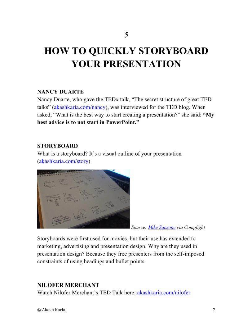
STORYBOARD
What is a storyboard? It’s a visual outline of your presentation
(akashkaria.com/story)
Source: Mike Sansone via Compfight
Storyboards were first used for movies, but their use has extended to
marketing, advertising and presentation design. Why are they used in
presentation design? Because they free presenters from the self-imposed
constraints of using headings and bullet points.
NILOFER MERCHANT
Watch Nilofer Merchant’s TED Talk here: akashkaria.com/nilofer
© Akash Karia 8
6
BILL GATES: DULL TO DASHING
SLIDES
BILL GATES
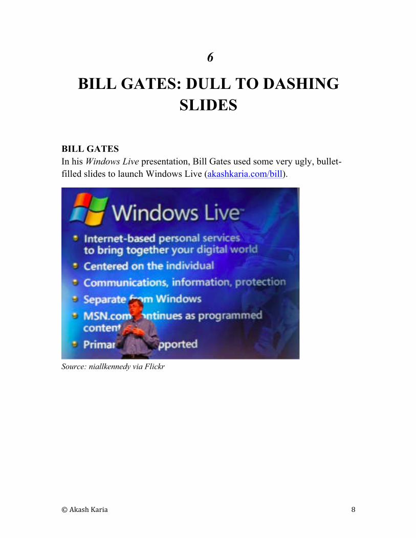
In his Windows Live presentation, Bill Gates used some very ugly, bullet-
filled slides to launch Windows Live (akashkaria.com/bill).
Source: niallkennedy via Flickr
© Akash Karia 9
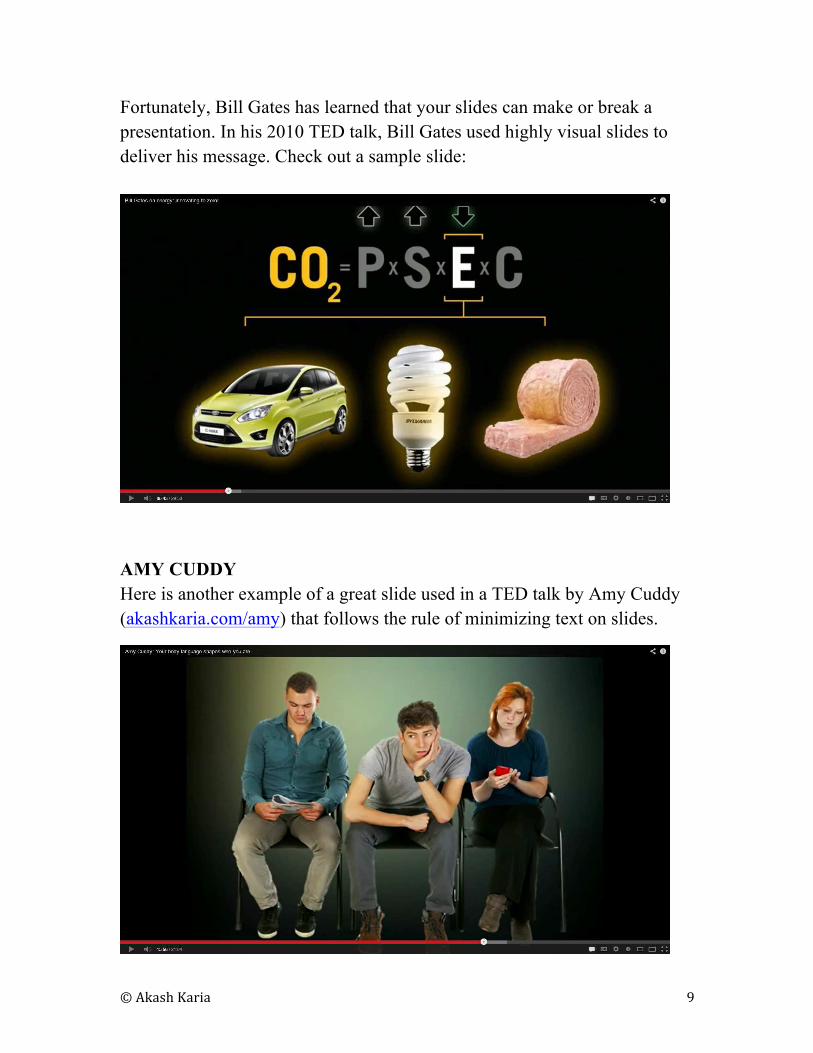
Fortunately, Bill Gates has learned that your slides can make or break a
presentation. In his 2010 TED talk, Bill Gates used highly visual slides to
deliver his message. Check out a sample slide:
AMY CUDDY
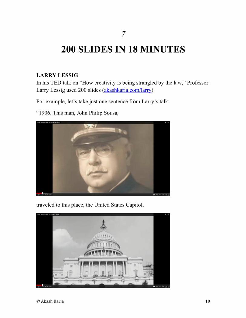
Here is another example of a great slide used in a TED talk by Amy Cuddy
(akashkaria.com/amy) that follows the rule of minimizing text on slides.
© Akash Karia 10
7
200 SLIDES IN 18 MINUTES
LARRY LESSIG
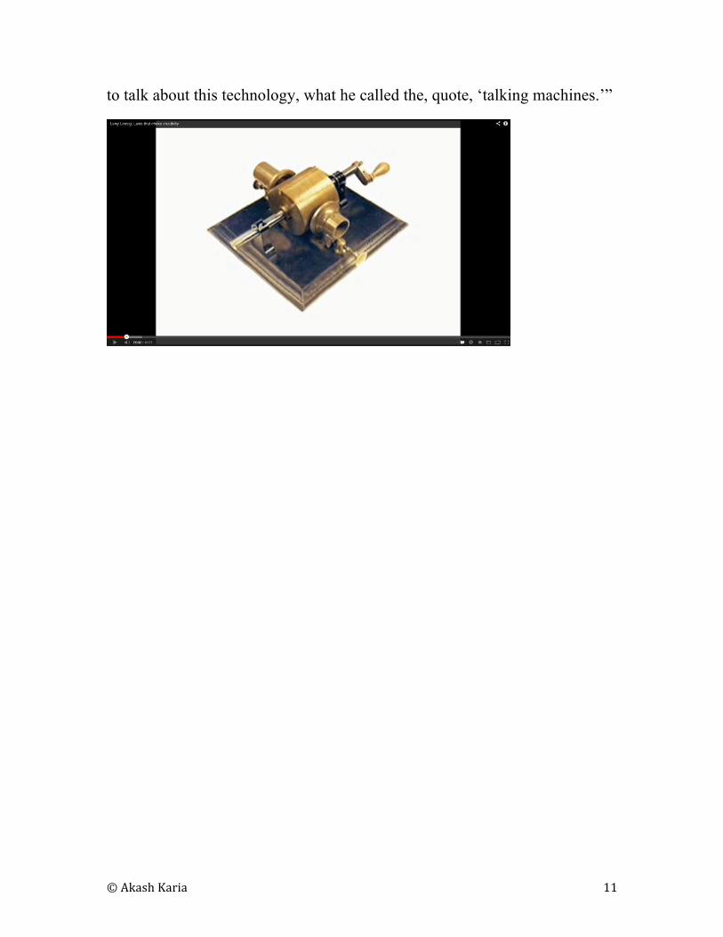
In his TED talk on “How creativity is being strangled by the law,” Professor
Larry Lessig used 200 slides (akashkaria.com/larry)
For example, let’s take just one sentence from Larry’s talk:
“1906. This man, John Philip Sousa,
traveled to this place, the United States Capitol,
© Akash Karia 11
to talk about this technology, what he called the, quote, ‘talking machines.’”
© Akash Karia 12
8
THE SETH GODIN PRESENTATION
FORMULA
SETH GODIN
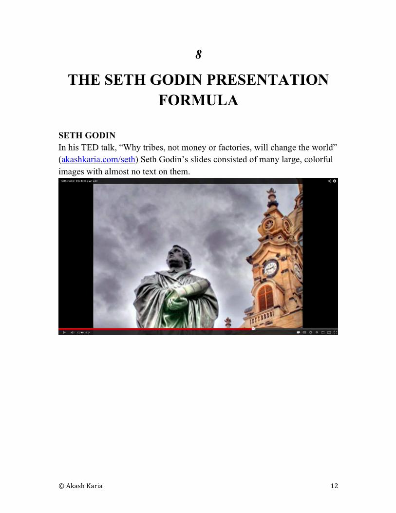
In his TED talk, “Why tribes, not money or factories, will change the world”
(akashkaria.com/seth) Seth Godin’s slides consisted of many large, colorful
images with almost no text on them.
© Akash Karia 13
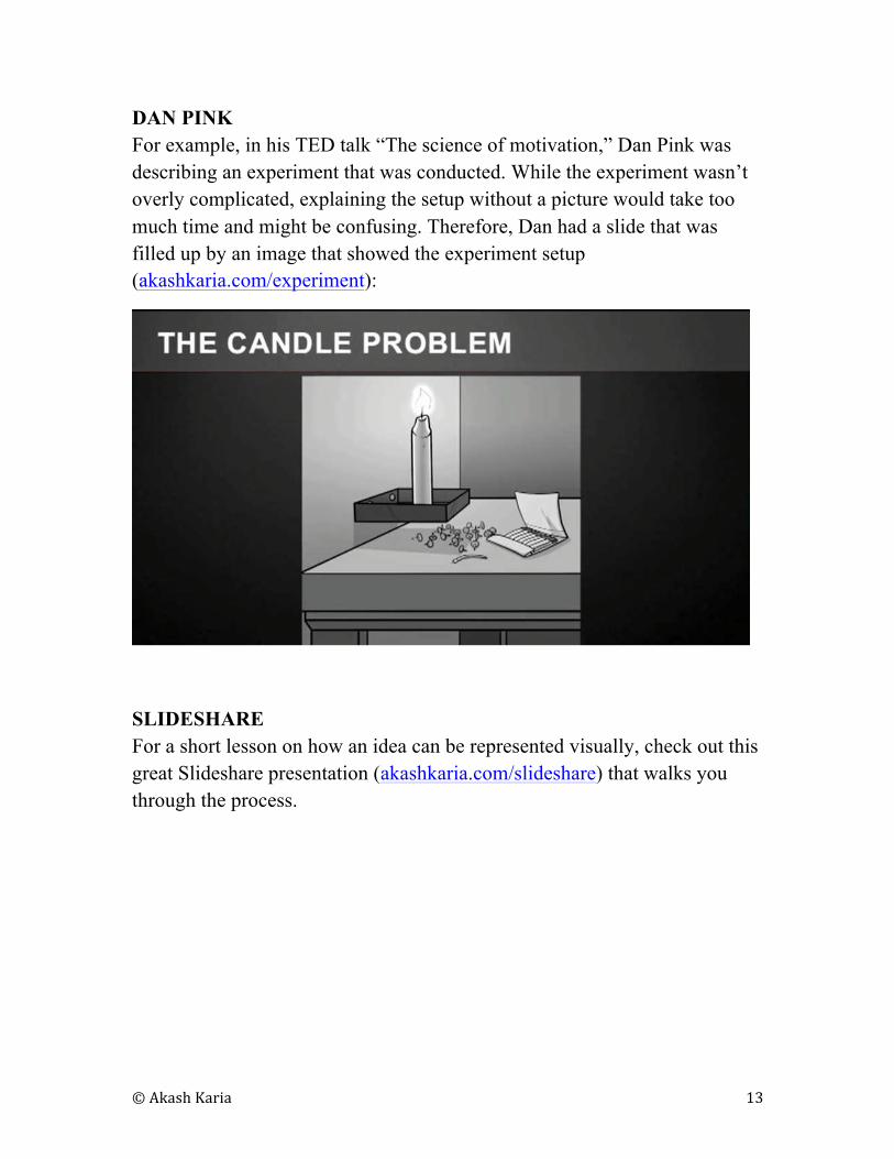
DAN PINK
For example, in his TED talk “The science of motivation,” Dan Pink was
describing an experiment that was conducted. While the experiment wasn’t
overly complicated, explaining the setup without a picture would take too
much time and might be confusing. Therefore, Dan had a slide that was
filled up by an image that showed the experiment setup
(akashkaria.com/experiment):
SLIDESHARE
For a short lesson on how an idea can be represented visually, check out this
great Slideshare presentation (akashkaria.com/slideshare) that walks you
through the process.
© Akash Karia 14
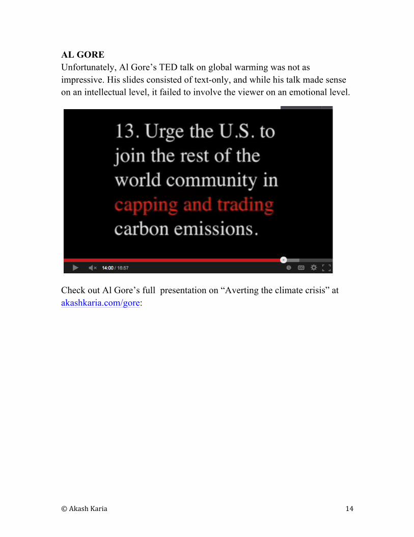
AL GORE
Unfortunately, Al Gore’s TED talk on global warming was not as
impressive. His slides consisted of text-only, and while his talk made sense
on an intellectual level, it failed to involve the viewer on an emotional level.
Check out Al Gore’s full presentation on “Averting the climate crisis” at
akashkaria.com/gore:
© Akash Karia 15
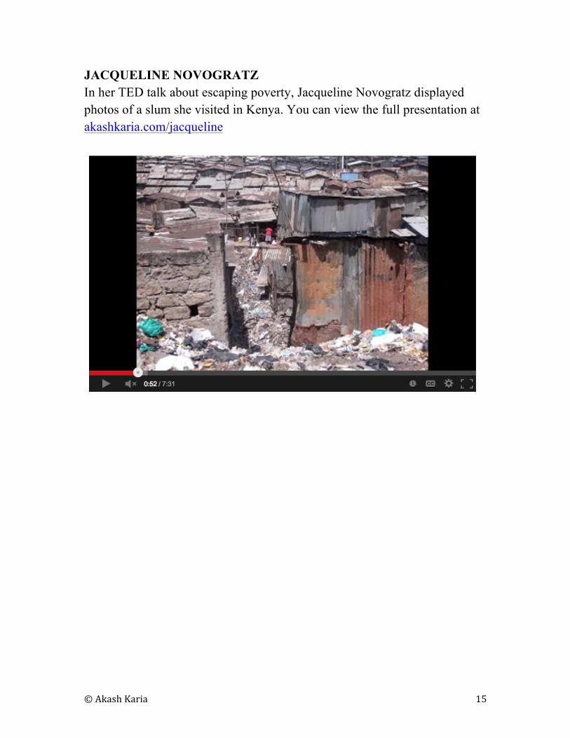
JACQUELINE NOVOGRATZ
In her TED talk about escaping poverty, Jacqueline Novogratz displayed
photos of a slum she visited in Kenya. You can view the full presentation at
akashkaria.com/jacqueline
© Akash Karia 16
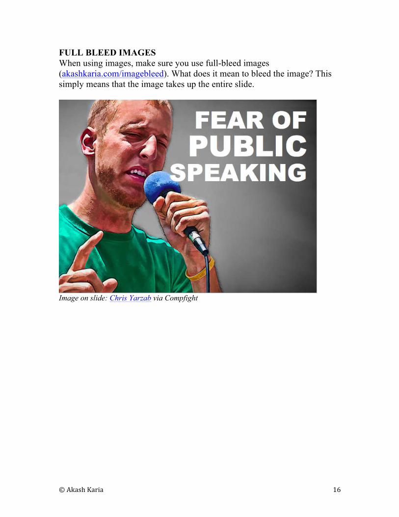
FULL BLEED IMAGES
When using images, make sure you use full-bleed images
(akashkaria.com/imagebleed). What does it mean to bleed the image? This
simply means that the image takes up the entire slide.
Image on slide: Chris Yarzab via Compfight

© Akash Karia 17
Full-bleed images are more appealing to look at than thumbnails of pictures
placed on slides:
Image on slide: Chris Yarzab via Compfight
© Akash Karia 18
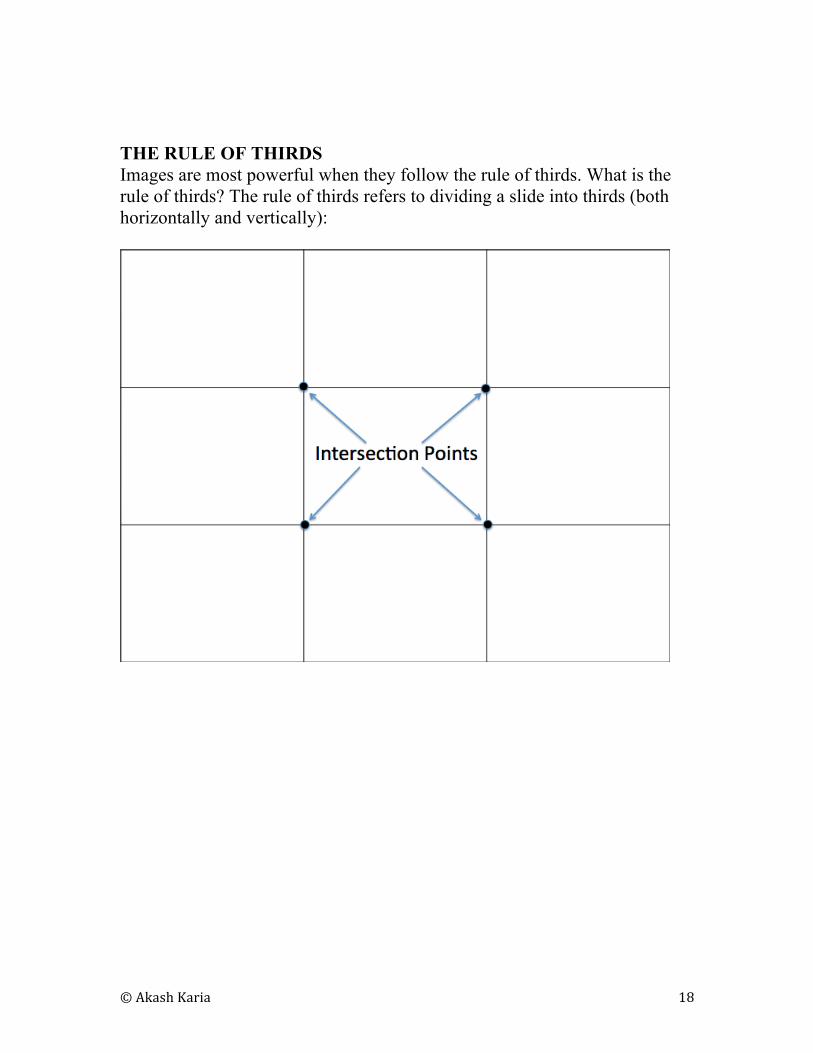
THE RULE OF THIRDS
Images are most powerful when they follow the rule of thirds. What is the
rule of thirds? The rule of thirds refers to dividing a slide into thirds (both
horizontally and vertically):
© Akash Karia 19
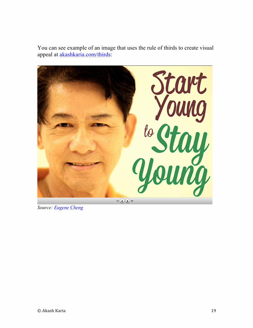
You can see example of an image that uses the rule of thirds to create visual
appeal at akashkaria.com/thirds:
Source: Eugene Cheng
© Akash Karia 20
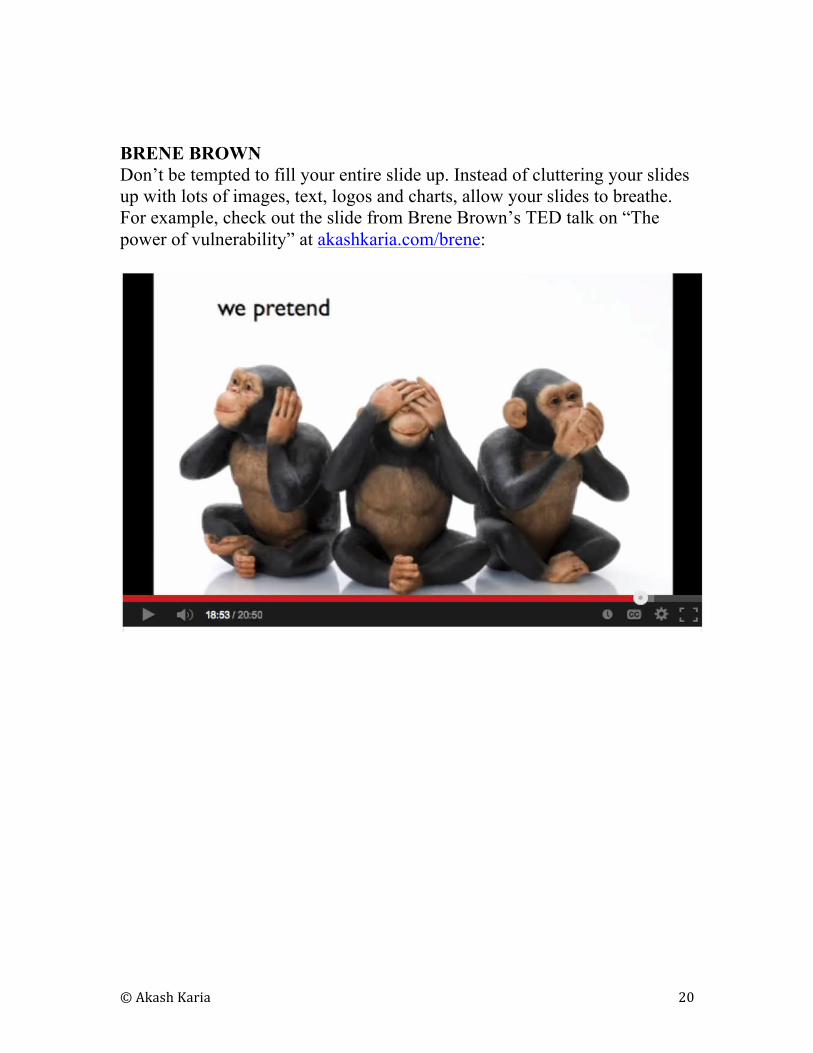
BRENE BROWN
Don’t be tempted to fill your entire slide up. Instead of cluttering your slides
up with lots of images, text, logos and charts, allow your slides to breathe.
For example, check out the slide from Brene Brown’s TED talk on “The
power of vulnerability” at akashkaria.com/brene:
© Akash Karia 21
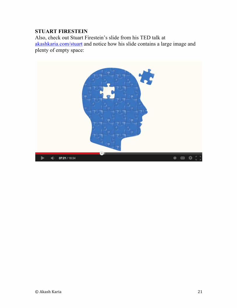
STUART FIRESTEIN
Also, check out Stuart Firestein’s slide from his TED talk at
akashkaria.com/stuart and notice how his slide contains a large image and
plenty of empty space:
© Akash Karia 22
9
IS YOUR FONT SEXY ENOUGH?
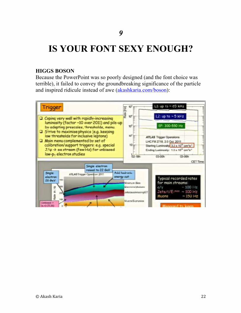
HIGGS BOSON
Because the PowerPoint was so poorly designed (and the font choice was
terrible), it failed to convey the groundbreaking significance of the particle
and inspired ridicule instead of awe (akashkaria.com/boson):
© Akash Karia 23
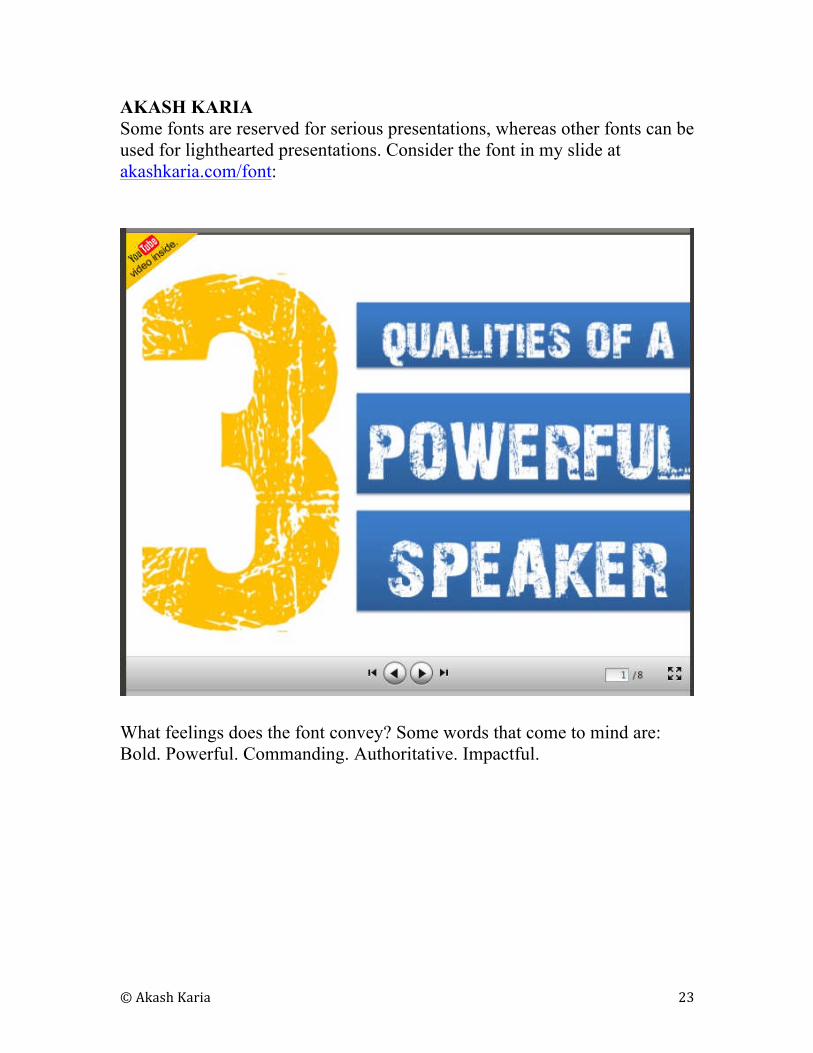
AKASH KARIA
Some fonts are reserved for serious presentations, whereas other fonts can be
used for lighthearted presentations. Consider the font in my slide at
akashkaria.com/font:
What feelings does the font convey? Some words that come to mind are:
Bold. Powerful. Commanding. Authoritative. Impactful.
© Akash Karia 24
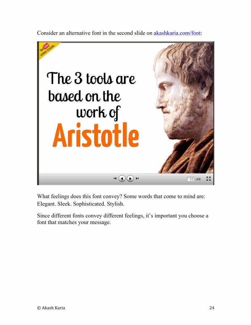
Consider an alternative font in the second slide on akashkaria.com/font:
What feelings does this font convey? Some words that come to mind are:
Elegant. Sleek. Sophisticated. Stylish.
Since different fonts convey different feelings, it’s important you choose a
font that matches your message.
© Akash Karia 25
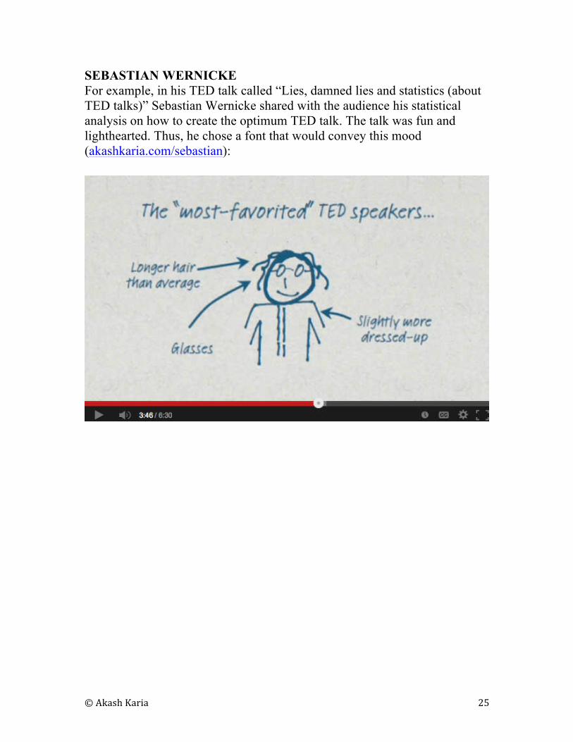
SEBASTIAN WERNICKE
For example, in his TED talk called “Lies, damned lies and statistics (about
TED talks)” Sebastian Wernicke shared with the audience his statistical
analysis on how to create the optimum TED talk. The talk was fun and
lighthearted. Thus, he chose a font that would convey this mood
(akashkaria.com/sebastian):
© Akash Karia 26
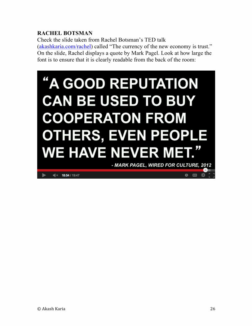
RACHEL BOTSMAN
Check the slide taken from Rachel Botsman’s TED talk
(akashkaria.com/rachel) called “The currency of the new economy is trust.”
On the slide, Rachel displays a quote by Mark Pagel. Look at how large the
font is to ensure that it is clearly readable from the back of the room:
© Akash Karia 27
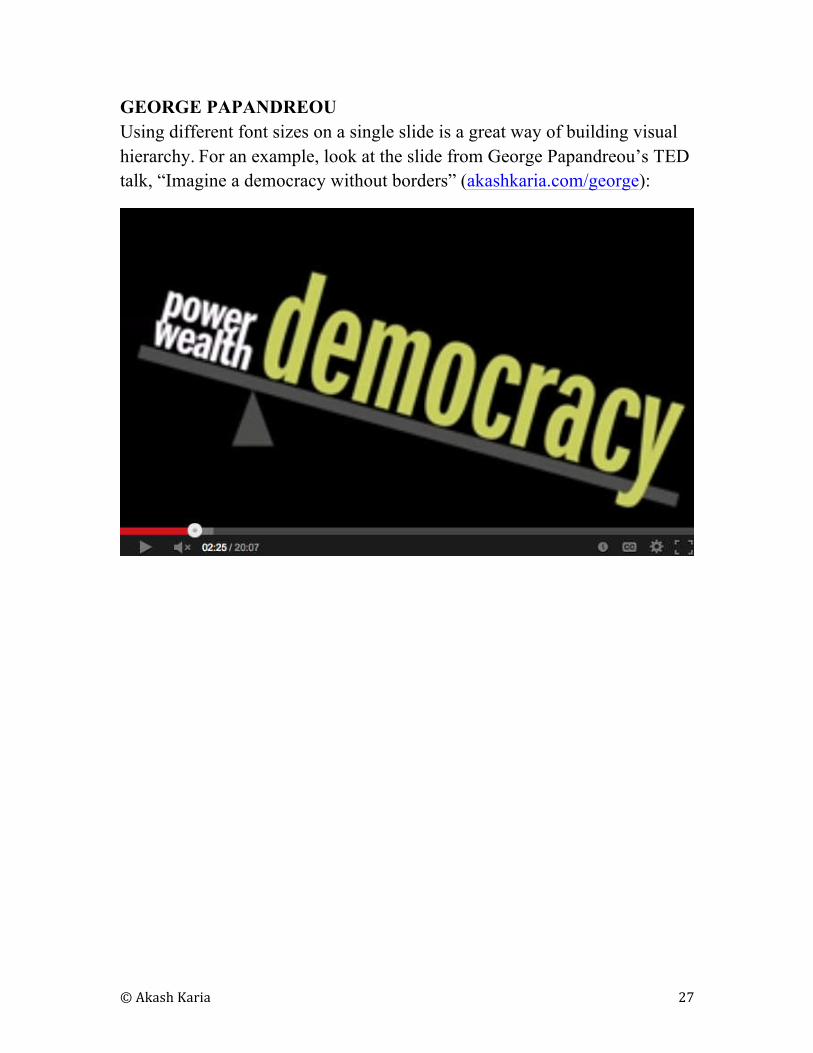
GEORGE PAPANDREOU
Using different font sizes on a single slide is a great way of building visual
hierarchy. For an example, look at the slide from George Papandreou’s TED
talk, “Imagine a democracy without borders” (akashkaria.com/george):
© Akash Karia 28
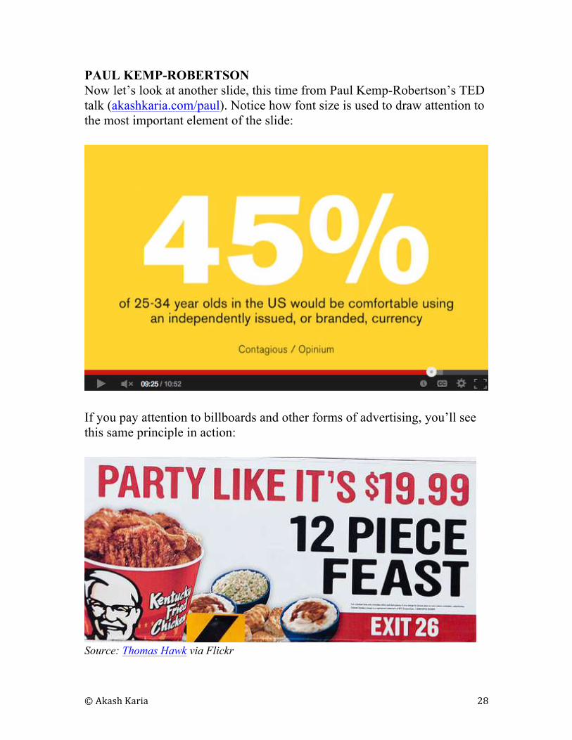
PAUL KEMP-ROBERTSON
Now let’s look at another slide, this time from Paul Kemp-Robertson’s TED
talk (akashkaria.com/paul). Notice how font size is used to draw attention to
the most important element of the slide:
If you pay attention to billboards and other forms of advertising, you’ll see
this same principle in action:
Source: Thomas Hawk via Flickr
© Akash Karia 29
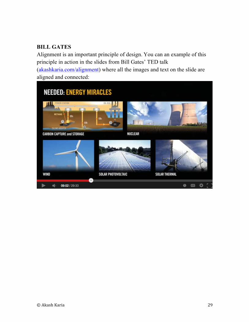
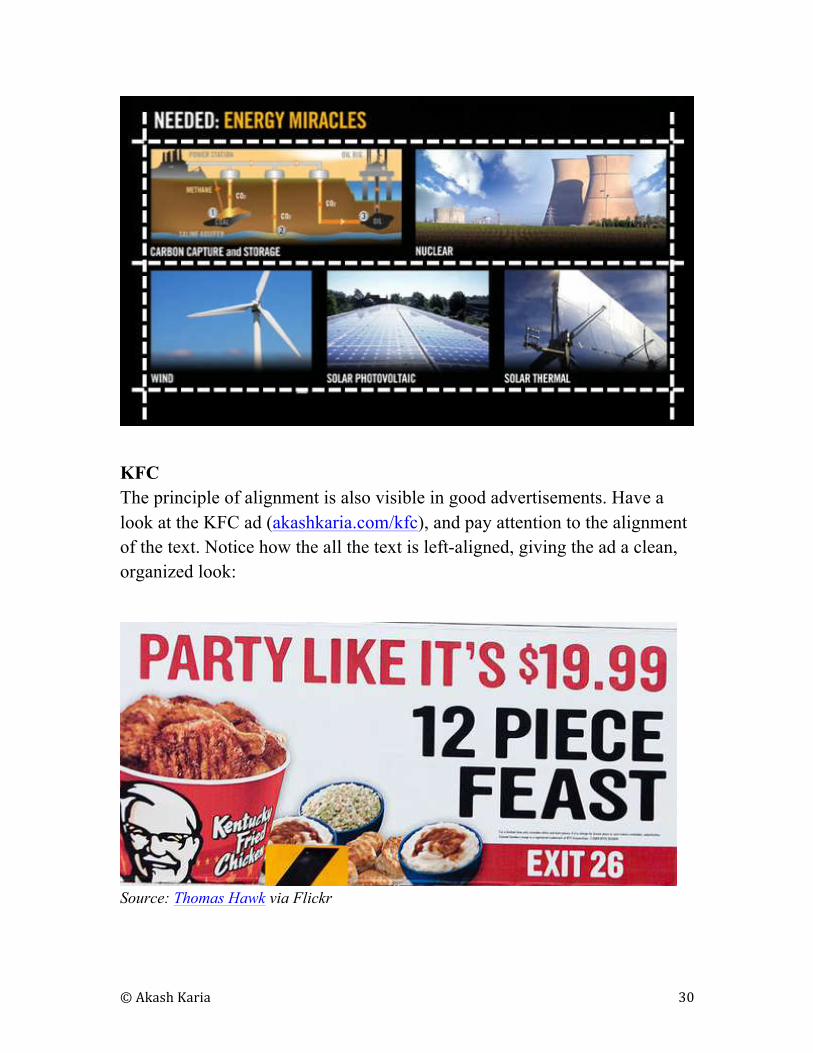
BILL GATES
Alignment is an important principle of design. You can an example of this
principle in action in the slides from Bill Gates’ TED talk
(akashkaria.com/alignment) where all the images and text on the slide are
aligned and connected:
© Akash Karia 30
KFC
The principle of alignment is also visible in good advertisements. Have a
look at the KFC ad (akashkaria.com/kfc), and pay attention to the alignment
of the text. Notice how the all the text is left-aligned, giving the ad a clean,
organized look:
Source: Thomas Hawk via Flickr
© Akash Karia 31
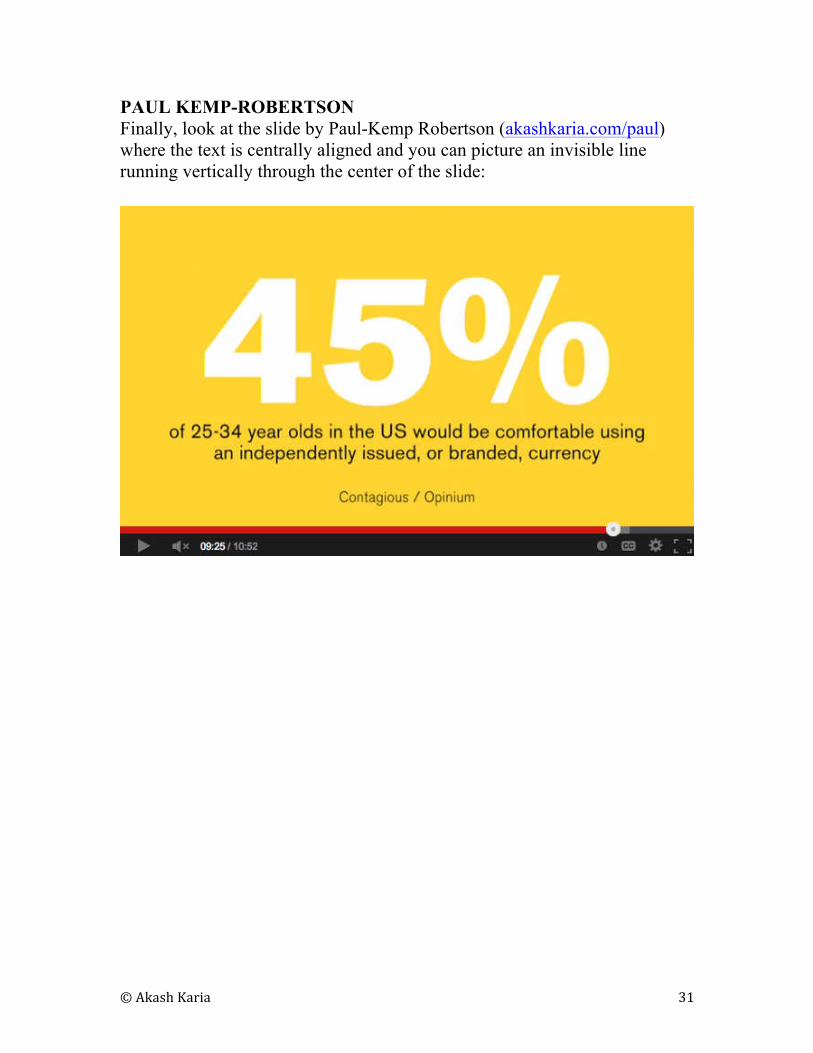
PAUL KEMP-ROBERTSON
Finally, look at the slide by Paul-Kemp Robertson (akashkaria.com/paul)
where the text is centrally aligned and you can picture an invisible line
running vertically through the center of the slide:
© Akash Karia 32
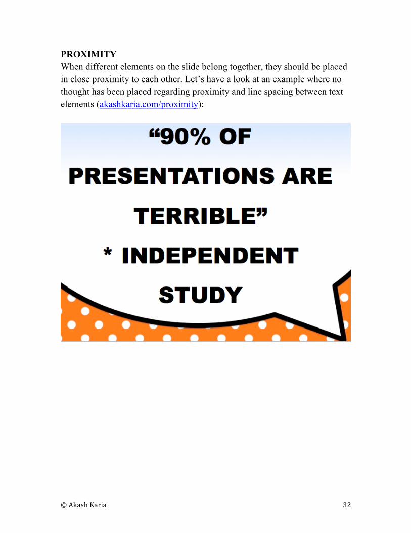
PROXIMITY
When different elements on the slide belong together, they should be placed
in close proximity to each other. Let’s have a look at an example where no
thought has been placed regarding proximity and line spacing between text
elements (akashkaria.com/proximity):
© Akash Karia 33
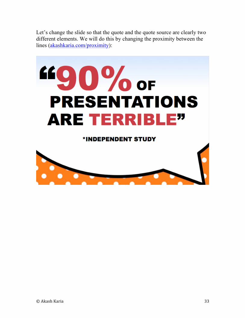
Let’s change the slide so that the quote and the quote source are clearly two
different elements. We will do this by changing the proximity between the
lines (akashkaria.com/proximity):
© Akash Karia 34
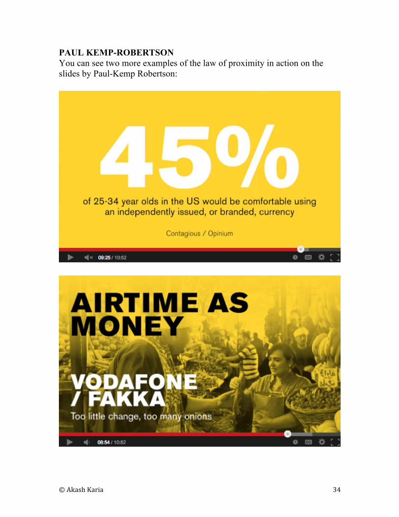
PAUL KEMP-ROBERTSON
You can see two more examples of the law of proximity in action on the
slides by Paul-Kemp Robertson:

© Akash Karia 35
GEORGE PAPANDREOU
A final way to add excitement to your typography is to experiment with
rotating text (akashkaria.com/george):
ADAPT
You can rotate text simply for aesthetic purposes. An example of a great
book cover that grabs attention using rotated text is Tim Harford’s book,
“Adapt” (hakashkaria.com/adapt):
© Akash Karia 36
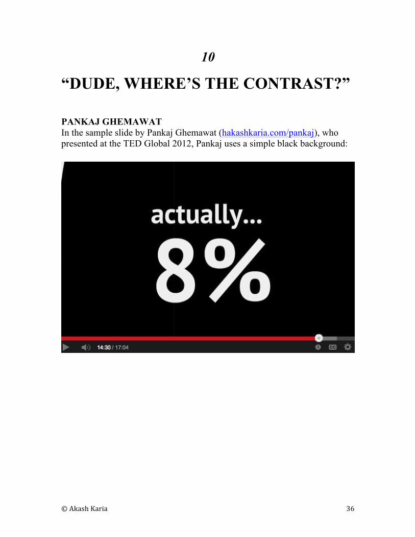
10
“DUDE, WHERE’S THE CONTRAST?”
PANKAJ GHEMAWAT
In the sample slide by Pankaj Ghemawat (hakashkaria.com/pankaj), who
presented at the TED Global 2012, Pankaj uses a simple black background:
© Akash Karia 37
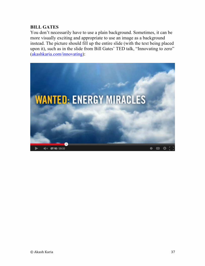
BILL GATES
You don’t necessarily have to use a plain background. Sometimes, it can be
more visually exciting and appropriate to use an image as a background
instead. The picture should fill up the entire slide (with the text being placed
upon it), such as in the slide from Bill Gates’ TED talk, “Innovating to zero”
(akashkaria.com/innovating):
© Akash Karia 38
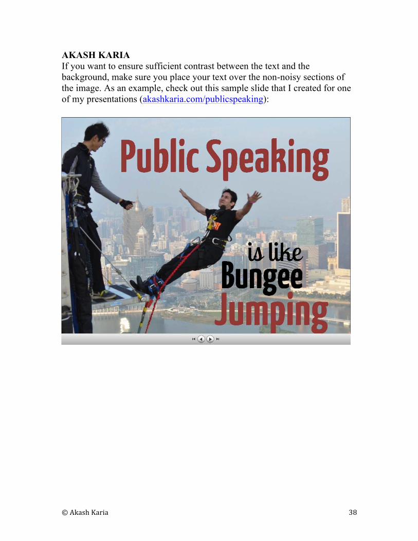
AKASH KARIA
If you want to ensure sufficient contrast between the text and the
background, make sure you place your text over the non-noisy sections of
the image. As an example, check out this sample slide that I created for one
of my presentations (akashkaria.com/publicspeaking):
© Akash Karia 39
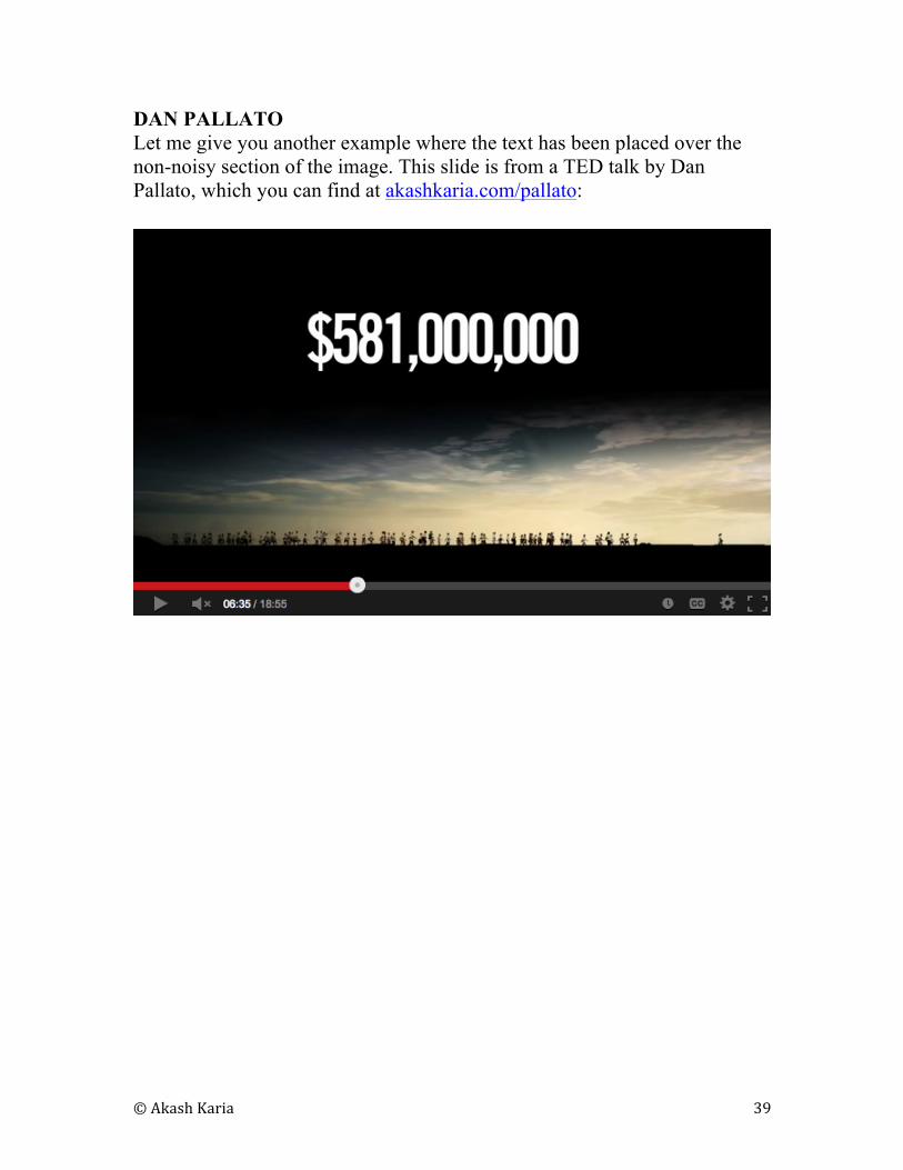
DAN PALLATO
Let me give you another example where the text has been placed over the
non-noisy section of the image. This slide is from a TED talk by Dan
Pallato, which you can find at akashkaria.com/pallato:
© Akash Karia 40
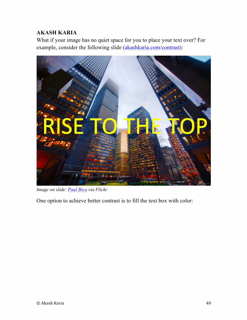
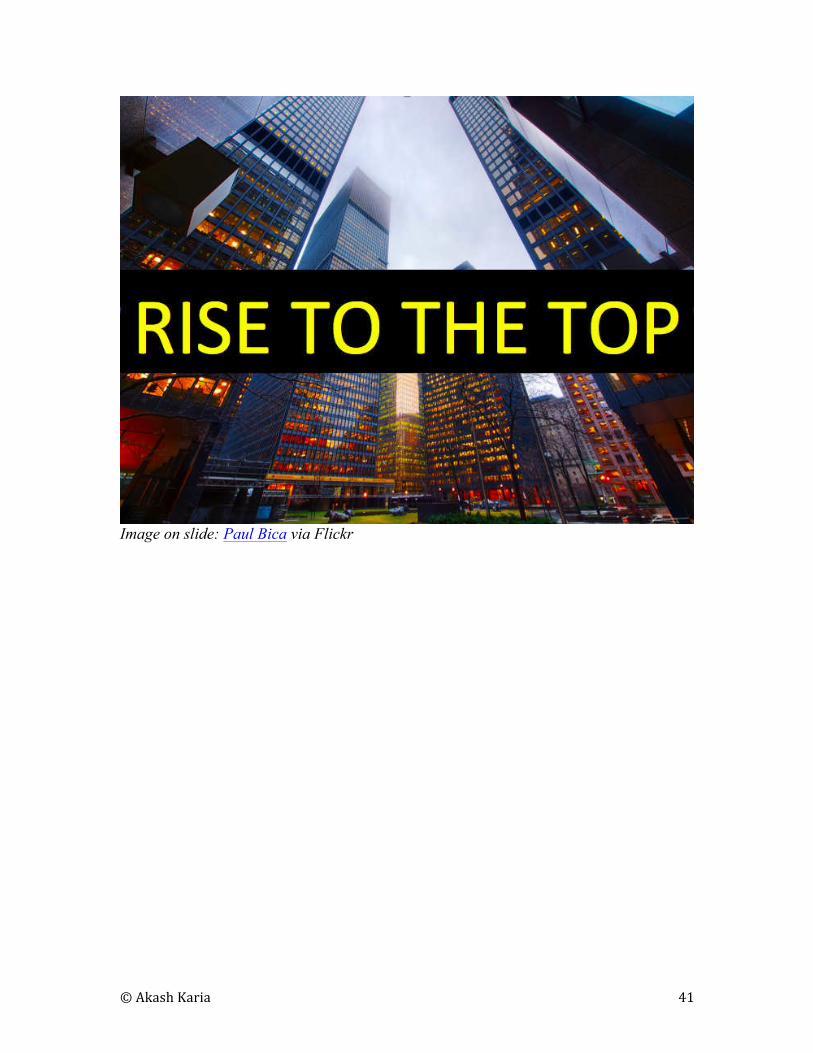
AKASH KARIA
What if your image has no quiet space for you to place your text over? For
example, consider the following slide (akashkaria.com/contrast):
Image on slide: Paul Bica via Flickr
One option to achieve better contrast is to fill the text box with color:
© Akash Karia 41
Image on slide: Paul Bica via Flickr
© Akash Karia 42
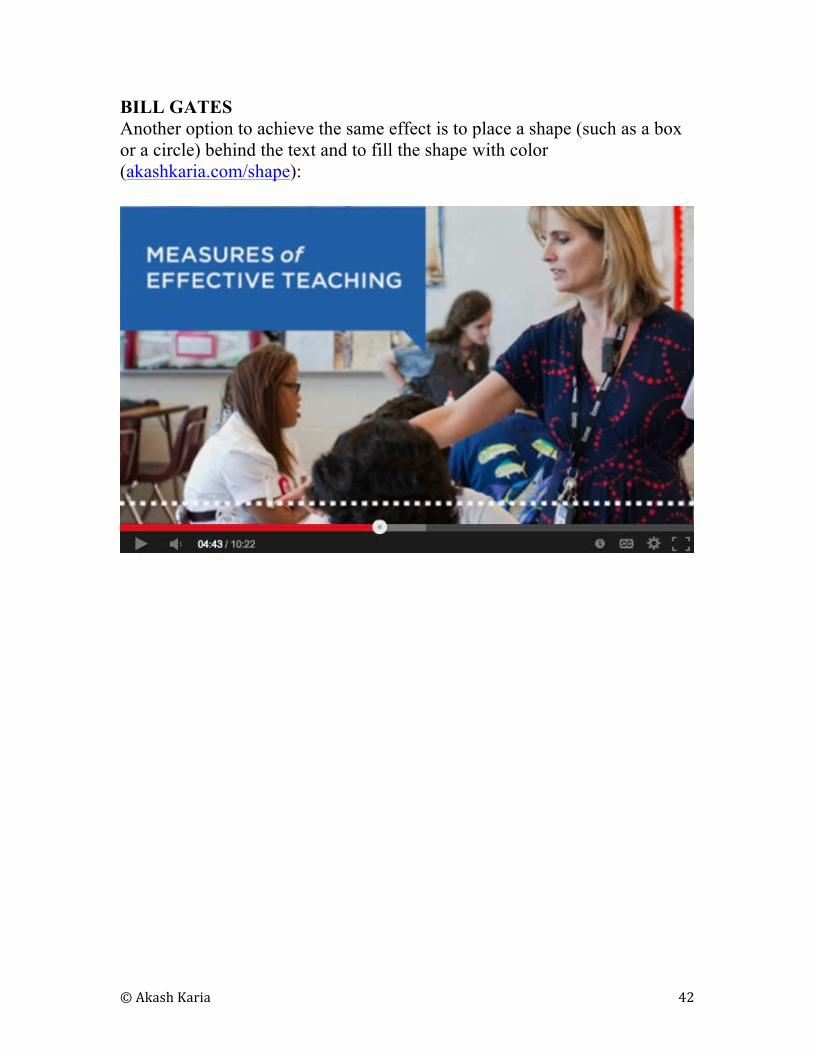
BILL GATES
Another option to achieve the same effect is to place a shape (such as a box
or a circle) behind the text and to fill the shape with color
(akashkaria.com/shape):
© Akash Karia 43
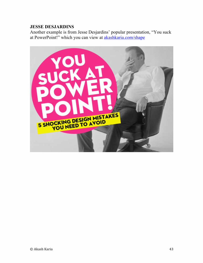
JESSE DESJARDINS
Another example is from Jesse Desjardins’ popular presentation, “You suck
at PowerPoint!” which you can view at akashkaria.com/shape
© Akash Karia 44
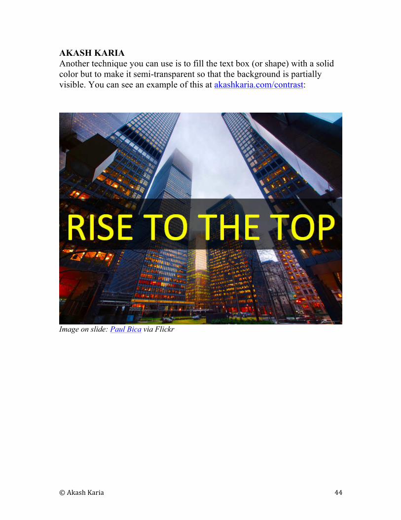
AKASH KARIA
Another technique you can use is to fill the text box (or shape) with a solid
color but to make it semi-transparent so that the background is partially
visible. You can see an example of this at akashkaria.com/contrast:
Image on slide: Paul Bica via Flickr
© Akash Karia 45
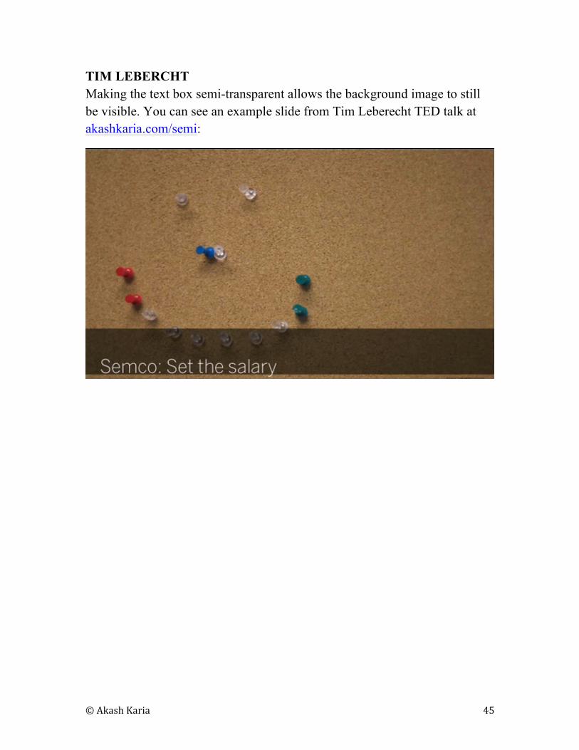
TIM LEBERCHT
Making the text box semi-transparent allows the background image to still
be visible. You can see an example slide from Tim Leberecht TED talk at
akashkaria.com/semi:

© Akash Karia 46
WOLFGANG KESSLING
Here’s one final example. This one comes from Wolfgang Kessling’s TED
talk on “How to air-condition outdoor spaces” (akashkaria.com/semi):
© Akash Karia 47
11
DISPLAYING DATA WITHOUT
BEING DULL
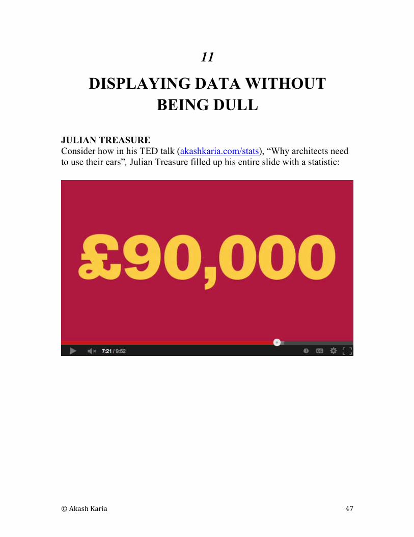
JULIAN TREASURE
Consider how in his TED talk (akashkaria.com/stats), “Why architects need
to use their ears”, Julian Treasure filled up his entire slide with a statistic:
© Akash Karia 48
BILL GATES
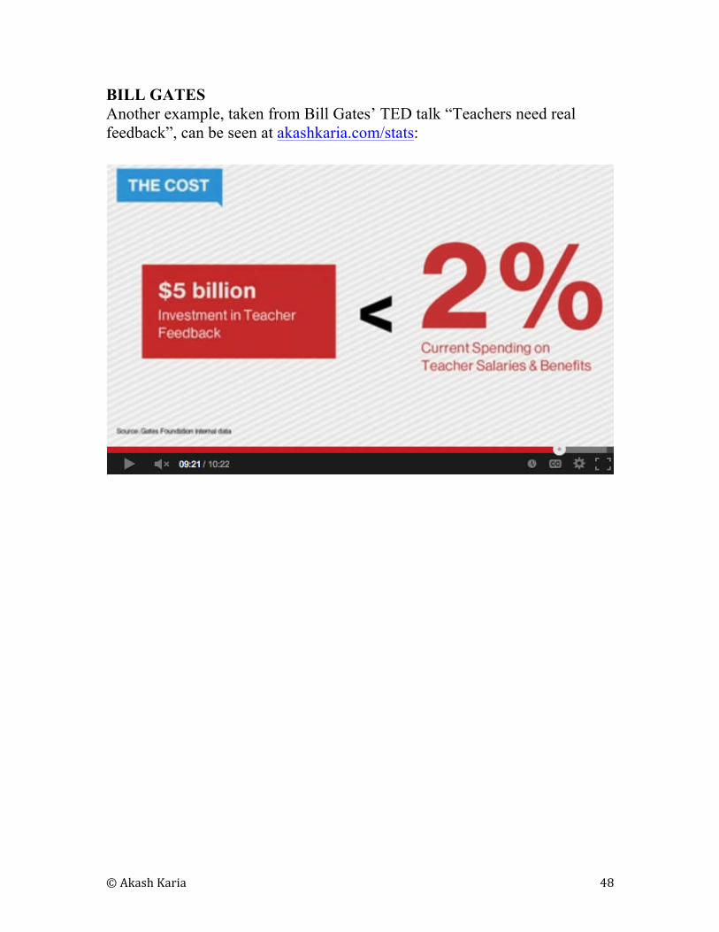
Another example, taken from Bill Gates’ TED talk “Teachers need real
feedback”, can be seen at akashkaria.com/stats:
© Akash Karia 49
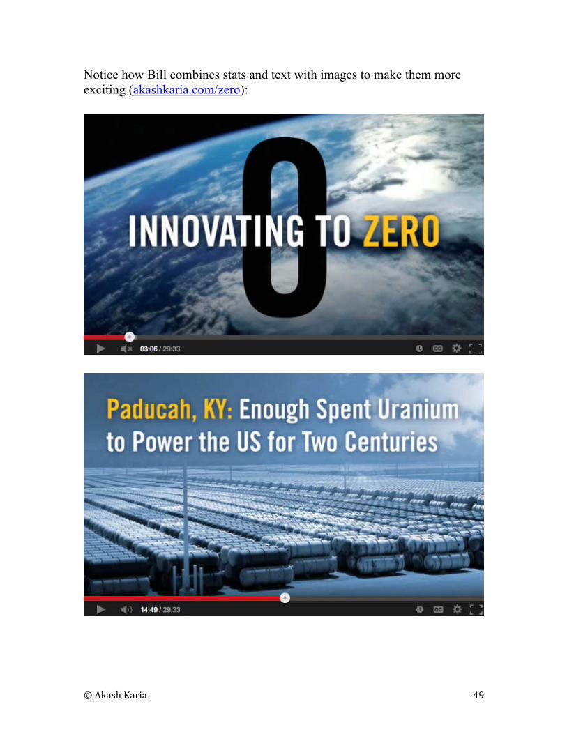
Notice how Bill combines stats and text with images to make them more
exciting (akashkaria.com/zero):
© Akash Karia 50
AKASH KARIA
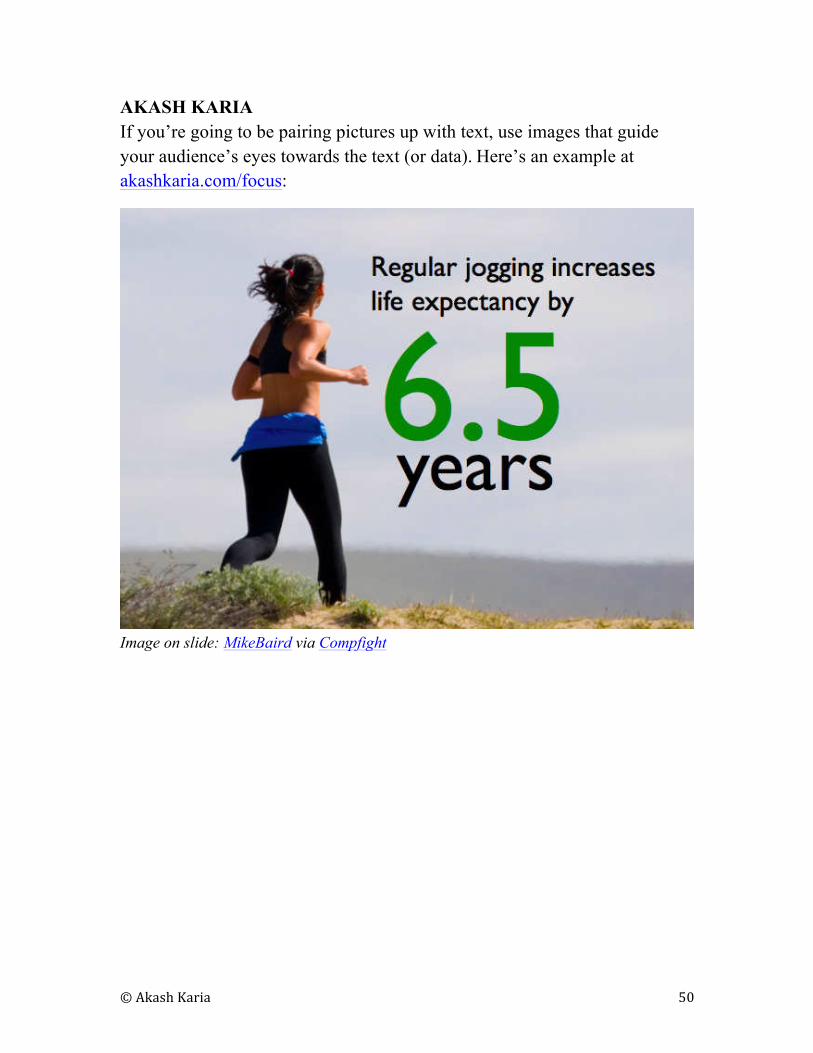
If you’re going to be pairing pictures up with text, use images that guide
your audience’s eyes towards the text (or data). Here’s an example at
akashkaria.com/focus:
Image on slide: MikeBaird via Compfight
© Akash Karia 51
BILL GATES
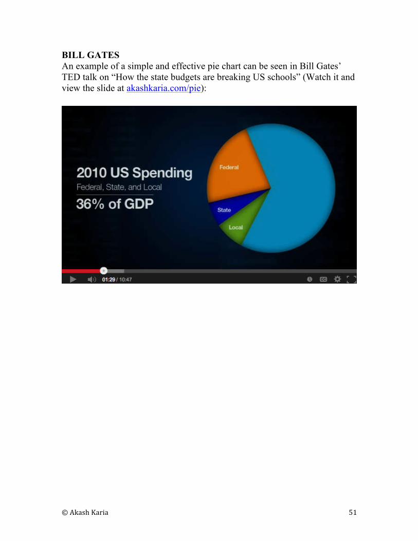
An example of a simple and effective pie chart can be seen in Bill Gates’
TED talk on “How the state budgets are breaking US schools” (Watch it and
view the slide at akashkaria.com/pie):
© Akash Karia 52
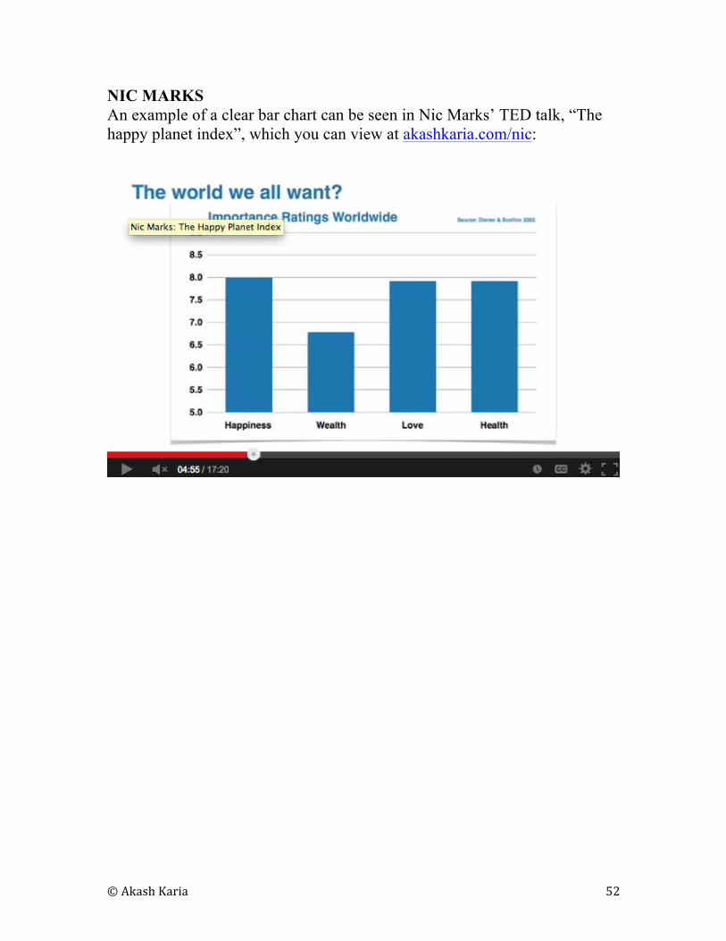
NIC MARKS
An example of a clear bar chart can be seen in Nic Marks’ TED talk, “The
happy planet index”, which you can view at akashkaria.com/nic:
© Akash Karia 53
12
SPICING UP YOUR PRESENTATIONS
WITH VIDEO
AMY CUDDY
In her TED talk on body language, Amy Cuddy made great use of embedded
videos within her presentation (If you haven’t already, you can watch the
presentation at akashkaria.com/amy)
© Akash Karia 54
13
“HOW DO I MAKE IT ALL
CONSISTENT?”
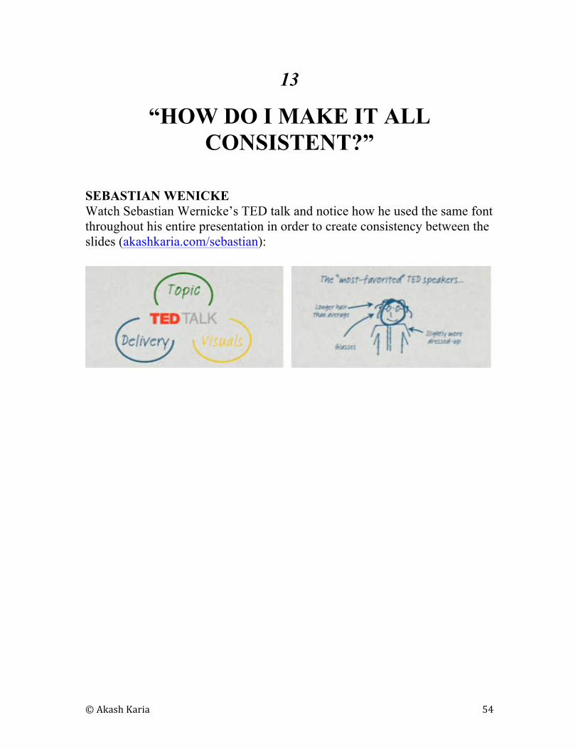
SEBASTIAN WENICKE
Watch Sebastian Wernicke’s TED talk and notice how he used the same font
throughout his entire presentation in order to create consistency between the
slides (akashkaria.com/sebastian):
© Akash Karia 55
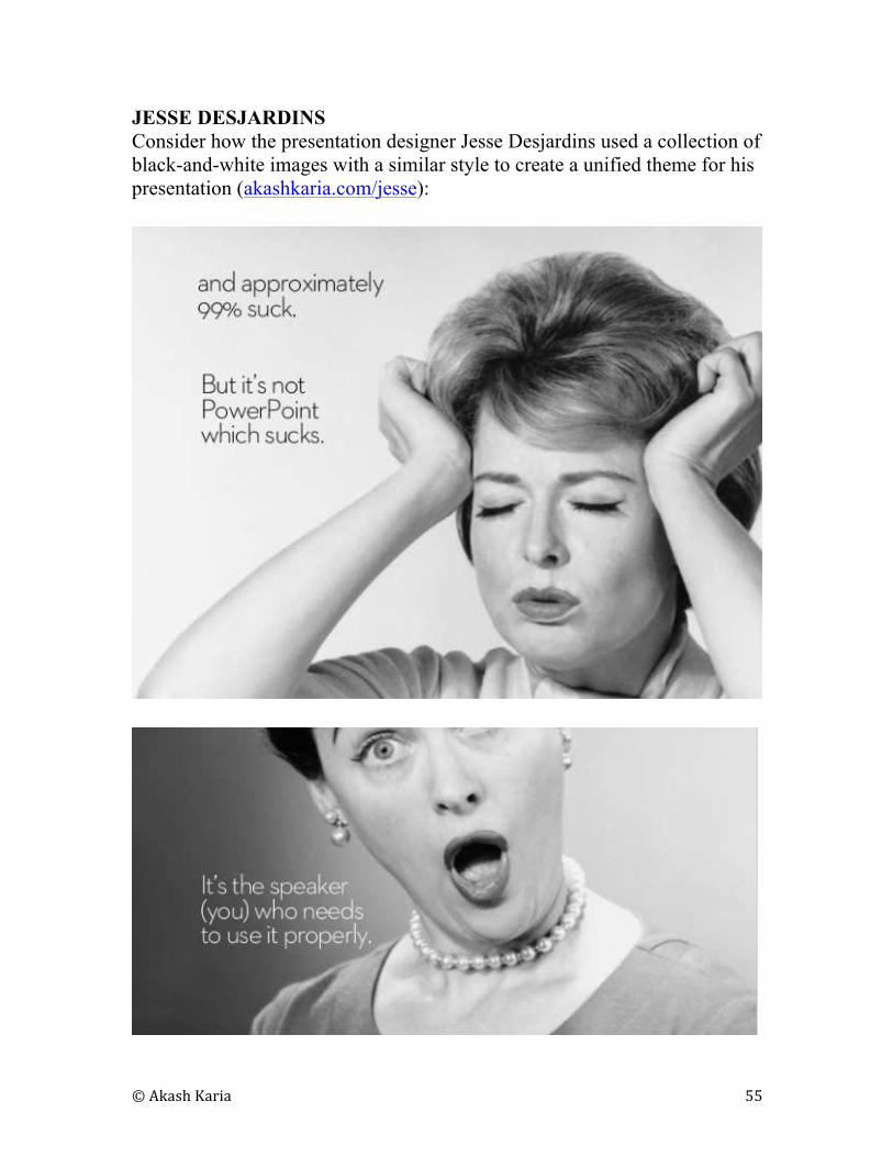
JESSE DESJARDINS
Consider how the presentation designer Jesse Desjardins used a collection of
black-and-white images with a similar style to create a unified theme for his
presentation (akashkaria.com/jesse):
© Akash Karia 56
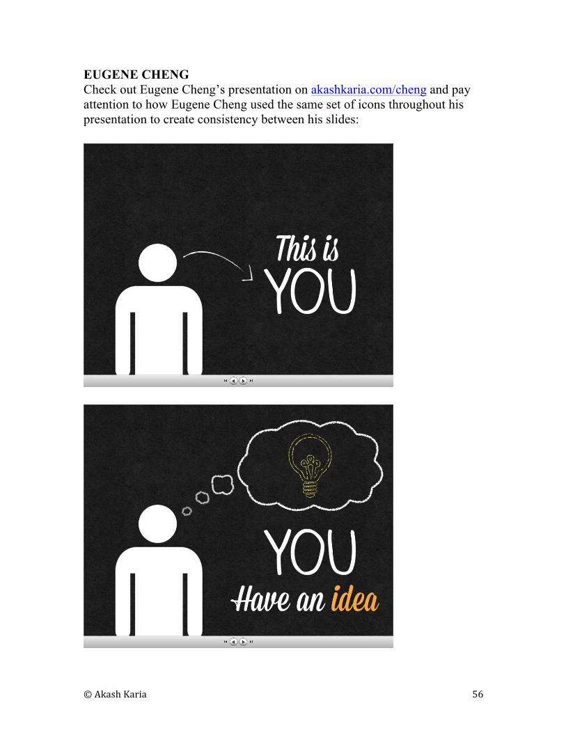
EUGENE CHENG
Check out Eugene Cheng’s presentation on akashkaria.com/cheng and pay
attention to how Eugene Cheng used the same set of icons throughout his
presentation to create consistency between his slides:
© Akash Karia 57
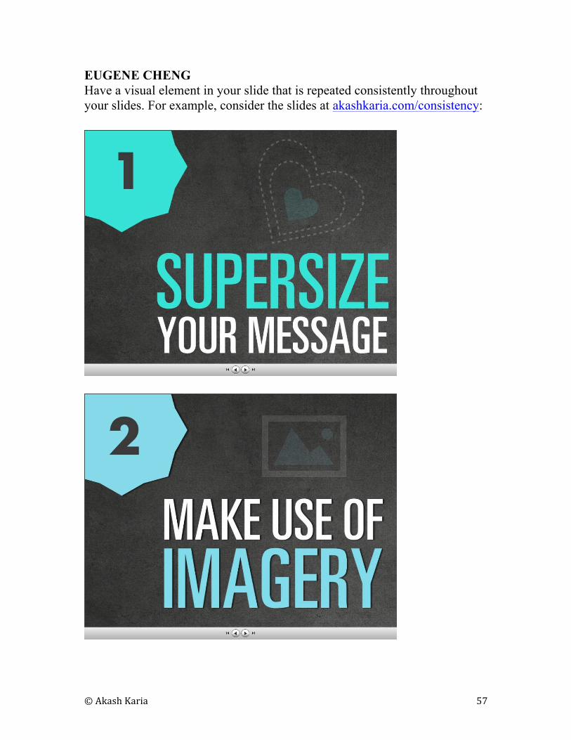
EUGENE CHENG
Have a visual element in your slide that is repeated consistently throughout
your slides. For example, consider the slides at akashkaria.com/consistency:
© Akash Karia 58
14
HOW TO DELIVER A GREAT TED
TALK
AKASH KARIA
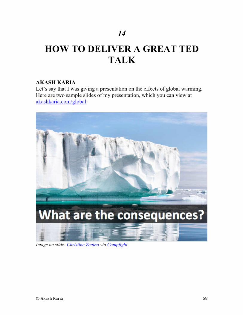
Let’s say that I was giving a presentation on the effects of global warming.
Here are two sample slides of my presentation, which you can view at
akashkaria.com/global:
Image on slide: Christine Zenino via Compfight
© Akash Karia 59
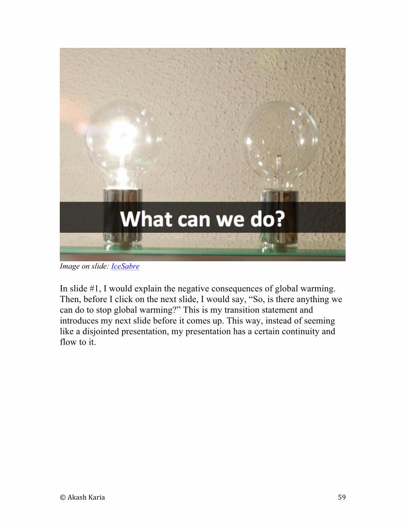
Image on slide: IceSabre
In slide #1, I would explain the negative consequences of global warming.
Then, before I click on the next slide, I would say, “So, is there anything we
can do to stop global warming?” This is my transition statement and
introduces my next slide before it comes up. This way, instead of seeming
like a disjointed presentation, my presentation has a certain continuity and
flow to it.
© Akash Karia 60
15
WRAP-UP: HOW TO CREATE TED-
WORTHY SLIDES
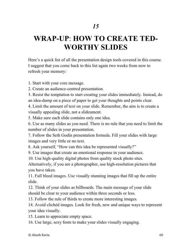
Here’s a quick list of all the presentation design tools covered in this course.
I suggest that you come back to this list again two weeks from now to
refresh your memory:
1. Start with your core message.
2. Create an audience-centred presentation.
3. Resist the temptation to start creating your slides immediately. Instead, do
an idea-dump on a piece of paper to get your thoughts and points clear.
4. Limit the amount of text on your slide. Remember, the aim is to create a
visually appealing slide, not a slideument.
5. Make sure each slide contains only one idea.
6. Use as many slides as you need. There is no rule that you need to limit the
number of slides in your presentation.
7. Follow the Seth Godin presentation formula. Fill your slides with large
images and very little or no text.
8. Ask yourself, “How can this idea be represented visually?”
9. Use images that create an emotional response in your audience.
10. Use high-quality digital photos from quality stock photo sites.
Alternatively, if you are a photographer, use high-resolution pictures that
you have taken.
11. Full bleed images. Use visually stunning images that fill up the entire
slide.
12. Think of your slides as billboards. The main message of your slide
should be clear to your audience within three seconds or less.
13. Follow the rule of thirds to create more interesting images.
14. Avoid clichéd images. Look for fresh, new and unique ways to represent
your idea visually.
15. Learn to appreciate empty space.
16. Use large, sexy fonts to make your slides visually engaging.
© Akash Karia 61
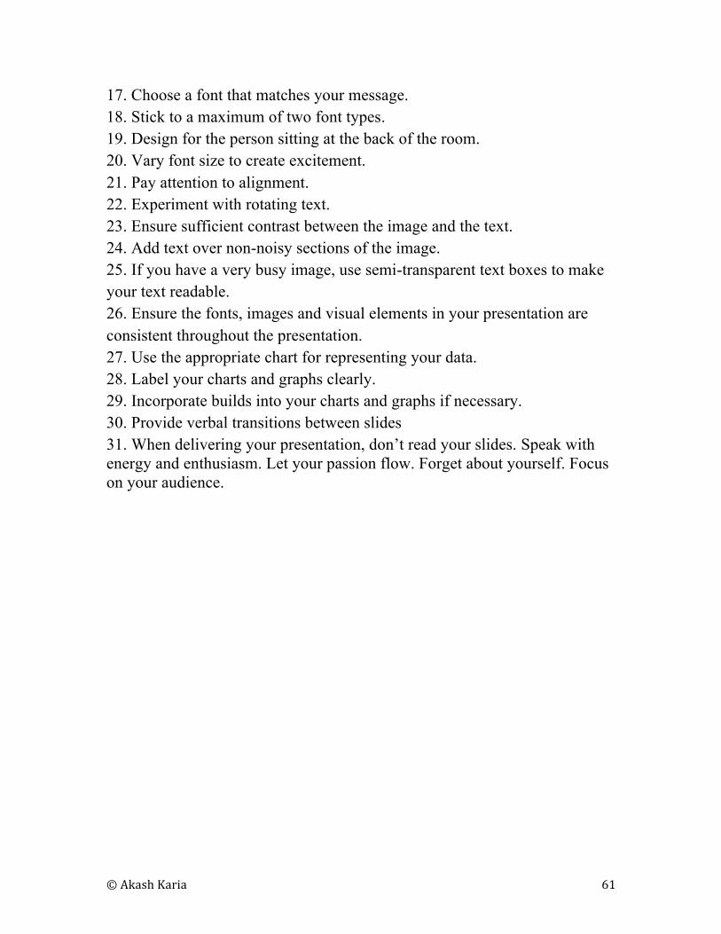
17. Choose a font that matches your message.
18. Stick to a maximum of two font types.
19. Design for the person sitting at the back of the room.
20. Vary font size to create excitement.
21. Pay attention to alignment.
22. Experiment with rotating text.
23. Ensure sufficient contrast between the image and the text.
24. Add text over non-noisy sections of the image.
25. If you have a very busy image, use semi-transparent text boxes to make
your text readable.
26. Ensure the fonts, images and visual elements in your presentation are
consistent throughout the presentation.
27. Use the appropriate chart for representing your data.
28. Label your charts and graphs clearly.
29. Incorporate builds into your charts and graphs if necessary.
30. Provide verbal transitions between slides
31. When delivering your presentation, don’t read your slides. Speak with
energy and enthusiasm. Let your passion flow. Forget about yourself. Focus
on your audience.
© Akash Karia 62
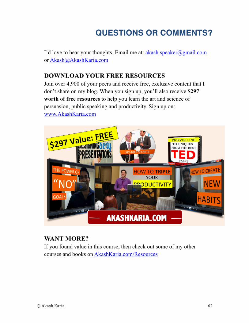
QUESTIONS OR COMMENTS?
I’d love to hear your thoughts. Email me at: [email protected]
DOWNLOAD YOUR FREE RESOURCES
Join over 4,900 of your peers and receive free, exclusive content that I
don’t share on my blog. When you sign up, you’ll also receive $297
worth of free resources to help you learn the art and science of
persuasion, public speaking and productivity. Sign up on:
www.AkashKaria.com
WANT MORE?
If you found value in this course, then check out some of my other
courses and books on AkashKaria.com/Resources
© Akash Karia 63
NEED A KEYNOTE SPEAKER OR A WORKSHOP
LEADER?
I am available to conduct keynotes, workshops and training sessions on
persuasion, public speaking and productivity. Check out the keynotes and
workshops I offer on my website and let’s set a time to discuss how I can be
of help to you.
LOOKING FOR ONE ON ONE COACHING?
I offer one-on-one coaching over Skype. I’ll help you make your upcoming
pitch powerful and persuasive. Reach me at [email protected] or
[email protected] to discuss the possibility of how we might work
together.
Talk soon!
Live well, work hard – and have fun doing both!
Akash Karia
www.AkashKaria.com