Embed Size (px)
Citation preview
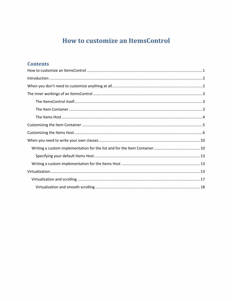
How to customize an ItemsControl
Contents How to customize an ItemsControl .............................................................................................................. 1
Introduction .................................................................................................................................................. 2
When you don’t need to customize anything at all ...................................................................................... 2
The inner workings of an ItemsControl ........................................................................................................ 3
The ItemsControl itself .......................................................................................................................... 3
The Item Container ............................................................................................................................... 3
The Items Host ...................................................................................................................................... 4
Customizing the Item Container ................................................................................................................... 5
Customizing the Items Host .......................................................................................................................... 6
When you need to write your own classes ................................................................................................. 10
Writing a custom implementation for the list and for the Item Container ............................................ 10
Specifying your default Items Host ..................................................................................................... 13
Writing a custom implementation for the Items Host ........................................................................... 13
Virtualization ............................................................................................................................................... 13
Virtualization and scrolling ..................................................................................................................... 17
Virtualization and smooth scrolling .................................................................................................... 18
Introduction
If you are a Silverlight developer there will be a moment when you’ll look at a ListBox and not be happy
with its default behavior. You are not exactly a beginner – you know how to modify the style or the
template for a control and even how to write your own custom controls. Depending on what changes
are needed you’ll consider different solutions. Modifying the style and template of the ListBox comes to
mind but it is not very clear how to achieve some of the customizations even if you are willing to modify
the template of the ListBox. If the changes you need are substantial you may be willing to write a
custom control but in the case of a ListBox this appears to be more difficult than expected. A ListBox is
not just a simple control. It is a container that manages a collection. And it is more than a container in
the sense that a Grid or a Canvas are containers. A ListBox has an ItemsSource that can be bound to a
data source. Writing a custom ListBox is quite different than writing a custom Panel.
You will see that in most cases customizing a list is not that hard. A couple of things are worth
mentioning from start. First, there are plenty of ways you can customize a ListBox without needing to
write a custom control. Second, the main subject of this story is the class ItemsControl and not ListBox.
You may be more familiar with the ListBox but most of the concepts we are going to analyze belong to
the ItemsControl. If you get to write a custom list it is much more likely that you’ll inherit your class from
ItemsControl rather than from ListBox.
The examples discussed in this article are illustrated in a sample Silverlight application you can view at
http://www.ladimolnar.com/Projects/ItemsControlDemo. You can download the code from
http://www.ladimolnar.com/Sources/ItemsControlDemo.zip.
When you don’t need to customize anything at all
We’ll start with a very simple case but one that surprisingly gives headaches to a lot of people. Let’s
suppose you need to show a ListBox that does not have any mouse over or selection effect. Actually
your list does not even have the concept of “selected”. It seems that the otherwise useful features of
the regular ListBox are just getting in your way.
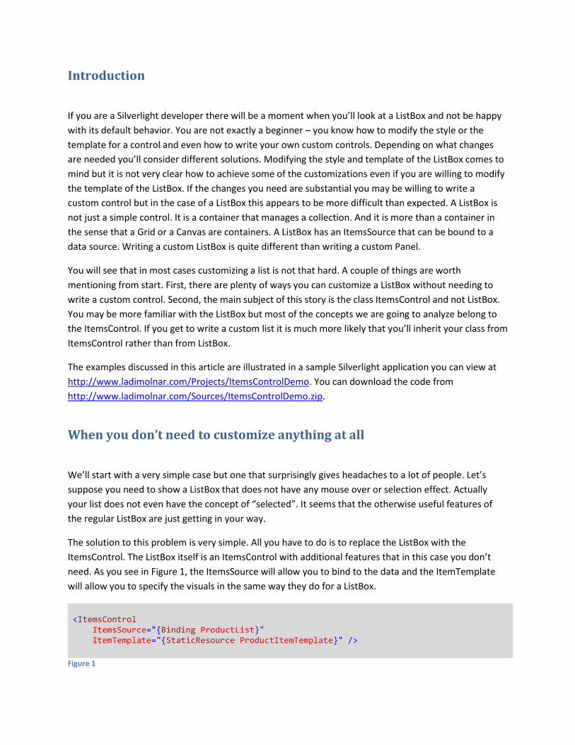
The solution to this problem is very simple. All you have to do is to replace the ListBox with the
ItemsControl. The ListBox itself is an ItemsControl with additional features that in this case you don’t
need. As you see in Figure 1, the ItemsSource will allow you to bind to the data and the ItemTemplate
will allow you to specify the visuals in the same way they do for a ListBox.
<ItemsControl ItemsSource="{Binding ProductList}" ItemTemplate="{StaticResource ProductItemTemplate}" />
Figure 1
The inner workings of an ItemsControl
Before we go any further, it will be useful to talk a little bit about how the ItemsControl class works.
When things will be simpler to illustrate with a ListBox I will refer to it as well but all the fundamental
concepts discussed here apply to both. Remember that ListBox inherits from ItemsControl.
The ItemsControl does not do a lot of the things you see happening on the screen. The credit belongs to
other classes that are collaborating with the ItemsControl but do their own thing. This is the result of a
good design where the responsibility for distinct operations was assigned to different classes. As you will
see it creates a foundation that allows for a lot of flexibility. Most of the time you can ignore the
multitude of components involved because the ListBox has its default set of collaborating classes. You
don’t have to specify anything in the XAML code, those other classes will be instantiated and play their
role automatically. Here are the players:
The ItemsControl itself
Its job is to manage a collection of objects. It does not decide where those objects will be placed on the
screen and has only indirect influence over their visual aspect. The ListBox extends the ItemsControl but
remains in the same area of responsibility which is to manage a collection of items. For example a
ListBox tracks which element is currently selected.
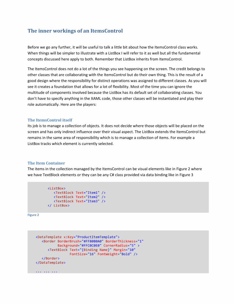
The Item Container
The items in the collection managed by the ItemsControl can be visual elements like in Figure 2 where
we have TextBlock elements or they can be any C# class provided via data binding like in Figure 3
<ListBox> <TextBlock Text="Item1" /> <TextBlock Text="Item2" /> <TextBlock Text="Item3" /> </ ListBox>
Figure 2
<DataTemplate x:Key="ProductItemTemplate"> <Border BorderBrush="#FF8080A0" BorderThickness="1" Background="#FFC0C0E0" CornerRadius="5" > <TextBlock Text="{Binding Name}" Margin="10" FontSize="16" FontWeight="Bold" /> </Border> </DataTemplate> ... ... ...
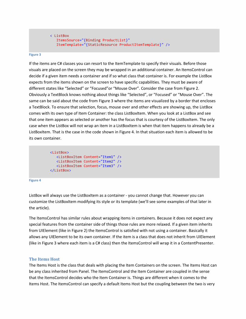
< ListBox ItemsSource="{Binding ProductList}" ItemTemplate="{StaticResource ProductItemTemplate}" />
Figure 3
If the items are C# classes you can resort to the ItemTemplate to specify their visuals. Before those
visuals are placed on the screen they may be wrapped in an additional container. An ItemsControl can
decide if a given item needs a container and if so what class that container is. For example the ListBox
expects from the items shown on the screen to have specific capabilities. They must be aware of
different states like “Selected” or “Focused”or “Mouse Over”. Consider the case from Figure 2.
Obviously a TextBlock knows nothing about things like “Selected”, or “Focused” or “Mouse Over”. The
same can be said about the code from Figure 3 where the items are visualized by a border that encloses
a TextBlock. To ensure that selection, focus, mouse over and other effects are showing up, the ListBox
comes with its own type of Item Container: the class ListBoxItem. When you look at a ListBox and see
that one item appears as selected or another has the focus that is courtesy of the ListBoxItem. The only
case when the ListBox will not wrap an item in a ListBoxItem is when that item happens to already be a
ListBoxItem. That is the case in the code shown in Figure 4. In that situation each item is allowed to be
its own container.
<ListBox> <ListBoxItem Content="Item1" /> <ListBoxItem Content="Item2" /> <ListBoxItem Content="Item3" /> </ListBox>
Figure 4
ListBox will always use the ListBoxItem as a container - you cannot change that. However you can
customize the ListBoxItem modifying its style or its template (we’ll see some examples of that later in
the article).
The ItemsControl has similar rules about wrapping items in containers. Because it does not expect any
special features from the container side of things those rules are more relaxed. If a given item inherits
from UIElement (like in Figure 2) the ItemsControl is satisfied with not using a container. Basically it
allows any UIElement to be its own container. If the item is a class that does not inherit from UIElement
(like in Figure 3 where each item is a C# class) then the ItemsControl will wrap it in a ContentPresenter.
The Items Host
The Items Host is the class that deals with placing the Item Containers on the screen. The Items Host can
be any class inherited from Panel. The ItemsControl and the Item Container are coupled in the sense
that the ItemsControl decides who the Item Container is. Things are different when it comes to the
Items Host. The ItemsControl can specify a default Items Host but the coupling between the two is very
loose. So much so that you can replace the Items Host with a control of your choosing as long as that
control inherits from Panel. For example the ListBox has a VirtualizingStackPanel as its default Items
Host but you can replace that with a StackPanel, a Canvas, a WrapPanel or a completely custom Panel
class that you wrote from scratch. You will see some very simple examples of this later in the article.
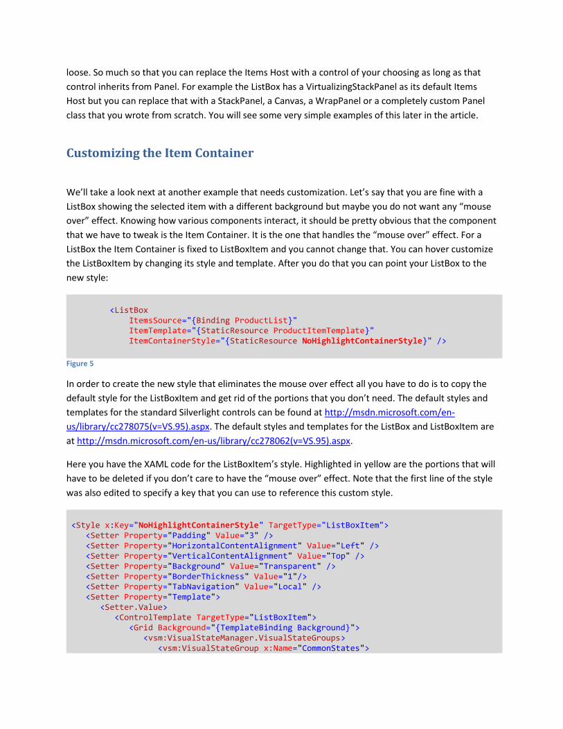
Customizing the Item Container
We’ll take a look next at another example that needs customization. Let’s say that you are fine with a
ListBox showing the selected item with a different background but maybe you do not want any “mouse
over” effect. Knowing how various components interact, it should be pretty obvious that the component
that we have to tweak is the Item Container. It is the one that handles the “mouse over” effect. For a
ListBox the Item Container is fixed to ListBoxItem and you cannot change that. You can hover customize
the ListBoxItem by changing its style and template. After you do that you can point your ListBox to the
new style:
<ListBox ItemsSource="{Binding ProductList}" ItemTemplate="{StaticResource ProductItemTemplate}" ItemContainerStyle="{StaticResource NoHighlightContainerStyle}" />
Figure 5
In order to create the new style that eliminates the mouse over effect all you have to do is to copy the
default style for the ListBoxItem and get rid of the portions that you don’t need. The default styles and
templates for the standard Silverlight controls can be found at http://msdn.microsoft.com/en-
us/library/cc278075(v=VS.95).aspx. The default styles and templates for the ListBox and ListBoxItem are
at http://msdn.microsoft.com/en-us/library/cc278062(v=VS.95).aspx.
Here you have the XAML code for the ListBoxItem’s style. Highlighted in yellow are the portions that will
have to be deleted if you don’t care to have the “mouse over” effect. Note that the first line of the style
was also edited to specify a key that you can use to reference this custom style.
<Style x:Key="NoHighlightContainerStyle" TargetType="ListBoxItem"> <Setter Property="Padding" Value="3" /> <Setter Property="HorizontalContentAlignment" Value="Left" /> <Setter Property="VerticalContentAlignment" Value="Top" /> <Setter Property="Background" Value="Transparent" /> <Setter Property="BorderThickness" Value="1"/> <Setter Property="TabNavigation" Value="Local" /> <Setter Property="Template"> <Setter.Value> <ControlTemplate TargetType="ListBoxItem"> <Grid Background="{TemplateBinding Background}"> <vsm:VisualStateManager.VisualStateGroups> <vsm:VisualStateGroup x:Name="CommonStates">
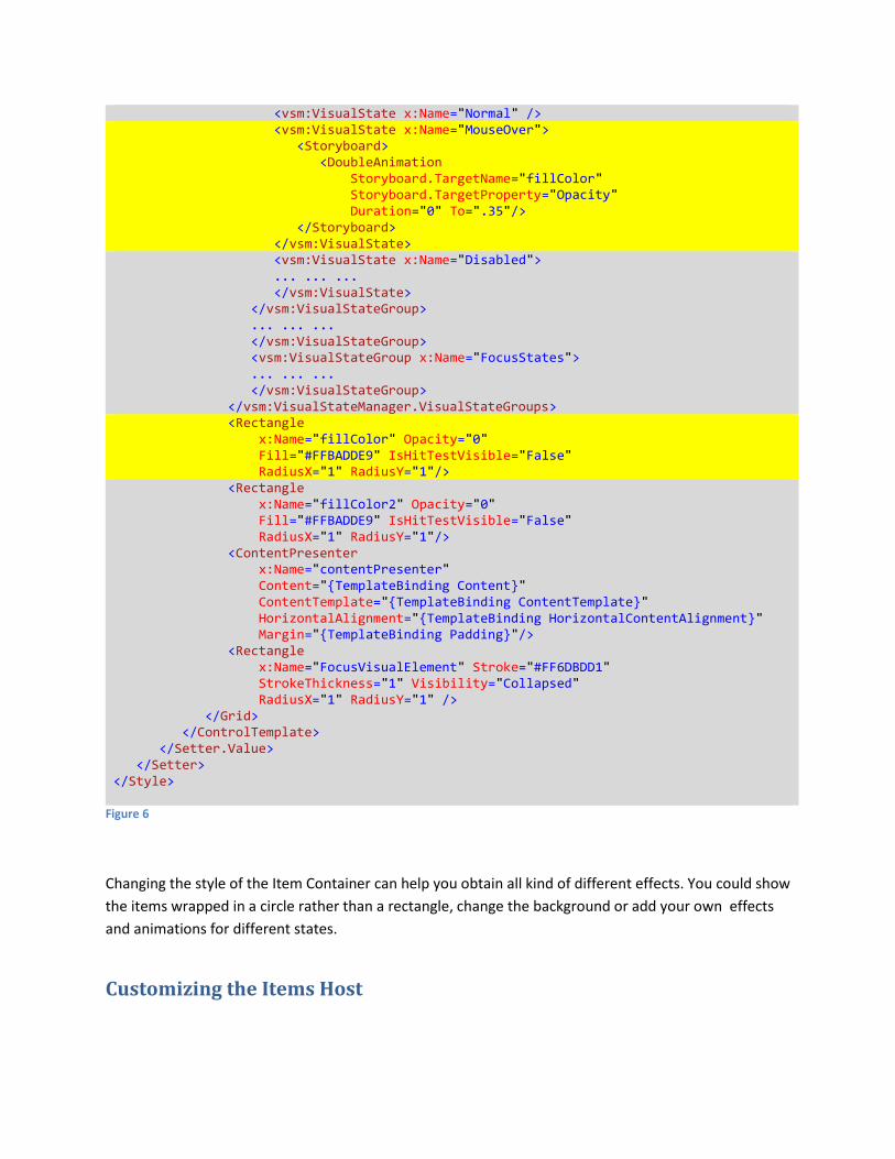
<vsm:VisualState x:Name="Normal" /> <vsm:VisualState x:Name="MouseOver"> <Storyboard> <DoubleAnimation Storyboard.TargetName="fillColor" Storyboard.TargetProperty="Opacity" Duration="0" To=".35"/> </Storyboard> </vsm:VisualState> <vsm:VisualState x:Name="Disabled"> ... ... ... </vsm:VisualState> </vsm:VisualStateGroup> ... ... ... </vsm:VisualStateGroup> <vsm:VisualStateGroup x:Name="FocusStates"> ... ... ... </vsm:VisualStateGroup> </vsm:VisualStateManager.VisualStateGroups> <Rectangle x:Name="fillColor" Opacity="0" Fill="#FFBADDE9" IsHitTestVisible="False" RadiusX="1" RadiusY="1"/> <Rectangle x:Name="fillColor2" Opacity="0" Fill="#FFBADDE9" IsHitTestVisible="False" RadiusX="1" RadiusY="1"/> <ContentPresenter x:Name="contentPresenter" Content="{TemplateBinding Content}" ContentTemplate="{TemplateBinding ContentTemplate}" HorizontalAlignment="{TemplateBinding HorizontalContentAlignment}" Margin="{TemplateBinding Padding}"/> <Rectangle x:Name="FocusVisualElement" Stroke="#FF6DBDD1" StrokeThickness="1" Visibility="Collapsed" RadiusX="1" RadiusY="1" /> </Grid> </ControlTemplate> </Setter.Value> </Setter> </Style>
Figure 6
Changing the style of the Item Container can help you obtain all kind of different effects. You could show
the items wrapped in a circle rather than a rectangle, change the background or add your own effects
and animations for different states.
Customizing the Items Host
Maybe a bunch of items stacked one on top of another is just fine for most of the list boxes. However
sometime this is not enough. The decision of how the items (actually the Item Containers) are to be
placed on the screen falls squarely with the Items Host. In case of a ListBox the default Items Host is a
VirtualizingStackPanel. If you don’t know yet about virtualization don’t let that intimidate you. Just
assume that we are talking about a regular StackPanel because for the purposes of this section it does
not make any difference. We’ll get to virtualization later (it is quite an important topic). Having a stack
panel for the Items Host means that you can configure it as you can do with any other stack panel. Even
better, the Items Host does not have to be a stack panel at all. It can be any Panel. Whatever Panel you
use for the Items Host it will simply wrap the Item Containers and all the layout rules for that Panel will
apply. Let’s look at a few variations of this case.
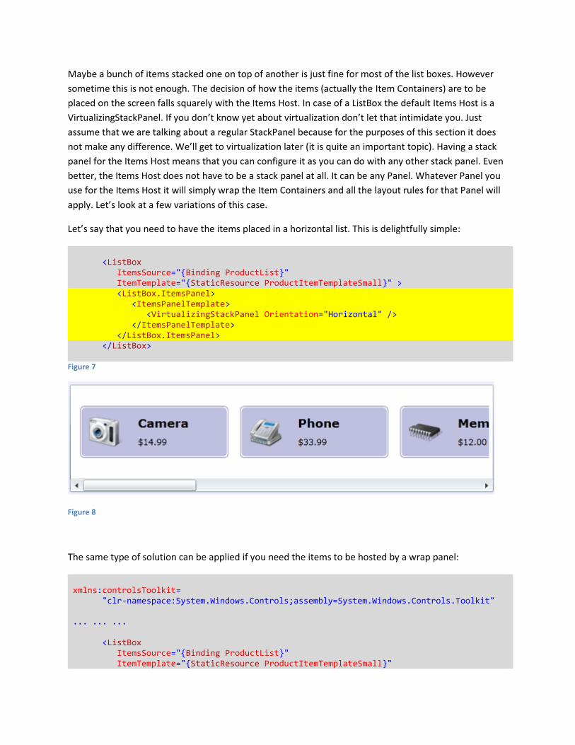
Let’s say that you need to have the items placed in a horizontal list. This is delightfully simple:
<ListBox ItemsSource="{Binding ProductList}" ItemTemplate="{StaticResource ProductItemTemplateSmall}" > <ListBox.ItemsPanel> <ItemsPanelTemplate> <VirtualizingStackPanel Orientation="Horizontal" /> </ItemsPanelTemplate> </ListBox.ItemsPanel> </ListBox>
Figure 7
Figure 8
The same type of solution can be applied if you need the items to be hosted by a wrap panel:
xmlns:controlsToolkit= "clr-namespace:System.Windows.Controls;assembly=System.Windows.Controls.Toolkit" ... ... ... <ListBox ItemsSource="{Binding ProductList}" ItemTemplate="{StaticResource ProductItemTemplateSmall}"
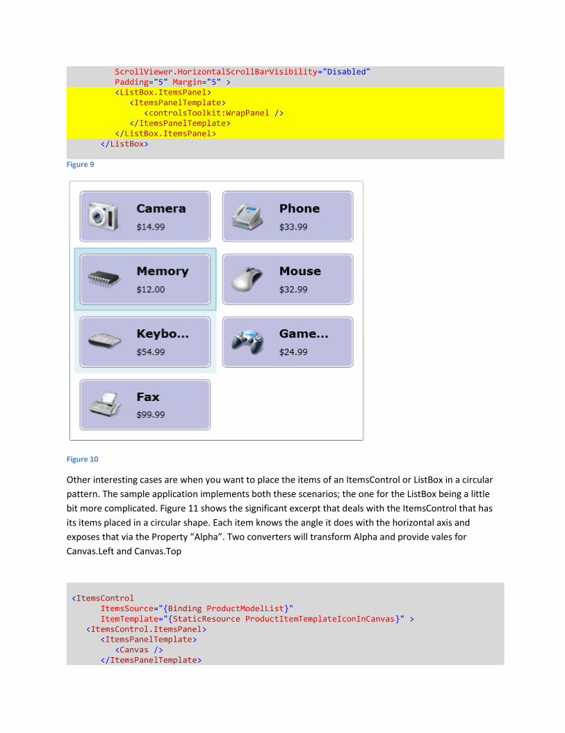
ScrollViewer.HorizontalScrollBarVisibility="Disabled" Padding="5" Margin="5" > <ListBox.ItemsPanel> <ItemsPanelTemplate> <controlsToolkit:WrapPanel /> </ItemsPanelTemplate> </ListBox.ItemsPanel> </ListBox>
Figure 9
Figure 10
Other interesting cases are when you want to place the items of an ItemsControl or ListBox in a circular
pattern. The sample application implements both these scenarios; the one for the ListBox being a little
bit more complicated. Figure 11 shows the significant excerpt that deals with the ItemsControl that has
its items placed in a circular shape. Each item knows the angle it does with the horizontal axis and
exposes that via the Property “Alpha”. Two converters will transform Alpha and provide vales for
Canvas.Left and Canvas.Top
<ItemsControl ItemsSource="{Binding ProductModelList}" ItemTemplate="{StaticResource ProductItemTemplateIconInCanvas}" > <ItemsControl.ItemsPanel> <ItemsPanelTemplate> <Canvas /> </ItemsPanelTemplate>
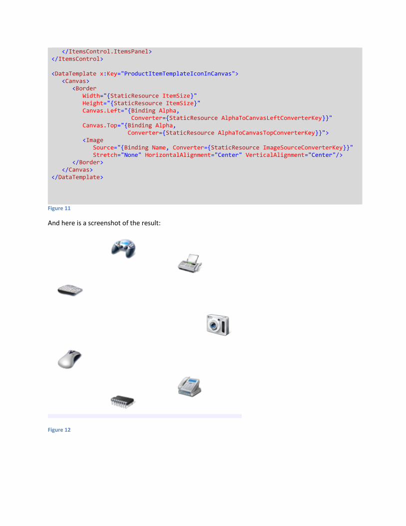
</ItemsControl.ItemsPanel> </ItemsControl> <DataTemplate x:Key="ProductItemTemplateIconInCanvas"> <Canvas> <Border Width="{StaticResource ItemSize}" Height="{StaticResource ItemSize}" Canvas.Left="{Binding Alpha, Converter={StaticResource AlphaToCanvasLeftConverterKey}}" Canvas.Top="{Binding Alpha, Converter={StaticResource AlphaToCanvasTopConverterKey}}"> <Image Source="{Binding Name, Converter={StaticResource ImageSourceConverterKey}}" Stretch="None" HorizontalAlignment="Center" VerticalAlignment="Center"/> </Border> </Canvas> </DataTemplate>
Figure 11
And here is a screenshot of the result:
Figure 12
When you need to write your own classes
If you read so far you saw that in a lot of cases you can go along with the ItemsControl or ListBox and
customize them by restyling the Item Container or by swapping the Items Host. This section goes a little
bit further and discusses what to do when you have to write your own custom classes. There are two
main scenarios here:
1. You write a custom implementation for the list and for the Item Container.
2. You write a custom implementation for the Items Host.
Let’s look at each of these scenarios.
Writing a custom implementation for the list and for the Item Container
First of all let’s point out a couple of typical situations when the standard ItemsControl or ListBox are not
enough:
- The Item Container needs to have some custom features. Remember that the ItemsControl (or
ListBox) will impose a certain container. For example the ListBox will always use a ListBoxItem as
a container. If you need a custom container you’ll also need to create your own class inherited
from ItemsControl and take control over the process of instantiating the right type of Item
Container.
- The concept of a simple sequential list is not enough. The tree view is such a case. You can see
an implementation of a tree view in the Silverlight Toolkit.
If you write your own class inherited from ItemsControl you will probably want to overwrite certain
virtual methods:
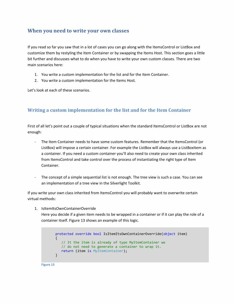
1. IsItemItsOwnContainerOverride
Here you decide if a given item needs to be wrapped in a container or if it can play the role of a
container itself. Figure 13 shows an example of this logic.
protected override bool IsItemItsOwnContainerOverride(object item) { // It the item is already of type MyItemContainer we // do not need to generate a container to wrap it. return (item is MyItemContainer); }
Figure 13
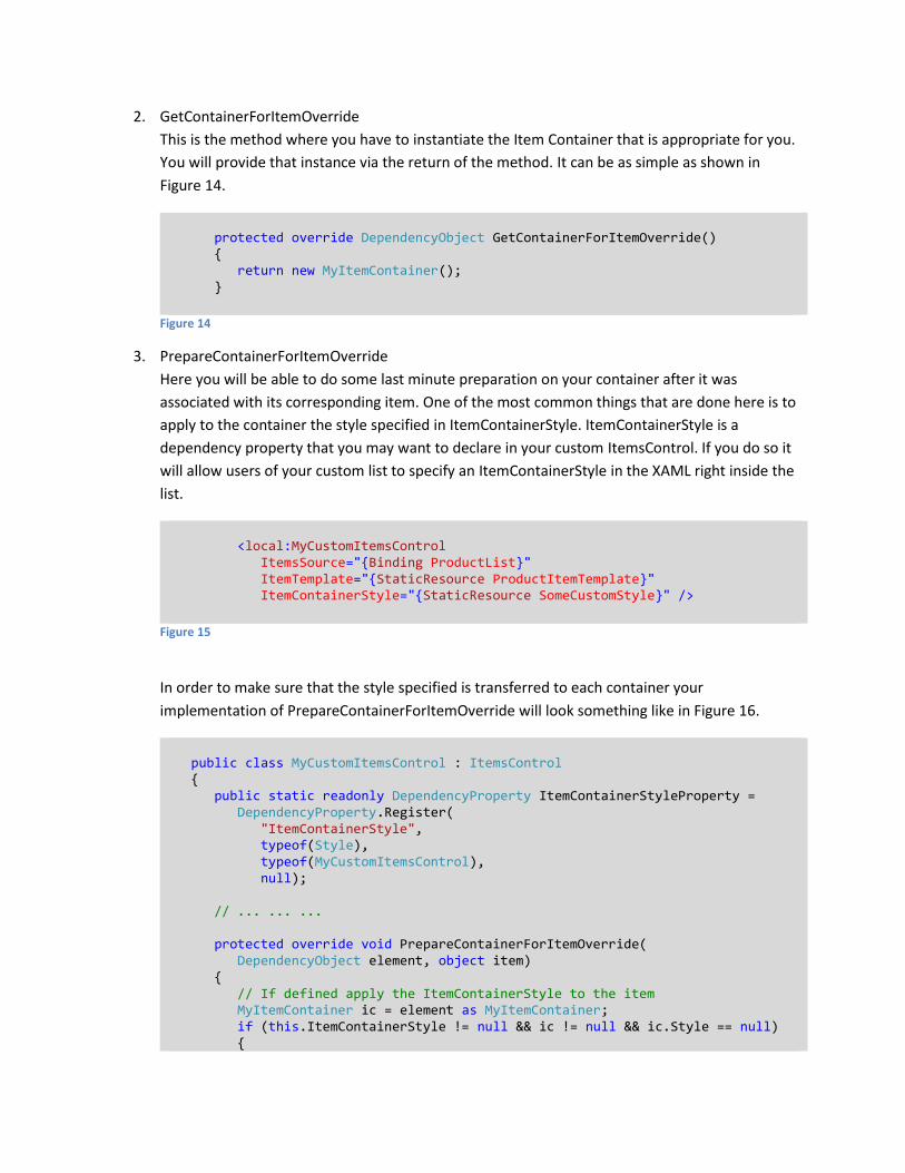
2. GetContainerForItemOverride
This is the method where you have to instantiate the Item Container that is appropriate for you.
You will provide that instance via the return of the method. It can be as simple as shown in
Figure 14.
protected override DependencyObject GetContainerForItemOverride() { return new MyItemContainer(); }
Figure 14
3. PrepareContainerForItemOverride
Here you will be able to do some last minute preparation on your container after it was
associated with its corresponding item. One of the most common things that are done here is to
apply to the container the style specified in ItemContainerStyle. ItemContainerStyle is a
dependency property that you may want to declare in your custom ItemsControl. If you do so it
will allow users of your custom list to specify an ItemContainerStyle in the XAML right inside the
list.
<local:MyCustomItemsControl ItemsSource="{Binding ProductList}" ItemTemplate="{StaticResource ProductItemTemplate}" ItemContainerStyle="{StaticResource SomeCustomStyle}" />
Figure 15
In order to make sure that the style specified is transferred to each container your
implementation of PrepareContainerForItemOverride will look something like in Figure 16.
public class MyCustomItemsControl : ItemsControl { public static readonly DependencyProperty ItemContainerStyleProperty = DependencyProperty.Register( "ItemContainerStyle", typeof(Style), typeof(MyCustomItemsControl), null); // ... ... ... protected override void PrepareContainerForItemOverride( DependencyObject element, object item) { // If defined apply the ItemContainerStyle to the item MyItemContainer ic = element as MyItemContainer; if (this.ItemContainerStyle != null && ic != null && ic.Style == null) {
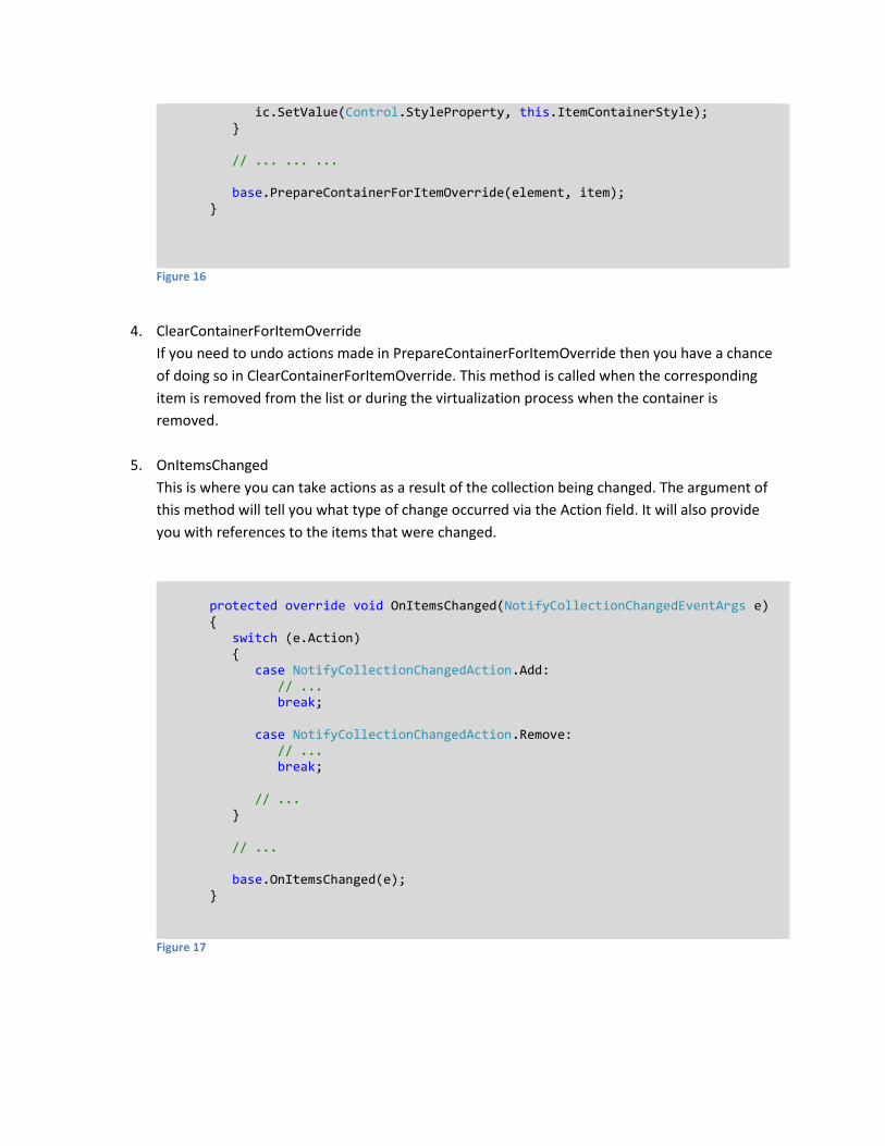
ic.SetValue(Control.StyleProperty, this.ItemContainerStyle); } // ... ... ... base.PrepareContainerForItemOverride(element, item); }
Figure 16
4. ClearContainerForItemOverride
If you need to undo actions made in PrepareContainerForItemOverride then you have a chance
of doing so in ClearContainerForItemOverride. This method is called when the corresponding
item is removed from the list or during the virtualization process when the container is
removed.
5. OnItemsChanged
This is where you can take actions as a result of the collection being changed. The argument of
this method will tell you what type of change occurred via the Action field. It will also provide
you with references to the items that were changed.
protected override void OnItemsChanged(NotifyCollectionChangedEventArgs e) { switch (e.Action) { case NotifyCollectionChangedAction.Add: // ... break; case NotifyCollectionChangedAction.Remove: // ... break; // ... } // ... base.OnItemsChanged(e); }
Figure 17
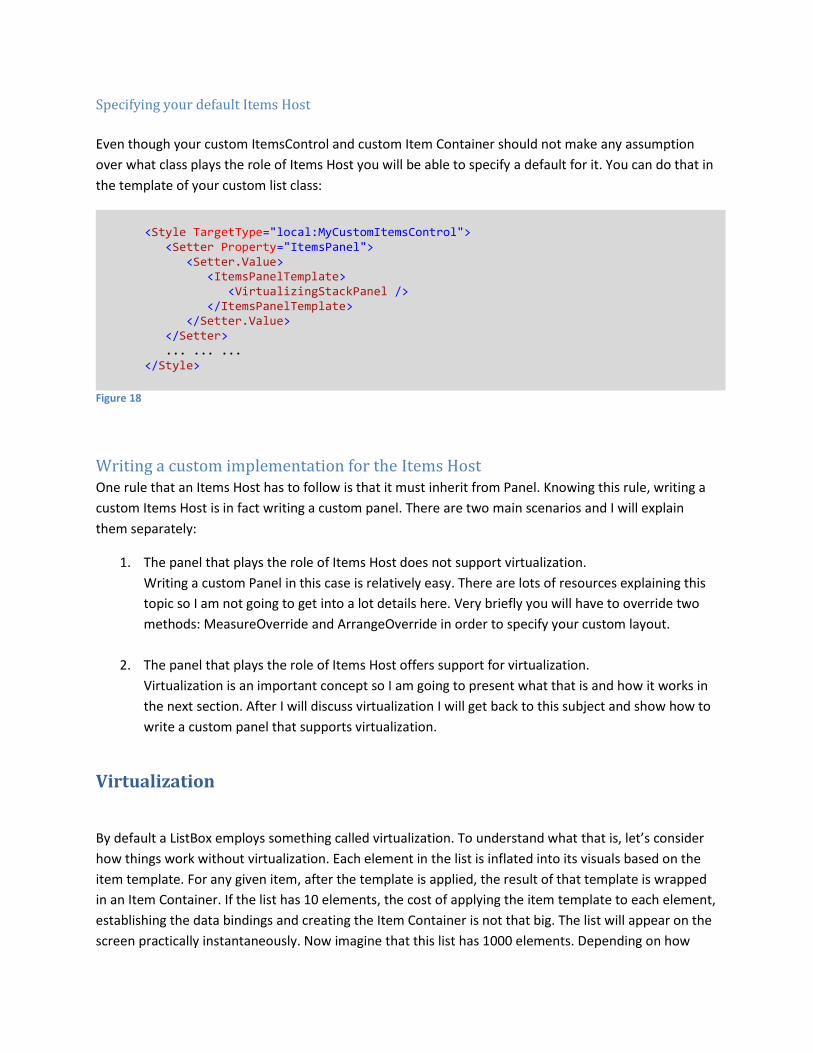
Specifying your default Items Host
Even though your custom ItemsControl and custom Item Container should not make any assumption
over what class plays the role of Items Host you will be able to specify a default for it. You can do that in
the template of your custom list class:
<Style TargetType="local:MyCustomItemsControl"> <Setter Property="ItemsPanel"> <Setter.Value> <ItemsPanelTemplate> <VirtualizingStackPanel /> </ItemsPanelTemplate> </Setter.Value> </Setter> ... ... ... </Style>
Figure 18
Writing a custom implementation for the Items Host One rule that an Items Host has to follow is that it must inherit from Panel. Knowing this rule, writing a
custom Items Host is in fact writing a custom panel. There are two main scenarios and I will explain
them separately:
1. The panel that plays the role of Items Host does not support virtualization.
Writing a custom Panel in this case is relatively easy. There are lots of resources explaining this
topic so I am not going to get into a lot details here. Very briefly you will have to override two
methods: MeasureOverride and ArrangeOverride in order to specify your custom layout.
2. The panel that plays the role of Items Host offers support for virtualization.
Virtualization is an important concept so I am going to present what that is and how it works in
the next section. After I will discuss virtualization I will get back to this subject and show how to
write a custom panel that supports virtualization.
Virtualization
By default a ListBox employs something called virtualization. To understand what that is, let’s consider
how things work without virtualization. Each element in the list is inflated into its visuals based on the
item template. For any given item, after the template is applied, the result of that template is wrapped
in an Item Container. If the list has 10 elements, the cost of applying the item template to each element,
establishing the data bindings and creating the Item Container is not that big. The list will appear on the
screen practically instantaneously. Now imagine that this list has 1000 elements. Depending on how
complex each item is the list may take quite a long time to appear. If you don’t think this is a realistic
concern then you are wrong. If the individual items have a really complex visualization even a list with
only 100 elements can be slow to appear. The solution to mitigate these performance issues is given by
virtualization. Virtualization means that only the items that are visible will go through the process of
applying the item template, establishing the data bindings and creating the Item Container. When
virtualization is supported, most of the code related to it is implemented by the Items Host. This makes
sense because it is the Items Host who knows which items are visible and which are not. The
ItemsControl also plays a small role: it slightly changes its internal behavior to support virtualization
when it sees that the Items Host inherits from VirtualizingPanel. In case of a ListBox the default Items
Host is a class called VirtualizingStackPanel.
An ItemsControl or a ListBox can cope very well with both type of panels – those who use virtualization
and those who don’t. This is why you can always replace the default VirtualizingStackPanel with a
StackPanel or with any other panel and the ListBox will work just fine.
The case when the Items Host does not support virtualization
As soon as a new item is inserted in the collection, the ItemsControl will trigger a process that results in
an Item Container being generated. After the container is generated, the ItemsControl will add it to the
Children collection of the Items Host. Such a host will always have the visual elements corresponding to
all items in its Children collection regardless of those elements being visible or not.
As soon as an existing item is removed from the collection the ItemsControl will remove the
corresponding visual element from the Children collection of the Items Host.
This makes things quite simple. If you have to write your own custom Panel class you will have to deal
with a lot less details if you don’t have to support virtualization. To control the layout of the children you
have to override MeasureOverride and ArrangeOverride. When implementing those methods you can
rely on the fact that all the children of your panel are prepared and ready to be used.
The case when the Items Host supports virtualization
When a new item is inserted in the collection, the ItemsControl will not initiate the item container
generation. No container being generated results in no visual element being added to the Children
collection of the Items Host. The responsibility of generating the Item Containers and adding them to
the Children collection now belongs to the Items Host itself. That happens because the Items Host is the
one who decides the layout of the elements on the screen hence it is the one who knows which items
are visible and which are not.
Until now we discussed about three major components relevant to our subject. They were the
ItemsControl, the Item Container and the Items Host. It is time to introduce the fourth: the item
container generator. It is a part of the ItemsControl but it has distinct responsibilities and plays its own
well defined role. The main feature of the generator is that it can handle the process of generating an
Item Container. It also has several other useful features related to container management. For example
it can return the container given the item, it can return the container given the item’s index, it can
return the item given the container and so on.
When virtualization is implemented, the Items Host has to take decisions regarding when a container
needs to be generated, when the container is no longer needed, when the generated containers have to
be added or removed from its Children collection. If you ever wrote a custom Panel (maybe one that
does not implement virtualization) you know that the MeasureOverride method is one of the methods
you need to override in order to specify the layout of the Panel’s children. Typically that is also the place
where you implement actions related to virtualization. The reason is that MeasureOverride is the place
where you know if a child is visible or not. Let’s go in some more detail on what happens in the
MeasureOverride of a virtualizing panel.
Inside MeasureOverride , after the you determine that an item is visible, you will get a reference to the
item container generator and ask it to generate the container for that given item. The container
generator will do so and return the container and a flag indicating if the container was newly generated
or if it was already available. If the container was newly generated, the Items Host will have to add it to
its own Children collection.
This is not all that the Items Host has to do. What was described above will make sure that containers
are not generated until they are needed. However, we have to take care of the process of dismantling
containers when they become invisible. The Items Host will have to keep one eye on which of its existing
children become invisible. This is what happens when you drag a scroll bar and elements slide out of the
viewport. Those children must be removed from the Children collection of the Items Host. The
generator also has to be informed to remove the corresponding container from the list it manages.
Another case that must be handled by the Items Host is when an item disappears from the collection
managed by the ItemsControl. An example of that is when the user selects a visible item in a list and
deletes it. User code will handle that by deleting the item from the collection that is data bound to the
ListBox. When that occurs, the item container generator which is subscribed to the CollectionChanged
event knows to remove the corresponding container (if one was generated) from the list it manages.
However the container is still referenced by the Children collection of the Items Host. The Items Host
must detect this situation and remove such “abandoned” child from its Children collection.
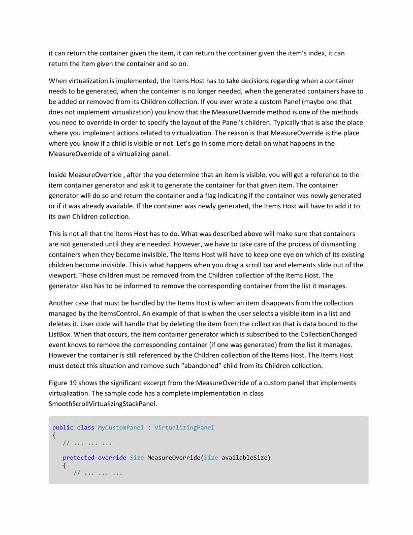
Figure 19 shows the significant excerpt from the MeasureOverride of a custom panel that implements
virtualization. The sample code has a complete implementation in class
SmoothScrollVirtualizingStackPanel.
public class MyCustomPanel : VirtualizingPanel { // ... ... ... protected override Size MeasureOverride(Size availableSize) { // ... ... ...
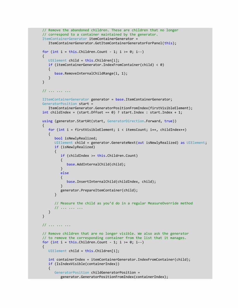
// Remove the abandoned children. These are children that no longer // correspond to a container maintained by the generator. ItemContainerGenerator itemContainerGenerator = ItemContainerGenerator.GetItemContainerGeneratorForPanel(this); for (int i = this.Children.Count - 1; i >= 0; i--) { UIElement child = this.Children[i]; if (itemContainerGenerator.IndexFromContainer(child) < 0) { base.RemoveInternalChildRange(i, 1); } } // ... ... ... IItemContainerGenerator generator = base.ItemContainerGenerator; GeneratorPosition start = ItemContainerGenerator.GeneratorPositionFromIndex(firstVisibleElement); int childIndex = (start.Offset == 0) ? start.Index : start.Index + 1; using (generator.StartAt(start, GeneratorDirection.Forward, true)) { for (int i = firstVisibleElement; i < itemsCount; i++, childIndex++) { bool isNewlyRealized; UIElement child = generator.GenerateNext(out isNewlyRealized) as UIElement; if (isNewlyRealized) { if (childIndex >= this.Children.Count) { base.AddInternalChild(child); } else { base.InsertInternalChild(childIndex, child); } generator.PrepareItemContainer(child); } // Measure the child as you’d do in a regular MeasureOverride method // ... ... ... } } // ... ... ... // Remove children that are no longer visible. We also ask the generator // to remove the corresponding container from the list that it manages. for (int i = this.Children.Count - 1; i >= 0; i--) { UIElement child = this.Children[i]; int containerIndex = itemContainerGenerator.IndexFromContainer(child); if (IsIndexVisible(containerIndex)) { GeneratorPosition childGeneratorPosition = generator.GeneratorPositionFromIndex(containerIndex);
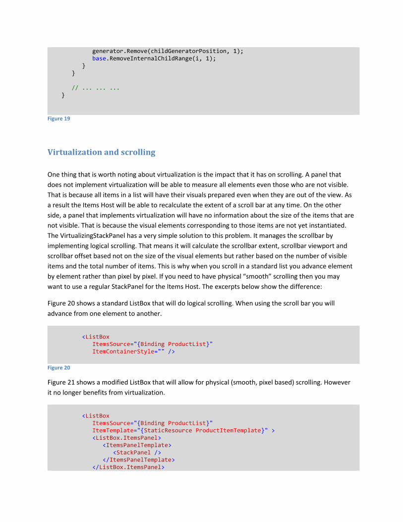
generator.Remove(childGeneratorPosition, 1); base.RemoveInternalChildRange(i, 1); } } // ... ... ... }
Figure 19
Virtualization and scrolling
One thing that is worth noting about virtualization is the impact that it has on scrolling. A panel that
does not implement virtualization will be able to measure all elements even those who are not visible.
That is because all items in a list will have their visuals prepared even when they are out of the view. As
a result the Items Host will be able to recalculate the extent of a scroll bar at any time. On the other
side, a panel that implements virtualization will have no information about the size of the items that are
not visible. That is because the visual elements corresponding to those items are not yet instantiated.
The VirtualizingStackPanel has a very simple solution to this problem. It manages the scrollbar by
implementing logical scrolling. That means it will calculate the scrollbar extent, scrollbar viewport and
scrollbar offset based not on the size of the visual elements but rather based on the number of visible
items and the total number of items. This is why when you scroll in a standard list you advance element
by element rather than pixel by pixel. If you need to have physical “smooth” scrolling then you may
want to use a regular StackPanel for the Items Host. The excerpts below show the difference:
Figure 20 shows a standard ListBox that will do logical scrolling. When using the scroll bar you will
advance from one element to another.
<ListBox ItemsSource="{Binding ProductList}" ItemContainerStyle="" />
Figure 20
Figure 21 shows a modified ListBox that will allow for physical (smooth, pixel based) scrolling. However
it no longer benefits from virtualization.
<ListBox ItemsSource="{Binding ProductList}" ItemTemplate="{StaticResource ProductItemTemplate}" > <ListBox.ItemsPanel> <ItemsPanelTemplate> <StackPanel /> </ItemsPanelTemplate> </ListBox.ItemsPanel>
</ListBox>
Figure 21
Virtualization and smooth scrolling
Just because the VirtualizingStackPanel does not do smooth scrolling does not mean it cannot be done.
If you want to implement something like that you have however to be able to calculate the extent and
the viewport of the scroll bar without being able to measure the elements that are not visible. One
situation when you can do that is when you know that “most of the time” the visual elements in your list
will have the same size. If that is a fair supposition, you can measure the visible elements and make
assumptions about the rest. If the items do not have the same size you may try to manage the scroll bar
information on the fly, making the best guess about the invisible elements and adapting continuously
while elements become visible or disappear. It is an open question if you can achieve good levels of
usability for the scrollbar when implementing such approach.
The sample that I am providing has a class called SmoothScrollVirtualizingStackPanel and it implements
both virtualization and smooth scrolling. It allows the user to set the size of the visual elements (that
includes the size of the container) via dedicated dependency properties. If the user does not do that,
SmoothScrollVirtualizingStackPanel will measure the first visible element and assume that all the
elements have the same size.


![[MS-SLXV-2010]: Silverlight XAML Vocabulary …download.microsoft.com/download/0/a/6/0a6f7755-9af5-448b-907d... · [MS-XAML] specification enables each application that uses Xaml](https://img.pdfslide.us/doc/110x75/5b43d8907f8b9af5798c4386/ms-slxv-2010-silverlight-xaml-vocabulary-ms-xaml-specification-enables.jpg)


![[MS-XAML]: XAML Object Mapping Specification 2006](https://img.pdfslide.us/doc/110x75/577d39661a28ab3a6b99a7b4/ms-xaml-xaml-object-mapping-specification-2006.jpg)