Embed Size (px)
Citation preview

NBER WORKING PAPER SERIES
HOW HAPPY ARE YOUR NEIGHBOURS? VARIATION IN LIFE SATISFACTION AMONG 1200 CANADIAN NEIGHBOURHOODS AND COMMUNITIES
John F. HelliwellHugh Shiplett
Christopher P. Barrington-Leigh
Working Paper 24592http://www.nber.org/papers/w24592
NATIONAL BUREAU OF ECONOMIC RESEARCH 1050 Massachusetts Avenue
Cambridge, MA 02138May 2018
The authors are grateful to Statistics Canada for access to data and especially to Grant Schellenberg and to Chaohui Lu for the preparation of the special tabulations used in this paper. The authors are also grateful to Jeffrey Hicks, Philip Morrison, and Giovanni Perucca for helpful suggestions, as well as participants at the 57th European Regional Science Association Congress. We are also grateful for the support of the Canadian Institute for Advanced Research and the Social Sciences and Humanities Research Council. The views expressed herein are those of the authors and do not necessarily reflect the views of the National Bureau of Economic Research.
NBER working papers are circulated for discussion and comment purposes. They have not been peer-reviewed or been subject to the review by the NBER Board of Directors that accompanies official NBER publications.
© 2018 by John F. Helliwell, Hugh Shiplett, and Christopher P. Barrington-Leigh. All rights reserved. Short sections of text, not to exceed two paragraphs, may be quoted without explicit permission provided that full credit, including © notice, is given to the source.

How Happy are Your Neighbours? Variation in Life Satisfaction among 1200 Canadian Neighbourhoodsand CommunitiesJohn F. Helliwell, Hugh Shiplett, and Christopher P. Barrington-LeighNBER Working Paper No. 24592May 2018JEL No. C81,I31,R12
ABSTRACT
This paper presents a new public-use dataset for community-level life satisfaction in Canada, based on more than 400,000 observations from the Canadian Community Health Surveys and the General Social Surveys. The country is divided into 1215 similarly sampled geographic regions, using natural, built, and administrative boundaries. A cross-validation exercise suggests that our choice of minimum sampling thresholds approximately maximizes the predictive power of our estimates. Our procedure reveals robust differences in life satisfaction between and across urban and rural communities. We then match the life satisfaction data with a range of key census variables to explore ways in which lives differ in the most and least happy communities. The data presented here are useful on their own to study community-level variation, and can also be used to provide contextual variables for multi-level modelling with individual life satisfaction data set in a community context.
John F. HelliwellVancouver School of EconomicsUniversity of British Columbia6000 Iona DriveVancouver, BC V6T 1L4CANADAand [email protected]
Hugh ShiplettVancouver School of EconomicsUniversity of British Columbia6000 Iona DriveVancouver, BC V6T 1L4CANADA [email protected]
Christopher P. Barrington-Leigh1130 Pine Ave WestMontreal, [email protected]
A data appendix is available at http://www.nber.org/data-appendix/w24592

1
Local, national, and global interest in subjective well-being has been growing rapidly over the
past twenty-five years. This is now starting to be matched by official collection of relevant
happiness data. Of the three general types of measure --- life evaluations, positive affect and
negative affect ---the former has been found to best capture the overall quality of life in a
community or country. Thus, while the OECD has recommended a substantial slate of measures
of subjective well-being (OECD 2013), the slate is anchored by a core question asking people
how satisfied they currently are with their lives as a whole, on a scale running from 0 to 10.
While a large literature has developed analyzing the distribution and determinants of life
satisfaction in cross-sectional or international contexts, only a few samples are sufficiently large
to deliver robust measures at sub-national levels.
A growing literature has shown that aggregate happiness varies substantially and systematically
across regions within countries (Aslam & Corrado 2012; Brezzi & Ramirez 2016; Glaeser
Gottlieb & Ziv 2016; Lu, Schellenberg, Hou, & Helliwell 2015; Lucas, Cheung, & Lawless
2014; OECD 2015; Okulicz-Kozaryn 2011; Office of National Statistics 2016; Oswald & Wu
2010, 2011). Across U.S. states, aggregate happiness has been shown to correlate strongly with
economically derived measures of local quality of life (Oswald & Wu 2010). Meanwhile,
unhappy cities and counties have experienced slower population growth in recent decades
(Glaeser et al. 2016; Lucas 2014). For local policymakers and urban planners interested in
improving happiness in their cities, it is imperative as a first step to know where people are
happy and where they are not, and also to understand in what ways the happy communities
within cities differ from those which are not.
Two major Canadian surveys – the Canadian Community Health Survey (CCHS) and the
General Social Survey (GSS) – have now been asking the same consistently worded and scaled
life satisfaction question since 2010, providing a national sample now exceeding 400,000
respondents. By agglomerating small-scale geographic units based on both natural and built
geography, we delineate 1215 community-level geographic entities each of which have a
minimum of 250 observations of individual life satisfaction. Of these geographic entities, 775 lie
within cities, and 440 in rural areas, together covering all of Canada’s geography.

2
In this paper we present the first estimates of life satisfaction in these communities. We also
perform a number of diagnostic tests to ensure that we have found a near-optimal trade-off
between sample size and number of communities, and to test whether our deliberate use of
natural, built and administrative structures to define borders gives us a significantly better trade-
off than we could have achieved using more arbitrary methods to define community boundaries.
Finally, we provide a preliminary descriptive analysis of community-level life satisfaction,
showing that it is strongly correlated with a variety of demographic and economic characteristics
measured separately in the National Household Survey.
The community-level means are quite tightly estimated in our data, with standard errors only
about 1% of the mean. Community level averages range from 7.0 to 8.9, more than twenty
standard errors. When we compare the average values of a number of variables in the top and
bottom quintiles, we find sharp differences in some variables, e.g. community belonging,
population density, inequality of well-being, and time in residence, and either slight or no
differences in other variables often found important at the individual level, e.g. income,
unemployment, and education. Together, these variables account for 50% of the large variation
in life satisfaction among communities.
Our purposes in this endeavour are twofold. Firstly, we aim to provide researchers, policy
makers, and the public with information about the level of variation in these outcomes and their
distribution across Canadian cities and communities. To this end we endeavoured to create
geographic units with a scale that was large enough to provide precise measurement, while
remaining small enough to reveal local-level patterns. Secondly, the dataset is intended for use
by researchers for the purposes of explaining those differences as well as providing contextual
variables for analysis in combination with lower-level or individual data. For these uses, it is
desirable that our units should use a scale corresponding to a plausible level within a multi-level
model. To this end, it is also practical that they should also fit well into the existing hierarchy of
census geographies.

3
The following sections first provide further motivation for providing data on aggregate happiness
at high geographic resolutions. Then we describe the theoretical background, outline our
preferred method, and present some validation tests. Following these methodological sections,
we describe the resulting data for life satisfaction and a number of community-level
characteristics. The data illustrate large differences between urban and rural life satisfaction, and
a wide range of life satisfaction outcomes among neighbourhoods within cities, and among rural
areas.
1. Motivation
There are a number of empirical and practical reasons for wanting high geographic resolution in
accounts of well-being. These have mostly to do with the general finding that the drivers and
supports of well-being have strong local components. Because dimensions of the social context
have proven such strong predictors of life satisfaction, variation across local communities is
likely for both the social supports and for life satisfaction itself. Trust in neighbours and sense of
belonging to one's local community, for instance, exhibit variation and predict life satisfaction
beyond their influence on other measured community and individual characteristics (Helliwell
and Wang 2011).
Social norm- and reference-setting, along with other spatial spillovers, are also likely to occur at
small geographic scales. Analyses of income reference effects, which are generally found to be
strong compared with the more direct, positive effect of income, have been carried out at census
tract scales and smaller, and have revealed differing results depending on the size and relevance
of the population group to whom comparisons are made (Barrington-Leigh and Helliwell 2008).
Inequality of well-being, which we measure by the standard deviation of life evaluations within
each community, has been argued to provide a broader and more relevant measure of inequality
than does inequality in the distribution of income (Goff et al 2018). We find evidence in our new
data as well that inequality of life satisfaction varies a lot among communities, and quite
differently from income inequality.

4
Numerous other social, economic, and demographic determinants including ethnicity, housing
type and housing costs, access to services, and so on all vary locally and have natural
implications for life satisfaction. This is particularly important given the high but still growing
urbanization rates in developed and developing countries, because aspects of the built and social
environment in cities vary greatly over small distances.
Studies which average spatially over all these sources of variation will tend to
underestimate their importance. This lack of variation, combined with the resulting drop in the
number of communities under study, renders it difficult or impossible to identify the underlying
relationships. Our procedures are especially designed to avoid these difficulties by respecting
natural boundaries while achieving sufficiently large and equal sample sizes.
The usefulness of high-resolution SWL datasets is also ultimately linked to the availability of
other data. The smallest geographic scales at which census data are compiled represent natural
targets for analysing SWL, and there is now a growing wealth of spatial analytic data from
government and other sources which can be brought to bear on the task of understanding the
determinants of life satisfaction.
On the other hand, life satisfaction is particularly challenging to measure at small geographic
scales. It has a large idiosyncratic component which is manifested as unexplained variance in
most modeling efforts. As a result, for reasons of cost, there are relatively few datasets available
with local sampling. National surveys tend anyway to stratify at larger spatial scales, and very
large samples must be accumulated in order to have both full coverage and the ability to
statistically discriminate at fine spatial scales. Indeed, until recently there were few examples
even of sub-national SWL datasets, with the United Kingdom and Canada having perhaps the
largest samples of SWL data collected as part of the official system of integrated surveys. This
situation is starting to improve as more countries initiate special surveys designed to be
integrated with available samples of administrative data. Full-country coverage with survey

5
samples large enough to provide a fine-grained geographic breakdown is still rare, but is very
likely to become more common in the next few years.
2. Methodology
2.1 Theoretical Considerations
Although the combined CCHS and GSS samples are large enough to permit community-level
geographic disaggregation, official geographic units suitable for reporting these statistics are not
currently available1. As a result, it was necessary to delineate intermediate-level statistical
reporting regions suitable for our purpose. The choice of both the scale and boundaries of these
units, however, is non-trivial and it is well known that these selections give rise to the modifiable
areal unit problem (MAUP), and can have large and complex effects on the patterns and
relationships revealed by the data (see Openshaw (1984) for the classic exposition, and Manley
(2014) for a recent survey).
The MAUP is generally conceptualized as comprising two related sub-problems resulting from
the ‘scale effect’ and the ‘zonation effect’. The scale effect arises from the choice of the number
of aggregate units in a given zoning scheme and, in the univariate statistical case, results in a
decrease in between-unit variance as a result of the increased smoothing of spatial differences. It
is important to note that while this holds weakly when comparing any aggregation of N units into
M < N units, it is not necessarily the case that that a coarser aggregation of the same N units into
M’ < M units will exhibit less variation than the aggregation into M units as a result of the
zonation effect, arising from the selection of boundaries conditional on the choice of M. An
illustrative context in which zonation effects have been studied extensively is the problem of
gerrymandering in electoral district design.
1 The largest sub-municipal units, census tracts, have an average sample size of 68, and remain unevenly sampled by
both surveys, which are stratified at much higher levels such that over 50% of census tracts have sample sizes below
50, and approximately 20% have sample sizes below 25.

6
When a data generating process operates at multiple overlapping spatial scales, the choice of
scale should coincide with that of the process under investigation (Wiens 1989). Numerous
studies have examined the sensitivity of correlations and regression parameters to differing
scales and aggregations with a range of results (Fotheringham and Wong 1991; Flowerdew 2011;
Flowerdew, Geddes, and Green 2001; Tranmer and Steel 2001) in different applications.
2.2 Implementation
We formed agglomerations of small-scale census geographical units with known sample sizes by
using natural and built geography and higher-level statistical boundaries to guide the delineation
of regions. This was accomplished using a series of special tabulations from Statistics Canada
providing sample sizes for life satisfaction variables from the CCHS and GSS surveys conducted
from 2009 to 2014 for all census tracts (CTs) and census subdivisions (CSDs) in Canada.
Census subdivisions (CSDs) correspond to municipal or similar administrative boundaries. These
administrative boundaries are determined at the territorial or provincial level, are non-
overlapping, and cover the entirety of Canada. Due to variation in provincial and territorial
delineation practices, as well as substantial variability in the size of Canadian municipalities,
CSDs are not of consistent size.
Consequently, wherever possible, CTs were used as the basis for our aggregate regions. CTs are
small, relatively uniform and stable geographic units defined only within Census Metropolitan
Areas (CMAs) and Census Agglomerations (CAs) with core populations of 50 000 or more.
Wherever they exist, CTs were used as base units for our aggregation instead of CSDs for
several reasons. First, their small size and uniformity, with populations generally ranging
between 2500 and 8000, corresponding to sample sizes averaging around 50, allowed us greater
flexibility in choosing boundaries for aggregate regions, generally comprising several CTs.
Second, CTs are delineated by committees of local experts in cooperation with Statistics Canada,
and must correspond to known permanent physical features. Using CTs wherever possible thus
allowed us to leverage information about relevant community boundaries more effectively than

7
would have been feasible if we had started from finer geographic units such as dissemination
areas. Since CTs perfectly subdivide CMAs and CAs, which are themselves composed of CSDs,
no overlap occurred between aggregate regions composed of CTs or CSDs, and full coverage of
Canadian geography was maintained.
The CCHS and GSS are both broadly representative of the Canadian population, but their
sampling frames do have some limited exclusions. The CCHS excludes individuals residing in
institutions (e.g. prisons, assisted living facilities, military bases), as well as on reserves or in
other indigenous settlements. After these exclusions, the CCHS still covers over 97 percent of
the Canadian population aged 12 and over. Similarly, the GSS is restricted to individuals in
private households aged 15 and over. As a result, although our aggregate regions cover all of
Canada’s geography, they do exclude a small proportion of individuals not sampled in the CCHS
and GSS, which may comprise substantial proportions of the underlying populations in a limited
number of cases, particularly when an aggregate region contains or overlaps with a large military
base or a reservation.
Sample counts for each of 5401 CTs and 4207 CSDs from the combined CCHS/GSS life
satisfaction sample were linked to 2011 census boundary files using ArcGIS. A target cell count
range of 300 to 500 was initially selected for the new regions, which was achieved by combining
CTs and CSDs by hand, according to the process outlined below2. In order to accommodate
cases where achieving a cell count above 300 would generate an implausible region or require a
region to straddle higher-level statistical boundaries, cell counts between 250 and 300 were
tolerated. Similarly, regions with cell counts higher than 500 were tolerated if they were deemed
to match underlying features well.
Since the CCHS and GSS samples are stratified at much coarser levels than the CT or CSD,
sample counts in higher resolution geographic units are not perfectly proportional to their
populations. Therefore, to ensure data quality, we use a sampling criterion as opposed to a
2 This target was tested first on the CMA of Vancouver and it was found that this target allowed aggregate regions to
correspond well to familiar neighborhoods (e.g. Kitsilano, Downtown West End, Lower Lonsdale, Mount Pleasant).
8
population criterion. In the case of life satisfaction, the individual idiosyncratic component
turned out to be large relative to the variance across geographic areas. Thus, since most of the
variation is within rather than between units targeting uniformity in sample sizes allowed us to
approximately minimize the average sampling error for our units. Regions outside tracted CMAs
had the same cell count rules as those within, excepting that since non-tracted CSDs could not be
broken down further, some resulting regions have very high cell counts.
The decision to proceed manually as opposed to using an agglomeration algorithm was due to
several factors. First, due to the high degree of variation within as opposed to between CTs, the
measurement error on their mean values is large relative to the total variation between CTs. This
problem could be exacerbated by algorithms designed to induce homogeneity in SWL within
agglomerations by pairing CTs in part on the basis of these errors. Second, with the potential
effects of the MAUP in mind, an algorithm favouring internal homogeneity in some set of
potential explanatory variables could generate regions tending to favour these variables over
others in subsequent analysis by generating units which differentially conform to the scale and
distribution of the processes in which they are involved. Alternatively, using patterns in road
connectivity allowed us to pursue a criterion which can be understood directly as both a powerful
influence on and a reflection of the physical structure of our communities, and which we feel is
otherwise plausibly neutral. Though laborious, a manual approach was deemed feasible, and
given the fundamental role of pattern detection in this approach, was preferred.
Within tracted CMAs, census tracts with their sample counts were overlain with road maps and
other census boundaries in ArcGIS. Agglomerations of CTs were designed to be compact and to
encompass areas that were well-connected internally by the underlying road structure. Natural
and built barriers such as rivers, highways, and railroads as well as other breaks in road
connectivity or abrupt changes in building patterns served as boundaries wherever possible.
Additionally, in order to leverage the quality of information in CT boundaries, in cases where
multiple 2011 CTs had been split from a single 2006 CT, it was preferred to recombine them
within this original CT. Figure 2.1 shows what this overlay looked like, and provides an example
of how road patterns and natural boundaries were used in London, Ontario. Wherever possible,

9
CSD boundaries were followed in order to maximize compatibility with the broad range of data-
sets which use census geography. Figure 2.2 provides an example of the close correspondence
with CSD boundaries in the CMA of Montreal. Since census tracts are initially delineated by
committees of local specialists, re-combining census tracts that were split in 2011 or previous
census years was strongly preferred in order to take advantage of this additional information.
Outside tracted areas, CSDs were combined using natural features as well as CMA/CA,
Economic Region (ER), and Census Division (CD) boundaries. Given the rigorous and more
consistent delineation of CMAs, CAs, and ERs by Statistics Canada, conformability with these
boundaries was given a higher priority than with CD boundaries, the delineations of which are
less consistent across provinces. Likewise, since ERs are composed of CDs, in the very small
number of cases where CMA/CA and ER boundaries conflicted, the former received priority.
Although the creation of disjoint regions was strongly avoided, there were a few cases where
CMA/CA and ER boundaries produced isolated areas without sufficient counts to become
aggregate regions. In such cases, the isolated areas were combined with nearby regions,
generally from the same CD. Figure 2.3 provides an example of the previous two cases. The only
cases where CMA/CA boundaries were not followed were when the CMA/CA did not contain a
sufficient number of observations, in which case outlying CSDs were added. Due to the nature of
the aggregation procedure, in which all regions are composed exclusively either of CTs or CSDs,
all boundaries of tracted CMAs and CAs are followed. Similarly, no aggregate regions overlap
provincial or territorial boundaries.
In all, 1215 aggregate units were created, spanning the entire country, of which 775 are located
in tracted CMAs. Within these CMAs, 86% of the new aggregate units have cell counts within
the target range of 300 to 500, with only 48 having cell counts between 250 and 300, and none
below 250. Similarly, only 38 of the 440 non-tracted regions fall in the 250-300 range, with all
others at 300+. Figures 2.4 and 2.5 plot the distribution of cell counts for tracted and non-tracted
ARs, respectively.

10
Substantial variations in mean levels of SWL are observed across regions, with a range of 7.04 to
8.96 and a standard deviation of 0.22. Even when outliers are eliminated, the range remains over
one point on the 11-scale, which those familiar with the literature on subjective well-being will
recognize as substantial. Using the standard deviations and sums of weights for the census tract
data, we were able to estimate the standard errors, which averaged 0.08. Based on the calculated
standard errors, 337 of the 775 urban were significantly different from the urban mean at p <
0.05. Figure 2.6 depicts the distribution of mean life satisfaction across regions. Perhaps not
surprisingly, the variation across communities within cities is larger than that between cities. For
example, the range of mean SWL within Canada’s three largest cities of Toronto, Montreal, and
Vancouver were 0.97, 0.98 and 1.21, respectively. This is approximately twice the range across
Canada’s CMAs and ERs.
2.3 Validation
As discussed above, there are trade-offs implicit in the selection of any aggregation scale. While
the scale of aggregation was initially chosen heuristically, we now undertake a cross-validation
exercise which provides a data-driven way of evaluating this decision.
We start by splitting census tracts into ‘estimation’ and ‘validation’ samples by randomly
selecting one census tract from each of our hand-built regions. The selected CTs are omitted
from the main data-set and placed into a validation sample, with the remaining census tracts
placed in the estimation sample.
For any given partition of the sample, 𝐽, induced by a sampling threshold 𝑛 which yields 𝑁𝐽
regions, we can then use the mean life satisfaction among the estimation census tracts in each
region to predict the mean life satisfaction in the region’s omitted census tract. This is
accomplished by OLS regression using the following specification3
𝐿𝑆𝑖𝑗 = 𝛽0 + 𝛽1𝐿𝑆̅̅�̅�−𝑖 + 𝑢𝑖𝑗
3 In practice, since census tracts are unevenly sampled, the observations on the left-hand side variable is measured with different levels of noise across observations. To account for this, the observations in this regression are weighted by the sum of weights in the omitted census tract.

11
where 𝐿𝑆𝑖𝑗 is the mean life satisfaction in omitted tract 𝑖, located in region 𝑗 ∈ 𝐽 , and where
𝐿𝑆̅̅�̅�−𝑖 =
1
∑ 𝑤𝑘𝑗(𝑘 ≠ 𝑖)∈𝑗∑ 𝑤𝑘𝑗𝐿𝑆𝑘𝑗
(𝑘 ≠ 𝑖)∈𝑗
where 𝑤𝑘𝑗 is the sum of weights in tract 𝑘, so that 𝐿𝑆̅̅�̅�−𝑖, gives the survey-weighted average life
satisfaction among the estimation tracts in the omitted tract’s region.
We can then compare any two regionalizations 𝐽 and 𝐽′, which use different sampling thresholds,
by comparing the fit of the regression of SWL in the omitted tracts on the leave-out means
induced by 𝐽 and 𝐽′. Intuitively, when 𝑛 is small so that 𝑁𝐽 is large, meaning that the regions
being used to predict 𝐿𝑆𝑖𝑗 are small, 𝐿𝑆̅̅�̅�−𝑖 uses a small number of observations sampled nearby.
Thus it provides a noisy but unbiased estimate of 𝐿𝑆𝑖𝑗. Conversely, when 𝑛 is large so that 𝑁𝐽 is
small, 𝐿𝑆̅̅�̅�−𝑖 uses a larger number of observations which are on average farther away, providing
an estimate with lower variance, but which is biased in the direction of the average in the broader
region. The optimal scale will balance these two effects to achieve the minimum mean squared
prediction error.
When the omitted tracts are held constant, maximizing the R-squared from these regressions is
the same as minimizing the mean squared error. In the results below we will use the regression
R-squared, as it allows us to compare relative predictive success and also has an intuitive
interpretation in this univariate setting as the square of the correlation between 𝐿𝑆𝑖𝑗 and 𝐿𝑆̅̅�̅�−𝑖.
Implementing the procedure outlined above, however, requires us to generate a large number of
alternative regionalizations. To do so, we implemented a simple regionalization algorithm
designed to simulate the use of a sampling threshold in generating compact, contiguous regions,
but ignoring the physical and built geography.
Our algorithm starts by collapsing census tracts to their centroids, which are allocated to the cells
of a very coarse latitude/longitude grid. The algorithm then proceeds to split any cell of the grid
which contains more than the user-specified threshold number of observations by bisecting it

12
along its shortest axis. If the split results in both sub-cells falling below the threshold, the split is
undone, otherwise the algorithm continues. When no more splits are possible, any cells with
sample sizes below the threshold which have been created as a result of being split from larger
cells, are merged with their neighbours until all cells meet the sampling criterion. The resulting
regions tend to be compact, due to the nature of the grid, and are approximately contiguous4. To
increase precision, the procedure is repeated for multiple draws of validation tracts, as well as
with different randomly assigned offsets to the starting grid.
It is important to note that the optimality of a scale in this case is conditional on the zonation
methodology used to draw the boundaries themselves. In this case, we will be using a procedure
designed broadly to mimic our own, in that it will favour compactness and contiguity, but which
does not take advantage of physical and built geography, as we have tried to. To the extent that
the procedures are different, the performance of the algorithmically generated regions at different
scales provide only a rough guide to the trade-off implicit in our own choice of sampling
thresholds. Furthermore, given that we used more information in our regionalization than the
algorithm, we hope to find that our method outperforms the algorithm. Thus, an ideal result
would be to find that the R-squared from using our regions is above that obtained from using
similar sized regions generated by the algorithm, and that the sample size in our regions is near
that at which the R-squared from the algorithm’s alternative regional splits reaches its maximum.
This is indeed what we find, as shown in Figure 2.7, which shows the average R-squared
obtained from regressing mean life satisfaction in the validation CTs on mean life satisfaction
among the remaining CTs in the region to which they are assigned, for a range of sampling
targets. The horizontal axis gives the average sample size per region for each target, which
ranges from 50, the size of a typical CT, to over 8,000, which would correspond to a small CA or
CMA. As expected, as we move from smaller to larger regions, our ability to predict life
satisfaction in the validation CTs initially rises while the effect of larger samples dominates. At
average sample sizes above 500, however, the detrimental effect of smoothing over local
4 Since the tracts are assigned based on the proximity of their centroids with no explicit contiguity requirement, sometimes water features or irregularly shaped neighbours can bisect the algorithm’s regions.

13
variation begins to dominate the limited gains from additional observations, and the predictive
power begins to fall again. In the optimal scale range, which appears to lie between regional
samples averaging between 300 and 1000, the regional means are able to explain over 60% more
of the variance in life satisfaction across validation CTs than regional groupings at either extreme
of the scale range.
We are pleased to see that our method, given by the red triangle in Figure 2.7, lies above the line
of the algorithmically generated regions, and explains a significantly higher fraction of the total
variance across CTs than is obtained from any of the comparator procedure, and nearly twice as
much as those at either extreme of the scale range. Even more importantly, our chosen sample
size approximates very closely the sweet spot implicit in the results from the test procedures5 –
the place where the gains in precision in the estimates of the sample means are offset by losses in
the relevance to local conditions.
3. How happy are they?
Because we have carved the Canadian geography so finely, no simple map can adequately show
the key features of our data. We can provide at least an example of the detail by using a sequence
of figures zooming in on a particular part of the country. This we do in the panels of Figure A.1
starting with the country as a whole, narrowing to the Toronto-Montreal-Quebec City corridor,
and then to Quebec City and its environs. Already there is some hint that big cities are not happy
havens, even if Quebec City is the happiest among them (Lu et al 2015). The high relative
happiness of the Province of Quebec, and of Quebec City is a recently established feature. It is
the consequence of a remarkable 25-year upward trajectory of life satisfaction in Quebec relative
to the rest of the country (Barrington-Leigh 2013). That long, large and highly significant trend
helps to show that life satisfaction differences between nations and among regions within
countries are not simply reflections of quasi-permanent features of language, culture, response
5 Note that the average sample size of our tracted regions, at 378, is slightly higher than that shown in figure 2.7, since the validation procedure required us to remove one CT from each.
14
styles and genetic make-up. They can instead reflect changes in the quality of lives as they are
experienced, even if standard variables cannot immediately account for the shifts.
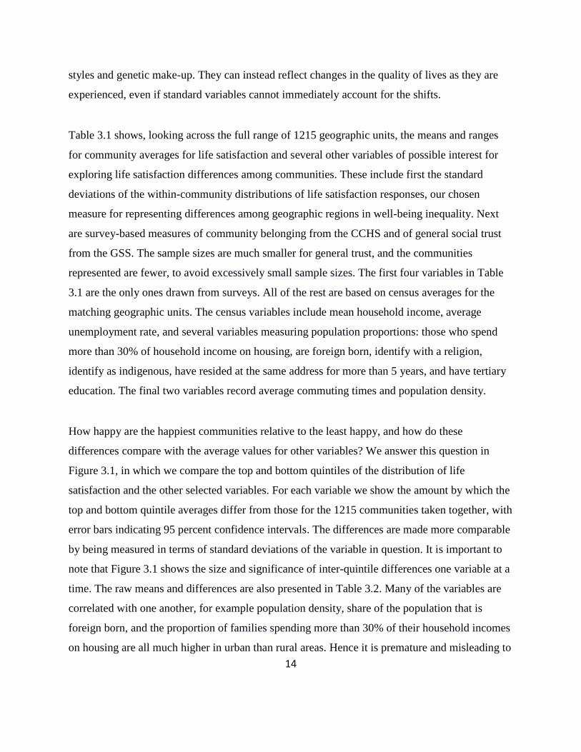
Table 3.1 shows, looking across the full range of 1215 geographic units, the means and ranges
for community averages for life satisfaction and several other variables of possible interest for
exploring life satisfaction differences among communities. These include first the standard
deviations of the within-community distributions of life satisfaction responses, our chosen
measure for representing differences among geographic regions in well-being inequality. Next
are survey-based measures of community belonging from the CCHS and of general social trust
from the GSS. The sample sizes are much smaller for general trust, and the communities
represented are fewer, to avoid excessively small sample sizes. The first four variables in Table
3.1 are the only ones drawn from surveys. All of the rest are based on census averages for the
matching geographic units. The census variables include mean household income, average
unemployment rate, and several variables measuring population proportions: those who spend
more than 30% of household income on housing, are foreign born, identify with a religion,
identify as indigenous, have resided at the same address for more than 5 years, and have tertiary
education. The final two variables record average commuting times and population density.
How happy are the happiest communities relative to the least happy, and how do these
differences compare with the average values for other variables? We answer this question in
Figure 3.1, in which we compare the top and bottom quintiles of the distribution of life
satisfaction and the other selected variables. For each variable we show the amount by which the
top and bottom quintile averages differ from those for the 1215 communities taken together, with
error bars indicating 95 percent confidence intervals. The differences are made more comparable
by being measured in terms of standard deviations of the variable in question. It is important to
note that Figure 3.1 shows the size and significance of inter-quintile differences one variable at a
time. The raw means and differences are also presented in Table 3.2. Many of the variables are
correlated with one another, for example population density, share of the population that is
foreign born, and the proportion of families spending more than 30% of their household incomes
on housing are all much higher in urban than rural areas. Hence it is premature and misleading to

15
think in causal terms. But there are nonetheless some very interesting patterns, some of which
are surprising.
There are large differences in average life satisfaction between the top and bottom quintiles,
from an average of 7.7 in the least happy quintile to 8.33 in the top quintile. Since the life
satisfaction means are measured quite precisely – with a standard error of about 0.08 – the
differences among communities are highly significant. The inequality measures also differ, with
the distribution of SWL being significantly more equal in the happiest quintile. There are also
large and highly significant differences in the sense of community belonging. By contrast,
general social trust is almost equal in the top and bottom quintiles, reflecting in part the fact that
the question relates to people in general, and not to those in the local community. There is far
more inter-community variation in trust questions with a local content, such as those asking how
likely a lost wallet would be returned if found by a neighbour. Unfortunately, the CCHS and the
GSS have not regularly asked such locally oriented trust questions, and the sample size is rather
small even for the more general social trust question.
Two more dogs that fail to bark are household incomes and unemployment rates, neither of
which differ significantly between the top and bottom quintiles.
The top and bottom quintiles do differ significantly for the first three of the population
proportion variables: those spending more than 30% of their household income on housing, the
proportion of the population that is foreign born, and the proportion who identify with a religion.
By contrast, the indigenous population shares are identical in the most and least happy
communities. In both quintiles the indigenous population shares average about 6%. The range of
indigenous population shares is very large, and equally so in both happiness quintiles, with
community average indigenous population shares ranging from 0 to over 90% in each.
The proportion of the population residing 5 years or more is significantly higher in the happiest
quintile, while the population share with tertiary education is equal in both quintiles. Median
commuting times and population density are significantly lower in the happiest communities,

16
while unemployment rates do not differ between top and bottom quintiles. Commuting times
average 17 minutes in the top quintile, and five minutes longer in the bottom, a statistically
significant difference. By contrast, population density in the least happy quintile is more than
eight times greater than in the happiest quintile. This latter finding, which was suggested by the
earlier maps, shows that life is significantly less happy in urban areas. We now split the data
accordingly to explore the issue further.
3.1 What’s wrong with city life?
An earlier paper (Lu et al 2015) split a slightly smaller sample of CCHS and GSS life
satisfaction data into 98 geographic units, each with more than 1,000 observations and with no
attempt being made to divide the 33 Census Metropolitan Areas (CMAs) into smaller
neighbourhoods. It was already apparent there that big city life was not very happy, with two of
Canada’s biggest cities, Vancouver and Toronto, in a virtual tie for bottom spot among all 98
CMAs and Economic Regions. On the face of it, this is a puzzle, as migrants generally, and
immigrants especially, choose to move to cities, and generally the largest and least happy of
cities. Are they unaware that life will be less happy there than elsewhere, do they hope and
expect to beat the averages, or are they driven by other motivations (Glaeser et al 2016)?
Our new dataset increases the sample size by an order of magnitude, and unpacks the complex
social geography of the metropolitan areas, all with an eye to finding out what is especially
different, and potentially difficult, about city life. We then explore the happiness differences
among cities, and among rural areas, to see what might be done to enable happier lives wherever
people choose to live. We do this by dividing our sample into urban (tracted) and rural
(untracted) samples, with the urban sample containing all population living in CMAs plus all
those living in Census Agglomerations with population exceeding 50,000.
First we make a direct comparison of life in the urban and rural samples, to see how, on average,
life satisfaction and the related census variables differ between the two types of community. This
is done in Figure 3.2 and Table 3.3. The average gap between urban and rural life satisfaction is

17
about one-third as large as was found earlier between the top and bottom quintiles. General trust
is almost identical in the urban and rural regions, as was also true for the top and bottom
quintiles. This is consistent with our presumption that this question relates to people in general,
and hence does not depend so readily on the local environment. But the sense of community
belonging, a well-established indicator of local social connectedness, has an urban-rural gap
almost as big as that between the top and bottom life satisfaction quintiles. Mean incomes are
slightly but significantly higher in the urban areas, and unemployment rates lower. The
proportion of those spending more than 30% of their incomes on housing is significantly higher
in the urban areas (25% vs 18%), although the difference is slightly less than for the
corresponding difference between the unhappiest and happiest community quintiles (30% vs
17%). The foreign-born share of the population is also much higher in the urban areas (at 22%,
compared to 6% in the rural areas), reflecting that fact that most immigrants now locate in urban
areas. The fraction of the population reporting a religious affiliation is slightly but significantly
higher in the rural areas (79% vs 75%), although this difference is less than between the top and
bottom quintiles (82% vs 71%). The average indigenous share is also significantly higher in rural
than urban areas (8% vs 3%), while it is identical in the top and bottom happiness quintiles
(6.4% vs 5.3%, ns)6.
Although there is no higher-education gap between the happiest and least happy communities,
there is a significant difference in education levels across the urban/rural divide, with the average
percentage of population with tertiary education being 67% in the cities vs 55% in the rural
areas. Average commuting times are 15 minutes in the rural areas, compared to 22 minutes in the
city, while population density is almost 100 times higher in the cities than in the rural areas.
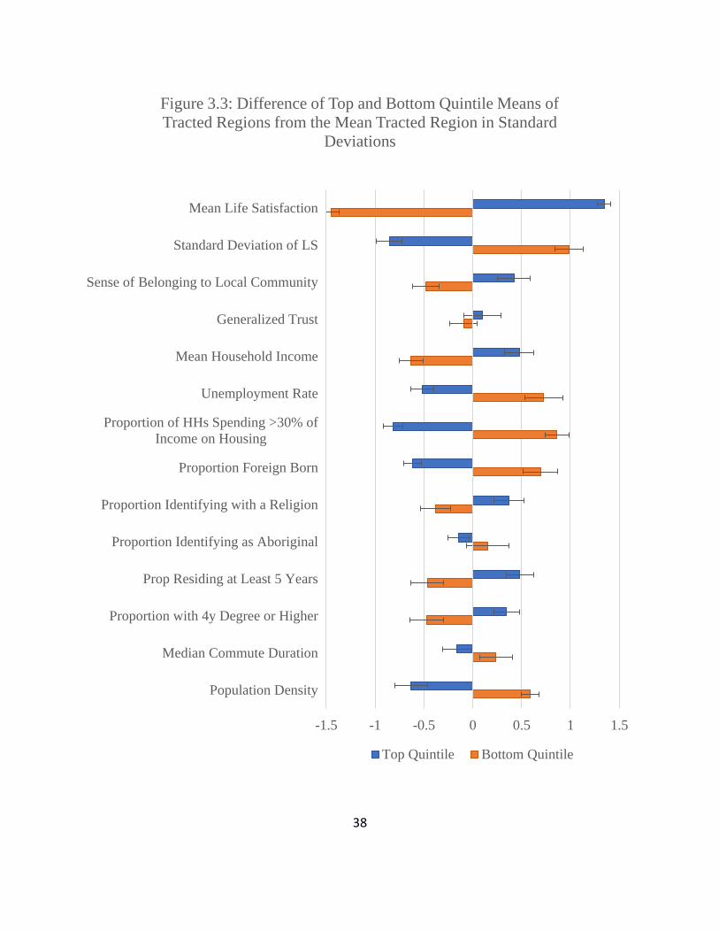
We now turn, in Figures 3.3 and 3.4, which repeat Figure 3.1 for the urban and rural samples
separately. Figure 3.3 examines the differences between top and bottom life satisfaction quintiles
6 It is necessary to be cautious when interpreting these differences, as the CCHS and GSS sampling frames do not
include on-reserve First Nations populations, while the census populations do. Our calculations and inferences will
be fully representative only to the extent that on-reserve populations would have had the same SWL responses as
off-reserve populations in their geographic unit.
18
among the 775 urban communities, while Figure 3.4 does the same thing for the rural sample,
which is slightly more than half as large. The corresponding raw means and differences are
presented in Tables 3.4 and 3.5.
The first thing to note is that there are large life satisfaction gaps between the top and bottom
quintiles in cities and in rural areas. Average life satisfaction in the top quintile of urban
communities is almost as high as in the rural sample (8.27 vs 8.39, a difference that is highly
significant in statistical terms). The bottom quintiles have average life satisfaction of 7.65 in the
city vs 7.89, a gap twice as large as that for the top quintiles. Although the inter-quintile gaps are
thus very large for life satisfaction in both city and rural areas, with something similar for well-
being inequality and a sense of community belonging, the picture is quite different for most of
the census-based variables. In particular, there is much more evidence of links to census
variables for the urban sample than in the rural areas.
When we compare the average characteristics of the most and least happy urban communities,
we find a number of large matching differences in census-based variables. In particular, in the
happiest quintile of urban neighbourhoods, incomes are higher, unemployment is lower, fewer
people spend more than 30% of their incomes on housing, proportions of the foreign-born are
lower, religious identification is higher, education levels are higher, commuting times are
shorter, and population densities are lower. Average values for general trust, and for indigenous
identification, do not differ significantly between the most and least happy quintiles.
Things are very different in Figure 3.4 comparing lives in the top and bottom quintiles in the
rural sample. There are more religious identifiers and fewer movers in the top quintile than in the
bottom one. But beyond those two differences, all of the other census variables have similar
averages in the top and bottom quintiles.
What have we learned thus far? We have seen that our community-based procedures for setting
geographic boundaries have indeed exposed large differences in average life satisfaction among
Canadian communities, and that these differences appear between the urban and rural samples

19
taken as a whole, as well as within each group viewed separately. Although average life
satisfaction is significantly higher in the rural sample, the range of community scores is very
large within each group, such that the happiest quintile of urban communities is almost as happy
as the happiest quintile of rural communities. The unhappiest urban quintile, however, is
substantially less happy than its rural equivalent.
The next remarkable result flows from a comparison between figures 3.3 and 3.4 showing the top
quintile vs bottom quintile results separately for the urban and rural samples. In both cases there
are large top to bottom differences in well-being inequality and sense of community belonging.
But when we looked at the census variables we found many sharp differences between the top
and bottom quintiles for the urban sample, and very few for the rural sample.
4. Summary and next steps
By way of summary, our procedures have given us 1215 Canadian communities with
significantly different average levels of life satisfaction. For efficiency of data use, we proposed
and implemented a method delivering sample sizes that are roughly equal across communities.
We used community structures, as revealed by road and other networks, to improve the extent to
which our groupings matched distinct communities. We also ensured that all boundaries coincide
with, and generally are nested within, census boundaries, so that the survey-based information
can be readily combined with census-based data for the same communities as well as those at
higher and lower scales.
Looking at the resulting data, we found a substantial range in average life satisfaction.
Comparing averages in the top and bottom quintiles, life satisfaction averaged 8.33 in the
happiest quintile and 7.7 in the least happy quintile. This gap of 0.6 points on the 0 to 10 scale is
substantial in scale, and highly significant in statistical terms. It is less than 20% as large as the
corresponding gap between the top and bottom quintiles of the roughly 150 countries covered by
the rankings in the World Happiness Reports, but three times larger than the difference between

20
the happiest and least happy of Canada’s five main geographic regions.7 We then saw how
average lives compared in the top and bottom quintiles of our 1215 communities. Well-being
equality and sense of community belonging were both significantly higher in the happy
communities, while there were no significant differences in average incomes, unemployment,
social trust, or indigenous population shares. But we did find that the top quintile communities
had lower commute times, smaller shares of the population spending over 30% of their incomes
on housing, smaller foreign-born population shares, and much smaller population densities, all of
which are features of rural rather than urban life. We then divided our sample into the rural and
urban parts, with the urban part representing almost two-thirds of the sample. We found life to
indeed be less happy in the cities – by 0.18 points, almost half as large as the gap between the top
and bottom quintiles. This was despite higher incomes, lower unemployment rates and higher
education in the urban areas. But urban dwellers were more likely to have moved recently, and
less likely to have a sense of community belonging than were those in more rural areas.
Following this preliminary look at the life satisfaction data and some of the related census
variables, we tried to discover whether our procedures give us a preferred way of splitting the
country into distinct communities.
We did this by using more mechanical but less information-rich ways of dividing the country
into contiguous communities in order to see if our methods for choosing boundaries significantly
increased the information value of the data, and to see the relative advantages of different sample
sizes. Smaller sample sizes increase the number of observations but also increase the noisiness of
the resulting estimates. These experiments showed a definite trade-off between these two effects.
Our sample sizes of 300, giving 1215 units, appeared to be at a reasonable place.
We have been able to generate a large sample of communities while respecting community
structure and maintaining adequate sample size. We hope that our data might be useful as they
are. Our tests against alternatives (as represented by Figure 2.7) suggest that our chosen
7 The five regions are British Columbia, the Prairies, Ontario, Quebec, and Atlantic Canada. Among these regions, SWL was found to be highest in Atlantic Canada and lowest in British Columbia. See Helliwell and Barrington-Leigh (2010).

21
community boundaries reflect a good compromise between sample size and community
structure. Future increases in the number of available survey responses will enable either a finer
geographic breakdown or, perhaps more importantly, enable the measurement and explanation of
changes over time in community-level life satisfaction.
We are making the resulting community-level Canadian data available to other researchers, with
an eye to two types of use. First, and most readily, they provide a snapshot of variations among
communities, both across and within cities, with a sample size large enough to invite
examination of plausible sources of the substantial inter-community differences we have found.
Second, these data can be used as social context variables for two-level modelling of individual-
level data for life satisfaction.
References
Aslam, A., & Corrado, L. (2011). The geography of well-being. Journal of Economic Geography, 12(3),
627-649.
Barrington-Leigh, C. P. (2013). The Quebec convergence and Canadian life satisfaction, 1985–2008.
Canadian Public Policy, 39(2), 193-219.
Barrington-Leigh, C. P., & Helliwell, J. F. (2008). Empathy and emulation: Life satisfaction and the
urban geography of comparison groups (WP 14593). National Bureau of Economic Research.
Brezzi, M., & Diaz Ramirez, M. (2016), Building subjective well-being indicators at the subnational
level: A preliminary assessment in OECD regions, OECD Regional Development Working
Papers, No. 2016/03, OECD Publishing, Paris.
DOI: http://dx.doi.org/10.1787/5jm2hhcjftvh-en
Flowerdew, R. (2011). How serious is the Modifiable Areal Unit Problem for analysis of English census
data?. Population Trends, 145(1), 106-118.
Flowerdew, R., Geddes, A., & Green, M. (2001). Behaviour of regression models under random
aggregation. Modelling scale in geographical information science, 89-104.
Fotheringham, A. S., & Wong, D. W. (1991). The modifiable areal unit problem in multivariate
statistical analysis. Environment and planning A, 23(7), 1025-1044.

22
Glaeser, E. L., Gottlieb, J. D., & Ziv, O. (2016). Unhappy cities. Journal of Labor Economics, 34(S2),
S129-S182.
Goff, L., Helliwell, J. F., & Mayraz, G. (2018). Inequality of Subjective Well-Being as a Comprehensive
Measure of Inequality. Economic Inquiry.
Han, S., Kim, H., & Lee, H. S. (2013). A multilevel analysis of the compositional and contextual
association of social capital and subjective well-being in Seoul, South Korea. Social Indicators
Research, 111(1), 185-202.
Helliwell, J. F., & Putnam, R. D. (2004). The social context of well-being. Philosophical Transactions
of the Royal Society B: Biological Sciences, 359(1449), 1435.
Helliwell, J. F., & Wang, S. (2011). Trust and Wellbeing. International Journal of Wellbeing, 1(1).
Helliwell, J. F., & Barrington‐Leigh, C. P. (2010). Viewpoint: Measuring and understanding subjective
well‐being. Canadian Journal of Economics/Revue canadienne d'économique, 43(3), 729-753.
Lu, C., Schellenberg, G., Hou, F., & Helliwell, J. F. (2015). How’s Life in the City? Life Satisfaction
across Census Metropolitan Areas and Economic Regions in Canada. Economic Insights.
Statistics Canada: Ottawa, ON.
Lucas, R. E. (2014). Life Satisfaction of U.S. Counties Predicts Population Growth. Social
Psychological and Personality Science, 5(4), 383–388.
Lucas, R. E., Cheung, F., & Lawless, N. M. (2014). Investigating the subjective well-being of United
States regions. In Geographical psychology: Exploring the interaction of environment and
behavior (pp. 161–177). American Psychological Association.
Manley, D. (2014). Scale, aggregation, and the modifiable areal unit problem. In Handbook of regional
science (pp. 1157-1171). Springer Berlin Heidelberg.
OECD (2013). OECD Guidelines on Measuring Subjective Well-being, OECD Publishing, Paris.
DOI: http://dx.doi.org/10.1787/9789264191655-en
OECD (2015). Measuring Well-being in Mexican States, OECD Publishing, Paris. DOI:
http://dx.doi.org/10.1787/9789264246072-en
Office for National Statistics (2016). Personal well-being in the UK: local authority update, 2015 to
2016: Estimates of personal well-being for UK local authorities from the financial year ending
2012 to financial year ending 2016. ONS Statistical Bulletin, 27 September 2016.
Okulicz-Kozaryn, A. (2011). Geography of European Life Satisfaction. Social Indicators Research,
101(3), 435–445.

23
Openshaw, S. (1984). The modifiable areal unit problem. Concepts and techniques in modern
geography.
Oswald, A. J., & Wu, S. (2010). Objective Confirmation of Subjective Measures of Human Well-Being:
Evidence from the U.S.A. Science, 327(5965), 576–579.
Oswald, A. J., & Wu, S. (2011). Well-being across America. Review of Economics and Statistics, 93(4),
1118–1134.
Tranmer, M., & Steel, D. (2001). Using local census data to investigate scale effects. Modelling scale in
geographical information science, 105-122.
Wiens, J. A. (1989). Spatial scaling in ecology. Functional ecology, 3(4), 385-397.
24
Tables

25
26

27
28

29
Figures
Figure 2.1
Colour-coded aggregate regions overlain on a map of London Ontario show how natural
boundaries and road patterns can delineate sensible regions.

30
Figure 2.2
Colour-coded regions aggregated from census tracts in Montreal, with internal CSD boundaries
overlain in yellow.

31
Figure 2.3
Colour-coded aggregate regions with CMA/CA boundaries in red and ER boundaries in blue. In
the centre, the CMA of Fredericton cuts off a small area in the north of its ER which has to be
combined with another outlying region (dark red) in the same ER to maintain a sufficient cell
count. In the south, the boundary of CMA Saint John is prioritized over an ER boundary when a
conflict arises due to a census tract at the Northern edge of the city; it joins the light green
region inside the CMA.

32
Figure 2.4

33
Figure 2.5

34
Figure 2.6
The distribution of mean SWL across aggregated regions on an 11-point Likert scale.

35
Figure 2.7
Goodness-of-fit from regressing mean life satisfaction in validation CTs on mean life satisfaction
in estimation CTs within regionalizations of varying geographical coarseness.

36
-1.5 -1 -0.5 0 0.5 1 1.5
Mean Life Satisfaction
Standard Deviation of LS
Sense of Belonging to Local Community
Generalized Trust
Mean Household Income
Unemployment Rate
Proportion of HHs Spending >30% of
Income on Housing
Proportion Foreign Born
Proportion Identifying with a Religion
Proportion Identifying as Aboriginal
Prop Residing at Least 5 Years
Proportion with 4y Degree or Higher
Median Commute Duration
Population Density
Figure 3.1: Difference of Top and Bottom Quintile Means from
the Mean Region in Standard Deviations
Top Quintile Bottom Quintile

37
-1.5 -1 -0.5 0 0.5 1 1.5
Mean Life Satisfaction
Standard Deviation of LS
Sense of Belonging to Local Community
Generalized Trust
Mean Household Income
Unemployment Rate
Proportion of HHs Spending >30% of
Income on Housing
Proportion Foreign Born
Proportion Identifying with a Religion
Proportion Identifying as Aboriginal
Prop Residing at Least 5 Years
Proportion with 4y Degree or Higher
Median Commute Duration
Population Density
Figure 3.2: Difference in Means of Tracted and Untracted
Regions from the Mean Region in Standard Deviations
Tracted Untracted
38
-1.5 -1 -0.5 0 0.5 1 1.5
Mean Life Satisfaction
Standard Deviation of LS
Sense of Belonging to Local Community
Generalized Trust
Mean Household Income
Unemployment Rate
Proportion of HHs Spending >30% of
Income on Housing
Proportion Foreign Born
Proportion Identifying with a Religion
Proportion Identifying as Aboriginal
Prop Residing at Least 5 Years
Proportion with 4y Degree or Higher
Median Commute Duration
Population Density
Figure 3.3: Difference of Top and Bottom Quintile Means of
Tracted Regions from the Mean Tracted Region in Standard
Deviations
Top Quintile Bottom Quintile

39
-1.5 -1 -0.5 0 0.5 1 1.5
Mean Life Satisfaction
Standard Deviation of LS
Sense of Belonging to Local Community
Generalized Trust
Mean Household Income
Unemployment Rate
Proportion of HHs Spending >30% of
Income on Housing
Proportion Foreign Born
Proportion Identifying with a Religion
Proportion Identifying as Indigenous
Prop Residing at Least 5 Years
Proportion with 4y Degree or Higher
Median Commute Duration
Population Density
Figure 3.4: Difference of Top and Bottom Quintile Means of
Untracted Regions from the Mean Untracted Region in Standard
Deviations
Top Quintile Bottom Quintile

40
Appendix: Maps
Figure A.1

41

42

43