Embed Size (px)
Citation preview
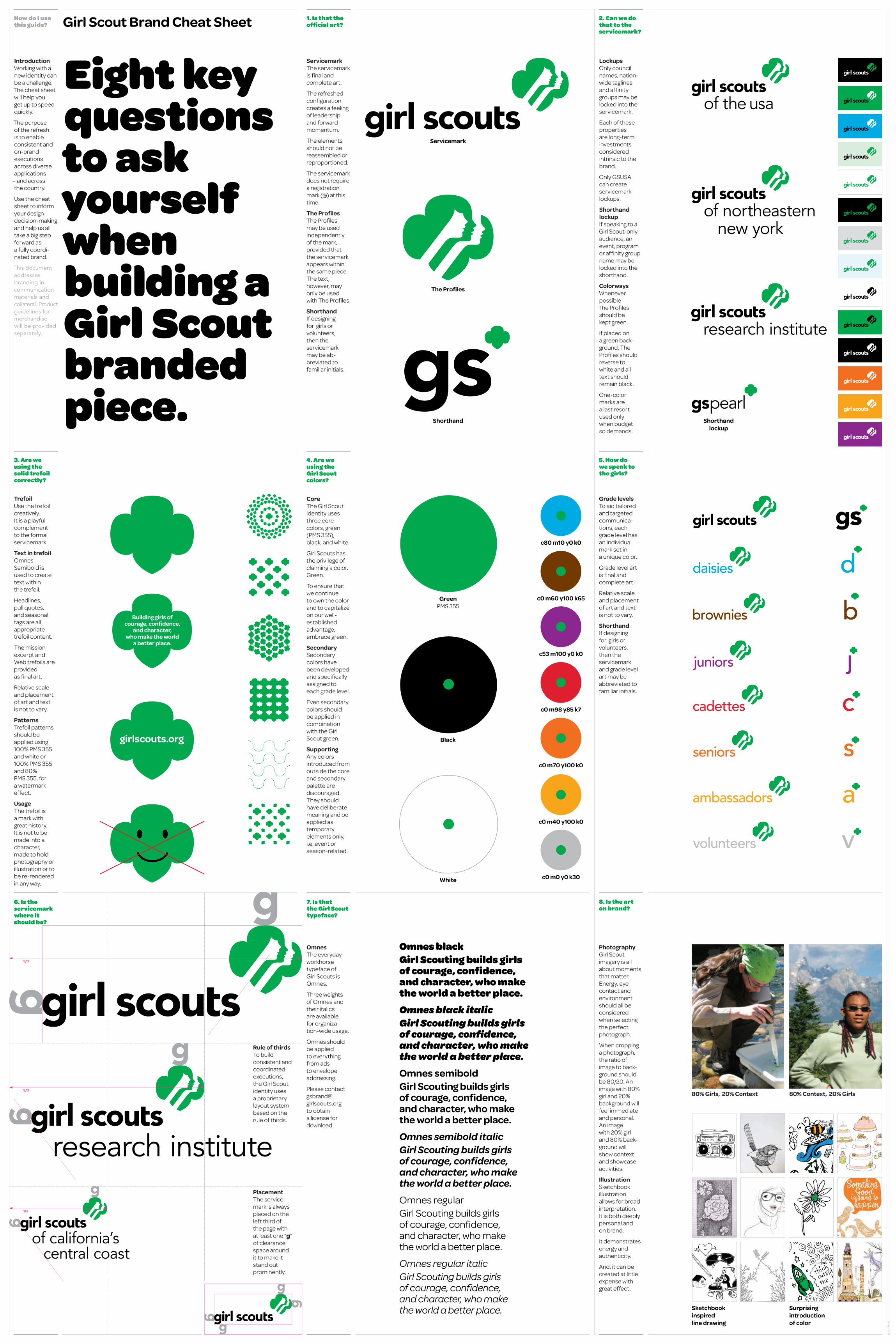
5. How do we speak to the girls?
Servicemark The servicemark is final and complete art.
The refreshed configuration creates a feeling of leadership and forward momentum.
The elements should not be reassembled or reproportioned.
The servicemark does not require a registration mark (®) at this time.
The ProfilesThe Profiles may be used independently of the mark, provided that the servicemark appears within the same piece. The text, however, may only be used with The Profiles.
ShorthandIf designing for girls or volunteers, then the servicemark may be ab- breviated to familiar initials.
Introduction Working with a new identity can be a challenge. The cheat sheet will help you get up to speed quickly.
The purpose of the refresh is to enable consistent and on-brand executions across diverse applications
– and across the country.
Use the cheat sheet to inform your design decision-making and help us all take a big step forward as a fully coordi-nated brand.
This document addresses branding in communication materials and collateral. Product guidelines for merchandise will be provided separately.
2. Can we do that to the servicemark?
Lockups Only council names, nation-wide taglines and affinity groups may be locked into the servicemark.
Each of these properties are long-term investments considered intrinsic to the brand.
Only GSUSA can create servicemark lockups.
Shorthand lockup If speaking to a Girl Scout-only audience, an event, program or affinity group name may be locked into the shorthand.
ColorwaysWhenever possible The Profiles should be kept green.
If placed on a green back-ground, The Profiles should reverse to white and all text should remain black.
One-color marks are a last resort used only when budget so demands.
Omnes The everyday workhorse typeface of Girl Scouts is Omnes.
Three weights of Omnes and their italics are available for organiza-tion-wide usage.
Omnes should be applied to everything from ads to envelope addressing.
Please contact [email protected] to obtain a license for download.
7. Is thatthe Girl Scouttypeface?
4. Are we using the Girl Scoutcolors?
Core The Girl Scout identity uses three core colors, green (PMS 355), black, and white.
Girl Scouts has the privilege of claiming a color. Green.
To ensure that we continue to own the color and to capitalize on our well- established advantage, embrace green.
Secondary Secondary colors have been developed and specifically assigned to each grade level.
Even secondary colors should be applied in combination with the Girl Scout green.
Supporting Any colors introduced from outside the core and secondary palette are discouraged. They should have deliberate meaning and be applied as temporary elements only, i.e. event or season-related.
6. Is the servicemark where it should be?
Omnes blackGirl Scouting builds girls of courage, confidence, and character, who make the world a better place.Omnes black italicGirl Scouting builds girls of courage, confidence, and character, who make the world a better place. Omnes semiboldGirl Scouting builds girls of courage, confidence, and character, who make the world a better place.Omnes semibold italicGirl Scouting builds girls of courage, confidence, and character, who make the world a better place.Omnes regularGirl Scouting builds girls of courage, confidence, and character, who make the world a better place.
Omnes regular italicGirl Scouting builds girls of courage, confidence, and character, who make the world a better place.
1. Is that theofficial art?
How do I use this guide?
The Profiles
Shorthand Shorthandlockup
Servicemark
8. Is the art on brand?
White
Black
Green PMS 355
Trefoil Use the trefoil creatively. It is a playful complement to the formal servicemark.
Text in trefoil Omnes Semibold is used to create text within the trefoil.
Headlines, pull quotes, and seasonal tags are all appropriate trefoil content.
The mission excerpt and Web trefoils are provided as final art.
Relative scale and placement of art and text is not to vary.
Patterns Trefoil patterns should be applied using 100% PMS 355 and white or 100% PMS 355 and 80% PMS 355, for a watermark effect.
Usage The trefoil is a mark with great history. It is not to be made into a character, made to hold photography or illustration or to be re-rendered in any way.
3. Are we using the solid trefoil correctly?
Girl Scout Brand Cheat Sheet
Eight key questions to ask yourselfwhen building a Girl Scout branded piece.
PlacementThe service-mark is always placed on the left third of the page with at least one “g” of clearance space around it to make it stand out prominently.
of california’s central coast
Rule of thirds To build consistent and coordinated executions, the Girl Scout identity uses a proprietary layout system based on the rule of thirds.
3/3
2/3
1/3
c80 m10 y0 k0
c0 m60 y100 k65
c53 m100 y0 k0
c0 m98 y85 k7
c0 m70 y100 k0
c0 m40 y100 k0
c0 m0 y0 k30
girlscouts.org
Grade levels To aid tailored and targeted communica-tions, each grade level has an individual mark set in a unique color.
Grade level art is final and complete art.
Relative scale and placement of art and text is not to vary.
ShorthandIf designing for girls or volunteers, then the servicemark and grade level art may be abbreviated to familiar initials.
Building girls of courage, confidence,
and character, who make the world
a better place.
80% Girls, 20% Context 80% Context, 20% Girls
Sketchbook inspired line drawing
Surprisingintroduction of color
Photography Girl Scout imagery is all about moments that matter. Energy, eye contact and environment should all be considered when selecting the perfect photograph.
When cropping a photograph, the ratio of image to back-ground should be 80/20. An image with 80% girl and 20% background will feel immediate and personal. An image with 20% girl and 80% back-ground will show context and showcase activities.
IllustrationSketchbook illustration allows for broad interpretation. It is both deeply personal and on brand.
It demonstrates energy and authenticity.
And, it can be created at little expense with great effect.
Design: O
CD


![THE AIESEC WAY [refreshed]](https://img.pdfslide.us/doc/110x75/57906fa91a28ab687499dfac/the-aiesec-way-refreshed.jpg)