Embed Size (px)
Citation preview
House Prices, Interest Rates, and the Mortgage Market Meltdown
By
Christopher Mayer*
(Columbia Business School and NBER)
and
R. Glenn Hubbard*
(Columbia Business School and NBER)
* The authors wish to acknowledge especially valuable comments and discussions with Charlie Himmelberg, as well as helpful thoughts from Andrew Haughwout, Karen Pence, Todd Sinai, and Joseph Tracy. Rembrandt Koning, Ben Lockwood, Michael Tannenbaum, and Ira Yeung provided extremely careful and excellent research assistance as well as many suggestions. Byrce Waters (MBA ’09) provided the data on global real estate stock returns while working with Oak Hill REIT Management. The Paul Milstein Center for Real Estate at Columbia Business School provided funding to support this analysis.

1
The headlines have been ominous. “As fear stalks the markets, the government may have to do more to steady nerves.” The article goes on to describe concerning exposure to high-risk mortgage loans. “The two main categories are subprime loans made to people with poor credit histories and … loans made on the basis of unverified assertions of income. Together these make up about a tenth of the value of outstanding mortgages.”
Other articles are equally daunting. “…banks are tightening conditions on mortgages as the number of non-performing loans rises, pricing out potential buyers. As a result, house sales are plunging. The number of completed sales in February was 24.4 percent below the same month last year.”
“Real house prices are 82 percent higher than they were in the last quarter of 1999 and have risen 70 percent relative to household income.” “The…stock market is down by 26 percent since its peak…Banks have been hit harder still…First in the firing-line has been a series of debt-laden financial and real-estate companies.”
Ominous, daunting, and perhaps surprising to some observers, these headlines do not describe the United States housing market and banking system, but that of other countries around the world. These quotes are taken from recent articles in The Economist, which has been reporting on the global housing boom for years.
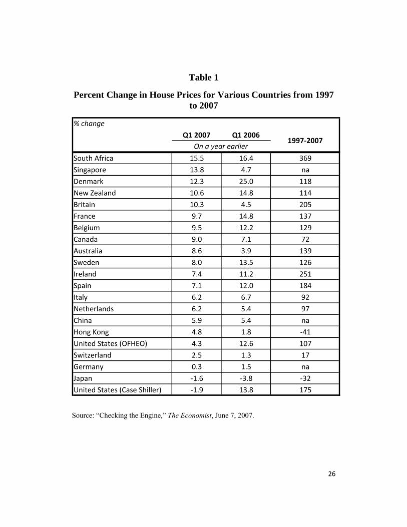
The first paragraph describes Britain, where booming house prices followed by a crash and bank lending problems have often mirrored those of the United States, at least on the surface.1 However, risky loans were typically made by regulated banks like Northern Rock or Bradford and Bingleys whose capital and net worth were at stake, rather than mortgage brokers. Thus, the argument that lenders “with no skin in the game” were the primary cause of the housing and banking crisis would not apply to the Britain. House prices in Britain rose 205 percent from 1997 to 2007:q1, exceeding the 178 percent rise in the United States as measured by the Case and Shiller/S&P price index or the 103 percent rise as reported by the OFHEO index.2 (Table 1 reports house price growth for 20 countries over this time period.) As in cities like New York, however, this incredible growth in British housing prices was accompanied by relatively little
1 See “Closer and closer to home” and “Death of one trick pony” in The Economist (August 2, 2008).
2 “Checking the engine,” The Economist (June 7, 2007).
2
new construction (home construction grew less than 12 percent between 1996 and 2006).
In Spain, house prices grew 184 percent over the same period. The Spanish housing market as described in the second paragraph appears to exhibit many similarities to markets like southern Florida in the US. 3 More than four million dwellings were constructed in the last decade. Even with a growing economy as Spain integrated with the rest of Europe, this construction greatly exceeded demand. As with the UK, these loans were typically originated by regulated banks. Banks are now greatly cutting back on lending as nonperforming loans rise. The Irish housing market exhibited many of the same characteristics as the Spanish market, with home price increases of 251 percent between 1997 and 2007:q1 and a growth in new construction of 177 percent between 1996 and 2006.
Almost halfway around the world, Australian house prices exhibited their own boom-bust-boom cycle as described in the third paragraph. House prices across the country rose in the early 2000s as interest rates fell. However, unlike much of the rest of the world, Australian real mortgage rates increased quickly from their floor. Australian house prices stagnated in Sydney, but continued booming in Perth, where rising raw material prices spurred the local economy. As mortgage rates flattened, Australian house prices again started rising. Credit concerns are starting to plague the economy.4
It is important to understand the global context when considering the housing situation in the United States. Below we examine the behavior of house prices in an attempt to consider the role of interest rates, the mortgage market, and other fundamental factors in explaining the boom-bust cycle of the 2000s. We focus on issues that might be relevant in developing new policy options to help the United States housing market going forward.
We begin with a more careful examination of the boom that took place in most, but not all global housing markets. Countries that experienced the highest rate of house price appreciation (Spain, France, US, Britain, and Australia) from 2001 to 2005 all had pronounced reductions in real mortgage rates. Yet some other notable countries with low mortgage rates (Germany and Japan) did not see much house price appreciation at all. However, at the end of the boom in 2006
3 “Structural Cracks,” The Economist (May 24, 2008).
4 See “Down under” (July 24, 2008) and “Australia’s budget” (May 15, 2008) in The Economist.
3
and 2007, real mortgage rates started to head up, yet house prices also kept rising in most countries.
It is also instructive to consider that global commercial real estate prices boomed over the same time period. Between 2002 and 2006, annualized returns to owning public real estate companies ranged between 12 and 29 percent in the US, Canada, Britain, Australia, France, Japan, and Singapore. These real estate returns greatly outpaced returns in the broader stock markets in these countries. This was not simply a matter of rising publicly-traded securities, private values surely increased as much or more as many public companies were taken private using highly leveraged transactions over this time period.
We draw several conclusions from these global data. First, the extremely high levels of returns to global real estate cannot easily be explained by an uptick in economic growth. Second, arguments that rely on securitization or lax regulation in any particular country appear inconsistent with the global nature of the boom. Instead, declines in global, long-term real interest rates appear to coincide with the time period when global property prices began to accelerate. However, declining real interest rates also cannot tell the whole story. Once the boom got going, prices accelerated even as real interest rates started to rise in 2006 and 2007. Plummeting lending standards and speculation by purchasers almost surely played a role in the acceleration of real estate prices above fundamentals in later years of the boom. This speculation took different forms across countries, but also appears to be a common denominator in the later stage of the property boom.
Next we examine the user cost model as a way to formalize the role of interest rates, the mortgage market, and other fundamental factors in United States housing markets, building on earlier work by Himmelberg et al. (2005) and Mayer and Sinai (2007). These papers show that there is a large and statistically significant relationship between the user cost—the after-tax cost of owning a home—and the cross-sectional variation in the price/rent ratio across United States MSAs. We confirm this relationship using recent data. Regressions show that a one percent change in the user cost results in a 0.62 to 0.85 percent change in house prices. This elasticity suggests that changes in interest rates have played a major role in the recent United States housing boom (and bust). But we also note that there is still excess volatility of the house price-rent ratio that is due to predominantly national factors. Credit market factors, including the subprime expansion of credit, and behavioral models are candidates to explain this excess volatility.
4
To further examine the relationship between user costs and house prices, we divide metropolitan property markets into three groups: Historically cyclical markets, metro areas with little real house price appreciation, and “recent boomers,” markets that historically have seen very little house price appreciation, but where house prices appeared to grow almost without bound in recent years. The analysis of United States housing data is mostly consistent with the global evidence. The data show that for the first two groups of markets, much of the increase in house prices through 2005 can be explained by fundamentals, particularly lower real long-term interest rates. However, excessive price appreciation as early as 2003 in the “recent boomers” is much harder to explain with a user cost model. This finding is consistent with arguments made by Glaeser et al. (2008) for these parts of the country where new construction is easy and prices almost surely must be driven primarily by construction costs. Finally, high rates of house price appreciation after 2005 are difficult to explain by fundamentals even in the historically cyclical markets.
We conclude by considering the appropriate role of policy to address the current housing situation with rapidly declining house prices and increasing spreads on new mortgages. Recent data shows that even with the government conservatorship of Fannie Mae and Freddie Mac, the spread between mortgage rates and the 10-year Treasury rate is near its high over the past 20 years. Our analysis suggests that the cost of owning a home relative to renting has increased between 10 and 17 percent relative to what it would be if the mortgage market was normally functioning. This analysis still underestimates the impact of the credit crunch on house prices, as down payment requirements may be tighter than at any time in more than a decade and fees have also risen sharply.
In this environment, we argue that the government should normalize the functioning of the mortgage market as proposed by R. Glenn Hubbard and Christopher Mayer.5 Under this plan, the government would take action to return mortgage rates to what they would otherwise be if the mortgage market were functioning normally (about 160 basis points above the 10-year Treasury rate). In addition, policy makers would help address refinancing problems for owners with negative equity by engaging in sharing equity write-offs with lenders. The government and taxpayers have an enormously strong incentive to address the housing market given that the losses to banks will not end and the economy is unlikely to stop declining until the housing market stabilizes. After all, the government currently owns or guarantees nearly $6 trillion in mortgage assets.
5 For more details on this plan, see http://www4.gsb.columbia.edu/realestate/research/mortgagemarket.

5
The principal benefit of our plan is to reduce mortgage rates by nearly one percent, holding up house prices by 10 to 17 percent around the country relative to how much house prices would fall if the mortgage market remains dysfunctional. Lower mortgage rates would allow many homeowners to refinance their mortgages at more normal spreads and to improve affordability for potential new home buyers.
Our plan would also create an appreciable macroeconomic stimulus for the economy of at least $118 billion annually. With normally priced mortgages, and a program to reduce negative equity, nearly 20 million Americans would be able to refinance their mortgages to more affordable rates. The typical borrower would save over $350 per month and many might be able to get out from under troubled and complicated negative amortization and adjustable-rate mortgages. About $4.6 billion of the savings is reduced monthly interest payments due to lower mortgage rates and smaller principal amounts, an aggregate stimulus of more than $55 billion per year. In addition, there is likely an appreciable wealth effect. If we assume a marginal propensity to consume from housing wealth of 3.5 percent, higher house prices would increase consumption by an additional $63 billion per year relative to a baseline forecast with higher mortgage rates.
Our plan would have a direct cost of as much as $121 billion (a one-time cost) but taxpayers would also get an equity stake in some homes going forward to help offset that cost. The program has many ancillary benefits such as increasing employment levels and job mobility as housing transactions return to more normal levels, as well as helping to fix inefficiencies associated with decision making by conflicted servicers.
Global Housing Markets from 1997-2007: Correlated Booms
House prices and interest rates: A simple theory
Before starting an examination of global house prices and mortgage rates, it is important to make a few comments about the theoretical framework that links house prices to interest rates. Consider the standard Gordon Growth Model in which the Asset Price = Dividend / (Interest rate – Dividend growth rate).6 For housing, the Gordon Growth Model would be reinterpreted as House Price = Rent/(Interest Rate – Rental growth rate). This model implies a convex relationship between house prices and interest rates; the lower the level of the
6 See Gordon (1962).
6
interest rate, the greater is the elasticity of house prices to changes in interest rates. In simple terms, the lower interest rates are, the bigger the percentage increase in house prices when interest rates fall by one percentage point. Of course, when making time series comparisons, even this convex relationship between house prices and interest rates is still a simplification. A more accurate version of the Gordon Growth Model as applied to housing (which economists refer to as the user cost model) requires further adjustments for factors like risk, taxes, depreciation, and mortgage rates.
Himmelberg et al. (2005) make the case that the user cost model can help explain how differences in expected appreciation rates of house prices across metropolitan areas can make house prices in high-growth rate markets like New York and San Francisco more sensitive to changes in mortgage rates than those in low growth rate markets like Houston or Phoenix. Mayer and Sinai (2007) show that the relationship between the price-rent ratio and 1/user cost is large and statistically significant. By contrast, using aggregate data from several countries, Shiller (2007b) argues that the simplified Gordon Growth Model cannot explain the relationship between real interest rates and real housing and stock prices. Shiller’s analysis of housing does not conduct any formal analysis and nor does it consider either the movement of rents or the behavior of mortgage markets.
It is beyond the scope of the paper to compute a formal user cost model for each of the countries reported in this paper. Such an analysis, while enormously valuable, would require a careful treatment of the tax and housing finance systems on a country-by-country basis.
In the analysis of international data, we examine mortgage rates as opposed to interest rates when looking at the relationship between real rates and house prices. In doing so, we can capture at least some differences across countries in the risk premium, inflation, and financing constraints inherent in the purchase of housing. However, such analysis is still a great simplification of the true theoretical relationship between interest rates and house prices.
Evidence across the world
A recent Goldman Sachs report analyzed factors that led to the global housing boom.7 The report cited several facts to support the importance of fundamentals. First, the Goldman Sachs report found a strong positive correlation between income growth and house price appreciation across countries. Second, house price appreciation was also strongly correlated with population growth. Finally, 7 See “Global Economics Weekly,” Issue No: 07/32, September 26, 2007.
7
and most importantly for our analysis, countries with the biggest reduction in real interest rates also had the highest rates of house price appreciation. Below we show more detailed time series evidence for selected countries that is consistent with the Goldman Sachs analysis, albeit focusing specifically on the most recent time period.
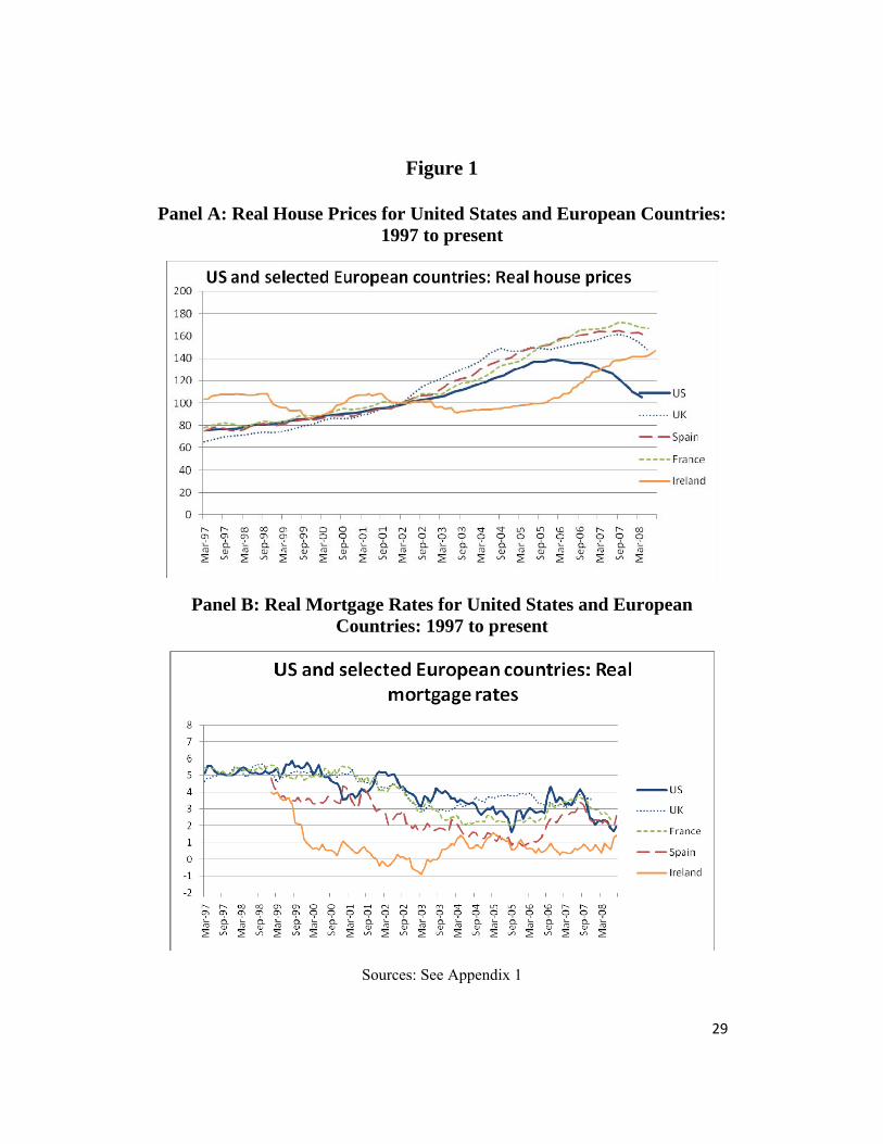
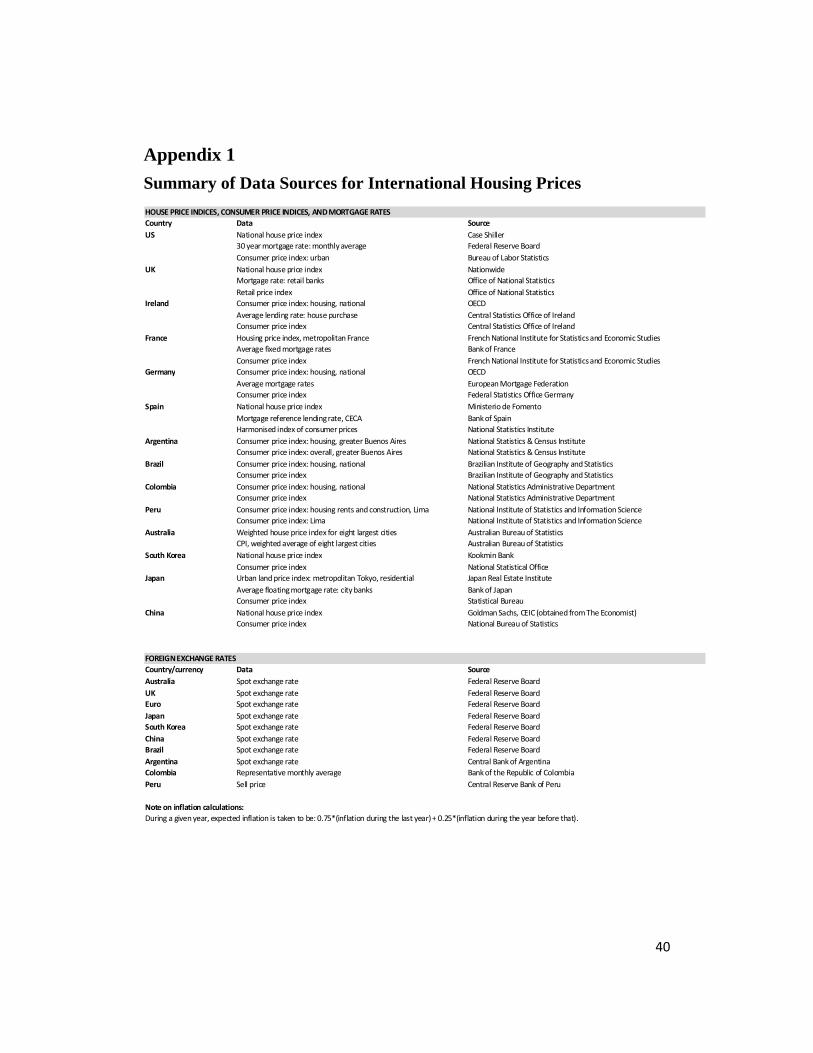
As reported in Table 1, house prices boomed in many parts of the world between 1997 and 2007. (The sources of all data in this section are described in Appendix 1.) In fact, United States house price appreciation does not look very remarkable compared to many other European countries such as Britain, France, Ireland, and Spain. Panel A in Figure 1 plots house price appreciation for the United States compared to these four countries from 1997 to 2008. Panel B in Figure 1 shows real mortgage rates over the same time period. Clearly the rise in real house prices is accompanied by a secular decline in real mortgage rates in the early 2000s. As real mortgage rates dropped more quickly in 2002, house prices demonstrated a commensurate rise.
House prices in the various European countries continued growing after 2005 even as real mortgage rates begin rising. However, economic growth in much of Europe remained strong. In the US, house prices started to fall by early 2007, even as house prices in these other countries were still rising. Clearly changes in mortgage rates cannot explain the most recent behavior of house prices. However, differences in economic growth must also have played a role. Economic growth expectations slowed in early 2007 for the United States relative to Europe.
Many commentators blame mortgage market excesses such as the growth of subprime lending for the sharp increase in United States house prices in the 2000s as well as the sudden decline in house prices after 2007.8 Of course, lending excesses were common in other countries as well (and are also historically common at the end of booms). Subprime loans and no-documentation mortgages appeared in the UK, as well as the US. However, throughout most of Europe, low-quality mortgages were originated by regulated, deposit-taking institutions like banks rather than mortgage brokers who could operate away from most banking regulators.9
8 See Mayer, Pence, and Sherlund (2008) for a summary of the nascent literature on this subject.
9 Of course, in the United States some risky and excessive lending practices were also undertaken by regulated, deposit-taking institutions like Indy Mac and Washington Mutual.
8
What appears to be most pronounced in the United States housing experience relative to the rest of the world was the extreme use of leverage, both at the household level (the median subprime loan in 2005 to 2007 had a combined loan-to-value ratio of 100 percent) and at the lender level with the use of mortgage-backed securities and even more highly leveraged collateralized debt obligations (CDOs). Such leverage may have led to a more sudden collapse in mortgage lending in the United States relative to much of Europe. In addition, European regulators may have moved more slowly in marking losses to market, but more quickly to prop up their banks when failures started to grow.
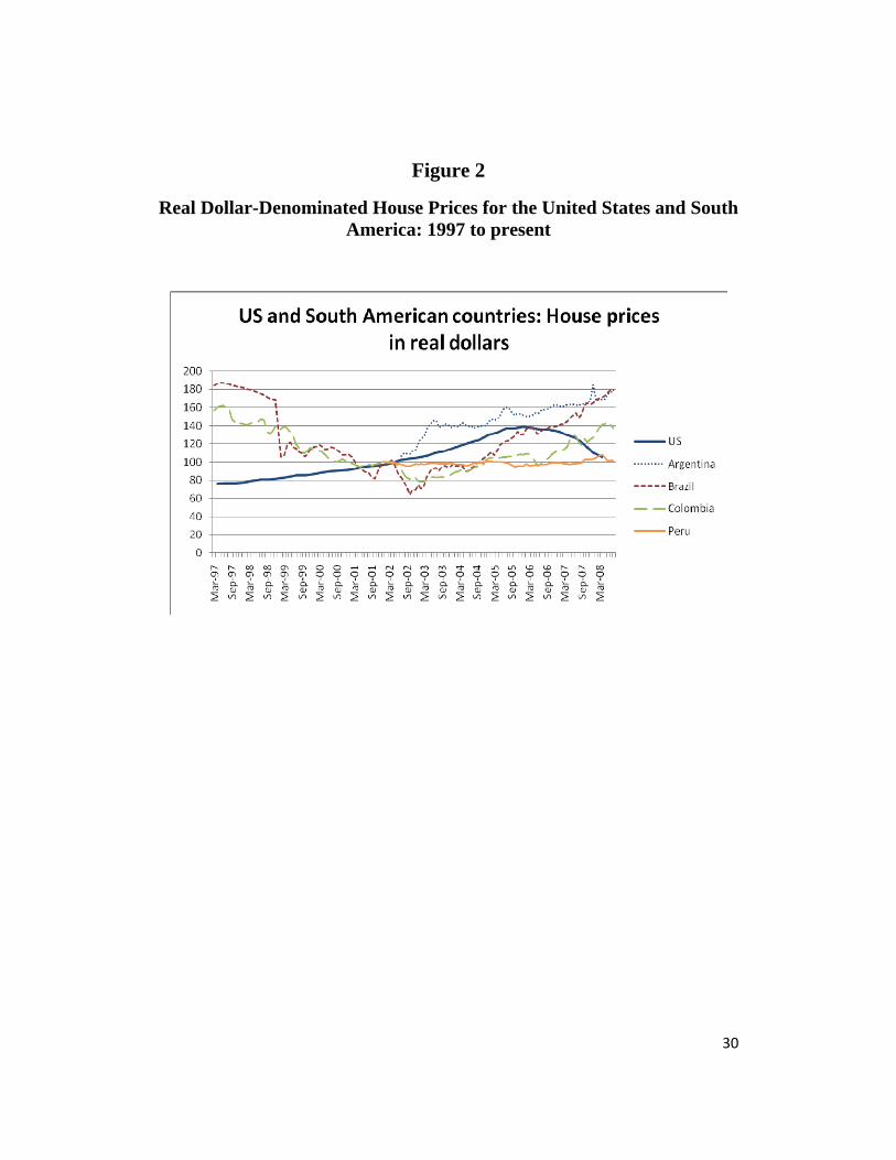
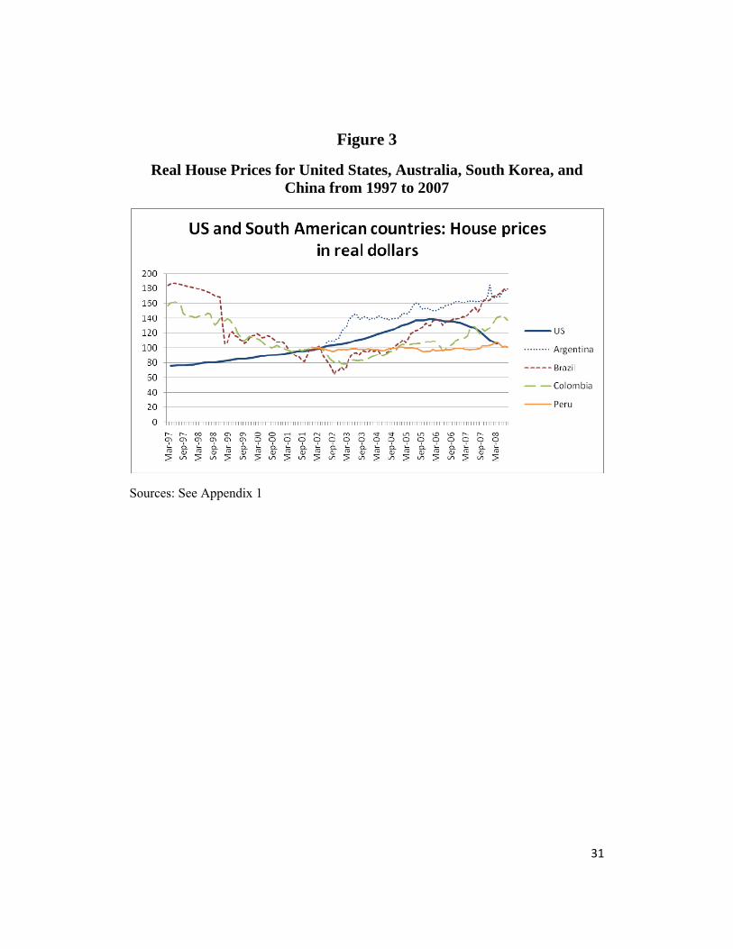
Additional data from other countries around the world show that the European experience with extraordinary rates of house price appreciation was not unique. For example, Figure 2 presents house price data for four countries in South America represented in real dollar terms.10 The crisis in the early 2000s had a pronounced downward effect on house prices throughout the region. However, the subsequent boom corresponded with a similar boom in other parts of the world. Figure 3 presents data from Australia, South Korea, and China. Once again, house prices grew rapidly when interest rates fell in 2002 and 2003. House price appreciation slowed in 2005, but picked up again afterwards.
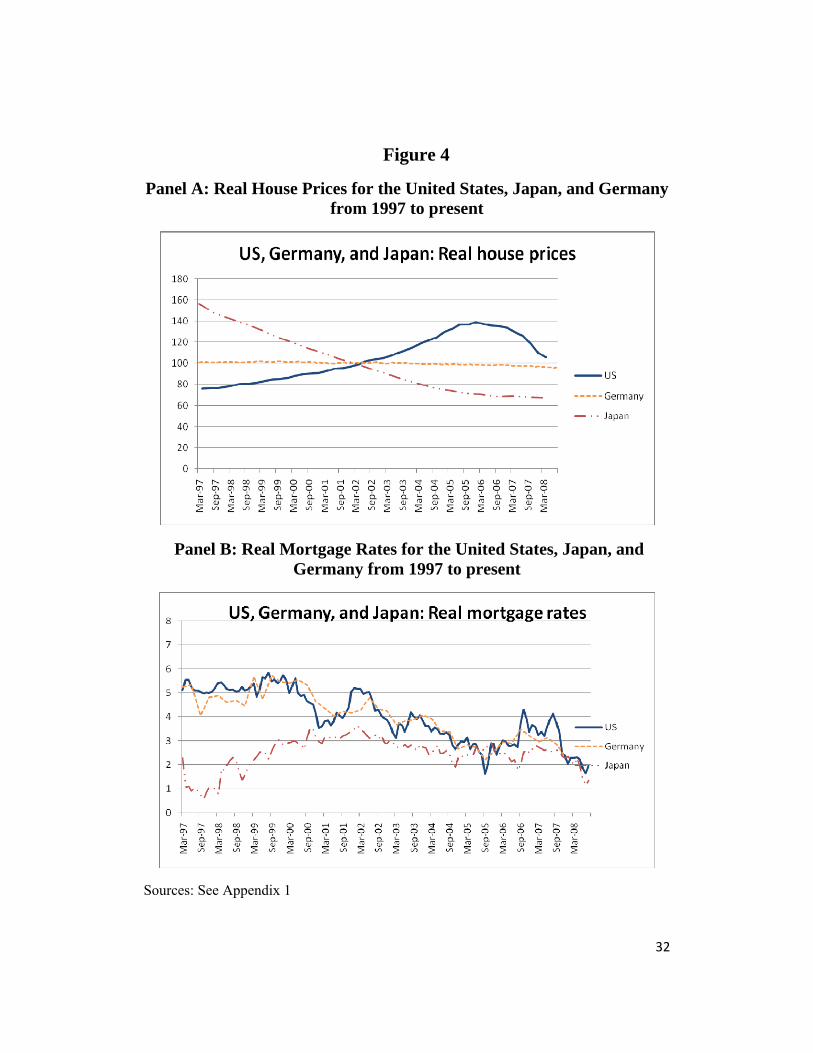
It is also instructive to separately consider the behavior of house prices and mortgages in Germany and especially Japan (see Figure 4). German and Japanese real mortgage rates fell with much of the rest of the world. However, local economic conditions played a crucial role in holding down house price appreciation. In Germany, the strong construction boom after the reunification of the two German states combined with slow population growth, led the country to have an oversupply of housing. More relevant to today’s conditions, Japan was in the middle of a more than decade-long economic slump. Even with low interest and mortgage rates, over-leveraged banks and underwater mortgages for many consumers led the country’s housing market to be in a constant state of decline. Many observers point to Japan as an example of the risks of leaving financial institutions without sufficient capital to make new loans.
Interpretation: House prices appear sensitive to real mortgage rates
The evidence for broad parts of the world suggests that low real interest and mortgage rates played a crucial role in the house price appreciation across the world between 2002 and 2006. One particular observation from the user cost
10 The data for South American countries are presented in real dollars because inflation data for some of these countries are of suspect quality. Partly as a result, many real estate transactions in these countries are conducted in dollars.
9
model is that the lower is the level of interest rates, the more sensitive are house price changes to movements in interest rates. This leads to the possibility that as interest rates fall, all else equal, house prices could become more correlated. This was exactly what happened in many parts of the world, as exemplified in Figures 1 to 3. The Goldman Sachs report mentioned earlier confirms this observation. The correlation of annual rates of house price appreciation across countries has grown in recent decades as real interest rates have fallen. Between 1998 and 2006, the correlation across OECD countries was an astounding 0.8, much higher than the 0.5 correlation that persisted in the 1980s and early 1990s.
Of course, the observation that real interest rates impact house prices should not be surprising from a theoretical perspective. Yet previous research has often suggested that real interest rates have little effect on house prices using evidence from newspaper searches or less comprehensive international comparisons (Shiller, 2007a and 2007b). We now go on to consider other real asset prices that also appear to have responded to the historic reduction in real interest rates in the mid-2000s.
Global Commercial Real Estate Returns: Another Correlated Boom
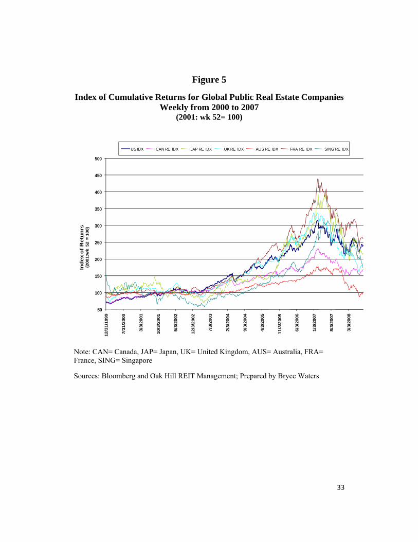
The boom in global housing prices did not occur in isolation. Returns to global commercial real estate also went through an unprecedented and highly correlated boom across a great variety of countries.
The timing and magnitude of the commercial real estate boom appears to closely mirror the global housing boom. While data on commercial real estate returns across countries are hard to gather in a comprehensive way, we collected returns to publically traded real estate companies in seven global markets, each with a large equity market capitalization of real estate companies and returns available back to 2000. These returns are displayed in Figure 5. While the bulk of the public companies is invested in commercial real estate, some homebuilders and residential developers are represented in this list. In countries that allow Real Estate Investment Trusts (REITs), especially the United States and Japan, REITs represent the bulk of the sample. REITs have grown globally in recent years as REIT laws were passed in many parts of the world.
The returns to public real estate companies are quite large and likely comparable to or even above the returns to owning housing in most of these countries over the same time period once adjusting for imputed rent (the equivalent of dividend payments for public companies) and leverage. Figure 5 reports equity returns, which include dividend payments as well as capital gains.
10
In addition, the public real estate companies use leverage to boost returns. Both the inclusion of dividends and the enhancement of leverage may explain why the returns for real estate public companies greatly exceed the rate of house price appreciation.
The numbers are striking. Real estate returns in France exceeded 300 percent between 2002 and 2006. In the United Kingdom returns were 236 percent. United States real estate companies returned a mere 216 percent over that four year period. In Japan, whose housing market was stagnant, many attributed the euphoria over the listing of public REITs to the 292 percent return from public real estate firms. Yet it is hard to imagine that the euphoria in Japan was much of a factor given the strong returns to real estate investment in other countries. Canadian real estate returns lagged that of other countries, much as Canada’s housing market was relatively sedated compared to markets in the United States and other industrialized countries. Australian returns were the lowest in this group, returning just 75 percent. Of course, these returns were well in excess of those in the broader stock market.
As with the housing market, local market factors also matter. Here we examined the correlation between real estate returns and those of the local stock market and United States REITs. We used data from the 2006 to 2008 time period to focus specifically on REIT share prices wherever possible, given the extent to which characteristics of REITs are more comparable across the world relative to other real estate companies. The details of the analysis are available from the authors, but are not reported here to conserve space. In all countries, we regressed the return on the local REIT or real estate index on returns in the local stock market and returns on the United States Morgan Stanley REIT index using weekly data.
The results show that REIT and real estate company returns are first, and foremost, correlated with local stock market returns. The coefficient on the variable for the local stock market return ranged from 0.54 to 1.1 and was always statistically significantly different from zero, suggesting a not-surprising, but strong correlation between real estate returns and the local economy. However, there was also a strong and statistically significant link between commercial real estate returns in each country and United States REIT returns, with coefficients ranging between 0.10 and 0.27. These findings suggest the likelihood of a global real estate factor. Real interest rates are a candidate for why such a global real estate factor exists. However, more work is required to examine this hypothesis.
11
User Costs and the Price-Rent Ratio in the United States Housing Market
While the evidence so far is strongly consistent with a decline in global real interest rates as strongly contributing to the recent boom in house prices, it is impossible to know how important real interest rates are, and whether house prices over-shot their fundamental levels, without a more formal model of house prices. The user cost model for housing as implemented by Himmelberg et al. (2005) is a good candidate for this analysis.11 However, as some analysts have pointed out, the user cost model does not fully consider the question of affordability. Therefore, we will also consider a variant on user costs; the ratio of owner imputed rent to income as a second measure of housing affordability.
To begin, we define user costs as:
(1) [ ]( )ittititit PEmrPR Δ−+−= %)1( τ .
Rit is the rent for one unit of housing services for one year in city i at time t, Pit is the corresponding price for prepurchasing the entire future flow of Ri, (1−τit)rt is the after-tax, equivalent-risk opportunity cost of capital, m is a measure of carrying costs (such as maintenance) per dollar of house, and E[%ΔP]it is the expectation of future house price appreciation in city i at time t. A more detailed description of the variables is available in Mayer and Sinai (2007).12
As many commentators have pointed out, the key variable in the user cost model is expected appreciation. Here, as in our earlier co-authored work, we use the rate of real house price appreciation from 1950-2000 at the metropolitan area level as computed in Gyourko et al. (2006) plus the expected rate of inflation. It is important to understand that this measure of house price appreciation does not attempt to model what home buyers might expect house price appreciation to be at any moment in time, but rather a longer-term measure of house value changes. As well, our calculated user costs are not intended to be a measure that can be used to forecast near-term changes in house prices.
11 Glaeser and Gyourko (2007b) suggest that the user cost model may be a poor candidate to examine the equilibrium level of house prices due to its lack of consideration of local supply and demand conditions and difficulties in measuring key variables like the risk premium and owner-equivalent rents. Despite these critiques, as shown below, the user cost model is the most tractable model suggested by economic theory to consider long-run equilibrium price levels and does a reasonably good job of explaining the price-rent ratio across a variety of markets.
12 This description, as well as Stata programs and links to the latest data are available on our website: http://www4.gsb.columbia.edu/realestate/research/housing.
12
Previous work suggests that the user cost measure does a good job of explaining cross-sectional variation in house prices across MSAs. For example, Mayer and Sinai (2007) show that a simple regression of the log(price-rent ratio) on the log(inverse of the user cost) obtains a coefficient of 0.48 using annual data from 1984 to 2006. While the coefficient is less than the 1.0 value predicted by theory, the data suggests that variation in the after-tax real interest rate is an important component of explaining the price-rent ratios across metropolitan areas. Even more striking, that same regression yields a coefficient of 1.26 in the more recent 1995-2006 time period. Thus house prices in the recent boom appear to be particularly sensitive to changes in the after-tax cost of owning a home. Of course, Mayer and Sinai show that other factors such as the incidence of subprime lending, loan-to-value ratios, and the past 5 year appreciation rate of house prices also affect the price-rent ratios in metropolitan areas. That lagged 5 year appreciation affects the price-rent ratio suggests some degree of momentum in house price levels, as pointed out by Case and Shiller (1989) and many others.
In the analysis below, we use the Case and Shiller/S&P house price indexes rather than the OFHEO data used in the previous work. In particular, the Case and Shiller data show a more pronounced decline in house prices from their peak that appears to better reflect current housing market conditions. As well, the Case and Shiller data are updated more frequently than the OFHEO data and thus give a better picture of the state of the housing market today.
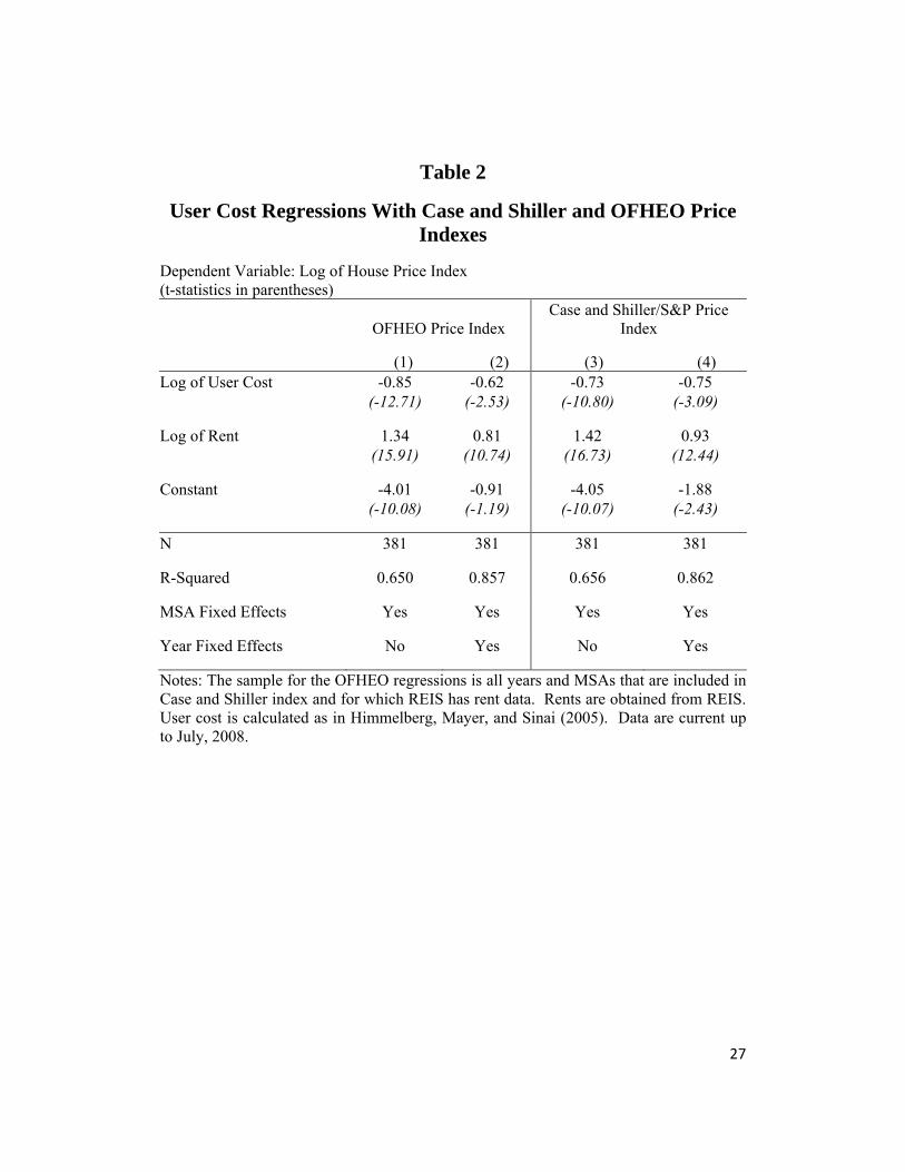
To begin, we run a simple user cost regression to confirm the large and statistically significant between house prices, user costs, and rents. Rearranging equation (1) to move house price on the left-hand side of the equation and taking logs gives: log(house price)= log(rent) – log(user cost). Thus the simple prediction is that the coefficient on log rent is 1.0 and the coefficient on log user cost is -1.0.
A complication in running this regression is that we do not observe matched rents and prices for a given home. Instead we use quality-controlled price and rent indexes.13 Thus it is impossible to test the “levels” version of the user cost model. Instead these regressions examine how well changes in prices are explained by changes in rents and changes in user costs.
Previous authors have claimed that problems with measuring matched rents and the acceleration of the price rent ratio cannot be easily explained by
13 Rent data are obtained from REIS and are sample rents for a constant quality apartment in various metropolitan areas from 1980 to present. We use the nominal rents to create a rent index for each metropolitan area.
13
movements in interest rates and rents.14 However, none of these papers have examined the user cost model using cross-sectional data across MSAs. For example, Glaeser and Gyourko (2008) regress log of the OFHEO house price index on the real interest rate and conclude that there is only a very small effect (-0.046). However, such a regression ignores the more structural relationship predicted by the user cost model. As well, the regression makes a claim using national data that the user cost model cannot explain variation across metropolitan areas. As we show, below, the data do not support the claim that house prices are only slightly correlated with interest rates.
Table 2 presents the simple user cost model regressions using log house price as the dependent variable and log rents and log user cost as the independent variables. The regressions include metropolitan area fixed effects and in some cases, year fixed effects.
The results suggest that house prices reflect changes in the user costs to an appreciable degree when using data for 18 metropolitan areas with available rent data and Case and Shiller house price indexes between 1987 and 2008. In particular, the coefficient on log user cost is about -0.62 to -0.85 in the OFHEO regressions and -0.73 to -0.75 in the Case and Shiller regressions. The overall fit is slightly better in the Case and Shiller regressions (columns 3 and 4). While the coefficient is statistically different from -1.0 in the specifications without year fixed effects, we still would conclude that after-tax interest rates exhibit a strong correlation with house price appreciation. This regression also validates the idea that declines in interest rates help explain the super-normal rates of house price appreciation in so-called “Superstar Cities” like Boston, Los Angeles, New York, and San Francisco.
The coefficients on log rents vary appreciably depending on the inclusion of year fixed effects. Without year fixed effects, the coefficient on log rents is well above unity; 1.3 in the OFHEO regression (column 2) and 1.4 in the Case and Shiller regression (column 4). When we include year effects, the coefficient on log rent drops to 0.80 in column (2) and 0.93 in column (4).
The excess variation in the log price-rent ratio without year effect suggests that factors other than rent and user cost growth also explain the growth in the growth in the price-rent ratio.15 However, the fact that the excess volatility of 14 See for example Glaeser and Gyourko (2007b; 2008) and Shiller (2007a; 2007b).
15 This is an empirical conclusion of many authors using different methodologies, including Case and Shiller (1989), Meese and Wallace (1993), Lamont and Stein (1999), Van Niewerburg and Weil (2007), and Mayer and Sinai (2008), among others.
14
rents drops out when year effects are included suggests that national factors are the predominant driver of the excess volatility of the price-rent ratio. This suggests that backward-looking expectations of price appreciation are not the primary cause of excess price-rent volatility in the user cost equation because this is an MSA-specific factor.
Instead we propose two other candidates. First, credit markets almost certainly play a role in the movement of national house prices. Subprime lending and reduced down payment and credit requirements to purchase were national factors that impacted many metropolitan areas.16 However, even without the excesses of subprime lending, the existence of household liquidity constraints or loss aversion can also lead to excess volatility of house prices.17 Second, Shiller (2007a) has proposed that a national, or even international, housing bubble might have developed in recent years. While we argue that changes in real interest rates played a key role in the global behavior of real estate, excess volatility remains across United States housing markets.
Imputed Rents and Housing Affordability Across the Country
Having argued that the user cost model presents a reasonable theoretical benchmark to assess current house prices and appears to be highly correlated with price-rent ratios, we now examine the level of house price-rent ratio today across the markets where Case and Shiller collect housing data. There are two key questions here. First, how far out of line did the price-rent ratio and housing affordability get in these markets? Second, where are house prices today?
To address these questions, we plot two measures, both of which are described in Himmelberg et al. (2007). The first is the imputed rent-to-rent ratio. Imputed rent (for owner-occupied housing) is just the house price index multiplied by the user cost at the MSA level. This is compared to the rent index. Since we compute these measures based on indexes, there is no natural level interpretation. Instead, we can only make relative comparisons. That is, we can examine how the cost of owning a house compares to renting between different years in an MSA. But if the cost of owning was inflated over the entire time period (maybe due to recently inflated expectations of house price appreciation), 16 See Pavlov and Wachter (2006; 2007) and Mayer and Sinai (2007). Mayer, Pence, and Sherlund (2009) survey the recent literature on subprime excesses.
17 See Stein (1995), Genesove and Mayer (1997; 2001), Lamont and Stein (1999), Ortalo-Magne and Rady (2006), and Engelhardt (2003).
15
then this ratio will give a flawed picture of the relative cost of owning to renting. The second measure is the imputed rent-to-income ratio. This index examines the ratio of imputed rent relative to income changes over the same time period. Once again, this is only a relative measure of housing affordability over the sample period. Thus we are really measuring whether relative housing affordability exceeds its MSA-specific average. Not surprisingly these two measures (imputed rent-to-rent and imputed rent-to-income) move quite similarly given that rent-to-income ratios have remained relatively constant across much of the country over this time period.18
We present these measures for three groups of cities using a categorization first proposed by Mayer (2007): historically cyclical markets, steady markets, and “recent boomers.” The first category is markets that have seen historically high rates of average appreciation, but are also more volatile (as might be predicted by the user cost model). Steady markets are those where there has been little historical appreciation, and markets where house prices have been more steady. The recent boomers are markets where historical rates of house price appreciation have been low, but where house prices exploded after 2002. We drop four cities from the Case and Shiller data. Las Vegas and Dallas do not have historical rent or price data starting in 1987. Portland and Seattle are not easily categorized in that they have adopted recent land use constraints that make new construction more difficult. Thus in the Gyourko et al. (2006) categorization they would be recent superstar cities and thus it is not reasonable to use historical rates of appreciation to measure future expected rates of house price appreciation.19
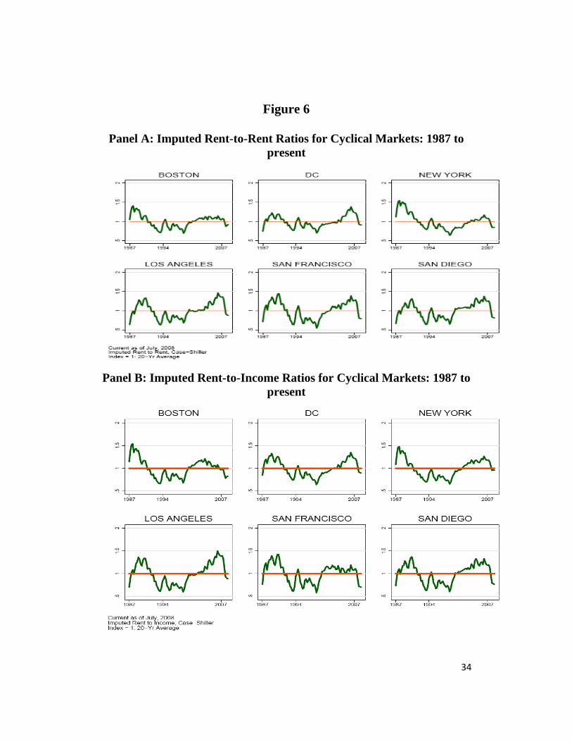
Figure 6 presents imputed rent-to-rent and imputed rent-to-income ratios for the cyclical cities between 1987 to present. Even when controlling for user costs, these metropolitan areas appear to exhibit high rates of short-term house price volatility that are not explained by changes in user costs. There are two pronounced cycles: one in the late 1980 and early 1990s and again after 2005. In the California and Washington DC markets, the recent cycle of excess appreciation after 2005 was particularly severe, with imputed rent-to-rent ratios exceeding their long-term average by as much as 40 percent. New York and Boston exhibited much less overpricing. As well, Mayer and Pence (2007) show that subprime lending was much more concentrated in California and Washington, DC. While it is impossible to use these data to make a causal link between subprime lending and excess appreciation, there is a very strong 18 See Davis and Ortalo-Magne (2008).
19 Data on all these cities on an updated basis, including Portland and Seattle, is available on the web at http://www4.gsb.columbia.edu/realestate/research/housing.
16
correlation between subprime lending and excess price-rent ratios across many cities as noted by Mayer and Sinai (2007). As well, recent rates of house price declines have been much larger in California and Washington, DC relative to New York and Boston.
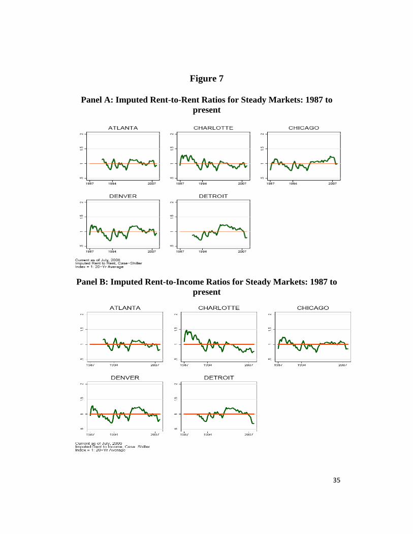
The imputed rent-to-rent and imputed rent-to-income ratios do not vary nearly as much in the stable markets exhibited in Figure 7. These markets are a mix of locations where new construction is relatively easy, such as Atlanta and Charlotte, and metropolitan areas with slow or even negative demand growth (Chicago and Detroit). Recent declines in house prices put the pricing and affordability measures near historic lows. Nonetheless, in a market like Detroit, secular economic decline might not lead an analyst to the conclusion that housing is really cheap. In areas where construction is less constrained such as Atlanta and Charlotte, ease of construction surely keeps prices near construction costs. All of the steady markets appear to have been impacted by the recent problems in credit markets (more on this in the next section), with strongly correlated house price declines.
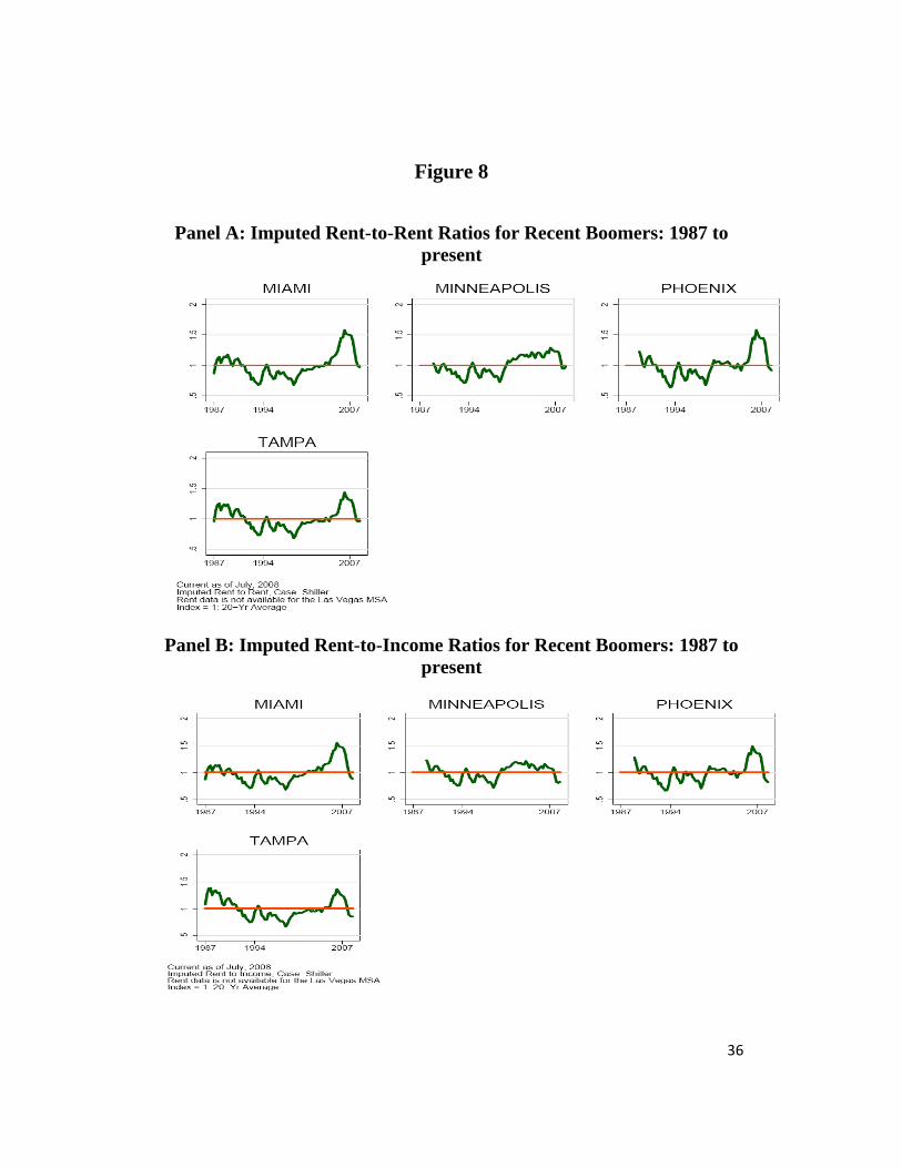
The “recent boomers” are the most stark example of markets where house prices got very far out of line with fundamentals in the mid-2000s. While interpretations of house price appreciation may differ across economists for the first two groups of markets, commentators or economists appear to agree that fundamentals cannot explain the sudden run-up in house prices in these recent boomers. Despite relatively unconstrained new construction of single-family homes and/or condominiums in Miami, Phoenix and Tampa, prices still spiked with extraordinary and historically unprecedented rates of appreciation from 2002 to 2006. Las Vegas surely matches this description as well, even if there is not historical data on rents from REIS to quantitatively support this hypothesis.
Going back to the earlier analysis of international markets, there are analogies between the behavior of prices in these groups of United States markets and the behavior of prices in some global markets. House prices in Britain and France, for example, mirror the behavior of prices in the historically cyclical and supply constrained markets like the northeast and California. In these markets, even if house prices are expected to fall, they likely will eventually recover as they have historically. However, Spain and Ireland seem more like Las Vegas and Phoenix. New construction was easy and prevalent during the recent boom, and house prices in these markets may well suffer a more permanent decline.
A second point is that the user cost model generates similar results to a construction cost model as exemplified by Glaeser et al. (2008). These authors argue that construction costs must constrain prices in markets without supply
17
constraints. The user cost model also generates similar findings. Markets where house prices have grown and construction is easy appear most overpriced by both metrics.
Mortgage Market Meltdown and House Prices
For the remainder of the paper, we consider the role of policy in dealing with the large, unprecedented, and highly correlated decline in house prices across large swaths of the United States. While fundamental factors clearly played a role in driving down house prices that were well above their fundamental level two years ago, Figures 6 to 8 suggest that house prices have fallen close to fundamental levels and in most markets already overshot where house prices should be in order that the imputed rent-to-rent ratio (or imputed rent-to-income) hits its average level of affordability in the last 20 years. Even if we remove the recent excess boom from the data, house prices are still close to where fundamentals suggest they should be using the latest data.
Nonetheless, house prices are likely to continue falling. Clearly, house prices exhibit medium-term momentum around their fundamental values. As well, the economy is turning down. Greater unemployment also pushes down house prices in a way that is not incorporated in this model, as it assumes historical growth in rents and prices.
Yet in our analysis, a third key factor is also playing an important role—the meltdown in mortgage markets has substantially raised mortgages rates relative to their historical relationship to interest rates. Thus, our analysis in the earlier sections is missing a key variable—the role of credit markets in mortgage prices and thus in house prices.
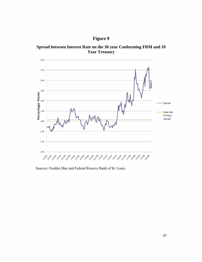
As in Figure 9, the spread between the interest rate on the average 30-year conforming mortgage and the 10-year Treasury bond has widened enormously in the last year. In fact, while the yield on the 10-year Treasury bond has fallen by nearly 1.5 percent in the past 2 years, the average rate on a conforming mortgage has fallen by about 0.5 percent. Almost surely, problems with Fannie Mae and Freddie Mac that eventually led to their being put into United States government conservatorship combined with the broader credit crunch are responsible for the increase in the spread between mortgage rates and Treasury securities. Nonetheless, the increase in mortgage spreads has had catastrophic consequences for housing affordability and will surely drive house prices down well below what their fundamental value would be with a normally functioning mortgage market.
18
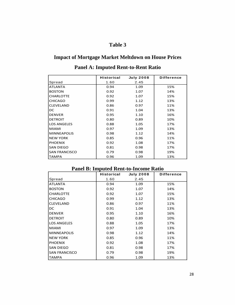
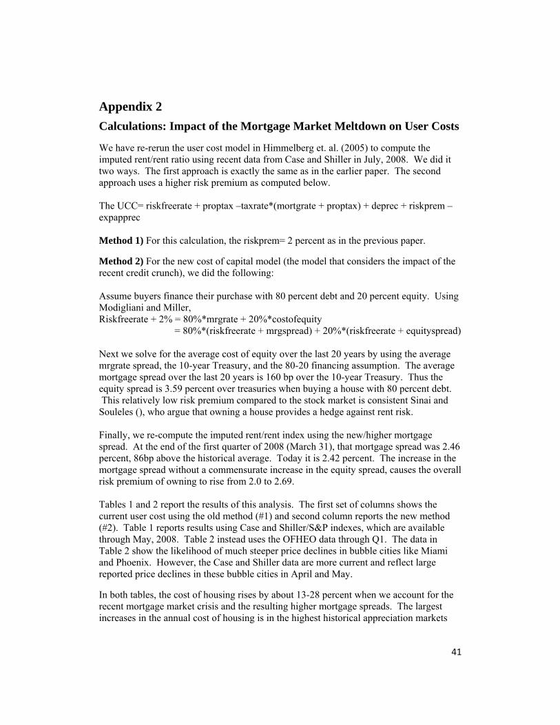
The impact of this additional increase in the mortgage spread is quite large. Table 3 presents the basic analysis in two scenarios. The first computation assumes there is a normally functioning mortgage market—that is, that mortgage rates are 1.6 percent above the 10-year Treasury rate as is the average spread over the last 20 years. The second computation shows the impact of the current distressed mortgage market on house prices, where mortgage rates exceed the 10-year Treasury rate by more than 2.4 percent as of July 2008, the date of the latest data in this paper for the Case and Shiller index. To make the second computation, we assume that borrowers use an 80 percent mortgage to finance their house and pay a higher spread on their mortgage. Appendix 2 details the calculations.
As a result of higher mortgage spreads, the imputed rent-to-rent ratio increases by about 10 to 17 percent, with the highest increases in the highest historical appreciation rate markets on the coasts. As before, house prices in these markets are the most sensitive to changes in interest rates. These computations suggest an appreciable drop in demand associated with higher mortgage rates that could push house prices down far beyond where they should fall based on fundamentals. In most markets, house prices are already at or below their fundamental values with normally functioning mortgage markets. However, according to our calculations, we should expect house prices in the bulk of markets to fall another 4 to 15 percent to reach their new fundamental level with higher mortgage spreads.
It is important to note that the user cost calculations are not far different from what a naïve borrower might assume when looking at how much house he or she could afford. Many analysts compute an affordability measure which is just a comparison of the accounting cost of owning a home. The numerator of the affordability index is typically the after tax mortgage payments on an 80 percent LTV mortgage at prevailing rates multiplied by the median price of a house. The denominator is the median income. The ratio the accounting cost of housing divided by income.
The major difference between the affordability index and the ratio of imputed rent-to-income is that the user cost incorporates expected house price or rent appreciation. Of course, some analysts have noted that the average level of the affordability index is higher in high-priced markets than low-priced markets. Note that the high cost markets are also the high appreciation rate markets, or “superstar cities.” That buyers pay higher owner-imputed costs in high priced markets is consistent with lower user costs in these markets. In a behavioral context, a buyer who looked at the after-tax accounting cost of owning a home and then was willing to pay more in markets where house prices have historically
19
risen, would be computing a reasonable approximation of the user cost model that is derived from theory.
A second major way of computing the extent to which house prices have fallen relative to fundamental values is to examine the overall price of housing. While empirical evidence from the post-war era suggests that real house prices in “superstar cities” (cyclical markets) will grow at a real rate of about 2 percent above the national average, real house prices in other metropolitan areas should more closely track construction costs (Gyourko et al. 2006).
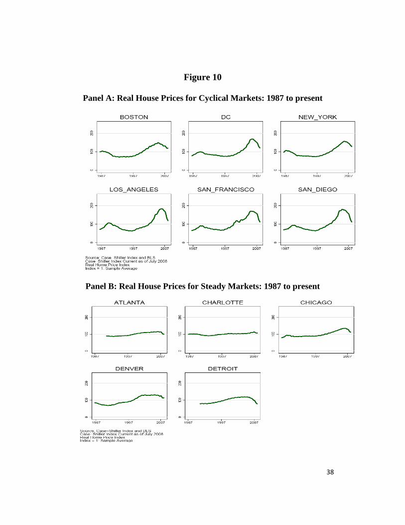
Calculations that just examine real house prices also come to the same basic conclusion as we obtain from the user cost calculations in Table 3: house prices have now fully corrected from their recent boom across most of the country. Figure 10 shows real house prices for the same three groups of cities as presented earlier.
For the cyclical cities, real house prices today are about 10 to 20 percent above their 21-year average. This is consistent with a real growth rate of about 2 percent per year over this time period. That suggests that house prices are about where they should be given that the underlying reasons for the long-term real growth of house prices in these superstar cities still persist, including limited supply and growing demand due to income growth, especially for the right tail of the national income distribution. Of course, the user cost methodology recognizes that real interest rates are much lower today than they were in 1987 and thus suggests that house prices are actually a bit cheap in some of these markets--or at least would be cheap if mortgage spreads were at historic levels.
In the steady markets, house prices have fallen most of the way to their previous levels, although Chicago and Denver exhibit a slight upward trend in real house prices. Given that these two markets have seen demand growth and have some constraints on building, it might not be surprising for house prices to rise over time.
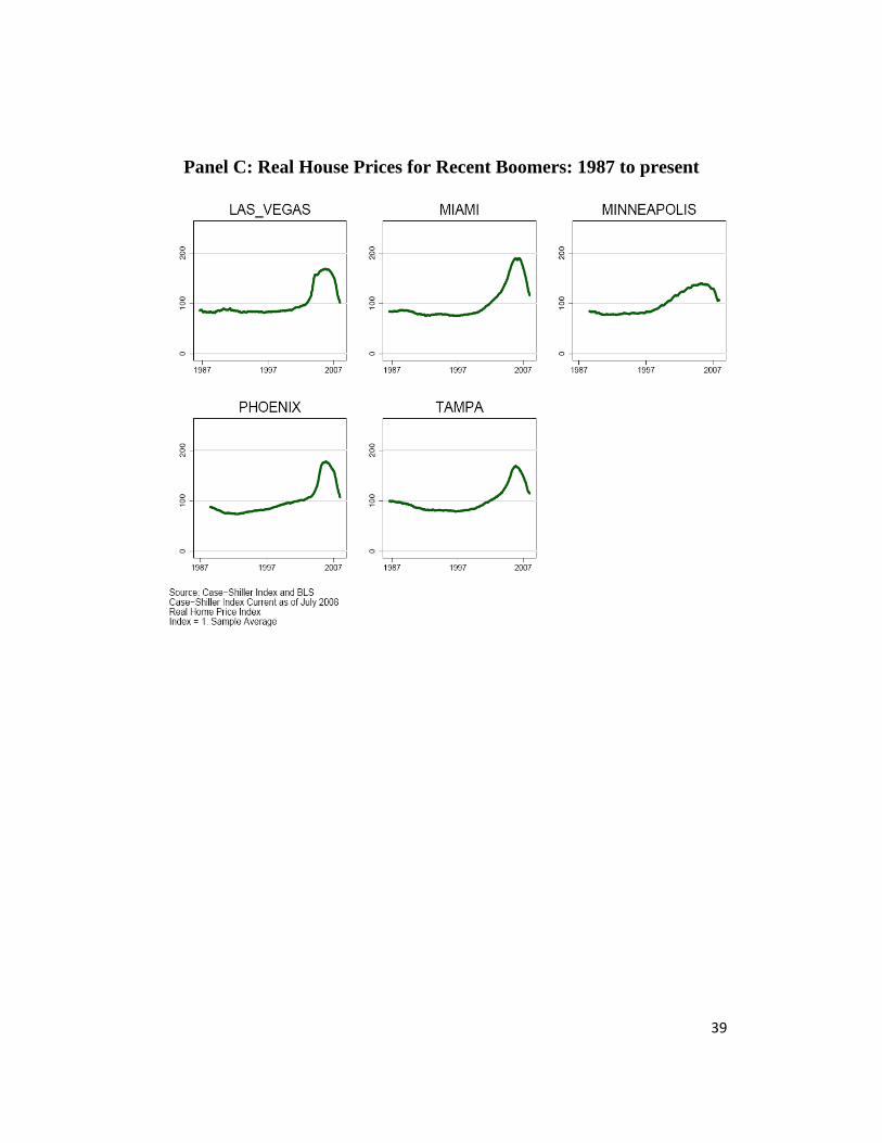
Real house prices have fallen by the largest percentages in the recent boomers, with real declines of as much as 35 percent over a two-year period. Yet, house prices have still not declined all the way to their previous level prior to the boom. Of course, real construction and materials costs have also gone up over this time period, so some real appreciation might be warranted. Nonetheless, it is still likely that house prices in these markets must fall further. The user cost model reports that house prices in these markets are a very close to fair value, once again reflecting the decline in real interest rates and rents that slightly increased over this time period.
20
Conclusion and Policy Analysis: A Specific Proposal
Throughout much of the paper we have argued that real interest rates have an important impact on housing and real estate prices. Evidence in favor of this hypothesis comes from an examination of global housing and commercial real estate markets, as well as statistical analysis of the user cost model in explaining the relative movement of the price-rent ratio in United States metropolitan areas.
Below we discuss a specific proposal that should be considered as the United States government considers how to address the current financial crisis.
First, and foremost, we believe that public policy toward housing in the present financial crisis should avoid near-term fixes that have adverse long-term consequences. For example, public policy should avoid substantial new subsidies for housing may boost the demand for homes and house prices, but run the risk of re-inflating a bubble in house prices. As well, reforms of bankruptcy laws that would increase the ease with which borrowers can reduce their debt burden may alleviate near-term balance-sheet distress for households. But such reforms do so at a large, longer-run cost--ex post changes in contracts will lead lenders to raise their required return on mortgage lending, actually increasing the cost of credit intermediation. The resulting higher mortgage rates will also further reduce house prices. Research on this subject that is particular to housing has come to conflicting conclusions20, however we continue to believe that evidence from other markets is quite compelling that the ex-ante cost of credit reflects the ex-post right of creditors. In addition, the bankruptcy courts are ill-equipped to handle the scale of foreclosures in a time sensitive manner.
Instead, we believe the appropriate course for policy is to re-establish “normal” lending terms for housing finance, while offering tools to resolve the millions of mortgages with negative homeowners’ equity, which may lead to foreclosures.21
20 Levitan (2009) presents empirical evidence that mortgage rates do not vary across states or property types in which the bankruptcy treatment is quite different. Yet, Pence (2006) shows that mortgage amounts are higher, all else equal, in states that allow non-judicial foreclosure, which is both faster and more secure relative to judicial foreclosure proceedings.
21 This argument was initially laid out in the opinion piece by R. Glenn Hubbard and Christopher Mayer entitled “First, Let’s Stabilize House Prices,” Wall Street Journal, October 2, 2008.
21
The recent expansion of the federal government’s role in housing finance—through expansion of authority of the Federal Housing Administration, the conservatorship of Fannie Mae and Freddie Mac, and the financial delegation authority in the Troubled Assets Relief Program—offers potent channels for stabilizing house prices and resolving underwater mortgages. In particular, reducing mortgage rates to levels that would prevail in a normally functioning housing market would support the current level of house prices and diminish the extent of further price declines. As argued above, house prices have already fallen to the level that they would likely attain in a normally functioning mortgage market. In addition, the creation of a contemporary analogue of the Depression-era Homeowners’ Loan Corporation (HOLC) can resolve troubled mortgages efficiently.
Consensus forecasts from the futures markets and various Wall Street analysts predict additional declines in house prices of 15 percent or more over the next 18 months. Consistent with the asset-pricing model presented earlier, lowering mortgage rates by nearly one percentage point would raise housing demand by about 10 to 17 percent, blunting the projected price declines. This reduction in mortgage rates can be accomplished without costly new subsidies.
Stabilizing the level of house prices is essential for repairing not only household balance sheets, but also for blunting declines in the value of mortgage-backed securities and complex securities built on top of these instruments. The enormous leverage in housing-related financial instruments gives house prices an outsized role in the balance sheets of households and financial institutions and forges the link between falling house prices and the rising cost of credit intermediation. Given that the initial decline in house prices of 15 to 20 percent have resulted in losses in the financial system of more than $500 billion. Another 15 percent fall in house prices would likely be devastating, exposing taxpayers to large losses from public ownership and guarantees of nearly $5.6 trillion of mortgages through Fannie Mae, Freddie Mac, and Ginnie Mae, plus loans to AIG and potential taxpayer liabilities on deposit insurance guarantees to troubled banks. The goal of policy action cannot be limited to raising housing demand at the margin, but must focus on impacting overall house prices.
The government-sponsored enterprises cannot, of course, simply announce lower mortgage rates. And present public policies, by drawing assets toward other financial institutions and away from the GSEs are raising GSEs’ funding costs. The spread between mortgage rates and the 10-year Treasury rate is now as high as it was prior to United States Government conservatorship of Fannie Mae and Freddie Mac. One possible mechanism would have the Federal Reserve offer to swap debt in Fannie Mae or Freddie Mac for an equivalent Treasury security
22
(modeled after the Term Securities Lending Facility at the Federal Reserve Bank of New York). Alternatively, the government might issue Treasury debt and then lend the proceeds to a special purpose vehicle (SPV). The SPV would serve as a pass-through entity, and lending to GSEs at Treasury rates. The latter plan would allow the government to lower current borrowing costs for Fannie Mae and Freddie Mac without impacting the price of currently outstanding securities. Both plans could be phased out over time as credit markets improve and allow for Fannie Mae and Freddie Mac to be restructured and spun off in the future.
We see two immediate beneficiaries of lower rates for 30-year fixed rate mortgages: existing borrowers currently in adjustable rate mortgages with higher rates and complicated step-up provisions and new first-time home buyers. Getting more homeowners into easily understandable mortgages would surely provide large benefits by eliminating more complicated mortgage products that many consumers do not understand and put these consumers at risk of large payment shocks.22 In addition, lower mortgage rates make housing more affordable. Moreover, a substantial intervention that benefits homeowners and the housing market will surely raise confidence of buyers that an end to the downward spiral of house prices may be in sight.
A second part of our plan is to create a modern equivalent of the Home Owners Loan Corporation. The modern HOLC would initially offer to help homeowners with negative equity refinance into a stable 30-year fixed rate mortgage with a 95 percent loan-to-value ratio by helping to absorb negative equity that is currently freezing credit and housing markets. It could offer to owners and servicers the opportunity to split the losses evenly on refinancing a mortgage with the new agency. Servicers or lenders would have to agree to accept these refinancings on all mortgages or on none at all to avoid cherry-picking. In return for the government portion of the write-down, which would be paid in cash, the HOLC would take an equity position in the house so that the taxpayer-funded agency profits when the housing market turns around.23 Fannie Mae, Freddie Mac, and the FHA could help manage the mortgage origination 22 Bucks and Pence (2008) show that many borrowers with adjustable rate mortgages do not understand some of the most basic provisions of their mortgages, such as the index of margin used to compute new payments at an adjustment period. Others did not even appear to understand that the rate on their mortgage could adjust.
23 Ideally the equity position would be paid based on changes in house price indexes in the county or metropolitan area where the home is located so as not to distort homeowners’ incentives to maintain or improve their house. Other proposals that allow homeowners to become renters in their own home suffer from a moral hazard problem that gives owners incentives to under-invest in their homes.
23
process so this could be implemented quite quickly. The refinanced mortgages would be packaged to held by the HOLC, sold to Fannie Mae, Freddie Mac, or Ginnie Mae, or eventually spun off in new mortgage-backed securities to investors when markets recover.
The costs to the government of this plan are difficult to precisely estimate given the equity sharing provision, but can be bounded based on the initial investment in the equity sharing provision. Detailed descriptions of these calculations are provided in Appendix 3. A program to share mortgage write-downs of up to $100,000 would cost lenders $121 billion and taxpayers would provide an equal subsidy of $121 billion. While these numbers are quite large, they are not enormous compared to the existing appropriations being considered to address the housing and financial crisis. And the equity sharing arrangement will likely bring in additional revenue over time. From the lenders’ perspective, many of the $121 billion of write-downs may well have already occurred and, in any case, the total amount is still modest compared to the anticipated write-downs embedded in share prices.
The macroeconomic stimulus from the two policy interventions we described is substantial. Under normal circumstances lower interest rates in a downturn benefit borrowers who refinance existing mortgages at lower rates and new buyers are encouraged to purchase housing. Yet with malfunctioning credit markets, lower interest rates are not getting passed along to consumers. Allowing mortgage refinancing as we have described above would reduce mortgage payments for almost 20 million homeowners who currently took out mortgages at times that mortgage rates were 5.75 percent or higher and meet our other criteria.24 The typical borrower would reduce his or her principal and interest payments by about $350 dollars, a total reduction in mortgage payments of nearly $100 billion per year. Of that reduction, about $16 billion per year of the reduction is due to interest savings with lower mortgage balances (HOLC effect), $39 billion is lower interest payments on remaining balances from homeowners who refinance at a lower rate (refinancing effect), and about $42 billion in reduced amortization payments associated with extending mortgages that had as few as 23 years remaining for a new 30-year term. Thus about $55 billion per year (HOLC and refinancing effects) would be a direct macroeconomic stimulus. The reduced mortgage amortization might also provide short-term benefits by helping relax other credit constraints that some consumers face due to reduced lending on credit cards, student loans, and auto loans.
24 See Appendix 3 for detailed calculations and what the costs and benefits might be for other caps.
24
The macroeconomic stimulus effect should also include an additional housing wealth effect. At the low end of our estimates, improved mortgage market operations would reduce house price declines by 10 percent. With an estimated aggregate housing valuation of about $18 trillion, housing wealth would increase about $1.8 trillion relative to what it might fall to without this program. If we assume a relatively low marginal propensity to consume out of housing wealth of 3.5 percent, U.S. consumption would rise by $63 billion relative to what would otherwise have occurred.
Combining these estimates gives a total macroeconomic stimulus of as $118 billion per year in lower mortgage payments and any new consumer spending due to a housing wealth effect. In addition to the direct macroeconomic stimulus, jump-starting the stalled housing market will increase employment in a variety of industries that depend on housing transactions (mortgage and real estate brokers, home supply companies, moving companies, etc.) as well as increase the efficiency of the labor market by reducing impediments to households moving to take another job (Ferreira et al. 2008).
There are other ancillary benefits of increasing prepayment speeds from existing mortgage-backed securities. Many of the troubled mortgages are now being managed by third-party servicers who are not compensated for successfully working out mortgages, so they have no incentives to put the effort and cost into real workouts (Gan and Mayer 2007; Ashcraft and Schuerman 2008). Previous reforms like HOPE NOW and explicit encouragement to servicers to modify loans have not succeeded (Cordell et al. 2008). Our plan would provide for individual re-underwriting of mortgages. Moving any loan with the possibility of repaying back to a single owner/servicer will have enormous advantages of burying a seriously flawed structure. Any borrower whose mortgage might be salvaged can be referred to the government program. Servicers will be left only with intractable loans that are unlikely to be paid, including loans to speculators or for investor-owned properties. They might well be better off selling these loans in bulk to specialists who will have the expertise and incentives to manage troubled real estate. The program of selling troubled loans in bulk through the Resolution Trust Corporation served the country very well in the early 1990s.
Whether the details of our proposal are adopted, or policymakers consider other options, it is imperative to restart the effective normal functioning of the mortgage market. Higher mortgage market spreads push down house prices (our estimate: 10-17%), creating additional losses in the banking system, raising the number of likely foreclosures, reducing consumer spending, and hammering confidence that the crisis is likely to end. Helping consumers to refinance into new mortgages with lower rates and helping to address the negative equity

25
problem will further reduce foreclosures and help clean-up consumer balance sheets. In addition, a well-publicized program to reduce mortgage rates helps confidence and affordability for potential new home buyers. Finally, taxpayers have strong incentives to protect their nearly $6 trillion in mortgages and mortgage guarantees that now sit on the federal balance sheet. Without strong policy action, the problems in the housing market will just get worse with appreciable consequences for all Americans.
26
Table 1
Percent Change in House Prices for Various Countries from 1997 to 2007
% change
Q1 2007 Q1 2006
South Africa 15.5 16.4 369
Singapore 13.8 4.7 na
Denmark 12.3 25.0 118
New Zealand 10.6 14.8 114
Britain 10.3 4.5 205
France 9.7 14.8 137
Belgium 9.5 12.2 129
Canada 9.0 7.1 72
Australia 8.6 3.9 139
Sweden 8.0 13.5 126
Ireland 7.4 11.2 251
Spain 7.1 12.0 184
Italy 6.2 6.7 92
Netherlands 6.2 5.4 97
China 5.9 5.4 na
Hong Kong 4.8 1.8 ‐41
United States (OFHEO) 4.3 12.6 107
Switzerland 2.5 1.3 17
Germany 0.3 1.5 na
Japan ‐1.6 ‐3.8 ‐32
United States (Case Shiller) ‐1.9 13.8 175
On a year earlier1997‐2007
Source: “Checking the Engine,” The Economist, June 7, 2007.
27
Table 2
User Cost Regressions With Case and Shiller and OFHEO Price Indexes
Dependent Variable: Log of House Price Index (t-statistics in parentheses)
OFHEO Price Index
(1) (2)
Case and Shiller/S&P Price Index
(3) (4) Log of User Cost -0.85 -0.62 -0.73 -0.75
(-12.71) (-2.53) (-10.80) (-3.09)
Log of Rent 1.34 0.81 1.42 0.93 (15.91) (10.74) (16.73) (12.44)
Constant -4.01 -0.91 -4.05 -1.88 (-10.08) (-1.19) (-10.07) (-2.43)
N 381 381 381 381
R-Squared 0.650 0.857 0.656 0.862
MSA Fixed Effects Yes Yes Yes Yes
Year Fixed Effects No Yes No Yes
Notes: The sample for the OFHEO regressions is all years and MSAs that are included in Case and Shiller index and for which REIS has rent data. Rents are obtained from REIS. User cost is calculated as in Himmelberg, Mayer, and Sinai (2005). Data are current up to July, 2008.
28
Table 3
Impact of Mortgage Market Meltdown on House Prices
Panel A: Imputed Rent-to-Rent Ratio
Historical July 2008 DifferenceSpread 1.60 2.45ATLANTA 0.94 1.09 15%BOSTON 0.92 1.07 14%CHARLOTTE 0.92 1.07 15%CHICAGO 0.99 1.12 13%CLEVELAND 0.86 0.97 11%DC 0.91 1.04 13%DENVER 0.95 1.10 16%DETROIT 0.80 0.89 10%LOS ANGELES 0.88 1.05 17%MIAMI 0.97 1.09 13%MINNEAPOLIS 0.98 1.12 14%NEW YORK 0.85 0.96 11%PHOENIX 0.92 1.08 17%SAN DIEGO 0.81 0.98 17%SAN FRANCISCO 0.79 0.98 19%TAMPA 0.96 1.09 13%
Panel B: Imputed Rent-to-Income Ratio
Historical July 2008 DifferenceSpread 1.60 2.45ATLANTA 0.94 1.09 15%BOSTON 0.92 1.07 14%CHARLOTTE 0.92 1.07 15%CHICAGO 0.99 1.12 13%CLEVELAND 0.86 0.97 11%DC 0.91 1.04 13%DENVER 0.95 1.10 16%DETROIT 0.80 0.89 10%LOS ANGELES 0.88 1.05 17%MIAMI 0.97 1.09 13%MINNEAPOLIS 0.98 1.12 14%NEW YORK 0.85 0.96 11%PHOENIX 0.92 1.08 17%SAN DIEGO 0.81 0.98 17%SAN FRANCISCO 0.79 0.98 19%TAMPA 0.96 1.09 13%
29
Figure 1
Panel A: Real House Prices for United States and European Countries: 1997 to present
Panel B: Real Mortgage Rates for United States and European
Countries: 1997 to present
Sources: See Appendix 1
30
Figure 2
Real Dollar-Denominated House Prices for the United States and South America: 1997 to present
31
Figure 3
Real House Prices for United States, Australia, South Korea, and China from 1997 to 2007
Sources: See Appendix 1
32
Figure 4
Panel A: Real House Prices for the United States, Japan, and Germany from 1997 to present
Panel B: Real Mortgage Rates for the United States, Japan, and
Germany from 1997 to present
Sources: See Appendix 1
33
Figure 5
Index of Cumulative Returns for Global Public Real Estate Companies Weekly from 2000 to 2007
(2001: wk 52= 100)
50
100
150
200
250
300
350
400
450
500
12/3
1/19
99
7/31
/200
0
3/3/
2001
10/3
/200
1
5/3/
2002
12/3
/200
2
7/3/
2003
2/3/
2004
9/3/
2004
4/3/
2005
11/3
/200
5
6/3/
2006
1/3/
2007
8/3/
2007
3/3/
2008
Inde
x of
Ret
unrs
(200
1:w
k 52
= 1
00)
US IDX CAN RE IDX JAP RE IDX UK RE IDX AUS RE IDX FRA RE IDX SING RE IDX
Note: CAN= Canada, JAP= Japan, UK= United Kingdom, AUS= Australia, FRA= France, SING= Singapore
Sources: Bloomberg and Oak Hill REIT Management; Prepared by Bryce Waters
34
Figure 6
Panel A: Imputed Rent-to-Rent Ratios for Cyclical Markets: 1987 to present
Panel B: Imputed Rent-to-Income Ratios for Cyclical Markets: 1987 to
present
35
Figure 7
Panel A: Imputed Rent-to-Rent Ratios for Steady Markets: 1987 to present
Panel B: Imputed Rent-to-Income Ratios for Steady Markets: 1987 to
present
36
Figure 8
Panel A: Imputed Rent-to-Rent Ratios for Recent Boomers: 1987 to
present
Panel B: Imputed Rent-to-Income Ratios for Recent Boomers: 1987 to
present
37
Figure 9
Spread between Interest Rate on the 30 year Conforming FRM and 10 Year Treasury
Sources: Freddie Mac and Federal Reserve Bank of St. Louis.
38
Figure 10
Panel A: Real House Prices for Cyclical Markets: 1987 to present
Panel B: Real House Prices for Steady Markets: 1987 to present
39
Panel C: Real House Prices for Recent Boomers: 1987 to present
40
Appendix 1 Summary of Data Sources for International Housing Prices HOUSE PRICE INDICES, CONSUMER PRICE INDICES, AND MORTGAGE RATESCountry Data SourceUS National house price index Case Shiller
30 year mortgage rate: monthly average Federal Reserve BoardConsumer price index: urban Bureau of Labor Statistics
UK National house price index NationwideMortgage rate: retail banks Office of National StatisticsRetail price index Office of National Statistics
Ireland Consumer price index: housing, national OECDAverage lending rate: house purchase Central Statistics Office of IrelandConsumer price index Central Statistics Office of Ireland
France Housing price index, metropolitan France French National Institute for Statistics and Economic StudiesAverage fixed mortgage rates Bank of FranceConsumer price index French National Institute for Statistics and Economic Studies
Germany Consumer price index: housing, national OECDAverage mortgage rates European Mortgage FederationConsumer price index Federal Statistics Office Germany
Spain National house price index Ministerio de Fomento Mortgage reference lending rate, CECA Bank of SpainHarmonised index of consumer prices National Statistics Institute
Argentina Consumer price index: housing, greater Buenos Aires National Statistics & Census InstituteConsumer price index: overall, greater Buenos Aires National Statistics & Census Institute
Brazil Consumer price index: housing, national Brazilian Institute of Geography and StatisticsConsumer price index Brazilian Institute of Geography and Statistics
Colombia Consumer price index: housing, national National Statistics Administrative DepartmentConsumer price index National Statistics Administrative Department
Peru Consumer price index: housing rents and construction, Lima National Institute of Statistics and Information ScienceConsumer price index: Lima National Institute of Statistics and Information Science
Australia Weighted house price index for eight largest cities Australian Bureau of StatisticsCPI, weighted average of eight largest cities Australian Bureau of Statistics
South Korea National house price index Kookmin BankConsumer price index National Statistical Office
Japan Urban land price index: metropolitan Tokyo, residential Japan Real Estate InstituteAverage floating mortgage rate: city banks Bank of JapanConsumer price index Statistical Bureau
China National house price index Goldman Sachs, CEIC (obtained from The Economist)Consumer price index National Bureau of Statistics
FOREIGN EXCHANGE RATESCountry/currency Data SourceAustralia Spot exchange rate Federal Reserve BoardUK Spot exchange rate Federal Reserve BoardEuro Spot exchange rate Federal Reserve BoardJapan Spot exchange rate Federal Reserve BoardSouth Korea Spot exchange rate Federal Reserve BoardChina Spot exchange rate Federal Reserve BoardBrazil Spot exchange rate Federal Reserve BoardArgentina Spot exchange rate Central Bank of ArgentinaColombia Representative monthly average Bank of the Republic of ColombiaPeru Sell price Central Reserve Bank of Peru
Note on inflation calculations:During a given year, expected inflation is taken to be: 0.75*(inflation during the last year) + 0.25*(inflation during the year before that).
41
Appendix 2 Calculations: Impact of the Mortgage Market Meltdown on User Costs
We have re-rerun the user cost model in Himmelberg et. al. (2005) to compute the imputed rent/rent ratio using recent data from Case and Shiller in July, 2008. We did it two ways. The first approach is exactly the same as in the earlier paper. The second approach uses a higher risk premium as computed below. The UCC= riskfreerate + proptax –taxrate*(mortgrate + proptax) + deprec + riskprem – expapprec Method 1) For this calculation, the riskprem= 2 percent as in the previous paper.
Method 2) For the new cost of capital model (the model that considers the impact of the recent credit crunch), we did the following: Assume buyers finance their purchase with 80 percent debt and 20 percent equity. Using Modigliani and Miller, Riskfreerate + 2% = 80%*mrgrate + 20%*costofequity = 80%*(riskfreerate + mrgspread) + 20%*(riskfreerate + equityspread) Next we solve for the average cost of equity over the last 20 years by using the average mrgrate spread, the 10-year Treasury, and the 80-20 financing assumption. The average mortgage spread over the last 20 years is 160 bp over the 10-year Treasury. Thus the equity spread is 3.59 percent over treasuries when buying a house with 80 percent debt. This relatively low risk premium compared to the stock market is consistent Sinai and Souleles (), who argue that owning a house provides a hedge against rent risk. Finally, we re-compute the imputed rent/rent index using the new/higher mortgage spread. At the end of the first quarter of 2008 (March 31), that mortgage spread was 2.46 percent, 86bp above the historical average. Today it is 2.42 percent. The increase in the mortgage spread without a commensurate increase in the equity spread, causes the overall risk premium of owning to rise from 2.0 to 2.69. Tables 1 and 2 report the results of this analysis. The first set of columns shows the current user cost using the old method (#1) and second column reports the new method (#2). Table 1 reports results using Case and Shiller/S&P indexes, which are available through May, 2008. Table 2 instead uses the OFHEO data through Q1. The data in Table 2 show the likelihood of much steeper price declines in bubble cities like Miami and Phoenix. However, the Case and Shiller data are more current and reflect large reported price declines in these bubble cities in April and May.
In both tables, the cost of housing rises by about 13-28 percent when we account for the recent mortgage market crisis and the resulting higher mortgage spreads. The largest increases in the annual cost of housing is in the highest historical appreciation markets

42
like New York, San Francisco, and Boston. As noted in the earlier paper, house prices in these markets trade at a large premium to rents and are especially sensitive to economic shocks to mortgage rates.
43
Appendix 3 Calculations: Negative Equity, Cost of Our Plan to Taxpayers, and Fiscal Stimulus
We use county deeds records from 377 counties in 31 states plus the District of Columbia (AL, AZ, CA, CO, CT, DC, FL, GA, IL, KS, KY, MD, MA, MI, MN, MO, NV, NH, NJ, NM, NY, NC, OH, OK, PA, SC, TN, TX, UT, VA, and WI ) and the 2000 United States Census. We consider all properties with sales or refinancing during or after the year 2000. With rising house prices, a property whose last transaction took place prior to 2000 is unlikely to have negative equity. We identify investor-owned properties as those in which the tax bill is sent to a different address than the property itself. We assume that properties with missing mailing address information are owner occupied. The sample is limited to residential properties described as condominiums, town houses, and single family homes.
From the most recent transaction, we compute an estimated value as of August 2008 by multiplying the last sale price by the percentage change in house prices in that county based on a county-level price index. Using the history of primary mortgages and additional liens on each property we are able to estimate the mortgage balance on that the property as of August 2008. To estimate the current outstanding mortgage balance, we use the average fixed mortgage rate during the month of origination (since the actual mortgage rate is not recorded in the deeds records). If the mortgage term length is missing, we assume a term of 30 years. The net equity position for each property is simply the estimated property value minus the estimated debt. We scale the numbers from our sample to national estimates by multiplying our estimates for each variable by the ratio of the number of housing units in the United States to the number of housing units in our sample.
Although we are not aware of any other estimates of the total dollar value of negative equity in the United States for owner-occupants, our results are roughly comparable to negative equity statistics that we have found from two other sources. Zillow.com estimates that 11.7 million homes have negative equity. First American CoreLogic estimates a total of 7.8 million properties with negative equity. Our estimates place that figure at 10.5 million, 8.8 million of which are owner occupants. Zillow reports that the average amount of negative equity (among households that have negative equity) to be about $59,000. We estimate that the average negative equity for owner occupants (among all owner occupants who have negative equity) is $77,000. As well, using the average negative equity and number of house holds from Zillow we can roughly estimate a national negative equity of $676 billion, whereas we estimate total negative equity at $846 billion, $677 billion among owner occupants. Our estimate of the percentage of investor-owned properties is similar to those found in Mayer, Pence, and Sherlund (2009) for subprime and Alt-A mortgages.
To examine who is eligible for the plan, we allow any owner occupant who took out a mortgage when average rates exceeded 5.75 percent to refinance into a new, 30 year
44
mortgage at 5.25 percent. The maximum allowed refinance amount is 95 percent of the current home value, not to exceed the current conforming loan limit of $729,750. Eligible homeowners also cannot refinance to a larger loan than their total current loan balance. In other words, the refinance balance is equal to either the current loan balance, 95 percent of the current property value, or $729,750 – whichever of the three values is least.
If a homeowner’s current outstanding loan balance is greater than the amount to which he is allowed to refinance (i.e., if the current LTV on the property exceeds 95 percent) then refinancing would require a “down payment” equal to the difference between the current loan value and the maximum allowed refinance amount. However, up to $100,000 of that down payment would be covered by the government, so refinancing would only require out-of-pocket expenditures for homeowners who are more than $100,000 underwater.
We calculate the mortgage payment reduction that each refinancing homeowner would receive, using the standard formula for amortized mortgage payments. We also break this monthly reduction down into the fiscal effects of the write downs (the “HOLC effect”) and the fiscal effects of the interest rate reduction (the “refi effect”). The HOLC effect is equal to the homeowner’s write down (if they qualify for one) times their original mortgage interest rate, divided by twelve (for a monthly reduction, rather than yearly). The refi effect is equal to the homeowner’s new mortgage amount (incorporating a write down, if eligible) times the difference between their original mortgage rate and the new rate of 5.25%, and again divided by twelve. (Since neither the HOLC nor the refi effect includes the reduction in principal payments associated with extending the mortgage to a new 30 year term, the sum of the two effects is less than the total reduction in monthly payments.)
Using the $100,000 cap, we obtain the following statistics from our sample (scaled up to a nationally representative sample as described above):
Number of currently outstanding mortgages originated since 2000: 32.6 million Currently outstanding mortgages originated to homeowners since 2000: 27.6 million Homeowners eligible to refinance to 5.25 percent meeting the above criteria: 19.9 million Percentage of homeowners eligible to refinance (out of all homeowners): 72 percent Total benefit from write downs (HOLC effect): $1.3 billion/month Total benefit from interest rate reduction (refi effect): $3.3 billion/month Total reduction in monthly payments per month (interest and principal): $7.1 billion Average reduction in monthly payment per homeowner who refinances: $355 Total mortgage write downs: $242 billion Cost to government of covering write downs (1/2 total cost of write downs): $121 billion
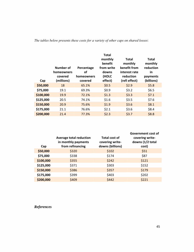
45
The tables below presents these costs for a variety of other caps on shared losses:
Cap
Number of homeowners
covered (millions)
Percentage of
homeowners covered
Total monthly benefit
from write downs (HOLC effect)
Total monthly
benefit from interest rate reduction (refi effect)
Total monthly reduction
in payments (billions)
$50,000 18 65.1% $0.5 $2.9 $5.8 $75,000 19.1 69.3% $0.9 $3.2 $6.5 $100,000 19.9 72.1% $1.3 $3.3 $7.1 $125,000 20.5 74.1% $1.6 $3.5 $7.6 $150,000 20.9 75.6% $1.9 $3.6 $8.1 $175,000 21.1 76.6% $2.1 $3.6 $8.4 $200,000 21.4 77.3% $2.3 $3.7 $8.8
Cap
Average total reduction in monthly payments from refinancing
Total cost of covering write‐downs (billions)
Government cost of covering write‐downs (1/2 total
cost) $50,000 $320 $102 $51 $75,000 $338 $174 $87 $100,000 $355 $242 $121 $125,000 $371 $303 $152 $150,000 $386 $357 $179 $175,000 $399 $403 $202 $200,000 $409 $442 $221
References
46
Ashcraft, Adam and Til Schuermann. 2008. “Understanding the Securitization of Subprime Mortgage Credit,“ Federal Reserve Bank of New York Staff Report #138, March.
Bucks, Brian and Karen Pence. 2008 “Do Borrowers Know Their Mortgage
Terms?” Journal of Urban Economics, 64(2):218-233. Case, Karl E. and Robert J. Shiller. 1989. “The Efficiency of the Market for
Single Family Homes”, American Economic Review (March 1989), 79(1): 125–37.
Davis, Morris and Francois Ortalo-Magne. 2008. “Household Expenditures,
Wages, and Rents,” University of Wisconsin mimeo. Engelhardt, Gary. 2003. “Nominal Loss Aversion, Housing Equity Constraints,
and Household Mobility: Evidence from the United States,” Journal of Urban Economics 53:1 (January) 171-195.
Ferreira, Fernando, Joseph Gyourko, and Joseph Tracy. 2008. “Housing Busts and
Household Mobility,” NBER Working Paper No. 14310. Gallin, Joshua H. 2006. “The long-run relationship between house prices and
rents.” Real Estate Economics, 34, 417-38. Gan, Yingjin and Christopher Mayer. 2007. “Agency Conflicts, Asset
Substitution, and Securitization,” NBER Working Paper No. 12359. Genesove, David and Christopher Mayer. 1997. “Equity and Time to Sale in the
Real Estate Market.” The American Economic Review 87(3), 255-69. _____. 2001. “Loss Aversion and Seller Behavior: Evidence from the Housing
Market.” Quarterly Journal of Economics 116(4), 1233-1260 Glaeser, Edward and Joseph Gyourko. 2007a. "Housing Dynamics," NBER
Working Paper No. 12787. _____. 2007b. “Arbitrage in Housing Markets.” "Housing Dynamics," NBER
Working Paper No. 13704. _____. 2008. “The Case Against Housing Price Supports.” Economists’ Voice,
October.
47
Glaeser, Edward, Joseph Gyourko, and Albert Saiz. 2008. “Housing Supply and
Housing Bubbles,” Journal of Urban Economics, forthcoming. Gordon, Myron J. 1962. The Investment, Financing and Valuation of the
Corporation. Homewood, Ill.: Irwin. Gyourko, Joseph, Christopher Mayer and Todd Sinai. 2006. “Superstar Cities,”
NBER working paper no. 12355. Himmelberg, Charles, Christopher Mayer and Todd Sinai. 2005. “Assessing High
House Prices: Bubbles, Fundamentals, and Misperceptions,” Journal of Economic Perspectives, Vol. 19(4), Fall, 67-92.
Lamont, Owen and Jeremy Stein. 1999. “Leverage and House Price Dynamics in
U.S. Cities”, Rand Journal of Economics 30, Autumn, pp. 466-486. Levitan, Adam. 2009. “Resolving the Foreclosure Crisis: Modifications of
Mortgages in Bankruptcy”, Wisconsin Law Review, forthcoming. Mayer, Christopher. 2007. Commentary on “Understanding Recent Trends in
House Prices and Home Ownership.” presented at the Federal Reserve Bank of Kansas City Conference at Jackson Hole, August 31.
Mayer, Christopher and Karen Pence. 2007. “Subprime Mortgages: What,
Where, and To Whom.” NBER Working Paper No. 14083. Mayer, Christopher, Karen Pence, and Shane Sherlund. 2009. “The Rise in
Mortgage Defaults,” Journal of Economic Perspectives, forthcoming. Mayer, Christopher and Todd Sinai. 2007. “Housing and Behavioral Finance,”
paper presented at the Federal Reserve Bank of Boston Conference on Behavioral Economics, September 25.
Meese, Richard and Nancy Wallace. 1993. Testing the Present Value Relation for
Housing Prices: Should I Leave My House in San Francisco? Journal of Urban Economics 35(3), 245-66.
Ortalo-Magne, Francois and Sven Rady. 1999. “Boom in, Bust Out: Young
Households and the Housing Cycle,” European Economic Review 43, April, 755-766.
48
_____. 2006. “Housing Market Dynamics: On the Contribution of Income Shocks
and Credit Constraints,” The Review of Economic Studies, 73: 459-85. Pavlov, Andrey and Susan Wachter. 2006. “The Inevitability of Marketwide
Underpricing of Mortgage Default Risk.” Real Estate Economics, 34(4), 479-96.
_____. 2007. “Aggressive Lending and Real Estate Markets,” mimeo, April 10. Pence, Karen M. 2006. “Foreclosing on Opportunity: State Laws and Mortgage
Credit.” Review of Economics and Statistics, 88:1, 177-82. Shiller, Robert. 2007. “Understanding Recent Trends in House Prices and Home
Ownership.” Paper presented at the Federal Reserve Bank of Kansas City Conference at Jackson Hole, August 31.
Sinai, Todd and Nicholas Souleles. 2005. “Owner Occupied Housing as a Hedge
Against Rent Risk,” Quarterly Journal of Economics, 120(2), 763-89. Smith, Gary and Margaret Hwang Smith. 2006. “Bubble, Bubble, Where's the
Housing Bubble?” Brookings Papers on Economic Activity 1, pp. 1-63.
Stein, Jeremy. 1995. “Prices and Trading Volume in the Housing Market: A
Model with Downpayment Effects,” Quarterly Journal of Economics 110, May, pp. 379-406.
Shiller, Robert. 2007a. “Understanding Recent Trends in House Prices and Home
Ownership.” Paper presented at the Federal Reserve Bank of Kansas City Conference at Jackson Hole, August 31.
_____. 2007b. “Low Interest Rates and High Asset Prices: An Interpretation In
Terms of Changing Popular Economic Models.” Brookings Papers on Economic Activity, Vol. 2, 111-32.
Sinai, Todd and Nicholas Souleles. 2005. “Owner Occupied Housing as a Hedge
Against Rent Risk,” Quarterly Journal of Economics, 120(2), 763-89. Van Nieuwerburg, Stijn and Pierre-Olivier Weil. 2007. “Why Has House Price
Dispersion Gone Up?“ NYU-Stern Working Paper, September.

49


![The Distribution Of Mortgage Rates - RBA · The Distribution of Mortgage Rates Michelle Bergmann and Michael Tran[*] Photo: Simon Bradfield – Getty Images Abstract Mortgage interest](https://img.pdfslide.us/doc/110x75/5ee093a0ad6a402d666bbd5c/the-distribution-of-mortgage-rates-rba-the-distribution-of-mortgage-rates-michelle.jpg)