Embed Size (px)
Citation preview
Histograms, Frequency Distributions and Ogives
Ms. Toliver
AP Statistics
Histograms
Histograms are bar graphs in which:• The bars have the same width and always touch• The width of a bar represents a quantitative value
(typically interval or ratio level) such as year, age or miles, rather than a category such as male or female
• The height of each bar indicates frequency (how often the value occurs)

Histograms
• Histograms are useful when you have a large amount of data to display.
• Histograms resemble bar graphs, but each bar represents a range of values rather than one value.

Frequency and FrequencyTable
• Before you can make a histogram, you need to make a frequency table.
• The frequency of a data value is simply the number of times the value occurs in the data set.
• A frequency table displays the frequencies. In other words the table shows how often a certain data value or range of data values occurs in the sample set.
Frequency Table
• The frequency table shows the distribution of data into the classes or ranges.
• First determine intervals that span all the data.
• The intervals are chosen so that each data value will fall into exactly one interval.

Find the Interval or Class Width
• Determine how many intervals or classes you will use.
• Calculate the range of the data
• Divide by the number of classes.
Highest value – lowest value
Number of classes

Find the Interval or Class Width(continued)
Look at Table 2-4 on page 53 of the text2.• The table shows one-way commuting distances
(miles) for 60 workers in downtown Dallas.• Determine the class width to separate the data
into 6 classes.• Highest value = 47• Lowest value = 1• Class width = 47-1 ~ 7.7
6• Always increase the class width to the next whole
number even if the answer is a whole number. So the class width is 8.
Find the Interval or Class Width(continued)
Table 2-5 on page 54 of the text2 shows the frequencies of the data.
• The lower class limit is the lowest data value that can fit in a class.
• The upper class limit is the highest data value that can fit in a class.
• The class width is the difference between the lower class limit of one class and the lower class limit of the next class.

Create the Classes
• For the first class, the smallest data value is the lower class limit. The class width determines the upper class limit.
• Add the class width to get the lower and upper class limits for the next class.
• Continue until you have the width for each class.
How to tally data
• You have used tally marks (│) to count objects or to keep track of the number of wins in a game of cards or Tic-Tac-Toe.
• Simply determine which class the data falls in and place a tally mark next to that class.
• When you have examined all the data, total up the tally marks in each class.
• This is the class frequency.
Constructing a Histogram
• The bars of a histogram must touch, but they cannot overlap. We need a boundary.
• To find the upper class boundary add 0.5 to the upper class limit.
• To find the lower class boundary subtract 0.5 from the lower class limit.
• The midpoint is the average of the lower and upper class limit.
Lower class limit + upper class limit2
Let’s tour an interactive lesson
• Interactivate: Histogram
Frequency Table
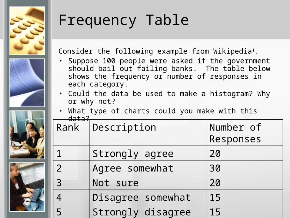
Consider the following example from Wikipedia1. • Suppose 100 people were asked if the government should
bail out failing banks. The table below shows the frequency or number of responses in each category.
• Could the data be used to make a histogram? Why or why not?
• What type of charts could you make with this data?
Rank Description Number of Responses
1 Strongly agree 20
2 Agree somewhat 30
3 Not sure 20
4 Disagree somewhat 15
5 Strongly disagree 15
Frequency Table
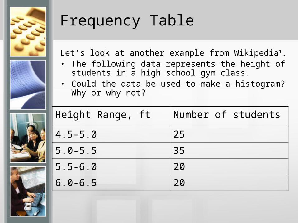
Let’s look at another example from Wikipedia1. • The following data represents the height of students in a
high school gym class. • Could the data be used to make a histogram? Why or why
not?
Height Range, ft Number of students
4.5-5.0 25
5.0-5.5 35
5.5-6.0 20
6.0-6.5 20

Frequency Table
Can you construct a histogram of the data?• How many intervals or classes are shown? What are the
intervals? Why can’t we use these intervals on a histogram? What data values would be problematic if we used the given intervals?
Height Range, ft Number of students
4.5-5.0 25
5.0-5.5 35
5.5-6.0 20
6.0-6.5 20
Why use Frequency Tables and Histograms
• Frequency tables and histograms make it easy for the user to readily identify trends and patterns.
• Refer to figure 2-15 on pg 61 of the textbook2. Study the various types of histograms then identify the examples that follow.
Types of Histograms
• Symmetrical – both sides of the histogram are more or less the same. The graph has a vertical line of symmetry down the middle.
• Uniform or rectangular – every class has an equal frequency. The height of each bar is the same.
• Skewed – the graph has tails off on one side or the other. It will either be skewed right or skewed left.
• Bimodal – the graph has two areas of high frequency separated by an area of low frequency.
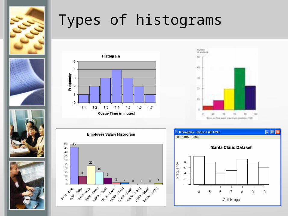
Types of histograms
Histograms
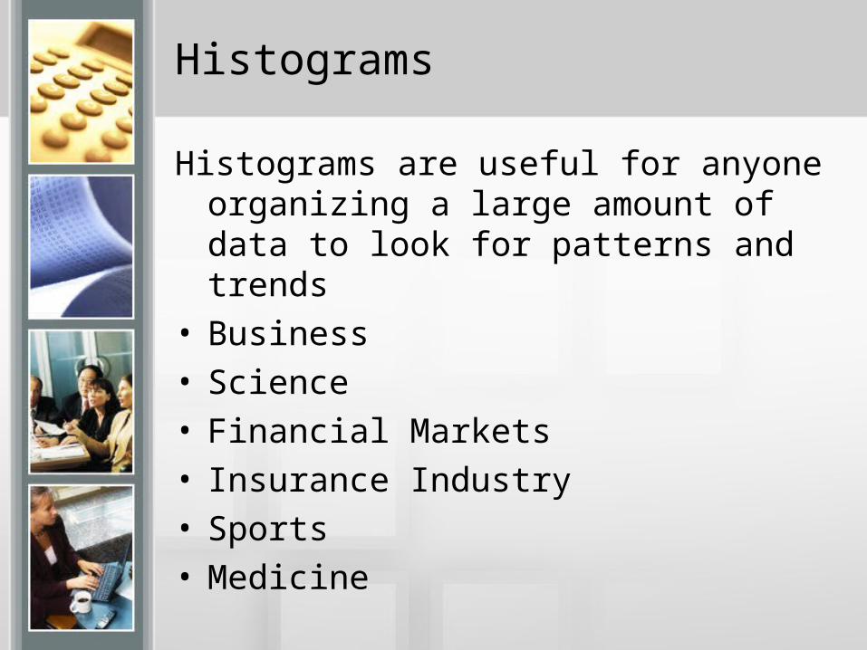
Histograms are useful for anyone organizing a large amount of data to look for patterns and trends
• Business• Science• Financial Markets• Insurance Industry• Sports• Medicine
How to Make a Frequency Table
1. Determine the number of classes you will use.2. Calculate the class width:
Highest value – lowest valueNumber of classes
Remember to go up to the next whole number.3. Create the classes. The smallest data value is
the lower class limit. Add the class width to get the class limits for the next class. Continue until you have the width for each class.
4. Tally the data in each class. Total the tallies to determine the class frequency.
5. Calculate the class boundaries.6. Calculate the midpoint for each class.
How to Make a Histogram
• Make a frequency table with the desired number of classes.
• Place class boundaries on the horizontal axis.
• Place frequencies on the vertical axis.• For each class on the frequency table
draw a bar. The width of the bar is the class boundary. The height of the bar is the class frequency.
Relative Frequency, Frequency Polygons and Ogives
• The bad news. That’s not all folks.• The good news: You already have the
data you need.
Relative Frequency
• Relative frequency is the frequency of each class divided by the total number of items in the data set.
Class frequency
Total frequencies
Relative Frequency Histogram
For each class on the frequency table draw a bar.
• The width of the bar is the class boundary.
• The height of the bar is the relative class frequency

Frequency Polygons
• A histogram gives the appearance that frequencies rise and fall sharply.
• A frequency polygon or line graph shows the continuous rise or fall of frequencies.
• The graph is generated by graphing the midpoints of each class and connecting the dots. See Fig.2-17 pg 63 of the text2.
• Ah, that’s why we calculated the midpoints.
How to Make a Frequency Polygon
• Make a frequency table.• Be sure to include the midpoints and the class
frequencies.• Midpoints will be on the horizontal axis.• Class frequency will be on the vertical axis.• For each class place a dot over the midpoint at
the height of the class frequency.• Connect the dots with line segments.• The graph ends and begins with a frequency of
zero, one class width from the first and last midpoint.
Ogives
• Sometimes we want to look at cumulative frequencies.
• The cumulative frequency for a class is the sum of the frequency for that class and all previous classes.
• Cumulative frequencies show how many data are below or above a given class. See Table 2-14 on pg 64 of the text2.
• An ogive is a line graph that displays the cumulative frequencies.
How to Make an Ogive
• Make a frequency table showing class boundaries and cumulative frequencies.
• Class boundaries will be on the horizontal axis.• Cumulative frequency will be on the vertical axis.• For each class place a dot over the upper class
boundary at the height of the cumulative frequency.
• Connect the dots with line segments.• An ogive begins on the horizontal axis at the
lower class boundary of the first class.
References
1. http://en.wikipedia.org/wiki
2. Understandable Statistics,8th Edition, Brase, Charles H. and Corrinne P., Houghton Miffling Company, Boston, MA, 2006
3. http://www.shodor.org/interactivate/activities/histogram/?version=1.6.0_05&browser=MSIE&vendor=Sun_Microsystems_Inc.