Embed Size (px)
Citation preview
Health inequalities within Herefordshire
Version 2.0, April 2013
1
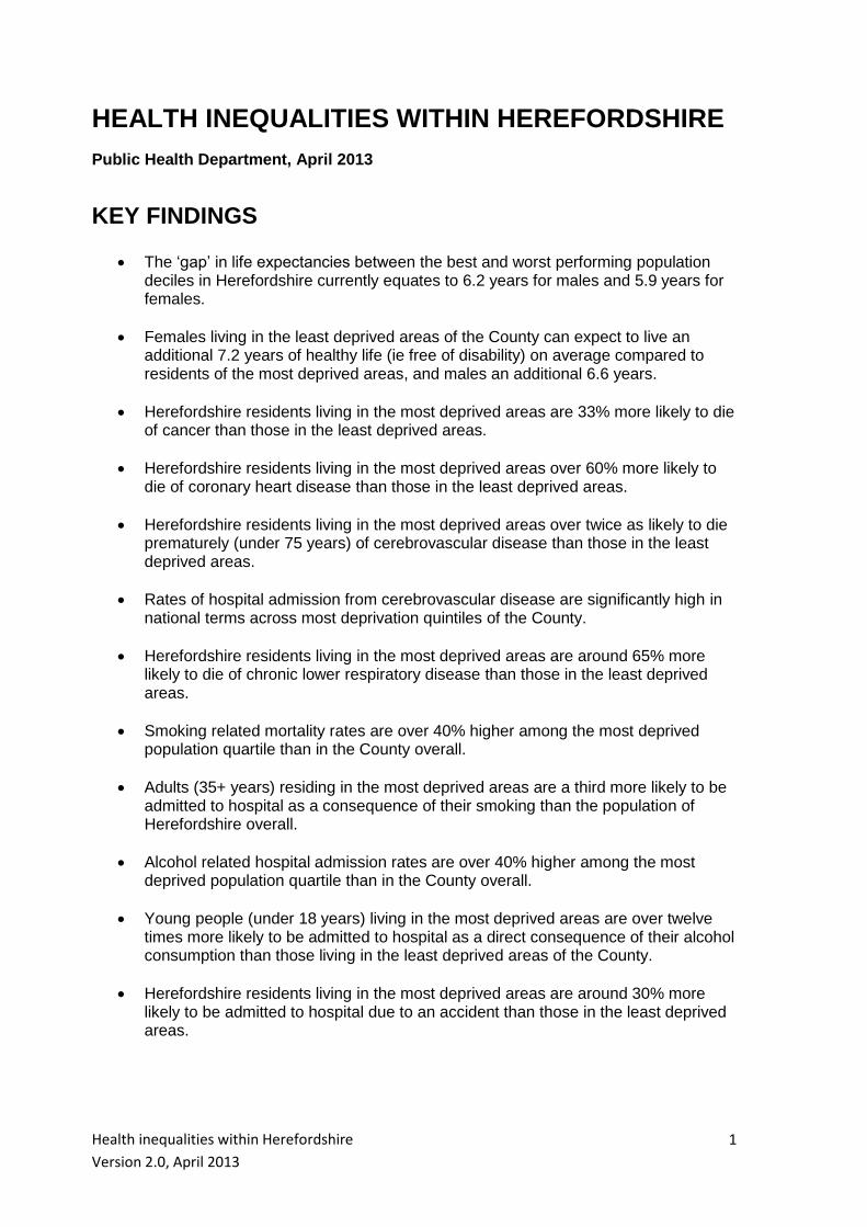
HEALTH INEQUALITIES WITHIN HEREFORDSHIRE
Public Health Department, April 2013
KEY FINDINGS
The ‘gap’ in life expectancies between the best and worst performing population deciles in Herefordshire currently equates to 6.2 years for males and 5.9 years for females.
Females living in the least deprived areas of the County can expect to live an additional 7.2 years of healthy life (ie free of disability) on average compared to residents of the most deprived areas, and males an additional 6.6 years.
Herefordshire residents living in the most deprived areas are 33% more likely to die of cancer than those in the least deprived areas.
Herefordshire residents living in the most deprived areas over 60% more likely to die of coronary heart disease than those in the least deprived areas.
Herefordshire residents living in the most deprived areas over twice as likely to die prematurely (under 75 years) of cerebrovascular disease than those in the least deprived areas.
Rates of hospital admission from cerebrovascular disease are significantly high in national terms across most deprivation quintiles of the County.
Herefordshire residents living in the most deprived areas are around 65% more likely to die of chronic lower respiratory disease than those in the least deprived areas.
Smoking related mortality rates are over 40% higher among the most deprived population quartile than in the County overall.
Adults (35+ years) residing in the most deprived areas are a third more likely to be admitted to hospital as a consequence of their smoking than the population of Herefordshire overall.
Alcohol related hospital admission rates are over 40% higher among the most deprived population quartile than in the County overall.
Young people (under 18 years) living in the most deprived areas are over twelve times more likely to be admitted to hospital as a direct consequence of their alcohol consumption than those living in the least deprived areas of the County.
Herefordshire residents living in the most deprived areas are around 30% more likely to be admitted to hospital due to an accident than those in the least deprived areas.
Health inequalities within Herefordshire
Version 2.0, April 2013
2
INEQUALITIES IN LIFE EXPECTANCIES
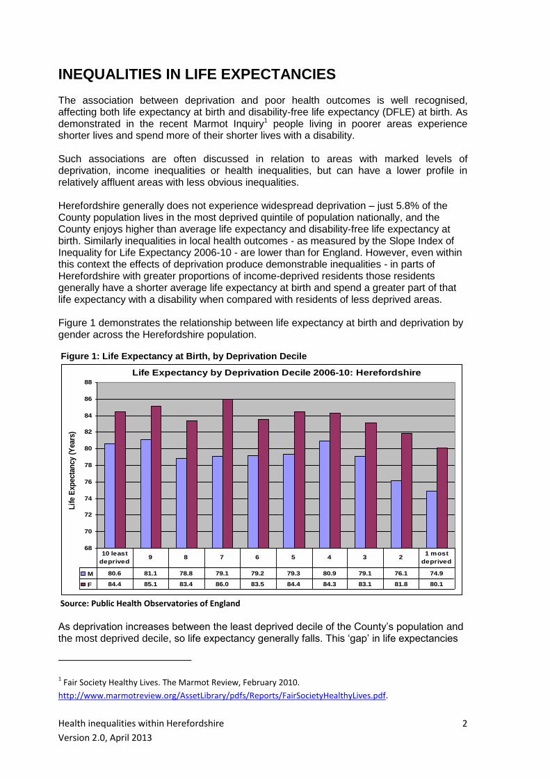
The association between deprivation and poor health outcomes is well recognised, affecting both life expectancy at birth and disability-free life expectancy (DFLE) at birth. As demonstrated in the recent Marmot Inquiry1 people living in poorer areas experience shorter lives and spend more of their shorter lives with a disability. Such associations are often discussed in relation to areas with marked levels of deprivation, income inequalities or health inequalities, but can have a lower profile in relatively affluent areas with less obvious inequalities. Herefordshire generally does not experience widespread deprivation – just 5.8% of the County population lives in the most deprived quintile of population nationally, and the County enjoys higher than average life expectancy and disability-free life expectancy at birth. Similarly inequalities in local health outcomes - as measured by the Slope Index of Inequality for Life Expectancy 2006-10 - are lower than for England. However, even within this context the effects of deprivation produce demonstrable inequalities - in parts of Herefordshire with greater proportions of income-deprived residents those residents generally have a shorter average life expectancy at birth and spend a greater part of that life expectancy with a disability when compared with residents of less deprived areas. Figure 1 demonstrates the relationship between life expectancy at birth and deprivation by gender across the Herefordshire population. Figure 1: Life Expectancy at Birth, by Deprivation Decile
Life Expectancy by Deprivation Decile 2006-10: Herefordshire
68
70
72
74
76
78
80
82
84
86
88
Lif
e E
xpec
tan
cy (
Yea
rs)
M 80.6 81.1 78.8 79.1 79.2 79.3 80.9 79.1 76.1 74.9
F 84.4 85.1 83.4 86.0 83.5 84.4 84.3 83.1 81.8 80.1
10 least
deprived9 8 7 6 5 4 3 2
1 most
deprived
Source: Public Health Observatories of England As deprivation increases between the least deprived decile of the County’s population and the most deprived decile, so life expectancy generally falls. This ‘gap’ in life expectancies
1 Fair Society Healthy Lives. The Marmot Review, February 2010.
http://www.marmotreview.org/AssetLibrary/pdfs/Reports/FairSocietyHealthyLives.pdf.
Health inequalities within Herefordshire
Version 2.0, April 2013
3
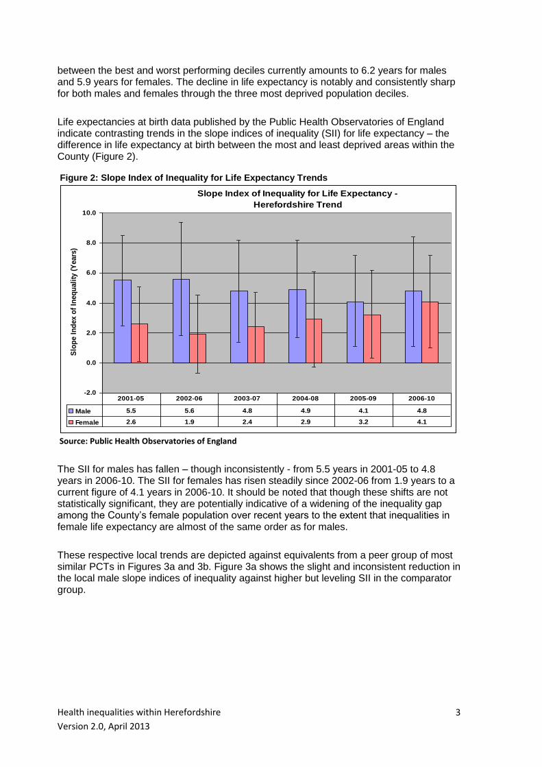
between the best and worst performing deciles currently amounts to 6.2 years for males and 5.9 years for females. The decline in life expectancy is notably and consistently sharp for both males and females through the three most deprived population deciles. Life expectancies at birth data published by the Public Health Observatories of England indicate contrasting trends in the slope indices of inequality (SII) for life expectancy – the difference in life expectancy at birth between the most and least deprived areas within the County (Figure 2). Figure 2: Slope Index of Inequality for Life Expectancy Trends
Slope Index of Inequality for Life Expectancy -
Herefordshire Trend
-2.0
0.0
2.0
4.0
6.0
8.0
10.0
Slo
pe I
nd
ex o
f In
eq
uali
ty (
Years
)
Male 5.5 5.6 4.8 4.9 4.1 4.8
Female 2.6 1.9 2.4 2.9 3.2 4.1
2001-05 2002-06 2003-07 2004-08 2005-09 2006-10
Source: Public Health Observatories of England
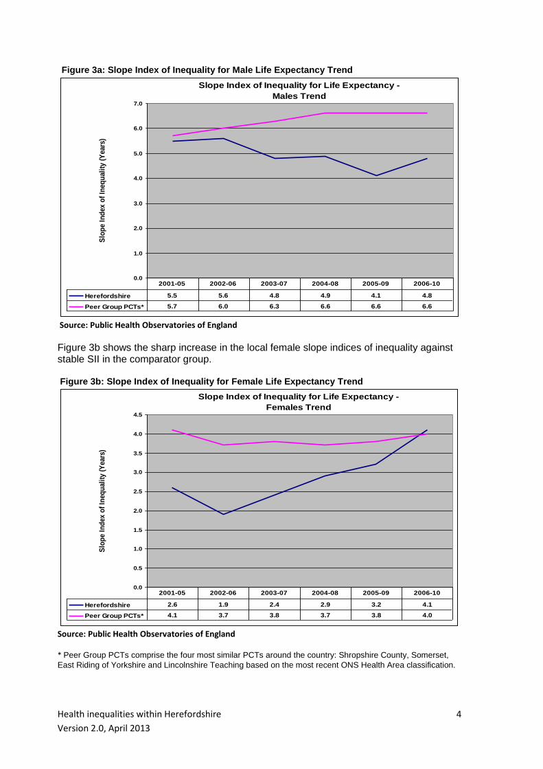
The SII for males has fallen – though inconsistently - from 5.5 years in 2001-05 to 4.8 years in 2006-10. The SII for females has risen steadily since 2002-06 from 1.9 years to a current figure of 4.1 years in 2006-10. It should be noted that though these shifts are not statistically significant, they are potentially indicative of a widening of the inequality gap among the County’s female population over recent years to the extent that inequalities in female life expectancy are almost of the same order as for males. These respective local trends are depicted against equivalents from a peer group of most similar PCTs in Figures 3a and 3b. Figure 3a shows the slight and inconsistent reduction in the local male slope indices of inequality against higher but leveling SII in the comparator group.
Health inequalities within Herefordshire
Version 2.0, April 2013
4
Figure 3a: Slope Index of Inequality for Male Life Expectancy Trend Slope Index of Inequality for Life Expectancy -
Males Trend
0.0
1.0
2.0
3.0
4.0
5.0
6.0
7.0S
lop
e I
nd
ex o
f In
eq
uali
ty (
Years
)
Herefordshire 5.5 5.6 4.8 4.9 4.1 4.8
Peer Group PCTs* 5.7 6.0 6.3 6.6 6.6 6.6
2001-05 2002-06 2003-07 2004-08 2005-09 2006-10
Source: Public Health Observatories of England
Figure 3b shows the sharp increase in the local female slope indices of inequality against stable SII in the comparator group. Figure 3b: Slope Index of Inequality for Female Life Expectancy Trend
Slope Index of Inequality for Life Expectancy -
Females Trend
0.0
0.5
1.0
1.5
2.0
2.5
3.0
3.5
4.0
4.5
Slo
pe I
nd
ex o
f In
eq
uali
ty (
Years
)
Herefordshire 2.6 1.9 2.4 2.9 3.2 4.1
Peer Group PCTs* 4.1 3.7 3.8 3.7 3.8 4.0
2001-05 2002-06 2003-07 2004-08 2005-09 2006-10
Source: Public Health Observatories of England
* Peer Group PCTs comprise the four most similar PCTs around the country: Shropshire County, Somerset,
East Riding of Yorkshire and Lincolnshire Teaching based on the most recent ONS Health Area classification.
Health inequalities within Herefordshire
Version 2.0, April 2013
5
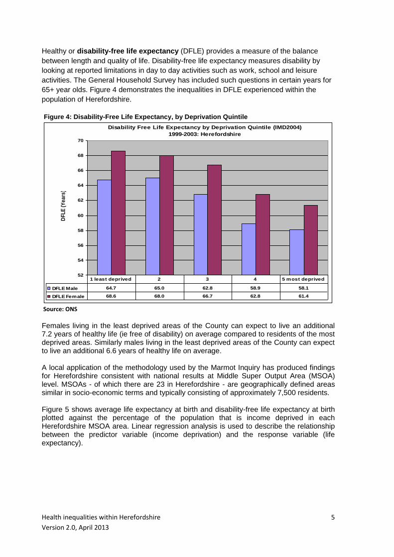
Healthy or disability-free life expectancy (DFLE) provides a measure of the balance
between length and quality of life. Disability-free life expectancy measures disability by
looking at reported limitations in day to day activities such as work, school and leisure
activities. The General Household Survey has included such questions in certain years for
65+ year olds. Figure 4 demonstrates the inequalities in DFLE experienced within the
population of Herefordshire. Figure 4: Disability-Free Life Expectancy, by Deprivation Quintile
Disability Free Life Expectancy by Deprivation Quintile (IMD2004)
1999-2003: Herefordshire
52
54
56
58
60
62
64
66
68
70
DF
LE
(Y
ea
rs)
DFLE Male 64.7 65.0 62.8 58.9 58.1
DFLE Female 68.6 68.0 66.7 62.8 61.4
1 least deprived 2 3 4 5 most deprived
Source: ONS
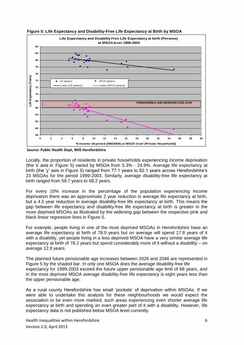
Females living in the least deprived areas of the County can expect to live an additional 7.2 years of healthy life (ie free of disability) on average compared to residents of the most deprived areas. Similarly males living in the least deprived areas of the County can expect to live an additional 6.6 years of healthy life on average. A local application of the methodology used by the Marmot Inquiry has produced findings for Herefordshire consistent with national results at Middle Super Output Area (MSOA) level. MSOAs - of which there are 23 in Herefordshire - are geographically defined areas similar in socio-economic terms and typically consisting of approximately 7,500 residents. Figure 5 shows average life expectancy at birth and disability-free life expectancy at birth plotted against the percentage of the population that is income deprived in each Herefordshire MSOA area. Linear regression analysis is used to describe the relationship between the predictor variable (income deprivation) and the response variable (life expectancy).
Health inequalities within Herefordshire
Version 2.0, April 2013
6
Figure 5: Life Expectancy and Disability-Free Life Expectancy at Birth by MSOA
Life Expectancy and Disability Free Life Expectancy at birth (Persons)
at MSOA level 1999-2003
58
60
62
64
66
68
70
72
74
76
78
80
82
84
0 2 4 6 8 10 12 14 16 18 20 22 24 26 28 30
% Income Deprived (IMD2004) at MSOA level (Private Households)
Lif
e E
xp
ecta
ncy (
Years
)
LE (years) DFLE (years)
Linear (LE (years)) Linear (DFLE (years))
PENSIONABLE AGE INCREASE 2026-2046
Source: Public Health Dept, NHS Herefordshire Locally, the proportion of residents in private households experiencing income deprivation (the ‘x’ axis in Figure 5) varied by MSOA from 5.3% - 24.9%. Average life expectancy at birth (the ‘y’ axis in Figure 5) ranged from 77.1 years to 82.1 years across Herefordshire’s 23 MSOAs for the period 1999-2003. Similarly, average disability-free life expectancy at birth ranged from 59.7 years to 68.2 years. For every 10% increase in the percentage of the population experiencing income deprivation there was an approximate 2 year reduction in average life expectancy at birth, but a 4.5 year reduction in average disability-free life expectancy at birth. This means the gap between life expectancy and disability-free life expectancy at birth is greater in the more deprived MSOAs as illustrated by the widening gap between the respective pink and black linear regression lines in Figure 5. For example, people living in one of the most deprived MSOAs in Herefordshire have an average life expectancy at birth of 78.0 years but on average will spend 17.8 years of it with a disability, yet people living in a less deprived MSOA have a very similar average life expectancy at birth of 78.2 years but spend considerably more of it without a disability – on average 12.9 years. The planned future pensionable age increases between 2026 and 2046 are represented in Figure 5 by the shaded bar. In only one MSOA does the average disability-free life expectancy for 1999-2003 exceed the future upper pensionable age limit of 68 years, and in the most deprived MSOA average disability-free life expectancy is eight years less than the upper pensionable age. As a rural county Herefordshire has small ‘pockets’ of deprivation within MSOAs. If we were able to undertake this analysis for these neighbourhoods we would expect the association to be even more marked; such areas experiencing even shorter average life expectancy at birth and spending an even greater part of it with a disability. However, life expectancy data is not published below MSOA level currently.

Health inequalities within Herefordshire
Version 2.0, April 2013
7
INEQUALITIES IN HEALTH OUTCOMES
By dividing the Herefordshire population into quartiles according to residence-based deprivation scores (IMD2007 or IMD20102 depending on data source) and measuring health-related activity within each quartile, it is possible to illustrate the relationship between deprivation and health status within the County across a range of disease or condition groups. It should be noted that the composition of deprivation quartiles will have changed to some extent between the IMD releases of 2007 and 2010, though the effect on quartile rates is considered to be minimal. Where the following analysis looks at hospital admissions of Herefordshire residents, it covers both elective and non-elective admissions to all providers and the time period covered varies with source. All mortality analysis is again residence-based and covers the years 2007-11; the most recent five-year period for which data is fully available
Cancer Standardised all age cancer mortality rates in the most deprived quartile of the population are the highest in the County (Figure 6.1). They are significantly higher than rates in the least deprived quartile with the mortality rate ratio between most and least deprived quartiles being 1.33, ie people residing in the most deprived areas are 33% more likely to die of cancer than those in the least deprived areas.
Figure 6.1: All Age Cancer Mortality, by Deprivation Quartile
Directly Standardised Mortality Rate by Deprivation Quartile (IMD2010)
2007-11 pooled: Cancers (ICD10 C00 - D48)
0.0
50.0
100.0
150.0
200.0
250.0
DS
R p
er
10
0,0
00
po
pu
lati
on
DSR 149.5 160.8 142.1 199.0 161.1
Q1 least
deprivedQ2 Q3
Q4 most
deprivedALL
Source: Public Health Dept, Herefordshire PCT
2 IMD: Indices of Multiple Deprivation commissioned by the Department of Communities and Local Government.

Health inequalities within Herefordshire
Version 2.0, April 2013
8
Standardised rates of premature (aged under 75 years) cancer mortality are notably higher in areas of the County experiencing greater deprivation as shown in Figure 6.2. The most deprived population quartile has a rate of premature mortality 1.44 times greater than that experienced by the least deprived quartile and a significantly higher rate than the County overall. Figure 6.2: Premature Cancer Mortality, by Deprivation Quartile
Directly Standardised Premature Mortality Rate by Deprivation Quartile
(IMD2010): Cancers (ICD10 C00-D48) 2007-11 pooled
0.0
50.0
100.0
150.0
200.0
DS
R p
er 1
00,0
00 p
op
ula
tio
n
DSR 90.5 99.6 93.4 130.1 102.3
Q1 least
deprivedQ2 Q3
Q4 most
deprivedALL
Source: Public Health Dept, Herefordshire PCT
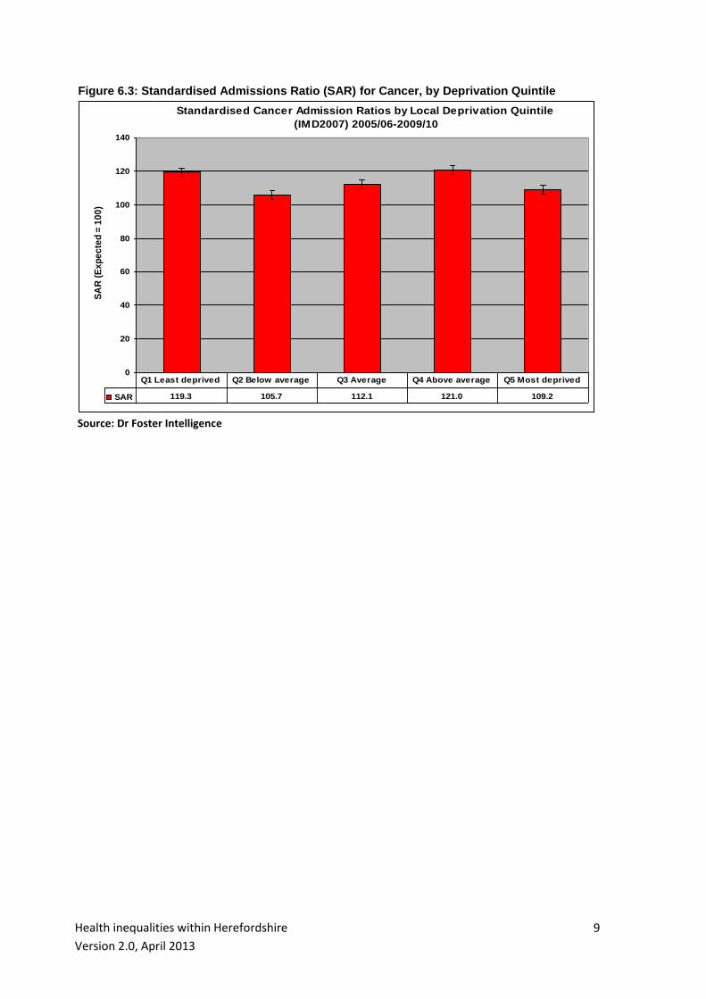
Unlike local mortality rate variations, no discernible correlation exists between hospital
admission levels and deprivation (Figure 6.3). Every population quintile within the County
has a significantly high standardised admissions ratio (SAR), ie admission levels
consistently exceed those expected given the age and sex structure and deprivation status
of each population quintile. Indeed, he least deprived quintile has a significantly higher
SAR than the most deprived, possibly indicating problems with access to healthcare
services among the most deprived
Health inequalities within Herefordshire
Version 2.0, April 2013
9
Figure 6.3: Standardised Admissions Ratio (SAR) for Cancer, by Deprivation Quintile
Standardised Cancer Admission Ratios by Local Deprivation Quintile
(IMD2007) 2005/06-2009/10
0
20
40
60
80
100
120
140
SA
R (
Ex
pe
cte
d =
10
0)
SAR 119.3 105.7 112.1 121.0 109.2
Q1 Least deprived Q2 Below average Q3 Average Q4 Above average Q5 Most deprived
Source: Dr Foster Intelligence

Health inequalities within Herefordshire
Version 2.0, April 2013
10
Coronary Heart Disease (CHD)
The most deprived quartile of Herefordshire’s population has a standardised all age CHD
mortality rate which is significantly high compared to the County as a whole (Figure 7.1),
and exceeds the rate in the least deprived quartile by over 60%, ie the rate ratio between
the most and least deprived quartiles is 1.62. Mortality rates in the least deprived quartile
(Q1) and Quartile 3 are significantly lower than in Herefordshire overall.
Figure 7.1: All Age CHD Mortality, by Deprivation Quartile
Directly Standardised Mortality Rate by Deprivation Quartile (IMD2010)
2007-11 pooled: CHD (ICD10 I20 - I25)
0.0
20.0
40.0
60.0
80.0
100.0
120.0
DS
R p
er
10
0,0
00
po
pu
lati
on
DSR 62.8 76.3 60.8 102.0 73.7
Q1 least
deprivedQ2 Q3
Q4 most
deprivedALL
Source: Public Health Dept, Herefordshire PCT
Within Herefordshire the rates of premature mortality due to coronary heart disease vary
markedly with deprivation levels (Figure 7.2). The most deprived population quartile has a
rate of premature mortality 2.37 times greater than that experienced by the least deprived
quartile and a significantly high rate relative the County overall.

Health inequalities within Herefordshire
Version 2.0, April 2013
11
Figure 7.2: Premature CHD Mortality, by Deprivation Quartile
Directly Standardised Premature Mortality Rate by Deprivation Quartile
(IMD2010): CHD (ICD10 I20-I25) 2007-11 pooled
0.0
20.0
40.0
60.0
80.0
DS
R p
er
100,0
00 p
op
ula
tio
n
DSR 23.8 37.0 25.9 56.3 34.5
Q1 least
deprivedQ2 Q3
Q4 most
deprivedALL
Source: Public Health Dept, Herefordshire PCT
There is no discernible correlation between CHD-related hospital admission rates and deprivation (Figure 7.3). Every population quintile within the County has a significantly low standardised admissions ratio (SAR), ie admission levels are consistently lower than expected given the age and sex structure and deprivation status of each population quintile. The SAR of the most deprived quintile is not significantly different from that of the least deprived. Figure 7.3: Standardised Admissions Ratios (SAR) for CHD, by Deprivation Quintile
Standardised CHD Admission Ratios by Local Deprivation Quintile
(IMD2007) 2005/06-2009/10
0
20
40
60
80
100
SA
R (
Ex
pe
cte
d =
10
0)
SAR 77.8 74.8 68.5 67.4 79.9
Q1 Least deprived Q2 Below average Q3 Average Q4 Above average Q5 Most deprived
Source: Dr Foster Intelligence
Health inequalities within Herefordshire
Version 2.0, April 2013
12
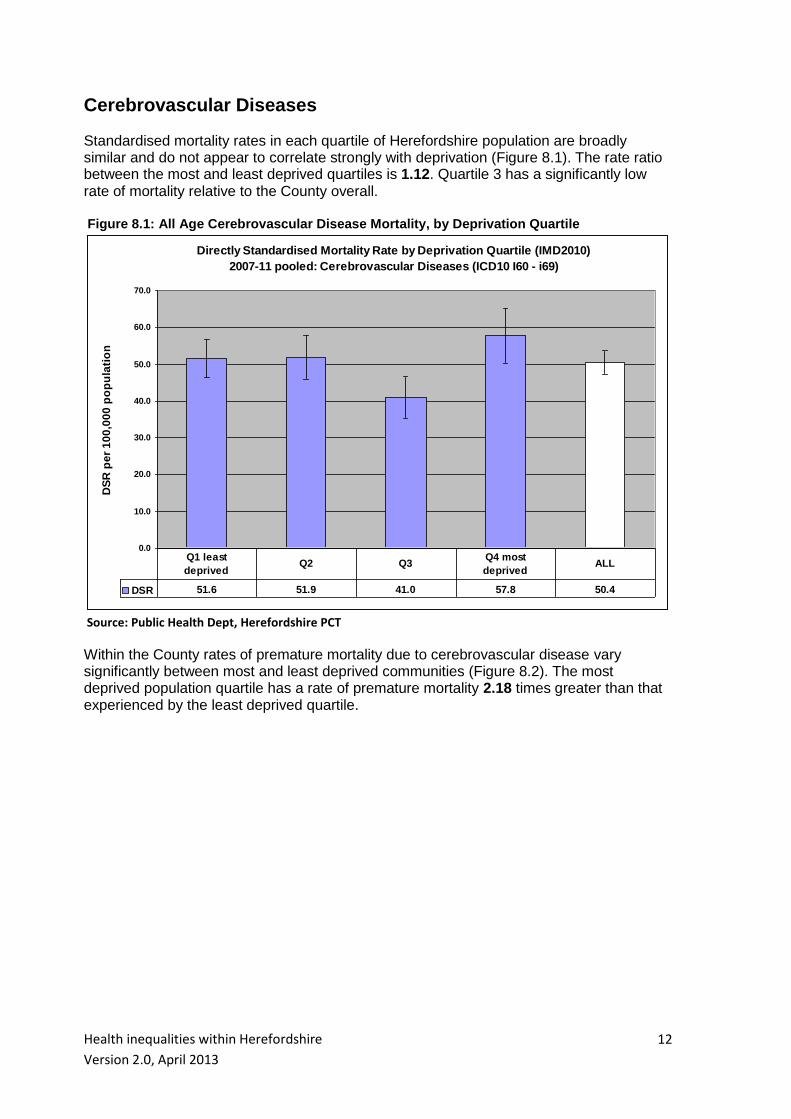
Cerebrovascular Diseases
Standardised mortality rates in each quartile of Herefordshire population are broadly similar and do not appear to correlate strongly with deprivation (Figure 8.1). The rate ratio between the most and least deprived quartiles is 1.12. Quartile 3 has a significantly low rate of mortality relative to the County overall. Figure 8.1: All Age Cerebrovascular Disease Mortality, by Deprivation Quartile
Directly Standardised Mortality Rate by Deprivation Quartile (IMD2010)
2007-11 pooled: Cerebrovascular Diseases (ICD10 I60 - i69)
0.0
10.0
20.0
30.0
40.0
50.0
60.0
70.0
DS
R p
er
10
0,0
00
po
pu
lati
on
DSR 51.6 51.9 41.0 57.8 50.4
Q1 least
deprivedQ2 Q3
Q4 most
deprivedALL
Source: Public Health Dept, Herefordshire PCT
Within the County rates of premature mortality due to cerebrovascular disease vary significantly between most and least deprived communities (Figure 8.2). The most deprived population quartile has a rate of premature mortality 2.18 times greater than that experienced by the least deprived quartile.

Health inequalities within Herefordshire
Version 2.0, April 2013
13
Figure 8.2: Premature Cerebrovascular Disease Mortality, by Deprivation Quartile
Directly Standardised Premature Mortality Rate by Deprivation Quartile
(IMD2010): Cerebrovascular Diseases (ICD10 I60-I69) 2007-11 pooled
0.0
5.0
10.0
15.0
20.0
25.0
30.0
DS
R p
er
10
0,0
00
po
pu
lati
on
DSR 8.3 7.7 11.0 18.1 10.9
Q1 least
deprivedQ2 Q3
Q4 most
deprivedALL
Source: Public Health Dept, Herefordshire PCT
No discernible correlation exists between hospital admission levels due to cerebrovascular
disease and deprivation (Figure 8.3). Most deprivation quintiles have a significantly high
standardised admissions ratio (SAR) ie admission levels are predominantly higher than
expected given the age and sex structure and deprivation status of each population
quintile within the County. SARs are not significantly different between the most and least
deprived quintiles.
Figure 8.3: Standardised Admissions Ratios (SAR) for Cerebrovascular Disease, by Deprivation Quintile
Standardised Cerebrovascular Disease Admission Ratios by Local
Deprivation Quintile (IMD2007) 2005/06-2009/10
0
20
40
60
80
100
120
140
SA
R (
Ex
pe
cte
d =
10
0)
SAR 125.1 124.1 106.7 124.3 116.7
Q1 Least deprived Q2 Below average Q3 Average Q4 Above average Q5 Most deprived
Source: Dr Foster Intelligence

Health inequalities within Herefordshire
Version 2.0, April 2013
14
Respiratory Diseases
Standardised mortality rates from chronic lower respiratory disease in the most deprived quartile of Herefordshire are the highest in the County at around 27 deaths per 100,000 population compared to 17 deaths per 100,000 in the least deprived quartile – a rate ratio of 1.65 (Figure 9.1). This indicates that people residing in the most deprived areas are 65% more likely to die of chronic lower respiratory disease than those in the least deprived areas and that this variation is statistically significant. Figure 9.1: All Age Chronic Lower Respiratory Disease Mortality, by Deprivation Quartile
Directly Standardised Mortality Rates 2005-09: Chronic Lower Respiratory
Disease (ICD10 J40-J47) by Deprivation Quartile (IMD2007)
0.0
5.0
10.0
15.0
20.0
25.0
30.0
35.0
Rate Ratio (most to least deprived) 1.65
DS
R p
er
100,0
00 (
ES
P)
DSR 16.5 23.4 19.7 27.3 21.1
Q1 least deprived Q2 Q3 Q4 most deprived ALL
Source: Public Health Dept, Herefordshire PCT
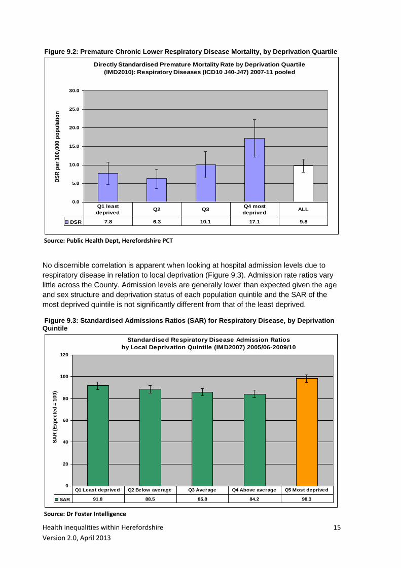
Within the County rates of premature mortality due to chronic lower respiratory disease increase with deprivation and are again significantly higher in the most deprived quartile (Figure 9.2). This quartile has a rate of premature mortality 2.19 times greater than that experienced by the least deprived quartile.
Health inequalities within Herefordshire
Version 2.0, April 2013
15
Figure 9.2: Premature Chronic Lower Respiratory Disease Mortality, by Deprivation Quartile
Directly Standardised Premature Mortality Rate by Deprivation Quartile
(IMD2010): Respiratory Diseases (ICD10 J40-J47) 2007-11 pooled
0.0
5.0
10.0
15.0
20.0
25.0
30.0
DS
R p
er
10
0,0
00
po
pu
lati
on
DSR 7.8 6.3 10.1 17.1 9.8
Q1 least
deprivedQ2 Q3
Q4 most
deprivedALL
Source: Public Health Dept, Herefordshire PCT
No discernible correlation is apparent when looking at hospital admission levels due to
respiratory disease in relation to local deprivation (Figure 9.3). Admission rate ratios vary
little across the County. Admission levels are generally lower than expected given the age
and sex structure and deprivation status of each population quintile and the SAR of the
most deprived quintile is not significantly different from that of the least deprived.
Figure 9.3: Standardised Admissions Ratios (SAR) for Respiratory Disease, by Deprivation Quintile
Standardised Respiratory Disease Admission Ratios
by Local Deprivation Quintile (IMD2007) 2005/06-2009/10
0
20
40
60
80
100
120
SA
R (
Ex
pe
cte
d =
10
0)
SAR 91.8 88.5 85.8 84.2 98.3
Q1 Least deprived Q2 Below average Q3 Average Q4 Above average Q5 Most deprived
Source: Dr Foster Intelligence
Health inequalities within Herefordshire
Version 2.0, April 2013
16
Smoking-related conditions
The relationship between deprivation and smoking-related morbidity is well-documented.
The methodology employed to measure smoking-related mortality is derived from a
document produced by the Health and Social Care Information Centre entitled 'Statistics
on Smoking: England'. It measures all mortality in England among adults aged 35 and over
from a range of diseases including various types of cancer, respiratory diseases,
circulatory diseases and some diseases of the digestive system.
The methodology is based on smoking-related percentages - ie the proportion of deaths
occurring in a population that can be attributed to smoking for each smoking-related
condition defined in terms of ICD10 codes. It can be used to adjust whole mortality
numbers for the proportion of each death that can be attributed to smoking and so
estimates the number of deaths that can be considered ‘smoking-attributable’, by gender.
For example, a death from lung cancer (ICD10 C33-C34) counts for 0.87 of a smoking-
related death among men and 0.74 among women.
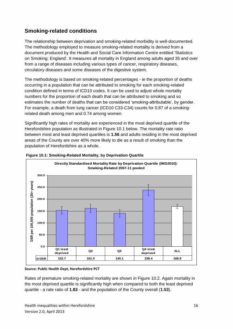
Significantly high rates of mortality are experienced in the most deprived quartile of the
Herefordshire population as illustrated in Figure 10.1 below. The mortality rate ratio
between most and least deprived quartiles is 1.56 and adults residing in the most deprived
areas of the County are over 40% more likely to die as a result of smoking than the
population of Herefordshire as a whole.
Figure 10.1: Smoking-Related Mortality, by Deprivation Quartile
Directly Standardised Mortality Rate by Deprivation Quartile (IMD2010):
Smoking-Related 2007-11 pooled
0.0
50.0
100.0
150.0
200.0
250.0
300.0
DS
R p
er
10
0,0
00
po
pu
lati
on
(3
5+
ye
ars
)
DSR 152.7 161.0 140.1 238.4 168.8
Q1 least
deprivedQ2 Q3
Q4 most
deprivedALL
Source: Public Health Dept, Herefordshire PCT
Rates of premature smoking-related mortality are shown in Figure 10.2. Again mortality in
the most deprived quartile is significantly high when compared to both the least deprived
quartile - a rate ratio of 1.83 - and the population of the County overall (1.53).

Health inequalities within Herefordshire
Version 2.0, April 2013
17
Figure 10.2: Premature Smoking-Related Mortality, by Deprivation Quartile
Directly Standardised Premature Mortality Rate by Deprivation Quartile
(IMD2010): Smoking-Related 2007-11 pooled
0.0
50.0
100.0
150.0
200.0
DS
R p
er
100,0
00 p
op
ula
tio
n (
35+
years
)
DSR 77.1 85.3 76.6 141.3 92.2
Q1 least
deprivedQ2 Q3
Q4 most
deprivedALL
Source: Public Health Dept, Herefordshire PCT
Hospital admissions caused by smoking are measured in a very similar way, though the
basket of relevant disease groups is slightly wider and includes additional conditions to
which smoking is considered an attributable factor, such as hip fractures among those
aged 55+ years and age-related cataracts.
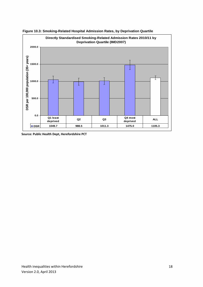
Figure 10.3 depicts the variation in smoking-related hospital admission rates across the
County. The standardised rate of admission in the most deprived quartile of population is
40% greater than in the least deprived quartile and adults living in the most deprived areas
can be said to be a third more likely to be admitted to hospital as a consequence of their
smoking than the population of Herefordshire overall.
Health inequalities within Herefordshire
Version 2.0, April 2013
18
Figure 10.3: Smoking-Related Hospital Admission Rates, by Deprivation Quartile
Directly Standardised Smoking-Related Admission Rates 2010/11 by
Deprivation Quartile (IMD2007)
0.0
500.0
1000.0
1500.0
2000.0
DS
R p
er
100,0
00 p
op
ula
tio
n (
35+
years
)
DSR 1049.7 988.5 1011.3 1475.0 1105.3
Q1 least
deprivedQ2 Q3
Q4 most
deprivedALL
Source: Public Health Dept, Herefordshire PCT
Health inequalities within Herefordshire
Version 2.0, April 2013
19
Alcohol-related conditions
As with smoking it is possible to measure the proportion of hospital admissions occurring
in a population that can be attributed to alcohol consumption. The methodology adjusts
whole admission numbers (across a wide range of alcohol-related conditions defined in
terms of ICD10 codes) for the proportion of each admission that can be attributed to
alcohol consumption and so estimates the number of admissions that can be considered
‘alcohol-attributable’, by gender and age. For example, an admission due to fibrosis and
cirrhosis of the liver (ICD10 K74) counts for 0.77 of an alcohol-related admission among
men aged 16-24 years but just 0.38 among women aged 75+ years.
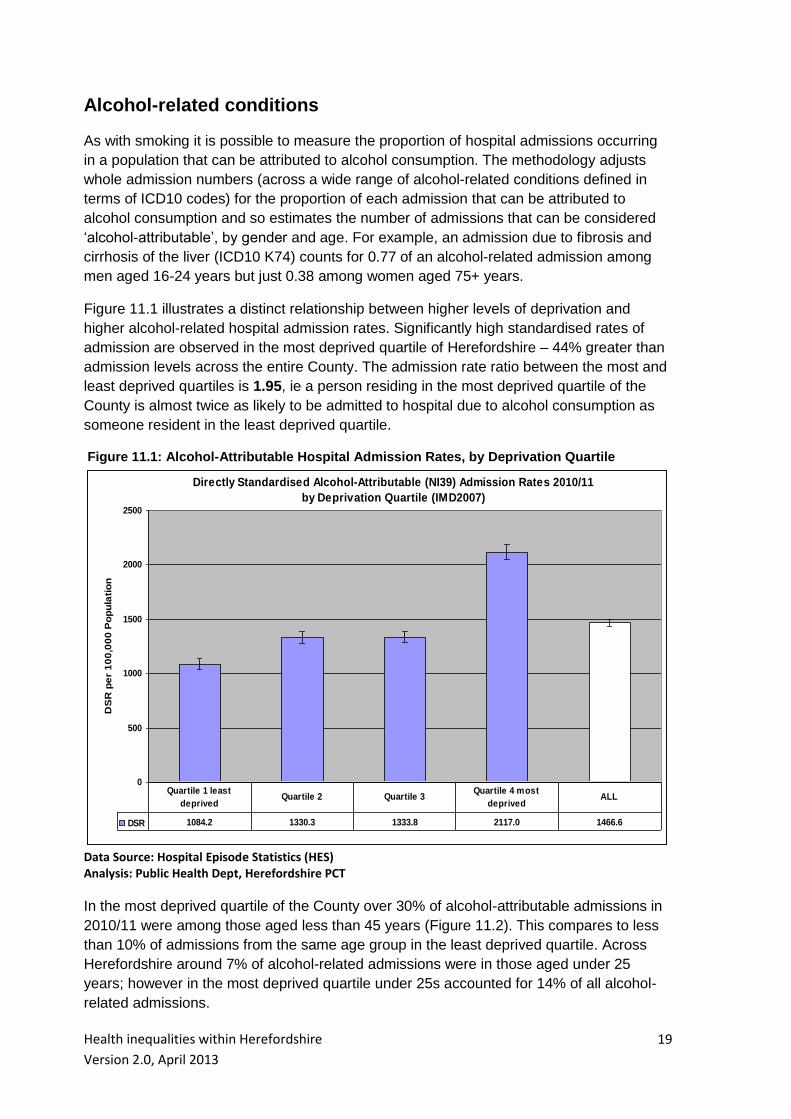
Figure 11.1 illustrates a distinct relationship between higher levels of deprivation and
higher alcohol-related hospital admission rates. Significantly high standardised rates of
admission are observed in the most deprived quartile of Herefordshire – 44% greater than
admission levels across the entire County. The admission rate ratio between the most and
least deprived quartiles is 1.95, ie a person residing in the most deprived quartile of the
County is almost twice as likely to be admitted to hospital due to alcohol consumption as
someone resident in the least deprived quartile.
Figure 11.1: Alcohol-Attributable Hospital Admission Rates, by Deprivation Quartile
Directly Standardised Alcohol-Attributable (NI39) Admission Rates 2010/11
by Deprivation Quartile (IMD2007)
0
500
1000
1500
2000
2500
DS
R p
er
10
0,0
00
Po
pu
lati
on
DSR 1084.2 1330.3 1333.8 2117.0 1466.6
Quartile 1 least
deprivedQuartile 2 Quartile 3
Quartile 4 most
deprivedALL
Data Source: Hospital Episode Statistics (HES) Analysis: Public Health Dept, Herefordshire PCT
In the most deprived quartile of the County over 30% of alcohol-attributable admissions in
2010/11 were among those aged less than 45 years (Figure 11.2). This compares to less
than 10% of admissions from the same age group in the least deprived quartile. Across
Herefordshire around 7% of alcohol-related admissions were in those aged under 25
years; however in the most deprived quartile under 25s accounted for 14% of all alcohol-
related admissions.

Health inequalities within Herefordshire
Version 2.0, April 2013
20
Figure 11.2: Alcohol-Attributable Hospital Admissions, by Age Band & Deprivation Quartile
Alcohol-Attributable Admissions 2010/11 by Age Band & Deprivation Quartile (IMD2007)
13.5
5.4
4.0
2.3
6.8
16.1
9.6
11.1
7.6
11.4
31.0
31.6
32.2
24.8
30.0
38.6
52.8
52.4
65.4
51.4
0% 10% 20% 30% 40% 50% 60% 70% 80% 90% 100%
most deprived Quartile
Quartile 3
Quartile 2
least deprived Quartile
County
% Admissions by Age Band
0-14 years
15-24 years
25-44 years
45-64 years
65+ years
Data Source: Hospital Episode Statistics (HES) Analysis: Public Health Dept, Herefordshire PCT
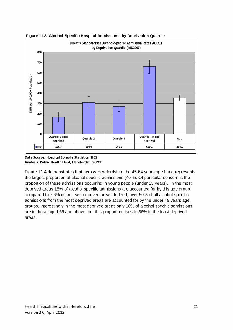
There is an even more pronounced association between higher levels of deprivation and
higher alcohol-specific hospital admission rates (Figure 11.3). The range of diagnoses
considered to be alcohol-specific includes acute conditions that typically arise from
excessive alcohol consumption exclusively eg ICD10 codes K70 (alcoholic liver disease)
and ICD10 K292 (alcoholic gastritis). Significantly high rates of admission are observed in
the most deprived quartile of the County – 86% greater than admission levels across all of
Herefordshire. The admission rate ratio between the most and least deprived quartiles is
3.95 – a resident of the most deprived areas of the County is almost four times as likely to
be admitted as a direct consequence of their alcohol consumption than a resident of the
least deprived areas.
Health inequalities within Herefordshire
Version 2.0, April 2013
21
Figure 11.3: Alcohol-Specific Hospital Admissions, by Deprivation Quartile
Directly Standardised Alcohol-Specific Admission Rates 2010/11
by Deprivation Quartile (IMD2007)
0
100
200
300
400
500
600
700
800
DS
R p
er
100,0
00 P
op
ula
tio
n
DSR 166.7 310.0 269.6 659.1 354.1
Quartile 1 least
deprivedQuartile 2 Quartile 3
Quartile 4 most
deprivedALL
Data Source: Hospital Episode Statistics (HES) Analysis: Public Health Dept, Herefordshire PCT
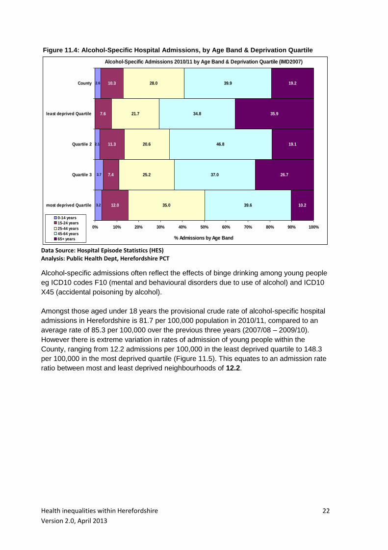
Figure 11.4 demonstrates that across Herefordshire the 45-64 years age band represents
the largest proportion of alcohol specific admissions (40%). Of particular concern is the
proportion of these admissions occurring in young people (under 25 years). In the most
deprived areas 15% of alcohol specific admissions are accounted for by this age group
compared to 7.6% in the least deprived areas. Indeed, over 50% of all alcohol-specific
admissions from the most deprived areas are accounted for by the under 45 years age
groups. Interestingly in the most deprived areas only 10% of alcohol specific admissions
are in those aged 65 and above, but this proportion rises to 36% in the least deprived
areas.
Health inequalities within Herefordshire
Version 2.0, April 2013
22
Figure 11.4: Alcohol-Specific Hospital Admissions, by Age Band & Deprivation Quartile
Alcohol-Specific Admissions 2010/11 by Age Band & Deprivation Quartile (IMD2007)
3.2
3.7
2.1
2.6
12.0
7.4
11.3
7.6
10.3
35.0
25.2
20.6
21.7
28.0
39.6
37.0
46.8
34.8
39.9
10.2
26.7
19.1
35.9
19.2
0% 10% 20% 30% 40% 50% 60% 70% 80% 90% 100%
most deprived Quartile
Quartile 3
Quartile 2
least deprived Quartile
County
% Admissions by Age Band
0-14 years
15-24 years
25-44 years
45-64 years
65+ years
Data Source: Hospital Episode Statistics (HES) Analysis: Public Health Dept, Herefordshire PCT
Alcohol-specific admissions often reflect the effects of binge drinking among young people
eg ICD10 codes F10 (mental and behavioural disorders due to use of alcohol) and ICD10
X45 (accidental poisoning by alcohol).
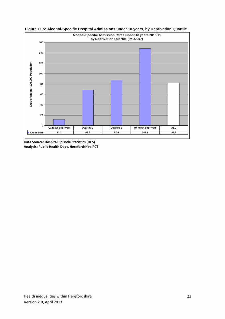
Amongst those aged under 18 years the provisional crude rate of alcohol-specific hospital
admissions in Herefordshire is 81.7 per 100,000 population in 2010/11, compared to an
average rate of 85.3 per 100,000 over the previous three years (2007/08 – 2009/10).
However there is extreme variation in rates of admission of young people within the
County, ranging from 12.2 admissions per 100,000 in the least deprived quartile to 148.3
per 100,000 in the most deprived quartile (Figure 11.5). This equates to an admission rate
ratio between most and least deprived neighbourhoods of 12.2.
Health inequalities within Herefordshire
Version 2.0, April 2013
23
Figure 11.5: Alcohol-Specific Hospital Admissions under 18 years, by Deprivation Quartile
Alcohol-Specific Admission Rates under 18 years 2010/11
by Deprivation Quartile (IMD2007)
0
20
40
60
80
100
120
140
160
Cru
de R
ate
per
100,0
00 P
op
ula
tio
n
Crude Rate 12.2 68.6 87.6 148.3 81.7
Q1 least deprived Quartile 2 Quartile 3 Q4 most deprived ALL
Data Source: Hospital Episode Statistics (HES) Analysis: Public Health Dept, Herefordshire PCT
Health inequalities within Herefordshire
Version 2.0, April 2013
24
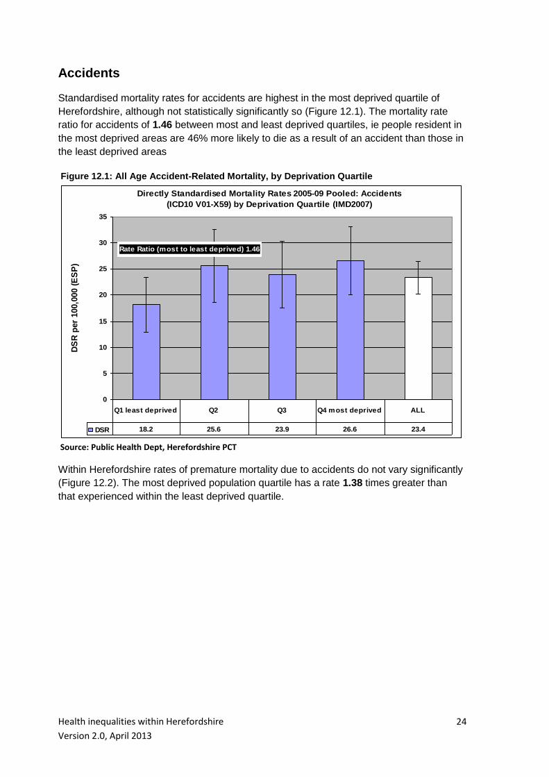
Accidents
Standardised mortality rates for accidents are highest in the most deprived quartile of
Herefordshire, although not statistically significantly so (Figure 12.1). The mortality rate
ratio for accidents of 1.46 between most and least deprived quartiles, ie people resident in
the most deprived areas are 46% more likely to die as a result of an accident than those in
the least deprived areas
Figure 12.1: All Age Accident-Related Mortality, by Deprivation Quartile
Directly Standardised Mortality Rates 2005-09 Pooled: Accidents
(ICD10 V01-X59) by Deprivation Quartile (IMD2007)
0
5
10
15
20
25
30
35
Rate Ratio (most to least deprived) 1.46
DS
R p
er
100,0
00 (
ES
P)
DSR 18.2 25.6 23.9 26.6 23.4
Q1 least deprived Q2 Q3 Q4 most deprived ALL
Source: Public Health Dept, Herefordshire PCT
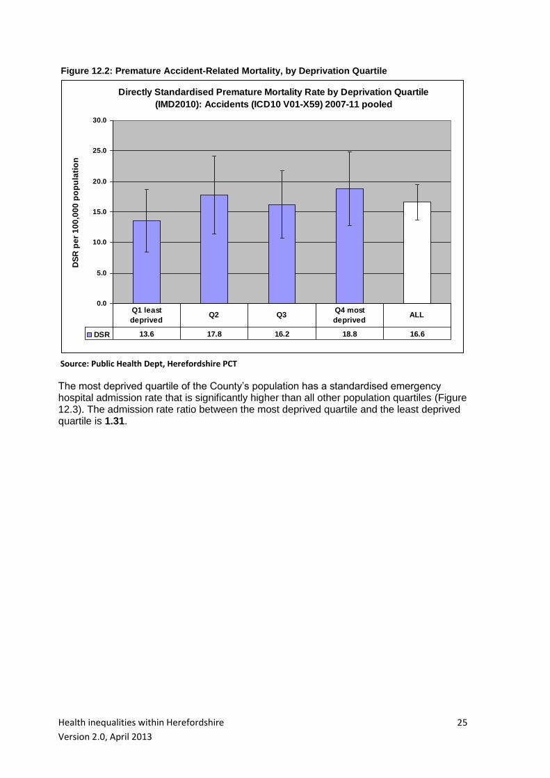
Within Herefordshire rates of premature mortality due to accidents do not vary significantly
(Figure 12.2). The most deprived population quartile has a rate 1.38 times greater than
that experienced within the least deprived quartile.
Health inequalities within Herefordshire
Version 2.0, April 2013
25
Figure 12.2: Premature Accident-Related Mortality, by Deprivation Quartile
Directly Standardised Premature Mortality Rate by Deprivation Quartile
(IMD2010): Accidents (ICD10 V01-X59) 2007-11 pooled
0.0
5.0
10.0
15.0
20.0
25.0
30.0
DS
R p
er
10
0,0
00
po
pu
lati
on
DSR 13.6 17.8 16.2 18.8 16.6
Q1 least
deprivedQ2 Q3
Q4 most
deprivedALL
Source: Public Health Dept, Herefordshire PCT
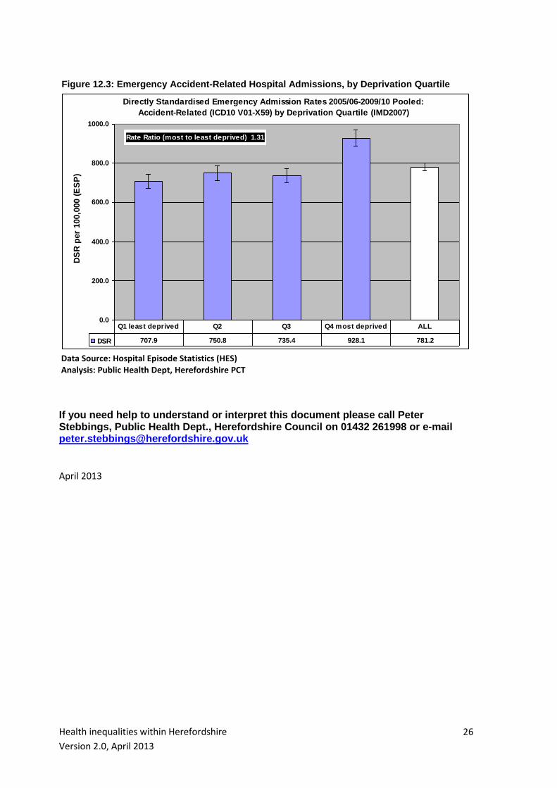
The most deprived quartile of the County’s population has a standardised emergency hospital admission rate that is significantly higher than all other population quartiles (Figure 12.3). The admission rate ratio between the most deprived quartile and the least deprived quartile is 1.31.
Health inequalities within Herefordshire
Version 2.0, April 2013
26
Figure 12.3: Emergency Accident-Related Hospital Admissions, by Deprivation Quartile
Directly Standardised Emergency Admission Rates 2005/06-2009/10 Pooled:
Accident-Related (ICD10 V01-X59) by Deprivation Quartile (IMD2007)
0.0
200.0
400.0
600.0
800.0
1000.0
Rate Ratio (most to least deprived) 1.31
DS
R p
er
100,0
00 (
ES
P)
DSR 707.9 750.8 735.4 928.1 781.2
Q1 least deprived Q2 Q3 Q4 most deprived ALL
Data Source: Hospital Episode Statistics (HES) Analysis: Public Health Dept, Herefordshire PCT
If you need help to understand or interpret this document please call Peter Stebbings, Public Health Dept., Herefordshire Council on 01432 261998 or e-mail [email protected] April 2013