Embed Size (px)
Citation preview


Handbook of Functional MRI Data Analysis
Functional magnetic resonance imaging (fMRI) has become the most popular method for imaging
brain function.Handbook of FunctionalMRIData Analysis provides a comprehensive and practical
introduction to the methods used for fMRI data analysis. Using minimal jargon, this book explains
the concepts behind processing fMRI data, focusing on the techniques that are most commonly
used in the field. This book provides background about the methods employed by common data
analysis packages including FSL, SPM, and AFNI. Some of the newest cutting-edge techniques,
including pattern classification analysis, connectivity modeling, and resting state network analysis,
are also discussed.
Readers of this book, whether newcomers to the field or experienced researchers, will obtain
a deep and effective knowledge of how to employ fMRI analysis to ask scientific questions and
become more sophisticated users of fMRI analysis software.
Dr. Russell A. Poldrack is the director of the Imaging Research Center and professor of
Psychology and Neurobiology at the University of Texas at Austin. He has published more than
100 articles in the field of cognitive neuroscience, in journals including Science, Nature, Neuron,
Nature Neuroscience, and PNAS. He is well known for his writings on how neuroimaging can be
used to make inferences about psychological function, as well as for his research using fMRI and
other imaging techniques to understand the brain systems that support learning and memory,
decision making, and executive function.
Dr. Jeanette A. Mumford is a research assistant professor in the Department of Psychology
at the University of Texas at Austin. Trained in biostatistics, her research has focused on the
development and characterization of new methods for statistical modeling and analysis of fMRI
data. Her work has examined the impact of different group modeling strategies and developed
new tools for modeling network structure in resting-state fMRI data. She is the developer of the
fmriPower software package, which provides power analysis tools for fMRI data.
Dr. Thomas E. Nichols is the head of Neuroimaging Statistics at the University of Warwick,
United Kingdom. He has been working in functional neuroimaging since 1992, when he joined
the University of Pittsburgh’s PET facility as programmer and statistician. He is known for his
work on inference in brain imaging, using both parametric and nonparametric methods, and he
is an active contributor to the FSL and SPM software packages. In 2009 he received the Wiley
Young Investigator Award from the Organization for Human Brain Mapping in recognition for his
contributions to statistical modeling and inference of neuroimaging data.


Handbook of FunctionalMRI Data Analysis
Russell A. PoldrackUniversity of Texas at Austin, Imaging Research Center
Jeanette A. MumfordUniversity of Texas at Austin
Thomas E. NicholsUniversity of Warwick

c a m b r i d g e u n i v e r s i t y p r e s s
Cambridge, New York, Melbourne, Madrid, Cape Town,
Singapore, São Paulo, Delhi, Tokyo, Mexico City
Cambridge University Press
32 Avenue of the Americas, New York, NY 10013-2473, USA
www.cambridge.org
Information on this title: www.cambridge.org/9780521517669
© Russell A. Poldrack, Jeanette A. Mumford, and Thomas E. Nichols, 2011
This publication is in copyright. Subject to statutory exception
and to the provisions of relevant collective licensing agreements,
no reproduction of any part may take place without the written
permission of Cambridge University Press.
First published 2011
Printed in China by Everbest
A catalog record for this publication is available from the British Library.
Library of Congress Cataloging in Publication data
Poldrack, Russell A.
Handbook of functional MRI data analysis / Russell A. Poldrack,
Jeanette A. Mumford, Thomas E. Nichols.
p. ; cm.
Includes bibliographical references and index.
ISBN 978-0-521-51766-9 (hardback)
1. Brain mapping – Statistical methods. 2. Brain – Imaging – Statistical methods.
3. Magnetic resonance imaging. I. Mumford, Jeanette A., 1975–
II. Nichols, Thomas E. III. Title.
[DNLM: 1. Magnetic Resonance Imaging. 2. Brain Mapping. 3. Data Interpretation,
Statistical. 4. Image Processing, Computer-Assisted – methods. WN 185]
RC386.6.B7P65 2011
616.8′047548–dc22 2011010349
ISBN 978-0-521-51766-9 Hardback
Cambridge University Press has no responsibility for the persistence or accuracy of URLs for external or
third-party Internet Web sites referred to in this publication and does not guarantee that any content on such
Web sites is, or will remain, accurate or appropriate.

Contents
Preface page ix
1 Introduction 1
1.1 A brief overview of fMRI 1
1.2 The emergence of cognitive neuroscience 3
1.3 A brief history of fMRI analysis 4
1.4 Major components of fMRI analysis 7
1.5 Software packages for fMRI analysis 7
1.6 Choosing a software package 10
1.7 Overview of processing streams 10
1.8 Prerequisites for fMRI analysis 10
2 Image processing basics 13
2.1 What is an image? 13
2.2 Coordinate systems 15
2.3 Spatial transformations 17
2.4 Filtering and Fourier analysis 31
3 Preprocessing fMRI data 34
3.1 Introduction 34
3.2 An overview of fMRI preprocessing 34
3.3 Quality control techniques 34
3.4 Distortion correction 38
3.5 Slice timing correction 41
3.6 Motion correction 43
3.7 Spatial smoothing 50
4 Spatial normalization 53
4.1 Introduction 53
4.2 Anatomical variability 53
v

vi
4.3 Coordinate spaces for neuroimaging 54
4.4 Atlases and templates 55
4.5 Preprocessing of anatomical images 56
4.6 Processing streams for fMRI normalization 58
4.7 Spatial normalization methods 60
4.8 Surface-based methods 62
4.9 Choosing a spatial normalization method 63
4.10 Quality control for spatial normalization 65
4.11 Troubleshooting normalization problems 66
4.12 Normalizing data from special populations 66
5 Statistical modeling: Single subject analysis 70
5.1 The BOLD signal 70
5.2 The BOLD noise 86
5.3 Study design and modeling strategies 92
6 Statistical modeling: Group analysis 100
6.1 The mixed effects model 100
6.2 Mean centering continuous covariates 105
7 Statistical inference on images 110
7.1 Basics of statistical inference 110
7.2 Features of interest in images 112
7.3 The multiple testing problem and solutions 116
7.4 Combining inferences: masking and conjunctions 123
7.5 Use of region of interest masks 126
7.6 Computing statistical power 126
8 Modeling brain connectivity 130
8.1 Introduction 130
8.2 Functional connectivity 131
8.3 Effective connectivity 144
8.4 Network analysis and graph theory 155
9 Multivoxel pattern analysis and machine learning 160
9.1 Introduction to pattern classification 160
9.2 Applying classifiers to fMRI data 163
9.3 Data extraction 163
9.4 Feature selection 164
9.5 Training and testing the classifier 165
9.6 Characterizing the classifier 171
10 Visualizing, localizing, and reporting fMRI data 173
10.1 Visualizing activation data 173
10.2 Localizing activation 176

vii
10.3 Localizing and reporting activation 179
10.4 Region of interest analysis 183
Appendix A Review of the General Linear Model 191
A.1 Estimating GLM parameters 191
A.2 Hypothesis testing 194
A.3 Correlation and heterogeneous variances 195
A.4 Why “general” linear model? 197
Appendix B Data organization and management 201
B.1 Computing for fMRI analysis 201
B.2 Data organization 202
B.3 Project management 204
B.4 Scripting for data analysis 205
Appendix C Image formats 208
C.1 Data storage 208
C.2 File formats 209
Bibliography 211
Index 225


Preface
Functional magnetic resonance imaging (fMRI) has, in less than two decades,
become the most commonly used method for the study of human brain function.
FMRI is a technique that uses magnetic resonance imaging to measure brain activity
by measuring changes in the local oxygenation of blood, which in turn reflects the
amount of local brain activity. The analysis of fMRI data is exceedingly complex,
requiring the use of sophisticated techniques from signal and image processing and
statistics in order to go from the raw data to the finished product, which is generally
a statistical map showing which brain regions responded to some particular manip-
ulation of mental or perceptual functions. There are now several software packages
available for the processing and analysis of fMRI data, several of which are freely
available.
The purpose of this book is to provide researchers with a sophisticated under-
standing of all of the techniques necessary for processing and analysis of fMRI data.
The content is organized roughly in line with the standard flow of data processing
operations, or processing stream, used in fMRI data analysis. After starting with a
general introduction to fMRI, the chapters walk through all the steps that one takes
in analyzing an fMRI dataset. We begin with an overview of basic image processing
methods, providing an introduction to the kinds of data that are used in fMRI and
how they can be transformed and filtered. We then discuss the many steps that are
used for preprocessing fMRI data, including quality control, correction for vari-
ous kinds of artifacts, and spatial smoothing, followed by a description of methods
for spatial normalization, which is the warping of data into a common anatomical
space. The next three chapters then discuss the heart of fMRI data analysis, which is
statistical modeling and inference. We separately discuss modeling data from fMRI
timeseries within an individual and modeling group data across individuals, fol-
lowed by an outline of methods for statistical inference that focuses on the severe
multiple test problem that is inherent in fMRI data. Two additional chapters focus
on methods for analyzing data that go beyond a single voxel, involving either the
ix

x Preface
modeling of connectivity between regions or the use of machine learning techniques
to model multivariate patterns in the data. The final chapter discusses approaches
for the visualization of the complex data that come out of fMRI analysis. The appen-
dices provide background about the general linear model, a practical guide to the
organization of fMRI data, and an introduction to imaging data file formats.
The intended audience for this book is individuals who want to understand fMRI
analysis at a deep conceptual level, rather than simply knowing which buttons to
push on the software package. This may include graduate students and advanced
undergraduate students, medical school students, and researchers in a broad range
of fields including psychology, neuroscience, radiology, neurology, statistics, and
bioinformatics. The book could be used in a number of types of courses, including
graduate and advanced undergraduate courses on neuroimaging as well as more
focused courses on fMRI data analysis.
We have attempted to explain the concepts in this book with a minimal amount
of mathematical notation. Some of the chapters include mathematical detail about
particular techniques, but this can generally be skipped without harm, though inter-
ested readers will find that understanding the mathematics can provide additional
insight. The reader is assumed to have a basic knowledge of statistics and linear
algebra, but we also provide background for the reader in these topics, particularly
with regard to the general linear model.
We believe that the only way to really learn about fMRI analysis is to do it. To that
end, we have provided the example datasets used in the book along with example
analysis scripts on the book’s Web site: http://www.fmri-data-analysis.org/.
Although our examples focus primarily on the FSL and SPM software packages,
we welcome developers and users of other packages to submit example scripts that
demonstrate how to analyze the data using those other packages. Another great way
to learn about fMRI analysis is to simulate data and test out different techniques. To
assist the reader in this exercise, we also provide on the Web site examples of code
that was used to create a number of the figures in the book. These examples include
MATLAB, R, and Python code, highlighting the many different ways in which one
can work with fMRI data.
The following people provided helpful comments on various chapters in the book,
for which we are very grateful: Akram Bakkour, Michael Chee, Joe Devlin, Marta
Garrido, Clark Glymour, Yaroslav Halchenko, Mark Jenkinson, Agatha Lenartowicz,
Randy McIntosh, Rajeev Raizada, Antonio Rangel, David Schnyer, and Klaas Enno
Stephan. We would also like to thank Lauren Cowles at Cambridge University Press
for her guidance and patience throughout the process of creating this book.

1
Introduction
The goal of this book is to provide the reader with a solid background in the tech-
niques used for processing and analysis of functional magnetic resonance imaging
(fMRI) data.
1.1 A brief overview of fMRI
Since its development in the early 1990s, fMRI has taken the scientific world by
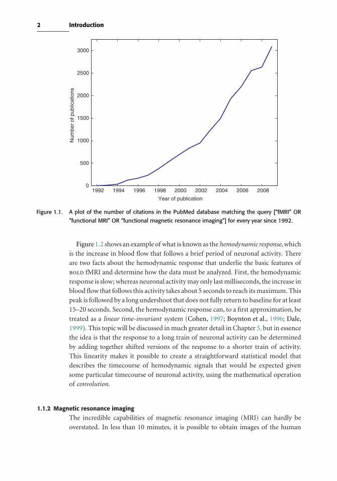
storm. This growth is easy to see from the plot of the number of papers that mention
the technique in the PubMed database of biomedical literature, shown in Figure 1.1.
Back in 1996 it was possible to sit down and read the entirety of the fMRI literature
in a week, whereas now it is barely feasible to read all of the fMRI papers that were
published in the previous week! The reason for this explosion in interest is that fMRI
provides an unprecedented ability to safely and noninvasively image brain activity
with very good spatial resolution and relatively good temporal resolution compared
to previous methods such as positron emission tomography (PET).
1.1.1 Blood flow and neuronal activity
The most common method of fMRI takes advantage of the fact that when neu-
rons in the brain become active, the amount of blood flowing through that area
is increased. This phenomenon has been known for more than 100 years, though
the mechanisms that cause it remain only partly understood. What is particularly
interesting is that the amount of blood that is sent to the area is more than is needed
to replenish the oxygen that is used by the activity of the cells. Thus, the activity-
related increase in blood flow caused by neuronal activity leads to a relative surplus
in local blood oxygen. The signal measured in fMRI depends on this change in
oxygenation and is referred to as the blood oxygenation level dependent, or bold,
signal.
1
2 Introduction
1992 1994 1996 1998 2000 2002 2004 2006 20080
500
1000
1500
2000
2500
3000
Year of publication
Num
ber
of p
ublic
atio
ns
Figure 1.1. A plot of the number of citations in the PubMed database matching the query [“fMRI” OR
“functional MRI” OR “functional magnetic resonance imaging”] for every year since 1992.
Figure 1.2 shows an example of what is known as the hemodynamic response, which
is the increase in blood flow that follows a brief period of neuronal activity. There
are two facts about the hemodynamic response that underlie the basic features of
bold fMRI and determine how the data must be analyzed. First, the hemodynamic
response is slow; whereas neuronal activity may only last milliseconds, the increase in
blood flow that follows this activity takes about 5 seconds to reach its maximum. This
peak is followed by a long undershoot that does not fully return to baseline for at least
15–20 seconds. Second, the hemodynamic response can, to a first approximation, be
treated as a linear time-invariant system (Cohen, 1997; Boynton et al., 1996; Dale,
1999). This topic will be discussed in much greater detail in Chapter 5, but in essence
the idea is that the response to a long train of neuronal activity can be determined
by adding together shifted versions of the response to a shorter train of activity.
This linearity makes it possible to create a straightforward statistical model that
describes the timecourse of hemodynamic signals that would be expected given
some particular timecourse of neuronal activity, using the mathematical operation
of convolution.
1.1.2 Magnetic resonance imaging
The incredible capabilities of magnetic resonance imaging (MRI) can hardly be
overstated. In less than 10 minutes, it is possible to obtain images of the human

3 1.2 The emergence of cognitive neuroscience
0 2 4 6 8 10 12 14 16−0.4
−0.2
0
0.2
0.4
0.6
0.8
1
Peristimulus time (seconds)
% c
hang
e in
MR
I sig
nal
Figure 1.2. An example of the hemodynamic responses evoked in area V1 by a contrast-reversing checker-
board displayed for 500 ms. The four different lines are data from four different individuals,
showing how variable these responses can be across people. The MRI signal was measured
every 250 ms, which accounts for the noisiness of the plots. (Data courtesy of Stephen Engel,
University of Minnesota)
brain that rival the quality of a postmortem examination, in a completely safe and
noninvasive way. Before the development of MRI, imaging primarily relied upon the
use of ionizing radiation (as used in X-rays, computed tomography, and positron
emission tomography). In addition to the safety concerns about radiation, none
of these techniques could provide the flexibility to image the broad range of tissue
characteristics that can be measured with MRI. Thus, the establishment of MRI as a
standard medical imaging tool in the 1980s led to a revolution in the ability to see
inside the human body.
1.2 The emergence of cognitive neuroscience
Our fascination with how the brain and mind are related is about as old as humanity
itself. Until the development of neuroimaging methods, the only way to understand
how mental function is organized in the brain was to examine the brains of indi-
viduals who had suffered damage due to stroke, infection, or injury. It was through
these kinds of studies that many early discoveries were made about the localization
of mental functions in the brain (though many of these have come into question

4 Introduction
subsequently). However, progress was limited by the many difficulties that arise in
studying brain-damaged patients (Shallice, 1988).
In order to better understand how mental functions relate to brain processes in
the normal state, researchers needed a way to image brain function while individu-
als performed mental tasks designed to manipulate specific mental processes. In the
1980s several groups of researchers (principally at Washington University in St. Louis
and the Karolinska Institute in Sweden) began to use positron emission tomography
(PET) to ask these questions. PET measures the breakdown of radioactive mate-
rials within the body. By using radioactive tracers that are attached to biologically
important molecules (such as water or glucose), it can measure aspects of brain
function such as blood flow or glucose metabolism. PET showed that it was possible
to localize mental functions in the brain, providing the first glimpses into the neural
organization of cognition in normal individuals (e.g., Posner et al., 1988). However,
the use of PET was limited due to safety concerns about radiation exposure, and due
to the scarce availability of PET systems.
fMRI provided exactly the tool that cognitive neuroscience was looking for. First,
it was safe, which meant that it could be used in a broad range of individuals, who
could be scanned repeatedly many times if necessary. It could also be used with
children, who could not take part in PET studies unless the scan was medically
necessary. Second, by the 1990s MRI systems had proliferated, such that nearly every
medical center had at least one scanner and often several. Because fMRI could be
performed on many standard MRI scanners (and today on nearly all of them), it was
accessible to many more researchers than PET had been. Finally, fMRI had some
important technical benefits over PET. In particular, its spatial resolution (i.e., its
ability to resolve small structures) was vastly better than PET. In addition, whereas
PET required scans lasting at least a minute, with fMRI it was possible to examine
events happening much more quickly. Cognitive neuroscientists around the world
quickly jumped on the bandwagon, and thus the growth spurt of fMRI began.
1.3 A brief history of fMRI analysis
When the first fMRI researchers collected their data in the early 1990s, they also
had to create the tools to analyze the data, as there was no “off-the-shelf” software
for analysis of fMRI data. The first experimental designs and analytic approaches
were inspired by analysis of blood flow data using PET. In PET blood flow studies,
acquisition of each image takes at least one minute, and a single task is repeated
for the entire acquisition. The individual images are then compared using simple
statistical procedures such as a t-test between task and resting images. Inspired by this
approach, early studies created activation maps by simply subtracting the average
activation during one task from activation during another. For example, in the study
by Kwong et al. (1992), blocks of visual stimulation were alternated with blocks of
no stimulation. As shown in Figure 1.3, the changes in signal in the visual cortex

5 1.3 A brief history of fMRI analysis
2860
2800
2740
26800 70 140 210 280
Sig
nal I
nten
sity
6050
5900
5750
56500 60 120 180 240
Seconds
Seconds
Photic Stimulation -- IR Images
Photic Stimulation -- GE Images
Sig
nal I
nten
sity
off offon on
off offon on
Figure 1.3. Early fMRI images from Kwong et al. (1992). The left panel shows a set of images starting
with the baseline image (top left), and followed by subtraction images taken at different
points during either visual stimulation or rest. The right panel shows the timecourse of a
region of interest in visual cortex, showing signal increases that occur during periods of visual
stimulation.
were evident even from inspection of single subtraction images. In order to obtain
statistical evidence for this effect, the images acquired during the stimulation blocks
were compared to the images from the no-stimulation blocks using a simple paired
t-test. This approach provided an easy way to find activation, but its limitations
quickly became evident. First, it required long blocks of stimulation (similar to PET
scans) in order to allow the signal to reach a steady state. Although feasible, this
approach in essence wasted the increased temporal resolution available from fMRI
data. Second, the simple t-test approach did not take into account the complex
temporal structure of fMRI data, which violated the assumptions of the statistics.
Researchers soon realized that the greater temporal resolution of fMRI relative to
PET permitted the use of event-related (ER) designs, where the individual impact of
relatively brief individual stimuli could be assessed. The first such studies used trials
that were spaced very widely in time (in order to allow the hemodynamic response to
return to baseline) and averaged the responses across a time window centered around
each trial (Buckner et al., 1996). However, the limitations of such slow event-related
designs were quickly evident; in particular, it required a great amount of scan time to
collect relatively few trials. The modeling of trials that occurred more rapidly in time
required a more fundamental understanding of the bold hemodynamic response
(HRF). A set of foundational studies (Boynton et al., 1996; Vazquez & Noll, 1998;
Dale & Buckner, 1997) established the range of event-related fMRI designs for which
6 Introduction
the bold response behaved as a linear time invariant system, which was roughly for
events separated by at least 2 seconds. The linearity of the bold is a crucial result,
dramatically simplifying the analysis by allowing the use of the General Linear Model
and also allowing the study of the statistical efficiency of various fMRI designs. For
example, using linearity Dale (1999) and Josephs & Henson (1999) demonstrated
that block designs were optimally sensitive to differences between conditions, but
careful arrangement of the events could provide the best possible ER design.
The noise in bold data also was a challenge, particularly with regard to the extreme
low frequency variation referred to as“drift.” Early work systematically examined the
sources and nature of this noise and characterized it as a combination of physiological
effects and scanner instabilities (Smith et al., 1999; Zarahn et al., 1997; Aguirre et al.,
1997), though the sources of drift remain somewhat poorly understood. The drift
was modeled by a combination of filters or nuisance regressors, or using temporal
autocorrelation models (Woolrich et al., 2001). Similar to PET, global variation in
the bold signal was observed that was unrelated to the task, and there were debates
as to whether global fMRI signal intensity should be regressed out, scaled-away, or
ignored (Aguirre et al., 1997).
In PET, little distinction was made between intrasubject and group analyses, and
the repeated measures correlation that arises from multiple (at most 12) scans from
a subject was ignored. With fMRI, there are hundreds of scans for each individual.
An early approach was to simply concatenate the time series for all individuals
in a study and perform the analysis across all timepoints, ignoring the fact that
these are repeated measures obtained across different individuals. This produced
“fixed effects” inferences in which a single subject could drive significant results
in a group analysis. The SPM group (Holmes & Friston, 1999) proposed a simple
approach to “mixed effects” modeling, whose inferences would generalize to the
sampled population. Their approach involved obtaining a separate effect estimate
per subject at each voxel and then combining these at a second level to test for effects
across subjects. Though still widely in use today, this approach did not account for
differences in intrasubject variability. An improved approach was proposed by the
FMRIB Software Library (FSL) group (Woolrich et al., 2004b; Beckmann & Smith,
2004) that used both the individual subject effect images and the corresponding
standard error images. Although the latter approach provides greater sensitivity
when there are dramatic differences in variability between subjects, recent work has
shown that these approaches do not differ much in typical single-group analyses
(Mumford & Nichols, 2009).
Since 2000, a new approach to fMRI analysis has become increasingly common,
which attempts to analyze the information present in patterns of activity rather than
the response at individual voxels. Known variously as multi-voxel pattern analysis
(MVPA), pattern information analysis, or machine learning, these methods attempt
to determine the degree to which different conditions (such as different stimulus
classes) can be distinguished on the basis of fMRI activation patterns, and also
7 1.5 Software packages for fMRI analysis
to understand what kind of information is present in those patterns. A particular
innovation of this set of methods is that they focus on making predictions about new
data, rather than simply describing the patterns that exist in a particular data set.
1.4 Major components of fMRI analysis
The analysis of fMRI data is made complex by a number of factors. First, the data
are liable to a number of artifacts, such as those caused by head movement. Second,
there are a number of sources of variability in the data, including variability between
individuals and variability across time within individuals. Third, the dimensionality
of the data is very large, which causes a number of challenges in comparison to
the small datasets that many scientists are accustomed to working with. The major
components of fMRI analysis are meant to deal with each of these problems. They
include
• Quality control: Ensuring that the data are not corrupted by artifacts.
• Distortion correction: The correction of spatial distortions that often occur in
fMRI images.
• Motion correction: The realignment of scans across time to correct for head
motion.
• Slice timing correction: The correction of differences in timing across different
slices in the image.
• Spatial normalization: The alignment of data from different individuals into
a common spatial framework so that their data can be combined for a group
analysis.
• Spatial smoothing: The intentional blurring of the data in order to reduce noise.
• Temporal filtering: The filtering of the data in time to remove low-frequency
noise.
• Statistical modeling: The fitting of a statistical model to the data in order to
estimate the response to a task or stimulus.
• Statistical inference: The estimation of statistical significance of the results,
correcting for the large number of statistical tests performed across the brain.
• Visualization: Visualization of the results and estimation of effect sizes.
The goal of this book is to outline the procedures involved in each of these steps.
1.5 Software packages for fMRI analysis
In the early days of fMRI, nearly every lab had its own home-grown software package
for data analysis, and there was little consistency between the procedures across
different labs. As fMRI matured, several of these in-house software packages began
to be distributed to other laboatories, and over time several of them came to be
distributed as full-fledged analysis suites, able to perform all aspects of analysis of
an fMRI study.

8 Introduction
Table 1.1. An overview of major fMRI software packages
Package Developer Platformsa Licensing
SPM University College MATLAB Open-source
London
FSL Oxford UNIX Open source
University
AFNI NIMH UNIX Open source
Brain Brain Innovation Mac OS X, Commercial
Voyager Windows, Linux (closed-source)
aThose platform listed as UNIX are available for Linux, Mac OS X, and other UNIX flavors.
Today, there are a number of comprehensive software packages for fMRI data
analysis, each of which has a loyal following. (See Table 1.1) The Web sites for all of
these packages are linked from the book Web site.
1.5.1 SPMSPM (which stands for Statistical Parametric Mapping) was the first widely used and
openly distributed software package for fMRI analysis. Developed by Karl Friston
and colleagues in the lab then known as the Functional Imaging Lab (or FIL) at
University College London, it started in the early 1990s as a program for analysis
of PET data and was then adapted in the mid-1990s for analysis of fMRI data.
It remains the most popular software package for fMRI analysis. SPM is built in
MATLAB, which makes it accessible on a very broad range of computer platforms.
In addition, MATLAB code is relatively readable, which makes it easy to look at
the code and see exactly what is being done by the programs. Even if one does
not use SPM as a primary analysis package, many of the MATLAB functions in
the SPM package are useful for processing data, reading and writing data files, and
other functions. SPM is also extensible through its toolbox functionality, and a large
number of extensions are available via the SPM Web site. One unique feature of
SPM is its connectivity modeling tools, including psychophysiological interaction
(Section 8.2.4) and dynamic causal modeling (Section 8.3.4). The visualization tools
available with SPM are relatively limited, and many users take advantage of other
packages for visualization.
1.5.2 FSLFSL (which stands for FMRIB Software Library) was created by Stephen Smith
and colleagues at Oxford University, and first released in 2000. FSL has gained
substantial popularity in recent years, due to its implementation of a number of

9 1.5 Software packages for fMRI analysis
cutting-edge techniques. First, FSL has been at the forefront of statistical modeling
for fMRI data, developing and implementing a number of novel modeling, estima-
tion, and inference techniques that are implemented in their FEAT, FLAME, and
RANDOMISE modules. Second, FSL includes a robust toolbox for independent
components analysis (ICA; see Section 8.2.5.2), which has become very popular
both for artifact detection and for modeling of resting-state fMRI data. Third, FSL
includes a sophisticated set of tools for analysis of diffusion tensor imaging data,
which is used to analyze the structure of white matter. FSL includes an increasingly
powerful visualization tool called FSLView, which includes the ability to overlay a
number of probabilistic atlases and to view time series as a movie. Another major
advantage of FSL is its integration with grid computing, which allows for the use of
computing clusters to greatly speed the analysis of very large datasets.
1.5.3 AFNIAFNI (which stands for Analysis of Functional NeuroImages) was created by Robert
Cox and his colleagues, first at the Medical College of Wisconsin and then at the
National Institutes of Mental Health. AFNI was developed during the very early days
of fMRI and has retained a loyal following. Its primary strength is in its very power-
ful and flexible visualization abilities, including the ability to integrate visualization
of volumes and cortical surfaces using the SUMA toolbox. AFNI’s statistical model-
ing and inference tools have historically been less sophisticated than those available
in SPM and FSL. However, recent work has integrated AFNI with the R statisti-
cal package, which allows use of more sophisticated modeling techniques available
within R.
1.5.4 Other important software packagesBrainVoyager. Brain Voyager, produced by Rainer Goebel and colleagues at Brain
Innovation, is the major commercial software package for fMRI analysis. It isavailable for all major computing platforms and is particularly known for its easeof use and refined user interface.
FreeSurfer. FreeSurfer is a package for anatomical MRI analysis developed by BruceFischl and colleagues at the Massachusetts General Hospital. Even though it isnot an fMRI analysis package per se, it has become increasingly useful for fMRIanalysis because it provides the means to automatically generate both corticalsurface models and anatomical parcellations with a minimum of human input.These models can then be used to align data across subjects using surface-basedapproaches, which may in some cases be more accurate than the more standardvolume-based methods for intersubject alignment (see Chapter 4). It is possi-ble to import statistical results obtained using FSL or SPM and project themonto the reconstructed cortical surface, allowing surface-based group statisticalanalysis.

10 Introduction
1.6 Choosing a software package
Given the variety of software packages available for fMRI analysis, how can one
choose among them? One way is to listen to the authors of this book, who have each
used a number of packages and eventually have chosen FSL as their primary analysis
package, although we each use other packages regularly as well. However, there are
other reasons that one might want to choose one package over the others. First, what
package do other experienced researchers at your institution use? Although mailing
lists can be helpful, there is no substitute for local expertise when one is learning a
new analysis package. Second, what particular aspects of analysis are most important
to you? For example, if you are intent on using dynamic causal modeling, then SPM
is the logical choice. If you are interested in using ICA, then FSL is a more appropriate
choice. Finally, it depends upon your computing platform. If you are a dedicated
Microsoft Windows user, then SPM is a good choice (though it is always possible
to install Linux on the same machine, which opens up many more possibilities). If
you have access to a large cluster, then you should consider FSL, given its built-in
support for grid computing.
It is certainly possible to mix and match analysis tools for different portions of
the processing stream. This has been made increasingly easy by the broad adoption
of the NIfTI file format by most of the major software packages (see Appendix C
for more on this). However, in general it makes sense to stick largely with a single
package, if only because it reduces the amount of emails one has to read from the
different software mailing lists!
1.7 Overview of processing streams
We refer to the sequence of operations performed in course of fMRI analysis as a
processing stream. Figure 1.4 provides a flowchart depicting some common process-
ing streams. The canonical processing streams differ somewhat between different
software packages; for example, in SPM spatial normalization is usually applied
prior to statistical analysis, whereas in FSL it is applied to the results from the
statistical analysis. However, the major pieces are the same across most packages.
1.8 Prerequisites for fMRI analysis
Research into the development of expertise suggests that it takes about ten years to
become expert in any field (Ericsson et al., 1993), and fMRI analysis is no different,
particularly because it requires a very broad range of knowledge and skills. However,
the new researcher has to start somewhere. Here, we outline the basic areas of
knowledge that we think are essential to becoming an expert at fMRI analysis, roughly
in order of importance.

11 1.8 Prerequisites for fMRI analysis
ImageReconstruction
MotionCorrection
Slice TimingCorrection
DistortionCorrection
SpatialSmoothing
StatisticalAnalysis
SpatialNormalization
SpatialNormalization
SpatialSmoothing
StatisticalAnalysis
FSL/AFNI
SPM
Figure 1.4. A depiction of common processing streams for fMRI data analysis.
1. Probability and statistics. There is probably no more important foundation for
fMRI analysis than a solid background in basic probability and statistics. With-
out this, nearly all of the concepts that are central to fMRI analysis will be
foreign.
2. Computer programming. It is our opinion that one simply cannot become an
effective user of fMRI analysis without strong computer programming skills.
There are many languages that are useful for fMRI analysis, including MATLAB,
Python, and UNIX shell scripting. The particular language is less important than
an underlying understanding of the methods of programming, and this is a place
where practice really does make perfect, particularly with regard to debugging
programs when things go wrong.
3. Linear algebra. The importance of linear algebra extends across many different
aspects of fMRI analysis, from statistics (where the general linear model is most
profitably defined in terms of linear algebra) to image processing (where many
operations on images are performed using linear algebra). A deep understanding
of fMRI analysis requires basic knowledge of linear algebra.
4. Magnetic resonance imaging. One can certainly analyze fMRI data without know-
ing the details of MRI acquisition, but a full understanding of fMRI data requires
that one understand where the data come from and what they are actually mea-
suring. This is particularly true when it comes to understanding the various ways
in which MRI artifacts may affect data analysis.
5. Neurophysiology and biophysics. fMRI signals are interesting because they are
an indirect measure of the activity of individual neurons. Understanding how

12 Introduction
neurons code information, and how these signals are reflected in blood flow, is
crucial to interpreting the results that are obtained from fMRI analysis.
6. Signal and image processing.A basic understanding of signal and image processing
methods is important for many of the techniques discussed in this book. In
particular, an understanding of Fourier analysis (Section 2.4) is very useful for
nearly every aspect of fMRI analysis.

2
Image processing basics
Many of the operations that are performed on fMRI data involve transforming
images. In this chapter, we provide an overview of the basic image processing
operations that are important for many different aspects of fMRI data analysis.
2.1 What is an image?
At its most basic, a digital image is a matrix of numbers that correspond to spatial
locations. When we view an image, we do so by representing the numbers in the
image in terms of gray values (as is common for anatomical MRI images such as in
Figure 2.1) or color values (as is common for statistical parametric maps). We gen-
erally refer to each element in the image as a “voxel,” which is the three-dimensional
analog to a pixel. When we “process” an image, we are generally performing some
kind of mathematical operation on the matrix. For example, an operation that
makes the image brighter (i.e., whiter) corresponds to increasing the values in the
matrix.
In a computer, images are represented as binary data, which means that the
representation takes the form of ones and zeros, rather than being represented in a
more familiar form such as numbers in plain text or in a spreadsheet. Larger numbers
are represented by combining these ones and zeros; a more detailed description of
this process is presented in Box 2.1.
Numeric formats. The most important implication of numeric representation is
that information can be lost if the representation is not appropriate. For example,
imagine that we take a raw MRI image that has integer values that range between
1,000 and 10,000, and we divide each voxel value by 100, resulting in a new image
with values ranging between 10 and 100. If the resulting image is stored using
floating point values, then all of the original information will be retained; that is, if
there were 9,000 unique values in the original image, there will also be 9,000 unique
13

14 Image processing basics
288 27 38 364 621
264 21 97 500 640
271 22 133 543 647
312 28 113 521 649
390 53 58 424 635
Figure 2.1. An image as a graphical representation of a matrix. The gray scale values in the image at left
correspond to numbers, which is shown for a set of particular voxels in the closeup section
on the right.
values in the new image (3,280 becomes 32.8, and so on). If the resulting image
is stored instead as integers (like the original image), then information is lost: The
9,000 unique values between 1,000 and 10,000 will be replaced by only 90 unique
values in the new image, which means that information has been lost when values
are rounded to the nearest integer. The tradeoff for using floating point numbers is
that they will result in larger image files (see Box 2.1).
Metadata. Beyond the values of each voxel, it is also critical to store other informa-
tion about the image, known generally as metadata. These data are generally stored
in a header, which can either be a separate file or a part of the image file. There are
a number of different types of formats that store this information, such as Analyze,
NIfTI, and DICOM. The details of these file formats are important but tangential to
our main discussion; the interested reader is directed to Appendix C.
Storing time series data. Whereas structural MRI images generally comprise a
single three-dimensional image, fMRI data are represented as a time series of three-
dimensional images. For example, we might collect an image every 2 seconds for
a total of 6 minutes, resulting in a time series of 180 three-dimensional images.
Some file formats allow representation of four-dimensional datasets, in which case
this entire time series could be saved in a single data file, with time as the fourth
dimension. Other formats require that the time series be stored as a series of separate
three-dimensional datafiles.

15 2.2 Coordinate systems
Box 2.1 Digital image representation
The numbers that comprise an image are generally represented as either integer
or floating point variables. In a digital computer, numbers are described in terms
of the amount of information that they contain in bits. A bit is the smallest pos-
sible amount of information, corresponding to a binary (true/false or 1/0) value.
The number of bits determines how many different possible values a numerical
variable can take. A one-bit variable can take two possible values (1/0), a two-bit
variable can take four possible values (00, 01, 10, 11), and so on; more generally,
a variable with n bits can take 2n different values. Raw MRI images are most
commonly stored as unsigned 16-bit values, meaning that they can take integer
values from 0 to 65535 (216 − 1). The results of analyses, such as statistical maps,
are generally stored as floating point numbers with either 32 bits (up to seven
decimal points, known as “single precision”) or 64 bits up to (14 decimal points,
known as “double precision”). They are referred to as “floating point” because the
decimal point can move around, allowing a much larger range of numbers to be
represented compared to the use of a fixed number of decimal points.
The number of bits used to store an image determines the precision with
which the information is represented. Sometimes the data are limited in their
precision due to the process that generates them, as is the case with raw MRI
data; in this case, using a variable with more precision would simply use more
memory than necessary without affecting the results. However, once we apply
processing operations to the data, then we may want additional precision to
avoid errors that occur when values are rounded to the nearest possible value
(known as quantization errors). The tradeoff for this added precision is greater
storage requirements. For example, a standard MRI image (with dimensions of
64 × 64 × 32 voxels) requires 256 kilobytes of diskspace when stored as a 16-bit
integer, but 1,024 kilobytes (one megabyte) when stored as a 64-bit floating point
value.
2.2 Coordinate systems
Since MRI images are related to physical objects, we require some way to relate the
data points in the image to spatial locations in the physical object. We do this using a
coordinate system, which is a way of specifying the spatial characteristics of an image.
The data matrix for a single brain image is usually three-dimensional, such that
each dimension in the matrix corresponds to a dimension in space. By convention,
these dimensions (or axes) are called X , Y , and Z . In the standard space used for
neuroimaging data (discussed further in Section 4.3), X represents the left–right
dimension, Y represents the anterior–posterior dimension, and Z represents the
inferior–superior dimension (see Figure 2.2).

16 Image processing basics
Z
Superior
Inferior
XLeft Right XLeft Right
Y
Anterior
Posterior
Z
Superior
Inferior
YPosterior Anterior
Coronal Axial Saggital
Figure 2.2. A depiction of the three main axes used in the standard coordinate space for MRI; images
taken directly from an MRI scanner may have different axis orientations.
In the data matrix, a specific voxel can be indexed as [Xvox ,Yvox ,Zvox], where these
three coordinates specify its position along each dimension in the matrix (starting
either at zero or one, depending upon the convention of the particular software
system). The specifics about how these data are stored (e.g., whether the first X value
refers to the leftmost or rightmost voxel) are generally stored in the image header;
see Appendix C for more information on image metadata.
2.2.1 Radiological and neurological conventions
Fields of scientific research often have their own conventions for presentation of data,
which usually have arisen by accident or fiat; for example, in electrophysiological
research, event-related potentials are often plotted with negative values going upward
and positive values going downward. The storage and display of brain images also
has a set of inconsistent conventions, which grew out of historical differences in
the preferences of radiologists and neurologists. Radiologists prefer to view images
with the right side of the brain on the left side of the image, supposedly so that the
orientation of the structures in the film matches the body when viewed from the
foot of the bed. The presentation of images with the left–right dimension reversed is
thus known as “radiological convention.” The convention amongst neurologists, on
the other hand, is to view images without flipping the left–right dimension (i.e., the
left side of the brain is on the left side of the image); this is known as neurological
convention. Unfortunately, there is no consistent convention for the storage or
display of images in brain imaging, meaning that one always has to worry about
whether the X dimension of the data is properly interpreted. Because of the left–
right symmetry of the human brain, there are no foolproof ways to determine from
an image of the brain which side is left and which is right. Anatomical differences
between the two hemispheres are subtle and inconsistent across individuals and do
not provide a sufficient means to identify the left and right hemispheres from an
image. For the anterior–posterior and inferior–superior dimensions, no convention

17 2.3 Spatial transformations
is needed because it is obvious which direction is up/down or forward/backward
due to the anatomy.
2.2.2 Standard coordinate spaces
The coordinate systems discussed earlier provide a link between the physical struc-
tures in the brain and the coordinates in the image. We call the original coordinate
system in the images as they were acquired from the MRI scanner the native space of
the image. Although the native space allows us to relate image coordinates to physical
structures, the brains of different individuals (or the same individual scanned on
different occasions) will not necessarily line up in native space. Different people have
brains that are different sizes, and even when the same person is scanned multiple
times, the brain will be in different places in the image depending upon exactly
where the head was positioned in the scanner. Because many research questions
in neuroimaging require us to combine data across individuals, we need a common
space in which different individuals can be aligned. The first impetus for such a com-
mon space came from neurosurgeons, who desired a standardized space in which
to perform stereotactic neurosurgery. Such spaces are now referred to generically
as standard spaces or stereotactic spaces. The most famous of these is the approach
developed by Jean Talairach (Talairach, 1967). More recently, a stereotactic coordi-
nate space developed at the Montreal Neurological Institute (MNI) on the basis of
a large number of MRI images has become a standard in the field. We discuss these
issues in much greater depth in Chapter 4.
2.3 Spatial transformations
Several aspects of fMRI analysis require spatially transforming images in some way,
for example, to align images within individuals (perhaps to correct for head motion)
or across individuals (in order to allow group analysis).
There is an unlimited number of ways to transform an image. A simple trans-
formation (with a small number of parameters) might move a structure in space
without changing its shape, whereas a more complex transformation might match
the shape of two complex structures to one another. In general, we will focus on
methods that have relatively few parameters in relation to the number of voxels. We
will also limit our focus to automated methods that do not require any manual delin-
eation of anatomical landmarks, since these are by far the most common today. In
this section, we only discuss volume-based transformations, which involve changes
to a three-dimensional volume of data. In Chapter 4 on spatial normalization, we
will also discuss surface-based registration, which spatially transforms the data using
surfaces (such as the surface of the cortex) rather than volumes.
Two steps are necessary to align one image to another. First, we have to estimate
the transformation parameters that result in the best alignment. This requires that
we have a transformation model that specifies the ways in which the image can be

18 Image processing basics
changed in order to realign it. Each parameter in such a model describes a change to
be made to the image. A very simple model may have only a few parameters; such
a model will only be able to make gross changes and will not be able to align the
fine details of the two images. A complex model may have many more parameters
and will be able to align the images better, especially in their finer details. We also
need a way to determine how misaligned the two images are, which we refer to as a
cost function. It is this cost function that we want to minimize in order to find the
parameters that best align the two images (see Section 2.3.2).
Once we have determined the parameters of the transformation model, we must
then resample the original image in order to create the realigned version. The original
coordinates of each voxel are transformed into the new space, and the new image is
created based on those transformed coordinates. Since the transformed coordinates
will generally not fall exactly on top of coordinates from the original image, it
is necessary to compute what the intensity values would be at those intermediate
points, which is known as interpolation. Methods of interpolation range from simple
(such as choosing the nearest original voxel) to complex weighted averages across
the entire image.
2.3.1 Transformation models
2.3.1.1 Affine transformations
The simplest transformation model used in fMRI involves the use of linear operators,
also known as affine transformations. A feature of affine transformations is that any
set of points that fell on a line prior to the transform will continue to fall on a line
after the transform. Thus, it is not possible to make radical changes to the shape of
an object (such as bending) using affine transforms.
An affine transformation involves a combination of linear transforms:
• Translation (shifting) along each axis
• Rotation around each axis
• Scaling (stretching) along each axis
• Shearing along each axis
Figure 2.3 shows examples of each of these transformations. For a three-dimensional
image, each of these operations can be performed for each dimension, and that
operation for each dimension is represented by a single parameter. Thus, a full affine
transformation where the image is translated, rotated, skewed, and stretched along
each axis in three dimensions is described by 12 parameters.
There are some cases where you might want to transform an image using only
a subset of the possible linear transformations, which corresponds to an affine
transformation with fewer than 12 parameters. For example, in motion correc-
tion we assume that the head is moving over time without changing its size or
shape. We can realign these images using an affine transform with only six param-
eters (three translations and three rotations), which is also referred to as a rigid
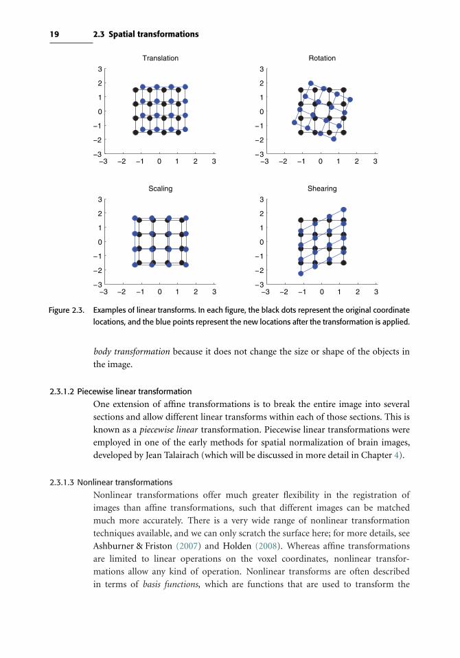
19 2.3 Spatial transformations
−2 −1−3 10 2 3 −2 −1−3 10 2 3
−2 −1−3 10 2 3 −2 −1−3 10 2 3
−3
−2
−1
0
1
2
3
Translation
−3
−2
−1
0
1
2
3
Rotation
−3
−2
−1
0
1
2
3
Scaling
−3
−2
−1
0
1
2
3
Shearing
Figure 2.3. Examples of linear transforms. In each figure, the black dots represent the original coordinate
locations, and the blue points represent the new locations after the transformation is applied.
body transformation because it does not change the size or shape of the objects in
the image.
2.3.1.2 Piecewise linear transformation
One extension of affine transformations is to break the entire image into several
sections and allow different linear transforms within each of those sections. This is
known as a piecewise linear transformation. Piecewise linear transformations were
employed in one of the early methods for spatial normalization of brain images,
developed by Jean Talairach (which will be discussed in more detail in Chapter 4).
2.3.1.3 Nonlinear transformations
Nonlinear transformations offer much greater flexibility in the registration of
images than affine transformations, such that different images can be matched
much more accurately. There is a very wide range of nonlinear transformation
techniques available, and we can only scratch the surface here; for more details, see
Ashburner & Friston (2007) and Holden (2008). Whereas affine transformations
are limited to linear operations on the voxel coordinates, nonlinear transfor-
mations allow any kind of operation. Nonlinear transforms are often described
in terms of basis functions, which are functions that are used to transform the

20 Image processing basics
Box 2.3.1 Mathematics of affine transformations
Affine transformations involve linear changes to the coordinates of an image,
which can be represented as:
Ctransformed = T ∗Corig
where Ctransformed are the transformed coordinates, Corig are the original coor-
dinates, and T is the transformation matrix. For more convenient application
of matrix operations, the coordinates are often represented as homogenous
coordinates, in which theN -dimensional coordinates are embedded in a (N +1)-
dimensional vector. This is a mathematical trick that makes it easier to perform
the operations (by allowing us to write Ctransformed = T ∗ Corig rather than
Ctransformed = T ∗Corig +Translation). For simplicity, here we present an exam-
ple of the transformation matrices that accomplish these transformations for
two-dimensional coordinates:
C =CXCY
1
where CX and CY are the coordinates in the X and Y dimensions, respectively.
Given these coordinates, then each of the transformations can be defined as
follows:
Translation along X (TransX ) and Y (TransY ) axes:
T =1 0 TransX
0 1 TransY0 0 1
Rotation in plane (by angle θ):
T =cos(θ) − sin(θ) 0
sin(θ) cos(θ) 0
0 0 1
Scaling along X (ScaleX ) and Y (ScaleY ) axes:
T =ScaleX 0 0
0 ScaleY 0
0 0 1

21 2.3 Spatial transformations
Shearing along X (ShearX ) and Y (ShearY ) axes:
T = 1 ShearX 0
ShearY 1 0
0 0 1
original coordinates. The affine transforms described earlier were one example of
basis functions. However, basis function expansion also allows us to re-represent the
coordinates in a higher-dimensional form, to allow more complex transformation.
For example, the polynomial basis expansion involves a polynomial function of
the original coordinates. A second-order polynomial expansion involves all possible
combinations of the original coordinates (X/Y/Z) up to the power of 2:
Xt = a1 + a2X + a3Y + a4Z + a5X2 + a6Y
2 + a7Z2 + a8XY + a9XZ + a10YZ
Yt = b1 + b2X + b3Y + b4Z + b5X2 + b6Y
2 + b7Z2 + b8XY + b9XZ + b10YZ
Zt = c1 + c2X + c3Y + c4Z + c5X 2 + c6Y 2 + c7Z 2 + c8XY + c9XZ + c10YZ
where Xt /Yt /Zt are the transformed coordinates. This expansion has a total of 30
parameters (a1 . . .a10, b1 . . .b10, and c1 . . . c10). Expansions to any order are possible,
with a rapidly increasing number of parameters as the order increases; for example,
a 12th order polynomial has a total of 1,365 parameters in three dimensions.
Another nonlinear basis function set that is commonly encountered in fMRI data
analysis is the discrete cosine transform (DCT) basis set, which historically was used
in SPM (Ashburner & Friston, 1999), though more recently has been supplanted
by spline basis functions. This basis set includes cosine functions that start at low
frequencies (which change very slowly over the image) and increase in frequency.
It is closely related to the Fourier transform, which will be discussed in more detail
in Section 2.4. Each of the cosine functions has a parameter associated with it; the
lower-frequency components are responsible for more gradual changes, whereas the
higher-frequency components are responsible for more localized changes.
For all nonlinear transformations, the greater the number of parameters, the
more freedom there is to transform the image. In particular, high-dimensional
transformations allow for more localized transformations; whereas linear transforms
necessarily affect the entire image in an equivalent manner, nonlinear transforms
can change some parts of the image much more drastically than others.
2.3.2 Cost functionsTo estimate which parameters of the transformation model can best align two images,
we need a way to define the difference between the images, which is referred to as a

22 Image processing basics
T1-weighted MRI T2-weighted MRI T2*-weighted fMRI
Figure 2.4. Examples of different MRI image types. The relative intensity of different brain areas (e.g.,
white matter, gray matter, ventricles) differs across the image types, which means that they
cannot be aligned simply by matching intensity across images.
cost function. A good cost function should be small when the images are well-aligned
and become larger as they become progressively more misaligned. The choice of an
appropriate cost function depends critically upon the type of images that you are
trying to register. If the images are of the same type (e.g., realigning fMRI data across
different timepoints), then the cost function simply needs to determine the similarity
of the image intensities across the two images. If the images are perfectly aligned, then
the intensity values in the images should be very close to one another (disregarding,
for the moment, the fact that they may change due to interesting factors such as
activation). This problem is commonly referred to as“within-modality”registration.
If, on the other hand, the images have different types of contrast (e.g., a T1-weighted
MRI image and a T2-weighted image), then optimal alignment will not result in
similar values across images. This is referred to as “between-modality” registration.
For T1-weighted versus T2-weighted images, white matter will be brighter than
gray matter in the T1-weighted image but vice versa in the T2-weighted image
(see Figure 2.4), and thus we cannot simply match the intensities across the images.
Instead, we want to use a method that is sensitive to the relative intensities of different
sets of voxels; for example, we might want to match bright sections of one image to
dark sections of another image.
Here we describe several of the most common cost functions used for within- and
between-modality registration of MRI images.
2.3.2.1 Least squares
The least-squares cost function is perhaps the most familiar, as it is the basis for
most standard statistical methods. This cost function measures the average squared

23 2.3 Spatial transformations
difference between voxel intensities in each image:
C =n∑v=1
(Av −Bv)2
where Av and Bv refer to the intensity of the vth voxel in images A and B, respec-
tively. Because it measures the similarity of values at each voxel, the least-squares cost
function is only appropriate for within-modality registration. Even within modal-
ities, it can perform badly if the two images have different intensity distributions
(e.g., one is brighter overall than the other or has a broader range of intensities).
One approach, which is an option in the AIR software package, is to first scale the
intensity distributions before using the least-squares cost function so that they fall
within the same range across images.
2.3.2.2 Normalized correlation
Normalized correlation measures the linear relationship between voxel intensities in
the two images. It is defined as
C =∑nv=1(AvBv)√∑n
v=1A2v
√∑nv=1B
2v
This measure is appropriate for within-modality registration only. In a comparison
of many different cost functions for motion correction, Jenkinson et al. (2002) found
that normalized correlation results in more accurate registration than several other
cost functions, including least squares. It is the default cost function for motion
correction in the FSL software package.
2.3.2.3 Mutual information
Whereas the cost functions described earlier for within-modality registration have
their basis in classical statistics, the mutual information cost function (Pluim et al.,
2003) (which can be used for between- or within-modality registration) arises from
the concept of entropy from information theory. Entropy refers to the amount of
uncertainty or randomness that is present in a signal:
H =N∑i=1
pi ∗ log
(1
pi
)= −
N∑i=1
pi ∗ log(pi)
where pi is the probability of each possible value xi of the variable; for continuous
variables, the values are grouped into N bins, often called histogram bins. Entropy
measures the degree to which each of the different possible values of a variable occurs
in a signal. If only one signal value can occur (i.e., pi = 1 for only one xi and pi = 0
for all other xi), then the entropy is minimized. If every different value occurs equally
often (i.e., pi = 1/N for all xi), then entropy is maximized. In this way, it bears a

24 Image processing basics
0 50 100 1500
50
100
150
T1-weighted image intensity
T2-
wei
ghte
d im
age
inte
nsity
intensity = 105 intensity = 47
intensity = 66 intensity = 63
Figure 2.5. An example of a joint histogram between T1-weighted and T2-weighted images. The darkness
of the image indicates greater frequency for that bin of the histogram. The intensities from
two different voxels in each image are shown, one in the gray matter (top slices) and one in
the white matter (bottom slices).
close relation to the variance of a signal, and also to the uncertainty with which
one can predict the next value of the signal. Entropy can be extended to multiple
images by examining the joint histogram of the images, which plots the frequency
of combinations of intensities across all possible values for all voxels in the images
(see Figure 2.5). If the two images are identical, then the joint histogram has values
along the diagonal only (because the values will be identical in the voxels in each
image), whereas differences between the images leads to a greater dispersion of values
across the histogram; note that for this within-modality case, correlation would be a
more appropriate cost function measure than mutual information (MI). For images
from different modalities, where mutual information is more appropriate, greater
misregistration leads to greater dispersion in the joint histogram (see Figure 2.6).
The joint entropy of two images A and B can then be computed from this joint
histogram as
H(A,B) =∑i,j
pi,j ∗ log
(1
pi,j
)
where i indexes values of A and j indexes values of B, and pi,j = P(A = Ai&B = Bj).This measure is lowest when the values of an image B are perfectly predictable by
the value of the same voxel in image A.
Mutual information is the difference between the total entropy of the individual
images and the joint entropy:
MI =H (A)+H (B)−H (A,B)
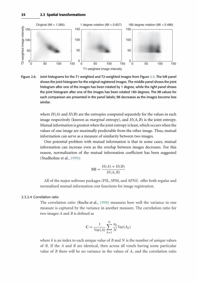
25 2.3 Spatial transformations
T1-weighted image intensity
T2-
wei
ghte
d im
age
inte
nsity
1 degree rotation (MI = 0.627) 180 degree rotation (MI = 0.486)Original (MI = 1.085)
0 50 100 1500
50
100
150
0 50 100 1500
50
100
150
0 50 100 1500
50
100
150
Figure 2.6. Joint histograms for the T1-weighted and T2-weighted images from Figure 2.5. The left panel
shows the joint histogram for the original registered images. The middle panel shows the joint
histogram after one of the images has been rotated by 1 degree, while the right panel shows
the joint histogram after one of the images has been rotated 180 degrees. The MI values for
each comparison are presented in the panel labels; MI decreases as the images become less
similar.
where H (A) and H (B) are the entropies computed separately for the values in each
image respectively (known as marginal entropy), and H (A,B) is the joint entropy.
Mutual information is greatest when the joint entropy is least, which occurs when the
values of one image are maximally predictable from the other image. Thus, mutual
information can serve as a measure of similarity between two images.
One potential problem with mutual information is that in some cases, mutual
information can increase even as the overlap between images decreases. For this
reason, normalization of the mutual information coefficient has been suggested
(Studholme et al., 1999):
MI = H (A)+H (B)
H (A,B)
All of the major software packages (FSL, SPM, and AFNI) offer both regular and
normalized mutual information cost functions for image registration.
2.3.2.4 Correlation ratio
The correlation ratio (Roche et al., 1998) measures how well the variance in one
measure is captured by the variance in another measure. The correlation ratio for
two images A and B is defined as
C = 1
Var(A)
N∑k=1
nkN
Var(Ak)
where k is an index to each unique value of B andN is the number of unique values
of B. If the A and B are identical, then across all voxels having some particular
value of B there will be no variance in the values of A, and the correlation ratio
26 Image processing basics
becomes zero. This measure is similar to the Woods criterion first implemented for
PET-MRI coregistration in the AIR software package (Woods et al., 1993), though
it does behave differently in some cases (Jenkinson & Smith, 2001). It is suitable for
both within-modality and between-modality registration and is the default between-
modality cost function in the FSL software package.
2.3.3 Estimating the transformation
To align two images, one must determine which set of parameters for the transfor-
mation model will result in the smallest value for the cost function. It is not usually
possible to determine the best parameters analytically, so one must instead estimate
them using an optimization method. There is an extensive literature on optimization
methods, but because fMRI researchers rarely work directly with these methods, we
will not describe them in detail here. Interested readers can see Press (2007) for more
details. Instead, we will focus on describing the problems that can arise in the context
of optimization, which are very important to understanding image registration.
Optimization methods for image registration attempt to find the particular set
of parameter values that minimize the cost function for the images being regis-
tered. The simplest method would be to exhaustively search all combinations of
all possible values for each parameter and choose the combination that minimizes
the cost function. Unfortunately, this approach is computationally infeasible for
all but the simplest problems with very small numbers of parameters. Instead,
we must use a method that attempts to minimize the cost function by search-
ing through the parameter space. A common class of methods perform what is
called gradient descent, in which the parameters are set to particular starting values,
and then the values are modified in the way that best reduces the cost function.
These methods are very powerful and can quickly solve optimization problems, but
they are susceptible to local minima. This problem becomes particularly evident
when there are a large number of parameters; the multidimensional “cost func-
tion space” has many local valleys in which the optimization method can get stuck,
leading to a suboptimal solution. Within the optimization literature there are many
approaches to solving the problem of local minima. Here we discuss two of them
that have been used in the neuroimaging literature, regularization, and multiscale
optimization.
2.3.3.1 Regularization
Regularization generically refers to methods for estimating parameters where there
is a penalty for certain values of the parameters. In the context of spatial normaliza-
tion, Ashburner, Friston, and colleagues have developed an approach (implemented
in SPM) in which there is an increasingly large penalty on more complex warps,
using the concept of bending energy to quantify the complexity of the warp
(Ashburner & Friston, 1999). This means that, the more complex the warp, the

27 2.3 Spatial transformations
LinearNonlinear -
high regularizationNonlinear -
moderate regularizationNonlinear -
no regularization
Figure 2.7. An example of the effects of regularization on nonlinear registration. Each of the four images
was created by registering a single high-resolution structural image to the T1-weighted tem-
plate in SPM5. The leftmost image was created using only affine transformation, whereas
the other three were created using nonlinear registration with varying levels of regularization
(regularization parameters of 100, 1, or 0, respectively). The rightmost panel provides an
example of the kind of anatomically unfeasible warps that result when nonlinear registration
is used without regularization; despite the anatomically infeasible nature of these warps, they
can result in higher-intensity matches to the template.
more evidence there needs to be to support it. When using nonlinear registration
tools without regularization (such as AIR and older versions of SPM), it is common
to see radical local warps that are clearly not anatomically reasonable (see Figure
2.7). The use of regularization prevents such unreasonable warps while still allowing
relatively fine changes that take advantage of small amounts of high-dimensional
warping.
2.3.3.2 Multiscale optimization
The multiscale optimization approach is motivated by the need to search over a
large set of parameter values (to avoid local minima) in a way that is feasible
in a reasonable amount of time. The fundamental idea is to start by estimating
the parameters at relatively low resolution (which will rely on the largest struc-
tures in the brain) and then to move to higher resolution once the larger features
have been aligned. For example, in FSL the registration is first performed at a
resolution of 8 mm. Because the rotation parameters turn out to be the most
difficult to estimate, a full search across rotations is performed at this lower
resolution. Once these are determined, then the optimization is performed at
increasingly finer scales (see Figure 2.8), at each step estimating more param-
eters, until all 12 parameters of the affine transformation are estimated at the
finest level (1 mm). This method was shown to avoid the local minima that can
occur when optimization is performed at a single resolution (Jenkinson & Smith,
2001).

28 Image processing basics
Original 2 mm 4 mm 8 mm
Figure 2.8. An example of the same image sampled at multiple resolutions, as used in multiscale
optimization implemented in FSL.
2.3.4 Reslicing and interpolation
Once the parameters for transformation have been estimated, they are then applied
to the original image to create a transformed, or resliced image. This involves filling
in the values of each voxel in the coordinate space using the transformed image
coordinates along with the original intensities. If the transformation was limited
so that the transformed locations overlapped exactly with locations in the original
image, then it would be possible to simply fill in those voxels with the values from
the corresponding transformed voxels. However, in general the transformations
will involve fractions of voxels; for example, in motion correction the movements
being corrected are often less than 1/10 of the voxel’s dimensions. In this case, the
transformed voxels do not overlap exactly with the original voxels, so it is necessary
to interpolate the values of the original image intensities in order to obtain the
resliced image.
2.3.4.1 Nearest neighbor interpolation
In nearest neighbor interpolation, the value of the new voxel is replaced with the
value of the nearest voxel in the original image. This form of interpolation is rarely
used, as it suffers from a number of problems. First, it can result in resliced images
that look “blocky” and generally suffer from a loss of resolution. This is especially
evident when the interpolation is performed multiple times on the same image, as
shown in Figure 2.9. Second, continuous changes in transformation parameters can
result in discontinuous changes in cost function values when using nearest neighbor
interpolation, which makes it unsuitable for use with optimization methods (which
often assume that cost functions are continuous).
The one case in which nearest neighbor interpolation is preferred is to transform
images where the voxel values represent labels rather than physical intensities. For
example, the anatomical atlases that are included with some software packages are

29 2.3 Spatial transformations
sinc trilinearnearest neighbor
Figure 2.9. An extreme example of the effects of repeated interpolation. Each image was rotated six
times by 0.01 radians, and resliced at each step using nearest neighbor, trilinear, and sinc
interpolation, respectively. Note the artifacts in the nearest neighbor image and the increased
blurriness in the trilinear image, in comparison to sinc interpolation.
stored as images with specific but arbitrary values corresponding to each structure in
the atlas (e.g., voxels in hippocampus have a value of 12, and those in the amygdala
have a value of 20). Using an interpolation method that averaged between these
numbers would give nonsensical results, so nearest neighbor interpolation would be
used to ensure that the label values in the transformed image retain the same exact
values as those in the original image.
2.3.4.2 Linear interpolation
This method, often referred to as tri-linear interpolation when it is applied in
three dimensions, involves taking a weighted average of the values at each of the
nearest points in the original image. An example of linear interpolation is shown
in Figure 2.10. This method has the benefit of being relatively fast compared to
higher-order interpolation methods, since it only takes into account those points
immediately adjacent to the new location. However, it tends to blur the image
somewhat more than higher-order interpolation methods, such as sinc interpolation.
2.3.4.3 Higher-order interpolation
A number of interpolation methods have been developed that integrate information
across a broader set of voxels than nearest neighbor (which uses only the single near-
est voxel) and linear interpolation (which integrates across the eight nearest voxels
in three dimensions). The most commonly encountered higher-order interpola-
tion method is sinc interpolation, which uses a sinc function [sinc(x) = sin(x)/x] as
shown in FIgure 2.11. In principle this form of interpolation should use information
from every voxel in the image, since the sinc function extends to infinity. However,
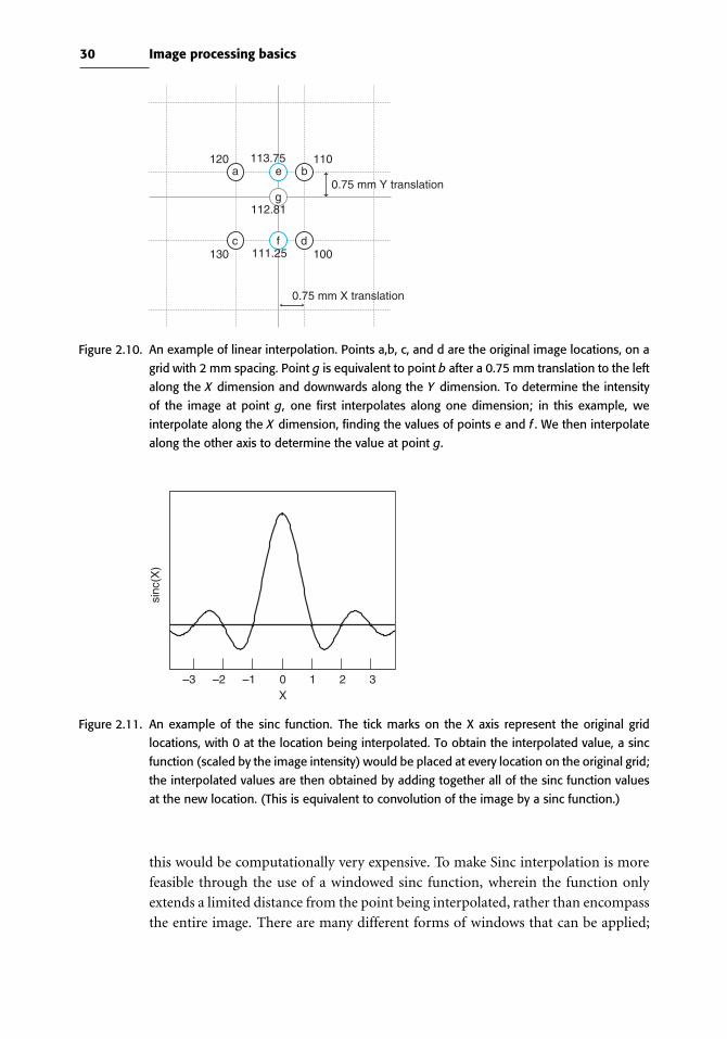
30 Image processing basics
120 110
100130
0.75 mm Y translation
0.75 mm X translation
c
a b
d
e
f
g
113.75
111.25
112.81
Figure 2.10. An example of linear interpolation. Points a,b, c, and d are the original image locations, on a
grid with 2 mm spacing. Point g is equivalent to point b after a 0.75 mm translation to the left
along the X dimension and downwards along the Y dimension. To determine the intensity
of the image at point g, one first interpolates along one dimension; in this example, we
interpolate along the X dimension, finding the values of points e and f . We then interpolate
along the other axis to determine the value at point g.
X
sinc
(X)
0 1–1 2–2 3–3
Figure 2.11. An example of the sinc function. The tick marks on the X axis represent the original grid
locations, with 0 at the location being interpolated. To obtain the interpolated value, a sinc
function (scaled by the image intensity) would be placed at every location on the original grid;
the interpolated values are then obtained by adding together all of the sinc function values
at the new location. (This is equivalent to convolution of the image by a sinc function.)
this would be computationally very expensive. To make Sinc interpolation is more
feasible through the use of a windowed sinc function, wherein the function only
extends a limited distance from the point being interpolated, rather than encompass
the entire image. There are many different forms of windows that can be applied;

31 2.4 Filtering and Fourier analysis
common options include Hanning and rectangular windows. The Hanning window
appears to lead to decreased interpolation errors relative to the rectangular window
(Ostuni et al., 1997), and thus should be chosen if available, using a window with a
radius (or half-length) of at least four voxels.
Another form of higher-order interpolation uses basis functions, as we described
in Section 2.3.1, for spatial transformation models. Basis functions, such as B-splines,
provide a more generalized approach to interpolation, which can encompass nearest-
neighbor and linear interpolation as well as higher-order nonlinear interpolation. A
detailed description of these methods is beyond the scope of this book; the interested
reader is directed to Thevenaz et al. (2000) and Ostuni et al. (1997).
2.4 Filtering and Fourier analysis
Many of the operations that are applied to fMRI data are meant to remove particular
kinds of signals or noise from the image. We refer to these operations as filtering
because they involve the selective transmission of certain kinds of information, just
as a coffee filter allows the liquid to pass but retains the solids. Filtering operations
are generally specified in the frequency domain rather than the space/time domain,
based on the concepts of Fourier analysis.
2.4.1 Fourier analysis
A very general way to understand filtering involves the decomposition of a sig-
nal into components. Using Fourier analysis, any signal can be decomposed using
a set of periodic functions, such as sines and cosines. An amusing but effec-
tive introduction to Fourier analysis can be found in the book Who Is Fourier?
(Translational College of LEX, 1997), and a more formal introduction can be found
in Bracewell (2000). In addition to being important for fMRI data analysis, Fourier
analysis also plays a fundamental role in the acquisition of MRI images.
The Fourier transform allows one to move from the original signal (in the space
or time domain) to a signal in the frequency domain that reflects the strength (or
power) of component signals at each frequency. When the power is plotted across
all frequencies, this is referred to as a power spectrum. Power spectra are commonly
used in fMRI data analysis. For example, they can be very useful for characterizing
the time course of signals that are estimated using independent components analysis
(see Chapter 3).
2.4.2 Filtering
Many different types of filters can be applied to data, but most of the filters used in
imaging are designed to allow particular portions (or bands) of the frequency spec-
trum to pass through while removing others.High-pass filters remove low-frequency
information while retaining high-frequency signals, whereas low-pass filters do the

32 Image processing basics
0 20 40 60 80 100
–3
–10123
–3
–10123
–3
–10123
Original data
Time
Val
ueV
alue
Val
ue
0.0 0.1 0.2 0.3 0.4 0.5
02468
12
02468
12
02468
12
Frequency
Pow
erP
ower
Pow
er0 20 40 60 80 100
Low pass filtered
Time
0.0 0.1 0.2 0.3 0.4 0.5
Frequency
Frequency
0 20 40 60 80 100
High pass filtered
Time
0.0 0.1 0.2 0.3 0.4 0.5
Figure 2.12. An example of Fourier analysis. The plots on the left show a time series, and the plots on the
right show the power spectrum for that time series. The top panel shows the original data,
the second row shows a low-pass filtered version of the signal, and the third row shows the
high-pass filtered version.
opposite. Figure 2.12 shows examples of filtering time series both in the temporal
and frequency domains and Figure 2.13 shows examples of the effects of filtering on
MRI images.
2.4.3 ConvolutionAnother way to understand filtering is in terms of the concept of convolution. Con-
volution can be thought of as what happens when a function is passed over another
signal and their overlap is added up at each point. For example, we might want to
blur an image using a Gaussian function, such that the value at each point in the new
image is an average of the surrounding values weighted by the Gaussian. This can be
accomplished by convolving the image with a Gaussian function (often referred to as

33 2.4 Filtering and Fourier analysis
Original Low pass High pass
Figure 2.13. Examples of filters applied to a T1-weighted MRI image; the original image is shown at left,
and the filtered versions are shown to the right. The low-pass filter blurs the image whereas
a high-pass filter enhances the edges in the image.
IdentityGaussian, σ=1Gaussian, σ=2
Figure 2.14. An example of convolution. The left panel shows three different kernels used for convolution.
The identity kernel has a positive value in its central point and zeros elsewhere, whereas
the Gaussian kernels spread gradually from the center. A random signal was created and
convolved with each of these kernels, with the results shown in the right panel. Convolution
with the identity kernel gives back the original data exactly, whereas convolution with a
Gaussian kernel results in smoothing of the data, with greater smoothing for the broader
kernel.
a Gaussian kernel), as shown in Figure 2.14. The concept of convolution will play a
central role in Chapter 5, as it is critical for understanding the relation between neu-
ral activity and blood flow in fMRI, where the expected fMRI signal is a convolution
between the stimulus function and a hemodynamic response function.

3
Preprocessing fMRI data
3.1 Introduction
Just as music recorded in a studio requires mixing and editing before being played on
the radio, MRI data from the scanner require a number of preprocessing operations
in order to prepare the data for analysis. Some of these operations are meant to
detect and repair potential artifacts in the data that may be caused either by the
MRI scanner itself or by the person being scanned. Others are meant to prepare the
data for later processing stages; for example, we may wish to spatially blur the data
to help ensure that the assumptions of later statistical operations are not violated.
This chapter provides an overview of the preprocessing operations that are applied
to fMRI data prior to the analyses discussed in later chapters. The preprocessing of
anatomical data will be discussed in Chapter 4.
In many places, the discussion in this chapter assumes basic knowledge of the
mechanics of MRI data acquisition. Readers without a background in MRI physics
should consult a textbook on MRI imaging techniques, such as Buxton (2002).
3.2 An overview of fMRI preprocessing
Preprocessing of fMRI data varies substantially between different software packages
and different laboratories, but there is a standard set of methods to choose from.
Figure 3.1 provides an overview of the various operations and the usual order in
which they are performed. However, note that none of these preprocessing steps is
absolutely necessary in all cases, although we believe that quality control measures
are mandatory.
3.3 Quality control techniques
The availability of comprehensive fMRI analysis packages makes it possible to analyze
an fMRI data set and obtain results without ever looking closely at the raw data, but
34
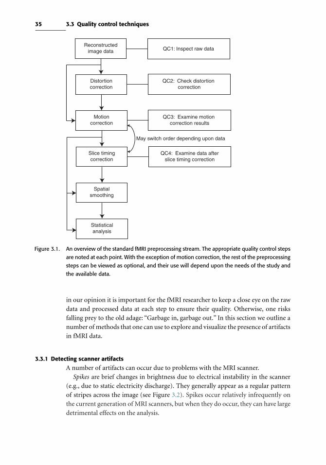
35 3.3 Quality control techniques
Reconstructedimage data QC1: Inspect raw data
Distortioncorrection
QC2: Check distortion correction
Motioncorrection
QC3: Examine motion correction results
Slice timingcorrection
QC4: Examine data afterslice timing correction
Spatialsmoothing
Statisticalanalysis
May switch order depending upon data
Figure 3.1. An overview of the standard fMRI preprocessing stream. The appropriate quality control steps
are noted at each point. With the exception of motion correction, the rest of the preprocessing
steps can be viewed as optional, and their use will depend upon the needs of the study and
the available data.
in our opinion it is important for the fMRI researcher to keep a close eye on the raw
data and processed data at each step to ensure their quality. Otherwise, one risks
falling prey to the old adage: “Garbage in, garbage out.” In this section we outline a
number of methods that one can use to explore and visualize the presence of artifacts
in fMRI data.
3.3.1 Detecting scanner artifacts
A number of artifacts can occur due to problems with the MRI scanner.
Spikes are brief changes in brightness due to electrical instability in the scanner
(e.g., due to static electricity discharge). They generally appear as a regular pattern
of stripes across the image (see Figure 3.2). Spikes occur relatively infrequently on
the current generation of MRI scanners, but when they do occur, they can have large
detrimental effects on the analysis.

36 Preprocessing fMRI data
Image without spike Images with spikes
Figure 3.2. Example of a spike in an fMRI image, reflected by the large diagonal stripes. This image comes
from a patient with a brain tumor, which appears as a large white blob at the bottom right
side of the brain image. (Images courtesy of Mark Cohen, UCLA)
Figure 3.3. Example of ghosting in an fMRI image. The ghosting is more apparent when the top value in
the intensity window of the image viewing program is reduced, as shown in the right panel.
(Images courtesy of Mark Cohen, UCLA)
Ghosting occurs when there is a slight offset in phase between different lines of
K-space in an echoplanar acquisition and can also occur due to periodic motion
such as heartbeat or respiration. It appears as a dim ghost of the brain to each side
in the phase-encoded direction of the MRI image (see Figure 3.3). It may be difficult
to see ghosting when looking at an image with the brightness window set to the
entire range of the image; it can be seen more easily by reducing the top value of the
intensity window in the image viewing program (as shown in Figure 3.3). In fMRI,
ghosting can result in activation appearing to occur outside of the brain and also
cause mislocalization of activation within the brain, if one region of the brain has
a ghost in another part. Ghosting rarely causes serious problems for fMRI on the
latest generation of MRI systems, but substantial ghosting problems do still occur on
occasion. When detected, they should be investigated with your local MRI technician
or physicist.

37 3.3 Quality control techniques
3.3.2 Time series animationThe human eye is very good at detecting changes when an fMRI time series is viewed
as an animation. Several tools allow viewing of animated time series; for example, in
FSLView, a time series can be viewed as an animation by simply clicking the Movie
Mode button. Any glaring changes over time can then be investigated in order to
better understand their source; in Chapter 5, we will discuss methods for dealing
with bad data points in statistical analysis.
3.3.3 Independent components analysis
As we will see in later chapters, fMRI analysis generally proceeds by creating a
statistical model (e.g., a model of task effects) and then finding regions where that
model explains the data well. However, sometimes we wish to find signals in the
data whose form is unknown, as in the detection of artifacts in fMRI data. There
is a set of exploratory data analysis methods that do just this, by detecting sys-
tematic patterns in the data; these methods will be described in more detail in
Chapter 8 on connectivity modeling, but we introduce them here in the context of
artifact detection. These methods decompose the four-dimensional dataset into a
set of spatio-temporal components that are mixed together in different proportions
to obtain the observed signal. There are many different ways that such a decom-
position can be performed, which generally differ in the kinds of constraints that
are put upon the components. For example, principal components analysis (PCA)
finds a set of components that are orthogonal to one another in multidimensional
space, whereas independent components analysis (ICA) finds a set of components
that are independent of one another. For a more detailed description of ICA, see
Section 8.2.5.2.
ICA has proven very useful for the identification of artifacts in fMRI data.
Figure 3.4 shows an example of such an ICA component, detected using the FSL
MELODIC ICA tool. ICA is particularly useful for identifying signals related to
within-scan effects of head motion or other nonrigid effects of motion, which cannot
be removed by standard motion correction techniques.
Once a set of artifactual components is identified, those components can be
removed from the data, creating a “denoised” dataset. It is important that such iden-
tification of components be based on explicit criteria for rejection to prevent bias;
these criteria will generally be based on both the spatial and temporal characteristics
of the components. For example, one criterion might be that components will be
rejected if they show strong alternation between slices (which is good evidence of a
motion-related effect when fMRI data are collected using the common interleaved
method; see Figure 3.7) along with a timecourse that shows a large spike at one or
more timepoints (see Figure 3.4). Methods for the automated classfication of ICA
components have been developed which may provide more reliable and unbiased
detection of artifact-related components than manual classification (Tohka et al.,
2008). However, we have found the manual examination of ICA components to be

38 Preprocessing fMRI data
Thresholded component map
0 20 40 60 80 100
0
5
10
Com
pone
ntre
spon
se
Time series plot of component response
Time
Figure 3.4. An example of a motion-related component detected using FSL’s MELODIC ICA tool. The
top panels shows a thresholded map that depicts which voxels load significantly on the
component, either positively (red) or negatively (blue). Telltale signs of motion include the
alternating response between slices (reflectingmotion in an interleaved acquisition), coherent
positive or negative signals around the edges of the brain, and the presence of a large single
spike in the timecourse of the component.
a useful exercise for researchers who are new to fMRI, as it provides a much better
view of the variety of signals that may be present in an fMRI dataset.
3.4 Distortion correction
The most common method for fMRI acquisition, gradient-echo echoplanar imaging
(EPI), suffers from artifacts near regions where air and tissue meet, such as the
sinuses or ear canals. These are due to the inhomogeneity of the main magnetic field
(known as B0) caused by the air–tissue interfaces, and take two forms: dropout and
geometric distortion. Dropout is seen as reduced signal in the brain areas adjacent to
these air–tissue interfaces, such as the orbitofrontal cortex and the lateral temporal

39 3.4 Distortion correction
Figure 3.5. An example of signal dropout in gradient-echo EPI images. The EPI image on the left and the
T1-weighted image on the right are combined in the middle (using a transparent overlay in
FSLview) to show regions where there is brain tissue in the T1-weighted image but no signal
in the EPI image. The orbitofrontal region, which has substantial dropout in this image, is
highlighted by the blue box.
lobe (see Figure 3.5). Once the data have been acquired, there is no way to retrieve
data from a region with significant dropout, so it is best to employ methods for MRI
acquisition that reduce dropout. It is very important to understand the particular
dropout patterns that are present in every dataset. For example, one would not
want to conclude that the orbitofrontal cortex is not responsive to a particular task
manipulation if there is no signal actually present in that region due to dropout. A
useful way to appreciate these dropout patterns is to overlay the functional image
over a structural image that it has been aligned to (as shown in Figure 3.5).
In addition to signal loss, fMRI images can also be spatially distorted in the
same regions. When gradients are applied to encode spatial information in the MRI
image, these inhomogeneities in the magnetic field result in errors in the location of
structures in the resulting images. Most commonly, regions in the anterior prefrontal
cortex and orbitofrontal cortex are distorted. The distortion occurs along the phase
encoding direction that is used by the MRI pulse sequence, which is generally the Y
(anterior-posterior) axis. These distortions make it difficult to align functional MRI
data with structural images.
It is possible to correct somewhat for the effects of magnetic field inhomogeneity
using a field map, which characterizes the B0 field (Jezzard & Balaban, 1995). Pulse
sequences for field mapping are available for most MRI scanners. They generally
work by obtaining images at two different echo times. The difference in phase
between the two images can be used to compute the local field inhomogeneity, and
these values can then be used to create a map quantifying the distance that each voxel
has been shifted. By inverting this map, one can determine the original location of
the data in each voxel. Figure 3.6 shows an example of distortion correction.
A number of difficulties arise in practice with the use of field maps to unwarp EPI
images. First, if there is noise in the field map, then this will introduce noise into

40 Preprocessing fMRI data
Field Map Images
Magnitude Phase (original) Phase (unwrapped)
Original EPI image Unwarped EPI image Difference image
Figure 3.6. Distortion correction using field mapping. Top panel: Original magnitude and phase images
from field mapping scan, along with unwrapped phase map (using FSL’s PRELUDE). Bottom
panel: Example of original EPI with substantial disortion in the frontal pole, an unwarped
version of the same image (using the field map in the top panel), and a difference image
obtained by subtracting the unwarped image from the original. (Data from FSL FEEDS
dataset)
the unwarped images. One way to address this is to apply some form of low-pass
filtering (or smoothing ) to the field maps, which reduces errors in the unwarped
images (Hutton et al., 2002). Second, if the field map is acquired separately from
the fMRI time series, then head motion between these scans must be accounted
for. It is possible to obtain dual-echo data throughout the fMRI time series, which
allows estimation of a unique field map at each timepoint, but this approach is rarely
used. There has also been work on methods to combine head motion correction and
distortion correction (Andersson et al., 2001), but there are not generally available
tools to perform this kind of integrated correction, and it is not clear whether the
benefits outweigh the costs of increased complexity.
If distortion correction is employed, then the postcorrection images should be
inspected and compared to the precorrection images to ensure that the distortion

41 3.5 Slice timing correction
correction operation has not introduced any artifacts (which can occur if there is a
problem with the field map).
3.5 Slice timing correction
Nearly all fMRI data are collected using two-dimensional MRI acquisition, in which
the data are acquired one slice at a time. In some cases, the slices are acquired in
ascending or descending order. In another method known as interleaved acquisition
(see Figure 3.7), every other slice is acquired sequentially, such that half of the slices
are acquired (e.g., the odd slices) followed by the other half (e.g., the even slices). The
use of 2D acquisition means that data in different parts of the image are acquired at
systematically different times, with these differences ranging up to several seconds
(depending upon the repetition time, or TR of the pulse sequence) (see Figure 3.8).
12345678
0.00 s
0.25 s
0.50 s
0.75 s
1.00 s
1.25 s
1.50 s
1.75 s
Figure 3.7. A depiction of slice timing in an interleaved MRI acquisition. The slices are acquired in the
order 1-3-5-7-2-4-6-8; the times on the right show the relative time at which the data in the
slice starts being acquired, assuming a repetition time of 2 seconds.
0 2 4 6 8 10 12 14
0
0.5
1 Slice 1Slice 2Slice 8
Seconds after stimulus
fMR
I res
pons
e
Figure 3.8. The effects of slice timing on the acquired data. The three curves represent samples from the
same hemodynamic response at the times corresponding to the slices in Figure 3.7. The slices
acquired later in the volume show an apparently earlier response at each time point because
the hemodynamic response has already started by the time that they are acquired.
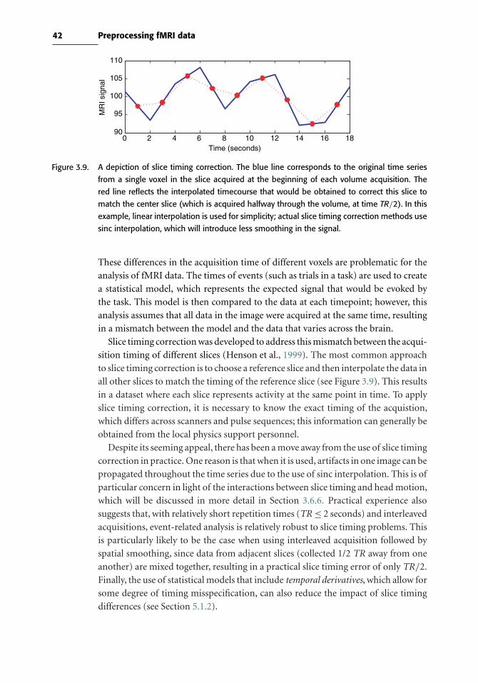
42 Preprocessing fMRI data
0 2 4 6 8 10 12 14 16 1890
95
100
105
110
Time (seconds)
MR
I sig
nal
Figure 3.9. A depiction of slice timing correction. The blue line corresponds to the original time series
from a single voxel in the slice acquired at the beginning of each volume acquisition. The
red line reflects the interpolated timecourse that would be obtained to correct this slice to
match the center slice (which is acquired halfway through the volume, at time TR/2). In this
example, linear interpolation is used for simplicity; actual slice timing correction methods use
sinc interpolation, which will introduce less smoothing in the signal.
These differences in the acquisition time of different voxels are problematic for the
analysis of fMRI data. The times of events (such as trials in a task) are used to create
a statistical model, which represents the expected signal that would be evoked by
the task. This model is then compared to the data at each timepoint; however, this
analysis assumes that all data in the image were acquired at the same time, resulting
in a mismatch between the model and the data that varies across the brain.
Slice timing correction was developed to address this mismatch between the acqui-
sition timing of different slices (Henson et al., 1999). The most common approach
to slice timing correction is to choose a reference slice and then interpolate the data in
all other slices to match the timing of the reference slice (see Figure 3.9). This results
in a dataset where each slice represents activity at the same point in time. To apply
slice timing correction, it is necessary to know the exact timing of the acquistion,
which differs across scanners and pulse sequences; this information can generally be
obtained from the local physics support personnel.
Despite its seeming appeal, there has been a move away from the use of slice timing
correction in practice. One reason is that when it is used, artifacts in one image can be
propagated throughout the time series due to the use of sinc interpolation. This is of
particular concern in light of the interactions between slice timing and head motion,
which will be discussed in more detail in Section 3.6.6. Practical experience also
suggests that, with relatively short repetition times (TR≤ 2 seconds) and interleaved
acquisitions, event-related analysis is relatively robust to slice timing problems. This
is particularly likely to be the case when using interleaved acquisition followed by
spatial smoothing, since data from adjacent slices (collected 1/2 TR away from one
another) are mixed together, resulting in a practical slice timing error of only TR/2.
Finally, the use of statistical models that include temporal derivatives, which allow for
some degree of timing misspecification, can also reduce the impact of slice timing
differences (see Section 5.1.2).

43 3.6 Motion correction
3.6 Motion correction
Even the best research subjects will move their heads (e.g., due to swallowing), and
this motion can have drastic effects on fMRI data, as shown in Figure 3.10. There are
two major effects of head motion. First, it results in a mismatch of the location of
subsequent images in the time series; this is often referred to as bulk motion because
it involves a wholesale movement of the head. It is this kind of motion that standard
motion correction techniques are designed to correct, by realigning the images in
the time series to a single reference image. Bulk motion can have large effects on
activation maps, which usually occur at edges in the image; this is due to the fact that
large changes in image intensity can occur when a voxel that has no brain tissue in it
at one point suddenly contains tissue due to motion. As shown in Figure 3.10, these
artifacts can take several forms depending upon the nature of motion, such as a ring
of positive or negative activation (reflecting movement along the inferior–superior
axis), positive activation on one side of the head and negative activation on the other
side (reflecting movement along the left-right axis), or large regions of positive or
negative activation in the orbitofrontal cortex (reflecting rotation along the left-right
axis). Another common location for such artifacts is at the edges of the ventricles.
Second, head motion can result in disruption of the MRI signal itself. When the
head moves, the protons that move into a voxel from a neighboring slice have an
excitation that is different from that expected by the scanner, and the reconstructed
signal will not accurately reflect the tissue in the voxel; this is known as a spin
history effect (Friston et al., 1996b). These effects can result in large changes in the
intensity of a single slice or set of slices, which can be seen as stripes of alternating
bright and dark slices if interleaved acquisition is used. This form of motion cannot
be corrected using standard motion correction techniques, but it can potentially
Figure 3.10. Examples of the effects of head motion on the resulting statistical maps. In each case, the
image shows activation for a blocked design motor task compared to a resting baseline. The
left panel shows a drastic example of motion-related artifacts (from a dataset of an individual
with Tourette syndrome). This is often referred to as a “flaming brain” artifact. The right panel
shows a more typical example, where motion is seen as activation along one side of the brain,
reflecting motion in that direction that is correlated with the task.
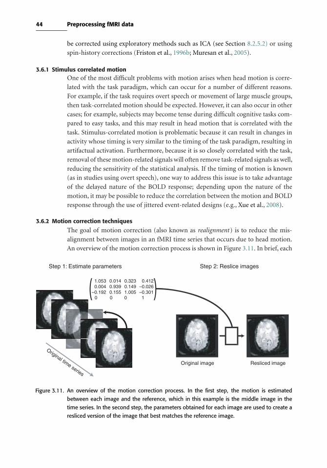
44 Preprocessing fMRI data
be corrected using exploratory methods such as ICA (see Section 8.2.5.2) or using
spin-history corrections (Friston et al., 1996b; Muresan et al., 2005).
3.6.1 Stimulus correlated motionOne of the most difficult problems with motion arises when head motion is corre-
lated with the task paradigm, which can occur for a number of different reasons.
For example, if the task requires overt speech or movement of large muscle groups,
then task-correlated motion should be expected. However, it can also occur in other
cases; for example, subjects may become tense during difficult cognitive tasks com-
pared to easy tasks, and this may result in head motion that is correlated with the
task. Stimulus-correlated motion is problematic because it can result in changes in
activity whose timing is very similar to the timing of the task paradigm, resulting in
artifactual activation. Furthermore, because it is so closely correlated with the task,
removal of these motion-related signals will often remove task-related signals as well,
reducing the sensitivity of the statistical analysis. If the timing of motion is known
(as in studies using overt speech), one way to address this issue is to take advantage
of the delayed nature of the BOLD response; depending upon the nature of the
motion, it may be possible to reduce the correlation between the motion and BOLD
response through the use of jittered event-related designs (e.g., Xue et al., 2008).
3.6.2 Motion correction techniques
The goal of motion correction (also known as realignment ) is to reduce the mis-
alignment between images in an fMRI time series that occurs due to head motion.
An overview of the motion correction process is shown in Figure 3.11. In brief, each
Original time series
1.0530.004
–0.192
0.0140.9390.155
0.3230.1491.005
0.412–0.026–0.301
Step 1: Estimate parameters Step 2: Reslice images
Original image Resliced image
0 0 0 1
Figure 3.11. An overview of the motion correction process. In the first step, the motion is estimated
between each image and the reference, which in this example is the middle image in the
time series. In the second step, the parameters obtained for each image are used to create a
resliced version of the image that best matches the reference image.
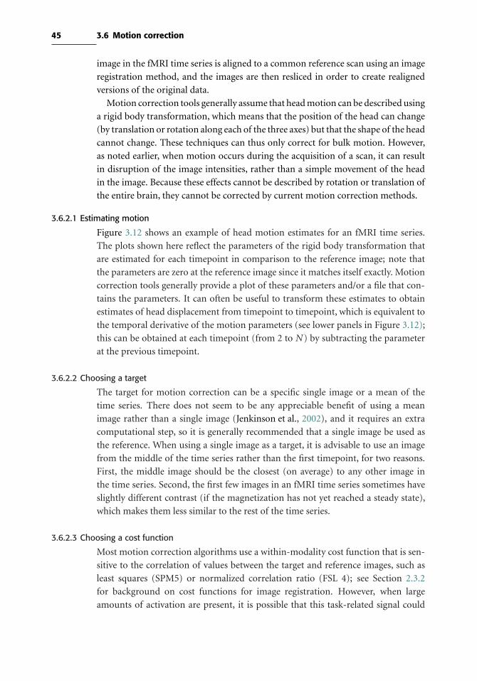
45 3.6 Motion correction
image in the fMRI time series is aligned to a common reference scan using an image
registration method, and the images are then resliced in order to create realigned
versions of the original data.
Motion correction tools generally assume that head motion can be described using
a rigid body transformation, which means that the position of the head can change
(by translation or rotation along each of the three axes) but that the shape of the head
cannot change. These techniques can thus only correct for bulk motion. However,
as noted earlier, when motion occurs during the acquisition of a scan, it can result
in disruption of the image intensities, rather than a simple movement of the head
in the image. Because these effects cannot be described by rotation or translation of
the entire brain, they cannot be corrected by current motion correction methods.
3.6.2.1 Estimating motion
Figure 3.12 shows an example of head motion estimates for an fMRI time series.
The plots shown here reflect the parameters of the rigid body transformation that
are estimated for each timepoint in comparison to the reference image; note that
the parameters are zero at the reference image since it matches itself exactly. Motion
correction tools generally provide a plot of these parameters and/or a file that con-
tains the parameters. It can often be useful to transform these estimates to obtain
estimates of head displacement from timepoint to timepoint, which is equivalent to
the temporal derivative of the motion parameters (see lower panels in Figure 3.12);
this can be obtained at each timepoint (from 2 to N ) by subtracting the parameter
at the previous timepoint.
3.6.2.2 Choosing a target
The target for motion correction can be a specific single image or a mean of the
time series. There does not seem to be any appreciable benefit of using a mean
image rather than a single image (Jenkinson et al., 2002), and it requires an extra
computational step, so it is generally recommended that a single image be used as
the reference. When using a single image as a target, it is advisable to use an image
from the middle of the time series rather than the first timepoint, for two reasons.
First, the middle image should be the closest (on average) to any other image in
the time series. Second, the first few images in an fMRI time series sometimes have
slightly different contrast (if the magnetization has not yet reached a steady state),
which makes them less similar to the rest of the time series.
3.6.2.3 Choosing a cost function
Most motion correction algorithms use a within-modality cost function that is sen-
sitive to the correlation of values between the target and reference images, such as
least squares (SPM5) or normalized correlation ratio (FSL 4); see Section 2.3.2
for background on cost functions for image registration. However, when large
amounts of activation are present, it is possible that this task-related signal could

46 Preprocessing fMRI data
0 50 100 150 200−2
0
2
4
6
8
10
Timepoints
Tra
nsla
tion
(mm
)
0 50 100 150 200−5
−4
−3
−2
−1
0
1
2
3
4
5
Timepoints
Rel
ativ
e di
spla
cem
ent (
mm
)
0 50 100 150 200−2
0
2
4
6
8
10
Timepoints
Tra
nsla
tion
(mm
)
0 50 100 150 200−5
−4
−3
−2
−1
0
1
2
3
4
5
Timepoints
Rel
ativ
e di
spla
cem
ent (
mm
)
X translation (mm)Y translation (mm)Z translation (mm)
X translation (mm)Y translation (mm)Z translation (mm)
X translation (mm)Y translation (mm)Z translation (mm)
X translation (mm)Y translation (mm)Z translation (mm)
Before motion correction After motion correction
Figure 3.12. Plots of estimated head motion. The top panels plot translation between timepoints, before
and after motion correction (i.e., how far the brain is from the reference image). The bottom
panels plot the first derivative of the data in the top panels, which correspond to relative
displacement at each timepoint (i.e., how far the brain is from the previous timepoint). Relative
displacement is often more useful as a means to inspect for motion than absolute translation.
be misinterpreted as motion when such a cost function is used (Freire & Mangin,
2001), resulting in inaccurate motion estimates and errors in the realigned images.
Other cost functions such as mutual information or robust estimators may be less
sensitive to these effects (Freire et al., 2002). It is not clear how important these
effects are in practice. The simulations presented by Friere and Mangin suggest
that these effects do not emerge unless relatively large proportions of the brain are
strongly active. This suggests that users with tasks that result in large amounts
of activation may wish to use a robust cost function such as mutual informa-
tion for motion correction to prevent contamination of the motion estimates by
activation signals.
3.6.2.4 Creating realigned images
A number of possible interpolation methods can be used to create the realigned time
series (see Section 2.3.4 for background on these methods). Linear interpolation is

47 3.6 Motion correction
relatively fast, but is known to result in a greater amount of smoothing and error
in the interpolated images when compared to higher-order methods (Ostuni et al.,
1997). Higher-order methods used for interpolation in motion correction include
sinc, spline, and Fourier-based interpolation. The practical differences between these
methods appear to be small (Oakes et al., 2005), so choices between these methods
will likely be driven by considerations such as processing time and availability within
a particular package. If processing time is not a concern, then a higher-order method
should be used when available, though it should also be noted that the gains in accu-
racy obtained using a higher-order interpolation method are likely to be swamped
by any spatial smoothing that is applied later in the processing stream.
3.6.3 Prospective motion correction
One relatively new development in fMRI methods is the availability of pulse
sequences that modify the location of the data acquisition at every timepoint in
order to prospectively correct for head motion. This approach has the benefit of
creating a motion-corrected dataset without the need for any interpolation. The
use of prospective motion correction could be quite beneficial (Thesen et al., 2000),
but it is important for users to consider the robustness of these methods for their
particular applications. Since the online methods must use quick and thus relatively
simple methods for estimating the location of the slices for the next timepoint, there
could potentially be error in the predicted slice location which could, for example,
cause loss of data from particular brain regions. Because such errors would be more
likely in cases of large within-scan motion, these methods may paradoxically be best
suited to populations where the motion is relatively minor.
3.6.4 Quality control for motion correction
As with any processing operation, the results should be checked to make sure that
the operation was successful and that no additional artifacts were introduced. One
useful way to check the results of motion correction is to view the motion-corrected
image as a movie; any visible motion in this movie would suggest that the motion
correction operation was not completely successful.
It might be tempting to run motion correction multiple times on the same dataset
if there are remaining signs of motion following the first application of motion cor-
rection. However, this is strongly discouraged. Since the first pass should remove
most effects of motion that are amenable to removal, on subsequent runs the algo-
rithm will be much more sensitive to other signals, such as activation-related signals.
In addition, the interpolation errors that are introduced at each step will degrade
the data.
3.6.5 Interactions between motion and susceptibility artifacts
Motion correction techniques generally use a rigid-body (six-parameter) spatial
transformation model, which assumes that the effects of motion do not change

48 Preprocessing fMRI data
the shape of the brain, just its position and orientation. However, in regions of
susceptibility artifact, the effects of motion do not obey a rigid-body model. For
example, if the head rotates around the X axis (as in swallowing), the angle of slices
through the orbitofrontal cortex will change. Because dropout and distortion in
this region depend upon the orientation of the slice with respect to the brain, they
will differ due to the change in the effective slice angle through the brain, and this
will result in differences in the shape of the brain in the image rather than simply
differences in the position and orientation of the brain. These changes can result
in artifactual activation (Wu et al., 1997), especially if motion is correlated with the
task. For this reason, large regions of activation in the orbitofrontal cortex that are
very near regions affected by susceptibility artifact should be interpreted with some
caution. These problems also provide further motivation for the use of techniques
to reduce susceptibility artifacts at the point of data acquisition.
3.6.6 Interactions between motion correction and slice timing correction
Slice timing correction and motion correction can interact with one another, and the
nature of these interactions is determined by the order in which they are performed.
If motion correction is performed first, then data that were actually acquired at one
point in time may be moved to a different slice, and thus the nominal acquisition
time that is specified in the slice timing correction algorithm may not match the
actual acquisition timing of those data. In addition, if there is a significant amount
of through-plane motion or rotation, then the interpolated voxels following motion
correction will include a mixture of data acquired at different points in time, again
resulting in potential errors due to slice timing correction.
If slice timing correction is performed first, then there is a potential for motion-
related intensity differences (which can be very large) to be propagated across time.
In addition, any actual through-plane motion or rotation will result in exactly the
same kind of mismatch between nominal and actual timing of data acquisition
discussed previously. This problem can be somewhat reduced by using prospective
motion correction (see Section 3.6.3), which will reduce effects of motion without
the need for interpolation and thus without mixing data collected at different times.
We would generally suggest that, if one insists on using slice timing correction, it
is applied after motion correction, since the effects of motion on voxel intensity can
potentially be very large. However, as noted in Section 3.5, there are good reasons to
avoid slice timing correction altogether if data are acquired using a relatively short
TR (2 seconds or less).
3.6.7 How much is too much motion?One of the most often asked questions regarding fMRI data analysis is how much
motion is too much, such that scans should be thrown away entirely if they exceed
that amount. Unfortunately, there is no easy answer to this question. To a large
degree, it depends upon how well the effects of motion are described by the rigid

49 3.6 Motion correction
body model: Not all motion is created equal. If the motion is gradual or occurs
between scanning runs, then a large amount of displacement can be corrected,
whereas if sudden motion occurs during a scan, it is likely that there will be effects
on image intensity that cannot be corrected using a rigid-body transformation.
As a general rule of thumb, any translational displacement (i.e., translation
between two adjacent timepoints) of more than 1/2 of the voxel dimension should
cause great concern about the quality of the data. However, this should not be
taken as a hard and fast rule; much smaller amounts of motion can cause seri-
ous problems, and sometimes even large amounts of motion can be successfully
corrected, especially if motion correction is combined with the ICA denoising
approach described earlier. In addition, the impact of motion is likely to vary
depending upon how correlated it is with the task or stimulus.
It is our opinion that entire scans should be thrown away only as a very last resort.
If the entire scan is riddled with large abrupt movements, then there may be no
alternative. However, there are a number of strategies that can be used to address
motion effects. First, one can attempt to remove coherent motion signals using
exploratory methods such as ICA, as described previously. Second, one can include
motion-related parameters in the statistical model (as described in Section 5.1.3).
Third, one can exclude some timepoints completely by including explanatory vari-
ables in the statistical model for the specific timepoints of interest. We have found
that these strategies generally allow most scans to be salvaged (at least in normal
subject populations), though there will always be some cases where it is necessary
to throw away an entire scanning run or subject. In pathological populations or
children, it is expected that a significant proportion of data will be unusable due to
excessive motion.
3.6.8 Physiological motion
In addition to motion caused by gross movements of the subject’s head, there is also
significant motion of the brain caused by physiological pulsations related to heart-
beat and breathing. The cardiac cycle is faster than than the repetition time of most
fMRI acquisitions, which results in aliasing of the cardiac cycle to lower frequencies
(see Figure 3.13 for a description of aliasing). In addition to pulsatile motion due
to the heartbeat, there may also be changes in the image due to respiration; the
changes in the magnetic susceptibility within the chest across the respiratory cycle
cause small changes in the magnetic field at the head.
One approach to addressing the problem of physiological motion is to monitor
and record the timing of heartbeat and respiration during scanning, and then to
retrospectively remove these effects from the data (e.g., Glover et al., 2000). These
methods are effective but require the added complication of physiological moni-
toring during scanning. A second approach is to use cardiac gating, in which the
timing of acquisition of individual image volumes is determined by the subject’s

50 Preprocessing fMRI data
0 2 4 6 8 10 12 14 16 18 20
–0.5
–1
0
0.5
1
Figure 3.13. Aliasing occurs when a dataset contains periodic signals at frequencies higher than theNyquist
frequency, which is half the sampling frequency. For example, if the frequency of heartbeats
is once per second, then it would be necessary to sample at least twice per second to prevent
aliasing of the heatbeat signal to lower frequencies. In this figure, the 1.0-Hz (once every
second) heartbeat signal, shown in blue, is aliased to a lower frequency of 0.2 Hz when
sampled at a rate of once every 1.25 seconds (0.8 Hz), shown in red.
own heartbeat. This method has been particularly useful in obtaining images from
deep brain structures such as the superior colliculus (Guimaraes et al., 1998), which
show the greatest amount of motion due to pulsatility. However, it has a number of
limitations (such as a nonstationary TR) that make data analysis difficult, and it can
also be technically difficult to implement for fMRI scanning. Another more general
approach is to use ICA to detect artifactual components in the fMRI time series, as
discussed earlier. This method is likely to detect some of the effects of physiological
motion, though not as well as methods that use physiological monitoring; however,
it has the benefit of not requiring any additional data collection beyond the standard
fMRI acquisition.
3.7 Spatial smoothing
Spatial smoothing involves the application of a filter to the image, which removes
high-frequency information (see Section 2.4 for background on filtering). It may
seem unintuitive that, having put so much effort into acquiring fMRI data with
the best possible resolution, we would then blur the images, which amounts to
throwing away high-frequency information. However, there are a number of reasons
researchers choose to apply spatial smoothing to fMRI data. First, by removing high-
frequency information (i.e., small-scale changes in the image), smoothing increases
the signal-to-noise ratio for signals with larger spatial scales. Because most activa-
tions in fMRI studies extend across many voxels, the benefits of gain in signal for
larger features may outweigh the costs of losing smaller features. In addition, the
acquisition of smaller voxels can help reduce dropout in regions of susceptibility
artifacts, and smoothing can help overcome the increased noise that occurs when
small voxels are used. Second, when data are combined across individuals, it is

51 3.7 Spatial smoothing
known that there is variability in the spatial location of functional regions that is not
corrected by spatial normalization (for more details, see Chapter 4). By blurring the
data across space, spatial smoothing can help reduce the mismatch across individu-
als, at the expense of spatial resolution. Third, there are some analysis methods (in
particular, the theory of Gaussian random fields; see Section 7.3.1.2) that require a
specific degree of spatial smoothness. Whereas spatial smoothing is almost always
applied for standard group fMRI studies, there are some cases in which unsmoothed
data are analyzed, such as the pattern classification analyses described in Chapter 9.
The most common means of spatial smoothing is the convolution of the
three-dimensional image with a three-dimensional Gaussian filter (or kernel); see
Section 2.4.3 for more on convolution). The amount of smoothing imposed by a
Gaussian kernel is determined by the width of the distribution. In statistics this is
generally described in terms of the standard deviation, whereas in image process-
ing the width of the distribution is described by the full width at half-maximum
(or FWHM ). This measures the width of the distribution at the point where it is
at half of its maximum; it is related to the standard deviation (σ ) by the equation
FWHM = 2σ√
2 ln(2), or approximately 2.55 ∗ σ . The larger FWHM, the greater
the smoothing, as was shown in Figure 2.14.
Importantly, the smoothness of an image is not necessarily identical to the smooth-
ing that has been applied to the image. Smoothness describes the correlations
between neighboring voxels. An image with random noise will have a very low
amount of smoothness, but MRI images generally have a greater amount of smooth-
ness, both due to filtering applied during image reconstruction and due to the
presence of intrinsic correlations in the image. When smoothing is applied to an
image, the smoothness of the resulting image is
FWHM =√FWHM 2
intrinsic + FWHM 2applied
This is particularly important to keep in mind when using statistical methods that
require an estimate of the smoothness of an image, which will be discussed in more
detail in Chapter 7.
3.7.1 How much should I smooth?There is no magic answer to the question of how much smoothing to apply, in part
because there are many reasons to smooth and each may suggest a different answer
to the question.
• If you are smoothing to reduce noise in the image, then you should apply a filter
that is no larger than the activation signals that you want to detect. Figure 3.14
shows the effects of different filter widths on the resulting activation images. Note,
however, that the effects here are specific to the particular task and systems being
imaged; if the task resulted in activation of smaller structures, then the same filter
width that results in detection here might lead the signal to be lost.

52 Preprocessing fMRI data
0 mm 4 mm 8 mm 16 mm 32 mm
Figure 3.14. An example of the effects of spatial smoothing on activation; the numbers correspond to the
FWHM of the smoothing kernel applied to the data before analysis. Increasing smoothing
leads to greater detection of larger clusters but decreased detection of smaller clusters.
• If you are smoothing to reduce the effects of anatomical variability, then the
optimal smoothing width will depend upon the amount of variability in the pop-
ulation you are imaging, and the degree to which this variability can be reduced
by your spatial normalization methods (see Chapter 4 for more on this topic).
• If you are smoothing to ensure the validity of Gaussian random field theory for
statistical analysis, then an FWHM of twice the voxel dimensions is appropriate.
In general, we would recommend erring toward too little rather than too much
smoothing, and we would thus recommend twice the voxel dimensions as a
reasonable starting point.

4
Spatial normalization
4.1 Introduction
In some cases fMRI data are collected from an individual with the goal of under-
standing that single person; for example, when fMRI is used to plan surgery to
remove a tumor. However, in most cases, we wish to generalize across individuals
to make claims about brain function that apply to our species more broadly. This
requires that data be integrated across individuals; however, individual brains are
highly variable in their size and shape, which requires that they first be transformed
so that they are aligned with one another. The process of spatially transforming
data into a common space for analysis is known as intersubject registration or spatial
normalization.
In this chapter we will assume some familiarity with neuroanatomy; for those
without experience in this domain, we discuss a number of useful atlases in
Section 10.2. Portions of this chapter were adapted from Devlin & Poldrack (2007).
4.2 Anatomical variability
At a gross level, the human brain shows remarkable consistency in its overall struc-
ture across individuals, although it can vary widely in its size and shape. With the
exception of those suffering genetic disorders of brain development, every human
has a brain that has two hemispheres joined by a corpus callosum whose shape
diverges relatively little across individuals. A set of major sulcal landmarks (such as
the central sulcus, sylvian fissure, and cingulate sulcus) are present in virtually every
individual, as are a very consistent set of deep brain structures such as the basal gan-
glia. However, a closer look reveals that there is a great deal of variability in the finer
details of brain structure. For example, all humans have a transverse gyrus in the
superior temporal lobe (known as Heschl’s gyrus) that is associated with the primary
auditory cortex, but the number and size of these transverse gyri varies considerably
across individuals (Penhune et al., 1996; Rademacher et al., 2001). Even in identical
53

54 Spatial normalization
twins there can be substantial differences between structures (Toga & Thompson,
2005). The goal of spatial normalization is to transform the brain images from
each individual in order to reduce the variability between individuals and allow
meaningful group analyses to be successfully performed.
4.3 Coordinate spaces for neuroimaging
To align individuals, we first need a reference frame in which to place the differ-
ent individuals. The idea of using a three-dimensional Cartesian coordinate space
as a common space for different brains was first proposed by the neurosurgeon
Jean Talairach (1967). He proposed a “three-dimensional proportional grid” (see
Figure 4.1), which is based on a set of anatomical landmarks: The anterior com-
missure (AC), and posterior commissure (PC), the midline saggital plane, and the
exterior boundaries of the brain at each edge. Given these landmarks, the origin
(zero-point) in the three-dimensional space is defined as the point where the AC
intersects the midline saggital plane. The axial plane is then defined as the plane
along the AC/PC line that is orthogonal to the midline saggital plane, and the coro-
nal plane is defined as the the plane that is orthogonal to the saggital and axial planes.
In addition, the space has a bounding box that specifies the extent of the space in
each dimension, which is defined by the most extreme portions of the brain in each
direction (as shown in Figure 4.1).
ACPC
Talairach landmarks Talairach bounding box
Figure 4.1. Talairach space is defined by a number of landmarks. The left panel points to the location of
the anterior commissure (AC) and posterior commissure (PC), which are the two landmarks
that determine the angle of the bounding box around the X axis. The right panel shows the
bounding box for the Talairach space, which is determined by the AC and PC, along with the
midline saggital plane (which determines the angle around the Z axis) and the superior and
inferior boundaries of the cortex (the temporal lobes on the inferior boundary determine the
angle around the Y axis).

55 4.4 Atlases and templates
4.4 Atlases and templates
An atlas provides a guide to the location of anatomical features in a coordinate
space. A template is an image that is representative of the atlas and provides a
target to which individual images can be aligned. A template can comprise an
image from a single individual or an average of a number of individuals. Whereas
atlases are useful for localization of activation and interpretation of results, tem-
plates play a central role in the spatial normalization of MRI data. Here we will
focus primarily on templates; in Chapter 10, we will discuss atlases in greater
detail.
4.4.1 The Talairach atlasThe best-known brain atlas is the one created by Talairach (1967) and subsequently
updated by Talairach & Tournoux (1988). This atlas provided a set of saggital, coro-
nal, and axial sections that were labeled by anatomical structure and Brodmann’s
areas. Talairach also provided a procedure to normalize any brain to the atlas, using
the set of anatomical landmarks described previously (see Section 4.7.1 for more on
this method). Once data have been normalized according to Talairach’s procedure,
the atlas provides a seemingly simple way to determine the anatomical location at
any particular location.
While it played a seminal role in the development of neuroimaging, the Talairach
atlas and the coordinate space associated with it are problematic (Devlin & Poldrack,
2007). In Section 10.2 we discuss the problems with this atlas in greater detail. With
regard to spatial normalization, a major problem is that there is no MRI scan available
for the individual on whom the atlas is based, so an accurate MRI template cannot
be created. This means that normalization to the template requires the identification
of anatomical landmarks that are then used to guide the normalization; as we will
describe later, such landmark-based normalization has generally been rejected in
favor of automated registration to image-based templates.
4.4.2 The MNI templates
Within the fMRI literature, the most common templates used for spatial normal-
ization are those developed at the Montreal Neurological Institute, known as the
MNI templates. These templates were developed to provide an MRI-based template
that would allow automated registration rather than landmark-based registration.
The first widely used template, known asMNI305, was created by first aligning a set
of 305 images to the Talairach atlas using landmark-based registration, creating a
mean of those images, and then realigning each image to that mean image using a
nine-parameter affine registration (Evans et al., 1993). Subsequently, another tem-
plate, known as ICBM-152, was developed by registering a set of higher-resolution
images to the MNI305 template. Versions of the ICBM-152 template are included

56 Spatial normalization
with each of the major software packages. It is important to note that there are slight
differences between the MNI305 and ICBM-152 templates, such that the resulting
images may differ in both size and positioning depending upon which template is
used (Lancaster et al., 2007).
4.5 Preprocessing of anatomical images
Most methods for spatial normalization require some degree of preprocessing of the
anatomical images prior to normalization. These operations include the correction
of low-frequency artifacts known as bias fields, the removal of non-brain tissues, and
the segmentation of the brain into different tissue types such as gray matter, white
matter, and cerebrospinal fluid (CSF). The use of these methods varies substantially
between software packages.
4.5.1 Bias field correctionImages collected at higher field strengths (3T and above) often show broad varia-
tion in their intensity, due to inhomogeneities in the excitation of the head caused
by a number of factors (Sled & Pike, 1998). This effect is rarely noticeable in fMRI
data (at least those collected at 3T), but can be pronounced in the high-resolution
T1-weighted anatomical images that are often collected alongside fMRI data. It is
seen as a very broad (low-frequency) variation in intensity across the image, gen-
erally brighter at the center and darker toward the edges of the brain. Because this
artifact can cause problems with subsequent image processing (such as registra-
tion, brain extraction, or tissue segmentation), it is often desirable to correct these
nonuniformities.
A number of different methods for bias field correction have been published,
which can be broken into two different approaches. The simpler approach is to
apply a high-pass filter to remove low-frequency signals from the image (Cohen et al.,
2000). A more complex approach combines bias field correction with tissue segmen-
tation; different classes of tissue (gray matter, white matter, and CSF) are modeled,
and the algorithm attempts to equate the distributions of intensities in these tissue
classes across different parts of the brain (Sled et al., 1998; Shattuck et al., 2001).
An example of bias field correction is presented in Figure 4.2. A systematic com-
parison between these different methods (Arnold et al., 2001) found that the latter
approach, which takes into account local information in the image, outperformed
methods using global filtering.
4.5.2 Brain extractionSome (though not all) preprocessing streams include the step of brain extraction
(also known as skull-stripping). Removal of the skull and other non-brain tissue can
be performed manually, but the procedure is very time consuming. Fortunately, a
number of automated methods have been developed to perform brain extraction.
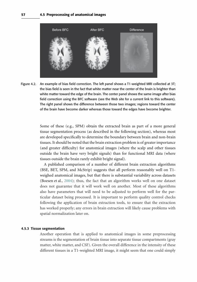
57 4.5 Preprocessing of anatomical images
Before BFC After BFC Difference
Figure 4.2. An example of bias field correction. The left panel shows a T1-weighted MRI collected at 3T;
the bias field is seen in the fact that white matter near the center of the brain is brighter than
white matter toward the edge of the brain. The center panel shows the same image after bias
field correction using the BFC software (see the Web site for a current link to this software).
The right panel shows the difference between those two images; regions toward the center
of the brain have become darker whereas those toward the edges have become brighter.
Some of these (e.g., SPM) obtain the extracted brain as part of a more general
tissue segmentation process (as described in the following section), whereas most
are developed specifically to determine the boundary between brain and non-brain
tissues. It should be noted that the brain extraction problem is of greater importance
(and greater difficulty) for anatomical images (where the scalp and other tissues
outside the brain have very bright signals) than for functional MRI data (where
tissues outside the brain rarely exhibit bright signal).
A published comparison of a number of different brain extraction algorithms
(BSE, BET, SPM, and McStrip) suggests that all perform reasonably well on T1-
weighed anatomical images, but that there is substantial variability across datasets
(Boesen et al., 2004); thus, the fact that an algorithm works well on one dataset
does not guarantee that it will work well on another. Most of these algorithms
also have parameters that will need to be adjusted to perform well for the par-
ticular dataset being processed. It is important to perform quality control checks
following the application of brain extraction tools, to ensure that the extraction
has worked properly; any errors in brain extraction will likely cause problems with
spatial normalization later on.
4.5.3 Tissue segmentation
Another operation that is applied to anatomical images in some preprocessing
streams is the segmentation of brain tissue into separate tissue compartments (gray
matter, white matter, and CSF). Given the overall difference in the intensity of these
different tissues in a T1-weighted MRI image, it might seem that one could simply

58 Spatial normalization
choose values and threshold the image to identify each component. However, in
reality, accurate brain segmentation is one of the more difficult problems in the pro-
cessing of MRI images. First, MRI images are noisy; thus, even if the mean intensity
of voxels in gray matter is very different from the mean intensity of voxels in white
matter, the distributions of their values may overlap. Second, there are many voxels
that contain a mixture of different tissue types in varying proportion; this is known
as a partial volume effect and results in voxels with a broad range of intensity depend-
ing upon their position. Third, as noted previously there may be nonuniformities
across the imaging field of view, such that the intensity of white matter in one region
may be closer to that of gray matter in another region than to that of white matter
in that other region. All of these factors make it very difficult to determine the tissue
class of a voxel based only on its intensity.
There is a very large literature on tissue segmentation with MRI images, which
we will not review here; for a review of these methods, see Clarke et al. (1995).
One recent approach that is of particular interest to fMRI researchers (given the
popularity of the SPM software) is the unified segmentation approach developed by
Ashburner & Friston (2005) that is implemented in SPM. This method combines
spatial normalization and bias field correction with tissue segmentation, so that the
prior probability that any voxel contains gray or white matter can be determined
using a probabilistic atlas of tissue types; this prior probability is then combined
with the data from the image determine the tissue class. Using this approach, two
voxels with identical intensities can be identified as different tissue types (e.g., if
one is in a location that is strongly expected to be gray matter and another strong
expected to white matter).
4.6 Processing streams for fMRI normalization
There are two commonly used processing streams for spatial normalization of fMRI
data (see Figure 4.3); for the purposes of this discussion, we will focus exclusively
on template-based normalization methods since they comprise the large majority
of current methods. In the first (which is customary in SPM), which we will refer
to as prestatistics normalization, the data are preprocessed and spatially normal-
ized prior to statistical analysis. In the poststatistics normalization approach (used
in FSL), the data are preprocessed and the statistical analysis is performed on data
in the native space; normalization is applied to the statistical result images fol-
lowing analysis. Each processing stream is valid; choices between them are usually
driven by the software package used for analysis. The poststatistics normalization
approach is more economical with regard to disk space; since the resolution of
the standard space is generally 2mm3 whereas the resolution of the native space
data is generally 3–4 mm3, it takes substantially more space to store a normal-
ized image versus a native space image. One potential pitfall of the poststatistics
approach can arise if there are voxels outside the brain whose values are stored as

59 4.6 Processing streams for fMRI normalization
1-step normalization 2-step normalization 3-step normalization
Anatomical Functional
T1-weightedtemplate
Echoplanartemplate
Anatomical Functional
T1-weightedtemplate
Concatenatedtransforms
Anatomical Functional
T1-weightedtemplate
Concatenatedtransforms
Figure 4.3. Three common processing streams for spatial normalization of fMRI data. Dark arrows denote
direct spatial registration, solid gray arrows represent inclusion of normalization parame-
ters in concatenation, and dotted gray arrow represents implicit normalization obtained by
concatenating individual transformation parameters.
NaN (“not a number”), as was the case in older versions of SPM. It is not pos-
sible to interpolate over voxels that have NaN values, so any attempt to perform
normalization on these images will lead to voxels near the edge of the brain also
being set to NaN (since interpolation at the edges will necessarily include voxels
outside of the brain). It is possible to solve this problem by replacing the NaN values
with zeros in the image, using tools such as SPM’s imcalc tool or FSL’s fslmaths
program.
A second question arises in the choice of which images to use for normalization
(see Figure 4.3). The simplest form of registration would be to directly normalize
the fMRI data to a template in the appropriate coordinate space made from the same
kind of image. This approach is common among users of SPM, which includes an
EPI template aligned to the MNI space. However, this approach is not optimal due to
the lack of anatomical details in the fMRI images, which means that the registration
will be largely driven by the high-contrast features at the edges of the brain. Thus,
although the overall outline of the brain will be accurate, structures within the brain
may not be accurately aligned.
An alternative is to use a multistep method that utilizes anatomical images in
addition to the fMRI images. Most fMRI datasets include, in addition to the fMRI
60 Spatial normalization
data, a high-resolution anatomical image (which we refer to as a high-res image)
as well as an anatomical image that covers exactly the same slices as the fMRI
acquisition (which we refer to as a coplanar image). In the multistep method,
the fMRI data are first registered to the subject’s anatomical image, which is often
referred to as coregistration. This is generally performed using an affine transfor-
mation with either seven parameters (X/Y /Z translation/rotation and a single
global scaling factor) or nine parameters (X/Y /Z translation/rotation/scaling). If
both coplanar and high-res images are available, then the best approach is to first
align the fMRI data and the coplanar image, then to align the coplanar image to
the high-res image, and then to normalize the high-res image to standard space.
These transformations (fMRI ⇒ coplanar, coplanar ⇒ high-res, and high-res ⇒standard space) can then be concatenated to create a single transformation from
fMRI native space to standard space (e.g., using the ConcatXFM_gui program in
FSL). Creating a single transformation by concatenating transforms, rather than
transforming and reslicing the fMRI images at each step, reduces the errors and
blurring that accrue with each interpolation. If it is necessary to perform multi-
ple interpolations serially on the same images, then care should be taken to use a
higher-order interpolation method such as sinc interpolation to minimize errors and
blurring.
4.7 Spatial normalization methods
4.7.1 Landmark-based methodsThe first methods developed for spatial normalization used landmarks to align the
brains across individuals. The best known such method is the one developed by
Talairach, which relied upon a set of anatomical landmarks including the ante-
rior and posterior commisures, midline saggital plane, and the exterior boundaries
of the brain in each direction (see Figure 4.1). (In the early days of fMRI, spa-
tial normalization was often referred to generically as “Talairach-ing.”) Although
landmark-based methods are still available in some software packages (such as
AFNI), they have in generally been supplanted by volume-based and surface-based
methods.
4.7.2 Volume-based registration
By far the most common form of spatial registration used in fMRI today is volume-
based registration to a template image. The methods used for this registration were
described in Chapter 2 and include affine linear registration as well as various forms
of nonlinear registration. The most common templates are the MNI305 or MNI152,
which are averages of large numbers of individuals who have been registered into a
common space.
61 4.7 Spatial normalization methods
4.7.3 Computational anatomy
A set of approaches from the field known as computational anatomy has gained sub-
stantial interest due to their ability to effectively align structures across individuals in
a way that respects anatomical constraints (Miller, 2004; Toga & Thompson, 2001).
Whereas the methods described so far use mathematical basis functions to deform
brains to match one another without regard to the nature of the material being
warped, computational anatomy methods generally use models based on physical
phenomena, such as the deformation of elastic materials or the flow of viscous flu-
ids (Christensen et al., 1994; Holden, 2008). One particular set of approaches use
a specific kind of transformation known as a diffeomorphism (for “differentiable
homeomorphism”). The mathematics of these methods are quite complex, and we
will only provide a brief overview; the interested reader is referred to Miller (2004)
and Holden (2008). A diffeomorphic transformation from one image to another
can be represented as a vector field, where the vector at every point describes the
movement of the data in that voxel from the original to the transformed image (see
Figure 4.4). These transformations have a very high number of parameters, but they
are regularized to ensure that the deformations are smooth and do not violate the
topology of the structures being transformed.
Computational anatomy methods have been made widely available via the DAR-
TEL toolbox for SPM (Ashburner, 2007) and the FNIRT tool within FSL. The results
from normalization with the DARTEL method are shown in Figure 4.5. Whereas
the average of eight individuals after registration using affine or basis-function
Figure 4.4. An example of the warp field for a brain normalized using FSL’s FNIRT nonlinear registra-
tion tool. The left panel shows the warp vector field; the arrow at each voxel represents
the movement of data in the original image to the transformed image. The right panel
shows the normalized image with a warped version of the original image grid overlaid on
the image.
62 Spatial normalization
AFNI manual Talairach FSL FLIRT affine SPM affine
SPM nonlinear (100) SPM nonlinear (12) SPM DARTEL
Figure 4.5. Examples of mean structural images for a group of eight subjects obtained after registration
using various registration methods. The number specified for the SPM nonlinear registrations
refers to the nonlinear frequency cutoff; a higher number reflects a smaller degree of nonlinear
warping. Note, in particular, the relative clarity of the DARTEL image compared to the other
images, which reflects the better registration of the different brains using that method.
registration is clearly blurry due to misregistration of fine structure across indi-
viduals, the average of these same individuals after registration using DARTEL is
much clearer, reflecting better alignment. We expect that these methods will gain
greater adoption in the fMRI literature.
4.8 Surface-based methods
Surface-based normalization methods take advantage of the fact that the cerebral
cortex is a connected sheet. These methods involve the extraction of the cortical
surface and normalization based on surface features, such as sulci and gyri. There
are a number of methods that have been proposed, which are implemented in freely
available software packages including FreeSurfer and CARET (see book Web site for
links to these packages).
The first step in surface-based normalization is the extraction of the cortical
surface from the anatomical image (see Figure 4.6). This process has been largely
automated in the FreeSurfer software package, though it is generally necessary to
ensure that the extracted surface does not contain any topological defects, such as
handles (when two separate parts of the surface are connected by a tunnel) or patches

63 4.9 Choosing a spatial normalization method
Figure 4.6. An example of cortical surface extraction using FreeSurfer. The left panel shows the extracted
cortical surface in red overlaid on the anatomical image used to extract the surface. Themiddle
panel shows a rendering of the reconstructed surface, and the right panel shows an inflated
version of the same surface; light gray areas represent gyri and darker areas represent sulci.
(Images courtesy of Akram Bakkour, University of Texas)
(holes in the surface). Once an accurate cortical surface has been extracted, then it
can be registered to a surface atlas, and the fMRI data can be mapped into the atlas
space after coregistration to the anatomical image that was used to create the surface.
Group analysis can then be performed in the space of the surface atlas.
Surface-based registration appears to more accurately register cortical features
than low-dimensional volume-based registration (Fischl et al., 1999; Desai et al.,
2005), and it is a very good method to use for neuroscience questions that are lim-
ited to the cortex. It has the drawback of being limited only to the cortical surface;
thus, deep brain regions cannot be analyzed using these methods. However, recent
work has developed methods that combine surface and volume-based registration
(Postelnicu et al., 2009), and one of these methods is available in the FreeSurfer
software package.
Surface-based methods have not been directly compared to high-dimensional
volume-based methods such as DARTEL or FNIRT, and those methods may
approach the accuracy of the surface-based or hybrid surface/volume-based
methods.
4.9 Choosing a spatial normalization method
Given all of this, how should one go about choosing a method for spatial normal-
ization? Because most researchers choose a single software package to rely upon for
their analyses, the primary factor is usually availability within the software package
that one uses. With the widespread implementation of the NIfTi file format (see
Appendix A) , it has become easier to use different packages for different parts of the
analysis stream, but it still remains difficult in many cases to mix and match different
packages. Both SPM and FSL include a set of both linear and nonlinear registration
methods; AFNI appears at present to only support affine linear registration. There
are also a number of other freely available tools that implement different forms of
nonlinear registration. The effects of normalization methods on functional imaging

64 Spatial normalization
Figure 4.7. A comparison of activationmaps for group analyses using linear registration (FSL FLIRT) versus
high-dimensional nonlinear registration (FSL FNIRT), from a group analysis of activation on a
stop-signal task. Voxels in red were activated for both analyses, those in green show voxels
that were active for linear but not nonlinear registration, and those in blue were active for
nonlinear but not for linear registration. There are a number of regions in the lateral prefrontal
cortex that were only detected after using nonlinear registration. (Images courtesy of Eliza
Congdon, UCLA)
results have not been extensively examined. One study (Ardekani et al., 2004) exam-
ined the effects of using registration methods with varying degrees of complexity
and found that using high-dimensional nonlinear warping (with the ART package)
resulted in greater sensitivity and reproducibility. Figure 4.7 shows the results from
a comparison of group analyses performed on data normalized using either affine
registration or high-dimensional nonlinear registration. What is evident from this
analysis is that there are some regions where smaller clusters of activation are not
detected when using affine registration but are detected using high-dimensional
registration. At the same time, the significant clusters are smaller in many places
for the nonlinear registration, reflecting the fact that better alignment will often
result in more precise localization. These results suggest that nonlinear registration
is generally preferred over linear registration.
A number of nonlinear registration methods were compared by (Klein et al.,
2009), who compared their degree of accuracy by measuring the resulting alignment
of anatomical regions using manually labeled brains. They found that the nonlinear
algorithms in general outperformed linear registration, but that there was substan-
tial variability between the different packages in their performance, with ART, SYN,
IRTK, and DARTEL performing the best across various tests. One notable feature of
this study is that the data and code used to run the analyses have been made publicly
available at http://www.mindboggle.info/papers/evaluation_NeuroImage2009.php,
so that the accuracy of additional methods can be compared to these existing
results.

65 4.10 Quality control for spatial normalization
4.10 Quality control for spatial normalization
It is essential to check the quality of any registration operation, including
coregistration and spatial normalization.
One useful step is to examine the normalized image with the outline of the tem-
plate (or reference image, in the case of coregistration) overlaid on the registered
image. This is provided in the registration reports from SPM and FSL (see Figure 4.8)
and is potentially the most useful tool because it provides the clearest view of the
overlap between images.
Another useful quality control step for spatial normalization is to examine the
average of the normalized brains. If the normalization operations have been suc-
cessful, then the averaged brain should look like a blurry version of a real brain, with
the blurriness depending upon the dimensionality of the warp. If the outlines of
individual brains are evident in the average, then this also suggests that there may be
problems with the normalization of some individuals, and that the normalization
should be examined in more detail.
Finally, another useful operation is to view the series of normalized images for
each individual as a movie (e.g., using the movie function in FSLview). Any images
that were not properly normalized should pop out as being particularly “jumpy” in
the movie.
Figure 4.8. Examples of outline overlays produced by FSL. The top row shows contour outlines from the
MNI template overlaid on the subject’s anatomical image, whereas the bottom row shows
the outlines from the subject’s anatomy overlaid on the template. In this case, registration
worked relatively well and there is only minor mismatch between the two images.
66 Spatial normalization
4.11 Troubleshooting normalization problems
If problems are encountered in the quality control phase, then it is important to
debug them. If the problem is a large degree of variation across individuals in
the registration, then you should make sure that the template that is being used
matches the brain images that are being registered. For example, if the images being
registered have been subjected to brain extraction, then the template should also be
brain-extracted. Otherwise, the surface of the cortex in the image may be aligned to
the surface of the scalp in the template. Another source of systematic problems can
come from systematic differences in the orientation of images, which can arise from
the conversion of images from scanner formats to standard image formats. Thus,
one of the first steps in troubleshooting a systematic misregistration problem should
be to make sure that the images being normalized have the same overall orientation
as the template. The best way to do this is to view the image in a viewer that shows
all three orthogonal directions (saggital, axial, and coronal), and make sure that the
planes in both images fall within the same section in the viewer (i.e., that the coronal
section appears in the same place in both images). Otherwise, it may be necessary
to swap the dimensions of the image to make them match. Switching dimensions
should be done with great care, however, to ensure that left/right orientation is not
inadvertently changed.
If the problem lies in misregistration of a single individual, then the first step
is to make sure that the preprocessing operations (such as brain extraction) were
performed successfully. For example, brain extraction methods can sometimes leave
large chunks of tissue around the neck, which can result in failed registration. In other
cases, misregistration may occur due to errors such as registering an image that has
not been brain-extracted to a brain-extracted template (see Figure 4.9). In this case, it
may be necessary to rerun the brain extraction using different options or to perform
manual editing of the image to remove the offending tissue. If this is not the case,
then registration can sometimes be improved by manually reorienting the images
so that they are closer to the target image, for example, by manually translating and
rotating the image so that it better aligns to the template image prior to registration.
4.12 Normalizing data from special populations
There is increasing interest in using fMRI to understand the changes in brain function
that occur with brain development, aging, and brain disorders. However, both aging
and development are also associated with changes in brain structure, which can
make it difficult to align the brains of individuals at different ages. Figure 4.10 shows
examples of brains from individuals across the lifespan, to highlight how different
their brain structures can be. These problems are ever greater when examining
patients with brain lesions (e.g., due to strokes or tumors). Fortunately, there are
methods to address each of these problems.
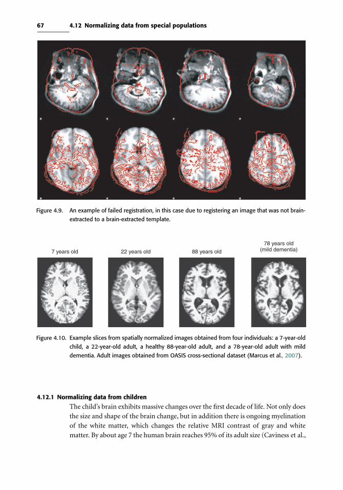
67 4.12 Normalizing data from special populations
Figure 4.9. An example of failed registration, in this case due to registering an image that was not brain-
extracted to a brain-extracted template.
7 years old 22 years old 88 years old
78 years old(mild dementia)
Figure 4.10. Example slices from spatially normalized images obtained from four individuals: a 7-year-old
child, a 22-year-old adult, a healthy 88-year-old adult, and a 78-year-old adult with mild
dementia. Adult images obtained from OASIS cross-sectional dataset (Marcus et al., 2007).
4.12.1 Normalizing data from children
The child’s brain exhibits massive changes over the first decade of life. Not only does
the size and shape of the brain change, but in addition there is ongoing myelination
of the white matter, which changes the relative MRI contrast of gray and white
matter. By about age 7 the human brain reaches 95% of its adult size (Caviness et al.,

68 Spatial normalization
1996), but maturational changes in brain structure, such as cortical thickness and
myelination, continue well into young adulthood. To compare fMRI data between
children and adults, it is necessary to use a spatial normalization method that either
explicitly accounts for these changes or is robust to them.
One way to explicitly account for age-related changes is to normalize to a pediatric
template (Wilke et al., 2002), or even to an age-specific template. The use of age-
specific templates will likely improve registration within the subject group. However,
we would caution against using age-specific templates in studies that wish to compare
between ages, because the use of different templates for different groups is likely to
result in systematic misregistration between groups.
Fortunately, common normalization methods have been shown to be relatively
robust to age-related differences in brain structure, at least for children of 7 years and
older. Burgund et al. (2002) examined the spatial error that occurred when the brains
of children and adults were warped to an adult template using affine registration.
They found that there were small but systematic errors of registration between
children and adults, on the order of about 5 mm. However, they showed using
simulated data that errors of this magnitude did not result in spurious differences
in fMRI activation between groups. Thus, for developmental studies that compare
activation between individuals of different ages, normalizing to a common template
seems to be a reasonable approach.
4.12.2 Normalizing data from the elderly
Normalizing data from elderly individuals poses another set of challenges
(Samanez-Larkin & D’Esposito, 2008). Aging is associated with decrease in gray
matter volume and increase in the volume of cerebrospinal fluid, as well as an
increase in variability across individuals. Further, a nonnegligible proportion of
the aged population will suffer from brain degeneration due to diseases such as
Alzheimer’s disease or cerebrovascular disorders, resulting in marked brain atro-
phy. The potential problems in normalization arising from these issues suggest
that quality control is even more important when working with data from older
individuals. One approach that has been suggested is the use of custom templates
that are matched to the age of the group being studied (Buckner et al., 2004). The
availability of large image databases, such as the OASIS database (Marcus et al.,
2007), make this possible, but there are several caveats. First, the custom tem-
plate should be derived from images that use the same MRI pulse sequence as
the data being studied. Second, it is important to keep in mind that although
group results may be better when using a custom population-specific template,
the resulting coordinates may not match well to the standard space. One potential
solution to this problem is to directly compare the custom atlas to an MNI atlas,
as demonstrated by Lancaster et al. (2007).

69 4.12 Normalizing data from special populations
Figure 4.11. An example of the use of cost function masking to improve registration in the presence of
lesions. The data used here are from an individual who underwent a right hemispherectomy,
and thus is missing most of the tissue in the right hemisphere. The top left panel shows the
MRI for this subject, which has a large area of missing signal in the right hemisphere. The lower
left panels show the result of spatial normalization using this original image; the registration
failed, with serious misalignment between the registered brain (shown in the second row)
and the template (shown in the third row with the outline of the registered image). The top
right panel shows the cost function mask that was created to mask out the lesioned area
(in white). The bottom right panels show the results of successful registration using this cost
function mask to exclude this region.
4.12.3 Normalizing data with lesions
Brain lesions can lead to large regions of missing signal in the anatomical image,
which can result in substantial errors in spatial normalization (see Figure 4.11). The
standard way to deal with this problem is to use cost function masking, in which
a portion of the image (usually corresponding to the lesion location) is excluded
from the cost function computation during registration (Brett et al., 2001). Thus,
the normalization solution can be driven only by the good portions of the image.
However, it is important to keep in mind that the effects of a lesion often extend
beyond the lesion itself, for example, by pushing on nearby regions. If this distortion
of other regions is serious enough, then it is likely to be impossible to accurately
normalize the image. In this case, an approach using anatomically based regions of
interest may be the best way to aggregate across subjects.

5
Statistical modeling: Single subject analysis
The goal of an fMRI data analysis is to analyze each voxel’s time series to see whether
the BOLD signal changes in response to some manipulation. For example, if a
stimulus was repeatedly presented to a subject in a blocked fashion, following the
trend shown in the red line in the top panel of Figure 5.1, we would search for voxel
time series that match this pattern, such as the BOLD signal shown in blue. The tool
used to fit and detect this variation is the general linear model (GLM), where the
BOLD time series plays the role of dependent variable, and the independent variables
in the model reflect the expected BOLD stimulus timecourses. Observe, though, that
square wave predictor in red doesn’t follow the BOLD data very well, due to sluggish
response of the physiology. This leads to one major focus of this chapter: Using our
understanding of the BOLD response to create GLM predictors that will model the
BOLD signal as accurately as possible. The other focus is modeling and accounting
for BOLD noise and other souces of variation in fMRI time series.
Throughout this chapter the models being discussed will refer to modeling the
BOLD signal in a single voxel in the brain. Such a voxel-by-voxel approach is
known as a mass univariate data analysis, in contrast to a multivariate approach
(see Chapters 8 and 9 for uses of multivariate models). We assume that the reader
has a basic understanding of the general linear model; for a review see Appendix A.
Once the data in all of the voxels are analyzed separately, they are combined across
subjects for a group analysis (as described in Chapter 6) and then the statistics are
assessed as an image as part of inference (as described in Chapter 7).
5.1 The BOLD signal
As described in Chapter 1, the BOLD signal arises from the interplay of blood flow,
blood volume, and blood oxygenation in response to changes in neuronal activity.
In short, under an active state, the local concentration of oxygenated hemoglobin
increases, which increases homogeneity of magnetic susceptibility, resulting in an
70

71 5.1 The BOLD signal
0 50 100 150 200 250 300−2
−1
0
1
2
Time (s)
BO
LD m
agni
tude
Figure 5.1. Illustration of BOLD fMRI time series in active voxel and illustration of an unconvolved signal
used to model the signal. The BOLD signal for an active voxel (blue) and the stimulus time
series (red) is shown.
increase in T2*-weighted MRI signal. As shown in Figure 5.1 the BOLD signal
(blue) does not increase instantaneously and does not return to baseline immediately
after the stimulus ends (red). Because these changes in blood flow are relatively
slow (evolving over several seconds), the BOLD signal is a blurred and delayed
representation of the original neural signal.
The hemodynamic response can be described as the ideal, noiseless response to an
infinitesimally brief stimulus. It has a number of important characteristics, shown
in Figure 5.2:
• Peak height: This is the most common feature of interest, since it is most directly
related to the amount of neuronal activity in the tissue (Logothetis et al., 2001).
For BOLD fMRI, the maximum observed amplitude is about 5% for primary
sensory stimulation, whereas signals of interest in cognitive studies are often in
the 0.1–0.5% range.
• Time to peak: The peak of the HRF generally falls within 4–6 seconds of the
stimulus onset.
• Width: The HRF rises within 1–2 seconds and returns to baseline by 12–20 seconds
after the stimulus onset.
• Initial dip: Some studies have identified an initial dip in the BOLD signal that
occurs within the first 1–2 seconds and is thought to reflect early oxygen con-
sumption before changes in blood flow and volume occur (Buxton, 2001). Many
studies have not found the initial dip, and when it is observed, it is generally a very
small signal in comparison to the peak positive BOLD response. It is generally
ignored in most models of fMRI data.
• Poststimulus undershoot: The HRF generally shows a late undershoot, which is
relatively small in amplitude compared to the positive response and persists up to
20 seconds or more after the stimulus.
Importantly, there is substantial variability in each of these features of the
HRF across brain areas and across individuals. For example, in the work of
Kruggel & von Cramon (1999), the time until peak varied between 6 and 11 seconds

72 Statistical modeling: Single subject analysis
ID
TP1
0.8
0.6
0.4
0.2
0
PSU
H
W
Figure 5.2. Characteristics of the hemodynamic response. The shape of the HRF function can be described
by a variety of characteristics including the time from the stimulus until peak (TP), height of
response (H), the width of the HRF at half the height (W), poststimulus undershoot (PSU)
and in some cases an initial dip (ID).
across voxels in a single subject. In Handwerker et al. (2004), a study of the HRF
shape revealed that both the time until peak and width of the HRF varied within
subjects across different regions of the brain and across subjects, with intersubject
variability higher than intrasubject variability. And D’Esposito et al. (2003) reviewed
a number of studies that compared the BOLD response in healthy young and eldery
subjects and found, while the shape of the HRF was simlar between the groups,
elderly had reduced signal-to-noise ratios in the response magnitudes.
5.1.1 ConvolutionAn important characteristic of the BOLD signal is that the relationship between the
neural response and the BOLD signal exhibits linear time invariant (LTI) properties.
The meaning of linearity is that if a neural response is scaled by a factor of a, then
the BOLD response is also scaled by this same factor of a. As shown in panel A of
Figure 5.3, when the neural response (red) is doubled in magnitude, the expected
BOLD response (blue) would then be doubled in magnitude. Linearity also implies
additivity, in that if you know what the response is for two separate events, if the
events were to both occur close together in time, the resulting signal would be the
sum of the independent signals. This is illustrated in panel B of Figure 5.3, where
neural responses for separate events (green) add linearly to create the expected BOLD
response. Time invariant means that if a stimulus is shifted by t seconds, the BOLD
response will also be shifted by this same amount.

73 5.1 The BOLD signal
0 10 20 30 40 50 60
−1
−0.5
0
0.5
1
1.5
2
−0.5
0
0.5
1
1.5
2
Time (s)
0 10 20 30 40 50 60Time (s)
Neural Response
BOLD activation
Individual task response
A
B
Figure 5.3. Examples of linear time invariance. Panel A illustrates that when a neural signal is twice
another, the resulting BOLD activation is also twice as large. Panel B shows how the signals
for separate trials, shown in green, add linearly to get the BOLD activation.
Box 5.1.1 What is linear about the hemodynamic response?
The GLM approach to fMRI analysis relies crucially on the assumption that the
hemodynamic response is a linear transformation of the underlying neuronal
signal, and the question of linearity has been examined in detail in the fMRI
literature.
It is first important to point out that there are two possible sources of non-
linearity between stimulation and BOLD responses. There could be nonlinearity
between the BOLD response and the neuronal signal, which is the main focus
of our review here. However, it is well known that there can also be nonlin-
earities in the relationship between stimuli and neuronal responses. A striking
example occurs in the auditory system, where sustained trains of sounds exceed-
ing a particular frequency are associated not with sustained neuronal activity
but rather with phasic bursts of activity at the onset and offset of the train
(Harms & Melcher, 2002). In other cases, such nonlinearities can occur due to

74 Statistical modeling: Single subject analysis
Box 5.1.1 (Continued)
neuronal adaptation, whereby the neuronal response to the same stimulus
becomes decreased upon repetition of that stimulus. Thus, it is always impor-
tant to take into account known neurophysiological data when devising models
for fMRI studies.
In early work by Dale & Buckner (1997), stimuli were presented in rapid suc-
cession and the assumption of linearity was tested by examining whether the
estimated response to multiple stimuli matched the response to a single stim-
ulus. This work showed that the response was indeed largely linear, and that
the estimated hemodynamic responses to subsequent trials were very similar
to the responses to a single trial. However, this match was not exact; in particular,
the estimates on subsequent trials were somewhat compressed relative to the first
trial. Further work has confirmed this nonlinearity, particularly for stimuli that
occur less than 2 seconds apart (e.g.,Wager et al., 2005). Another nonlinearity that
has been noted relates to stimulus duration, whereby very brief stimuli exhibit
much larger BOLD responses than would be expected based on longer stimuli. For
example, Yesilyurt et al. (2008) found that the BOLD response to a 5-millisecond
visual stimulus was only half as large as the response to a 1,000-millisecond stim-
ulus. Fortunately, while these nonlinearities are clearly important, for the range in
which most cognitive fMRI studies occur, they will have relatively small impact.
The LTI properties of the BOLD signal have been studied in detail (see Box 5.1.1.),
and there is a general consensus that the transform from neuronal activity to BOLD
signal is largely LTI. Because of this, a natural approach to creating an expected BOLD
signal from a given neural input is to use the convolution operation. Convolution is
a way of blending two functions together in an LTI fashion. Specifically, the stimulus
onset time series, f (such as the red trend in Figure 5.1) is blended with an HRF, h,
creating a shape that more closely represents the shape of the BOLD response. The
operation is given by
(h ∗ f )(t ) =∫h(τ )f (t − τ)dτ (5.1)
Recall that in Section 3.7 convolution was used in a slightly different context when
data were spatially smoothed by convolving the data with a Gaussian kernel.
Choosing an appropriate HRF function is key in capturing the shape as best as
possible and will ensure a good fit of the GLM regressors to the BOLD time series
when signal is present.
5.1.1.1 Characterizing the hemodynamic response function
To obtain the predicted BOLD response using convolution, we need an estimate of
the HRF. One way to estimate the shape of the response is to present stimuli that are

75 5.1 The BOLD signal
A
B
0 50 100 150 200 250 300 350 400−200
−100
0
100
200
Time (s)
BO
LD a
ctiv
atio
n
0 2 4 6 8 10 12 14 16 18 20−200
−100
0
100
200
Time relative to stimulus onset (s)
BO
LD a
ctiv
atio
n
0 2 4 6 8 10 12 14 16 18 20−40−20
020406080
Time relative to stimulus onset (s)
BO
LD a
ctiv
atio
nC
Figure 5.4. Example of selective averaging. Panel A shows the original time series, highlighting the 22-
second window around each stimulus presentation. Panel B overlays the windowed BOLD
time series, and panel C shows the average of the windowed time series.
widely spaced in time (e.g., every 30 seconds) and then simply to average the evoked
responses at each point in time with respect to the stimulus (referred to variously as
peristimulus time averaging, selective averaging, or deconvolution). Figure 5.4 shows
an example of such a process. Panel A shows the original time series, where 22-
second windows around each stimulus (starting 2 seconds before the stimulus and
lasting for 20 seconds after) are highlighted in different colors. The 11 windowed
segments are overlaid in panel B and after averaging the timecourses (panel C) a less
noisy image of the response function is obtained.
The work of Friston et al. (1994a) and Lange & Zeger (1997) applied deconvolu-
tion models to BOLD data to characterize the HRF and found that, in general, it was
approximately described by a gamma function. The choice of the “canonical” HRF
using a single gamma function was common until it was realized that the model fit
could be further improved by accounting for the poststimulus undershoot, which is
not modeled with a single gamma HRF. For this reason, a canonical HRF based on the
combination of two gamma functions, known as a double-gammaHRF, was adopted
(Friston et al., 1998; Glover, 1999). The first gamma function models the shape of
the initial stimulus response and the second gamma function models the under-
shoot. Each analysis software package has default parameter settings that generate a

76 Statistical modeling: Single subject analysis
0 5 10 15 20 25 30−2
0
2
4
Time(s)
BO
LD m
agni
tude
Mean signalNo convolutionGammaDouble Gamma
Figure 5.5. Illustration of different canonical hemodynamic response functions. The black line is the
average BOLD response over multiple presentations of a block of stimuli. The red line is the
unconvolved time course, blue uses the gamma HRF, whereas the green line is the double
gamma, which fits the data best as it accounts for the poststimulus undershoot.
canonical HRF. For example, the default double gamma HRF in SPM has a delay of
response set to 6 seconds and a delay of undershoot (relative to onset) of 16 seconds,
among five other parameters. These defaults are used in all analyses unless specified
otherwise by the user. The only parameter that is free to vary, which is actually
estimated in the linear model, is the height of the response. Figure 5.5 illustrates
the model fit to data (black) for the boxcar regressor (red), boxcar convolved with
a gamma HRF (blue), and boxcar convolved with a double gamma HRF (green).
The double gamma has a better fit, since it models the poststimulus undershoot. If
a gamma is used instead of a double gamma when there is a strong poststimulus
undershoot, the undershoot may pull down the baseline of the model, and as a result
the height of the response may be underestimated.
5.1.2 Beyond the canonical HRF
The approach described previously assumed that the HRF could be accurately
described using a single canonical response function. However, as was seen in
Figure 1.2, hemodynamic responses may differ substantially between individuals
in their shape, time to peak, and other aspects. In addition, a number of studies
have shown that the shape of the hemodynamic response also differs across different
brain regions for the same individual. If we use the canonical HRF, then we are biased
to only find responses that are similar to that function. On the other hand, if we
use a more complicated model allowing for more flexibility in the shape of the HRF
by incorporating more parameters, we will have more variability in the estimates.
This is what is often referred to as the bias-variance tradeoff. Because of the known
variability in the HRF, it is common to use more complicated and flexible models in
fMRI analysis.
If we do need a more flexible HRF model, there are a number of approaches that
can be used to capture a broader range of response profiles. A popular approach is to
use a set of HRF basis functions, functions that when combined linearly give a range
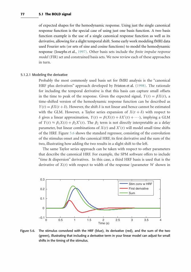
77 5.1 The BOLD signal
of expected shapes for the hemodynamic response. Using just the single canonical
response function is the special case of using just one basis function. A two basis
function example is the use of a single canonical response function as well as its
derivative, allowing for a slight temporal shift. Some early work modeling fMRI data
used Fourier sets (or sets of sine and cosine functions) to model the hemodynamic
response (Josephs et al., 1997). Other basis sets include the finite impulse response
model (FIR) set and constrained basis sets. We now review each of these approaches
in turn.
5.1.2.1 Modeling the derivative
Probably the most commonly used basis set for fMRI analysis is the “canonical
HRF plus derivatives” approach developed by Friston et al. (1998). The rationale
for including the temporal derivative is that this basis can capture small offsets
in the time to peak of the response. Given the expected signal, Y (t ) = βX(t ), a
time-shifted version of the hemodynamic response function can be described as
Y (t ) = βX(t + δ). However, the shift δ is not linear and hence cannot be estimated
with the GLM. However, a Taylor series expansion of X(t + δ) with respect to
δ gives a linear approximation, Y (t ) = β(X(t ) + δX ′(t ) + ·· ·), implying a GLM
of Y (t ) ≈ β1X(t ) + β2X ′(t ). The β2 term is not directly interpretable as a delay
parameter, but linear combinations of X(t ) and X ′(t ) will model small time shifts
of the HRF. Figure 5.6 shows the standard regressor, consisting of the convolution
of the stimulus onset and the canonical HRF, its first derivative and the sum of the
two, illustrating how adding the two results in a slight shift to the left.
The same Taylor series approach can be taken with respect to other parameters
that describe the canonical HRF. For example, the SPM software offers to include
“time & dispersion” derivatives. In this case, a third HRF basis is used that is the
derivative of X(t ) with respect to width of the response (parameter W shown in
0 0.5 1 1.5 2 2.5 3 3.5 4−0.1
0
0.1
0.2
0.3
Time (s)
Stim conv w HRF
First derivative
Sum
Figure 5.6. The stimulus convolved with the HRF (blue), its derivative (red), and the sum of the two
(green), illustrating that including a derivative term in your linear model can adjust for small
shifts in the timing of the stimulus.

78 Statistical modeling: Single subject analysis
Figure 5.2). Similar to a temporal derivative that models temporal shifts, this allows
the width of the fitted HRF to vary slightly from the canonical HRF.
5.1.2.2 Finite impulse response models
The most flexible model for capturing the HRF shape for a response is the FIR
basis set. In this approach, a window around the stimulus is chosen and the GLM
is used to model the response at each time point within this window. Figure 5.7
shows an example for a study where one trial type was present, where the left
side of the figure illustrates the model and the right panel shows how the parameter
estimates from the model reveal the HRF shape. Each regressor models a specific time
point in the window surrounding the trial presentation (often called peristimulus
time). In this case the first regressor corresponds to 2 seconds prior to stimulus
presentation, the second is during the stimulus presentation and so on, continuing
until 20 seconds after the trial onset. Note that in some cases a single time point
(row of the design matrix) may be modeled by two different parameters when trials
are sufficiently close in time. For example, in this design the first two time points of
a trial window overlap with the last two time points of the previous trial window.
The GLM will appropriately account for this overlap by virtue of the additivity of
the BOLD response.
The flexibility of the FIR model to capture the shape of the HRF comes at the
cost of an increase in the variability of the estimates (i.e., a bias–variance tradeoff).
While we are less biased about the shape of the HRF, the variability of our estimates
−0.1
0
0.1
0.2
0.3
0.4
Par
amet
er e
stim
ate
mag
nitu
de
Model: Y=Xβ Parameter Estimates
=
βons-2
βons
βons+2
βons+4
βons+6
βons+8
βons+10
βons+12
βons+14
βons+16
βons+18
βons+20
ons+18
ons+20
ons+14
ons+16
ons+10
ons+12
ons+6
ons+8
ons+2
ons+4
ons-2
ons
Figure 5.7. Model and estimates corresponding to an FIRmodel. On the left is themodel used to estimate
the FIR parameters, where the BOLD time series is the outcome, the design matrix consists
of 0s (black) and 1s (white), and there is a separate parameter estimated for each point in
the window around the stimulus. For example, the first regressor and parameter (βons−2)correspond to the time point 2 seconds prior to onset time, the second regressor is during
onset and so on. The TR in this case is 2 seconds, so the regressors differ by increments of 2
seconds. The right panel illustrates how the parameter estimates from the FIR model capture
the shape of the HRF.

79 5.1 The BOLD signal
increases since fewer data points are contributing to each parameter’s estimate.
Additionally, collinearity between the regressors, due to overlapping stimuli, can
increase the variability of the estimates further.
One consideration when using the FIR model is how the results of the model fit are
used at the next level of analysis. It is common for researchers to fit an FIR model to
their data, with reasoning like “I don’t want to assume a shape of the hemodynamic
response.” This is true, but it only holds if one actually uses the entirety of the FIR fit
in the higher-level analysis. As discussed in Chapter 6, the standard group modeling
approach assumes the data have been distilled down to one BOLD measure per
subject (e.g., the parmeter for an event modeled with a canonical HRF). However,
a FIR fit consists of many measures (e.g., 12 values in the example in Figure 5.7),
and this requires a type of multivariate model to fit all of these responses at the
group level. Some authors simply select the parameter from a single FIR bin to take
to a group analysis, however this itself implies an assumption that the peak BOLD
response falls at that time point. In general, FIR models are most appropriate for
studies focused on the characterization of the shape of the hemodynamic response,
and not for studies that are primarily focused on detecting activation.
5.1.2.3 Constrained basis sets
At one end of the spectrum there is the lower-bias, higher-variance FIR basis set and
at the other end is the higher-bias, lower-variance canonical HRF basis function.
An approach that falls somewhere in the middle of the bias–variance spectrum
is the use of constrained basis sets, which takes into account known features of the
hemodynamic response (such as the fact that it is smooth, starts at zero, ramps slowly,
and returns to zero) but still allows flexibility to fit a range of possible responses.
Instead of convolving the stimulus onset time series with a single canonical HRF,
a set of functions that capture different aspects of the shape of the HRF are used.
One approach to constructing a set of basis functions is to first generate a set of
HRF shapes that are reasonable, say by varying some of the parameters outlined in
Figure 5.2, and then using principal components analysis to extract a set of basis
functions that describe this set well. This is the approach taken by Woolrich et al.
(2004a) in the FMIRB Linear Optimal Basis Set (FLOBS) algorithm. Figure 5.8 shows
an example of four-function basis set developed using this approach (panel A), and
some examples of HRF shapes that can be created using linear combinations of these
functions (panel B). Although some shape is imposed, different linear combinations
of these shapes allow for a larger variety of HRF shapes than using a single canonical
basis function.
The benefit of this basis set is that instead of the, say, 12 parameters that must be
estimated for the FIR model, only 4 parameters must be estimated for this basis set,
which helps reduce the variability of the estimates. Figure 5.9 illustrates the fit of
three approaches: double gamma canonical HRF (blue), a basis set with four basis
functions (red), and the FIR model (green). The canonical HRF model is fitting a

80 Statistical modeling: Single subject analysis
A B
Figure 5.8. Examples of constrained basis sets (panel A) and linear combinations of the basis (panel
B). The four basis functions in panel A were produced using the FMRIB linear optimal basis
set algorithm. These functions would be convolved with the stimulus onset to create four
regressors for modeling the overall HRF shape, compared with the ten regressors shown in
the FIR model in Figure 5.7. The right panel illustrates 4 different linear combinations of the
basis functions, illustrating the variations in HRF shape that the basis functions are able to
model.
0 5 10 15 20 25−20
−10
0
10
20
30
40
Time relative to stimulus onset (s)
BO
LD a
ctiv
atio
n
Double GammaBasis functionsFIR
Figure 5.9. Examples of fitting data with a canonical HRF (blue), set of three basis functions (red) and
FIR model with ten time points (green). In this case the peak of the double gamma seems
to be too early compared to the fits of the more flexible basis function and FIR models. The
double gamma fit is smoothest while the FIR model fit is the noisiest.
single parameter and has the smoothest fit, whereas the ten-parameter FIR fit is the
noisiest. Both the FIR and four-basis function models illustrate that the imposed
time to peak of the double gamma function may be a bit too early and therefore the
peak amplitude is underestimated.

81 5.1 The BOLD signal
In summary, although it would seem that we always want unbiased estimates,
often accepting a small amount of bias will result in a greater reduction in variance,
especially when that bias fits with our preexisting knowledge about the underlying
data. When using models with a large set of basis functions, we must be aware that
the flexibility of the model may fit unrealistic HRFs, for example, a shape with two
separate positive bumps. In fMRI this means that we usually accept imperfect fit
of the canonical HRF in exchange for greater precision and interpretability in our
parameter estimates.
5.1.3 Other modeling considerations
Time resolution of the model. The canonical HRF is usually plotted as a smooth
curve, as in Figure 5.2, with very fine time resolution. In practice, BOLD time series
have time resolution (i.e., repetition time or TR) of 2–3 seconds, yet the events do
not usually fall exactly at the begining of an image acquisition nor last the entire TR.
At coarse time resolution, the stimulus time course for any event or combination
of events occurring within the time frame of a single TR would look the same at
a time resolution of TR seconds, the convolved signal would look the same. For
example, if the TR = 3 seconds, the following four types of trial presentations
would have the same representation at the time resolution of 3 seconds: a stimulus
starting at 0 second and lasting 1 second, a stimulus starting at 0 second lasting 2
seconds, a stimulus starting at 0 second and lasting 3 seconds, and a stimulus starting
at 2 seconds lasting 1 second. Specifically, the convolved signal for all four of these
tasks in a space with a single unit time resolution of 3 seconds would be the dashed
black line shown in the right panel of Figure 5.10.
0 5 10 15 20 25
0
0.2
0.4
Time(s)
Time resolution = 0.1s
0 5 10 15 20 25
0
0.2
0.4
Time(s)
Time resolution = 3s
0s−1s0s−2s0s−3s2s−3s
Convolved in 3s res
Figure 5.10. Illustrating why convolution is performed in a higher-resolution time domain than the TR. The
left panel shows different stimuli, with timings indicated in the legend, convolved with the
double gamma HRF in a high-resolution time domain. The right panel illustrates the result that
would be acquired for all four stimuli if convolution was done in the lower time resolution of
3 seconds (black dashed line) compared to the signals that are acquired by down-sampling
the higher-resolution signals from the left-hand panel (solid colored lines).

82 Statistical modeling: Single subject analysis
To more accurately model the predicted HRF, most software packages first up-
sample the stimulus presentation times into a higher time resolution, convolve them
with the HRF, and then down-sample the convolved functions to the original time
resolution. By doing so, the timing of the stimuli is more accurately represented and
since a higher resolution HRF is used, the shape of the response is more accurate.
The left-hand side of Figure 5.10 shows the four time courses described previously,
convolved in a high time resolution space of 0.1 second. The right panel of the figure
shows the down-sampled versions of the time series (solid lines) as well as the signal
that would result if the convolution was done in the 3-seconds time resolution space
(dotted line). The reason the dotted black line does not match the 3-second event
(yellow line) is a result of differences in accuracies of HRF shapes in the two time
domains.
Modeling parametric modulation. In many cases, some feature of a stimulus or
task can be parametrically varied, with the expectation that this will be reflected in
the strength of the neural response. For example, Boynton et al. (1996) parametri-
cally modulated the contrast of a visual stimulus, and showed that neural responses
in area V1 responded linearly to this modulation. In designs like this, the paramet-
ric modulation can be modeled using an additional regressor in the design matrix,
known as a parametric regressor. A stimulus onset time series consists of stick func-
tions, usually of equal height. To create a parametric regressor, each onset’s stick
function has a height reflecting the strength of the stimulus for that trial. Figure 5.11
shows an example of how a parametrically modulated regressor is created. The top
panel shows the timing of the stimuli, where the numbers above the stimuli refer to
the modulation value. The unmodulated regressor is shown in panel B and panel C
shows the modulated version. It is important that the height values are demeaned
prior to creating the regressor, in order to ensure that the parametric regressor is
not correlated with the unmodulated regressor. It is also important that the GLM
always include an unmodulated regressor in addition to the parametrically modu-
lated regressor. This is analogous to the need to include an intercept term in a linear
regression model along with the slope term, since without an intercept it is assumed
that the fitted line will go through the origin.
Modeling behavioral response times. Historically, most fMRI researchers have not
taken response times of the subject’s behavioral responses into account in modeling
fMRI data; instead, they have used a constant-duration impulse for all trials. How-
ever, one of the general maxims of good statistical modeling practice is that if we
know of a factor that could affect the data, we should include it in the model. Due
to linearity of the BOLD response, we know that twice the neural response results
in a BOLD signal that has twice the magnitude. However, as shown in Figure 5.10
a stimulus that is twice as long will also have a BOLD response that is about twice
as high (red versus blue line). Thus, trials with longer processing times could have
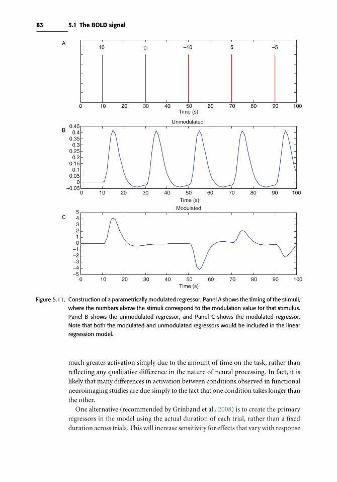
83 5.1 The BOLD signal
0 10 20 30 40 50 60 70 80 90 100Time (s)
0 10 20 30 40 50 60 70 80 90 100−0.05
00.050.1
0.150.2
0.250.3
0.350.4
0.45
Time (s)
Unmodulated
0 10 20 30 40 50 60 70 80 90 100−5−4−3−2−1
012345
Time (s)
Modulated
10 0 –10 5 –5A
B
C
Figure 5.11. Construction of a parametrically modulated regressor. Panel A shows the timing of the stimuli,
where the numbers above the stimuli correspond to the modulation value for that stimulus.
Panel B shows the unmodulated regressor, and Panel C shows the modulated regressor.
Note that both the modulated and unmodulated regressors would be included in the linear
regression model.
much greater activation simply due to the amount of time on the task, rather than
reflecting any qualitative difference in the nature of neural processing. In fact, it is
likely that many differences in activation between conditions observed in functional
neuroimaging studies are due simply to the fact that one condition takes longer than
the other.
One alternative (recommended by Grinband et al., 2008) is to create the primary
regressors in the model using the actual duration of each trial, rather than a fixed
duration across trials. This will increase sensitivity for effects that vary with response

84 Statistical modeling: Single subject analysis
time but will decrease sensitivity for effects that are constant across trials. A second
alternative, which we prefer, is to create the primary regressor using a constant
duration, but then include an additional parametric regressor that varies according
to response time. This will ensure that the effects of response time are removed from
the model and also allows the separate interrogation of constant effects and effects
that vary with response time.
Modelingmotion parameters. As described in Section 3.6, head motion during the
scan can cause artifacts in the data even after applying image registration methods.
As a result, it is a good idea to include motion regressors in the model to account for
artifacts and motion-related variance. This is done by including the six time courses
of the translation and rotation parameters as nuisance regressors in the model. The
term nuisance is used to describe regressors that are included in the model to pick
up extra variability in the data when there is no interest in carrying out inference
on the corresponding parameters. Additionally, it is often beneficial to include the
derivatives of the motion parameters, as they can help model motion-related noise
and spikes in the data.
Generally we expect that the inclusion of motion regressors will reduce error vari-
ance and improve detection power. However, if the motion is correlated with the
task, inclusion of the motion regressors may eliminate significant regions seen other-
wise. This is because the GLM bases the significance of experimental effects only on
the variability uniquely attributable to experimental sources. When such variability
is indistinguishable between motion and experimental sources, the significance of
the results is reduced, which prevents movement-induced false positives.
Orthogonalization. A common occurrence in fMRI studies is to have a design that
includes regressors that are correlated with each other to some extent. For example,
if you were modeling the presentation of a stimulus as well as the subject’s response,
these two events occur in close proximity, and so the corresponding regressors in the
GLM will be highly correlated. The second panel of Figure 5.12 shows an example of
correlated regressors (r = 0.59), where the green time series represents the stimulus
presentation and the red time series models the subject’s response 2 seconds later.
As just mentioned, the GLM has an essential property in that only the variability
unique to a particular regressor drives the parameter estimate for that regressor. The
variability described by two regressors X1 and X2 can be thought of as having three
portions, that unique to X1, that unique to X2, and the shared variability. In cases
where two regressors are orthogonal (uncorrelated), there is no shared variability
component, whereas when they are highly correlated, the unique portion for each
regressor is small. This results in unstable and highly variable parameter estimates,
which leads to a loss of statistical power.
The data in the top panel of Figure 5.12 contains stimulus- and response-related
effects; the second panel of Figure 5.12 shows the model and t-statistics for the
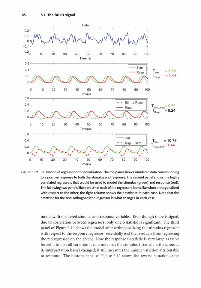
85 5.1 The BOLD signal
0 10 20 30 40 50 60 70 80 90 100−0.2
−0.1
0
0.1
0.2
Time (s)
Data
0 10 20 30 40 50 60 70 80 90 100
0
0.2
0.4
0.6
Time(s)
0 10 20 30 40 50 60 70 80 90 100
0
0.2
0.4
0.6
Time(s)
0 10 20 30 40 50 60 70 80 90 100
0
0.2
0.4
0.6
Time(s)
Stim
Resp
Stim ⊥ Resp
Resp
Stim
Resp ⊥ Stim
TStim = 5.75TResp = 1.44
TStim ⊥ Resp = 5.75TResp = 9.24
TStim = 10.78TResp ⊥ Stim= 1.44
Figure 5.12. Illustration of regressor orthogonalization. The top panel shows simulated data corresponding
to a positive response to both the stimulus and response. The second panel shows the highly
correlated regressors that would be used to model the stimulus (green) and response (red).
The following two panels illustrate what each of the regressors looks like when orthogonalized
with respect to the other; the right column shows the t-statistics in each case. Note that the
t-statistic for the non-orthogonalized regressor is what changes in each case.
model with unaltered simulus and response variables. Even though there is signal,
due to correlation between regressors, only one t-statistic is significant. The third
panel of Figure 5.12 shows the model after orthogonalizing the stimulus regressor
with respect to the response regressor (essentially just the residuals from regressing
the red regressor on the green). Now the response t-statistic is very large as we’ve
forced it to take all variation it can; note that the stimulus t-statistic is the same, as
its interpretation hasn’t changed; it still measures the unique variation attributable
to response. The bottom panel of Figure 5.12 shows the reverse situation, after

86 Statistical modeling: Single subject analysis
orthogonalizing the response regressor with respect to the stimulus regressor. Now
the response t-statistic is very large, and the stimulus regressor’s t-statistic matches
its original value.
It is because of the arbitrary apportionment of variabilty and signficance just
demonstrated that we normally recommend against orthogonalization. Only in
cases where variables are clearly serving a supplementary role should orthogonaliza-
tion be used. For example, when a canonical pluse temporal derivative HRF basis is
used, the temporal derivative regressor is orthogonalized with respect to the canon-
ical regressor. This is appropriate because the temporal derivative is only present
to reduce error variance, and any shared experimental variance between the two
regressors can safely be attributed to the first regressor.
5.2 The BOLD noise
The previous section described how the BOLD signal is modeled, and this section
focuses on the other type of variability in the data, the noise. In general the term noise
is used to describe any variability in the data that is not related to the experimental
design. There are two categories of noise. One type iswhite noise, which is broadband
and not focused at any particular frequencies. The other, referred to as structured
noise, reflects coherent sources of variability such as physiological fluctuations that
occur at particular frequencies, and thus is colored noise. By characterizing the
structure of the noise, it can be incorporated into the GLM, improving the fit of the
model. Structured noise can result in violations of the assumption of the GLM that
observations are not correlated, and false positive rates may increase if it is ignored.
5.2.1 Characterizing the noise
The most obvious characteristic of noise in BOLD fMRI data is the presence of low-
frequency drift. Figure 5.13 shows an example of drift in an fMRI time series in both
the time domain (left) and the power spectrum in the Fourier domain (right). The
power spectrum is acquired by taking the Fourier transform of the time series; theX
axis of the plot refers to different frequencies, whereas the Y axis refers to the power,
or strength, of this frequency in the data. For example, this voxel is active, and since
the frequency of the stimulus is one cycle every 40 seconds, there is a spike in the
power spectrum at 1/40 seconds = 0.025 Hz. This time series also exhibits a slowly
increasing trend in the time domain, which, since it is low frequency, contributes
to the power at lower frequencies of the power spectrum. The shape of the power
spectrum is often referred to as the 1/f, or inverse frequency, function (Zarahn et al.,
1997).
Initially the source of the 1/f noise structure in fMRI data was not clear. The noise
structure was studied in great detail by Aguirre et al. (1997) and Zarahn et al. (1997)
in both humans and water phantoms to determine whether the 1/f noise was physi-
ologic or due to the scanner. Additionally, they examined a variety of computers and
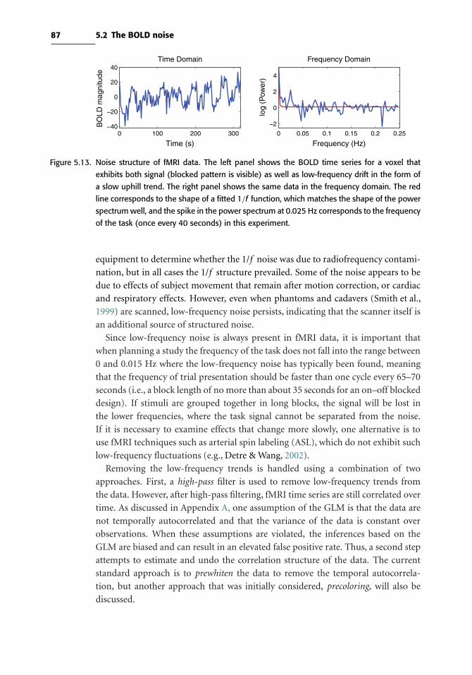
87 5.2 The BOLD noise
0 100 200 300−40
−20
0
20
40
Time (s)
BO
LD m
agni
tude
Time Domain
0 0.05 0.1 0.15 0.2 0.25
−2
0
2
4
Frequency (Hz)
log
(Pow
er)
Frequency Domain
Figure 5.13. Noise structure of fMRI data. The left panel shows the BOLD time series for a voxel that
exhibits both signal (blocked pattern is visible) as well as low-frequency drift in the form of
a slow uphill trend. The right panel shows the same data in the frequency domain. The red
line corresponds to the shape of a fitted 1/f function, which matches the shape of the power
spectrumwell, and the spike in the power spectrum at 0.025 Hz corresponds to the frequency
of the task (once every 40 seconds) in this experiment.
equipment to determine whether the 1/f noise was due to radiofrequency contami-
nation, but in all cases the 1/f structure prevailed. Some of the noise appears to be
due to effects of subject movement that remain after motion correction, or cardiac
and respiratory effects. However, even when phantoms and cadavers (Smith et al.,
1999) are scanned, low-frequency noise persists, indicating that the scanner itself is
an additional source of structured noise.
Since low-frequency noise is always present in fMRI data, it is important that
when planning a study the frequency of the task does not fall into the range between
0 and 0.015 Hz where the low-frequency noise has typically been found, meaning
that the frequency of trial presentation should be faster than one cycle every 65–70
seconds (i.e., a block length of no more than about 35 seconds for an on–off blocked
design). If stimuli are grouped together in long blocks, the signal will be lost in
the lower frequencies, where the task signal cannot be separated from the noise.
If it is necessary to examine effects that change more slowly, one alternative is to
use fMRI techniques such as arterial spin labeling (ASL), which do not exhibit such
low-frequency fluctuations (e.g., Detre & Wang, 2002).
Removing the low-frequency trends is handled using a combination of two
approaches. First, a high-pass filter is used to remove low-frequency trends from
the data. However, after high-pass filtering, fMRI time series are still correlated over
time. As discussed in Appendix A, one assumption of the GLM is that the data are
not temporally autocorrelated and that the variance of the data is constant over
observations. When these assumptions are violated, the inferences based on the
GLM are biased and can result in an elevated false positive rate. Thus, a second step
attempts to estimate and undo the correlation structure of the data. The current
standard approach is to prewhiten the data to remove the temporal autocorrela-
tion, but another approach that was initially considered, precoloring, will also be
discussed.

88 Statistical modeling: Single subject analysis
5.2.2 High-pass filtering
The most common approach for removing low-frequency trends is to apply what is
known as a high-pass filter. One approach of high-pass filtering is to add a discrete
cosine transform (DCT) basis set to the design matrix, such as the example shown
in Figure 5.14. Figure 5.15 shows the original time series (top) and fit of the DCT
basis functions to the data (green). The middle panel shows the original time series
(blue) and the high-pass filtered time series using the DCT basis set (green), and the
bottom panel shows the same, but in the Fourier domain. After high-pass filtering,
the drifting at the beginning and end of the time series is removed. When using a
DCT basis set, the highest frequency cosine function that should be included would
correspond to the highest frequency that is desired to be removed from the data,
which is chosen to avoid the frequency of the experimental task that is also being
modeled. As a rough rule of thumb, the longest period of the drift DCT basis should
be at least twice the period of an on–off block design.
Another approach to removing the low-frequency drift, which is used by the FSL
software package, is to fit a locally weighted scatterplot smoothing, or LOWESS,
model to the time series and remove the estimated trend from the data. A LOWESS
model fits a local linear regression over a window of the data weighting points in the
middle of the window rather than around the edges, for example using a gaussian
function as a weight. For details on the LOWESS model, see Cleveland (1979). The
result is that the low-frequency trends in the data are picked up by the LOWESS fit,
as shown in the top panel of Figure 5.15 (red). After this trend is fit to the data, it
is subtracted, resulting in a high-pass filtered data set shown in the middle panel of
Figure 5.15. The larger the window, the higher the frequencies that are filtered out
of the data, so the window should be chosen to only remove frequencies in the low
end of the spectrum far from the frequency of the task. Figure 5.15 shows that in the
time domain, the DCT basis function and LOWESS approaches yield very similar
results. In the spectral domain, however, the power of the data filtered using the
DCT basis set drops to 0 as the frequency decreases, whereas the LOWESS fit has a
more gentle roll off as frequency decreases.
0 10 20 30 40 50 60 70 80 90 100−0.2
−0.1
0
0.1
0.2
Time (s)
Figure 5.14. Discrete cosine transform basis set. The five lines correspond to the first five discrete cosine
transform basis functions, starting with a constant term and then increasing the frequency of
the cosine by a half period with each additional curve.
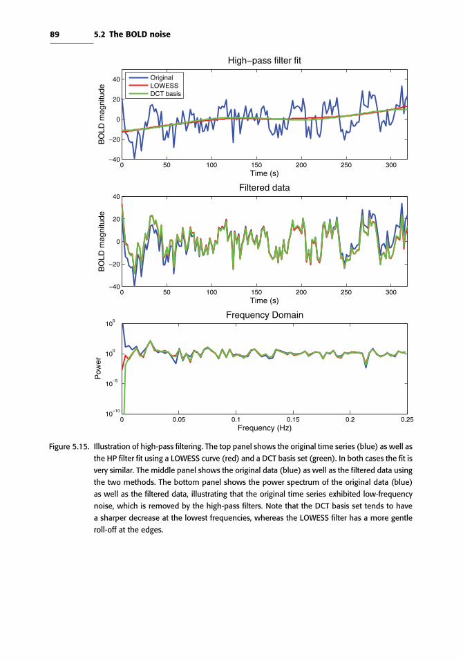
89 5.2 The BOLD noise
0 50 100 150 200 250 300−40
−20
0
20
40
Time (s)
BO
LD m
agni
tude
High−pass filter fit
0 50 100 150 200 250 300−40
−20
0
20
40
Time (s)
BO
LD m
agni
tude
Filtered data
0 0.05 0.1 0.15 0.2 0.2510
−10
10−5
100
105
Frequency (Hz)
Pow
er
Frequency Domain
OriginalLOWESSDCT basis
Figure 5.15. Illustration of high-pass filtering. The top panel shows the original time series (blue) as well as
the HP filter fit using a LOWESS curve (red) and a DCT basis set (green). In both cases the fit is
very similar. The middle panel shows the original data (blue) as well as the filtered data using
the two methods. The bottom panel shows the power spectrum of the original data (blue)
as well as the filtered data, illustrating that the original time series exhibited low-frequency
noise, which is removed by the high-pass filters. Note that the DCT basis set tends to have
a sharper decrease at the lowest frequencies, whereas the LOWESS filter has a more gentle
roll-off at the edges.
90 Statistical modeling: Single subject analysis
5.2.3 Prewhitening
After high-pass filtering, the fMRI time series are still temporally autocorrelated,
where the correlation increases as the temporal proximity of two data points
increases. As discussed in Appendix A, in order for the general linear model estimates
to be unbiased and have minimum variance among all unbiased estimators, a very
appealing quality in an estimate, the data going into the model cannot be correlated,
and the variance at each time point must be identical. When data are temporally
autocorrelated, prewhitening removes this correlation from the GLM prior to esti-
mation. The prewhitening process is generally carried out in two steps. In the first
step, the GLM is fit ignoring temporal autocorrelation to obtain the model residuals,
which is the original data with all modeled variability removed. The residuals are
then used to estimate the autocorrelation structure, and then model estimation is
carried out after prewhitening both the data and the design matrix. In general, the
GLM with the original data has the following form:
Y = Xβ + ε, (5.2)
where Y is the BOLD time series,X is the design matrix, β is the vector of parameter
estimates, and ε is the error variance, which is assumed to be normally distributed
with a mean of 0 and a covariance of σ 2V. The GLM estimates for β are only optimal
whenV is the identity matrix, but since the BOLD data are autocorrelated,V is not the
identity; it may have nonzero off-diagonal elements representing cross-correlation
and may have varying values along the diagonal, representing differences in variance
across time. Prewhitening involves finding a matrix,W, such thatWVW′ = IT, where
IT is an identity matrix with the same number of rows and columns as the time series.
Prewhitening involves premultiplying both sides of the GLM by W to give
WY = WXβ +Wε, (5.3)
where now the covariance of Wε is Cov(Wε) = σ 2WVW′ = σ 2IT. Therefore, the
whitened model has independent error terms, and the GLM estimates from this
model are optimal. More details can be found in Appendix A.
The reason for using the residuals is so that the prewhitening process only removes
temporal autocorrelation present in the data that is not related to the task of inter-
est; that is, it removes autocorrelation that is part of the noise rather than part
of the signal. Although this process is straightforward, it depends on the model
of the temporal autocorrelation being exactly correct. If the correlation is not
removed perfectly, the assumptions of the GLM that the data are uncorrelated with
equal variance for each time point will be violated, and hence inferences may be
biased.
91 5.2 The BOLD noise
There are different models for BOLD noise that have been found to describe the
correlation well. The simplest is known as the AR(1) model and simply assumes the
variance of each time point is 1, and the correlation between pairs of data points
decreases geometrically as the data are further apart (cor(yi ,yi+a) = ρa). A slightly
more complicated correlation model adds an additional variance parameter and
is known as the AR(1)+ white noise (AR(1) +WN ). The added variance is the
white noise. This is a special case of a more general correlation model known as
the autoregressive, moving average or ARMA model (Box et al., 2008). Specifically
the ARMA(1,1), which has one autoregressive parameter like the AR(1) with an
additional moving average parameter. All three of these correlation models fit well
to the 1/f trend found in the power spectra of fMRI time series. Another option
is to use an unstructured covariance estimate, where the correlation for each lag in
the time series is estimated separately. This tends to have more parameters than the
three parameter AR(1) +WN , making it less biased, but the correlation estimates
are less stable (more variable).
It is important that the correlation model used in fMRI strikes a balance between
having enough parameters to describe the correlation structure accurately, but not
having too many parameters, since this will cause the estimates to be more variable
due to a lack of degrees of freedom. If a modeling approach produces estimates that
are too variable, the typical solution to increase the degrees of freedom. Since the
degrees of freedom are roughly equal to the number of data points minus the num-
ber of parameters being estimated, they can be increased by either increasing the
amount of data (e.g., pooling data across multiple voxels) or decreasing the number
of parameters being estimated by using a simpler correlation model. One drawback
of estimating the temporal autocorrelation model by pooling across multiple voxels
is that the temporal autocorrelation structure is not exactly the same for all regions
of the brain (Worsley et al., 2002; Zarahn et al., 1997). Likewise, using only a few
parameters in the autocorrelation model may not capture the trend thoroughly. All
software packages use a combination of both of these tactics. In SPM , for example, a
simple AR(1)+WN model is fit globally, pooling information from all voxels found
to be significant in a preliminary fit. The model captures the correlation structure
well, and by using a global approach, the estimate is not highly variable. FSL, on the
other hand, uses a slightly different approach with an unstructured autocorrelation
estimate, meaning a nonparametric approach is used to estimate the correlation
for each lag of the time series. Instead of having a global estimate of the corre-
lation, FSL instead smoothes the correlation estimate spatially. Additionally, since
the correlations for high lags have very few time points, these estimates are highly
variable. To solve this issue, FSL uses a Tukey Taper, which smoothes the correlation
estimate in the spectral domain to the point where correlations at high lags are
set to 0. Typically around 6–12 parameters are used for this voxelwise correlation
estimation.

92 Statistical modeling: Single subject analysis
5.2.4 Precoloring
Whether fMRI time series should be whitened or, the opposite, temporally smoothed,
was at one point a contentious topic in the fMRI analysis literature. Even though
it is theoretically optimal, prewhitening was not commonly used intially. This was
in part due to inaccurate correlation models that gave biased variance estimates
and could inflate false positive risk (Friston et al., 2000). Temporal smoothing or
low-pass filtering, dubbed precoloring was initially considered as a better approach
to modeling temporal autocorrelation as it did not have the same problems with
bias that prewhitening had (prior to the employment of the regularization strategies
discussed above).
The general idea behind precoloring is that since we do not know the true structure
of the temporal autocorrelation, we impose more autocorrelation with a low-pass
filter. While strictly the autocorrelation in the data is now a combination of an
unknown intrinsic autocorrelation and the smoothing-induced autocorrelation, the
latter swamps the former, and we assume the autocorrelation is known and equal to
that from the low-pass filtering. With a known autocorrelation, the standard errors
and the degrees of freedom can then be adjusted to eliminate bias and produce valid
inferences. Figures 5.16 and 5.17 illustrate all types of filtering for blocked stimuli
and random stimuli, respectively. The top panels show the original data in the time
(left) and spectral (right) domains, the second and third panels show high-pass and
low-pass filtering, and the bottom panel show bandpass filtering, which is both high
and low-pass filtering. Bandpass filtering was introduced earlier (Section 2.4.2) in
terms of spatial filtering of fMRI data. Just as high-pass filtering the data removes
low-frequency trends in the data, low-pass filtering removes high-frequency trends
in the data.
The major problem with low-pass filtering the data is that in many fMRI experi-
ments the stimuli are presented in a random fashion, meaning that the signal covers a
wide range of frequencies, including some high-frequencies. When data are low-pass
filtered, the high-frequency components are removed from the data, which means
signal is being removed from the data. As Figure 5.16 shows with a block design,
since most of the power for the task is focused at lower frequencies, the high-pass
filter does not remove the task-based trends from the data. On the other hand, Figure
5.17 shows that in an event-related study, the power for the task is spread across a
wide range of frequencies and so the low-pass filter ends up removing some of the
task signal. Because of this and also due to the development of better regularization
approaches for prewhitening, precoloring is not a recommended solution for dealing
with temporal autocorrelation.
5.3 Study design and modeling strategies
Depending on what the investigator is interested in measuring, different study
designs and modeling strategies are required. On one end of the spectrum, the

93 5.3 Study design and modeling strategies
0 100 200 300
−20
0
20
Time (s)
BO
LD m
agni
tude
0 0.05 0.1 0.15 0.2 0.250
50
100
150
Frequency (Hz)
Pow
er
0 100 200 300
−20
0
20
Time (s)
BO
LD m
agni
tude
0 0.05 0.1 0.15 0.2 0.250
50
100
150
Frequency (Hz)P
ower
0 100 200 300
−20
−10
0
10
20
Time (s)
BO
LD m
agni
tude
0 0.05 0.1 0.15 0.2 0.250
50
100
150
Frequency (Hz)
Pow
er
0 100 200 300
−10
0
10
20
Time (s)
BO
LD m
agni
tude
0 0.05 0.1 0.15 0.2 0.250
50
100
150
Frequency (Hz)
Pow
er
HP
LP
BP
Figure 5.16. Illustration of different filtering approaches on data with blocked trials. The left column shows
the result in the time domain, and the right column, in the Fourier domain. The first row is
the original data followed by high-pass (HP), low-pass (LP), and bandpass (BP) filtered data,
respectively. When trials are blocked, most of the task-based frequency is focused at one point
(0.25 Hz in this case), while the rest is aliased to other frequencies. The HP filter removes
low-frequency drift, as shown before, whereas the LP filter removes high-frequency trends.
Applying both in the BP filtered case removes variability at both low and high frequencies but
preserves the bulk of the signal at 0.25 Hz.

94 Statistical modeling: Single subject analysis
0 100 200 300
−40
−20
0
20
40
Time (s)
BO
LD m
agni
tude
0 0.05 0.1 0.15 0.2 0.250
10
20
30
40
50
Frequency (Hz)
Pow
er
0 100 200 300
−20
0
20
Time (s)
BO
LD m
agni
tude
0 0.05 0.1 0.15 0.2 0.250
5
10
15
20
Frequency (Hz)P
ower
0 100 200 300
−20
0
20
Time (s)
BO
LD m
agni
tude
0 0.05 0.1 0.15 0.2 0.250
10
20
30
40
50
Frequency (Hz)
Pow
er
0 100 200 300
−10
−5
0
5
10
Time (s)
BO
LD m
agni
tude
0 0.05 0.1 0.15 0.2 0.250
5
10
15
20
Frequency (Hz)
Pow
er
HP
LP
BP
Figure 5.17. Illustration of different filtering approaches on data with randomly spaced trials. The left
column shows the result in the time domain, and the right column, in the Fourier domain.
The first row is the original data followed by high-pass (HP), low-pass (LP), and bandpass
(BP) filtered data, respectively. Since the trials are spaced randomly in time, the task energy
is spread over a wide range of higher frequencies. In the LP-filtered case, only low-frequency
noise is removed, but in the LP and BP filtered cases, much of the higher frequency signal is
removed by the filter, which will have a negative impact on our GLM inferences since there
is little signal left to detect.

95 5.3 Study design and modeling strategies
investigator may only be interested in detecting and estimating the magnitude of
activation (referred to as detection). On the other hand, the investigator may be
interested in estimating the precise shape of the hemodynamic response associated
with the task (referred to as estimation). Not only are different models required to
test each of these hypothesis, but different study designs are more appropriate for
testing each; in fact, as we will see later, designs that are optimized to test for one
of them will in general be relatively poor at testing the other. Additionally, when
multiple task types are present in a study, some study designs are more optimal than
others. These issues will be discussed in the following sections.
5.3.1 Study design: Estimation and detection
Imagine you have a small pile of sand on your kitchen floor (the size of a handful).
From a distance it is easy to deduce that there is indeed a pile of sand on your floor.
If you kneel down and look very closely at the sand without touching it you would
be able to see the shapes of some of the granules that were on the outside of the
pile, but you cannot study the shape of the granules in the middle. In this case we
would say our ability to detect the presence of sand was quite high, but our ability
to estimate the shape of the granules of the sand was not as good. Now imagine that
you spread the sand around on the floor with your hand. Once it is spread out, you
can look closely and see almost every side of each granule of sand and you can gather
more information on the shape of the individual granule. On the other hand, if you
stood up and backed away, it would not be as easy to detect that there was sand on
the floor and where, specifically, the sand was. So, in this case our ability to estimate
the shape is good, but our detection ability is poor.
This analogy can also be applied to trials in an fMRI experiment. If the investigator
is mostly concerned with detecting the presence of a response, the best way to ensure
this is to block the trials together. Note, when this is done, we only get a little bit of
information about the shape of the HRF from the few trials at the beginning and the
end of the block, whereas the ones in the middle do not tell us anything about the
shape but do contribute to the ability to detect the response. On the other hand, if
we separate the trials with a little bit of time, it is much easier to capture the specific
shape of the HRF from our data. Note that if the trials have too much time between
them and occur at regular intervals, there won’t be enough trials to estimate the
HRF shape very well, and the study will be very boring for the test subject, which
will decrease the quality of the data. The solution is to use randomly spaced trials.
The GLM model is able to pick out the shape of the HRF through the FIR model,
or other models described in Section 5.1.2, and since more trials are included the
estimates will be less variable.
To strike a balance between estimation and detection, one suggestion is to use a
semi-random design, which can be constructed by starting with the trials blocked
and then randomly moving trials to break up the blocked shape (Liu et al., 2001).
It should be noted that if a design has trials that are blocked as well as randomly

96 Statistical modeling: Single subject analysis
spaced, the blocked trials should be modeled separate from the spaced trials. This is
because the mental processes for separated stimuli may be different than when the
stimuli are rapidly presented and so the interpretation of the two types of stimulus
presentation differ.
5.3.2 Study design: Multiple stimulus types
The previous section primarily concerns a study where there is only a single type of
stimulus presented, but in most cases two or more stimulus or trial types are involved,
and then it must be determined what order these stimuli will be presented and how
much time will be between each stimulus. In some cases, the order of the stimuli is
fixed, for example when a cue is given followed by a stimulus that the subject then
responds to, the events always occur in the order of cue, stimulus, response. When
regressors in a GLM are highly correlated, the estimates of the parameters are quite
unstable and hence highly variable. Another way of stating that an estimate has high
variability is to say it has low efficiency. Efficiency is calculated as the inverse of the
parameter estimate’s variance. In general, if the design matrix is given by X and
if β is the vector of parameters to be estimated in the GLM, the covariance of the
parameter estimates is given by
Cov(β
) = (X′X)−1σ 2 (5.4)
where σ 2 is the error variance. (Here we neglect the whitening, but the equation
still works if we replace X with WX.) Design efficiency typically only refers to the
variance due to the design, or (X′X)−1, so for a given contrast of parameters, c, the
efficiency for that contrast is defined as
eff(cβ
) = 1
c(X′X)−1c′ (5.5)
In the simplest case, if there were two parameters in the model and the interest was
in the efficiency of the first parameter, β1 (corresponding to H0 : β1 = 0) and so the
contrast would be c = [1 0]. There is not a meaningful cutoff for an acceptable level
of efficiency, but instead the efficiencies for a variety of models can be estimated
and then the most efficient model would be chosen. A measure related to efficiency
with a more meaningful cutoff is the power of a statistical test. Since this calculation
requires knowledge of σ 2, it is more complicated to estimate and isn’t necessary
if one simply wants to rank designs to choose the most efficient one, since the
most efficient design will by default also have the highest power. A more detailed
description of statistical power for fMRI studies is given in Chapter 6.
The top panel of Figure 5.18 shows an example of two correlated regressors, where
the timing for one stimulus (blue) always occurs 6 seconds prior to the presentation
of a second stimulus (green). In this case, the correlation between the two regressors
is very high (corr = −0.61), meaning the estimates of the parameters corresponding

97 5.3 Study design and modeling strategies
0 20 40 60 80 100 120 140 160 180 200−0.2
0
0.2
0.4
0.6
Time (s)
Fixed time = 6s
0 20 40 60 80 100 120 140 160 180 200−0.2
0
0.2
0.4
0.6
Time (s)
Random time between 1 and 11 s
Figure 5.18. How jittering can improve model fit. In the top panel, the time between the first stimulus
(blue) and the second (green) is always fixed at 6 seconds, whereas in the bottom panel
the time between stimuli is randomly chosen between 1 and 10 seconds (so on average it is
6-seconds). The regressors in the top panel aremore highly correlated (corr= −0.61); the cor-relation between regressors in the bottom panel is much smaller inmagnitude (corr= −0.15).As a result, the design in the bottom panel is more efficient at estimating the magnitudes of
each stimulus.
to each trial type are highly variable. The value of (X′X)−1 for this fixed ISI design
(XF ) is given by (X′FXF
)−1 =(
0.5632 0.3465
0.3465 0.5703
)(5.6)
so the efficiency for estimating β1 (corresponding to the blue stimulus) would be1
0.5632 = 1.76 and the efficiency for estimating β2 (corresponding to the green stimu-
lus) is 10.5703 = 1.75. In the bottom panel of Figure 5.18, the time between the the first
stimulus, and the second stimulus is jittered randomly, where the timing is sampled
from a uniform distribution ranging between 1 and 11 seconds. Note, on average,
the timing between the first and second trial types is equivalent to what is shown
in the top panel (6 seconds). In this case, the correlation between regressors has a
smaller magnitude of −0.15, and therefore the estimates for the parameters for each
trial type are much less variable. In this case the model variance corresponding to
the jittered design, XJ , is given by
(X′JXJ
)−1 =(
0.3606 0.0602
0.0602 0.4640
)(5.7)
Note the off-diagonal entries, corresponding to the covariance, are much smaller
in this case, and the diagonal elements, corresponding to the variances, are much
smaller since there is less collinearity between the regressors. The efficiency for

98 Statistical modeling: Single subject analysis
estimating β1 would be 10.3606 = 2.77 and the efficiency for estimating β2 is 1
0.4640 =2.16. Compared to the efficiencies of the fixed ISI designs, this random ISI design is
57% more efficient in estimating β1 and 23% more efficient in estimating β2. This
relates back to the earlier discussion about orthogonality, since in the fixed ISI design
regressors are correlated, there is little unique variance for each regressor to be used
to estimate the corresponding parameter and hence the efficiency is lower.
5.3.3 Optimizing fMRI designs
When developing a new study design, one must consider a variety of designs and
look at both the estimation and detection abilities of those designs and choose
the design that is most suitable for the purposes of the study. Additionally, it is
important to consider the psychological factors of the experiment. If the ordering of
the stimuli is easy to predict there will be problems with habituation of the subject to
the task. As more trial types are added to the study the number of possible designs,
including different orderings of stimuli and timings between stimuli, is quite large
and searching over all designs and checking the estimation and detection abilities
of each is not a feasible task. Instead, it is helpful to develop a search algorithm
that methodically chooses designs. The simplest example of a search algortithm is
that of the permuted block design (Liu, 2004). As described earlier, when trials are
blocked, the ability to detect the activation corresponding to the blocked stimuli is
quite great, but the ability to estimate the shape of the HRF is not great. Additionally,
blocked stimuli may not be psychologically interesting for the investigator to study.
The permuted block design starts with the stimuli blocked by task type and then TRs
are randomly chosen and the stimuli in the TRs are swapped, hence breaking up the
blockiness of the design. This is then repeated, and after many iterations the stimuli
will be randomly ordered, corresponding to a design where detection has decreased
(from the original block design) and estimation of the HRF has increased. Designs
along the continuum can be selected for the study, depending on the desired amount
of detection and estimation, while keeping the study interesting for the subject.
Another approach to selecting the ordering of stimuli in an experiment is to use
what are called maximal length sequences, or M-sequences (Liu & Frank, 2004; Liu,
2004). M-sequences are series of 0s and 1s that are maximally uncorrelated with
shifted versions of themselves. Since an FIR model is nothing more than multiple
copies of the stimulus stick functions shifted in time, this means that M-sequences
will produces FIR models with covariates that have the least amount of correlation
between them as possible, which will lead to highly efficient estimates of each lag of
the FIR model. This also means that M-sequences are ideal for estimating the shape
of the HRF, but not necessarily very good at building designs with high detection
power for an assumed canonical HRF.
So far the discussion of optimal designs has not mentioned psychological factors of
the design, like predictability and counterbalancing, and other arbitrary constraints

99 5.3 Study design and modeling strategies
on the design, like ensuring that equal number of trials are presented for different trial
types. Instead of just optimizing statistical properties, by maximizing a cost function
that is a combination of different design “fitness” properties, designs that have good
efficiency and psychological properties can be found. The cost function will be quite
complicated, however, making traditional optimization methods challenging. This
has motivated the use of evolutionary or “genetic algorithms” for finding event-
related fMRI designs that maximize arbitrary fitness criterion (Wager & Nichols,
2003). Recent work has improved upon this approach by using M-sequences to find
good initial guesses of designs (Kao et al., 2009).

6
Statistical modeling: Group analysis
Whereas the previous chapter focused on analyzing the data from a single run for a
single subject, this chapter focuses on how we combine the single subject results to
obtain group results and test group hypotheses. The most important consideration
of the group fMRI model is that it accounts for the so-called repeated measures
aspect of the data, which means that subjects are randomly sampled from a larger
population, and multiple fMRI measurements are obtained for each subject. If the
proper model is not used, inferences will only apply to the particular subjects in the
study, as opposed to the population from which they were sampled. In general, it is
important that subjects are treated as random effects in the model, which is known
as a mixed effects model. The difference between treating subjects as random versus
fixed quantities is discussed in the following section.
6.1 The mixed effects model
6.1.1 MotivationTo motivate the need for a mixed effects analysis, we use a simple example from
outside of the imaging domain. Instead of measuring brain activity for a subject,
imagine that we measure hair length. The goal is to see if there is a difference in the
length of hair between men and women and since we clearly cannot measure hair
length on all people we randomly sample from the population. Once we know the
distributions of hair length for men and women, they can be compared statistically
to see if there is a difference.
The experiment begins by randomly selecting four men and four women. Note
within each group hair length has two sources of variability: variability of hair length
across different hairs from a single person and variability in the length of hair across
people due to their different hair cuts. Let σ 2W be the within-subject variance and σ 2
B
is between subject variance.
100

101 6.1 The mixed effects model
The top eight distributions in Figure 6.1 show the hair length distributions for
the four men and four women. Precisely, these distributions describe the relative
frequency of hair length of a randomly selected hair from a single individual. Here
we have assumed that the variation of a given individual’s hair length is 1 inch
(σ 2W = 1 ).
If our population of interest is precisely these eight men and women, then
between-subject variation can be neglected, and a fixed effects analysis can be
used. Precisely, the question to be answered is: How does the hair length of these
particular four men compare to that of these particular four women? For the sake of
illustration, let’s assume we sample only a single hair from each subject, for a total
of four hairs within each gender group. Then the fixed effects variance of the aver-
age hair length in each gender is σ 2FFX = 1
4σ 2W = 0.25 inches squared. The resulting
fixed effects distributions with variance σ 2FFX, are shown in Figure 6.1, below the
individuals’ distributions.
Recall that our initial goal was to study the hair length differences between all men
and all women, not just those in our sample as described in the previous paragraph.
To extrapolate to the population of all people, we need something that describes the
distrubution of hair length across all people. This is accomplished by additionally
including the between-subject variance, σ 2B , which describes the variability of hair
length across people. When the between-subject variance is modeled separately from
the within-subject variance, it is typically described as treating the subjects as being
randomly sampled from the population, or treating the subject as a random effect.
This type of modeling strategy is more generally referred to as a mixed model.
0 2 4 6 8 10 12 14 16Hair Length (inches)
Female 1
Female 2
Female 3
Female 4
Male 1
Male 2
Male 3
Male 4
Fixed effects
Mixed effects
Figure 6.1. Comparison of fixed and mixed effects analysis. The blue and pink distributions correspond to
males and females, respectively. The top eight distributions are subject-specific distributions,
followed by the group distributions stemming from fixed effects and mixed effects analysis.
The vertical lines indicate the sample means for the two groups.

102 Statistical modeling: Group analysis
Assuming σ 2B = 49 inches squared is the between-subject variability in hair length,
the total mixed effects variance for each subject is the sum of the two variabilities,
σ 2W + σ 2
B . Then the total mixed effects variance for the average hair length within
each group (again assuming only a single hair has been sample from each subject)
is σ 2MFX = σ 2
W /4 + σ 2B/4 = 1/4 + 49/4 = 12.5. The corresponding mixed effects
distribution is shown in the bottom panel of 6.1. Note that if the fixed effects
distributions were wrongly used to make a conclusion about all men and women,
they would show that males have shorter hair than females, since the distributions
have very little overlap. In fact, the mixed effects distributions show considerable
overlap, and we would not, based on this small sample, be able to conclude that men
and women have different hair length.
One simplification here is that we only measured one hair per person. It would
be better to randomly select multiple hairs, measure each, and average. If we instead
had measured 25 hairs per person, then the distribution of each subject’s average
would have variance σ 2W /25; for the fixed effect distribution σ 2
FFX = 14σ 2W /25 = 0.01
and for the mixed effects distribution σ 2MFX = 1
4σ 2W /25+ 1
4σ 2B = 12.26. Observe that,
since σ 2B is so much larger than σ 2
W , increasing intrasubject precision (by sampling
more hairs from each individual) has little impact on the mixed effects variance.
Returning to fMRI, the basic issues are essentially the same. Instead of measuring
multiple hairs, we are measuring the brain activation at a particular brain location
multiple times. In group fMRI studies, most often the interest is in making conclu-
sions about populations and not specific subjects and hence a mixed effects method
is necessary to obtain valid inferences from group fMRI data.
6.1.2 Mixed effects modeling approach used in fMRI
The mixed effects model for fMRI is carried out in multiple stages. We will start by
assuming that each subject has a single run of fMRI data and that there are multiple
subjects. The subjects belong to one of two groups, and the goal of the study is to
see whether the activation difference when viewing faces versus houses is different
between the two groups (patients and controls). In this case, there are two levels in
the model. The first level involves modeling the data for each subject separately; the
output of this model is subject-specific estimates of the faces–houses contrast and
within-subject variance estimates for this contrast. The left side of Figure 6.2 shows
an example of what the first-level model and the corresponding contrasts would
look like for testing faces–houses. In these illustrations, it is assumed that the mean
of the data and the regressors in the first-level design are 0 and hence an intercept
term (column of 1s) is not needed. The second-level model then takes as input
the subject-specific parameter estimates and variance estimates from the first-level
model. In the example in the right panel Figure 6.2 the group model includes 12
subjects, with 6 subjects from each of two groups. The model estimates a mean for
each group and the contrast tests whether the faces–houses activation is stronger in
the first group relative to the second group and is an example of a two-sample t -test.

103 6.1 The mixed effects model
H0:
Level 1 model for subject k
H0:
Level 2 model for comparing group 1 to group 2
Figure 6.2. Illustration of the two-stage mixed modeling approach used for fMRI data. The first stage (left)
models a single subject’s data and the second stage (right) combines the single subject esti-
mates (in this case, six subjects in each of two groups) in a two-sample t-test. The hypothesis
of interest is whether activation to visual stimuli of faces versus houses is greater in group 1
versus group 2. The first-stage model estimates the faces–houses (βkfaces − βkhouses) for each
subject and then this contrast for each of 12 subjects comprises the dependent variable in the
group model. The group model design matrix has a regressor for the mean of groups 1 and
2 in the first and second columns, respectively; therefore βG1 and βG2 represent the means
for each group.
See the end of Appendix A for a review of how to set up a wide variety of models
using the GLM, including linear regression, one-sample t -tests, two-sample t -tests,
paired t -tests, ANOVA, ANCOVA, and repeated measures ANOVA.
The first-level model estimation is carried out as described in the previous chapter.
Recall from the previous section that a proper mixed effects model accounts for both
within- and between-subject sources of variability. The first-level model supplies us
with the within-subject variance estimate and the between-subject variance is esti-
mated in the second-level analysis. There are two different approaches to estimating
the between-subject variance used in fMRI software. The most involved approach
accounts for the between-subject variance while simultaneously estimating the vari-
ance between subjects. This is typically done in an iterative fashion, where the
group mean and between-subject variance are alternatively estimated, for details see
Worsley et al. (2002) and Woolrich et al. (2004b). In the end, the overall variance
for a subject, j , is defined by σ 2Wj
+ σ 2B , where σ 2
Wjis the first-level within-subject
variance for subject j and σ 2B is the between-subject variance, which is identical for
all subjects. The intrasubject variance σ 2Wj
is known from the relatively precise esti-
mates obtained at the first-level model, whereas σ 2B must be estimated at the second
level, generally on the basis of many fewer observations.

104 Statistical modeling: Group analysis
Since each subject’s mixed effects variance will likely be different, the weighted
linear regression approach described in Appendix A is used, where (σ 2Wj
+ σ 2B)
−1/2
is used as a weight for that subject j ’s data. The essential feature of this approach
is that “bad” subjects, those with relatively high σ 2Wj
, are down-weighted relative to
“good” subjects.
The other approach to estimating the mixed model requires making a simplify-
ing assumption, that the within-subject variances are identical across subjects; this
approach allows ordinary least squares (OLS)model estimation to be used. The OLS
model assumes that all of the σ 2Wj
are the same, in which case the mixed effects vari-
ance is greatly simplified. Let σ 2W be the common within-subject variance across all
subjects, then the mixed effects variance is given by σ 2W +σ 2
B . Since this value is the
same across all subjects, we can just express it as σ 2MFX , a single variance parameter,
and OLS will estimate this quantity as the residual variance. In our earlier example
of calculating difference in means of the faces–houses contrast, this means that in
our group model we are assuming we have a set of observations from a normal dis-
tribution with variance σ 2MFX , which simply boils down to carrying out a standard
two-sample t -test on the first-level contrast estimates across subjects. In other words,
the mean and variance in this model are calculated just as you would in a two-sample
t -test. This greatly reduces the computation time for the model estimation, since it
is no longer necessary to use iterative methods.
The only downside to this model is that, in practice, the σ 2Wj
will never be exactly
equal over subjects. Perhaps the subject wasn’t paying attention or moved a lot in the
scanner, increasing the variability of the data compared to other subjects. Also, in
many experiments, the number of trials is dependent on the subject’s response, and
one subject may have very few correct trials and another subject having almost all
correct trials. Fortunately, for single-group comparisons, it doesn’t make much dif-
ference whether OLS or GLS is used at the second level (Mumford & Nichols, 2009).
However, if two groups or more are compared, or a second-level regression with a
covariate is used, OLS and GLS may give different answers and GLS is to be preferred.
See Box 6.1.2 for details on how different software packages fit second-level models.
6.1.3 Fixed effects modelsThe fixed effects model was described at the beginning of this chapter and only uses
the within-subject variance, σ 2W . The most common use of a fixed effects model is
when each subject has multiple runs of data and the runs need to be combined. In
this case, the model estimation has three levels: single run, single subject, and group.
The single run analysis (first level) is carried out as described in the previous chapter,
the single subject analysis (second level) amounts to a weighted average of the first-
level effects, and the group analysis (third level) is estimated as discussed in the
previous section. Precisely, the second-level analysis combines the per run estimates
using a fixed effects model, which is a weighted linear regression with weights simply
given by the inverse of the within-run standard deviations that were estimated in
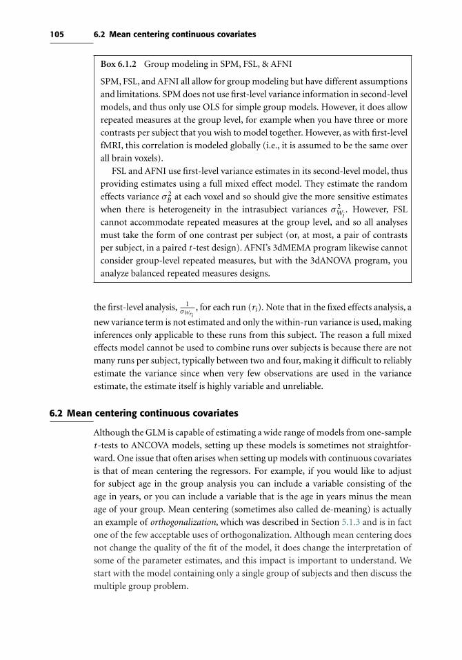
105 6.2 Mean centering continuous covariates
Box 6.1.2 Group modeling in SPM, FSL, & AFNI
SPM, FSL, and AFNI all allow for group modeling but have different assumptions
and limitations. SPM does not use first-level variance information in second-level
models, and thus only use OLS for simple group models. However, it does allow
repeated measures at the group level, for example when you have three or more
contrasts per subject that you wish to model together. However, as with first-level
fMRI, this correlation is modeled globally (i.e., it is assumed to be the same over
all brain voxels).
FSL and AFNI use first-level variance estimates in its second-level model, thus
providing estimates using a full mixed effect model. They estimate the random
effects variance σ 2B at each voxel and so should give the more sensitive estimates
when there is heterogeneity in the intrasubject variances σ 2Wj
. However, FSL
cannot accommodate repeated measures at the group level, and so all analyses
must take the form of one contrast per subject (or, at most, a pair of contrasts
per subject, in a paired t -test design). AFNI’s 3dMEMA program likewise cannot
consider group-level repeated measures, but with the 3dANOVA program, you
analyze balanced repeated measures designs.
the first-level analysis, 1σWri
, for each run (ri). Note that in the fixed effects analysis, a
new variance term is not estimated and only the within-run variance is used, making
inferences only applicable to these runs from this subject. The reason a full mixed
effects model cannot be used to combine runs over subjects is because there are not
many runs per subject, typically between two and four, making it difficult to reliably
estimate the variance since when very few observations are used in the variance
estimate, the estimate itself is highly variable and unreliable.
6.2 Mean centering continuous covariates
Although the GLM is capable of estimating a wide range of models from one-sample
t -tests to ANCOVA models, setting up these models is sometimes not straightfor-
ward. One issue that often arises when setting up models with continuous covariates
is that of mean centering the regressors. For example, if you would like to adjust
for subject age in the group analysis you can include a variable consisting of the
age in years, or you can include a variable that is the age in years minus the mean
age of your group. Mean centering (sometimes also called de-meaning) is actually
an example of orthogonalization, which was described in Section 5.1.3 and is in fact
one of the few acceptable uses of orthogonalization. Although mean centering does
not change the quality of the fit of the model, it does change the interpretation of
some of the parameter estimates, and this impact is important to understand. We
start with the model containing only a single group of subjects and then discuss the
multiple group problem.

106 Statistical modeling: Group analysis
−4 −2 0 2 4 6 8 10 12−0.2
−0.1
0
0.1
0.2
0.3
0.4
0.5
0.6
0.7B
OLD
act
ivat
ion
Age (years)−4 −2 0 2 4 6 8 10 12
−0.2
−0.1
0
0.1
0.2
0.3
0.4
0.5
0.6
0.7
BO
LD a
ctiv
atio
n
Age−mean(Age) (years)
β0
β1
β0
β1
^
^
^
^
Figure 6.3. Simple linear regression fit before (left) and after (right) mean centering the continuous
covariate, Age. In both cases the slope of the line, β1, is identical, but after age is demeaned,
this shifts the data so that the Y intercept of the linear fit is the overall mean of the dependent
variable (BOLD activation).
6.2.1 Single group
It is easiest to understand the impact of mean centering a covariate in the case of
a simple linear regression. For example, assume the model includes the intercept
(column of 1s) as well as an age covariate, BOLD = β0 + β1 ∗ Age + ε. Without
mean-centering age, the interpretation of β0 is the mean BOLD activation at age 0
(Figure 6.3, left), which is obviously not a very useful interpretation. Instead, if age is
mean centered, by replacing each subject’s age value with their age minus the mean
age over all subjects, the interpretation is more useful. The right side of Figure 6.3
shows the data and model fit when mean-centered age is used and since the data
have been shifted to the left, β0 is now the mean BOLD activation for the subjects
in the analysis. Notice that although mean-centering age impacts the estimate of
β0, the estimate for β1 remains unchanged (the slopes of the fitted regression in the
right and left panels of Figure 6.3 match). This is a example of the general fact that
when one variable (in this case, the age variable) is orthogonalized with respect to
another variable (in this case, the mean BOLD activation), the parameter estimate
for the orthogonalized variable does not change while the parameter estimate for
the variable orthogonalized against does change.
6.2.2 Multiple groups
In the single group case, it is fairly straightforward to understand why mean centering
is appropriate and how it should be carried out, but with two groups the situation is
more complicated. Let’s start with a simple case, in which there are two groups (males
and females) with measures of the BOLD signal corresponding to an emotional face
task for each subject. You are interested in whether females would have stronger

107 6.2 Mean centering continuous covariates
activation corresponding to the emotional faces than males. The starting point is
the two-sample t -test, and you find that the group difference is indeed significant,
reflecting the fact that females have more activation than males (p < .0001).
Although you have found a difference in BOLD activation according to gender
with the two-sample t -test, it may be the case that depression level, another measure
you have collected on all subjects, explains the differences in BOLD activation better
than gender. In other words, it could simply be the case that males are less depressed
than females, and depression differences, not gender differences, describe the vari-
ability in the BOLD activation corresponding to emotional faces. To test whether
this is the case, you would add depression as a regressor to the two-sample t -test
model as shown in the left panel of Figure 6.4. Your primary interest is in the group
effect and whether it remains when depression level is added to the model, so you test
the contrast c1 = [1 −1 0] and find that after adjusting for depression levels across
subjects there is no longer a gender difference in the BOLD response to emotional
faces (p = .56). In addition, a contrast for the depression effect (c2 = [0 0 1]) is
significant with p < .0001. In other words, the differences in BOLD activation are
not due to gender, but are best explained by a subject’s depression level. In this case,
mean centering has no impact on the contrast that tests for the group difference (c2)
because the model is fitting two lines, one for each gender, with different intercepts
Females Males Depression Females Males Dep (F) Dep (M)
24
25
15
21
15
16
25
19
17
15
12
12
17
10
19
18
11
21
23
14
23
24
25
15
21
21
15
16
25
19
17
15
12
12
17
10
19
18
11
14
Figure 6.4. Design matrices when adding depression level to a two sample t-test. The left panel demon-
strates the model with only a main effect for depression, whereas the right panel illustrates
the model with an gender/depression interaction. The numbers in red correspond to the
depression scores for the subjects (without mean centering).
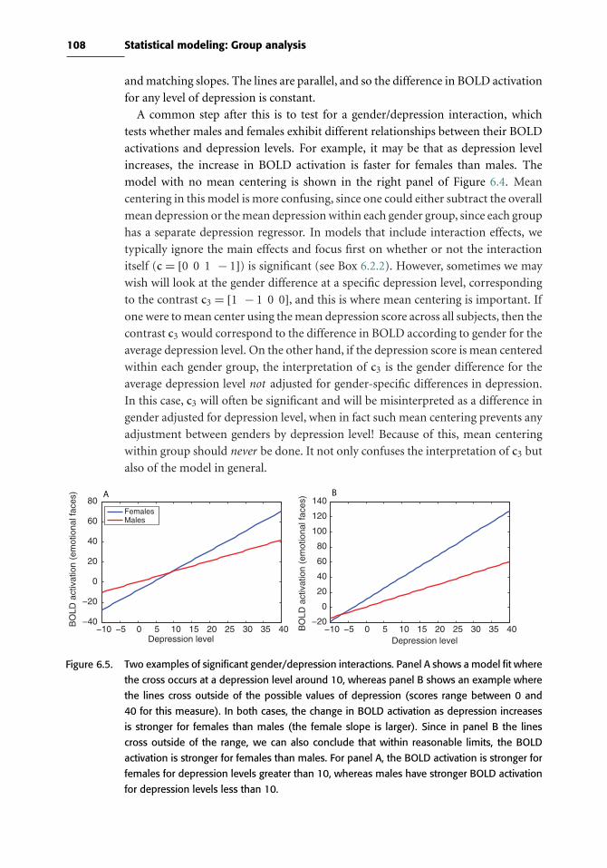
108 Statistical modeling: Group analysis
and matching slopes. The lines are parallel, and so the difference in BOLD activation
for any level of depression is constant.
A common step after this is to test for a gender/depression interaction, which
tests whether males and females exhibit different relationships between their BOLD
activations and depression levels. For example, it may be that as depression level
increases, the increase in BOLD activation is faster for females than males. The
model with no mean centering is shown in the right panel of Figure 6.4. Mean
centering in this model is more confusing, since one could either subtract the overall
mean depression or the mean depression within each gender group, since each group
has a separate depression regressor. In models that include interaction effects, we
typically ignore the main effects and focus first on whether or not the interaction
itself (c = [0 0 1 − 1]) is significant (see Box 6.2.2). However, sometimes we may
wish will look at the gender difference at a specific depression level, corresponding
to the contrast c3 = [1 − 1 0 0], and this is where mean centering is important. If
one were to mean center using the mean depression score across all subjects, then the
contrast c3 would correspond to the difference in BOLD according to gender for the
average depression level. On the other hand, if the depression score is mean centered
within each gender group, the interpretation of c3 is the gender difference for the
average depression level not adjusted for gender-specific differences in depression.
In this case, c3 will often be significant and will be misinterpreted as a difference in
gender adjusted for depression level, when in fact such mean centering prevents any
adjustment between genders by depression level! Because of this, mean centering
within group should never be done. It not only confuses the interpretation of c3 but
also of the model in general.
−10 −5 0 5 10 15 20 25 30 35 40−40
−20
0
20
40
60
80
Depression level
BO
LD a
ctiv
atio
n (e
mot
iona
l fac
es)
−10 −5 0 5 10 15 20 25 30 35 40−20
0
20
40
60
80
100
120
140
Depression level
BO
LD a
ctiv
atio
n (e
mot
iona
l fac
es)
FemalesMales
A B
Figure 6.5. Two examples of significant gender/depression interactions. Panel A shows a model fit where
the cross occurs at a depression level around 10, whereas panel B shows an example where
the lines cross outside of the possible values of depression (scores range between 0 and
40 for this measure). In both cases, the change in BOLD activation as depression increases
is stronger for females than males (the female slope is larger). Since in panel B the lines
cross outside of the range, we can also conclude that within reasonable limits, the BOLD
activation is stronger for females than males. For panel A, the BOLD activation is stronger for
females for depression levels greater than 10, whereas males have stronger BOLD activation
for depression levels less than 10.

109 6.2 Mean centering continuous covariates
Box 6.2.2 Understanding models with significant interactions
When you model an interaction between a categorical covariate and a continuous
covariate, as shown in the right panel of Figure 6.4, you are basically fitting a
simple linear regression for males and females separately, allowing both the inter-
cepts and linear trend associated with depression to vary by gender group. If the
interaction is significant, it means that the slopes of these lines differ and that
the lines will cross for some value of depression. Figure 6.5 shows two examples
of model fits when there was a significant gender/depression interaction in the
model. When looking at these fitted models, it is easy to see that what is perhaps
the most interesting is where the lines cross and how they behave before and after
this crossing point. If the cross occurs at a depression level that is meaningful,
such as in panel A, then this tells us that below this depression level females have
lower BOLD activation than males and above this depression level females have
higher BOLD activations. We often call this a crossover interaction because the
response crosses over at meaningful values of the variable. On the other hand, in
panel B the lines would cross for a negative value of depression level, which does
not actually occur in the data. In this case, it is interesting that females always
have stronger activation than males and that their change in BOLD activation as
depression increases is much stronger than the change in male BOLD activation.
Note that finding this crossing point requires using all four parameter estimates
from the model (occurs when depression is (β2 −β1)/(β3 −β4)), which is often
difficult to do in an imaging analysis unless you are focusing on a single region
of interest. Typically in a whole brain analysis the focus is on whether or not the
slope for males is greater or less than the slope for females (so c = [0 0 1 −1] or
c = [0 0 − 1 1]).The important thing to note is that the main effect of group reflects the dif-
ference in activation at the average depression level across subjects, and does not
tell us where the lines cross. This is the reason why we generally do not interpret
main effects when they occur in the context of interactions, because they can be
misleading.

7
Statistical inference on images
The goal of statistical inference is to make decisions based on our data, while
accounting for uncertainty due to noise in the data. From a broad perspective,
statistical inference on fMRI data is no different from traditional data analysis on,
say, a response time dataset. Inference for fMRI is challenging, however, because of
the massive nature of the datasets and their spatial form. Thus, we need to define
precisely what are the features of the images that we want to make inference on, and
we have to account for the multiplicity in searching over the brain for an effect.
We begin with a brief review of traditional univariate statistical inference and then
discuss the different features in images we can make inference on and finally cover
the very important issue of multiple testing.
7.1 Basics of statistical inference
We will first briefly review the concepts of classical hypothesis testing, which is the
main approach used for statistical inference in fMRI analysis. A null hypothesis H0
is an assertion about a parameter, some feature of the population from which we’re
sampling. H0 is the default case, typically that of “no effect,” and the alternative
hypothesis H1 corresponds to the scientific hypothesis of interest. A test statistic T
is a function of the data that summarizes the evidence against the null hypothesis.
We write T for the yet-to-be-observed (random valued) test statistic, and t for a
particular observed value of T . (Note here T stands for a generic Test statistic, not
t -test.) While there are many different possible types of test statistics with different
units and interpretations (e.g., t -tests, F-tests, χ2-tests), the P-value expresses the
evidence against H0 for any type of T : The P-value is P(T ≥ t |H0), the chance
under the null hypothesis of observing a test statistic as large or larger than actually
observed. (Tests for decreases in T or two-sided changes, i.e., either positive or
negative, are possible by redefining T .)
110

111 7.1 Basics of statistical inference
It is useful to dispense with two frequent misunderstandings about P-values. First,
and crucially, the P-value is not the probability that the null is true given the data,
P(H0|T ). To determine this quantity, we must use Bayesian computations that are
not part of Classical hypothesis testing (see Box 7.1). Roughly, the P-value expresses
the surprise of observing the data if the null hypothesis was actually true. Second, a
P-value can only be used to refute H0 and doesn’t provide evidence for the truth of
H0. The reason for this is that the P-value computation begins by assuming that the
null hypothesis is true, and thus a P-value cannot be used to deduce thatH0 is true.
When P-values are used to decide whether to reject H0 or not, there are two
different types of errors that one can make, and we can quantify the likelihood of
each. Rejecting H0 when there is no effect is a Type I or false positive error. The
desired tolerance of the chance of a false positive is the Type I error level, denoted α.
Failing to reject H0 when there truly is an effect is a Type II or false negative error.
The chance that a testing procedure correctly rejectsH0 when there is a true effect is
the power of the procedure (which is one minus the Type II error rate). Power varies
as a function of the size of the true effect, the efficiency of the statistical procedure,
and the sample size. This implies that a sample size that is sufficient to detect an effect
in one study (which has a relatively large effect magnitude using a sensitive statistical
test) may not be sufficient to find an effect in other studies where the true effect is
smaller or the test is less sensitive. In Section 7.6 we consider power calculations in
detail.
For any testing procedure used to make “Reject”/“Don’t Reject” decisions, based
either on T or on P , there are several ways to describe the performance of the test. A
test is said to be valid if the chance of a Type I error is less than or equal to α; if this
chance exceeds α, we say the test is invalid or anticonservative. A test is exact if the
chance of a Type I error is precisely α, while if this probability is strictly less than α
we say the test is conservative. In this terminology, we always seek to use valid tests,
and among valid tests we seek those with the greatest power.
Box 7.1 Bayesian statistics and inference
Bayesian methods are growing in popularity, as they provide a means to express
prior knowledge before we see the data. Thomas Bayes (1702–61) is remembered
for the following theorem:
P(A|B) = P(B|A)P(A)
P(B)
which says the chance of random event A occurring assuming or given that B
occurs, can be computed from an expression involving the reverse statement, the
chance of B given A. This expression gives a formal mechanism for combining
112 Statistical inference on images
prior information with information in the data. In the context of the GLM with
data y and parameters β, it allows us to write f (β|y) ∝ f (y|β)f (β), where f (β)
is the prior density, our beliefs about the parameters before we see the data (e.g.,
that BOLD percent changes generally range from −5% to +5%), f (y|β) is the
traditional likelihood of the data given parameters, and f (β|y) is the posterior,
the distribution of the parameter after we observe the data. Crucially, it allows
us to make probabilistic statements on the unknown parameter β, whereas clas-
sical (or frequentist ) statistics assumes β is fixed and has no random variation.
Bayesian inference is based entirely on the posterior: The posterior mean provides
a point estimate, and the posterior standard deviation provides the equivalent of
a standard error.
There are fundamental differences between the classical and Bayesian
approaches. A classical method couches inference relative to infinite theoreti-
cal replications of your experiment: A 95% confidence interval means that if you
were to repeat your experiment over and over, 19 out of 20 times (on average)
the interval produced will cover the fixed, true, but unobservable parameter. The
randomness of the data over hypothetical experimental replications drives fre-
quentist inference. The Bayesian method casts inference based on belief about the
random unobservable parameter: The prior expresses belief about the parameter
before seeing the data, the posterior expresses belief about the parameter after
seeing the data. There is no reference to infinite replications of your experiment,
as the data are fixed (not random).
A true Bayesian thinks a classical statistician is absurd for referencing imag-
inary experiments that are never conducted. A true classical statistician thinks
a Bayesian is irrational because different scientists (with different priors) could
analyze the same data and come to different conclusions. Fortunately, in many
settings the Bayesian and classical methods give similar answers, because with
more and more data the influence of the prior diminishes and the posterior looks
like the classical likelihood function.
7.2 Features of interest in images
For an image composed ofV voxels, it might seem that there is only one way to decide
where there is a signal, by testing each and every voxel individually. This approach
is referred to as ‘voxel-level’ inference. Alternatively, we can take into account the
spatial information available in the images, by finding connected clusters of activated
voxels and testing the significance of each cluster, which is referred to as ‘cluster-level’
inference. (See Figure 7.1.) Finally, we might sometimes simply want to ask ‘is there
any significant activation anywhere?’ which is referred to as a ‘set-level’ inference.
First, we discuss what it means to have a significant voxel-level or cluster-level result,

113 7.2 Features of interest in images
T v
alue
clusterextent
voxelmagnitude
u
uc
Space
Space
Cluster–Level Inference
Voxel–Level Inference
T v
alue
Figure 7.1. Illustration of voxel-level versus cluster-level inference. Both axes show the same one-
dimensional section of a statistic image. In the top, voxel-level inference finds two voxels
above a significance threshold, and thus both voxels are individually marked as significant.
In the bottom, a cluster-forming threshold defines clusters, and cluster-wise inference finds
a single cluster of 12 voxels significant; none of the 12 voxels are individually significant, but
together they comprise a significant cluster.
and then how we actually compute significance (P-values) accounting for the search
over the brain.
7.2.1 Voxel-level inferenceIn an image of test statistics, each voxel’s value measures the evidence against the null
hypothesis at that location. The most spatially specific inference that we can make
is to determine whether there is a significant effect at each individual voxel. We do
this by examining whether the statistic at each voxel exceeds a threshold u; if it does,
then we mark that voxel as being “significant” (i.e., we reject the null hypothesis at
that voxel). Such voxel-by-voxel inferences allow us to make very specific inferences
if the threshold is chosen properly; in Section 7.3 we discuss how the threshold is
chosen.
7.2.2 Cluster-level inferenceVoxel-level inferences make no use of any spatial information in the image, such
as the fact that activated voxels might be clustered together in space. However, we
generally expect that the signals in fMRI will be spatially extended. One reason is
that the brain regions that are activated in fMRI are often much larger than the size
of a single voxel. The second reason is that fMRI data are often spatially smoothed
114 Statistical inference on images
and then oversampled to small (e.g., 2 mm3) voxels during spatial normalization,
which results in a spreading of the signal across many voxels in the image.
To take advantage of this knowledge about the spatial structure of fMRI signals,
it is most common to make inferences about clusters of activated voxels rather than
about individual voxels, which is referred to as cluster-level inference. The most
common approach to cluster-level inference involves a two-step procedure. First, a
primary threshold (known as a cluster-forming threshold) uc is applied to a statistic
image, and the groups of contiguous voxels above uc are defined as ‘clusters’. What
exactly constitutes ‘contiguous’ depends on the definition of a neighborhood. For
example, in 2D, we certainly would consider two suprathreshold voxels connected if
they share an edge (4-connectivity), but might also consider them connected if they
share a corner (8-connectivity). In 3D, the choices are 6-connectivity (only faces), 18-
connectivity (also edges) or 26-connectivity (also corners).1 Second, the significance
of each cluster is determined by measuring its size (in voxels) and comparing this to
a critical cluster size threshold k. Methods for choosing this threshold k are discussed
below in Section 7.3.
Cluster size inference is generally more sensitive than voxel-level inference for
standard MRI data (Friston et al., 1996a). In rough terms, cluster size inference
should be better at detecting a signal when that signal is larger in scale than the
smoothness of the noise. To see this, consider an example where our fMRI noise
has smoothness of 10 mm FWHM and the true effects are also 10 mm in scale. In
this instance, the true signal clusters will be similar in size to noise-only clusters,
and it will be difficult for cluster-level inference to detect the signal. In contrast,
if the scale of the effect is larger than 10 mm, cluster-level inference should detect
the effects more often than voxel-level inference. Assigning signifiance to clusters
based on their extent ignores the statistic values within a cluster. It would seem
that using such intensity information would improve the sensitivity of cluster infer-
ence, and indeed some authors have found this result. Poline & Mazoyer (1993)
proposed inference using the minimum of the cluster size P-value and cluster peak
P-value, and Bullmore et al. (1999) suggested cluster mass inference based on the
sum of all voxel-level statistic values in a cluster. For the mass statistic in particular,
Hayasaka & Nichols (2004) found that it has equal or greater power than the size
statistic.
There are two drawbacks to cluster-level inference: The arbitrary cluster-forming
threshold and the lack of spatial specificity. The cluster-forming threshold uc can be
set to any value in principle, though if set too low, focal signal may be lost in the
gigantic clusters that are formed, and if set too high it may exclude voxels with weak
signal intensity (see Figure 7.2). Also, random field theory results break down for
thresholds more generous than α = 0.01 (see Section 7.3.1). Most troubling, if one
1 The SPM software uses 18-connectivity while the FSL uses 26-connectivity; in practice you find very similarclusters with either connectivity unless the data has very low smoothness.
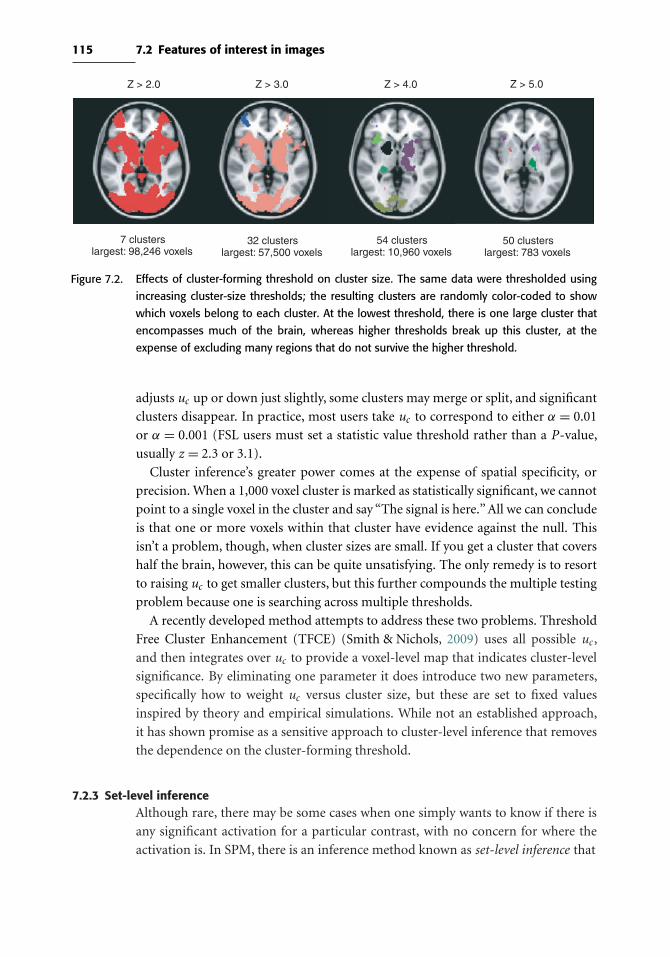
115 7.2 Features of interest in images
7 clusterslargest: 98,246 voxels
32 clusterslargest: 57,500 voxels
54 clusterslargest: 10,960 voxels
50 clusterslargest: 783 voxels
Z > 2.0 Z > 3.0 Z > 4.0 Z > 5.0
Figure 7.2. Effects of cluster-forming threshold on cluster size. The same data were thresholded using
increasing cluster-size thresholds; the resulting clusters are randomly color-coded to show
which voxels belong to each cluster. At the lowest threshold, there is one large cluster that
encompasses much of the brain, whereas higher thresholds break up this cluster, at the
expense of excluding many regions that do not survive the higher threshold.
adjusts uc up or down just slightly, some clusters may merge or split, and significant
clusters disappear. In practice, most users take uc to correspond to either α = 0.01
or α = 0.001 (FSL users must set a statistic value threshold rather than a P-value,
usually z = 2.3 or 3.1).
Cluster inference’s greater power comes at the expense of spatial specificity, or
precision. When a 1,000 voxel cluster is marked as statistically significant, we cannot
point to a single voxel in the cluster and say “The signal is here.” All we can conclude
is that one or more voxels within that cluster have evidence against the null. This
isn’t a problem, though, when cluster sizes are small. If you get a cluster that covers
half the brain, however, this can be quite unsatisfying. The only remedy is to resort
to raising uc to get smaller clusters, but this further compounds the multiple testing
problem because one is searching across multiple thresholds.
A recently developed method attempts to address these two problems. Threshold
Free Cluster Enhancement (TFCE) (Smith & Nichols, 2009) uses all possible uc ,
and then integrates over uc to provide a voxel-level map that indicates cluster-level
significance. By eliminating one parameter it does introduce two new parameters,
specifically how to weight uc versus cluster size, but these are set to fixed values
inspired by theory and empirical simulations. While not an established approach,
it has shown promise as a sensitive approach to cluster-level inference that removes
the dependence on the cluster-forming threshold.
7.2.3 Set-level inferenceAlthough rare, there may be some cases when one simply wants to know if there is
any significant activation for a particular contrast, with no concern for where the
activation is. In SPM, there is an inference method known as set-level inference that

116 Statistical inference on images
Box 7.2.3 Inference on location vs. inference on magnitude
When we apply a threshold to a statistic image and search the brain for
activations, the end result is an inference on location. We answer the question:
“Where in the brain is there a response to my experiment?” Once a significant
region is identified as active, one would like to characterize the nature of the effect,
in particular the effect magnitude. However, due to a problem of circularity (dis-
cussed in greater detail in Chapter 10; see Box 10.4.2), we cannot subsequently
answer the question of how large the identified effect is. The reason is that of
all the possible true positive voxels we will detect, we are more likely to find the
voxels that are randomly higher than the true effect and will miss those that are
randomly smaller. In genetics this is known as the “winner’s curse,” as the first
group to find a gene will often report an effect size that is greater than any subse-
quent replication.
At the present time, there is no way to correct for the bias in effect sizes found by
searching the brain for activations. One simply must recognize that effect size bias
is present and note this when discussing the result. If unbiased effect size estimates
are required, one must sacrifice inference on location and instead assume a fixed
and known location for the effect. Specifically, one must use a priori specified
regions of interest (ROIs) and average the data within those regions. For more on
the topic of circularity, see Kriegeskorte et al. (2009).
is an overall test of whether there exists any significant signals anywhere in the brain.
The test statistic is the number of clusters for an arbitrary cluster defining threshold
uc that are larger than an arbitrary cluster size threshold k. A significant set-level
P-value indicates that there are an unusually large number of clusters present, but
it doesn’t indicate which clusters are significant. For this reason it is referred to an
omnibus test and has no localizing power whatsoever.
7.3 The multiple testing problem and solutions
As previously reviewed, classical statistical methods provide a straightforward
means to control the level of false positive risk through appropriate selection of
α. However, this guarantee is a made only on a test-by-test basis. If a statistic image
has 100,000 voxels, and we declare all voxels with P < 0.05 to be “significant,” then
on average 5% of the 100,000 voxels – 5,000 voxels – will be false positives! This
problem is referred to as the multiple testing problem and is a critical issue for fMRI
analysis.
Standard hypothesis tests are designed only to control the ‘per comparison rate’
and are not meant to be used repetitively for a set of related tests. To account for the
multiplicity, we have to measure false positive risk over an entire image. We define,

117 7.3 The multiple testing problem and solutions
in turn, two measures of false positive risk – the familywise error rate and the false
discovery rate.
7.3.1 Familywise error rate
The most common measure of Type I error over multiple tests is the ‘familywise error
rate’, abbreviated FWER or FWE. FWE is the chance of one or more false positives
anywhere in the image. When we use a valid procedure with αFWE = 0.05, there is
at most a 5% chance of any false positives anywhere in the map. Equivalently, after
thresholding with a valid αFWE = 0.05 threshold, we have 95% confidence that there
are no false positive voxels (or clusters) in the thresholded map. For a particular voxel
(or cluster), we can refer to its “corrected FWE P-value” or just “corrected P-value,”
which is the smallest αFWE that allows detection of that voxel (or cluster).
Several procedures that can provide valid corrected P-values for fMRI data are
available.
7.3.1.1 Bonferroni correction
Perhaps the most widely known method for controlling FWE is the ‘Bonferroni
correction.’ By using a threshold of α = αFWE/V , where V is the number of tests,
we will have a valid FWE procedure for any type of data. However, even though it
will control FWE for any dataset, the Bonferroni procedure becomes conservative
when there is strong correlation between tests. Because of the smoothness of fMRI
data, Bonferroni corrections are usually very strongly conservative. Instead, we need
a method that accounts for the spatial dependence between voxels. The two main
methods that do this are random field theory (RFT) and permutation methods.
7.3.1.2 Random field theory
Random field theory uses an elegant mathematical theory on the topology of thresh-
olded images. The details of this method require mathematics beyond the scope of
this book, but an approachable overview can be found in Nichols & Hayasaka (2003);
treatments with more mathematical detail can be found in Cao & Worsley (2001)
and Adler & Taylor (2007).
A crucial aspect of RFT is how it accounts for the degree of smoothness in
the data. Smoothness is measured by FWHM = [FWHMx ,FWHMy ,FWHMz ].This smoothness is not the size of the Gaussian smoothing kernel applied to the
data, but rather the intrinsic smoothness of the data. That is, even before any
smoothing, there is some spatial correlation present in all imaging data, and the
RFT smoothness parameter relates to the combination of the intrinsic and applied
smoothing.
The definition of RFT’s FWHM is somewhat convoluted: It is the size of a Gaussian
kernel that, when applied to spatially independent “white noise” data, induces the
118 Statistical inference on images
degree of smoothness present in the noise of the data at hand. See previous citations
for a more precise definition in terms of the variability of the partial derivatives of
the noise.
A related concept is ‘RESEL’ or RESolution ELement, a virtual voxel of size
FWHMx × FWHMy × FWHMz . The analysis volume expressed in units of RESELs
is denoted R, the RESEL count.
We present one formula to gain intuition on how RFT results work, the expression
for the corrected P-value for a voxel value t in a three-dimensional Gaussian statistic
image
PvoxFWE(t ) ≈ R× (4 ln(2))3/2
(2π)2e−t 2/2(t 2 − 1) (7.1)
where R = V /(FWHMxFWHMyFWHMz ) is the RESEL count for the image. This
demonstrates the essential role of the RESEL count and shows that, for a given
statistic value t and search volume V , as the product of FWHM’s increase, the
RESEL count decreases and so does the corrected P-value, producing increased
significance. The intuition is that greater smoothness means there is a less severe
multiple testing problem, and a less stringent correction is necessary. Conversely,
as the search volume in RESELs grows, so does the corrected P-value, producing
decreased significance for the same statistical value. This should also make sense, as
the larger the search volume, the more severe the multiple testing problem.
These observations illustrate how RFT inference adapts to the smoothness in the
data, and how the RESEL count is related to the number of ‘independent observa-
tions’ in the image. This loose interpretation, however, is far as it goes, and RFT
should never be misunderstood to be equivalent to a ‘RESEL-based Bonferroni cor-
rection’. This is not the case, and there is no equivalent voxel count that you can feed
into Bonferroni correction that will match RFT inferences (Nichols & Hayasaka,
2003).
RFT can also be used to obtain P-values for the clusters based on cluster-size
(Friston et al., 1994b). Again, the details are mathematically involved, but Gaussian
random field theory provides results for the expected size and number of clusters, and
these results adapt to the smoothness of the search volume. RFT P-values have also
been developed for the alternate cluster statistics mentioned earlier, combined cluster
size and peak height (Poline & Mazoyer, 1993) and cluster mass (Zhang et al., 2009).
Limitations of RFT. Even though RFT methods form the core of fMRI inference,
they have a number of shortcomings. First, they require a multitude of distribu-
tional assumptions and approximations. In particular, they require that the random
field be sufficiently smooth, which practically means that one needs to smooth the
data with a Gaussian filter whose FWHM is at least twice the voxel dimensions.
In fact, the RFT methods are overly conservative for smoothness less than three-
to four-voxel FWHM (Nichols & Hayasaka, 2003; Hayasaka & Nichols, 2003). In

119 7.3 The multiple testing problem and solutions
addition, RFT methods are overly conservative for sample sizes less than about 20
(Nichols & Hayasaka, 2003; Hayasaka & Nichols, 2003).
7.3.1.3 Parametric simulations
Another approach to voxel-level and cluster-level inference is Monte Carlo simu-
lation, from which we can find a threshold that controls the FWE. For example,
Forman et al. (1995) proposed a Monte Carlo cluster-level inference method. Gaus-
sian data are simulated and smoothed based on the estimated smoothness of the real
data, creating surrogate statistic images under the null hypothesis. These surrogate
images are thresholded, and an empirical cluster size distribution is derived. These
methods have an underlying model that is similar to RFT’s model (i.e., smooth
Gaussian data), but they do not rely on an asymptotic or approximate results. They
are, however, much more computationally intensive than RFT.
This method is implemented in AFNI’s alphasim program. Users of this approach
must take care that the smoothness parameter, which, as in RFT, is not the size of
the applied smoothing kernel but the estimated intrinsic smoothness of the data. In
addition, the analysis mask used for the simulation must be exactly the same as the
mask used for analysis of the real data.
7.3.1.4 Nonparametric approaches
Instead of making parametric assumptions about the data to approximate P-values,
an alternative approach is to use the data themselves to obtain empirical null dis-
tributions of the test statistic of interest. The two most widely used resampling
methods are permutation tests and the bootstrap. While the bootstrap is perhaps
better known, it is an asymptotic method (meaning that it is only provably correct in
the large-sample limit), and in particular has been shown to have poor performance
for estimating FWE-corrected P-values (Troendle et al., 2004). In contrast the per-
mutation test, which has exact control of false positive risk, is a useful alternative to
RFT methods for small samples.
A permutation test is easy to understand when comparing two groups. Consider-
ing just a single voxel, suppose you have two groups of ten subjects, high performers
(H) and low performers (L), each of whose BOLD response data you wish to com-
pare. Under the null hypothesis of no group difference, the group labels are arbitrary,
and one could randomly select ten subjects to be the H group, reanalyze the data,
and expect similar results. This is the principle of the permutation test: repeatedly
shuffling the assignment of experimental labels to the data, and analyzing the data
for each shuffle to create a distribution of statistic values that would be expected
under the null hypothesis. Just as a parametric P-value is found by integrating the
tails of the null distribution that are more extreme than the actual data observed,
the nonparametric permutation P-value is the proportion of the permuted statistic
values that are as or more extreme than the value that was actually observed. See
Figure 7.3 for an illustration of this example with three subjects per group.

120 Statistical inference on images
( None – standard deviation unknown )
Nonparametric Null Distribution of D
D = xH − xL
T = D/SD
MeanDifference
fMRI Activation
Two SampleT Statistic
0.05
n/a
0.05
0.0117
Data Statistic Null Distribution P-value
Figure 7.3. Illustration of parametric and nonparametric inference at the group level, comparing two
groups of three subjects. Parametric methods use assumptions about the data to find the
null distribution of the test statistic. Nonparametric methods use the data itself to find the
null distribution, allowing the consideration of nonstandard test statistics. Under the null
hypothesis the group labels are irrelevant, and thus we can reanalyze the data over and over
with different permutations of the labels. Here, there are 20 possible ways to assign three
subjects to the Low-performers group (and the other three must be high performers), and
thus the permutation distribution consists of 20 test statistic values. With either parametric or
nonparametric methods, the P-value is the proportion of the null distribution as large or larger
than the statistic actually observed. However, there is no parametric test for the difference, as
the standard deviation (SD) is unknown.
For a single subject’s fMRI data, the permutation test is difficult to apply. Drift
and temporal autocorrelation make the timeseries autocorrelated and thus not
“exchangeable”under the null hypothesis (since randomly reordering the data points
would disrupt the temporal autocorrelation). Even though there are methods to
decorrelate the data (Bullmore et al., 2001) as part of the permutation procedure,
such semiparametric methods are very computationally demanding and depend on
accurate modelling of the correlation.
At the group level, on the other hand, the permutation approach is easy to apply
(this correction is implemented in the randomise tool in FSL and in the SnPM

121 7.3 The multiple testing problem and solutions
toolbox for SPM). Each subject is analyzed with a standard GLM model, and for
each contrast of interest, an effect image (a Contrast of Parameter Estimates or
COPE image in FSL; a con image in SPM) is created. If there is just a single group of
subjects, it might seem that a permutation test is impossible, as there are no group
labels to permute. If we instead assume that the COPE images have a symmetric
distribution (about zero under H0), a permutation test can be made by randomly
multiplying each subject’s COPE by 1 or −1. The assumption of symmetry is much
weaker than a Gaussian assumption and can be justified by the first-level errors
having a symmetric distribution.
So far, we have discussed the use of permutation tests to obtain null distributions
at each voxel, but this does not solve the multiple testing problem. Importantly,
permutation can also be used to obtain FWE-corrected P-values. An FWE-corrected
P-value is found by comparing a particular statistic value to the distribution of the
maximal statistic across the whole image. In the previous High and Low performers
example, this means that for each random labeling of Hs and Ls, the entire brain
volume is analyzed, and the maximum statistic value across the whole brain is noted.
In the case of voxel-level inference, this is the largest intensity in the statistic image,
whereas for cluster-level inference, this is the size of the largest cluster in the image.
With repeated permutation a distribution of the maximum statistic is constructed,
and the FWE corrected P-value is the proportion of maxima in the permutation
distribution that is as large or larger than the observed statistic value.
The primary drawback of permutation methods is that they are computationally
intensive. Whereas RFT computations take seconds at most, a typical permutation
analysis can take anywhere from 10 minutes to an hour on modern computing
hardware. However, given the great amount of time spent to perform other aspects
of fMRI processing, this seems like a relatively small price to pay for the accuracy
that comes from using permutation tests. In general, when FWE-corrected results
are desired, we recommend the use of permutation tests for all inferences on group
fMRI data.
7.3.2 False discovery rate
While FWE-corrected voxel-level tests were the first methods available for neu-
roimaging, practitioners often found the procedures to be quite insensitive, leaving
them with no results that survived correction. While sometimes FWE inferences are
conservative due to inaccurate RFT methods, even with exact permutation FWE
methods, many experiments will produce no positive results (especially with small
sample sizes). A more lenient alternative to FWE correction is the false discovery
rate (Benjamini & Hochberg, 1995; Genovese et al., 2002). The false discovery pro-
portion (FDP) is the fraction of detected voxels (or clusters) that are false positives
(defined as 0 if there are no detected voxels). FDP is unobservable, but FDR proce-
dures guarantee that the average FDP is controlled. Put another way, where a level
0.05 FWE procedure is correct 95% of the time – no more than 5% of experiments

122 Statistical inference on images
FWE
Control of Familywise Error Rate at 10%
Control of False Discovery Rate at 10%
Occurrence of Familywise Error
Signal + Noise
6.7% 10.4% 14.9% 9.3% 16.2% 13.8% 14.0% 10.5% 12.2% 8.7%
11.3% 11.3% 12.5% 10.8% 11.5% 10.0% 10.7% 11.2% 10.2% 9.5%
Control of Per Comparison Rate at 10%
Percentage of Null Pixels That Are False Positives
Percentage of Activated Pixels That Are False Positives
Figure 7.4. Illustration of three different multiple comparison procedures. Each column corresponds
to a different realization of signal plus noise, as illustrated in the simulated data in the top
row, and can be thought of as your next ten experiments. The top row shows the statistic
image without any thresholding. The second row illustrates the control of the per comparison
rate at 10%, that is, no special account of multiplicity. The third row shows control of the
familywise error rate at 10%, say with RFT or Bonferroni. The bottom row shows control of
the false discovery rate. With no adjustment formultiple testing (second row) there is excellent
sensitivity, but very poor specificity – there are false positives everywhere. Controlling FWE
(third row) gives excellent specificity – only 1 out of 10 experiments have any false positives—
but poor sensitivity. Controlling FDR (bottom row) is a compromise between no correction
and FWE correction, giving greater sensitivity at the expense of some false positives, even
though it is still controlled as a fraction of all voxels detected. Note that, just as the emperical
per comparison error rate for each experiment is never exactly 10%, likewise the empirical
false discovery rate is never exactly 10%; in both instances, we’re guaranteed only that, in the
long run, the average rate will not exceed 10%.
examined can have any false positives – a level 0.05 FDR procedure produces results
that are 95% correct – in the long run the average FDP will be no more than 5%.
(See Figure 7.4.)
FDR’s greater sensitivity comes at the cost of greater false positive risk. That risk
is still measured in an objective way that accounts for features of the data, which is
in contrast to, say, an uncorrected α = 0.001 threshold, which will give varying false
positive risk depending on smoothness and the size of the search region. Standard
123 7.4 Combining inferences: masking and conjunctions
FDR, as applied voxel-level, lacks any kind of spatial specificity, similar to cluster
inference. Given a map of FDR-significant voxels, one cannot point to a single
voxel and conclude that it is significant. One can only assert that, on average, no
more than 5% (or the FDR level used) of the voxels present are false positives.
Even if some significant voxels form a large cluster, and others are scattered as tiny
clusters, voxel-level FDR has no spatial aspect and does not factor cluster size into
significance.
This lack of spatial precision has led some to criticise FDR, with
Chumbley & Friston (2009) even recommending that voxel-level FDR should not
be used at all. They propose, instead, that FDR should be applied in a cluster-level
fashion. On balance, both voxel-level and cluster-level FDR are reasonable proce-
dures, and each needs to be interpreted with care, accounting for the presence of
false positives in the map of significant voxels or clusters.
7.3.3 Inference example
To illustrate these inference methods just discussed, we consider data from a gam-
bling task (Tom et al., 2007); these data are available from the book Web site. In this
experiment, 16 subjects were offered 50/50 gambles where the size of the potential
gain and loss varied parametrically from trial to trial. Here we just consider the neg-
ative parametric effect of potential loss on BOLD response (which identifies regions
whose activity goes down as the size of the potential loss goes up). Using a cluster-
forming threshold of Z = 2.3, 154 clusters were found (Figure 7.5a). Based on the
search volume and estimated smoothness, RFT finds 5% FWE critical cluster size
threshold to be 570 voxels, and only four clusters are larger (Figure 7.5b and Table
7.1).
Note the difficulty in visualizing 3D clusters with orthogonal slices. In Figure 7.5b,
in the coronal (middle) slice, there appears to be perhaps six or more separate clusters,
yet in fact there are only three clusters shown this panel. Contiguity of clusters is
measured in 3D and is very difficult to gauge visually from 2-D slices.
Another challenge arises with large clusters, such as the first cluster in Table 7.1
and as seen in the lower portions of the sagittal and coronal (left and middle) slices.
This cluster covers a number of anatomical regions, yet calling this cluster significant
only tells us there is some signal somewhere in these 6,041 voxels. If we had known
this would be a problem a prori, we could have used voxel-level inference instead
to improve spatial specificity. For this data, though, no voxels are found significant
with either FWE or FDR (max voxel Z = 4.00 has PvoxFWE = 1.0, Pvox
FDR = 0.1251). This
is typical of cluster inference greater sensitivity over voxel-level inference.
7.4 Combining inferences: masking and conjunctions
A single fMRI experiment will usually produce a number of different contrasts, and
fully understanding the outcome of the study may require combining the statistic

124 Statistical inference on images
(a) All clusters created with Z=2.3 cluster-forming threshold
(b) Clusters surviving 5% FWE threshold
Figure 7.5. Thresholded maps from the gambling experiment, parametric effect of the size of potential
loss on BOLD response. Top (a) shows clusters created with Z = 2.3 cluster-forming thresholdand no cluster-size threshold, while bottom (b) shows the 3 clusters that survive a critical
cluster size threshold of 570 voxels.
Table 7.1. Significant clusters from the gambling experiment.
Region Cluster Corrected X Y Z
Size P-value
(voxels) PclusFWE
Striatum, ventromedial prefrontal cortex, ventral
anterior cingulate cortex, medial orbitofrontal
cortex
6,041 <0.0001 0 4 −4
Right superior frontal gyrus 1,102 0.0010 22 42 38
Posterior cingulate 901 0.0040 4 −38 40
Left superior frontal gyrus 738 0.0133 −30 24 54
Notes: Search volume: 236,516 2 × 2 × 2 mm3 voxels, 1.89 liters, 1,719.1 RESELs, FWHM 5.1 mm
Cluster forming threshold Z = 2.3, 0.05 FWE cluster size threshold k = 570.aOf the 154 clusters found (see Figure 7.5) with a cluster-forming threshold of Z = 2.3, only the four listed
here are FWE significant at 0.05. X, Y, Z coordinates listed are the location of the peak Z value in each cluster.

125 7.4 Combining inferences: masking and conjunctions
images in different ways. To make these issues concrete, consider a 2 × 2 facto-
rial design, where there are two factors with two levels each. Henson et al. (2002)
uses such a design for a face recognition and implicit memory. That study has
two factors, “Fame” indicating whether a presented face is famous or nonfamous
and “Repetition” indicating whether this is the first or second presentation of a
face (each face was presented exactly twice). Among the contrasts of interest are:
cFamous>Nonfamous , the positive effect of famousness, averaged over both presenta-
tions; cFamous:Rep1>Nonfamous:Rep1, the famousness effect on the first presentation;
cFamous:Rep2>Nonfamous:Rep2 , the famousness effect on the second presentation; and
cFame×Repetition= cFamous:Rep1>Nonfamous:Rep1−cFamous:Rep2>Nonfamous:Rep2 , a one-sided
test of the interaction, repitition-dependent effect of famousness.
The interaction contrast cFame×Repetition is perhaps the most interesting effect,
but it detects voxels both where the cFamous:Rep1>Nonfamous:Rep1 effect is positive
and greater than cFamous:Rep2>Nonfamous:Rep2 and where decreases in the cFamous:
Rep1>Nonfamous:Rep1 effect are less negative than decreases in cFamous:Rep2>
Nonfamous:Rep2 . Assume we are only interested in the interaction when the effects
of famousness are positive. We can address this by first creating the statistic image
for cFamous:Rep1>Nonfamous:Rep1 and thresholding at 0 to create a binary mask indicat-
ing where cFamous:Rep1>Nonfamous:Rep1 is positive. We then create the statistic image for
cFame×Repetition , apply significance thresholding as usual, and finally apply the binary
mask. The resulting map will show significant effects for cFame×Repetition masked for
positive effects of famousness. Note that here we are using masking as an image
processing manipulation, eliminating voxels that satisfy an arbitrary condition on
a supplemental contrast. That is, the statistical threshold is uninformed about the
nature of the mask, and, in general, the false positive rate will be only lower after
application of such a mask. See the next section for use of regions of interest to
change the search region and affect the multiple testing correction.
Whereas an interaction looks for differences in effects, a conjunction looks for sim-
ilarities (Nichols et al., 2005). For example, we may wish to find regions where there
is a Fame effect for both the first and second face presentation. A conjunction of the
tests specified by contrasts cFamous:Rep1>Nonfamous:Rep1 and cFamous:Rep2>Nonfamous:Rep2will provide this inference. Note that this conjunction is not the same as the main
effect of Fame, cFamous>Nonfamous , which could be significant if there was a positive
Fame effect in just either the first or second presentation.
Valid conjunction inference is obtained by thresholding each statistic image sep-
arately and then taking the voxel-level intersection of above-threshold voxels. There
is no assumption of independence between each contrast tested, and the voxel-
level significance level of the conjunction is that of each of the combined tests;
for example, if a 5% FWE voxel-level threshold is applied to each statistic image,
the conjunction inference has level 5% FWE. Alternatively, the voxel-wise mini-
mum can be computed, and this minimum image can be thresholded as if it were
a single statistic image. The precise definition of conjunction inference is that it
126 Statistical inference on images
measures the evidence against the conjunction null hypothesis that one or more effects
are null.
Note there is often low power to detect a conjunction, simply because it is a
stringent requirement that each and every test must demonstrate a significant effect.
Friston et al. (2005) proposed a weakened form of conjunction inference that also
uses the minimum statistic of K effects. Instead of making inference on the con-
junction null hypothesis, which has an alternative hypothesis that all K effects are
true, they make inference on an intermediate null whose alternative holds that at
least k < K of the effects are true. This alternative approach, however, requires an
assumption of independence between the tested effects and, as stated, cannot provide
an inference that all effects are true.
7.5 Use of region of interest masks
If a study is focused on a particular region of the brain, then it is possible to limit
the search for activations to a region of interest, which reduces the stringency of the
correction for multiple testing. In Chapter 10 we discuss the issue of ROI analysis
in more detail; here we focus on the use of ROIs with voxel-level or cluster-level
inference to reduce the volume of brain searched for activations, often known as a
‘small volume correction’. The advantage of this strategy is that the ROI definitions
do not have to be very precise, as they are only used to define regions of the brain
that are of interest or not. As mentioned before, it is crucial that the ROI is defined
independently of the statistical analysis of interest.
The only practical concerns to be aware of is that not all multiple testing proce-
dures work equally well for very small ROIs. Cluster-level inference based on RFT,
for example, assumes that the search region is large relative to the smoothness of the
noise. Clusters that touch the edge of the search can have their significance under-
estimated, with either RFT or permutation, thus cluster-level inference is not ideal
when using ROIs smaller than about 25 RESELs. For example, if FWHM in voxel
units is [3,3,3] voxels3, a 1,000-voxel ROI has RESEL count 1,000/(3×3×3) = 37.0,
and thus is sufficiently large. Similarly voxel-level inference with FDR correction can
work poorly when ROIs are very small. In essence, FDR has to learn the distribution
of nonnull P-values to distinguish them from the background of null P-values.
7.6 Computing statistical power
One of the most common questions asked of statisticians is “How many subjects do
I need in my study in order to detect a hypothesized effect?” To answer this question,
we need to compute the statistical power of the test. As mentioned at the start of the
chapter, power is the probability of correctly rejecting the null hypothesis when it is
false (i.e., when there is a true signal). Figure 7.6 illustrates how power is calculated
for a simple univariate test. The red distribution is the null distribution of a Z test

127 7.6 Computing statistical power
−4 −2 0 2 4 6 80
0.1
0.2
0.3
0.4
0.5
Null
Statistic threshold
Alternative
Figure 7.6. Illustration of how power is calculated. The red distribution is the null distribution, which is
centered about 0, and the blue distribution is the alternative distribution centered about a
value determined by the expected mean and variance of the activation. The statistic threshold
indicates the threshold that is used to assess whether or not a statistic value is significant or
not. The area under the null distribution to the right of this threshold is the type I error rate,
α, and the area under the alternative distribution to the right of this threshold (blue shaded
region) is the power.
statistic, and the blue distribution is the alternative distribution. The mean of the
alternative distribution is a function of the size of the activation you expect to have
in your study, its variance, and the sample size. For a given α level (e.g., α = 0.05
for a single test), you find the corresponding null distribution threshold such that
the area to the right of this threshold under the null distribution is α (the Type
I error rate) and then the area to the right of this threshold under the alternative
distribution is the power. If your test has 80% power, it means that you will have,
with many possible replicate experiments, an 80% chance of detecting the specified
signal.
Power analyses must be carried out prior to data collection to plan how many
subjects are necessary for a study. The power calculation itself is a function of the
number of subjects in the study; the Type I error rate, α; the size of the effect that
you wish to be able to detect, δ; and the variance of this effect, σ 2. Power is also
impacted by the number of runs of data that will be collected and the length of the
runs because those factors affect the variance of the effect (see Mumford & Nichols,
2008, for details). Using this calculation, one can compute the number of subjects
necessary to find the desired effect with 80% power, which is the generally accepted
threshold for reasonable power. The size of the effect and its variance are often based
on pilot data or data from a similar previous study. As discussed in Chapter 6, the
variance of the effect takes on a complicated form, including a within-subject and
between-subject component, and so it must be carefully estimated to reflect this
structure.
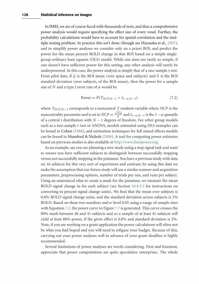
128 Statistical inference on images
In fMRI, we are of course faced with thousands of tests, and thus a comprehensive
power analysis would require specifying the effect size of every voxel. Further, the
probability calculations would have to account for spatial correlation and the mul-
tiple testing problem. In practice this isn’t done (though see Hayasaka et al., 2007),
and to simplify power analyses we consider only an a priori ROI, and predict the
power for the mean percent BOLD change in that ROI based on a simple single-
group ordinary least squares (OLS) model. While our aims are rarely so simple, if
one doesn’t have sufficient power for this setting, any other analysis will surely be
underpowered. In this case, the power analysis is simply that of a one-sample t-test.
From pilot data, if µ is the ROI mean (over space and subjects) and σ is the ROI
standard deviation (over subjects, of the ROI mean), then the power for a sample
size of N and a type I error rate of α would be
Power = P(TNCP ,N−1 > t1−α,N−1) (7.2)
where TNCP ,N−1 corresponds to a noncentral T random variable where NCP is the
noncentrality parameter and is set toNCP =√N µ
σand t1−α,N−1 is the 1−α quantile
of a central t distribution with N − 1 degrees of freedom. For other group models
such as a two-sample t -test or ANOVA, models estimated using OLS examples can
be found in Cohen (1988), and estimation techniques for full mixed effects models
can be found in Mumford & Nichols (2008). A tool for computing power estimates
based on previous studies is also available at http://www.fmripower.org.
As an example, say you are planning a new study using a stop signal task and want
to ensure you have sufficient subjects to distinguish between successfully stopping
versus not successfully stopping in the putamen. You have a previous study with data
on 16 subjects for this very sort of experiment and contrast; by using this data we
make the assumption that our future study will use a similar scanner and acquisition
parameters, preprocessing options, number of trials per run, and runs per subject.
Using an anatomical atlas to create a mask for the putamen, we measure the mean
BOLD signal change in for each subject (see Section 10.4.3.3 for instructions on
converting to percent signal change units). We find that the mean over subjects is
0.8% BOLD signal change units, and the standard deviation across subjects is 2%
BOLD. Based on these two numbers and α-level 0.05 using a range of sample sizes
with Equation 7.2, the power curve in Figure 7.7 is generated. This curve crosses the
80% mark between 40 and 41 subjects and so a sample of at least 41 subjects will
yield at least 80% power, if the given effect is 0.8% and standard deviation is 2%.
Note, if you are working on a grant application the power calculations will often not
be what you had hoped and you will need to refigure your budget. Because of this,
carrying out your power analyses well in advance of your grant deadline is highly
recommended.
Several limitations of power analyses are worth considering. First and foremost,
appreciate that power computations are quite speculative enterprises. The whole

129 7.6 Computing statistical power
10 15 20 25 30 35 40 45 5030
40
50
60
70
80
90
Number of Subjects
Pow
er (
%)
Figure 7.7. Power curve. The curve was generated using an estimated mean effect of 0.8% signal change
units with standard deviation of 2% signal change units and a type I error rate of 0.05 using
Equation 7.2. Since the graph crosses 80% between 40 and 41 subjects, a sample size of 41
will yield at least 80% power.
point of planning an experiment is to study an effect, yet a power analysis assumes
you know the true effect magnitude and standard deviation. Thus, it is a good idea
to consider a range of “what if” scenarios: What if the true effect is 10% smaller?
20% smaller? What if standard deviation is off, by 10%? and so on. If it appears you
still have good power over a range of alternative scenarios, you should be in good
shape.
Second, never compute the power of a study post hoc. That is, it is pointless to
assess the power of a study that has already been performed: If the effect is there and
you detect it, you have 100% power; if it is there and you missed it, you have 0%
power. Another way to see this is to consider a series of failed experiments, where the
null hypothesis is always true. If α = 0.05 is used, we will reject the null hypothesis
and declare a significant result on 5% of these tests. Further, say the observed test
statistic t is just equal to the statistic threshold, and we use t to compute an effect
size and power (t could be higher, but let’s be pessimistic). In this case, you will
compute the power to be 50% (as it can be inferred from Figure 7.6, if you shift
the mean of the alternative distribution left to equal the statistic threshold). Thus, a
series of failed experiments will tell you that you have at least 50% power whenever
they detect something, when in fact you have 0% power.
Finally, best practice dictates that you base your power analysis on studies that
are as similar to your planned study as possible. From those studies, calculate the
typical mean and standard deviation of the relevant effect and use independently
determined ROIs to avoid circular estimates of effect size (see Box 10.4.2). For more
details on the limitations of power analysis, see Hoenig & Heisey (2001).

8
Modeling brain connectivity
8.1 Introduction
One of the oldest debates in the history of neuroscience centers on the localization
of function in the brain; that is, whether specific mental functions are localized to
specific brain regions or instead rely more diffusely upon the entire brain (Finger,
1994). The concept of localization first arose from work by Franz Gall and the
phrenologists, who attempted to localize mental functions to specific brain regions
based on the shape of the skull. Although Gall was an outstanding neuroscientist
(Zola-Morgan, 1995), he was wrong in his assumption about how the skull relates
to the brain, and phrenology was in the end taken over by charlatans. In the early
twentieth century, researchers such as Karl Lashley argued against localization of
function, on the basis of research showing that cortical lesions in rats had relatively
global effects on behavior. However, across the twentieth century the pendulum
shifted toward a localizationist view, such that most neuroscientists now agree that
there is at least some degree of localization of mental function. At the same time,
the function of each of these regions must be integrated in order to acheive coherent
mental function and behavior. These concepts have been referred to as functional
specialization and functional integration, respectively (Friston, 1994).
Today, nearly all neuroimaging studies are centered on functional localization.
However, there is increasing recognition that neuroimaging research must take func-
tional integration seriously to fully explain brain function (Friston, 2005; McIntosh,
2000). This chapter outlines methods for analyzing brain connectivity with fMRI
data, which provide a means to understand how spatially distant brain regions
interact and work together to create mental function. Whereas the methods in
the foregoing chapters reflect a general consensus about how fMRI data should be
analyzed, there is much less agreement about how brain connectivity should be ana-
lyzed, and these methods are undergoing continual development and refinement.
We attempt to provide a broad overview of the extant methods, focusing on those
for which there are available implementations for fMRI data.
130
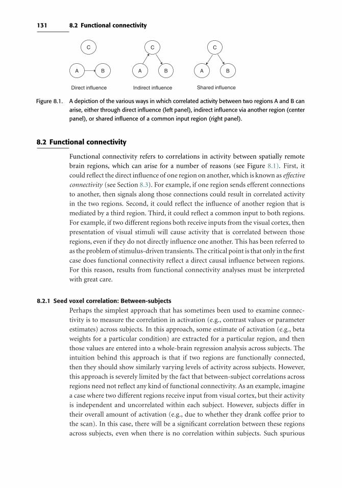
131 8.2 Functional connectivity
A B
Direct influence Indirect influence Shared influence
A B
C
A B
CC
Figure 8.1. A depiction of the various ways in which correlated activity between two regions A and B can
arise, either through direct influence (left panel), indirect influence via another region (center
panel), or shared influence of a common input region (right panel).
8.2 Functional connectivity
Functional connectivity refers to correlations in activity between spatially remote
brain regions, which can arise for a number of reasons (see Figure 8.1). First, it
could reflect the direct influence of one region on another, which is known as effective
connectivity (see Section 8.3). For example, if one region sends efferent connections
to another, then signals along those connections could result in correlated activity
in the two regions. Second, it could reflect the influence of another region that is
mediated by a third region. Third, it could reflect a common input to both regions.
For example, if two different regions both receive inputs from the visual cortex, then
presentation of visual stimuli will cause activity that is correlated between those
regions, even if they do not directly influence one another. This has been referred to
as the problem of stimulus-driven transients. The critical point is that only in the first
case does functional connectivity reflect a direct causal influence between regions.
For this reason, results from functional connectivity analyses must be interpreted
with great care.
8.2.1 Seed voxel correlation: Between-subjects
Perhaps the simplest approach that has sometimes been used to examine connec-
tivity is to measure the correlation in activation (e.g., contrast values or parameter
estimates) across subjects. In this approach, some estimate of activation (e.g., beta
weights for a particular condition) are extracted for a particular region, and then
those values are entered into a whole-brain regression analysis across subjects. The
intuition behind this approach is that if two regions are functionally connected,
then they should show similarly varying levels of activity across subjects. However,
this approach is severely limited by the fact that between-subject correlations across
regions need not reflect any kind of functional connectivity. As an example, imagine
a case where two different regions receive input from visual cortex, but their activity
is independent and uncorrelated within each subject. However, subjects differ in
their overall amount of activation (e.g., due to whether they drank coffee prior to
the scan). In this case, there will be a significant correlation between these regions
across subjects, even when there is no correlation within subjects. Such spurious

132 Modeling brain connectivity
correlations can occur if some subjects show greater BOLD response than others
due to noise (e.g., subjects who move more may show smaller activation signals)
or physiological factors (e.g., recent ingestion of caffiene or tobacco). These possi-
bilities suggest that positive correlation between regional activation across subjects
must be interpreted with caution. It may be the case that negative correlations are
more interpretable because they unlikely reflect the kind of global factors that were
outlined earlier. Between-subjects correlation may provide interesting data to com-
plement other forms of connectivity analysis (cf. McIntosh, 1999), but it is likely to
be insufficient to establish connectivity on its own.
8.2.2 Seed voxel correlation: Within-subjects
Another simple way to estimate functional connectivity is to compute the correla-
tion between the timecourses of different regions. This is most often done by first
extracting the timecourse from a seed voxel or seed region, which is determined based
on some a priori hypothesis, and then computing its correlation with all of the voxels
across the brain. When extracting signal from a region, one can either take the mean
of the voxels at each point in the timecourse or extract the first eigenvariate of the
region (as in done in SPM). The first eigenvariate reflects the component of variance
that accounts for the most variance in the signal and that is orthogonal to all other
components (see Section 8.2.5.1 for more on this idea). The rationale for using this
method rather than the mean is that if there are mulitple signal sources within the
region, the first eigenvariate will reflect the strongest single source whereas the mean
will reflect a combination of multiple sources. In practice there appears to be very
little difference between these methods.
Box 8.2.2. An example dataset for connectivity analysis
For all of the approaches described in this chapter, we will use the same dataset
(which is availale for download on the book Web site, along with instructions to
complete the example analyses).
The data in this example are from a subject (randomly selected from a larger
group) performing rhyming judgments on either words or pseudowords across
separate blocks (Xue & Poldrack, unpublished data). On each trial, the subject
judged whether a pair of visually presented stimuli rhymed or not by pressing
one of two response keys. In each 20-second block, eight pairs of words were pre-
sented for 2.5 seconds each. Blocks were separated by 20-second periods of visual
fixation. Four blocks of words were followed by four blocks of pseudowords.
The data were acquired on a Siemens Allegra 3T MRI scanner, using the
following scanning parameters: TR = 2000 ms, TE = 30 ms, field of view =200 mm, matrix size = 64 × 64, 33 slices, slice thickness = 4 mm (0 skip), 160
timepoints.
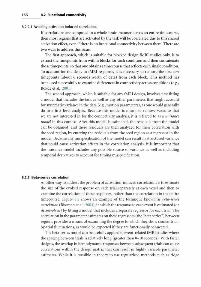
133 8.2 Functional connectivity
8.2.2.1 Avoiding activation-induced correlations
If correlations are computed in a whole-brain manner across an entire timecourse,
then most regions that are activated by the task will be correlated due to this shared
activation effect, even if there is no functional connectivity between them. There are
two ways to address this issue.
The first approach, which is suitable for blocked design fMRI studies only, is to
extract the timepoints from within blocks for each condition and then concatenate
those timepoints, so that one obtains a timecourse that reflects each single condition.
To account for the delay in fMRI response, it is necessary to remove the first few
timepoints (about 6 seconds worth of data) from each block. This method has
been used successfully to examine differences in connectivity across conditions (e.g.,
Bokde et al., 2001).
The second approach, which is suitable for any fMRI design, involves first fitting
a model that includes the task as well as any other parameters that might account
for systematic variance in the data (e.g., motion parameters), as one would generally
do in a first-level analysis. Because this model is meant to remove variance that
we are not interested in for the connectivity analysis, it is referred to as a nuisance
model in this context. After this model is estimated, the residuals from the model
can be obtained, and these residuals are then analyzed for their correlation with
the seed region, by entering the residuals from the seed region as a regressor in the
model. Because any misspecification of the model can result in structured variance
that could cause activation effects in the correlation analysis, it is important that
the nuisance model includes any possible source of variance as well as including
temporal derivatives to account for timing misspecification.
8.2.3 Beta-series correlationAnother way to address the problem of activation-induced correlations is to estimate
the size of the evoked response on each trial separately at each voxel and then to
examine the correlation of these responses, rather than the correlation in the entire
timecourse. Figure 8.2 shows an example of the technique known as beta-series
correlation (Rissman et al., 2004), in which the response to each event is estimated (or
deconvolved) by fitting a model that includes a separate regressor for each trial. The
correlation in the parameter estimates on these regressors (the“beta series”) between
regions provides a means of examining the degree to which they show similar trial-
by-trial fluctuations, as would be expected if they are functionally connected.
The beta-series model can be usefully applied to event-related fMRI studies where
the spacing between trials is relatively long (greater than 8–10 seconds). With faster
designs, the overlap in hemodynamic responses between subsequent trials can cause
correlations within the design matrix that can result in highly variable parameter
estimates. While it is possible in theory to use regularized methods such as ridge

134 Modeling brain connectivity
5 10 15 20 25
100
200
300
400
500
600
700
800
900
1000
r(A,B)=0.953
0 100 200 300 400 500 600 700 800 900 1000
0 100 200 300 400 500 600 700 800 900 1000
−0.20
0.20.40.60.8
−0.20
0.20.40.60.8
r = 0.953
0 5 10 15 20 252
4
6
8
0 5 10 15 20 253
4
5
6
7r = 0.073
r(A,B)=0.007
Raw timeseries Beta seriesBeta series design matrix
Figure 8.2. Beta-series correlation estimates a response for each trial using a separate regressor, as shown
in the design matrix in the middle of the figure. The original timeseries for the two regions
plotted in the figure are highly correlated (r = 0.953), due to activation-related transients inthe signal. When the beta series is estimated using the general linear model with the design
matrix shown in the middle, the resulting estimates show that the trial-by-trial response of
these two regions is actually uncorrelated (r=0.007). Thus, beta-series correlation can identifyfunctional connectivity without being sensitive to activation-induced effects.
regression to estimate such models (Rizk-Jackson et al., 2008), there is likely to be a
substantial loss in power. Thus, this method is most appropriate for relatively slow
event-related designs.
8.2.4 Psychophysiological interaction
The foregoing approaches allow estimation of correlations that extend across an
entire imaging run (i.e., that do not change with the task). However, the question of
interest is often how functional connectivity is modulated by a task. The first method
described earlier, involving dicing of the timecourse into task-specific sections, allows
this question to be asked, but it requires comparison of correlations across runs which
can be problematic.
A more elegant way to ask the question of how connectivity with a seed region is
modulated by some other factor (such as a task) is the psychophysiological interaction
(PPI) approach (Friston et al., 1997). In PPI, the standard GLM modeling the task at
the first level is used along with an additional regressor that models the interaction
between the task and the timecourse in a seed voxel. For example, for a model with
a single task regressor (X), the standard GLM would be
Y = β0 +β1X + ε
For the PPI analysis, the model would also include regressors that model the signal
from the seed region (R) and the interaction between the seed region and the task:
Y = β0 +β1X +β2R+β3R ∗X + ε
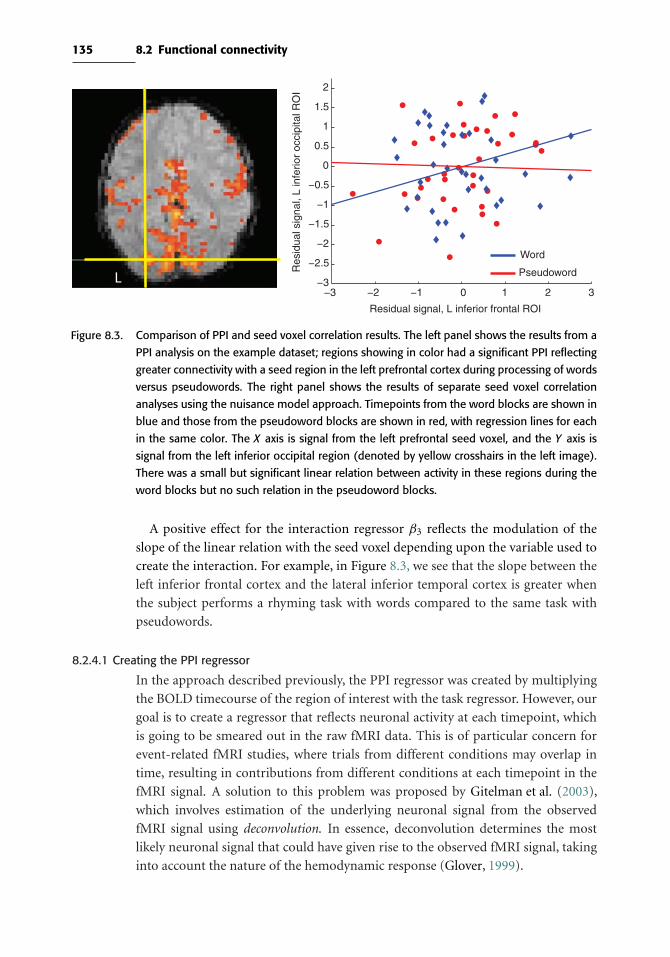
135 8.2 Functional connectivity
L−3 −2 −1 0 1 2 3
−3
−2.5
−2
−1.5
−1
−0.5
0
0.5
1
1.5
2
Res
idua
l sig
nal,
L in
ferio
r oc
cipi
tal R
OI
Residual signal, L inferior frontal ROI
Word
Pseudoword
Figure 8.3. Comparison of PPI and seed voxel correlation results. The left panel shows the results from a
PPI analysis on the example dataset; regions showing in color had a significant PPI reflecting
greater connectivity with a seed region in the left prefrontal cortex during processing of words
versus pseudowords. The right panel shows the results of separate seed voxel correlation
analyses using the nuisance model approach. Timepoints from the word blocks are shown in
blue and those from the pseudoword blocks are shown in red, with regression lines for each
in the same color. The X axis is signal from the left prefrontal seed voxel, and the Y axis is
signal from the left inferior occipital region (denoted by yellow crosshairs in the left image).
There was a small but significant linear relation between activity in these regions during the
word blocks but no such relation in the pseudoword blocks.
A positive effect for the interaction regressor β3 reflects the modulation of the
slope of the linear relation with the seed voxel depending upon the variable used to
create the interaction. For example, in Figure 8.3, we see that the slope between the
left inferior frontal cortex and the lateral inferior temporal cortex is greater when
the subject performs a rhyming task with words compared to the same task with
pseudowords.
8.2.4.1 Creating the PPI regressor
In the approach described previously, the PPI regressor was created by multiplying
the BOLD timecourse of the region of interest with the task regressor. However, our
goal is to create a regressor that reflects neuronal activity at each timepoint, which
is going to be smeared out in the raw fMRI data. This is of particular concern for
event-related fMRI studies, where trials from different conditions may overlap in
time, resulting in contributions from different conditions at each timepoint in the
fMRI signal. A solution to this problem was proposed by Gitelman et al. (2003),
which involves estimation of the underlying neuronal signal from the observed
fMRI signal using deconvolution. In essence, deconvolution determines the most
likely neuronal signal that could have given rise to the observed fMRI signal, taking
into account the nature of the hemodynamic response (Glover, 1999).
136 Modeling brain connectivity
The approach of Gitelman et al. (2003) uses a large set of basis functions to
model the neuronal signal, so many that the design matrix has as many regres-
sors as timepoints. Specifically, if y was the BOLD seed voxel timeseries that we were
interested in obtaining the neuronal signal for and ifH is the HRF matrix, the model
used would be y = HBβ +ε, whereB is a square design matrix comprised of as many
basis functions as timepoints. The reason so many regressors are used is to have as
much flexibility as possible to capture the shape of the neuronal response. Once β is
obtained, the neuronal signal estimate is simply Bβ. Although using such a large set
of basis functions will allow for the most flexible fit of the neuronal signal, the esti-
mates for a linear model with a square design matrix are very unstable. Typically, this
problem can be solved by simply removing unnecessary regressors from the design.
For example, we’d expect the neuronal response to be relatively smooth, so remov-
ing high-frequency basis functions could be considered, but this would sacrifice the
quality of the fit. A solution is to use a regularized model estimation technique,
which imposes prior assumptions on the shape of the response. In this case, for
example, higher-frequency basis functions would be down-weighted through priors
in a Bayesian estimation procedure. This is more appealing than simply removing
higher-frequency trends, since higher-frequency trends aren’t completely removed.
Once the signal is deconvolved, then the PPI regressor is created by multiplying the
unconvolved task regressor by the deconvolved signal regressor (Bβ), and then this
is reconvolved in order to place it back into the hemodynamic domain.
8.2.4.2 Potential problems with PPI
One problem that can occur with PPI, especially in event-related designs, is that the
PPI regressor may be highly correlated with the task regressor. If the task regressor is
not included, then any activation observed for the PPI cannot be uniquely attributed
to the interaction, as it could also reflect the overall effect of the task. For this reason,
the task regressor and seed regressor should always be included in the statistical
model for a PPI analysis alongside the PPI regressor. However, if both task and PPI
regressors are included in the model, then this can result in a lack of efficiency due
to the variance inflation that occurs with correlated regressors. Thus, the correlation
between PPI and task regressors should always be examined, and if it is too high,
then the results should be treated with caution.
Another problem with PPI is that it assumes that the fit of the hemodynamic
model is exact. If there is any misspecification of the model, then this could drive
correlations that reflect activation-induced effects rather than reflecting functional
connectivity.
8.2.5 Multivariate decomposition
There are a number of ways to decompose a matrix into separate components,
which can be used to identify coherently active networks from fMRI data. In the
language of matrix algebra, these are known as matrix factorization methods. Each

137 8.2 Functional connectivity
Gaussiandata
Principal components analysis Independent components analysis
Non-Gaussiandata
Figure 8.4. PCA and ICA find different types of structure in the data. In the top panel, the data are sampled
from a Gaussian distribution. The two components detected by each technique are shown
as red and green lines. With Gaussian data, PCA finds the direction with the most variance
as the first component, and the orthogonal direction as the second component (top left).
ICA finds a different set of components with this dataset, which likely reflects fitting to the
noise since there is no signal remaining once the data have been whitened (top right). In the
lower panel, the data are a mixture of two different signals. PCA cannot find these sources of
variance since they are not orthogonal (bottom left), whereas ICA is able to accurately detect
the two signals in the data (bottom right).
of these methods assumes that the data are composed of some number of underlying
components that are mixed together to form the observed data. The main differences
between methods center on how the underlying components are related to one
another and how they are estimated from the data.
8.2.5.1 Principal components analysis
One of best-known methods for matrix decomposition is principal components
analysis (PCA). PCA is a method for reexpressing a dataset in terms of a set of com-
ponents that are uncorrelated, or orthogonal to one another. As shown in Figure 8.4,
the first principal component is equivalent to the direction through the data that has
138 Modeling brain connectivity
the greatest amount of variance; the second principal component is the direction
that accounts for the next greatest amount of variance and is uncorrelated with the
first principal component, and so on. The number of components is the minimum
of the number of dimensions or observations; in fMRI data, there are generally many
more dimensions (voxels) than there are observations (timepoints or subjects). PCA
can also be used as a data reduction technique; for example, instead of analyzing
the data from each of the thousands of voxels in the brain, one might analyze the
data from just the first few principal components, which account for the majority of
the variance in the data. This is discussed further in Section 9.4 regarding machine
learning analyses.
To perform PCA on fMRI data, the data must be reformatted into a two-
dimensional matrix, with voxels as columns and timepoints/subjects as rows. PCA
will provide a set of components that have a value for each timepoint, which
reflects the combinations of voxels that account for the most variance. Each of
these components also has a loading for each voxel, which denotes how much that
voxel contributes to each component. Figure 8.5 shows an example of some PCA
components for the example dataset.
PCA was used as a method for functional connectivity analysis in some early stud-
ies (Friston et al., 1993). It has the benefit of being simple and easily implemented.
However, it has the substantial drawback of being sensitive only to signals that follow
a Gaussian distribution. Although some signals in fMRI data clearly do follow such
a distribution (as shown in Figure 8.5), there are many signals of interest that will
be mixed together by PCA because they do not follow a Gaussian distribution. In
this case, independent components analysis is a more appropriate technique, and in
practice ICA has largely supplanted PCA as a method for characterizing functional
connectivity.
8.2.5.2 Independent components analysis
Independent components analysis was developed to solve the problem of detect-
ing unknown signals in a dataset, sometimes called the blind source separation
problem. This problem is often described using the example of a cocktail party
(Hyvärinen & Oja, 2000). Imagine a party with microphones placed throughout the
room and a large number of people talking. A blind source separation problem
would be to separate out the speech stream of each person speaking using only the
recordings from these microphones. The idea is that the recording from each micro-
phone reflects a mixture of all of the different speakers (weighted by their distance
from the microphone, their head direction, etc.), and our goal is to unmix the sources
from the recordings; we assume that the speakers and microphones do not move
during the recording, so that the mixing process is stationary during the recording.
Formally, the ICA model is defined as
x = As
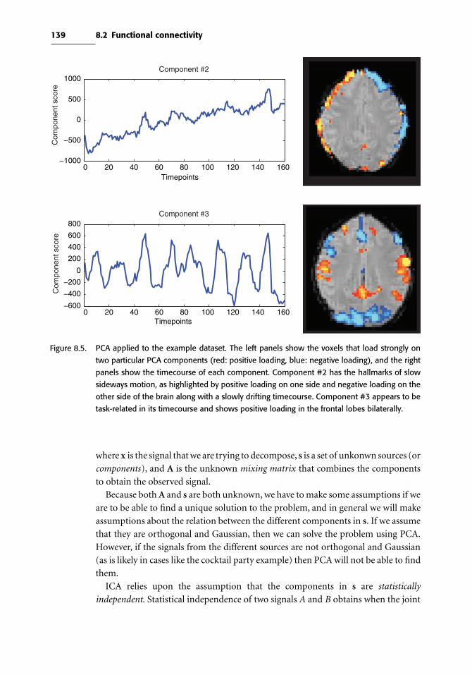
139 8.2 Functional connectivity
Component #2
Component #3
0 20 40 60 80 100 120 140 160−600
−400
−200
0
200
400
600
800
Timepoints
0 20 40 60 80 100 120 140 160−1000
−500
0
500
1000
Timepoints
Com
pone
nt s
core
Com
pone
nt s
core
Figure 8.5. PCA applied to the example dataset. The left panels show the voxels that load strongly on
two particular PCA components (red: positive loading, blue: negative loading), and the right
panels show the timecourse of each component. Component #2 has the hallmarks of slow
sideways motion, as highlighted by positive loading on one side and negative loading on the
other side of the brain along with a slowly drifting timecourse. Component #3 appears to be
task-related in its timecourse and shows positive loading in the frontal lobes bilaterally.
where x is the signal that we are trying to decompose, s is a set of unkonwn sources (or
components), and A is the unknown mixing matrix that combines the components
to obtain the observed signal.
Because bothA and s are both unknown, we have to make some assumptions if we
are to be able to find a unique solution to the problem, and in general we will make
assumptions about the relation between the different components in s. If we assume
that they are orthogonal and Gaussian, then we can solve the problem using PCA.
However, if the signals from the different sources are not orthogonal and Gaussian
(as is likely in cases like the cocktail party example) then PCA will not be able to find
them.
ICA relies upon the assumption that the components in s are statistically
independent. Statistical independence of two signals A and B obtains when the joint
140 Modeling brain connectivity
Box 8.2.5. Resting state fMRI
The initial development of fMRI was driven by researchers interested in under-
standing the brain’s evoked responses to external events or mental stimuli. Thus,
nearly all research focused on the measurement of responses evoked by con-
trolled tasks inspired by cognitive psychology. However, two early findings drove
researchers to move away from this sole focus on task-evoked activity. First, it
became clear that there is a set of brain regions whose activity is high at rest and
almost invariably goes down whenever one performs a demanding cognitive task
(Shulman et al., 1997). In fact, most experienced fMRI researchers would agree
that this decrease of activity in regions including the ventromedial prefrontal cor-
tex, precuneus, and temporoparietal cortex is the most replicable finding in all
neuroimaging research! Marcus Raichle and his colleagues (Raichle et al., 2001)
proposed that this activity reflects what they called the brain’s “default mode,”
which they proposed to reflect the true metabolic baseline of brain activity.
Second, Biswal et al. (1995) published a study in which subjects simply rested
in the scanner, and the data were then examined using a seed correlation analysis
with a seed in the left motor cortex. This analysis found that other regions in the
motor system (including the thalamus and contralateral motor cortex) showed
correlations with the seed, suggesting that correlations in resting state activity can
provide insight into the function of neural systems even if they are not actively
engaged. Subsequent work has shown that resting-state fMRI data contains a great
deal of interesting structure, to the degree that one can detect many of the same
networks that are engaged during different kinds of cognitive tasks in addition
to default-mode regions (Smith et al., 2009). This work shows that it is essential
to distinguish resting-state and default-mode concepts, since the default mode is
only one of the networks that appears in resting state FMRI data.
Since about 2000, there has been an explosion in the use of resting-state fMRI to
characterize brain function. Many of these studies have used ICA (Section 8.2.5.2)
because of its ability to robustly detect networks of coherent activity during rest.
Others have used the network analysis approaches described in Section 8.4, or
seed correlation analyses designed to identify the correlates of specific regions at
rest.
probability is equal to the product of the individual probabilities: P(A,B) =P(A)P(B). When A and B are independent, then knowing the value of one does
not provide any information about the value of the other. In cases where the signal
components are generated by independent processes (such as independent speakers
at a cocktail party, or independent neural processes in fMRI), ICA may be more able
than PCA to correctly identify the component sources because they will likely be
non-Gaussian.

141 8.2 Functional connectivity
Independence is related to but different from orthogonality (or uncorrelatedness);
it is possible that two variables can be statistically dependent even if they are orthog-
onal, which occurs when the data do not conform to a Gaussian distribution. In fact,
the independent components in ICA are estimated by searching for non-Gaussian
signals in the data. The details of ICA estimation are beyond the scope of this book,
but the interested reader should consult Hyvärinen & Oja (2000) for an overview.
Since ICA searches for non-Gaussian signals, most ICA algorithms first whiten the
data using PCA in order to remove any Gaussian signals in the data. Some software
packages (e.g., FSL’s MELODIC) will output both the PCA and ICA results, and it
may be useful to examine both in order to retain sensitivity to the widest range of
signals in the data.
The standard ICA model is “noise-free,” since it does not include an error term
to represent the noise in the data. A probabilistic ICA model has been developed
(Beckmann & Smith, 2004) that includes a noise term:
x = As+ e
where e∼N (0,σ). This model has the advantage of allowing statistical inference on
the estimated sources, by providing measures of error for the estimated components
and parameters. The probabilistic ICA model is implemented in the MELODIC
software in FSL .
To apply ICA to fMRI data, the data must first be rearranged into a two-
dimensional matrix. When applying ICA to fMRI timecourse data, it is necessary
to choose whether the algorithm should search for components that are either spa-
tially independent or temporally independent (which is determined by which way
the input matrix is oriented). Most methods have assumed spatially independent
components; when applied in this way, ICA returns a set of spatial components
along with a mixing matrix that denotes the contribution of each spatial pattern
to the observed signal at each timepoint (as shown in Figure 8.6). The assumption
of spatial independence can be justified based on the intuition that there is a large
number of potentially independent networks in the brain, which might have similar
timecourses during performance of a task. It provides the ability to detect spatially
distinct effects (such as task activation versus task-correlated head motion) that may
have correlated timecourses.
There are a number of qualifications that must be kept in mind when using
ICA. First, ICA solutions are not unique, and thus require additional constraints to
determine an optimal solution. Some of these methods, such as the probabilistic
ICA model in FSL, are stochastic, such that different solutions may occur when the
same dataset is run multiple times through the ICA procedure. Second, because it
is sensitive to non-Gaussian structure, ICA can be very sensitive to outliers in the
data. This is generally seen as a positive, since it makes ICA useful for identifying
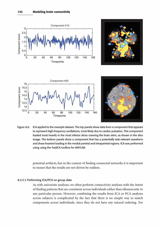
142 Modeling brain connectivity
Component #13
Component #20
0 20 40 60 80 100 120 140 1600
0.5
1
1.5
2
2.5
3
Timepoints
Com
pone
nt s
core
0 20 40 60 80 100 120 140 16012.5
13
13.5
14
14.5
15
15.5
16
Timepoints
Com
pone
nt s
core
Figure 8.6. ICA applied to the example dataset. The top panels show data from a component that appears
to represent high-frequency oscillations, most likely due to cardiac pulsation. This component
loaded most heavily in the most inferior slices covering the brain stem, as shown in the slice
image. The bottom panels show a component that has a potentially task-relevant waveform
and show heaviest loading in the medial parietal and intraparietal regions. ICA was performed
using using the FastICA toolbox for MATLAB.
potential artifacts, but in the context of finding connected networks it is important
to ensure that the results are not driven by outliers.
8.2.5.3 Performing ICA/PCA on group data
As with univariate analyses, we often perform connectivity analyses with the intent
of finding patterns that are consistent across individuals rather than idiosyncratic to
any particular person. However, combining the results from ICA or PCA analyses
across subjects is complicated by the fact that there is no simple way to match
components across individuals, since they do not have any natural ordering. For

143 8.2 Functional connectivity
example, one subject may have a component that reflects task-driven activation as
#13, whereas for another subject this component may be #2.
There are a number of ways in which group ICA/PCA analysis has been per-
formed (Calhoun et al., 2009). Perhaps the simplest is to average the data across
subjects and then perform ICA on the mean dataset. This has the advantage of being
simple, but it will only provide power to find components that are highly consis-
tent across individuals in both time and space; any idiosyncratic effects are likely to
be averaged away. This approach also does not work to detect resting state signals
(Box 8.2.5), since they will largely be temporally uncorrelated across individuals.
Another approach is to perform ICA on each individual, and then use some form of
clustering or correlation analysis to match components between individuals. While
intuitively appealing, the noisiness of the estimated components can make it difficult
to accurately match components across individuals. A slightly more sophisticated
approach is to concatenate the data matrices for each individual (after spatial nor-
malization to align voxels across individuals). Concatenating across time will result
in detection of shared spatial components, whereas concatenation across voxels will
result in detection of shared timecourses across individuals. Most studies have used
concatenation across time, and a comparison of these different methods using sim-
ulated data suggested that concatenating across time is more reliable than averaging
over subjects or concatenating across voxels (Schmithorst & Holland, 2004).
There are several ways to estimate the timecourses of the spatially independent
components (i.e., the mixing matrix) when data are concatenated across time. In the
GIFT software (Calhoun et al., 2009), a separate mixing matrix is estimated for each
individual. In the Tensor–PICA approach implemented in FSL (Beckmann & Smith,
2005), a common group mixing matrix is estimated, and a scaling factor is esti-
mated for each subject. Because it assumes a common timecourse, the Tensor–PICA
approach is less suitable for cases where the timecourses may differ across individu-
als, such as in resting-state fluctuations. Other approaches are also available that fall
in between these methods (Guo & Pagnoni, 2008).
8.2.6 Partial least squares
The foregoing methods for matrix decomposition focused on decomposing the
fMRI data, without regard to any other knowledge that one might have, such as
knowledge about a task or some measurement such as behavioral performance.
Partial least squares (PLS) is a method that simultaneously decomposes the fMRI
data and a design matrix in a way that maximizes the covariance between them. Thus,
whereas PCA and ICA find components that explain the most variance in the data
alone, PLS finds components that best explain the relation between the data and the
design matrix (Abdi, 2003). PLS was first applied to PET data (McIntosh et al., 1996)
and later to fMRI data. When applied to neuroimaging data, the design matrix can
either reflect a task manipulation (i.e., the same design matrix used in the standard

144 Modeling brain connectivity
L
L
0 20 40 60 80 100 120 140 160−1
−0.5
0
0.5
1
Timepoints
Com
pone
nt lo
adin
g
0 20 40 60 80 100 120 140 160−0.2
0
0.2
0.4
0.6
0.8
1
1.2
Timepoints
Com
pone
nt lo
adin
g
Figure 8.7. PLS applied to the example dataset. The top row is the first PLS component; its timecourse
reflects a larger response to the first four blocks (the word condition) compared to the second
four blocks (the pseudoword condition). The spatial pattern of this component, which closely
follows the brain outline in the lower slice shown in the figure, suggests that it likely reflects
a task-related motion artifact that subsided over the run. The second row is the second
component, which loads roughly equally for both tasks and shows engagement of regions
known to be involved in reading. (Thanks to Herve Abdi for the MATLAB code used to create
this figure.)
GLM analysis) or possibly behavioral performance associated with each observation
(McIntosh & Lobaugh, 2004). For example, in Figure 8.7, PLS was performed on the
example dataset using the design matrix containing two conditions (as described in
Box 8.2.2).
8.3 Effective connectivity
The functional connectivity methods described in the previous section provide evi-
dence regarding how activity covaries across brain regions, and thus can elucidate
to some degree the interactions that occur between regions. However, in the end
we would often like to make stronger claims; in particular, we would like to know
whether activity in one region has a causal influence on activity in another region.

145 8.3 Effective connectivity
Effective connectivity models attempt to bridge this explanatory gap by providing
the ability to test causal models regarding the interactions between regions.
The astute reader may at this point say: “But wait, one of the basic lessons in my
first statistics class is that correlation does not equal causation.” It is indeed true
that correlation between two variables does not necessarily imply a direct causal
relation between those variables. However, the presence of a correlation implies that
there is a causal relation somewhere (either between the two variables, or via some
unmeasured third variable, as seen in Figure 8.1), and correlations most certainly
can provide evidence regarding potential causal relations, especially when there are
more than two variables. There is now a well-developed theory of causality that has
been developed within the machine learning field (Spirtes et al., 2000; Pearl, 2000),
which provides mathematical proof that it is possible to test causal hypotheses using
only observational data (such as observed correlations). The methods described
below take advantage of correlations to extract information and test hypotheses
about causal relations between brain regions.
Models of causal processes such as effective connectivity are often expressed in
terms of directed graphs, like those shown in Figure 8.1; these are also referred
to as path diagrams in the context of path analysis and SEM. The nodes (circles)
in the graph refer to brain areas, and the edges (lines with arrows) refer to causal
relations. In general, the methods used for effective connectivity analysis are limited
to relatively small numbers of variables; for fMRI, these variables are usually the
averaged signal within a set of regions of interest.
8.3.1 Challenges to causal inference with fMRI data
There are a number of aspects of fMRI data that render the inference of causal
relations very challenging (Ramsey et al., 2010). Here we outline several of the major
problems.
Size of the model space. Given some set of brain regions, the goal of effective
connectivity analysis is to understand how those regions influence one another.
One obvious approach to answering this question is to test all possible graphs to
determine which one best fits the data. However, the number of possible directed
graphs increases super-exponentially as a function of the number of regions in the
graph; for example, for a graph with six nodes, there are more than one billion
possible directed graphs! Even with fast computers, this combinatorial explosion
renders exhaustive search of the space impossible for more than about six regions.
Another approach that has been taken to this problem is to specify a small set of
models based on other knowledge (e.g., knowledge about connectivity from animal
models). Although it is possible to reliably compare the fit of a small set of models,
the results will only be valid if the most accurate model is contained in the set of
tested models, which seems unlikely for large search spaces. Thus, the ability to
search for the best possible model amongst the enormous number of alternatives is

146 Modeling brain connectivity
crucial. Fortunately, there are methods available that make this problem tractable
under particular assumptions, which we discuss in Section 8.3.3.
Indirectmeasurements. Analyses of effective connectivity are applied to fMRI data,
but the causal relations that we wish to discover regard the underlying neuronal sig-
nals. Thus, the variables amongst which we wish to model causality are latent, or
unobserved, and we have to estimate their causal relations from observed signals
that include both noise and systematic distortions of the signal (such as hemody-
namic delays). Unfortunately, this can result in serious problems for estimating the
underlying causal relations. First, it can be shown that measurement noise in the
observed measurements (which is substantial for fMRI data) results in the identi-
fication of spurious causal relations that do not exist between the latent variables
(Ramsey et al., 2010). Second, any differences in the hemodynamic response (e.g.,
its latency) across regions can also result in the identification of spurious causal rela-
tions if one relies upon temporal information to infer causal relations. A number of
methods have been proposed to address these problems, which are outlined in the
following sections.
Combining data across individuals. The analysis of effective connectivity is gen-
erally performed on timeseries data, which contain relevant information about
relations between activation across regions. However, as with activation analyses,
we are generally interested in making inferences about the connectivity patterns that
exist in the larger population, as opposed to the specific set of individuals sampled.
Further, it is likely that the true pattern of connectivity varies across individuals
as a function of age, experience, genetics, and other factors; even if they share the
same causal structure, the parameters describing connectivity are likely to vary. It is
thus important to employ methods that can adequately characterize effective con-
nectivity at the population level. The simplest possible approach would be to simply
combine the data across individuals and assess the model on this composite dataset.
However, as discussed by Ramsey et al. (2010), pooling data across individuals can
lead to an observed pattern of independence and conditional independence relations
that are not reflective of any particular individual in the group. Thus, it is necessary
to employ some form of “random effects” analysis to ensure that connectivity is
properly estimated across the group.
8.3.2 Path analysis and structural equation modeling
The first method proposed for analysis of effective connectivity in neuroimaging was
path analysis, which is a form of structural equation modeling (SEM). Introductions
to this method can be found in Shipley (2000) and Bentler & Stein (1992), and a
formal treatment can be found in Bollen (1989). Because path analysis is a special
case of SEM in which there are no unobserved (or latent ) variables, our discussion
will be framed in terms of the more general SEM.

147 8.3 Effective connectivity
8.3.2.1 Specifying a structural model
SEM is a method by which one can test hypotheses about causal influence between
variables. It requires that one start with a model that specifies the hypothesized
causal relations, which are specified in terms of a set of linear equations (though it is
also possible to create nonlinear structural equation models). For example, take the
three variables in Figure 8.1. The relations between these variables can be specified
in terms of the following linear equations:
A = β1,1A+β1,2B+β1,3C
B = β2,1A+β2,2B+β2,3C
C = β3,1A+β3,2B+β3,3C
or in matrix notation: A
B
C
= β1,1 β1,2 β1,3
β2,1 β2,2 β2,3
β3,1 β3,2 β3,3
A
B
C
We will refer to the matrix of βs as the connectivity matrix since it expresses the
connectivity between the different variables. The connectivity matrix maps directly
to a representation as a directed graph, as shown in Figure 8.8.
In addition to modeling connectivity between regions, an SEM can also include
extraneous variables (e.g., which model the task inputs) as well as error terms for the
observed variables, as well as latent variables, which are hypothesized but unobserved
variables that are related in some way to the observed variables (see Section 8.3.2.3
below for more on the role of latent variables in SEM with fMRI).
8.3.2.2 Estimating and testing an SEM
In most of the methods described so far in this book, parameters of statistical models
have been estimated by minimizing the difference between the actual data and model
predictions. However, SEM uses a different approach. Instead of comparing the
actual and predicted data, the parameters in an SEM are estimated by minimizing
the difference between the actual and predicted covariance between the variables.
The estimated parameters are known as path coefficients and represent how much of
a change in one variable would occur due to a change in the other variable, holding
all other variables constant.
Once the model is estimated, we must use a statistical test to determine how well
it fits the observed data. First, it is possible to test the overall fit of the model by
examining how well it explains the observed covariances, using a chi-squared test
to determine whether the predicted covariance structure is significantly different
from the actual structure. Note that this turns the standard hypothesis-testing logic

148 Modeling brain connectivity
A
B
C
D A
B
C
D
A0010
B1011
C0001
D0000
ABCD
From
To
A0111
B0000
C0001
D0000
ABCD
From
To
Figure 8.8. Examples of path diagrams and their associated connectivity matrices. In this example, all
paths have a strength of either 1 (present) or zero (absent).
on its head: Whereas the null hypothesis is usually the hypothesis that we want to
overturn, in this case the null hypothesis is that the model is correct. It is thus critical
to understand that a nonsignificant chi-squared test does not imply that the model
is true or best, just that we can’t reject the hypothesis that it is correct. There could
well be many other models that would fit equally well or better. For this reason, the
absolute fit of a model is generally not of primary interest.
More often, we wish to test hypotheses about which of a set of models best fits
the data. For example, we may wish to know whether two particular regions are
connected to one another based on the data. This can be achieved by comparing two
models, one of which allows the connection and one of which does not (i.e., that
parameter is fixed at zero). The relative fit of the two models can then be compared,
and if the fit of the model with the path is significantly better than the model without
the path, then we conclude that the connection exists. It is sometimes argued that
model comparison should only be performed when the absolute fit of the model is
good, but simulations by Protzner & McIntosh (2006) suggest that it is possible to
find reliable differences between models even when the absolute fit of the model to
the data is relatively poor.
It is critical to note that a model with more parameters will almost always fit the
data better than a model with fewer parameters. Thus, we cannot simply compare the
goodness of fit of the two models. Instead, we must use a model comparison statistic
that takes into account the number of parameters in the model, such as the Akaike
Information Criterion (AIC) or Bayesian Information Criterion (BIC). In other
cases, we may wish to make inferences about the values of specific parameters of the
model, rather than making comparisons between different models (cf. Stephan et al.,
2010). For example, we may wish to determine whether the connection between two

149 8.3 Effective connectivity
regions is positive or negative. This can be done by examining the estimated path
values in the selected model.
8.3.2.3 Complications using SEM with fMRI data
There are a number of potential problems with using SEM on fMRI data. First,
the standard methods for testing of SEM model fit assume independence between
observations, which is not true of fMRI data. However, it is possible to adjust the
degrees of freedom in the chi-squared test so that they reflect the effective degrees of
freedom, which reflects the number of independent observations given the temporal
autocorrelation in the data (Bullmore et al., 2000).
Most SEM studies have used a priori anatomical models to specify a graph and
then performed hypothesis testing on that graph. However, failure to reject the
model (through a nonsignificant chi-squared test) does not establish that it is the
correct model, only that there is not enough evidence to reject it. As previously
noted, it would be preferable to search all possible models to find the best-fitting
one, given that our anatomical priors offer relatively weak starting points for building
models of functional connectivity. For all but the smallest networks, exhaustively
testing all possible models becomes computationally intractable, so search meth-
ods become necessary. The most common approach used in the SEM literature
is a greedy search technique, in which one starts with a model with no connec-
tions and repeatedly adds the one connection that would most increase the model
fit. This uses a technique called Lagrangian multipliers (Bullmore et al., 2000), also
known in the SEM literature as modification indices. Unfortunately, it has been
shown that this approach to network detection is unreliable because it tends to
find local minima rather than the globally best network (Spirtes et al., 2000). The
search methods described in the following section are known to outperform this
approach.
Because SEM models are usually employed for fMRI analysis, another more fun-
damental problem is that the model is meant to identify causal relations between
neuronal signals, but these must be estimated based on indirect and noisy BOLD
MRI measurements (Penny et al., 2004). It can be shown (Ramsey et al., 2010) that
when causal inferences about latent variables are based on indirect measurements,
independent noise in the measurements will result in the identification of spuri-
ous relationships between some variables. In addition, the transformation from
latent neuronal signals to observed hemodynamic signals is complex and nonlinear;
even though such a relation could be accommodated with SEM, it is more natu-
rally accommodated within approaches such as dynamic causal modeling (Section
8.3.4) that directly estimate the hemodynamic response function to estimate causal
relations between neuronal elements.

150 Modeling brain connectivity
A B
No independencebetween A, B, & C
A B
C
A B
CC
A C
B C
B A | C
Figure 8.9. Each of the graphical models from Figure 8.1 implies a different set of conditional indepen-
dence relations between the three nodes. Independence is denoted by ⊥⊥ , such that B⊥⊥ A|Cmeans “B is independent of A after conditioning on C.”
8.3.3 Graphical causal models
Another way to characterize the causal structure of a dataset has been developed
in the context of graphical causal models (Spirtes et al., 2000; Shipley, 2000; Pearl,
2000). This approach is based on the idea that the causal relations in a graph have
implications regarding the conditional independence relations between different sets
of variables in the graph. Conditional independence means that two variables are
independent when conditioned on some other variable(s) and Figure 8.9 illustrates
examples of conditional independence based on the graphs from Figure 8.1. This
idea will be familiar from the context of regression, where conditioning on a third
variable is equivalent to including it as a covariate in the statistical model. If two
variables are correlated via a third variable, then including that third variable as a
regressor should remove the correlation, thus rendering the variables independent.
By determining the conditional independence relations that exist between a set
of variables, it is possible to determine the graph or graphs that describe the causal
relations that are implied by the pattern of conditional independence (Pearl, 2000;
Spirtes et al., 2000). A set of methods developed in the field of machine learning
over the last 20 years has provided the ability to efficiently search for such graphical
structures.
A number of search algorithms exist for graph search, many of which are imple-
mented in the freely available TETRAD software (see link on the book Web site).
They differ primarily in the kinds of graphs that they are able to find (e.g., with or
without cycles, with or without latent variables), and in their assumptions regarding
the data (e.g., continuous vs. discrete, normally distributed versus nonnormal).
A detailed description of these methods is outside the scope of this book; see
Spirtes et al. (2000) and the TETRAD software manual for more details. Figure
8.10 shows an example of results using this software. Once the optimal graph(s)
have been identified using these graph search methods, then they can be used as a
basis for other kinds of effective connectivity models, such as SEM or dynamic causal
models.

151 8.3 Effective connectivity
I
LOCC207.95
LIPL
–58.84
LACC0.81
LMTG0.06
0.27
LIFG0.61 0.92
0.34
I
LOCC
142.86
LIFG
29.01
LACC102.47
LMTG
51.92
LIPL 0.40.53
0.31
0.14
0.19
1.41
0.44
0.5
A: TETRAD (greedy equivalence search)
B: SEM (using modification indices)
Figure 8.10. A comparison of the best-fitting models estimated using TETRAD IV and modification indices
with structural equation modeling, using the example dataset. The data were timecourses
from single voxels in five regions (LOCC: left occipital, LMTG: left middle temporal, LIPL:
left inferior parietal, LACC: left anterior cingulate, LIFG: left inferior frontal), as well as an
exogenous input representing the task convolved with a hemodynamic response. For the
TETRAD example, the greedy equivalence search (GES) algorithm was used to search for the
best-fitting graph, starting with the knowledge that the input was connected to LOCC. For the
SEM example, a greedy search technique was applied as described by using the SEM function
in R; starting with a basic model in which the input connected to LOCC, at each stage the
edge that increased the model fit most greatly (as measured by modification indices) was
added, until the chi-squared test for lack of model fit was no longer significant. The fit of the
resulting networks was better for the TETRAD model (BIC = −27) than for the SEM model
(BIC = −10).

152 Modeling brain connectivity
One particular challenge to the use of search methods such as graphical causal
modeling is to combine data across multiple subjects. Although it might seem most
obvious to simply combine the data across subjects into a single search, or average
the data across subjects, each of these has the potential to obtain incorrect results.
As mentioned previously, the independence relations between variables that exist in
a combined dataset may not reflect the relations that exist for any of the individu-
als. To address this issue, Ramsey et al. (2010) developed a method called IMaGES
(independent multiply assessed greedy equivalence search), which performs a search
across multiple subjects, even if those subjects do not share all of the same variables
(e.g., if one subject has no significant signal within a particular ROI). This method,
which is also available in the TETRAD software package, searches for the best-fitting
graph structure, looking separately at each subject in each step of the search, and
then combining the fit across subjects in order to find the model that fits best across
the entire group.
8.3.4 Dynamic causal modeling
Whereas SEM and graphical causal models are very general methods that are applica-
ble to many different kinds of data, dynamic causal modeling (DCM) (Friston et al.,
2003) is a method developed specifically for the modeling of causal relations in neu-
roimaging data (fMRI and EEG/MEG). DCM attempts to infer the dynamics of the
underlying neuronal systems from the observed fMRI signal. A DCM for fMRI is
composed of two parts: A model of the neurodynamics (i.e., the underlying neuronal
activity) and a model of the hemodynamics (i.e., the blood flow response induced by
the neurodynamics).
The neurodynamic model in DCM is a differential equation (Penny et al., 2004):
zt =A+
J∑j=1
ut (j)Bj
zt +Cutwhere t indexes time, zt is the derivative of neuronal activity in time, ut (j) is the jth
of J extrinsic inputs at time t, and A, Bj , and C are connectivity matrices:
• A is the matrix of intrinsic connections, which specifies which regions are connected
to one another and whether those connections are unidirectional or bidirectional.
• C is the matrix of input connections, which specifies which regions are affected by
which extrinsic inputs uj (e.g., stimuli or instructions).
• Bj are themodulatory connections, which specify how the intrinsic connections in
A are changed by each of the uj inputs.
DCM is often referred to as a bilinear model because it involves the interaction of
two linear effects; however, the DCM model has also been extended to nonlinear
cases in which connections are modulated by a third region (Stephan et al., 2008).
The hemodynamic model in DCM is a version of the balloon-windkessel model

153 8.3 Effective connectivity
(Buxton et al., 1998; Mandeville et al., 1999), which models the relation between
neuronal activity and changes in blood flow, blood volume, and blood oxygenation
that result in the measured fMRI signal. These two models are combined in DCM
to form a generative model of the fMRI signal, and given this model it is possible to
simultaneously estimate the parameters of the neurodynamic model (i.e., the A, Bj ,
andC matrices) and hemodynamic model from fMRI data using Bayesian inference.
The details of this estimation are quite complicated, and the interested reader should
consult (Friston et al., 2003; Penny et al., 2004; Stephan et al., 2007) for more details.
Once the model parameters have been estimated, one can test hypotheses regard-
ing specific connections or models. There are two classes of inference that are
commonly made using DCM; a full explication of the DCM approach is provided by
Stephan et al. (2010), and the interested reader is referred to that paper for very useful
guidance regarding the use of DCM. Inference on themodel space involves compar-
ison of a set of DCMs in order to identify the model that best fits the observed data.
For example, one might wish to know whether a model with a full set of modulatory
connections fits the data better than models that are missing various ones of those
connections. This employs model selection techniques, which take into account the
complexity of the model in addition to its fit to the data. Inference on the model
parameters involves the estimation of parameters for a particular model or for all of
a set of models. For example, one might wish to know whether a specific modulatory
parameter differs between two subjects groups. This question can be addressed using
random effects analyses of the parameters that are estimated for each individual.
Although DCM is very powerful, it has some important limitations. First, as
with SEM, the validity of the results depends upon the anatomical models that are
specified and the regions that are used for data extraction. Although it is possible to
perform trial-and-error search using DCM, this is unlikely to span a large enough
part of the model space to accurately find the globally best model. Instead, one may
consider using the graphical search techniques outlined earlier to construct a set of
plausible candidate models, and then using DCM to test specific hypotheses about
those models. Second, the current implmentation of DCM is limited to models with
relatively few regions (due to memory limitations in MATLAB), though this may be
alleviated by the use of 64-bit systems. Finally, recent work has shown that whereas
DCM is highly reliable in model selection (e.g., across runs for the same individual),
the exact parameter estimates can be relatively unreliable in cases where there are
correlations between different parameter values (Rowe et al., 2010). Thus, analyses
that rely upon the exact parameter values should be used with caution.
8.3.4.1 Using DCM
We fit the DCM model to the same data used in the previous examples in this
chapter, using the same five ROIs as in Figure 8.10. The model of connectivity for
DCM was based on the output from the TETRAD graph search. We first compared
three different models. Model 1 allowed modulation of all connections by the task.

154 Modeling brain connectivity
Model 2 had the same intrinsic connectivity but did not allow any modulation of
intrinsic connections by the task. Model 3 was a“straw man”model that did not allow
any intrinsic connections. Model comparison between these three models showed
that Model 1 was the most likely, with a posterior probability of .995. As expected,
comparison of Model 2 to Model 3 also showed that Model 2 was preferred, with a
posterior probability approaching 1.
8.3.5 Granger causality
Granger causality is a method originally developed for the analysis of economic
data, which models causality by examining the relation in time between variables.
Granger causality is based on the notion that causes always precede effects in time. It
is often framed in terms of amultivariate autoregressive (or MAR) model, where the
values of a set of variables at some time t are modeled as a function of their values at
earlier points in time. Given two variables X and Y , we say that X “Granger-causes”
Y if the value of Y at time t is better predicted by the values of X and Y at time
t − 1 than by the value of Y at time t − 1 alone. Granger causality has been applied
in a whole-brain manner, known as Granger causality mapping (or GCM), whereby
timecourse in a seed voxel is compared to all other voxels in the brain and Granger
causality is computed for each voxel (Roebroeck et al., 2005).
Granger causality (and especially GCM) is a seemingly appealing alternative to
other forms of effective connectivity modeling because it provides a way to examine
whole-brain effective connectivity without the need for specifying an anatomical
network, as is required for DCM and SEM. However, Granger causality analysis
with fMRI data is problematic due to the temporal characteristics of fMRI data.
First, since Granger causality relies upon the relative activity of regions in time,
it is critical that the effects of slice timing be first accounted for; the differences
in relative timing of acquisition across slices are likely to be much larger than the
relative timing effects due to neural processing. Second, Granger causality assumes
that the hemodynamic response is similar in its timing characteristics across the
brain. However, this is known to be false (Miezin et al., 2000), and these differ-
ences in the timing of hemodynamic responses across brain regions will be manifest
as spurious causes in a Granger causality analysis. In fact, it has been shown by
David et al. (2008), using simultaneous electrophysiological recordings and fMRI,
that Granger causality on fMRI timeseries does not accurately extract causal influ-
ences; on the other hand, when the timeseries were deconvolved to obtain estimates
of the neuronal signal (using the hemodynamic model from DCM along with elec-
trophysiological recordings), then Granger causality was able to correctly extract
the causal relations that were observed in the electrophysiological data. Third, it
is a known problem for Granger causality when the data are sampled at a rate
slower than the causal process (as occurs when fMRI data are sampled on the
order of seconds, when neuronal interactions occur on the order of milliseconds)

155 8.4 Network analysis and graph theory
(Ramsey et al., 2010; Swanson & Granger, 1996). The proposed solution to this
problem by Swanson & Granger (1996) is to obtain the residuals from a timeseries
analysis and then to apply the graphical causal model search procedures described
earlier (cf. Ramsey et al., 2010). Future developments may provide Granger causality
methods that are more appropriate to fMRI data, but for the moment we discourage
the use of Granger causality analysis with fMRI data.
8.4 Network analysis and graph theory
Another approach to modeling connectivity in fMRI data comes from a seemingly
very different field: the study of social networks. Sociologists have long been inter-
ested in the so-called “six degrees of separation” phenomenon, whereby nearly
everyone can find a path of friends to anyone else in the world in six or fewer
steps. In the 1990s, a group of physicists began analyzing complex networks (such
as the World Wide Web and the brain) and in doing so developed a new set of mod-
els for understanding the structure of a broad range of complex networks. A lively
introduction to this area can be found in Watts (2003); a more detailed review can
be found in Newman (2003), and an annotated collection of the classic papers in the
area is found in Newman et al. (2006).
8.4.1 Small world networksOne of the fundamental contributions of network modeling has been the discovery
and formal characterization of a kind of network, known as a small world network,
which appears to be ubiquitous in complex systems. Small world networks have
been discovered everywhere from the World Wide Web to the nervous system of
the nematode C. elegans to the co-actor networks in films (made famous by the
“Six Degrees of Kevin Bacon” game). Before describing a small world network, we
first introduce a few important concepts from graph theory. A network is composed
of a set of nodes, which are connected by links (known as edges). The degree of a
node is the number of edges that it has. Now, let us first imagine a network where
edges are placed randomly between nodes (known as a random network). If we
examine the distribution of degree values (that is, the distribution of how connected
each node is), we will see that it decreases exponentially, such that the number of
heavily connected nodes is vanishingly small. However, when researchers started
to examine complex networks such as the World Wide Web using these methods,
they found that the degree distributions instead showed a long tail, such that there
were more highly connected nodes than one would expect randomly. Networks with
such degree distributions have small world characteristics, which means that the
average distance between two nodes is less than one would expect in a randomly
connected graph of the same size and mean degree. There is growing evidence that
brain structure and function can both be characterized in terms of small world
networks (Stephan et al., 2000; Bassett & Bullmore, 2006; Sporns et al., 2004), and

156 Modeling brain connectivity
analyses of network interactions in fMRI data have already provided important new
insights. For example, analyses of resting state fMRI data across development have
shown that the interactions between regions change over development in ways that
are not obvious from the analysis of activation alone (Fair et al., 2007). Although
it would be possible to apply network analysis methods to task-related fMRI data,
it has generally been applied to resting-state data, which we will focus on here. An
example resting state dataset is available from the book Web site.
8.4.2 Modeling networks with resting-state fMRI data
After properly preprocessing the data, the steps for network modeling with resting-
state fMRI data are as follows:
1. Extract data. Network analyses vary in the number of nodes included in the anal-
ysis, but it is generally advisable to keep it as small as possible in order to optimize
the analysis, as computations on more than a few thousand nodes become com-
putationally very intensive. Often, signal is extracted from a limited number of
regions of interest. For example, Fair et al. (2009) extracted data from 34 regions,
which were based on previous studies. The preprocessed data from each of these
regions is extracted and combined in an N (timepoints) × P (regions) matrix.
2. Compute network adjacency. Using the data extracted in step 2, we next compute a
measure that indexes the strength of the relation between signals at each node in
the network. The most common measure of adjacency is the Pearson correlation
coefficient (r). The adjacency matrix is generally thresholded at some relatively
liberal value (e.g., r > 0.1) in order to exclude edges that reflect noise. Another
adjacency measure, known as topological overlap (Ravasz et al., 2002), computes
the degree to which two nodes are highly correlated with the same other nodes (i.e.,
whether they are in the same correlational“neighborhood”). This measure may be
more robust than simple correlation (Zhang & Horvath, 2005). For any adjacency
measure, one must decide whether to use signed or unsigned (absolute) values,
which reflects the nature of the question being asked (i.e., are negative correlations
between nodes interesting?). After thresholding the adjacency matrix, this step
results in a P × P matrix with binary entries specifying the presence or absence
of a link between nodes.
3. Characterize the network.Having estimated the network from the adjacency mea-
sures, one can then characterize various aspects of the network, such as the average
path length, clustering coefficient, or modularity measures. These measures may
be useful in providing a general characterization of the topology of the network,
such as the degree to which it exhibits a small world topology. There are a number
of toolboxes available for performing these analyses in MATLAB, R, python, and
other languages; links can be found on at the book Web site.
4. Visualize the network. Visualizing the network is the best way to apprehend its
organization. An example is shown in Figure 8.11. It should be noted that there
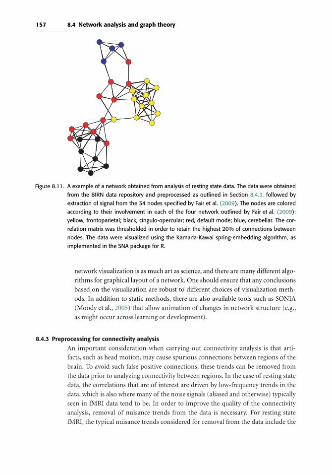
157 8.4 Network analysis and graph theory
Figure 8.11. A example of a network obtained from analysis of resting state data. The data were obtained
from the BIRN data repository and preprocessed as outlined in Section 8.4.3, followed by
extraction of signal from the 34 nodes specified by Fair et al. (2009). The nodes are colored
according to their involvement in each of the four network outlined by Fair et al. (2009):
yellow, frontoparietal; black, cingulo-opercular; red, default mode; blue, cerebellar. The cor-
relation matrix was thresholded in order to retain the highest 20% of connections between
nodes. The data were visualized using the Kamada-Kawai spring-embedding algorithm, as
implemented in the SNA package for R.
network visualization is as much art as science, and there are many different algo-
rithms for graphical layout of a network. One should ensure that any conclusions
based on the visualization are robust to different choices of visualization meth-
ods. In addition to static methods, there are also available tools such as SONIA
(Moody et al., 2005) that allow animation of changes in network structure (e.g.,
as might occur across learning or development).
8.4.3 Preprocessing for connectivity analysis
An important consideration when carrying out connectivity analysis is that arti-
facts, such as head motion, may cause spurious connections between regions of the
brain. To avoid such false positive connections, these trends can be removed from
the data prior to analyzing connectivity between regions. In the case of resting state
data, the correlations that are of interest are driven by low-frequency trends in the
data, which is also where many of the noise signals (aliased and otherwise) typically
seen in fMRI data tend to be. In order to improve the quality of the connectivity
analysis, removal of nuisance trends from the data is necessary. For resting state
fMRI, the typical nuisance trends considered for removal from the data include the
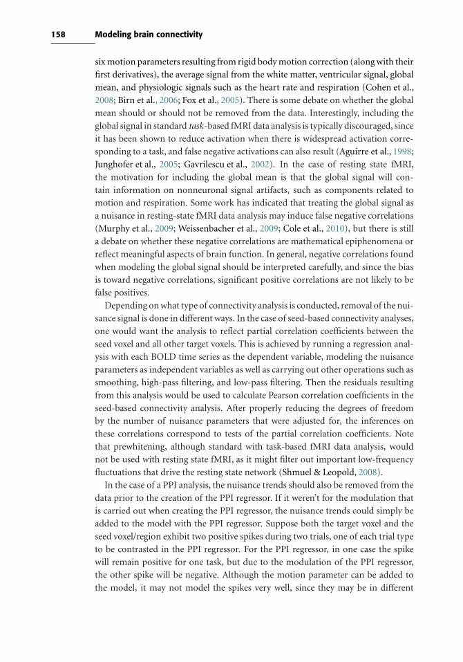
158 Modeling brain connectivity
six motion parameters resulting from rigid body motion correction (along with their
first derivatives), the average signal from the white matter, ventricular signal, global
mean, and physiologic signals such as the heart rate and respiration (Cohen et al.,
2008; Birn et al., 2006; Fox et al., 2005). There is some debate on whether the global
mean should or should not be removed from the data. Interestingly, including the
global signal in standard task-based fMRI data analysis is typically discouraged, since
it has been shown to reduce activation when there is widespread activation corre-
sponding to a task, and false negative activations can also result (Aguirre et al., 1998;
Junghofer et al., 2005; Gavrilescu et al., 2002). In the case of resting state fMRI,
the motivation for including the global mean is that the global signal will con-
tain information on nonneuronal signal artifacts, such as components related to
motion and respiration. Some work has indicated that treating the global signal as
a nuisance in resting-state fMRI data analysis may induce false negative correlations
(Murphy et al., 2009; Weissenbacher et al., 2009; Cole et al., 2010), but there is still
a debate on whether these negative correlations are mathematical epiphenomena or
reflect meaningful aspects of brain function. In general, negative correlations found
when modeling the global signal should be interpreted carefully, and since the bias
is toward negative correlations, significant positive correlations are not likely to be
false positives.
Depending on what type of connectivity analysis is conducted, removal of the nui-
sance signal is done in different ways. In the case of seed-based connectivity analyses,
one would want the analysis to reflect partial correlation coefficients between the
seed voxel and all other target voxels. This is achieved by running a regression anal-
ysis with each BOLD time series as the dependent variable, modeling the nuisance
parameters as independent variables as well as carrying out other operations such as
smoothing, high-pass filtering, and low-pass filtering. Then the residuals resulting
from this analysis would be used to calculate Pearson correlation coefficients in the
seed-based connectivity analysis. After properly reducing the degrees of freedom
by the number of nuisance parameters that were adjusted for, the inferences on
these correlations correspond to tests of the partial correlation coefficients. Note
that prewhitening, although standard with task-based fMRI data analysis, would
not be used with resting state fMRI, as it might filter out important low-frequency
fluctuations that drive the resting state network (Shmuel & Leopold, 2008).
In the case of a PPI analysis, the nuisance trends should also be removed from the
data prior to the creation of the PPI regressor. If it weren’t for the modulation that
is carried out when creating the PPI regressor, the nuisance trends could simply be
added to the model with the PPI regressor. Suppose both the target voxel and the
seed voxel/region exhibit two positive spikes during two trials, one of each trial type
to be contrasted in the PPI regressor. For the PPI regressor, in one case the spike
will remain positive for one task, but due to the modulation of the PPI regressor,
the other spike will be negative. Although the motion parameter can be added to
the model, it may not model the spikes very well, since they may be in different

159 8.4 Network analysis and graph theory
directions in the PPI regressor. The solution is to remove all nuisance trends from
the data prior to creation of the seed time series and creation of the PPI regressor.
This would be accomplished as previously described in the case of resting-state data.
Of course, inferences should account for the additional degrees of freedom that were
used in the nuisance model.
Lastly, for independent component analysis, it is not necessary to model nuisance
parameters from the data, since the nuisance components will automatically be
separated from the resting-state network components. The challenge is separating
out these two groups of components, although an approach for identifying resting
state network components based on how well they match the default mode network
(Greicius & Menon, 2004; Greicius et al., 2007).

9
Multivoxel pattern analysis andmachine learning
9.1 Introduction to pattern classification
The statistical methods discussed in the book so far have had the common feature
of trying to best characterize the dataset at hand. For example, when we apply
the general linear model to a dataset, we use methods that determine the model
parameters that best describe that dataset (where “best” means “with the lowest
mean squared difference between the observed and fitted data points”). The field
known variously asmachine learning, statistical learning, or pattern recognition takes
a different approach to modeling data. Instead of finding the model parameters that
best characterize the observed data, machine learning methods attempt to find the
model parameters that allow the most accurate prediction for new observations. The
fact that these are not always the same is one of the most fundamental intuitions
that underlies this approach.
The field of machine learning is enormous and continually growing, and we can
only skim the surface of these methods in this chapter. At points we will assume
that the reader has some familiarity with the basic concepts of machine learning.
For readers who want to learn more, there are several good textbooks on machine
learning methods, including Alpaydin (2004), Bishop (2006), Duda et al. (2001),
and Hastie et al. (2001). With regard to the specific application of machine learning
methods to fMRI, often referred to as multivoxel pattern analysis or MVPA, excel-
lent reviews include Haynes & Rees (2006), Norman et al. (2006), and O’Toole et al.
(2007) Links to software packages for machine learning analysis can be found on the
book Web site.
9.1.1 An overview of the machine learning approach
The goal of machine learning is to maximize the ability to make predictions about
data that have not yet been observed; that is, we wish to generalize from the observed
data to yet-unseen data. For example, we may wish to use fMRI data to predict
which of two drugs will more effectively treat a new psychiatric patient or to decode
160

161 9.1 Introduction to pattern classification
the kind of mental process that an individual is engaged in. When the prediction is
one of a set of discrete categories, we refer to it as classification, whereas when it is
a continuous value we refer to it as regression; since nearly all applications to fMRI
have used classification rather than regression, we will refer generally to classification
and regression machines as classifiers.
9.1.1.1 Features, observations, and the “curse of dimensionality”
In machine learning, we aim to learn the relation between a set of observed features
(in our case, the intensity of voxels) and some outcome variable (e.g., mental state or
psychiatric diagnosis) over some set of observations (usually either individual trials
or individual subjects). However, in fMRI (as in many other modern data analysis
problems), the number of features (usually more than 50,000) is many times greater
than the number of observations (20–100). This makes it impossible to fit a standard
GLM model to the data using standard techniques, since the number of features in
a GLM must be less than the number of observations to estimate a unique set of
parameters. The large number of dimensions also poses a more fundamental prob-
lem in modeling. To adequately model a dataset, we need to measure systematically
across the range of each variable being measured. For example, if we want to examine
the relation between height and weight, we need to sample individuals whose height
varies across the entire range of the population. However, as we add dimensions, the
number of samples that are required to cover the range of all dimensions grows expo-
nentially; this problem is known as the “curse of dimensionality” (Bellman, 1961).
The field of machine learning is largely concerned with developing methods to
deal with this curse. One way to do so is to reduce the number of dimensions. For
example, if there is redundant information across many dimensions, then one can
use dimensionality reduction techniques such as principal components analysis or
independent components analysis to identify a smaller set of alternative dimensions
that give rise to the data. Another way to address the curse is to assume that the signal
is sparse in the data, and focus on a small number of features. This can be done either
by using a classifier that is designed to find sparse solutions, or through the use of
feature selection techniques that reduce the number of features being examined.
9.1.1.2 Overfitting
One might think that the model that fits the observed data best would be most likely
to also predict new outcomes most accurately, but it is easy to see that this is not the
case (see Figure 9.1). A more complex model (i.e., a model with more parameters)
will always fit the training data more accurately; in the limit, if there are as many
parameters as there are data points, then the data can be fit perfectly. However, if
the actual function relating these variables is less complex (e.g., a linear or quadratic
function), then using a more complex model will result in overfitting, in which the
model fit is driven largely by noise in the training data. This results in a better fit for
the training data but worse generalization to the test data, as show in Figure 9.1.

162 Multivoxel pattern analysis and machine learning
0 10 20 30 40 50
−0.
4−
0.2
0.0
0.2
0.4
Data points
Trai
ning
val
ue
LinearCubic20th order
5 10 15 20
0.0
0.5
1.0
1.5
Model order
Mea
n sq
uare
d er
ror
Training errorTest error
Figure 9.1. An example of overfitting. The left panel shows a set of data points created by adding random
Gaussian noise to a cubic function. The data were then fitted using three different models: A
linear model (solid line), the correct cubic model (dotted line), and a 20th-order polynomial
model (dashed line). The cubic model clearly fits the response. The linear model underfits the
data, whereas the 20th-order model overfits the data, adapting its response to noise present
in many of the individual data points. The right panel shows the fit of the model to the training
data and to a test dataset generated using the same function with independent noise values.
Whereas increasing the model order always increases the fit to the training data, the fit of the
model to the test data actually decreases as the model order increases beyond the true value
of 3, reflecting overfitting to the training data.
163 9.3 Data extraction
9.2 Applying classifiers to fMRI data
The process of applying a classifier to fMRI data (often referred to as multivoxel
pattern analysis or MVPA) follows four steps:
• Data extraction: Extract the data that will be used to train and test the classifier.
• Feature selection: Select which features will be included in the analysis.
• Training and testing : Train the classifier on the dataset and determine its accuracy
at out-of-sample generalization.
• Classifier characterization: Determine which features are most important for
classification accuracy.
9.3 Data extraction
The data that are extracted from the fMRI timeseries depend upon the nature of
the classification problem. For classification of different events for a particular indi-
vidual (which we will call within-subject classification), the challenge is to extract
the features that best reflect the activity evoked by each event. This is relatively
easy for blocked designs because there are sets of timepoints that can be uniquely
attributed to each particular condition. One can either include all of the time-
points within a block, or use some summary of the timepoints such as the mean
or the beta of a GLM model for the block. For event-related designs with relatively
long intertrial intervals (greater than about 10 seconds), we can extract the sig-
nal evoked on each event with relatively little contamination due to other events;
one can either use the beta-series correlation model discussed in Section 8.2.3, or
use a simpler approach in which one simply takes the single timepoint that occurs
4–6 seconds after the event, which should capture the peak of the hemodynamic
response. For rapid event-related designs, the overlap between different events makes
the data extraction problem much more difficult. One alternative method applica-
ble to both slow and rapid event-related designs is to use a beta-series approach
(Section 8.2.3). However, for rapid designs the closeness of the events in time may
result in substantial correlations in the design matrix that will cause highly variable
estimates. It is possible to use ridge regression in order to address this problem
(Rizk-Jackson et al., 2008) but the sensitivity of this approach will almost certainly
be low.
Another alternative is to enter the entire timecourse of each trial into the classifier,
which is known as a spatiotemporal classifier (Mourão-Miranda et al., 2007). In this
case, the classifier will determine which timepoints contain relevant information.
This approach has the benefit of not assuming any particular shape for the hemo-
dynamic response and thus may be more sensitive if the response differs from the
canonical shape. However, it also greatly increases the number of features and could
make it more difficult for some classifiers to learn. We would generally recommend
that researchers who are interested in applying machine learning methods should

164 Multivoxel pattern analysis and machine learning
use either blocked designs or relatively slow event-related designs to mitigate the
severe feature extraction problems that arise with rapid event-related designs.
Another alternative is to forego trial-by-trial classification and instead classify
between summary statistic maps estimated for separate portions of the data (e.g.,
separate runs) (e.g., Haxby et al., 2001; Haynes et al., 2007) This eliminates the prob-
lems with estimation of trial-by-trial responses, but it does slightly change the
conclusions that one can draw from the results; rather than implying that one can
accurately decode individual trials, it instead provides a more general measure of
how much information is present regarding the distinction that is being classified. A
similar approach can be used for studies that attempt to classify across individuals;
in this case, it is most common to use some form of spatially normalized summary
map for each individual, such as a parameter estimate map or t/Z -statistic map.
There may be some utility in using statistical maps rather than parameter estimate
maps because they have the same scaling across voxels.
9.4 Feature selection
Having extracted the relevant data from the fMRI timeseries, the next step is to
determine which features (voxels) to include in the classifier analysis. There are two
possible layers of feature selection. First, we can identify a set of voxels in a way
that does not involve any knowledge of the outcome variable, either using a priori
anatomical knowledge or features of the data that are unrelated to the outcome
variable. Second, we can use the classifier to identify which voxels are most useful
for classification, and use just those features in the analysis. The former is discussed
here; the latter, in Section 9.5.
Most simply, one can just include the data from the entire brain (Poldrack et al.,
2009; Hanson & Halchenko, 2008). Depending upon the voxel size, this can be up to
300,000 features, which is beyond the limits of some classifiers (e.g., neural networks)
and stretches the limits of many others. Support vector machines are generally the
classifier of choice for this kind of analysis, as they perform well even with very large
numbers of features (but still sometimes benefit from further feature selection). The
whole-brain approach is most appropriate when the question of interest is whether
there is information in the brain relevant to some particular functional distinction,
without regard to where that information is found (though it is possible to obtain
localization for some whole-brain classifiers using the classifier characterization
methods to be discussed in Section 9.6).
It is also possible to limit the analysis to particular voxels using a priori regions
of interest. Various strategies for specification of ROIs are discussed in Section
10.4.2 and include the use of individualized anatomical labels or population-based
anatomical atlases as well as independent functional localizers. This strategy can be
particularly useful when the goal is to identify the relative importance of particular
anatomically or functionally defined region in a specific function or to focus on a
165 9.5 Training and testing the classifier
particular region of prior interest. It is important to ensure that the selection of ROI
is not based on any knowledge of the results from the analysis, since this could bias
the resulting generalization estimates.
Beyond anatomically driven feature selection, it is also possible to perform unsu-
pervised feature selection using characteristics of the individual features that are
unrelated to the outcome variable. For example, we might choose those features that
have the highest variance across observations, under the assumption that they are
likely to carry more information about differences between observations than would
less-variable features.
9.5 Training and testing the classifier
Once we have preprocessed the data, the next step is to train the classifier and assess its
generalization performance (by comparing its predictions to the known true values
of the outcome variable). To accurately assess the performance of the classifier in
generalization to new data, it is critical that we use separate datasets to train and test
the classifier (see Box 9.5.2). The simplest way to do this would be to collect two
datasets, using one to train the classifier and the other to test it. However, this would
be inefficient, since we would have to collect twice the number of observations that
we would otherwise collect. In addition, the results would be rather variable, since
they would depend upon which observations randomly appear in the study and test
samples. Fortunately, there are much more effective ways to assess generalization
ability, which take advantage of the fact that we can use the same data for training
and testing if we do so in separate training–testing iterations. This procedure goes by
the name of cross-validation; it is often referred to as k-fold cross-validation reflecting
the fact that the data are broken into k blocks of observations, and the classifier is
trained on all blocks but one, then tested on the left-out block, which is then repeated
for all blocks. If k is equal to the number of observations, then this is called leave-
one-out cross-validation. Leave-one-out cross-validation is relatively costly in terms
of computation (since the classifier has to be fit for each left-out observation) but
will provide an unbiased measure of test accuracy, whereas cross-validation with
larger k may sometimes be biased; ten-fold cross-validation appears to be a good
compromise (Hastie et al., 2009).
9.5.1 Feature selection/eliminationIt is common to use feature selection within the cross-validation cycle to reduce the
number of features by excluding noninformative features (which add noise but no
signal). For example, we can perform a statistical test to determine whether each voxel
shows a statistically significant difference between conditions. A more sophisticated
approach is known as recursive feature elimination (Guyon et al., 2002), in which
166 Multivoxel pattern analysis and machine learning
Box 9.5.2 The importance of separate training and test data
The goal of any classifier analysis is an accurate assessment of generalization, that
is, performance on a test dataset that is completely separate from the data used to
train the classifier. However, information about the test set can be insidious, and
any contamination of the training data with the test data will result in an overesti-
mate of generalization performance. It is thus extremely important to ensure that
the training procedure does not involve any “peeking” at the test data. One good
clue that contamination has occurred is when one sees classifier performance that
is too good ; if generalization performance on a test set is at 99% accuracy, it is
very likely that some contamination has occurred.
A good general strategy for identifying contamination is to execute the
entire processing stream using a dataset where the relationship between the
features and outcomes has been broken (e.g., by randomly reassigning the out-
comes across observations). This requires the assumption of exchangeability
(Nichols & Holmes, 2002) (see Section 7.3.1.4), so it is important to make sure
that the units of reassignment are exchangeable under the null hypothesis. It is
useful to have a processing stream that is completely automated, so that this can
be run many times and the average accuracy can be computed. Because the aver-
age accuracy should be identical to chance in this situation, any bias should be
evident.
As an example, let’s say that we wish to classify which of two classes of stimuli
is present based on signal from a set of voxels. (A simulation of this analysis is
available on the book Web site.) We would like to limit our analysis only to voxels
that are likely to show an effect of the stimulus class, to reduce the impact of noise
on our analysis, which can be determined using a standard univariate statistical
test at each voxel. As a simple procedure, let’s take half of the data as our training
data and the other half as the test data. We could perform the univariate test over
the entire dataset (training + test halves), taking the voxels that show the greatest
difference between classes in that dataset. Alternatively, we could perform the
same feature selection using only the data from the training set. If we perform
these analyses in a simulation where there is true signal present, we will see that
both of them will show significant classification accuracy, but the procedure that
includes the test data will show slightly higher generalization accuracy. The bias
due to including test data in the feature selection procedure is even more evident
when we simulate what happens when there is not actually any signal present.
In this case, the procedure using only the training data to select features exhibits
accuracy of 50%, as one would expect when there is no signal present. However,
the procedure using both training and test data to select features shows accuracy
above chance; for example, if there are 1,000 voxels and we choose the top 10 for
inclusion in the analysis, the test accuracy will be around 75%, even though there is
no signal actually present! The reason for this false accuracy is that the feature

167 9.5 Training and testing the classifier
Box 9.5.2 (Continued)
selection procedure found those voxels that just happened to have differences in
signal between the classes (due to random noise) in both the training and test
phases. This analysis highlights the utility and importance of simulating one’s
entire analysis stream using noise data.
the classifier is iteratively fit and at each step a certain number or proportion of the
least informative features is removed. Such approaches can in some cases be useful
to increase classifier performance. It is critical that feature selection is performed
on training data that are separate from the test set; if the test data are used in
the feature selection step, then the test results are likely to be compromised (see
Box 9.5.2).
Feature selection can also be accomplished using dimensionality reduction tech-
niques to reduce the data to a smaller number of dimensions, which may nonetheless
carry nearly all of the information present in the larger dataset (due to correlations
among features). For example, the matrix decomposition methods discussed in
Section 8.2.5, such as PCA and ICA, can be used for this purpose.
9.5.2 Classifiers for fMRI dataBefore performing a classification analysis, it is necessary to choose which of the
myriad available techniques one will use.
9.5.2.1 Linear vs. nonlinear classifiers
Classifiers vary in the kinds of statistical relations that they can detect. Linear classi-
fiers can detect effects where it is possible to separate the data points associated with
each class using a linear function; in two dimensions this is a line, whereas in high-
dimensional spaces this will be a hyperplane. Nonlinear classifiers can detect effects
that are defined by more complex functions. Figures 9.2 and 9.3 show examples of
a range of classifiers (both linear and nonlinear) applied to classification problems
that are linear and nonlinear, respectively.
The literature on fMRI classification has largely used linear classifiers, for several
reasons. First, linear classifiers are generally the simplest to understand (though
some nonlinear classifiers, such as quadratic discriminant analysis, are also quite
simple). Second, linear classifiers are generally easier to characterize, as discussed
in Section 9.6. Third, nonlinear classifiers have additional parameters that require
optimization, and this generally requires an additional layer of cross-validation
(since the parameter optimization must be independent of the test data). Despite
this, there will clearly be some problems for which linear classifiers fail but nonlinear
classifiers succeed, and it is important to include nonlinear classifiers in any relative
assessment of classifier performance.
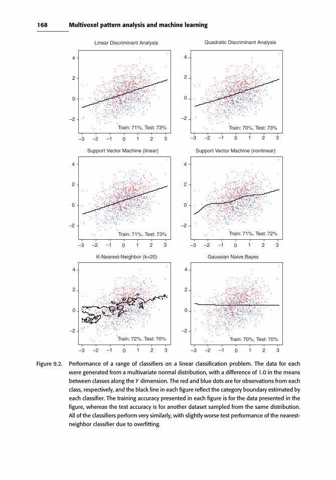
168 Multivoxel pattern analysis and machine learning
4
2
0
–2
–3 –2 –1 0 1 2 3
4
2
0
–2
–3 –2 –1 0 1 2 3
4
2
0
–2
–3 –2 –1 0 1 2 3
4
2
0
–2
–3 –2 –1 0 1 2 3
4
2
0
–2
–3 –2 –1 0 1 2 3
4
2
0
–2
–3 –2 –1 0 1 2 3
Linear Discriminant Analysis Quadratic Discriminant Analysis
Support Vector Machine (nonlinear)Support Vector Machine (linear)
Gaussian Naive BayesK-Nearest-Neighbor (k=20)
Train: 70%, Test: 70%Train: 72%, Test: 70%
Train: 71%, Test: 73%
Train: 71%, Test: 73% Train: 70%, Test: 73%
Train: 71%, Test: 72%
Figure 9.2. Performance of a range of classifiers on a linear classification problem. The data for each
were generated from a multivariate normal distribution, with a difference of 1.0 in the means
between classes along the Y dimension. The red and blue dots are for observations from each
class, respectively, and the black line in each figure reflect the category boundary estimated by
each classifier. The training accuracy presented in each figure is for the data presented in the
figure, whereas the test accuracy is for another dataset sampled from the same distribution.
All of the classifiers perform very similarly, with slightly worse test performance of the nearest-
neighbor classifier due to overfitting.
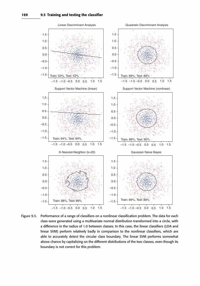
169 9.5 Training and testing the classifier
1.5
1.0
0.5
0.0
–0.5
–1.0
–1.5
–1.5 –1.0 –0.5 0.0 0.5 1.0 1.5
1.5
1.0
0.5
0.0
–0.5
–1.0
–1.5
–1.5 –1.0 –0.5 0.0 0.5 1.0 1.5
1.5
1.0
0.5
0.0
–0.5
–1.0
–1.5
–1.5 –1.0 –0.5 0.0 0.5 1.0 1.5
1.5
1.0
0.5
0.0
–0.5
–1.0
–1.5
–1.5 –1.0 –0.5 0.0 0.5 1.0 1.5
1.5
1.0
0.5
0.0
–0.5
–1.0
–1.5
–1.5 –1.0 –0.5 0.0 0.5 1.0 1.5
1.5
1.0
0.5
0.0
–0.5
–1.0
–1.5
–1.5 –1.0 –0.5 0.0 0.5 1.0 1.5
Linear Discriminant Analysis Quadratic Discriminant Analysis
Support Vector Machine (linear)
Train: 53%, Test: 53%
Support Vector Machine (nonlinear)
K-Nearest-Neighbor (k=20) Gaussian Naive Bayes
Train: 89%, Test: 89%
Train: 64%, Test: 64%
Train: 88%, Test: 89% Train: 89%, Test: 89%
Train: 89%, Test: 90%
Figure 9.3. Performance of a range of classifiers on a nonlinear classification problem. The data for each
class were generated using a multivariate normal distribution transformed into a circle, with
a difference in the radius of 1.0 between classes. In this case, the linear classifiers (LDA and
linear SVM) perform relatively badly in comparison to the nonlinear classifiers, which are
able to accurately detect the circular class boundary. The linear SVM performs somewhat
above chance by capitalizing on the different distributions of the two classes, even though its
boundary is not correct for this problem.

170 Multivoxel pattern analysis and machine learning
9.5.2.2 Computational limitations
Classifiers also vary in the size of the feature sets they can accommodate, and their
efficiency at fitting large datasets. Some classifiers (such as support vector machines)
can be implemented in such a way that very large datasets (e.g., several hundred
thousand features) can be fit in a reasonable amount of time (e.g., 1–2 hours).
Others, such as neural networks, are feasible with datasets up to about 5,000 to
10,000 features, at which point memory requirements become a limiting factor
(depending upon the specific algorithm and implementation). In addition, fitting
of these models can take a very long time. At the other end of the spectrum are
classifiers, such as linear discriminant analysis, that require that the number of
features is less than the number of observations; these methods are generally used
in conjunction with some form of dimensionality reduction in order to address this
limitation.
9.5.2.3 Tendency to overfit
Classifiers also vary in their tendency to overfit the data. Some classifiers, such as
one-nearest-neighbor classifiers and simple neural network methods, are very likely
to overfit the data, resulting in very good training performance but very bad gener-
alization. However, most classification techniques use some form of regularization
to prevent overfitting. Further, some techniques (such as support vector machines)
are specifically designed to prevent overfitting.
9.5.3 Which classifier is best?There is a large literature focused on the development of newer and better clas-
sifier techniques, and one often sees papers in the fMRI literature that report the
application of a novel classifier technique to fMRI data, touting its performance
in comparison to other methods. It is critical to realize, however, that although
particular classifiers may work well for particular datasets or problems, no single
method is superior across all datasets and classification problems. This can in fact
be proven formally and is known as the “no free lunch” theorem in machine learning
(Duda et al., 2001). Each particular classifier will perform well on datasets that are
well-matched to its particular assumptions, whereas the same classifier could per-
form very badly on other datasets that are mismatched. It is thus important to test a
range of classifiers to ensure that the results of any study are not limited by the nature
of the particular classifier being studied. Using tools such as the PyMVPA toolbox
or the R software package, it is possible to assess the performance of a large panel
of classifiers on any dataset, which will likely provide the best guidance as to which
classifier is most appropriate to the problem at hand. Again here, it is important that
any such model selection is performed on data that are separate from the ultimate
test data.
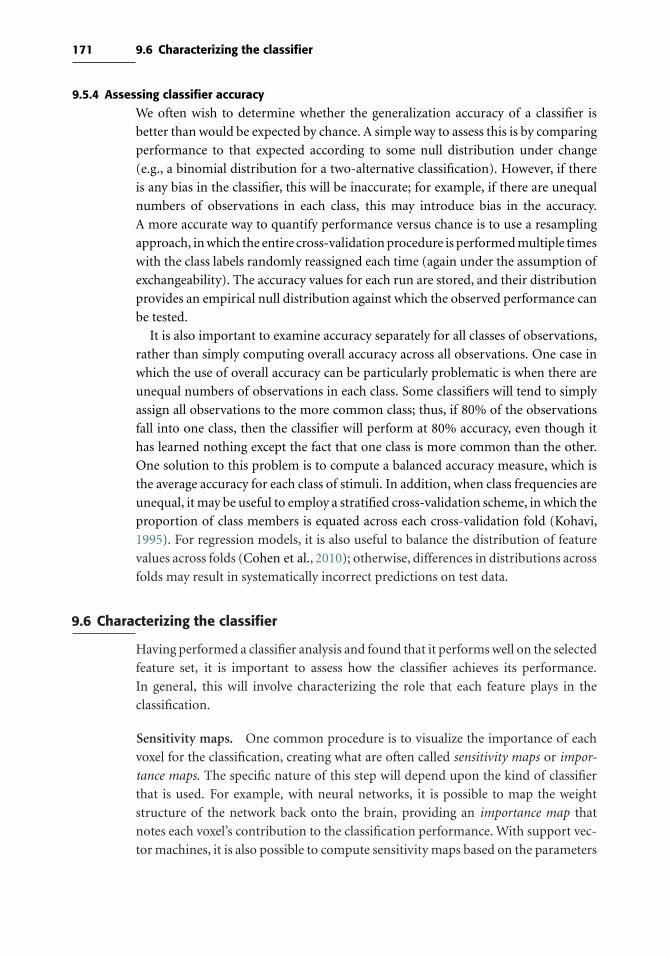
171 9.6 Characterizing the classifier
9.5.4 Assessing classifier accuracy
We often wish to determine whether the generalization accuracy of a classifier is
better than would be expected by chance. A simple way to assess this is by comparing
performance to that expected according to some null distribution under change
(e.g., a binomial distribution for a two-alternative classification). However, if there
is any bias in the classifier, this will be inaccurate; for example, if there are unequal
numbers of observations in each class, this may introduce bias in the accuracy.
A more accurate way to quantify performance versus chance is to use a resampling
approach, in which the entire cross-validation procedure is performed multiple times
with the class labels randomly reassigned each time (again under the assumption of
exchangeability). The accuracy values for each run are stored, and their distribution
provides an empirical null distribution against which the observed performance can
be tested.
It is also important to examine accuracy separately for all classes of observations,
rather than simply computing overall accuracy across all observations. One case in
which the use of overall accuracy can be particularly problematic is when there are
unequal numbers of observations in each class. Some classifiers will tend to simply
assign all observations to the more common class; thus, if 80% of the observations
fall into one class, then the classifier will perform at 80% accuracy, even though it
has learned nothing except the fact that one class is more common than the other.
One solution to this problem is to compute a balanced accuracy measure, which is
the average accuracy for each class of stimuli. In addition, when class frequencies are
unequal, it may be useful to employ a stratified cross-validation scheme, in which the
proportion of class members is equated across each cross-validation fold (Kohavi,
1995). For regression models, it is also useful to balance the distribution of feature
values across folds (Cohen et al., 2010); otherwise, differences in distributions across
folds may result in systematically incorrect predictions on test data.
9.6 Characterizing the classifier
Having performed a classifier analysis and found that it performs well on the selected
feature set, it is important to assess how the classifier achieves its performance.
In general, this will involve characterizing the role that each feature plays in the
classification.
Sensitivity maps. One common procedure is to visualize the importance of each
voxel for the classification, creating what are often called sensitivity maps or impor-
tance maps. The specific nature of this step will depend upon the kind of classifier
that is used. For example, with neural networks, it is possible to map the weight
structure of the network back onto the brain, providing an importance map that
notes each voxel’s contribution to the classification performance. With support vec-
tor machines, it is also possible to compute sensitivity maps based on the parameters

172 Multivoxel pattern analysis and machine learning
assigned to each dimension. With any such maps, it is important to keep in mind that
they reflect the sensitivity of the particular classifier that was chosen for the analysis,
and that different classifiers may be sensitive to different features. In addition, sen-
sitivity may not imply that the feature is important for generalization. Nonetheless,
sensitivity maps are often useful for better understanding how the classifier achieves
its performance.
It is also possible to assess the importance of features by examining the effect of
disrupting them by adding noise. For example, Hanson et al. (2004) did this using a
neural network classifier, adding noise to each input voxel and choosing those where
noise affected performance by at least 30%. The exact nature of the noise is likely to
be important, depending upon the classifier, so this approach is recommended only
for users who have a very solid understanding of classifier behavior.
The searchlight procedure. Another technique that has been used to character-
ize regional classifier performance is the searchlight (Kriegeskorte et al., 2006). In
this method, a small sphere is placed with its center at each voxel, and the classi-
fier is trained and tested using only voxels within that sphere; the test accuracy is
then assigned to the center voxel. This provides a map showing which regions con-
tain information relevant to classification. Searchlight maps are particularly useful
because they can be used in a group analysis to find regions that show consis-
tent classification accuracy across subjects. There are two potential difficulties with
searchlight analyses. First, depending upon the speed of the particular classifier, the
resolution of the data, and the choice of searchlight radius, running a searchlight
at every voxel in the brain can result in very long computation times. Second, the
choice of radius may affect the nature of the results; a very large searchlight will
potentially integrate information across multiple functional regions, whereas a very
small searchlight will integrate information over just a few voxels. The appropriate
choice of searchlight radius depends upon the hypothesis that is being tested.
Once searchlight maps are obtained, it is necessary to threshold them in order to
identify which regions show significant classification performance. For individual
subjects, one common practice is to threshold the map using a binomial test. How-
ever, this approach can be problematic if there is any bias in the classifier, so it is best
to use permutation testing as described earlier. For group analyses, the searchlight
sensitivity maps can be submitted to a standard GLM analysis treating subjects as a
random effect.

10
Visualizing, localizing, and reportingfMRI data
The dimensionality of fMRI data is so large that, in order to understand the data,
it is necessary to use visualization tools that make it easier to see the larger patterns
in the data. Parts of this chapter are adapted from Devlin & Poldrack (2007) and
Poldrack (2007).
10.1 Visualizing activation data
It is most useful to visualize fMRI data using a tool that provides simultaneous
viewing in all three canonical orientations at once (see Figure 10.1), which is available
in all of the major analysis packages.
Because we wish to view the activation data overlaid on brain anatomy, it is
necessary to choose an anatomical image to serve as an underlay. This anatomical
image should be as faithful as possible to the functional image being overlaid. When
viewing an individual participant’s activation, the most accurate representation is
obtained by overlaying the statistical maps onto that individual’s own anatomical
scan coregistered to the functional data. When viewing activation from a group
analysis, the underlay should reflect the anatomical variability in the group as well
as the smoothing that has been applied to the fMRI data. Overlaying the activation
on the anatomical image from a single subject, or on a single-subject image, implies
a degree of anatomical precision that is not actually present in the functional data.
Instead, the activation should be visualized on an average structural image from the
group coregistered to the functional data, preferably after applying the same amount
of spatial smoothing as was applied to the functional data. Although this appears
less precise due to the blurring of macroanatomical landmarks, it accurately reflects
the imprecision in the functional data due to underlying anatomical variability and
smoothing.
After choosing an appropriate underlay, it is then necessary to choose how to visu-
alize the statistical map. Most commonly, the map is visualized after thresholding,
173
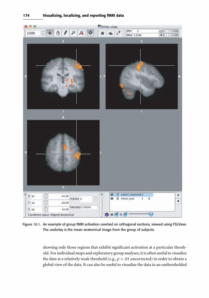
174 Visualizing, localizing, and reporting fMRI data
Figure 10.1. An example of group fMRI activation overlaid on orthogonal sections, viewed using FSLView.
The underlay is the mean anatomical image from the group of subjects.
showing only those regions that exhibit significant activation at a particular thresh-
old. For individual maps and exploratory group analyses, it is often useful to visualize
the data at a relatively weak threshold (e.g., p< .01 uncorrected) in order to obtain a
global view of the data. It can also be useful to visualize the data in an unthresholded

175 10.1 Visualizing activation data
Figure 10.2. Various ways of viewing fMRI activation maps. Left panel: Standard thresholded activation
maps, showing positive activation in red/yellow and negative activation in blue/green. Middle
panel: True color map of the same data, showing positive signals in red and negative signals
in blue, created using the mricron software package. Right panel: Rendering of the same data
onto the cortical surface, using the CARET software package.
manner, using truecolor maps (see Figure 10.2). This gives a global impression of
the nature of the statistical map and also provides a view of which regions are not
represented in the statistical map due to dropout or artifacts, as well as showing
both positive and negative effects. For inference, however, we always suggest using a
corrected threshold.
Another way to view activation data is to project them onto the cortical sur-
face, as shown in Figure 10.2. This can be a very useful way to visualize activation,
as it provides a three-dimensional perspective that can be difficult to gain from
anatomical slices alone. In addition, data can be registered by alignment of cortical
surface features and then analyzed in surface space, which can sometimes provide
better alignment across subjects than volume-based alignment (e.g., Desai et al.,
2005). However, these methods often require substantial processing time and man-
ual intervention to accurately reconstruct the cortical surface. Recently, a method
has been developed that allows projection of individual or group functional activa-
tion onto a population-based surface atlas (Van Essen, 2005). This method, known
as multifiducial mapping, maps the activation data from a group analysis onto the
cortical surfaces of a group of (different) subjects and then averages those map-
pings, thus avoiding the bias that would result from mapping group data onto a
single subject’s surface. Although individual reconstruction will remain the gold
standard for mapping activation data to the cortical surface, the multifiducial map-
ping technique (implemented in the CARET software package) provides a useful
means for viewing projections of group activation data on a population-averaged
cortical surface.
SPM includes two visualization tools that are often used but can result in mislocal-
ization if used inappropriately. The first is the “glass brain” rendering that has been
used since the early days of PET analysis (see Figure 10.3). This is a three-dimensional

176 Visualizing, localizing, and reporting fMRI data
Low threshold
SPM{T15} SPM{T15}
High thresholdS
PM
mip
[0,0
,0]
SP
Mm
ip[0
,0,0
]
Figure 10.3. An example of SPM’s glass brain visualization, showing maximum intensity projections along
each axis. At a lower threhsold (shown the left panel), there are a relatively large number of
regions active, which makes it relatively difficult to determine the location of activation. At a
higher threshold (right panel), it becomes easier to identify the location of activated regions.
projection known as a “maximum intensity projection” as it reflects the strongest
signal along each projection through the brain for the given axis. Using the glass
brain figures to localize activation requires substantial practice, and even then it is
difficult to be very precise. In addition, if large amounts of activation are present, as
in the left panel of Figure 10.3, it can be difficult to differentiate activated regions.
The SPM“rendering” tool is often used to project activation onto the brain surface
for visualization (see Figure 10.4). It is important to note, however, that this is not
a proper rendering; rather, it is more similar to the maximum intensity projection
used for the glass brain. Our recommendation for visualization of group activation
on the cortical surface would be to project the data into cortical surface space, using
CARET or FreeSurfer, which will lead to more precise localization.
10.2 Localizing activation
One of the most common questions on the mailing lists for fMRI analysis soft-
ware packages is some variant of the following: “I’ve run an analysis and obtained
an activation map. How can I determine what anatomical regions are activated?”
As outlined by Devlin & Poldrack (2007), there are two approaches to this ques-
tion. One (which we refer to as “black-box anatomy”) is to use an automated tool
to identify activation locations, which requires no knowledge of neuroanatomy.
The alternative, which we strongly suggest, is to use knowledge of neuroanatomy
along with a variety of atlases to determine which anatomical regions are
activated.
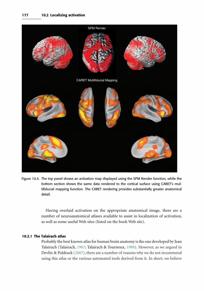
177 10.2 Localizing activation
SPM Render
CARET Multifiducial Mapping
Figure 10.4. The top panel shows an activation map displayed using the SPM Render function, while the
bottom section shows the same data rendered to the cortical surface using CARET’s mul-
tifiducial mapping function. The CARET rendering provides substantially greater anatomical
detail.
Having overlaid activation on the appropriate anatomical image, there are a
number of neuroanatomical atlases available to assist in localization of activation,
as well as some useful Web sites (listed on the book Web site).
10.2.1 The Talairach atlasProbably the best known atlas for human brain anatomy is the one developed by Jean
Talairach (Talairach, 1967; Talairach & Tournoux, 1988). However, as we argued in
Devlin & Poldrack (2007), there are a number of reasons why we do not recommend
using this atlas or the various automated tools derived from it. In short, we believe

178 Visualizing, localizing, and reporting fMRI data
that localization based on the Talairach atlas is an alluringly easy but bad option. It
is easy because the atlas has an overlaid coordinate system, which makes it trivial to
identify an activated location. It is nonetheless a bad option because this provides a
false sense of precision and accuracy, for a number of reasons:
1. The atlas is based on the single brain of a 60-year-old woman, and therefore is not
representative of either the population as a whole nor any individuals.
2. Almost all major analysis packages use the templates based on the MNI305
atlas as their target for spatial normalization, which are population-based (and
therefore representative) templates. An extra step is needed to convert coor-
dinates into Talairach space, and this introduces additional registration error.
Worse still, there is no consensus regarding how to perform this transformation
(Brett et al., 2002; Carmack et al., 2004; Lancaster et al., 2007) and therefore the
chosen method biases the results, introducing additional variation and therefore
reducing accuracy.
3. The atlas is based on a single left hemisphere that was reflected to model the
other hemisphere. However, there are well-known hemispheric asymmetries
in normal individuals (e.g., location of Heschl’s gyrus, length of precentral
gyrus), such that assuming symmetry across hemispheres will result in additional
inaccuracy.
4. The Talairach atlas is labeled with Brodmann’s areas, but the precision of these
labels is highly misleading. The labels were transferred manually from the
Brodmann’s map by Talairach, and even according to Talairach the mapping
is uncertain (cf., Brett et al., 2002; Uylings et al., 2005).
For all of these reasons, the Talairach atlas is not a good choice. Likewise, we believe
that automated coordinate-based labeling methods based on the Talairach atlas (such
as the Talairach Daemon: Lancaster et al., 2000) are problematic. We believe that it
is much better to take the nominally more difficult, but far more accurate, route of
using an anatomical atlas rather than one based on coordinates.
10.2.2 Anatomical atlasesOne atlas that we find particularly useful is the Duvernoy atlas (Duvernoy &
Bourgouin, 1999), which presents MRI images in all three canonical planes as well
as photographs of matching brain slices. The lack of a coordinate system in the atlas
forces one to localize not by coordinates but in terms of relevant macroanatom-
ical landmarks. In addition to Duvernoy (which has unfortunately gone out of
print), there are several other atlases that can also be useful (e.g., Mai et al., 2004;
Woolsey et al., 2008), and there are specialty atlases for specific brain regions such
as cerebellum (Schmahmann, 2000), hippocampus (Duvernoy, 2005), subcortical
structures (Lucerna et al., 2004), and white matter tracts (Mori et al., 2004). The
highly skilled neuroanatomist may be able to accurately label most structures with-
out an atlas, but for most researchers these atlases are essential. Moreover, the
process of examining the anatomy closely leads to a better appreciation of anatomical

179 10.3 Localizing and reporting activation
variability, increases one’s ability to correctly identify these structures in the future
without reference to an atlas, and helps build up a 3D internal mental model of
neuroanatomy, which we think is an essential aspect of neuroimaging expertise.
10.2.3 Probabilistic atlasesWhereas the atlases described previously are based on the brains of single individ-
uals, a probabilistic atlas attempts to provide a description of the variability in the
localization of specific anatomical structures within a stereotactic space across a large
number of individuals. For example, the LONI probabilistic atlas (Shattuck et al.,
2008) was created by manually labeling 56 structures in each hemisphere for a
group of 40 individuals and then normalizing those data into MNI space. The data
were then used to create maps that show the probability of any specific anatomi-
cal region at a particular region. A similar probabilistic atlas, based on a different
manual labeling scheme and known as the Harvard-Oxford atlas, is included with
FSL; the FSLView viewer also includes a set of atlas tools, which can provide for
any voxel whose regions are potentially present at that voxel and their likelihood
(see Figure 10.5). Because they are reflective of the variability that exists between
individuals, these atlases can provide a much more reliable way to label activation
locations.
10.2.4 Automated anatomical labeling
Another option for anatomical localization is the use of software capable of
automatically labeling individual T1-weighted images using standard anatomical
parcellation schemes (e.g., Desikan et al., 2006; Fischl et al., 2002). These techniques
rely on automated methods for identifying sulci and matching them to labeled
models in order to parcellate and identify anatomical regions. For example, the
FreeSurfer software package can parcellate a T1-weighted high-resolution anatomi-
cal image, providing a label image identifying the anatomical region for each voxel.
Similarly, the FIRST tool in FSL can produce parcellated images of subcortical struc-
tures. These tools can be very helpful when identifying anatomical regions, as well
as for creating independent anatomical regions of interest. However, the labelings
are not 100% accurate across individuals, and it is important to manually verify the
labeling, again with reference to an atlas. This is particularly the case for regions
such as the amygdala that can be very difficult to segment.
10.3 Localizing and reporting activation
Nearly all neuroimaging papers report tables with stereotactic coordinates and asso-
ciated anatomical labels; an example is shown in Table 10.1. In general, these
coordinates are reported in either the space defined by the Talairach atlas (which is
generally referred to as Talairach space) or that defined by the MNI template (which
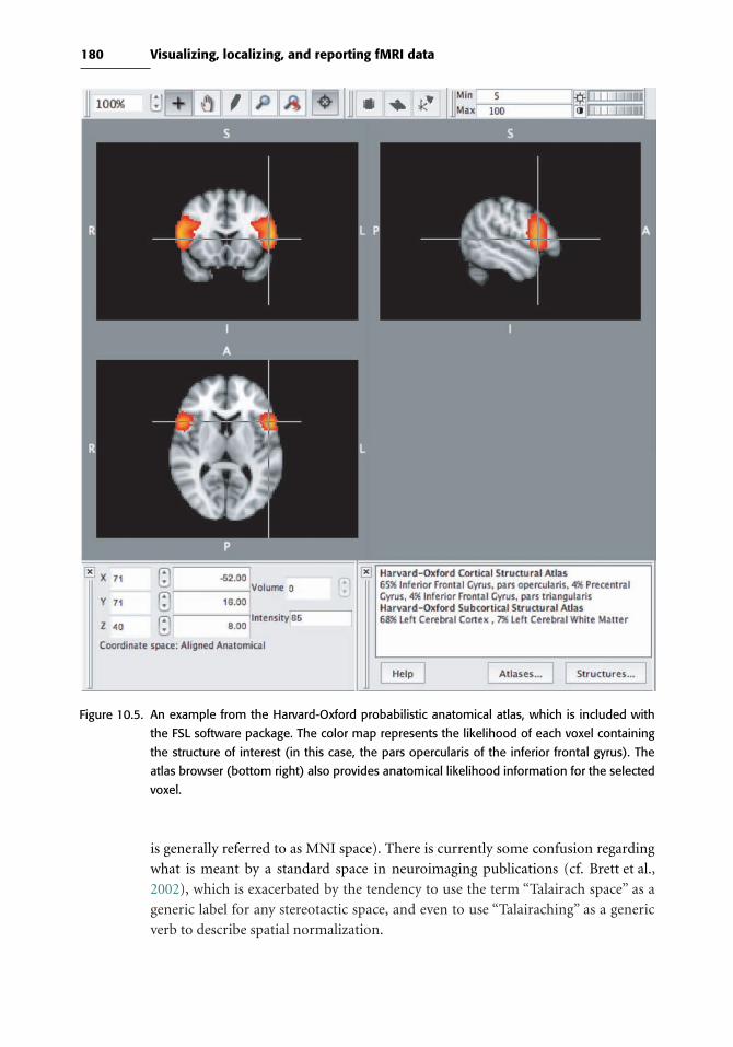
180 Visualizing, localizing, and reporting fMRI data
Figure 10.5. An example from the Harvard-Oxford probabilistic anatomical atlas, which is included with
the FSL software package. The color map represents the likelihood of each voxel containing
the structure of interest (in this case, the pars opercularis of the inferior frontal gyrus). The
atlas browser (bottom right) also provides anatomical likelihood information for the selected
voxel.
is generally referred to as MNI space). There is currently some confusion regarding
what is meant by a standard space in neuroimaging publications (cf. Brett et al.,
2002), which is exacerbated by the tendency to use the term “Talairach space” as a
generic label for any stereotactic space, and even to use “Talairaching” as a generic
verb to describe spatial normalization.
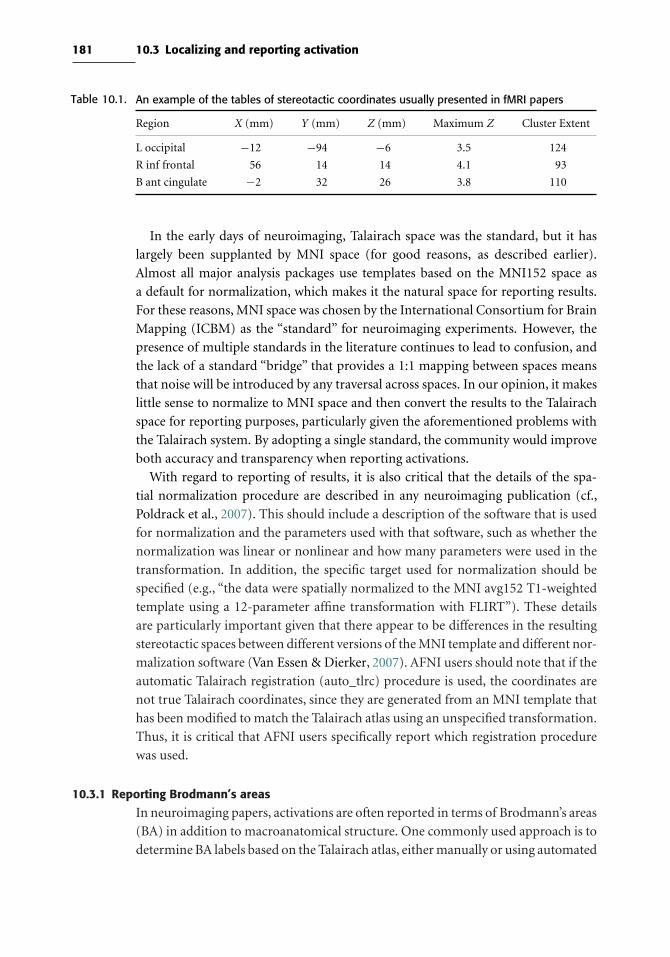
181 10.3 Localizing and reporting activation
Table 10.1. An example of the tables of stereotactic coordinates usually presented in fMRI papers
Region X (mm) Y (mm) Z (mm) Maximum Z Cluster Extent
L occipital −12 −94 −6 3.5 124
R inf frontal 56 14 14 4.1 93
B ant cingulate −2 32 26 3.8 110
In the early days of neuroimaging, Talairach space was the standard, but it has
largely been supplanted by MNI space (for good reasons, as described earlier).
Almost all major analysis packages use templates based on the MNI152 space as
a default for normalization, which makes it the natural space for reporting results.
For these reasons, MNI space was chosen by the International Consortium for Brain
Mapping (ICBM) as the “standard” for neuroimaging experiments. However, the
presence of multiple standards in the literature continues to lead to confusion, and
the lack of a standard “bridge” that provides a 1:1 mapping between spaces means
that noise will be introduced by any traversal across spaces. In our opinion, it makes
little sense to normalize to MNI space and then convert the results to the Talairach
space for reporting purposes, particularly given the aforementioned problems with
the Talairach system. By adopting a single standard, the community would improve
both accuracy and transparency when reporting activations.
With regard to reporting of results, it is also critical that the details of the spa-
tial normalization procedure are described in any neuroimaging publication (cf.,
Poldrack et al., 2007). This should include a description of the software that is used
for normalization and the parameters used with that software, such as whether the
normalization was linear or nonlinear and how many parameters were used in the
transformation. In addition, the specific target used for normalization should be
specified (e.g., “the data were spatially normalized to the MNI avg152 T1-weighted
template using a 12-parameter affine transformation with FLIRT”). These details
are particularly important given that there appear to be differences in the resulting
stereotactic spaces between different versions of the MNI template and different nor-
malization software (Van Essen & Dierker, 2007). AFNI users should note that if the
automatic Talairach registration (auto_tlrc) procedure is used, the coordinates are
not true Talairach coordinates, since they are generated from an MNI template that
has been modified to match the Talairach atlas using an unspecified transformation.
Thus, it is critical that AFNI users specifically report which registration procedure
was used.
10.3.1 Reporting Brodmann’s areas
In neuroimaging papers, activations are often reported in terms of Brodmann’s areas
(BA) in addition to macroanatomical structure. One commonly used approach is to
determine BA labels based on the Talairach atlas, either manually or using automated

182 Visualizing, localizing, and reporting fMRI data
means such as the Talairach Daemon. However, as previously discussed, the BA labels
in the Talairach atlas are actually just “guesstimates” about the actual location of
Brodmann’s areas. Another approach is to infer BA labels from macroanatomy using
Brodmann’s original map as a guide; for example, activation in the triangular portion
of the inferior frontal gyrus is often assigned to BA45 based on their correspondence
in Brodmann’s original atlas. However, it is now clear that cytoarchitecture does not
map cleanly onto macroanatomy; in particular, borders of Brodmann’s areas do not
match sulcal boundaries, and there is substantial variability in the relation between
Brodmann’s areas and macroanatomy (Amunts et al., 1999). Consequently, informal
estimates of Brodmann areas are unwarranted and should be avoided (Uylings et al.,
2005).
A more valid method is to use the probabilistic BA maps generated by Zilles
and colleagues. These maps (available in standard image formats normalized to the
MNI space) are based on post-mortem histology from multiple brains, yielding a
probabilistic estimate of locations that explicitly includes variability. These atlases
are now available within both SPM (via the SPM Anatomy Toolbox; Eickhoff et al.,
2005) and FSL (as part of the FSLView atlas toolkit), which allows the integration
of these maps with functional imaging analysis. The limitation of this approach is
that, due to the painstakingly difficult nature of this work, these maps only exist for
a small subset of BAs, so it may not be possible to identify all of the BAs for a set of
activations in a study.
Finally, it should be noted that the use of Brodmann’s areas is based on the assump-
tion that they reflect functionally important boundaries. However, this assumption
may not be correct. As noted by Orban & Vanduffel (2007), it is well known that
individual Brodmann’s areas (e.g., area 18 in the visual cortex) exhibit substantial
functional heterogeneity, suggesting that even if cytoarchitecture were known for
human subjects (which is it not), it may not be the best guide to function.
10.3.2 Creating coordinate lists
It is customary to report multiple local maxima for larger clusters; for example,
users of SPM generally report the top three local maxima since that is the number
of maxima reported by default in the software’s output. It is important to note that
when clusters are very large, this limitation to a small number of maxima can lead
to a description that leaves out many structures that may be activated. However,
reporting every possible maximum within the cluster can result in unwieldy tables
of coordinates. Another alternative is to provide for each cluster a listing of all of
the anatomical regions that are encompassed by the cluster. For example, one could
intersect the cluster with a probabilistic atlas image and report all of the regions that
fall within the cluster. This results in a more faithful anatomical description, but
has the drawback that any regions not included in the table will not be included in
coordinate-based meta-analyses that may be performed based on the data.

183 10.4 Region of interest analysis
10.4 Region of interest analysis
In a region of interest analysis, the fMRI signal is characterized within a defined
region and analyzed as an aggregate rather than voxel by voxel. One might want to
perform an ROI analysis for several reasons, which have very different justifications
and make very different assumptions. One reason is to control for Type I error
by limiting the number of statistical tests to a few ROIs. A second reason is to limit
testing to a region that is functionally defined on the basis of some other information,
such as a separate “localizer” scan or condition. Finally, ROI analysis can be used to
characterize the patterns that led to a significant result. In complex designs, such as
factorial designs with multiple levels, it can often be difficult to discern the pattern
of activity across conditions from an overall statistical map, and it can be useful to
see the signal in areas of interest plotted for each condition.
10.4.1 ROIs for statistical controlBecause whole-brain correction of familywise error can be quite conservative, it is
often preferable to limit the analysis to predefined ROIs, thus reducing the number
of statistical tests to be controlled for. In SPM parlance, this is known as small
volume correction. This approach is only to be used in cases where the region of
interest was specified before any analysis has been performed on the data. If any
knowledge of the results leaks into the choice of small volumes, then the resulting
statistical results will be biased, inflating familywise Type I error. We recommend
that prior to analyzing any dataset, one writes down a set of anatomical ROIs that are
hypothesized to be involved for each contrast. Although it is perfectly acceptable to
base small volume corrections on the results from previous studies, it is not acceptable
to look to previous studies and choose regions after a dataset has been analyzed, since
the choice of regions from the prior studies will be biased by the known results.
10.4.2 Defining ROIs
ROIs can be defined either in terms of structural or functional features. Structural
ROIs are generally defined based on macroanatomy, such as gyral anatomy. In many
cases, the best practice is to define such ROIs for each subject based on their own
anatomy, since there can be substantial variability between individuals in macro-
scopic anatomy. Recent developments in automated anatomical labeling offer the
promise of highly reliable labeling of cortical and subcortical structures in individ-
ual anatomical images with a minimum of manual intervention (Fischl et al., 2002),
though it will remain important to confirm these results against the actual anatomy.
One common practice that requires extreme caution is the use of ROIs based on
single-subject anatomical atlases, such as the AAL atlas (Tzourio-Mazoyer et al.,
2002) or the Talairach atlas. Because of the inability of spatial normalization to
perfectly match brains across individuals, there will be substantial lack of overlap

184 Visualizing, localizing, and reporting fMRI data
Box 10.4.2 Circularity and “voodoo correlations”
In 2009, a paper ignited a firestorm in the fMRI community over ROI analy-
sis methods. Originally titled “Voodoo Correlations in Social Neuroscience,” the
paper by Vul et al. (2009) accused a large number of studies of engaging in circu-
lar data analysis practices that led to greatly inflated estimates of effect sizes. The
paper focused on findings of correlations between behavioral measures (such as
personality tests) and activation, but the point holds for any study that attempts
to estimate the size of an activation effect using a region of interest derived from
the same data. Around the same time, Kriegeskorte et al. (2009) published a paper
that more generally outlined the problem of “circular analysis” in neuroscience
(not limited to neuroimaging).
The circular analysis problem arises when one selects a subset of noisy variables
(e.g., voxels) from an initial analysis for further characterization. When a voxel
exceeds the threshold (and is thus selected for further analysis), this can be due
either to signal or to noise. In the case in which there is no signal, the only voxels
that will exceed the threshold will be the ones that have a very strong positive noise
value. If we then estimate the mean intensity of only those voxels that exceed the
threshold, they will necessarily have a large positive value; there is no way that it
could be otherwise, since they were already selected on the basis of exceeding the
threshold. In the case where there is both true signal and noise, the mean of the
voxels that exceed threshold will be inflated by the positive noise values, since
those voxels with strong negative noise contributions will not reach threshold.
Thus, the mean effect size for voxels reaching threshold will over-estimate the
true effect size.
The review by Vul et al. (2009) suggested that a large number of studies in the
social neuroscience literature had used circular analysis methods to determine
effect sizes, and that these estimates were thus inflated. Although the published
responses to that paper raised various issues, none disputed the prevalence or
problematic nature of circular analysis in the fMRI literature. Since the publica-
tion of these papers, the literature has become much more sensitive to the issue
of circularity, and it is now generally unacceptable.
between any group of subjects and these atlases (Nieto-Castanon et al., 2003). If it
is necessary to use atlas-based ROIs (i.e., anatomical ROIs not derived from one’s
own subjects), then the best practice is to use ROIs based on probabilistic atlases of
macrosopic anatomy (Hammers et al., 2003; Shattuck et al., 2008) or probabilistic
cytoarchitectural atlases (Eickhoff et al., 2005).
Functional ROIs are generally based on analysis of data from the same individual.
The “gold standard” approach is to use an independent functional localizer scan to
identify voxels in a particular anatomical region that show a particular response. For

185 10.4 Region of interest analysis
example, in studies of visual processing, it is common to perform separate scans to
first identify retinotopically responsive regions of visual cortex, and then analyze the
data from other scans separately using retinotopically defined areas as ROIs. This
is an optimal approach because the localizer is completely independent of the data
being analyzed. It has been argued that functional ROIs can alternatively be created
using an orthogonal contrast in the same design (Friston et al., 2006). However, it
has been shown by Kriegeskorte et al. (2009) that this procedure can result in bias
in the resulting estimates if the “effective regressors” defined by the contrasts are
not orthogonal (which can occur due to correlations between conditions in rapid
event-related designs).
One additional way that ROIs can be created is based on previous studies.
Although one can take the stereotactic coordinates from an activation in a single
study and place an ROI at that location, it is better practice to derive ROIs from
meta-analyses of the domain or task of interest. There are now well-established
methods for meta-analysis of functional imaging studies (e.g., Costafreda, 2009),
and these methods can be used to generate ROIs that will be more reliable than
those based on single-study activations.
10.4.3 Quantifying signals within an ROI
Once an ROI has been defined, it is then necessary to quantify the fMRI signal within
the region. There are a number of approaches to this problem.
10.4.3.1 Voxel-counting
One approach that was often used in early studies is to threshold the statistical map
and count the number of activated voxels in each region. However, this approach
is problematic, as it can be very sensitive to the specific threshold. Further, voxel
counts have been shown to be an unreliable measure of activation compared to direct
measures of signal change (Cohen & DuBois, 1999). A more common approach is
to use some form of summary statistic across voxels in the region of interest.
10.4.3.2 Extracting signals for ROI analysis
Data are commonly extracted for ROI analysis in two ways. In parameter estimate
extraction, one extracts the estimated parameter value (e.g., “beta” images in SPM,
“pe” images in FSL) for each condition in the statistical model. This can be partic-
ularly useful for understanding contrasts that include a number of conditions (e.g.,
multiway interactions in ANOVA models), but it does not provide any new informa-
tion beyond that contained in the standard analysis beyond collapsing across voxels
within the region.
In hemodynamic response extraction, the raw data are interrogated and the entire
hemodynamic response to each condition across the ROI is estimated, generally
using a finite impulse response (FIR) model that estimates the evoked response at

186 Visualizing, localizing, and reporting fMRI data
each point in peristimulus time (Dale, 1999); see Section 5.1.2.2 for more on this
model. This approach provides a different view of the data by showing the entire
estimated response in time (making no assumptions about its shape), rather than the
fit of an assumed hemodynamic response. The FIR model can tend to overfit the data
given the large number of parameters (one for each timepoint in the hemodynamic
response), and thus one can sometimes see estimated hemodynamic responses that
are not physiologically plausible, especially with smaller sample sizes. Approaches
using constrained flexible basis sets such as smoothed FIR (Goutte et al., 2000),
logistic models (Lindquist & Wager, 2007), or optimized basis sets (Woolrich et al.,
2004a) may be useful for obtaining better estimates of the underlying hemodynamic
response.
It is not uncommon for papers to present figures showing hemodynamic responses
estimated from regions that were active in a statistical model that was based on an
assumed hemodynamic response; the implication is that the shape of the resulting
data provides some confidence that the data conform to the expected shape of a
hemodynamic response. However, such analyses are circular; because the analysis
searched for regions that showed responses that resemble a canonical HRF, it would
be impossible for the response in significant regions not to show a response that
resembles the canonical HRF.
10.4.3.3 Computing percent signal change
Rather than using raw parameter estimate values, it is usually preferable to compute
a more standard measure, and the most common is the percentage of BOLD signal
change. This measure is simply the magnitude of the BOLD response divided by
the overall mean of the BOLD time series. For a single trial type, the magnitude
of the BOLD signal is the change in BOLD from baseline to peak of the response.
The parameter estimates obtained from the GLM are not direct measures of the
magnitude of the BOLD response, but a scaled version dependent on the height of
the regressor used in the model. Consider a study using blocked trials, where each
block has the same number of trials. The estimated signal from the GLM parameter
estimates would be given by β0 + Xβ1, where β0 is the estimated intercept, X is
the regressor for the blocked task, and β1 is the corresponding parameter estimate.
Therefore, the estimated magnitude of the BOLD signal would be given by the
height of the regressor, X, multiplied by the parameter estimate, β1. So, the value
for percent signal change would be given by PCH = 100 ∗PE ∗BM/MN , where PE
is the GLM parameter estimate, BM is the distance from the baseline to maximum
of the regressor, andMN is the mean of the BOLD time series and multiplication by
100 puts the value into percentage units. Note that this is a very simple case where
the stimuli are blocked in blocks of equal length.
Two issues arise when stimuli are of varying lengths or when the ISI varies between
trials. First, due to the linearity of the relationship between the neural response and
BOLD signal, which was discussed in Chapter 5, we know that shorter stimuli have
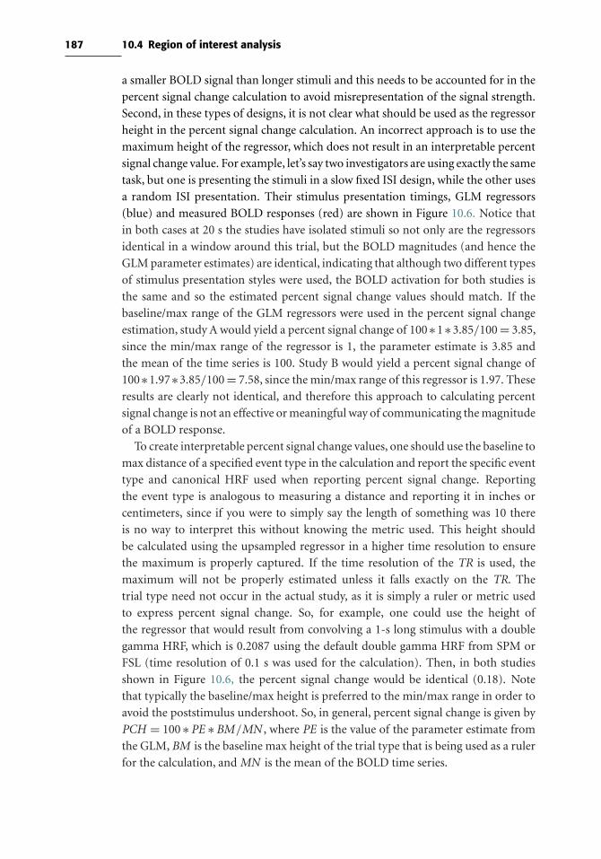
187 10.4 Region of interest analysis
a smaller BOLD signal than longer stimuli and this needs to be accounted for in the
percent signal change calculation to avoid misrepresentation of the signal strength.
Second, in these types of designs, it is not clear what should be used as the regressor
height in the percent signal change calculation. An incorrect approach is to use the
maximum height of the regressor, which does not result in an interpretable percent
signal change value. For example, let’s say two investigators are using exactly the same
task, but one is presenting the stimuli in a slow fixed ISI design, while the other uses
a random ISI presentation. Their stimulus presentation timings, GLM regressors
(blue) and measured BOLD responses (red) are shown in Figure 10.6. Notice that
in both cases at 20 s the studies have isolated stimuli so not only are the regressors
identical in a window around this trial, but the BOLD magnitudes (and hence the
GLM parameter estimates) are identical, indicating that although two different types
of stimulus presentation styles were used, the BOLD activation for both studies is
the same and so the estimated percent signal change values should match. If the
baseline/max range of the GLM regressors were used in the percent signal change
estimation, study A would yield a percent signal change of 100∗1∗3.85/100 = 3.85,
since the min/max range of the regressor is 1, the parameter estimate is 3.85 and
the mean of the time series is 100. Study B would yield a percent signal change of
100∗1.97∗3.85/100 = 7.58, since the min/max range of this regressor is 1.97. These
results are clearly not identical, and therefore this approach to calculating percent
signal change is not an effective or meaningful way of communicating the magnitude
of a BOLD response.
To create interpretable percent signal change values, one should use the baseline to
max distance of a specified event type in the calculation and report the specific event
type and canonical HRF used when reporting percent signal change. Reporting
the event type is analogous to measuring a distance and reporting it in inches or
centimeters, since if you were to simply say the length of something was 10 there
is no way to interpret this without knowing the metric used. This height should
be calculated using the upsampled regressor in a higher time resolution to ensure
the maximum is properly captured. If the time resolution of the TR is used, the
maximum will not be properly estimated unless it falls exactly on the TR. The
trial type need not occur in the actual study, as it is simply a ruler or metric used
to express percent signal change. So, for example, one could use the height of
the regressor that would result from convolving a 1-s long stimulus with a double
gamma HRF, which is 0.2087 using the default double gamma HRF from SPM or
FSL (time resolution of 0.1 s was used for the calculation). Then, in both studies
shown in Figure 10.6, the percent signal change would be identical (0.18). Note
that typically the baseline/max height is preferred to the min/max range in order to
avoid the poststimulus undershoot. So, in general, percent signal change is given by
PCH = 100 ∗PE ∗BM/MN , where PE is the value of the parameter estimate from
the GLM, BM is the baseline max height of the trial type that is being used as a ruler
for the calculation, andMN is the mean of the BOLD time series.
188 Visualizing, localizing, and reporting fMRI data
0 20 40 60 80 100 120 140 160 180 200
100
100.5
101
101.5
102
Time (s)
Fixed ISI
0 20 40 60 80 100 120 140 160 180 200
100
100.5
101
101.5
102
Variable ISI
Time (s)
RegressorBOLD signalStimulus
Figure 10.6. Examples of regressors and BOLD signal for two studies using the same stimuli but differ-
ent stimulus presentation strategies. The study in the top image uses isolated trials and the
baseline/max range of the regressor is 1. The second study uses a variable ISI and so the
baseline/max range of the regressor is larger (1.97) due to two trials that are close in time.
Although the brain activity has the same magnitude in both studies, as can be seen at 20 s,
where both studies have an isolated 2-s trial, using the baseline/max range to calculate
percent signal change will incorrectly give different results.
The preceding example deals with the calculation of percent signal change for a
single task, but typically fMRI studies focus on contrasts of parameter estimates for
different tasks. Say, for example, the first two regressors in the GLM modeled faces
and houses, respectively, and we estimated the contrast c = [1 −1] to find activation
related to faces minus houses. Now we would like to report the activation in terms
of percent signal change. It might be tempting to simply use the equation PCH =100 ∗CON ∗ BM/MN , replacing the parameter estimate of the previous equation
with the contrast estimate CON = cβ, but this could produce misleading estimates.
Consider the case where one investigator used the contrast c1 = [1 −1] and another
used c2 = [2 − 2]. Although both of these contrasts are valid and will result in
identical inferences, the first contrast estimate, c1β, will be half as large as the second
contrast estimate, c2β. Since the interpretation of the second contrast is twice the
difference of faces and houses, the appropriate percent signal change corresponding
to the difference of faces and houses would be given by 12 ∗ c2β ∗ BM/MN , so a
contrast scale factor is introduced to ensure the interpretation of the percent signal
change calculation. Specifically, PCH = 100∗SF ∗CON ∗BM/MN , where SF is the
appropriate contrast scale factor.
Another example would be if three trial types were used and the contrast c =[1 1 1] was used to test the activation for the average response across all three trial
189 10.4 Region of interest analysis
types. Again, this contrast is valid in terms of the hypothesis test for the mean
across tasks, but the interpretation of CON = cβ is actually the sum of the three
tasks, and so the appropriate percent signal change calculation would be given by
PCH = 100∗ 13CON ∗BM/MN . Note that, in most cases, if contrasts are constructed
so that the positive numbers in the contrast sum to 1 and the negative numbers sum
to −1, the scale factor in this calculation will be 1. Exceptions include some contrasts
that may arise in more complicated ANOVA models.
10.4.3.4 Summarizing data within an ROI
Once the signals have been extracted, they need to be summarized, and even this
seemingly uncontroversial operation requires some careful thought. The simplest
method is to simply average the extracted signal across voxels within the ROI, and
this is a common method. However, within SPM, the default method is to compute
the first principal component (or eigenvariate) of the signal. The intuition behind
this method is that if there are multiple processes occurring within the region, the
first principal component will reflect the strongest of those processes, whereas the
mean will reflect a combination of them. The most obvious example is the case
where there are both activated and deactivated voxels within a single ROI, in which
case the major eigenvariate may be more reflective of the largest of those whereas the
mean may be close to zero. There have not been any systematic comparisons of these
methods to our knowledge, but we would note that in most cases the mean and first
principal component of signals from within an ROI will be highly correlated with
one another.
When large anatomical ROIs are used (e.g., the entire superior temporal gyrus),
even if the region contains significantly active voxels, this activation may only occur
in a small proportion of voxels in the ROI. This suggests that simply averaging across
the entire region could swamp the signal from this small number of voxels with noise
from the remaining nonactivated voxels. There is no widely accepted solution to this
problem, which suggests that ROI analyses should focus on relatively small and/or
functionally coherent regions if possible.

Appendix A: Review of the GeneralLinear Model
The general linear model is an important tool in many fMRI data analyses. As the
name “general” suggests, this model can be used for many different types of analyses,
including correlations, one-sample t -tests, two-sample t -tests, analysis of variance
(ANOVA), and analysis of covariance (ANCOVA). This appendix is a review of the
GLM and covers parameter estimation, hypothesis testing, and model setup for these
various types of analyses.
Some knowledge of matrix algebra is assumed in this section, and for a more
detailed explanation of the GLM, it is recommended to read Neter et al. (1996).
A.1 Estimating GLM parameters
The GLM relates a single continuous dependent, or response, variable to one or
more continuous or categorical independent variables, or predictors. The simplest
model is a simple linear regression, which contains a single independent variable.
For example, finding the relationship between the dependent variable of mental
processing speed and the independent variable, age (Figure A.1). The goal is to
create a model that fits the data well and since this appears to be a simple linear
relationship between age and processing speed, the model is Y= β0 +β1X1, where Yis a vector of length T containing the processing speeds for T subjects, β0 describes
where the line crosses the y axis, β1 is the slope of the line and X1 is the vector of
length T containing the ages of the subjects. Note that if β0 is omitted from the
model, the fitted line will be forced to go through the origin, which typically does
not follow the trend of the data very well and so intercepts are included in almost all
linear models.
Notice that the data points in Figure A.1 do not lie exactly in a line. This is because
Y, the processing speeds, are random quantities that have been measured with some
degree of error. To account for this, a random error term is added to the GLM model
Y = β0 +β1X1 + ε
191

192 Appendix A
0 5 10 15 20
0
2
4
6
8
10
Y (
Pro
cess
ing
Spe
ed)
X1 (Age)
β0
β1
Figure A.1. Example of data and model for a simple linear regression. The intercept, β0, is where the
line crosses the y axis and the slope, β1, describes the relationship between the dependent
variable, mental processing speed, and the independent variable, age.
where ε is a random vector of length T that describes the distribution of the error
between the true value of the dependent variable and the measured values that are
obtained for the study. The standard assumption is that ε is normally distributed
such that the vector has a mean of 0 and a variance of σ 2. Further, any two elements
of the error vector are assumed to be uncorrelated, Cor(εi ,εj) = 0. This is typically
written as ε ∼ N (0,σ 2I), where N is the multivariate normal distribution and I is
a T × T identity matrix, which only has 1s along the diagonal and 0s on the off
diagonal.
The interpretation of the model follows: If we were to know the true values of β0
and β1, then for a given age, say 20 years old, the expected mean processing speed
for this age would be β0 + β1 × 20. If we were to collect a sample of processing
speeds from 20 year olds, the distribution of the data would be normal with a mean
of β0 + β1 × 20 and a variance of σ 2. Although the mean processing speed would
change for different age groups, the variance would be the same. The distribution
for those with an age of 10 years would have a mean of β0 +β1 × 20 and a variance
of σ 2.
A.1.1 Simple linear regression
To find the estimates of the parameters β0 and β1, the method of least squares is
used, which minimizes the squared difference between the data,Y, and the estimates,
Y = β0 + β1X1. This difference is known as the residual, and this is denoted by
e = Y− Y and would be the horizontal distance between a point and the fitted line.
The estimate of the error variance, σ 2, is given by σ 2 = e′eT −2 , where T is the number

193 Appendix A
of data points. The quantity T − 2 is the degrees of freedom for this model and
consists of the amount of information going into the model (T data points) minus
the number of parameters we had to estimate (two, β0 and β1). The line shown in
Figure A.1 illustrates the least squares fit of the model to the data where, for a given
age, the distribution of processing speed for that age is estimated to have a mean of
β0 +age× β1, and σ 2 is the estimate of the variance of the data for that value of age.
Under the assumptions that the error has a mean of zero, constant variance and
correlation of 0, the least squares estimates of the βis have a nice property according
to the Gauss Markov theorem (Graybill, 1961), which is that β is unbiased and
has the smallest variance among all unbiased estimators of β. In other words if we
were to repeat the experiment an infinite number of times and estimate β each time,
the average of these βs would be equal to the true value of β. Not only that, but
the variance of the estimates of β is smaller than any other estimator that gives an
unbiased estimate of β. When the assumptions are violated, the estimate will not
have these properties, and Section A.3 will describe the methods used to handle these
situations.
A.1.2 Multiple linear regression
It is possible to have multiple independent variables, X1,X2, . . . ,Xp, in which case
the GLM would be Y = β0 + β1X1 + β2X2 + ·· · + βpXp + ε. The error term, ε, is
distributed the same as before (ε ∼N (0,σ 2I)) and each parameter, βi , is interpreted
as the effect of Xi controlling for all other variables in the model. So, for example, if
age and gender were independent variables, the parameter estimate for age would be
the relationship of age on processing speed, adjusting for gender or holding gender
constant. Sometimes the parameters in a multiple linear regression are referred to as
partial regression coefficients since they reflect the effect of one predictor controlling
for all of the other predictors.
The multiple linear regression formula can be concisely expressed using matrix
algebra as
Y = Xβ + ε
whereX is aT×pmatrix with each column corresponding to anXi and β is a column
vector of length p+ 1, β = [β0,β1, · · · ,βp]′. The use of matrix algebra makes the
derivation of β easy. Since X isn’t a square matrix, we can’t solve the equation
Y = Xβ by premultiplying both sides by X−1, because only square matrices have
inverses. Instead, if we first premultiply both sides of the equation by X′, we have
the so-called normal equations
X′Y = X′Xβ

194 Appendix A
Table A.1. Two examples of rank deficient matrices1 0 7
1 0 7
0 1 0
0 1 0
1 0 2
1 0 2
1 1 5
1 1 5
It can be shown that any β that satisfies the normal equations minimizes the sum-
of-squares of the residuals e′e, and thus it gives the least squares solution
β = (X′X)−1X′Y (A.1)
assuming X′X is invertible.
The estimate for σ 2 is the same as before, σ 2 = e′eT−(p+1)
, where T is the number of
rows in X and p+ 1 is the number of columns, resulting in T − (p+ 1) the degrees
of freedom for multiple linear regression.
In order for the inverse ofX′X to exist,X must have full column rank, which means
no column is a linear combination of any of the other columns in the design matrix.
In Table A.1, the matrix on the left-hand side is rank deficient since multiplying
the first column by 7 yields the third column, and the matrix on the right is rank
deficient since twice the first column plus three times the second equals the third
column. If the design matrix is rank deficient there is not a unique solution for the
parameter estimates. Consider the matrix on the left of Table A.1, and estimate the
three corresponding parameters, β1, β2, β3, when Y = [14 14 0 0]′. It is easy to
show that not only are β1 = 0,β2 = 0, and β3 = 2 parameters that give an exact
solution since 1 0 7
1 0 7
0 1 0
0 1 0
0
0
2
=
14
14
0
0
(A.2)
but β1 = 14,β2 = 0, and β3 = 0 and an infinite number of other combinations will
also perfectly fit the data.
A.2 Hypothesis testing
The previous section described how to obtain the estimates of the parameters
β0,β1, . . . ,βp and σ 2, and this section describes how to carry out hypothesis tests on
linear combinations, or contrasts, of the βis. A row-vector of length p+ 1 is used to
define the contrast to be tested. The simplest contrast tests a single parameter in the
vector of parameters, β. For example, if there were four parameters in the model,
[β0,β1,β2,β3]′, then the contrast to test whether the first parameter, β0 was different
from 0,H0 : β0 = 0, would be c = [1 0 0 0], since cβ = β0. It is also possible to test

195 Appendix A
whether two parameters are different from each other. To test,H0 : β2 = β3, which is
equivalent toH0 : β2 −β3 = 0, the contrast c = [0 1 − 1 0] would be used. In both
of these cases, the null hypothesis can be re-expressed asH0 : cβ = 0.
To test the hypothesis, the distribution of cβ under the null assumption, that the
contrast is equal to 0, must be known. It can be shown that the distribution of cβis normal with a mean of cβ and a variance of c(X′X)−1c′σ 2, so under the null
hypothesis, cβ ∼ N (0,c(X′X)−1c′σ 2). Since we do not know the variance σ 2, we
cannot use the normal distribution to carry out the hypothesis test. Instead, we use
the t statistic
t = cβ√c(X′X)−1c′σ 2
(A.3)
which, under the null, is distributed as a t -distribution with T − (p + 1) degrees
of freedom. A P-value for a one-sided alternative hypothesis, such as HA : cβ > 0
is given by P(TT−(p+1) ≥ t ), where TN−(p+1) is a random variable following a
t -distribution with T − (p + 1) degrees of freedom, and t is the observed test
statistic. The P-value for a two-sided hypothesis test, HA : cβ �= 0, is calculated
as P(TT−(p+1) ≥ |t |).In addition to hypothesis testing of single contrasts using a t -statistic, one can
also simultaneously test multiple contrasts using an F-test. For example, again using
the model with four parameters, to test whether all of the βs are 0, H0 : β1 = β2 =β3 = β4 = 0, one would specify a set of contrasts in the form of a matrix. Each row
of the contrast corresponds to one of the four simultaneous tests, in this case that a
particular βi is 0, and looks like the following:
c =
1 0 0 0
0 1 0 0
0 0 1 0
0 0 0 1
(A.4)
The F-statistic is then given by
F = (cβ)′[rc(
Cov(β))c′]−1(cβ) (A.5)
where r is the rank of c and typically is equal to the number of rows in c . The
F-statistic in Equation (A.5) is distributed as an F with r numerator and T − (p+1)
denominator degrees of freedom (Fr ,T−(p+1)).
A.3 Correlation and heterogeneous variances
One of the important assumptions of the GLM, mentioned at the beginning of this
appendix, is that the elements of the error vector, ε are uncorrelated, Cor(εi ,εj) = 0
for i �= j and that they all have the same variance, Var(εi) = σ 2 for all i. There are

196 Appendix A
many cases when this assumption is violated. For example, imagine that the dataset
on age and processing speed included sets of identical twins; in this case, some
individuals will be more similar than others. More relevant to fMRI, this can also
occur when the dependent variable Y includes temporally correlated data. When
this occurs, the distribution of the error is given by Cov(ε) = σ 2V, where V is the
symmetric correlation matrix and σ 2 is the varaince.
The most common solution to this problem is to prewhiten the data, or to remove
the temporal correlation. Since a correlation matrix is symmetric and positive defi-
nite, the Cholesky decomposition can be used to find a matrixK such thatV−1 =K′K(see Harville (1997) for more details on matrix decomposition). To prewhiten the
data, K is premultiplied on both sides of the GLM to give
KY = KXβ +Kε (A.6)
Since the errors are now independent,
Cov(Kε) = KCov(ε)K′ = σ 2I
we can rewrite Equation (A.6) as
Y∗ = X∗β + ε∗ (A.7)
where Y∗ = KY, X∗ = KX, and ε∗ = Kε. Most important, since Cov(ε∗) = σ 2I, the
previously stated assumptions hold, and we can use least squares to estimate our
parameters and their variances. The parameter estimates would be
β = (X∗′X∗)−1X∗′
Y∗ (A.8)
which can be also written as β = (X′V−1X)−1X′V−1Y. The covariance of β is given
by
Cov(β) = (X∗′X∗)−1σ 2 (A.9)
or Cov(β) = (XV−1X)−1σ 2 and σ 2 is estimated as shown earlier.
If the error terms are uncorrelated, Cor(ε) = I, but the assumption of equal
variances is violated, Var(εi) �= Var(εj), i �= j , the variances are said to be hetero-
geneous, and the GLM is estimated as shown in Equations (A.8) and (A.9), with
K = diag(1/σ1,1/σ2, . . . , 1/σT ). The expression diag(1/σ1, . . . , 1/σT ) simply refers
to a matrix with 0s on the off diagonal and 1/σ1,1/σ2, . . . , 1/σT along the diagonal.
This is known as weighted linear regression. In both the prewhitening approach
and the weighted linear regression approach, the necessary variance and covariance
parameters are estimated from the data and then used to get the contrast estimates
and carry out hypothesis testing.

197 Appendix A
A.4 Why “general” linear model?
The GLM is a powerful tool, since many different types of analyses can be carried out
using it including: one-sample t -tests, two-sample t -tests, paired t -tests, ANOVA,
and ANCOVA. The first section illustrated simple linear regression in the example
where processing speed was modeled as a function of age. Figure A.2 shows some
common analyses that are carried out using the GLM where the top example is
the simplest model, a one-sample t -test. In this case, we have one group and are
interested in testing whether the overall mean is 0. The design is simply a column of
1s and the contrast is c = [1].The next design shown in Figure A.2 is a two-sample t -test, where the data either
belong to group 1 (G1) or group 2 (G2). In the outcome vector,Y, all G1 observations
are at the beginning, and G2 observations follow. The design matrix has two columns,
where the parameter for each column corresponds to the means for G1 and G2,
respectively. The contrast shown tests whether the means of the two groups are
equal, but it is also possible to test the mean of each group using the separate
contrasts, c = [1 0] and c = [0 1]. Note that there are alternative ways of setting up
the design for a two-sample t -test, which are not illustrated in the figure. Two other
examples of design matrices for the two-sample t -test are given as XT1 and XT2 in
Equation (A.10).
XT1 =
1 0...
...
1 0
1 1...
...
1 1
XT2 =
1 1...
...
1 1
1 −1...
...
1 −1
(A.10)
In XT1, the first column models the mean of the baseline or unmodeled group mean.
In this case, the mean of group 1 is not explicitly modeled and so the parameter
corresponding to the first column would be the mean for group 1, and the parameter
associated with the second column would be the difference in means between groups
1 and 2.
In the case of XT2 the first column corresponds to the overall mean of the
data and the second column is the difference between the means of group 1 and
group 2. It is often the case that there are multiple ways of setting up a design
matrix, so it is important to understand what the parameters for the columns
of the design correspond to. For XT1, for example, XT1β would yield the vector,
Y= [β0,β0, . . . ,β0,β0 +β1, . . . ,β0 +β1]′, and so it is clear to see that β0 corresponds
to the mean of group 1 and β0 +β1 is the mean for group 2, hence β1 is the difference
between the two means. Similarly, XT2β gives a value of β0 + β1 for the group 1
entries and β0 − β1 for the group 2 entries, meaning β0 is the overall mean and β1
is the difference in means between the two groups.

198 Appendix A
β1111111
1 01 01 01 01 00 10 10 10 10 1
βG1βG2
βdi�βS1βS2βS3βS4βS5
1 1 1 0 1 01 1 1 0 1 01 1 0 1 0 11 1 0 1 0 11 1 -1 -1 -1 -11 1 -1 -1 -1 -1 1 -1 1 0 -1 01 -1 1 0 -1 01 -1 0 1 0 -11 -1 0 1 0 -11 -1 -1 -1 1 11 -1 -1 -1 1 1
βmeanβA1βB1βB2βA1B1βA1B2
A1B11A1B12A1B21A1B22A1B31A1B32A2B11A2B12A2B21A2B22A2B31A2B32
AS1BS1AS2BS2AS3BS3AS4BS4AS5BS5
G11G12G13G14G15G21G22G23G24G25
G1G2G3G4G5G6
One-sample t-test.6 observations
Two-sample t-test. 5 subjects in group 1 (G1) and 5 subjects in group 2 (G2)
Paired t-test.5 paired measures of A and B.
Two way ANOVA. Factor A has two levels and factor B has 3 levels. #ere are 2 observations for each A/B combination.
Test Description Order of data
Xβ
H0 : Overall mean=0H0 : β1= 0H0 : cβ = 0c = [1]
H0 : mean of G1 di�erent from G2H0 : βG1−βG2= 0H0 : cβ =0c = [1 -1]
H0 : A is di�erent from B H0 : βdi� = 0H0 : cβ = 0c = [1 0 0 0 0 0]
Hypothesis Test
F-tests for all contrasts
H0 : Overall mean=0 H0 : βmean = 0H0 : cβ = 0c = [1 0 0 0 0 0]
H0 : Main A e�ect=0 H0 : βA1 = 0H0 : cβ = 0c = [0 1 0 0 0 0]
H0 : Main B e�ect = 0 H0 : βB1 = βB2 = 0H0 : cβ=0c = 0 0 1 0 0 0 0 0 0 1 0 0
H0 : A/B interaction e�ect=0 H0 : βA1B1=βA1B2=0H0 : cβ=0c = 0 0 0 0 1 0 0 0 0 0 0 1
1 1 0 0 0 0–1 1 0 0 0 0 1 0 1 0 0 0–1 0 1 0 0 0 1 0 0 1 0 0–1 0 0 1 0 0 1 0 0 0 1 0–1 0 0 0 1 0 1 0 0 0 0 1–1 0 0 0 0 1
Figure A.2. Examples of GLMmodels for popular study designs including: One-sample t-test, two-sample
t-test, paired t-test, and two-way ANOVA. The first column describes the model, the second
column describes how the data are ordered in the outcome vector, the third column shows
the design matrix, and the last column illustrates the hypothesis tests and corresponding
contrasts. Note, in the ANOVA example F -tests are used for all contrasts, whereas t-tests are
used for the other examples.

199 Appendix A
The paired t -test is the third example in Figure A.2, where there are N groups of
paired observations. For example, we could haveN subjects scanned on two sessions
and want to compare session 2 to session 1. In the outcome vector, Y, observations
are ordered by subject, session 1 followed by session 2. The first column of the design
matrix is modeling the difference and the last N columns of the design matrix are
modeling subject-specific means. By adjusting for the subject-specific means, the
difference refers to the difference in the centered or demeaned pairs of data points.
To test the paired difference, the contrast only includes the first parameter, the rest
of the parameters related to the subject-specific means are considered “nuisance,”
since we do not typically test them, but they are necessary to include in the model
to pick up extra variability due to each subject having a different mean.
The last example illustrates a two-way ANOVA, with two levels for the first factor
and three levels for the second factor. There are a couple of ways to set up this model,
but the one illustrated here is a factor effects setup and is used when the interest is in
testing the typical ANOVA hypotheses of overall mean, main effects, and interaction
effects. In general, the format used to create the regressors is as follows: For each
factor the number of regressors is equal to one less than the number of levels for
that factor. So our first factor, call it A, will have one regressor associated with it and
the second factor, call it B, will have two. Each regressor is modeling the difference
between a level of the factor to a baseline level. For example, the second column of X
in the ANOVA panel of Figure A.2 is the regressor for factor A and takes a value of 1
for rows corresponding to level 1 of A (A1), and since the second level is the reference
level, all rows corresponding to A2 are −1. The third and fourth columns are the
regressors for factor B and the third level, B3, is the reference so both regressors are
−1 for those corresponding rows. The third regressor compares B1 to B3, so it is 1
for level B1 and 0 for level B2. The fourth regressor compares B2 to B3 and so it is
0 for B1 and 1 for B2. The last two columns make up the interaction and are found
by multiplying the second and third and second and fourth columns, respectively.
All contrasts are tested using an F-test, since this is standard for ANOVA. To test
the main effects, we simply include a contrast for each regressor corresponding to
that factor, and to test the interaction we would include a contrast for each regressor
corresponding to an interaction. The other option is to use a cell means approach,
where we simply have six regressors, one for each of the six cells of the 2×3 ANOVA.
It is an extension of the two-sample t -test model shown in Figure A.2 and is more
convenient when we are interested in testing hypothesis that compare the means
between cells of the ANOVA.
It should be noted that in some cases it is possible to use a linear regression model
when there are repeated measures. For example, the two-sample t -test can be thought
of as a one-way ANOVA with two levels and repeated measures across the levels. In
a similar fashion, the two-factor ANOVA model in the bottom panel of Figure A.2
can be extended to a repeated measures case, where measures are repeated for all
factors in the model, say a subject is studied before and after a treatment (factor A)

200 Appendix A
for three types of memory tasks (factor B). In this case, the single mean column
would be broken up into separate subject means, and these columns of the design
matrix would be treated as nuisance. A very important note when using the linear
model for repeated measures ANOVA designs is that it only works in the case when
the measures are balanced across the factor levels. So, for example, if a subject was
missing measurements for the second and third levels of factor B after treatment, this
linear regression approach cannot be used. In cases such as this, more complicated
models and estimation strategies are necessary to achieve appropriate test statistics
and hypothesis test results.

Appendix B: Data organization andmanagement
The amount of computation that is performed, and data that are produced, in the
process of fMRI research can be quite astounding. For a laboratory with multiple
researchers, it becomes critical to ensure that a common scheme is used to organize
the data; for example, when a student leaves a laboratory, the PI may still need to
determine which data were used for a particular analysis reported in a paper in order
to perform additional analyses. In this appendix, we discuss some practices that
help researchers meet the computational needs of fMRI research and keep the data
deluge under control, particularly as they move toward developing a research group
or laboratory with multiple researchers performing data analysis.
B.1 Computing for fMRI analysis
The power of today’s computers means that almost all of the data analysis methods
discussed in this book can be performed on a standard desktop machine. Given
this, one model for organization of a laboratory is what we might call “just a bunch
of workstations” (JBOW). Under this model, each member of the research group
has his or her own workstation on which to perform analyses. This model has the
benefit of requiring little in the way of specialized hardware, system administration,
or user training. Thus, one can get started very quickly with analysis. However, it
has a number of potential disadvantages:
• The processing power of each individual is limited to that of a single workstation,
making large analyses difficult.
• The data storage is generally not redundant, and thus failure of a single hard drive
can lead to complete data loss.
• Centralized backup and archiving of the data can be difficult to organize.
• Software updates may differ across machines, such that different members of the
team may use different software versions.
Another more complicated model is referred to as the client/server model, in which
a centralized server provides computing resources to all of the members of the group.
201

202 Appendix B
This generally requires that individuals log into a central system and perform their
analyses remotely. The data storage in such a system generally relies upon RAID
(redundant array of inexpensive disks) storage, which provides protection against
disk failure as well as faster speed by spreading files across multiple disks. The
client/server model has the disadvantage of being more costly to install and difficult
to administer, generally requiring professional system administration. However, it
has a number of distinct advantages over the JBOW model:
• It allows one to take advantage of a large number of processors.
• The use of RAID provides better protection and lessens the impact of disk failure.
• It makes centralized backup much easier since the data reside on a single filesystem.
• It allows better control over software updating and versioning.
One recent development for fMRI analysis is the more common implementation
of grid computing, in which a large cluster of computers can be used in parallel to
perform data analysis with much greater speed than is possible with a single system.
Software packages such as the Sun Grid Engine (SGE) allow parallel processing
on nearly any cluster of computers, and fMRI analysis packages are beginning to
provide direct support for such grid processing. For example, with FSL one can
execute a large number of analysis jobs (many more than the number of processors
available), and if SGE is installed, the jobs will be automatically coordinated so that
the computer does not get overloaded. For these reasons, we strongly recommend
that researchers adopt a client/server computing model as they start to develop a
larger research group.
Operating systems. Although there are certainly a large number of labs that effec-
tively use Microsoft Windows for data analysis, it is our opinion that UNIX-based
operating systems (e.g., Linux, Mac OS X) are the best choice for fMRI data analysis.
First, there is a greater amount of freely available analysis software for UNIX systems,
in comparison to Windows systems. All of the major packages (SPM, FSL, AFNI)
are available for UNIX systems, whereas only SPM is can run natively on Windows.
It is possible to run FSL or AFNI using a virtual machine under Windows, but this
is suboptimal from a performance standpoint. Second, the ability to script analyses
under UNIX is (in our opinion) superior to that under Windows systems.
B.2 Data organization
One of the most important lessons that we have learned in doing fMRI research
is the need for a consistent and clear scheme for organizing and naming data files.
It may seem relatively unimportant for a single study, but as datasets multiply, it
becomes increasingly important to be able to find data across studies. In addition,
the use of consistent data organization and naming schemes across studies allows
one to relatively easily write scripts to perform analyses across multiple studies.

203 Appendix B
data
Study 1
Study 2
sub001
sub002 analysis
behavioral
notes
task1
task2
analysis2_parametric
analysis1_basic
MP-RAGE
EPI_002
EPI_001
analysis1_basic
analysis2_parametric
group
raw
Figure B.1. Example of a schema for data organization.
One effective way to implement good data organization is to create a complete
directory structure when the data are first downloaded from the MRI scanner.
Figure B.1 shows an example of the data organization created by the script that
is used for downloading data in one of our labs. In the process of analyzing a dataset,
one often fits a number of different models to the data; we have found it very useful
to place each separate model in a separate folder, with a name that is descriptive of
the particular model.
Because raw fMRI data files can be quite large, it is advisable to avoid copying them
multiple times for different analyses. One very useful feature of UNIX operating
systems is the ability to create symbolic links, which are similar to file shortcuts in
Windows and aliases in MacOS, and consist of a small file that points a file to another
file. Symbolic links allow one to leave raw files with their original names but then
create more intuitively named references to the data. It is also generally advisable to
make the raw data files read-only, so that they will not be modified by any subsequent
processing operations, or accidentally deleted.

204 Appendix B
For larger laboratories, there are more complicated systems available to assist
with data organization. For example, the Extensible Neuroimaging Archive Toolkit
(XNAT) project (http://www.xnat.org/) provides a very powerful open-source tool-
box for the storage and management of neuroimaging data. Tools such as XNAT
have the benefit of scaling well to very large datasets, but they also require substan-
tial system administration expertise in order to customize them to any particular
application.
B.3 Project management
As the size of one’s laboratory increases, it can become increasingly difficult to
determine the status of individual projects. For example, on more than one occasion
we have found it necessary to track down data to create a figure for a presentation
when the student who performed the analysis was not available. This can result in
a challenging exercise in data archaeology. The use of consistent and transparent
naming schemes for analyses can certainly help with this problem, but the challenge
remains that much of the important information remains hidden in the researcher’s
notebook. Likewise, when a laboratory has multiple active human research protocols,
it can be challenging to simply keep track of all of these.
We have found it very useful to maintain an online project management system
in order to provide a permanent accessible record of all of the projects performed
in the laboratory. Although there are a number of very powerful project manage-
ment systems available, a simple but very useful approach is to use freely available
wiki software (such as MediaWiki: http://www.mediawiki.org) to create an online
repository for information about studies in the laboratory. Because editing of wiki
pages is relatively simple, this provides an easy means for researchers to document
their studies and analyses. It is also easy to upload files to the system. In addition,
the security features of wiki software allow one to limit access to this information to
the relevant lab members or guests.
It is also possible to create more direct connections between the data analysis soft-
ware and the wiki system. For example, we have created software that automatically
generates a wiki page whenever a subject’s data are transferred from the scanner to
the data analysis system. The DICOM header for each subject is transferred into
a SQL database, and this information is used to create a page that shows the scan
meta-data for each imaging series collected during the session. This software is freely
available via the book Web site.
We suggest the following as a minimum list of information that should be included
in the project management page for each project or study:
• A list of all personnel involved in the study and their individual roles in the project.
• Specific information about the location (directory and computer) of the data for
each subject
• Notes regarding the exclusion of any particular subjects from the analysis.

205 Appendix B
• A textual description of the study equivalent in detail to a published methods
section. For a checklist of which details should be included, see Poldrack et al.
(2007).
• Copies of any stimulus files and programs used to administer the task.
• A description of all different analyses performed on the data, describing their
purpose and outcome, and specific information about the location of any scripts
used to run the analysis.
• Copies of any abstracts, presentations, or papers associated with the study.
B.4 Scripting for data analysis
The ability to script analyses is, in our opinion, essential to the ability to effectively
analyze fMRI data. There are a number of advantages to using scripts as opposed
to running analyses by hand. First, it can greatly increase the efficiency of analyses.
Whereas it may be reasonable to run small numbers of analyses using a GUI-driven
program, as the size of datasets increases it can become almost impossible to exe-
cute analyses manually. In addition, the use of scripts can make it much easier to
try multiple different analyses, which can be important given the large number of
arbitrary choices that one must make in setting up any particular analysis. Second,
scripting can decrease the likelihood of errors, which are bound to occur when one
manually specifies the details of an analysis. Third, scripting allows one to exactly
reconstruct the details of any analysis, and rerun the analysis if necessary.
There are a number of scripting languages, and the choice of language is generally
much less important than the decision to script in the first place, as most of them
have similar capabilities from the standpoint of automating fMRI analysis. Some
popular choices follow:
• UNIX Shell scripting languages, such as varieties of the Bourne shell (sh/bash) or
C shell (csh/tcsh), in combination with the UNIX tools sed and awk
• Python
• PERL
• MATLAB
The choice of scripting language interacts with the particular software package
being used; SPM users will likely choose MATLAB, whereas users of FSL or AFNI
can use nearly any of the scripting languages described here.
An example. Here we provide a simple example of what one can do using scripting
with FSL. The files used for this example are available on the book Web site, as are a
number of other scripts used for preprocessing and other operations.
We begin by using the FSL Feat GUI to set up the design for a single run for a
single subject. This creates a set of design files, including design.fsf (which contains
the description of the design), design.mat (which contains the design matrix), and
design.con (which contains the contrasts). If the design is the same across subjects

206 Appendix B
(i.e., contains the same conditions), then we can take advantage of the use of con-
sistent naming schemes across subjects to create a new design file for each subject
by replacing the relevant parts in the original file. The script below automatically
creates and runs FSL analyses for multiple subjects using the design.fsf file (here
called input.fsf) created for the first subject. Note that to use this successfully, all
files that FSL expects (such as the onset files for each condition) must have the same
name and be in the same relative location for each subject.
#!/bin/sh
BASEDIR="/path/to/data/directory"
ANALYSIS_NAME="analysis2_parametric"
doanalysis()
{
### IF THE DIRECTORY DOESN’T ALREADY EXIST, CREATE IT
if [ ! -e $BASEDIR/$SUB/analysis/analysis2_parametric ]
then
mkdir $BASEDIR/$SUB/analysis/analysis2_parametric
fi
### CHANGE TO THE ANALYSIS DIRECTORY
cd $BASEDIR/$SUB/analysis/analysis2_parametric
### SET UP RUN 1
sed -e "s/SUB_001/${SUB}/" -e "s/EPI_4/EPI_$
{SCANS_INDEX[0]}/"
-e "s/S004_4D_mcf_brain.hdr/S00${SCANS_INDEX[0]}_4D_m
cf_brain.hdr/"
$BASEDIR/orig.fsf > $BASEDIR/$SUB/analysis/
$ANALYSIS_NAME/run1.fsf;
### SET UP RUN 2
sed -e "s/SUB_001/${SUB}/" -e "s/EPI_4/EPI_$
{SCANS_INDEX[1]}/"
-e "s/S004_4D_mcf_brain.hdr/S00${SCANS_INDEX[1]}_4D_m
cf_brain.hdr/"
-e "s/run1/run2/" $BASEDIR/orig.fsf
> $BASEDIR/$SUB/analysis/$ANALYSIS_NAME/run2.fsf;
### EXECUTE FEAT FOR EACH RUN

207 Appendix B
for j in $DESIGN_NAME
do
feat $BASEDIR/$SUB/analysis/$ANALYSIS_NAME/$j
done
}
########### RUN ANALYSIS FOR SUBJECT 2
SUB="SUB_002"
DESIGN_NAME=("run1.fsf" "run2.fsf")
SCANS_INDEX=(4 5)
doanalysis
########### RUN ANALYSIS FOR SUBJECT 3
SUB="SUB_002"
DESIGN_NAME=("run1.fsf" "run2.fsf")
SCANS_INDEX=(5 7)
doanalysis
B.4.1 Some nuggets for scripting fMRI analyses
Here are some tips that may be useful when writing scripts for fMRI analysis.
• If creating file names that include numbers in them to represent an index, always
use numbers that are zero-padded (e.g., “file0001.nii” rather than “file1.nii”).
The reason for this is that the utilities that list file names (such as the UNIX ls
command) do so alphabetically, which will result in misordering if used on files
without zero-padding.
• It is often useful to first create a script that prints out all of the commands that
it will execute, without actually executing them, to make sure that the correct
commands will be executed.
• Always use absolute path names in scripts rather than relative path names.
• In general, avoid deleting files as part of a script. If files must be deleted, be sure
to use absolute path names, and never use wild cards (e.g., rm *).
• For complex scripts, it is often useful to to write another script or program (e.g.,
using MATLAB or a scripting language) to create the script. Anytime one finds
one’s self doing the same operation many times by hand, it is likely that a script
could help streamline the operation, prevent errors, and provide an enduring
record of the operations that were performed.
Appendix C: Image formats
In the early days of fMRI, image formats were truly a Tower of Babel. Because most
data were collected using research pulse sequences, the data were largely recon-
structed offline and saved to file formats that varied from center to center. Because
most analysis software was also written in-house, this was not a particular problem,
so long as one didn’t need to share data between centers. As the field developed,
several standard file formats came into use, and the use of different formats between
centers or laboratories was largely driven by the requirements of different analysis
software packages, but until recently there still remained a substantial variety of file
formats. Fortunately, the situation has gotten much better in the last decade, with the
development and near-universal implementation of a common file format, known
as NiFTI. In this appendix, we briefly describe some general issues regarding the
storage of fMRI data along with some of the most important file formats.
C.1 Data storage
As discussed in Chapter 2, MRI data are usually stored in a binary data file as either 8-
or 16-bit integers. The size of the data file on disk will thus be the product of the data
size and the dimensions of the image. For example, storing a 16-bit integer image
with dimensions of 128 × 128 × 96 will take up 25,165,824 bits (or 3 megabytes). In
addition to the raw image data, we also generally wish to store additional information
about the image, which we refer to asmetadata. These data describe various aspects
of the image, such as the dimensions and the data type. This is important because it
would not be possible to tell by looking at an binary dataset whether, for example, it
was a 128 × 128 × 96 image collected at 16 bits or a 128 × 128 × 192 image collected
at 8 bits. As discussed here, different image formats retain very different amounts
and kinds of metadata.
Structural MRI images are generally stored as three-dimensional data files.
Because fMRI data are collected as a series of images, they can be stored either
as a set of three-dimensional files, or as a single four-dimensional file, where the
208

209 Appendix C
Table C.1. Description of some medical image data formats
Format Name File Extension Origin
Analyze .img/.hdr Analyze software, Mayo Clinic
DICOM none ACR/NEMA consortium
NIfTI .nii or .img/.hdr NIH Neuroimaging Informatics Tools Initiative
MINC .mnc Montreal Neurological Institute (extension of NetCDF)
AFNI brick .BRIK AFNI software, Medical College of Wisconsin/NIMH
fourth dimension is time. We generally prefer to store data as four-dimensional if
possible, since it minimizes the number of files that must be dealt with, but some
analysis packages cannot handle four-dimensional files.
C.2 File formats
Throughout the history of neuroimaging there has been a large number of different
image formats; several of these are described in Table C.1. Here we describe the three
most important formats at present: DICOM, Analyze, and NIfTI.
C.2.1 DICOMMost MRI scanners today save their reconstructed data to a format called DICOM.
This format arose from a consortium involving the American College of Radiologists
(ACR) and the National Electronics Manufacturers Association (NEMA). DICOM
is much more than simply an image storage format; it provides a protocol by which
different imaging systems can communicate different forms of data, of which MRI
images are one particular type. The current version of DICOM was introduced in
1993 and is supported by all of the major MRI scanner vendors.
DICOM generally stores each slice as a separate file; these files are conventially
named using numbers reflecting the slice number, though this can vary between
systems. The header information is embedded into the file and must be extracted
using special software that can read and“dump”the header information. Of all of the
different formats, DICOM retains the greatest amount of meta-data in the header,
including low-level information about the scanner and image acquisition as well as
information about the subject.
Although DICOM is the standard format for outputting data from MRI scanners,
it is almost always necessary to convert from DICOM to some other format before
data analysis. The main reason is that DICOM datasets are unwieldy, owing to the
storage of each slice as a separate file. This can soon lead to massive numbers of small
files that clog file systems and slow analysis. There are a number of freely available
tools that can convert DICOM data files to any of the other major storage formats.1
1 For some reason, there is a tendency for imaging researchers to try to develop their own conversion programsfor file formats rather than using existing conversion software. In our opinion, this is a waste of time, in

210 Appendix C
C.2.1.1 Mosaic data storage
Some MRI pulse sequences (particularly on Siemens MRI systems) store fMRI
datasets to DICOM as amosaic, in which each image contains a mosaic of 16 actual
slices presented as a single image. This is done to economize storage space, in cases
where the scanner prefers to save images that have a dimension of 256 × 256, whereas
fMRI images generally have a matrix size of 64 × 64. These mosaic images must gen-
erally be unpacked before analysis, in order to create three- or four-dimensional files
that can be recognized by the analysis software.
C.2.2 Analyze
One of the best-known older formats for MRI data is known as Analyze; its name
comes from a software package of the same name that was developed at the Mayo
Clinic (and rarely used by fMRI researchers due to its expense). Analyze stores each
dataset in a set of two files. A data file, which has the extension .img, contains the
binary data for the image. A header file, which as the extension .hdr, contains the
metadata for the image. Analyze was a popular format in the early days of fMRI, but
it has largely been supplanted by the NIfTI format. Its main limitation is that the
header has a relatively limited representation of the image metadata.
C.2.3 NIfTIIn 2000, the National Institute of Mental Health and the National Institute of Neu-
rological Disorders and Stroke instituted a consortium of researchers to develop a
new data storage format that would help alleviate problems with data sharing across
different centers and software packages. In 2004, the first version of a new file format,
known as NIfTI-1, was released. This format is an extension of the Analyze 7.5 for-
mat, adding a number of additional kinds of metadata. One of the most important
features in the NIfTI format is a way to represent the relationship between voxel
indices and spatial locations in the MRI scanner. When used properly, this helps
to ensure that one can always accurately determine which direction is which (e.g.,
which side of the image represents the left side of the brain).
The standard file extension for NIfTI images is .nii, which contains both the
header and image data. However, because of the relation between NIfTI and Analyze
formats, it is also possible to represent NIfTI images using separate image (.img) and
header (.hdr) files. One convenient feature of the single-file .nii format is that the
files can be compressed using standard compression software (e.g., gzip), and some
software packages (e.g., FSL) can directly read and write compressed .nii files (which
have the extension .nii.gz).
addition to a potential source of errors. There are many unsolved problems in neuroimaging that are worthyof the attention of smart scientist/programmers, but conversion from DICOM to other standard imageformats is not one of them.

Bibliography
Abdi, H. 2003. Partial least squares regression (PLS-regression), inEncyclopedia for researchmethods
for the social sciences, M. Lewis Beck, A. Bryman, and T. Futing, Eds. Thousand Oaks, CA: Sage,
792–5.
Adler, R, & Taylor, J. 2007. Random fields and geometry. New York, NY: Springer.
Aguirre, GK, Zarahn, E & D’Esposito, M. 1997. Empirical analyses of BOLD fMRI statistics. II. Spa-
tially smoothed data collected under null-hypothesis and experimental conditions.Neuroimage,
5, 199–212.
Aguirre, GK, Zarahn, E & D’Esposito, M. 1998. The inferential impact of global signal covariates
in functional neuroimaging analyses. Neuroimage, 8(3), 302–6.
Alpaydin, E. 2004. Introduction to machine learning. Cambridge, Mass.: MIT Press.
Amunts, K, Schleicher, A, Bürgel, U, Mohlberg, H, Uylings, H B, & Zilles, K. 1999. Broca’s region
revisited: Cytoarchitecture and intersubject variability. J Comp Neurol, 412(2), 319–41.
Andersson, JL, Hutton, C, Ashburner, J, Turner, R, & Friston, K. 2001. Modeling geometric
deformations in EPI time series. Neuroimage, 13(5), 903–19.
Ardekani, BA, Bachman, AH, Strother, SC, Fujibayashi, Y, & Yonekura, Y. 2004. Impact of inter-
subject image registration on group analysis of fMRI data. International Congress Series, 1265,
49–59. Quantitation in Biomedical Imaging with PET and MRI. Proceedings of the International
Workshop on Quantitation in Biomedical Imaging with PET and MRI.
Arnold, JB, Liow, JS, Schaper, KA, Stern, JJ, Sled, JG, Shattuck, DW, Worth, AJ, Cohen, MS, Leahy,
RM, Mazziotta, JC, & Rottenberg, DA. 2001. Qualitative and quantitative evaluation of six
algorithms for correcting intensity nonuniformity effects. Neuroimage, 13(5), 931–43.
Ashburner, J. 2007. A fast diffeomorphic image registration algorithm.Neuroimage, 38(1), 95–113.
Ashburner, J, & Friston, K. 2005. Unified segmentation. Neuroimage, 26(3), 839–51.
Ashburner, J, & Friston, KJ. 1999. Nonlinear spatial normalization using basis functions. Hum
Brain Mapp, 7(4), 254–266.
Ashburner, J, & Friston, KJ. 2007. Non-linear registration, KJ Friston, J Ashburner, S Kiebel,
TE Nichols, & Penny, WD (Eds)., In Statistical parametric mapping: the analysis of functional
brain images, 1st ed, London: Elsevier/Academic Press.
Bassett, DS, & Bullmore, E. 2006. Small-world brain networks. Neuroscientist, 12(6), 512–23.
Beckmann, CF, & Smith, SM. 2004. Probabilistic independent component analysis for functional
magnetic resonance imaging. IEEE Trans Med Imaging, 23(2), 137–52.
211
212 Bibliography
Beckmann, CF, & Smith, SM. 2005. Tensorial extensions of independent component analysis for
multisubject FMRI analysis. Neuroimage, 25(1), 294–311.
Bellman, RE. 1961. Adaptive control processes. Princeton, N.J.: Princeton University Press.
Benjamini, Y, & Hochberg, Y. 1995. Controlling the false discovery rate: a practical and powerful
approach to multiple testing. J R Stat Soc. Ser B Methodol, 57(1), 289–300.
Bentler, PM, & Stein, JA. 1992. Structural equation models in medical research. Stat Methods Med
Res, 1(2), 159–181.
Birn, RM, Diamond, JB, Smith, MA, & Bandettini, PA. 2006. Separating respiratory-variation-
related fluctuations from neuronal-activity-related fluctuations in fMRI.Neuroimage, 31, 1536–
48.
Bishop, CM. 2006. Pattern recognition and machine learning. New York: Springer.
Biswal, B, Yetkin, FZ, Haughton, VM, & Hyde, JS. 1995. Functional connectivity in the motor
cortex of resting human brain using echo-planar MRI.Magn Reson Med, 34(4), 537–41.
Boesen, K, Rehm, K, Schaper, K, Stoltzner, S, Woods, R, Lüders, E, & Rottenberg, D. 2004.
Quantitative comparison of four brain extraction algorithms. Neuroimage, 22(3), 1255–61.
Bokde, AL, Tagamets, MA, Friedman, RB, & Horwitz, B. 2001. Functional interactions of the
inferior frontal cortex during the processing of words and word-like stimuli. Neuron, 30(2),
609–17.
Bollen, KA. 1989. Structural equations with latent variables. New York: Wiley.
Box, GE, Jenkins, GM, & Reinsel, GC. 2008. Time series analysis: Forcasting and control. Hoboken,
NJ: John Wiley.
Boynton, GM, Engel, SA, Glover, GH, & Heeger, DJ. 1996. Linear systems analysis of functional
magnetic resonance imaging in human V1. J Neurosci, 16(13), 4207–21.
Bracewell, RN. 2000. The Fourier transform and its applications. 3rd ed. Boston: McGraw Hill.
Brett, M, Leff, AP, Rorden, C, & Ashburner, J. 2001. Spatial normalization of brain images with
focal lesions using cost function masking. Neuroimage, 14(2), 486–500.
Brett, M, Johnsrude, IS, & Owen, AM. 2002. The problem of functional localization in the human
brain. Nat Rev Neurosci, 3(3), 243–9.
Buckner, RL, Bandettini, PA, O’Craven, KM, Savoy, RL, Petersen, SE, Raichle, ME, & Rosen, BR.
1996. Detection of cortical activation during averaged single trials of a cognitive task using
functional magnetic resonance imaging. Proc Natl Acad Sci U S A, 93(25), 14878–83.
Buckner, RL, Head, D, Parker, J, Fotenos, AF, Marcus, D, Morris, JC, & Snyder, AZ. 2004. A unified
approach for morphometric and functional data analysis in young, old, and demented adults
using automated atlas-based head size normalization: Reliability and validation against manual
measurement of total intracranial volume. Neuroimage, 23(2), 724–38.
Bullmore, E, Horwitz, B, Honey, G, Brammer, M, Williams, S, & Sharma, T. 2000. How good is
good enough in path analysis of fMRI data? Neuroimage, 11(4), 289–301.
Bullmore, E, Long, C, Suckling, J, Fadili, J, Calvert, G., Zelaya, F, Carpenter, T.A, & Brammer, M.
2001. Colored noise and computational inference in neurophysiological (fMRI) time series
analysis: Resampling methods in time and wavelet domains. Hum Brain Mapp, 12(2),
61–78.
Bullmore, ET, Suckling, J, Overmeyer, S, Rabe-hesketh, S, Taylor, E, & Brammer, MJ. 1999. Global,
voxel, and cluster tests, by theory and permutation, for a difference between two groups of
structural MR images of the brain. IEEE Trans. Med. Imaging, 18, 32–42.

213 Bibliography
Burgund, ED, Kang, HC, Kelly, JE, Buckner, RL, Snyder, AZ, Petersen, SE, & Schlaggar, BL.
2002. The feasibility of a common stereotactic space for children and adults in fMRI studies of
development. Neuroimage, 17(1), 184–200.
Buxton, RB. 2001. The elusive initial dip. Neuroimage, 13(6 Pt 1), 953–8.
Buxton, RB, Wong, EC, & Frank, LR. 1998. Dynamics of blood flow and oxygenation changes
during brain activation: the balloon model.Magn Reson Med; 39(6), 855–64.
Buxton, RB. 2002. Introduction to functional magnetic resonance imaging: Principles and techniques.
Cambridge, UK: Cambridge University Press.
Calhoun, VD, Liu, J, & Adali, T. 2009. A review of group ICA for fMRI data and ICA for joint
inference of imaging, genetic, and ERP data. Neuroimage, 45(1 Suppl), S163–72.
Cao, J, & Worsley, KJ. 2001. Spatial statistics: Methodological Aspscts andApplications. Lecture Notes
in Statistics; vol. 159., New York: Springer, Chapter 8. Applications of random fields in human
brain mapping, pp. 169–82.
Carmack, PS, Spence, J, Gunst, RF, Schucany, WR, Woodward, WA, & Haley, RW. 2004. Improved
agreement between Talairach and MNI coordinate spaces in deep brain regions. Neuroimage,
22(1), 367–71.
Caviness, Jr, VS, Kennedy, DN, Richelme, C, Rademacher, J, & Filipek, PA. 1996. The human brain
age 7–11 years: A volumetric analysis based on magnetic resonance images. Cereb Cortex, 6(5),
726–36.
Christensen, GE, Rabbitt, RD, & Miller, MI. 1994. 3D brain mapping using a deformable
neuroanatomy. Phys Med Biol, 39(3), 609–18.
Chumbley, JR, & Friston, KJ. 2009. False discovery rate revisited: FDR and topological inference
using Gaussian random fields. Neuroimage, 44(1), 62–70.
Clarke, LP, Velthuizen, RP, Camacho, MA, Heine, JJ, Vaidyanathan, M, Hall, LO, Thatcher, RW, &
Silbiger, ML. 1995. MRI segmentation: Methods and applications.Magn Reson Imaging, 13(3),
343–68.
Cleveland, WS. 1979. Robust locally weighted regression and smoothing scatterplots. J Am Stat
Assoc, 74, 829–836.
Cohen, AL, Fair, DA, Dosenbach, NU, Miezin, FM, Dierker, D, Van Essen, DC, Schlaggar, BL, &
Petersen, SE 2008. Defining functional areas in individual human brains using resting functional
connectivity MRI. Neuroimage, 41, 45–57.
Cohen, J. 1988. Power analysis for the behavioral sciences. Hillsdale, NJ: Lawrence Erlbaum
Associates.
Cohen, JR, Asarnow, RF, Sabb, FW, Bilder, RM, Bookheimer, SY, Knowlton, BJ, & Poldrack, RA.
2010. Decoding developmental differences and individual variability in response inhibition
through predictive analyses across individuals. Front Hum Neurosci, 4, 47.
Cohen, MS. 1997. Parametric analysis of fMRI data using linear systems methods. Neuroimage,
6(2), 93–103.
Cohen, MS, & DuBois, RM. 1999. Stability, repeatability, and the expression of signal magnitude
in functional magnetic resonance imaging. J Magn Reson Imaging, 10(1), 33–40.
Cohen, MS, DuBois, RM, & Zeineh, MM. 2000. Rapid and effective correction of RF
inhomogeneity for high field magnetic resonance imaging. Hum Brain Mapp, 10(4), 204–11.
Cole, DM, Smith, SM, & Beckmann, CF. 2010. Advances and pitfalls in the analysis and
interpretation of resting-state FMRI data. Front Syst Neurosci, 4, 8.
214 Bibliography
Costafreda, SG. 2009. Pooling FMRI data: Meta-analysis, mega-analysis and multicenter studies.
Front Neuroinformat, 3, 33.
Dale, AM. 1999. Optimal experimental design for event-related fMRI. Hum Brain Mapp, 8(2–3),
109–14.
Dale, AM, & Buckner, RL. 1997. Selective averaging of rapidly presentd individual trials using
fMRI. Hum Brain Mapp, 5, 329–340.
David, O, Guillemain, I, Saillet, S, Reyt, S, Deransart, C, Segebarth, C, & Depaulis, A. 2008.
Identifying neural drivers with functional MRI: An electrophysiological validation. PLoS Biol,
6(12), 2683–97.
Desai, R, Liebenthal, E, Possing, ET, Waldron, E, & Binder, JR. 2005. Volumetric vs. surface-based
alignment for localization of auditory cortex activation. Neuroimage, 26(4), 1019–29.
Desikan, RS, Ségonne, F, Fischl, B, Quinn, BT, Dickerson, BC, Blacker, D, Buckner, RL, Dale,
AM, Maguire, RP, Hyman, BT, Albert, MS, & Killiany, RJ. 2006. An automated labeling system
for subdividing the human cerebral cortex on MRI scans into gyral based regions of interest.
Neuroimage, 31(3), 968–80.
D’Esposito, M, Deouell, LY, & Gazzaley, A. 2003. Alterations in the BOLD fMRI signal with ageing
and disease: A challenge for neuroimaging. Nat Rev Neurosci, 4(11), 863–72.
Detre, JA, & Wang, J. 2002. Technical aspects and utility of fMRI using BOLD and ASL. Clin
Neurophysiol, 113(5), 621–34.
Devlin, JT, & Poldrack, RA. 2007. In praise of tedious anatomy. Neuroimage, 37(4), 1033–41.
Duda, RO, Hart, PE, & Stork, DG. 2001. Pattern classification, 2nd ed. New York: Wiley.
Duvernoy, HM. 2005. The human hippocampus: Functional anatomy, vascularization, and serial
sections with MRI, 3rd ed. Berlin: Springer.
Duvernoy, HM., & Bourgouin, P. 1999. The human brain: Surface, three-dimensional sectional
anatomy with MRI, and blood supply, 2nd. ed. Wien: Springer.
Eickhoff, SB, Stephan, KE, Mohlberg, H, Grefkes, C, Fink, GR, Amunts, K, & Zilles, Karl. 2005. A
new SPM toolbox for combining probabilistic cytoarchitectonic maps and functional imaging
data. Neuroimage, 25(4), 1325–35.
Ericsson, KA, Krampe, RT, & Tesch-Romer, C. 1993. The role of deliberate practice in the
acquisition of expert performance. Psychol Rev, 100, 363–406.
Evans, A, Collins, D, Mills, S, Brown, E, Kelly, R, & Peters, T. 1993. 3D statistical neuroanatomical
models from 305 MRI volumes. Nuclear Science Symposium and Medical Imaging Conference,
1993, 1993 IEEE Conference Record, January. vol. 3, 1813–17.
Fair, DA, Dosenbach, NUF, Church, JA, Cohen, AL, Brahmbhatt, S, Miezin, FM, Barch, DM,
Raichle, ME, Petersen, SE, & Schlaggar, BL. 2007. Development of distinct control networks
through segregation and integration. Proc Natl Acad Sci U S A, 104(33), 13507–12.
Fair, DA, Cohen, AL, Power, JD, Dosenbach, NUF, Church, JA, Miezin, FM, Schlaggar, BL, &
Petersen, SE. 2009. Functional brain networks develop from a "local to distributed" organization.
PLoS Comput Biol, 5(5), e1000381.
Finger, S. 1994. Origins of neuroscience: A history of explorations into brain function. New York:
Oxford University Press.
Fischl, B, Sereno, MI, Tootell, RB, & Dale, AM. 1999. High-resolution intersubject averaging and
a coordinate system for the cortical surface. Hum Brain Mapp, 8(4), 272–84.
Fischl, B, Salat, DH, Busa, E, Albert, M, Dieterich, M, Haselgrove, C, van der Kouwe, A, Killiany,
R, Kennedy, D, Klaveness, S, Montillo, A, Makris, N, Rosen, B, & Dale, AM. 2002. Whole brain

215 Bibliography
segmentation: Automated labeling of neuroanatomical structures in the human brain. Neuron,
33(3), 341–55.
Forman, SD, Cohen, JD, Fitzgerald, JD, Eddy, WF, Mintun, MA, & Noll, DC. 1995. Improved
assessment of significant activation in functional magnetic resonance imaging (fMRI): Use of a
cluster-size threshold.Magn Reson Med, 33, 636–47.
Fox, MD, Snyder, AZ, Vincent, JL, Corbetta, M., Van Essen, DC, & Raichle, ME. 2005. The human
brain is intrinsically organized into dynamic, anticorrelated functional networks. Proc Natl Acad
Sci USA, 102, 9673–78.
Freire, L, & Mangin, JF. 2001. Motion correction algorithms may create spurious brain activations
in the absence of subject motion. Neuroimage, 14(3), 709–22.
Freire, L, Roche, A, & Mangin, JF. 2002. What is the best similarity measure for motion correction
in fMRI time series? IEEE Trans Med Imaging, 21(5), 470–84.
Friston, K. 1994. Functional and effective connectivity in neuroimaging: A synthesis. Hum Brain
mapp 2, 56–78.
Friston, KJ. 2005. Models of brain function in neuroimaging. Annu Rev Psychol, 56, 57–87.
Friston, K, Jezzard, P, & Turner, R. 1994a. Analysis of functional MRI time-series. Hum Brain
Mapp, 1, 1–19.
Friston, KJ, Worsley, KJ, Frackowiak, RSJ, Mazziotta, JC, & Evans, AC. 1994b. Assessing the
significance of focal activations using their spatial extent. Hum Brain Mapp, 1, 210–20.
Friston, KJ, Frith, CD, Liddle, PF, & Frackowiak, RS. 1993. Functional connectivity: The principal-
component analysis of large (PET) data sets. J Cereb Blood Flow Metab, 13(1), 5–14.
Friston, KJ, Holmes, A, Poline, JB, Price, CJ, & Frith, CD. 1996a. Detecting activations in PET and
fMRI: Levels of inference and power. Neuroimage, 4(3), 223–35.
Friston, KJ, Williams, S, Howard, R, Frackowiak, RS, & Turner, R. 1996b. Movement-related effects
in fMRI time-series.Magn Reson Med, 35(3), 346–55.
Friston, KJ, Buechel, C, Fink, GR, Morris, J, Rolls, E, & Dolan, RJ. 1997. Psychophysiological and
modulatory interactions in neuroimaging. Neuroimage, 6(3), 218–29.
Friston, KJ, Fletcher, P, Josephs, O, Holmes, A, Rugg, MD, & Turner, R. 1998. Event-related fMRI:
Characterizing differential responses. Neuroimage, 7, 30–40.
Friston, KJ, Josephs, O, Zarahn, E, Holmes, AP, Rouquette, S, & Poline, J. 2000. To smooth or not
to smooth? Bias and efficiency in fMRI time-series analysis. Neuroimage, 12, 196–208.
Friston, KJ, Harrison, L, & Penny, W. 2003. Dynamic causal modelling. Neuroimage, 19(4), 1273–
302.
Friston, KJ, Penny, WD, & Glaser, DE. 2005. Conjunction revisited. Neuroimage, 25(3), 661–7.
Friston, KJ,Rotshtein, P,Geng, JJ, Sterzer, P,& Henson, RN. 2006. A critique of functional localisers.
Neuroimage, 30(4), 1077–87.
Gavrilescu, M, Shaw, ME, Stuart, GW, Eckersley, P, Svalbe, ID, & Egan, GF. 2002. Simulation of the
effects of global normalization procedures in functional MRI. Neuroimage, 17, 532–42.
Genovese, CR, Lazar, NA, & Nichols, TE. 2002. Thresholding of statistical maps in functional
neuroimaging using the false discovery rate. Neuroimage, 15(4), 870–78.
Gitelman, DR, Penny, WD,Ashburner, J, & Friston, KJ. 2003. Modeling regional and psychophysio-
logic interactions in fMRI: the importance of hemodynamic deconvolution.Neuroimage, 19(1),
200–7.
Glover, GH. 1999. Deconvolution of impulse response in event-related BOLD fMRI. Neuroimage,
9(4), 416–29.

216 Bibliography
Glover, GH, Li, TQ, & Ress, D. 2000. Image-based method for retrospective correction of
physiological motion effects in fMRI: RETROICOR.Magn Reson Med, 44(1), 162–7.
Goutte, C, Nielsen, FA, & Hansen, LK. 2000. Modeling the haemodynamic response in fMRI using
smooth FIR filters. IEEE Trans Med Imaging, 19(12), 1188–201.
Graybill, FA. 1961. An introduction to linear statistical models. New York, NY: McGraw-Hill.
Greicius, MD, & Menon, V. 2004. Default-mode activity during a passive sensory task: Uncoupled
from deactivation but impacting activation. J Cogn Neurosci, 16, 1484–92.
Greicius, MD, Flores, BH, Menon, V, Glover, GH, Solvason, HB, Kenna, H, Reiss, AL, & Schatzberg,
AF 2007. Resting-state functional connectivity in major depression: Abnormally increased
contributions from subgenual cingulate cortex and thalamus. Biol Psychiat, 62, 429–437.
Grinband, J, Wager, TD, Lindquist, M, Ferrera, VP, & Hirsch, J. 2008. Detection of time-varying
signals in event-related fMRI designs. Neuroimage, 43, 509–520.
Guimaraes, AR, Melcher, JR, Talavage, TM, Baker, JR, Ledden, P, Rosen, BR, Kiang, NY,
Fullerton, BC, & Weisskoff, RM. 1998. Imaging subcortical auditory activity in humans. Hum
Brain Mapp, 6(1), 33–41.
Guo, Y, & Pagnoni, G. 2008. A unified framework for group independent component analysis for
multi-subject fMRI data. Neuroimage, 42(3), 1078–93.
Guyon, I, Weston, J, Barnhill, S, & Vapnik, V. 2002. Gene selection for cancer classification using
support vector machines.Machine Learning, 46(1–3), 389–422.
Hammers, A, Allom, R, Koepp, MJ, Free, SL, Myers, R, Lemieux, Louis, M, TN, Brooks, DJ, &
Duncan, JS. 2003. Three-dimensional maximum probability atlas of the human brain, with
particular reference to the temporal lobe. Hum Brain Mapp, 19(4), 224–47.
Handwerker, DA,Ollinger, JM,& D’Esposito, M. 2004. Variation of BOLD hemodynamic responses
across subjects and brain regions and their effects on statistical analyses. Neuroimage, 21,
1639–1651.
Hanson, SJ, & Halchenko, YO. 2008. Brain reading using full brain support vector machines for
object recognition: There is no “face” identification area. Neural Comput, 20(2), 486–503.
Hanson, SJ, Matsuka, T, & Haxby, JV. 2004. Combinatorial codes in ventral temporal lobe for
object recognition: Haxby (2001) revisited: is there a "face" area?Neuroimage, 23(1), 156–66.
Harms, MP, & Melcher, JR. 2002. Sound repetition rate in the human auditory pathway:
Representations in the waveshape and amplitude of fMRI activation. J Neurophysiol, 88(3),
1433–50.
Harville, DA. 1997.Matrix algebra from a statisticians perspective. New York, NY: Springer Science
and Buisness Medicine.
Hastie, T, Tibshirani, R, & Friedman, JH. 2001. The elements of statistical learning: Data mining,
inference, and prediction, with 200 full-color illustrations. New York: Springer.
Hastie, T, Tibshirani, R, & Friedman, JH. 2009. The elements of statistical learning: Data mining,
inference, and prediction, (2nd ed.). New York: Springer.
Haxby, JV, Gobbini, MI, Furey, ML, Ishai, A, Schouten, JL, & Pietrini, P. 2001. Distributed and
overlapping representations of faces and objects in ventral temporal cortex. Science, 293(5539),
2425–30.
Hayasaka, S, & Nichols, TE. 2003. Validating cluster size inference : Random field and permutation
methods. Neuroimage, 20, 2343–56.
Hayasaka, S, & Nichols, TE. 2004. Combining voxel intensity and cluster extent with permutation
test framework. Neuroimage, 23(1), 54–63.

217 Bibliography
Hayasaka, S, Peiffer, AM, Hugenschmidt, CE, & Laurienti, PJ. 2007. Power and sample size cal-
culation for neuroimaging studies by non-central random field theory. Neuroimage, 37(3),
721–30.
Haynes, JD, & Rees, G. 2006. Decoding mental states from brain activity in humans. Nat Rev
Neurosci, 7(7), 523–534.
Haynes, JD, Sakai, K, Rees, G, Gilbert, S, Frith, C, & Passingham, RE. 2007. Reading hidden
intentions in the human brain. Curr Biol, 17(4), 323–28.
Henson, RNA, Buchel, C, Josephs, O, & Friston, KJ. 1999. The slice-timing problem in event-related
fMRI. NeuroImage, 9, 125.
Henson, RNA, Shallice, T, Gorno-Tempini, ML, & Dolan, RJ. 2002. Face repetition effects in
implicit and explicit memory tests as measured by fMRI. Cerebral cortex, 12(2), 178–86.
Hoenig, JM, & Heisey, DM. 2001. The abuse of power: The pervasive fallacy of power calculations
for data analysis. Amer Stat, 55, 19–24.
Holden, M. 2008. A review of geometric transformations for nonrigid body registration. IEEE
Trans Med Imaging, 27(1), 111–128.
Holmes, AP, & Friston, KJ. 1999. Generalisability, random effects & population inference. Neu-
roimage, 7(4 (2/3)), S754. Proceedings of Fourth International Conference on Functional Mapping
of the Human Brain, June 7–12, 1998, Montreal, Canada.
Hutton, C, Bork, A, Josephs, O, Deichmann, R, Ashburner, J, & Turner, R. 2002. Image distortion
correction in fMRI: A quantitative evaluation. Neuroimage, 16(1), 217–40.
Hyvärinen, A, & Oja, E. 2000. Independent component analysis: algorithms and applications.
Neural Networks, 13(4-5), 411–30.
Jenkinson, M, & Smith, S. 2001. A global optimisation method for robust affine registration of
brain images.Med Image Anal, 5(2), 143–56.
Jenkinson, M, Bannister, P, Brady, M, & Smith, S. 2002. Improved optimization for the robust
and accurate linear registration and motion correction of brain images. Neuroimage, 17(2),
825–41.
Jezzard, P, & Balaban, RS. 1995. Correction for geometric distortion in echo planar images from
B0 field variations.Magn reson Med, 34(1), 65–73.
Josephs, O,& Henson, RN. 1999. Event-related functional magnetic resonance imaging: Modelling,
inference and optimization. Philos Trans R Soc Lon. Ser. B Biol Sci, 354(1387), 1215–28.
Josephs, O, Turner, R, & Friston, K. 1997. Event-related f MRI. Hum Brain Mapp, 5, 243–248.
Junghofer, M, Schupp, HT, Stark, R, & Vaitl, D. 2005. Neuroimaging of Emotion: empirical effects
of proportional global signal scaling in fMRI data analysis. Neuroimage, 25, 520–6.
Kao, M-H, Mandal, A, Lazar, N, & Stufken, J. 2009. Multi-objective optimal experimental designs
for event-related fMRI studies. Neuroimage, 44(3), 849–56.
Klein, A, Andersson, J, Ardekani, BA, Ashburner, J, Avants, B, Chiang, M-C, Christensen, GE,
Collins, DL, Gee, J, Hellier, P, Song, JH, Jenkinson, M, Lepage, C, Rueckert, D, Thompson, P,
Vercauteren, T,Woods, RP, Mann, JJ, & Parsey, RV. 2009. Evaluation of 14 nonlinear deformation
algorithms applied to human brain MRI registration. Neuroimage, 46(3), 786–802.
Kohavi, R. 1995. A Study of cross-validation and bootstrap for accuracy estimation and model
selection. International Joint Conference on Artificial Intelligence. San Francisco, CA: Morgan
Kaufmann Publishers, 1137–43.
Kriegeskorte, N, Goebel, R, & Bandettini, P. 2006. Information-based functional brain mapping.
Proc Natl Acad Sci U S A, 103(10), 3863–8.

218 Bibliography
Kriegeskorte, N, Simmons, WK, Bellgowan, PSF, & Baker, CI. 2009. Circular analysis in systems
neuroscience: The dangers of double dipping. Nat Neurosci, 12(5), 535–40.
Kruggel, F., & von Cramon, DY. 1999. Temporal properties of the hemodynamic response in
functional MRI. Hum Brain Mapp, 8, 259–71.
Kwong, KK, Belliveau, JW, Chesler, DA, Goldberg, IE, Weisskoff, RM, Poncelet, BP, Kennedy, DN,
Hoppel, BE, Cohen, MS, & Turner, R. 1992. Dynamic magnetic resonance imaging of human
brain activity during primary sensory stimulation. Proc Natl Acad Sci U S A, 89(12), 5675–9.
Lancaster, JL, Woldorff, MG, Parsons, LM, Liotti, M, Freitas, CS, Rainey, L, Kochunov, PV, Nick-
erson, D, Mikiten, SA, & Fox, PT. 2000. Automated Talairach atlas labels for functional brain
mapping. Hum Brain Mapp, 10(3), 120–31.
Lancaster, JL, Tordesillas-Gutiérrez, D, Martinez, M, Salinas, F, Evans, A, Zilles, K, Mazziotta, JC, &
Fox, PT. 2007. Bias between MNI and Talairach coordinates analyzed using the ICBM-152 brain
template. Hum Brain Mapp, 28(11), 1194–205.
Lange, N, & Zeger, S. 1997. Non-linear Fourier time series analysis for human brain mapping by
functional magnetic resonance imaging. Appl Statistics, 46, 1–29.
Lindquist, MA, & Wager, TD. 2007. Validity and power in hemodynamic response modeling: a
comparison study and a new approach. Hum Brain Mapp, 28(8), 764–84.
Liu, T. 2004. Efficiency, power, and entropy in event-related fMRI with multiple trial types. Part
II: Design of experiments. Neuro Image, 21(1), 401–13.
Liu, T, & Frank, LR. 2004. Efficiency, power, and entropy in event-related FMRI with multiple trial
types. Part I: Theory. Neuroimage, 21(1), 387–400.
Liu, TT, Frank, LR, Wong, EC, & Buxton, RB 2001. Detection power, estimation efficiency, and
predictability in event-related fMRI. Neuroimage, 13, 759–73.
Logothetis, NK, Pauls, J, Augath, M, Trinath, T, & Oeltermann, A. 2001. Neurophysiological
investigation of the basis of the fMRI signal. Nature, 412, 150–7.
Lucerna, S, Salpietro, FM, Alafaci, C, & Tomasello, F. 2004. In vivo atlas of deep brain structures.
Berlin Heidelberg, Germany: Springer.
Mai, JK, Assheuer, J, & Paxinos, G. 2004. Atlas of the human brain, (2nd ed.) San Diego: Academic
Press.
Mandeville, B, Marota, JJ, Ayata, C, Zaharchuk, G, Moskowitz, MA, Rosen, BR, & Weisskoff, RM.
1999. Evidence of a cerebrovascular postarteriole windkessel with delayed compliance. J Cereb
Blood Flow Metab, 19(6), 679–89.
Marcus, DS, Wang, TH, Parker, J, Csernansky, JG, Morris, JC, & Buckner, RL. 2007. Open
access series of imaging studies (OASIS): Cross-sectional MRI data in young, middle aged,
nondemented, and demented older adults. J Cogn Neurosci, 19(9), 1498–507.
McIntosh, AR. 1999. Mapping cognition to the brain through neural interactions.Memory, 7(5–6),
523–48.
McIntosh, AR. 2000. Towards a network theory of cognition. Neural Netw, 13(8–9), 861–70.
McIntosh, AR, Bookstein, FL, Haxby, JV, & Grady, CL. 1996. Spatial pattern analysis of functional
brain images using partial least squares. Neuroimage, 3(3–1), 143–57.
McIntosh, AR, & Lobaugh, NJ. 2004. Partial least squares analysis of neuroimaging data:
Applications and advances. Neuroimage, 23 Suppl 1, S250–63.
Miezin, FM, Maccotta, L, Ollinger, JM, Petersen, SE, & Buckner, RL. 2000. Characterizing the
hemodynamic response: effects of presentation rate, sampling procedure, and the possibility of
ordering brain activity based on relative timing. Neuroimage, 11(6–1), 735–59.

219 Bibliography
Miller, MI. 2004. Computational anatomy: Shape, growth, and atrophy comparison via
diffeomorphisms. Neuroimage, 23 Suppl 1, S19–33.
Moody, J, McFarland, DA, & Bender-deMoll, S. 2005. Visualizing network dynamics.Amer J Sociol,
110, 1206–41.
Mori, S, Wakana, S, & Van Zijl, PCM. 2004.MRI atlas of human white matter. 1st ed. Amsterdam:
Elsevier.
Mourão-Miranda, J, Friston, KJ, & Brammer, M. 2007. Dynamic discrimination analysis: A spatial-
temporal SVM. Neuroimage, 36(1), 88–99.
Mumford, JA, & Nichols, TE. 2008. Power calculation for group fMRI studies accounting for
arbitrary design and temporal autocorrelation. Neuroimage, 39(1), 261–8.
Mumford, JA, & Nichols, T. 2009. Simple group fMRI modeling and inference.Neuroimage, 47(4),
1469–75.
Muresan, L, Renken, R, Roerdink, JBTM, & Duifhuis, H. 2005. Automated correction of spin-
history related motion artefacts in fMRI: simulated and phantom data. IEEE transactions on
bio-medical engineering, 52(8), 1450–60.
Murphy, K, Birn, RM, Handwerker, DA, Jones, TB, & Bandettini, PA. 2009. The impact of
global signal regression on resting state correlations: are anti-correlated networks introduced?
Neuroimage, 44, 893–905.
Neter, J, Kutner, M, Wasserman, W, & Nachtshiem, C. 1996. Applied linear statistical models.
McGraw-Hill Irwin.
Newman, MEJ. 2003. The structure and function of complex networks. SIAMRev, 45(2), 167–256.
Newman, MEJ,Barabási, A-L,& Watts, DJ. 2006.The structure and dynamics of networks. Princeton:
Princeton University Press.
Nichols, TE, & Holmes, Andrew P. 2002. Nonparametric permutation tests for functional
neuroimaging: a primer with examples. Hum Brain Mapp, 15(1), 1–25.
Nichols, TE,& Hayasaka, S. 2003. Controlling the familywise error rate in functional neuroimaging:
A comparative review. Stat Meth Med Res, 12(5), 419–446.
Nichols, T, Brett, Matthew, A, Jesper, Wager, Tor, & Poline, J.B. 2005. Valid conjunction inference
with the minimum statistic. Neuroimage, 25(3), 653–60.
Nieto-Castanon, A, Ghosh, SS, Tourville, JA, & Guenther, FH. 2003. Region of interest based
analysis of functional imaging data. Neuroimage, 19(4), 1303–16.
Norman, KA, Polyn, SM, Detre, GJ, & Haxby, JV. 2006. Beyond mind-reading: Multi-voxel pattern
analysis of fMRI data. Trends Cogn Sci, 10(9), 424–30.
Oakes, TR, Johnstone, T, Walsh, KSO, Greischar, LL, Alexander, AL, Fox, AS, & Davidson, RJ. 2005.
Comparison of fMRI motion correction software tools. Neuroimage, 28(3), 529–43.
Orban, GA, & Vanduffel, W. 2007. Comment on Devlin and Poldrack.Neuroimage, 37(4), 1057–8;
discussion 1066–8.
Ostuni, JL, Santha, AK, Mattay, VS, Weinberger, DR, Levin, RL, & Frank, JA. 1997. Analy-
sis of interpolation effects in the reslicing of functional MR images. J Comput Assist Tomog,
21(5), 803–10.
O’Toole, AJ, Jiang, F, Abdi, H, Penard, N, Dunlop, JP, & Parent, MA. 2007. Theoretical, statis-
tical, and practical perspectives on pattern-based classification approaches to the analysis of
functional neuroimaging data. J Cogn Neurosci, 19(11), 1735–52.
Pearl, J. 2000. Causality: Models, reasoning, and inference. Cambridge: Cambridge University
Press.

220 Bibliography
Penhune, VB, Zatorre, RJ, MacDonald, D, and Evans, AE. 1996. Interhemispheric anatomical
differences in human primary auditory cortex: Probabilistic mapping and volume measurement
from MR scans. Cerebral Cortex, 6(5), 661–672.
Penny, WD, Stephan, KE, Mechelli, A, & Friston, KJ. 2004. Modelling functional integration:
A comparison of structural equation and dynamic causal models. Neuroimage, 23 Suppl 1,
S264–74.
Pluim, J, Maintz, J, & Viergever, M. 2003. Mutual-information-based registration of medical
images: A survey.Med Imaging 22(8), 986–1004.
Poldrack, RA. 2007. Region of interest analysis for fMRI. Soc Cogn Affect Neurosci, 2(1), 67–70.
Poldrack, RA, Fletcher, PC, Henson, RN, Worsley, KJ, Brett, M, & Nichols, TE. 2007. Guidelines
for reporting an fMRI study. Neuroimage 40(2), 409–14.
Poldrack, RA, Halchenko, YO, & Hanson, SJ. 2009. Decoding the large-scale structure of brain
function by classifying mental states across individuals. Psychol Sci 20(11), 1364–72.
Poline, JB, & Mazoyer, BM. 1993. Analysis of individual positron emission tomography activation
maps by detection of high signal-to-noise-ratio pixel clusters. J Cereb Blood FlowMetabol, 13(3),
425–37.
Posner, MI, Petersen, SE, Fox, PT, & Raichle, ME. 1988. Localization of cognitive operations in the
human brain. Science, 240(4859), 1627–31.
Postelnicu, G, Zollei, L, & Fischl, B. 2009. Combined volumetric and surface registration. IEEE
Trans Med Imaging, 28(4), 508–22.
Press, WH. 2007.Numerical recipes: The art of scientific computing, 3rd ed. Cambridge: Cambridge
University Press.
Protzner, AB, & McIntosh, AR. 2006. Testing effective connectivity changes with structural
equation modeling: What does a bad model tell us?Hum Brain Mapp, 27(12), 935–47.
Rademacher, J, Morosan, P, Schormann, T, Schleicher, A,Werner, C, Freund, HJ, et al. (2001). Prob-
abilistic mapping and volume measurement of human primary auditory cortex. Neuroimage,
13(4), 669–683.
Raichle, ME, MacLeod, AM, Snyder, AZ, Powers, WJ, Gusnard, DA, & Shulman, GL. 2001. A default
mode of brain function. Proc Natl Acad Sci U S A, 98(2), 676–82.
Ramsey, JD, Hanson, SJ, Hanson, C, Halchenko, YO, Poldrack, RA, & Glymour, C. 2010. Six
problems for causal inference from fMRI. Neuroimage, 49(2), 1545–58.
Ravasz, E, Somera, AL, Mongru, DA, Oltvai, ZN, & Barabási, AL. 2002. Hierarchical organization
of modularity in metabolic networks. Science, 297(5586), 1551–5.
Rissman, J, Gazzaley, A, & D’Esposito, M. 2004. Measuring functional connectivity during distinct
stages of a cognitive task. Neuroimage, 23(2), 752–63.
Rizk-Jackson, A, Mumford, J, & Poldrack, RA. 2008. Classification analysis of rapid event-related
fMRI studies. Org Hum Brain Mapp Abst.
Roche, A, Malandain, G, Pennec, X, & Ayache, N. 1998. The correlation ratio as a new similarity
measure for multimodal image registration. Proc MICCAI, January.
Roebroeck, A, Formisano, E, & Goebel, R. 2005. Mapping directed influence over the brain using
Granger causality and fMRI. Neuroimage, 25(1), 230–42.
Rowe, JB, Hughes, LE, Barker, RA, & Owen, AM. 2010. Dynamic causal modelling of effective
connectivity from fMRI: Are results reproducible and sensitive to Parkinson’s disease and its
treatment? Neuroimage, 52(3), 1015–26.

221 Bibliography
Samanez-Larkin, GR, & D’Esposito, M. 2008. Group comparisons: Imaging the aging brain. Soc
Cogn Affect Neurosci, 3(3), 290–7.
Schmahmann, JD. 2000.MRI atlas of the human cerebellum. San Diego: Academic Press.
Schmithorst, VJ, & Holland, SK. 2004. Comparison of three methods for generating group statisti-
cal inferences from independent component analysis of functional magnetic resonance imaging
data. J Magn Reson Imaging, 19(3), 365–8.
Shallice, T. 1988. From neuropsychology to mental structure. Cambridge: Cambridge University
Press.
Shattuck, DW, Sandor-Leahy, SR, Schaper, KA, Rottenberg, DA, & Leahy, RM. 2001. Magnetic
resonance image tissue classification using a partial volume model. Neuroimage, 13(5), 856–76.
Shattuck, DW, Mirza, M, Adisetiyo, V, Hojatkashani, C, Salamon, G, Narr, KL, Poldrack, RA,
Bilder, RM, & Toga, AW. 2008. Construction of a 3D probabilistic atlas of human cortical
structures. Neuroimage, 39(3), 1064–80.
Shipley, B. 2000.Cause and correlation in biology: A user’s guide to path analysis, structural equations,
and causal inference. Cambridge: Cambridge University Press.
Shmuel, A, & Leopold, DA. 2008. Neuronal correlates of spontaneous fluctuations in fMRI signals
in monkey visual cortex: Implications for functional connectivity at rest. Hum Brain Mapp, 29,
751–61.
Shulman, GL, Fiez, JA, Corbetta, M, Buckner, RL, Miezin, FM, Raichle, ME, & Petersen, SE.
1997. Common blood flow changes across visual tasks: II. Decreases in cerebral cortex. J Cogn
Neurosci, 9(5), 648–63.
Sled, J, & Pike, G. 1998. Understanding intensity nonuniformity in MRI. Proc. Med Image Comput
Computer-Assisted Intervention, 1496, 614–22.
Sled, JG, Zijdenbos, AP, & Evans, AC. 1998. A nonparametric method for automatic correction of
intensity nonuniformity in MRI data. IEEE Trans Med Imaging, 17(1), 87–97.
Smith, AM, Lewis, BK, Ruttimann, UE,Ye, FQ, Sinnwell, TM,Yang, Y, Duyn, JH, & Frank, JA. 1999.
Investigation of low frequency drift in fMRI signal. Neuroimage, 9, 526–33.
Smith, SM, & Nichols, TE. 2009. Threshold-free cluster enhancement: Addressing problems of
smoothing, threshold dependence and localisation in cluster inference. Neuroimage, 44(1),
83–98.
Smith, SM, Fox, PT, Miller, KL, Glahn, DC, Fox, PM, Mackay, CE, Filippini, N, Watkins, KE, Toro,
R, Laird, AR, & Beckmann, CF. 2009. Correspondence of the brain’s functional architecture
during activation and rest. Proc Natl Acad Sci U S A, 106(31), 13040–5.
Spirtes, P, Glymour, CN, & Scheines, R. 2000.Causation, prediction, and search, 2nd ed. Cambridge,
Mass.: MIT Press.
Sporns, O, Chialvo, DR, Kaiser, M, & Hilgetag, CC. 2004. Organization, development and function
of complex brain networks. Trends Cogn Sci (Regul Ed), 8(9), 418–25.
Stephan, KE, Hilgetag, CC, Burns, GA, O’Neill, MA, Young, MP, & Kötter, R. 2000. Computational
analysis of functional connectivity between areas of primate cerebral cortex. Philos Trans R Soc
Lond B Biol Sci, 355(1393), 111–26.
Stephan, KE, Weiskopf, N, Drysdale, PM, Robinson, PA, & Friston, KJ. 2007. Comparing
hemodynamic models with DCM. Neuroimage, 38(3), 387–401.
Stephan, KE, Kasper, L, Harrison, LM, Daunizeau, J, den Ouden, H EM, Breakspear, M, & Friston,
KJ. 2008. Nonlinear dynamic causal models for fMRI. Neuroimage, 42(2), 649–62.

222 Bibliography
Stephan, KE, Penny, WD, Moran, RJ, den Ouden, HEM, Daunizeau, J, & Friston, KJ. 2010. Ten
simple rules for dynamic causal modeling. Neuroimage, 49(4), 3099–109.
Studholme, C, Hill, D, & Hawkes, D. 1999. An overlap invariant entropy measure of 3D medical
image alignment. Pattern Recog. 32, 71–86.
Swanson, N, & Granger, C. 1996. Impulse response functions based on a causal approach to
residual orthogonalization in vector autoregressions. J Amer. Stat Assoc, 92, 357–67.
Talairach, J. 1967. Atlas d’anatomie stéréotaxique du télencéphale: études anatomo-radiologiques.
Paris: Masson et Cie.
Talairach, J, & Tournoux, P. 1988. Co-planar stereotaxic atlas of the human brain. Stuttgart: Thieme.
Thesen, S, Heid, O, Mueller, E, & Schad, LR. 2000. Prospective acquisition correction for head
motion with image-based tracking for real-time fMRI.Magn Reson Med, 44(3), 457–65.
Thevenaz, P, Blu, T, & Unser, M. 2000. Interpolation revisited. IEEE Trans Med Imaging, 19(7),
739–58.
Toga, AW, & Thompson, PM. 2001. Maps of the brain. Anat Rec, 265(2), 37–53.
Toga, AW,& Thompson, PM. 2005. Genetics of brain structure and intelligence.AnnuRevNeurosci,
28, 1–23.
Tohka, J, Foerde, K, Aron, AR, Tom, SM, Toga, AW, & Poldrack, RA. 2008. Automatic independent
component labeling for artifact removal in fMRI. Neuroimage, 39(3), 1227–45.
Tom, SM, Fox, CR, Trepel, C, & Poldrack, RA. 2007. The neural basis of loss aversion in decision-
making under risk. Science, 315(5811), 515–18.
Translational College of LEX. 1997. Who is Fourier?: A mathematical adventure, 2nd ed. Boston:
Language Research Foundation.
Troendle, JF, Korn, EL, & McShane, LM. 2004. An example of slow convergence of the bootstrap
in high dimensions. American Statistician, 58(1), 25–9.
Tzourio-Mazoyer, N, Landeau, B, Papathanassiou, D, Crivello, F, Etard, O, Delcroix, N, Mazoyer,
B, & Joliot, M. 2002. Automated anatomical labeling of activations in SPM using a macroscopic
anatomical parcellation of the MNI MRI single-subject brain. Neuroimage, 15(1), 273–89.
Uylings, HBM, Rajkowska, G, Sanz-Arigita, E, Amunts, K, & Zilles, K. 2005. Consequences of
large interindividual variability for human brain atlases: Converging macroscopical imaging
and microscopical neuroanatomy. Anat Embryol (Berl), 210(5–6), 423–31.
Van Essen, DC. 2005. A Population-Average, Landmark- and surface-based (PALS) atlas of human
cerebral cortex. Neuroimage, 28(3), 635–62.
Van Essen, DC, & Dierker, D. 2007. On navigating the human cerebral cortex: Response to “in
praise of tedious anatomy”. Neuroimage, 37(4), 1050–4; discussion 1066–8.
Vazquez, a L, & Noll, DC. 1998. Nonlinear aspects of the BOLD response in functional MRI.
Neuroimage, 7(2), 108–18.
Vul, E, Harris, C, Winkielman, P, & Pashler, H. 2009. Puzzlingly high correlations in fMRI Studies
of emotion, personality, and social cognition. Perspect Psychol Sci, 4, 274–90.
Wager, TD, & Nichols, TE. 2003. Optimization of experimental design in fMRI: A general
framework using a genetic algorithm. Neuroimage, 18(2), 293–309.
Wager, TD, Vazquez, A, Hernandez, L, & Noll, DC. 2005. Accounting for nonlinear BOLD
effects in fMRI: Parameter estimates and a model for prediction in rapid event-related studies.
Neuroimage, 25(1), 206–18.
Watts, DJ. 2003. Six degrees: The science of a connected age, 1st ed. New York: Norton.

223 Bibliography
Weissenbacher, A, Kasess, C., Gerstl, F, Lanzenberger, R, Moser, E, & Windischberger, C. 2009.
Correlations and anticorrelations in resting-state functional connectivity MRI: A quantitative
comparison of preprocessing strategies. Neuroimage, 47, 1408–16.
Wilke, M, Schmithorst, VJ, & Holland, SK. 2002. Assessment of spatial normalization of whole-
brain magnetic resonance images in children. Hum Brain Mapp, 17(1), 48–60.
Woods, R, Mazziotta, J, & Cherry, S. 1993. MRI-PET registration with automated algorithm.
J Comput Assist Tomogr 17(4), 536–46.
Woolrich, MW, Behrens, TEJ, & Smith, SM. 2004a. Constrained linear basis sets for HRF modelling
using variational Bayes. Neuroimage, 21(4), 1748–61.
Woolrich, MW, Behrens, TEJ, Beckmann, CF, Jenkinson, M, & Smith, SM. 2004b. Multilevel linear
modelling for FMRI group analysis using Bayesian inference. Neuroimage, 21(4), 1732–47.
Woolrich, MW, Ripley, BD, Brady, M, & Smith, SM. 2001. Temporal autocorrelation in univariate
linear modeling of FMRI data. Neuroimage, 14(6), 1370–86.
Woolsey, TA, Hanaway, J, & Gado, MH. 2008. The brain atlas: A visual guide to the human central
nervous system, 3rd ed. Hoboken, N.J.: Wiley.
Worsley, KJ, Liao, CH, Aston, J, Petre, V, Duncan, GH, Morales, F, & Evans, AC. 2002. A general
statistical analysis for fMRI data. Neuroimage, 15, 1–15.
Wu, D H, Lewin, J S, & Duerk, J L. 1997. Inadequacy of motion correction algorithms in functional
MRI: Role of susceptibility-induced artifacts. J Magn Reson Imaging, 7(2), 365–70.
Xue, G, Aron, AR, & Poldrack, RA. 2008. Common neural substrates for inhibition of spoken and
manual responses. Cereb Cortex, 18(8), 1923–32.
Yesilyurt, B, Ugurbil, K, & Uludag, K. 2008. Dynamics and nonlinearities of the BOLD response at
very short stimulus durations.Magn Reson Imaging, 26(7), 853–62.
Zarahn, E, Aguirre, GK, & D’Esposito, M. 1997. Empirical analyses of BOLD fMRI statistics. I.
Spatially unsmoothed data collected under null-hypothesis conditions. Neuroimage, 5, 179–97.
Zhang, B, & Horvath, S. 2005. A general framework for weighted gene co-expression network
analysis. Stat Appl Genet Mol Biol, 4, Article17.
Zhang, H, Nichols, TE, & Johnson, TD. 2009. Cluster mass inference via random field theory.
Neuroimage, 44(1), 51–61.
Zola-Morgan, S. 1995. Localization of brain function: The legacy of Franz Joseph Gall (1758-1828).
Annu Rev Neurosci, 18, 359–83.


Index
AC, see anterior commissureAC-PC line, 54aliasing, 49, 50alternative hypothesis, 110anatomical variability, 53–54anterior commissure, 54AR(1) + white noise model, 91artifacts, 35autoregressive moving average model, 91
balloon model, 153basis function, 21, 31, 77
constrained basis set, 79–81Bayesian inference, 153Bayesian statistics, 111beta-series correlation, 133–134, 163between-modality registration, 22bias field correction, 56Bonferroni, 122Bonferroni correction, 117bounding box, 54brain extraction, 56–57Brodmann’s area, 178, 181–182
circularity, 116, 184classifier, 161, 167–172
assessing accuracy, 171characterizing, 171–172linear, 167nonlinear, 167sensitivity analysis, 171–172
cluster forming threshold, 114, 115computational anatomy, 61conditional independence, 150conjuncion inference, see statistical inference;
conjunctionconnectivity
effective, 144–155functional, 131–144
convolution, 32–74coordinate space, 54coordinate system, 15–16coregistration, 60
cost function, 18, 21–26correlation ratio, 25–26least squares, 22–23mutual information, 23–25, 46normalized correlation, 23
cost function masking, 69cross-validation, 165, 171curse of dimensionality, 161
data organization, 202–204deconvolution, 75, 133, 135, 136default mode, 140, 159design optimization, 98–99diffeomorphism, 61dimensionality reduction, 161, 167directed graph, 145discrete cosine transform basis, 88dispersion derivative, 77distortion correction, 38–41drift, 6, 86dropout, 38, 39Duvernoy atlas, 178dynamic causal model, 152–154
efficiency, 95–98entropy, 23
false discovery rate, 121–123familywise error rate, 117–121FDR, see false discovery ratefeature selection, 161, 164–167file format
Analyze, 209–210BRIK, 209DICOM, 209MINC, 209NIfTi, 63, 208–210
filterhigh-pass, 32, 33, 88low-pass, 32, 33, 92
finite impulse response model, 77–80, 98, 186FIR, see finite impulse response model
225
226 Index
fixed effects model, 6, 104fMRI
event-related, 5, 133resting-state, 140
formatnumeric, 13–15
Fourier analysis, 31Fourier transform, see Fourier analysisFriston, Karl, 8full width at half maximum, 51, 118functional localization, 130functional localizer, 185functional specialization, 130FWE, see familywise error rate
Gauss Markov theorem, 193Gaussian random field theory, see random
field theorygeneral linear model, 6, 103, 191–200
estimation, 191multiple linear regression, 193simple linear regression, 192weighted linear regression, 196
geometric distortion, 38ghosting, 35, 36glass brain, see maximum intensity projectionGLM, see general linear modelglobal signal covariate, 158Granger causality, 154–155Granger causality mapping, 154graph theory, 155graphical causal model, 150–152grid computing, 202
hemodynamic response, 2, 71–77, 133, 186assuming a shape, 79canonical, 75–77linearity, 6, 73–74, 187temporal resolution, 81–82
homogenous coordinates, 20HRF, see hemodynamic response
ICA, see independent components analysisindependent components analysis, 37–38, 44, 50,
138–143, 159, 167inference, see statistical inferenceinterleaved acquisition, 41interpolation, 18, 28–31, 46
higher-order, 29–31linear, 29, 47nearest neighbor, 28–29sinc, 29–30, 47
jitter, 97joint histogram, 24, 25
Lagrangian multiplier, 149linear discriminant analysis, 170LOWESS, 88
M-sequence, 98machine learning, 6, 160masking, see statistical inference; maskingmaximum intensity projection, 175metadata, 14, 208mixed effects model, 6, 100–104
between subject variance, 100compared to fixed effects model, 100–102ordinary least squares, 104two stage approach, 102–104within subject variance, 100
modelingANOVA, 199contrasts, 194design matrix setup, 197–200interactions, 109mean centering covariates, 105–108motion parameters, 84paired t -test, 197response time, 82–84t -test, 197
mosaic data storage, 210motion correction, 43–50
interactions with slice timing correction, 48interactions with susceptibility, 47–48prospective, 47quality control for, 47
multifiducial mapping, 175multiple testing problem, 116multiscale optimization, 27multivoxel pattern analysis, 6, 163MVPA, see multivoxel pattern analysis, see
multivoxel pattern analysis
NaN, see not a numbernetwork analysis, 155–159
preprocessing for, 157–159neurological convention, 16noise, 86–92
1/f, 86normalization
children, 67–68choosing a method, 63–64data with lesions, 68, 69elderly, 68landmark-based, 60quality control, 65–66special populations, 66–68surface-based, 62–63, 175troubleshooting, 66–67volume-based, 60, 175
not a number, 59nuisance model, 133, 157–158null hypothesis, 110
operating systems, 202orthogonal sections, 174orthogonalization, 84overfitting, 170, 161–170
P-value, 110parametric modulation, 82

227 Index
parametric simulations, 119partial least squares, 143–144path analysis, see structural equation modelingpattern information analysis, see multivoxel pattern
analysisPC, see posterior commissurePCA, see principal components analysispercent signal change, 186–189peristimulus time averaging, see selective averagingPET, see positron emission tomographyphrenology, 130physiological motion, 49PLS, see partial least squarespositron emission tomography, 4posterior commissure, 54power, 111power analysis, 126–129
post hoc, 129ROI-based calculation, 127
power spectrum, 31, 32PPI, see psychophysiological interactionprecoloring, 92prewhitening, 90–91, 196principal components analysis, 132, 137–138, 167probabilistic atlas, 179, 182processing stream, 10, 35, 58–60project management, 204–205psychophysiological interaction, 134–136, 158–159
quadratic discriminant analysis, 167quality control, 34–38quantization error, 15
radiological convention, 16Raichle, Marcus, 140RAID, 202random field theory, 51, 114, 117–119rank deficient, 194recursive feature elimination, 167region of interest, 116, 164, 183–189
for inference, 126registration
landmark-based, 55linear, 63–64nonlinear, 63–64
regularization, 26–27RESEL, 118ROI, see region of interest
scripting, 205–207searchlight procedure, 172seed correlation, 131–133selective averaging, 75SEM, see structural equation modelingskull stripping, see brain extractionslice timing correction, 41–42small volume correction, 126, 183small-world network, 155–156software package, 7
AFNI, 8–9, 25, 60, 202alphasim, 119group modeling, 105
AIR, 23, 26, 27
ART, 64BFC, 57Brain Voyager, 8, 9CARET, 62, 175–177choosing, 10DARTEL, 61, 64FastICA, 142FreeSurfer, 9, 62, 63, 176, 179FSL, 8–9, 23, 25–28, 58–60, 88, 91, 115,
143, 202, 205FIRST, 179FLIRT, 64FLOBS, 79, 80FNIRT, 61, 62, 64FSLView, 65, 174group modeling, 105MELODIC, 141randomise, 120
GIFT, 143IRTK, 64MATLAB, 205mricron, 175PERL, 205PyMVPA, 170Python, 205R, 170SPM, 8, 25–27, 57–59, 77, 91, 132, 176, 202, 205
group modeling, 105SnPM, 121
SYN, 64TETRAD, 150–153UNIX, 205XNAT, 204
spatial smoothing, 50–52spatiotemporal classifier, 163spikes, 35, 36spin history, 43statistical inference
Bayesian, 111–112classical, 110–112cluster mass, 114cluster size, 114cluster-level, 112–115conjunction, 125conjunctions, 126masking, 125nonparametric, 119–121set-level, 112, 115–116voxel-level, 112–113
statistical learning, see machine learningstimulus correlated motion, 44stimulus-driven transients, 131structural equation modeling, 146–149, 154support vector machine, 164, 170
Talairach atlas, 55, 177–178Talairach space, 17, 54, 179–181Talairach, Jean, 17, 19, 54template
custom, 68ICBM-152, 56MNI, 55, 60, 178, 181
temporal derivative, 77

228 Index
TFCE, see threshold free cluster enhancementthreshold free cluster enhancement, 115tissue segmentation, 57–58transform
affine, 18–19, 60discrete cosine, 21linear, 18, 19nonlinear, 19–21piecewise linear, 19rigid body, 19
Type I error, 111Type II error, 111
unified segmentation, 58UNIX, 202, 203
voodoo correlations, see circularityvoxel, 13voxel-counting, 185
within-modality registration, 22Woods criterion, 26