Embed Size (px)
DESCRIPTION
GUI: A new range of luxurious paper for Antalis (face off competition)
Citation preview

G U I
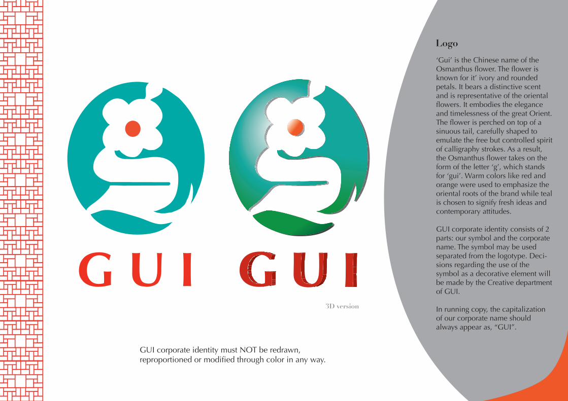
3D version
Logo
‘Gui’ is the Chinese name of the Osmanthus flower. The flower is known for it’ ivory and rounded petals. It bears a distinctive scent and is representative of the oriental flowers. It embodies the elegance and timelessness of the great Orient. The flower is perched on top of a sinuous tail, carefully shaped to emulate the free but controlled spirit of calligraphy strokes. As a result, the Osmanthus flower takes on the form of the letter ‘g’, which stands for ‘gui’. Warm colors like red and orange were used to emphasize the oriental roots of the brand while teal is chosen to signify fresh ideas and contemporary attitudes.
GUI corporate identity consists of 2 parts: our symbol and the corporate name. The symbol may be used separated from the logotype. Deci-sions regarding the use of the symbol as a decorative element will be made by the Creative department of GUI.
In running copy, the capitalization of our corporate name should always appear as, “GUI”.
G U IGUI corporate identity must NOT be redrawn,reproportioned or modified through color in any way.
G U I
Format
G U I
G U I
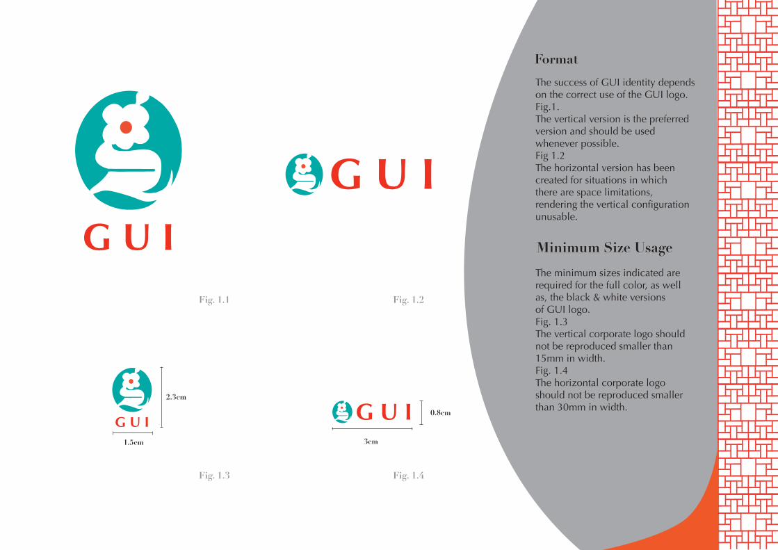
Fig. 1.1 Fig. 1.2
Fig. 1.3 Fig. 1.4
1.5cm 3cm
2.3cm
The success of GUI identity depends on the correct use of the GUI logo.Fig.1.The vertical version is the preferredversion and should be usedwhenever possible.Fig 1.2The horizontal version has beencreated for situations in whichthere are space limitations,rendering the vertical configurationunusable.
Minimum Size Usage
The minimum sizes indicated are required for the full color, as well as, the black & white versionsof GUI logo.Fig. 1.3The vertical corporate logo shouldnot be reproduced smaller than 15mm in width.Fig. 1.4The horizontal corporate logo should not be reproduced smaller than 30mm in width.
0.8cm
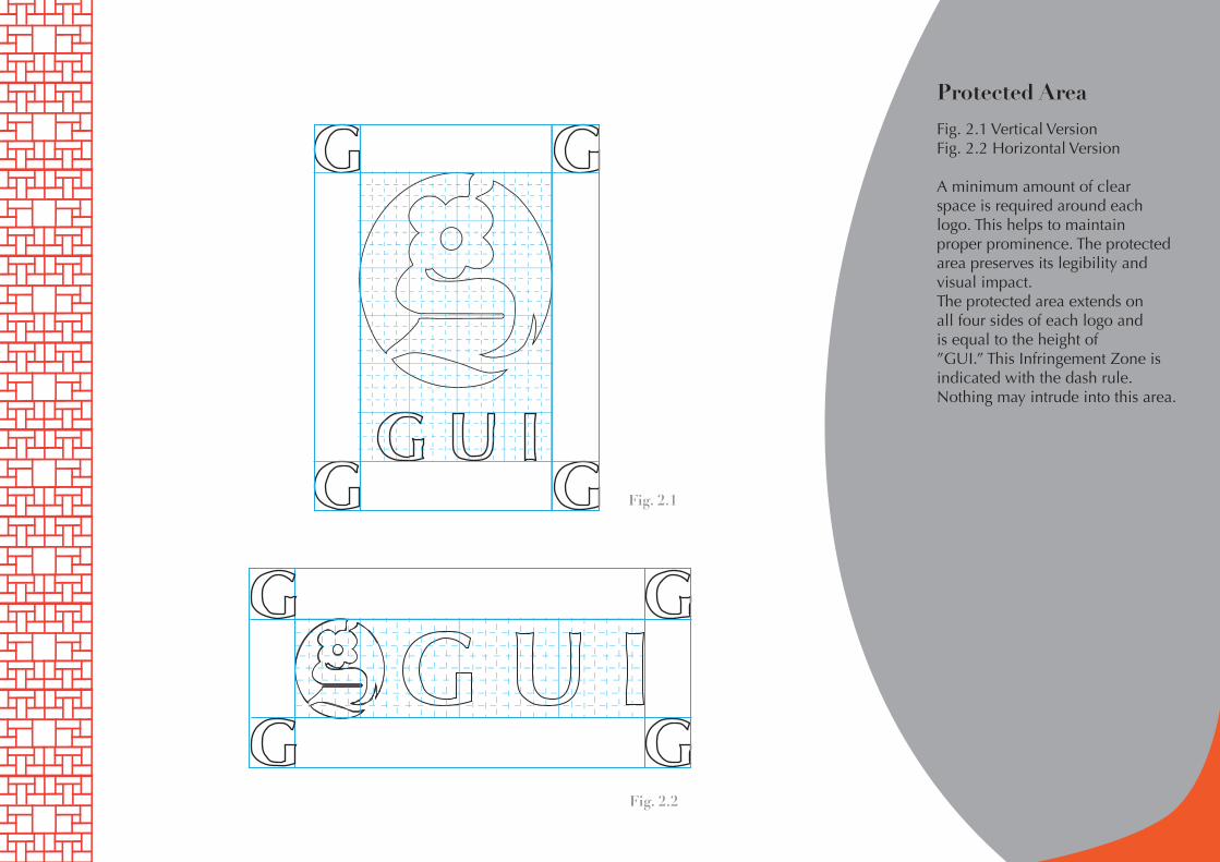
Protected Area
Fig. 2.1 Vertical VersionFig. 2.2 Horizontal Version
A minimum amount of clearspace is required around eachlogo. This helps to maintainproper prominence. The protectedarea preserves its legibility andvisual impact.The protected area extends onall four sides of each logo andis equal to the height of”GUI.” This Infringement Zone isindicated with the dash rule.Nothing may intrude into this area.
Fig. 2.1
Fig. 2.2
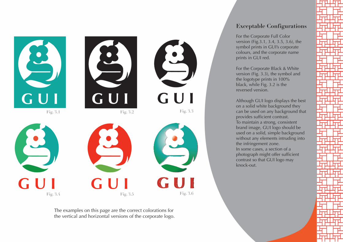
Exceptable Configurations
G U I
G U I
G U I
G U I
G U I
For the Corporate Full Colorversion (Fig.3.1, 3.4, 3.5, 3.6), the symbol prints in GUI’s corporate colours, and the corporate name prints in GUI red.
For the Corporate Black & Whiteversion (Fig. 3.3), the symbol and the logotype prints in 100% black, while Fig. 3.2 is the reversed version.
Although GUI logo displays the best on a solid white background they can be used on any background that provides sufficient contrast.To maintain a strong, consistentbrand image, GUI logo should be used on a solid, simple background without any elements intruding into the infringement zone.In some cases, a section of aphotograph might offer sufficientcontrast so that GUI logo may knock-out.
Fig. 3.1 Fig. 3.2 Fig. 3.3
Fig. 3.4 Fig. 3.5 Fig. 3.6
The examples on this page are the correct colorations forthe vertical and horizontal versions of the corporate logo.
Exceptable Configurations
G U I G U I
G U I G U I
G U I
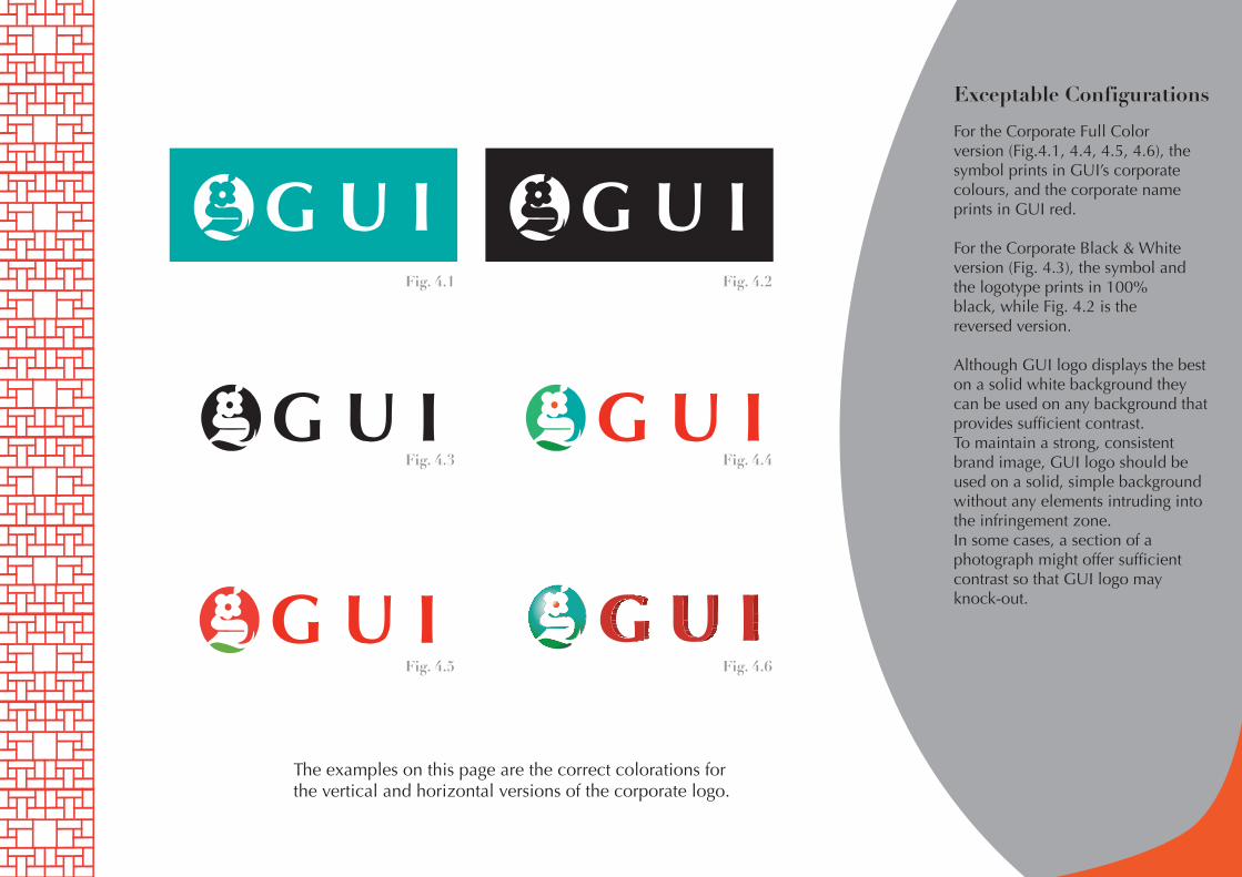
For the Corporate Full Colorversion (Fig.4.1, 4.4, 4.5, 4.6), the symbol prints in GUI’s corporate colours, and the corporate name prints in GUI red.
For the Corporate Black & Whiteversion (Fig. 4.3), the symbol and the logotype prints in 100% black, while Fig. 4.2 is the reversed version.
Although GUI logo displays the best on a solid white background they can be used on any background that provides sufficient contrast.To maintain a strong, consistentbrand image, GUI logo should be used on a solid, simple background without any elements intruding into the infringement zone.In some cases, a section of aphotograph might offer sufficientcontrast so that GUI logo may knock-out.
Fig. 4.1 Fig. 4.2
Fig. 4.3 Fig. 4.4
Fig. 4.5 Fig. 4.6
The examples on this page are the correct colorations forthe vertical and horizontal versions of the corporate logo.
Unexceptable Configurations
G U I
G U I
G U I G U I
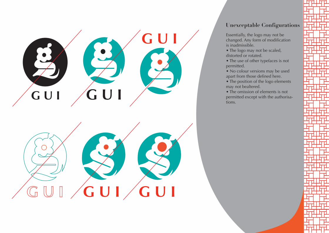
Essentially, the logo may not be changed. Any form of modification is inadmissible.• The logo may not be scaled, distorted or rotated.• The use of other typefaces is not permitted.• No colour versions may be used apart from those defined here.• The position of the logo elements may not bealtered.• The omission of elements is not permitted except with the authorisa-tions.
Unexceptable Configurations
G U I
G U I
G U I
G U I
G U
I
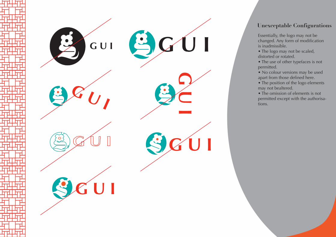
Essentially, the logo may not be changed. Any form of modification is inadmissible.• The logo may not be scaled, distorted or rotated.• The use of other typefaces is not permitted.• No colour versions may be used apart from those defined here.• The position of the logo elements may not bealtered.• The omission of elements is not permitted except with the authorisa-tions.
Secondary
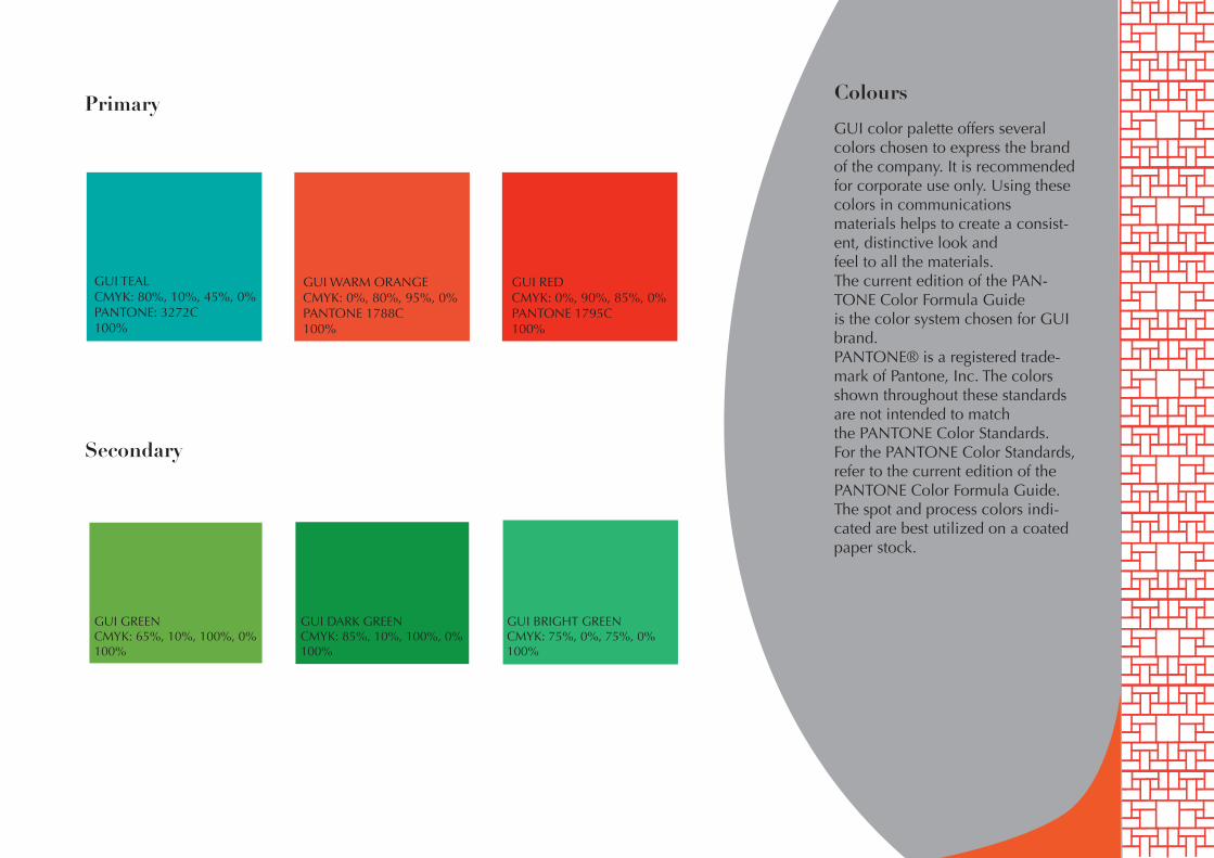
Primary Colours
GUI TEALCMYK: 80%, 10%, 45%, 0%PANTONE: 3272C100%
GUI GREENCMYK: 65%, 10%, 100%, 0%100%
GUI DARK GREENCMYK: 85%, 10%, 100%, 0%100%
GUI BRIGHT GREENCMYK: 75%, 0%, 75%, 0%100%
GUI WARM ORANGECMYK: 0%, 80%, 95%, 0%PANTONE 1788C100%
GUI REDCMYK: 0%, 90%, 85%, 0%PANTONE 1795C100%
GUI color palette offers several colors chosen to express the brand of the company. It is recommendedfor corporate use only. Using these colors in communicationsmaterials helps to create a consist-ent, distinctive look andfeel to all the materials.The current edition of the PAN-TONE Color Formula Guideis the color system chosen for GUI brand.PANTONE® is a registered trade-mark of Pantone, Inc. The colors shown throughout these standards are not intended to matchthe PANTONE Color Standards.For the PANTONE Color Standards, refer to the current edition of the PANTONE Color Formula Guide.The spot and process colors indi-cated are best utilized on a coated paper stock.
TypefacesOptima RegularABCDEFGHIJKLMNOPQRSTUVWXYZabcdefghijklmnopqrstuvwxyz1234567890 ~!@#$%^&*(),./’;[]\|}{”:?<>
Optima ItalicABCDEFGHIJKLMNOPQRSTUVWXYZabcdefghijklmnopqrstuvwxyz1234567890 ~!@#$%^&*(),./’;[]\|}{”:?<>
Optima BoldABCDEFGHIJKLMNOPQRSTUVWXYZabcdefghijklmnopqrstuvwxyz1234567890 ~!@#$%^&*(),./’;[]\|}{”:?<>
Optima Bold ItalicABCDEFGHIJKLMNOPQRSTUVWXYZabcdefghijklmnopqrstuvwxyz1234567890 ~!@#$%^&*(),./’;[]\|}{”:?<>
Optima Extra BlackABCDEFGHIJKLMNOPQRSTUVWXYZabcdefghijklmnopqrstuvwxyz1234567890 ~!@#$%^&*(),./’;[]\|}{”:?<>
Optima BoldABCDEFGHIJKLMNOPQRSTUVWXYZabcdefghijklmnopqrstuvwxyz1234567890 ~!@#$%^&*(),./’;[]\|}{”:?<>
Didot RegularABCDEFGHIJKLMNOPQRSTUVWXYZabcdefghijklmnopqrstuvwxyz1234567890 ~!@#$%^&*(),./’;[]\|}{”:?<>
Didot BoldABCDEFGHIJKLMNOPQRSTUVWXYZabcdefghijklmnopqrstuvwxyz1234567890 ~!@#$%^&*(),./’;[]\|}{”:?<>
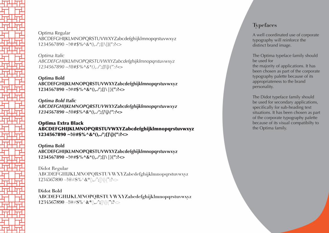
A well coordinated use of corporate typography will reinforce the distinct brand image.
The Optima typeface family should be used forthe majority of applications. It has been chosen as part of the corporate typography palette because of its appropriateness to the brandpersonality.
The Didot typeface family shouldbe used for secondary applications, specifically for sub-heading textsituations. It has been chosen as part of the corporate typography palette because of its visual compatibilty to the Optima family.
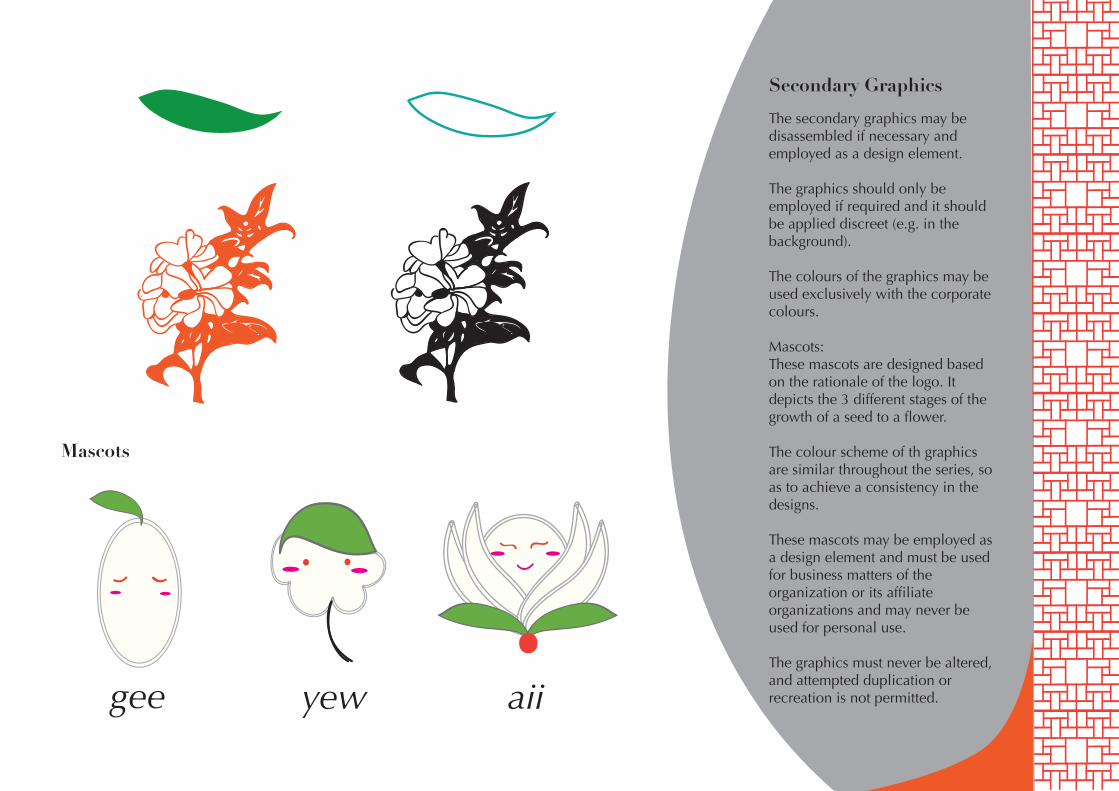
Secondary Graphics
aiiyewgee
Mascots
The secondary graphics may be disassembled if necessary and employed as a design element.
The graphics should only be employed if required and it should be applied discreet (e.g. in the background).
The colours of the graphics may be used exclusively with the corporate colours.
Mascots:These mascots are designed based on the rationale of the logo. It depicts the 3 different stages of the growth of a seed to a flower.
The colour scheme of th graphics are similar throughout the series, so as to achieve a consistency in the designs.
These mascots may be employed as a design element and must be used for business matters of the organization or its affiliate organizations and may never be used for personal use.
The graphics must never be altered, and attempted duplication or recreation is not permitted.
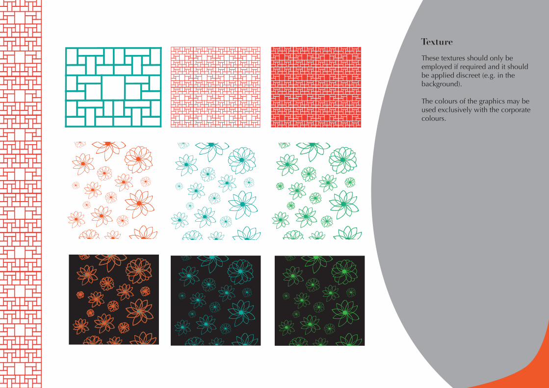
Texture
These textures should only be employed if required and it should be applied discreet (e.g. in the background).
The colours of the graphics may be used exclusively with the corporate colours.
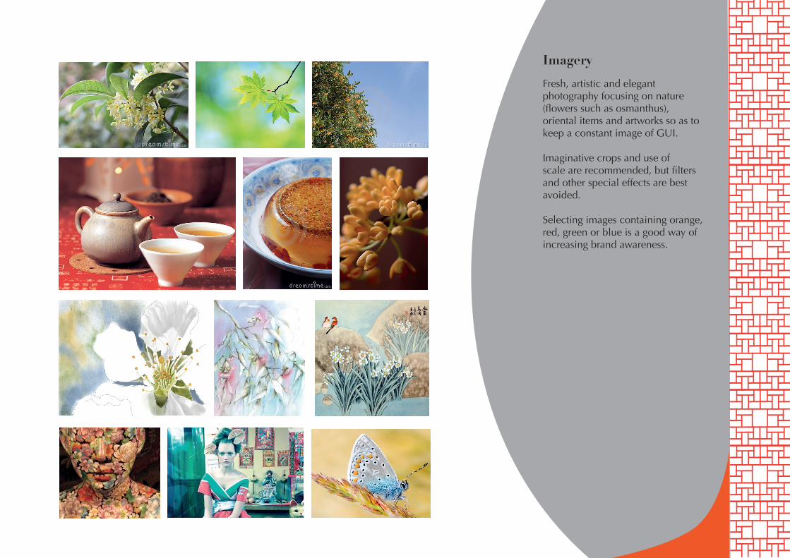
Imagery
Fresh, artistic and elegant photography focusing on nature (flowers such as osmanthus), oriental items and artworks so as to keep a constant image of GUI.
Imaginative crops and use ofscale are recommended, but filters and other special effects are best avoided.
Selecting images containing orange, red, green or blue is a good way ofincreasing brand awareness.
G U I
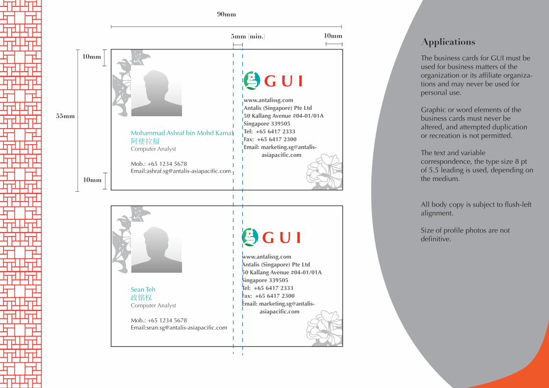
Mohammad Ashraf bin Mohd Kamal
Computer Analyst
Mob.: +65 1234 5678 Email:[email protected]
www.antalissg.comAntalis (Singapore) Pte Ltd 50 Kallang Avenue #04-01/01ASingapore 339505Tel: +65 6417 2333Fax: +65 6417 2300Email: marketing.sg@antalis- asiapacific.com
Applications
政铭权
阿使拉福
90mm
55mm
G U I
Sean Teh
Computer Analyst
Mob.: +65 1234 5678 Email:[email protected]
www.antalissg.comAntalis (Singapore) Pte Ltd 50 Kallang Avenue #04-01/01ASingapore 339505Tel: +65 6417 2333Fax: +65 6417 2300Email: marketing.sg@antalis- asiapacific.com
10mm
10mm
10mm
The business cards for GUI must be used for business matters of the organization or its affiliate organiza-tions and may never be used for personal use.
Graphic or word elements of the business cards must never be altered, and attempted duplication or recreation is not permitted.
The text and variable correspondence, the type size 8 pt of 5.5 leading is used, depending on the medium.
All body copy is subject to flush-left alignment.
Size of profile photos are not definitive.
5mm (min.)
Applications
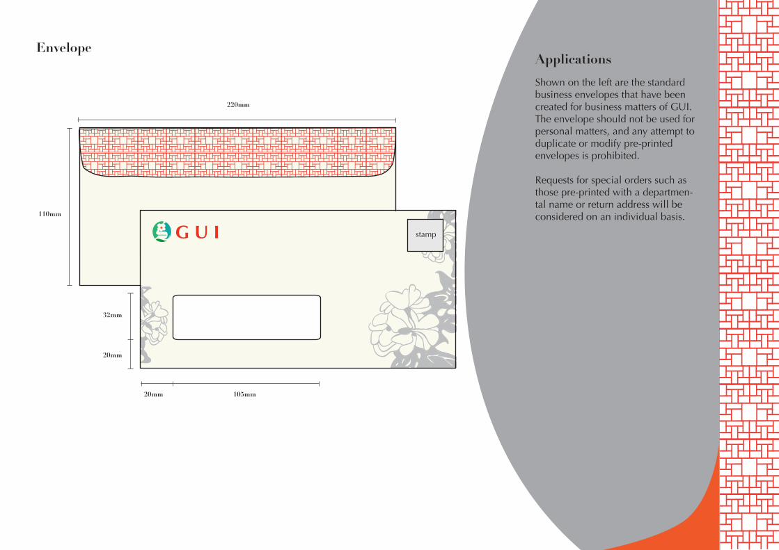
220mm
110mm
105mm 20mm
20mm
32mm
G U I
Shown on the left are the standard business envelopes that have been created for business matters of GUI. The envelope should not be used for personal matters, and any attempt to duplicate or modify pre-printed envelopes is prohibited.
Requests for special orders such as those pre-printed with a departmen-tal name or return address will be considered on an individual basis.
Envelope
stamp
Applications
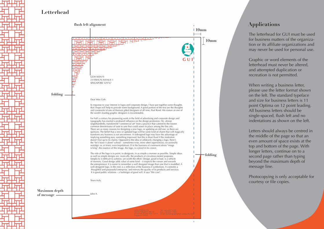
The letterhead for GUI must be used for business matters of the organiza-tion or its affiliate organizations and may never be used for personal use.
Graphic or word elements of the letterhead must never be altered, and attempted duplication or recreation is not permitted.
When writing a business letter, please use the letter format shown on the left. The standard typeface and size for business letters is 11 point Optima on 12 point leading. All business letters should be single-spaced, flush left and no indentations as shown on the left.
Letters should always be centred in the middle of the page so that an even amount of space exists at the top and bottom of the page. With longer letters, continue on to a second page rather than typing beyond the maximum depth of message line.
Photocopying is only acceptable for courtesy or file copies.
Letterhead
flush left alignment
folding
folding
Maximum depth of message
10mm
10mm
www.antalissg.comAntalis (Singapore) Pte Ltd 50 Kallang Avenue #04-01/01ASingapore 339505
Tel: +65 6417 2333Fax: +65 6417 2300Email: [email protected]
GOH WEN YI23 YISHUN AVENUE 1SINGAPORE 529767
Dear Miss Goh:
In response to your interest in logos and corporate design, I have put together some thoughts that I hope will help to provide some background. A good portion of the text are the thoughts and comments of one of themost gifted designers of all time, Paul Rand. His stature as one of the world's leading graphic designers is incontestable.
For half a century his pioneering work in the field of advertising and corporate design and typography has exerted a profound influence on the design profession. He, almost singlehandedly, transformed "commercial art" from a practice that catered to the lowest common denominator of taste to one that could assert its place among the fine arts.There are as many reasons for designing a new logo, or updating an old one, as there are opinions. The belief that a new or updated logo will be some kind of charm that will magically transform any business is not uncommon. A redesigned logo may have the advantage of implying something new, something improved, but this is short-lived if the institution doesn't live up to its claims. Opposed to the idea of arbitrarily changing a logo, there's the "let's leave it alone" school – sometimes wise, more often superstitious, occasionally nostalgic or, at times, even trepidatious. If in the business of communications "image is king", the essence of this image, the logo, is a jewel in its crown.
The role of the logo is to point, to designate, in as simple a manner as possible. Simple ideas as well as simple designs are, ironically, the products of circuitous mental purposes. Simplicity is difficult to achieve, yet worth the effort. Design, good or bad, is a vehicle of memory. Good design adds value of some kind – it respects the viewer and rewards the entrepreneur. It is easier to remember a well designed image than one that is muddled. A well designed logo, in the end, is a reflection of the business it symbolizes. It connotes a thoughtful and purposeful enterprise, and mirrors the quality of its products and services. It is good public relations – a harbinger of good will. It says "We care".
Yours truly,
John A.
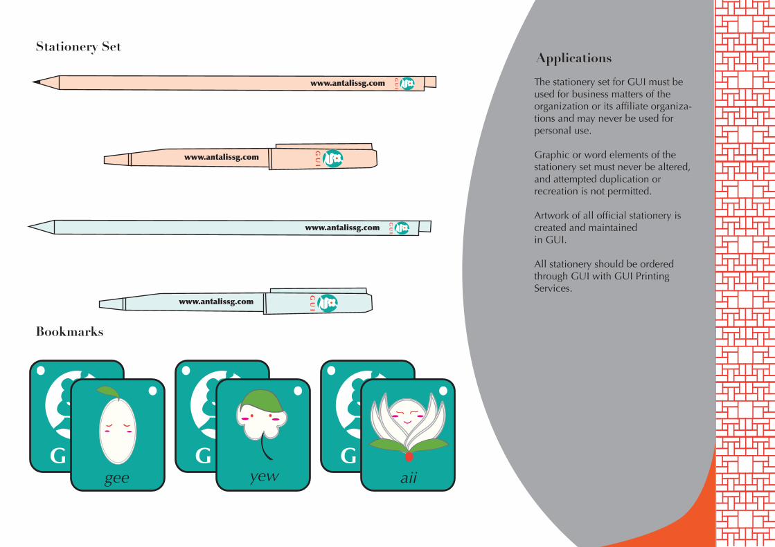
The stationery set for GUI must be used for business matters of the organization or its affiliate organiza-tions and may never be used for personal use.
Graphic or word elements of the stationery set must never be altered, and attempted duplication or recreation is not permitted.
Artwork of all official stationery is created and maintainedin GUI.
All stationery should be ordered through GUI with GUI Printing Services.
Applications
www.antalissg.com
www.antalissg.com
www.antalissg.com
www.antalissg.com
G U Igee
G U Iyew
G U Iaii
Bookmarks
Stationery Set
Applications
G U IG U I
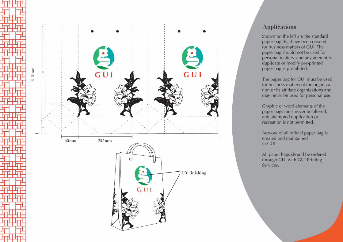
45mm
UV finishing
255mm
415m
mShown on the left are the standard paper bag that have been created for business matters of GUI. The paper bag should not be used for personal matters, and any attempt to duplicate or modify pre-printed paper bag is prohibited.
The paper bag for GUI must be used for business matters of the organiza-tion or its affiliate organizations and may never be used for personal use.
Graphic or word elements of the paper bags must never be altered, and attempted duplication or recreation is not permitted.
Artwork of all official paper bag is created and maintainedin GUI.
All paper bags should be ordered through GUI with GUI Printing Services.
.
Applications
G U
IG
U I
G U
I
G U
IG
U I
G U
I
G U
IG
U I
G U
I
G U
IG
U I
G U
I
G U
IG
U I
G U
I
G U
IG
U I
G U
I
G U
IG
U I
G U
I
G U
IG
U I
G U
I
G U
IG
U I
G U
I
G U
IG
U I
G U
I
G U
IG
U I
G U
I
G U
IG
U I
G U
I
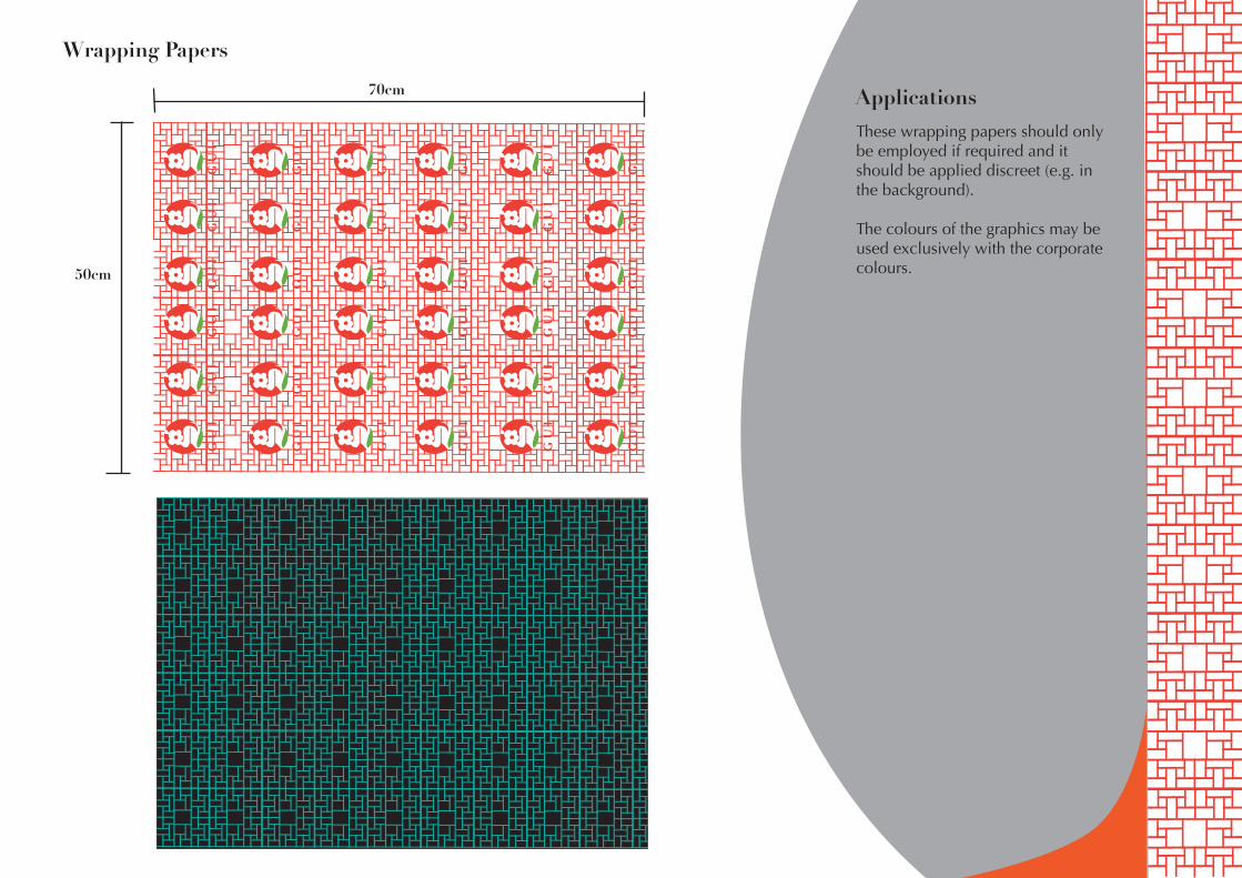
50cm
70cm
These wrapping papers should only be employed if required and it should be applied discreet (e.g. in the background).
The colours of the graphics may be used exclusively with the corporate colours.
Wrapping Papers
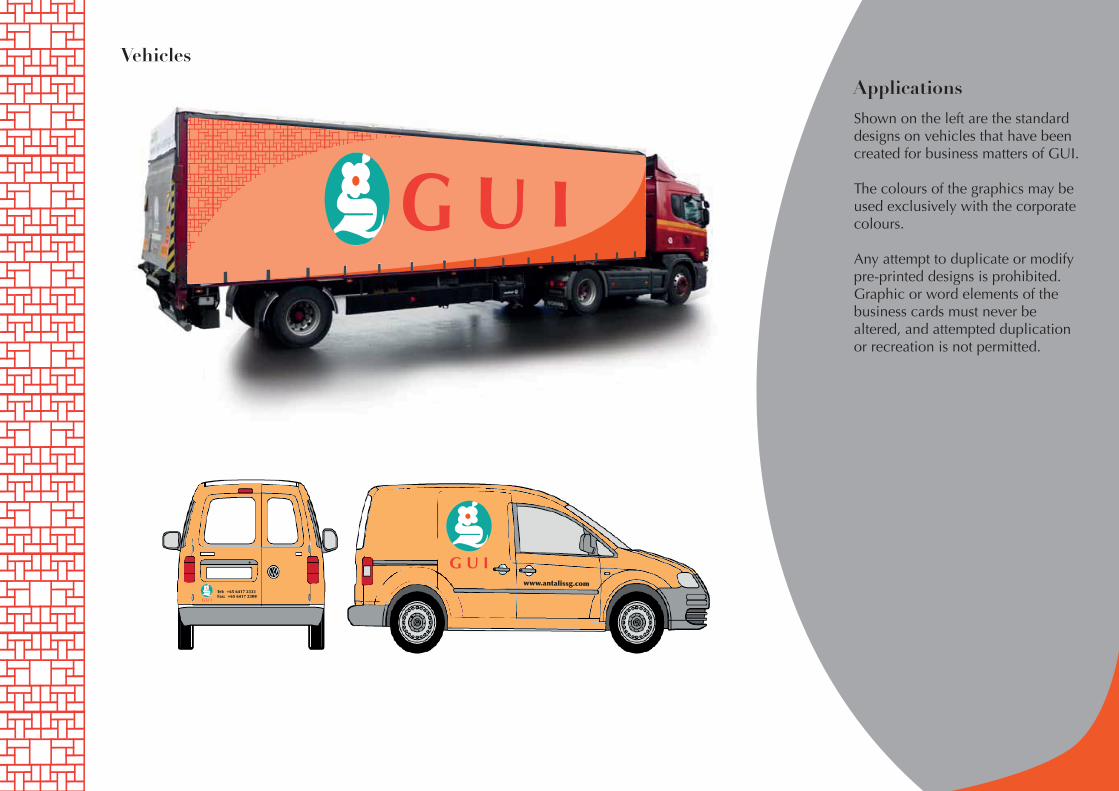
ApplicationsShown on the left are the standard designs on vehicles that have been created for business matters of GUI.
The colours of the graphics may be used exclusively with the corporate colours.
Any attempt to duplicate or modify pre-printed designs is prohibited. Graphic or word elements of the business cards must never be altered, and attempted duplication or recreation is not permitted.
Vehicles
G U Iwww.antalissg.com
Tel: +65 6417 2333Fax: +65 6417 2300
G U I
G U I
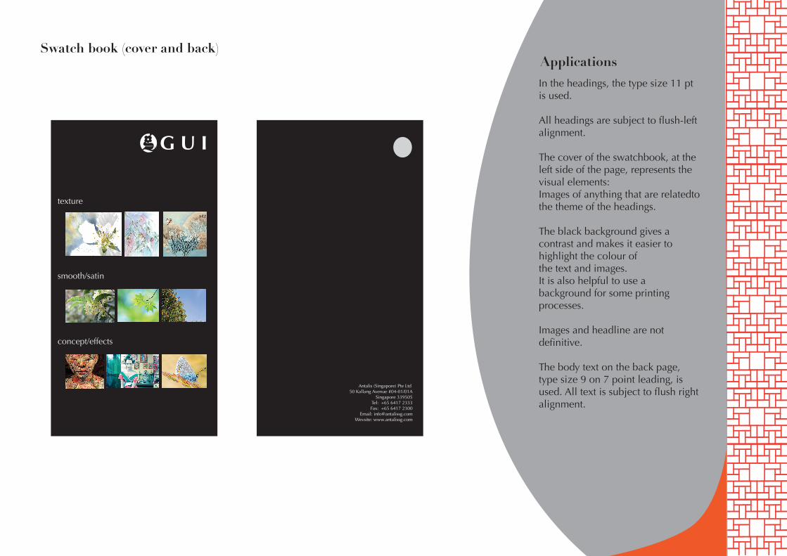
texture
smooth/satin
concept/effects
ApplicationsIn the headings, the type size 11 pt is used.
All headings are subject to flush-left alignment.
The cover of the swatchbook, at the left side of the page, represents the visual elements:Images of anything that are relatedto the theme of the headings.
The black background gives a contrast and makes it easier to highlight the colour ofthe text and images.It is also helpful to use a background for some printing processes.
Images and headline are not definitive.
The body text on the back page, type size 9 on 7 point leading, is used. All text is subject to flush right alignment.
Swatch book (cover and back)
Antalis (Singapore) Pte Ltd 50 Kallang Avenue #04-01/01A
Singapore 339505Tel: +65 6417 2333Fax: +65 6417 2300
Email: [email protected]: www.antalissg.com


![JUnit-Testing GUI Components [Autosaved]shsaad/seng426/resources/Lab Slides... · 2011-06-15 · JUnit-Testing GUI Components . Agenda Test GUI Components Simple GUI Application Test](https://img.pdfslide.us/doc/110x75/5e237780175e3d268e70f660/junit-testing-gui-components-autosaved-shsaadseng426resourceslab-slides.jpg)