Embed Size (px)
Citation preview
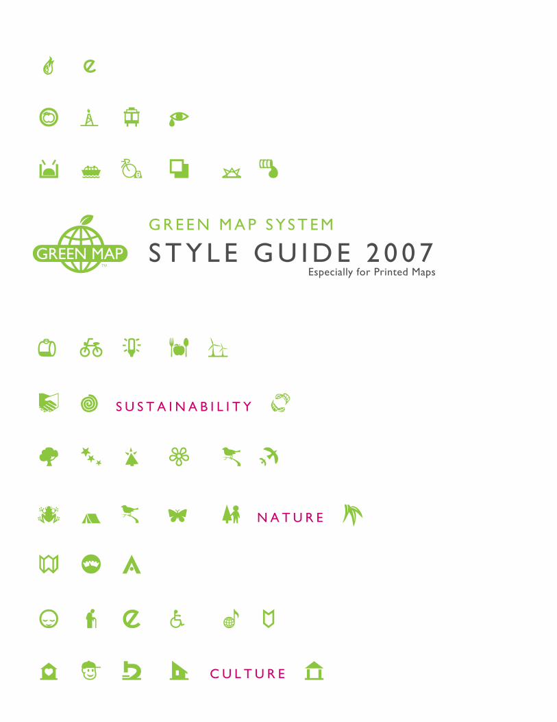
G R E E N M A P S YS T E M
S T Y L E G U I D E 2 0 0 7Especially for Printed Maps
N A T U R E
S U S T A I N A B I L I T Y
C U L T U R E
D
(
I
`
0
†R ‰
Green Map SystemPO Box 249New York, NY 10002 USA
[email protected]+1 212 674 1631
This Style Guide is available to all Green Mapmakers at GreenMap.org. Download the Graphic Kit there as well, in the Tool Center. Share your related resources there, too.
If you print this Style Guide, we recommend double sided printing on recycled paper.
This Guide may be copied or emailed freely to your Green Map project partners, but may not be sold or posted online.
Dedicated to Green Mapmakers, past, present and future.
Icons © Green Map System, Inc., 2003. All rights reserved. Green Map® is a registered trademark and is used with permission.
GreenMap.org
ThINK GLOBAL, MAP LOCAL!
Green Map Style Guide
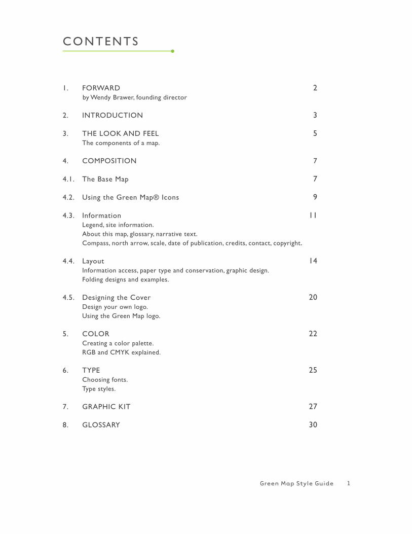
1. FORwARD 2 by wendy Brawer, founding director
2. INTRODUCTION 3
3. ThE LOOK AND FEEL 5 The components of a map.
4. COMPOSITION 7
4.1. The Base Map 7
4.2. Using the Green Map® Icons 9
4.3. Information 11 Legend, site information. About this map, glossary, narrative text. Compass, north arrow, scale, date of publication, credits, contact, copyright.
4.4. Layout 14 Information access, paper type and conservation, graphic design. Folding designs and examples.
4.5. Designing the Cover 20 Design your own logo. Using the Green Map logo.
5. COLOR 22 Creating a color palette. RGB and CMYK explained.
6. TYPE 25 Choosing fonts. Type styles.
7. GRAPhIC KIT 27
8. GLOSSARY 30
CONTENTS
1
Green Map Style Guide
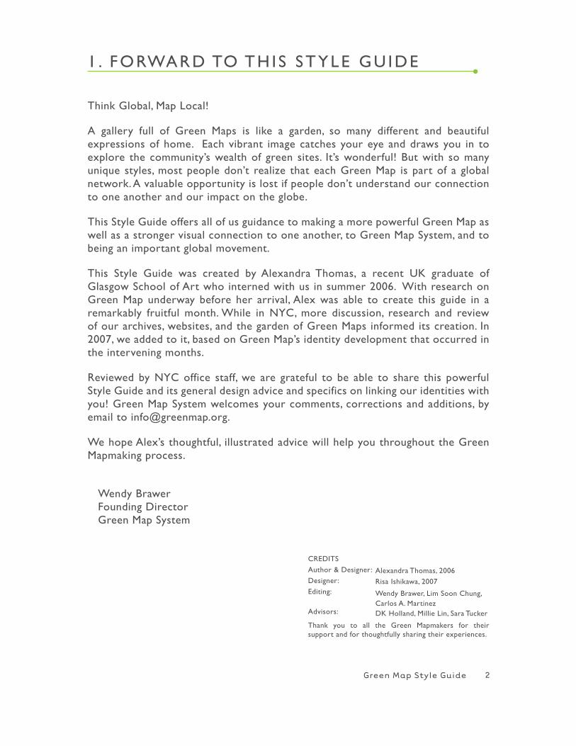
1 . FORwARD TO Th IS STYLE GU IDE
Think Global, Map Local!
A gallery full of Green Maps is like a garden, so many different and beautiful expressions of home. Each vibrant image catches your eye and draws you in to explore the community’s wealth of green sites. It’s wonderful! But with so many unique styles, most people don’t realize that each Green Map is part of a global network. A valuable opportunity is lost if people don’t understand our connection to one another and our impact on the globe.
This Style Guide offers all of us guidance to making a more powerful Green Map as well as a stronger visual connection to one another, to Green Map System, and to being an important global movement.
This Style Guide was created by Alexandra Thomas, a recent UK graduate of Glasgow School of Art who interned with us in summer 2006. with research on Green Map underway before her arrival, Alex was able to create this guide in a remarkably fruitful month. while in NYC, more discussion, research and review of our archives, websites, and the garden of Green Maps informed its creation. In 2007, we added to it, based on Green Map’s identity development that occurred in the intervening months.
Reviewed by NYC office staff, we are grateful to be able to share this powerful Style Guide and its general design advice and specifics on linking our identities with you! Green Map System welcomes your comments, corrections and additions, by email to [email protected].
we hope Alex’s thoughtful, illustrated advice will help you throughout the Green Mapmaking process.
wendy Brawer Founding Director Green Map System
2
CREDITS
Author & Designer:
Designer:
Editing:
Advisors:
Thank you to all the Green Mapmakers for their support and for thoughtfully sharing their experiences.
Alexandra Thomas, 2006
Risa Ishikawa, 2007
wendy Brawer, Lim Soon Chung,Carlos A. MartinezDK holland, Millie Lin, Sara Tucker
Green Map Style Guide
2 . INTRODUCTION
GREEN MAP SYSTEM is a very unique, colourful and complex system and network (even those terms do not sum up what GMS encompasses). By its 12th year of life, GMS has achieved an enormous amount. The focus has been on getting out there, achieving and growing. with numerous individual and integrated parts and products, the very nature and beauty of GMS is that it is self-perpetuating, flexible, collaborative, expressive and creative. Subsequently it has a complex story to communicate. Our goal with this style guide is to suggest ways to make all local Green Maps appear more visually linked in an easily recognisable brand.
There are almost 400 different Green Map projects around the globe, a staggering number. Each will produce a varying number of maps, printed and online, and often brochures, videos and books, using a wide range of formats and graphical styles. There are also Regional hubs developing in the form of the Mapa Verde Cuba, the Taiwanese Green Life Map and Green Map Japan to name but a few.
A niche has already been carved out for the GMS and all its individual and connected parts. It is very well understood from the inside, with no shortage of expertise, project and product descriptions that are well known locally but not globally. As it has grown as an organisation, the fluid nature of GMS has been recognised as both a triumph and an obstacle. In order for it to grow as a movement, attract support, recognition, funding and the wider understanding it deserves, there needs to be a more recognisable structure. In short, the present ‘fuzzy’ branding needs to be sharpened up. This stronger identity will help your projects gain support and recognition at the same time!
A BIT ABOUT BRANDING :
‘Branding’ works on several levels, but can most simply be described as a method of distinguishing one thing from another. It is about the message, image and experience, and a means of identifying a specific company or NGO’s products or work. It informs us about the underlying core values, aims and identity. Equally importantly it enables us, the audience, to formulate our ideas about how we relate to the said organisation/ product. Do we understand it? Trust it? Support it? will we stick with this brand?
Branding (or ‘identity’) is achieved with the specified use of logo, color, palette, typefaces, formats, images, and language. These signifiers are used in every com-munication vehicle that helps convey the brand identity: reports, letterheads, web site, signage and maps, etc.
3
Green Map Style Guide
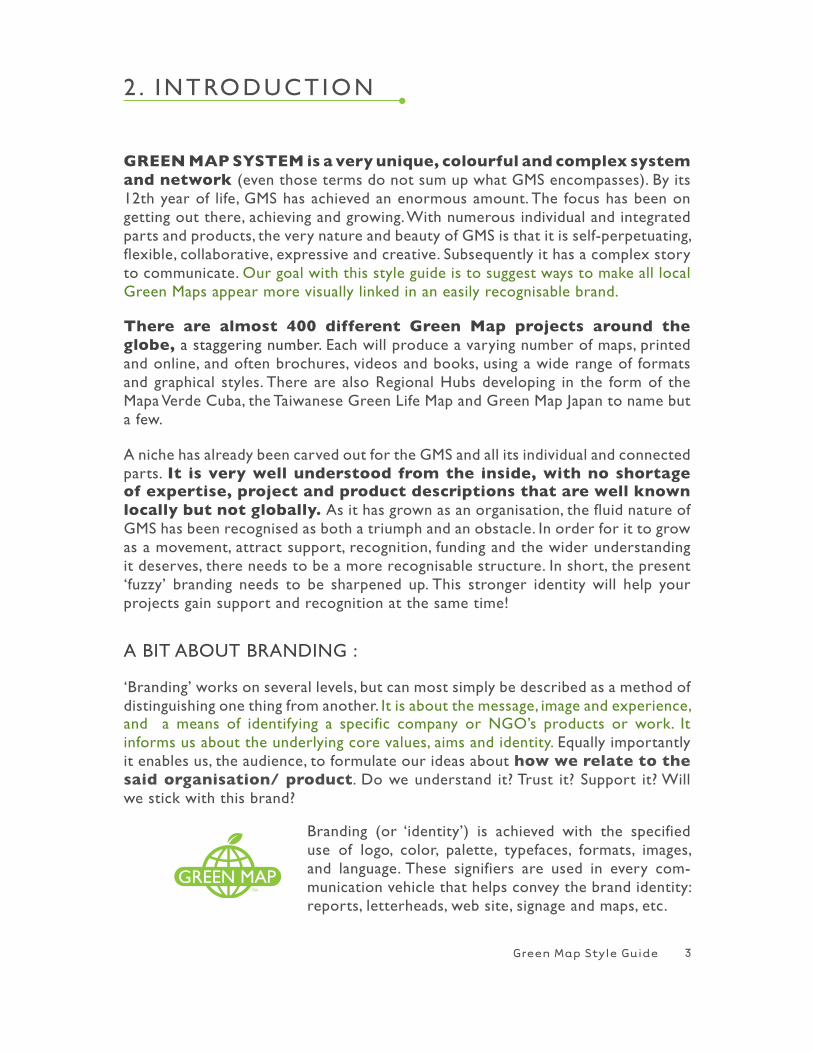
Green Maps need a graphic style and system of branding to visually pull together the diverse outcomes, one that will guide and not restrict. with such a diverse set of Maps and graphic styles, our communication to the outside world is confusing. The work of one artist can be very diverse, but will always have certain recognisable charateristics and signature stylistic attributes. Although within the greater Green Map System we have many artists, designers, geographers, scientists, sociologists, etc., yet it is still possible to create a more cohesive style.
The guide will take the Mapmaker through the different elements of designing and creating a map. It will offer guidance and some rules. This illustrative guide offers examples of more successful design, font and information organisation in previously published Green Maps. There will also be a downloadable Graphic Kit offering example color palettes, graphics and elements such as north arrows, scales, etc.
There will be little actual prescription but we hope with guidance Mapmakers will collaborate and eventually create a more coherent style together. however, the use of Green Map System’s logo, sometimes with a block of text, will be more prescribed than before (see page 20-21), as to the placement, alignment, size and preferred colours. Mapmakers will be able to choose the Green Map logo in different formats and colours from the kit, so it will retain a sense of continual style and still harmonize with various map designs and your own logo.
Including the copyright and trademark statement is a must! It is in everybody’s best interest to collaborate on this crucial element of Green Map® System’s brand, today and in the future.
4
if is an individual project, at the moment thebranding looks something like this..
Green Map Style Guide
3 . ThE LOOK AND FEEL
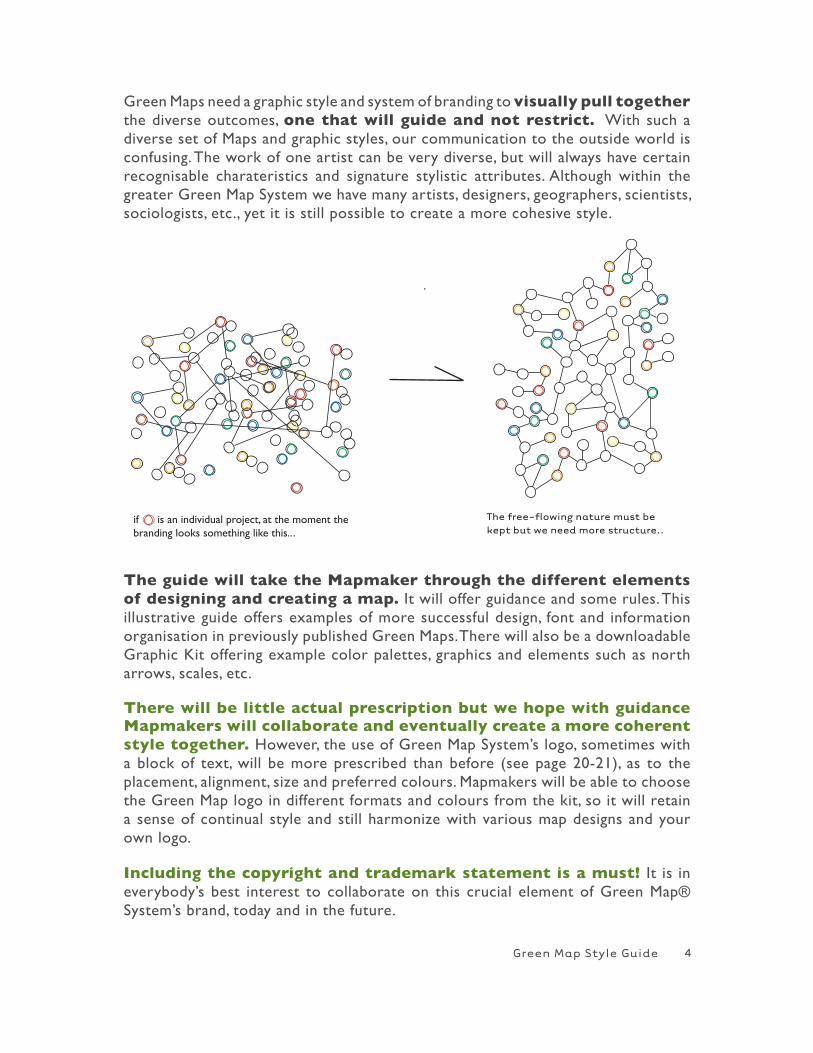
Every decision you make graphically on your map, everything from color use to density and amount of text, to the way the folding is designed and how images are placed on the page, conveys a message. Each aspect says something about you, your map, city, and the Green Map System you are part of.
For example; the map showing a library plan conveys a completely different message than the map promoting the town `Pigeon Lake’. The use of color, style, font and information varies. Each map conveys an entirely different message about its subject.
Although your map’s local functions and cultural representations are very important, it should reflect that it is part of a bigger system, working towards a common goal. A more coherent Green Map graphic style will help the movement gain support and recognition, and in turn strengthen individual Mapmaking projects. Our goal is to clarify what we want the map to ‘say’ and how it reflects Green Map’s temperament, energy, goals and ethics. Remember that a picture tells a thousand words.
This Style Guide will take you through the different components of a map and the designing of each part. The overall look of the map must always be kept in mind – in the end it is the whole package that users engage with, and the whole package that reflects the identity.
5
Green Map Style Guide
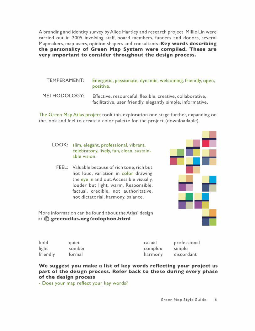
A branding and identity survey by Alice hartley and research project Millie Lin were carried out in 2005 involving staff, board members, funders and donors, several Mapmakers, map users, opinion shapers and consultants. Key words describing the personality of Green Map System were compiled. These are very important to consider throughout the design process.
TEMPERAMENT:
METhODOLOGY:
slim, elegant, professional, vibrant, celebratory, lively, fun, clean, sustain-able vision.
Valuable because of rich tone, rich but not loud, variation in color drawing the eye in and out. Accessible visually, louder but light, warm. Responsible, factual, credible, not authoritative, not dictatorial, harmony, balance.
More information can be found about the Atlas’ design at H greenatlas.org/colophon.html
bold quiet casual professionallight somber complex simplefriendly formal harmony discordant We suggest you make a list of key words reflecting your project as part of the design process. Refer back to these during every phase of the design process - Does your map reflect your key words?
Energetic, passionate, dynamic, welcoming, friendly, open, positive.
Effective, resourceful, flexible, creative, collaborative,facilitative, user friendly, elegantly simple, informative.
The Green Map Atlas project took this exploration one stage further, expanding on the look and feel to create a color palette for the project (downloadable).
LOOK:
FEEL:
6
Green Map Style Guide
4 . COMPOS IT ION
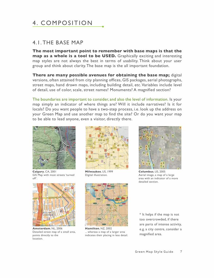
The most important point to remember with base maps is that the map as a whole is a tool to be USED. Graphically exciting and interesting map styles are not always the best in terms of usability. Think about your user group and think about clarity. The base map is the all important foundation.
There are many possible avenues for obtaining the base map; digital versions, often attained from city planning offices, GIS packages, aerial photographs, street maps, hand drawn maps, including building detail, etc. Variables include level of detail, use of color, scale, street names? Monuments? A magnified section?
The boundaries are important to consider, and also the level of information. Is your map simply an indicator of where things are? will it include narratives? Is it for locals? Do you want people to have a two-step process, i.e. look up the address on your Green Map and use another map to find the site? Or do you want your map to be able to lead anyone, even a visitor, directly there.
* It helps if the map is not too overcrowded, if there are parts of intense activity, e.g. a city centre, consider a magnified area.
Calgary, CA, 2001 GIS Map with most streets ‘turned off ’.
Milwaukee, US, 1999Digital illustration.
Columbus, US, 2005Aerial image, a map of a large area with an indicator of a more detailed section.
Hamilton, NZ, 2002 ... whereas a map of a larger area indicates their placing in less detail.
Amsterdam, NL, 2006 Detailed street map of a small area, points directly to thelocation.
7
4.1. ThE BASE MAP
Green Map Style Guide
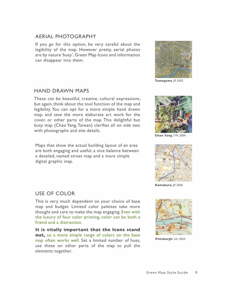
AERIAL PhOTOGRAPhYIf you go for this option, be very careful about the legibility of the map. however pretty, aerial photos are by nature ‘busy’, Green Map Icons and information can disappear into them.
hAND DRAwN MAPSThese can be beautiful, creative, cultural expressions, but again, think about the tool function of the map and legibility. You can opt for a more simple hand drawn map, and save the more elaborate art work for the cover, or other parts of the map. This delightful but busy map (Chao Yang, Taiwan) clarifies all on side two with photographs and site details.
Maps that show the actual building layout of an area are both engaging and useful, a nice balance between a detailed, named street map and a more simple digital graphic map.
Tamagawa, JP, 2002
Chao Yang, Tw, 2004
USE OF COLORThis is very much dependent on your choice of base map and budget. Limited color palettes take more thought and care to make the map engaging. Even with the luxury of four color printing, color can be both a friend and a distraction.
It is vitally important that the Icons stand out, so a more simple range of colors on the base map often works well. Set a limited number of hues, use these on other parts of the map to pull the elements together.
Kamakura, JP, 2006
Pittsburgh, US, 2003
8
Green Map Style Guide
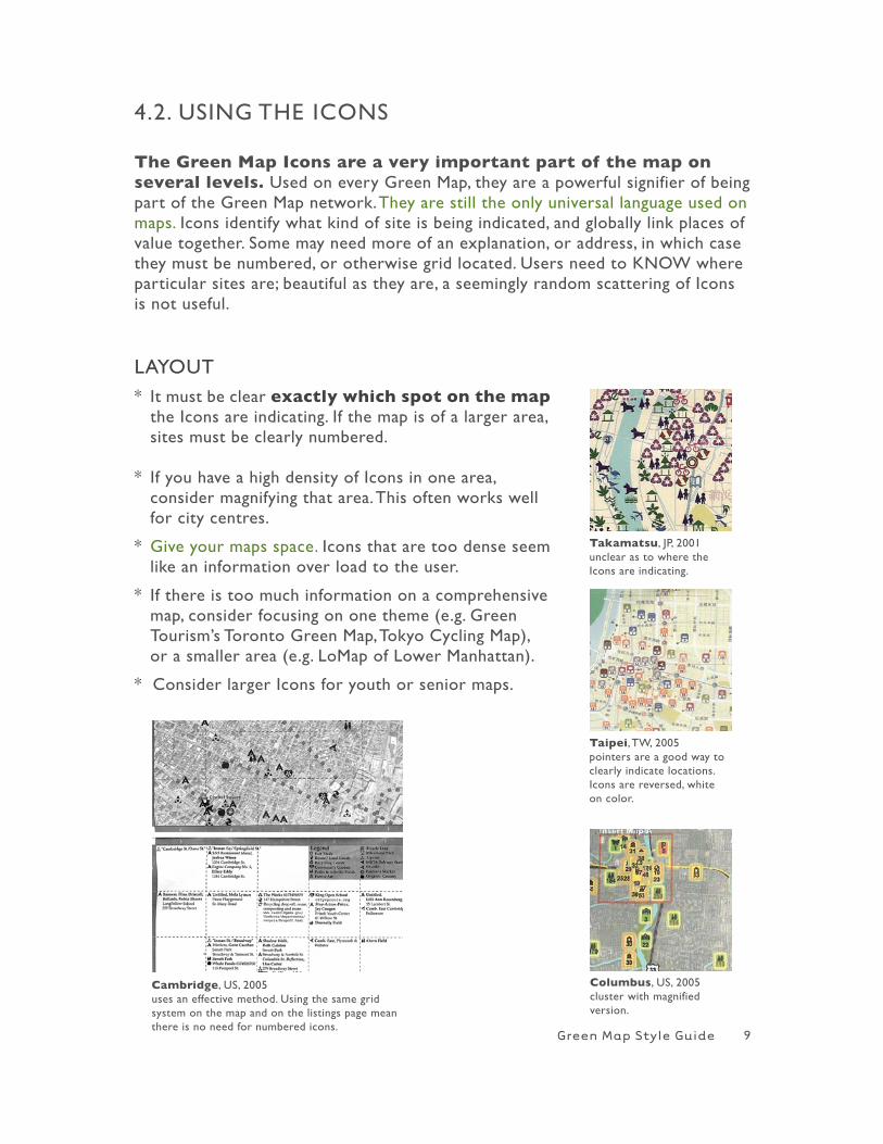
The Green Map Icons are a very important part of the map on several levels. Used on every Green Map, they are a powerful signifier of being part of the Green Map network. They are still the only universal language used on maps. Icons identify what kind of site is being indicated, and globally link places of value together. Some may need more of an explanation, or address, in which case they must be numbered, or otherwise grid located. Users need to KNOw where particular sites are; beautiful as they are, a seemingly random scattering of Icons is not useful.
4.2. USING ThE ICONS
LAYOUT* It must be clear exactly which spot on the map the Icons are indicating. If the map is of a larger area, sites must be clearly numbered.
* If you have a high density of Icons in one area, consider magnifying that area. This often works well for city centres.
* Give your maps space. Icons that are too dense seem like an information over load to the user.
* If there is too much information on a comprehensive map, consider focusing on one theme (e.g. Green Tourism’s Toronto Green Map, Tokyo Cycling Map), or a smaller area (e.g. LoMap of Lower Manhattan).
* Consider larger Icons for youth or senior maps.
Takamatsu, JP, 2001unclear as to where the Icons are indicating.
Taipei, Tw, 2005pointers are a good way to clearly indicate locations. Icons are reversed, white on color.
Columbus, US, 2005cluster with magnified version.
Cambridge, US, 2005uses an effective method. Using the same grid system on the map and on the listings page mean there is no need for numbered icons.
9
Green Map Style Guide
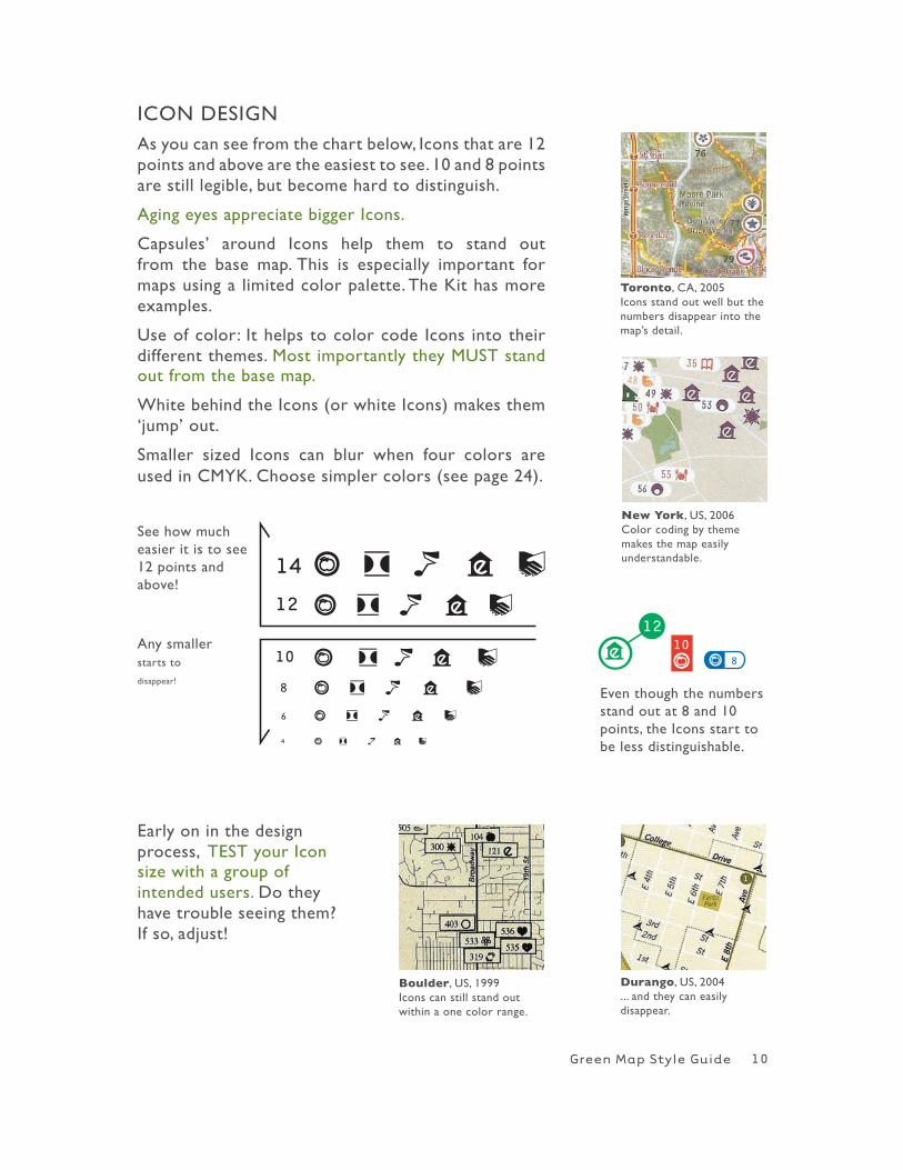
ICON DESIGNAs you can see from the chart below, Icons that are 12 points and above are the easiest to see. 10 and 8 points are still legible, but become hard to distinguish.
Aging eyes appreciate bigger Icons.
Capsules’ around Icons help them to stand out from the base map. This is especially important for maps using a limited color palette. The Kit has more examples.
Use of color: It helps to color code Icons into their different themes. Most importantly they MUST stand out from the base map.
white behind the Icons (or white Icons) makes them ‘jump’ out.
Smaller sized Icons can blur when four colors are used in CMYK. Choose simpler colors (see page 24).
a d 4 b k
a d 4 b k
a d 4 b k
a d 4 b k
a d 4 b k
a d 4 b k
See how much easier it is to see 12 points and above!
Any smaller starts to disappear!
Early on in the design process, TEST your Icon size with a group of intended users. Do they have trouble seeing them? If so, adjust!
Even though the numbers stand out at 8 and 10 points, the Icons start to be less distinguishable.
a ab
Toronto, CA, 2005Icons stand out well but the numbers disappear into the map’s detail.
New York, US, 2006Color coding by theme makes the map easily understandable.
Durango, US, 2004... and they can easily disappear.
Boulder, US, 1999Icons can still stand out within a one color range.
10
Green Map Style Guide
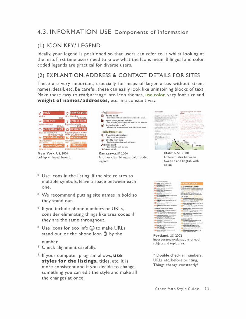
(1) ICON KEY/ LEGENDIdeally, your legend is positioned so that users can refer to it whilst looking at the map. First time users need to know what the Icons mean. Bilingual and color coded legends are practical for diverse users.
(2) ExPLANTION, ADDRESS & CONTACT DETAILS FOR SITES These are very important, especially for maps of larger areas without street names, detail, etc. Be careful, these can easily look like uninspiring blocks of text. Make these easy to read; arrange into Icon themes, use color, vary font size and weight of names/addresses, etc. in a constant way.
4.3. INFORMATION USE Components of information
* Use Icons in the listing. If the site relates to multiple symbols, leave a space between each one.
* we recommend putting site names in bold so they stand out.
* If you include phone numbers or URLs, consider eliminating things like area codes if they are the same throughout.
* Use Icons for eco info H to make URLs stand out, or the phone Icon , by the
number.* Check alignment carefully.
* If your computer program allows, use styles for the listings, titles, etc. It is more consistent and if you decide to change something you can edit the style and make all the changes at once.
New York, US, 2004LoMap, trilingual legend.
Kanazawa, JP, 2004Another clear, bilingual color coded legend.
Malmo, SE, 2000Differentiates between Swedish and English with color.
Portland, US, 2002incorporates explanations of each subject and topic area.
11
* Double check all numbers, URLs etc, before printing, Things change constantly!
Green Map Style Guide
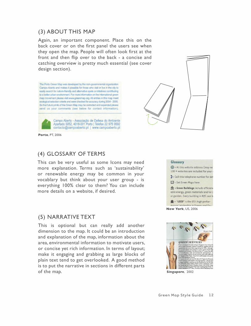
(3) ABOUT ThIS MAPAgain, an important component. Place this on the back cover or on the first panel the users see when they open the map. People will often look first at the front and then flip over to the back - a concise and catching overview is pretty much essential (see cover design section).
(4) GLOSSARY OF TERMS This can be very useful as some Icons may need more explanation. Terms such as ‘sustainability’ or renewable energy may be common in your vocablary but think about your user group - is everything 100% clear to them? You can include more details on a website, if desired.
(5) NARRATIVE TExTThis is optional but can really add another dimension to the map. It could be an introduction and explanation of the map, information about the area, environmental information to motivate users, or concise yet rich information. In terms of layout; make it engaging and grabbing as large blocks of plain text tend to get overlooked. A good method is to put the narrative in sections in different parts of the map.
Porto, PT, 2006
New York, US, 2006
Singapore, 2002
12
Green Map Style Guide
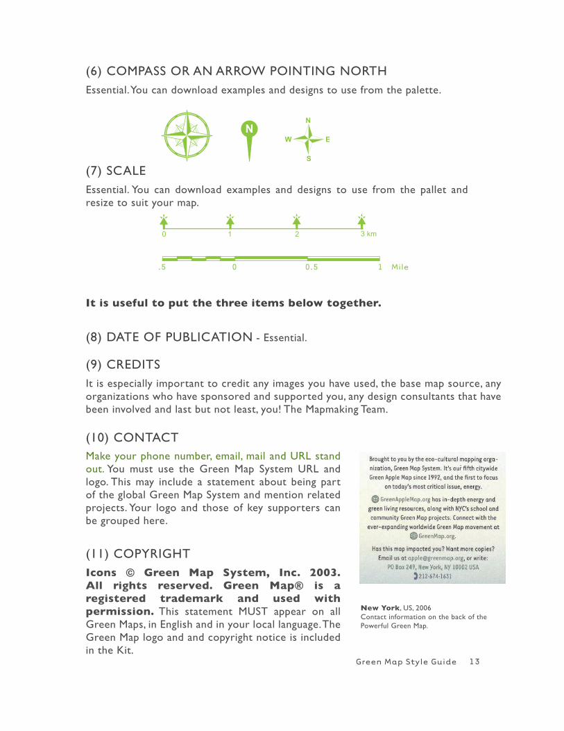
(6) COMPASS OR AN ARROw POINTING NORThEssential. You can download examples and designs to use from the palette.
(8) DATE OF PUBLICATION - Essential.
(9) CREDITSIt is especially important to credit any images you have used, the base map source, any organizations who have sponsored and supported you, any design consultants that have been involved and last but not least, you! The Mapmaking Team.
New York, US, 2006Contact information on the back of the Powerful Green Map.
r r1 2 3 km0
r r
(7) SCALEEssential. You can download examples and designs to use from the pallet and resize to suit your map.
(10) CONTACTMake your phone number, email, mail and URL stand out. You must use the Green Map System URL and logo. This may include a statement about being part of the global Green Map System and mention related projects. Your logo and those of key supporters can be grouped here.
(11) COPYRIGhT Icons © Green Map System, Inc. 2003. All rights reserved. Green Map® is a registered trademark and used with permission. This statement MUST appear on all Green Maps, in English and in your local language. The Green Map logo and and copyright notice is included in the Kit.
13
It is useful to put the three items below together.
Green Map Style Guide
There are infinite ways to compose a Green Map! Financial resources will have a great deal of influence on paper type, size and use of color.
4.4. LAYOUT Composition, size and folding
POINTS TO CONSIDER
Try to conserve paper. Standard sizes vary from country to country. Design your map to minimise trimming or better still use no trim at all! A good option is to use half a standard size and print on both sides, this way two maps fit exactly to one sheet and fold easily. Maps with a ‘bleed’ (ink up to the edge of the paper) must be trimmed.
How much ink coverage will you use and which ink type? will it be glossy (shiny) or matte (non-shiny)? Can you use recycled paper or soy ink? Investigate several different printing houses if possible, ask for samples and quotes.
H GreenMap.org in the Participate section has more on working with printers. Look at maps you admire and learn from the choices they made.
Does your map fit in a standard size envelope? Or should it be a ‘self mailer’, with space for a stamp and address? Consider other ways to display your map. For example, two Calgary maps can be taped together to create a large wall poster, this is accomplished with a ‘bleed’ on one edge.
How will the map be folded and what size will it be? Experiment with different folding techniques. Remember the map has to fold away easily too! Take into consideration who is using the map and where they will be using it. A very large paper size is not easiest or most convenient for users on the move. If you are designing for children or the elderly, hand them a folded mock-up and watch how they open and close it. Note any difficulties they have and adjust your design accordingly.
Be sure to give the printer a mock up so it is folded correctly.
14
Green Map Style Guide
How well can the user access the information?How easily can they find and understand it?
Good graphic design engages the user; differences in color, size, texture and tone lead the eye over the page.
Big blocks of text all in one size can sometimes cause the user to lose interest. Put a draft on the wall and get opinions. Note which areas stand out, and which merge together. If you are using a limited color palette, the layout can help to make certain areas stand out. A printed draft can also help you find typos and design errors.
Space is important, try not to overcrowd your map. Consider putting some of the details on the website instead of the print map. Information is easier to digest when it is not crammed together.
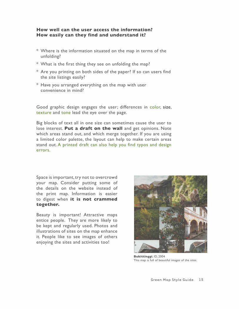
Beauty is important! Attractive maps entice people. They are more likely to be kept and regularly used. Photos and illustrations of sites on the map enhance it. People like to see images of others enjoying the sites and activities too!
Bukittinggi, ID, 2004This map is full of beautiful images of the sites.
* where is the information situated on the map in terms of the unfolding?
* what is the first thing they see on unfolding the map?
* Are you printing on both sides of the paper? If so can users find the site listings easily?
* have you arranged everything on the map with user convenience in mind?
15
Green Map Style Guide
A small range of maps have been selected to show different folding and layout methods – each has an interesting approach. There are many other existing maps that are equally successful and many more methods to be discovered. Experimenta-tion is encouraged!
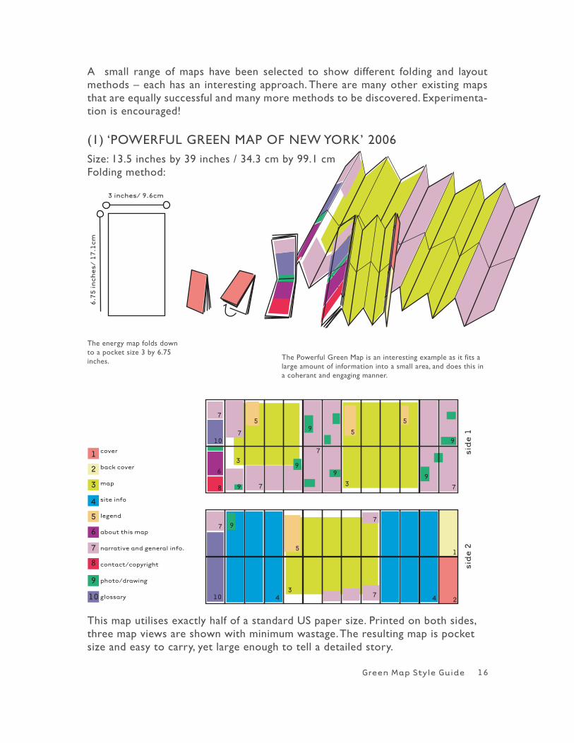
(1) ‘POwERFUL GREEN MAP OF NEw YORK’ 2006Size: 13.5 inches by 39 inches / 34.3 cm by 99.1 cmFolding method:
This map utilises exactly half of a standard US paper size. Printed on both sides, three map views are shown with minimum wastage. The resulting map is pocket size and easy to carry, yet large enough to tell a detailed story.
The energy map folds down to a pocket size 3 by 6.75 inches. The Powerful Green Map is an interesting example as it fits a
large amount of information into a small area, and does this in a coherant and engaging manner.
16
Green Map Style Guide
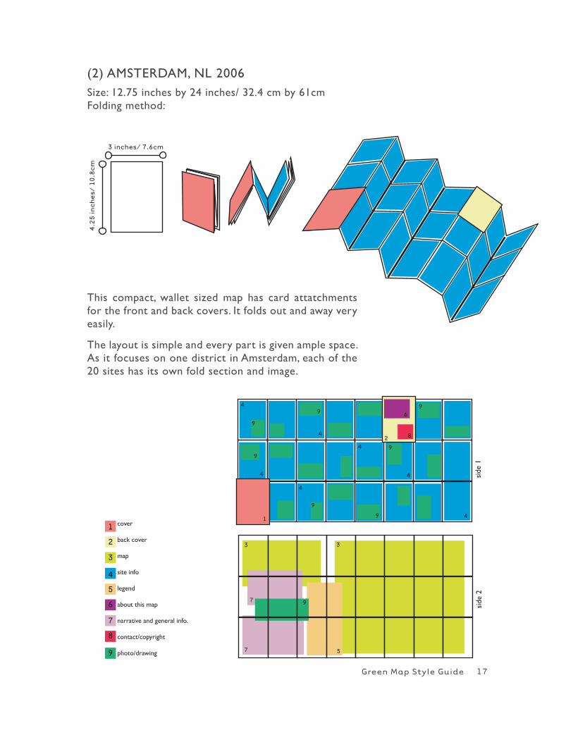
(2) AMSTERDAM, NL 2006Size: 12.75 inches by 24 inches/ 32.4 cm by 61cmFolding method:
cover
back cover
map
site info
legend
about this map
narrative and general info.
contact/copyright
photo/drawing
side
1
side
2
This compact, wallet sized map has card attatchments for the front and back covers. It folds out and away very easily.
The layout is simple and every part is given ample space. As it focuses on one district in Amsterdam, each of the 20 sites has its own fold section and image.
17
Green Map Style Guide
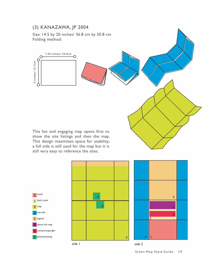
(3) KANAZAwA, JP 2004Size: 14.5 by 20 inches/ 36.8 cm by 50.8 cmFolding method:
cover
back cover
map
site info
legend
about this map
contact/copyright
photo/drawing
side 1 side 2
This fun and engaging map opens first to show the site listings and then the map. This design maximizes space for usability; a full side is still used for the map but it is still very easy to reference the sites.
18
Green Map Style Guide
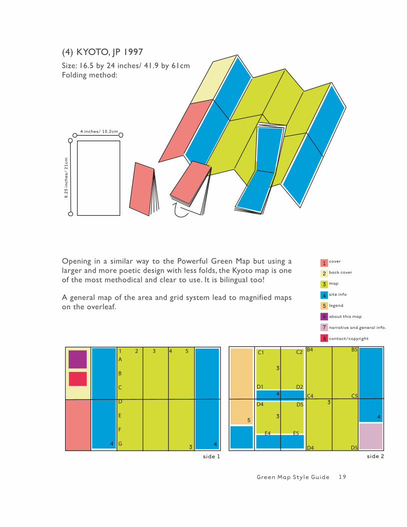
(4) KYOTO, JP 1997Size: 16.5 by 24 inches/ 41.9 by 61cm Folding method:
C1 C2
D1 D2
D4 D5
E4 E5
B4 B5
C4 C5
D4 D5
1 2 3 4 5
A
B
C
D
E
F
G
Opening in a similar way to the Powerful Green Map but using a larger and more poetic design with less folds, the Kyoto map is one of the most methodical and clear to use. It is bilingual too!
A general map of the area and grid system lead to magnified maps on the overleaf.
19
Green Map Style Guide
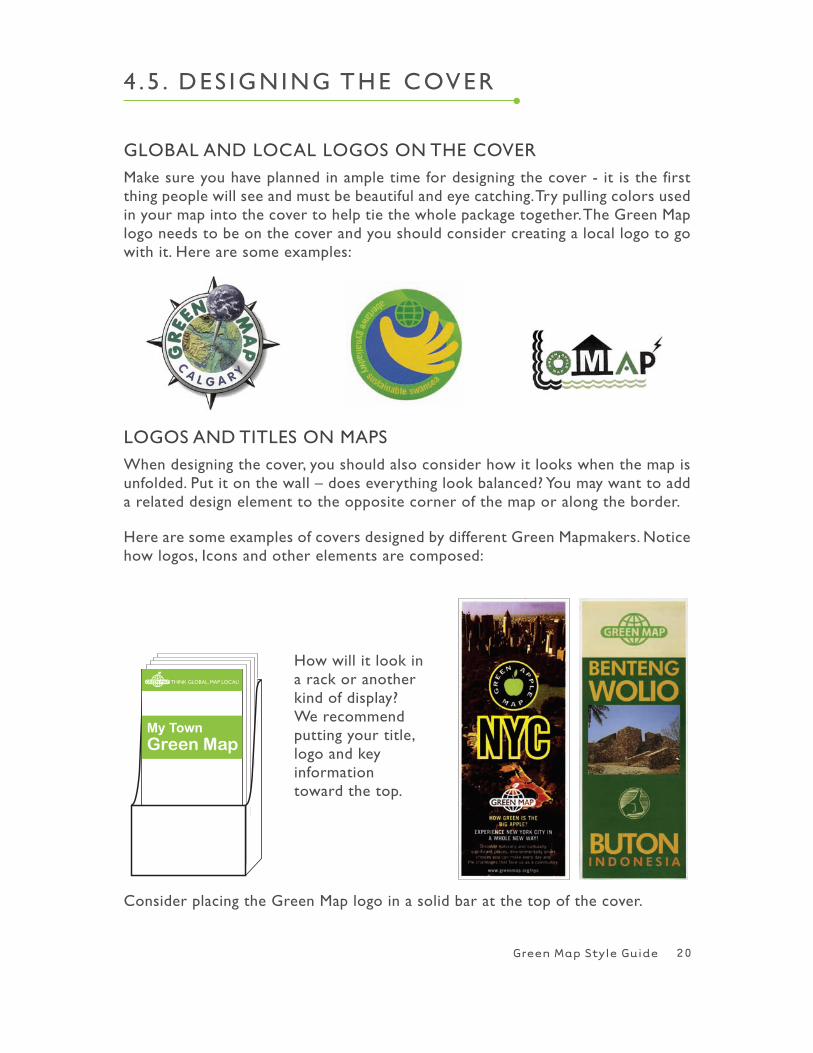
GLOBAL AND LOCAL LOGOS ON ThE COVERMake sure you have planned in ample time for designing the cover - it is the first thing people will see and must be beautiful and eye catching. Try pulling colors used in your map into the cover to help tie the whole package together. The Green Map logo needs to be on the cover and you should consider creating a local logo to go with it. here are some examples:
4 . 5 . DES IGNING ThE COVER
20
LOGOS AND TITLES ON MAPS when designing the cover, you should also consider how it looks when the map is unfolded. Put it on the wall – does everything look balanced? You may want to add a related design element to the opposite corner of the map or along the border.
here are some examples of covers designed by different Green Mapmakers. Notice how logos, Icons and other elements are composed:
how will it look in a rack or another kind of display? we recommend putting your title, logo and key information toward the top.
My TownGreen Map
THINK GLOBAL, MAP LOCAL!
Consider placing the Green Map logo in a solid bar at the top of the cover.
Green Map Style Guide
* No smaller than 1/2” (1.3cm)
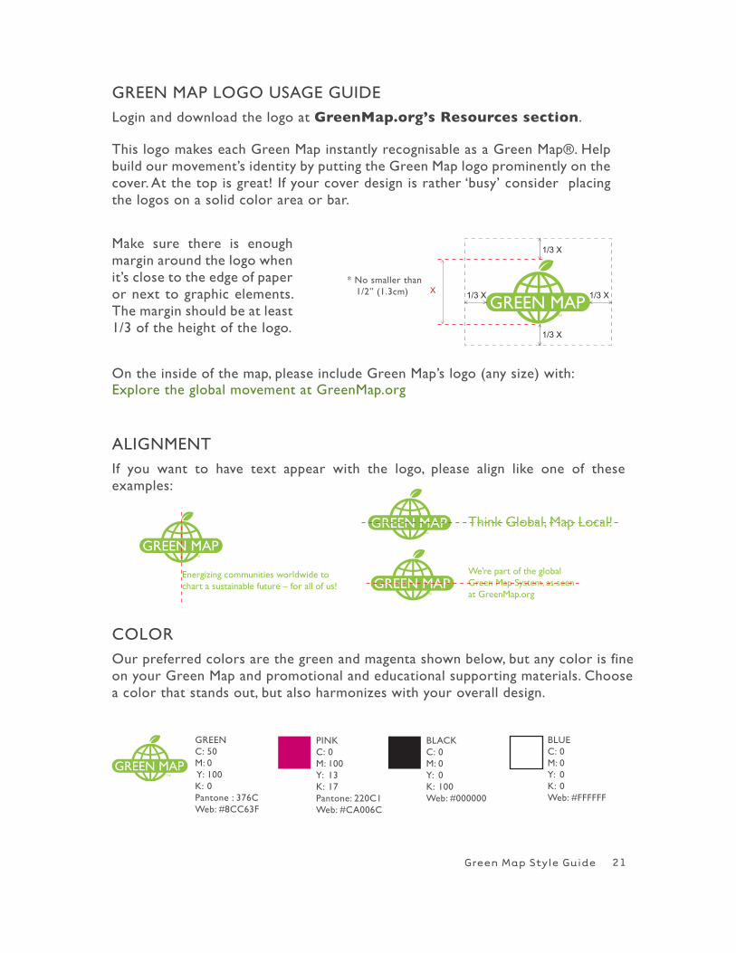
GREEN MAP LOGO USAGE GUIDELogin and download the logo at GreenMap.org’s Resources section.
This logo makes each Green Map instantly recognisable as a Green Map®. help build our movement’s identity by putting the Green Map logo prominently on the cover. At the top is great! If your cover design is rather ‘busy’ consider placing the logos on a solid color area or bar.
21
ALIGNMENTIf you want to have text appear with the logo, please align like one of these examples:
Energizing communities worldwide to chart a sustainable future – for all of us!
We’re part of the global Green Map System, as seen at GreenMap.org
Think Global, Map Local!
1/3 X1/3 X
1/3 X
1/3 X
X
On the inside of the map, please include Green Map’s logo (any size) with: Explore the global movement at GreenMap.org
COLOROur preferred colors are the green and magenta shown below, but any color is fine on your Green Map and promotional and educational supporting materials. Choose a color that stands out, but also harmonizes with your overall design.
GREENC: 50M: 0 Y: 100K: 0Pantone : 376Cweb: #8CC63F
BLACKC: 0M: 0Y: 0K: 100web: #000000
PINKC: 0M: 100Y: 13K: 17Pantone: 220C1web: #CA006C
BLUEC: 0M: 0Y: 0K: 0web: #FFFFFF
Make sure there is enough margin around the logo when it’s close to the edge of paper or next to graphic elements. The margin should be at least 1/3 of the height of the logo.
Green Map Style Guide
5 . COLOR
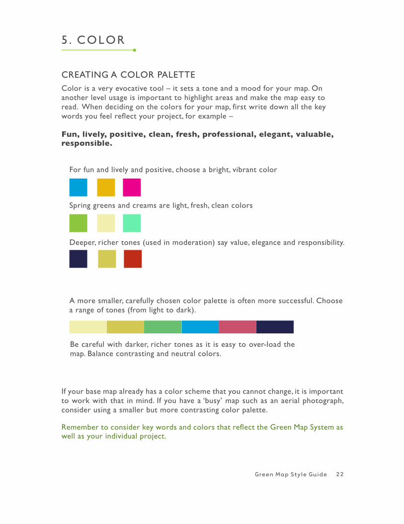
CREATING A COLOR PALETTEColor is a very evocative tool – it sets a tone and a mood for your map. On another level usage is important to highlight areas and make the map easy to read. when deciding on the colors for your map, first write down all the key words you feel reflect your project, for example –
Fun, lively, positive, clean, fresh, professional, elegant, valuable, responsible.
For fun and lively and positive, choose a bright, vibrant color
Spring greens and creams are light, fresh, clean colors
Deeper, richer tones (used in moderation) say value, elegance and responsibility.
A more smaller, carefully chosen color palette is often more successful. Choose a range of tones (from light to dark).
If your base map already has a color scheme that you cannot change, it is important to work with that in mind. If you have a ‘busy’ map such as an aerial photograph, consider using a smaller but more contrasting color palette.
Remember to consider key words and colors that reflect the Green Map System as well as your individual project.
Be careful with darker, richer tones as it is easy to over-load the map. Balance contrasting and neutral colors.
22
Green Map Style Guide
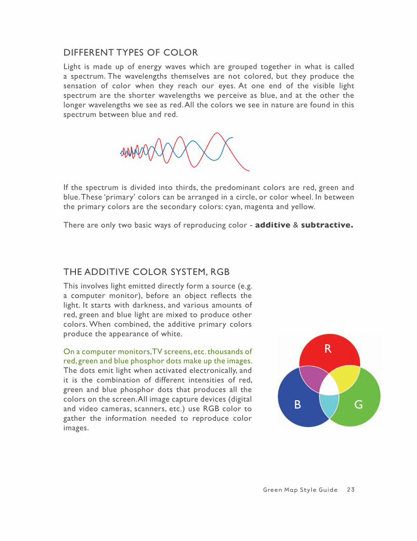
DIFFERENT TYPES OF COLORLight is made up of energy waves which are grouped together in what is called a spectrum. The wavelengths themselves are not colored, but they produce the sensation of color when they reach our eyes. At one end of the visible light spectrum are the shorter wavelengths we perceive as blue, and at the other the longer wavelengths we see as red. All the colors we see in nature are found in this spectrum between blue and red.
ThE ADDITIVE COLOR SYSTEM, RGB
This involves light emitted directly form a source (e.g. a computer monitor), before an object reflects the light. It starts with darkness, and various amounts of red, green and blue light are mixed to produce other colors. when combined, the additive primary colors produce the appearance of white.
On a computer monitors, TV screens, etc. thousands of red, green and blue phosphor dots make up the images. The dots emit light when activated electronically, and it is the combination of different intensities of red, green and blue phosphor dots that produces all the colors on the screen. All image capture devices (digital and video cameras, scanners, etc.) use RGB color to gather the information needed to reproduce color images.
If the spectrum is divided into thirds, the predominant colors are red, green and blue. These ‘primary’ colors can be arranged in a circle, or color wheel. In between the primary colors are the secondary colors: cyan, magenta and yellow.
There are only two basic ways of reproducing color - additive & subtractive.
23
R
B G
Green Map Style Guide
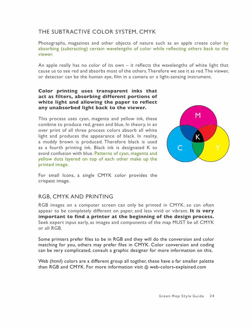
Color printing uses transparent inks that act as filters, absorbing different portions of white light and allowing the paper to reflect any unabsorbed light back to the viewer.
This process uses cyan, magenta and yellow ink, these combine to produce red, green and blue. In theory, in an over print of all three process colors absorb all white light and produces the appearance of black. In reality, a muddy brown is produced. Therefore black is used as a fourth printing ink. Black ink is designated K to avoid confusion with blue. Patterns of cyan, magenta and yellow dots layered on top of each other make up the printed image.
For small Icons, a single CMYK color provides the crispest image.
Some printers prefer files to be in RGB and they will do the conversion and color matching for you, others may prefer files in CMYK. Color conversion and coding can be very complicated, consult a graphic designer for more information on this.
web (html) colors are a different group all togther, these have a far smaller palette than RGB and CMYK. For more information visit H web-colors-explained.com
RGB, CMYK AND PRINTING RGB images on a computer screen can only be printed in CMYK, so can often appear to be completely different on paper, and less vivid or vibrant. It is very important to find a printer at the beginning of the design process. Seek expert input early, as images and components of the map MUST be all CMYK or all RGB.
ThE SUBTRACTIVE COLOR SYSTEM, CMYK
Photographs, magazines and other objects of nature such as an apple create color by absorbing (subtracting) certain wavelengths of color while reflecting others back to the viewer.
An apple really has no color of its own – it reflects the wavelengths of white light that cause us to see red and absorbs most of the others. Therefore we see it as red. The viewer, or detector can be the human eye, film in a camera or a light-sensing instrument.
24
M
C Y
K
Green Map Style Guide
6 . TYPE
Typography (the use of type) is quite a complex area as there are literally thousands of different fonts, styles and ways of using them. There are degreecourses devoted to just this subject.
here are a few simple but important areas to consider when choosing thefont(s) and designing the type face on your map.
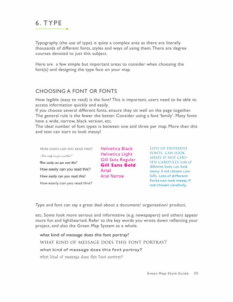
how legible (easy to read) is the font? This is important, users need to be able to access information quickly and easily. If you choose several different fonts, ensure they sit well on the page together. The general rule is the fewer the better. Consider using a font ‘family’. Many fonts have a wide, narrow, black version, etc.The ideal number of font types is between one and three per map. More than this and text can start to look messy!
How easily can you read this?
How easily can you read this?
How easily can you read this?
How easily can you read this?
how easily can you read this?
How easily can you read this?
Lots of different fonts can look messy if not cho-sen carefully. Lots of different fonts can look messy if not chosen care-fully. Lots of different fonts can look messy if not chosen carefully.
Type and font can say a great deal about a document/ organisation/ product,
etc. Some look more serious and informative (e.g. newspapers) and others appear more fun and lighthearted. Refer to the key words you wrote down reflecting your project, and also the Green Map System as a whole.
what kind of message does this font portray?
what kind of message does this font portray?
what kind of message does this font portray?
what kind of message does this font portray?
Helvetica Black Helvetica LightGill Sans RegularGill Sans BoldArialArial Narrow
ChOOSING A FONT OR FONTS
25
Green Map Style Guide
TYPE STYLES AND ARRANGEMENTS There are numerous different ways to arrange type on a page. The main aim should be to make the text on the map interesting and eye catching, without compromising legibility and information access.
Vary size and style (i.e. bold, italic) to highlight points and areas. It is vital to have variation in the type to help the eye flow over the page. Blur your eyes at the page. Do parts stand out, or is it just one mass of text?
Consider using a bold style and/or larger font size for the headings. Choose a lighter style and smaller size for the main bodies of text. You can highlight important sections of information using bold font and/or a larger size.
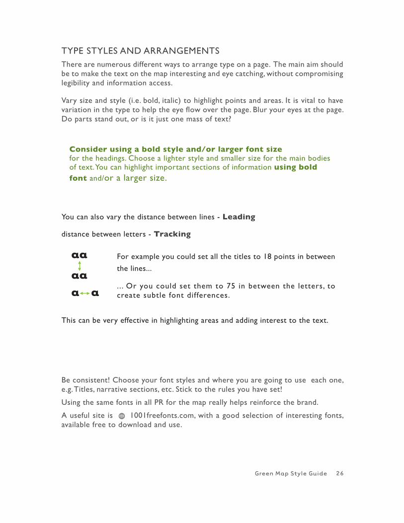
You can also vary the distance between lines - Leading
distance between letters - Tracking
This can be very effective in highlighting areas and adding interest to the text.
For example you could set all the titles to 18 points in between
the lines...
. . . Or you could set them to 75 in between the letters, to create subtle font differences.
Be consistent! Choose your font styles and where you are going to use each one, e.g. Titles, narrative sections, etc. Stick to the rules you have set!
Using the same fonts in all PR for the map really helps reinforce the brand.
A useful site is H 1001freefonts.com, with a good selection of interesting fonts, available free to download and use.
26
Green Map Style Guide
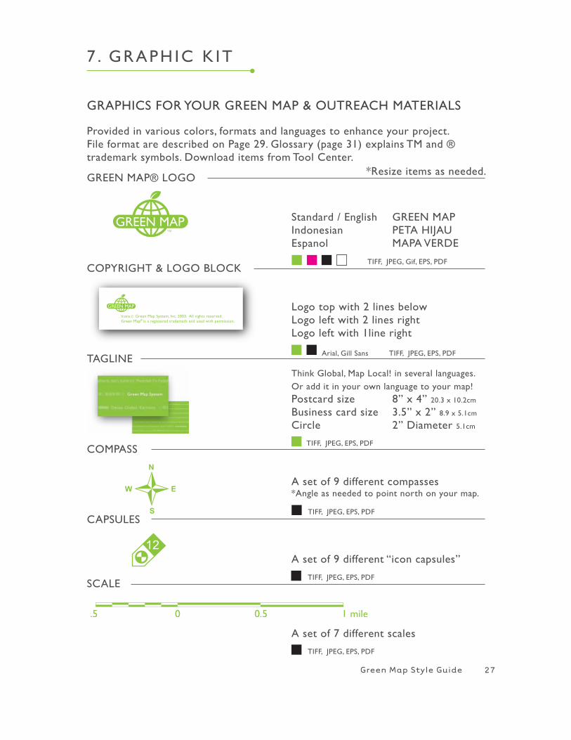
GREEN MAP® LOGO
COPYRIGhT & LOGO BLOCK
TAGLINE
COMPASS
CAPSULES
Standard / English GREEN MAPIndonesian PETA hIJAUEspanol MAPA VERDE
Think Global, Map Local! in several languages. Or add it in your own language to your map!Postcard size 8” x 4” 20.3 x 10.2cm
Business card size 3.5” x 2” 8.9 x 5.1cm
Circle 2” Diameter 5.1cm
Logo top with 2 lines belowLogo left with 2 lines rightLogo left with 1line right
A set of 9 different compasses*Angle as needed to point north on your map.
12A set of 9 different “icon capsules”
A set of 7 different scales
7 . GRAPh IC K IT
Arial, Gill Sans TIFF, JPEG, EPS, PDF
TIFF, JPEG, Gif, EPS, PDF
TIFF, JPEG, EPS, PDF
TIFF, JPEG, EPS, PDF
TIFF, JPEG, EPS, PDF
TIFF, JPEG, EPS, PDF
GRAPhICS FOR YOUR GREEN MAP & OUTREACh MATERIALS
Provided in various colors, formats and languages to enhance your project. File format are described on Page 29. Glossary (page 31) explains TM and ® trademark symbols. Download items from Tool Center.
27
SCALE
*Resize items as needed.
Green Map Style Guide
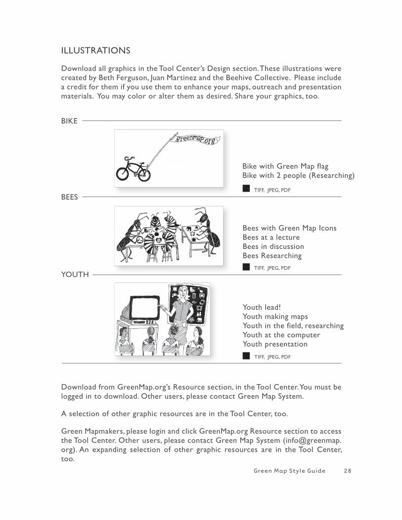
BIKE
Bike with Green Map flagBike with 2 people (Researching)
Bees with Green Map IconsBees at a lectureBees in discussionBees Researching
BEES
YOUTh
Youth lead!Youth making mapsYouth in the field, researchingYouth at the computerYouth presentation
TIFF, JPEG, PDF
TIFF, JPEG, PDF
TIFF, JPEG, PDF
Download from GreenMap.org’s Resource section, in the Tool Center. You must be logged in to download. Other users, please contact Green Map System.
A selection of other graphic resources are in the Tool Center, too.
Green Mapmakers, please login and click GreenMap.org Resource section to access the Tool Center. Other users, please contact Green Map System ([email protected]). An expanding selection of other graphic resources are in the Tool Center, too.
ILLUSTRATIONS
Download all graphics in the Tool Center’s Design section. These illustrations were created by Beth Ferguson, Juan Martinez and the Beehive Collective. Please include a credit for them if you use them to enhance your maps, outreach and presentation materials. You may color or alter them as desired. Share your graphics, too.
28
Green Map Style Guide
7 . GRAPh IC K IT
OPEN IN ADOBE ILLUSTRATOR
1. Right click or hold <CTRL> and click (or right click) on EPS file and click open with Illustrator.
2.Select an object with Selection Tool (black arrow).
3. Change size and colors whatever you want.
*EPS and PDF files open in Adobe Illustrator. when you open PDF files, you need to ungroup image and delete outside box.
OPEN IN ADOBE PhOTOShOP
1. Right click or hold <CTRL> and click (or right click) on TIF, JPG, GIF file and click open with Photoshop.
2. Select an object with Magic Wand Tool. If there are more than one object hold <OPTION> to add selection.3. Change color and size whatever you want.
*TIFF, JPEG and Gif open in Adobe Photoshop. Please read below to choose the correct format for different medias.
FILE TYPES
INSTRUCTIONS FOR MAC OR PC
TIFF Bitmap. high resolution, background is separated from an image, Good for printed materials.
JPEG Bitmap. Low resolution, background is merged with background.
GIF Low resolution, background is separated from the image, Only recommended for website or digital use.
EPS Vector (or Bitmap). Good for editing in Illustrator. Insert EPS file on any word processing software.
PDF Vector (or Bitmap). Good for editing in Illustrator.
29
Green Map Style Guide
AAerial Photography is the taking of photographs from above with a camera mounted on an aircraft, balloon, rocket or similar vehicle. Remote sensing and GIS can turn them into maps.
Atlas Project (a.k.a. Green Map Atlas) is the collection of ten unique stories of Green Mapmaking. These examples tell you about the creation of community mapmaking projects, including their motivations, methodologies, key sites and outcomes. (GreenAtlas.org).BBase Map is a standard map designed for the presentation and analysis of data con taining geographic features used for locational reference. It usually includes the coordinates, geographical and major political outlines, water bodies, city blocks, etc.CCMYK is the abbreviation for cyan, magenta, yellow and black. These are the printer colors used to create color prints. Most Color Printers, Ink-Jet, Laser, Dye-Sublimation, Thermal, and Crayon printers use these as their printer colors. (This is one of the color management problems for computers. Converting RGB files to CMYK files causes color shifts (see chapter 5).
Color Palette is a system of designated colors that are used in conjunction with each other to achieve visual consistency.
Compass (rose) is a star-like drawing of the points of a compass showing north, east, south and west. Maps traditionally use a compass to align the view to North. GGIS (Geographic Information System) is a system of computer hardware, software and data for collecting, storing, analyzing and disseminating information about geographic areas. Google Map is an example of GIS
Green Maps are locally created maps that chart the natural and cultural environment, using adaptable tools and a shared visual language of Green Map® Icons to highlight green living resources.
Green Map System locally adaptable, globally shared framework for environmental mapmaking. Active globally since 1995, GMS is a 501(c)(3) not-for-profit organization based in New York City. (H see GreenMap.org). Green Map Icons are a set of copyrighted symbols that identify, promote and link natural, cultural and sustainable resources on every Green Map.
Grid (mapping) is a group of horizontal and vertical lines that provide guidelines for interpretation through the using a coordinate system (latitude-longitude, letter and/or number codes, etc.).IIcons are pictographic representations used to communicate a message.
8 . GLOSSARY
30
Green Map Style Guide
Icon Key/Legend is the reference area on a map that lists and explains the colors, symbols, pictures, line patterns, shadings and annotation used on the map. The legend often includes the scale, origin, orientation, and other map information to interpret a map. LLayout is the arrangement of text blocks, headlines and graphics on a page.
P Panel refers to a section of the map usually divided by the folding.
PDF Portable Document Format is Adobe’s universal and compact file format that captures all the elements of a document in an electronic image pre serving the fonts, images, graphics, and layout of any source document. To view and use the files, you need the free Acrobat Reader, which you can easily download (www.adobe.com). Very useful for sharing Green Maps (you can even make all the URLS into active links) SScale is the ratio between a distance on the map and the corresponding distance on the earth, with the distance on the map typically expressed as 1. Thus, a scale of 1:100,000 means 1 inch on the map equals 100,000 inches (approximately 1.6 miles) on the earth. Large scale maps depict a small area and show more detail. Small scale maps depict a large area and show less detail.
Standard paper sizes vary from country to country. Check with a local printer so your Green Map can be published with minimal waste. (see H GreenMap.org in the Resources section)
Sustainability is about meeting the needs of the present without compromising the ability of future generations to meet their needs. Encompasses a wide range of factors, e.g. keeping population densities below the carrying ca pacity of a region, facilitating the renewal of renewable resources, conserving and establishing priorities for the use of non-renewable resources, and keeping environmental impact below the level required to allow affected systems to recover and continue to evolve.TTrademark Symbol we use the ® with the words Green Map because this is a registered trademark. But while our new logo’s registration is being processed, the TM is used. when its registration is finalized, the logos in the Tool Center will be replaced.
Type Style refers to the specific attribute or variation within a typefaces family. Styles can include italic, bold, bold italic, condensed, expanded, black or outline.
31