Embed Size (px)
DESCRIPTION
Graphing With Excel. ROC Curve Graph. Select Data for Diagonal. Graphing Wizard. XY (Scatter). Use Straight Line Connectors. Also use symbols for points. This is the only data that we know. Data is in Columns. Label Your Axes. Remove Legend. Why?. This is what you have now. - PowerPoint PPT Presentation
Citation preview

Graphing With Excel
ROC Curve Graph
Diagonal My Data
FA HIT FA Hit
0 0 0.04 0.24
1 1 0.3 0.69
0.65 0.92
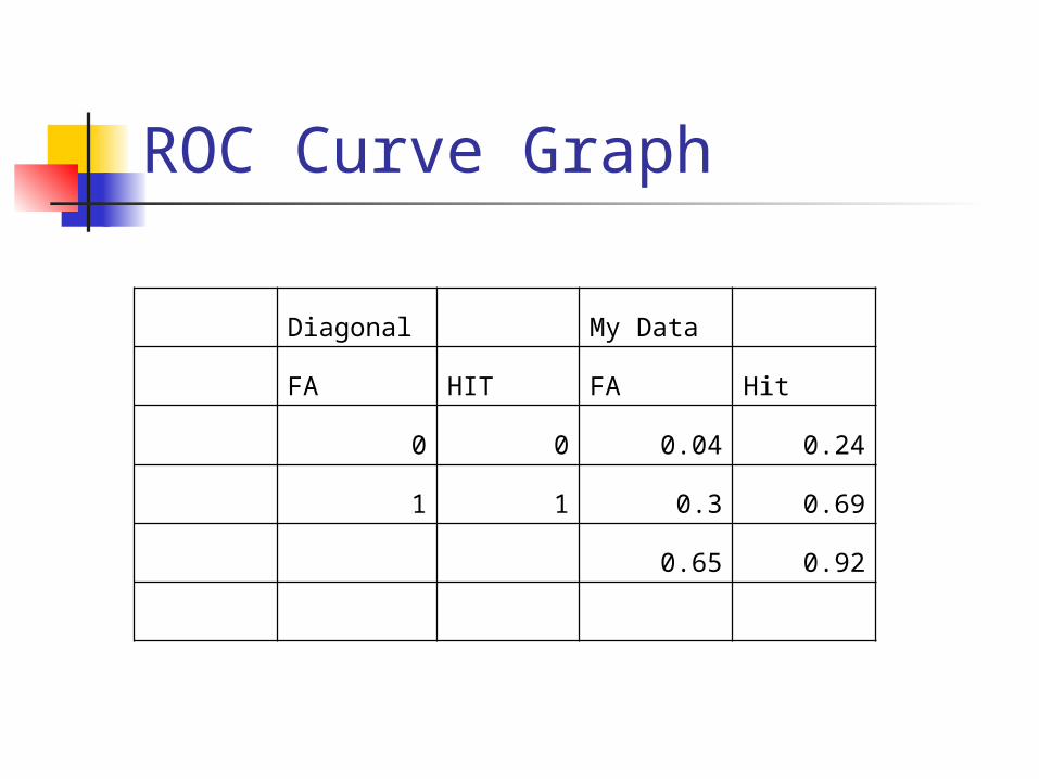
Select Data for Diagonal
Diagonal My Data
FA HIT FA Hit
0 0 0.04 0.24
1 1 0.3 0.69
0.65 0.92
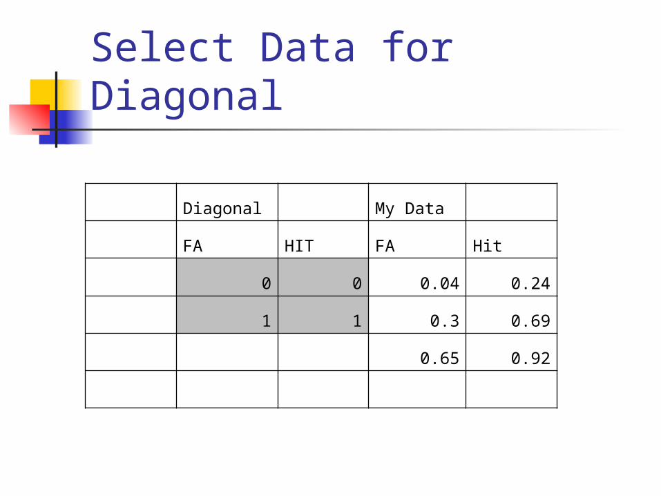
Graphing Wizard
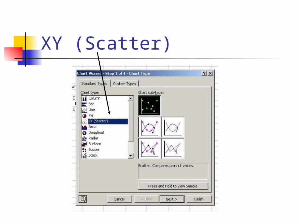
XY (Scatter)
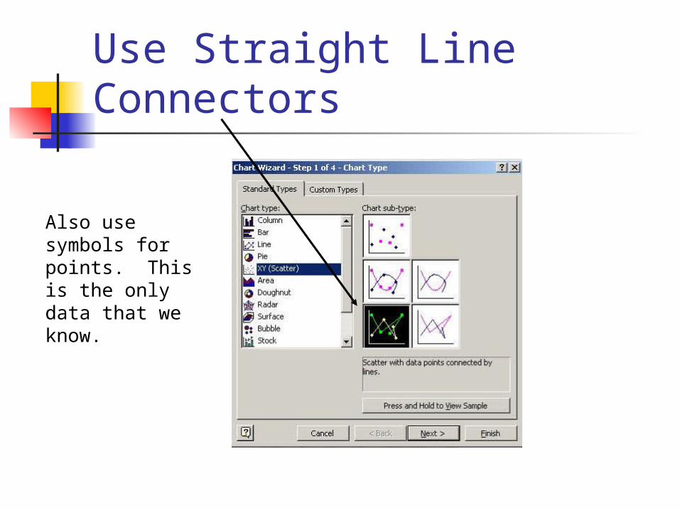
Use Straight Line Connectors
Also use symbols for points. This is the only data that we know.
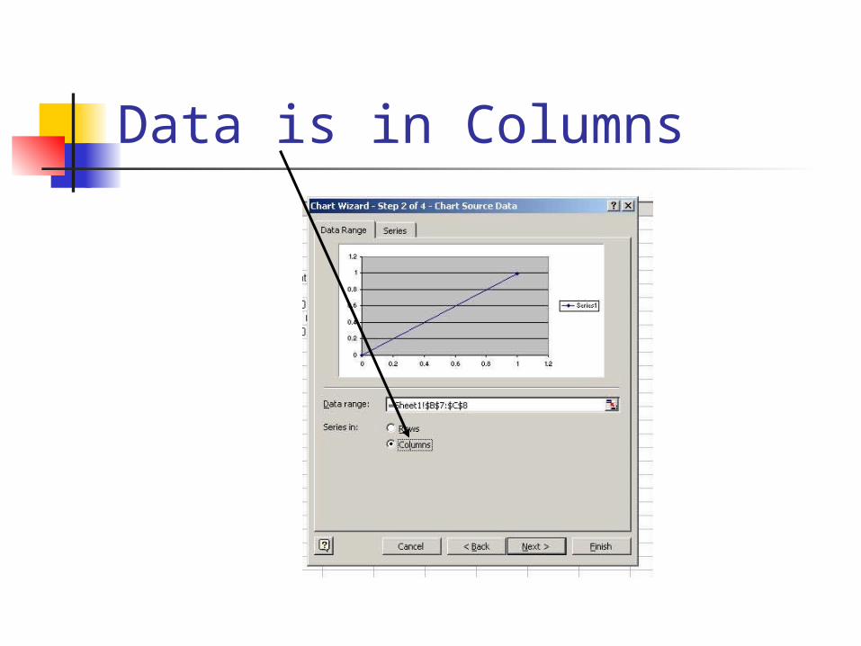
Data is in Columns
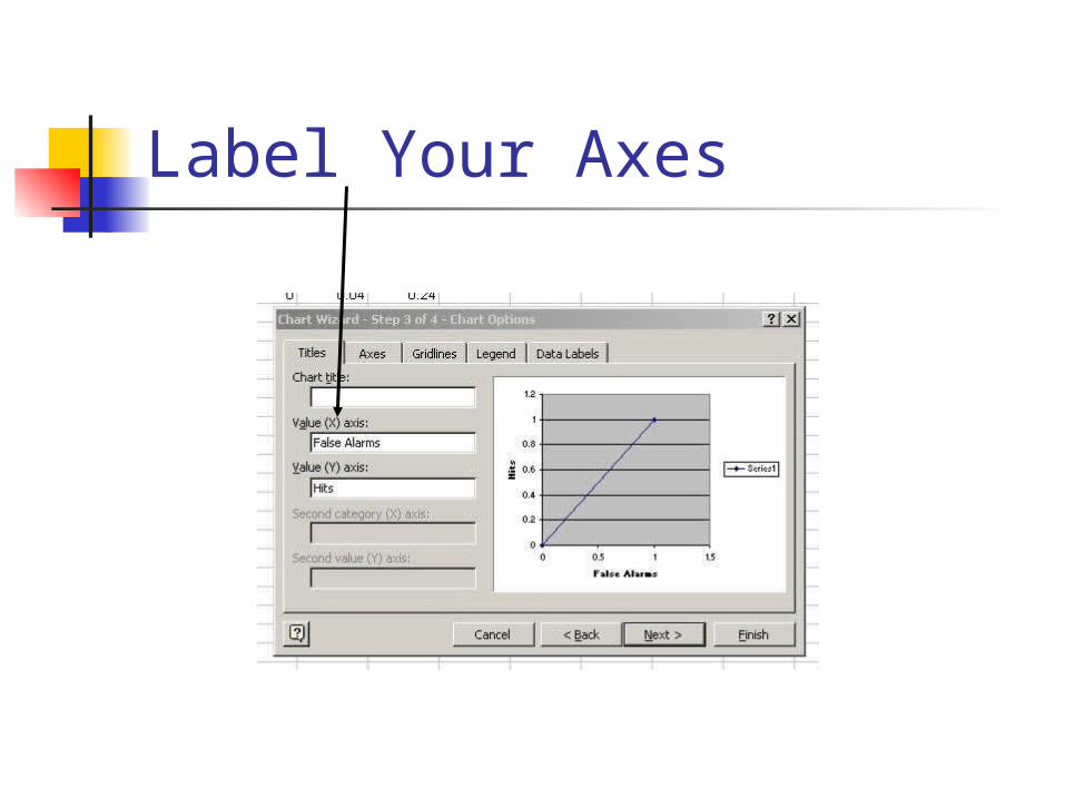
Label Your Axes
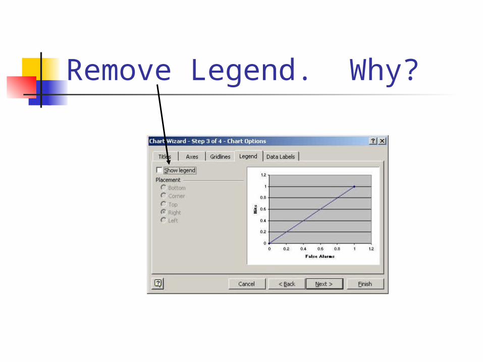
Remove Legend. Why?
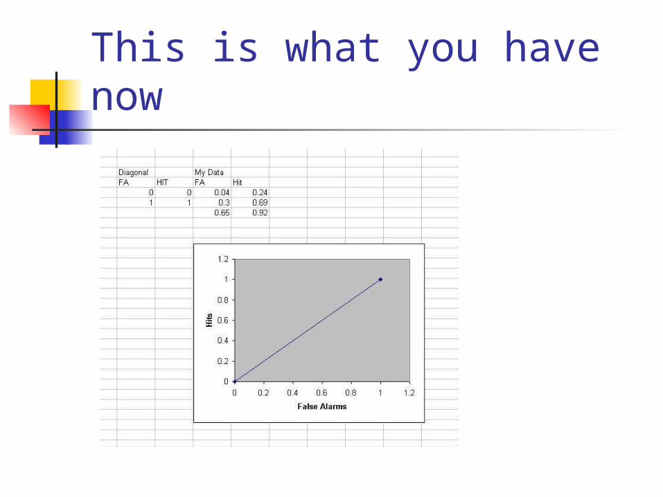
This is what you have now
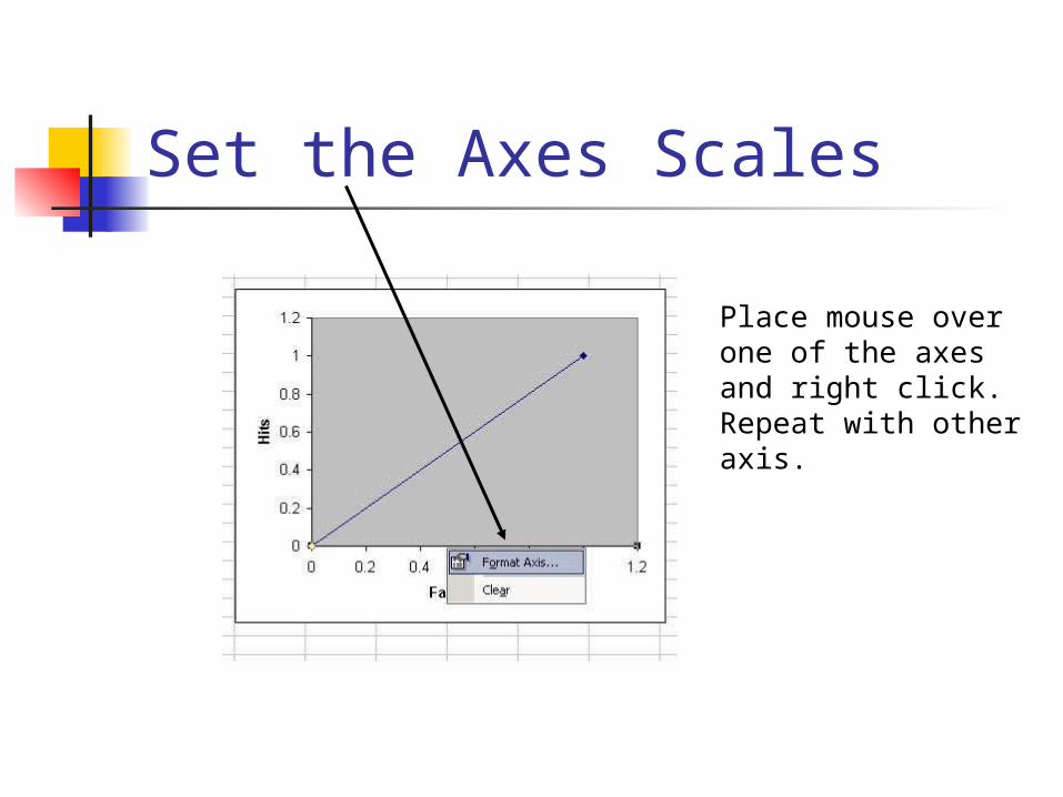
Set the Axes Scales
Place mouse over one of the axes and right click. Repeat with other axis.
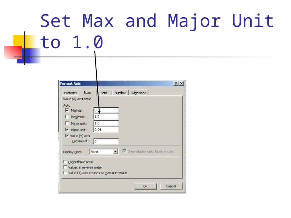
Set Max and Major Unit to 1.0
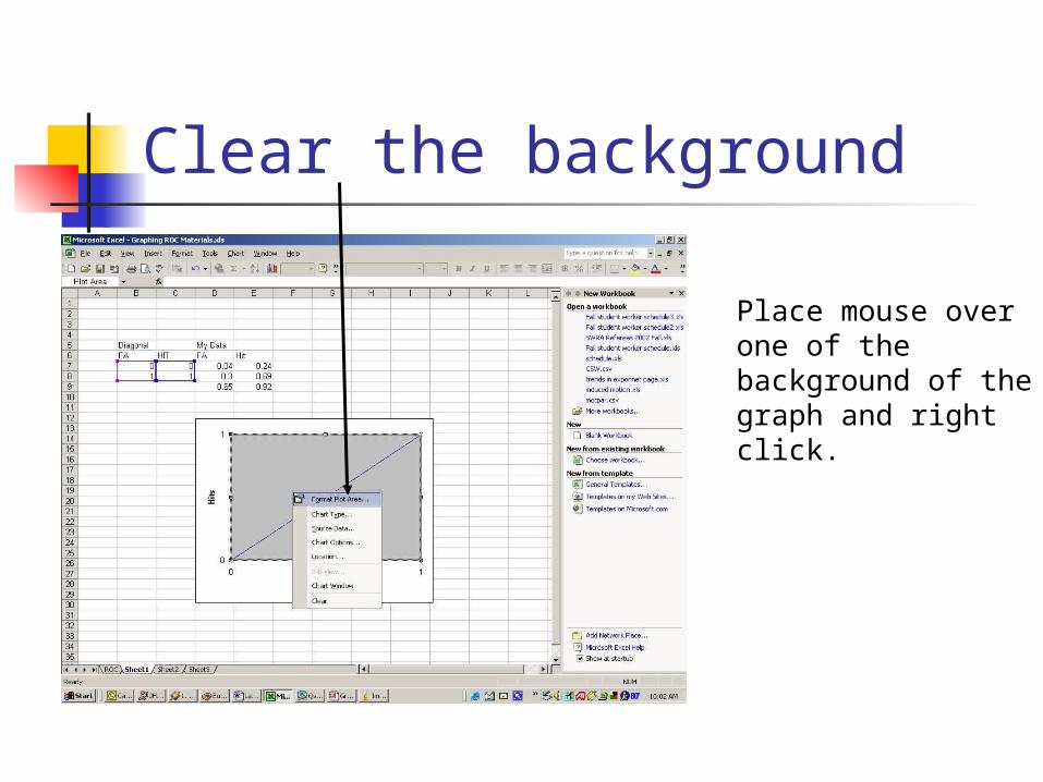
Clear the background
Place mouse over one of the background of the graph and right click.
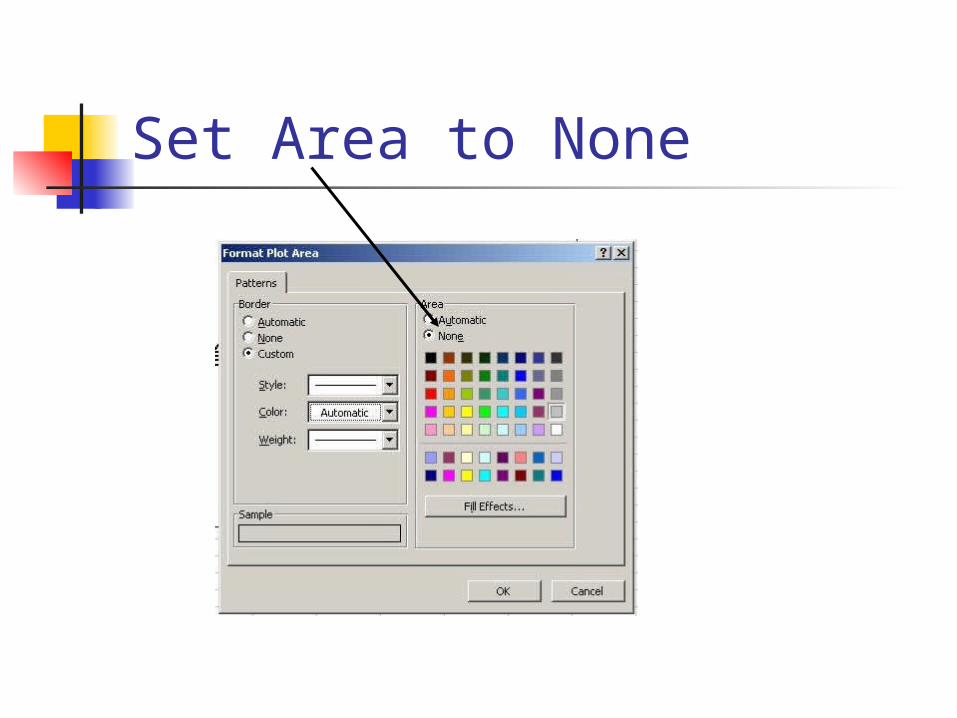
Set Area to None
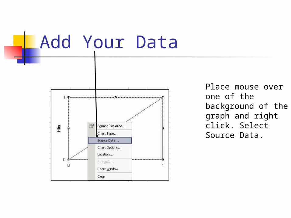
Add Your Data
Place mouse over one of the background of the graph and right click. Select Source Data.
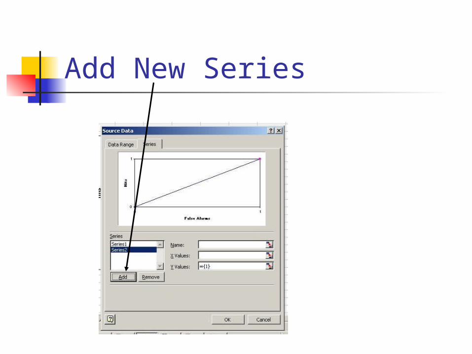
Add New Series
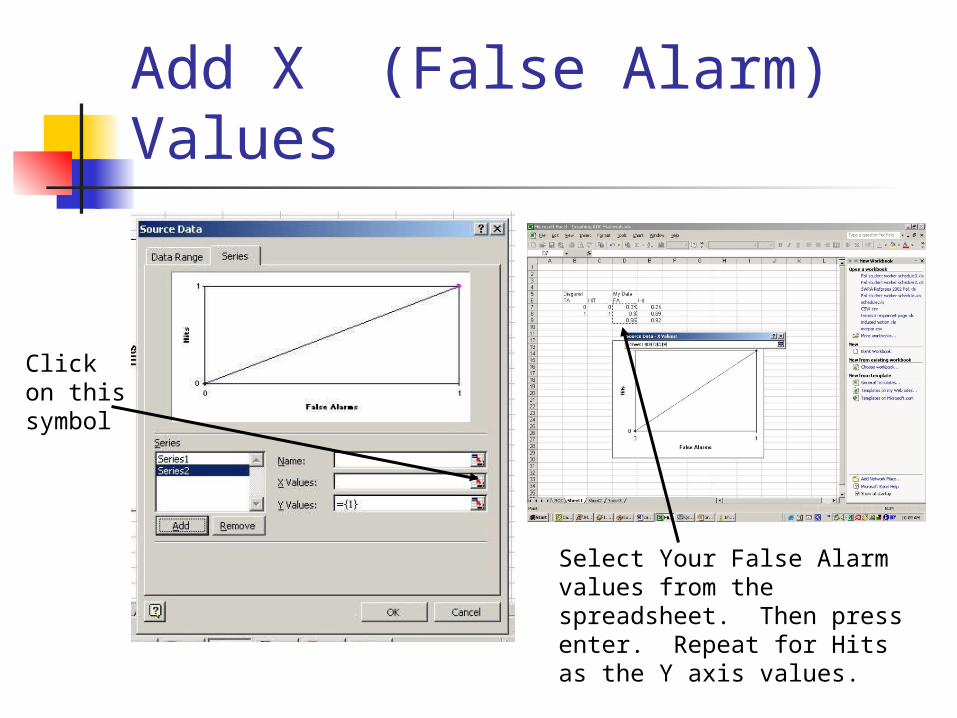
Add X (False Alarm) Values
Click on this symbol
Select Your False Alarm values from the spreadsheet. Then press enter. Repeat for Hits as the Y axis values.
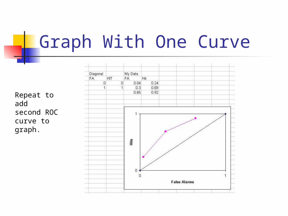
Graph With One Curve
Repeat to addsecond ROC curve to graph.