Embed Size (px)
DESCRIPTION
Chapter 2. Graphical Descriptive Techniques. 2.1 Introduction. Descriptive statistics involves the arrangement, summary, and presentation of data, to enable meaningful interpretation, and to support decision making. Descriptive statistics methods make use of graphical techniques - PowerPoint PPT Presentation
Citation preview
1
Graphical Descriptive Techniques
Graphical Descriptive Techniques
Chapter 2Chapter 2
2
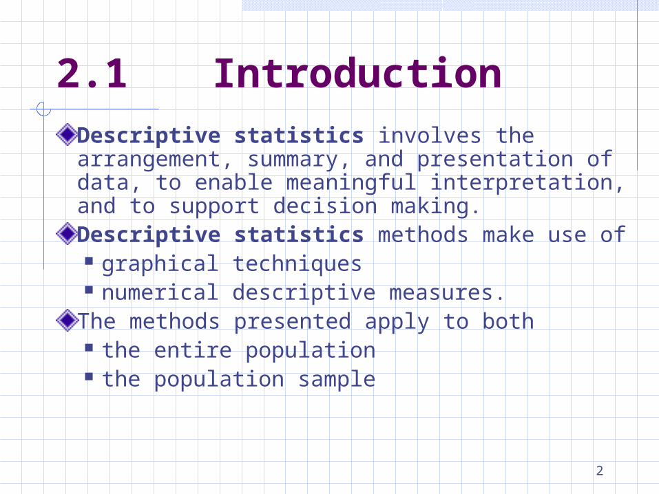
2.1 Introduction
Descriptive statistics involves the arrangement, summary, and presentation of data, to enable meaningful interpretation, and to support decision making.Descriptive statistics methods make use of graphical techniques numerical descriptive measures.
The methods presented apply to both the entire population the population sample
3
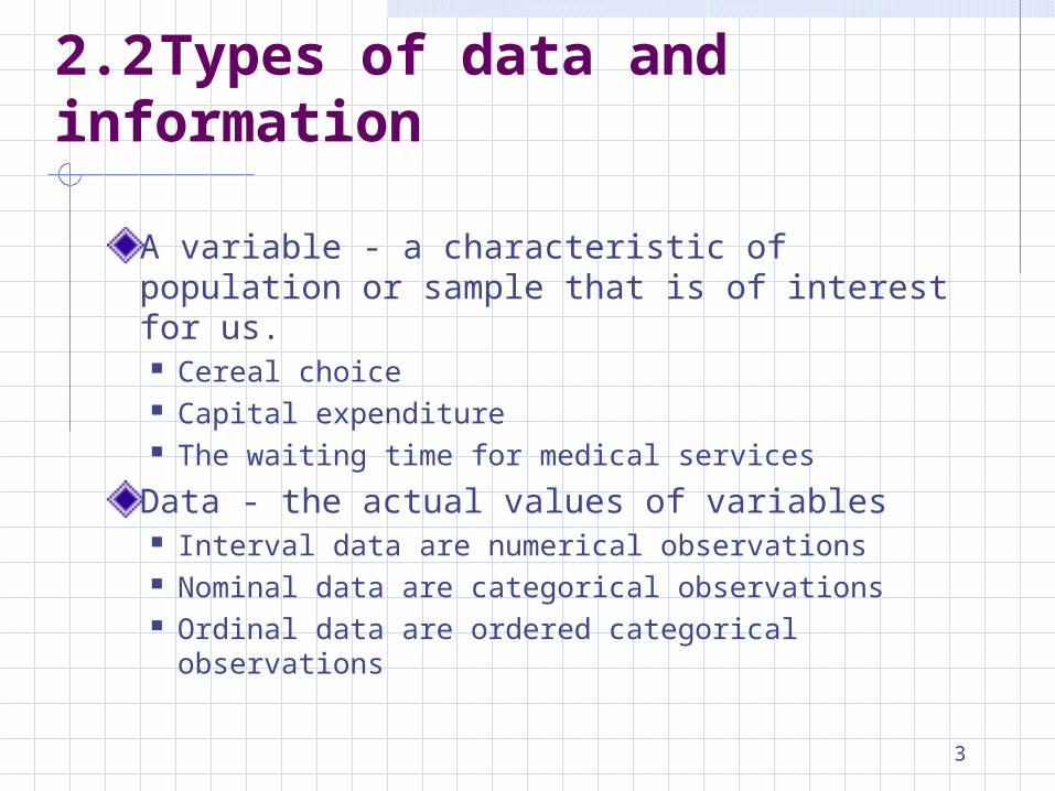
2.2 Types of data and information
A variable - a characteristic of population or sample that is of interest for us. Cereal choice Capital expenditure The waiting time for medical services
Data - the actual values of variables Interval data are numerical observations Nominal data are categorical observations Ordinal data are ordered categorical observations
4
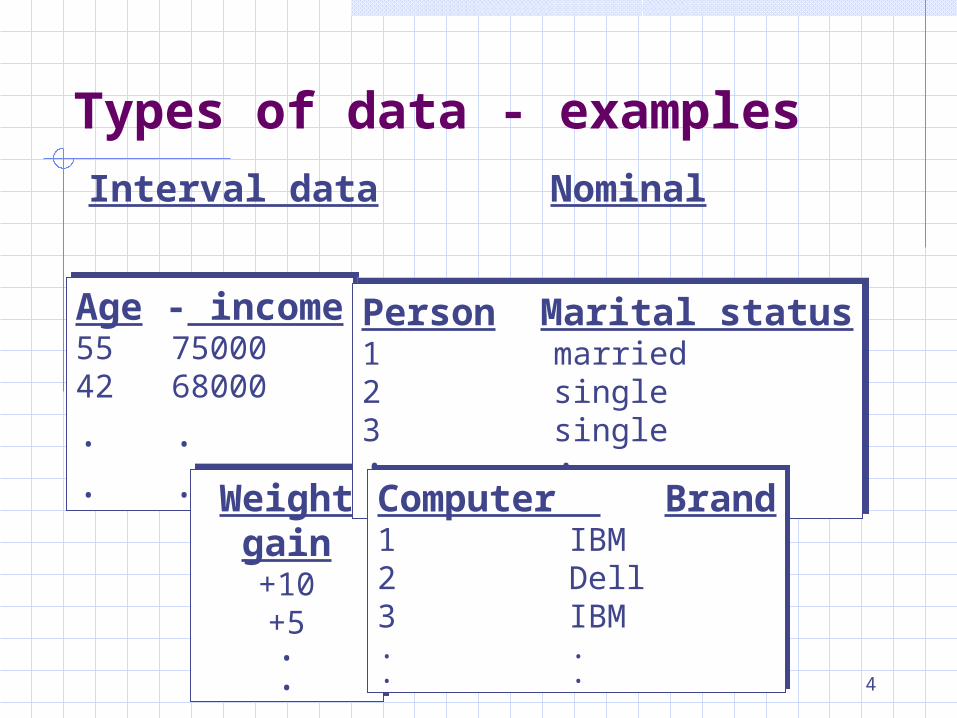
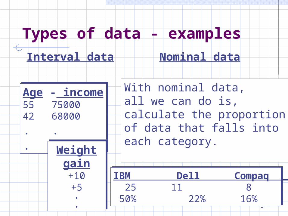
Types of data - examples
Interval data
Age - income55 7500042 68000
. .
. .
Age - income55 7500042 68000
. .
. .Weight gain+10+5..
Weight gain+10+5..
Nominal
Person Marital status1 married2 single3 single. .. .
Person Marital status1 married2 single3 single. .. .Computer Brand
1 IBM2 Dell3 IBM. .. .
Computer Brand1 IBM2 Dell3 IBM. .. .
5
Types of data - examples
Interval data
Age - income55 7500042 68000
. .
. .
Age - income55 7500042 68000
. .
. .
Nominal data
With nominal data, all we can do is, calculate the proportion of data that falls into each category.
IBM Dell Compaq Other Total 25 11 8 6 50 50% 22% 16% 12%
IBM Dell Compaq Other Total 25 11 8 6 50 50% 22% 16% 12%
Weight gain+10+5..
Weight gain+10+5..
6
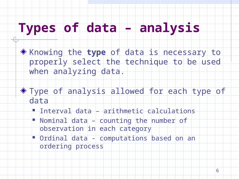
Types of data – analysis
Knowing the type of data is necessary to properly select the technique to be used when analyzing data.
Type of analysis allowed for each type of data Interval data – arithmetic calculations Nominal data – counting the number of observation in each
category Ordinal data - computations based on an ordering process
7
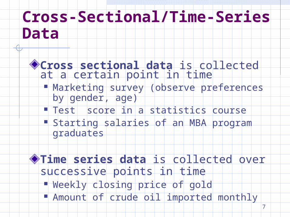
Cross-Sectional/Time-Series Data
Cross sectional data is collected at a certain point in time Marketing survey (observe preferences by gender,
age) Test score in a statistics course Starting salaries of an MBA program graduates
Time series data is collected over successive points in time Weekly closing price of gold Amount of crude oil imported monthly
8
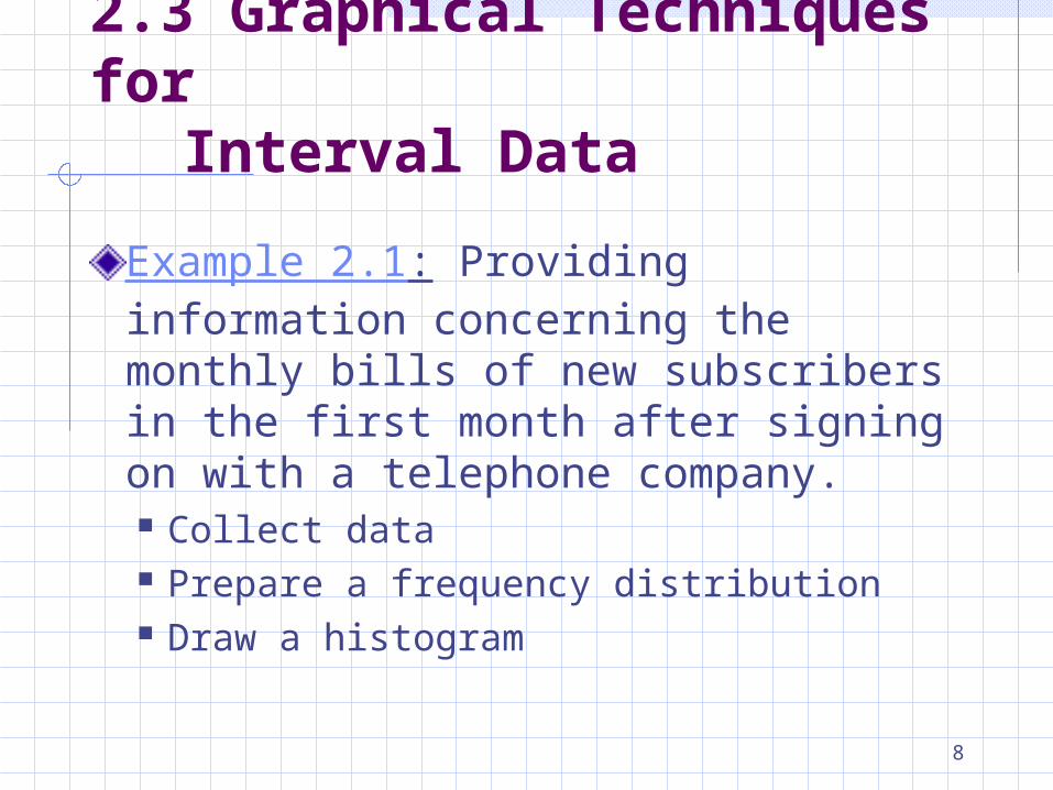
2.3 Graphical Techniques forInterval Data
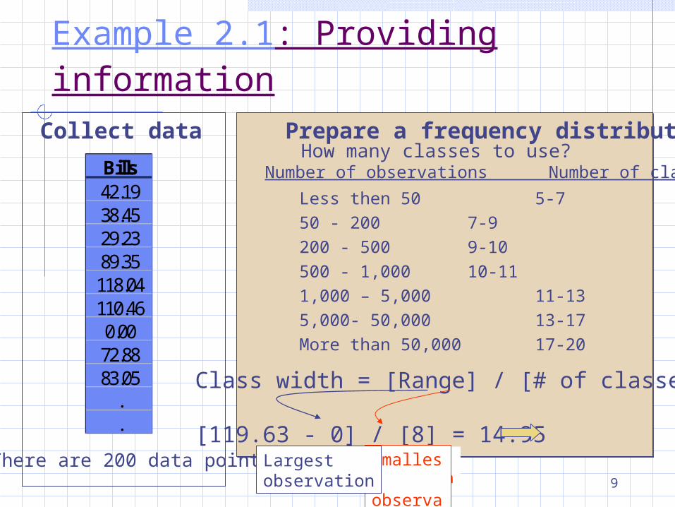
Example 2.1: Providing information concerning the monthly bills of new subscribers in the first month after signing on with a telephone company. Collect data Prepare a frequency distribution Draw a histogram
9
Largest observation
Collect dataBills42.1938.4529.2389.35118.04110.460.0072.8883.05
.
.
(There are 200 data points
Prepare a frequency distributionHow many classes to use?Number of observations Number of classes
Less then 50 5-750 - 200 7-9200 - 500 9-10500 - 1,000 10-111,000 – 5,000 11-135,000- 50,000 13-17More than 50,000 17-20
Class width = [Range] / [# of classes]
[119.63 - 0] / [8] = 14.95 15Largest observationLargest observation
Smallest observationSmallest observationSmallest observationSmallest observation
Largest observation
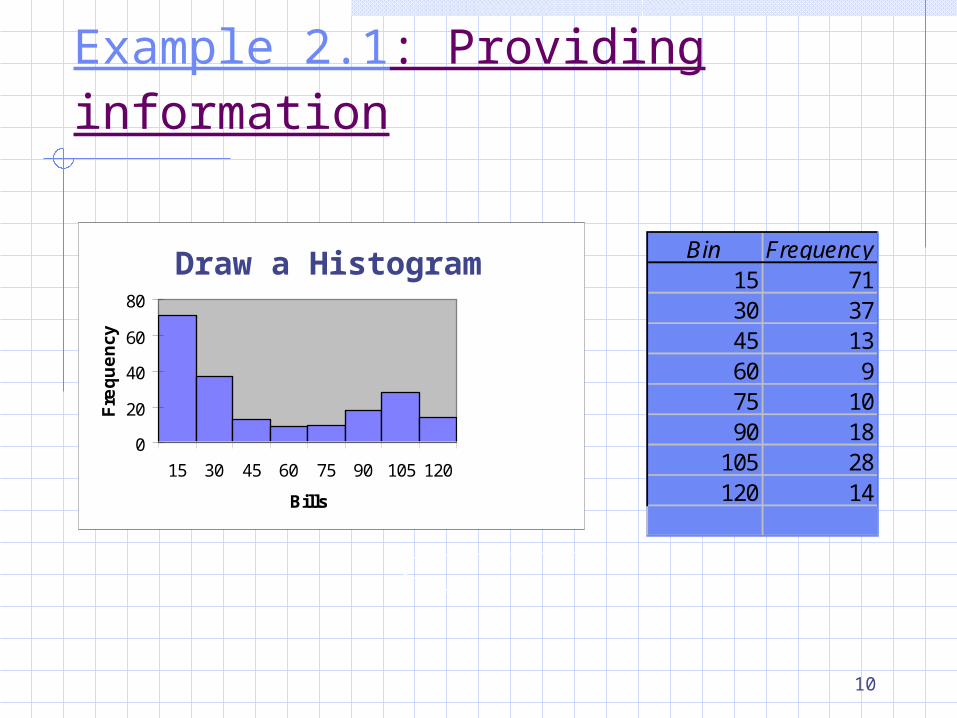
Example 2.1: Providing information
10
0
20
40
60
80
15 30 45 60 75 90 105 120
Bills
Fre
qu
en
cy
Draw a HistogramBin Frequency
15 7130 3745 1360 975 1090 18
105 28120 14
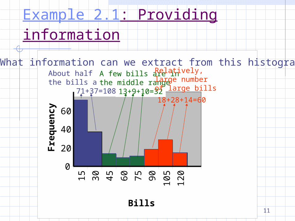
Example 2.1: Providing information
11
0
20
40
60
8015 30 45 60 75 90 10
5
120
Bills
Fre
qu
ency
What information can we extract from this histogramAbout half of all the bills are small
71+37=108 13+9+10=32
A few bills are in the middle range
Relatively,large numberof large bills
18+28+14=60
Example 2.1: Providing information
12
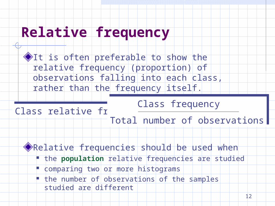
It is often preferable to show the relative frequency (proportion) of observations falling into each class, rather than the frequency itself.
Relative frequencies should be used when the population relative frequencies are studied comparing two or more histograms the number of observations of the samples studied are
different
Class relative frequency = Class relative frequency = Class frequency
Total number of observations
Class frequency
Total number of observations
Relative frequency
13
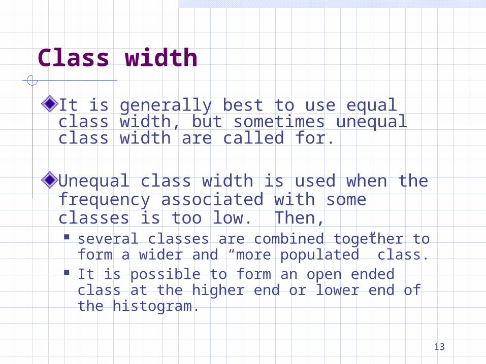
It is generally best to use equal class width, but sometimes unequal class width are called for.
Unequal class width is used when the frequency associated with some classes is too low. Then, several classes are combined together to form a
wider and “more populated” class. It is possible to form an open ended class at the
higher end or lower end of the histogram.
Class width
14
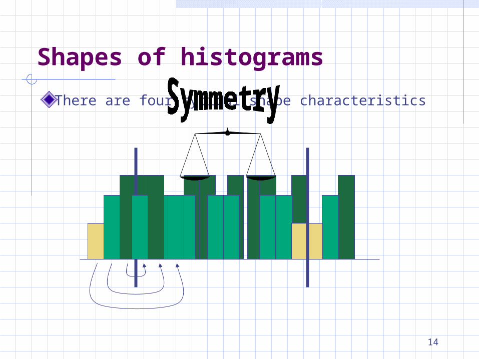
There are four typical shape characteristics
Shapes of histograms
15
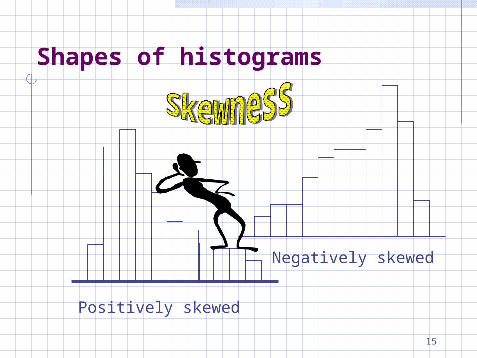
Positively skewed
Negatively skewed
Shapes of histograms
16
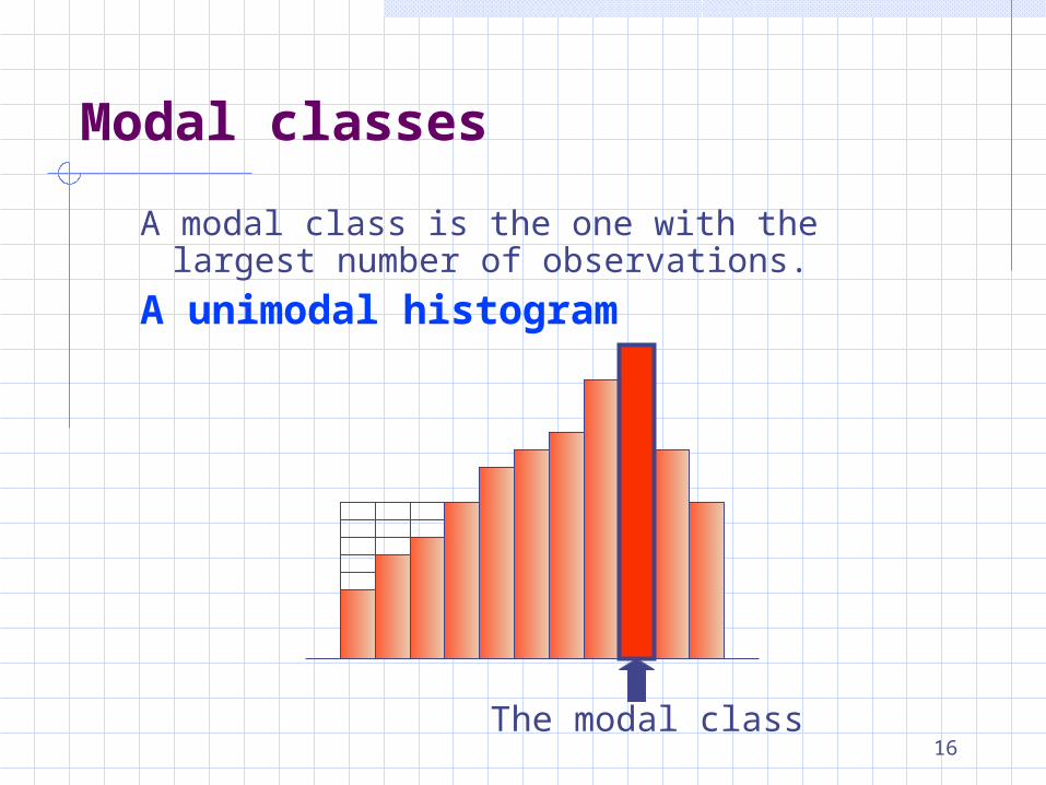
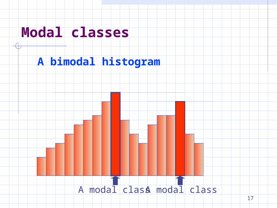
A modal class is the one with the largest number of observations.
A unimodal histogram
The modal class
Modal classes
17
Modal classes
A bimodal histogram
A modal class A modal class
18
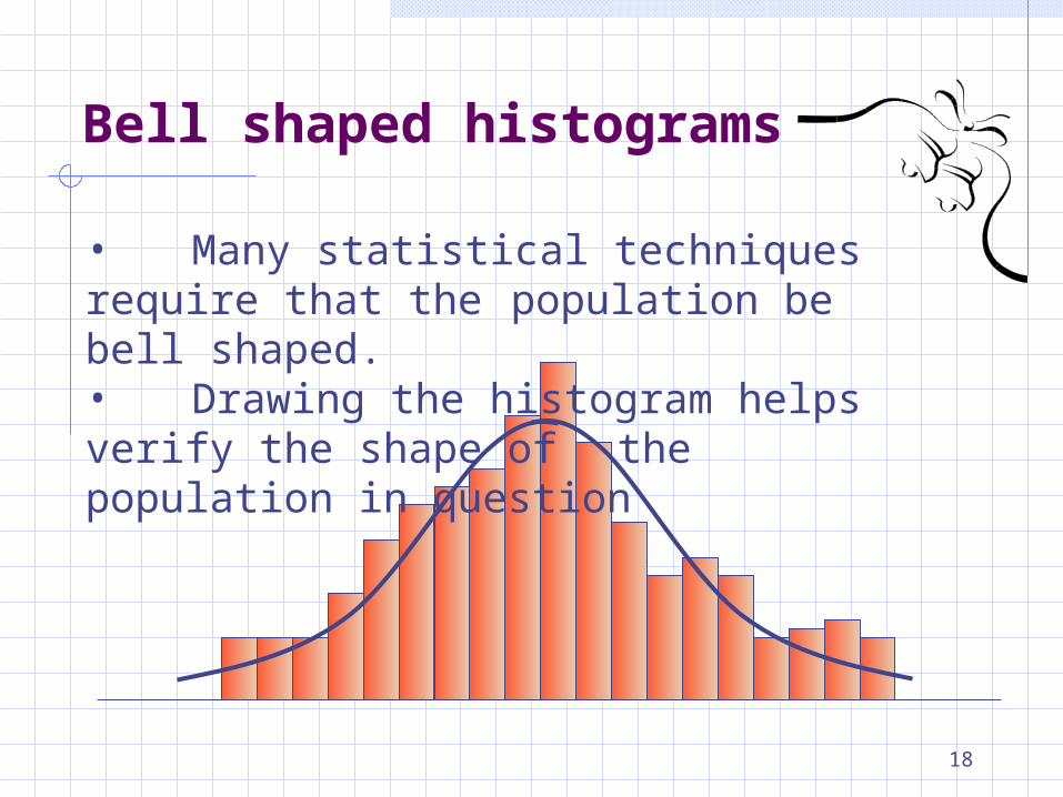
• Many statistical techniques require that the population be bell shaped.
• Drawing the histogram helps verify the shape of the population in question
Bell shaped histograms
19
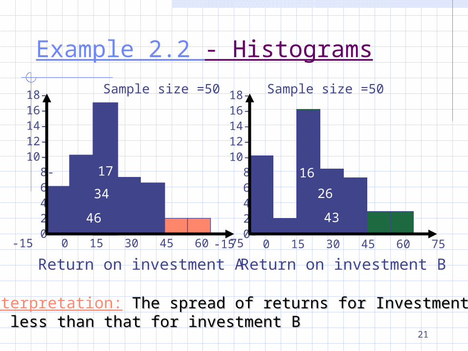
Example 2.2: Selecting an investment An investor is considering investing in one
out of two investments. The returns on these investments were
recorded. From the two histograms, how can the
investor interpret the Expected returns The spread of the return (the risk involved with
each investment)
Interpreting histograms
20
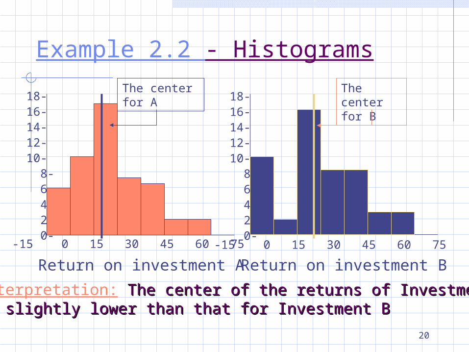
Example 2.2 - Histograms
18-16-14-12-10- 8- 6- 4- 2- 0-
18-16-14-12-10- 8- 6- 4- 2- 0-
-15 0 15 30 45 60 75 -15 0 15 30 45 60 75
Return on investment A Return on investment B
Interpretation: The center of the returns of Investment AThe center of the returns of Investment Ais slightly lower than that for Investment Bis slightly lower than that for Investment B
The center for B
The center for A
21
18-16-14-12-10- 8- 6- 4- 2- 0-
18-16-14-12-10- 8- 6- 4- 2- 0-
-15 0 15 30 45 60 75 -15 0 15 30 45 60 75
Interpretation: The spread of returns for Investment AThe spread of returns for Investment Ais less than that for investment Bis less than that for investment B
Return on investment A Return on investment B
17 16
Sample size =50 Sample size =50
34 26
46 43
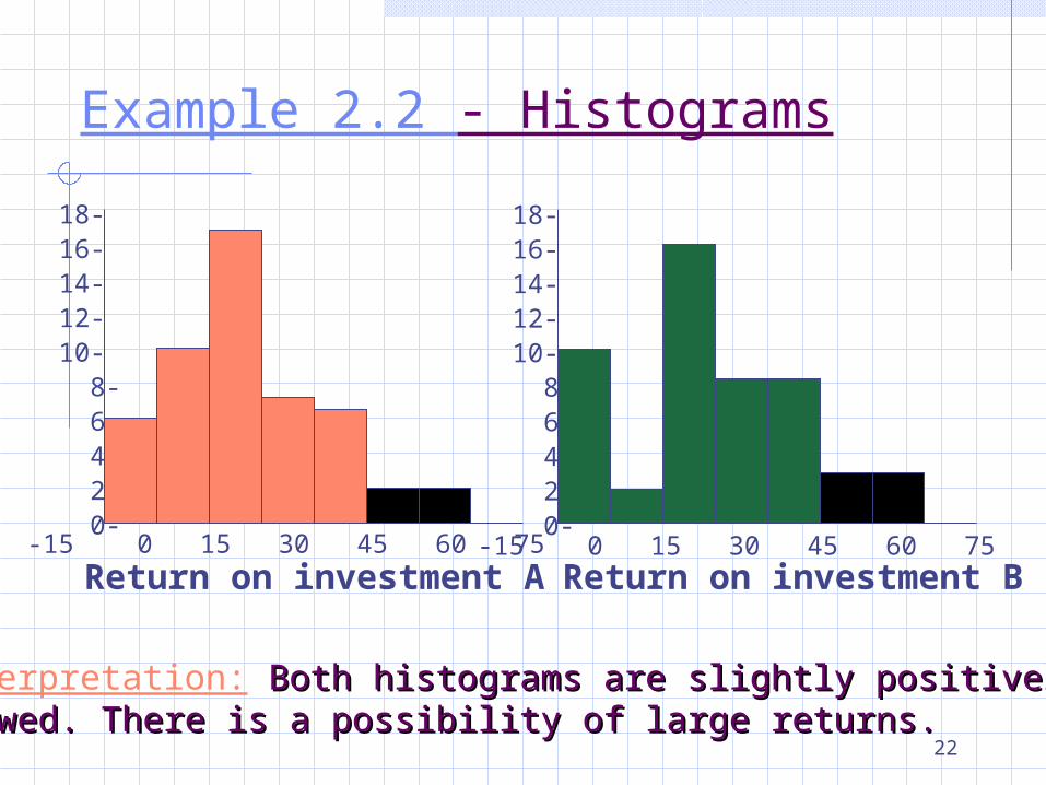
Example 2.2 - Histograms
22
18-16-14-12-10- 8- 6- 4- 2- 0-
18-16-14-12-10- 8- 6- 4- 2- 0-
-15 0 15 30 45 60 75 -15 0 15 30 45 60 75Return on investment A Return on investment B
Interpretation: Both histograms are slightly positively Both histograms are slightly positively skewed. There is a possibility of large returns.skewed. There is a possibility of large returns.
Example 2.2 - Histograms
23
Example 2.2: Conclusion It seems that investment A is better, because:
Its expected return is only slightly below that of investment B
The risk from investing in A is smaller. The possibility of having a high rate of return exists
for both investment.
Providing information
24
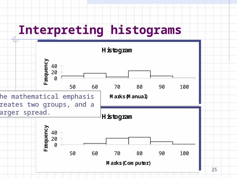
Example 2.3: Comparing students’ performance Students’ performance in two statistics classes
were compared. The two classes differed in their teaching
emphasis Class A – mathematical analysis and development of
theory. Class B – applications and computer based analysis.
The final mark for each student in each course was recorded.
Draw histograms and interpret the results.
Interpreting histograms
25
Histogram
02040
50 60 70 80 90 100
Marks(Manual)
Fre
qu
en
cy
Histogram
02040
50 60 70 80 90 100
Marks(Manual)
Fre
qu
en
cy
Histogram
02040
50 60 70 80 90 100
Marks(Computer)
Fre
qu
en
cy
Histogram
02040
50 60 70 80 90 100
Marks(Computer)
Fre
qu
en
cy
Interpreting histograms
The mathematical emphasiscreates two groups, and a larger spread.
26
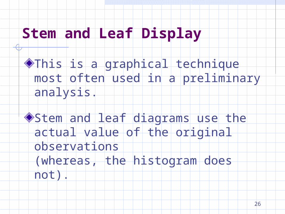
This is a graphical technique most often used in a preliminary analysis.
Stem and leaf diagrams use the actual value of the original observations (whereas, the histogram does not).
Stem and Leaf Display
27
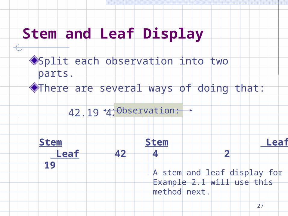
Split each observation into two parts.
There are several ways of doing that:
42.19 42.19
Stem Leaf 4219
Stem Leaf4 2
A stem and leaf display forExample 2.1 will use thismethod next.
Stem and Leaf Display
Observation:
28
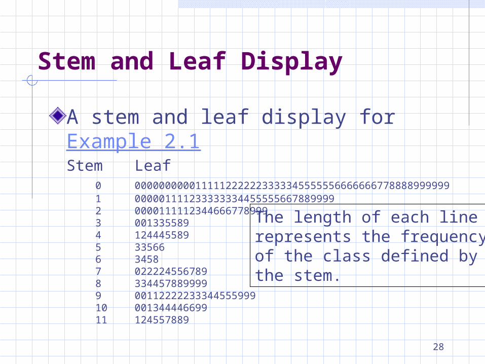
A stem and leaf display for Example 2.1Stem Leaf
0 00000000001111122222233333455555566666667788889999991 0000011112333333344555556678899992 00001111123446667789993 0013355894 1244455895 335666 34587 0222245567898 3344578899999 0011222223334455599910 00134444669911 124557889
The length of each linerepresents the frequency of the class defined by the stem.
Stem and Leaf Display
29
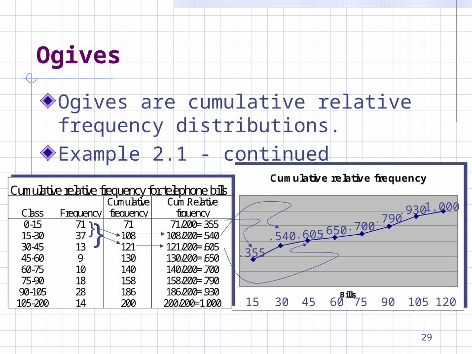
Ogives
Cumulative relative frequency
Bills
Cumulative relative frequency
Bills
Cumulative relative frequency for telephone billsCumulative Cum.Relative
Class Frequency frequency frquency0-15 71 71 71/200=.355
15-30 37 108 108/200=.54030-45 13 121 121/200=.60545-60 9 130 130/200=.65060-75 10 140 140/200=.70075-90 18 158 158/200=.79090-105 28 186 186/200=.930
105-200 14 200 200/200=1.000
}}
15
.355
30
.540
45
.605
60
.650
75
.700
90
.790
105
.930
120
1.000
Ogives are cumulative relative frequency distributions.
Example 2.1 - continued
30
2.4 Graphical Techniques for Nominal data
The only allowable calculation on nominal data is to count the frequency of each value of a variable.When the raw data can be naturally categorized in a meaningful manner, we can display frequencies by Bar charts – emphasize frequency of occurrences
of the different categories. Pie chart – emphasize the proportion of
occurrences of each category.
31
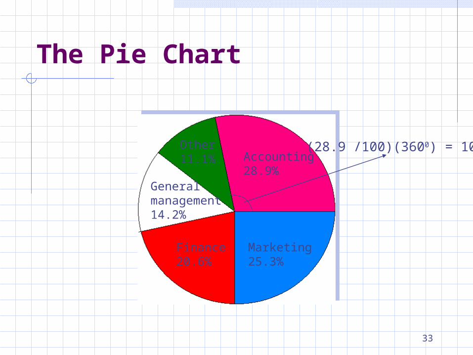
The Pie Chart
The pie chart is a circle, subdivided into a number of slices that represent the various categories.The size of each slice is proportional to the percentage corresponding to the category it represents.
32
Example 2.4 The student placement office at a university
wanted to determine the general areas of employment of last year school graduates.
Data was collected, and the count of the occurrences was recorded for each area.
These counts were converted to proportions and the results were presented as a pie chart and a bar chart.
The Pie Chart
33
Marketing25.3%
Finance20.6%
General management14.2%
Other11.1% Accounting
28.9%
(28.9 /100)(3600) = 1040
The Pie Chart
34
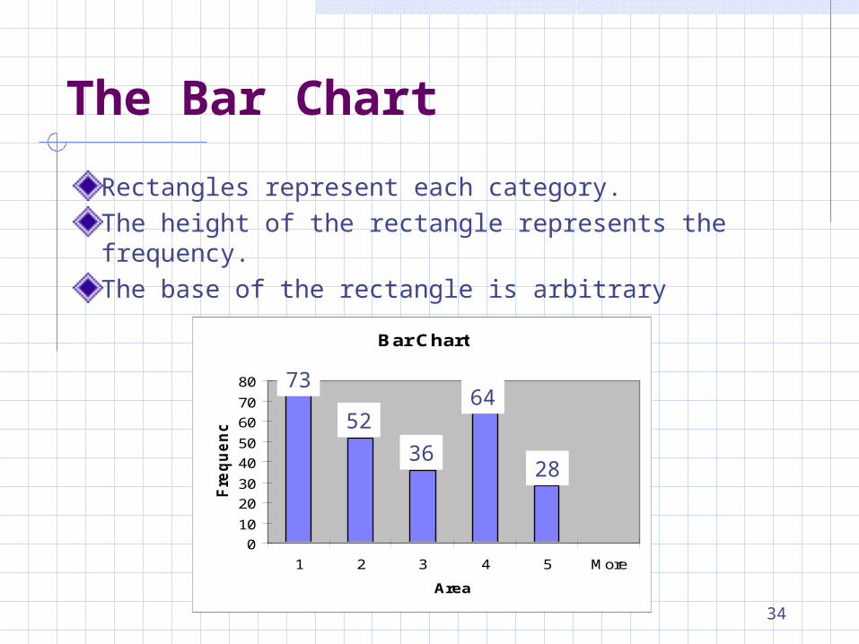
Rectangles represent each category.
The height of the rectangle represents the frequency.
The base of the rectangle is arbitrary
Bar Chart
0
10
20
30
40
50
60
70
80
1 2 3 4 5 More
Area
Fre
qu
en
cy
73
5236
64
28
The Bar Chart
35
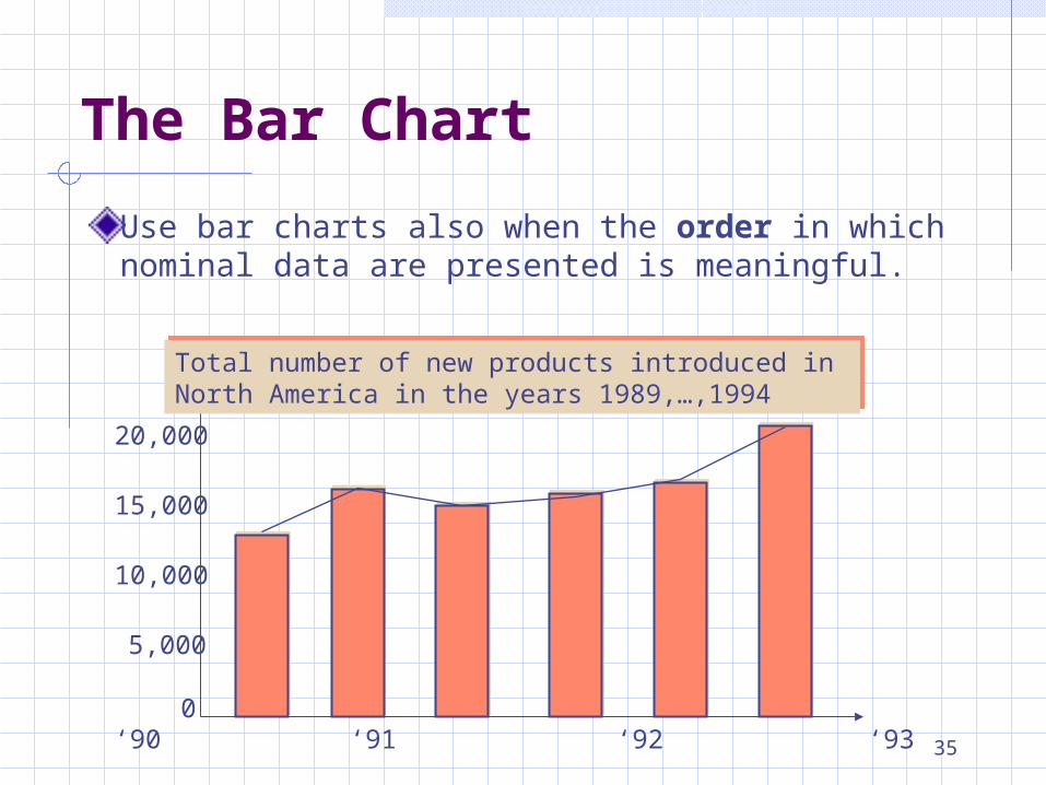
Use bar charts also when the order in which nominal data are presented is meaningful.
0
5,000
10,000
15,000
20,000
‘89 ‘90 ‘91 ‘92 ‘93 ‘94
Total number of new products introduced in North America in the years 1989,…,1994Total number of new products introduced in North America in the years 1989,…,1994
The Bar Chart
36
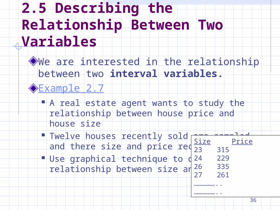
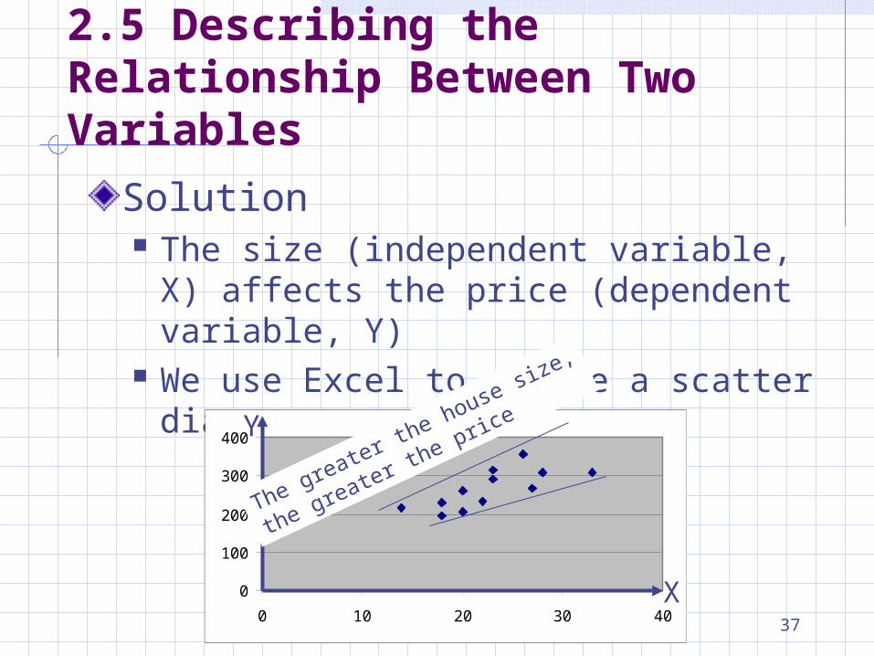
2.5 Describing the Relationship Between Two Variables
We are interested in the relationship between two interval variables.
Example 2.7 A real estate agent wants to study the relationship
between house price and house size Twelve houses recently sold are sampled and
there size and price recorded Use graphical technique to describe the
relationship between size and price.
Size Price23 31524 22926 33527 261……………..……………..
37
Solution The size (independent variable, X) affects
the price (dependent variable, Y) We use Excel to create a scatter diagram
2.5 Describing the Relationship Between Two Variables
0
100
200
300
400
0 10 20 30 40
Y
X
The greater the house siz
e,
the greater the price
38
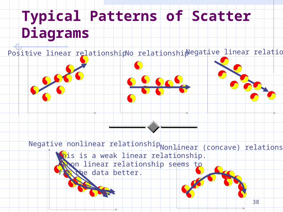
Typical Patterns of Scatter DiagramsPositive linear relationship Negative linear relationshipNo relationship
Negative nonlinear relationship
This is a weak linear relationship.A non linear relationship seems to fit the data better.
Nonlinear (concave) relationship
39
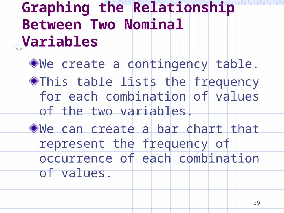
Graphing the Relationship Between Two Nominal Variables
We create a contingency table.
This table lists the frequency for each combination of values of the two variables.
We can create a bar chart that represent the frequency of occurrence of each combination of values.
40
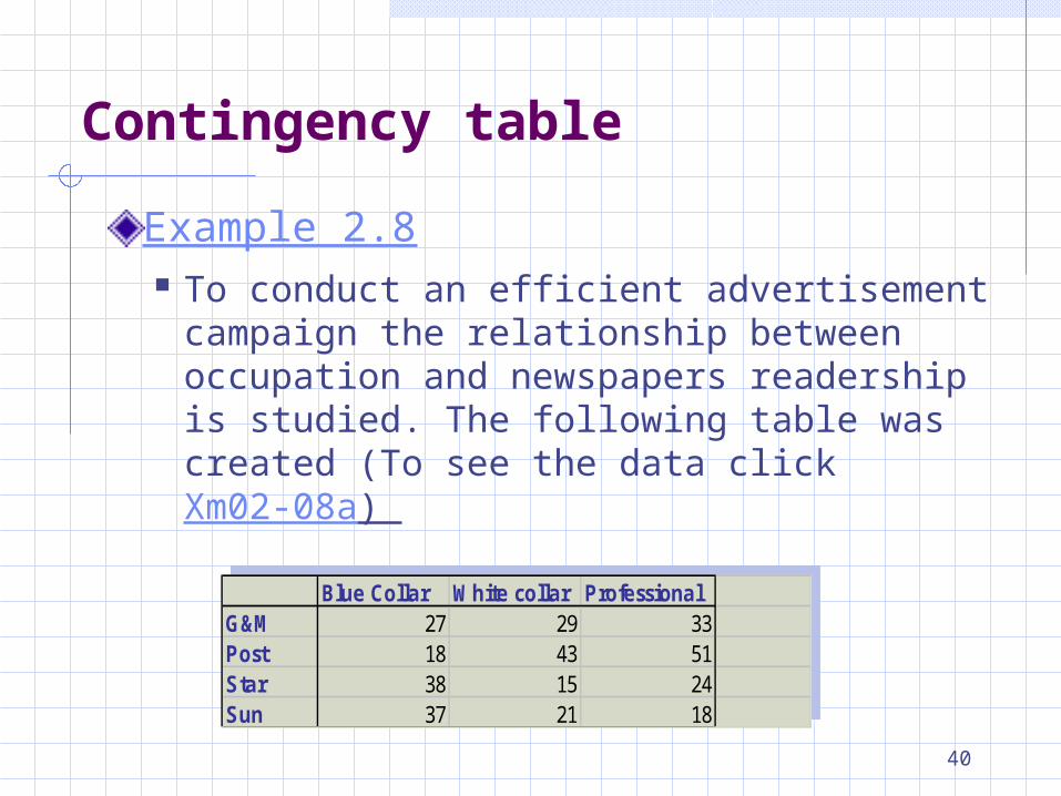
Example 2.8 To conduct an efficient advertisement
campaign the relationship between occupation and newspapers readership is studied. The following table was created (To see the data click Xm02-08a)
Contingency table
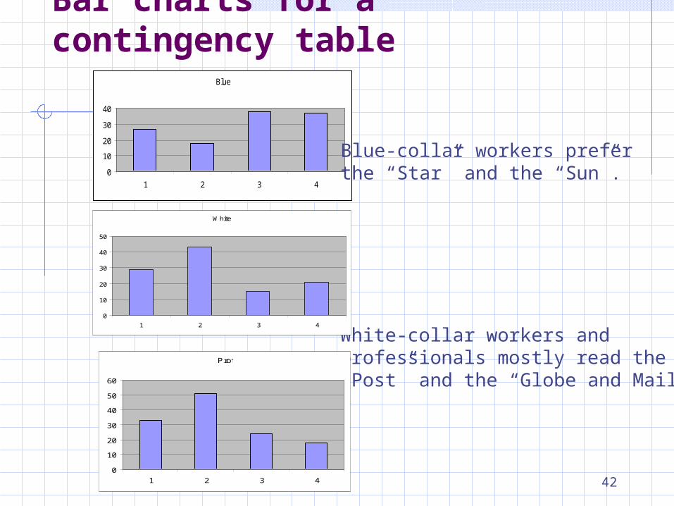
Blue Collar White collar ProfessionalG&M 27 29 33Post 18 43 51Star 38 15 24Sun 37 21 18
Blue Collar White collar ProfessionalG&M 27 29 33Post 18 43 51Star 38 15 24Sun 37 21 18
41
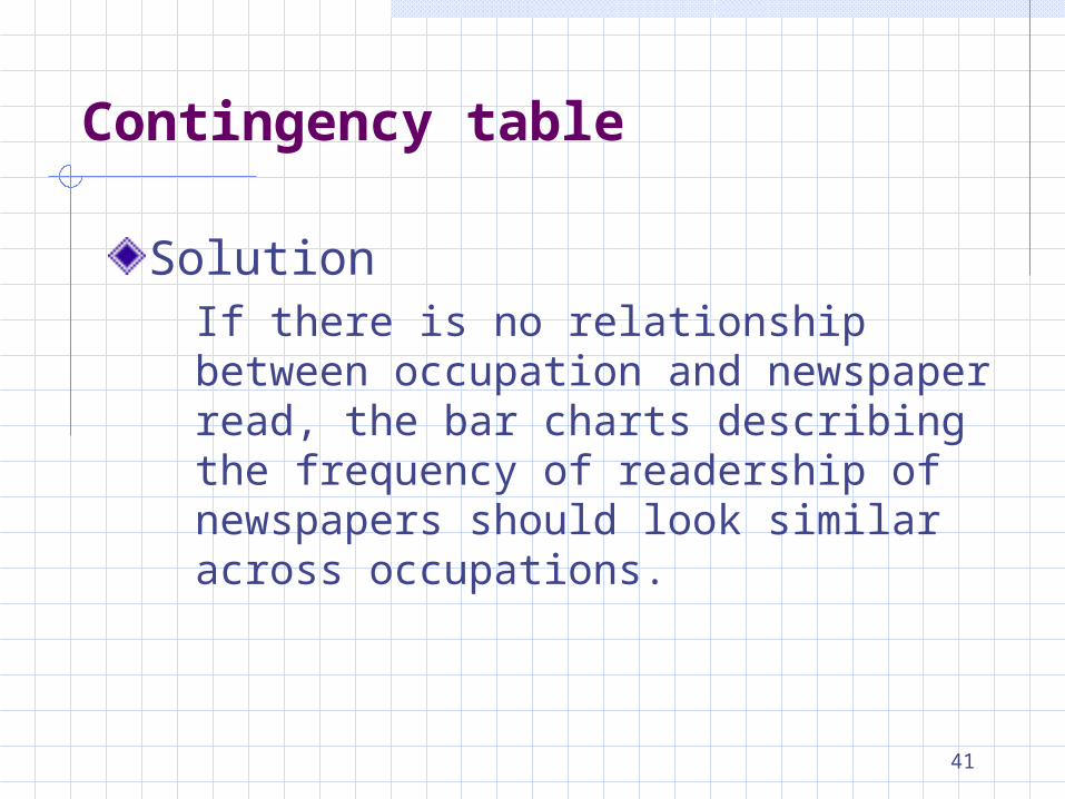
SolutionIf there is no relationship between occupation and newspaper read, the bar charts describing the frequency of readership of newspapers should look similar across occupations.
Contingency table
42
Blue
0
10
20
30
40
1 2 3 4
Blue-collar workers prefer the “Star” and the “Sun”.
White-collar workers and professionals mostly read the “Post” and the “Globe and Mail”
Bar charts for a contingency table
White
0
10
20
30
40
50
1 2 3 4
Prof
0
10
20
30
40
50
60
1 2 3 4
43
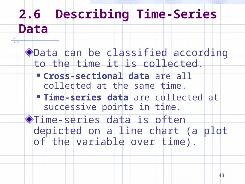
2.6 Describing Time-Series Data
Data can be classified according to the time it is collected. Cross-sectional data are all collected at
the same time. Time-series data are collected at
successive points in time.
Time-series data is often depicted on a line chart (a plot of the variable over time).
44
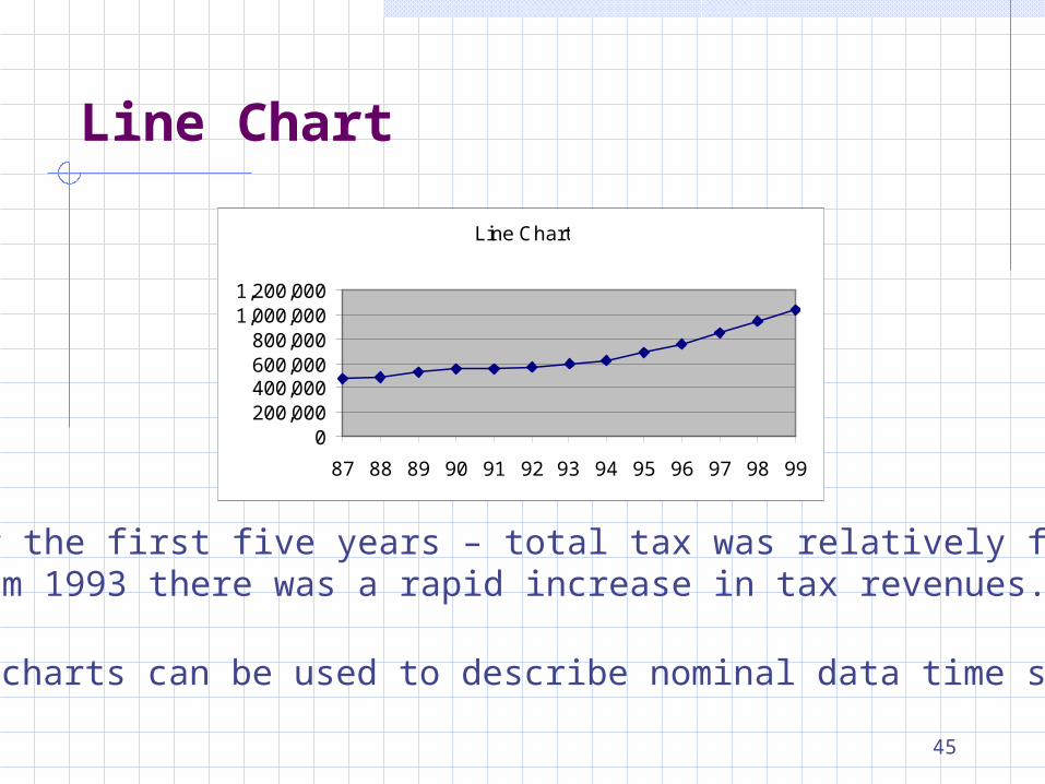
Line Chart
Example 2.9 The total amount of income tax paid by
individuals in 1987 through 1999 are listed below.
Draw a graph of this data and describe the information produced
45
Line Chart
0200,000400,000600,000800,000
1,000,0001,200,000
87 88 89 90 91 92 93 94 95 96 97 98 99
For the first five years – total tax was relatively flatFrom 1993 there was a rapid increase in tax revenues.
Line charts can be used to describe nominal data time series.
Line Chart