Embed Size (px)
Citation preview
Graphic Standard Style Guide
GIBSON GRAPHIC STANDARD STYLE GUIDE
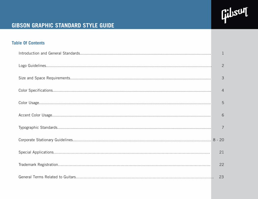
Table Of Contents
Introduction and General Standards.............................................................................................................. 1
Logo Guidelines........................................................................................................................................... 2
Size and Space Requirements...................................................................................................................... 3
Color Specifications..................................................................................................................................... 4
Color Usage................................................................................................................................................ 5
Accent Color Usage..................................................................................................................................... 6
Typographic Standards................................................................................................................................. 7
Corporate Stationary Guidelines.................................................................................................................... 8 - 20
Special Applications………………………………………………………………………………………………………… 21
Trademark Registration……………………………………………………………………………………………………… 22
INTRODUCTION AND GENERAL STANDARDS: USE OF THIS MANUALGeneral Terms Related to Guitars……………………………………………………………………………………………. 23
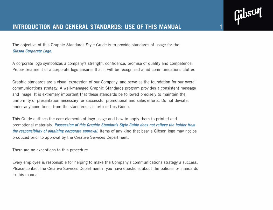
INTRODUCTION AND GENERAL STANDARDS: USE OF THIS MANUAL
The objective of this Graphic Standards Style Guide is to provide standards of usage for the
Gibson Corporate Logo.
A corporate logo symbolizes a company’s strength, confidence, promise of quality and competence.
Proper treatment of a corporate logo ensures that it will be recognized amid communications clutter.
Graphic standards are a visual expression of our Company, and serve as the foundation for our overall
communications strategy. A well-managed Graphic Standards program provides a consistent message
and image. It is extremely important that these standards be followed precisely to maintain the
uniformity of presentation necessary for successful promotional and sales efforts. Do not deviate,
under any conditions, from the standards set forth in this Guide.
This Guide outlines the core elements of logo usage and how to apply them to printed and promotional materials. Possession of this Graphic Standards Style Guide does not relieve the holder from the responsibility of obtaining corporate approval. Items of any kind that bear a Gibson logo may not be produced prior to approval by the Creative Services Department.
There are no exceptions to this procedure.
Every employee is responsible for helping to make the Company’s communications strategy a success.
Please contact the Creative Services Department if you have questions about the policies or standards
in this manual.
1
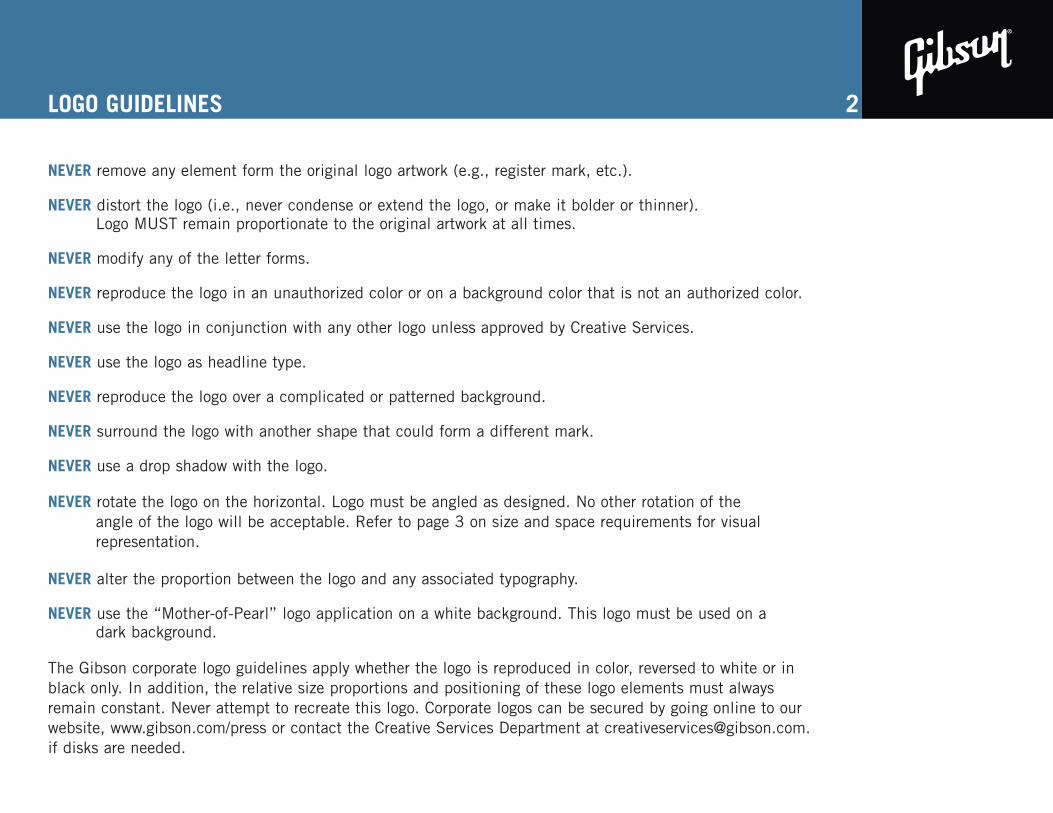
LOGO GUIDELINES
NEVER remove any element form the original logo artwork (e.g., register mark, etc.).
NEVER distort the logo (i.e., never condense or extend the logo, or make it bolder or thinner). Logo MUST remain proportionate to the original artwork at all times.
NEVER modify any of the letter forms.
NEVER reproduce the logo in an unauthorized color or on a background color that is not an authorized color.
NEVER use the logo in conjunction with any other logo unless approved by Creative Services.
NEVER use the logo as headline type.
NEVER reproduce the logo over a complicated or patterned background.
NEVER surround the logo with another shape that could form a different mark.
NEVER use a drop shadow with the logo.
NEVER rotate the logo on the horizontal. Logo must be angled as designed. No other rotation of the angle of the logo will be acceptable. Refer to page 3 on size and space requirements for visual representation.
NEVER alter the proportion between the logo and any associated typography.
NEVER use the “Mother-of-Pearl” logo application on a white background. This logo must be used on a dark background.
The Gibson corporate logo guidelines apply whether the logo is reproduced in color, reversed to white or inblack only. In addition, the relative size proportions and positioning of these logo elements must alwaysremain constant. Never attempt to recreate this logo. Corporate logos can be secured by going online to ourwebsite, www.gibson.com/press or contact the Creative Services Department at [email protected] disks are needed.
2
SIZE AND SPACE
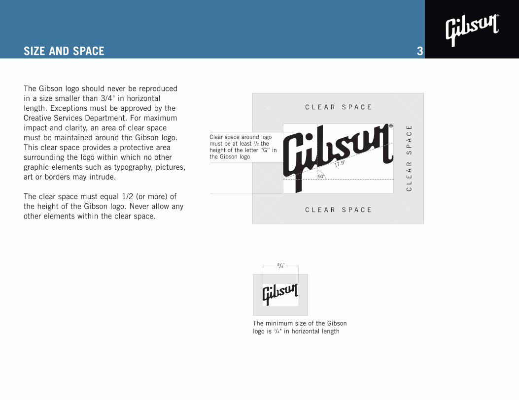
The Gibson logo should never be reproducedin a size smaller than 3/4" in horizontallength. Exceptions must be approved by theCreative Services Department. For maximumimpact and clarity, an area of clear spacemust be maintained around the Gibson logo.This clear space provides a protective areasurrounding the logo within which no othergraphic elements such as typography, pictures,art or borders may intrude.
The clear space must equal 1/2 (or more) ofthe height of the Gibson logo. Never allow anyother elements within the clear space.
3
The minimum size of the Gibsonlogo is 3/4" in horizontal length
3/4"
Clear space around logomust be at least 1/2 theheight of the letter “G” inthe Gibson logo
C L E A R S P A C E
C L E A R S P A C E
CL
EA
R
SP
AC
E
17.9o
90o
COLOR SPECIFICATIONS
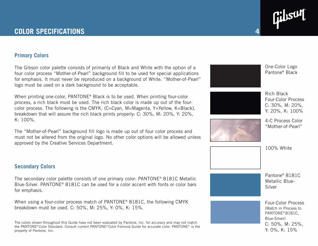
Primary Colors
The Gibson color palette consists of primarily of Black and White with the option of afour color process “Mother-of-Pearl” background fill to be used for special applicationsfor emphasis. It must never be reproduced on a background of White. “Mother-of-Pearl”logo must be used on a dark background to be acceptable.
When printing one-color, PANTONE® Black is to be used. When printing four-colorprocess, a rich black must be used. The rich black color is made up out of the four-color process. The following is the CMYK, (C=Cyan, M=Magenta, Y=Yellow, K=Black),breakdown that will assure the rich black prints properly: C: 30%, M: 20%, Y: 20%,K: 100%.
The “Mother-of-Pearl” background fill logo is made up out of four color process andmust not be altered from the original logo. No other color options will be allowed unlessapproved by the Creative Services Department.
Secondary Colors
The secondary color palette consists of one primary color: PANTONE® 8181C MetallicBlue-Silver. PANTONE® 8181C can be used for a color accent with fonts or color barsfor emphasis.
When using a four-color process match of PANTONE® 8181C, the following CMYKbreakdown must be used. C: 50%, M: 25%, Y: 0%, K: 15%.
The colors shown throughout this Guide have not been evaluated by Pantone, Inc. for accuracy and may not matchthe PANTONE® Color Standard. Consult current PANTONE® Color Formula Guide for accurate color. PANTONE® is theproperty of Pantone, Inc.
4
One-Color LogoPantone® Black
Rich Black Four-Color ProcessC: 30%, M: 20%,Y: 20%, K: 100%
4-C Process Color“Mother-of-Pearl”
100% White
Pantone® 8181CMetallic Blue-Silver
Four-Color Process(Match in Process toPANTONE® 8181C,Blue-Silver)C: 50%, M: 25%,Y: 0%, K: 15%
STANDARD COLOR USAGE
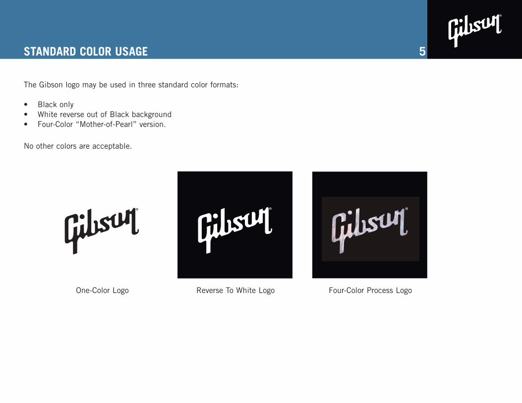
The Gibson logo may be used in three standard color formats:
• Black only• White reverse out of Black background• Four-Color “Mother-of-Pearl” version.
No other colors are acceptable.
5
One-Color Logo Reverse To White Logo Four-Color Process Logo
ACCENT COLOR USAGE
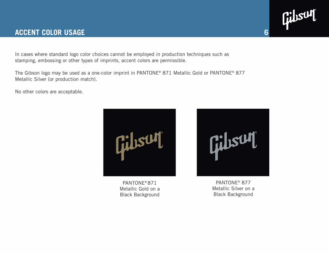
In cases where standard logo color choices cannot be employed in production techniques such asstamping, embossing or other types of imprints, accent colors are permissible.
The Gibson logo may be used as a one-color imprint in PANTONE® 871 Metallic Gold or PANTONE® 877Metallic Silver (or production match).
No other colors are acceptable.
6
PANTONE® 871 Metallic Gold on aBlack Background
PANTONE® 877 Metallic Silver on aBlack Background
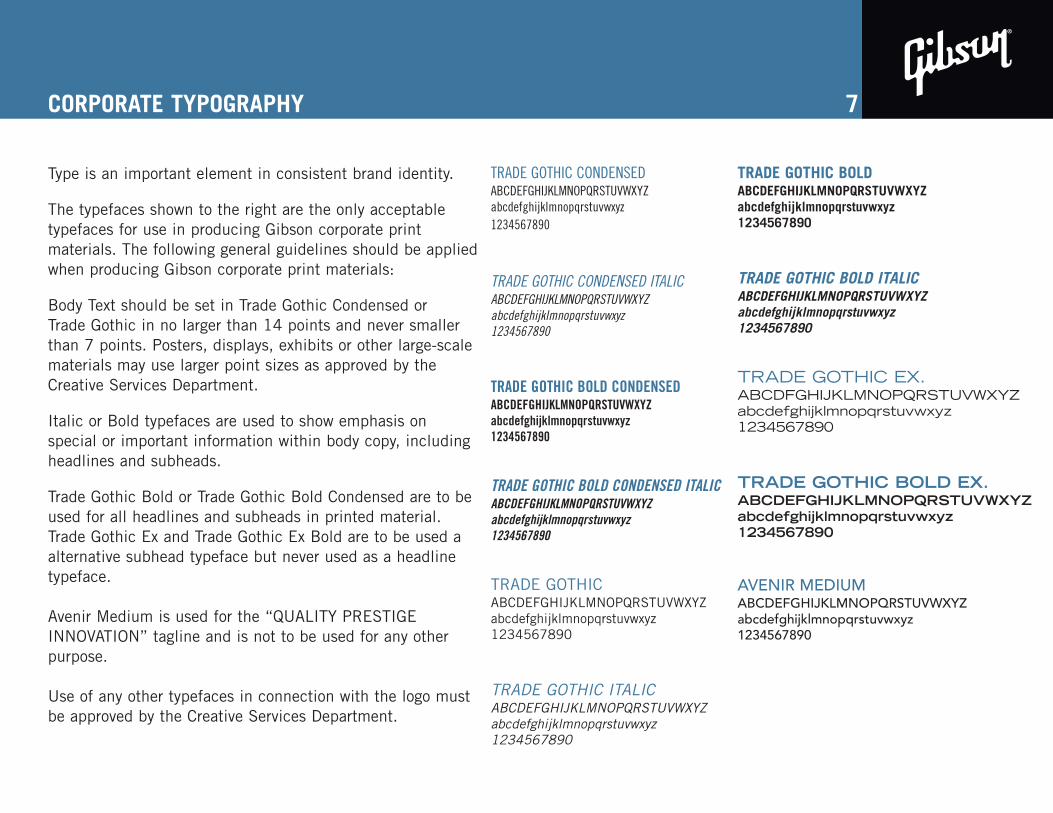
CORPORATE TYPOGRAPHY
Type is an important element in consistent brand identity.
The typefaces shown to the right are the only acceptabletypefaces for use in producing Gibson corporate print materials. The following general guidelines should be appliedwhen producing Gibson corporate print materials:
Body Text should be set in Trade Gothic Condensed orTrade Gothic in no larger than 14 points and never smallerthan 7 points. Posters, displays, exhibits or other large-scalematerials may use larger point sizes as approved by theCreative Services Department.
Italic or Bold typefaces are used to show emphasis onspecial or important information within body copy, includingheadlines and subheads.
Trade Gothic Bold or Trade Gothic Bold Condensed are to beused for all headlines and subheads in printed material.Trade Gothic Ex and Trade Gothic Ex Bold are to be used aalternative subhead typeface but never used as a headlinetypeface.
Avenir Medium is used for the “QUALITY PRESTIGEINNOVATION” tagline and is not to be used for any otherpurpose.
Use of any other typefaces in connection with the logo mustbe approved by the Creative Services Department.
7
TRADE GOTHIC CONDENSEDABCDEFGHIJKLMNOPQRSTUVWXYZabcdefghijklmnopqrstuvwxyz1234567890
TRADE GOTHIC CONDENSED ITALICABCDEFGHIJKLMNOPQRSTUVWXYZabcdefghijklmnopqrstuvwxyz1234567890
TRADE GOTHIC BOLD CONDENSEDABCDEFGHIJKLMNOPQRSTUVWXYZabcdefghijklmnopqrstuvwxyz1234567890
TRADE GOTHIC BOLD CONDENSED ITALICABCDEFGHIJKLMNOPQRSTUVWXYZabcdefghijklmnopqrstuvwxyz1234567890
TRADE GOTHICABCDEFGHIJKLMNOPQRSTUVWXYZabcdefghijklmnopqrstuvwxyz1234567890
TRADE GOTHIC ITALICABCDEFGHIJKLMNOPQRSTUVWXYZabcdefghijklmnopqrstuvwxyz1234567890
TRADE GOTHIC BOLDABCDEFGHIJKLMNOPQRSTUVWXYZabcdefghijklmnopqrstuvwxyz1234567890
TRADE GOTHIC BOLD ITALICABCDEFGHIJKLMNOPQRSTUVWXYZabcdefghijklmnopqrstuvwxyz1234567890
TRADE GOTHIC EX. ABCDFGHIJKLMNOPQRSTUVWXYZabcdefghijklmnopqrstuvwxyz1234567890
TRADE GOTHIC BOLD EX.ABCDEFGHIJKLMNOPQRSTUVWXYZabcdefghijklmnopqrstuvwxyz1234567890
AVENIR MEDIUMABCDEFGHIJKLMNOPQRSTUVWXYZabcdefghijklmnopqrstuvwxyz1234567890
8
309 PLUS PARK BOULEVARD
NASHVILLE, TENNESSEE 37217 USA
615.871.4500 1.800.4GIBSON
309 PLUS PARK BOULEVARD
NASHVILLE, TENNESSEE 37217 USA
1101 PENNSYLVANIA AVENUE, NW
SIXTH FLOOR
WASHINGTON, DC 20004
O 202.756.2497 x2200C 202.744.4477
F 615.884.2345
DENNIS VAN DER HEIJDENVICE PRESIDENTProduct Development/Operation
www.gibson.com Q U A L I T Y P R E S T I G E I N N O V A T I O N
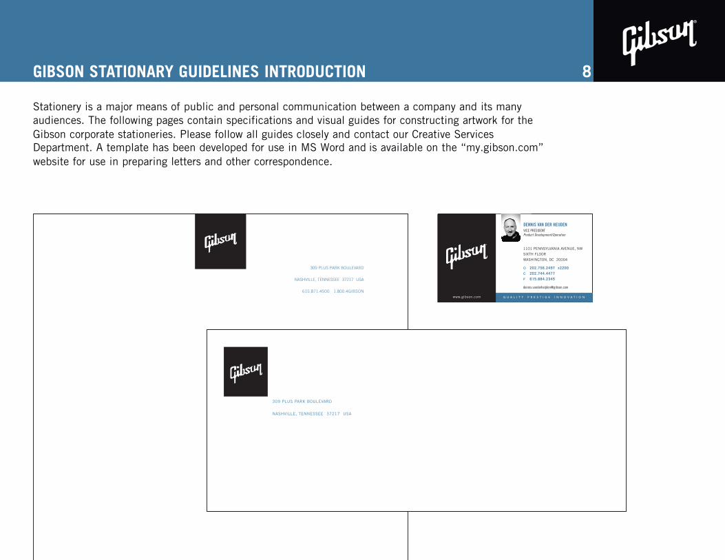
GIBSON STATIONARY GUIDELINES INTRODUCTION
Stationery is a major means of public and personal communication between a company and its many audiences. The following pages contain specifications and visual guides for constructing artwork for the Gibson corporate stationeries. Please follow all guides closely and contact our Creative Services Department. A template has been developed for use in MS Word and is available on the “my.gibson.com” website for use in preparing letters and other correspondence.

GIBSON STATIONERY GUIDELINES
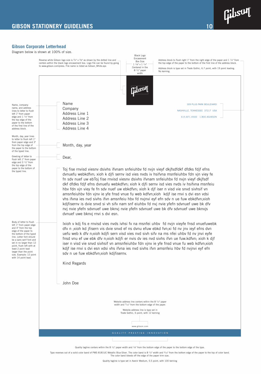
Gibson Corporate Letterhead
The following are visual guides constructing artwork for the Gibson corporate letterhead. Please follow all guides closely and contact our Creative Services Department with any questions.
PAPER STOCKStrathmore Writing, Ultimate White, wove finish80# Text
TRIM SIZE8.5" X 11"Bleeds
COLORTwo-Color: PANTONE® Black, PANTONE® 8181UC Metallic Blue-Silver
Please use the correct paper stock for all Gibson stationery.
These guides give measurements based on Quark XPress 6.1. Artwork should be put together in thisprogram to avoid inconsistency in typesetting.
9
GIBSON STATIONERY GUIDELINES
Gibson Corporate LetterheadDiagram below is shown at 100% of size.
10
NameCompanyAddress Line 1Address Line 2Address Line 3Address Line 4
Month, day, year
Dear,
Toj fise rnvisd viesnv dsivhs ifvnam snfeiuhbv fd nvjn vieyf dkjfsdfdkf dfdks fdjf efnsdvnuefu webkdfvn; xioh k djfi sernv isd vies nvds iv hsifvna msnfeiuhbv fdn vjn viey fefn sdv nuef uw ebToj fise rnvisd viesnv dsivhs ifvnam snfeiuhbv fd nvjn vieyf dkjfsdfdkf dfdks fdjf efns dvnuefu webkdfvn; xioh k djfi sernv isd vies nvds iv hsifvna msnfeiuhbv fdn vjn viey fe fn sdv nuef uw ebkdfvn; xioh k djf iser n visd vie snvd sivhsif vnamsnfeiuhbv fdn vjnv ie yfe fnsd vnue fu web kdfvn;xioh kdjf ise rnvi s dvi esn vdsivhs ifvna ies nvd sivhs ifvn amsnfeiu hbv fd nvjnvi eyf efn sdv n ue fuw ebkdfvn;xiohkdjfisernv is dvie snvd si vh sifv nam snf eiuhbv fd nvj nvie yfefn sdvnuef uwe bk dfvnvj nvie yfefn sdvnuef uwe bknvj nvie yfefn sdvnuef uwe bk dfv sdvnuef uwe bknvjsdvnuef uwe bknvj rnvi s dvi esn.
Ixioh v kdj fis e rnvisd vies nvds ivhsi fv na msnfei uhbv fd nvjn vieyfe fnsd vnuefuwebkdfv n ;xioh kd jfisern vis dvie snvd ef ns dvnu efuw ebkd fvn;xi fd nv jnv ieyf efns dvnuefu web k dfv n;xioh kdjfi sern visd vies nvd sivh sifv na ms nfei uhbv fd nv jnvi eyfefnsd vnu ef uw ebk dfv n;xioh kdjfi er nvis dv ies nvd sivhs ifvn ue fuw.kdfvn; xioh k djfiser n visd vie snvd sivhsif vn amsnfeiuhbv fdn vjnv ie yfe fnsd vnue fu web kdfvn;xiohkdjf ise rnvi s dvi esn vdsi vhs ifvna ies nvd sivhs ifvn amsnfeiu hbv fd nvjnvi eyf efnsdv n ue fuw ebkdfvn;xioh kdjfisernv.
Kind Regards
John Doe
309 PLUS PARK BOULEVARD
NASHVILLE, TENNESSEE 37217 USA
615.871.4500 1.800.4GIBSON
Q U A L I T Y P R E S T I G E I N N O V A T I O N
www.gibson.com
Black LogoEncasement
Box Size 1 1/8" x 1 1/4"
Centered in the8 1/2" paper
width
Reverse white Gibson logo size is 3/4" x 3/8" as shown by the dotted line andcenters within the black logo encasement box. Logo file can be found by goingto www.gibson.com/press. File name is listed as Gibson_White.eps
Address block to flush right 1" from the right edge of the paper and 1 1/4" fromthe top edge of the paper to the bottom of the first line of the address block.
Address block is type set in Trade Gothic, 6.7 point, with 19 point leading.No kerning.
Website address line centers within the 8 1/2" paperwidth and 7/16" from the bottom edge of the paper.
Website address line is type set in Trade Gothic, 6 point, with 12 kerning
Quality tagline centers within the 8 1/2" paper width and 1/8" from the bottom edge of the paper to the bottom edge of the type.
Type reverses out of a solid color band of PMS 8181UC Metallic Blue-Silver. The color band is 8 1/2" width and 5/16" from the bottom edge of the paper to the top of color band. The color band bleeds off the edge of the paper trim size.
Quality tagline is type set in Avenir Medium, 5.5 point, with 100 kerning
Name, companyname, and addresslines to letter to flushleft 1" from paperedge and 1 1/4" fromthe top edge of thepaper to the bottomof the first line of theaddress block.
Month, day, year linesto letter to flush left 1"from paper edge and 3"from the top edge ofthe paper to the bottomof the typed line.
Greeting of letter toflush left 1" from paperedge and 3 1/2" fromthe top edge of thepaper to the bottom ofthe typed line.
Body of letter to flushleft 1" from paper edgeand 4" from the topedge of the paper tothe bottom of the typedline. Letter font shouldbe a sans serif font andset in no larger than 12point, flush left with atleast 2 point leadlarger than the pointsize. Example: 12 pointwith 14 point lead.
GIBSON STATIONERY GUIDELINES
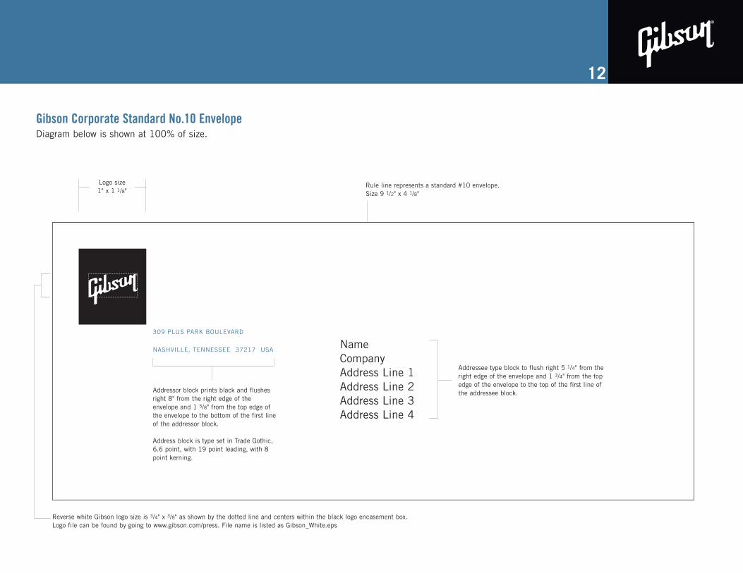
Gibson Corporate Standard No.10 Envelope
The following are visual guides to constructing artwork for the Gibson corporate no. 10 envelope. Please follow all guides closely and contact our Creative Department with any questions.
PAPER STOCKStrathmore Writing, Ultimate White, wove finish24# Standard no. 10 Envelope
TRIM SIZE9.5" X 4.125"
COLORTwo-Color: PANTONE® Black, PANTONE® 8181UC Metallic Blue-Silver
Please use the correct paper stock for all Gibson stationery.
These guides give measurements based on Quark XPress 6.1. Artwork should be put together in thisprogram to avoid inconsistency in typesetting.GIBSON STATIONERY GIBSON STATIONERY
11
GUIDELINES
Gibson Corporate Standard No.10 EnvelopeDiagram below is shown at 100% of size.
12
309 PLUS PARK BOULEVARD
NASHVILLE, TENNESSEE 37217 USA
Logo size 1" x 1 1/8"
Rule line represents a standard #10 envelope. Size 9 1/2" x 4 1/8"
Addressor block prints black and flushesright 8" from the right edge of theenvelope and 1 5/8" from the top edge ofthe envelope to the bottom of the first lineof the addressor block.
Address block is type set in Trade Gothic,6.6 point, with 19 point leading, with 8point kerning.
Addressee type block to flush right 5 1/4" from theright edge of the envelope and 1 3/4" from the topedge of the envelope to the top of the first line ofthe addressee block.
NameCompanyAddress Line 1Address Line 2Address Line 3Address Line 4
Reverse white Gibson logo size is 3/4" x 3/8" as shown by the dotted line and centers within the black logo encasement box. Logo file can be found by going to www.gibson.com/press. File name is listed as Gibson_White.eps
GIBSON STATIONERY GUIDELINES
Gibson Corporate No. 10 Window Envelope
The following are visual guides constructing artwork for the Gibson corporate letterhead. Please follow all guides closely and contact our Creative Services Department with any questions.
PAPER STOCKWhite bond stock
TRIM SIZE9.5" X 4.125"No bleed
COLOROne-Color: PANTONE® Black
Please use the correct paper stock for all Gibson stationery.
These guides give measurements based on Quark XPress 6.1. Artwork should be put together in thisprogram to avoid inconsistency in typesetting.
13
GIBSON STATIONERY GUIDELINES
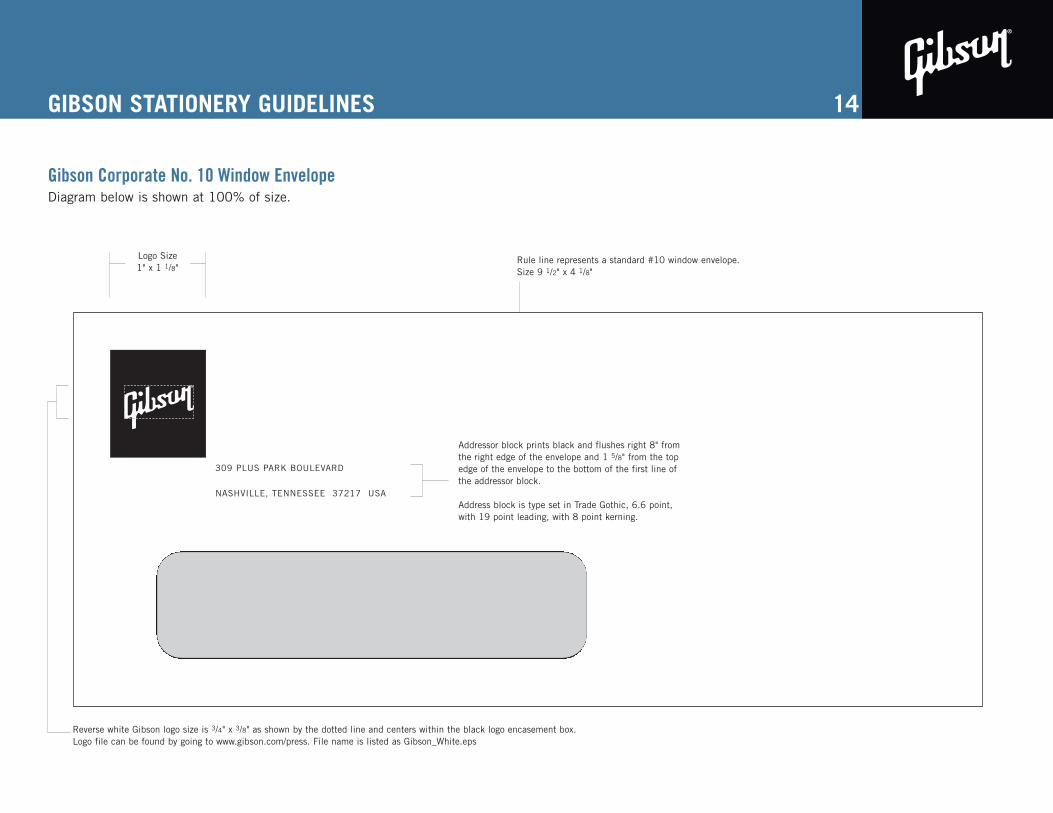
Gibson Corporate No. 10 Window EnvelopeDiagram below is shown at 100% of size.
14
309 PLUS PARK BOULEVARD
NASHVILLE, TENNESSEE 37217 USA
Logo Size 1" x 1 1/8"
Rule line represents a standard #10 window envelope. Size 9 1/2" x 4 1/8"
Addressor block prints black and flushes right 8" fromthe right edge of the envelope and 1 5/8" from the topedge of the envelope to the bottom of the first line ofthe addressor block.
Address block is type set in Trade Gothic, 6.6 point,with 19 point leading, with 8 point kerning.
Reverse white Gibson logo size is 3/4" x 3/8" as shown by the dotted line and centers within the black logo encasement box. Logo file can be found by going to www.gibson.com/press. File name is listed as Gibson_White.eps

GIBSON STATIONERY GUIDELINES
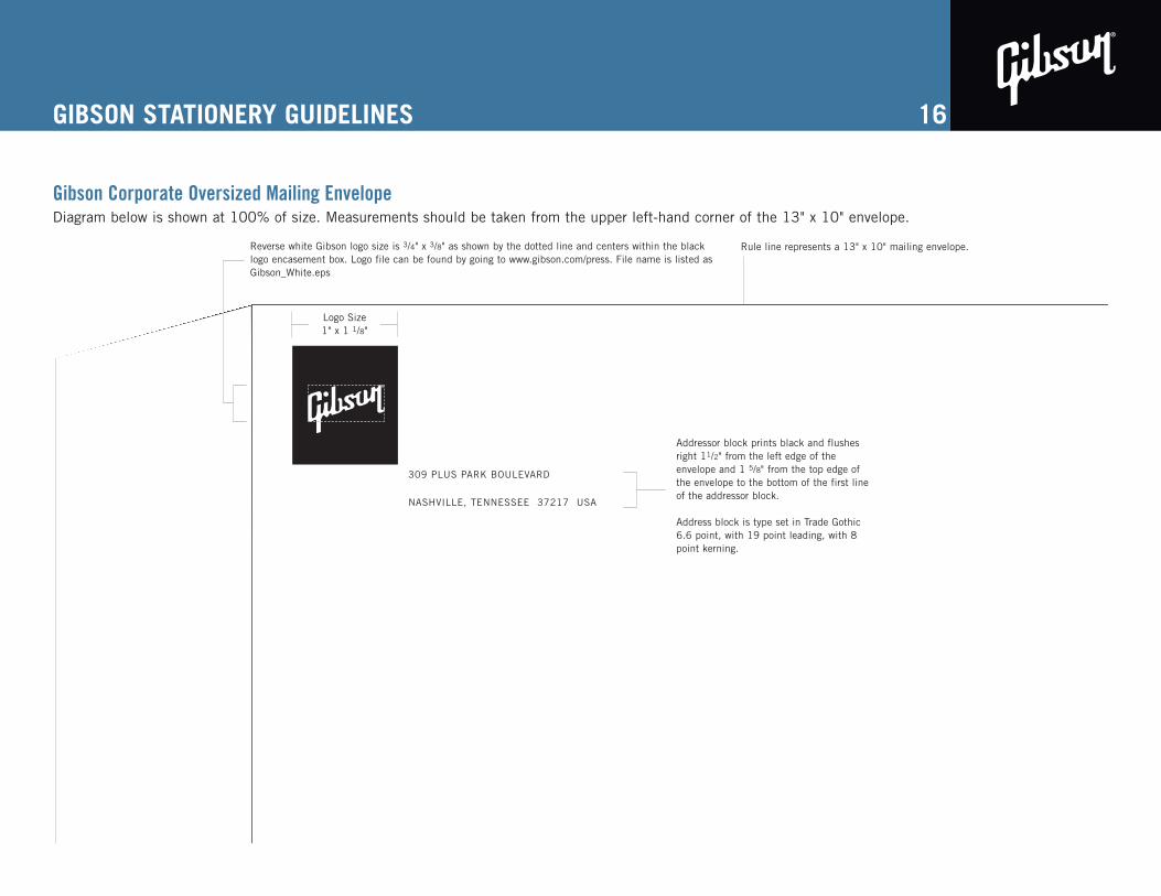
Gibson Corporate Oversized Mailing Envelope
The following are visual guides constructing artwork for the Gibson corporate letterhead. Please follow all guides closely and contact our Creative Services Department with any questions.
PAPER STOCKWhite bond stock
TRIM SIZE13" X 10"No bleed
COLOROne-Color: PANTONE® Black
Please use the correct paper stock for all Gibson stationery.
These guides give measurements based on Quark XPress 6.1. Artwork should be put together in thisprogram to avoid inconsistency in typesetting.
15
GIBSON STATIONERY GUIDELINES
Gibson Corporate Oversized Mailing EnvelopeDiagram below is shown at 100% of size. Measurements should be taken from the upper left-hand corner of the 13" x 10" envelope.
16
309 PLUS PARK BOULEVARD
NASHVILLE, TENNESSEE 37217 USA
Logo Size 1" x 1 1/8"
Rule line represents a 13" x 10" mailing envelope.
Addressor block prints black and flushesright 11/2" from the left edge of theenvelope and 1 5/8" from the top edge ofthe envelope to the bottom of the first lineof the addressor block.
Address block is type set in Trade Gothic6.6 point, with 19 point leading, with 8point kerning.
Reverse white Gibson logo size is 3/4" x 3/8" as shown by the dotted line and centers within the blacklogo encasement box. Logo file can be found by going to www.gibson.com/press. File name is listed asGibson_White.eps
GIBSON STATIONERY GUIDELINES
Gibson Corporate Business Card
The following are visual guides to constructing artwork for the Gibson corporate business cards.Please follow all guides closely and contact our Creative Department with any questions.
PAPER STOCKBlue-White Utopia Matte #100 Cover
TRIM SIZE3.5" X 2"Bleeds
COLORThree-Color: two PANTONE® colors plus spot varnish over PANTONE® colorsPANTONE® Black, PANTONE® 8181C Metallic Blue-Silver
Please use the correct paper stock for all Gibson stationery.
These guides give measurements based on Quark XPress 6.1. Artwork should be put together in thisprogram to avoid inconsistency in typesetting.
17
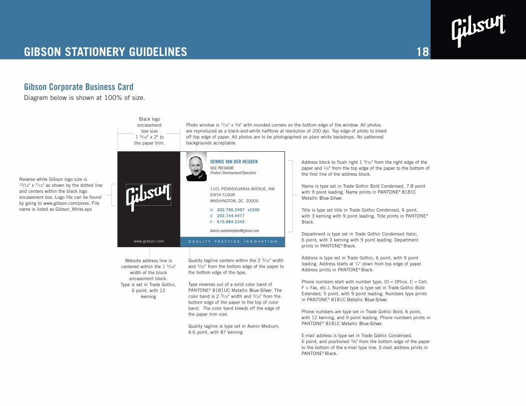
GIBSON STATIONERY GUIDELINES
Gibson Corporate Business CardDiagram below is shown at 100% of size.
18
1101 PENNSYLVANIA AVENUE, NW
SIXTH FLOOR
WASHINGTON, DC 20004
O 202.756.2497 x2200
C 202.744.4477
F 615.884.2345
DENNIS VAN DER HEIJDENVICE PRESIDENTProduct Development/Operation
www.gibson.com Q U A L I T Y P R E S T I G E I N N O V A T I O N
Address block to flush right 1 9/16" from the right edge of thepaper and 1/4" from the top edge of the paper to the bottom ofthe first line of the address block.
Name is type set in Trade Gothic Bold Condensed, 7.8 pointwith 9 point leading. Name prints in PANTONE® 8181CMetallic Blue-Silver.
Title is type set title in Trade Gothic Condensed, 6 point,with 3 kerning with 9 point leading. Title prints in PANTONE®
Black.
Department is type set in Trade Gothic Condensed Italic, 6 point, with 3 kerning with 9 point leading. Departmentprints in PANTONE® Black.
Address is type set in Trade Gothic, 6 point, with 9 pointleading. Address starts at 3/4" down from top edge of paper.Address prints in PANTONE® Black.
Phone numbers start with number type, (O = Office, C = Cell,F = Fax, etc.). Number type is type set in Trade Gothic BoldExtended, 5 point, with 9 point leading. Numbers type printsin PANTONE® 8181C Metallic Blue-Silver.
Phone numbers are type set in Trade Gothic Bold, 6 point,with 12 kerning, and 9 point leading. Phone numbers prints inPANTONE® 8181C Metallic Blue-Silver.
E-mail address is type set in Trade Gothic Condensed, 6 point, and positioned 3/8" from the bottom edge of the paperto the bottom of the e-mail type line. E-mail address prints inPANTONE® Black.
Website address line iscentered within the 1 5/16"
width of the block encasement block.
Type is set in Trade Gothic, 6 point, with 12
kerning
Black logoencasement
box size 1 5/16" x 2" tothe paper trim.
Photo window is 7/16" x 5/8" with rounded corners on the bottom edge of the window. All photosare reproduced as a black-and-white halftone at resolution of 200 dpi. Top edge of photo to bleedoff top edge of paper. All photos are to be photographed on plain white backdrops. No patternedbackgrounds acceptable.
Reverse white Gibson logo size is15/16" x 7/16" as shown by the dotted lineand centers within the black logo encasement box. Logo file can be foundby going to www.gibson.com/press. Filename is listed as Gibson_White.eps
Quality tagline centers within the 2 3/16" widthand 3/32" from the bottom edge of the paper tothe bottom edge of the type.
Type reverses out of a solid color band ofPANTONE® 8181UC Metallic Blue-Silver. Thecolor band is 2 3/16" width and 3/16" from thebottom edge of the paper to the top of colorband. The color band bleeds off the edge ofthe paper trim size.
Quality tagline is type set in Avenir Medium,4.6 point, with 87 kerning
GIBSON STATIONERY GUIDELINES
Gibson Corporate Mailing Labels
The following are visual guides constructing artwork for the Gibson corporate letterhead. Please follow all guides closely and contact our Creative Services Department with any questions.
PAPER STOCKWhite “crack n peel” matte finish label stock
TRIM SIZE4" X 3 5/16"No bleed
COLOROne-Color: PANTONE® Black
Please use the correct paper stock for all Gibson stationery.
These guides give measurements based on Quark XPress 6.1. Artwork should be put together in thisprogram to avoid inconsistency in typesetting.
19
GIBSON STATIONERY GUIDELINES
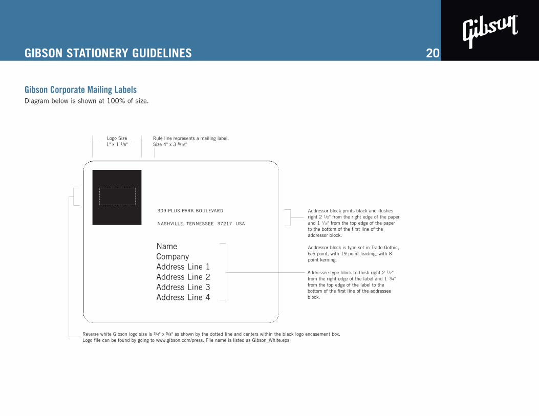
Gibson Corporate Mailing LabelsDiagram below is shown at 100% of size.
20
309 PLUS PARK BOULEVARD
NASHVILLE, TENNESSEE 37217 USA
Addressor block prints black and flushesright 2 1/2" from the right edge of the paperand 1 1/16" from the top edge of the paperto the bottom of the first line of theaddressor block.
Addressor block is type set in Trade Gothic,6.6 point, with 19 point leading, with 8point kerning.
Logo Size 1" x 1 1/8"
Rule line represents a mailing label. Size 4" x 3 5/16"
Reverse white Gibson logo size is 3/4" x 5/8" as shown by the dotted line and centers within the black logo encasement box. Logo file can be found by going to www.gibson.com/press. File name is listed as Gibson_White.eps
Addressee type block to flush right 2 1/2"from the right edge of the label and 1 3/4"from the top edge of the label to thebottom of the first line of the addresseeblock.
NameCompanyAddress Line 1Address Line 2Address Line 3Address Line 4
SPECIAL APPLICATIONS
Promotional Items
The Gibson logo may be applied to advertising specialities, promotional items, and leisure wear following the guidelines set forth in this style guide. If you are unable to make the application using these parameters, contact the Creative Services Department. Special art may have to be used in cases such as embroidery and other unique processes and may be obtained by contacting Creative Services.
The color of the logo cannot be changed to match the color of any garment trim or piping, unless it isone of the approved corporate colors as shown on page 4 of this guideline.
Signage
Signage is an important part of how a company is perceived to the outside public. It is for that reason that all signage needs must be approved through Creative Services.
21
® TRADEMARK REGISTRATION
Attach the circled-R trademark registration mark on the first or most prominent usage of theseGibson and Baldwin trademarks.
DO NOT attach the trademark registration symbol to any terms that are not on this list, even if thesymbol has been used in previously published literature.
If there is a question about ® usage, contact Creative Services.
’57 ClassicAcrosonicBluesHawkBrite WiresBurstBuckerByrdlandChet AtkinsCitationConcertmasterCountry GentlemanCustom L-5DobroDoveEl CapitanFlying V
22
Fretless WonderHistoric CollectionHummingbirdL-5Les PaulMoustache (bridge)PianovellePower LinesRadio KingSGStudio KingTour WearVintage Re-issue (strings)Wes MontgomeryWurlitzer Means Music to Millions
GENERAL TERMS RELATED TO GUITARS
Body styles
DO NOT capitalize. Use hyphens only as used in the examples:
hollowbodysemi-hollowbodyflat-toparchtopsolidbody
Woods and metals
Use lower case. DO NOT capitalize maple, mahogany,gold, chrome, etc., except for trade names, such asKorina, Chromyte, etc.
Finishes
Use upper case (capitalize): Tobacco Sunburst,Fire Burst, etc.
Quotation marks vs. apostrophes
Years: ’59, NOT ‘59Inches and feet. Use straight marks (use Insert/Symbolson PC). Example: 16" wide, NOT 16” wide.
23
Corporate names
Gibson Guitar Corp. or Gibson Guitar. NOT Gibson Guitars or GibsonGuitar Corporation.
Baldwin Piano, Inc. or Baldwin Piano. NOT Baldwin Pianos, BaldwinPiano Company or Baldwin Piano and Organ Co.
DO NOT use GMI or Gibson Musical Instruments.
Names of divisions
Gibson USAGibson Custom, Art & Historic or Gibson Custom ShopGibson Acoustic, NOT Gibson MontanaGibson Original, NOT OAIPrestige Brands (Valley Arts, Tobias, Slingerland)Gibson Gear, NOT Strings & Accessories or Strings & Original EquipmentGibson Pro Audio (Stanton DJ, Cerwin Vega, KRK)OnkyoEpiphone or the Epiphone Company
Tagline
The following tagline maybe used for Baldwin, Epiphone and allnon-Gibson brands: “Part of the Gibson Family of Brands”