Embed Size (px)
Citation preview
graphicidentitystandardsmanual
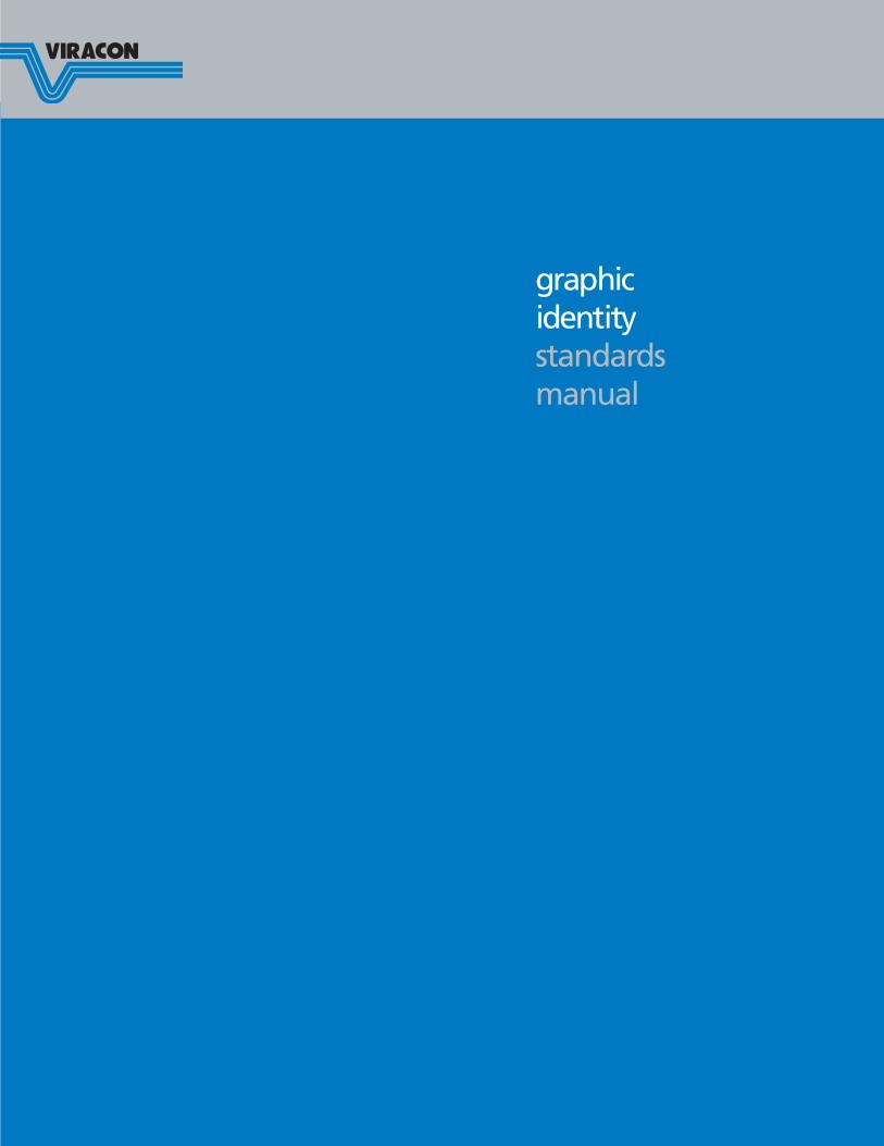
Introduction . . . . . . . . . . . . . . . . . . . . . . . page 3
Branding . . . . . . . . . . . . . . . . . . . . . . . . . . page 3
Definition of Terms . . . . . . . . . . . . . . . . . . page 4
Color Usage . . . . . . . . . . . . . . . . . . . . . . . page 5
One-color corporate signature . . . . . . page 5
Two-color corporate signature . . . . . . page 5
Background Colors . . . . . . . . . . . . . . . . . . page 5
Additional Guidelines . . . . . . . . . . . . . . . . page 6
Protected area . . . . . . . . . . . . . . . . . . page 6
Redesign . . . . . . . . . . . . . . . . . . . . . . page 6
Typography . . . . . . . . . . . . . . . . . . . . page 6
Positioning . . . . . . . . . . . . . . . . . . . . . page 6
Color treatments . . . . . . . . . . . . . . . . page 6
Size . . . . . . . . . . . . . . . . . . . . . . . . . . page 7
Exceptions . . . . . . . . . . . . . . . . . . . . . page 7
Reproductions . . . . . . . . . . . . . . . . . . page 7
Compatible Typefaces . . . . . . . . . . . . . . . . page 8
Corporate Trademarks . . . . . . . . . . . . . . . page 9
Tagline . . . . . . . . . . . . . . . . . . . . . . . . . . page 10
Stationery Format . . . . . . . . . . . . . . . . . . page 11
Letterhead stationery . . . . . . . . . . . . page 11
Stationery envelopes . . . . . . . . . . . . page 12
Business cards . . . . . . . . . . . . . . . . . page 12
Labels . . . . . . . . . . . . . . . . . . . . . . . . . . . page 13
Mailing . . . . . . . . . . . . . . . . . . . . . . . page 13
Product . . . . . . . . . . . . . . . . . . . . . . page 13
Viraspan . . . . . . . . . . . . . . . . . . . . . . page 13
Promotional/Marketing Materials . . . . . . page 14
Brochures . . . . . . . . . . . . . . . . . . . . . page 14
Advertisements . . . . . . . . . . . . . . . . page 14
Newsletters . . . . . . . . . . . . . . . . . . . page 14
Soft goods . . . . . . . . . . . . . . . . . . . . page 15
Vehicles . . . . . . . . . . . . . . . . . . . . . . page 15
Signage . . . . . . . . . . . . . . . . . . . . . . page 15
Other uses . . . . . . . . . . . . . . . . . . . . page 15
Viracon Graphics Identity Standards
page 2
table of contents
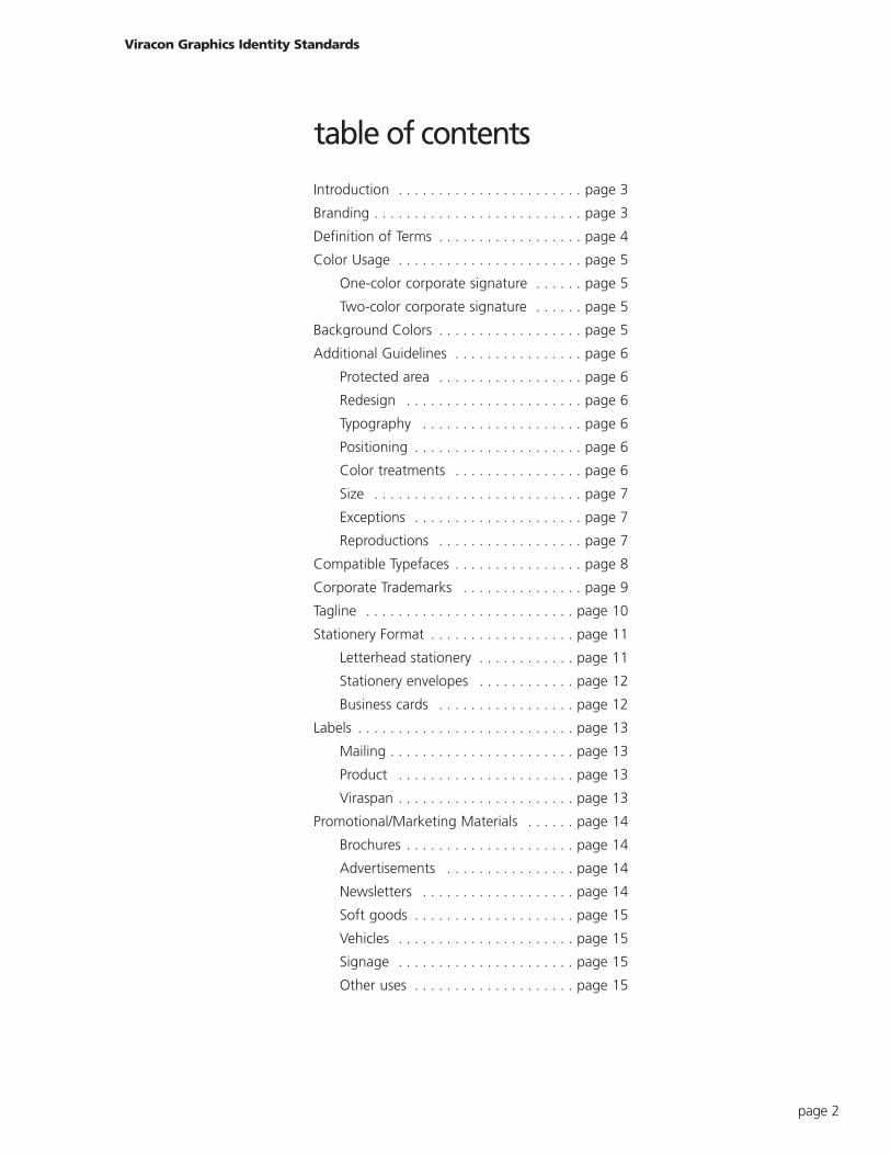
Why do we need Graphic Standards?
The visual identification symbol for Viracon is the
corporate signature, or logo. It is to the company what
a handwritten signature is to a person: a unique graphic
expression of individuality. Our logo is our company’s
most visible symbol and stands for everything we do and
say about our company. It reflects the integrity, stability
and reliability our customers have come to depend on
for innovation, trusted solutions and high performance.
Letters, business cards, brochures, labels, advertisements,
signs, soft goods and other visual materials that feature
our corporate signature affect public perception
of Viracon. As a result, it is important that Viracon
project a clear, consistent and professional image.
To ensure this, Viracon has developed a corporate signa-
ture and guidelines for its use. This corporate signature
must be used in its entirety and reproduced from
authorized original illustrations or EPS vector artwork.
It may not be redrawn, re-proportioned or modified in
any way.
There are two versions of the corporate signature that
you can use depending on the positioning statement
desired and the size in which it will be reproduced. The
corporate signature variations account for the need to
adjust the size of the Viracon corporate signature to
maintain clarity and avoid filling in at smaller sizes.
Viracon’s Marketing Department will provide original
illustrations of the corporate signature and answer
questions regarding its use.
Who we are. What we stand for.
The Viracon brand is the symbol of business transactions
and promises made and kept over a long period of time.
Since 1970, Viracon has grown into an international
company that offers the most complete range of high-
performance architectural glass products available world-
wide. Our reputation for delivering design, aesthetic,
budget and performance solutions for clients both large
and small is the result of supplying high-performance
glass products to projects around the world.
An expanded product line, innovative technology and a
global presence have resulted in Viracon becoming the
leader in glass fabrication.
Viracon Graphics Identity Standards
page 3
introduction branding
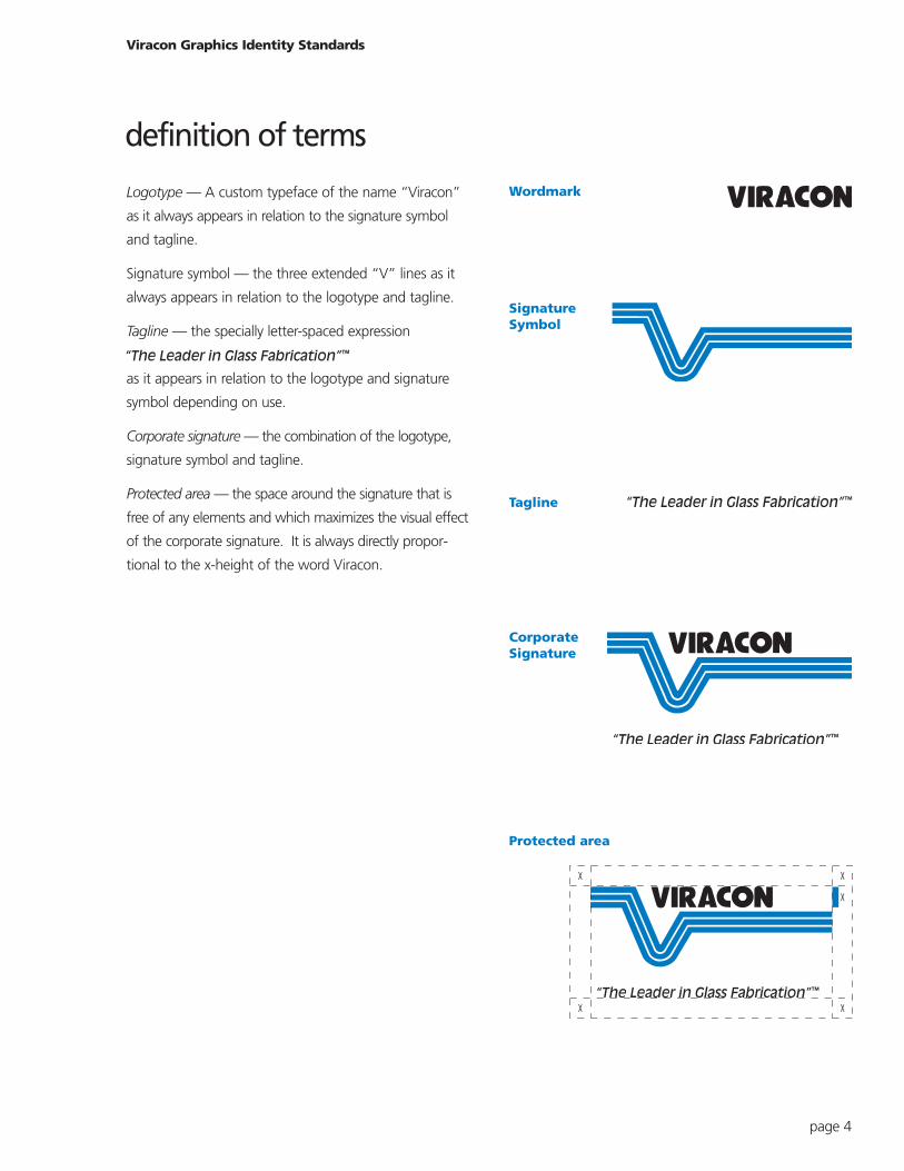
Logotype — A custom typeface of the name “Viracon”
as it always appears in relation to the signature symbol
and tagline.
Signature symbol — the three extended “V” lines as it
always appears in relation to the logotype and tagline.
Tagline — the specially letter-spaced expression “The
Leader in Glass Fabrication
as it appears in relation to the logotype and signature
symbol depending on use.
Corporate signature — the combination of the logotype,
signature symbol and tagline.
Protected area — the space around the signature that is
free of any elements and which maximizes the visual effect
of the corporate signature. It is always directly propor-
tional to the x-height of the word Viracon.
Viracon Graphics Identity Standards
page 4
Wordmark
CorporateSignature
Tagline
SignatureSymbol
Protected area
definition of terms
One-color corporate signature
The corporate signature must appear in all black when
printed in a single color. For materials printed in a single
color other than black, the corporate signature must
print white on a solid color background. For example,
if a one-color brochure is printed with blue ink, the
corporate signature must print white on a solid blue
background.
The corporate signature may not appear in any
single color other than black or white. Any other color
treatments of the corporate signature may not be used
unless approved by the Marketing Department.
Two-color corporate signature
The preferred corporate signature is two-color.
However, when printing limitations or cost considerations
preclude the use of the two-color corporate signature,
use the one-color corporate signature.
For two-color treatments of the corporate signature, all
typography must print black. The three lines under the
name Viracon must print PANTONE® 300 blue. No other
color combinations may be used.
The white space between the three lines should always
feature the color background on which the corporate
signature is displayed. Never fill in, shade or alter this
space in any way.
Like the Viracon corporate signature, color provides apower means of visual recognition. When Viracon colorsare consistently used, the company’s graphic identity isall the more effective.
As with the Viracon corporate signature, color use onbackgrounds should be treated with a great deal of visual respect to avoid conflicting color treatments.When printing on any black or dark background, reversethe corporate signature to white. You may print thetwo-color corporate signature on a neutral backgroundas long as it displays sufficient contrast for both the blackand PANTONE 300 blue.
One-color
One-color(reverse)
Two-color
Viracon Graphics Identity Standards
page 5
color usage
background colors
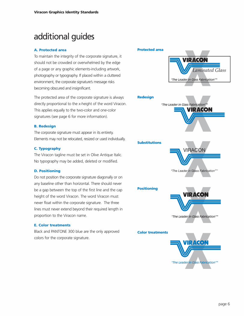
A. Protected area
To maintain the integrity of the corporate signature, it
should not be crowded or overwhelmed by the edge
of a page or any graphic elements-including artwork,
photography or typography. If placed within a cluttered
environment, the corporate signature’s message risks
becoming obscured and insignificant.
The protected area of the corporate signature is always
directly proportional to the x-height of the word Viracon.
This applies equally to the two-color and one-color
signatures (see page 6 for more information).
B. Redesign
The corporate signature must appear in its entirety.
Elements may not be relocated, resized or used individually.
C. Typography
The Viracon tagline must be set in Olive Antique Italic.
No typography may be added, deleted or modified.
D. Positioning
Do not position the corporate signature diagonally or on
any baseline other than horizontal. There should never
be a gap between the top of the first line and the cap
height of the word Viracon. The word Viracon must
never float within the corporate signature. The three
lines must never extend beyond their required length in
proportion to the Viracon name.
E. Color treatments
Black and PANTONE 300 blue are the only approved
colors for the corporate signature.
Viracon Graphics Identity Standards
page 6
Protected area
Redesign
Substitutions
Positioning
Color treatments
additional guides
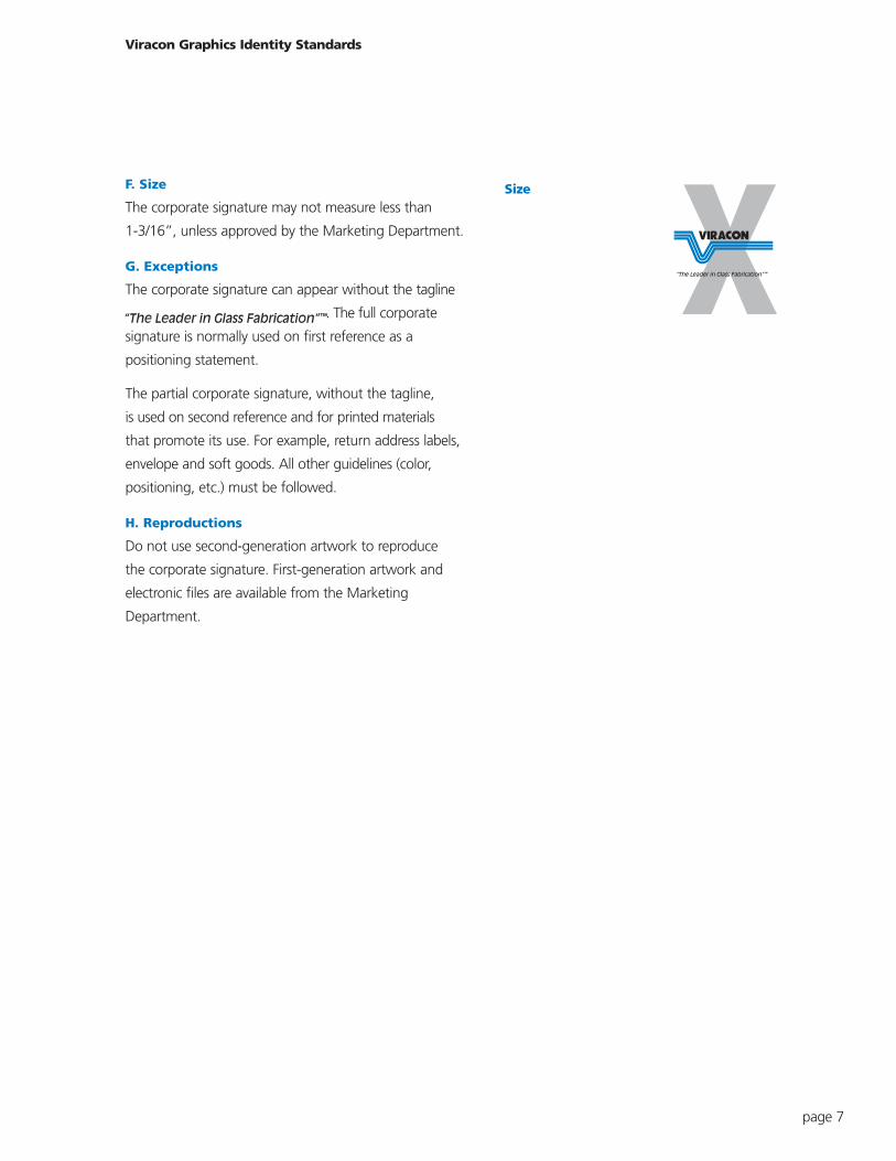
F. Size
The corporate signature may not measure less than
1-3/16”, unless approved by the Marketing Department.
G. Exceptions
The corporate signature can appear without the tagline
“The Leader in Glass Fabricati . The full corporate
signature is normally used on first reference as a
positioning statement.
The partial corporate signature, without the tagline,
is used on second reference and for printed materials
that promote its use. For example, return address labels,
envelope and soft goods. All other guidelines (color,
positioning, etc.) must be followed.
H. Reproductions
Do not use second-generation artwork to reproduce
the corporate signature. First-generation artwork and
electronic files are available from the Marketing
Department.
Viracon Graphics Identity Standards
page 7
Size
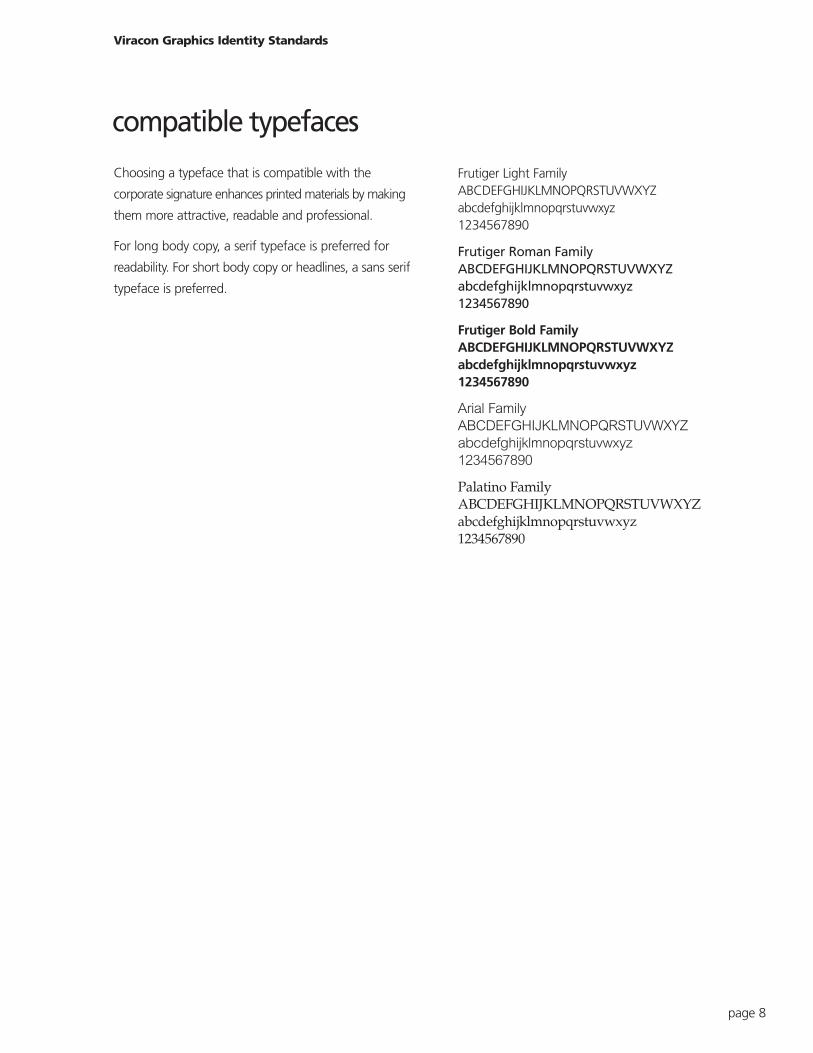
Choosing a typeface that is compatible with the
corporate signature enhances printed materials by making
them more attractive, readable and professional.
For long body copy, a serif typeface is preferred for
readability. For short body copy or headlines, a sans serif
typeface is preferred.
Viracon Graphics Identity Standards
page 8
Frutiger Light FamilyABCDEFGHIJKLMNOPQRSTUVWXYZabcdefghijklmnopqrstuvwxyz1234567890
Frutiger Roman FamilyABCDEFGHIJKLMNOPQRSTUVWXYZabcdefghijklmnopqrstuvwxyz1234567890
Frutiger Bold FamilyABCDEFGHIJKLMNOPQRSTUVWXYZabcdefghijklmnopqrstuvwxyz1234567890
Arial Family
ABCDEFGHIJKLMNOPQRSTUVWXYZ
abcdefghijklmnopqrstuvwxyz
1234567890
Palatino FamilyABCDEFGHIJKLMNOPQRSTUVWXYZabcdefghijklmnopqrstuvwxyz1234567890
compatible typefaces
A Viracon trademark is an approved word, phrase or
symbol used with or without the Viracon corporate
signature to identify a specific positioning statement,
product or service.
Because trademarks distinguish Viracon from other com-
panies, the correct use of trademark symbols is essential.
Each trademarked product, statement or service must
feature the trademark symbol on first reference only, with
the exception of the tagline. The trademark listings are
listed at the right.
Viracon Graphics Identity Standards
page 9
Superwindow™
Solarscreen™
Solarscreen 2000™
StormGuard™
Viraconsulting™
Viraspan™
corporate trademarks
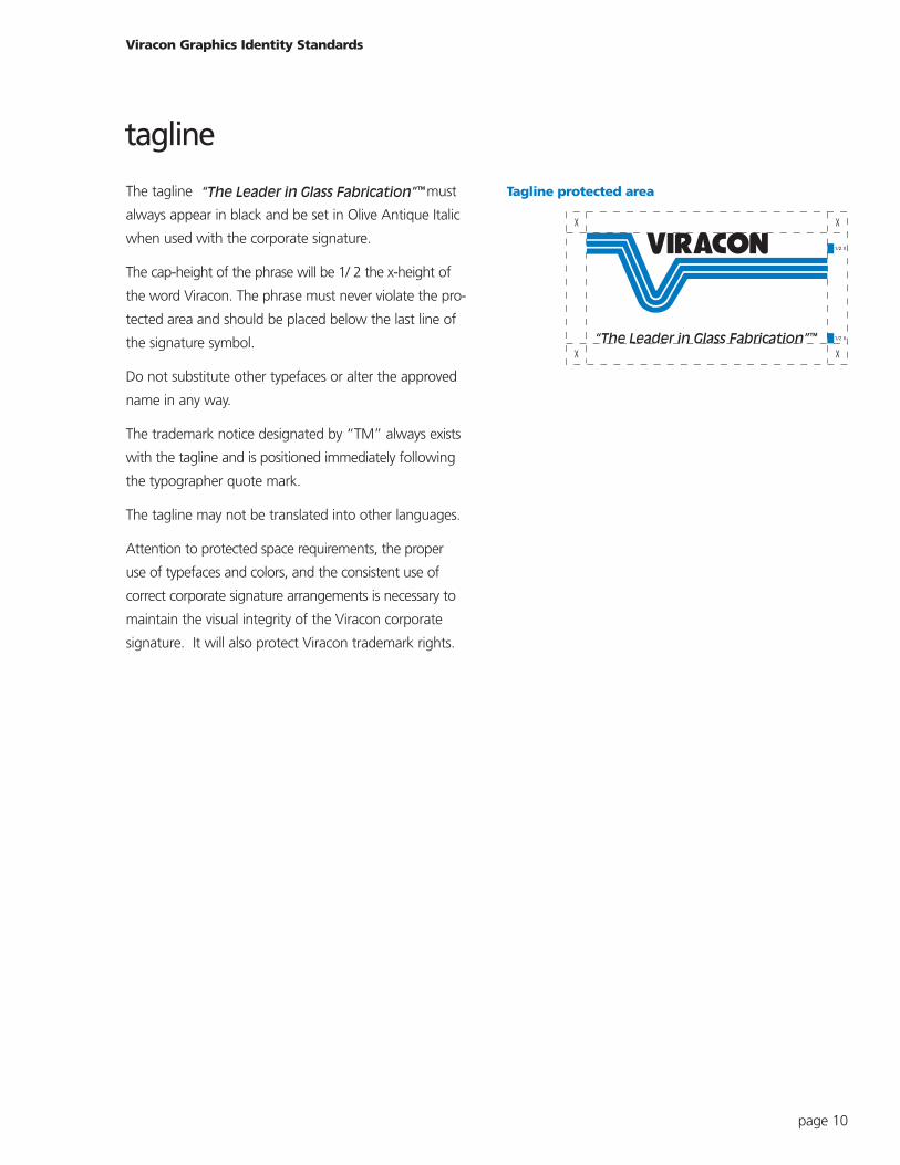
The tagline “The Leader in Glass Fabrication” must
always appear in black and be set in Olive Antique Italic
when used with the corporate signature.
The cap-height of the phrase will be 1/ 2 the x-height of
the word Viracon. The phrase must never violate the pro-
tected area and should be placed below the last line of
the signature symbol.
Do not substitute other typefaces or alter the approved
name in any way.
The trademark notice designated by “TM” always exists
with the tagline and is positioned immediately following
the typographer quote mark.
The tagline may not be translated into other languages.
Attention to protected space requirements, the proper
use of typefaces and colors, and the consistent use of
correct corporate signature arrangements is necessary to
maintain the visual integrity of the Viracon corporate
signature. It will also protect Viracon trademark rights.
Viracon Graphics Identity Standards
page 10
1/2 X
1/2 X
Tagline protected area
tagline
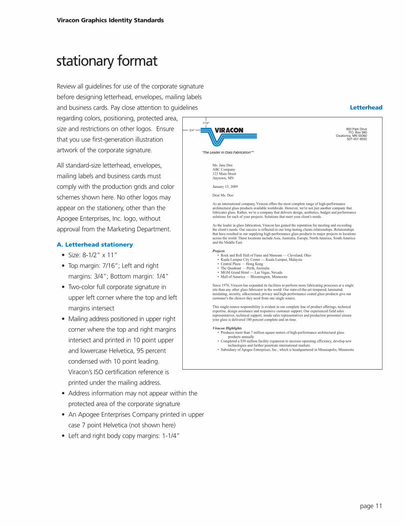
Review all guidelines for use of the corporate signature
before designing letterhead, envelopes, mailing labels
and business cards. Pay close attention to guidelines
regarding colors, positioning, protected area,
size and restrictions on other logos. Ensure
that you use first-generation illustration
artwork of the corporate signature.
All standard-size letterhead, envelopes,
mailing labels and business cards must
comply with the production grids and color
schemes shown here. No other logos may
appear on the stationery, other than the
Apogee Enterprises, Inc. logo, without
approval from the Marketing Department.
A. Letterhead stationery
• Size: 8-1/2” x 11”
• Top margin: 7/16”; Left and right
margins: 3/4”; Bottom margin: 1/4”
• Two-color full corporate signature in
upper left corner where the top and left
margins intersect
• Mailing address positioned in upper right
corner where the top and right margins
intersect and printed in 10 point upper
and lowercase Helvetica, 95 percent
condensed with 10 point leading.
Viracon’s ISO certification reference is
printed under the mailing address.
• Address information may not appear within the
protected area of the corporate signature
• An Apogee Enterprises Company printed in upper
case 7 point Helvetica (not shown here)
• Left and right body copy margins: 1-1/4”
Viracon Graphics Identity Standards
page 11
800 Park DriveP.O. Box 990
Owatonna, MN 55060507-451-9555
Ms. Jane DoeABC Company123 Main StreetAnytown, MN
January 15, 2009
Dear Ms. Doe:
As an international company, Viracon offers the most complete range of high-performancearchitectural glass products available worldwide. However, we’re not just another company thatfabricates glass. Rather, we’re a company that delivers design, aesthetics, budget and performancesolutions for each of your projects. Solutions that meet your client’s needs.
As the leader in glass fabrication, Viracon has gained the reputation for meeting and exceedingthe client’s needs. Our success is reflected in our long-lasting clients relationships. Relationshipsthat have resulted in our supplying high-performance glass products to major projects in locationsacross the world. These locations include Asia, Australia, Europe, North America, South Americaand the Middle East.
Projects • Rock and Roll Hall of Fame and Museum — Cleveland, Ohio • Kuala Lumpur City Center — Kuala Lumpur, Malaysia • Central Plaza — Hong Kong • The Quadrant — Perth, Australia • MGM Grand Hotel — Las Vegas, Nevada • Mall of America — Bloomington, Minnesota
Since 1970, Viracon has expanded its facilities to perform more fabricating processes at a singlesite than any other glass fabricator in the world. Our state-of-the-art tempered, laminated,insulating, security, silkscreened, privacy and high-performance coated glass products give ourcustomer’s the choices they need from one single source.
This single-source responsibility is evident in our complete line of product offerings, technicalexpertise, design assistance and responsive customer support. Our experienced field salesrepresentatives, technical support, inside sales representatives and production personnel ensureyour glass is delivered 100 percent complete and on time.
Viracon Highlights • Produces more than 7 million square meters of high-performance architectural glass products annually • Completed a $30 million facility expansion to increase operating efficiency, develop new technologies and further penetrate international markets • Subsidiary of Apogee Enterprises, Inc., which is headquartered in Minneapolis, Minnesota
7/16"
3/4"
Letterhead
stationary format
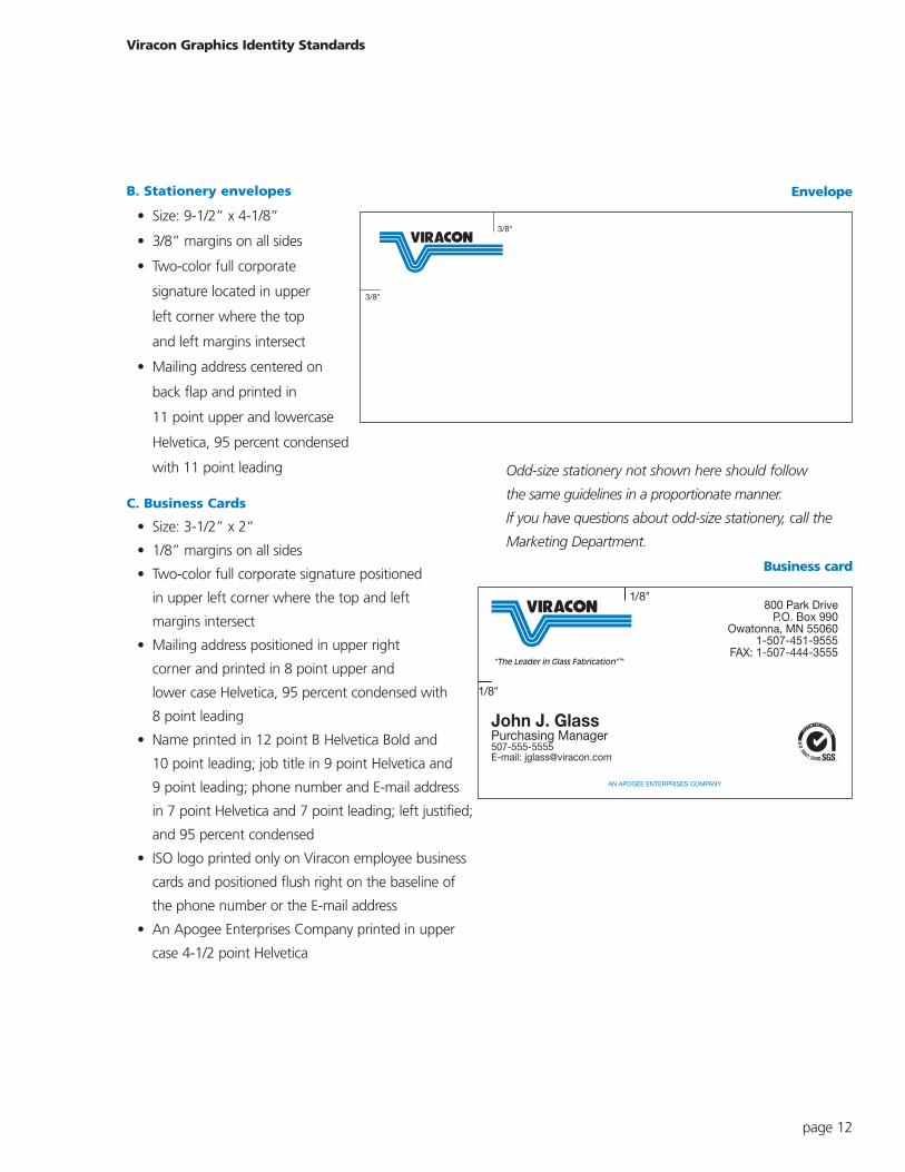
B. Stationery envelopes
• Size: 9-1/2” x 4-1/8”
• 3/8” margins on all sides
• Two-color full corporate
signature located in upper
left corner where the top
and left margins intersect
• Mailing address centered on
back flap and printed in
11 point upper and lowercase
Helvetica, 95 percent condensed
with 11 point leading
C. Business Cards
• Size: 3-1/2” x 2”
• 1/8” margins on all sides
• Two-color full corporate signature positioned
in upper left corner where the top and left
margins intersect
• Mailing address positioned in upper right
corner and printed in 8 point upper and
lower case Helvetica, 95 percent condensed with
8 point leading
• Name printed in 12 point B Helvetica Bold and
10 point leading; job title in 9 point Helvetica and
9 point leading; phone number and E-mail address
in 7 point Helvetica and 7 point leading; left justified;
and 95 percent condensed
• ISO logo printed only on Viracon employee business
cards and positioned flush right on the baseline of
the phone number or the E-mail address
• An Apogee Enterprises Company printed in upper
case 4-1/2 point Helvetica
Odd-size stationery not shown here should follow
the same guidelines in a proportionate manner.
If you have questions about odd-size stationery, call the
Marketing Department.
Viracon Graphics Identity Standards
page 12
3/8"
3/8"
800 Park DriveP.O. Box 990
Owatonna, MN 550601-507-451-9555
FAX: 1-507-444-3555
John J. GlassPurchasing Manager507-555-5555E-mail: [email protected]
AN APOGEE ENTERPRISES COMPANY
1/8"
1/8"
Envelope
Business card
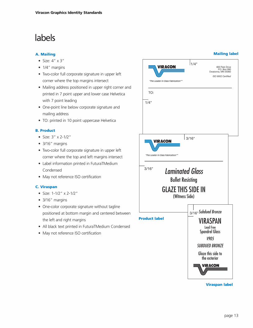
A. Mailing
• Size: 4” x 3”
• 1/4” margins
• Two-color full corporate signature in upper left
corner where the top margins intersect
• Mailing address positioned in upper right corner and
printed in 7 point upper and lower case Helvetica
with 7 point leading
• One-point line below corporate signature and
mailing address
• TO: printed in 10 point uppercase Helvetica
B. Product
• Size: 3” x 2-1/2”
• 3/16” margins
• Two-color full corporate signature in upper left
corner where the top and left margins intersect
• Label information printed in FuturaTMedium
Condensed
• May not reference ISO certification
C. Viraspan
• Size: 1-1/2” x 2-1/2”
• 3/16” margins
• One-color corporate signature without tagline
positioned at bottom margin and centered between
the left and right margins
• All black text printed in FuturaTMedium Condensed
• May not reference ISO certification
Viracon Graphics Identity Standards
page 13
800 Park DriveP.O. Box 990
Owatonna, MN 55060
ISO 9002 Certified
TO:
1/4"
1/4"
3/16"
3/16" Laminated GlassBullet Resisting
GLAZE THIS SIDE IN(Witness Side)
3/16"Subdued Bronze
VIRASPANLead Free
Spandrel Glass
V905
SUBDUED BRONZE
Glaze this side tothe exterior
Mailing label
Product label
Viraspan label
labels
A. Brochures
Please review all guidelines for use of the corporate
signature before designing brochures and other literature.
Pay close attention to guidelines regarding colors,
positioning, protected area, size and restrictions on
other logos. Ensure that you use EPS vector artwork of
the corporate signature.
For one-color brochures, ensure that the corporate
signature is printed in all black or white (reversed) from a
solid background.
When printing brochures in two or more colors, ensure
that corporate signature is printed in official blue and
black colors, all black or white (reversed) from a solid
background.
B. Advertisements
Review all guidelines for use of the corporate signature
before designing advertisements. Pay close attention to
guidelines regarding colors, positioning, protected area,
size and restrictions on other logos.
Ensure that you use EPS vector artwork of the
corporate signature.
C. Newsletters
Please review all guidelines for use of the corporate
signature before designing newsletters. Pay close
attention to guidelines regarding colors, positioning,
protected area size and restrictions on other logos.
Ensure that you use EPS vector artwork of the
corporate signature.
Viracon Graphics Identity Standards
page 14
promotional/marketingmaterials
D. Soft goods
Review all guidelines for use of the corporate signature
before designing embroidered and screen-printed soft
goods. Pay close attention to guidelines regarding
colors, positioning, protected area, size and restrictions
on other logos.
For embroidery, ensure that you use EPS vector
artwork of the corporate signature.
For screen-printing, ensure that you use EPS vector
artwork of the corporate signature.
E. Vehicles
Please review all guidelines for use of the corporate
signature before designing logo usage on vehicles.
Pay close attention to guidelines regarding colors,
positioning, protected area, size and restrictions on
other logos. Ensure that you use EPS vector
artwork of the corporate signature.
F. Signage
Please review all guidelines for use of the corporate
signature before designing any signage. Pay close atten-
tion to guidelines regarding colors, positioning, protected
area, size and restrictions on other logos.
Ensure that you use EPS vector artwork of the
corporate signature.
G. Other Uses
This graphic identity standards guide only covers basic
uses of Viracon’s corporate signature. For applications not
covered in this publication-or for clarification of the
guidelines it contains-please contact the Marketing
Department.
Viracon Graphics Identity Standards
page 15Pantone is a registered trademark of Pantone, Inc.
© 2009 Viracon. All rights reserved.

![[XLS]cds.fs.cornell.educds.fs.cornell.edu/file/Energy Model Template.xls · Web viewViracon VE 1-2M Viracon VE 1-40 Viracon VE 1-85 Fixed, Double clear, 1/8in, 1/4in air, Code Fixed,](https://img.pdfslide.us/doc/110x75/5b0e02cd7f8b9af9688b50fd/xlscdsfs-model-templatexlsweb-viewviracon-ve-1-2m-viracon-ve-1-40-viracon-ve.jpg)


![[XLS]cds.fs.cornell.educds.fs.cornell.edu/file/EnergyModelTemplate_08-11-11 (3).xls · Web viewViracon VE 1-2M Viracon VE 1-40 Viracon VE 1-85 Fixed, Double clear, 1/8in, 1/4in air,](https://img.pdfslide.us/doc/110x75/5b0e02cd7f8b9af9688b5101/xlscdsfs-3xlsweb-viewviracon-ve-1-2m-viracon-ve-1-40-viracon-ve-1-85-fixed.jpg)