Embed Size (px)
Citation preview
Graphic Identity GuidelinesAs a comprehensive reference, the Brigham Young Universtiy–Hawaii Graphic Identity Guidelines are essential to the institution. It contains information for communicating the university’s unique mission and is a guide for producing appropriate work.
Whether a brochure, poster, web page, or simple letterhead, all marketing and communication materials are, without exception, part of a larger identity system. Piece by piece, they should all contribute to a single effective impression. An institutional graphic identity is the consistent image created by an institution’s offline and online communications. This image usually consists of graphics, typefaces, layout, logo, specified colors, as well as communication themes and messages.
May 11, 2011 5:14 PM
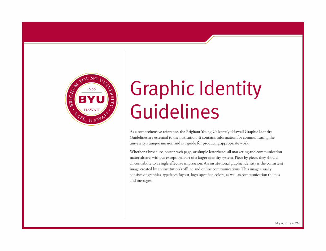
Global Representation
The university has specific identity implications far beyond the campus community. There is an inherent global responsibility to represent the university’s sponsor, The Church of Jesus Christ of Latter-day Saints. With its rise in national and international recognition, the university is charged with promoting an appropriate institutional graphic identity. Responsibility for the university graphic identity rests with University Relations & Communications, acting on behalf of the President.
When writing the university name, always make sure to represent it in a consistent manner. The three appropriate uses of the name are as follows:
Official University Name
Brigham Young University–Hawaiiwith en-dash, not em-dash or hyphen
To be used when first referring to the university name in any official communication piece, and whenever possible in subsequent references.
BYU–Hawaiiwith en-dash, not em-dash or hyphen
The abbreviation BYU–Hawaii is acceptable on second reference. (To create an en-dash using a pc, press and hold the control key then press the h\phen key on the numeric keypad. On a Mac, press and hold the option key then press the h\phen key).
BYUH or BYU–Hwith or without en-dash, not em-dash or hyphen
Avoid using BYUH or BYU–H in official publications and correspondence.
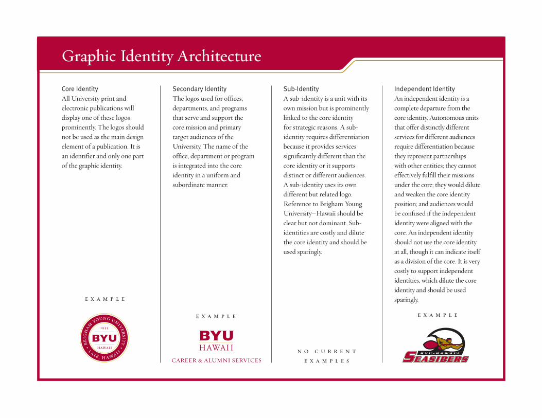
Core IdentityAll University print and electronic publications will display one of these logos prominently. The logos should not be used as the main design element of a publication. It is an identifier and only one part of the graphic identity.
Secondary IdentityThe logos used for offices, departments, and programs that serve and support the core mission and primary target audiences of the University. The name of the office, department or program is integrated into the core identity in a uniform and subordinate manner.
Sub-IdentityA sub-identity is a unit with its own mission but is prominently linked to the core identity for strategic reasons. A sub-identity requires differentiation because it provides services significantly different than the core identity or it supports distinct or different audiences. A sub-identity uses its own different but related logo. Reference to Brigham Young University–Hawaii should be clear but not dominant. Sub-identities are costly and dilute the core identity and should be used sparingly.
Independent IdentityAn independent identity is a complete departure from the core identity. Autonomous units that offer distinctly different services for different audiences require differentiation because they represent partnerships with other entities; they cannot effectively fulfill their missions under the core; they would dilute and weaken the core identity position; and audiences would be confused if the independent identity were aligned with the core. An independent identity should not use the core identity at all, though it can indicate itself as a division of the core. It is very costly to support independent identities, which dilute the core identity and should be used sparingly.
Graphic Identity Architecture
e x a m p l e
e x a m p l e e x a m p l e
n o c u r r e n te x a m p l e s
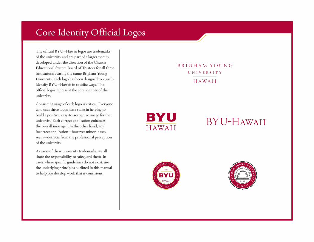
The official BYU–Hawaii logos are trademarks of the university and are part of a larger system developed under the direction of the Church Educational System Board of Trustees for all three institutions bearing the name Brigham Young University. Each logo has been designed to visually identify BYU–Hawaii in specific ways. The official logos represent the core identity of the univeristy.
Consistent usage of each logo is critical. Everyone who uses these logos has a stake in helping to build a positive, easy-to-recognize image for the university. Each correct application enhances the overall message. On the other hand, any incorrect application—however minor it may seem—detracts from the professional perception of the university.
As users of these university trademarks, we all share the responsibility to safeguard them. In cases where specific guidelines do not exist, use the underlying principles outlined in this manual to help you develop work that is consistent.
Core Identity Official Logos
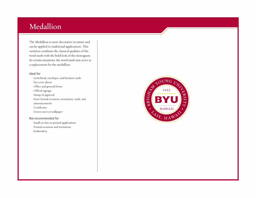
The Medallion is more decorative in nature and can be applied to traditional applications. This variation combines the classical qualities of the word mark with the bold look of the monogram. In certain situations, the word mark may serve as a replacement for the medallion.
Ideal for• Letterhead, envelopes, and business cards• Fax cover sheets• Office and general forms• Official signage• Stamp of approval• Semi-formal occasions, invitations, cards, and
announcements• Certificates• Screen saver or wallpaper
Not recommended for• Small on-line or printed applications• Formal occasions and invitations• Embroidery
Medallion
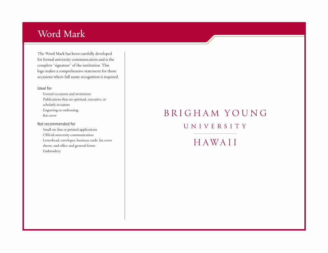
The Word Mark has been carefully developed for formal university communication and is the complete “signature” of the institution. This logo makes a comprehensive statement for those occasions where full name recognition is required.
Ideal for• Formal occasions and invitations• Publications that are spiritual, executive, or
scholarly in nature• Engraving or embossing• Kit cover
Not recommended for• Small on-line or printed applications• Official university communication• Letterhead, envelopes, business cards, fax cover
sheets, and office and general forms• Embroidery
Word Mark
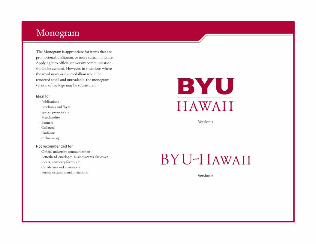
The Monogram is appropriate for items that are promotional, utilitarian, or more casual in nature. Applying it to official university communication should be avoided. However, in situations where the word mark or the medallion would be rendered small and unreadable, the monogram version of the logo may be substituted.
Ideal for• Publications• Brochures and flyers• Special promotions• Merchandise• Banners• Collateral• Uniforms• Online usage
Not recommended for• Official university communication• Letterhead, envelopes, business cards, fax cover
sheets, university forms, etc.• Certificates and invitations• Formal occasions and invitations
Monogram
Version 1
Version 2
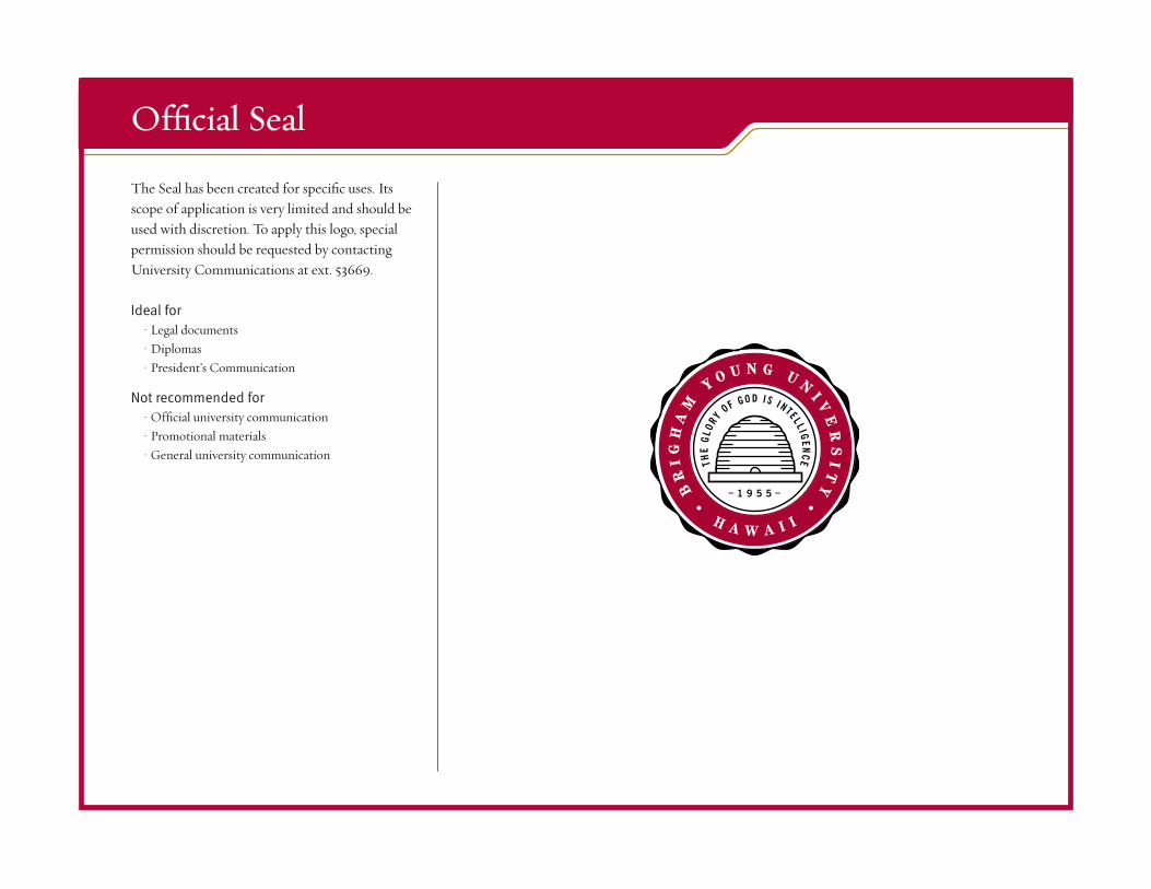
The Seal has been created for specific uses. Its scope of application is very limited and should be used with discretion. To apply this logo, special permission should be requested by contacting University Communications at ext. 53669.
Ideal for• Legal documents• Diplomas• President’s Communication
Not recommended for• Official university communication• Promotional materials• General university communication
Official Seal
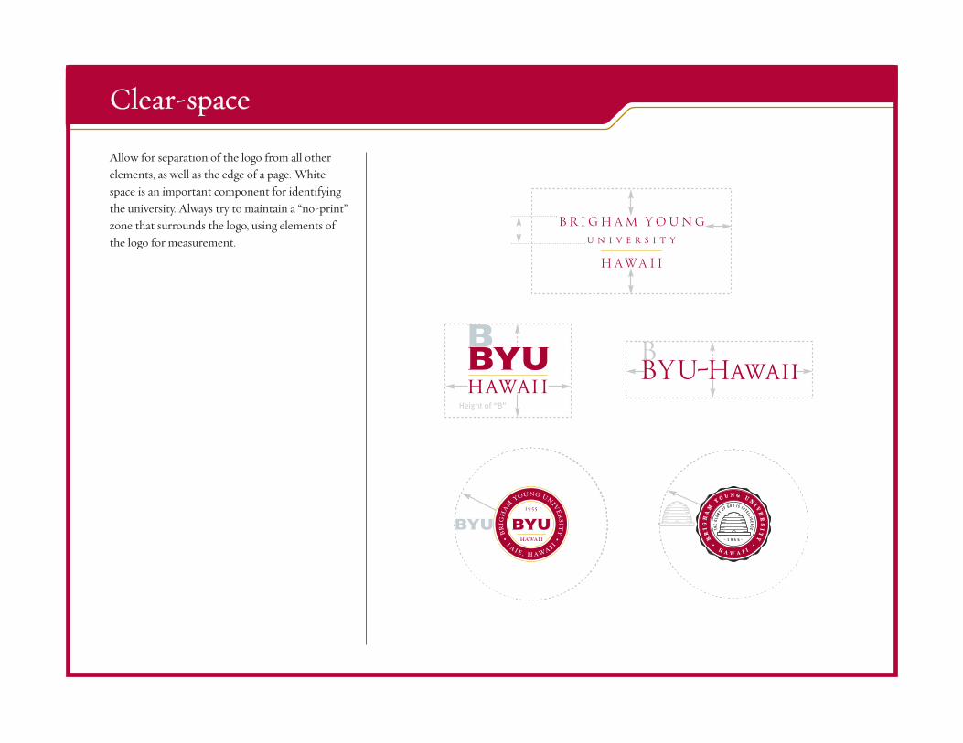
Allow for separation of the logo from all other elements, as well as the edge of a page. White space is an important component for identifying the university. Always try to maintain a “no-print” zone that surrounds the logo, using elements of the logo for measurement.
Clear-space
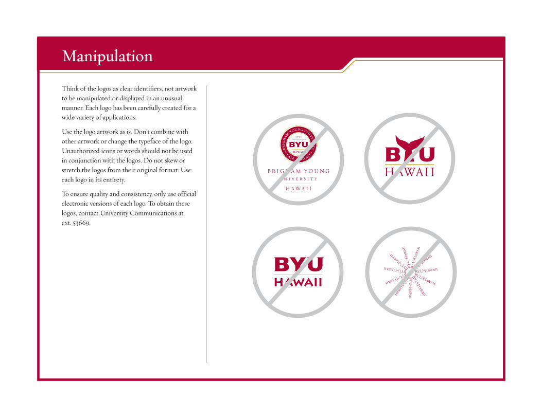
Think of the logos as clear identifiers, not artwork to be manipulated or displayed in an unusual manner. Each logo has been carefully created for a wide variety of applications.
Use the logo artwork as is. Don’t combine with other artwork or change the typeface of the logo. Unauthorized icons or words should not be used in conjunction with the logos. Do not skew or stretch the logos from their original format. Use each logo in its entirety.
To ensure quality and consistency, only use official electronic versions of each logo. To obtain these logos, contact University Communications at ext. 53669.
Manipulation
Hawaii
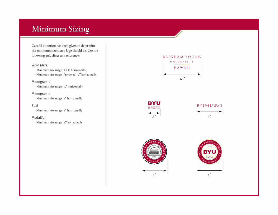
Careful attention has been given to determine the minimum size that a logo should be. Use the following guidelines as a reference:
Word Mark• Minimum size usage: 1.25” horizontally• Minimum size usage if reversed: 2” horizontally
Monogram 1• Minimum size usage: .5" horizontally
Monogram 2• Minimum size usage: 1" horizontally
Seal• Minimum size usage: 1" horizontally
Medallion• Minimum size usage: 1” horizontally
Minimum Sizing
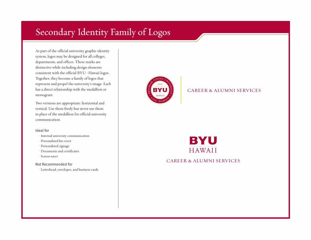
As part of the official university graphic identity system, logos may be designed for all colleges, departments, and offices. These marks are distinctive while including design elements consistent with the official BYU–Hawaii logos. Together, they become a family of logos that represent and propel the university’s image. Each has a direct relationship with the medallion or monogram.
Two versions are appropriate: horizontal and vertical. Use them freely but never use them in place of the medallion for official university communication.
Ideal for• Internal university communication• Personalized kit cover• Personalized signage• Documents and certificates• Screen saver
Not Recommended for• Letterhead, envelopes, and business cards
Secondary Identity Family of Logos
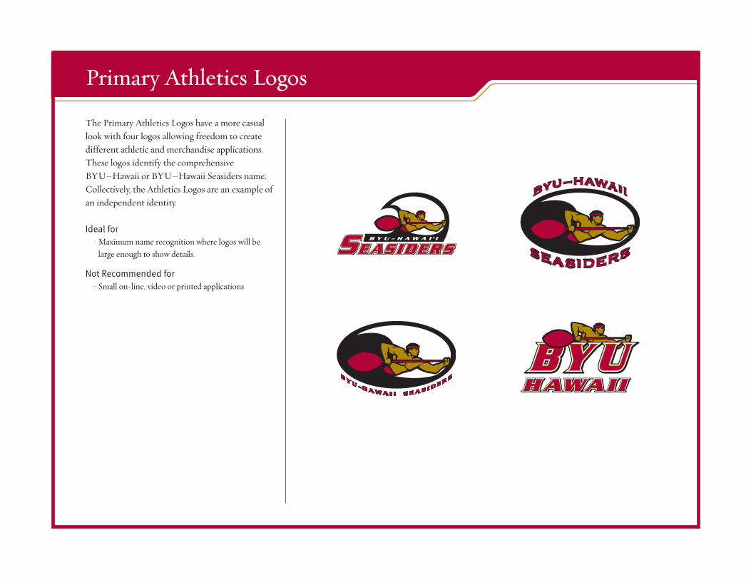
The Primary Athletics Logos have a more casual look with four logos allowing freedom to create different athletic and merchandise applications. These logos identify the comprehensive BYU–Hawaii or BYU–Hawaii Seasiders name. Collectively, the Athletics Logos are an example of an independent identity.
Ideal for• Maximum name recognition where logos will be
large enough to show details.
Not Recommended for• Small on-line, video or printed applications
Primary Athletics Logos
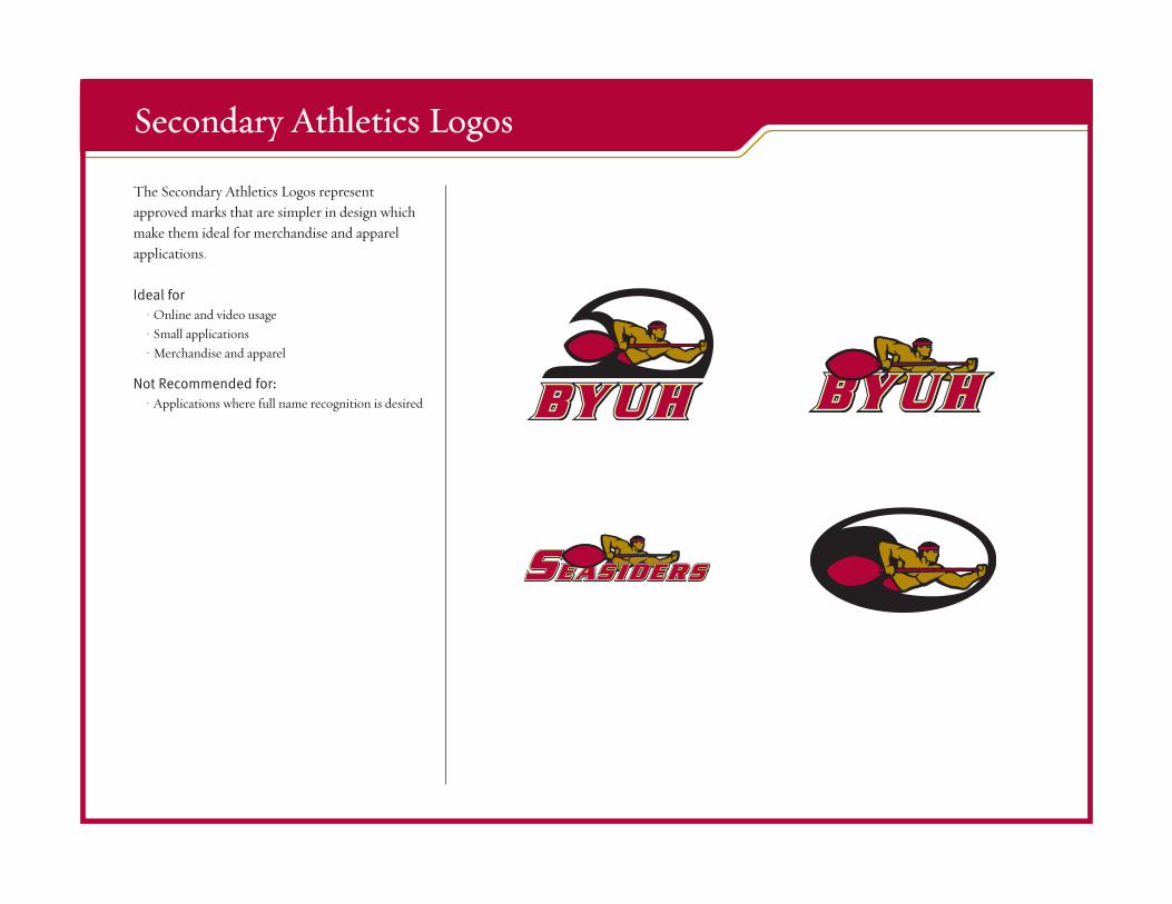
The Secondary Athletics Logos represent approved marks that are simpler in design which make them ideal for merchandise and apparel applications.
Ideal for• Online and video usage• Small applications• Merchandise and apparel
Not Recommended for:• Applications where full name recognition is desired
Secondary Athletics Logos
Athletics Logos Guidelines
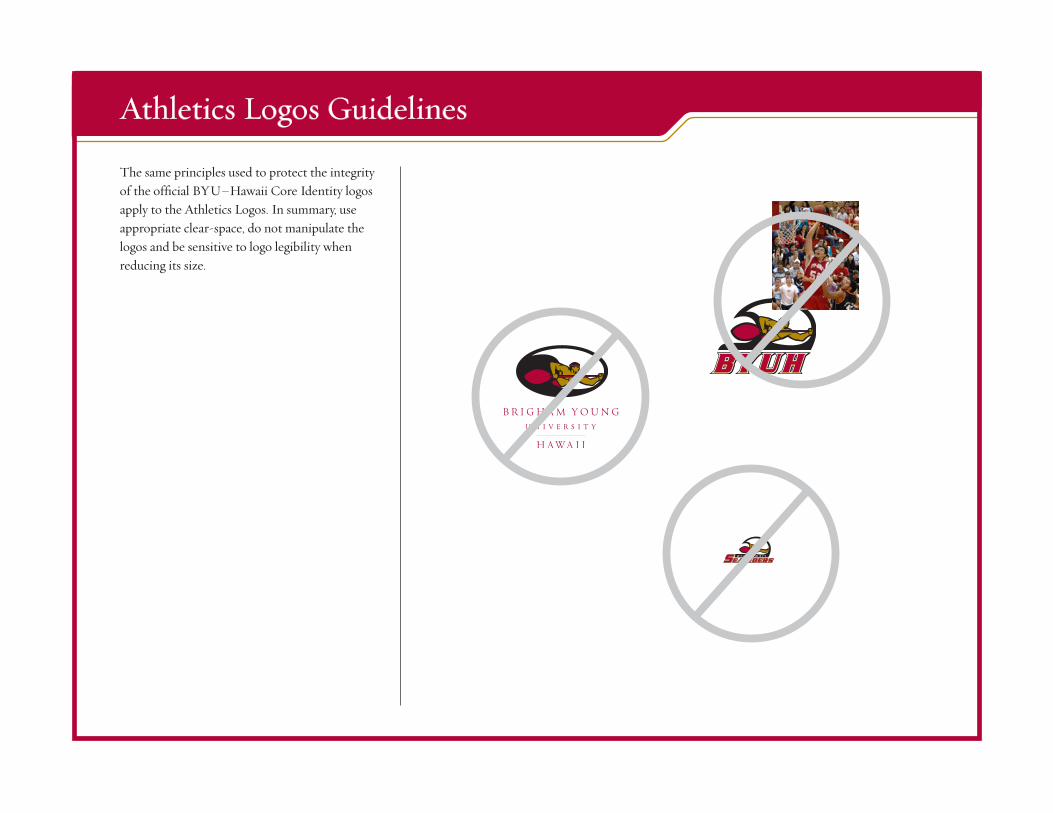
The same principles used to protect the integrity of the official BYU–Hawaii Core Identity logos apply to the Athletics Logos. In summary, use appropriate clear-space, do not manipulate the logos and be sensitive to logo legibility when reducing its size.
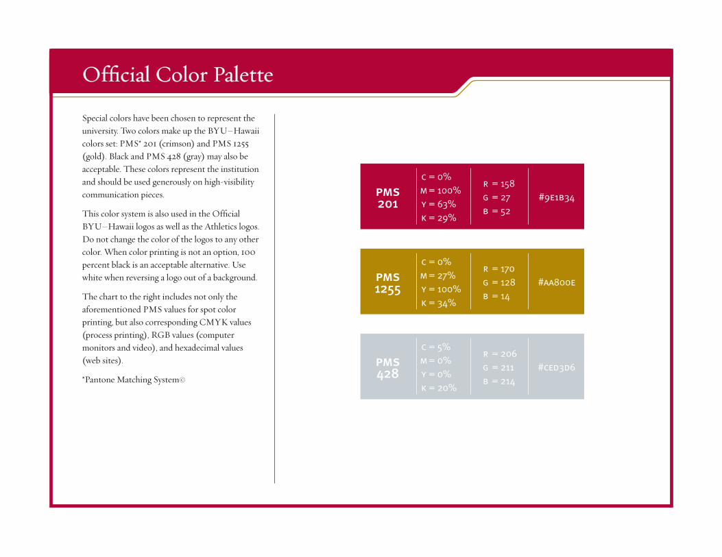
Special colors have been chosen to represent the university. Two colors make up the BYU–Hawaii colors set: PMS* 201 (crimson) and PMS 1255 (gold). Black and PMS 428 (gray) may also be acceptable. These colors represent the institution and should be used generously on high-visibility communication pieces.
This color system is also used in the Official BYU–Hawaii logos as well as the Athletics logos. Do not change the color of the logos to any other color. When color printing is not an option, 100 percent black is an acceptable alternative. Use white when reversing a logo out of a background.
The chart to the right includes not only the aforementi0ned PMS values for spot color printing, but also corresponding CMYK values (process printing), RGB values (computer monitors and video), and hexadecimal values (web sites).
*Pantone Matching System©
Official Color Palette
pms201
c = 0% m = 100% y = 63% k = 29%
r = 158 g = 27 b = 52
#9e1b34
pms1255
c = 0% m = 27% y = 100% k = 34%
r = 170 g = 128 b = 14
#aa800e
pms428
c = 5% m = 0% y = 0% k = 20%
r = 206 g = 211 b = 214
#ced3d6
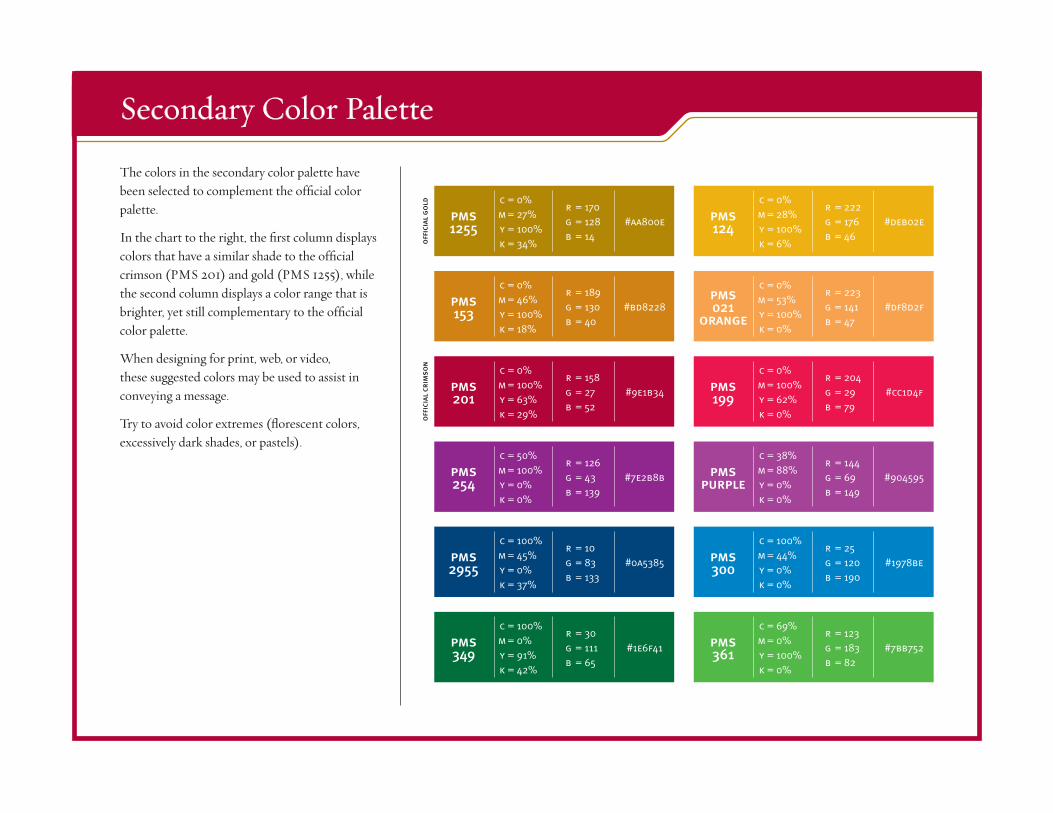
Secondary Color Palette
pms1255
c = 0% m = 27% y = 100% k = 34%
r = 170 g = 128 b = 14
#aa800e pms124
c = 0% m = 28% y = 100% k = 6%
r = 222 g = 176 b = 46
#deb02e
pms2955
c = 100% m = 45% y = 0% k = 37%
r = 10 g = 83 b = 133
#0a5385 pms300
c = 100% m = 44% y = 0% k = 0%
r = 25 g = 120 b = 190
#1978be
pms153
c = 0% m = 46% y = 100% k = 18%
r = 189 g = 130 b = 40
#bd8228pms021
orange
c = 0% m = 53% y = 100% k = 0%
r = 223 g = 141 b = 47
#df8d2f
pms349
c = 100% m = 0% y = 91% k = 42%
r = 30 g = 111 b = 65
#1e6f41 pms361
c = 69% m = 0% y = 100% k = 0%
r = 123 g = 183 b = 82
#7bb752
pms254
c = 50% m = 100% y = 0% k = 0%
r = 126 g = 43 b = 139
#7e2b8b pmspurple
c = 38% m = 88% y = 0% k = 0%
r = 144 g = 69 b = 149
#904595
pms199
c = 0% m = 100% y = 62% k = 0%
r = 204 g = 29 b = 79
#cc1d4fpms201
c = 0% m = 100% y = 63% k = 29%
r = 158 g = 27 b = 52
#9e1b34
offi
cial
cri
mso
no
ffici
al g
old
The colors in the secondary color palette have been selected to complement the official color palette.
In the chart to the right, the first column displays colors that have a similar shade to the official crimson (PMS 201) and gold (PMS 1255), while the second column displays a color range that is brighter, yet still complementary to the official color palette.
When designing for print, web, or video, these suggested colors may be used to assist in conveying a message.
Try to avoid color extremes (florescent colors, excessively dark shades, or pastels).
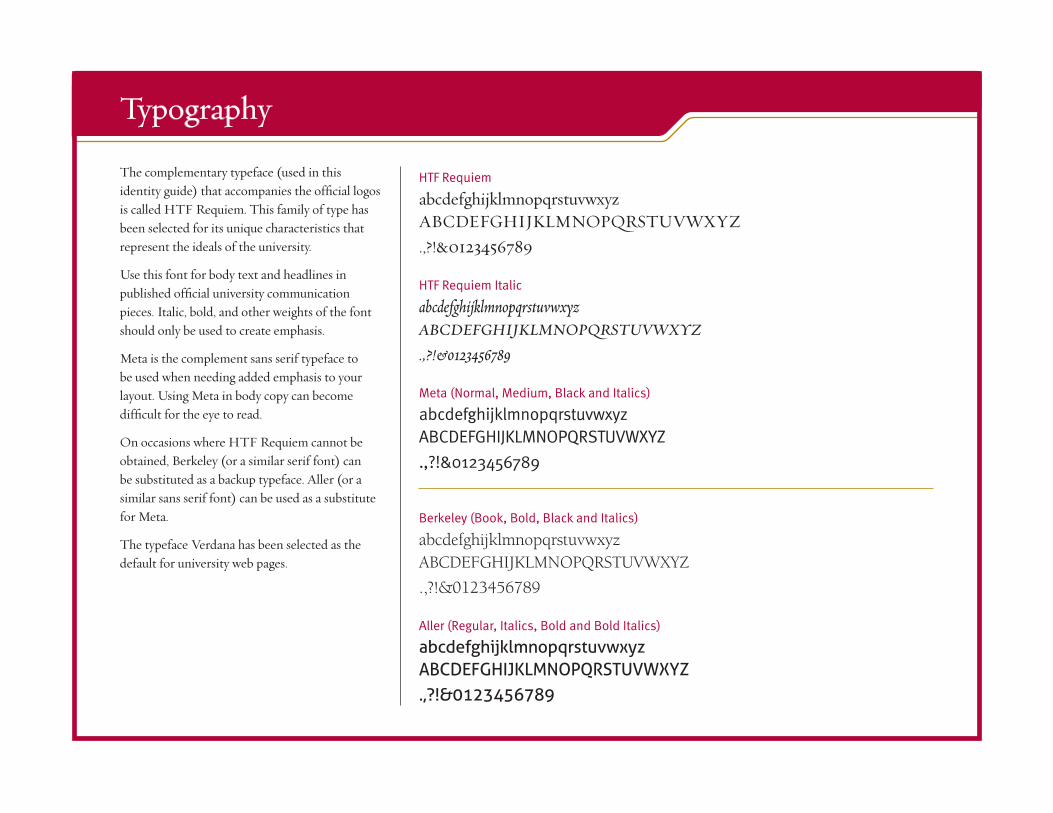
The complementary typeface (used in this identity guide) that accompanies the official logos is called HTF Requiem. This family of type has been selected for its unique characteristics that represent the ideals of the university.
Use this font for body text and headlines in published official university communication pieces. Italic, bold, and other weights of the font should only be used to create emphasis.
Meta is the complement sans serif typeface to be used when needing added emphasis to your layout. Using Meta in body copy can become difficult for the eye to read.
On occasions where HTF Requiem cannot be obtained, Berkeley (or a similar serif font) can be substituted as a backup typeface. Aller (or a similar sans serif font) can be used as a substitute for Meta.
The typeface Verdana has been selected as the default for university web pages.
Typography
HTF Requiem
abcdefghijklmnopqrstuvwxyz ABCDEFGHIJKLMNOPQRSTUVWXYZ .,?!&0123456789
HTF Requiem Italic
abcdefghijklmnopqrstuvwxyz ABCDEFGHIJKLMNOPQRSTUVWXYZ
.,?!&0123456789
Meta (Normal, Medium, Black and Italics)
abcdefghijklmnopqrstuvwxyz ABCDEFGHIJKLMNOPQRSTUVWXYZ
.,?!&0123456789
Berkeley (Book, Bold, Black and Italics)
abcdefghijklmnopqrstuvwxyz ABCDEFGHIJKLMNOPQRSTUVWXYZ
.,?!&0123456789
Aller (Regular, Italics, Bold and Bold Italics)
abcdefghijklmnopqrstuvwxyz ABCDEFGHIJKLMNOPQRSTUVWXYZ .,?!&0123456789
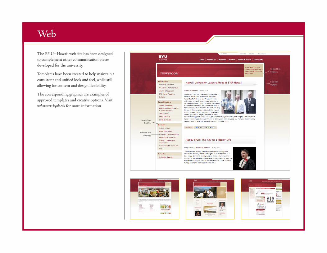
The BYU–Hawaii web site has been designed to complement other communication pieces developed for the university.
Templates have been created to help maintain a consistent and unified look and feel, while still allowing for content and design flexiblility.
The corresponding graphics are examples of approved templates and creative options. Visit webmasters.byuh.edu for more information.
Web
Contact box#d9cca3
Header box#e7dfc4
Crimson text #9e1b34
Gray box#f9f9f9
Communication PlatformThe communication platform is made up of three key identities: Official University Identity, Promotional Identity, and Special Identity. All visual and verbal elements should support, adhere, and fall within one of them. Together they create a unified and instantly recognizable message.
Three Key Identities
Official University IdentityWith the medallion as its main visual element, the official identity was developed to reflect a dignified and scholarly image. In certain formal situations, the word mark may serve as a replacement for the medallion. This identity should be used on all communication pieces representing the university in an official capacity.
At the forefront of the official BYU–Hawaii identity are letterhead, envelopes and business cards. Division, department, and office logos should not be used on these items.
Letterhead, envelopes and business cards are printed at BYU–Hawaii Print Services located at Physical Plant, ext. 53461.
Ideal for• Official university communication• Kit covers• Letterhead, envelopes, and business cards• Fax cover sheets• Office and general forms• Invitations, cards, and memos• Official signage• Division and department logos• Student organization logos
Promotional IdentityUse the promotional identity when a more relaxed, yet compelling, message is needed. The medallion or monogram logos are best suited for these applications. The promotional identity may be changed from time to time as required. The main philosophy behind the promotional identity is a focus on students.
Ideal for• Catalogs• Directories• Advertising campaigns• Banners and posters• Billboards• Slides and media• Direct mail campaigns• Web
Special IdentityCertain groups, events, and promotions may need a voice that is individual, yet still belonging to the overall BYU–Hawaii identity. In such cases, the basic elements of this guide should be considered when producing a unique piece. In some way, every piece should fit into the bigger whole of the institution. If there are multiple pieces within a unique campaign, they should all be familiar and consistent with each other.
Ideal for• Activities• Special events• Groups• Performances• Special merchandise