Embed Size (px)
Citation preview
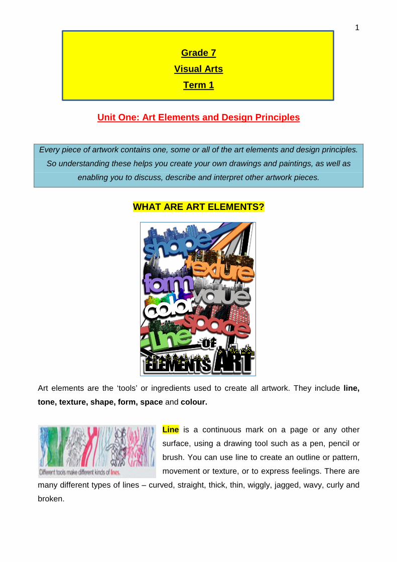
1
Grade 7 Visual Arts
Term 1
Unit One: Art Elements and Design Principles Every piece of artwork contains one, some or all of the art elements and design principles.
So understanding these helps you create your own drawings and paintings, as well as
enabling you to discuss, describe and interpret other artwork pieces.
WHAT ARE ART ELEMENTS?
Art elements are the ‘tools’ or ingredients used to create all artwork. They include line, tone, texture, shape, form, space and colour.
Line is a continuous mark on a page or any other
surface, using a drawing tool such as a pen, pencil or
brush. You can use line to create an outline or pattern,
movement or texture, or to express feelings. There are
many different types of lines – curved, straight, thick, thin, wiggly, jagged, wavy, curly and
broken.
2
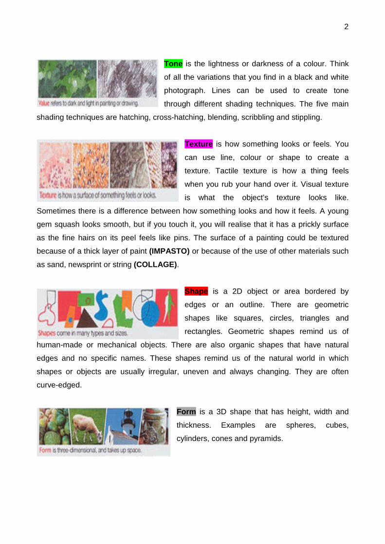
Tone is the lightness or darkness of a colour. Think
of all the variations that you find in a black and white
photograph. Lines can be used to create tone
through different shading techniques. The five main
shading techniques are hatching, cross-hatching, blending, scribbling and stippling.
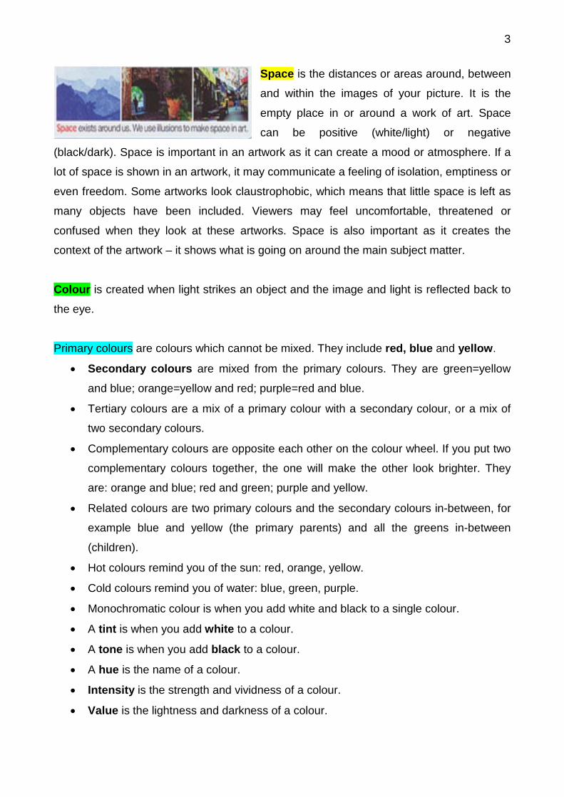
Texture is how something looks or feels. You
can use line, colour or shape to create a
texture. Tactile texture is how a thing feels
when you rub your hand over it. Visual texture
is what the object’s texture looks like.
Sometimes there is a difference between how something looks and how it feels. A young
gem squash looks smooth, but if you touch it, you will realise that it has a prickly surface
as the fine hairs on its peel feels like pins. The surface of a painting could be textured
because of a thick layer of paint (IMPASTO) or because of the use of other materials such
as sand, newsprint or string (COLLAGE).
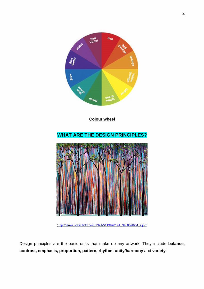
Shape is a 2D object or area bordered by
edges or an outline. There are geometric
shapes like squares, circles, triangles and
rectangles. Geometric shapes remind us of
human-made or mechanical objects. There are also organic shapes that have natural
edges and no specific names. These shapes remind us of the natural world in which
shapes or objects are usually irregular, uneven and always changing. They are often
curve-edged.
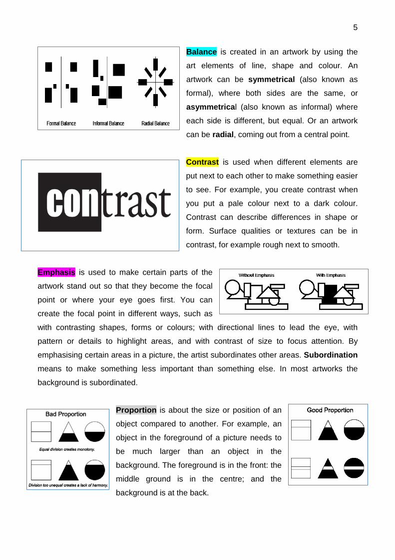
Form is a 3D shape that has height, width and
thickness. Examples are spheres, cubes,
cylinders, cones and pyramids.
3
Space is the distances or areas around, between
and within the images of your picture. It is the
empty place in or around a work of art. Space
can be positive (white/light) or negative
(black/dark). Space is important in an artwork as it can create a mood or atmosphere. If a
lot of space is shown in an artwork, it may communicate a feeling of isolation, emptiness or
even freedom. Some artworks look claustrophobic, which means that little space is left as
many objects have been included. Viewers may feel uncomfortable, threatened or
confused when they look at these artworks. Space is also important as it creates the
context of the artwork – it shows what is going on around the main subject matter.
Colour is created when light strikes an object and the image and light is reflected back to
the eye.
Primary colours are colours which cannot be mixed. They include red, blue and yellow.
• Secondary colours are mixed from the primary colours. They are green=yellow
and blue; orange=yellow and red; purple=red and blue.
• Tertiary colours are a mix of a primary colour with a secondary colour, or a mix of
two secondary colours.
• Complementary colours are opposite each other on the colour wheel. If you put two
complementary colours together, the one will make the other look brighter. They
are: orange and blue; red and green; purple and yellow.
• Related colours are two primary colours and the secondary colours in-between, for
example blue and yellow (the primary parents) and all the greens in-between
(children).
• Hot colours remind you of the sun: red, orange, yellow.
• Cold colours remind you of water: blue, green, purple.
• Monochromatic colour is when you add white and black to a single colour.
• A tint is when you add white to a colour.
• A tone is when you add black to a colour.
• A hue is the name of a colour.
• Intensity is the strength and vividness of a colour.
• Value is the lightness and darkness of a colour.
4
Colour wheel
WHAT ARE THE DESIGN PRINCIPLES?
(http://farm2.staticflickr.com/1324/5119970141_3ed0cef604_z.jpg)
Design principles are the basic units that make up any artwork. They include balance, contrast, emphasis, proportion, pattern, rhythm, unity/harmony and variety.
5
Balance is created in an artwork by using the
art elements of line, shape and colour. An
artwork can be symmetrical (also known as
formal), where both sides are the same, or
asymmetrical (also known as informal) where
each side is different, but equal. Or an artwork
can be radial, coming out from a central point.
Contrast is used when different elements are
put next to each other to make something easier
to see. For example, you create contrast when
you put a pale colour next to a dark colour.
Contrast can describe differences in shape or
form. Surface qualities or textures can be in
contrast, for example rough next to smooth.
Emphasis is used to make certain parts of the
artwork stand out so that they become the focal
point or where your eye goes first. You can
create the focal point in different ways, such as
with contrasting shapes, forms or colours; with directional lines to lead the eye, with
pattern or details to highlight areas, and with contrast of size to focus attention. By
emphasising certain areas in a picture, the artist subordinates other areas. Subordination
means to make something less important than something else. In most artworks the
background is subordinated.
Proportion is about the size or position of an
object compared to another. For example, an
object in the foreground of a picture needs to
be much larger than an object in the
background. The foreground is in the front: the
middle ground is in the centre; and the
background is at the back.
6
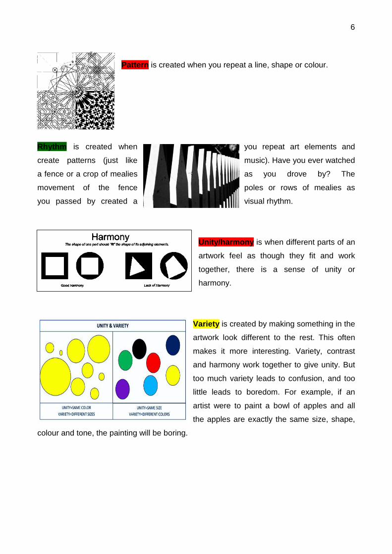
Pattern is created when you repeat a line, shape or colour.
Rhythm is created when you repeat art elements and
create patterns (just like music). Have you ever watched
a fence or a crop of mealies as you drove by? The
movement of the fence poles or rows of mealies as
you passed by created a visual rhythm.
Unity/harmony is when different parts of an
artwork feel as though they fit and work
together, there is a sense of unity or
harmony.
Variety is created by making something in the
artwork look different to the rest. This often
makes it more interesting. Variety, contrast
and harmony work together to give unity. But
too much variety leads to confusion, and too
little leads to boredom. For example, if an
artist were to paint a bowl of apples and all
the apples are exactly the same size, shape,
colour and tone, the painting will be boring.
7
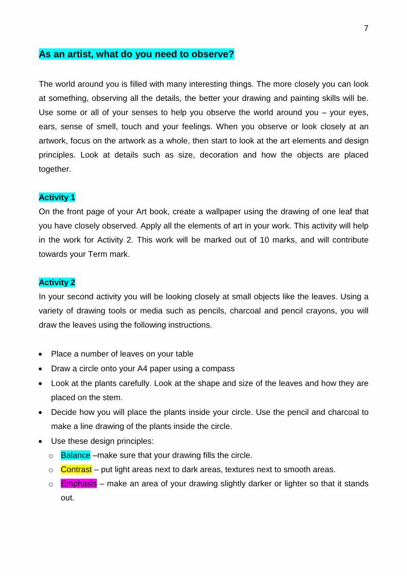
As an artist, what do you need to observe?
The world around you is filled with many interesting things. The more closely you can look
at something, observing all the details, the better your drawing and painting skills will be.
Use some or all of your senses to help you observe the world around you – your eyes,
ears, sense of smell, touch and your feelings. When you observe or look closely at an
artwork, focus on the artwork as a whole, then start to look at the art elements and design
principles. Look at details such as size, decoration and how the objects are placed
together.
Activity 1
On the front page of your Art book, create a wallpaper using the drawing of one leaf that
you have closely observed. Apply all the elements of art in your work. This activity will help
in the work for Activity 2. This work will be marked out of 10 marks, and will contribute
towards your Term mark.
Activity 2 In your second activity you will be looking closely at small objects like the leaves. Using a
variety of drawing tools or media such as pencils, charcoal and pencil crayons, you will
draw the leaves using the following instructions.
• Place a number of leaves on your table
• Draw a circle onto your A4 paper using a compass
• Look at the plants carefully. Look at the shape and size of the leaves and how they are
placed on the stem.
• Decide how you will place the plants inside your circle. Use the pencil and charcoal to
make a line drawing of the plants inside the circle.
• Use these design principles:
o Balance –make sure that your drawing fills the circle.
o Contrast – put light areas next to dark areas, textures next to smooth areas.
o Emphasis – make an area of your drawing slightly darker or lighter so that it stands
out.
8
• Draw each plant one at a time. Experiment with pencil and charcoal to create the
following art elements:
o The shape of each leaf and parts of the plant.
o Different marks and lines – for example you can make tiny, fine hair marks or lines
on one plant or big, bold lines on another.
o Tone with light and dark areas where there are shadows.
o Texture to show how the plants feel to the touch.
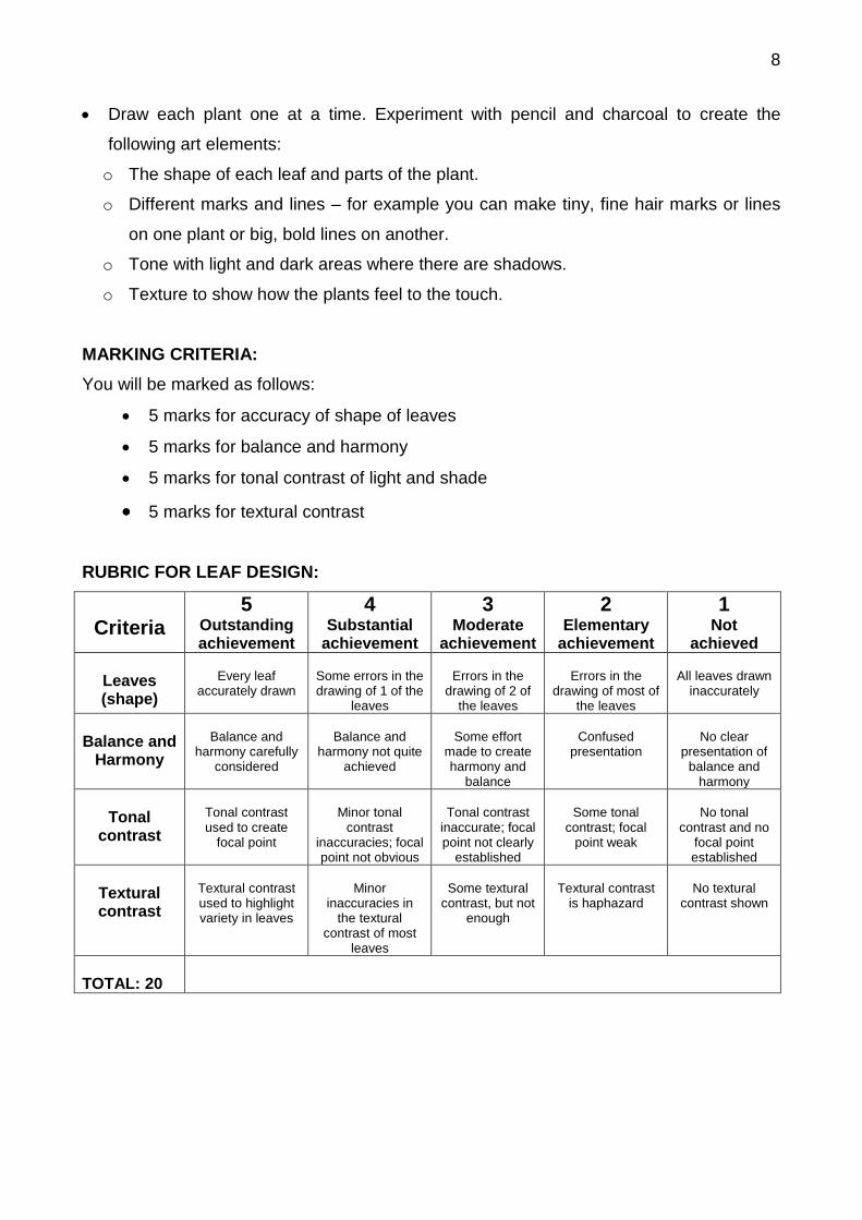
MARKING CRITERIA: You will be marked as follows:
• 5 marks for accuracy of shape of leaves
• 5 marks for balance and harmony
• 5 marks for tonal contrast of light and shade
• 5 marks for textural contrast RUBRIC FOR LEAF DESIGN:
Criteria
5 Outstanding achievement
4 Substantial
achievement
3 Moderate
achievement
2 Elementary
achievement
1 Not
achieved
Leaves (shape)
Every leaf
accurately drawn
Some errors in the drawing of 1 of the
leaves
Errors in the
drawing of 2 of the leaves
Errors in the
drawing of most of the leaves
All leaves drawn
inaccurately
Balance and
Harmony
Balance and
harmony carefully considered
Balance and
harmony not quite achieved
Some effort
made to create harmony and
balance
Confused
presentation
No clear
presentation of balance and
harmony
Tonal contrast
Tonal contrast used to create
focal point
Minor tonal
contrast inaccuracies; focal point not obvious
Tonal contrast
inaccurate; focal point not clearly
established
Some tonal
contrast; focal point weak
No tonal
contrast and no focal point established
Textural contrast
Textural contrast used to highlight variety in leaves
Minor
inaccuracies in the textural
contrast of most leaves
Some textural
contrast, but not enough
Textural contrast
is haphazard
No textural
contrast shown
TOTAL: 20
9
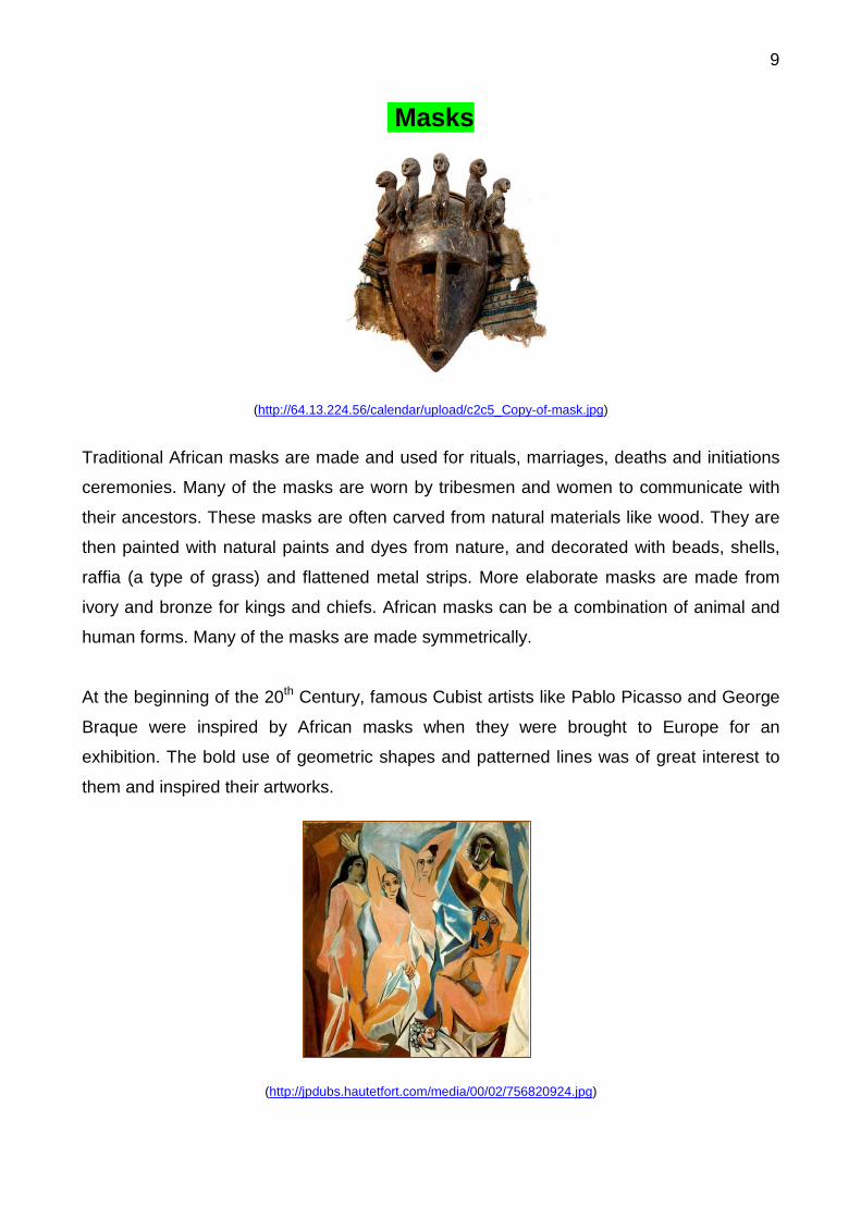
Masks
(http://64.13.224.56/calendar/upload/c2c5_Copy-of-mask.jpg)
Traditional African masks are made and used for rituals, marriages, deaths and initiations
ceremonies. Many of the masks are worn by tribesmen and women to communicate with
their ancestors. These masks are often carved from natural materials like wood. They are
then painted with natural paints and dyes from nature, and decorated with beads, shells,
raffia (a type of grass) and flattened metal strips. More elaborate masks are made from
ivory and bronze for kings and chiefs. African masks can be a combination of animal and
human forms. Many of the masks are made symmetrically.
At the beginning of the 20th Century, famous Cubist artists like Pablo Picasso and George
Braque were inspired by African masks when they were brought to Europe for an
exhibition. The bold use of geometric shapes and patterned lines was of great interest to
them and inspired their artworks.
(http://jpdubs.hautetfort.com/media/00/02/756820924.jpg)
10
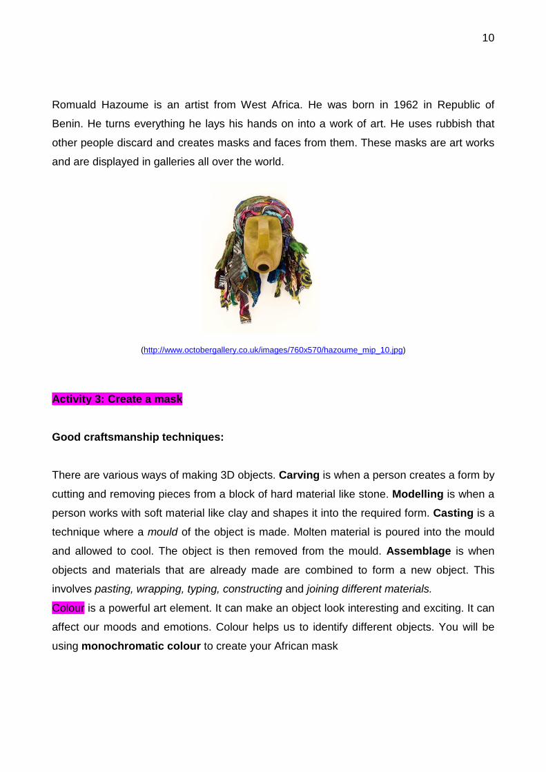
Romuald Hazoume is an artist from West Africa. He was born in 1962 in Republic of
Benin. He turns everything he lays his hands on into a work of art. He uses rubbish that
other people discard and creates masks and faces from them. These masks are art works
and are displayed in galleries all over the world.
(http://www.octobergallery.co.uk/images/760x570/hazoume_mip_10.jpg)
Activity 3: Create a mask Good craftsmanship techniques: There are various ways of making 3D objects. Carving is when a person creates a form by
cutting and removing pieces from a block of hard material like stone. Modelling is when a
person works with soft material like clay and shapes it into the required form. Casting is a
technique where a mould of the object is made. Molten material is poured into the mould
and allowed to cool. The object is then removed from the mould. Assemblage is when
objects and materials that are already made are combined to form a new object. This
involves pasting, wrapping, typing, constructing and joining different materials.
Colour is a powerful art element. It can make an object look interesting and exciting. It can
affect our moods and emotions. Colour helps us to identify different objects. You will be
using monochromatic colour to create your African mask
11
Designing your African mask:
• Divide a page in your Art book into 4 sections.
• Think about what types of masks you have seen before. Your mask must be unique
and creative – something no-one has done or seen before.
• Brainstorm 4 different ideas for your mask in the 4 different sections. Your mask must
communicate a message or emotion.
• Analyse your 4 ideas. How have you used the Art Elements (shape, line, tone and
texture) and the Design Principles (proportion, emphasis and contrast) in interesting
ways? Make some notes on your designs.
• Design your final idea for your mask on a new page using all your ideas.
Remember to collect monochromatic recycled materials to construct your mask.
1. You will need natural materials such as leaves, sticks, grass and seeds
2. You will need recycled materials such as ribbons, fabric, buttons, tinfoil,
wire, plastic bottles or clear plastic
3. Bring glue or a stapler
4. Bring scissors
5. You will need a cardboard shape or container big enough to cover your face
6. Bring an extra strip of cardboard or elastic:
• Work on your own, using the recycled materials you collected. Share your materials
with you classmates if you have extra. Remember your materials must be
monochromatic.
• Remember you have to make a mask which communicates an emotion or message.
Decide on what emotion or message it will be. You need to use the art elements and
design principles to make your message clear.
• Cut out small holes in the cardboard for your eyes and nose.
• Using various construction methods, start to add your recycled materials to the
cardboard structure. Do not just stick them on; do something interesting with them –
tie or melt them together, or wrap something around them. Join different materials
together. It is important that you use the recycled and natural materials to show your
creativity and innovation.
12
• Make sure the materials are stuck on properly and will not fall off.
• Include the design principles of rhythm, repetition and variety in your mask.
7. Finally, make a headband or strap to go around your head. Measure a strip of
cardboard around the top of your head. Fasten it with glue or a stapler. Then stick the
mask to the band. Get someone to help you with this. While you hold the mask up to
your face, your partner can mark where the band on your head should be stuck to your
mask.
MARKING CRITERIA:
• 5 marks for work in art book
• 5 marks for monochromatic work
• 5 marks for character of mask
• 5 marks for neatness of work
RUBRIC FOR MASK
5 Outstanding achievement
4 Substantial
achievement
3 Moderate
achievement
2 Elementary
Achievement
1 Not
achieved
Work in art book
Excellent ideas
for mask
Very good
ideas, but some aspects could be improved
upon
Good ideas for
mask
Adequate
expression of ideas, but lacks
originality
No original thought in developing mask ideas
Monochro
matic theme
Tonal quality of
single colour used very effectively
Tonal quality
very good, but some errors in
selection of material
Tonal quality
good, but errors detract from uniformity of
colour
Tonal quality not
adequately achieved with several errors
noted
Poor tonal
quality or no evidence of
understanding monochromatic
scheme
Character
Excellent communication of message or
emotion
Very good
communication of message or
emotion
Good
communication of message or
emotion
Adequate
communication of message or
emotion
Poor
communication of message or
emotion
Neatness of work
Work is very
neat
Work is neat,
but 1 or 2 aspects of the mask could be improved upon
Work is neat,
but 3 or 4 aspects of the mask could be improved upon
While some
aspects of the mask are neat, most of added elements are
untidy
Mask
presentation is weak and
elements are very untidy
TOTAL: 20