Embed Size (px)
Citation preview
GRADE 3 SUPPLEMENTSet E1 Data Analysis: Graphing
IncludesActivity 1: Ice Cream Survey E1.1
Activity 2: Book Lovers’ Survey E1.7
Activity 3: Under the Same Roof E1.13
Independent Worksheet 1: Pizza Survey E1.19
Independent Worksheet 2: The Pencil Survey E1.23
Skills & ConceptsH construct and analyze picture and bar graphs and use them to answer questions and solve
problems
H organize data in tables, pictographs, bar graphs, and dot plots
H interpret data in tables, pictographs, bar graphs, and dot plots
H analyze dot plots, pictographs, and bar graphs to make predictions about populations
H compare the benefits of using tables, bar graphs, and dot plots as representations of a
given data set
P201304
Bridges in Mathematics Grade 3 Supplement
Set E1 Data Analysis: Graphing
The Math Learning Center, PO Box 12929, Salem, Oregon 97309. Tel. 1 800 575–8130.
© 2013 by The Math Learning Center
All rights reserved.
Prepared for publication on Macintosh Desktop Publishing system.
Printed in the United States of America.
P201304
The Math Learning Center grants permission to classroom teachers to reproduce blackline
masters in appropriate quantities for their classroom use.
Bridges in Mathematics is a standards-based K–5 curriculum that provides a unique blend
of concept development and skills practice in the context of problem solving. It incorpo-
rates the Number Corner, a collection of daily skill-building activities for students.
The Math Learning Center is a nonprofit organization serving the education community.
Our mission is to inspire and enable individuals to discover and develop their mathematical
confidence and ability. We offer innovative and standards-based professional development,
curriculum, materials, and resources to support learning and teaching. To find out more,
visit us at www.mathlearningcenter.org.
Set E1 Data Analysis: Graphing
Bridges in Mathematics Grade 3 Supplement • E1.1© The Math Learning Center
Set E1 H Activity 1
ACTIVITY
Ice Cream Survey
OverviewThe teacher surveys the class to find out which of four ice
cream flavors each student likes best. The data is organized
and students work in pairs to represent the survey results
on a pictograph. Each student then transfers the informa-
tion to a bar graph. Students interpret the results of these
two graphs and evaluate the two different presentations.
Skills & ConceptsH construct and analyze picture and bar graphs and use
them to answer questions and solve problems
You’ll needH Ice Cream Cones (page E1.4, quarter-class set cut in half)
H Ice Cream Bar Graph (page E1.5, class set)
H 1 sheet of 81⁄2˝ × 11˝ or 81⁄2˝ × 14˝ copy paper for each
student pair (see note)
H 3˝ × 3˝ sticky notes, 1 per student
H scissors
H glue sticks
H crayons or colored pencils
H pencils and rulers
Note Give students a choice of copy paper size for their
pictographs. Their choice will depend to some extent on
your class size and the results of the survey.
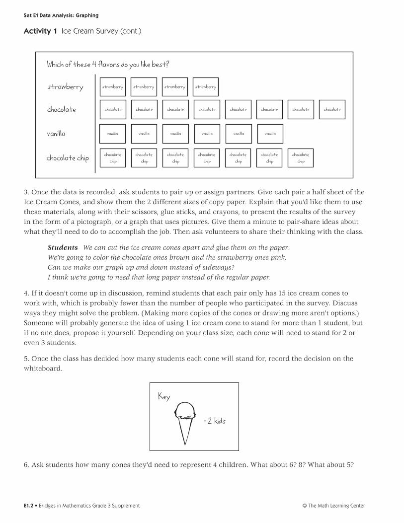
Instructions for Ice Cream Survey 1. Tell students you want to conduct a survey about ice cream flavors today. Write the following flavors on the whiteboard: strawberry, chocolate, vanilla, and chocolate chip. Ask students to think privately about which of these 4 flavors is their favorite. Give out 3" × 3" sticky notes, and ask each student to write his or her favorite flavor on a note without talking to anyone else. (This allows each student to make his or her own choice without being influenced by classmates.)
2. Call students up to post their sticky notes in rows beside the appropriate flavor, and discuss the data briefly. How many students chose each flavor? Which flavor is most popular? Which is least popular? How many students participated in the survey?
Set E1 Data Analysis: Graphing
© The Math Learning CenterE1.2 • Bridges in Mathematics Grade 3 Supplement
Which of these 4 flavors do you like best?
strawberry
chocolate
vanilla
chocolate chip
strawberry strawberry strawberry strawberry
chocolate chocolate chocolate chocolate chocolate chocolate chocolate chocolate
vanilla vanilla vanilla vanilla vanilla vanilla
chocolate chip
chocolate chip
chocolate chip
chocolate chip
chocolate chip
chocolate chip
chocolate chip
3. Once the data is recorded, ask students to pair up or assign partners. Give each pair a half sheet of the Ice Cream Cones, and show them the 2 different sizes of copy paper. Explain that you’d like them to use these materials, along with their scissors, glue sticks, and crayons, to present the results of the survey in the form of a pictograph, or a graph that uses pictures. Give them a minute to pair-share ideas about what they’ll need to do to accomplish the job. Then ask volunteers to share their thinking with the class.
Students We can cut the ice cream cones apart and glue them on the paper. We’re going to color the chocolate ones brown and the strawberry ones pink. Can we make our graph up and down instead of sideways? I think we’re going to need that long paper instead of the regular paper.
4. If it doesn’t come up in discussion, remind students that each pair only has 15 ice cream cones to work with, which is probably fewer than the number of people who participated in the survey. Discuss ways they might solve the problem. (Making more copies of the cones or drawing more aren’t options.) Someone will probably generate the idea of using 1 ice cream cone to stand for more than 1 student, but if no one does, propose it yourself. Depending on your class size, each cone will need to stand for 2 or even 3 students.
5. Once the class has decided how many students each cone will stand for, record the decision on the whiteboard.
Key
= 2 kids
6. Ask students how many cones they’d need to represent 4 children. What about 6? 8? What about 5?
Activity 1 Ice Cream Survey (cont.)

Set E1 Data Analysis: Graphing
Bridges in Mathematics Grade 3 Supplement • E1.3© The Math Learning Center
Twilight It’s 2 cones for 4 kids, 3 cones for 6, and 4 cones for 8, but how can we show 5? That’s impossible!
Rosa I know! We can cut a cone in half, so for 5 kids, it would be 2 cones and then half a cone.
7. Once students understand what to do, have them go to work in pairs, cutting, organizing, and gluing their cones onto the size paper they’ve selected. Let them know that they can organize the cones into rows or columns. Remind them to give the graph a title, label both axes, and include a key to show how many children each cone stands for.
8. As the first pairs finish their pictographs, give each student a copy of the Ice Cream Bar Graph black-line. Explain that they’ll each need to show the results of the survey as a bar graph as well as a picto-graph. Talk with them about some of the things they’ll need to do to transfer the information from one to the other. Each cone stands for 2 (or 3) students. Will they be able to keep the same scale on their bar graph, coloring in 1 cell for every 2 (or 3) students, or will they need to change the scale in some way? As you discuss the assignment with the class, elicit some of the similarities and differences between picto-graphs and bar graphs.
NAME DATE
Ice Cream Bar Graph
Graph Title ___________________________________________ _
s t n e d
u t S f o r e
b
m
u N
Ice Cream Flavor s
1 Which flavor is our class favorite? ___________________________
2 Which flavor is the least favorite? ___________________________
3 On the back of this sheet, write at least 3 other observations about your graph.
4 This kind of graph is called a bar graph. The other graph you made is called a pictograph. Which kind of graph do think is better? Why?
Set E1 Data Analys s: Graph ng B ack ine Run a class set
Our Favorite Flavors by Alex and Delia
Key
= 2 kids
Strawberry Chocolate Vanilla Chocolate Chip
2
4
6
8
9. Give students who are still working on their pictographs time to complete them, while the others start work on their bar graphs. When they’re finished with both, they may have definite preferences for one or the other. Encourage them to voice and explain their opinions as they complete question 4 at the bot-tom of the bar graph sheet. Which type of graph is more fun to make? Which is easier to read? Why?
Activity 1 Ice Cream Survey (cont.)

© The Math Learning CenterE1.4 • Bridges in Mathematics Grade 3 Supplement
Set E1 Data Analysis: Graphing Blackline Run a quarter-class set and cut the sheets in half.
Ice Cream Cones

Bridges in Mathematics Grade 3 Supplement • E1.5© The Math Learning Center
NAME DATE
Set E1 Data Analysis: Graphing Blackline Run a class set.
Ice Cream Bar Graph
Graph Title ____________________________________________
Num
ber
of S
tud
ents
Ice Cream Flavors
1 Which flavor is our class favorite? ___________________________
2 Which flavor is the least favorite? ___________________________
3 On the back of this sheet, write at least 3 other observations about your graph.
4 This kind of graph is called a bar graph. The other graph you made is called a pictograph. Which kind of graph do think is better? Why?

© The Math Learning CenterE1.6 • Bridges in Mathematics Grade 3 Supplement

Set E1 Data Analysis: Graphing
Bridges in Mathematics Grade 3 Supplement • E1.7© The Math Learning Center
Set E1 H Activity 2
ACTIVITY
Book Lovers’ Survey
OverviewThe teacher surveys the class to find out which of four
types of books each student likes best. The data is orga-
nized and students work in pairs to represent the survey
results on a pictograph. Each student then transfers the
information to a bar graph. Students interpret the results
of these two graphs and evaluate the two different pre-
sentations.
Skills & ConceptsH construct and analyze picture and bar graphs and use
them to answer questions and solve problems
You’ll needH Book Markers (page E1.10, quarter-class set cut in half)
H Book Bar Graph (page E1.11, run a class set)
H 1 sheet of 81⁄2˝ × 11˝ or 81⁄2˝ × 14˝ copy paper for each
student pair (see note)
H 3˝ × 3˝ sticky notes, 1 per student
H scissors
H glue sticks
H crayons or colored pencils
H pencils and rulers
Note Give students a choice of copy paper size for their
pictographs. Their choice will depend to some extent on
your class size and the results of the survey.
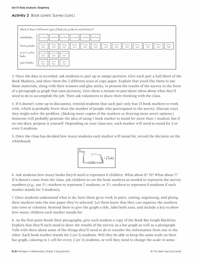
Instructions for Book Lovers’ Survey 1. Tell students you want to conduct a survey about the kinds of books they most like to read. Write the following on the whiteboard: animal books, fantasy books, arts and crafts books, and sports books. (If these don’t match what your students actually love to read, change the list. Ask students to think pri-vately about which of these 4 types of books they like best to read. Give out 3" × 3" sticky notes, and ask each student to write his or her favorite of the 4 on a note without talking to anyone else. (This allows each student to make his or her own choice without being influenced by classmates.)
2. Call students up to post their sticky notes in rows beside the appropriate listing, and discuss the data briefly. How many students chose each type of book? Which type of book is most popular? Which is least popular? How many students participated in the survey?
Set E1 Data Analysis: Graphing
© The Math Learning CenterE1.8 • Bridges in Mathematics Grade 3 Supplement
Which of these 4 different types of books do you like to read the best?
animal books
fantasy books
arts & craftsbooks
sports books
animal books animal books animal books animal books animal books animal books
fantasy books
fantasy books
fantasy books
fantasy books
fantasy books
fantasy books
fantasy books
fantasy books
fantasy books
fantasy books
fantasy books
fantasy books
fantasy books
arts & craftsbooks
arts & craftsbooks
arts & craftsbooks
sportsbooks
sportsbooks
sportsbooks
3. Once the data is recorded, ask students to pair up or assign partners. Give each pair a half sheet of the Book Markers, and show them the 2 different sizes of copy paper. Explain that you’d like them to use these materials, along with their scissors and glue sticks, to present the results of the survey in the form of a pictograph (a graph that uses pictures). Give them a minute to pair-share ideas about what they’ll need to do to accomplish the job. Then ask volunteers to share their thinking with the class.
4. If it doesn’t come up in discussion, remind students that each pair only has 15 book markers to work with, which is probably fewer than the number of people who participated in the survey. Discuss ways they might solve the problem. (Making more copies of the markers or drawing more aren’t options.) Someone will probably generate the idea of using 1 book marker to stand for more than 1 student, but if no one does, propose it yourself. Depending on your class size, each marker will need to stand for 2 or even 3 students.
5. Once the class has decided how many students each marker will stand for, record the decision on the whiteboard.
Key= 2 kids
6. Ask students how many books they’d need to represent 6 children. What about 8? 10? What about 7? If it doesn’t come from the class, ask children to cut the book markers as needed to represent the survey numbers (e.g., use 31⁄2 markers to represent 7 students, or 32⁄3 markers to represent 8 students if each marker stands for 3 students).
7. Once students understand what to do, have them go to work in pairs, cutting, organizing, and gluing their markers onto the size paper they’ve selected. Let them know that they can organize the markers into rows or columns. Remind them to give the graph a title, label both axes, and include a key to show how many children each marker stands for.
8. As the first pairs finish their pictographs, give each student a copy of the Book Bar Graph blackline. Explain that they’ll each need to show the results of the survey as a bar graph as well as a pictograph. Talk with them about some of the things they’ll need to do to transfer the information from one to the other. Each book marker stands for 2 (or 3) students. Will they be able to keep the same scale on their bar graph, coloring in 1 cell for every 2 (or 3) students, or will they need to change the scale in some
Activity 2 Book Lovers’ Survey (cont.)
Set E1 Data Analysis: Graphing
Bridges in Mathematics Grade 3 Supplement • E1.9© The Math Learning Center
way? As you discuss the assignment with the class, elicit some of the similarities and differences be-tween pictographs and bar graphs.
NAME DATE
Book Bar Graph
Graph Title ___________________________________________ _
s t n e d
u t S f o r e
b
m
u N
Types of Books
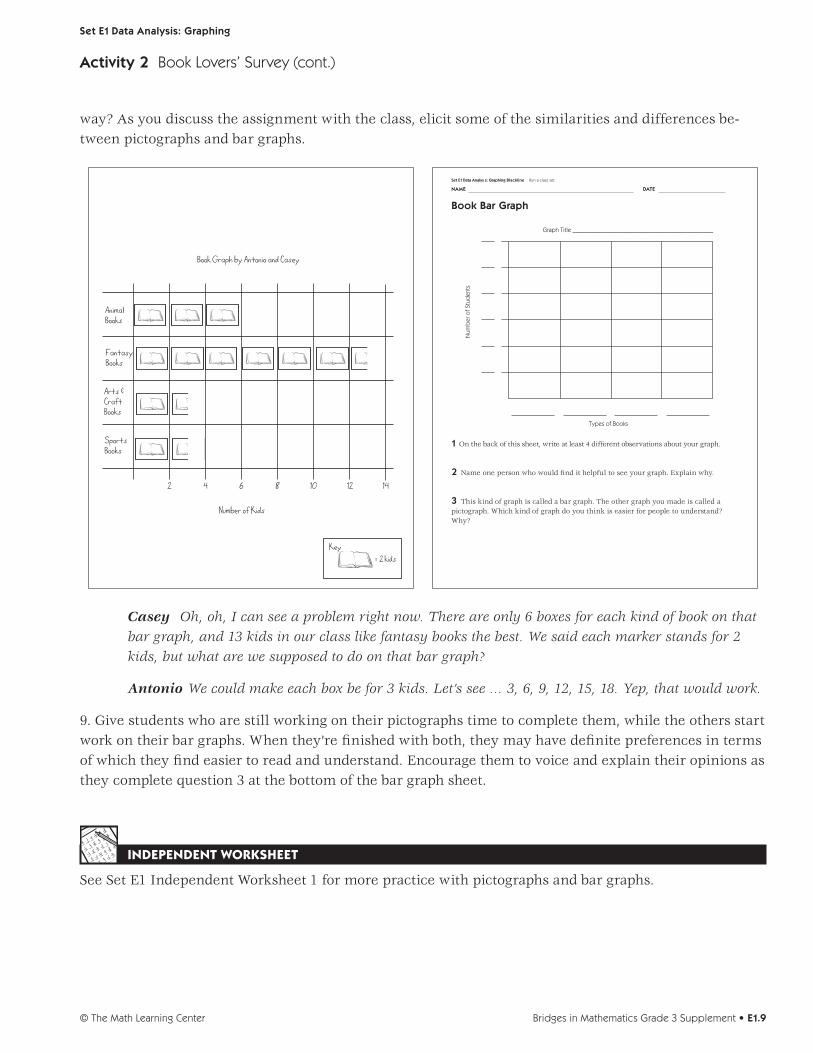
1 On the back of this sheet, write at least 4 different observations about your graph.
2 Name one person who would find it helpful to see your graph. Explain why.
3 This kind of graph is called a bar graph. The other graph you made is called a pictograph. Which kind of graph do you think is easier for people to understand? Why?
Set E1 Data Analys s: Graphing Blackline Run a class set
Key= 2 kids
Number of Kids
Animal Books
Fantasy Books
Arts &Craft Books
SportsBooks
Book Graph by Antonio and Casey
2 4 6 8 10 12 14
Casey Oh, oh, I can see a problem right now. There are only 6 boxes for each kind of book on that bar graph, and 13 kids in our class like fantasy books the best. We said each marker stands for 2 kids, but what are we supposed to do on that bar graph?
Antonio We could make each box be for 3 kids. Let’s see … 3, 6, 9, 12, 15, 18. Yep, that would work.
9. Give students who are still working on their pictographs time to complete them, while the others start work on their bar graphs. When they’re finished with both, they may have definite preferences in terms of which they find easier to read and understand. Encourage them to voice and explain their opinions as they complete question 3 at the bottom of the bar graph sheet.
INDEPENDENT WORKSHEET
See Set E1 Independent Worksheet 1 for more practice with pictographs and bar graphs.
Activity 2 Book Lovers’ Survey (cont.)
© The Math Learning CenterE1.10 • Bridges in Mathematics Grade 3 Supplement
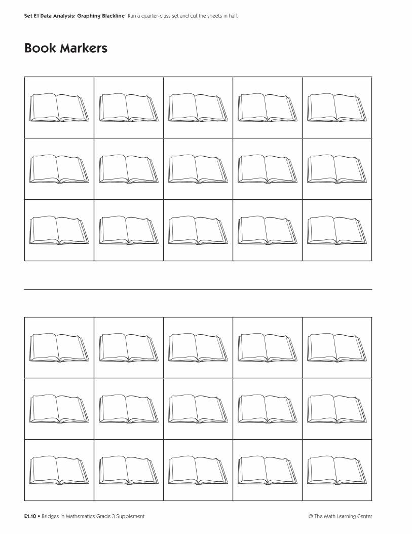
Set E1 Data Analysis: Graphing Blackline Run a quarter-class set and cut the sheets in half.
Book Markers

Bridges in Mathematics Grade 3 Supplement • E1.11© The Math Learning Center
NAME DATE
Set E1 Data Analysis: Graphing Blackline Run a class set.
Book Bar Graph
Graph Title ____________________________________________
Num
ber
of S
tud
ents
Types of Books
1 On the back of this sheet, write at least 4 different observations about your graph.
2 Name one person who would find it helpful to see your graph. Explain why.
3 This kind of graph is called a bar graph. The other graph you made is called a pictograph. Which kind of graph do you think is easier for people to understand? Why?

© The Math Learning CenterE1.12 • Bridges in Mathematics Grade 3 Supplement

Set E1 Data Analysis: Graphing
Bridges in Mathematics Grade 3 Supplement • E1.13© The Math Learning Center
Set E1 H Activity 3
ACTIVITY
Under the Same Roof
OverviewStudents collect, organize, interpret, and analyze data
about the number of people living in their house right
now. The data is organized in three different ways, and
students are asked to compare the benefits of the differ-
ent formats.
Skills & ConceptsH organize data in tables, bar graphs, and dot plots
H interpret data in tables, bar graphs, and dot plots
H analyze dot plot and bar graphs to make predictions
about populations
H compare the benefits of using tables, bar graphs, and
dot plots as representations of a given data set
You’ll needH Under the Same Roof (pages E1.17 and E1.18, run a
class set plus a copy of each sheet on a transparency)
H 1 1⁄2˝ × 2˝ sticky notes, one per student
H a book about families (see Advance Preparation)
Advance Preparations It’s fun to open this activity by
reading a book about families. Several books that de-
scribe and honor the diversity of families are All Families
are Different, by Sol Gordon; The Family Book, by Todd
Parr; and All Kinds of Families, by Norma Simon.
Instructions for Under the Same Roof1. Open this activity by reading a story or otherwise introducing the topic of families. Then propose to conduct a survey about people’s families. Share with students the number of people living in your house right now, including yourself. Then record that number on a small sticky note.
Teacher There are four people living in my house: my son, my daughter, my husband, and myself. My sister was living with us last year, but now she has her own house. Right now, there are just 4 of us, so I will write 4 on my sticky note.
2. Give students each a sticky note. Ask them to record the number of people living in their house right now, and place the sticky note on their desk in front of them.
3. Place the Under the Same Roof, sheet 1, on display at the overhead. Write a 2 in the first row, first col-umn of the table. Ask students to raise their hands if they have 2 people living in their house right now. Solicit help from the class to count the number of hands raised, and record the number in the first row, second column. Continue in this fashion until you have recorded all the students’ data.

Set E1 Data Analysis: Graphing
© The Math Learning CenterE1.14 • Bridges in Mathematics Grade 3 Supplement
2 33 44 125 46 37 210 1
NAME DATE
Set E1 Data Ana ys s: Graphing B ack ine Run a c ass set and one copy on a transparency
Under the Same Roof page 1 of 2
How many people live in your house right now? Is it the same for everyone in our class? Let’s do a survey and fi nd out.
1 Record the data in a table.
Number of People in the House Number of Students
4. Have students pair-share their observations about the data. What do they notice? What does the table tell them? Then ask a few volunteers to share their ideas with the class.
5. Tell students that there are different ways to organize data. Today, you are going to work together to organize the data in three different formats, and then consider the advantages of each. The format you just used is called a table. Now you are going to organize the information on a dot, or line plot. Draw a line along the bottom of the whiteboard. Record the numbers 0, 1, and 2 at evenly spaced intervals along the first part of the line. Ask students who live in households with any of those three numbers of people to bring their sticky notes up and place them where they belong.
6. Continue adding numbers and inviting students to post their sticky notes. Stop periodically to discuss the data. What do students notice? What is the difference between looking at the data in the table and on the dot plot? Does either format seem to have advantages over the other? Be sure students take note of the fact that the dot plots shows all the numbers in the range, even though there may be no entries. Does this make a difference?
109876543210
4444
555
66
7 107
65
333
222
344444444
Students Wow! Look at how high it goes on 4. A lot of kids have 4 people in their house. It’s even on both sides of the 4. There are four 3s and four 5s.
Activity 3 Under the Same Roof (cont.)
Set E1 Data Analysis: Graphing
Bridges in Mathematics Grade 3 Supplement • E1.15© The Math Learning Center
It goes way up, and then it goes back down. There aren’t any kids with 8 or 9 people in their house.
Teacher Does it make any difference to look at our data on the dot plot? If you look at the table, you can see that lots of you have live in households with 4 people.
Students But you can see it even better on the graph. The table just shows numbers. The line plot is more like a picture. The 12 doesn’t seem so big on the table as when you see all the sticky notes on the board. Also, you can see that no one has 0, 1, 8, or 9 people in the house. The table doesn’t really tell you that.
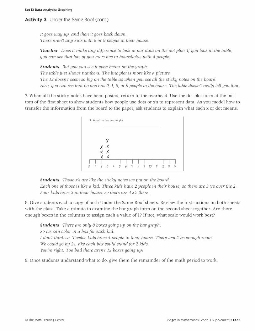
7. When all the sticky notes have been posted, return to the overhead. Use the dot plot form at the bot-tom of the first sheet to show students how people use dots or x’s to represent data. As you model how to transfer the information from the board to the paper, ask students to explain what each x or dot means.
14131211109876543210
3 412
70 1
Und r the Same R o page 1 o
1 R co d the dat in a table
Num f Peo le i the House Numbe of Student
2 Record the data on a dot plot.
Students Those x’s are like the sticky notes we put on the board. Each one of those is like a kid. Three kids have 2 people in their house, so there are 3 x’s over the 2. Four kids have 3 in their house, so there are 4 x’s there.
8. Give students each a copy of both Under the Same Roof sheets. Review the instructions on both sheets with the class. Take a minute to examine the bar graph form on the second sheet together. Are there enough boxes in the columns to assign each a value of 1? If not, what scale would work best?
Students There are only 8 boxes going up on the bar graph. So we can color in a box for each kid. I don’t think so. Twelve kids have 4 people in their house. There won’t be enough room. We could go by 2s, like each box could stand for 2 kids. You’re right. Too bad there aren’t 12 boxes going up!
9. Once students understand what to do, give them the remainder of the math period to work.
Activity 3 Under the Same Roof (cont.)

Set E1 Data Analysis: Graphing
© The Math Learning CenterE1.16 • Bridges in Mathematics Grade 3 Supplement
NAME DATE
Set E1 Data Analysis: Graph ng Blackline Run a class set and one copy on a transparency
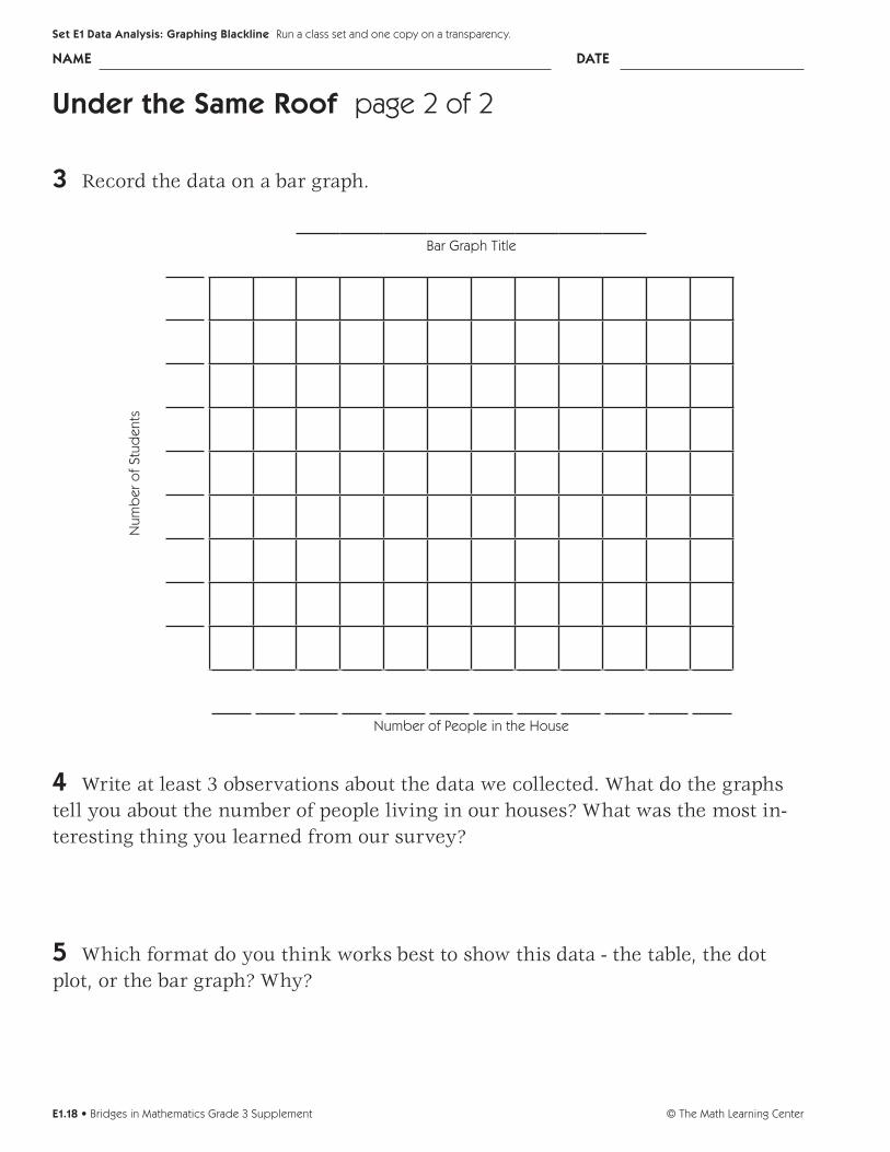
Under the Same Roof page 2 of 2
3 Record the data on a bar graph.
Bar Graph Title
Num
ber
of
Stud
ents
Number of People in the House
4 Write at least 3 observations about the data we collected. What do the graphs tell you about the number of people living in our houses? What was the most in-teresting thing you learned from our survey?
5 Which format do you think works best to show this data - the table, the dot plot, or the bar graph? Why?
INDEPENDENT WORKSHEET
Use Set E1 Independent Worksheet 2 to provide students with more practice organizing, interpreting, analyzing, and comparing the advantages of data in tables, dot plots, and bar graphs.
Activity 3 Under the Same Roof (cont.)
NAME DATE
Set E1 Data Analysis: Graphing Blackline Run a class set and one copy on a transparency
Under the Same Roof page 1 of 2
How many people live in your house right now? Is it the same for everyone in our class? Let’s do a survey and fi nd out.
1 Record the data in a table.
Number of People in the House Number of Students
2 Record the data on a dot plot.

Bridges in Mathematics Grade 3 Supplement • E1.17© The Math Learning Center
NAME DATE
Set E1 Data Analysis: Graphing Blackline Run a class set and one copy on a transparency.
Under the Same Roof page 1 of 2
How many people live in your house right now? Is it the same for everyone in our class? Let’s do a survey and find out.
1 Record the data in a table.
Number of People in the House Number of Students
2 Record the data on a dot plot.
© The Math Learning CenterE1.18 • Bridges in Mathematics Grade 3 Supplement
NAME DATE
Set E1 Data Analysis: Graphing Blackline Run a class set and one copy on a transparency.
Under the Same Roof page 2 of 2
3 Record the data on a bar graph.
Bar Graph Title
Num
ber
of
Stud
ents
Number of People in the House
4 Write at least 3 observations about the data we collected. What do the graphs tell you about the number of people living in our houses? What was the most in-teresting thing you learned from our survey?
5 Which format do you think works best to show this data - the table, the dot plot, or the bar graph? Why?

Bridges in Mathematics Grade 3 Supplement • E1.19© The Math Learning Center
NAME DATE
Set E1 Data Analysis: Graphing Blackline Use anytime after Set E1 Activity 2. Run a class set.
Set E1 H Independent Worksheet 1
INDEPENDENT WORKSHEET
Pizza Survey
1 The cafeteria at Morgan School did a survey to see what kind of pizza the kids like best. Here are the results from Mrs. Hill’s third grade.
Type of Pizza Number of Students Who Like It BestPepperoni 8 students
Cheese 14 studentsHam & Pineapple 6 students
a Make a pictograph to show this data. Give your graph a title and be sure to finish labeling both axes (sides).
Graph Title _____________________________
Kind
of P
izza
Key = 2 students
Number of Students
b How many students from Mrs. Hill’s class took the survey? _________
c Do you think this survey would turn out about the same in your third grade? Why or why not?
(Continued on back.)
© The Math Learning CenterE1.20 • Bridges in Mathematics Grade 3 Supplement
Set E1 Data Analysis: Graphing Blackline Run a class set.
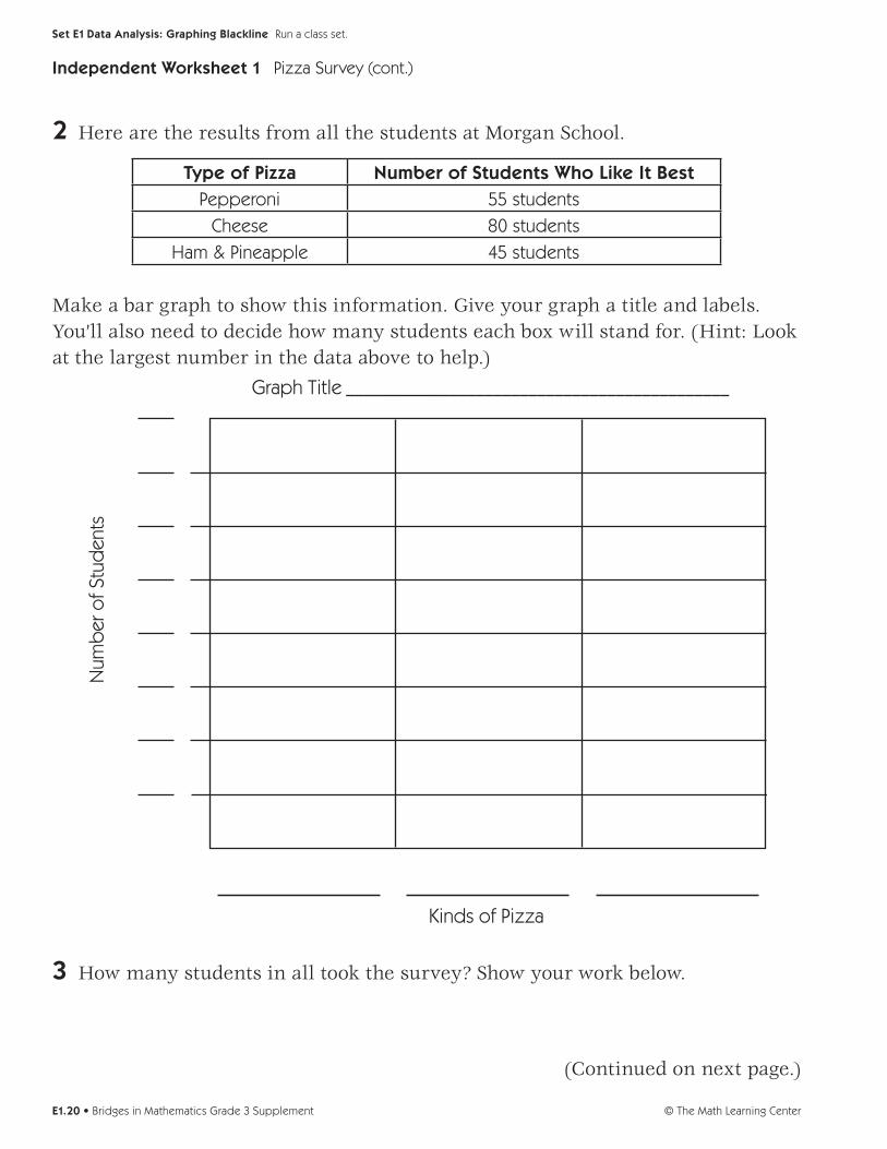
2 Here are the results from all the students at Morgan School.
Type of Pizza Number of Students Who Like It BestPepperoni 55 students
Cheese 80 studentsHam & Pineapple 45 students
Make a bar graph to show this information. Give your graph a title and labels. You’ll also need to decide how many students each box will stand for. (Hint: Look at the largest number in the data above to help.)
Graph Title ____________________________________________
Num
ber
of S
tud
ents
Kinds of Pizza
3 How many students in all took the survey? Show your work below.
(Continued on next page.)
Independent Worksheet 1 Pizza Survey (cont.)

Bridges in Mathematics Grade 3 Supplement • E1.21© The Math Learning Center
NAME DATE
Set E1 Data Analysis: Graphing Blackline Run a class set.
4 The people who work in the cafeteria used the results of the pizza survey to help make some decisions about what to buy and what to cook. List 2 decisions they might have made after they saw the bar graph you just made.
•
•
CHALLENGE
5 Do a pizza survey in your own classroom. You can change the choices and have more if you want. After you’ve collected the data, make a pictograph or a bar graph to show the results.
Independent Worksheet 1 Pizza Survey (cont.)

© The Math Learning CenterE1.22 • Bridges in Mathematics Grade 3 Supplement
Bridges in Mathematics Grade 3 Supplement • E1.23© The Math Learning Center
NAME DATE
Set E1 Data Analysis: Graphing Blackline Use anytime after Set E1 Activity 3. Run a class set.
Set E1 H Independent Worksheet 2
INDEPENDENT WORKSHEET
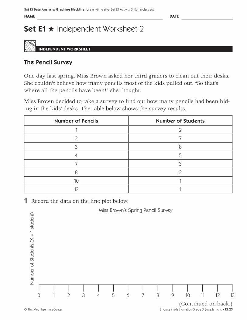
The Pencil Survey
One day last spring, Miss Brown asked her third graders to clean out their desks. She couldn’t believe how many pencils most of the kids pulled out. “So that’s where all the pencils have been!” she thought.
Miss Brown decided to take a survey to find out how many pencils had been hid-ing in the kids’ desks. The table below shows the survey results.
Number of Pencils Number of Students
1 2
2 7
3 8
4 5
7 3
8 2
10 1
12 1
1 Record the data on the line plot below.
Num
ber
of
Stud
ents
(X
= 1
stu
den
t)
Miss Brown’s Spring Pencil Survey
135 91 113 7 124 80 102 6
(Continued on back.)

© The Math Learning CenterE1.24 • Bridges in Mathematics Grade 3 Supplement
Set E1 Data Analysis: Graphing Blackline Run a class set.
Independent Worksheet 2 The Pencil Survey (cont.)
2 The next year, Miss Brown thought, “I will ask the children to clean out their desks earlier this year so we don’t run out of pencils so fast.” The line plot below shows how many pencils the kids found in their desks that time.
Num
ber
of
Stud
ents
(X
= 1
stu
den
t)
Miss Brown’s Fall Pencil Survey
3 How many pencils did most of the kids have in their desks last spring?
4 How many pencils did most of the kids have in their desks in the fall?
5 Were there more pencils hiding in the kids’ desks last spring or in the fall? Explain how you figured it out.
6 Why did the pencil survey turn out to be different in the fall than last spring? Give at least 2 possible explanations.
135 91 113 7 124 80 102 6