Embed Size (px)
Citation preview

Copyright is owned by the Author of the thesis. Permission is given for a copy to be downloaded by an individual for the purpose of research and private study only. The thesis may not be reproduced elsewhere without the permission of the Author.
A Thesis Submitted in Fulfilment of the
Masters of Design
GoodnessDe-signing the Nature and Culture of
New Zealand Milk Packaging Signs
at the Institute of Communication Design
Massey University, Wellington, NZ.
Tulia Moss February 2008
2
Abstract
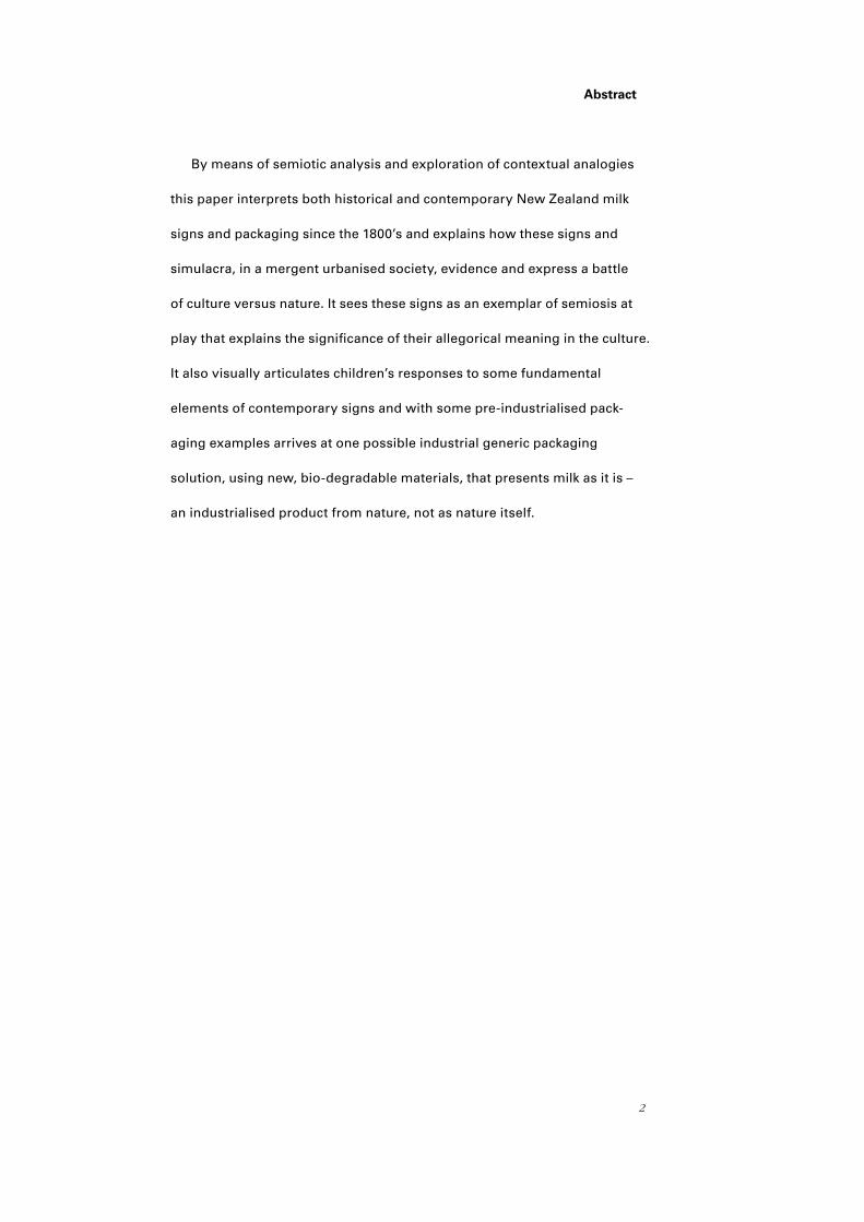
By means of semiotic analysis and exploration of contextual analogies
this paper interprets both historical and contemporary New Zealand milk
signs and packaging since the 1800’s and explains how these signs and
simulacra, in a mergent urbanised society, evidence and express a battle
of culture versus nature. It sees these signs as an exemplar of semiosis at
play that explains the significance of their allegorical meaning in the culture.
It also visually articulates children’s responses to some fundamental
elements of contemporary signs and with some pre-industrialised pack-
aging examples arrives at one possible industrial generic packaging
solution, using new, bio-degradable materials, that presents milk as it is –
an industrialised product from nature, not as nature itself.

3
Acknowledgements
Thank you to Daniel and Reuben, who are the now and the future, and the
inspiration for what is good. I am grateful to Dr Claire Robinson for providing
guidance, support and comments. Greg Gilbert for his encouragement and
helpfulness with structure. Warren Love for creating continuity and clarity with
his editing of words into sentences. My student Dean Ivamy for teaching me
how to set up files and for re-designing this document. Brandon Syme for
letting me into the workshop. Uli Thie for working out the volume and Wendy
Neale for teaching me about resin casting. Lastly, John Clemens for his artful
craftsmanship in screenprinting the wrappers.
And thanks too, to my examiners – whoever you are.

4
CONTENTS
Abstract ….2 Acknowledgements ....3 List of Images….5
Introduction….8 Research Aims ….10
CHAPTER
The Meaning of Nature and the Nature of Meaning ….11
Summary ....16
CHAPTER
Early Industrial New Zealand Milk Sign Semiotics ….17
Deciphering Early New Zealand Dairy Signs ….21 Summary ....29
CHAPTER
Contemporary Milk Packaging Deciphered in Relation to Culture ….30
Meadow Fresh Brand….30 Meadow Fresh Milk Packaging Variants…. 32
Naturalea Brand ….35 Anchor Brand …. 36
Anchor Milk Packaging Variants ….37 Farmgate Brand….39
Meadow Fresh Organic & Anchor Anlene …. 41 Discussion ....42
CHAPTER
Cultural Context: A point in time ….43 De-signing ….43
Household Commodity Packaging - Domestic Danger....48 Children’s Views….44
Packaging Materials ....52 From the Non-Reader’s Perspective....49
Pre-Industrial Packaging....55 The National Packaging Covenant ….53
CHAPTER
Conclusion ….65 Artefact Summary Analysis....63 Design Process ….58
Workbook ....83 Questionnaire ....68 Appendices ….67
Bibliography....151 In-text References ….149 Creative Summary....113
1
2
3
4
5
5
List of Images
Image Page
1: Wellington export dock for Cheese & Butter to Britain, 1915.........................................8 Wellington Harbour Board Annual Report, (1915). Wellington: Witcombe & Tombs. 2: Dairy Factory, Whangamomona, Taranaki, early 1900’s................................................17 New Zealand National Archives (2005).
3: Lea & Perrins Sauce sold in what was known then as a Pharmaceutical bottle, exported to New Zealand from mid 1800’s..................................................................19 (Retrieved from www. worcestershire.whub.org.uk/home/wcc-tourism-john- wheeley-lea-william-henry-perrins 27 February, 2008).
4: Typical Imported Packaging of the 1800’s, remains unchanged in 2007........................19 5: Parker’s Hair Tonic..........................................................................................................20 Wolfe, R. (1987). Well Made New Zealand. Auckland: Reed Methuen.
6: Milk is industrialised - Laval’s Partnership with New Zealand milk begins....................21 Wolfe, R. (1987). Well Made New Zealand. Auckland: Reed Methuen.
7: Nature = Luck...............................................................................................................22 Wolfe, R. (1987). Well Made New Zealand. Auckland: Reed Methuen.
8: The Umbilical to Mother England ................................................................................23 Wolfe, R. (1987). Well Made New Zealand. Auckland: Reed Methuen.
9: Loyal.............................................................................................................................23 Wolfe, R. (1987). Well Made New Zealand. Auckland: Reed Methuen. 10: Culture Holds Water .....................................................................................................24 Wolfe, R. (1987) Well Made New Zealand. Auckland: Reed Methuen.
11: 1890’s mechanical milking machine sign......................................................................24 Wolfe, R. (1987). Well Made New Zealand. Auckland: Reed Methuen. 12: Tree-eerT........................................................................................................................25 Wolfe, R. (1987). Well Made New Zealand. Auckland: Reed Methuen.
13: Music doth soothe the Savage Beast...........................................................................25 Wolfe, R. (1987). Well Made New Zealand. Auckland: Reed Methuen.
14: Introduced Culture.........................................................................................................26 Wolfe, R. (1987). Well Made New Zealand. Auckland: Reed Methuen.
15: Scientific Specimen.......................................................................................................26 Wolfe, R. (1987). Well Made New Zealand. Auckland: Reed Methuen.
16: Gentrified Anthropomorphised Nature..........................................................................27 Wolfe, R. (1987). Well Made New Zealand. Auckland: Reed Methuen.
I7: The Nature of the Beast................................................................................................28 Wolfe, R. (1987). Well Made New Zealand. Auckland: Reed Methuen.
18: Early ‘Cultured Milk’ Signs Cow = Milk = Ingredient ...................................................29 Wolfe, R. (1987). Well Made New Zealand. Auckland: Reed Methuen.
19: Meadow Fresh Brand Sign (2006)................................................................................30
6
20: Speechless emotion comic novel circa 1950’s. Herge, R.G. (1907-1983).....................31 Retrieved 27 February 2008 from www.virtualtourist.com 21: Speechless emotion comic novel..................................................................................31 Sobel, M. (2006) Retrieved 10 May, 2007 from www.sequart.com.Love and Rockets#11 Shelf Life#12
22: Meadow Fresh Milk Variant Packaging. (2006).............................................................32
23: Calci-Kids Choco-Zoom milk jug label. (2006)...............................................................33
24: 2 pints of pasteurised standard ‘silver-top’ milk (2007)................................................34
25: Naturalea carton packaging (2007)................................................................................35
26: Lea (2007).....................................................................................................................35 Retrieved 27 February, 2008 from www.istockphoto.com
27: Anchor Brand sign (2007)............................................................................................. 36
28: Anchor Milk Packaging Variants ....................................................................................36
29: The Milk (2007).............................................................................................................37
30: Xtra (2007)....................................................................................................................38
31: Mega (2007).................................................................................................................38
32: Trim (2007)...................................................................................................................38
33: Farmgate Brand Packaging (2007)................................................................................39
34: Farmgate Calcium Enriched (2007)...............................................................................40
35: Farmgate Slim Milk (2007)............................................................................................40
36: Farmgate Extra Slim (2007)..........................................................................................40
37: Farmgate Full Cream (2007).........................................................................................40
38: New Zealand 45c Stamp (2006)......................................................................................40
39: Organic & Scientific Milk (2007)...................................................................................41
40: Porirua East 1960s........................................................................................................43 Retrieved 27 February, 2008 from www.nzhistory.net.nz
41: Four Square Sign..........................................................................................................44 Retrieved 10 May, 2007 from www.enwikipedia.org
42: Research Questionnaire ...............................................................................................45 Favre, J.P. Richtige Farbe - Erfolgreiche Packung (1969)
43: Research Images of Packaging Colour Questionnaire.................................................46 Favre, J.P. Richtige Farbe - Erfolgreiche Packung (1969)
7
44: Visual Summary of Questionnaire (2004)....................................................................47
45: 615 New Zealand children in 2.5 years misread packaging signs of toxic product as food or drink. These images illustrate the non-reader deciphering context............48
46: Morning Fresh (2005)..................................................................................................49
47: Citrus Tree (2005).........................................................................................................49
48: finish (2005).................................................................................................................50
49: Brainlicker (2005).........................................................................................................50
50: Packaging Signs change all the time (2002-2007)........................................................51
51: Meadow Fresh Seedling Swap Free Native Seedling Bring in any Meadow Fresh Milk packaging to participating garden centre and nurseries on SATURDAY 7th and SUNDAY 8th August 2004 and we will swap it for a FREE Native Seedling! Visit www.meadowfresh.co.nz to find the participating garden centre or nursery closest to you…There are also some useful recycling tips to help you care for our environment. (2004)...................................................................................................53
52: How To Wrap Five Eggs. Oka, H. (1967).......................................................................56 53: How To Wrap Five Eggs. Oka, H. (1967).......................................................................56
54: How To Wrap Five Eggs. Oka, H. (1967).......................................................................56
55: How To Wrap Five Eggs. Oka, H. (1967).......................................................................57
56: How To Wrap Five Eggs. Oka, H. (1967).......................................................................57
57: Breast Milk (2008).......................................................................................................59 Retrieved 29 February, 2008 from www.jupiterimages.com (sourced)
58: Tip of milk Packaging (2007).........................................................................................59
59: Design Exploration (2005)............................................................................................59
60: Design Exploration (2005)..................................................................................... ......59
61: Design Exploration (2005)............................................................................................59
62: Internal Structure (2005)..............................................................................................59
63: Mt Taranaki..................................................................................................................59 Retrieved 18 October, 2006 from www.tourism.net.nz
64: Final Concept. (2007)...................................................................................................59
65: Final Concept. (2007)...................................................................................................62

8
Introduction
This thesis analyses New Zealand milk packaging since the 1880s, with particular
attention given to the relationship between nature and culture in the packaging and its signs.
Milk is a product of nature, yet one that is increasingly altered and mediated by industry.
As the relationship between milk and nature changes, signs for milk provide evidence of
changes in broader cultural attitudes to nature. These signs have been enmeshed in the
visual culture of New Zealand since inception when dairying became the backbone of
economic growth. Milk was a dietary staple for early settlers to New Zealand. With pre-
1900 industrialisation, milk production began to exceed domestic needs. Exporting to Britain,
made possible by refrigeration aboard ships, increased the financial incentive to produce
milk for manufacture into cheese and butter. Seen below in image 1, Wellington Wharf, in
1915, was a well-established export dock for cheese and butter to Britain. With commod-
ification came the first milk product brand identity. Early milk product brand identity served
a number of functions within New Zealand. It signified local provincial identity, geographic
location, the producer’s cultural origins and consumer identity. But brand identity signs also
revealed underlying cultural attitudes to nature. This thesis discusses the battle of culture to
dominate over nature, a battle that continues to this day, played out through contemporary
milk packaging and identity design.
In proposing culture be a part of, rather than
apart from, nature a new generic milk packaging
design is presented that embodies this concept.
The design is a mass-produced packaging
artefact of sustainable materiality that represents
a symbiosis of nature and culture and displays
decipherable visual signs as to the nature of the
content and the content of nature. Moreover, as milk signs have traditionally been aimed
at children or at adults feeding children, the design is informed by an ethical obligation
1: Wellington export dock for Cheese & Butter to Britain, 1915

9
to children, both in how the signs can be read and how they signify the contents within the
package. The theoretical framework of this thesis is semiotic analyses typified by Levi-Strauss,
Barthes, Williamson and Baudrillard. These theorists are used to read milk signs and also to
understand the relationship between culture and nature implicit in semiotic theory. The design
project included is the outcome of the research into the signs and packaging discussed here.
Because the design is an outcome resulting from the research, the theoretical component of
the thesis and its subsequent evaluation of milk signs form the first part of this thesis. This
analysis includes a contextualisation of historical milk signs through an investigation of industrial
packaging in New Zealand, followed by a discussion of historical New Zealand milk signs
beginning in the 1880s and then an evaluation of contemporary milk signs. My design is also
informed by responses contemporary children have to packaging and this designer’s response
to research into pre-industrial packaging. From such a contextual analysis comes the foundation
for my design.
The literature review sets out the theoretical context of this thesis, looking at historic
predictive cultural arguments around perceptions of nature and a discussion about why there is
a contemporary cultural reinterpretation of nature that is different again. The semiotic analysis
deciphers early New Zealand industrial signs, establishing culture in relation to nature and
provides the context within which the following chapter deciphers early New Zealand dairy signs.
Chapter three discusses contemporary milk signs in relation to culture. This is followed, in chapter
four with an explanation of my motives for pursuing this topic and the cultural allegorical reality
on which it is based. This leads into findings from research I conducted with children about what
milk is to them and about what colour signifies. Following on from this is a discussion on
domestic commodity packaging signs including the change in the meaning of the signs in a
different context. Chapter five discusses the differences between the materiality of contemporary
milk packaging signs, what they signify and what is implied in relation to nature. Next is a small
case study on how pre-industrial packaging signs functioned. Lastly in chapter six the design
rationale is explained and a solution offered that reconnects industrialised culture with nature.

10
Research Aims
New Zealand’s cultural identity is dependent on material commodity artefacts to define
culture and connect it with notions of nature. Food signs in particular have been and remain
visual representations of New Zealand culture. Be it ‘Marmite’, ‘Edmonds–Sure to Rise’,
‘Watties’ and particularly, dairy products such as ‘Fernleaf Butter’ and ‘Anchor Dairy
Products’. Milk signs reflect, inform and form part of that identity. Milk packaging cartons
and “jugs” for consumers are symbolic objects with ever-changing signs that fulfil social
and psychological desires. Russell Belk (1997) described the recurring state as more
constant than a need; consumers having an innate insatiable “desire to desire” (p.27)
which is in constant cyclical flow.
Milk has been integral in forming New Zealand cultural identity. New Zealand milk is
a product from nature; its industrialisation is embedded in national identity through the
history of the country’s economic growth, its usage and allied social conventions within
New Zealand culture. Milk packaging signs inform cultural identity in relation to nature
and reflect New Zealand cultural attitudes toward nature. This design investigation faces
the dilemma of creating milk packaging and signs from nature for an industrialised
culture that has commodified notions of nature, at the same time as acknowledging the
physiological need present in all living things to be satiated. In aiming to stimulate a
primal biological instinct to consume, issues of form, size, scent and colour are set into
play. Here the nature inherent in culture becomes apparent because signification of culture
and commodification are made secondary.
Mandatory functions of packaging are to carry, contain, stack, store, protect, sometimes
infuse, display and communicate (through various sign strategies) the contents. The aim of
this project is to fulfil the functions of industrialised packaging, compete with the plethora
of simulacrum, signs of nature and other things, without resorting to a hyperreal nature. In
other words, there is a need to communicate to consumers who have little or no first hand
awareness of nature.

11
CHAPTER
The Meaning Of Nature And The Nature Of Meaning
Part of the analytical framework of this thesis comes from a summary of works by John
Fiske who in his book ‘Introduction to Communication Studies’ (1990) discussed what is now
accepted doctrine - the early work on semiotics by logician C.S. Pierce (1839-1914) and linguist
/philosopher F. de Saussure (1857-1913) that examined the relationship between a sign in
relation to the object it referred to (the signifier), and the viewer (decipherer) to create the
meaning of the sign (the signified). Pierce distinguished the interchangeability of the three in
their interplay with each other. Primarily these theorists were discussing linguistics and were
focused on the importance of the phoneme (the smallest phonetic unit that distinguishes
one word from another) in relation to meaning of a word and in relation to the object being
signified. Fiske’s discussion continued with Roland Barthes, a French philosopher, who
expanded on de Saussure’s work, but focused more on the relationship between a visual
sign (other than linguistics) and the decipherer of the sign. Barthes further distinguished
a sign’s primary, tangible meaning as its “denoted” meaning and the secondary meaning
as its “connoted” meaning. The meaning of a sign, in Barthes’ view, is determined by the
decipherer, and is formed within a context of cultural reference. According to Barthes (1973)
meaning is determined by the relationship between the sign and the external reality of the
decipherer - a part of what is collectively determined by culture. Barthes examined the social
and historical influences affecting culture and how the inferences within sign meanings reflect
dominant cultural values. The dominant cultural values impacting on the dominated culture
he termed “naturalised”. Sign systems, Barthes argued, were referential of a dominant
hegemony within consumerist culture. The semiotic frameworks outlined in Fiske’s summary
of Barthes’ rationale, to decipher milk signs and their meanings, are used here to reveal our
cultural perceptions of nature.
1

12
To understand cultural interpretations of nature, food and packaging, signs reference the
anthropological study of pre-industrial cultures made by Claude Levi-Strauss who studied
many tribal cultures, New Zealand Maori amongst them. The myths Levi-Strauss recorded,
in ‘The Raw and the Cooked. Introduction to a Science of Mythology’ (1969), of South
American forest tribes were interesting because they were oratory of abstract, seemingly
nonsensical tales, but the objects and events connoted signs to the culture that allegorically
taught, in memorable ways, survival within nature. A sign such as rotten wood, which was
an unpleasant food source, could also signify an agreeable source, as rotten wood could be
deciphered (depending on the context within the myth) as fuel for cooked food. The context
of the object (rotten wood) changed the overall allegoric message in the meaning. A signifier
within a myth had a different meaning entirely if the order and the juxtaposition of the objects
and events were changed. As with Barthes’ argument then, the cultural context provides the
means for deciphering signs.
Levi-Strauss likened the myths of pre-industrial cultures to visual signs in contemporary
culture. First evident from within his records is the innate human ability to create and
decipher complex signs. His studies of cultures directly dependent on first hand experience
and knowledge of nature for survival, revealed a common theme within their myths around
gustatory consumption which Levi-Strauss defined as ‘the cooked’ and ‘the raw.’ He created
binary graphs and mapped ‘the cooked’ (a metaphor for culture) and ‘the raw’ (a metaphor
for nature). It is explained below in summary that pre industrial cultural definitions differed
from contemporary distinctions.
RAW
manufactured objects (for spiritual purposes)
of the rotten or mouldy
slow
real (without embellishment)
snack
unborn / newborn
child and animal
COOKED
utensils
burnt
fast
human
meal
corrupt / tainted
pubescent girl / postpartum woman
13
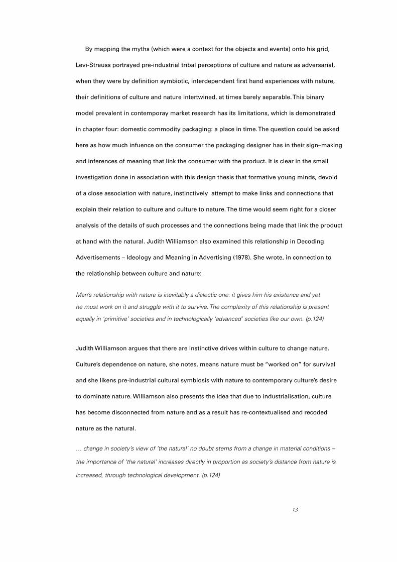
By mapping the myths (which were a context for the objects and events) onto his grid,
Levi-Strauss portrayed pre-industrial tribal perceptions of culture and nature as adversarial,
when they were by definition symbiotic, interdependent first hand experiences with nature,
their definitions of culture and nature intertwined, at times barely separable. This binary
model prevalent in contemporay market research has its limitations, which is demonstrated
in chapter four: domestic commodity packaging: a place in time. The question could be asked
here as how much infuence on the consumer the packaging designer has in their sign–making
and inferences of meaning that link the consumer with the product. It is clear in the small
investigation done in association with this design thesis that formative young minds, devoid
of a close association with nature, instinctively attempt to make links and connections that
explain their relation to culture and culture to nature. The time would seem right for a closer
analysis of the details of such processes and the connections being made that link the product
at hand with the natural. Judith Williamson also examined this relationship in Decoding
Advertisements – Ideology and Meaning in Advertising (1978). She wrote, in connection to
the relationship between culture and nature:
Man’s relationship with nature is inevitably a dialectic one: it gives him his existence and yet
he must work on it and struggle with it to survive. The complexity of this relationship is present
equally in ‘primitive’ societies and in technologically ‘advanced’ societies like our own. (p.124)
Judith Williamson argues that there are instinctive drives within culture to change nature.
Culture’s dependence on nature, she notes, means nature must be “worked on” for survival
and she likens pre-industrial cultural symbiosis with nature to contemporary culture’s desire
to dominate nature. Williamson also presents the idea that due to industrialisation, culture
has become disconnected from nature and as a result has re-contextualised and recoded
nature as the natural.
… change in society’s view of ‘the natural’ no doubt stems from a change in material conditions –
the importance of ‘the natural’ increases directly in proportion as society’s distance from nature is
increased, through technological development. (p.124)

14
Williamson argues that industrialised culture no longer sees nature as an adversary
because nature has been mediated; power over nature had resulted in recoding nature as
a romanticised, tame version of “natural.” Being so removed from nature, industrialised
culture had only limited understanding of how nature functioned, as it had ceased to be
directly meaningful in every day life.
Nature is the primary referent of a culture. It is the ‘raw material’ of our environment, both the
root of all technological development and its opposition; that which technology strives both
to improve and to overcome. If a culture is to refer to itself, therefore, it can only do so by the
representation of its transformation of nature – it has meaning in terms of what it has changed.
(p. 103) (emphasis added)
Williamson concluded that the more a culture changes nature, the more superior a culture
sees itself over nature. Natural becomes the sign for nature, but as a sign it is only a
constructed representation of the referent. Natural, to an industrialised culture, has values
such as safe, convenient and predictable. Industrialised culture then understands nature to
be an adversary under control.
Packaging and its signs have an all-pervasive influence on how the consumer, young
or old, sees themselves in the product and its relation to nature. It is in a dreamlike state in
which these cultural signifiers are consumed and made part of conversations the consumer
has with themself – a cow is not a cow, it is a symbol of nature. In this dreamlike state
misconceptions and inaccurate assumptions are made. This need to understand a significant
cultural icon in New Zealand culture is satisfied by the marketers’ methods of signifying
representational signs inherent in the significance of milk in the culture. Following on
from Williamson, Post Modernist theorist Jean Baudrillard, in his 1988 essay ‘Simulacra &
Simulations’, argues that everyday signs in industrialised culture are unrelated to first-hand
experiences: they lack context. They are not referential of a history or an environment, but of
technology and are random, virtual, artificial and indecipherable. He described these signs as
“simulacra”, arguing that they have produced a “mediatised” culture, made subservient to
15
a superior technology. Baudrillard argued that technology is the new dominant culture, with
society transposed to become “raw nature” for technology. Baudrillard refers repeatedly to
society’s loss of “reality”, the mediatisation of consumers by way of visual exaggerations he
calls “hyperreality”, resulting in a loss of a self-referential cultural reality. By the loss of reality
Baudrillard means that culture no longer references first hand experience of nature but,
rather, mediatised arbitrary sources. This process is less than fully understood by the New
Zealand consumer who buys into the belief they are made good by consuming the product
before them which is inherently good – and that milk is raw and natural, when its packaging
and accompanying signs, if read closely, say something different.
Levi-Strauss and Baudrillard place nature and culture as opposites and adversaries
whereas Williamson denotes both interdependence and a desire for culture to dominate in
the relationship. Fiske, too, when promulgating his structuralist methodology, reveals his
adversarial character when arguing the benefits of his methodology used to decipher various
theoretical semiotic models. Fiske stated:
It appears more functional; it can encourage us to improve our skills of communication, which
will then enable us to impose ourselves on the world around us more effectively. It sees
communication as a determinant, and improving communication as a way of increasing social
control. (p.189)
Central to the argument of this thesis is the significance of the cultural allegorical meaning
behind milk signs. The consumption of milk is an act of being good and made good by good-
ness. A cow is not a cow in the psyche of the human being. It is sometimes an archetype
– an allegorical mother substitute in Freudian terms. Such symbolism, associations and
implications utilised in signs and packages becomes part of the unconscious meanings
consumers deduce about themselves. The inference is that sustenance and mother-nurturing
contained within the packaging give comfort to the consumer who believes that nature is
close at hand, even though milk is cooked, not raw, and is made something else.
16
Summary
Pre-industrial cultures without written signs were expert decipherers of signs in nature
because their physical existence depended on this knowledge for survival. Their ability to
create and decipher myths with complex meanings using denoted and connoted signifiers
affirmed their “cultural” identities in relation to nature. It is clear signs informed and
reflected the perspective that cultures were dependent on, if at times separate from, nature.
Industrialised culture too has signs for a purpose. Contemporary signs have evolved to
denote and connote meaning from a technological or increasingly removed perspective.
In this way, signs are not only arbitrary abstractions (direct representations of referents or
first hand experiences) but second level abstractions (signs of representations) where the
referent is increasingly abstracted or mythicised. Contemporary culture is less dependent
on nature first hand and so relies heavily on mediated representations of nature, such as
‘the natural’.
To a culture sheltered from first hand experiences of nature, actions in nature have
become indecipherable. Where life is planned and scheduled with controls created by the
culture, nature is perceived as unpredictable and consequently the signs that reference
nature do so on an almost conscious level, as threateningly adversarial toward culture.
These mediated notions of nature create and reflect nature as an enemy of human
endeavours. Contemporary culture displays measures of its perceived superiority over
nature by signs that imply domination of nature. This is not only evident in popular culture,
but also in the theorists who are cornerstones in the discussion of semiotic theoretical
thinking, for they have launched their arguments from a perspective of nature being
opposite and opposed to culture.

17
CHAPTER
Early New Zealand Milk Sign Semiotics
This chapter deciphers the meanings of early New Zealand industrial milk signs. The
denoted meanings define a culture identifying predominantly with their places of origin,
not with their local surroundings and not with an export destination. The connoted mean-
ings of dairy signs record a culture signifying the battles with its primary adversary
– nature. Image 2 depicts an example of early industrialisation. In a comparatively
incomprehensible environment the settlers’ survival, dependent on producing food, was
reliant on their abilities or inabilities to decipher signs in nature. But there were other
issues under-pinning settler attitudes about
nature that prevailed beyond that of survival.
Whilst settlers’ cultural identities continued in
the new environment despite the separation
from their geographic origins, their self-identity
was put into question by anthropologist Charles
Robert Darwin’s observations of nature.
In his book ‘The Preservation of Favoured
Races in the Struggle for Life’ (usually abbreviated to‘The Origin of Species by Means
of Natural Selection’ (1859), he argued that man evolved from primates and challenged
the prevailing Christian belief that man descended from God. Although an anthropologist,
his theories were taken at the time to be a scientific response to studying nature and set
religion against science in passionate debate. Where was man in relation to nature?
Throughout his written observations Darwin anthropomorphised nature, using human
logic and simile to interpret nature’s course. Darwin then argued that “nature’s way” was
brutal and adversarial; renowned for his phrase ‘survival of the fittest’, to mean the weak
inevitably becoming extinct, instilling the notion that nature is inherently adversarial.
2: Dairy Factory, Whangamomona, Taranaki, early 1900’s
2

18
Charles Darwin first visited New Zealand in 1835. After the publication of his book he
regretted the impact of his work on the indigenous people, as a consequence of the inter-
pretations of the governing elite – prominent New Zealanders were Darwinists (Walker, 2001).
By atoning moral, social, scientific, religious and political forums, the physical and spiritual
needs of culture had affirmed a superior identity and other-ness by overpowering nature.
There was rigorous public debate around Darwin’s assertions that fuelled the culture to
distinguish their ‘otherness’ from nature.
With the industrialisation of milk production, provinces competed independently for
government funding and later for export returns. This began a need for signs to identify and
differentiate producers. Although consuming milk from animals had been a centuries old
practice, early New Zealand milk signs did not depict cows. For avoiding any possible
connotations with the devil, the capacity for humans to ingest the lactation fluids of a cloven-
hoofed cattle beast perhaps required signs that defined the boundaries between culture and
nature. After all, consumers are what they consume. Raw milk altered into butter and cheese
was sufficiently changed for it to become ‘culture’. Cows denoted milk only when there was
cultural intervention and when milk was an ingredient.To purchasers, milk signs were
signifiers of the producer identity and the cultural influences affecting manufactured milk
products. As milk signs had limited display (on delivery carts as livery, and building signage)
purchase of raw milk product was influenced by the proximity of fresh milk supply and credit
arrangements. Purchasers received information and affirmation of a cultural identity and,
within that, a provincial identity through what milk signs signified and reinforced on a
gustatory level; as the physical ingestion of a substance, mythically recoded. In early New
Zealand, signs depicting cows were signification for raw nature. Bovine treatments: drenches,
insecticides, medicines and dietary supplements, were a manmade improvement on nature,
or antidote for ‘failing nature’, signified through various visual strategies in the generalist
commodity retail shops of consumer society. Early packaging signs were constrained by print
technology, the quality and characteristics of the applied surfaces, reference material and
artistic ability.

19
Lea & Perrins Sauce, (Image 3) an imported product, widely advertised
in newspapers, was a typical food packaging sign of the period. The Lea &
Perrins Sauce bottle was glass, the usual packaging material for goods from
Britain, from where most imported goods came, between 1860 and 1900.
What was not usual was the bottle shape, known generically as a medicine
bottle. The overall composition of the label graphics was centred – with
patterned borders, also customary, and a composition of decorative bold
display and italic fonts. There were etchings of scenes depicting the factory
and geographic location of Worcestershire. The paper stock was used to
create a third colour. The script signature “Lea & Perrins” was not an
individual’s signature. The elements of the sign connoted a legal contract
or paper-note money. The label signified a product that had been
authenticated as genuine (not an imitation); the hand drawn script
insinuated a signature, which in turn connoted a guarantee, as if it were a
legal contract. Lea & Perrins Sauce assured consumers of authenticity and
value through its signification of the authentic and money.
Lyle’s Black Treacle (Image 4) is similar to Lea & Perrins; with its centred
composition, a name authenticating the product and decorative motifs
juxtaposed with bold san serif display upper case typography. A gold
band arched over an illustration of a lion, surrounded by bees. The Lion is
the savage beast made noble because it is dead, a metaphor for culture
celebrating conquest over ‘dead nature’. The Lion is also a metaphor for
Africa, the origin of the raw sugar cane; a place perceived to be wild
nature to be conquered by British culture. “Out of the strong comes forth
sweetness”; – a signifier of a cultural truism that signified the life force
of the savage beast contained in a tin of treacle. With Biblical reference,
Samson kills a lion and later sees that a swarm of bees had formed a comb
of honey in the carcass. Samson then turns this into a riddle: “Out of the
3: Lea & Perrins Sauce sold in what was known then as a Pharmaceutical bottle.
4: Typical Imported Packaging of the 1800’s, remains unchanged in 2007.
20
eater came forth meat and out of the strong came forth sweetness.” The
eater is also a symbol for the British Empire and ‘treacle’ a metaphor
for blood. The Lyle’s Black Treacle sign depicts a potent product with the
rhetoric of homage to death as a superior state, and with a righteous
glee in its portrayal of superiority over nature – hence the proposed
consumption of this same idea.
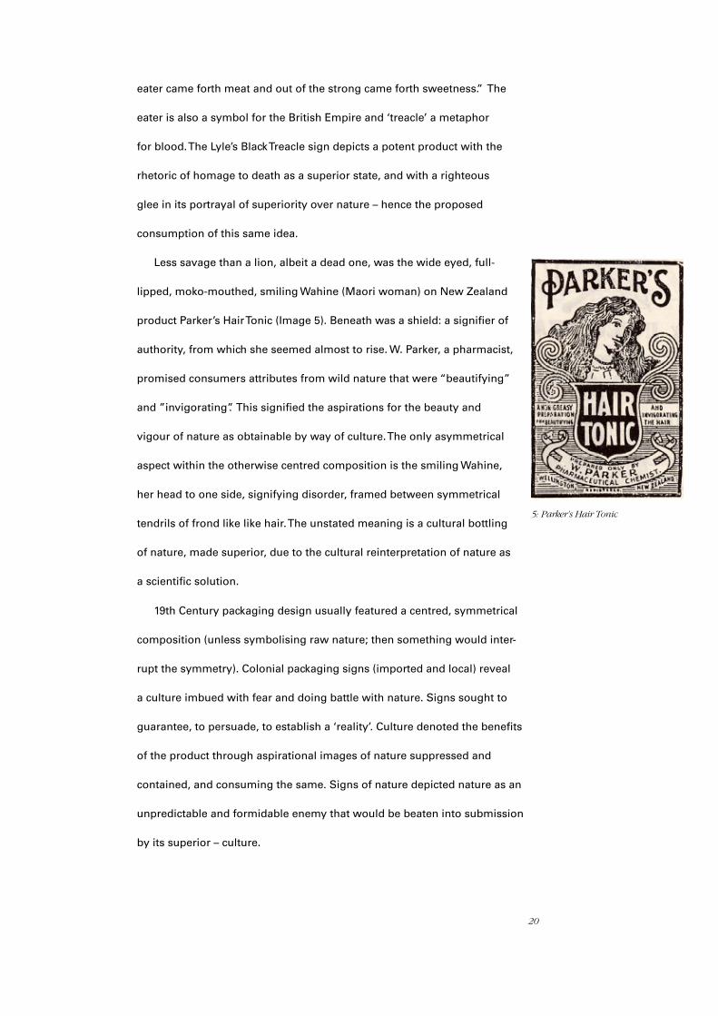
Less savage than a lion, albeit a dead one, was the wide eyed, full-
lipped, moko-mouthed, smiling Wahine (Maori woman) on New Zealand
product Parker’s Hair Tonic (Image 5). Beneath was a shield: a signifier of
authority, from which she seemed almost to rise. W. Parker, a pharmacist,
promised consumers attributes from wild nature that were “beautifying”
and ”invigorating”. This signified the aspirations for the beauty and
vigour of nature as obtainable by way of culture. The only asymmetrical
aspect within the otherwise centred composition is the smiling Wahine,
her head to one side, signifying disorder, framed between symmetrical
tendrils of frond like like hair. The unstated meaning is a cultural bottling
of nature, made superior, due to the cultural reinterpretation of nature as
a scientific solution.
19th Century packaging design usually featured a centred, symmetrical
composition (unless symbolising raw nature; then something would inter-
rupt the symmetry). Colonial packaging signs (imported and local) reveal
a culture imbued with fear and doing battle with nature. Signs sought to
guarantee, to persuade, to establish a ‘reality’. Culture denoted the benefits
of the product through aspirational images of nature suppressed and
contained, and consuming the same. Signs of nature depicted nature as an
unpredictable and formidable enemy that would be beaten into submission
by its superior – culture.
5: Parker’s Hair Tonic

21
Deciphering Early New Zealand Dairy Signs
Levi-Strauss’ structuralist theory mapped pre-industrial culture as in opposition to nature
even though his findings indicated it was not quite so straightforward. However the validity
of his argument is apparent where evidence of this opposition was prevalent: in the signs of
industrialised culture. Early New Zealand milk signs are examples of this evidence, wherein
the relationship between culture and nature is adversarial.
Research into cultural attitudes toward nature began with
deciphering of the earliest recorded New Zealand milk signs.
These were found in “Well Made New Zealand” written by
Michael Wolfe (1987), who had searched the first company
registers of business records in the National Archives to record
early New Zealand graphic signs. The Enfield Butter Factory
sign (Image 6) is an illustration of the Laval Separator. In the home, milk was left to stand
for three days; over that time the cream would separate from the milk, the milk then separ-
ated into curds and whey. The curds were kept for cheese and butter and the whey was fed
to the domestic rubbish disposal unit – the pig. Milk was considered a food and a dietary
necessity with medicinal benefits; it was a raw ingredient used in cooking. Cream was a
luxury according to Mrs Beeton, a home management authority of the day (Beeton, 1880.
p.1713). In more populated areas, like Wellington, the milkman delivered same-day milk
door to door by horse and cart, and transferred it into domestic jugs and billycans by way
of “can and dipper”. The filled domestic containers were placed into the kitchen “safe” (as
domestic refrigeration was not available) – a kitchen cupboard that had five sides made of
wire mesh.The cupboard extended outside, always on the shady side of the house, it was
insect and vermin proof and always cool. If the milk was in a jug, it was covered with a bead
weighted gauze and went onto the table as was. Separating milk was a time-consuming and
labour-intensive process. The Laval Separator was first imported from Sweden in 1884 and
6: Milk is industrialised – Laval’s Partnership with New Zealand milk begins
22
it furthered the industrialisation of milk significantly as it sped up milk
separation and saved time and labour both commercially and in the
home. And it was believed to be a more hygienic process. The milk sign
here is ‘industrialised superior milk’. The separator, and by extension the
sign, is a cultural intermediary between nature and culture.
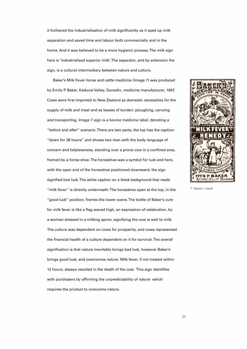
Baker’s Milk Fever horse and cattle medicine (Image 7) was produced
by Emily P. Baker, Kaikorai Valley, Dunedin, medicine manufacturer, 1897.
Cows were first imported to New Zealand as domestic necessities for the
supply of milk and meat and as beasts of burden: ploughing, carrying
and transporting. Image 7 sign is a bovine medicine label, denoting a
“before and after” scenario. There are two parts; the top has the caption:
“down for 36 hours” and shows two men with the body language of
concern and helplessness, standing over a prone cow in a confined area,
framed by a horse shoe. The horseshoe was a symbol for luck and here,
with the open end of the horseshoe positioned downward, the sign
signified bad luck. The white caption on a black background that reads
“milk fever” is directly underneath. The horseshoe open at the top, in the
“good luck” position, frames the lower scene. The bottle of Baker’s cure
for milk fever is like a flag waved high, an expression of celebration, by
a woman dressed in a milking apron, signifying the cow is well to milk.
The culture was dependent on cows for prosperity, and cows represented
the financial health of a culture dependent on it for survival. The overall
signification is that nature inevitably brings bad luck, however Baker’s
brings good luck, and overcomes nature. Milk fever, if not treated within
12 hours, always resulted in the death of the cow. This sign identifies
with purchasers by affirming the unpredictability of nature which
requires the product to overcome nature.
7: Nature = Luck
23
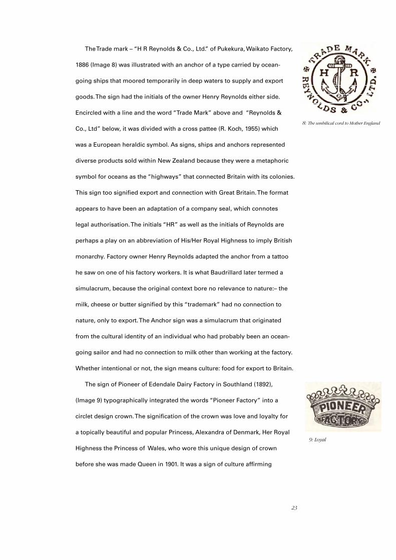
The Trade mark – “H R Reynolds & Co., Ltd.” of Pukekura, Waikato Factory,
1886 (Image 8) was illustrated with an anchor of a type carried by ocean-
going ships that moored temporarily in deep waters to supply and export
goods. The sign had the initials of the owner Henry Reynolds either side.
Encircled with a line and the word “Trade Mark” above and “Reynolds &
Co., Ltd” below, it was divided with a cross pattee (R. Koch, 1955) which
was a European heraldic symbol. As signs, ships and anchors represented
diverse products sold within New Zealand because they were a metaphoric
symbol for oceans as the “highways” that connected Britain with its colonies.
This sign too signified export and connection with Great Britain. The format
appears to have been an adaptation of a company seal, which connotes
legal authorisation. The initials “HR” as well as the initials of Reynolds are
perhaps a play on an abbreviation of His/Her Royal Highness to imply British
monarchy. Factory owner Henry Reynolds adapted the anchor from a tattoo
he saw on one of his factory workers. It is what Baudrillard later termed a
simulacrum, because the original context bore no relevance to nature:– the
milk, cheese or butter signified by this “trademark” had no connection to
nature, only to export. The Anchor sign was a simulacrum that originated
from the cultural identity of an individual who had probably been an ocean-
going sailor and had no connection to milk other than working at the factory.
Whether intentional or not, the sign means culture: food for export to Britain.
The sign of Pioneer of Edendale Dairy Factory in Southland (1892),
(Image 9) typographically integrated the words “Pioneer Factory” into a
circlet design crown. The signification of the crown was love and loyalty for
a topically beautiful and popular Princess, Alexandra of Denmark, Her Royal
Highness the Princess of Wales, who wore this unique design of crown
before she was made Queen in 1901. It was a sign of culture affirming
8: The umbilical cord to Mother England
9: Loyal

24
consumer loyalty and a love for the Crown as they
pioneered, breaking new ground in a battle with nature.
East Taieri Creamery 1893 (Image 10) was an Otago
Dairy factory sign constrained by a rectangular border
with 58 circles. At mid-point between “East” and “Taieri”,
dotted lines make up a cross. There are four stars within
the cross. Inside the border are three leaves in a vase with
a shield on it obscured by the middle leaf. Denotation of location is prominent in the lettering.
This was important because up until 1876 New Zealand was divided into provinces that competed
for funding for public works, railways and immigration, which caused intense parochial rivalry.
Even within Taieri boundaries there seems to have been some geographic delineation that defined
different social status. Identifying a producer by a sign identified local inhabitants within, and
as, their province. The cross on the label is an Irish or Scottish Saltire, most probably Scottish as
many settlers who came to that area were from Scotland. In between the Saltire is the Southern
Cross – a configuration of stars seen in the skies above New Zealand – which had been appearing
on the New Zealand flag since 1834. Industrialisation was represented by the border of circles
with dropped shadows to signify metal nails or rivets in regular repetition. The plaque and shield
are signs of authority and status. This indicates an emerging national identity, nature inherently
entwined with culture, combined with emergent rural industrialisation more subtle, but similar in
concept, to Image 11. The multi-furrowed plough, mechanical cultivators, threshing mills and the
Laval Separator were all operating in the district by this time as Shaw notes, 1977. Also important,
in the context of Image 10, the Taieri settlers drained
wetlands, “swamps”, and cleared flax (a prolific native
plant) in order to farm on soil rich plains. The vessel is
a metaphor for water contained. The three plume-like
broad leaves signify culture because they were not flax.
The foliage symbolised culture triumphing over nature
because cultivated flora replaced native flora (and
10: Culture Holds Water
11: 1890’s mechanical milking machine sign

25
was here in water contained within a vessel). The Taieri Creamery sign
signified industrialised farming that had contained and replaced nature.
The sign for the Eltham Co-operative Dairy Factory Company (Ltd),
(1893) cheese and butter factory (Image 12) was a symmetrical image
made up of simple lines and dots combined in a stencil style technique
depicting a native Ponga and Flax. Below the image, an anagram
“EERT” is followed by “Brand”. Eert is the Dutch word for “Honours.”
The triangular shape suggested by the down-turned tips of flax and the
white space around the flax denotes a ghostly Mount Taranaki, a dominant landmark seen from
that geographic area.There are many unknown contextual aspects required to properly decode
this interesting sign. Were the dairy owners Dutch? Does it imply honouring nature? Was EERT an
acronym? Or was it “tree” spelt backward, as suggested by Wolfe (1987). When setting hot metal
type, the letters must be placed back to front and upside down on the galley – could a mistake
in the setting have caused a spur-of the-moment decision? resulting in an acronym suggesting
a group, and the group a connectedness between individuals that embody that group. The first
localised provincial Dairy Farmers Collective was recorded in 1871. Collectives separated, sold
and delivered milk within their locale under a common sign. The more conventional term was
“Trademark.” As a noun, “Brand” was a symbol for more than one product. The illustrated part of
the sign was rendered in the stencil-style of a fire heated branding iron which, compared to the
fine line quality of the typography, had a contrasting crudeness signifying nature. Overall the sign
represented a network of stakeholders and many products sourced from
an orderly (symmetrical) raw nature.
The Owaka Dairy Factory Co. Owaka, Otago, 1893 sign (Image 13)
denotes a “modern” pedal harp with the pedals and the lower base of
the sign removed. The original source of the image was probably from
other print material, possibly a mail order catalogue, which was a
common way for settlers to purchase items from Britain and America.
The sign renders the Gaelic harp that appeared on the unofficial flag of
12: Tree-eerT.
13: Music doth soothe the Savage Beast

26
Ireland in 1893. It was common knowledge that dulcet tones put the cows in a placid mood
whilst being milked, just as it was believed that harsh voices could curdle milk. The idea of a
refined cultural item such as a harp in a cow shed elevates the perception of the milk being
culturally inspired/produced. The Owaka Dairy Factory
Co. sign intimates, because of Irish music, the milk
from raw nature made sweeter.
The sign for Pines Farm, Junction Road, 1893, near
New Plymouth was registered to a William Paynter
(Image 14 ). The sign was a crude hand-made stencil
that had Paynter’s initials either side of shapes intended to signify a tree. The border formed
a broken line triangular shape. Despite the raw look of the shapes, (an expression for nature),
the underlying meaning was one of culture, because it depicts a Monterey Pine (pinus-
radiata), a non-native species imported into New Zealand in the 1850s. The broken lines (Mt
Taranaki?) that formed the triangle contained the tree, none-the-less. Other emblems of nature
such as the Scottish Thistle, Irish Shamrock, Tudor Rose, Oak Leaves and Acorns also signified
the empire. Signs that infer the export destination symbolised the cultural identity of the
producer and consumer.
The Fern leaf butter and cheese sign for Canterbury
Central Co-op dairy Company (Ltd), 1893 (Image 15) is an
image of the tip of a fern frond or bracken, with an banner
containing an acronym; CCCDC, the company’s initials. In
this sign the fern is in the style of a botanical study, a cultural
intervention. Interestingly, signs with images of ferns were
usually on the diagonal (the angle fern fronds grow), another
indication here that here nature is realigned. The fern tip is
emerging vertically but separate from a heraldic scroll.
14: Cultured Nature
15: Scientific Specimen
27
The fern is contained within a symmetrical frame
with inverted corners that might signify a glass photo-
graphic plate or a tray. This sign is nature studied and
contained by science.
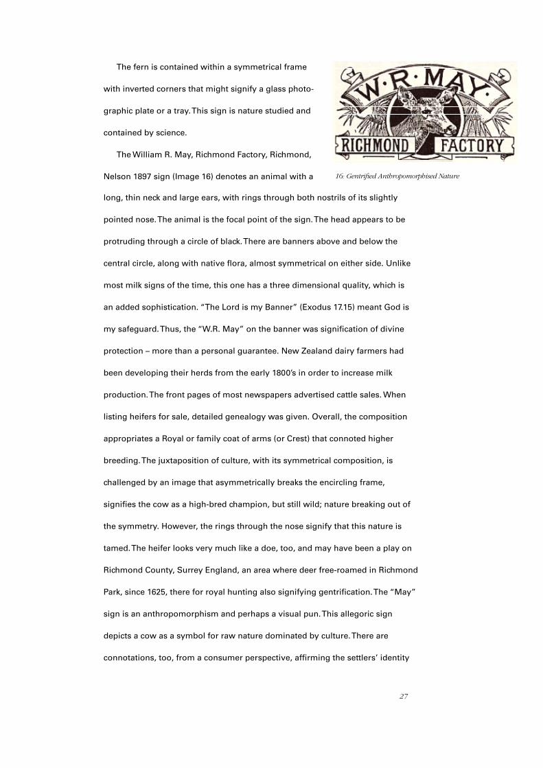
The William R. May, Richmond Factory, Richmond,
Nelson 1897 sign (Image 16) denotes an animal with a
long, thin neck and large ears, with rings through both nostrils of its slightly
pointed nose. The animal is the focal point of the sign. The head appears to be
protruding through a circle of black. There are banners above and below the
central circle, along with native flora, almost symmetrical on either side. Unlike
most milk signs of the time, this one has a three dimensional quality, which is
an added sophistication. “The Lord is my Banner” (Exodus 17.15) meant God is
my safeguard. Thus, the “W.R. May” on the banner was signification of divine
protection – more than a personal guarantee. New Zealand dairy farmers had
been developing their herds from the early 1800’s in order to increase milk
production. The front pages of most newspapers advertised cattle sales. When
listing heifers for sale, detailed genealogy was given. Overall, the composition
appropriates a Royal or family coat of arms (or Crest) that connoted higher
breeding. The juxtaposition of culture, with its symmetrical composition, is
challenged by an image that asymmetrically breaks the encircling frame,
signifies the cow as a high-bred champion, but still wild; nature breaking out of
the symmetry. However, the rings through the nose signify that this nature is
tamed. The heifer looks very much like a doe, too, and may have been a play on
Richmond County, Surrey England, an area where deer free-roamed in Richmond
Park, since 1625, there for royal hunting also signifying gentrification. The “May”
sign is an anthropomorphism and perhaps a visual pun. This allegoric sign
depicts a cow as a symbol for raw nature dominated by culture. There are
connotations, too, from a consumer perspective, affirming the settlers’ identity
16: Gentrified Anthropomorphised Nature
28
as part of the greater British Empire, as loyal subjects: exporters to the
motherland. The Richmond Factory inference is that of a superior product
through anthropomorphism of the cow, overseen by ‘divine guarantee’
and historical gentrification.
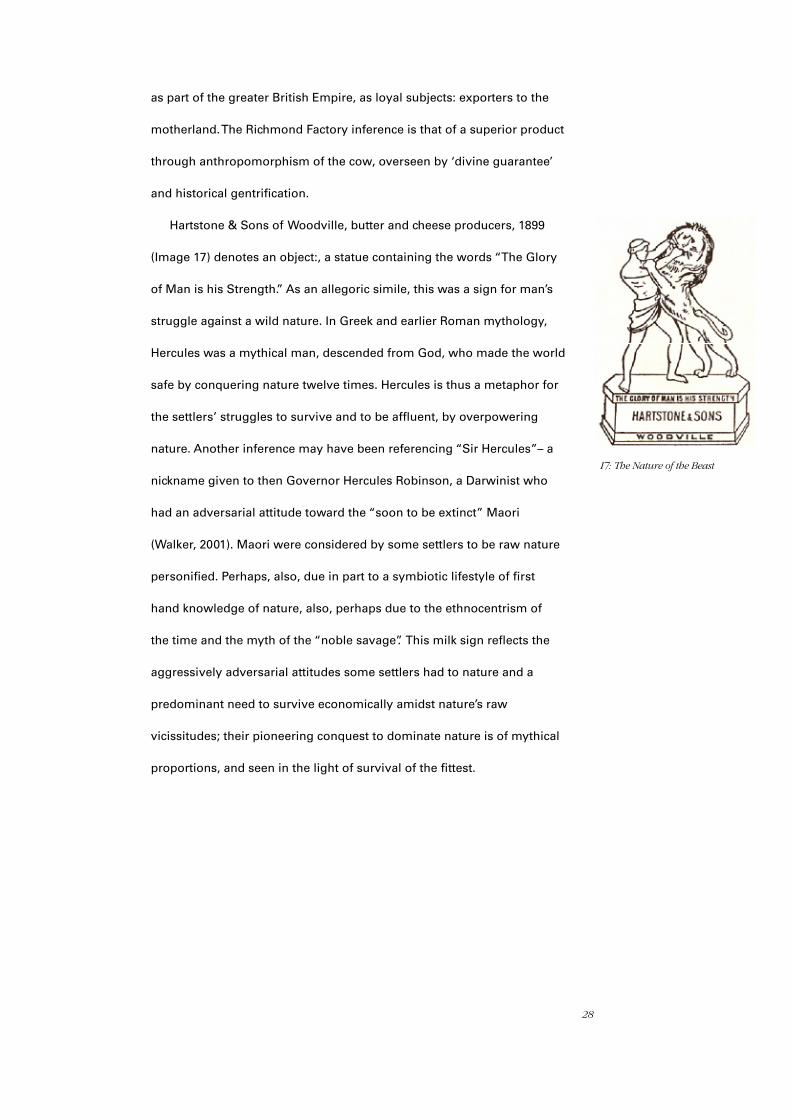
Hartstone & Sons of Woodville, butter and cheese producers, 1899
(Image 17) denotes an object:, a statue containing the words “The Glory
of Man is his Strength.” As an allegoric simile, this was a sign for man’s
struggle against a wild nature. In Greek and earlier Roman mythology,
Hercules was a mythical man, descended from God, who made the world
safe by conquering nature twelve times. Hercules is thus a metaphor for
the settlers’ struggles to survive and to be affluent, by overpowering
nature. Another inference may have been referencing “Sir Hercules”– a
nickname given to then Governor Hercules Robinson, a Darwinist who
had an adversarial attitude toward the “soon to be extinct” Maori
(Walker, 2001). Maori were considered by some settlers to be raw nature
personified. Perhaps, also, due in part to a symbiotic lifestyle of first
hand knowledge of nature, also, perhaps due to the ethnocentrism of
the time and the myth of the “noble savage”. This milk sign reflects the
aggressively adversarial attitudes some settlers had to nature and a
predominant need to survive economically amidst nature’s raw
vicissitudes; their pioneering conquest to dominate nature is of mythical
proportions, and seen in the light of survival of the fittest.
I7: The Nature of the Beast

29
Summary
Early New Zealand milk signs signified culture to consumers. Signs
representing milk frequently denoted other things that consumers could
decipher as signs of culture, rather than raw nature, because consuming
milk as an act of culture affirmed consumers of their cultural identity. Most
milk signs prior to 1900 denoted anything but cows; once milk was altered
(cooked) into cheese and butter, cows became signs for a raw ingredient
(Image 18). In other words the raw, or natural, depended on cultural signs
for mediation, whereas the cooked, or culture, could reference nature as it
was, by process, safely removed from it.
Whilst milk was a raw source of sustenance and an everyday dietary
staple, milk signs denoted a province orientated, pro-industrial identity.
Consumers affirmed their other-ness from nature (at a time when nature
was considered something to overcome) through milk signs connoting
the divine, political and economic right to dominate nature. Thus signs
signifying culture could include “natural” objects that connected the
individual to culture through signs of civilisation and the empire, such as
an acorn, thistles etc. The further removed a product was from raw nature
the more likely it was that the signs used referenced nature. The purer the
product the more likely the signs were to denote culture. 18: Examples of early ‘Culture’ Milk Signs. Brand without a Cow = Milk = Ingredient (raw). Brand with a cow = a product from culture (cooked).

30
CHAPTER
Contemporary Milk Packaging Signs Deciphered In Relation To Culture
This chapter deciphers the most popular domestic milk packaging signs
in New Zealand today, explaining how New Zealand milk signs reveal much
about the current relationship with nature, and argues that contemporary
packaging signs still signify a culture in combat with nature.
Meadow Fresh Brand
“Meadow Fresh” (Image 19) is one of Fonterra New Zealand’s milk
brands. Meadow Fresh brand of dairy products are sold daily within New
Zealand. In the visual identity the Meadow Fresh typography and underline
is light green below a composition of six yellow shapes denoting a splash
and a sun. The two colour elements always appear together out of a white
background. There are no meadows in New Zealand; “Meadow” is an English
noun New Zealanders might have read in European fairytales. Urban New
Zealand culture refers to a “pasture” or “paddock” and rural New Zealanders
to a “flat”, or a “block”. The word “Meadow” references settler origins and
infantilises the consumer. “Meadow” signifies nature as natural.
Connotations of fresh occur in association with Meadow, implying
sourced directly from the paddock and farm. An apple on a tree is “raw”–
immediately after picking it becomes “fresh”. Fresh means “only just picked”
yet the contents have been “standardised”. Standardised appears as part of
the packaging sign. The word also suggests normality but actually refers to
19: Meadow Fresh Brand Sign (2006)
3
31
an alteration of the milk beyond mere Pasteurisation and homogenisation
– standardised milk has fat and other content removed to a base level.
Variants (such as Fonterra’s Calci-Trim, Calci-kids, Trim, Balance, Mega Milk,
Xtra etc) are products with added measures of milk powders put back into
standardised milk. Under the Food Standards Act manufacturers need not
inform consumers of the re-constituted content of the product because the
base liquid is classified as milk.
The colour white signifies pure, clean, hygienic milk. Yellow (sunshine)
represents calcium, rich flavour and brightness. The green represents
fresh grass on hills growing live cow food. The typestyle imitates fluid and
the natural. The sun is a life source and often used as a cliché to represent
morning, which has associations for the consumer of health and the
natural origins of the milk. The overall composition is a cliché of a childlike
composition of New Zealand countryside with the sun emerging from
behind green, rolling hills. The fluid, splash-like strokes and droplets infer
milk, movement and an energetic spontaneous quality expected of the
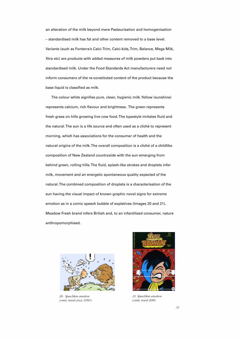
natural. The combined composition of droplets is a characterisation of the
sun having the visual impact of known graphic novel signs for extreme
emotion as in a comic speech bubble of expletives (Images 20 and 21).
Meadow Fresh brand infers British and, to an infantilised consumer, nature
anthropomorphised.
20: Speechless emotion comic novel circa 1950’s
21: Speechless emotion comic novel 2006
32
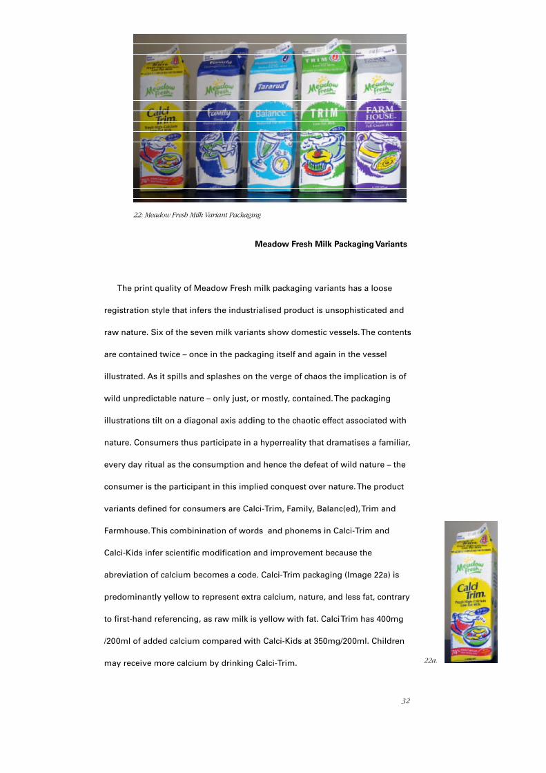
Meadow Fresh Milk Packaging Variants
The print quality of Meadow Fresh milk packaging variants has a loose
registration style that infers the industrialised product is unsophisticated and
raw nature. Six of the seven milk variants show domestic vessels. The contents
are contained twice – once in the packaging itself and again in the vessel
illustrated. As it spills and splashes on the verge of chaos the implication is of
wild unpredictable nature – only just, or mostly, contained. The packaging
illustrations tilt on a diagonal axis adding to the chaotic effect associated with
nature. Consumers thus participate in a hyperreality that dramatises a familiar,
every day ritual as the consumption and hence the defeat of wild nature – the
consumer is the participant in this implied conquest over nature. The product
variants defined for consumers are Calci-Trim, Family, Balanc(ed), Trim and
Farmhouse. This combinination of words and phonems in Calci-Trim and
Calci-Kids infer scientific modification and improvement because the
abreviation of calcium becomes a code. Calci-Trim packaging (Image 22a) is
predominantly yellow to represent extra calcium, nature, and less fat, contrary
to first-hand referencing, as raw milk is yellow with fat. Calci Trim has 400mg
/200ml of added calcium compared with Calci-Kids at 350mg/200ml. Children
may receive more calcium by drinking Calci-Trim.
22: Meadow Fresh Milk Variant Packaging
22a.
33
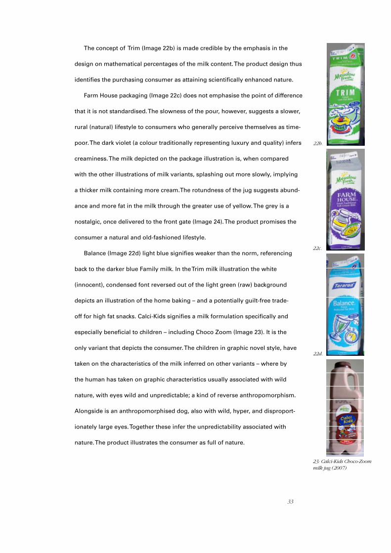
The concept of Trim (Image 22b) is made credible by the emphasis in the
design on mathematical percentages of the milk content. The product design thus
identifies the purchasing consumer as attaining scientifically enhanced nature.
Farm House packaging (Image 22c) does not emphasise the point of difference
that it is not standardised. The slowness of the pour, however, suggests a slower,
rural (natural) lifestyle to consumers who generally perceive themselves as time-
poor. The dark violet (a colour traditionally representing luxury and quality) infers
creaminess. The milk depicted on the package illustration is, when compared
with the other illustrations of milk variants, splashing out more slowly, implying
a thicker milk containing more cream.The rotundness of the jug suggests abund-
ance and more fat in the milk through the greater use of yellow. The grey is a
nostalgic, once delivered to the front gate (Image 24). The product promises the
consumer a natural and old-fashioned lifestyle.
Balance (Image 22d) light blue signifies weaker than the norm, referencing
back to the darker blue Family milk. In the Trim milk illustration the white
(innocent), condensed font reversed out of the light green (raw) background
depicts an illustration of the home baking – and a potentially guilt-free trade-
off for high fat snacks. Calci-Kids signifies a milk formulation specifically and
especially beneficial to children – including Choco Zoom (Image 23). It is the
only variant that depicts the consumer. The children in graphic novel style, have
taken on the characteristics of the milk inferred on other variants – where by
the human has taken on graphic characteristics usually associated with wild
nature, with eyes wild and unpredictable; a kind of reverse anthropomorphism.
Alongside is an anthropomorphised dog, also with wild, hyper, and disproport-
ionately large eyes. Together these infer the unpredictability associated with
nature. The product illustrates the consumer as full of nature.
22b.
22c.
22d.
23: Calci-Kids Choco-Zoommilk jug (2007)
34
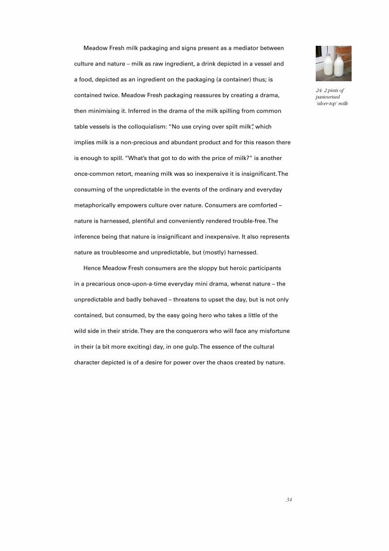
Meadow Fresh milk packaging and signs present as a mediator between
culture and nature – milk as raw ingredient, a drink depicted in a vessel and
a food, depicted as an ingredient on the packaging (a container) thus; is
contained twice. Meadow Fresh packaging reassures by creating a drama,
then minimising it. Inferred in the drama of the milk spilling from common
table vessels is the colloquialism: “No use crying over spilt milk”, which
implies milk is a non-precious and abundant product and for this reason there
is enough to spill. “What’s that got to do with the price of milk?” is another
once-common retort, meaning milk was so inexpensive it is insignificant. The
consuming of the unpredictable in the events of the ordinary and everyday
metaphorically empowers culture over nature. Consumers are comforted –
nature is harnessed, plentiful and conveniently rendered trouble-free. The
inference being that nature is insignificant and inexpensive. It also represents
nature as troublesome and unpredictable, but (mostly) harnessed.
Hence Meadow Fresh consumers are the sloppy but heroic participants
in a precarious once-upon-a-time everyday mini drama, whenst nature – the
unpredictable and badly behaved – threatens to upset the day, but is not only
contained, but consumed, by the easy going hero who takes a little of the
wild side in their stride. They are the conquerors who will face any misfortune
in their (a bit more exciting) day, in one gulp. The essence of the cultural
character depicted is of a desire for power over the chaos created by nature.
24: 2 pints of pasteurised ‘silver-top’ milk
35
Naturalea Brand
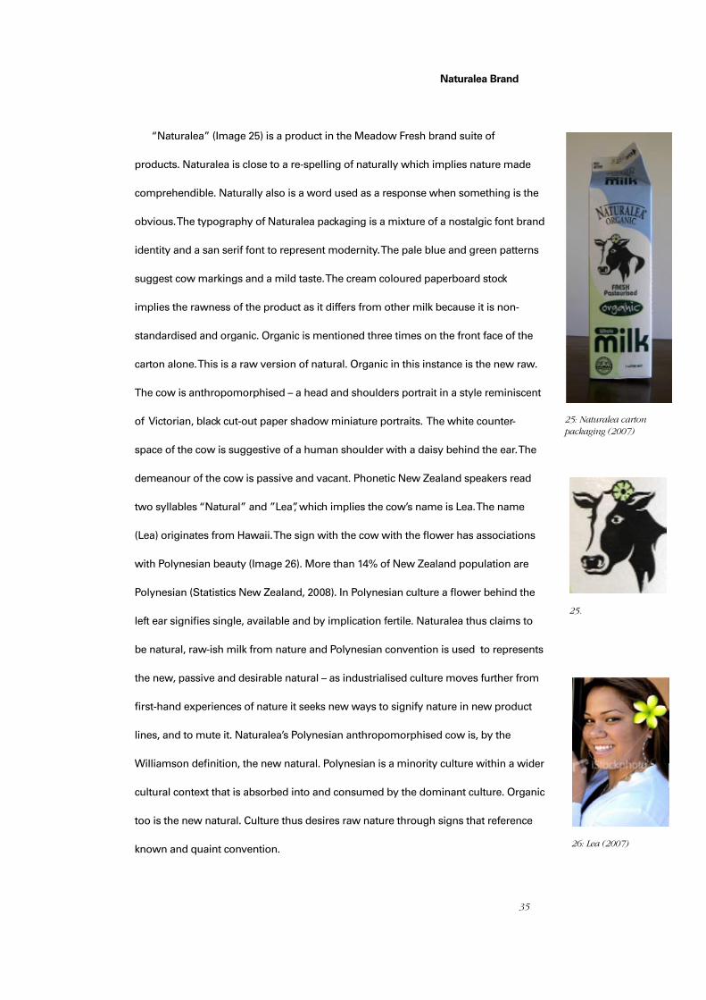
“Naturalea” (Image 25) is a product in the Meadow Fresh brand suite of
products. Naturalea is close to a re-spelling of naturally which implies nature made
comprehendible. Naturally also is a word used as a response when something is the
obvious. The typography of Naturalea packaging is a mixture of a nostalgic font brand
identity and a san serif font to represent modernity. The pale blue and green patterns
suggest cow markings and a mild taste. The cream coloured paperboard stock
implies the rawness of the product as it differs from other milk because it is non-
standardised and organic. Organic is mentioned three times on the front face of the
carton alone. This is a raw version of natural. Organic in this instance is the new raw.
The cow is anthropomorphised – a head and shoulders portrait in a style reminiscent
of Victorian, black cut-out paper shadow miniature portraits. The white counter-
space of the cow is suggestive of a human shoulder with a daisy behind the ear. The
demeanour of the cow is passive and vacant. Phonetic New Zealand speakers read
two syllables “Natural” and ”Lea”, which implies the cow’s name is Lea. The name
(Lea) originates from Hawaii. The sign with the cow with the flower has associations
with Polynesian beauty (Image 26). More than 14% of New Zealand population are
Polynesian (Statistics New Zealand, 2008). In Polynesian culture a flower behind the
left ear signifies single, available and by implication fertile. Naturalea thus claims to
be natural, raw-ish milk from nature and Polynesian convention is used to represents
the new, passive and desirable natural – as industrialised culture moves further from
first-hand experiences of nature it seeks new ways to signify nature in new product
lines, and to mute it. Naturalea’s Polynesian anthropomorphised cow is, by the
Williamson definition, the new natural. Polynesian is a minority culture within a wider
cultural context that is absorbed into and consumed by the dominant culture. Organic
too is the new natural. Culture thus desires raw nature through signs that reference
known and quaint convention.
25: Naturalea carton packaging (2007)
26: Lea (2007)
25.
36
Anchor Brand
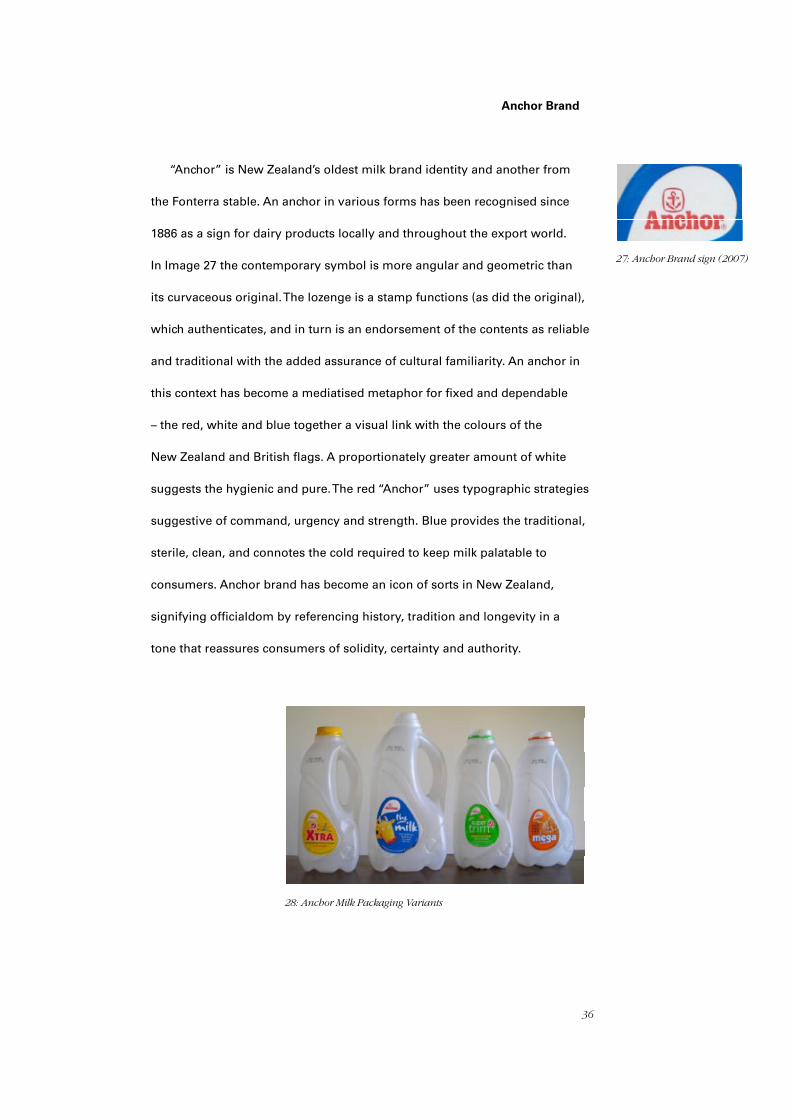
“Anchor” is New Zealand’s oldest milk brand identity and another from
the Fonterra stable. An anchor in various forms has been recognised since
1886 as a sign for dairy products locally and throughout the export world.
In Image 27 the contemporary symbol is more angular and geometric than
its curvaceous original. The lozenge is a stamp functions (as did the original),
which authenticates, and in turn is an endorsement of the contents as reliable
and traditional with the added assurance of cultural familiarity. An anchor in
this context has become a mediatised metaphor for fixed and dependable
– the red, white and blue together a visual link with the colours of the
New Zealand and British flags. A proportionately greater amount of white
suggests the hygienic and pure. The red “Anchor” uses typographic strategies
suggestive of command, urgency and strength. Blue provides the traditional,
sterile, clean, and connotes the cold required to keep milk palatable to
consumers. Anchor brand has become an icon of sorts in New Zealand,
signifying officialdom by referencing history, tradition and longevity in a
tone that reassures consumers of solidity, certainty and authority.
27: Anchor Brand sign (2007)
28: Anchor Milk Packaging Variants

37
Anchor Milk Packaging Variants
The Anchor artefact in the accompanying (Images 28 and 29) is a unique
deviation from the conventional commodity bottle-shape of its less distinctive
competitors (Image 28). The bottles have an integrated handle, coloured
screw-on caps and stick on paper labels that mirror the brand speech bubble.
The bottle also embodies the notion of the brand shape. The bottle form is
asymmetric, and represents the natural, especially in comparison to other
more market dominant shapes. The amorphous speech bubble/droplet/splash
shape of the bottle is ergonomically considerate and suggestive of a sensory
amalgamation with the natural. Consumers are encouraged to perceive them-
selves as natural and consequently what they are consuming is also natural.
It has an embossed anchor near the base of the front facia, hidden under the
label, acting as a “signature” of authenticity and reassurance. The brand is the
product and this resonates with the consumer.
The Anchor variant known as “the milk” (Image 29) is nostalgically
reminiscent of the blue-top milk that came in quart, pint and half pint glass
bottles when milk was known simply and colloquially as the milk. The name
references the traditional. The lowercase letterforms have a passive child-like
irregularity which suggests the imperfection and randomness associated with
modern signs for nature. The typestyle is globular, as though it were milk.
Humour is set up through the juxtaposition of an anthropomorphised yellow
cow speaking the brand name authoritatively as though it were a talking head
on television – momentarily in the frame, with a smiling bucolic demeanour.
The by-line “original true blue” is an expression used for honesty and again
references the blue foil-top variant introduced in glass bottles. A rather stupid
looking cow in childlike graphic novel illustration style, talks authoritatively at
consumers.
29: The Milk (2007)
38
“Xtra” milk variant is a texting-style abbreviation that signifies it is techno-
logy superior and youth-coded. There is also the connotation of “X”–“marking
the spot.” The white “plus” sign out of a red circle is technology (a button) like
a Red Cross in reverse – together a metaphor for rescue and approval – the
heart foundation tick a further authorisation of healthiness. The illustration of
a thin, leaping, genderless runner in comparatively small scale juxtaposes the
other graphic elements. The yellow background is everything – an environment
of xtra-ness. This packaging sign has no associations with nature or the natural.
The overall message is of consumers, here dwarfed by a technological rescue
pack (Image 30 previous page).
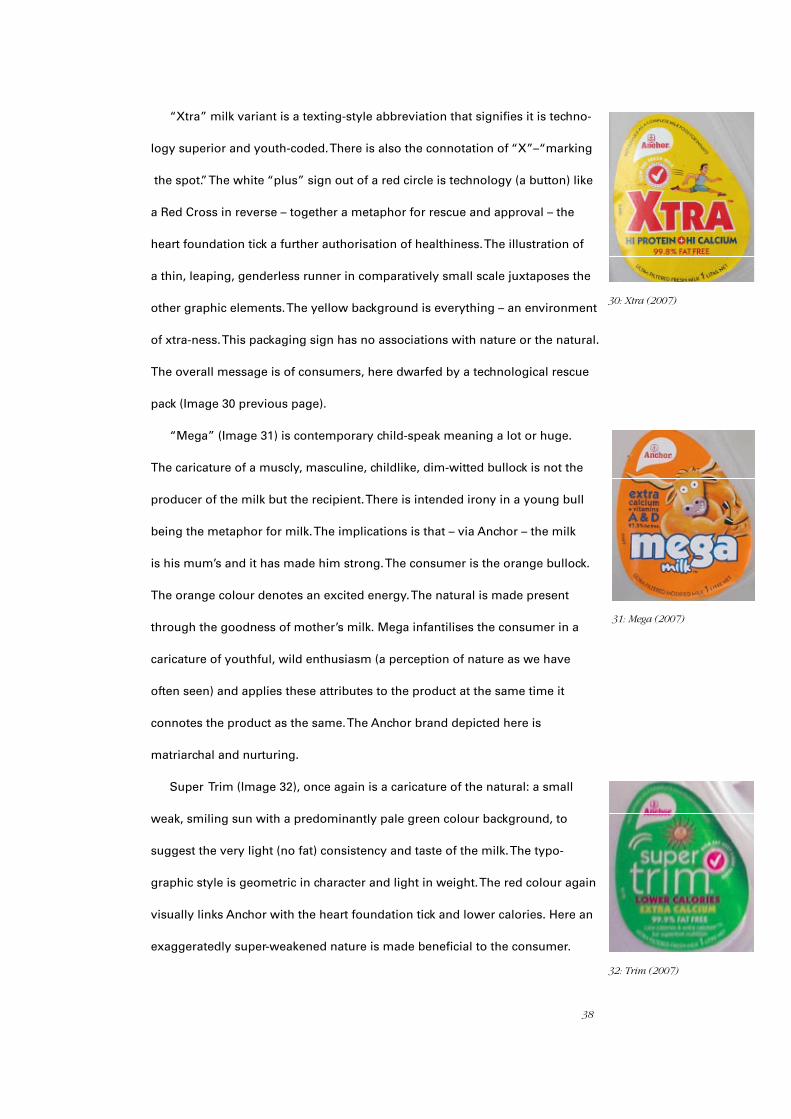
“Mega” (Image 31) is contemporary child-speak meaning a lot or huge.
The caricature of a muscly, masculine, childlike, dim-witted bullock is not the
producer of the milk but the recipient. There is intended irony in a young bull
being the metaphor for milk. The implications is that – via Anchor – the milk
is his mum’s and it has made him strong. The consumer is the orange bullock.
The orange colour denotes an excited energy. The natural is made present
through the goodness of mother’s milk. Mega infantilises the consumer in a
caricature of youthful, wild enthusiasm (a perception of nature as we have
often seen) and applies these attributes to the product at the same time it
connotes the product as the same. The Anchor brand depicted here is
matriarchal and nurturing.
Super Trim (Image 32), once again is a caricature of the natural: a small
weak, smiling sun with a predominantly pale green colour background, to
suggest the very light (no fat) consistency and taste of the milk. The typo-
graphic style is geometric in character and light in weight. The red colour again
visually links Anchor with the heart foundation tick and lower calories. Here an
exaggeratedly super-weakened nature is made beneficial to the consumer.
30: Xtra (2007)
31: Mega (2007)
32: Trim (2007)

39
Thus Anchor consumers are bit players – their role played out amidst
infantilised caricatures of a Simpson-esque, globular world whilst “ingesting”
commanding orders from huge, anthropomorphised cattle, tiny runners and
a weakened sunshine. The caricatures are hyperbolised; consumers know
they are not real and are entertained as they join in and consume the game.
The essence of the depicted cultural characters inherent in the allegory is the
desire to be accepted, to do the right thing, from a tone mollified by humour –
and the battle culture has with nature continues unabated.
Farmgate Brand
“Farmgate” is the New World supermarket chain’s own brand milk, sold
solely in high density Polyethylene bottles (HDPE). The two words, run
together, are restrained – symbolically a gate which restrains the movement
of cows (nature) and a boundary proffered by the manufacturer – put in
place between nature and culture. Overall, the colours are green and blue to
represent sky and land – nature. The underlying composition of the label is a
grid, with specific messages within each section. The top right quadrant has
four (New Zealand flag) stars and a graduating blue tint. The word “farmgate”
is in white reversed out of the blue background. The composition speaks of
white middle class New Zealand as well as of outside (nature) in an optimistic
new dawn of a future new day.The lowercase typography for farmgate, milk,
fresh, litre, net and Pasteurised speaks in a non-authoritative passive voice.
The lower right quadrant is a barcode – connoting mass production. The lower
left has scientific information about the milk and the top left has the numeral
“2” and the word “fresh” almost as a headline alongside two “fresh” young
children. The children are happy, Caucasian and appear well fed and content.
33: Farmgate Brand Packaging (2007)
33: Farmgate Brand sign (2007)

40
They are dressed and groomed in a subtly old-fashioned, non-contemporary
style. They have the demeanour of being related, which suggests family. The
word Homogenised over the chin of the laughing boy denotes a child happy
to consume this version of milk. The children are the foreground to a blurred
background that is dreamlike and of nature. Farmgate here implies the
children’s protection and, significantly, their separation from nature.
Homogenised and Pasteurised are a further scientific assurance: farmgate
is nature managed by cultural intervention (Image 33).
Culturally coded colours are again evident. Farmgate colours follow
Meadow Fresh signs’ colour codes (Image 22): Yellow for calcium enriched,
dark violet for full-cream non-homogenised, light blue for low-fat milk and
dark blue for milk without powdered milk additives. The products “Slim”
and “Extra Slim” are referential of both the consumer and the product.
Farmgate nutritional information follows the layout style indicated in the
New Zealand food standard guidelines for providing nutritional information
on packaging. The contents are listed far to the left and the quantities far to
the right with no visual link between left and right, making it difficult to line
up the two. In critiquing this sign it is irresistable not to mention that the
nutritional information has a distinct counter space within the body of the
copy unintentionally denoting a head and shoulders profile of a dog (Image
38). The skyward – looking children, bathed in warm mid-day sunshine on a
dreamlike background, look toward the new day and wait expectantly. The
purchaser fulfils the wait by literally buying into his or her own childhood
dreams and familial aspirations – culture yearns for a future that is safe,
loving, optimistic, pristine and orderly. Again nature is contained and
restrained and made safe through the auspices of the industrial. The design
elements are less concerned with branding and more conservative but the
same theme remains.
34: Farmgate Calcium Enriched (2007)
35: Farmgate Slim Milk (2007)
36: Farmgate Extra Slim (2007)
37: Farmgate Full Cream Milk (2007)38: New Zealand 45c Stamp (2006)
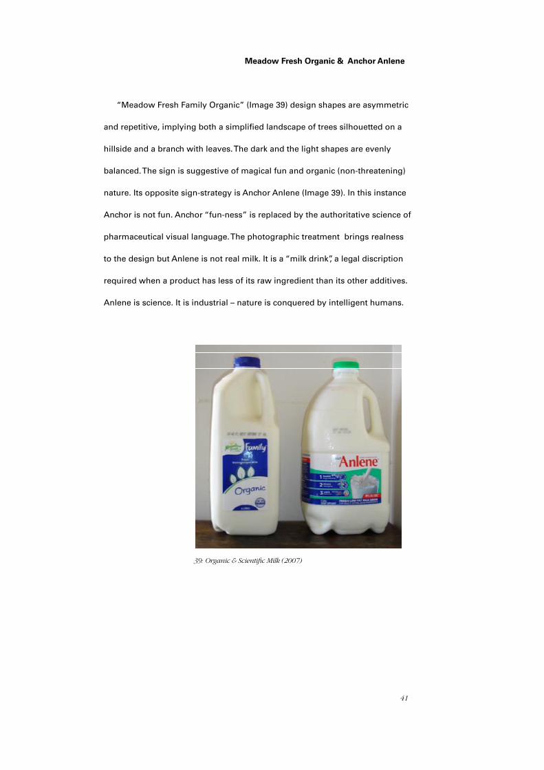
41
Meadow Fresh Organic & Anchor Anlene
“Meadow Fresh Family Organic” (Image 39) design shapes are asymmetric
and repetitive, implying both a simplified landscape of trees silhouetted on a
hillside and a branch with leaves. The dark and the light shapes are evenly
balanced. The sign is suggestive of magical fun and organic (non-threatening)
nature. Its opposite sign-strategy is Anchor Anlene (Image 39). In this instance
Anchor is not fun. Anchor “fun-ness” is replaced by the authoritative science of
pharmaceutical visual language. The photographic treatment brings realness
to the design but Anlene is not real milk. It is a “milk drink”, a legal discription
required when a product has less of its raw ingredient than its other additives.
Anlene is science. It is industrial – nature is conquered by intelligent humans.
39: Organic & Scientific Milk (2007)
42
Discussion
The confusion and profusion of signs in everyday New Zealand milk pack-
aging reflects a culture that sees itself in child-like caricatures and mini-dramas
that represent reconstituted nature as “the natural.” Milk signs humour, contra-
dict and obfusticate innate contradictions – the farm and the cow are just down
the road and the product is the authentically raw – a false assurance that little
about milk has really changed. Through contemporary milk signs culture is seen
seeking a connectedness with nature, believing the act of consumption will
affirm that which no longer is. The reconstitution of the cooked as the natural
distances the consumer from the source whilst proclaiming the opposite. The
natural has been replaced by the Organic and here the battle is seemingly less
intense; organic can be straight from the cow, scientifically enhanced. In reality
not much has changed.
Since the beginning milk packaging and signs have stood in place of nature,
subverted nature to culture, and continue to subvert it still further. Milk has
always been a prominent metaphor for nurture, close to the cultural roots of
New Zealand identity. We accept and have come to expect milk signs promot-
ing the tenuous claim that in a modern socio-economic system milk is raw. This
sleight-of-hand requires a consumer embedded in a culture, with a child-like
understanding of nature. Baudrillard’s (1988) prophecy in part is realised, for a
culture imbued with technology and distanced from the product’s source cannot
decipher the visual clues. Although industrialised packaging and product is
clearly mass produced and unnatural, culture as expressed in the signs and
packaging discussed is blind to this truth, preferring to believe to be true that
milk is as raw nature. More recently, contemporary milk packaging signs reflect
a shift from this desire to dominate nature to the desire to merge with it.
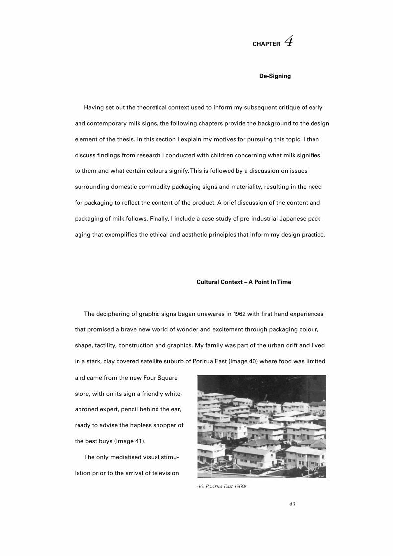
43
CHAPTER
De-Signing
Having set out the theoretical context used to inform my subsequent critique of early
and contemporary milk signs, the following chapters provide the background to the design
element of the thesis. In this section I explain my motives for pursuing this topic. I then
discuss findings from research I conducted with children concerning what milk signifies
to them and what certain colours signify. This is followed by a discussion on issues
surrounding domestic commodity packaging signs and materiality, resulting in the need
for packaging to reflect the content of the product. A brief discussion of the content and
packaging of milk follows. Finally, I include a case study of pre-industrial Japanese pack-
aging that exemplifies the ethical and aesthetic principles that inform my design practice.
Cultural Context – A Point In Time
The deciphering of graphic signs began unawares in 1962 with first hand experiences
that promised a brave new world of wonder and excitement through packaging colour,
shape, tactility, construction and graphics. My family was part of the urban drift and lived
in a stark, clay covered satellite suburb of Porirua East (Image 40) where food was limited
and came from the new Four Square
store, with on its sign a friendly white-
aproned expert, pencil behind the ear,
ready to advise the hapless shopper of
the best buys (Image 41).
The only mediatised visual stimu-
lation prior to the arrival of television
40: Porirua East 1960s.
4
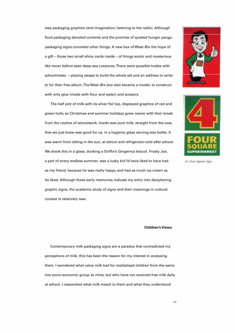
44
was packaging graphics (and imagination; listening to the radio). Although
food packaging denoted contents and the promise of quieted hunger pangs,
packaging signs connoted other things. A new box of Weet–Bix the hope of
a gift – those two small shiny cards inside – of things exotic and mysterious
like never before seen deep-sea creatures. There were possible trades with
schoolmates – playing swaps to build the whole set and an address to write
to for their free album. The Weet–Bix box also became a model, to construct
with only glue (made with flour and water) and scissors.
The half pint of milk with its silver foil top, displayed graphics of red and
green holly as Christmas and summer holidays grew nearer with their break
from the routine of schoolwork. Inside was pure milk, straight from the cow,
that we just knew was good for us, in a hygienic glass serving-size bottle. It
was warm from sitting in the sun, at school and refrigerator-cold after school.
We drank this in a glass, dunking a Griffin’s Gingernut biscuit. Frosty Joe,
a part of every endless summer, was a lucky kid I’d have liked to have had
as my friend, because he was really happy and had as much ice cream as
he liked. Although these early memories indicate my entry into deciphering
graphic signs, the academic study of signs and their meanings in cultural
context is relatively new.
Children’s Views
Contemporary milk packaging signs are a paradox that contradicted my
perceptions of milk, this has been the reason for my interest in analysing
them. I wondered what value milk had for mediatised children from the same
low socio-economic group as mine, but who have not received free milk daily
at school. I researched what milk meant to them and what they understood
41: Four Square Sign
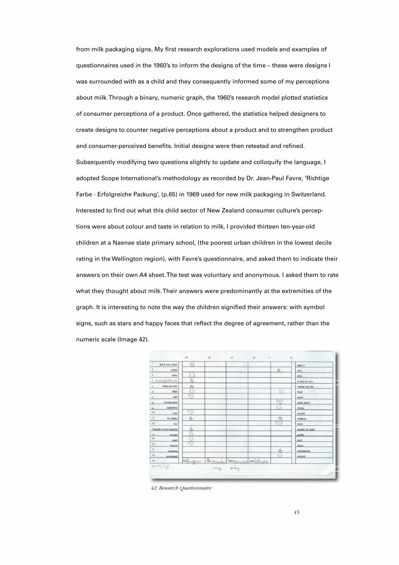
45
from milk packaging signs. My first research explorations used models and examples of
questionnaires used in the 1960’s to inform the designs of the time – these were designs I
was surrounded with as a child and they consequently informed some of my perceptions
about milk. Through a binary, numeric graph, the 1960’s research model plotted statistics
of consumer perceptions of a product. Once gathered, the statistics helped designers to
create designs to counter negative perceptions about a product and to strengthen product
and consumer-perceived benefits. Initial designs were then retested and refined.
Subsequently modifying two questions slightly to update and colloquify the language, I
adopted Scope International’s methodology as recorded by Dr. Jean-Paul Favre, ‘Richtige
Farbe - Erfolgreiche Packung’, (p.65) in 1969 used for new milk packaging in Switzerland.
Interested to find out what this child sector of New Zealand consumer culture’s percep-
tions were about colour and taste in relation to milk, I provided thirteen ten-year-old
children at a Naenae state primary school, (the poorest urban children in the lowest decile
rating in the Wellington region), with Favre’s questionnaire, and asked them to indicate their
answers on their own A4 sheet. The test was voluntary and anonymous. I asked them to rate
what they thought about milk. Their answers were predominantly at the extremities of the
graph. It is interesting to note the way the children signified their answers: with symbol
signs, such as stars and happy faces that reflect the degree of agreement, rather than the
numeric scale (Image 42).
42: Research Questionnaire
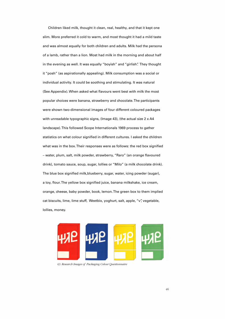
46
Children liked milk, thought it clean, real, healthy, and that it kept one
slim. More preferred it cold to warm, and most thought it had a mild taste
and was almost equally for both children and adults. Milk had the persona
of a lamb, rather than a lion. Most had milk in the morning and about half
in the evening as well. It was equally “boyish” and “girlish”. They thought
it “posh” (as aspirationally appealing). Milk consumption was a social or
individual activity. It could be soothing and stimulating. It was natural
(See Appendix). When asked what flavours went best with milk the most
popular choices were banana, strawberry and chocolate. The participants
were shown two-dimensional images of four different coloured packages
with unreadable typographic signs, (Image 43), (the actual size 2 x A4
landscape). This followed Scope Internationals 1969 process to gather
statistics on what colour signified in different cultures. I asked the children
what was in the box. Their responses were as follows: the red box signified
– water, plum, salt, milk powder, strawberry, “Raro” (an orange flavoured
drink), tomato sauce, soup, sugar, lollies or “Milo” (a milk chocolate drink).
The blue box signified milk,blueberry, sugar, water, icing powder (sugar),
a toy, flour. The yellow box signified juice, banana milkshake, ice cream,
orange, cheese, baby powder, book, lemon. The green box to them implied
cat biscuits, lime, lime stuff, Weetbix, yoghurt, salt, apple, “v”, vegetable,
lollies, money.
43: Research Images of Packaging Colour Questionnaire
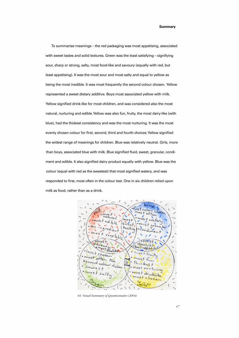
47
Summary
To summarise meanings – the red packaging was most appetising, associated
with sweet tastes and solid textures. Green was the least satisfying – signifying
sour, sharp or strong, salty, most food-like and savoury (equally with red, but
least appetising). It was the most sour and most salty and equal to yellow as
being the most inedible. It was most frequently the second colour chosen. Yellow
represented a sweet dietary additive. Boys most associated yellow with milk.
Yellow signified drink-like for most children, and was considered also the most
natural, nurturing and edible. Yellow was also fun, fruity, the most dairy-like (with
blue), had the thickest consistency and was the most nurturing. It was the most
evenly chosen colour for first, second, third and fourth choices. Yellow signified
the widest range of meanings for children. Blue was relatively neutral. Girls, more
than boys, associated blue with milk. Blue signified fluid, sweet, granular, condi-
ment and edible. It also signified dairy product equally with yellow. Blue was the
colour (equal with red as the sweetest) that most signified watery, and was
responded to first, most often in the colour test. One in six children relied upon
milk as food, rather than as a drink.
44: Visual Summary of Questionnaire (2004)
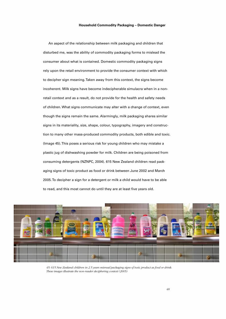
48
Household Commodity Packaging – Domestic Danger
An aspect of the relationship between milk packaging and children that
disturbed me, was the ability of commodity packaging forms to mislead the
consumer about what is contained. Domestic commodity packaging signs
rely upon the retail environment to provide the consumer context with which
to decipher sign meaning. Taken away from this context, the signs become
incoherent. Milk signs have become indecipherable simulacra when in a non-
retail context and as a result, do not provide for the health and safety needs
of children. What signs communicate may alter with a change of context, even
though the signs remain the same. Alarmingly, milk packaging shares similar
signs in its materiality, size, shape, colour, typography, imagery and construc-
tion to many other mass-produced commodity products, both edible and toxic.
(Image 45). This poses a serious risk for young children who may mistake a
plastic jug of dishwashing powder for milk. Children are being poisoned from
consuming detergents (NZNPC, 2004). 615 New Zealand children read pack-
aging signs of toxic product as food or drink between June 2002 and March
2005. To decipher a sign for a detergent or milk a child would have to be able
to read, and this most cannot do until they are at least five years old.
45: 615 New Zealand children in 2.5 years misread packaging signs of toxic product as food or drink. These images illustrate the non-reader deciphering context (2005)
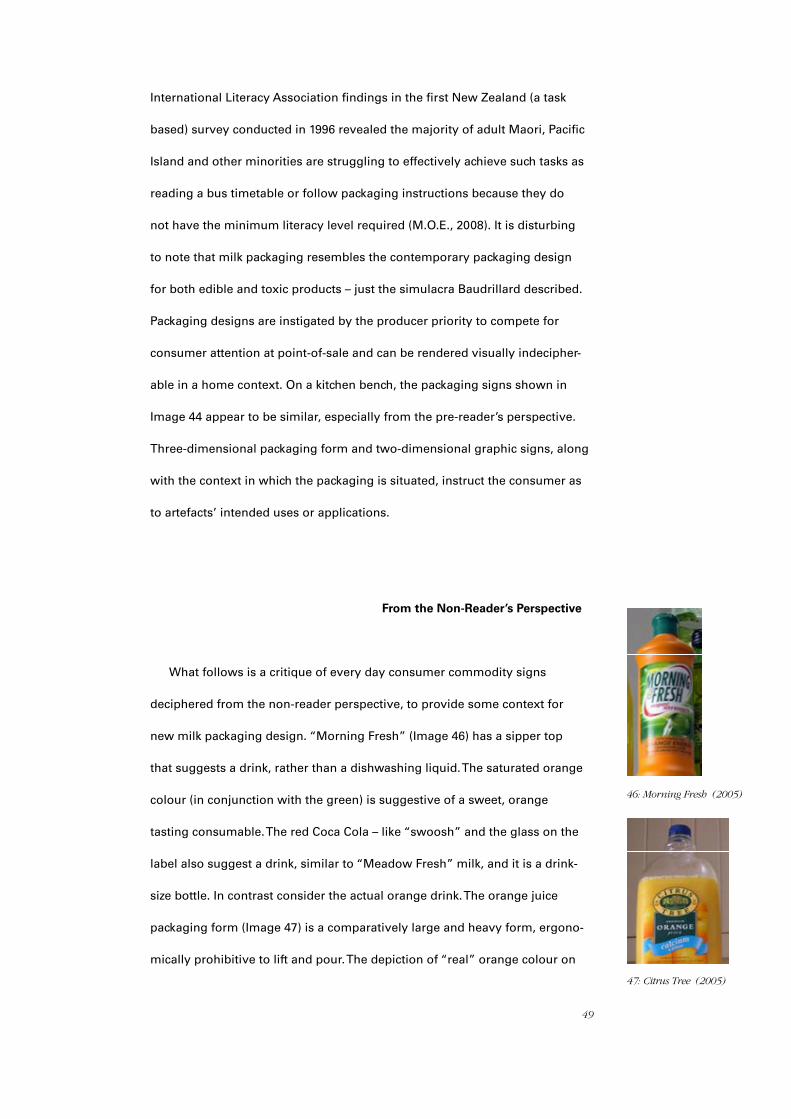
49
International Literacy Association findings in the first New Zealand (a task
based) survey conducted in 1996 revealed the majority of adult Maori, Pacific
Island and other minorities are struggling to effectively achieve such tasks as
reading a bus timetable or follow packaging instructions because they do
not have the minimum literacy level required (M.O.E., 2008). It is disturbing
to note that milk packaging resembles the contemporary packaging design
for both edible and toxic products – just the simulacra Baudrillard described.
Packaging designs are instigated by the producer priority to compete for
consumer attention at point-of-sale and can be rendered visually indecipher-
able in a home context. On a kitchen bench, the packaging signs shown in
Image 44 appear to be similar, especially from the pre-reader’s perspective.
Three-dimensional packaging form and two-dimensional graphic signs, along
with the context in which the packaging is situated, instruct the consumer as
to artefacts’ intended uses or applications.
From the Non-Reader’s Perspective
What follows is a critique of every day consumer commodity signs
deciphered from the non-reader perspective, to provide some context for
new milk packaging design. “Morning Fresh” (Image 46) has a sipper top
that suggests a drink, rather than a dishwashing liquid. The saturated orange
colour (in conjunction with the green) is suggestive of a sweet, orange
tasting consumable. The red Coca Cola – like “swoosh” and the glass on the
label also suggest a drink, similar to “Meadow Fresh” milk, and it is a drink-
size bottle. In contrast consider the actual orange drink. The orange juice
packaging form (Image 47) is a comparatively large and heavy form, ergono-
mically prohibitive to lift and pour. The depiction of “real” orange colour on
46: Morning Fresh (2005)
47: Citrus Tree (2005)

50
the label is visible but unappetising because it is juxtaposed with dark
green - a colour children associate with savoury or vegetable, as demo-
nstrated, a taste experience often avoided. There is a printed texture of
oranges but this is cropped beyond recognition, without scale or context.
Such ambiguities heighten the threat posed.
“Finish” (Image 48) has a blue top that is fast-flow and cup-like and
it has the same blue of the most common milk cap colour. The product is
ammonia based dishwashing powder and is highly toxic. Alongside, at
the top of the handle, is a shape that repeats like a child’s building blocks.
A glass is pictured; again reinforcing a perception of drink-ability. The
yellow colour may create the idea of banana flavour to children. There is
a “lolly” (sweet) over the dot of the “i” of finish.
The poorest children, who are often responsible for purchasing their
own dietary needs (Scragg, 2005), rely on a collage of packaging signs
that are non-referential. When a “roll-on” deodorant package design is
reappropriated to contain a confection called “Brainlicker” (Image 49),
adults may not decipher such a meaning, regardless of the packaging
forms, but children do. Children reference first-hand, packaging forms
that are generic for other products. In this case the “Brainlicker” candy
is indistinguishable from roll-on deodorant, except for the signs on the
packaging – neither of which literally reference the product within, other
than a sour taste inferred by the lime green colour.
In an article for Consumer magazine, Bev Frederikson (2005) report-
ed on child poisoning. She explains that children have access to highly
corrosive substances. Pouring these into their mouths can cause irrepar-
able damage as the substances may but actually be look like milk but are
dishwashing powder. They look like milk because milk is packaged like
many commodity products that are non-consumable. In the same article
48: finish (2005)
49: Brainlicker: (2005)

51
I was quoted as pointing out that for non-readers milk packaging was
indecipherable from some detergent packaging. Since then Consumer
(2007) has reported the work of the injury prevention service of Starship
Children’s Health, “Safekids”, which has forced a reduction in the levels of
highly corrosive dishwashing powders and is drafting regulations to improve
dishwashing powder labelling and packaging requirements. The
tragic consequences of packaging design simulacra will most likely persist
until producer driven research provides designers with professional object-
ives. The situation cannot easily be resolved by making minor adjustments,
for fear of losing sales. Poison statistics indicate children looking for some-
thing to drink are deciphering the visual language of toxic product packaging
forms, colours, symbols and combinations of these, as often more appetising
than consumable commodities. In addition, commodity product packaging
such as milk is constantly changing so for the non-reader, recall of a
recognised set of packaging signs may be obsolete. (see Images 50i to 50xvi).
50i-xvi : Packaging Signs change all the time (2002-2007)
52
As the spectrum of contemporary commodity packaging artefacts do not
have a unique form for a specific type of product, new milk packaging for
children is needed to differentiate them. By signifying flavour etc. through
relevant colour use, in a combination that addresses usability in a unique
and unmistakable way, and through size, shape and accessibility providing
unmistakable differentiation.
Packaging Materials
In exploring the signification of culture in relation to nature by way of
milk signs it is also necessary to investigate the physical properties of milk
packaging artefacts. Milk containers are partially transparent, which causes
milk to be exposed to light. The material is porous and there is air below
the cap. Air space and light contribute to rapid degradation. Vitamins leach
through the packaging within a matter of a few hours (Cladman, (1998),
Haisman, (1992). The content of the milk as listed on the packaging may be
now, with a shelf life of eight days or more, displayed in florescent lit fridges,
what the content values might be.
Consumers are being lead to believe, through school programmes and
packaging promotions, that milk cartons are biodegradable because of camp-
aigns to swap native seedlings for empty used cartons. The idea of the “swap”
implies the exchange of two things of equal value, however this is not the
case with HDPE milk cartons. HDPE can be reused. Reheated it becomes a
black substance used for such things as out-water underground plumbing
pipes and seedling trays but this process makes the material actively toxic.
This packaging remains unchanged in landfill. It is a recent practice to use
HDPE liners to seal off toxins in landfills, rather than have them break down,

53
therefore the non-biodegradability of HDPE is presented as a consumer
benefit. Future milk packaging needs to not only signify a return to nature
and care for the environment but also be adapted to deliver on this.
The National Packaging Covenant
The New Zealand Ministry of the Environment signed the New Zealand
Packaging Accord in 2004. It proposed shared responsibility between con-
sumers, industry and government, for managing the environmental impact
of consumer packaging waste. The aims set out to inform consumers, and to
assist them to make decisions about purchases – influenced by the recovery
and disposal practices required in the life cycle of the spent materials.
51: “Meadow Fresh Seedling Swap Meadow Fresh Seedling Swap Free Native Seedling Bring in any Meadow Fresh Milk packaging to participating garden centre and nurseries on SATURDAY 7th and SUNDAY 8th August 2004 and we will swap it for a FREE Native Seedling! Visit www.meadowfresh.co.nz to find the participating garden centre or nursery closest to you…There are also some useful recycling tips to help you care for our environment”. (2004)
54
Packaging designers in future will be expected to consider the environmental
impact of what they create because there will be costs attached to products
arising from the cost of packaging disposal. In Japan, producers are respons-
ible for recycling costs of their packaging. A different model in Germany
(since 1991 the – “Ordinance on the Avoidance of Packaging Waste”) involves
the consumer being taxed per item purchased, this has, according to the
RMIT(2005), had major impact on packaging design in Germany. The New
Zealand Accord currently is a voluntary agreement, with onus on payment
by the producer. Some materials mentioned in the Accord are glass,
paper and plastics. There is no aim to reduce the disposal or recycling of
composite packaging such as milk cartons, that are plastic and paper. The
Covenant is a self-regulatory agreement relevant to suppliers of raw packaging
material, packaging manufacturers, processors, packaging users, brand
owners, producers, retailers, wholesalers, governments and consumers.
All, say the Accord, are responsible for minimizing adverse environmental
consequences from production and waste. Brand owners in the future, if not
signees of the voluntary Covenant, will compulsarily be covered by the
National Environment Protection Measure (NEPM). The NEPM will require
them to recover their products’ consumer packaging. NEPM will require that
the energy from packaging disposal is recovered, or the packaging be reused
or recycled. In future consumers will be informed adequately about how the
packaging will be dealt with. The question thus posed for future milk packaging
is whether it is possible to package milk in a container that (i) does not leach
content value (ii) is biodegradable (iii) conforms with the National Packaging
Covenant, and (iv) does not confuse as to its content.
55
Pre Industrial Packaging
Pre-Industrial packaging is hand-made from nature first-hand, and pack-
ages both raw and cooked materials (products). Industrialised culture must
manage packaging production on an entirely different scale day to day.
Could industry manufacture a functional, natural packaging system for milk?
Historically, the study of packaging per se, has tended to be scattered
throughout other disciplines (such as psychology, philosophy, fine arts,
sociology and advertising) – seen as a metaphoric symbol, rather than on
its own merits; as artefacts that reflect the values of a culture. Records of
pre-industrial, biodegradable, every-day packaging artefacts have been very
sparsely documented. But Mr H. Oka fortunately, saw the beauty of the
deminishing pre-industrial food-packaging designs of Japan and recorded
these regional signature design objects in How to Wrap Five Eggs (1967).
The book offers an insight into what was possible in packaging design in a
particular pre-industrial culture. The culture it examines was dependent on
nature and reflected first-hand knowledge of nature.
Two categories Levi-Strauss defined as of cultural significance were
“utensils” (physical tools with functions) and “manufactured objects” (of
spiritual significance). In contemporary milk packaging the utensil is the milk
container. The “manufactured object” is equivalent to the values and mean-
ing the culture has attached to milk – a piece of the allegorical. On a physical
level and on a psychological level, then, packaging artefacts that function
between the consumer and the food in a seamless interaction.
The pre-eminent collections recorded by Mr Oka in 1967, and the later
1975 sequel How to Wrap Five More Eggs evidence functional, beautiful
symbols displaying Japan as having a close culture/nature relationship.

56
These artefacts signify a culture that created objects that were transparent
in their construction, function and communication: the artefacts were in
harmony with culture. This section deciphers pre industrial packaging in a
contemporary context.
The packaging shown in (Image 52) was packaging that stacked, protect-
ed, displayed, hung, contained and carried five eggs. It was made from rice
straw, a readily available material at the point the eggs were gathered. The
bulk of the straw was at the base where the weight stress is greatest. Each
egg had outer protection from impact as the straw twists at the extremities
of the eggs. The top fastening is a pocket of protective air and also is the
carrying handle as the object was not freestanding. The colour, texture and
odour of the rice straw informed of the freshness of the eggs.
Sasa no shizuku (bamboo leaf dewdrop) (Image 53) had many functions;
like a contemporary “six pack” it held five hollow bamboo segments each
containing a drink made of dark purple Azuki bean, sugar and water. The
consumer removed the leaf wrapped at the top of the bamboo and then
punctured the lower membrane base and sucked the rising contents. The
woven trays and contents were placed in a cold stream (or running water)
to keep cool. The visual effect of the dark shiny violet against the wet, fresh
green colour must have provided consumers with sensory pleasure. They
were sold by a confectionery company in Kyoto.
The Kyoto sweet, Shinsei mame, (Image 54) was considered an ancient
and traditional confection, believed to have been invented by a Buddhist
monk centuries earlier. It was a “cooked” (manufactured object) that
symbolised through shape and manufacture, a spiritual wholeness and
completeness. This circular ball was an edible sphere that formed two
symmetrical bowls on opening. The inside held the same edible confection,
repeated on a smaller scale.
52: How To Wrap Five Eggs. Oka, H. (1967).
53: Azuki bean confection/ drink
54: A (cooked) Spiritual food & object

57
An area known for its long winters and heavy snow was symbolised
by a miniature snowshoe made of bamboo, straw rope and dyed paper.
The traditional textile pattern identifies it being from Ojiya in the Niigata
Prefecture (Image 55). The symbols identify the contents as vegetables
pickled in soybean paste.
Image 56 shows a folded kumazasa leaf and a crystal-like layer of pectin
preserve called Sasa ame: the leaf not only wrapped the preserve but also
infused it with a ecalyptus type flavour. Pre-industrial Japanese packaging
utilised available materials in nature to package raw and cooked products.
The age of the packaging indicated the freshness of the product. Some pack-
aging signified geographic location, the uniqueness of a region, [prefecture]
such as the climate, local produce and geographic location and features.
Some packaging celebrated seasonal changes. The packaging also signified
beyond utilitarian function, as exemplars of unique and diverse provincial
identities that wrought unique designs, displaying the skill and ingenuity of
the maker’s allied social functions and habits. The packaging created was
beautiful and informed by first hand knowledge of nature. The consumer of
the product would interact with nature (the packaging form) that was a part
of a culture also part of nature. Consideration for the implications of these
examples gave me the inspiration to create packaging design that changed
the relationship between packaging nature and packaging culture.
55: Ojiya Promotion
56: Pectin leaf wraps & flavours the preserve
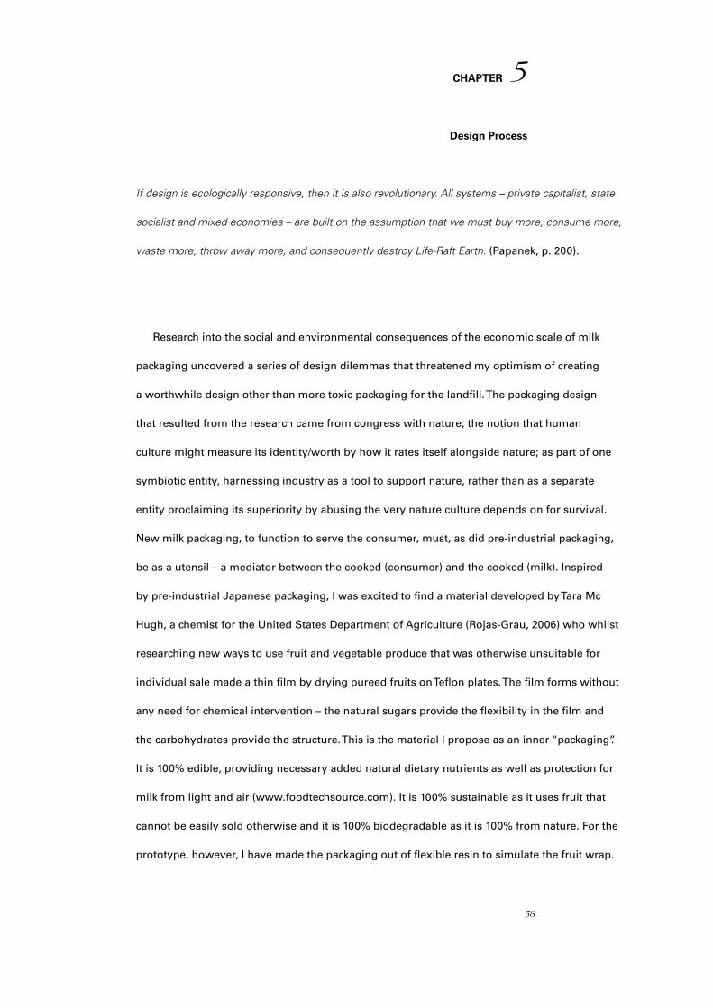
58
CHAPTER
Design Process
If design is ecologically responsive, then it is also revolutionary. All systems – private capitalist, state
socialist and mixed economies – are built on the assumption that we must buy more, consume more,
waste more, throw away more, and consequently destroy Life-Raft Earth. (Papanek, p. 200).
Research into the social and environmental consequences of the economic scale of milk
packaging uncovered a series of design dilemmas that threatened my optimism of creating
a worthwhile design other than more toxic packaging for the landfill. The packaging design
that resulted from the research came from congress with nature; the notion that human
culture might measure its identity/worth by how it rates itself alongside nature; as part of one
symbiotic entity, harnessing industry as a tool to support nature, rather than as a separate
entity proclaiming its superiority by abusing the very nature culture depends on for survival.
New milk packaging, to function to serve the consumer, must, as did pre-industrial packaging,
be as a utensil – a mediator between the cooked (consumer) and the cooked (milk). Inspired
by pre-industrial Japanese packaging, I was excited to find a material developed by Tara Mc
Hugh, a chemist for the United States Department of Agriculture (Rojas-Grau, 2006) who whilst
researching new ways to use fruit and vegetable produce that was otherwise unsuitable for
individual sale made a thin film by drying pureed fruits on Teflon plates. The film forms without
any need for chemical intervention – the natural sugars provide the flexibility in the film and
the carbohydrates provide the structure. This is the material I propose as an inner “packaging”.
It is 100% edible, providing necessary added natural dietary nutrients as well as protection for
milk from light and air (www.foodtechsource.com). It is 100% sustainable as it uses fruit that
cannot be easily sold otherwise and it is 100% biodegradable as it is 100% from nature. For the
prototype, however, I have made the packaging out of flexible resin to simulate the fruit wrap.
5
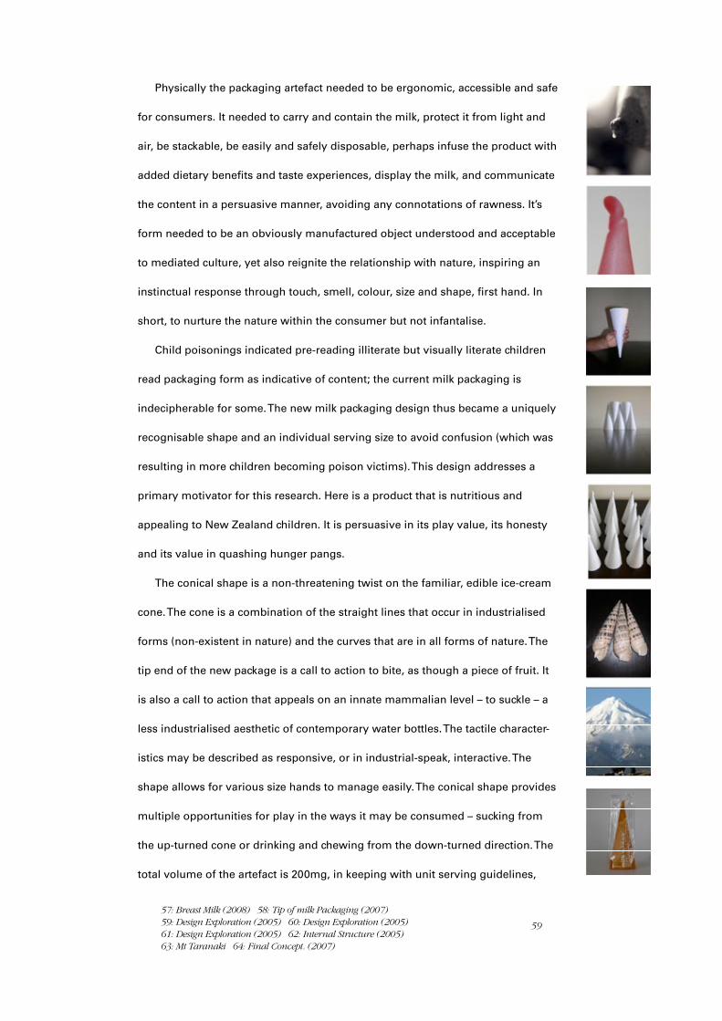
59
Physically the packaging artefact needed to be ergonomic, accessible and safe
for consumers. It needed to carry and contain the milk, protect it from light and
air, be stackable, be easily and safely disposable, perhaps infuse the product with
added dietary benefits and taste experiences, display the milk, and communicate
the content in a persuasive manner, avoiding any connotations of rawness. It’s
form needed to be an obviously manufactured object understood and acceptable
to mediated culture, yet also reignite the relationship with nature, inspiring an
instinctual response through touch, smell, colour, size and shape, first hand. In
short, to nurture the nature within the consumer but not infantalise.
Child poisonings indicated pre-reading illiterate but visually literate children
read packaging form as indicative of content; the current milk packaging is
indecipherable for some. The new milk packaging design thus became a uniquely
recognisable shape and an individual serving size to avoid confusion (which was
resulting in more children becoming poison victims). This design addresses a
primary motivator for this research. Here is a product that is nutritious and
appealing to New Zealand children. It is persuasive in its play value, its honesty
and its value in quashing hunger pangs.
The conical shape is a non-threatening twist on the familiar, edible ice-cream
cone. The cone is a combination of the straight lines that occur in industrialised
forms (non-existent in nature) and the curves that are in all forms of nature. The
tip end of the new package is a call to action to bite, as though a piece of fruit. It
is also a call to action that appeals on an innate mammalian level – to suckle – a
less industrialised aesthetic of contemporary water bottles. The tactile character-
istics may be described as responsive, or in industrial-speak, interactive. The
shape allows for various size hands to manage easily. The conical shape provides
multiple opportunities for play in the ways it may be consumed – sucking from
the up-turned cone or drinking and chewing from the down-turned direction. The
total volume of the artefact is 200mg, in keeping with unit serving guidelines,
57: Breast Milk (2008) 58: Tip of milk Packaging (2007) 59: Design Exploration (2005) 60: Design Exploration (2005) 61: Design Exploration (2005) 62: Internal Structure (2005) 63: Mt Taranaki 64: Final Concept. (2007)
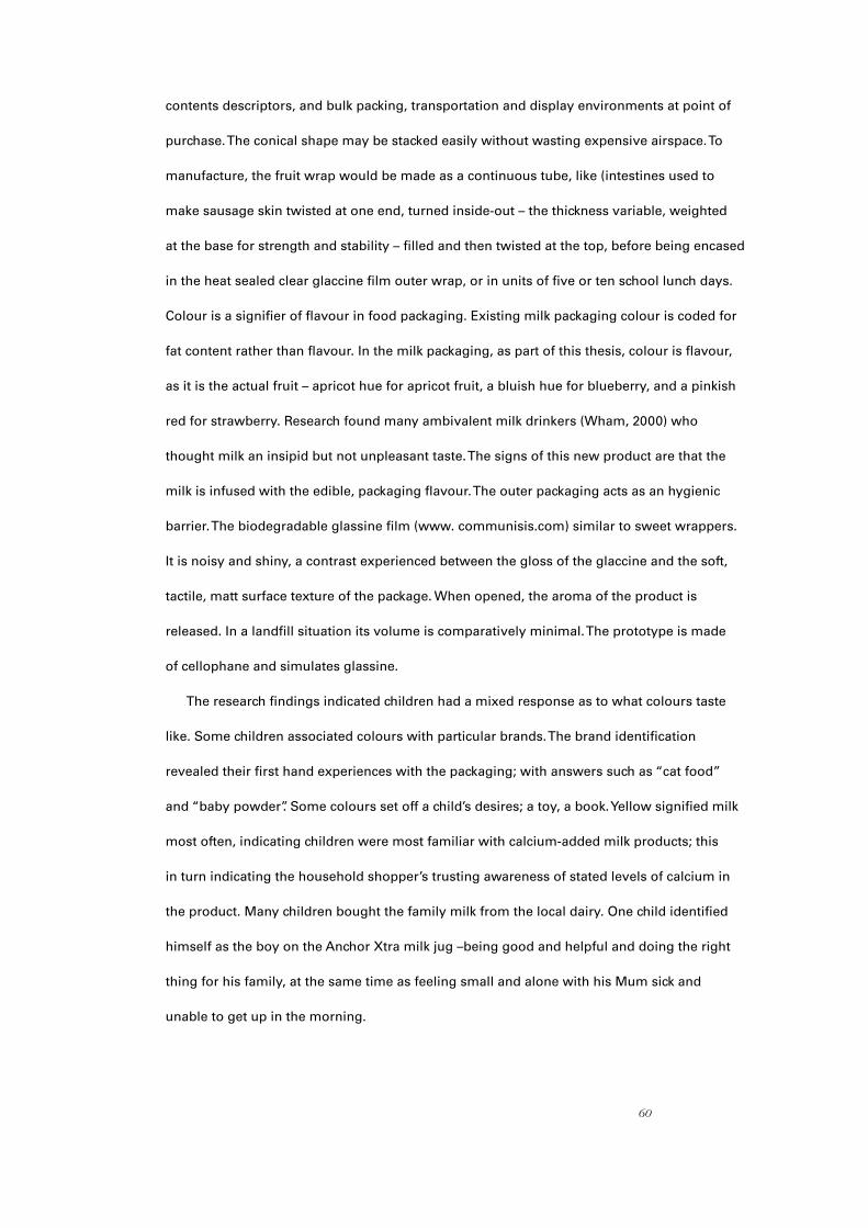
60
contents descriptors, and bulk packing, transportation and display environments at point of
purchase. The conical shape may be stacked easily without wasting expensive airspace. To
manufacture, the fruit wrap would be made as a continuous tube, like (intestines used to
make sausage skin twisted at one end, turned inside-out – the thickness variable, weighted
at the base for strength and stability – filled and then twisted at the top, before being encased
in the heat sealed clear glaccine film outer wrap, or in units of five or ten school lunch days.
Colour is a signifier of flavour in food packaging. Existing milk packaging colour is coded for
fat content rather than flavour. In the milk packaging, as part of this thesis, colour is flavour,
as it is the actual fruit – apricot hue for apricot fruit, a bluish hue for blueberry, and a pinkish
red for strawberry. Research found many ambivalent milk drinkers (Wham, 2000) who
thought milk an insipid but not unpleasant taste. The signs of this new product are that the
milk is infused with the edible, packaging flavour. The outer packaging acts as an hygienic
barrier. The biodegradable glassine film (www. communisis.com) similar to sweet wrappers.
It is noisy and shiny, a contrast experienced between the gloss of the glaccine and the soft,
tactile, matt surface texture of the package. When opened, the aroma of the product is
released. In a landfill situation its volume is comparatively minimal. The prototype is made
of cellophane and simulates glassine.
The research findings indicated children had a mixed response as to what colours taste
like. Some children associated colours with particular brands. The brand identification
revealed their first hand experiences with the packaging; with answers such as “cat food”
and “baby powder”. Some colours set off a child’s desires; a toy, a book. Yellow signified milk
most often, indicating children were most familiar with calcium-added milk products; this
in turn indicating the household shopper’s trusting awareness of stated levels of calcium in
the product. Many children bought the family milk from the local dairy. One child identified
himself as the boy on the Anchor Xtra milk jug –being good and helpful and doing the right
thing for his family, at the same time as feeling small and alone with his Mum sick and
unable to get up in the morning.

61
The internal structure of the package may be cell-like (similar to inside an orange), making
consumption easier. Or, it could be a spiral (similar to the structure inside a shell) to slow
the milk and be less likely to spill (see workbook for working drawings). More fruit packaging
would, beneficially, provide more favourable dietary fibre (the sugar content modified) and
although there is perhaps too much for a child to consume, it is biodegradable waste. My
final packaging models are orange for apricot, red for strawberry and blue for blueberry.
The supplied mock-up is Rasberry, a treat fruit for poorer children. I believe there ought to
be a yellow package as well – banana flavoured. Because children expect yellow to signify
banana food, I would consider packaging yoghurt inside a yellow vessel, to fulfil their
expectations they have deduced from their semiotic decipherings.
The selected typefaces provide a juxtaposition of a humanist font – Cooper Black – with
a geometric font – Futura Condensed. Cooper Black has the curvaceous fullness of nature,
inferring milk as wholesome nature, while Futura Condensed provides the factual voice of
science. Cooper Black also has a “squishiness” that alludes to the nature of the packaging
experience. The typographic content is informative and succinct. The overall design relies
on the juxtaposition of an obviously playful product alongside a non-emotive font to provide
a balanced tone. The content description on the outer glaccine is divided into information
about the fruit wrap first, in bold headline. Then the description is repeated with bold
emphasis on the milk when the milk contents are described.
The glossy brand sign that appears at around 72pt on the matt surface of the product was
a decision made as part of the design process. It is an intrinsic part of the product and cannot
be removed, providing an indelible identification that projects pride and authenticity – “bite”
is a reassurance, instructing consumers as to what to do when faced with this new product.
The brand offers identification should there be line extensions such as yoghurt. The brand is
on the product. It is also a potential marketing tool for promotional strategies (see workbook
concepts). There is a tight wrap and a loose wrap design solution.

62
65: Final Milk Packaging Design Concept (2007) – Delicious, Edible, Nutritious, Biodegradable, Sustainable, Fun, Economic, Stack-able, Display-able.
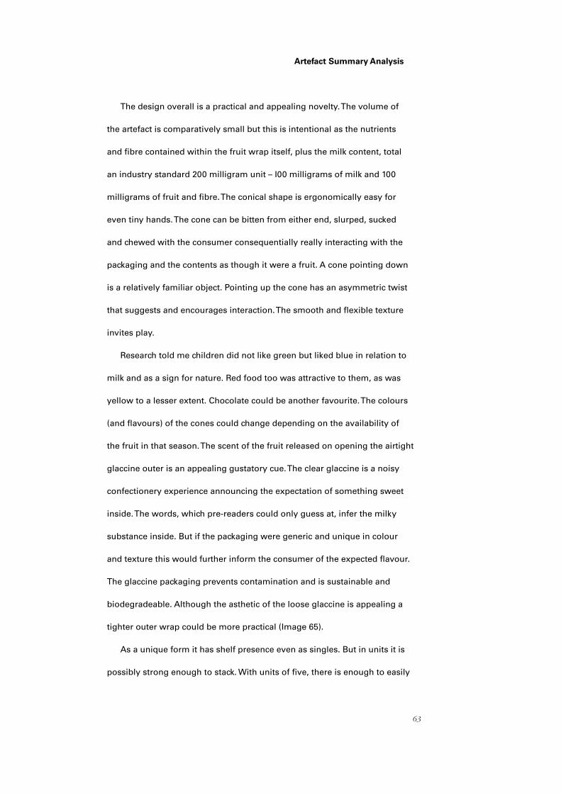
63
Artefact Summary Analysis
The design overall is a practical and appealing novelty. The volume of
the artefact is comparatively small but this is intentional as the nutrients
and fibre contained within the fruit wrap itself, plus the milk content, total
an industry standard 200 milligram unit – I00 milligrams of milk and 100
milligrams of fruit and fibre. The conical shape is ergonomically easy for
even tiny hands. The cone can be bitten from either end, slurped, sucked
and chewed with the consumer consequentially really interacting with the
packaging and the contents as though it were a fruit. A cone pointing down
is a relatively familiar object. Pointing up the cone has an asymmetric twist
that suggests and encourages interaction. The smooth and flexible texture
invites play.
Research told me children did not like green but liked blue in relation to
milk and as a sign for nature. Red food too was attractive to them, as was
yellow to a lesser extent. Chocolate could be another favourite. The colours
(and flavours) of the cones could change depending on the availability of
the fruit in that season. The scent of the fruit released on opening the airtight
glaccine outer is an appealing gustatory cue. The clear glaccine is a noisy
confectionery experience announcing the expectation of something sweet
inside. The words, which pre-readers could only guess at, infer the milky
substance inside. But if the packaging were generic and unique in colour
and texture this would further inform the consumer of the expected flavour.
The glaccine packaging prevents contamination and is sustainable and
biodegradeable. Although the asthetic of the loose glaccine is appealing a
tighter outer wrap could be more practical (Image 65).
As a unique form it has shelf presence even as singles. But in units it is
possibly strong enough to stack. With units of five, there is enough to easily
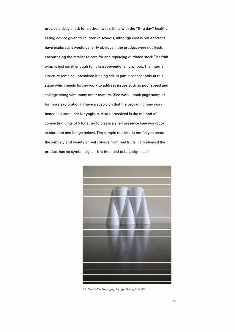
64
provide a daily snack for a school week. It fits with the “5+ a day” healthy
eating advice given to children in schools, although cost is not a factor I
have explored. It would be fairly obvious if the product were not fresh,
encouraging the retailer to care for and replacing outdated stock. The fruit
wrap is just small enough to fit in a conventional lunchbox. The internal
structure remains unresolved it being still in part a concept only at this
stage which needs further work to address issues such as pour speed and
spillage along with many other matters. (See work - book page samples
for more exploration). I have a suspicion that the packaging may work
better as a container for yoghurt. Also unresolved is the method of
connecting units of 5 together to create a shelf presence (see workbook
exploration and image below). The sample models do not fully express
the subtlety and beauty of real colours from real fruits. I am pleased the
product has no symbol signs – it is intended to be a sign itself.
65: Final Milk Packaging Design Concept (2007)
65
Conclusion
In many areas designers must learn how to re-design (Papanek. p.81)
Semiotic analysis of New Zealand milk signs and packaging from 1800 to the present day
has provided a necessary framework for deciphering the underlying relationship between
culture and nature. Milk is a product from nature, however the industrialisation of milk has
been enmeshed uniquely into the social conventions, perceptions and economic growth of
New Zealand culture. The historical context of New Zealand milk signs and what they signified,
and the signification of contemporary milk signs, have given context for the development of
the design brief and resulting milk packaging artefact.
By applying the theoretical frameworks of Strauss, Baudrillard, Barthes, Williamson and
Pierce, the thesis deciphers early signs, revealing a paradoxical relationship of domination by
culture over nature – its right to do so unquestioningly. Early New Zealand milk signs reflect-
ed a transposed culture fearful of untamed nature and battling against it. In an emergent,
largely regionalised industry, nature was resignified as symbols for culture. The raw product
was inferred, rendered not visible and presented as improved by technology, sweetened by
music, made superior by breeding and contained and rendered harmless by science; in some
instances also represented by symbols of empire, loyalty, monarchy, brute strength or more
latterly simply not nature – improved.
Deciphering contemporary New Zealand milk signs revealed a culture still overwhelmingly
expressing a domination over nature: nature now reassigned as ‘the natural’ with remnants of
past signs; still visual threads in a new time context. Semiotic analysis of contemporary milk
signs also included the wider context of competitive commodity artefacts and signs which
became simulacra when taken out of the retail environment, becoming indecipherable from
toxic substances to non- readers.
66
Contemporary milk signs and packaging paradoxically also reflect culture with a new desire to
merge with nature through signs signifying raw nature in people, authoritative anthropomorphised
cows, wild children, cartoon characters that infantalise the culture – the new expression of raw
nature moving beyond natural to organic.
Milk packaging artefacts do little more than contain the product for transportation and display.
The packaging materials, from a non renewable resource, are non biodegradable and unable to
protect the nutritional values of the milk beyond a few hours. The size of the packaging is a difficult
prospect to manoeuvre for some consumers. The new raw renders the consumers’ association
with nature even more distant and alienated.
My aim in this thesis was to design milk packaging that would denote attributes connoted in
contemporary milk packaging signs, with secondary meaning; signifiers pertinent to the nature
of the product and not inferring too close an association with the natural. The milk packaging
design concept is a physical object that is an industrialised aesthetic, yet merges culture with the
experiential of nature first hand in the context of industrial reality. Referencing pre-industrial pack-
aging design provided direction for a new generic approach to mass produced packaging artefacts
as signs. The functions of the milk packaging artefact were extended beyond the industrial require-
ments of contemporary packaging functions of containment, ease to fill, transportation, and display
of milk. Extending the design brief involved addressing cultural allegory and repackaging to
address the materiality and disposal. The design solution is unmistakable to decipher, even for
non readers. It provides additional nutrition by protecting milk from light and air degradation and
providing added nutritonal value, appealing taste and scent. It is one possible solution to the
central issues – this thesis explores and exposes, and thus its aesthetic references attributes from
nature, culture and industry. It comes from a renewable resource. The milk packaging design
concept of this thesis is some proof that it is possible to not dominate nature. A packaging object
that signifies what it is, through an industrialised aesthetic, by breaking the allegoric inferences,
enables consumers to decipher the product as it is – industrialised milk with a twist of nature.

67
Appendices

68
Questionnaire

69

70

71

72

73

74

75

76
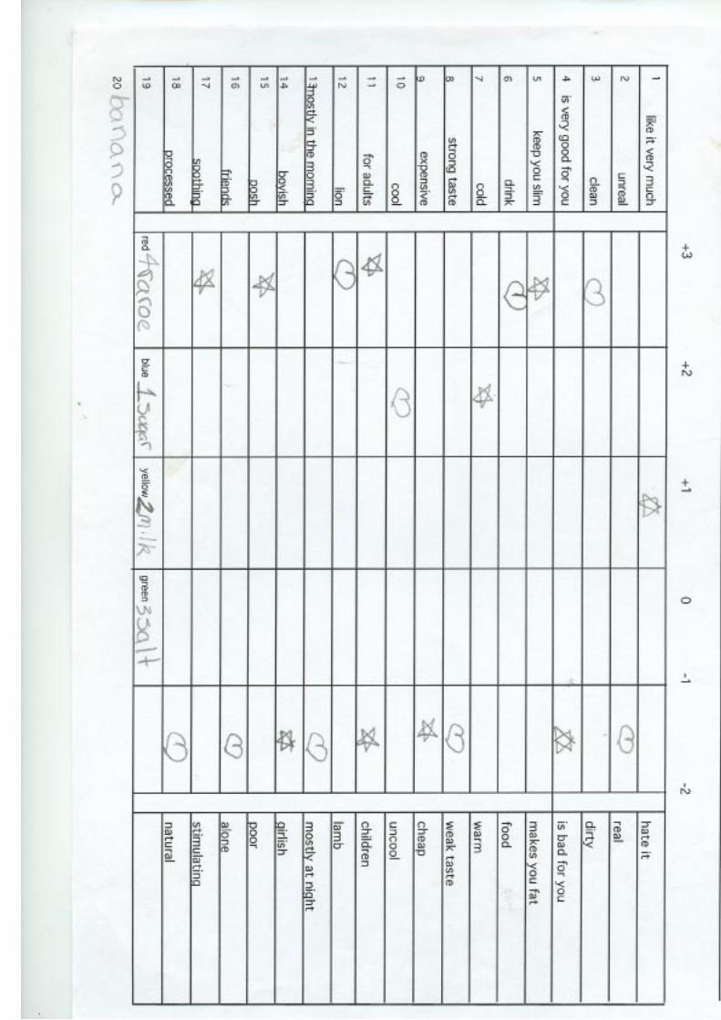
77

78
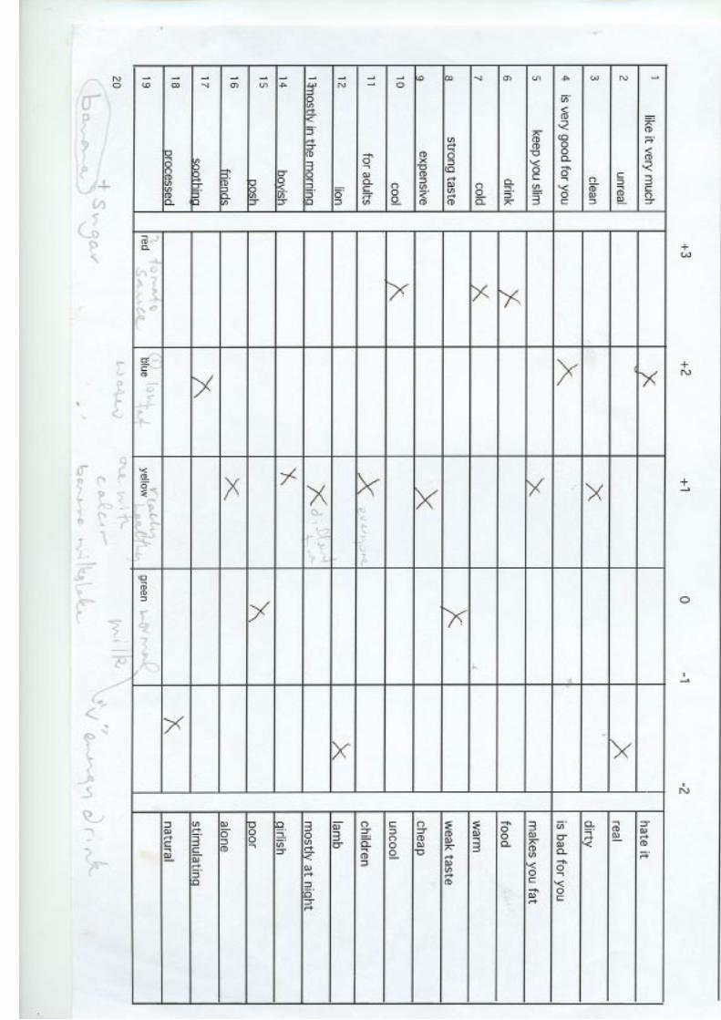
79
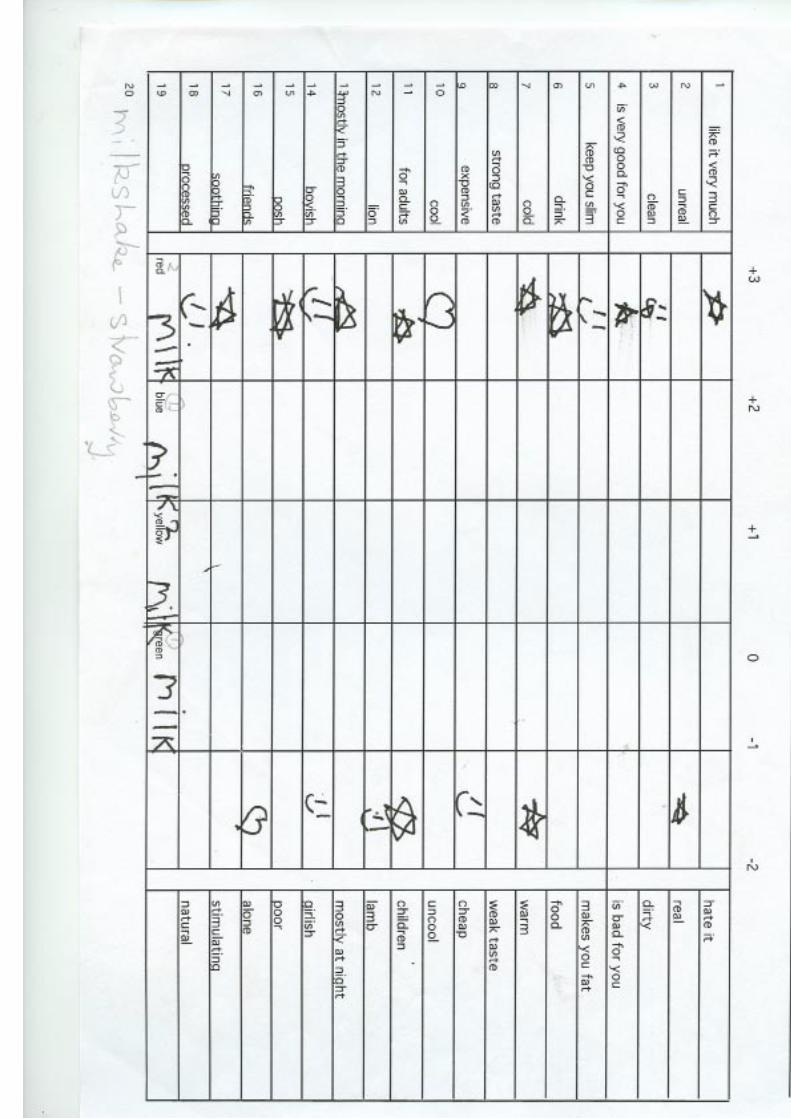
80

81

82
STATISTICS OF ANSWERS
Red Blue Yellow Green SWEET 6 6 5 2 SOUR 0 0 1 4 SALTY 1 0 0 2 SAVOURY 3 1 1 3WATERY 3 7 5 2 THICK 2 0 4 1GRANULAR 3 4 1 2EDIBLE 13 12 11 11 INEDIBLE 0 1 2 2INGREDIENT 3 2 0 1 CONDIMENT 2 3 0 1 DAIRY 2 6 6 2 NURTURING 11 11 12 4FUN 5 5 9 6 NATURAL 13 12 11 8FRUIT 2 1 5 4

83
Workbook
84

85
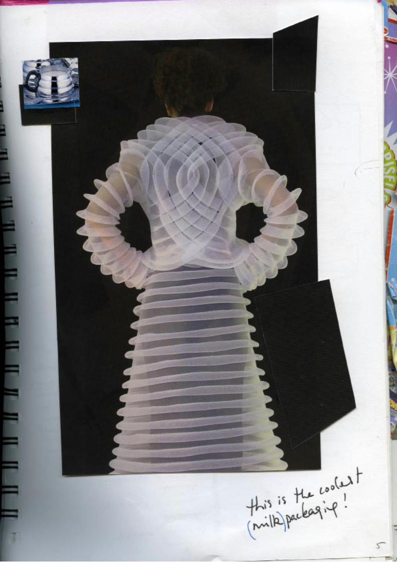
86
87

88
89
90
91

92
93
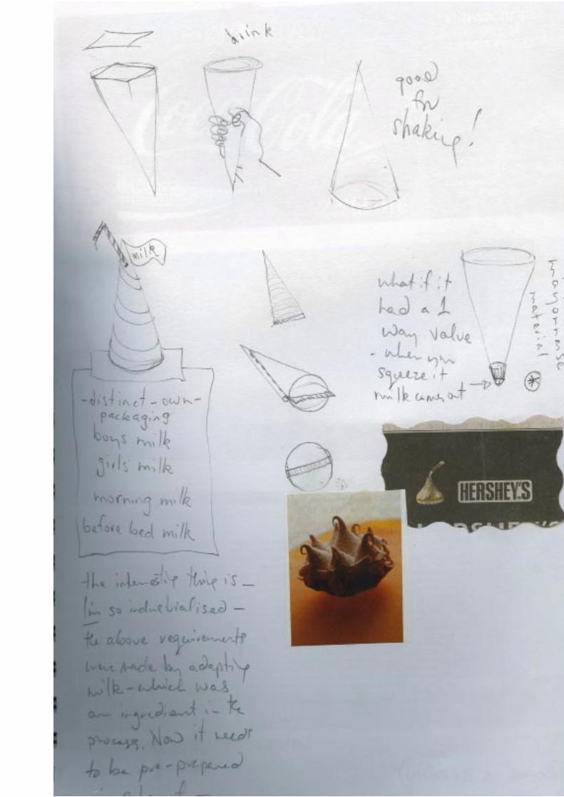
94
95

96
97
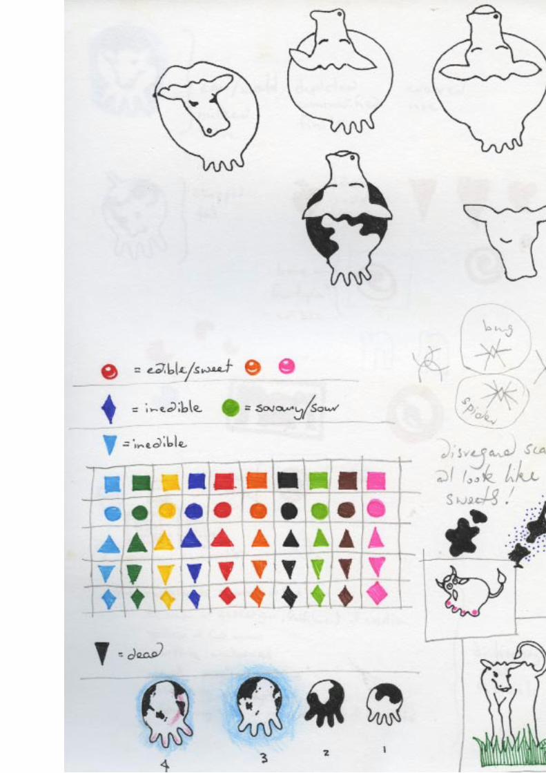
98

99
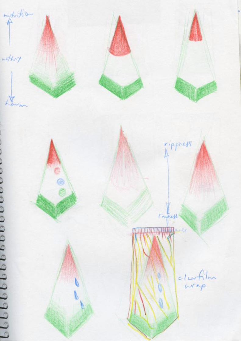
100

101

102

103
104
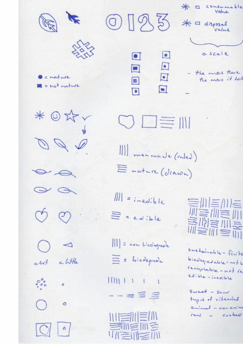
105
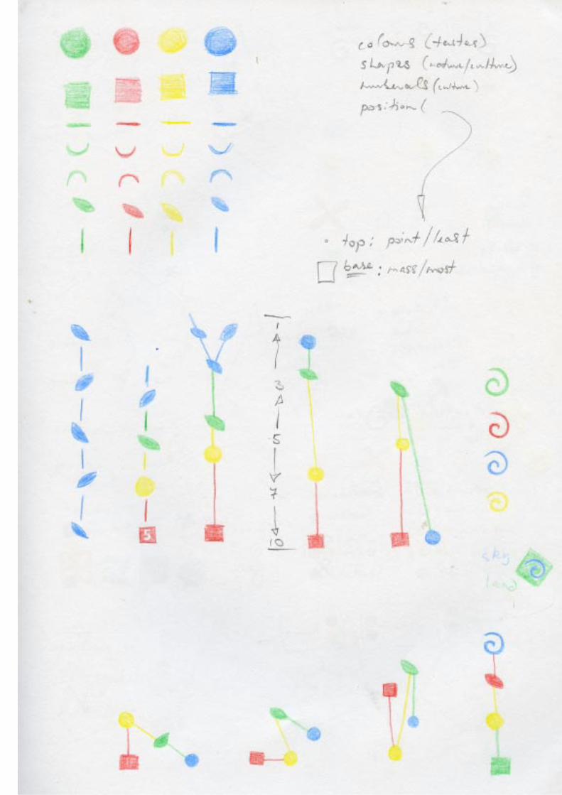
106

107
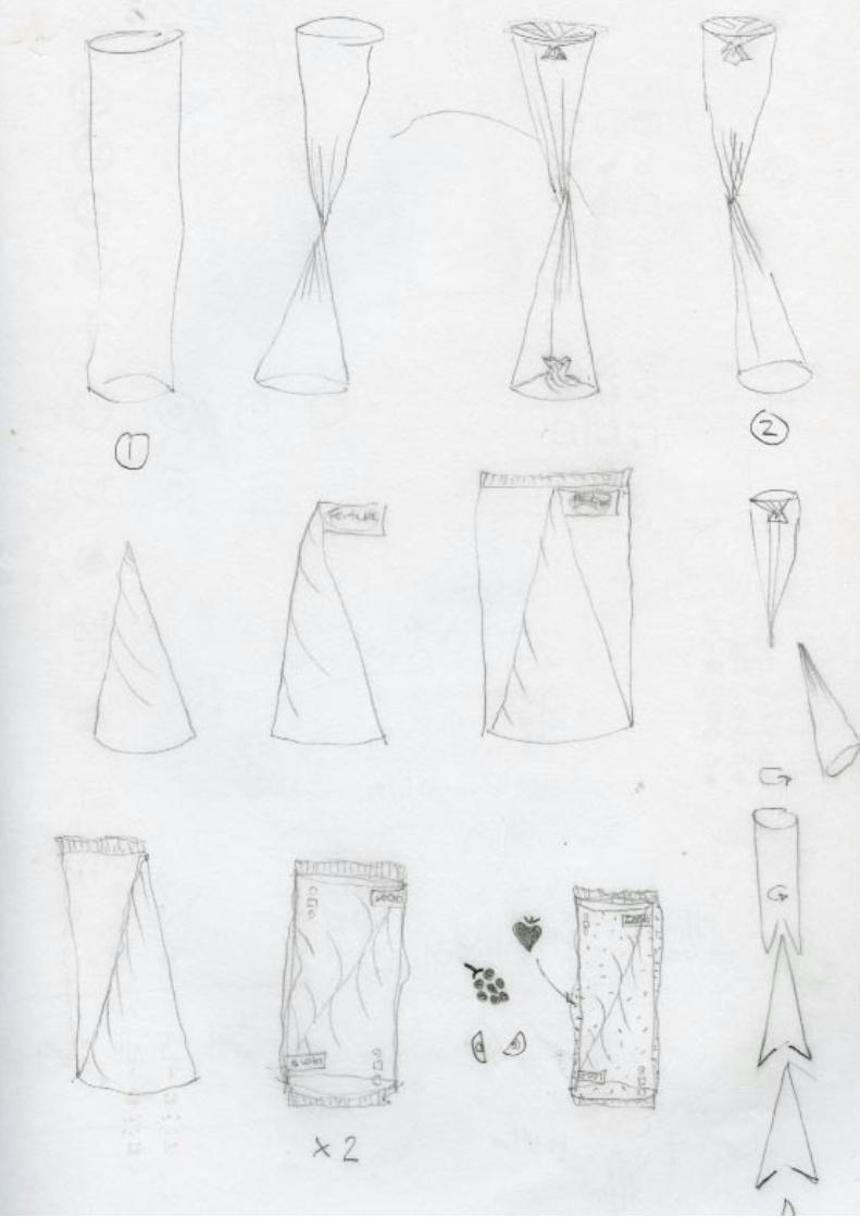
108
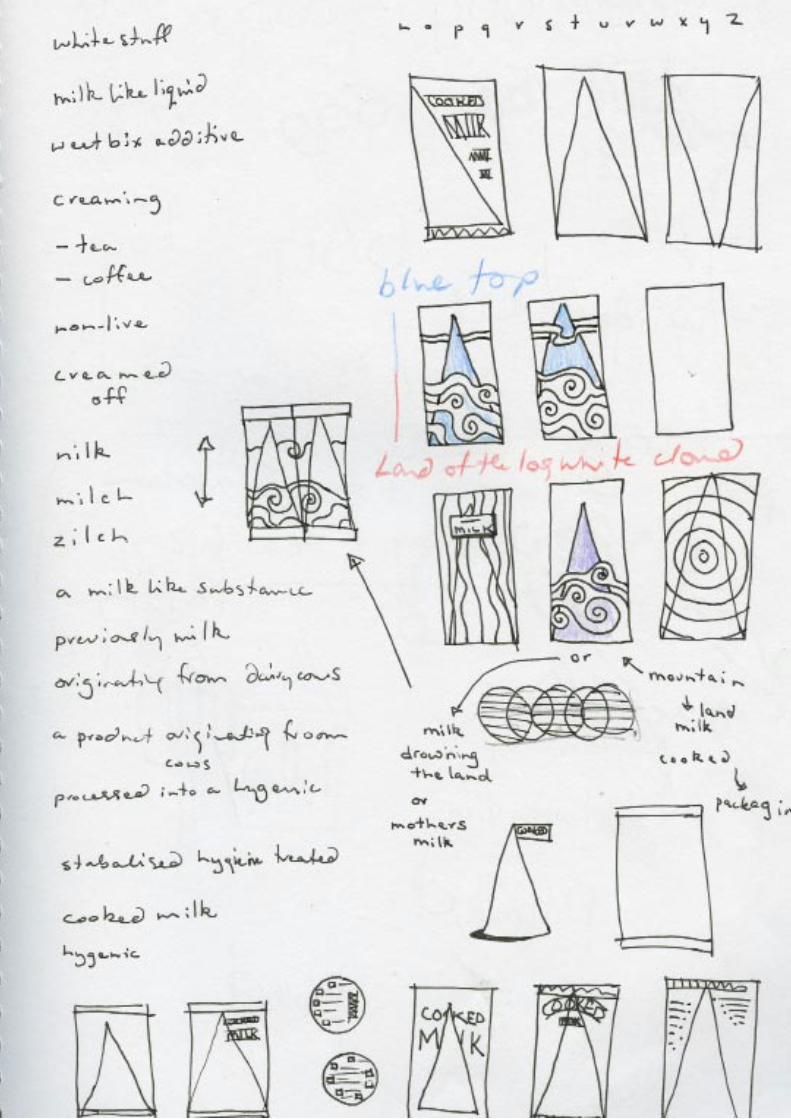
109
110
111

112

113
Creative Summary

114
115
116
117
118

119

120

121
122

123
124

125

126
127

128

129

130

131
132

133

134

135

136

137

138

139
140

141

142
143
144

145
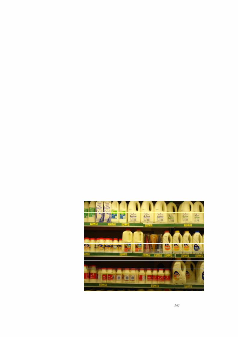
146
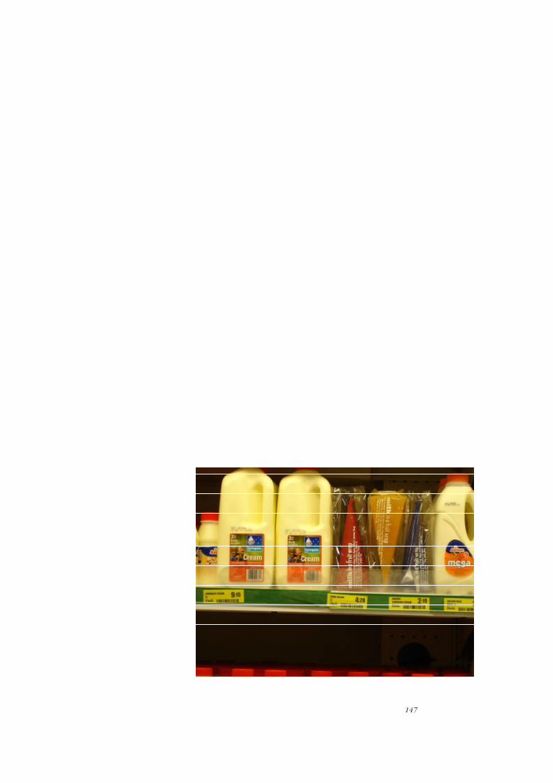
147
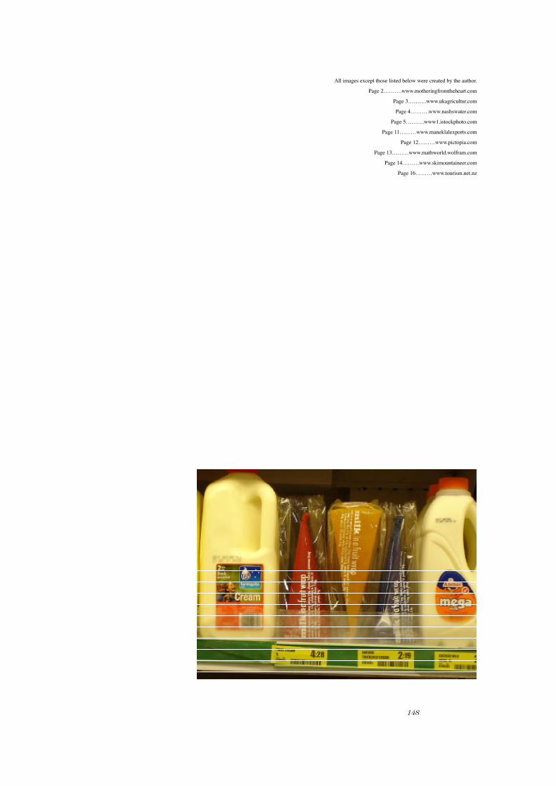
148
All images except those listed below were created by the author.
Page 2……….www.motheringfromtheheart.com
Page 3……….www.ukagricultur.com
Page 4……….www.nashswater.com
Page 5……….www1.istockphoto.com
Page 11………www.maneklalexports.com
Page 12………www.pictopia.com
Page 13………www.mathworld.wolfram.com
Page 14………www.skimountaineer.com
Page 16………www.tourism.net.nz

149
Bibliography
Anchor milk site. Retrieved 19 January, 2005. http://www.anchorville.co.nz/flash/loader.php
Appadurai, A. Ed. (1986). The social life of things. Commodities in cultural perspective. Cambridge: Cambridge University Press.
Ausubel, D. P. (1960). The fern and the tiki. An american view of new zealand national character, social attitudes, and race relations. London: Angus & Robertson.
Balaji,R.(2006). Tetra pak trains its eyes on dairy industry. The Hindu. 19 September, 2006. Retrieved 3 March, 2006 from http://www.hindu.com/2006/09/19/stories/2006091908691600.htm
Bateman, D. (1986). The illustrated encyclopaedia of new zealand. Auckland: David Bateman Ltd.
Bayley, S. (1991). Taste: the secret meaning of things. London: Faber & Faber.
Beeton, I. (1880). The book of household management. Section:1713. London: Ward, Lock and Co.
Beeton, I. (1880). The housewife’s treasury of domestic information. London: Ward, Lock and Co.
Belk, R.W., Ger, G., & Askegaard,S. (1996). Metaphors of consumer desire. Advances in Consumer Research, 23, 368-73.
Belk, R. W. (2000). May the farce be with you: on las vegas and consumer infantilisation. Consumption, Markets and Culture, 4, 126-140.
Betts, P. (2004).The authority of everyday objects: a cultural history of west german industrial design. California: University of California Press.
Betts, R. (2004). A history of popular culture: more of everything, faster and brighter. New York: Routledge.
Bordieu, P. (1996). Trans. Nice, R. Distinction: a social critique of the judgement of taste. United States of America: Harvard College.
Briggs, A. (2001). Veblen, bourdieu, and conspicuous consumption. Journal of Economic Issues, 35, 99.
Chambers,J. (2007). Safekids Media Release. (2004).New Zealand National Poisons Centre. Otago University. Retrieved 3 March, 2008 from www.safekids.org.nz/downloads/Kitchen%20Poisons%20-%20Safekids%20Position%202007.pdf
Duchting, H. (2000). Kandinsky:1866-1944: A revolution in painting. Koln: Benedikt Taschen.
Featherstone M. (1996). Consumer culture & postmodernism. London. Sage Publications Ltd.
Findlay, V. (2002) Color.: A natural history of the palette. New York: Ballantine Books.
Fiske, John. (1978). Reading television. London: Methuen & Co. Ltd.
Fitzsimmons, C. (19 August, 2003). Milk keeps kids’ bones strong. The Weekend Australian. Retrieved 21 August, 2003 from www.theaustralian.news.com.au.
Fonterra Co-operative group. Working with a fair value share. Fonterra Co-operative Group. Retrieved 12 October 2004 from http://www.fonterra.com/content/dairyingnz/history/history3.jsp
Frederikson, B. (30 March, 2005). Dishwasher detergent safety - acid test.Consumer Magazine. 445,12.
Gage, J. (1993). Colour and culture: practice and meaning from antiquity to abstraction. London: Thames and Hudson.
Gentry, J., Baker, S. M., & Kraft, F. B. (1995). The role of possessions in creating, maintaining and preserving one’s Identity: Over the life course. Advances in Consumer Research, 22, 413-418.
Ger, G. (1999). Product-place images: Image as a narrative. Advances in Consumer Research, 26, 163-163.

150
Gerstner, K. (1968). Designing programmes. Switzerland: Arthur Niggli.
Gerstner, K. (1986). The forms of color: The interaction of visual elements. London: MIT Press.
Gerstner, K. (2001). !’ review of 5x10 years of graphic design etc. Osfildern-Ruit: Hatje Cantz.
Goethe,von. J. (1840). Theory of colours. (11th ed.). London: John Murray.
Goulding, A., Grant, A.M., Taylor, R.W., Williams, S.M., Parnell, W., Wilson, N., & Mann, J. (2007). Clinical and laboratory observations: Ethnic differences in extreme obesity. Journal of Pediatrics, 151, 542-544.
Grunenberg. C. & Hollein, M. (Eds). (2002). Shopping: A century of art and consumer culture. Ostfildern - Ruit: Hatje Cantz.
Holland, D.K. Ed. (2001). Design issues: how graphic design inform society. New York: Allworth Press.
Honour, H. & Fleming, J. (1995). A world history of art (4th ed.). London: Lawrence King.
Holt. D.B. (1998). Does cultural structure american consumption. Journal of Consumer Research. V 25 nl p.1
Hughes, R. (2000). The shock of the new: art and the century of change. London: Thames and Hudson.
Jae, H., & Delecchio, D. (2004). Decision making by low literacy consumers in the presence of point-of-purchase information. Journal of Consumer Affairs, 38, 342-342.
Jain, M. (1998). Dairy foods, fats, and cancer: A review of epidemiological evidence. USA: Nutrition Research, i8, 905-937.
Johnston, M. (2005). Free fruit speaks health message. New Zealand Herald. 3 March 2005.
King, M. J.(2003). The penguin history of new zealand. Auckland: Penguin Group.
Koch, R. (1955). The book of signs. Dover:
Kotler,P. (2003). Marketing insights from a-z: 80 concepts every manager needs to know. New Jersey: John Wiley &Sons, Inc.
Kotler, P., Jain, D. J., Maesincee, S. (2002). Marketing moves: a new approach to profits, growth, and renewal. United States of America: Harvard Business School.
Kyoto Protocol. Generic site. Retrieved 17 July, 2006 from http://www.crl.co.nz/climate_change/default.asp
Lea and Perrins Worcestershire Sauce. Retrieved 13 December, 2007 from www.worcestershire.whub.org.uk.
Lyles Treacle. Retrieved 12 December 2007 from www.lylesgoldensyrup.com/LylesGoldenSyrup/PastPresent/default.htm#LionLogo
Lury, C. (1996). Consumer culture. United Kingdom: Polity Press Blackwell Publishers Ltd.
Meadow Fresh generic site. Retrieved 19 January,2005 from http://www.meadowfresh.co.nz/calci_kids/
Miller, D. (1987). Material culture and mass consumption. Oxford: Blackwell Publishers.
Moyer, VA. Current problems in Paediatric and Adolescent Health Care: Child and Adolescent obesity. Science Direct. V34 p.6-43. Retrieved 23 December 2004 from http://www.sciencedirect.com/science?_ob=ArticleURL&_udi=B7CVN-4KD4WXS-1&_user=572227&_coverDate=12%2F31%2F2001&_rdoc=1&_fmt=full&_orig=browse&_srch=doc-info(%23toc%2318083%232001%23999689989%23602961%23FLP%23display%23Volume)&_cdi=18083&_sort=d&_docanchor=&_ct=3&_acct=C000029098&_version=1&_urlVersion=0&_userid=572227&md5=27ac30812160ce2d0a0567fa462ba7f0
Naylor, G. (1968). The bauhaus. London: Studio Vista Limited.
Newton, C. (1999). Victorian designs for the home. London: V&A Publications.

151
New Zealand Packaging Accord. (2004). Ministry of the environment. http://www.mfe.govt.nz/publications/waste/packaging-accord-jul04/index.html www.mfe.govt.nz
New Zealand Food Standards Authority. (2008). http://www.nzfsa.govt.nz/publications/media-releases/2008/2008-29-feb-labelling-booklet.htm
Norman, D. A. (1998). The design of everyday things. London: The MIT Press.
Orange, R. (2004). Ending child poverty? A comparative assessment of united kingdom and new zealand labour government policies for directly increasing family incomes, 1998-2004. Retrieved 2 February 2005 from http://www.msd.govt.nz/events/conferences/social-policy-04/papers-presentations/96.html
Piper,C. (1995). Billy-can to carton: a history of gisborne milk. Gisborne: Te Rau Print Limited.
Ratneshwar, S., Mick, D.G. & Huffman. (Eds).(2000). The why of consumption: contemporary perspectives on consumer motives, goals and desires. London: Routledge.
Riley II, C.A. (1995). Color codes- modern theories of color in philosophy, painting and architecture, literature, music and psychology. New England: University Press.
Robertson, G.L. (2002). The Paper Beverage Carton: Past and Future. Food Technology.56, 46-52. Retrieved 12 May 2004 from http://direct.bl.uk/bld/PlaceOrder.do?UIN=116844394&ETOC=RN&from=searchengine www.ift.org/ publications.
Robson, J. (2002). 38, The retail experience. Shopping at tate liverpool. The European Retail Digest. Retrieved 26 July, 2004 from www.templeton.ox.ac.uk/pdf/erd/SampleErd/issue38_article02.pdf
Rojas-Grau, M.A., Avena-Bustillos,R.J., Friedman, M., Henika, P.A., Martin-Belloso, O., & McHugh,T.H.(2006). Mechanical barrier, and antimicrobial properties of apple puree edible films containing plant essential oils.Journal of agricultural and food, 24, 9262-9267. Retrieved 3 March from http://apps.isiknowledge.com/full_record.do?product=UA&search_mode=GeneralSearch&qid=5&SID=1AiF3MhfFIn774G5HMD&page=1&doc=2&colname=WOS
Scammell, H. B. (1891). Scammel’s universal treasure-house of useful knowledge. an encyclope(a)dia of valuable receipts in the principal arts of life. Philadelphia: Scammel & Company, Publishers.
Schroeder,J.E. (2002). Visual consumption. London: Routledge.
Scragg, R. Laungsen, M. & Robinson, E. (2001). Parental smoking and related behaviours influence adolescent tobacco smoking: results from the 2001 new zealand national survey of 4th form students. The New Zealand Medical Journal, 116, 1187.
Scrimgeour, F. (1997). Dairy Produce: Analysis of Progress and Issues. New Zealand Business Review. Retrieved from http://wms-soros.mngt.waikato.ac.nz/Research+Website/Research+Publications/Staff+List+Publications?uniid=40023
Shaw,M.S. & Farrant,E.D. (1977) The taieri plain.: tales of years that are gone. Christchurch: Capper Press.
Sparke, P. (1995). As long as it’s pink, the sexual politics of taste. London: Pandora.
Sparke, P. (Ed.).(1986) Did britain make it? British design in context 1946-86. London: The Design Council.
Staff writer. (24 September, 2004). Milk for everybody. Scoop Media. Anchor milk press release. Retrieved 29 September. 2004 from www. scoop.co.nz
Staff writer. (23 May, 2001). New study shows worrying milk consumption trends. New Zealand Dietetic Association Press Release. Scoop Media. Retrieved 23 May, 2001 from www.scoop.co.nz
Staff writer. (23 March, 2004). Number of Obese Children triples in 11 years. The New Zealand Herald. Retrieved 15 April, 2004).
Staff writer. (April, 2007). Poison update. Consumer. 474,6.
Stirling, P. (28 September 2002). The young and the restless. The Listener.
152
Sutherland, A. & Thompson, B. (2003). Kidfluence; the marketer’s guide to understanding and reaching generation y-kids, tweens, and teens. New York: Mc Graw-Hill.
Swartz, D. (1996). Bridging the study of culture and religion; Pierre bordieu’s political economy of symbolic power. Sociology of religion, 57, 71-85.
Szmigin, I. (2003). Understanding the consumer. London: Sage.
Tetra Laval. ()2008) http://investing.businessweek.com/businessweek/research/stocks/private/snapshot.asp?privcapId=795177 Tufte, E.R. (1983). The visual display of quantitative information. Connecticut: Graphics Press.
Tetra Pak (New Zealand) Limited. (1985) Milk in Cartons: The Facts. www.TetrPak.com
Lea. thinkbabynames. Retrieved 12 December, 2007 from http://www.thinkbabynames.com/meaning/0/Lea
Tufte, E.R. (1990). Envisioning information. Connecticut: Graphics Press.
Varley, H. (Eds.). (1980). Colour. London: Mitchell Beazley Artists House.
Verlegh, P.W.J., (1999). Ingroups, outgroups, and stereotyping: Consumer behaviour and social identity theory. Advances in Consumer Research, 26, 162-162.
Volboudt, P. (1986). Kandinsky. Paris: Art Data.
Walker, P. (2001). The Fox Boy. London: Bloomsbury.
Wattanasuwan, K. , Elliott, R. (1999). The buddhist self and symbolic consumption: The consumption experience of the teenage dhammakaya buddists in thailand. Advances in Consumer Research. 26, 150-155.
Watson, J. J.,Wright, K. (2000). Consumer ethnocentrism and attitudes towards domestic and foreign products. European Journal of Marketing, 34,1149-1166.
Whitford, F. (1967). Kandinsky. London: Paul Hamlyn.
Wittgenstein, L. (1977). Remarks on Colour. Oxford: Basel Blackwell.