Embed Size (px)
Citation preview
3Q 2016
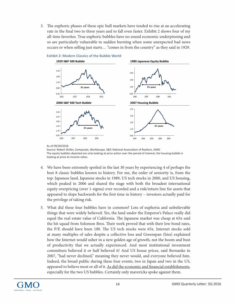
GMO Quarterly Letter
Hellish Choices:What’s An Asset Owner To Do?Ben Inker
Pages 1-11
Table of Contents
Not With A Bang But A Whimper(and other stuff)Jeremy Grantham
Pages 12-25
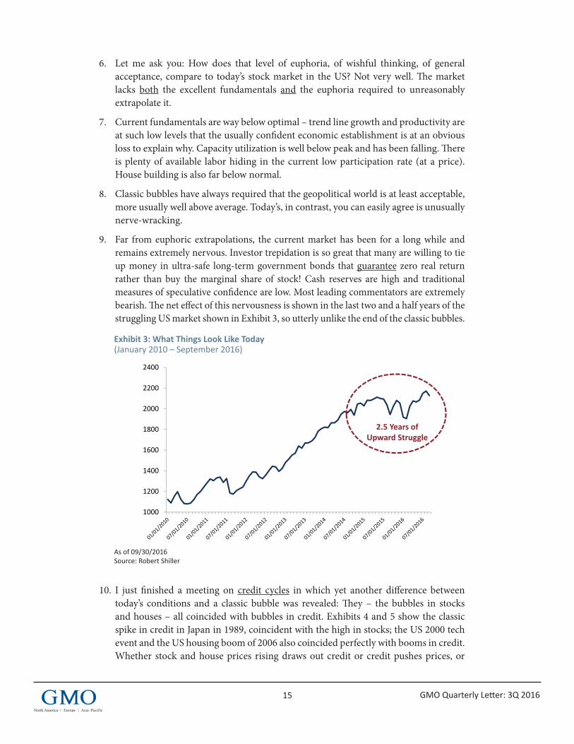
1
3Q 2016
GMO Quarterly Letter
Executive SummaryGiven today’s low yields and high valuations across almost all asset classes, there are no particularly good outcomes available for investors. We believe that either valuations will revert to historically normal levels and near-term returns will be very bad, or valuations will remain elevated relative to history. If valuations remain elevated indefinitely, near-term returns will be less bad but still insufficient for investors to achieve their goals. Furthermore, given elevated valuations in the long term, long-term returns will also be insufficient for investors to achieve their goals. It would be very handy to know which scenario will play out, as the reversion versus no reversion scenarios have important implications both for the appropriate portfolio to run today and critical institution-level decisions that investors will be forced to make in the future. Unfortunately, we believe there is no certainty as to which scenario will play out. As a result, we believe it is prudent for investors to try to build portfolios that are robust to either outcome and start contingency planning for the possibility that long-term returns will be meaningfully lower than what is necessary for their current saving/contribution and spending plans to be sustainable.
IntroductionOver the past few years, my colleague James Montier and I have written extensively on the possibility that there has been a permanent shift in the investment landscape.1 The investment landscape today is an unprecedented one, where we believe it is not so much that asset prices look mispriced relative to one another (although some of that is going on) but that almost all asset classes are priced at valuations that seem to guarantee returns lower than history. Our standard forecasting approach assumes that this situation will gradually dissipate, such that seven years from now valuations will be back to historical norms. James calls this scenario Purgatory because it means a finite period of pain, followed by a return to better conditions for investors. An alternative possibility, which James refers to as Hell, is that valuations have permanently shifted higher, leaving nearer-term returns to asset classes somewhat better than our standard methodology would suggest, but at the expense of lower long-term returns. By now some of our clients are probably thoroughly sick of hearing about the topic, but this piece is going to delve into it yet again, because the question of whether we are in Purgatory or Hell is a crucial one, not only for its implications for what portfolio is the right one for an investor to hold at the moment, but also for the institutional choices investors have to make that go well beyond simple asset allocation. In his letter this quarter, Jeremy Grantham is exploring 1 James has, however, consistently suggested that the possibility of a permanent shift is fairly low.
Hellish Choices:What’s An Asset Owner To Do? Ben Inker
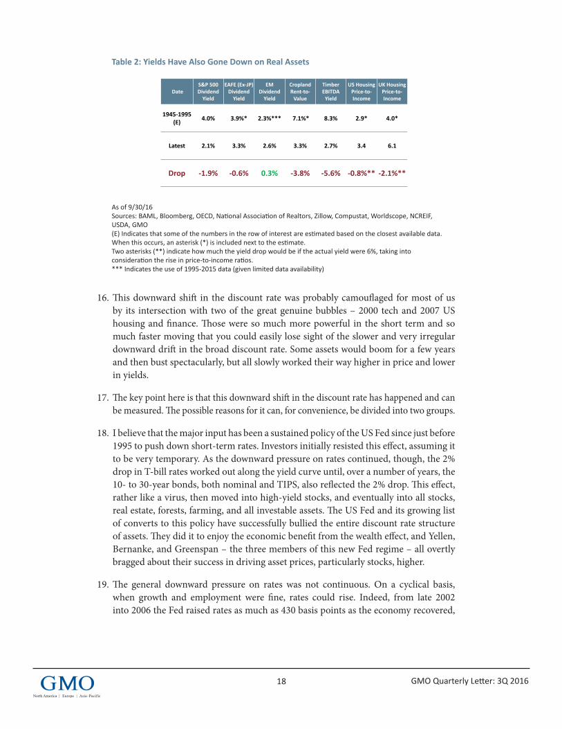
2 GMO Quarterly Letter: 3Q 2016
a slightly different version of the Hell scenario. His version of Hell is driven more by weaknesses in the arbitrage that should force asset prices back to equilibrium rather than changes to discount rates, but it has similar implications for investors and institutions.
The distinction between Purgatory and Hell is an important one, because each scenario creates different challenges for investors. In short, Purgatory creates an important investment dilemma today, as the “optimal” portfolio looks strikingly different from traditional portfolios. If we are in Hell, by contrast, traditional portfolios are not obviously wrong today, but the basic assumptions investors make about their sustainable spending rates are dangerously incorrect. These twin issues – the implications for today’s portfolios and the implications for institutional decisions into the future – are crucial for us in the Asset Allocation group at GMO. And they are the reason why most of the investment conversations I have had with my colleague John Thorndike2 over the past few months have either been on this topic or have been impacted by the dilemma of which scenario to assume. The rest of this paper is largely a summary of our discussions on the topic, which we recently presented at our annual client conference.
Why all the discussion of Hell?There are a couple of important points to make about why we spend so much time discussing the Hell scenario today when we have not done so in the past. The first is that we would likely not be discussing it at all if it did not seem to be priced into the market. If asset prices today were generally clustered around normal valuation levels, we would spend very little time concerning ourselves with the possibility that all assets would simultaneously rise in price and valuation to a new high plateau, which would, in the future, be considered normal. In other words, we run the risk here of making the same mistake that we have accused plenty of other investors of making in the past, trying to justify the price level of an overvalued market with those ever dangerous words “This time is different.” The second is that unlike many points in history, the change to the expected returns to assets involved in going from a Purgatory scenario to a Hell scenario has very important implications for the correct portfolio to hold today. Even had you known in 2000 or 2003 or 2007 whether the future was going to evolve consistent with the Purgatory scenario versus the Hell scenario, you would not have needed to run a particularly different portfolio. Today’s portfolio is much more profoundly different depending on which you think is correct. And finally, Hell goes beyond being merely an “investment problem” into the realm of being an “institutional problem,” with implications for foundations, endowments, pension funds, and individual savers that are much broader than the simple question of what portfolio is the right one to run today.
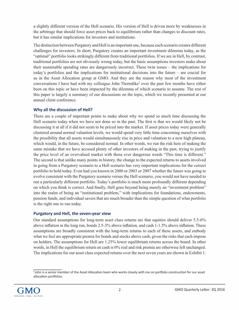
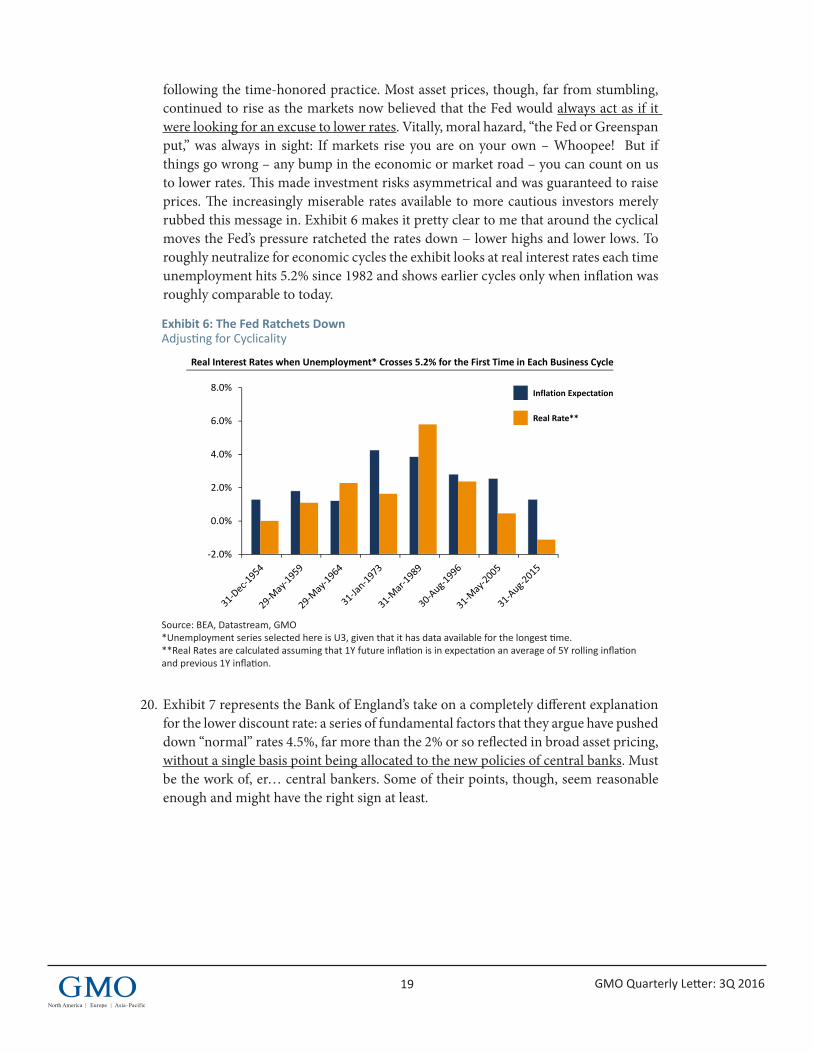
Purgatory and Hell, the seven-year viewOur standard assumptions for long-term asset class returns are that equities should deliver 5.5-6% above inflation in the long run, bonds 2.5-3% above inflation, and cash 1-1.5% above inflation. These assumptions are broadly consistent with the long-term returns to each of these assets, and embody what we feel are appropriate premia for bonds and stocks above cash, given the risks that each impose on holders. The assumptions for Hell are 1.25% lower equilibrium returns across the board. In other words, in Hell the equilibrium return on cash is 0% real and risk premia are otherwise left unchanged. The implications for our asset class expected returns over the next seven years are shown in Exhibit 1.
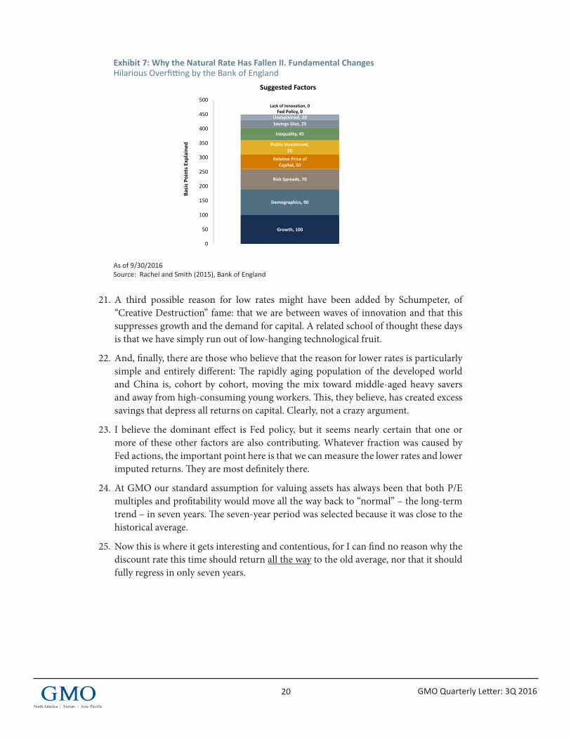
2 John is a senior member of the Asset Allocation team who works closely with me on portfolio construction for our asset allocation portfolios.
3 GMO Quarterly Letter: 3Q 2016
Exhibit 1: 7-Year Asset Class Forecasts in Purgatory and Hell
As of 9/30/16 Source: GMO The chart represents real return forecasts for several asset classes and not for any GMO fund or strategy. These forecasts are forward-looking statements based upon the reasonable beliefs of GMO and are not a guarantee of future performance. Forward-looking statements speak only as of the date they are made, and GMO assumes no duty to and does not undertake to update forward-looking statements. Forward-looking statements are subject to numerous assumptions, risks, and uncertainties, which change over time. Actual results may differ materially from those anticipated in forward-looking statements. U.S. inflation is assumed to mean revert to long-term inflation of 2.2% over 15 years.
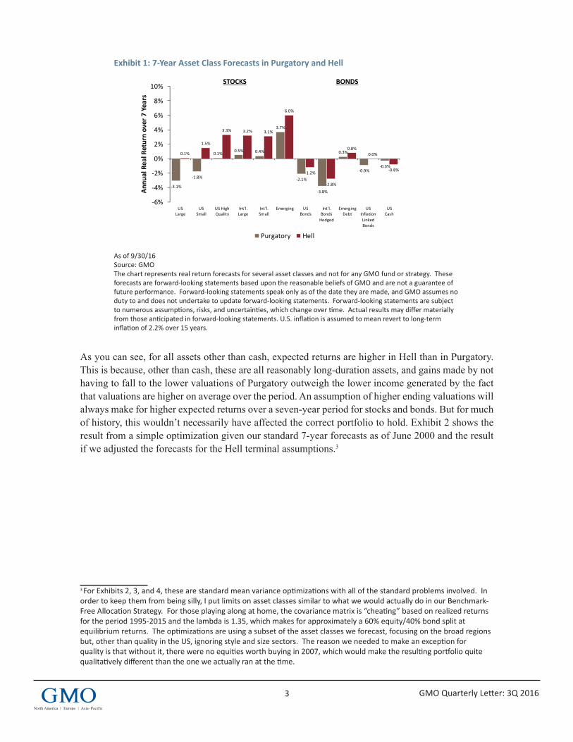
As you can see, for all assets other than cash, expected returns are higher in Hell than in Purgatory. This is because, other than cash, these are all reasonably long-duration assets, and gains made by not having to fall to the lower valuations of Purgatory outweigh the lower income generated by the fact that valuations are higher on average over the period. An assumption of higher ending valuations will always make for higher expected returns over a seven-year period for stocks and bonds. But for much of history, this wouldn’t necessarily have affected the correct portfolio to hold. Exhibit 2 shows the result from a simple optimization given our standard 7-year forecasts as of June 2000 and the result if we adjusted the forecasts for the Hell terminal assumptions.3
3 For Exhibits 2, 3, and 4, these are standard mean variance optimizations with all of the standard problems involved. In order to keep them from being silly, I put limits on asset classes similar to what we would actually do in our Benchmark-Free Allocation Strategy. For those playing along at home, the covariance matrix is “cheating” based on realized returns for the period 1995-2015 and the lambda is 1.35, which makes for approximately a 60% equity/40% bond split at equilibrium returns. The optimizations are using a subset of the asset classes we forecast, focusing on the broad regions but, other than quality in the US, ignoring style and size sectors. The reason we needed to make an exception for quality is that without it, there were no equities worth buying in 2007, which would make the resulting portfolio quite qualitatively different than the one we actually ran at the time.
0BI_AA1_Conf2_11-16
Proprietary information – not for distribution. Copyright © 2016 by GMO LLC. All rights reserved.
‐3.1%
‐1.8%
0.1%0.5% 0.4%
3.7%
‐2.1%
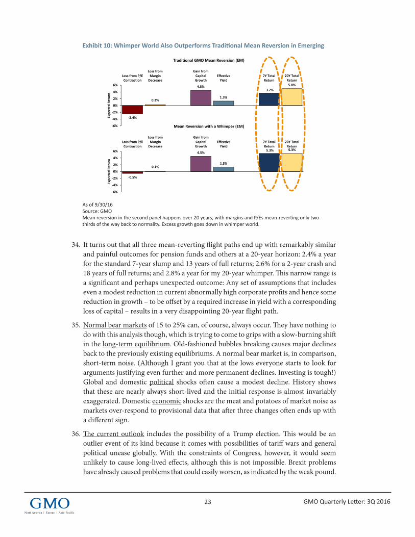
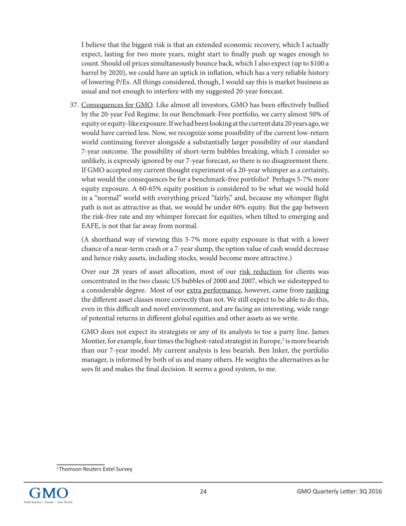
‐3.8%
0.3%
‐0.9%‐0.3%
0.1%
1.5%
3.3% 3.2% 3.1%
6.0%
‐1.2%
‐2.8%
0.8%0.0%
‐0.8%
‐6%
‐4%
‐2%
0%
2%
4%
6%
8%
10%
USLarge
USSmall
US HighQuality
Int'l.Large
Int'l.Small
Emerging USBonds
Int'l.BondsHedged
EmergingDebt
USInflationLinkedBonds
USCash
Purgatory Hell
Exhibit 1: 7 Year Asset Class Forecasts in Purgatory and HellAs of September 30, 2016
Source: GMOThe chart represents real return forecasts for several asset classes and not for any GMO fund or strategy. These forecasts are forward‐looking statements based upon the reasonable beliefs of GMO and are not a guarantee of future performance. Forward‐looking statements speak only as of the date they are made, and GMO assumes no duty to and does not undertake to update forward‐looking statements. Forward‐looking statements are subject to numerous assumptions, risks, and uncertainties, which change over time. Actual results may differ materially from those anticipated in forward‐looking statements. U.S. inflation is assumed to mean revert to long‐term inflation of 2.2% over 15 years.
Annu
al Real Return over 7 Years
STOCKS BONDS
4 GMO Quarterly Letter: 3Q 2016
Exhibit 2: Optimal Portfolios in June 2000
Source: GMO
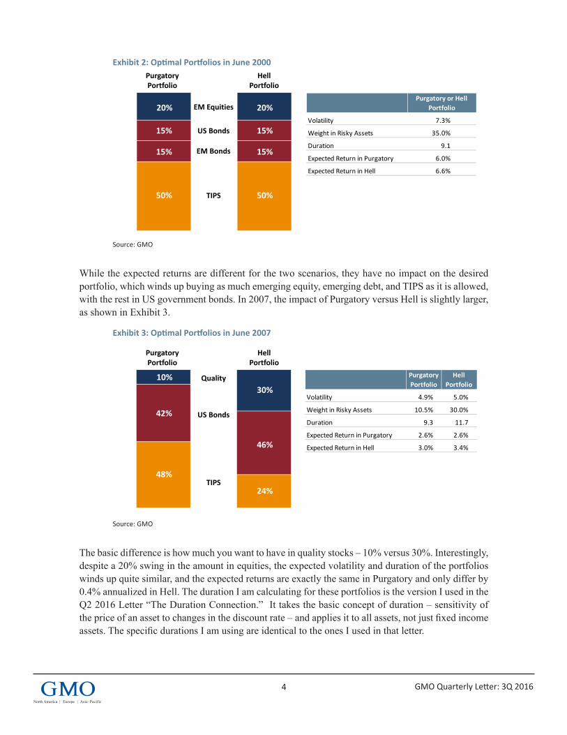
While the expected returns are different for the two scenarios, they have no impact on the desired portfolio, which winds up buying as much emerging equity, emerging debt, and TIPS as it is allowed, with the rest in US government bonds. In 2007, the impact of Purgatory versus Hell is slightly larger, as shown in Exhibit 3.
Exhibit 3: Optimal Portfolios in June 2007
Source: GMO
The basic difference is how much you want to have in quality stocks – 10% versus 30%. Interestingly, despite a 20% swing in the amount in equities, the expected volatility and duration of the portfolios winds up quite similar, and the expected returns are exactly the same in Purgatory and only differ by 0.4% annualized in Hell. The duration I am calculating for these portfolios is the version I used in the Q2 2016 Letter “The Duration Connection.” It takes the basic concept of duration – sensitivity of the price of an asset to changes in the discount rate – and applies it to all assets, not just fixed income assets. The specific durations I am using are identical to the ones I used in that letter.
1BI_AA1_Conf2_11-16
Proprietary information – not for distribution. Copyright © 2016 by GMO LLC. All rights reserved.
Exhibit 2: Optimal Portfolios in June 2000Purgatory and Hell are often not a big deal for portfolio decisions
Source: GMO
Purgatory Portfolio
HellPortfolio
20%
15%
15%
50%
20%
15%
15%
50%
EM Equities
EM Bonds
US Bonds
TIPS
June 2000
Purgatory or HellPortfolio
Volatility 7.3%
Weight in Risky Assets 35.0%
Duration 9.1
Expected Return in Purgatory 6.0%
Expected Return in Hell 6.6%
2BI_AA1_Conf2_11-16
Proprietary information – not for distribution. Copyright © 2016 by GMO LLC. All rights reserved.
Exhibit 3: Optimal Portfolios in June 2007Purgatory and Hell are often not a big deal for portfolio decisions
Source: GMO
Purgatory Portfolio
HellPortfolio
10%
42%
48%
30%
46%
24%
Quality
US Bonds
TIPS
June 2007
PurgatoryPortfolio
HellPortfolio
Volatility 4.9% 5.0%
Weight in Risky Assets 10.5% 30.0%
Duration 9.3 11.7
Expected Return in Purgatory 2.6% 2.6%
Expected Return in Hell 3.0% 3.4%
5 GMO Quarterly Letter: 3Q 2016
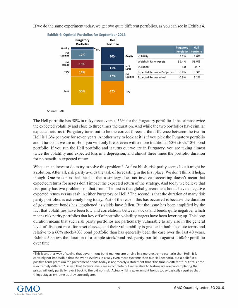
If we do the same experiment today, we get two quite different portfolios, as you can see in Exhibit 4.
Exhibit 4: Optimal Portfolios for September 2016
Source: GMO
The Hell portfolio has 58% in risky assets versus 36% for the Purgatory portfolio. It has almost twice the expected volatility and close to three times the duration. And while the two portfolios have similar expected returns if Purgatory turns out to be the correct forecast, the difference between the two in Hell is 1.3% per year for seven years. Another way to look at it is if you pick the Purgatory portfolio and it turns out we are in Hell, you will only break even with a more traditional 60% stock/40% bond portfolio. If you run the Hell portfolio and it turns out we are in Purgatory, you are taking almost twice the volatility and expected loss in a depression, and almost three times the portfolio duration for no benefit in expected return.
What can an investor do to try to solve this problem? At first blush, risk parity seems like it might be a solution. After all, risk parity avoids the task of forecasting in the first place. We don’t think it helps, though. One reason is that the fact that a strategy does not involve forecasting doesn’t mean that expected returns for assets don’t impact the expected return of the strategy. And today we believe that risk parity has two problems on that front. The first is that global government bonds have a negative expected return versus cash in either Purgatory or Hell.4 The second is that the duration of many risk parity portfolios is extremely long today. Part of the reason this has occurred is because the duration of government bonds has lengthened as yields have fallen. But the issue has been amplified by the fact that volatilities have been low and correlations between stocks and bonds quite negative, which means risk parity portfolios that key off of portfolio volatility targets have been levering up. This long duration means that such risk parity portfolios are particularly vulnerable to any rise in the general level of discount rates for asset classes, and their vulnerability is greater in both absolute terms and relative to a 60% stock/40% bond portfolio than has generally been the case over the last 40 years. Exhibit 5 shows the duration of a simple stock/bond risk parity portfolio against a 60/40 portfolio over time.
4 This is another way of saying that government bond markets are pricing in a more extreme scenario than Hell. It is certainly not impossible that the world evolves in a way even more extreme than our Hell scenario, but a belief in a positive term premium for government bonds today is not merely a statement that “this time is different,” but “this time is extremely different.” Given that today’s levels are a complete outlier relative to history, we are contemplating that prices will only partially revert back to the old normal. Actually liking government bonds today basically requires that things stay as extreme as they currently are.
3BI_AA1_Conf2_11-16
Proprietary information – not for distribution. Copyright © 2016 by GMO LLC. All rights reserved.
Exhibit 4: Optimal Portfolios in September 2016Today, Purgatory vs. Hell is a big deal
Source: GMO
17%
15%
14%
50%
30%
11%
17%
42%
EMEquities
TIPS
EMBonds
Cash
PurgatoryPortfolio
HellPortfolio
Volatility 5.3% 9.6%
Weight in Risky Assets 36.4% 58.0%
Duration 6.0 14.7
Expected Return in Purgatory 0.4% 0.3%
Expected Return in Hell 0.9% 2.2%
Quality
EMEquities
Int’l.Large
TIPS
4%Quality
September 2016
Purgatory Portfolio
HellPortfolio
6 GMO Quarterly Letter: 3Q 2016
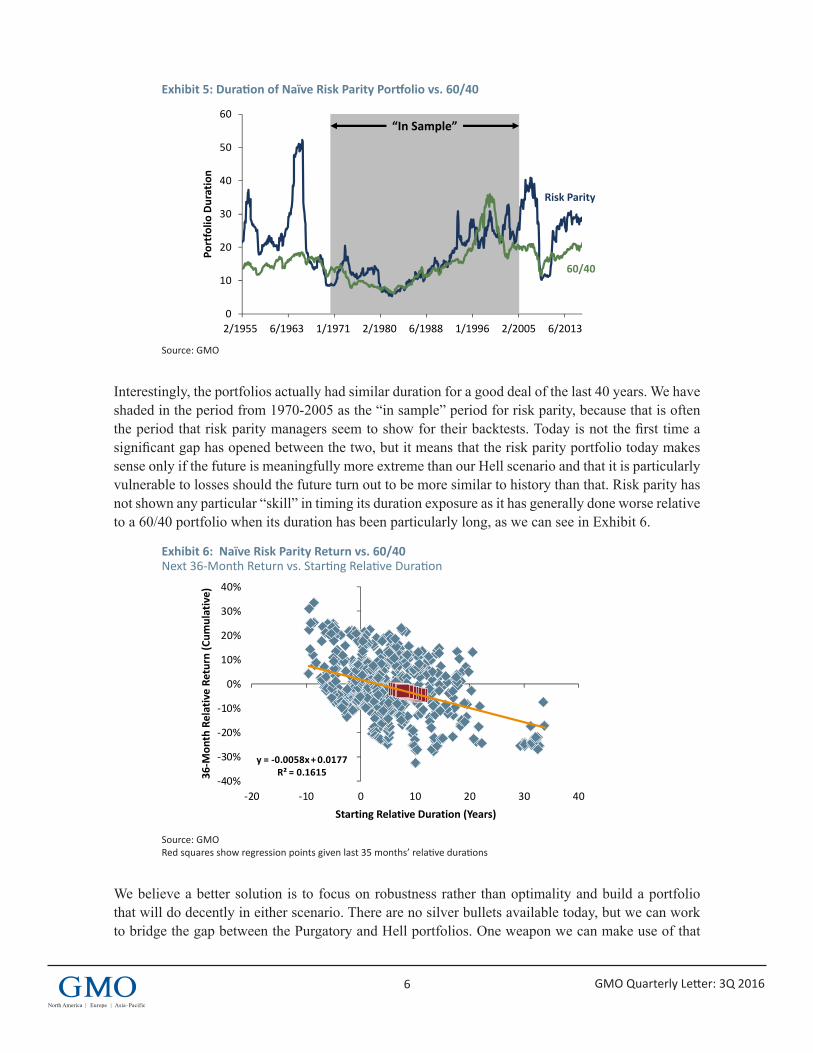
Exhibit 5: Duration of Naïve Risk Parity Portfolio vs. 60/40
Source: GMO
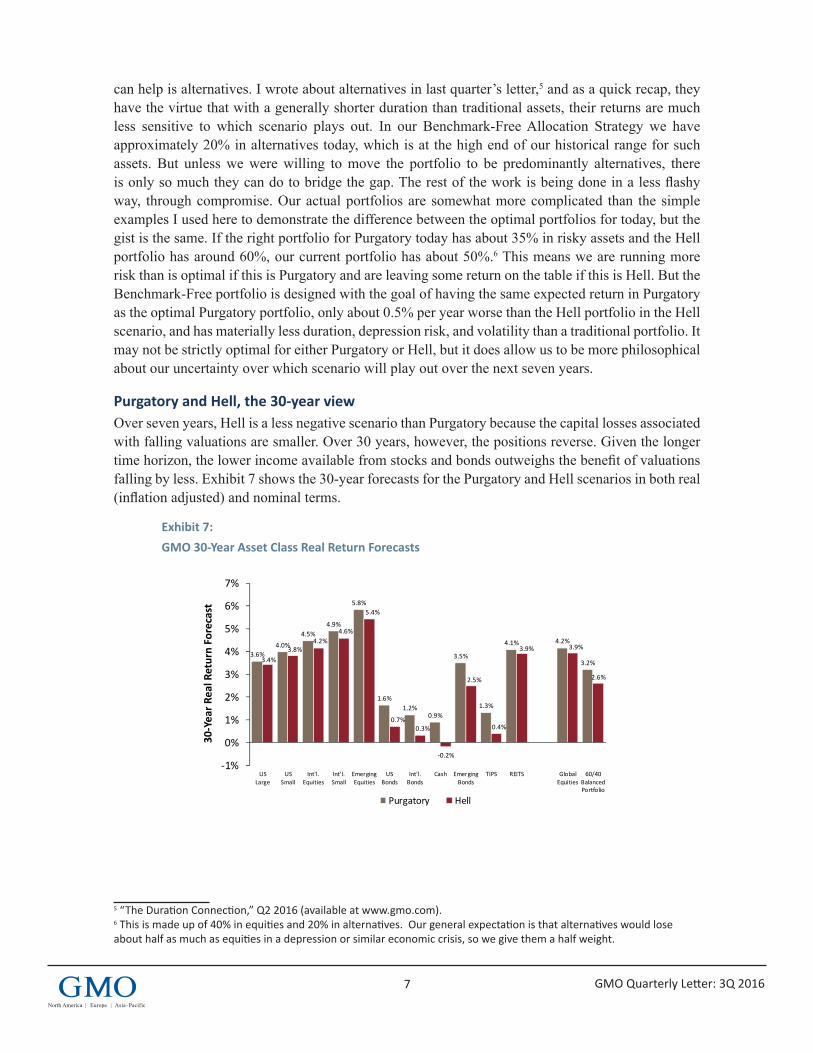
Interestingly, the portfolios actually had similar duration for a good deal of the last 40 years. We have shaded in the period from 1970-2005 as the “in sample” period for risk parity, because that is often the period that risk parity managers seem to show for their backtests. Today is not the first time a significant gap has opened between the two, but it means that the risk parity portfolio today makes sense only if the future is meaningfully more extreme than our Hell scenario and that it is particularly vulnerable to losses should the future turn out to be more similar to history than that. Risk parity has not shown any particular “skill” in timing its duration exposure as it has generally done worse relative to a 60/40 portfolio when its duration has been particularly long, as we can see in Exhibit 6.
Exhibit 6: Naïve Risk Parity Return vs. 60/40 Next 36-Month Return vs. Starting Relative Duration
Source: GMO Red squares show regression points given last 35 months’ relative durations
We believe a better solution is to focus on robustness rather than optimality and build a portfolio that will do decently in either scenario. There are no silver bullets available today, but we can work to bridge the gap between the Purgatory and Hell portfolios. One weapon we can make use of that
4BI_AA1_Conf2_11-16
Proprietary information – not for distribution. Copyright © 2016 by GMO LLC. All rights reserved.
Exhibit 5: Duration of Naïve Risk Parity Portfolio vs 60/40Not what we’d call parity
Naïve Risk Parity Duration
Source: GMO
0
10
20
30
40
50
60
1955.02 1963.06 1971.1 1980.02 1988.06 1996.1 2005.02 2013.06
Portfolio
Duration
Risk Parity
60/40
“In Sample”
2/1955 6/20132/20051/19966/19882/19801/19716/1963
5BI_AA1_Conf2_11-16
Proprietary information – not for distribution. Copyright © 2016 by GMO LLC. All rights reserved.
Exhibit 6: Relative Duration and Subsequent Returns for Risk ParityHigher duration, lower returns?
Naïve Risk Parity Return vs. 60/40:Next 36 Months vs. Starting Relative Years’ Effective Duration
Source: GMORed squares show regression points given last 35 months’ relative durations
36‐M
onth Relative Re
turn (C
umulative)
Starting Relative Duration (Years)
y = ‐0.0058x + 0.0177R² = 0.1615
‐40%
‐30%
‐20%
‐10%
0%
10%
20%
30%
40%
‐20 ‐10 0 10 20 30 40
7 GMO Quarterly Letter: 3Q 2016
can help is alternatives. I wrote about alternatives in last quarter’s letter,5 and as a quick recap, they have the virtue that with a generally shorter duration than traditional assets, their returns are much less sensitive to which scenario plays out. In our Benchmark-Free Allocation Strategy we have approximately 20% in alternatives today, which is at the high end of our historical range for such assets. But unless we were willing to move the portfolio to be predominantly alternatives, there is only so much they can do to bridge the gap. The rest of the work is being done in a less flashy way, through compromise. Our actual portfolios are somewhat more complicated than the simple examples I used here to demonstrate the difference between the optimal portfolios for today, but the gist is the same. If the right portfolio for Purgatory today has about 35% in risky assets and the Hell portfolio has around 60%, our current portfolio has about 50%.6 This means we are running more risk than is optimal if this is Purgatory and are leaving some return on the table if this is Hell. But the Benchmark-Free portfolio is designed with the goal of having the same expected return in Purgatory as the optimal Purgatory portfolio, only about 0.5% per year worse than the Hell portfolio in the Hell scenario, and has materially less duration, depression risk, and volatility than a traditional portfolio. It may not be strictly optimal for either Purgatory or Hell, but it does allow us to be more philosophical about our uncertainty over which scenario will play out over the next seven years.
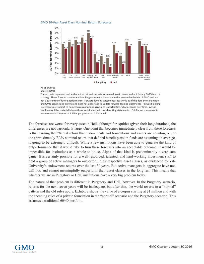
Purgatory and Hell, the 30-year viewOver seven years, Hell is a less negative scenario than Purgatory because the capital losses associated with falling valuations are smaller. Over 30 years, however, the positions reverse. Given the longer time horizon, the lower income available from stocks and bonds outweighs the benefit of valuations falling by less. Exhibit 7 shows the 30-year forecasts for the Purgatory and Hell scenarios in both real (inflation adjusted) and nominal terms.
Exhibit 7:GMO 30-Year Asset Class Real Return Forecasts
5 “The Duration Connection,” Q2 2016 (available at www.gmo.com).6 This is made up of 40% in equities and 20% in alternatives. Our general expectation is that alternatives would lose about half as much as equities in a depression or similar economic crisis, so we give them a half weight.
6BI_AA1_Conf2_11-16
Proprietary information – not for distribution. Copyright © 2016 by GMO LLC. All rights reserved.
3.6%4.0%
4.5%4.9%
5.8%
1.6%1.2%
0.9%
3.5%
1.3%
4.1% 4.2%
3.2%3.4%3.8%
4.2%4.6%
5.4%
0.7%0.3%
‐0.2%
2.5%
0.4%
3.9% 3.9%
2.6%
‐1%
0%
1%
2%
3%
4%
5%
6%
7%
USLarge
USSmall
Int'l.Equities
Int'l.Small
EmergingEquities
USBonds
Int'l.Bonds
Cash EmergingBonds
TIPS REITS GlobalEquities
60/40BalancedPortfolio
Purgatory Hell
Exhibit 7: 30‐Year Asset Class Real Return ForecastsAs the time horizon lengthens, Purgatory starts to look better
As of 9/30/16Source: GMOThe chart represents real return forecasts for several asset classes and not for any GMO fund or strategy. These forecasts are forward‐looking statements based upon the reasonable beliefs of GMO and are not a guarantee of future performance. Forward‐looking statements speak only as of the date they are made, and GMO assumes no duty to and does not undertake to update forward‐looking statements. Forward‐looking statements are subject to numerous assumptions, risks, and uncertainties, which change over time. Actual results may differ materially from those anticipated in forward‐looking statements. U.S. inflation is assumed to mean revert to long‐term inflation of 2.2% over 15 years.
30‐Year R
eal Return Forecast
8 GMO Quarterly Letter: 3Q 2016
GMO 30-Year Asset Class Nominal Return Forecasts
As of 9/30/16 Source: GMO These charts represent real and nominal return forecasts for several asset classes and not for any GMO fund or strategy. These forecasts are forward-looking statements based upon the reasonable beliefs of GMO and are not a guarantee of future performance. Forward-looking statements speak only as of the date they are made, and GMO assumes no duty to and does not undertake to update forward-looking statements. Forward-looking statements are subject to numerous assumptions, risks, and uncertainties, which change over time. Actual results may differ materially from those anticipated in forward-looking statements. US inflation is assumed to mean revert in 15 years to 2.2% in purgatory and 1.5% in hell.
The forecasts are worse for every asset in Hell, although for equities (given their long durations) the differences are not particularly large. One point that becomes immediately clear from these forecasts is that earning the 5% real return that endowments and foundations and savers are counting on, or the approximately 7.3% nominal return that defined benefit pension funds are assuming on average, is going to be extremely difficult. While a few institutions have been able to generate the kind of outperformance that it would take to turn these forecasts into an acceptable outcome, it would be impossible for institutions as a whole to do so. Alpha of that kind is predominantly a zero sum game. It is certainly possible for a well-resourced, talented, and hard-working investment staff to field a group of active managers to outperform their respective asset classes, as evidenced by Yale University’s endowment returns over the last 30 years. But active managers in aggregate have not, will not, and cannot meaningfully outperform their asset classes in the long run. This means that whether we are in Purgatory or Hell, institutions have a very big problem today.
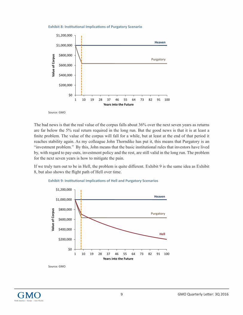
The nature of that problem is different in Purgatory and Hell, however. In the Purgatory scenario, returns for the next seven years will be inadequate, but after that, the world reverts to a “normal” pattern and the old rules apply. Exhibit 8 shows the value of a corpus starting at $1 million and with the spending rules of a private foundation in the “normal” scenario and the Purgatory scenario. This assumes a traditional 60/40 portfolio.
7BI_AA1_Conf2_11-16
Proprietary information – not for distribution. Copyright © 2016 by GMO LLC. All rights reserved.
5.8%6.2%
6.7%7.1%
8.0%
3.8%3.4%
3.1%
5.7%
3.5%
6.3% 6.4%
5.4%
4.9%5.3%
5.7%6.1%
6.9%
2.2%1.8%
1.3%
4.0%
1.9%
5.4% 5.4%
4.1%
0%
1%
2%
3%
4%
5%
6%
7%
8%
9%
USLarge
USSmall
Int'l.Equities
Int'l.Small
EmergingEquities
USBonds
Int'l.Bonds
Cash EmergingBonds
TIPS REITS GlobalEquities
60/40BalancedPortfolio
Purgatory Hell
Exhibit 7: 30 Year Nominal Returns
As of 9/30/16Source: GMOThe chart represents real return forecasts for several asset classes and not for any GMO fund or strategy. These forecasts are forward‐looking statements based upon the reasonable beliefs of GMO and are not a guarantee of future performance. Forward‐looking statements speak only as of the date they are made, and GMO assumes no duty to and does not undertake to update forward‐looking statements. Forward‐looking statements are subject to numerous assumptions, risks, and uncertainties, which change over time. Actual results may differ materially from those anticipated in forward‐looking statements. U.S. inflation is assumed to mean revert to long‐term inflation of 2.2% over 15 years.
30‐Yea
r Nom
inal Return Fo
recast
9 GMO Quarterly Letter: 3Q 2016
Exhibit 8: Institutional Implications of Purgatory Scenario
Source: GMO
The bad news is that the real value of the corpus falls about 36% over the next seven years as returns are far below the 5% real return required in the long run. But the good news is that it is at least a finite problem. The value of the corpus will fall for a while, but at least at the end of that period it reaches stability again. As my colleague John Thorndike has put it, this means that Purgatory is an “investment problem.” By this, John means that the basic institutional rules that investors have lived by, with regard to pay-outs, investment policy and the rest, are still valid in the long run. The problem for the next seven years is how to mitigate the pain.
If we truly turn out to be in Hell, the problem is quite different. Exhibit 9 is the same idea as Exhibit 8, but also shows the flight path of Hell over time.
Exhibit 9: Institutional Implications of Hell and Purgatory Scenarios
Source: GMO
8BI_AA1_Conf2_11-16
Proprietary information – not for distribution. Copyright © 2016 by GMO LLC. All rights reserved.
Exhibit 8: Institutional Implications of Purgatory Scenario
$0
$200,000
$400,000
$600,000
$800,000
$1,000,000
$1,200,000
1 10 19 28 37 46 55 64 73 82 91 100
Value of Corpu
s
Years into the Future
Heaven
Purgatory
9BI_AA1_Conf2_11-16
Proprietary information – not for distribution. Copyright © 2016 by GMO LLC. All rights reserved.
Exhibit 9: Institutional Implications of Hell and Purgatory Scenarios
$0
$200,000
$400,000
$600,000
$800,000
$1,000,000
$1,200,000
1 10 19 28 37 46 55 64 73 82 91 100
Value of Corpu
s
Years into the Future
Heaven
Purgatory
Hell
10 GMO Quarterly Letter: 3Q 2016
The losses for a traditional 60/40 portfolio are less severe in the Hell scenario for the next seven years, but the trouble does not end with year seven. If we are in Hell, the basic math for foundations simply fails. A 60/40 portfolio has no hope of delivering the 5% real that the foundation needs to pay out over time, and in fact no combination of stocks and bonds will get you to 5% real, because the equilibrium for stocks is only 4.5% real in Hell, and they are the highest-expected-return asset. This means, in John’s terminology, that Hell is an “institutional problem.” The basic assumption that the foundation could expect to live on in perpetuity becomes false. Translating to the endowment problem, the spending rate that preserves intergenerational fairness has fallen materially. For someone saving for retirement, the required savings rate has just risen markedly, because not only is the pot of retirement savings going to be growing more slowly than expected, but the safe spending rate for a given pool of savings in retirement has just fallen. For a defined benefit pension plan, making reasonable if arbitrary assumptions of a duration of 15.5 and payouts over 30 years, if it was fully funded at a 7.3% expected return, the funded status drops to 80% in Purgatory and 67% in Hell.
ConclusionBoth Purgatory and Hell are bad outcomes for investors, but we believe the basic point is that from today’s valuation levels, there are no good outcomes for investors. In the nearer term, maintaining today’s high valuation levels implies less pain for investors. But as the time horizon lengthens, the lower cash flows associated with higher valuations bite more and more, so the longer the time horizon, the more mean reversion of valuations is a positive rather than a negative. In the long run, we can hope that valuations fall to historically normal levels, because only if that happens will the institutional business models and savings and investing heuristics that institutions and savers have built still be valid.
But it is difficult to dismiss the possibility that this time actually is different. While all periods in which asset prices move well away from historical norms on valuations have a narrative that explains why the shift is rational and permanent, I would argue that this time is more different than most. Whether we are talking about 1989 in Japan, 2000 in the US, or 2007 globally, what bubbles generally have in common is that the narratives require the suspension of some fundamental rules of capitalism. They require either large permanent gaps between the cost of capital and return on capital, or some group of investors to voluntarily settle for far lower returns than they could get in other assets with similar or less risk. Today’s market has an internal consistency that those markets lack. If there has been a permanent drop of discount rates of perhaps 1.5 percentage points, then market prices are generally close enough to fair value that you can explain away the discrepancies as business as usual. That does not mean that the drop in discount rates actually is permanent. Markets are notorious for a lack of imagination about how the future can differ from the present. But the models that purport to explain the “natural” level of short-term interest rates generally show neither much ability to explain history nor have a lot of theoretical appeal to them. This means we have poor guides for what short-term interest rates “should” be. Sadly, I believe that includes the model of “whatever rates have been on average over the last N years,” which is the market historian’s default model for the future. That makes it hard to dismiss an argument that the rate has changed in a durable way, even if the argument that the change will be durable is a largely speculative one.
Will the future look like the Hell scenario? We hope not. While it is better for the next few years, the longer-run implications are fairly bleak. But hope is not an investment strategy. We believe that today it is irresponsible not to at least contemplate the possibility of Hell in building a portfolio, and
11 GMO Quarterly Letter: 3Q 2016
Disclaimer: The views expressed are the views of Ben Inker through the period ending November 2016, and are subject to change at any time based on market and other conditions. This is not an offer or solicitation for the purchase or sale of any security and should not be construed as such. References to specific securities and issuers are for illustrative purposes only and are not intended to be, and should not be interpreted as, recommendations to purchase or sell such securities.
The expectations provided above are based upon the reasonable beliefs of the Asset Allocation team and are not a guarantee. Expectations speak only as of the date they are made, and GMO assumes no duty to and does not undertake to update such expectations. Expectations are subject to numerous assumptions, risks, and uncertainties, which change over time. Actual results may differ materially from those anticipated in the expectations above.
Copyright © 2016 by GMO LLC. All rights reserved.
likewise it is irresponsible for institutions not to contemplate the possibility of Hell when thinking of their broader decisions. For our part, we work first to try to build the right portfolios for our clients, and today our idea of how to do that is to build a portfolio that is robust to either outcome.
But we also consider it part of our job to help advise our clients beyond the portfolios we run, and the Hell scenario is a possibility that few, if any, investors are truly prepared for. Savers and institutions had a very nasty shock when 2008-09 happened to their portfolios. But in some ways it was easy to deal with. Having a 30-40% hole blown out of your portfolio suddenly causes plenty of soul searching and difficult decisions. But the need for the decisions is so obvious that everyone involved knows something needs to be done, and done fairly quickly. Hell, on the other hand, will creep up slowly. The problem will not be a giant drop in the value of the portfolio, but serial disappointment in returns that doesn’t amount to a lot in a single year. Only the accumulation of disappointing years and a slowly shrinking corpus/falling funded status/inadequate accumulation of retirement savings will make clear the depth of the problem.
The trouble is that by the time it is obvious in a 2008-09 sense that something is badly wrong, investors will have wasted a lot of time that could have been used to mitigate the problem if only they had acted. One unfortunate feature of the institutional landscape is that there will be very little praise and no lack of scorn for those who are first to move in the necessary direction to survive Hell. The pension fund CIO who recommends moving expected returns from 7.3% to 4.5% is overwhelmingly more likely to be fired than lauded. But ignoring reality does not change reality. While the circumstances in which Jeremy Grantham wrote “Reinvesting When Terrified” were quite different than today’s daunting prospects for institutions, his advice nevertheless is still completely true. “There is only one cure for terminal paralysis: you absolutely must have a battle plan… and stick to it.”7 Even if there is too much uncertainty about which scenario we are facing as investors to know exactly the perfect plan for today’s portfolio and for tomorrow’s institutional dilemmas, now is exactly the time we need to start building our battle plans for the challenges we will be facing in the coming years.
7 Jeremy Grantham, “Reinvesting When Terrified,” March 2009 (available at www.gmo.com).
12
3Q 2016
GMO Quarterly Letter
Not With A Bang But A Whimper1 (and other stuff)Jeremy Grantham
PreambleRather like a parrot I have been repeating for 10 quarters now my belief that we would not have a traditional bubble burst in the US equity market until we had reached at least 2300 on the S&P, the threshold level of major bubbles in the past, and at least until we had reached the election. Well, we are close on both counts now. My passionate hope was that I would then, perhaps 6 months after the election, recommend a major sidestep of the coming deluge that would conveniently have arrived 6 to 12 months later, allowing us then, after a 50% decline, to leap back into cheap equity markets enthusiastically, more enthusiastically, that is, than we did last time in 2009. Thus we would save many of our clients tons of money as we had (eventually) in the 2000 bust, at least for those clients who stayed with us for the ride, and in 2007. I consider myself a bubble historian and one who is eager to see one form and break: I have often said that they are the only really important events in investing.
I have come to believe, however, very reluctantly, that we bubble historians have, together with much of the market, been a bit brainwashed by our exposure in the last 30 years to 4 of the perhaps 6 or 8 great investment bubbles in history: Japanese land and Japanese equities in 1989, US tech in 2000, and more or less everything in 2007. For bubble historians eager to see pins used on bubbles and spoiled by the prevalence of bubbles in the last 30 years, it is tempting to see them too often. Well, the US market today is not a classic bubble, not even close. The market is unlikely to go “bang” in the way those bubbles did. It is far more likely that the mean reversion will be slow and incomplete. The consequences are dismal for investors: we are likely to limp into the setting sun with very low returns. For bubble historians, though, it is heartbreaking for there will be no histrionics, no chance of being a real hero. Not this time.
The 2300 level on the S&P 500, which marks the 2-standard-deviation (2-sigma) point on historical data that has effectively separated real bubbles from mere bull markets, is in this case quite possibly a red herring. It is comparing today’s much higher pricing environment to history’s far lower levels. I have made much of the convenience of 2-sigma in the past as it has brought some apparent precision to the more touchy-feely definition of a true bubble: excellent fundamentals irrationally extrapolated. Now, when this definition conflicts with the 2-sigma measurement – ironically, it was chosen partly because it had never conflicted before – I apparently prefer the less statistical test. But you can imagine the trepidation with which I do this.
1 “This is the way the world ends, not with a bang but a whimper,” T.S. Eliot, The Hollow Men.
13 GMO Quarterly Letter: 3Q 2016
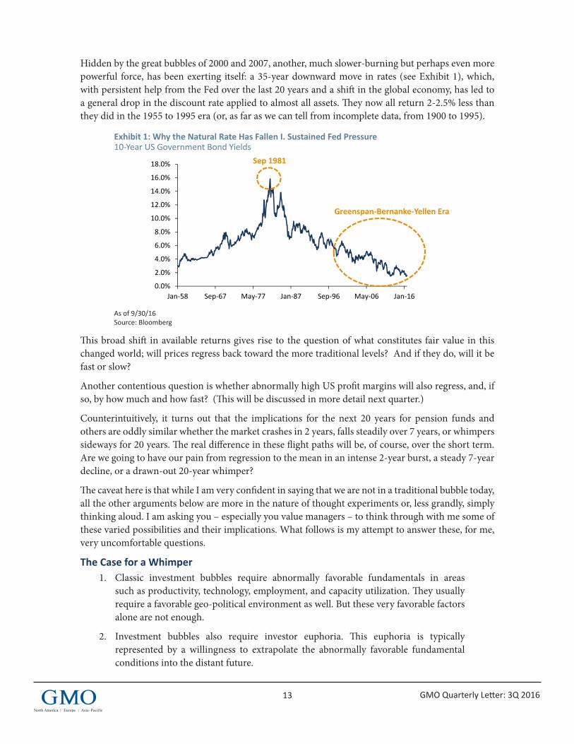
Hidden by the great bubbles of 2000 and 2007, another, much slower-burning but perhaps even more powerful force, has been exerting itself: a 35-year downward move in rates (see Exhibit 1), which, with persistent help from the Fed over the last 20 years and a shift in the global economy, has led to a general drop in the discount rate applied to almost all assets. They now all return 2-2.5% less than they did in the 1955 to 1995 era (or, as far as we can tell from incomplete data, from 1900 to 1995).
Exhibit 1: Why the Natural Rate Has Fallen I. Sustained Fed Pressure 10-Year US Government Bond Yields
As of 9/30/16 Source: Bloomberg
This broad shift in available returns gives rise to the question of what constitutes fair value in this changed world; will prices regress back toward the more traditional levels? And if they do, will it be fast or slow?
Another contentious question is whether abnormally high US profit margins will also regress, and, if so, by how much and how fast? (This will be discussed in more detail next quarter.)
Counterintuitively, it turns out that the implications for the next 20 years for pension funds and others are oddly similar whether the market crashes in 2 years, falls steadily over 7 years, or whimpers sideways for 20 years. The real difference in these flight paths will be, of course, over the short term. Are we going to have our pain from regression to the mean in an intense 2-year burst, a steady 7-year decline, or a drawn-out 20-year whimper?
The caveat here is that while I am very confident in saying that we are not in a traditional bubble today, all the other arguments below are more in the nature of thought experiments or, less grandly, simply thinking aloud. I am asking you – especially you value managers – to think through with me some of these varied possibilities and their implications. What follows is my attempt to answer these, for me, very uncomfortable questions.
The Case for a Whimper1. Classic investment bubbles require abnormally favorable fundamentals in areas
such as productivity, technology, employment, and capacity utilization. They usually require a favorable geo-political environment as well. But these very favorable factors alone are not enough.
2. Investment bubbles also require investor euphoria. This euphoria is typically represented by a willingness to extrapolate the abnormally favorable fundamental conditions into the distant future.
0Proprietary information – not for distribution. Copyright © 2016 by GMO LLC. All rights reserved.
0.0%
2.0%
4.0%
6.0%
8.0%
10.0%
12.0%
14.0%
16.0%
18.0%
Jan‐58 Sep‐67 May‐77 Jan‐87 Sep‐96 May‐06 Jan‐16
Exhibit 1: Why the Natural Rate has Fallen I. Sustained Fed Pressure
Sep 1981
As of 9/30/16Source: Bloomberg
10‐Year US Government Bond Yields
Greenspan‐Bernanke‐Yellen Era
14 GMO Quarterly Letter: 3Q 2016
3. The euphoric phases of these epic bull markets have tended to rise at an accelerating rate in the final two to three years and to fall even faster. Exhibit 2 shows four of my all-time favorites. True euphoric bubbles have no sound economic underpinning and so are particularly vulnerable to sudden bursting when some unexpected bad news occurs or when selling just starts… “comes in from the country” as they said in 1929.
Exhibit 2: Modern Classics of the Bubble World
As of 09/30/2016 Source: Robert Shiller, Compustat, Worldscope, S&P, National Association of Realtors, GMO The equity bubbles depicted are only looking at price action over the period of interest; the housing bubble is looking at price-to-income ratios.
4. We have been extremely spoiled in the last 30 years by experiencing 4 of perhaps the best 8 classic bubbles known to history. For me, the order of seniority is, from the top: Japanese land, Japanese stocks in 1989, US tech stocks in 2000, and US housing, which peaked in 2006 and shared the stage with both the broadest international equity overpricing (over 1-sigma) ever recorded and a risk/return line for assets that appeared to slope backwards for the first time in history – investors actually paid for the privilege of taking risk.
5. What did these four bubbles have in common? Lots of euphoria and unbelievable things that were widely believed: Yes, the land under the Emperor’s Palace really did equal the real estate value of California. The Japanese market was cheap at 65x said the hit squad from Solomon Bros. Their work proved that with their low bond rates, the P/E should have been 100. The US tech stocks were 65x. Internet stocks sold at many multiples of sales despite a collective loss and Greenspan (hiss) explained how the Internet would usher in a new golden age of growth, not the boom and bust of productivity that we actually experienced. And most institutional investment committees believed it or half believed it! And US house prices, said Bernanke in 2007, “had never declined,” meaning they never would, and everyone believed him. Indeed, the broad public during these four events, two in Japan and two in the US, appeared to believe most or all of it. As did the economic and financial establishments, especially for the two US bubbles. Certainly only mavericks spoke against them.
1Proprietary information – not for distribution. Copyright © 2016 by GMO LLC. All rights reserved.
0.90
1.10
1.30
1.50
1.70
1997 2000 2003 2006 2009
Exhibit 2: Modern Classics of the Bubble World
As of 09/30/2016Source: Robert Shiller, Compustat, Worldscope, S&P, National Association of Realtors, GMOThe equity bubbles depicted are only looking at price action over the period of interest; the housing bubble is looking at price‐to‐income ratios.
1929 S&P 500 Bubble
2000 S&P 500 Tech Bubble
1989 Japanese Equity Bubble
2007 Housing Bubble
0.90
1.20
1.50
1.80
2.10
2.40
1995 1997 1999 2001
0.90
1.40
1.90
2.40
1985 1987 1989 19910.30
0.80
1.30
1.80
2.30
1925 1927 1929 1931
3½ years 3½ years
3½ years3½ years
15 GMO Quarterly Letter: 3Q 2016
6. Let me ask you: How does that level of euphoria, of wishful thinking, of general acceptance, compare to today’s stock market in the US? Not very well. The market lacks both the excellent fundamentals and the euphoria required to unreasonably extrapolate it.
7. Current fundamentals are way below optimal – trend line growth and productivity are at such low levels that the usually confident economic establishment is at an obvious loss to explain why. Capacity utilization is well below peak and has been falling. There is plenty of available labor hiding in the current low participation rate (at a price). House building is also far below normal.
8. Classic bubbles have always required that the geopolitical world is at least acceptable, more usually well above average. Today’s, in contrast, you can easily agree is unusually nerve-wracking.
9. Far from euphoric extrapolations, the current market has been for a long while and remains extremely nervous. Investor trepidation is so great that many are willing to tie up money in ultra-safe long-term government bonds that guarantee zero real return rather than buy the marginal share of stock! Cash reserves are high and traditional measures of speculative confidence are low. Most leading commentators are extremely bearish. The net effect of this nervousness is shown in the last two and a half years of the struggling US market shown in Exhibit 3, so utterly unlike the end of the classic bubbles.
Exhibit 3: What Things Look Like Today (January 2010 – September 2016)
As of 09/30/2016 Source: Robert Shiller
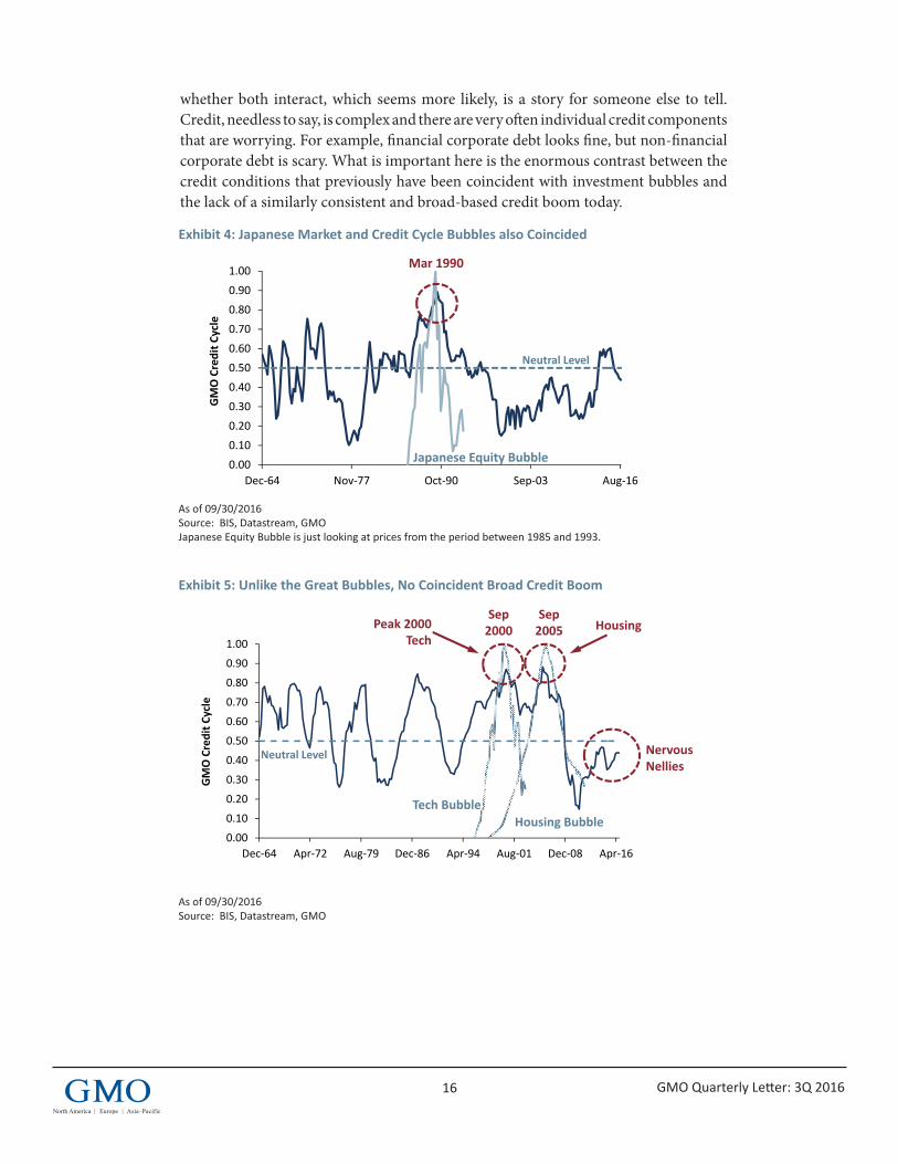
10. I just finished a meeting on credit cycles in which yet another difference between today’s conditions and a classic bubble was revealed: They – the bubbles in stocks and houses – all coincided with bubbles in credit. Exhibits 4 and 5 show the classic spike in credit in Japan in 1989, coincident with the high in stocks; the US 2000 tech event and the US housing boom of 2006 also coincided perfectly with booms in credit. Whether stock and house prices rising draws out credit or credit pushes prices, or
2Proprietary information – not for distribution. Copyright © 2016 by GMO LLC. All rights reserved.
Exhibit 3: And What Things Look Like TodayJanuary 2010 – September 2016
As of 09/30/2016Source: Robert Shiller
1000
1200
1400
1600
1800
2000
2200
2400
2.5 Years of Upward Struggle
16 GMO Quarterly Letter: 3Q 2016
whether both interact, which seems more likely, is a story for someone else to tell. Credit, needless to say, is complex and there are very often individual credit components that are worrying. For example, financial corporate debt looks fine, but non-financial corporate debt is scary. What is important here is the enormous contrast between the credit conditions that previously have been coincident with investment bubbles and the lack of a similarly consistent and broad-based credit boom today.
Exhibit 4: Japanese Market and Credit Cycle Bubbles also Coincided
As of 09/30/2016 Source: BIS, Datastream, GMO Japanese Equity Bubble is just looking at prices from the period between 1985 and 1993.
Exhibit 5: Unlike the Great Bubbles, No Coincident Broad Credit Boom
As of 09/30/2016 Source: BIS, Datastream, GMO
3Proprietary information – not for distribution. Copyright © 2016 by GMO LLC. All rights reserved.
0.00
0.10
0.20
0.30
0.40
0.50
0.60
0.70
0.80
0.90
1.00
Dec‐64 Nov‐77 Oct‐90 Sep‐03 Aug‐16
GMO Credit C
ycle
Exhibit 4: Japanese Market and Credit Cycle Bubbles also Coincided
Mar 1990
As of 09/30/2016Source: BIS, Datastream, GMOJapanese Equity Bubble is just looking at prices from the period between 1985 and 1993The GMO Credit Cycle incorporates six factors: Private Credit to GDP Growth, Inflation Surprise, Bank Credit to M2, Real House Price Change, Banks’ Net Foreign Assets, and the Private Financial Balance
Japanese Equity Bubble
Neutral Level
4Proprietary information – not for distribution. Copyright © 2016 by GMO LLC. All rights reserved.
0.00
0.10
0.20
0.30
0.40
0.50
0.60
0.70
0.80
0.90
1.00
Dec‐64 Apr‐72 Aug‐79 Dec‐86 Apr‐94 Aug‐01 Dec‐08 Apr‐16
GMO Credit C
ycle
Exhibit 5: Unlike the Great Bubbles, No Coincident Broad Credit BoomUS Credit Cycle
Peak 2000 Tech
HousingSep 2005
Sep 2000
As of 09/30/2016Source: BIS, Datastream, GMOThe GMO Credit Cycle incorporates six factors: Private Credit to GDP Growth, Inflation Surprise, Bank Credit to M2, Real House Price Change, Banks’ Net Foreign Assets, and the Private Financial Balance
Nervous Nellies
Neutral Level
Tech BubbleHousing Bubble
17 GMO Quarterly Letter: 3Q 2016
11. The current market therefore is closer to an anti-bubble than a bubble. In every sense, that is, except one: Traditional measures of value score this market as extremely overpriced by historical standards.
12. At GMO we have put particular weight for identifying investment bubbles on the statistical measure of a 2-sigma upside move above the long-term trend line, a measure of deviation that uses only long-term prices and volatility around the trend. (A 2-sigma deviation occurs every 44 years in a normally distributed world and every 35 years in our actual fat-tailed stock market world.) Today’s (November 7) price is only 8% away from the 2-sigma level that we calculate for the S&P 500 of 2300.
13. Upside moves of 2-sigma have historically done an excellent job of differentiating between mere bull markets and the real McCoy investment bubbles that are likely to decline a lot – all the way back to trend – often around 50% in equities. And to do so in a hurry, in one to three years.
14. So we have an apparent paradox. None of the usual economic or psychological conditions for an investment bubble are being met, yet the current price is almost on the statistical boundary of a bubble. Can this be reconciled? I believe so.
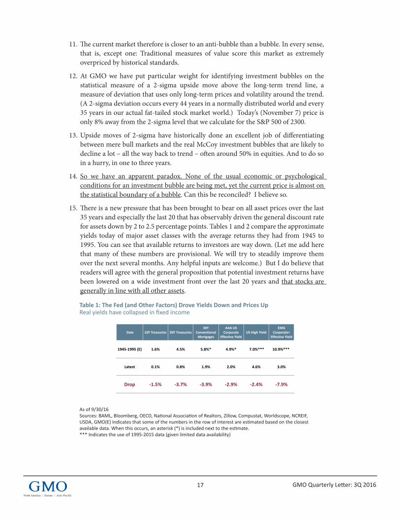
15. There is a new pressure that has been brought to bear on all asset prices over the last 35 years and especially the last 20 that has observably driven the general discount rate for assets down by 2 to 2.5 percentage points. Tables 1 and 2 compare the approximate yields today of major asset classes with the average returns they had from 1945 to 1995. You can see that available returns to investors are way down. (Let me add here that many of these numbers are provisional. We will try to steadily improve them over the next several months. Any helpful inputs are welcome.) But I do believe that readers will agree with the general proposition that potential investment returns have been lowered on a wide investment front over the last 20 years and that stocks are generally in line with all other assets.
Table 1: The Fed (and Other Factors) Drove Yields Down and Prices Up Real yields have collapsed in fixed income
As of 9/30/16 Sources: BAML, Bloomberg, OECD, National Association of Realtors, Zillow, Compustat, Worldscope, NCREIF, USDA, GMO(E) Indicates that some of the numbers in the row of interest are estimated based on the closest available data. When this occurs, an asterisk (*) is included next to the estimate. *** Indicates the use of 1995-2015 data (given limited data availability) 5Proprietary information – not for distribution. Copyright © 2016 by GMO LLC. All rights reserved.
Table 1: The Fed (and Other Factors) Drove Yields Down & Prices UpReal yields have collapsed in fixed income
As of 9/30/16Sources: BAML, Bloomberg, OECD, National Association of Realtors, Zillow, Compustat, Worldscope, NCREIF, USDA, GMO(E) Indicates that some of the numbers in the row of interest are estimated based on the closest available data. When this occurs, an asterisk (*) is included next to the estimate.*** Indicate the use of 1995‐2015 data (given limited data availability)
Date 10Y Treasuries 30Y Treasuries30Y
Conventional Mortgages
AAA US Corporate
Effective YieldUS High Yield
EMG Corporate+
Effective Yield
1945‐1995 (E) 1.6% 4.5% 5.8%* 4.9%* 7.0%*** 10.9%***
Latest 0.1% 0.8% 1.9% 2.0% 4.6% 3.0%
Drop ‐1.5% ‐3.7% ‐3.9% ‐2.9% ‐2.4% ‐7.9%
18 GMO Quarterly Letter: 3Q 2016
Table 2: Yields Have Also Gone Down on Real Assets
As of 9/30/16 Sources: BAML, Bloomberg, OECD, National Association of Realtors, Zillow, Compustat, Worldscope, NCREIF, USDA, GMO (E) Indicates that some of the numbers in the row of interest are estimated based on the closest available data. When this occurs, an asterisk (*) is included next to the estimate. Two asterisks (**) indicate how much the yield drop would be if the actual yield were 6%, taking into consideration the rise in price-to-income ratios. *** Indicates the use of 1995-2015 data (given limited data availability)
16. This downward shift in the discount rate was probably camouflaged for most of us by its intersection with two of the great genuine bubbles – 2000 tech and 2007 US housing and finance. Those were so much more powerful in the short term and so much faster moving that you could easily lose sight of the slower and very irregular downward drift in the broad discount rate. Some assets would boom for a few years and then bust spectacularly, but all slowly worked their way higher in price and lower in yields.
17. The key point here is that this downward shift in the discount rate has happened and can be measured. The possible reasons for it can, for convenience, be divided into two groups.
18. I believe that the major input has been a sustained policy of the US Fed since just before 1995 to push down short-term rates. Investors initially resisted this effect, assuming it to be very temporary. As the downward pressure on rates continued, though, the 2% drop in T-bill rates worked out along the yield curve until, over a number of years, the 10- to 30-year bonds, both nominal and TIPS, also reflected the 2% drop. This effect, rather like a virus, then moved into high-yield stocks, and eventually into all stocks, real estate, forests, farming, and all investable assets. The US Fed and its growing list of converts to this policy have successfully bullied the entire discount rate structure of assets. They did it to enjoy the economic benefit from the wealth effect, and Yellen, Bernanke, and Greenspan – the three members of this new Fed regime – all overtly bragged about their success in driving asset prices, particularly stocks, higher.
19. The general downward pressure on rates was not continuous. On a cyclical basis, when growth and employment were fine, rates could rise. Indeed, from late 2002 into 2006 the Fed raised rates as much as 430 basis points as the economy recovered,
11Proprietary information – not for distribution. Copyright © 2016 by GMO LLC. All rights reserved.
Table 2Yields have also gone down on real assets
As of 9/30/16Sources: BAML, Bloomberg, OECD, National Association of Realtors, Zillow, Compustat, Worldscope, NCREIF, USDA, GMO(E) Indicates that some of the numbers in the row of interest are estimated based on the closest available data. When this occurs, an asterisk (*) is included next to the estimate.Two asterisks (**) indicate how much the yield drop would be if the actual yield were 6%, taking into consideration the rise in price‐to‐income ratios.*** Indicate the use of 1995‐2015 data (given limited data availability)
DateS&P 500 Dividend Yield
EAFE (Ex‐JP) Dividend Yield
EM DividendYield
CroplandRent‐to‐Value
Timber EBITDA Yield
US Housing Price‐to‐Income
UK Housing Price‐to‐Income
1945‐1995 (E) 4.0% 3.9%* 2.3%*** 7.1%* 8.3% 2.9* 4.0*
Latest 2.1% 3.3% 2.6% 3.3% 2.7% 3.4 6.1
Drop ‐1.9% ‐0.6% 0.3% ‐3.8% ‐5.6% ‐0.8%** ‐2.1%**
19 GMO Quarterly Letter: 3Q 2016
following the time-honored practice. Most asset prices, though, far from stumbling, continued to rise as the markets now believed that the Fed would always act as if it were looking for an excuse to lower rates. Vitally, moral hazard, “the Fed or Greenspan put,” was always in sight: If markets rise you are on your own – Whoopee! But if things go wrong – any bump in the economic or market road – you can count on us to lower rates. This made investment risks asymmetrical and was guaranteed to raise prices. The increasingly miserable rates available to more cautious investors merely rubbed this message in. Exhibit 6 makes it pretty clear to me that around the cyclical moves the Fed’s pressure ratcheted the rates down − lower highs and lower lows. To roughly neutralize for economic cycles the exhibit looks at real interest rates each time unemployment hits 5.2% since 1982 and shows earlier cycles only when inflation was roughly comparable to today.
Exhibit 6: The Fed Ratchets Down Adjusting for Cyclicality
Source: BEA, Datastream, GMO *Unemployment series selected here is U3, given that it has data available for the longest time. **Real Rates are calculated assuming that 1Y future inflation is in expectation an average of 5Y rolling inflation and previous 1Y inflation.
20. Exhibit 7 represents the Bank of England’s take on a completely different explanation for the lower discount rate: a series of fundamental factors that they argue have pushed down “normal” rates 4.5%, far more than the 2% or so reflected in broad asset pricing, without a single basis point being allocated to the new policies of central banks. Must be the work of, er… central bankers. Some of their points, though, seem reasonable enough and might have the right sign at least.
7Proprietary information – not for distribution. Copyright © 2016 by GMO LLC. All rights reserved.
Exhibit 6: The Fed Ratchets DownAdjusting for cyclicality
Source: BEA, Datastream, GMO*Unemployment series selected here is U3, given that it has data available for the longest time.**Real Rates are calculated assuming that 1Y future inflation is in expectation an average of 5Y rolling inflation and previous 1Y inflation.
Real Interest Rates when Unemployment* Crosses 5.2% for the First Time in Each Business Cycle
‐2.0%
0.0%
2.0%
4.0%
6.0%
8.0% Inflation Expectation
Real Rate**
20 GMO Quarterly Letter: 3Q 2016
Exhibit 7: Why the Natural Rate Has Fallen II. Fundamental Changes Hilarious Overfitting by the Bank of England
As of 9/30/2016 Source: Rachel and Smith (2015), Bank of England
21. A third possible reason for low rates might have been added by Schumpeter, of “Creative Destruction” fame: that we are between waves of innovation and that this suppresses growth and the demand for capital. A related school of thought these days is that we have simply run out of low-hanging technological fruit.
22. And, finally, there are those who believe that the reason for lower rates is particularly simple and entirely different: The rapidly aging population of the developed world and China is, cohort by cohort, moving the mix toward middle-aged heavy savers and away from high-consuming young workers. This, they believe, has created excess savings that depress all returns on capital. Clearly, not a crazy argument.
23. I believe the dominant effect is Fed policy, but it seems nearly certain that one or more of these other factors are also contributing. Whatever fraction was caused by Fed actions, the important point here is that we can measure the lower rates and lower imputed returns. They are most definitely there.
24. At GMO our standard assumption for valuing assets has always been that both P/E multiples and profitability would move all the way back to “normal” – the long-term trend – in seven years. The seven-year period was selected because it was close to the historical average.
25. Now this is where it gets interesting and contentious, for I can find no reason why the discount rate this time should return all the way to the old average, nor that it should fully regress in only seven years.
6Proprietary information – not for distribution. Copyright © 2016 by GMO LLC. All rights reserved.
Exhibit 7: Why the Natural Rate Has Fallen II. Fundamental ChangesHilarious overfitting by the Bank of England
As of 9/30/2016Source: Rachel and Smith (2015), Bank of England
Growth, 100
Demographics, 90
Risk Spreads, 70
Relative Price of Capital, 50
Public Investment, 50
Inequality, 45
Savings Glut, 25Unexplained, 20Fed Policy, 0
Lack of Innovation, 0
0
50
100
150
200
250
300
350
400
450
500
Basis Po
ints Exp
lained
Suggested Factors
21 GMO Quarterly Letter: 3Q 2016
26. The case for partial regression of rates hinges on the possibilities that the broad post war era of 1945 to 2005 will turn out to have been a golden era of global growth that will not be equaled again for at least a couple of decades. We now appear to be in a slower-growing world, the result of a slower-growing and aging population and lower productivity. Quite possibly, lower growth and other reasons mentioned above will lower the demand for capital and thus result in a permanently lower return on all capital, at least to a moderate degree.
27. The current fad for the Fed and central banks trying to influence the economy through lower rates is also unlikely to go away entirely, even over 20 years. Economic dogmas die hard despite evidence of failure. Think of all the unnecessary pain and misdirection from the idea of Rational Expectations and the Efficient Market Hypothesis.
28. History, though, has shown repeatedly that financial and economic ratios have a strong tendency to return to their old, normal levels. These ratios did not spend 100 years or so wandering around a central tendency for no reason. This leads me to believe that the odds still favor some mean reversion: the discount rate moving toward the old normal from today’s extreme. I propose that returning two-thirds of the way to the old normal has a higher probability than either returning all the way or staying indefinitely at current levels, although both are possible.
29. The case for a slower than usual regression rests on my belief that most of the reasons suggested for a lowering of rates are slow-moving: population profiles; Fed policy regimes; temporary (or permanent) lack of a growth push from innovation; income inequality. Much as I would like some of these factors, such as income inequality, to change rapidly, it seems wishful thinking. What do you think? It took 35 years to get from high to low in rates, for example. Bottom line, I suggest a 20-year flight path to get back two-thirds of the way to normal so that T-bills will yield around 1.2-1.5% real again, and developed country equities will return 5.0% instead of our current 5.7% “normal” assumption. Let me point out that all alternate assumptions – whether three years, seven years, or no return at all – are also arbitrary. Granted, each of these is merely a possibility. Our task is to find the least unlikely.
30. And now for another difficult and contentious point: Over roughly the last 20 years there has been a historically unprecedented rise in corporate profit margins. The reasons for this will be considered in part two next quarter. Importantly, many of the reasons are structural and very slow-moving. There is little in the real world data to suggest that there will be a rapid decline back to the old average.
31. In the model I am suggesting here, I assume that corporate returns will slowly, over 20 years, drop back two-thirds of the way to their old normal.
32. This is how my suggested 20-year “evolution” would play out compared to our traditional 7-year full mean reversion model (see Exhibit 8).
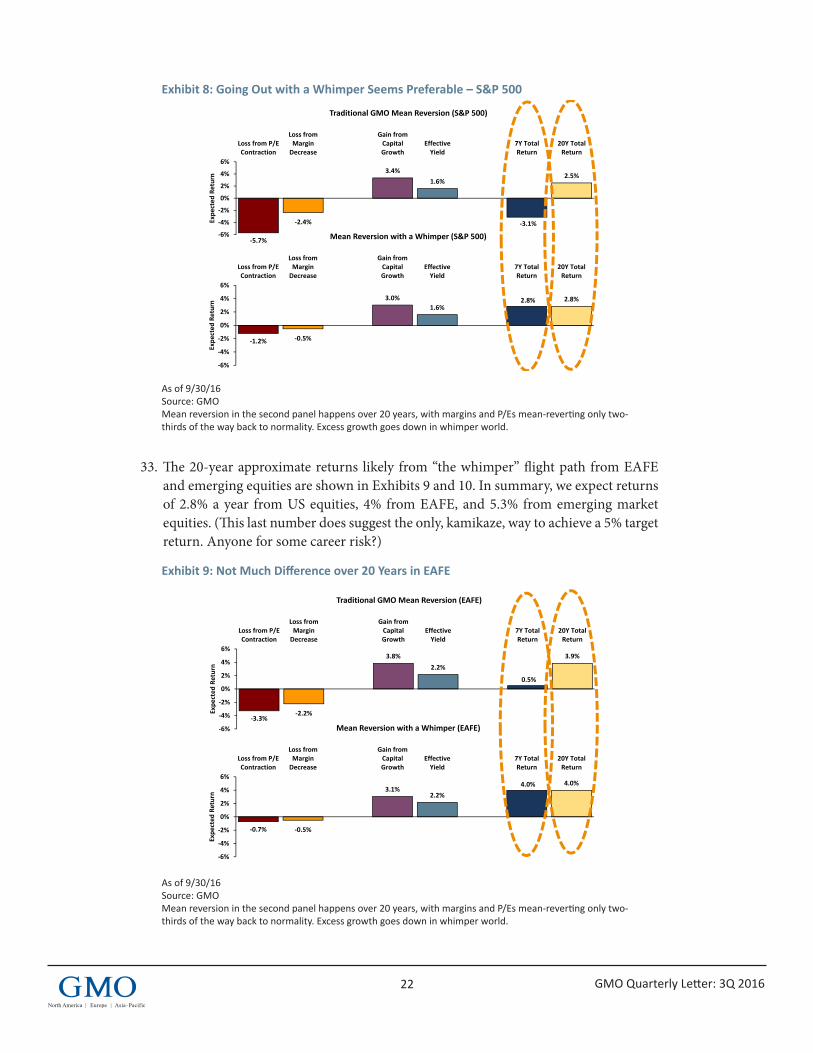
22 GMO Quarterly Letter: 3Q 2016
Exhibit 8: Going Out with a Whimper Seems Preferable – S&P 500
As of 9/30/16 Source: GMO Mean reversion in the second panel happens over 20 years, with margins and P/Es mean-reverting only two-thirds of the way back to normality. Excess growth goes down in whimper world.
33. The 20-year approximate returns likely from “the whimper” flight path from EAFE and emerging equities are shown in Exhibits 9 and 10. In summary, we expect returns of 2.8% a year from US equities, 4% from EAFE, and 5.3% from emerging market equities. (This last number does suggest the only, kamikaze, way to achieve a 5% target return. Anyone for some career risk?)
Exhibit 9: Not Much Difference over 20 Years in EAFE
As of 9/30/16 Source: GMO Mean reversion in the second panel happens over 20 years, with margins and P/Es mean-reverting only two-thirds of the way back to normality. Excess growth goes down in whimper world.
8Proprietary information – not for distribution. Copyright © 2016 by GMO LLC. All rights reserved.
‐3.3%‐2.2%
3.8%2.2%
0.5%
3.9%
‐6%
‐4%
‐2%
0%
2%
4%
6%
Loss from P/EContraction
Loss fromMarginDecrease
Gain fromCapitalGrowth
EffectiveYield
7Y TotalReturn
20Y TotalReturn
Expe
cted
Return
Traditional GMO Mean Reversion (EAFE)
Exhibit 9: Not With a Bang but a Whimper (a Thought Experiment)Not much difference over 20Y in EAFE
Mean reversion in the second panel happens over 20 years, with margins and P/Es mean‐reverting only two‐thirds of the way back to normality. Excess growth goes down in whimper world.As of 09/30/2016; Source: GMO
‐0.7% ‐0.5%
3.1%2.2%
4.0% 4.0%
‐6%
‐4%
‐2%
0%
2%
4%
6%
Loss from P/EContraction
Loss fromMarginDecrease
Gain fromCapitalGrowth
EffectiveYield
7Y TotalReturn
20Y TotalReturn
Expe
cted
Return
Mean Reversion with a Whimper (EAFE)
7Proprietary information – not for distribution. Copyright © 2016 by GMO LLC. All rights reserved.
‐5.7%
‐2.4%
3.4%1.6%
‐3.1%
2.5%
‐6%
‐4%
‐2%
0%
2%
4%
6%
Loss from P/EContraction
Loss fromMarginDecrease
Gain fromCapitalGrowth
EffectiveYield
7Y TotalReturn
20Y TotalReturn
Expe
cted
Return
Traditional GMO Mean Reversion (S&P 500)
‐1.2% ‐0.5%
3.0%1.6%
2.8% 2.8%
‐6%
‐4%
‐2%
0%
2%
4%
6%
Loss from P/EContraction
Loss fromMarginDecrease
Gain fromCapitalGrowth
EffectiveYield
7Y TotalReturn
20Y TotalReturn
Expe
cted
Return
Mean Reversion with a Whimper (S&P 500)
Exhibit 8: Not With a Bang but a Whimper (a Thought Experiment)Going out with a whimper seems preferable – S&P 500
Mean reversion in the second panel happens over 20 years, with margins and P/Es mean‐reverting only two‐thirds of the way back to normality. Excess growth goes down in whimper world.As of 9/30/16Source: GMO
23 GMO Quarterly Letter: 3Q 2016
Exhibit 10: Whimper World Also Outperforms Traditional Mean Reversion in Emerging
As of 9/30/16 Source: GMO Mean reversion in the second panel happens over 20 years, with margins and P/Es mean-reverting only two-thirds of the way back to normality. Excess growth goes down in whimper world.
34. It turns out that all three mean-reverting flight paths end up with remarkably similar and painful outcomes for pension funds and others at a 20-year horizon: 2.4% a year for the standard 7-year slump and 13 years of full returns; 2.6% for a 2-year crash and 18 years of full returns; and 2.8% a year for my 20-year whimper. This narrow range is a significant and perhaps unexpected outcome: Any set of assumptions that includes even a modest reduction in current abnormally high corporate profits and hence some reduction in growth – to be offset by a required increase in yield with a corresponding loss of capital – results in a very disappointing 20-year flight path.
35. Normal bear markets of 15 to 25% can, of course, always occur. They have nothing to do with this analysis though, which is trying to come to grips with a slow-burning shift in the long-term equilibrium. Old-fashioned bubbles breaking causes major declines back to the previously existing equilibriums. A normal bear market is, in comparison, short-term noise. (Although I grant you that at the lows everyone starts to look for arguments justifying even further and more permanent declines. Investing is tough!) Global and domestic political shocks often cause a modest decline. History shows that these are nearly always short-lived and the initial response is almost invariably exaggerated. Domestic economic shocks are the meat and potatoes of market noise as markets over-respond to provisional data that after three changes often ends up with a different sign.
36. The current outlook includes the possibility of a Trump election. This would be an outlier event of its kind because it comes with possibilities of tariff wars and general political unease globally. With the constraints of Congress, however, it would seem unlikely to cause long-lived effects, although this is not impossible. Brexit problems have already caused problems that could easily worsen, as indicated by the weak pound.
9Proprietary information – not for distribution. Copyright © 2016 by GMO LLC. All rights reserved.
Exhibit 10: Not With a Bang but a Whimper (a Thought Experiment)Whimper world also outperforms traditional Mean Reversion in Emerging
Mean reversion in the second panel happens over 20 years, with margins and P/Es mean‐reverting only two‐thrids of the way back to normality. Excess growth goes down in whimper world.As of 09/30/2016; Source: GMO
‐0.5%
0.1%
4.5%
1.3%
5.3% 5.3%
‐6%
‐4%
‐2%
0%
2%
4%
6%
Loss from P/EContraction
Loss fromMarginDecrease
Gain fromCapitalGrowth
EffectiveYield
Adjustmentfor Resources
7Y TotalReturn
20Y TotalReturn
Expe
cted
Return
Mean Reversion with a Whimper (EM)
‐2.4%
0.2%
4.5%
1.3%
3.7%5.0%
‐6%
‐4%
‐2%
0%
2%
4%
6%
Loss from P/EContraction
Loss fromMarginDecrease
Gain fromCapitalGrowth
EffectiveYield
Adjustmentfor Resources
7Y TotalReturn
20Y TotalReturn
Expe
cted
Return
Traditional GMO Mean Reversion (EM)
24 GMO Quarterly Letter: 3Q 2016
I believe that the biggest risk is that an extended economic recovery, which I actually expect, lasting for two more years, might start to finally push up wages enough to count. Should oil prices simultaneously bounce back, which I also expect (up to $100 a barrel by 2020), we could have an uptick in inflation, which has a very reliable history of lowering P/Es. All things considered, though, I would say this is market business as usual and not enough to interfere with my suggested 20-year forecast.
37. Consequences for GMO. Like almost all investors, GMO has been effectively bullied by the 20-year Fed Regime. In our Benchmark-Free portfolio, we carry almost 50% of equity or equity-like exposure. If we had been looking at the current data 20 years ago, we would have carried less. Now, we recognize some possibility of the current low-return world continuing forever alongside a substantially larger possibility of our standard 7-year outcome. The possibility of short-term bubbles breaking, which I consider so unlikely, is expressly ignored by our 7-year forecast, so there is no disagreement there. If GMO accepted my current thought experiment of a 20-year whimper as a certainty, what would the consequences be for a benchmark-free portfolio? Perhaps 5-7% more equity exposure. A 60-65% equity position is considered to be what we would hold in a “normal” world with everything priced “fairly,” and, because my whimper flight path is not as attractive as that, we would be under 60% equity. But the gap between the risk-free rate and my whimper forecast for equities, when tilted to emerging and EAFE, is not that far away from normal.
(A shorthand way of viewing this 5-7% more equity exposure is that with a lower chance of a near-term crash or a 7-year slump, the option value of cash would decrease and hence risky assets, including stocks, would become more attractive.)
Over our 28 years of asset allocation, most of our risk reduction for clients was concentrated in the two classic US bubbles of 2000 and 2007, which we sidestepped to a considerable degree. Most of our extra performance, however, came from ranking the different asset classes more correctly than not. We still expect to be able to do this, even in this difficult and novel environment, and are facing an interesting, wide range of potential returns in different global equities and other assets as we write.
GMO does not expect its strategists or any of its analysts to toe a party line. James Montier, for example, four times the highest-rated strategist in Europe,2 is more bearish than our 7-year model. My current analysis is less bearish. Ben Inker, the portfolio manager, is informed by both of us and many others. He weights the alternatives as he sees fit and makes the final decision. It seems a good system, to me.
2 Thomson Reuters Extel Survey
25 GMO Quarterly Letter: 3Q 2016
Disclaimer: The views expressed are the views of Jeremy Grantham through the period ending November 2016, and are subject to change at any time based on market and other conditions. This is not an offer or solicitation for the purchase or sale of any security and should not be construed as such. References to specific securities and issuers are for illustrative purposes only and are not intended to be, and should not be interpreted as, recommendations to purchase or sell such securities.
Copyright © 2016 by GMO LLC. All rights reserved.
Brexit: wounds from playing cricketYes, London, your financial business will be hurt. Long and hard. And most corporations will lose easy access to the biggest market in the world. As for universities, which receive much EU money, for students and faculty it will be a bone cruncher. Someone, somewhere may benefit? But the people voted. In a sea of misrepresentations by a Brexit leadership who promptly resigned, 51.8% voted to leave. The people voted…in a way that has absolutely no constitutional standing. In contrast, Members of Parliament have an unstated constitutional and ethical duty to do what is in the best long-run interest of the UK. The majority of Members of Parliament know that Brexit is not that. But the people voted; so it would not be cricket (“not kosher” for Americans), to override it. But what a high price for playing cricket!
Happily, my one-third chance of no Brexit still looks good as the Prime Minister does her duty in frightening everyone with a cold and hard Brexit. Just possibly she is combining this hard-Brexit-up-your-nose strategy with a remarkably inclusive program (for a Conservative!) to win over enough previously Brexit voters to have a revote by referendum or Parliament by the spring without a revolution. You never know your luck.