Embed Size (px)
DESCRIPTION
A collection of GIMP tips, tutorials, and how-tos from the GIMPing Along blog
Citation preview
Volume 1June 17, 2007 through
February 10, 2011
by Thomas Boito http://boitblog.blogspot.com

2
Contents
1 2007 5
1.1 June . . . . . . . . . . . . . . . . . . . . . . . . . . . . . . . . . . . . . . . . . . . . . . . . 5
Create a Realistic Looking Ticket (GIMP) (2007-06-18 13:14) . . . . . . . . . . . . . . . . . 5
Creating an Andy Warhol-like Effect with GIMP (2007-06-23 13:18) . . . . . . . . . . . . . 16
1.2 July . . . . . . . . . . . . . . . . . . . . . . . . . . . . . . . . . . . . . . . . . . . . . . . . 21
Creating Text on a Sphere with GIMP (2007-07-05 15:30) . . . . . . . . . . . . . . . . . . . 21
Creating a brush with variable size (2007-07-09 16:18) . . . . . . . . . . . . . . . . . . . . . 27
Blending Two Images with GIMP (2007-07-17 13:13) . . . . . . . . . . . . . . . . . . . . . . 31
Grid on a Globe (2007-07-24 10:30) . . . . . . . . . . . . . . . . . . . . . . . . . . . . . . . . 35
Crop Tool Quick Tip (2007-07-25 09:25) . . . . . . . . . . . . . . . . . . . . . . . . . . . . . 41
1.3 August . . . . . . . . . . . . . . . . . . . . . . . . . . . . . . . . . . . . . . . . . . . . . . . 42
How to delete saved settings from Levels, etc. (2007-08-03 08:23) . . . . . . . . . . . . . . . 42
Put on a Happy Sky (2007-08-25 11:27) . . . . . . . . . . . . . . . . . . . . . . . . . . . . . 42
1.4 December . . . . . . . . . . . . . . . . . . . . . . . . . . . . . . . . . . . . . . . . . . . . . 51
Lawn Care with GIMP (2007-12-02 10:16) . . . . . . . . . . . . . . . . . . . . . . . . . . . . 51
2 2008 59
Filling Text With An Image (2008-12-28 14:01) . . . . . . . . . . . . . . . . . . . . . . . . . 59
3 2009 71
3.1 January . . . . . . . . . . . . . . . . . . . . . . . . . . . . . . . . . . . . . . . . . . . . . . 71
Lomographic Effect (2009-01-10 15:59) . . . . . . . . . . . . . . . . . . . . . . . . . . . . . . 71
Brushes and Fonts for GIMP (2009-01-11 11:23) . . . . . . . . . . . . . . . . . . . . . . . . 83
Using GIMP’s Perspective Clone Tool (2009-01-18 19:15) . . . . . . . . . . . . . . . . . . . 84
3.2 April . . . . . . . . . . . . . . . . . . . . . . . . . . . . . . . . . . . . . . . . . . . . . . . . 88
Two Tone GIMP (2009-04-06 18:54) . . . . . . . . . . . . . . . . . . . . . . . . . . . . . . . 88
3.3 July . . . . . . . . . . . . . . . . . . . . . . . . . . . . . . . . . . . . . . . . . . . . . . . . 101
Create a Bright Neon Pattern of Repea... (2009-07-31 11:16) . . . . . . . . . . . . . . . . . 101
3.4 December . . . . . . . . . . . . . . . . . . . . . . . . . . . . . . . . . . . . . . . . . . . . . 114
Create an Attractive Star Field (2009-12-29 10:10) . . . . . . . . . . . . . . . . . . . . . . . 114
3
4 2010 121
4.1 March . . . . . . . . . . . . . . . . . . . . . . . . . . . . . . . . . . . . . . . . . . . . . . . 121
Just Too Big! (2010-03-01 16:41) . . . . . . . . . . . . . . . . . . . . . . . . . . . . . . . . . 121
Responding to Comments (2010-03-01 17:09) . . . . . . . . . . . . . . . . . . . . . . . . . . 128
Moon Shadow (2010-03-16 15:34) . . . . . . . . . . . . . . . . . . . . . . . . . . . . . . . . . 128
4.2 June . . . . . . . . . . . . . . . . . . . . . . . . . . . . . . . . . . . . . . . . . . . . . . . . 134
Old Blue Eyes (2010-06-07 13:37) . . . . . . . . . . . . . . . . . . . . . . . . . . . . . . . . . 134
4.3 August . . . . . . . . . . . . . . . . . . . . . . . . . . . . . . . . . . . . . . . . . . . . . . . 139
The Catch (2010-08-15 14:45) . . . . . . . . . . . . . . . . . . . . . . . . . . . . . . . . . . . 139
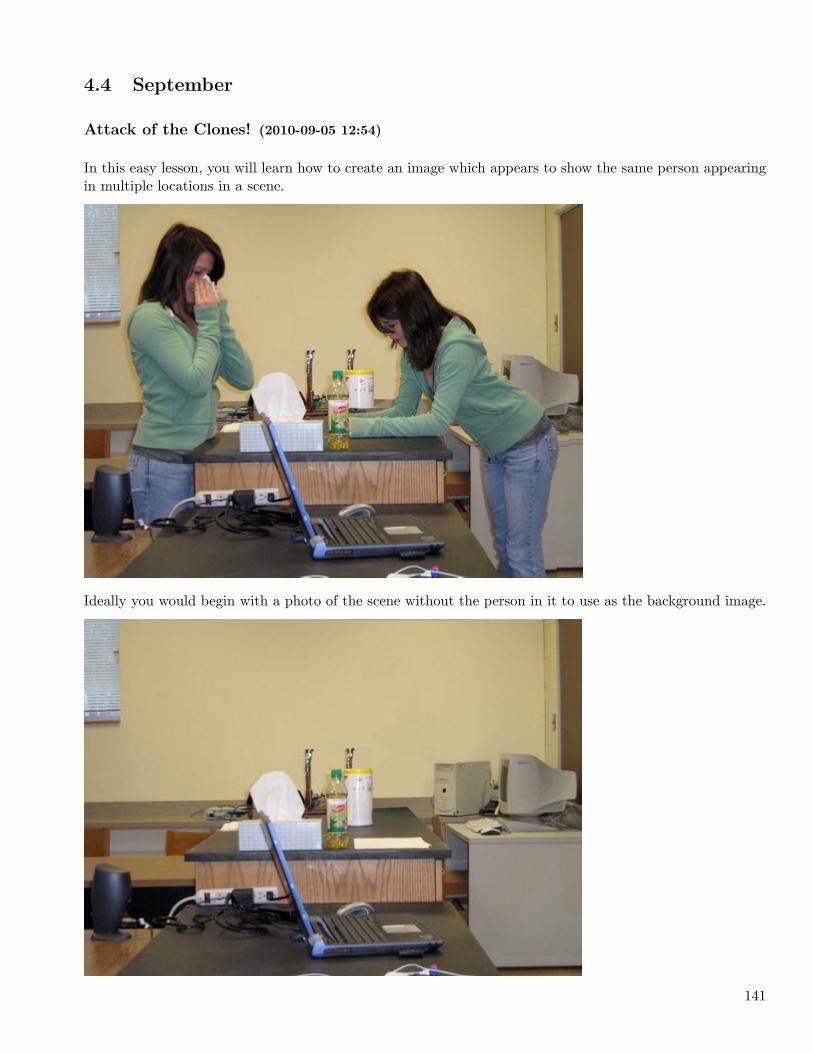
4.4 September . . . . . . . . . . . . . . . . . . . . . . . . . . . . . . . . . . . . . . . . . . . . . 141
Attack of the Clones! (2010-09-05 12:54) . . . . . . . . . . . . . . . . . . . . . . . . . . . . . 141
5 2011 149
5.1 January . . . . . . . . . . . . . . . . . . . . . . . . . . . . . . . . . . . . . . . . . . . . . . 149
Quick and Easy Zoom Effect (2011-01-11 12:43) . . . . . . . . . . . . . . . . . . . . . . . . 149
Make GIMP the Default External Editor in iPhoto (2011-01-18 13:17) . . . . . . . . . . . . 151
5.2 February . . . . . . . . . . . . . . . . . . . . . . . . . . . . . . . . . . . . . . . . . . . . . . 153
Create a Watermark and Place it in a Photo (2011-02-05 19:37) . . . . . . . . . . . . . . . . 153
Back in the Day (2011-02-08 11:32) . . . . . . . . . . . . . . . . . . . . . . . . . . . . . . . . 162
4
Chapter 1
2007
1.1 June
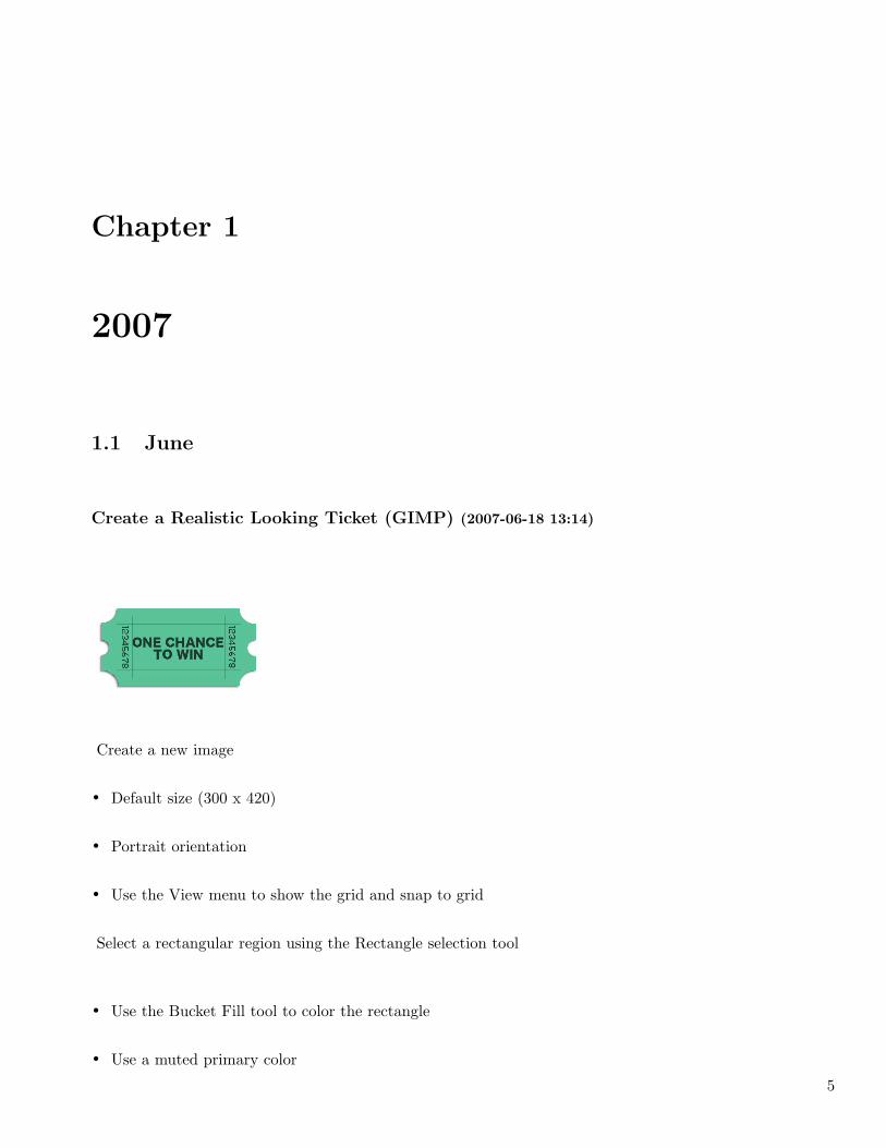
Create a Realistic Looking Ticket (GIMP) (2007-06-18 13:14)
Create a new image
• Default size (300 x 420)
• Portrait orientation
• Use the View menu to show the grid and snap to grid
Select a rectangular region using the Rectangle selection tool
• Use the Bucket Fill tool to color the rectangle
• Use a muted primary color
5
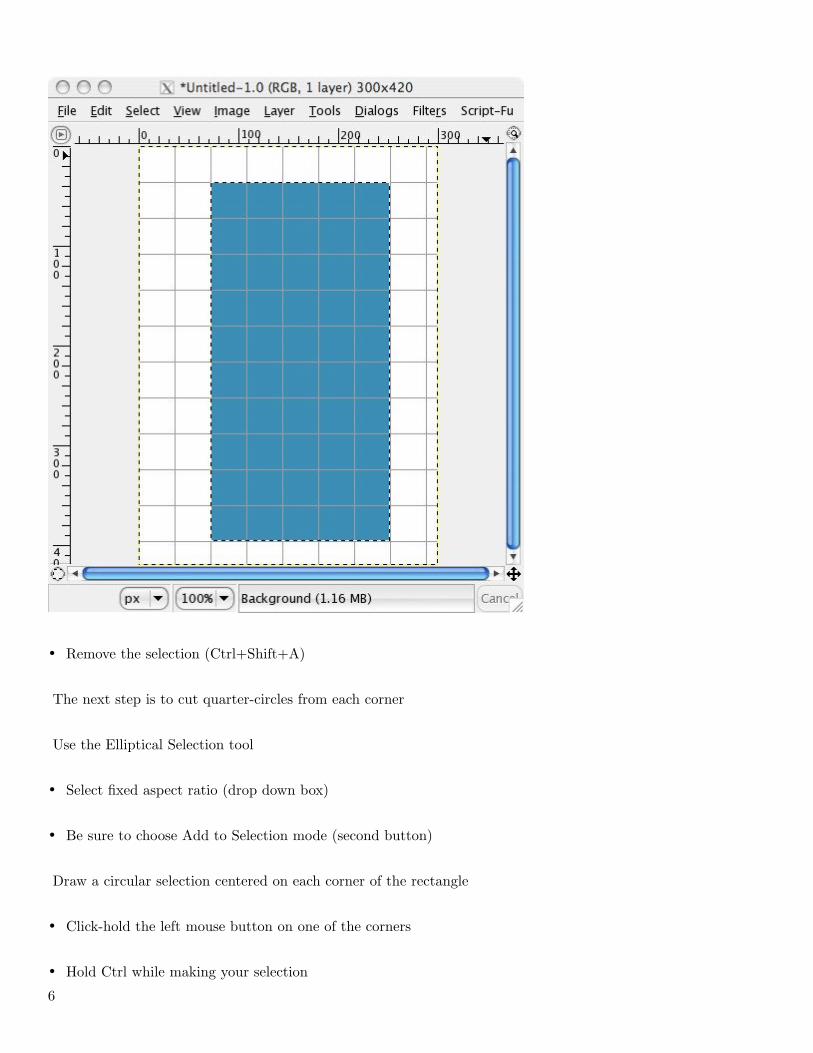
• Remove the selection (Ctrl+Shift+A)
The next step is to cut quarter-circles from each corner
Use the Elliptical Selection tool
• Select fixed aspect ratio (drop down box)
• Be sure to choose Add to Selection mode (second button)
Draw a circular selection centered on each corner of the rectangle
• Click-hold the left mouse button on one of the corners
• Hold Ctrl while making your selection
6
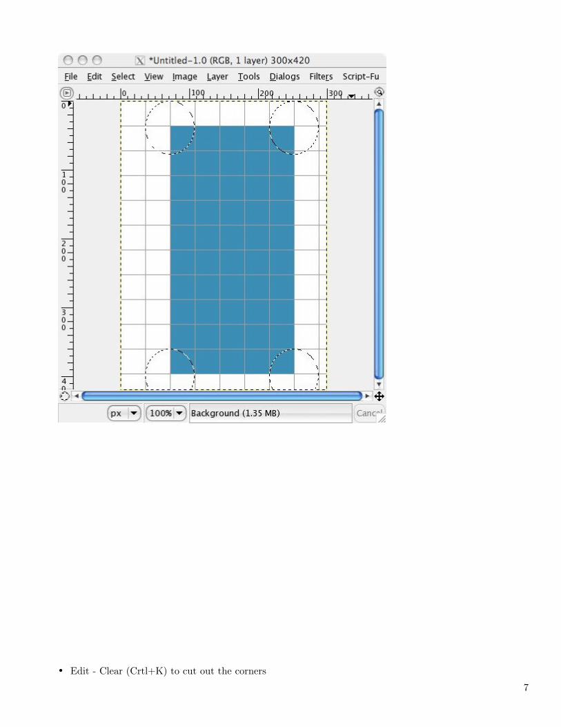
• Edit - Clear (Crtl+K) to cut out the corners
7
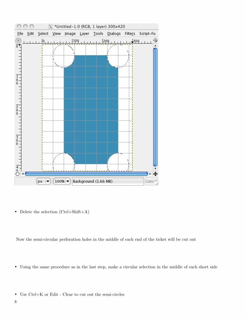
• Delete the selection (Ctrl+Shift+A)
Now the semi-circular perforation holes in the middle of each end of the ticket will be cut out
• Using the same procedure as in the last step, make a circular selection in the middle of each short side
• Use Ctrl+K or Edit - Clear to cut out the semi-circles
8
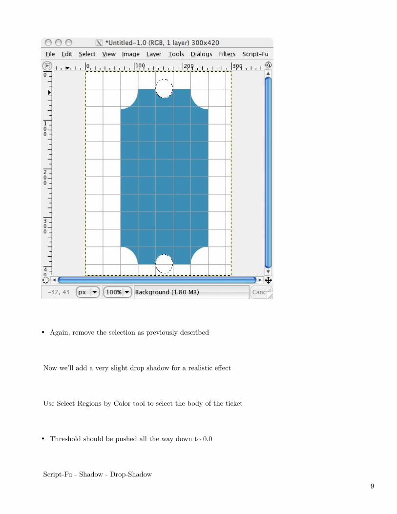
• Again, remove the selection as previously described
Now we’ll add a very slight drop shadow for a realistic effect
Use Select Regions by Color tool to select the body of the ticket
• Threshold should be pushed all the way down to 0.0
Script-Fu - Shadow - Drop-Shadow
9
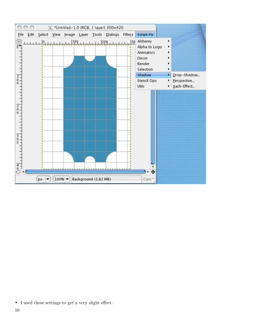
• I used these settings to get a very slight effect.
10
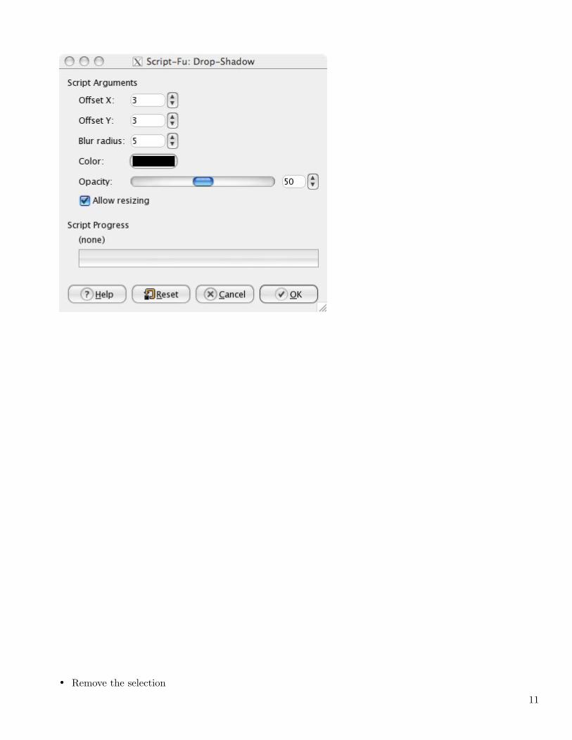
• Remove the selection
11
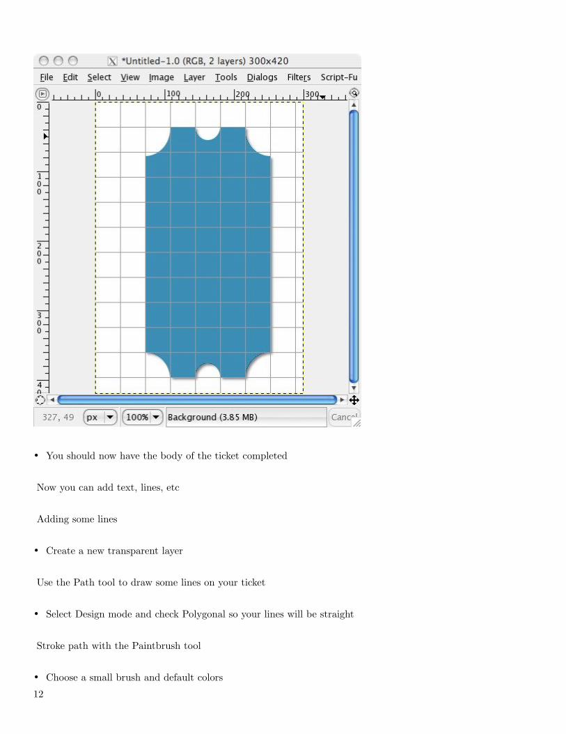
• You should now have the body of the ticket completed
Now you can add text, lines, etc
Adding some lines
• Create a new transparent layer
Use the Path tool to draw some lines on your ticket
• Select Design mode and check Polygonal so your lines will be straight
Stroke path with the Paintbrush tool
• Choose a small brush and default colors
12
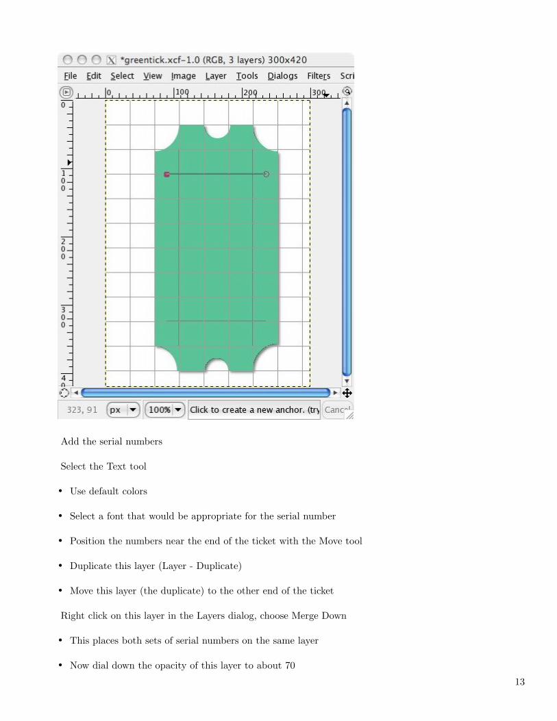
Add the serial numbers
Select the Text tool
• Use default colors
• Select a font that would be appropriate for the serial number
• Position the numbers near the end of the ticket with the Move tool
• Duplicate this layer (Layer - Duplicate)
• Move this layer (the duplicate) to the other end of the ticket
Right click on this layer in the Layers dialog, choose Merge Down
• This places both sets of serial numbers on the same layer
• Now dial down the opacity of this layer to about 70
13
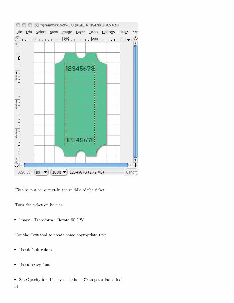
Finally, put some text in the middle of the ticket
Turn the ticket on its side
• Image - Transform - Rotate 90 CW
Use the Text tool to create some appropriate text
• Use default colors
• Use a heavy font
• Set Opacity for this layer at about 70 to get a faded look
14
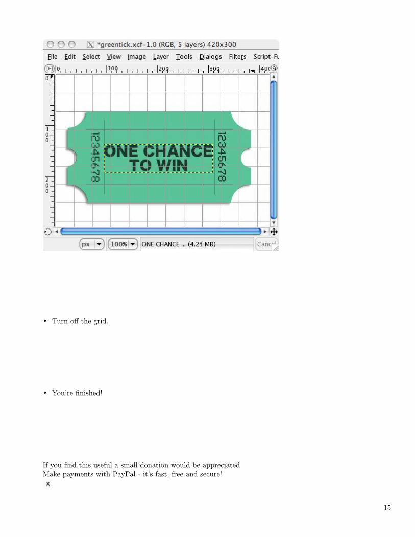
• Turn off the grid.
• You’re finished!
If you find this useful a small donation would be appreciatedMake payments with PayPal - it’s fast, free and secure!
15
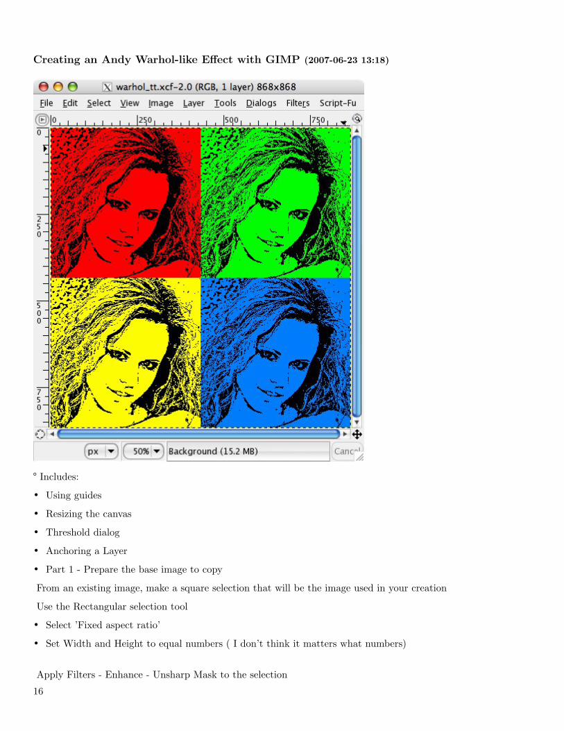
Creating an Andy Warhol-like Effect with GIMP (2007-06-23 13:18)
° Includes:
• Using guides
• Resizing the canvas
• Threshold dialog
• Anchoring a Layer
• Part 1 - Prepare the base image to copy
From an existing image, make a square selection that will be the image used in your creation
Use the Rectangular selection tool
• Select ’Fixed aspect ratio’
• Set Width and Height to equal numbers ( I don’t think it matters what numbers)
Apply Filters - Enhance - Unsharp Mask to the selection
16
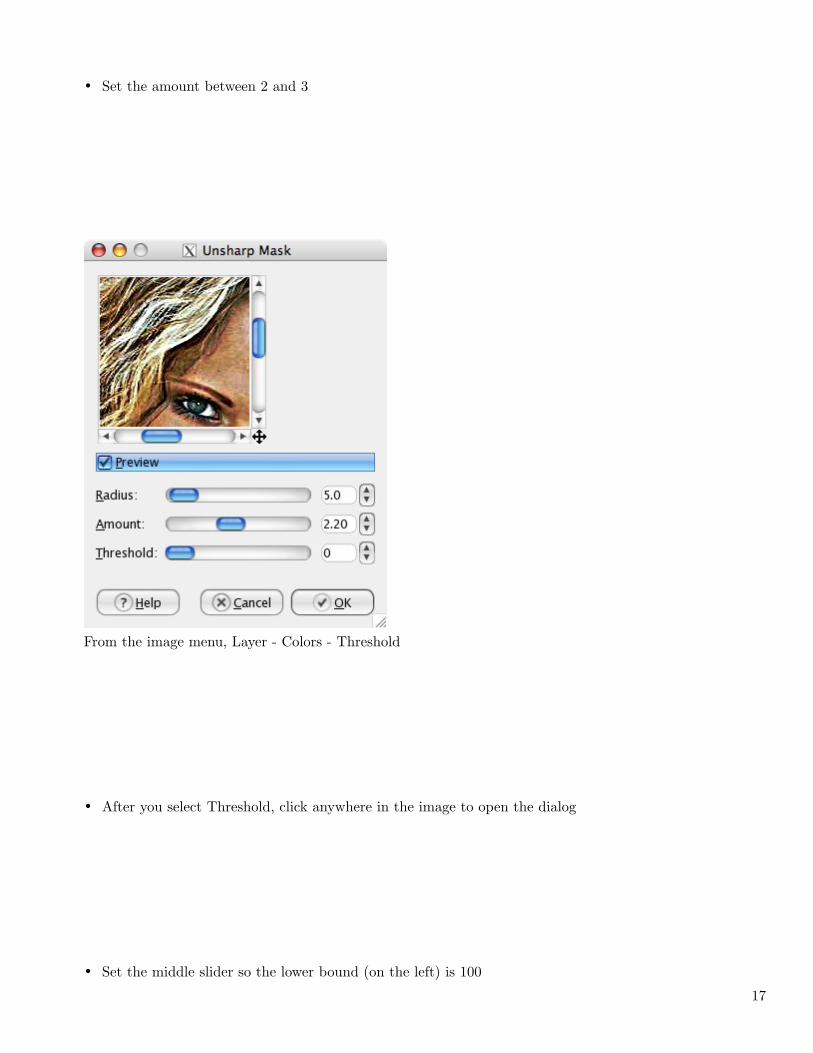
• Set the amount between 2 and 3
From the image menu, Layer - Colors - Threshold
• After you select Threshold, click anywhere in the image to open the dialog
• Set the middle slider so the lower bound (on the left) is 100
17
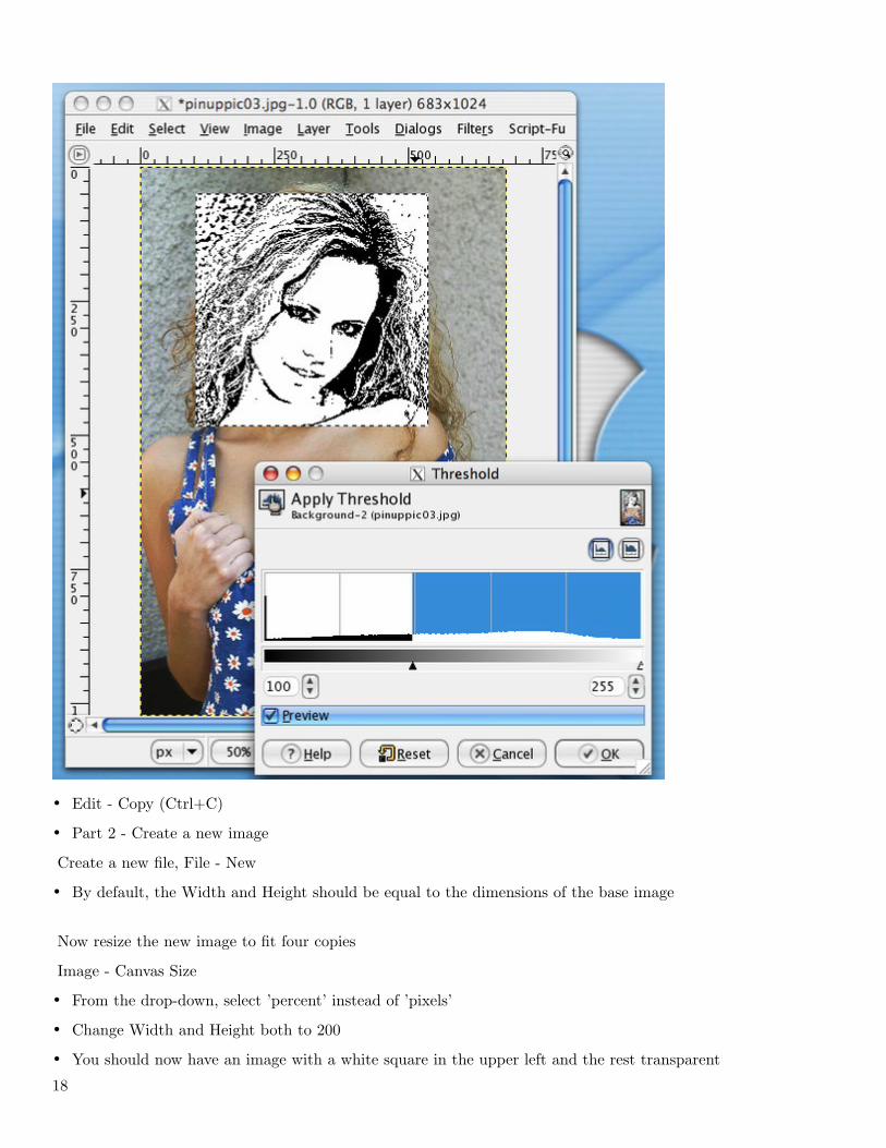
• Edit - Copy (Ctrl+C)
• Part 2 - Create a new image
Create a new file, File - New
• By default, the Width and Height should be equal to the dimensions of the base image
Now resize the new image to fit four copies
Image - Canvas Size
• From the drop-down, select ’percent’ instead of ’pixels’
• Change Width and Height both to 200
• You should now have an image with a white square in the upper left and the rest transparent
18
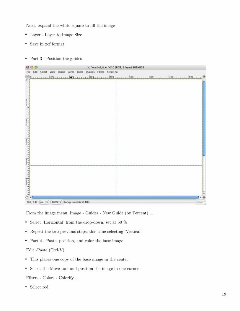
Next, expand the white square to fill the image
• Layer - Layer to Image Size
• Save in xcf format
• Part 3 - Position the guides
From the image menu, Image - Guides - New Guide (by Percent) ...
• Select ’Horizontal’ from the drop-down, set at 50 %
• Repeat the two previous steps, this time selecting ’Vertical’
• Part 4 - Paste, position, and color the base image
Edit -Paste (Ctrl-V)
• This places one copy of the base image in the center
• Select the Move tool and position the image in one corner
Filters - Colors - Colorify ...
• Select red
19
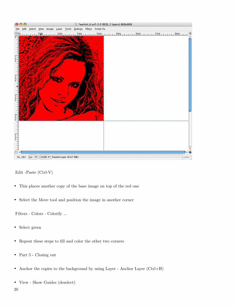
Edit -Paste (Ctrl-V)
• This places another copy of the base image on top of the red one
• Select the Move tool and position the image in another corner
Filters - Colors - Colorify ...
• Select green
• Repeat these steps to fill and color the other two corners
• Part 5 - Closing out
• Anchor the copies to the background by using Layer - Anchor Layer (Ctrl+H)
• View - Show Guides (deselect)
20
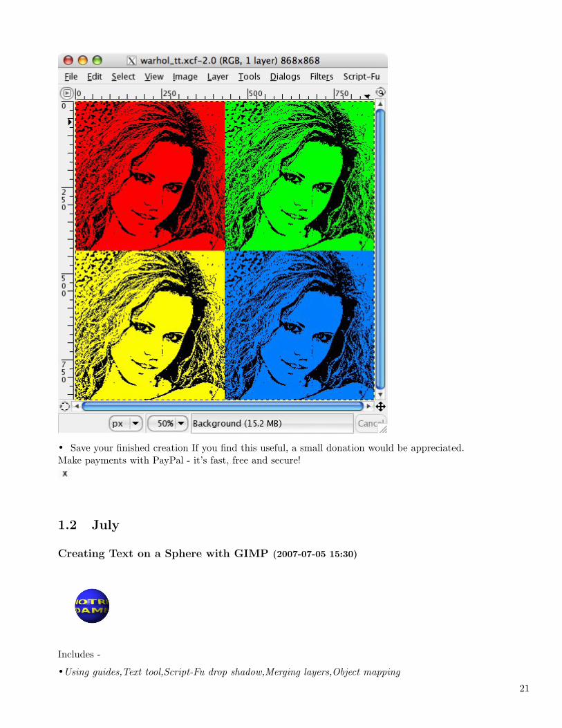
• Save your finished creation If you find this useful, a small donation would be appreciated.Make payments with PayPal - it’s fast, free and secure!
1.2 July
Creating Text on a Sphere with GIMP (2007-07-05 15:30)
Includes -
•Using guides,Text tool,Script-Fu drop shadow,Merging layers,Object mapping
21
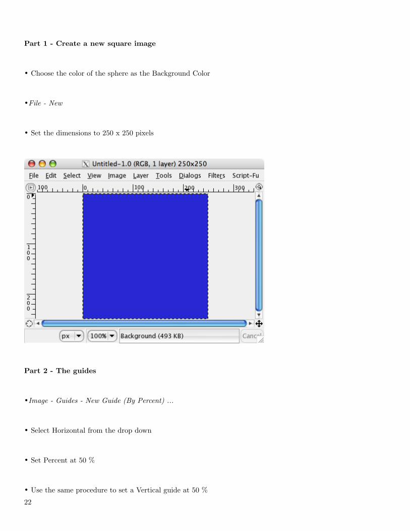
Part 1 - Create a new square image
• Choose the color of the sphere as the Background Color
•File - New
• Set the dimensions to 250 x 250 pixels
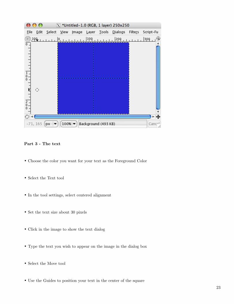
Part 2 - The guides
•Image - Guides - New Guide (By Percent) ...
• Select Horizontal from the drop down
• Set Percent at 50 %
• Use the same procedure to set a Vertical guide at 50 %
22
Part 3 - The text
• Choose the color you want for your text as the Foreground Color
• Select the Text tool
• In the tool settings, select centered alignment
• Set the text size about 30 pixels
• Click in the image to show the text dialog
• Type the text you wish to appear on the image in the dialog box
• Select the Move tool
• Use the Guides to position your text in the center of the square
23
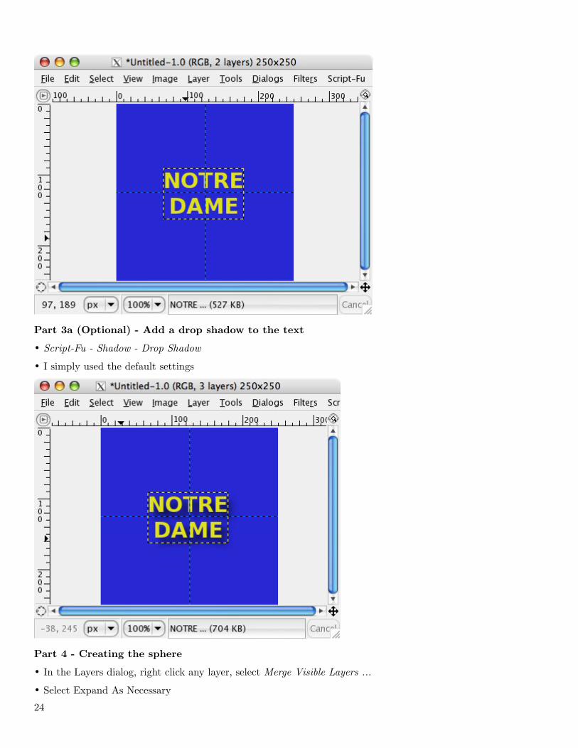
Part 3a (Optional) - Add a drop shadow to the text
• Script-Fu - Shadow - Drop Shadow
• I simply used the default settings
Part 4 - Creating the sphere
• In the Layers dialog, right click any layer, select Merge Visible Layers ...
• Select Expand As Necessary
24
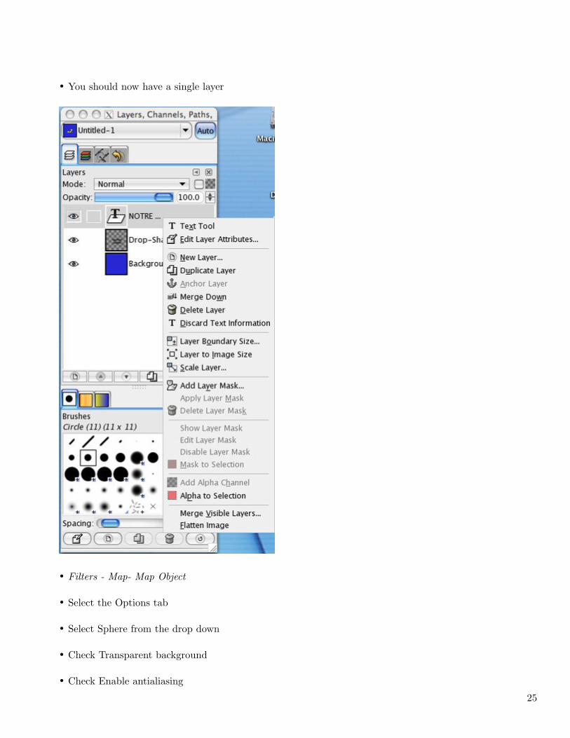
• You should now have a single layer
• Filters - Map- Map Object
• Select the Options tab
• Select Sphere from the drop down
• Check Transparent background
• Check Enable antialiasing
25
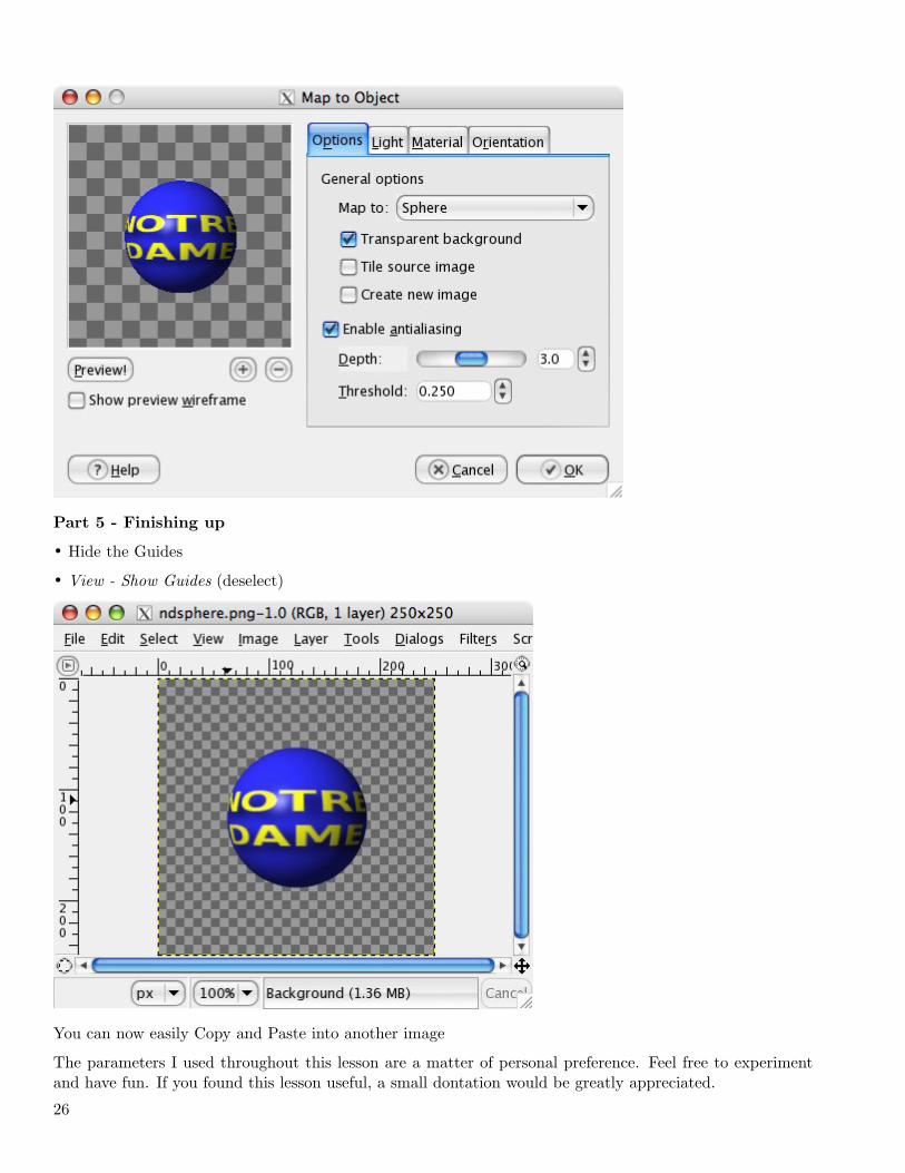
Part 5 - Finishing up
• Hide the Guides
• View - Show Guides (deselect)
You can now easily Copy and Paste into another image
The parameters I used throughout this lesson are a matter of personal preference. Feel free to experimentand have fun. If you found this lesson useful, a small dontation would be greatly appreciated.
26
Make payments with PayPal - it’s fast, free and secure!
Creating a brush with variable size (2007-07-09 16:18)
When I first started to use [1]GIMP, one of the Photoshop® features I most missed was the ability to resizea brush on-the-fly rather than having to reselect a different size brush or create a new one of the needed size.I searched unsuccessfully for a way to do this.Recently, as I was looking in the [2]GIMP manual online, I noticed an item [3]’Creating a brush with variablesize’. I hadn’t ever noticed this item before, so it’s either been recently added or I’m #@ % &. At any rate,I’m presenting it here enhanced with screenshots for those of you who would like to make use of this handyfeature.
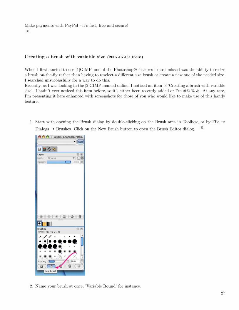
1. Start with opening the Brush dialog by double-clicking on the Brush area in Toolbox, or by File
Dialogs Brushes. Click on the New Brush button to open the Brush Editor dialog.
2. Name your brush at once, ’Variable Round’ for instance.
27
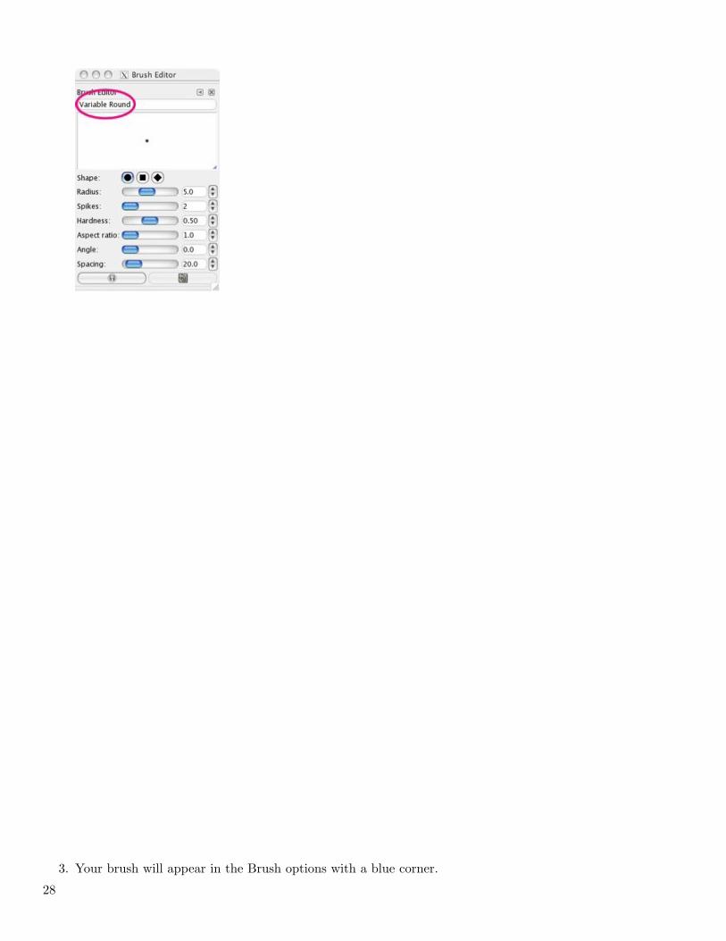
3. Your brush will appear in the Brush options with a blue corner.
28
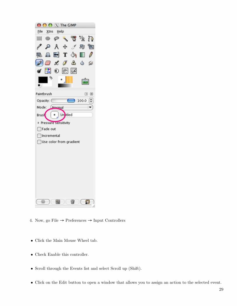
4. Now, go File Preferences Input Controllers
• Click the Main Mouse Wheel tab.
• Check Enable this controller.
• Scroll through the Events list and select Scroll up (Shift).
• Click on the Edit button to open a window that allows you to assign an action to the selected event.
29
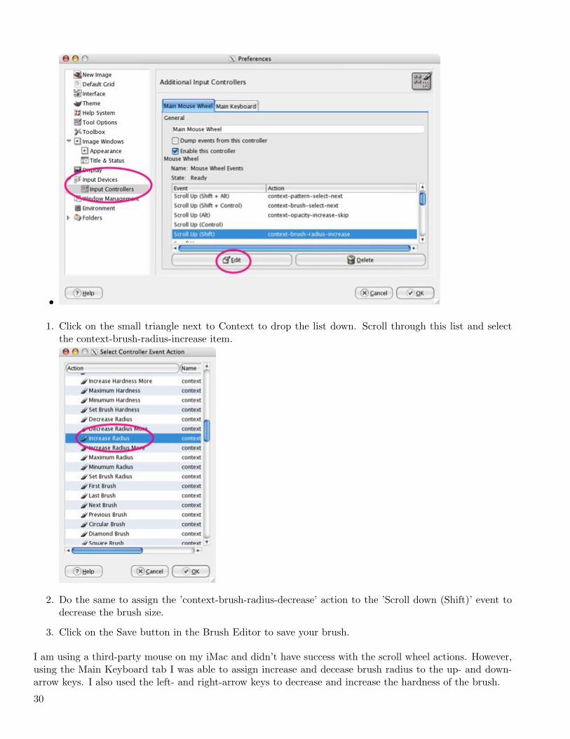
•
1. Click on the small triangle next to Context to drop the list down. Scroll through this list and selectthe context-brush-radius-increase item.
2. Do the same to assign the ’context-brush-radius-decrease’ action to the ’Scroll down (Shift)’ event todecrease the brush size.
3. Click on the Save button in the Brush Editor to save your brush.
I am using a third-party mouse on my iMac and didn’t have success with the scroll wheel actions. However,using the Main Keyboard tab I was able to assign increase and decease brush radius to the up- and down-arrow keys. I also used the left- and right-arrow keys to decrease and increase the hardness of the brush.
30
If you work with a tool that has a ’Brush’ option and have selected your Variable Round brush, press theShift key and you will be able to vary the brush size by using the mouse wheel or the up- and down-arrowkeys. This change will be visible in real time in the brush area of the Toolbox and in the Brush Dialog.Hope you found this useful. –tab
1. http://www.gimp.org/
2. http://docs.gimp.org/en/index.html
3. http://docs.gimp.org/en/gimp-using-variable-size-brush.html
Blending Two Images with GIMP (2007-07-17 13:13)
Included in this tutorial -
• Resizing a Canvas
• Creating a new transparent layer
• Anchor a floating layer
• Using a layer mask
• Using the gradient tool
• Flattening an image
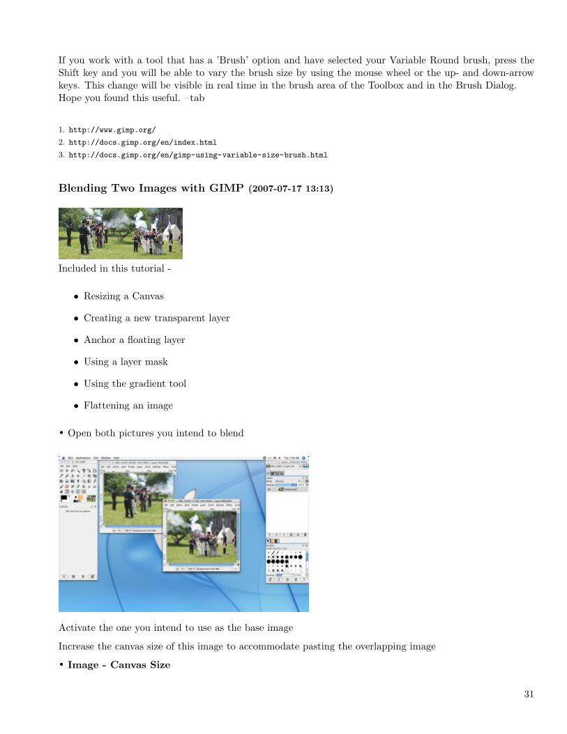
• Open both pictures you intend to blend
Activate the one you intend to use as the base image
Increase the canvas size of this image to accommodate pasting the overlapping image
• Image - Canvas Size
31
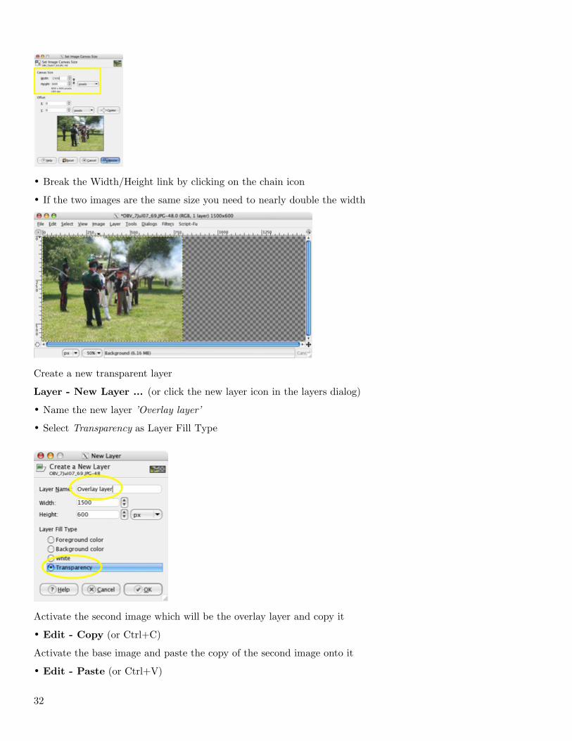
• Break the Width/Height link by clicking on the chain icon
• If the two images are the same size you need to nearly double the width
Create a new transparent layer
Layer - New Layer ... (or click the new layer icon in the layers dialog)
• Name the new layer ’Overlay layer’
• Select Transparency as Layer Fill Type
Activate the second image which will be the overlay layer and copy it
• Edit - Copy (or Ctrl+C)
Activate the base image and paste the copy of the second image onto it
• Edit - Paste (or Ctrl+V)
32
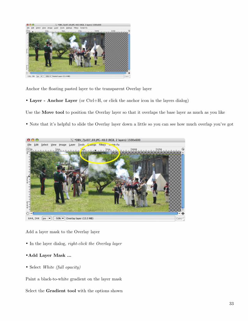
Anchor the floating pasted layer to the transparent Overlay layer
• Layer - Anchor Layer (or Ctrl+H, or click the anchor icon in the layers dialog)
Use the Move tool to position the Overlay layer so that it overlaps the base layer as much as you like
• Note that it’s helpful to slide the Overlay layer down a little so you can see how much overlap you’ve got
Add a layer mask to the Overlay layer
• In the layer dialog, right-click the Overlay layer
•Add Layer Mask ...
• Select White (full opacity)
Paint a black-to-white gradient on the layer mask
Select the Gradient tool with the options shown
33
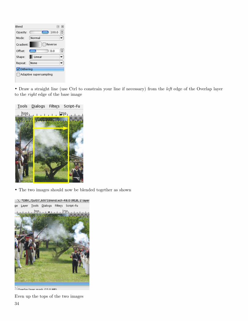
• Draw a straight line (use Ctrl to constrain your line if necessary) from the left edge of the Overlap layerto the right edge of the base image
• The two images should now be blended together as shown
Even up the tops of the two images
34
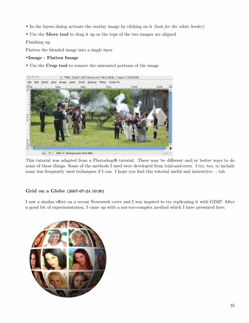
• In the layers dialog activate the overlay image by clicking on it (look for the white border)
• Use the Move tool to drag it up so the tops of the two images are aligned
Finishing up
Flatten the blended image into a single layer
•Image - Flatten Image
• Use the Crop tool to remove the unwanted portions of the image
This tutorial was adapted from a Photoshop® tutorial. There may be different and/or better ways to dosome of these things. Some of the methods I used were developed from trial-and-error. I try, too, to includesome less frequently used techniques if I can. I hope you find this tutorial useful and instructive. - tab
Grid on a Globe (2007-07-24 10:30)
I saw a similar effect on a recent Newsweek cover and I was inspired to try replicating it with GIMP. Aftera good bit of experimentation, I came up with a not-too-complex method which I have presented here.
35
Part 1 - Preparation
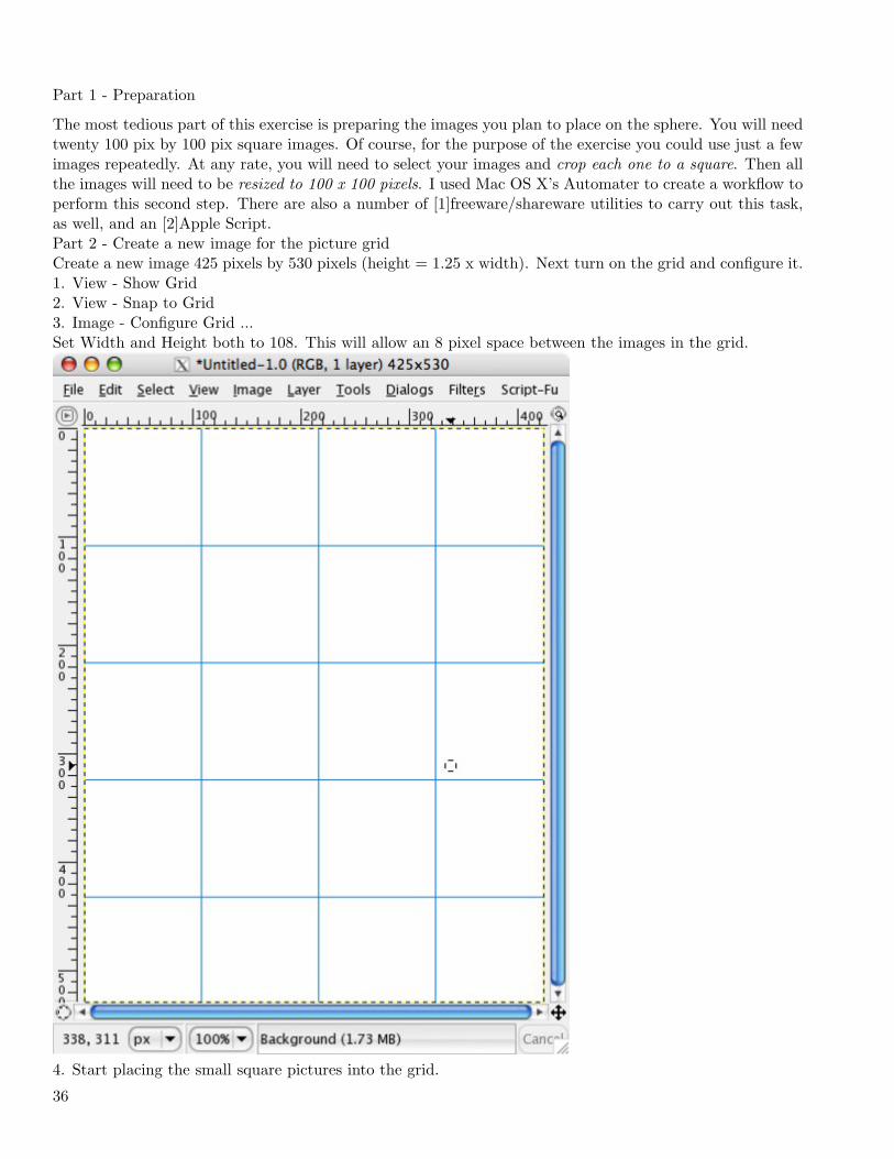
The most tedious part of this exercise is preparing the images you plan to place on the sphere. You will needtwenty 100 pix by 100 pix square images. Of course, for the purpose of the exercise you could use just a fewimages repeatedly. At any rate, you will need to select your images and crop each one to a square. Then allthe images will need to be resized to 100 x 100 pixels. I used Mac OS X’s Automater to create a workflow toperform this second step. There are also a number of [1]freeware/shareware utilities to carry out this task,as well, and an [2]Apple Script.Part 2 - Create a new image for the picture gridCreate a new image 425 pixels by 530 pixels (height = 1.25 x width). Next turn on the grid and configure it.1. View - Show Grid2. View - Snap to Grid3. Image - Configure Grid ...Set Width and Height both to 108. This will allow an 8 pixel space between the images in the grid.
4. Start placing the small square pictures into the grid.
36
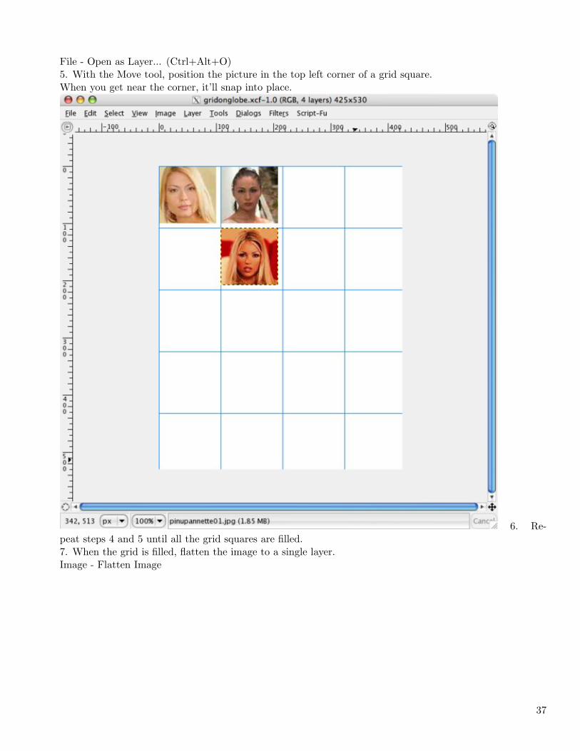
File - Open as Layer... (Ctrl+Alt+O)5. With the Move tool, position the picture in the top left corner of a grid square.When you get near the corner, it’ll snap into place.
6. Re-peat steps 4 and 5 until all the grid squares are filled.7. When the grid is filled, flatten the image to a single layer.Image - Flatten Image
37
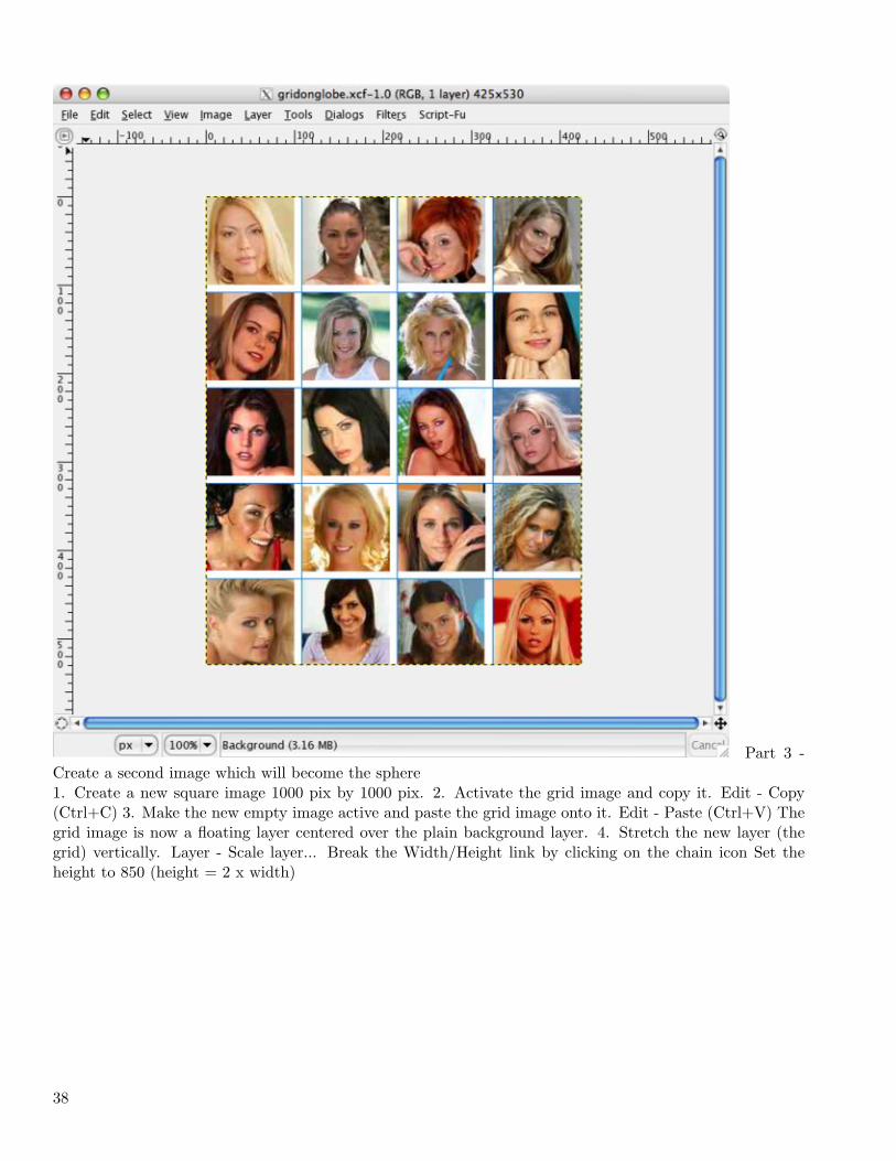
Part 3 -Create a second image which will become the sphere1. Create a new square image 1000 pix by 1000 pix. 2. Activate the grid image and copy it. Edit - Copy(Ctrl+C) 3. Make the new empty image active and paste the grid image onto it. Edit - Paste (Ctrl+V) Thegrid image is now a floating layer centered over the plain background layer. 4. Stretch the new layer (thegrid) vertically. Layer - Scale layer... Break the Width/Height link by clicking on the chain icon Set theheight to 850 (height = 2 x width)
38
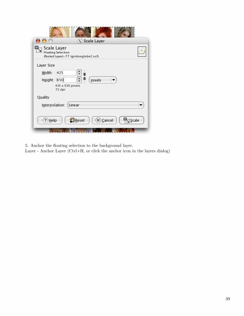
5. Anchor the floating selection to the background layer.Layer - Anchor Layer (Ctrl+H, or click the anchor icon in the layers dialog)
39
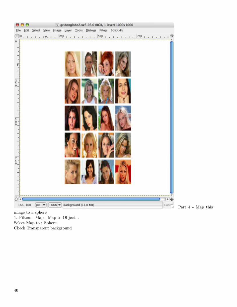
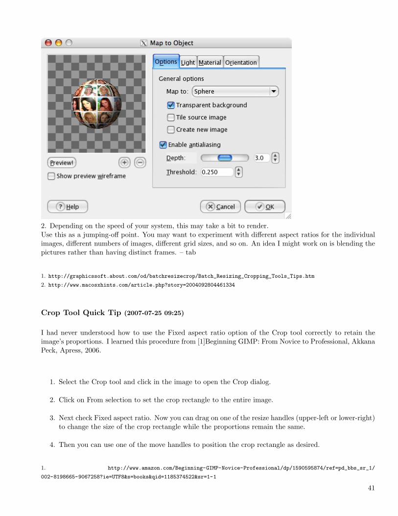
Part 4 - Map thisimage to a sphere1. Filters - Map - Map to Object...Select Map to : SphereCheck Transparent background
40
2. Depending on the speed of your system, this may take a bit to render.Use this as a jumping-off point. You may want to experiment with different aspect ratios for the individualimages, different numbers of images, different grid sizes, and so on. An idea I might work on is blending thepictures rather than having distinct frames. – tab
1. http://graphicssoft.about.com/od/batchresizecrop/Batch_Resizing_Cropping_Tools_Tips.htm
2. http://www.macosxhints.com/article.php?story=2004092804461334
Crop Tool Quick Tip (2007-07-25 09:25)
I had never understood how to use the Fixed aspect ratio option of the Crop tool correctly to retain theimage’s proportions. I learned this procedure from [1]Beginning GIMP: From Novice to Professional, AkkanaPeck, Apress, 2006.
1. Select the Crop tool and click in the image to open the Crop dialog.
2. Click on From selection to set the crop rectangle to the entire image.
3. Next check Fixed aspect ratio. Now you can drag on one of the resize handles (upper-left or lower-right)to change the size of the crop rectangle while the proportions remain the same.
4. Then you can use one of the move handles to position the crop rectangle as desired.
1. http://www.amazon.com/Beginning-GIMP-Novice-Professional/dp/1590595874/ref=pd_bbs_sr_1/
002-8198665-9067258?ie=UTF8&s=books&qid=1185374522&sr=1-1
41
1.3 August
How to delete saved settings from Levels, etc. (2007-08-03 08:23)
This information applies to Mac OS X, GIMP 2.2
Sometimes while working on a project you may want to save the settings you used in a Levels or other dialogto use on other images in the project. When that project ends, you will probably want to delete those savedsettings.I found myself in this situation recently, but I was unable to find any documentation explaining how todelete these saved Levels settings. I was eventually able to determine these settings were stored in a folderin /home/.gimp-2.2. I then learned that since this folder name begins with a dot, it is hidden by OS X.Next, I had to figure out how to access this hidden folder. I found the following scripts which run from theTerminal. Type this in the Terminal to show all hidden folders and files,defaults write com.apple.finder AppleShowAllFiles TRUEkillall FinderThen, open Finder from the Dock and navigate to the .gimp-2.2 folder. Open it and delete the saved profiles.You’ll likely want to restore file/folder hiding. Run the following,defaults write com.apple.finder AppleShowAllFiles FALSEkillall FinderA note of warning, be careful when modifying hidden things. Backup first.Hopefully, future versions of GIMP will have a simpler way to delete these no longer needed files.
Put on a Happy Sky (2007-08-25 11:27)
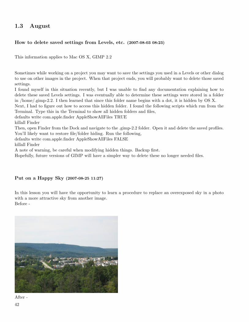
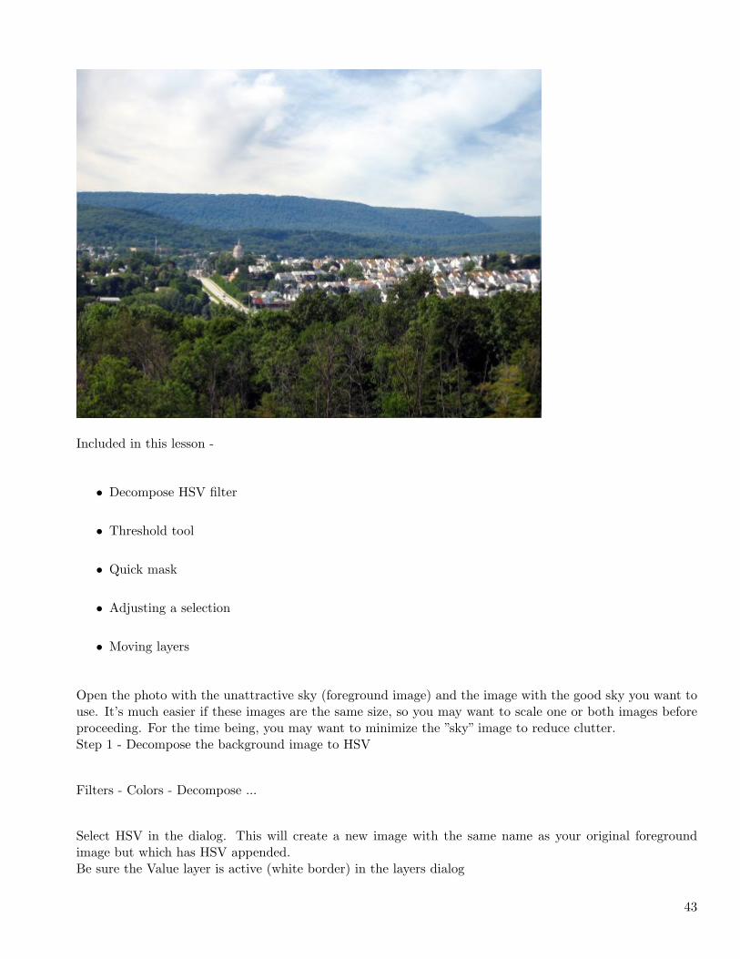
In this lesson you will have the opportunity to learn a procedure to replace an overexposed sky in a photowith a more attractive sky from another image.Before -
After -
42
Included in this lesson -
• Decompose HSV filter
• Threshold tool
• Quick mask
• Adjusting a selection
• Moving layers
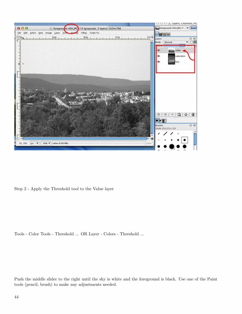
Open the photo with the unattractive sky (foreground image) and the image with the good sky you want touse. It’s much easier if these images are the same size, so you may want to scale one or both images beforeproceeding. For the time being, you may want to minimize the ”sky” image to reduce clutter.Step 1 - Decompose the background image to HSV
Filters - Colors - Decompose ...
Select HSV in the dialog. This will create a new image with the same name as your original foregroundimage but which has HSV appended.Be sure the Value layer is active (white border) in the layers dialog
43
Step 2 - Apply the Threshold tool to the Value layer
Tools - Color Tools - Threshold ... OR Layer - Colors - Threshold ...
Push the middle slider to the right until the sky is white and the foreground is black. Use one of the Painttools (pencil, brush) to make any adjustments needed.
44

Step 3 - Apply Quick Mask to the foreground imageSelect your original foreground image and toggle the Quick Mask ON by clicking in the bottom left cornerof the image window (Shift+Q OR Select - Toggle Quick Mask).The entire image should now be covered by a translucent red layer.
45
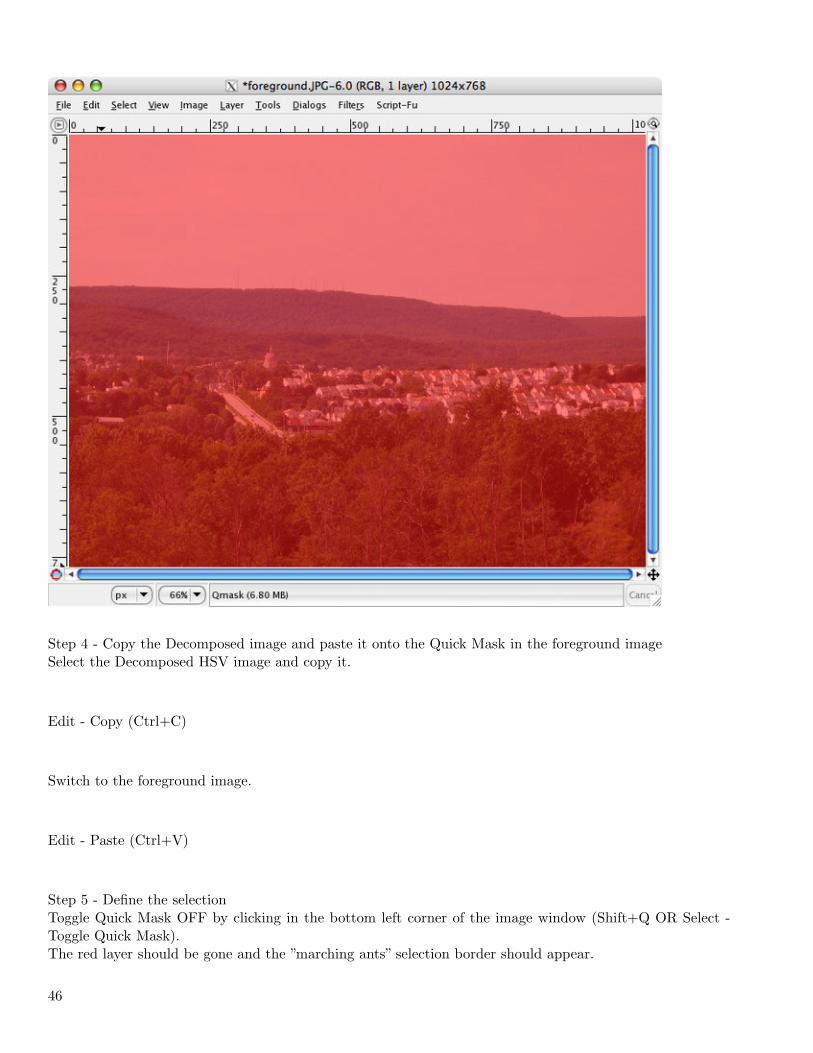
Step 4 - Copy the Decomposed image and paste it onto the Quick Mask in the foreground imageSelect the Decomposed HSV image and copy it.
Edit - Copy (Ctrl+C)
Switch to the foreground image.
Edit - Paste (Ctrl+V)
Step 5 - Define the selectionToggle Quick Mask OFF by clicking in the bottom left corner of the image window (Shift+Q OR Select -Toggle Quick Mask).The red layer should be gone and the ”marching ants” selection border should appear.
46
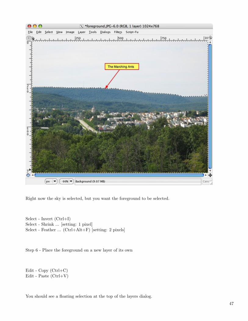
Right now the sky is selected, but you want the foreground to be selected.
Select - Invert (Ctrl+I)Select - Shrink ... [setting: 1 pixel]Select - Feather ... (Ctrl+Alt+F) [setting: 2 pixels]
Step 6 - Place the foreground on a new layer of its own
Edit - Copy (Ctrl+C)Edit - Paste (Ctrl+V)
You should see a floating selection at the top of the layers dialog.
47
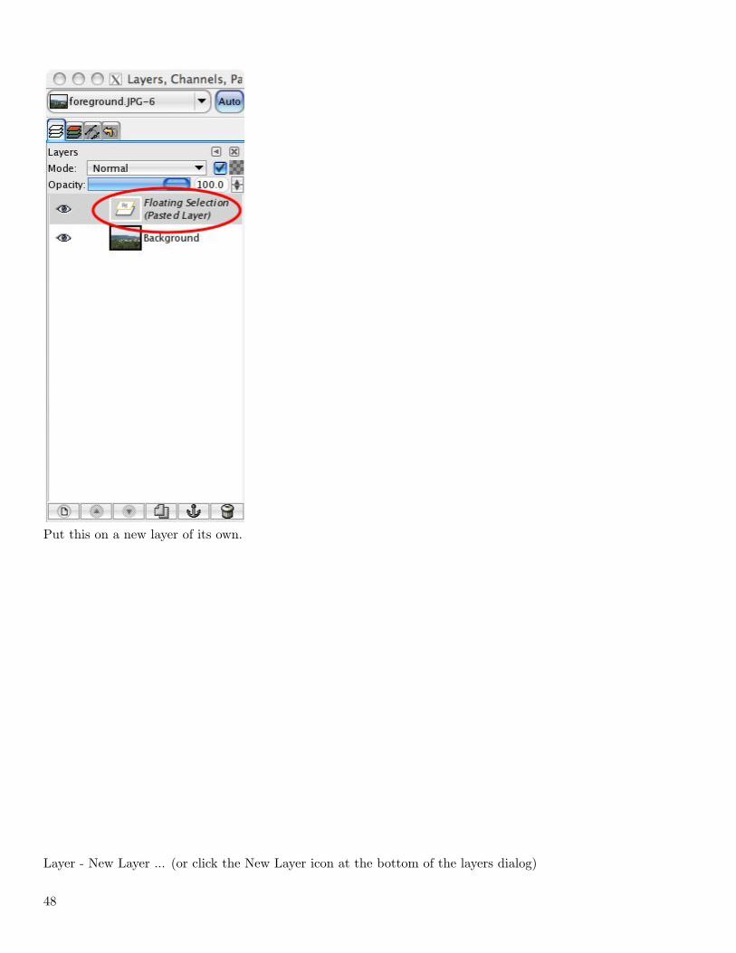
Put this on a new layer of its own.
Layer - New Layer ... (or click the New Layer icon at the bottom of the layers dialog)
48
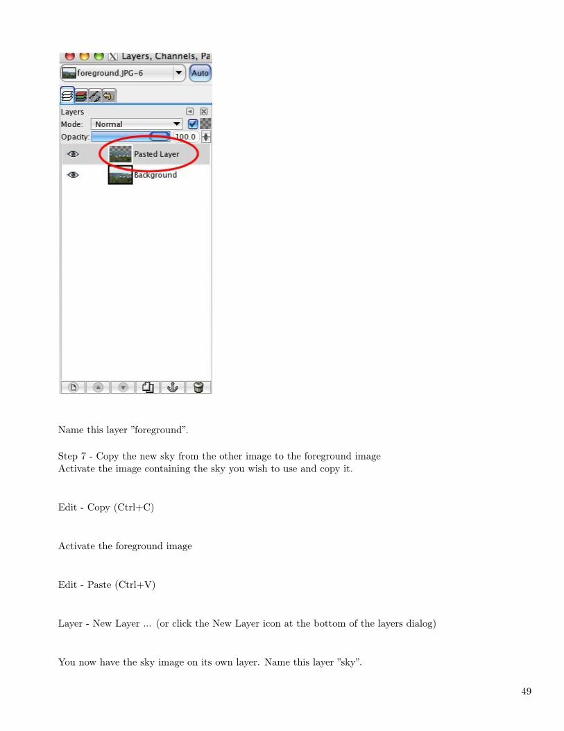
Name this layer ”foreground”.
Step 7 - Copy the new sky from the other image to the foreground imageActivate the image containing the sky you wish to use and copy it.
Edit - Copy (Ctrl+C)
Activate the foreground image
Edit - Paste (Ctrl+V)
Layer - New Layer ... (or click the New Layer icon at the bottom of the layers dialog)
You now have the sky image on its own layer. Name this layer ”sky”.
49
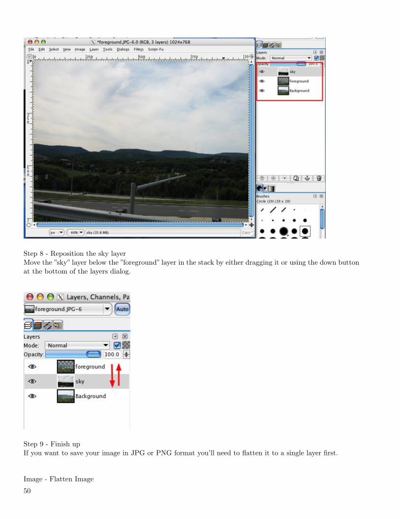
Step 8 - Reposition the sky layerMove the ”sky” layer below the ”foreground” layer in the stack by either dragging it or using the down buttonat the bottom of the layers dialog.
Step 9 - Finish upIf you want to save your image in JPG or PNG format you’ll need to flatten it to a single layer first.
Image - Flatten Image
50
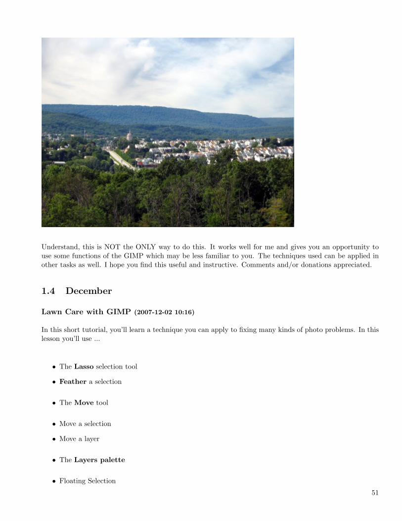
Understand, this is NOT the ONLY way to do this. It works well for me and gives you an opportunity touse some functions of the GIMP which may be less familiar to you. The techniques used can be applied inother tasks as well. I hope you find this useful and instructive. Comments and/or donations appreciated.
1.4 December
Lawn Care with GIMP (2007-12-02 10:16)
In this short tutorial, you’ll learn a technique you can apply to fixing many kinds of photo problems. In thislesson you’ll use ...
• The Lasso selection tool
• Feather a selection
• The Move tool
• Move a selection
• Move a layer
• The Layers palette
• Floating Selection
51
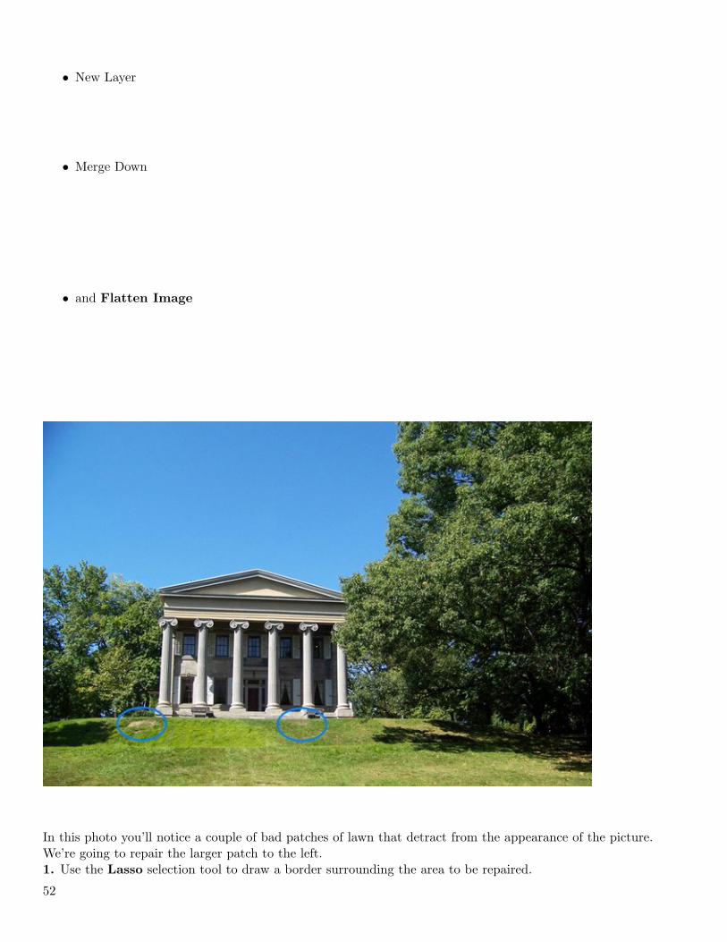
• New Layer
• Merge Down
• and Flatten Image
In this photo you’ll notice a couple of bad patches of lawn that detract from the appearance of the picture.We’re going to repair the larger patch to the left.1. Use the Lasso selection tool to draw a border surrounding the area to be repaired.
52

2. Feather the edge of the selection by at least 10 pixels, Select - Feather...
3. The selection needs to be dragged to a patch of good grass. Click the Move tool’s icon then click theSelection icon so the move affects the selection only ...
53
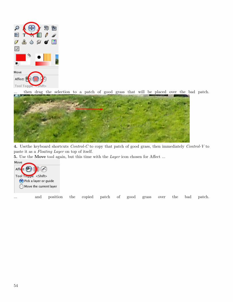
... then drag the selection to a patch of good grass that will be placed over the bad patch.
4. Usethe keyboard shortcuts Control-C to copy that patch of good grass, then immediately Control-V topaste it as a Floating Layer on top of itself.5. Use the Move tool again, but this time with the Layer icon chosen for Affect ...
... and position the copied patch of good grass over the bad patch.
54
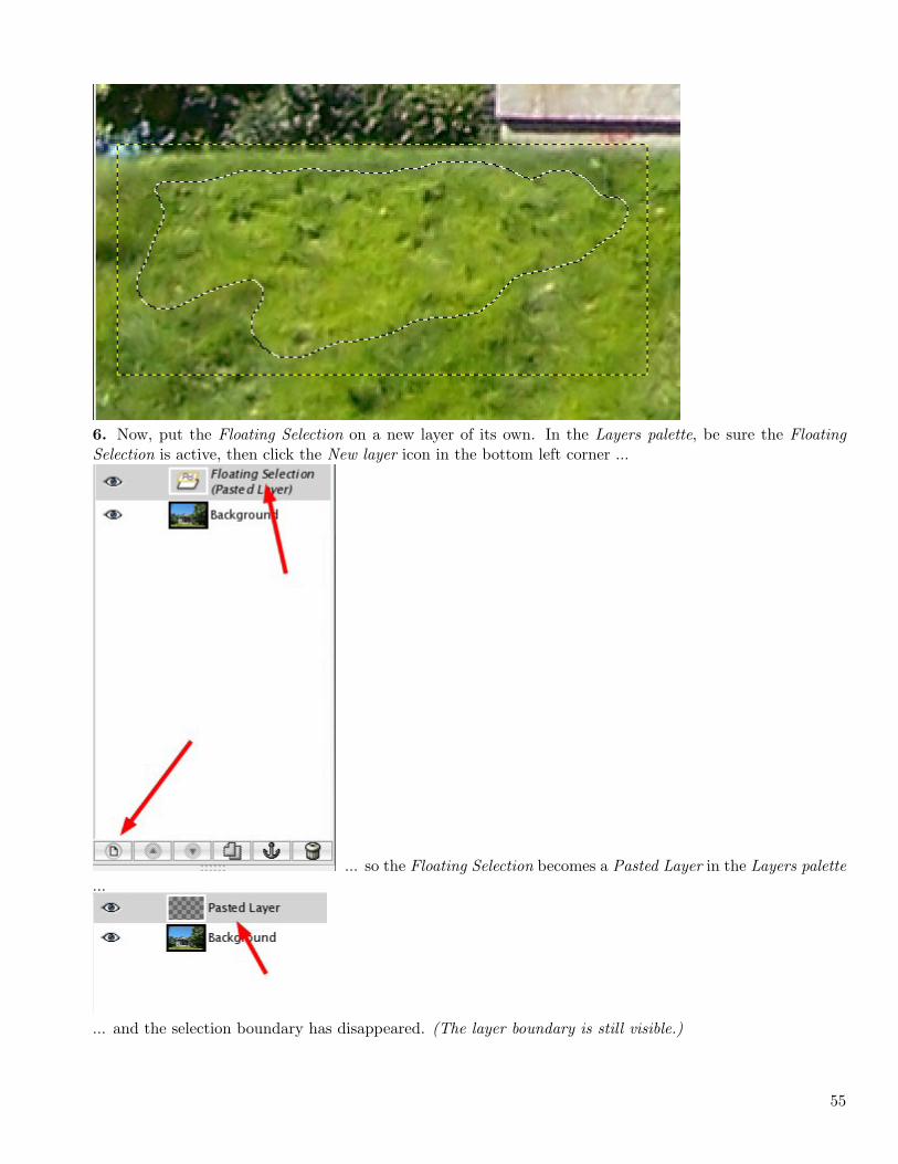
6. Now, put the Floating Selection on a new layer of its own. In the Layers palette, be sure the FloatingSelection is active, then click the New layer icon in the bottom left corner ...
... so the Floating Selection becomes a Pasted Layer in the Layers palette...
... and the selection boundary has disappeared. (The layer boundary is still visible.)
55
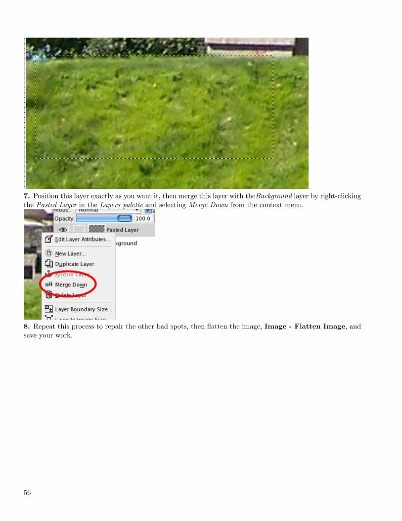
7. Position this layer exactly as you want it, then merge this layer with theBackground layer by right-clickingthe Pasted Layer in the Layers palette and selecting Merge Down from the context menu.
8. Repeat this process to repair the other bad spots, then flatten the image, Image - Flatten Image, andsave your work.
56
I haven’t had much time for writing tutorials recently, but I’ve wanted to share this for some time. I hopeyou learn something you can use.This is likely the last tutorial I’ll write until I get GIMP 2.4 and learn about it.
57

58
Chapter 2
2008
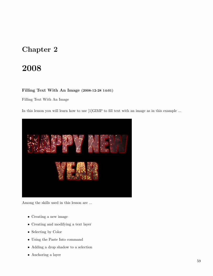
Filling Text With An Image (2008-12-28 14:01)
Filling Text With An Image
In this lesson you will learn how to use [1]GIMP to fill text with an image as in this example ...
Among the skills used in this lesson are ...
• Creating a new image
• Creating and modifying a text layer
• Selecting by Color
• Using the Paste Into command
• Adding a drop shadow to a selection
• Anchoring a layer
59
• Flattening an image
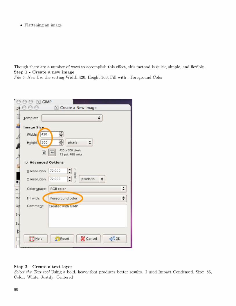
Though there are a number of ways to accomplish this effect, this method is quick, simple, and flexible.Step 1 - Create a new image
File > New Use the setting Width 420, Height 300, Fill with : Foreground Color
Step 2 - Create a text layer
Select the Text tool Using a bold, heavy font produces better results. I used Impact Condensed, Size: 85,Color: White, Justify: Centered
60
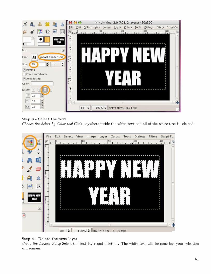
Step 3 - Select the text
Choose the Select by Color tool Click anywhere inside the white text and all of the white text is selected.
Step 4 - Delete the text layer
Using the Layers dialog Select the text layer and delete it. The white text will be gone but your selectionwill remain.
61
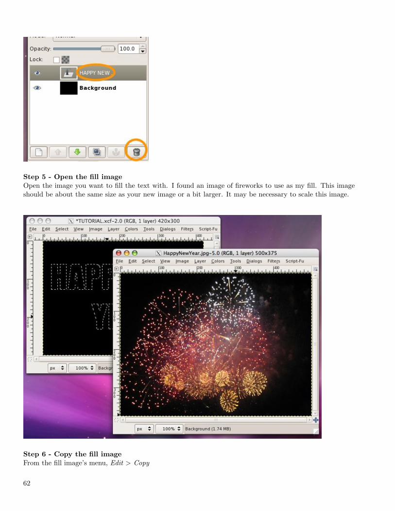
Step 5 - Open the fill image
Open the image you want to fill the text with. I found an image of fireworks to use as my fill. This imageshould be about the same size as your new image or a bit larger. It may be necessary to scale this image.
Step 6 - Copy the fill image
From the fill image’s menu, Edit > Copy
62
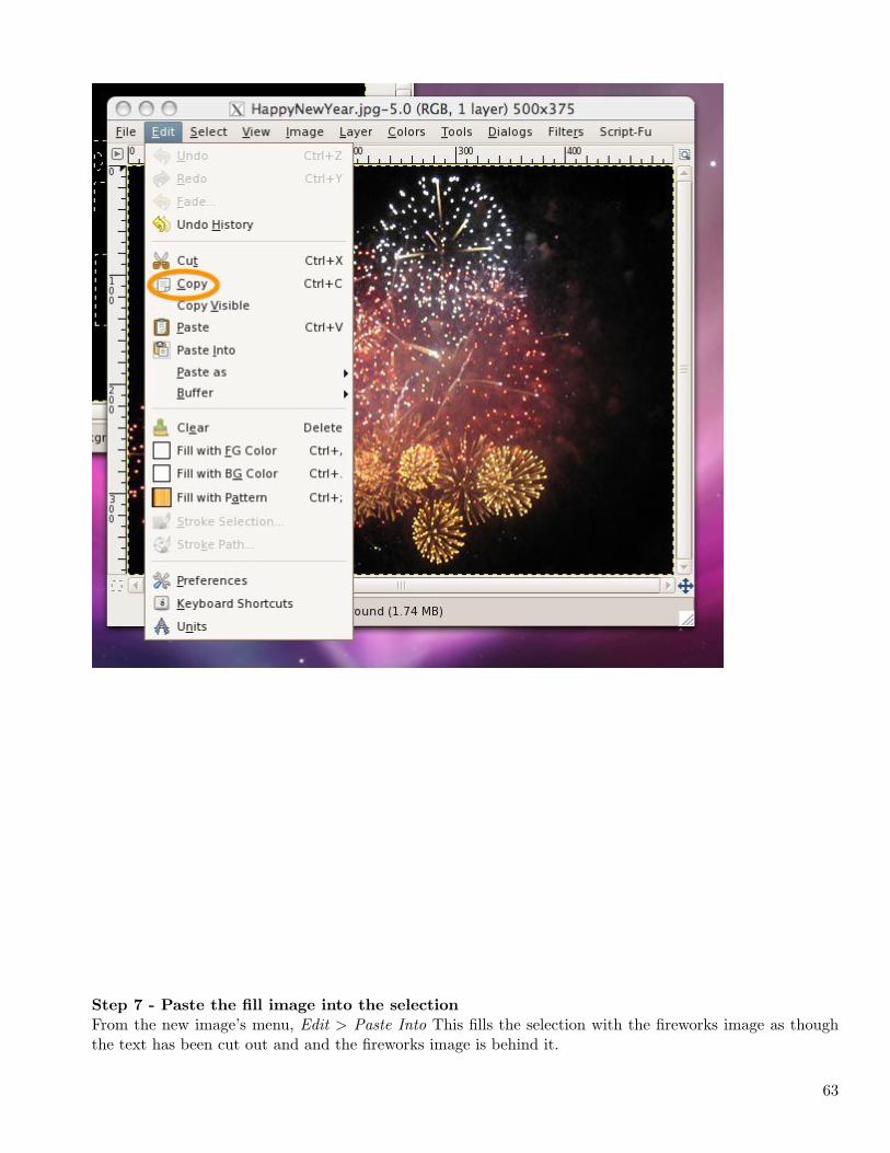
Step 7 - Paste the fill image into the selection
From the new image’s menu, Edit > Paste Into This fills the selection with the fireworks image as thoughthe text has been cut out and and the fireworks image is behind it.
63
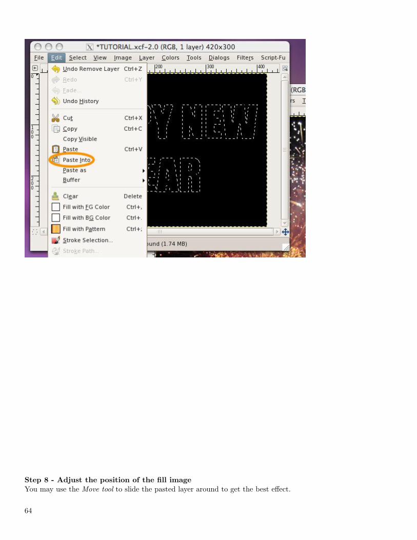
Step 8 - Adjust the position of the fill image
You may use the Move tool to slide the pasted layer around to get the best effect.
64
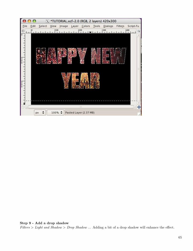
Step 9 - Add a drop shadow
Filters > Light and Shadow > Drop Shadow ... Adding a bit of a drop shadow will enhance the effect.
65
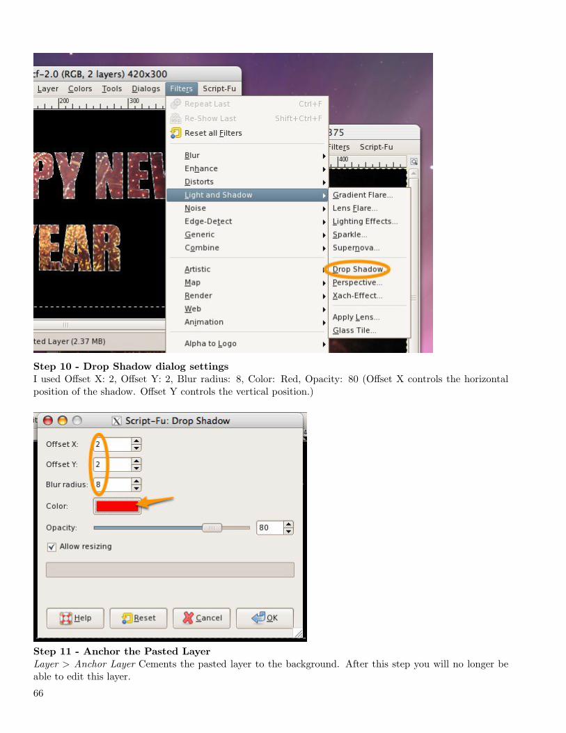
Step 10 - Drop Shadow dialog settings
I used Offset X: 2, Offset Y: 2, Blur radius: 8, Color: Red, Opacity: 80 (Offset X controls the horizontalposition of the shadow. Offset Y controls the vertical position.)
Step 11 - Anchor the Pasted Layer
Layer > Anchor Layer Cements the pasted layer to the background. After this step you will no longer beable to edit this layer.
66
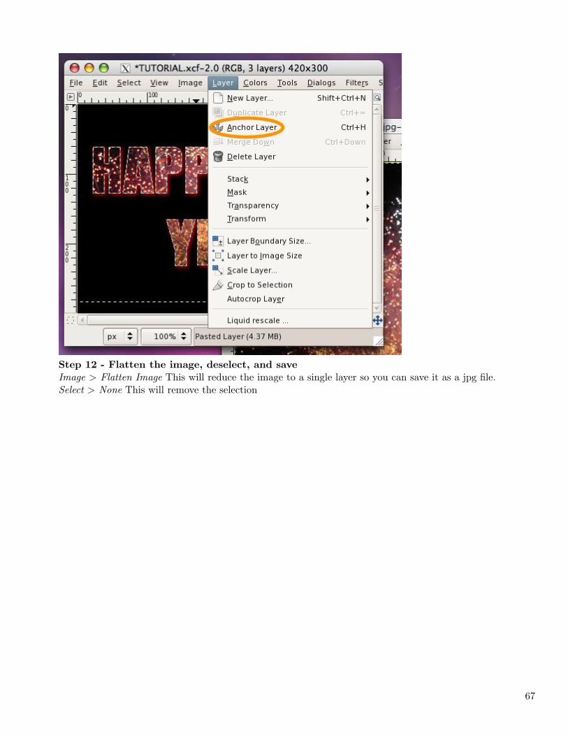
Step 12 - Flatten the image, deselect, and save
Image > Flatten Image This will reduce the image to a single layer so you can save it as a jpg file.Select > None This will remove the selection
67
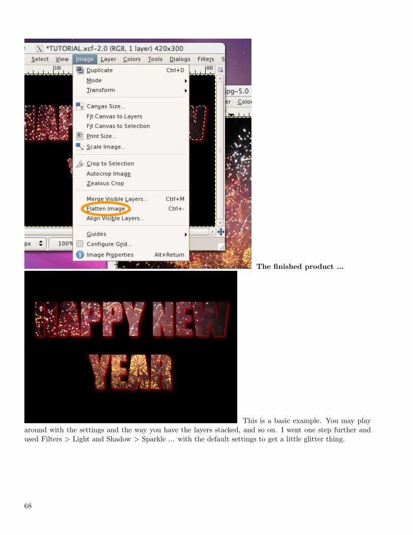
The finished product ...
This is a basic example. You may playaround with the settings and the way you have the layers stacked, and so on. I went one step further andused Filters > Light and Shadow > Sparkle ... with the default settings to get a little glitter thing.
68
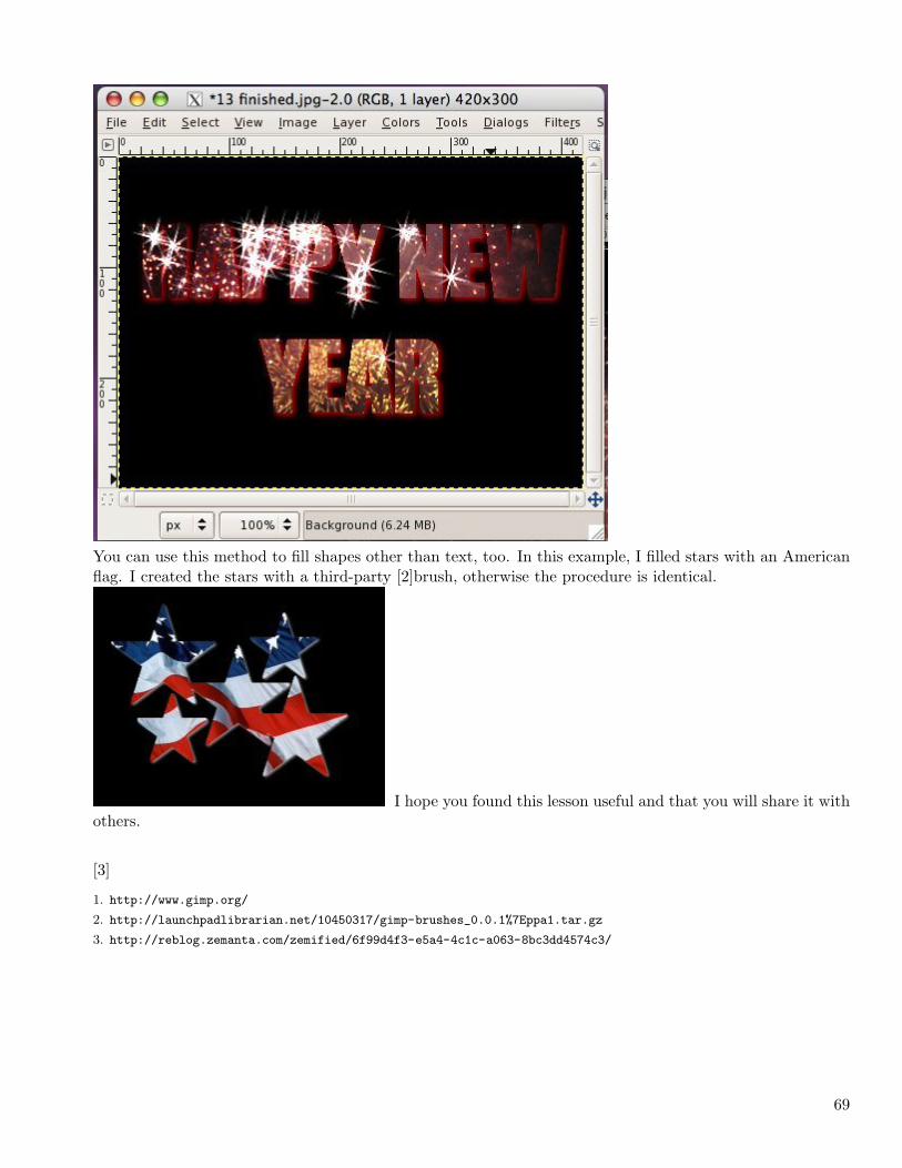
You can use this method to fill shapes other than text, too. In this example, I filled stars with an Americanflag. I created the stars with a third-party [2]brush, otherwise the procedure is identical.
I hope you found this lesson useful and that you will share it withothers.
[3]
1. http://www.gimp.org/
2. http://launchpadlibrarian.net/10450317/gimp-brushes_0.0.1%7Eppa1.tar.gz
3. http://reblog.zemanta.com/zemified/6f99d4f3-e5a4-4c1c-a063-8bc3dd4574c3/
69

70
Chapter 3
2009
3.1 January
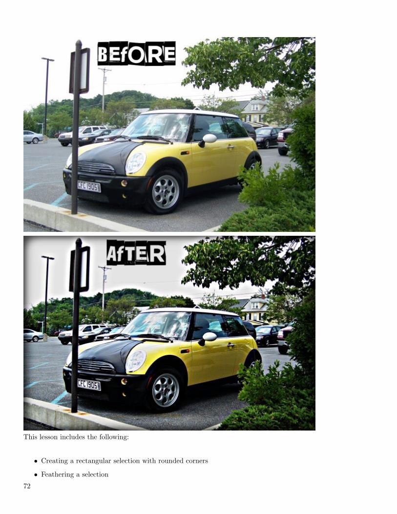
Lomographic Effect (2009-01-10 15:59)
[1]Lomography™ emphasizes casual, snapshot photography. Characteristics such as over-saturated colors,off-kilter exposure, blurring, and alternative film processing are often considered part of the LomographicTechnique. Users are encouraged to take a lighthearted approach to their photography, and use these tech-niques to document everyday life, as the Lomo LC-A’s small size, simple controls, and ability to shoot inlow light encourages candid photography, photo reportage, and photo vérité. The 35 mm LOMO LC-ACompact Automat camera was originally created and produced by LOMO PLC of St. Petersburg, Russia.(Wikipedia)There are numerous methods for achieving a lomographic effect through post processing. After exploringseveral of these, I developed the following relatively simple process using GIMP to create the desired effect.
71
This lesson includes the following:
• Creating a rectangular selection with rounded corners
• Feathering a selection
72
• Duplicating and creating layers
• Setting layer modes and opacity
• Using the Curves Tool
• Using the Unsharp Mask filter
• And more
Choose an appropriate image or [2]download this one.
Begin by duplicating the background. I always like to duplicate the background image. In case anythinggoes horribly wrong, I can easily recover my original layer.
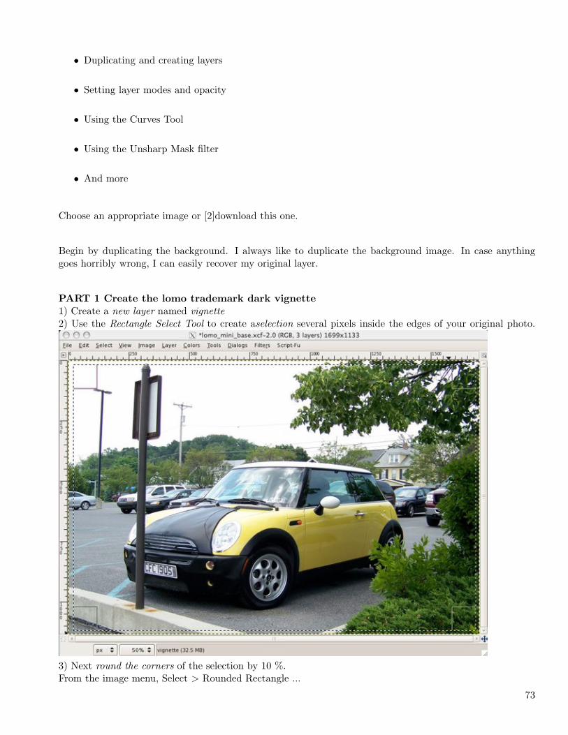
PART 1 Create the lomo trademark dark vignette
1) Create a new layer named vignette2) Use the Rectangle Select Tool to create aselection several pixels inside the edges of your original photo.
3) Next round the corners of the selection by 10 %.From the image menu, Select > Rounded Rectangle ...
73
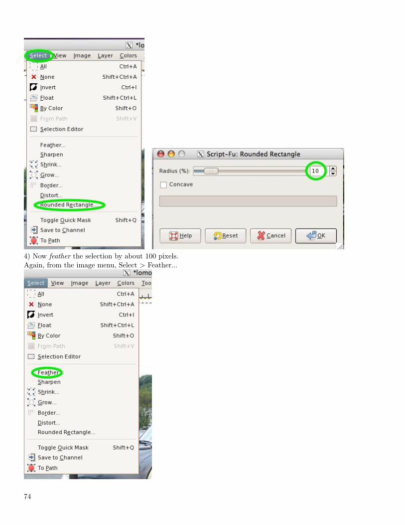
4) Now feather the selection by about 100 pixels.Again, from the image menu, Select > Feather...
74
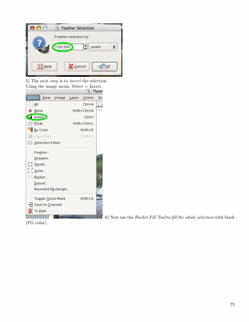
5) The next step is to invert the selection.Using the image menu, Select > Invert.
6) Now use the Bucket Fill Tool to fill the whole selection with black(FG color).
75
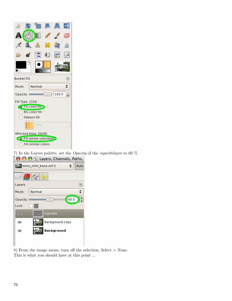
7) In the Layers palette, set the Opacity of the vignettelayer to 60 %
8) From the image menu, turn off the selection, Select > None.This is what you should have at this point ...
76
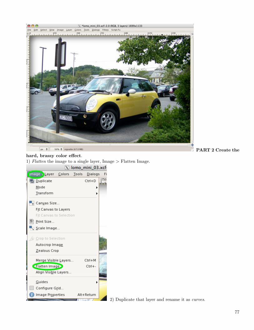
PART 2 Create the
hard, brassy color effect.1) Flatten the image to a single layer, Image > Flatten Image.
2) Duplicate that layer and rename it as curves.
77
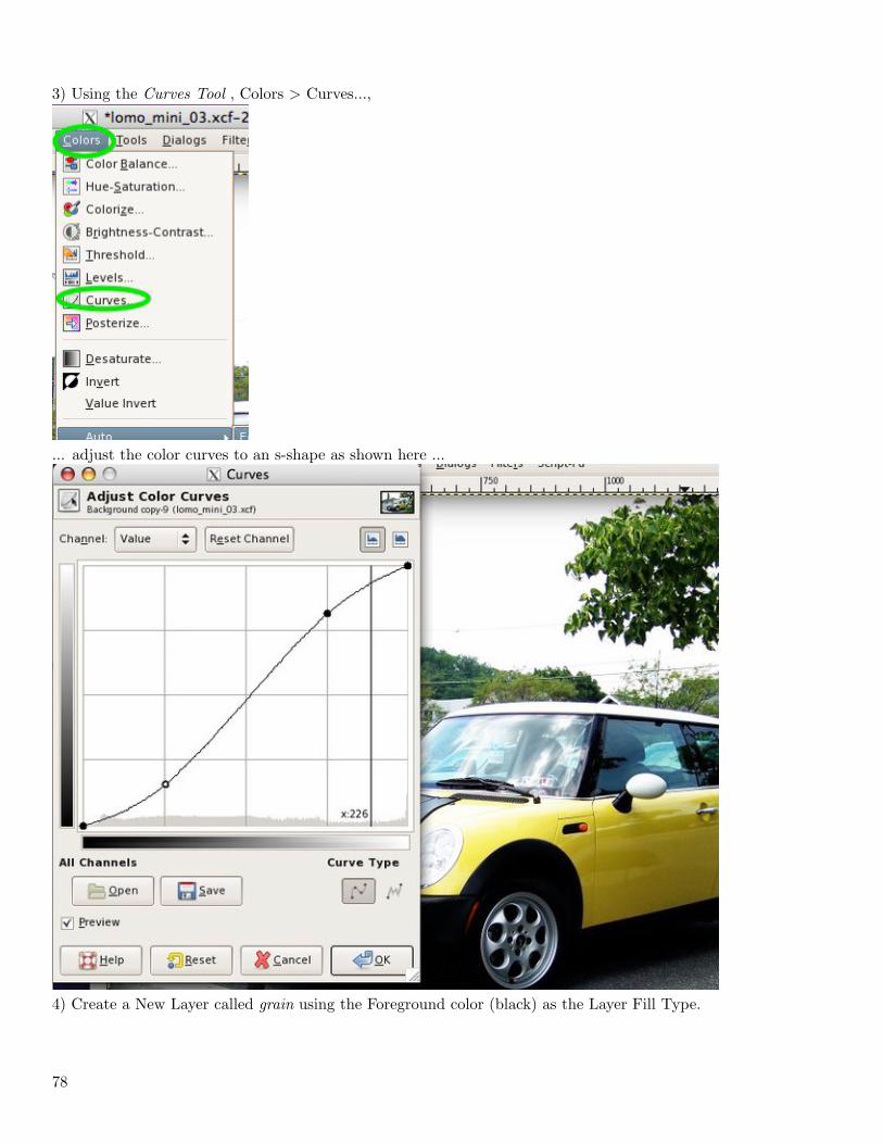
3) Using the Curves Tool , Colors > Curves...,
... adjust the color curves to an s-shape as shown here ...
4) Create a New Layer called grain using the Foreground color (black) as the Layer Fill Type.
78
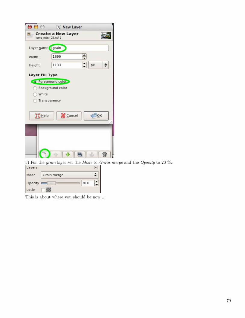
5) For the grain layer set the Mode to Grain merge and the Opacity to 20 %.
This is about where you should be now ...
79
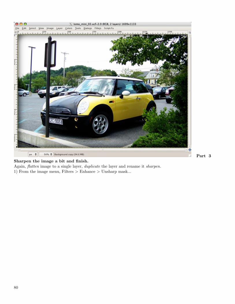
Part 3
Sharpen the image a bit and finish.
Again, flatten image to a single layer, duplicate the layer and rename it sharpen.1) From the image menu, Filters > Enhance > Unsharp mask...
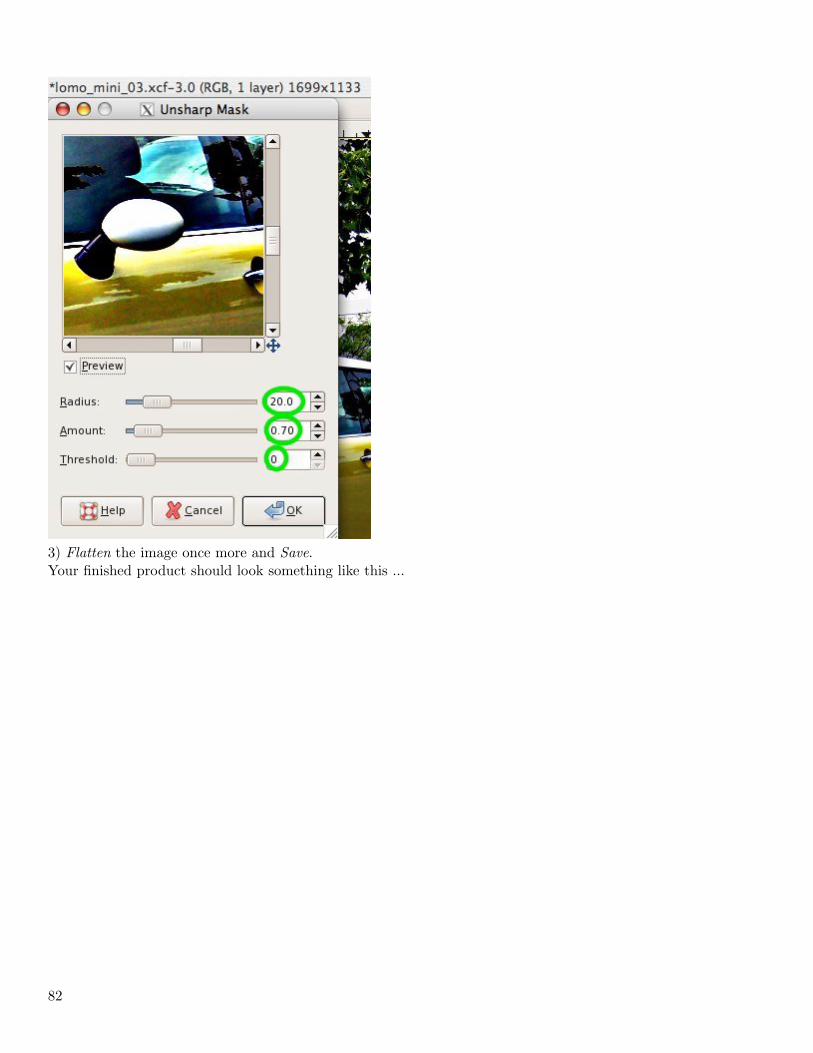
80
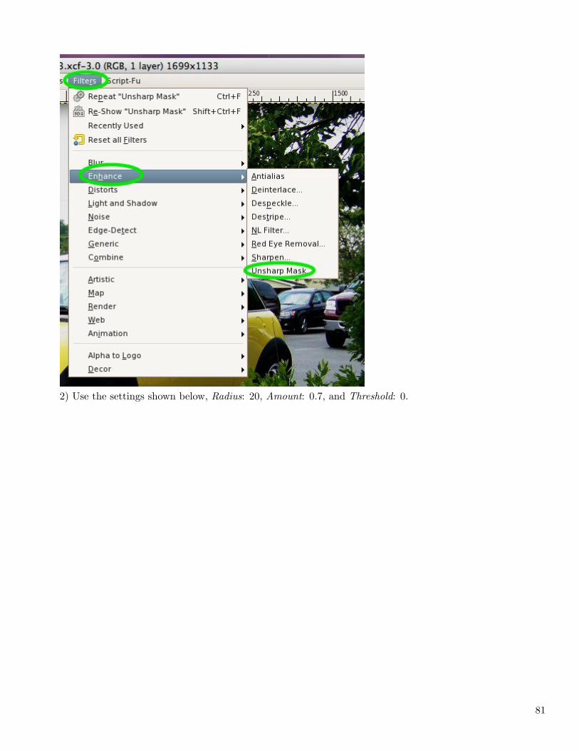
2) Use the settings shown below, Radius: 20, Amount: 0.7, and Threshold: 0.
81
3) Flatten the image once more and Save.Your finished product should look something like this ...
82
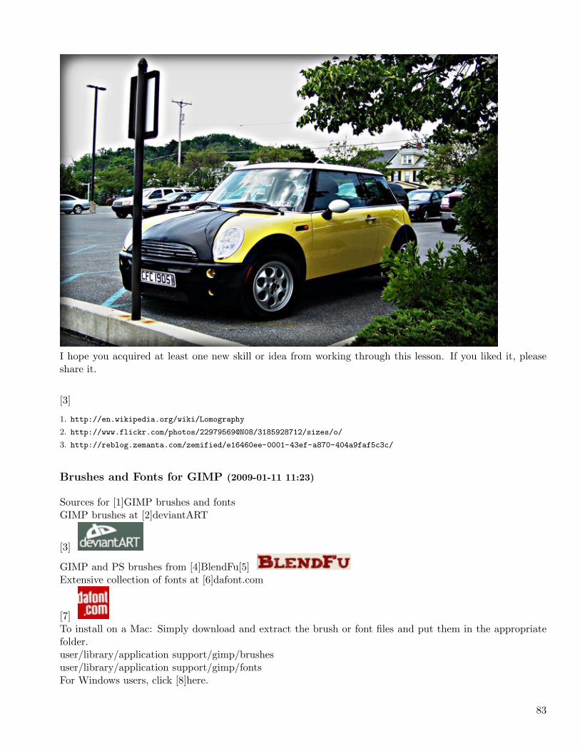
I hope you acquired at least one new skill or idea from working through this lesson. If you liked it, pleaseshare it.
[3]
1. http://en.wikipedia.org/wiki/Lomography
2. http://www.flickr.com/photos/22979569@N08/3185928712/sizes/o/
3. http://reblog.zemanta.com/zemified/e16460ee-0001-43ef-a870-404a9faf5c3c/
Brushes and Fonts for GIMP (2009-01-11 11:23)
Sources for [1]GIMP brushes and fontsGIMP brushes at [2]deviantART
[3]
GIMP and PS brushes from [4]BlendFu[5]Extensive collection of fonts at [6]dafont.com
[7]To install on a Mac: Simply download and extract the brush or font files and put them in the appropriatefolder.user/library/application support/gimp/brushesuser/library/application support/gimp/fontsFor Windows users, click [8]here.
83
[9]
1. http://www.gimp.org/
2. http://browse.deviantart.com/resources/applications/gimpbrushes/?alltime=yes&order=9
3. http://img.skitch.com/20090111-ksf7n1xn5uiuswdxdk8w8529yx.jpg
4. http://www.blendfu.com/
5. http://img.skitch.com/20090111-txmwatht6fesyyuqsqc2yqe7ti.jpg
6. http://www.dafont.com/
7. http://img.skitch.com/20090111-rpwnnni3hsy5xgcpsdrw89s44i.jpg
8. http://www.metacafe.com/watch/1033539/howto_install_gimp_brushes/
9. http://reblog.zemanta.com/zemified/0fd37b67-a481-4a37-96b5-5aaeea03ea0e/
Using GIMP’s Perspective Clone Tool (2009-01-18 19:15)
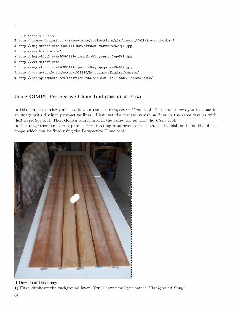
In this simple exercise you’ll see how to use the Perspective Clone tool. This tool allows you to clone inan image with distinct perspective lines. First, set the wanted vanishing lines in the same way as withthePerspective tool. Then clone a source area in the same way as with the Clone tool.In this image there are strong parallel lines receding from near to far. There’s a blemish in the middle of theimage which can be fixed using the Perspective Clone tool.
[1]Download this image.1) First, duplicate the background layer. You’ll have new layer named ”Background Copy”.
84
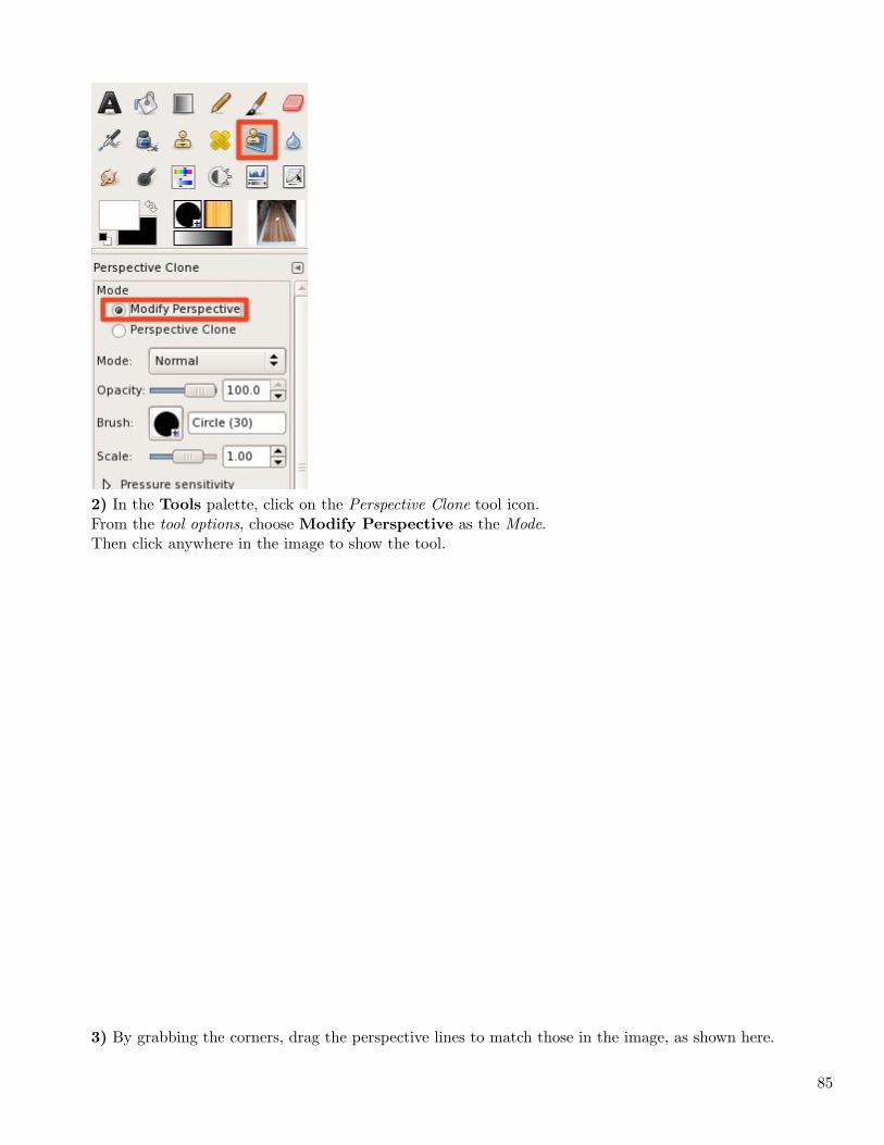
2) In the Tools palette, click on the Perspective Clone tool icon.From the tool options, choose Modify Perspective as the Mode.Then click anywhere in the image to show the tool.
3) By grabbing the corners, drag the perspective lines to match those in the image, as shown here.
85
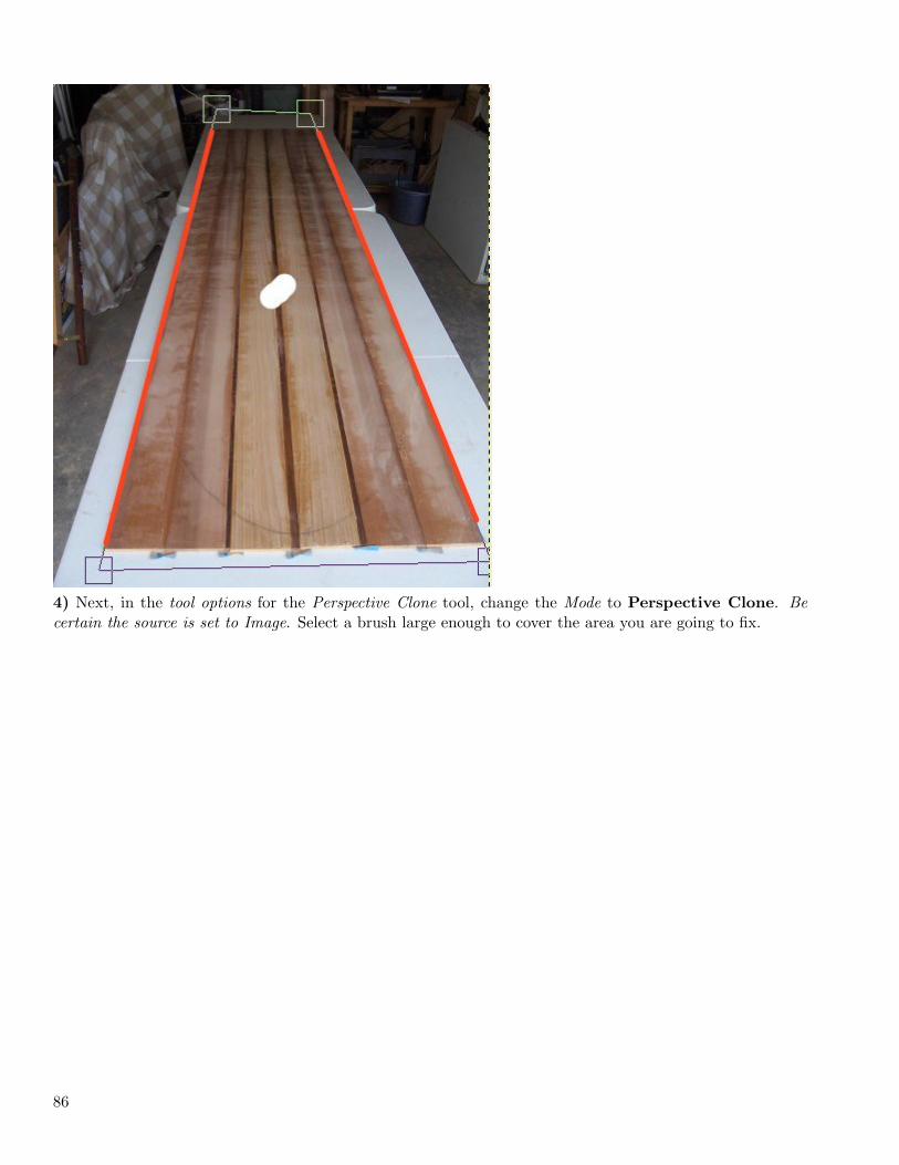
4) Next, in the tool options for the Perspective Clone tool, change the Mode to Perspective Clone. Becertain the source is set to Image. Select a brush large enough to cover the area you are going to fix.
86
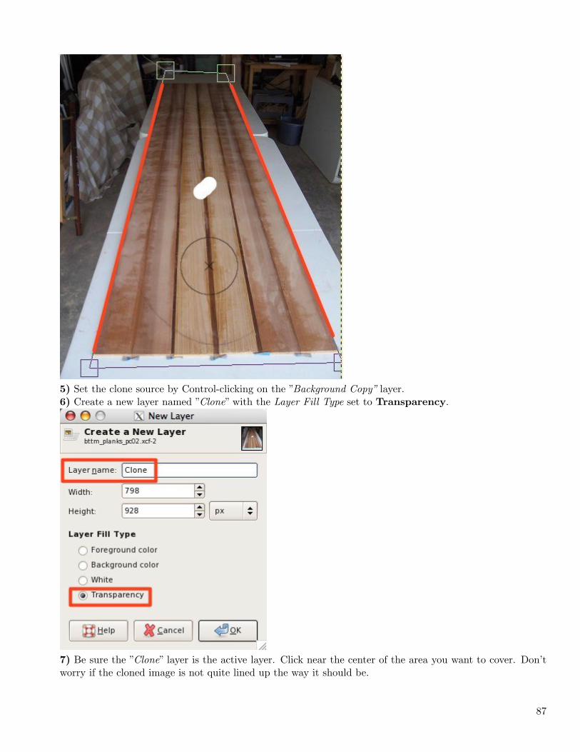
5) Set the clone source by Control-clicking on the ”Background Copy” layer.6) Create a new layer named ”Clone” with the Layer Fill Type set to Transparency.
7) Be sure the ”Clone” layer is the active layer. Click near the center of the area you want to cover. Don’tworry if the cloned image is not quite lined up the way it should be.
87
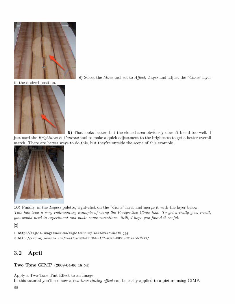
8) Select the Move tool set to Affect: Layer and adjust the ”Clone” layerto the desired position.
9) That looks better, but the cloned area obviously doesn’t blend too well. Ijust used the Brightness & Contrast tool to make a quick adjustment to the brightness to get a better overallmatch. There are better ways to do this, but they’re outside the scope of this example.
10) Finally, in the Layers palette, right-click on the ”Clone” layer and merge it with the layer below.This has been a very rudimentary example of using the Perspective Clone tool. To get a really good result,you would need to experiment and make some variations. Still, I hope you found it useful.
[2]
1. http://img514.imageshack.us/img514/8113/planksexercisecf0.jpg
2. http://reblog.zemanta.com/zemified/3bddcf8d-c1f7-4d23-863c-631aa5dc2a79/
3.2 April
Two Tone GIMP (2009-04-06 18:54)
Apply a Two-Tone Tint Effect to an ImageIn this tutorial you’ll see how a two-tone tinting effect can be easily applied to a picture using GIMP.
88
Among the tools and techniques you’ll use in this tutorial ...
• Desaturate an image
• Set guides by percent
• Multiply layer mode
• Layer mask
• Blend tool
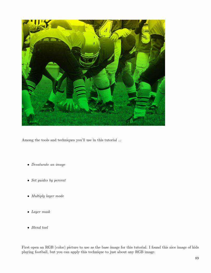
First open an RGB (color) picture to use as the base image for this tutorial. I found this nice image of kidsplaying football, but you can apply this technique to just about any RGB image.
89
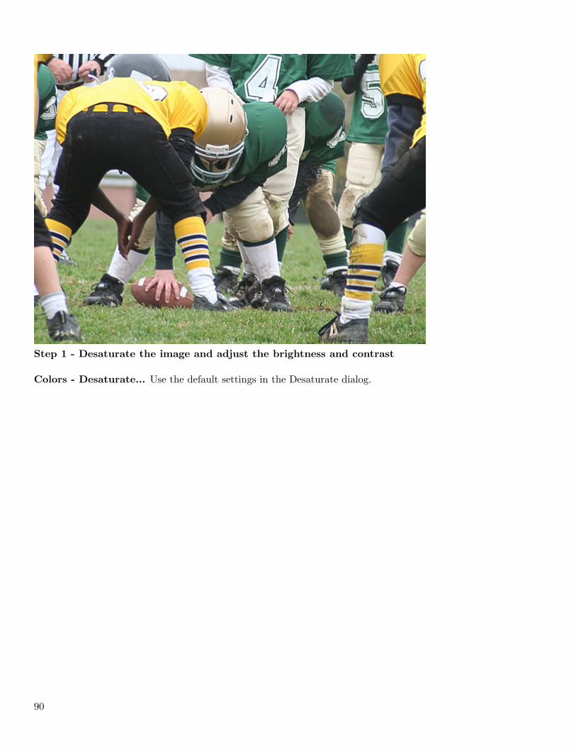
Step 1 - Desaturate the image and adjust the brightness and contrast
Colors - Desaturate... Use the default settings in the Desaturate dialog.
90
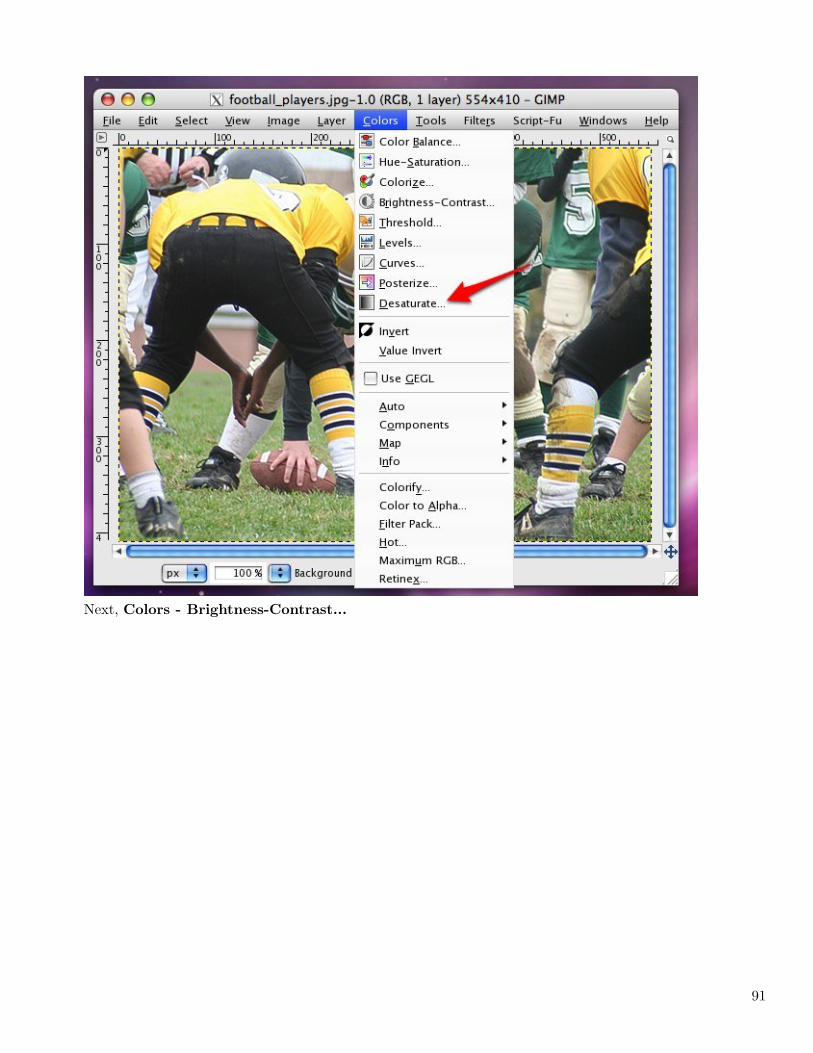
Next, Colors - Brightness-Contrast...
91
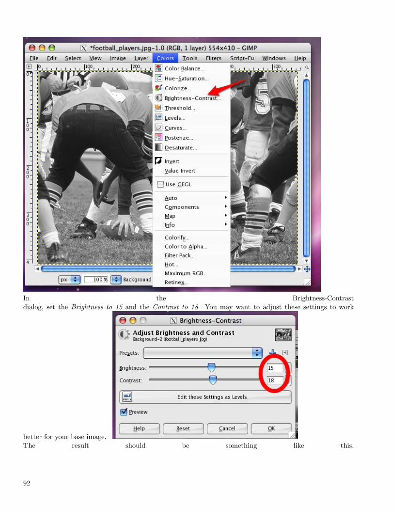
In the Brightness-Contrastdialog, set the Brightness to 15 and the Contrast to 18. You may want to adjust these settings to work
better for your base image.The result should be something like this.
92
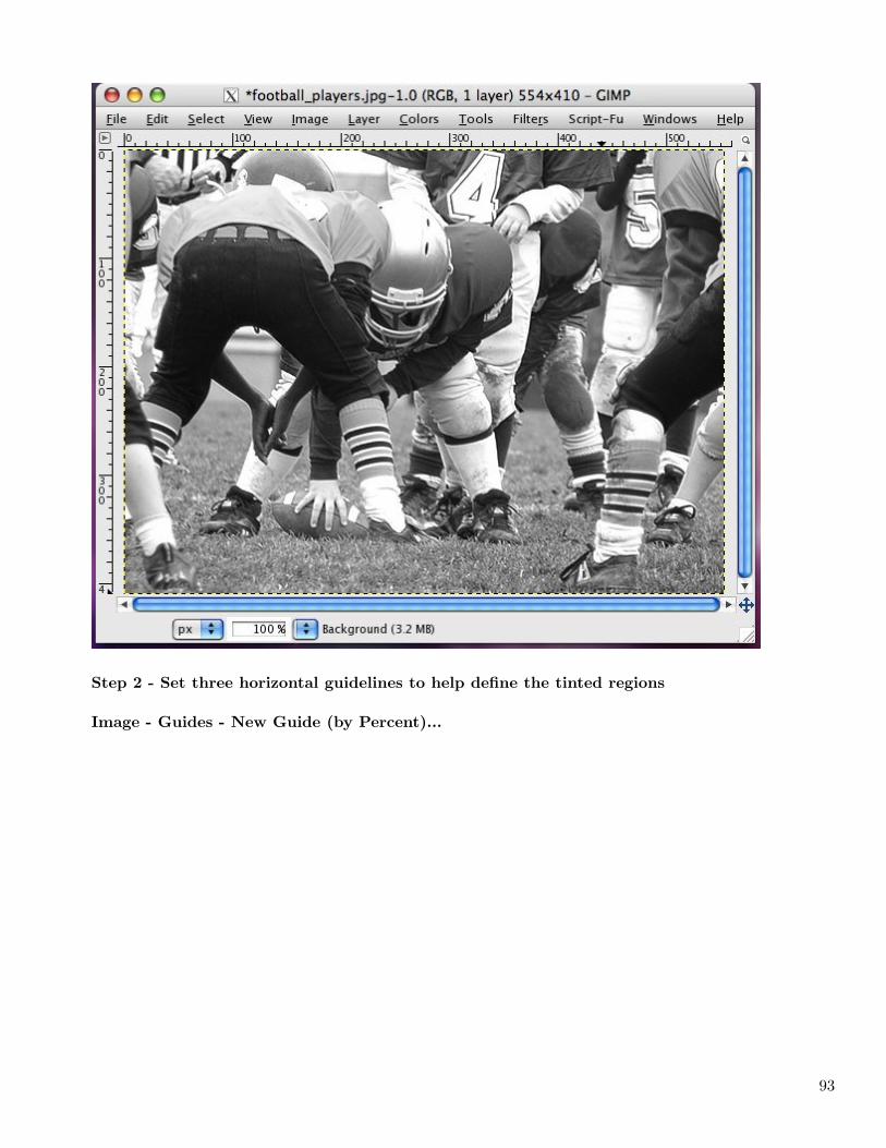
Step 2 - Set three horizontal guidelines to help define the tinted regions
Image - Guides - New Guide (by Percent)...
93
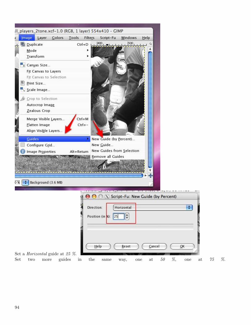
Set a Horizontal guide at 25 %.Set two more guides in the same way, one at 50 %, one at 75 %.
94
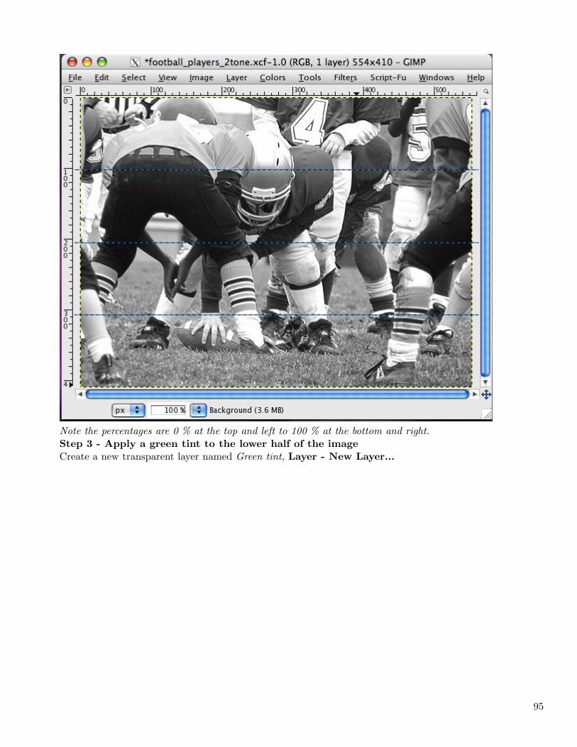
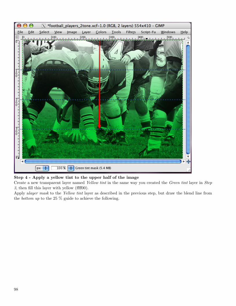
Note the percentages are 0 % at the top and left to 100 % at the bottom and right.Step 3 - Apply a green tint to the lower half of the image
Create a new transparent layer named Green tint, Layer - New Layer...
95
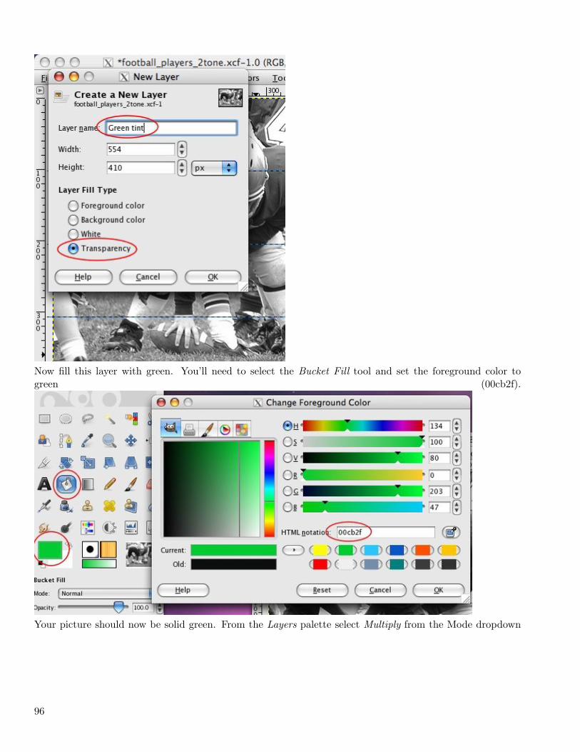
Now fill this layer with green. You’ll need to select the Bucket Fill tool and set the foreground color togreen (00cb2f).
Your picture should now be solid green. From the Layers palette select Multiply from the Mode dropdown
96
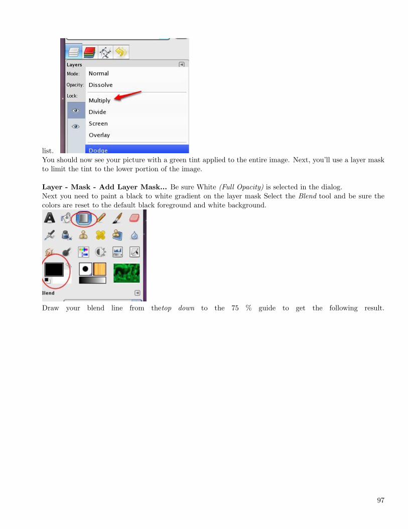
list.You should now see your picture with a green tint applied to the entire image. Next, you’ll use a layer maskto limit the tint to the lower portion of the image.
Layer - Mask - Add Layer Mask... Be sure White (Full Opacity) is selected in the dialog.Next you need to paint a black to white gradient on the layer mask Select the Blend tool and be sure thecolors are reset to the default black foreground and white background.
Draw your blend line from thetop down to the 75 % guide to get the following result.
97
Step 4 - Apply a yellow tint to the upper half of the image
Create a new transparent layer named Yellow tint in the same way you created the Green tint layer in Step3, then fill this layer with yellow (ffff00).Apply alayer mask to the Yellow tint layer as described in the previous step, but draw the blend line fromthe bottom up to the 25 % guide to achieve the following.
98
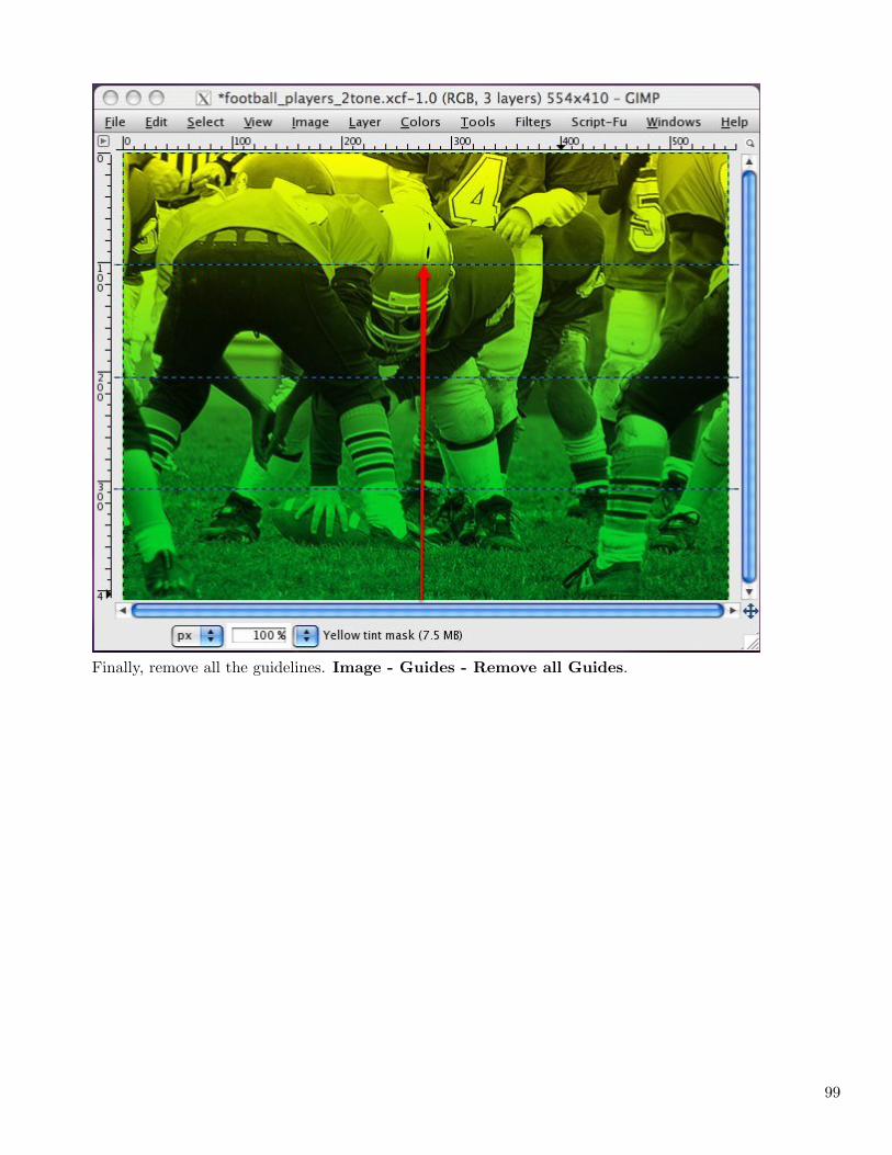
Finally, remove all the guidelines. Image - Guides - Remove all Guides.
99
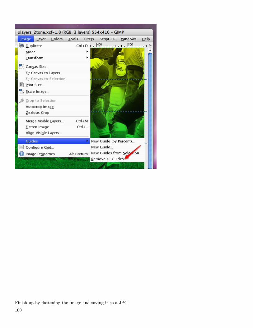
Finish up by flattening the image and saving it as a JPG.
100

That’s it. I think it’s a nice effect to use in some images. You might like to experiment with applying thetwo-tone effect vertically or even diagonally, maybe even along a curve.
Hope you picked up a new skill or idea. If you liked this lesson, please share it.
I’m trying something new. I’m embedding the map I used to write this tutorial. It might be a good post-tutorial reference.
IFRAME: [1]http://share.xmind.net/ embed/xmath2007/two-tone-tutorial-1/
[2]
1. http://share.xmind.net/_embed/xmath2007/two-tone-tutorial-1/
2. http://reblog.zemanta.com/zemified/2bc9cb58-2560-48d7-808a-b2ce75fa9467/
3.3 July
Create a Bright Neon Pattern of Repea... (2009-07-31 11:16)
In this lesson you will learn how to create an image in which a simple shape is repeated in a variety of glowingcolors on a black background. This is our goal ...
101
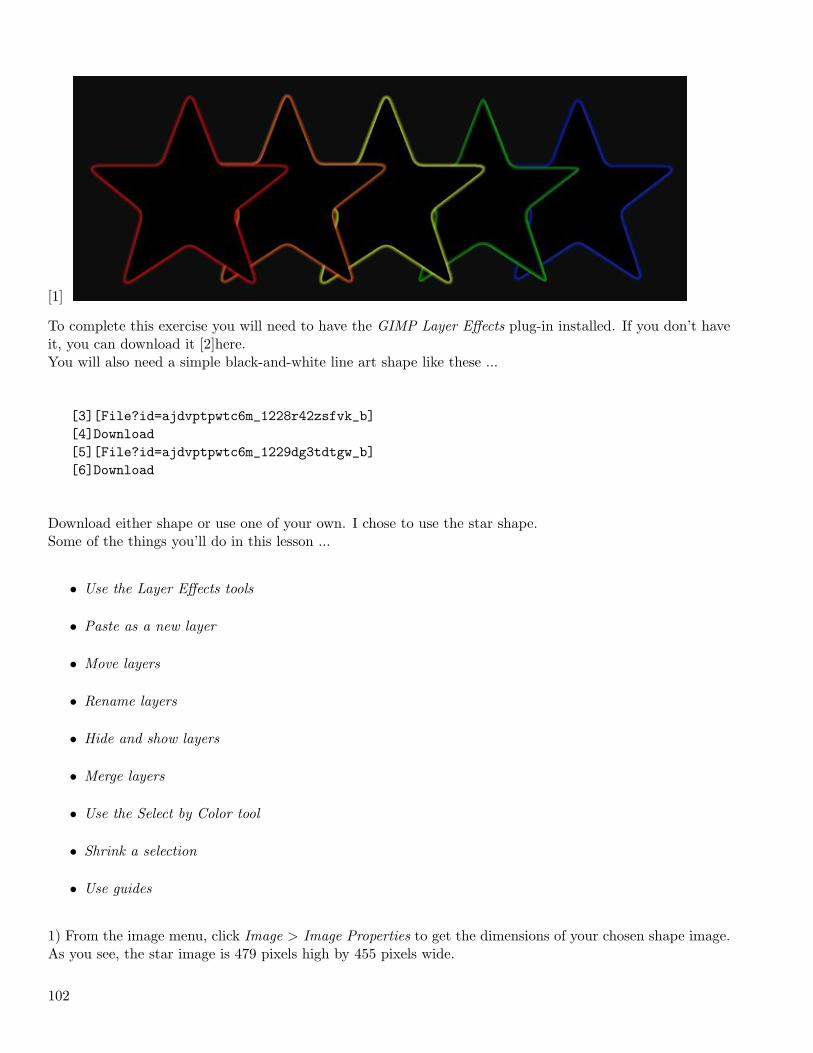
[1]
To complete this exercise you will need to have the GIMP Layer Effects plug-in installed. If you don’t haveit, you can download it [2]here.You will also need a simple black-and-white line art shape like these ...
[3][File?id=ajdvptpwtc6m_1228r42zsfvk_b][4]Download[5][File?id=ajdvptpwtc6m_1229dg3tdtgw_b][6]Download
Download either shape or use one of your own. I chose to use the star shape.Some of the things you’ll do in this lesson ...
• Use the Layer Effects tools
• Paste as a new layer
• Move layers
• Rename layers
• Hide and show layers
• Merge layers
• Use the Select by Color tool
• Shrink a selection
• Use guides
1) From the image menu, click Image > Image Properties to get the dimensions of your chosen shape image.As you see, the star image is 479 pixels high by 455 pixels wide.
102
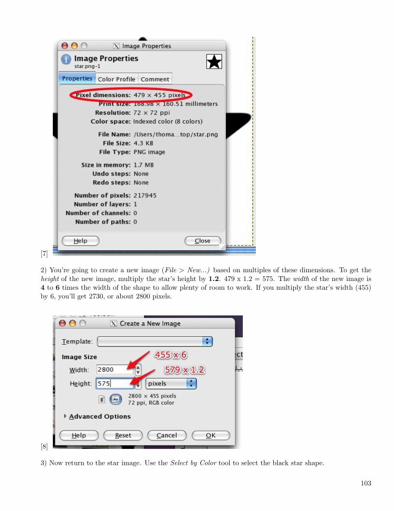
[7]
2) You’re going to create a new image (File > New...) based on multiples of these dimensions. To get theheight of the new image, multiply the star’s height by 1.2. 479 x 1.2 = 575. The width of the new image is4 to 6 times the width of the shape to allow plenty of room to work. If you multiply the star’s width (455)by 6, you’ll get 2730, or about 2800 pixels.
[8]
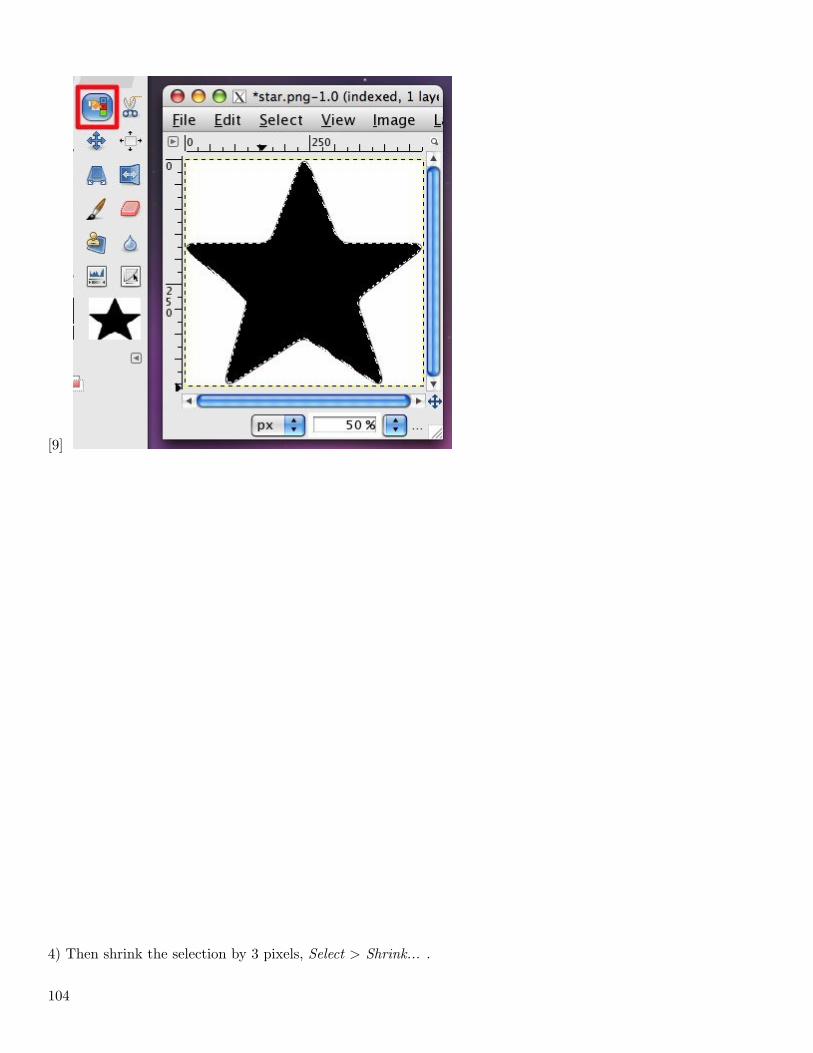
3) Now return to the star image. Use the Select by Color tool to select the black star shape.
103
[9]
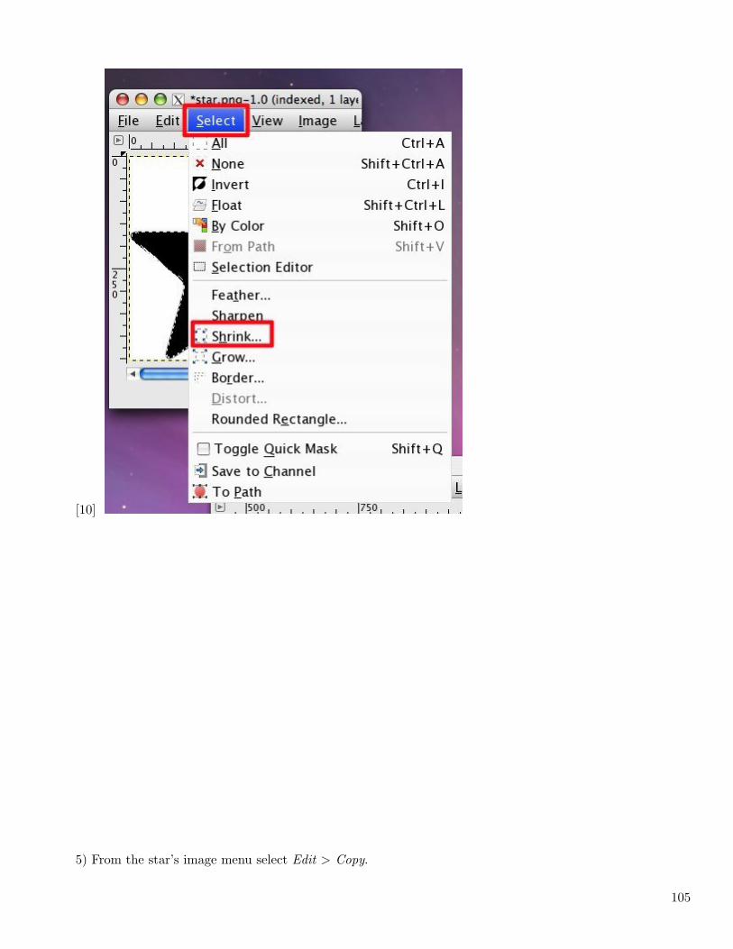
4) Then shrink the selection by 3 pixels, Select > Shrink... .
104
[10]
5) From the star’s image menu select Edit > Copy.
105
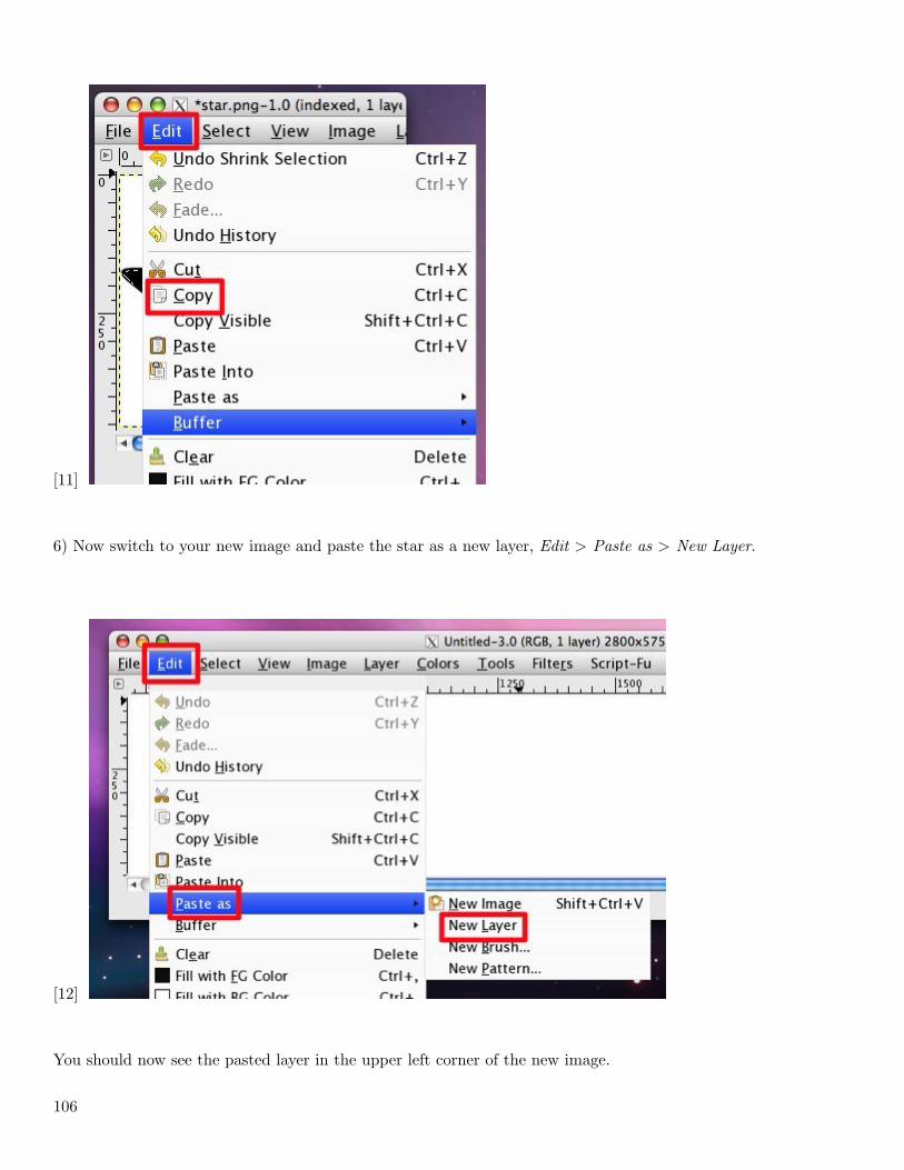
[11]
6) Now switch to your new image and paste the star as a new layer, Edit > Paste as > New Layer.
[12]
You should now see the pasted layer in the upper left corner of the new image.
106
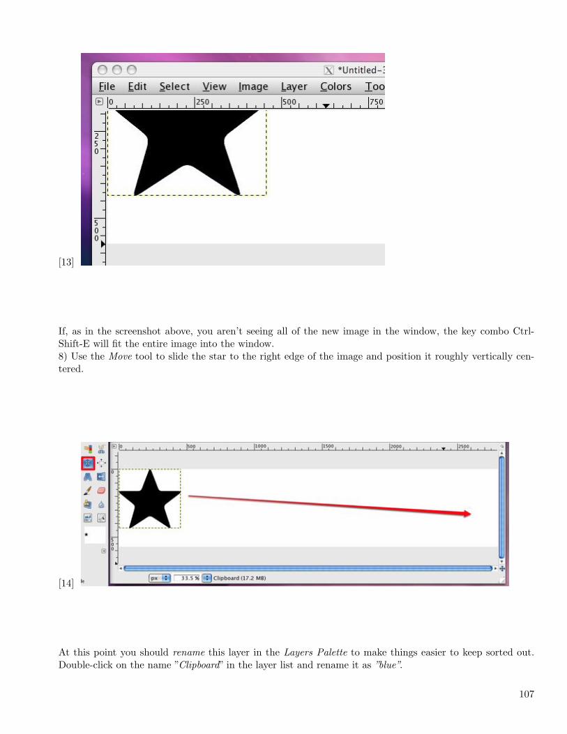
[13]
If, as in the screenshot above, you aren’t seeing all of the new image in the window, the key combo Ctrl-Shift-E will fit the entire image into the window.8) Use the Move tool to slide the star to the right edge of the image and position it roughly vertically cen-tered.
[14]
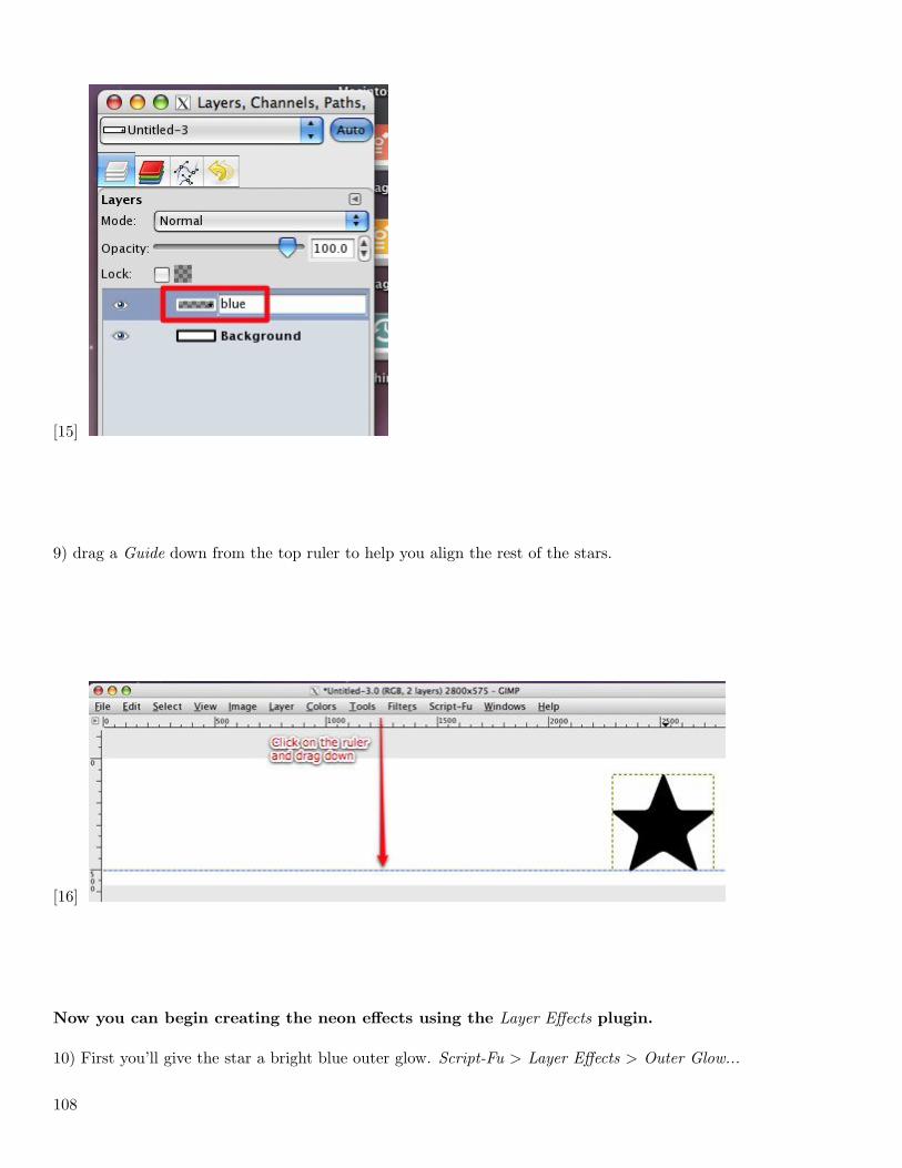
At this point you should rename this layer in the Layers Palette to make things easier to keep sorted out.Double-click on the name ”Clipboard” in the layer list and rename it as ”blue”.
107
[15]
9) drag a Guide down from the top ruler to help you align the rest of the stars.
[16]
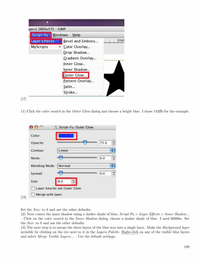
Now you can begin creating the neon effects using the Layer Effects plugin.
10) First you’ll give the star a bright blue outer glow. Script-Fu > Layer Effects > Outer Glow...
108
[17]
11) Click the color swatch in the Outer Glow dialog and choose a bright blue. I chose 142ffb for the example.
[18]
Set the Size: to 8 and use the other defaults.12) Next comes the inner shadow using a darker shade of blue, Script-Fu > Layer Effects > Inner Shadow.... Click on the color swatch in the Inner Shadow dialog, choose a darker shade of blue. I used 00008a. Setthe Size: to 8 and use the other defaults.13) The next step is to merge the three layers of the blue star into a single layer. Make the Background layerinvisible by clicking on the eye next to it in the Layers Palette. Right-click on any of the visible blue layersand select Merge Visible Layers... . Use the default settings.
109
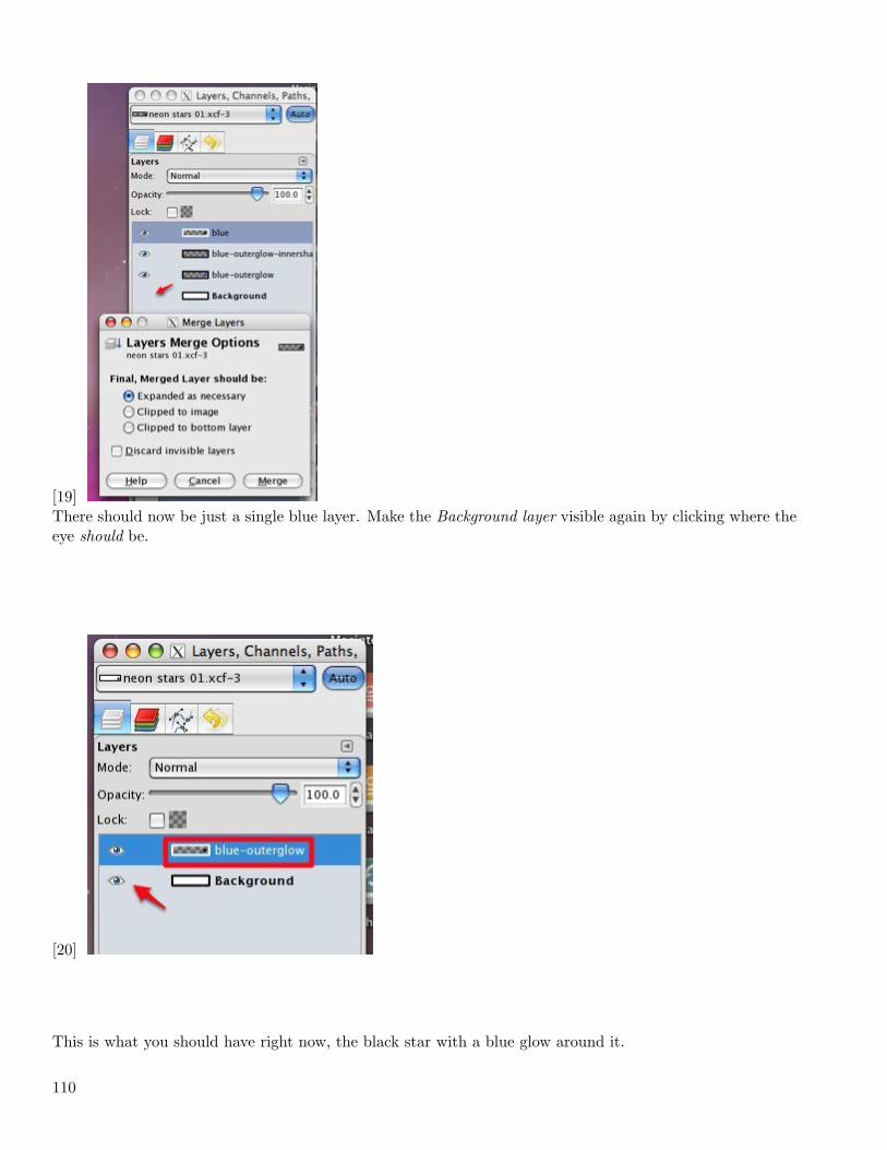
[19]There should now be just a single blue layer. Make the Background layer visible again by clicking where theeye should be.
[20]
This is what you should have right now, the black star with a blue glow around it.
110
[21]
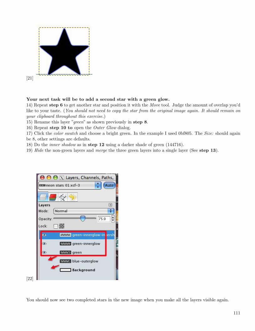
Your next task will be to add a second star with a green glow.
14) Repeat step 6 to get another star and position it with the Move tool. Judge the amount of overlap you’dlike to your taste. (You should not need to copy the star from the original image again. It should remain onyour clipboard throughout this exercise.)15) Rename this layer ”green” as shown previously in step 8.16) Repeat step 10 to open the Outer Glow dialog.17) Click the color swatch and choose a bright green. In the example I used 0bf805. The Size: should againbe 8, other settings are defaults.18) Do the inner shadow as in step 12 using a darker shade of green (144716).19) Hide the non-green layers and merge the three green layers into a single layer (See step 13).
[22]
You should now see two completed stars in the new image when you make all the layers visible again.
111
[23]
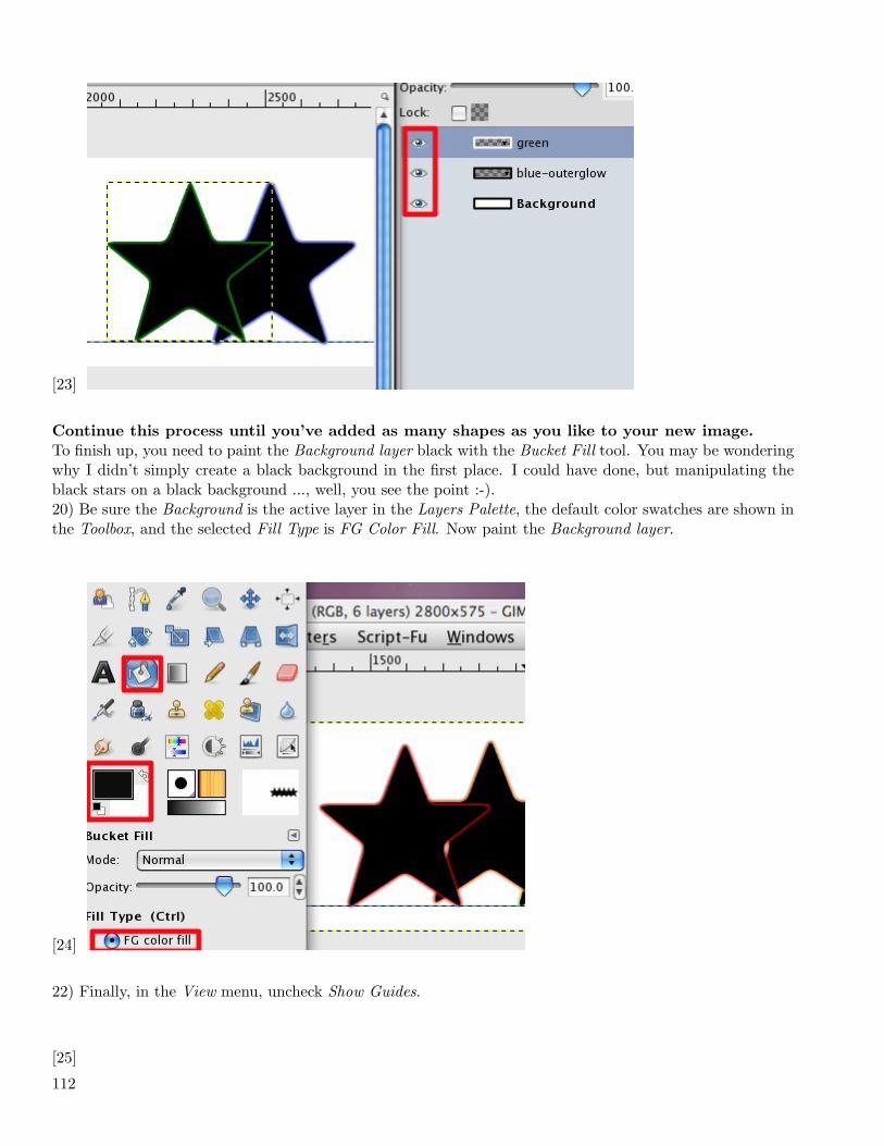
Continue this process until you’ve added as many shapes as you like to your new image.
To finish up, you need to paint the Background layer black with the Bucket Fill tool. You may be wonderingwhy I didn’t simply create a black background in the first place. I could have done, but manipulating theblack stars on a black background ..., well, you see the point :-).20) Be sure the Background is the active layer in the Layers Palette, the default color swatches are shown inthe Toolbox, and the selected Fill Type is FG Color Fill. Now paint the Background layer.
[24]
22) Finally, in the View menu, uncheck Show Guides.
[25]
112
[26]
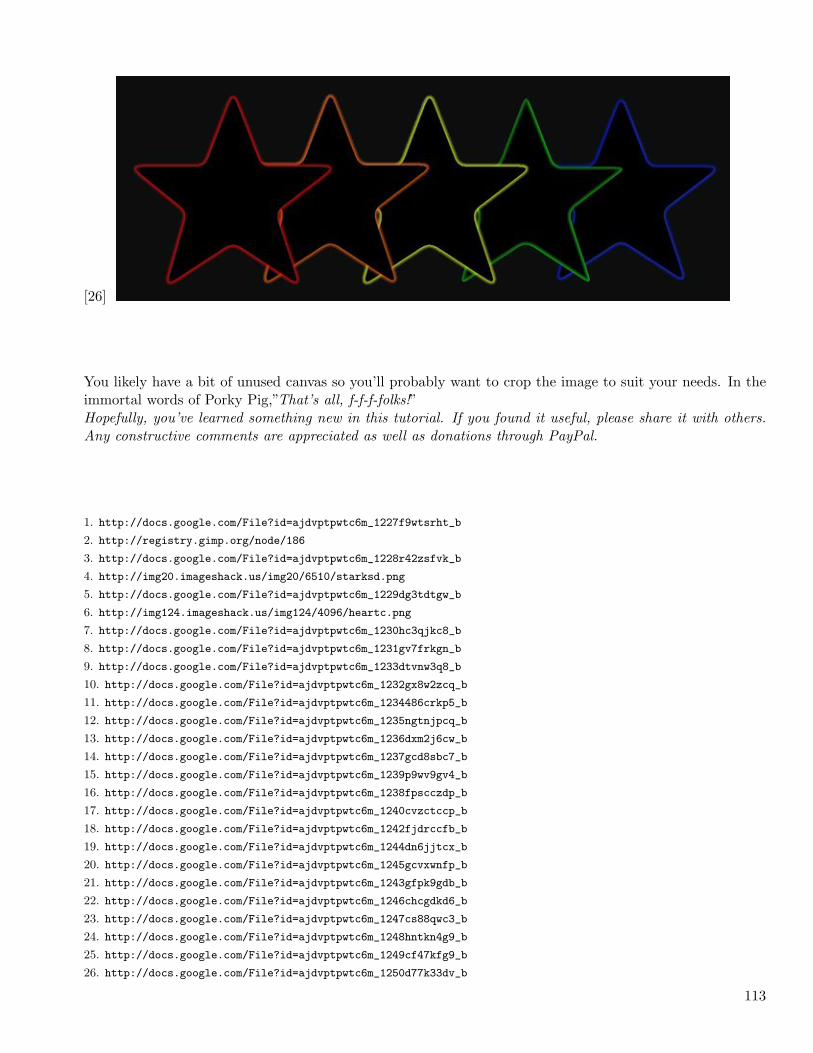
You likely have a bit of unused canvas so you’ll probably want to crop the image to suit your needs. In theimmortal words of Porky Pig,”That’s all, f-f-f-folks!”Hopefully, you’ve learned something new in this tutorial. If you found it useful, please share it with others.Any constructive comments are appreciated as well as donations through PayPal.
1. http://docs.google.com/File?id=ajdvptpwtc6m_1227f9wtsrht_b
2. http://registry.gimp.org/node/186
3. http://docs.google.com/File?id=ajdvptpwtc6m_1228r42zsfvk_b
4. http://img20.imageshack.us/img20/6510/starksd.png
5. http://docs.google.com/File?id=ajdvptpwtc6m_1229dg3tdtgw_b
6. http://img124.imageshack.us/img124/4096/heartc.png
7. http://docs.google.com/File?id=ajdvptpwtc6m_1230hc3qjkc8_b
8. http://docs.google.com/File?id=ajdvptpwtc6m_1231gv7frkgn_b
9. http://docs.google.com/File?id=ajdvptpwtc6m_1233dtvnw3q8_b
10. http://docs.google.com/File?id=ajdvptpwtc6m_1232gx8w2zcq_b
11. http://docs.google.com/File?id=ajdvptpwtc6m_1234486crkp5_b
12. http://docs.google.com/File?id=ajdvptpwtc6m_1235ngtnjpcq_b
13. http://docs.google.com/File?id=ajdvptpwtc6m_1236dxm2j6cw_b
14. http://docs.google.com/File?id=ajdvptpwtc6m_1237gcd8sbc7_b
15. http://docs.google.com/File?id=ajdvptpwtc6m_1239p9wv9gv4_b
16. http://docs.google.com/File?id=ajdvptpwtc6m_1238fpscczdp_b
17. http://docs.google.com/File?id=ajdvptpwtc6m_1240cvzctccp_b
18. http://docs.google.com/File?id=ajdvptpwtc6m_1242fjdrccfb_b
19. http://docs.google.com/File?id=ajdvptpwtc6m_1244dn6jjtcx_b
20. http://docs.google.com/File?id=ajdvptpwtc6m_1245gcvxwnfp_b
21. http://docs.google.com/File?id=ajdvptpwtc6m_1243gfpk9gdb_b
22. http://docs.google.com/File?id=ajdvptpwtc6m_1246chcgdkd6_b
23. http://docs.google.com/File?id=ajdvptpwtc6m_1247cs88qwc3_b
24. http://docs.google.com/File?id=ajdvptpwtc6m_1248hntkn4g9_b
25. http://docs.google.com/File?id=ajdvptpwtc6m_1249cf47kfg9_b
26. http://docs.google.com/File?id=ajdvptpwtc6m_1250d77k33dv_b
113
3.4 December
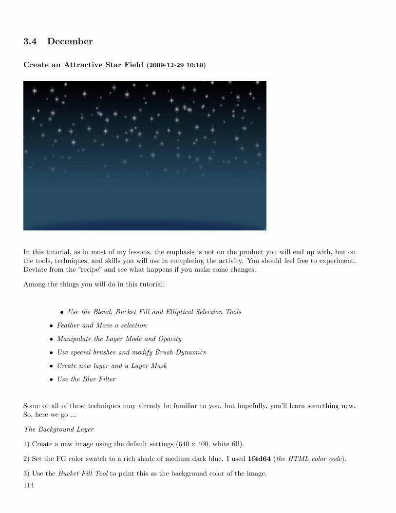
Create an Attractive Star Field (2009-12-29 10:10)
In this tutorial, as in most of my lessons, the emphasis is not on the product you will end up with, but onthe tools, techniques, and skills you will use in completing the activity. You should feel free to experiment.Deviate from the ”recipe” and see what happens if you make some changes.
Among the things you will do in this tutorial:
• Use the Blend, Bucket Fill and Elliptical Selection Tools
• Feather and Move a selection
• Manipulate the Layer Mode and Opacity
• Use special brushes and modify Brush Dynamics
• Create new layer and a Layer Mask
• Use the Blur Filter
Some or all of these techniques may already be familiar to you, but hopefully, you’ll learn something new.So, here we go ...
The Background Layer
1) Create a new image using the default settings (640 x 400, white fill).
2) Set the FG color swatch to a rich shade of medium dark blue. I used 1f4d64 (the HTML color code).
3) Use the Bucket Fill Tool to paint this as the background color of the image.
114
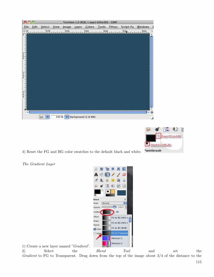
4) Reset the FG and BG color swatches to the default black and white.
The Gradient Layer
1) Create a new layer named ”Gradient”.2) Select the Blend Tool and set theGradient to FG to Transparent. Drag down from the top of the image about 3/4 of the distance to the
115
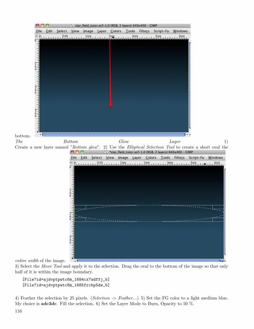
bottom.The Bottom Glow Layer 1)Create a new layer named ”Bottom glow”. 2) Use the Elliptical Selection Tool to create a short oval the
entire width of the image.3) Select the Move Tool and apply it to the selection. Drag the oval to the bottom of the image so that onlyhalf of it is within the image boundary.
[File?id=ajdvptpwtc6m_1684cx7wdffj_b][File?id=ajdvptpwtc6m_1685frcbp5dw_b]
4) Feather the selection by 25 pixels. (Selection -> Feather...) 5) Set the FG color to a light medium blue.My choice is adc3dc. Fill the selection. 6) Set the Layer Mode to Burn, Opacity to 50 %.
116
[File?id=ajdvptpwtc6m_1686dkk5h6f3_b][File?id=ajdvptpwtc6m_1687dp9hdmhr_b]
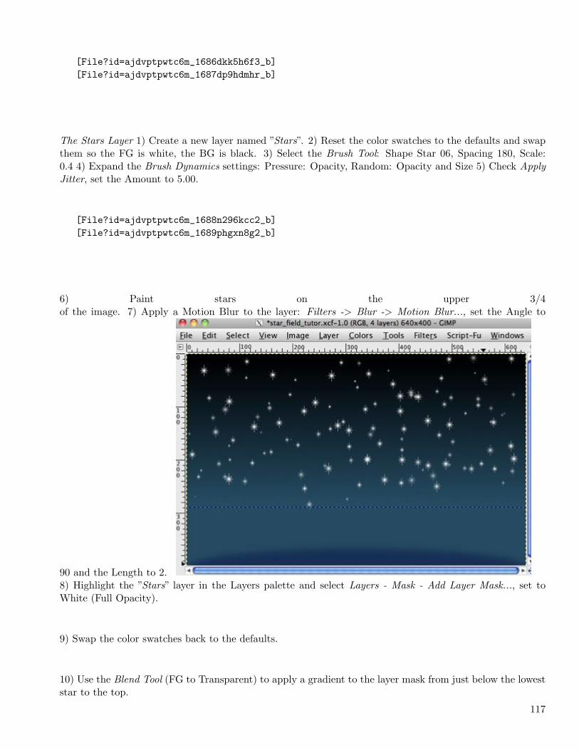
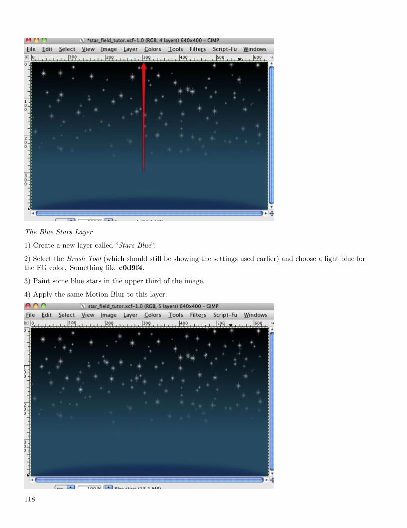
The Stars Layer 1) Create a new layer named ”Stars”. 2) Reset the color swatches to the defaults and swapthem so the FG is white, the BG is black. 3) Select the Brush Tool: Shape Star 06, Spacing 180, Scale:0.4 4) Expand the Brush Dynamics settings: Pressure: Opacity, Random: Opacity and Size 5) Check ApplyJitter, set the Amount to 5.00.
[File?id=ajdvptpwtc6m_1688n296kcc2_b][File?id=ajdvptpwtc6m_1689phgxn8g2_b]
6) Paint stars on the upper 3/4of the image. 7) Apply a Motion Blur to the layer: Filters -> Blur -> Motion Blur..., set the Angle to
90 and the Length to 2.8) Highlight the ”Stars” layer in the Layers palette and select Layers - Mask - Add Layer Mask..., set toWhite (Full Opacity).
9) Swap the color swatches back to the defaults.
10) Use the Blend Tool (FG to Transparent) to apply a gradient to the layer mask from just below the loweststar to the top.
117
The Blue Stars Layer
1) Create a new layer called ”Stars Blue”.
2) Select the Brush Tool (which should still be showing the settings used earlier) and choose a light blue forthe FG color. Something like c0d9f4.
3) Paint some blue stars in the upper third of the image.
4) Apply the same Motion Blur to this layer.
118
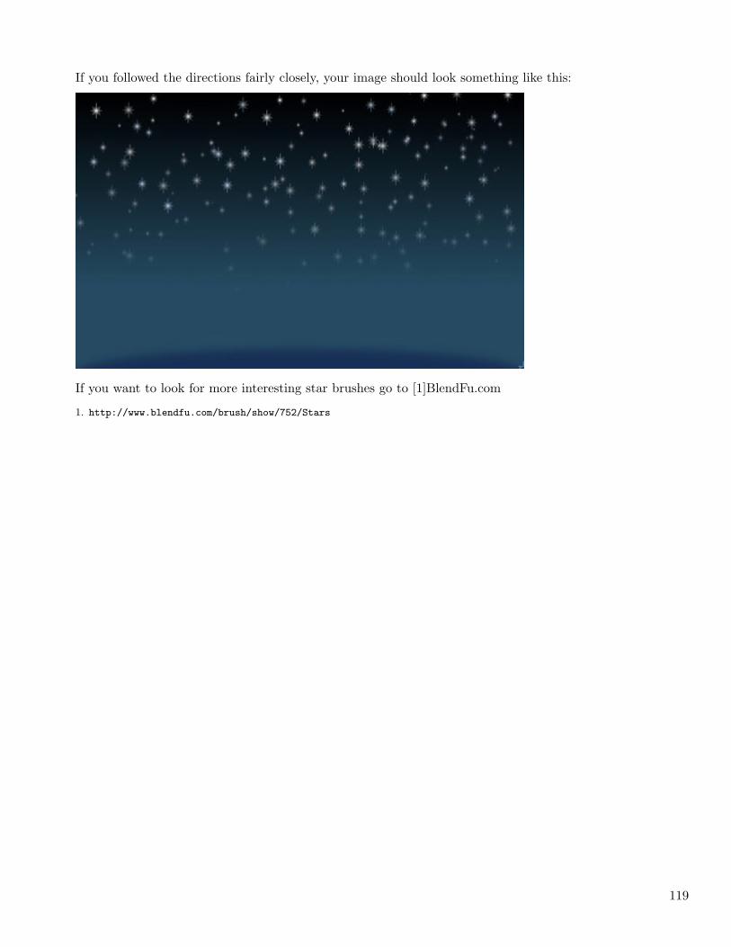
If you followed the directions fairly closely, your image should look something like this:
If you want to look for more interesting star brushes go to [1]BlendFu.com
1. http://www.blendfu.com/brush/show/752/Stars
119

120
Chapter 4
2010
4.1 March
Just Too Big! (2010-03-01 16:41)
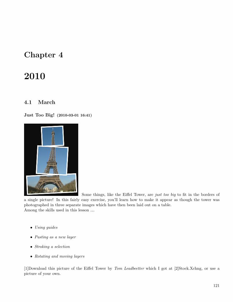
Some things, like the Eiffel Tower, are just too big to fit in the borders ofa single picture! In this fairly easy exercise, you’ll learn how to make it appear as though the tower wasphotographed in three separate images which have then been laid out on a table.Among the skills used in this lesson …
• Using guides
• Pasting as a new layer
• Stroking a selection
• Rotating and moving layers
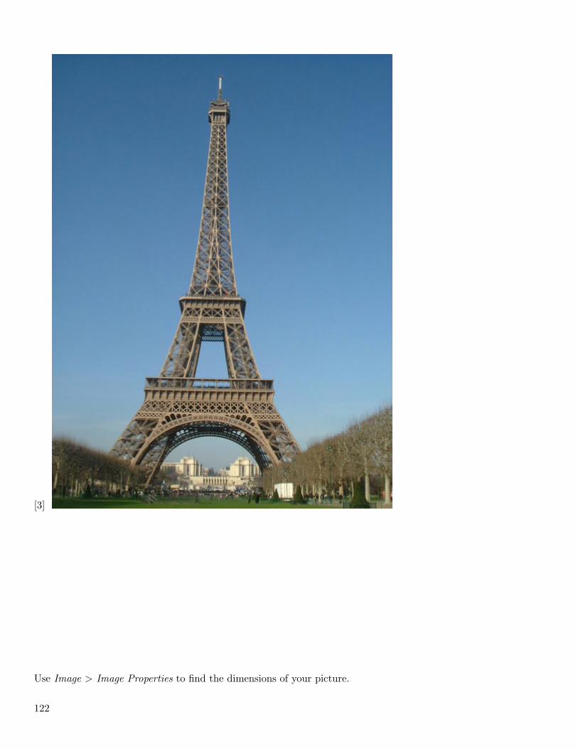
[1]Download this picture of the Eiffel Tower by Tom Leadbeetter which I got at [2]Stock.Xchng, or use apicture of your own.
121
[3]
Use Image > Image Properties to find the dimensions of your picture.
122
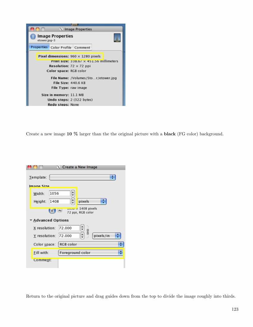
Create a new image 10 % larger than the the original picture with a black (FG color) background.
Return to the original picture and drag guides down from the top to divide the image roughly into thirds.
123
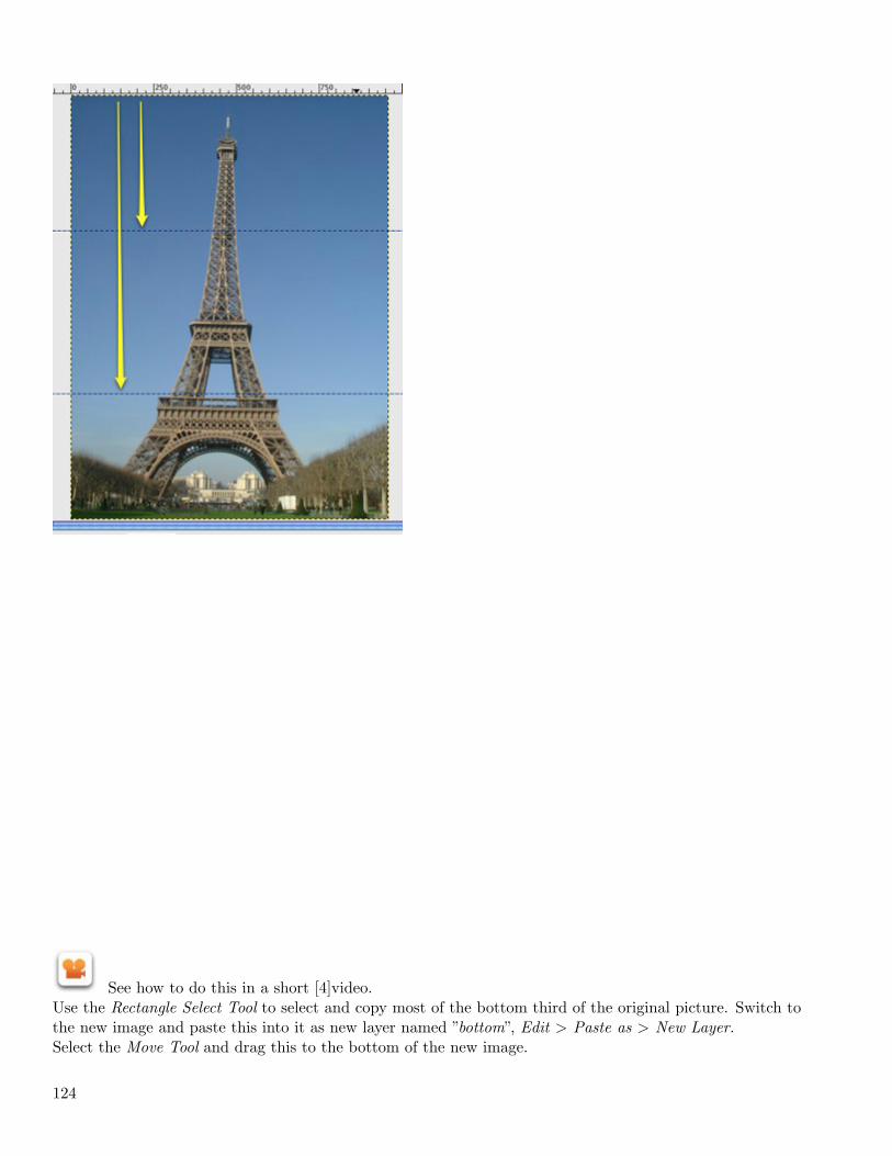
See how to do this in a short [4]video.Use the Rectangle Select Tool to select and copy most of the bottom third of the original picture. Switch tothe new image and paste this into it as new layer named ”bottom”, Edit > Paste as > New Layer.Select the Move Tool and drag this to the bottom of the new image.
124
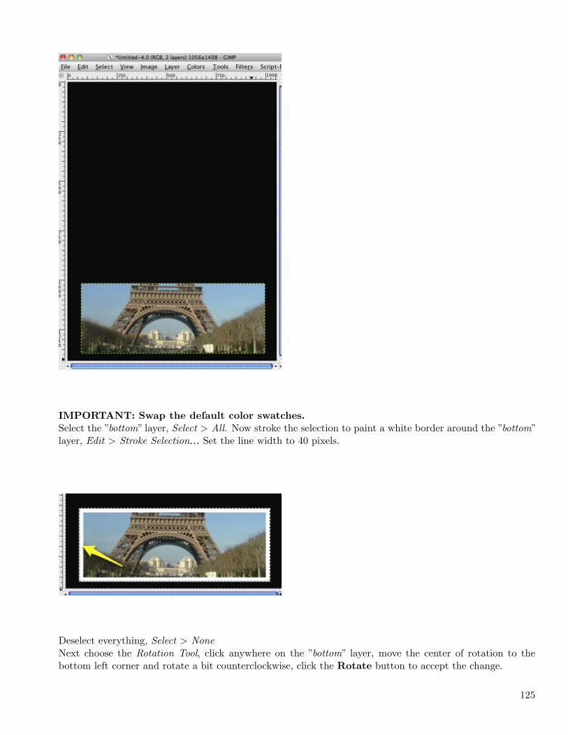
IMPORTANT: Swap the default color swatches.
Select the ”bottom” layer, Select > All. Now stroke the selection to paint a white border around the ”bottom”layer, Edit > Stroke Selection… Set the line width to 40 pixels.
Deselect everything, Select > NoneNext choose the Rotation Tool, click anywhere on the ”bottom” layer, move the center of rotation to thebottom left corner and rotate a bit counterclockwise, click the Rotate button to accept the change.
125
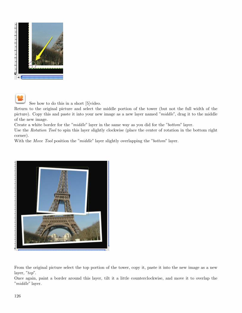
See how to do this in a short [5]video.Return to the original picture and select the middle portion of the tower (but not the full width of thepicture). Copy this and paste it into your new image as a new layer named ”middle”, drag it to the middleof the new image.Create a white border for the ”middle” layer in the same way as you did for the ”bottom” layer.Use the Rotation Tool to spin this layer slightly clockwise (place the center of rotation in the bottom rightcorner).With the Move Tool position the ”middle” layer slightly overlapping the ”bottom” layer.
From the original picture select the top portion of the tower, copy it, paste it into the new image as a newlayer, ”top”.Once again, paint a border around this layer, tilt it a little counterclockwise, and move it to overlap the”middle” layer.
126
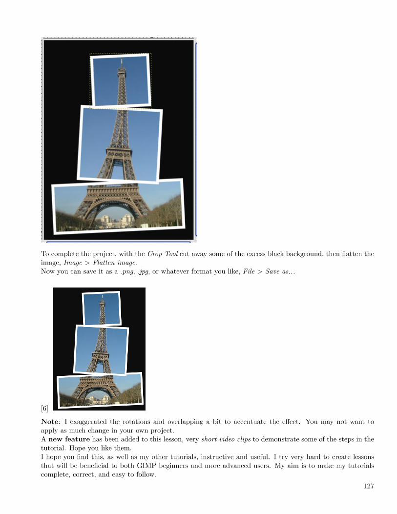
To complete the project, with the Crop Tool cut away some of the excess black background, then flatten theimage, Image > Flatten image.Now you can save it as a .png, .jpg, or whatever format you like, File > Save as…
[6]
Note: I exaggerated the rotations and overlapping a bit to accentuate the effect. You may not want toapply as much change in your own project.A new feature has been added to this lesson, very short video clips to demonstrate some of the steps in thetutorial. Hope you like them.I hope you find this, as well as my other tutorials, instructive and useful. I try very hard to create lessonsthat will be beneficial to both GIMP beginners and more advanced users. My aim is to make my tutorialscomplete, correct, and easy to follow.
127
If you have found these lessons to be helpful and worthwhile, a small donation via PayPal (Please use thebutton on the left) would be very much appreciated.
1. http://yfrog.com/euetowerj
2. http://www.sxc.hu/
3. http://docs.google.com/File?id=ajdvptpwtc6m_1929gwpv9fdv_b
4. http://screencast.com/t/OTYyY2VmZTkt
5. http://screencast.com/t/YWM4MzhhOW
6. http://docs.google.com/File?id=ajdvptpwtc6m_1940dj2pmggb_b
Responding to Comments (2010-03-01 17:09)
[1] Some of you have posted comments in which you have asked questions aboutthe tutorials. I have not responded to these because I had not been aware of them. Though I have very littletime to devote to this blog, I plan to try to do a better job with this.I have made some changes to the commenting and comment notification procedures that I hope will help inthis. Please bear with me.I appreciate those of you who visit here whether regularly or just occasionally. I’d love to do more tutorials.Good tutorials take a lot of time, and I just can’t fit them in very often. I have many notes on tutorials forthe future. Ahh, maybe someday.
1. http://4.bp.blogspot.com/_cL2Mo6y31lw/S4xCfyEaL_I/AAAAAAAAFX8/q-rYPFBhVeE/s1600-h/hourglass
Moon Shadow (2010-03-16 15:34)
”I’m being followed by a moon shadow
moon shadow-moon shadowleaping and hopping on a moon shadowmoon shadow-moon shadow”- Cat Stevens
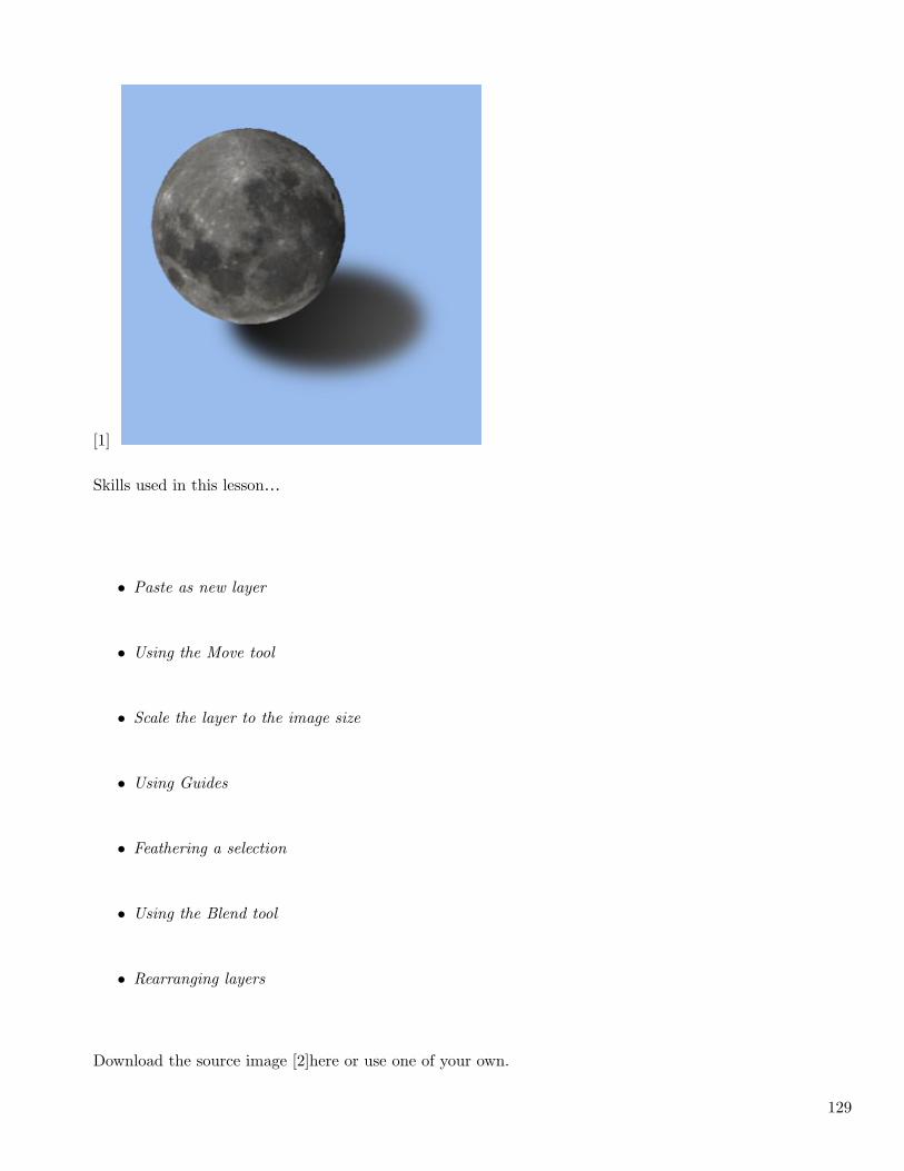
I had a request to show how an extracted image can be placed on a plain background with a realistic shadow.As always, there are different ways to accomplish this. This, I think, is a relatively simple and straight-forward method.
128
[1]
Skills used in this lesson…
• Paste as new layer
• Using the Move tool
• Scale the layer to the image size
• Using Guides
• Feathering a selection
• Using the Blend tool
• Rearranging layers
Download the source image [2]here or use one of your own.
129
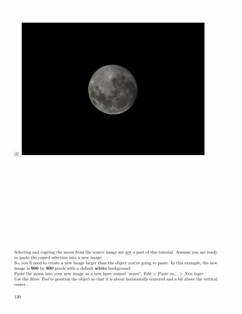
[3]
Selecting and copying the moon from the source image are not a part of this tutorial. Assume you are readyto paste the copied selection into a new image.So, you’ll need to create a new image larger than the object you’re going to paste. In this example, the newimage is 900 by 900 pixels with a default white background.Paste the moon into your new image as a new layer named ”moon”, Edit > Paste as… > New layerUse the Move Tool to position the object so that it is about horizontally centered and a bit above the verticalcenter.
130
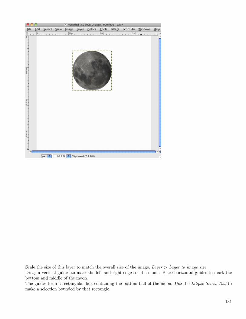
Scale the size of this layer to match the overall size of the image, Layer > Layer to image sizeDrag in vertical guides to mark the left and right edges of the moon. Place horizontal guides to mark thebottom and middle of the moon.The guides form a rectangular box containing the bottom half of the moon. Use the Ellipse Select Tool tomake a selection bounded by that rectangle.
131
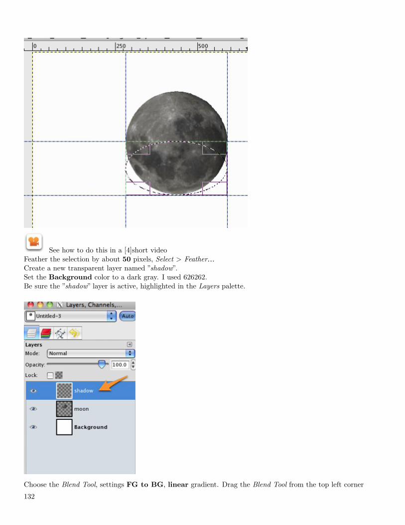
See how to do this in a [4]short videoFeather the selection by about 50 pixels, Select > Feather…Create a new transparent layer named ”shadow”.Set the Background color to a dark gray. I used 626262.Be sure the ”shadow” layer is active, highlighted in the Layers palette.
Choose the Blend Tool, settings FG to BG, linear gradient. Drag the Blend Tool from the top left corner
132
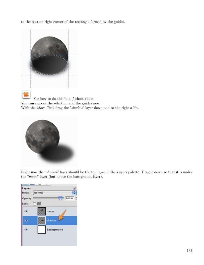
to the bottom right corner of the rectangle formed by the guides.
See how to do this in a [5]short videoYou can remove the selection and the guides now.With the Move Tool, drag the ”shadow” layer down and to the right a bit.
Right now the ”shadow” layer should be the top layer in the Layers palette. Drag it down so that it is underthe ”moon” layer (but above the background layer).
133
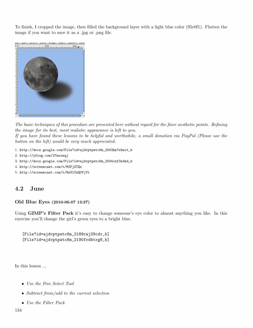
To finish, I cropped the image, then filled the background layer with a light blue color (95c0f1). Flatten theimage if you want to save it as a .jpg or .png file.
The basic techniques of this procedure are presented here without regard for the finer aesthetic points. Refiningthe image for its best, most realistic appearance is left to you.If you have found these lessons to be helpful and worthwhile, a small donation via PayPal (Please use thebutton on the left) would be very much appreciated.
1. http://docs.google.com/File?id=ajdvptpwtc6m_2003hn7sbnct_b
2. http://yfrog.com/27moonqj
3. http://docs.google.com/File?id=ajdvptpwtc6m_2004cnf3s4hd_b
4. http://screencast.com/t/M2FjZTQx
5. http://screencast.com/t/NzVlYzQ0YjYt
4.2 June
Old Blue Eyes (2010-06-07 13:37)
Using GIMP’s Filter Pack it’s easy to change someone’s eye color to almost anything you like. In thisexercise you’ll change the girl’s green eyes to a bright blue.
[File?id=ajdvptpwtc6m_2189cwj29cdv_b][File?id=ajdvptpwtc6m_2190frdbtrg8_b]
In this lesson ...
• Use the Free Select Tool
• Subtract from/add to the current selection
• Use the Filter Pack
134
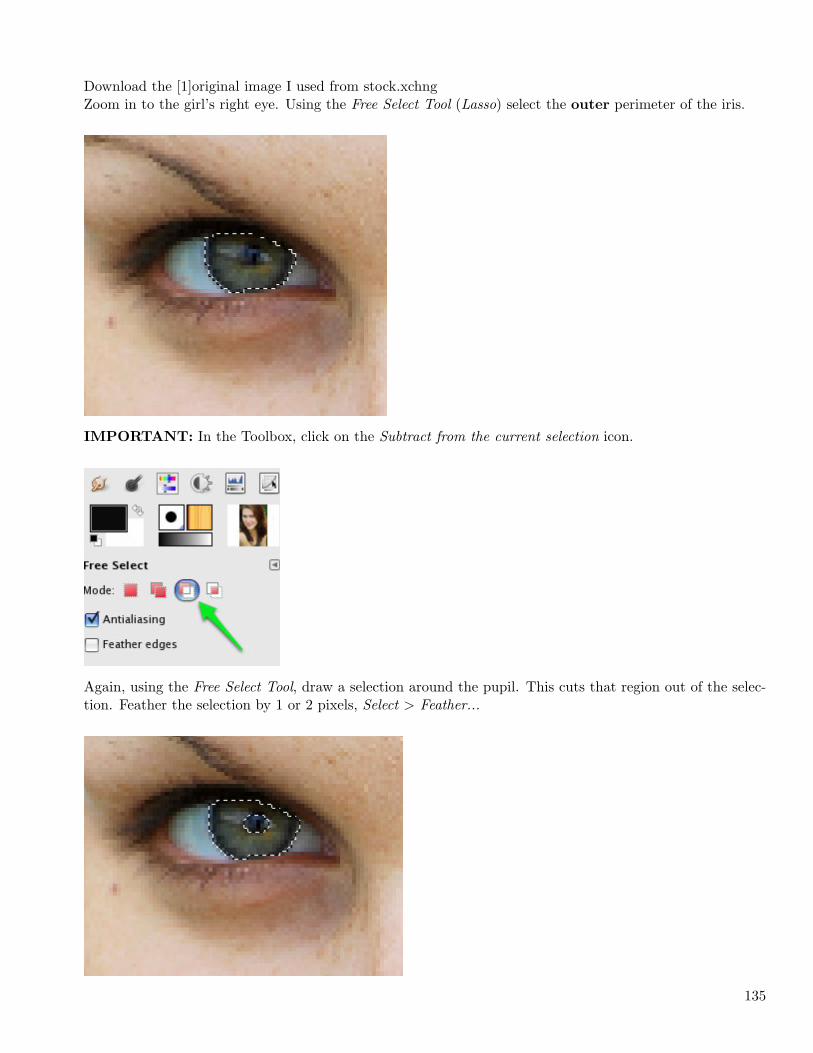
Download the [1]original image I used from stock.xchngZoom in to the girl’s right eye. Using the Free Select Tool (Lasso) select the outer perimeter of the iris.
IMPORTANT: In the Toolbox, click on the Subtract from the current selection icon.
Again, using the Free Select Tool, draw a selection around the pupil. This cuts that region out of the selec-tion. Feather the selection by 1 or 2 pixels, Select > Feather...
135
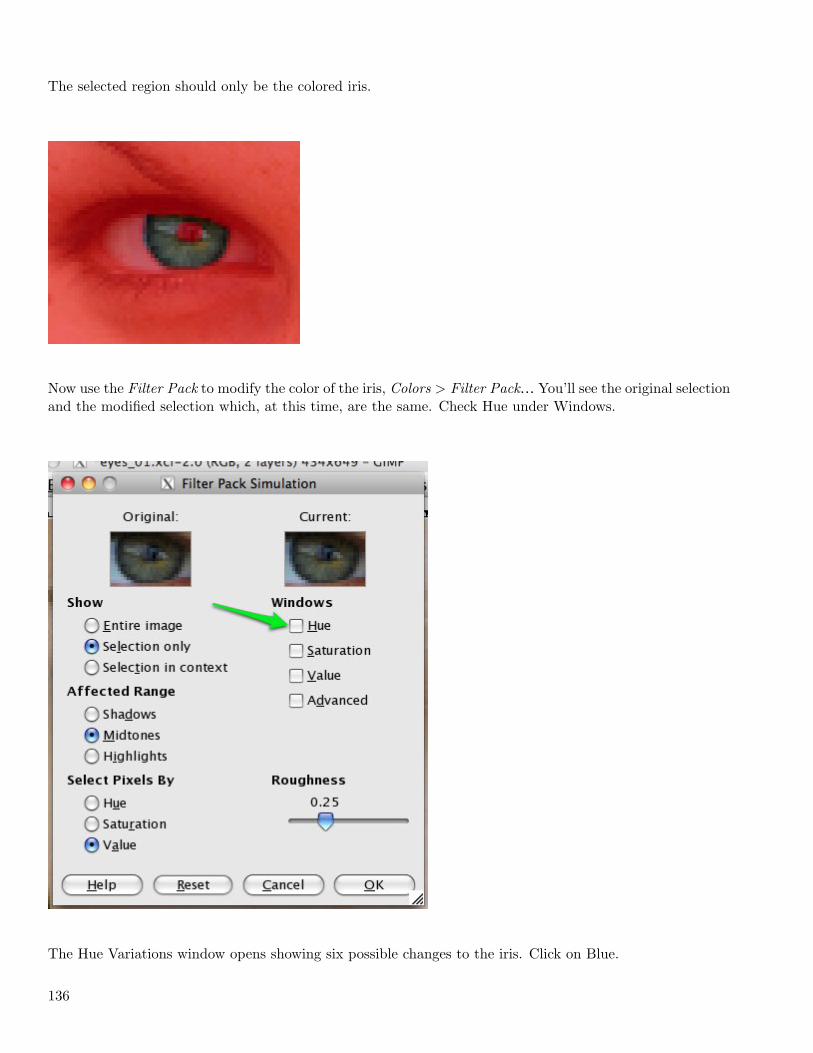
The selected region should only be the colored iris.
Now use the Filter Pack to modify the color of the iris, Colors > Filter Pack… You’ll see the original selectionand the modified selection which, at this time, are the same. Check Hue under Windows.
The Hue Variations window opens showing six possible changes to the iris. Click on Blue.
136
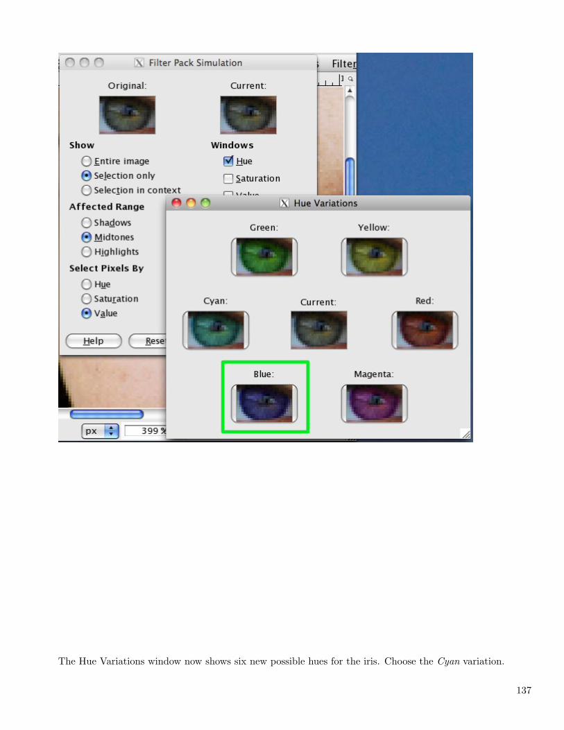
The Hue Variations window now shows six new possible hues for the iris. Choose the Cyan variation.
137
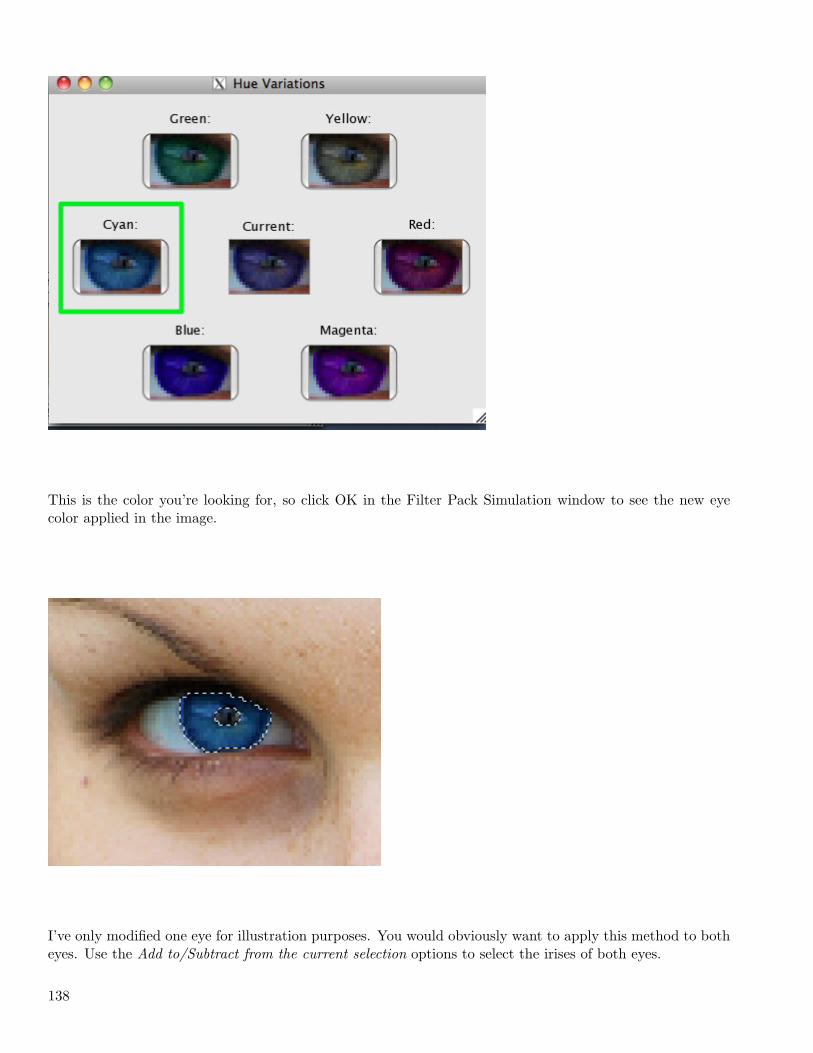
This is the color you’re looking for, so click OK in the Filter Pack Simulation window to see the new eyecolor applied in the image.
I’ve only modified one eye for illustration purposes. You would obviously want to apply this method to botheyes. Use the Add to/Subtract from the current selection options to select the irises of both eyes.
138
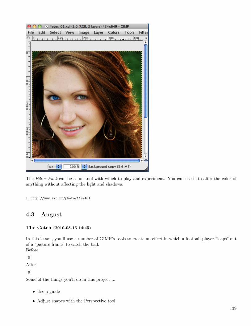
The Filter Pack can be a fun tool with which to play and experiment. You can use it to alter the color ofanything without affecting the light and shadows.
1. http://www.sxc.hu/photo/1192481
4.3 August
The Catch (2010-08-15 14:45)
In this lesson, you’ll use a number of GIMP’s tools to create an effect in which a football player ”leaps” outof a ”picture frame” to catch the ball.Before
After
Some of the things you’ll do in this project ...
• Use a guide
• Adjust shapes with the Perspective tool
139
• Clear the contents of a selection
• Feather, shrink, and invert selections
• Hide a layer
• Use the Eraser tool
Download the original image [1]here or use one of your own.
1. First, drag a guide down from the top ruler to define the location of the top of the ”frame”.2. Now, the tedious part. Select the portion of the football player above the guide (which will be outside ofthe ”frame”) and a small portion below the guide. I used the Extraction tool and refined the selection using
a Quick Mask. The details of making this selection are not within the scope of this lesson.
3. Choose the Rectangle Select tool and click on the ”Add to selection” mode icon.Select the entire region between the guide and the bottom of the image, invert the selection, and feather it3 pixels.
4. Create a new layer named ”black” and fill the whole selection with default black using the Bucket tool.
Deselect everything, Select > None.
In the next step, you’ll define the ”picture frame.”5. With the Rectangle Select tool in Normal mode, select the entire region below the guide again. Use thePerspective tool (be certain to choose the modify selection icon), to reshape the selection into a trapezoid.
See how to do this in a [2]short video6. Invert this selection. Use the Pencil tool to paint the areas to the left of, right of, and below the ”frame”default black.
7. Create a new layer, ”white.” Fill the trapezoidal selection with default white.8. Shrink the selection by 35 pixels. Using the Perspective tool again, adjust this trapezoid to give theappearance that the the top border of the ”frame” is farther from you than the bottom edge.
9. Clear the white fill from the inner selection, Edit > Clear.All that remains is to delete the part of the white ”frame” that covers the leaping player.10. Hide the ”white” layer (click the ”eye” in the Layers palette). Use the Lasso tool to select the portion ofthe football player which is under the border (be generous). Be sure to accurately select the left and rightedges of the player. Feather the selection by 3 pixels. I chose to do this in pieces, but you could do it all atonce.
11. Make the ”white” layer visible again (be sure it’s the active layer). Use the Eraser tool to remove theselected area of the white border from over the player.That’s it!
Dolphins and whales are great subjects for this effect. I think you could do some nice things with basketballplayers and soccer goalies, too. Have fun!
1. http://i221.photobucket.com/albums/dd67/xmath_photos/Uncategorized/leapingint00.jpg
2. http://img06/
140
4.4 September
Attack of the Clones! (2010-09-05 12:54)
In this easy lesson, you will learn how to create an image which appears to show the same person appearingin multiple locations in a scene.
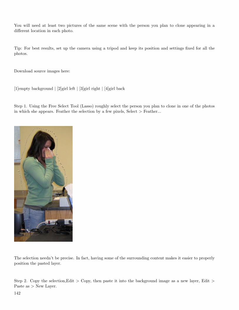
Ideally you would begin with a photo of the scene without the person in it to use as the background image.
141
You will need at least two pictures of the same scene with the person you plan to clone appearing in adifferent location in each photo.
Tip: For best results, set up the camera using a tripod and keep its position and settings fixed for all thephotos.
Download source images here:
[1]empty background | [2]girl left | [3]girl right | [4]girl back
Step 1. Using the Free Select Tool (Lasso) roughly select the person you plan to clone in one of the photosin which she appears. Feather the selection by a few pixels, Select > Feather...
The selection needn’t be precise. In fact, having some of the surrounding content makes it easier to properlyposition the pasted layer.
Step 2. Copy the selection,Edit > Copy, then paste it into the background image as a new layer, Edit >Paste as > New Layer.
142
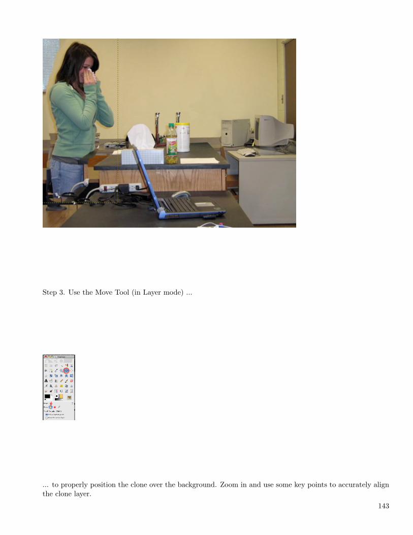
Step 3. Use the Move Tool (in Layer mode) ...
... to properly position the clone over the background. Zoom in and use some key points to accurately alignthe clone layer.
143
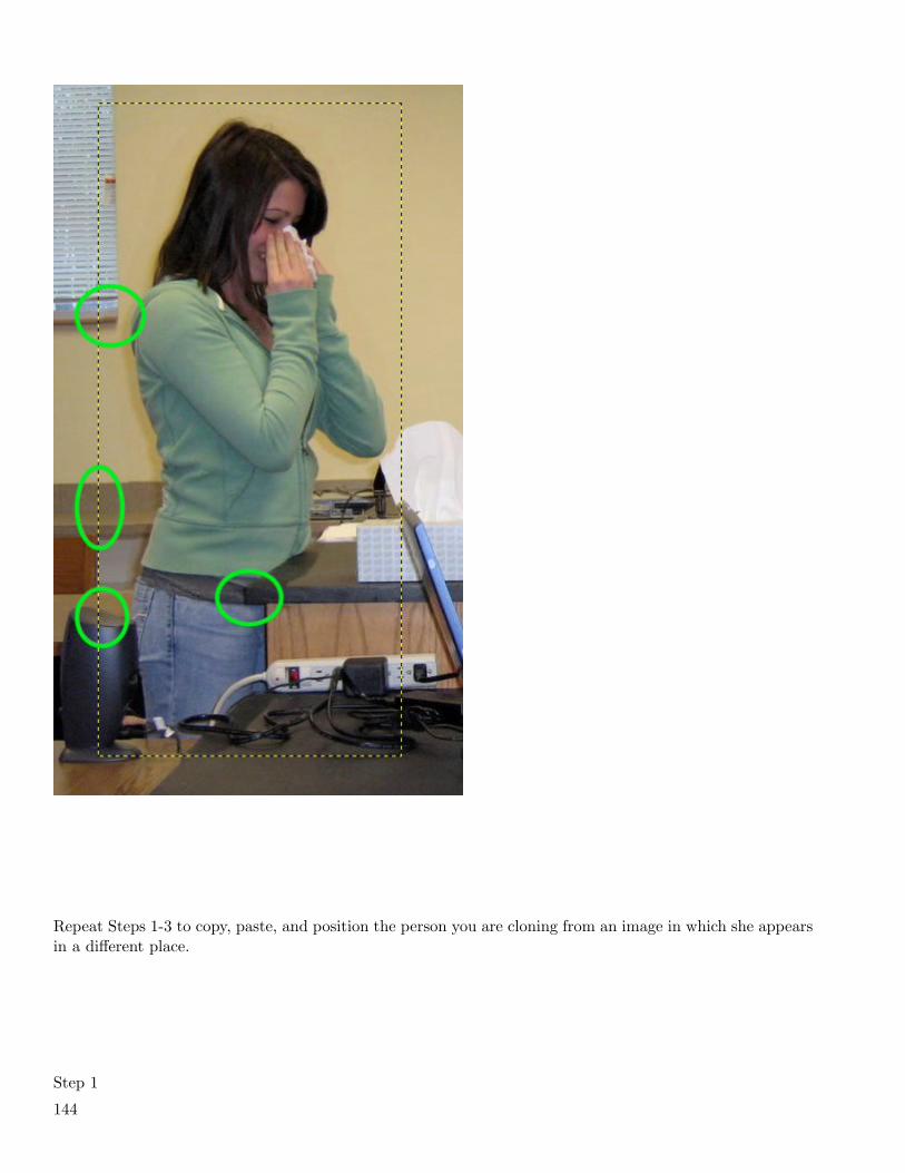
Repeat Steps 1-3 to copy, paste, and position the person you are cloning from an image in which she appearsin a different place.
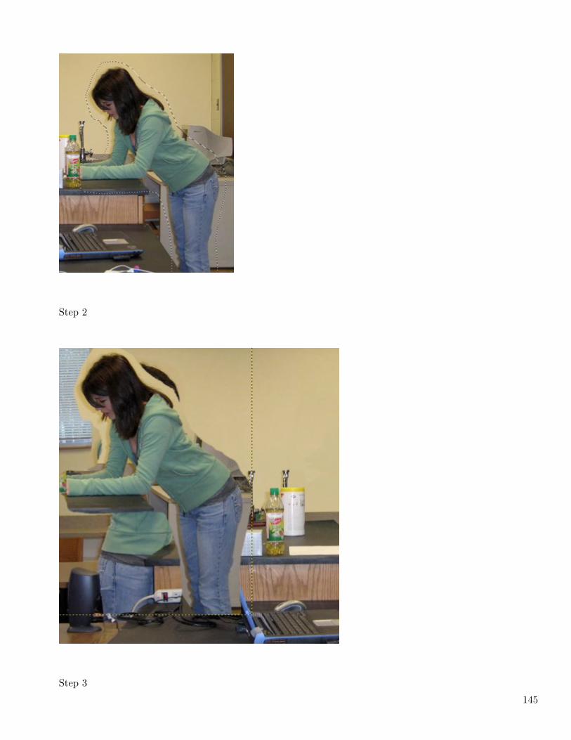
Step 1
144
Step 2
Step 3
145
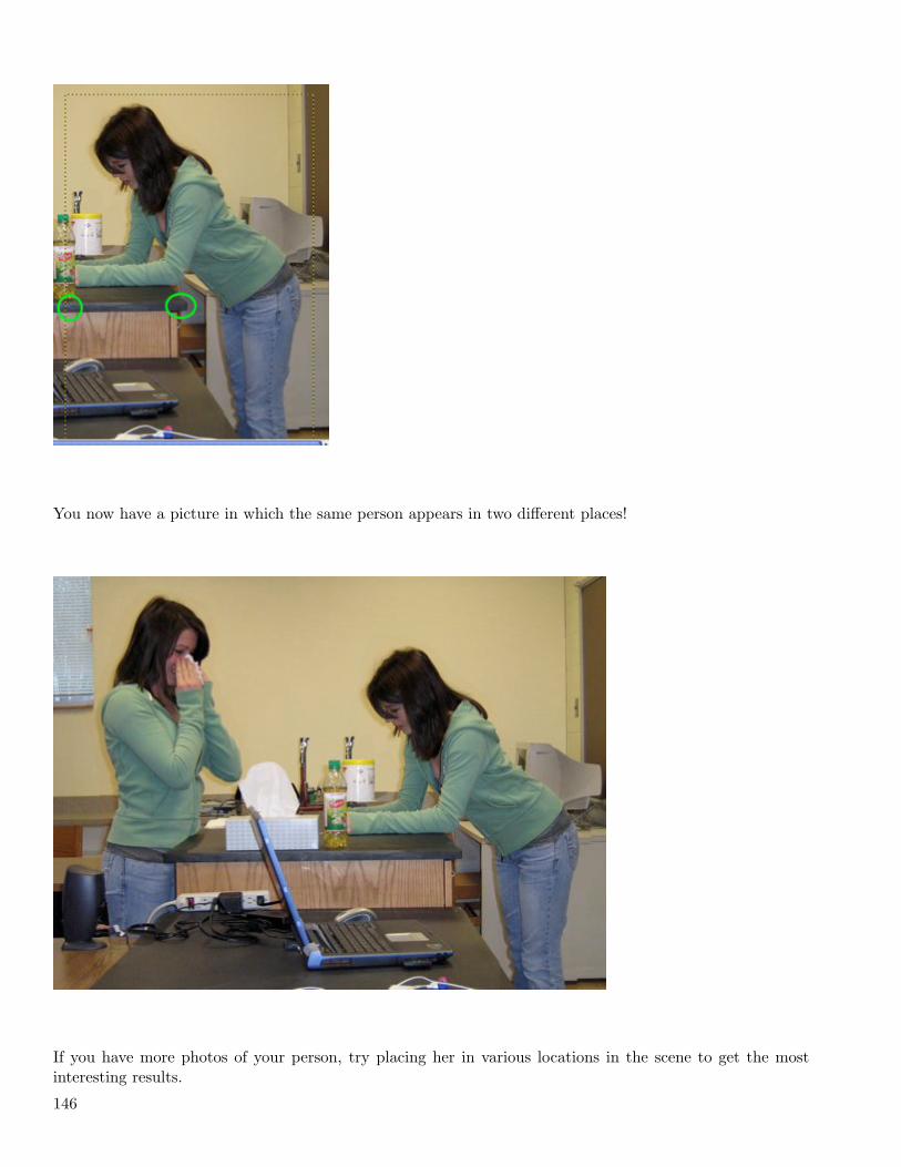
You now have a picture in which the same person appears in two different places!
If you have more photos of your person, try placing her in various locations in the scene to get the mostinteresting results.
146
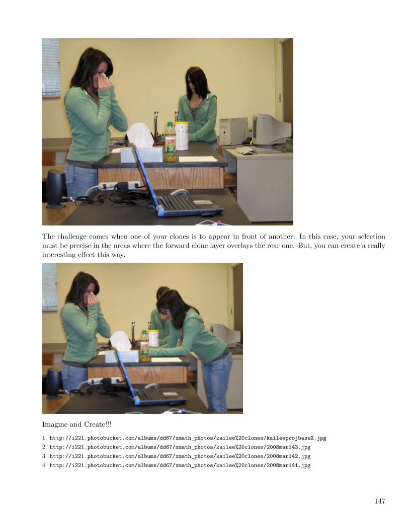
The challenge comes when one of your clones is to appear in front of another. In this case, your selectionmust be precise in the areas where the forward clone layer overlays the rear one. But, you can create a reallyinteresting effect this way.
Imagine and Create!!!
1. http://i221.photobucket.com/albums/dd67/xmath_photos/kailee%20clones/kaileeprojbaseX.jpg
2. http://i221.photobucket.com/albums/dd67/xmath_photos/kailee%20clones/2008mar143.jpg
3. http://i221.photobucket.com/albums/dd67/xmath_photos/kailee%20clones/2008mar142.jpg
4. http://i221.photobucket.com/albums/dd67/xmath_photos/kailee%20clones/2008mar141.jpg
147

148
Chapter 5
2011
5.1 January
Quick and Easy Zoom Effect (2011-01-11 12:43)
In this tutorial you’ll create the effect of having zoomed in on a portion of a screenshot to emphasize some-thing in that area.
This lesson was inspired by Jessica Cam Wong’s very good [1]tutorial on this effect. In this exercise yourproduct may be be less elegant, but you’ll achieve what I believe is a satisfactory and pleasing result a bitmore easily and quickly.A portion of this procedure includes using the GIMP Layer Effects plugin. If you don’t have the LayerEffects plugin installed, you can get it [2]here at the GIMP Plugin Registry.Some of the skills you will use in this exercise:
• Create a new layer from a pasted selection
• Expand a new layer to the size of the image
• Resize (scale) a layer
• Create a selection using Alpha to Selection
• Grow a selection
• Apply the Drop Shadow filter
• Hide, merge, and reveal layers
You will, of course, need a screenshot on which to work. You can capture a screenshot in GIMP using File >Create > Screenshot… . Capture an approximately 700-800 pixel square screenshot using whatever methodyou prefer.
Begin by using the Ellipse Select tool to define the ”zoomed in” area.
149
Then copy and immediately paste this selection (Ctrl+C, Ctrl+V). It looks as though nothing has happened,
but in the Layers pallet you should notice a ”Floating Selection”.
Create a new layer (Layer > New Layer…) which will turn this floating selection into a new layer, name itZoom. Expand this layer to the full image size, Layer > Layer to Image Size.In the Layers pallet, select the Background layer. Scale this layer down to the desired size, Layer > Scale
Layer… . I made the Background layer 400 pixels wide.
Position the Zoom layer over the Background layer as desired.
Right-click the Zoom layer in the Layer pallet and select Alpha to Selection. This creates a selection fromthe zoomed in area.
Grow the selection by 2 pixels, Select > Grow… .
Create a new layer, Border, and use the Bucket Fill tool to fill the selection on the Border layer with black,the foreground color.
In the Layers pallet drag the Border layer below the Zoom layer.
Apply the Inner Shadow script from the Layer Effects plugin, Script-Fu > Layer Effects > Inner Shadow…with the default settings. You can skip this step and still get a fairly nice effect if you don’t want to installthe plugin.
Remove the current selection, Ctrl+Shft+A. Now apply a Drop Shadow to the Zoom layer, Filters > Light
and Shadow > Drop Shadow… . Use the default settings.The next step is to merge the Drop Shadow, Border, and Zoom layers. In the Layers pallet, click the eyeicon for the Background layer to hide it temporarily. Right-click any of the visible layers and select MergeVisible Layers…, then click the Merge button.
Make the Background layer visible again (click where the eye should be) and select that layer.
From here, I’m going to present two different ways to finish this effect. Background BlurBlur the Background layer just a bit, Filters > Blur > Gaussian Blur… , set the Blur Radius at 2 for bothHorizontal and Vertical.
150
Background DimCreate a new layer, named Dim, in the Foreground Color (black). Set the Dim layer’s opacity to about 25%.
Finally, crop out the transparent region around the perimeter, flatten the image, and save it as a JPG orPNG for web use.Experiment with different settings, filters, and colors to get an effect you like. As always, I’ve tried to useone or two less familiar tools or techniques. Hope you learned something and are inspired to try somethingnew.
1. http://www.makeuseof.com/tag/create-simple-zoomed-effect-screenshots-gimp/
2. http://registry.gimp.org/node/186
Make GIMP the Default External Editor in iPhoto (2011-01-18 13:17)
Apple’s iPhoto has some really good editing tools, but sometimes you need the far more powerful toolsavailable in GIMP. You can easily make GIMP the default editor for iPhoto images.
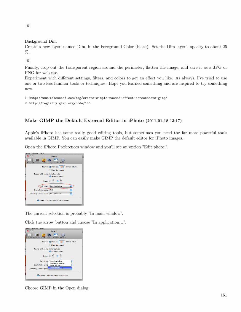
Open the iPhoto Preferences window and you’ll see an option ”Edit photo:”.
The current selection is probably ”In main window”.
Click the arrow button and choose ”In application…”.
Choose GIMP in the Open dialog.
151
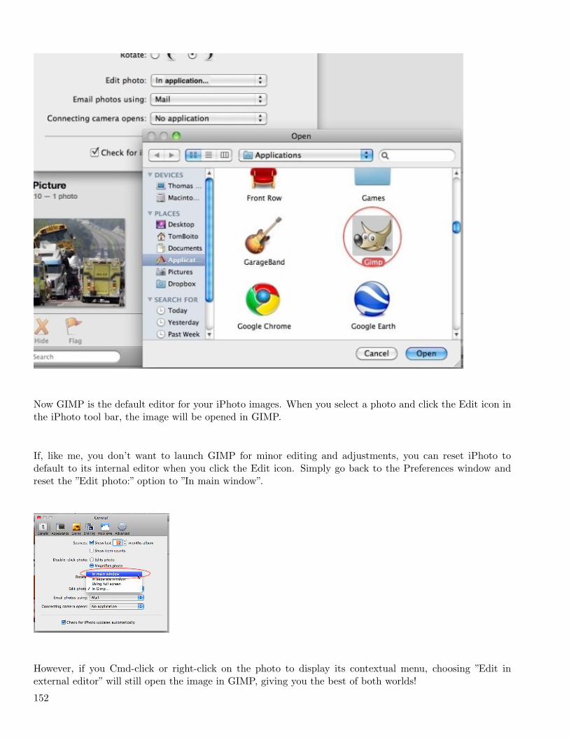
Now GIMP is the default editor for your iPhoto images. When you select a photo and click the Edit icon inthe iPhoto tool bar, the image will be opened in GIMP.
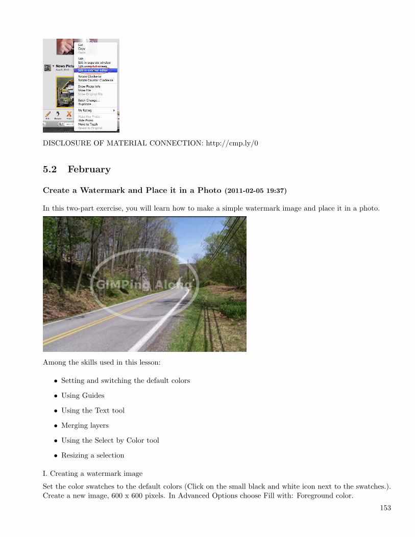
If, like me, you don’t want to launch GIMP for minor editing and adjustments, you can reset iPhoto todefault to its internal editor when you click the Edit icon. Simply go back to the Preferences window andreset the ”Edit photo:” option to ”In main window”.
However, if you Cmd-click or right-click on the photo to display its contextual menu, choosing ”Edit inexternal editor” will still open the image in GIMP, giving you the best of both worlds!
152
DISCLOSURE OF MATERIAL CONNECTION: http://cmp.ly/0
5.2 February
Create a Watermark and Place it in a Photo (2011-02-05 19:37)
In this two-part exercise, you will learn how to make a simple watermark image and place it in a photo.
Among the skills used in this lesson:
• Setting and switching the default colors
• Using Guides
• Using the Text tool
• Merging layers
• Using the Select by Color tool
• Resizing a selection
I. Creating a watermark image
Set the color swatches to the default colors (Click on the small black and white icon next to the swatches.).Create a new image, 600 x 600 pixels. In Advanced Options choose Fill with: Foreground color.
153
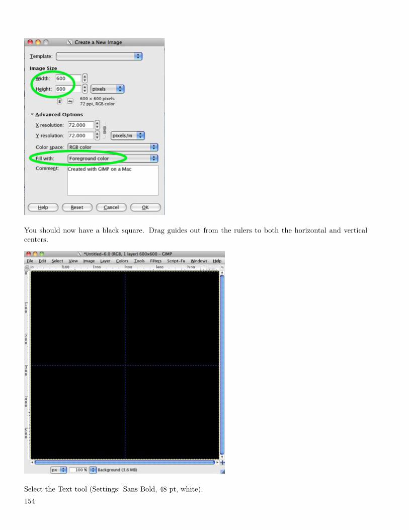
You should now have a black square. Drag guides out from the rulers to both the horizontal and verticalcenters.
Select the Text tool (Settings: Sans Bold, 48 pt, white).
154
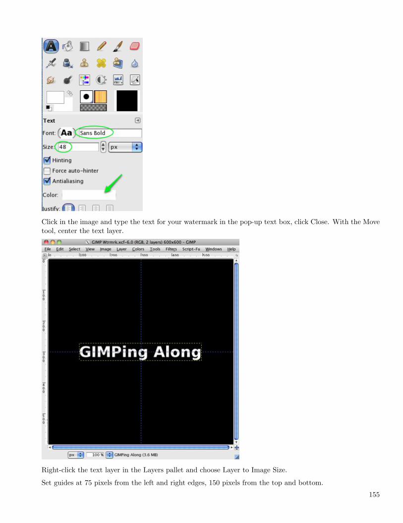
Click in the image and type the text for your watermark in the pop-up text box, click Close. With the Movetool, center the text layer.
Right-click the text layer in the Layers pallet and choose Layer to Image Size.
Set guides at 75 pixels from the left and right edges, 150 pixels from the top and bottom.
155
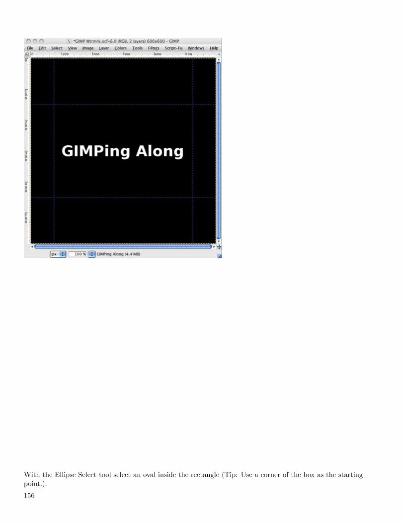
With the Ellipse Select tool select an oval inside the rectangle (Tip: Use a corner of the box as the startingpoint.).
156
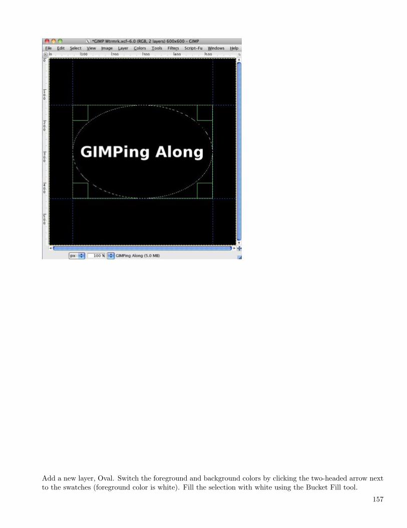
Add a new layer, Oval. Switch the foreground and background colors by clicking the two-headed arrow nextto the swatches (foreground color is white). Fill the selection with white using the Bucket Fill tool.
157
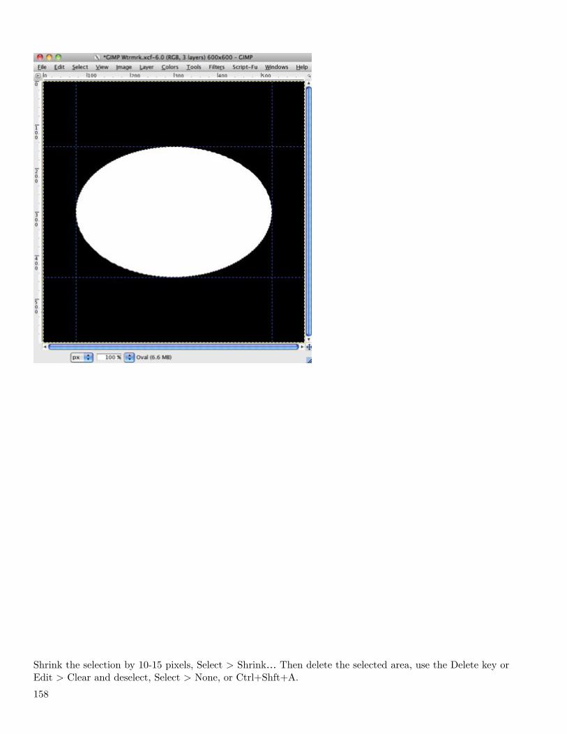
Shrink the selection by 10-15 pixels, Select > Shrink… Then delete the selected area, use the Delete key orEdit > Clear and deselect, Select > None, or Ctrl+Shft+A.
158
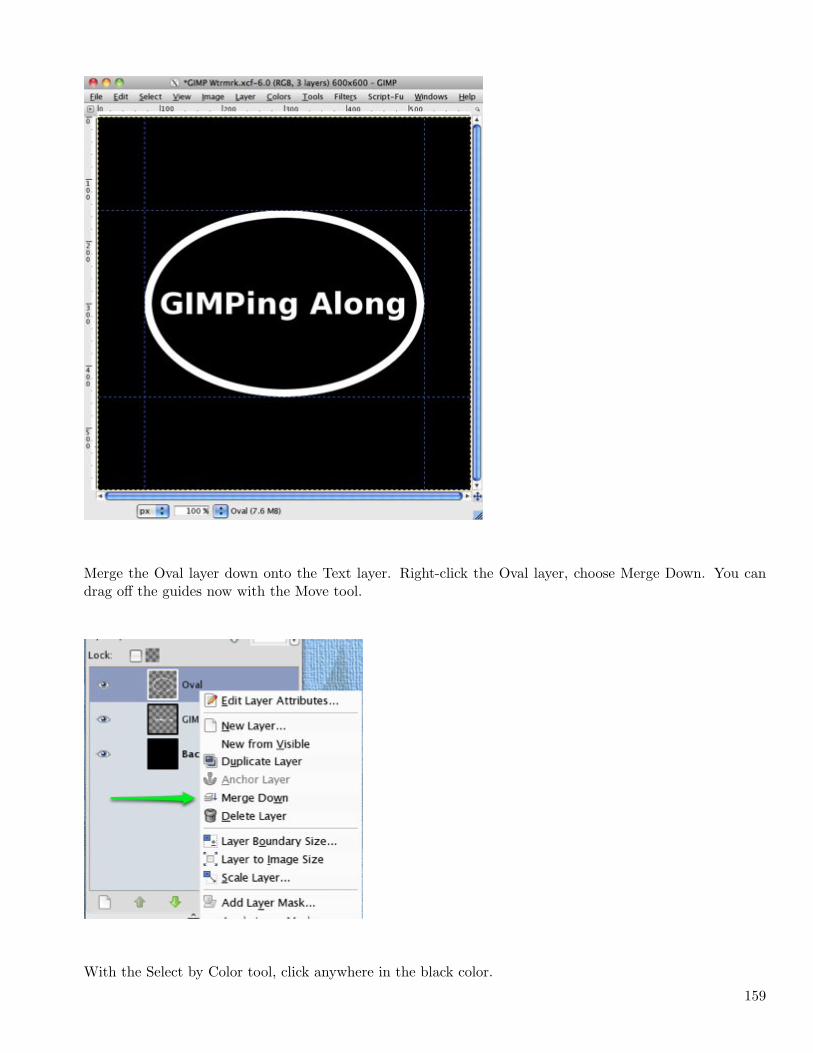
Merge the Oval layer down onto the Text layer. Right-click the Oval layer, choose Merge Down. You candrag off the guides now with the Move tool.
With the Select by Color tool, click anywhere in the black color.
159
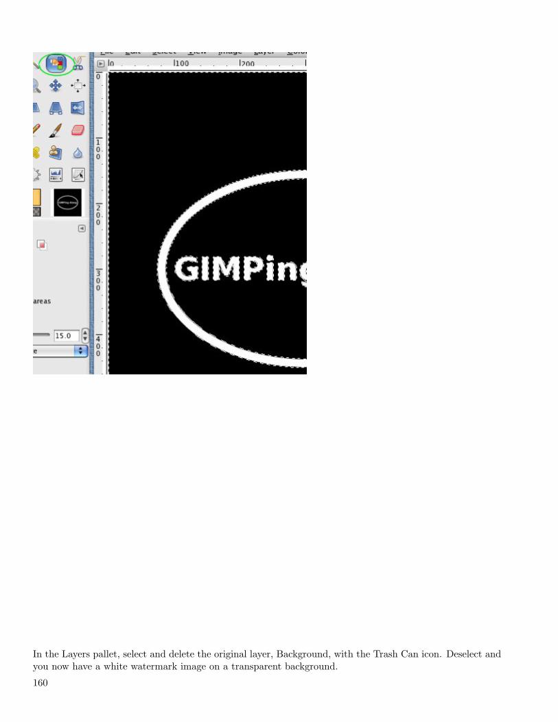
In the Layers pallet, select and delete the original layer, Background, with the Trash Can icon. Deselect andyou now have a white watermark image on a transparent background.
160
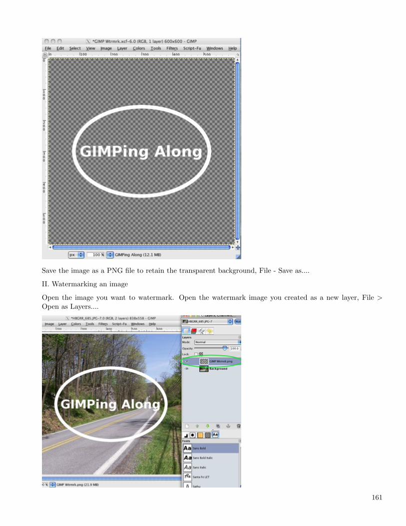
Save the image as a PNG file to retain the transparent background, File - Save as....
II. Watermarking an image
Open the image you want to watermark. Open the watermark image you created as a new layer, File >Open as Layers....
161
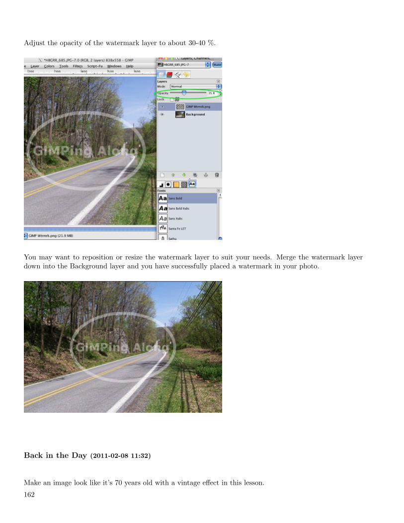
Adjust the opacity of the watermark layer to about 30-40 %.
You may want to reposition or resize the watermark layer to suit your needs. Merge the watermark layerdown into the Background layer and you have successfully placed a watermark in your photo.
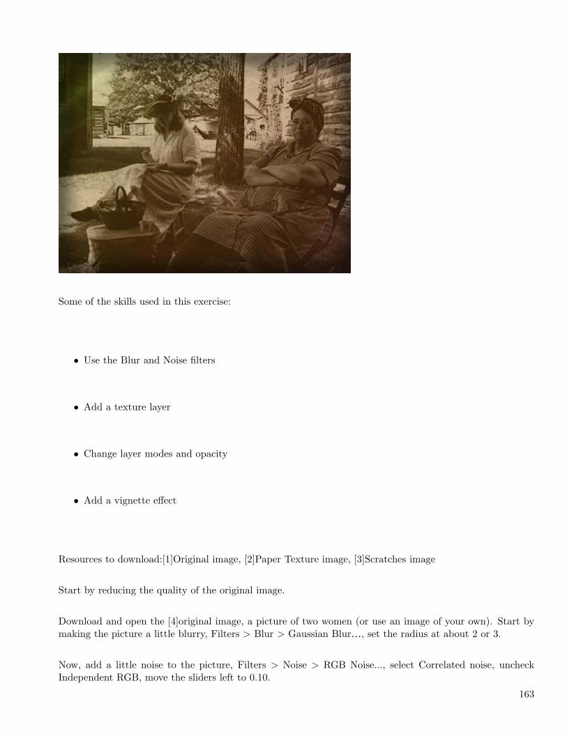
Back in the Day (2011-02-08 11:32)
Make an image look like it’s 70 years old with a vintage effect in this lesson.
162
Some of the skills used in this exercise:
• Use the Blur and Noise filters
• Add a texture layer
• Change layer modes and opacity
• Add a vignette effect
Resources to download:[1]Original image, [2]Paper Texture image, [3]Scratches image
Start by reducing the quality of the original image.
Download and open the [4]original image, a picture of two women (or use an image of your own). Start bymaking the picture a little blurry, Filters > Blur > Gaussian Blur…, set the radius at about 2 or 3.
Now, add a little noise to the picture, Filters > Noise > RGB Noise..., select Correlated noise, uncheckIndependent RGB, move the sliders left to 0.10.
163
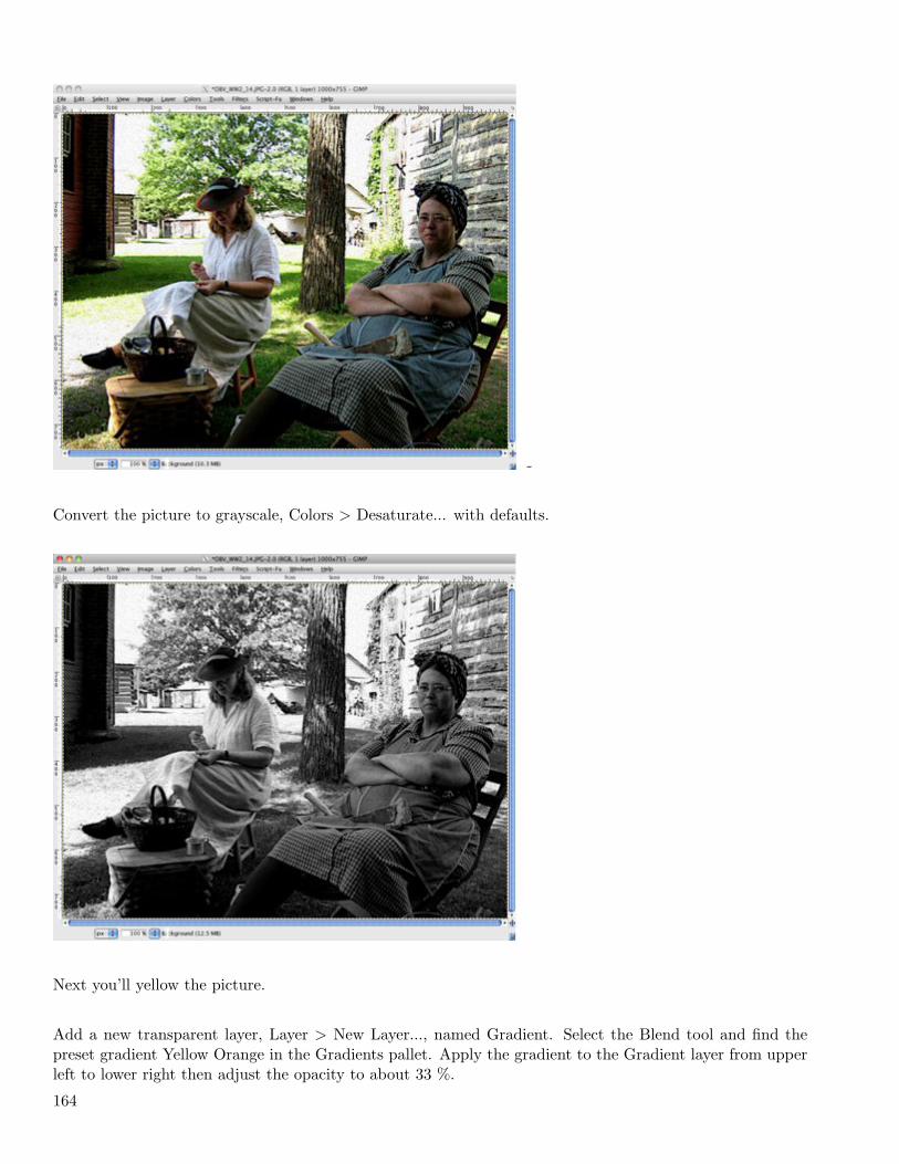
-
Convert the picture to grayscale, Colors > Desaturate... with defaults.
Next you’ll yellow the picture.
Add a new transparent layer, Layer > New Layer..., named Gradient. Select the Blend tool and find thepreset gradient Yellow Orange in the Gradients pallet. Apply the gradient to the Gradient layer from upperleft to lower right then adjust the opacity to about 33 %.
164
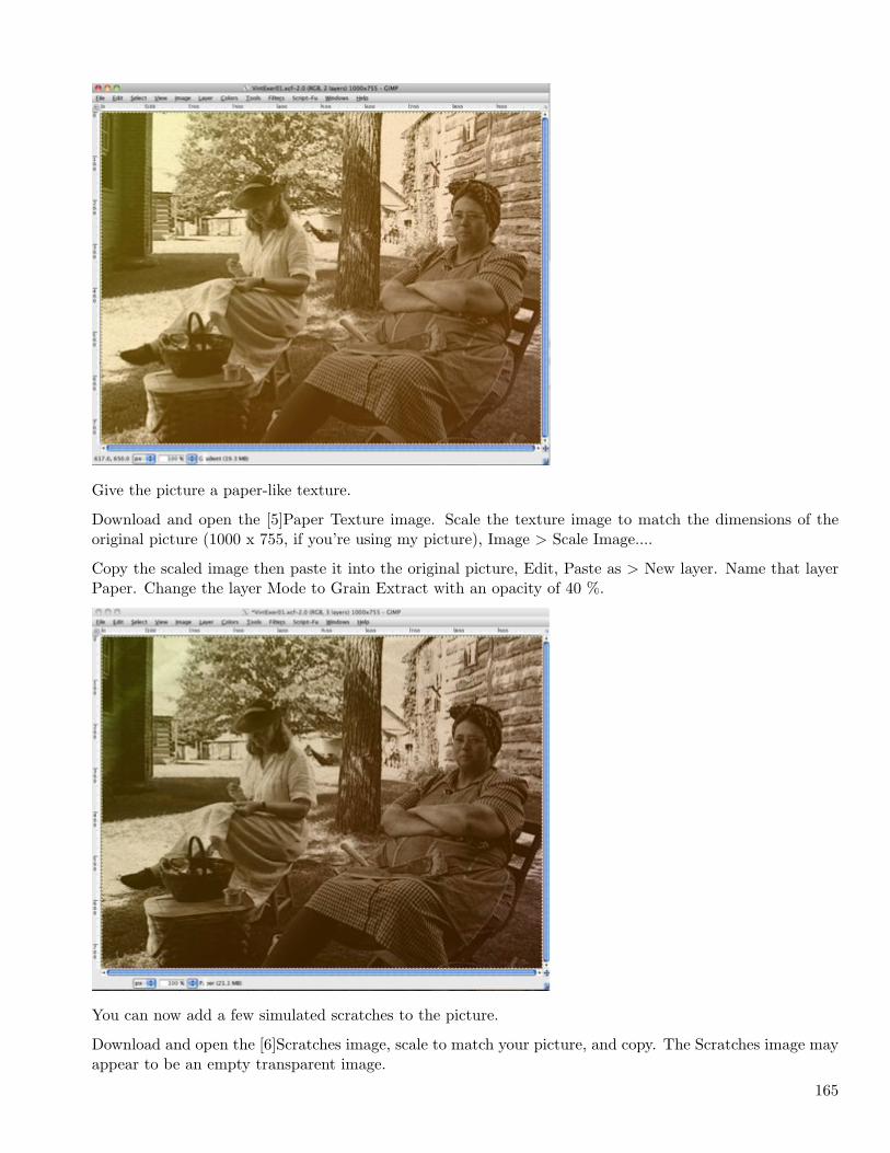
Give the picture a paper-like texture.
Download and open the [5]Paper Texture image. Scale the texture image to match the dimensions of theoriginal picture (1000 x 755, if you’re using my picture), Image > Scale Image....
Copy the scaled image then paste it into the original picture, Edit, Paste as > New layer. Name that layerPaper. Change the layer Mode to Grain Extract with an opacity of 40 %.
You can now add a few simulated scratches to the picture.
Download and open the [6]Scratches image, scale to match your picture, and copy. The Scratches image mayappear to be an empty transparent image.
165
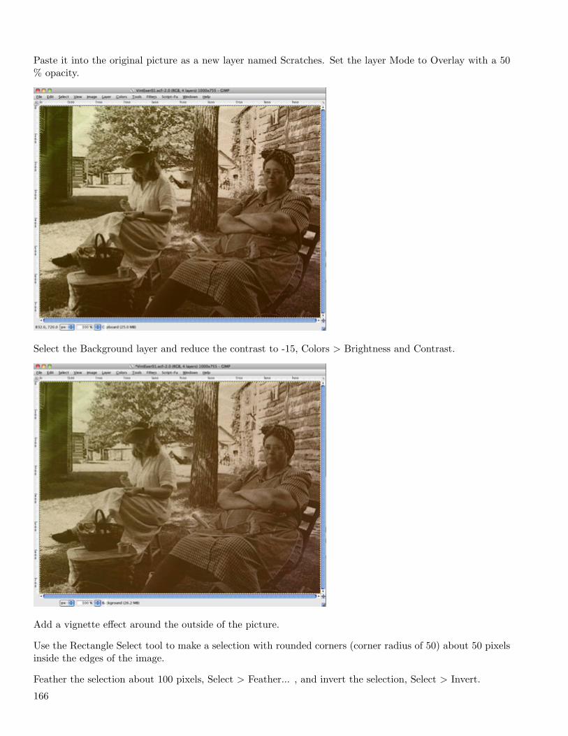
Paste it into the original picture as a new layer named Scratches. Set the layer Mode to Overlay with a 50% opacity.
Select the Background layer and reduce the contrast to -15, Colors > Brightness and Contrast.
Add a vignette effect around the outside of the picture.
Use the Rectangle Select tool to make a selection with rounded corners (corner radius of 50) about 50 pixelsinside the edges of the image.
Feather the selection about 100 pixels, Select > Feather... , and invert the selection, Select > Invert.
166
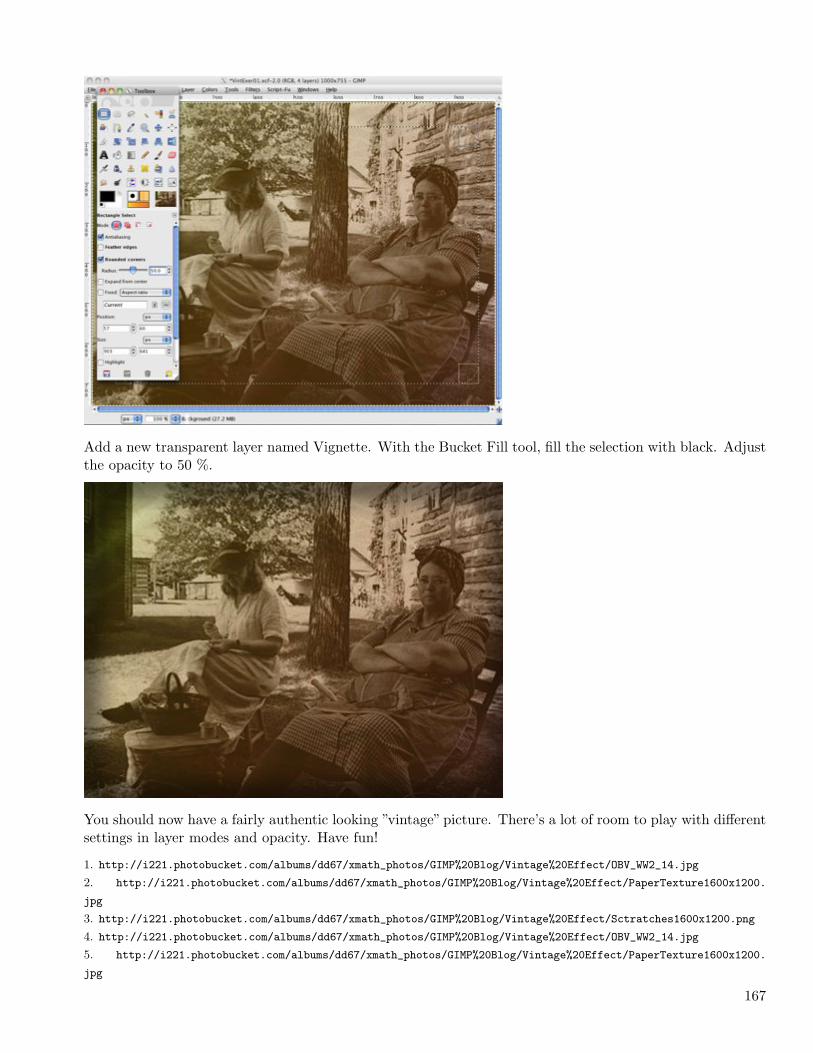
Add a new transparent layer named Vignette. With the Bucket Fill tool, fill the selection with black. Adjustthe opacity to 50 %.
You should now have a fairly authentic looking ”vintage” picture. There’s a lot of room to play with differentsettings in layer modes and opacity. Have fun!
1. http://i221.photobucket.com/albums/dd67/xmath_photos/GIMP%20Blog/Vintage%20Effect/OBV_WW2_14.jpg
2. http://i221.photobucket.com/albums/dd67/xmath_photos/GIMP%20Blog/Vintage%20Effect/PaperTexture1600x1200.
jpg
3. http://i221.photobucket.com/albums/dd67/xmath_photos/GIMP%20Blog/Vintage%20Effect/Sctratches1600x1200.png
4. http://i221.photobucket.com/albums/dd67/xmath_photos/GIMP%20Blog/Vintage%20Effect/OBV_WW2_14.jpg
5. http://i221.photobucket.com/albums/dd67/xmath_photos/GIMP%20Blog/Vintage%20Effect/PaperTexture1600x1200.
jpg
167

6. http://i221.photobucket.com/albums/dd67/xmath_photos/GIMP%20Blog/Vintage%20Effect/Sctratches1600x1200.png
168

BlogBook v0.4,LATEX2ε & GNU/Linux.
http://www.blogbooker.com
Edited: February 11, 2011