Embed Size (px)
Citation preview
ggplot2
Dr. Jennifer (Jenny) BryanDepartment of Statistics and Michael Smith LaboratoriesUniversity of British Columbia
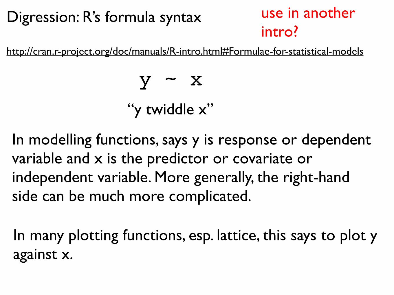
Digression: R’s formula syntax
http://cran.r-project.org/doc/manuals/R-intro.html#Formulae-for-statistical-models
y ~ x“y twiddle x”
In modelling functions, says y is response or dependent variable and x is the predictor or covariate or independent variable. More generally, the right-hand side can be much more complicated.
In many plotting functions, esp. lattice, this says to plot y against x.
use in another intro?

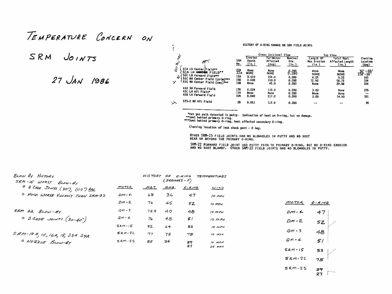
“A picture is worth a thousand words”
http://msnbcmedia1.msn.com/j/msnbc/Components/Photos/050709/050609_columbia_hmed_6p.hmedium.jpg
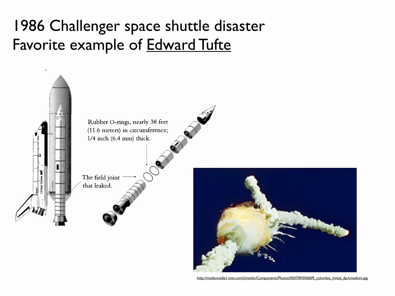
1986 Challenger space shuttle disasterFavorite example of Edward Tufte
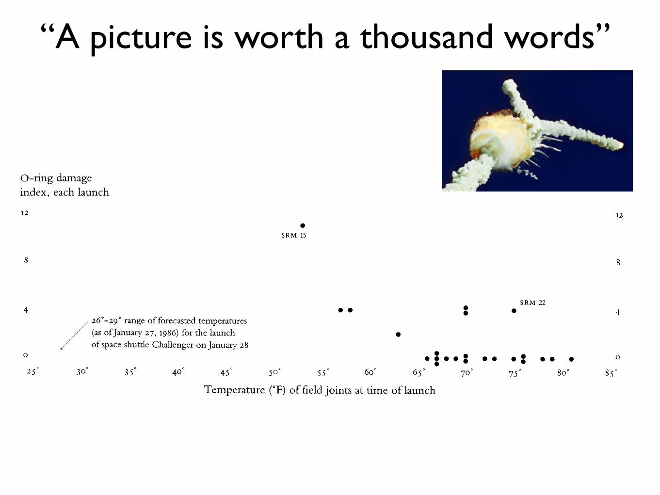
“A picture is worth a thousand words”
“A picture is worth a thousand words”
Siddhartha R. Dalal; Edward B. Fowlkes; Bruce Hoadley. Risk Analysis of the Space Shuttle: Pre-Challenger Prediction of Failure. JASA, Vol. 84, No. 408 (Dec., 1989), pp. 945-957. Access via JSTOR.

Edward Tuftehttp://www.edwardtufte.com
BOOK:Visual Explanations: Images and Quantities, Evidence and Narrative
Ch. 5 deals with the Challenger disasterThat chapter is available for $7 as a downloadable booklet:http://www.edwardtufte.com/tufte/books_textb
“A picture is worth a thousand words”
Always, always, always plot the data.
Replace (or complement) ‘typical’ tables of data or statistical results with figures that are more compelling and accessible.
Whenever possible, generate figures that overlay / juxtapose observed data and analytical results, e.g. the ‘fit’.
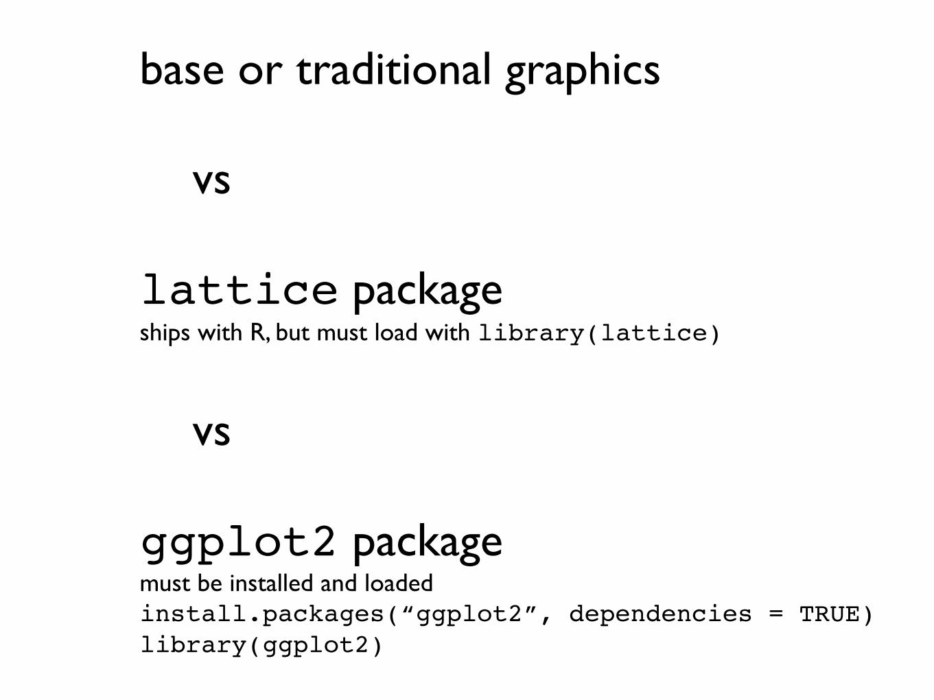
base or traditional graphics
vs
lattice packageships with R, but must load with library(lattice)
vs
ggplot2 packagemust be installed and loadedinstall.packages(“ggplot2”, dependencies = TRUE)library(ggplot2)
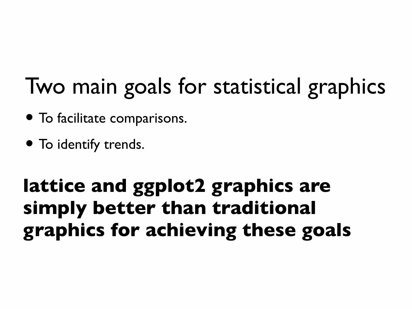
Two main goals for statistical graphics• To facilitate comparisons.
• To identify trends.
lattice and ggplot2 graphics are simply better than traditional graphics for achieving these goals
Assignment 1: Best Set of Graphs
2000 6000 10000 14000
4055
70
Year of 1950
Income per PersonLife
Exp
ecta
ncy
at B
irth
(yrs
)
0 5000 10000 15000
5065
Year of 1955
Income per PersonLife
Exp
ecta
ncy
at B
irth
(yrs
)
0 5000 10000 15000
3050
70
Year of 1960
Income per PersonLife
Exp
ecta
ncy
at B
irth
(yrs
)
0 5000 10000 15000 20000
5565
Year of 1965
Income per PersonLife
Exp
ecta
ncy
at B
irth
(yrs
)
0 5000 10000 20000
6470
Year of 1970
Income per PersonLife
Exp
ecta
ncy
at B
irth
(yrs
)
0 5000 10000 20000
6470
Year of 1975
Income per PersonLife
Exp
ecta
ncy
at B
irth
(yrs
)
0 5000 15000 25000
6672
Year of 1980
Income per PersonLife
Exp
ecta
ncy
at B
irth
(yrs
)
10000 15000 20000 25000 30000
7076
Year of 1985
Income per PersonLife
Exp
ecta
ncy
at B
irth
(yrs
)
lattice
base
Income per person (GDP/capita, inflation−adjusted $)
Life
exp
ecta
ncy
at b
irth
(yea
rs)
304050607080
10^2.5 10^3.5 10^4.5
●●
●
●
●●
●
●●●
●
● ●●●
●
●●
●●
●
●
●
●
●
●
●●
●●
●
●
●
●
●
●
●
●
●●
●
●
●
●
●
●
●
●
●
●
●
●
1962
Afric
a
●●
●
●●
● ●
● ●
●●
●
●●●
●
●
●●
●
●
●●
●●
●●
●●
●
●
●
●
●
●
●
●
●
●●
●
●
●
●
●
●
●
●
●
●
●
●
1977
Afric
a
10^2.5 10^3.5 10^4.5
●
●
●●
●●●
●●●
●
●
●
●●●
●
● ●
●
●
●● ●
●
●
●●
●
●
●
●
●
●
● ●
●●
●
●
●●
●
●
●
●
●
●
●
●
●
●
1992
Afric
a
●
●
●● ●
●●●
● ●
●
●
●
●
●●●●
●
●●
●
●
●
●
●
●
●●
●
●
●
●
●●
●
●
●
●
●
●
●
●
●
●
●
●
●
●
●
●
●
2007
Afric
a
●●●
●●
●
●
●●
●
●
●
● ●
●●
●●
●
●●
●
●●
●
1962
Amer
icas ●●
●●
●
●
●●
●
●
●
●
●●
●
●
●
●
●
●
●●● ●
1977
Amer
icas ●●● ●
●
●●
●●
●
●
●
●
●
●●●
●
●●
●●●●
1992
Amer
icas
304050607080
●●● ●●
● ●●
●●
●
●
●●
●●●●
● ●●●
●●
2007
Amer
icas
304050607080
●
●
●●●
●●●
●●
●
●
●
●
●
●●
●
●●
●
●●
●
●
●● ●
●
●
●
1962
Asia
●
●
●●●
●●●
●●
●●
●
●
●
●●
●
●●
●
● ●
●
●
●
●
●
●
●
●
1977
Asia ●
●
●●● ● ●●
●
●
●●
●
●
●
● ●
●
●
●
●
●●
●
●
●
●
●●
●
●
1992
Asia ●●
●●● ●●
●
●
●
●
●
●
●●
●
●
●●
●
●●
●
●
●●
●
●
●●
2007
Asia
●●●●●●
●
●
●●
●●
●
●●
●
●●
●●
●●
●
●
●
●
●
●
●
●
1962Eu
rope
10^2.5 10^3.5 10^4.5
●●●●
●
●●●
●●●
●●
●● ●
●●
●●
●●
●●
●
●
●●
●
●
1977
Euro
pe
●●
●●●●●●
●
●
●●
●●●
●
●
●●
●
●●●
●
●
●
●●
●
●
1992
Euro
pe
10^2.5 10^3.5 10^4.5
304050607080●
●●●●●●●
●●● ●●
● ●
●●●
●
●
●
● ●
● ●●
●●
●
●
2007
Euro
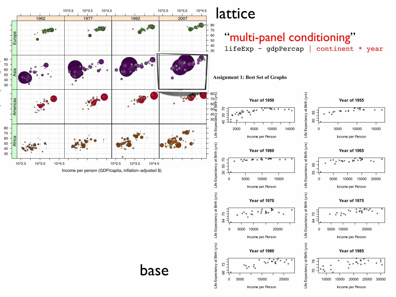
pe “multi-panel conditioning”lifeExp ~ gdpPercap | continent * year
ggplot2
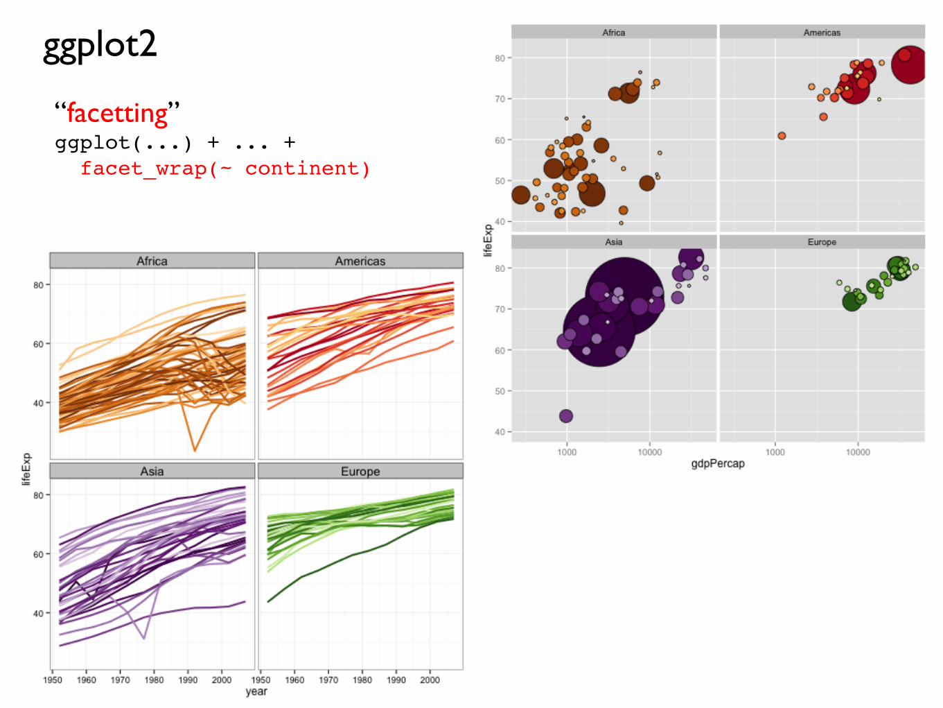
“facetting”ggplot(...) + ... + facet_wrap(~ continent)
Income per person (GDP/capita, inflation−adjusted $)
Life
exp
ecta
ncy
at b
irth
(yea
rs)
30
40
50
60
70
80
1000 10000
●
●
●
●
●
●
●
●●
●
●
●
●●
●●
●
●
●
●●
●
●
●●
●
●
●
●
●
●
●
●
●
●
●
●
●
●
●
●●●
●
●
●
●
●
●
●
●
●
●
●
●
●
●
●
●
● ●●
●
●
●
●
●
●
●
●
●
●
●
●
●
●
●
●●
●
●
●
●
●
●
●
●
●
●●
●●
●
●
●
●
●
● ●
●
●
●
●
●●
●
●
●
●
●
●
●
●●
●
●
●
●● ●●
●
●
●
●
●
●
●
●
●
●
●
●
●
●
●
●
●
●
1962
●
●
●
●
●
●●●
●●● ●●
●
●
●
●
●
● ●
●
●
●
●●
●●
●●
●●
●
●
●
●
●
●
●
●●
●
●
●
●●
●
●●
●● ●
● ●
●
●
●
●●
●
●
●
●
●
●
●
●
●
●
●
●
●●
●
●
●
●
●●
●●
●
●
●
●
●
●
●
●
●
●
●●
●
●
●
●
●
●
●
●
●●
●
●
●
●
●
●●
●
●
●
●
●●
●
●
●
●●
●●
●
●
●
●
●
●
●
●
●
●
●
●
●
●
1977
●
●●
● ● ●●●
●●●
●
●
●
●
● ●
●●●●
●
●●
●●
●
●●
●●
●
●●
●
●
●
●
●
●
●
●●
●
●
●
●●
●
●
●
●
●
●
●
●
●
●
●●
●
●
●
●●
●
●●●
●
●
●
●
●
●
●
●
●
●
●
●
●
●
●
●
●
●
●
●
● ●
●
●
●
●●
●
●
●●●
●
●
●
●
●
●●
●
●
●
●
●
●
●
●
●
●
●
●
●●
●
●
●
●
●
●
●
●
●
●
●
●
1992
1000 10000
30
40
50
60
70
80●
●●●
●
●
●●●
●
●●●●
●
●
●
●
●●●
●●
●
●
●
●
●
●
● ●
●
●●
●
●
●
●
●
●
●
●
●
●
●●
●●
●
●
●
●
●
●
●●
●
●
●
● ●● ●
●
●
●● ●
●
●
●
●
●
●
●
●
●
●
●
●●
●
●●
●
●
●●
●
●
●
●
●
●
●●
● ●
●
●●
●
●
●
●
●
● ●
●
● ●
●
●
●
●
●
●
●
●
●
●
●
●
●
●
●
●
●
●
●
●
●
●
2007
AfricaAmericasAsiaEuropeOceania
●
●
●
●
●
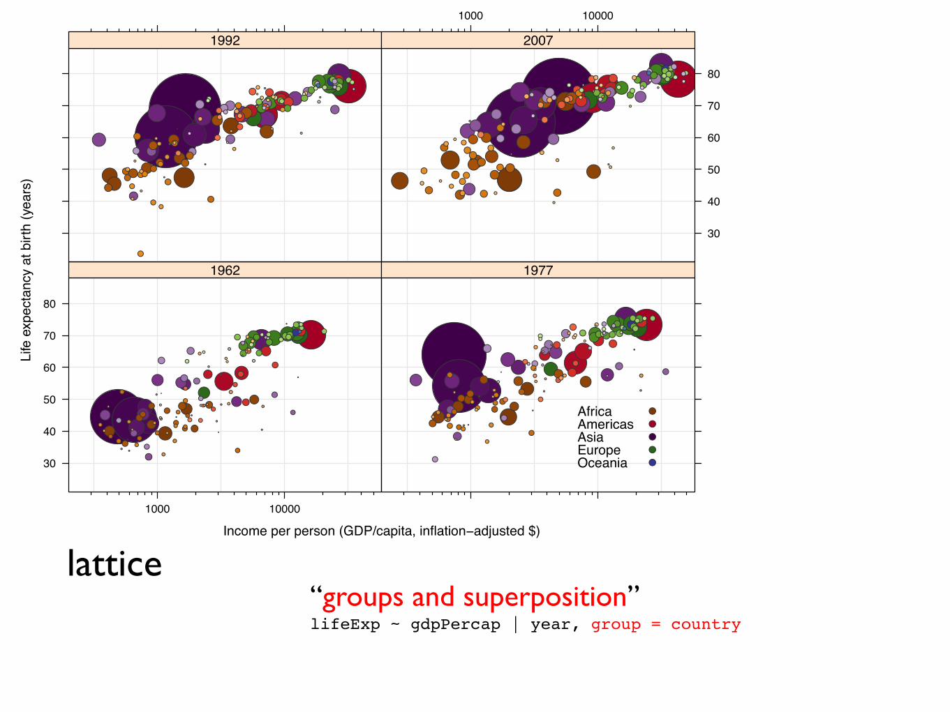
lattice“groups and superposition”lifeExp ~ gdpPercap | year, group = country
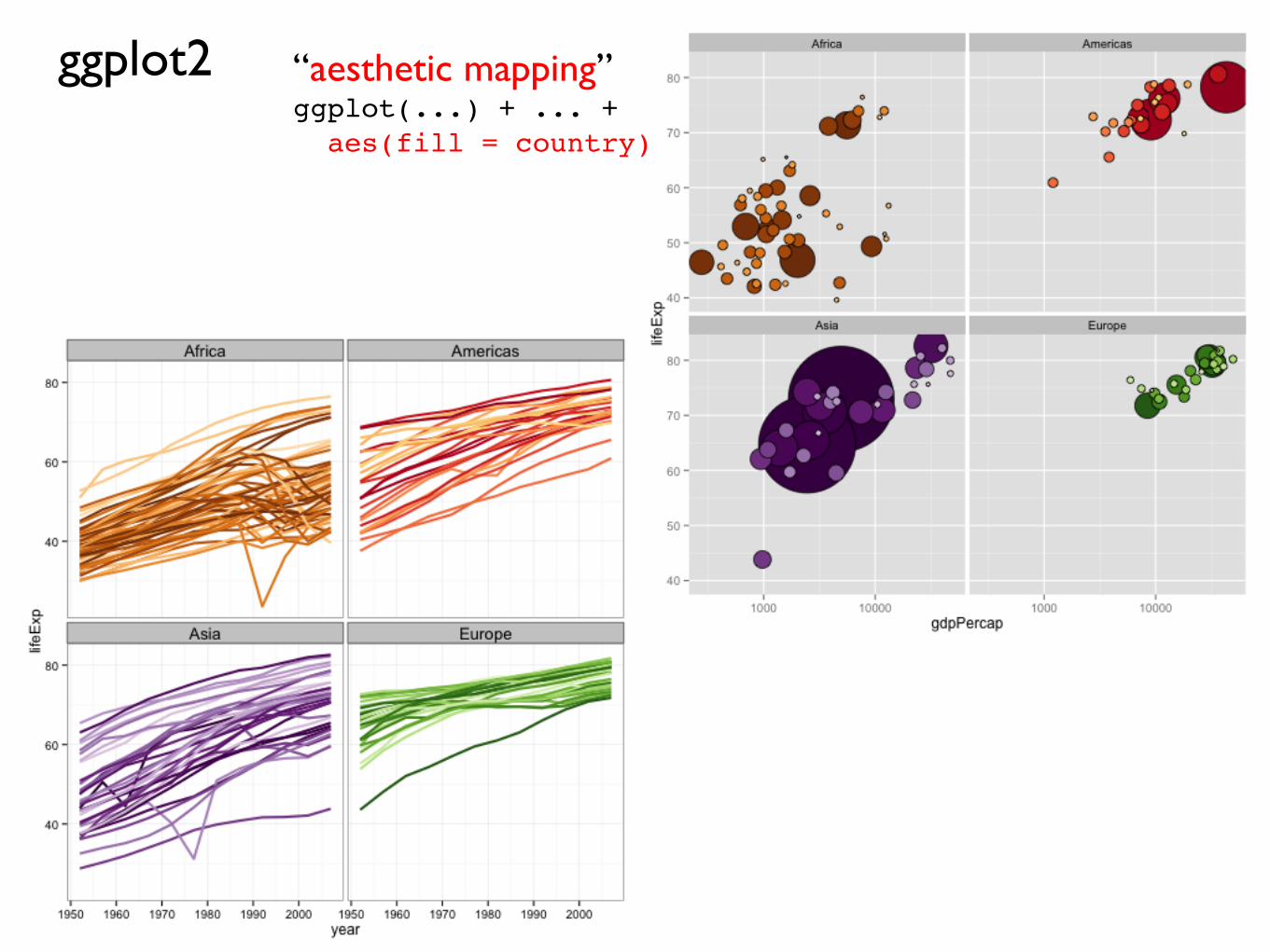
ggplot2 “aesthetic mapping”ggplot(...) + ... + aes(fill = country)
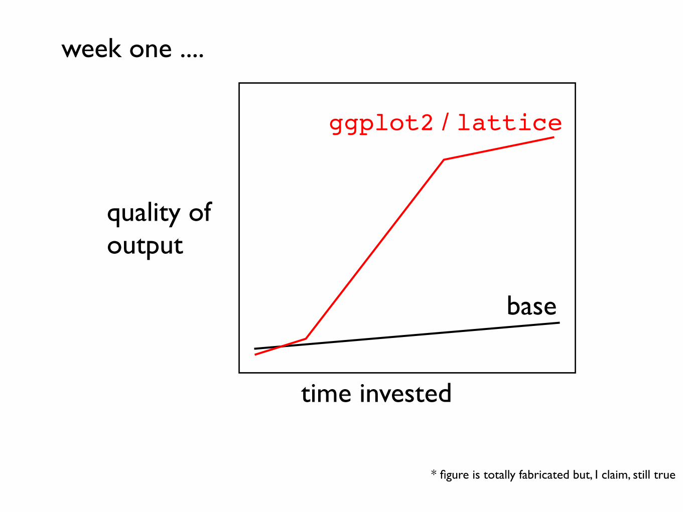
time invested
quality of output
* figure is totally fabricated but, I claim, still true
base
ggplot2 / lattice
week one ....
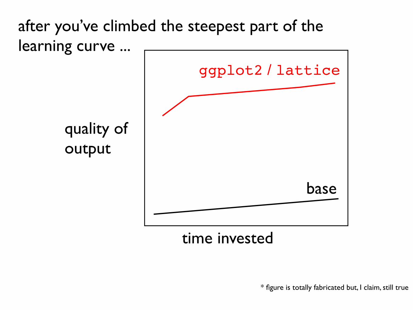
time invested
quality of output
* figure is totally fabricated but, I claim, still true
base
after you’ve climbed the steepest part of the learning curve ...
ggplot2 / lattice
Data Visualization with R & ggplot2
Karthik Ram
September 2, 2013
Data Visualization with R & ggplot2 Karthik Ram
Next few slides borrowed from here:
Some housekeeping
Install some packages (make sure you also have recent copies of
reshape2 and plyr)
install.packages("ggplot2", dependencies = TRUE)
Data Visualization with R & ggplot2 Karthik Ram
Why ggplot2?
•Follows a grammar, just like any language.
•It defines basic components that make up a sentence. In this
case, the grammar defines components in a plot.
•Grammar of graphics originally coined by Lee Wilkinson
Data Visualization with R & ggplot2 Karthik Ram
Why ggplot2?
•Supports a continuum of expertise.
•Get started right away but with practice you can e↵ortless
build complex, publication quality figures.
Data Visualization with R & ggplot2 Karthik Ram
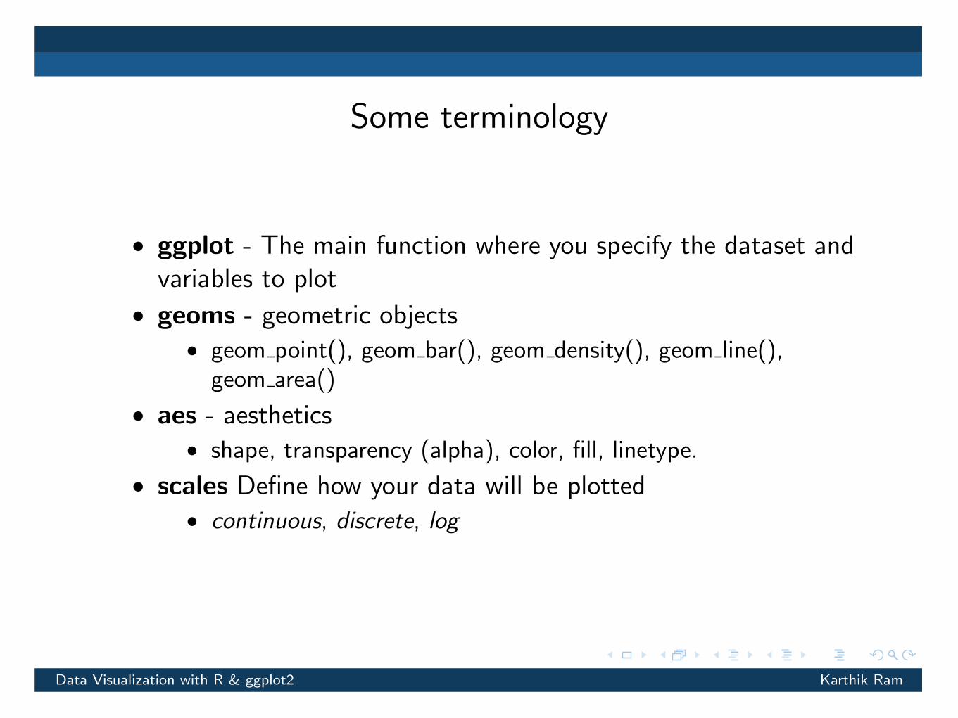
Some terminology
•ggplot - The main function where you specify the dataset and
variables to plot
•geoms - geometric objects
•geom point(), geom bar(), geom density(), geom line(),
geom area()
•aes - aesthetics
•shape, transparency (alpha), color, fill, linetype.
•scales Define how your data will be plotted
•continuous, discrete, log
Data Visualization with R & ggplot2 Karthik Ram
30 3 Mastering the grammar
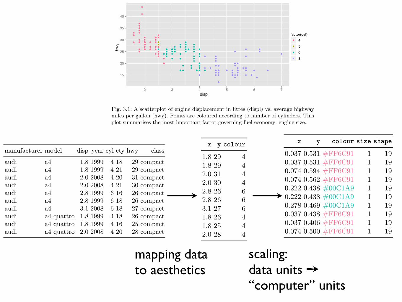
This new dataset is a result of applying the aesthetic mappings to the originaldata. We can create many di!erent types of plots using this data. The scatter-plot uses points, but were we instead to draw lines we would get a line plot. Ifwe used bars, we’d get a bar plot. Neither of those examples makes sense forthis data, but we could still draw them, as in Figure 3.2. In ggplot2 we canproduce many plots that don’t make sense, yet are grammatically valid. Thisis no di!erent than English, where we can create senseless but grammaticalsentences like the angry rock barked like a comma.
x y colour
1.8 29 41.8 29 42.0 31 42.0 30 42.8 26 62.8 26 63.1 27 61.8 26 41.8 25 42.0 28 4
Table 3.2: First 10 rows from mpg rearranged into the format required for a scatterplot.This data frame contains all the data to be displayed on the plot.
displ
hwy
15
20
25
30
35
40
2 3 4 5 6 7
displ
hwy
0
10
20
30
40
2 3 4 5 6 7
Fig. 3.2: Instead of using points to represent the data, we could use other geoms likelines (left) or bars (right). Neither of these geoms makes sense for this data, but theyare still grammatically valid.
28 3 Mastering the grammar
This chapter begins by describing in detail the process of drawing a simpleplot. Section 3.3 starts with a simple scatterplot, then Section 3.4 makes itmore complex by adding a smooth line and faceting. While working throughthese examples you will be introduced to all six components of the grammar,which are then defined more precisely in Section 3.5. The chapter concludeswith Section 3.6, which describes how the various components map to datastructures in R.
3.2 Fuel economy data
Consider the fuel economy dataset, mpg, a sample of which is illustrated inTable 3.1. It records make, model, class, engine size, transmission and fueleconomy for a selection of US cars in 1999 and 2008. It contains the 38 modelsthat were updated every year, an indicator that the car was a popular model.These models include popular cars like the Audi A4, Honda Civic, HyundaiSonata, Nissan Maxima, Toyota Camry and Volkswagen Jetta. This datacomes from the EPA fuel economy website, http://fueleconomy.gov.
manufacturer model disp year cyl cty hwy class
audi a4 1.8 1999 4 18 29 compactaudi a4 1.8 1999 4 21 29 compactaudi a4 2.0 2008 4 20 31 compactaudi a4 2.0 2008 4 21 30 compactaudi a4 2.8 1999 6 16 26 compactaudi a4 2.8 1999 6 18 26 compactaudi a4 3.1 2008 6 18 27 compactaudi a4 quattro 1.8 1999 4 18 26 compactaudi a4 quattro 1.8 1999 4 16 25 compactaudi a4 quattro 2.0 2008 4 20 28 compact
Table 3.1: The first 10 cars in the mpg dataset, included in the ggplot2 package. ctyand hwy record miles per gallon (mpg) for city and highway driving, respectively,and displ is the engine displacement in litres.
This dataset suggests many interesting questions. How are engine size andfuel economy related? Do certain manufacturers care more about economythan others? Has fuel economy improved in the last ten years? We will try toanswer the first question and in the process learn more details about how thescatterplot is created.
3.3 Building a scatterplot 29
3.3 Building a scatterplot
Consider Figure 3.1, one attempt to answer this question. It is a scatterplot oftwo continuous variables (engine displacement and highway mpg), with pointscoloured by a third variable (number of cylinders). From your experience inthe previous chapter, you should have a pretty good feel for how to create thisplot with qplot(). But what is going on underneath the surface? How doesggplot2 draw this plot?
qplot(displ, hwy, data = mpg, colour = factor(cyl))
displ
hwy
15
20
25
30
35
40
!!
!!
!!
!! !
!
!
!!!
!
!
!
!!
!
!!
!!
!
!!!
!
!
!!
!!
!
!!
!
!! !!!
!
!
!
!!
!
!
!!
!
!
!!!
!
!
!
!
!!
!
!
!
!!
!
!
!
!!
!
!
!
!
!!!! !!
!!
!!!
!! !!!
!!
!
!
!
!!
!!
!
!!
! !
!!
!!! !
!
!
!
!!
!!
!
!
!!
!
!!!
!
!!
!
!
!!!
! !
!!
!
! !!!
!
!
!
!!
!
!!!
!
!!
!
!!!
!! !
!
!
!
!
! !
!
!
!!
!
!
!!
!
!!
!
!
!
!
!
!!
!
!!
!
!!!
!
!!
!
!
! !!
!
!!!!
!
!
!!!!
!
!
!
!!
!!
! !
!
!!
!!
!!
!
!
!
!
2 3 4 5 6 7
factor(cyl)! 4
! 5
! 6
! 8
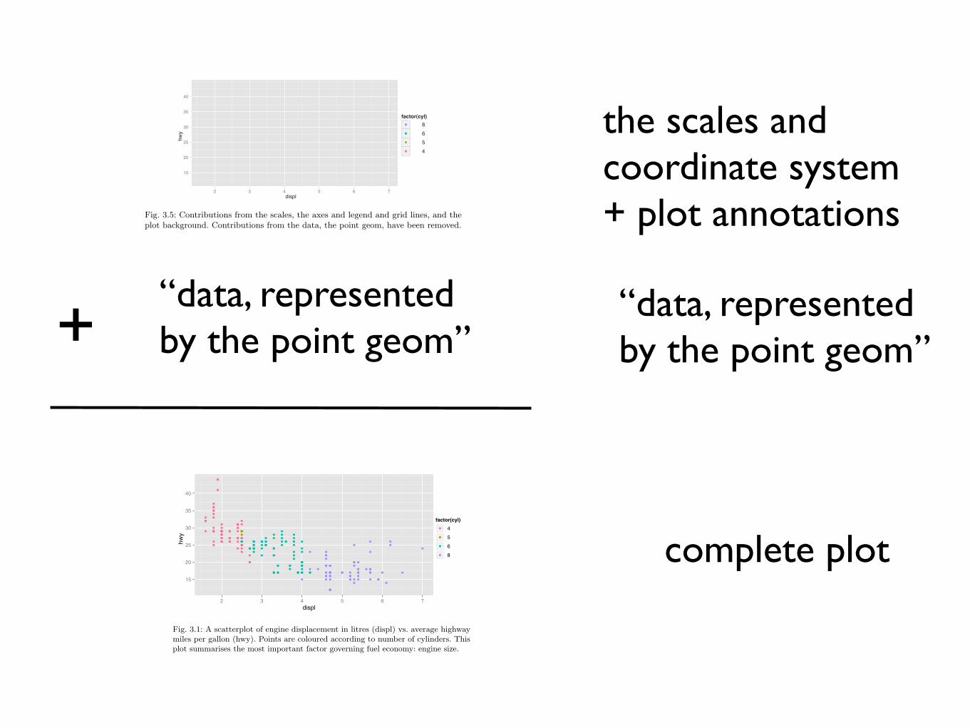
Fig. 3.1: A scatterplot of engine displacement in litres (displ) vs. average highwaymiles per gallon (hwy). Points are coloured according to number of cylinders. Thisplot summarises the most important factor governing fuel economy: engine size.
Mapping aesthetics to data
What precisely is a scatterplot? You have seen many before and have probablyeven drawn some by hand. A scatterplot represents each observation as apoint (•), positioned according to the value of two variables. As well as ahorizontal and vertical position, each point also has a size, a colour and ashape. These attributes are called aesthetics, and are the properties that canbe perceived on the graphic. Each aesthetic can be mapped to a variable, orset to a constant value. In Figure 3.1 displ is mapped to horizontal position,hwy to vertical position and cyl to colour. Size and shape are not mapped tovariables, but remain at their (constant) default values.
Once we have these mappings we can create a new dataset that records thisinformation. Table 3.2 shows the first 10 rows of the data behind Figure 3.1.
mapping data to aesthetics
32 3 Mastering the grammar
to physical units (e.g., pixels and colours) that the computer can display. Thisconversion process is called scaling and performed by scales. Now that thesevalues are meaningful to the computer, they may not be meaningful to us:colours are represented by a six-letter hexadecimal string, sizes by a numberand shapes by an integer. These aesthetic specifications that are meaningfulto R are described in Appendix B.
In this example, we have three aesthetics that need to be scaled: horizontalposition (x), vertical position (y) and colour. Scaling position is easy in thisexample because we are using the default linear scales. We need only a linearmapping from the range of the data to [0, 1]. We use [0, 1] instead of exactpixels because the drawing system that ggplot2 uses, grid, takes care of thatfinal conversion for us. A final step determines how the two positions (x andy) are combined to form the final location on the plot. This is done by thecoordinate system, or coord. In most cases this will be Cartesian coordinates,but it might be polar coordinates, or a spherical projection used for a map.
The process for mapping the colour is a little more complicated, as we havea non-numeric result: colours. However, colours can be thought of as havingthree components, corresponding to the three types of colour-detecting cells inthe human eye. These three cell types give rise to a three-dimensional colourspace. Scaling then involves mapping the data values to points in this space.There are many ways to do this, but here since cyl is a categorical variable wemap values to evenly spaced hues on the colour wheel, as shown in Figure 3.4.A di!erent mapping is used when the variable is continuous.
The result of these conversions is Table 3.4, which contains values thathave meaning to the computer. As well as aesthetics that have been mappedto variable, we also include aesthetics that are constant. We need these so thatthe aesthetics for each point are completely specified and R can draw the plot.
x y colour size shape
0.037 0.531 #FF6C91 1 190.037 0.531 #FF6C91 1 190.074 0.594 #FF6C91 1 190.074 0.562 #FF6C91 1 190.222 0.438 #00C1A9 1 190.222 0.438 #00C1A9 1 190.278 0.469 #00C1A9 1 190.037 0.438 #FF6C91 1 190.037 0.406 #FF6C91 1 190.074 0.500 #FF6C91 1 19
Table 3.4: Simple dataset with variables mapped into aesthetic space. The descriptionof colours is intimidating, but this is the form that R uses internally. Default valuesfor other aesthetics are filled in: the points will be filled circles (shape 19 in R) witha 1-mm diameter.
scaling:data units ➙ “computer” units
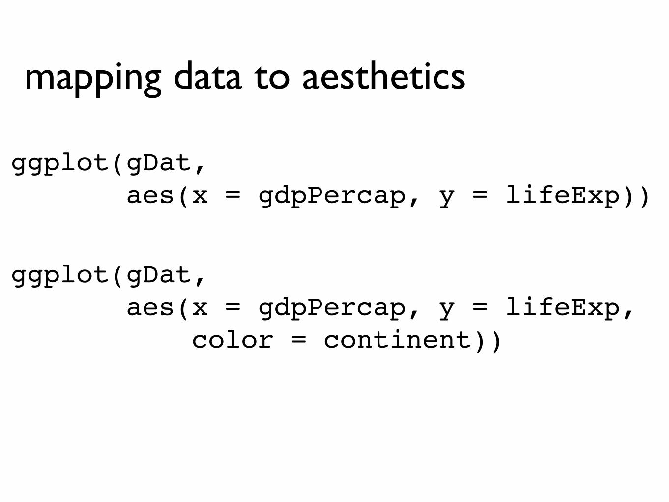
ggplot(gDat, aes(x = gdpPercap, y = lifeExp))
mapping data to aesthetics
ggplot(gDat, aes(x = gdpPercap, y = lifeExp, color = continent))
3.3 Building a scatterplot 29
3.3 Building a scatterplot
Consider Figure 3.1, one attempt to answer this question. It is a scatterplot oftwo continuous variables (engine displacement and highway mpg), with pointscoloured by a third variable (number of cylinders). From your experience inthe previous chapter, you should have a pretty good feel for how to create thisplot with qplot(). But what is going on underneath the surface? How doesggplot2 draw this plot?
qplot(displ, hwy, data = mpg, colour = factor(cyl))
displ
hwy
15
20
25
30
35
40
!!
!!
!!
!! !
!
!
!!!
!
!
!
!!
!
!!
!!
!
!!!
!
!
!!
!!
!
!!
!
!! !!!
!
!
!
!!
!
!
!!
!
!
!!!
!
!
!
!
!!
!
!
!
!!
!
!
!
!!
!
!
!
!
!!!! !!
!!
!!!
!! !!!
!!
!
!
!
!!
!!
!
!!
! !
!!
!!! !
!
!
!
!!
!!
!
!
!!
!
!!!
!
!!
!
!
!!!
! !
!!
!
! !!!
!
!
!
!!
!
!!!
!
!!
!
!!!
!! !
!
!
!
!
! !
!
!
!!
!
!
!!
!
!!
!
!
!
!
!
!!
!
!!
!
!!!
!
!!
!
!
! !!
!
!!!!
!
!
!!!!
!
!
!
!!
!!
! !
!
!!
!!
!!
!
!
!
!
2 3 4 5 6 7
factor(cyl)! 4
! 5
! 6
! 8
Fig. 3.1: A scatterplot of engine displacement in litres (displ) vs. average highwaymiles per gallon (hwy). Points are coloured according to number of cylinders. Thisplot summarises the most important factor governing fuel economy: engine size.
Mapping aesthetics to data
What precisely is a scatterplot? You have seen many before and have probablyeven drawn some by hand. A scatterplot represents each observation as apoint (•), positioned according to the value of two variables. As well as ahorizontal and vertical position, each point also has a size, a colour and ashape. These attributes are called aesthetics, and are the properties that canbe perceived on the graphic. Each aesthetic can be mapped to a variable, orset to a constant value. In Figure 3.1 displ is mapped to horizontal position,hwy to vertical position and cyl to colour. Size and shape are not mapped tovariables, but remain at their (constant) default values.
Once we have these mappings we can create a new dataset that records thisinformation. Table 3.2 shows the first 10 rows of the data behind Figure 3.1.
3.3 Building a scatterplot 33
Fig. 3.4: A colour wheel illustrating the choice of five equally spaced colours. This isthe default scale for discrete variables.
Finally, we need to render this data to create the graphical objects thatare displayed on the screen. To create a complete plot we need to combinegraphical objects from three sources: the data, represented by the point geom;the scales and coordinate system, which generate axes and legends so that wecan read values from the graph; and plot annotations, such as the backgroundand plot title. Figure 3.5 separates the contribution of the data from thecontributions of the scales and plot annotations.
hw
y
15
20
25
30
35
40
displ2 3 4 5 6 7
factor(cyl)● 8● 6● 5● 4
Fig. 3.5: Contributions from the scales, the axes and legend and grid lines, and theplot background. Contributions from the data, the point geom, have been removed.
“data, represented by the point geom”+
complete plot
“data, represented by the point geom”
the scales and coordinate system + plot annotations
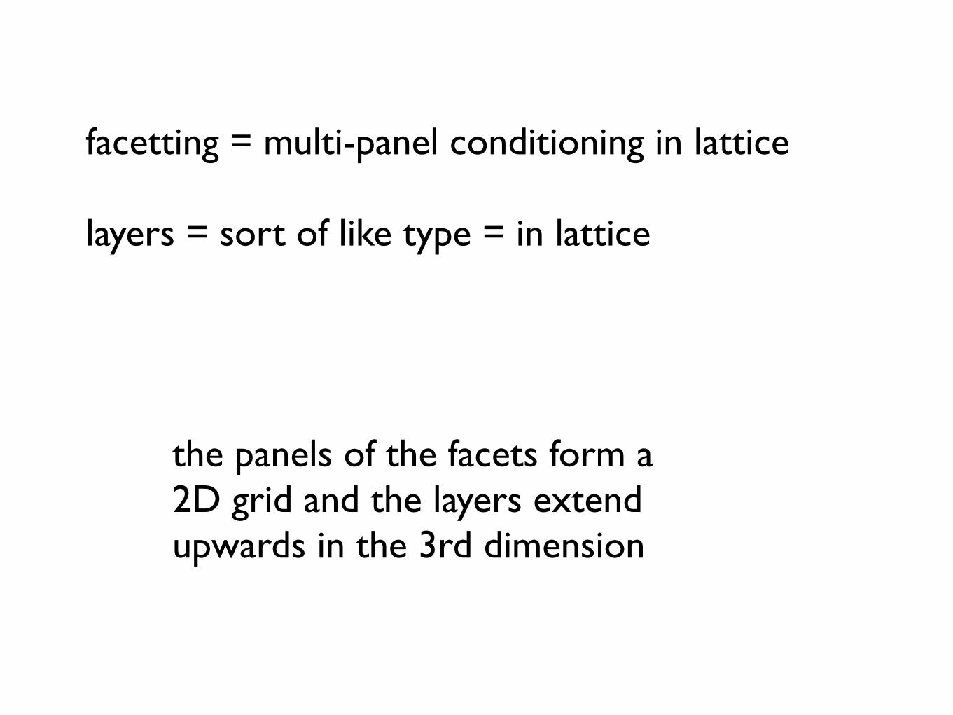
facetting = multi-panel conditioning in lattice
layers = sort of like type = in lattice
the panels of the facets form a 2D grid and the layers extend upwards in the 3rd dimension
36 3 Mastering the grammar
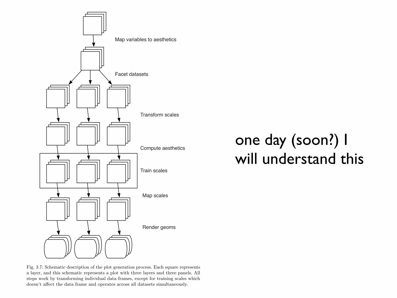
Map variables to aesthetics
Facet datasets
Transform scales
Train scales
Map scales
Render geoms
Compute aesthetics
Fig. 3.7: Schematic description of the plot generation process. Each square representsa layer, and this schematic represents a plot with three layers and three panels. Allsteps work by transforming individual data frames, except for training scales whichdoesn’t a!ect the data frame and operates across all datasets simultaneously.
one day (soon?) I will understand this
3.5 Components of the layered grammar 37
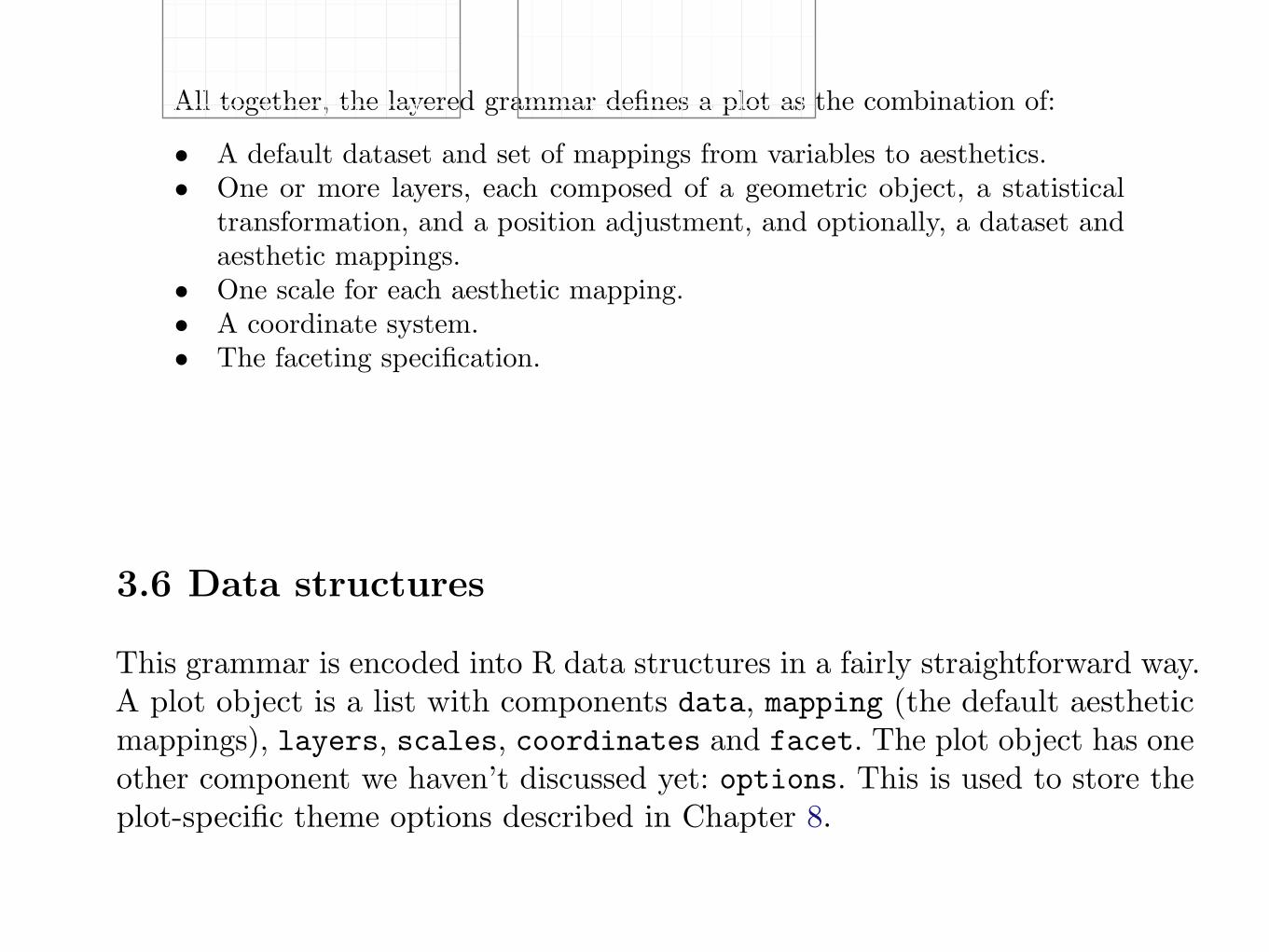
which deals with overlapping graphic objects. Together, the data, mappings,stat, geom and position adjustment form a layer. A plot may have multiplelayers, as in the example where we overlaid a smoothed line on a scatterplot.All together, the layered grammar defines a plot as the combination of:
• A default dataset and set of mappings from variables to aesthetics.• One or more layers, each composed of a geometric object, a statistical
transformation, and a position adjustment, and optionally, a dataset andaesthetic mappings.
• One scale for each aesthetic mapping.• A coordinate system.• The faceting specification.
The following sections describe each of the higher level components moreprecisely, and point you to the parts of the book where they are documented.
3.5.1 Layers
Layers are responsible for creating the objects that we perceive on the plot.A layer is composed of four parts:
• data and aesthetic mapping,• a statistical transformation (stat),• a geometric object (geom)• and a position adjustment.
The properties of a layer are described in Chapter 4 and how they can be usedto visualise data in Chapter 5.
3.5.2 Scales
A scale controls the mapping from data to aesthetic attributes, and we needa scale for every aesthetic used on a plot. Each scale operates across all thedata in the plot, ensuring a consistent mapping from data to aesthetics. Somescales are illustrated in Figure 3.8.
A scale is a function, and its inverse, along with a set of parameters. Forexample, the colour gradient scale maps a segment of the real line to a paththrough a colour space. The parameters of the function define whether thepath is linear or curved, which colour space to use (e.g., LUV or RGB), andthe colours at the start and end.
The inverse function is used to draw a guide so that you can read valuesfrom the graph. Guides are either axes (for position scales) or legends (foreverything else). Most mappings have a unique inverse (i.e., the mappingfunction is one-to-one), but many do not. A unique inverse makes it possibleto recover the original data, but this is not always desirable if we want to focusattention on a single aspect.
Chapter 6 describes scales in detail.
3.6 Data structures 39
1
2
3
4
5
2 4 6 8 10
1
2
3
4
5
2 4 6 8 10
1
2
3
4
5
2
4
6
8
10
Fig. 3.9: Examples of axes and grid lines for three coordinate systems: Cartesian,semi-log and polar. The polar coordinate system illustrates the di!culties associatedwith non-Cartesian coordinates: it is hard to draw the axes well.
specification describes which variables should be used to split up the data, andwhether position scales should be free or constrained. Faceting is described inChapter 7.
3.6 Data structures
This grammar is encoded into R data structures in a fairly straightforward way.A plot object is a list with components data, mapping (the default aestheticmappings), layers, scales, coordinates and facet. The plot object has oneother component we haven’t discussed yet: options. This is used to store theplot-specific theme options described in Chapter 8.
Plots can be created in two ways: all at once with qplot(), as shown inthe previous chapter, or piece-by-piece with ggplot() and layer functions, asdescribed in the next chapter. Once you have a plot object, there are a fewthings you can do with it:
• Render it on screen, with print(). This happens automatically whenrunning interactively, but inside a loop or function, you’ll need to print()it yourself.
• Render it to disk, with ggsave(), described in Section 8.3.• Briefly describe its structure with summary().• Save a cached copy of it to disk, with save(). This saves a complete copy
of the plot object, so you can easily re-create that exact plot with load().Note that data is stored inside the plot, so that if you change the dataoutside of the plot, and then redraw a saved plot, it will not be updated.
The following code illustrates some of these tools.
> p <- qplot(displ, hwy, data = mpg, colour = factor(cyl))> summary(p)
saving figures to file
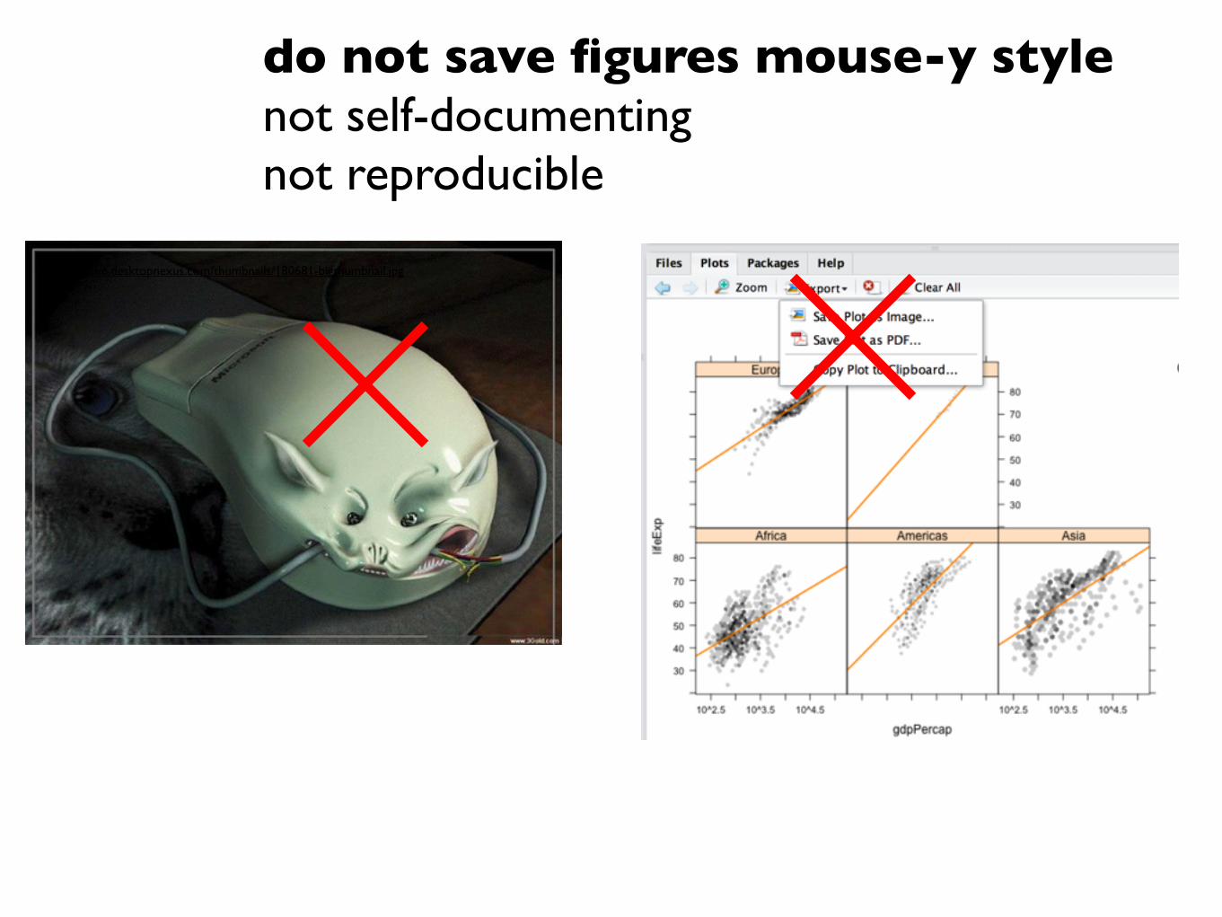
do not save figures mouse-y stylenot self-documentingnot reproducible
http://cache.desktopnexus.com/thumbnails/180681-bigthumbnail.jpg
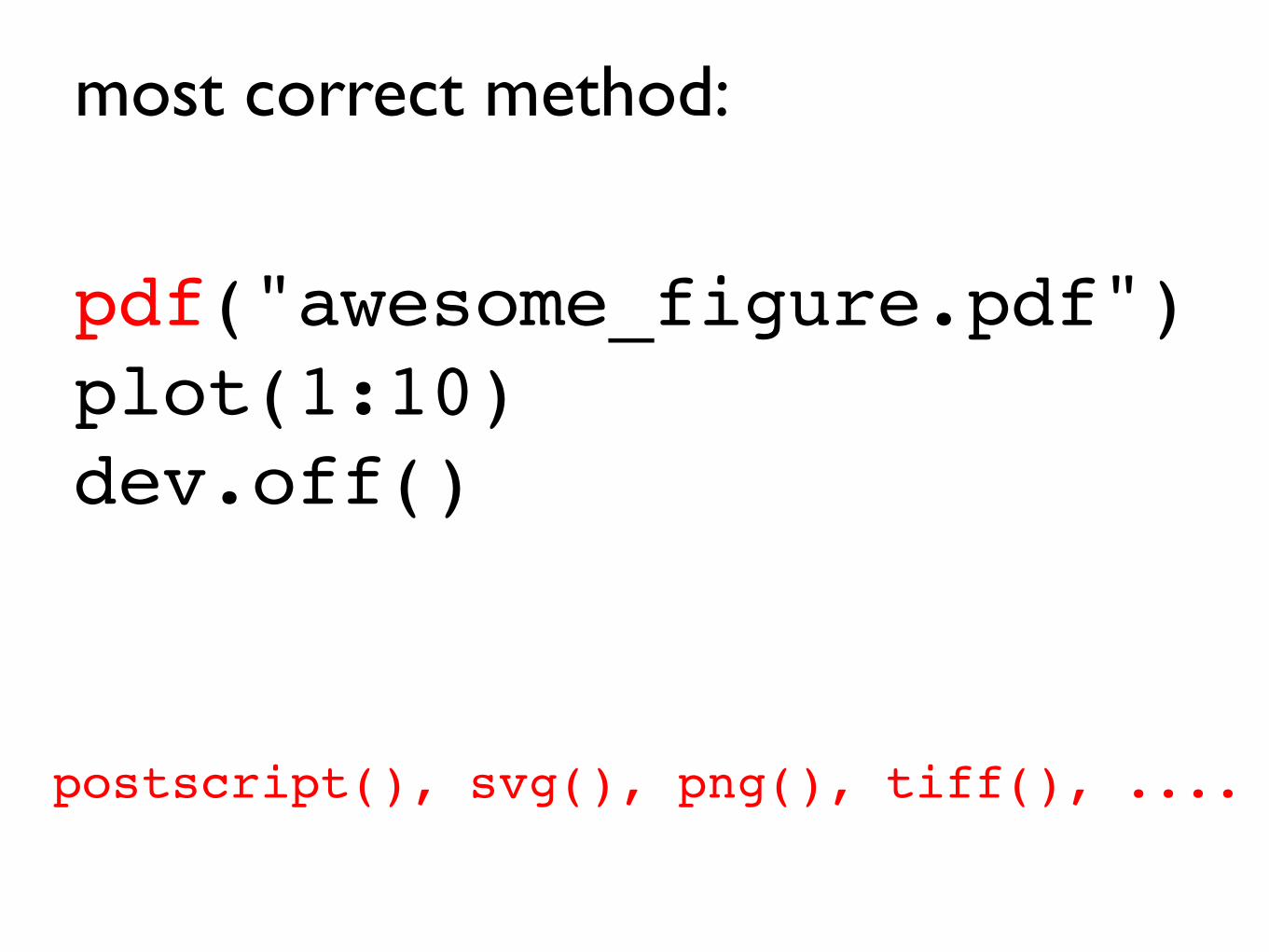
pdf("awesome_figure.pdf")plot(1:10)dev.off()
postscript(), svg(), png(), tiff(), ....
most correct method:
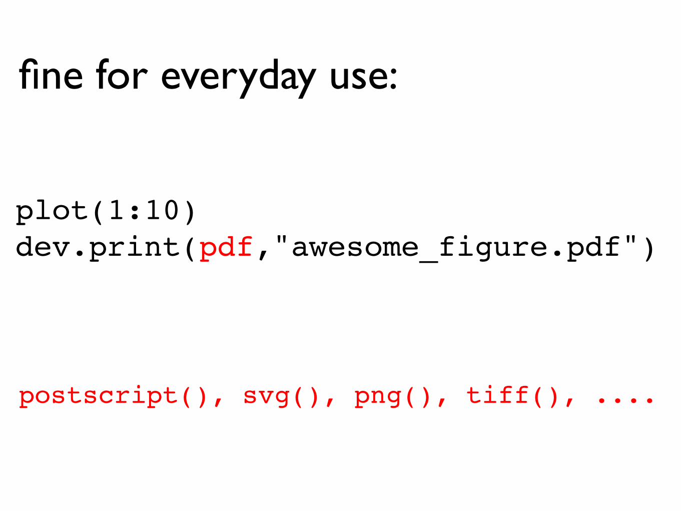
plot(1:10)dev.print(pdf,"awesome_figure.pdf")
fine for everyday use:
postscript(), svg(), png(), tiff(), ....
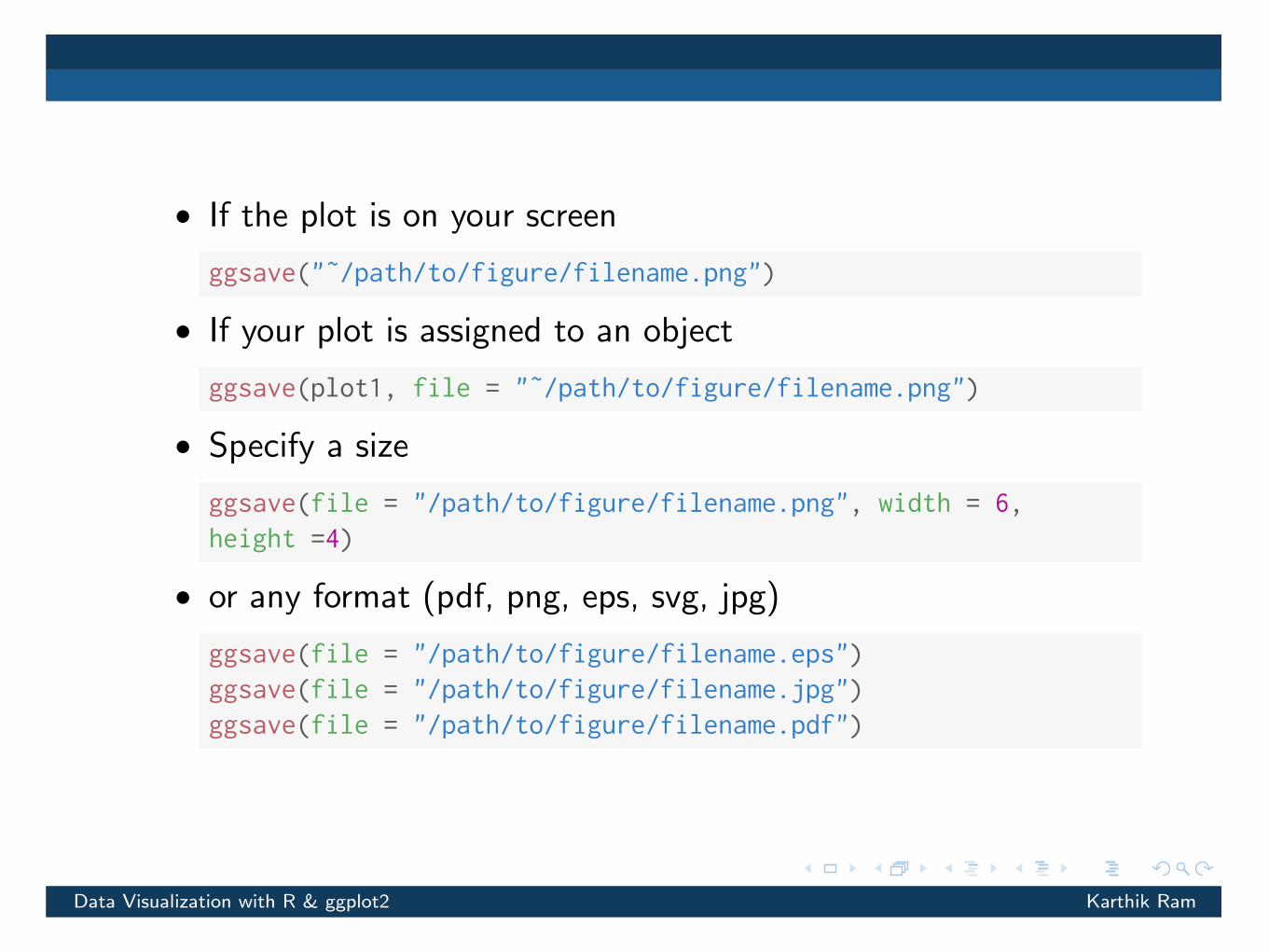
•If the plot is on your screen
ggsave("˜/path/to/figure/filename.png")
•If your plot is assigned to an object
ggsave(plot1, file = "˜/path/to/figure/filename.png")
•Specify a size
ggsave(file = "/path/to/figure/filename.png", width = 6,height =4)
•or any format (pdf, png, eps, svg, jpg)
ggsave(file = "/path/to/figure/filename.eps")ggsave(file = "/path/to/figure/filename.jpg")ggsave(file = "/path/to/figure/filename.pdf")
Data Visualization with R & ggplot2 Karthik Ram