Embed Size (px)
Citation preview
Getting StartED
with CSS
by David Powers
GETTING STARTED WITH CSS Copyright © 2009 by David Powers
All rights reserved. No part of this work may be reproduced or transmitted in any form or by any means, electronic or mechanical, including photocopying, recording, or by any information storage or retrieval
system, without the prior written permission of the copyright owner and the publisher.
ISBN-13 (pbk): 978-1-4302-2543-0
ISBN-13 (electronic): 978-1-4302-2544-7
Printed and bound in the United States of America 9 8 7 6 5 4 3 2 1
Trademarked names may appear in this book. Rather than use a trademark symbol with every occurrence of a trademarked name, we use the names only in an editorial fashion and to the benefit of the trademark
owner, with no intention of infringement of the trademark.
Distributed to the book trade worldwide by Springer-Verlag New York, Inc., 233 Spring Street, 6th Floor, New York, NY 10013. Phone 1-800-SPRINGER, fax 201-348-4505, e-mail [email protected],
or visit www.springeronline.com.
For information on translations, please e-mail [email protected], or visit www.apress.com.
Apress and friends of ED books may be purchased in bulk for academic, corporate, or promotional use. eBook versions and licenses are also available for most titles. For more information, reference our Special
Bulk Sales–eBook Licensing web page at http://www.apress.com/info/bulksales.
The information in this book is distributed on an “as is” basis, without warranty. Although every precaution has been taken in the preparation of this work, neither the author(s) nor Apress shall have any liability to
any person or entity with respect to any loss or damage caused or alleged to be caused directly or indirectly by the information contained in this work.
The source code for this book is freely available to readers at www.friendsofed.com in the Downloads section.
Credits
President and Publisher: Paul Manning
Lead Editor: Ben Renow-Clarke
Technical Reviewer: Peter Elst
Editorial Board: Clay Andres, Steve Anglin, Mark Beckner, Ewan
Buckingham, Tony Campbell, Gary Cornell, Jonathan Gennick, Michelle Lowman, Matthew Moodie, Jeffrey
Pepper, Frank Pohlmann, Ben Renow-Clarke, Dominic Shakeshaft, Matt Wade, Tom Welsh
Coordinating Editor: Kelly Moritz
Copy Editor: Heather Lang
Compositors: MacPS, LLC
Indexers: BIM Indexing and e-Services
Artist: April Milne
Interior Designer: Anna Ishchenko
iv
Contents at a Glance
Contents at a Glance .................................................................... iv
Contents ....................................................................................v
About the Author........................................................................ xv
About the Technical Reviewer .......................................................xvi
Acknowledgments......................................................................xvii
Introduction ............................................................................. xix
Chapter 1: What Is CSS, and Why Should I Learn It? ...............................1
Chapter 2: How Do I Improve the Look of Text and Links? ..................... 39
Chapter 3: How Can I Improve the Layout of My Text?.......................... 85
Chapter 4: How Can I Flow Text Around Images?............................... 121
Chapter 5: How Do I Add Backgrounds and Borders to Improve the Look of My Page? ..................................... 155
Chapter 6: How Do I Solve the Mysteries of Width and Height? ............. 199
Chapter 7: How Do I Create Differently Styled Sections? ..................... 243
Chapter 8: How Do I Style Lists and Navigation Menus? ....................... 275
Chapter 9: How Do I Style Tables?................................................. 325
Chapter 10: How Do I Position Elements Precisely on the Page?............ 363
Chapter 11: Are There Any Guidelines for Basic Page Layout? .............. 403
Chapter 12: How Do I Create Styles for Printing? .............................. 453
Appendix: CSS Properties and Selectors.......................................... 495
Index..................................................................................... 535

1
Chapter 1 What Is CSS, and Why Should I Learn It? In the beginning, the Web was simple. Figure 1-1 shows what the first-ever
public web page looked like. As you can see, it consisted of plain, unadorned
text. Headings were in large, bold type; links were blue and underlined—and
that was it.
Figure 1-1. The first-ever web page contained just text and links.
Getting StartED with CSS
2
LinkED The original, which was created toward the end of 1990, no longer exists,
but you can see a copy at www.w3.org/History/19921103-hypertext/ hypertext/WWW/TheProject.html.
The lack of images and any attempt at styling the page seem odd to us now,
but the Web’s origins lie in the scientific community, not with artists or graphic
designers. The inventor of the World Wide Web (WWW), Tim Berners-Lee, was
working at the European Organization for Nuclear Research (CERN) in
Switzerland and was frustrated by the need to log onto different computers to
get information. So he devised a way of sharing information among computers.
Putting aside the technical details of how information is transferred from one
computer to another, the principle behind the Web is very simple. Documents
are marked up to indicate what’s a heading, paragraph, list, and so on; and
links (or hyperlinks, to give them their correct name) tell the web browser
where to find related documents. The tags used to mark up the text evolved
into what we now know as HyperText Markup Language (HTML).
It didn’t take long before people other than scientists realized the potential of
the Web and began to demand the ability to include images. Once images
began to brighten up web pages, designers wanted not only a way to make text
look more interesting but also to lay out the contents of a page in more
attractive ways than just headings and paragraphs. In addition to new tags
being added to HTML, designers began to use their imagination to invent new
uses for existing tags. Most notably, the <table> tag, which was intended to
display scientific data in tabular form, was adapted to provide a grid structure
for page layout.
The rapid growth of the Web was exciting, but it was also chaotic. HTML was being
stretched beyond its limits. Tags such as <h4> were no longer being used for low-
level subheadings, but to display small, bold text. The <blockquote> tag, often
nested several levels deep, became a way to indent objects, rather than to
highlight a quotation from another source. Document structure was thrown to the
wind, making it difficult and expensive to maintain web pages or adapt them for
other uses, such as printed materials.
The answer was to restore HTML to its original purpose—marking up the
structure of the document—and create a new markup language devoted to
styling the look of a web page. That new markup language was called
Cascading Style Sheets (CSS), and that’s what this book is about.
3
Chapter 1: What is CSS, and Why Should I Learn It?
ExplainED CSS stands for Cascading Style Sheets, but most web designers say “CSS is
. . .” rather than “CSS are. . .” This is because they’re referring to CSS as
a technology and not to individual style sheets.
In this chapter, you’ll learn about the following:
The advantages of CSS and why now is a good time to start learning
How to write style rules and apply them to your web pages
How to avoid common beginner mistakes
Choosing the tools to help you work with CSS
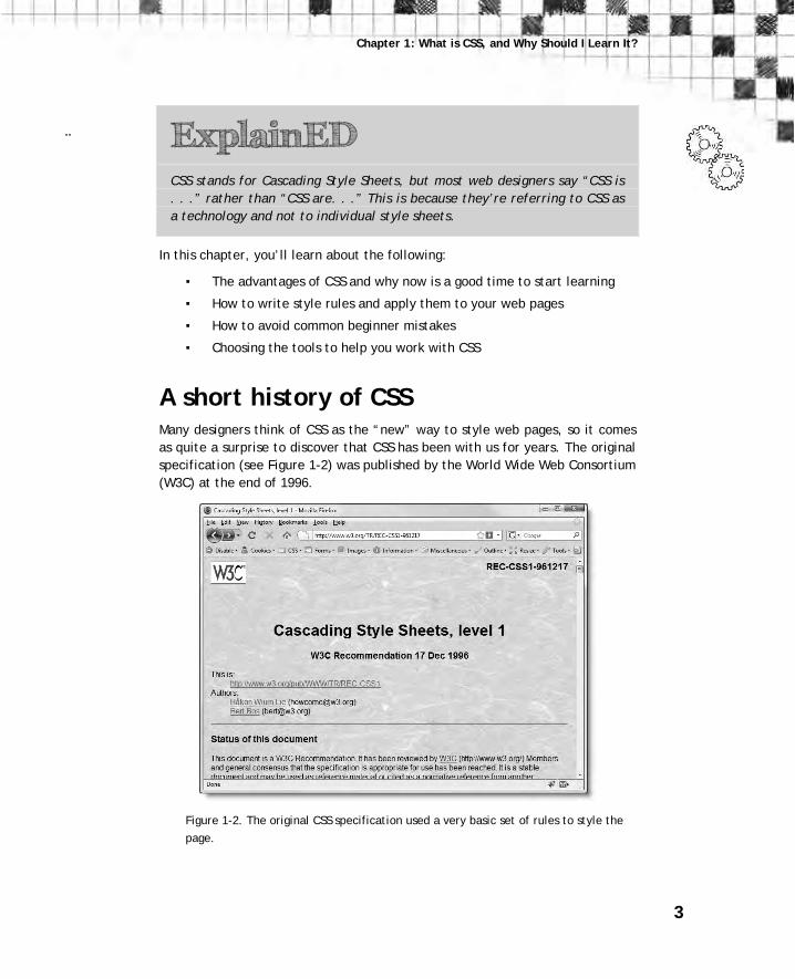
A short history of CSS Many designers think of CSS as the “new” way to style web pages, so it comes
as quite a surprise to discover that CSS has been with us for years. The original
specification (see Figure 1-2) was published by the World Wide Web Consortium
(W3C) at the end of 1996.
Figure 1-2. The original CSS specification used a very basic set of rules to style the
page.

Getting StartED with CSS
4
ExplainED The W3C (www.w3.org) is the body responsible for drawing up agreed
standards for the Web. Its members include all the big software and
technology companies, as well as government and research institutions
from over 40 countries. This often leads to slow decisions. Strictly
speaking, W3C standards are only recommendations. That’s why they’re
not always fully supported by all browsers. Equally important, the
recommendations sometimes lag behind the pace of innovation on the
Web. For example, browsers began supporting CSS opacity long before its
incorporation into a W3C standard.
Why CSS has taken so long to be embraced by designers
According to the W3C, the CSS specification was drawn up in response to
“pressure from authors for richer visual control.” The demand for better
control of web pages was certainly there, but browsers in the late 1990s just
weren’t up to the job. They implemented CSS very poorly or not at all. As a
result, only the very brave or foolhardy adopted CSS in the early stages.
Nevertheless, the W3C continued work on the specification and brought out a
new version, CSS2, in 1998. This retained all the features of CSS1 and added
some new ones.
Instead of designers leaping with joy, those brave enough to embrace CSS
ended up banging their heads on their keyboards in frustration. The
specification was a statement of what the W3C thought browsers ought to do.
The reality was completely different. The now-defunct Netscape Navigator 4
(usually referred to simply as Netscape 4) was the most popular browser at the
time, with an estimated 80 percent market share in 1997. It supported a lot of
CSS, but not very well. Its rival, Microsoft Internet Explorer (IE), also in version
4, was even worse. However, Microsoft put a huge effort into improving its
browser, and by the time IE6 was released in 2001, it supported most of CSS—
although it was far from perfect.
Microsoft’s battle with Netscape completely reversed the browser scene, with
IE taking about 90 percent of the market share by 2001–2002. With Netscape in
terminal decline, adventurous designers began to use CSS in earnest, but they
faced several problems:

5
Chapter 1: What is CSS, and Why Should I Learn It?
Netscape’s original dominance of the browser market left a significant
user base resistant to change, particularly in schools and public
libraries in the United States. This meant finding ways to style web
pages that could still be rendered in Netscape 4 without causing it to
crash.
CSS in IE6 was usable, but it had many bugs and didn’t support every
feature.
Although IE was the dominant browser, new ones, such as Firefox,
Safari, and Opera, came on the scene aiming at full standards
compliance and with better support for CSS.
Even when designers felt they could reasonably stop supporting Netscape 4,
they faced a new dilemma with the emergence of the standards-compliant
browsers. They could either ignore the standards and design for IE6 or create
CSS that worked well in the new browsers and find ways to compensate for the
flaws in IE6.
For a long time, instead of fixing the CSS bugs in IE6, Microsoft issued only
security updates. However, a combination of security scares and demands for
better CSS support eventually resulted in Firefox making considerable inroads
into its market share. Firefox is managed by the Mozilla Corporation, an
organization that traces its origins to Netscape but is now controlled by the
nonprofit Mozilla Foundation. For legal reasons, Firefox underwent several
name changes, but within two years of its original release in February 2004, it
had taken an estimated 10 percent of the browser market share. Microsoft’s
response emerged in the form of IE7 in 2006. It still wasn’t perfect, but it was
followed in March 2009 by IE8, which finally supports the whole of CSS2.1.
Firefox, in the meantime, has continued its rise and currently represents nearly
one in four of all browsers in use.
ExplainED The W3C doesn’t formally adopt a CSS specification until all parts of it are
implemented by two browsers or user agents, such as screen readers for
the visually impaired. Because no two browsers ever managed to
implement the full CSS2 specification, the W3C dropped some features,
added some new ones, and issued a revised specification called CSS2.1 in
2002. More than a decade after the original publication of the CSS2
specification, CSS2.1 still hadn’t received formal approval. No wonder web
designers have been frustrated with the glacial progress of CSS!

Getting StartED with CSS
6
The time for CSS has finally come
After such a dismal history, you might be wondering whether it’s worth the effort
of learning CSS. The answer is a resounding yes. Within seven months of its
release, IE8 represented 18 percent of browsers in use, reducing the combined
market share of IE6 and IE7 to roughly 40 percent. The bad news for web
designers is that, in the early months at least, IE8’s rise was due to people
switching from IE7; little dent was made in the market share for IE6, which has
annoying CSS bugs. It’s fair to say it will take several years before IE6 and IE7
disappear completely from the scene, but the arrival of IE8 and other modern
browsers, such as Firefox, Safari, and Opera, means you can now use CSS with far
greater confidence than ever before. As long as the website remains usable in
older browsers, you don’t need to worry if there are some minor differences in
display.
AdvancED Before deploying a website on the Internet, check what it looks like in all
the main browsers and on different operating systems. If you don’t have
access to some browsers or operating systems, ask in an online forum
for others to check for you, or subscribe to a browser testing service, such
as Browsercam (www.browsercam.com). If you have Dreamweaver CS4 or
later, you can use Adobe BrowserLab (http://browserlab.adobe.com/). On Windows, you can also use Expression Web SuperPreview
(http://expression.microsoft.com/en-us/dd565874.aspx) to compare how
your pages look in IE6 and IE7 or IE8. The version of Expression Web
SuperPreview released just as this book was about to go to press also
included support for Firefox 3.5, so more browsers might be added in
future.
Some designers fret if their site doesn’t look exactly the same in each
browser. Don’t worry about the difference of an odd pixel or two. Most
visitors only see your site in one browser. What really matters is that it
works and looks acceptable to each visitor.
7
Chapter 1: What is CSS, and Why Should I Learn It?
What are the advantages of CSS? CSS has three huge advantages, namely:
Less-cluttered HTML code, making it easier to read and maintain
The ability to change the look of a whole site by changing a single file
Greater control over the way page elements look
Let’s take a look at each of these in detail.
Write simpler markup
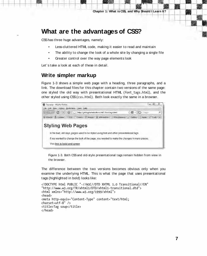
Figure 1-3 shows a simple web page with a heading, three paragraphs, and a
link. The download files for this chapter contain two versions of the same page:
one styled the old way with presentational HTML (font_tags.html), and the
other styled using CSS (css.html). Both look exactly the same in a browser.
Figure 1-3. Both CSS and old-style presentational tags remain hidden from view in
the browser.
The difference between the two versions becomes obvious only when you
examine the underlying HTML. This is what the page that uses presentational
tags (highlighted in bold) looks like:
<!DOCTYPE html PUBLIC "-//W3C//DTD XHTML 1.0 Transitional//EN" "http://www.w3.org/TR/xhtml1/DTD/xhtml1-transitional.dtd"> <html xmlns="http://www.w3.org/1999/xhtml"> <head> <meta http-equiv="Content-Type" content="text/html; charset=utf-8" /> <title>Tag soup</title> </head>
Getting StartED with CSS
8
<body bgcolor="#FFFFFF" text="#000000" link="#006600" vlink="#009966" alink="#006600"> <h1><font color="#990000" size="6" face="Arial, Helvetica, sans-serif">Styling Web Pages</font></h1> <blockquote> <p><font size="3" face="Arial, Helvetica, sans-serif">In the bad, old days, pages used to be styled using font and other presentational tags.</font></p> <p><font size="3" face="Arial, Helvetica, sans-serif">If you wanted to change the look of the page, you needed to make the changes in many places.</font></p> <p><font size="3" face="Arial, Helvetica, sans-serif">This <strong><a href="#">link is bold and green</a></strong>.</font> </p> </blockquote> </body> </html>
The HTML for the version of the page that uses CSS looks like this:
<!DOCTYPE html PUBLIC "-//W3C//DTD XHTML 1.0 Transitional//EN" "http://www.w3.org/TR/xhtml1/DTD/xhtml1-transitional.dtd"> <html xmlns="http://www.w3.org/1999/xhtml"> <head> <meta http-equiv="Content-Type" content="text/html; charset=utf-8" /> <title>Styling with CSS</title> <link href="css/simple.css" rel="stylesheet" type="text/css" /> </head> <body> <h1>Styling Web Pages</h1> <p>In the bad, old days, pages used to be styled using font and other presentational tags.</p> <p>If you wanted to change the look of the page, you needed to make the changes in many places.</p> <p>This <a href="#">link is bold and green</a>.</p> </body> </html>
9
Chapter 1: What is CSS, and Why Should I Learn It?
ExplainED The examples in this book use Extensible HyperText Markup Language
(XHTML) 1.0, which is identical to HTML 4.01, except that it follows
slightly stricter rules. XHTML was originally intended to replace HTML, but
the W3C began work on HTML5 in 2007. Then in July 2009, it announced
that work would stop on XHTML 2. This threw the web development
community into confusion over which standard they should use, with some
people mistakenly believing that XHTML 1.0 was also being abandoned.
XHTML 1.0 remains an approved standard, and is still preferred by many
developers because of its stricter rules.
At the time of this writing, HTML5 is still only a draft, but the W3C has
stated that it will be compatible with both HTML 4.01 and XHTML 1.0. So,
it doesn’t matter which version you choose. I use “HTML” to refer to all
three flavors. The CSS taught in this book will work with all of them.
The markup is much simpler and easier to read. Even if you use an HTML editor
that generates the markup for you, there are times when it’s necessary to
examine the underlying code. The lightweight code used by a well-designed
CSS site makes this a pleasure, rather than a perilous journey hacking through
masses of tangled code. There’s also less of it, so the page loads more quickly
and uses less bandwidth.
AdvancED Just because most people use broadband these days, it doesn’t mean that
page size is no longer important. Masses of code not only take longer to
display in a browser, but the bigger your pages, the more bandwidth you
consume. On a popular site, this can cost a lot of money in extra
bandwidth charges.
“So, where’s the CSS?” you might be asking. It’s not in the web page, but in a
separate file (called a style sheet), simple.css. The <link> tag highlighted in
bold in the <head> of the page tells the browser where to find the styles. The
code inside simple.css looks like this:
body { font-family: Arial, Helvetica, sans-serif; color: #000;

Getting StartED with CSS
10
background-color: #FFF; } h1 { color: #900; } p { margin-left: 40px; } a:link { color: #060; font-weight: bold; } a:visited { color: #096; } a:hover, a:active { color: #060; }
Don’t worry about the meaning of the CSS code yet. You’ll learn about the
structure of style rules in “How do I write a style rule?” later in this chapter,
and you’ll be writing your own rules to format text in Chapter 2.
Although it might seem strange to put instructions on how your page should
look in a separate file, there’s a very good reason for doing so. You can attach
the same set of instructions to every page in your website. Unlike
presentational HTML markup, which needs to be applied individually to each
element, CSS gives you central control over the look of the whole site. What’s
more, changes to your style sheet are automatically applied to all pages that
are linked to it.
AdvancED When styles are defined in an external style sheet, the browser stores
them in the cache on the visitor’s computer, so they need to be
downloaded only once regardless of how many pages are viewed in your
site. This speeds up the display of subsequent pages and reduces
bandwidth usage
Turn into a quick change artist
The best way to see the power of CSS in action is to visit
www.csszengarden.com. Every page in the site looks completely different (see
Figure 1-4), but if you look at the underlying HTML, you’ll see that it’s actually
exactly the same page. What changes the look of the page is the style sheet
attached to it.
11
Chapter 1: What is CSS, and Why Should I Learn It?
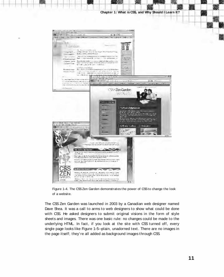
Figure 1-4. The CSS Zen Garden demonstrates the power of CSS to change the look
of a website.
The CSS Zen Garden was launched in 2003 by a Canadian web designer named
Dave Shea. It was a call to arms to web designers to show what could be done
with CSS. He asked designers to submit original visions in the form of style
sheets and images. There was one basic rule: no changes could be made to the
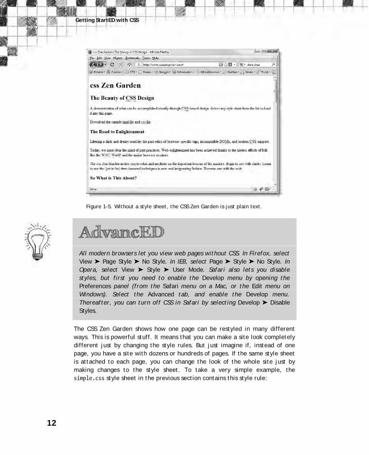
underlying HTML. In fact, if you look at the site with CSS turned off, every
single page looks like Figure 1-5—plain, unadorned text. There are no images in
the page itself; they’re all added as background images through CSS.
Getting StartED with CSS
12
Figure 1-5. Without a style sheet, the CSS Zen Garden is just plain text.
AdvancED All modern browsers let you view web pages without CSS. In Firefox, select
View ➤ Page Style ➤ No Style. In IE8, select Page ➤ Style ➤ No Style. In
Opera, select View ➤ Style ➤ User Mode. Safari also lets you disable
styles, but first you need to enable the Develop menu by opening the
Preferences panel (from the Safari menu on a Mac, or the Edit menu on
Windows). Select the Advanced tab, and enable the Develop menu.
Thereafter, you can turn off CSS in Safari by selecting Develop ➤ Disable
Styles.
The CSS Zen Garden shows how one page can be restyled in many different
ways. This is powerful stuff. It means that you can make a site look completely
different just by changing the style rules. But just imagine if, instead of one
page, you have a site with dozens or hundreds of pages. If the same style sheet
is attached to each page, you can change the look of the whole site just by
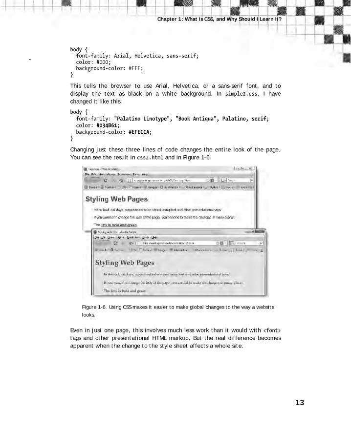
making changes to the style sheet. To take a very simple example, the
simple.css style sheet in the previous section contains this style rule:
13
Chapter 1: What is CSS, and Why Should I Learn It?
body { font-family: Arial, Helvetica, sans-serif; color: #000; background-color: #FFF; }
This tells the browser to use Arial, Helvetica, or a sans-serif font, and to
display the text as black on a white background. In simple2.css, I have
changed it like this:
body { font-family: "Palatino Linotype", "Book Antiqua", Palatino, serif; color: #034B61; background-color: #EFECCA; }
Changing just these three lines of code changes the entire look of the page.
You can see the result in css2.html and in Figure 1-6.
Figure 1-6. Using CSS makes it easier to make global changes to the way a website
looks.
Even in just one page, this involves much less work than it would with <font> tags and other presentational HTML markup. But the real difference becomes
apparent when the change to the style sheet affects a whole site.

Getting StartED with CSS
14
Gain greater control over the look of page elements
The other huge advantage of CSS is that it gives you a finer level of control
over the look of different elements on your page. If you add a border to an
image or table with HTML markup, you get the same border on all sides. With
CSS, you can apply a different border to each side of an element. As shown in
Figure 1-7, this lets you create embossed and indented buttons without the
need to use images (you can test the page yourself in borders.html in the
download files for this chapter).
Figure 1-7. With CSS, you can use different borders to create the illusion of
embossed or indented buttons.
The technique is very simple: you add a darker border to the right and bottom,
and a lighter border to the other two edges to create an embossed effect.
Reversing the colors creates an indented effect.
Incidentally, the two buttons in borders.html are not in a table. Their positions
are controlled by adjusting their margins and using a CSS property called float. You’ll learn about margins in Chapter 3, and Chapter 4 introduces you to the
concept of floating page elements to the left or right of other objects or text.
When used in combination with each other, you can flow text around images in
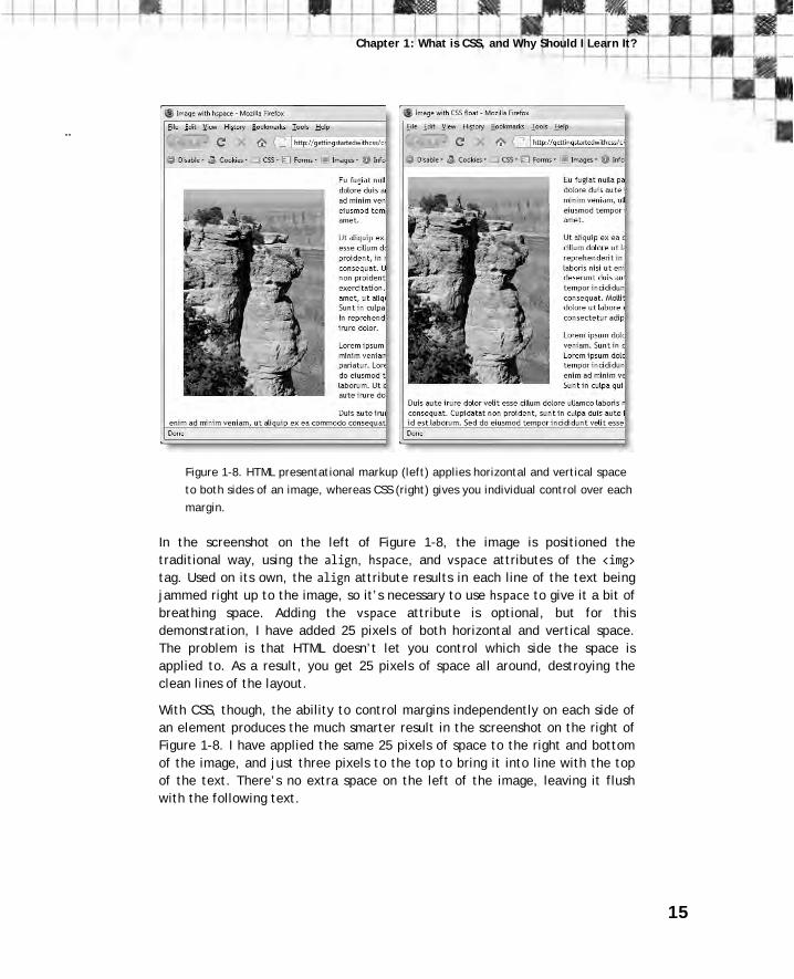
a much cleaner way than using the vspace and hspace HTML attributes. Figure
1-8 shows the difference (the original files are image_hspace.html and
image_float.html in the download files for this chapter).
15
Chapter 1: What is CSS, and Why Should I Learn It?
Figure 1-8. HTML presentational markup (left) applies horizontal and vertical space
to both sides of an image, whereas CSS (right) gives you individual control over each
margin.
In the screenshot on the left of Figure 1-8, the image is positioned the
traditional way, using the align, hspace, and vspace attributes of the <img> tag. Used on its own, the align attribute results in each line of the text being
jammed right up to the image, so it’s necessary to use hspace to give it a bit of
breathing space. Adding the vspace attribute is optional, but for this
demonstration, I have added 25 pixels of both horizontal and vertical space.
The problem is that HTML doesn’t let you control which side the space is
applied to. As a result, you get 25 pixels of space all around, destroying the
clean lines of the layout.
With CSS, though, the ability to control margins independently on each side of
an element produces the much smarter result in the screenshot on the right of
Figure 1-8. I have applied the same 25 pixels of space to the right and bottom
of the image, and just three pixels to the top to bring it into line with the top
of the text. There’s no extra space on the left of the image, leaving it flush
with the following text.

Getting StartED with CSS
16
This flexibility extends to background images, which can be positioned with a
great degree of accuracy, often producing stunning results, such as the designs
in the CSS Zen Garden (see Figure 1-4).
So, how do I use CSS? Like HTML, CSS is written as plain text. So, you don’t need anything more
sophisticated than a text editor, such as Notepad or TextEdit, to start writing
CSS. However, if you’re using an HTML editor to build your web pages, you’ll
almost certainly find that it provides you with code hints or other features to
help create your style rules. Adobe Dreamweaver (www.adobe.com/products/ dreamweaver/), the leading professional tool for building websites, has a lot of
CSS features, including a dialog box that builds style rules for you. It groups the
main CSS properties in logical categories to make them easier for beginners
to find (see Figure 1-9). If you prefer to work directly in the code, most
HTML editors, including Dreamweaver and Microsoft Expression Web
(www.microsoft.com/expression/products/overview.aspx?key=web), offer pop-
up code hints similar to those in shown in Figure 1-10. The granddaddy of script
editors on the Mac, BBEdit (www.barebones.com/products/bbedit/) uses both
code hints and dialog boxes (see Figure 1-11).
Figure 1-9. Dreamweaver helps build style sheets through a dialog box that lists the
main CSS properties.
17
Chapter 1: What is CSS, and Why Should I Learn It?
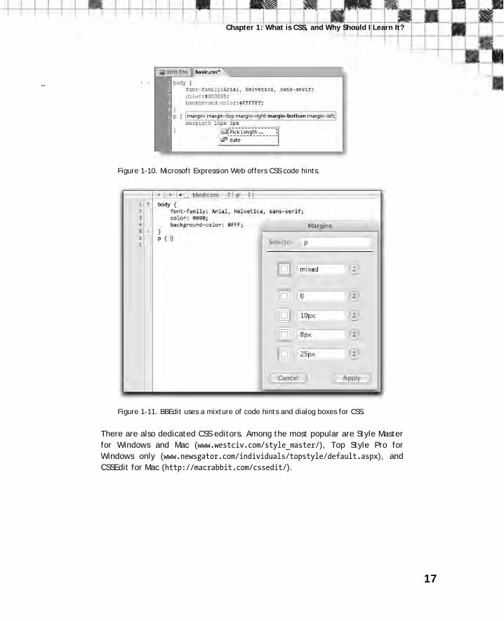
Figure 1-10. Microsoft Expression Web offers CSS code hints.
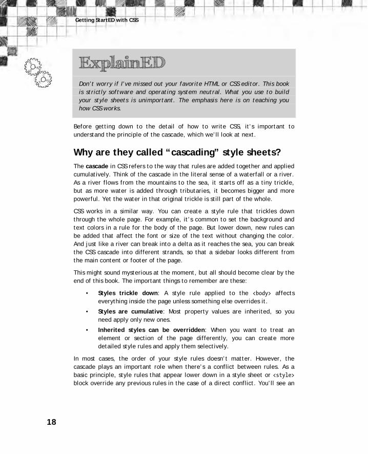
Figure 1-11. BBEdit uses a mixture of code hints and dialog boxes for CSS.
There are also dedicated CSS editors. Among the most popular are Style Master
for Windows and Mac (www.westciv.com/style_master/), Top Style Pro for
Windows only (www.newsgator.com/individuals/topstyle/default.aspx), and
CSSEdit for Mac (http://macrabbit.com/cssedit/).
Getting StartED with CSS
18
ExplainED Don’t worry if I’ve missed out your favorite HTML or CSS editor. This book
is strictly software and operating system neutral. What you use to build
your style sheets is unimportant. The emphasis here is on teaching you
how CSS works.
Before getting down to the detail of how to write CSS, it’s important to
understand the principle of the cascade, which we’ll look at next.
Why are they called “cascading” style sheets?
The cascade in CSS refers to the way that rules are added together and applied
cumulatively. Think of the cascade in the literal sense of a waterfall or a river.
As a river flows from the mountains to the sea, it starts off as a tiny trickle,
but as more water is added through tributaries, it becomes bigger and more
powerful. Yet the water in that original trickle is still part of the whole.
CSS works in a similar way. You can create a style rule that trickles down
through the whole page. For example, it’s common to set the background and
text colors in a rule for the body of the page. But lower down, new rules can
be added that affect the font or size of the text without changing the color.
And just like a river can break into a delta as it reaches the sea, you can break
the CSS cascade into different strands, so that a sidebar looks different from
the main content or footer of the page.
This might sound mysterious at the moment, but all should become clear by the
end of this book. The important things to remember are these:
Styles trickle down: A style rule applied to the <body> affects
everything inside the page unless something else overrides it.
Styles are cumulative: Most property values are inherited, so you
need apply only new ones.
Inherited styles can be overridden: When you want to treat an
element or section of the page differently, you can create more
detailed style rules and apply them selectively.
In most cases, the order of your style rules doesn’t matter. However, the
cascade plays an important role when there’s a conflict between rules. As a
basic principle, style rules that appear lower down in a style sheet or <style> block override any previous rules in the case of a direct conflict. You’ll see an

19
Chapter 1: What is CSS, and Why Should I Learn It?
example of this principle in action in “Don’t forget the cascade” later in this
chapter. But first, I need to show you how to write CSS.
AdvancED I’m deliberately simplifying things to avoid overburdening you with too
much detail at this stage. Chapter 7 explains the rules that determine
which style wins in the case of a conflict. For the time being, just
remember that a rule that appears after another one can override it.
How do I write a style rule?
Creating a style rule is very simple. Figure 1-12 shows the different parts that
make up a style rule, using an example from simple.css earlier in the chapter.
Figure 1-12. The anatomy of a style rule
Let’s take a look at each part in turn:
Selector: This tells the browser where you want to apply the rule.
Figure 1-12 uses the simplest type of selector, a type selector, which
redefines the default style of an HTML tag. You create a type selector
by using the name of an HTML tag without the surrounding angle
brackets. This example redefines the style of all <p> tags—in other
words, paragraphs. Because they redefine the style of HTML tags,
you’ll also see type selectors referred to as “tag selectors.” You’ll
learn about other types of selectors as you progress through this book.
Declaration block: This begins with a left curly brace and ends with a
right curly brace. You put your style declarations between these
braces. Each declaration consists of a property followed by a colon (:) and value, and ends with a semicolon (;).
Getting StartED with CSS
20
Property: This is one of the properties defined in the CSS
specification. There are nearly 100 visual properties in the current
version, CSS2.1. Most have intuitive names. The property in Figure 1-
12 affects the left margin of the element being styled. Property names
are not case-sensitive, but they are normally written entirely in
lowercase. The CSS specification also defines aural properties for use
with screen readers for the disabled, but these are beyond the scope
of this book.
Value: This is the value you want to apply to the property. Some
properties have a fixed list of values that you can choose from. Others
let you specify the value yourself, although the value must still adhere
to some simple rules. The example in Figure 1-12 sets the value of the
left margin to 40 pixels.
There’s a full list of all CSS2.1 visual properties and their permitted values in
this book’s appendix. Each chapter also has handy tables to remind you of the
properties used to style different parts of a web page.
Note that the property is separated from the value by a colon (:), and the
value is followed by a semicolon (;). Strictly speaking, you can leave out the
semicolon after the last declaration in a block or if the block contains only one
property/value pair.
AdvancED Get into the habit of always using a semicolon after the value, even if
there’s only one declaration inside the declaration block. You might forget
to insert it when later adding extra declarations to the same block. A
missing semicolon in the middle of a declaration block is a common cause
of CSS failing to work as expected. Remember: colon between property
and value, semicolon after the value.
The declaration block in Figure 1-12 contains only one property/value pair, but
you can define any number of properties in the same declaration block.
21
Chapter 1: What is CSS, and Why Should I Learn It?
AdvancED Technically speaking, a declaration block with no style declarations
between the curly braces is perfectly valid. An empty declaration block
does nothing, but you might want to put one in your style sheet to remind
you to fix the styles later. You might also want to remove existing styles
temporarily when troubleshooting a problem.
Formatting CSS for ease of maintenance
Browsers don’t care how you format your style rules. As long as you separate
each property from its value by a colon, put a semicolon after the value, and
surround declaration blocks with curly braces, the browser ignores any
whitespace in your style sheet. However, a consistent layout makes your CSS
easier to maintain.
The example in Figure 1-12 uses whitespace to make the rule easier to read,
but the following is just as valid:
p{margin-left:40px;}
Spreading everything out even more like this is also acceptable:
p { margin-left : 40px ; }
However, the following will not work:
p { margin - left : 40 px; }
Although CSS ignores whitespace in style declarations, you cannot put any
spaces in property names. Nor can there be any whitespace in the value
between a number and the unit of measurement. Accidentally putting a space
between 40 and px renders the rule invalid and prevents it from working.
In simple.css earlier in the chapter, I put rules with a single declaration all on
the same line but spaced out rules with multiple declarations like this:
body { font-family: Arial, Helvetica, sans-serif; color: #000; background-color: #FFF; }
Getting StartED with CSS
22
h1 { color: #900; } p { margin-left: 40px; }
Putting rules with a single declaration all on the same line saves space but is
probably not so easy to read. It also means that you need to reformat
everything if you decide to add another declaration inside a single-line
declaration block. Spacing out everything like this is probably easier on the
eye, and easier to maintain:
body { font-family: Arial, Helvetica, sans-serif; color: #000; background-color: #FFF; } h1 { color: #900; } p { margin-left: 40px; }
Adding comments to your CSS
Style sheets can run to hundreds of lines, so it’s often a good idea to add
comments to your style sheets to remind you what a particular rule or set of
rules is for. Anything between /* and */ is treated as a comment in CSS and is
ignored by the browser. Comments can be spread over more than one line. You
could add comments to the previous example like this:
/* Sets the font, text color, and background color for the page. These values will be applied to all elements in the page unless overridden by subsequent style rules. */ body { font-family: Arial, Helvetica, sans-serif; color: #000; background-color: #FFF; } /* Overrides the body rule and colors level 1 headings red */ h1 { color: #900; } /* Puts a 40-pixel left margin on all paragraphs */ p { margin-left: 40px; }
Adding comments to every rule like this is overkill. Too many comments can be
just as just as bad as no comments at all.
23
Chapter 1: What is CSS, and Why Should I Learn It?
Comment tags can also be used to disable part of your CSS temporarily. This is
a useful technique when experimenting with new ideas or troubleshooting
problems. Just put the opening /* and closing */ comment tags around the
section that you want to disable. You can disable a single declaration or a
whole section at a time. For example, this disables the color and background-color properties in the following rule:
body { font-family: Arial, Helvetica, sans-serif; /* color: #000; background-color: #FFF; */ }
Just remove the comment tags to restore the rules.
AdvancED Comments cannot be nested. As soon as the browser encounters the first
*/ closing tag, it treats everything else as CSS until it finds another /* opening tag. When disabling rules temporarily, make sure you remove the
comment tags from any rules that have already been disabled within the
section you’re blocking off. The same applies to any comments within the
section. Alternatively, add a closing comment tag before each nested
opening tag.
Where do I create my CSS?
Style rules can be defined in three places, namely:
External style sheets: This is the most common and effective way of
using CSS. The styles in external style sheets affect all pages to which
they’re linked. You can link more than one style sheet to a page.
A <style> block: This must go in the <head> of the web page. The
style rules are applied only to that page. This can be useful if you
want to apply a different set of rules to one page, but as soon as you
want to apply the rules to more than one page, they should be moved
to an external style sheet.
Getting StartED with CSS
24
A style attribute: This goes in the opening tag of an HTML element,
so it applies to that element alone. This is the least efficient way to
apply CSS and should be avoided. As with all rules, there is an
exception: some email programs, such as Outlook 2007, don’t
understand style rules unless they’re applied this way. At the time of
this writing, Microsoft says it has no plans to change the way it
handles CSS in Outlook 2010.
LinkED See http://msdn.microsoft.com/en-us/library/aa338201.aspx for details
of how Outlook 2007 handles HTML and CSS.
There’s also a fourth way to add CSS to your page, although it’s not part of any
official standard: using an Internet Explorer conditional comment. I’ll explain
the purpose of conditional comments and how they work after describing the
standard ways of defining styles.
Using external style sheets
Create your style rules in a separate file, and save the file with .css as the file
name extension. An external style sheet can be anywhere within your website,
but the normal practice is to put all style sheets in a dedicated folder called
styles or css.
It’s important to note that an external style sheet must not contain anything
other than CSS style rules or CSS comments. You cannot mix HTML, JavaScript,
or anything else in a style sheet. If you do, your styles won’t work.
There are two ways to attach an external style sheet to a page: using a <link> tag or a CSS @import rule.
Attaching a style sheet with a <link> tag This is the most common way to
attach an external style sheet. The <link> tag must go inside the <head> of the
web page. This is how simple.css is linked to css.html in the download files
for this chapter:
<!DOCTYPE html PUBLIC "-//W3C//DTD XHTML 1.0 Transitional//EN" "http://www.w3.org/TR/xhtml1/DTD/xhtml1-transitional.dtd"> <html xmlns="http://www.w3.org/1999/xhtml"> <head> <meta http-equiv="Content-Type" content="text/html; charset=utf-8" /> <title>Styling with CSS</title>

25
Chapter 1: What is CSS, and Why Should I Learn It?
<link href="css/simple.css" rel="stylesheet" type="text/css" /> </head>
If you’re using an HTML editor, such as Dreamweaver or Expression Web, the
<link> tag is created automatically when you select the option to attach a
style sheet. As you can see in the preceding example, it contains three
attributes: href, rel, and type. All of them must be included. However, even if
you’re hand-coding, the only one with a value you need to change is href, which tells the browser where to find the style sheet.
AdvancED The rel attribute accepts two values: stylesheet or alternate stylesheet (in both cases, stylesheet is written as one word). In practice, stylesheet is the only one you’re ever likely to use. It instructs the browser to load
the files in the external style sheet and apply them to the page.
Using rel="alternate stylesheet" prevents the browser from loading the
styles automatically. However, if you also add a title attribute to the
<link> tag, IE8 and most other modern browsers let users choose which set
of styles to load. In theory, this sounds a good idea but is of very little
practical value because there’s no obvious indication of a choice of styles,
except by selecting the appropriate browser menu (Page ➤ Style in IE8,
and View ➤ Page Style in Firefox). More important, the browser doesn’t
remember your choice. You can test this in css_alternate.html in the
download files. Change the style in your browser to Sandy, and then click
the link in the final paragraph. This loads css_alternate2.html, which also
has a choice of style sheets. When the new page loads, the original styles
are applied, not the ones you have just chosen.
Using an @import rule This technique was frequently used in the past
because it was not supported by Netscape 4, so it provided a convenient way to
hide styles that caused the browser to crash. Now that Netscape 4 has been
consigned to the dustbin of history, there’s no real advantage in using @import to link a style sheet directly to a web page. However, I have included it here so
you know what it’s for if you come across it in an existing site.
The following code shows how simple.css is linked to css_import.html in the
download files using @import:
<!DOCTYPE html PUBLIC "-//W3C//DTD XHTML 1.0 Transitional//EN" "http://www.w3.org/TR/xhtml1/DTD/xhtml1-transitional.dtd"> <html xmlns="http://www.w3.org/1999/xhtml">
Getting StartED with CSS
26
<head> <meta http-equiv="Content-Type" content="text/html; charset=utf-8" /> <title>Styling with CSS</title> <style type="text/css"> @import url("css/simple.css"); </style> </head>
As you can see, the @import rule goes inside an HTML <style> block in the
<head> of the page. The location of the style sheet is specified by putting it
between the parentheses of url(). The quotes around the path to the style
sheet are optional.
Again, if you’re using an HTML editor, it should create all this code for you
automatically.
You can also use @import in an external style sheet to import the styles from
another style sheet. This can be useful when you organize your rules in several
different style sheets. Instead of linking each style sheet separately to your
web pages, you can link just one, which then imports the rules from the other
style sheets.
If you do this, the @import rule must come before any other style rules in the
external style sheet. Also, because it’s in an external style sheet, you don’t
wrap it in an HTML <style> block. The following code shows how you might
import rules into one external style sheet from another:
@import url("another.css"); /* Other style rules */ body { font-family: Arial, Helvetica, sans-serif; color: #000; background-color: #FFF; }
AdvancED Using @import is the only way to import style rules from one style sheet to
another. The <link> tag can be used only inside the <head> of an HTML
page. It cannot be used inside another style sheet.
27
Chapter 1: What is CSS, and Why Should I Learn It?
Using a <style> block
Using an HTML <style> block in the <head> of a page limits the style rules to
the current page. Because they’re embedded in the page, these are known as
embedded styles. You should normally use this technique only for styles that
you want to limit to a single page. The following code shows how I embedded
the styles in image_float.html (see Figure 1-8):
<!DOCTYPE html PUBLIC "-//W3C//DTD XHTML 1.0 Transitional//EN" "http://www.w3.org/TR/xhtml1/DTD/xhtml1-transitional.dtd"> <html xmlns="http://www.w3.org/1999/xhtml"> <head> <meta http-equiv="Content-Type" content="text/html; charset=utf-8" /> <title>Image with CSS float</title> <style type="text/css"> p { font-family:"Trebuchet MS", Arial, Helvetica, sans-serif; font-size: 85%; line-height: 1.3; } .floatleft { float: left; margin-right: 20px; margin-bottom: 20px; margin-top: 3px; } </style> </head>
As you can see, the style rules are written in exactly the same way as in an
external style sheet, but they are wrapped in a pair of HTML <style> tags. The
opening tag must contain type="text/css".
AdvancED The @import rule is also wrapped in a <style> block when used to attach a
style sheet to a page. If you embed any other styles in the <head> of the
page, they must come after the @import rule. Otherwise, the external
style sheet will be ignored. Avoid using @import unless really necessary.

Getting StartED with CSS
28
Applying a style directly to an HTML element
The final way to apply CSS is by adding a style attribute to the opening tag of
an HTML element. This is known as creating an inline style and should be
avoided unless you need to create styles for an HTML newsletter.
Inline styles use the same properties and values as CSS rules that you put in an
external style sheet or embedded in the <head> of a page. The only differences
are that you don’t need a selector (because the HTML tag itself acts as the
selector), and the curly braces are replaced by quotes. For example, you might
create the following style rule for <h1> tags:
h1 { font-family: Arial, Helvetica, sans-serif; color: #900; }
To create an inline style, add the style properties and values to the style attribute of the opening tag like this:
<h1 style="font-family: Arial, Helvetica, sans-serif; color: #900;"> This Heading Uses an Inline Style</h1>
I have inserted spaces in the value of the style attribute for ease of reading,
but the following is just as valid:
<h1 style="font-family:Arial,Helvetica,sans-serif;color:#900;"> This Heading Uses an Inline Style</h1>
Don’t forget the cascade
You can attach as many external style sheets to a page as you like. On a
complex site, using multiple style sheets can be a good idea, allowing you to
organize your style rules into logical categories, such as typography, layout,
color, and so on. You can also use a combination of external styles and
embedded ones. However, it’s important to remember that CSS always applies
style rules according to the principles of the cascade. Even if rules are in
separate locations, their values are added together. So, if you have separate
style sheets for fonts and colors, the rules for <h1> tags will be added together;
and if there’s a conflict between rules, the value that comes lowest in the
cascade normally wins. This means the order in which you attach or embed
your styles affects which rule takes precedence in case of a conflict.

29
Chapter 1: What is CSS, and Why Should I Learn It?
AdvancED If you decide to use @import, remember that the rules are included in the
cascade at the point they are imported. Since the @import rule must come
before any other rules in an external style sheet, the imported rules are
higher in the cascade. So, if you import styles2.css into styles1.css, the
rules in styles2.css are applied first. The rules in styles1.css come
further down the cascade and override the earlier rules in case of a
conflict.
Let’s use a simple example to make that clear. The file css_conflict1.html attaches simple.css with a <link> tag and then defines an embedded style for
the color of <h1> tags like this:
<link href="css/simple.css" rel="stylesheet" type="text/css" /> <style type="text/css"> h1 { color: #006; } </style>
Because the embedded style comes lower down in the cascade, the value of
color (#006) overrides the value in simple.css (#900). So, the heading in the
page is a deep blue instead of dark red. However, let’s move the <link> below
the <style> block in css_conflict2.html like this:
<style type="text/css"> h1 { color: #006; } </style> <link href="css/simple.css" rel="stylesheet" type="text/css" />
The result is that the heading is now dark red. The order (or cascade) affects
the way the styles are applied.
Inline styles are in the opening HTML tag of the element they apply to. So,
they’re always the lowest in the cascade and always take precedence.
AdvancED Although the position of a style rule in the cascade is very important, the
type of selector used also plays a big role in determining which rule takes
precedence. You’ll learn more about this in Chapters 4 and 7.
Getting StartED with CSS
30
Using Internet Explorer conditional comments
Versions of Microsoft Internet Explorer prior to IE8 have serious CSS bugs that
can destroy your page layout. Of the versions still in common use, IE6 is the
worst offender; IE7 is considerably better but does have some problems. Over
the years, web designers have resorted to a number of ingenious techniques—or
hacks—to hide from Internet Explorer style rules that it doesn’t understand.
The problem with hacks is that they’re nonstandard, difficult to remember,
and could break in future browsers. Fortunately, there’s a simple solution:
using Internet Explorer conditional comments.
ExplainED If you’re new to CSS, feel free to skip this section and come back later
when you encounter a bug in Internet Explorer. It’s best to get your pages
working first in a standards-compliant browser, such as IE8, Firefox 3.5, or
Safari 4, before worrying about bugs in older versions of Internet Explorer.
What’s great about conditional comments is that they’re wrapped in HTML
comment tags, so—although they use proprietary code—the markup in your web
page remains valid. What’s more, everything inside a conditional comment is
ignored by other browsers. Only Internet Explorer sees and acts on its contents.
The slight drawback with conditional comments is that you cannot put them
inside an external style sheet. When using them with CSS, you must put them in
the <head> of each web page.
The basic structure of a conditional comment looks like this:
<!--[if condition]> Content that will be seen only by Internet Explorer <![endif]-->
The condition that goes in the opening pair of square brackets determines
which version(s) of Internet Explorer use the code inside the conditional
comment. Table 1-1 lists the most important values used in building conditions.
31
Chapter 1: What is CSS, and Why Should I Learn It?
Table 1-1. Values used in building IE conditional comments
Value Meaning
lt Less than
lte Less than or equal to
gt Greater than
gte Greater than or equal to
IE 6 Internet Explorer 6 (note the space before the number)
IE 7 Internet Explorer 7 (note the space before the number)
If your styles trigger a bug in IE6 or IE7, you can use a conditional comment to
add an extra style to compensate for the bug and hide it from all other
browsers, including IE8. For example, in Chapter 5, I use the following
conditional comment to add an extra style rule that only IE6 or earlier versions
will see (don’t worry about the meaning of the rule at the moment—it’s
explained in Chapter 5):
<!--[if lte IE 6]> <style type="text/css"> .highlight1, .highlight2 { zoom: 1; } </style> <![endif]-->
Notice that the conditional comment contains a complete <style> block.
Because it uses HTML comment tags, you cannot put it inside an embedded
style block.
If you have several style rules that apply only to earlier versions of Internet
Explorer, you can put them in an external style sheet and use a conditional
comment to link the style sheet to your page like this:
<link href="css/normal_styles.css" rel="stylesheet" type="text/css" /> <!--[if lte IE 7]> <link href="css/ie_styles.css" rel="stylesheet" type="text/css" /> <![endif]-->
Getting StartED with CSS
32
All browsers see the styles in normal_styles.css, but only IE7 and earlier take
any notice of ie_styles.css. Most of the time, the way you overcome a bug in
IE6 or IE7 is by overriding the style seen by other browsers. Therefore, it’s
important to put the styles in the conditional comment after the normal styles.
Limiting which devices use your styles
By default, your style rules are used by all types of media that are capable of
displaying them. However, CSS lets you create separate sets of rules and target
them at different types of devices by specifying one or more media types.
Specifying media types is completely optional, so feel free to skip this section
and come back to it later when you’re ready.
These days, people don’t use just a browser in a desktop or laptop computer to
access the Web. They use all sorts of devices: mobile phones, TV, screen
readers for the visually impaired, and so on. If your design uses features that
aren’t supported by a particular type of device, you can restrict which devices
use external style sheets or embedded styles by specifying one or more of the
media types listed in Table 1-2. One of the most useful is print, which lets you
specify separate style rules for how you want your web pages to be printed out,
as described in Chapter 12.
Table 1-2. Media types supported by CSS
Type Use
all The default value if no media type is specified. Applies the
styles to all devices.
braille Specifies that the styles should be used for Braille tactile
feedback devices.
embossed Applies the styles to paged Braille printers.
handheld For handheld devices, such as mobile phones.
print Applies the styles to the pages when they are printed.
projection Indicates that the styles are for use with a projector.
screen Specifies that the styles should be used in a visual browser
on a desktop or laptop computer.
33
Chapter 1: What is CSS, and Why Should I Learn It?
Type Use
speech Intended for speech synthesizers for the visually impaired.
tty For teletypes, terminals, or portable devices with limited
display capabilities. Do not use pixels as a measurement
with this media type.
tv Intended for televisions and similar devices.
The most common way to specify the media type(s) you want to target is by
adding the media attribute to the <link> or <style> tag. This accepts a comma-
separated list of media types from Table 1-2 like this:
<link href="css/simple.css" rel="stylesheet" type="text/css" media="screen, handheld, tv" />
For embedded styles, use this syntax:
<style type="text/css" media="screen, handheld, tv"> /* Embedded styles */ </style>
When using @import, the list of media types follows the url() property like
this:
@import url("css/simple.css") screen, handheld, tv;
Note that when used with @import, the media types are not enclosed in quotes.
The important thing to remember is that specifying media types like this
prevents the styles from being used by other media types. So, the preceding
examples limit the styles to screen, handheld, and tv. Unless you specify other
rules, no styles will be applied to other media types.
Using the media attribute affects all styles in the external style sheet or
<style> block. However, you can also use an @media rule to control which rules
are used by different media types within a style sheet or <style> block. To use
an @media rule, add the media type(s) after @media, and wrap the targeted
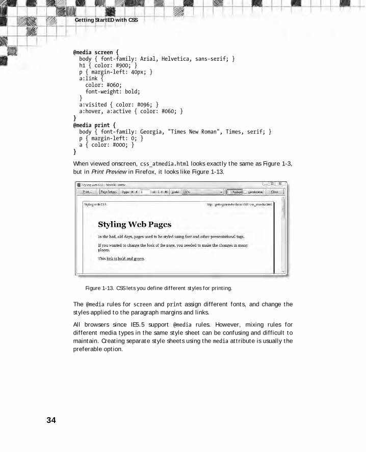
rules in a pair of curly braces. The following code shows separate rules for
screen and print media types (you can test the code in css_atmedia.html and
css_atmedia.css in the download files):
body { color: #000; background-color: #FFF; }
Getting StartED with CSS
34
@media screen { body { font-family: Arial, Helvetica, sans-serif; } h1 { color: #900; } p { margin-left: 40px; } a:link { color: #060; font-weight: bold; } a:visited { color: #096; } a:hover, a:active { color: #060; } } @media print { body { font-family: Georgia, "Times New Roman", Times, serif; } p { margin-left: 0; } a { color: #000; } }
When viewed onscreen, css_atmedia.html looks exactly the same as Figure 1-3,
but in Print Preview in Firefox, it looks like Figure 1-13.
Figure 1-13. CSS lets you define different styles for printing.
The @media rules for screen and print assign different fonts, and change the
styles applied to the paragraph margins and links.
All browsers since IE5.5 support @media rules. However, mixing rules for
different media types in the same style sheet can be confusing and difficult to
maintain. Creating separate style sheets using the media attribute is usually the
preferable option.
35
Chapter 1: What is CSS, and Why Should I Learn It?
AdvancED Support for the various media types is patchy. The most reliable—and
useful—are screen and print. Create one style sheet to style the way your
pages look in a browser. Create a separate style sheet to control the same
pages when printed out.
Learning to write CSS well CSS is amazingly simple, but it can also be phenomenally complex—at times
infuriatingly so. The simplicity of CSS lies in the limited number of properties
you need to remember. The complexity lies in the fact that you can combine
the properties in an infinite number of ways. This makes CSS extremely
powerful, but it also means there can be a long learning curve before you begin
to feel comfortable.
My advice is not to rush. The way I learned CSS was to add or change one
property at a time and view the results in a browser. It was a slow, tedious
process, but it helped me understand the interaction of the different
properties. Once you appreciate the trickle-down, cumulative effect of the
cascade, you’ll be amazed at the power of CSS. The time spent will be repaid
many times over in increased efficiency and easier maintenance of your
websites.
Avoiding common mistakes
CSS beginners are prone to two common diseases known as classitis and divitis.
You won’t find either of them in a medical dictionary, but they are widespread
among web developers. Once caught, they are notoriously difficult to cure. The
style rule in Figure 1-12 uses a type selector, which redefines the default look
of an HTML tag. It’s the simplest type of selector, yet is often overlooked by
beginners who become fixated with another type of selector known as a class.
A class can be used to apply the same styles to many different elements in a
page. You apply a class by adding the class name to the opening HTML tag of
the element. This has a comforting, familiar feeling, because you’re applying
the style directly. However, it’s little better than the old method of using
<font> tags and other presentational markup that needed to be added directly
to every element.
Getting StartED with CSS
36
The file css_classitis.html in the download files for this chapter shows the
type of problem caused by overuse of classes. Every paragraph has an opening
tag that looks like this: <p class="bodyText">. In Chapter 4, you’ll see the
important role classes have to play, but this is overkill. As css.html proves, you
can style paragraphs without the need for any extra markup in the HTML.
The other disease, divitis, tends to afflict designers who relied heavily on table
layout. A <div> is an HTML device designed to group elements together so they
can be styled in a unified way. Unfortunately, many people misinterpret the
role of a <div>, and wrap everything in a <div> before styling it. Again, this
usually results in redundant markup.
My aim in this book is to try to help you avoid catching either of these diseases.
I suffered from both of them at one stage and know how hard it is to undo bad
habits once learned. So, if you have previous experience of CSS, please try to
put out of your head all thoughts of using classes or wrapping elements in <div> tags, at least for the time being. Classes and <div> tags have a vital role to
play in CSS, but I want you to learn first about using type selectors and
exploiting the cumulative effect of the cascade.
Test your CSS early in several browsers
The whole purpose of CSS is to control the way your web pages look in a
browser. Because Internet Explorer is the most widely used browser, over the
years many designers have made the mistake of using IE6 or IE7 to test their
web pages. After getting everything looking the way they wanted, they finally
tested in Firefox, Opera, or Safari, and discovered to their horror that the
pages didn’t display properly. Unfortunately, the CSS bugs in IE6 and IE7 meant
that fixing the problems in the other browsers was much more difficult than if
they had designed their styles to work in a more standards-compliant browser
to start with. The arrival of IE8 should make things easier for developers, but
the Web is constantly changing. The moral of this story is to test early and test
often in different browsers—and on different operating systems. Design for
browsers that you know to be standards-compliant (IE8 or the most recent
versions of Firefox, Safari, Google Chrome, and Opera).
Building a useful toolset for working with CSS
Understanding the effect of a style rule can sometimes be difficult, even for
experienced designers. Fortunately, there are some useful tools available that
let you inspect the styles not only of your own site but of any public website,
giving you a useful insight into how CSS works.

37
Chapter 1: What is CSS, and Why Should I Learn It?
I have already mentioned the Develop menu in Safari. You enable it by
selecting the check box labeled Show Develop menu in menu bar in the
Advanced tab of the Preferences panel. In Safari 4, this gives you access to the
Web Inspector (see Figure 1-15), a sophisticated panel that lets you analyze
how style rules are being applied. You can also use the panel to disable styles
temporarily to see what effect it has. The Web Inspector panel might look
baffling now, but as you come to understand CSS, you’ll appreciate just how
useful it is.
Figure 1-15. The Web Inspector in Safari 4 helps you analyze the effect of
style rules with a range of helpful tools.
Similar analysis tools are available in the most recent versions of other leading
browsers. You access the Developer Tools panel in IE8 through the Tools menu
or by pressing F12. In Opera 10, select Tools ➤ Advanced ➤ Developer Tools.
Firefox doesn’t have a built-in panel, but the Firebug and Web Developer
Toolbar add-ons are indispensible for working with CSS. Both are free, and can
be obtained by selecting Tools ➤ Add-ons from the Firefox menu. Use the
search field in the Get Add-ons tab to locate and download Firebug and the
Web Developer Toolbar.

Getting StartED with CSS
38
Of course, you also need a decent selection of modern browsers for testing:
IE8, Firefox, and Safari at the minimum. You can find them easily online using
your favorite search engine—and they’re all free, so there’s no excuse not to
use them.
Chapter review This chapter has given you a brief overview of the reasons behind the
development of CSS and why it took so long to become widely adopted by the
web development community. Although it will take several years for older
browsers with substandard support for CSS to die out, the arguments in favor of
using CSS are now overwhelming. Learning how to create styles involves
patience and practice, but the effort is more than repaid by the efficiencies
offered by CSS. To take just a simple example, changing the color of links with
CSS involves a simple change to a single page that affects the whole website.
The most efficient way to use CSS is by creating style rules in one or more
external style sheets and attaching them to each page with the <link> tag. You
can also embed styles in the <head> of a page if you want to apply special
styles only to that page. The third way of applying styles is inline with the
style attribute in the opening HTML tag of the element you want to affect.
However, inline styles are the least efficient form of CSS and should normally
be used only when designing an HTML email.
In the next chapter, you’ll start creating your own CSS to style text. This is the
quickest way to make a dramatic difference to the look of your pages. It also
helps reinforce the basic concept of using the cascade, showing the cumulative
effect of styles as they trickle down the structure of a web page and how they
can be overridden by styles lower down in a style sheet.


![sushekha@adobe.com arXiv:2112.00166v1 [cs.CV] 30 Nov 2021](https://img.pdfslide.us/doc/110x75/622f6ae5ceff5353e342d210/sushekhaadobecom-arxiv211200166v1-cscv-30-nov-2021.jpg)