Embed Size (px)
Citation preview

Geographic Visualization across the Social Sciences
Martin Dodge, Mary McDerby & Martin Turner; University of Manchester
Final report on workshop on geographic visualization held at the University of Manchester, 12-13th June 2006.
Image above consists of test stills from data created by the Hadley Centre for Climate Research that is a specialist group of the UK Met Office involved with ongoing research into global climate prediction. They have produced a number of climate models e.g., HadCM1, HadCM2 etc. The goal of the work carried out at the University of Manchester is to show their data in an easily understandable manner with impact to grab the attention of their audience. The full model and simulation generates many variables covering temperature, wind, ocean flow, soil moisture, sea levels etc. and are used to create accurate scientific visualization animations. The A2 scenario describes a very heterogeneous world.

Geographic Visualization across the Social Sciences
Martin Dodge, Mary McDerby, Martin Turner i 30 May 2007 University of Manchester
Contents
1 Executive Summary and Recommendations ................................................................................................1
1.1 Issues Discussed ................................................................................................................................1
1.2 Grand Challenges ...............................................................................................................................2
1.3 Recommendations ..............................................................................................................................2
2 Background to the Workshop ........................................................................................................................4
3 Geographic Visualization across the Social Sciences ..................................................................................5
4 Introduction to the Themes............................................................................................................................6
5 Innovative Applications..................................................................................................................................7
5.1 Presentations ......................................................................................................................................7
5.1.1 The Geographic Visualization of Migration and Mortality in Colonial Fiji, 1879-1885............7
5.1.2 Visualising Geographies. Pitfalls and Potentialities of Geographic Representation in Social Anthropology .......................................................................................................................................7
5.1.3 Geographic visualization across the social sciences - Geovisualization Applications in Research and Teaching: Evaluation and Reflection ...........................................................................8
5.1.3.1 Purpose...................................................................................................................8
5.1.3.2 Design / methodology / approach ...........................................................................9
5.1.3.3 Findings...................................................................................................................9
5.1.3.4 Practical Implications ..............................................................................................9
5.1.3.5 Originality/Value......................................................................................................9
5.1.4 Landscape Visualization and Mixed Realities ......................................................................10
6 Geotools ......................................................................................................................................................12
6.1 Presentations ....................................................................................................................................12
6.1.1 Re-visualizing our world .......................................................................................................12
6.1.1.1 Method ..................................................................................................................12
6.1.1.2 Content..................................................................................................................12
6.1.2 Aerial Photography and Planning: emerging uses in property research..............................13
6.1.3 Geovisualization and time – new opportunities for the space-time cube.............................14
6.1.4 The Influence of Uncertainty Visualization on Decision Making. .........................................15

Geographic Visualization across the Social Sciences
Martin Dodge, Mary McDerby, Martin Turner ii 30 May 2007 University of Manchester
7 Built Environment / 3D.................................................................................................................................16
7.1 Presentations ....................................................................................................................................16
7.1.1 3D GIS: Teaching and Planning for the Future ....................................................................16
7.1.2 The Faster and Simpler Means of Building Intelligent 3D City Models for 3D Urban GIS...16
7.1.3 Geographic Visualization for Forward Planning in the Fast Growing Megacities of the Developing World: Prospects and Limitations ..................................................................................18
7.1.4 Designing Visual Systems for Public Participation in Urban Planning .................................19
8 Multi-Dimensional Methods .........................................................................................................................21
8.1 Presentations ....................................................................................................................................21
8.1.1 Visualizing Data Gathered by Mobile Phones......................................................................21
8.1.2 Travails in the Third Dimension............................................................................................22
8.1.3 Metadata Frameworks for Automating Visualization of Long-run Geographical Change....23
9 Keynotes......................................................................................................................................................25
9.1 What Does Google Earth Mean for Social Sciences? ......................................................................25
9.2 The Milestones Project: A Case Study in Statistical Historiography.................................................26
9.3 The Visual City ..................................................................................................................................26
9.4 Where are we with Exploratory Visualization? (Multiple Linked Views & Beyond)...........................27
10 Data / National Services ..............................................................................................................................28
10.1 Geospatial Data Visualization via Web Services – An Introduction to the Technologies and Nomenclature ..............................................................................................................................................28
Appendix A Agenda for the Workshop.....................................................................................................30
Appendix B Participants...........................................................................................................................33
Appendix C References, Contacts and Acronyms...................................................................................34

Geographic Visualization across the Social Sciences
Martin Dodge, Mary McDerby, Martin Turner Page 1 30 May 2007 Manchester Visualization Centre
1 Executive Summary and Recommendations An agenda setting workshop to discuss geographic visualization across the social sciences was held at The University of Manchester on the 12th and 13th June 2006. Over fifty people from 21 institutions attended, 5 of which were international. The workshop was funded by the National Centre of e-Social Science (NCeSS) and organised by Dr Martin Dodge (Geography, University of Manchester), Dr Martin Turner and Mary McDerby (Manchester Computing, University of Manchester) and Professor Mike Batty (Centre for Advanced Spatial Analysis, University College London).
The aims of the meeting were to:
• Explore the ‘state of the art’ geographic visualization across the social sciences.
• Review innovative methods and techniques.
• Evaluate new software tools and data resources.
• Report on the development of new applications to support research and pedagogy.
In some sense the workshop represented a (near) ten year update on the AGOCG-sponsored Graphics, Visualization and Social Sciences workshop held in May 1997 at Loughborough University (see www.agocg.ac.uk).
The areas covered by the talks were:
• Innovative Applications
• Novel geotools, particular web-based ones
• Availability of Large Data set and Value-added by National Services
• Built Environment and Three-Dimensional Visualization
• Multi-Dimensional Methods
• Exploratory Visualization
1.1 Issues Discussed
Results of the discussions are:
• Adoption of technology.
• Context of viewing the imagery.
• Effective use of metadata.
• Differences in understanding of visualizations.
• Accuracy.
• Inappropriate use.
• Privacy/confidentiality.

Geographic Visualization across the Social Sciences
Martin Dodge, Mary McDerby, Martin Turner Page 2 30 May 2007 Manchester Visualization Centre
• Usability (HCI).
• Merge iconic and symbolic models i.e., pedestrian models into 3D iconic models.
1.2 Grand Challenges
The following were seen as needs with the geographic visualization arena:
• Collaborative graphics and visualization tools
• Ontologies
• Interoperable
1.3 Recommendations
The outcome of the workshop is the following recommendations:
• A review of the use of graphics and visualization in Geographic Visualization should be undertaken. This will form a second report and possibly a book. This will include an overview of the kind of tools used in each area.
• There is a need for further workshops focussed on different aspects of visualization relevant to different parts of the social sciences (e.g., health and privacy/uncertainty; history and temporal data; economics and mobile interactions; sociology and evolving social networks).
• A more in-depth summary of the field will be provided in an edited book that is being developed with chapters from selected workshop speakers and other invited experts. It is anticipated that the book will be published late in 2007.
It was commented that visualization in the social sciences had only moved on in the last ten years and is in a vibrant and healthy state – with many new fields and computational aspects opening up.
Further details and PDFs of all the presentations submitted can be found at:
http://www.ncess.ac.uk/events/ASW/visualisation/
Thanks to all our sponsors:
• NCeSS
• JISC
• CCSR
• vizNET
• ESRC
• University of Nottingham
• University of Manchester
• UCL - Centre for Advanced Spatial Analysis

Geographic Visualization across the Social Sciences
Martin Dodge, Mary McDerby, Martin Turner Page 3 30 May 2007 Manchester Visualization Centre
Geographic Visualization across the Social Sciences
Martin Dodge, Mary McDerby, Martin Turner Page 4 30 May 2007 Manchester Visualization Centre
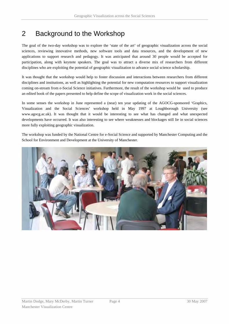
2 Background to the Workshop The goal of the two-day workshop was to explore the ‘state of the art’ of geographic visualization across the social sciences, reviewing innovative methods, new software tools and data resources, and the development of new applications to support research and pedagogy. It was anticipated that around 30 people would be accepted for participation, along with keynote speakers. The goal was to attract a diverse mix of researchers from different disciplines who are exploiting the potential of geographic visualization to advance social science scholarship.
It was thought that the workshop would help to foster discussion and interactions between researchers from different disciplines and institutions, as well as highlighting the potential for new computation resources to support visualization coming on-stream from e-Social Science initiatives. Furthermore, the result of the workshop would be used to produce an edited book of the papers presented to help define the scope of visualization work in the social sciences.
In some senses the workshop in June represented a (near) ten year updating of the AGOCG-sponsored ‘Graphics, Visualization and the Social Sciences’ workshop held in May 1997 at Loughborough University (see www.agocg.ac.uk). It was thought that it would be interesting to see what has changed and what unexpected developments have occurred. It was also interesting to see where weaknesses and blockages still lie in social sciences more fully exploiting geographic visualization.
The workshop was funded by the National Centre for e-Social Science and supported by Manchester Computing and the School for Environment and Development at the University of Manchester.

Geographic Visualization across the Social Sciences
Martin Dodge, Mary McDerby, Martin Turner Page 5 30 May 2007 Manchester Visualization Centre
3 Geographic Visualization across the Social Sciences There is increasing realisation of the potential for ‘geography’ to provide the primary basis for innovative visualization and knowledge exploration. As can clearly be seen in the rapid growth in the use of geographic information systems (GIS), multimedia cartography and all manner of web-based mapping tools, geographic visualization broadly defined represents a significant area of development for visualization.
Within many the social science disciplines there is growing signs of a ‘spatial turn’ as research questions and modes of analysis centre around geographic location and understanding of spatial relations and flows. Many social sciences disciplines are exploiting the spatial components of large data to facilitate their analysis. Interactive geographic visualization is crucial here.
Outside of academia there is also a great deal of excitement in ‘digital geography’, evident for example in terms of new mapping of data and new types of application – such as map ‘mash-ups’ using Google maps, the map hacking and open-source mapping activists using cheap GPS to visualise the world afresh. The value of aerial photography and satellite imagery is being unlocked into easy (and fun) browsable interfaces such as Google Earth and Microsoft Local Live.

Geographic Visualization across the Social Sciences
Martin Dodge, Mary McDerby, Martin Turner Page 6 30 May 2007 Manchester Visualization Centre
4 Introduction to the Themes In the workshop advertisement the following themes were listed: • Work in real-time visualization, especially in tracking mobile phenomena
• Role of the Earth globe as both a metaphor and a mode of interactive exploration
• Increasing availability of large datasets of social and economic data that are geo-coded and can be analysed using geographic
• Ethics in visualising individual identifiable data
• Teaching and learning through geographic visualization
• Tracking and movement in terms of the surveillant society
• Networks, focussing on social networks, trade, rumours, strikes
• Locational issues including GIS
• Large data sets and databases
The following sections list the themes as a result of the papers that were submitted. They were broadly categorised as follows:
• Innovative Applications
• Geotools
• Data/National Services
• Built Environment/3D
• Multi-Dimensional Methods
As well as the papers discussed in the themes sections there were several invited keynote speakers, who presented work on the following areas:
• What does Google Earth mean for the Social Sciences? (Prof. Goodchild, UCSB, USA)
• The Milestones Project: A Case Study in Statistical Historiography. (Prof. Friendly, York University, Canada)
• The Visual City. (Prof. Batty and Dr Smith, UCL)
• Where are we with Exploratory Visualization? (Dr Roberts, University of Kent)

Geographic Visualization across the Social Sciences
Martin Dodge, Mary McDerby, Martin Turner Page 7 30 May 2007 Manchester Visualization Centre
5 Innovative Applications
5.1 Presentations
5.1.1 The Geographic Visualization of Migration and Mortality in Colonial Fiji, 1879-1885.
Dr Laurence Brown, University of Manchester
This paper explores the potential of GIS-based visualization to challenge some of the dominant themes of recent economic history. Focusing on the experiences of Melanesian migrant labourers in Fiji, this research examines how their migration fuelled the construction of a plantation economy in the British colony. Cartographic visualization was used by colonial authorities in the 1880s to analyse the high death-rates of these Melanesian immigrants, and those findings are compared with GIS visualizations based on data drawn from shipping registers, government reports, the local press and business records. While nineteenth century debates focused on the clustering of migrant mortality, this research also seeks to use visualization to analyze how such experiences were shaped by the journeys and environments that migrants experienced.
5.1.2 Visualising Geographies. Pitfalls and Potentialities of Geographic Representation in Social Anthropology
Andreas Dafinger, University of Manchester
GIS and spatial analysis are some of the most powerful tools that can be added to the anthropologist’s toolbox; in my own research I successfully employed the space syntax model (Hillier/CASA) to decipher local social structures, which are based on the fusion of kinship and local group formation, and are only decipherable through the spatial analysis of homesteads and neighbourhoods. On a wider scale, I used maps as a research tool, by mapping linguistic, economic, social, political data and basing interviews on the preliminary findings of these mapping processes: essential information was only retrievable through the use of mapping and the space syntax model.
On the other hand, computer aided mapping and GIS are not easily incorporated in the anthropological mainstream. Anthropology defines itself - like no other discipline in the humanities - through its key methodology, the (as Geertz called it, oxymoron of) ‘participant observation’. The anthropologist is at the same time researcher and his or her most important tool. As a consequence an obsession with qualitative data, and a general aversion against anything quantifiable seems paradigmatic for the whole discipline. Using maps, mapping, (leave alone GIS) as part of the methods employed in the data gaining process is often restricted to development-oriented approaches, and when used in other fields, is often considered suspicious and on many occasions even seen as incompatible with ‘solid research’. Map making is generally outsourced (to geographers working as cartographers) and –sarcastically speaking– anthropologists presenting their own maps evidently seemed to have too much spare time that better should have been spent on obtaining ‘real data’.
This is often revealed in the way anthropologists make use of ‘advanced’ technology such as GPS and mapping software, and the stunning naïveté many anthropologists gather GPS-data en passant, together with a strong reluctance to redesign the research process. This can –possibly- be addressed by acknowledging the possibilities of geographic and other spatial representation in the anthropological field from the onset of anthropological education / studies: spatial anthropology still needs to be established as a subfield in anthropological methodology.
Geographic Visualization across the Social Sciences
Martin Dodge, Mary McDerby, Martin Turner Page 8 30 May 2007 Manchester Visualization Centre
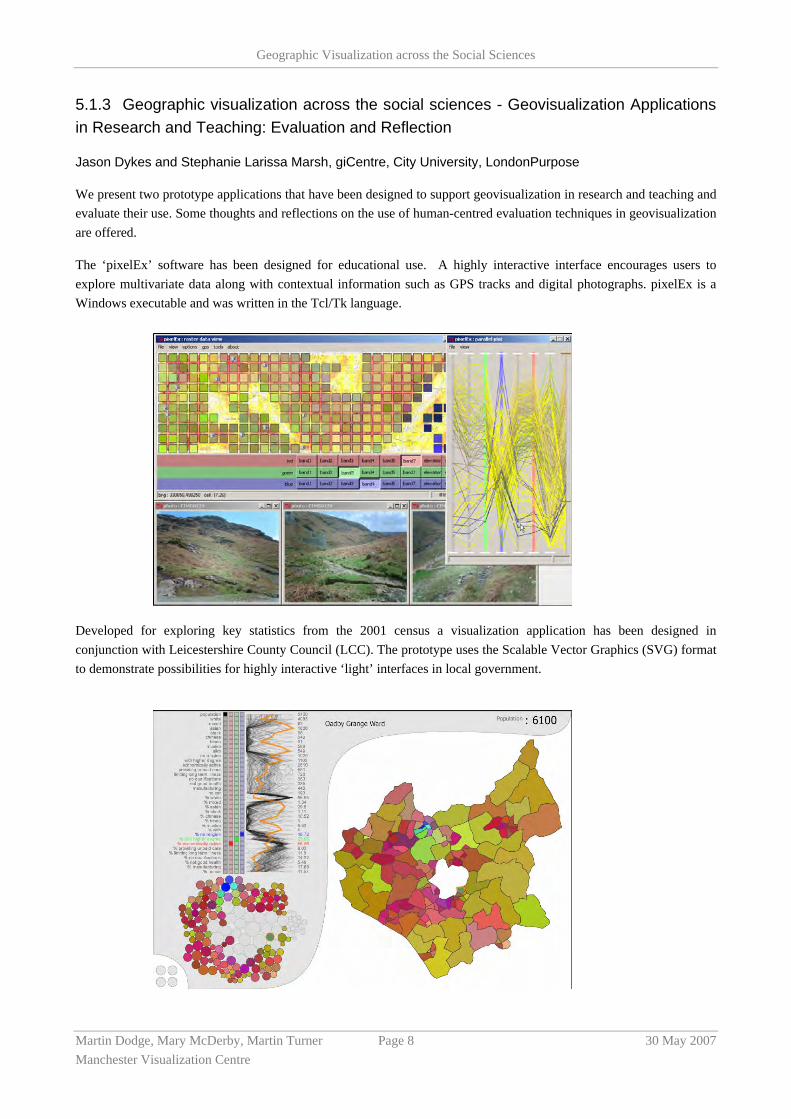
5.1.3 Geographic visualization across the social sciences - Geovisualization Applications in Research and Teaching: Evaluation and Reflection
Jason Dykes and Stephanie Larissa Marsh, giCentre, City University, LondonPurpose
We present two prototype applications that have been designed to support geovisualization in research and teaching and evaluate their use. Some thoughts and reflections on the use of human-centred evaluation techniques in geovisualization are offered.
The ‘pixelEx’ software has been designed for educational use. A highly interactive interface encourages users to explore multivariate data along with contextual information such as GPS tracks and digital photographs. pixelEx is a Windows executable and was written in the Tcl/Tk language.
Developed for exploring key statistics from the 2001 census a visualization application has been designed in conjunction with Leicestershire County Council (LCC). The prototype uses the Scalable Vector Graphics (SVG) format to demonstrate possibilities for highly interactive ‘light’ interfaces in local government.
Geographic Visualization across the Social Sciences
Martin Dodge, Mary McDerby, Martin Turner Page 9 30 May 2007 Manchester Visualization Centre
We adapt, apply and compare some human-centred techniques for evaluating geovisualization and report upon the results of using them with our two applications.
Design / methodology / approach
The two applications combine statistical and geographic views with interaction designs that encourage exploration through dynamic linking. Both have been evaluated using a two-stage process, enabling us to explore some of the issues associated with using human-centred techniques for evaluating geovisualization. pixelEx was evaluated twice ‘in the wild’ on field trips using different evaluation frameworks that drew upon observation, think-aloud, discussion, questionnaires and pre and post-exercise assignments. The LCC application was evaluated in two controlled experiments: a remote instructional evaluation undertaken by members of LCC where data were collected through note-taking and an exploratory face-to-face evaluation at City University using note-taking, think-aloud and an on-screen recorder. Content analysis was used on the qualitative data and statistical tests performed on the quantitative data in both cases.
Findings
Our empirical evidence shows that visualization can be used effectively in learning - students successfully explored data and gained insight using pixelEx ‘in the wild’ with significant improvements in performance following the exercise. Inconsistencies in the results of the two experiments and a tendency for more useful data to be collected when interaction was most complex suggest a need for diverse coordinated evaluation studies in a range of scenarios in geovisualization.
Users responded positively to the LCC application in our controlled experiments, which enabled them to complete tasks successfully. Diverse interaction strategies were recorded in the exploratory exercise along with evidence of ideation. Levels of ideation related to a combination of visual attention, degree of interaction and prior knowledge. Non-intrusive techniques provided the richest data, including ‘think aloud’ and continuous on-screen capture. Once again, consistency between individuals or groups was limited.
Practical Implications
We present evidence that visualization is useful both through controlled experiments with experts and ‘in the wild’ (albeit in a pedagogic, rather that an analytical context). Human-centred techniques show that users employ a range of approaches to successfully complete tasks, capture information on ideation and identify usability issues, particularly when interaction is at its most sophisticated and diverse. However, different evaluations in different contexts do not result in consistent findings and geovisualization evaluation studies should be planned and interpreted in the context of this information. We identify ‘motivation’, ‘expertise’ and ‘time’ as key factors in determining the quality of ideation recorded and recommend using longitudinal studies that focus on exploratory tasks with motivated expert users. Non-intrusive methods should be used to capture data from expert visualizers along with continuous automated techniques.Originality/Value
The two novel geovisualization prototypes employ emerging technology to offer visualization environments for the social sciences. They can be used and evaluated by the academic community for teaching and research.
The experiments offer empirical evidence that geovisualization can support learning, analysis and ideation. We demonstrate that human-centred approaches can contribute beneficial evaluation methods for geovisualization environments in lab-based studies and ‘in the wild’ and recommend that a range of approaches be used to capture information from motivated users: ‘think-aloud’ techniques are most appropriate for capturing data on ideation, in conjunction with automatically collected data on software use. However, the variation in results that we report suggest that the findings of such studies should perhaps be regarded as less than compelling if considered in isolation. Comparisons of evaluations with different users ‘in the wild’ and under controlled conditions are recommended. We

Geographic Visualization across the Social Sciences
Martin Dodge, Mary McDerby, Martin Turner Page 10 30 May 2007 Manchester Visualization Centre
suggest comparative studies that elicit general principles from a broad series of focussed expert evaluations. Such a ‘meta-framework’ for evaluating geovisualization requires cooperation and coordination across the community. Our recommendations, justified with some experimental evidence, may be of use to the wider visualization community. The findings of this study and the wider efforts that we call for can be used by social scientists to develop accessible interactive maps for research and education.
5.1.4 Landscape Visualization and Mixed Realities
Gary Priestnall, Centre for Geospatial Science, University of Nottingham
This paper reflects on experiences of using landscape visualisation in the context of the real environments concerned. From a teaching and learning perspective landscape visualisation is being used to engage student groups in certain technical debates concerning the nature and use of digital surface models, photography and digital reconstructions of the natural environment. Simple augmented reality techniques using perspective views printed onto transparencies have been extended to using GPS-enabled Personal Digital Assistants (PDAs) to deliver spatially referenced 3D views of hidden landscapes (geology) and past landscapes (glaciated) in the context of a physical geography fieldtrip. Lab-based visualisation is being used before and after fieldwork but also to explore the differences between wayfinding and orientation between real world and virtual world. The lab also serves as a test environment for the PDA-based applications mentioned above through synchronising the user location between lab-based real-time stereo visualisations and the PDA application. Mobile technology and visualisation will form part of the Nottingham arm of an ongoing initiative called SPLINT (Spatial Literacy IN Teaching), a Centre for Excellence in Teaching and Learning funded by the Higher Education Funding Council of England (HEFCE). Involving the University of Leicester (lead), the University of Nottingham, and University College London, SPLINT aims to advance the pedagogy of geospatial technologies, focusing primarily on taught postgraduate GIS and geomatics courses, and to generally enhance spatial literacy in Higher Education across a wider cross-disciplinary framework.
The rationale for the approach taken to integrating landscape visualisation into teaching is to encourage students to think about what they are looking at. Digital models of the Earth’s surface are moving increasingly into the public domain across a range of applications using new data commodities such as radar and lidar. Visualisations of these landscape models can be very engaging and believable yet the audience for such visualisations may be unfamiliar with the nature of the digital data which have gone into creating these models. There is a need to explore the way in which people interpret landscape visualisation and to raise awareness of the nature of various forms of digital surface models from which such views are generated. Geography fieldwork offers an ideal opportunity to explore the distinction between ‘believable’ and ‘representative’ visualisation and in so doing introduce students to digital geographic data in the context of their real world counterparts.
Related to these initiatives have been a series of collaborations with artist and lecturer Derek Hampson exploring landscape representation from the perspectives of Geographical Information Science, Art and Cultural Geography. Elements of the ‘Mapping Change’ project (www.mappingchange.com) brought together students and lecturers from GIS and Art backgrounds to focus on the issue of representation. More recently the ‘Chat Moss’ project (www.chatmoss.co.uk) focussed on how landscape is represented through both painting and GIS and the different ways in which people gain understanding from these various representations. This clearly sits within a broad research agenda which includes the following questions:
• How should we best model and visualise data for a landscape?
• Are we capturing the essential data in the first place?
• How do we convey a full and rich understanding of the world via GIS, spatial multimedia or mobile devices and re-present this in intuitive ways?

Geographic Visualization across the Social Sciences
Martin Dodge, Mary McDerby, Martin Turner Page 11 30 May 2007 Manchester Visualization Centre
• What are the implications for the development of GIS ontologies?
Perhaps one significant common issue which emerges from the fieldwork visualisation work and from the exploratory GIS – Art collaborations is the importance of being able to communicate effectively the metadata associated with the visualisation. Specific areas of interest for ongoing work in this area therefore include:
• Developing techniques to communicate the nature and scale of the data in relation to known objects of interest.
• Investigate the importance of spatial context and the factors which influence our ability to orientate ourselves to a visual representation.
• For reconstructed environments such as glacial ice forms the interpretation of these as ‘truth’ rather than one possible scenario derived from limited evidence must be avoided. We must explore ways in which the evidence used for reconstructions is made easily accessible and not hidden by the apparent realism of the visualisation.
Geographic Visualization across the Social Sciences
Martin Dodge, Mary McDerby, Martin Turner Page 12 30 May 2007 Manchester Visualization Centre
6 Geotools
6.1 Presentations
6.1.1 Re-visualizing our world
Anna Barford, University of Sheffield
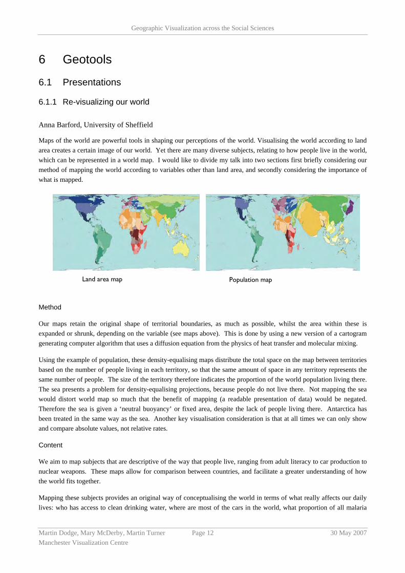
Maps of the world are powerful tools in shaping our perceptions of the world. Visualising the world according to land area creates a certain image of our world. Yet there are many diverse subjects, relating to how people live in the world, which can be represented in a world map. I would like to divide my talk into two sections first briefly considering our method of mapping the world according to variables other than land area, and secondly considering the importance of what is mapped.
Method
Our maps retain the original shape of territorial boundaries, as much as possible, whilst the area within these is expanded or shrunk, depending on the variable (see maps above). This is done by using a new version of a cartogram generating computer algorithm that uses a diffusion equation from the physics of heat transfer and molecular mixing.
Using the example of population, these density-equalising maps distribute the total space on the map between territories based on the number of people living in each territory, so that the same amount of space in any territory represents the same number of people. The size of the territory therefore indicates the proportion of the world population living there. The sea presents a problem for density-equalising projections, because people do not live there. Not mapping the sea would distort world map so much that the benefit of mapping (a readable presentation of data) would be negated. Therefore the sea is given a ‘neutral buoyancy’ or fixed area, despite the lack of people living there. Antarctica has been treated in the same way as the sea. Another key visualisation consideration is that at all times we can only show and compare absolute values, not relative rates.
Content
We aim to map subjects that are descriptive of the way that people live, ranging from adult literacy to car production to nuclear weapons. These maps allow for comparison between countries, and facilitate a greater understanding of how the world fits together.
Mapping these subjects provides an original way of conceptualising the world in terms of what really affects our daily lives: who has access to clean drinking water, where are most of the cars in the world, what proportion of all malaria
Land area map Population map

Geographic Visualization across the Social Sciences
Martin Dodge, Mary McDerby, Martin Turner Page 13 30 May 2007 Manchester Visualization Centre
cases are in each country? When imagining the world it is more meaningful to think in terms of these subjects, not just land area.
Until recently, there was a lack of worldwide territory-level data on many variables, which would make a project such as this impossible. The United Nations Millennium Development Goals gave an impetus for much more world-level data to be recorded, for preliminary datasets to be corrected, and for more areas to be included. The availability of this data has made world mapping possible for the three hundred and sixty-five subjects that we will map.
The main aim of this project is to communicate this data. These maps are useful, effective and interesting vehicles to achieve this aim. World level data is information about us, and it can greatly increase our understandings of the world and our positions within it. Each of us has some right and some responsibility to understand how their life relates to that of others. This project is timely given the demands last year to ‘make poverty history’ – reading our maps illustrates the extent of worldwide inequalities. Whilst the maps themselves do not change anything, they are descriptive. As Rosa Luxemberg (1871-1919) stated: “the most revolutionary thing one can do is always to proclaim loudly what is happening”1.
6.1.2 Aerial Photography and Planning: emerging uses in property research
Dr. Scott Orford, University of Cardiff
Aerial photographs are among the most important, widely available, and commonly used of remotely sensed images. One of their principal uses has been in Photogrammetry where they are used to construct and update topographic maps and produce spatial measurements such as ground distances and terrain elevations. In Planning they have been also used in a variety of natural resource and appraisal surveys, typically providing a contextual backdrop to development plans or for monitoring land-use change over time. Beyond this though, their use in UK Planning has been rather minimal, which is a reflection of the cost of obtaining good quality, up-to-date images. This situation is changing rapidly however, with the advent of new and improved sources of up-to-date digital aerial photography from companies such as UK Perspectives, Getmapping and Cities Revealed and more recently from free web-interfaces such as Google Earth and Microsoft’s Virtual Earth. These are providing new opportunities for the use of aerial photographs in Planning, both in teaching and research, and also in Planning practice where it is possible for local governments to use this (‘free’ - in the case of Google Earth and Virtual Earth) software for professional purposes. In addition, what was once a specialist area is now becoming available in the public domain, with Google Earth and Virtual Earth allowing high-quality images to be accessed freely by the general public?
My interest in aerial photography is in the area of property research in Planning, in more substantive roles than simply providing a contextual backdrop to development plans. There are three related (and emerging) areas of interest:
1. The use of aerial photography in the construction and maintenance of Local Authority property databases.
High-resolution aerial photography can provide a number of property attributes for individual dwellings and can be used to enhance existing data sources. For instance, in conjunction with OS Mastermap it can provide information on individual property attributes such as dwelling type, building materials and structural design as well as issues relating to neighbourhood quality. The use of aerial photography is also very effective in rural and sparsely populated areas where developments and improvements to property are hard to see from the road. Comparison of property records against aerial photographs can also identify unreported improvements, such as a new garage or a loft extension.
1 Rosa Luxemberg (1871-1919), cited in Immaneul Wallerstien (2003) The Decline of American Power. The New Press, London p.43-44

Geographic Visualization across the Social Sciences
Martin Dodge, Mary McDerby, Martin Turner Page 14 30 May 2007 Manchester Visualization Centre
2. The use of aerial photography in computer assisted mass appraisal (CAMA).
Following on from 1, CAMA is a system that maintains and supplies property information from a variety of sources and is used by Planning authorities in many countries (but not currently in the UK) as a means of calculating at-a-distance property valuations. The integration of aerial photography into CAMA is seen by many property valuation experts as a major step forward in local property taxation and the UK Government is investigating CAMA in England to help assess council tax, inheritance tax and capital gains tax.
3. The ethical issues of using high-quality aerial photographs to extract information on people and property in order to inform planning policy.
The news that the UK Government is considering using ‘spy-in-the-sky’ technology and CAMA to re-evaluate council tax bands in England was greeted with concern as a potential breech of people’s privacy. Shami Chakrabarti, director of Liberty, commented that: “It’s ludicrous. It’s not only a waste of resources, it’s a shockingly disproportionate interference with people’s privacy”. Likewise, Caroline Spelmen MP, Conservative Secretary of State for Local Government, stated that: “[I]t appears that the Government will … be using aerial photography to invade people’s privacy and lay the ground for a new stealth tax on home improvements”. Although there is obvious political rhetoric in these statements, they do highlight real issues concerned with privacy that access to high-resolution aerial photography may pose, particularly when integrated with other information. An example of this is using aerial photographs with OS Mastermap to identify the dwelling type of individual properties and then comparing this to similar information in the 2001 Census. Substantial small-area differences between the two could reveal disclosure procedures undertaken to ensure confidentiality in the Census. Another example is the way that house buyers are increasingly using web mash-ups on sites such as Housingmaps.com (which integrates aerial-photographs, maps, estate agent data, Local Authority and other data) to inform their purchasing decisions. With aerial photographs not only can buyers view the property in which they are interested, but they can also view the neighbour’s properties and the surrounding area. Recent work funded by the Joseph Rowntree Foundation has suggested that such web searches could be increasing social segregation in the housing market as people make broad judgements at-a-distance based on digital information as opposed to site visits and local knowledge.
My presentation will thus concern the new uses of aerial photography resulting from the emerging data sources and technologies in the context of housing and property research in Planning. It will highlight examples of how academic researchers and professional planners are using aerial photography in their work and also examine some of the potential ethical issues resulting from the availability of high-resolution images in the public domain.
6.1.3 Geovisualization and time – new opportunities for the space-time cube
Prof. Menno-Jan Kraak
Today’s maps offer interesting opportunities to visualize dynamic phenomena. This is possible because the map is no longer the map as many of us know it. Traditionally it is known for it capacity to ‘present’ spatial patterns and relationships. Although this is still very much true, the map should also be seen as flexible interface to geospatial data. Maps offer interaction with the data behind the visual representation and additionally maps are instruments that encourage exploration and stimulate the user to think. In today’s mapping environment, the world of Geovisualization, methods and techniques from all kind of disciplines are combined. Next to cartography, geography and GIScience, these include scientific visualization, image analysis, information visualization, exploratory data analysis, and visual analytics.
The influence of these disciplines as well as the latest Internet technology with for instance sensor web enabled technology and the wide spread use of GPS has introduced new, potentially real time data gathering and presentation

Geographic Visualization across the Social Sciences
Martin Dodge, Mary McDerby, Martin Turner Page 15 30 May 2007 Manchester Visualization Centre
technology. Next to animation the interactive environment of dynamically linked views with different visual representations of moving objects/persons in space time will be discussed. Despite all new developments one traditional visual representation goes through a revival, the Space-Time-Cube. Today Hägerstrand’s model is relatively easy to generate and the necessary data is also, under specific conditions, available. New PDA’s and mobile phones are standard equipped with GPS able to collect trajectories. The Space-Time-Cube will be compared with other options to visualize trajectory information.
As an example to demonstrate the possibilities of the visualization options available data from the ‘running community’ is used. Runners are stimulated to analyse and share their results by the available gadgets. During runs they wear chips that in real-time register progress and time, and are also allow runners to find their photograph or videos among of ten thousands. Traditional GPS vendors like Garmin have discovered this market and offer dedicated runners-equipment that allows runners to analyse their training and runs. Not only can they answer questions like what was my highest heartbeat, but also where and when did this occur. Running becomes absorbed in a geo-world. Virtual runner communities exist and people can share their results. Track can be exported to Google-Earth and viewed by others. Although with limited functionality the Space Time Cube can be modeled on top of Google Earth to put its content in a more global position. Other sports that move like orienteering and cross country skiing will be discussed as well.
6.1.4 The Influence of Uncertainty Visualization on Decision Making.
Stephanie Deitrick, Arizona State University
As the volume and richness of geographic data increases, the need for visualizing these data in an informative and consistent manner becomes more acute. In particular, the accuracy, suitability and confidence of information being displayed, such as when the data are from multiple sources or contain some inherent uncertainty, are becoming a greater concern. The accuracy and timeliness of the data are particularly important in situations where visualization is used to support decision-making. The incorporation of uncertainty information into GIS applications and data sets is thus a vital component for the critical examination of spatial data used in decision support.
The importance of quantifying and representing uncertainty in geographic data is well recognized in science in general, and geography in particular (MacEachren et al. 2005; Zhang and Goodchild 2002; Cliburn et al. 2002). Much of the effort to formalize an approach to the visualization of uncertainty classifies uncertainty and its visualizations by how the uncertainty is represented—uncertainty is treated as an additional variable or piece of information that is incorporated into the visualization by mapping it as transparency, fog, texture, etc. to alter the appearance of the underlying data. I argue that this approach must be adjusted for the case of uncertainty visualization for decision making. Specifically, we need to shift from a typology of uncertainty visualization methods based on uncertainty as another type or piece of data to a typology based on the type of decision task.
While uncertainty visualization may influence decisions, I believe that the degree of influence is governed first and foremost by the decision task and not solely by the specific visualization technique used to communicate uncertainty information (Deitrick 2006). In my recent Master’s thesis, I presented a study of the influence of uncertainty visualization on decisions, and developed a preliminary typology of decision-making tasks and their relation to visualization. At the workshop, I would share the results of my Master’s thesis research, and would look forward to discussions with other participants to continue to develop a framework for my dissertation research. I would be an active participant in discussions regarding the implications of emerging visualization and uncertainty visualization methodologies and tools in social science.
Geographic Visualization across the Social Sciences
Martin Dodge, Mary McDerby, Martin Turner Page 16 30 May 2007 Manchester Visualization Centre
7 Built Environment & Three-Dimensional Visualization
7.1 Presentations
7.1.1 3D GIS: Teaching and Planning for the Future
John Marsden, University of Liverpool
This position paper briefly describes the way in which aspects of creating maps using computers on Town and Country Planning courses in the Department of Civic Design at the University of Liverpool has changed over the last 20 years moving from simple line maps to 3D GIS. The principal focus of GIS teaching has been on the manipulation, mapping and analysis of vector data using ArcView. However, in recent years, the 3D drawing package SketchUp has also been introduced into the GIS course and has proved extremely popular. This paper demonstrates how the linking of the two packages provides a means of introducing students to 3D GIS. It includes examples used in the classroom that are drawn from a wide range of projects and case studies.
Traditionally town and country planning students communicated their ideas and concepts using plans, sketches and physical models. More recently, as computers got more powerful, 3D (sometimes referred to as 2.5D) effect mapping became possible using digital terrain models (DTMs) and digital elevation models (DEMs) with hill shades. With the advent of specialist 3D drawing packages it was possible to ‘extrude’ building footprints from aerial photography and scanned drawings. Since 2003 the 3D drawing package SketchUp was introduced into various modules, beginning with the first year undergraduates, and has proved extremely popular with the students. With respect to this the students have been better able to express their ideas as they see them, as they demonstrate their plans within the computer environment in a very eye-catching way. Not only do the students enjoy generating their models this way, but it enables them to better show off their ideas of the built form as it fits into their planning context.
One of the drawbacks to using a 3D drawing package was that the models did not exist in true georeferenced space. True, they could be correctly scaled, but they existed in unregistered ‘drawing board space’. A particularly exciting development, as this paper demonstrates, is how the linking of the two packages (ArcView and SketchUp) via recent plug-ins in conjunction with MasterMap data set provides a means of creating 3D models in real geographical space with all the functionality and advantages of correctly georeferenced overlays of different data sets.
Note that this paper is not designed to be a formidable technical lecture. Rather, it will be an easy to follow, hopefully pleasant and somewhat colourful experience that participants can enjoy. The more technical aspects can be developed, perhaps in response to specific questions or in one-to-one ‘networking’.
7.1.2 The Faster and Simpler Means of Building Intelligent 3D City Models for 3D Urban GIS
Peter Ekow Baffoe, Newcastle University
Virtual 3D city models represent spatial and geographic referenced urban data by means of 3D geo-virtual environments that basically include terrain models, building models, vegetation models as well as models of roads and transportation systems. In general, these models are used to present, explore, analyze, and manage urban data. An increasing number of applications and systems incorporate virtual 3D city models as essential system components such as for urban planning and redevelopment, facility management, logistics, security, telecommunication, disaster management, location-based services, real estate portals as well as urban-related entertainment and education products (Dollner et al, 2006). Therefore a large number of potential users and usages require an efficient and effective access to

Geographic Visualization across the Social Sciences
Martin Dodge, Mary McDerby, Martin Turner Page 17 30 May 2007 Manchester Visualization Centre
and tools for virtual 3D city models and their contents. The city is usually the centre of education, trade, industry, cultural life, government, etc. It offers a variety of opportunities, which always has attracted people from the villages. For example, 70% of the population of the USA lives in cities, with 24% moving from rural areas to towns in the last 20 years (Zlatanova, 2000). The increase in population inevitably leads to the increase in both the complexity of tasks that have to be tackled and the information that has to be processed. In many cases, the need for 3D geo-referenced information is extremely high. It also very clear that use of 3D GIS to illustrate and analyze GIS data is growing since virtual environment is very convincing in public meetings. The world around us is three-dimensional and it seems natural that presentations of GIS data should move in this direction. However, since there are large number of data to process and whole lot of applications to look at, there is the need for simpler and faster means of handling these data.
After working with three different types of software in this PhD project, namely Terra Vista, SketchUp and ArcGIS, all the bottle necks in building 3D city models are being removed. Terra Vista using Feature Analysis and Coding Convention (FACC) model for attribution was able to develop splendid 3D models in GIS but was restricted to its residential and industrial models suitable for urban development applications. Moreover, one cannot model the features to suit the one in the real world. ESRI’s ArcGIS on the other hand could only provide an extrusion of the 2D data to a 2.5D model; only one z value can be provided for any (x, y). In SketchUp, these restrictions are omitted but the software produces a real 3D city model which acts as a symbol not having x, y and z coordinates in real world space. Using a combination of these three software system can produced the faster and simpler means of developing 3D urban objects in GIS of real world which has x, y and z coordinates in real world space.
In representation of the real world, features being used range from 2D to 3D. These features can be classified according to geometrical and topological criteria. Classes identified between the 2D and 3D models include 2.5D, a polygon having only one z-value, and a little more complex 2.8D model. Groger (2005) defines the 2.8D model as one which is a slight extension of 2.5D model and preserves the algorithmic and conceptual simplicity of the 2D case as much as possible. This complexity has strong impacts on the models and tools which are required to represent, manage and edit the data. The most important standard for geometric and topological models in GIS, ISO 19107 ‘Spatial Schema’ (Herring, 2001), which was issued by the ISO and the Open Geospatial Consortium, allows to aggregate solids to complexes and to represent the invisible faces and its 3D topology explicitly. However, tools to manage such 3D models are very complex and maintaining consistency is a difficult problem.
Different approaches to the task of representing the geometry and topology of 3D objects exist. 3D models built in CAD systems have no geographical reference. Here we are trying to maintain geographic reference and topology. From CAD systems it is known that 3D models can be distinguished in wire frame models, boundary models and volume models (Katjer & Volker, 2005). Geometric modelling in 3D city models is most commonly done with boundary representation (B-rep), which represents the body by faces, edges, nodes, and the topological connectivity of those elements. Representing an object, all enclosing faces are aggregated into a unique representation. The boundary representation has the advantage of not mixing topological and geometric information. Also a quick visualisation and application of textures on any surfaces is possible. However, because it is difficult to model with B-Reps, Constructive Solid Geometry is much more suitable for CAD modelling. The Constructive Solid Geometry (CSG), which is often used in CAD-Systems, builds objects using volume primitives such as cylinder, cubes, and spheres. This enables a simple way of representing complex buildings and other man-made objects. A problem is that the construction is not unique. Thus, different representations can form the same geometry. Spatial analysis is difficult to handle and textures cannot be applied easily as the single surfaces cannot be dealt with on at a time.
ESRI who produce ArcGIS does not provide any capability to make ones own 3D symbols or multipatch features but do provide the capability for geographic referencing. Considering the afore discussions above, we found out that to produce a more realistic 3D urban city models that are geo-referenced, there would be the need for additional software. That was why SketchUp software was introduced. This software system can be used to build more realistic 3D city models in a simpler and faster way but models produced can not be geographically referenced. The processes involved

Geographic Visualization across the Social Sciences
Martin Dodge, Mary McDerby, Martin Turner Page 18 30 May 2007 Manchester Visualization Centre
in producing 3D city models using these software systems are described briefly below; first create a new geodatabase and multipatch feature class in ArcGIS that can receive the models. As with all feature classes, the map projection is defined. To make the building spatially aware the features are selected from layers in ArcGIS and then imported into SketchUp. Imported layers can include TINs. Before importing the features to SketchUp the height element of the buildings is added as a field in the attribute table. So the foot-prints of the buildings are used right away in the construction of the building models. Once the building is completed, it is selected from the background layers and saved as a multipatch and exported to ArcGIS (ArcScene or ArcGlobe). When the building is added to the 3D environment of ArcGIS, it will retain its spatial understanding inherited from the other layer and be properly positioned on the landscape. This makes the concept simple and faster.
Quite often it is necessary to have not only one but multiple representations of a model with different accuracies. Therefore, different Levels of Details (LoD) have been applied. Traditionally, the main reason for representing different LoDs is efficient visualisation (Kolbe & Groger, 2004). Efficient analysis is another important reason for using LoD in a multifunctional 3D GIS. In most software, to achieve these different LoDs is a very difficult task. Here all the difficulties involved in the processes are eliminated. LoDs will allow several forms of representations for the same object. These could be the same object past, current and future. Using these simple tools we are able to build more realistic 3D city models for different LoDs which are well geographically referenced. These levels of details include building blocks, textured building blocks, more detailed architectural representation (ie showing windows, doors etc) and internal structures. In using photo images from aerial, terrestrial and consumer-grade photography, we are able to produce photo realistic representation of the real world. The system would be able to process and analyse 3D spatial information gathered from urban environments.
7.1.3 Geographic Visualization for Forward Planning in the Fast Growing Megacities of the Developing World: Prospects and Limitations
Dr. Manoj Kumar Roy, Queen’s University Belfast
Continued urbanisation is a global phenomenon, but the rapid increase in the total urban population is now principally a matter of increase in developing countries. Explosive population growth, slow economic growth and poor state of environment are some of the dominant characteristics of the urbanisation process in developing countries. Here, the trend is exacerbated by inefficient land resource management, land use planning, and development regulation systems, which cannot keep pace with the demand for land for urban use. Urgent action is needed where planning frameworks should combine a system of policy formulation that requires personal opinion (provided by stakeholders) with factual information (provided by scientific analysis or other objective experts). Advanced spatial analysis and geographic visualisation, facilitated by GIS, integrated with modelling and other software in the form of Planning Support Systems (PSS), have the potential to provide essential support. This understanding, together with recent advances mostly in developed countries, may justify the development of relevant geographic visualisation tools in developing countries.
Dhaka is one of the world megacities. Despite a declining trend, the annual population growth rate is still in excess of 3%, which is expected to result in a total population of 16 million by 2015. The urban core is already congested and badly polluted; therefore new development must take place in the fringe areas despite these being prone to flooding and containing very productive farmland. The likely consequence is the rise of the most fundamental conflict between the need for more food, which demands conservation as well as raising productivity of agricultural land and the need for more land for urban expansion. Resolving these conflicts with a view to promote sustainable urbanisation requires enabling local planners develop alternative land use scenarios and assess potential consequences. This can be greatly facilitated by tools, such as PSS, by incorporating the concept of integrated land use planning in its most advanced form as well as securing effective stakeholder participation. Geographic visualisation is an essential element of PSS tools, for example for communicating factor and suitability maps for land use suitability analysis and final land use allocation maps. In the recently developed Dhaka Development Planning Support System (DMDPSS), this level of geographic

Geographic Visualization across the Social Sciences
Martin Dodge, Mary McDerby, Martin Turner Page 19 30 May 2007 Manchester Visualization Centre
visualisation has been successfully achieved. However, to what extent can enhanced geographic visualisation help to ensure the utility and long term usability of the DMDPSS? Indeed, how far are such developments practical or desirable in a developing country context? Answers to these questions must take account of cultural and ethical dimensions as well as technological ones. For example, in Dhaka this needs to take account of the prevailing socio-political environment, government restrictions and highly uneven access to technology.
The situation differs across the developing world. In Malaysia, for example, a more favourable socio-political condition has led the relatively rapid development of advanced geographic visualisation tools. There have been some innovative initiatives in Brazil to overcome the lack of technical know how and in Colombia, the use of ‘urban observatory’ to facilitate community participation was successful. Nevertheless current examples are not always comparable with the state-of-the-art geographic visualisation in developed countries, such as with 3d visualisation, visualisation of fractal geometry, Web GIS and real time geographic visualisation. While there may be valuable technical lessons, the success of any geographic visualisation tool in developing countries lies, to a great extent, on consideration of the local context.
This paper will discuss the potential for enhanced geo-visualisation functionality as part of planning support system tools for developing megacities. Although, it will centre on an analysis of Dhaka, Bangladesh, it will draw on examples from across the developing world to illustrate issues associated with current levels of data availability, access, quality and socio-political contexts.
7.1.4 Designing Visual Systems for Public Participation in Urban Planning
Andy Hamilton and Yun Chen, University of Salford
The authors are from the Virtual Planning Research & Enterprise Group within the University of Salford Research Institute for the Built and Human Environment. The group researches ICT aspects of planning from data structures to application development and end user interactivity.
Within the IntelCities project (EU-funded, 6.8 million Euros, FP6 IP 2004-2005), the Virtual Planning team produced visualisation systems for use in planning. Our experience of this work highlighted the difficulty of producing systems to satisfy requirements of a wide range of stakeholders; including developers, planners and local citizens.
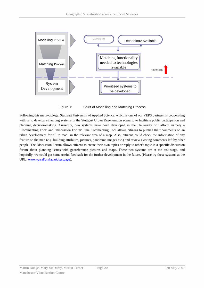
In the Virtual Environmental Planning Systems (VEPS) project (EU-funded, 2 million Euros, INTERREG IIB 2005-2008), we decided that a specific methodology needed to be developed to address the complex stakeholder problems in the systems that we are developing with other partners. The methodology is based on the Human-Centred Approach (HCA). It uses modelling and matching of user needs and technology to transform the initial system requirements to the final system solution. The methodology offers a process path for project partners and is intended to address two key perspectives: grasping requirements from multiple user groups and adopting appropriate ICTs (e.g. VR, GIS and Internet) to meet these requirements.
The methodology produced is based on the concept that information system development is not a solely technical challenge, but more a learning process which should result in a close match between requirements which are developed into system functionality and technology that can deliver the functionality. The consideration of contextual factors, and accommodation of both user and technical issues is essential for successful system development, which must fit resources, constraints, needs, wishes, and all the unique exigencies of the specific context. That is to say, on the one hand, people affected by the system need to be a focus during the whole development process. A model of their requirements should be continuously developed. However, on the other hand, designers cannot just follow what users say, since users may not be aware of technical considerations and other system constraints and thus may want to make decisions that are consistent with their preferences, which may not help to improve system performance. Designers need to match user requirements to available technologies, finding an appropriate balance between them. The spirit of the methodology is illustrated in the Figure 1 below.
Geographic Visualization across the Social Sciences
Martin Dodge, Mary McDerby, Martin Turner Page 20 30 May 2007 Manchester Visualization Centre
Figure 1: Spirit of Modelling and Matching Process
Following this methodology, Stuttgart University of Applied Science, which is one of our VEPS partners, is cooperating with us to develop ePlanning systems in the Stuttgart Urban Regeneration scenario to facilitate public participation and planning decision-making. Currently, two systems have been developed in the University of Salford, namely a ‘Commenting Tool’ and ‘Discussion Forum’. The Commenting Tool allows citizens to publish their comments on an urban development for all to read in the relevant area of a map. Also, citizens could check the information of any feature on the map (e.g. building attributes, pictures, panorama images etc.) and review existing comments left by other people. The Discussion Forum allows citizens to create their own topics or reply to other's topic in a specific discussion forum about planning issues with georeference pictures and maps. These two systems are at the test stage, and hopefully, we could get some useful feedback for the further development in the future. (Please try these systems at the URL: www.vp.salford.ac.uk/testpage).
Prioritised systems to be developed
Technology Available
User Needs
Matching functionality needed to technologies
available
Modelling Process
Matching Process
System Development
Iterative
Geographic Visualization across the Social Sciences
Martin Dodge, Mary McDerby, Martin Turner Page 21 30 May 2007 Manchester Visualization Centre
8 Multi-Dimensional Methods
8.1 Presentations
8.1.1 Visualizing Data Gathered by Mobile Phones
Michael Wright, Leif Oppermann, Mauricio Capra, Adam Drozd, University of Nottingham
In an increasing number of research disciplines data gathering is an integral part of current research. Furthermore, data gathering is moving out of the traditional laboratory environment and into the ‘wild’. For example, pollution monitoring as presented by Steed et al. [1] and Rudman et al. [2] uses mobile pollution monitoring equipment to gather data about pollution levels around a city. Other examples include Uncle Roy All Around You [3] where a range of data about movements and interactions between online and street players gave a rich data set from which player cooperation and emergent behaviour can be studied. This is further explored in mobile pervasive games such as Can You See Me Now [4] and I Like Frank [5].
Visualization tools to graphically represent the data gathered by these systems are an important requirement. Ethnographers for example, often collect a wide range of data such as text logs, audio and video. Tools such as Replayer [6] allow the ethnographer to view this gathered data based on location tags attached to the data which, is often presented on a map. Similarly, the Replay Tool [9] presents spatial or map views of user movements through the physical environment which, combined with temporal views of the data, reveal ‘thick’ and ‘thin’ areas of data availability. Consequently, data presented in these visualizations is much more accessible to the ethnographer when compared to the raw record.
However, one possible limitation to these data gathering systems described above is the need to physically carry a number of different devices such as a PDA, GPS receiver and other sensors. These devices vary in weight and cost and so limit the number of possible users that could gather data. In contrast to this we propose that mid range mobile phones, such as the Nokia Series 60, could be an excellent device by which multimedia data can be gathered by a large number of users for a variety of research activities.
Indeed, mobile phones are the most ubiquitous piece of computing technology today. With over 54 million people owning and using one in the UK in 2004 [7] the shear numbers of mobile phones provides researchers with a readily available and relatively cheap piece of hardware to capture data (such as images, audio and text) which can be location tagged. This location tag can either be spatial (i.e. GPS in newer mobile phones) or a non-spatial cell to which the users mobile phone is connected (i.e. the mobile phone mast they are receiving a signal from).
Capturing data in this way presents two main challenges (1) the technical infrastructure to facilitate the user capturing and sending location tagged data and (2) how we can visualize this location tagged data. We present solutions to both of these challenges however, our main focus is on visualization.
We first introduce a possible solution to the technical infrastructure by which users can gather and send text data based on the mobile phone game Hitchers [8]. Furthermore, we discuss how the Hitchers game could be extended to include multimedia data such as images and video. Additionally, we discuss the need for authoring tools and techniques so that different ‘games’ can be created in which players are set tasks such as gathering photos of graffiti or taking small videos of interesting activities happening at their location.
The second and main challenge that we discuss is the visualization of this captured data focusing on how we can visualize data that contains non-spatial location tags.

Geographic Visualization across the Social Sciences
Martin Dodge, Mary McDerby, Martin Turner Page 22 30 May 2007 Manchester Visualization Centre
We discuss possible solutions to this problem by describing the Hitchers visualization system that takes the form of a connected graph whose nodes represent unique cell-IDs and whose arcs represent direct transitions between pairs of cell-IDs that have been recorded by players during the game. We propose that visualizations such as this can help designers deal with the seams in cellular positioning as well as establish potential mappings between clusters and patterns of mapped cells and user-meaningful places and activities. This visualization could then be used as the basis of design and authoring tools such that data gathered from users can be presented to a researcher and experiments refined or new ones created.
Additionally, we discuss another visualization system which is based on pre-collected data of coverage and propagation of cell-IDs and their GPS-position. This geo-coded cell-ID data can then be used to visualize cell coverage on a map therefore, tying non-spatial location tags to a, albeit large, physical location.
8.1.2 Travails in the Third Dimension
Prof. Ifan. D. H. Shepherd, Middlesex University
Introduction
3D geographics are everywhere, from feature films and videogames to TV weather maps and in-car SatNav devices. With the recent launch of 3D Web maps by Google and Microsoft, and the impending release of 3D graphical interfaces onto the world’s PC desktops (through Microsoft’s Aero interface and Linux’s Xgl and AIGLK 3D desktop rendering engines), it is an appropriate time to take stock of 3D facilities in a GIS context.
This paper will attempt to answer three broad questions about the role of 3D displays in GIS, and particularly those available for spatial data visualisation. First, how far have we come in developing effective 3D displays for the analysis of spatial and other data? Second, when is it appropriate to use 3D techniques in visualising data, and which 3D techniques are most appropriate for particular applications? And third, what are the current R&D challenges in making effective use of the third dimension for visualising data across the social sciences? Answers to these questions will be based on a review of existing 3D GIS and the author’s experiments with his own prototype 3D data visualisation software. Examples will be drawn from research and teaching projects in geography, history and marketing.
Key themes
The main themes to be explored in this paper are:
• The visual interpretation problems posed by scale distortions across 3D views Although the problem of interpreting scenes which suffer from scale distortion and spatial occlusion was recognised early on in the development of 3D data visualisations, it has still only been partially solved, and current GIS software offer users few of the available techniques to reduce the problem.
• The ‘robbing Peter to pay Paul’ syndrome in time-space mapping Although Hagerstrand’s time-space cube has enjoyed something of a renaissance due to the development of powerful 3D graphical displays, it suffers from the co-opting of the z-axis to display time, with the result that ground surface features are rendered on a 2D plane. This is one example of the broader ‘dimension robbing’ problem in data visualisation, for which possible solutions are needed.
• The need for an entirely new symbol system for 3D data visualisation, based on the graphical sign system The 2D repertoire of symbols described in Bertin’s model is insufficient and inappropriate as a basis for developing symbols for 3D data visualisation. A new approach is required, based partly on recent experiments in the environmental sciences, in order to build a new vocabulary and grammar of 3D signs.

Geographic Visualization across the Social Sciences
Martin Dodge, Mary McDerby, Martin Turner Page 23 30 May 2007 Manchester Visualization Centre
• The need for a broader approach to the level of detail (LOD) problem Large spatial datasets require LOD to improve efficiency, but LOD techniques that are specific to certain types of data are also needed to support user interpretation of data in 3D space.
• The problem of choosing which 3D facilities to use for which applications A variety of approaches to 3D data visualisation is available (including fully immersive, semi-immersive and augmented reality), and several basic techniques may be used to enhance three-dimensional viewing (including parallax, stereo displays and kinetic visualisation). Users need effective guidance on when these should -- and should not -- be used.
• The need for multiple navigational metaphors and aids for moving around in 3D space Given that most computer users are incapable of navigating freely in 3D space, and given that different applications require different approaches to 3D navigation, the development and deployment of multiple 3D navigation metaphors and tools is long overdue.
• The challenge of developing multi-sensory 3D data realisations The lack of multi-sensory facilities is a major failing of most GIS, not only because it disables visually impaired users, but also because it reduces the information capacity of 3D data representations.
• The need to make available a wider range of user-computer interfaces for interaction with 3D worlds Although most computer games, many consumer devices and numerous experimental visualisation systems provide interface devices that are well adapted to 3D operations, most GIS users are restricted to the standard WIMP-style interface that emerged in a 2D graphics era.
Conclusions
Among the conclusions drawn are:
• Current GIS software has a long way to go in order to provide user-friendly and analytically effective toolkits for 3D data visualisation.
• Users face a steep learning curve in making effective use of the third dimension for data visualisation.
• Educators and trainers have a major responsibility for developing appropriate learning materials and guidelines to help users make the most effective choices in harnessing the power of 3D data visualisation.
• A considerable amount of basic research is still needed to determine which 3D facilities are best suited to which applications, and also to determine when 2D data visualisation is best.
8.1.3 Metadata Frameworks for Automating Visualization of Long-run Geographical Change
Humphrey Southall, University of Portsmouth
Data libraries and data visualisation should be closely linked, but are usually kept far apart: the main function of data libraries is seen as allowing expert users to download tabular data into their own systems for analytical use; visualisation is generally the province of just such expert users, and systems rely on the user knowing enough about their data and their software to make sensible decisions about which graphs and maps are logically valid. This is frequently about knowing what are appropriate divisors for computing rates.

Geographic Visualization across the Social Sciences
Martin Dodge, Mary McDerby, Martin Turner Page 24 30 May 2007 Manchester Visualization Centre
Figure 2: Graphing a rate: Infant Mortality in Salford CB 1911-73
The 2001 census was Britain's twentieth, and the continuing importance of the census lies in the amount of geographical detail it provides: you would expect systems visualising long-run geographical change to be commonplace. However, most on-line census systems provide no internal visualisation capability, examples including CASWEB, or Danny Dorling's Linking Censuses through Time. The Office of National Statistics' Neighbourhood Statistics system, aimed at the general public, does present census data graphically, but is limited to 2001 as an isolated time slice. One system which did enable mapping of census data for multiple dates was the original Great Britain Historical GIS, developed between 1994 and 2000. One limitation was that it was implemented using ArcGIS using very extensive AML scripts, but even if it had been run within Arc Internet Map Server it required users to select data to be mapped from a large set of separate Oracle tables. http://www.port.ac.uk/research/gbhgis
Those systems are obviously limited to Britain, but two US systems provide crucial background to the work presented here. The Great American History Machine (GAHM), despite its name, was a pioneering temporal GIS holding a broad range of census data at US county-level to 1840 to 1990. It could generate an immense range of choropleth maps, but gave users no assistance in selecting ones which were meaningful: the easiest maps to create were of crude counts rather than any kind of rate, and even if a user knew that choropleth maps should present rates not counts the GAHM gave them no help in choosing a divisor. The current US National Historical GIS (NHGIS), despite its central role in the development of the metadata system discussed below, is still designed primarily to allow researchers to download statistics and boundaries. http://www.nhgis.org

Geographic Visualization across the Social Sciences
Martin Dodge, Mary McDerby, Martin Turner Page 25 30 May 2007 Manchester Visualization Centre
9 Keynotes
9.1 What Does Google Earth Mean for Social Sciences?
Professor Michael F. Goodchild, NUI Maynooth and UC Santa Barbara
Google Earth (GE) has had enormous impact since it first appeared just over a year ago. Its simple interface, easy access to terabytes of high-resolution geographic information, and programmable interface caught the imagination of hackers, researchers, and the general public. Numerous applications have been developed, and GE has emerged as a potential output and visualization environment for many researchers. GE was featured as the cover story of a recent issue of Nature, where I was quoted as saying that it was democratizing GIS “just as the PC democratized computing”. For years I have taught a full-year sequence on GIS to senior undergraduates, and have used the ability to generate a fly-by as a reward for reaching the end of the sequence; today a child of ten can do the same thing using GE in ten minutes.
It has been recognized for a long time that seeing the Earth as a three-dimensional solid could greatly simplify GIS tasks. Map projections are complex and messy, and few people master them to the point of being completely confident in their properties and uses. Forcing GIS users to contend with map projections, as well as figures of the Earth and vertical datums, adds a layer of complexity that is in principle avoidable. GE shows the Earth as it appears from space (treating it as a sphere, which slightly distorts its real shape), and does all of its processing on the sphere. So while it would take considerable time to explain to a student why using a measuring tool on a Mercator projection would give a very misleading value for the distance between Los Angeles and London, no such complications occur in using GE. Similarly area on the Earth’s surface is computed by GE using spherical trigonometry rather than by messing with areas on projections that may or may not be equal-area. The complications of scale are also bypassed, and in GE one changes scale by the simple expedient of moving towards or away from the Earth. In summary, GE is a far more attractive environment for displaying data than the traditional GIS. It is only when one wants to print a two-dimensional picture of a significant fraction of the Earth’s surface that one still needs to confront issues of projection, and even then the Perspective Orthographic (the formal name for a view of the Earth from space) may be a suitable choice. The general public is becoming more and more familiar with it now that it is routinely used by the visual media.
Researchers in the US are used to open and free access to the base mapping that provides the framework for visualization of geographic information, but in other countries base mapping may be expensive and hard to acquire. Google Earth has had impact here also, by providing easy and free access to imagery, together with other framework layers such as named streets and named topographic features in some areas. The spatial resolution of the base imagery varies, and is typically higher in urban areas than rural. Many urban areas are covered at better than 1m resolution, allowing individual buildings and even land parcels to be readily identified. This open access has caused problems in many parts of the world, such as in India, where the national mapping agency prohibits public access to much base mapping.
Use of GE in the social sciences raises a number of interesting and potentially challenging questions:
• What types of information does GE privilege, and whose agenda does it represent? What kind of digital mirror does it provide?
• Information that is inherently visible, such as topography, is easily rendered in GE, but how can more abstract and socially relevant variables be rendered in ways that are meaningful to social scientists?
• There have been many successful extensions of GE, using KML. How can these be catalogued and made discoverable?

Geographic Visualization across the Social Sciences
Martin Dodge, Mary McDerby, Martin Turner Page 26 30 May 2007 Manchester Visualization Centre
• What are the prospects for extending GE into the realm of spatial analysis? Will ESRI’s promised GISExplorer fill this niche?
• Has DE exacerbated the Digital Divide?
• How accurate is GE’s registration? Can tools be developed to support real-time rubber-sheeting?
• What are the prospects of support for different alphabets and the use of diacriticals?
• How does GE compare in all of these respects to the growing list of competing systems?
• Can GE be used as a platform for simulation modelling?
9.2 The Milestones Project: A Case Study in Statistical Historiography
Michael Friendly, York University, Toronto, Canada
The graphic representation of quantitative information has deep roots, that reach into the histories of thematic cartography, geodesic measurement, statistics and statistical graphics, medicine, and other fields, and also into enabling developments in technology for reproduction, display and computation.
The Milestones Project attempts to document and illustrate these historical developments leading to modern data visualization and visual thinking. It consists of a comprehensive catalogue of important milestones in all fields related to data visualization, with representative images, bibliographical citations, cross references, web links.
In this presentation, I describe the origins and present status of this project, present a brief overview of some of the milestones in this history, and try to address questions of statistical historiography--- how to represent, analyze, display, and study themes, antecedents, influences, patterns, trends, and so forth.
9.3 The Visual City
Prof. Mike Batty and Dr Andy Smith Centre for Advanced Spatial Analysis (CASA), University College London

Geographic Visualization across the Social Sciences
Martin Dodge, Mary McDerby, Martin Turner Page 27 30 May 2007 Manchester Visualization Centre
This presentation will deal with half a dozen different ways in which cities can be visualised, from more abstract conceptions which draw on ideas from urban and regional economics and social physics, all the way to much more concrete abstractions which portray the city in 3D and related ways. The notion of a `model' is essential to such visualisation and the talk will focus on different kinds of models. Cities and related spatial systems where the focus has a natural graphics, represents good examples of where scientists can develop visualisation which generate useful insights. Visualisation in this context is thus not merely for better communication but for better science. One of the features of visualisation in this field is the development of ways in which visual interfaces to what might appear to be relatively narrow problems can links several different visualisations. The emphasis of the talk will be ion sketching a wide variety of visualisations but all of various aspects of cities which depend on different models associated with different social sciences and related fields. The material will draw on papers by Batty, Steadman and Xie (2006) and Batty and Hudson-Smith (2005).
9.4 Where are we with Exploratory Visualization? (Multiple Linked Views & Beyond)
Dr Jonathan Roberts, University of Kent
In this talk I will look at exploratory visualization, especially EV utilizing many multiple views that are all coordinated together (such as through brushing, navigational slaving etc). I will discuss various techniques that we currently use, and offer some discussion points of where we should further research. The presentation will include (1) the fundamental building blocks for EV with MLV, (2) some theories and models underpinning the systems, (3) the challenges with generating appropriate extensible infrastructures, (4) human interface issues (HCI) such as how to manage the many views, and finally (5) discuss perception within these environments.

Geographic Visualization across the Social Sciences
Martin Dodge, Mary McDerby, Martin Turner Page 28 30 May 2007 Manchester Visualization Centre
Large Datasets and National Services
9.5 Geospatial Data Visualization via Web Services – An Introduction to the Technologies and Nomenclature
James Reid, EDINA, University of Edinburgh
The Open Geospatial Consortium, Inc. (OGC) [www.opengeospatial.org] is a non-profit international voluntary consensus standards organisation that is leading the development of standards for geospatial data services. A range of OGC standards have relevance to the area of visualisation, not least:
• Web Map Service (WMS)
• Web Feature Service (WFS)
• Web Coverage Service (WCS)
• Style Layer Descriptor (SLD)
• Geography Markup Language (GML)
• Scaleable Vector Graphics (SVG)
These standards describe mechanisms by which distributed and heterogeneous data sources can be accessed, styled and visualised via web services. Within UK academia there is growing interest in exploiting such technologies for the delivery of geospatial data and the National Data Centres on the back of a successful Interoperability Project are increasingly looking to deploy their geospatial datasets via this route. The purpose of this presentation is to provide a brief overview of the pertinent standards, provide a gentle introduction to the nomenclature, to illustrate their practical use and to highlight the potential they offer for users to develop new approaches to visualisation, including ongoing work to Grid enable access to such services.
Simple Visualisation via a web service – Web Map Servers
The WMS specification is a simple, yet powerful interface to web mapping services to return map images. All necessary parameters for retrieving metadata or map images are encoded in the request URL e.g. http://glue.badc.rl.ac.uk/cgibin/mapserv?map=/var/www/html/jiscInterop/nerc.map&Service=wms&version=1.1.1&REQUEST=GetMap&layers=temp which results in :

Geographic Visualization across the Social Sciences
Martin Dodge, Mary McDerby, Martin Turner Page 29 30 May 2007 Manchester Visualization Centre
The critical bit to note is the REQUEST parameter which takes a number of values of which the following are the most important:
• GetCapabilities - this returns an XML file containing server-level metadata, description of services and content, acceptable request parameters. This file is often the starting point as it advertises the details of the data holdings and what to ask to get them i.e. what the server is capable of providing.
• GetMap – this returns a map image whose geospatial and dimensional parameters are well-defined (the additional parameters in the URL above for example request a layer called ‘temp’ (temperature) as well as the type of web service (WMS) and the version number of the WMS standard implemented (1.1.1).
The WMS thus allows the discovery and generation of custom static maps.
Accessing Data via a web service – the Web Feature Service (WFS) and the Web Coverage Service (WCS)
Unlike the WMS, the WFS manages feature data (as distinct from images). It too has a GetCapabilities interface and supports a GetFeature request to actually retrieve geographic data as XML (actually Geography Markup Language GML) encoded features. The thing to note is that the WFS delivers the actual data, not simply a representation of it as the WMS does. Similarly, the WCS can be viewed as a raster equivalent of a WFS which focuses on providing access to intact, raw data of coverages such as imagery, DEMs and other types of gridded data. Typically, client-side applications will model, analyze and render the data.
Specifying Portrayal Rules – Style Layer Descriptors (SLD)
The Style Layer Descriptor (SLD) Specification addresses the need for geospatial consumers (either humans or machines) to control the visual portrayal of the data with which they work. SLD can be used to portray the output of Web Map Servers, Web Feature Servers and Web Coverage Servers .
Transformation to Visualisation – GML to SVG
GML is an XML grammar for the modelling, transport, and storage of geographic information. GML provides a variety of object types for describing geography including features, coordinate reference systems, geometry, topology, time, units of measure and generalized values. Implementers may decide to store geographic application schemas and information in GML, or they may decide to convert from some other storage format on demand and use GML only for schema and data transport. Using XML processing technologies the raw GML can be transformed into a visual representation - Scalable Vector Graphics (SVG). SVG enables Web developers and designers to create dynamically generated, high-quality graphics from real-time data with precise structural and visual control.

Geographic Visualization across the Social Sciences
Martin Dodge, Mary McDerby, Martin Turner Page 30 30 May 2007 Manchester Visualization Centre
Appendix A Agenda for the Workshop
Monday 12th June
9:30 – 10:00 Registration and Coffee
10:00 – 10:10 Welcome: Martin Dodge and Martin Turner
10:10 – 10:20 Agenda Setting Workshops: NCeSS, Gillian Sinclair
10:20 – 11:00 Keynote 1: Michael Goodchild
What Does Google Earth Mean for the Social Sciences?
11:00 – 11:30 Coffee Break
11:30 – 12:50 Session 1: Innovative Applications
Talk 1: The Geographic Visualization of Migration and Mortality in Colonial Fiji, 1879 – 1885: Laurence Brown
Talk 2: Visualising Geographies. Pitfalls and Potentialities of Geographic Representation in Social Anthropology: Andreas Dafinger
Talk 3: Geovisualization Applications in Research and Teaching: Evaluation and Reflection: Jason Dykes & Stephanie Larissa Marsh
Talk 4: Landscape Visualization and Mixed Realities: Gary Priestnall
12:50 – 14:00 Lunch
14:00 – 14:40 Keynote 2: Michael Friendly
The Milestones Project: A Case Study in Statistical Historiography
14:40 – 16:00 Session 2: Geotools
Talk 5: Re-visualizing Our World
Anna Barford
Talk 6: Aerial Photography and Planning: Emerging Uses in Property Research: Scott Orford
Talk 7: Geovisualization and time – new opportunities for the sapce-time cube: Menno-Jan Kraak

Geographic Visualization across the Social Sciences
Martin Dodge, Mary McDerby, Martin Turner Page 31 30 May 2007 Manchester Visualization Centre
Talk 8: The Influence of Uncertainty Visualization on Decision Making: Stephanie Deitrick
16:00 – 16:30 Coffee Break
16:30 – 17:10 Session 3: Data / National Services
Talk 9: MIMAS Geospatial Services; Kamie Kitmitto
Talk 10: Geospatial Data Visualization Via Web Services – An Introduction to the Technologies and Nomenclature: James Reid
17:10 – 18:00 50 minutes working session(s)
19:00 – 21:30 Dinner

Geographic Visualization across the Social Sciences
Martin Dodge, Mary McDerby, Martin Turner Page 32 30 May 2007 Manchester Visualization Centre
Tuesday 13th June
09:00 – 09:10 Registration and Coffee
09:10 – 09:50 Keynote 3: Mike Batty
The Visual City
09:50 – 11:10 Session 4: Built Environment / 3D
Talk 11: 3D GIS: Teaching and Planning for the Future: John Marsden
Talk 12: The Faster and Simpler Means of Building Intelligent 3D City Models for 3D Urban GIS: Peter Ekow Baffoe
Talk 13: Geographic Visualisation for Forward Planning in the Fast Growing Megacities of the Developing World: Prospects and Limitations: Manoj Kumar Roy
Talk 14: Designing Visual Systems for Public Participation in Urban Planning: Andy Hamilton
11:10 – 11:40 Coffee Break
11:40 – 13:15 Session 5: Multi-Dimensional Methods
Talk 15: Visualizing Data Gathered by Mobile Phones: Michael Wright
Talk 16: Travails in the Third Dimension: Ifan D. Shepherd
Talk 17: Metadata Frameworks for Automating Visualization of Long-run geographical Change: Humphrey Southall
25 minutes working session 3
13:15 – 14:15 Lunch
14:55 – 14:55 Keynote 4: Jonathan Roberts
Where are we with Exploratory Visualization? (Multiple Linked Views & Beyond)
14:55 – 15:30 Session 6:
Working session 4: Summing Up
15:30 – 16:30 Demos and Coffee
VIPL / Manchester Computing

Geographic Visualization across the Social Sciences
Martin Dodge, Mary McDerby, Martin Turner Page 33 30 May 2007 Manchester Visualization Centre
Appendix B Participants
Name Institution Email
Chris Allen Lancashire Care Mental Health Trust [email protected]
Amer Alroichdi The University of Manchester [email protected]
Nick Avis Cardiff University [email protected]
Anna Barford The University of Sheffield [email protected]
Robert Barr The University of Manchester [email protected]
Mike Batty UCL/CASA [email protected]
Laurence Brown The University of Manchester [email protected]
Yun Chen The University of Salford [email protected]
Andreas Dafinger The University of Manchester [email protected]
Stephanie Dietrick Arizona State University [email protected]
Martin Dodge The University of Manchester [email protected]
Jennifer Donlan The University of Limerick [email protected]
Jason Dykes City University London [email protected]
Andy Evans University of Leeds [email protected]
Michael Goodchild University of California, Santa Barbara
Sarah Goodwin City University London [email protected]
Andy Hamilton University of Salford [email protected]
Karl Hennermann University of Manchester [email protected]
Terry Hewitt University of Manchester [email protected]
Andy Hudson-Smith UCL/CASA [email protected]
Richard Kingston University of Manchester [email protected]
Kamie Kitmitto University of Manchester [email protected]
Menno-Jan Kraak ITC [email protected]
Yien Kwok University of Manchester [email protected]

Geographic Visualization across the Social Sciences
Martin Dodge, Mary McDerby, Martin Turner Page 34 30 May 2007 Manchester Visualization Centre
Yuwei Lin National Centre for e-Social Science [email protected]
David Lloyd City University London [email protected]
John Marsden University of Liverpool [email protected]
Lynne Marsh University of Hertfordshire [email protected]
Stephanie Marsh City University London [email protected]
Mary McDerby University of Manchester [email protected]
Gail Millin University of Manchester [email protected]
Jon Minton University of York [email protected]
Scott Orford Cardiff University [email protected]
Simon Peters University of Manchester [email protected]
Gary Priestnall University of Nottingham [email protected]
John Pritchard University of Sheffield [email protected]
James Reid University of Edinburgh [email protected]
Jonathan Roberts University of Kent [email protected]
Andrew Rowley University of Manchester [email protected]
Roy Manoj Kumar Queen’s University, Belfast [email protected]
Ralph Schroeder University of Oxford [email protected]
Ifan Shepherd Middlesex University [email protected]
Humphrey Southall University of Portsmouth [email protected]
Graham Squires University of Manchester [email protected]
Andy Turner University of Leeds [email protected]
Martin Turner University of Manchester [email protected]
Emma Uprichard University of Durham [email protected]
Colin Venters National Centre for e-Social Science [email protected]
Michael Wright University of Nottingham [email protected]
Jialiang Yao University of Salford [email protected]