Embed Size (px)
Citation preview
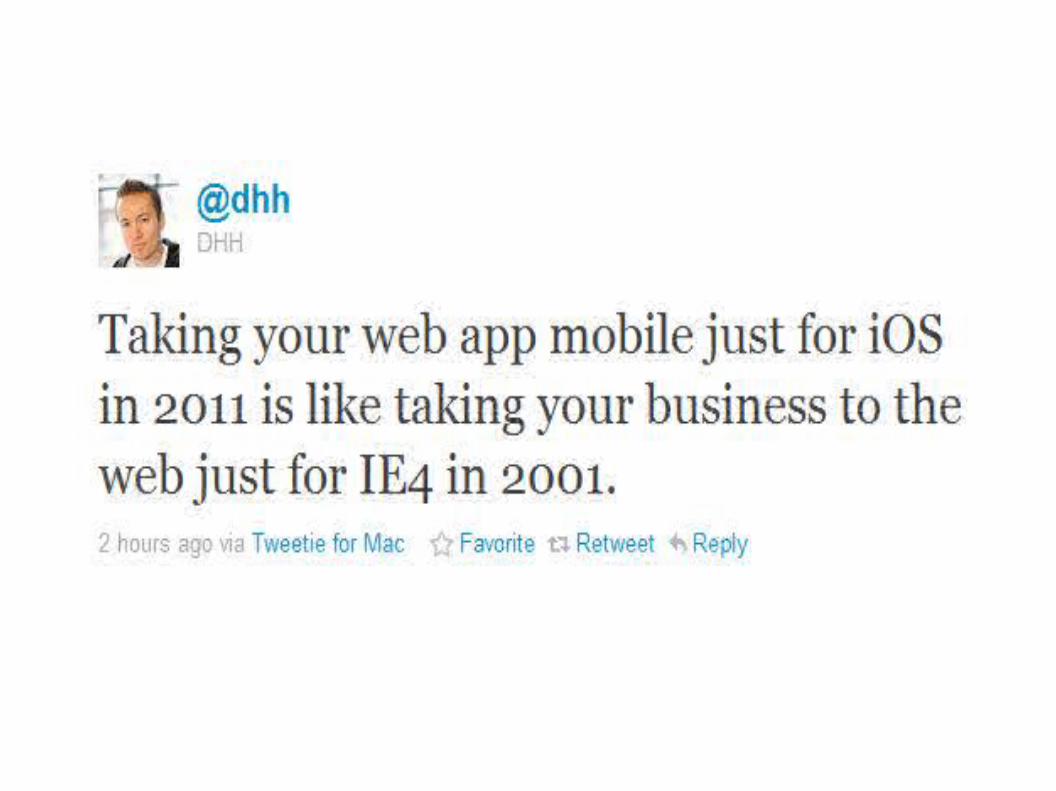
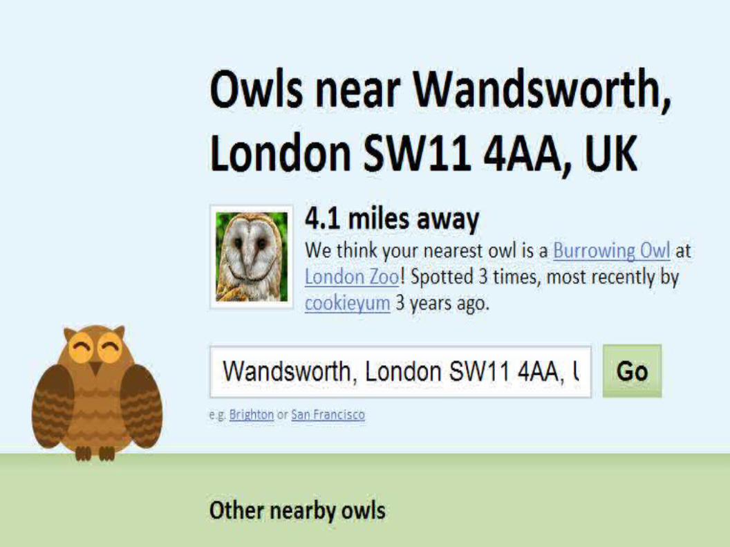
Web Anywhere
Bruce Lawson / SxSW/ 12 March 2011
Mobile Optimisation With HTML5, CSS3, JavaScript
introducinghtml5.com
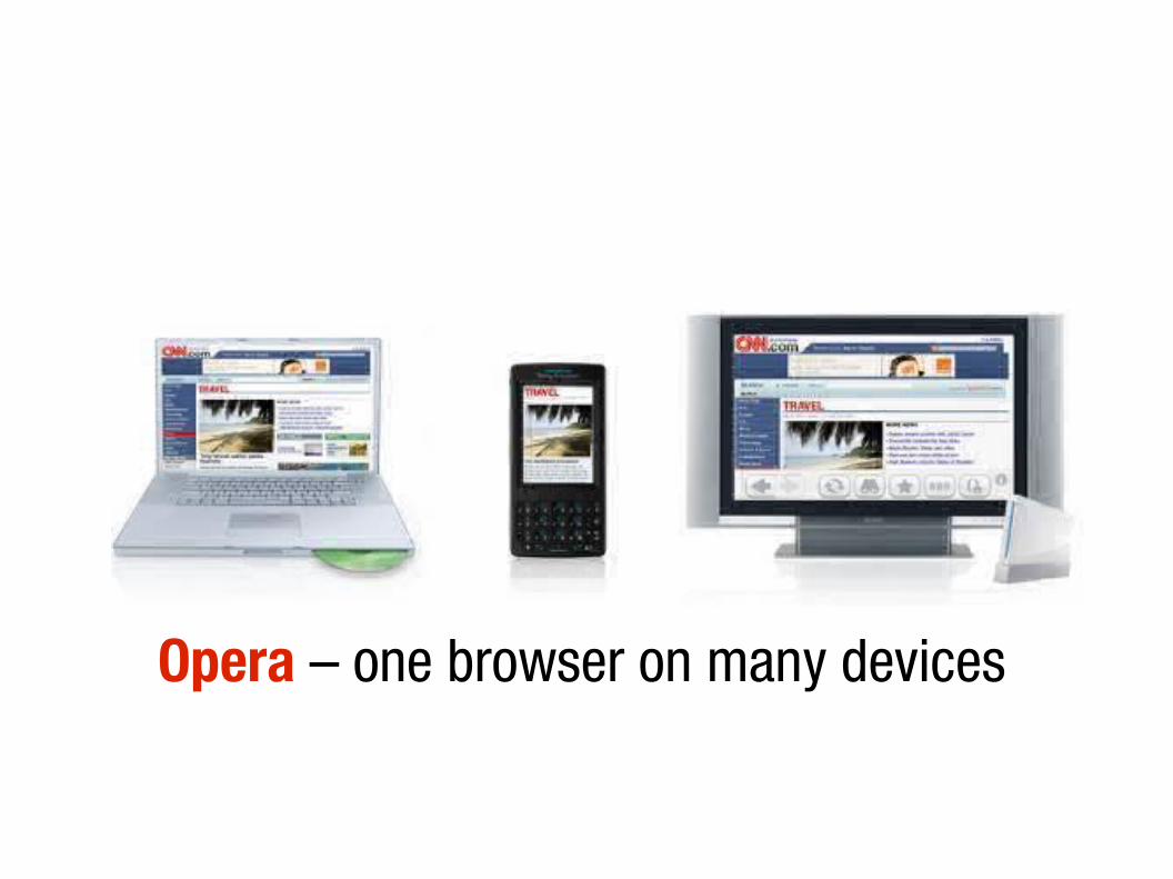
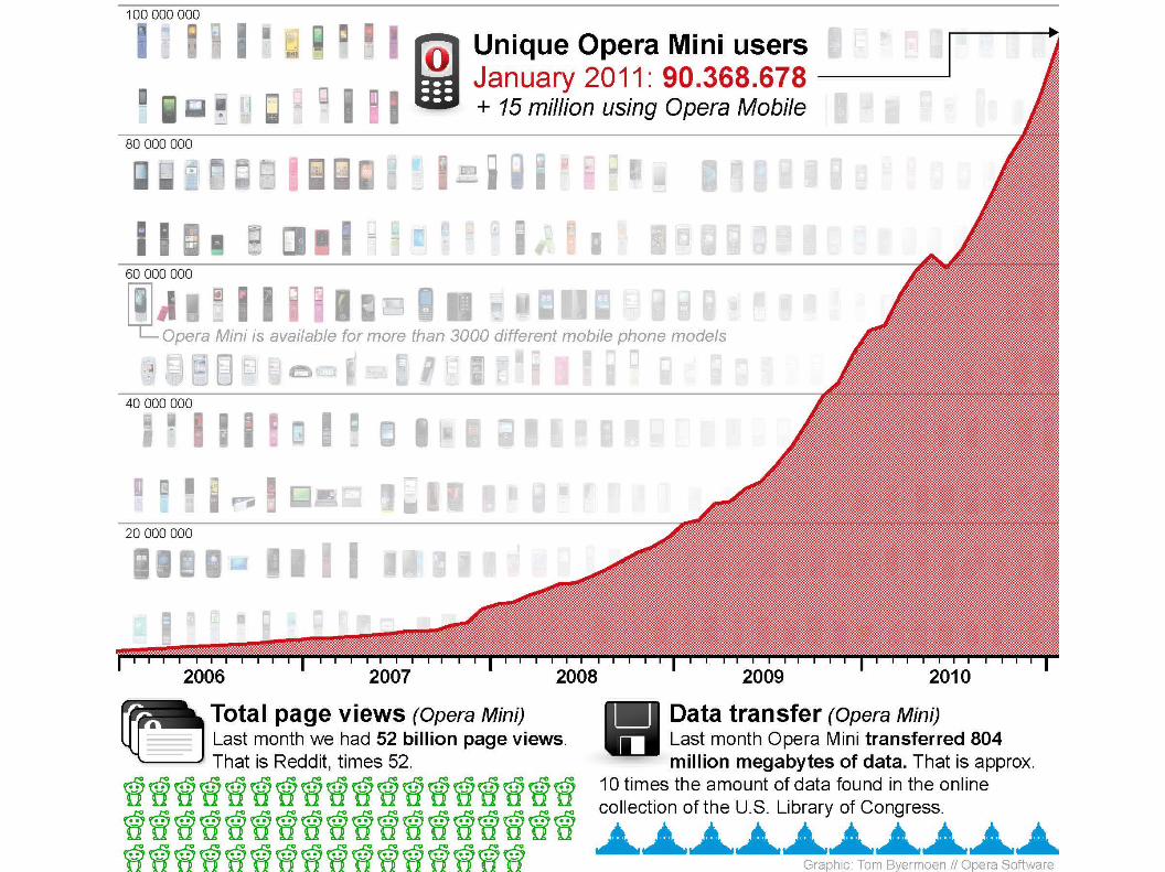
Opera – one browser on many devices
"Our goal is to take the one true Web and make it available to people on their terms."
Jon S. von Tetzchner, Opera Co-founder
"All I ask is access to the full Web, for everyone, everywhere. And some more beer."
Me
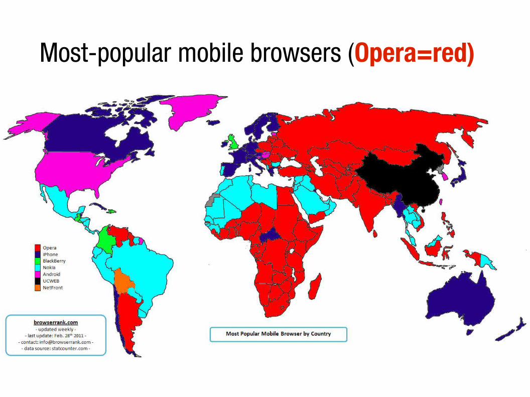
Most-popular mobile browsers (Opera=red)
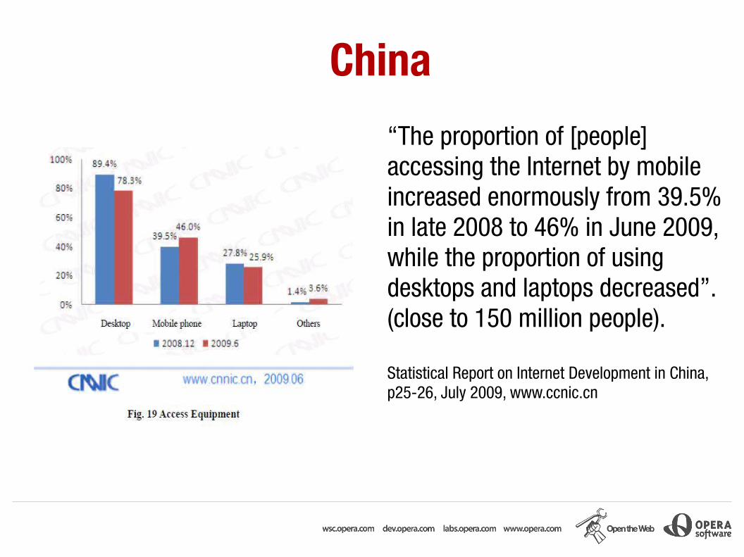
China
“The proportion of [people] accessing the Internet by mobile increased enormously from 39.5% in late 2008 to 46% in June 2009, while the proportion of using desktops and laptops decreased”. (close to 150 million people).
Statistical Report on Internet Development in China, p25-26, July 2009, www.ccnic.cn
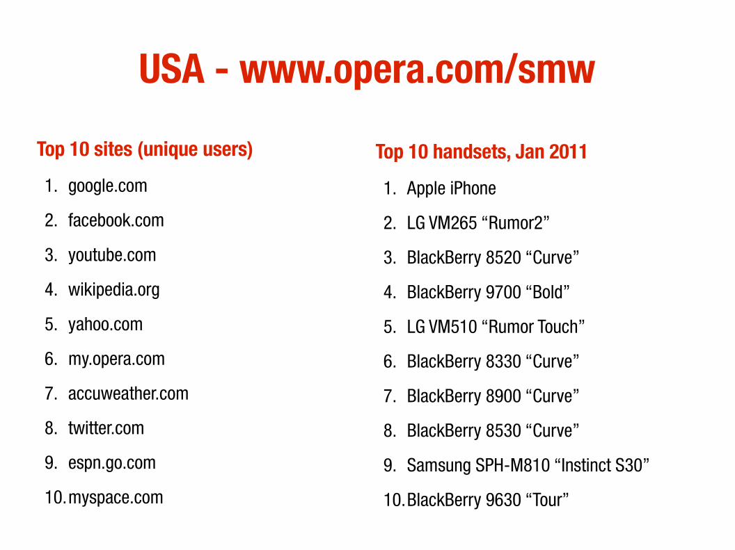
USA - www.opera.com/smw
Top 10 sites (unique users)
1. google.com
2. facebook.com
3. youtube.com
4. wikipedia.org
5. yahoo.com
6. my.opera.com
7. accuweather.com
8. twitter.com
9. espn.go.com
10.myspace.com
Top 10 handsets, Jan 2011
1. Apple iPhone
2. LG VM265 “Rumor2”
3. BlackBerry 8520 “Curve”
4. BlackBerry 9700 “Bold”
5. LG VM510 “Rumor Touch”
6. BlackBerry 8330 “Curve”
7. BlackBerry 8900 “Curve”
8. BlackBerry 8530 “Curve”
9. Samsung SPH-M810 “Instinct S30”
10.BlackBerry 9630 “Tour”
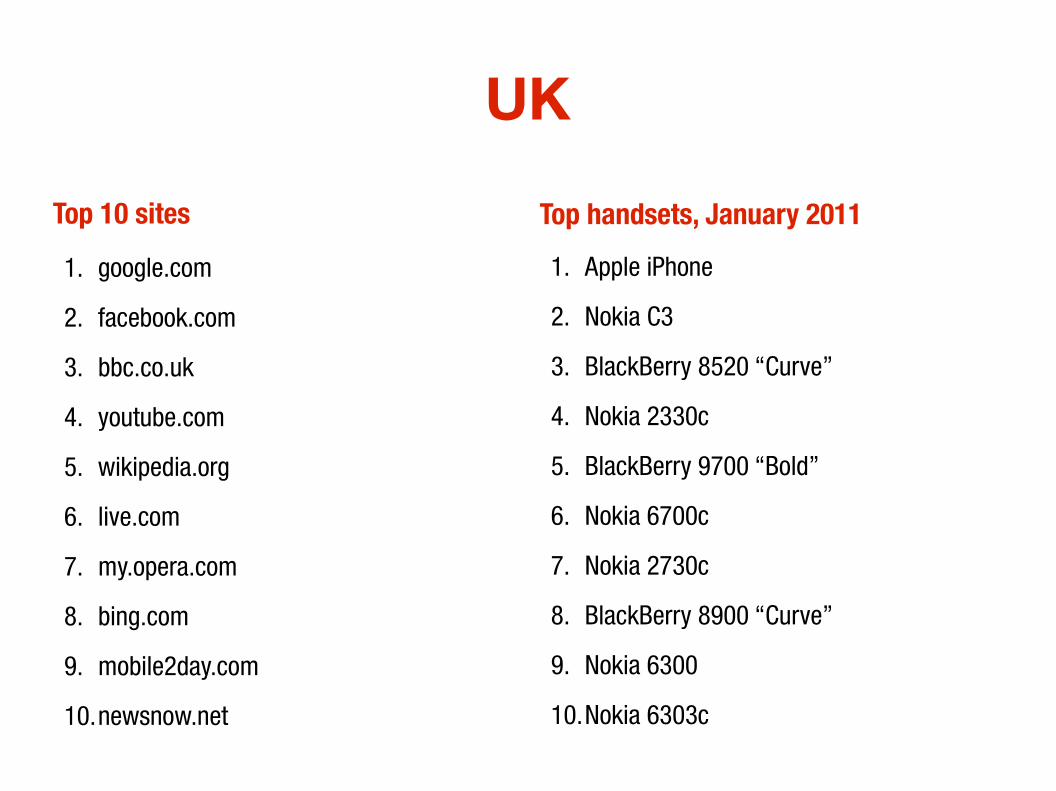
UK
Top 10 sites 1. google.com
2. facebook.com
3. bbc.co.uk
4. youtube.com
5. wikipedia.org
6. live.com
7. my.opera.com
8. bing.com
9. mobile2day.com
10.newsnow.net
Top handsets, January 2011
1. Apple iPhone
2. Nokia C3
3. BlackBerry 8520 “Curve”
4. Nokia 2330c
5. BlackBerry 9700 “Bold”
6. Nokia 6700c
7. Nokia 2730c
8. BlackBerry 8900 “Curve”
9. Nokia 6300
10.Nokia 6303c
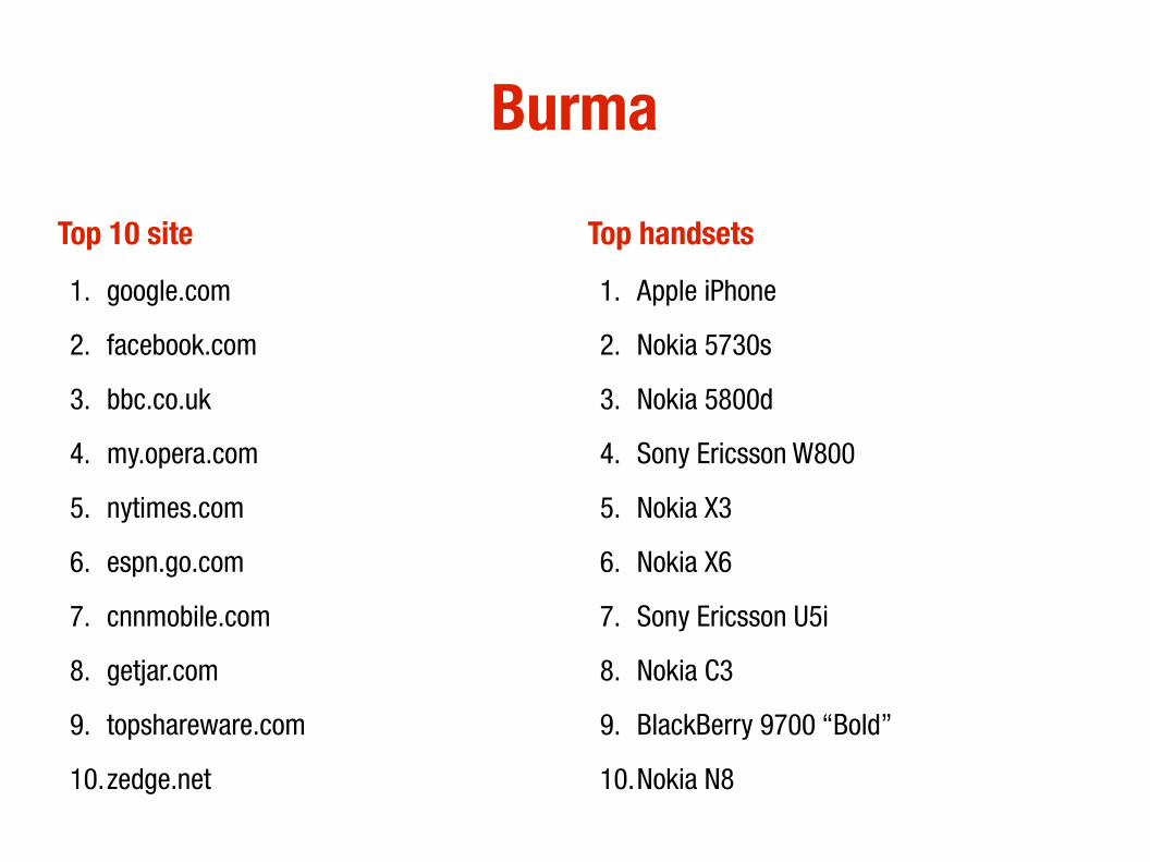
Burma
Top 10 site
1. google.com
2. facebook.com
3. bbc.co.uk
4. my.opera.com
5. nytimes.com
6. espn.go.com
7. cnnmobile.com
8. getjar.com
9. topshareware.com
10.zedge.net
Top handsets
1. Apple iPhone
2. Nokia 5730s
3. Nokia 5800d
4. Sony Ericsson W800
5. Nokia X3
6. Nokia X6
7. Sony Ericsson U5i
8. Nokia C3
9. BlackBerry 9700 “Bold”
10.Nokia N8
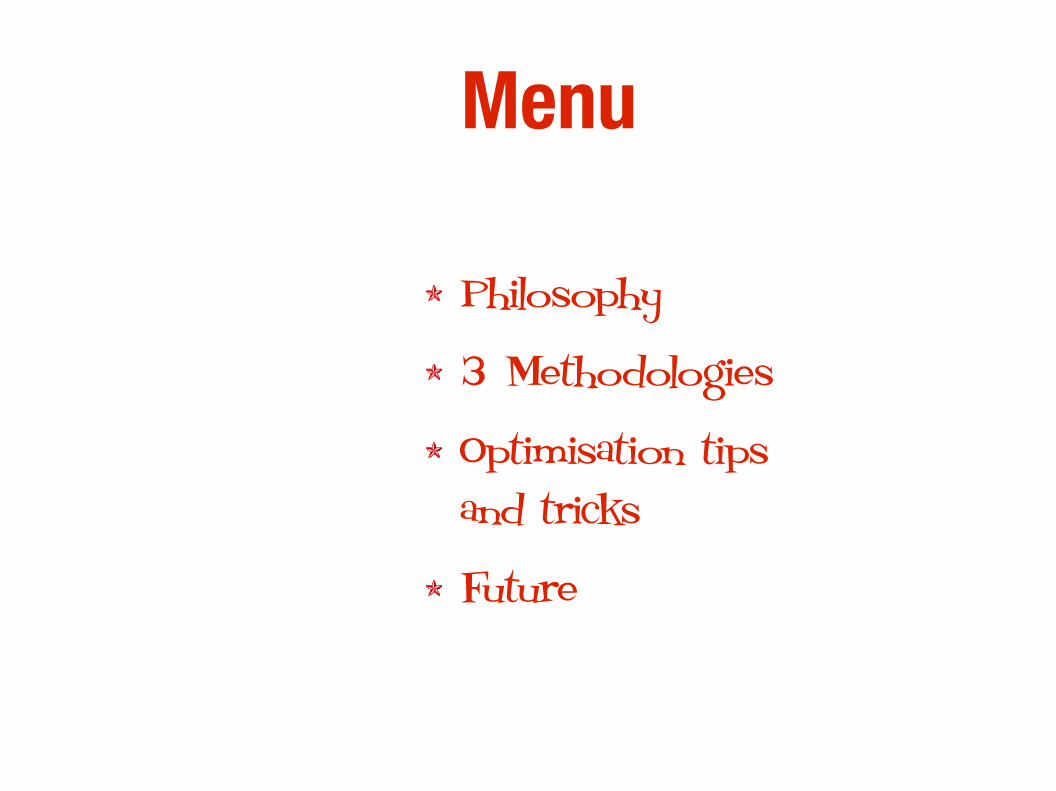
Menu
Philosophy
3 Methodologies
Optimisation tips and tricks
Future

Mobile Web philosophy

Three methodologies
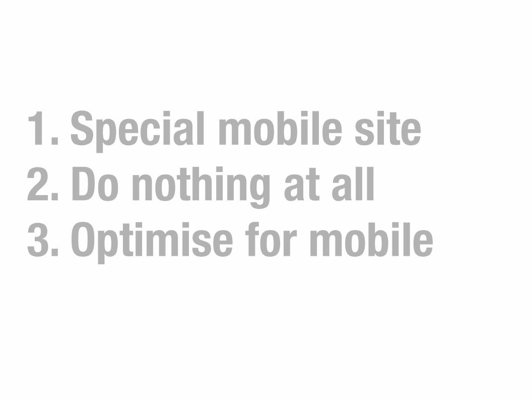
1. Special mobile site2. Do nothing at all3. Optimise for mobile
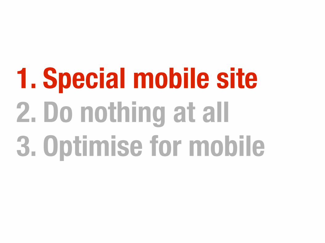
1. Special mobile site2. Do nothing at all3. Optimise for mobile
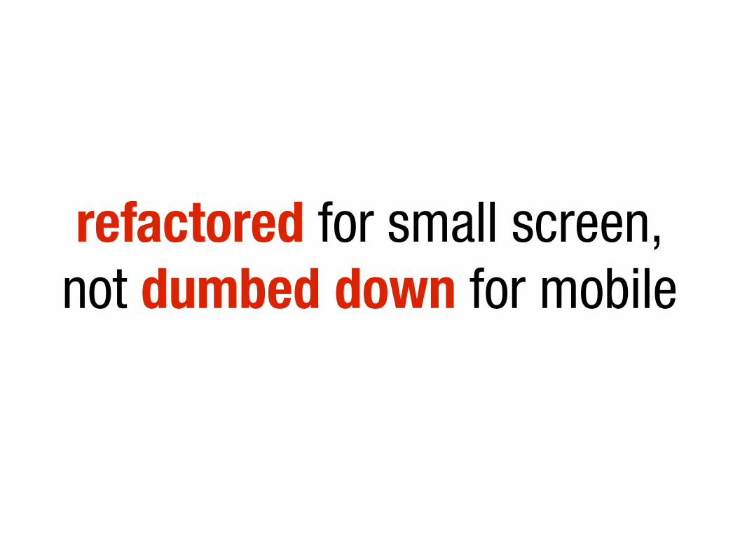
refactored for small screen,not dumbed down for mobile
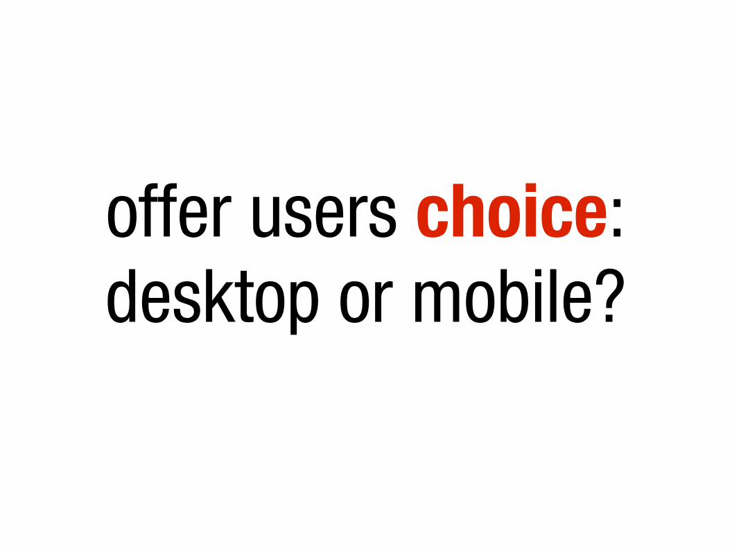
offer users choice:desktop or mobile?

beware browser sniffingphoto: http://www.flickr.com/photos/timdorr/2096272747/
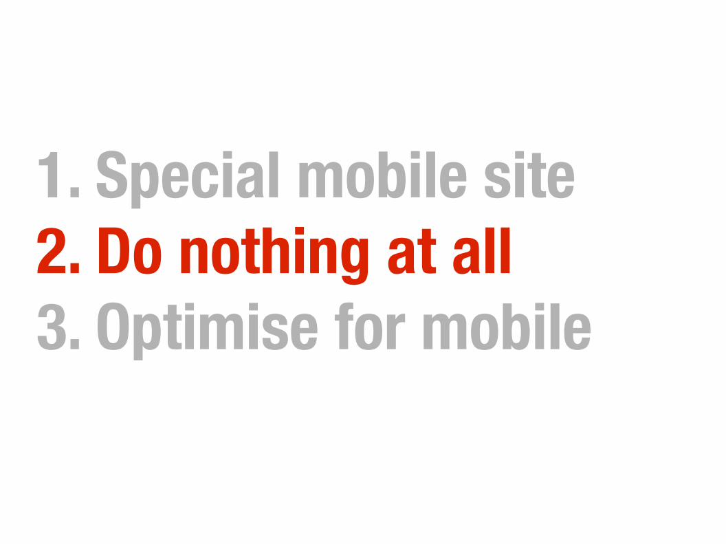
1. Special mobile site2. Do nothing at all3. Optimise for mobile
not WAP or text anymore...
mobile browsersknow how to deal with the Web

JavaScript touch eventsaddEventListener('touchstart'..)addEventListener('touchmove'..)
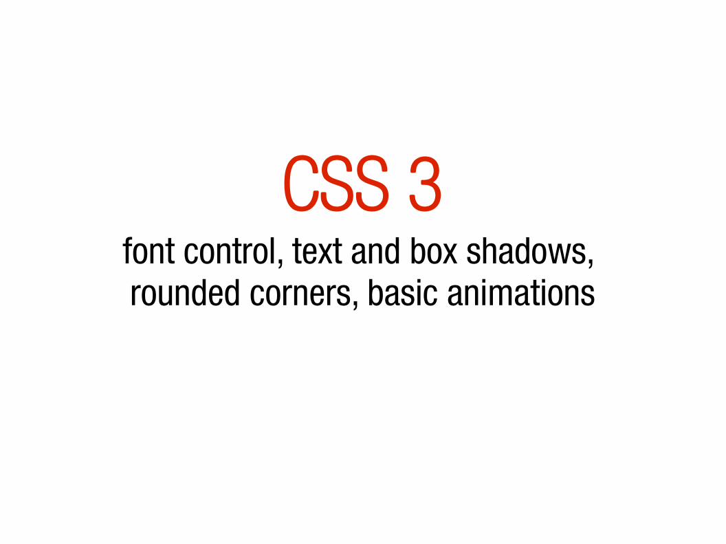
CSS 3font control, text and box shadows, rounded corners, basic animations

-moz-transition: all 0.5s ease-in-out;-ms-transition: all 0.5s ease-in-out;-o-transition: all 0.5s ease-in-out;-webkit-transition: all 0.5s ease-in-out;transition: all 0.5s ease-in-out;
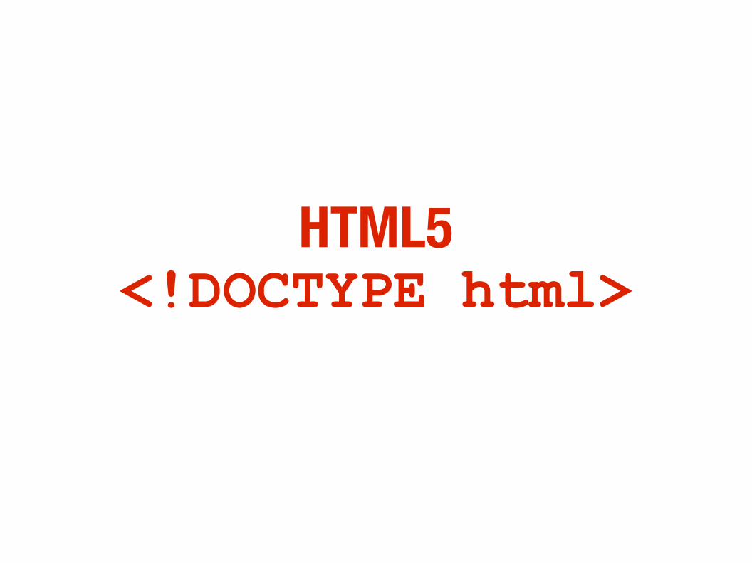
HTML5<!DOCTYPE html>
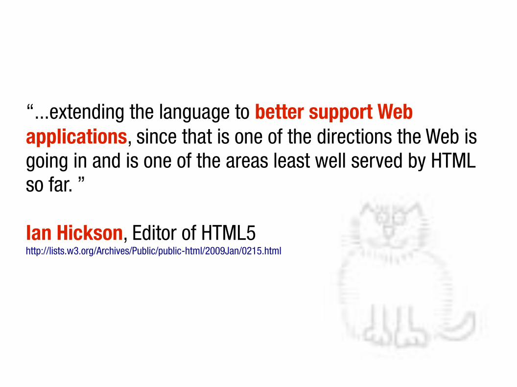
“...extending the language to better support Web applications, since that is one of the directions the Web is going in and is one of the areas least well served by HTML so far. ”
Ian Hickson, Editor of HTML5http://lists.w3.org/Archives/Public/public-html/2009Jan/0215.html

<canvas>
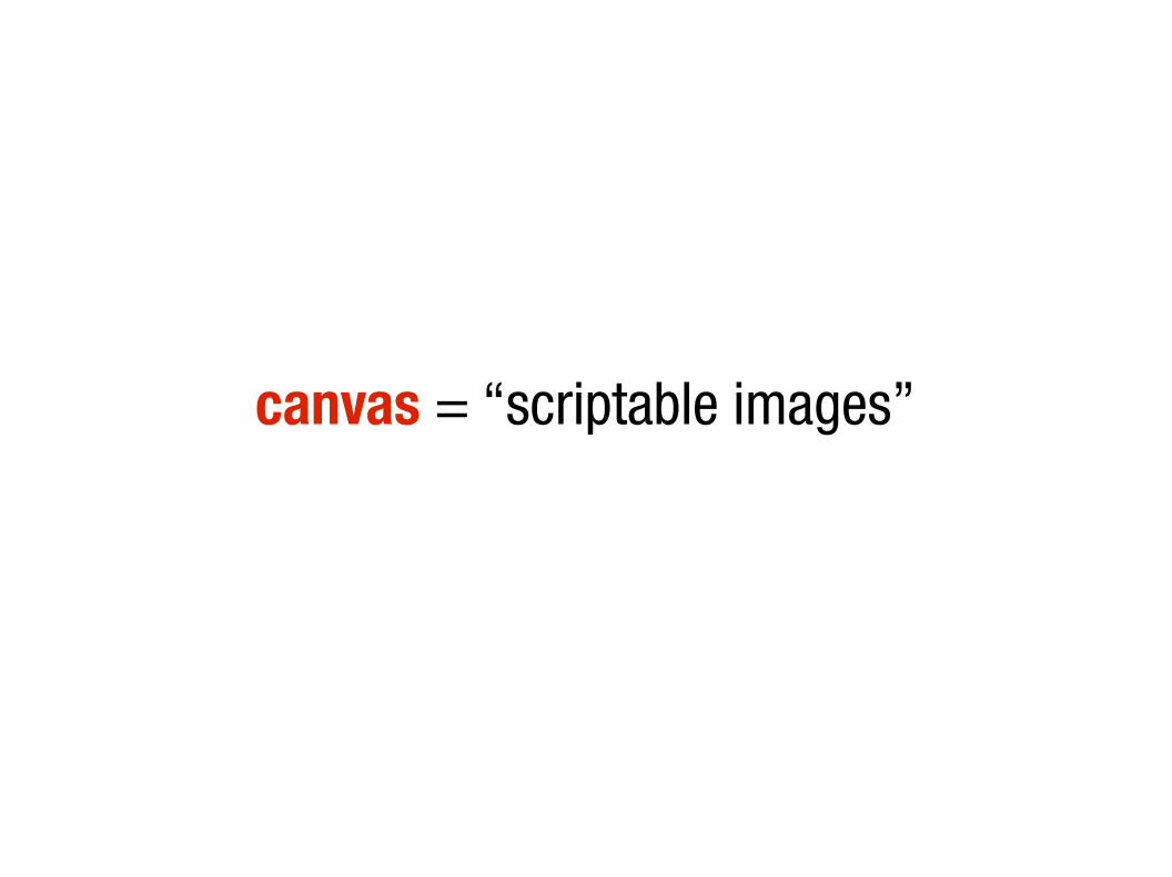
canvas = “scriptable images”
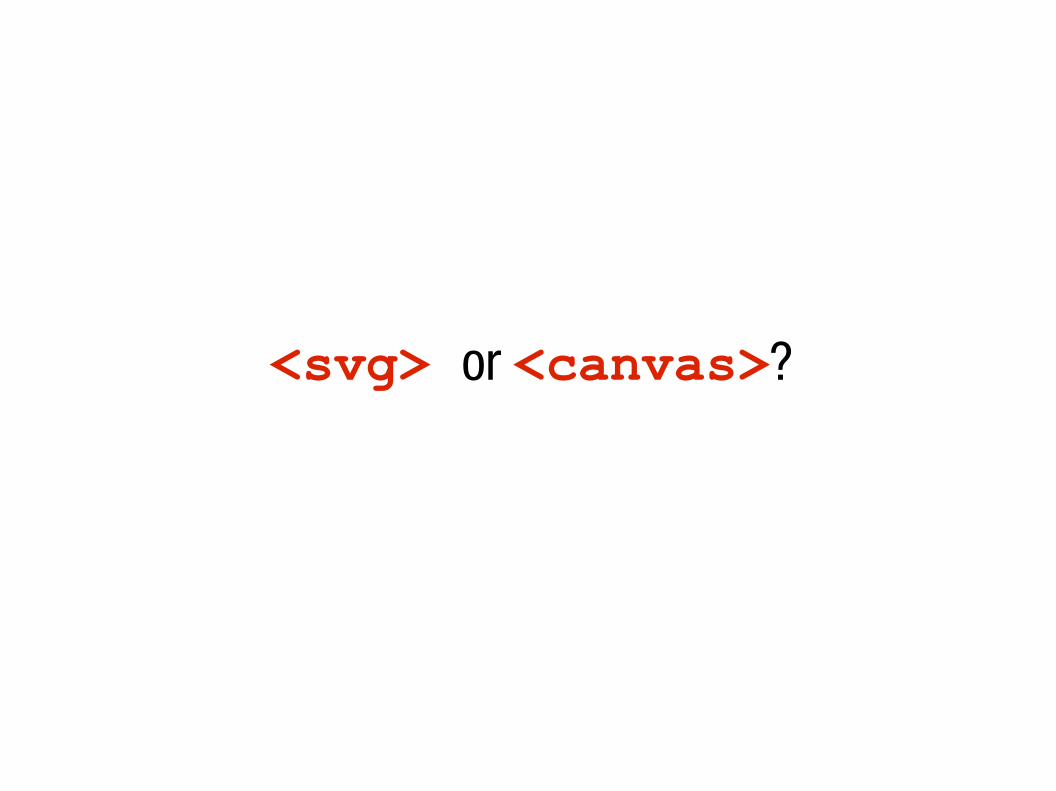
<svg> or <canvas>?
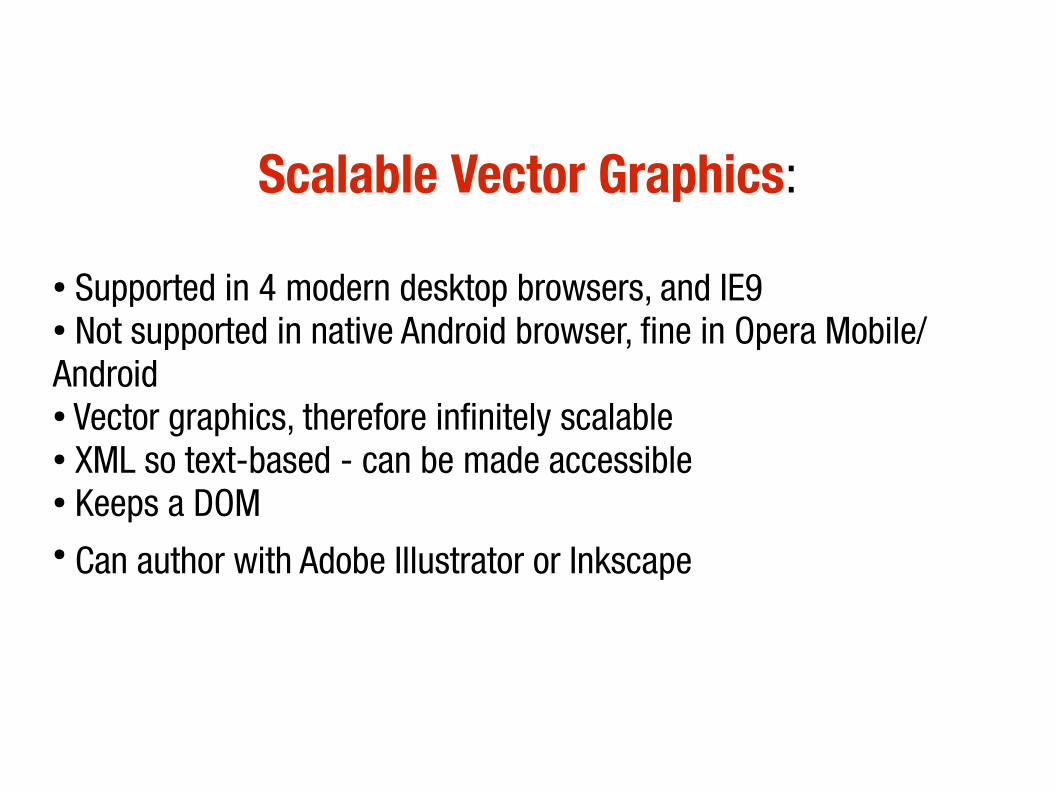
Scalable Vector Graphics:
● Supported in 4 modern desktop browsers, and IE9● Not supported in native Android browser, fine in Opera Mobile/ Android● Vector graphics, therefore infinitely scalable● XML so text-based - can be made accessible● Keeps a DOM● Can author with Adobe Illustrator or Inkscape

geolocation
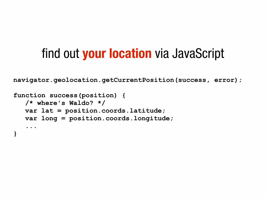
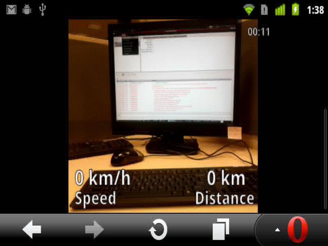
find out your location via JavaScript
navigator.geolocation.getCurrentPosition(success, error);function success(position) {
/* where's Waldo? */var lat = position.coords.latitude;var long = position.coords.longitude;...
}
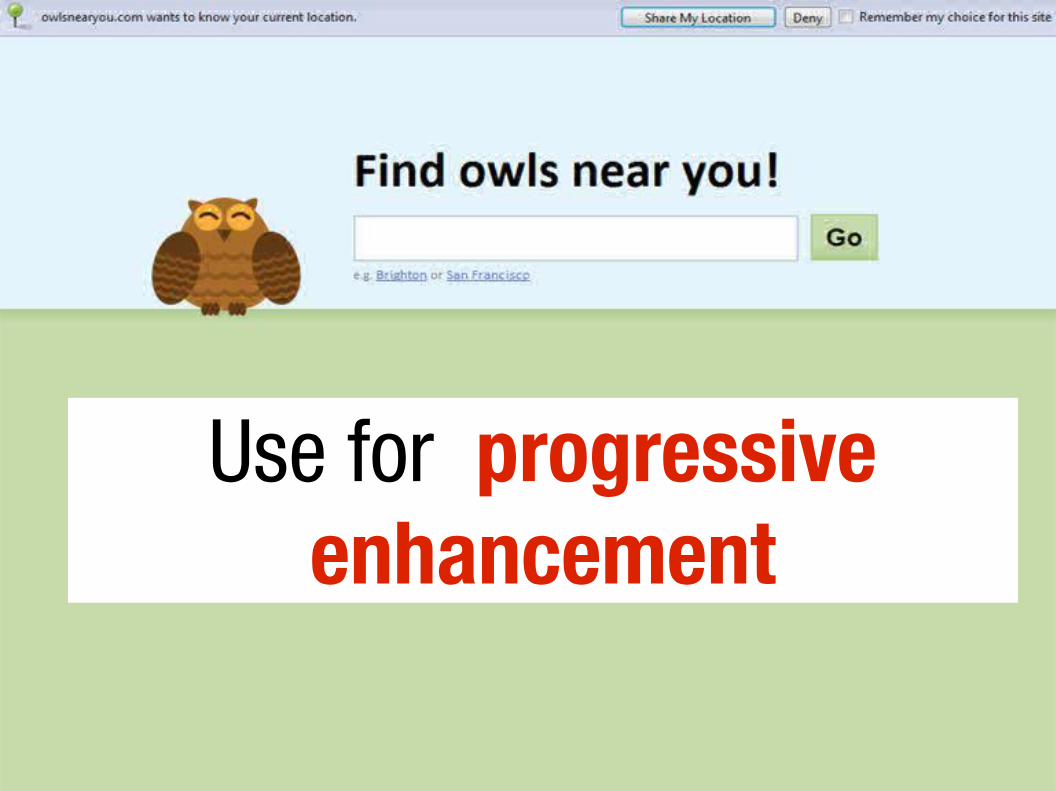
Use for progressive enhancement
offline support
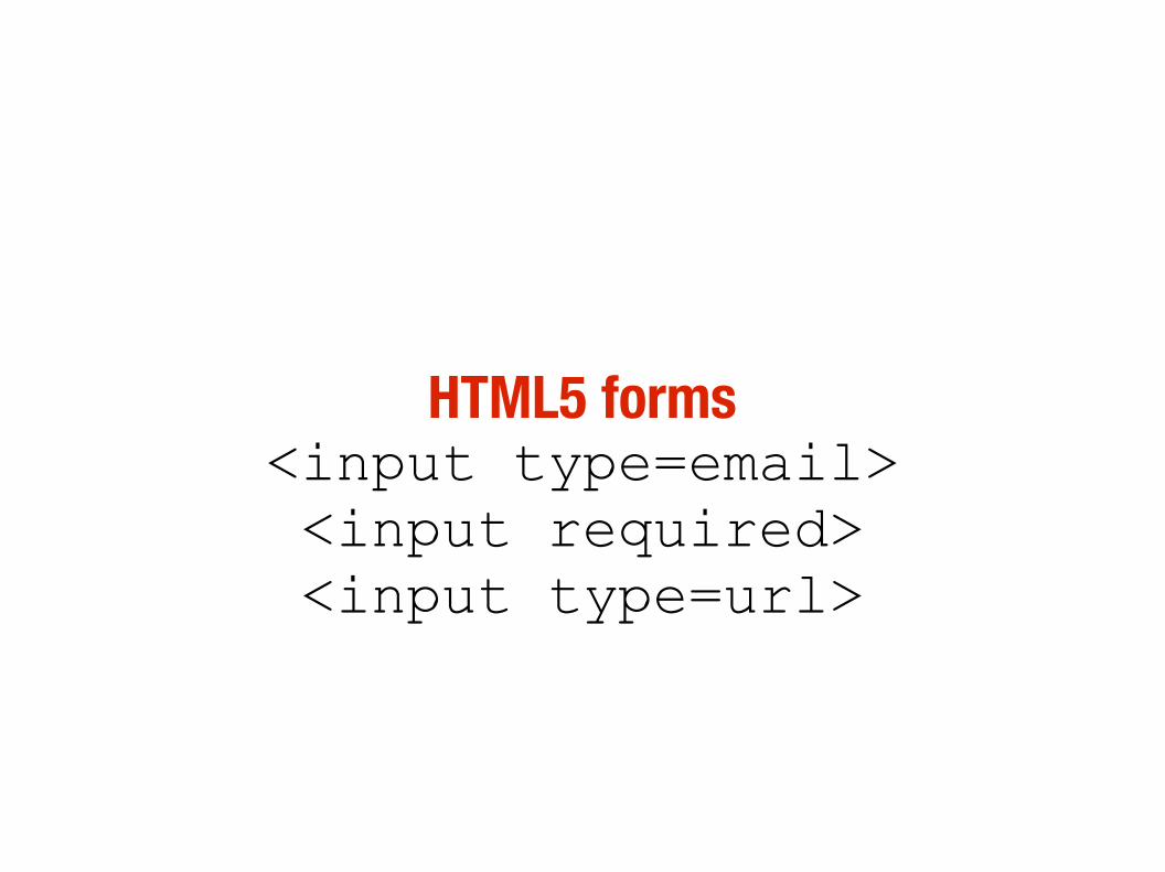
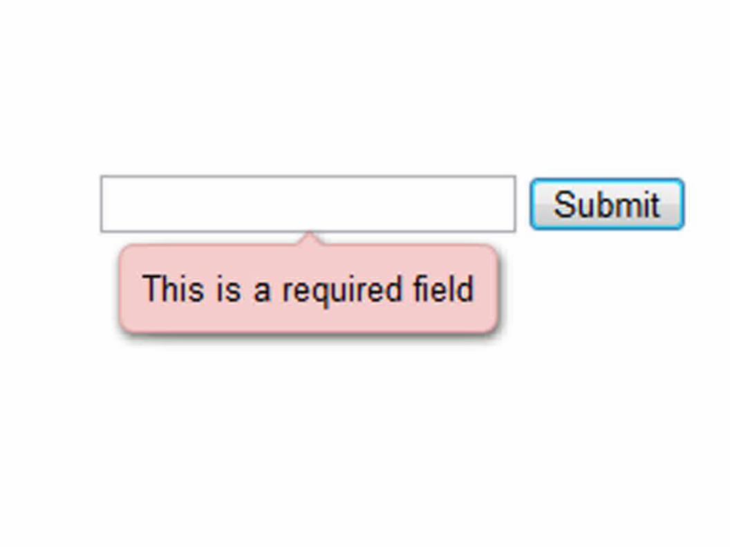
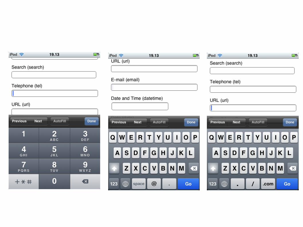
HTML5 forms<input type=email><input required><input type=url>
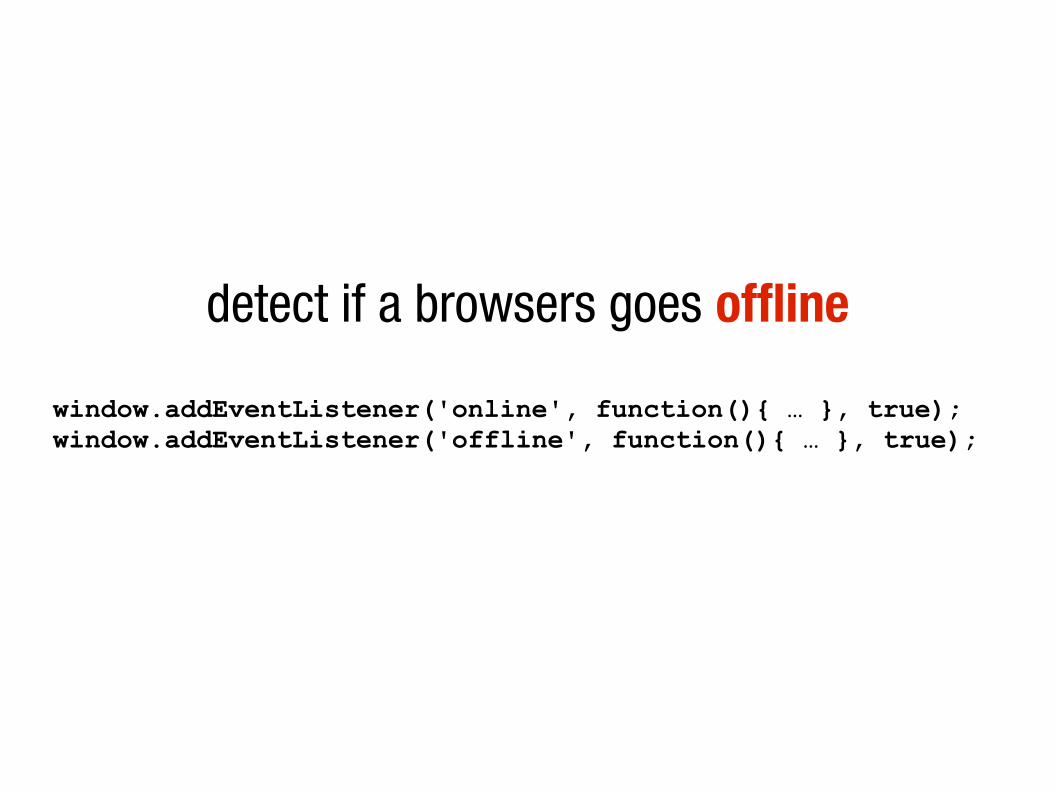
detect if a browsers goes offline
window.addEventListener('online', function(){ … }, true);window.addEventListener('offline', function(){ … }, true);
storage
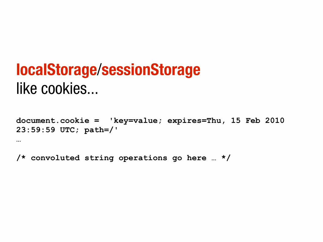
localStorage/sessionStoragelike cookies...
document.cookie = 'key=value; expires=Thu, 15 Feb 2010 23:59:59 UTC; path=/'…/* convoluted string operations go here … */
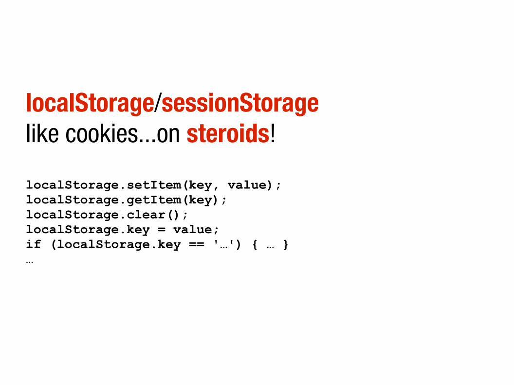
localStorage/sessionStoragelike cookies...on steroids!
localStorage.setItem(key, value);localStorage.getItem(key);localStorage.clear();localStorage.key = value;if (localStorage.key == '…') { … }…

application cache

cache UI/resource files for offline use
<html manifest=”blah.manifest”>CACHE MANIFEST# send this with correct text/cache-manifest MIMEimages/sprites.pngscripts/common.jsscripts/jquery.jsstyles/global.css

Server-sent EventsWeb Sockets
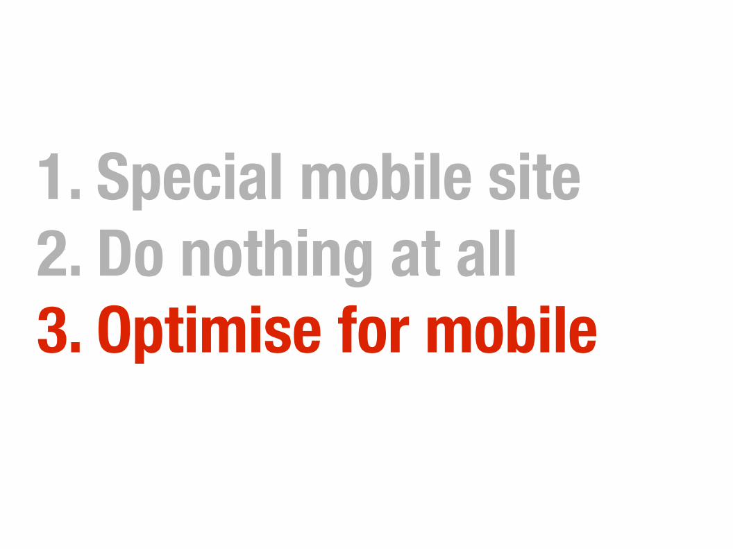
1. Special mobile site2. Do nothing at all3. Optimise for mobile
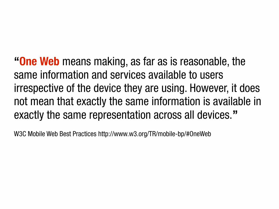
“One Web means making, as far as is reasonable, the same information and services available to users irrespective of the device they are using. However, it does not mean that exactly the same information is available in exactly the same representation across all devices.”W3C Mobile Web Best Practices http://www.w3.org/TR/mobile-bp/#OneWeb
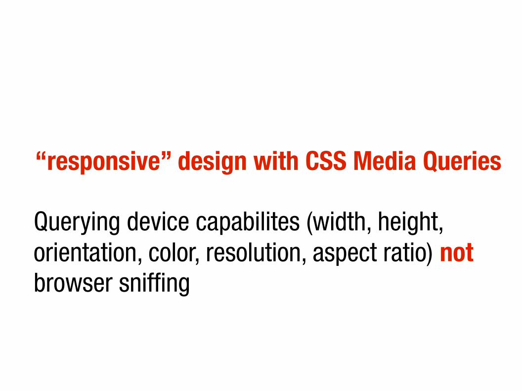
“responsive” design with CSS Media Queries
Querying device capabilites (width, height, orientation, color, resolution, aspect ratio) not browser sniffing
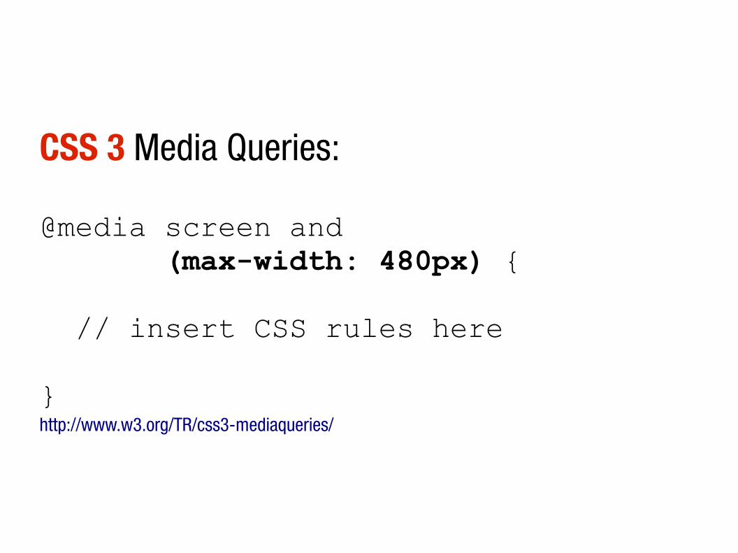
CSS 3 Media Queries:
@media screen and (max-width: 480px) { // insert CSS rules here
}http://www.w3.org/TR/css3-mediaqueries/

Viewport metatag
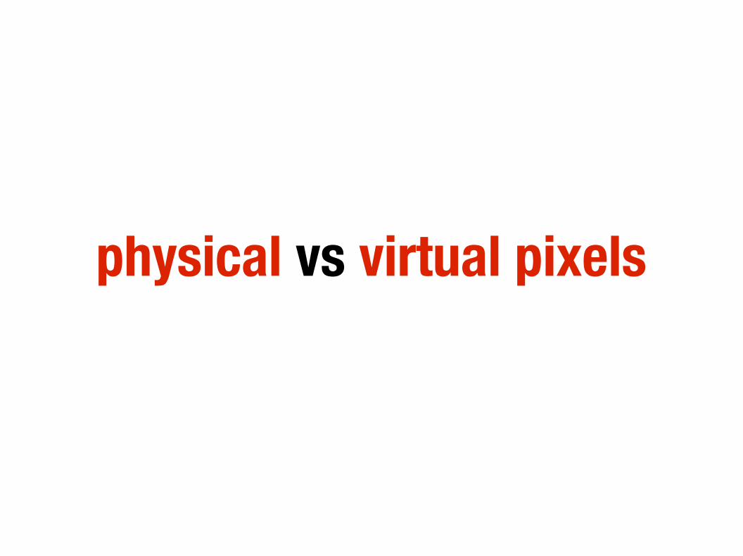
physical vs virtual pixels
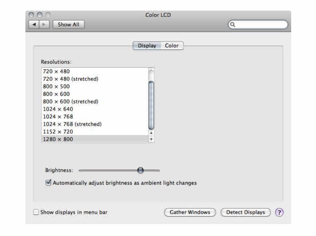

viewport meta<meta name="viewport" content="width=device-width"><meta name="viewport" content="width=320, initial-scale=2.3,user-scalable=no">http://developer.apple.com/safari/library/documentation/AppleApplications/Reference/SafariWebContent/UsingtheViewport/UsingtheViewport.html
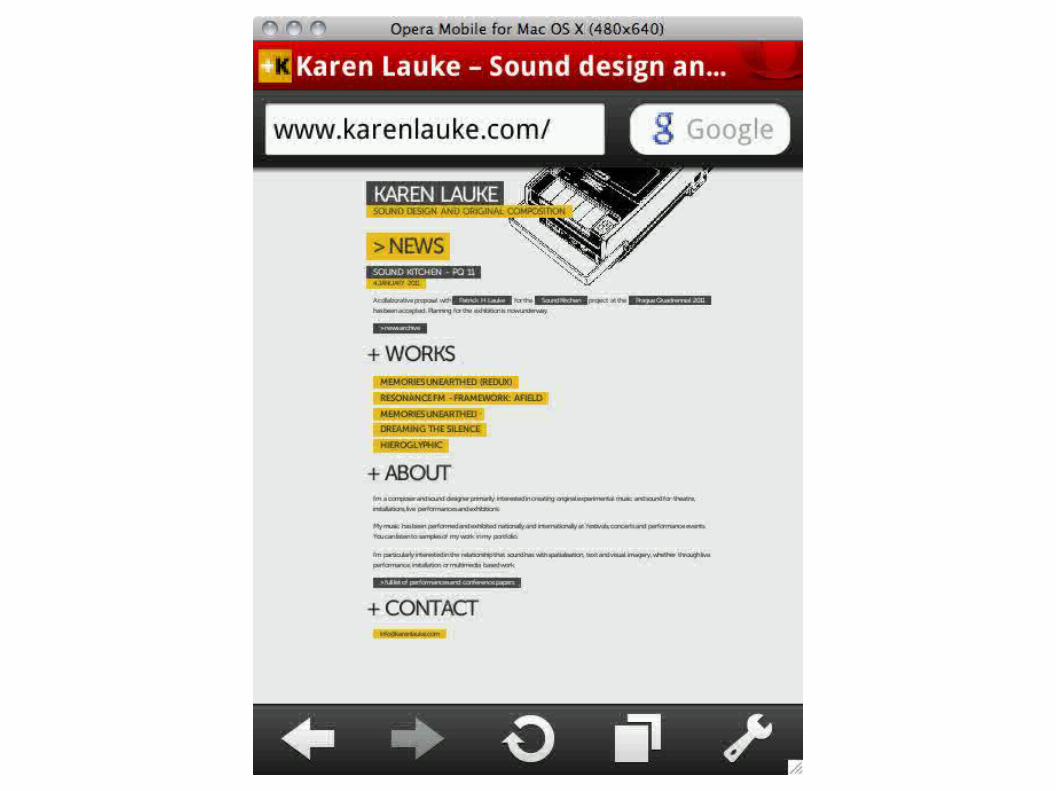
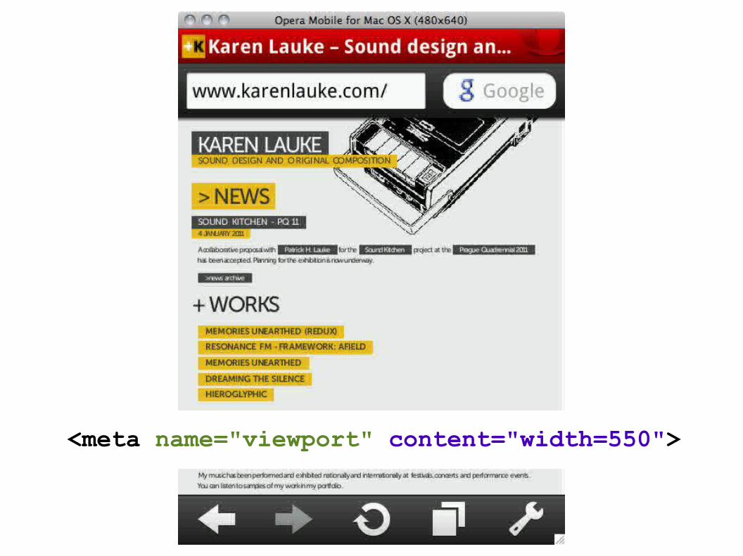
<meta name="viewport" content="width=550">
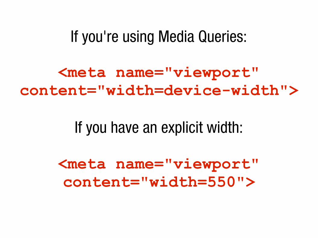
If you're using Media Queries:
<meta name="viewport" content="width=device-width">
If you have an explicit width:
<meta name="viewport" content="width=550">

Tips 'n' tricks
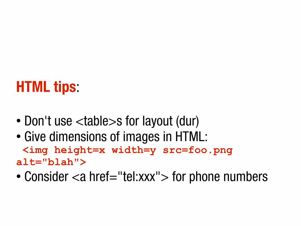
HTML tips:
● Don't use <table>s for layout (dur) ● Give dimensions of images in HTML: <img height=x width=y src=foo.png alt="blah">● Consider <a href="tel:xxx"> for phone numbers
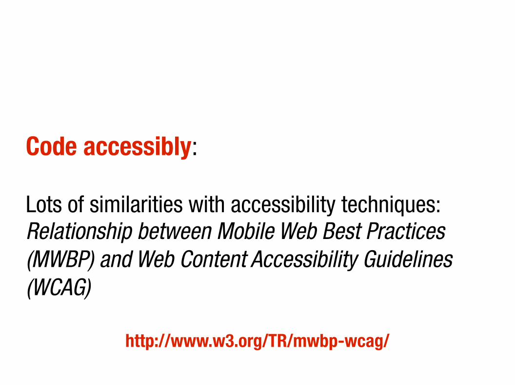
Code accessibly:
Lots of similarities with accessibility techniques: Relationship between Mobile Web Best Practices (MWBP) and Web Content Accessibility Guidelines (WCAG)
http://www.w3.org/TR/mwbp-wcag/
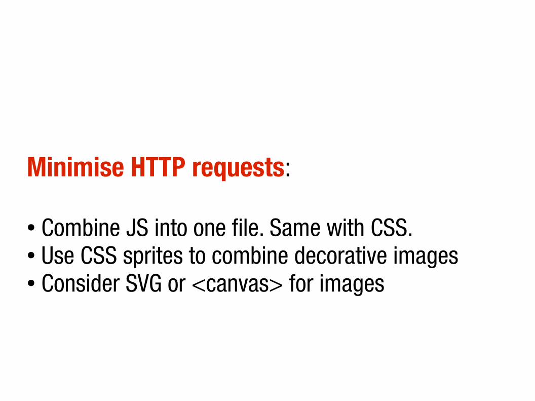
Minimise HTTP requests:
● Combine JS into one file. Same with CSS.● Use CSS sprites to combine decorative images● Consider SVG or <canvas> for images
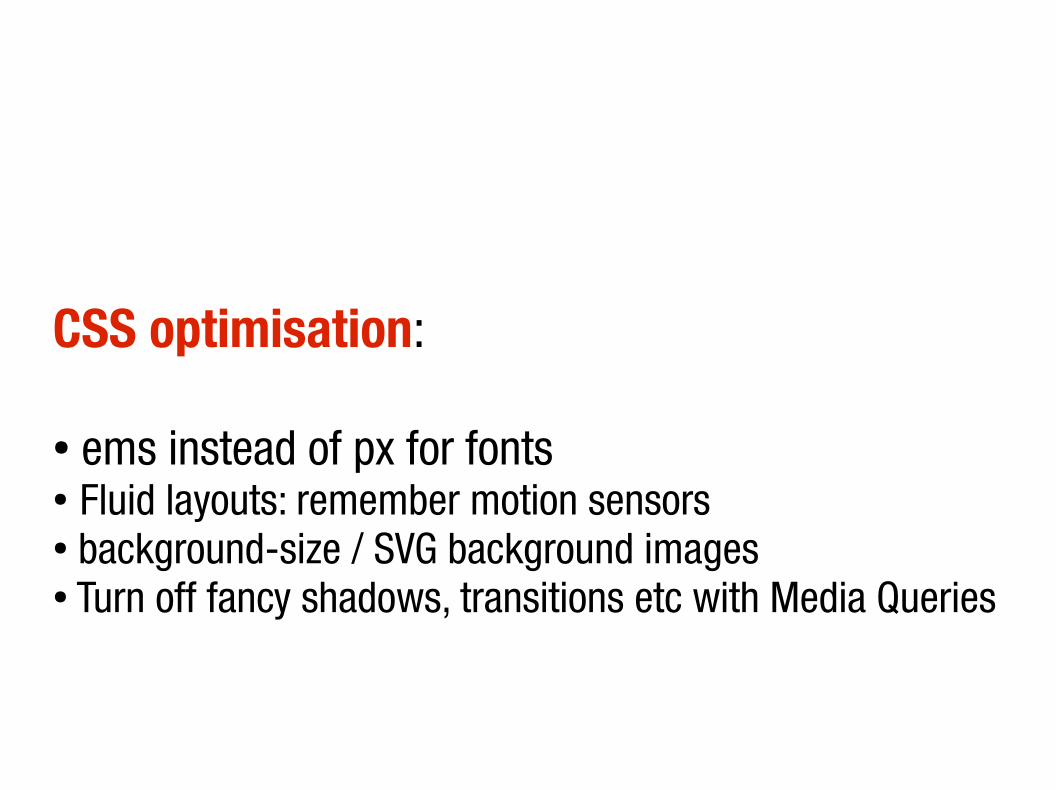
CSS optimisation:
● ems instead of px for fonts● Fluid layouts: remember motion sensors● background-size / SVG background images● Turn off fancy shadows, transitions etc with Media Queries
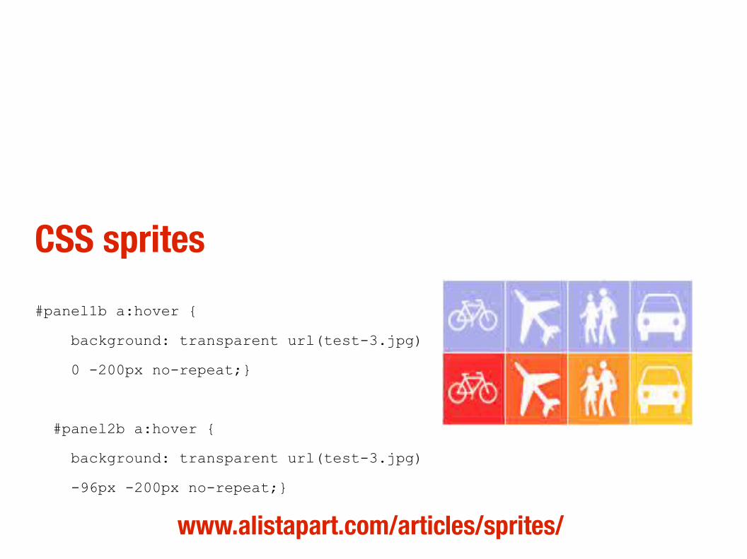
CSS sprites
#panel1b a:hover { background: transparent url(test-3.jpg) 0 -200px no-repeat;}
#panel2b a:hover { background: transparent url(test-3.jpg) -96px -200px no-repeat;}
www.alistapart.com/articles/sprites/

Data URLs
http://software.hixie.ch/utilities/cgi/data/data
data:image/x-icon,%00%00%01%00%02%00%10%10%00%00%00%00%00%00h%05%00%00%26%00%00%00%20%20%00%00%00%00%00%00%A8%08%00%00%8%05%00%00(%00%00%00%10%00%00%00%20%00%00%00%01%00%08%00%00%00%00%00%40%01%00%00%00%00%00%00%00%00%00%00%00%00%00%00%00%00%00%00%00%00%00%00%FF%FF%FF%00u%7D%8C%00%B1%BF%CF%00%3D%3FG%00%D0%DF%F3%00%9E%9F%A1%00%1A%1E%26%00Z%60g%00%D6%D8%D1%00%EC%EC%EB%00%B2%B2%AD%00%88%8D%9E%00rpt%00KNZ%00%2C.%3E%00%C2%C2%BC%00%C6%C9%D8%00%06%09%14%00%A9%AD%C1%00%9A%9E%B6%00%86%88%87%00%7C%80z%00%CF%D4%E3%00%CB%CE%C7%00%E2%E2%E1%00%11%14%1C%00%E3%E8%F8%00dht%00(.%2F%00%A5%AB%B0%00%F6%F7%F6%00TTd%00ov%80%00%91%93%96%00%B1%B6%C4%00%00%02%0C%00%8C%98%A1%00%C3%C4%CE%00%BB%BE%D4%00%7F%81%8D%00lkm%00%D5%DA%E9%00%A6%A6%A7%00AHJ%00TVZ%00%96%97%A0%007%3B%40%00%89%8E%93%00%DC%DC%DC%00ip%7B%00%C6%C6%C5%00%FC%FF%F6%0015%3A%00%DE%E3%F2%00%85%87%97%00wt%7D%00%5BV_%00xy%85%00%B7%BE%C9%0079H%00%A5%A9%BB%00acj%00%CA%CF%DF%00%B5%B8%CF%00%CC%D3%EA%00%9E%A8%B1%00jmt%00%BF%C7%D9%00%E9%E8%E6%00%85%89%90%00%8B%92%9A%00%7Bz%7D%00%D6%DF%F6%00y%81%90%00(*4%00%CC%CC%CD%00%5B%5Bc%00%BF%C4%D3%00%BE%BF%C0%00%F6%F5%F0%00chm%00%AB%B2%BE%00qr%7C%00%D4%D7%EE%00%C3%CA%D3%00%BA%BF%CE%00%9E%A3%B4%00%8C%93%A4%00tt%82%00V%5Cg%00BCL%00%00%00%07%00%F0%EF%ED%00%3BCJ%00GLW%00%D4%D4%D4%00%B4%BD
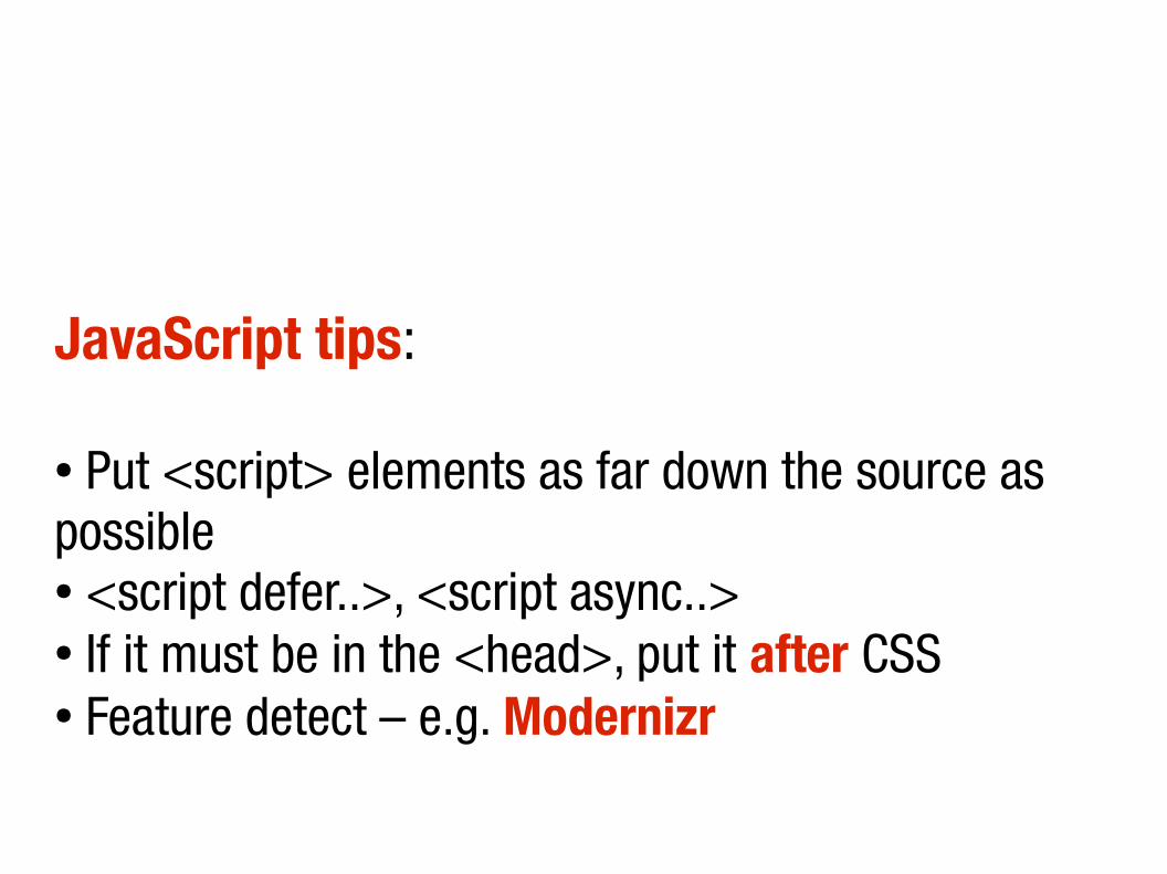
JavaScript tips:
● Put <script> elements as far down the source as possible● <script defer..>, <script async..>● If it must be in the <head>, put it after CSS● Feature detect – e.g. Modernizr

Web or Apps?
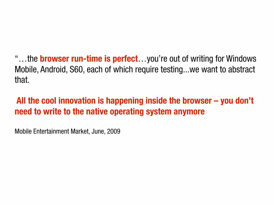
“…the browser run-time is perfect…you’re out of writing for Windows Mobile, Android, S60, each of which require testing...we want to abstract that.
All the cool innovation is happening inside the browser – you don’t need to write to the native operating system anymore.”
Mobile Entertainment Market, June, 2009
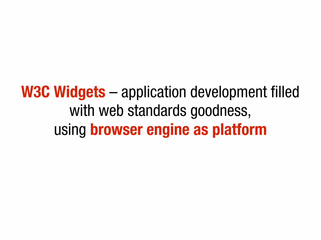
W3C Widgets – application development filled with web standards goodness,
using browser engine as platform
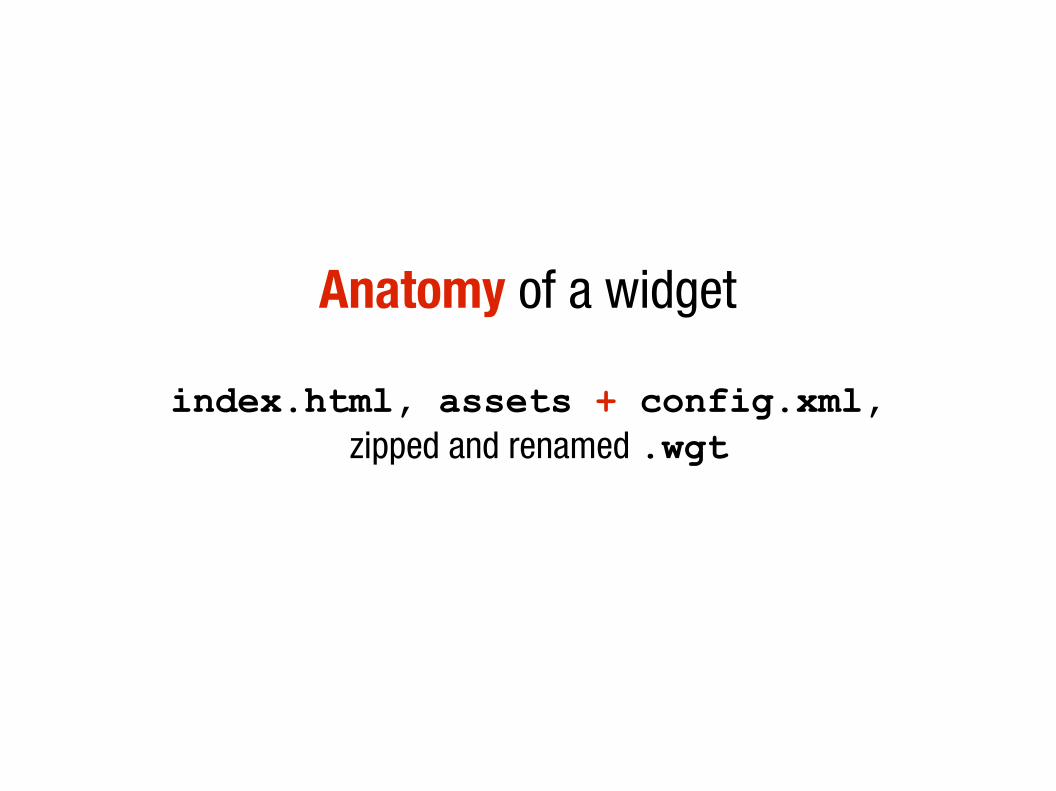
Anatomy of a widget
index.html, assets + config.xml, zipped and renamed .wgt
The future

W3C DAP(Devices and Protocols Working Group)
WAC(http://www.wacapps.net/)
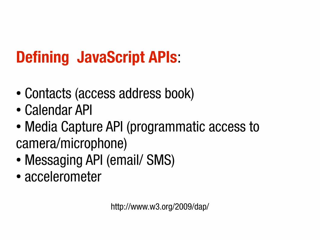
Defining JavaScript APIs:
● Contacts (access address book)● Calendar API● Media Capture API (programmatic access to camera/microphone)● Messaging API (email/ SMS)● accelerometer
http://www.w3.org/2009/dap/

HTML5 <device>
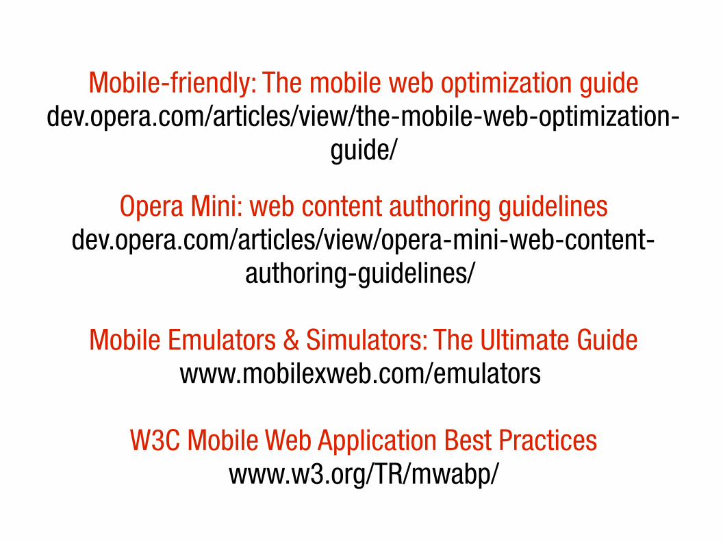
Mobile-friendly: The mobile web optimization guide
dev.opera.com/articles/view/the-mobile-web-optimization-guide/
Opera Mini: web content authoring guidelinesdev.opera.com/articles/view/opera-mini-web-content-
authoring-guidelines/
Mobile Emulators & Simulators: The Ultimate Guide www.mobilexweb.com/emulators
W3C Mobile Web Application Best Practiceswww.w3.org/TR/mwabp/