Embed Size (px)
Citation preview
Infl ation and PricesOctober Price Statistics
Financial Markets, Money and Monetary PolicyThe Yield Curve, November 2009
Economic ActivityEconomic Projections from the November FOMC
MeetingReal GDP: Third-Quarter 2009 Second Estimate Measures of Economic Slack, Cost Pressure,
and Infl ationThe Employment Situation
International MarketsRenminbi-Dollar Peg Once Again
Regional AcitivtyOhio’s Economic Momentum Fourth District Employment Conditions
Banking and Financial InstitutionsSupply and Demand Shocks in Residential Mortgages
In This Issue:
December 2009 (November 13, 2009 to December 8, 2009)
2Federal Reserve Bank of Cleveland, Economic Trends | December 2009
Infl ation and PricesOctober Price Statistics
11.24.09by Brent Meyer
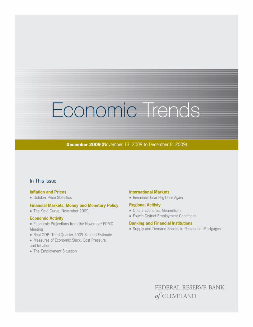
Th e CPI rose at an annualized rate of 3.4 percent in October, as energy prices jumped up 19 percent. On a year-over-year basis, the CPI is down 0.2 percent, up from a 12-month growth rate of −1.3 percent in September. Excluding food and energy prices, the “core” CPI rose 2.2 percent during the month, largely on sharp increases in used cars and trucks (up 48.6 percent) and new vehicles prices (up 21.3 percent). Th e measures of underlying infl ation produced by the Federal Reserve Bank of Cleveland continued to run a little softer than those of the BLS, as the 16 percent trimmed-mean CPI rose 1.9 percent and the median CPI increased 1.2 percent. Over the past 12 months, the median is up 1.5 percent, and the growth rate in the trimmed mean is up 1.2 percent.
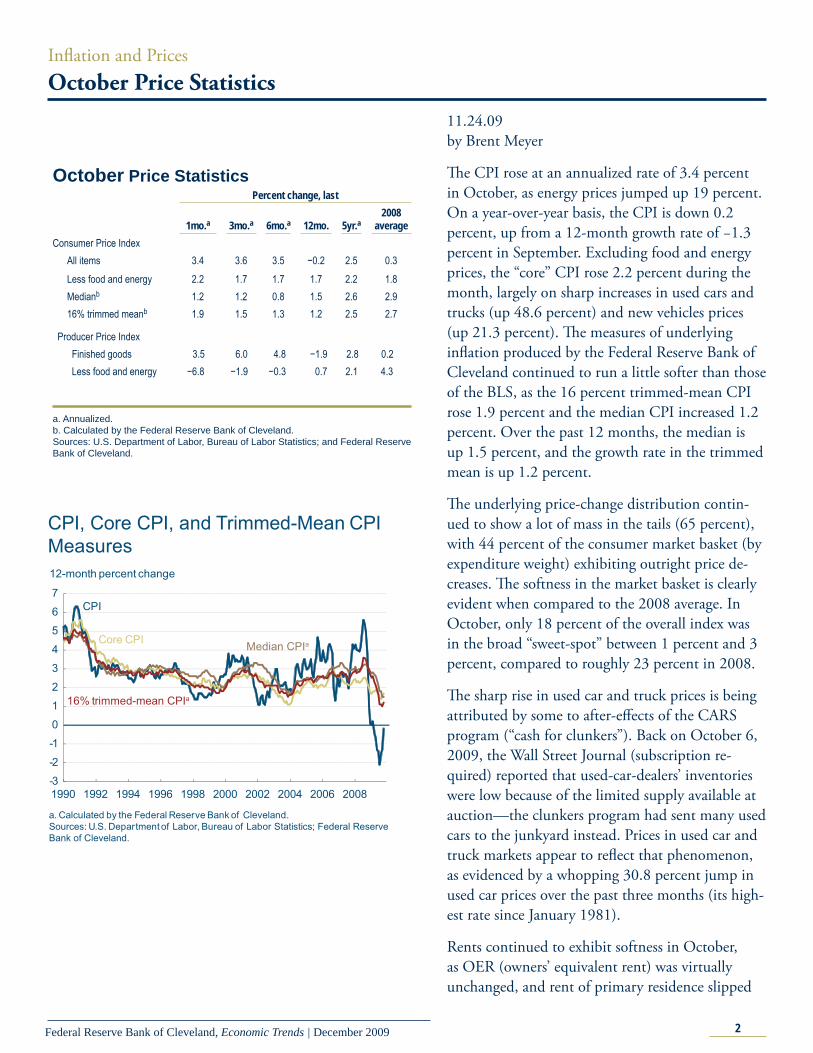
Th e underlying price-change distribution contin-ued to show a lot of mass in the tails (65 percent), with 44 percent of the consumer market basket (by expenditure weight) exhibiting outright price de-creases. Th e softness in the market basket is clearly evident when compared to the 2008 average. In October, only 18 percent of the overall index was in the broad “sweet-spot” between 1 percent and 3 percent, compared to roughly 23 percent in 2008.
Th e sharp rise in used car and truck prices is being attributed by some to after-eff ects of the CARS program (“cash for clunkers”). Back on October 6, 2009, the Wall Street Journal (subscription re-quired) reported that used-car-dealers’ inventories were low because of the limited supply available at auction—the clunkers program had sent many used cars to the junkyard instead. Prices in used car and truck markets appear to refl ect that phenomenon, as evidenced by a whopping 30.8 percent jump in used car prices over the past three months (its high-est rate since January 1981).
Rents continued to exhibit softness in October, as OER (owners’ equivalent rent) was virtually unchanged, and rent of primary residence slipped
October Price Statistics Percent change, last 1mo.a 3mo.a 6mo.a 12mo. 5yr.a
2008 average
Consumer Price Index All items 3.4 3.6 3.5 −0.2 2.5 0.3 Less food and energy 2.2 1.7 1.7 1.7 2.2 1.8 Medianb 1.2 1.2 0.8 1.5 2.6 2.9 16% trimmed meanb 1.9 1.5 1.3 1.2 2.5 2.7
Producer Price Index Finished goods 3.5 6.0 4.8 −1.9 2.8 0.2
Less food and energy −6.8 −1.9 −0.3 0.7 2.1 4.3 a. Annualized.b. Calculated by the Federal Reserve Bank of Cleveland.Sources: U.S. Department of Labor, Bureau of Labor Statistics; and Federal Reserve Bank of Cleveland.
-3
-2
-1
0
1
2
3
4
5
6
7
1990 1992 1994 1996 1998 2000 2002 2004 2006 2008
12-month percent change
Core CPI Median CPIa
16% trimmed-mean CPIa
CPI
a. Calculated by the Federal Reserve Bank of Cleveland.Sources: U.S. Department of Labor, Bureau of Labor Statistics; Federal Reserve Bank of Cleveland.
CPI, Core CPI, and Trimmed-Mean CPI Measures
3Federal Reserve Bank of Cleveland, Economic Trends | December 2009
down 1.3 percent. Both series are up just 1.2 percent over the past year, an all-time low for OER and the lowest growth rate for rent of primary residence since the mid-1960s. Because the two series account for roughly 30 percent of the overall index (by expenditure weight), continued low read-ings should apply some downward pressure on the overall market basket.
Th e consensus CPI infl ation forecast from the most recent Blue Chip survey continues to moderate over the next few quarters, coming in at just under 2.0 percent at the end of 2010. Interestingly, the average of the bottom 10 forecasts shows headline infl ation slipping into negative territory in the second quarter of 2010, while the top-ten average puts infl ation at around 3.0 percent throughout the forecast period.
0
10
20
30
40
50
<0 0 to 1 1 to 2 2 to 3 3 to 4 4 to 5 >5
Weighted frequency
CPI Component Price Change Distribution
October 20092009:Q3 average
Source: Bureau of Labor Statistics.
Annualized monthly percentage change
2008 average
Used Cars and Trucks Prices
-30
-20
-10
0
10
20
30
40
50
10/08 12/08 2/09 4/09 6/09 8/09 10/09
Annualized percent change
Source: Bureau of Labor Statistics.
0
2
4
6
8
1983 1986 1989 1992 1995 1998 2001 2004 2007
Rents12-month percent change
Rent of primary residence
Source: Bureau of Labor Statistics.
Owners’ equivalent rent (OER)
-10
-8
-6
-4
-2
0
2
4
6
8
3/06 3/07 3/08 3/09 3/10
Annualized quarterly percent change
CPI and Forecasts
Sources: Blue Chip Economic Indicators, November 2009; Bureau of Labor Statistics.
Actual Top 10 forecast
Bottom 10 forecast
Forecast
4Federal Reserve Bank of Cleveland, Economic Trends | December 2009
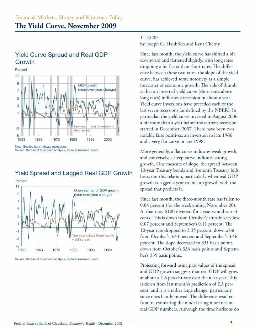
Financial Markets, Money and Monetary PolicyTh e Yield Curve, November 2009
11.25.09by Joseph G. Haubrich and Kent Cherny
Since last month, the yield curve has shifted a bit downward and fl attened slightly, with long rates dropping a bit faster than short rates. Th e diff er-ence between these two rates, the slope of the yield curve, has achieved some notoriety as a simple forecaster of economic growth. Th e rule of thumb is that an inverted yield curve (short rates above long rates) indicates a recession in about a year. Yield curve inversions have preceded each of the last seven recessions (as defi ned by the NBER). In particular, the yield curve inverted in August 2006, a bit more than a year before the current recession started in December, 2007. Th ere have been two notable false positives: an inversion in late 1966 and a very fl at curve in late 1998.
More generally, a fl at curve indicates weak growth, and conversely, a steep curve indicates strong growth. One measure of slope, the spread between 10-year Treasury bonds and 3-month Treasury bills, bears out this relation, particularly when real GDP growth is lagged a year to line up growth with the spread that predicts it.
Since last month, the three-month rate has fallen to 0.04 percent (for the week ending November 20). At that rate, $100 invested for a year would earn 4 cents. Th is is down from October’s already very low 0.07 percent and September’s 0.11 percent. Th e 10-year rate dropped to 3.35 percent, down a bit from October’s 3.43 percent and September’s 3.46 percent. Th e slope decreased to 331 basis points, down from October’s 336 basis points and Septem-ber’s 335 basis points.
Projecting forward using past values of the spread and GDP growth suggests that real GDP will grow at about a 1.6 percent rate over the next year. Th is is down from last month’s prediction of 2.3 per-cent, and it is a rather large change, particularly since rates hardly moved. Th e diff erence resulted from re-estimating the model using more recent real GDP numbers. Although the time horizons do
-5
-3
-1
1
3
5
7
9
11
1953 1963 1973 1983 1993 2003
Yield Curve Spread and Real GDP Growth
Note: Shaded bars indicate recessions.Source: Bureau of Economic Analysis, Federal Reserve Board.
Percent
GDP growth (year-over-year change)
Ten-year minus three-month yield spread
-5
-3
-1
1
3
5
7
9
11
1953 1963 1973 1983 1993 2003
Yield Spread and Lagged Real GDP Growth
Source: Bureau of Economic Analysis, Federal Reserve Board.
Percent
One-year lag of GDP growth(year-over-year change)
Ten-year minus three-month yield spread
5Federal Reserve Bank of Cleveland, Economic Trends | December 2009
not match exactly, our estimate comes in somewhat below other forecasts.
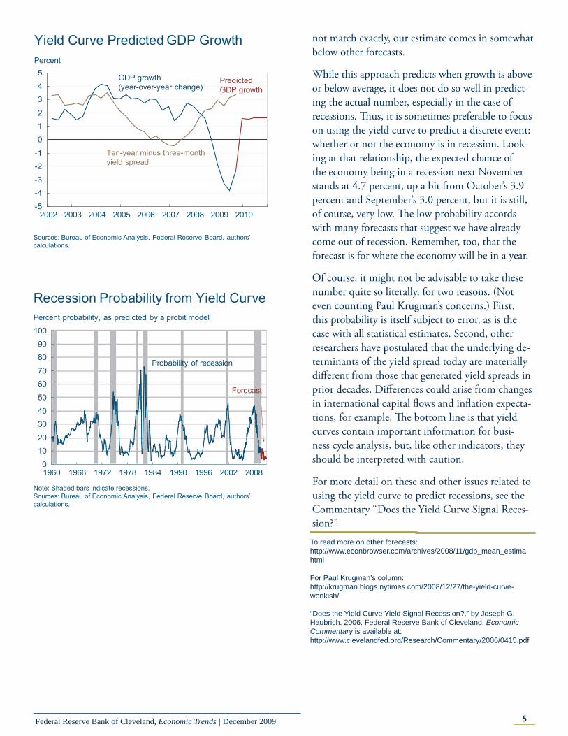
While this approach predicts when growth is above or below average, it does not do so well in predict-ing the actual number, especially in the case of recessions. Th us, it is sometimes preferable to focus on using the yield curve to predict a discrete event: whether or not the economy is in recession. Look-ing at that relationship, the expected chance of the economy being in a recession next November stands at 4.7 percent, up a bit from October’s 3.9 percent and September’s 3.0 percent, but it is still, of course, very low. Th e low probability accords with many forecasts that suggest we have already come out of recession. Remember, too, that the forecast is for where the economy will be in a year.
Of course, it might not be advisable to take these number quite so literally, for two reasons. (Not even counting Paul Krugman’s concerns.) First, this probability is itself subject to error, as is the case with all statistical estimates. Second, other researchers have postulated that the underlying de-terminants of the yield spread today are materially diff erent from those that generated yield spreads in prior decades. Diff erences could arise from changes in international capital fl ows and infl ation expecta-tions, for example. Th e bottom line is that yield curves contain important information for busi-ness cycle analysis, but, like other indicators, they should be interpreted with caution.
For more detail on these and other issues related to using the yield curve to predict recessions, see the Commentary “Does the Yield Curve Signal Reces-sion?”
Yield Curve Predicted GDP Growth
-5
-4
-3
-2
-1
0
1
2
3
4
5
2002 2003 2004 2005 2006 2007 2008 2009 2010
Sources: Bureau of Economic Analysis, Federal Reserve Board, authors’ calculations.
Percent
GDP growth (year-over-year change)
Ten-year minus three-monthyield spread
PredictedGDP growth
0
10
20
30
40
50
60
70
80
90
100
1960 1966 1972 1978 1984 1990 1996 2002 2008
Recession Probability from Yield Curve
Note: Shaded bars indicate recessions.Sources: Bureau of Economic Analysis, Federal Reserve Board, authors’ calculations.
Percent probability, as predicted by a probit model
Probability of recession
Forecast
To read more on other forecasts:http://www.econbrowser.com/archives/2008/11/gdp_mean_estima.html
For Paul Krugman’s column:http://krugman.blogs.nytimes.com/2008/12/27/the-yield-curve-wonkish/
“Does the Yield Curve Yield Signal Recession?,” by Joseph G. Haubrich. 2006. Federal Reserve Bank of Cleveland, Economic Commentary is available at:http://www.clevelandfed.org/Research/Commentary/2006/0415.pdf
6Federal Reserve Bank of Cleveland, Economic Trends | December 2009
Economic ActivityEconomic Projections from the November FOMC Meeting
11.25.09by Brent Meyer
Th e economic projections of the Federal Open Market Committee (FOMC) are released in con-junction with the minutes of the meetings four times a year (January, April, June, and Novem-ber). Th e projections are based on the informa-tion available at the time, as well as participants’ assumptions about the economic factors aff ecting the outlook and their view of appropriate monetary policy. Appropriate monetary policy is defi ned as “the future policy that, based on current informa-tion, is deemed most likely to foster outcomes for economic activity and infl ation that best satisfy the participant’s interpretation of the Federal Reserve’s dual objectives of maximum employment and price stability.”
Data available to FOMC participants on November 3-4 were indicative of a nascent recovery and, quite possibly, the end of one of the most severe postwar recessions on record. Notably, industrial produc-tion posted its third consecutive gain in September, which pushed its three-month annualized growth rate up to a strong 12.2 percent. Various housing-market indicators showed signs of a rebound (albeit from relatively low levels). Also, while overall consumer spending refl ected the eff ects of the government’s auto rebates in late July and August, “core” retail sales (excluding autos, building materi-als, and gasoline sales) showed somewhat surprising strength, rising at annualized rates of 6.7 percent in August and 4.8 percent in September. Indica-tors of employment conditions continued to point to a soft (but improving) labor market. Nonfarm payroll losses averaged roughly 225, 000 in the third quarter, compared to an average monthly loss of 428,000 in the second quarter. Th at said, the unemployment rate continued to climb and had reached 9.8 percent at the time of the meeting.
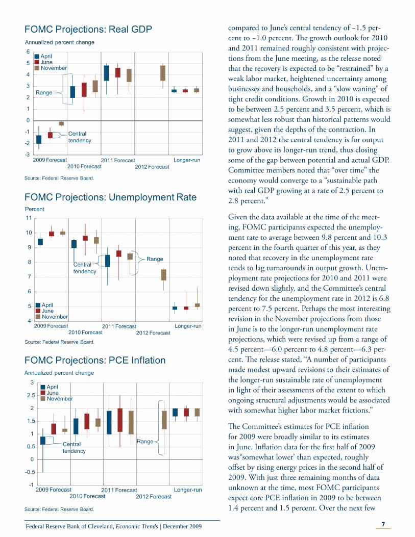
Th e Committee’s central tendency for economic growth is now for the economy to contract on a year-over-year basis in 2009 between −0.4 percent and −0.1 percent, a dramatic improvement when
7Federal Reserve Bank of Cleveland, Economic Trends | December 2009
compared to June’s central tendency of −1.5 per-cent to −1.0 percent. Th e growth outlook for 2010 and 2011 remained roughly consistent with projec-tions from the June meeting, as the release noted that the recovery is expected to be “restrained” by a weak labor market, heightened uncertainty among businesses and households, and a “slow waning” of tight credit conditions. Growth in 2010 is expected to be between 2.5 percent and 3.5 percent, which is somewhat less robust than historical patterns would suggest, given the depths of the contraction. In 2011 and 2012 the central tendency is for output to grow above its longer-run trend, thus closing some of the gap between potential and actual GDP. Committee members noted that “over time” the economy would converge to a “sustainable path with real GDP growing at a rate of 2.5 percent to 2.8 percent.”
Given the data available at the time of the meet-ing, FOMC participants expected the unemploy-ment rate to average between 9.8 percent and 10.3 percent in the fourth quarter of this year, as they noted that recovery in the unemployment rate tends to lag turnarounds in output growth. Unem-ployment rate projections for 2010 and 2011 were revised down slightly, and the Committee’s central tendency for the unemployment rate in 2012 is 6.8 percent to 7.5 percent. Perhaps the most interesting revision in the November projections from those in June is to the longer-run unemployment rate projections, which were revised up from a range of 4.5 percent—6.0 percent to 4.8 percent—6.3 per-cent. Th e release stated, “A number of participants made modest upward revisions to their estimates of the longer-run sustainable rate of unemployment in light of their assessments of the extent to which ongoing structural adjustments would be associated with somewhat higher labor market frictions.”
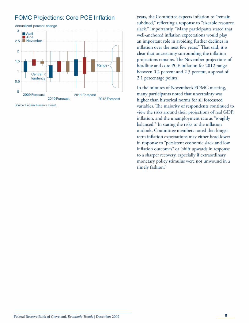
Th e Committee’s estimates for PCE infl ation for 2009 were broadly similar to its estimates in June. Infl ation data for the fi rst half of 2009 was“somewhat lower’ than expected, roughly off set by rising energy prices in the second half of 2009. With just three remaining months of data unknown at the time, most FOMC participants expect core PCE infl ation in 2009 to be between 1.4 percent and 1.5 percent. Over the next few
FOMC Projections: Real GDPAnnualized percent change
-3
-2
-1
0
1
2
3
4
5
6
Source: Federal Reserve Board.
Centraltendency
Range
2009 Forecast2010 Forecast
2011 Forecast Longer-run
AprilJuneNovember
2012 Forecast
4
5
6
7
8
9
10
11
FOMC Projections: Unemployment RatePercent
Source: Federal Reserve Board.
Centraltendency
Range
2009 Forecast2010 Forecast
2011 Forecast Longer-run2012 Forecast
AprilJuneNovember
-1
-0.5
0
0.5
1
1.5
2
2.5
3
FOMC Projections: PCE InflationAnnualized percent change
Source: Federal Reserve Board.
Centraltendency
Range
2009 Forecast2010 Forecast
2011 Forecast Longer-run2012 Forecast
AprilJuneNovember
8Federal Reserve Bank of Cleveland, Economic Trends | December 2009
years, the Committee expects infl ation to “remain subdued,” refl ecting a response to “sizeable resource slack.” Importantly, “Many participants stated that well-anchored infl ation expectations would play an important role in avoiding further declines in infl ation over the next few years.” Th at said, it is clear that uncertainty surrounding the infl ation projections remains. Th e November projections of headline and core PCE infl ation for 2012 range between 0.2 percent and 2.3 percent, a spread of 2.1 percentage points.
In the minutes of November’s FOMC meeting, many participants noted that uncertainty was higher than historical norms for all forecasted variables. Th e majority of respondents continued to view the risks around their projections of real GDP, infl ation, and the unemployment rate as “roughly balanced.” In stating the risks to the infl ation outlook, Committee members noted that longer-term infl ation expectations may either head lower in response to “persistent economic slack and low infl ation outcomes” or “shift upwards in response to a sharper recovery, especially if extraordinary monetary policy stimulus were not unwound in a timely fashion.”
2009 Forecast2010 Forecast
2011 Forecast2012 Forecast
AprilJuneNovember
0
0.5
1
1.5
2
2.5
3
FOMC Projections: Core PCE InflationAnnualized percent change
Source: Federal Reserve Board.
Centraltendency
Range
9Federal Reserve Bank of Cleveland, Economic Trends | December 2009
Economic Activity
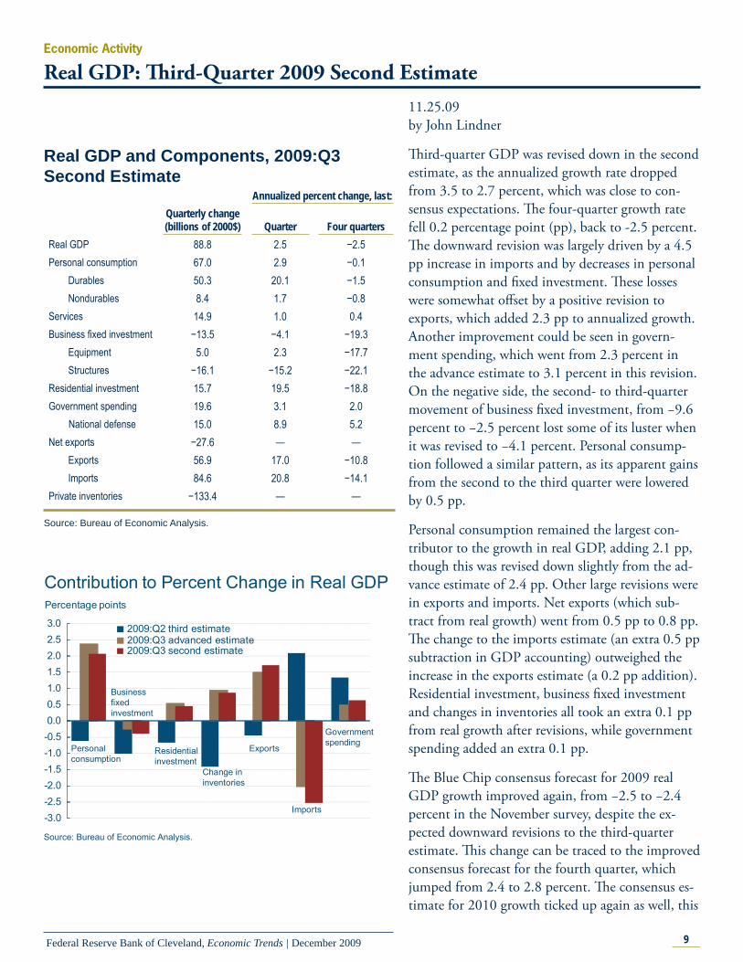
Real GDP: Th ird-Quarter 2009 Second Estimate11.25.09by John Lindner
Th ird-quarter GDP was revised down in the second estimate, as the annualized growth rate dropped from 3.5 to 2.7 percent, which was close to con-sensus expectations. Th e four-quarter growth rate fell 0.2 percentage point (pp), back to -2.5 percent. Th e downward revision was largely driven by a 4.5 pp increase in imports and by decreases in personal consumption and fi xed investment. Th ese losses were somewhat off set by a positive revision to exports, which added 2.3 pp to annualized growth. Another improvement could be seen in govern-ment spending, which went from 2.3 percent in the advance estimate to 3.1 percent in this revision. On the negative side, the second- to third-quarter movement of business fi xed investment, from −9.6 percent to −2.5 percent lost some of its luster when it was revised to −4.1 percent. Personal consump-tion followed a similar pattern, as its apparent gains from the second to the third quarter were lowered by 0.5 pp.
Personal consumption remained the largest con-tributor to the growth in real GDP, adding 2.1 pp, though this was revised down slightly from the ad-vance estimate of 2.4 pp. Other large revisions were in exports and imports. Net exports (which sub-tract from real growth) went from 0.5 pp to 0.8 pp. Th e change to the imports estimate (an extra 0.5 pp subtraction in GDP accounting) outweighed the increase in the exports estimate (a 0.2 pp addition). Residential investment, business fi xed investment and changes in inventories all took an extra 0.1 pp from real growth after revisions, while government spending added an extra 0.1 pp.
Th e Blue Chip consensus forecast for 2009 real GDP growth improved again, from −2.5 to −2.4 percent in the November survey, despite the ex-pected downward revisions to the third-quarter estimate. Th is change can be traced to the improved consensus forecast for the fourth quarter, which jumped from 2.4 to 2.8 percent. Th e consensus es-timate for 2010 growth ticked up again as well, this
Real GDP and Components, 2009:Q3 Second Estimate
Annualized percent change, last: Quarterly change (billions of 2000$) Quarter Four quarters
Real GDP 88.8 2.5 −2.5Personal consumption 67.0 2.9 −0.1 Durables 50.3 20.1 −1.5 Nondurables 8.4 1.7 −0.8Services 14.9 1.0 0.4Business fi xed investment −13.5 −4.1 −19.3 Equipment 5.0 2.3 −17.7 Structures −16.1 −15.2 −22.1Residential investment 15.7 19.5 −18.8Government spending 19.6 3.1 2.0 National defense 15.0 8.9 5.2Net exports −27.6 — — Exports 56.9 17.0 −10.8 Imports 84.6 20.8 −14.1Private inventories −133.4 — —
Source: Bureau of Economic Analysis.
-3.0-2.5-2.0-1.5-1.0-0.50.00.51.01.52.02.53.0
Contribution to Percent Change in Real GDP Percentage points
Personalconsumption
Businessfixed investment
Residentialinvestment
Change ininventories
Exports
Imports
Governmentspending
Source: Bureau of Economic Analysis.
2009:Q2 third estimate2009:Q3 advanced estimate2009:Q3 second estimate
10Federal Reserve Bank of Cleveland, Economic Trends | December 2009
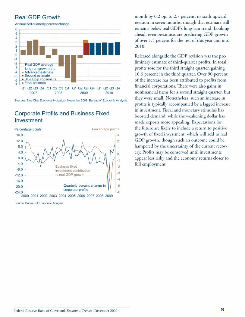
month by 0.2 pp, to 2.7 percent, its sixth upward revision in seven months, though that estimate still remains below real GDP’s long-run trend. Looking ahead, even pessimists are predicting GDP growth of over 1.5 percent for the rest of this year and into 2010.
Released alongside the GDP revision was the pre-liminary estimate of third-quarter profi ts. In total, profi ts rose for the third straight quarter, gaining 10.6 percent in the third quarter. Over 90 percent of the increase has been attributed to profi ts from fi nancial corporations. Th ere were also gains in nonfi nancial fi rms for a second straight quarter, but they were small. Nonetheless, such an increase in profi ts is typically accompanied by a lagged increase in investment. Fiscal and monetary stimulus has boosted demand, while the weakening dollar has made exports more appealing. Expectations for the future are likely to include a return to positive growth of fi xed investment, which will add to real GDP growth, though such an outcome could be hampered by the uncertainty of the current recov-ery. Profi ts may be conserved until investments appear less risky and the economy returns closer to full employment.
-7-6-5-4-3-2-10123456
Q1 Q2 Q3 Q4 Q1 Q2 Q3 Q4 Q1 Q2 Q3 Q4 Q1 Q2 Q3 Q4
Annualized quarterly percent change
Real GDP Growth
Sources: Blue Chip Economic Indicators, November 2009; Bureau of Economic Analysis.
2007
Final estimate
20092008 2010
Blue Chip consensus Second estimateAdvanced estimate
Real GDP averagelong-run growth rate
Corporate Profits and Business Fixed Investment
-24.0
-20.0
-16.0
-12.0
-8.0
-4.0
0.0
4.0
8.0
12.0
16.0
2000 2001 2002 2003 2004 2005 2006 2007 2008 2009-6
-5
-4
-3
-2
-1
0
1
2
3
Source: Bureau of Economic Analysis.
Percentage points
Quarterly percent change incorporate profits
Business fixedinvestment contributionto real GDP growth
Percentage points
11Federal Reserve Bank of Cleveland, Economic Trends | December 2009
Economic ActivityMeasures of Economic Slack, Cost Pressure, and Infl ation
12.01.09by Filippo Occhino and Kyle Fee
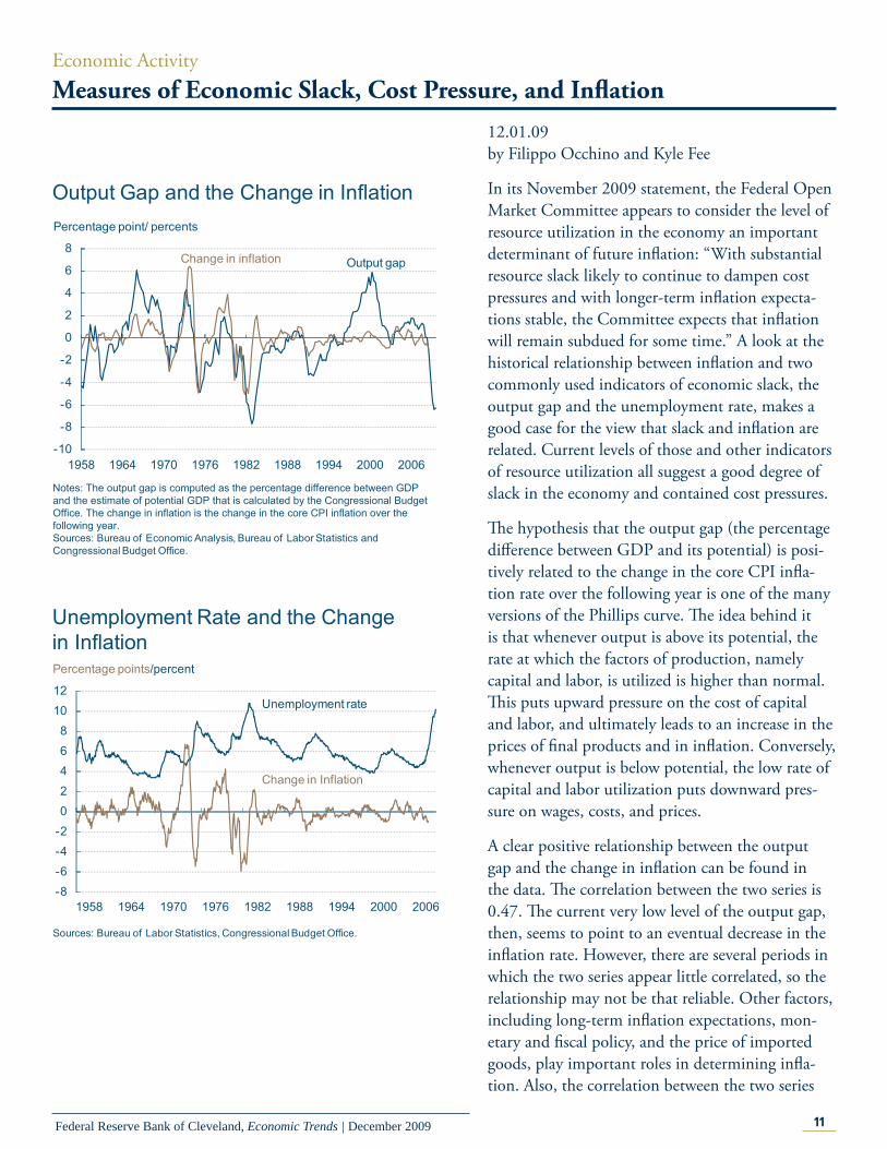
In its November 2009 statement, the Federal Open Market Committee appears to consider the level of resource utilization in the economy an important determinant of future infl ation: “With substantial resource slack likely to continue to dampen cost pressures and with longer-term infl ation expecta-tions stable, the Committee expects that infl ation will remain subdued for some time.” A look at the historical relationship between infl ation and two commonly used indicators of economic slack, the output gap and the unemployment rate, makes a good case for the view that slack and infl ation are related. Current levels of those and other indicators of resource utilization all suggest a good degree of slack in the economy and contained cost pressures.
Th e hypothesis that the output gap (the percentage diff erence between GDP and its potential) is posi-tively related to the change in the core CPI infl a-tion rate over the following year is one of the many versions of the Phillips curve. Th e idea behind it is that whenever output is above its potential, the rate at which the factors of production, namely capital and labor, is utilized is higher than normal. Th is puts upward pressure on the cost of capital and labor, and ultimately leads to an increase in the prices of fi nal products and in infl ation. Conversely, whenever output is below potential, the low rate of capital and labor utilization puts downward pres-sure on wages, costs, and prices.
A clear positive relationship between the output gap and the change in infl ation can be found in the data. Th e correlation between the two series is 0.47. Th e current very low level of the output gap, then, seems to point to an eventual decrease in the infl ation rate. However, there are several periods in which the two series appear little correlated, so the relationship may not be that reliable. Other factors, including long-term infl ation expectations, mon-etary and fi scal policy, and the price of imported goods, play important roles in determining infl a-tion. Also, the correlation between the two series
Unemployment Rate and the Change in Inflation
-8-6-4-202468
1012
Change in Inflation
Unemployment rate
1958 1964 1970 1976 1982 1988 1994 2000 2006
Sources: Bureau of Labor Statistics, Congressional Budget Office.
Percentage points/percent
Output Gap and the Change in Inflation
-10
-8
-6
-4
-2
0
2
4
6
8
1958 1964 1970 1976 1982 1988 1994 2000 2006
Percentage point/ percents
Change in inflation Output gap
Notes: The output gap is computed as the percentage difference between GDP and the estimate of potential GDP that is calculated by the Congressional Budget Office. The change in inflation is the change in the core CPI inflation over the following year.Sources: Bureau of Economic Analysis, Bureau of Labor Statistics andCongressional Budget Office.
12Federal Reserve Bank of Cleveland, Economic Trends | December 2009
is smaller after 1982, so the relationship may have weakened in recent decades. Finally, one should take into account that a very large degree of uncer-tainty surrounds the current estimates of potential GDP and the output gap.
Another simple and standard version of the Phillips curve states that the unemployment rate is nega-tively related to the change in core CPI infl ation over the following year. Th e argument behind this hypothesis is similar to the previous one, except that it focuses on the rate of labor utilization, rather than the rate of utilization of all factors of produc-tion. An unemployment rate above its natural rate, which we here take as constant over time, puts downward pressure on wages, and leads in turn to lower fi nal product prices.
Th e data also confi rm a negative relationship between the unemployment rate and the change in infl ation. Th e correlation between the two series is −0.37. Th e currently very high level of unem-ployment, above 10 percent, may then lead us to anticipate a subdued infl ation rate, at least over the short run. As with the output gap and infl ation, however, the relationship does not hold during several periods and has somehow weakened during the last decades.
Th is evidence seems consistent then with the view that the level of resource utilization in the economy contains information about the future short-run dynamics of infl ation. Other indicators of resource utilization and cost pressures are likewise correlated to subsequent changes in infl ation. Th eir recent trends also point to low infl ation pressures in the near term.
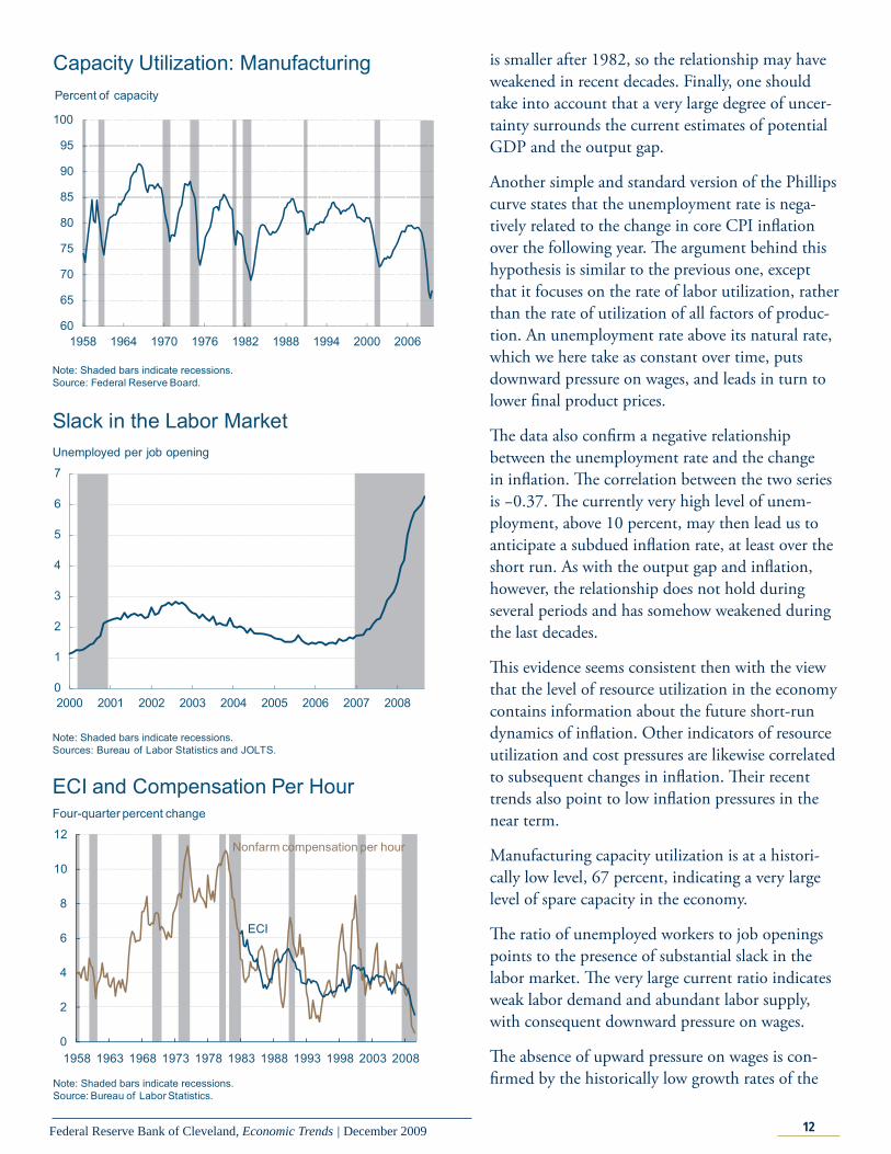
Manufacturing capacity utilization is at a histori-cally low level, 67 percent, indicating a very large level of spare capacity in the economy.
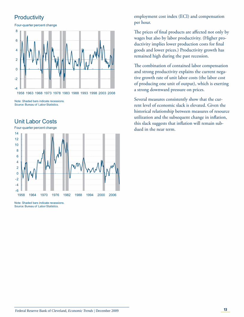
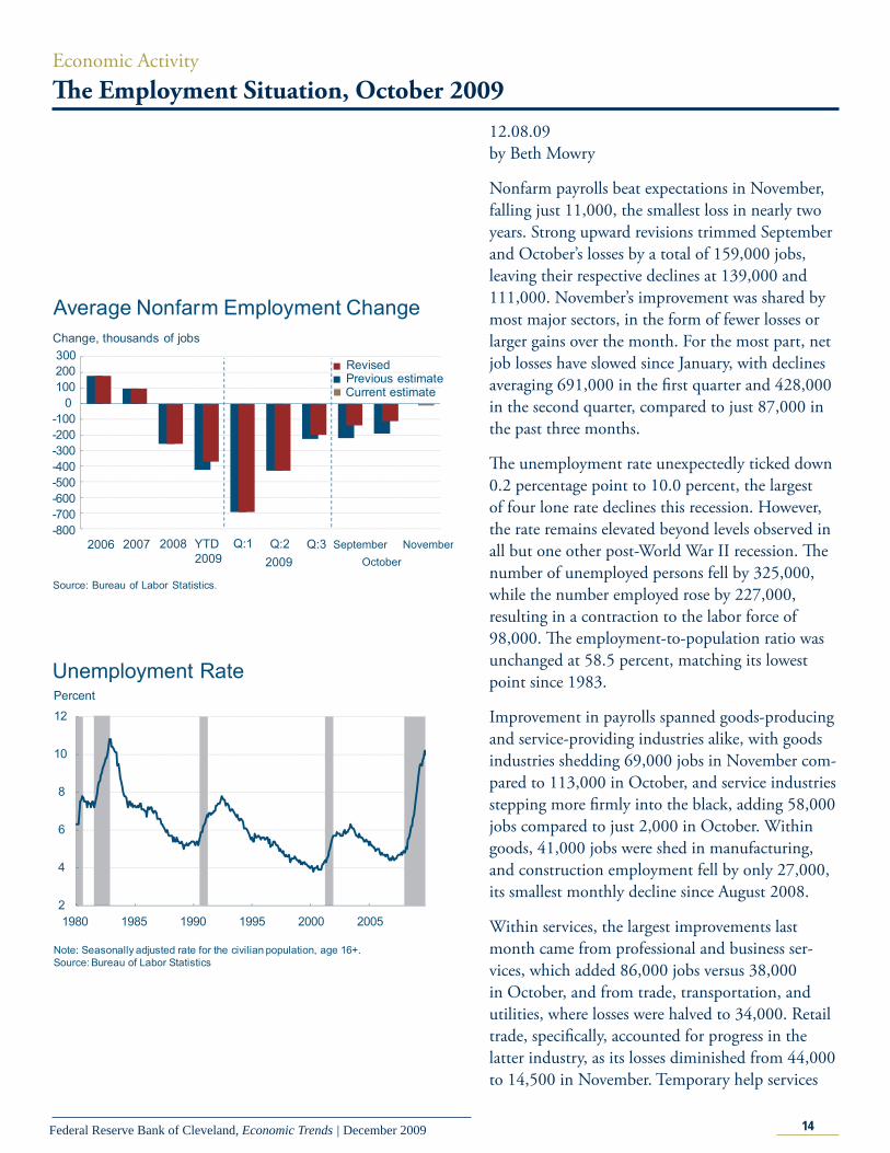
Th e ratio of unemployed workers to job openings points to the presence of substantial slack in the labor market. Th e very large current ratio indicates weak labor demand and abundant labor supply, with consequent downward pressure on wages.
Th e absence of upward pressure on wages is con-fi rmed by the historically low growth rates of the
Capacity Utilization: Manufacturing
Note: Shaded bars indicate recessions.Source: Federal Reserve Board.
Percent of capacity
60
65
70
75
80
85
90
95
100
1958 1964 1970 1976 1982 1988 1994 2000 2006
Slack in the Labor Market
0
1
2
3
4
5
6
7
2000 2001 2002 2003 2004 2005 2006 2007 2008
Note: Shaded bars indicate recessions.Sources: Bureau of Labor Statistics and JOLTS.
Unemployed per job opening
0
2
4
6
8
10
12
1958 1963 1968 1973 1978 1983 1988 1993 1998 2003 2008
ECI and Compensation Per Hour
Note: Shaded bars indicate recessions.Source: Bureau of Labor Statistics.
Four-quarter percent change
Nonfarm compensation per hour
ECI
13Federal Reserve Bank of Cleveland, Economic Trends | December 2009
employment cost index (ECI) and compensation per hour.
Th e prices of fi nal products are aff ected not only by wages but also by labor productivity. (Higher pro-ductivity implies lower production costs for fi nal goods and lower prices.) Productivity growth has remained high during the past recession.
Th e combination of contained labor compensation and strong productivity explains the current nega-tive growth rate of unit labor costs (the labor cost of producing one unit of output), which is exerting a strong downward pressure on prices.
Several measures consistently show that the cur-rent level of economic slack is elevated. Given the historical relationship between measures of resource utilization and the subsequent change in infl ation, this slack suggests that infl ation will remain sub-dued in the near term.
-4
-2
0
2
4
6
8
1958 1963 1968 1973 1978 1983 1988 1993 1998 2003 2008
Productivity
Note: Shaded bars indicate recessions.Source: Bureau of Labor Statistics.
Four-quarter percent change
Unit Labor Costs
Note: Shaded bars indicate recessions.Source: Bureau of Labor Statistics.
Four-quarter percent change
-6
-4
-2
0
2
4
6
8
10
12
14
1958 1964 1970 1976 1982 1988 1994 2000 2006
14Federal Reserve Bank of Cleveland, Economic Trends | December 2009
Economic ActivityTh e Employment Situation, October 2009
12.08.09by Beth Mowry
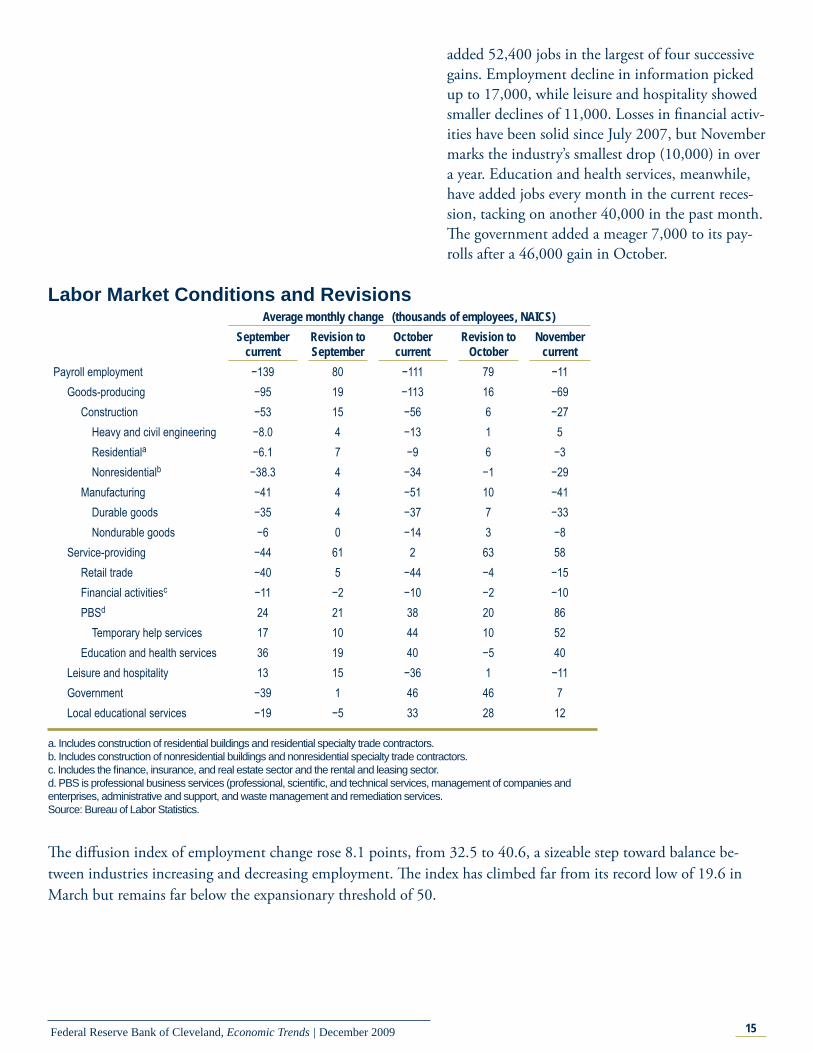
Nonfarm payrolls beat expectations in November, falling just 11,000, the smallest loss in nearly two years. Strong upward revisions trimmed September and October’s losses by a total of 159,000 jobs, leaving their respective declines at 139,000 and 111,000. November’s improvement was shared by most major sectors, in the form of fewer losses or larger gains over the month. For the most part, net job losses have slowed since January, with declines averaging 691,000 in the fi rst quarter and 428,000 in the second quarter, compared to just 87,000 in the past three months.
Th e unemployment rate unexpectedly ticked down 0.2 percentage point to 10.0 percent, the largest of four lone rate declines this recession. However, the rate remains elevated beyond levels observed in all but one other post-World War II recession. Th e number of unemployed persons fell by 325,000, while the number employed rose by 227,000, resulting in a contraction to the labor force of 98,000. Th e employment-to-population ratio was unchanged at 58.5 percent, matching its lowest point since 1983.
Improvement in payrolls spanned goods-producing and service-providing industries alike, with goods industries shedding 69,000 jobs in November com-pared to 113,000 in October, and service industries stepping more fi rmly into the black, adding 58,000 jobs compared to just 2,000 in October. Within goods, 41,000 jobs were shed in manufacturing, and construction employment fell by only 27,000, its smallest monthly decline since August 2008.
Within services, the largest improvements last month came from professional and business ser-vices, which added 86,000 jobs versus 38,000 in October, and from trade, transportation, and utilities, where losses were halved to 34,000. Retail trade, specifi cally, accounted for progress in the latter industry, as its losses diminished from 44,000 to 14,500 in November. Temporary help services
-800-700-600-500-400-300-200-100
0100200
Average Nonfarm Employment ChangeChange, thousands of jobs
Source: Bureau of Labor Statistics.
2006 2007 2008 YTD2009
Q:12009Q:2 Q:3 September
October
300
November
RevisedPrevious estimateCurrent estimate
2
4
6
8
10
12
1980 1985 1990 1995 2000 2005
Note: Seasonally adjusted rate for the civilian population, age 16+.Source: Bureau of Labor Statistics
Unemployment RatePercent
15Federal Reserve Bank of Cleveland, Economic Trends | December 2009
Labor Market Conditions and RevisionsAverage monthly change (thousands of employees, NAICS)
September current
Revision to September
October current
Revision to October
November current
Payroll employment −139 80 −111 79 −11Goods-producing −95 19 −113 16 −69
Construction −53 15 −56 6 −27Heavy and civil engineering −8.0 4 −13 1 5
Residentiala −6.1 7 −9 6 −3 Nonresidentialb −38.3 4 −34 −1 −29 Manufacturing −41 4 −51 10 −41 Durable goods −35 4 −37 7 −33 Nondurable goods −6 0 −14 3 −8 Service-providing −44 61 2 63 58 Retail trade −40 5 −44 −4 −15 Financial activitiesc −11 −2 −10 −2 −10 PBSd 24 21 38 20 86 Temporary help services 17 10 44 10 52 Education and health services 36 19 40 −5 40 Leisure and hospitality 13 15 −36 1 −11 Government −39 1 46 46 7 Local educational services −19 −5 33 28 12
a. Includes construction of residential buildings and residential specialty trade contractors.b. Includes construction of nonresidential buildings and nonresidential specialty trade contractors.c. Includes the fi nance, insurance, and real estate sector and the rental and leasing sector.d. PBS is professional business services (professional, scientifi c, and technical services, management of companies and enterprises, administrative and support, and waste management and remediation services.Source: Bureau of Labor Statistics.
added 52,400 jobs in the largest of four successive gains. Employment decline in information picked up to 17,000, while leisure and hospitality showed smaller declines of 11,000. Losses in fi nancial activ-ities have been solid since July 2007, but November marks the industry’s smallest drop (10,000) in over a year. Education and health services, meanwhile, have added jobs every month in the current reces-sion, tacking on another 40,000 in the past month. Th e government added a meager 7,000 to its pay-rolls after a 46,000 gain in October.
Th e diff usion index of employment change rose 8.1 points, from 32.5 to 40.6, a sizeable step toward balance be-tween industries increasing and decreasing employment. Th e index has climbed far from its record low of 19.6 in March but remains far below the expansionary threshold of 50.
16Federal Reserve Bank of Cleveland, Economic Trends | December 2009
International MarketsRenminbi-Dollar Peg Once Again
11.25.09by Owen F. Humpage and Caroline Herrell
China gains a competitive advantage not from its peg with the dollar, but from its ability to off set the impact of foreign fi nancial infl ows on its price level. Appreciating this distinction is crucial for under-standing Chinese exchange-rate policies.
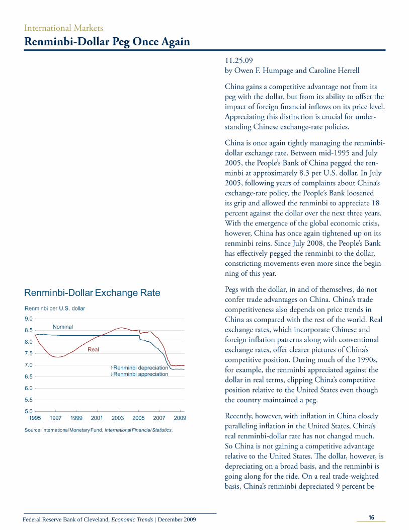
China is once again tightly managing the renminbi-dollar exchange rate. Between mid-1995 and July 2005, the People’s Bank of China pegged the ren-minbi at approximately 8.3 per U.S. dollar. In July 2005, following years of complaints about China’s exchange-rate policy, the People’s Bank loosened its grip and allowed the renminbi to appreciate 18 percent against the dollar over the next three years. With the emergence of the global economic crisis, however, China has once again tightened up on its renminbi reins. Since July 2008, the People’s Bank has eff ectively pegged the renminbi to the dollar, constricting movements even more since the begin-ning of this year.
Pegs with the dollar, in and of themselves, do not confer trade advantages on China. China’s trade competitiveness also depends on price trends in China as compared with the rest of the world. Real exchange rates, which incorporate Chinese and foreign infl ation patterns along with conventional exchange rates, off er clearer pictures of China’s competitive position. During much of the 1990s, for example, the renminbi appreciated against the dollar in real terms, clipping China’s competitive position relative to the United States even though the country maintained a peg.
Recently, however, with infl ation in China closely paralleling infl ation in the United States, China’s real renminbi-dollar rate has not changed much. So China is not gaining a competitive advantage relative to the United States. Th e dollar, however, is depreciating on a broad basis, and the renminbi is going along for the ride. On a real trade-weighted basis, China’s renminbi depreciated 9 percent be-
5.0
5.5
6.0
6.5
7.0
7.5
8.0
8.5
9.0
1995 1997 1999 2001 2003 2005 2007 2009
Renminbi per U.S. dollar
Renminbi-Dollar Exchange Rate
Source: International Monetary Fund, International Financial Statistics.
Real
Nominal
Renminbi depreciationRenminbi appreciation
17Federal Reserve Bank of Cleveland, Economic Trends | December 2009
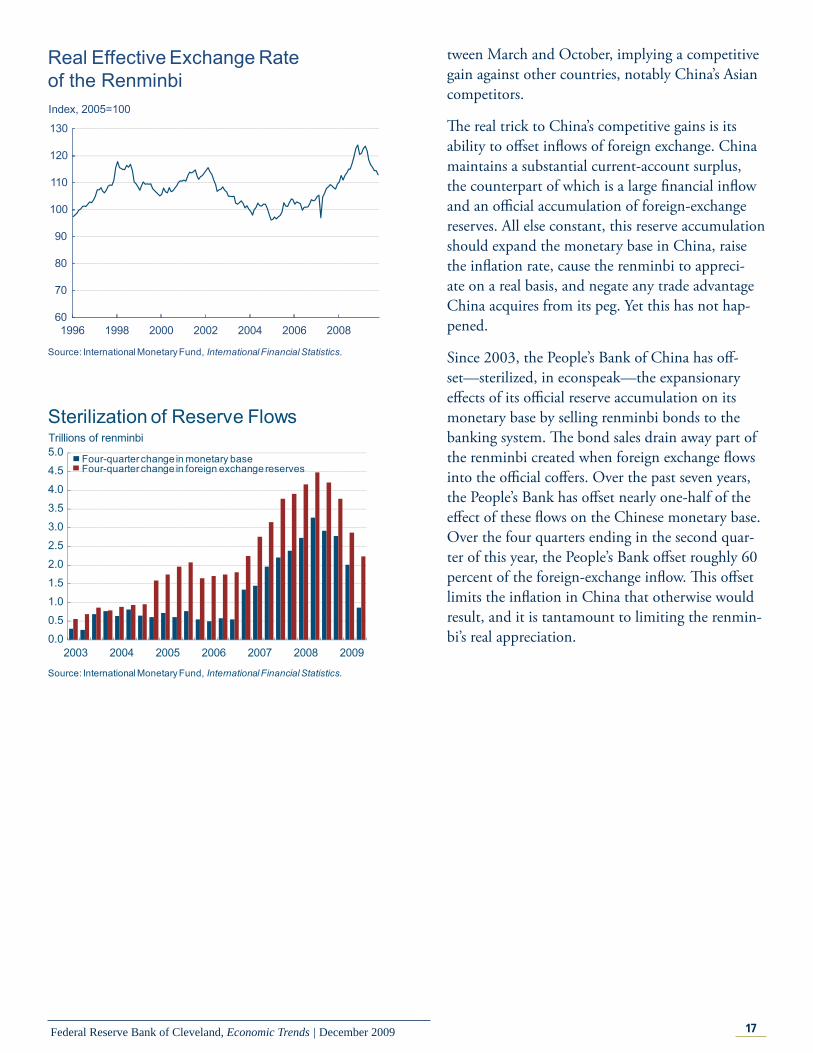
tween March and October, implying a competitive gain against other countries, notably China’s Asian competitors.
Th e real trick to China’s competitive gains is its ability to off set infl ows of foreign exchange. China maintains a substantial current-account surplus, the counterpart of which is a large fi nancial infl ow and an offi cial accumulation of foreign-exchange reserves. All else constant, this reserve accumulation should expand the monetary base in China, raise the infl ation rate, cause the renminbi to appreci-ate on a real basis, and negate any trade advantage China acquires from its peg. Yet this has not hap-pened.
Since 2003, the People’s Bank of China has off -set—sterilized, in econspeak—the expansionary eff ects of its offi cial reserve accumulation on its monetary base by selling renminbi bonds to the banking system. Th e bond sales drain away part of the renminbi created when foreign exchange fl ows into the offi cial coff ers. Over the past seven years, the People’s Bank has off set nearly one-half of the eff ect of these fl ows on the Chinese monetary base. Over the four quarters ending in the second quar-ter of this year, the People’s Bank off set roughly 60 percent of the foreign-exchange infl ow. Th is off set limits the infl ation in China that otherwise would result, and it is tantamount to limiting the renmin-bi’s real appreciation.
60
70
80
90
100
110
120
130
1996 1998 2000 2002 2004 2006 2008
Index, 2005=100
Real Effective Exchange Rate of the Renminbi
Source: International Monetary Fund, International Financial Statistics.
0.0
0.5
1.0
1.5
2.0
2.5
3.0
3.5
4.0
4.5
5.0
2003 2004 2005 2006 2007 2008 2009
Four-quarter change in monetary baseFour-quarter change in foreign exchange reserves
Source: International Monetary Fund, International Financial Statistics.
Trillions of renminbi Sterilization of Reserve Flows
18Federal Reserve Bank of Cleveland, Economic Trends | December 2009
Regional ActivityOhio’s Economic Momentum
12.04.09by Kyle Fee
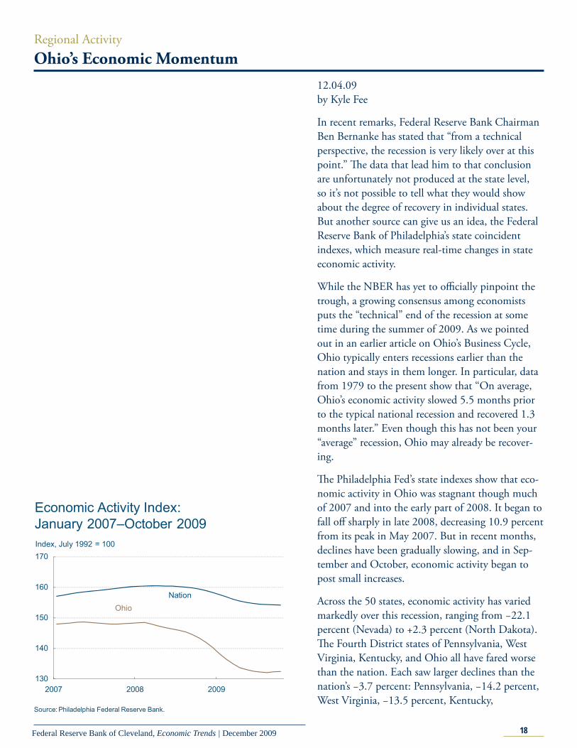
In recent remarks, Federal Reserve Bank Chairman Ben Bernanke has stated that “from a technical perspective, the recession is very likely over at this point.” Th e data that lead him to that conclusion are unfortunately not produced at the state level, so it’s not possible to tell what they would show about the degree of recovery in individual states. But another source can give us an idea, the Federal Reserve Bank of Philadelphia’s state coincident indexes, which measure real-time changes in state economic activity.
While the NBER has yet to offi cially pinpoint the trough, a growing consensus among economists puts the “technical” end of the recession at some time during the summer of 2009. As we pointed out in an earlier article on Ohio’s Business Cycle, Ohio typically enters recessions earlier than the nation and stays in them longer. In particular, data from 1979 to the present show that “On average, Ohio’s economic activity slowed 5.5 months prior to the typical national recession and recovered 1.3 months later.” Even though this has not been your “average” recession, Ohio may already be recover-ing.
Th e Philadelphia Fed’s state indexes show that eco-nomic activity in Ohio was stagnant though much of 2007 and into the early part of 2008. It began to fall off sharply in late 2008, decreasing 10.9 percent from its peak in May 2007. But in recent months, declines have been gradually slowing, and in Sep-tember and October, economic activity began to post small increases.
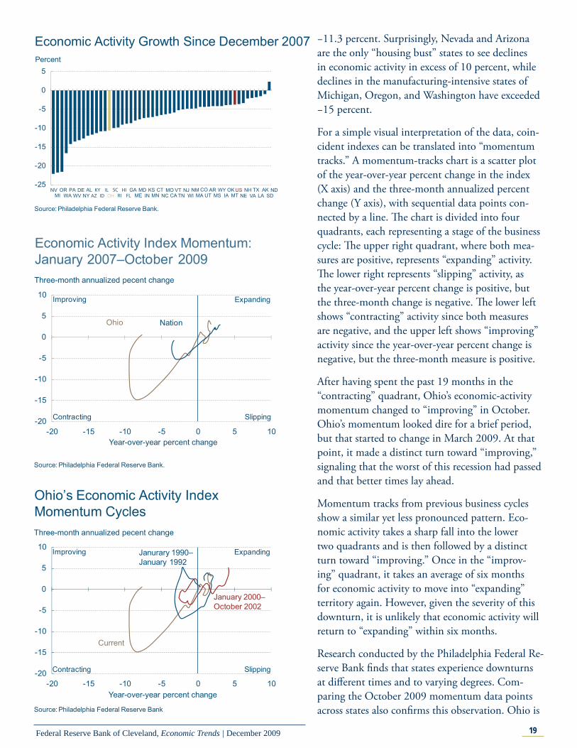
Across the 50 states, economic activity has varied markedly over this recession, ranging from −22.1 percent (Nevada) to +2.3 percent (North Dakota). Th e Fourth District states of Pennsylvania, West Virginia, Kentucky, and Ohio all have fared worse than the nation. Each saw larger declines than the nation’s −3.7 percent: Pennsylvania, −14.2 percent, West Virginia, −13.5 percent, Kentucky,
Economic Activity Index: January 2007–October 2009
130
140
150
160
170
2007 2008 2009
Index, July 1992 = 100
Source: Philadelphia Federal Reserve Bank.
OhioNation
19Federal Reserve Bank of Cleveland, Economic Trends | December 2009
Economic Activity Growth Since December 2007
-25
-20
-15
-10
-5
0
5Percent
Source: Philadelphia Federal Reserve Bank.
NVMI
ORWA
PAWV
DENY
ALAZKYID
ILOH
SCRIHIFL
GAME IN
MD KSMN
CTNC
MOCA
VTTN
NJWI
NMMA
COUT
ARMS
WYIA
OKMT
USNE
NHVA
TXLA
AKSD
ND
Economic Activity Index Momentum:January 2007–October 2009
-20
-15
-10
-5
0
5
10
-20 -15 -10 -5 0 5 10Year-over-year percent change
Three-month annualized pecent change
Expanding
SlippingContracting
Improving
Ohio Nation
Source: Philadelphia Federal Reserve Bank.
Ohio’s Economic Activity Index Momentum Cycles
-20
-15
-10
-5
0
5
10
-20 -15 -10 -5 0 5 10
Current
Janurary 1990–January 1992
Source: Philadelphia Federal Reserve Bank
January 2000–October 2002
Year-over-year percent change
Three-month annualized pecent change
Expanding
SlippingContracting
Improving
−11.3 percent. Surprisingly, Nevada and Arizona are the only “housing bust” states to see declines in economic activity in excess of 10 percent, while declines in the manufacturing-intensive states of Michigan, Oregon, and Washington have exceeded −15 percent.
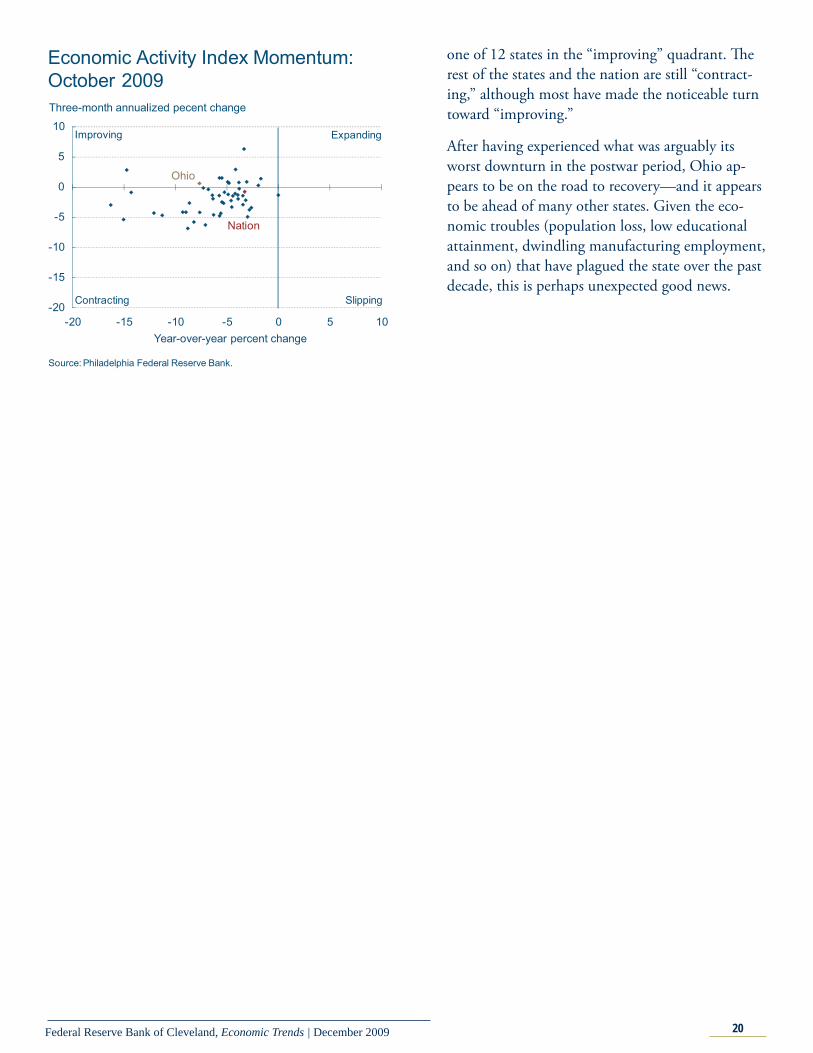
For a simple visual interpretation of the data, coin-cident indexes can be translated into “momentum tracks.” A momentum-tracks chart is a scatter plot of the year-over-year percent change in the index (X axis) and the three-month annualized percent change (Y axis), with sequential data points con-nected by a line. Th e chart is divided into four quadrants, each representing a stage of the business cycle: Th e upper right quadrant, where both mea-sures are positive, represents “expanding” activity. Th e lower right represents “slipping” activity, as the year-over-year percent change is positive, but the three-month change is negative. Th e lower left shows “contracting” activity since both measures are negative, and the upper left shows “improving” activity since the year-over-year percent change is negative, but the three-month measure is positive.
After having spent the past 19 months in the “contracting” quadrant, Ohio’s economic-activity momentum changed to “improving” in October. Ohio’s momentum looked dire for a brief period, but that started to change in March 2009. At that point, it made a distinct turn toward “improving,” signaling that the worst of this recession had passed and that better times lay ahead.
Momentum tracks from previous business cycles show a similar yet less pronounced pattern. Eco-nomic activity takes a sharp fall into the lower two quadrants and is then followed by a distinct turn toward “improving.” Once in the “improv-ing” quadrant, it takes an average of six months for economic activity to move into “expanding” territory again. However, given the severity of this downturn, it is unlikely that economic activity will return to “expanding” within six months.
Research conducted by the Philadelphia Federal Re-serve Bank fi nds that states experience downturns at diff erent times and to varying degrees. Com-paring the October 2009 momentum data points across states also confi rms this observation. Ohio is
20Federal Reserve Bank of Cleveland, Economic Trends | December 2009
one of 12 states in the “improving” quadrant. Th e rest of the states and the nation are still “contract-ing,” although most have made the noticeable turn toward “improving.”
After having experienced what was arguably its worst downturn in the postwar period, Ohio ap-pears to be on the road to recovery—and it appears to be ahead of many other states. Given the eco-nomic troubles (population loss, low educational attainment, dwindling manufacturing employment, and so on) that have plagued the state over the past decade, this is perhaps unexpected good news.
Economic Activity Index Momentum: October 2009
-20
-15
-10
-5
0
5
10
-20 -15 -10 -5 0 5 10
Source: Philadelphia Federal Reserve Bank.
Ohio
Nation
Year-over-year percent change
Three-month annualized pecent change
Expanding
SlippingContracting
Improving
21Federal Reserve Bank of Cleveland, Economic Trends | December 2009
Regional ActivityFourth District Employment Conditions
12.07.09by Kyle Fee
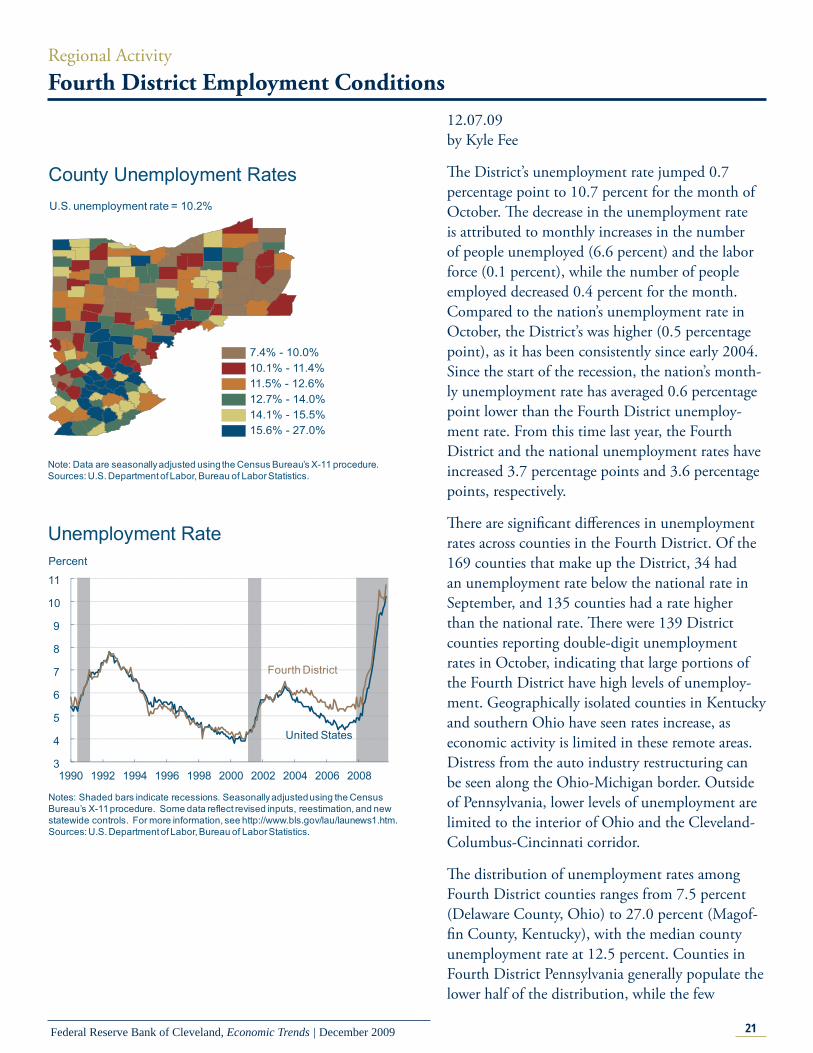
Th e District’s unemployment rate jumped 0.7 percentage point to 10.7 percent for the month of October. Th e decrease in the unemployment rate is attributed to monthly increases in the number of people unemployed (6.6 percent) and the labor force (0.1 percent), while the number of people employed decreased 0.4 percent for the month. Compared to the nation’s unemployment rate in October, the District’s was higher (0.5 percentage point), as it has been consistently since early 2004. Since the start of the recession, the nation’s month-ly unemployment rate has averaged 0.6 percentage point lower than the Fourth District unemploy-ment rate. From this time last year, the Fourth District and the national unemployment rates have increased 3.7 percentage points and 3.6 percentage points, respectively.
Th ere are signifi cant diff erences in unemployment rates across counties in the Fourth District. Of the 169 counties that make up the District, 34 had an unemployment rate below the national rate in September, and 135 counties had a rate higher than the national rate. Th ere were 139 District counties reporting double-digit unemployment rates in October, indicating that large portions of the Fourth District have high levels of unemploy-ment. Geographically isolated counties in Kentucky and southern Ohio have seen rates increase, as economic activity is limited in these remote areas. Distress from the auto industry restructuring can be seen along the Ohio-Michigan border. Outside of Pennsylvania, lower levels of unemployment are limited to the interior of Ohio and the Cleveland-Columbus-Cincinnati corridor.
Th e distribution of unemployment rates among Fourth District counties ranges from 7.5 percent (Delaware County, Ohio) to 27.0 percent (Magof-fi n County, Kentucky), with the median county unemployment rate at 12.5 percent. Counties in Fourth District Pennsylvania generally populate the lower half of the distribution, while the few
3
4
5
6
7
8
9
10
11
1990 1992 1994 1996 1998 2000 2002 2004 2006 2008
Percent
United States
Unemployment Rate
Notes: Shaded bars indicate recessions. Seasonally adjusted using the Census Bureau’s X-11 procedure. Some data reflect revised inputs, reestimation, and new statewide controls. For more information, see http://www.bls.gov/lau/launews1.htm.Sources: U.S. Department of Labor, Bureau of Labor Statistics.
Fourth District
County Unemployment Rates
Note: Data are seasonally adjusted using the Census Bureau’s X-11 procedure. Sources: U.S. Department of Labor, Bureau of Labor Statistics.
U.S. unemployment rate = 10.2%
7.4% - 10.0%10.1% - 11.4%11.5% - 12.6%12.7% - 14.0%14.1% - 15.5%15.6% - 27.0%
22Federal Reserve Bank of Cleveland, Economic Trends | December 2009
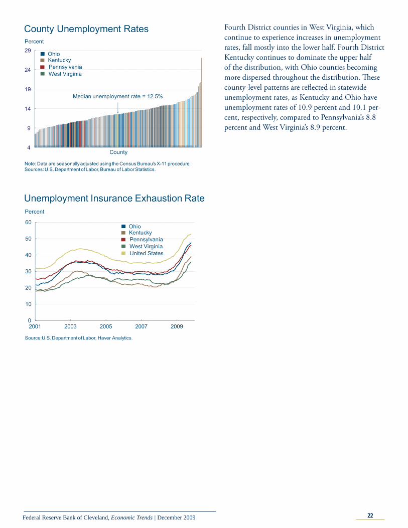
Fourth District counties in West Virginia, which continue to experience increases in unemployment rates, fall mostly into the lower half. Fourth District Kentucky continues to dominate the upper half of the distribution, with Ohio counties becoming more dispersed throughout the distribution. Th ese county-level patterns are refl ected in statewide unemployment rates, as Kentucky and Ohio have unemployment rates of 10.9 percent and 10.1 per-cent, respectively, compared to Pennsylvania’s 8.8 percent and West Virginia’s 8.9 percent.
4
9
14
19
24
29Percent
County Unemployment Rates
Note: Data are seasonally adjusted using the Census Bureau’s X-11 procedure.Sources: U.S. Department of Labor, Bureau of Labor Statistics.
County
PennsylvaniaWest Virginia
OhioKentucky
Median unemployment rate = 12.5%
0
10
20
30
40
50
60
2001 2003 2005 2007 2009
Unemployment Insurance Exhaustion Rate
Source:U.S. Department of Labor, Haver Analytics.
Percent
PennsylvaniaWest Virginia
OhioKentucky
United States
23Federal Reserve Bank of Cleveland, Economic Trends | December 2009
Banking and Financial InstitutionsSupply and Demand Shocks in Residential Mortgages
12.08.09by Jian Cai and Kent Cherny
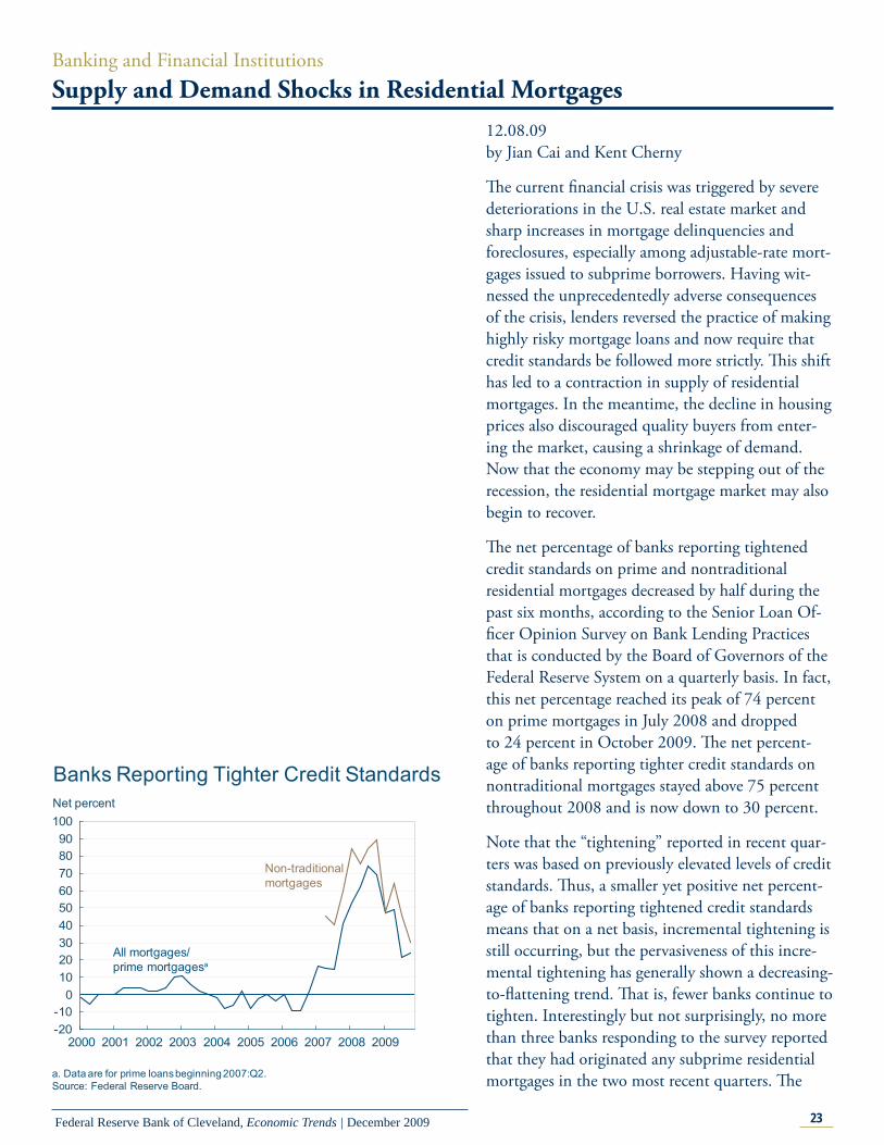
Th e current fi nancial crisis was triggered by severe deteriorations in the U.S. real estate market and sharp increases in mortgage delinquencies and foreclosures, especially among adjustable-rate mort-gages issued to subprime borrowers. Having wit-nessed the unprecedentedly adverse consequences of the crisis, lenders reversed the practice of making highly risky mortgage loans and now require that credit standards be followed more strictly. Th is shift has led to a contraction in supply of residential mortgages. In the meantime, the decline in housing prices also discouraged quality buyers from enter-ing the market, causing a shrinkage of demand. Now that the economy may be stepping out of the recession, the residential mortgage market may also begin to recover.
Th e net percentage of banks reporting tightened credit standards on prime and nontraditional residential mortgages decreased by half during the past six months, according to the Senior Loan Of-fi cer Opinion Survey on Bank Lending Practices that is conducted by the Board of Governors of the Federal Reserve System on a quarterly basis. In fact, this net percentage reached its peak of 74 percent on prime mortgages in July 2008 and dropped to 24 percent in October 2009. Th e net percent-age of banks reporting tighter credit standards on nontraditional mortgages stayed above 75 percent throughout 2008 and is now down to 30 percent.
Note that the “tightening” reported in recent quar-ters was based on previously elevated levels of credit standards. Th us, a smaller yet positive net percent-age of banks reporting tightened credit standards means that on a net basis, incremental tightening is still occurring, but the pervasiveness of this incre-mental tightening has generally shown a decreasing-to-fl attening trend. Th at is, fewer banks continue to tighten. Interestingly but not surprisingly, no more than three banks responding to the survey reported that they had originated any subprime residential mortgages in the two most recent quarters. Th e
Banks Reporting Tighter Credit Standards
-20-10
0102030405060708090
100
2000 2001 2002 2003 2004 2005 2006 2007 2008 2009
Net percent
All mortgages/prime mortgagesa
Non-traditionalmortgages
a. Data are for prime loans beginning 2007:Q2.Source: Federal Reserve Board.
24Federal Reserve Bank of Cleveland, Economic Trends | December 2009
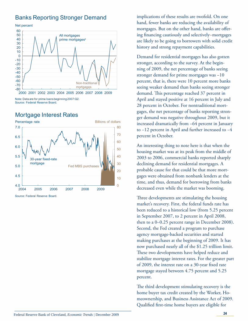
implications of these results are twofold. On one hand, fewer banks are reducing the availability of mortgages. But on the other hand, banks are off er-ing fi nancing cautiously and selectively−mortgages are likely to be going to borrowers with solid credit history and strong repayment capabilities.
Demand for residential mortgages has also gotten stronger, according to the survey. At the begin-ning of 2009, the net percentage of banks seeing stronger demand for prime mortgages was −10 percent, that is, there were 10 percent more banks seeing weaker demand than banks seeing stronger demand. Th is percentage reached 37 percent in April and stayed positive at 16 percent in July and 28 percent in October. For nontraditional mort-gages, the net percentage of banks reporting stron-ger demand was negative throughout 2009, but it increased dramatically from −64 percent in January to −12 percent in April and further increased to −4 percent in October.
An interesting thing to note here is that when the housing market was at its peak from the middle of 2003 to 2006, commercial banks reported sharply declining demand for residential mortgages. A probable cause for that could be that more mort-gages were obtained from nonbank lenders at the time, and thus, demand for borrowing from banks decreased even while the market was booming.
Th ree developments are stimulating the housing market’s recovery. First, the federal funds rate has been reduced to a historical low (from 5.25 percent in September 2007, to 2 percent in April 2008, then to a 0–0.25 percent range in December 2008). Second, the Fed created a program to purchase agency mortgage-backed securities and started making purchases at the beginning of 2009. It has now purchased nearly all of the $1.25 trillion limit. Th ese two developments have helped reduce and stabilize mortgage interest rates. For the greater part of 2009, the interest rate on a 30-year fi xed rate mortgage stayed between 4.75 percent and 5.25 percent.
Th e third development stimulating recovery is the home buyer tax credit created by the Worker, Ho-meownership, and Business Assistance Act of 2009. Qualifi ed fi rst-time home buyers are eligible for
Banks Reporting Stronger Demand
-80-70-60-50-40-30-20-10
0102030405060
2000 2001 2002 2003 2004 2005 2006 2007 2008 2009
Net percent
All mortgagesprime mortgagesa
Non-traditionalmortgages
Note: Data are for prime loans beginning 2007:Q2.Source: Federal Reserve Board.
Mortgage Interest Rates
4.0
4.5
5.0
5.5
6.0
6.5
7.0
2004 2005 2006 2007 2008 20090
10
20
30
40
50
60
70
80
Source: Federal Reserve Board.
Percentage rate
30-year fixed-ratemortgage
Billions of dollars
Fed MBS purchases
25Federal Reserve Bank of Cleveland, Economic Trends | December 2009
Economic Trends is published by the Research Department of the Federal Reserve Bank of Cleveland.
Views stated in Economic Trends are those of individuals in the Research Department and not necessarily those of the Fed-eral Reserve Bank of Cleveland or of the Board of Governors of the Federal Reserve System. Materials may be reprinted provided that the source is credited.
If you’d like to subscribe to a free e-mail service that tells you when Trends is updated, please send an empty email mes-sage to [email protected]. No commands in either the subject header or message body are required.
ISSN 0748-2922
a tax credit of up to $8,000, and qualifi ed repeat home buyers are eligible for up to $6,500. Apply-ing to sales made between January 2009 and April 2010, the tax credit is in fact an eff ective reduction in house sales prices and motivates potential home buyers to enter the market.
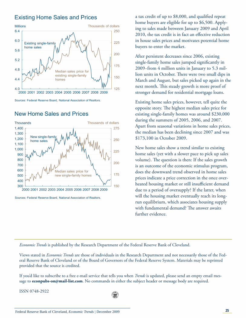
After persistent decreases since 2006, existing single-family home sales jumped signifi cantly in 2009−from 4 million units in January to 5.3 mil-lion units in October. Th ere were two small dips in March and August, but sales picked up again in the next month. Th is steady growth is more proof of stronger demand for residential mortgage loans.
Existing home sales prices, however, tell quite the opposite story. Th e highest median sales price for existing single-family homes was around $230,000 during the summers of 2005, 2006, and 2007. Apart from seasonal variations in home sales prices, the median has been declining since 2007 and was $173,100 in October 2009.
New home sales show a trend similar to existing home sales (yet with a slower pace to pick up sales volume). Th e question is then: If the sales growth is an outcome of the economic stimulus program, does the downward trend observed in home sales prices indicate a price correction in the once over-heated housing market or still insuffi cient demand due to a period of oversupply? If the latter, when will the housing market eventually reach its long-run equilibrium, which associates housing supply with fundamental demand? Th e answer awaits further evidence.
Existing Home Sales and Prices
4.0
4.4
4.8
5.2
5.6
6.0
6.4
2000 2001 2002 2003 2004 2005 2006 2007 2008 2009125
150
175
200
225
250
Sources: Federal Reserve Board, National Association of Realtors.
Millions
Existing single-familyhome sales
Median sales price forexisting single-familyhomes
Thousands of dollars
New Home Sales and Prices
300400500600700800900
1,0001,1001,2001,3001,400
2000 2001 2002 2003 2004 2005 2006 2007 2008 2009150
175
200
225
250
275Thousands
New single-familyhome sales
Median sales price fornew single-family homes
Thousands of dollars
Sources: Federal Reserve Board, National Association of Realtors.