Embed Size (px)
DESCRIPTION
Â
Citation preview
Brand Guidelines
March 2014

2
ContentsMission Statement .........................3
Logo ...................................................4
Logo Clear Space ...........................5
Logo Variations ..............................6
Logo Don’ts ..................................... 7
Colors and Typeface .....................8
Collateral ..........................................9
Closing Statement ........................ 11

3
Mission Statement
How to use the Style Guide
In 2012 Forward Movement Inc. was created by Lonnetta Albright. Through coaching, training and consultation, Forward Movement Inc. empowers individuals in their 20s, 30s, 40s and beyond to achieve success that’s balanced and transformative. For employers, services help to create supportive and developmental work environments for valued employees and ultimately healthy and productive organizations.
A brand is a definition of distinction. It separates you from your competitors and creates a visual and perceptual difference for your organization and business communications. This design standard has been created to show the rules that must be followed when producing the material relating to web, print and collateral.

4
The LogoHere it is, the logo. The logo is the most visible element of the brand identity; a universal signature. The logo signifies the movement and journey forward for all those who Forward Movement Inc. empowers. The logo is made up of three elements: the logotype, the curved lines, and the person symbol. While it may seem like a simple logo, it must be treated nicely. The following pages covers its usage so to always looks its best.
5
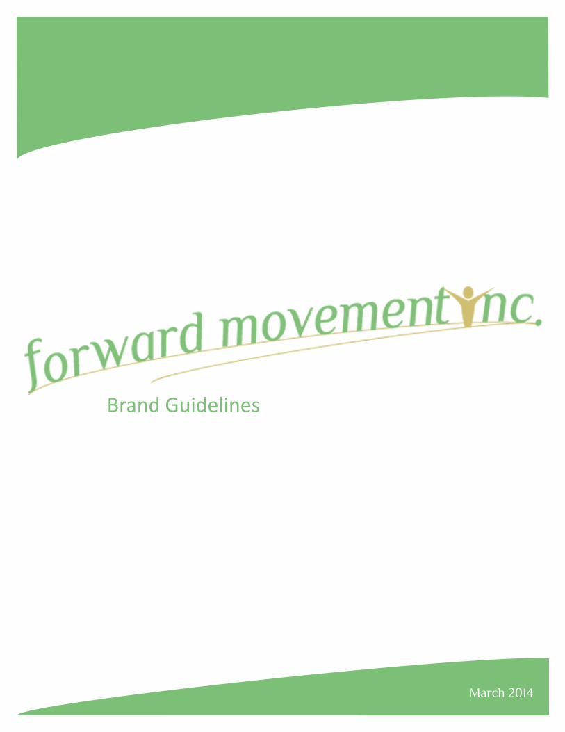
Logo Clear spaceEveryone needs some personal space, even logos. To ensure that the Forward Movement Inc.’s signature is clearly visible in all applications, the logo is surrounded by sufficient clear space. When the logo is used, a clear space of 50% of the height of the letter “f”. In certain circumstances when a 50% clear space is not possible, then a clear spaces of 25% can be used.
50%
50%
25%

6
Logo Variations
Black logo on white background White logo on black background
White logo on green background White logo on gold background

7
Logo Don’ts
DON’T rotate the logo
DON’T outline the logo
DON’T stretch the logoDON’T add a drop shadow to the logo

8
Logo Colors
Logo Typeface
Forward Movement Inc. uses two colors that express their main goal of empowering people to achieve their goals. The palette combines the growth of green and the success of gold.
Typography is an important aspect of any brand identity and contributes to the distinctive aesthetic. The typography below should be followed to ensure consistency. The primary typeface is philosopher, for certain circumstances, calibri italic is a secondary.
Pantone
Pantone
616 C
346 C
CMYK
CMYK
C20 M20 Y67 K0
C54 M3 Y71 K0
RGB
RGB
R209 G191 B112
R126 G191 B118
Hex
Hex
D1BF70
7EBF76
PhilosopherABCDEFGHIJKLMNOPQRSTUVWXYZabcdefghijklmnopqrstuvwxyz0123456789

9
Collateral

10
11
Design is EverythingDesign is everything. These guidelines will aid in keeping the consistency and integrity of the brand. Applying these principles takes time and effort, but it shows the importance of Forward Movement Inc. as well as the success of those who have achieved their goals with the guidance the company.

March 2014