Embed Size (px)
Citation preview

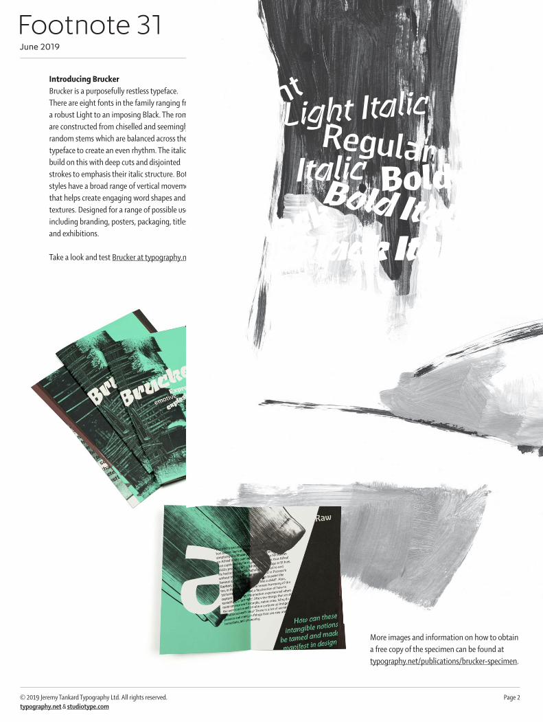
Footnote 31 June 2019
© 2019 Jeremy Tankard Typography Ltd. All rights reserved. typography.net & studiotype.com
Jeremy Tankard
BruckerEi
ght r
estle
ss a
nd a
ggra
vate
d fo
ntsExpressive
emotive
explosive
Footnote 31 June 2019
© 2019 Jeremy Tankard Typography Ltd. All rights reserved. Page 2typography.net & studiotype.com
Introducing BruckerBrucker is a purposefully restless typeface. There are eight fonts in the family ranging from a robust Light to an imposing Black. The romans are constructed from chiselled and seemingly random stems which are balanced across the typeface to create an even rhythm. The italics build on this with deep cuts and disjointed strokes to emphasis their italic structure. Both styles have a broad range of vertical movement that helps create engaging word shapes and textures. Designed for a range of possible uses including branding, posters, packaging, titles, and exhibitions.
Take a look and test Brucker at typography.net.The eight fonts of Brucker
Printed specimenThe 16 page Brucker specimen is an explorative showing of the typeface. The text is grouped under the words Raw, Expression, Angular, Silhouette and Typeface. It focuses on a range of concepts which inspired the design and prompts questions such as; At what point does a crude shape end and a designed one start? How much can the image of a letter, word, or text, inherently impart feeling?How can a bend in a curve enhance a character’s movement?How can altering the shape of a letter affect its archetypal structure?
More images and information on how to obtain a free copy of the specimen can be found at typography.net/publications/brucker-specimen.
LightLight Italic
RegularItalic BoldBold ItalicBlack
Black Italic

Footnote 31 June 2019
© 2019 Jeremy Tankard Typography Ltd. All rights reserved. Page 3typography.net & studiotype.com
Origins and harmonyDuring the early development of Brucker, a variety of letters (and their contexts) were looked at. Primary amongst these is the approach to lettering that many illustrators, painters and lettercutters adopt. Specifically that they are not restricted by the requirement that letters need to function in a multitude of ever-changing combinations. As a result more variety to layout, letter shape, pattern and rhythm can be explored.
This can be seen in Ralph Beyer’s lettering at Coventry Cathedral. The ‘Tablets of the Word’ confront you as raw and crude, yet these are shapes that once seen could only have been done ‘that way’. Love them or hate them, in the context in which they appear, they perform their job admirably. The lettercutter and designer, Teucer Wilson visited Coventry Cathedral in 2014 and mused over the lettering on his blog (see https://teucerwilson.com/2014/04/18/coventry-cathedral-ralph-beyers-lettering/). We need to take a step back, and let our rational trained eyes, with their need for visual order, be over-ruled by the irrational, feelings-led heart.
Lettering that appeared in Central Europe in the early 20th century is full of energy and expression. Their strongly graphic and immediate shapes are reminiscent of the vernacular letters seen throughout history. For example, the letters seen on a silver penny share the same immediacy. Minted in London during the reign of Edward III (1327–77), the letters are weathered by history, but are also a product of their time and manufacture.
All these styles are imbued with a directness and energy, and can best be described as primordial. They’re not over-worked letters and they’re not mannered letters.
One of the ‘Tablets of the Word’ in Coventry Cathedral, cut by Ralph Beyer, 1960–61. Image by Teucer Wilson
Edward III (1327-77), penny, London. Images by Numiscorner.com
Lettering from an art show poster by Oskar Kokoschka, 1909
Lettering by Rudolf Koch and cut in wood by Max Dorn, 1920
Footnote 31 June 2019
© 2019 Jeremy Tankard Typography Ltd. All rights reserved. Page 4typography.net & studiotype.com
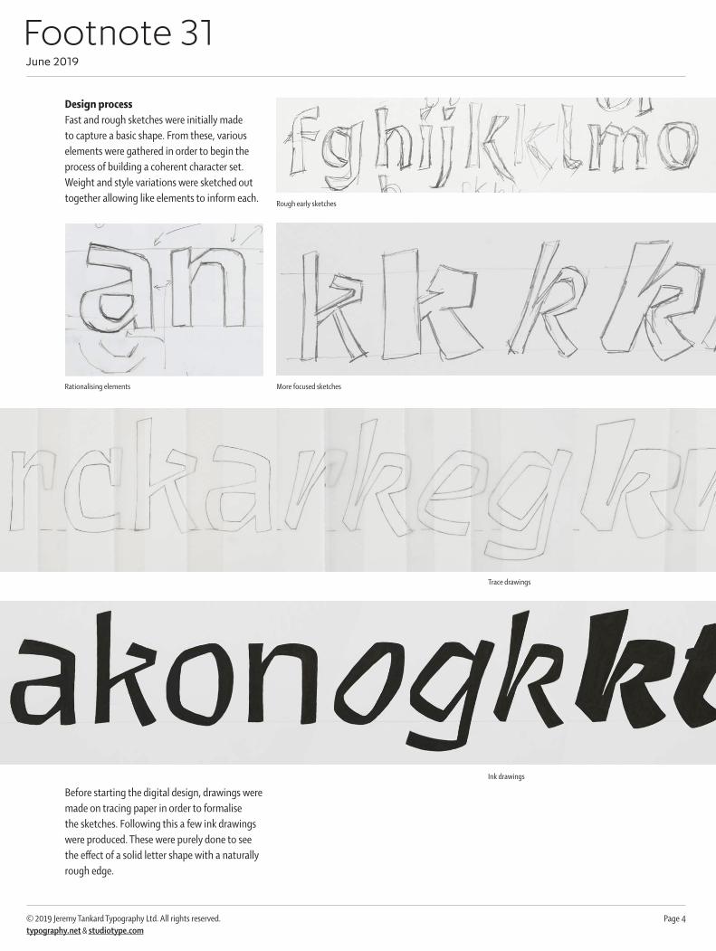
Design processFast and rough sketches were initially made to capture a basic shape. From these, various elements were gathered in order to begin the process of building a coherent character set. Weight and style variations were sketched out together allowing like elements to inform each.
Before starting the digital design, drawings were made on tracing paper in order to formalise the sketches. Following this a few ink drawings were produced. These were purely done to see the effect of a solid letter shape with a naturally rough edge.
Rough early sketches
Rationalising elements More focused sketches
Trace drawings
Ink drawings
Footnote 31 June 2019
© 2019 Jeremy Tankard Typography Ltd. All rights reserved. Page 5typography.net & studiotype.com
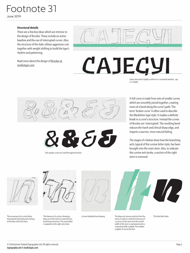
Structural detailsThere are a few key ideas which are intrinsic to the design of Brucker. These include an active baseline and the use of interrupted curves. Also, the structure of the italic utilises aggressive cuts together with weight shifting to build the type’s rhythm and patterning.
Read more about the design of Brucker at studiotype.com.
A full curve is made from sets of smaller curves which are smoothly joined together, creating more of a bend along the curve’s path. The term ‘broken curve’ is often used to describe the Blackletter type style. It implies a definite break in a curve’s structure. Instead the curves of Brucker are ‘interrupted’. The resulting bend reduces the harsh and clinical sharp edge, and imparts a warmer, more natural feeling.
The stages of n below show how the branching arch, typical of the cursive letter style, has been brought into the main stem. Also, to indicate the cursive exit stroke, a section of the right stem is removed.
The movement of a cursive letter showing the branching arch starting at the base of the first stem
The features of a cursive; showing a deep cut to the stem to create the low-branching movement. The same detail is repeated on the right exit stroke
A more finalised trace drawing The deep cuts remove sections from the stems in order to create the structure of a cursive. At the same time the overall width of the stem is maintained and no unwanted width is added. This enables a tighter fit across the font
The final italic letter
n
CAJEGYILetter stems don’t tightly conform to a consistent baseline , cap or x-height.
Soft angular curves are used throughout Brucker
&&&&