Embed Size (px)
Citation preview
34
London —Culture CLondon
Culture—6 C
097096
The V&A, South KensingtonThe grand collection
Through the towering limestone entrance of the Victoria and Albert Museum (v&a) sits a catalogued oasis of over 5,000 years of art and design. For the traditionalists there are ceiling-to-floor rooms of Victorian-era collectibles, western European sculptures dating back to the 4th century and textiles from Middle Ages British embroidery to Edo-period Japanese kimonos.
But the collections aren’t all from bygone eras. If something more modern appeals, make a beeline for Room 106 to see a little on the history of stage make-up in the form of Kylie Minogue’s dressing room or visit the expansive art deco display. Whichever era you choose to explore, ensure you exit through the gift shop: it is arguably one of the best in London.Cromwell Road, SW7 2RL144 (0)20 7942 2000vam.ac.uk
3
I might just have found inspiration for my next still life
—The museum contains at
least 8 million objects
Va
st collection
DD7 New York —Design and architecture
New YorkDesign and architecture—
109 108
Milton Glaser’s logo first appeared in 1977
In 1994, 500 million Anthoras were sold in a year
Commissioners’ Plan, 1811Think inside the box
Manhattan’s most distinctive urban characteristic is its grid layout. A testament to the city’s efficiency and pragmatism, this urban plan was originally presented in the form of a sizeable map called the Commissioners’ Plan of 1811.
The plan allowed for the orderly development and regulated sale of land in Manhattan across the axes of 12 north-to-south avenues, eventually intersected by over 100 numbered streets. You can view a reproduction of the map in the book The Greatest Grid: The Master Plan of Manhattan 1811-2011. Alternatively, urban-planning buffs can view a 3D panorama of New York’s topography and its 895,000
Street signageGlowing endorsement
Visitors often flock to Times Square to see the brightest and loudest digital signage but old-time New York is most elegantly spelled out on its waterfront. Take a meander over the Queensboro Bridge on the Upper East Side to spy the two-storey red neon sign for the city’s largest film-and-television studio, Silvercup, enterprisingly looming above the bridge’s overpass. Crossing the East River into Long Island City, Queens, you can cheers the Pepsi-Cola sign recently moved from a nearby site. It’s calligraphic neon offering from 1936, complete with a classic bottle, faces the UN building across the water.
Back in Manhattan and looking onto the Hudson River, the New Yorker Hotel on 34th Street announces itself in outsized, blocky neon red letters atop its 1930s art deco massing, visible from the northernmost stretches of the High Line park.
Metronome, Flatiron DistrictSwing on by
Designed by Kristin Jones and Andrew Ginzel, and dating from 1999, “Metronome” is one of New York’s more mysterious public-art installations, plastered to the façade of One Union Square South. The most intriguing section is a 12-digit electronic display showing a seemingly random set of numbers (in fact it’s telling you the 24- hour-clock time to the second and what’s left of the day) that manages to capture some of the frenzy and energy of the city. Undoubtedly a landmark but one that baffles and delights New Yorkers in equal measure. 1 Union Square South, NY 10003
New York Times logoDesign classic
This instantly recognisable logo has been through mild updates over the years but its first major change came in 1967 when the Times dropped the full stop after its name, previously present for 116 years. The change – hardly revolutionary – caused uproar and the paper reportedly lost some 1,000 subscribers. Famed typographer and native Brooklynite Ed Benguiat was the man tasked with the update; he is credited with the design of more than 600 typefaces and logotypes spanning Esquire, Reader’s Digest and Coca-Cola. Benguiat took a minimalist approach, making his small changes by hand.nytimes.com
I love NY logoHeart of the city
Back in the late 1970s, high crime and corruption made New York a place to avoid. With lofty aims of rebranding it as place of pride, the city contracted an advertising firm. It, in turn, hired Milton Glaser to come up with a new brand identity for the metropolis. With pop-art impact, Glaser created a simple text block with the easily replicated proclamation: I Love NY. The design is now on everything from T-shirts and coffee mugs to mobile-phone cases and skateboard decks. You can see the original concept sketch and storyboards in the Museum of Modern Art.moma.org
Subway typographyUnderground talent
Few graphic designers have their work viewed so many times on a daily basis as Massimo Vignelli. One of the Italian designer’s most celebrated works is the New York subway map and iconography, which debuted in 1972. The designer worked alongside Bob Noorda at the Unimark design firm; together they organised the previously chaotic signage.
The result was so celebrated that it has been included in the Museum of Modern Art’s collection of postwar design. Details of the Helvetica shift – a series of clean and colourful letters and numbers – were printed in a 174-page manual that still guides signs made today. While Vignelli’s first streamlined map was redrawn to be more geographically accurate in 1979, the original diagram can be viewed on the mta’s Weekender section on its website.web.mta.info/weekender
Anthora cupHot seller
New York and coffee are indivisible. One of the first immigrant communities to promote the brew in the city was Greek and by the 1960s they boasted a formidable network of cafés and diners. Leslie Buck, owner of Sherri Cup Company, smelled a business opportunity and in 1963 designed a paper cup, the Anthora, which he hoped to sell to Greek hospitality clients. The design in blue and white (the colours of the Greek flag) featured kitsch classical motifs and included the slogan “We are happy to serve you”. It would prove an instant hit, resonating well beyond the Greek community.
3
2
4
1
6
5 7
Citywide graphic design and visual identityLook and learn
—In 2013,
7,764 new signs were installed
Sig
n of the times
buildings (built up until 1992) at the Queens Museum of Art.Queens Museum of Art, Flushing Meadows Corona Park, NY 11368 queensmuseum.org
Divided loyalties—
While the Metronome may divide opinion it’s not as
controversial as Aluminaire House, the US’s first all-metal
pre-fabricated house from 1934. It was moved from NYC to Palm Springs in early 2015 after the city rejected giving it a permanent home in Queens.
London—Culture CLondon
Culture—6 C
097096
The V&A, South KensingtonThe grand collection
Through the towering limestone entrance of the Victoria and Albert Museum (v&a) sits a catalogued oasis of over 5,000 years of art and design. For the traditionalists there are ceiling-to-floor rooms of Victorian-era collectibles, western European sculptures dating back to the 4th century and textiles from Middle Ages British embroidery to Edo-period Japanese kimonos.
But the collections aren’t all from bygone eras. If something more modern appeals, make a beeline for Room 106 to see a little on the history of stage make-up in the form of Kylie Minogue’s dressing room or visit the expansive art deco display. Whichever era you choose to explore, ensure you exit through the gift shop: it is arguably one of the best in London.Cromwell Road, SW7 2RL144 (0)20 7942 2000vam.ac.uk
3
I might just have found inspiration for my next still life
—The museum contains at
least 8 million objects
VaVaV
st collection
DD7 New York—Design and architecture
New YorkDesign and architecture—
109 108
Milton Glaser’s logo first appeared in 1977
In 1994, 500 million Anthoras were sold in a year
Commissioners’ Plan, 1811Think inside the box
Manhattan’s most distinctive urban characteristic is its grid layout. A testament to the city’s efficiency and pragmatism, this urban plan was originally presented in the form of a sizeable map called the Commissioners’ Plan of 1811.
The plan allowed for the orderly development and regulated sale of land in Manhattan across the axes of 12 north-to-south avenues, eventually intersected by over 100 numbered streets. You can view a reproduction of the map in the book The Greatest Grid: The Master Plan of Manhattan 1811-2011. Alternatively, urban-planning buffs can view a 3D panorama of New York’s topography and its 895,000
Street signageGlowing endorsement
Visitors often flock to Times Square to see the brightest and loudest digital signage but old-time New York is most elegantly spelled out on its waterfront. Take a meander over the Queensboro Bridge on the Upper East Side to spy the two-storey red neon sign for the city’s largest film-and-television studio, Silvercup, enterprisingly looming above the bridge’s overpass. Crossing the East River into Long Island City, Queens, you can cheers the Pepsi-Cola sign recently moved from a nearby site. It’s calligraphic neon offering from 1936, complete with a classic bottle, faces the UN building across the water.
Back in Manhattan and looking onto the Hudson River, the New Yorker Hotel on 34th Street announces itself in outsized, blocky neon red letters atop its 1930s art deco massing, visible from the northernmost stretches of the High Line park.
Metronome, Flatiron DistrictSwing on by
Designed by Kristin Jones and Andrew Ginzel, and dating from 1999, “Metronome” is one of New York’s more mysterious public-art installations, plastered to the façade of One Union Square South. The most intriguing section is a 12-digit electronic display showing a seemingly random set of numbers (in fact it’s telling you the 24-hour-clock time to the second and what’s left of the day) that manages to capture some of the frenzy and energy of the city. Undoubtedly a landmark but one that baffles and delights New Yorkers in equal measure.1 Union Square South, NY 10003
New York Times logoDesign classic
This instantly recognisable logo has been through mild updates over the years but its first major change came in 1967 when the Times dropped the full stop after Times dropped the full stop after Timesits name, previously present for 116 years. The change – hardly revolutionary – caused uproar and the paper reportedly lost some 1,000 subscribers. Famed typographer and native Brooklynite Ed Benguiat was the man tasked with the update; he is credited with the design of more than 600 typefaces and logotypes spanning Esquire, Reader’s Digestand Coca-Cola. Benguiat took a minimalist approach, making his small changes by hand.nytimes.com
I love NY logoHeart of the city
Back in the late 1970s, high crime and corruption made New York a place to avoid. With lofty aims of rebranding it as place of pride, the city contracted an advertising firm. It, in turn, hired Milton Glaser to come up with a new brand identity for the metropolis. With pop-art impact, Glaser created a simple text block with the easily replicated proclamation: I Love NY. The design is now on everything from T-shirts and coffee mugs to mobile-phone cases and skateboard decks. You can see the original concept sketch and storyboards in the Museum of Modern Art.moma.org
Subway typographyUnderground talent
Few graphic designers have their work viewed so many times on a daily basis as Massimo Vignelli. One of the Italian designer’s most celebrated works is the New York subway map and iconography, which debuted in 1972. The designer worked alongside Bob Noorda at the Unimark design firm; together they organised the previously chaotic signage.
The result was so celebrated that it has been included in the Museum of Modern Art’s collection of postwar design. Details of the Helvetica shift – a series of clean and colourful letters and numbers – were printed in a 174-page manual that still guides signs made today. While Vignelli’s first streamlined map was redrawn to be more geographically accurate in 1979, the original diagram can be viewed on the mta’s Weekender section on its website.web.mta.info/weekender
Anthora cupHot seller
New York and coffee are indivisible. One of the first immigrant communities to promote the brew in the city was Greek and by the 1960s they boasted a formidable network of cafés and diners. Leslie Buck, owner of Sherri Cup Company, smelled a business opportunity and in 1963 designed a paper cup, the Anthora, which he hoped to sell to Greek hospitality clients. The design in blue and white (the colours of the Greek flag) featured kitsch classical motifs and included the slogan “We are happy to serve you”. It would prove an instant hit, resonating well beyond the Greek community.
3
2
4
1
6
5 7
Citywide graphic design and visual identityLook and learn
—In 2013,
7,764 new signs were installed
Sig
n of the times
buildings (built up until 1992) at the Queens Museum of Art.Queens Museum of Art, Flushing Meadows Corona Park,NY 11368queensmuseum.org
Divided loyalties—
While the Metronome may divide opinion it’s not as
controversial as Aluminaire House, the US’s first all-metal
pre-fabricated house from 1934. It was moved from NYC to Palm Springs in early 2015 after the city rejected giving it a permanent home in Queens.
LUOGHI
COSE
P
RETIRO è un cara� ere tipicamente Didot, ma reinterpreta la tipografia vernacolare castigliana e andalusa. Disegnato da Jean François Porchez per la rivista spagnola Madriz, prende il nome dal celebre parco di Madrid. typofonderie.com
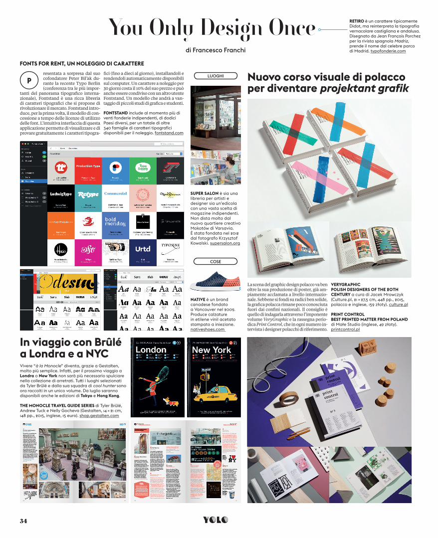
FONTS FOR RENT, UN NOLEGGIO DI CARATTEREresentata a sorpresa dal suo cofondatore Peter Bil’ak du-rante la recente Typo Berlin (conferenza tra le più impor-
tanti del panorama tipografi co interna-zionale), Fontstand è una ricca libreria di caratteri tipografi ci che si propone di rivoluzionare il mercato. Fontstand intro-duce, per la prima volta, il modello di con-cessione a tempo delle licenze di utilizzo delle font. L’intuitiva interfaccia di questa applicazione permette di visualizzare e di provare gratuitamente i caratteri tipogra-
fi ci (fi no a dieci al giorno), installandoli e rendendoli automaticamente disponibili sul computer. Un carattere a noleggio per 30 giorni costa il 10% del suo prezzo e può anche essere condiviso con un altro utente Fontstand. Un modello che andrà a van-taggio di piccoli studi di grafi ca e studenti.
La scena del graphic design polacco va ben oltre la sua produzione di poster, già am-piamente acclamata a livello internazio-nale. Sebbene si fondi su radici ben solide, la grafi ca polacca rimane poco conosciuta fuori dai confi ni nazionali. Il consiglio è quello di indagarla attraverso l’imponente volume VeryGraphic e la rassegna perio-dica Print Control, che in ogni numero in-tervista i designer polacchi di riferimento.
PRINT CONTROL BEST PRINTED MATTER FROM POLAND di Małe Studio (inglese, 49 złoty). printcontrol.pl
VERYGRAPHICPOLISH DESIGNERS OF THE 20TH CENTURY a cura di Jacek Mrowczyk (Culture.pl, 21 × 27,5 cm, 448 pp., 2015, polacco e inglese, 159 złoty). culture.pl
In viaggio con Brûlé a Londra e a NYCVivere “à la Monocle” diventa, grazie a Gestalten, molto più semplice. Infa� i, per il prossimo viaggio a Londra o New York non sarà più necessario spulciare nella collezione di arretrati. Tu� i i luoghi selezionati da Tyler Brûlé e dalla sua squadra di cool hunter sono ora raccolti in un unico volume. Da luglio saranno disponibili anche le edizioni di Tokyo e Hong Kong.
THE MONOCLE TRAVEL GUIDE SERIES di Tyler Brûlé, Andrew Tuck e Nelly Gocheva (Gestalten, 14 × 21 cm, 148 pp., 2015, inglese, 15 euro). shop.gestalten.com
SUPER SALON è sia una libreria per artisti e designer sia un’edicola con una vasta scelta di magazine indipendenti. Non dista molto dal nuovo quartiere creativo Mokotów di Varsavia. È stata fondata nel 2012 dal fotografo Krzysztof Kowalski. supersalon.org
NATIVE è un brand canadese fondato a Vancouver nel 2009. Produce calzature in etilene vinil acetato stampato a iniezione. nativeshoes.com
FONTSTAND include al momento più di venti fonderie indipendenti, di dodici Paesi diversi, per un totale di oltre 340 famiglie di cara� eri tipografici disponibili per il noleggio. fontstand.com
Nuovo corso visuale di polaccoper diventare projektant grafik
di Francesco Franchi
TRIL72_34_YODO_FF_bis.indd 34 08/06/15 18.53