Embed Size (px)
Citation preview

Fiscal Studies (1994) vol. 15, no. 4, pp. 1-28
UK Household Cost-of-LivingIndices, 1979–92
IAN CRAWFORD1
I. INTRODUCTION
The only circumstance under which one can speak accurately about the cost-of-living index is one in which household expenditure patterns do not vary. Ifrelative prices move and households consume goods and services in differentproportions, then each household will have its own unique cost-of-living index.This paper is concerned with the pattern and extent of these variations in the costof living between different types of household.
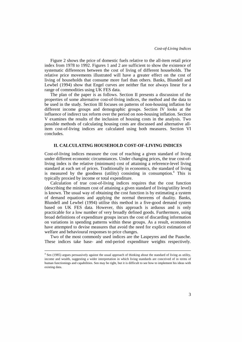
To illustrate this, consider the data on a typical necessity: domestic fuels.Figure 1 shows the Engel curve2 for domestic fuel drawn non-parametricallyusing UK data from the 1992 Family Expenditure Survey (FES). The fuel shareof total spending declines as the logarithm of total expenditure increases. Thisdownward- sloping Engel curve is typical of goods that are usually thought of asnecessities: poorer households with lower total expenditure spend a greaterproportion of that total on necessities like fuel and food than do richerhouseholds.3
1 Senior Researcher at the Institute for Fiscal Studies.The author would like to thank James Banks, Richard Blundell, Andrew Dilnot, Alissa Goodman, TerrenceGorman, John Hills, Pat McGregor, Judith Payne, Marysia Walsh, Steven Webb, two anonymous referees andseminar participants at the London School of Economics and the Institute for Fiscal Studies. Finance for thisresearch, provided by the Joseph Rowntree Foundation under its Programme of Work on Income and Wealthand the ESRC Research Centre for the Microeconomic Analysis of Fiscal Policy at IFS, is gratefullyacknowledged. Material from the Family Expenditure Survey, made available by the Central Statistical Officethrough the ESRC Data Archive, has been used by permission of the Controller of Her Majesty’s StationeryOffice. All errors are the sole responsibility of the author.2 The proportion of the total household budget allocated to fuel against log total expenditure.3 Luxuries are usually characterised by upward-sloping Engel curves.

Fiscal Studies
2
FIGURE 1The Engel Curve for Domestic Energy, FES, 1992
FIGURE 2The Relative Price of Domestic Fuel, 1978-92
0.30
0.25
0.20
0.15
0.10
0.05
0.00
Fue
l sha
re
1 2 3 4 5 6 87
Log real expenditure
1.25
1.20
1.15
1.10
1.05
1.00
0.95
1978 1979 1982 1986 1988 1989 19921980 1981 1983 1985 1987 1990 19911984
Cost-of-Living Indices
3
Figure 2 shows the price of domestic fuels relative to the all-item retail priceindex from 1978 to 1992. Figures 1 and 2 are sufficient to show the existence ofsystematic differences between the cost of living of different households. Therelative price movements illustrated will have a greater effect on the cost ofliving of households that consume more fuel than others. Banks, Blundell andLewbel (1994) show that Engel curves are neither flat nor always linear for arange of commodities using UK FES data.
The plan of the paper is as follows. Section II presents a discussion of theproperties of some alternative cost-of-living indices, the method and the data tobe used in the study. Section III focuses on patterns of non-housing inflation fordifferent income groups and demographic groups. Section IV looks at theinfluence of indirect tax reform over the period on non-housing inflation. SectionV examines the results of the inclusion of housing costs in the analysis. Twopossible methods of calculating housing costs are discussed and alternative all-item cost-of-living indices are calculated using both measures. Section VIconcludes.
II. CALCULATING HOUSEHOLD COST-OF-LIVING INDICES
Cost-of-living indices measure the cost of reaching a given standard of livingunder different economic circumstances. Under changing prices, the true cost-of-living index is the relative (minimum) cost of attaining a reference-level livingstandard at each set of prices. Traditionally in economics, the standard of livingis measured by the goodness (utility) consisting in consumption.4 This istypically proxied by income or total expenditure.
Calculation of true cost-of-living indices requires that the cost function(describing the minimum cost of attaining a given standard of living/utility level)is known. The usual way of obtaining the cost function is by estimating a systemof demand equations and applying the normal theorems of duality. Banks,Blundell and Lewbel (1994) utilise this method in a five-good demand systembased on UK FES data. However, this approach is arduous and is onlypracticable for a low number of very broadly defined goods. Furthermore, usingbroad definitions of expenditure groups incurs the cost of discarding informationon variations in spending patterns within these groups. As a result, economistshave attempted to devise measures that avoid the need for explicit estimation ofwelfare and behavioural responses to price changes.
Two of the most commonly used indices are the Laspeyres and the Paasche.These indices take base- and end-period expenditure weights respectively.
4 Sen (1985) argues persuasively against the usual approach of thinking about the standard of living as utility,income and wealth, suggesting a wider interpretation in which living standards are conceived of in terms ofhuman functionings and capabilities. Sen may be right, but it is difficult to see how to implement his ideas withexisting data.

Fiscal Studies
4
However, the only circumstance under which the Laspeyres and Paasche indiceswill be equal to the appropriate true indices is one in which householdpreferences exhibit no substitution effects, i.e. household consumption patternsdo not respond to relative price changes. Empirical studies usually find ampleevidence of substitution effects.5
A useful alternative to the Laspeyres and Paasche indices is one proposed byTornqvist (1936) which Diewert (1976) shows to be equivalent to the true indexunder a relatively more plausible model of household consumption behaviourwhich allows for substitution effects. This uses expenditure weights which arethe average of the beginning (Laspeyres) and end-period (Paasche) weights. TheTornqvist index is based upon a preferred model of household behaviour, andalthough it still avoids the need to estimate substitution effects, it does not sufferthe substitution bias inherent in the Paasche and Laspeyres indices.6 It also hasthe advantage that the model of preferences underlying it is fairly general7 andperforms relatively well in applied work on demand analysis.8
The method adopted here is to calculate chained series of pairwise Tornqvistindices for each commodity. This will mean that each link in the chain refers to adifferent reference welfare level. Nevertheless, Diewert (1978) shows that theseindices differentially approximate each other as well as the true index providedthat variations in prices and expenditures between each period are small. Heargues that this provides a strong justification for minimising period-to-periodvariations in prices and quantities by means of frequent rebasing and by chainingannual indices.
The indices calculated in this paper use information on price movements fromthe 74 sub-indices of the retail price index for the period 1978 to 1992, andcorresponding household expenditure data from the Family Expenditure Surveyfor the same period. Because the price data are collected from national sources,there is no regional variation and as a result this paper ignores regional issues.Differences in cost-of-living indices between population groups are thusgenerated entirely by differences in their spending patterns, scaled by relativeprice movements. In the following sections, cost-of-living indices for specificpopulation groups are calculated and compared with the all-household ‘headline’measure.
5 Blundell, Pashardes and Weber (1994), for example, find evidence of large cross-price substitution effects inUK FES data.6 For a proof of this, see Diewert (1978).7 Christensen, Jorgenson and Lau, 1975.8 Deaton and Muellbauer, 1980; Blundell, Pashardes and Weber, 1994.
Cost-of-Living Indices
5
III. NON-HOUSING MEASURES
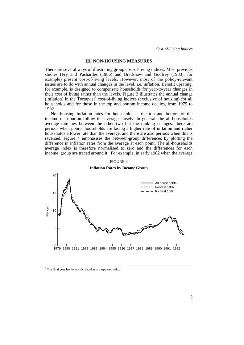
There are several ways of illustrating group cost-of-living indices. Most previousstudies (Fry and Pashardes (1986) and Bradshaw and Godfrey (1983), forexample) present cost-of-living levels. However, most of the policy-relevantissues are to do with annual changes in the level, i.e. inflation. Benefit uprating,for example, is designed to compensate households for year-to-year changes intheir cost of living rather than the levels. Figure 3 illustrates the annual change(inflation) in the Tornqvist9 cost-of-living indices (exclusive of housing) for allhouseholds and for those in the top and bottom income deciles, from 1979 to1992.
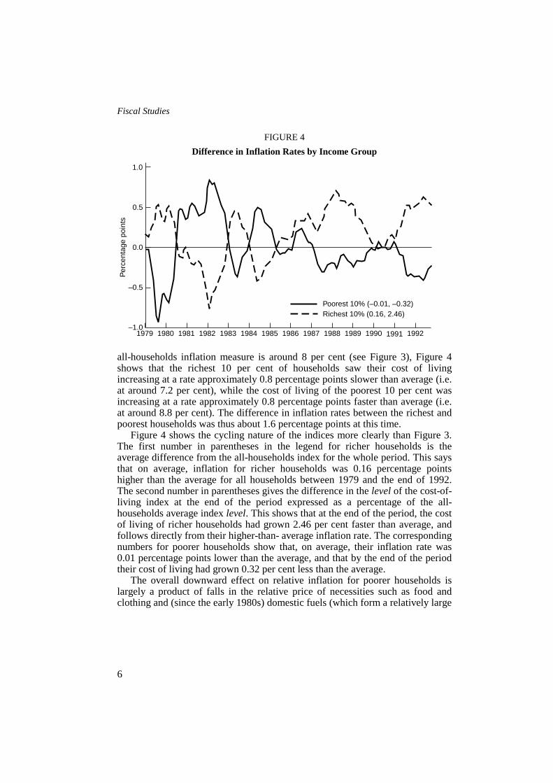
Non-housing inflation rates for households at the top and bottom of theincome distribution follow the average closely. In general, the all-householdsaverage rate lies between the other two but the ranking changes: there areperiods when poorer households are facing a higher rate of inflation and richerhouseholds a lower rate than the average, and there are also periods when this isreversed. Figure 4 emphasises the between-group differences by plotting thedifference in inflation rates from the average at each point. The all-householdsaverage index is therefore normalised to zero and the differences for eachincome group are traced around it. For example, in early 1982 when the average
FIGURE 3Inflation Rates by Income Group
9 The final year has been calculated as a Laspeyres index.
20
15
10
5
01979 1980 1983 1987 1988 1989 19921981 1982 1984 1986 1990 19911985
Per
cen
t
All householdsPoorest 10%Richest 10%
Fiscal Studies
6
FIGURE 4Difference in Inflation Rates by Income Group
all-households inflation measure is around 8 per cent (see Figure 3), Figure 4shows that the richest 10 per cent of households saw their cost of livingincreasing at a rate approximately 0.8 percentage points slower than average (i.e.at around 7.2 per cent), while the cost of living of the poorest 10 per cent wasincreasing at a rate approximately 0.8 percentage points faster than average (i.e.at around 8.8 per cent). The difference in inflation rates between the richest andpoorest households was thus about 1.6 percentage points at this time.
Figure 4 shows the cycling nature of the indices more clearly than Figure 3.The first number in parentheses in the legend for richer households is theaverage difference from the all-households index for the whole period. This saysthat on average, inflation for richer households was 0.16 percentage pointshigher than the average for all households between 1979 and the end of 1992.The second number in parentheses gives the difference in the level of the cost-of-living index at the end of the period expressed as a percentage of the all-households average index level. This shows that at the end of the period, the costof living of richer households had grown 2.46 per cent faster than average, andfollows directly from their higher-than- average inflation rate. The correspondingnumbers for poorer households show that, on average, their inflation rate was0.01 percentage points lower than the average, and that by the end of the periodtheir cost of living had grown 0.32 per cent less than the average.
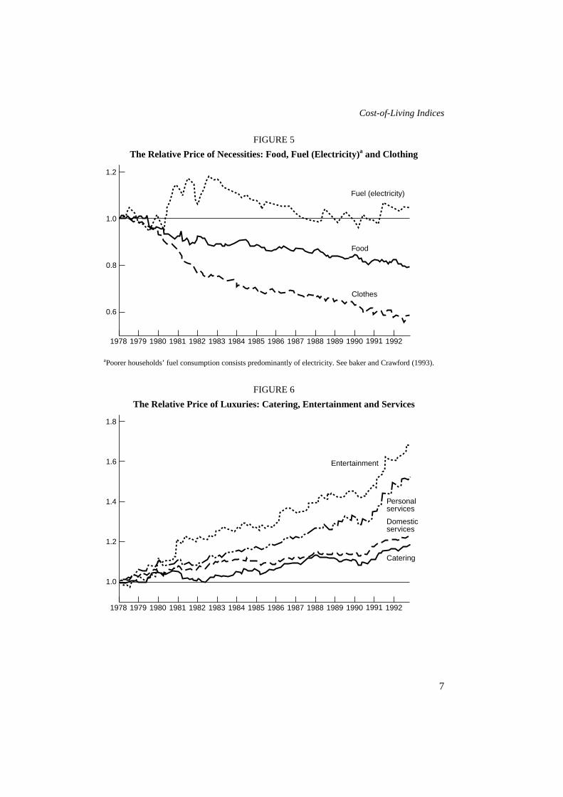
The overall downward effect on relative inflation for poorer households islargely a product of falls in the relative price of necessities such as food andclothing and (since the early 1980s) domestic fuels (which form a relatively large
1.0
0.5
0.0
–0.5
–1.01979 1980 1983 1987 1988 1989 19921981 1982 1984 1986 1990 19911985
Per
cent
age
poin
ts
Poorest 10% (–0.01, –0.32)Richest 10% (0.16, 2.46)
Cost-of-Living Indices
7
FIGURE 5The Relative Price of Necessities: Food, Fuel (Electricity)a and Clothing
aPoorer households’ fuel consumption consists predominantly of electricity. See baker and Crawford (1993).
FIGURE 6The Relative Price of Luxuries: Catering, Entertainment and Services
1.2
1.0
0.8
0.6
1978 1979 1982 1986 1987 1988 19921980 1981 1983 1985 1989 19911984 1990
Clothes
Food
Fuel (electricity)
1.8
1.4
1.2
1.0
1978 1979 1982 1986 1987 1988 19921980 1981 1983 1985 1989 19911984 1990
Entertainment
Personalservices
1.6
Domesticservices
Catering

Fiscal Studies
8
TABLE 1Proportion of Total Non-Housing Expenditure Allocated across Goods,
FES, 1978 and 1992
Group Year All Poorest 10 per cent Richest 10 per cent
Food 1978 0.24 0.34 0.161992 0.17 0.23 0.10
Catering 1978 0.04 0.03 0.051992 0.04 0.03 0.05
Alcohol 1978 0.06 0.04 0.061992 0.05 0.05 0.04
Tobacco 1978 0.04 0.06 0.021992 0.02 0.05 0.01
Fuel 1978 0.07 0.10 0.051992 0.06 0.09 0.04
Durables 1978 0.07 0.05 0.101992 0.07 0.05 0.08
Clothes 1978 0.10 0.08 0.101992 0.07 0.08 0.06
Motoring 1978 0.13 0.09 0.161992 0.15 0.11 0.15
Fares 1978 0.03 0.03 0.031992 0.04 0.04 0.03
Entertainment 1978 0.05 0.03 0.081992 0.11 0.05 0.22
Other 1978 0.17 0.15 0.181992 0.21 0.21 0.23
part of their total spending), and increases in the prices of many luxuries such aseating out, entertainment and other services (which form a relatively small part).Figures 5 and 6 illustrate these trends in relative prices, and Table 1 reports theaverage expenditure shares for each group at the beginning and end of theperiod.
The table shows that the average share of spending allocated to necessities(food, fuel, clothing) for all households has fallen from 0.41 to 0.30 over thesample period. The downward-sloping Engel curve relationship for necessities isapparent at both ends of the period. Richer households spend less on necessitiesthan average (0.31 falling to 0.20), and poorer households spend more (0.52falling to 0.40). The corresponding share increases have been in luxury goodssuch as entertainment and the ‘other’ category which is mostly services. One ofthe largest differences between the two groups over time is spending on
Cost-of-Living Indices
9
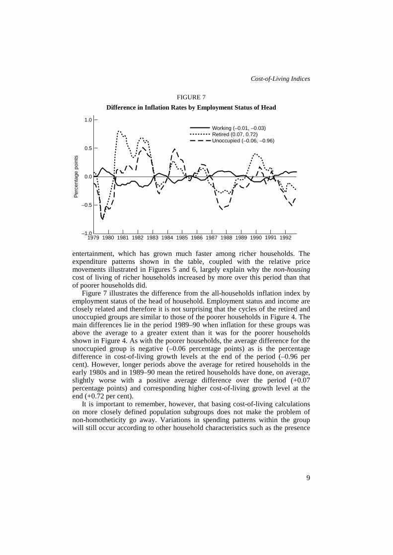
FIGURE 7Difference in Inflation Rates by Employment Status of Head
entertainment, which has grown much faster among richer households. Theexpenditure patterns shown in the table, coupled with the relative pricemovements illustrated in Figures 5 and 6, largely explain why the non-housingcost of living of richer households increased by more over this period than thatof poorer households did.
Figure 7 illustrates the difference from the all-households inflation index byemployment status of the head of household. Employment status and income areclosely related and therefore it is not surprising that the cycles of the retired andunoccupied groups are similar to those of the poorer households in Figure 4. Themain differences lie in the period 1989–90 when inflation for these groups wasabove the average to a greater extent than it was for the poorer householdsshown in Figure 4. As with the poorer households, the average difference for theunoccupied group is negative (–0.06 percentage points) as is the percentagedifference in cost-of-living growth levels at the end of the period (–0.96 percent). However, longer periods above the average for retired households in theearly 1980s and in 1989–90 mean the retired households have done, on average,slightly worse with a positive average difference over the period (+0.07percentage points) and corresponding higher cost-of-living growth level at theend (+0.72 per cent).
It is important to remember, however, that basing cost-of-living calculationson more closely defined population subgroups does not make the problem ofnon-homotheticity go away. Variations in spending patterns within the groupwill still occur according to other household characteristics such as the presence
1.0
0.0
–0.5
–1.01979 1982 1986 1987 1988 19921980 1981 1983 1985 1989 19911984 1990
0.5
Per
cent
age
poin
ts
Working (–0.01, –0.03)Retired (0.07, 0.72)Unoccupied (–0.06, –0.96)

Fiscal Studies
10
of children. Nevertheless, such an index should be more representative than theall-households average.
Taking the poorest 10 per cent of the population and calculating changes intheir average cost of living gave Figure 4. Variations in income and totalexpenditure are naturally small within the group, and consequently differences inspending patterns due to households’ positions along the Engel curve are alsosmall. However, differences in household demographics within this section ofthe population may entail differences between Engel curves defined on thesecharacteristics. There are, for example, poor households with children and poorhouseholds without children, young poor households and old poor households.These other factors will contribute to within-group variations in budget shareswhich may also be well determined.
FIGURE 8Difference in Inflation Rates within the First Income Decile Group,
by Employment Status of Head
In Figure 8, the poorest 10 per cent of the population is subdivided byemployment status and the differences from the average within the bottom decilegroup traced. The zero line therefore corresponds to the normalisation around theaverage line for the poorest 10 per cent in Figure 4. Those households that maybe thought of as the poorest amongst the poorest 10 per cent of the population(those in which the head is retired and drawing a pension or unoccupied)10
appear to have suffered least under inflation over this period. Average inflationrates for these groups are 0.05 percentage points and 0.04 percentage points
10 See Goodman and Webb (1994, this volume).
1.5
0.5
–0.5
–1.0
1979 1982 1986 1987 1988 19921980 1981 1983 1985 1989 19911984 1990
1.0
0.0
–1.5
Per
cent
age
poin
ts
Working (0.02, 0.38)Retired (–0.05, –0.62)Unoccupied (–0.04, –0.63)

Cost-of-Living Indices
11
respectively below the average for their decile group (and therefore 0.06percentage points and 0.05 percentage points below the all-households averagefor this period). By the end of the period, their cost-of-living levels are 0.62 percent and 0.63 per cent respectively below the decile average (0.94 per cent and0.95 per cent below the population average).
Working households within the decile have a higher-than-average inflationrate of +0.02 percentage points compared with the decile average (+0.01percentage points compared with the population as a whole). This is becausepensioners and unemployed households among the poorest 10 per cent are evenmore dependent on consumption of necessities than working households in thesame group. Given the falls in the relative price of necessities over the periodillustrated in Figure 5, their higher-than-average consumption of necessities hasinsulated them from inflation by more than the average for their group. Thepattern that emerges across the income distribution is therefore preserved withinthe decile group.
A major demographic characteristic which influences households’expenditure patterns is the presence of children. However, the differences inrelative inflation rates for households with and without children are small, nomore than ±0.2 percentage points at the most in the very early 1980s. Thepresence of children makes a household take on some of the spendingcharacteristics of poorer households (adults forgo spending on luxuries likeentertainment for more spending on necessities like food and clothing). This sortof spending pattern reduces the incidence of inflation over the period onhouseholds that consume these goods. The presence of children within ahousehold results in an average inflation rate which is 0.07 percentage pointsbelow the population average over the period, and a cost of living 1 per centbelow average at the end. Households without children, like richer households,are able to spend more on luxuries and over the period had a higher-than-averageinflation rate.
Households in the bottom decile group with children have experienced anaverage rate of inflation over the period 0.04 percentage points less than thedecile group average (0.05 percentage points less than the all-householdsaverage). Poor households without children, with a little more money to spendon luxuries, had an average rate of inflation which was 0.05 percentage pointsabove the decile group average (0.04 percentage points above the populationaverage).
The general result that emerges from this analysis of non-housing inflation isthat, because the price of luxuries has risen faster than the price of necessitiesover the period, households that allocate a higher proportion of total non-housingexpenditure to necessities (either as a result of low household income oradditional non-earning household members) have experienced a lower-than-average increase in their cost of living.

Fiscal Studies
12
It should be obvious that conclusions based on the data presented in thissection will be heavily dependent upon the period from which the data aredrawn. This is demonstrated by previous studies such as Bradshaw and Godfrey(1983) and Fry and Pashardes (1986) which find an anti-poor bias in priceincreases based on observations over shorter time periods (1978–83 and 1974–82). Earlier studies11 indicate that the post-war period has seen cycles in the costof living over the longer term. For example, during the war, the price ofnecessities was kept low. However, in the period immediately after the war, therelative price of necessities rose fast, increasing the cost of living of poorerhouseholds. This bias was reduced in the early 1960s and then disappearedaltogether by the beginning of the 1970s. However, food price rises in particularduring the 1970s once more increased the cost of living of poorer households.This continued through the 1970s despite the food subsidies introduced by thegovernment in 1974. With membership of the Common Market and thedismantling of the food subsidy schemes, food prices rose once more, and this,combined with rising fuel prices, saw the burden of inflation falling most heavilyon the poor.
IV. INDIRECT TAXATION
Since 1979, there have been various reforms to the structure and rate of VATand excise duties. This section removes the influence of tax changes from thecost-of- living indices presented in Section III. The widening of the VAT base inApril 1994 to include domestic fuels does not fall within the period of this study,although its implications for households across the income distribution areobvious from Section III.12
In the UK, VAT is a broadly progressive tax in the sense that richerhouseholds pay more VAT as a proportion of total spending. This progressivityis entirely due to the base upon which VAT is levied and the spending patternsshown in Table 1. During the period 1979–92, food, domestic fuels, passengertransport and children’s clothing, inter alia, were zero-rated for VAT (i.e.entirely untaxed). Given that these types of goods are more important elementsof total expenditure for poorer households, zero-rating means that the burden ofVAT falls most heavily on better- off households.
The incidence of excise duties is more mixed. The main dutiable goods aretobacco, alcohol and petrol. In general, petrol expenditure is higher for richerthan for poorer households because of wider car-ownership amongst wealthierhouseholds. As a result, petrol excise duties are progressive when looked at
11 Allen, 1958; Brittain, 1960; Tipping, 1970; Muellbauer, 1977; Piachaud, 1978.>12 See Crawford, Smith and Webb (1993).
Cost-of-Living Indices
13
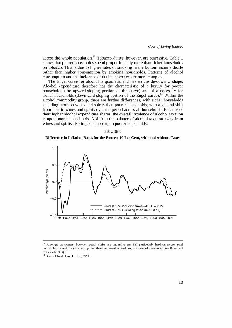
across the whole population.13 Tobacco duties, however, are regressive. Table 1shows that poorer households spend proportionately more than richer householdson tobacco. This is due to higher rates of smoking in the bottom income decilerather than higher consumption by smoking households. Patterns of alcoholconsumption and the incidence of duties, however, are more complex.
The Engel curve for alcohol is quadratic and has an upside-down U shape.Alcohol expenditure therefore has the characteristic of a luxury for poorerhouseholds (the upward-sloping portion of the curve) and of a necessity forricher households (downward-sloping portion of the Engel curve).14 Within thealcohol commodity group, there are further differences, with richer householdsspending more on wines and spirits than poorer households, with a general shiftfrom beer to wines and spirits over the period across all households. Because oftheir higher alcohol expenditure shares, the overall incidence of alcohol taxationis upon poorer households. A shift in the balance of alcohol taxation away fromwines and spirits also impacts more upon poorer households.
FIGURE 9Difference in Inflation Rates for the Poorest 10 Per Cent, with and without Taxes
13 Amongst car-owners, however, petrol duties are regressive and fall particularly hard on poorer ruralhouseholds for which car-ownership, and therefore petrol expenditure, are more of a necessity. See Baker andCrawford (1993).14 Banks, Blundell and Lewbel, 1994.
1.0
0.0
–0.5
–1.01979 1982 1986 1987 1988 19921980 1981 1983 1985 1989 19911984 1990
0.5
Per
cent
age
poin
ts
Poorest 10% including taxes (–0.01, –0.32)Poorest 10% excluding taxes (0.05, 0.48)

Fiscal Studies
14
FIGURE 10Difference in Inflation Rates for the Richest 10 Per Cent, with and without Taxes
To illustrate the effects of indirect tax changes on the cost of living ofdifferent income groups, price increases due to VAT and excise duty changeshave been removed from the price indices from 1978 onward and the cost-of-living indices recalculated.15 Figures 9 and 10 show the differences from theaverage inflation index for the poorest and richest households. The solid linescorrespond to the lines in Figure 4; however, here the indices are calculatedusing the Laspeyres formulation and not the Tornqvist.
The problem with the Tornqvist index in this application lies in the use of theend-period weight. The end-period weight depends on the end-period pricevector, so when the counter-factual tax-exclusive price series is used, the correctend- period weights are not observed. Instead, only the base-period weights areobserved and therefore the Laspeyres index is calculated.
The first major difference between the taxed and untaxed series occurs inmid-1979. This corresponds to the VAT reforms in Geoffrey Howe’s firstBudget. The amalgamation of the two VAT rates to a single, higher, 15 per centrate caused the faster increase in the cost of living of richer households and theslower-than-average increase for poorer households illustrated. One year later,the effects of the VAT increase drop out of the inflation rates for both groups,and return the tax-inclusive series to close to the tax-exclusive path.
15 It is assumed that indirect taxes have been passed on in full to consumers.
1.0
0.0
–0.5
–1.01979 1982 1986 1987 1988 19921980 1981 1983 1985 1989 19911984 1990
0.5
Per
cent
age
poin
ts
Richest 10% including taxes (0.16, 2.46)Richest 10% excluding taxes (0.14, 2.22)

Cost-of-Living Indices
15
Increases in excise duties, particularly on beer and cigarettes, and later the cutin wine duties are shown to push up inflation for poorer households betweenmid- 1980 and 1987. The next period was one in which most excise duties weresimply uprated in line with inflation in each Budget. The final feature of notecomes with the increase in the VAT rate to 17.5 per cent in 1991 by NormanLamont. Just as it did in 1979, the VAT increase pushed up cost-of-livinginflation for richer households faster than for poorer households. Again, theeffects only last one year.
Overall, the effects of indirect taxes have been to slow cost-of-living inflationfor poorer households relative to the average. In the absence of VAT and indirecttaxes, the poorest 10 per cent of households in the income distribution wouldhave had an average increase in their cost of living which was 0.05 percentagepoints higher than average instead of 0.01 percentage points lower. Richerhouseholds’ cost-of-living increases would have remained higher than averagedue to increases in the relative price of luxuries, but by a lesser amount (0.14percentage points rather than 0.16 percentage points).
V. HOUSING
Housing costs form one of the largest components of total householdexpenditure. Not only are the weights relatively large, but the contribution ofmortgage payments in particular has been quite volatile. These factors togethermake the cost-of-living indices extremely sensitive to fluctuations in mortgageinterest rates; on average, a 1 percentage point increase in mortgage interest ratesraises inflation by half a percentage point. There is no reason to suppose that thisincrease in living costs would be distributed evenly across the population.
The treatment of shelter costs for home-owners is practically andconceptually difficult. At present, shelter costs for home-owners are representedin the RPI by nominal mortgage interest payments. Essentially, the currentapproach is to multiply the average outstanding mortgage debt (calculated as aweighted average of the value of mortgages taken out over the previous 25 years)by the current interest rate.
The use of the interest charge measures current expenditure by the household,but does not reflect the price of the shelter service which the house provides. Inthe same way as the price of a new consumer durable is unaffected by themonthly payments made to the finance company when it is bought on hire-purchase, there is a clear and obvious distinction between the price of shelterservices and the borrowing costs of the household.16 Mortgage costs go up anddown with interest rates and fall to zero at the end of the term, but this is notrelated to the price of the flow of shelter services which the house provides. 16 See Robinson and Skinner (1989).
Fiscal Studies
16
While the current approach entails a high degree of sensitivity to interest ratechanges, large variations in house prices hardly affect it at all due to the 25-yearmoving average. Current expenditure on shelter by incumbent home-owners willbe unaffected, but if the price of shelter services is the imputed rent then thisshould rise with house prices. In the UK, however, the imputed rent approach isdifficult to apply because the house rental market is heavily influenced by theprovision of public housing. The use of imputed rents in the RPI was abandonedin 1975.
There is a particular problem with the measurement of shelter costs forowner-occupiers (households which own their homes outright). Thesehouseholds do not make mortgage payments and so the use of mortgage interestpayments for them would give a zero cost. Nevertheless, there must be some costto owner-occupation; after all, the capital invested in the house may be moreprofitably invested elsewhere. Furthermore, these households own an assetwhich is slowly deteriorating physically and technologically. It is also an assetwith a capital value which fluctuates. The concept of the user cost approach is analternative designed to deal with this.
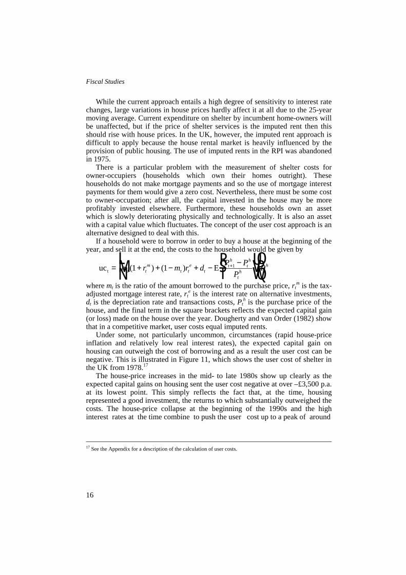
If a household were to borrow in order to buy a house at the beginning of theyear, and sell it at the end, the costs to the household would be given by
where mt is the ratio of the amount borrowed to the purchase price, rtm is the tax-
adjusted mortgage interest rate, rte is the interest rate on alternative investments,
dt is the depreciation rate and transactions costs, Pth is the purchase price of the
house, and the final term in the square brackets reflects the expected capital gain(or loss) made on the house over the year. Dougherty and van Order (1982) showthat in a competitive market, user costs equal imputed rents.
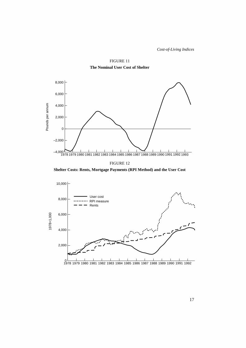
Under some, not particularly uncommon, circumstances (rapid house-priceinflation and relatively low real interest rates), the expected capital gain onhousing can outweigh the cost of borrowing and as a result the user cost can benegative. This is illustrated in Figure 11, which shows the user cost of shelter inthe UK from 1978.17
The house-price increases in the mid- to late 1980s show up clearly as theexpected capital gains on housing sent the user cost negative at over –£3,500 p.a.at its lowest point. This simply reflects the fact that, at the time, housingrepresented a good investment, the returns to which substantially outweighed thecosts. The house-price collapse at the beginning of the 1990s and the highinterest rates at the time combine to push the user cost up to a peak of around
17 See the Appendix for a description of the calculation of user costs.
uc Et = + + − + − −RSTUVW
LNM
OQP
+m r m r d P PP
Pt tm
t te
tth
th
th t
h( ) ( )1 1 1
Cost-of-Living Indices
17
FIGURE 11The Nominal User Cost of Shelter
FIGURE 12Shelter Costs: Rents, Mortgage Payments (RPI Method) and the User Cost
8,000
0
–2,000
–4,0001978 1982 1986 1987 1988 19931980 1981 1983 1985 1989 19911984 1990
4,000
Pou
nds
per
annu
m
1979 1992
6,000
2,000
10,000
2,000
01978 1982 1986 1987 1988 19921980 1981 1983 1985 1989 19911984 1990
6,000
1978
=1,
000
1979
8,000
4,000
User costRPI measureRents

Fiscal Studies
18
£8,000 p.a. The beginnings of the recovery in the housing market and the recentfalls in interest rates pull the index down again at the end of the period.
Figure 12 shows the user cost index, the mortgage payment index used in theRPI and the price series for rents. The fact that the influence of house-pricemovements on the RPI measure is negligible is illustrated quite clearly as theRPI measure continues to rise gently in the mid-1980s when expected capitalgains cause the user cost to fall. The RPI measure also peaks earlier than the usercost when interest rates first started to fall. Because the lowest point in thehouse-price cycle was not reached for a few months after interest rates fell, theuser cost measure continues to rise, although at a slower rate. The pattern ofsteps in the rents series is due to the influence of annual changes in rents chargedon public housing.
The issue of the appropriate weight for the user cost series is difficult toresolve. The concept of a user cost is notional. The cost is incurred by thehousehold but accrued rather than actually paid. Mortgagers, for example, accruecapital gains and losses but only pay their monthly mortgage bills. The usualweight applied to changes in the price of a good is the expenditure share, whereexpenditure is price multiplied by quantity. In the case of housing, the implicitquantity is one. The expenditure is therefore the current price. This implies thatthe weight to apply to the user cost price series is the average nominal user costitself.
One problem with this is that the weight is both large and extremely volatile,as can be seen from Figure 11. In 1978, for example, average total weekly non-housing expenditure was £68. The average weekly user cost was around –£70. In1992, the average weekly user cost was around £150, while average total non-housing expenditure was £224. At other times (early 1980, 1985 and 1989), theuser cost is zero. Annual increases in the user cost series reach around 100 percent in early 1979 and in 1988, while they are negative at other times. Includingthe user cost price series with the nominal user cost weight would result in anunacceptably volatile index which was completely dominated by shelter costs. Itis also difficult to know how to deal with a negative weight. The approachadopted here is a compromise aimed at focusing on the different effects of thetwo price series. The weight used under the user cost approach is mortgagepayments for households with mortgages, and average mortgage payments forhouseholds that own their houses outright. This has the benefit of using similarweights to those used under the RPI method for mortgagers, but also gives apositive weight to owner-occupiers. The next subsection presents results basedon housing-inclusive cost-of-living indices calculated using the RPI method,while subsection 2 discusses and compares the effects of using the user costapproach.
Cost-of-Living Indices
19
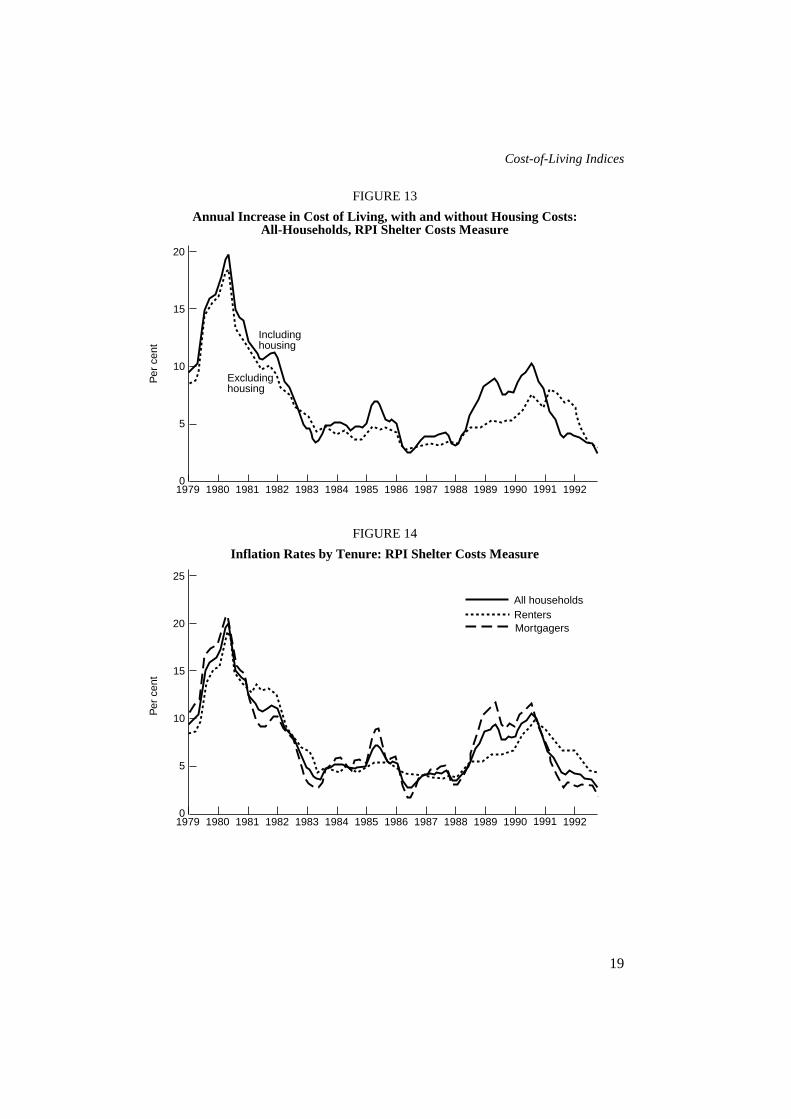
FIGURE 13Annual Increase in Cost of Living, with and without Housing Costs:
All-Households, RPI Shelter Costs Measure
FIGURE 14Inflation Rates by Tenure: RPI Shelter Costs Measure
20
5
01979 1982 1986 1987 1988 19921980 1981 1983 1985 1989 19911984 1990
15
Per
cen
t
10
Including housing
Excluding housing
25
5
01979 1982 1986 1987 1988 19921980 1981 1983 1985 1989 19911984 1990
15
Per
cen
t
10
All householdsRentersMortgagers20

Fiscal Studies
20
1. The Mortgage Interest ApproachFigure 13 shows the Tornqvist all-households average inflation rate calculatedwith and without housing costs using the mortgage interest payment (RPI)method.
The effects of rents and mortgage payments are clear, particularly in the late1980s when increases in interest rates pushed inflation in the all-items indexabove inflation in the non-housing index. The differential effects on rentersversus mortgagers are shown in Figure 14.
The first major point of departure is 1981 when local authority rents wereincreased sharply18 as grants from central government were cut, and in thefollowing year mortgage interest rates fell. The main differences, however, areapparent from 1988 onward, as increases in interest rates pushed the cost ofliving of home-owners up faster while rents lagged. The interest rate cuts whichenter the index from early 1990 had the reverse effect, cutting the rate ofincrease for home-owners relative to the average and allowing the cost of livingfor renters to catch up with the average as rents rose more sharply and interestrate cuts for home-buyers pulled the average down. By the end of the period, theaverage cost of living for households with mortgages rose 1.07 per cent morethan the all-households average on this measure of shelter costs.
Figure 15 shows the difference in cost-of-living inflation for households inthe top and bottom 10 per cent of the income distribution.19 To a large extent, thedifferences are driven by differences in tenure types between the two groups.The increase in the cost of living for poorer households in early 1981corresponds to the timing of the rent increase. Similarly, the fall in the mid- tolate 1980s coincides with the increases in mortgage rates which are shown toimpact on the richer households, most of whom are home-owners.
Compared with Figure 4, the inclusion of housing costs appears to amplifythe cycles in the indices. Adding housing costs increases the average differencefor poorer households from –0.01 to –0.07 percentage points and the finaldifference in growth levels from 0.32 per cent to 0.67 per cent less than thepopulation mean. This is because increases in housing-costs inflation generallycoincide with increases in non-housing inflation. The 1981 rent increases, forexample, coincided with a period of higher-than-average non-housing inflationfor poorer households. Mortgage inflation at the end of the 1980s coincided witha period of higher-than- average inflation for the richer households. Only at theend of the sample period, in the 1990s, do the housing and non-housing effectsappear to cancel each other out as rents rise once more relative to mortgageswhile non-housing inflation for the poorest 10 per cent fell
18 See Figure 12.19 Before-housing-costs measure: see Goodman and Webb (1994, this volume).

Cost-of-Living Indices
21
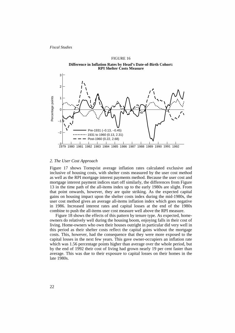
FIGURE 15Difference in Inflation Rates by Income Group: RPI Shelter Costs Measure
Figure 16 shows the difference in inflation rates for three broad date-of-birthcohorts: households in which the head was born before 1931 (i.e. those wherethe head was aged 48 or more at the start of the period and over 62 at the end),those in which the head was born after 1930 but before 1961, and those in whichthe head was born after 1960 (i.e. households in which the head was under 19 atthe beginning and under 32 at the end).
The path for the youngest cohort is similar to that for renters and poorerhouseholds until about 1983. They seemed to be particularly hard hit in early1981 by the combined effects of the rent increase and other, non-housinginflation. During the mid-1980s, this cohort appears to take on some of thecharacteristics of richer home-owners, possibly as a result of the right to buycouncil houses and as part of the general shift towards house-purchase. Thisturns out to be unfortunate since they then enter the period of high interest rateswith more members who are mortgagers. The average difference from the all-households inflation rate is therefore quite high, at 0.22 percentage points aboveaverage, and consequently their cost-of-living level at the end has grown 2.68 percent more than average. There therefore appears to be quite a strong cohort-specific effect in which an ill- timed move into house-buying increased the costof living of younger households. In contrast to those born after 1960, the eldesthouseholds did relatively well, finishing the period with a cost of living that hasgrown 0.45 per cent slower than average.
Per
cent
age
poin
ts
3
–1
–21979 1982 1986 1987 1988 19921980 1981 1983 1985 1989 19911984 1990
1
0
Poorest 10% (–0.07, –0.67)Richest 10% (0.25, 2.97)
2
Fiscal Studies
22
FIGURE 16Difference in Inflation Rates by Head’s Date-of-Birth Cohort:
RPI Shelter Costs Measure
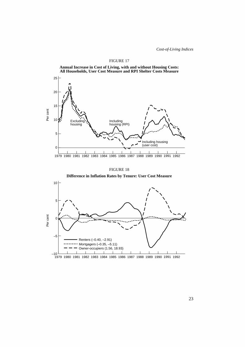
2. The User Cost ApproachFigure 17 shows Tornqvist average inflation rates calculated exclusive andinclusive of housing costs, with shelter costs measured by the user cost methodas well as the RPI mortgage interest payments method. Because the user cost andmortgage interest payment indices start off similarly, the differences from Figure13 in the time path of the all-items index up to the early 1980s are slight. Fromthat point onwards, however, they are quite striking. As the expected capitalgains on housing impact upon the shelter costs index during the mid-1980s, theuser cost method gives an average all-items inflation index which goes negativein 1986. Increased interest rates and capital losses at the end of the 1980scombine to push the all-items user cost measure well above the RPI measure.
Figure 18 shows the effects of this pattern by tenure type. As expected, home-owners do relatively well during the housing boom, enjoying falls in their cost ofliving. Home-owners who own their houses outright in particular did very well inthis period as their shelter costs reflect the capital gains without the mortgagecosts. This, however, had the consequence that they were more exposed to thecapital losses in the next few years. This gave owner-occupiers an inflation ratewhich was 1.56 percentage points higher than average over the whole period, butby the end of 1992 their cost of living had grown nearly 19 per cent faster thanaverage. This was due to their exposure to capital losses on their homes in thelate 1980s.
Per
cent
age
poin
ts
3
–1
–31979 1982 1986 1987 1988 19921980 1981 1983 1985 1989 19911984 1990
1
0
Pre-1931 (–0.13, –0.45)1931 to 1960 (0.13, 2.31)
2
–2
Post-1960 (0.22, 2.68)
Cost-of-Living Indices
23
FIGURE 17Annual Increase in Cost of Living, with and without Housing Costs:All Households, User Cost Measure and RPI Shelter Costs Measure
FIGURE 18Difference in Inflation Rates by Tenure: User Cost Measure
Per
cen
t
25
5
0
1979 1982 1986 1987 1988 19921980 1981 1983 1985 1989 19911984 1990
15
10 Excludinghousing
Includinghousing (RPI)
Including housing(user cost)
20
Per
cen
t
10
–5
–101979 1982 1986 1987 1988 19921980 1981 1983 1985 1989 19911984 1990
5
0
Renters (–0.40, –2.91)Mortgagers (–0.35, –5.11)Owner-occupiers (1.56, 18.93)
Fiscal Studies
24
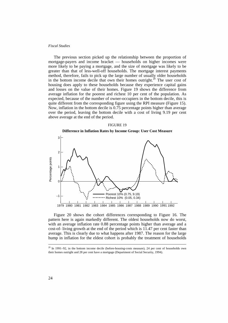
The previous section picked up the relationship between the proportion ofmortgage-payers and income bracket — households on higher incomes weremore likely to be paying a mortgage, and the size of mortgage was likely to begreater than that of less-well-off households. The mortgage interest paymentsmethod, therefore, fails to pick up the large number of usually older householdsin the bottom income decile that own their homes outright.20 The user cost ofhousing does apply to these households because they experience capital gainsand losses on the value of their homes. Figure 19 shows the difference fromaverage inflation for the poorest and richest 10 per cent of the population. Asexpected, because of the number of owner-occupiers in the bottom decile, this isquite different from the corresponding figure using the RPI measure (Figure 15).Now, inflation in the bottom decile is 0.75 percentage points higher than averageover the period, leaving the bottom decile with a cost of living 9.19 per centabove average at the end of the period.
FIGURE 19Difference in Inflation Rates by Income Group: User Cost Measure
Figure 20 shows the cohort differences corresponding to Figure 16. Thepattern here is again markedly different. The oldest households now do worst,with an average inflation rate 0.88 percentage points higher than average and acost-of- living growth at the end of the period which is 11.47 per cent faster thanaverage. This is clearly due to what happens after 1987. The reason for the largehump in inflation for the eldest cohort is probably the treatment of households 20 In 1991–92, in the bottom income decile (before-housing-costs measure), 24 per cent of households owntheir homes outright and 28 per cent have a mortgage (Department of Social Security, 1994).
3
1
0
–1
1979 1982 1986 1987 1988 19921980 1981 1983 1985 1989 19911984 1990
2
Per
cent
age
poin
ts
Poorest 10% (0.75, 9.19)Richest 10% (0.05, 0.34)

Cost-of-Living Indices
25
that own their houses outright. These sorts of households were therefore exposedto the capital losses on their homes which the user cost measure includes and thiscompletely alters the picture to one where the cohort-specific effect falls not onthe young but on the old.
FIGURE 20Differences in Inflation Rates by Head’s Date-of-Birth Cohort: User Cost Measure
VI. CONCLUSIONS
Several criticisms can be made of the approach adopted in this paper. Firstly,differences in spending patterns could be a function of differences in priceswhich we do not observe in these data. Apart from regional price variation,which is not examined, differences in prices could also be correlated withhousehold characteristics which are examined. For example, poorer householdswithout private transport may be forced to buy goods at the corner shop ratherthan the edge- of-town superstore. The prices they face may be higher than thosepaid by richer households. However, this only matters if the rates of change inthese different sets of prices are different over time.
Secondly, the issue of quality changes has not been addressed. Qualityimprovements in goods and services over the period may mean that more utilityis derived from consumption of some goods, e.g. video-recorders are better nowthan in 1979. This means that cost-of-living indices like those calculated heremay overestimate cost increases because they do not adjust for qualityimprovements. A counter-argument may be that consumers become harder to
4
0
–2
–41979 1982 1986 1987 1988 19921980 1981 1983 1985 1989 19911984 1990
2
Per
cent
age
poin
ts
Pre-1931 (0.88, 11.47)1931 to 1960 (–0.28, –3.52)Post-1960 (–0.15, –1.14)

Fiscal Studies
26
please as quality improves over time. Higher quality would then be needed toelicit the same level of welfare in 1992 as in 1979. It is not possible to addressthe issue of quality with these data.
This paper does not resolve the issue of the treatment of housing costs. Thesensitivity of the results to different measures of shelter costs is illustrated butfurther work is required to develop truly sensible treatment of shelter costs withan appropriate weight. This would provide enough material for a long paper inits own right.
It is important to reiterate that these results are entirely dependent upon theperiod studied. A different period would have given different results. The run ofdata from 1979 to 1992 does, however, nest two other papers (Bradshaw andGodfrey (1983) and Fry and Pashardes (1986)) and shows that their results, likethose here, do not apply more widely than over the period from which they drawtheir data.
The object of this paper has been to examine the extent and pattern ofdifferences in the cost of living for subgroups of the population. The main resultis that differences in the growth in cost of living at the end of the period studiedare small. However, relative inflation rates for different households cycle overthe period and there are several periods in which inflation rates differ widelybetween the top and bottom of the income distribution and between demographicgroups.
The fall in the relative price of necessities and the corresponding increase inthe price of luxuries over the period, and the difference in expenditure patternsbetween rich and poor households, have meant that the cost of living hasincreased faster for richer households than it has for poorer households. Theprogressive nature of indirect taxes between 1979 and 1992 has been shown tohave contributed to this effect. This means that the real income of poorerhouseholds is higher at the moment, and the real income of richer households islower at the moment, than standard low income statistics suggest, and thisnarrows the increase in real income inequality. However, this does not imply thatit is good to be poor. The differences are small and the welfare effects of lowincome massively outweigh the effects of a slightly lower-than-average increasein their cost of living.21
Given that these differences between groups are small, the obvious questionis whether they matter when uprating benefits etc. Benefit uprating is designed tocompensate poor households for year-to-year increases in the cost of living. Onaverage, cost-of-living increases in line with the average index over the periodwould have been broadly accurate (in fact, they have been overly generous by avery small amount). This should not be taken to imply, however, that there is noneed for the government to use an index more representative of the cost of livingof poorer households to uprate benefits. This paper has demonstrated that 21 See Stoker (1986).
Cost-of-Living Indices
27
households in receipt of benefits have had both periods of higher-than-averageand periods of lower-than-average increases in living costs in the order of around±2 per cent. These periods can last up to one or two years. Benefit uprating onthe basis of average increases has therefore overcompensated them for increasesin their cost of living at some times and undercompensated them at other times.These period-to-period errors matter if there are liquidity constraints andhouseholds cannot reallocate the excess from one period to another to smooththeir consumption. There almost certainly are such constraints, and this meansthat using the ‘wrong’ index imposes costs on poorer households even if theoverall increase is more or less right when viewed over a longer period.
APPENDIX: THE USER COST MEASURE OF SHELTER COSTS
User costs were calculated using average monthly house-price data supplied bythe Department of the Environment. Expected capital gains were estimated non-parametrically using these data. Essentially, this process applied a 12-monthweighted moving average around each data point. Following the Bank ofEngland’s treatment of user costs in its housing-adjusted retail price index,depreciation was set at 0.5 per cent, transactions costs at 2 per cent and averageproportion of the price borrowed at 65 per cent. The mortgage interest rate isfrom Table 7.1L in Financial Statistics (HMSO). The opportunity costcalculations are based on the Treasury Bill yield from Table 38 in EconomicTrends (HMSO).
REFERENCES
Allen, R. G. D. (1958), ‘Movements in retail prices since 1953’, Economica,vol. 25, pp. 14–25.
Baker, P. and Crawford, I. (1993), ‘The distributional aspects ofenvironmental taxation’, Scottish Economic Bulletin, no. 46, pp. 35–44.
Banks, J., Blundell, R. and Lewbel, A. (1994), ‘Quadratic Engel curves,indirect tax reform and welfare measurement’, University College London,Discussion Paper no. 94-04.
Blundell, R., Pashardes, P. and Weber, G. (1994), ‘What do we learn aboutconsumer demand patterns from micro-data?’, American Economic Review, vol.83, pp. 570–83.
Bradshaw, J. and Godfrey, C. (1983), ‘Inflation and the poor’, New Society,vol. 65, pp. 247–8.
Brittain, J. A. (1960), ‘Some neglected features of Britain’s incomelevelling’, American Economic Review, vol. 50, Papers and Proceedings, pp.335–44.

Fiscal Studies
28
Christensen, A. G., Jorgenson, D. W. and Lau, L. J. (1975), ‘Transcendentallogarithmic utility functions’, American Economic Review, vol. 65, pp. 367–83.
Crawford, I., Smith, S. and Webb, S. (1993), VAT on Domestic Energy,Commentary no. 39, London: Institute for Fiscal Studies.
Deaton, A. and Muellbauer, J. (1980), ‘An almost ideal demand system’,American Economic Review, vol. 70, pp. 312–36.
Department of Social Security (1994), Households Below Average Income: AStatistical Analysis 1979–1991/92, London: HMSO.
Diewert, W. E. (1976), ‘Exact and superlative index numbers’, Journal ofEconometrics, vol. 4, pp. 115–45.
— (1978), ‘The economic theory of index numbers: a survey’, in A. Deaton(ed.), The Theory and Measurement of Consumer Behaviour: Essays in Honourof Sir Richard Stone, Cambridge: Cambridge University Press.
Dougherty, A. and van Order, R. (1982), ‘Inflation, housing costs and theconsumer price index’, American Economic Review, vol. 72, pp. 154–64.
Fry, V. and Pashardes, P. (1986), The RPI and the Cost of Living, ReportSeries no. 22, London: Institute for Fiscal Studies.
Goodman, A. and Webb, S. (1994), ‘For richer, for poorer: the changingdistribution of income in the UK, 1961–91’, Fiscal Studies, vol. 15, no. 4, pp.29–62 (this issue).
Muellbauer, J. (1977), ‘The cost-of-living’, in Social Security Research,London: HMSO.
Piachaud, D. (1978), ‘Prices and the distribution of incomes’, in LordDiamond (Chairman), Royal Commission on the Distribution of Income andWealth, Selected Evidence for Report 6, London: HMSO.
Robinson, W. and Skinner, T. (1989), Reforming the RPI: A Better Treatmentof Housing Costs?, Commentary no. 15, London: Institute for Fiscal Studies.
Sen, A. (1985), ‘The standard of living: lecture I — concepts and critiques’,in G. Hawthorn (ed.), The Standard of Living, Cambridge: Cambridge UniversityPress.
Stoker, T. (1986), ‘The distributional welfare effects of rising prices in theUnited States’, American Economic Review, vol. 76, pp. 335–49.
Tipping, D. G. (1970), ‘Price changes and income distribution’, AppliedStatistics, vol. 19, pp. 1–17.
Tornqvist, L. (1936), ‘The Bank of Finland’s consumption price index’, Bankof Finland Monthly Bulletin, vol. 10, pp. 1–8.

![CHAPTER 5: USE REGULATIONS 5.1 TABLES OF PERMITTED …Group Living Nursing home [4] S S P S S P PS PS 5.2.1(G) Household Living Bed and Breakfast S S 5.2.1(B) Household Living Boarding](https://img.pdfslide.us/doc/110x75/5f0cf8bd7e708231d4380a3a/chapter-5-use-regulations-51-tables-of-permitted-group-living-nursing-home-4.jpg)