Embed Size (px)
Citation preview
final spine = 0.346"
Responsive Design WordPress
How to make great responsive themes and plugins
Joe Casabona
with
Level: Intermediate Category: Web Development/Web DesignCover Design: Aren Straiger
US $39.99 CAn $41.99
www.newriders.com
Joe Casabona is a web
developer, teacher, speaker, and
writer currently working for the
University of Scranton. He has
been making websites since
2002 and using WordPress
since 2004. He is also the author
of Building WordPress Themes
from Scratch.
With the ever-increasing need to view websites on mobile devices, websites have to be adaptable to thousands of different screen resolutions. In Responsive Design with WordPress, expert web developer Joe Casabona teaches you how to leverage WordPress to get the most out of responsive design, implement best practices, automate important processes, and make your life easier overall. You’ll start with a refresher on the core functionality of WordPress, then dive into developing responsive themes and plugins. Find out what to consider at the outset of the design process to save hours of work during redesigns. Learn up-to-date best practices for deter-mining breakpoints, accessibility, and preventing website bloat for better user experience no matter the user’s connection speed. Finally, you’ll apply the principles you learn to specific tutorials, such as building a photo gallery, map page, and products page.
• Learn when to rely on themes and when it’s best to use plugins.
• Apply your responsive CSS to a WordPress theme.
• Learn various navigation techniques, such as Jump to with smooth scrolling or Select box.
• Use popular responsive techniques, like picturefill.js, to make images respond to different screen resolutions and connection speeds.
• Explore frameworks, including Bootstrap and Foundation.
• Download dozens of code samples to help implement responsive design techniques, and test yourself with end-of-chapter quizzes.
Responsive Design with WordPress
Responsive D
es
ign
with
WordPress
CA
SA
Bo
nA
9780321957412_ResponsiveWordPress_Cvr.indd 1 11/13/13 10:56 AM
Responsive DESIGN WordPress
How to make great responsive themes and plugins
Joe Casabona
with
Responsive Design with WordPressJoe Casabona
New Riderswww.newriders.comTo report errors, please send a note to: [email protected] Riders is an imprint of Peachpit, a division of Pearson Education.Copyright © 2014 by Joseph Casabona
Acquisitions Editor: Michael NolanProject Editor: Nancy PetersonDevelopment Editor: Eric Schumacher-RasmussenCopyeditor: Joanne GosnellProofreader: Scout FestaTechnical Reviewer: Stephen N. MekoshProduction Coordinator: David Van NessCompositor: Danielle FosterCover Designer: Aren StraigerInterior Designer: Danielle FosterIndexer: FireCrystal Communications
Notice of RightsAll rights reserved. No part of this book may be reproduced or transmitted in any form by any means, electronic, mechanical, photocopying, recording, or otherwise, without the prior written permission of the publisher. For information on getting permission for reprints and excerpts, contact [email protected].
Image of Treo used courtesy Jonathan Vasata/Shutterstock.
Notice of LiabilityThe information in this book is distributed on an “As Is” basis, without warranty. While every precaution has been taken in the preparation of the book, neither the author nor Peachpit shall have any liability to any person or entity with respect to any loss or damage caused or alleged to be caused directly or indirectly by the instructions contained in this book or by the computer software and hardware products described in it.
TrademarksWordPress is a registered trademark of the WordPress Foundation in the United States and/or other countries.
Many of the designations used by manufacturers and sellers to distinguish their products are claimed as trademarks. Where those designations appear in this book, and Peachpit was aware of a trademark claim, the designations appear as requested by the owner of the trademark. All other product names and services identified throughout this book are used in editorial fashion only and for the benefit of such companies with no intention of infringe-ment of the trademark. No such use, or the use of any trade name, is intended to convey endorsement or other affiliation with this book.
ISBN 13: 978-0-321-95741-2 ISBN 10: 0-321-95741-5
9 8 7 6 5 4 3 2 1
Printed and bound in the United States of America
Dedication
To my parents, Louis and Marie, for their continued support. And to Joe and Jean
Rizzi, whose advice, kindness, and patience helped me get to where I am today.
RESPONSIVE DESIGN WITH WORDPRESSiv
Acknowledgments
I’d like to thank the following people, without whom this book wouldn’t be in
your hands:
RR Stephen Mekosh for not only being a fantastic tech editor and a good friend,
but also being the first person to show me both CSS and WordPress.
RR Michael Nolan for giving me the chance to write this book and welcoming me
to Peachpit Press/New Riders.
RR Nancy Peterson and Eric Schumacher-Rasmussen for advice and guidance,
editing, keeping me on track, and our weekly talks.
RR Joanne Gosnell and Scout Festa for copyediting and proofreading, respec-
tively, and for making it seem like I have a good command over grammar and
the English language.
RR The design team at Peachpit Press for making this book look amazing.
RR Jesse Friedman for the wonderful foreword and kind words.
RR Jason Coleman, Stephanie Leary, Lisa Sabin-Wilson, and Pippin Williamson for
letting me pick their brains on both WordPress and the art of writing a book.
RR My family and friends, especially my parents; my brothers Phil, Mike, and
Rob; Dave Redding; Rob McManus; Matt Wren; and my wonderful girlfriend,
Erin Holman.
I’d also like to make a quick mention of my brother Phil’s website,
http://phil.casabona.org. He took the headshot used in this book, and
I love his work.
Contents v
Contents
Foreword viii
Introduction x
Chapter 1 What Is Responsive Web Design? 1Responsive Web Design Origins 2
Breakpoints & Media Queries 3
The Current State of Devices 7
Consider Connection Speeds 8
Wrapping Up 11
Chapter 2 Creating a Basic WordPress Theme 13Meet Our Website 16
Template Structure 16
The Loop 23
Custom Post Types 26
Plugins and Shortcodes 29
Wrapping Up 33
Chapter 3 Making Your Theme Responsive: The Ground Floor 35Responsive Techniques 36
Adding the Responsive Layout 42
Testing WordPress’ Default CSS Classes 47
Wrapping Up 55
RESPONSIVE DESIGN WITH WORDPRESSvi
Chapter 4 Making Your Theme Responsive: Core Features 57Handling Navigation 58
Handling Images 75
Handling Widgets 81
Wrapping Up 88
Chapter 5 Making Your Theme Responsive: Blog Features 91Handling Comments 92
Handling Archives 103
Wrapping Up 119
Chapter 6 Using Responsive Theme Frameworks 121Some Principles of Reuse to Keep in Mind 122
About WordPress Frameworks 129
Popular WordPress Frameworks 132
Wrapping Up 140
Chapter 7 Techniques and Tutorials 141Introduction 142
How to Build a Responsive WordPress
Photo Gallery 144
How to Build a Responsive WordPress Map Page
Using Google Maps 150
How to Build a Responsive WordPress
Image Slider 154
Contents vii
How to Build a Responsive WordPress
Contact Form 161
How to Build a Responsive WordPress
Products Page 167
Wrapping Up 177
Appendix Resources 179A Few Words to Sum Up 180
Books 181
Meetups 184
Links 185
Index 186
RESPONSIVE DESIGN WITH WORDPRESSviii
Foreword
By Jesse FriedmanToday WordPress powers 20% of all websites, and we can look forward to it
powering 1 in 4 sites launched in 2014. I launched my first WordPress-powered
website in 2005, before all the “cool kids” were doing it. I am very proud to be a
veteran developer and strategist for a product used by millions of people all over
the world.
Since I launched that first site back in 2005, I have written my own book on devel-
oping for WordPress, and I have a few more coming out in spring 2014. I have also
contributed to other books and written articles for online publications such as
Smashing Magazine and net Magazine, and I teach both in universities and online.
I have also spoken at conferences all over the world, including one where I met
Joe Casabona.
I was honored when Joe asked me to write the foreword for this book, because I
knew it was going to be great. Joe has a real talent for turning complicated solu-
tions into very simple step-by-step directions. WordPress was built to be simple—
simple to set up, simple to install, and simple to extend. Still, it can be somewhat
challenging to understand for novice designers and developers who are looking to
build on basic WordPress functionality.
These challenges prompted me to write my book Web Designer’s Guide to WordPress: Plan, Theme, Build, Launch in 2012 and is exactly why Joe wrote his
book this year. We are both veteran developers who want to help grow the
WordPress community. The best way to do that is to help educate the community
and share our experiences and knowledge around a product we use every day. Joe
has done just that with Responsive Design with WordPress. This is a solid book with
lots of great examples.
As a professor at two universities in Rhode Island, I know this book will compli-
ment my class curriculum beautifully. The lessons, examples, and even questions
at the end of each chapter help you build a great foundation on WordPress and
Responsive Web Design. You also will develop a WordPress theme as you follow
along with the book, so you’ll be reinforcing the skills you’re building as you read.
Foreword ix
Not to mention you’ll be learning two skills at the same time. You’ll be learning
WordPress and, at the same time, gaining experience specifically in Responsive
Web Design. This approach will not only help to strengthen your skills in both
areas but will also make you an expert in a very profitable niche.
As I mentioned earlier, WordPress will power 25% of all websites launched
in 2014. This means that 1 in 4 new sites will need a developer who knows
WordPress. What’s more, as of this year more information is being consumed on
mobile devices than on traditional computers. If you didn’t have strong skills in
Responsive Web Design in 2013, you’re definitely going to need them in 2014
and beyond.
In my opinion, there is no better way to learn a skill than by doing it yourself. This
book is the best way to learn both WordPress and Responsive Web Design at the
same time. Great job, Joe!
RESPONSIVE DESIGN WITH WORDPRESSx
Introduction
I got my first portable device when I was a freshman in high school. It was the
Palm m100 and I loved it dearly. It didn’t do much, and, well, at 13 or 14 I didn’t
have much to use it for. But having a computer in my pocket? Crazy! As a result,
it went everywhere with me (and may have gotten taken away once or twice after
I used it in class).
Then I moved to the Compaq iPAQ, which ran Windows and had a color screen.
Even crazier, I thought. I could run real programs on this. I even asked about
campus Wi-Fi when I was visiting colleges in the early 2000s, when it was just
becoming popular. I thought of all the amazing things I could do with a tiny com-
puter that came with a pen (stylus) and fit in my pocket. Still, I found myself want-
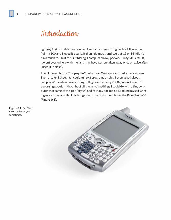
ing more after a while. This brings me to my first smartphone: the Palm Treo 650
(Figure 0.1).
Figure 0.1 Oh, Treo 650. I still miss you sometimes.
IntroduCtIon xi
I would do everything on this phone—make calls, take photos, sync my Google
Account to it. It even had a primitive browser called Blazer. I could visit websites
from my phone!
Since then, of course, the mobile landscape has changed. The iPhone brought
a full-featured browser to mobile devices, capable of everything from CSS to
JavaScript. It didn’t solve one problem, though: the problem of the small screen.
That’s where Responsive Web Design comes in.
Perhaps you’ve heard of it. It’s apparently pretty popular right now. Lots of
people—developers, designers, agencies, and users—are asking about it. And why
shouldn’t they? On top of catering to what is a quickly growing market, it’s pretty
cool. Responsive Web Design has become one of those things people check for
when they visit a site (resizing a webpage is totally the new “check the source for
table layouts”).
If you’re designing a website, you ultimately have no control over how it’s viewed;
you don’t get to decide where it’s viewed or what it’s viewed on or the connection
on which it’s viewed. That might sound scary to some, but to me (and I bet to you,
too) it’s quite the contrary. I love solving that problem. That’s not to say it’s not a
little daunting. I mean, you need to create a website that is easy to use on mobile
but that totally “wows” on the desktop. That’s what Responsive Web Design is
all about.
WordPress is pretty great too. It powers millions of webpages. Hundreds of mil-
lions, even. As you read in the Foreword, it will run 1 of every 4 websites launched
in 2014. It does a lot for us while allowing us to do a lot. So how does WordPress
fit in with Responsive Web Design? Well, as it turns out, it can be really helpful
when creating responsive themes; it has a lot of really great built-in features that
we, as developers, can leverage to create better responsive sites. And that’s just
what I’m going to show you how to do.
Who Is This Book for?I’d like to tell you that this book is for anyone looking to develop WordPress sites,
but in order to get into the real heart of why I wrote this book, I need to make a
few assumptions about you, dear reader.
First, I assume you have a working knowledge of HTML, CSS, PHP, JavaScript,
and MySQL. I also assume you have some familiarity with WordPress—you’ve
installed it, you use it, you’ve possibly even coded a theme for it. Finally, I assume
you’ve used a server in some capacity; you should at least know the WordPress
directory structure and how to use FTP/SFTP.
RESPONSIVE DESIGN WITH WORDPRESSxii
So this book is for web developers and WordPress developers who want to take
advantage of what WordPress has to offer in order to create great responsive
websites. In this book, we are going to cover a wide range of topics and techniques
for converting website elements to responsive WordPress theme features.
I will provide a bit of a primer, however. In the first chapter, we will take a closer
look at Responsive Web Design: what it is, where it came from, and best practices
for using it. Then, there will be a brief overview of WordPress theme develop-
ment; this will go over some of the major parts of the WordPress theme—impor-
tant files, the Loop, Custom Post Types, plugins, and more. Then, we’ll get into the
real fun part.
The real meat of the book—making a responsive WordPress theme—is divided
into three parts. Chapter 3 will cover prominent responsive techniques and
how to integrate them into the WordPress theme. Chapters 4 and 5 will look at
specific components of a WordPress website, including navigation, images, com-
ments, widgets, archives, and plugins.
We will wrap up the book by looking at responsive theme frameworks and child
themes in Chapter 6, followed by a cookbook-style section full of tutorials for
responsive development in Chapter 7.
Why Did I Write This Book?When I came up with the idea for this book, there were a lot of things floating
through my head. Responsive Web Design is always changing; WordPress is
always changing. The best practices of a couple of years ago have changed in both
fields, and it’s important to get that information out.
There is a big movement in the web development community toward “doing
responsive responsibly” (a phrase coined by Scott Jehl); this is the idea that
responsive isn’t just about screen sizes. There is another big movement in the
WordPress community to remove functionality from themes (features such as
sliders and Custom Post Types that rely on content). I wanted to create a single
place that talks about these things, as a lot of web developers are likely working
with both responsive design and WordPress.
IntroduCtIon xiii
Coding ConventionsFirst of all, any code you come across in the book will be presented in one of two
ways. It could be inline, like this: <?php echo “Hello World!”; ?>, or it could be in
its own block, which looks like this:
function hello_world(){
$s= “Hello World”;
return $s;
}
print hello_world();
Either way, you should be able to recognize it pretty quickly. As far as standards,
the WordPress Codex lays out quite a few (http://rwdwp.com/16). I will do my
best to adhere to these coding standards.
To denote that the code on the page takes place in the middle of a block of code
(that is, there was some code skipped between the first line listed and the next),
look for an ellipses (...).
A couple of things I’d like to point out: I will be using HTML5 markup here, but we
won’t do anything with the more advanced facets of HTML5, like Web Sockets or
Storage APIs.
In most cases, the CSS will use .classes instead of #ids. This should make for
cleaner CSS while eliminating the need for really specific selectors. All of my CSS
will be formatted like this:
.class-name{
color: #FFFFFF;
background: #000000;
}
Notice the use of dashes (-) instead of camel case or underscores, and the fact
that the closing bracket is also indented. This makes it easier to read the CSS,
especially when there is a lot.
Conversely, my PHP function names will always use underscores (_) and be pre-
fixed with mf_, like this: mf_get_featured_images().
TIPLook for text like
this in the margins
for Tips and Notes.
RESPONSIVE DESIGN WITH WORDPRESSxiv
Finally, sometimes the layout limitations of a print publication mean that we have
to stretch single lines of code over more than one line. In those cases, you’ll see
a light gray arrow (p) to indicate that these lines of code should not be broken
when you use them. If you’ve got the digital version of this book, you may find that
code breaks unpredictably in the text. In that case, it’s important to rely on the
downloadable files (www.rwdwp.com) for accuracy.
Other Book NotesThere is a lot of code in the book. Most of the time I will point out where
you can find that code. If I don’t, all of it is available on the book’s website,
www.rwdwp.com, as well as on GitHub. You will also find a list of all the
short URLs and the sites they point to.
As you code throughout the book, you’ll notice that I don’t make much mention
of testing before Chapter 6; it’s important to test on at least a couple of devices,
especially if you plan on using these techniques in production-ready sites (and I
hope you do).
Finally, I tend to use a lot of acronyms, which are usually defined in context.
In case they aren’t, here are the most common ones:
RR RWD: Responsive Web Design
RR WP: WordPress
RR RESS: Responsive Design + Server Side Components
RR The Codex: the WordPress Codex (or documentation of the API)
Chapter4Making
Your Theme Responsive:
Core Features
RESPONSIVE DESIGN WITH WORDPRESS58
So far, you’ve seen multiple ways to make a website responsive. Now it’s time to
really dig in and combine those techniques with WordPress’ unique capabilities.
In Chapter 3, you learned how to apply your responsive CSS to a WordPress theme.
You also got an in-depth look at WordPress’ generated CSS classes and created
some default styles for what are considered the “essential” ones. From here on out,
you’ll go even further, focusing on two types of features: core and blog.
This chapter looks at some of the core features of WordPress instrumental to
a good User Experience. The next chapters are about using what WordPress
provides developers and leveraging those tools to create better responsive sites.
That said, you’ll look at three areas of development in this chapter: navigation
menus, images, and widgets.
Handling NavigationResponsive navigation techniques are bountiful in books and blog posts;
many developers have come up with their own implementations for navigation
menus on responsive sites. Brad Frost outlines some of the most popular ones at
http://rwdwp.com/32.
In this section, we will look at a few popular techniques and how they look on the
Millennium Flights site, and then decide what’s best.
A Look at Popular TechniquesIf you looked at Brad Frost’s post, you’ll see that he also wrote a second one and
linked to several others. In other words, there are lots of navigation menu pat-
terns to choose from.
We will explore three possible options for the Millennium Flights navigation: Do
Nothing (or Top Nav), Jump to (or Footer nav), and the Select box…plus a bonus
technique that may surprise you. While we won’t be implementing it, we will also
look at the Off-Canvas technique, which is a bit more advanced
DO NOTHING (OR TOP NAV)
This is the easiest one to implement. You simply leave the navigation as is at the
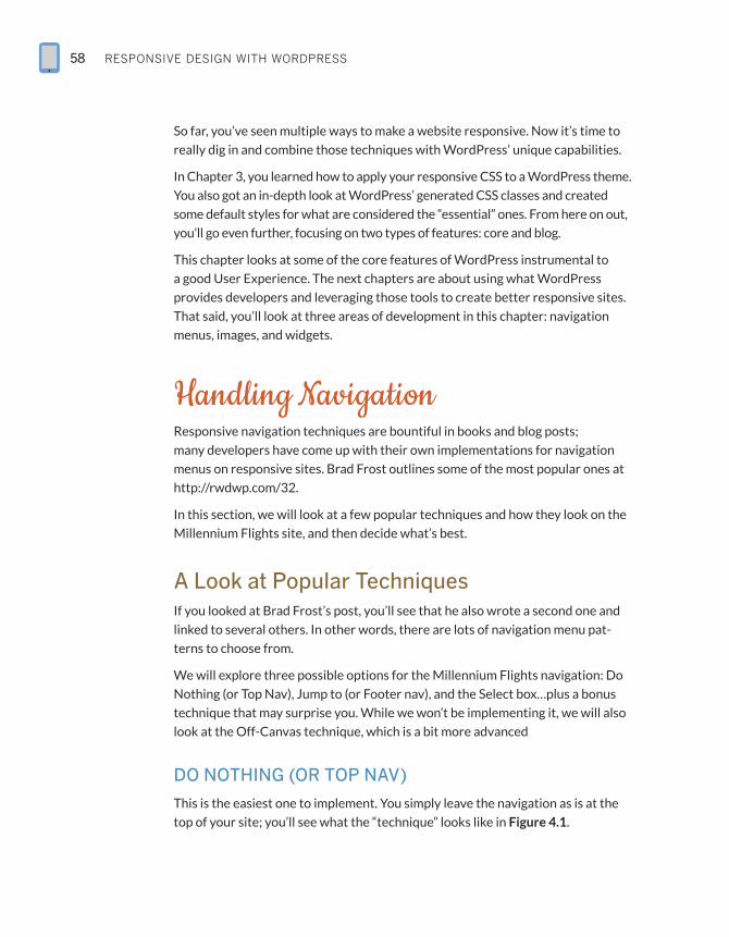
top of your site; you’ll see what the “technique” looks like in Figure 4.1.
makIng Your tHeme responsIve: Core Features 59
As long as your navigation styles are not limited by a specific Media Query, they
will apply to the entire site if you employ the Do Nothing technique. It is easy to
apply because you don’t have to make changes to your code, but there are some
pitfalls. Luckily the navigation for Millennium Flights uses big text, but imagine a
site with smaller text using this approach. Users may have difficulty selecting the
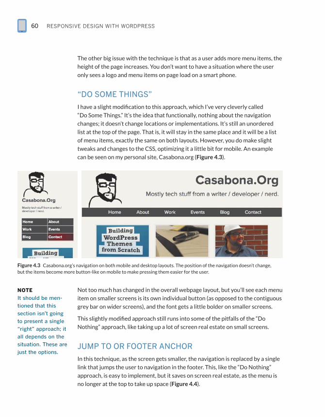
menu items on smaller screens (Figure 4.2).
Figure 4.2 On the left is how this website navigation renders on an Android phone. On the right, you see what happens when you resize the browser. In both cases, the nav appears small and difficult to press without zooming.
Figure 4.1 Millennium Flights with the “Do Nothing” responsive navigation technique.
“Hide and Cry”
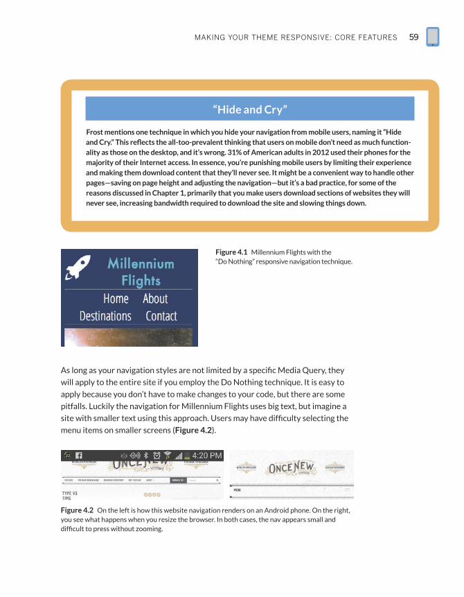
Frost mentions one technique in which you hide your navigation from mobile users, naming it “Hide and Cry.” This reflects the all-too-prevalent thinking that users on mobile don’t need as much function-ality as those on the desktop, and it’s wrong. 31% of American adults in 2012 used their phones for the majority of their Internet access. In essence, you’re punishing mobile users by limiting their experience and making them download content that they’ll never see. It might be a convenient way to handle other pages—saving on page height and adjusting the navigation—but it’s a bad practice, for some of the reasons discussed in Chapter 1, primarily that you make users download sections of websites they will never see, increasing bandwidth required to download the site and slowing things down.
RESPONSIVE DESIGN WITH WORDPRESS60
The other big issue with the technique is that as a user adds more menu items, the
height of the page increases. You don’t want to have a situation where the user
only sees a logo and menu items on page load on a smart phone.
“DO SOME THINGS”
I have a slight modification to this approach, which I’ve very cleverly called
“Do Some Things.” It’s the idea that functionally, nothing about the navigation
changes; it doesn’t change locations or implementations. It’s still an unordered
list at the top of the page. That is, it will stay in the same place and it will be a list
of menu items, exactly the same on both layouts. However, you do make slight
tweaks and changes to the CSS, optimizing it a little bit for mobile. An example
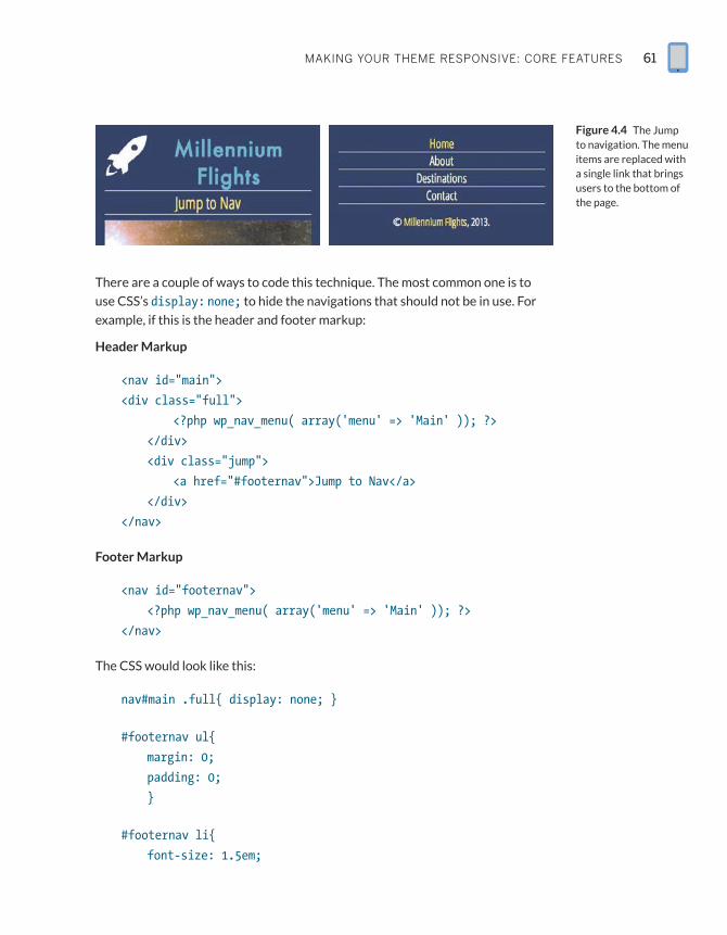
can be seen on my personal site, Casabona.org (Figure 4.3).
Figure 4.3 Casabona.org’s navigation on both mobile and desktop layouts. The position of the navigation doesn’t change, but the items become more button-like on mobile to make pressing them easier for the user.
Not too much has changed in the overall webpage layout, but you’ll see each menu
item on smaller screens is its own individual button (as opposed to the contiguous
grey bar on wider screens), and the font gets a little bolder on smaller screens.
This slightly modified approach still runs into some of the pitfalls of the “Do
Nothing” approach, like taking up a lot of screen real estate on small screens.
JUMP TO OR FOOTER ANCHOR
In this technique, as the screen gets smaller, the navigation is replaced by a single
link that jumps the user to navigation in the footer. This, like the “Do Nothing”
approach, is easy to implement, but it saves on screen real estate, as the menu is
no longer at the top to take up space (Figure 4.4).
NOTEIt should be men-
tioned that this
section isn’t going
to present a single
“right” approach; it
all depends on the
situation. These are
just the options.
makIng Your tHeme responsIve: Core Features 61
There are a couple of ways to code this technique. The most common one is to
use CSS’s display: none; to hide the navigations that should not be in use. For
example, if this is the header and footer markup:
Header Markup
<nav id=”main”>
<div class=”full”>
<?php wp_nav_menu( array(‘menu’ => ‘Main’ )); ?>
</div>
<div class=”jump”>
<a href=”#footernav”>Jump to Nav</a>
</div>
</nav>
Footer Markup
<nav id=”footernav”>
<?php wp_nav_menu( array(‘menu’ => ‘Main’ )); ?>
</nav>
The CSS would look like this:
nav#main .full{ display: none; }
#footernav ul{
margin: 0;
padding: 0;
}
#footernav li{
font-size: 1.5em;
Figure 4.4 The Jump to navigation. The menu items are replaced with a single link that brings users to the bottom of the page.
RESPONSIVE DESIGN WITH WORDPRESS62
border-bottom: 1px solid #FFFFFF;
}
#footernav li a{
padding: 10px;
}
...
@media screen and (min-width: 34.188em){
...
nav#main .full{
display: block;
}
#footernav, nav#main .jump{
display: none;
}
...
}
This code works fine, but it’s forcing the user to download code that he isn’t going
to see. Later in this section, you are going to see how this method can be improved
using RESS.
Aside from the extra code, this experience might be a jarring one for the user.
The page view would change from the top of the page to the bottom without
any scrolling or animations, changing everything the user was looking at; it’s not
very smooth. A better solution, and one that takes into account the issues we’ve
seen with the techniques we’ve looked at, would be to convert the navigation to a
Select box for mobile.
THE SELECT BOX
The Select box is a clean, user-friendly method that places the navigation at the
top of the page without taking up too much screen space. One drawback is that
it’s not as easy to implement as the previous methods because you actually need
to code up two separate menus—one normal menu, and one inside of a select box
(Figure 4.5).
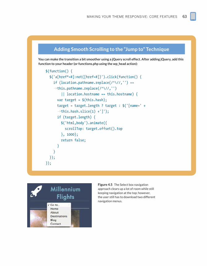
makIng Your tHeme responsIve: Core Features 63
Figure 4.5 The Select box navigation approach clears up a lot of room while still keeping navigation at the top; however, the user still has to download two different navigation menus.
Adding Smooth Scrolling to the “Jump to” Technique
You can make the transition a bit smoother using a jQuery scroll effect. After adding jQuery, add this function to your header (or functions.php using the wp_head action):
$(function() {
$(‘a[href*=#]:not([href=#])’).click(function() {
if (location.pathname.replace(/^\//,’’) ==
pthis.pathname.replace(/^\//,’’)
|| location.hostname == this.hostname) {
var target = $(this.hash);
target = target.length ? target : $(‘[name=’ +
pthis.hash.slice(1) +’]’);
if (target.length) {
$(‘html,body’).animate({
scrollTop: target.offset().top
}, 1000);
return false;
}
}
});
});
RESPONSIVE DESIGN WITH WORDPRESS64
Let’s think outside of WordPress for a second, and look at the HTML structure for
a select menu navigation:
<select onchange=”location=this.options[this.selectedIndex].
pvalue;”>
<option value=”” selected=”selected”>Go to...</option>
<option value=”/home/”>Home</option>
<option value=”/about/”>About</option>
<option value=”/destinations/”>Destinations</option>
<option value=”/contact/”>Contact</option>
</select>
While this seems like a pretty standard implementation, it’s actually going to take
a little bit of work to get this properly working in WordPress because it changes
the entire structure of the menu. Luckily, WordPress allows developers to do just
that with the Walker_Nav_Menu class. A “Walker” in programming is a way to tra-
verse, or process, tree-like data structures, which create hierarchical data. In this
case, it’s traversing HTML to create an unordered list of nav items. You will create
a file called Select_Nav_Walker.php, where you will write a class that extends
Walker_Nav_Menu, using the four functions it uses to display the menu:
class Select_Nav_Walker extends Walker_Nav_Menu {
public function start_lvl(&$output, $depth){}
public function end_lvl(&$output, $depth){}
public function start_el(&$output, $item, $depth, $args){}
public function end_el(&$output, $item, $depth){}
}
The functions start_lvl and end_lvl print the opening and closing elements for
the menu; by default this is <ul> and </ul>. You will actually add the new markup
(the <select> tags from above) in a different area, so both of those functions will
remain as is: blank.
The other two functions, start_el and end_el, will be used to print the individual
menu items. end_el is incredibly simple:
public function end_el(&$output, $item, $depth){
$output .= “</option>\n”;
}
makIng Your tHeme responsIve: Core Features 65
The function is just one line—the markup that closes the menu item. By default,
it is </li>, but since this is a select menu, you are changing it to </option>. The
variable $output is what this class continually adds to before sending it back to be
printed on the screen. Because of that, it’s important to use “.=” and not just “=”.
If you don’t, your menu will just be </option>.
The start_el function is a little more complicated than that, and it will make use
of the $item argument passed to it:
public function start_el(&$output, $item, $depth, $args){
$item->title = esc_attr($item->title);
parent:: start_el(&$output, $item, $depth, $args);
$output .= ‘ <option value=”’. $item->url .’”>’.
p$item->title;
}
The first line escapes the title, converting special characters to HTML entities.
Then it calls the parent function (remember this class is extending the built-in
Walker_Nav_Menu class), which will apply all CSS classes that would otherwise be
applied. Finally, we send the <option> element to $output. $item is an array that
has several values, including url and title.
That completes the class, with the entire thing looking like this:
class Select_Nav_Walker extends Walker_Nav_Menu {
public function start_lvl(&$output, $depth){}
public function end_lvl(&$output, $depth){}
public function start_el(&$output, $item, $depth, $args){
$item->title = esc_attr($item->title);
parent::start_el(&$output, $item, $depth, $args);
$output .= ‘ <option value=”’. $item->url .’”>’.
p$item->title;
}
public function end_el(&$output, $item, $depth){
$output .= “</option>\n”;
}
}
RESPONSIVE DESIGN WITH WORDPRESS66
You can either place it directly into functions.php or in its own file, including it in
functions.php.
After that, you’ll need to attend to the header.php markup, which looks like this:
<nav id=”main”>
<div class=”full”>
<?php wp_nav_menu( array(‘menu’ => ‘Main’ )); ?>
</div>
<div class=”select-menu”>
<?php
wp_nav_menu(array(
‘menu’ => ‘Main’,
‘walker’ => new Select_Nav_Walker(),
‘items_wrap’ => ‘<select ONCHANGE=
p”location=this.options[this.selectedIndex].
pvalue;”><option>Go to..</option>%3$s</select>’,
‘container’ => false
)
);
?>
</div>
</nav>
You will show/hide the proper menu the same way you did with the Footer
Anchor technique, but we will explore a better option later in this section.
What should be pointed out here are the new entries for the select-menu version
of wp_nav_menu(). There are three new arguments being passed to it:
RR walker: The value of the Walker is the instantiation of your Select_Nav_
Walker class. This tells WordPress to use this walker instead of the default to
construct the menu.
RR items_wrap: By default, this is the <ul> wrapper for the normal walker. Since
your walker is for a select menu, the appropriate markup should be sent. You’ll
also notice the %3$s. This is necessary to make sure $output is included.
RR container: This by default wraps the entire list in a div, which we don’t
need to do.
makIng Your tHeme responsIve: Core Features 67
That’s everything. Now you should have the regular menu at full width and the
select menu for smaller screens. This still has the issue of multiple menus being
downloaded, but we will fix that later.
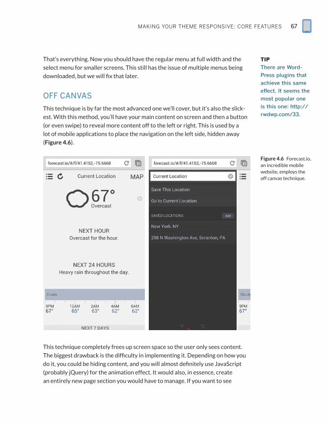
OFF CANVAS
This technique is by far the most advanced one we’ll cover, but it’s also the slick-
est. With this method, you’ll have your main content on screen and then a button
(or even swipe) to reveal more content off to the left or right. This is used by a
lot of mobile applications to place the navigation on the left side, hidden away
(Figure 4.6).
This technique completely frees up screen space so the user only sees content.
The biggest drawback is the difficulty in implementing it. Depending on how you
do it, you could be hiding content, and you will almost definitely use JavaScript
(probably jQuery) for the animation effect. It would also, in essence, create
an entirely new page section you would have to manage. If you want to see
TIPThere are Word-
Press plugins that
achieve this same
effect. It seems the
most popular one
is this one: http://
rwdwp.com/33.
Figure 4.6 Forecast.io, an incredible mobile website, employs the off canvas technique.
RESPONSIVE DESIGN WITH WORDPRESS68
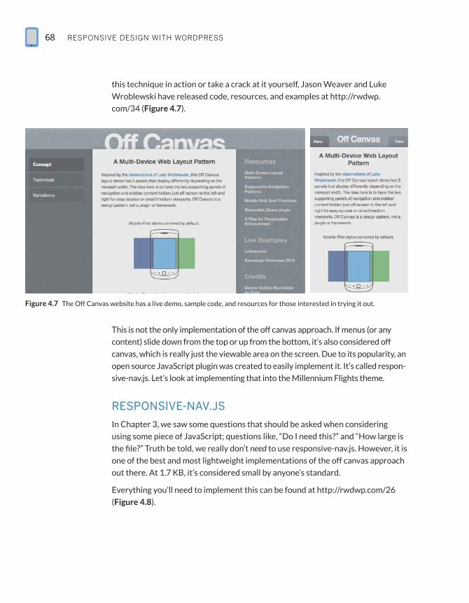
this technique in action or take a crack at it yourself, Jason Weaver and Luke
Wroblewski have released code, resources, and examples at http://rwdwp.
com/34 (Figure 4.7).
Figure 4.7 The Off Canvas website has a live demo, sample code, and resources for those interested in trying it out.
This is not the only implementation of the off canvas approach. If menus (or any
content) slide down from the top or up from the bottom, it’s also considered off
canvas, which is really just the viewable area on the screen. Due to its popularity, an
open source JavaScript plugin was created to easily implement it. It’s called respon-
sive-nav.js. Let’s look at implementing that into the Millennium Flights theme.
RESPONSIVE-NAV.JS
In Chapter 3, we saw some questions that should be asked when considering
using some piece of JavaScript; questions like, “Do I need this?” and “How large is
the file?” Truth be told, we really don’t need to use responsive-nav.js. However, it is
one of the best and most lightweight implementations of the off canvas approach
out there. At 1.7 KB, it’s considered small by anyone’s standard.
Everything you’ll need to implement this can be found at http://rwdwp.com/26
(Figure 4.8).
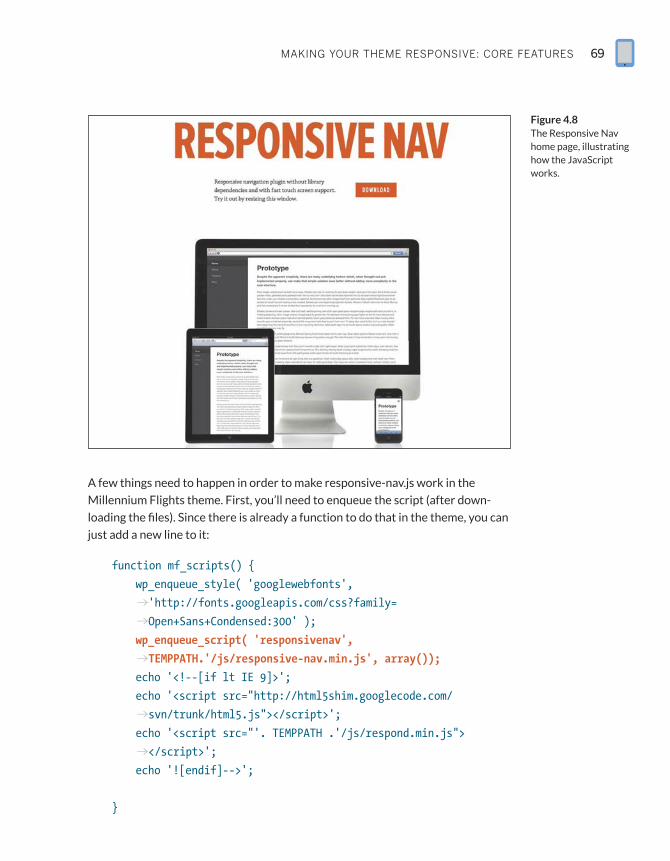
makIng Your tHeme responsIve: Core Features 69
A few things need to happen in order to make responsive-nav.js work in the
Millennium Flights theme. First, you’ll need to enqueue the script (after down-
loading the files). Since there is already a function to do that in the theme, you can
just add a new line to it:
function mf_scripts() {
wp_enqueue_style( ‘googlewebfonts’,
p‘http://fonts.googleapis.com/css?family=
pOpen+Sans+Condensed:300’ );
wp_enqueue_script( ‘responsivenav’,
pTEMPPATH.’/js/responsive-nav.min.js’, array());
echo ‘<!--[if lt IE 9]>’;
echo ‘<script src=”http://html5shim.googlecode.com/
psvn/trunk/html5.js”></script>’;
echo ‘<script src=”’. TEMPPATH .’/js/respond.min.js”>
p</script>’;
echo ‘![endif]-->’;
}
Figure 4.8 The Responsive Nav home page, illustrating how the JavaScript works.
RESPONSIVE DESIGN WITH WORDPRESS70
Since the script requires the containing div to have a CSS ID, you’ll have to modify
the nav function slightly. In header.php, change the wp_nav_menu function to this:
<nav id=”main”>
<?php wp_nav_menu( array(‘menu’ => ‘Main’,
p‘container_id’ => ‘top-menu’)); ?>
</nav>
You’re adding one more argument, container_id, which will add id=”top-menu”
to the div containing the nav menu. Then it’s time to add the CSS.
From the downloaded files, you’ll also find a style sheet called responsive-nav.
css. You can copy that CSS into your theme’s style.css file, but you’ll need to make
some modifications. This will go before any Media Queries:
#top-menu ul {
margin: 0;
padding: 0;
width: 100%;
display: block;
list-style: none;
}
#top-menu li {
width: 100%;
}
.js #top-menu {
clip: rect(0 0 0 0);
max-height: 0;
position: absolute;
display: block;
overflow: hidden;
zoom: 1;
}
makIng Your tHeme responsIve: Core Features 71
nav.opened {
max-height: 9999px;
}
This is a slight modification of the default CSS, changed only to match our new
menu selector. The same thing goes for the CSS added after the first Media Query:
@media screen and (min-width: 34.188em){
.js #top-menu {
position: relative;
}
.js #top-menu {
max-height: none;
}
#nav-toggle {
display: none;
}
...
}
Finally, there is a bit of JavaScript that should go before the </body> tag. To insert
it into the theme, we can use the wp_footer action:
function mf_responsive_nav(){
echo ‘<script>
var navigation = responsiveNav(“#top-menu”);
</script>’;
}
add_action(‘wp_footer’, ‘mf_responsive_nav’);
This will tell responsive-nav.js to look for the div with the ID top-menu and apply
the changes to the menu in that container. Once that is done, you should be able
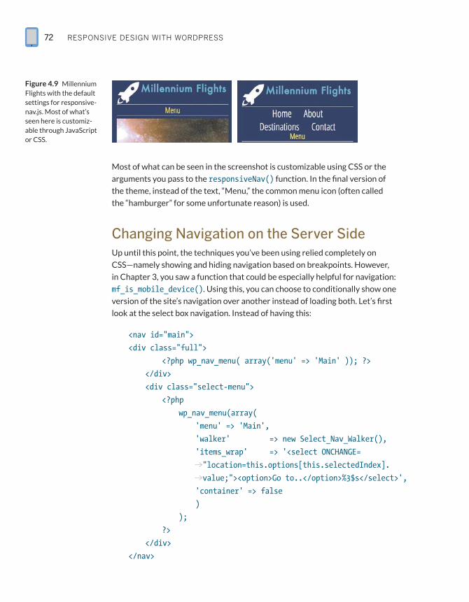
to refresh your page and see the results (Figure 4.9).
RESPONSIVE DESIGN WITH WORDPRESS72
Most of what can be seen in the screenshot is customizable using CSS or the
arguments you pass to the responsiveNav() function. In the final version of
the theme, instead of the text, “Menu,” the common menu icon (often called
the “hamburger” for some unfortunate reason) is used.
Changing Navigation on the Server SideUp until this point, the techniques you’ve been using relied completely on
CSS—namely showing and hiding navigation based on breakpoints. However,
in Chapter 3, you saw a function that could be especially helpful for navigation:
mf_is_mobile_device(). Using this, you can choose to conditionally show one
version of the site’s navigation over another instead of loading both. Let’s first
look at the select box navigation. Instead of having this:
<nav id=”main”>
<div class=”full”>
<?php wp_nav_menu( array(‘menu’ => ‘Main’ )); ?>
</div>
<div class=”select-menu”>
<?php
wp_nav_menu(array(
‘menu’ => ‘Main’,
‘walker’ => new Select_Nav_Walker(),
‘items_wrap’ => ‘<select ONCHANGE=
p”location=this.options[this.selectedIndex].
pvalue;”><option>Go to..</option>%3$s</select>’,
‘container’ => false
)
);
?>
</div>
</nav>
Figure 4.9 Millennium Flights with the default settings for responsive-nav.js. Most of what’s seen here is customiz-able through JavaScript or CSS.
makIng Your tHeme responsIve: Core Features 73
…we can have something much cleaner, and requiring much less CSS:
<nav id=”main”>
<?php
if(!ISMOBILE){
wp_nav_menu( array(‘menu’ => ‘Main’, ‘container_id’ =>
p‘top-menu’));
}else{
wp_nav_menu(array(
‘menu’ => ‘Main’,
‘walker’ => new Select_Nav_Walker(),
‘items_wrap’ => ‘<select ONCHANGE=
p”location=this.options[this.selectedIndex].
pvalue;”><option>Go to..</option>%3$s</select>’,
‘container’ => false
)
);
}
?>
</nav>
Notice there isn’t an extra class to hide one menu over the other. It simply says, “If the
user is not on a mobile device, print the normal menu. Otherwise, print the select box
menu.” This means the user isn’t downloading two sets of navigation, and you don’t
have to write extra CSS to hide or show that navigation based on breakpoints.
The same thing can be done with the Jump to or Footer Anchor approach.
In header.php, you’ll have:
<nav id=”main”>
<?php
if(!ISMOBILE){
wp_nav_menu( array(‘menu’ => ‘Main’,
p‘container_id’ => ‘top-menu’));
}else{
echo ‘<a href=”#footernav”>Jump to Nav</a>’;
}
?>
</nav>
NOTEWhen testing a
layout using RESS,
you won’t be able
to just resize your
browser window;
you will have to do
device testing.
RESPONSIVE DESIGN WITH WORDPRESS74
This is constructed just like the Select box code above, except there is a jump link
to the footer. And here is what the footer.php markup looks like:
<?php if(ISMOBILE){ ?>
<nav id=”footernav”>
<?php wp_nav_menu( array(‘menu’ => ‘Main’ )); ?>
</nav>
<?php } ?>
In the footer, you are checking to make sure the user is on a mobile device before
printing out the navigation.
Moving forward, we will be able to employ this technique in several other areas
of the theme. So with all of these techniques and more, how do you decide which
one to use?
Ask What’s Best for the UsersAs with just about anything in the field of web development (nay, design and
development in general), it’s best to ask what’s best for your users. In many cases,
that might be whatever takes up the least amount of screen real estate.
However, maybe your users would understand the navigation better if they saw
it all laid out in front of them. Maybe your users don’t realize what the “ham-
burger” icon is. The best thing to do is some research into how your users use
your website. Do some A/B testing, or at the very least, get the opinion of friends
and family. Ask your users for feedback. As with a lot of things in coding, simple is
probably better than clever.
To determine what’s best for your users, ask yourself a few questions:
RR From what class/type of devices do my users access the site?
RR Are my users there to see what’s on the home page, or do they usually go to a
different page?
RR What information do I want to present as most important?
RR How tech-savvy are my users?
And, as mentioned earlier, give them some options and see what works out best.
TIPIf you are having
issues implement-
ing RESS into your
theme or need some
added functionality,
Jesse Friedman’s
WP Mobile Detect
plugin is available in
the Plugin Reposi-
tory http://rwdwp.
com/35.
makIng Your tHeme responsIve: Core Features 75
Handling ImagesImages are one of the biggest sticking points for making a website truly respon-
sive; it’s not good enough to just resize them along with the layout or container.
There are a lot of tools and techniques out there to aid in better resizing, smaller
file sizes, faster loading, and more. What really helps is the way WordPress pro-
cesses uploaded images.
How WordPress Uploads ImagesBy default, when you upload an image, the WordPress media uploader creates
several different sizes: thumbnail (150x150px max), medium (300x300px max),
large (1024x1024px max), and full, which is the original size of the uploaded
image. You can also specify different sizes using the_post_thumbnail() or
get_the_post_thumbnail(), but this will only return an <img> tag with width and
height specified. If you want just an image URL, you can use wp_get_attachment_
image_src(), which returns an array with URL, width, height, and a Boolean; the
Boolean tells you if the image is a resized version (true) or the original (false).
Using SVG Images
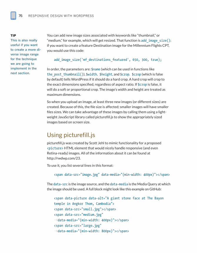
We won’t discuss Scalable Vector Graphics (SVG) extensively here because it’s not specific to WordPress, but it is a very good technique to use when it comes to scalable images. SVGs have no set pixel widths or heights associated with them (though there is a default width and height). Because of this, they scale well without losing quality, and even look great on Apple Retina displays. Using them is as easy as using the <img> tag, though there are some support issues, namely for IE 8 and below and Android 2.3 and below. Chris Coyier has a really great tutorial for getting started here: http://rwdwp.com/36. In order to allow SVG uploads in WordPress, you will also need this function (also courtesy of Chris Coyier):
function mf_allow_svg( $mimes ){
$mimes[‘svg’] = ‘image/svg+xml’;
return $mimes;
}
add_filter( ‘upload_mimes’, ‘mf_allow_svg’ );
RESPONSIVE DESIGN WITH WORDPRESS76
You can add new image sizes associated with keywords like “thumbnail,” or
“medium,” for example, which will get resized. That function is add_image_size();
if you want to create a feature Destination image for the Millennium Flights CPT,
you would use this code:
add_image_size(‘mf_destinations_featured’, 650, 300, true);
In order, the parameters are: $name (which can be used in functions like
the_post_thumbnail()), $width, $height, and $crop. $crop (which is false
by default) tells WordPress if it should do a hard crop. A hard crop will crop to
the exact dimensions specified, regardless of aspect ratio. If $crop is false, it
will do a soft or proportional crop. The image’s width and height are treated as
maximum dimensions.
So when you upload an image, at least three new images (or different sizes) are
created. Because of this, the file size is affected; smaller images will have smaller
files sizes. We can take advantage of these images by calling them using a light-
weight JavaScript library called picturefill.js to show the appropriately sized
images based on screen size.
Using picturefill.jspicturefill.js was created by Scott Jehl to mimic functionality for a proposed
<picture> HTML element that would nicely handle responsive (and even
Retina-ready) images. All of the information about it can be found at
http://rwdwp.com/23.
To use it, you list several lines in this format:
<span data-src=”image.jpg” data-media=”(min-width: 400px)”></span>
The data-src is the image source, and the data-media is the Media Query at which
the image should be used. A full block might look like this example on GitHub:
<span data-picture data-alt=”A giant stone face at The Bayon
temple in Angkor Thom, Cambodia”>
<span data-src=”small.jpg”></span>
<span data-src=”medium.jpg”
pdata-media=”(min-width: 400px)”></span>
<span data-src=”large.jpg”
pdata-media=”(min-width: 800px)”></span>
TIPThis is also really
useful if you want
to create a more di-
verse image range
for the technique
we are going to
implement in the
next section.
makIng Your tHeme responsIve: Core Features 77
<span data-src=”extralarge.jpg”
pdata-media=”(min-width: 1000px)”></span>
<!-- Fallback content for non-JS browsers. Same img src
pas the initial, unqualified source element. -->
<noscript>
<img src=”external/imgs/small.jpg” alt=”A giant stone face at
pThe Bayon temple in Angkor Thom, Cambodia”>
</noscript>
</span>
The first one is assumed to be for the smallest screens, and you can have as many
entries/Media Queries as you like. The GitHub page talks about various uses
before the basic example here, but this will serve us well.
As you might imagine, we can use this script along with the multiple image sizes
produced by WordPress’ Media Manager to automatically generate a picturefill
object that can be called in your themes:
function mf_get_featured_image($html, $aid=false){
$sizes= array(‘thumbnail’, ‘medium’, ‘large’, ‘full’);
$img= ‘<span data-picture data-alt=”’.get_the_title().’”>’;
$ct= 0;
$aid= (!$aid) ? get_post_thumbnail_id() : $aid;
foreach($sizes as $size){
$url= wp_get_attachment_image_src($aid, $size);
$width= ($ct < sizeof($sizes)-1) ? ($url[1]*0.66) :
p($width/0.66)+25;
$img.= ‘
<span data-src=”’. $url[0] .’”’;
$img.= ($ct > 0) ? ‘ data-media=”(min-width: ‘.
p$width .’px)”></span>’ :’></span>’;
$ct++;
}
RESPONSIVE DESIGN WITH WORDPRESS78
$url= wp_get_attachment_image_src( $aid, $sizes[1]);
$img.= ‘<noscript>
<img src=”’.$url[0] .’” alt=”’.
pget_the_title().’”>
</noscript>
</span>’;
return $img;
}
There are a few things going on here. The first is that the function has an array of all
the default sizes in WordPress. If you have your own sizes defined, you will have to
add them here. This is so the picturefill element is accurately populated. After some
setup (defining the image sizes, opening the picturefill element, initializing a coun-
ter), it moves through the $sizes, printing an image entry for each size.
For each entry, wp_get_attachment_image_src() is called to grab the URL of the
image based on the image’s ID (which get_post_thumbnail_id() returns based
on the post ID) and the size. wp_get_attachement_image_src() returns an array
that includes the image, the width, the height, and whether or not it’s cropped.
The first time through the Loop, we don’t need to specify a minimum width, since
that image will be a default. That’s where the counter comes in. For the rest of the
iterations, the width is calculated using a simple formula and an assumption. Let’s
look at that line again:
$width= ($ct < sizeof($sizes)-1) ? ($url[1]*0.66) :
p($width/0.66)+25;
What’s happening here in most cases is that we start showing the next image
size up at 66% the width of the image; so if the image is 1000px, it will start being
shown at 660px. However, if it is the last image in the array, the assumption is that
this is the biggest image (the image at full width). There are some strange results
returned in some cases with this image, so you can’t rely on the width and height
returned with the full width image. We simply take the previous image’s width
and add 25px to it.
The last thing this function does before returning the picturefill code is set a
default image in case JavaScript is disabled. The medium image is the default.
Since this plugin requires picturefill, one more task needs to be performed, and
that’s to actually add picturefill.js to the rest of the JavaScript loaded on the site.
Looking at the mf_scripts() we’ve used throughout the book, you’ll notice that
makIng Your tHeme responsIve: Core Features 79
the line wp_enqueue_script( ‘picturefill’, TEMPPATH.’/js/picturefill.
js’, array()); has already been added.
If you’d rather continue to use the_post_thumbnail() instead of a new function,
or if you want this to apply to all features images/instances of the_post_
thumbnail(), you can easily do that by adding this filter to your functions.php file:
add_filter( ‘post_thumbnail_html’, ‘mf_get_featured_image’);
It’s important to note that this function will not automatically run for all images
on pages and blog posts; this is strictly for getting featured post images. To
replace all post images would require content filters, as well as some regex magic
to replace the <img> tag with the picturefill script.
There is a plugin available that will replace content images with picturefill, located
at http://rwdwp.com/37. Based on my testing, it works fairly well, but you may see
performance issues. That said, this might be your best bet as what I was experi-
menting with returned worse performance than the plugin.
Moving forward, you can also use a shortcode, along with the above function.
I didn’t touch on the arguments the function accepts, but the first is $html; this
is the HTML send by the post_thumbnail_html filter. The second is $aid, for
attachment ID. This will allow you to call the function on any image you want,
not just featured ones.
The shortcode you’re going to create is [mf_image src=’path/to/image’]. This
is a shortcode that will accept a URL for an argument and print out the picturefill
markup for that image. The function that does the heavy lifting is a modified ver-
sion of one by wpmu.org (http://rwdwp.com/38) and is listed below, but first let’s
look at the function used for the actual shortcode:
function mf_responsive_image($atts, $content=null){
extract( shortcode_atts( array(
‘src’ => false
), $atts ) );
if(!$src){
return ‘’;
}else{
$aid= mf_get_attachment_id_from_src($src);
$img= mf_get_featured_image(‘’, $aid);
}
NOTETo support
featured images,
you will need to
add add_theme_support( ‘post-thumbnails’ );
to your functions.
php file.
RESPONSIVE DESIGN WITH WORDPRESS80
return $img;
}
add_shortcode(‘mf_image’, ‘mf_responsive_image’);
The function will check to make sure a URL is passed, then grab the ID for that
URL (that’s where wpmu.org’s function comes in) before passing that ID off to the
mf_get_featured_image function. It will then return the HTML generated. Here
is the function that grabs the attachment ID based on the URL:
function mf_get_attachment_id_from_src($url) {
global $wpdb;
$prefix = $wpdb->prefix;
$attachment = $wpdb->get_col($wpdb->prepare(“SELECT ID
pFROM “ . $prefix . “posts” . “ WHERE guid=’%s’;”, $url ));
return $attachment[0];
}
Between the shortcode and the featured image function, you have two good
methods for using picturefill and responsive images moving forward. Hopefully
an efficient way to do all images will emerge in the near future. In the mean-
time, there is another method that can be used to make images a bit more
responsive-friendly.
Overriding Set Width and HeightThis is a technique that Jesse Friedman put forth in his book, Web Designer’s Guide to WordPress. jQuery would allow us to search for all <img> tags in the content and
remove the set width and height attributes applied to images. This will, at the very
least, ensure that the images resize properly:
$(function(){
$(“.post img).removeAttr(“width”).removeAttribute(“height”);
}
You can add this function to your header (or even better, using add_action) and
enqueue jQuery, and you’re all set.
NOTEUnfortunately, the
shortcode means
you won’t be able
to use the media
uploader to insert
images into posts.
makIng Your tHeme responsIve: Core Features 81
CSS may also be used for the technique, though results may vary based on
custom posts, images, and other CSS rules; because of that, this code may need
to be tweaked:
img[class*=”align”],
img[class*=”wp-image-”] {
height: auto; }
img.size-full {
width: auto; }
Handling WidgetsSidebars and widgets are a staple of many sites, including those powered by
WordPress. The WordPress admin makes it incredibly easy for end users to
manage their own sidebars; however, it’s up to you to ensure that the sidebars
and widgets don’t break when it comes to responsive design. First, let’s look at
responsive sidebars.
The SidebarIt’s worth noting right off the bat that using the term sidebar (at least in this book)
doesn’t necessarily mean the physical location of this content. The sidebar can be
any auxiliary content. It just so happens that the main example of our sidebar is on
the right side.
Responsive sidebar development starts right at the beginning of the coding
process, in determining where in the markup the sidebar will go. It’s important to
structure and stack each column properly, especially when taking a Mobile First
approach to development; if we don’t, it might be the case that on small screens,
the sidebar shows first, and then the main content area.
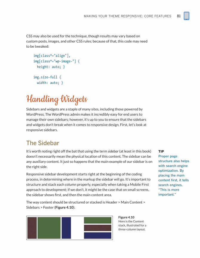
The way content should be structured or stacked is Header > Main Content >
Sidebars > Footer (Figure 4.10).
TIPProper page
structure also helps
with search engine
optimization. By
placing the main
content first, it tells
search engines,
“This is more
important.”
Figure 4.10 Here is the Content stack, illustrated for a three-column layout.
RESPONSIVE DESIGN WITH WORDPRESS82
The Millennium Flights site actually only has a right sidebar, so the structure of
things in the HTML will look like this:
<div id=”content” class=”group”>
<div class=”entry”>
<!--Content Goes Here-->
</div>
<aside class=”sidebar”>
<!--Widgets Go Here-->
</aside>
</div>
Notice that the div with the id “content” serves as a container for both the main
content area and the sidebar. The div “entry” will be for the site’s main content,
and the aside element will house the sidebar.
Since the sections are in the proper order, there is actually no CSS required for
smaller screens, layout wise. Any pre–Media Query styles will be strictly for some
padding, font adjustments, image aligning, and so on. However, once the screen
reaches a certain width, it’s time to move the entire sidebar up to the right, next
to the main content area. The CSS looks like this:
@media screen and (min-width: 40.625em){
#wrapper #content .entry{
float: left;
width: 66%;
}
#wrapper #content aside{
margin-left: 68%;
width: 30%;
}
If you’ve worked with non-fluid (or fixed) layouts, this should look familiar to you.
The main content area, .entry, is being floated to the left and limited to a width of
66%. The sidebar is then given a slightly larger margin and a width that accounts
for the extra spacing. As users expand out even more, we may want the sidebar
and content area to adjust further so the content and sidebar look proportionally
better compared to the width of the screen:
makIng Your tHeme responsIve: Core Features 83
@media screen and (min-width: 55.652em){
#wrapper #content .entry{
float: left;
width: 75%;
}
#wrapper #content aside{
margin-left: 78%;
width: 22%;
}
}
As you develop, it’s important to test and try different layouts along the way.
Remember—the breakpoints are based on content, not device! Do what’s best for
your own content.
That’s all we need as far as structural CSS goes for the sidebar. Of course, now
there is the question of handling widgets…
The .group Class
In order to ensure there is no runaway floating content without using the common .clearfix class, the .group class can be used. This technique was put forth by Dan Cederholm as a better alternative that cuts down on markup. The CSS looks like this:
.group:after {
content: “.”;
display: block;
height: 0;
clear: both;
visibility: hidden;
}
This will make the containing class “self-clearing” and alleviate the need for an empty container. It’s worth noting that the :after pseudo-class does not work in IE7 and below.
RESPONSIVE DESIGN WITH WORDPRESS84
Sidebar WidgetsA widget in WordPress is defined as adding features and content to sidebars.
Generally speaking, they are boxes placed outside the main content area that
can contain any kind of content—text, images, forms, and so on. As designers and
developers, we should plan to support these elements and more, as there are
hundreds (perhaps thousands) of widgets out there.
First, you must properly register your sidebars to use containers and class names
you assign. Here’s what’s added in the Millennium Flights theme:
register_sidebar( array (
‘name’ => __( ‘Sidebar’, ‘main-sidebar’ ),
‘id’ => ‘primary-widget-area’,
‘description’ => __( ‘The primary widget area’, ‘wpbp’ ),
‘before_widget’ => ‘<div class=”widget”>’,
‘after_widget’ => “</div>”,
‘before_title’ => ‘<h3 class=”widget-title”>’,
‘after_title’ => ‘</h3>’,
) );
register_sidebar( array (
‘name’ => __( ‘Sidebar2’, ‘secondary-sidebar’ ),
‘id’ => ‘secondary-widget-area’,
‘description’ => __( ‘The secondary widget area’, ‘wpbp’ ),
‘before_widget’ => ‘<div class=”widget”>’,
‘after_widget’ => “</div>”,
‘before_title’ => ‘<h3 class=”widget-title”>’,
‘after_title’ => ‘</h3>’,
) );
You can see that the same structure is used for both sidebars. Each widget gets
the class “widget,” and the titles are <h3> tags with the class “widget-title.” This
will allow you to apply general styles to HTML elements without them being over-
ridden by other plugins.
In the Millennium Flights theme, before any Media Queries, there are some basic
styles applied to elements you might find in a sidebar widget. These will also
optimize certain elements (like form fields) for touchscreen devices.
TIPWhen developing
your own plugins or
widgets for release,
use the least
amount of CSS
possible and make
it easily available
to theme editors
who might want to
change it.
makIng Your tHeme responsIve: Core Features 85
aside .widget h3{
margin-top: 0px;
color: #8E6DD7;
}
aside .widget{
border-bottom: 2px solid #FFFFFF;
margin: 10px 1.5%;
text-align: left;
padding: 5px 0.4%;
}
aside .widget p, aside .widget ul,
aside .widget ol, aside .widget dl{
margin: 0;
padding: 0;
font-size: 1.2em;
}
aside .widget li{
padding: 0;
margin: 0 0 0 1em;
list-style-type: none;
}
aside .widget input, aside .widget select{
margin: 1%;
padding: 7px;
font-size: 1.6em;
width: 100%;
border: 1px solid #CFCFCF;
-moz-border-radius: 10px;
-webkit-border-radius: 10px;
-o-border-radius: 10px;
border-radius: 10px;
}
RESPONSIVE DESIGN WITH WORDPRESS86
Then, as users move to larger screens, only slight adjustments are needed:
@media screen and (min-width: 40.625em){
aside .widget input[type=submit], aside .widget
input[type=button]{
margin: 0 auto;
padding: 3px;
font-size: 1.25em;
width: 40%;
}
footer aside .widget{
width: 30%;
margin: 10px 1.2%;
float: left;
text-align: left;
}
}
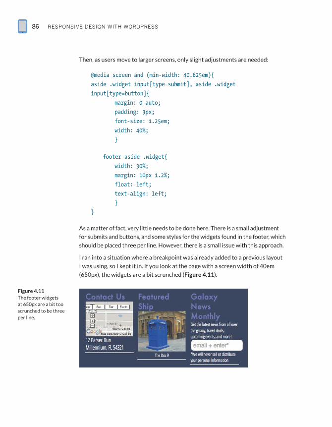
As a matter of fact, very little needs to be done here. There is a small adjustment
for submits and buttons, and some styles for the widgets found in the footer, which
should be placed three per line. However, there is a small issue with this approach.
I ran into a situation where a breakpoint was already added to a previous layout
I was using, so I kept it in. If you look at the page with a screen width of 40em
(650px), the widgets are a bit scrunched (Figure 4.11).
Figure 4.11 The footer widgets at 650px are a bit too scrunched to be three per line.
makIng Your tHeme responsIve: Core Features 87
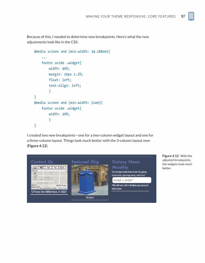
Because of this, I needed to determine new breakpoints. Here’s what the new
adjustments look like in the CSS:
@media screen and (min-width: 34.188em){
...
footer aside .widget{
width: 46%;
margin: 10px 1.2%;
float: left;
text-align: left;
}
}
@media screen and (min-width: 51em){
footer aside .widget{
width: 30%;
}
}
I created two new breakpoints—one for a two-column widget layout and one for
a three-column layout. Things look much better with the 3-column layout now
(Figure 4.12).
Figure 4.12 With the adjusted breakpoints, the widgets look much better.
RESPONSIVE DESIGN WITH WORDPRESS88
As you continue to add widgets to your theme, it’s important to consider
the following:
RR Is the widget properly coded? Will it use the HTML structure you defined
when registering the sidebars?
RR Does it come with its own complicated CSS? If it does, overriding styles
(especially if they are inline) might be a pain in the neck due to the need to
nest classes and be incredibly specific with your style selectors.
RR Does the author make the class names intuitive and easy to find (through
documentation)? If so, you’ll have an easier time styling for them.
If you properly plan and code consistently, you shouldn’t run into issues with your
widgets. Between the reset, default element styles, and default widget styles
discussed in this chapter, most bases should be covered.
Wrapping UpWe explored quite a bit in this chapter, from several navigation techniques using
Media Queries, RESS, and JavaScript to making our images respond to both
screen resolutions and connection speeds, as well as making the most out of our
sidebar widgets.
Images proved to be a tough task to tackle, but we can now replace featured
images automatically and post images with a shortcode. While images still remain
a bit of a question mark as far as the best way to replace in-content images on a
large scale due to some possible performance issues, what we looked at will at
least help you and your users moving forward. Trying to fix all images at load time
puts a lot of stress on the website that results in it being visibly slower. Hopefully
we will see this improved upon in the near future.
Since this chapter focused primarily on layout elements, in the next chapter we
will go back to WordPress’ roots and look at making elements of the blog por-
tion of a site responsive. Specifically, we’ll look at comments, archives, and other
developers’ plugins.
makIng Your tHeme responsIve: Core Features 89
Questions1. What is the biggest pitfall of the “Do Nothing” navigation approach?
2. When should RESS be employed in regard to navigation?
3. What does picturefill.js do?
4. How do you ensure content integrity as far as multicolumn layouts
are concerned?
Answers1. It will take up a lot of vertical space, pushing the content down the page.
2. RESS should be employed when we are hiding navigation/markup based on
screen width.
3. It replaces a single <img> with multiple image options, to be displayed based
on screen width.
4. Structure the columns so the main content is on top, followed by the sidebars.

This page intentionally left blank
RESPONSIVE DESIGN WITH WORDPRESS186
Index
<body> tag, 20Boilerplate, 135Bootstrap, 132–133, 134, 140brackets, xiiibradfrostweb.com, 185breakpoints, 3–8, 12, 143Brighthand.com, 7broadband connections, 125Browsershots, 126BrowserStack, 126browser testing, 119, 125, 126, 143Building WordPress Themes from Scratch
(Casabona), 19, 181business directories, 15, 27
CCalendar widget, 54camel case, xiiicaptions, 19, 48, 149–150Casabona, Joe, 181Casabona.org, 60, 103catalog pages, 167, 177categories, 24, 28, 115Categories widget, 115category.php page, 105Cederholm, Dan, 83child themes, 138–139, 140Chrome, 119, 125classes, CSS, xiii, 19, 47–55, 146.clearfix class, 83closing brackets, xiiiCMS, 26code
conflicts, 143designing, 122documenting, 122reusing, 122–129, 140testing, 122
Codex. See WordPress Codexcoding conventions, xiii, 118. See also
WordPress Codexcolumns, 81, 87, 89comment forms, 96–97, 100commenting systems, 93Comment Loading plugin, AJAX, 98–99, 118
- (dashes), xiii_ (underscores), xiii3G/4G connections, 125320press, 132
AA/B testing, 74actions, 31–32, 34add_image_size() function, 76Adobe Edge Inspect, 126AJAX Comment Loading plugin, 98–99, 118.aligncenter class, 49.alignleft class, 47, 49, 50.alignright class, 47, 49, 50alistapart.com, 185A List Apart webzine, 2, 12, 185Android, 2, 4, 7, 124An Event Apart, 184Apple, 7archive.php, 105archives, 103–118Archives by Date widget, 104–110archives.php, 21, 105–107, 110, 113Archives widget, 105archive templates, 105–106attachments, 27, 34author pages, 105Autocompleter plugin, 117Automattic, 137
Bbest practices
CSS, 18–19RWD, 2, 4, 182WordPress, 15, 18, 143
Beta Tester, WordPress, 128beta testing, 119, 125Big Web Show, 185Blackberry, 124Blazer, xiblog features, 92–120
handling archives, 103–118handling comments, 92–103
blog posts, 27. See also postsbody_class() function, 55
187Index
comment pagination, 98, 102comments, 92–103
counting, 103creating form for entering, 96–97creating page for, 101–103displaying photos with, 93incremental loading of, 98–101styles associated with, 50–52styling, 92–95and User Experience, 92
comments_number() function, 103comments page, 101–103commercial themes, 132Compact Archives plugin, 105, 107Compaq iPAQ, xcompressing files, 10–11conferences, 184connection speeds, 8–11, 125Contact Form 7, 161–167contact forms, 142, 161–167container argument, 66, 70content, separating features from, 14, 122content-based breakpoints, 5–8, 12Content Management Systems, 26content sliders, 154Content stack, 81Core, modifying the, 15, 29Coyier, Chris, 75CPTs
and CMSes, 26coding, 28creating new taxonomies for, 171frameworks/templates for, 28and functions.php, 19for image slider, 159–160meaning of acronym, 15planning, 28, 142for products page, 168, 170–176purpose of, 26registering, 28tips for developing, 28ways of using, 27, 28
creativebloq.com, 185Creative Market, 131, 140cropping images, 76CSS
adding to style.css, 145, 157, 178for aligning images, 19best practices, 18–19classes, xiii, 19, 47–55, 146coding conventions, xiii
consolidating into single file, 18for contact form, 165–166frameworks, 9, 127gzipping, 11license considerations, 32modifying, 145for photo gallery, 146–150and plugins, 118resets, 44for responsive forms, 161and RWD, 2for styling captions, 19vs. JavaScript, 41and WordPress site development, xi, 2
CSS-Tricks, 185custom logos, 19Custom Post Types, xii, 15. See also CPTs
DDamstra, David, 182Dashboard, 14dashes (-), xiiidata, storing, 32database errors, 128database tables, 32Date Archive widget, 115debugging, 128definition lists/tags, 149design patterns, 123Design Patterns: Elements of Reusable Object-
Oriented Software (Gamma), 123desktop systems, 5device detection, 19, 37, 38–40device testing, 123–124, 143Digging into WordPress blog, 53directories, 14–15, 27. See also foldersDisqus, 93documentation, 122, 143Dolphin, 119, 125“Do Nothing” navigation, 58–60, 89“Do Some Things” navigation, 60dot releases, 120, 128download speeds, 11
Ee-commerce sites, 29, 161, 168Edge Inspect, Adobe, 126Elegant Themes, 131, 140em-based breakpoints, 4–5, 12em-to-px conversion, 5
RESPONSIVE DESIGN WITH WORDPRESS188
end_el function, 64–65end_lvl function, 64enqueue_script() function, 143Envato, 130e-Readers, 124excerpts, 24, 25extract() function, 152, 178
FFacebook, 93featured images, 79, 80, 88, 159, 168, 169file-size considerations, 10, 41filters, 31–32, 34Firefox, 125fitvid.js, 41flexible text, 4, 5FlexSlider, 154, 156, 160Flickr, 144floating styles, 50folders, 29–30, 127. See also directoriesfont size, 4“Footer Anchor” navigation, 60–62, 66footer.php, 20–21, 74footer widgets, 86Forecast.io, 67form labels, 165, 166forms plugins, 161Foundation, 133–134, 140frameworks
CPT, 28CSS, 9, 127customizing, 134defining needs for, 126–129descriptions of popular, 132–139developing your own, 128–129, 139evolution of, 127–128sources of, 129–131testing, 139theme, 126–139WordPress, 129–139
Friedman, Jesse, viii–ix, 17, 74, 80, 181front-page.php, 21, 22Frost, Brad, 9, 58, 59, 124, 185FTP, xifunctions.php, 19, 45, 127
Ggallery, photo, 144–150gallery_shortcode function, 149gallery_style hook, 145
Gamma, Erich, 123Genesis, 136Gently Mad, 185get_footer() function, 20, 101, 107get_header() function, 20, 101, 107get_posts() function, 24, 25–26get_the_post_thumbnail() function, 159Ghostlab, 126Gingerbread phones, 124GitHub, xiv, 28, 37, 42, 101GNU General Public License, 32. See also GPLGoogle
Glass, 7, 180Maps, 150–153mobile devices, 7Web Fonts, 45, 127
GPL, 18, 30, 32, 131Gravatar, 93Gravity Forms, 161.group class, 83gzip, 10–11
H“hamburger” icon, 72, 74Happy Monday Podcast, 185have_posts() function, 24header.php, 20–21, 44–46, 66, 70, 73<head> tag, 20“Hello World” shortcode, 33“Hide and Cry” navigation, 59hierarchical data, 64home page, 21–22home.php, 21–22hooks, 19, 31–32HTC phones, 124HTML, xi, 2, 11, 41HTML5, xiii, 9, 127, 135, 137, 151
I#ids, xiiiIE, 9, 41, 46, 75, 83, 125if/else statements, 24image gallery, 144–150ImageOptim, 10images
aligning, 19, 47cropping, 76featured, 79, 80, 88, 159, 168, 169how WordPress uploads, 75–76license considerations, 32
189Index
limiting width of, 50managing, 144optimizing, 10overriding set width/height of, 80–81resizing, 10, 76, 80–81, 147, 175–176scalable, 75
Image Slider tutorial, 154–160<img> tag, 75Implementing Responsive Design (Kadlec), 183index.php, 16, 19, 21–22Internet Explorer. See IEiPad, 5, 7, 124iPAQ, xiPhone, xi, 5, 7, 124items_wrap argument, 66
JJavaScript
deciding when to include, 56and file size, 41gzipping, 11libraries, 9loading, 20and “Off Canvas” navigation, 67picturefill.js, 76–80placing comments on webpage with, 93responsive-nav.js, 68–72and RWD, xi, 41vs. HTML/CSS, 41
Jehl, Scott, xii, 76jQuery, 9, 20, 63, 67, 117, 138Jumbotron, 133“Jump To” navigation, 60–62, 63
K–LK2 theme, 126Kadlec, Tim, 183Kindle, 7, 124labels, form, 165, 166layouts
multicolumn, 81, 87, 89non-fluid/fixed, 82responsive, 42–46testing, 83
lazy loading, 36Lifehacker, 124lightbox, 145links, 180, 185. See also permalinkslogin screens, 19logos, 19
Loops, 23–26lukew.com, 185
MMain Loop, 24, 26Map Page tutorial, 150–153Marcotte, Ethan, 2, 5, 12, 182Masonry, jQuery, 138Media Manager, 144Media Queries, 3–4, 19, 36, 55, 125Media Uploader, 144, 145meetups, 184menu icon, 72menus. See navigation menusmfp_register() function, 170–171mfs_get_slider() function, 158Microsoft Xbox, 7Millennium Flights
Archive by Date section, 109comments page, 102custom CSS, 44default styles, 48Destinations CPT, 27footer.php, 20–21header.php, 44–46HTML Template, 42navigation menus, 58–72sidebar, 82, 84–88
minifying files, 10, 41mobile browsers, 119mobile devices. See also specific devices
detecting, 38–40hiding navigation from, 59popularity of, ix, 3screen size/resolution, 7testing design on multiple, 119, 124
Mobile First (Wroblewski), 10, 183“Mobile First” design, 9–10, 81, 125modifying the Core, 15, 29Motorola phones, 124muleradio.net, 185Mullenweg, Matt, 32multicolumn layouts, 81, 87, 89MySQL, xi
N–Onavigation.js, 137navigation menus
adding smooth scrolling to, 63changing on server side, 72–74
RESPONSIVE DESIGN WITH WORDPRESS190
navigation menus (continued )creating, 58–72and functions.php file, 19getting user feedback on, 74hiding from mobile users, 59, 89managing, 27testing, 74
.net magazine, viii, 131, 185NextGen Gallery, 149Nexus phone, 7, 124Ninja Forms, 161“Off Canvas” navigation, 67–68Off Canvas website, 68online resources, 184–185Open Device Labs, 119, 123, 125open source software, 32, 128, 129Opera/Opera Mini, 119, 125optimizing images, 10options functions, 32
Ppages
applying styles to specfic, 55as WordPress post types, 27
page structure, 81, 89page weight, 11pagination, comment, 98, 102Palm devices, x–xiparent themes, 138–139, 140permalinks, 23, 24, 25, 107Photo Gallery tutorial, 144–150PHP, xi, xiii, 19, 128, 152, 178phpdoc, 143picturefill.js, 41, 76–80, 89, 159, 160pixel-based breakpoints, 4pixel-to-em conversion, 5Plugin Directory, WordPress, 149, 161Plugin Repository, 74plugins, 29–32
autocomplete, 117choosing responsive-friendly, 117–119coding conventions, 30defining, 30, 155developing your own, 84documenting, 143forms, 161free vs. commercial, 132and GPL, 32guidelines for developing, 118, 142keeping CPTs in separate, 28loading information from, 20
loading too many, 118photo gallery, 149purpose of, 29storing data for later use, 32vs. themes, 14–15and WordPress Codex, 15
Plugins area, WordPress admin, 29/plugins/ directory, 14podcasts, 185polyfills, 41, 55portfolios, 142, 173post_class() function, 55posts
applying styles to specfic, 55displaying, 24, 25listing by date, 54modifying, 25
post types, 27, 34prices, product, 172, 173, 174print.css, 18, 19Products Page tutorial, 167–177Professional WordPress: Design and
Development (Williams et al.), 182progress bars, 113px-to-em conversion, 5
Q–Rquery_posts() function, 25, 34, 107Reading settings, WordPress admin, 22README file, 143real estate listings, 28register_post_type() function, 28register_taxonomy() function, 28remote code inspection, 126Resizer, Window, 6resizing images, 10, 76, 80–81, 147,
175–176resolution, screen, 5, 7–8, 19respond.js, 41Responsive Design + Server Side
Components, xiv, 56. See also RESSresponsive frameworks, 129, 132–139, 140responsive layout, 42–46Responsive Nav home page, 69responsive-nav.js, 68–72, 137Responsive Nav script, 41responsive.rga.com, 185“Responsive” theme, 130Responsive Web Design
best practices, 2, 4, 182books about, 182–183
191Index
breakpoints, 3–8, 12, 143and connection speeds, 8–11image-handling techniques, 75–81importance of learning, ixand JavaScript (See JavaScript)and Media Queries (See Media Queries)navigation techniques, 58–74origins of, 2–3purpose of, xiresources, 180–185and RESS, 37–40 (See also RESS)testing, 119tutorials, 144–177widgets, 81–88
Responsive Web Design (Marcotte), 182RESS, xiv, 37–40, 55, 56, 73, 89reuse, software, 122–129, 140revisions, 27RFPs, 123Rieger, Stephanie, 4, 5RIOT, 10roundups, 131, 140RSS widget, 19RWD, xiv. See also Responsive Web Designrwdwp.com, xiv, 180, 185
SSaaS, 132Safari, 125Samsung Galaxy phones, 7, 124Scalable Vector Graphics, 75ScientiaMobile, 19screen resolution, 5, 7–8, 19screenshots, 18, 126screen size, 7scripts, 20, 41, 143, 156–160. See also
JavaScriptscroll effect, jQuery, 63SearchAutocomplete plugin, 117search bars, 116search engine optimization, 81search forms, 54search function, 104, 117search results page, 21Search widget, 116Secondary Loop, 24security patches, 120“Select Box” navigation, 62–67, 72–73Select_Nav_Walker class, 64, 66separation of concerns, 14, 122, 140
Server Side Components, xivserver-side device detection, 19, 37Settings>Permalinks section, WordPress
admin, 23setup_postdata() function, 26SFTP, xiShop Talk Show, 185shortcode
for image slider, 157–158for map page, 151–153for products page, 168–170purpose of, 29, 33
shortcode_atts() function, 152sidebars, 19, 53, 81–88Skins, 136sliders, xii, 156–160smartphones, x–xi, 7, 124. See also specific
devicesSmashing Magazine, viii, 131, 185Software as a Service, 132software reuse, 122–129, 140Sony mobile devices, 7spec docs, 123Speedtest app, 11speed testing, 11, 119, 125start_el function, 64–65start_lvl function, 64StatCounter, 8Stern, Hal, 182Storage APIs, xiiistoring data, 32StudioPress, 136style.css, 16, 18–19, 42, 70, 138SVG images, 75Swappa, 124
Ttabular data, 105tag clouds, 110–115Tag Cloud widget, 114tag pages, 105tags, 18, 28, 115. See also template tagstaxonomies, 28, 32, 171Template Hierarchy, 17, 21templates
archive, 105–106CPT, 28fallback structure for, 17serving up device-based, 19
template tags, 23, 24–25, 32, 149, 157–158, 168–170
RESPONSIVE DESIGN WITH WORDPRESS192
testingautomated multi-device, 126browser, 119, 125, 126, 143code, 122–123device, 123–124, 143frameworks, 139layouts, 83navigation menus, 74speed, 119, 125websites, xiv, 119
text fields, 28text size, 4The Codex. See WordPress Codexthe_content() function, 19, 25the_excerpt() function, 25thegentlymad.com, 185theme development, 15–34. See also themes
Custom Post Types, 26–28 (See also CPTs)Loops, 23–26template structure, 16–22
ThemeForest, 130–131, 140theme frameworks, 126–140. See also
themescustomizing, 134defining needs for, 126–127descriptions of popular, 132–139developing your own, 128–129, 139evolution of, 127–128free vs. commercial, 132sources of, 129–131testing, 139
themesapplying general templates to, 42–46default WordPress, 137defined, 16defining needs for, 126–127documenting, 143feature-loading, 15free vs. commercial, 132and GPL, 32making searchable, 18modifying, 139, 140pages required for, 16removing functionality from, xiisimple boilerplate, 42sources of, 129–131using child/parent, 138–139vs. plugins, 14–15what to include in, 142and WordPress Codex, 15
Themes directory, 135/themes/ directory, 14
the_permalink() function, 25the_post() function, 24Thesis, 135–136This Is Responsive, 185thumbnails, 19, 75, 76, 159, 176titles, 24“Top Nav” navigation, 58–60touchscreen devices, 84Treo, x–xitrolls, 92“’Trouble’ with Android, The,” 4tutorials, 142–177
autocomplete feature, 117child themes, 138comment form, 97contact form, 161–167image slider, 154–160map page, 150–153photo gallery, 144–150products page, 167–177
Tuts+, 185tutsplus.com, 138, 185tweets, 31. See also TwitterTwenty Fourteen theme, 138Twenty Ten theme, 146Twenty Thirteen theme, 137–138Twitter, 93, 132
U–Vunderscores (_), xiiiUnderscores framework, 137updates, WordPress, 120URLs, 23, 107. See also permalinksUser Agent detection, 36, 40User Experience (UX), 41, 58, 92, 104variables, 32, 152, 155
W–Zwalker argument, 66Walker_Nav_Menu class, 64Weaver, Jason, 68web browsers, testing on multiple, 119,
125, 126, 143Web Designer’s Guide to WordPress
(Friedman), viii, 17, 80, 181Web Fonts, Google, 45, 127websites
controlling how they’re viewed, xicreating custom home page for, 21–22creating responsive, xii (See also
Responsive Web Design)
193Index
and download speeds, 11e-commerce, 29lazy loading of, 36Millennium Flights (See Millennium
Flights)“Mobile First” approach to designing,
9–10, 81optimal load time for, 9popularity of WordPress for powering, viiipresenting products on, 167search considerations, 116–117testing, xiv, 119, 122–126URL for this book’s, xiv, 180, 185WordPress resources, 185
Web Sockets, xiiiwidgets, 52–54, 81–88Williams, Brad, 182Window Resizer, 6Windows Phone, 124Wireless Universal Resource FiLe, 37, 56.
See also WURFLsWooThemes, 117, 131, 140WordCamp Central, 184WordPress
APIs, 15best practices, 15, 18, 143Beta Tester, 128blog features, 92–120books about, viii, 17, 19, 181–182as CMS, 26Codex (See WordPress Codex)comments, 50–52 (See also comments)core features, 58–89creating responsive websites with, xii
(See also Responsive Web Design)Dashboard, 14default CSS classes, 47–55directories, 14–15and download speeds, 11extending functionality of sites created
with, 29frameworks, 129–140and GPL, 32installing betas/nightly releases of, 128Loops, 23–26Media Manager, 144Media Uploader, 144, 145native post types, 27as open source software, 32page URLs in, 23Plugin Directory, 149, 161
popularity of, viii, ix, xiresources, 180–185search feature, 117separation of content/function, 14, 122and SVG images, 75Template Hierarchy, 17, 21themes (See themes)tutorials (See tutorials)updating, 120widgets, 52–54
WordPress adminPlugins area, 29Reading settings, 22Settings>Permalinks section, 23Themes/Appearance section, 18
WordPress Codexand CPTs, 28, 171and CSS, 18, 19, 118and database tables, 32and hooks, 31and Loops, 23, 24, 25and page URLs, 23and plugins, 118purpose of, xiv, 15and query_post() function, 25and template tags, 24
WordPress directory, 129–130, 143WordPress for Web Developers (Leary), 182WordPress.org, 129, 140WP-Bootstrap, 132.wp-caption class, 48, 49–50wp-comments-page plugin, 101/wp-content/ directory, 14, 15/wp-content/plugins directory, 29WP e-commerce, 168wp_enqueue_script() function, 20, 46, 69,
79, 156, 178wp_footer() function, 20wp_head() function, 20, 21wp_is_mobile() function, 38–40WP Mobile Detect plugin, 74wpmu.org, 129, 134wp_nav_menu() function, 66WP_Query() function, 24, 25–26wp_tag_cloud() function, 110WPTuts+, 117Wroblewski, Luke, 7, 10, 68, 183, 185WURFLs, 37, 40, 56ZURB, 133
![Index [ptgmedia.pearsoncmg.com]ptgmedia.pearsoncmg.com/images/0131443305/index/0131443305_ind… · WebSphere Portal, 439-440 WebSphere with Lotus Collaboration, 7-12, 91 built-in](https://img.pdfslide.us/doc/110x75/5ac3013b7f8b9a2b5c8b65c0/index-websphere-portal-439-440-websphere-with-lotus-collaboration-7-12.jpg)
![Index [ptgmedia.pearsoncmg.com]ptgmedia.pearsoncmg.com/images/9780789736925/index/0789736926... · Advertising templates, 13 Alert component, adding, 400-401 alignment with guide](https://img.pdfslide.us/doc/110x75/5ad5175e7f8b9a075a8c7946/index-templates-13-alert-component-adding-400-401-alignment-with-guide-layers.jpg)
![Index [ptgmedia.pearsoncmg.com]ptgmedia.pearsoncmg.com/.../samplechapter/0321278542_Index.pdf · / character, 1156, 1533 ^ character, ... Accelerometer data, 1297–1303 Accent, 17–18,](https://img.pdfslide.us/doc/110x75/5b4fe1c87f8b9a5a6f8d56a9/index-character-1156-1533-character-accelerometer-data-12971303.jpg)
![Index [ptgmedia.pearsoncmg.com]ptgmedia.pearsoncmg.com/.../index/0321503104_Index.pdf · Index Abbot framework, 312–317 ... EJB3, 236 and JNDI, 190, 210 Spring framework, 271–272](https://img.pdfslide.us/doc/110x75/5ae0305e7f8b9ab4688d030d/index-abbot-framework-312317-ejb3-236-and-jndi-190-210-spring-framework.jpg)
![INDEX [ptgmedia.pearsoncmg.com]ptgmedia.pearsoncmg.com/images/0201844532/index/cooperindex.… · CommandMenu class, 260 Command objects, 256–257, 259, 261, 277 building, 257–259](https://img.pdfslide.us/doc/110x75/5f0e066f7e708231d43d3f4d/index-commandmenu-class-260-command-objects-256a257-259-261-277-building.jpg)
![Index [ptgmedia.pearsoncmg.com]ptgmedia.pearsoncmg.com/images/9780132354806/index/0132344483... · Actions/ folder, 87, 99–100, 217 actionsGlobalContext() method, 62–65, 128–129,](https://img.pdfslide.us/doc/110x75/5a9eafd77f8b9a76178bb68c/index-folder-87-99100-217-actionsglobalcontext-method-6265-128129.jpg)
![Index [ptgmedia.pearsoncmg.com]ptgmedia.pearsoncmg.com/images/0321382188/index/beauchemin_index.pdf · Index 965 A Abort method, 34 AbstractCollectionBase property, 800 Access client,](https://img.pdfslide.us/doc/110x75/5ebd1b9d0e59b25a4617a60f/index-index-965-a-abort-method-34-abstractcollectionbase-property-800-access.jpg)
![INDEX [ptgmedia.pearsoncmg.com]ptgmedia.pearsoncmg.com/images/1587201356/index/1587201356index.pdfINDEX Symbols & Numerics | (pipe), 182 3DES (Data Encryption Standard), 250 10Base2,](https://img.pdfslide.us/doc/110x75/5e38c3bdc963a75897555c88/index-index-symbols-numerics-pipe-182-3des-data-encryption-standard.jpg)
![Index [ptgmedia.pearsoncmg.com]ptgmedia.pearsoncmg.com/images/9780130449689/index/01304496… · Index A ad hoc paths, 371 adaptive serializers, 509–512 addPort method (Service),](https://img.pdfslide.us/doc/110x75/5ece26abcebd7c0f84040f05/index-index-a-ad-hoc-paths-371-adaptive-serializers-509a512-addport-method.jpg)

![Index [ptgmedia.pearsoncmg.com]ptgmedia.pearsoncmg.com/images/0321174046/index/yaoindex.pdf · Connected approach, ADO.NET, 800–801 Connections database connectivity, 910–912](https://img.pdfslide.us/doc/110x75/5f30ed544ee386719c70bf6b/index-connected-approach-adonet-800a801-connections-database-connectivity.jpg)
![Index [ptgmedia.pearsoncmg.com]ptgmedia.pearsoncmg.com/images/0321437381/index/poppendieck_… · C cadence asynchronous, example, 109 cycle time reduction, 108–109 establishing,](https://img.pdfslide.us/doc/110x75/5ebf8d9f510079707b2f9127/index-c-cadence-asynchronous-example-109-cycle-time-reduction-108a109-establishing.jpg)
![Index [ptgmedia.pearsoncmg.com]ptgmedia.pearsoncmg.com/images/0201787911/index/gongindex.pdf · generateCertificate method 201, 225 generateCertificates method 201, 225 generateCertPath](https://img.pdfslide.us/doc/110x75/5f060d677e708231d4160d45/index-generatecertificate-method-201-225-generatecertificates-method-201-225.jpg)
![INDEX [ptgmedia.pearsoncmg.com]ptgmedia.pearsoncmg.com/images/013100851X/index/... · 2009. 6. 9. · Classes (.NET) cryptography and security capabilities, 8 cryptography programming,](https://img.pdfslide.us/doc/110x75/5fec284d0194f9301437c3f9/index-2009-6-9-classes-net-cryptography-and-security-capabilities-8.jpg)
![index [ptgmedia.pearsoncmg.com]ptgmedia.pearsoncmg.com/images/0131875086/index/Quigley_Index.pdfALTER command, 631 ALTER TABLE statement, 620, 631–633 Alternation, metacharacters](https://img.pdfslide.us/doc/110x75/5f1a03d6a4800e15f930a24e/index-alter-command-631-alter-table-statement-620-631a633-alternation.jpg)
![Index [ptgmedia.pearsoncmg.com]ptgmedia.pearsoncmg.com/images/0131456938/index/...Index 641 authentication with pam_ldap, 274 authentication with pam_unix, 177, 273 authentication,](https://img.pdfslide.us/doc/110x75/5e90eaa9baa01c25b64f495a/index-index-641-authentication-with-pamldap-274-authentication-with-pamunix.jpg)
![INDEX [ptgmedia.pearsoncmg.com]ptgmedia.pearsoncmg.com/images/0131481045/index/0131481045_index.pdfDragon scenario; Death of a Teleco mmuter scenario; ... Information Security Magazine,](https://img.pdfslide.us/doc/110x75/5ada28c87f8b9a86378cfb93/index-scenario-death-of-a-teleco-mmuter-scenario-information-security.jpg)
![INDEX [ptgmedia.pearsoncmg.com]ptgmedia.pearsoncmg.com › images › 020172149X › index › v... · See also Site branding Brand space, balancing with navigation space, 230–232](https://img.pdfslide.us/doc/110x75/5f0f8a677e708231d444abe5/index-a-images-a-020172149x-a-index-a-v-see-also-site-branding.jpg)
![Index [ptgmedia.pearsoncmg.com]ptgmedia.pearsoncmg.com/images/0201721481/index/lippman_index.pdf · “primer” — 2005/1/19 — 18:36 — page 843 — #865 Index Bold face numbers](https://img.pdfslide.us/doc/110x75/5aab92077f8b9a8d678bf98b/index-primer-2005119-1836-page-843-865-index-bold-face.jpg)
![Index [ptgmedia.pearsoncmg.com]ptgmedia.pearsoncmg.com/images/0130473944/index/...Index 1053 evaluation of, 290–291 with interrupted isothermal operation, 599–605 journal critique](https://img.pdfslide.us/doc/110x75/5ea000e9f069200b9d4c11e4/index-index-1053-evaluation-of-290a291-with-interrupted-isothermal-operation.jpg)
![Index [ptgmedia.pearsoncmg.com]ptgmedia.pearsoncmg.com/images/0201750775/index/staronindex.pdf · Business analysis, and Oracle Windows installation, 76 Business opportunity, 39-49](https://img.pdfslide.us/doc/110x75/5f93a2bb7cdc6c721b25751e/index-business-analysis-and-oracle-windows-installation-76-business-opportunity.jpg)
![INDEX [ptgmedia.pearsoncmg.com]ptgmedia.pearsoncmg.com/images/1587201216/index/... · DDoS (distributed denial of service) attacks, 19–21 detecting, 77 domain name hijackings, 19](https://img.pdfslide.us/doc/110x75/600ea46f02d4827f9244f929/index-ddos-distributed-denial-of-service-attacks-19a21-detecting-77-domain.jpg)
![Index [ptgmedia.pearsoncmg.com]ptgmedia.pearsoncmg.com/images/0201729156/index/kanindex.pdfCertification, ISO standard, 414 Changed source instructions (CSI), 91 Check sheets. See](https://img.pdfslide.us/doc/110x75/5edb0ea609ac2c67fa68bd79/index-certification-iso-standard-414-changed-source-instructions-csi-91.jpg)
![index [ptgmedia.pearsoncmg.com]ptgmedia.pearsoncmg.com/.../samplechapter/0789736063_Index.pdf · ActiveX Data Objects (ADO), 825 ... add-ins. See also Business Contact Manager; COM](https://img.pdfslide.us/doc/110x75/5abee6177f8b9ab02d8d81eb/index-data-objects-ado-825-add-ins-see-also-business-contact-manager.jpg)

![Index [ptgmedia.pearsoncmg.com]ptgmedia.pearsoncmg.com/images/9780321246424/index/03212464… · NSIS script, 214 ComplexProgramTarget macro, 116 component element, 498 composite](https://img.pdfslide.us/doc/110x75/5e9ecae8e04f1640c13ae129/index-nsis-script-214-complexprogramtarget-macro-116-component-element-498.jpg)
![Index [ptgmedia.pearsoncmg.com]ptgmedia.pearsoncmg.com/images/0201700476/index/hendersonindex.… · Index 1001 CLOSE command, cursor variables, ... xxxii–xxxiii ... 439–441 source](https://img.pdfslide.us/doc/110x75/5aa67a817f8b9a185d8ea983/index-index-1001-close-command-cursor-variables-xxxiixxxiii-439441.jpg)
![Index [ptgmedia.pearsoncmg.com]ptgmedia.pearsoncmg.com/images/0131467484/index/... · Cultural Revolution, 33, 63, 73 currencies Chinese yuan, 13-14 Japanese yen, 13-14 realigning](https://img.pdfslide.us/doc/110x75/5f3cf647b7ce7529ba0e9a97/index-cultural-revolution-33-63-73-currencies-chinese-yuan-13-14-japanese.jpg)

![Index [ptgmedia.pearsoncmg.com]ptgmedia.pearsoncmg.com/images/9780201895513/index/020189551X... · Index Page numbers ... in weather monitoring system, 467 Access, ... Action abstraction,](https://img.pdfslide.us/doc/110x75/5b782e577f8b9ade548ba158/index-index-page-numbers-in-weather-monitoring-system-467-access-.jpg)