Embed Size (px)
DESCRIPTION
Final Issuu Portfolio
Citation preview

C L A S S C AT E G O R Y
1
P R O J E C T

P O R T F O L I OD E N I S A T R E N K L E
T I T L E
2
© Den i s a Trenk le
A l l r ight s re ser ved
No pa r t of th i s book may be u sed or reproduced in any manner w ithout
a w r it ten perm i s s ion f rom the author, except i n the contex t of rev iews .
Ever y re a sonab le a t t empt h a s been made to ident i f y owner s o f
copy r ight . Er ror s or om i s s ion s w i l l be cor rec ted in subsequent ed it ion s .
Wr it ten , de s igned and produced by :
Denisa Trenk le den i s a .t renk le @ gma i l .com
Academy of A r t Un iver s i t y
79 New Montgomer y St reet , San Fr anc i sco, CA 94105
Depa r tment Di rec tor Ph i l Ham let t

SEL ECT E D WOR K S OF DEN ISA T R EN K L E
C L A S S C AT E G O R Y
3
P R O J E C T

P O R T F O L I OD E N I S A T R E N K L E
T I T L E
4

C L A S S C AT E G O R Y
5
P R O J E C T
Page 06 - 31
Design Your Cit y
Page 32 - 61
Oddly Ever A f ter
Page 62 - 83
Seven Eleven Re-branded
Page 84 - 99
Memor ies of Faraway
Page 100 - 107
Postcards From Ita ly
Page 108 - 117
Exper imenta l Type
Page 118 - 131
Luc in i Oi l & Vinega r
Page 132 - 141
Lost in the Land
Page 142 - 149
Urban Travel Tag
Page 150 - 155
A Fancy Guide to Ser i f s
Page 156 - 161
We Used To Wait
Page 162 - 173
Urban Reviva l
TA B L E OF CO N T E N T S

D E S I G N YO U R C I T Y
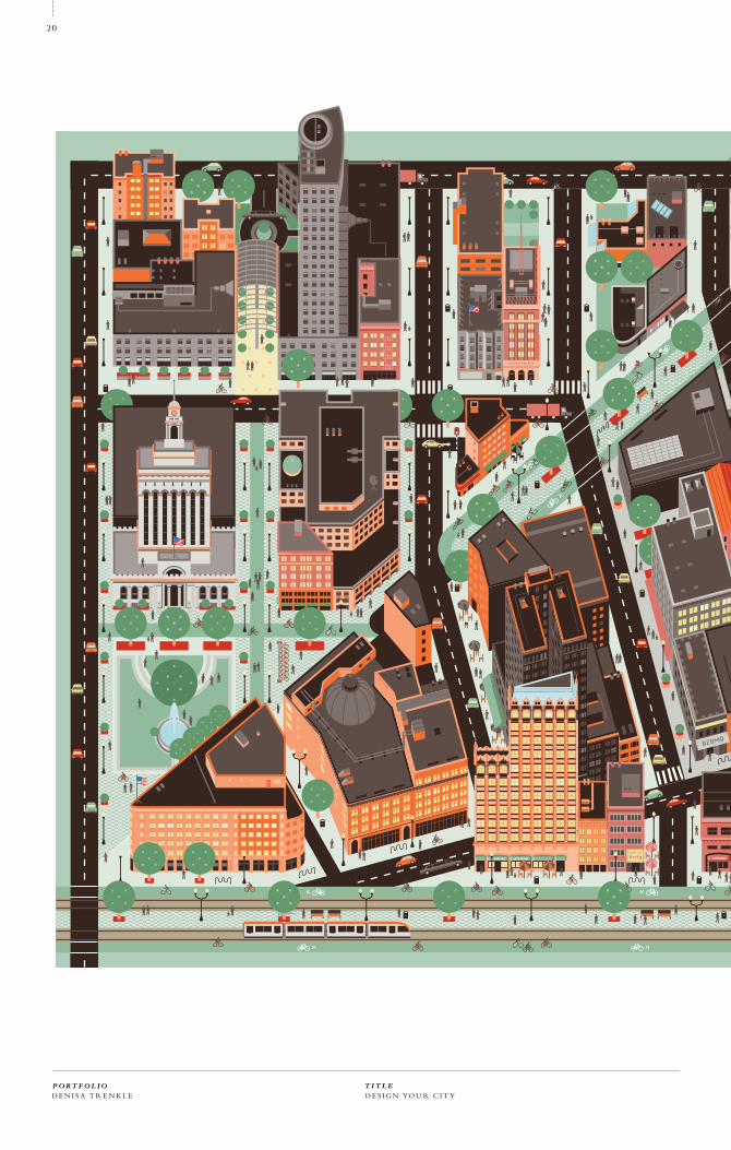
Design Your City is an educational, inspirational, and empowering guide to making your city a
more rewarding place to live and work. Design Your City will help you envision a city where
you don’t need a car, because public transit and pedestrian space are pleasant. A city where the
parks are plentiful and safe, and biking is easier than driving.
Design Your City is a fully fledged package which educates, inspires, and empowers. A Thesis
Book and Urban Dictionary educate you in the tenets of good urbanism – what makes the scale
of a street feel inviting? How does “soft policing” contribute to public safety? What is the proper
pr ice of parking? Severa l pieces inspire by presenting either idea l ized versions of rea l ity—
a dream of what Oakland could be with the Ideal Oakland Map – or how other cities present
examples of good urbanism with the Most Livable Cities book and Postcards. Finally, once you
are inspired and educated, Design Your City empowers you to make your city what could be it.
P O R T F O L I OD E N I S A T R E N K L E
T I T L E
6
DESIGN YOUR CITY 01/11
OBJECTIVE
CONCEPT
2 011

D I R E C T E D S T U D Y P R I N T, W E B , PAC K AG I N G M A S T E R S T H E S I SC L A S S C AT E G O R Y
7
P R O J E C T

D E S I G N YO U R C I T YP O R T F O L I OD E N I S A T R E N K L E
T I T L E
8

Title
Design Your Cit y
Date
Spr ing 2010 - present
Title
Academic
Class
Directed Study
Instructor
Phi l Hamlet t
Egon Terplan (urban planner)
Br ian Singer (g raphic designer)
Format
Books
Poster s
Web site
Smar t phone appl icat ion
Col latera l
Typography
Tungsten, Archer, Rockwel l
Mater ials
MOAB Entrada
EPSON ink
Photography taken
by Denisa Trenk le
Jana Benjamin Navrat i lova
Fl ickr photography
I l lust rat ion by designer
and by Odeh A. Amar in
D I R E C T E D S T U D Y P R I N T, W E B , PAC K AG I N G M A S T E R S T H E S I SC L A S S C AT E G O R Y
9
P R O J E C T
PRO J EC T N U M B E R
DAT E
01/11
2 011

D E S I G N YO U R C I T YP O R T F O L I OD E N I S A T R E N K L E
T I T L E
10

D I R E C T E D S T U D Y P R I N T, W E B , PAC K AG I N G M A S T E R S T H E S I SC L A S S C AT E G O R Y
11
P R O J E C T

D E S I G N YO U R C I T YP O R T F O L I OD E N I S A T R E N K L E
T I T L E
12

D I R E C T E D S T U D Y P R I N T, W E B , PAC K AG I N G M A S T E R S T H E S I SC L A S S C AT E G O R Y
13
P R O J E C T

D E S I G N YO U R C I T YP O R T F O L I OD E N I S A T R E N K L E
T I T L E
14

D I R E C T E D S T U D Y P R I N T, W E B , PAC K AG I N G M A S T E R S T H E S I SC L A S S C AT E G O R Y
15
P R O J E C T

D E S I G N YO U R C I T YP O R T F O L I OD E N I S A T R E N K L E
T I T L E
16

D I R E C T E D S T U D Y P R I N T, W E B , PAC K AG I N G M A S T E R S T H E S I SC L A S S C AT E G O R Y
17
P R O J E C T

D E S I G N YO U R C I T YP O R T F O L I OD E N I S A T R E N K L E
T I T L E
18

D I R E C T E D S T U D Y P R I N T, W E B , PAC K AG I N G M A S T E R S T H E S I SC L A S S C AT E G O R Y
19
P R O J E C T
D E S I G N YO U R C I T YP O R T F O L I OD E N I S A T R E N K L E
T I T L E
20

D I R E C T E D S T U D Y P R I N T, W E B , PAC K AG I N G M A S T E R S T H E S I SC L A S S C AT E G O R Y
21
P R O J E C T

D E S I G N YO U R C I T YP O R T F O L I OD E N I S A T R E N K L E
T I T L E
22

D I R E C T E D S T U D Y P R I N T, W E B , PAC K AG I N G M A S T E R S T H E S I SC L A S S C AT E G O R Y
23
P R O J E C T

D E S I G N YO U R C I T YP O R T F O L I OD E N I S A T R E N K L E
T I T L E
24

D I R E C T E D S T U D Y P R I N T, W E B , PAC K AG I N G M A S T E R S T H E S I SC L A S S C AT E G O R Y
25
P R O J E C T

D E S I G N YO U R C I T YP O R T F O L I OD E N I S A T R E N K L E
T I T L E
26

D I R E C T E D S T U D Y P R I N T, W E B , PAC K AG I N G M A S T E R S T H E S I SC L A S S C AT E G O R Y
27
P R O J E C T

D E S I G N YO U R C I T YP O R T F O L I OD E N I S A T R E N K L E
T I T L E
28

D I R E C T E D S T U D Y P R I N T, W E B , PAC K AG I N G M A S T E R S T H E S I SC L A S S C AT E G O R Y
29
P R O J E C T

D E S I G N YO U R C I T YP O R T F O L I OD E N I S A T R E N K L E
T I T L E
30

D I R E C T E D S T U D Y P R I N T, W E B , PAC K AG I N G M A S T E R S T H E S I SC L A S S C AT E G O R Y
31
P R O J E C T
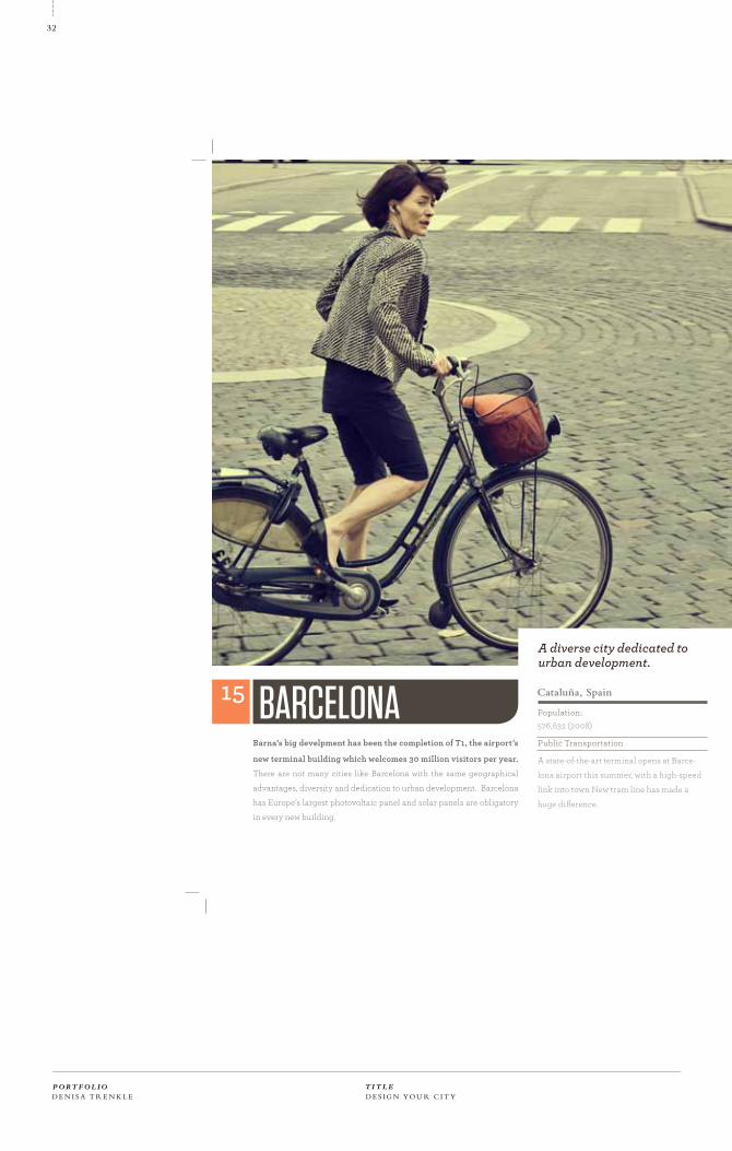
A diverse city dedicated to urban development.
BARCELONA15 Cataluña, Spain
Population:576,632 (2008)
Public Transportation
A state-of-the-art terminal opens at Barce-
lona airport this summer, with a high-speed
link into town New tram line has made a
huge difference.
Barna’s big develpment has been the completion of T1, the airport’s
new terminal building which welcomes 30 million visitors per year.
There are not many cities like Barcelona with the same geographical
advantages, diversity and dedication to urban development. Barcelona
has Europe’s largest photovoltaic panel and solar panels are obligatory
in every new building.
D E S I G N YO U R C I T YP O R T F O L I OD E N I S A T R E N K L E
T I T L E
32

Fukuoka edges ahead because of its easy living and connection.
Population:1.44 million (2008)
Public Transportation
The metro is fast and reliable. Buses cover
almost all of the city. The city has no infra-
structure plans for elctric cars at the mo-
ment. it takes 11 minutes to get to Fukuoka
Airport by metro from the city centre.
This open, easy-going city in northern Kyushu does things its
own way, combining the efficiency that is given in every Japanese
metropolis with and outward-looking dynamism. With plenty of
green space and beaches nearby, and the rest of Kyushu made ever more
accessible with the island’s own bullet train, Fukuoka also has excellent
links to the rest of Japan. Recent measures have included making the
central Tenjin area a free wi-fi zone.
FUKUOKA 16Kyūshū, Japan.
D I R E C T E D S T U D Y P R I N T, W E B , PAC K AG I N G M A S T E R S T H E S I SC L A S S C AT E G O R Y
33
P R O J E C T

O D D LY E V E R A F T E R
Conceptualize a film festival that fully defines and characterizes the selected film director. Create
a collection of relevant products that work as a visually cohesive set promoting the given fictitious
film festival. Develop the following: Film Catalog, DVD Packaging, Record Packaging, Poster,
Schedule, printed promotional materials, tickets.
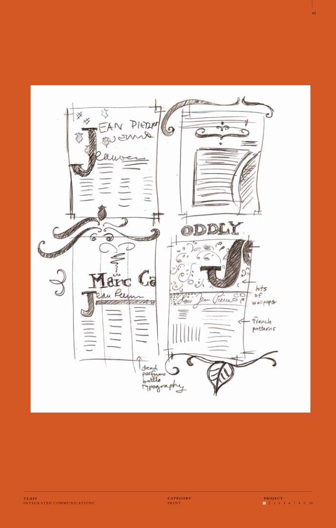
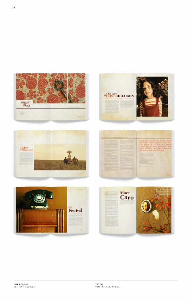
I selected Jean-Pierre Jeunet—a French contemporary self-taught film maker who is known for
surrealistic fantastic cinema pieces, such as Amélie from Montmartre, The City of Lost Children,
Delicatessen or A Very Long Engagement. I have always been fascinated by the visuals of his films
that channel the aesthetics of France of the 40’s and 50’s. The films are filled with old wooden
furniture, typography of old tin boxes and perfume bottles, vintage ripped wallpapers, gaudy
ceramic pieces, and grandmother’s doilies. As I watched the films a complete and layered visual
world unraveled in front of my eyes that I then transferred into my design.
P O R T F O L I OD E N I S A T R E N K L E
T I T L E
34
ODDLY EVER AFTER 02/11
OBJECTIVE
CONCEPT
2 0 0 9

I N T E G R A T E D C O M M U N I C AT I O N S P R I N T 1 2 3 4 5 6 7 8 9 10 C L A S S C AT E G O R Y
35
P R O J E C T

O D D LY E V E R A F T E RP O R T F O L I OD E N I S A T R E N K L E
T I T L E
36

Tit le
Odd ly Ever A f ter
Date
Fa l l 2009
Tit le
Academ ic
Class
Integ r a ted Commun ica t ion s
In s t r u c to r
Hunter Wimmer
Format
Book s
Pos ter
Packag ing
Bus ine s s Ca rd s
Col l a ter a l
DV D cover s
Record Cover
Typog raphy
Gotham Nar row, A rcher
Mate r ia l s
MOA B Ent r ad a
EPSON ink
Photog r aphy t aken
by de s igner
F l ick r photog r aphy
I N T E G R A T E D C O M M U N I C AT I O N S P R I N T 1 2 3 4 5 6 7 8 9 10 C L A S S C AT E G O R Y
37
P R O J E C T
P r o j e c t N u m b e r
T im e o f P r o d u c t i o n
02/11
2 0 0 9
W ha t i f I t a p e d w rapp i ng pap e r a l l ove r my wa l l s t o r e p r odu c e t h e “Fr e n ch G ranny” l i v i ng r o om l o ok ?
O D D LY E V E R A F T E R
O D D LY E V E R A F T E R
P O R T F O L I OD E N I S A T R E N K L E
T I T L E
38
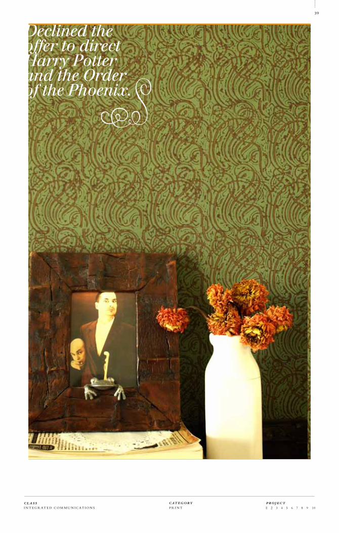
Declined the offer to direct Harry Potter and the Order of the Phoenix.
I N T E G R A T E D C O M M U N I C AT I O N S P R I N T 1 2 3 4 5 6 7 8 9 10 C L A S S C AT E G O R Y
39
P R O J E C T

O D D LY E V E R A F T E RP O R T F O L I OD E N I S A T R E N K L E
T I T L E
40

I N T E G R A T E D C O M M U N I C AT I O N S P R I N T 1 2 3 4 5 6 7 8 9 10 C L A S S C AT E G O R Y
41
P R O J E C T

O D D LY E V E R A F T E RP O R T F O L I OD E N I S A T R E N K L E
T I T L E
42

I N T E G R A T E D C O M M U N I C AT I O N S P R I N T 1 2 3 4 5 6 7 8 9 10 C L A S S C AT E G O R Y
43
P R O J E C T

O D D LY E V E R A F T E R
vintage + french + sur real + quirky
P O R T F O L I OD E N I S A T R E N K L E
T I T L E
44
I N T E G R A T E D C O M M U N I C AT I O N S P R I N T 1 2 3 4 5 6 7 8 9 10 C L A S S C AT E G O R Y
45
P R O J E C T

O D D LY E V E R A F T E RP O R T F O L I OD E N I S A T R E N K L E
T I T L E
46

I N T E G R A T E D C O M M U N I C AT I O N S P R I N T 1 2 3 4 5 6 7 8 9 10 C L A S S C AT E G O R Y
47
P R O J E C T

O D D LY E V E R A F T E RP O R T F O L I OD E N I S A T R E N K L E
T I T L E
48

I N T E G R A T E D C O M M U N I C AT I O N S P R I N T 1 2 3 4 5 6 7 8 9 10 C L A S S C AT E G O R Y
49
P R O J E C T

O D D LY E V E R A F T E RP O R T F O L I OD E N I S A T R E N K L E
T I T L E
50

I N T E G R A T E D C O M M U N I C AT I O N S P R I N T 1 2 3 4 5 6 7 8 9 10 C L A S S C AT E G O R Y
51
P R O J E C T

O D D LY E V E R A F T E RP O R T F O L I OD E N I S A T R E N K L E
T I T L E
52

I N T E G R A T E D C O M M U N I C AT I O N S P R I N T 1 2 3 4 5 6 7 8 9 10 C L A S S C AT E G O R Y
53
P R O J E C T
O D D LY E V E R A F T E RP O R T F O L I OD E N I S A T R E N K L E
T I T L E
54

I N T E G R A T E D C O M M U N I C AT I O N S P R I N T 1 2 3 4 5 6 7 8 9 10 C L A S S C AT E G O R Y
55
P R O J E C T

O D D LY E V E R A F T E RP O R T F O L I OD E N I S A T R E N K L E
T I T L E
56

I N T E G R A T E D C O M M U N I C AT I O N S P R I N T 1 2 3 4 5 6 7 8 9 10 C L A S S C AT E G O R Y
57
P R O J E C T

O D D LY E V E R A F T E RP O R T F O L I OD E N I S A T R E N K L E
T I T L E
58
Film Festival DVD Set // In the spirit of the visual concept of Jean-Pierre Jeunet’s Film Festival,
the DVD set too carries the quirky visual language of the Film Festival Catalog, with the vintage
wallpaper being the main visual theme showing up on each one of the cases.

I N T E G R A T E D C O M M U N I C AT I O N S P R I N T 1 2 3 4 5 6 7 8 9 10 C L A S S C AT E G O R Y
59
P R O J E C T

O D D LY E V E R A F T E RP O R T F O L I OD E N I S A T R E N K L E
T I T L E
60

I N T E G R A T E D C O M M U N I C AT I O N S P R I N T 1 2 3 4 5 6 7 8 9 10 C L A S S C AT E G O R Y
61
P R O J E C T

FEATURED FILMS OF THE FESTIVAL: A VERY LONG ENGAGEMENTAMÉLIEDELICATESSENFOUTAISESTHE CITY OF LOST CHILDREN
SPECIAL APPEARANCES: Audrey Tatou (15.5. at 17:30 in Rouge Room)Jean-Pierre Jeunet (17.5. at 20:00 in Bleu Room)Marc Caro (16.5. at 18:30 in Verde Room)
w w w. o d d l yev e r a f te r. c o m
15-17 2010STUDIO 28 CINÉMA
MAY in the famousTel: 08/92 68 07 4310 Rue Lepic, Paris, Montmar tre Arrodissment
O D D LY E V E R A F T E RP O R T F O L I OD E N I S A T R E N K L E
T I T L E
62

I N T E G R A T E D C O M M U N I C AT I O N S P R I N T 1 2 3 4 5 6 7 8 9 10 C L A S S C AT E G O R Y
63
P R O J E C T

D E S I G N YO U R C I T Y
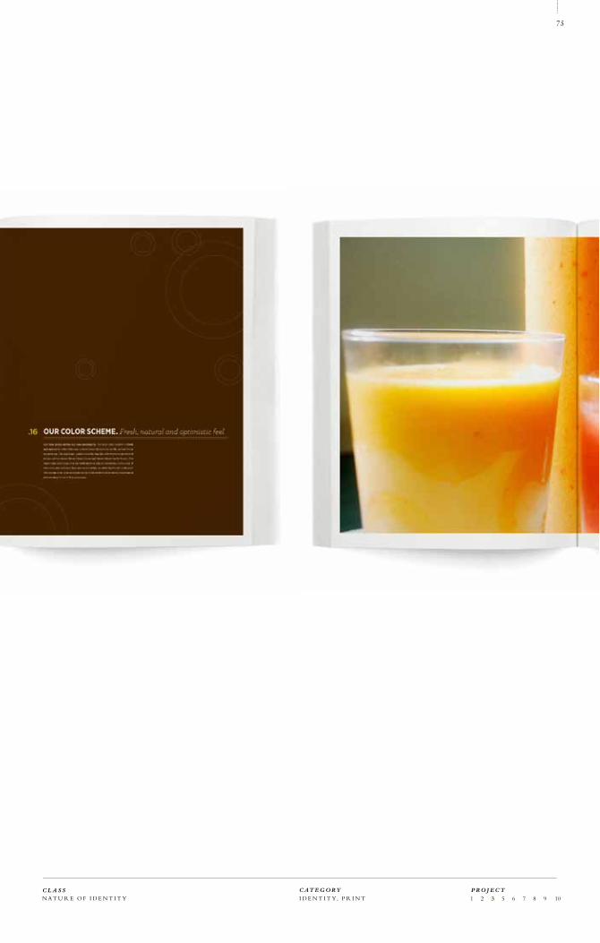
In the Nature of Identity course students were asked to select a dying, dead or defunct brand and
reinvent it through development of a new identity, visual standars and brand extensions.
During my trip to Japan in order to save money purchased many a meal in cheap establishments
such as Seven Eleven or Lawson. However, shopping and eating in Seven Eleven is a slightly dif-
ferent experience. The stores are clean, well-lit with outdoor seating, and, most of all, serve fresh
and healthy food options. I wanted to extend this experience and healthy meal options into the
American version of Seven Eleven, while preserving the convenience and long hours. My vision
transformed the old, unattractive brand into a modern, fresh and health-minded convenience
store that serves meals made of fresh ingredients only. “Always Fresh. Always Open” is the new
motto preserving both the traditional and newly acquired values. Seven Eleven now has a chil-
dren’s food section, as well as a bakery ,ready made bento boxes or freshly squeezed orange juices.
P O R T F O L I OD E N I S A T R E N K L E
T I T L E
64
SEVEN ELEVEN 03/11
OBJECTIVE
CONCEPT
2 011

N A T U R E O F I D E N T I T Y I D E N T I T Y, P R I N T 1 2 3 5 6 7 8 9 10C L A S S C AT E G O R Y
65
P R O J E C T

S E V E N E L E V E NP O R T F O L I OD E N I S A T R E N K L E
T I T L E
66

N A T U R E O F I D E N T I T Y I D E N T I T Y, P R I N T 1 2 3 5 6 7 8 9 10C L A S S C AT E G O R Y
67
P R O J E C T
Title
Seven Eleven
Date
Fall 2010
Title
Academic
Class
Integrated Communications
Instructor
Hunter Wimmer
Format
Book
Collateral
Rendered Packaging
Web site
Typography
Gotham Narrow, Archer
Materials
MOAB Entrada
EPSON ink
Photography taken
by designer and
Flickr photography
PRO J EC T N U M B E R
DAT E
03/11
2 010

S E V E N E L E V E N
fresh + open + wholesome + modern
P O R T F O L I OD E N I S A T R E N K L E
T I T L E
68

N A T U R E O F I D E N T I T Y I D E N T I T Y, P R I N T 1 2 3 5 6 7 8 9 10C L A S S C AT E G O R Y
69
P R O J E C T

S E V E N E L E V E NP O R T F O L I OD E N I S A T R E N K L E
T I T L E
70

N A T U R E O F I D E N T I T Y I D E N T I T Y, P R I N T 1 2 3 5 6 7 8 9 10C L A S S C AT E G O R Y
71
P R O J E C T

S E V E N E L E V E NP O R T F O L I OD E N I S A T R E N K L E
T I T L E
72

N A T U R E O F I D E N T I T Y I D E N T I T Y, P R I N T 1 2 3 5 6 7 8 9 10C L A S S C AT E G O R Y
73
P R O J E C T

S E V E N E L E V E NP O R T F O L I OD E N I S A T R E N K L E
T I T L E
74
N A T U R E O F I D E N T I T Y I D E N T I T Y, P R I N T 1 2 3 5 6 7 8 9 10C L A S S C AT E G O R Y
75
P R O J E C T

S E V E N E L E V E NP O R T F O L I OD E N I S A T R E N K L E
T I T L E
76

N A T U R E O F I D E N T I T Y I D E N T I T Y, P R I N T 1 2 3 5 6 7 8 9 10C L A S S C AT E G O R Y
77
P R O J E C T
Always Fresh. Always Open.

S E V E N E L E V E NP O R T F O L I OD E N I S A T R E N K L E
T I T L E
78

N A T U R E O F I D E N T I T Y I D E N T I T Y, P R I N T 1 2 3 5 6 7 8 9 10C L A S S C AT E G O R Y
79
P R O J E C T

S E V E N E L E V E NP O R T F O L I OD E N I S A T R E N K L E
T I T L E
80

N A T U R E O F I D E N T I T Y I D E N T I T Y, P R I N T 1 2 3 5 6 7 8 9 10C L A S S C AT E G O R Y
81
P R O J E C T

S E V E N E L E V E NP O R T F O L I OD E N I S A T R E N K L E
T I T L E
82

N A T U R E O F I D E N T I T Y I D E N T I T Y, P R I N T 1 2 3 5 6 7 8 9 10
HOME
STORE ONLINE
STREET
food delivery
gift baskets
catering
lunch kits
recipe books
flower delivery
ATM’s
drink vending machines
food vending machines
bike rental spots
credit card/transit pass
hostel spots
order delivery
weight-loss program
pre-pay food order
iPhone app/iPad app
recipes
fresh meals
coffee shop
wi-fi
movie rental
kids’ corner
pastry line
C L A S S C AT E G O R Y
83
P R O J E C T

S E V E N E L E V E NP O R T F O L I OD E N I S A T R E N K L E
T I T L E
84

Lorem ipsum dolor sit amet, consectetur adipiscing elit. Nam nisl sem, fermentum in lobortis ac,
suscipit ut tellus. Nulla ut justo justo. Etiam leo ante, ornare iaculis consequat ac, feugiat vitae arcu.
Aenean orci eros, gravida quis rutrum sit amet, ultricies et risus. Donec ultrices, metus non lobortis
ullamcorper, sem nisl volutpat turpis, at vestibulum dui orci.
N A T U R E O F I D E N T I T Y I D E N T I T Y, P R I N T 1 2 3 5 6 7 8 9 10C L A S S C AT E G O R Y
85
P R O J E C T

D E S I G N YO U R C I T Y
In the Nature of Identity course students were asked to select a dying, dead or defunct brand and
reinvent it through development of a new identity, visual standars and brand extensions.
During my trip to Japan in order to save money purchased many a meal in cheap establishments
such as Seven Eleven or Lawson. However, shopping and eating in Seven Eleven is a slightly dif-
ferent experience. The stores are clean, well-lit with outdoor seating, and, most of all, serve fresh
and healthy food options. I wanted to extend this experience and healthy meal options into the
American version of Seven Eleven, while preserving the convenience and long hours. My vision
transformed the old, unattractive brand into a modern, fresh and health-minded convenience
store that serves meals made of fresh ingredients only. “Always Fresh. Always Open” is the new
motto preserving both the traditional and newly acquired values. Seven Eleven now has a chil-
dren’s food section, as well as a bakery ,ready made bento boxes or freshly squeezed orange juices.
P O R T F O L I OD E N I S A T R E N K L E
T I T L E
86
MEMORIES OFFARAWAY PLACES 0 4/11
OBJECTIVE
CONCEPT
2 011

E X P E R I M E N T A L T Y P O G R A P H Y I D E N T I T Y, T Y P O G R A P H Y 1 2 3 4 5 6 7 8 9 10 C L A S S C AT E G O R Y
87
P R O J E C T

M E M O R I E S O F FA R AWAY P L AC E SP O R T F O L I OD E N I S A T R E N K L E
T I T L E
88

Title
Memories of Faraway Places
Date
Fall 2009
Title
Academic
Class
Experimental Typography
Instructor
Stan Zienka
Format
Book
Typography
Medio
Materials
MOAB Entrada
EPSON ink
Photography taken
by designer
E X P E R I M E N T A L T Y P O G R A P H Y I D E N T I T Y, T Y P O G R A P H Y 1 2 3 4 5 6 7 8 9 10 C L A S S C AT E G O R Y
89
P R O J E C T
PRO J EC T N U M B E R
DAT E
0 4/11
2 011

M E M O R I E S O F FA R AWAY P L AC E SP O R T F O L I OD E N I S A T R E N K L E
T I T L E
90

Lorem ipsum dolor sit amet, consectetur adipiscing elit. Nam nisl sem, fermentum in lobortis ac,
suscipit ut tellus. Nulla ut justo justo. Etiam leo ante, ornare iaculis consequat ac, feugiat vitae arcu.
Aenean orci eros, gravida quis rutrum sit amet, ultricies et risus. Donec ultrices, metus non lobortis
ullamcorper, sem nisl volutpat turpis, at vestibulum dui orci.
E X P E R I M E N T A L T Y P O G R A P H Y I D E N T I T Y, T Y P O G R A P H Y 1 2 3 4 5 6 7 8 9 10 C L A S S C AT E G O R Y
91
P R O J E C T

M E M O R I E S O F FA R AWAY P L AC E S
In Memomeries of Faraway Places, due to the nostalgic and ethereal nature of the
topic, I chose to shoot my own photography in a very personal and quirky way,
with hand-writing exposed all over my body. This way, I was able to communicate
short messages and memories related to my travels to the reader.
P O R T F O L I OD E N I S A T R E N K L E
T I T L E
92

E X P E R I M E N T A L T Y P O G R A P H Y I D E N T I T Y, T Y P O G R A P H Y 1 2 3 4 5 6 7 8 9 10 C L A S S C AT E G O R Y
93
P R O J E C T

M E M O R I E S O F FA R AWAY P L AC E SP O R T F O L I OD E N I S A T R E N K L E
T I T L E
94

E X P E R I M E N T A L T Y P O G R A P H Y I D E N T I T Y, T Y P O G R A P H Y 1 2 3 4 5 6 7 8 9 10 C L A S S C AT E G O R Y
95
P R O J E C T

M E M O R I E S O F FA R AWAY P L AC E SP O R T F O L I OD E N I S A T R E N K L E
T I T L E
96

E X P E R I M E N T A L T Y P O G R A P H Y I D E N T I T Y, T Y P O G R A P H Y 1 2 3 4 5 6 7 8 9 10 C L A S S C AT E G O R Y
97
P R O J E C T

M E M O R I E S O F FA R AWAY P L AC E SP O R T F O L I OD E N I S A T R E N K L E
T I T L E
98

E X P E R I M E N T A L T Y P O G R A P H Y I D E N T I T Y, T Y P O G R A P H Y 1 2 3 4 5 6 7 8 9 10 C L A S S C AT E G O R Y
99
P R O J E C T

M E M O R I E S O F FA R AWAY P L AC E SP O R T F O L I OD E N I S A T R E N K L E
T I T L E
100

E X P E R I M E N T A L T Y P O G R A P H Y I D E N T I T Y, T Y P O G R A P H Y 1 2 3 4 5 6 7 8 9 10 C L A S S C AT E G O R Y
101
P R O J E C T

D E S I G N YO U R C I T Y
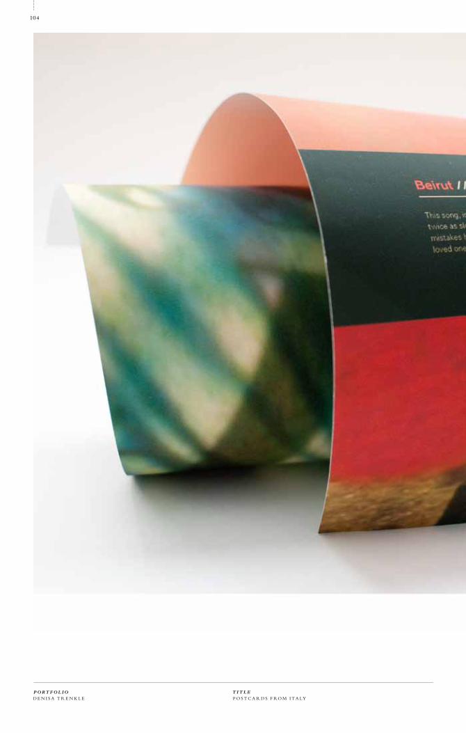
Create a poster using lyrics from a song. The poster should be an opportunity to create and look
at typography from a variety of angles and production methods.
Upon selecting a song (Postcards from Italy by Beirut), I started experimenting with typographic
elements. Everything from scanning hand-written type to photographing transparency sheets had
been tried before deciding on the final set of photos and type. The final design consists of a set of
several photographic images overlapping together with photographs of transparency sheets, and
photographs of other objects with the lyrics of the aforementioned song.
P O R T F O L I OD E N I S A T R E N K L E
T I T L E
102
BEIRUTPOSTCARD POSTER 05/11
OBJECTIVE
CONCEPT
2 011

E X P E R I M E N T A L T Y P O G R A P H Y P R I N T, P O S T E R 1 2 3 4 5 6 7 8 9 10 C L A S S C AT E G O R Y
103
P R O J E C T
P O S T C A R D S F RO M I T A LYP O R T F O L I OD E N I S A T R E N K L E
T I T L E
104

Title
Postcards From Italy Poster
Date
Fall 2009
Title
Academic
Class
Experimental Typography
Instructor
Stan Zienka
Format
Poster
Typography
Univers, Justus
Materials
MOAB Cayenta
EPSON ink
Photography taken
by designer
E X P E R I M E N T A L T Y P O G R A P H Y P R I N T, P O S T E R 1 2 3 4 5 6 7 8 9 10 C L A S S C AT E G O R Y
105
P R O J E C T
PRO J EC T N U M B E R
DAT E
05/11
2 0 0 9

P O S T C A R D S F RO M I T A LYP O R T F O L I OD E N I S A T R E N K L E
T I T L E
106

E X P E R I M E N T A L T Y P O G R A P H Y P R I N T, P O S T E R 1 2 3 4 5 6 7 8 9 10 C L A S S C AT E G O R Y
107
P R O J E C T
Beirut // P
ostcard
s From
Italy G
ula
g Orkesta
r (Relea
sed in
2005)
Th
is son
g, in m
y op
inio
n, re
fers to a re
lation
ship th
at has p
ossib
ly en
de
d. It rad
iates n
ostalg
ia for th
e time
s go
ne b
y, spe
aks of th
e hap
py tim
es h
im an
d his lo
ver h
ad. It’s fu
ll of m
etap
ho
rs for fig
hts o
r bad
time
s that th
ey h
ad expe
rien
ced
. “T
he sh
attere
d sou
l follo
win
g close
, bu
t ne
arly twice as slo
w” m
igh
t refe
r to a hap
pin
ess ye
t to com
e. T
he artist h
as mad
e som
e mistake
s in the p
ast and w
as shatte
red
by th
em
, bu
t he is fo
llow
ing a b
ette
r path in life
, pe
rhap
s be
cause o
f this w
om
an. T
he fo
llow
ing lin
es in th
e seco
nd stan
za spe
ak of h
is past, an
d the u
nn
ece
ssary mistake
s he h
as mad
e. B
ut h
e slide
s in to
no
te he d
oe
sn’t reg
ret th
em
. Th
e line “at th
ose w
ho ad
mit d
efe
at too late” is an
alog
ou
s to no
t qu
itting w
hile yo
u’re ah
ead
. “T
ho
se we
re ou
r time
s” mig
ht re
fer to h
is min
d set o
f no re
gre
ts. Th
e last stanza
de
picts h
im se
ttling d
ow
n with h
is love
d on
e. H
e is wise
r, pe
rhap
s, and h
as realize
d he w
ants to sp
en
d the re
st of h
is life with h
er.
>>

P O S T C A R D S F RO M I T A LYP O R T F O L I OD E N I S A T R E N K L E
T I T L E
108

Lorem ipsum dolor sit amet, consectetur adipiscing elit. Nam nisl sem, fermentum in lobortis ac,
suscipit ut tellus. Nulla ut justo justo. Etiam leo ante, ornare iaculis consequat ac, feugiat vitae arcu.
Aenean orci eros, gravida quis rutrum sit amet, ultricies et risus. Donec ultrices, metus non lobortis
ullamcorper, sem nisl volutpat turpis, at vestibulum dui orci.
E X P E R I M E N T A L T Y P O G R A P H Y P R I N T, P O S T E R 1 2 3 4 5 6 7 8 9 10 C L A S S C AT E G O R Y
109
P R O J E C T

D E S I G N YO U R C I T Y
Prior to the experimentation phase, the students were encouraged to choose a typeface (Univers
in this case) to research and analyze to the smallest details.
Univers was chosen for its classic, modernistic aesthetic and the breadth of weights it offers. The
type was perfected until the rags and alignment looked identical. Some of the typographic layouts
paid homage to masters such as Wolfgang Weingart, others were a sheer experimentation with
the form and shape of the typeface, giving traditional typographic layouts a new dimension
and enhancing them with elements of unexpected. Printed on beautiful, luxurious French Rives
paper, the typographic set was given a refined, custom-made housing.
P O R T F O L I OD E N I S A T R E N K L E
T I T L E
110
TYPE EXPERIMENTS 05/11
OBJECTIVE
CONCEPT
2 011

T Y P E S Y S T E M S T Y P O G R A P H Y, P R I N T 1 2 3 4 5 6 7 8 9 10 C L A S S C AT E G O R Y
111
P R O J E C T

U N I V E R S E X P E R I M E N T A L T Y P EP O R T F O L I OD E N I S A T R E N K L E
T I T L E
112

T Y P E S Y S T E M S T Y P O G R A P H Y, P R I N T 1 2 3 4 5 6 7 8 9 10
Title
Univers Type Experiments
Date
Fall 2009
Title
Academic
Class
Type Systems
Instructor
Jennifer Sterling
Format
Posters
Typography
Univers, Helvetica
Materials
Rives Paper
EPSON ink
PRO J EC T N U M B E R
DAT E
06/11
2 0 0 9
C L A S S C AT E G O R Y
113
P R O J E C T

U N I V E R S E X P E R I M E N T A L T Y P EP O R T F O L I OD E N I S A T R E N K L E
T I T L E
114

T Y P E S Y S T E M S T Y P O G R A P H Y, P R I N T 1 2 3 4 5 6 7 8 9 10 C L A S S C AT E G O R Y
115
P R O J E C T

U N I V E R S E X P E R I M E N T A L T Y P EP O R T F O L I OD E N I S A T R E N K L E
T I T L E
116

T Y P E S Y S T E M S T Y P O G R A P H Y, P R I N T 1 2 3 4 5 6 7 8 9 10 C L A S S C AT E G O R Y
117
P R O J E C T

U N I V E R S E X P E R I M E N T A L T Y P EP O R T F O L I OD E N I S A T R E N K L E
T I T L E
118

T Y P E S Y S T E M S T Y P O G R A P H Y, P R I N T 1 2 3 4 5 6 7 8 9 10 C L A S S C AT E G O R Y
119
P R O J E C T

D E S I G N YO U R C I T Y
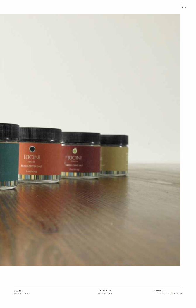
Choose an Oil and Vinegar producer and re-package their current line of products. Study their
history, current audience and overall market placement in order to make educated decisions related
to the re-design. The re-design consisted of a new identity, concept, a set of oil and vinegar
bottles, as well as a set of high-end flavored salts.
I discovered a maker of oil and vinegar from Modena, Italy, called Lucini who produce a medium
to high grade quality olive oils and vinegars. Despite the quality of the products, the packaging
design of their products is relatively poor and out of date. With a new identity, a fresher and more
contemporary look, an appeal to a younger, affluent crowd was given to the brand.
P O R T F O L I OD E N I S A T R E N K L E
T I T L E
120
LUCINIOIL & VINEGAR 07/11
OBJECTIVE
CONCEPT
2 010

PAC K AG I N G 2 PAC K AG I N G 1 2 3 4 5 6 7 8 9 10 C L A S S C AT E G O R Y
121
P R O J E C T

L U C I N I O I L & V I N E G A RP O R T F O L I OD E N I S A T R E N K L E
T I T L E
122

Title
Lucini Oil, Vinegar & Salt
Date
Spring 2010
Title
Academic
Class
Packaging 2
Instructor
Christine George
Format
Packaging
Typography
Medio, Century Gothic
Materials
MOAB Entrada
EPSON ink
Illustration
by designer
PAC K AG I N G 2 PAC K AG I N G 1 2 3 4 5 6 7 8 9 10 C L A S S C AT E G O R Y
123
P R O J E C T
P r o j e c t N u m b e r
T im e o f P r o d u c t i o n
07/11
2 010

L U C I N I O I L & V I N E G A RP O R T F O L I OD E N I S A T R E N K L E
T I T L E
124

PAC K AG I N G 2 PAC K AG I N G 1 2 3 4 5 6 7 8 9 10 C L A S S C AT E G O R Y
125
P R O J E C T

L U C I N I O I L & V I N E G A RP O R T F O L I OD E N I S A T R E N K L E
T I T L E
126

PAC K AG I N G 2 PAC K AG I N G 1 2 3 4 5 6 7 8 9 10 C L A S S C AT E G O R Y
127
P R O J E C T

L U C I N I O I L & V I N E G A RP O R T F O L I OD E N I S A T R E N K L E
T I T L E
128
PAC K AG I N G 2 PAC K AG I N G 1 2 3 4 5 6 7 8 9 10 C L A S S C AT E G O R Y
129
P R O J E C T

L U C I N I O I L & V I N E G A RP O R T F O L I OD E N I S A T R E N K L E
T I T L E
130

PAC K AG I N G 2 PAC K AG I N G 1 2 3 4 5 6 7 8 9 10 C L A S S C AT E G O R Y
131
P R O J E C T

L U C I N I O I L & V I N E G A RP O R T F O L I OD E N I S A T R E N K L E
T I T L E
132

PAC K AG I N G 2 PAC K AG I N G 1 2 3 4 5 6 7 8 9 10 C L A S S C AT E G O R Y
133
P R O J E C T

D E S I G N YO U R C I T Y
Create and artist book with a constructed narrative with appropriate scale, binding method, and
materials. The concept and the materials need to elevate the presentation of the content. This
assignment was open-ended as far as topic was concerned.
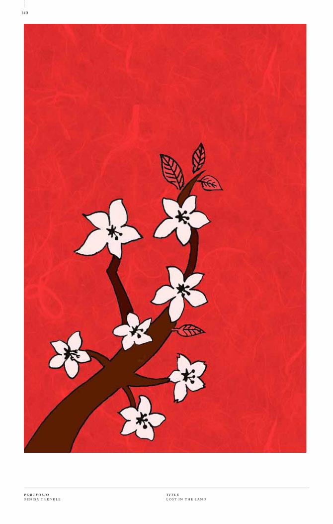
The parameters for this project were completely open-ended, and since I’m a great urban enthu-
siast and traveller I got inspired by my, at the time, recent travels to Japan. The book represents a
series of experiences and encounters during my travels, visualized in the form of a flag book. The
book borrows visuals from traditional Japanese culture and lends an opportunity to peek into the
particular experiences tied to these objects. When open, the flag book pages transform into one
large image of a sakura—Japanese cherry blossom tree. The book consists of short anecdotes and
illustrations that work well together as a set.
P O R T F O L I OD E N I S A T R E N K L E
T I T L E
134
LOST IN THE LANDOF THE RISING SUN 08/11
OBJECTIVE
CONCEPT
2 011

B O O K A R T S P R I N T, B O O K M A K I N G 1 2 3 4 5 6 7 8 9 10 C L A S S C AT E G O R Y
135
P R O J E C T

L O S T I N T H E L A N DP O R T F O L I OD E N I S A T R E N K L E
T I T L E
136

Title
Lost in the Land of the Rising Sun
Date
Fall 2010
Title
Academic
Class
Book Arts
Instructor
Macy Chadwick
Format
Typography
Garamond
Materials
Neenah Paper
Japanese Silk Paper
Illustration
by designer
B O O K A R T S P R I N T, B O O K M A K I N G 1 2 3 4 5 6 7 8 9 10 C L A S S C AT E G O R Y
137
P R O J E C T
PRO J EC T N U M B E R
DAT E
08/11
2 010

L O S T I N T H E L A N DP O R T F O L I OD E N I S A T R E N K L E
T I T L E
138

B O O K A R T S P R I N T, B O O K M A K I N G 1 2 3 4 5 6 7 8 9 10 C L A S S C AT E G O R Y
139
P R O J E C T
L O S T I N T H E L A N DP O R T F O L I OD E N I S A T R E N K L E
T I T L E
140

B O O K A R T S P R I N T, B O O K M A K I N G 1 2 3 4 5 6 7 8 9 10 C L A S S C AT E G O R Y
141
P R O J E C T

L O S T I N T H E L A N DP O R T F O L I OD E N I S A T R E N K L E
T I T L E
142

B O O K A R T S P R I N T, B O O K M A K I N G 1 2 3 4 5 6 7 8 9 10 C L A S S C AT E G O R Y
143
P R O J E C T

D E S I G N YO U R C I T Y
Design and create a letter pressed piece related to the topic of travel. Encase your travel tag in a
packaging with a letter pressed title.
For this particular piece I opted for the general theme of urban travel. Being inspired by the travel
posters from the 40’s and 50’s, I created a unique, letter pressed look consisting of a hand-carved
linoleum block image and hand-set typography. Through working on this piece I acquired new
appreciation for the profession, as well as manual, non-digital design, which tends to be more
personal and unique.
P O R T F O L I OD E N I S A T R E N K L E
T I T L E
144
URBAN TRAVEL TAG 0 9/11
OBJECTIVE
CONCEPT
2 011

L E T T E RP R E S S P R I N T, T Y P O G R A P H Y 1 2 3 4 5 6 7 8 9 10 C L A S S C AT E G O R Y
145
P R O J E C T

U R B A N T R AV E L T AGP O R T F O L I OD E N I S A T R E N K L E
T I T L E
146

Title
Urban Travel Letterpress Tag
Date
Spring 2011
Title
Academic
Class
Letterpress
Instructor
Macy Chadwick
Format
Tag
Packaging
Typography
Centaur
Materials
Letra Paper
L E T T E RP R E S S P R I N T, T Y P O G R A P H Y 1 2 3 4 5 6 7 8 9 10 C L A S S C AT E G O R Y
147
P R O J E C T
PRO J EC T N U M B E R
DAT E
08/11
2 011

U R B A N T R AV E L T AGP O R T F O L I OD E N I S A T R E N K L E
T I T L E
148

L E T T E RP R E S S P R I N T, T Y P O G R A P H Y 1 2 3 4 5 6 7 8 9 10 C L A S S C AT E G O R Y
149
P R O J E C T

U R B A N T R AV E L T AGP O R T F O L I OD E N I S A T R E N K L E
T I T L E
150

L E T T E RP R E S S P R I N T, T Y P O G R A P H Y 1 2 3 4 5 6 7 8 9 10 C L A S S C AT E G O R Y
151
P R O J E C T

D E S I G N YO U R C I T Y
Create and artist book with a constructed narrative with appropriate scale, binding method, and
materials. The concept and the materials need to elevate the presentation of the content. This
assignment was open-ended as far as topic is concerned.
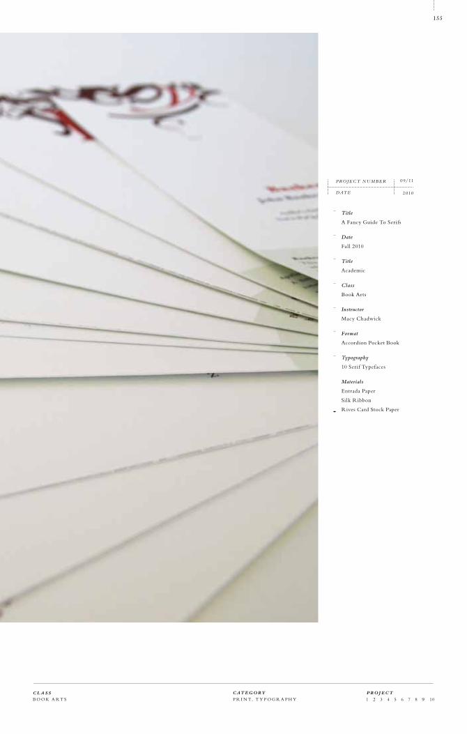
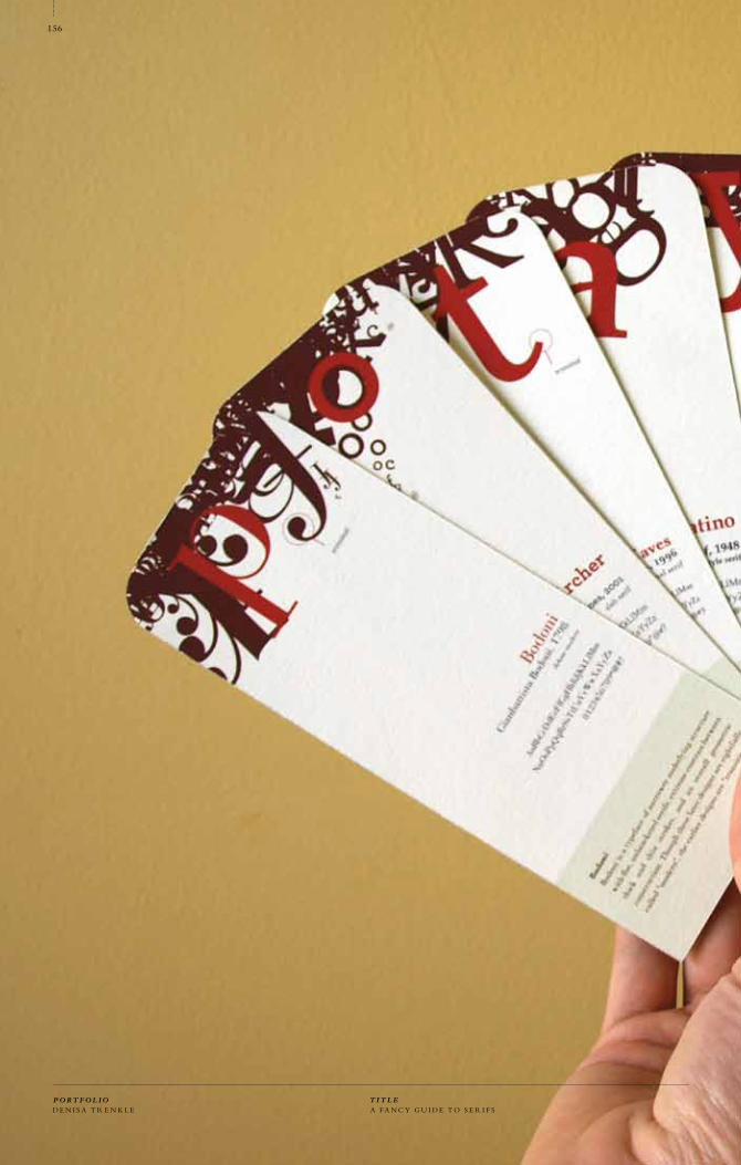
As a graphic design student in a book arts course I have encountered many non-designer students
who had difficulty recognizing and/or using the proper typefaces for their projects. My book is an
attempt to help people in a similar situation, breaking down the best, most usable serif typefaces
into categories and providing brief descriptions and types of uses. The book is bound as a pocket
accordion book with removable cards , each representing one of the chosen serif typefaces.
P O R T F O L I OD E N I S A T R E N K L E
T I T L E
152
A FANCYGUIDE TO SERIFS 0 9/11
OBJECTIVE
CONCEPT
2 011

B O O K A R T S P R I N T, T Y P O G R A P H Y 1 2 3 4 5 6 7 8 9 10 C L A S S C AT E G O R Y
153
P R O J E C T

A FA N C Y G U I D E T O S E R I F SP O R T F O L I OD E N I S A T R E N K L E
T I T L E
154
B O O K A R T S P R I N T, T Y P O G R A P H Y 1 2 3 4 5 6 7 8 9 10 C L A S S C AT E G O R Y
155
P R O J E C T
Title
A Fancy Guide To Serifs
Date
Fall 2010
Title
Academic
Class
Book Arts
Instructor
Macy Chadwick
Format
Accordion Pocket Book
Typography
10 Serif Typefaces
Materials
Entrada Paper
Silk Ribbon
Rives Card Stock Paper
PRO J EC T N U M B E R
DAT E
0 9/11
2 010
A FA N C Y G U I D E T O S E R I F SP O R T F O L I OD E N I S A T R E N K L E
T I T L E
156

B O O K A R T S P R I N T, T Y P O G R A P H Y 1 2 3 4 5 6 7 8 9 10 C L A S S C AT E G O R Y
157
P R O J E C T

Create a broadside poster, using at least two letterpress methods, such as linoleum block print,
hand-set typography, pressure printing or polymer plate printing. The theme of the poster is
open-ended, however, it needs to feature a text from a poem or lyrics of a song.
In an effort to work creatively without temporarily being attached to a computer, I completed a
letterpress course. For this particular assignment, I chose a piece of lyrics from a song by Arcade
Fire, We Used to Wait. The song expresses a nostalgia for the times long gone when technology
didn’t dictate the pace of our lives. I felt it to be appropriate for the broadside to be subdued and
let the negative space reign, in order to express a certain sadness for those times. The image was
created by carving a linoleum block, the text was set on a polymer plate.
P O R T F O L I OD E N I S A T R E N K L E
158
WE USED TO WAIT 10/11
OBJECTIVE
CONCEPT
2 011
T I T L EW E U S E D T O WA I T

159
C L A S S C AT E G O R Y P R O J E C T
L E T T E RP RE S S P R I N T, T Y P O G R A P H Y 1 2 3 4 5 6 7 8 9 10

P O R T F O L I OD E N I S A T R E N K L E
160
T I T L EW E U S E D T O WA I T

161
Title
We Used to Wait
Date
Spring 2011
Title
Academic
Class
Letterpress
Instructor
Macy Chadwick
Format
Poster
Typography
Clarendon
Materials
Vandercook Press
Letra Paper
Linoleum Block
PRO J EC T N U M B E R
DAT E
10/11
2 011
C L A S S C AT E G O R Y P R O J E C T
L E T T E RP RE S S P R I N T, T Y P O G R A P H Y 1 2 3 4 5 6 7 8 9 10

P O R T F O L I OD E N I S A T R E N K L E
162
T I T L EW E U S E D T O WA I T

163
C L A S S C AT E G O R Y P R O J E C T
L E T T E RP RE S S P R I N T, T Y P O G R A P H Y 1 2 3 4 5 6 7 8 9 10

U R B A N R E V I VA L
Research extensively a chosen topic and design a book based on your research. Find, propose and
design a set of solutions to the given problem.
For this title, I researched the state of urbanism in the United States, analyzed its historical context,
drew comparisons between urban places in the United States and other cities of the world, and
proposed solutions to some of the related problems. Working on this book inspired me to the extent
of making a decision to continue my research on the given topic for my thesis project.
P O R T F O L I OD E N I S A T R E N K L E
T I T L E
164
URBAN REVIVAL 11/11
OBJECTIVE
CONCEPT
2 0 0 9
V I S UA L C O M M U N I C A T I O N S P R I N T 1 2 3 4 5 6 7 8 9 10 C L A S S C AT E G O R Y
165
P R O J E C T

U R B A N R E V I VA LP O R T F O L I OD E N I S A T R E N K L E
T I T L E
166

Title
Urban Revival
Date
Fall 2009
Title
Academic
Class
Visual Communications
Instructors
Hunter Wimmer
Phil Hamlett
Format
Book
Typography
Helvetica
Materials
Epson Paper
Epson Ink
Photography
by designer
Flickr photography
Asahi Book Cloth
V I S UA L C O M M U N I C A T I O N S P R I N T 1 2 3 4 5 6 7 8 9 10 C L A S S C AT E G O R Y
167
P R O J E C T
PRO J EC T N U M B E R
DAT E
11/11
2 0 0 9

U R B A N R E V I VA LP O R T F O L I OD E N I S A T R E N K L E
T I T L E
168

V I S UA L C O M M U N I C A T I O N S P R I N T 1 2 3 4 5 6 7 8 9 10 C L A S S C AT E G O R Y
169
P R O J E C T

U R B A N R E V I VA LP O R T F O L I OD E N I S A T R E N K L E
T I T L E
170

V I S UA L C O M M U N I C A T I O N S P R I N T 1 2 3 4 5 6 7 8 9 10 C L A S S C AT E G O R Y
171
P R O J E C T

A healthy street should be a spatial entity, not a residue between bad buildings.
01Chapter
When you live in a smallspace in the city, if forcesyou to create a sense of community outside.”
Jonathan, 33 Director at WCG Worldwide
Loves New Wave Rock
Enjoys cooking for friends
From Oakland, California
01Guest
ELEGANTLY EXECTUTED PARKING SOLUTIONS RESPECTING THE ORIGINAL CITYSCAPE.
02
U R B A N R E V I VA LP O R T F O L I OD E N I S A T R E N K L E
T I T L E
172

V I S UA L C O M M U N I C A T I O N S P R I N T 1 2 3 4 5 6 7 8 9 10 C L A S S C AT E G O R Y
173
P R O J E C T
U R B A N R E V I VA LP O R T F O L I OD E N I S A T R E N K L E
T I T L E
174

V I S UA L C O M M U N I C A T I O N S P R I N T 1 2 3 4 5 6 7 8 9 10 C L A S S C AT E G O R Y
175
P R O J E C T

U R B A N R E V I VA L
Most of all, many thanks to my wonderful husband Jim. Without his loving moral and practical
support I would not have made it through this challenge.
I would also like to thank to my family for always being there for me, even if so far away. To my
grandmother for her unconditional love and support. Many thanks also to my friends from the
Academy (you know who you are), as well as friends in my home country and other corners of
Europe, for always having a willing ear to listen and showing interest in my design work.
Thanks to all my teachers and mentors: Mary Scott, Phil Hamlett, Hunter Wimmer, Jeremy Stout,
Stan Zienka, Michael Kilgore, Brian Singer, Egon Terplan, Macy Chadwick, Shel Perkins, Jennifer
Sterling, Reneé D’Arcy, Mauro Cavelletti.
P O R T F O L I OD E N I S A T R E N K L E
T I T L E
176
THANK YOU

V I S UA L C O M M U N I C A T I O N S P R I N T 1 2 3 4 5 6 7 8 9 10 C L A S S C AT E G O R Y
177
P R O J E C T

Title
Observations
Date
Spring 2011
Instructor
Mary Scott
Printer
Andresen, San Francisco
Bindery
The Key, Oakland
Format
Book
Web Site
Stationery
Postcards
Typography
Bembo
Materials
Canson Paper
Epson Inks
Foil Stamping
Photography
Denisa Trenkle
Jana Benjamin Navratilova
Hand Model
Lama Khayyat
Jim Trenkle
P O R T F O L I OD E N I S A T R E N K L E
T I T L E
178

C L A S S C AT E G O R Y
179
P R O J E C T