Embed Size (px)
Citation preview

AS TIME GOES BYShifting incomes and inequality between and within generations
FEBRUARY 2017 Adam Corlett
@resfoundationintergencommission.org
REPORT

Contents
Executive Summary ��������������������������������������������������������������������������������������������������������������������������������3
Section 1: Income differences between generations ���������������������������������������������������������������������7
Section 2: Differences within generations ������������������������������������������������������������������������������������ 13
Section 3: Generations and pensioners ������������������������������������������������������������������������������������������22
Section 4: What has driven pensioner income growth? ����������������������������������������������������������� 33
Section 5: Conclusion ����������������������������������������������������������������������������������������������������������������������������45
@resfoundationintergencommission.org
As time goes by Contents
2

Executive Summary
This is the Resolution Foundation’s fourth report for the Intergenerational Commission, which over the course of 2017 will examine issues of intergenerational fairness and make recommendations to strengthen the intergenerational social contract� This paper, building on previous work on the earnings of different generations, examines household income� Specifically, it looks both at changes in income and changes in inequalities between and within different generations�
Our assumptions about living standards rising from generation to generation are being disrupted
Over the course of the 20th Century, years of economic growth and rising living standards meant that we came to take for granted that the income of each generation would be higher than its predecessor� For example, average baby boomer incomes at age 55 were £10,000 higher than among members of the silent generation at the same age� Average silent generation incomes were in turn £6,000 higher at age 55 than those recorded by the greatest generation� Both equate to generation-on-generation income growth rates of around 50 per cent� Improvements of a similar scale were evident among members of generation X at younger ages� This pattern has been a key measure of our progress as a nation�
However, this generation-on-generation progress appears to have stalled in the 21st Century� Members of the youngest of the generations to have reached adulthood – millennials – have not to date secured incomes that are any higher than those of generation X at the same ages� In part, of course, this reflects the impact of the financial crisis – incomes have suffered across all generations in the last decade� But if current economic forecasts turn out to be right, and government policy remains unchanged, then the outlook for the group looks little better� By 2020-21, many millennial households will have reached their mid-30s and yet might still be no better off than members of generation X were at the same age�
With millennials struggling not just in the labour market but also in relation to asset building – particularly in terms of housing – there is a growing sense that the current generation of young adults is facing a new set of living standards challenges which require fresh thinking if the generational progress that once seemed inevitable is to be restarted�
Against this backdrop, inequalities within generations can affect living standards progress between generations
These new concerns about the prospects for younger generations sit alongside a much more well-trodden debate about unfairness within generations� While inter- and intra-generational equity are different concepts, they are nevertheless intertwined�
For example, some intra-generational inequality might be considered palatable if the generation as a whole is securing significant living standards gains relative to those who came before� In marked contrast, the current stalling of generational progress is likely to mean that any given level of inequality is harder to take� Changes in inequality also affect which parts of any given generation see living standards progress compared
@resfoundationintergencommission.org
As time goes by Executive Summary
3

to their predecessors� Likewise, we should be concerned that inequalities within older generations (in relation to home ownership, for example) might amplify future inequal-ities in a younger generation that may not enjoy the same opportunities (with only those millennials able to access the bank of mum and dad or receive large inheritances being able to ever become property owners, perhaps)�
In this note we show that all generations have significant within-generation inequality� But generation X has the dubious honour of being the most unequal to date� This reflects the arrival of its members into adulthood from the late-1980s onwards, the precise point at which overall income inequality in the economy was reaching new heights� Earlier generations recorded increases in inequality at the same time, but from lower bases; members of generation X simply started out in a world that was more unequal than the one their parents and grandparents faced�
In contrast, millennials reached adulthood as the financial crisis hit, sparking a modest reduction in – still very high – levels of economy-wide inequality� High levels of employment and minimum wage policies have provided more protection for poorer millennials than might have been in place in previous decades; while the generalised slowdown in pay growth in the post-crisis period has stymied opportunities for richer millennials to open up the same scale of earnings gap as their predecessors did�
But millennials are potentially suffering from smaller, generationally-specific, trends� Most notably, stark differences in housing costs between renters and owners mean that declining levels of home ownership within the younger generation is pressing upward on inequality� This housing divide is less marked for older generations, though clearly not all older households are asset-rich� Around 30 per cent of baby boomer families do not own their own home for instance, while 16 per cent of those aged 55-64 have no private pension provision�
What the inequality picture looks like for millennials when they approach retirement will depend both on the opportunities they have to accumulate assets over the course of their working lives and on the way in which the unevenly-held wealth of older generations cascades down� Ensuring that we develop clear strategies on both of these issues – rather than simply leaving it to chance – will be a key undertaking of the Inter-generational Commission�
Recent years have been characterised by a clear divergence between pensioner and working-age incomes
Much of the popular debate about intergenerational living standards is couched not in terms of generations, but instead by contrasting the fortunes of the pensioner population with those of working-age households�
This is perhaps unsurprising given the remarkable reversal of position between these two groups in recent years: median pensioner income has been playing catch up with non-pensioner incomes for many years and, from 2011-12 onwards, the living standards of the typical pensioner after housing costs have actually been higher than those of the typical non-pensioner� Having been £70 a week lower than typical working-age incomes in 2001-02, typical pensioner households now have incomes that are £20 a week higher than their working-age counterparts�
To some extent this distinction fuels the unhelpful perception of a zero-sum ‘genera-tional war’, in which the flat or falling incomes faced by many working-age households
@resfoundationintergencommission.org
As time goes by Executive Summary
4

are viewed as being the direct product of the gains made by individual pensioners� This is clearly wrong, not least because the very welcome improvements in headline pensioner incomes of recent years do not track income growth for individual pensioner households from year to year� Instead, each year new individuals reach pension age (usually with higher incomes than the average existing pensioner) while others of course die (usually with lower than average incomes)� The composition of the pensioner group therefore changes relatively quickly, and this can have a significant feed through to headline income levels even as individual pensioner incomes remain relatively unchanged from year to year through retirement� We find that if we follow birth year cohorts (for example, everyone born in 1935) from year to year, we do not see the high income growth that is true of typical incomes – which compare ever-changing populations of pensioners each year�
An intergenerational focus can help build on welcome successes in relation to rising pensioner incomes while tackling those working-age challenges that threaten to undermine future generational progress
Nevertheless, it remains the case that pensioners have fared much better overall than working-age households have in recent years� From a public policy perspective it is vital that we understand what has driven this divergence� By doing so, we can be better equipped to ensure we can simultaneously build on the successes made in relation to recent cohorts of pensioners; identify where more might be done to ensure a more even sharing of gains across members of the pensioner population; and tackle the challenges facing younger groups� In doing this, we can ensure that future generations can continue to look forward to higher living standards in older age than their predecessors enjoyed�
Importantly, our research shows that more recent cohorts of pensioners have higher incomes not just because of general income growth over time, but also because they are now far more likely to be in work or to have a partner in work (either as employees or on a self-employed basis)� In fact, almost one in five pensioner families now have at least one person in work – a figure that rose dramatically in the 2000s until the financial crisis� Of the 31 per cent rise in typical gross pensioner incomes (before housing costs) that occurred between 2001-02 and 2014-15, approaching one-quarter was the product of increased income from employment� Going forward, it is important that we continue to encourage, incentivise and support older working�
But clearly savings matter too� Increases in private pension and investment income accounted for around half of the 31 per cent increase noted above� The closure of generous defined benefit occupational pension schemes to younger workers mean that future gains of this scale are more questionable unless we take further action – particu-larly against a backdrop of the recent lost decade (or longer) on pay growth�
The remainder of the 31 per cent increase in pensioner incomes between 2001-02 and 2014-15 was derived from growth in public benefits – largely before the introduction of the state pension ‘triple lock’ – with this source proving an especially major driver of improvements at the lower end of the pensioner income scale� As our population ages, balancing the crucial role played by the state in retirement – especially in relation to lower income households – with fiscal sustainability will be an important consideration in the coming years� Forthcoming reports for the Intergenerational Commission will
@resfoundationintergencommission.org
As time goes by Executive Summary
5

look at each of these issues in considerably more detail� What’s already clear is that the context within which policies related to living standards are made is changing signifi-cantly in the UK, knocking down many long-standing assumptions as it does so�
Significant rises in pensioner incomes compared to those of the working-age population are transforming the picture of who lives on low incomes in 21st Century Britain, even though the lived experience of individual pensioner households is more complex than a simple focus on strong headline income growth measures might suggest� And from a generational perspective, the apparent stalling of living standards progress for millennials remains a major challenge to our shared sense of what national progress in Britain looks like� The Intergenerational Commission is investigating and working within this changed context in order to strengthen the country’s intergenerational contract�
@resfoundationintergencommission.org
As time goes by Executive Summary
6

Section 1
Income differences between generations
Real incomes tend to increase with age, but we have also become used to each generation being better off than its predecessors were at each stage of life, thanks to economic growth. However, this section shows that millennials have to date been little better off than the generation before, a noticeable slowing on the generation-on-generation improvement we have come to expect. The reasons for this unwelcome slowdown are questions that will be explored further in future reports for the Intergenerational Commission.
The rest of this paper goes beyond averages to explore differences within generations and the relative incomes of young and old to set these questions of intergenerational fairness in a wider context. It also explores the reasons for and implications of one of the biggest living standards shifts of recent years – a significant relative rise in the incomes of retired households relative to working-age households.
We expect each generation will be better off than its predecessor
Throughout 2017, the Intergenerational Commission will continue the work it began last year exploring questions of intergenerational fairness in detail and ultimately seeking ways to strengthen our social contract�1 Future papers will explore particular facets of the labour market and public policy over recent decades, and set out potential changes to minimise or avert intergenerational unfairness� Building on our work so far, not least on pay levels for different generations, this paper seeks first to improve our understanding of what has happened to a fuller measure of living standards – household incomes – for each generation and to make clear what theories about intergenerational trends are supported by the data and which are not�
As set out in previous papers for the Intergenerational Commission, we use the following definitions for generations:
1� The millennials, born 1981-2000
2� Generation X, born 1966-1980
3� The baby boomers, born 1946-1965
4� The silent generation, born 1926-1945
5� The greatest generation, born 1911-1925
6� The forgotten generation, born 1896-1910
7� The lost generation, born 1881-1895
1 See the launch report L Gardiner, Stagnation Generation, Resolution Foundation, July 2016 for further details
@resfoundationintergencommission.org
As time goes by Section 1
7

In exploring the living standards of these generations using hard data, there are two key ways in which we can make comparisons� First we can compare the living standards of different generations in the present day� But this type of analysis has its limitations: it does not account for economic differences at the various stages of life, for continued economic growth or for broader social trends� These can be difficult to disentangle� A second approach – where enough data is available – is to make a like-with-like comparison of each generation’s income at the same age, for example comparing millennials at age 25 to members of generation X at age 25�
Figure 1 takes this second approach and shows the average household income of five of our generations at each age�2 As this makes clear, incomes have risen with age at least until members of the group begin to retire around the age of 60 at which point they generally flatline�
2 Age here refers to the age of the household reference person as recorded in the relevant household survey.
Figure 1: The average income of each generation at each age tends to be higher than its predecessors
Average household income for each generation by age, after housing costs
Notes: Data covers Great Britain, 1961 to 2014-15. Real, equivalised incomes in 2014-15 prices using a CPI variant that excludes all housing costs. Figures for each generation are derived from a weighted average of estimates by single year of age for each single-year birth cohort within that generation; generations are included if at least five birth years are present in the data.
Source: RF analysis of IFS & DWP, Households Below Average Income
£0
£5,000
£10,000
£15,000
£20,000
£25,000
£30,000
£35,000
20 25 30 35 40 45 50 55 60 65 70 75
Baby boomers (1946-1965) Silent gen (1926-1945)
Greatest gen (1911-1925) Forgotten gen (1896-1910)
Lost gen (1881-1895)
@resfoundationintergencommission.org
As time goes by Section 1
8

Figure 1 also shows that for most of the twentieth century the living standards of those in each subsequent generation have improved compared to their predecessors� For example, when the ‘forgotten generation’ were 60 (an age they hit between 1956 and 1970) their average household income after housing costs was £10,000 in today’s money�3 When the subsequent generation (the ‘greatest generation’) were the same age their average income was £13,000; for the ‘silent generation’ it was then £21,000; and most recently for the ‘baby boomers’ it was £28,000�
These two findings are consistent with well-known growth in real incomes and GDP per capita over time� These lead us to expect not only that we will get better off as we age (at least until we reach retirement) but also that each generation will be better off than those that came before�4 Delivering on this second expectation is at the core of what we have come to see as the purpose of growing our economy and indeed of the contract between the generations�
But this natural order is being disrupted
Figure 1 completes the picture presented in Figure 1 by adding in information on the most recent two generations, generation X and the millennials� As this makes clear, both comfortable assumptions that incomes will grow over the (working) life span and that each generation will be better off than the one before are potentially under threat�
3 As ever, we ‘equivalise’ incomes to account for household size. The equivalised incomes given here are equal to the non-equivalised incomes for couples with no children, while a higher cash income would be needed for a larger family and a smaller income for a single adult. We give average incomes after subtracting housing costs (rents and mortgage interest) to give the best proxy of living standards, but in this case the results are also similar when we look at incomes before housing costs.
4 While we use household incomes and inflation as measures of living standards, it should be noted that these are not perfect. They do not, for example, include the value of public services nor assess the value of health and the environment, nor the value of home labour, and there many complications in comparing prices over time.
@resfoundationintergencommission.org
As time goes by Section 1
9

To begin, we see that to date the average income of millennials has broadly been no different from the generation before� But even more strikingly, by their late 20s millennials’ income was lower than that of generation X at the same age – the first time in our data that a generation has fallen below its predecessor� It is not just the performance of millennials which gives us pause for thought however� The incomes of generation X also show less generational progress on the incomes of baby boomers at the same age�
The recession, or more than that?
Given that we have come to expect rising living standards both over the life course and between generations, if younger groups do not experience the same improvements as their parents and grandparents it is easy to see why they, and indeed their parents and grandparents, will worry�
Figure 2: For the first time, one generation has been worse off than its predecessor
Average household income for each generation by age, after housing costs
Notes: Data covers Great Britain, 1961 to 2014-15. Real, equivalised incomes in 2014-15 prices using a CPI variant that excludes all housing costs. Figures for each generation are derived from a weighted average of estimates by single year of age for each single-year birth cohort within that generation; generations are included if at least five birth years are present in the data.
Source: RF analysis of IFS & DWP, Households Below Average Income
£0
£5,000
£10,000
£15,000
£20,000
£25,000
£30,000
£35,000
20 25 30 35 40 45 50 55 60 65 70 75
Millennials (1981-2000) Gen X (1966-1980)
Baby boomers (1946-1965) Silent gen (1926-1945)
Greatest gen (1911-1925) Forgotten gen (1896-1910)
Lost gen (1881-1895)
@resfoundationintergencommission.org
As time goes by Section 1
10

A key question for the Intergenerational Commission is the degree to which the slowdown in generational living standards progress relates to a generalised impact on the working-age population of the financial crisis and associated squeeze on living standards, with differential impacts on cohorts within that crisis, or to wider cohort effects�
Untangling these effects completely is beyond the remit of this paper, but Figure 3 makes clear that some elements of all these effects are likely to be at work� The 2008 recession and subsequent sluggish recovery have clearly had an impact, although not an equal one, on the incomes of all generations comprised of working-age people, but even before the financial crisis there was evidence of millennials not seeing significant generational income progress compared to generation X�
Figure 3: The recession had a large impact on every generation but at a time of life for millennials when their incomes should have been rising rapidly
Average household incomes for each generation by year, after housing costs
Notes and source: see Fig 1. Generations are captured from age 20 up to age 79, and are included if at least five birth years are present in the data.
£10,000
£15,000
£20,000
£25,000
£30,000
£35,000
1995 1997 1999 2001 2003 2005 2007 2009 2011 2013
Recession Lost gen (1881-1895)Forgotten gen (1896-1910) Greatest gen (1911-1925)Silent gen (1926-1945) Baby boomers (1946-1965)Gen X (1966-1980) Millennials (1981-2000)
@resfoundationintergencommission.org
As time goes by Section 1
11

In considering the effects of the financial crisis on the millennials it should be noted that some younger millennials have not yet even turned 20 and so have had no chance to impact any of the figures above� While it is undoubtedly an advantage for them not to be entering the labour market during a recession, as many of the older members of their generation had to, the less good news is that the Resolution Foundation’s income projections up to 2020-215 suggest weak income growth in the years ahead unless the economy outperforms expectations or public policy is changed� The result is that, on current projections, the average millennial household at 35 might also be no better off than generation X were at the same age, and the average generation X household at 50 might be only a little better off than the baby boomers before them�
In the longer run, even though it has downgraded its projections recently, the Office for Budget Responsibility still assumes average productivity growth of 2 per cent a year (equivalent to a doubling every 35 years)� If this turns out to be accurate, the engine of generation-to-generation growth should be restored but wider cohort challenges for millennials and the lasting impact of bearing the brunt of such a big economic crisis would still remain�
These are some of the key issues that the Intergenerational Commission will explore further over the course of this year� All the figures presented in this section are average incomes for each age and generation which, as ever, can obscure a whole world of variation between those in the same group� As a result, we now turn to look at income inequalities within generations too�
5 A Corlett & S Clarke, Living Standards 2017, Resolution Foundation, February 2017, and accompanying unpublished calculations.
@resfoundationintergencommission.org
As time goes by Section 1
12

Section 2
Differences within generations
The average income levels and average scale of living standards progress between generations discussed in the previous section matter a lot. Digging deeper within those averages however is also important to understand differences within generations on both accounts.
For example, on generational living standards progress, higher income baby boomers saw much more generational progress than lower income boomers. This was driven by econo-my-wide changes in inequality. For the same reason generation X has had the highest level of inequality of any generation to date as a result of reaching maturity after the inequality increases of the 1980s.
Income level differences within each generation are often, except on very long timescales, as large or larger than differences between generations. For example a higher income millennial at age 20 had a larger income than a low income baby boomer has had at any age.
On assets too, where differences between generations are crucial to both policy making and understanding the direction the country is heading in, this report notes significant variation within each generation. A significant minority of those in older generations do not own their own home, and inequalities in private pension wealth are significant in every generation. We explore a range of within-generation differences in this section, before turning to consider the distinct concept of pensioners and non-pensioners in Section 3.
Generational living standard progress differs for different groups and variations within generations can be as large as those between generations
As Section 1 has shown, average incomes offer one important point of comparison across generations, but inequalities mean they may not capture the range of people’s experiences or of generational living standards progress for different parts of the population� To give a more nuanced picture on both counts, Figure 4 again presents real incomes by age and generation, but this time for those at the 20th and 80th percentile points (‘p20’ and ‘p80’) rather than the mean�
@resfoundationintergencommission.org
As time goes by Section 2
13

Figure 4 reinforces the fact that there have generally been significant income gaps between generations, but also shows that differences between higher and lower income households within a generation are also significant� For example, a higher income millennial at age 20 had a greater income than a lower income baby boomer has had at any age� As a rough rule of thumb, the income gap between p20 and its counterpart p80 is similar to that of one age group compared to another born 50 years later� Put another way, intra-generational inequality can mean that lower income households are the equivalent of half a century behind their higher income contemporaries in terms of their living standards�
Inequalities within generations have changed over time
Figure 4 hints at the fact that inequality within generations is not constant over time, which is another way of saying that generational living standards progress varies across the household income distribution� By using the ratio which divides the income of the p80 household by that of the p20 household we can show more clearly how inequality has changed across the life course for each generation�
Figure 5 shows that broadly speaking, inequality has risen from generation to generation� While 80/20 ratios of around 2 were the norm for incomes after housing costs when the silent generation and greatest generation were younger, for today’s youth
Figure 4: Inequalities within generations can be just as large as those between generations
Household income at the 20th and 80th percentile points for each generation by age, after housing costs
Notes and source: see Fig 1. ‘p20’ refers to a household that is richer than only 20 per cent of households while ‘p80’ is richer than 80 per cent of households. 60 per cent of households have incomes between these two figures.
Millennial - p20 Generation X - p20
Millennial- p80
Generation X - p80 Baby boomer - p80
£0
£5,000
£10,000
£15,000
£20,000
£25,000
£30,000
£35,000
£40,000
20 25 30 35 40 45 50 55 60 65 70 75
Silent gen - p80
Silent gen - p20 Greatest gen - p20
Greatest gen - p80
Forgotten gen - p20
Forgotten gen - p80Baby boomer- p20
@resfoundationintergencommission.org
As time goes by Section 2
14

the ratio is around 3 or above� However, as Figure 5 also makes clear inequality tends to decline in old age – as the number of households in employment falls (it is also possible that unequal survival rates for different income groups makes a difference)�6 Old age inequality has also changed over time� The limited data available for the lost generation shows how pensioner inequality fell notably between it and the forgotten generation but has subsequently risen again�
Analysis using the Gini measure of inequality gives a very similar set of results, though we get a slightly different take on the question if we look at income before housing costs� Figure 6 shows the before housing costs picture, and makes clear that inequality using this measure is no higher among millennials and generation X than it was for baby boomers at the same age, reflecting regressive shifts in housing costs over recent decades�
6 Note that a majority of the forgotten generation and greatest generation did not survive to age 75 – see Figure 2 in D Finch, Live long and prosper, Resolution Foundation, January 2017 – and inequalities in life expectancy based on occupational and regional deprivation are well known.
Figure 5: Generation X are so far the most unequal generation ever for their age, at least after housing costs
p80/p20 ratio for household incomes of each generation by age, after housing costs
Notes: Data covers Great Britain, 1961 to 2014-15. Real, equivalised incomes in 2014-15 prices using a CPI variant that excludes all housing costs. Figures for each generation are derived from a weighted average of estimates by single year of age for each single-year birth cohort within that generation; generations are included if at least five birth years are present in the data.
Source: RF analysis of IFS & DWP, Households Below Average Income
1.0
1.5
2.0
2.5
3.0
3.5
20 25 30 35 40 45 50 55 60 65 70 75
Millennials (1981-2000) Gen X (1966-1980)
Baby boomers (1946-1965) Silent gen (1926-1945)
Greatest gen (1911-1925) Forgotten gen (1896-1910)
Lost gen (1881-1895)
@resfoundationintergencommission.org
As time goes by Section 2
15

Do inequalities change over time because of generation effects?
From the perspective of the Intergenerational Commission it is important to know whether these shifts in inequality levels from generation to generation are the result of generation-specific forces� In fact, analysis suggests that inequality changes for most generations at the same times due to economy-wide policy changes or broad macroe-conomic trends rather than the peculiarities of particular generations� Figure 7 shows the same data as above but with average incomes in each generation for each year (rather than at each age)� As this makes clear, inequality rose for every generation in the 1980s, for example� So the baby boomers and silent generation have experienced these increases, whereas younger generations have never known the lower inequality that was present in the 1960s and 1970s�
Figure 6: Inequality before housing costs is not as high for millennials and generation X as it is after housing costs
p80/p20 ratio for household incomes of each generation by age, before housing costs
Notes: Data covers Great Britain, 1961 to 2014-15. Real, equivalised incomes in 2014-15 prices using a CPI variant that excludes all housing costs. Figures for each generation are derived from a weighted average of estimates by single year of age for each single-year birth cohort within that generation; generations are included if at least five birth years are present in the data.
Source: RF analysis of IFS & DWP, Households Below Average Income
1.5
2.0
2.5
3.0
20 25 30 35 40 45 50 55 60 65 70 75
Millennials (1981-2000) Gen X (1966-1980)Baby boomers (1946-1965) Silent gen (1926-1945)Greatest gen (1911-1925) Forgotten gen (1896-1910)Lost gen (1881-1895)
@resfoundationintergencommission.org
As time goes by Section 2
16

For working-age households we conclude from this that economy-wide effects, driving the shape of the national income distribution, have a big impact on differences in gener-ational living standards progress for different parts of the income distribution� Higher income baby boomers experienced very large generational progress over higher income members of the silent generation because they were in the labour market at a time of significantly increasing inequality as well as rising average incomes�
It is also worth noting that, as we should expect, inequality also appears to peak when some members of a generation are retired and some are not, before falling back once a large part of the group are no longer workers – as is the case for the silent generation in Figure 7�
Figure 7: Inequality within generations seems to be driven more by age, the economy and policy rather than within-cohort effects
p80/p20 ratio for household incomes of each generation by year, after housing costs
Notes: Data covers Great Britain, 1961 to 2014-15. Real, equivalised incomes in 2014-15 prices using a CPI variant that excludes all housing costs. Figures for each generation are derived from a weighted average of estimates by single year of age for each single-year birth cohort within that generation; generations are included if at least five birth years are present in the data.
Source: RF analysis of IFS & DWP, Households Below Average Income
1.5
2
2.5
3
3.5
1961 1966 1971 1976 1981 1986 1991 1996 2001 2006 2011
Millennials (1981-2000)
Generation X (1966-1980)
Baby boomers (1946-1965)
Silent generation (1926-1945)
Greatest generation (1911-1926)
@resfoundationintergencommission.org
As time goes by Section 2
17

There are also large variations in wealth within generations
So far in this section we have looked at incomes but the Intergenerational Commission is also focused on changes in wealth between generations (though the two are deeply related)� For most, wealth is held primarily in the forms of housing and pension saving and we consider how these two assets are distributed both between and within generations below�
Housing wealth
Owning a home is a key way that households build up wealth over time in the UK both as a result of the enforced saving it demands and (at least for some) capital appreci-ation� Previous work has shown that home ownership has been significantly lower for millennials than for generation X and the baby boomers before them, making up a central feature of the sense that the longstanding promise of generational progress is at risk�7
To delve into the inequalities within generations in more detail, Figure 8 shows a breakdown of current tenure by generation� It is important to note that this means comparing generations of very different ages – many millennials are under 18 or at university, for example, while even the eldest (around 35) and richest are unlikely to have paid off a mortgage already� Around 70 per cent of families in the three older generations own their own home, a level of ownership that subsequent generations are a very long way off from achieving (and, moreover, previous work has shown that over 4 per cent of baby boomers receive income as landlords)�8 But it is worth noting the diversity of tenure even in these older generations, with almost 20 per cent rent in the social housing sector in each and almost 10 per cent of baby boomer families renting in the private sector�
7 L Gardiner, Stagnation Generation, Resolution Foundation, July 2016
8 L Gardiner, Stagnation Generation, Resolution Foundation, July 2016
@resfoundationintergencommission.org
As time goes by Section 2
18

These data provide more detail than traditional tenure categories – for example capturing adults who live in their parent’s home too�9 This is also important at the other end of the age scale� Among the greatest generation, roughly 10 per cent live in someone else’s home (such as their children’s)�
But, in considering the wide range of personal circumstances regarding housing, it should also be noted that the survey data used here (and throughout our reports) does not include those in care homes or other communal establishments for the most part� Census figures show that over 400,000 people resided in care homes in Great Britain in 2011�10
Private pensions
While the haves and have-nots in housing wealth may be significant, inequality in pension wealth is also worthy of note� Significant changes in both the type and volume of pension asset accumulation are visible between generations, not least given the decline
9 L Judge & A Corlett, Only half of families own their own home – how do the other half live?, Resolution Foundation blog, December 2016
10 ONS, Labour Force Survey User Guide, Volume 1 – LFS background and methodology 2015
Figure 8: Home ownership is much more common for older generations but not all own their own home
Family units by tenure and generation, year to Q3 2016
Notes: Data covers the UK. Excludes millennials under 19.
Source: RF analysis of Labour Force Survey
0%
10%
20%
30%
40%
50%
60%
70%
80%
90%
100%
Greatest gen Silent gen Babyboomer
Gen X Millennial
Adult FT student in parents' home
Adult child in parents' home
Family in someone else's home
Sharing private rent
Private rent alone
Housing association rent
Council rent
Own with mortgage
Own outright
@resfoundationintergencommission.org
As time goes by Section 2
19

in prevalence of defined benefit pensions for younger generations and the ongoing roll out of automatic enrolment� The detail, and implications, of these trends will be the subject of a further publication for the Intergenerational Commission�
But as with housing there are significant variations within as well as between generations in pension wealth� Taking into account all forms of private pension wealth, Figure 9 shows the distribution – with typical values for poorer, median and richer households – throughout the lifecycle� There is inequality, of course, between age groups – with younger households having little in the way of pension savings, those age 55-64 having the most, and older people having drawn down this wealth� This is to be expected, and is a separate issue to differences between the generations at given life stages� But there is also huge inequality within each age group�
At young ages, there is a large gulf between those with some pension wealth and those with none� But this only reduces slightly with age� So for example among those households headed by someone aged 55-64, 16 per cent have no pension wealth whatsoever, a further 14 per cent have some but no more than £20,000 per adult, 46 per cent have between £20,000 and £250,000 per adult, and 25 per cent have more than £250,000 per adult� Finally, it is worth noting that while state pension entitlement is vastly more equal than
Figure 9: Inequalities in pension wealth are vast
Total household pension wealth per adult
Source: RF analysis of WAS Wave 4, July 2012 to June 2014
£0
£100,000
£200,000
£300,000
£400,000
£500,000
20-24 25-29 30-34 35-39 40-44 45-49 50-54 55-59 60-64 65-69 70-74 75-79 80+
p10 p25 p50 p75 p90
—Millennials— —Silent gen.———Baby boomers————Gen X——
@resfoundationintergencommission.org
As time goes by Section 2
20

private pensions, it is not universal� Only 36 per cent of women age 65-69 received the full state pension in 2014, with most receiving over 50 but less than 100 per cent of its value�11 That said, reforms mean coverage will be more widely spread in future�
Inequalities both between and within generations are significant and important� But also crucial to the current debate is the related, but distinct, question of differences in living standards between life stages as opposed to generations� In the next section we continue to explore questions of living standards but using different terms – this time looking at the differences between the pensioner and non-pensioner population over time, as well as the inequalities within these groups�
11 D Thurley et al., Women and pensions, House of Commons Library, November 2015
@resfoundationintergencommission.org
As time goes by Section 2
21
Section 3
Generations and pensioners
The work of the Intergenerational Commission focuses on the different living standard experiences of successive generations. But most household income statistics, and the debates that surround them, divide the population into pensioner and non-pensioner households – a split crucially reflecting life stage rather than generations.
To unpick the related economic and policy debates relating to life stages and generations, we now look at which generations make up the current pensioner population, how incomes have diverged for pensioners and non-pensioners and at inequality among pensioners. Section 4 then explores some of the drivers of these trends.
Pensioners are currently dominated by the silent generation, but with increasing numbers of baby boomers
The concept of ‘generations’ should not be confused with that of ‘age’� Although elderly today, the greatest generation were once children and one day the millennials will be the oldest generation� Similarly, the age-based concepts of ‘pensioners’ and ‘non-pen-sioners’ – often used in the Resolution Foundation’s and others’ work, and defined in Box 1 – are not based on generations�
It is possible to bring these two conversations together, however, by looking at which generations make up the current pensioner population (or 65+ here for simplicity)� This is shown in Figure 10� In 2014, chosen to match our latest year of household income data (2014-15), the oldest 6 per cent of those age 65+ were from the greatest generation, around 68 per cent were from the silent generation and just over a quarter were baby boomers�12
12 These figures are based on age in whole years in mid-2014, rather than precise date of birth.
@resfoundationintergencommission.org
As time goes by Section 3
22

It is worth emphasising this point� Most of the baby boomer generation are not yet pensioners, with the pensioner population instead still dominated by the silent generation� Nonetheless, the baby boom of 1947 is clearly visible, including in comparison to the age distribution in 2002 (also shown, but without generational splits)� This particular birth-year cohort turned 65 in 2012, and a record number of people are set to turn 70 in 2017�13 But it will not be until 2032 when the last baby boomers hit State Pension age – which will by then be 67�
13 D Willetts, Happy 70th, baby-boomer – but it’s the young who need the gifts, Resolution Foundation blog, January 2017
Figure 10: In recent years ‘pensioners’ have largely been of the silent generation, but baby boomers are now hitting pension age
Proportion of 65+ year olds at each age, 2002 and 2014
Source: RF analysis of ONS, Mid-year Population Estimates
0%
1%
2%
3%
4%
5%
6%
7%
8%
65 66 67 68 69 70 71 72 73 74 75 76 77 78 79 80 81 82 83 84 85 86 87 88 89 90 91 92 93 94 95
2002 2014
Silent generation
Greatest generation
Baby boomer
@resfoundationintergencommission.org
As time goes by Section 3
23

Pensioners have overtaken working-age households in income
Previous Resolution Foundation research has shown that pensioner incomes have grown significantly faster than those of working-age households in recent years�14
As a result, while typical working-age incomes remain above those of typical pensioner households before housing costs, after housing costs are accounted for the median pensioner income is now above its working-age equivalent�15 This partly reflects crucial shifts in property wealth, alongside stronger before housing cost income growth for pensioner households�
14 See A Corlett & S Clarke, Living Standards 2017, Resolution Foundation, February 2017 for example
15 Households are weighted by population (including children), meaning that the median pensioner is the medi-an individual pensioner (and ditto with non-pensioners) even though their income is measured on a house-hold level.
i Box 1: Defining pensioner households
In this report we use the DWP’s definition of pensioner households (or benefit units).1 This regards anyone who is of State Pension age or over (currently 65+ for men and almost 64+ and rising for women) as a pensioner. A pensioner household (or benefit unit if multiple families share a household) is simply one where one or more adults are pensioners. So a pensioner couple may include a non-pensioner, for example, and might also include children. Moreover, this definition is silent about work status: a pensioner could well still be in work. However, it is customary to use ‘working-age’ to refer to non-pen-sioner households.
There are other approaches we could adopt however. The Office for National Statistics employs the terms retired households and non-retired households.2 For
1 DWP, Households Below Average Income (HBAI) Quality and Methodology Information Report, 2014-15
2 ONS, Household disposable income and inequality in the UK: financial year ending 2016, January 2017
its purposes, a retired person is defined as “anyone who describes themselves (in the Living Costs and Food Survey) as ‘retired’ or anyone over minimum National Insurance pension age [State Pension age] describing themselves as ’unoccupied’ or ‘sick or injured but not intending to seek work’. A retired household is defined as one where the combined income of retired members amounts to at least half the total gross income of the household.” As a result, the ‘retired households’ group is likely to exclude more working households than the DWP definition.
Finally, an alternative is to simply split the population into age groups. For example, some work has looked at all households headed by someone age 60+ (and 65+ is another alternative).3 This would most likely capture still more older working households, particularly as the State Pension age increases, but avoids complex divisions.
3 e.g. PPI, Briefing Note Number 88: Have pensioners’ incomes grown in this period of austerity?, February 2017
@resfoundationintergencommission.org
As time goes by Section 3
24

This crossover has been some time in the making� As Figure 11 shows, pensioner incomes grew considerably faster in the 2000s before the financial crisis, displaying a very strong 28 per cent growth between 2001 and 2009� Over the same time, typical working-age incomes grew by only 6 per cent – due to rising housing costs and slowing pay growth� And while pensioners were not unaffected by the financial crisis, their typical income still grew by 4 per cent between 2009 and 2014� This was considerably better than that of working-age households who experienced a 1 per cent fall during this period�
The (narrow) overtaking of non-pensioners by pensioners is not just true of the median but also of the mean� And Figure 11 shows that the gap is much larger at the bottom� When we compare lower income pensioners and non-pensioners, these groups had almost identical living standards up until 2002 but since then lower income working-age households have lagged further and further behind their older counterparts� Near the top of the income distribution – a household richer than 80 per cent of its peers – non-pensioner incomes remained higher than their pensioner equivalents in 2014-15, but remarkably even this gap has almost been closed�
The full income distributions of pensioner and non-pensioner households in 2014-15 are shown in Figure 12� It makes clear again that the widest gaps are between poor non-pen-sioners and poor pensioners, with the latter benefiting from both a stronger safety net
Figure 11: Typical pensioner incomes are now above working-age ones
Real equivalised disposable income, after housing costs
Notes: Adjusted to 2014-15 prices using a CPI variant that excludes all housing costs.
Source: RF analysis of DWP, Households Below Average Income
£0
£5,000
£10,000
£15,000
£20,000
£25,000
£30,000
£35,000
1994-95 1996-97 1998-99 2000-01 2002-03 2004-05 2006-07 2008-09 2010-11 2012-13 2014-15
Median
p80
p20
Working-age
Pensioner
Working-age
PensionerPensioner
Working-age
@resfoundationintergencommission.org
As time goes by Section 3
25
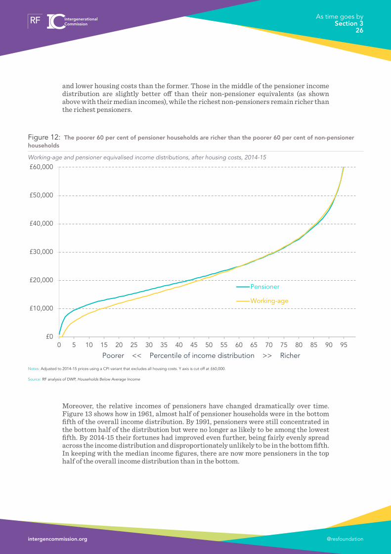
and lower housing costs than the former� Those in the middle of the pensioner income distribution are slightly better off than their non-pensioner equivalents (as shown above with their median incomes), while the richest non-pensioners remain richer than the richest pensioners�
Moreover, the relative incomes of pensioners have changed dramatically over time� Figure 13 shows how in 1961, almost half of pensioner households were in the bottom fifth of the overall income distribution� By 1991, pensioners were still concentrated in the bottom half of the distribution but were no longer as likely to be among the lowest fifth� By 2014-15 their fortunes had improved even further, being fairly evenly spread across the income distribution and disproportionately unlikely to be in the bottom fifth� In keeping with the median income figures, there are now more pensioners in the top half of the overall income distribution than in the bottom�
Figure 12: The poorer 60 per cent of pensioner households are richer than the poorer 60 per cent of non-pensioner households
Working-age and pensioner equivalised income distributions, after housing costs, 2014-15
Notes: Adjusted to 2014-15 prices using a CPI variant that excludes all housing costs. Y axis is cut off at £60,000.
Source: RF analysis of DWP, Households Below Average Income
£0
£10,000
£20,000
£30,000
£40,000
£50,000
£60,000
0 5 10 15 20 25 30 35 40 45 50 55 60 65 70 75 80 85 90 95
Pensioner
Working-age
Poorer << Percentile of income distribution >> Richer
@resfoundationintergencommission.org
As time goes by Section 3
26

Given these trends it is unsurprising that while pensioners made up over 40 per cent of those living in relative poverty in 1961, this has now fallen to 12 per cent – dispropor-tionately low for their share of the population, with parents and children making up a disproportionately high share�
Looking forward, there is little reason to think these divergent trends will go into reverse in the short-term, with pensioner income growth forecast to be faster than for non-pensioners in the Resolution Foundation’s nowcasts for 2015-16 and 2016-17 and projection to 2020-21�16
We should note quite how big a shift this turnaround in relative incomes of pensioner and working-age households is� It requires a conscious rethinking of how we conceive of incomes in 21st Century Britain, in contrast to the last half a century�
There are issues we should be mindful of when it comes to measuring pensioner incomes
It is worth pausing for a moment however to consider some conceptual and practical
16 A Corlett & S Clarke, Living Standards 2017, Resolution Foundation, February 2017
Figure 13: Pensioner households are now unlikely to have the lowest incomes in society, but are well spread between every other part of the income distribution
Proportion of pensioners in each decile of overall household income distribution, after housing costs
Source: RF analysis of IFS & DWP, Households Below Average Income
0%
5%
10%
15%
20%
25%
30%
35%
1 2 3 4 5 6 7 8 9 10
1961 1991 2014-15
Poorer << Decile of overall income distribution >> Richer
@resfoundationintergencommission.org
As time goes by Section 3
27

issues that might affect our measurement of relative pensioner and non-pensioner incomes�
To begin, there are two good reasons to think we may be overestimating pensioner incomes:
• Disability-related benefits form a more significant part of pensioner incomes compared to working-age� However, these are paid specifically to offset disabili-ty-related costs and so it is arguable that income from this source does not represent a higher standard of living�17
• Previous Resolution Foundation (and ONS) work has shown that inflation – while normally presented as a single, economy-wide figure – was higher for pensioner households in the 2000s and up to 2013-14 due to their typical patterns of spending�18 However, this is not a fixed condition: over the past 3 years the picture has reversed and inflation has been higher for working-age households�
On the other side of the ledger, however, there are reasons to think our income statistics may be under-estimating pensioner living standards:
• It is known that benefit take-up is generally underreported in the Family Resources Survey, but that this is particularly true of pension credit�19
• Prices can be lower for pensioners, particularly for transport and leisure activities or for example through the Warm Home Discount received by many on their electricity bills�
• Relatedly, work based on Minimum Income Standards has suggested that the equiv-alisation factors we use to provide a fair comparison of incomes across different sizes and types of household overestimate the needs of pensioners (and of couples)�20
• The impact of wealth may not be well-reflected in income statistics� These do not capture drawdown of financial wealth, for example, except for annuities� And unrealised capital gains and potential equity release from housing are more relevant for pensioners� The impact of physical wealth – already owning white goods, cars etc� – is also significant�
• While it is hard to put a value on leisure time, it must be noted that retirees of course have much more of it, along with the lack of childcare and commuting costs that can accompany working�
So there are limitations to what income data can tell us about living standards� But other survey questions can provide additional insights into pensioner living standards�
17 PPI, Briefing Note Number 88: Have pensioners’ incomes grown in this period of austerity?, February 2017
18 A Corlett & S Clarke, Living Standards 2017, Resolution Foundation, February 2017, Section 5
19 See A Corlett & S Clarke, Living Standards 2017, Resolution Foundation, February 2017, Box 6
20 D Hirsch, The cost of a child in the twenty-first century, Child Poverty Action Group, September 2012, Annex 2
@resfoundationintergencommission.org
As time goes by Section 3
28

Well-being surveys from the ONS, for example, show that those aged 65-79 generally have the highest life satisfaction, sense of worth and happiness of all adults, and that pensioners have the lowest degrees of anxiety�21
A similar picture emerges when we look at other survey data about subjective financial well-being� Older people are more likely to consider themselves to be “living comfortably” or “doing alright” financially, as Figure 14 shows�22 Overall, while it is important to be mindful of the income data issues above, we conclude that there is little reason to mistrust our finding that pensioners now typically have higher economic well-being than non-pensioner households�
21 ONS, Measuring National Well-being: At what age is Personal Well-being the highest?, February 2016
22 This also accords with YouGov survey data on who considers themselves “just about managing” or “not managing”, as shown in A Corlett & S Clarke, Living Standards 2017, Resolution Foundation, February 2017, Box 5
Figure 14: Older people are much more likely to claim to be living comfortably and less likely to be having difficulty managing financially
Responses to the question: ‘how are you managing financially now?’
Source: RF analysis of Understanding Society, Wave 5 (2013-2014)
0%
10%
20%
30%
40%
50%
60%
70%
80%
90%
100%
15-19yearsold
20-24yearsold
25-29yearsold
30-34yearsold
35-39yearsold
40-44yearsold
45-49yearsold
50-54yearsold
55-59yearsold
60-64yearsold
65-69yearsold
70+
Finding it very difficult
Finding it quite difficult
Just about getting by
Doing alright
Living comfortably
@resfoundationintergencommission.org
As time goes by Section 3
29

Income inequality is lower among pensioners but is still historically high
Pensioners may now have a higher typical income than working-age households but it would clearly be inaccurate to suggest that everything is rosy for all the older population� Figure 12 also showed that the differences between the higher and lower income members of both the pensioner and working-age groups are much larger than the difference between the two� And despite our noting that pensioner poverty is now less prevalent than working-age poverty, there were still 2 million pensioners below the before housing costs relative poverty line in 2014-15 (16 per cent) and 1�6 million below (14 per cent) once we account for housing costs�23
Figure 15, showing the Gini inequality coefficients both before and after housing costs for pensioners and working-age households, provides a further take on the question� While this confirms that pensioners have lower inequality than working-age households, their inequality coefficient is still high compared to the 1960s and 1970s� More recently the trend has flattened, with housing costs appearing to have played a role in reducing inequality among pensioners in stark contrast to the inequality increases seen among working-age households on an after housing costs basis�
23 IFS, Living standards, poverty and inequality in the UK: 2016
Figure 15: Inequality among pensioners is broadly flat, but rose greatly during the 1980s
Gini coefficient of equivalised household income
Notes: Discontinuity between FES and FRS-based HBAI, but external comparison shows the two are largely comparable. Small sample sizes before 1968.
Source: RF analysis of IFS & DWP, Households Below Average Income
0.20
0.22
0.24
0.26
0.28
0.30
0.32
0.34
0.36
0.38
0.40
0.42
1961 1964 1967 1970 1973 1976 1979 1982 1985 1988 1991 1994 1997 2000 2003 2006 2009 2012
Working-age, after housing costs
Working-age, before housing costs
Pensioner, after housing costs
Pensioner, before housing costs
@resfoundationintergencommission.org
As time goes by Section 3
30

It should be noted that these pensioner inequality figures are higher than those presented by the ONS for retired households�24 In part this is due to methodological differences,25 but also due to the difference between retired and pensioner households explored in Box 1 and in more detail in Section 4� Their figures show similar trends, however, with retiree inequality falling immediately following the financial crisis but since rising�
Finally, Figure 16 shows how pensioner income growth (after housing costs) has been shared in four different periods� Between 1994-95 and 2002-03, income growth was stronger in the bottom half of the distribution, but up to 2007-08 (a period we often refer to as the pre-crisis slowdown for non-pensioners) growth was weakest at the bottom and strongest at the very top� In the period of the financial crisis, however, incomes rose for most of the distribution but fell at the very top� And from 2012-13 to 2014-15, income growth has been regressive though this is likely at least in part to be a natural bounce back from the downturn (and note that individual percentiles – even with smoothing – represent only small sample sizes)�
24 ONS, Household disposable income and inequality in the UK: financial year ending 2016, January 2017
25 Notably: the ONS weight by household rather than number of individuals, and do not supplement their top incomes using administrative data.
Figure 16: Top pensioner incomes were hit in the recession
Average real annual pensioner income growth across the distribution, after housing costs
Notes: The bottom five per cent are excluded due to high statistical uncertainty, and lines are then smoothed using a five-percentile rolling average. Top income percentiles may be volatile, particularly in short time periods.
Source: RF analysis of DWP, Households Below Average Income
-2%
-1%
0%
+1%
+2%
+3%
+4%
+5%
+6%
0 5 10 15 20 25 30 35 40 45 50 55 60 65 70 75 80 85 90 95
1994-95 to 2002-03 2002-03 to 2007-08
2007-08 to 2012-13 2012-13 to 2014-15
Poorer << Percentile of pensioner income distribution >> Richer
@resfoundationintergencommission.org
As time goes by Section 3
31

To conclude, the cumulative impact of pensioner incomes rising faster than those of working-age households in recent decades has led to a stark turnaround in pensioners’ financial positon relative to the rest of the population� But while pensioners may have ‘never had it so good’ we must remain alert to the fact that poverty among the pensioner population remains a real, if reduced, challenge� On inequality there are also signs of an increase among pensioners in recent years – something we should remain alert to� In our fourth and final section we turn to consider what factors lie behind the marked improvement in typical pensioner living standards in recent years, and what this has meant in terms of the real-world experience of pensioners�
@resfoundationintergencommission.org
As time goes by Section 3
32

Section 4
What has driven pensioner income growth?
The previous section showed that typical pensioner incomes have grown strongly in recent years, overtaking working-age equivalents and marking a structural shift in the way in which income is distributed in Britain.
In this section, we look in detail at what has been driving the growth in pensioner incomes, noting that relatively high typical and mean pensioner income growth is not the same as saying that all pensioner households have seen that income growth year to year. As with all averages this is because of differences in experiences across pensioners, but also crucially because a key driver of typical pensioner income growth is the change in the pensioner population that comes over time as older (generally poorer) generations of pensioners die and new (generally richer) generations of pensioners join the population.
We also examine how the changing characteristics of the pensioner population has affected overall income growth in the group. We find that such compositional factors explain almost a quarter of pensioner income growth from 2001-02 to 2014-15, with higher employment, higher home ownership and changing demographics proving particularly noteworthy.
Turning to income sources, as opposed to pensioner characteristics, we can see that across the same time period growing private pension and other investment income drove half of the rise in gross pensioner incomes, with the remaining half explained equally by growth in the state pension (and other benefits) and earnings.
Nevertheless, while this analysis shows that the lived experience of recent years is more complex than a simple focus on headline income growth measures might suggest, it is clear that younger and older generations have faced very divergent experiences in the post-crisis period. And the headline figures are of course important when designing policies that inevitably apply to broad ‘working-age’ and ‘pensioner’ groups.
Headline pensioner income increases do not necessarily translate into year-to-year improvements for individual pensioners
As shown in the previous section, typical pensioner incomes have grown strongly over recent years� But such a description is likely a surprise to many pensioner households, many of whom often feel that their income is flat year to year� In fact, it’s quite possible that both of these outcomes are true�
The drivers of median pensioner incomes are more complex than those of non-pen-sioners� For one, the ‘pensioner’ group has high flux, with a large proportion dying each year to be replaced by new pensioners (of younger and generally richer generations)� This flux is higher than in the working-age population, which generally covers a larger
@resfoundationintergencommission.org
As time goes by Section 4
33

age range and so is less affected by inflows and outflows� So when we compare typical incomes in 2014 with typical incomes in 2001, for example, we are to a large extent comparing two different populations of pensioners�
This helps to explain why typical pensioner incomes have been observed to rise in real terms each year even when state pension and occupational pensions annuities have been generally inflation-linked at best (though differing inflation measures also play a role)�
Figure 17 presents two sets of data� One shows the growth in typical pensioner incomes which – as we’ve seen – has been particularly strong in recent years� The second dataset shows typical incomes for selected birth year cohorts over time; for example, the ‘Born 1935’ birth year cohort compares typical incomes of those age 65 in 2000, age 66 in 2001, and so forth up to age 79 in 2014� While this is not comparing exactly the same people over time (due to the data source being a sample rather than covering the entire population or a longitudinal panel), it is comparing the same annual cohort over time�26
26 However, until birth cohorts are age 65+, these income figures will reflect only those households with a female pensioner household reference person. In addition, income trends will be affected if lower income members of the cohort die earlier.
Figure 17: The typical pensioner income has grown strongly, but no birth cohort has seen such strong growth
Index of real median household income (2000=100), after housing costs (two year average)
Notes: Adjusted for inflation using a CPI variant that excludes all housing costs.
Source: RF analysis of DWP, Households Below Average Income
90
95
100
105
110
115
120
125
130
135
140
2000 2001 2002 2003 2004 2005 2006 2007 2008 2009 2010 2011 2012 2013 2014
All pensioners
Born 1930(70 in 2000)
Born 1940(60 in 2000)
Born 1935(65 in 2000)
@resfoundationintergencommission.org
As time goes by Section 4
34

Although such fine-grained data is inevitably noisy, no matter what birth year cohort we look at we find that income growth has not been as strong as the figures for all pensioners as a whole� This is in line with the data presented in Figure 1 at the start of this report, which similarly showed that the average incomes of members of the silent generation at age 70 were no higher than they had been at age 60�27 Indeed this is what we should expect given that most forms of pension income are to a great extent fixed in real terms once they begin to be drawn on�
‘Pensioner’ households are not necessarily ‘retired’: the importance of work
In interpreting rising pensioner incomes, it is also important to acknowledge the role of employment� While the ‘pensioner’ and ‘retired’ labels are often used interchangeably, they are – as discussed in Box 1 – different concepts� The standard pensioner household definition simply covers those families containing someone over their gender-specific State Pension age�
Significant proportions of such families have someone in work – either working beyond the State Pension age or a spouse who has not yet reached that threshold, or both� And this proportion has grown over time, as shown in Figure 18: in the decade running up to the last recession, the proportion of pensioner families with at least one person in work rose to around one in five� It has been slightly lower since, likely reflecting both the labour market impact of the recession and a narrowing gap between female and male State Pension ages� And although part-time work makes up the lion’s share of this employment, the proportion with at least one person in full-time employment has also risen significantly�
27 See also PPI, Briefing Note Number 88: Have pensioners’ incomes grown in this period of austerity?, February 2017
@resfoundationintergencommission.org
As time goes by Section 4
35

Of course, employment is more common at younger ages within the pensioner group� But there has been an increase at all ages over time� Both these patterns are shown in Table 1� For example, one in ten pensioner families headed by someone age 70 had someone in work in 1999, a proportion that has now doubled to one in five� At ages under 65 (still the male State Pension age), employment is particularly common – though the rising female State Pension age is inevitably reducing the number of pensioner families of this age�
Figure 18: Almost a fifth of pensioner families have at least one person in work
Proportion of pensioner benefit units by work status
Source: RF analysis of DWP, Households Below Average Income
0%
2%
4%
6%
8%
10%
12%
14%
16%
18%
20%
1996 1998 2000 2002 2004 2006 2008 2010 2012 2014
1+ self employed
1+ part time
1 full time, 1 notworking
1 full time, 1 parttime
All full time
@resfoundationintergencommission.org
As time goes by Section 4
36

Table 1: Working is becoming increasingly common among pensioners at all ages
Proportion of pensioner benefit units with at least one person in work
Notes: Groups excluded where there are fewer than 100,000 benefit units of that age due to increases in the female state pension age.
Source: RF analysis of DWP, Households Below Average Income
So while typical pensioner household incomes are higher than working-age ones, the picture is greatly altered if we make a distinction between working and non-working households� Figure 19 looks in detail at median incomes for all-working, all-workless and mixed households of pension and non-pension age� Perhaps surprisingly, pensioners in working households have the highest typical income of any group – followed by pensioners in mixed households� But working-age people in working households have the next highest income, with a much higher median than workless pensioners�
1996 1997 1998 1999 2000 2001 2002 2003 2004 2005 2006 2007 2008 2009 2010 2011 2012 2013 2014
60 34% 46% 43% 40% 44% 52% 52% 58% 52% 52% 57% 58% 55% 60% 59% 73%
61 39% 43% 38% 42% 48% 47% 45% 45% 50% 51% 48% 60% 52% 59% 58% 63% 59% 72%
62 44% 42% 42% 36% 40% 40% 42% 39% 50% 54% 46% 54% 53% 56% 54% 50% 44% 52% 53%
63 34% 41% 30% 40% 35% 40% 46% 38% 39% 41% 51% 39% 53% 52% 51% 51% 41% 47% 51%
64 28% 35% 33% 33% 31% 31% 42% 39% 41% 41% 39% 49% 47% 49% 47% 41% 46% 44% 44%
65 23% 26% 25% 25% 22% 23% 21% 25% 31% 31% 29% 33% 32% 35% 32% 33% 36% 34% 43%
66 18% 19% 17% 21% 22% 22% 22% 26% 23% 22% 22% 27% 30% 27% 31% 32% 31% 31% 29%
67 17% 19% 18% 18% 21% 18% 18% 18% 16% 22% 23% 23% 25% 27% 21% 27% 28% 28% 27%
68 16% 14% 14% 14% 20% 18% 14% 15% 15% 19% 18% 17% 19% 25% 21% 24% 26% 19% 25%
69 13% 14% 12% 15% 15% 10% 15% 11% 16% 13% 15% 15% 15% 14% 17% 20% 20% 22% 19%
70 11% 10% 10% 10% 13% 7% 12% 10% 11% 12% 13% 16% 9% 18% 14% 16% 13% 16% 20%
71 9% 10% 12% 14% 8% 8% 7% 9% 10% 9% 12% 10% 8% 13% 11% 12% 13% 14% 19%
72 7% 8% 8% 7% 7% 8% 9% 7% 8% 10% 10% 13% 9% 8% 10% 12% 11% 12% 14%
73 8% 8% 7% 8% 8% 8% 6% 5% 9% 8% 6% 7% 6% 10% 8% 11% 10% 11% 10%
74 7% 7% 6% 6% 6% 4% 7% 7% 7% 9% 6% 6% 7% 8% 12% 4% 10% 6% 9%
75 4% 4% 7% 7% 5% 4% 7% 5% 6% 3% 9% 6% 9% 4% 8% 7% 9% 8% 9%
76 4% 5% 5% 2% 5% 3% 6% 5% 5% 5% 4% 4% 4% 4% 4% 8% 8% 7% 4%
77 4% 5% 2% 4% 6% 3% 2% 3% 4% 4% 4% 3% 6% 6% 3% 4% 4% 4% 3%
78 3% 5% 5% 1% 0% 4% 4% 4% 3% 5% 4% 5% 5% 5% 5% 5% 3% 4% 6%
79 0% 3% 1% 3% 2% 2% 4% 3% 2% 3% 4% 1% 3% 4% 5% 7% 3% 3% 3%
Ag
e
@resfoundationintergencommission.org
As time goes by Section 4
37

That said, workless pensioner incomes have grown more rapidly than those of any other group, with 34 per cent real income growth since 2001 compared to 8 per cent growth for working-age working households (and a fall for working-age mixed households)� It is also worth noting that pensioners in workless households have higher incomes than working-age people in mixed households and almost double the income of working-age workless households�
As well as playing a key role in the headline pensioner income story, employment is also an important contributor to inequality among pensioners: inequality among working pensioner households is higher than among workless ones and the gap between the former and the latter also contributes to overall pensioner inequality� But it also appears that inequality has risen among workless pensioner households in recent years�
Overall of course, the increase in employment income for pensioner households is to be welcomed, contributing as it does to significantly higher standards of living for today’s
Figure 19: The typical workless pensioner household has not overtaken the typical non-pensioner household
Median real disposable household income, after housing costs
Notes: Real, equivalised incomes in 2014-15 prices using a CPI variant that excludes all housing costs.
Source: RF analysis of DWP, Households Below Average Income
£0
£5,000
£10,000
£15,000
£20,000
£25,000
£30,000
£35,000
1996 1997 1998 1999 2000 2001 2002 2003 2004 2005 2006 2007 2008 2009 2010 2011 2012 2013 2014
Working age - working Pensioner - workingWorking age - mixed Pensioner - mixedWorking age - workless Pensioner - worklessWorking age - all Pensioner - all
@resfoundationintergencommission.org
As time goes by Section 4
38

pensioners compared to their predecessors� Forthcoming research for the Intergenera-tional Commission will explore these labour market changes in more detail and look at the role employment might play in supporting the incomes of future generations of pensioners�
A changing composition has boosted average pensioner incomes
Building on the fact that rising employment has been an important factor in generating higher pensioner incomes, we can formally quantify the impact of this and other changes in the characteristics of the pensioner population on pensioner income growth figures�
Figure 20 presents the results of a regression analysis to this effect� It estimates how much of pensioner income growth in each year since 2001-02 has been down to changes in – say – how many members of the group were in work� The residual reflects ‘real’ income growth rather than changes in the relative size of different pensioner groups� This residual is the income growth driven by both other income growth for individual households year to year not explained by characteristic changes, and the wider effect of the first issue discussed above of new, richer cohorts of pensioners entering and older, poorer cohorts of pensioners exiting the population, where their higher pension income is not just based on differences in the characteristics below (such as being more likely to work)�
Figure 20: The changing make-up of the pensioner population – particularly regarding work status and housing tenure – has played a role in boosting mean incomes
Decomposition of real annual pensioner income growth, after housing costs
Source: RF analysis of DWP, Households Below Average Income
-4%
-3%
-2%
-1%
0%
+1%
+2%
+3%
+4%
+5%
+6%
2002-03 2004-05 2006-07 2008-09 2010-11 2012-13 2014-15 Av.
In-group 'real'growth
Housingtenure
Region ðnicity
Disability
Work status
Age
Householdcomposition
@resfoundationintergencommission.org
As time goes by Section 4
39

Over the period as a whole, we find that almost a quarter of income growth was accounted for by compositional changes in the characteristics shown in Figure 20 (though there may be others not captured here)� By far the two most important factors were work status (the aforementioned decline in worklessness among pensioner households) and housing tenure (an overall shift from social renting to outright home ownership)�
The compositional effects have not been constant over time, however� As indicated earlier, the proportion of pensioner families with someone in employment declined following the financial crisis, and this served to create a (temporary) compositional ‘drag’ on incomes�
Also of interest is the compositional effect of changes in the age profile of the pensioner population (including the household reference person and their spouse)� While this has had little effect over the period as a whole, it has shifted from representing a small drag prior to 2009-10 into a small boost since then� With the demographic bulge of younger baby boomers entering the pensioner population increasing the number of 65-70 year olds in recent years – as shown in Figure 10 – this pushes up average incomes due to the consistently higher incomes of younger pensioners� However, it is clear that this has been only a minor driver of the relatively strong performance of pensioner incomes in recent years�
The majority of recent pensioner income growth has not been down to compositional changes
While these compositional factors are important, Figure 20 also makes clear that they only explain around a quarter of recent pensioner income growth� That should not be a surprise given that we see that income growth has been strong for all pensioner groups: young and old, working and workless, couples and singles�
To further explain why pensioner incomes have grown so strongly – and relatively equally – we need to look at the range of sources that contribute to pensioner incomes and how these differ for different parts of the population�
To this end, Figure 21 breaks down before-tax (and before housing costs) pensioner incomes into five categories: benefit income, investment income (and some minor extras), occupational pension income, self-employment earnings and employee earnings� These are incomes for couples or individual pensioners but presented on a per-adult basis�
@resfoundationintergencommission.org
As time goes by Section 4
40

The large gap between the richest and poorest fifths is notable – though post-tax the disparity would be narrower� But just as striking is how different groups rely on different income sources� The richest fifth have a range of income sources – including employment and investment income (and it is partly because they have employment income that they are in the top fifth)� In contrast, the poorest fifth rely almost exclusively on benefit income� In fact, given the splits between working and workless pensioners, 74 per cent of gross employment income goes to the richest 20 per cent of pensioners, and 80 per cent of self-employment income�
Figure 22 also shows the same results for three age groups of pensioner families – those with a reference person under 70, those age 70-79 and those age 80+�
Figure 21: Gross income for pensioner benefit units comes from a range of sources and is considerably higher for the richest
Mean gross income per adult, 2014-15
Source: RF analysis of DWP, Households Below Average Income, 2014-15
-£5,000
£0
£5,000
£10,000
£15,000
£20,000
£25,000
£30,000
£35,000
£40,000
Poorest 2 3 4 Richest All
Benefits
Investment &other
Occupationalpensions
Self-employment
Employment
Quintile of pensioner income distribution
@resfoundationintergencommission.org
As time goes by Section 4
41

It is clear that inequality is higher among younger pensioners – primarily due to the particularly strong performance of the richest fifth of pensioner households under 70� A heavily related fact is the extent to which younger pensioners derive larger parts of their incomes from employment (including self-employment) and the extent to which private pensions play a key role for richer pensioners in each of the three age groups�
This approach also lets us consider how different sources of income have changed in importance over time, and how they have contributed to the overall relatively strong growth in pensioner incomes� Figure 22 breaks down the change in gross pensioner income since 2001-02 into each of the different sources, showing how all of the sources of income we identify have played important roles� Looking across the pensioner group as a whole, of the 31 per cent growth recorded in gross real income per adult, 8 percentage points can be ascribed to employee and self-employment income; 15 percentage points to private pensions and other investment income; and 8 percentage points to the state pension and other benefits�
Figure 22: Sources of pensioner income vary by both age and income group
Mean gross income per adult, by age and income quintile, 2014-15
Source: RF analysis of DWP, Households Below Average Income, 2014-15
-£5,000
£0
£5,000
£10,000
£15,000
£20,000
£25,000
£30,000
£35,000
£40,000
£45,000
£50,000
1 2 3 4 5 All 1 2 3 4 5 All 1 2 3 4 5 All All
Benefits
Investment & other
Occupational pensions
Self-employment
Employment
Under 70 Age 70-79 Age 80+ All
@resfoundationintergencommission.org
As time goes by Section 4
42

But the importance of these components differs across the income distribution – even though total income growth has been similarly strong for each group� For example, employment income and occupational pensions have contributed more to overall growth among richer pensioners than among poorer ones� In contrast, increases in benefit income have provided a disproportional boost to the incomes of poorer pensioner households� It is worth noting, however, that most of this growth occurred before the introduction of the ‘triple lock’ rule for state pension uprating, which was only properly implemented for the first time in April 2012� But before this the state pension was most commonly uprated in line with RPI inflation (which is no longer considered to meet ‘national statistic’ standards) – and this was generally higher than the CPI inflation that forms the basis of all inflation-adjustment in this paper�
Differences are apparent across the age groups too, as Figure 24 shows� For example, employment income has been a large part of income growth for pensioner families under 70� In contrast, occupational pensions are responsible for the majority of income growth for the 80+ group over this period, in part reflecting cohorts entering the 80+ life stage with higher occupational pensions than their predecessors�
Figure 23: Pensioner income growth has been strong, relatively even and driven by multiple sources
Real gross income growth per adult, 2001-02 to 2014-15
Source: RF analysis of DWP, Households Below Average Income
+1% +3% +3% +5%+8%
+5%
-1%
+1% +1%
+3%
+4%
+2%
+3%
+9%+14%
+16%+12%
+12%
+2%
+3%
+3%
+2% +3%
+3%
+17%
+19%+14%
+7%+2%
+8%
-5%
0%
+5%
+10%
+15%
+20%
+25%
+30%
+35%
Poorest 2 3 4 Richest All
Benefits
Investment &other
Occupationalpensions
Self-employment
Employment
Quintile of pensioner income distribution
@resfoundationintergencommission.org
As time goes by Section 4
43

The future shape of pensioner incomes rests on how we rise to the challenges facing today’s working-age households
What’s clear is that, despite the complexities and divergences uncovered when scratching beneath the surface of the group, pensioner incomes have grown much more strongly in recent years than working-age incomes have�
Such strong growth is of course unequivocally good news� But we need to learn the right lessons of recent successes and aim to do more, both for current pensioners and future ones� We will look in more detail at prospects for various sources of pensioner income in future Intergenerational Commission papers� In particular, we will consider how the challenges facing younger generations in relation to work, pay, saving and asset-building might affect their living standard outcomes as they age and reach pensioner status�
Figure 24: Growth has been relatively even across age groups and income groups, but the sources of that growth have differed significantly
Real gross income growth per adult, by age and income quintile, 2001-02 to 2014-15
Source: RF analysis of DWP, Households Below Average Income
-5%
0%
+5%
+10%
+15%
+20%
+25%
+30%
+35%
+40%
1 2 3 4 5 All 1 2 3 4 5 All 1 2 3 4 5 All All
Benefits Investment & otherOccupational pensions Self-employmentEmployment
Under 70 Age 70-79 Age 80+ All
@resfoundationintergencommission.org
As time goes by Section 4
44

Section 5
Conclusion
The divergence in pensioner and working-age income trends over the past 15 years or so is one of the big economic shifts of our time� In many ways it is an unrelated combination of a success story – with increases in pensioner incomes driving welcome and big reductions in pensioner poverty – and economic failure dragging on working-age household incomes� This significant change obviously matters for the context in which public policy is made: the age-based stereotypes of the 20th Century are increasingly out of kilter with reality� For example, it is odd given this reversal that recent policy has focused spending cuts almost exclusively on working-age households (and indeed lower income working-age families in particular)�
Within this background context we should however understand what headline pensioner income growth figures mean for individual pensioner households already in retirement, for whom annual income growth is considerably lower� Similarly welcome improvements in pensioner incomes and falling poverty rates sit alongside the fact that too many pensioners remain on very low incomes�
Looking to the future it is also important that we learn from recent successes in raising pensioner incomes as we look to ensure future pensioners can also enjoy higher standards of living – a goal that a forthcoming paper for the Intergenerational Commission will explore� The roles of employment income and good private pension savings are central in this regard�
Achieving that objective also depends on younger generations’ incomes in working life which, as this paper has shown, are not benefiting from the generational progress we came to expect in the last century� This stalling of generational living standards progress is also not felt equally across the household income distribution, not least because significant inequalities exist within every generation and shift over time�
While these traditional forms of within-generation inequality are well covered in the wider debate, and not therefore the primary focus of the Intergenerational Commission, policy must remain alive to differences within generations� This is particularly true because there may be areas where the two interact, with inequality within generations having the potential to amplify between-generation differences� Or indeed for within-gen-eration inequality to be passed down between generations� These complexities are at the heart of any serious attempt to grapple with fairness between the generations and to strengthen the intergenerational contract�
@resfoundationintergencommission.org
As time goes by Section 5
45
Resolution Foundation is an independent research and policy organisation. Our goal is to improve the lives of people with low to middle incomes by delivering change in areas where they are currently disadvantaged. We do this by:
• undertaking research and economic analysis to understand the challenges facing people on a low to middle income;
• developing practical and effective policy proposals; and
• engaging with policy makers and stakeholders to influence decision-making and bring about change.
For more information on this report, contact:
Adam Corlett Economic Analyst [email protected]
020 3372 2983
@resfoundationintergencommission.org

![· a. Pre-2007 BSNL pensioner / family pensioner means a pensioner/ family pensioner. who. aner retirement from BSNL during the period I. 10.2000 to 31.12.2006, was drawing] entitled](https://img.pdfslide.us/doc/110x75/5e7138433b4e95744525db27/a-pre-2007-bsnl-pensioner-family-pensioner-means-a-pensioner-family-pensioner.jpg)