Embed Size (px)
Citation preview
Design Research Society Design Research Society
DRS Digital Library DRS Digital Library
DRS Biennial Conference Series DRS2018 - Catalyst
Jun 25th, 12:00 AM
Exploring the Interaction Between Lighting Variables and Exploring the Interaction Between Lighting Variables and
Information Transfer as a New Function of Lighting Information Transfer as a New Function of Lighting
Jun Daeun Maker Lab Seoul
Kim Chajoong Maker Lab Seoul
Cho Kwangmin UNIST
Follow this and additional works at: https://dl.designresearchsociety.org/drs-conference-papers
Citation Citation Daeun, J., Chajoong, K., and Kwangmin, C. (2018) Exploring the Interaction Between Lighting Variables and Information Transfer as a New Function of Lighting, in Storni, C., Leahy, K., McMahon, M., Lloyd, P. and Bohemia, E. (eds.), Design as a catalyst for change - DRS International Conference 2018, 25-28 June, Limerick, Ireland. https://doi.org/10.21606/drs.2018.547
This Research Paper is brought to you for free and open access by the Conference Proceedings at DRS Digital Library. It has been accepted for inclusion in DRS Biennial Conference Series by an authorized administrator of DRS Digital Library. For more information, please contact [email protected].
This work is licensed under a Creative Commons Attribution-NonCommercial-Share Alike 4.0 International License. https://creativecommons.org/licenses/by-nc-sa/4.0/
Exploring the Interaction Between Lighting Variables and Information Transfer as a New Function of Lighting DAEUN Juna* CHAJOONG Kima; and KWANGMIN Chob
a Maker Lab Seoul b UNIST * Corresponding author email: [email protected] doi: 10.21606/drs.2018.547
Together with the improvement of artificial light sources such as LED, lighting has been utilized in our everyday products for various purposes such as visual aesthetic enhancement, and emotion induction. Nevertheless, little attention has been paid to another function of transferring information with lighting. Therefore, this study attempted to explore how information transfer would be effectively made with manipulating lighting variables. An experiment was designed in which the interaction between lighting variables and information transfer was investigated depending on type of information in human-product interaction Three products were adopted to represent each type of information and used in the design of experiment stimuli. 30 participants were recruited for the experiment. The results indicate that information transfer can be effectively made with manipulating lighting variables. This implies that lighting is a useful way to intuitively and fast deliver information to people. The findings could help designers better understand the roles of lighting variables in information transfer.
lighting; information transfer; lighting variables; type of information
1 Introduction Vision is the most dependent sense for human’s everyday life among human sensors because more than 50% of the brain is related to vision directly or indirectly (Elizabeth, 1996). Before handling artificial light expertly, most of human’s daily life had followed the cycle of the sun that is the biggest supplier of light on Earth. They had started to use fire as an illuminator in the dark such as night, which is the origin of the artificial light and such use of light in human life is defined as lighting (Cho, Yang, & Seo, 2010). In early lighting candles and lamps had been mainly used for the purpose to brighten the space. Unfortunately, they utilizing the fire as the source of lighting had difficulties in emitting stable and regular light. Thanks to the bulb that Thomason Edison invented in 1879, our daily activities were able to be expanded to night without many constraints (Brox, 2010). Sources of artificial lighting have been developed continuously until today. These days, LED (Light Emitting
2228
Diode) lighting is receiving much attention, because it is more efficient, digitally controllable, and much smaller than earlier types of light source (Hoonhout, Jumpertz, & Mason, 2011).
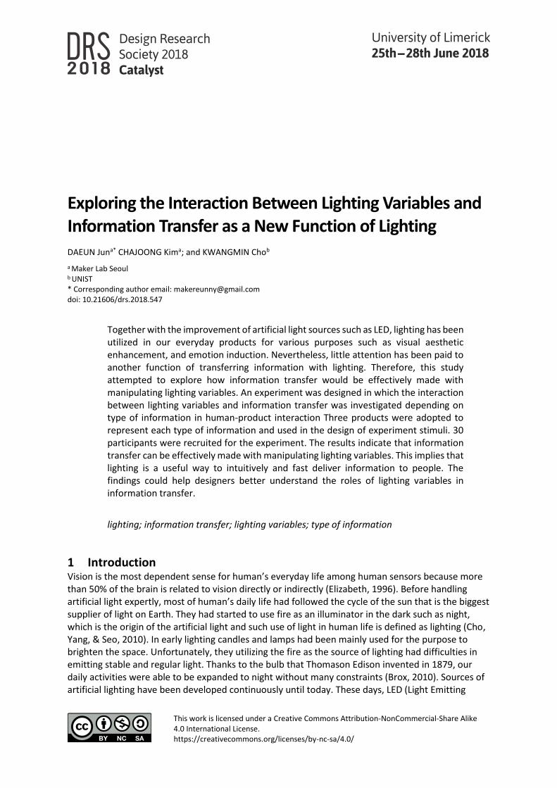
Thanks to the advent of LED, lighting does not only function to illuminate, but also to transfer information, enhance visual aesthetics, and induce emotions in human-product interaction (Figure 1) (Jun et al., 2014; Jun, 2015). For example, landscape lighting has been used to decorate the outdoor and to create better sceneries. Traffic signals have used lighting to deliver information at night. The LED indicator of battery charge can show how much the battery is charged with the color of the indicator.
Figure 1 The visibility and three sub-functions of lighting in the human-lighting interaction
The visualization of information is a useful way to deliver information to people, and lighting also can be used to visualize information. The method for processing information in the eye is much more easy and effective than other senses (Smiciklas, 2012). With extending the method of delivering visual information such as paper, video, and computer screen, human has been able to extend the depth of our knowledge and experience (Tufte & Weise Moeller, 1997). The traffic signal is a typical product that uses visualized information using lighting. Especially, visualized information using lighting has increased better effectiveness in the dark night. After developing small light of LED, indicators in electronic appliance have started to use lighting in product. The representative product is the classic IBM system in 1964 (Schubert et al., 2005). Transmission of visual information by lighting is more effective immediately with understanding the information (Jun & Kim, 2014; Jun, 2015). The method of information transfer using lighting is expected to increase with the expansion of electronic goods and the development of LED lighting. Moreover, LED lighting can be easily controlled according to situations because of the function of LED digital control. Therefore, the lighting would be able to deliver a variety of information by utilizing the function to control lighting factors. With LED lighting the interaction between human and product in information transfer can be richer than the traditional ways of information transfer. Nevertheless, most studies have focused on the development of artificial light source only or the enhancement of aesthetics and emotion. Also, only a few factors such as turning on or off lighting and color change have been mostly used in present products with LED. Therefore, the study aimed to understand the interaction between lighting variables and information transfer, and then explore what possibilities could exist in information transfer with LED lighting. With a better understanding of the interaction, it can help designers increase utilization of lighting in product, improve usability of product, and furthermore create new interactive products with lighting in terms of information transfer.
2229
In order to the research goal, research questions were formulated as listed below:
• Is it possible to deliver richer information by controlling variables of lighting?
• Which variables of lighting would play a role in transferring information?
• What experience do people have about lighting-based information in human-product interaction?
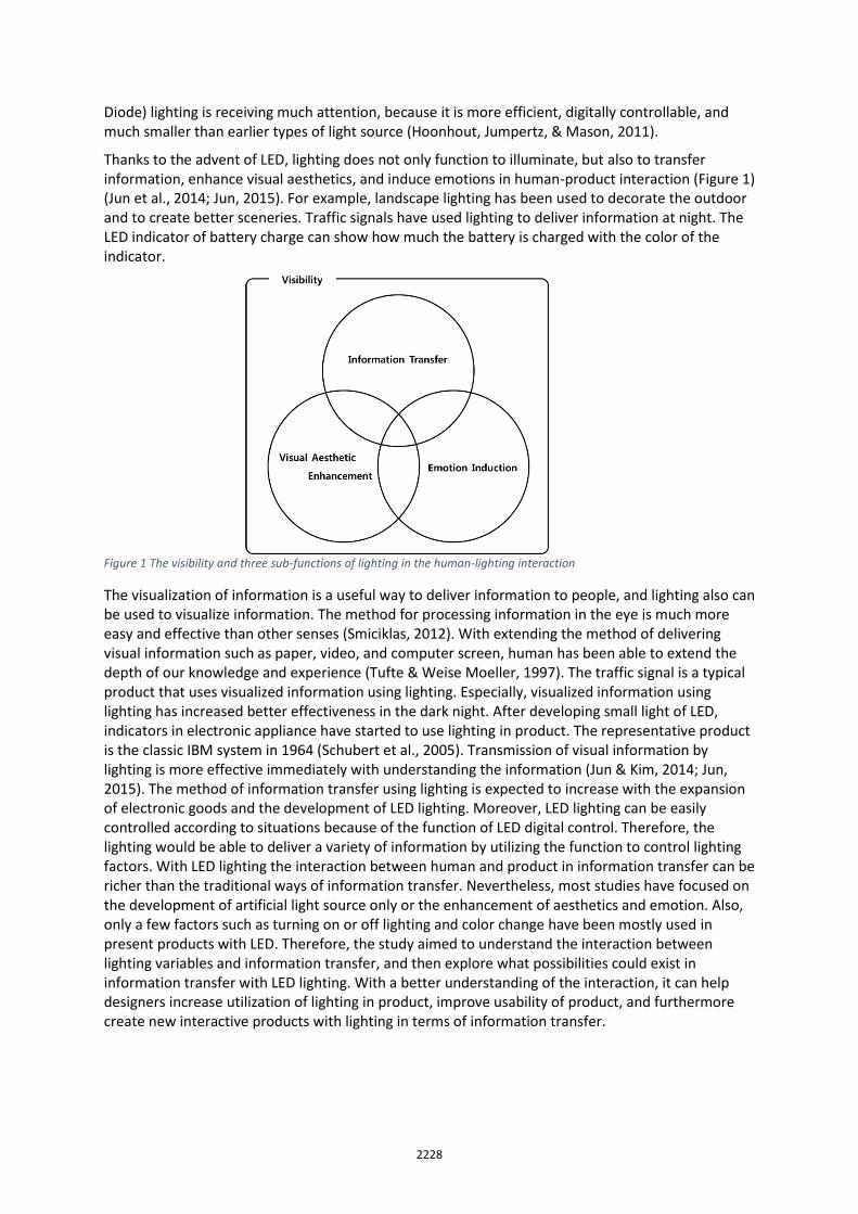
1.1 Lighting variables in human-product interaction The parameters of lighting that affect vision have been diversified. Lighting has played a key role in theatre to create touching scenes in drama. Initially, four parameters of lighting were considered in theater lighting: distribution, intensity, movement, and color (Gillette, 2012). Recently, Essig and Setlow (2012) have identified seven parameters of lighting: intensity, color, direction, distribution, texture, shape, and movement. As lighting technologies are advanced, especially interactive design study related to lighting also has described seven parameters: the number of lighting, intensity, amount of light, type of light, color, reaction scheme, and light changes (Chang, 2010). Whereas architecture and interior design focus more on the arrangement or position of lighting than the other basic parameters of lighting. These studies of theatre and interaction have showed that many parameters of lighting are adjustable and these parameters would transfer diverse visual perception to human. Beritin’s research has represented the original visual variables and has described seven visual variables that these units were modified: value (change from light to dark), color size (change in length, area and repetition), texture (variation in grain), shape (infinite number of shapes), position (change in the location) and orientation (changes in alignment) (Bertin, 1983). Because the meanings of lighting parameters look similar or overlapping among studies, redefined lighting parameters were necessary for the study, through which exisitng lighting parameters can be overall and clearly represented. Based on the literature review, seven parameters of lighting could be redefined: intensity (the level of illuminance), color (consisting of color temperature and hue as stimulation in the retina by spectrum of light), area (illumination area by lighting), movement (automated changes of lighting), texture (the degree to which light scatters) and distribution (the direction of emitted light) (Figure 2) (Jun et al., 2014, Jun, 2015).
intensity color area
movement texture distribution
Figure 2 Six lighting variables
1.2 Type of information in human-product interaction Because there are many types of classification of information, the classification of data and information is a big issue (Ware, 2013). Information can be categorized according to the subject such as physical information, biological information, economic information, and so on. Although the terminology has not been standardized or fixed yet, information consists of different types of data: primary data, secondary data, metadata, operational data, and derivative data (Floridi, 2010). One experiment was conducted to figure out structured framework for understanding the type of information that people need (Dearman, Kellar, & Truong, 2008). This study has been assorted the
2230
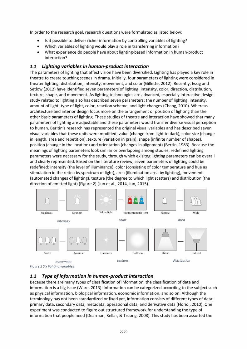
information as nine categories: person, establishment & organization, offering, event, environmental condition, trivia & pop culture, finding, availability, and guidance. In human-product interaction there are three important elements: person, product and environment (Rooden, 2001; Van Kuijk, 2010). Therefore, according to the concept of human-product interaction study with three components, information is classified as three categories: personal information, product information, and environmental information (Figure 3). Personal information includes information that is inherent to the person such as name, birthday, phone number, height, blood sugar, and so on. Product information refers to what is notified about the state of the product. It includes state of operation, size, price, battery storage, time, and so on. Environmental information includes weather, geography, traffic and so on. Environment information is closely related to human life. Human can get environmental information directly by human senses, and this information is delivered through some products such as phone, television, and so on as well.
Figure 3 Three types of information in human-product interaction
2 Methodology
2.1 Experiment Design
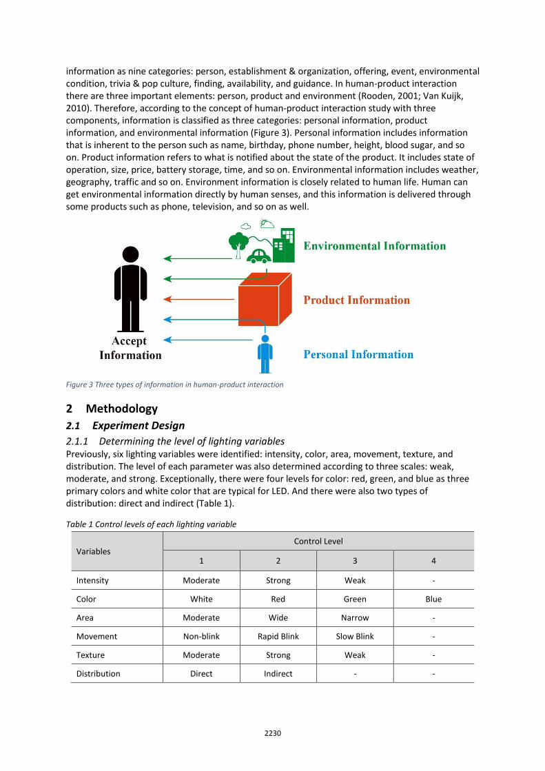
2.1.1 Determining the level of lighting variables Previously, six lighting variables were identified: intensity, color, area, movement, texture, and distribution. The level of each parameter was also determined according to three scales: weak, moderate, and strong. Exceptionally, there were four levels for color: red, green, and blue as three primary colors and white color that are typical for LED. And there were also two types of distribution: direct and indirect (Table 1).
Table 1 Control levels of each lighting variable
Variables Control Level
1 2 3 4
Intensity Moderate Strong Weak -
Color White Red Green Blue
Area Moderate Wide Narrow -
Movement Non-blink Rapid Blink Slow Blink -
Texture Moderate Strong Weak -
Distribution Direct Indirect - -
2231
2.1.2 The Development of Use Scenarios Three experimental stimuli representing each information type were determined: blood pressure gauge, external memory disk, and ozone concentration indicator. Each product had three use scenarios related to their information. The blood pressure gauge could indicate how high or low the blood pressure of the user is with lighting. The lighting for external memory disk could be used to indicate how much space of storage is remained. The ozone concentration indicator could display the levels of ozone in the air. The scenarios of each experimental stimulus are shown in detail in Table 2.
Table 2 Use scenarios of each experimental stimulus
Experimental stimulus Use scenario
Blood pressure gauge
High blood pressure
Normal blood pressure
Low blood pressure
External hard disk
The storage space is full
The half of storage space is filled
The storage space is almost empty
Ozone concentration indicator Too high ozone concentration (Inappropriate for everyone to go out)
High ozone concentrations (Inappropriate for the old and weak to go out)
Normal ozone condition (Appropriate for outdoor activity)
2.2 Participants Participants were recruited through an off-line advertisement. 30 participants were recruited for this experiment and they were all paid for the participation. 15 people were males and 15 were females. The age of participants ranged from 19 to 25 years old and the average was 20.7 years old. They were all university students at the time of the experiment.
2.3 Apparatus
2.3.1 Experimental stimuli Some consumer electronic products such as battery charger and wireless router have already popularly used LED lighting to transfer information of the product. Because prior experiences could influence the experiment, it was necessary to find new products that have not used lighting as a means of information transfer before. The type of information could be divided into three categories depending on the source of information: user information, product information, and environmental information. Each experimental stimulus should provide each type of information respectively, and at the same time, no LED lighting has not been used for the stimuli to transfer information the product. Based on those criteria, three experimental stimuli were selected and developed. The stimulus providing user information was a blood pressure gauge. This information has been delivered with numbers indicating the blood pressure of the user. The stimulus representing product information was an external memory disk. The storage information of the memory disk has been also provided with numbers. The weather is one of the most definite environmental information. Ozone concentration indicator was selected as the stimuli representing environmental information, such information provided with numbers usually.
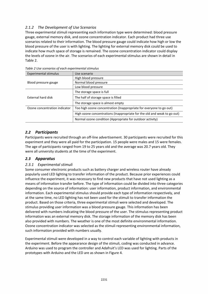
Experimental stimuli were developed in a way to control each variable of lighting with products in the experiment. Before the appearance design of the stimuli, coding was conducted in advance. Arduino was used to program the controller and Adafruit’s LED was used for lighting. Parts of the prototypes with Arduino and the LED are as shown in Figure 4.
2232
Figure 4 Control parts of the stimuli with Arduino and LED: external hard disk (left), blood pressure gauge (middle), and ozone concentration indicator (right)
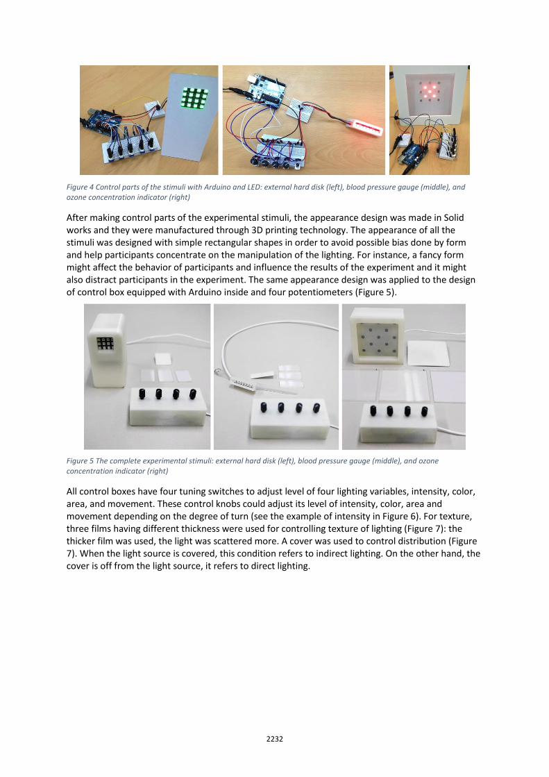
After making control parts of the experimental stimuli, the appearance design was made in Solid works and they were manufactured through 3D printing technology. The appearance of all the stimuli was designed with simple rectangular shapes in order to avoid possible bias done by form and help participants concentrate on the manipulation of the lighting. For instance, a fancy form might affect the behavior of participants and influence the results of the experiment and it might also distract participants in the experiment. The same appearance design was applied to the design of control box equipped with Arduino inside and four potentiometers (Figure 5).
Figure 5 The complete experimental stimuli: external hard disk (left), blood pressure gauge (middle), and ozone concentration indicator (right)
All control boxes have four tuning switches to adjust level of four lighting variables, intensity, color, area, and movement. These control knobs could adjust its level of intensity, color, area and movement depending on the degree of turn (see the example of intensity in Figure 6). For texture, three films having different thickness were used for controlling texture of lighting (Figure 7): the thicker film was used, the light was scattered more. A cover was used to control distribution (Figure 7). When the light source is covered, this condition refers to indirect lighting. On the other hand, the cover is off from the light source, it refers to direct lighting.
2233
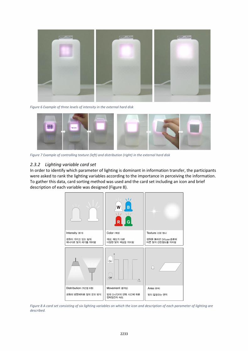
Figure 6 Example of three levels of intensity in the external hard disk
Figure 7 Example of controlling texture (left) and distribution (right) in the external hard disk
2.3.2 Lighting variable card set In order to identify which parameter of lighting is dominant in information transfer, the participants were asked to rank the lighting variables according to the importance in perceiving the information. To gather this data, card sorting method was used and the card set including an icon and brief description of each variable was designed (Figure 8).
Figure 8 A card set consisting of six lighting variables on which the icon and description of each parameter of lighting are described.
2234
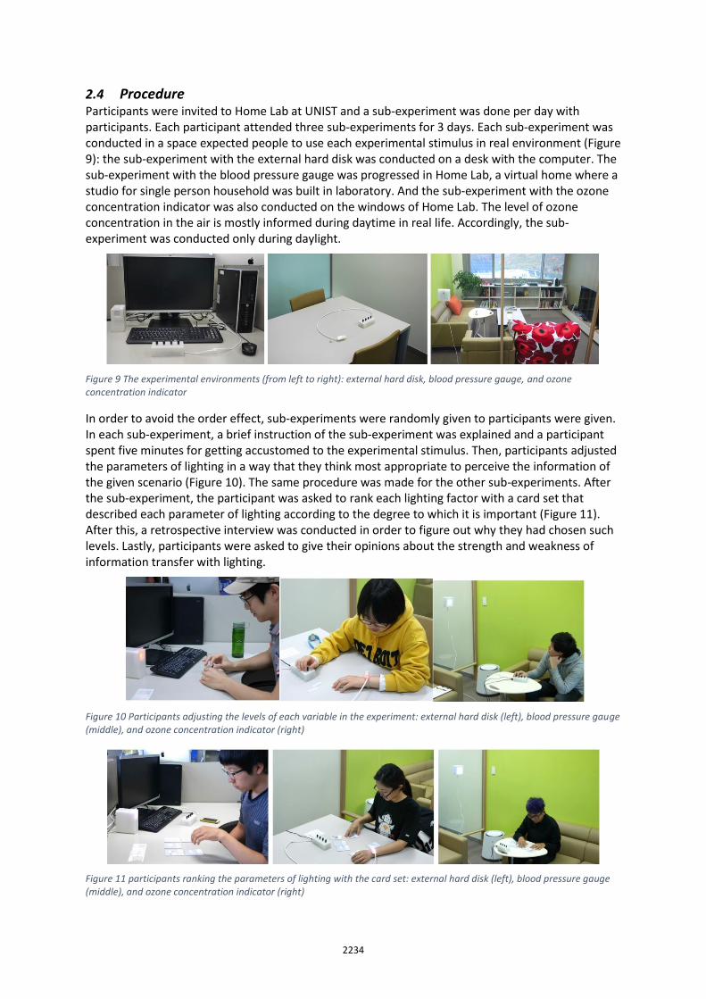
2.4 Procedure Participants were invited to Home Lab at UNIST and a sub-experiment was done per day with participants. Each participant attended three sub-experiments for 3 days. Each sub-experiment was conducted in a space expected people to use each experimental stimulus in real environment (Figure 9): the sub-experiment with the external hard disk was conducted on a desk with the computer. The sub-experiment with the blood pressure gauge was progressed in Home Lab, a virtual home where a studio for single person household was built in laboratory. And the sub-experiment with the ozone concentration indicator was also conducted on the windows of Home Lab. The level of ozone concentration in the air is mostly informed during daytime in real life. Accordingly, the sub-experiment was conducted only during daylight.
Figure 9 The experimental environments (from left to right): external hard disk, blood pressure gauge, and ozone concentration indicator
In order to avoid the order effect, sub-experiments were randomly given to participants were given. In each sub-experiment, a brief instruction of the sub-experiment was explained and a participant spent five minutes for getting accustomed to the experimental stimulus. Then, participants adjusted the parameters of lighting in a way that they think most appropriate to perceive the information of the given scenario (Figure 10). The same procedure was made for the other sub-experiments. After the sub-experiment, the participant was asked to rank each lighting factor with a card set that described each parameter of lighting according to the degree to which it is important (Figure 11). After this, a retrospective interview was conducted in order to figure out why they had chosen such levels. Lastly, participants were asked to give their opinions about the strength and weakness of information transfer with lighting.
Figure 10 Participants adjusting the levels of each variable in the experiment: external hard disk (left), blood pressure gauge (middle), and ozone concentration indicator (right)
Figure 11 participants ranking the parameters of lighting with the card set: external hard disk (left), blood pressure gauge (middle), and ozone concentration indicator (right)
2235
3 Results
3.1 The usage of lighting variables in information transfer
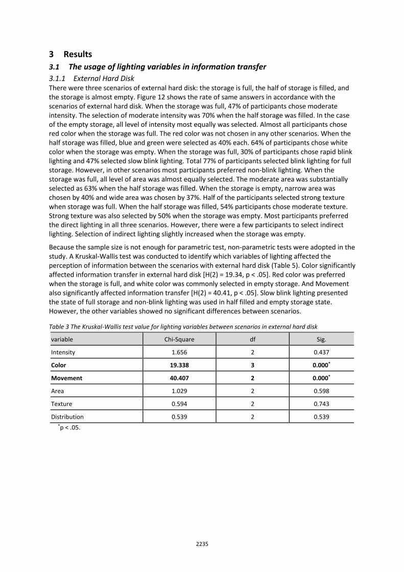
3.1.1 External Hard Disk There were three scenarios of external hard disk: the storage is full, the half of storage is filled, and the storage is almost empty. Figure 12 shows the rate of same answers in accordance with the scenarios of external hard disk. When the storage was full, 47% of participants chose moderate intensity. The selection of moderate intensity was 70% when the half storage was filled. In the case of the empty storage, all level of intensity most equally was selected. Almost all participants chose red color when the storage was full. The red color was not chosen in any other scenarios. When the half storage was filled, blue and green were selected as 40% each. 64% of participants chose white color when the storage was empty. When the storage was full, 30% of participants chose rapid blink lighting and 47% selected slow blink lighting. Total 77% of participants selected blink lighting for full storage. However, in other scenarios most participants preferred non-blink lighting. When the storage was full, all level of area was almost equally selected. The moderate area was substantially selected as 63% when the half storage was filled. When the storage is empty, narrow area was chosen by 40% and wide area was chosen by 37%. Half of the participants selected strong texture when storage was full. When the half storage was filled, 54% participants chose moderate texture. Strong texture was also selected by 50% when the storage was empty. Most participants preferred the direct lighting in all three scenarios. However, there were a few participants to select indirect lighting. Selection of indirect lighting slightly increased when the storage was empty.
Because the sample size is not enough for parametric test, non-parametric tests were adopted in the study. A Kruskal-Wallis test was conducted to identify which variables of lighting affected the perception of information between the scenarios with external hard disk (Table 5). Color significantly affected information transfer in external hard disk [H(2) = 19.34, p < .05]. Red color was preferred when the storage is full, and white color was commonly selected in empty storage. And Movement also significantly affected information transfer [H(2) = 40.41, p < .05]. Slow blink lighting presented the state of full storage and non-blink lighting was used in half filled and empty storage state. However, the other variables showed no significant differences between scenarios.
Table 3 The Kruskal-Wallis test value for lighting variables between scenarios in external hard disk
variable Chi-Square df Sig.
Intensity 1.656 2 0.437
Color 19.338 3 0.000*
Movement 40.407 2 0.000*
Area 1.029 2 0.598
Texture 0.594 2 0.743
Distribution 0.539 2 0.539 *p < .05.
2236
Figure 12 The response percentages of each variable according to the scenarios of external hard disk
2237
Through the interview, the reasons that participants had chosen the level of lighting factor were identified. Some participants selected strong intensity to show the information clearly. Or in order to perceive a strong message that storage was full, they chose strong intensity. When the half storage was filled, moderate intensity was selected because no warning information was necessary. Although the storage was empty, participants chose strong intensity to perceive the state of whether it was connected to the electric outlet. The red color was selected to alert that there was no extra storage space. Participants considered that white color presents the empty situation like white paper. The reason that green color was chosen was to show the state of remaining space for storage. And some participants chose blue color because blue represents the mean of computer and technology. Participants considered that blink lighting delivers alert state and attracts attention from them. Therefore, most participants selected blink lighting when the storage was full. On the other hand, participants thought that blinking light was disturbing when the alarm was not required. The selection of area was irregular because some participants selected the wide area indicating the remaining storage space, while someone selected the wide area which in this case implies the used storage space. Although there was no certain reason to select a particular level of texture, many participants preferred more scattered lighting with strong texture. Most people chose direct lighting in information transfer because indirect lighting could hinder their perception of the light. On the other hand, only a few people selected the indirect lighting because of its aesthetical characteristic.
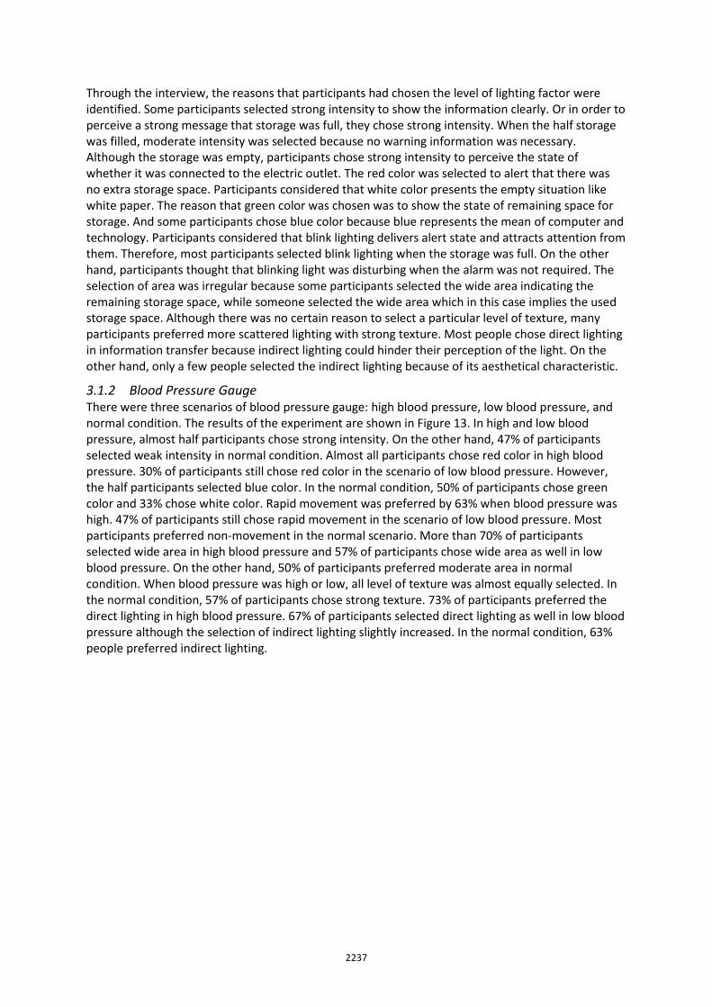
3.1.2 Blood Pressure Gauge There were three scenarios of blood pressure gauge: high blood pressure, low blood pressure, and normal condition. The results of the experiment are shown in Figure 13. In high and low blood pressure, almost half participants chose strong intensity. On the other hand, 47% of participants selected weak intensity in normal condition. Almost all participants chose red color in high blood pressure. 30% of participants still chose red color in the scenario of low blood pressure. However, the half participants selected blue color. In the normal condition, 50% of participants chose green color and 33% chose white color. Rapid movement was preferred by 63% when blood pressure was high. 47% of participants still chose rapid movement in the scenario of low blood pressure. Most participants preferred non-movement in the normal scenario. More than 70% of participants selected wide area in high blood pressure and 57% of participants chose wide area as well in low blood pressure. On the other hand, 50% of participants preferred moderate area in normal condition. When blood pressure was high or low, all level of texture was almost equally selected. In the normal condition, 57% of participants chose strong texture. 73% of participants preferred the direct lighting in high blood pressure. 67% of participants selected direct lighting as well in low blood pressure although the selection of indirect lighting slightly increased. In the normal condition, 63% people preferred indirect lighting.
2238
Figure 13 The response percentages of each variable according to scenario of blood pressure gauge
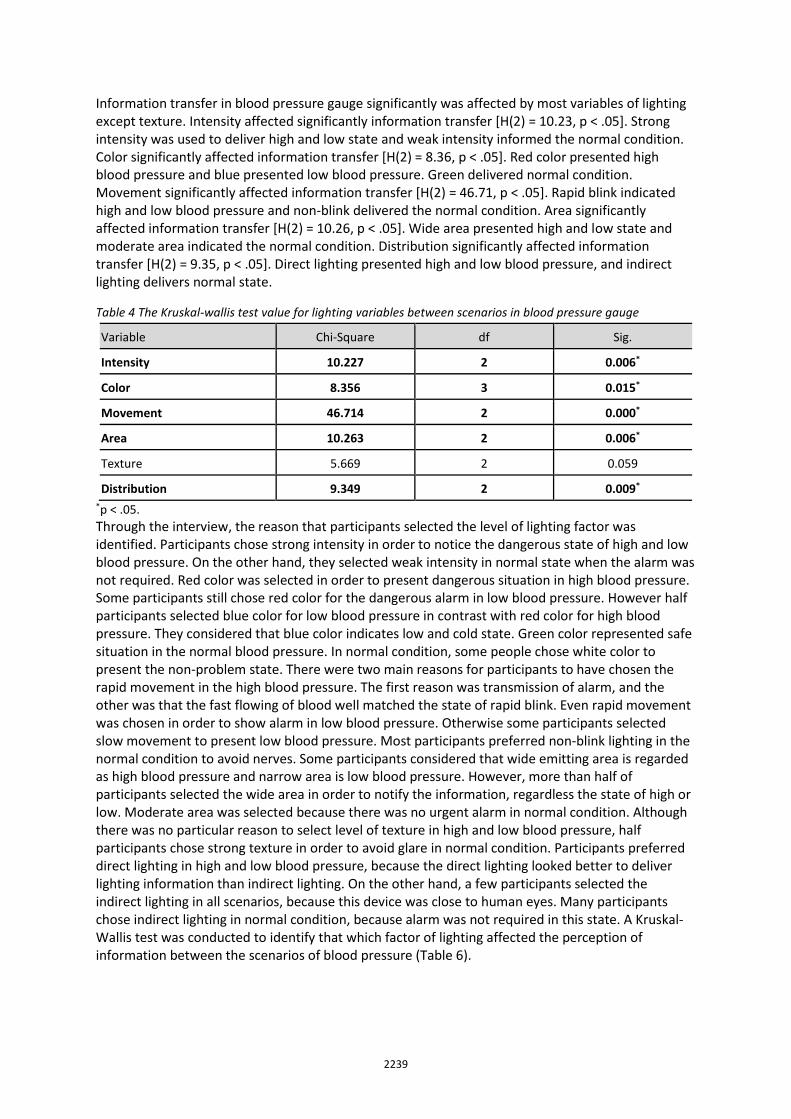
2239
Information transfer in blood pressure gauge significantly was affected by most variables of lighting except texture. Intensity affected significantly information transfer [H(2) = 10.23, p < .05]. Strong intensity was used to deliver high and low state and weak intensity informed the normal condition. Color significantly affected information transfer [H(2) = 8.36, p < .05]. Red color presented high blood pressure and blue presented low blood pressure. Green delivered normal condition. Movement significantly affected information transfer [H(2) = 46.71, p < .05]. Rapid blink indicated high and low blood pressure and non-blink delivered the normal condition. Area significantly affected information transfer [H(2) = 10.26, p < .05]. Wide area presented high and low state and moderate area indicated the normal condition. Distribution significantly affected information transfer [H(2) = 9.35, p < .05]. Direct lighting presented high and low blood pressure, and indirect lighting delivers normal state.
Table 4 The Kruskal-wallis test value for lighting variables between scenarios in blood pressure gauge
Variable Chi-Square df Sig.
Intensity 10.227 2 0.006*
Color 8.356 3 0.015*
Movement 46.714 2 0.000*
Area 10.263 2 0.006*
Texture 5.669 2 0.059
Distribution 9.349 2 0.009*
*p < .05.
Through the interview, the reason that participants selected the level of lighting factor was identified. Participants chose strong intensity in order to notice the dangerous state of high and low blood pressure. On the other hand, they selected weak intensity in normal state when the alarm was not required. Red color was selected in order to present dangerous situation in high blood pressure. Some participants still chose red color for the dangerous alarm in low blood pressure. However half participants selected blue color for low blood pressure in contrast with red color for high blood pressure. They considered that blue color indicates low and cold state. Green color represented safe situation in the normal blood pressure. In normal condition, some people chose white color to present the non-problem state. There were two main reasons for participants to have chosen the rapid movement in the high blood pressure. The first reason was transmission of alarm, and the other was that the fast flowing of blood well matched the state of rapid blink. Even rapid movement was chosen in order to show alarm in low blood pressure. Otherwise some participants selected slow movement to present low blood pressure. Most participants preferred non-blink lighting in the normal condition to avoid nerves. Some participants considered that wide emitting area is regarded as high blood pressure and narrow area is low blood pressure. However, more than half of participants selected the wide area in order to notify the information, regardless the state of high or low. Moderate area was selected because there was no urgent alarm in normal condition. Although there was no particular reason to select level of texture in high and low blood pressure, half participants chose strong texture in order to avoid glare in normal condition. Participants preferred direct lighting in high and low blood pressure, because the direct lighting looked better to deliver lighting information than indirect lighting. On the other hand, a few participants selected the indirect lighting in all scenarios, because this device was close to human eyes. Many participants chose indirect lighting in normal condition, because alarm was not required in this state. A Kruskal-Wallis test was conducted to identify that which factor of lighting affected the perception of information between the scenarios of blood pressure (Table 6).
2240
3.1.3 Ozone Concentration Indicator There were three scenarios of ozone concentrations indicator: Too high ozone concentration (inappropriate for everyone to go out), high ozone concentration (inappropriate for the old and weak to go
out), and normal condition (appropriate for outdoor activity). Figure 14 shows the experimental results of same answering in accordance with scenario of ozone concentration indicator. 73% of participants choose strong intensity when ozone concentration was too high. More than half participants selected strong intensity in high ozone concentration as well. Most common choice in the normal condition was moderate intensity. Almost all participants selected red color in too high ozone concentration. In high ozone concentration, the other colors were chosen little by little although red color was still selected by 57% of participants. Green and white colors were chosen by each 40% in the normal condition. When the ozone concentration was too high, 40% of participants choose rapid movement that was not chosen in any other scenario. Although 43% of participants selected slow movement, more than half participants preferred non-blink lighting in high ozone scenario. In the normal condition, all participants selected non-blink lighting. Wide area was selected by 86% when ozone concentration was too high. In high ozone scenario, moderate area was chosen by 70%. In the normal condition, most common choice was wide intensity by 47% and selection of moderate area was as high as 40%. Although selection of strong texture was high in the all scenario, the other level of texture was chosen by range from 20% to less than 40%. Most participants preferred the direct lighting in all three scenarios. However, there were a few people to select indirect lighting. Selection of indirect lighting slightly increased in normal condition.
A Kruskal-Wallis test was conducted to identify that which factor of lighting affected the notification of information in the scenario of ozone concentration indicator (Table 7). Intensity significantly affected information transfer [H(2) = 8.99, p < .05]. Strong intensity presented too high and high ozone concentration. Movement significantly affected information transfer [H(2) = 31.97, p < .05]. Rapid movement delivered the perception of too high ozone concentration. Non-movement indicated high ozone concentration and normal condition. Area significantly affected information transfer [H(2) = 21.22, p < .05]. Wide area delivered the state of too high ozone concentration and moderate area presented high ozone concentration.
Table 5 The Kruskal-wallis test value for lighting variables between scenarios in ozone concentration indicator
Variable Chi-Square df Sig.
Intensity 8.991 2 0.011*
Color 2.932 3 0.231
Movement 31.968 2 0.000*
Area 21.217 2 0.000*
Texture 1.796 2 0.407
Distribution 4.182 2 0.124 *p < .05.
2241
Figure 14 The response percentages of each variable according to scenario of ozone concentration indicator
2242
Participants told that the strong intensity was associated with a dangerous situation. Therefore, they selected brightest intensity when outdoor activity was riskier. Red color was chosen to notice the alarm of dangerous outside when ozone concentration was too high. Although half participants also selected red color in high ozone concentration, the others chose different colors because it is possible for general people to go outside. In normal condition, the green color was selected as the meaning of safety for outdoor activity, and white color was chosen as the meaning that alarm was not required. In order to perceive the too high ozone concentration, participants preferred blinking light. On the other hand, blinking light was not selected at all in a normal condition, because blinking light was considered disturbing. Participants presented the difference between too high and high ozone concentration by controlling area. The wide area meant too high ozone concentrations, and middle area meant high ozone concentrations. Whereas narrow area was not preferred in normal condition in order to show the connection of power. Regarding texture, participants preferred scattered lighting by strong texture. Participants preferred direct lighting in all scenarios in order to deliver exact information. However, a few participants wanted indirect lighting, because it looked beautiful than direct lighting.
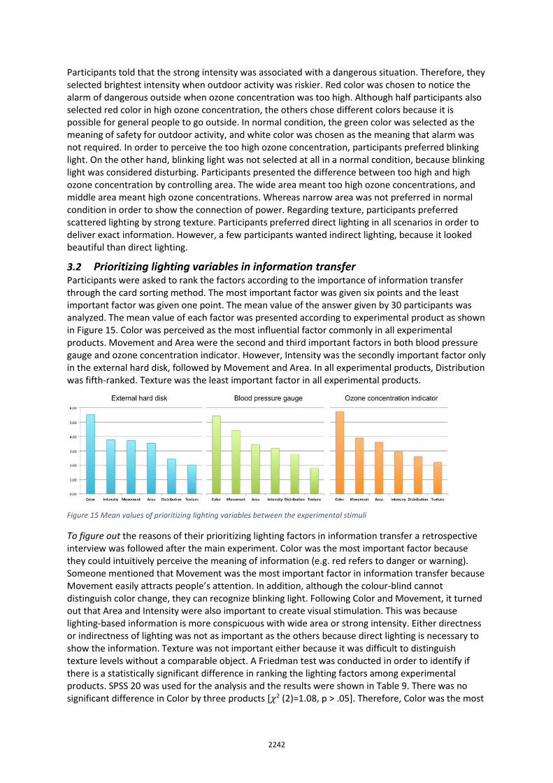
3.2 Prioritizing lighting variables in information transfer Participants were asked to rank the factors according to the importance of information transfer through the card sorting method. The most important factor was given six points and the least important factor was given one point. The mean value of the answer given by 30 participants was analyzed. The mean value of each factor was presented according to experimental product as shown in Figure 15. Color was perceived as the most influential factor commonly in all experimental products. Movement and Area were the second and third important factors in both blood pressure gauge and ozone concentration indicator. However, Intensity was the secondly important factor only in the external hard disk, followed by Movement and Area. In all experimental products, Distribution was fifth-ranked. Texture was the least important factor in all experimental products.
Figure 15 Mean values of prioritizing lighting variables between the experimental stimuli
To figure out the reasons of their prioritizing lighting factors in information transfer a retrospective interview was followed after the main experiment. Color was the most important factor because they could intuitively perceive the meaning of information (e.g. red refers to danger or warning). Someone mentioned that Movement was the most important factor in information transfer because Movement easily attracts people’s attention. In addition, although the colour-blind cannot distinguish color change, they can recognize blinking light. Following Color and Movement, it turned out that Area and Intensity were also important to create visual stimulation. This was because lighting-based information is more conspicuous with wide area or strong intensity. Either directness or indirectness of lighting was not as important as the others because direct lighting is necessary to show the information. Texture was not important either because it was difficult to distinguish texture levels without a comparable object. A Friedman test was conducted in order to identify if there is a statistically significant difference in ranking the lighting factors among experimental products. SPSS 20 was used for the analysis and the results were shown in Table 9. There was no significant difference in Color by three products [𝜒2 (2)=1.08, p > .05]. Therefore, Color was the most
2243
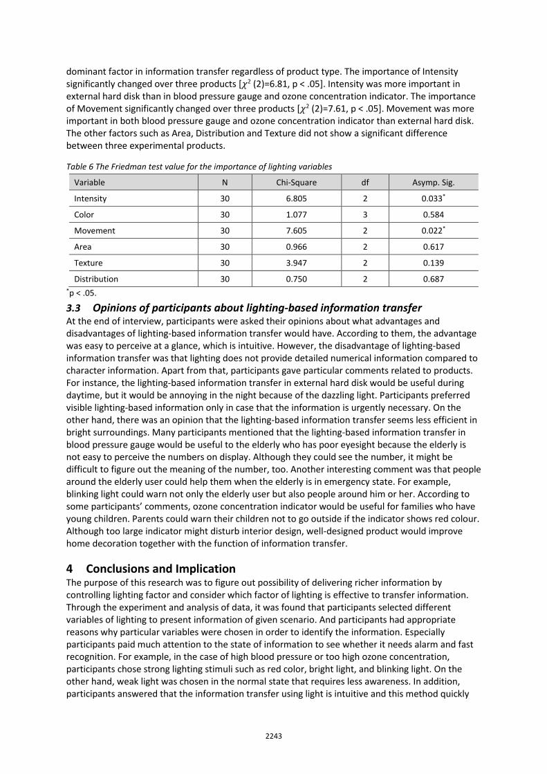
dominant factor in information transfer regardless of product type. The importance of Intensity significantly changed over three products [𝜒2 (2)=6.81, p < .05]. Intensity was more important in external hard disk than in blood pressure gauge and ozone concentration indicator. The importance of Movement significantly changed over three products [𝜒2 (2)=7.61, p < .05]. Movement was more important in both blood pressure gauge and ozone concentration indicator than external hard disk. The other factors such as Area, Distribution and Texture did not show a significant difference between three experimental products.
Table 6 The Friedman test value for the importance of lighting variables
Variable N Chi-Square df Asymp. Sig.
Intensity 30 6.805 2 0.033*
Color 30 1.077 3 0.584
Movement 30 7.605 2 0.022*
Area 30 0.966 2 0.617
Texture 30 3.947 2 0.139
Distribution 30 0.750 2 0.687 *p < .05.
3.3 Opinions of participants about lighting-based information transfer At the end of interview, participants were asked their opinions about what advantages and disadvantages of lighting-based information transfer would have. According to them, the advantage was easy to perceive at a glance, which is intuitive. However, the disadvantage of lighting-based information transfer was that lighting does not provide detailed numerical information compared to character information. Apart from that, participants gave particular comments related to products. For instance, the lighting-based information transfer in external hard disk would be useful during daytime, but it would be annoying in the night because of the dazzling light. Participants preferred visible lighting-based information only in case that the information is urgently necessary. On the other hand, there was an opinion that the lighting-based information transfer seems less efficient in bright surroundings. Many participants mentioned that the lighting-based information transfer in blood pressure gauge would be useful to the elderly who has poor eyesight because the elderly is not easy to perceive the numbers on display. Although they could see the number, it might be difficult to figure out the meaning of the number, too. Another interesting comment was that people around the elderly user could help them when the elderly is in emergency state. For example, blinking light could warn not only the elderly user but also people around him or her. According to some participants’ comments, ozone concentration indicator would be useful for families who have young children. Parents could warn their children not to go outside if the indicator shows red colour. Although too large indicator might disturb interior design, well-designed product would improve home decoration together with the function of information transfer.
4 Conclusions and Implication The purpose of this research was to figure out possibility of delivering richer information by controlling lighting factor and consider which factor of lighting is effective to transfer information. Through the experiment and analysis of data, it was found that participants selected different variables of lighting to present information of given scenario. And participants had appropriate reasons why particular variables were chosen in order to identify the information. Especially participants paid much attention to the state of information to see whether it needs alarm and fast recognition. For example, in the case of high blood pressure or too high ozone concentration, participants chose strong lighting stimuli such as red color, bright light, and blinking light. On the other hand, weak light was chosen in the normal state that requires less awareness. In addition, participants answered that the information transfer using light is intuitive and this method quickly
2244
delivers information to people. It meant that lighting-based information is useful and delivers richer information by controlling lighting factor. It was expected that the influence of color would be one of the effective factors because color already has been used in product. And frequent use of red and green color was expected, because these are representative colors in lighting of consumer products. However, an interesting finding was that many participants preferred choosing white color than green one. Green was usually used to symbolize safety and white mostly presented the state of low, less, and empty. It means that lighting color is a useful factor which can represent different information regardless of previous experience. It seems necessary to identify their relation between lighting color and information transfer for further study because LED lighting can control diverse colors. To capture the people’s attention with blinking light was a good way to deliver information according to importance of situation. Especially, communication using Movement of lighting will be important to the color-blind who cannot distinguish color change. This study found that movement should be utilized carefully because too much blink lighting might evoke annoyance. Brightness of lighting can be adjusted by Intensity of the lighting. Perception of the brightness is dependent on the context where the lighting is used. For example, a particular level of intensity can be relatively differently perceived between at day and at night. Therefore, understanding context of usage is important to create lighting-based information. Because too strong intensity might be dazzling and too low intensity might not deliver visual stimulation. Even though change of texture was not important factor in information transfer, this study found out that people prefer scattered lighting by using strong texture. Distribution is not important in this experiment. However, there was a remarkable reason when participant chose the level of Distribution in blood pressure gauge. Most participants preferred indirect lighting to reduce eyestrain by lighting in normal blood pressure. It means that Distribution is important to improve usability according to product context. In addition, the interesting fact is that some people prefer indirect lighting, because it is nice to see regardless of information transfer and product type. The experiment was conducted with three representative products in order to identify the possibility of lighting-based information by controlling lighting factor. Each lighting variable had different functions to deliver information. In this study, color and movement were used as important factor to present information. However, it could not be applied to all product type. Considering there are a lot of consumer electronic products in the world and the types are diversified, the interaction between human and lighting in information transfer should be continually studied. This study identified that controlling factor of lighting deliver richer information. Considering applying lighting factors to products will increase due to controllable LED lighting, visual stimulation can be an effective method to transfer information and lighting easily creates visual interaction in product without high technology. Therefore, the study might be helpful for designers to understand the role of lighting variables in information transfer, which can lead to creating products people love to use. However, it is hard to generalize the findings of the study considering limitations of the study: a small number of participants in the experiment, all of whom were university students. Furthermore, we have to be careful in implementing the findings considering that there are some number of colour-blind people in our population. Therefore, further studies should take these issues into account to produce more reliable and applicable outcomes.
Acknowledgements: This work was supported by the ‘Promotion of Special Design-Technology Convergence Graduate School’ of the Korea Institute of Design Promotion with a grant from the Ministry of the Trade, Industry & Energy, Republic of Korea (N0001436).
5 References Bertin, J. (1983). Semiology of graphics: diagrams, networks, maps. Brox, J. (2010). Brilliant: the evolution of artificial light: Houghton Mifflin Harcourt. Chang, M. (2010). Role and usage of light in product interface design. (Maste's thesis), Kookmin University. Cho, G., Yang, J., & Seo, B. (2010). Lighting hand book. South Korea: Ohmsha·Sungandang.
2245
Dearman, D., Kellar, M., & Truong, K. N. (2008). An examination of daily information needs and sharing opportunities. Paper presented at the Proceedings of the 2008 ACM conference on Computer supported cooperative work.
Elizabeth, T. (1996). MIT Research - Brain Processing of Visual Information. Retrieved December 19, 1996, from http://bit.ly/smIcH0
Essig, L., & Setlow, J. (2012). Lighting and the design idea (Third ed.): Wadsworth Cengage Learning. Floridi, L. (2010). Information: A very short introduction: Oxford University Press. Goldstein, E. (2009). Sensation and perception: Cengage Learning. Hoonhout, J., Jumpertz, L., & Mason, J. (2011). The future of interaction with light and lighting dynamics.
Interaction Techniques for Future Lighting Systems, 14. Jun, D., & Kim, C. (2014). The application of lighting factors in information transfer: a case study of external
hard disk. Paper presented at the 2014 Fall Conference of the Ergonomics Society of Korea, South Korea. Jun, D., Kim, C., & Kwak, Y. (2014). Exploring the Role of Lighting in Human-Product Interaction. Paper
presented at the The 1st Asian Conference on Ergonomics and Design, Jeju, South Korea. Jun, D. (2015). Exploring New Interactions with Lighting in Information Transfer (master's thesis), Ulsan
National Institute of Science and Technology, South Korea. McCaffety, K. (2006). The chandelier through the centuries. Savoy House. Oh, B., & Kang, S. (2008). Textbook of information design. South Korea: Angraphics. Rooden, M. J. (2001). Design models for anticipating future usage. Schubert, E. F., Gessmann, T., & Kim, J. K. (2005). Light emitting diodes: Wiley Online Library. Smiciklas, M. (2012). The power of infographics: Using pictures to communicate and connect with your
audiences: Que Publishing. Tufte, E. R., & Weise Moeller, E. (1997). Visual explanations: images and quantities, evidence and narrative
(Vol. 36): Graphics Press Cheshire, CT. Van Kuijk, J. (2010). Managing product usability; how companies deal with usability in the development of
electronic consumer products. Delft University of Technology. PhD Thesis. Ware, C. (2010). Visual thinking: For design: Morgan Kaufmann. Ware, C. (2013). Information visualization: perception for design: Elsevier.
About the Authors:
Daeun Jun She earned a bachelor’s degree in mechanical engineering and industrial design from Hanyang university and a MSc in Industrial Design from UNIST. Her research topic focuses on understanding and designing informational lighting in terms of human-product interaction. She is also much interested in making something using Arduino and 3D printer.
Chajoong Kim He holds a BSc degree in Mechanical Engineering from Chung-Ang University and has six years working experience as engineer. In 2003, he went to the Netherlands to study industrial design. He earned MSc and PhD at the Faculty of Industrial Design Engineering, Delft University of Technology in the country. His research interest is in user experience design, interaction design, usability and user diversity in design. He has been part of advisory board for PyeongChang 2018 Paralympic Winter Games since Fall 2015, and his expertise on accessibility is helping to make the world event successfully.
Kwangmin Cho He holds a BSc and MSc in integrated industrial design and engineering system design from UNIST. He likes creating something with various tools and materials. His interests are in figuring out design problems in public space and improving them in order to provide positive experiences for people.