Embed Size (px)
Citation preview

EXCEL WORKSHOPEXCEL FUNDAMENTALS
SURESH NAIR, Ph.D.Associate Dean for Graduate ProgramsProfessor and Ackerman Scholar, Operations and Info Management
School of BusinessUniversity of Connecticut, Storrs, USA
http://users.business.uconn.edu/snair/excel.html

Preliminaries2
Go to the Workshop website and download the file First Spreadsheet http://users.business.uconn.edu/snair/excel.
html Basic skills
Entering serial numbers Write 1 and 2, choose both cells, leave cursor Notice the black square at right bottom of
selection. This is the Handle Hover on top of the handle and the cursor
become a + Hold down left button and pull down to the
extent needed
Prof. Suresh Nair, University of Connecticut

Preliminaries (contd.)3
Freezing panes Used for large spreadsheets to freeze header rows and columns Place cursor on E6 Go to \View and choose Freeze Panes
Filter Used to filter (show) all rows with the same data in a column Place cursor on D5 and go \Home\Sort&Filter\Filter Note the pull down menu indicators for each column Under Teams, filter for team 1, and copy all HW grades for all members.
Do the same for other teams. Remove filter indicators \Home\Sort&Filter\Filter
Insert/delete columns Choose column or row Header Click \Home\Insert or \Home\Delete Insert a column at Column I. Call this HW Total

Entering formulas4
Always start an equation with an = (equal sign) Simple formulas
In row 31, calculate the average for HW, Ex1 and Ex2 scores for the class. =average([select data cells])
In column I, find HW total. In I6 =sum([select data cells E6..H6]) Or, use the icon S on top
Copying formula down column Select I6. Hover on handle (bottom right of cell) and
double click This is an extremely useful feature for large
spreadsheetsProf. Suresh Nair, University of Connecticut
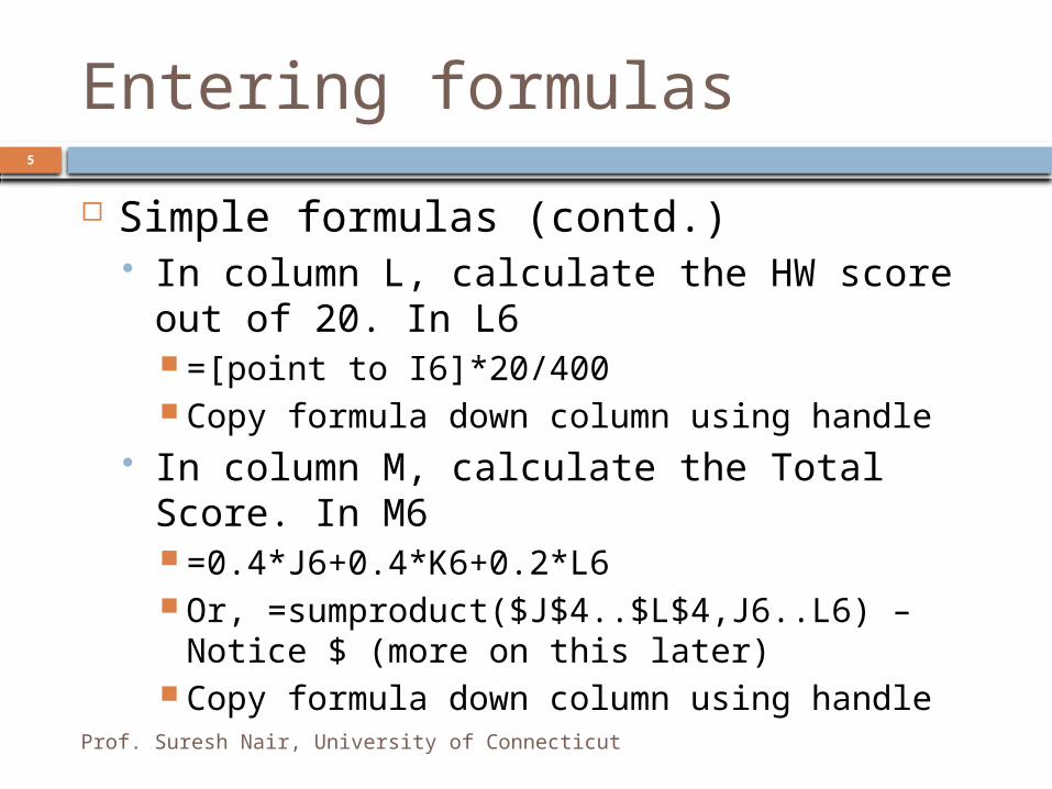
Entering formulas5
Simple formulas (contd.) In column L, calculate the HW score out of
20. In L6 =[point to I6]*20/400 Copy formula down column using handle
In column M, calculate the Total Score. In M6 =0.4*J6+0.4*K6+0.2*L6 Or, =sumproduct($J$4..$L$4,J6..L6) – Notice $
(more on this later) Copy formula down column using handle
Prof. Suresh Nair, University of Connecticut

Sorting6
Sorting files Select all data except bottom totals.
Include headers Sort the file down (descending) on
column M Total score Go \Home\Sort&Filter\Custom Sort Under Sort By choose Total Under Order, choose Largest to smallest Click OK
Now that the file is sorted in descending order, assign letter grades in column N (manually)
PASTE SPECIAL - VALUES At times you want to get rid of the
formula in a cell and only leave the value in place (e.g., in simulations). [select cells] CTRL-C to copy \Home\Paste\Paste Values (2007) Right click and choose 123 (2010)

VLOOKUP
Prof. Suresh Nair, University of Connecticut
7
We can assign grades without sorting by using VLOOKUP
On the right of the spreadsheet create a small table. Suppose the address of the numbers in the table (do not include header) is T5..U15
In cell N6 =vlookup(M6,$T$5..$U$15,2)
The way to read this formula is M6 is the number to be converted to grade $T$5..$U$15 is the conversion table address 2 is the column from the table to return here when
there is a match.
Copy formula down column using handle
Low end Grade50 F60 D70 C-73 C77 C+80 B-83 B87 B+90 A-93 A97 A+

Summarizing Data
If you cannot recall a function, use the fx button on the formula bar
Measures of Central Tendency Arithmetic mean
=average(a1.a5) Median (the central value)
=median(a1.a5) Mode (the most frequently occurring value)
=mode(a1.a5)
Measures of Variation Range (the difference between the max and min value)
=range(a1.a5) Standard deviation
=stdev(a1.a5)
8
Prof. Suresh Nair, University of Connecticut

Other Useful Functions to Summarize Data Sum
=sum(a1.a5) Sumif
=sumif(a1.a5,”<25”,b1.b5). Check for condition in a1.a5, and if true sum corresponding values in b1.b5 (Optional).
Count and Countif. Counts occurrences. =count(a1.a5) or =countif(a1.a5,”<25”,b1.b5).
Min or Max =min(a1.a5) or =max(a1.a5)
Quick Summaries for Numeric Data Select Numeric data cells At bottom frame of Excel find the summary data such as
Average, Count, Max, Min, Sum, etc.
9

Presenting Data - Pie Charts and Line Charts
Example: We illustrate the drawing of Pie charts and 2 Axis charts using data in Auto_sml.xls. Select the data (including headers), go to the \Insert\Pie icon and choose the Pie Chart. Next choose Line.
Add chart title and axis titles by choosing Layout under Chart Tools – do this for Vertical Axis (call it “Specs”), and Horizontal Axis (call it “Weight, lbs.”). Title the chart “Car Weight vs. Specs.”
1500-1999
2000-2499
2500-2999
3000-3499
3500-3999
4000-4499
0.00
10.00
20.00
30.00
40.00
50.00
60.00
70.00
80.00
90.00
MPG
RLegRm
FLeg Rm
Width
10

2 Axis Charts
The chart will look better as a 2-axis chart, since one the series has values much smaller than the others. Choose the chart. Under Chart Tools, choose Format, and under Current Selection drop down, choose Rleg Room. Then choose Format Selection and click radio button for Secondary axis.
1500-1999
2000-2499
2500-2999
3000-3499
3500-3999
4000-4499
0.00
25.00
50.00
75.00
100.00
0.00
1.00
2.00
3.00
4.00
5.00
6.00
7.00
8.00Mileage
MPGFLeg RmWidthRLegRm
Weight
MP
G,
Fle
g R
oo
m,
Wid
th
Rle
g R
oo
m
11

XY Charts and Bubble Charts
12
None of the previous charts are scaled on the X axis. They simply consider the X values to be categories. Therefore 2,5, 23 and 107 will be equi-spaced on the x axis, as if they were colors or brands. If you need to show scaled values, you need to use Scatter charts
If you need to show 2 y-axis values to scale you may use the Bubble chart. (The custom 2-axis chart’s x-axis is categories and not to scale)
The left most column chosen is shown on the X-axis, the second column is the Y axis and the third column is the bubble size
I have found Scatter charts to be the most important type of chart in Excel
15.00 20.00 25.00 30.00 35.000.00
1.00
2.00
3.00
4.00
5.00
6.00
7.00
8.00
RLegRm
15.00 20.00 25.00 30.00 35.000.00
2.00
4.00
6.00
8.00
RLegRm
MPG
Rear
Leg R
oom

Elements of Charting Style
0.0
10.0
20.0
30.0
40.0
50.0
60.0
70.0
80.0
90.0
0 10 20 30 40
FLeg Rm
Width
First let Chart Wizard do its thing. Then pretty it up
Remove background gray. It does not print well. Right click on background, Format Plot Area. On right panel say None.
Fix scale. Double click on scale to fix. Choose Scale tab. Change Min and Max
Get rid of grid line. Click on any grid line. Delete. Fix markers and lines. Click on line drawn, then right click, choose Format
Data Series, and then choose different weight and style for different lines (colors do not print well). On the right panel choose markers on some of the lines which may have same weight and style. Auto Comfort
30.0
40.0
50.0
60.0
70.0
80.0
15 20 25 30 35MPG
Siz
e, I
nch
es
FLeg Rm
Width
13

EXCEL WORKSHOPEXCEL ADVANCED
http://users.business.uconn.edu/snair/excel.html
SURESH NAIR, Ph.D.Associate Dean for Graduate ProgramsProfessor and Ackerman Scholar, Operations and Info Management
School of BusinessUniversity of Connecticut, Storrs, USA

Anchoring
This is the most important aspect of Excel Get used to anchoring cell references
If in cell B2 you say =A1, this is a relative reference. You are simply meaning the stuff one row above and one column to the left
If in cell B2 you say =$A1, this is an absolute reference to column A, but relative reference to one row above. That is, if you copy this formula to B3, it will show up as =$A2
If in cell B2 you say =A$1, this is an relative reference to the column of the left, but absolute reference to row A. That is, if you copy this formula to C2, it will show up as =B$1
If in cell B2 you say =$A$1, this is an absolute reference to column A and row 1. That is, if you copy this formula to B3, it will still show up as =$A$1
15
Prof. Suresh Nair, University of Connecticut

Formulas and Anchoring (contd.)
100 200 300 400 5001 101 201 301 401 5012 102 202 302 402 5023 103 203 303 403 5034 104 204 304 404 5045 105 205 305 405 505
Download file Anchoring.xls from the website
After doing the exercises on the second tab of the spreadsheet, you should be able to enter a formula in one cell and copy it to all other cells to obtain a table as shown below:
16
Prof. Suresh Nair, University of Connecticut

Importing Text Data
Use the Text Import wizard Example: The file Mutual.txt has information on Mutual
funds and is delimited by comma. First save this file to disk. From any Excel document, \Office\Open and select this file
(under Files of Type, choose Text Files). The Text Import Wizard screen comes up. Choose Delimited.
On the next screen take off the check against Tab and put a check against Comma. Click Finish.
Save file as an Excel Worksheet, Mutual.xls The file Auto.txt has information on automobiles and is
delimited by the character | Do exactly as above, but on the second screen choose
Other and put a | in the box. Save as Auto.xls
17
Prof. Suresh Nair, University of Connecticut

Histograms
Let’s draw a histogram on car widths from file Auto.xls
\Data\Data Analysis\Histogram and leave Bin Range blank. Put a check against Chart Output
After you see the output, go back to Histogram menu and enter the Bin Range (incl header) for better display. Start at 60 and increase by 2.5 for each bin.
18
60 66 72 78 84Mor
e0
20
40
Histogram
Frequency
Width, inches
Fre
quency

Filtering
Choose \Home\Sort and Filter\Filter Hides unimportant rows Can specify multiple column filters, and custom
filters
19

Conditional Formatting
Similar to filtering, but simply highlights important cells, does not hide the other cells.
Choose \Home\Conditional Formatting There are many options available
20

Pivot Tables (Important)
This is an extremely useful way to examining whether there is any relationship or pattern between two or more variables.
Use the Pivot Table wizard in Excel Select the data including the headings Choose \Insert\Pivot Table, then OK Select the Filter, Column and Row variables, and the body of the
matrix (S value) by dragging
21

Pivot Tables (contd.)
Group the data for the row or column, if necessary (right click on any row value (say) > Group). Enter start, end and interval size
22
Prof. Suresh Nair, University of Connecticut

Pivot Tables (contd.)
Change the way to summarize data as needed (count, sum, etc.) and change the format of the numbers as needed. Right click on top left cell, choose Summarize Data By…More Options…second tab Show Values As. Say % of row. Choose Number Format (Custom, #.## for zero suppression) as needed.
23

Questions?
24
![INDEX [sites.rootsweb.com]sites.rootsweb.com/~scoconee/Cemetery_GPS/surnames/...INDEX Abbott, Alice, 198 Ackerman, Callie Robinson, 540 Ackerman, David, 215 Ackerman, Joseph Earle,](https://img.pdfslide.us/doc/110x75/5e4d824abd5273468b45391f/index-sites-sites-scoconeecemeterygpssurnames-index-abbott-alice-198.jpg)