Embed Size (px)
Citation preview
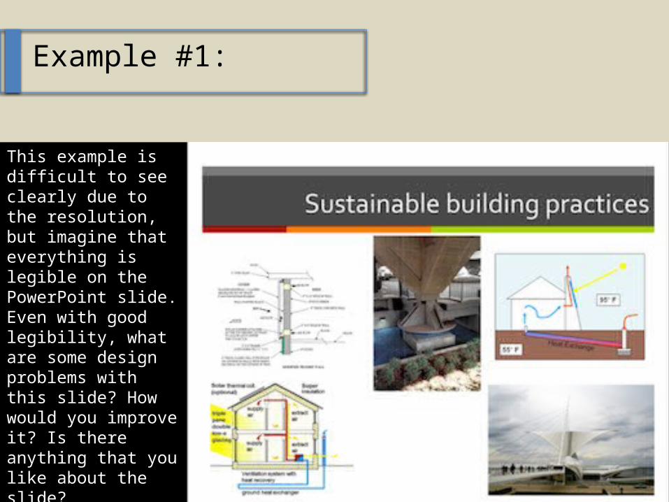
Example #1:
This example is dif-ficult to see clearly due to the resolu-tion, but imagine that everything is legible on the Pow-erPoint slide. Even with good legibility, what are some de-sign problems with this slide? How would you improve it? Is there anything that you like about the slide?
Example #1:
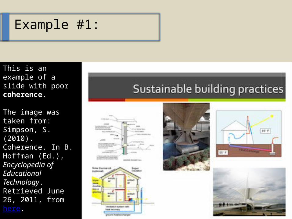
This is an example of a slide with poor coherence.
The image was taken from: Simpson, S. (2010). Coherence. In B. Hoffman (Ed.), En-cyclopedia of Edu-cational Technology. Retrieved June 26, 2011, from here.
Example #2:
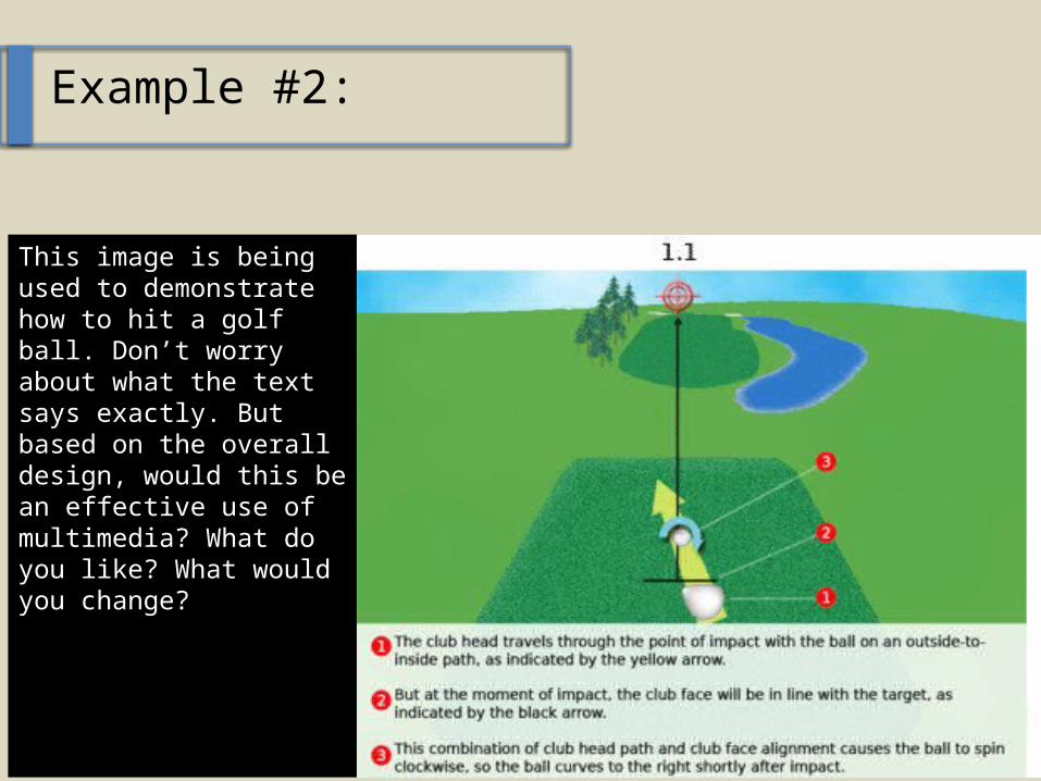
This image is being used to demonstrate how to hit a golf ball. Don’t worry about what the text says exactly. But based on the overall de-sign, would this be an ef-fective use of multime-dia? What do you like? What would you change?
Example #2:
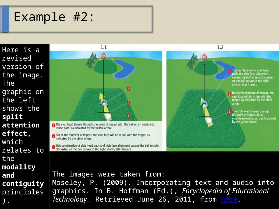
Here is a re-vised ver-sion of the image. The graphic on the left shows the split atten-tion effect, which re-lates to the modality and conti-guity prin-ciples).
The images were taken from:Moseley, P. (2009). Incorporating text and audio into graphics. In B. Hoffman (Ed.), Encyclopedia of Educational Technology. Retrieved June 26, 2011, from here.
Example #3:
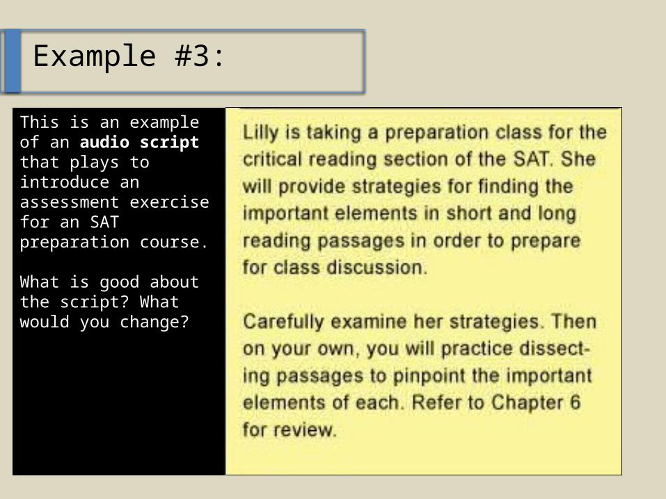
This is an example of an audio script that plays to introduce an assessment exercise for an SAT preparation course.
What is good about the script? What would you change?
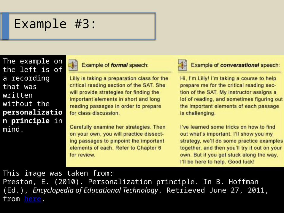
Example #3:
The example on the left is of a recording that was written without the personaliza-tion principle in mind.
This image was taken from:Preston, E. (2010). Personalization principle. In B. Hoffman (Ed.), Encyclopedia of Educational Technology. Retrieved June 27, 2011, from here.
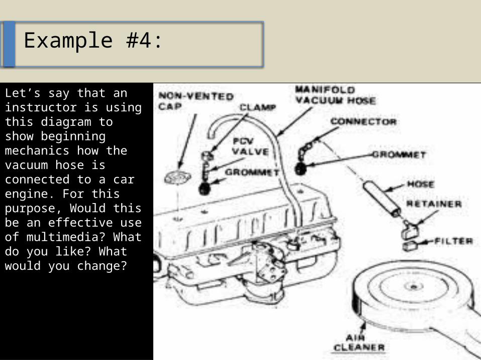
Example #4:
Let’s say that an in-structor is using this diagram to show be-ginning mechanics how the vacuum hose is connected to a car en-gine. For this purpose, Would this be an effec-tive use of multimedia? What do you like? What would you change?
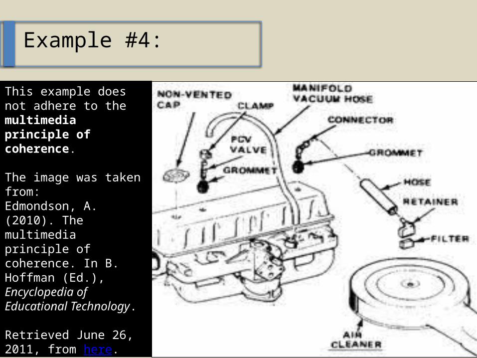
Example #4:
This example does not adhere to the multi-media principle of coherence.
The image was taken from:Edmondson, A. (2010). The multimedia princi-ple of coherence. In B. Hoffman (Ed.), Ency-clopedia of Educational Technology.
Retrieved June 26, 2011, from here.
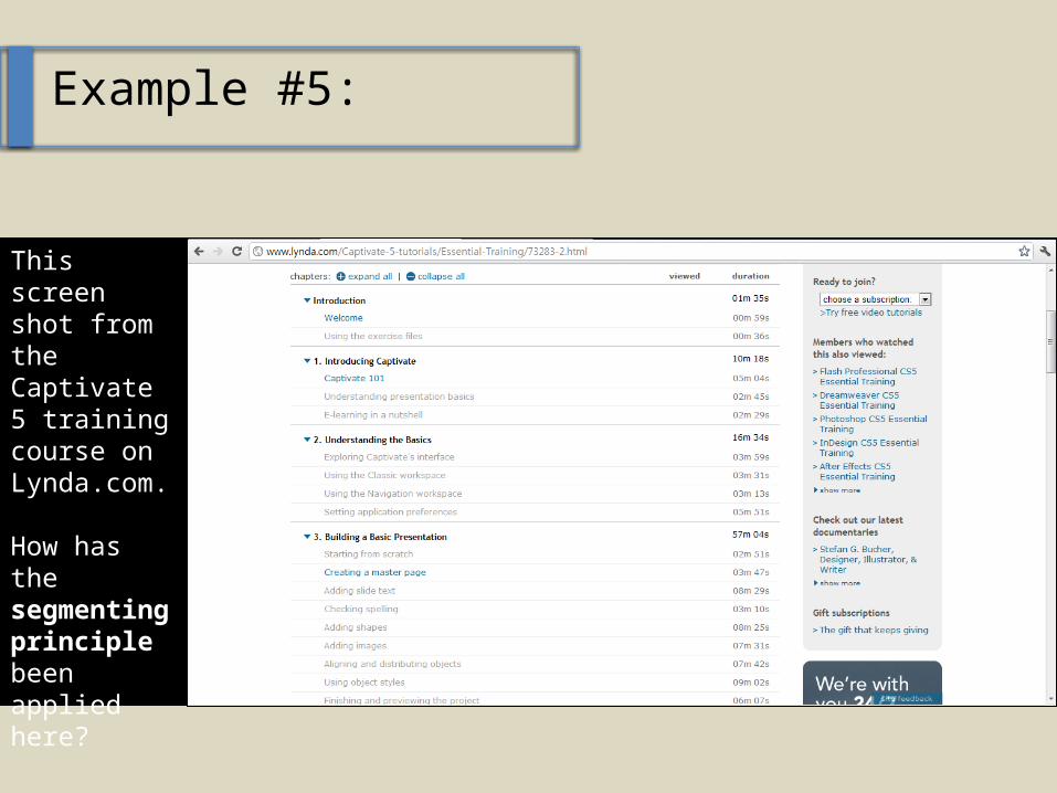
Example #5:
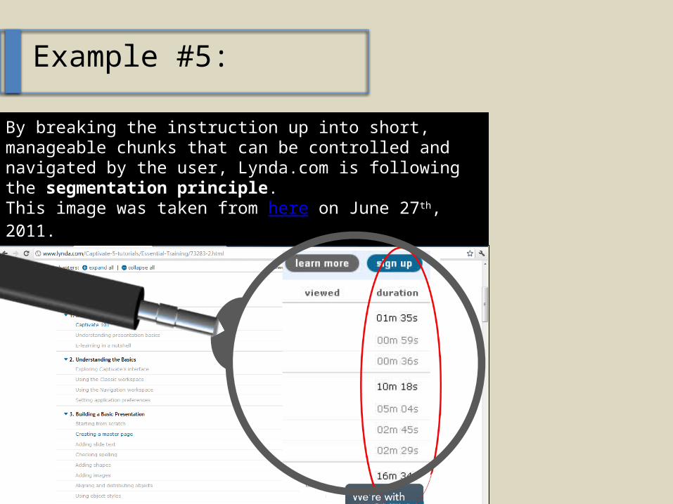
This screen shot from the Capti-vate 5 train-ing course on Lynda.-com.
How has the segment-ing princi-ple been applied here?
Example #5:
By breaking the instruction up into short, manageable chunks that can be controlled and navigated by the user, Lynda.com is following the segmentation prin-ciple.This image was taken from here on June 27th, 2011.
Example #6:
Finally, check out this award-winning e-learning course from the Articulate team, who run the popular websites, The Rapid e-Learning Blog (available here) and E-Learning Heroes (avail-able here).
How did Articulate use the 10 principles of multimedia design to create an effective course? Reference specific examples. Is there anything that you would have done differently?
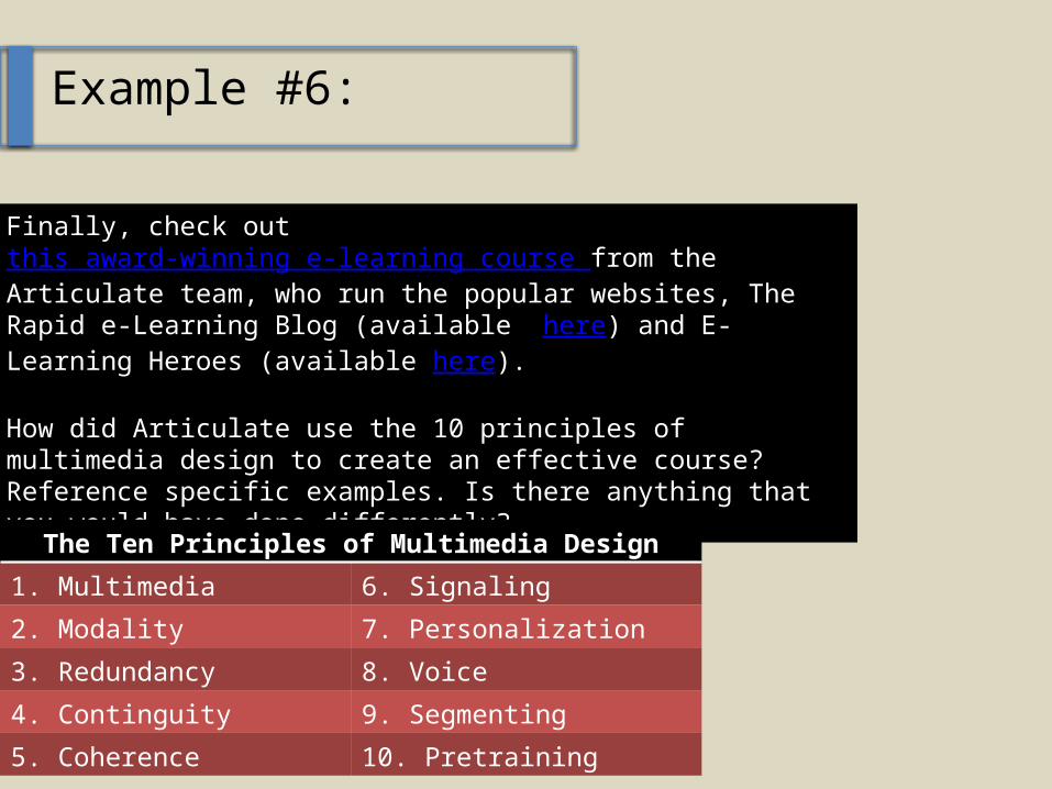
The Ten Principles of Multimedia Design
1. Multimedia 6. Signaling
2. Modality 7. Personalization
3. Redundancy 8. Voice
4. Continguity 9. Segmenting
5. Coherence 10. Pretraining
Questions or Comments?