Embed Size (px)
Citation preview
EWD/Sencha Touch 2Custom Tag Guide
M/Gateway Developments Ltd http://www.mgateway.com
M/Gateway Developments Ltd
Table of Contents
Introduction 1
Background 1
EWD Sencha Touch 2 Custom Tags: General Features 1
Container Pages and Fragments 1
Important Note when copying the examples in this document 2
Sencha Touch 2 Custom Tags 3
Working from the Sencha Touch 2 Examples 5
Sencha Touch 2 Custom Tag Definitions 7
Installation and Configuration 8
Installing the Sencha Touch 2 Tag Library 8
Configuring EWD for use with Sencha Touch 2 8
The <st2:container> Tag 9
The <st2:fragment> Tag 10
A Simple Hello World Application 11
Pre-requisites 11
Hello World version 1 11
Hello World Analysed 12
Creating your own Pointers to Sencha Touch 2 Widgets 14
Generating the Hello World Panel Contents Dynamically 15
The Outer Panel 16
Copyright ©2012, M/Gateway Developments Ltd. All Rights Reserved
EWD Sencha Touch 2 Custom Tag Guide (Build 938) i
Nesting Components 17
Adding Panels using Fragments 17
Using Javascript with Sencha Touch 2 18
Using Listeners 18
Using Explicitly-added Javascript 20
Requesting and Fetching Fragments 21
The EWD.ajax.getPage() Function 21
Preventing Unauthorised Use 22
The NextPage Attribute 23
Native App Behaviour 26
Background 26
The Home Screen Icon and Startup Image 26
Creating a Home Screen Icon 27
Enhancing Hello World 30
Scrolling 30
Toolbars 30
Debugging EWD Applications 32
Using Chrome/Safari Developer Tools 32
Adding Dynamic UI Behaviour 37
Buttons, Events, Hiding and Showing UI Elements 37
Button Icons 40
Badges 40
Button UIs 41
Lists & Nested Lists 42
About Lists 42
Copyright ©2012, M/Gateway Developments Ltd. All Rights Reserved
EWD Sencha Touch 2 Custom Tag Guide (Build 938) ii
A Simple Manually-defined List 42
Integrating Lists with Fragments and Layouts 43
Dynamic Lists 45
Grouping and the indexBar 48
Lists and the NavigationView Component 49
Using Masks to indicate processing 53
Understanding Asynchronous Event Handling 55
Nested Lists 55
Dynamic/Over-ride Name/Value Pairs 60
Pop-up Panels 62
Background 62
Simple Example 62
Using Fragments with Pop-up Panels 63
Adding Content to a Pop-up Panel 64
Tab Panels 66
Defining a Tab Panel 66
An Example 66
Using Icons as Tabs 67
Adding Dynamic Behaviour 68
Carousels 69
Background 69
Example 69
Dynamic Control of Panels within a Carousel 70
Forms 71
Sencha Touch 2 Forms 71
Copyright ©2012, M/Gateway Developments Ltd. All Rights Reserved
EWD Sencha Touch 2 Custom Tag Guide (Build 938) iii
Text Fields 72
Submitting Forms 73
Setting Field Defaults 78
Date Fields 78
Number Fields 79
Spinner Fields 80
Email Fields 81
Hidden Fields 82
Password Fields 82
Slider Fields 83
Radio Fields 84
Dynamically-defined Radio Fields 85
Checkbox Fields 85
Dynamically-defined Checkboxes 86
Search Fields 87
Select Fields 87
Toggle Fields 88
Url Fields 89
Textarea Fields 90
Miscellaneous Components 91
ActionSheets 91
Images 92
TitleBars 93
Segmented Buttons 95
Labels 96
Copyright ©2012, M/Gateway Developments Ltd. All Rights Reserved
EWD Sencha Touch 2 Custom Tag Guide (Build 938) iv
Audio 97
Video 97
Appendix 1: Installing EWD 99
Installing EWD 99
GT.M 99
Caché 99
Configuring EWD 99
Caché & CSP 100
1a) Simple Default Configuration 100
1b) Custom Configuration 100
2) Define CSP Application 100
Caché & WebLink 101
GT.M 102
Creating EWD Pages 102
Running EWD Applications 103
Further Information about EWD 105
Copyright ©2012, M/Gateway Developments Ltd. All Rights Reserved
EWD Sencha Touch 2 Custom Tag Guide (Build 938) v
Introduction
Background
Enterprise Web Developer (EWD) is a framework for rapidly building web applications that integrate with the Caché and GT.M databases. An important and powerful feature of EWD is its Custom Tags: these can be used to abstract and simplify the use of Javascript frameworks. This has two key benefits:
- reducing the learning curve of what are often complex and poorly-documented frameworks
- replacing programming code with a tag-based development framework. It is generally recognised that HTML and XML tags are a lot easier to read, understand and maintain than programming code.
This document describes one such EWD Custom Tag Library, which abstracts Sencha Touch 2, arguably the current market leader in Mobile Web Javascript frameworks (http://www.sencha.com/products/touch/). By using the EWD/Sencha Touch 2 tags, you can build mobile applications for iOS and Android devices that look and feel like native applications, but with the ease of development and deployment of web applications.
EWD Sencha Touch 2 Custom Tags: General Features
Container Pages and FragmentsThe EWD Sencha Touch 2 Custom Tags adopt the same convention and shortcut to EWD as introduced with the ExtJS v4 Tags (http://gradvs1.mgateway.com/download/EWD_ExtJS4_Reference.pdf): an abbreviated way to define Container Pages and Fragments.
A Container Page is the initial complete page of HTML that is loaded into the browser and which remains in place through-out the user’s session. Fragments are chunks of dynamically-generated markup that are injected into the container page (using AJAX/DOM techniques) and/or dynamically-generated Javascript or JSON code that is pulled into the Container Page’s Javascript environment and automatically invoked.
Copyright ©2012, M/Gateway Developments Ltd. All Rights Reserved
EWD Sencha Touch 2 Custom Tag Guide (Build 938) 1
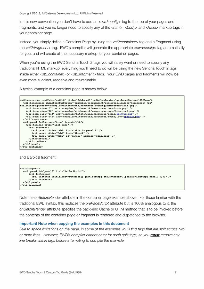
In this new convention you don’t have to add an <ewd:config> tag to the top of your pages and fragments, and you no longer need to specify any of the <html>, <body> and <head> markup tags in your container page.
Instead, you simply define a Container Page by using the <st2:container> tag and a Fragment using the <st2:fragment> tag. EWD’s compiler will generate the appropriate <ewd:config> tag automatically for you, and will create all the necessary markup for your container pages.
When you’re using the EWD Sencha Touch 2 tags you will rarely want or need to specify any traditional HTML markup: everything you’ll need to do will be using the new Sencha Touch 2 tags inside either <st2:container> or <st2:fragment> tags. Your EWD pages and fragments will now be even more succinct, readable and maintainable.
A typical example of a container page is shown below:
<st2:container rootPath="/st2.0" title="TabPanel1" onBeforeRender="getPanelContent^ST2Demo"> <st2:homeScreen phoneStartupScreen="examples/kitchensink/resources/loading/Homescreen.jpg" tabletStartupScreen="examples/kitchensink/resources/loading/Homescreen~ipad.jpg"> <st2:icon size="57" url="examples/kitchensink/resources/icons/Icon.png" /> <st2:icon size="72" url="examples/kitchensink/resources/icons/Icon~ipad.png" /> <st2:icon size="114" url="examples/kitchensink/resources/icons/[email protected]" /> <st2:icon size="144" url="examples/kitchensink/resources/icons/[email protected]" /> </st2:homeScreen> <st2:panel fullscreen="true" layout="fit"> <st2:toolbar title="List Demo" /> <st2:tabPanel> <st2:panel title="Tab1" html="This is panel 1" /> <st2:panel title="Tab2" html="#html2" /> <st2:panel title="Tab3" id="panel3" addPage="panelfrag" /> </st2:tabPanel> </st2:toolbar> </st2:panel></st2:container>
and a typical fragment:
<st2:fragment> <st2:panel id="panel2" html="Hello World!"> <st2:listeners> <st2:listener initialize="function() {Ext.getCmp('theContainer').push(Ext.getCmp('panel2'));}" /> </st2:listeners> </st2:panel></st2:fragment>
Note the onBeforeRender attribute in the container page example above. For those familiar with the traditional EWD syntax, this replaces the prePageScript attribute but is 100% analogous to it: the onBeforeRender attribute specifies the back-end Caché or GT.M method that is to be invoked before the contents of the container page or fragment is rendered and dispatched to the browser.
Important Note when copying the examples in this documentDue to space limitations on the page, in some of the examples you’ll find tags that are split across two or more lines. However, EWD’s compiler cannot cater for such split tags, so you must remove any line breaks within tags before attempting to compile the example.
Copyright ©2012, M/Gateway Developments Ltd. All Rights Reserved
EWD Sencha Touch 2 Custom Tag Guide (Build 938) 2
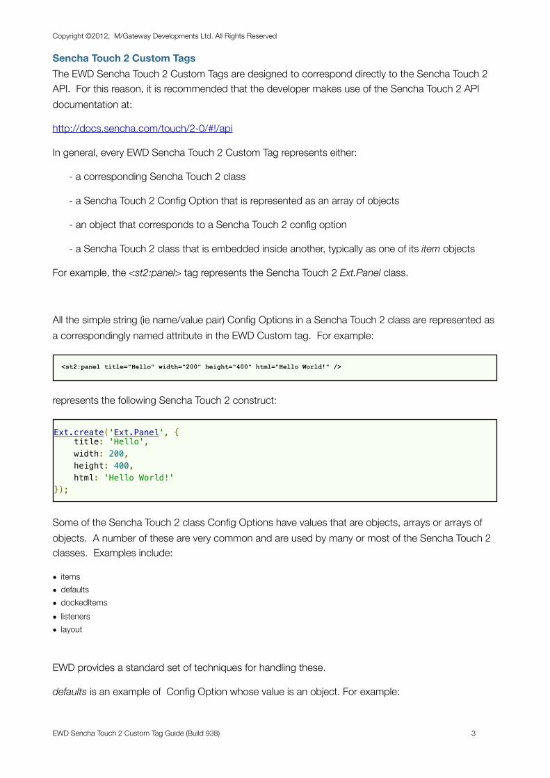
Sencha Touch 2 Custom TagsThe EWD Sencha Touch 2 Custom Tags are designed to correspond directly to the Sencha Touch 2 API. For this reason, it is recommended that the developer makes use of the Sencha Touch 2 API documentation at:
http://docs.sencha.com/touch/2-0/#!/api
In general, every EWD Sencha Touch 2 Custom Tag represents either:
- a corresponding Sencha Touch 2 class
- a Sencha Touch 2 Config Option that is represented as an array of objects
- an object that corresponds to a Sencha Touch 2 config option
- a Sencha Touch 2 class that is embedded inside another, typically as one of its item objects
For example, the <st2:panel> tag represents the Sencha Touch 2 Ext.Panel class.
All the simple string (ie name/value pair) Config Options in a Sencha Touch 2 class are represented as a correspondingly named attribute in the EWD Custom tag. For example:
<st2:panel title="Hello" width="200" height="400" html="Hello World!" />
represents the following Sencha Touch 2 construct:
Ext.create('Ext.Panel', { title: 'Hello', width: 200, height: 400, html: 'Hello World!'});
Some of the Sencha Touch 2 class Config Options have values that are objects, arrays or arrays of objects. A number of these are very common and are used by many or most of the Sencha Touch 2 classes. Examples include:
• items• defaults• dockedItems• listeners• layout
EWD provides a standard set of techniques for handling these.
defaults is an example of Config Option whose value is an object. For example:
Copyright ©2012, M/Gateway Developments Ltd. All Rights Reserved
EWD Sencha Touch 2 Custom Tag Guide (Build 938) 3
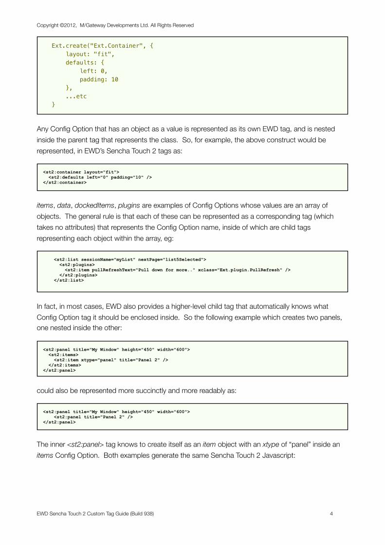
Ext.create("Ext.Container", { layout: "fit", defaults: { left: 0, padding: 10 }, ...etc }
Any Config Option that has an object as a value is represented as its own EWD tag, and is nested inside the parent tag that represents the class. So, for example, the above construct would be represented, in EWD’s Sencha Touch 2 tags as:
<st2:container layout="fit"> <st2:defaults left="0" padding="10" /> </st2:container>
items, data, dockedItems, plugins are examples of Config Options whose values are an array of objects. The general rule is that each of these can be represented as a corresponding tag (which takes no attributes) that represents the Config Option name, inside of which are child tags representing each object within the array, eg:
<st2:list sessionName="myList" nextPage="list5Selected"> <st2:plugins> <st2:item pullRefreshText="Pull down for more.." xclass="Ext.plugin.PullRefresh" /> </st2:plugins> </st2:list>
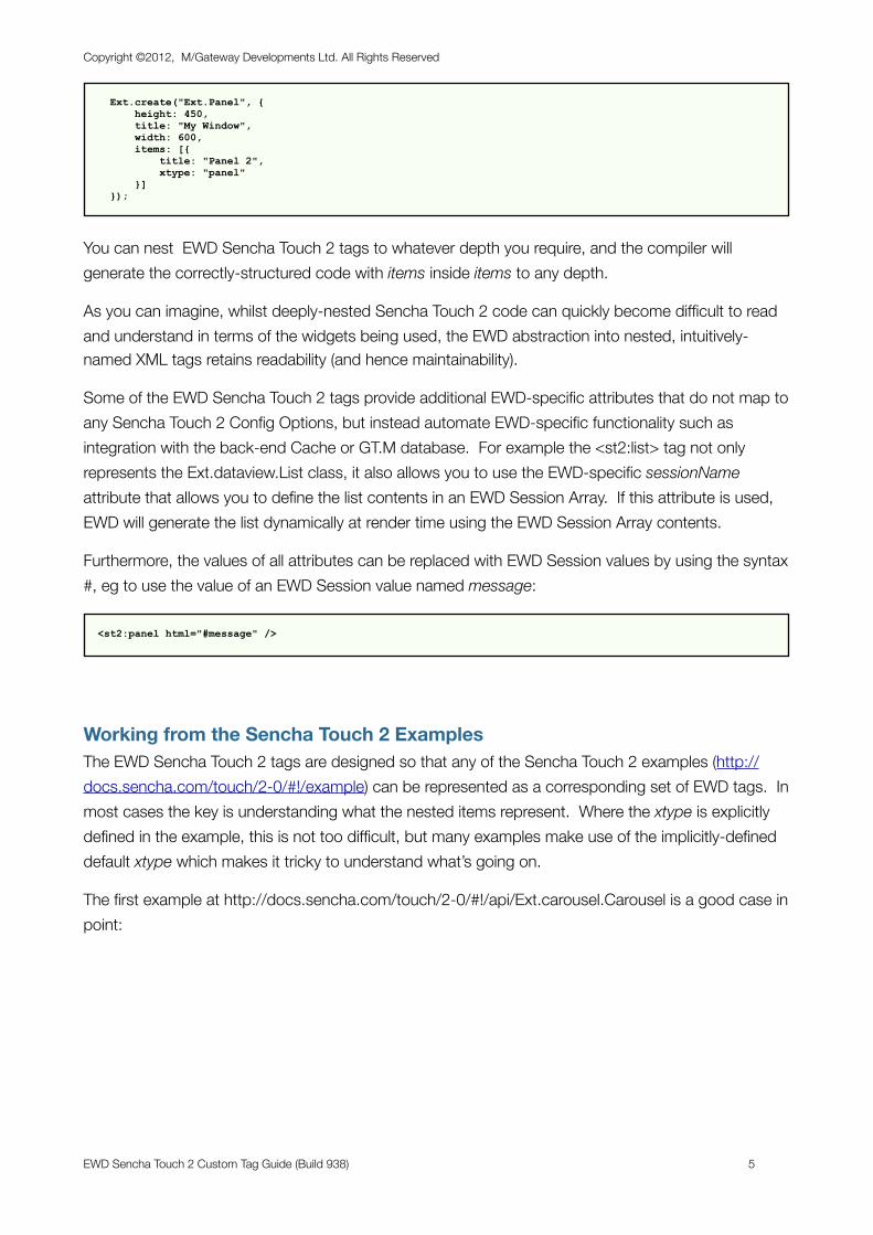
In fact, in most cases, EWD also provides a higher-level child tag that automatically knows what Config Option tag it should be enclosed inside. So the following example which creates two panels, one nested inside the other:
<st2:panel title="My Window" height="450" width="600"> <st2:items> <st2:item xtype="panel" title="Panel 2" /> </st2:items> </st2:panel>
could also be represented more succinctly and more readably as:
<st2:panel title="My Window" height="450" width="600"> <st2:panel title="Panel 2" /> </st2:panel>
The inner <st2:panel> tag knows to create itself as an item object with an xtype of “panel” inside an items Config Option. Both examples generate the same Sencha Touch 2 Javascript:
Copyright ©2012, M/Gateway Developments Ltd. All Rights Reserved
EWD Sencha Touch 2 Custom Tag Guide (Build 938) 4
Ext.create("Ext.Panel", { height: 450, title: "My Window", width: 600, items: [{ title: "Panel 2", xtype: "panel" }] });
You can nest EWD Sencha Touch 2 tags to whatever depth you require, and the compiler will generate the correctly-structured code with items inside items to any depth.
As you can imagine, whilst deeply-nested Sencha Touch 2 code can quickly become difficult to read and understand in terms of the widgets being used, the EWD abstraction into nested, intuitively-named XML tags retains readability (and hence maintainability).
Some of the EWD Sencha Touch 2 tags provide additional EWD-specific attributes that do not map to any Sencha Touch 2 Config Options, but instead automate EWD-specific functionality such as integration with the back-end Cache or GT.M database. For example the <st2:list> tag not only represents the Ext.dataview.List class, it also allows you to use the EWD-specific sessionName attribute that allows you to define the list contents in an EWD Session Array. If this attribute is used, EWD will generate the list dynamically at render time using the EWD Session Array contents.
Furthermore, the values of all attributes can be replaced with EWD Session values by using the syntax #, eg to use the value of an EWD Session value named message:
<st2:panel html="#message" />
Working from the Sencha Touch 2 ExamplesThe EWD Sencha Touch 2 tags are designed so that any of the Sencha Touch 2 examples (http://docs.sencha.com/touch/2-0/#!/example) can be represented as a corresponding set of EWD tags. In most cases the key is understanding what the nested items represent. Where the xtype is explicitly defined in the example, this is not too difficult, but many examples make use of the implicitly-defined default xtype which makes it tricky to understand what’s going on.
The first example at http://docs.sencha.com/touch/2-0/#!/api/Ext.carousel.Carousel is a good case in point:
Copyright ©2012, M/Gateway Developments Ltd. All Rights Reserved
EWD Sencha Touch 2 Custom Tag Guide (Build 938) 5
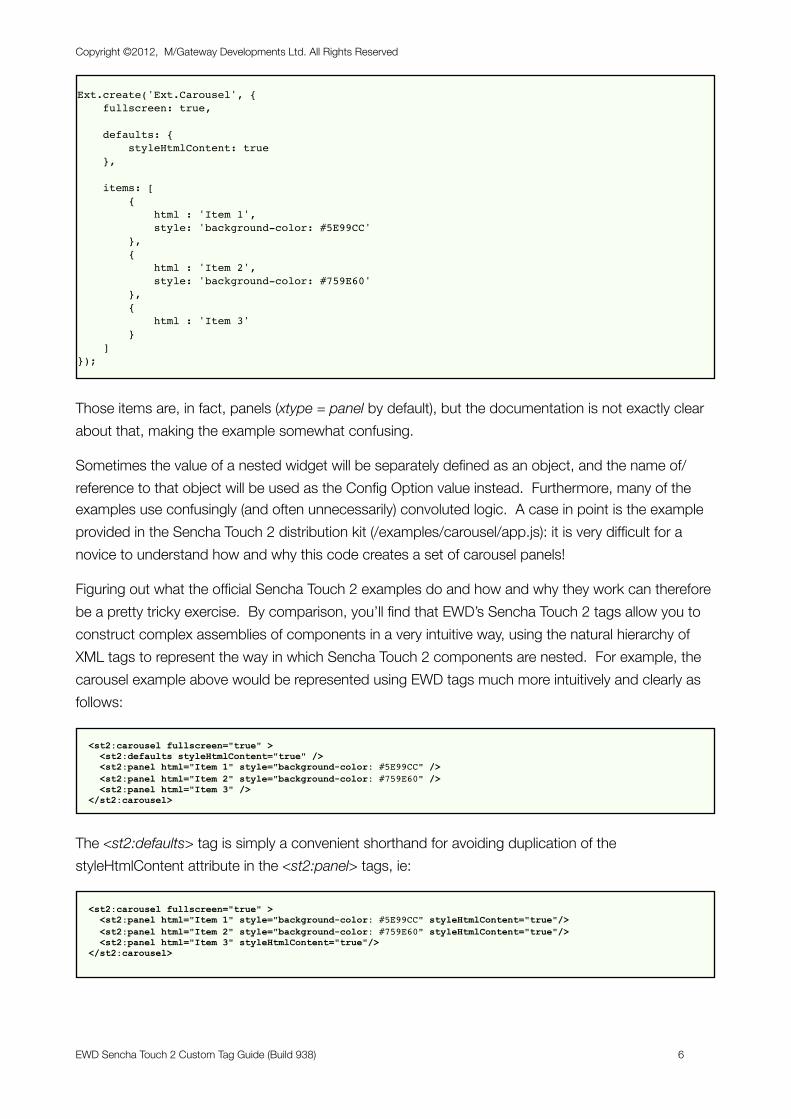
Ext.create('Ext.Carousel', { fullscreen: true,
defaults: { styleHtmlContent: true },
items: [ { html : 'Item 1', style: 'background-color: #5E99CC' }, { html : 'Item 2', style: 'background-color: #759E60' }, { html : 'Item 3' } ]});
Those items are, in fact, panels (xtype = panel by default), but the documentation is not exactly clear about that, making the example somewhat confusing.
Sometimes the value of a nested widget will be separately defined as an object, and the name of/reference to that object will be used as the Config Option value instead. Furthermore, many of the examples use confusingly (and often unnecessarily) convoluted logic. A case in point is the example provided in the Sencha Touch 2 distribution kit (/examples/carousel/app.js): it is very difficult for a novice to understand how and why this code creates a set of carousel panels!
Figuring out what the official Sencha Touch 2 examples do and how and why they work can therefore be a pretty tricky exercise. By comparison, you’ll find that EWD’s Sencha Touch 2 tags allow you to construct complex assemblies of components in a very intuitive way, using the natural hierarchy of XML tags to represent the way in which Sencha Touch 2 components are nested. For example, the carousel example above would be represented using EWD tags much more intuitively and clearly as follows:
<st2:carousel fullscreen="true" > <st2:defaults styleHtmlContent="true" /> <st2:panel html="Item 1" style="background-color: #5E99CC" /> <st2:panel html="Item 2" style="background-color: #759E60" /> <st2:panel html="Item 3" /> </st2:carousel>
The <st2:defaults> tag is simply a convenient shorthand for avoiding duplication of the styleHtmlContent attribute in the <st2:panel> tags, ie:
<st2:carousel fullscreen="true" > <st2:panel html="Item 1" style="background-color: #5E99CC" styleHtmlContent="true"/> <st2:panel html="Item 2" style="background-color: #759E60" styleHtmlContent="true"/> <st2:panel html="Item 3" styleHtmlContent="true"/> </st2:carousel>
Copyright ©2012, M/Gateway Developments Ltd. All Rights Reserved
EWD Sencha Touch 2 Custom Tag Guide (Build 938) 6
This clear and intuitive way of representing assemblies Sencha Touch 2 components significantly aids readability and improves the maintainability of Sencha Touch applications, compared with the “free-for-all” of manually written Sencha Touch 2 Javascript logic.
Sencha Touch 2 Custom Tag DefinitionsThe EWD Sencha Touch 2 Custom Tags use the highly abstracted compilation technique that was introduced with the ExtJS v4 tags. You can see the list of available tags and their JSON-based abstracted processing definitions by looking at the routine file _zewdSTch2Map.m in the EWD GitHub Repository at:
https://github.com/robtweed/EWD
A description of the JSON abstracted tag definition conventions that have been used are beyond the scope of this current document, but advanced EWD developers should be aware that they can extend the tag set by adding further JSON-based definitions to the global:
- ^zewd(”mappingObject”,”st2”)
Copyright ©2012, M/Gateway Developments Ltd. All Rights Reserved
EWD Sencha Touch 2 Custom Tag Guide (Build 938) 7
Instal lation and Configuration
Installing the Sencha Touch 2 Tag LibraryThe EWD Sencha Touch 2 Custom Tags are incorporated into EWD Build 938 and later. All you need to do is to install the Sencha Touch 2 Javascript library from the Sencha Site:
http://www.sencha.com/products/touch/download/
Where you install Sencha Touch 2 is up to you, but it must be in a directory path that is accessible to your Web Server.
Configuring EWD for use with Sencha Touch 2Configuration is very simple: in the <st2:container> tag of your applications, you must specify the root web-server path that points to the directory path where you’ve installed the Sencha Touch 2 Javascript library, eg if you are using the dEWDrop VM (http://www.fourthwatchsoftware.com/) and you install Sencha Touch 2 in the physical path:
/home/vista/www/st2.0
then because the physical path /home/vista/www is mapped in the Apache configuration file to the alias /vista, the <st2:container> tags in your EWD Sencha Touch 2 applications will look like this:
<st2:container rootPath="/vista/st2.0"> .... etc </st2:container>
The examples used in this document will all use a rootPath of “/vista/st2.0”. You should adjust your examples accordingly to reflect the location you’ve used for the Sencha Touch 2 Javascript files.
Copyright ©2012, M/Gateway Developments Ltd. All Rights Reserved
EWD Sencha Touch 2 Custom Tag Guide (Build 938) 8
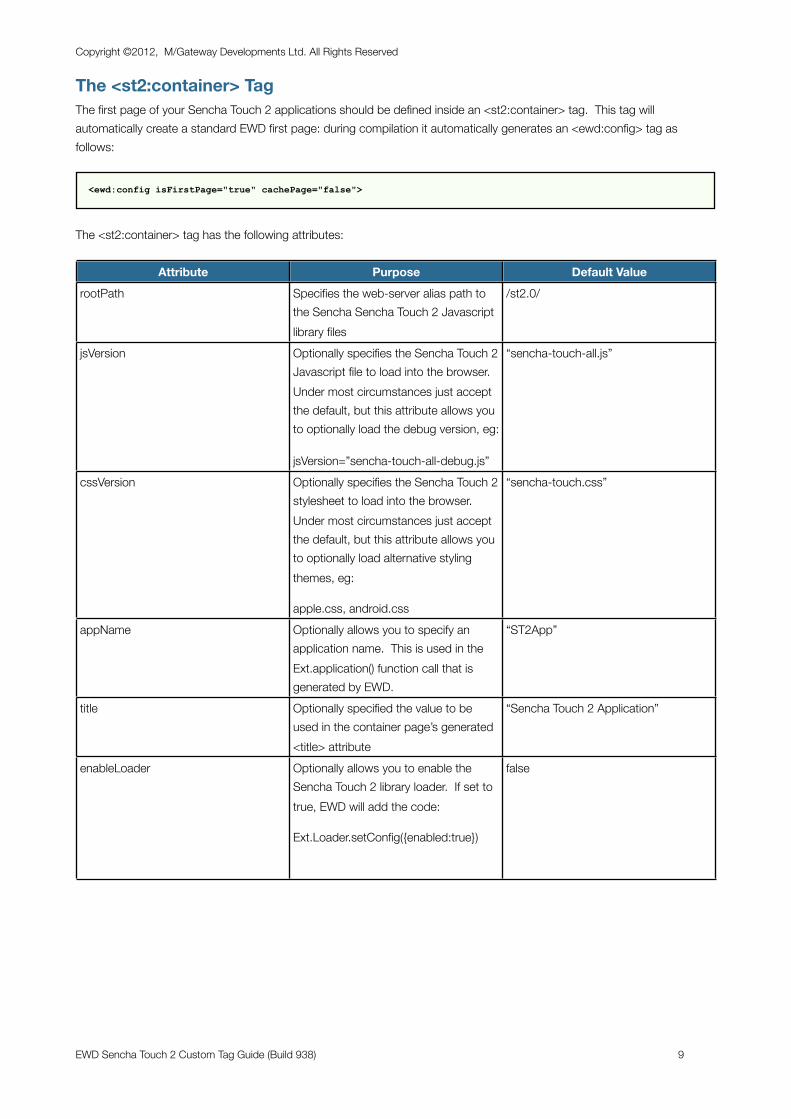
The <st2:container> TagThe first page of your Sencha Touch 2 applications should be defined inside an <st2:container> tag. This tag will automatically create a standard EWD first page: during compilation it automatically generates an <ewd:config> tag as follows:
<ewd:config isFirstPage="true" cachePage="false">
The <st2:container> tag has the following attributes:
Attribute Purpose Default ValuerootPath Specifies the web-server alias path to
the Sencha Sencha Touch 2 Javascript library files
/st2.0/
jsVersion Optionally specifies the Sencha Touch 2 Javascript file to load into the browser. Under most circumstances just accept the default, but this attribute allows you to optionally load the debug version, eg:
jsVersion=”sencha-touch-all-debug.js”
“sencha-touch-all.js”
cssVersion Optionally specifies the Sencha Touch 2 stylesheet to load into the browser. Under most circumstances just accept the default, but this attribute allows you to optionally load alternative styling themes, eg:
apple.css, android.css
“sencha-touch.css”
appName Optionally allows you to specify an application name. This is used in the Ext.application() function call that is generated by EWD.
“ST2App”
title Optionally specified the value to be used in the container page’s generated <title> attribute
“Sencha Touch 2 Application”
enableLoader Optionally allows you to enable the Sencha Touch 2 library loader. If set to true, EWD will add the code:
Ext.Loader.setConfig({enabled:true})
false
Copyright ©2012, M/Gateway Developments Ltd. All Rights Reserved
EWD Sencha Touch 2 Custom Tag Guide (Build 938) 9
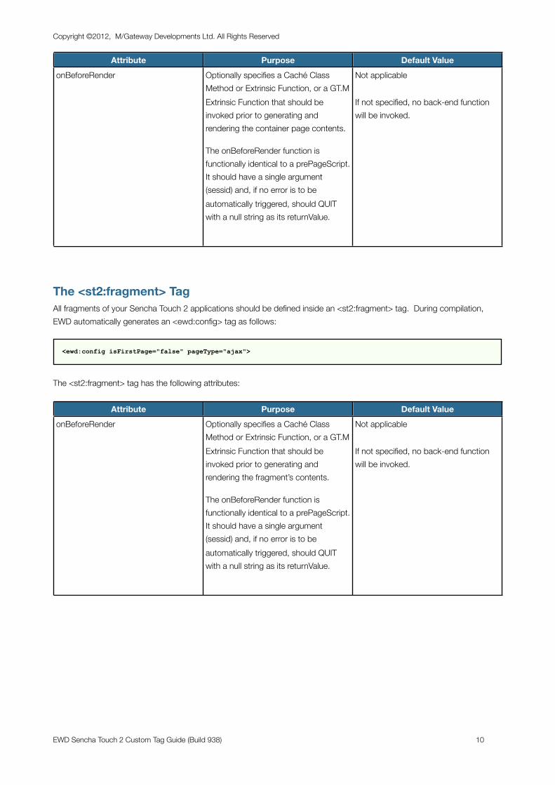
Attribute Purpose Default ValueonBeforeRender Optionally specifies a Caché Class
Method or Extrinsic Function, or a GT.M Extrinsic Function that should be invoked prior to generating and rendering the container page contents.
The onBeforeRender function is functionally identical to a prePageScript. It should have a single argument (sessid) and, if no error is to be automatically triggered, should QUIT with a null string as its returnValue.
Not applicable
If not specified, no back-end function will be invoked.
The <st2:fragment> TagAll fragments of your Sencha Touch 2 applications should be defined inside an <st2:fragment> tag. During compilation, EWD automatically generates an <ewd:config> tag as follows:
<ewd:config isFirstPage="false" pageType="ajax">
The <st2:fragment> tag has the following attributes:
Attribute Purpose Default ValueonBeforeRender Optionally specifies a Caché Class
Method or Extrinsic Function, or a GT.M Extrinsic Function that should be invoked prior to generating and rendering the fragment’s contents.
The onBeforeRender function is functionally identical to a prePageScript. It should have a single argument (sessid) and, if no error is to be automatically triggered, should QUIT with a null string as its returnValue.
Not applicable
If not specified, no back-end function will be invoked.
Copyright ©2012, M/Gateway Developments Ltd. All Rights Reserved
EWD Sencha Touch 2 Custom Tag Guide (Build 938) 10
A Simple Hello World Application
Pre-requisitesIn this chapter, we’ll create a simple Hello World application, using an Sencha Touch 2 Panel widget.
It is assumed that you’ve installed and configured EWD (See Appendix 1). Make sure you’ve installed Build 938 or later.
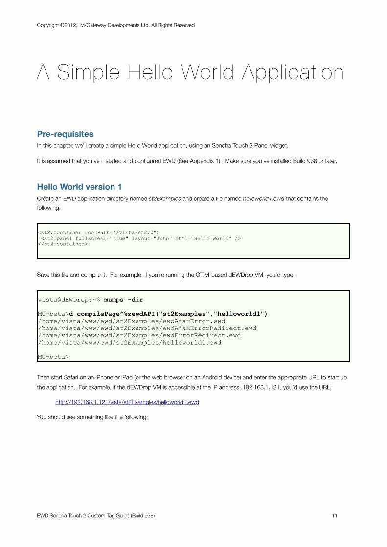
Hello World version 1Create an EWD application directory named st2Examples and create a file named helloworld1.ewd that contains the following:
<st2:container rootPath="/vista/st2.0"> <st2:panel fullscreen="true" layout="auto" html="Hello World" /></st2:container>
Save this file and compile it. For example, if you’re running the GT.M-based dEWDrop VM, you’d type:
vista@dEWDrop:~$ mumps -dir
MU-beta>d compilePage^%zewdAPI("st2Examples","helloworld1")/home/vista/www/ewd/st2Examples/ewdAjaxError.ewd/home/vista/www/ewd/st2Examples/ewdAjaxErrorRedirect.ewd/home/vista/www/ewd/st2Examples/ewdErrorRedirect.ewd/home/vista/www/ewd/st2Examples/helloworld1.ewd
MU-beta>
Then start Safari on an iPhone or iPad (or the web browser on an Android device) and enter the appropriate URL to start up the application. For example, if the dEWDrop VM is accessible at the IP address: 192.168.1.121, you’d use the URL:
http://192.168.1.121/vista/st2Examples/helloworld1.ewd
You should see something like the following:
Copyright ©2012, M/Gateway Developments Ltd. All Rights Reserved
EWD Sencha Touch 2 Custom Tag Guide (Build 938) 11
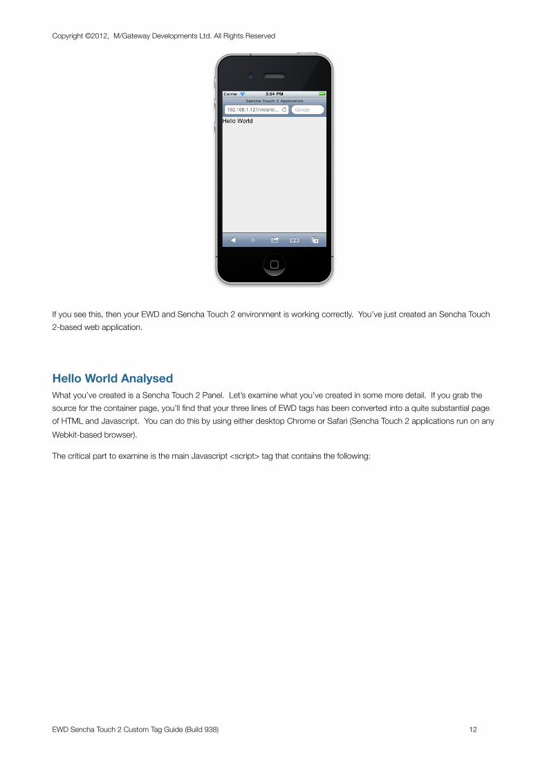
If you see this, then your EWD and Sencha Touch 2 environment is working correctly. You’ve just created an Sencha Touch 2-based web application.
Hello World AnalysedWhat you’ve created is a Sencha Touch 2 Panel. Let’s examine what you’ve created in some more detail. If you grab the source for the container page, you’ll find that your three lines of EWD tags has been converted into a quite substantial page of HTML and Javascript. You can do this by using either desktop Chrome or Safari (Sencha Touch 2 applications run on any Webkit-based browser).
The critical part to examine is the main Javascript <script> tag that contains the following:
Copyright ©2012, M/Gateway Developments Ltd. All Rights Reserved
EWD Sencha Touch 2 Custom Tag Guide (Build 938) 12
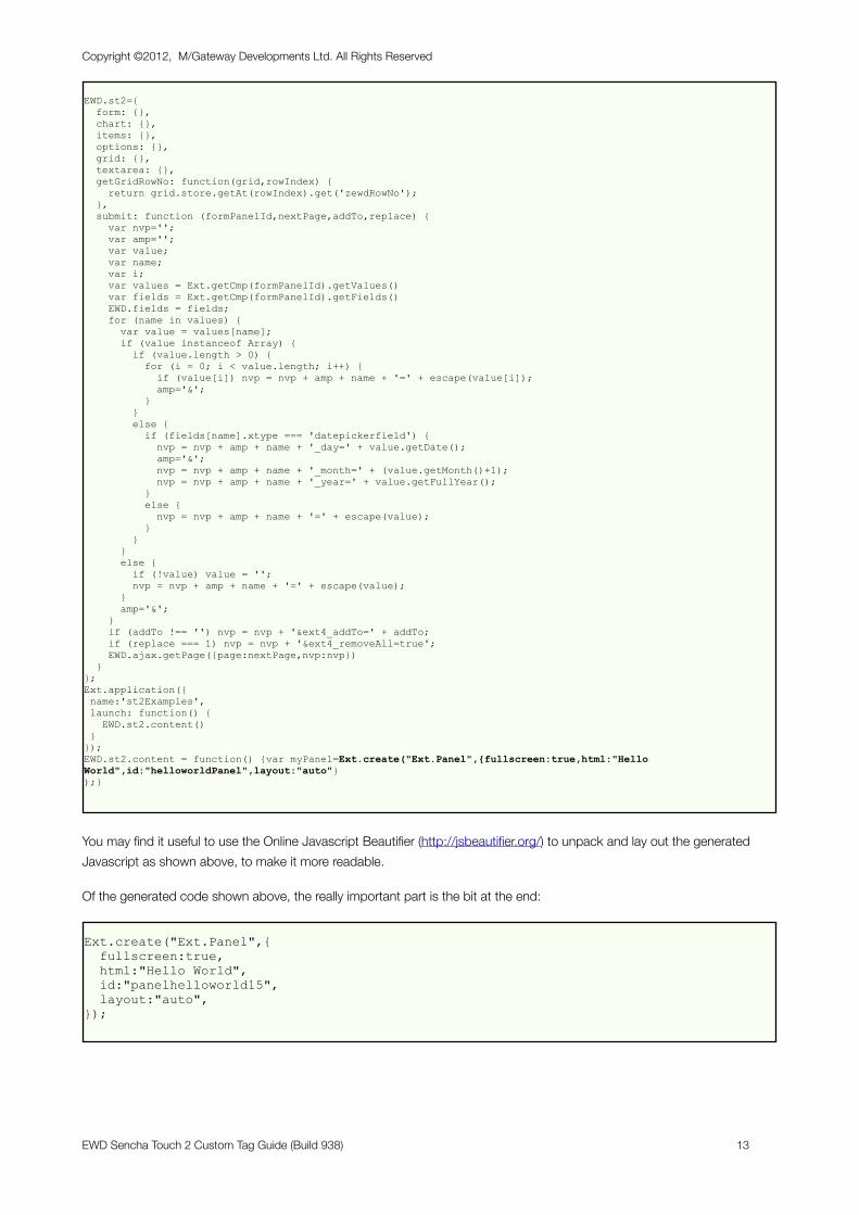
EWD.st2={ form: {}, chart: {}, items: {}, options: {}, grid: {}, textarea: {}, getGridRowNo: function(grid,rowIndex) { return grid.store.getAt(rowIndex).get('zewdRowNo'); }, submit: function (formPanelId,nextPage,addTo,replace) { var nvp=''; var amp=''; var value; var name; var i; var values = Ext.getCmp(formPanelId).getValues() var fields = Ext.getCmp(formPanelId).getFields() EWD.fields = fields; for (name in values) { var value = values[name]; if (value instanceof Array) { if (value.length > 0) { for (i = 0; i < value.length; i++) { if (value[i]) nvp = nvp + amp + name + '=' + escape(value[i]); amp='&'; } } else { if (fields[name].xtype === 'datepickerfield') { nvp = nvp + amp + name + '_day=' + value.getDate(); amp='&'; nvp = nvp + amp + name + '_month=' + (value.getMonth()+1); nvp = nvp + amp + name + '_year=' + value.getFullYear(); } else { nvp = nvp + amp + name + '=' + escape(value); } } } else { if (!value) value = ''; nvp = nvp + amp + name + '=' + escape(value); } amp='&'; } if (addTo !== '') nvp = nvp + '&ext4_addTo=' + addTo; if (replace === 1) nvp = nvp + '&ext4_removeAll=true'; EWD.ajax.getPage({page:nextPage,nvp:nvp}) }};Ext.application({ name:'st2Examples', launch: function() { EWD.st2.content() }});EWD.st2.content = function() {var myPanel=Ext.create("Ext.Panel",{fullscreen:true,html:"Hello World",id:"helloworldPanel",layout:"auto"});}
You may find it useful to use the Online Javascript Beautifier (http://jsbeautifier.org/) to unpack and lay out the generated Javascript as shown above, to make it more readable.
Of the generated code shown above, the really important part is the bit at the end:
Ext.create("Ext.Panel",{ fullscreen:true, html:"Hello World", id:"panelhelloworld15", layout:"auto",});
Copyright ©2012, M/Gateway Developments Ltd. All Rights Reserved
EWD Sencha Touch 2 Custom Tag Guide (Build 938) 13
This is the Sencha Touch 2 Javascript code that was specifically generated from your original <st2:panel> tag. You’ll see that its attributes have been converted into corresponding object properties, and EWD’s compiler has added another attribute: id. EWD has added an id so that the panel widget could be uniquely identified using:
Ext.getCmp("panelhelloworld15");
Creating your own Pointers to Sencha Touch 2 WidgetsIt is much more practical to provide our own id value, since we’ll not easily be able to predict the id value that EWD will otherwise automatically assign. You can do this very simply by editing the EWD page as follows:
<st2:container rootPath="/vista/st2.0"> <st2:panel id="helloworldPanel" fullscreen="true" layout="auto" html="Hello World" /></st2:container>
If you recompile this page, run it in the browser again and view the source, you’ll see that the code has now changed to:
Ext.create("Ext.Panel",{ fullscreen:true, html:"Hello World", id:"helloworldPanel", layout:"auto"});
Another way to obtain a pointer to the panel widget is to specify an object reference for the panel:
<st2:container rootPath="/vista/st2.0"> <st2:panel id="helloworldPanel" fullscreen="true" layout="auto" html="Hello World" object="myPanel" var="true" /></st2:container>
Compile, re-run and view the source, and you’ll see that the generated code for the panel widget has now changed to:
var myPanel = Ext.create("Ext.Panel",{ fullscreen:true, html:"Hello World", id:"helloworldPanel", layout:"auto"});
The attribute var=”true” told the compiler to scope the object name (myPanel) using a var command. The panel can now be referenced either using the variable myPanel or the function Ext.getCmp(‘helloworldPanel’). If you omit the var=”true” attribute or specify var=”false”, then the object is declared as a global variable, ie:
Copyright ©2012, M/Gateway Developments Ltd. All Rights Reserved
EWD Sencha Touch 2 Custom Tag Guide (Build 938) 14
myPanel = Ext.create("Ext.Panel",{ fullscreen:true, html:"Hello World", id:"helloworldPanel", layout:"auto"});
It is generally recommended that in most circumstances, you should specify var=”true”.
Generating the Hello World Panel Contents DynamicallyDynamic content is generated in EWD applications using the onBeforeRender function. Basically it’s a two-step approach:
- write a Cache or GT.M function that creates and/or gets data (eg from the database)
- save that data into the EWD Session as simple variables or multi-dimensional arrays
The EWD tags can then make use of data in the EWD Session. Some of the EWD Sencha Touch 2 tags automatically know how to use data stored in EWD Session Arrays, but simple EWD Session Variables can be used as the value of any Sencha Touch 2 tag attribute. The latter capability is very simple: instead of using a quoted literal value, just add a # symbol at the start of the value, eg:
<st2:container rootPath="/vista/st2.0"> <st2:panel id="helloworldPanel" fullscreen="true" layout="auto" html="#hello" object="myPanel" var="true" /></st2:container>
In the example above, we’ve substituted the literal value for the html attribute with a reference to an EWD Session Variable named hello. In effect, what this is saying is: the value of the html attribute will be whatever is currently held in an EWD Session Variable named hello.
What’s missing from the example above is the means by which the EWD Session variable named hello is created. We therefore need to add an onBeforeRender attribute to the <st2:container> tag, eg:
<st2:container rootPath="/vista/st2.0" onBeforeRender="getHello^ST2Demo"> <st2:panel id="helloworldPanel" fullscreen="true" layout="auto" html="#hello" object="myPanel" var="true" /></st2:container>
In the example above, a GT.M function named getHello() from a routine file named ext4Demo will be invoked before the Container Page is generated and rendered. This function could look something like this:
getHello(sessid) ; d setSessionValue^%zewdAPI("hello","Hello World! This is the dEWDrop VM",sessid) QUIT "" ;
If you’re using the dEWDrop VM, you can create this using a text editor. Save it as /home/vista/p/ST2Demo.m
Save the the new version of the EWD page as helloworld2.ewd, compile it and re-run the URL again. It should now look like this:
Copyright ©2012, M/Gateway Developments Ltd. All Rights Reserved
EWD Sencha Touch 2 Custom Tag Guide (Build 938) 15
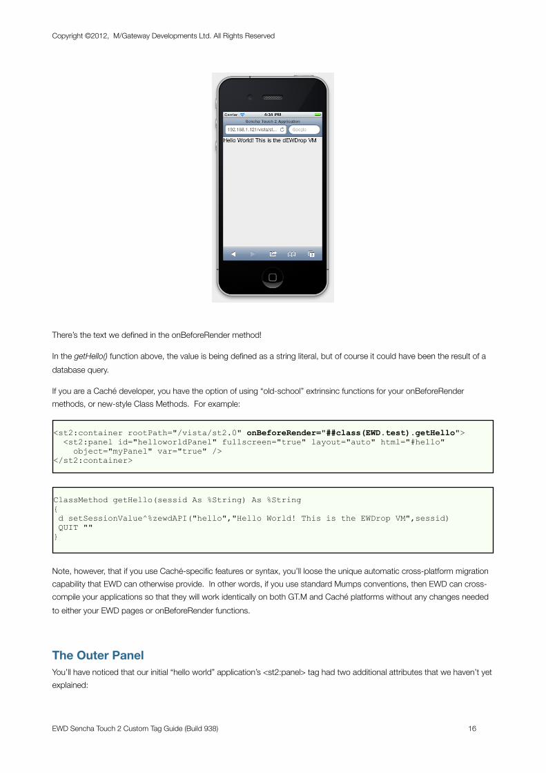
There’s the text we defined in the onBeforeRender method!
In the getHello() function above, the value is being defined as a string literal, but of course it could have been the result of a database query.
If you are a Caché developer, you have the option of using “old-school” extrinsinc functions for your onBeforeRender methods, or new-style Class Methods. For example:
<st2:container rootPath="/vista/st2.0" onBeforeRender="##class(EWD.test).getHello"> <st2:panel id="helloworldPanel" fullscreen="true" layout="auto" html="#hello" object="myPanel" var="true" /></st2:container>
ClassMethod getHello(sessid As %String) As %String{ d setSessionValue^%zewdAPI("hello","Hello World! This is the EWDrop VM",sessid) QUIT ""}
Note, however, that if you use Caché-specific features or syntax, you’ll loose the unique automatic cross-platform migration capability that EWD can otherwise provide. In other words, if you use standard Mumps conventions, then EWD can cross-compile your applications so that they will work identically on both GT.M and Caché platforms without any changes needed to either your EWD pages or onBeforeRender functions.
The Outer PanelYou’ll have noticed that our initial “hello world” application’s <st2:panel> tag had two additional attributes that we haven’t yet explained:
Copyright ©2012, M/Gateway Developments Ltd. All Rights Reserved
EWD Sencha Touch 2 Custom Tag Guide (Build 938) 16
- fullscreen
- layout
If your outer tag in your container page is an <st2:panel> tag, you’ll find that you need to specify these, otherwise:
- nothing will appear in the browser; and/or
- components / widgets that you embed inside the outer panel won’t render at all or correctly
Sencha’s examples tend to use the Ext.Container component as the outermost component, and this is mapped to an EWD tag named <st2:container>. If you use the <st2:container> tag, you can dispense with the fullscreen and layout attributes, because EWD adds these for you automatically. Hence, the preferred structure of our helloworld application should be as follows:
<st2:container rootPath="/st2.0" onBeforeRender="##class(EWD.test).getHello"> <st2:container> <st2:panel html="#hello" object="myPanel" var="true" /> </st:container></st2:container>
Don’t confuse the two <st2:container> tags that are being used in this page. The outer one is used by EWD and tells the compiler that this is a full page of HTML: a container page. The inner one represents a Sencha Touch 2 Ext.Container component.
Nesting ComponentsAlthough you can mix standard HTML markup with Sencha Touch 2 widgets, Sencha Touch 2 is really designed to be self-contained and most UI effects you’ll need can be achieved using Sencha Touch 2 widgets and their APIs.
The Panel is probably the most basic UI unit in Sencha Touch 2: you’ll find that you’ll be using them all over the place in many different ways. Panels can be nested inside each other and alongside and/or inside others. The example above demonstrates this, showing an <st2:panel> tag nested inside an <st2:container> tag.
Adding Panels using FragmentsSencha Touch 2 allows you to add new components to your main container component dynamically using Javascript. Panels (and many other components) expose an add() method that can be used to dynamically add other components. EWD’s Sencha Touch 2 tags automatically use this mechanism when you use Fragments to inject new dynamically-generated widgets into what’s already being displayed in your Container Page.
So, for example, we could rewrite the previous example using a Container Page and Fragment as follows:
Container Page: helloworld4.ewd
<st2:container rootPath="/st2.0"> <st2:container addPage="helloworld4a" /></st2:container>
Fragment: helloworld4a.ewd
Copyright ©2012, M/Gateway Developments Ltd. All Rights Reserved
EWD Sencha Touch 2 Custom Tag Guide (Build 938) 17
<st2:fragment onBeforeRender="##class(EWD.test).getHello"> <st2:panel html="#hello" object="myPanel" var="true" /></st2:fragment>
The key attribute is addPage. This does two things:
- asks EWD to fetch the fragment named helloworld4a.ewd
- after this fragment is rendered, the add() method is invoked for the panel owning the addPage attribute. The panel that is added is the outer one in the fragment being fetched.
The addPage attribute can be used with most Sencha Touch 2 component widgets. By default, the fragment that is fetched will be added along with any other panels (or other component widgets) that have been previously added. However, if you also include the attribute replacePreviousPage=”true”, then the fetched fragment will replace any previously added fragment panels (or other component widgets).
Using Javascript with Sencha Touch 2There are two ways in which you can use Javascript in conjunction with EWD’s Sencha Touch 2 tags:
- using widget-specific listeners
- using explicitly added Javascript code within Fragments
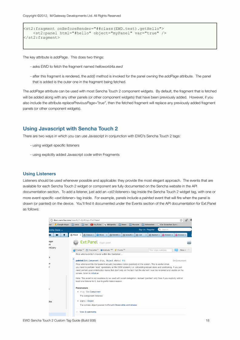
Using ListenersListeners should be used whenever possible and applicable: they provide the most elegant approach. The events that are available for each Sencha Touch 2 widget or component are fully documented on the Sencha website in the API documentation section. To add a listener, just add an <st2:listeners> tag inside the Sencha Touch 2 widget tag, with one or more event-specific <ext:listener> tag inside. For example, panels include a painted event that will fire when the panel is drawn (or painted) on the device. You’ll find it documented under the Events section of the API documentation for Ext.Panel as follows:
Copyright ©2012, M/Gateway Developments Ltd. All Rights Reserved
EWD Sencha Touch 2 Custom Tag Guide (Build 938) 18
To make use of this in our example, we could edit the helloworld4a.ewd fragment as follows:
<st2:fragment onBeforeRender="##class(EWD.test).getHello"> <st2:panel html="#hello" object="myPanel" var="true"> <st2:listeners> <st2:listener painted="alert('painted!');" /> </st2:listeners> </st2:panel> </st2:fragment>
Most listeners have parameters that may be used by your function. To make use of these, you need to replace the abbreviated render function that we’ve used in the example above with a full function specification. The documentation for the render event shows it has two parameters: this and eOpts. this provides a pointer to the panel that owns the listener. So, we could enhance the example above as follows:
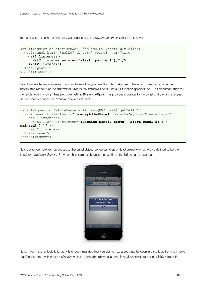
<st2:fragment onBeforeRender="##class(EWD.test).getHello"> <st2:panel html="#hello" id="myAddedPanel" object="myPanel" var="true"> <st2:listeners> <st2:listener painted="function(panel, eopts) {alert(panel.id + ' painted!');}" /> </st2:listeners> </st2:panel> </st2:fragment>
Now our render listener has access to the panel object, so we can display its id property which we’ve defined to be the literal text “myAddedPanel”. So when the example above is run, we’ll see the following alert appear:
Note: if your listener logic is lengthy, it is recommended that you define it as a separate function in a static .js file, and invoke that function from within the <st2:listener> tag. Long attribute values containing Javascript logic can quickly reduce the
Copyright ©2012, M/Gateway Developments Ltd. All Rights Reserved
EWD Sencha Touch 2 Custom Tag Guide (Build 938) 19
readability (and hence the maintainability) of EWD pages or fragments For example the alert logic could be defined separately in a function named alertMe(), allowing us to reduce the render attribute to the following:
<st2:listener render="function(panel,eopts) {alertMe(panel);}" />
The <st2:listeners> tag is available for use with any Sencha Touch 2 tag that maps to a corresponding Sencha Touch 2 component widget for which documented Events exist.
Using Explicitly-added JavascriptIn some situations, it’s more appropriate to add explicit blocks of Javascript code to your Fragments. You can specify whether your block of Javascript code is to be added before or after any generated Sencha Touch 2 Javascript code.
Note: to ensure maximum readability and maintainability of your pages and fragments, you should endeavour to use static Javascript, defined in static .js files, whenever possible. In-line Javascript blocks within your fragments should be restricted to logic that has to be dynamically defined at run-time, providing, for example, a specific and probably different value each time a fragment is rendered.
Static Javascript files can be requested and loaded into your Container page using a standard <script> tag, eg:
<st2:container rootPath="/vista/st2.0"> <script src="/vista/js/st2Demo.js" /> <st2:container addPage="helloworld5a" /></st2:container>
You can defer execution of the script file by adding the attribute defer=”defer”.
You can also add in-line Javascript to your Container Page, though this should be kept to a minimum, eg:
<st2:container rootPath="/vista/st2.0"> <script src="/vista/js/st2Demo.js" /> <st2:container addPage="helloworld5a" /> <script type="text/javascript"> alert("in-line Javascript here!"); </script></st2:container>
Inline Javascript within Fragments has to be handled differently: you embed any Javascript code inside <st2:js> tags. The <st2:js> tag has one mandatory attribute: at. Possible values are “top” and “bottom”, denoting whether the inline Javascript is to be placed before or after any generated Sencha Touch 2 Javascript. For example:
Copyright ©2012, M/Gateway Developments Ltd. All Rights Reserved
EWD Sencha Touch 2 Custom Tag Guide (Build 938) 20
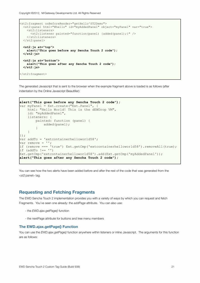
<st2:fragment onBeforeRender="getHello^ST2Demo"> <st2:panel html="#hello" id="myAddedPanel" object="myPanel" var="true"> <st2:listeners> <st2:listener painted="function(panel) {added(panel);}" /> </st2:listeners> </st2:panel>
<st2:js at="top"> alert("This goes before any Sencha Touch 2 code"); </st2:js>
<st2:js at="bottom"> alert("This goes after any Sencha Touch 2 code"); </st2:js>
</st2:fragment>
The generated Javascript that is sent to the browser when the example fragment above is loaded is as follows (after indentation by the Online Javascript Beautifier):
alert("This goes before any Sencha Touch 2 code");var myPanel = Ext.create("Ext.Panel", { html: "Hello World! This is the dEWDrop VM", id: "myAddedPanel", listeners: { painted: function (panel) { added(panel); } }});var addTo = 'extcontainerhelloworld58';var remove = '';if (remove === 'true') Ext.getCmp('extcontainerhelloworld58').removeAll(true);if (addTo !== '') Ext.getCmp('extcontainerhelloworld58').add(Ext.getCmp('myAddedPanel'));alert("This goes after any Sencha Touch 2 code");
You can see how the two alerts have been added before and after the rest of the code that was generated from the <st2:panel> tag.
Requesting and Fetching FragmentsThe EWD Sencha Touch 2 implementation provides you with a variety of ways by which you can request and fetch Fragments. You’ve seen one already: the addPage attribute. You can also use:
- the EWD.ajax.getPage() function
- the nextPage attribute for buttons and tree menu members
The EWD.ajax.getPage() FunctionYou can use the EWD.ajax.getPage() function anywhere within listeners or inline Javascript. The arguments for this function are as follows:
Copyright ©2012, M/Gateway Developments Ltd. All Rights Reserved
EWD Sencha Touch 2 Custom Tag Guide (Build 938) 21
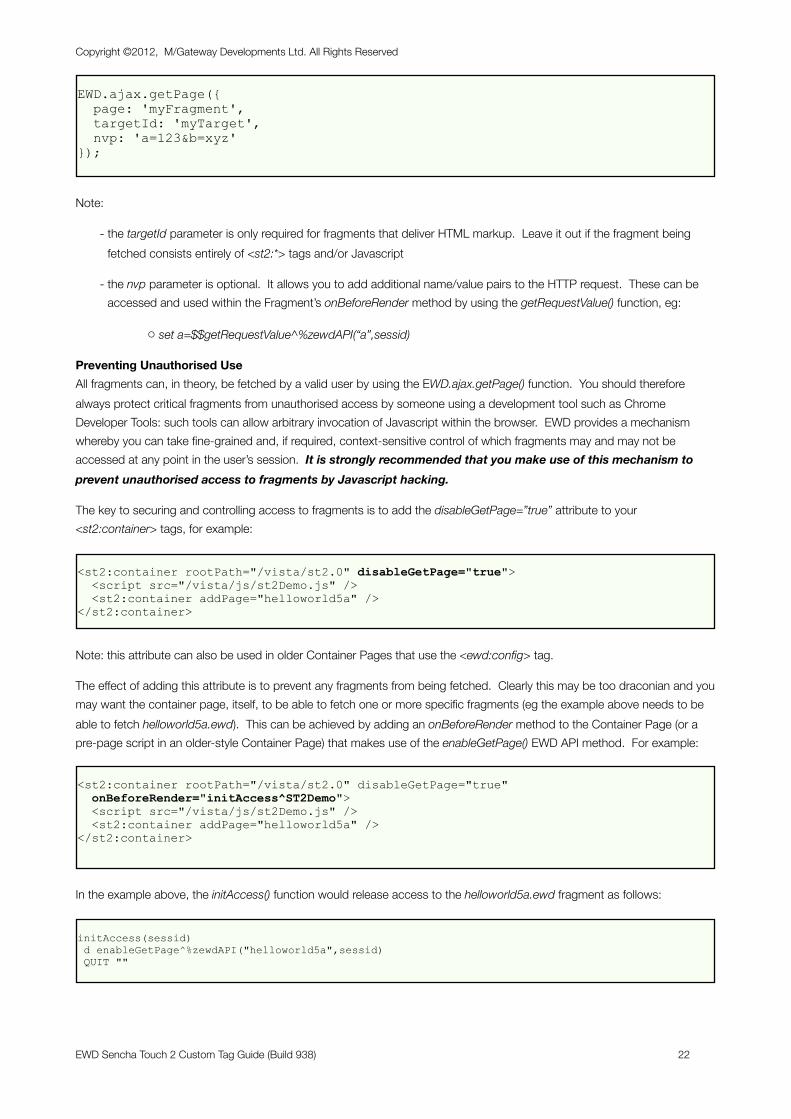
EWD.ajax.getPage({ page: 'myFragment', targetId: 'myTarget', nvp: 'a=123&b=xyz'});
Note:
- the targetId parameter is only required for fragments that deliver HTML markup. Leave it out if the fragment being fetched consists entirely of <st2:*> tags and/or Javascript
- the nvp parameter is optional. It allows you to add additional name/value pairs to the HTTP request. These can be accessed and used within the Fragment’s onBeforeRender method by using the getRequestValue() function, eg:
o set a=$$getRequestValue^%zewdAPI(“a”,sessid)
Preventing Unauthorised UseAll fragments can, in theory, be fetched by a valid user by using the EWD.ajax.getPage() function. You should therefore always protect critical fragments from unauthorised access by someone using a development tool such as Chrome Developer Tools: such tools can allow arbitrary invocation of Javascript within the browser. EWD provides a mechanism whereby you can take fine-grained and, if required, context-sensitive control of which fragments may and may not be accessed at any point in the user’s session. It is strongly recommended that you make use of this mechanism to prevent unauthorised access to fragments by Javascript hacking.
The key to securing and controlling access to fragments is to add the disableGetPage=”true” attribute to your <st2:container> tags, for example:
<st2:container rootPath="/vista/st2.0" disableGetPage="true"> <script src="/vista/js/st2Demo.js" /> <st2:container addPage="helloworld5a" /></st2:container>
Note: this attribute can also be used in older Container Pages that use the <ewd:config> tag.
The effect of adding this attribute is to prevent any fragments from being fetched. Clearly this may be too draconian and you may want the container page, itself, to be able to fetch one or more specific fragments (eg the example above needs to be able to fetch helloworld5a.ewd). This can be achieved by adding an onBeforeRender method to the Container Page (or a pre-page script in an older-style Container Page) that makes use of the enableGetPage() EWD API method. For example:
<st2:container rootPath="/vista/st2.0" disableGetPage="true" onBeforeRender="initAccess^ST2Demo"> <script src="/vista/js/st2Demo.js" /> <st2:container addPage="helloworld5a" /></st2:container>
In the example above, the initAccess() function would release access to the helloworld5a.ewd fragment as follows:
initAccess(sessid) d enableGetPage^%zewdAPI("helloworld5a",sessid) QUIT ""
Copyright ©2012, M/Gateway Developments Ltd. All Rights Reserved
EWD Sencha Touch 2 Custom Tag Guide (Build 938) 22
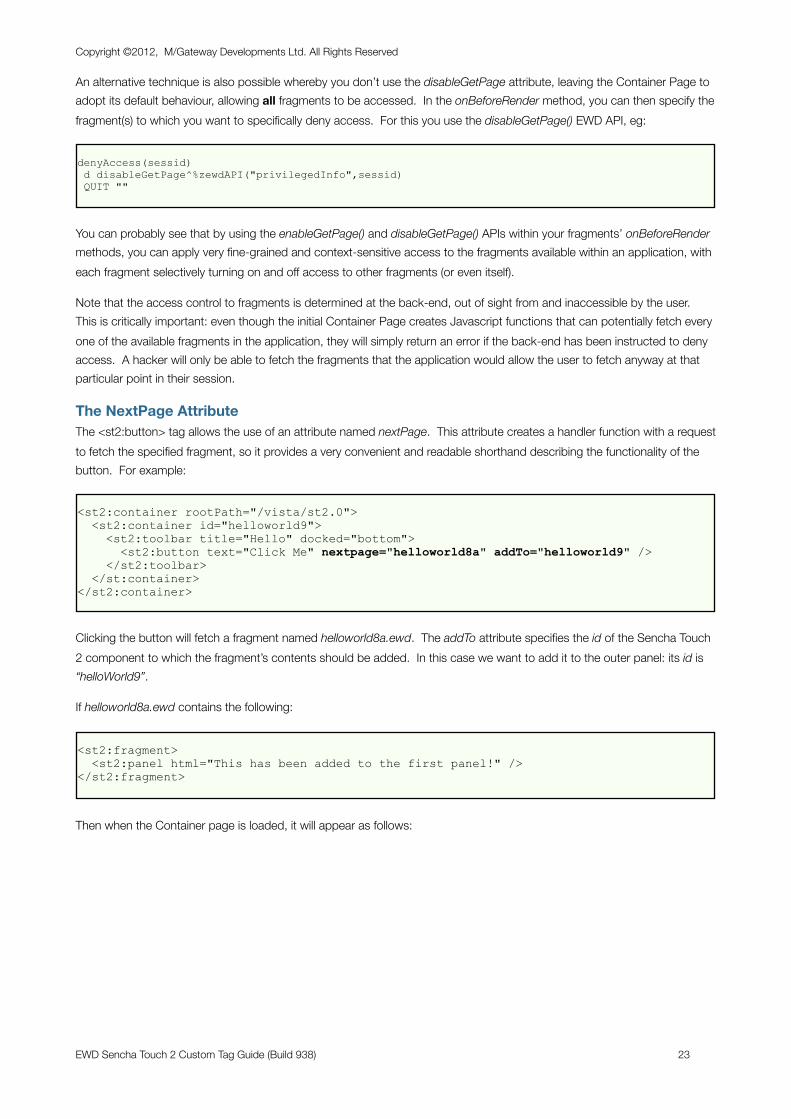
An alternative technique is also possible whereby you don’t use the disableGetPage attribute, leaving the Container Page to adopt its default behaviour, allowing all fragments to be accessed. In the onBeforeRender method, you can then specify the fragment(s) to which you want to specifically deny access. For this you use the disableGetPage() EWD API, eg:
denyAccess(sessid) d disableGetPage^%zewdAPI("privilegedInfo",sessid) QUIT ""
You can probably see that by using the enableGetPage() and disableGetPage() APIs within your fragments’ onBeforeRender methods, you can apply very fine-grained and context-sensitive access to the fragments available within an application, with each fragment selectively turning on and off access to other fragments (or even itself).
Note that the access control to fragments is determined at the back-end, out of sight from and inaccessible by the user. This is critically important: even though the initial Container Page creates Javascript functions that can potentially fetch every one of the available fragments in the application, they will simply return an error if the back-end has been instructed to deny access. A hacker will only be able to fetch the fragments that the application would allow the user to fetch anyway at that particular point in their session.
The NextPage AttributeThe <st2:button> tag allows the use of an attribute named nextPage. This attribute creates a handler function with a request to fetch the specified fragment, so it provides a very convenient and readable shorthand describing the functionality of the button. For example:
<st2:container rootPath="/vista/st2.0"> <st2:container id="helloworld9"> <st2:toolbar title="Hello" docked="bottom"> <st2:button text="Click Me" nextpage="helloworld8a" addTo="helloworld9" /> </st2:toolbar> </st:container></st2:container>
Clicking the button will fetch a fragment named helloworld8a.ewd. The addTo attribute specifies the id of the Sencha Touch 2 component to which the fragment’s contents should be added. In this case we want to add it to the outer panel: its id is “helloWorld9”.
If helloworld8a.ewd contains the following:
<st2:fragment> <st2:panel html="This has been added to the first panel!" /></st2:fragment>
Then when the Container page is loaded, it will appear as follows:
Copyright ©2012, M/Gateway Developments Ltd. All Rights Reserved
EWD Sencha Touch 2 Custom Tag Guide (Build 938) 23
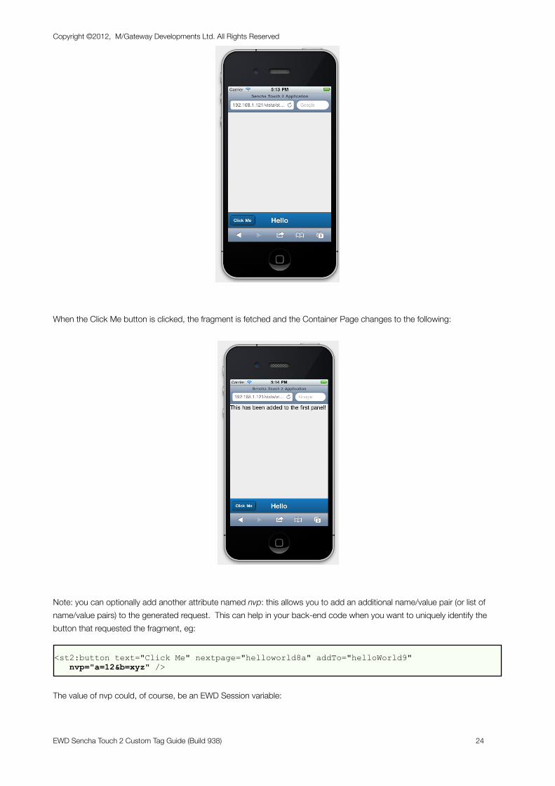
When the Click Me button is clicked, the fragment is fetched and the Container Page changes to the following:
Note: you can optionally add another attribute named nvp: this allows you to add an additional name/value pair (or list of name/value pairs) to the generated request. This can help in your back-end code when you want to uniquely identify the button that requested the fragment, eg:
<st2:button text="Click Me" nextpage="helloworld8a" addTo="helloWorld9" nvp="a=12&b=xyz" />
The value of nvp could, of course, be an EWD Session variable:
Copyright ©2012, M/Gateway Developments Ltd. All Rights Reserved
EWD Sencha Touch 2 Custom Tag Guide (Build 938) 24
<st2:button text="Click Me" nextpage="helloworld8a" addTo="helloWorld9" nvp="#but1nvp" />
Of course, you are not limited to this behaviour for buttons. If you require other behaviour, you can define a handler using the standard, documented handler Config Option, eg:
<st2:button text="Try Me" handler="function() {alert('You clicked the button')}" />
Copyright ©2012, M/Gateway Developments Ltd. All Rights Reserved
EWD Sencha Touch 2 Custom Tag Guide (Build 938) 25
Native App Behaviour
BackgroundThe whole idea of Sencha Touch 2 is that it enables us to create web applications for mobile devices that look almost indistinguishable from and behave just like Native Mobile Apps. However, our Hello World application doesn’t look or behave like that yet. For one thing, we had to start up Mobile Safari and type in a URL to get it started, and then it had the browser “chrome” at the top and bottom.
Sencha Touch 2 also allows us to create mobile web applications that run on both iOS and Android devices. This reference document will focus on iOS devices, and the techniques for making a mobile web application behave and appear like a Native App is somewhat different on other devices: the process is not actually anything to do with EWD, and the reader is encouraged to search on Google to find out the corresponding techniques for their Android (or other non-iOS) device.
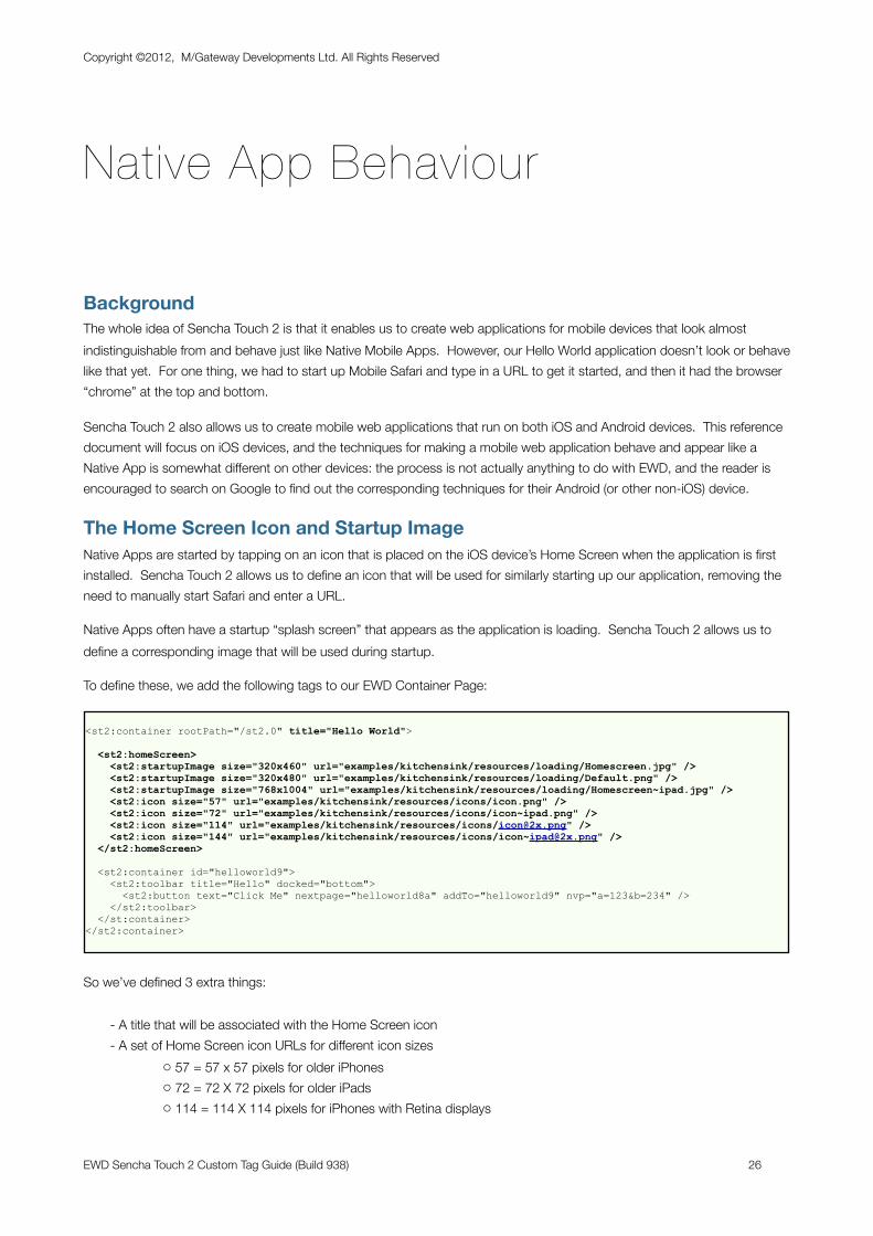
The Home Screen Icon and Startup ImageNative Apps are started by tapping on an icon that is placed on the iOS device’s Home Screen when the application is first installed. Sencha Touch 2 allows us to define an icon that will be used for similarly starting up our application, removing the need to manually start Safari and enter a URL.
Native Apps often have a startup “splash screen” that appears as the application is loading. Sencha Touch 2 allows us to define a corresponding image that will be used during startup.
To define these, we add the following tags to our EWD Container Page:
<st2:container rootPath="/st2.0" title="Hello World">
<st2:homeScreen> <st2:startupImage size="320x460" url="examples/kitchensink/resources/loading/Homescreen.jpg" /> <st2:startupImage size="320x480" url="examples/kitchensink/resources/loading/Default.png" /> <st2:startupImage size="768x1004" url="examples/kitchensink/resources/loading/Homescreen~ipad.jpg" /> <st2:icon size="57" url="examples/kitchensink/resources/icons/icon.png" /> <st2:icon size="72" url="examples/kitchensink/resources/icons/icon~ipad.png" /> <st2:icon size="114" url="examples/kitchensink/resources/icons/[email protected]" /> <st2:icon size="144" url="examples/kitchensink/resources/icons/[email protected]" /> </st2:homeScreen>
<st2:container id="helloworld9"> <st2:toolbar title="Hello" docked="bottom"> <st2:button text="Click Me" nextpage="helloworld8a" addTo="helloworld9" nvp="a=123&b=234" /> </st2:toolbar> </st:container></st2:container>
So we’ve defined 3 extra things:
- A title that will be associated with the Home Screen icon- A set of Home Screen icon URLs for different icon sizes
o 57 = 57 x 57 pixels for older iPhoneso 72 = 72 X 72 pixels for older iPadso 114 = 114 X 114 pixels for iPhones with Retina displays
Copyright ©2012, M/Gateway Developments Ltd. All Rights Reserved
EWD Sencha Touch 2 Custom Tag Guide (Build 938) 26
o 144 = 144 x 144 pixels for iPads with Retina displays
- A set of startup images for different mobile device screen sizes, ego 320 x 460 pixels for older iPhoneso 768 x 1004 pixels for older iPads
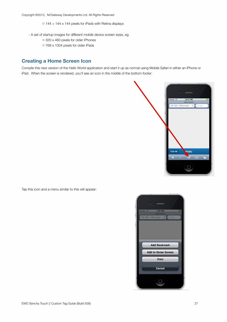
Creating a Home Screen IconCompile this new version of the Hello World application and start it up as normal using Mobile Safari in either an iPhone or iPad. When the screen is rendered, you’ll see an icon in the middle of the bottom footer:
Tap this icon and a menu similar to this will appear:
Copyright ©2012, M/Gateway Developments Ltd. All Rights Reserved
EWD Sencha Touch 2 Custom Tag Guide (Build 938) 27
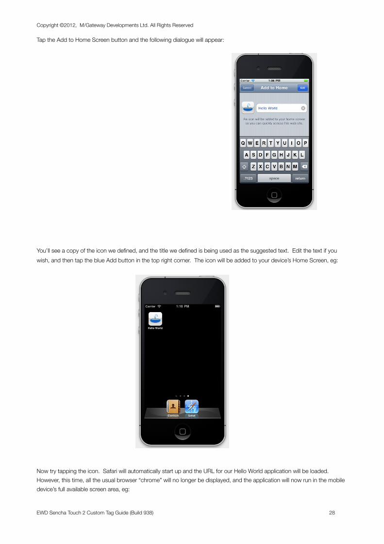
Tap the Add to Home Screen button and the following dialogue will appear:
You’ll see a copy of the icon we defined, and the title we defined is being used as the suggested text. Edit the text if you wish, and then tap the blue Add button in the top right corner. The icon will be added to your device’s Home Screen, eg:
Now try tapping the icon. Safari will automatically start up and the URL for our Hello World application will be loaded. However, this time, all the usual browser “chrome” will no longer be displayed, and the application will now run in the mobile device’s full available screen area, eg:
Copyright ©2012, M/Gateway Developments Ltd. All Rights Reserved
EWD Sencha Touch 2 Custom Tag Guide (Build 938) 28
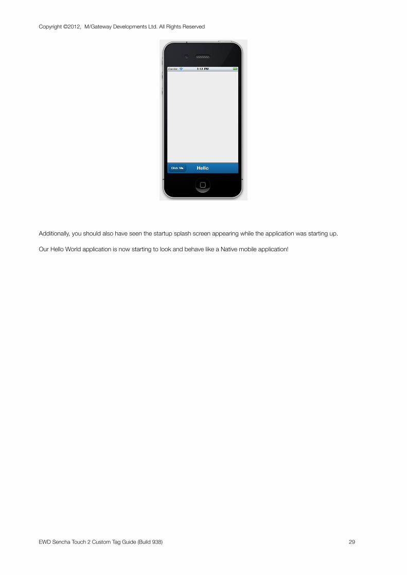
Additionally, you should also have seen the startup splash screen appearing while the application was starting up.
Our Hello World application is now starting to look and behave like a Native mobile application!
Copyright ©2012, M/Gateway Developments Ltd. All Rights Reserved
EWD Sencha Touch 2 Custom Tag Guide (Build 938) 29
Enhancing Hello World
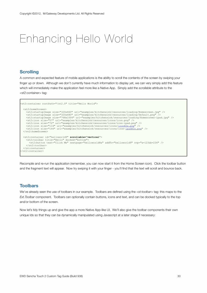
ScrollingA common and expected feature of mobile applications is the ability to scroll the contents of the screen by swiping your finger up or down. Although we don’t currently have much information to display yet, we can very simply add this feature which will immediately make the application feel more like a Native App. Simply add the scrollable attribute to the <st2:container> tag:
<st2:container rootPath="/st2.0" title="Hello World">
<st2:homeScreen> <st2:startupImage size="320x460" url="examples/kitchensink/resources/loading/Homescreen.jpg" /> <st2:startupImage size="320x480" url="examples/kitchensink/resources/loading/Default.png" /> <st2:startupImage size="768x1004" url="examples/kitchensink/resources/loading/Homescreen~ipad.jpg" /> <st2:icon size="57" url="examples/kitchensink/resources/icons/icon.png" /> <st2:icon size="72" url="examples/kitchensink/resources/icons/icon~ipad.png" /> <st2:icon size="114" url="examples/kitchensink/resources/icons/[email protected]" /> <st2:icon size="144" url="examples/kitchensink/resources/icons/[email protected]" /> </st2:homeScreen>
<st2:container id="helloworld9" scrollable="vertical"> <st2:toolbar title="Hello" docked="bottom"> <st2:button text="Click Me" nextpage="helloworld8a" addTo="helloworld9" nvp="a=123&b=234" /> </st2:toolbar> </st:container></st2:container>
Recompile and re-run the application (remember, you can now start it from the Home Screen icon). Click the toolbar button and the fragment text will appear. Now try swiping it with your finger - you’ll find that the text will scroll and bounce back.
ToolbarsWe’ve already seen the use of toolbars in our example. Toolbars are defined using the <st:toolbar> tag: this maps to the Ext.Toolbar component. Toolbars can optionally contain buttons, icons and text, and can be docked typically to the top and/or bottom of the screen.
Now let’s tidy things up and give the app a more Native App-like UI, We’ll also give the toolbar components their own unique Ids so that they can be dynamically manipulated using Javascript at a later stage if necessary:
Copyright ©2012, M/Gateway Developments Ltd. All Rights Reserved
EWD Sencha Touch 2 Custom Tag Guide (Build 938) 30
<st2:container rootPath="/st2.0" title="Hello World">
<st2:homeScreen> <st2:startupImage size="320x460" url="examples/kitchensink/resources/loading/Homescreen.jpg" /> <st2:startupImage size="320x480" url="examples/kitchensink/resources/loading/Default.png" /> <st2:startupImage size="768x1004" url="examples/kitchensink/resources/loading/Homescreen~ipad.jpg" /> <st2:icon size="57" url="examples/kitchensink/resources/icons/icon.png" /> <st2:icon size="72" url="examples/kitchensink/resources/icons/icon~ipad.png" /> <st2:icon size="114" url="examples/kitchensink/resources/icons/[email protected]" /> <st2:icon size="144" url="examples/kitchensink/resources/icons/[email protected]" /> </st2:homeScreen>
<st2:container id="helloworld9" scrollable="vertical"> <st2:toolbar title="Hello" docked="top" id= "topToolbar"> <st2:button text="Click Me" nextpage="helloworld8a" addTo="helloworld9" nvp="a=123&b=234" /> </st2:toolbar> <st2:toolbar docked="bottom" id= "bottomToolbar" /> </st:container></st2:container>
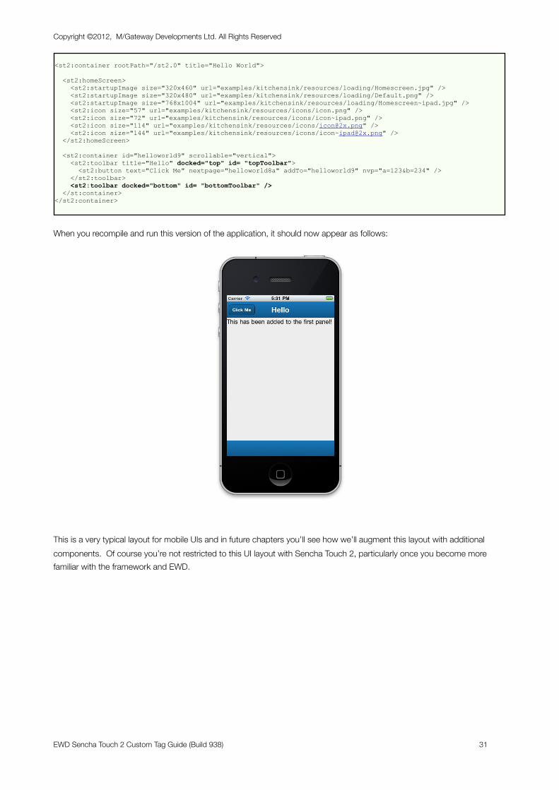
When you recompile and run this version of the application, it should now appear as follows:
This is a very typical layout for mobile UIs and in future chapters you’ll see how we’ll augment this layout with additional components. Of course you’re not restricted to this UI layout with Sencha Touch 2, particularly once you become more familiar with the framework and EWD.
Copyright ©2012, M/Gateway Developments Ltd. All Rights Reserved
EWD Sencha Touch 2 Custom Tag Guide (Build 938) 31
Debugging EWD Applications
Using Chrome/Safari Developer Tools
Although EWD can be used to generate Sencha Touch 2 applications without the author really understanding much about the Javascript that EWD generates, as with any tool, the more you can learn about the Sencha Touch 2 framework itself, the better you’ll understand what’s going on under the hood and the easier you’ll find debugging when things inevitably go wrong.
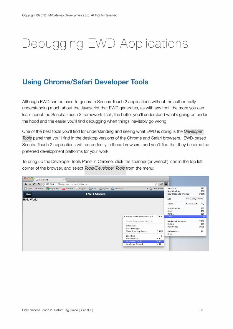
One of the best tools you’ll find for understanding and seeing what EWD is doing is the Developer Tools panel that you’ll find in the desktop versions of the Chrome and Safari browsers. EWD-based Sencha Touch 2 applications will run perfectly in these browsers, and you’ll find that they become the preferred development platforms for your work.
To bring up the Developer Tools Panel in Chrome, click the spanner (or wrench) icon in the top left corner of the browser, and select Tools/Developer Tools from the menu:
Copyright ©2012, M/Gateway Developments Ltd. All Rights Reserved
EWD Sencha Touch 2 Custom Tag Guide (Build 938) 32
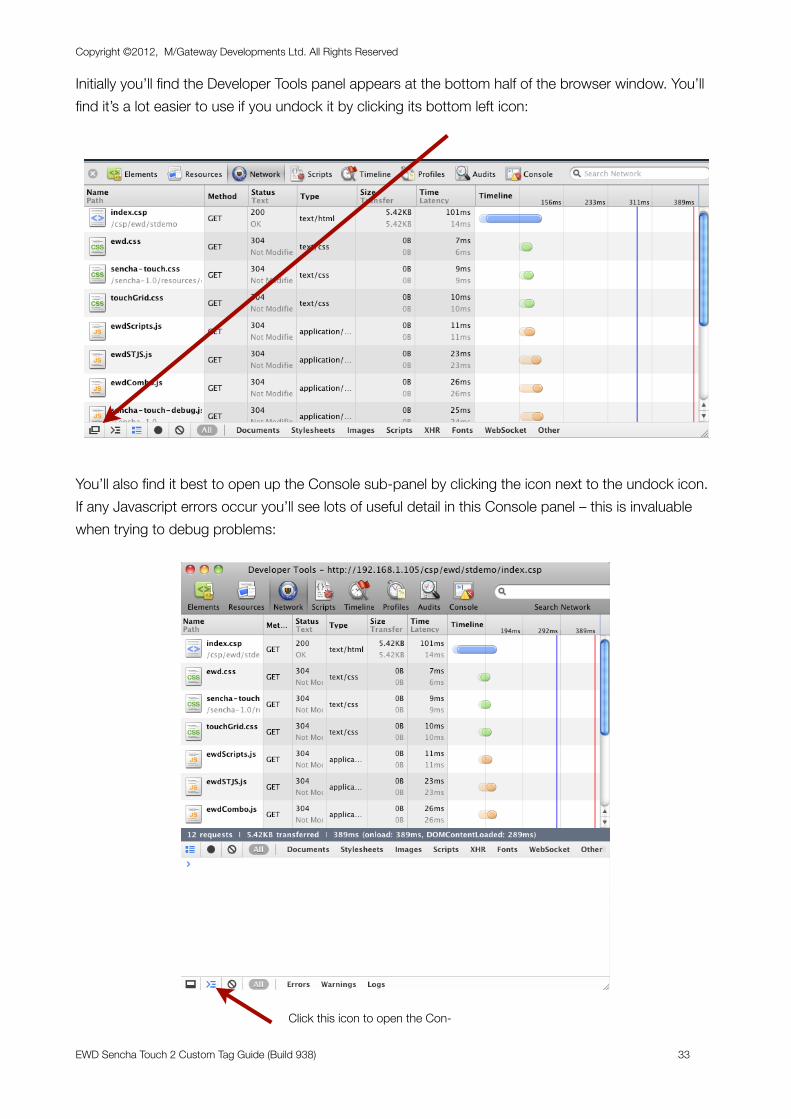
Initially you’ll find the Developer Tools panel appears at the bottom half of the browser window. You’ll find it’s a lot easier to use if you undock it by clicking its bottom left icon:
You’ll also find it best to open up the Console sub-panel by clicking the icon next to the undock icon. If any Javascript errors occur you’ll see lots of useful detail in this Console panel – this is invaluable when trying to debug problems:
Copyright ©2012, M/Gateway Developments Ltd. All Rights Reserved
EWD Sencha Touch 2 Custom Tag Guide (Build 938) 33
Click this icon to open the Con-
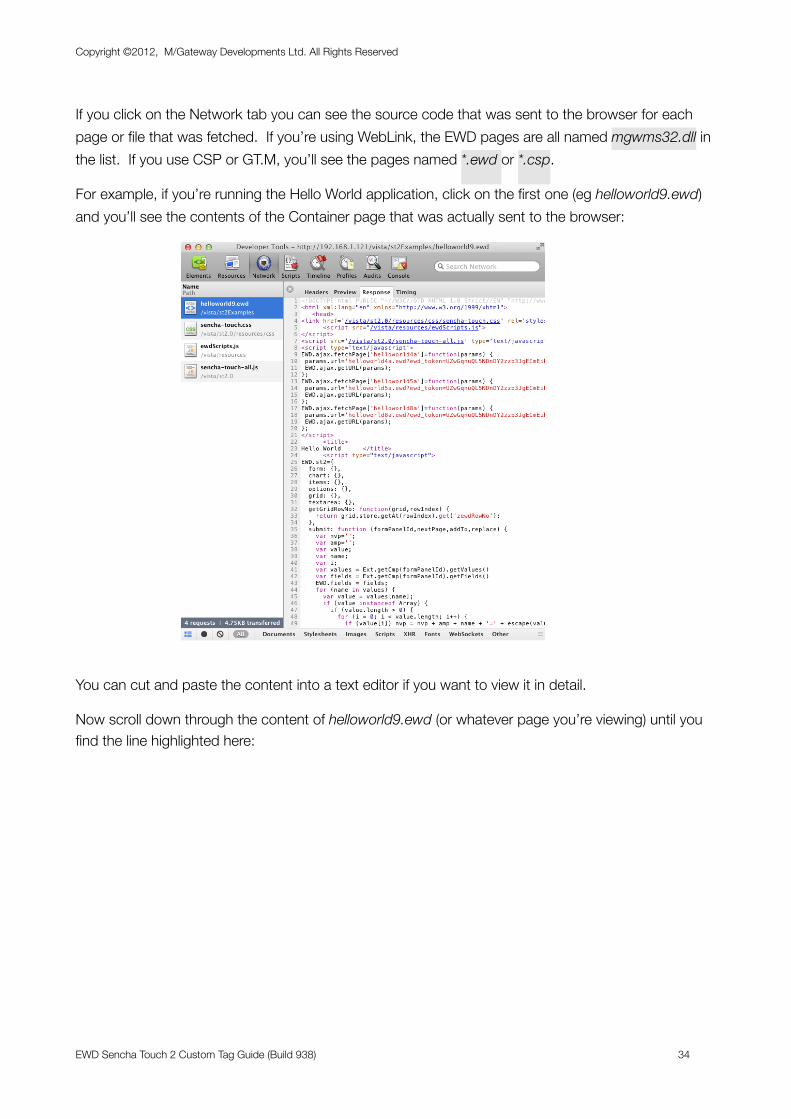
If you click on the Network tab you can see the source code that was sent to the browser for each page or file that was fetched. If you’re using WebLink, the EWD pages are all named mgwms32.dll in the list. If you use CSP or GT.M, you’ll see the pages named *.ewd or *.csp.
For example, if you’re running the Hello World application, click on the first one (eg helloworld9.ewd) and you’ll see the contents of the Container page that was actually sent to the browser:
You can cut and paste the content into a text editor if you want to view it in detail.
Now scroll down through the content of helloworld9.ewd (or whatever page you’re viewing) until you find the line highlighted here:
Copyright ©2012, M/Gateway Developments Ltd. All Rights Reserved
EWD Sencha Touch 2 Custom Tag Guide (Build 938) 34
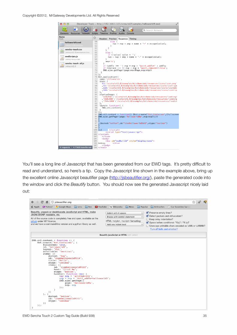
You’ll see a long line of Javascript that has been generated from our EWD tags. It’s pretty difficult to read and understand, so here’s a tip. Copy the Javascript line shown in the example above, bring up the excellent online Javascript beautifier page (http://jsbeautifier.org/), paste the generated code into the window and click the Beautify button. You should now see the generated Javascript nicely laid out:
Copyright ©2012, M/Gateway Developments Ltd. All Rights Reserved
EWD Sencha Touch 2 Custom Tag Guide (Build 938) 35
Now you can see that what was actually sent to the browser was an Ext.Container constructor that defined our simple Hello World panel, toolbars and buttons.
If you study the code that EWD generated, you’ll begin to understand how the EWD Sencha Touch 2 tags relate to the Sencha Touch 2 component classes and their Config Options.
In the subsequent examples of this tutorial, you should use these tools to examine more closely what’s happening.
Copyright ©2012, M/Gateway Developments Ltd. All Rights Reserved
EWD Sencha Touch 2 Custom Tag Guide (Build 938) 36
Adding Dynamic UI Behaviour
Buttons, Events, Hiding and Showing UI ElementsWe’re now going to take a look at how you can add more buttons into our example page’s top toolbar and how they can be used to control the UI.
Edit your helloworld.ewd page so it now looks like this:
<st2:container rootPath="/st2.0" title="Hello World">
<st2:homeScreen> <st2:startupImage size="320x460" url="examples/kitchensink/resources/loading/Homescreen.jpg" /> <st2:startupImage size="320x480" url="examples/kitchensink/resources/loading/Default.png" /> <st2:startupImage size="768x1004" url="examples/kitchensink/resources/loading/Homescreen~ipad.jpg" /> <st2:icon size="57" url="examples/kitchensink/resources/icons/icon.png" /> <st2:icon size="72" url="examples/kitchensink/resources/icons/icon~ipad.png" /> <st2:icon size="114" url="examples/kitchensink/resources/icons/[email protected]" /> <st2:icon size="144" url="examples/kitchensink/resources/icons/[email protected]" /> </st2:homeScreen>
<st2:container id="helloworld9" scrollable="vertical"> <st2:toolbar title="Hello" docked="top" id= "topToolbar"> <st2:button text="Click Me" nextpage="helloworld8a" addTo="helloworld9" nvp="a=123&b=234" /> <st2:spacer /> <st2:button text="Hide" id=hideBtn" /> <st2:button text="Show" id=showBtn" hidden="true" /> </st2:toolbar> <st2:toolbar docked="bottom" id= "bottomToolbar" /> </st:container></st2:container>
The <st2:spacer /> tag forces the buttons before and after it to be equally spread across the width of the toolbar. The hidden=”true” attribute on the “Show” button makes it initially hidden. So when you compile and run this page, you’ll find the “Click Me” button on the left of the toolbar and the “Hide” button on the right.
Now we’ll add some dynamic behaviour: when the Hide button is tapped, we’ll hide the bottom toolbar. At the same time we’ll make the Hide button disappear and reveal the Show button. Tapping the Show button will do the reverse.
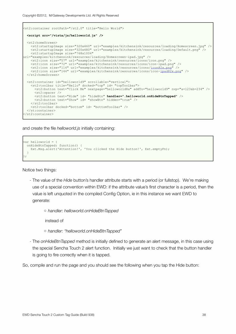
The logic to perform this dynamic behaviour will be Javascript code, and we’re going to put it into a Javascript file named helloworld.js which we’ll place in a suitable webserver path. For example, if you’re using the dEWDrop VM, we’ll place it into the directory /home/vista/www/js - this path has the web server alias path /vista/js.
Edit the helloworld.ewd page as follows:
Copyright ©2012, M/Gateway Developments Ltd. All Rights Reserved
EWD Sencha Touch 2 Custom Tag Guide (Build 938) 37
<st2:container rootPath="/st2.0" title="Hello World">
<script src="/vista/js/helloworld.js" />
<st2:homeScreen> <st2:startupImage size="320x460" url="examples/kitchensink/resources/loading/Homescreen.jpg" /> <st2:startupImage size="320x480" url="examples/kitchensink/resources/loading/Default.png" /> <st2:startupImage size="768x1004" url="examples/kitchensink/resources/loading/Homescreen~ipad.jpg" /> <st2:icon size="57" url="examples/kitchensink/resources/icons/icon.png" /> <st2:icon size="72" url="examples/kitchensink/resources/icons/icon~ipad.png" /> <st2:icon size="114" url="examples/kitchensink/resources/icons/[email protected]" /> <st2:icon size="144" url="examples/kitchensink/resources/icons/[email protected]" /> </st2:homeScreen>
<st2:container id="helloworld9" scrollable="vertical"> <st2:toolbar title="Hello" docked="top" id= "topToolbar"> <st2:button text="Click Me" nextpage="helloworld8a" addTo="helloworld9" nvp="a=123&b=234" /> <st2:spacer /> <st2:button text="Hide" id= "hideBtn" handler=".helloworld.onHideBtnTapped" /> <st2:button text="Show" id= "showBtn" hidden="true" /> </st2:toolbar> <st2:toolbar docked="bottom" id= "bottomToolbar" /> </st:container></st2:container>
and create the file helloworld.js initially containing:
var helloworld = { onHideBtnTapped: function() { Ext.Msg.alert('Attention!', 'You clicked the Hide button!', Ext.emptyFn); }};
Notice two things:
- The value of the Hide button’s handler attribute starts with a period (or fullstop). We’re making use of a special convention within EWD: if the attribute value’s first character is a period, then the value is left unquoted in the compiled Config Option, ie in this instance we want EWD to generate:
o handler: helloworld.onHideBtnTapped
instead of
o handler: “helloworld.onHideBtnTapped”
- The onHideBtnTapped method is initially defined to generate an alert message, in this case using the special Sencha Touch 2 alert function. Initially we just want to check that the button handler is going to fire correctly when it is tapped.
So, compile and run the page and you should see the following when you tap the Hide button:
Copyright ©2012, M/Gateway Developments Ltd. All Rights Reserved
EWD Sencha Touch 2 Custom Tag Guide (Build 938) 38
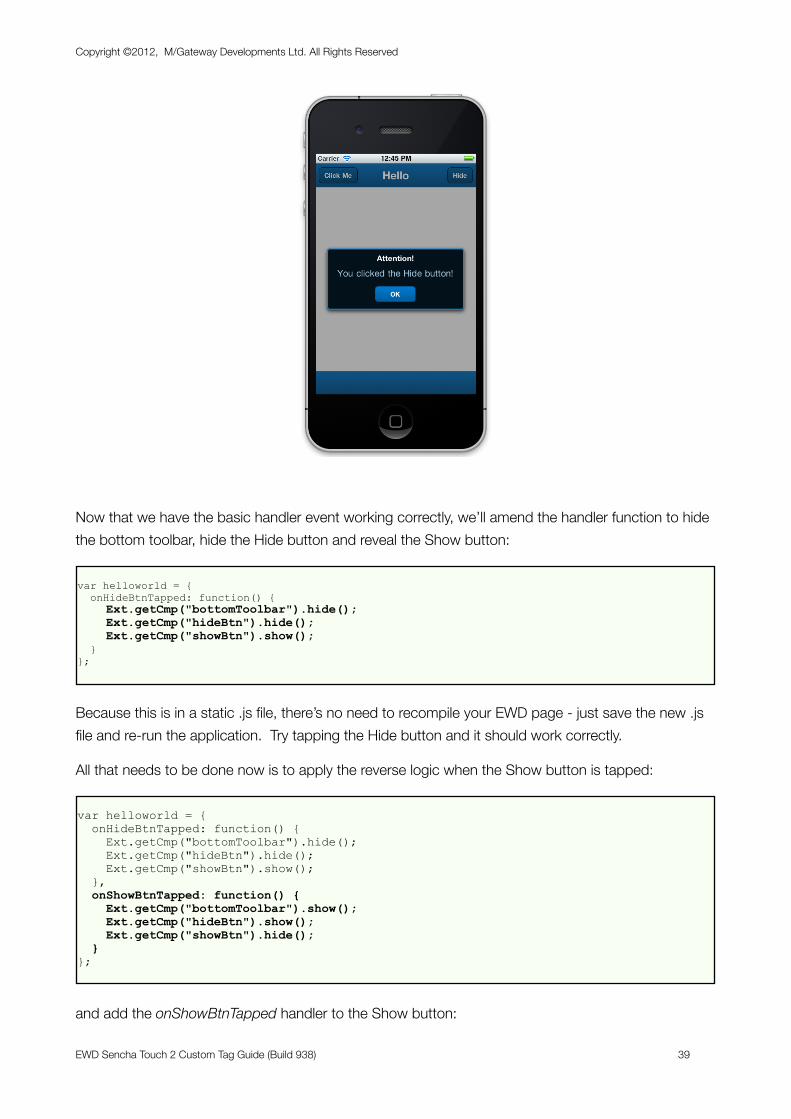
Now that we have the basic handler event working correctly, we’ll amend the handler function to hide the bottom toolbar, hide the Hide button and reveal the Show button:
var helloworld = { onHideBtnTapped: function() { Ext.getCmp("bottomToolbar").hide(); Ext.getCmp("hideBtn").hide(); Ext.getCmp("showBtn").show(); }};
Because this is in a static .js file, there’s no need to recompile your EWD page - just save the new .js file and re-run the application. Try tapping the Hide button and it should work correctly.
All that needs to be done now is to apply the reverse logic when the Show button is tapped:
var helloworld = { onHideBtnTapped: function() { Ext.getCmp("bottomToolbar").hide(); Ext.getCmp("hideBtn").hide(); Ext.getCmp("showBtn").show(); }, onShowBtnTapped: function() { Ext.getCmp("bottomToolbar").show(); Ext.getCmp("hideBtn").show(); Ext.getCmp("showBtn").hide(); }};
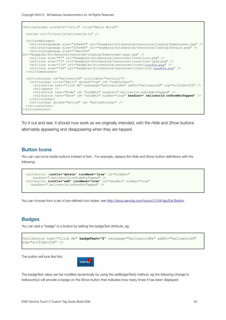
and add the onShowBtnTapped handler to the Show button:
Copyright ©2012, M/Gateway Developments Ltd. All Rights Reserved
EWD Sencha Touch 2 Custom Tag Guide (Build 938) 39
<st2:container rootPath="/st2.0" title="Hello World">
<script src="/vista/js/helloworld.js" />
<st2:homeScreen> <st2:startupImage size="320x460" url="examples/kitchensink/resources/loading/Homescreen.jpg" /> <st2:startupImage size="320x480" url="examples/kitchensink/resources/loading/Default.png" /> <st2:startupImage size="768x1004" url="examples/kitchensink/resources/loading/Homescreen~ipad.jpg" /> <st2:icon size="57" url="examples/kitchensink/resources/icons/icon.png" /> <st2:icon size="72" url="examples/kitchensink/resources/icons/icon~ipad.png" /> <st2:icon size="114" url="examples/kitchensink/resources/icons/[email protected]" /> <st2:icon size="144" url="examples/kitchensink/resources/icons/[email protected]" /> </st2:homeScreen>
<st2:container id="helloworld9" scrollable="vertical"> <st2:toolbar title="Hello" docked="top" id= "topToolbar"> <st2:button text="Click Me" nextpage="helloworld8a" addTo="helloworld9" nvp="a=123&b=234" /> <st2:spacer /> <st2:button text="Hide" id= "hideBtn" handler=".helloworld.onHideBtnTapped" /> <st2:button text="Show" id= "showBtn" hidden="true" handler=".helloworld.onShowBtnTapped" /> </st2:toolbar> <st2:toolbar docked="bottom" id= "bottomToolbar" /> </st:container></st2:container>
Try it out and see: it should now work as we originally intended, with the Hide and Show buttons alternately appearing and disappearing when they are tapped.
Button IconsYou can use icons inside buttons instead of text. For example, replace the Hide and Show button definitions with the following:
<st2:button iconCls="delete" iconMask="true" id="hideBtn" handler=".helloworld.onHideBtnTapped" /> <st2:button iconCls="add" iconMask="true" id="showBtn" hidden="true" handler=".helloworld.onShowBtnTapped" />
You can choose from a set of pre-defined icon styles: see http://docs.sencha.com/touch/2-0/#!/api/Ext.Button
BadgesYou can add a “badge” to a button by setting the badgeText attribute, eg:
<st2:button text="Click Me" badgeText="2" nextpage="helloworld8a" addTo="helloworld9" nvp="a=123&b=234" />
The button will look like this:
The badgeText value can be modified dynamically by using the setBadgeText() method, eg the following change to helloworld.js will provide a badge on the Show button that indicates how many times it has been displayed:
Copyright ©2012, M/Gateway Developments Ltd. All Rights Reserved
EWD Sencha Touch 2 Custom Tag Guide (Build 938) 40
onHideBtnTapped: function() { Ext.getCmp("bottomToolbar").hide(); Ext.getCmp("hideBtn").hide(); Ext.getCmp("showBtn").show(); var count = +Ext.getCmp("showBtn").getBadgeText(); Ext.getCmp("showBtn").setBadgeText(count + 1); },
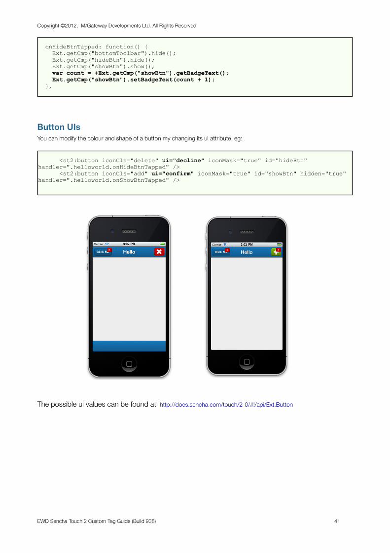
Button UIsYou can modify the colour and shape of a button my changing its ui attribute, eg:
<st2:button iconCls="delete" ui="decline" iconMask="true" id="hideBtn" handler=".helloworld.onHideBtnTapped" /> <st2:button iconCls="add" ui="confirm" iconMask="true" id="showBtn" hidden="true" handler=".helloworld.onShowBtnTapped" />
The possible ui values can be found at http://docs.sencha.com/touch/2-0/#!/api/Ext.Button
Copyright ©2012, M/Gateway Developments Ltd. All Rights Reserved
EWD Sencha Touch 2 Custom Tag Guide (Build 938) 41
Lists & Nested Lists
About ListsOne of the primary UI components that is used in most mobile web applications is the menu or List. The List is a particularly effective way of navigating and selecting from quite large amounts of data in mobile devices because you can use a swipe gesture to quickly scroll through the list. The scrolling list will have momentum and will continue to scroll by after a fast swipe gesture.
Sencha Touch 2 provides two versions of Lists:
- List: a single-level list
- NestedList: a multi-level list
EWD allows you to define a List either manually using tags, or dynamically by linking to an EWD Session Array.
A Simple Manually-defined ListYou can use the primitive-level EWD / Sencha Touch 2 tag mappings to create a simple, hard-coded List. For example:
<st2:container rootPath="/vista/st2.0" title="List1"> <st2:homeScreen> <st2:startupImage size="320x460" url="examples/kitchensink/resources/loading/Homescreen.jpg" /> <st2:startupImage size="320x480" url="examples/kitchensink/resources/loading/Default.png" /> <st2:startupImage size="768x1004" url="examples/kitchensink/resources/loading/Homescreen~ipad.jpg" /> <st2:icon size="57" url="examples/kitchensink/resources/icons/icon.png" /> <st2:icon size="72" url="examples/kitchensink/resources/icons/icon~ipad.png" /> <st2:icon size="114" url="examples/kitchensink/resources/icons/[email protected]" /> <st2:icon size="144" url="examples/kitchensink/resources/icons/[email protected]" /> </st2:homeScreen> <st2:container fullscreen="true" layout="fit"> <st2:toolbar title="List Demo" />
<st2:list itemTpl="{title}"> <st2:data> <st2:item title="Item 1" /> <st2:item title="Item 2" /> <st2:item title="Item 3" /> <st2:item title="Item 4" /> </st2:data> <st2:listeners> <st2:listener itemtap="function(list, index, item, record, e) {alert(record.getData().title);}" /> </st2:listeners> </st2:list>
</st2:container></st2:container>
Copyright ©2012, M/Gateway Developments Ltd. All Rights Reserved
EWD Sencha Touch 2 Custom Tag Guide (Build 938) 42
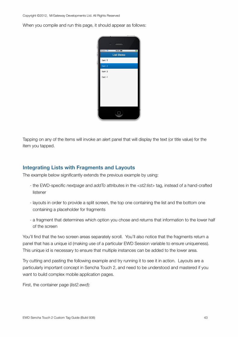
When you compile and run this page, it should appear as follows:
Tapping on any of the items will invoke an alert panel that will display the text (or title value) for the item you tapped.
Integrating Lists with Fragments and LayoutsThe example below significantly extends the previous example by using:
- the EWD-specific nextpage and addTo attributes in the <st2:list> tag, instead of a hand-crafted listener
- layouts in order to provide a split screen, the top one containing the list and the bottom one containing a placeholder for fragments
- a fragment that determines which option you chose and returns that information to the lower half of the screen
You’ll find that the two screen areas separately scroll. You’ll also notice that the fragments return a panel that has a unique id (making use of a particular EWD Session variable to ensure uniqueness). This unique id is necessary to ensure that multiple instances can be added to the lower area.
Try cutting and pasting the following example and try running it to see it in action. Layouts are a particularly important concept in Sencha Touch 2, and need to be understood and mastered if you want to build complex mobile application pages.
First, the container page (list2.ewd):
Copyright ©2012, M/Gateway Developments Ltd. All Rights Reserved
EWD Sencha Touch 2 Custom Tag Guide (Build 938) 43
<st2:container rootPath="/vista/st2.0" title="List2"> <st2:homeScreen> <st2:startupImage size="320x460" url="examples/kitchensink/resources/loading/Homescreen.jpg" /> <st2:startupImage size="320x480" url="examples/kitchensink/resources/loading/Default.png" /> <st2:startupImage size="768x1004" url="examples/kitchensink/resources/loading/Homescreen~ipad.jpg" /> <st2:icon size="57" url="examples/kitchensink/resources/icons/icon.png" /> <st2:icon size="72" url="examples/kitchensink/resources/icons/icon~ipad.png" /> <st2:icon size="114" url="examples/kitchensink/resources/icons/[email protected]" /> <st2:icon size="144" url="examples/kitchensink/resources/icons/[email protected]" /> </st2:homeScreen>
<st2:container fullscreen="true" layout="vbox" id="container"> <st2:toolbar title="List Demo" />
<st2:panel layout="fit" flex="2"> <st2:list itemTpl="{title}" nextpage="list2a" addTo="lowerPanel" replacePreviousPage="false"> <st2:data> <st2:item title="Item 1" /> <st2:item title="Item 2" /> <st2:item title="Item 3" /> <st2:item title="Item 4" /> <st2:item title="Item 5" /> <st2:item title="Item 6" /> <st2:item title="Item 7" /> </st2:data> </st2:list> </st2:panel>
<st2:panel id="lowerPanel" flex="1" scrollable="vertical" />
</st2:container>
</st2:container>
And the fragment (list2a.ewd):
<st2:fragment onBeforeRender="getSelectedListItem^ST2Demo"> <st2:panel id="panel<?= #ewd_sessionExpiry ?>" html="You selected <?= #recordNo ?>" /></st2:fragment>
Finally, the onBeforeRender method (getSelectedListItem^ST2Demo):
getSelectedListItem(sessid) d copyRequestValueToSession^%zewdAPI("recordNo",sessid) QUIT "" ;
When you use the nextpage attribute with the <st2:list> tag, EWD automatically adds a name/value pair (recordNo) to the outgoing request for the nextpage fragment. You’ll see when you run this example that recordNo corresponds to the item number you tapped (the first item is number 1).
Here’s what the running application will look like after a number of list items have been tapped. You’ll see that the top and bottom panel areas scroll independently:
Copyright ©2012, M/Gateway Developments Ltd. All Rights Reserved
EWD Sencha Touch 2 Custom Tag Guide (Build 938) 44
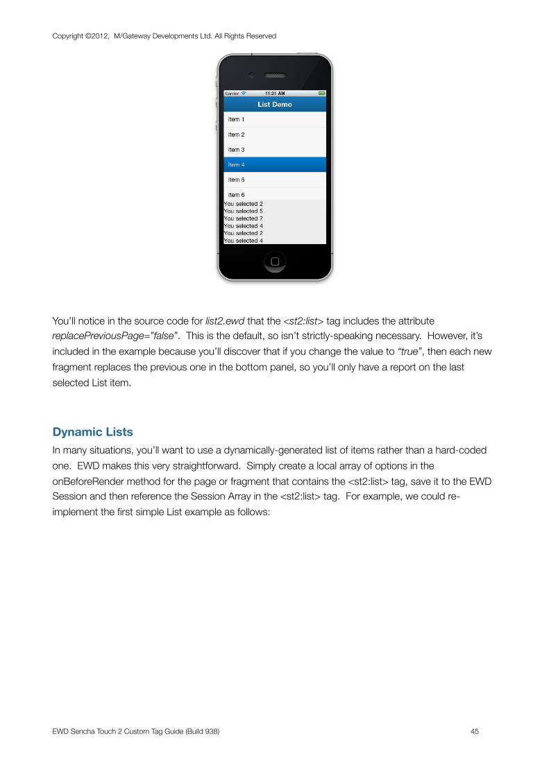
You’ll notice in the source code for list2.ewd that the <st2:list> tag includes the attribute replacePreviousPage=”false”. This is the default, so isn’t strictly-speaking necessary. However, it’s included in the example because you’ll discover that if you change the value to “true”, then each new fragment replaces the previous one in the bottom panel, so you’ll only have a report on the last selected List item.
Dynamic ListsIn many situations, you’ll want to use a dynamically-generated list of items rather than a hard-coded one. EWD makes this very straightforward. Simply create a local array of options in the onBeforeRender method for the page or fragment that contains the <st2:list> tag, save it to the EWD Session and then reference the Session Array in the <st2:list> tag. For example, we could re-implement the first simple List example as follows:
Copyright ©2012, M/Gateway Developments Ltd. All Rights Reserved
EWD Sencha Touch 2 Custom Tag Guide (Build 938) 45
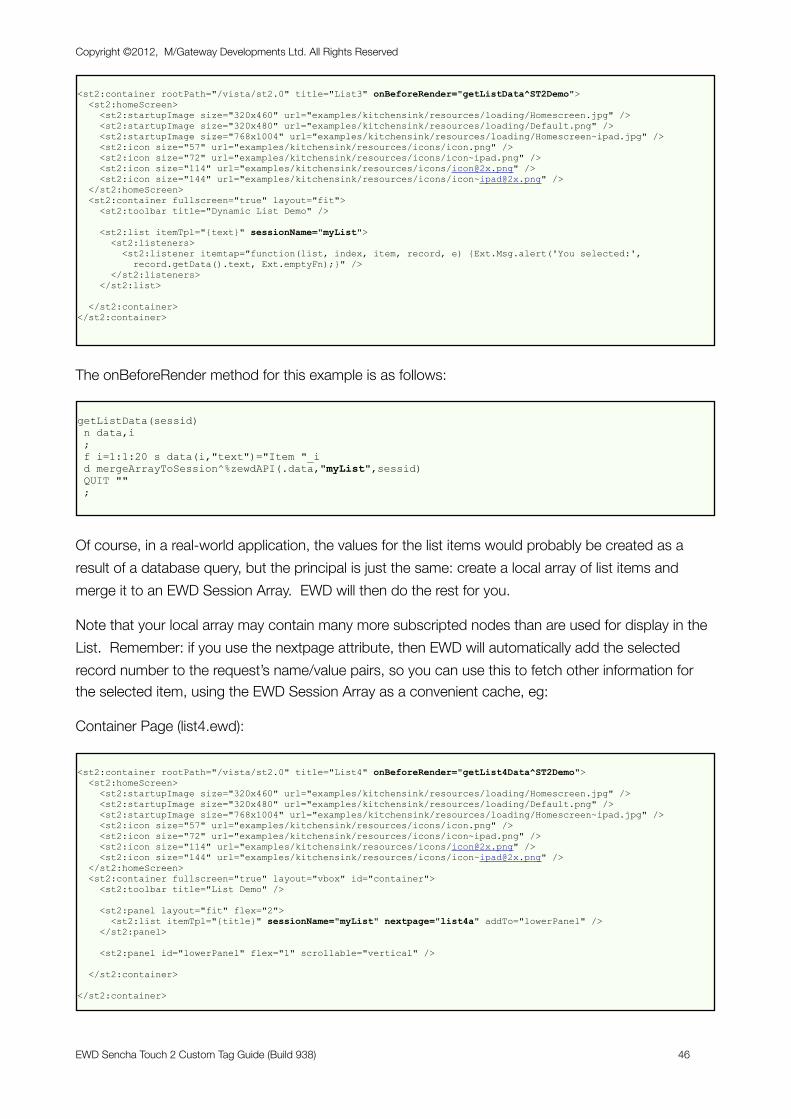
<st2:container rootPath="/vista/st2.0" title="List3" onBeforeRender="getListData^ST2Demo"> <st2:homeScreen> <st2:startupImage size="320x460" url="examples/kitchensink/resources/loading/Homescreen.jpg" /> <st2:startupImage size="320x480" url="examples/kitchensink/resources/loading/Default.png" /> <st2:startupImage size="768x1004" url="examples/kitchensink/resources/loading/Homescreen~ipad.jpg" /> <st2:icon size="57" url="examples/kitchensink/resources/icons/icon.png" /> <st2:icon size="72" url="examples/kitchensink/resources/icons/icon~ipad.png" /> <st2:icon size="114" url="examples/kitchensink/resources/icons/[email protected]" /> <st2:icon size="144" url="examples/kitchensink/resources/icons/[email protected]" /> </st2:homeScreen> <st2:container fullscreen="true" layout="fit"> <st2:toolbar title="Dynamic List Demo" />
<st2:list itemTpl="{text}" sessionName="myList"> <st2:listeners> <st2:listener itemtap="function(list, index, item, record, e) {Ext.Msg.alert('You selected:', record.getData().text, Ext.emptyFn);}" /> </st2:listeners> </st2:list>
</st2:container></st2:container>
The onBeforeRender method for this example is as follows:
getListData(sessid) n data,i ; f i=1:1:20 s data(i,"text")="Item "_i d mergeArrayToSession^%zewdAPI(.data,"myList",sessid) QUIT "" ;
Of course, in a real-world application, the values for the list items would probably be created as a result of a database query, but the principal is just the same: create a local array of list items and merge it to an EWD Session Array. EWD will then do the rest for you.
Note that your local array may contain many more subscripted nodes than are used for display in the List. Remember: if you use the nextpage attribute, then EWD will automatically add the selected record number to the request’s name/value pairs, so you can use this to fetch other information for the selected item, using the EWD Session Array as a convenient cache, eg:
Container Page (list4.ewd):
<st2:container rootPath="/vista/st2.0" title="List4" onBeforeRender="getList4Data^ST2Demo"> <st2:homeScreen> <st2:startupImage size="320x460" url="examples/kitchensink/resources/loading/Homescreen.jpg" /> <st2:startupImage size="320x480" url="examples/kitchensink/resources/loading/Default.png" /> <st2:startupImage size="768x1004" url="examples/kitchensink/resources/loading/Homescreen~ipad.jpg" /> <st2:icon size="57" url="examples/kitchensink/resources/icons/icon.png" /> <st2:icon size="72" url="examples/kitchensink/resources/icons/icon~ipad.png" /> <st2:icon size="114" url="examples/kitchensink/resources/icons/[email protected]" /> <st2:icon size="144" url="examples/kitchensink/resources/icons/[email protected]" /> </st2:homeScreen> <st2:container fullscreen="true" layout="vbox" id="container"> <st2:toolbar title="List Demo" />
<st2:panel layout="fit" flex="2"> <st2:list itemTpl="{title}" sessionName="myList" nextpage="list4a" addTo="lowerPanel" /> </st2:panel>
<st2:panel id="lowerPanel" flex="1" scrollable="vertical" />
</st2:container>
</st2:container>
Copyright ©2012, M/Gateway Developments Ltd. All Rights Reserved
EWD Sencha Touch 2 Custom Tag Guide (Build 938) 46
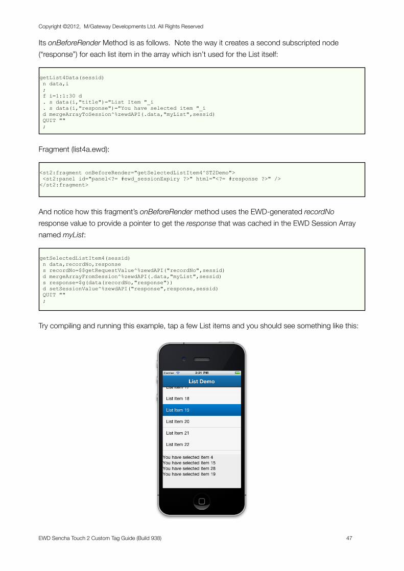
Its onBeforeRender Method is as follows. Note the way it creates a second subscripted node (“response”) for each list item in the array which isn’t used for the List itself:
getList4Data(sessid) n data,i ; f i=1:1:30 d . s data(i,"title")="List Item "_i . s data(i,"response")="You have selected item "_i d mergeArrayToSession^%zewdAPI(.data,"myList",sessid) QUIT "" ;
Fragment (list4a.ewd):
<st2:fragment onBeforeRender="getSelectedListItem4^ST2Demo"> <st2:panel id="panel<?= #ewd_sessionExpiry ?>" html="<?= #response ?>" /></st2:fragment>
And notice how this fragment’s onBeforeRender method uses the EWD-generated recordNo response value to provide a pointer to get the response that was cached in the EWD Session Array named myList:
getSelectedListItem4(sessid) n data,recordNo,response s recordNo=$$getRequestValue^%zewdAPI("recordNo",sessid) d mergeArrayFromSession^%zewdAPI(.data,"myList",sessid) s response=$g(data(recordNo,"response")) d setSessionValue^%zewdAPI("response",response,sessid) QUIT "" ;
Try compiling and running this example, tap a few List items and you should see something like this:
Copyright ©2012, M/Gateway Developments Ltd. All Rights Reserved
EWD Sencha Touch 2 Custom Tag Guide (Build 938) 47
Grouping and the indexBarSencha Touch 2 provides a number of very useful enhancements for lists. One that will be familiar to anyone who has used mobile apps is the ability to group list items, eg grouping people’s names by the first letter of their last name. An associated trick is the ability to add an index bar (showing a - z) which, when tapped, scrolls the List to the appropriate grouping.
EWD makes it very easy to use these capabilities. Here’s an example that demonstrates the technique:
<st2:container rootPath="/vista/st2.0" title="List5" onBeforeRender="getGroupedListData^ST2Demo"> <st2:homeScreen> <st2:startupImage size="320x460" url="examples/kitchensink/resources/loading/Homescreen.jpg" /> <st2:startupImage size="320x480" url="examples/kitchensink/resources/loading/Default.png" /> <st2:startupImage size="768x1004" url="examples/kitchensink/resources/loading/Homescreen~ipad.jpg" /> <st2:icon size="57" url="examples/kitchensink/resources/icons/icon.png" /> <st2:icon size="72" url="examples/kitchensink/resources/icons/icon~ipad.png" /> <st2:icon size="114" url="examples/kitchensink/resources/icons/[email protected]" /> <st2:icon size="144" url="examples/kitchensink/resources/icons/[email protected]" /> </st2:homeScreen> <st2:container> <st2:toolbar title="List Demo" /> <st2:panel id="myPanel" layout="fit"> <st2:list sessionName="myList" groupField="lastName" sortField="lastName" itemTpl="{firstName} {lastName}" indexBar="true" nextpage="list5a" /> </st:panel> </st2:container></st2:container>
The onBeforeRender method creates a Session Array with firstName and lastName as subscripts:
getGroupedListData(sessid) n data ; s data(1,"firstName")="Tommy" s data(1,"lastName")="Maintz" s data(2,"firstName")="Rob" s data(2,"lastName")="Dougan" s data(3,"firstName")="James" s data(3,"lastName")="Davis" s data(4,"firstName")="Rob" s data(4,"lastName")="Tweed" s data(5,"firstName")="Simon" s data(5,"lastName")="Tweed" s data(6,"firstName")="Chris" s data(6,"lastName")="Munt" s data(7,"firstName")="Chris" s data(7,"lastName")="Casey" d mergeArrayToSession^%zewdAPI(.data,"myList",sessid) QUIT "" ;
The example above is setting hard-coded values, but, of course, in a real-world situation, you’d build the data local array from the results of a query against the database. That’s all that’s needed in terms of back-end code. The presentation, grouping etc is all defined in the EWD page.
The fragment that is fetched when an item is tapped simply demonstrates how, despite the re-sorting of the List items as a result of grouping, the additional name/value pair recordNo relates to the tapped
Copyright ©2012, M/Gateway Developments Ltd. All Rights Reserved
EWD Sencha Touch 2 Custom Tag Guide (Build 938) 48
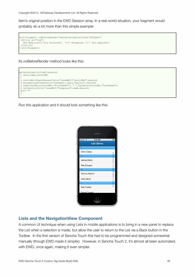
item’s original position in the EWD Session array. In a real-world situation, your fragment would probably do a lot more than this simple example:
<st2:fragment onBeforeRender="getSelectedListItem5^ST2Demo"> <st2:js at="top"> Ext.Msg.alert('You Selected', '<?= #response ?>', Ext.emptyFn); </st2:js></st2:fragment>
Its onBeforeRender method looks like this:
getSelectedListItem5(sessid) n data,name,recordNo ; s recordNo=$$getRequestValue^%zewdAPI("recordNo",sessid) d mergeArrayFromSession^%zewdAPI(.data,"myList",sessid) s name=$g(data(recordNo,"firstName"))_" "_$g(data(recordNo,"lastName")) d setSessionValue^%zewdAPI("response",name,sessid) QUIT "" ;
Run this application and it should look something like this:
Lists and the NavigationView ComponentA common UI technique when using Lists in mobile applications is to bring in a new panel to replace the List when a selection is made, but allow the user to return to the List via a Back button in the Toolbar. In the first version of Sencha Touch this had to be programmed and designed somewhat manually (though EWD made it simpler). However, in Sencha Touch 2, it’s almost all been automated, with EWD, once again, making it even simpler.
Copyright ©2012, M/Gateway Developments Ltd. All Rights Reserved
EWD Sencha Touch 2 Custom Tag Guide (Build 938) 49
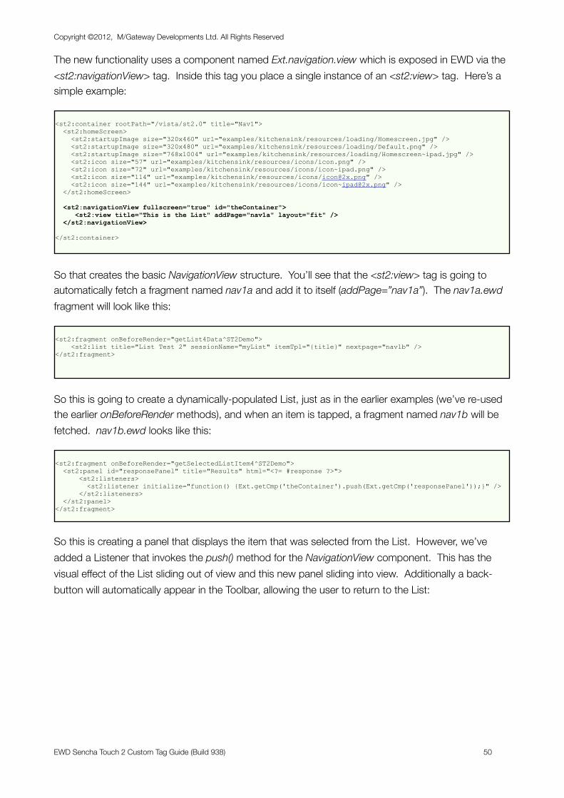
The new functionality uses a component named Ext.navigation.view which is exposed in EWD via the <st2:navigationView> tag. Inside this tag you place a single instance of an <st2:view> tag. Here’s a simple example:
<st2:container rootPath="/vista/st2.0" title="Nav1"> <st2:homeScreen> <st2:startupImage size="320x460" url="examples/kitchensink/resources/loading/Homescreen.jpg" /> <st2:startupImage size="320x480" url="examples/kitchensink/resources/loading/Default.png" /> <st2:startupImage size="768x1004" url="examples/kitchensink/resources/loading/Homescreen~ipad.jpg" /> <st2:icon size="57" url="examples/kitchensink/resources/icons/icon.png" /> <st2:icon size="72" url="examples/kitchensink/resources/icons/icon~ipad.png" /> <st2:icon size="114" url="examples/kitchensink/resources/icons/[email protected]" /> <st2:icon size="144" url="examples/kitchensink/resources/icons/[email protected]" /> </st2:homeScreen>
<st2:navigationView fullscreen="true" id="theContainer"> <st2:view title="This is the List" addPage="nav1a" layout="fit" /> </st2:navigationView>
</st2:container>
So that creates the basic NavigationView structure. You’ll see that the <st2:view> tag is going to automatically fetch a fragment named nav1a and add it to itself (addPage=”nav1a”). The nav1a.ewd fragment will look like this:
<st2:fragment onBeforeRender="getList4Data^ST2Demo"> <st2:list title="List Test 2" sessionName="myList" itemTpl="{title}" nextpage="nav1b" /></st2:fragment>
So this is going to create a dynamically-populated List, just as in the earlier examples (we’ve re-used the earlier onBeforeRender methods), and when an item is tapped, a fragment named nav1b will be fetched. nav1b.ewd looks like this:
<st2:fragment onBeforeRender="getSelectedListItem4^ST2Demo"> <st2:panel id="responsePanel" title="Results" html="<?= #response ?>"> <st2:listeners> <st2:listener initialize="function() {Ext.getCmp('theContainer').push(Ext.getCmp('responsePanel'));}" /> </st2:listeners> </st2:panel></st2:fragment>
So this is creating a panel that displays the item that was selected from the List. However, we’ve added a Listener that invokes the push() method for the NavigationView component. This has the visual effect of the List sliding out of view and this new panel sliding into view. Additionally a back-button will automatically appear in the Toolbar, allowing the user to return to the List:
Copyright ©2012, M/Gateway Developments Ltd. All Rights Reserved
EWD Sencha Touch 2 Custom Tag Guide (Build 938) 50
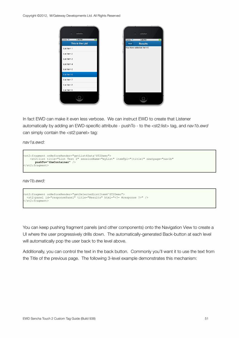
In fact EWD can make it even less verbose. We can instruct EWD to create that Listener automatically by adding an EWD-specific attribute - pushTo - to the <st2:list> tag, and nav1b.ewd can simply contain the <st2:panel> tag:
nav1a.ewd:
<st2:fragment onBeforeRender="getList4Data^ST2Demo"> <st2:list title="List Test 2" sessionName="myList" itemTpl="{title}" nextpage="nav1b" pushTo="theContainer" /></st2:fragment>
nav1b.ewd:
<st2:fragment onBeforeRender="getSelectedListItem4^ST2Demo"> <st2:panel id="responsePanel" title="Results" html="<?= #response ?>" /></st2:fragment>
You can keep pushing fragment panels (and other components) onto the Navigation View to create a UI where the user progressively drills down. The automatically-generated Back-button at each level will automatically pop the user back to the level above.
Additionally, you can control the text in the back button. Commonly you’ll want it to use the text from the Title of the previous page. The following 3-level example demonstrates this mechanism:
Copyright ©2012, M/Gateway Developments Ltd. All Rights Reserved
EWD Sencha Touch 2 Custom Tag Guide (Build 938) 51
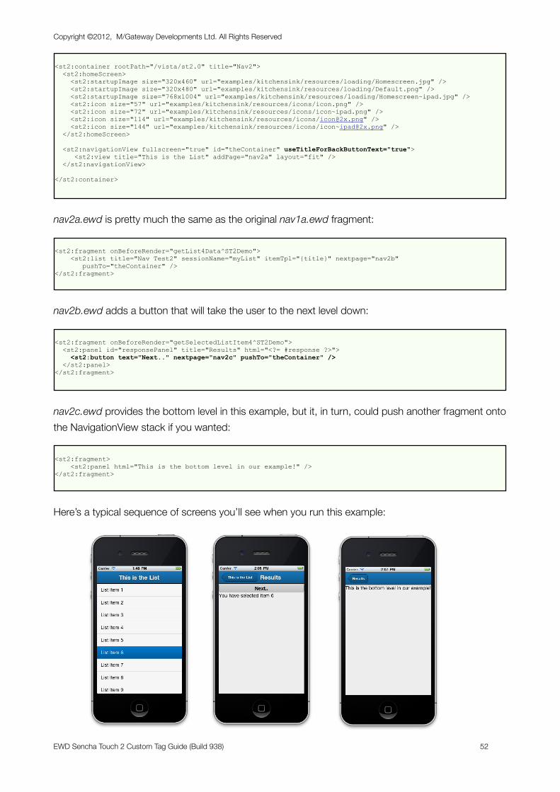
<st2:container rootPath="/vista/st2.0" title="Nav2"> <st2:homeScreen> <st2:startupImage size="320x460" url="examples/kitchensink/resources/loading/Homescreen.jpg" /> <st2:startupImage size="320x480" url="examples/kitchensink/resources/loading/Default.png" /> <st2:startupImage size="768x1004" url="examples/kitchensink/resources/loading/Homescreen~ipad.jpg" /> <st2:icon size="57" url="examples/kitchensink/resources/icons/icon.png" /> <st2:icon size="72" url="examples/kitchensink/resources/icons/icon~ipad.png" /> <st2:icon size="114" url="examples/kitchensink/resources/icons/[email protected]" /> <st2:icon size="144" url="examples/kitchensink/resources/icons/[email protected]" /> </st2:homeScreen>
<st2:navigationView fullscreen="true" id="theContainer" useTitleForBackButtonText="true"> <st2:view title="This is the List" addPage="nav2a" layout="fit" /> </st2:navigationView>
</st2:container>
nav2a.ewd is pretty much the same as the original nav1a.ewd fragment:
<st2:fragment onBeforeRender="getList4Data^ST2Demo"> <st2:list title="Nav Test2" sessionName="myList" itemTpl="{title}" nextpage="nav2b" pushTo="theContainer" /></st2:fragment>
nav2b.ewd adds a button that will take the user to the next level down:
<st2:fragment onBeforeRender="getSelectedListItem4^ST2Demo"> <st2:panel id="responsePanel" title="Results" html="<?= #response ?>"> <st2:button text="Next.." nextpage="nav2c" pushTo="theContainer" /> </st2:panel></st2:fragment>
nav2c.ewd provides the bottom level in this example, but it, in turn, could push another fragment onto the NavigationView stack if you wanted:
<st2:fragment> <st2:panel html="This is the bottom level in our example!" /></st2:fragment>
Here’s a typical sequence of screens you’ll see when you run this example:
Copyright ©2012, M/Gateway Developments Ltd. All Rights Reserved
EWD Sencha Touch 2 Custom Tag Guide (Build 938) 52
Notice how the text in the Back Button is automatically set to the previous screen’s Title text.
If you want to use different text in the back-buttons, you can customise the text very easily. Consult the Sencha documentation at http://docs.sencha.com/touch/2-0/#!/api/Ext.navigation.View with particular attention to the defaultBackButtonText Config Option and the setDefaultBackButtonText() method.
Using Masks to indicate processingSometimes, your back-end onBeforeRender methods may involve complex processing that may take some time. In such situations, it can be a good idea to use a processing mask that tells the user to wait. Sencha Touch 2 provides such a mechanism, and, once again, EWD simplifies its use to almost trivial levels.
To demonstrate the principle, we’re going to use the example we used in the previous section above, but let’s introduce a forced processing delay in the onBeforeRender methods, simply by introducing a hang command to stop processing for a few seconds.
The container page remains unchanged. However, the first and second fragments, nav2a.ewd and nav2b.ewd, now look like this:
nav1a.ewd:
<st2:fragment onBeforeRender="getList4Data^ST2Demo"> <st2:list title="Nav Test2" sessionName="myList" itemTpl="{title}" nextpage="nav2b" pushTo="theContainer" setMask="theContainer" maskMessage="Please wait!" /></st2:fragment>
nav2b.ewd:
<st2:fragment onBeforeRender="getSelectedListItem4^ST2Demo"> <st2:panel id="responsePanel" title="Results" html="<?= #response ?>"> <st2:button text="Next.." nextpage="nav2c" pushTo="theContainer" setMask="theContainer" maskMessage="Wait again" /> </st2:panel></st2:fragment>
The setMask attribute tells EWD the id of the component to mask. This is usually the panel, container or navigationView component that has been set with fullScreen=”true”. In our example, it’s the navigationView component which is defined in the Container Page and has an id of “theContainer”.
The maskMessage defines an optional text message that will display under a graphical spinner device.
EWD will automatically add the listener needed to remove the processing mask when the fragment is rendered.
We’ll add processing delays to the onBeforeRender methods, which means we’ll add an onBeforeRender method to the last fragment also:
Copyright ©2012, M/Gateway Developments Ltd. All Rights Reserved
EWD Sencha Touch 2 Custom Tag Guide (Build 938) 53
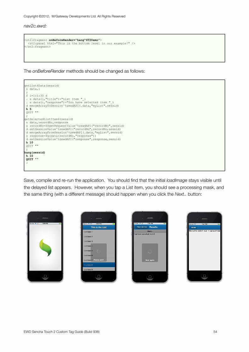
nav2c.ewd:
<st2:fragment onBeforeRender="hang^ST2Demo"> <st2:panel html="This is the bottom level in our example!" /></st2:fragment>
The onBeforeRender methods should be changed as follows:
getList4Data(sessid) n data,i ; f i=1:1:30 d . s data(i,"title")="List Item "_i . s data(i,"response")="You have selected item "_i d mergeArrayToSession^%zewdAPI(.data,"myList",sessid) h 5 QUIT "" ;getSelectedListItem4(sessid) n data,recordNo,response s recordNo=$$getRequestValue^%zewdAPI("recordNo",sessid) d setSessionValue^%zewdAPI("recordNo",recordNo,sessid) d mergeArrayFromSession^%zewdAPI(.data,"myList",sessid) s response=$g(data(recordNo,"response")) d setSessionValue^%zewdAPI("response",response,sessid) h 10 QUIT "" ;hang(sessid) h 10 QUIT "" ;
Save, compile and re-run the application. You should find that the initial loadImage stays visible until the delayed list appears. However, when you tap a List item, you should see a processing mask, and the same thing (with a different message) should happen when you click the Next.. button:
Copyright ©2012, M/Gateway Developments Ltd. All Rights Reserved
EWD Sencha Touch 2 Custom Tag Guide (Build 938) 54
Understanding Asynchronous Event Handling The processing mask processing that EWD has automatically generated in the previous example is a good demonstration of how you need to handle events asynchronously when fetching fragments in EWD.
If you wanted to manually define the same processing mask logic, you’d need to do the following (we’ll just focus on the situation where you tap a List Item in nav2a.ewd):
nav2a.ewd:
<st2:fragment onBeforeRender="getList4Data^ST2Demo"> <st2:list title="Nav Test2" sessionName="myList" itemTpl="{title}" nextpage="nav2b" pushTo="theContainer"> <st2:listeners> <st2:listener itemTap="Ext.getCmp('theContainer').setMasked({xtype:'loadmask',message:'Wait!!'});" /> </st2:listeners> </st2:list></st2:fragment>
This listener will put the loadmask in place whenever you tap a List Item. In order to turn off the loadmask, we have to wait until the fragment (nav2b.ewd) is retrieved and loaded. Since this happens asynchronously, and can take some time, we can’t use the itemTap listener above as this would turn off the loadmask immediately. Instead, we have to turn off the loadmask using Javascript in the fetched fragment. The best approach would be to use the panel’s painted listener (most components expose this), eg:
nav2b.ewd:
<st2:fragment onBeforeRender="getSelectedListItem4^ST2Demo"> <st2:panel id="responsePanel" title="Results" html="<?= #response ?>"> <st2:button text="Next.." nextpage="nav2c" pushTo="theContainer" setMask="theContainer" maskMessage="Wait again" /> <st2:listeners> <st2:listener painted="Ext.getCmp('theContainer').setMasked(false);" /> </st2:listeners> </st2:panel></st2:fragment>
So, when using EWD and fetching fragments and handling events, always think asynchronous!
Nested ListsSo far, we have just used simple, single-level linear lists. Sencha Touch 2 also provides a multi-level List component, known as the NestedList component. EWD makes it easy to specify dynamic Nested Lists. Indeed, due to the complexity of the associated store structure in which you would normally have to specify the list items, it is recommended that you always specify Nested List data dynamically and let EWD generate the necessary store descriptions and logic for you.
If you’re already familiar with EWD’s ExtJS v4 tags, you’ll realise that there is an inherent similarity between an ExtJS tree component and a Sencha Touch Nested List component: both are just
Copyright ©2012, M/Gateway Developments Ltd. All Rights Reserved
EWD Sencha Touch 2 Custom Tag Guide (Build 938) 55
different ways of presenting the same multi-dimensional data. For that reason, dynamically-defined Nested Lists can be defined using the same back-end logic as you’d use for ExtJS trees.
You define the Nested List items as a local array that you then save in the EWD Session. The array structure is as follows:
tree(1,”child”,itemNo,”text”) = Text for the itemNo’th level 1 List item Lower levels use the “child” subscript: tree(1,”child”,itemNo,”child”,subItemNo,”text”)
and this can be repeated to any depth, eg
tree(1,”child”,1,”child”,1,”child”,1,”text”)=”Item”
Here’s an example:
Container Page (nestedList1.ewd):
<st2:container rootPath="/vista/st2.0" title="NestedList" onBeforeRender="getNestedListData^ST2Demo"> <st2:homeScreen> <st2:startupImage size="320x460" url="examples/kitchensink/resources/loading/Homescreen.jpg" /> <st2:startupImage size="320x480" url="examples/kitchensink/resources/loading/Default.png" /> <st2:startupImage size="768x1004" url="examples/kitchensink/resources/loading/Homescreen~ipad.jpg" /> <st2:icon size="57" url="examples/kitchensink/resources/icons/icon.png" /> <st2:icon size="72" url="examples/kitchensink/resources/icons/icon~ipad.png" /> <st2:icon size="114" url="examples/kitchensink/resources/icons/[email protected]" /> <st2:icon size="144" url="examples/kitchensink/resources/icons/[email protected]" /> </st2:homeScreen>
<st2:container> <st2:panel id="myPanel" layout="fit"> <st2:nestedList sessionName="myTree" title="Nested Test" nextPage="nestedList1a" /> </st:panel> </st2:container>
</st2:container>
The onBeforeRender method looks like this:
Copyright ©2012, M/Gateway Developments Ltd. All Rights Reserved
EWD Sencha Touch 2 Custom Tag Guide (Build 938) 56
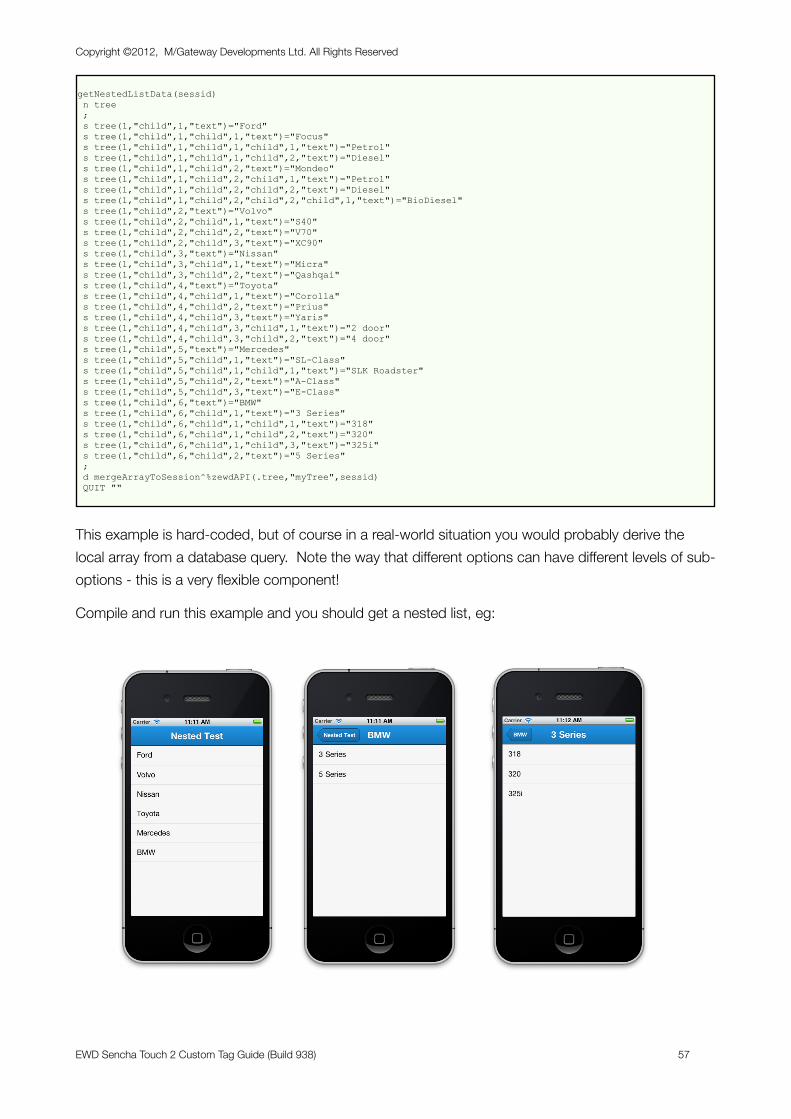
getNestedListData(sessid) n tree ; s tree(1,"child",1,"text")="Ford" s tree(1,"child",1,"child",1,"text")="Focus" s tree(1,"child",1,"child",1,"child",1,"text")="Petrol" s tree(1,"child",1,"child",1,"child",2,"text")="Diesel" s tree(1,"child",1,"child",2,"text")="Mondeo" s tree(1,"child",1,"child",2,"child",1,"text")="Petrol" s tree(1,"child",1,"child",2,"child",2,"text")="Diesel" s tree(1,"child",1,"child",2,"child",2,"child",1,"text")="BioDiesel" s tree(1,"child",2,"text")="Volvo" s tree(1,"child",2,"child",1,"text")="S40" s tree(1,"child",2,"child",2,"text")="V70" s tree(1,"child",2,"child",3,"text")="XC90" s tree(1,"child",3,"text")="Nissan" s tree(1,"child",3,"child",1,"text")="Micra" s tree(1,"child",3,"child",2,"text")="Qashqai" s tree(1,"child",4,"text")="Toyota" s tree(1,"child",4,"child",1,"text")="Corolla" s tree(1,"child",4,"child",2,"text")="Prius" s tree(1,"child",4,"child",3,"text")="Yaris" s tree(1,"child",4,"child",3,"child",1,"text")="2 door" s tree(1,"child",4,"child",3,"child",2,"text")="4 door" s tree(1,"child",5,"text")="Mercedes" s tree(1,"child",5,"child",1,"text")="SL-Class" s tree(1,"child",5,"child",1,"child",1,"text")="SLK Roadster" s tree(1,"child",5,"child",2,"text")="A-Class" s tree(1,"child",5,"child",3,"text")="E-Class" s tree(1,"child",6,"text")="BMW" s tree(1,"child",6,"child",1,"text")="3 Series" s tree(1,"child",6,"child",1,"child",1,"text")="318" s tree(1,"child",6,"child",1,"child",2,"text")="320" s tree(1,"child",6,"child",1,"child",3,"text")="325i" s tree(1,"child",6,"child",2,"text")="5 Series" ; d mergeArrayToSession^%zewdAPI(.tree,"myTree",sessid) QUIT ""
This example is hard-coded, but of course in a real-world situation you would probably derive the local array from a database query. Note the way that different options can have different levels of sub-options - this is a very flexible component!
Compile and run this example and you should get a nested list, eg:
Copyright ©2012, M/Gateway Developments Ltd. All Rights Reserved
EWD Sencha Touch 2 Custom Tag Guide (Build 938) 57
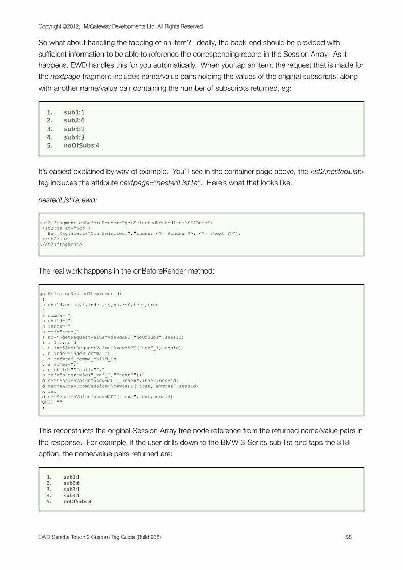
So what about handling the tapping of an item? Ideally, the back-end should be provided with sufficient information to be able to reference the corresponding record in the Session Array. As it happens, EWD handles this for you automatically. When you tap an item, the request that is made for the nextpage fragment includes name/value pairs holding the values of the original subscripts, along with another name/value pair containing the number of subscripts returned, eg:
1. sub1:12. sub2:63. sub3:14. sub4:35. noOfSubs:4
It’s easiest explained by way of example. You’ll see in the container page above, the <st2:nestedList> tag includes the attribute nextpage=”nestedList1a”. Here’s what that looks like:
nestedList1a.ewd:
<st2:fragment onBeforeRender="getSelectedNestedItem^ST2Demo"> <st2:js at="top"> Ext.Msg.alert("You Selected:","index: <?= #index ?>; <?= #text ?>"); </st2:js></st2:fragment>
The real work happens in the onBeforeRender method:
getSelectedNestedItem(sessid) ; n child,comma,i,index,ix,no,ref,text,tree ; s comma="" s child="" s index="" s ref="tree(" s no=$$getRequestValue^%zewdAPI("noOfSubs",sessid) f i=1:1:no d . s ix=$$getRequestValue^%zewdAPI("sub"_i,sessid) . s index=index_comma_ix . s ref=ref_comma_child_ix . s comma="," . s child="""child""," s ref="s text=$g("_ref_",""text""))" d setSessionValue^%zewdAPI("index",index,sessid) d mergeArrayFromSession^%zewdAPI(.tree,"myTree",sessid) x ref d setSessionValue^%zewdAPI("text",text,sessid) QUIT "" ;
This reconstructs the original Session Array tree node reference from the returned name/value pairs in the response. For example, if the user drills down to the BMW 3-Series sub-list and taps the 318 option, the name/value pairs returned are:
1. sub1:12. sub2:63. sub3:14. sub4:15. noOfSubs:4
Copyright ©2012, M/Gateway Developments Ltd. All Rights Reserved
EWD Sencha Touch 2 Custom Tag Guide (Build 938) 58
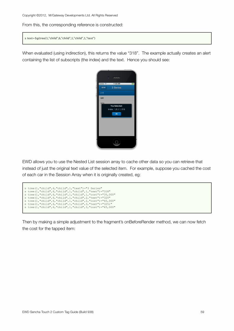
From this, the corresponding reference is constructed:
s text=$g(tree(1,”child”,6,”child”,1,”child”,1,”text”)
When evaluated (using indirection), this returns the value “318”. The example actually creates an alert containing the list of subscripts (the index) and the text. Hence you should see:
EWD allows you to use the Nested List session array to cache other data so you can retrieve that instead of just the original text value of the selected item. For example, suppose you cached the cost of each car in the Session Array when it is originally created, eg:
s tree(1,"child",6,"child",1,"text")="3 Series" s tree(1,"child",6,"child",1,"child",1,"text")="318" s tree(1,"child",6,"child",1,"child",1,"cost")="35,000" s tree(1,"child",6,"child",1,"child",2,"text")="320" s tree(1,"child",6,"child",1,"child",2,"cost")="40,000" s tree(1,"child",6,"child",1,"child",3,"text")="325i" s tree(1,"child",6,"child",1,"child",3,"cost")="45,000"
Then by making a simple adjustment to the fragment’s onBeforeRender method, we can now fetch the cost for the tapped item:
Copyright ©2012, M/Gateway Developments Ltd. All Rights Reserved
EWD Sencha Touch 2 Custom Tag Guide (Build 938) 59
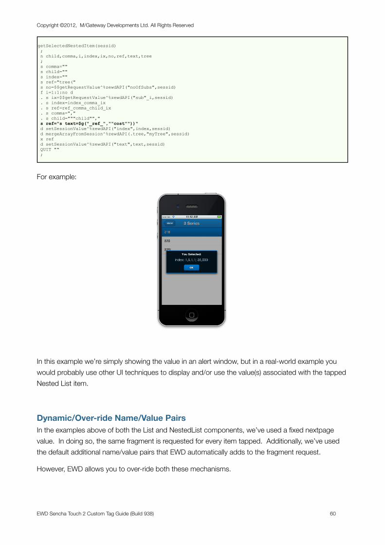
getSelectedNestedItem(sessid) ; n child,comma,i,index,ix,no,ref,text,tree ; s comma="" s child="" s index="" s ref="tree(" s no=$$getRequestValue^%zewdAPI("noOfSubs",sessid) f i=1:1:no d . s ix=$$getRequestValue^%zewdAPI("sub"_i,sessid) . s index=index_comma_ix . s ref=ref_comma_child_ix . s comma="," . s child="""child""," s ref="s text=$g("_ref_",""cost""))" d setSessionValue^%zewdAPI("index",index,sessid) d mergeArrayFromSession^%zewdAPI(.tree,"myTree",sessid) x ref d setSessionValue^%zewdAPI("text",text,sessid) QUIT "" ;
For example:
In this example we’re simply showing the value in an alert window, but in a real-world example you would probably use other UI techniques to display and/or use the value(s) associated with the tapped Nested List item.
Dynamic/Over-ride Name/Value PairsIn the examples above of both the List and NestedList components, we’ve used a fixed nextpage value. In doing so, the same fragment is requested for every item tapped. Additionally, we’ve used the default additional name/value pairs that EWD automatically adds to the fragment request.
However, EWD allows you to over-ride both these mechanisms.
Copyright ©2012, M/Gateway Developments Ltd. All Rights Reserved
EWD Sencha Touch 2 Custom Tag Guide (Build 938) 60
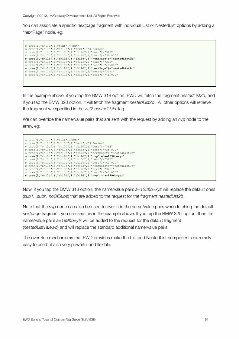
You can associate a specific nextpage fragment with individual List or NestedList options by adding a “nextPage” node, eg:
s tree(1,"child",6,"text")="BMW" s tree(1,"child",6,"child",1,"text")="3 Series" s tree(1,"child",6,"child",1,"child",1,"text")="318" s tree(1,"child",6,"child",1,"child",1,"cost")="35,000" s tree(1,"child",6,"child",1,"child",1,"nextPage")="nestedList2b" s tree(1,"child",6,"child",1,"child",2,"text")="320" s tree(1,"child",6,"child",1,"child",2,"cost")="40,000" s tree(1,"child",6,"child",1,"child",2,"nextPage")="nestedList2c" s tree(1,"child",6,"child",1,"child",3,"text")="325i" s tree(1,"child",6,"child",1,"child",3,"cost")="45,000"
In the example above, if you tap the BMW 318 option, EWD will fetch the fragment nestedList2b, and if you tap the BMW 320 option, it will fetch the fragment nestedList2c. All other options will retrieve the fragment we specified in the <st2:nestedList> tag.
We can override the name/value pairs that are sent with the request by adding an nvp node to the array, eg:
s tree(1,"child",6,"text")="BMW" s tree(1,"child",6,"child",1,"text")="3 Series" s tree(1,"child",6,"child",1,"child",1,"text")="318" s tree(1,"child",6,"child",1,"child",1,"cost")="35,000" s tree(1,"child",6,"child",1,"child",1,"nextpage")="nestedList2b" s tree(1,"child",6,"child",1,"child",1,"nvp")="a=123&b=xyz" s tree(1,"child",6,"child",1,"child",2,"text")="320" s tree(1,"child",6,"child",1,"child",2,"cost")="40,000" s tree(1,"child",6,"child",1,"child",2,"nextpage")="nestedList2c" s tree(1,"child",6,"child",1,"child",3,"text")="325i" s tree(1,"child",6,"child",1,"child",3,"cost")="45,000" s tree(1,"child",6,"child",1,"child",3,"nvp")="a=199&b=ytr"
Now, if you tap the BMW 318 option, the name/value pairs a=123&b=xyz will replace the default ones (sub1...subn, noOfSubs) that are added to the request for the fragment nestedList2b.
Note that the nvp node can also be used to over-ride the name/value pairs when fetching the default nextpage fragment: you can see this in the example above. If you tap the BMW 325i option, then the name/value pairs a=199&b=ytr will be added to the request for the default fragment (nestedList1a.ewd) and will replace the standard additional name/value pairs.
The over-ride mechanisms that EWD provides make the List and NestedList components extremely easy to use but also very powerful and flexible.
Copyright ©2012, M/Gateway Developments Ltd. All Rights Reserved
EWD Sencha Touch 2 Custom Tag Guide (Build 938) 61
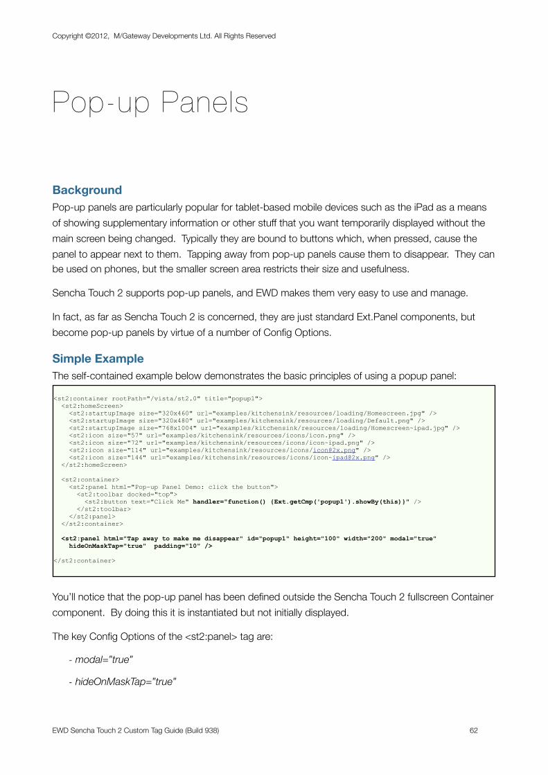
Pop-up Panels
BackgroundPop-up panels are particularly popular for tablet-based mobile devices such as the iPad as a means of showing supplementary information or other stuff that you want temporarily displayed without the main screen being changed. Typically they are bound to buttons which, when pressed, cause the panel to appear next to them. Tapping away from pop-up panels cause them to disappear. They can be used on phones, but the smaller screen area restricts their size and usefulness.
Sencha Touch 2 supports pop-up panels, and EWD makes them very easy to use and manage.
In fact, as far as Sencha Touch 2 is concerned, they are just standard Ext.Panel components, but become pop-up panels by virtue of a number of Config Options.
Simple ExampleThe self-contained example below demonstrates the basic principles of using a popup panel:
<st2:container rootPath="/vista/st2.0" title="popup1"> <st2:homeScreen> <st2:startupImage size="320x460" url="examples/kitchensink/resources/loading/Homescreen.jpg" /> <st2:startupImage size="320x480" url="examples/kitchensink/resources/loading/Default.png" /> <st2:startupImage size="768x1004" url="examples/kitchensink/resources/loading/Homescreen~ipad.jpg" /> <st2:icon size="57" url="examples/kitchensink/resources/icons/icon.png" /> <st2:icon size="72" url="examples/kitchensink/resources/icons/icon~ipad.png" /> <st2:icon size="114" url="examples/kitchensink/resources/icons/[email protected]" /> <st2:icon size="144" url="examples/kitchensink/resources/icons/[email protected]" /> </st2:homeScreen>
<st2:container> <st2:panel html="Pop-up Panel Demo: click the button"> <st2:toolbar docked="top"> <st2:button text="Click Me" handler="function() {Ext.getCmp('popup1').showBy(this)}" /> </st2:toolbar> </st2:panel> </st2:container>
<st2:panel html="Tap away to make me disappear" id="popup1" height="100" width="200" modal="true" hideOnMaskTap="true" padding="10" />
</st2:container>
You’ll notice that the pop-up panel has been defined outside the Sencha Touch 2 fullscreen Container component. By doing this it is instantiated but not initially displayed.
The key Config Options of the <st2:panel> tag are:
- modal=”true”
- hideOnMaskTap=”true”
Copyright ©2012, M/Gateway Developments Ltd. All Rights Reserved
EWD Sencha Touch 2 Custom Tag Guide (Build 938) 62
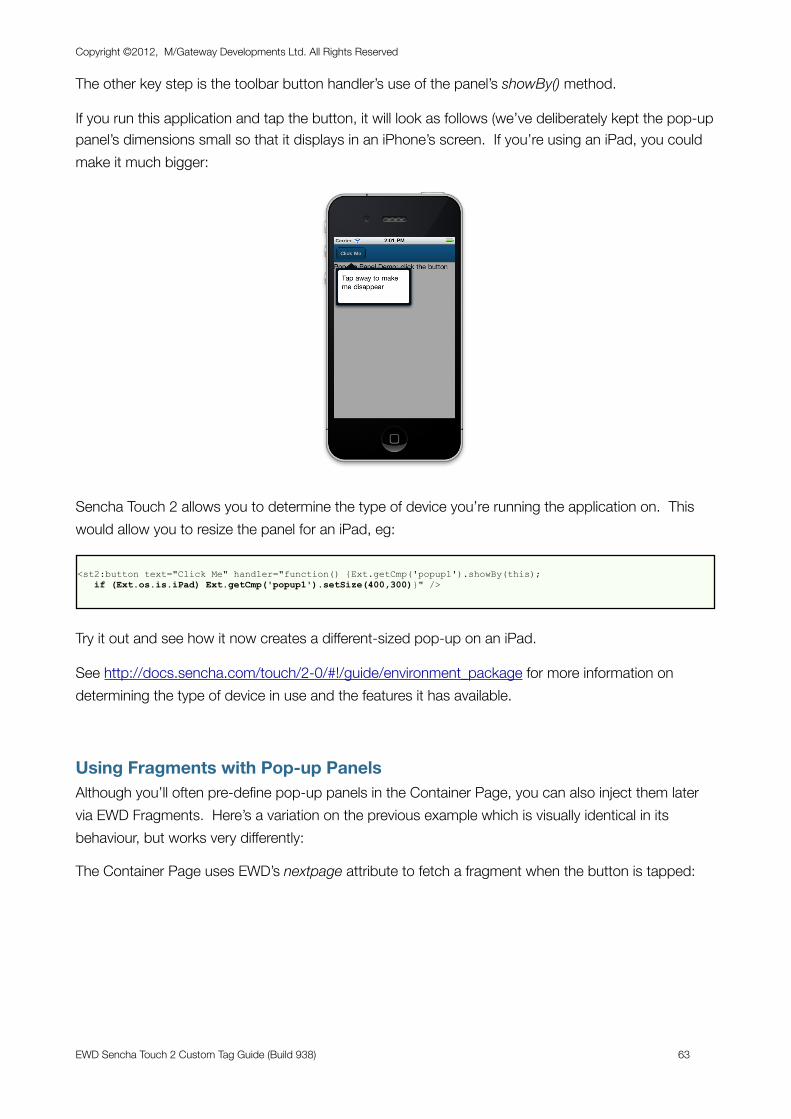
The other key step is the toolbar button handler’s use of the panel’s showBy() method.
If you run this application and tap the button, it will look as follows (we’ve deliberately kept the pop-up panel’s dimensions small so that it displays in an iPhone’s screen. If you’re using an iPad, you could make it much bigger:
Sencha Touch 2 allows you to determine the type of device you’re running the application on. This would allow you to resize the panel for an iPad, eg:
<st2:button text="Click Me" handler="function() {Ext.getCmp('popup1').showBy(this); if (Ext.os.is.iPad) Ext.getCmp('popup1').setSize(400,300)}" />
Try it out and see how it now creates a different-sized pop-up on an iPad.
See http://docs.sencha.com/touch/2-0/#!/guide/environment_package for more information on determining the type of device in use and the features it has available.
Using Fragments with Pop-up PanelsAlthough you’ll often pre-define pop-up panels in the Container Page, you can also inject them later via EWD Fragments. Here’s a variation on the previous example which is visually identical in its behaviour, but works very differently:
The Container Page uses EWD’s nextpage attribute to fetch a fragment when the button is tapped:
Copyright ©2012, M/Gateway Developments Ltd. All Rights Reserved
EWD Sencha Touch 2 Custom Tag Guide (Build 938) 63
<st2:container rootPath="/vista/st2.0" title="popup1"> <st2:homeScreen> <st2:startupImage size="320x460" url="examples/kitchensink/resources/loading/Homescreen.jpg" /> <st2:startupImage size="320x480" url="examples/kitchensink/resources/loading/Default.png" /> <st2:startupImage size="768x1004" url="examples/kitchensink/resources/loading/Homescreen~ipad.jpg" /> <st2:icon size="57" url="examples/kitchensink/resources/icons/icon.png" /> <st2:icon size="72" url="examples/kitchensink/resources/icons/icon~ipad.png" /> <st2:icon size="114" url="examples/kitchensink/resources/icons/[email protected]" /> <st2:icon size="144" url="examples/kitchensink/resources/icons/[email protected]" /> </st2:homeScreen>
<st2:container> <st2:panel html="Pop-up Panel Demo 2: click the button"> <st2:toolbar docked="top"> <st2:button text="Click Me" id="theButton" nextpage="popup2a" /> </st2:toolbar> </st2:panel> </st2:container>
</st2:container>
The fragment (popup2a.ewd) instantiates a pop-up panel and uses its initialize listener to invoke its showBy() method, thereby bringing it into view automatically and binding it to the button:
<st2:fragment>
<st2:panel html="Tap away to make me disappear too" id="popup1" height="100" width="200" modal="true" hideOnMaskTap="true" padding="10"> <st2:listeners> <st2:listener initialize="function(me) {me.showBy(Ext.getCmp('theButton'))}" /> <st2:listener hide="function(me) {me.destroy()}" /> </st2:listeners> </st2:panel>
</st2:fragment>
Note the second listener (hide) which causes the popup panel object to destroy itself when you tap away from it and it disappears. This is essential because each time the button is pressed, a new instance of the panel is fetched from the back-end. We’ve hard-coded its id (popup1), so each instance will have an identical id. Only one can exist at any time in the Container Page’s Javascript environment, so we must ensure that the previous one is removed before fetching a new one.
We didn’t need to do this in the first example, because each button press simply invoked the original pop-up panel’s showBy() method, ie the same instance was just being brought back into view.
Adding Content to a Pop-up PanelPop-up panels are simply specially-formatted versions of Ext.Panel components, so they can be handled and manipulated just like any other Panel. So, having instantiated a pop-up panel and brought it into view, we could, for example, fetch another fragment and add its content into the popup, eg:
Copyright ©2012, M/Gateway Developments Ltd. All Rights Reserved
EWD Sencha Touch 2 Custom Tag Guide (Build 938) 64
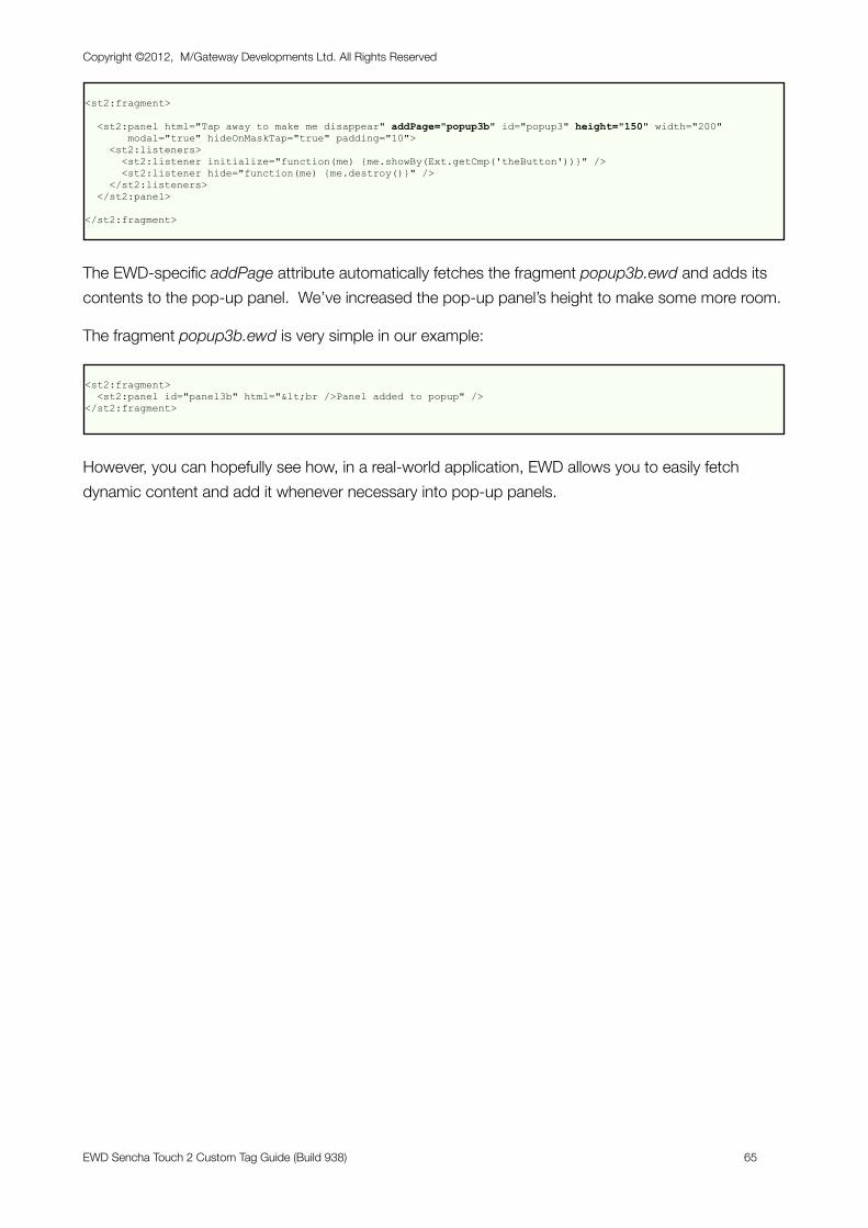
<st2:fragment>
<st2:panel html="Tap away to make me disappear" addPage="popup3b" id="popup3" height="150" width="200" modal="true" hideOnMaskTap="true" padding="10"> <st2:listeners> <st2:listener initialize="function(me) {me.showBy(Ext.getCmp('theButton'))}" /> <st2:listener hide="function(me) {me.destroy()}" /> </st2:listeners> </st2:panel>
</st2:fragment>
The EWD-specific addPage attribute automatically fetches the fragment popup3b.ewd and adds its contents to the pop-up panel. We’ve increased the pop-up panel’s height to make some more room.
The fragment popup3b.ewd is very simple in our example:
<st2:fragment> <st2:panel id="panel3b" html="<br />Panel added to popup" /></st2:fragment>
However, you can hopefully see how, in a real-world application, EWD allows you to easily fetch dynamic content and add it whenever necessary into pop-up panels.
Copyright ©2012, M/Gateway Developments Ltd. All Rights Reserved
EWD Sencha Touch 2 Custom Tag Guide (Build 938) 65
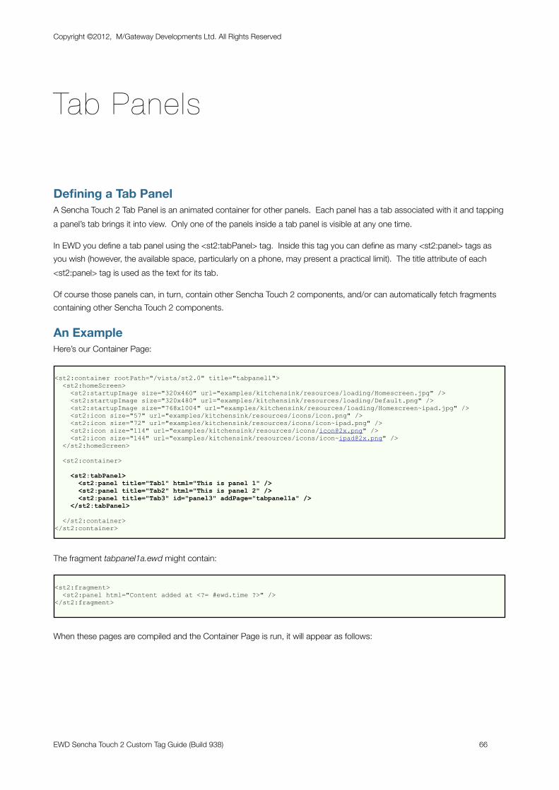
Tab Panels
Defining a Tab PanelA Sencha Touch 2 Tab Panel is an animated container for other panels. Each panel has a tab associated with it and tapping a panel’s tab brings it into view. Only one of the panels inside a tab panel is visible at any one time.
In EWD you define a tab panel using the <st2:tabPanel> tag. Inside this tag you can define as many <st2:panel> tags as you wish (however, the available space, particularly on a phone, may present a practical limit). The title attribute of each <st2:panel> tag is used as the text for its tab.
Of course those panels can, in turn, contain other Sencha Touch 2 components, and/or can automatically fetch fragments containing other Sencha Touch 2 components.
An ExampleHere’s our Container Page:
<st2:container rootPath="/vista/st2.0" title="tabpanel1"> <st2:homeScreen> <st2:startupImage size="320x460" url="examples/kitchensink/resources/loading/Homescreen.jpg" /> <st2:startupImage size="320x480" url="examples/kitchensink/resources/loading/Default.png" /> <st2:startupImage size="768x1004" url="examples/kitchensink/resources/loading/Homescreen~ipad.jpg" /> <st2:icon size="57" url="examples/kitchensink/resources/icons/icon.png" /> <st2:icon size="72" url="examples/kitchensink/resources/icons/icon~ipad.png" /> <st2:icon size="114" url="examples/kitchensink/resources/icons/[email protected]" /> <st2:icon size="144" url="examples/kitchensink/resources/icons/[email protected]" /> </st2:homeScreen>
<st2:container>
<st2:tabPanel> <st2:panel title="Tab1" html="This is panel 1" /> <st2:panel title="Tab2" html="This is panel 2" /> <st2:panel title="Tab3" id="panel3" addPage="tabpanel1a" /> </st2:tabPanel>
</st2:container></st2:container>
The fragment tabpanel1a.ewd might contain:
<st2:fragment> <st2:panel html="Content added at <?= #ewd.time ?>" /></st2:fragment>
When these pages are compiled and the Container Page is run, it will appear as follows:
Copyright ©2012, M/Gateway Developments Ltd. All Rights Reserved
EWD Sencha Touch 2 Custom Tag Guide (Build 938) 66
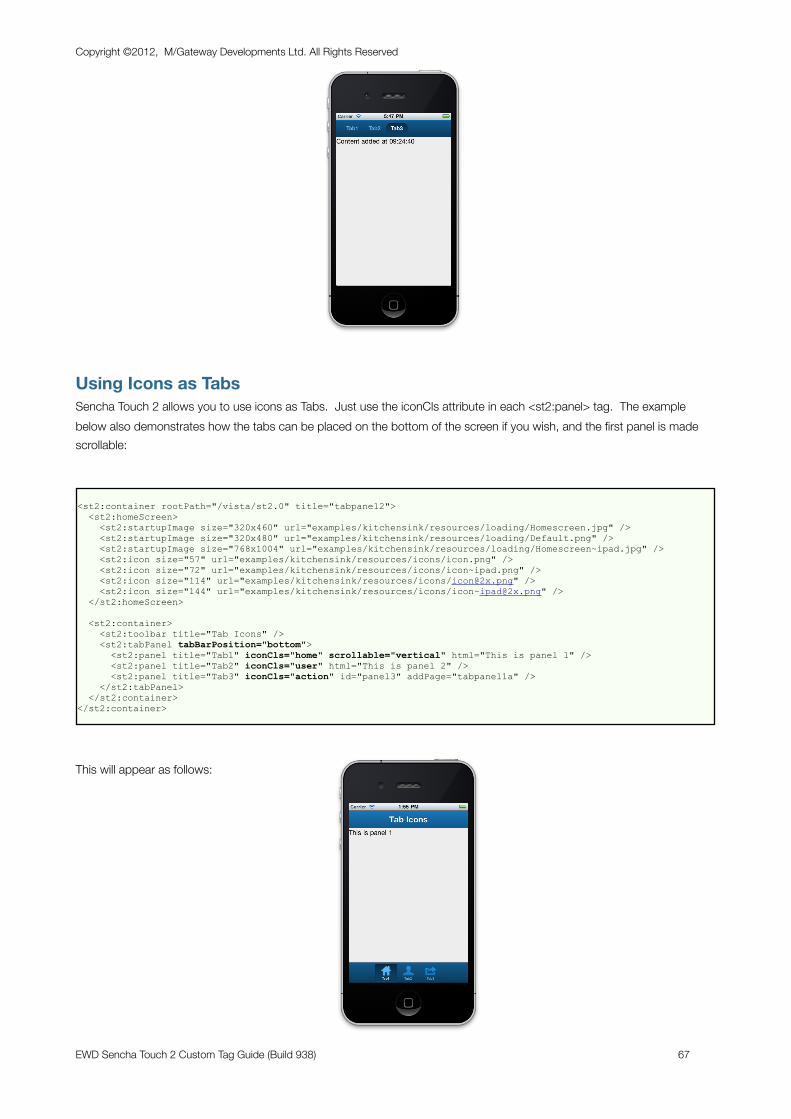
Using Icons as TabsSencha Touch 2 allows you to use icons as Tabs. Just use the iconCls attribute in each <st2:panel> tag. The example below also demonstrates how the tabs can be placed on the bottom of the screen if you wish, and the first panel is made scrollable:
<st2:container rootPath="/vista/st2.0" title="tabpanel2"> <st2:homeScreen> <st2:startupImage size="320x460" url="examples/kitchensink/resources/loading/Homescreen.jpg" /> <st2:startupImage size="320x480" url="examples/kitchensink/resources/loading/Default.png" /> <st2:startupImage size="768x1004" url="examples/kitchensink/resources/loading/Homescreen~ipad.jpg" /> <st2:icon size="57" url="examples/kitchensink/resources/icons/icon.png" /> <st2:icon size="72" url="examples/kitchensink/resources/icons/icon~ipad.png" /> <st2:icon size="114" url="examples/kitchensink/resources/icons/[email protected]" /> <st2:icon size="144" url="examples/kitchensink/resources/icons/[email protected]" /> </st2:homeScreen>
<st2:container> <st2:toolbar title="Tab Icons" /> <st2:tabPanel tabBarPosition="bottom"> <st2:panel title="Tab1" iconCls="home" scrollable="vertical" html="This is panel 1" /> <st2:panel title="Tab2" iconCls="user" html="This is panel 2" /> <st2:panel title="Tab3" iconCls="action" id="panel3" addPage="tabpanel1a" /> </st2:tabPanel> </st2:container></st2:container>
This will appear as follows:
Copyright ©2012, M/Gateway Developments Ltd. All Rights Reserved
EWD Sencha Touch 2 Custom Tag Guide (Build 938) 67
You can find a list of possible icon names at:
http://docs.sencha.com/touch/2-0/#!/api/Ext.Button-cfg-iconCls
Make sure you click on the Comments to see some lists and sources of further information.
Adding Dynamic BehaviourSencha Touch 2 allows you do many dynamic things with tabs and tab panels, including:
- adding panels to and removing panels from a tab panel
- programmatically selecting tabs
Here’s an example of how you can perform these actions via EWD:
<st2:container rootPath="/vista/st2.0" title="tabpanel3"> <st2:homeScreen> <st2:startupImage size="320x460" url="examples/kitchensink/resources/loading/Homescreen.jpg" /> <st2:startupImage size="320x480" url="examples/kitchensink/resources/loading/Default.png" /> <st2:startupImage size="768x1004" url="examples/kitchensink/resources/loading/Homescreen~ipad.jpg" /> <st2:icon size="57" url="examples/kitchensink/resources/icons/icon.png" /> <st2:icon size="72" url="examples/kitchensink/resources/icons/icon~ipad.png" /> <st2:icon size="114" url="examples/kitchensink/resources/icons/[email protected]" /> <st2:icon size="144" url="examples/kitchensink/resources/icons/[email protected]" /> </st2:homeScreen>
<st2:container> <st2:toolbar title="Tab Icons"> <st2:button text="2nd" handler="function() {Ext.getCmp('myTabPanel').setActiveItem(1)}" /> <st2:button text="Add" nextPage="tabpanel4a" addTo="myTabPanel" /> </st2:toolbar> <st2:tabPanel tabBarPosition="bottom" id="myTabPanel"> <st2:panel title="Tab1" iconCls="home" scrollable="vertical" html="This is panel 1" /> <st2:panel title="Tab2" iconCls="user" html="This is panel 2" /> <st2:panel title="Tab3" iconCls="action" id="panel3" addPage="tabpanel1a" /> </st2:tabPanel> </st2:container>
</st2:container>
Here’s the new tab fragment:
<st2:fragment> <st2:panel title="New" id="tab<?= #ewd.sessionExpiry ?>" html="New tab added at <?= #ewd.time ?>" iconCls="reply" /></st2:fragment>
Note that is is critically important to keep the id values of all Sencha Touch 2 components unique: if you don’t, the effects can be unpredictable. Hence, this fragment generates a unique id for itself by appending the EWD-generated ewd.sessionExpiry Session value which is automatically updated on every request:
Try compiling and running this example to see it in action.
Copyright ©2012, M/Gateway Developments Ltd. All Rights Reserved
EWD Sencha Touch 2 Custom Tag Guide (Build 938) 68
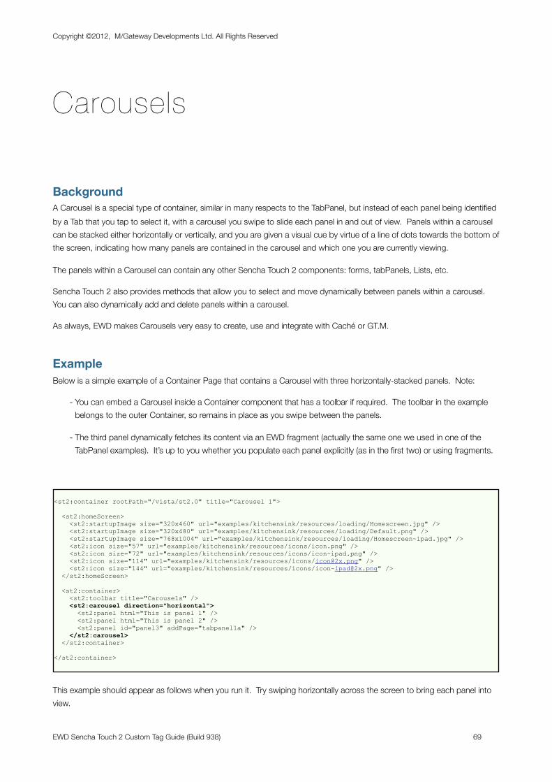
Carousels
BackgroundA Carousel is a special type of container, similar in many respects to the TabPanel, but instead of each panel being identified by a Tab that you tap to select it, with a carousel you swipe to slide each panel in and out of view. Panels within a carousel can be stacked either horizontally or vertically, and you are given a visual cue by virtue of a line of dots towards the bottom of the screen, indicating how many panels are contained in the carousel and which one you are currently viewing.
The panels within a Carousel can contain any other Sencha Touch 2 components: forms, tabPanels, Lists, etc.
Sencha Touch 2 also provides methods that allow you to select and move dynamically between panels within a carousel. You can also dynamically add and delete panels within a carousel.
As always, EWD makes Carousels very easy to create, use and integrate with Caché or GT.M.
ExampleBelow is a simple example of a Container Page that contains a Carousel with three horizontally-stacked panels. Note:
- You can embed a Carousel inside a Container component that has a toolbar if required. The toolbar in the example belongs to the outer Container, so remains in place as you swipe between the panels.
- The third panel dynamically fetches its content via an EWD fragment (actually the same one we used in one of the TabPanel examples). It’s up to you whether you populate each panel explicitly (as in the first two) or using fragments.
<st2:container rootPath="/vista/st2.0" title="Carousel 1">
<st2:homeScreen> <st2:startupImage size="320x460" url="examples/kitchensink/resources/loading/Homescreen.jpg" /> <st2:startupImage size="320x480" url="examples/kitchensink/resources/loading/Default.png" /> <st2:startupImage size="768x1004" url="examples/kitchensink/resources/loading/Homescreen~ipad.jpg" /> <st2:icon size="57" url="examples/kitchensink/resources/icons/icon.png" /> <st2:icon size="72" url="examples/kitchensink/resources/icons/icon~ipad.png" /> <st2:icon size="114" url="examples/kitchensink/resources/icons/[email protected]" /> <st2:icon size="144" url="examples/kitchensink/resources/icons/[email protected]" /> </st2:homeScreen>
<st2:container> <st2:toolbar title="Carousels" /> <st2:carousel direction="horizontal"> <st2:panel html="This is panel 1" /> <st2:panel html="This is panel 2" /> <st2:panel id="panel3" addPage="tabpanel1a" /> </st2:carousel> </st2:container>
</st2:container>
This example should appear as follows when you run it. Try swiping horizontally across the screen to bring each panel into view.
Copyright ©2012, M/Gateway Developments Ltd. All Rights Reserved
EWD Sencha Touch 2 Custom Tag Guide (Build 938) 69
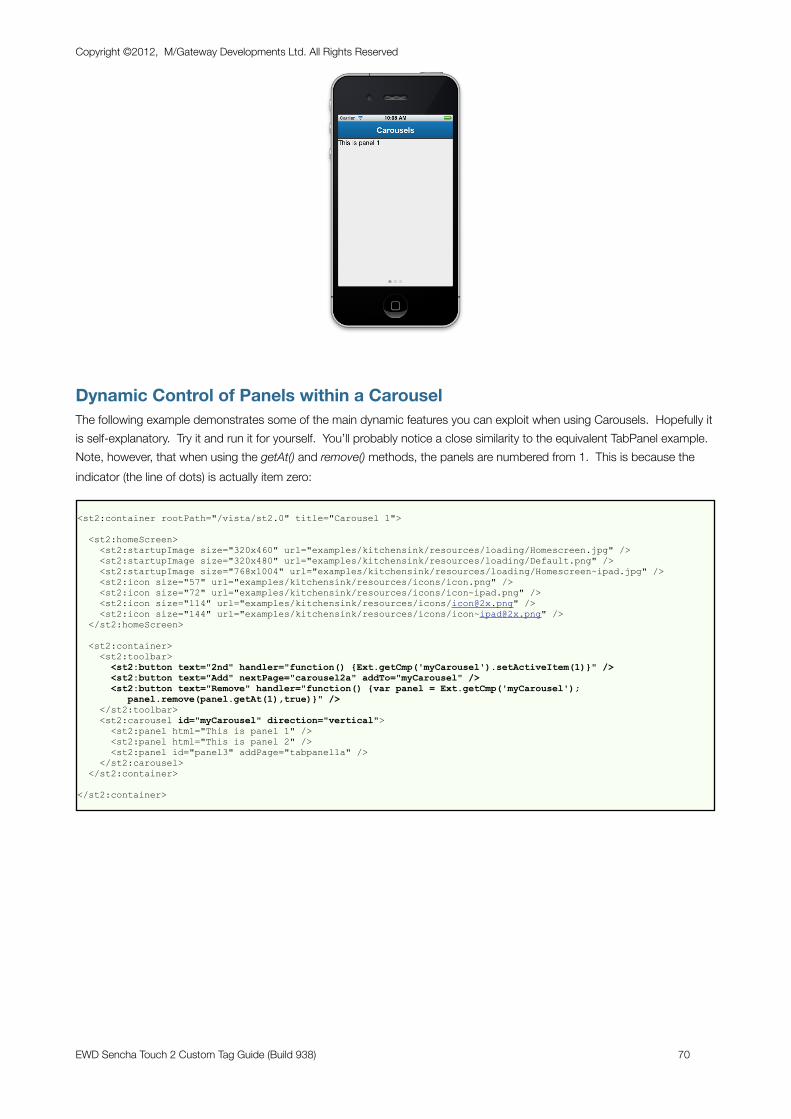
Dynamic Control of Panels within a CarouselThe following example demonstrates some of the main dynamic features you can exploit when using Carousels. Hopefully it is self-explanatory. Try it and run it for yourself. You’ll probably notice a close similarity to the equivalent TabPanel example. Note, however, that when using the getAt() and remove() methods, the panels are numbered from 1. This is because the indicator (the line of dots) is actually item zero:
<st2:container rootPath="/vista/st2.0" title="Carousel 1">
<st2:homeScreen> <st2:startupImage size="320x460" url="examples/kitchensink/resources/loading/Homescreen.jpg" /> <st2:startupImage size="320x480" url="examples/kitchensink/resources/loading/Default.png" /> <st2:startupImage size="768x1004" url="examples/kitchensink/resources/loading/Homescreen~ipad.jpg" /> <st2:icon size="57" url="examples/kitchensink/resources/icons/icon.png" /> <st2:icon size="72" url="examples/kitchensink/resources/icons/icon~ipad.png" /> <st2:icon size="114" url="examples/kitchensink/resources/icons/[email protected]" /> <st2:icon size="144" url="examples/kitchensink/resources/icons/[email protected]" /> </st2:homeScreen>
<st2:container> <st2:toolbar> <st2:button text="2nd" handler="function() {Ext.getCmp('myCarousel').setActiveItem(1)}" /> <st2:button text="Add" nextPage="carousel2a" addTo="myCarousel" /> <st2:button text="Remove" handler="function() {var panel = Ext.getCmp('myCarousel'); panel.remove(panel.getAt(1),true)}" /> </st2:toolbar> <st2:carousel id="myCarousel" direction="vertical"> <st2:panel html="This is panel 1" /> <st2:panel html="This is panel 2" /> <st2:panel id="panel3" addPage="tabpanel1a" /> </st2:carousel> </st2:container>
</st2:container>
Copyright ©2012, M/Gateway Developments Ltd. All Rights Reserved
EWD Sencha Touch 2 Custom Tag Guide (Build 938) 70
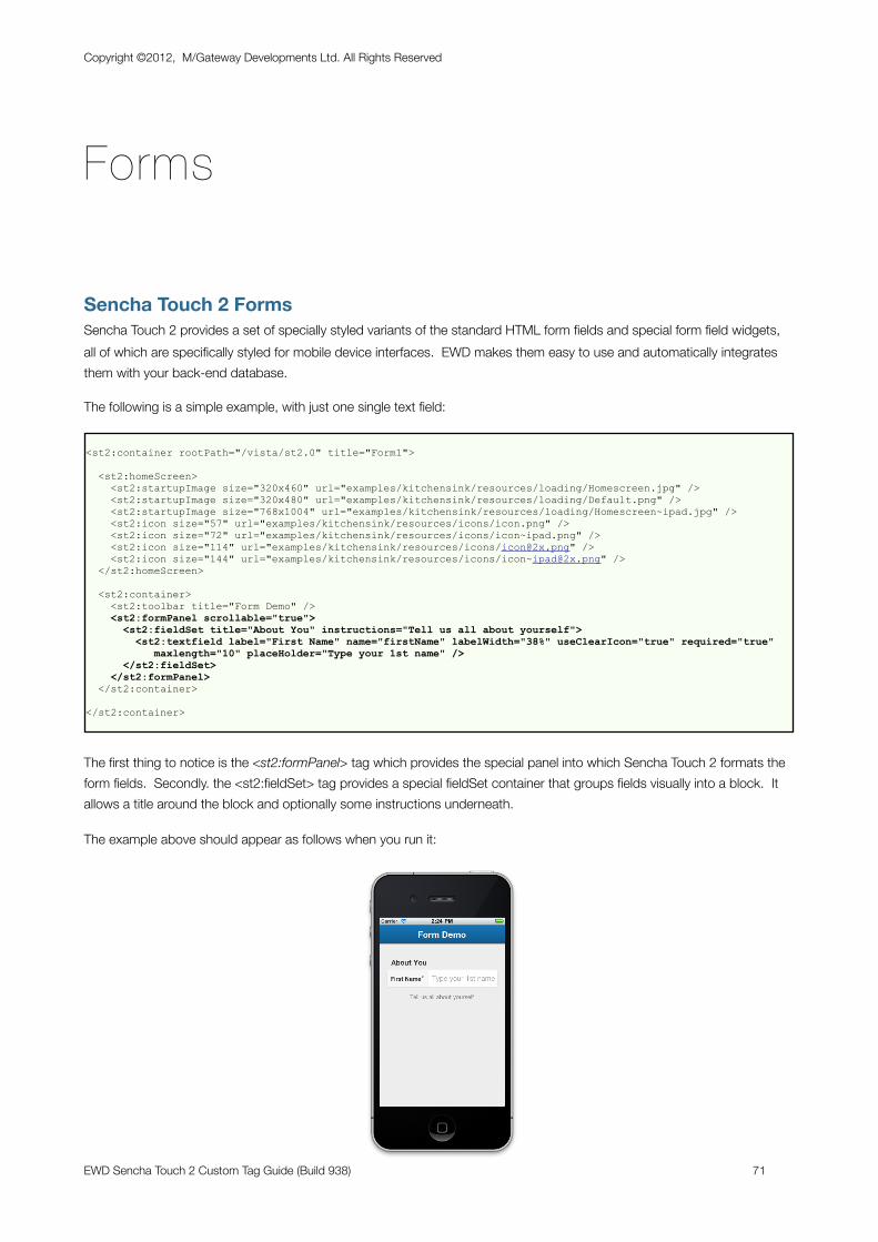
Forms
Sencha Touch 2 FormsSencha Touch 2 provides a set of specially styled variants of the standard HTML form fields and special form field widgets, all of which are specifically styled for mobile device interfaces. EWD makes them easy to use and automatically integrates them with your back-end database.
The following is a simple example, with just one single text field:
<st2:container rootPath="/vista/st2.0" title="Form1">
<st2:homeScreen> <st2:startupImage size="320x460" url="examples/kitchensink/resources/loading/Homescreen.jpg" /> <st2:startupImage size="320x480" url="examples/kitchensink/resources/loading/Default.png" /> <st2:startupImage size="768x1004" url="examples/kitchensink/resources/loading/Homescreen~ipad.jpg" /> <st2:icon size="57" url="examples/kitchensink/resources/icons/icon.png" /> <st2:icon size="72" url="examples/kitchensink/resources/icons/icon~ipad.png" /> <st2:icon size="114" url="examples/kitchensink/resources/icons/[email protected]" /> <st2:icon size="144" url="examples/kitchensink/resources/icons/[email protected]" /> </st2:homeScreen>
<st2:container> <st2:toolbar title="Form Demo" /> <st2:formPanel scrollable="true"> <st2:fieldSet title="About You" instructions="Tell us all about yourself"> <st2:textfield label="First Name" name="firstName" labelWidth="38%" useClearIcon="true" required="true" maxlength="10" placeHolder="Type your 1st name" /> </st2:fieldSet> </st2:formPanel> </st2:container>
</st2:container>
The first thing to notice is the <st2:formPanel> tag which provides the special panel into which Sencha Touch 2 formats the form fields. Secondly. the <st2:fieldSet> tag provides a special fieldSet container that groups fields visually into a block. It allows a title around the block and optionally some instructions underneath.
The example above should appear as follows when you run it:
Copyright ©2012, M/Gateway Developments Ltd. All Rights Reserved
EWD Sencha Touch 2 Custom Tag Guide (Build 938) 71
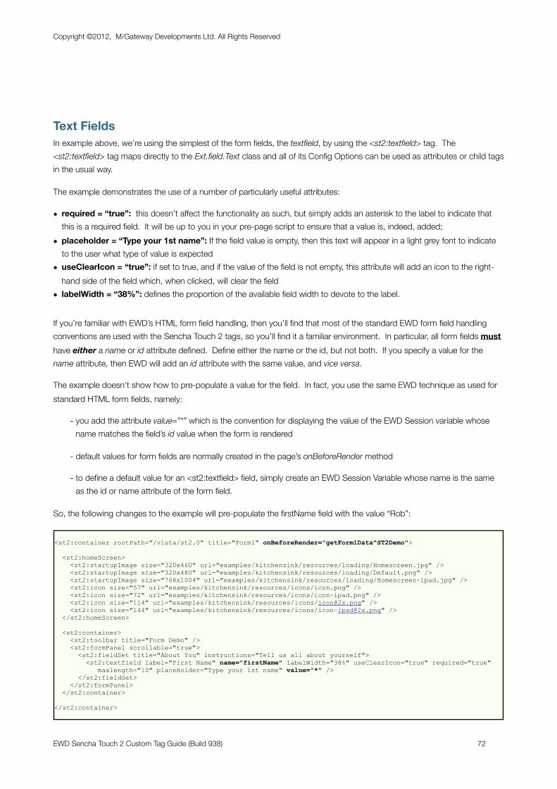
Text FieldsIn example above, we’re using the simplest of the form fields, the textfield, by using the <st2:textfield> tag. The <st2:textfield> tag maps directly to the Ext.field.Text class and all of its Config Options can be used as attributes or child tags in the usual way.
The example demonstrates the use of a number of particularly useful attributes:
• required = “true”: this doesn’t affect the functionality as such, but simply adds an asterisk to the label to indicate that this is a required field. It will be up to you in your pre-page script to ensure that a value is, indeed, added;
• placeholder = “Type your 1st name”: If the field value is empty, then this text will appear in a light grey font to indicate to the user what type of value is expected
• useClearIcon = “true”: if set to true, and if the value of the field is not empty, this attribute will add an icon to the right-hand side of the field which, when clicked, will clear the field
• labelWidth = “38%”: defines the proportion of the available field width to devote to the label.
If you’re familiar with EWD’s HTML form field handling, then you’ll find that most of the standard EWD form field handling conventions are used with the Sencha Touch 2 tags, so you’ll find it a familiar environment. In particular, all form fields must have either a name or id attribute defined. Define either the name or the id, but not both. If you specify a value for the name attribute, then EWD will add an id attribute with the same value, and vice versa.
The example doesn’t show how to pre-populate a value for the field. In fact, you use the same EWD technique as used for standard HTML form fields, namely:
- you add the attribute value=”*” which is the convention for displaying the value of the EWD Session variable whose name matches the field’s id value when the form is rendered
- default values for form fields are normally created in the page’s onBeforeRender method
- to define a default value for an <st2:textfield> field, simply create an EWD Session Variable whose name is the same as the id or name attribute of the form field.
So, the following changes to the example will pre-populate the firstName field with the value “Rob”:
<st2:container rootPath="/vista/st2.0" title="Form1" onBeforeRender="getForm1Data^ST2Demo">
<st2:homeScreen> <st2:startupImage size="320x460" url="examples/kitchensink/resources/loading/Homescreen.jpg" /> <st2:startupImage size="320x480" url="examples/kitchensink/resources/loading/Default.png" /> <st2:startupImage size="768x1004" url="examples/kitchensink/resources/loading/Homescreen~ipad.jpg" /> <st2:icon size="57" url="examples/kitchensink/resources/icons/icon.png" /> <st2:icon size="72" url="examples/kitchensink/resources/icons/icon~ipad.png" /> <st2:icon size="114" url="examples/kitchensink/resources/icons/[email protected]" /> <st2:icon size="144" url="examples/kitchensink/resources/icons/[email protected]" /> </st2:homeScreen>
<st2:container> <st2:toolbar title="Form Demo" /> <st2:formPanel scrollable="true"> <st2:fieldSet title="About You" instructions="Tell us all about yourself"> <st2:textfield label="First Name" name="firstName" labelWidth="38%" useClearIcon="true" required="true" maxlength="10" placeHolder="Type your 1st name" value="*" /> </st2:fieldSet> </st2:formPanel> </st2:container>
</st2:container>
Copyright ©2012, M/Gateway Developments Ltd. All Rights Reserved
EWD Sencha Touch 2 Custom Tag Guide (Build 938) 72
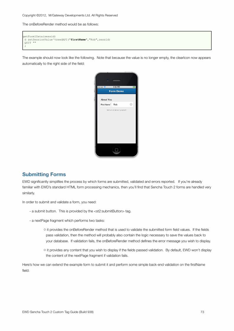
The onBeforeRender method would be as follows:
getForm1Data(sessid) d setSessionValue^%zewdAPI("firstName","Rob",sessid) QUIT "" ;
The example should now look like the following. Note that because the value is no longer empty, the clearIcon now appears automatically to the right side of the field:
Submitting FormsEWD significantly simplifies the process by which forms are submitted, validated and errors reported. If you’re already familiar with EWD’s standard HTML form processing mechanics, then you’ll find that Sencha Touch 2 forms are handled very similarly.
In order to submit and validate a form, you need:
- a submit button. This is provided by the <st2:submitButton> tag.
- a nextPage fragment which performs two tasks:
o it provides the onBeforeRender method that is used to validate the submitted form field values. If the fields pass validation, then the method will probably also contain the logic necessary to save the values back to your database. If validation fails, the onBeforeRender method defines the error message you wish to display.
o it provides any content that you wish to display if the fields passed validation. By default, EWD won’t display the content of the nextPage fragment if validation fails.
Here’s how we can extend the example form to submit it and perform some simple back-end validation on the firstName field:
Copyright ©2012, M/Gateway Developments Ltd. All Rights Reserved
EWD Sencha Touch 2 Custom Tag Guide (Build 938) 73
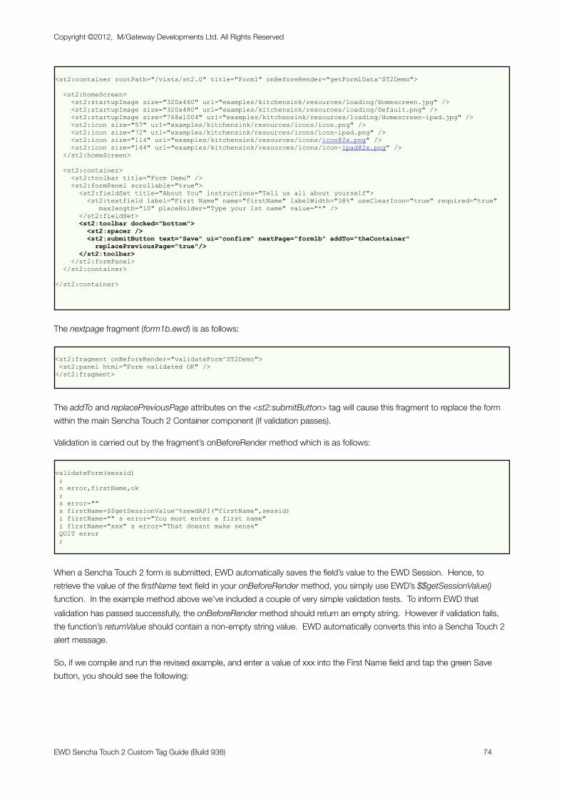
<st2:container rootPath="/vista/st2.0" title="Form1" onBeforeRender="getForm1Data^ST2Demo">
<st2:homeScreen> <st2:startupImage size="320x460" url="examples/kitchensink/resources/loading/Homescreen.jpg" /> <st2:startupImage size="320x480" url="examples/kitchensink/resources/loading/Default.png" /> <st2:startupImage size="768x1004" url="examples/kitchensink/resources/loading/Homescreen~ipad.jpg" /> <st2:icon size="57" url="examples/kitchensink/resources/icons/icon.png" /> <st2:icon size="72" url="examples/kitchensink/resources/icons/icon~ipad.png" /> <st2:icon size="114" url="examples/kitchensink/resources/icons/[email protected]" /> <st2:icon size="144" url="examples/kitchensink/resources/icons/[email protected]" /> </st2:homeScreen>
<st2:container> <st2:toolbar title="Form Demo" /> <st2:formPanel scrollable="true"> <st2:fieldSet title="About You" instructions="Tell us all about yourself"> <st2:textfield label="First Name" name="firstName" labelWidth="38%" useClearIcon="true" required="true" maxlength="10" placeHolder="Type your 1st name" value="*" /> </st2:fieldSet> <st2:toolbar docked="bottom"> <st2:spacer /> <st2:submitButton text="Save" ui="confirm" nextPage="form1b" addTo="theContainer" replacePreviousPage="true"/> </st2:toolbar> </st2:formPanel> </st2:container>
</st2:container>
The nextpage fragment (form1b.ewd) is as follows:
<st2:fragment onBeforeRender="validateForm^ST2Demo"> <st2:panel html="Form validated OK" /></st2:fragment>
The addTo and replacePreviousPage attributes on the <st2:submitButton> tag will cause this fragment to replace the form within the main Sencha Touch 2 Container component (if validation passes).
Validation is carried out by the fragment’s onBeforeRender method which is as follows:
validateForm(sessid) ; n error,firstName,ok ; s error="" s firstName=$$getSessionValue^%zewdAPI("firstName",sessid) i firstName="" s error="You must enter a first name" i firstName="xxx" s error="That doesnt make sense" QUIT error ;
When a Sencha Touch 2 form is submitted, EWD automatically saves the field’s value to the EWD Session. Hence, to retrieve the value of the firstName text field in your onBeforeRender method, you simply use EWD’s $$getSessionValue() function. In the example method above we’ve included a couple of very simple validation tests. To inform EWD that validation has passed successfully, the onBeforeRender method should return an empty string. However if validation fails, the function’s returnValue should contain a non-empty string value. EWD automatically converts this into a Sencha Touch 2 alert message.
So, if we compile and run the revised example, and enter a value of xxx into the First Name field and tap the green Save button, you should see the following:
Copyright ©2012, M/Gateway Developments Ltd. All Rights Reserved
EWD Sencha Touch 2 Custom Tag Guide (Build 938) 74
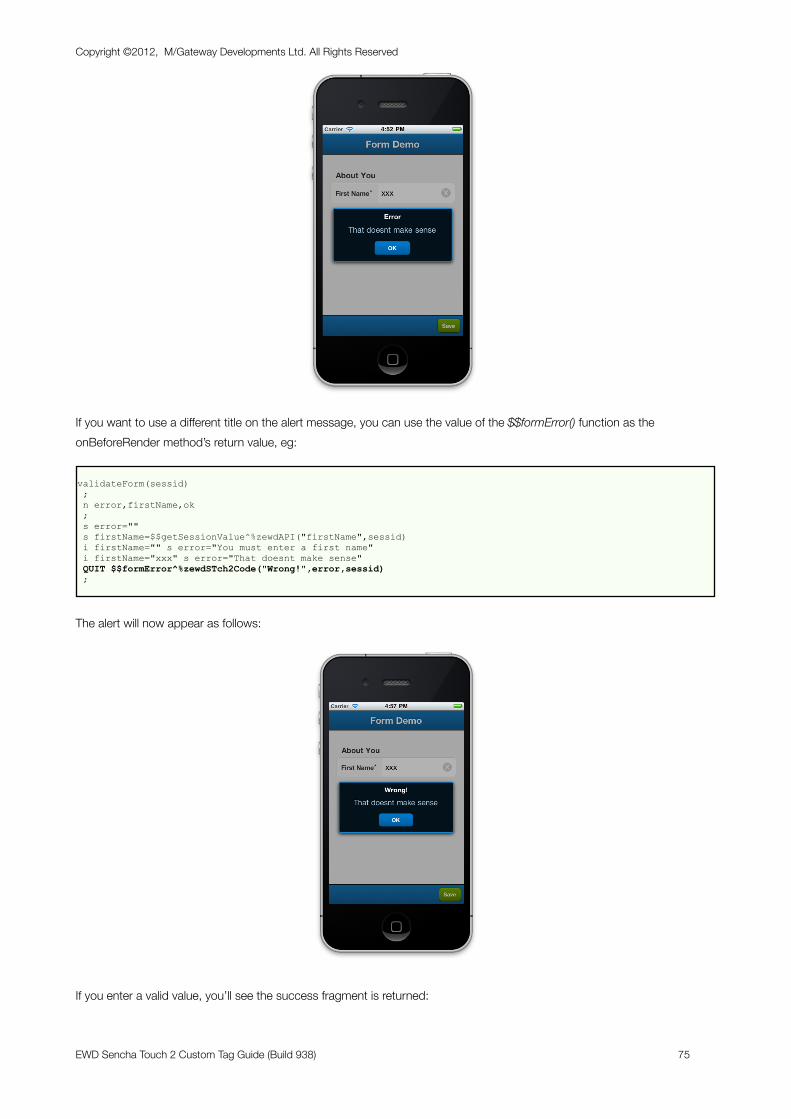
If you want to use a different title on the alert message, you can use the value of the $$formError() function as the onBeforeRender method’s return value, eg:
validateForm(sessid) ; n error,firstName,ok ; s error="" s firstName=$$getSessionValue^%zewdAPI("firstName",sessid) i firstName="" s error="You must enter a first name" i firstName="xxx" s error="That doesnt make sense" QUIT $$formError^%zewdSTch2Code("Wrong!",error,sessid) ;
The alert will now appear as follows:
If you enter a valid value, you’ll see the success fragment is returned:
Copyright ©2012, M/Gateway Developments Ltd. All Rights Reserved
EWD Sencha Touch 2 Custom Tag Guide (Build 938) 75
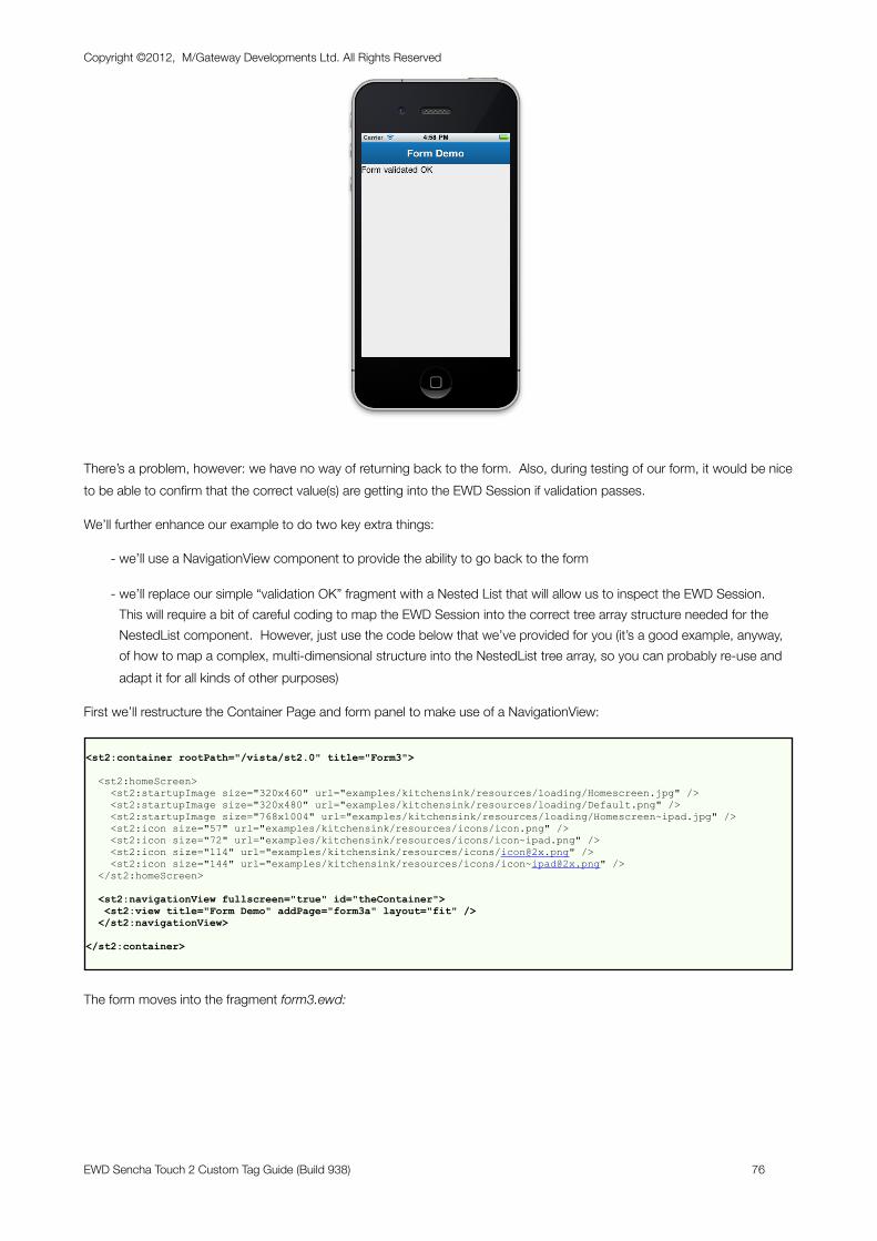
There’s a problem, however: we have no way of returning back to the form. Also, during testing of our form, it would be nice to be able to confirm that the correct value(s) are getting into the EWD Session if validation passes.
We’ll further enhance our example to do two key extra things:
- we’ll use a NavigationView component to provide the ability to go back to the form
- we’ll replace our simple “validation OK” fragment with a Nested List that will allow us to inspect the EWD Session. This will require a bit of careful coding to map the EWD Session into the correct tree array structure needed for the NestedList component. However, just use the code below that we’ve provided for you (it’s a good example, anyway, of how to map a complex, multi-dimensional structure into the NestedList tree array, so you can probably re-use and adapt it for all kinds of other purposes)
First we’ll restructure the Container Page and form panel to make use of a NavigationView:
<st2:container rootPath="/vista/st2.0" title="Form3">
<st2:homeScreen> <st2:startupImage size="320x460" url="examples/kitchensink/resources/loading/Homescreen.jpg" /> <st2:startupImage size="320x480" url="examples/kitchensink/resources/loading/Default.png" /> <st2:startupImage size="768x1004" url="examples/kitchensink/resources/loading/Homescreen~ipad.jpg" /> <st2:icon size="57" url="examples/kitchensink/resources/icons/icon.png" /> <st2:icon size="72" url="examples/kitchensink/resources/icons/icon~ipad.png" /> <st2:icon size="114" url="examples/kitchensink/resources/icons/[email protected]" /> <st2:icon size="144" url="examples/kitchensink/resources/icons/[email protected]" /> </st2:homeScreen>
<st2:navigationView fullscreen="true" id="theContainer"> <st2:view title="Form Demo" addPage="form3a" layout="fit" /> </st2:navigationView>
</st2:container>
The form moves into the fragment form3.ewd:
Copyright ©2012, M/Gateway Developments Ltd. All Rights Reserved
EWD Sencha Touch 2 Custom Tag Guide (Build 938) 76
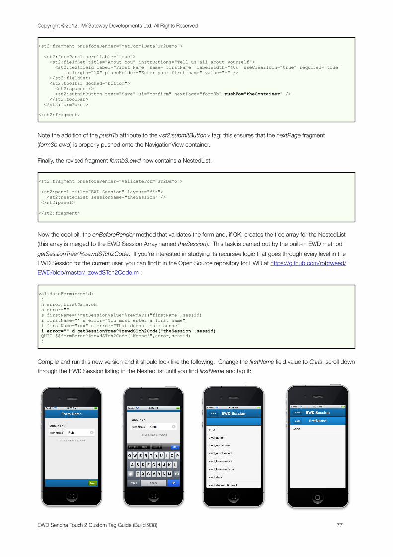
<st2:fragment onBeforeRender="getForm1Data^ST2Demo">
<st2:formPanel scrollable="true"> <st2:fieldSet title="About You" instructions="Tell us all about yourself"> <st2:textfield label="First Name" name="firstName" labelWidth="40%" useClearIcon="true" required="true" maxlength="10" placeHolder="Enter your first name" value="*" /> </st2:fieldSet> <st2:toolbar docked="bottom"> <st2:spacer /> <st2:submitButton text="Save" ui="confirm" nextPage="form3b" pushTo="theContainer" /> </st2:toolbar> </st2:formPanel>
</st2:fragment>
Note the addition of the pushTo attribute to the <st2:submitButton> tag: this ensures that the nextPage fragment (form3b.ewd) is properly pushed onto the NavigationView container.
Finally, the revised fragment formb3.ewd now contains a NestedList:
<st2:fragment onBeforeRender="validateForm^ST2Demo">
<st2:panel title="EWD Session" layout="fit"> <st2:nestedList sessionName="theSession" /> </st2:panel>
</st2:fragment>
Now the cool bit: the onBeforeRender method that validates the form and, if OK, creates the tree array for the NestedList (this array is merged to the EWD Session Array named theSession). This task is carried out by the built-in EWD method getSessionTree^%zewdSTch2Code. If you’re interested in studying its recursive logic that goes through every level in the EWD Session for the current user, you can find it in the Open Source repository for EWD at https://github.com/robtweed/EWD/blob/master/_zewdSTch2Code.m :
validateForm(sessid) ; n error,firstName,ok s error="" s firstName=$$getSessionValue^%zewdAPI("firstName",sessid) i firstName="" s error="You must enter a first name" i firstName="xxx" s error="That doesnt make sense" i error="" d getSessionTree^%zewdSTch2Code("theSession",sessid) QUIT $$formError^%zewdSTch2Code("Wrong!",error,sessid) ;
Compile and run this new version and it should look like the following. Change the firstName field value to Chris, scroll down through the EWD Session listing in the NestedList until you find firstName and tap it:
Copyright ©2012, M/Gateway Developments Ltd. All Rights Reserved
EWD Sencha Touch 2 Custom Tag Guide (Build 938) 77
So you can now confirm that the EWD Session value for the firstName field is, indeed, Chris, just as we typed. You’ll also see that we can now navigate backwards all the way back to the form if we wish, making use of the navigation mechanics that are built into the NavigationView and NestedList components.
Now that we have this set of pages/fragments in place, we can use it throughout the rest of this chapter for demonstrating and testing the other Sencha Touch 2 form field types.
Setting Field DefaultsAs you build up a set of form fields, you’ll probably find that a number of attributes are being repeated in each tag, eg labelWidth, useClearIcon, required, etc. Instead of repeating these attributes, Sencha Touch 2 allows you to declare these as defaults. EWD exposes this mechanism via the <st2:defaults> tag. So, if we added a second text field to our example, instead of the following:
<st2:fragment onBeforeRender="getForm1Data^ST2Demo">
<st2:formPanel scrollable="true"> <st2:fieldSet title="About You" instructions="Tell us all about yourself"> <st2:textfield label="First Name" name="firstName" labelWidth="40%" useClearIcon="true" required="true" maxlength="10" placeHolder="Enter your first name" value="*" /> <st2:textfield label="Last Name" name="lastName" labelWidth="40%" useClearIcon="true" required="true" maxlength="10" placeHolder="Enter your last name" value="*" /> </st2:fieldSet> <st2:toolbar docked="bottom"> <st2:spacer /> <st2:submitButton text="Save" ui="confirm" nextPage="form3b" pushTo="theContainer" /> </st2:toolbar> </st2:formPanel>
</st2:fragment>
We could express this as follows, so that every field inherits the default values for the labelWidth, useClearIcon and required attributes:
<st2:fragment onBeforeRender="getForm1Data^ST2Demo">
<st2:formPanel scrollable="true"> <st2:fieldSet title="About You" instructions="Tell us all about yourself"> <st2:defaults labelWidth="40%" useClearIcon="true" required="true" /> <st2:textfield label="First Name" name="firstName" maxlength="10" placeHolder="Enter your first name" value="*" /> <st2:textfield label="Last Name" name="lastName" maxlength="10" placeHolder="Enter your last name" value="*" /> </st2:fieldSet> <st2:toolbar docked="bottom"> <st2:spacer /> <st2:submitButton text="Save" ui="confirm" nextPage="form3b" pushTo="theContainer" /> </st2:toolbar> </st2:formPanel>
</st2:fragment>
Date FieldsDate fields allow dates to be visually formatted in a wide variety of ways, and are edited using a date spinner widget that automatically pops up when you tap the field, eg:
Copyright ©2012, M/Gateway Developments Ltd. All Rights Reserved
EWD Sencha Touch 2 Custom Tag Guide (Build 938) 78
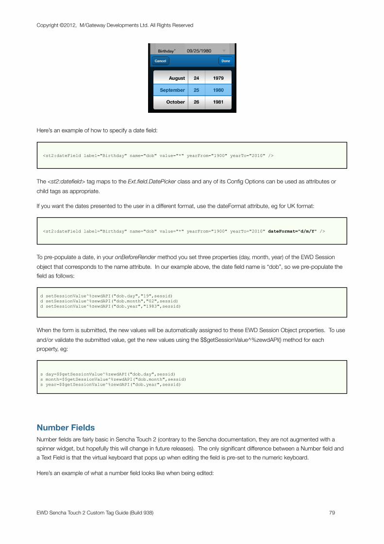
Here’s an example of how to specify a date field:
<st2:dateField label="Birthday" name="dob" value="*" yearFrom="1900" yearTo="2010" />
The <st2:datefield> tag maps to the Ext.field.DatePicker class and any of its Config Options can be used as attributes or child tags as appropriate.
If you want the dates presented to the user in a different format, use the dateFormat attribute, eg for UK format:
<st2:dateField label="Birthday" name="dob" value="*" yearFrom="1900" yearTo="2010" dateFormat="d/m/Y" />
To pre-populate a date, in your onBeforeRender method you set three properties (day, month, year) of the EWD Session object that corresponds to the name attribute. In our example above, the date field name is “dob”, so we pre-populate the field as follows:
d setSessionValue^%zewdAPI("dob.day","19",sessid) d setSessionValue^%zewdAPI("dob.month","02",sessid) d setSessionValue^%zewdAPI("dob.year","1983",sessid)
When the form is submitted, the new values will be automatically assigned to these EWD Session Object properties. To use and/or validate the submitted value, get the new values using the $$getSessionValue^%zewdAPI() method for each property, eg:
s day=$$getSessionValue^%zewdAPI("dob.day",sessid) s month=$$getSessionValue^%zewdAPI("dob.month",sessid) s year=$$getSessionValue^%zewdAPI("dob.year",sessid)
Number FieldsNumber fields are fairly basic in Sencha Touch 2 (contrary to the Sencha documentation, they are not augmented with a spinner widget, but hopefully this will change in future releases). The only significant difference between a Number field and a Text Field is that the virtual keyboard that pops up when editing the field is pre-set to the numeric keyboard.
Here’s an example of what a number field looks like when being edited:
Copyright ©2012, M/Gateway Developments Ltd. All Rights Reserved
EWD Sencha Touch 2 Custom Tag Guide (Build 938) 79
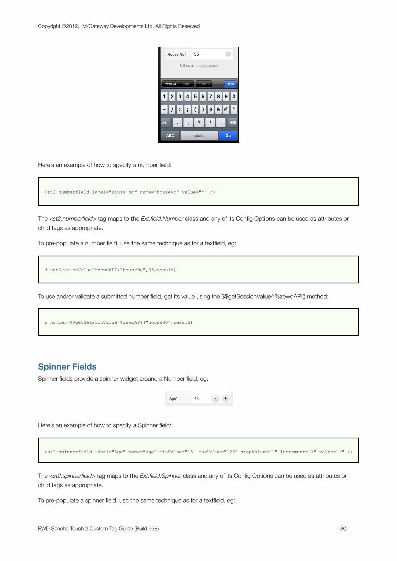
Here’s an example of how to specify a number field:
<st2:numberfield label="House No" name="houseNo" value="*" />
The <st2:numberfield> tag maps to the Ext.field.Number class and any of its Config Options can be used as attributes or child tags as appropriate.
To pre-populate a number field, use the same technique as for a textfield, eg:
d setSessionValue^%zewdAPI("houseNo",35,sessid)
To use and/or validate a submitted number field, get its value using the $$getSessionValue^%zewdAPI() method:
s number=$$getSessionValue^%zewdAPI("houseNo",sessid)
Spinner FieldsSpinner fields provide a spinner widget around a Number field, eg:
Here’s an example of how to specify a Spinner field:
<st2:spinnerfield label="Age" name="age" minValue="18" maxValue="120" stepValue="1" increment="1" value="*" />
The <st2:spinnerfield> tag maps to the Ext.field.Spinner class and any of its Config Options can be used as attributes or child tags as appropriate.
To pre-populate a spinner field, use the same technique as for a textfield, eg:
Copyright ©2012, M/Gateway Developments Ltd. All Rights Reserved
EWD Sencha Touch 2 Custom Tag Guide (Build 938) 80
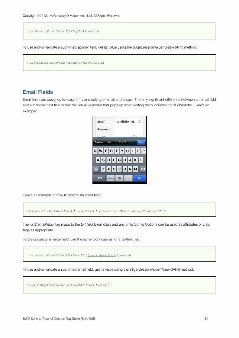
d setSessionValue^%zewdAPI("age",43,sessid)
To use and/or validate a submitted spinner field, get its value using the $$getSessionValue^%zewdAPI() method:
s age=$$getSessionValue^%zewdAPI("age",sessid)
Email FieldsEmail fields are designed for easy entry and editing of email addresses. The only significant difference between an email field and a standard text field is that the virtual keyboard that pops up when editing them includes the @ character. Here’s an example:
Here’s an example of how to specify an email field:
<st2:emailfield label="Email" name="email" placeHolder="Email address" value="*" />
The <st2:emailfield> tag maps to the Ext.field.Email class and any of its Config Options can be used as attributes or child tags as appropriate.
To pre-populate an email field, use the same technique as for a textfield, eg:
d setSessionValue^%zewdAPI("email","[email protected]",sessid)
To use and/or validate a submitted email field, get its value using the $$getSessionValue^%zewdAPI() method:
s email=$$getSessionValue^%zewdAPI("email",sessid)
Copyright ©2012, M/Gateway Developments Ltd. All Rights Reserved
EWD Sencha Touch 2 Custom Tag Guide (Build 938) 81
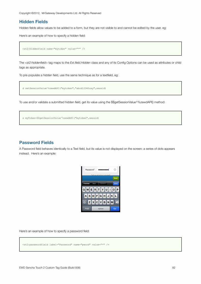
Hidden FieldsHidden fields allow values to be added to a form, but they are not visible to and cannot be edited by the user, eg:
Here’s an example of how to specify a hidden field:
<st2:hiddenfield name="mytoken" value="*" />
The <st2:hiddenfield> tag maps to the Ext.field.Hidden class and any of its Config Options can be used as attributes or child tags as appropriate.
To pre-populate a hidden field, use the same technique as for a textfield, eg:
d setSessionValue^%zewdAPI("mytoken","abcd12345zxy",sessid)
To use and/or validate a submitted hidden field, get its value using the $$getSessionValue^%zewdAPI() method:
s myToken=$$getSessionValue^%zewdAPI("mytoken",sessid)
Password FieldsA Password field behaves identically to a Text field, but its value is not displayed on the screen: a series of dots appears instead. Here’s an example:
Here’s an example of how to specify a password field:
<st2:passwordfield label="Password" name="pword" value="*" />
Copyright ©2012, M/Gateway Developments Ltd. All Rights Reserved
EWD Sencha Touch 2 Custom Tag Guide (Build 938) 82
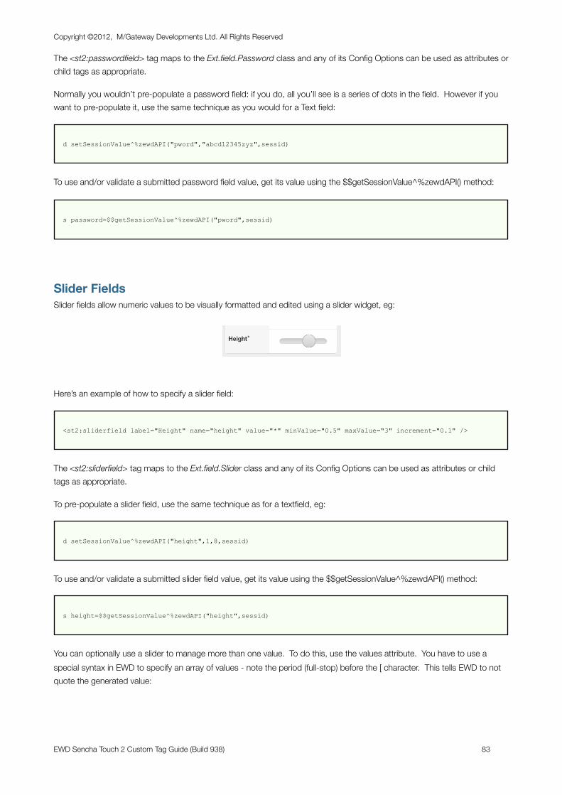
The <st2:passwordfield> tag maps to the Ext.field.Password class and any of its Config Options can be used as attributes or child tags as appropriate.
Normally you wouldn’t pre-populate a password field: if you do, all you’ll see is a series of dots in the field. However if you want to pre-populate it, use the same technique as you would for a Text field:
d setSessionValue^%zewdAPI("pword","abcd12345zyz",sessid)
To use and/or validate a submitted password field value, get its value using the $$getSessionValue^%zewdAPI() method:
s password=$$getSessionValue^%zewdAPI("pword",sessid)
Slider FieldsSlider fields allow numeric values to be visually formatted and edited using a slider widget, eg:
Here’s an example of how to specify a slider field:
<st2:sliderfield label="Height" name="height" value="*" minValue="0.5" maxValue="3" increment="0.1" />
The <st2:sliderfield> tag maps to the Ext.field.Slider class and any of its Config Options can be used as attributes or child tags as appropriate.
To pre-populate a slider field, use the same technique as for a textfield, eg:
d setSessionValue^%zewdAPI("height",1,8,sessid)
To use and/or validate a submitted slider field value, get its value using the $$getSessionValue^%zewdAPI() method:
s height=$$getSessionValue^%zewdAPI("height",sessid)
You can optionally use a slider to manage more than one value. To do this, use the values attribute. You have to use a special syntax in EWD to specify an array of values - note the period (full-stop) before the [ character. This tells EWD to not quote the generated value:
Copyright ©2012, M/Gateway Developments Ltd. All Rights Reserved
EWD Sencha Touch 2 Custom Tag Guide (Build 938) 83
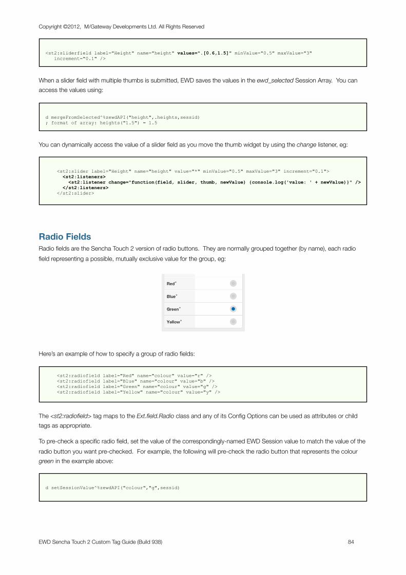
<st2:sliderfield label="Height" name="height" values=".[0.6,1.5]" minValue="0.5" maxValue="3" increment="0.1" />
When a slider field with multiple thumbs is submitted, EWD saves the values in the ewd_selected Session Array. You can access the values using:
d mergeFromSelected^%zewdAPI("height",.heights,sessid) ; format of array: heights("1.5") = 1.5
You can dynamically access the value of a slider field as you move the thumb widget by using the change listener, eg:
<st2:slider label="Height" name="height" value="*" minValue="0.5" maxValue="3" increment="0.1"> <st2:listeners> <st2:listener change="function(field, slider, thumb, newValue) {console.log('value: ' + newValue)}" /> </st2:listeners> </st2:slider>
Radio FieldsRadio fields are the Sencha Touch 2 version of radio buttons. They are normally grouped together (by name), each radio field representing a possible, mutually exclusive value for the group, eg:
Here’s an example of how to specify a group of radio fields:
<st2:radiofield label="Red" name="colour" value="r" /> <st2:radiofield label="Blue" name="colour" value="b" /> <st2:radiofield label="Green" name="colour" value="g" /> <st2:radiofield label="Yellow" name="colour" value="y" />
The <st2:radiofield> tag maps to the Ext.field.Radio class and any of its Config Options can be used as attributes or child tags as appropriate.
To pre-check a specific radio field, set the value of the correspondingly-named EWD Session value to match the value of the radio button you want pre-checked. For example, the following will pre-check the radio button that represents the colour green in the example above:
d setSessionValue^%zewdAPI("colour","g",sessid)
Copyright ©2012, M/Gateway Developments Ltd. All Rights Reserved
EWD Sencha Touch 2 Custom Tag Guide (Build 938) 84
To use and/or validate the submitted response from a radio group, get the value of the radio button that was checked using the $$getSessionValue^%zewdAPI() method:
s valueChecked=$$getSessionValue^%zewdAPI("rb",sessid)
Dynamically-defined Radio FieldsYou can also define a group of radio buttons dynamically. This is done by creating an EWD Session Array that contains the radio button definitions. Typically you would define this array in the onBeforeRender method of the page or fragment that contains the form. You then reference this Session Array in the <st2:radiofield> tag. For example:
<st2:radiofield sessionName="birds" name="bird" />
The EWD Session Array (in this example named “myRadioFields”) would be created as follows:
s radio(1,"label")="Robin" s radio(1,"value")="robin" s radio(1,"labelWidth")="40%" s radio(2,"label")="Blackbird" s radio(2,"value")="blackbird" s radio(2,"labelWidth")="40%" s radio(3,"label")="Owl" s radio(3,"value")="owl" s radio(3,"labelWidth")="40%" d mergeArrayToSession^%zewdAPI(.radio,"birds",sessid) d setSessionValue^%zewdAPI("bird","owl",sessid)
Note that dynamically-defined radio fields do not inherit the <st2:defaults> attributes, so you should define them, if necessary, in the local array for each field, as shown above.
Checkbox FieldsCheckbox fields are the Sencha Touch 2 version of checkboxes. They are often created as a group, all with the same name, eg:
Here’s an example of how to specify a group of checkbox fields:
<st2:checkboxfield label="Tomato" name="veg" value="tom" /> <st2:checkboxfield label="Carrot" name="veg" value="car" /> <st2:checkboxfield label="Onion" name="veg" value="on" />
The <st2:checkboxfield> tag maps to the Ext.field.Checkbox class and any of its Config Options can be used as attributes or child tags as appropriate.
Copyright ©2012, M/Gateway Developments Ltd. All Rights Reserved
EWD Sencha Touch 2 Custom Tag Guide (Build 938) 85
To pre-check one or more checkboxes in a group, use the standard EWD techniques for checkbox form fields: you must use one of two EWD APIs to create the EWD Selected Array:
- invoke the setCheckboxOn() method for each checkbox that should be checked
- create a local array of checkboxes to be checked, then invoke the setCheckboxValues() method.
For example, the following two alternatives will pre-check the first and third checkboxes in the example above:
d initialiseCheckbox^%zewdAPI("veg",sessid) d setCheckboxOn^%zewdAPI("veg","on",sessid) d setCheckboxOn^%zewdAPI("veg","tom",sessid)
n veg d initialiseCheckbox^%zewdAPI("veg",sessid) s veg("on")="on" s veg("tom")="tom" d setCheckboxValues^%zewdAPI("veg",.veg,sessid)
The initialiseCheckbox() method clears any previously checked values in the EWD Session Array and its use is recommended to ensure no residual values are lurking in the Session.
To use and/or validate the submitted responses from a checkbox group, you extract the values from the ewd_selected Array, again using the standard EWD APIs for checkboxes. Again, there are two alternative techniques.
To determine whether a specific checkbox was checked when the form was submitted:
i $$isCheckboxOn^%zewdAPI("veg","on",sessid) s result="Onion was selected"
To create a local array of checked fields in the submitted checkbox group:
d getCheckboxValues^%zewdAPI("veg",.selected,sessid) ; format of array: selected("on") = "on"
Dynamically-defined CheckboxesYou can also define a group of checkboxes dynamically. This is done by creating an EWD Session Array that contains the checkbox definitions. Typically you would define this array in the onBeforeRender method of the page or fragment that contains the form. You then reference this Session Array in the <st2:checkboxGroup> tag. The checkbox name is also defined in the <st2:checkboxGroup> tag. For example:
<st2:checkboxfield sessionName="cars" name="car" />
The EWD Session Array (in this example named “cars”) would be created and checkboxes pre-checked as follows:
Copyright ©2012, M/Gateway Developments Ltd. All Rights Reserved
EWD Sencha Touch 2 Custom Tag Guide (Build 938) 86
s cb(1,"label")="Toyota" s cb(1,"value")="toyota" s cb(1,"labelWidth")="40%" s cb(2,"label")="Ford" s cb(2,"value")="ford" s cb(2,"labelWidth")="40%" s cb(3,"label")="BMW" s cb(3,"value")="bmw" s cb(3,"labelWidth")="40%" d mergeArrayToSession^%zewdAPI(.cb,"cars",sessid) d initialiseCheckbox^%zewdAPI("car",sessid) d setCheckboxOn^%zewdAPI("car","ford",sessid)
Determining which checkboxes were checked after the form is submitted is exactly as described earlier for manually-defined checkbox fields.
Search FieldsSearch fields are a new HTML5 field type. The only significant difference between a search field and a standard text field is the styling and the addition of a magnifying glass icon. Here’s an example:
Here’s an example of how to specify a search field:
<st2:searchfield label="Query" name="query" />
The <st2:searchfield> tag maps to the Ext.field.Search class and any of its Config Options can be used as attributes or child tags as appropriate.
To pre-populate a search field, use the same technique as for a textfield, eg:
d setSessionValue^%zewdAPI("query","Google",sessid)
To use and/or validate a submitted search field, get its value using the $$getSessionValue^%zewdAPI() method:
s query=$$getSessionValue^%zewdAPI("query",sessid)
Select FieldsThe Sencha Touch 2 Select field provides special styling for the HTML <select> field, showing the options in a spinner that pops up when you tap the field, eg:
Copyright ©2012, M/Gateway Developments Ltd. All Rights Reserved
EWD Sencha Touch 2 Custom Tag Guide (Build 938) 87
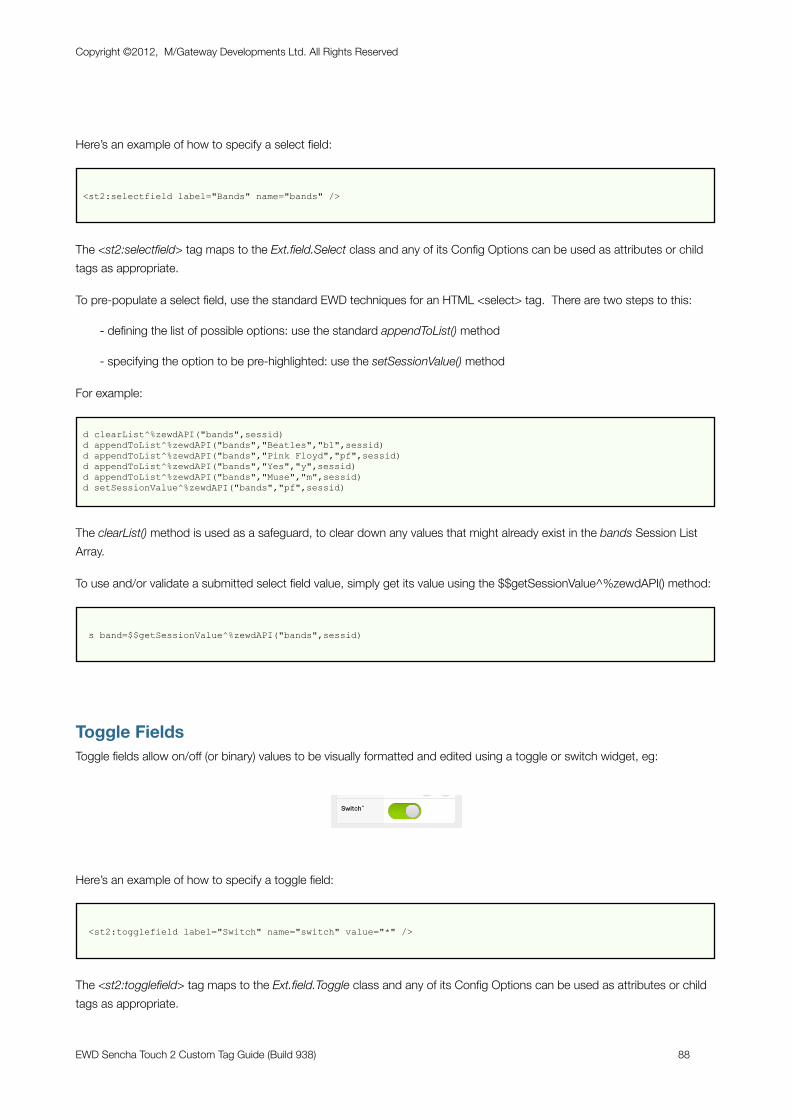
Here’s an example of how to specify a select field:
<st2:selectfield label="Bands" name="bands" />
The <st2:selectfield> tag maps to the Ext.field.Select class and any of its Config Options can be used as attributes or child tags as appropriate.
To pre-populate a select field, use the standard EWD techniques for an HTML <select> tag. There are two steps to this:
- defining the list of possible options: use the standard appendToList() method
- specifying the option to be pre-highlighted: use the setSessionValue() method
For example:
d clearList^%zewdAPI("bands",sessid) d appendToList^%zewdAPI("bands","Beatles","b1",sessid) d appendToList^%zewdAPI("bands","Pink Floyd","pf",sessid) d appendToList^%zewdAPI("bands","Yes","y",sessid) d appendToList^%zewdAPI("bands","Muse","m",sessid) d setSessionValue^%zewdAPI("bands","pf",sessid)
The clearList() method is used as a safeguard, to clear down any values that might already exist in the bands Session List Array.
To use and/or validate a submitted select field value, simply get its value using the $$getSessionValue^%zewdAPI() method:
s band=$$getSessionValue^%zewdAPI("bands",sessid)
Toggle FieldsToggle fields allow on/off (or binary) values to be visually formatted and edited using a toggle or switch widget, eg:
Here’s an example of how to specify a toggle field:
<st2:togglefield label="Switch" name="switch" value="*" />
The <st2:togglefield> tag maps to the Ext.field.Toggle class and any of its Config Options can be used as attributes or child tags as appropriate.
Copyright ©2012, M/Gateway Developments Ltd. All Rights Reserved
EWD Sencha Touch 2 Custom Tag Guide (Build 938) 88
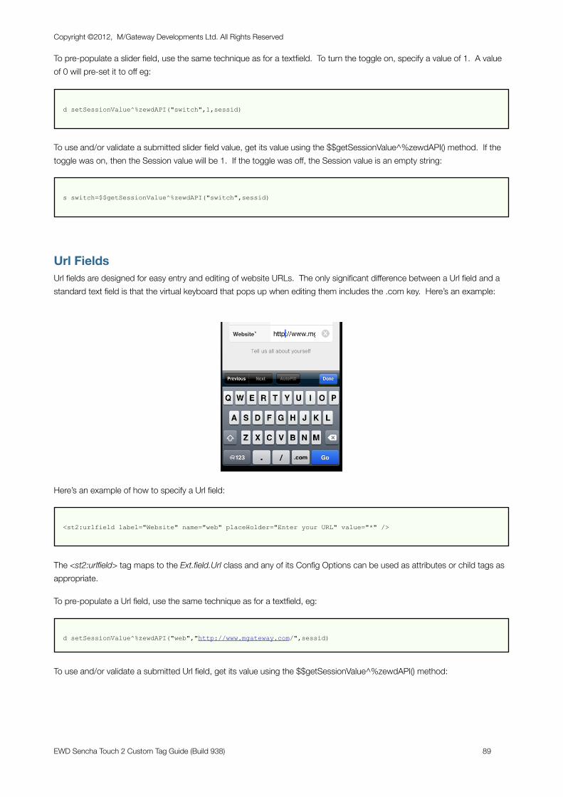
To pre-populate a slider field, use the same technique as for a textfield. To turn the toggle on, specify a value of 1. A value of 0 will pre-set it to off eg:
d setSessionValue^%zewdAPI("switch",1,sessid)
To use and/or validate a submitted slider field value, get its value using the $$getSessionValue^%zewdAPI() method. If the toggle was on, then the Session value will be 1. If the toggle was off, the Session value is an empty string:
s switch=$$getSessionValue^%zewdAPI("switch",sessid)
Url FieldsUrl fields are designed for easy entry and editing of website URLs. The only significant difference between a Url field and a standard text field is that the virtual keyboard that pops up when editing them includes the .com key. Here’s an example:
Here’s an example of how to specify a Url field:
<st2:urlfield label="Website" name="web" placeHolder="Enter your URL" value="*" />
The <st2:urlfield> tag maps to the Ext.field.Url class and any of its Config Options can be used as attributes or child tags as appropriate.
To pre-populate a Url field, use the same technique as for a textfield, eg:
d setSessionValue^%zewdAPI("web","http://www.mgateway.com/",sessid)
To use and/or validate a submitted Url field, get its value using the $$getSessionValue^%zewdAPI() method:
Copyright ©2012, M/Gateway Developments Ltd. All Rights Reserved
EWD Sencha Touch 2 Custom Tag Guide (Build 938) 89
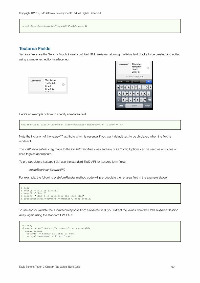
s url=$$getSessionValue^%zewdAPI("web",sessid)
Textarea FieldsTextarea fields are the Sencha Touch 2 version of the HTML textarea, allowing multi-line text blocks to be created and edited using a simple text editor interface, eg:
Here’s an example of how to specify a textarea field:
<st2:textarea label="Comments" name="comments" maxRows="10" value="*" />
Note the inclusion of the value=”*” attribute which is essential if you want default text to be displayed when the field is rendered.
The <st2:textareafield> tag maps to the Ext.field.TextArea class and any of its Config Options can be used as attributes or child tags as appropriate.
To pre-populate a textarea field, use the standard EWD API for textarea form fields:
createTextArea^%zewdAPI()
For example, the following onBeforeRender method code will pre-populate the textarea field in the example above:
n mess s mess(1)="This is line 1" s mess(2)="Line 2" s mess(3)="Line 3 is initially the last line" d createTextArea^%zewdAPI("comments",.mess,sessid)
To use and/or validate the submitted response from a textarea field, you extract the values from the EWD TextArea Session Array, again using the standard EWD API:
n array d getTextArea^%zewdAPI("comments",.array,sessid) ; array format: ; array(0) = number of lines of text ; array(lineNumber) = line of text
Copyright ©2012, M/Gateway Developments Ltd. All Rights Reserved
EWD Sencha Touch 2 Custom Tag Guide (Build 938) 90
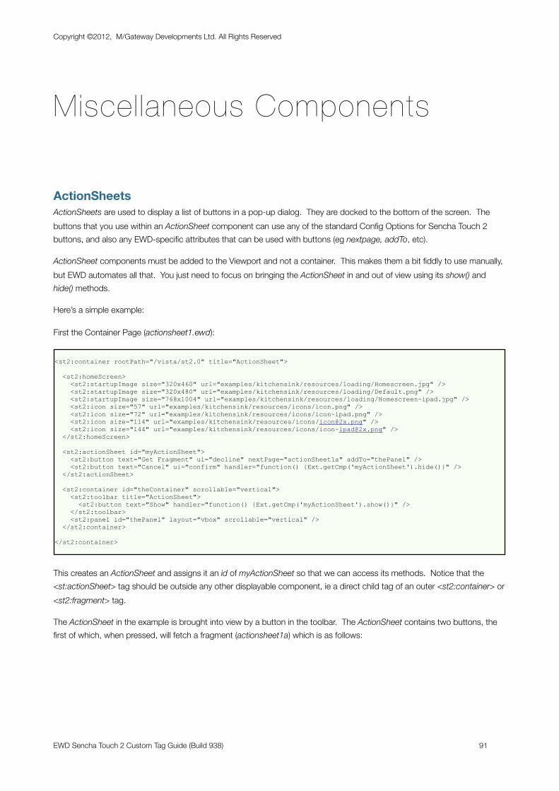
Miscellaneous Components
ActionSheetsActionSheets are used to display a list of buttons in a pop-up dialog. They are docked to the bottom of the screen. The buttons that you use within an ActionSheet component can use any of the standard Config Options for Sencha Touch 2 buttons, and also any EWD-specific attributes that can be used with buttons (eg nextpage, addTo, etc).
ActionSheet components must be added to the Viewport and not a container. This makes them a bit fiddly to use manually, but EWD automates all that. You just need to focus on bringing the ActionSheet in and out of view using its show() and hide() methods.
Here’s a simple example:
First the Container Page (actionsheet1.ewd):
<st2:container rootPath="/vista/st2.0" title="ActionSheet">
<st2:homeScreen> <st2:startupImage size="320x460" url="examples/kitchensink/resources/loading/Homescreen.jpg" /> <st2:startupImage size="320x480" url="examples/kitchensink/resources/loading/Default.png" /> <st2:startupImage size="768x1004" url="examples/kitchensink/resources/loading/Homescreen~ipad.jpg" /> <st2:icon size="57" url="examples/kitchensink/resources/icons/icon.png" /> <st2:icon size="72" url="examples/kitchensink/resources/icons/icon~ipad.png" /> <st2:icon size="114" url="examples/kitchensink/resources/icons/[email protected]" /> <st2:icon size="144" url="examples/kitchensink/resources/icons/[email protected]" /> </st2:homeScreen>
<st2:actionSheet id="myActionSheet"> <st2:button text="Get Fragment" ui="decline" nextPage="actionSheet1a" addTo="thePanel" /> <st2:button text="Cancel" ui="confirm" handler="function() {Ext.getCmp('myActionSheet').hide()}" /> </st2:actionSheet>
<st2:container id="theContainer" scrollable="vertical"> <st2:toolbar title="ActionSheet"> <st2:button text="Show" handler="function() {Ext.getCmp('myActionSheet').show()}" /> </st2:toolbar> <st2:panel id="thePanel" layout="vbox" scrollable="vertical" /> </st2:container>
</st2:container>
This creates an ActionSheet and assigns it an id of myActionSheet so that we can access its methods. Notice that the <st:actionSheet> tag should be outside any other displayable component, ie a direct child tag of an outer <st2:container> or <st2:fragment> tag.
The ActionSheet in the example is brought into view by a button in the toolbar. The ActionSheet contains two buttons, the first of which, when pressed, will fetch a fragment (actionsheet1a) which is as follows:
Copyright ©2012, M/Gateway Developments Ltd. All Rights Reserved
EWD Sencha Touch 2 Custom Tag Guide (Build 938) 91
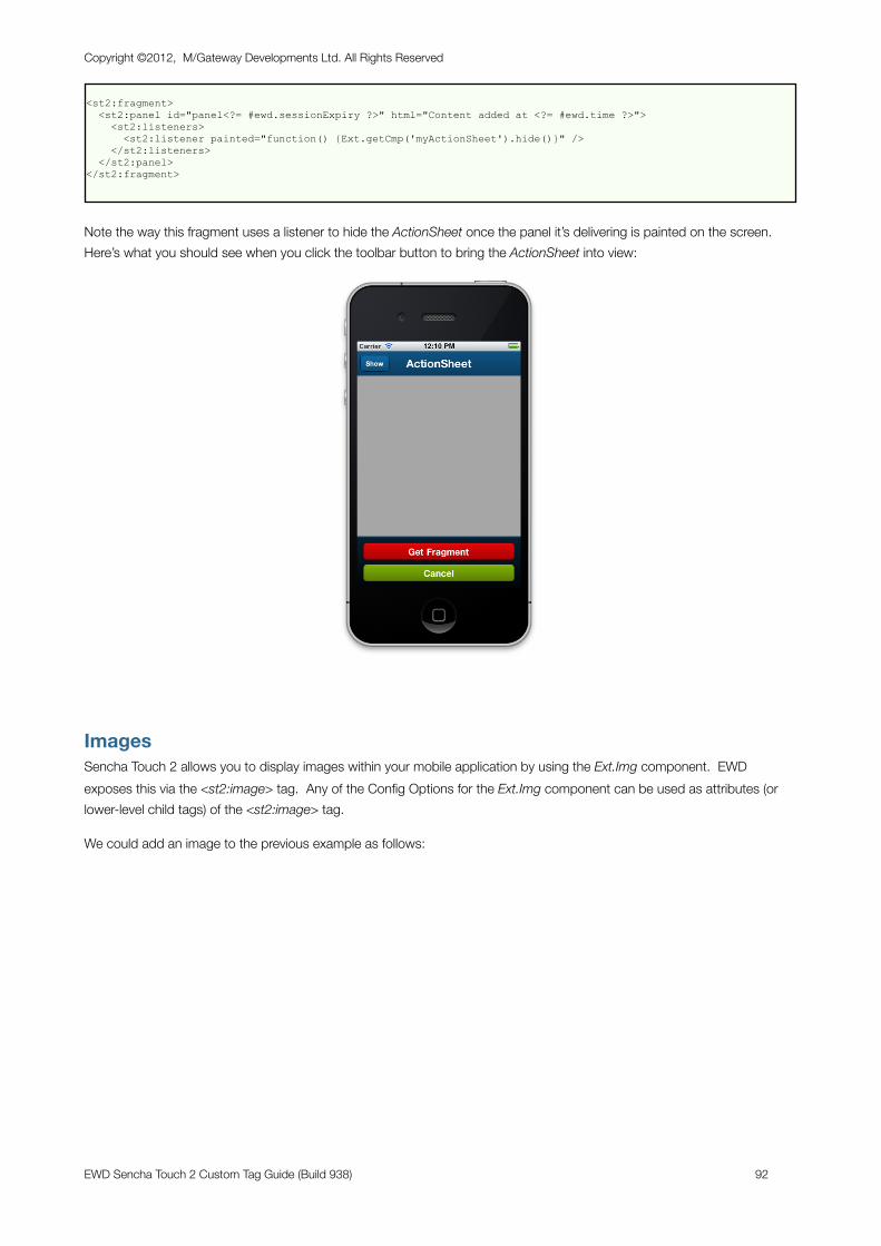
<st2:fragment> <st2:panel id="panel<?= #ewd.sessionExpiry ?>" html="Content added at <?= #ewd.time ?>"> <st2:listeners> <st2:listener painted="function() {Ext.getCmp('myActionSheet').hide()}" /> </st2:listeners> </st2:panel></st2:fragment>
Note the way this fragment uses a listener to hide the ActionSheet once the panel it’s delivering is painted on the screen. Here’s what you should see when you click the toolbar button to bring the ActionSheet into view:
ImagesSencha Touch 2 allows you to display images within your mobile application by using the Ext.Img component. EWD exposes this via the <st2:image> tag. Any of the Config Options for the Ext.Img component can be used as attributes (or lower-level child tags) of the <st2:image> tag.
We could add an image to the previous example as follows:
Copyright ©2012, M/Gateway Developments Ltd. All Rights Reserved
EWD Sencha Touch 2 Custom Tag Guide (Build 938) 92
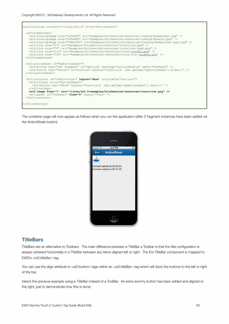
<st2:container rootPath="/vista/st2.0" title="ActionSheet">
<st2:homeScreen> <st2:startupImage size="320x460" url="examples/kitchensink/resources/loading/Homescreen.jpg" /> <st2:startupImage size="320x480" url="examples/kitchensink/resources/loading/Default.png" /> <st2:startupImage size="768x1004" url="examples/kitchensink/resources/loading/Homescreen~ipad.jpg" /> <st2:icon size="57" url="examples/kitchensink/resources/icons/icon.png" /> <st2:icon size="72" url="examples/kitchensink/resources/icons/icon~ipad.png" /> <st2:icon size="114" url="examples/kitchensink/resources/icons/[email protected]" /> <st2:icon size="144" url="examples/kitchensink/resources/icons/[email protected]" /> </st2:homeScreen>
<st2:actionSheet id="myActionSheet"> <st2:button text="Get Fragment" ui="decline" nextPage="actionSheet1a" addTo="thePanel" /> <st2:button text="Cancel" ui="confirm" handler="function() {Ext.getCmp('myActionSheet').hide()}" /> </st2:actionSheet>
<st2:container id="theContainer" layout="vbox" scrollable="vertical"> <st2:toolbar title="ActionSheet"> <st2:button text="Show" handler="function() {Ext.getCmp('myActionSheet').show()}" /> </st2:toolbar> <st2:image flex="1" src="/vista/st2.0/examples/kitchensink/resources/icons/icon.png" /> <st2:panel id="thePanel" flex="5" layout="vbox" /> </st2:container>
</st2:container>
The container page will now appear as follows when you run the application (after 2 fragment instances have been added via the ActionSheet button):
TitleBarsTitleBars are an alternative to Toolbars. The main difference between a TitleBar a Toolbar is that the title configuration is always centered horizontally in a TitleBar between any items aligned left or right. The Ext.TitleBar component is mapped to EWD’s <st2:titleBar> tag.
You can use the align attribute in <st2:button> tags within an <st2:titleBar> tag which will dock the buttons to the left or right of the bar.
Here’s the previous example using a TitleBar instead of a ToolBar. An extra dummy button has been added and aligned to the right, just to demonstrate how this is done:
Copyright ©2012, M/Gateway Developments Ltd. All Rights Reserved
EWD Sencha Touch 2 Custom Tag Guide (Build 938) 93
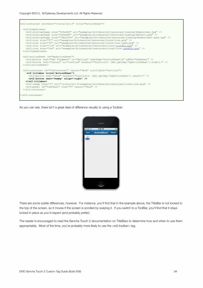
<st2:container rootPath="/vista/st2.0" title="ActionSheet">
<st2:homeScreen> <st2:startupImage size="320x460" url="examples/kitchensink/resources/loading/Homescreen.jpg" /> <st2:startupImage size="320x480" url="examples/kitchensink/resources/loading/Default.png" /> <st2:startupImage size="768x1004" url="examples/kitchensink/resources/loading/Homescreen~ipad.jpg" /> <st2:icon size="57" url="examples/kitchensink/resources/icons/icon.png" /> <st2:icon size="72" url="examples/kitchensink/resources/icons/icon~ipad.png" /> <st2:icon size="114" url="examples/kitchensink/resources/icons/[email protected]" /> <st2:icon size="144" url="examples/kitchensink/resources/icons/[email protected]" /> </st2:homeScreen>
<st2:actionSheet id="myActionSheet"> <st2:button text="Get Fragment" ui="decline" nextPage="actionSheet1a" addTo="thePanel" /> <st2:button text="Cancel" ui="confirm" handler="function() {Ext.getCmp('myActionSheet').hide()}" /> </st2:actionSheet>
<st2:container id="theContainer" layout="vbox" scrollable="vertical"> <st2:titlebar title="ActionSheet"> <st2:button text="Show" handler="function() {Ext.getCmp('myActionSheet').show()}" /> <st2:button text="Dummy" align="right" /> </st2:titlebar> <st2:image flex="1" src="/vista/st2.0/examples/kitchensink/resources/icons/icon.png" /> <st2:panel id="thePanel" flex="5" layout="vbox" /> </st2:container>
</st2:container>
As you can see, there isn’t a great deal of difference visually to using a Toolbar:
There are some subtle differences, however. For instance, you’ll find that in the example above, the TitleBar is not locked to the top of the screen, so it moves if the screen is scrolled by swiping it. If you switch to a ToolBar, you’ll find that it stays locked in place as you’d expect (and probably prefer).
The reader is encouraged to read the Sencha Touch 2 documentation on TitleBars to determine how and when to use them appropriately. Most of the time, you’re probably more likely to use the <st2:toolbar> tag.
Copyright ©2012, M/Gateway Developments Ltd. All Rights Reserved
EWD Sencha Touch 2 Custom Tag Guide (Build 938) 94
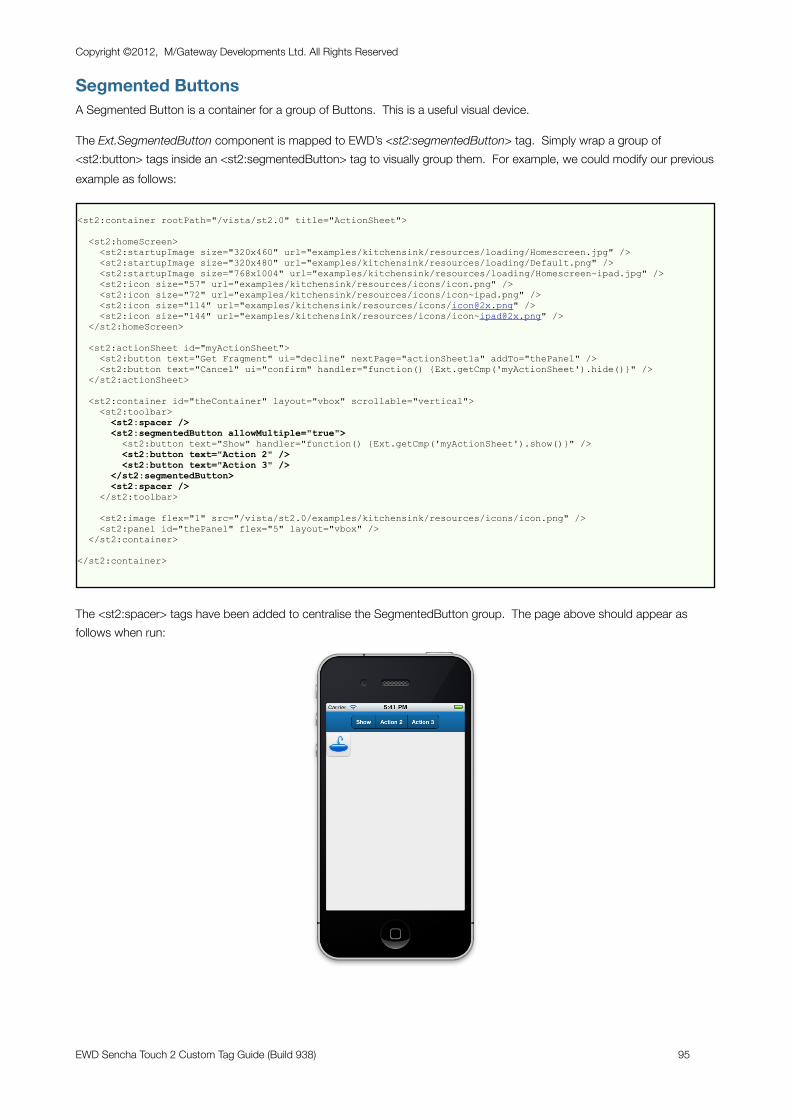
Segmented ButtonsA Segmented Button is a container for a group of Buttons. This is a useful visual device.
The Ext.SegmentedButton component is mapped to EWD’s <st2:segmentedButton> tag. Simply wrap a group of <st2:button> tags inside an <st2:segmentedButton> tag to visually group them. For example, we could modify our previous example as follows:
<st2:container rootPath="/vista/st2.0" title="ActionSheet">
<st2:homeScreen> <st2:startupImage size="320x460" url="examples/kitchensink/resources/loading/Homescreen.jpg" /> <st2:startupImage size="320x480" url="examples/kitchensink/resources/loading/Default.png" /> <st2:startupImage size="768x1004" url="examples/kitchensink/resources/loading/Homescreen~ipad.jpg" /> <st2:icon size="57" url="examples/kitchensink/resources/icons/icon.png" /> <st2:icon size="72" url="examples/kitchensink/resources/icons/icon~ipad.png" /> <st2:icon size="114" url="examples/kitchensink/resources/icons/[email protected]" /> <st2:icon size="144" url="examples/kitchensink/resources/icons/[email protected]" /> </st2:homeScreen>
<st2:actionSheet id="myActionSheet"> <st2:button text="Get Fragment" ui="decline" nextPage="actionSheet1a" addTo="thePanel" /> <st2:button text="Cancel" ui="confirm" handler="function() {Ext.getCmp('myActionSheet').hide()}" /> </st2:actionSheet>
<st2:container id="theContainer" layout="vbox" scrollable="vertical"> <st2:toolbar> <st2:spacer /> <st2:segmentedButton allowMultiple="true"> <st2:button text="Show" handler="function() {Ext.getCmp('myActionSheet').show()}" /> <st2:button text="Action 2" /> <st2:button text="Action 3" /> </st2:segmentedButton> <st2:spacer /> </st2:toolbar>
<st2:image flex="1" src="/vista/st2.0/examples/kitchensink/resources/icons/icon.png" /> <st2:panel id="thePanel" flex="5" layout="vbox" /> </st2:container>
</st2:container>
The <st2:spacer> tags have been added to centralise the SegmentedButton group. The page above should appear as follows when run:
Copyright ©2012, M/Gateway Developments Ltd. All Rights Reserved
EWD Sencha Touch 2 Custom Tag Guide (Build 938) 95
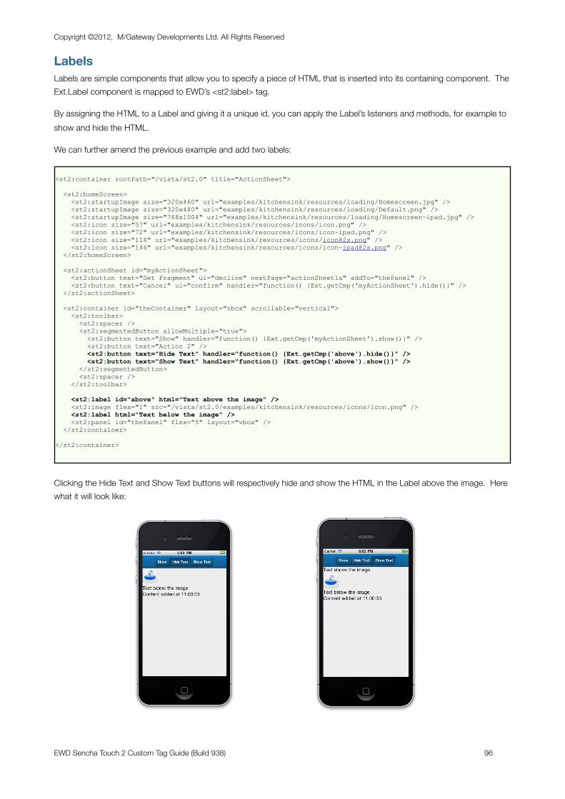
LabelsLabels are simple components that allow you to specify a piece of HTML that is inserted into its containing component. The Ext.Label component is mapped to EWD’s <st2:label> tag.
By assigning the HTML to a Label and giving it a unique id, you can apply the Label’s listeners and methods, for example to show and hide the HTML.
We can further amend the previous example and add two labels:
<st2:container rootPath="/vista/st2.0" title="ActionSheet">
<st2:homeScreen> <st2:startupImage size="320x460" url="examples/kitchensink/resources/loading/Homescreen.jpg" /> <st2:startupImage size="320x480" url="examples/kitchensink/resources/loading/Default.png" /> <st2:startupImage size="768x1004" url="examples/kitchensink/resources/loading/Homescreen~ipad.jpg" /> <st2:icon size="57" url="examples/kitchensink/resources/icons/icon.png" /> <st2:icon size="72" url="examples/kitchensink/resources/icons/icon~ipad.png" /> <st2:icon size="114" url="examples/kitchensink/resources/icons/[email protected]" /> <st2:icon size="144" url="examples/kitchensink/resources/icons/[email protected]" /> </st2:homeScreen>
<st2:actionSheet id="myActionSheet"> <st2:button text="Get Fragment" ui="decline" nextPage="actionSheet1a" addTo="thePanel" /> <st2:button text="Cancel" ui="confirm" handler="function() {Ext.getCmp('myActionSheet').hide()}" /> </st2:actionSheet>
<st2:container id="theContainer" layout="vbox" scrollable="vertical"> <st2:toolbar> <st2:spacer /> <st2:segmentedButton allowMultiple="true"> <st2:button text="Show" handler="function() {Ext.getCmp('myActionSheet').show()}" /> <st2:button text="Action 2" /> <st2:button text="Hide Text" handler="function() {Ext.getCmp('above').hide()}" /> <st2:button text="Show Text" handler="function() {Ext.getCmp('above').show()}" /> </st2:segmentedButton> <st2:spacer /> </st2:toolbar>
<st2:label id="above" html="Text above the image" /> <st2:image flex="1" src="/vista/st2.0/examples/kitchensink/resources/icons/icon.png" /> <st2:label html="Text below the image" /> <st2:panel id="thePanel" flex="5" layout="vbox" /> </st2:container>
</st2:container>
Clicking the Hide Text and Show Text buttons will respectively hide and show the HTML in the Label above the image. Here what it will look like:
Copyright ©2012, M/Gateway Developments Ltd. All Rights Reserved
EWD Sencha Touch 2 Custom Tag Guide (Build 938) 96
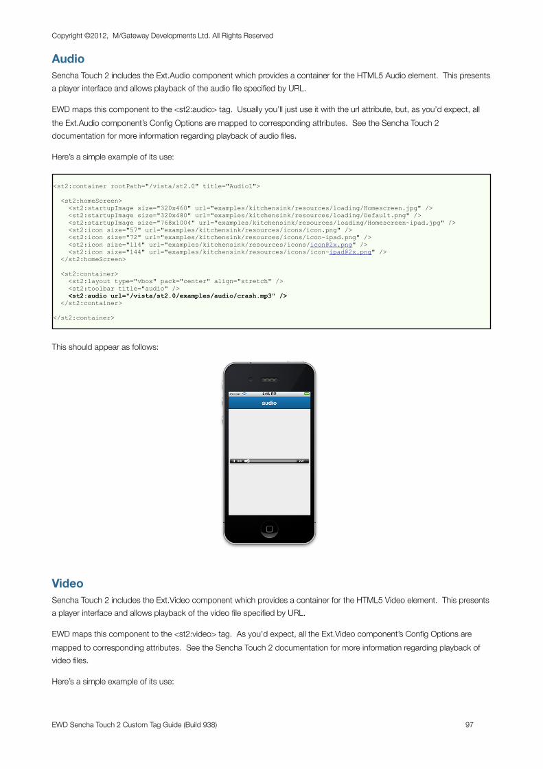
AudioSencha Touch 2 includes the Ext.Audio component which provides a container for the HTML5 Audio element. This presents a player interface and allows playback of the audio file specified by URL.
EWD maps this component to the <st2:audio> tag. Usually you’ll just use it with the url attribute, but, as you’d expect, all the Ext.Audio component’s Config Options are mapped to corresponding attributes. See the Sencha Touch 2 documentation for more information regarding playback of audio files.
Here’s a simple example of its use:
<st2:container rootPath="/vista/st2.0" title="Audio1">
<st2:homeScreen> <st2:startupImage size="320x460" url="examples/kitchensink/resources/loading/Homescreen.jpg" /> <st2:startupImage size="320x480" url="examples/kitchensink/resources/loading/Default.png" /> <st2:startupImage size="768x1004" url="examples/kitchensink/resources/loading/Homescreen~ipad.jpg" /> <st2:icon size="57" url="examples/kitchensink/resources/icons/icon.png" /> <st2:icon size="72" url="examples/kitchensink/resources/icons/icon~ipad.png" /> <st2:icon size="114" url="examples/kitchensink/resources/icons/[email protected]" /> <st2:icon size="144" url="examples/kitchensink/resources/icons/[email protected]" /> </st2:homeScreen>
<st2:container> <st2:layout type="vbox" pack="center" align="stretch" /> <st2:toolbar title="audio" /> <st2:audio url="/vista/st2.0/examples/audio/crash.mp3" /> </st2:container>
</st2:container>
This should appear as follows:
VideoSencha Touch 2 includes the Ext.Video component which provides a container for the HTML5 Video element. This presents a player interface and allows playback of the video file specified by URL.
EWD maps this component to the <st2:video> tag. As you’d expect, all the Ext.Video component’s Config Options are mapped to corresponding attributes. See the Sencha Touch 2 documentation for more information regarding playback of video files.
Here’s a simple example of its use:
Copyright ©2012, M/Gateway Developments Ltd. All Rights Reserved
EWD Sencha Touch 2 Custom Tag Guide (Build 938) 97
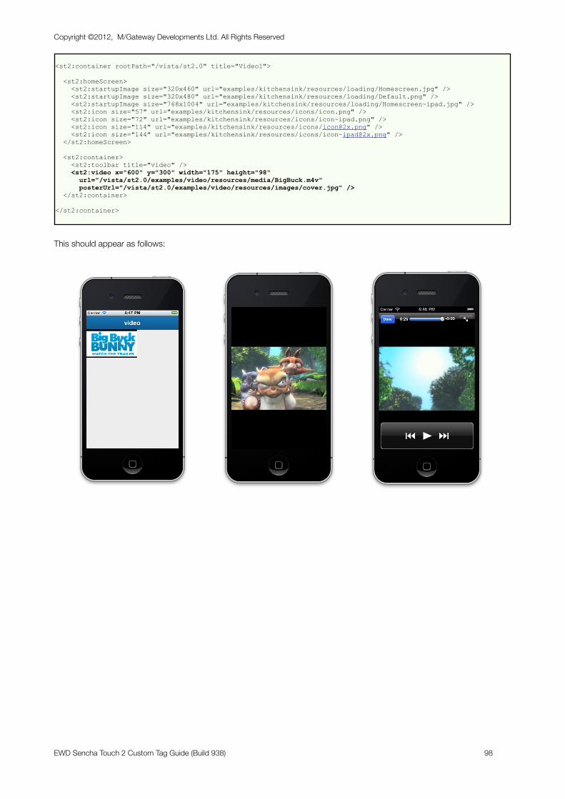
<st2:container rootPath="/vista/st2.0" title="Video1">
<st2:homeScreen> <st2:startupImage size="320x460" url="examples/kitchensink/resources/loading/Homescreen.jpg" /> <st2:startupImage size="320x480" url="examples/kitchensink/resources/loading/Default.png" /> <st2:startupImage size="768x1004" url="examples/kitchensink/resources/loading/Homescreen~ipad.jpg" /> <st2:icon size="57" url="examples/kitchensink/resources/icons/icon.png" /> <st2:icon size="72" url="examples/kitchensink/resources/icons/icon~ipad.png" /> <st2:icon size="114" url="examples/kitchensink/resources/icons/[email protected]" /> <st2:icon size="144" url="examples/kitchensink/resources/icons/[email protected]" /> </st2:homeScreen>
<st2:container> <st2:toolbar title="video" /> <st2:video x="600" y="300" width="175" height="98" url="/vista/st2.0/examples/video/resources/media/BigBuck.m4v" posterUrl="/vista/st2.0/examples/video/resources/images/cover.jpg" /> </st2:container>
</st2:container>
This should appear as follows:
Copyright ©2012, M/Gateway Developments Ltd. All Rights Reserved
EWD Sencha Touch 2 Custom Tag Guide (Build 938) 98
Appendix 1: Instal l ing EWD
Installing EWD
GT.MThe quickest and simplest way to use EWD and GT.M is to download and use the dEWDrop Virtual Machine (http://www.fourthwatchsoftware.com) which is pre-configured with the latest build of EWD. However, if you wish to build your own system, you can get the latest EWD routine files from https://github.com/robtweed/EWD. See our website (http://www.mgateway.com/ewd.html) for details on installing EWD on GT.M systems.
CachéYou should download a copy of the latest version of EWD from our web site (http://www.mgateway.com):
• Click the Enterprise Web Developer tab• Click the tabs Download EWD followed by EWD for Caché. • Complete the registration form and you’ll be able to download the latest copy of EWD for free. The
Sencha Touch custom tags are included in EWD.
The zip file that you'll download contains one critical file:
• zewd.xml - the object code file that you install into your %SYS namespace using $system.OBJ.Load(). Let this overwrite any existing copy of ^%zewd* routines if you already have EWD on your Caché system
Configuring EWD
EWD can generate CSP, WebLink and GT.M versions of Mobile web applications from the same EWD application source code. If you're already using EWD, then you can immediately start developing EWD applications.
If you're new to EWD, then you'll need to configure EWD for either WebLink, CSP or GT.M, depending on which technology you use. There are configuration instructions on our web site, but here's a quick
Copyright ©2012, M/Gateway Developments Ltd. All Rights Reserved
EWD Sencha Touch 2 Custom Tag Guide (Build 938) 99
way of configuring them, based on certain assumptions - just change the references according to your exact GT.M or Caché/WebLink/CSP configuration.
Caché & CSP
1a) Simple Default ConfigurationIf you are using a default Caché installation and want to initially use the built-in Apache web server that is configured to use port 57772, you can just run (in a Caché Terminal session):
do configureDefault^%zewdCSP
This sets up the configuration global ^zewd for you.
1b) Custom ConfigurationHowever, if you have configured IIS or some other web server for use with CSP, you’ll need to manually configure EWD as appropriate to your specific configuration. This is done via the global ^zewd. Here’s an example of how to do this:
Assumptions:
• you'll be running your EWD-generated CSP applications in your USER namespace• you're using IIS as your web server and its root path is c:\inetpub\wwwroot• your source EWD applications will reside under the path c:\ewdapps• the CSP application directories and files generated by EWD will be saved under
c:\InterSystems\Caché\CSP\ewd
Create a global named ^zewd as follows (adjust as necessary):
^zewd("config","RootURL","csp")="/csp/ewd" ^zewd("config","applicationRootPath")="c:\ewdapps" ^zewd("config","outputRootPath","csp")="c:\InterSystems\Cache\CSP\ewd" ^zewd("config","jsScriptPath","csp","mode")="fixed" ^zewd("config","jsScriptPath","csp","path")="/" ^zewd("config","jsScriptPath","csp","outputPath")="c:\Inetpub\wwwroot"
2) Define CSP ApplicationNext, you must create a CSP Application named "/csp/ewd" that points to the outputRootPath above and directs you to the required namespace (USER). To so this, use the Caché System Management Portal, select Security Management/ CSP Applications, then click the Create New CSP Application link.
Fill out the form as shown below to get you started:
Copyright ©2012, M/Gateway Developments Ltd. All Rights Reserved
EWD Sencha Touch 2 Custom Tag Guide (Build 938) 100
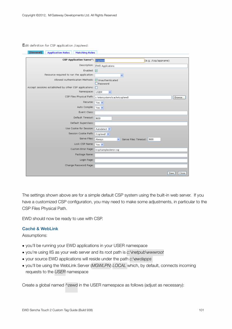
The settings shown above are for a simple default CSP system using the built-in web server. If you have a customized CSP configuration, you may need to make some adjustments, in particular to the CSP Files Physical Path.
EWD should now be ready to use with CSP.
Caché & WebLinkAssumptions:
• you'll be running your EWD applications in your USER namespace• you're using IIS as your web server and its root path is c:\inetpub\wwwroot• your source EWD applications will reside under the path c:\ewdapps • you'll be using the WebLink Server (MGWLPN) LOCAL which, by default, connects incoming
requests to the USER namespace
Create a global named ^zewd in the USER namespace as follows (adjust as necessary):
Copyright ©2012, M/Gateway Developments Ltd. All Rights Reserved
EWD Sencha Touch 2 Custom Tag Guide (Build 938) 101
^zewd("config","RootURL","wl")="/scripts/mgwms32.dll" ^zewd("config","applicationRootPath")="/usr/ewdApps" ^zewd("config","jsScriptPath","wl")="fixed" ^zewd("config","jsScriptPath","wl","mode")="fixed" ^zewd("config","jsScriptPath","wl","outputPath")="c:\Inetpub\wwwroot" ^zewd("config","jsScriptPath","wl","path")="/"
You also must create the global (again in USER):
^MGWAPP("ewdwl")="runPage^%zewdWLD"
This latter global creates the WebLink dispatcher to EWD's WebLink run-time engine.
GT.MExamples assume that you are running a GT.M and EWD configuration, defined as per the dEWDrop Virtual machine:
• you'll be in the /home/vista/ path when you start the GT.M shell using mumps -dir• you're using Apache as your web server and its root path is /home/vista/www• your source EWD applications will reside under the path /home/vista/www/ewd• m_apache has been installed and configured to dispatch to EWD’s runtime code when URLs are
encountered containing /vista• Javascript and CSS files that are generated by EWD will be saved under the webserver
path /vista/resources
Create a global named ^zewd as follows (adjust as necessary):
^zewd("config","RootURL","gtm")="/vista/"^zewd("config","applicationRootPath")="/home/vista/www/ewd"^zewd("config","jsScriptPath","gtm","mode")="fixed"^zewd("config","jsScriptPath","gtm","outputPath")="/home/vista/www/resources/"^zewd("config","jsScriptPath","gtm","path")="/vista/resources/"^zewd("config","routinePath","gtm")="/home/vista/www/r/"
Creating EWD PagesThis tutorial will guide you through the process, but here’s a quick summary of the process involved, based on the configuration settings shown above.
Having configured your EWD environment, you should now be ready to start developing. Create your new EWD application source pages in subdirectories of the Application Root Path, eg if your Application Root Path is c:\ewdapps and your application is named myApp::
Copyright ©2012, M/Gateway Developments Ltd. All Rights Reserved
EWD Sencha Touch 2 Custom Tag Guide (Build 938) 102
c:\ewdapps\myApp\index.ewd
c:\ewdapps\myApp\login.ewd
You can use any text editor to create and edit these files.
To create an executable web application from these pages, you must compile them. This is most easily done using the command-line APIs that you invoke from within Caché Terminal or, if you are using GT.M, from within a Linux terminal session running the GT.M shell.
To compile an entire application (eg one named myApp):
CSP: USER> d compileAll^%zewdAPI("myApp",,"csp")
WebLink: USER> d compileAll^%zewdAPI("myApp",,"wl")
GT.M: USER> d compileAll^%zewdAPI("myApp")
To compile one page (eg myPage.ewd) in an application (eg myApp):
CSP: USER> d compilePage^%zewdAPI("myApp","myPage",,"csp")
WebLink: USER> d compilePage^%zewdAPI("myApp","myPage",,"wl")
GT.M: USER> d compilePage^%zewdAPI("myApp","myPage")
Running EWD ApplicationsYou’ll now have a runnable Web Application that will run in a desktop browser. The structure of the URL you’ll use to invoke and start the application depends on whether you’re using GT.M, WebLink or CSP:
Copyright ©2012, M/Gateway Developments Ltd. All Rights Reserved
EWD Sencha Touch 2 Custom Tag Guide (Build 938) 103
CSP
For CSP EWD applications, the structure of the URL you’ll use is:
http://127.0.0.1/csp/ewd/[applicationName]/[pageName].csp
where: applicationName is the name of your EWD application
pageName is the name of the first page of your EWD application
for example:
http://127.0.0.1/csp/ewd/myApp/index.csp
WebLink
For WebLink EWD applications, the structure of the URL you’ll use is:
http://127.0.0.1/scripts/mgwms32.dll?MGWLPN=LOCAL&MGWAPP=ewdwl&app=[applicationName]&page=[pageName]
where applicationName is the name of your EWD application
pageName is the name of the first page of your EWD application
for example:
http://127.0.0.1/scripts/mgwms32.dll?MGWLPN=LOCAL&MGWAPP=ewdwl&app=myApp&page=index
If you’re using Apache, you’ll typically replace /scripts/mgwms32.dll with cgi-bin/nph-mgwcgi
Of course if you’re using a WebLink Server other than LOCAL, you’ll also need to change the value of the MGWLPN name/value pair.
GT.M
For GT.M EWD applications, the structure of the URL you’ll use is:
http://127.0.0.1/vista/[applicationName]/[pageName].ewd
where applicationName is the name of your EWD application
pageName is the name of the first page of your EWD application
for example:
http://127.0.0.1/vista/myApp/index.ewd
Copyright ©2012, M/Gateway Developments Ltd. All Rights Reserved
EWD Sencha Touch 2 Custom Tag Guide (Build 938) 104
Further Information about EWDYou’ll find lots of information and examples at the M/Gateway web site (http://www.mgateway.com):
- at the top right of the home page under the heading Key Documentation
- under the EWD tab
You should also subscribe to and make use of the EWD Community Google Group (https://groups.google.com/group/enterprise-web-developer-community) where you will find a wealth of information about how to use EWD and more detail on tricks, treats, hidden and lesser-known features. The Google Group is searchable and is well-worth exploring in detail. You can also use it to ask questions and see help and advice when struggling with your own EWD-related problems. Additionally, use it to make suggestions about new functionality and features that you’d like to see in EWD.
Copyright ©2012, M/Gateway Developments Ltd. All Rights Reserved
EWD Sencha Touch 2 Custom Tag Guide (Build 938) 105