Embed Size (px)
Citation preview
Media Evaluation – Tamera Lall
How did you attract/address your audience?
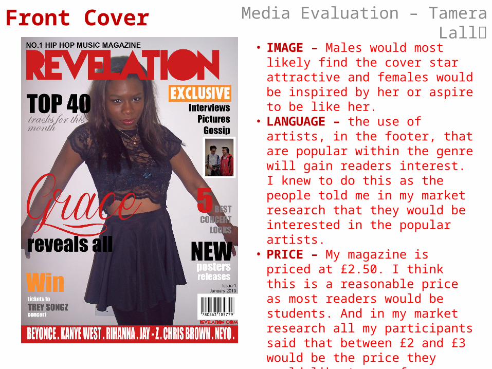
Media Evaluation – Tamera LallFront Cover• IMAGE – Males would most likely find
the cover star attractive and females would be inspired by her or aspire to be like her.
• LANGUAGE – the use of artists, in the footer, that are popular within the genre will gain readers interest. I knew to do this as the people told me in my market research that they would be interested in the popular artists.
• PRICE – My magazine is priced at £2.50. I think this is a reasonable price as most readers would be students. And in my market research all my participants said that between £2 and £3 would be the price they would like to pay for a magazine.
• MASTHEAD – The masthead is in a bright coloured, interesting font. This would make it stand out to the audience but not be too overwhelming. Having more neutral colours for the rest of the page means it still looks classy and sophisticated.

Media Evaluation – Tamera LallContents Page• IMAGE – the image links to the one on
the front cover. The pose is unusual and eye-catching which hopefully is interesting to readers. Again it should attract males and females for the same reasons as previous.
• TEXT – the features highlighted on the contents page includes information that would hopefully be interesting to the readers that like the Hip Hop/R&B music genre so would find those articles interesting. Also, when I carried out market research I found out that most people would like to see a competition in the magazine so I made sure there was one on the contents page.
• COLOURS – Again, the colours used are consistent so the magazine looks professional. It also isn’t too in-your-face so would hopefully attract to the audience.
Media Evaluation – Tamera LallDouble-Page Spread
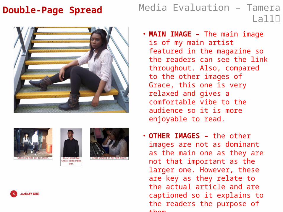
• MAIN IMAGE – The main image is of my main artist featured in the magazine so the readers can see the link throughout. Also, compared to the other images of Grace, this one is very relaxed and gives a comfortable vibe to the audience so it is more enjoyable to read.
• OTHER IMAGES – the other images are not as dominant as the main one as they are not that important as the larger one. However, these are key as they relate to the actual article and are captioned so it explains to the readers the purpose of them.

Media Evaluation – Tamera LallDouble-Page Spread
• MASTHEAD – the masthead is in a font that resembles graffiti but is a bit more of a sophisticated version of it. This will hopefully appeal to the audience as it looks a lot more approachable.
• TEXT – the actual article is in an interview form which is what was recommended from the market research as people said they wanted to read an interview with an upcoming artist.