Embed Size (px)
Citation preview

EVALUATION OF THE COMMON MARKET ORGANISATION (CMO) IN THE CEREAL SECTOR
NATIONAL REPORT — UK
David Jackson
LMC International Ltd
Oxford, England

Contents (i)
Table of Contents
Case Study Monograph — UK..................................................................................... 1
1. Overview of National Report — UK ............................................................................ 1
1.1 Rationale ......................................................................................................... 1 1.2 Structure.......................................................................................................... 1
2. An Introduction to the Cereals Sector......................................................................... 2
2.1 UK ................................................................................................................... 2 2.2 England ........................................................................................................... 6 2.3 Scotland .......................................................................................................... 7
3. Producers’ Income Levels .......................................................................................... 9
3.1 Overview ......................................................................................................... 9 3.2 Net Farm Value Added per Annual Work Unit............................................... 10 3.3 National Farm Income Sources..................................................................... 10 3.4 Non-Farm Incomes........................................................................................ 12 3.5 Land Prices and Rentals ............................................................................... 13 3.6 General Conclusions ..................................................................................... 15
4. Dependence on Direct Payments ............................................................................. 15
4.1 Overview ....................................................................................................... 15 4.2 Direct Payments Relative to Farm Net Value Added Per Annual Work Unit . 16 4.3 Direct Payments Relative to Gross Margins.................................................. 16 4.4 General Conclusions ..................................................................................... 17
5. Production Structures on Holdings ........................................................................... 18
5.1 Overview ....................................................................................................... 18 5.2 Farm Size ...................................................................................................... 18 5.3 Farm Practices .............................................................................................. 20 5.4 Environmental Considerations ...................................................................... 24 5.5 Capital Inputs ................................................................................................ 24 5.6 Labour Inputs ................................................................................................ 25 5.7 General Conclusions ..................................................................................... 27
6. Adapting Supply to Demand — quantity and Quality................................................ 28
6.1 Overview ....................................................................................................... 28 6.2 Cereal Quantity ............................................................................................. 29 6.3 Cereal Quality................................................................................................ 29 6.4 On-Farm Feed — Barley and Wheat............................................................. 32 6.5 General Conclusions ..................................................................................... 32
7. Effects of the Drop in Institutional Prices .................................................................. 33
7.1 Overview ....................................................................................................... 33 7.2 Institutional Prices ......................................................................................... 33 7.3 Competitiveness on the Export Market.......................................................... 34
Contents (ii)
7.4 Competitiveness on the Domestic Market ..................................................... 34 7.5 General Conclusions ..................................................................................... 36
8. Effects Restricting Competition — UK...................................................................... 36
8.1 Overview ....................................................................................................... 36 8.2 Monthly Sales into Intervention ..................................................................... 37 8.3 Returns to Storage ........................................................................................ 38 8.4 Market Structure............................................................................................ 40 8.5 General Conclusions ..................................................................................... 41
Appendix to the Case Study Monograph — UK........................................................ I1
Part 1: Introduction to the Cereals Sector...................................................................... I2
Crop Production (Area & Yield), Consumption and Trade Balances — UK ......... I2 Crop Production (Area & Yield) — England ......................................................... I5 Agricultural Structure — Scotland ........................................................................ I6 Crop Production (Area & Yield) — Scotland......................................................... I7
Part 2.1: Producers’ Income level.................................................................................. I9
Prices, Exchange Rates ....................................................................................... I9 Net Farm Value Added per Annual Work Unit.................................................... I10 National Farm Income Sources.......................................................................... I14 Land Prices and Rents ....................................................................................... I19
Part 2.2 — Analysis of Trends in Producers’ Income (FNVA/AWU) by Type of Farming and ESU Size Class ............................................................................. I23
UK ..................................................................................................................... I23 Scotland ............................................................................................................. I26 England .............................................................................................................. I27
Part 3: Dependence on Direct Payments .................................................................... I30
England Summary.............................................................................................. I30 Scotland Summary ............................................................................................. I32
Part 4: Production Structures on Holdings................................................................... I35
Farm Size ........................................................................................................... I35 Farm Practices ................................................................................................... I37 Chemical Plant Protection .................................................................................. I39 Environmental Considerations ........................................................................... I41 Capital Inputs ..................................................................................................... I44 Labour Inputs ..................................................................................................... I45
Part 5: Adapting Supply to Demand — Quantity and Quality ...................................... I46
Cereal Quantity .................................................................................................. I46 Wheat Quality..................................................................................................... I47 On-Farm Feed, Barley and Wheat ..................................................................... I48
Part 6: Effects of the Drop in Institutional Prices ......................................................... I51

Contents (iii)
Institutional Prices .............................................................................................. I51 Competitiveness on the Export Market .............................................................. I52 Competitiveness on the Domestic Market .......................................................... I53 Feed Usage........................................................................................................ I54
Part 7: Effects Restriction Competition ........................................................................ I57
Monthly Sales into Intervention .......................................................................... I57 Market Structure................................................................................................. I59
Part 8: Analysis of Questionnaire Submitted to Producers.......................................... I60
England .............................................................................................................. I61 Producers’ Income Levels .................................................................................. I61 Dependence on Direct Payments....................................................................... I61 Production Structures on Holdings..................................................................... I62 Adapting Supply to Demand: Quality and Quantity ............................................ I62 Land Use: Choice of Crop .................................................................................. I62 Effects of the Drop in Institutional Prices............................................................ I62 Effects Restricting Competition .......................................................................... I63 Scotland ............................................................................................................. I77 Background Information ..................................................................................... I77 Producers’ Income Levels .................................................................................. I77 Dependence on Direct Payments....................................................................... I77 Production Structures on Holdings..................................................................... I77 Adapting Supply to Demand: Quality and Quantity ............................................ I78 Land Use: Choice of Crop .................................................................................. I78 Effects of the Drop in Institutional Prices............................................................ I78 Effects Restricting Competition .......................................................................... I79
Part 9: Typology of Farms ........................................................................................... I96

Contents (iv)
List of Tables
Table UK.1: United Kingdom, Area Statistics, 2003 .................................................... 2 Table UK.2: United Kingdom, Employment Statistics, 2003........................................ 3 Table UK.3: Change in Number of Farm Holdings by Economic Size Unit
by Farm Type, 1992/93-2003/04 ........................................................... 19 Table UK.4: England/Eastern Counties, Impact on Fixed Costs of Contract
Farming, 2003/04 .................................................................................. 27 Table UK.5: Relationship of the Percentage Bread-making Wheat Premium with
Changes in Production of Feed Wheat and Bread-making Wheat, 1995/96-2003/04 ................................................................................... 31
Table I.1: UK, Production of Wheat, Barley and Oats, 1995/96-2003/04 ............... I2 Table I.2: UK, Wheat Supply Demand Balance, 1995/96-2003/04 ........................ I3 Table I.3: UK, Barley Supply Demand Balance, 1995/96-2003/04......................... I3 Table I.4: UK, Oats Supply Demand Balance, 1995/96-2003/04 ........................... I4 Table I.5: UK, Total Cereals Supply Demand Balance, 1995/96-2003/04 ............. I4 Table I.6: UK, Area and Yields for Wheat, Barley and Oats, 1995/96-2003/04...... I4 Table I.7: England, Production of Wheat and Barley, 1995/96-2003/04 ................ I5 Table I.8: England, Area of Wheat and Barley, 1995/96-2003/04 .......................... I5 Table I.9: England, Yields of Wheat and Barley, 1995/96-2003/04........................ I6 Table I.10: Scotland, Production of Barley and Oats, 1995/96-2003/04 .................. I7 Table I.11: Scotland, Area of Oats and Barley, 1995/96-2003/04 ............................ I7 Table I.12: Scotland, Yields of Oats and Barley, 1995/96-2003/04.......................... I8 Table I.13: Producer Incomes for UK, England and Scotland, 1995-2002............. I12 Table I.14: Rankings of Producer Incomes and Changes in Incomes for UK,
England and Scotland, 1995-2002 ....................................................... I13 Table I.15: UK, Non-Farming Incomes, All Farm Types, 2004............................... I18 Table I.16: England, Agricultural Land Sales, 1993-2003 ...................................... I19 Table I.17: UK, Calculation of Gross Margin for Winter Wheat, 2004/05 ............... I34 Table I.18: UK, Farm Practices Survey Results, 2004: “If you grow cereal
crops, do you limit the spraying of pesticides/fertilisers on headlands to encourage wildlife?” ........................................................ I43
Table I.19: Monthly Increments in Intervention Price, 1995/96-2004/05 ................ I57 Table I.20: Member State Agricultural Production Sold Through
Cooperatives, 1997 .............................................................................. I59 Table I.21: Number of Respondents in Each Farm Type ....................................... I61 Table I.22: Number of Respondents in Each Farm Type ....................................... I77 Table I.23. : Aggregation of FADN ESU Size Classes into New ESU Size
Classes................................................................................................. I96

Contents (v)
List of Diagrams
Diagram UK.1: UK Cereal Production, 1970/71-2003/04 ............................................ 4 Diagram UK.2: UK Area for Wheat, Barley and Oats, 1970/71-2003/04..................... 5 Diagram UK.3: UK Yields for Wheat, Barley and Oats, 1970/71-2003/04................... 5 Diagram UK.4: England, Cereal Production, 1995/96-2003/04................................... 7 Diagram UK.5: Scotland, Cereal Production, 1995/96-2003/04 .................................. 8 Diagram UK.6: Average Net Farm Incomes for Cereal Farms, 1994/95-2002/03..... 11 Diagram UK.7: Scotland, Comparison of Average Net Farm Income and Non-
Farming Incomes, 1998/99-2003/04 ................................................. 13 Diagram UK.8: Direct Payments as a Percentage of Gross Margins ........................ 17 Diagram UK.9: Arable Land Area Under Inversion and Minimum Tillage,
1997-2004......................................................................................... 21 Diagram UK.10: Fertiliser Application Rates for All Crops and Grassland,
1988-2002......................................................................................... 23 Diagram UK.11: UK Agricultural Labour Force, 1984-2004 ........................................ 25 Diagram UK.12: England/Eastern Counties, Real Expenditure on Contracting
by Farm Holdings, 1995/96-2003/04................................................. 26 Diagram UK.13: UK – Millers’ Wheat Usage by Source, 1984/85-2003/04................. 30 Diagram UK.14: UK, Monthly Increment in Intervention Price Compared
with Implied Monthly Market Rate of Interest for Feed Wheat ...................................................................................... 39
Diagram UK.15: UK Cereal Sales Made Through Farm Cooperatives ....................... 41
Diagram I.1: UK, Arable Crop Production, 1984/85-2003/04 ................................. I2 Diagram I.2: UK, Cereal Trade Balance, 1990/91-2003/04.................................... I3 Diagram I.3: UK, Cereal Prices, 1990/91-2004/05 ................................................. I9 Diagram I.4: Exchange Rate, ECU/Euro per £ Sterling, 1990/91-2003/04........... I10 Diagram I.5: Average Net Farm Incomes for Cereal Farms, 1994/95-2002/03.... I14 Diagram I.6: England, Average Net Farm Incomes for Cereal Specialists,
General Cropping and Mixed Farming, 1994/95-2002/03................ I16 Diagram I.7: Scotland, Average Net Farm Incomes for Cereal Specialists,
General Cropping and Mixed Farming, 1994/95-2002/03................ I16 Diagram I.8: Distribution of Net Farm Incomes, 2001/02 ..................................... I17 Diagram I.9: England/Eastern Counties, Real Net Farm Incomes per
Hectare by Farm Type, 1993/94-2003/04 ........................................ I17 Diagram I.10: Scotland, Non-Farming Incomes per Farm Household,
1998/99-2003/04.............................................................................. I18 Diagram I.11: England, Real and Nominal Agricultural Land Prices, 1990-2003 ... I19 Diagram I.12: Scotland, Value of Assets per Hectare (Land and Buildings),
1993/94-2003/04.............................................................................. I20 Diagram I.13: England, Agricultural Land Prices by Size of Land Area Sold,
1993-2003I........................................................................................ 21 Diagram I.14: England, Agricultural Land Sales by Size of Land Area Sold,
1993-2003........................................................................................ I21 Diagram I.15: England & Scotland, Rent of Cereal Specialist Agricultural
Land, 1993/94-2003/04.................................................................... I22 Diagram I.16: United Kingdom, FNVA/AWU, FADN Type of Farming 13:
Specialist COP Crops (TF14), ESU Size Classes C&D and E&F.... I23 Diagram I.17: United Kingdom, FNVA/AWU, FADN Type of Farming 14:
General Field Cropping (TF14), ESU Size Classes C&D and E&F . I24 Diagram I.18: United Kingdom, FNVA/AWU, FADN Type of Farming 8:
Mixed Crops – Livestock (TF8), ESU Size Classes C&D and E&F . I24

Contents (vi)
Diagram I.19: United Kingdom, FNVA/AWU, All FADN Types of Farming, Size Class C&D (Medium) ....................................................................... I25
Diagram I.20: United Kingdom, FNVA/AWU, All FADN Types of Farming, ESU Size Class E&F (Large) ........................................................... I25
Diagram I.21: Scotland, FNVA/AWU, FADN Type of Farming 8: Mixed Crops – Livestock (TF8), ESU Size Classes C&D and E&F............................................................. I26
Diagram I.22: Scotland, FNVA/AWU, All FADN Types of Farming Size Class C&D (Medium) ............................................................... I26
Diagram I.23: Scotland, FNVA/AWU, All FADN Types of Farming Size Class E&F (Large) ................................................................... I27
Diagram I.24: England, FNVA/AWU, FADN Type of Farming 13: Specialist COP Crops (TF14), ESU Size Classes C&D and E&F .................... I27
Diagram I.25: England, FNVA/AWU, FADN Type of Farming 14: General Field Cropping (TF14), ESU Size Classes C&D and E&F .................................................................................. I28
Diagram I.26: England, FNVA/AWU, FADN Type of Farming 8: Mixed Crops – Livestock (TF8), ESU Size Classes C&D and E&F .................................................................................. I28
Diagram I.27: England, FNVA/AWU, FADN Type of Farming, Size Class C&D (Medium) ....................................................................... I29
Diagram I.28: England, FNVA/AWU, FADN Type of Farming, Size Class E&F (Large) ........................................................................... I29
Diagram I.29: England, The Proportions of FNVA/AWU Accounted for by Area and Set-Aside Payments by Farm Type, 1995-97 and 2000-02...... I31
Diagram I.30: England, Comparison of the Value of Area and Set-Aside Payments per AWU by Farm Typology, 1995-97 and 2000-02 ....... I31
Diagram I.31: Scotland, The Proportions of FNVA/AWU Accounted for by Area and Set-Aside Payments by Farm Type, 1995-97 and 2000-02...... I33
Diagram I.32: Scotland, Comparison of the Value of Area and Set-Aside Payments per AWU by Farm Typology, 1995-97 and 2000-02 ....... I33
Diagram I.33: UK, Number of Farm Holdings, 1992/93-2003/04............................ I35 Diagram I.34: UK, Number of Cereal Specialist Farm Holdings by Economic
Size Unit, 1992/93-2003/04 ............................................................. I36 Diagram I.35: Scotland, Average Farm Size, 1993/94-2003/04 ............................. I36 Diagram I.36: Scotland, Value of Seed per Hectare, 1993/94-2003/04 ................. I37 Diagram I.37: Scotland, Value of Fertiliser per Hectare, 1993/94-2003/04 ............ I37 Diagram I.38: UK, Organically Managed Land, 1993 –2003 .................................. I38 Diagram I.39: UK, Organically Managed Land by Sector, 2003............................. I39 Diagram I.40: Pesticide Use on Winter Wheat in Great Britain, 1992-2002 ........... I40 Diagram I.41: UK, Area in Environmentally Sensitive Areas and Countryside
Stewardship Schemes, 1987-2002.................................................. I42 Diagram I.42: England/Eastern Counties, Real Annual Machinery Cost
per Hectare by Farm Type, 1993/94-2003/04.................................. I44 Diagram I.43: England/Eastern Counties, Real Labour Cost per Hectare
by Farm Type, 1993/94-2003/04...................................................... I45 Diagram I.44: Scotland, Real Labour Cost per Hectare by Farm Type,
1993/94-2003/04 ............................................................................. I45 Diagram I.45: Domestic Production Surpluses Over Domestic Consumption,
1990/91-2004/05.............................................................................. I46 Diagram I.46: UK, End-of-Year Cereal Stocks, 1990/91-2004/05 .......................... I47 Diagram I.47: UK, Wheat Production by Quality Group, 1995/96-2004/05 ............ I48 Diagram I.48: UK, Compound Feed Production and Feed Wheat / Barley
Prices, 1992/93-2003/04.................................................................. I50

Contents (vii)
Diagram I.49: On-Farm Cereal Consumption as Percentage of Cereal Sales to Compound Feed Mills, 1995/96-2002/03........................... I50
Diagram: I.50: UK, Intervention Prices, 1990/91-2003/04 ....................................... I51 Diagram I.51: UK, Total Cereal Exports, 1990-2004 .............................................. I52 Diagram I.52: EU, Average Export Refunds, 1996/97-2003/04.............................. I52 Diagram I.53: UK, Intervention Year-End Stocks, 1995/96-2003/04 ...................... I53 Diagram I.54: UK, Total Cereal Imports, 1990-2004 .............................................. I53 Diagram I.55: UK, Horse Feed Consumption, 1992-2004...................................... I54 Diagram I.56: UK, Total Cereal and Oilseed Meal Usage in Compound
Animal Feed, 1992/93-2003/04........................................................ I55 Diagram I.57: UK, Maize Gluten Feed and Citrus Pulp Usage in Compound
Animal Feed, 1992/93-2003/04........................................................ I55 Diagram I.58: UK, Delivered Feed Wheat Price versus Alternative Compound
Feedstuff Prices, 1990/91-2003/04.................................................. I56 Diagram I.59: UK, Average Total Monthly Cereal Sales into Intervention,
1997/98-2003/041............................................................................ I57 Diagram I.60: UK, Average Monthly Feed Barley Sales Off-Farm,
1997/98-2003/04.............................................................................. I58 Diagram I.61: UK, Average Monthly Feed Wheat Sales Off-Farm ......................... I58 Diagram I.62: Percentage of Farm Household Income Derived from
Farm Activities ................................................................................. I64 Diagram I.63: Percentage of Farm Income Derived from 1st Cereal
Production — Wheat........................................................................ I64 Diagram I.64: Percentage of Farm Income Derived from Total Cereal
Production 10 Years Ago................................................................. I64 Diagram I.65: Percentage of Farm Income Derived from Total
Cereal Production. ........................................................................... I64 Diagram I.66: Percentage of Farm Income Derived from 2nd Cereal
Production — Rapeseed.................................................................. I64 Diagram I.67: Percentage of Farm Income Derived from 1st Cereal
Production 10 Years Ago — Wheat ................................................. I64 Diagram I.68: Percentage of Farm Income Derived from 2nd Cereal
Production 10 Years Ago — Rapeseed ........................................... I65 Diagram I.69: Change in Asset Value of Farmland Over the Past 10 Years.......... I65 Diagram I.70: Reduction of Involvement in Farming, Without Direct Payments..... I65 Diagram I.71: Change in Rental Value of Farmland Over the Past 10 Years ........ I65 Diagram I.72: Farm Income From Direct Payments ............................................... I65 Diagram I.73: Changes in the Dependence on Direct Payments Over the
Past 10 Years .................................................................................. I65 Diagram I.74: Changes in Cereal Area Since 1995................................................ I66 Diagram I.75: Changes in the Amount and Type of Capital Investment in
Machinery Since 1995 ..................................................................... I66 Diagram I.76: Changes in the Amount and Type of Seed Use for
Cereal Production on Farms Since 1995 ......................................... I66 Diagram I.77: Influence of Price Support on Cereal Farming Practices
Since 1995....................................................................................... I66 Diagram I.78: Changes in the Use of Labour per Hectare in Cereal
Production Since 1995..................................................................... I66 Diagram I.79: Changes in the Amount and Type of Fertiliser Use for Cereal
Production on Farms Since 1995..................................................... I66 Diagram I.80: Changes in the Amount and Type of Irrigation Use for Cereal
Production on Farms Since 1995..................................................... I67 Diagram I.81: Main Sources of Price Information Affecting Cereal
Planting — 1st Source ..................................................................... I67 Diagram I.82: Main Sources of Price Information 3rd Source ................................ I67

Contents (viii)
Diagram I.83: Affect of Environmental Considerations on Decisions for Cereal Production........................................................................................ I67
Diagram I.84: Main Sources of Price Information Affecting Cereal Planting — 2nd Source.................................................................... I67
Diagram I.85: Wholesale or Producer Price ........................................................... I67 Diagram I.86: Other Crops Affected by Expansions/Contractions in Cereal
Area — 1st Crop .............................................................................. I68 Diagram I.87: Effect of direct payments on cereal planting decisions — 1st Crop. I68 Diagram I.88: Influence of Quality Price Premium on Cereal Quality..................... I68 Diagram I.89: Other Crops Affected by Expansions/Contractions in Cereal
Area — 2nd Crop ............................................................................. I68 Diagram I.90: Influence of the Rules on Set Aside Since 1992 on Cereal
Planting Decisions ........................................................................... I68 Diagram I.91: Influence of Quality Needs of Customers on Cereal Quality............ I68 Diagram I.92: Change in Cereal Quality Since 1995 — 1st Cereal — Wheat........ I69 Diagram I.93: Change in the Volume of Feed Produced On-Farm, since 1995 ..... I69 Diagram I.94: Sequence of Crops Over the Rotational Cycle — Crop 2................ I69 Diagram I.95: Effects of Changed Minimum Quality Standards for Cereals
Sold to Intervention on Cereal Production ....................................... I69 Diagram I.96: Influence of the New Cereals Regime on the Volume of Feed
Produced On-Farm .......................................................................... I69 Diagram I.97: Sequence of Crops Over the Rotational Cycle — Crop 3................ I69 Diagram I.98: Sequence of Crops Over the Rotational Cycle — Crop 4................ I70 Diagram I.99: Main Sources of Price Information Affecting Cereal
Planting — 2nd Source.................................................................... I70 Diagram I.100: Change in the Relative Profitability of Cereals Since 1995
Against the Main Alternative Crops.................................................. I70 Diagram I.101: Main Sources of Price Information Affecting Cereal
Planting — 1st Source ..................................................................... I70 Diagram I.102: Main Sources of Price Information Affecting Cereal
Planting — 3rd Source..................................................................... I70 Diagram I.103: Change in the Relative Profitability of Cereals Since 1995
Against Voluntary Set Aside ............................................................ I70 Diagram I.104: Crop Affected by Changes in the Cereal Area 1.............................. I71 Diagram I.105: Crop Affected by Changes in the Cereal Area 3.............................. I71 Diagram I.106: Influence of the Rules on Set Aside on Cereal Planting Decisions.. I71 Diagram I.107: Crop Affected by Changes in the Cereal Area 2.............................. I71 Diagram I.108: Influence of the Introduction of Direct Payments on Cereal
Planting Decisions ........................................................................... I71 Diagram I.109: Extent of Agronomic Constraints on the Optimal Planting Decision I71 Diagram I.110: Extent of Environmental Constraints on the Optimal
Planting Decision ............................................................................. I72 Diagram I.111: Changes Labour Use per Hectare in Cereal Production
Since 1995....................................................................................... I72 Diagram I.112: Changes in the Amount and Type of Fertiliser Use Since 1995 ...... I72 Diagram I.113: Changes in the Amount and Type of Capital Investment In
Machinery Since 1995 ..................................................................... I72 Diagram I.114: Changes in the Amount and Type of Seed Use Since 1995............ I72 Diagram I.115: Changes in the Amount and Type of Irrigation Use Since 1995 ...... I72 Diagram I.116: Influence of the Cereal Regime Since 1995 .................................... I73 Diagram I.117: Effect of the Intervention Prices on the Area Planted to
Cereals — Cereal 1 — Wheat ......................................................... I73 Diagram I.118: Effect of the Intervention Prices on the Area Planted to
Cereals — Cereal 3 — Rapeseed ................................................... I73
Contents (ix)
Diagram I.119: Influence of Environmental Consideration on Decisions for Cereal Production ............................................................................ I73
Diagram I.120: Effect of the Intervention Prices on the Area Planted to Cereals — Cereal 2 — Barley.......................................................... I73
Diagram I.121: Change in On-Farm Feed Practice, in Relation to Purchases of Feed Off-Farm, since 1995.......................................................... I73
Diagram I.122: Influence of the Requirements of End-Users on the Quality and Type of Cereal Grown............................................................... I74
Diagram I.123: Effects of the Minimum Quality Standards for Cereals Sold to Intervention on Cereal Production ................................................... I74
Diagram I.124: Extent of Forward Sale of Cereals or Use of Cereal Futures Markets ............................................................................................ I74
Diagram I.125: Effects of the Markets for Cereals for Biofuels on Cereal Production ............................................................................ I74
Diagram I.126: Influence of Transport Costs on the Reduction of Farmers Ability to Supply Important Local or External Markets ..................... I74
Diagram I.127: Extent of On Farm Storage Use to Control the Release of the Crop Over the Year.......................................................................... I74
Diagram I.128: Background Information — Main Crop Grown on Farm, 1st Crop — General Field Cropping................................................. I75
Diagram I.129: Background Information — Main Crop Grown on Farm, 2nd Crop — General Field Cropping ............................................... I75
Diagram I.130: Background Information — Main Crop Grown on Farm, 3rd Crop — General Field Cropping ................................................ I75
Diagram I.131: Background Information — Main Crop Grown on Farm, 1st Crop — Other Cereal Specialists ............................................... I75
Diagram I.132: Background Information — Main Crop Grown on Farm, 2nd Crop — Other Cereal Specialists.............................................. I75
Diagram I.133: Background Information — Main Crop Grown on Farm, 3rd Crop — Other Cereal Specialists............................................... I75
Diagram I.134: Background Information — Main Crop Grown on Farm, 4th Crop — General Field Cropping ................................................ I76
Diagram I.135: Background Information — Main Crop Grown on Farm, 5th Crop — General Field Cropping ................................................ I76
Diagram I.136: Background Information — Main Crop Grown on Farm, 4th Crop — Other Cereal Specialists............................................... I76
Diagram I.137: Background Information — Main Crop Grown on Farm, 5th Crop — Other Cereal Specialists............................................... I76
Diagram I.138: Percentage of Farm Household Income Derived from Farm Activities ................................................................................. I80
Diagram I.139: Percentage of Farm Income Derived from 1st Cereal Production — Wheat........................................................................ I80
Diagram I.140: Percentage of Farm Income Derived from 2nd Cereal Production — Barley ........................................................................ I80
Diagram I.141: Percentage of Farm Income Derived from Total Cereal Production I80 Diagram I.142: Percentage of Farm Income Derived from 1st Cereal
Production — Barley ........................................................................ I80 Diagram I.143: Percentage of Farm Income Derived from 2nd Cereal
Production — Wheat........................................................................ I80 Diagram I.144: Percentage of Farm Income Derived from Total Cereal
Production 10 Years Ago................................................................. I81 Diagram I.145: Percentage of Farm Income Derived from 1st Cereal
Production 10 Years Ago — Barley ................................................. I81 Diagram I.146: Percentage of Farm Income Derived from 2nd Cereal
Production 10 Years Ago — Wheat ................................................. I81

Contents (x)
Diagram I.147: Percentage of Farm Income Derived from 1st Cereal Production 10 Years Ago — Wheat ................................................. I81
Diagram I.148: Percentage of Farm Income Derived from 2nd Cereal Production 10 Years Ago — Barley ................................................. I81
Diagram I.149: Change in Rental Value of Farmland Over the Past 10 Years. ....... I81 Diagram I.150: Change in Asset Value of Farmland Over the Past 10 Years.......... I82 Diagram I.151: Reduction of Involvement in Farming, Without Direct Payments..... I82 Diagram I.152: Changes in Cereal Area Since 1995................................................ I82 Diagram I.153: Farm Income From Direct Payments ............................................... I82 Diagram I.154: Changes in the Dependence on Direct Payments Over the
Past 10 Years .................................................................................. I82 Diagram I.155 Influence of Price Support on Cereal Farming Practices
Since 1995....................................................................................... I82 Diagram I.156: Changes in the Amount and Type of Capital Investment in
Machinery Since 1995 ..................................................................... I83 Diagram I.157: Changes in the Amount and Type of Seed Use for Cereal
Production on Farms Since 1995..................................................... I83 Diagram I.158: Changes in the Amount and Type of Irrigation Use for Cereal
Production on Farms Since 1995..................................................... I83 Diagram I.159: Changes in the Use of Labour per Hectare in Cereal
Production Since 1995..................................................................... I83 Diagram I.160: Changes in the Amount and Type of Fertiliser Use for Cereal
Production on Farms Since 1995..................................................... I83 Diagram I.161: Affect of Environmental Considerations on Decisions for Cereal
Production........................................................................................ I83 Diagram I.162: Main Sources of Price Information Affecting Cereal
Planting — 1st Source ..................................................................... I84 Diagram I.163: Main Sources of Price Information Affecting Cereal
Planting — 3rd Source..................................................................... I84 Diagram I.164: Other Crops Affected by Expansions/Contractions in Cereal
Area — 1st Crop .............................................................................. I84 Diagram I.165: Main Sources of Price Information Affecting Cereal
Planting — 2nd Source.................................................................... I84 Diagram I.166: Wholesale or Producer Price ........................................................... I84 Diagram I.167: Effect of Direct Payments on Cereal Planting
Decisions — 1st Crop ...................................................................... I84 Diagram I.168: Other Crops Affected by Expansions/Contractions in Cereal
Area — 2nd Crop ............................................................................. I85 Diagram I.169: Influence of the Rules on Set Aside Since 1992 on Cereal
Planting Decisions ........................................................................... I85 Diagram I.170: Change in Cereal Quality Since 1995 — 1st Cereal — Wheat........ I85 Diagram I.171: Influence of Quality Price Premium on Cereal Quality..................... I85 Diagram I.172: Influence of Quality Needs of Customers on Cereal Quality............ I85 Diagram I.173: Change in Cereal Quality Since 1995 — 1st Cereal — Barley ........ I85 Diagram I.174: Change in Cereal Quality Since 1995 — 2nd Cereal — Barley....... I86 Diagram I.175: Effects of Changed Minimum Quality Standards for Cereals
Sold to Intervention on Cereal Production ....................................... I86 Diagram I.176: Influence of the New Cereals Regime on the Volume of Feed
Produced On-Farm .......................................................................... I86 Diagram I.177: Change in Cereal Quality Since 1995 — 2nd Cereal — Wheat....... I86 Diagram I.178: Change in the Volume of Feed Produced On-Farm, since 1995 ..... I86 Diagram I.179: Sequence of Crops Over the Rotational Cycle — Crop 1................ I86 Diagram I.180: Sequence of Crops Over the Rotational Cycle — Crop 2................ I87 Diagram I.181: Sequence of Crops Over the Rotational Cycle — Crop 4................ I87

Contents (xi)
Diagram I.182: Main Sources of Price Information Affecting Cereal Planting — 2nd Source.................................................................... I87
Diagram I.183: Sequence of Crops Over the Rotational Cycle — Crop 3 Note: FADN. The definition of the FADN types of farming and size classes are provided in Part 9 of this Appendix........................ I87
Diagram I.184: Main Sources of Price Information Affecting Cereal Planting — 1st Source ..................................................................... I87
Diagram I.185: Main Sources of Price Information Affecting Cereal Planting — 3rd Source..................................................................... I87
Diagram I.186: Wholesale or Producer Price ........................................................... I88 Diagram I.187: Change in the Relative Profitability of Cereals Since 1995
Against Voluntary Set Aside ............................................................ I88 Diagram I.188: Crop Affected by Changes in the Cereal Area 2.............................. I88 Diagram I.189: Change in the Relative Profitability of Cereals Since 1995
Against the Main Alternative Crops.................................................. I88 Diagram I.190: Crop Affected by Changes in the Cereal Area 1.............................. I88 Diagram I.191: Crop Affected by Changes in the Cereal Area 3.............................. I88 Diagram I.192: Influence of the Introduction of Direct Payments on Cereal
Planting Decisions ........................................................................... I89 Diagram I.193: Extent of Agronomic Constraints on the Optimal Planting Decision I89 Diagram I.194: Changes in the Amount and Type of Capital Investment In
Machinery Since 1995 ..................................................................... I89 Diagram I.195: Influence of the Rules on Set Aside on Cereal Planting Decisions.. I89 Diagram I.196: Extent of Environmental Constraints on the Optimal
Planting Decision ............................................................................. I89 Diagram I.197: Changes Labour Use per Hectare in Cereal Production
Since 1995....................................................................................... I89 Diagram I.198: Changes in the Amount and Type of Seed Use Since 1995............ I90 Diagram I.199: Changes in the Amount and Type of Irrigation Use Since 1995 ...... I90 Diagram I.200: Influence of Environmental Consideration on Decisions for
Cereal Production ............................................................................ I90 Diagram I.201: Changes in the Amount and Type of Fertiliser Use Since 1995 ...... I90 Diagram I.202: Influence of the Cereal Regime Since 1995 .................................... I90 Diagram I.203: Effect of the Intervention Prices on the Area Planted to
Cereals — Cereal 1 — Wheat ......................................................... I90 Diagram I.204: Effect of the Intervention Prices on the Area Planted to
Cereals — Cereal 1 — Barley.......................................................... I91 Diagram I.205: Effect of the Intervention Prices on the Area Planted to
Cereals — Cereal 2 — Wheat ......................................................... I91 Diagram I.206: Effect of the Intervention Prices on the Area Planted to
Cereals — Cereal 3 — Oats ............................................................ I91 Diagram I.207: Effect of the Intervention Prices on the Area Planted to
Cereals — Cereal 2 — Barley.......................................................... I91 Diagram I.208: Effect of the Intervention Prices on the Area Planted to
Cereals — Cereal 3 — Rapeseed ................................................... I91 Diagram I.209: Change in On-Farm Feed Practice, in Relation to Purchases
of Feed Off-Farm, since 1995.......................................................... I91 Diagram I.210: Influence of the Requirements of End-Users on the Quality
and Type of Cereal Grown............................................................... I92 Diagram I.211: Effects of the Minimum Quality Standards for Cereals Sold to
Intervention on Cereal Production ................................................... I92 Diagram I.212: Extent of Forward Sale of Cereals or Use of Cereal Futures
Markets ............................................................................................ I92 Diagram I.213: Effects of the Markets for Cereals for Biofuels on Cereal
Production........................................................................................ I92

Contents (xii)
Diagram I.214: Influence of Transport Costs on the Reduction of Farmers Ability to Supply Important Local or External Markets ..................... I92
Diagram I.215: Extent of On Farm Storage Use to Control the Release of the Crop Over the Year.................................................................... I92
Diagram I.216: Background Information — Main Crop Grown on Farm, 1st Crop — COP Specialists............................................................ I93
Diagram I.217: Background Information — Main Crop Grown on Farm, 2nd Crop — COP Specialists........................................................... I93
Diagram I.218: Background Information — Main Crop Grown on Farm, 2nd Crop — Other Cereal Specialists.............................................. I93
Diagram I.219: Background Information — Main Crop Grown on Farm, 1st Crop — Other Cereal Specialists ............................................... I93
Diagram I.220: Background Information — Main Crop Grown on Farm, 2nd Crop — Mixed Crops Livestock ................................................ I93
Diagram I.221: Background Information — Main Crop Grown on Farm, 3rd Crop — COP Specialists ........................................................... I93
Diagram I.222: Background Information — Main Crop Grown on Farm, 3rd Crop — Mixed Crops Livestock ................................................. I94
Diagram I.223: Background Information — Main Crop Grown on Farm, 4th Crop — COP Specialists............................................................ I94
Diagram I.224: Background Information — Main Crop Grown on Farm, 4thCrop — Other Cereal Specialists................................................ I94
Diagram I.225: Background Information — Main Crop Grown on Farm, 3rd Crop — Other Cereal Specialists............................................... I94
Diagram I.226: Background Information — Main Crop Grown on Farm, 4th Crop — Mixed Crops Livestock ................................................. I94
Diagram I.227: Background Information — Main Crop Grown on Farm, 5th Crop — Mixed Crops Livestock ................................................. I94
Diagram I.228: Background Information — Main Crop Grown on Farm, 5th Crop — Other Cereal Specialists............................................... I95

CASE STUDY MONOGRAPH — UK PAGE 1
Case Study Monograph — UK
As part of this Evaluation of the market regime for cereals, we have undertaken case studies to develop the basis for answering the Evaluation Questions. We have prepared case study monographs of six member states of the EU-15, and of regions within several of those members as relevant to particular Evaluation Questions, as well as case studies of two new member states.
1. OVERVIEW OF NATIONAL REPORT — UK
1.1 Rationale
This report covers the United Kingdom, which was selected because it is a leading cereal producer in the EU. The UK is used as a case study for discussions about adapting supply to demand and price formation and competitiveness of cereals on the internal and export markets, with particular emphasis on the effects of the drop in institutional prices and the effects restricting competition.
For specific discussions, this case study also covers two separate regions:
England, which is characterised by large farm sizes, greater than the EU average, with intensive agricultural practices, but with input use affected by environmental legislation. It has become a net cereals exporter since the reforms were introduced. England is used as a case study for the discussion on producers’ income levels and dependence on direct payments.
Scotland, which, like Denmark, is a representative of northerly European farming conditions, as reflected in its choice of cereal crops. There has been a major shift in the area of cereal production since the reforms. Scotland is ideal for use as a case study in the discussion about producers’ income levels and dependence on direct payments.
1.2 Structure
This national report on the UK is divided in two parts:
The Case Study Monograph — after this overview, we describe the cereal sector in the UK and in the two regions selected. We then proceed to summarise the national and regional case studies, presenting the key information obtained that serves as tools for addressing the specific, relevant evaluation themes.
Appendix to the Case Study Monograph — This part contains copious supporting material, mostly statistical in illustrative tables and diagrams but also more detailed text, that expands on key points in the Case Study Monograph. The Appendix to the Case Study Monograph for the UK is denoted as I. Please note: the tables and diagrams in the Appendix are denoted as Table I.x and Diagram I.x (“x” being an integer).
In the course of preparing this case study monograph, we have drawn heavily upon a series of interviews with participants from all the main cereal sectors, from production to processors and end-users, traders, government agencies, storage and transport companies. These are provided separately, but only in a confidential appendix, due to necessary terms and conditions for conducting the interviews.

CASE STUDY MONOGRAPH — UK PAGE 2
Interviews and Questionnaires conducted in the UK For the purpose of this case study, 42 stakeholders in the cereal sector were
interviewed by the regional consultant. In order to collect primary data for the study, a questionnaire survey was
undertaken of cereals producers in the UK regions of England and Scotland. Out of the 200 questionnaires sent out in each region, 17 were returned to the regional consultant by respondents in England and 19 by respondents in Scotland. The main findings of the analysis of the questionnaires, together with the relevant diagrams, are provided in the Appendix.
2. AN INTRODUCTION TO THE CEREALS SECTOR
2.1 UK
Agricultural Conditions — UK
Table UK.1: United Kingdom, Area Statistics, 2003 (‘000 hectares)
Total Country Area 24,410 Utilised Agricultural Area 16,352 Total Cereals Area (excl.rice) 3,059 Common Wheat Area 1,833 Barley Area 1,078 Oats & Mixed Cereals Area 126 Maize Area - Rye & Meslin Area 4 Durum Wheat Area 3 Total Set Aside Area 722 Industrial Set Aside Area 88
Source: EUROSTAT
Total UK land area is 24,410,000 hectares, of which 16,352,000 hectares (approximately 67%) were under cultivation in 2003.
In 2003, cereals were grown on 17% of the UK’s utilised agricultural land, common wheat accounted for roughly 60% of this area (see Table UK.1).
Table UK.1 also illustrates that 722,000 hectares of land were set aside under the different set-aside schemes for arable land, of which 88,000 hectares was industrial set-aside.
Farming accounts for more than 70% of the total land area of the UK, and produces nearly 65% of food products consumed nationally. UK farming contributes £6.6 billion (€9.7 billion) a year to the economy, and employs over half a million people. Agriculture’s share in the gross domestic product of the UK was 0.8% in 2003/04.

CASE STUDY MONOGRAPH — UK PAGE 3
The UK is a major producer of arable crops, and of cereal crops in particular. The main crops grown are wheat, oats, oilseed rape, sugar beet, barley and potatoes. Arable areas are concentrated in the eastern and southern portions of the UK, with large sheep, beef and dairy sectors providing significant outlets for feed grains.
Cereal production dominates the UK arable sector, dwarfing production of oilseeds and protein crops, with cereals accounting for 90% of total cereal, oilseed and protein crop (COP) production over the past three crop years. (See Diagram I.1 in the Appendix.)
Table UK.2: United Kingdom, Employment Statistics, 2003 (‘000 hectares)
Numbers of Holdings ('000) 61Civilian Employment in Agriculture ('000 persons) 344Employment in Agriculture (AWU) -Regularly Employed non-Family Members in Agriculture (%) (AWU) -Irregularly Employed non-Family Members in Agriculture (%) (AWU) -
Note: AWU = equivalent full-time workers.
Source: EUROSTAT
In 2003, 344 thousand civilians were employed in agriculture in the United Kingdom (see Table UK.2). The United Kingdom had 61 thousand holdings in 2003.
Cereals Production — UK
Within the cereals sector, wheat and barley are currently the most important crops grown in the UK, with oats comprising a minor, but significant, sector. However, the relative importance of wheat has increased substantially since the UK acceded to the EU in 1973. Diagram UK.1 presents UK cereal production since 1970/71, illustrating the growth of wheat to its current dominant position.
Total UK cereals production has declined since 1995/96, mostly accounted for by barley production, which has fallen by two million tonnes over the period. Meanwhile, wheat production has fallen very slightly and oats have remained largely static.

CASE STUDY MONOGRAPH — UK PAGE 4
Diagram UK.1: UK Cereal Production, 1970/71-2003/04
0
5
10
15
20
25
30
1970/71 1974/75 1978/79 1982/83 1986/87 1990/91 1994/95 1998/99 2002/03
Milli
on T
onne
s
Wheat Barley Oats
Source: HGCA
Cereals Area and Yields — UK
As Diagram UK.1 above reveals, since 1970/71 UK wheat production has grown by 220%. Meanwhile, area has grown only 80%, while barley area has declined 55% and oats area 70% (Diagram UK.2 below). The difference is explained by long term yield increases: over the period, wheat yields have progressed at a faster rate than barley and oats (Diagram UK.3 below). The emerging gap between wheat and barley yields has been important in driving gross margins from wheat above those of barley, thereby ensuring the place of wheat in the farm rotation. An interesting point to note, however, is that since 1995/96, yields of all three major cereals have been largely unchanged. (See Table I.1 in the Appendix.)

CASE STUDY MONOGRAPH — UK PAGE 5
Diagram UK.2: UK Area for Wheat, Barley and Oats, 1970/71-2003/04
0
500
1,000
1,500
2,000
2,500
1970/71 1974/75 1978/79 1982/83 1986/87 1990/91 1994/95 1998/99 2002/03
Hec
tare
s ('0
00)
Wheat Barley Oats
Source: HGCA
Diagram UK.3: UK Yields for Wheat, Barley and Oats, 1970/71-2003/04
3
4
5
6
7
8
9
1970/71 1974/75 1978/79 1982/83 1986/87 1990/91 1994/95 1998/99 2002/03
Tonn
es p
er H
ecta
re
Wheat Barley Oats
Source: HGCA

CASE STUDY MONOGRAPH — UK PAGE 6
Cereals Trade — UK
Before its accession to the EU in 1973, the UK was a net importer of cereals, notably in wheat. Since accession, the UK has evolved into a net exporter of cereals, including wheat, with a current production surplus for wheat, barley and oats, and a deficit in maize. Nonetheless, since 1995/96, exports of each crop have declined. In the case of barley, this has been due largely to decreasing production, while in the cases of wheat and oats, increased domestic consumption has eroded exportable surpluses. (See Diagram I.2 and Tables I.2 to I.5 in the Appendix for the UK cereals trade balance and supply/demand balances.)
Now that we have considered the aggregate position of the UK cereal sector, we turn to the regional positions of England and Scotland, considering barley and oats production in England, and barley and oats production in Scotland.
2.2 England
Cereals Production — England
In this report, we consider specifically the cases of barley and wheat production in England, as within the cereals sector, they are the most important crops, with oats comprising a minor sector. Diagram UK.4 presents English cereal production since 1995/96, revealing the dominance of wheat in the sector, though a slight downward trend is observable in wheat production. The severely weather-affected wheat crop is 2001/02 is clearly visible.
Barley production has declined since 1995/96, with the three-year average declining by 0.9 million tonnes over the period. Wheat has been broadly stable, although the most recent three-year average is distorted by the poor crop of 2001/02. Overall, these trends have led to an increased dominance of wheat production in the English cereal sector. (See Table I.7 for crop production between 1995/96 and 2003/04.)

CASE STUDY MONOGRAPH — UK PAGE 7
Diagram UK.4: England, Cereal Production, 1995/96-2003/04
0
5
10
15
20
25
1995/96 1996/97 1997/98 1998/99 1999/00 2000/01 2001/02 2002/03 2003/04
Milli
on T
onne
s
Wheat Barley Oats
Source: Defra Note: Oats production is presented where data available for comparison, 1998/99 to 2002/03 only.
Area and Yields — England
The decline in English cereal production is in large part a consequence of reduced acreage under cereals, sharper for barley than for wheat since 1995/96. However, barley area has not declined as fast as production of the crop over the same period, while wheat area has fallen faster than the decline in production.
The explanation lies with the trend in yields. The English cereal sector is characterised by high yields, though the maritime climate can limit production of the highest quality hard wheat varieties. Yields have declined, however, for English barley since 1995/96, while risen slightly for wheat. (See Tables I.8 and I.9 in the Appendix for English barley and wheat area and yields from 1995/96 to 2003/04.)
2.3 Scotland
Below we discuss the cereals sector in Scotland; for a discussion of the structure of agriculture, see the Appendix.
Cereals Production — Scotland
In this report, we consider specifically the cases of barley and oats production in Scotland, because within the cereals sector, wheat and barley are the most important crops, though oats is an important niche crop. Diagram UK.5 presents Scottish cereal production since 1995/96, illustrating the dominant position of barley, which represents around two-thirds of the cereal sector in Scotland.
Barley and oats production have increased since 1995/96, largely at the expense of the decline in wheat production highlighted in Diagram UK.5. The trend in barley production has increased by an annual average of 0.9% over the period, while the

CASE STUDY MONOGRAPH — UK PAGE 8
trend in oats production has increased by 1.0% per annum. (See Table I.10 in the Appendix for production of these crops between 1995/96 and 2003/04.)
Diagram UK.5: Scotland, Cereal Production, 1995/96-2003/04
0.0
0.5
1.0
1.5
2.0
2.5
3.0
3.5
1995/96 1996/97 1997/98 1998/99 1999/00 2000/01 2001/02 2002/03 2003/04
Milli
on T
onne
s
Wheat Barley Oats
Source: SEERAD/Defra
Area and Yields — Scotland
The increase in Scottish production of barley and oats over the last ten years has been driven by two separate phenomena. Barley area has increased over the period 1995/96 to 2003/04, while oats area has declined. Overall, Scottish cereal production is characterised by high yields but high moisture levels, which necessitate extensive drying. However, as both crops have increased their production over the period (see Table I.10), yields must have moved in opposite directions. This is confirmed by the data from the period, which show a small rise in oat yields, but a slight fall in barley yields. (See Tables I.11 and I.12 in the Appendix for Scottish barley and oats area and yields from 1995/96 to 2003/04.)

CASE STUDY MONOGRAPH — UK PAGE 9
3. PRODUCERS’ INCOME LEVELS
3.1 Overview
In this section, we examine incomes at the producer level between 1995/96 and 2003/04 for the UK, and for England and Scotland separately, considering whether the CMO measures for cereals, including market support, direct payments and set-aside, have helped producers obtain a fair and sufficiently stable income.
We also consider some of the unexpected effects within the sector, notably the impact on agricultural land prices and rents, and assess whether any observed effects have been due to cereal policy measures.
Indicators
In order to assess income levels, we adopt both EU and national level data. The EU measures use the Net Farm Value Added (NFVA) per Annual Working Unit (AWU) methodology presented in the main report accompanying this case study. For the national level, we draw upon the Farm Business Survey results from the annual survey carried out on behalf of the UK Department for Environment, Food and Rural Affairs (Defra). Off-farm incomes are also considered to assess the impact of policy measures.
Land prices and land rentals are utilised to consider the unexpected effects of cereal policy measures.
Judgement Criteria
Cereal incomes will be considered fair and sufficiently stable if they have moved in a broadly similar direction to those earned in other farm sectors, and do not display notably greater volatility.
Statistical Importance of Featured Period 1995/96-2003/04
Before exploring UK farm incomes, it is important to recognise at the outset that 1995 was a particularly good year for UK producers for several reasons, including importantly:
Cereal prices were at high levels.
The weakness of sterling against the euro meant that euro-denominated area payments converted to high payments when expressed in pounds sterling.
Because of these market circumstances in the early part of the featured period 1995/96 to 2003/04, there was a lag in the transmission of the MacSharry reforms of the CAP through to UK cereal producers. Reductions in intervention prices, denominated in euros, did not translate into falls when expressed in sterling until sterling began to rise after 1995/96. Moreover, compensatory area payments were denominated in euros, as explained above.
Have the measures, in particular the level of market support, direct payments and set-aside, helped the different types of producers obtain a fair and sufficiently stable income?

CASE STUDY MONOGRAPH — UK PAGE 10
In the opinion of most farmers interviewed in the course of this report, farm incomes in England and Scotland actually rose briefly around 1995/96 following the implementation of the MacSharry reforms.
3.2 Net Farm Value Added per Annual Work Unit
In broad terms, farm incomes for all farm types considered in this report have for the most part declined since 1995. (See Appendix for fuller discussion and Tables I.15 and I.14 for analysis of income data.)
Within the limitations of the short series of data, and missing data and small sample sizes therein, analysis of income data reveals several interesting conclusions. These include:
Farm incomes have trended downwards over the period, in the UK as a whole and in England.
Scale is important for income. In all farm types for the UK, England and Scotland, large farms have higher incomes than medium size farms.
Scale is especially important for COP specialists, in the UK, England and Scotland. There is a large divergence between incomes for COP specialists on large and medium scale farms: on large farms, COP specialists were among the highest ranked incomes in both 1995 and 2002, while for medium farms, incomes were all toward the lower end of the income rankings in both years.
Incomes have fallen relatively steeply for both large and medium size COP specialists. For the UK as whole and for England, medium size COP specialists have experienced the greatest percentage falls over the period, from already low-income levels. In Scotland, the pattern is somewhat reversed, with large COP farms experiencing larger income reductions relative to other farm types.
3.3 National Farm Income Sources
In this section, we compare regional and national information sources of farm income data with the broad conclusions presented above from the NFVA/AWU data.
In Diagram UK.6, we present nominal net farm incomes for cereal specialists in the UK, England and Scotland according to Defra’s Farm Business Survey1.
The diagram reveals the peak in net farm incomes enjoyed in 1995/96, and the steep decline to 1997/98 as falling cereal prices and sterling’s appreciation meant that the MacSharry reforms belatedly affected incomes in the UK farm sector. Incomes stabilised somewhat between 1997/98 and 2002/03, and have enjoyed a recovery recently, due primarily to higher prices for cereals in 2003/04 (Diagram UK.6).
A considerable amount of volatility is depicted by cereal farm incomes, although the peaks in income are notably more pronounced than the flat-bottomed troughs. This observation is supported by farmers interviewed in the course of this report, who considered farm support measures, notably intervention prices and arable area payments, to provide a floor to incomes. Set-aside may also help in this regard, by
1 Estimates for 2004/05 are provisional.

CASE STUDY MONOGRAPH — UK PAGE 11
providing a positive remuneration for marginal fields that would derive negative margins if farmed with cereals.
Diagram UK.6: Average Net Farm Incomes for Cereal Farms2, 1994/95-2002/03
-20
0
20
40
60
80
100
1994/95 1995/96 1996/97 1997/98 1998/99 1999/00 2000/01 2001/02 2002/03 2003/04 2004/05
'000
Eur
os
UK England Scotland
Source: Defra
A further notable feature of Diagram UK.6 is how closely the England and UK figures are related, with England accounting for over 90% of the UK weighting in cereals. This should be borne in mind in the remainder of this case study, as data is sometimes available only for the UK as a whole and for Scotland separately (as a result of the devolution of some functions to a separate Scottish parliament from London). Where this is the case, the UK can be taken as a close proxy for the English situation.
Using Defra data to compare cereal specialists with general arable cropping and mixed farming reveals the convergence in incomes among farm types over the period in England, where cereal farm incomes are now similar to mixed farming, although general cropping incomes remain somewhat higher but more volatile. In this regard, support measures can be said to have affected incomes in a fair manner, as incomes across farming sectors have converged over time. (See Diagrams I.6 and I.7 in the appendix.)
In Scotland, cereal farm incomes plummeted from their mid 1990s peaks, and have become negative in 2004/05, as have other farming activities. Scottish cereal incomes have been more volatile than other sectors over the period, as measured by the coefficient of variation, although this is largely due to the high prices of the initial years in the period. By contrast, mixed farming incomes in Scotland rose gradually from the
2 Defra define cereal farms in this context to have more than two-thirds of farm gross margins derived from
cereal crops. General cropping farms have no more than two-thirds of farm gross margins from any single crop type. Mixed farms are defined as those farms where no more than two-thirds of the farm gross margin comes from either arable or livestock.
CASE STUDY MONOGRAPH — UK PAGE 12
late 1990s, until 2004/05, largely due to the successful product differentiation and premium branding of Scottish beef.
In this latter case, the phenomenon has not been a product of policy, although farmers felt that policy reforms in the form of declining support had stimulated various private initiatives.
Almost half of all cereal farms (defined as deriving 70% of gross margins from cereal crops) in England and Scotland earned net farm incomes of less than zero in 2001/02, while the most successful 5% of cereal farms in England earned over €80,000. (See Diagram I.8 in the appendix.)
Another way of considering net farm incomes is to compare incomes on a per hectare basis. Again the peaks in 1995/96 are apparent, and the downward trend in incomes per hectare since that time is notable for all sectors, with cereal specialists becoming the lowest remunerated sector in several years recently. The rather dramatic recovery for both arable sectors in 2003/04 is explained by the impact of high grain prices, and is thought to be anomalous and unsustainable by industry sources. Evidence for this supposition is provided by other income series contained here extending to 2004/05. (See Diagram I.9 in the appendix.)
3.4 Non-Farm Incomes
Although accurate data on non-farm incomes for farm holdings is sparse, an ADAS Farmers’ Voice Survey in 2004 found that 70% of UK farm households have some income from non-farming sources. Only two-thirds of average farm income for respondents came directly from farming. Table I.15 in the appendix presents the results of the ADAS survey. (Unfortunately, there are no figures available prior to this date to assess how this source of income has altered over time.)
The Cambridge University Report on Farming in the Eastern Counties has also found increases in non-farm income in the eastern counties of England, which represent the English cereal heartland, predominantly from rental of farm buildings and contract work.
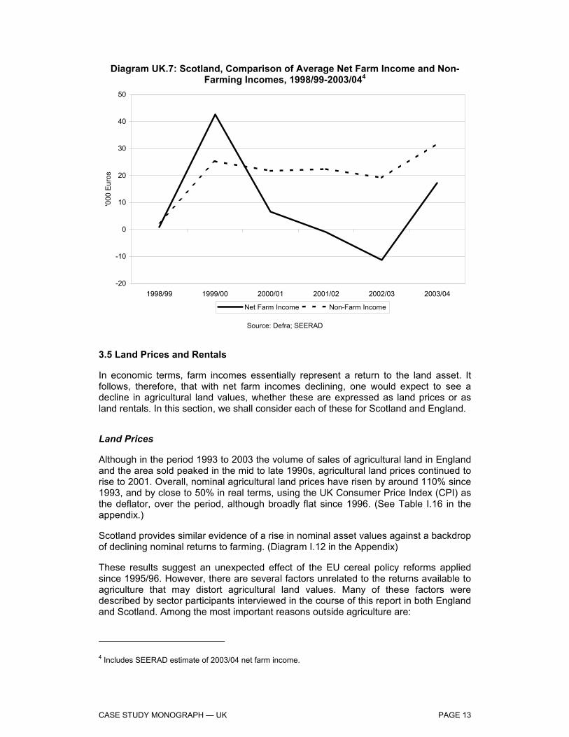
For Scotland, SEERAD data on non-farm incomes show that specialist cereal producers earn more income from non-farming activities than do general field cropping farmers, while for both types of producers3 off-farm income is considerably more important than on-farm diversification. (See Diagram UK.7)
Such is the importance of non-farm incomes to the farm household, non-farm incomes now typically contribute more to the total household income than incomes from farming activities, as Diagram UK.9 reveals. Moreover, non-farm incomes display notably greater stability than net farm incomes.
3 SEERAD define cereal specialists, general cropping and mixed farming in the same way as Defra.
CASE STUDY MONOGRAPH — UK PAGE 13
Diagram UK.7: Scotland, Comparison of Average Net Farm Income and Non-Farming Incomes, 1998/99-2003/044
-20
-10
0
10
20
30
40
50
1998/99 1999/00 2000/01 2001/02 2002/03 2003/04
'000
Eur
os
Net Farm Income Non-Farm Income
Source: Defra; SEERAD
3.5 Land Prices and Rentals
In economic terms, farm incomes essentially represent a return to the land asset. It follows, therefore, that with net farm incomes declining, one would expect to see a decline in agricultural land values, whether these are expressed as land prices or as land rentals. In this section, we shall consider each of these for Scotland and England.
Land Prices
Although in the period 1993 to 2003 the volume of sales of agricultural land in England and the area sold peaked in the mid to late 1990s, agricultural land prices continued to rise to 2001. Overall, nominal agricultural land prices have risen by around 110% since 1993, and by close to 50% in real terms, using the UK Consumer Price Index (CPI) as the deflator, over the period, although broadly flat since 1996. (See Table I.16 in the appendix.)
Scotland provides similar evidence of a rise in nominal asset values against a backdrop of declining nominal returns to farming. (Diagram I.12 in the Appendix)
These results suggest an unexpected effect of the EU cereal policy reforms applied since 1995/96. However, there are several factors unrelated to the returns available to agriculture that may distort agricultural land values. Many of these factors were described by sector participants interviewed in the course of this report in both England and Scotland. Among the most important reasons outside agriculture are:
4 Includes SEERAD estimate of 2003/04 net farm income.

CASE STUDY MONOGRAPH — UK PAGE 14
Amenity Value of Land: Agricultural smallholdings and farmland have become prized assets in the booming UK property market of the last decade. With improved transport networks and changes in work practices (including the increase in home working), the distances from employment centres that people can and will travel has increased, bringing more rural areas into the prospective property market.
Inheritance Tax: Agricultural land is exempt from inheritance tax in the UK, and is therefore retained by land-owning farmers more readily than would otherwise be the case. If the land were sold, the capital would be eligible for capital gains tax (however, see rollover tax allowance below) and inheritance tax. Given the age structure for UK farmers (average age 59), this is an important restraint on the volume of land entering the market for sale.
Rollover Tax: Liabilities for capital gains tax can be rolled over for three years, and any asset purchases made during this time become exempt from capital gains tax. For example, if a farmer sold land, he would normally be liable to pay capital gains tax at a rate of 40%; however, if this capital is spent on eligible assets over the next three years, the amount spent is exempt from capital gains tax. Many farmers acknowledged that they have sold agricultural land, and then purchased agricultural land elsewhere, to take advantage of this rollover allowance. This offers support to agricultural land prices by creating demand for the asset as a tax avoidance strategy.
Uncertainty: Many farmers and other cereal sector participants felt that reforms in EU agriculture had increased uncertainty in the sector, particularly with regard to prices. Because of this, many farmers felt that holding land assets, for the reasons described above, provide a hedge against agricultural commodity prices.
In addition to the above, interviewees also suggested several farm-related factors supporting the price of land:
Scale Economies: As the analysis above revealed, returns to agriculture improve with the scale of farm. Thus, at the margin, there is always an incentive to increase the scale of production by purchasing appropriate land when it becomes available. The prime reason for scale economies is that fixed costs are spread over a larger land area, so lowering costs per unit area. Thus, returns from additional units of land are offset against marginal, or variable, cost only, increasing the return from purchased land units and thereby supporting land prices.
Lack of Contiguous Fields: One drawback commonly cited as inhibiting farm expansion and operational efficiency is that farm holdings often comprise non-contiguous plots of land. For this reason, when favourably sited agricultural land becomes available contiguous to existing holdings, this land is highly prized, thereby supporting land prices.
Illiquid Market: For many of the reasons mentioned above, the volume of land entering the market is relatively low, and, therefore, demand often outstrips supply when suitable holdings are available.
(Some insight into the importance of some of these factors is provided by Diagrams I.13 and I.14, which present English agricultural land sales by the size of area sold.)

CASE STUDY MONOGRAPH — UK PAGE 15
Land Rentals
As with land prices, land rentals have risen over the period as a whole, although there has been a distinct drop since the late 1990s — slightly earlier than the recent declines in land prices. Nevertheless, the overall impression may again lend some credence to the support given to land prices by the farming factors mentioned above — namely, the desire for economies of scale and contiguous plots, and the problem of illiquid markets providing limited opportunities to pursue these strategies. (See Diagram I.15.)
Many interviewees in England also claimed that land rents are heavily determined by arable area payments. The available data reveal that this has been broadly true in England over the period, with rents moving largely parallel to area payments, albeit with area payments at a higher level. However, rents have fallen slightly more quickly than area payments over the last year or two.
3.6 General Conclusions
Level of Incomes: Cereal farm incomes have moved broadly in line with incomes from other farm sectors. However, farm incomes for almost all farm typologies and regions have declined over the period, whereas incomes earned off-farm have increased for cereal farm households especially. CMO cereal measures have been a formative influence on these trends.
Volatility of Incomes: Cereal farm incomes have been relatively volatile over the period 1995/96 to 2003/04, in some regions more so than for other farm sectors. However, volatility was largely caused by high prices early in the period, and was notably greater in an upward than a downward direction. Intervention prices and arable area payments provided a significant floor to downward movements in incomes.
Unexpected Effects: Land markets have not come to reflect the declining returns to agriculture. This is due largely to a range of factors outside the agricultural sector. Nevertheless, cereal policy reforms have encouraged the evolution towards larger cereal farms, which has in part driven the demand side of land prices.
4. DEPENDENCE ON DIRECT PAYMENTS
Has the system of direct payments kept certain types of holding overly dependent?
4.1 Overview
In this section, we consider whether the system of direct payments has kept certain types of holding overly dependent on area payments for their overall income. Direct payments (referred to in the FADN data as compensatory payments) refer to annual payments provided per hectare of cereals, unrelated to yields for individual farmers.
Indicators
In order to assess whether farmers are over-dependent on direct payments, we have disaggregated the FADN income measure of Farm Net Value Added per Annual Working Unit into revenues from cereal sales, direct payments, set-aside and other

CASE STUDY MONOGRAPH — UK PAGE 16
activities for each of our farming sector typologies. This analysis is conducted for both England and Scotland.
We have also considered gross margin analysis at the UK level, complied from national data sources, to assess how dependence on direct payments as a proportion of gross margins has changed over time.
Judgement Criteria
Direct payments are considered to have kept certain types of holding substantially over dependent if they are greater than one half of gross margins or FNVA per AWU.
4.2 Direct Payments Relative to Farm Net Value Added Per Annual Work Unit (FNVA/AWU)
England
All farm types have increased their dependence on direct payments between the two periods, 1995-1997 and 2000-2002, with medium size COP specialists the most dependent. Furthermore, large COP specialists are more dependent upon direct payments than other included farming sectors. (Diagrams I.24 – I.28 in the appendix)
Scotland
COP specialists have increased their dependence very slightly between the two periods, while mixed farms have actually reduced dependence. COP specialists are again the most dependent farm sector. Furthermore, large Scottish COP specialists are now less dependent than their English counterparts upon direct payments. (Diagram I.21)
4.3 Direct Payments Relative to Gross Margins
In this section, we compare direct payments for the UK against the gross margin of winter wheat and winter barley. (Table I.17 in the appendix presents an example of the derivation of the gross margin for winter wheat.)
The results of this calculation for winter wheat and winter barley are presented in Diagram UK.8. The diagram reveals that direct payments represent a higher proportion of barley gross margins than is the case for wheat, and this corresponds to the view of informants interviewed for this report. In both cases, direct payments have increased substantially as a proportion of gross margins, from below 50% to above 100% in both cases.
As direct payments for cereals have been broadly flat since 1995/96, the reasons for the increased dependence is due primarily to the decrease in cereal prices with the implementation of the MacSharry reforms. As we mentioned earlier, the full effect of the reforms was delayed in the UK until 1997/98 by high prevailing global cereal prices and exchange rate effects, but since that time the trend has been broken only by high cereal prices in 2003/04.

CASE STUDY MONOGRAPH — UK PAGE 17
Diagram UK.8: Direct Payments as a Percentage of Gross Margins
0%
50%
100%
150%
200%
250%
1993/94 1995/96 1997/98 1999/00 2001/02 2003/04
Dire
ct P
aym
ents
as
% o
f Gro
ss M
argi
n .
Winter Wheat Winter Barley
4.4 General Conclusions
For both England and Scotland, COP specialists are overly dependent on direct payments as a proportion of income. This situation has been made more severe by the cereal CMO reforms post-1995/96.
A similar conclusion emerges from analysis of direct payments as a proportion of UK gross margins for wheat and barley.
This view is strongly supported by farmers and other sector participants interviewed in the course of this study.

CASE STUDY MONOGRAPH — UK PAGE 18
5. PRODUCTION STRUCTURES ON HOLDINGS
5.1 Overview
In this section, we consider whether the CMO measures for cereals have encouraged a more rational use of resources on farm holdings in the UK, focusing on England and Scotland separately where data allows. Within these countries, and for the UK as a whole where regional data is not available, the analysis compares structural developments in cereal farming with developments in other farm sectors.
Indicators
When assessing developments in on-farm production structures, we shall consider the following indicators of farm efficiency and factor intensity:
Farm size Farm practices Capital and building inputs Labour inputs Crop inputs, including seed, fertiliser, chemical protection and irrigation Environmental considerations
Judgement Criteria
The rational use of resources will be assessed in terms of the factor intensities observed prior to and after 1995/96. A more rational use of resources will be judged as lowering factor costs per hectare, especially where inputs have been shown to demonstrate negative environmental externalities. Increasing farm sizes and farm practices conducive to reducing costs will also be considered as demonstrating improved resource allocation in cereal farming.
5.2 Farm Size
Informants for this report agreed, almost universally, that average farm sizes have grown since 1995. In this section, we consider this supposition for cereal specialists, general cropping and mixed farming.
Firstly, when considering the number of farms in each classification of farm size, it is worth noting that the number of holdings overall across the three categories of farm type combined has decreased 12% from 1992/93 to 2003/04 (8% decrease since 1995/96).
Cereal specialists account for the majority of holdings, and, while cereal farm holdings have increased slightly over the period, both general cropping, in particular, and mixed farm holdings have declined. (Diagram I.33)
Have the measures taken together, in particular the market support, direct paymentsand set-aside, encouraged more rational use of resources (land, labour, investment,etc.) on holdings?

CASE STUDY MONOGRAPH — UK PAGE 19
Looking specifically at cereal farm holdings, there is a relatively slight increase in number of holdings in each size category. (Diagram I.34) Thus, in terms of cereal farms, there is no strong evidence of increasing farm size over the featured period.
To compare the situation for cereal specialists against general cropping and mixed farming, we have prepared Table UK.3. This presents the change in the number of holdings in each farm size category between 1992/93 and 2003/04 for each farm type.
Table UK.3: Change in Number of Farm Holdings by Economic Size Unit by Farm Type, 1992/93-2003/04 Cereal Specialists General Cropping Mixed Farming
< 8 hectares 10% -28% 41% 8-40 hectares 6% -50% -20% 40-100 hectares 1% -33% -28% 100-240 hectares 2% -25% -29% > 240 hectares 14% -19% -26%
Total 5% -35% -13%
Source: Defra
Table UK.3 confirms the slight rise in cereal farm holdings in each size category, with the greatest increases in the smallest and largest size categories. By contrast, general cropping farm holdings reveal major decreases in the number of holdings overall, with slightly lower falls in the larger size categories. Mixed farming presents some interesting results, with a substantial rise in the number of smallholdings. This is driven almost entirely by purchases of smallholdings as hobby farms and lifestyle choices for their amenity value. In other size categories, mixed farming does not reveal any discernible change in farm size, with all categories declining by similar amounts.
These results appear to contradict, in part, the view of most participants that farm sizes are increasing. This view is based upon the understanding and observation of industry participants that the viable economic size of farms, including cereal farms, has increased in the last ten years.
Changes in Farming Systems and the Rise of Contract Farming
Reconciling these two divergent observations rests with the problem of the data available on farm holdings and the actual units farmed. The data suggest that, for cereal farms at least, relatively few farmers have exited the sector. However, this is not to say that the size of unit farmed by individual farmers has not increased — farmed units very probably have increased, due largely to changes in the farming systems employed. In particular, the substantial increases observed in contract farming (see below) will have affected the farm size and unit dynamic.
Interviews with farmers, agencies and traders in the course of this report suggest that farmers with smaller units have not sold up and left the industry, as the farm sales data in Table I.16 confirm, but rather have maintained ownership of farms, but turned over the farming of the land to contractors. The actual arrangement with contractors may vary, with some farmers hiring contractors for a fee, and retaining profits, while others increasingly retain area payments and allow contractors to retain profits from the

CASE STUDY MONOGRAPH — UK PAGE 20
farming operations. In this way, the average size of units farmed by individual enterprises, in this case contractors, could be increasing over time, and scale economies derived, but this would not be captured by the existing data collection format.
Scotland
Farm sizes in Scotland are generally larger than the UK average, and have been following a familiar pattern of growth over the past ten years. The average size for cereal specialist farms is now around 100 hectares, having risen 80% since 1995/96 –a faster rate of increase than for general cropping farms over the same period. (Diagram I.35)
5.3 Farm Practices
Cereal farming methods in the UK have evolved over the period 1995/96 to 2003/04, driven primarily by agronomic and technological knowledge, and by the overwhelming incentive to cut costs as institutional and market prices have declined, pressurising cereal margins.
Overall, the majority of the changes in farm practices are a continuation of trends towards larger farm units in order to improve profitability and to manage fixed costs more efficiently (even though, as noted above, ownership structures may have changed more slowly). Cereal farm incomes in the mid 1990s were relatively high, due to favourable currency exchange rates and high commodity prices taking pressure off less profitable farms, as we have mentioned previously. However, since 1996/97, net farm incomes have dropped substantially, resulting in many growers reviewing their businesses.
The extent to which these changes in practice are due to changes in policy support measures is difficult to quantify. Farmers consistently expressed the opinion that changes in practice had not been due to policy, but rather had been due to falls in price. However, the downward trend in prices is clearly linked to the reduction in intervention prices since the MacSharry reforms (albeit with a lag in the UK).
The main direct consequences of the support measures that have had an effect on farming practices and were identified by sector participants interviewed are:
The ‘fixing’ of arable land due to the designation of land as eligible or ineligible for area payments, particularly in areas of traditional mixed farming. This trend was frequently mentioned in interviews as occurring in mixed farming areas in the west of England. The process has caused a shift in rotation pattern to a predominantly arable rotation, rather than the traditional grass/arable rotation.
The variable rate of set-aside, which was felt to have had an impact on declining input levels.
The increase in organic farming since 1995 particularly linked to the UK’s Organic Farming Scheme (see Appendix to this case study monograph).
The main constraints on these processes were identified as existing farm business structures, particularly fixed cost commitments and farmer attitudes, while many participants also felt some of the inertia was undoubtedly due to the coupled support measures.

CASE STUDY MONOGRAPH — UK PAGE 21
Minimum Tillage
One notable development mentioned by all informants, though more widespread in the English cereal heartland of the Eastern counties than in Scotland, is the expansion of the cereal area under minimum tillage practices. Some data is available on this trend for arable areas in total, and is presented in Diagram UK.9.
Diagram UK.9: Arable Land Area Under Inversion and Minimum Tillage, 1997-2004
0
20
40
60
80
100
1997 1998 1999 2000 2001 2002 2003 2004
% o
f Ara
ble
Land
Inversion Tillage Minimum Tillage
Source: Soil Management Initiative Note: Data for 2001 is extrapolated between two individual survey periods,
the first from 1997 to 2000, and the second from 2002 to 2004.
The move towards increased minimum tillage reflects efforts to save on labour and machinery costs, and also greater reliance on larger units of machinery to save on labour costs. A survey carried out by the Soil Management Initiative estimated that 42% of primary cultivations are now minimum tillage. There are no survey figures from 1995; however, industry participants believe the figure was around 10%.
Crop Inputs
Seed
Generally, seed rates have been reduced by earlier seed drilling in the UK, largely following HGCA-funded work in late 1990s. For example, winter wheat seed rates were, on average, 180kg/ha before the work began, and are now around 150kg/ha.
A secondary issue with seed is the increased tendency towards farm-saved seed substituting for certified seed. Seed breeders have experienced declines in the rate of seed applied per hectare due to the early drilling drive mentioned above, and also because of the second phenomenon of farm-saved seed, which is perceived by many farmers to save on costs. Although technically plant breeders are due a fee when seed

CASE STUDY MONOGRAPH — UK PAGE 22
from a previous crop is saved on-farm for later drilling, this is not always forthcoming, and monitoring this system is cumbersome.
A major longer-term concern in this area is the effect of declining seed sales on plant breeding development for UK conditions. The UK is relatively unusual in the global grain industry due to its temperate maritime climate, and many seed varieties are developed particularly for these conditions. However, declining sales reduce the incentive and return from seed breeding for this market. Several seed breeders expressed this concern, and a contraction in the number of participants in the UK breeding sector supports this view.
Evidence from the industry suggest that the volume of certified seed used per hectare may have fallen from 120 to 130 kilograms per hectare in the mid 1990s to as low as 95 to 100 kilograms per hectare in the last three years.
Seed — Scotland
A similar trend has emerged in Scotland over the last ten years. There has been a gradual decline over the period in seed costs per hectare for both cereal specialists and general cropping, with cereal specialists seed costs falling almost 20% per hectare since 1995/96. (See Diagram I.36 in the Appendix.)
Fertiliser
Defra has funded a long running survey of fertiliser use, the British Survey of Fertiliser Practice. The following observations were made about the declining fertiliser applications rates:
Nitrogen: The downward trend is observed on grassland and, to a lesser extent, on tillage crops, including cereals.
Phosphate: Overall phosphate use on tillage crops gradually declined. The 2001 rate of 43 kg/ha was the lowest since records began in 1983. The low recent level of phosphate use on tillage crops is associated principally with a change to spring from winter barley, as spring barley has a lower fertiliser requirement.
Potash: As is the case for phosphate, the low recent levels of potash use on tillage crops is associated principally with a change to spring from winter barley.
More recently, in 2004/05, the increase in fuel prices has driven the price of nitrogen to its highest levels, which, combined with historically low grain prices, may increase the rate of the downward trend in nitrogen use.
Fertiliser — Scotland
In Scotland, the peak of fertiliser inputs during the high cereal prices of 1995/96 was followed by steady decline for both cereal specialists and general cropping. Cereal specialists’ fertiliser costs have fallen 30% per hectare since 1995/96. (Diagram I.37 in the Appendix)
The trend of intensification to 1995/96, followed by extensification after the MacSharry cereal reforms, is supported by interviews with farming bodies and agencies in the course of this report. Farmers expressed the view that yields were the driving motivator

CASE STUDY MONOGRAPH — UK PAGE 23
prior to 1995/96, when higher prices were obtained, while cost reduction has become the prime motivator since the reforms initiated lower prices.
Diagram UK.10: Fertiliser Application Rates for All Crops and Grassland, 1988-2002
0
20
40
60
80
100
120
140
160
1983-1987 1988-1992 1993-1997 1998-2002
kilo
gram
s pe
r hec
tare
Nitrogen Phosphate Potash
Source: British Survey of Fertiliser Practice
Chemical Plant Protection
The Pesticide Usage Survey reveals that the background level of pesticide use for winter wheat, which accounts for a third of the UK cropped area, and a significant amount of pesticide use, has changed relatively little, although, in 1996, favourable autumn weather conditions resulted in an increase in the use of higher-dose autumn-applied herbicides. (See Diagram I.40 in the Appendix.)
An interesting overall conclusion from Diagram I.40 is that a trend of increased input use (intensification) prior to 1995/96, and decreased use after 1995/96 (extensification), is again apparent, as with fertiliser application.
Irrigation
Irrigation on cereals is not common in the UK. Some spring cereals on light land may be irrigated in a very dry season, but only if the irrigation is in place for other higher value crops, such as potatoes or sugar beet, and there is spare water and machinery capacity, which is uncommon.
Despite the general absence of cereal irrigation in the UK, there is some limited anecdotal evidence that water applications are increasing in cereal farming and general cropping where farmers have ready access to installed systems.
In large part, many felt this was a consequence of changing climatic conditions, with drier conditions more common in the dominant eastern cereal regions. Moreover,

CASE STUDY MONOGRAPH — UK PAGE 24
advances in irrigation technology allowed more efficient and targeted water applications.
5.4 Environmental Considerations
Overall, environmental considerations have not been primary issues in influencing decisions for cereal production. Most decisions on cereal production are taken on an economic and practical level. There has, however, been an increase in awareness of environmental issues over the last 10 years with schemes such as the Countryside Stewardship becoming more popular with the introduction of the Arable Options in 2002. Outside of organic farming, mentioned above, there have been other initiatives such as LEAF (Linking Environment and Farming, www.leafuk.org.uk), which started in 1991, and the continuation of organisations such as FWAG (Farm Wildlife Advisory Group, www.fwag.org.uk). More recently, there have been other initiatives driven by legislation, and the possibility of legislation such as Local Environmental Risk Assessment for Pesticides (LERAPS) and the Voluntary Initiative on Pesticides (www.voluntaryinitiative.org.uk), which is an industry-led programme. Other research such as the SAFFE project is currently underway looking at practical ways of increasing biodiversity on arable farms. Records of changing practice have been recorded in the UK Farm Practices Survey only since 2001. A discussion of environmental initiatives can be found in the Appendix.
5.5 Capital Inputs
Cereal machinery costs have fallen by a third in real terms, per hectare, since 1995/96. The machinery costs for cereal farming remain low relative to the more specialist equipment employed by general cropping, which is heavily weighted by potatoes and sugar beet in this region. Anecdotal evidence from Scotland collected in the course of this report gives no reason to suspect any different pattern emerging in that region. (For a discussion and diagram of the data, see the Appendix and Diagram UK.10.)

CASE STUDY MONOGRAPH — UK PAGE 25
Diagram UK.11: UK Agricultural Labour Force, 1984-2004
0
100
200
300
400
500
600
700
800
1984 1986 1988 1990 1992 1994 1996 1998 2000 2001 2003
'000
Wor
kers
Full Time Part Time/Seasonal Farmers/Spouses/Directors
Source: Defra
5.6 Labour Inputs
The UK agricultural labour force has fallen steadily since 1985, as Diagram UK.11 reveals. The biggest fall by far has been in full-time workers, the number of which has halved since 1984, followed by seasonal workers, which have declined by almost 30% over the same period. In the case of farmers, spouses and directors, the decline is only 6%, while the overall total has dropped by just over 20%. This suggests strongly that farmers have shed waged labour as a strategy to continue in the industry, with relatively few farmers actually exiting the industry.
Labour — England
The experience of labour in farming in the UK is similar to that for capital, with farms typically pursuing a strategy of stripping out fixed costs wherever possible, and often converting these to a variable cost in the form of contracting (see below). However, although the numbers employed in agriculture in the UK follow a gradual declining trend, the cost of labour per hectare has not fallen as quickly as capital costs per hectare. This is partly due to wage awards offsetting declining quantities of labour in agriculture, and partly because of productivity gains in machinery via larger and more specialist equipment. (See Diagram I.43 in the Appendix for the real costs of labour per hectare for cereal specialists against other farm types since 1993/94.)
The downward trend in labour costs since the late 1990s may reflect, in the opinion of many industry participants, lower wage costs for agricultural labour due to the inflow of eastern European farm workers into England from the late 1990s onwards. Interviews for this report found much evidence of increased immigrant employment on farms, and this increased supply may have reduced agricultural wage pressures.

CASE STUDY MONOGRAPH — UK PAGE 26
Labour — Scotland
The phenomenon of eastern European labour was recorded far less frequently in Scotland, and this may go some way to explaining the slightly different labour cost curve for Scotland, where real labour costs per hectare declined in the early part of the period but have remained largely stable on cereal farms since the late 1990s (see Diagram I.44 in the Appendix).
Contract Farming
The trend towards increased contract and share farming is well established in both English and Scottish cereal regions. As with minimum tillage practices, the motivation for employing contractors is primarily to lower fixed costs of machinery and labour — in effect, contracting converts these fixed costs onto a variable cost basis. In part, the drive towards larger and more specialised machinery units supports the contracting trend, as economies of scale in costs are passed onto farmers employing contractors, who would otherwise suffer capital indivisibilities and sub-optimal equipment utilisation rates.
In addition, in interviews for this report, many farmers, contractors and input suppliers expressed the view that higher specifications of equipment, and increased regulations regarding operating licences, have limited the ability of individual farmers to operate varied machinery units.
Diagram UK.12 illustrates the increased use of contract farming in the cereal heartland of the eastern counties in England. The diagram shows expenditure on contracting costs per hectare by farm type.
Diagram UK.12: England/Eastern Counties, Real Expenditure on Contracting by Farm Holdings, 1995/96-2003/04
0
10
20
30
40
50
60
70
80
1995/96 1996/97 1997/98 1998/99 1999/00 2000/01 2001/02 2002/03 2003/04
€ pe
r hec
tare
, 200
3/04
pric
es
Cereal Specialists General Cropping Mixed Farming
Source: Report on Farming in the Eastern Counties of England, University of Cambridge, Rural Business Unit

CASE STUDY MONOGRAPH — UK PAGE 27
Diagram UK.12 reveals that contracting grew rapidly after 1995/96 for each farm type, but has since declined for mixed farms, which have also employed contractors with greater variability than other, farming types. In the case of cereals, contracting has remained relatively stable since 2000/01, while it has continued to increase for general cropping farms. Informants suggest this is due to the abundance of specialist and quota crops in general cropping in the Eastern counties, such as potatoes and sugar beet, where increasingly expensive and specialised equipment is more suited to contracting.
The impact of contracting on fixed costs is revealed by Table UK.4, which presents fixed costs per hectare for farms in the eastern countries of England employing (i) no contractors; (ii) some use of contractors; and (iii) farming with contractors. This last category covers farmers who remained fully responsible for the management of their farms, but engaged contractors to carry out most of the farming operations. As the table reveals, the greatest impact of contracting is in labour and machinery costs, although in this sample case the cost savings were outweighed by the costs of hiring contractors. However, informants made clear that there are other benefits of contracting in addition to the cost impact, such as:
Time savings for farmer, allowing income to be earned from other ventures.
Spreading of labour and machinery load, allowing cropping decisions not be restricted by bottlenecks of farm labour and machinery.
Flexibility in cropping decision, unconstrained by the need to utilise fixed assets.
Table UK.4: England/Eastern Counties, Impact on Fixed Costs of Contract Farming, 2003/04 (€ per hectare) No. Contractors Some Use of Contractors Farming with Contractors
Fixed Cost Labour 86 165 18 Machinery - Depreciation 127 124 64 - Repairs 63 72 28 - Fuel and electricity 44 45 29 - Vehicle tax and insurance 18 15 10 Contracting Costs 0 25 235 Rental and other Rental Value 208 209 219 Other Overhead Costs 85 113 118
Total Fixed Costs 630 767 722
Source: Report on Farming in the Eastern Counties of England, University of Cambridge, Rural Business Unit.
5.7 General Conclusions
Farm Holdings: While the number of UK farm holdings overall has declined, cereal specialists have increased since 1995/96. This shows that the CMO measures have possibly favoured cereals rather than general cropping and mixed farming.
Farm Size: Scottish farms sizes, especially cereal farms, have increased since 1995/96, with most participants agreeing this was largely an economic response

CASE STUDY MONOGRAPH — UK PAGE 28
to farm reforms. For the UK as a whole, however, the trends are distorted by the rise of amenity sales of small farm holdings.
Farm Practices and Input Usage: Farm reforms have prompted cost reductions in inputs per hectare post 1995/96. Prior to this date, a trend of intensification was observable, with yields the dominant motivator; after this date, decreased input use and cost reductions via greater extensification have been the response to reduced cereal prices under the CMO reform.
Environmental Practices: Improved environmental practices are observed post 1995/96. These have been in part an attempt to cut farm input costs, as above, but also, importantly, as a response to national and regional level environmental initiatives.
6. ADAPTING SUPPLY TO DEMAND — QUANTITY AND QUALITY
6.1 Overview
In this section, we assess whether UK producers have responded to the market signals expressed by prices, both in the relevant locations and with the relevant cereal qualities demanded by the market. Where this has not been the case, we identify the factors constraining the supply response.
Indicators
Market imbalances are identified by considering domestic production and consumption of the major cereals in the UK. Where surplus production of a cereal is ongoing, we use stock levels to identify whether a commercial market exists for the product, or whether over-production has been stimulated by institutional CMO measures.
In terms of cereal quality, we consider wheat quality over time, and the response of wheat producers to market signals for differentiated wheat qualities. We also consider the response of on-farm feed producers to the changes in the cereals regime over the past ten years.
Judgement Criteria
Producers will be considered to have responded to the market signals if the relative production of different types and qualities of cereal is in line with the demands of end-users in the sector. A high correlation between the premium for bread-making wheat and the relative production of bread-making wheat will also be regarded as evidence of a response to market factors.
In the case of on-farm feed, as institutional prices have fallen, we would expect to see an increase of feed cereals retained on-farm.
Have producers responded to the market signals expressed by prices in the relevantlocations and at the relevant times when deciding which types and qualities of cereals toproduce, where the qualities are those viewed as appropriate by end-users? If not, whatis preventing supply from adapting to demand in the EU?

CASE STUDY MONOGRAPH — UK PAGE 29
6.2 Cereal Quantity
The UK cereal market is able to supply its own requirements of wheat, barley and oats, in aggregate terms. Only in maize, used heavily by the animal feed sector, does the UK maintain a large and persistent domestic supply deficit. Although some fodder (silage) maize is grown in the UK, the damp maritime climate is largely unsuited for large-scale commercial maize cultivation. Furthermore, the UK base area for maize eligibility for direct payments places a severe constraint upon maize production. To this extent, in the view of UK industry participants, including farmers, government and feed producers, maize production in the UK would be greater if there were no base area constraint, but would be lower if there were no direct payment at all available for maize. (See Diagram I.45 in the Appendix.)
In respect of aggregate supply, therefore, the UK appears to be responding to the market signals to supply cereals, notwithstanding climatic parameters. However, the market could be said to be failing if commercial outlets were not available for this production. In this case, surplus production would accumulate as stocks, rather than finding export markets.
End-of-year stocks for oats and intervention wheat have been negligible since 1995/96, while the same has been true of intervention barley in recent years. For commercial barley and commercial wheat stores, while these show some fluctuation around mean end-of-year stocks, the level of stocks shows no evidence of accumulating over time. (See Diagram I.46 in the Appendix.) This conclusion is supported by traders, cooperatives, merchants and other industry participants, who universally indicated that end-of-year stocks merely represent carry-over of old crop into the new marketing year, and that these stocks are normally cleared in the opening months of the new season.
Summary
The UK does not, within the parameters of its climate, have difficulties in matching aggregate supply to the demands of its cereal industries — a view overwhelmingly confirmed by informants contributing to this report.
Nevertheless, there is an increasing concern expressed among processors of wheat, barley and oats, that recent reforms to the CMO under the Mid Term Review may reduce production of cereals and create tighter markets for acceptable quality in the near future. As a response, processors are increasingly entering into direct medium term contracts with growers to ensure adequate raw material supplies.
This raises the more complex issue within the UK of the internal markets for different qualities of cereal, and it is to this area that we devote the remainder of this section.
6.3 Cereal Quality
The primary influences on cereal quality are:
Choice of variety
Weather, and in particular the weather at harvest.
Of these, the choice of variety represents the planned cereal quality, while the weather is the primary determinant of the achieved cereal quality.

CASE STUDY MONOGRAPH — UK PAGE 30
Wheat
In terms of wheat quality, the UK, although a surplus producer of wheat in aggregate, maintains a deficit of milling wheat. Diagram UK.13 presents the proportion of UK, EU and third country wheat used by UK millers from 1984.
Diagram UK.13: UK – Millers’ Wheat Usage by Source, 1984/85-2003/04
0
1
2
3
4
5
6
1984/85 1986/87 1988/89 1990/91 1992/93 1994/95 1996/97 1998/99 2000/01 2002/03
milli
on to
nnes
UK Wheat EU Wheat 3rd Country Wheat
Source: National Association of British & Irish Millers (Nabim)
Diagram UK13 reveals that total wheat usage increased by almost one million tonnes from the mid 1980s to 1997/98, but has been relatively stable since that time. Most of the early increase came from an expansion of UK wheat, partly via an increasing market and partly at the expense of other EU sources. From 1984/85 to 1995/96, the proportion of home grown wheat used by UK millers increased from 61% to 86%. Since 1995/96, there has been a broadly similar proportion of home grown wheat used in the milling industry, with the level at 86% in 2003/04.
The volume of imported third country wheat has stabilised at between 0.25 and 0.6 million tonnes, and overwhelmingly represents premium quality (Group 1) bread-making wheat, imported mainly from Canada, Australia and the USA.
Millers interviewed in the course of this report felt that this volume represents an approximate minimum, with UK production of premium hard wheat limited by the maritime climate, though with a degree of annual variability.
It is realistic to conclude provisionally, therefore, that UK wheat quality has responded as far as possible to the requirements of the domestic milling industry, within the parameters of the domestic climate.
There has been an upgrading of the quality of UK production over the past ten years. (Diagram I.47 in the Appendix) Whether this has been in response to the demands of end-users is debatable, as most industry participants felt that growers’ quality upgrading was largely a response to:

CASE STUDY MONOGRAPH — UK PAGE 31
Availability of better seed varieties improving quality
Better prices for higher quality wheat
More marketing flexibility as growers’ move out of Group 4 feed wheat
Difficulties in accessing intervention for UK feed wheat.
In part, the last two of these factors are in themselves a reflection of buyers’ and end-users’ requirements, which are reflected in prices, the second factor. Given that end-users were largely satisfied with the quality of UK wheat available, notwithstanding the climatic limitations, the upgrading of wheat quality does not appear to have been a response to a deficiency in the market, but rather a rational response to improve farm profitability, facilitated by varietal development.
Producing bread-making wheat requires the farmer to increase the inputs, and therefore the costs, of producing the wheat crop. More expensive seed varieties and more fertiliser, sprays and labour inputs are required. Whether the required bread-making wheat quality is achieved is then a function largely of favourable weather patterns, and the expertise of the farmer. Within these parameters, it is possible to gauge the response of farmers to positive market signals for bread-making wheat production. For example, following a period of high premia for bread-making wheat over feed wheat, we would expect farmers’ output of bread-making wheat to increase in the next cycle. Conversely, we would expect feed wheat production to fall.
Table UK.5 presents the correlation of farmers’ supply responses for both bread-making and feed wheat to price premia.
Table UK.5: Relationship of the Percentage Bread-making Wheat Premium with Changes in Production of Feed Wheat and Bread-making Wheat, 1995/96-2003/04
Correlation with Bread-making Wheat Premium
Bread-making Wheat Production 0.78 Feed Wheat Production -0.72
Note: The price series uses the annual premium of bread-making wheat over feed wheat, expressed as a percentage. Production of bread-making wheat and feed wheat are expressed as the percentage change from the preceding year. The bread-making wheat premium is then compared with wheat production, with wheat production lagged by one year. Thus, we assume that wheat output in 2003/04 responds to prices from 2002/03.
The table reveals a strong correlation in both cases, implying that farmers increased production of bread-making wheat in response to market signals, and reduce production of feed wheat. This suggests that planting decisions from 1995/96 onwards were based on market economics rather than the CMO for wheat (other than measures that have influenced market prices).
This confirms the view of farmers interviewed for the report, who maintained that, within the parameters of rotational and climatic requirements, market prices were the dominant factor influencing planting decisions. All farmers felt this trend had increased in importance since 1995/96, and would continue to do so following the Mid-Term Review and Single Farm Payment system.
CASE STUDY MONOGRAPH — UK PAGE 32
In terms of intervention, many bodies felt that the intervention system discriminates against UK wheat due to the UK climate. In particular, the UK feels the so-called “Dough Machinery” test, which has to be passed to get wheat into intervention, disadvantages the UK. Most UK wheat varieties usually fail this test, and UK government agencies feel the test favours continental varieties, irrespective of actual quality. Because of this test, only the very lowest-moisture UK wheat is currently able to get into intervention. Nevertheless, with very little UK wheat ever offered to intervention, this was not felt to be a major determinant of UK wheat quality. Rather, UK bodies are concerned that the intervention regulations do not represent a level playing field for wheat.
6.4 On-Farm Feed — Barley and Wheat
One way of considering whether the CMO measures for cereals have influenced farm behaviour is to consider the mixed farming and animal feed sectors, and in particular the balance between on-farm feed production and bought-in (off-farm) compound feedstuffs. In the mixed farming sector, the producer is faced with a choice between production of cereals for on-farm consumption, or production of cereals for commercial sale, with cereals being bought-in as an ingredient in compound animal feeds.
The economics of the on-farm/off-farm cereal balance are complex, with many individual farm factors influencing the farm decision. These include:
Livestock/arable ratio on farm Existing on-farm feed mill capabilities Area of grassland on farm Land freight/transport rates Suitable cereal area, and whether potential output is wholly sufficient for livestock Cereal price relative to other feed raw material prices.
In broad terms, when domestic cereal prices are high, farmers’ interviewed for this report in both Scotland and England expressed a preference to sell cereal output commercially, and to buy-in compound feeds. (For a full discussion of on-farm feed decisions, see the relevant section in the Appendix and Diagrams I.48 and I.49.)
6.5 General Conclusions
Market Imbalances: The UK cereal sector is self-sufficient in the production of wheat, barley and oats. As stocks of these cereals have not accumulated over time, the analysis suggests that suppliers have responded to market requirements in these sectors. Only in fodder maize, where production is limited by the small institutional base area for maize in the UK, is a large and persistent deficit maintained, and part of this deficit at least is due to the institutional base area limit, although climatic conditions would naturally constrain maize production in some parts of the country.
Cereal Quality: Producers have responded to market signals in the wheat sector, within the parameters of its damp maritime climate. No institutional barriers are acknowledged as limiting production quality in the sector.
On-Farm Feed: Feed cereal producers have behaved in an economically rational manner by increasing on-farm feed production in aggregate as cereal support prices have declined. Nevertheless, industry participants regard the institutional support for the livestock sector as central to the on-farm feed production decision.

CASE STUDY MONOGRAPH — UK PAGE 33
7. EFFECTS OF THE DROP IN INSTITUTIONAL PRICES
7.1 Overview
In this section, we consider whether the cuts in institutional prices have resulted in a fall in UK cereal prices. We also assess whether any observed falls in market prices have improved the competitiveness of UK cereals in domestic and export markets.
Indicators
Volumes of UK cereal exports will be considered as an indicator of export competitiveness, in conjunction with the level of export refunds required for open market sales. Intervention stocks are also considered as an indicator of an inability to clear markets due to external uncompetitiveness.
Judgement Criteria
An increased ability to compete on the external market will be judged by declining levels of export subsidy, where exports continue to be made, and by low levels of intervention stocks. Domestic competitiveness will be considered in the light of competition with imported cereals and alternative feedstuffs in the compound animal feed sector.
In order to address these questions, we consider UK cereals’ competitiveness relative to the major competing products in the main food and end-use markets for cereals. The key markets analysed include:
Human consumption
Animal feed consumption
The key competing products in these sectors can be summarised as:
Domestic cereal substitutes
Imported cereals
Imported cereal substitutes.
In terms of the UK, the cereals covered are soft wheat, barley and oats.
7.2 Institutional Prices
The intervention price for cereals for the UK experienced a 15% fall between July 1995 and July 2003. (Diagram I.50 in the Appendix) When expressed in pounds sterling, the equivalent fall in support prices has been even greater — 30% over the same period.
Have the cut in institutional prices (intervention price, threshold price for imports) and themeasures defining the qualities eligible for intervention resulted in a sufficient drop ininternal market prices to ensure that Community cereal production is competitive on theinternal and export markets?

CASE STUDY MONOGRAPH — UK PAGE 34
7.3 Competitiveness on the Export Market
The UK is a significant exporter of cereals. Wheat dominates UK cereal exports, while oat have a relatively minor role. However, there has been a decline in wheat and barley exports since 1992/93, while oat exports have increased slightly, albeit from a very low level. Comparing the most recent three-year period with the three-year period centred on 1995/96, both wheat and barley exports have declined over 40%, while oats exports have risen by 6%. (See Diagram I.51 in the Appendix.)
Although UK exports of wheat and barley have declined in absolute terms since the start of our featured period, this is not to say that UK export competitiveness has declined. For instance, the observed trend in exports could have been stimulated by an expansion of the domestic market for wheat and barley.
UK cereals can be understood to be competitive on the export market if:
Large export refunds are not required to ensure outlets for surplus cereal production
Public intervention stocks have not accumulated in order to remove exportable surpluses from the market.
Export Refunds
Export refunds represent the amount required to compensate EU exporters for the difference in price between world and domestic markets. Thus, if export refunds are falling, this suggests that EU prices are aligning more closely with world market prices.
Data reveal that export refunds have fallen in recent years in the EU for each cereal (Diagram I.52 in the Appendix), suggesting that EU prices are converging with world market prices, and, therefore, EU cereals are becoming more competitive in export markets. In so far as the UK is a major exporter of wheat and barley (Diagram I.51 in the Appendix), the lowering of export refunds may reflect increased competitiveness of the UK cereal sector.
Intervention Stocks
As export refunds have fallen, if the UK were not able to market grain internally or in non-EU export markets at these lower rates of refund, we would expect to see an accumulation of cereal intervention stocks in the UK. Furthermore, intervention stocks would accumulate if the UK were unable to compete with imports in the domestic market. Neither of these scenarios is the case in the UK, where intervention stocks are very low compared with the EU average situation. In recent years, year-end intervention stocks have dwindled, and been limited to barley only (Diagram I.53 in the Appendix). This suggests the UK does not have difficulties in marketing its grain, and with export refunds being low over the past few years, these two factors together indicate competitiveness on the part of the UK cereal sector.
7.4 Competitiveness on the Domestic Market
Improved UK competitiveness on the domestic cereal market should be indicated by:
Declining import volumes of both cereals and cereal substitutes (where these compete with domestic cereals for market share)

CASE STUDY MONOGRAPH — UK PAGE 35
Convergence of UK cereal prices with world cereal prices.
Imports of Cereals and Cereal Substitutes
There has been a relatively high level of maize and wheat imports since 1990. In addition, barley imports have declined over the period; by over 40% from the three-year period 1994-96 to 2002-2004, whereas wheat imports have risen slightly, just over 10%, and oats imports have increased substantially, albeit from a very low base. (See Diagram I.54 in the Appendix.)
Barley may have become more competitive in the domestic market since the 1990s, as indicated by declining imports, while this may not have been the case for wheat and oats.
For wheat, this situation is unlikely to change significantly, as the UK is unable to produce sufficient quantities of high quality hard wheat for bread making, due to its relatively damp climate. Within the parameters set by annual climatic variations, the UK bread-milling sector has to import hard wheat to blend with domestic Group 1 milling wheat in the bread-making process. Industry evidence suggests this volume is around 0.4 to 0.6 million tonnes per annum, sourced largely from Australia and Canada, though French and German wheat is also utilised.
In the case of oats, industry evidence suggests the rise may be due to the increase in recreational equestrianism, and the popularity of oat feeds in this sector. This increasing demand has not been met with a rise in UK commercial feed oats production, as oats are typically grown under direct contract arrangements with millers, with feed oats generally unable to maintain a place in the rotation. This situation may alter as the rise in oat feed demand makes its presence felt in the domestic sector, and the benefit of oats as a low input, low cost crop become more significant. (See Diagram I.55 in the Appendix for horse feed volumes from 1992 in the UK.)
Overall, on the evidence of usage in the feed sector, UK cereal competitiveness looks to have improved since 1995/96, with barley imports declining and cereals capturing a higher percentage of the animal feed sector. (See the relevant section and Diagrams I.56 and I.57 in the Appendix.)
Cereal Price Competitiveness
Despite the evidence above, there are many reasons, other than improving competitiveness, why cereal imports may decline and cereal usage may improve its position in the feed sector. Therefore, we consider a further important indicator of competitiveness, namely relative prices.
The increased substitution of cereals for alternative feedstuffs in the compound feed sector suggests that UK cereals have indeed become more competitive in the domestic market. This conclusion can be considered further by comparing prices of key feed ingredients.
There has been a decline in ratios over the entire period, with UK feed wheat typically traded at around 80% of the price of imported soymeal in 1995/96. By 2003, this ratio had fallen to 50%. A similar pattern is apparent for UK feed wheat against imported maize gluten, falling from 120% in 1995 to around 90% in 2003. Again, this suggests an improvement in the competitiveness of UK cereals since 1995/96. (Diagram I.58 in the Appendix)

CASE STUDY MONOGRAPH — UK PAGE 36
7.5 General Conclusions
Export Subsidies: Export subsidies for UK cereal exports have declined significantly since 1995/96. This suggests strongly that cuts in intervention prices for cereals have improved the competitiveness of UK cereals in external markets.
Intervention Stocks: Intervention stocks have declined significantly over the featured period, suggesting UK cereals compete effectively for market share on domestic and external markets.
Internal Competitiveness: UK cereals have captured market share from imported and domestic competitors in the compound feed sector, suggesting improved competitiveness in the domestic cereal sector. This is confirmed by the price competitiveness of cereals against competitors, although this trend was evident prior to reforms cereal completed in 1995/96.
8. EFFECTS RESTRICTING COMPETITION — UK
8.1 Overview
In this section, we consider whether the measures for cereals allow private initiatives conducive to artificial increases in the EU internal market price, using the UK as an example.
The EU employs fixed monthly increments in the cereal intervention price, raising the intervention price by specified amounts from November through to May. The actual amount of the monthly increment has varied since 1995/96 (Table I.19 in the Appendix). The increments apply to all cereals eligible for intervention.
Indicators
Given these institutional arrangements, it is possible that actions by independent private agents, whether producers, cooperatives, traders or end-users, could potentially inflate internal market prices. We shall consider the following as indicators of this potential:
Delaying the sale of harvests
Holding onto stocks bought earlier in the marketing year.
Judgement Criteria
The measures could be said to have allowed private initiatives conducive to artificial price increases if:
Sales into intervention are made late in the marketing year, in order to capture any private storage premium
Does the system allow private initiatives conducive to artificial increases in theinternal market price, such as stockpiling?

CASE STUDY MONOGRAPH — UK PAGE 37
The return from storage appears to have increased more than the cost of storage over the crop year
8.2 Monthly Sales into Intervention
The monthly increments in intervention prices (Table I.19 in the Appendix) are designed to cover the costs of storage. Once sales have been made into intervention, the ownership of grain passes from the private agent to the local intervention board. Since the intervention price provides an effective floor to cereal prices, we would expect market prices, when close to intervention levels, to mirror broadly the monthly increments. Moreover, if the market return to storage were greater than the cost of storage, we would expect private agents to purchase grain early in the season, and to sell into intervention, if required, as late as possible in the marketing year, thereby capturing any storage premium.
Sales of cereals into intervention rise over the marketing year, with the bulk of UK deliveries taking place predominantly in March, April and May. Sales cannot be made into intervention after 31 May, though purchases appear in June where offers have been made prior to 31 May. The significance of the June peak in intervention deliveries is that this represents offers made to intervention at the last possible point in the cycle, thereby achieving the highest monthly increment, and also providing the longest opportunity to wait for pricing peaks in the market. (See Diagram I.59 in the Appendix for sales into intervention by month from 1997/98 to 2003/045.)
This lends some circumstantial support to the idea that private agents could be holding onto cereal stocks during the crop year, with the intention that either market prices could rise, or with the failsafe that sales can made into intervention later in the year. As the vast bulk of intervention deliveries in the UK are in barley, this is likely to occur predominantly in the barley market. The same cannot be said for wheat, where prices are generally above intervention, and, therefore, the role of monthly increments is largely irrelevant.
Nevertheless, selling into intervention late in the season does not in itself mean that the monthly increment in intervention prices for barley provides a premium return to storage — rather it could be that increments at the least provide a form of insurance against price falls when holding stocks; in effect, intervention sales constitute a free put option.
Further evidence of the incentive to store barley longer than might be the case without monthly increments is provided by Diagram I.60, which presents feed barley sales off-farm over the marketing year, again averaged from 1997/98 to 2003/046. The diagram reveals that sales off-farm peak in the months immediately after harvest. Thus, though the majority of feed barley leaves the farm in the early half of the marketing year, the mode in monthly sales into intervention does not occur until the latest permitted month of the marketing year. It should be remembered, however, that sales of crops early in the season may simply reflect a lack of on-farm storage facilities, and such selling patterns would tend to lead to a carry structure in the market over the season. This would give private agents a natural incentive to purchase grain early and store over the season, irrespective of intervention increments.
5 Data are unavailable prior to this period. 6 Data applies only to HGCA levy payers, which represents approximately 60% of UK cereals.
CASE STUDY MONOGRAPH — UK PAGE 38
Interestingly, in the case of wheat (Diagram I.60), where intervention plays a relatively minor role in the market, sales off-farm are more varied than they are for barley over the course of the year. It is possible this may reflect a lower incentive on the part of private agents to take early deliveries of crops in order to store for sales later in the year. Furthermore, this may also reflect a greater propensity towards on-farm storage in the wheat sector. To the extent that storage for wheat and barley is interchangeable, this suggests that farmers could store grain early in the season, but do so to a lesser extent for barley than for wheat.
There is, therefore, some circumstantial evidence to suggest that private agents may be buying barley early in the season and delaying sales until towards the end of the intervention period. It is interesting that this occurs more in the barley sector than in the wheat sector, as barley is far more closely affected by intervention prices in the UK than wheat. This suggests a greater incentive to adopt this strategy for barley than wheat. However, this is not to say that monthly intervention price increments necessarily provide a premium return to storage. In order to consider whether this is the case, we need to consider the returns to storage in the sector.
8.3 Returns to Storage
The monthly increments in the intervention price are designed to cover the costs of holding grain. In 2003/04, the monthly increment of €0.93 per month represented an equivalent of 0.89% interest, or return, per month (applied from November to May). In Diagram UK.14, we compare this institutional, and guaranteed, return to cereal storage against the implied market rate of interest, calculated as:
Implied Market Interest Rate = (Second Futures Position - First (Nearby) Futures Position) / First (Nearby) Futures Position
The diagram uses the LIFFE feed wheat contract, as there is no futures contract for barley in the UK. However, as many market participants interviewed for this report suggest, the market for feed wheat is effectively underpinned by intervention for barley, since the two are close substitutes in the feed industry.

CASE STUDY MONOGRAPH — UK PAGE 39
Diagram UK.14: UK, Monthly Increment in Intervention Price Compared with Implied Monthly Market Rate of Interest for Feed Wheat
-20%
-15%
-10%
-5%
0%
5%
10%
Aug-93
Feb-94
Aug-94
Feb-95
Aug-95
Feb-96
Aug-96
Feb-97
Aug-97
Feb-98
Aug-98
Feb-99
Aug-99
Feb-00
Aug-00
Feb-01
Aug-01
Feb-02
Aug-02
Feb-03
Aug-03
Feb-04
Aug-04
Feb-05Im
plie
d R
ate
of In
tere
st p
er M
onth
Implied Market Interest Rate Monthly Increment
Diagram UK.14 reveals that:
From 1993/94 to 1995/96, the monthly market returns are closely related to the institutional monthly increments, suggesting strongly that intervention underpinned the market carry structure.
In later years, the market return is notably greater than the monthly increment, suggesting increased market power on the part of market participants.
The market return falls significantly, and is nearly always negative, immediately before the end of the intervention period in June.
The last of these findings indicates that the market is underpinned by the intervention system, and that the market expects prices to fall after the end of the eligible intervention period. As feed wheat and barley markets are closely related, this helps explain why the bulk of sales into intervention are made in June, as revealed in Diagram I.59.
The diagram reveals that the market believes that returns to storage are greater than the monthly increments, thereby giving an incentive to private agents to store cereals from harvest until the end of the intervention period on May 31. The reasons the market carry structure is greater than that of the monthly increments is that the costs of storage for market actors are greater than the immediate physical storage costs recompensed via the monthly increments for intervention storage. Private storage also has to account for the opportunity cost of holding stocks, including the opportunity cost of money. Furthermore, the market return for storage is also likely to incorporate a risk premium.

CASE STUDY MONOGRAPH — UK PAGE 40
Putting these two conclusions together, it appears that the structure of seasonal inter-temporal prices offers an incentive to purchase grain early in the season and store until the end of the intervention period, and that the return in the market is largely underpinned by the intervention system. Therefore, the system of intervention reduced competition and thereby artificially raised prices during the period of monthly increments in cereal prices. This was most evident in 1993/94 to 1995/96, but was said by informants to have remained a factor after that year, when the monthly increments were lowered.
Several traders, merchants and cooperatives interviewed for this report commented on the returns that could be made from storage prior to 1995/96, and the subsequent investment in storage in that earlier period. During the period after 1995/96, lower intervention prices and increments reduced the incentive to build invest in storage, but many informants noted a contraction of players in the cereal trading and cooperative marketing sector, thereby presenting potentially greater market power to those remaining in the sector. This may have made storage still a profitable activity before the decrease in monthly increments for the 2004/05 season. From this time, participants are unanimous that there are no institutional returns to be made from storage activities.
8.4 Market Structure
The ability to capture the returns suggested by the previous analysis will depend in part upon the market power exerted by different actors in the cereal market, as suggested above. Typically, a large number of sellers, i.e. individual farmers, will find it difficult to exert significant market power, and will act largely as price takers in the market place. Moreover, the smaller number of buyers (predominantly traders and end-users) will enable them to more successfully capture the returns from storage suggested by the analysis above.
One way for farmers to exert more influence over the market and capture any returns available from storage is to form cooperatives. To the extent that the increased prevalence of cooperatives may indicate a greater ability to withhold grain from the market and thereby influence internal market prices, we have put together Table I.20, which presents the importance of cooperatives by country in the EU in 1997 (the last available survey).
Table I.20 reveals the relatively low volume of production sold via cereal cooperatives in the UK, accounting for only one quarter of marketed production. This is against an EU average of 50%. Thus, the potential for farmers to influence the market in the EU via cooperative selling strategies is limited.
Although the official data for this series was last compiled in 1997, many sector participants interviewed for this report felt the current figure for UK cereal output sold via cooperatives had risen since that point, and now stood at perhaps one-third of the market total. Moreover, many observers felt that this would continue to expand as the role of traders was circumvented, particularly due to the increasing prevalence of direct contracts with cereal processors. Diagram UK.15 presents the official data on cooperative cereal sales in the UK from 1990s, and extrapolates this series to the present day. This projection reinforces the view of current sector participants that cooperatives could now account for third of sales. Allied to this increased market power, the number of traders in the sector has diminished, with several large traders and exiting the industry in recent years.
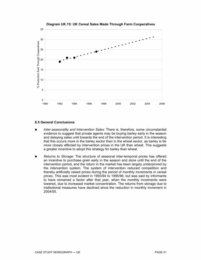
CASE STUDY MONOGRAPH — UK PAGE 41
Diagram UK.15: UK Cereal Sales Made Through Farm Cooperatives
0
5
10
15
20
25
30
35
1990 1992 1994 1996 1998 2000 2002 2004 2006
% P
rodu
ctio
n S
old
Thro
ugh
Coo
pera
tives
8.5 General Conclusions
Inter-seasonality and Intervention Sales: There is, therefore, some circumstantial evidence to suggest that private agents may be buying barley early in the season and delaying sales until towards the end of the intervention period. It is interesting that this occurs more in the barley sector than in the wheat sector, as barley is far more closely affected by intervention prices in the UK than wheat. This suggests a greater incentive to adopt this strategy for barley than wheat.
Returns to Storage: The structure of seasonal inter-temporal prices has offered an incentive to purchase grain early in the season and store until the end of the intervention period, and the return in the market has been largely underpinned by the intervention system. The system of intervention reduced competition and thereby artificially raised prices during the period of monthly increments in cereal prices. This was most evident in 1993/94 to 1995/96, but was said by informants to have remained a factor after that year, when the monthly increments were lowered, due to increased market concentration. The returns from storage due to institutional measures have declined since the reduction in monthly increment in 2004/05.

APPENDIX TO CASE STUDY MONOGRAPH — UK PAGE I1
Appendix to the Case Study Monograph — UK
The present Appendix comprises the following Parts:
Part 1 supporting the report section, Introduction to the Cereals Sector in the UK, England and Scotland.
Part 2.1 supporting the report section, Producers’ Income Levels.
Part 2.2 presents a set of diagrams showing the trends in Farm Net Value Added per Annual Working Unit (FNVA/AWU), which is used as a proxy for average incomes in a farm enterprise, in the United Kingdom as a whole and in the regions of England and Scotland. The data used in the analysis of the trends in FNVA/AWU have been provided by the DG Agriculture’s Farm Accounting Data Network division (FADN).
Part 3.1 supporting the report section, Dependence on Direct Payments.
Part 3.2 contains a set of diagrams depicting the impact of direct payments upon the incomes of cereal producers in England and Scotland. The analysis on the effect of direct payments is based on data provided by FADN.
Part 4 supporting the report section, Production Structures on Holdings.
Part 5 supporting the report section, Adapting Supply to Demand – Quantity and Quality.
Part 6 supporting the report section, Effects of the Drop in Institutional Prices.
Part 7 supporting the report section, Effects Restricting Competition.
Part 8 presents diagrams showing the results of the analysis based on the data collected through the questionnaires distributed by the regional partner to a selected sample of cereal producers in England and Scotland.
Part 9 presents definitions of the FADN types of farming and size classes.

APPENDIX TO CASE STUDY MONOGRAPH — UK PAGE I2
Part 1: Introduction to the Cereals Sector
Crop Production (Area & Yield), Consumption and Trade Balances — UK
Diagram I.1 presents total production of cereal, oilseed and protein (COP) crops in the UK over the period 1984/85 to 2003/04.
Diagram I.1: UK, Arable Crop Production, 1984/85-2003/04
0
5
10
15
20
25
30
1984/85 1987/88 1990/91 1993/94 1996/97 1999/00 2002/03
Milli
on T
onne
s
Cereals (wheat, barley, oats, mixed grains) Oilseeds (oilseed rape) Proteins (field peas, field beans)
Source: Defra Statistics
Table I.1: UK, Production of Wheat, Barley and Oats, 1995/96-2003/04 (million tonnes) Wheat Barley Oats Total
1995/96 16.1 7.8 0.6 24.5 1996/97 15.0 7.8 0.6 23.4 1997/98 15.5 6.6 0.6 22.7 1998/99 14.9 6.6 0.5 22.0 1999/00 16.7 6.5 0.6 23.8 2000/01 11.6 6.7 0.6 18.9 2001/02 16.0 6.1 0.8 22.9 2002/03 14.3 6.4 0.7 21.4 2003/04 15.5 5.8 0.6 21.9 Source: HGCA

APPENDIX TO CASE STUDY MONOGRAPH — UK PAGE I3
Diagram I.2: UK, Cereal Trade Balance, 1990/91-2003/04
-2
-1
0
1
2
3
4
5
1990/91 1992/93 1994/95 1996/97 1998/99 2000/01 2002/03
Milli
on T
onne
s
Wheat Barley Oats Maize
Source: Defra
Table I.2: UK, Wheat Supply Demand Balance, 1995/96-2003/04 (million tonnes) 1995/96 1996/97 1997/98 1998/99 1999/00 2000/01 2001/02 2002/03 2003/04
Production 14.3 16.1 15.0 15.5 14.9 16.7 11.6 16.0 14.3 Consumption 11.7 12.4 12.9 13.1 13.0 13.7 12.9 13.6 13.1 Imports 0.9 0.8 1.3 1.1 1.2 1.2 1.5 1.1 0.9 Exports 3.1 4.6 4.0 3.3 3.1 3.4 0.6 3.4 2.2 Source: Defra
Table I.3: UK, Barley Supply Demand Balance, 1995/96-2003/04 (million tonnes) 1995/96 1996/97 1997/98 1998/99 1999/00 2000/01 2001/02 2002/03 2003/04
Production 6.8 7.8 7.8 6.6 6.6 6.5 6.7 6.1 6.4 Consumption 5.9 5.7 5.6 5.4 5.3 5.5 6.0 5.4 5.6 Imports 0.1 0.1 0.2 0.2 0.1 0.1 0.1 0.1 0.1 Exports 1.4 2.1 1.3 1.9 1.7 1.3 0.6 1.1 0.9
Source: Defra

APPENDIX TO CASE STUDY MONOGRAPH — UK PAGE I4
Table I.4: UK, Oats Supply Demand Balance, 1995/96-2003/04 (million tonnes) 1995/96 1996/97 1997/98 1998/99 1999/00 2000/01 2001/02 2002/03 2003/04
Production 0.6 0.6 0.6 0.6 0.5 0.6 0.6 0.8 0.7 Consumption 0.4 0.5 0.5 0.5 0.5 0.5 0.5 0.6 0.6 Imports 0.0 0.0 0.0 0.0 0.0 0.0 0.0 0.0 0.0 Exports 0.2 0.1 0.1 0.1 0.0 0.1 0.1 0.2 0.1 Source: Defra
Table I.5: UK, Total Cereals Supply Demand Balance, 1995/96-2003/04 (million tonnes)
1995/96 1996/97 1997/98 1998/99 1999/00 2000/01 2001/02 2002/03 2003/04
Production 21.9 24.6 23.5 22.8 22.1 24.0 19.0 23.0 21.5 Consumption 19.7 20.3 20.8 20.7 20.5 21.4 21.1 21.3 21.0 Imports 2.6 2.4 3.1 2.9 2.9 2.8 3.2 2.7 2.6 Exports 4.7 6.9 5.4 5.3 4.9 4.8 1.3 4.7 3.2 Source: Defra
Table I.6 reveals that, based upon the three-year averages, wheat and barley yields have risen only very slightly over the period, while oat yields have been relatively static.
Table I.6: UK, Area and Yields for Wheat, Barley and Oats, 1995/96-2003/04
Wheat Barley Oats Area Yield Area Yield Area Yield 000 ha tonnes/ha 000 ha tonnes/ha 000 ha tonnes/ha
1995/96 1,976 8.2 1,269 6.1 96 6.1 1996/97 2,036 7.4 1,359 5.8 100 5.8 1997/98 2,045 7.6 1,253 5.3 98 6.0 1998/99 1,847 8.0 1,179 5.6 92 5.9 1999/00 2,086 8.0 1,128 5.8 109 5.9 2000/01 1,635 7.1 1,245 5.3 112 5.5 2001/02 1,996 8.0 1,101 5.6 126 6.0 2002/03 1,837 7.8 1,078 5.9 122 6.2 2003/04 1,990 7.8 1,010 5.8 108 5.8 Average 1995/96-1997/98 2,019 7.7 1,294 5.7 98 6.0 Average 2001/02-2003/04 1,941 7.9 1,063 5.8 119 6.0 Source: HGCA
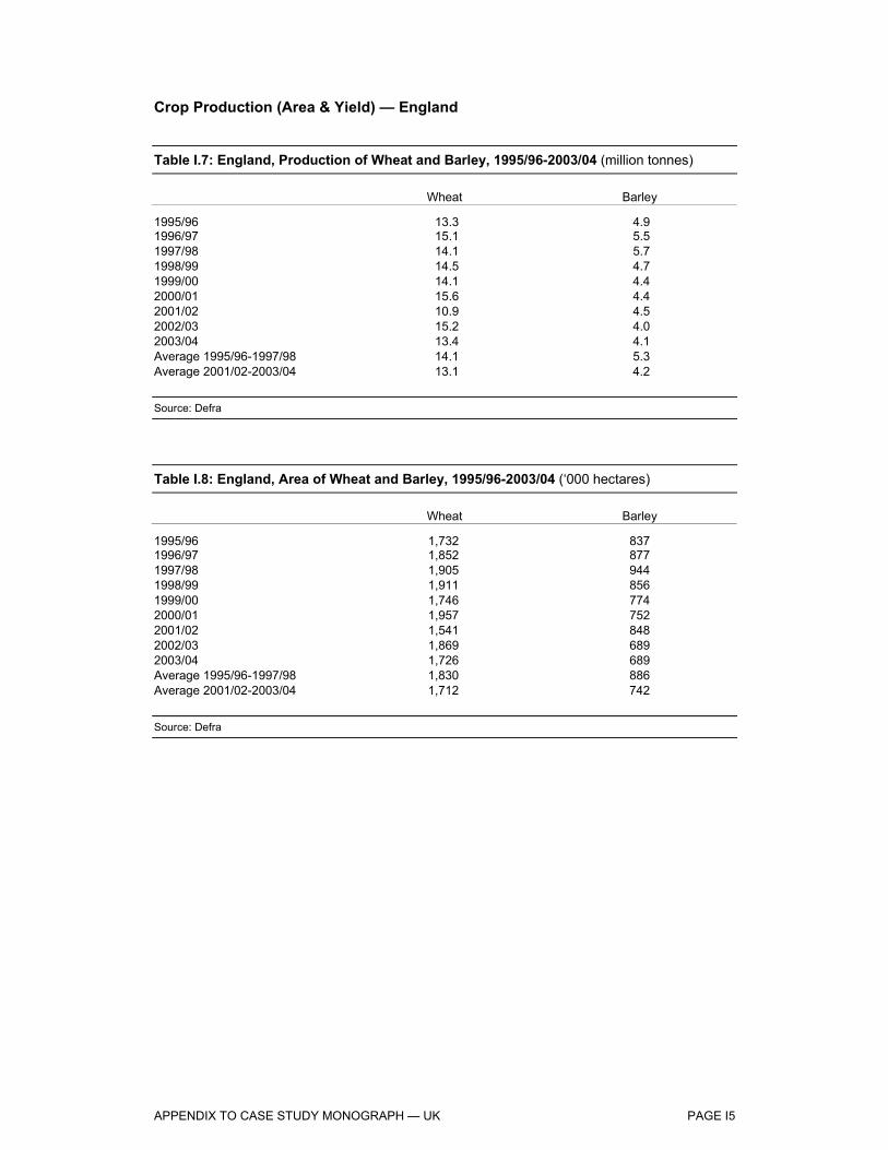
APPENDIX TO CASE STUDY MONOGRAPH — UK PAGE I5
Crop Production (Area & Yield) — England
Table I.7: England, Production of Wheat and Barley, 1995/96-2003/04 (million tonnes) Wheat Barley
1995/96 13.3 4.9 1996/97 15.1 5.5 1997/98 14.1 5.7 1998/99 14.5 4.7 1999/00 14.1 4.4 2000/01 15.6 4.4 2001/02 10.9 4.5 2002/03 15.2 4.0 2003/04 13.4 4.1 Average 1995/96-1997/98 14.1 5.3 Average 2001/02-2003/04 13.1 4.2 Source: Defra
Table I.8: England, Area of Wheat and Barley, 1995/96-2003/04 (‘000 hectares) Wheat Barley
1995/96 1,732 837 1996/97 1,852 877 1997/98 1,905 944 1998/99 1,911 856 1999/00 1,746 774 2000/01 1,957 752 2001/02 1,541 848 2002/03 1,869 689 2003/04 1,726 689 Average 1995/96-1997/98 1,830 886 Average 2001/02-2003/04 1,712 742 Source: Defra

APPENDIX TO CASE STUDY MONOGRAPH — UK PAGE I6
Table I.9: England, Yields of Wheat and Barley, 1995/96-2003/04 (tonnes per hectares) Wheat Barley
1995/96 7.7 5.8 1996/97 8.1 6.3 1997/98 7.4 6.0 1998/99 7.6 5.5 1999/00 8.1 5.7 2000/01 8.0 5.9 2001/02 7.1 5.3 2002/03 8.0 5.9 2003/04 8.0 5.9 Average 1995/96-1997/98 7.7 6.0 Average 2001/02-2003/04 7.7 5.7 Source: Defra
Agricultural Structure — Scotland
Some 75% of Scotland’s land area is under agricultural production. Scotland’s farmers produce output worth around £2 billion (€2.9 billion) per annum, and are responsible for much of Scotland’s £400 million (€590 million) food exports, which rise to £2.4 billion (€3.5 billion) if whisky exports are included. Total income from farming in Scotland in 2003 is estimated at around £472 million (€690 million). Around 85% of Scotland is classified as Less Favoured Area. This EU classification recognises natural and geographic disadvantage.
There are large numbers of farms in north-west Scotland, but these tend to be significantly smaller than those elsewhere in the country in terms of livestock and/or area cropped. Sheep farming is the predominant farming type in the north-west, and there are also many sheep farms in the south of the country. The larger, more specialised arable farms tend to be concentrated in the east. Beef farming takes place throughout Scotland, but is particularly common in the south west. This area also has the bulk of the dairy sector1.
Around 70,000 people are employed directly in agriculture in Scotland, which represents around 8% of the rural labour force. This means that agriculture is the third largest employer in rural Scotland after the service industries and public sector. It is estimated that a further 200,000 jobs — one in ten of all Scottish jobs — are dependent on agriculture, largely in food and drink processing industries and agricultural supplies sector2.
However, the pattern of employment on Scottish farms is changing. From 1990 to 2001, the number of owner-occupiers on farms remained relatively stable, at around 29,000. Meanwhile, the number of spouses working on Scottish farms has increased from just less than 12,000 in 1990 to just under 14,000 in 2001. In the same period, the number of full time workers has declined from more than 37,000 to fewer than 30,000.
1 NFU Scotland: www.nfus.org.uk 2 NFU Scotland, Scottish Farming Facts.

APPENDIX TO CASE STUDY MONOGRAPH — UK PAGE I7
By contrast, the number of part time and seasonal workers has increased almost proportionately — from less than 30,000 to above 35,0003.
Crop Production (Area & Yield) — Scotland
Table I.10: Scotland, Production of Barley and Oats, 1995/96-2003/04 (million tonnes)
Barley Oats
1995/96 1.66 0.11 1996/97 1.94 0.10 1997/98 1.81 0.12 1998/99 1.62 0.11 1999/00 1.84 0.12 2000/01 1.77 0.12 2001/02 1.92 0.11 2002/03 1.70 0.10 2003/04 1.98 0.13 Average 1995/96-1997/98 1.80 0.11 Average 2001/02-2003/04 1.87 0.12 Source: Defra/SEERAD
Table I.11: Scotland, Area of Oats and Barley, 1995/96-2003/04 (‘000 hectares) Barley Oats
1995/96 290 25.2 1996/97 324 20.0 1997/98 344 21.2 1998/99 334 21.8 1999/00 339 22.3 2000/01 316 21.9 2001/02 337 21.3 2002/03 325 21.1 2003/04 322 22.2 Average 1995/96-1997/98 319 22.1 Average 2001/02-2003/04 328 21.5 Source: Defra/SEERAD
3 NFU Scotland, Scottish Farming Facts.
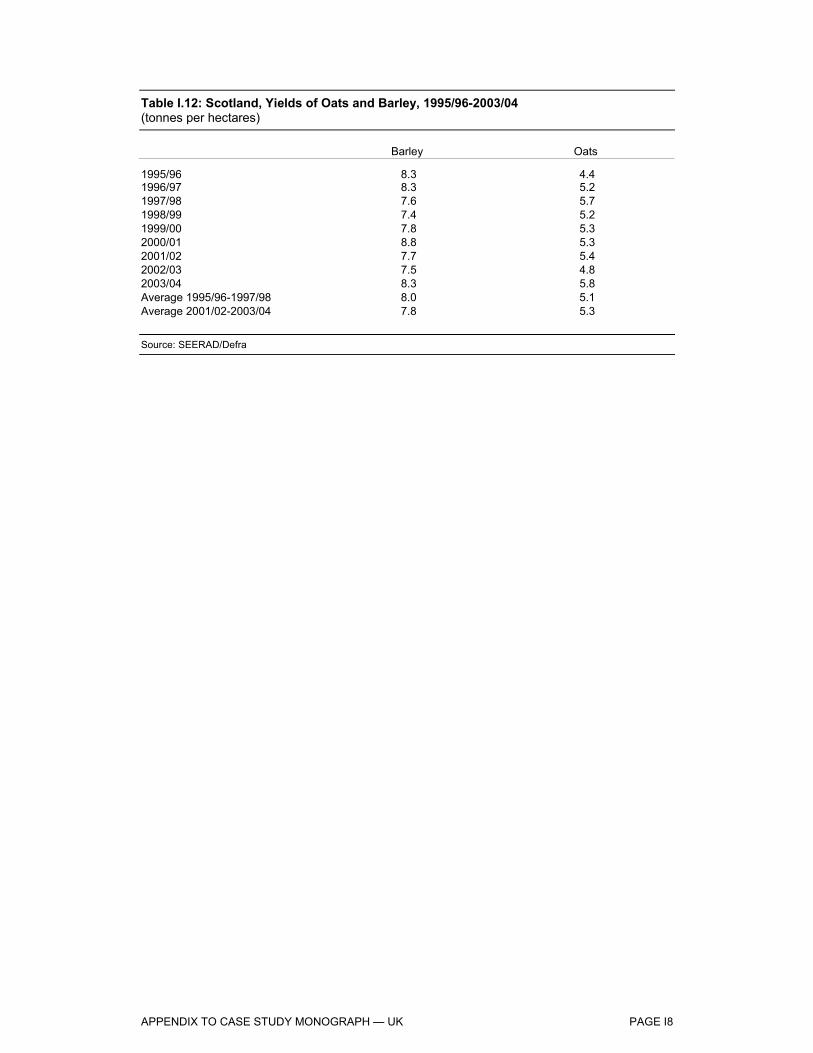
APPENDIX TO CASE STUDY MONOGRAPH — UK PAGE I8
Table I.12: Scotland, Yields of Oats and Barley, 1995/96-2003/04 (tonnes per hectares) Barley Oats
1995/96 8.3 4.4 1996/97 8.3 5.2 1997/98 7.6 5.7 1998/99 7.4 5.2 1999/00 7.8 5.3 2000/01 8.8 5.3 2001/02 7.7 5.4 2002/03 7.5 4.8 2003/04 8.3 5.8 Average 1995/96-1997/98 8.0 5.1 Average 2001/02-2003/04 7.8 5.3 Source: SEERAD/Defra

APPENDIX TO CASE STUDY MONOGRAPH — UK PAGE I9
Part 2.1: Producers’ Income level
Prices, Exchange Rates
Diagram I.3: UK, Cereal Prices, 1990/91-2004/054
100
120
140
160
180
200
220
240
1990/91 1992/93 1994/95 1996/97 1998/99 2000/01 2002/03 2004/05
€ pe
r ton
ne
Breadmaking Wheat Feed Barley Feed Wheat
Source: HGCA
4 Represents average delivered price for East Anglia, London, Yorkshire and Liverpool.
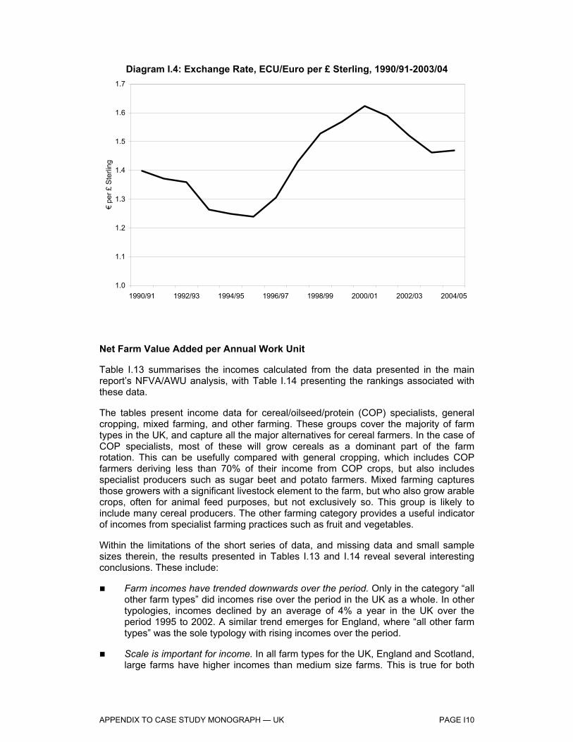
APPENDIX TO CASE STUDY MONOGRAPH — UK PAGE I10
Diagram I.4: Exchange Rate, ECU/Euro per £ Sterling, 1990/91-2003/04
1.0
1.1
1.2
1.3
1.4
1.5
1.6
1.7
1990/91 1992/93 1994/95 1996/97 1998/99 2000/01 2002/03 2004/05
€ pe
r £ S
terli
ng
Net Farm Value Added per Annual Work Unit
Table I.13 summarises the incomes calculated from the data presented in the main report’s NFVA/AWU analysis, with Table I.14 presenting the rankings associated with these data.
The tables present income data for cereal/oilseed/protein (COP) specialists, general cropping, mixed farming, and other farming. These groups cover the majority of farm types in the UK, and capture all the major alternatives for cereal farmers. In the case of COP specialists, most of these will grow cereals as a dominant part of the farm rotation. This can be usefully compared with general cropping, which includes COP farmers deriving less than 70% of their income from COP crops, but also includes specialist producers such as sugar beet and potato farmers. Mixed farming captures those growers with a significant livestock element to the farm, but who also grow arable crops, often for animal feed purposes, but not exclusively so. This group is likely to include many cereal producers. The other farming category provides a useful indicator of incomes from specialist farming practices such as fruit and vegetables.
Within the limitations of the short series of data, and missing data and small sample sizes therein, the results presented in Tables I.13 and I.14 reveal several interesting conclusions. These include:
Farm incomes have trended downwards over the period. Only in the category “all other farm types” did incomes rise over the period in the UK as a whole. In other typologies, incomes declined by an average of 4% a year in the UK over the period 1995 to 2002. A similar trend emerges for England, where “all other farm types” was the sole typology with rising incomes over the period.
Scale is important for income. In all farm types for the UK, England and Scotland, large farms have higher incomes than medium size farms. This is true for both

APPENDIX TO CASE STUDY MONOGRAPH — UK PAGE I11
the beginning of the series, in 1995, and the end of the series, in 2002, with the exception of general cropping in Scotland in 1995, where incomes are at a similar level.
Scale is especially important for COP specialists. There is a large divergence between incomes for COP specialists on large and medium scale farms. As Table I.14 reveals, on large farms, in the UK, England and Scotland, COP specialists were among the highest ranked incomes in both 1995 and 2002. However, for medium farms, incomes in the UK, England and Scotland were all toward the lower end of the income rankings, both in 1995 and 2002.
Incomes have fallen relatively steeply for COP specialists. For the UK as whole, COP specialists have experienced relatively steep declines in incomes (albeit from higher levels), with large farms having a 3.5% per annum decline and medium farms an 8% per annum decline over the featured period. A similar pattern is observable for England also. In each of these cases, medium size COP specialists have experienced the greatest percentage falls over the period, from already low income levels (Table I.14). Large COP farms in Scotland have also experienced large income reductions relative to other farm types. Medium size COP farms in Scotland have experienced lower declines in income, but incomes in this farm type were already at very low levels — the lowest of any farm type — in 1995.
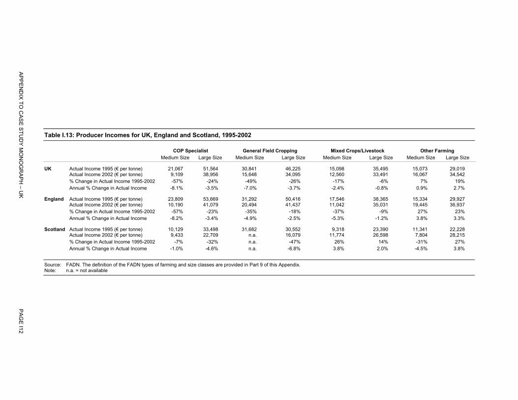
Table I.13: Producer Incomes for UK, England and Scotland, 1995-2002 COP Specialist General Field Cropping Mixed Crops/Livestock Other Farming Medium Size Large Size Medium Size Large Size Medium Size Large Size Medium Size Large Size
UK Actual Income 1995 (€ per tonne) 21,067 51,564 30,841 46,225 15,098 35,495 15,073 29,019 Actual Income 2002 (€ per tonne) 9,109 38,956 15,648 34,095 12,560 33,491 16,067 34,542 % Change in Actual Income 1995-2002 -57% -24% -49% -26% -17% -6% 7% 19% Annual % Change in Actual Income -8.1% -3.5% -7.0% -3.7% -2.4% -0.8% 0.9% 2.7%
England Actual Income 1995 (€ per tonne) 23,809 53,669 31,292 50,416 17,546 38,365 15,334 29,927 Actual Income 2002 (€ per tonne) 10,190 41,079 20,494 41,437 11,042 35,031 19,445 36,937 % Change in Actual Income 1995-2002 -57% -23% -35% -18% -37% -9% 27% 23% Annual % Change in Actual Income -8.2% -3.4% -4.9% -2.5% -5.3% -1.2% 3.8% 3.3%
Scotland Actual Income 1995 (€ per tonne) 10,129 33,498 31,682 30,552 9,318 23,390 11,341 22,228 Actual Income 2002 (€ per tonne) 9,433 22,709 n.a. 16,079 11,774 26,598 7,804 28,215 % Change in Actual Income 1995-2002 -7% -32% n.a. -47% 26% 14% -31% 27% Annual % Change in Actual Income -1.0% -4.6% n.a. -6.8% 3.8% 2.0% -4.5% 3.8% Source: FADN. The definition of the FADN types of farming and size classes are provided in Part 9 of this Appendix. Note: n.a. = not available
AP
PE
ND
IX TO
CA
SE
STU
DY
MO
NO
GR
AP
H – U
K
PA
GE
I12

Table I.14: Rankings of Producer Incomes and Changes in Incomes for UK, England and Scotland, 1995-2002 COP Specialist General Field Cropping Mixed Crops/Livestock Other Farming Medium Size Large Size Medium Size Large Size Medium Size Large Size Medium Size Large Size
UK Actual Income 1995 (€ per tonne) 6 1 4 2 7 3 8 5 Actual Income 2002 (€ per tonne) 8 1 6 3 7 4 5 2 % Change in Actual Income 1995-2002 8 5 7 6 4 3 2 1 Annual % Change in Actual Income 8 5 7 6 4 3 2 1
England Actual Income 1995 (€ per tonne) 6 1 4 2 7 3 8 5 Actual Income 2002 (€ per tonne) 8 2 5 1 7 4 6 3 % Change in Actual Income 1995-2002 8 5 6 4 7 3 1 2 Annual % Change in Actual Income 8 5 6 4 7 3 1 2
Scotland Actual Income 1995 (€ per tonne) 7 1 2 3 8 4 6 5 Actual Income 2002 (€ per tonne) 6 3 n.a. 4 5 2 7 1 % Change in Actual Income 1995-2002 4 6 n.a. 7 2 3 5 1 Annual % Change in Actual Income 4 6 n.a. 7 2 3 5 1 Source: FADN. The definition of the FADN types of farming and size classes are provided in Part 9 of this Appendix. Note: n.a. = Not available
AP
PE
ND
IX TO
CA
SE
STU
DY
MO
NO
GR
AP
H
PA
GE
I13

APPENDIX TO CASE STUDY MONOGRAPH — UK PAGE I14
National Farm Income Sources
In Diagram I.5, we present nominal net farm incomes for cereal specialists in the UK, England and Scotland according to Defra’s Farm Business Survey5.
Diagram I.5: Average Net Farm Incomes for Cereal Farms6, 1994/95-2002/03
-20
0
20
40
60
80
100
1994/95 1995/96 1996/97 1997/98 1998/99 1999/00 2000/01 2001/02 2002/03 2003/04 2004/05
'000
Eur
os
UK England Scotland
Source: Defra
The diagram reveals the peak in net farm incomes enjoyed in 1995/96, and the steep decline to 1997/98 as falling cereal prices and sterling’s appreciation meant that the MacSharry reforms belatedly affected incomes in the UK farm sector. Incomes stabilised somewhat between 1997/98 and 2002/03, and have enjoyed a recovery recently, due primarily to higher prices for cereals in 2003/04 (Diagram UK.1.1).
A considerable amount of volatility is depicted by cereal farm incomes, although the peaks in income are notably more pronounced than the flat-bottomed troughs. This observation is supported by farmers interviewed in the course of this report, who considered farm support measures, notably intervention prices and arable area payments, to provide a floor to incomes. Set-aside may also help in this regard, by providing a positive remuneration for marginal fields that would derive negative margins if farmed with cereals.
A further notable feature of Diagram I.5 is how closely the England and UK figures are related, with England accounting for over 90% of the UK weighting in cereals. This should be borne in mind in the remainder of this case study, as data is sometimes 5 Estimates for 2004/05 are provisional.
6 Defra define cereal farms in this context to have more than two-thirds of farm gross margins derived from cereal crops. General cropping farms have no more than two-thirds of farm gross margins from any single crop type. Mixed farms are defined as those farms where no more than two-thirds of the farm gross margin comes from either arable or livestock.
APPENDIX TO CASE STUDY MONOGRAPH — UK PAGE I15
available only for the UK as a whole and for Scotland separately, as a result of the devolution of some functions to a separate Scottish parliament from London. Where this is the case, however, the UK can be taken as a close proxy for the English situation.
Diagrams A6 and A7, also using Defra data, compare cereal specialists with general arable cropping and mixed farming in England and Scotland. The diagrams reveal the convergence in incomes among farm types over the period in England, where cereal farm incomes are now similar to mixed farming, although general cropping incomes remain somewhat higher but more volatile. In this regard, support measures can be said to have affected incomes in a fair manner, as incomes across farming sectors have converged over time.
In the Scottish case, cereal farm incomes plummeted from their mid 1990s peaks, and have become negative in 2004/05, as have other farming activities. By contrast, mixed farming incomes in Scotland rose gradually from the late 1990s, until 2004/05, largely due to the successful product differentiation and premium branding of Scottish beef. In this latter case, this phenomenon has not been a product of policy, although farmers felt policy reforms in the form of declining support had stimulated various private initiatives. Scottish cereal incomes have also been more volatile than other sectors over the period, as measured by the coefficient of variation, although this is largely due to the high prices of the initial years in the period.
Diagram I.8 presents the distribution of net farm incomes for cereal farms (again defined as having 70% of gross margins from cereal crops) for England and Scotland in 2001/02, revealing that almost half of all cereal farms in England and Scotland earned net farm incomes of less than zero in 2001/02, while the most successful 5% of cereal farms in England earned over €80,000.
Another way of considering net farm incomes is to compare incomes on a per hectare basis. In Diagram I.9, we present net farm incomes for the Eastern Counties of England for cereal specialists and other farms types over time, in real terms7. Again the peaks in 1995/96 are apparent, and the downward trend in incomes per hectare since that time is notable for all sectors, with cereal specialists becoming the lowest remunerated sector in several years recently. The rather dramatic recovery for both arable sectors in 2003/04 is explained by the impact of high grain prices (see Diagram UK.1.1), and is thought to be anomalous and unsustainable by industry sources. Evidence for this supposition is provided by other income series contained here extending to 2004/05.
7 The Eastern Counties represent the major cereal growing area of the UK, and is the subject of detailed
annual analysis by the Rural Business Unit of Cambridge University. Farming participants and authorities for this study felt that the average position for the Eastern Counties is a reasonable proxy for the English cereal situation in many instances, particularly given its heavy weighting in England cereal aggregates. Moreover, the data available for the region is available in long series up to 2003/04.

APPENDIX TO CASE STUDY MONOGRAPH — UK PAGE I16
Diagram I.6: England, Average Net Farm Incomes for Cereal Specialists, General Cropping and Mixed Farming, 1994/95-2002/03
0
20
40
60
80
100
120
1994/95 1995/96 1996/97 1997/98 1998/99 1999/00 2000/01 2001/02 2002/03 2003/04 2004/05
'000
Eur
os
Cereal General Cropping Mixed Farming
Source: Defra
Diagram I.7: Scotland, Average Net Farm Incomes for Cereal Specialists, General Cropping and Mixed Farming, 1994/95-2002/03
-20
0
20
40
60
80
100
1994/95 1995/96 1996/97 1997/98 1998/99 1999/00 2000/01 2001/02 2002/03 2003/04 2004/05
'000
Eur
os
Cereal General Cropping Mixed Farming
Source: Defra

APPENDIX TO CASE STUDY MONOGRAPH — UK PAGE I17
Diagram I.8: Distribution of Net Farm Incomes, 2001/02
0
10
20
30
40
50
60
Less thanzero
0 - €8,000 €8,000 -€16,000
€16,000 -€32,000
€32,000 -£48,000
€48,000 -€80,000
€80,000 +
Per
Cen
t (%
)
England Scotland
Source: Defra
Diagram I.9: England/Eastern Counties, Real Net Farm Incomes per Hectare by Farm Type, 1993/94-2003/04
0
100
200
300
400
500
600
700
1993/94 1994/95 1995/96 1996/97 1997/98 1998/99 1999/00 2000/01 2001/02 2002/03 2003/04
€ pe
r hec
tare
Cereal Specialists General Cropping Mixed Farming
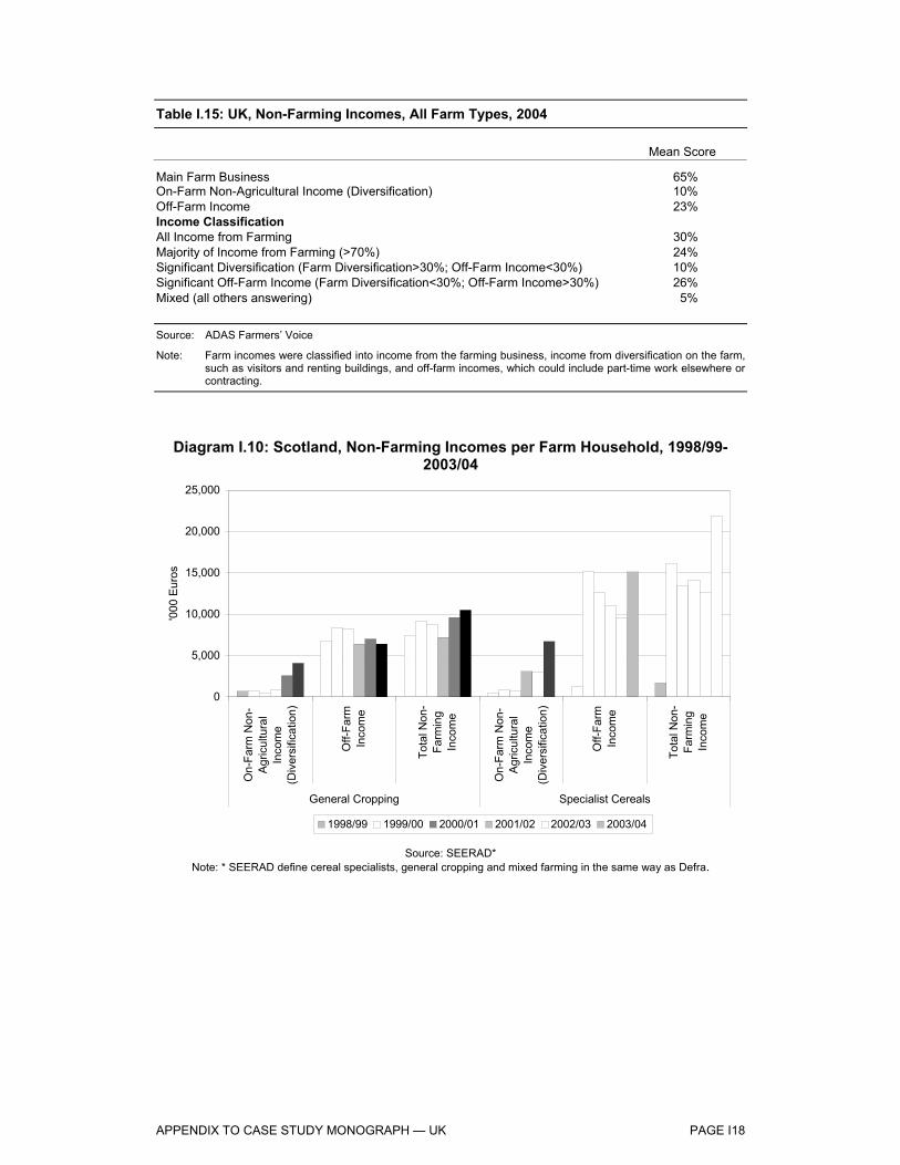
APPENDIX TO CASE STUDY MONOGRAPH — UK PAGE I18
Table I.15: UK, Non-Farming Incomes, All Farm Types, 2004
Mean Score
Main Farm Business 65% On-Farm Non-Agricultural Income (Diversification) 10% Off-Farm Income 23% Income Classification All Income from Farming 30% Majority of Income from Farming (>70%) 24% Significant Diversification (Farm Diversification>30%; Off-Farm Income<30%) 10% Significant Off-Farm Income (Farm Diversification<30%; Off-Farm Income>30%) 26% Mixed (all others answering) 5% Source: ADAS Farmers’ Voice
Note: Farm incomes were classified into income from the farming business, income from diversification on the farm, such as visitors and renting buildings, and off-farm incomes, which could include part-time work elsewhere or contracting.
Diagram I.10: Scotland, Non-Farming Incomes per Farm Household, 1998/99-2003/04
0
5,000
10,000
15,000
20,000
25,000
On-
Farm
Non
-A
gric
ultu
ral
Inco
me
(Div
ersi
ficat
ion)
Off-
Farm
Inco
me
Tota
l Non
-Fa
rmin
gIn
com
e
On-
Farm
Non
-A
gric
ultu
ral
Inco
me
(Div
ersi
ficat
ion)
Off-
Farm
Inco
me
Tota
l Non
-Fa
rmin
gIn
com
e
General Cropping Specialist Cereals
'000
Eur
os
1998/99 1999/00 2000/01 2001/02 2002/03 2003/04
Source: SEERAD* Note: * SEERAD define cereal specialists, general cropping and mixed farming in the same way as Defra.

APPENDIX TO CASE STUDY MONOGRAPH — UK PAGE I19
Land Prices and Rents
Table I.16: England, Agricultural Land Sales, 1993-2003 Number of Sales Area Sold
(Hectares) Average Price (€ per Hectare)
Real Sterling Price Index (1995=100)
1993 2,689 78,607 4,864 84 1994 2,811 86,576 5,452 91 1995 2,862 91,371 5,780 100 1996 3,425 105,743 7,453 123 1997 4,187 124,840 9,323 127 1998 3,498 103,802 9,075 117 1999 3,437 91,534 10,140 126 2000 3,227 78,502 11,626 129 2001 2,596 65,317 11,898 133 2002 2,976 76,256 10,970 122 2003 2,262 57,400 10,194 125 Source: Defra Note: Deflator used is Consumer Price Index (CPI)
Diagram I.11 presents agricultural land prices in England from 1990, both in nominal prices and as an index of real sterling prices. It reveals that, although prices have risen in nominal terms, in real terms land prices have been broadly flat since 1996.
Diagram I.11: England, Real and Nominal Agricultural Land Prices, 1990-2003
0
2
4
6
8
10
12
14
1990 1991 1992 1993 1994 1995 1996 1997 1998 1999 2000 2001 2002 2003
Nom
inal
Lan
d P
rice
('000
€/h
ecta
re)
40
60
80
100
120
140
160
180
Real S
terling Price Index (1995=100)
Nominal Land Price Real Sterling Land Price Index (1995=100)
Source: Defra

APPENDIX TO CASE STUDY MONOGRAPH — UK PAGE I20
Turning to Scotland, Diagram I.12 presents the value of land and building assets per hectare from 1993 to 2003, offering similar evidence of a rise in nominal asset values against a backdrop of declining nominal returns to farming.
Diagram I.12: Scotland, Value of Assets per Hectare (Land and Buildings), 1993/94-2003/04
0
3,000
6,000
9,000
12,000
15,000
1993/94 1994/95 1995/96 1996/97 1997/98 1998/99 1999/00 2000/01 2001/02 2002/03 2003/04
€ pe
r hec
tare
General Cropping (Nominal) Cereal Specialists (Nominal)
Source: SEERAD
Diagram I.13 reveals that land prices broadly increased in each size category over the period 1993 to 2003, although price falls were registered in the last two years. In addition, the diagram also reveals that prices were highest for small plots, and correspondingly lowest for large plots. Assuming most lifestyle-led purchases are of smaller land areas, this finding lends support to the notion that, in the market for smallholdings especially, the amenity value of farmland acts to support prices.
Diagram I.14 reveals that the greatest total area sold was in the form of smaller plots, and, of course, the number of transactions in this category is by far the highest. This may be to take advantage of the higher prices suggested by Diagram UK.1.12, but it is also possible that economies of scale do have a role to play in farming profitability, and that smallholders have a greater propensity to failure and sale.

APPENDIX TO CASE STUDY MONOGRAPH — UK PAGE I21
Diagram I.13: England, Agricultural Land Prices by Size of Land Area Sold, 1993-2003
0
2
4
6
8
10
12
14
16
5-49.9 Hectares 50-99.9 Hectares 100+ Hectares
'000
€ p
er h
ecta
re
1993 1994 1995 1996 1997 1998 1999 2000 2001 2002 2003
Source: Defra
Diagram I.14: England, Agricultural Land Sales by Size of Land Area Sold, 1993-2003
0
10
20
30
40
50
60
70
5-49.9 Hectares 50-99.9 Hectares 100+ Hectares
'000
hec
tare
s
1993 1994 1995 1996 1997 1998 1999 2000 2001 2002 2003
Source: Defra

APPENDIX TO CASE STUDY MONOGRAPH — UK PAGE I22
Diagram I.15 presents land rentals for cereal specialists in England and Scotland from 1993/94 to 2003/04, and also shows the cereal Arable Area Payments (AAPs) for England over the period. (AAPs are converted to euros from the actual values paid to cereal farmers in England, in sterling, after allowing for scale backs due to overshoots in area.)
Diagram I.15: England & Scotland, Rent of Cereal Specialist Agricultural Land, 1993/94-2003/04
0
50
100
150
200
250
300
350
400
1993/94 1994/95 1995/96 1996/97 1997/98 1998/99 1999/00 2000/01 2001/02 2002/03 2003/04
€ pe
r hec
tare
Scotland England England Cereals AAP
Source: Defra; SEERAD
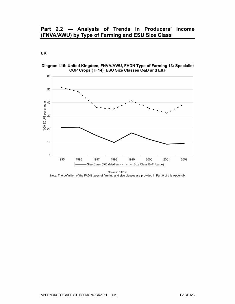
APPENDIX TO CASE STUDY MONOGRAPH — UK PAGE I23
Part 2.2 — Analysis of Trends in Producers’ Income (FNVA/AWU) by Type of Farming and ESU Size Class
UK
Diagram I.16: United Kingdom, FNVA/AWU, FADN Type of Farming 13: Specialist COP Crops (TF14), ESU Size Classes C&D and E&F
0
10
20
30
40
50
60
1995 1996 1997 1998 1999 2000 2001 2002
'000
EC
U/€
per
ann
um
Size Class C+D (Medium) Size Class E+F (Large)
Source: FADN. Note: The definition of the FADN types of farming and size classes are provided in Part 9 of this Appendix

APPENDIX TO CASE STUDY MONOGRAPH — UK PAGE I24
Diagram I.17: United Kingdom, FNVA/AWU, FADN Type of Farming 14: General Field Cropping (TF14), ESU Size Classes C&D and E&F
0
5
10
15
20
25
30
35
40
45
50
1995 1996 1997 1998 1999 2000 2001 2002
'000
EC
U/€
per
ann
um
Size Class C+D (Medium) Size Class E+F (Large)
Source: FADN. Note: The definition of the FADN types of farming and size classes are provided in Part 9 of this Appendix
Diagram I.18: United Kingdom, FNVA/AWU, FADN Type of Farming 8: Mixed Crops – Livestock (TF8), ESU Size Classes C&D and E&F
0
5
10
15
20
25
30
35
40
1995 1996 1997 1998 1999 2000 2001 2002
'000
EC
U/€
per
ann
um
Size Class C+D (Medium) Size Class E+F (Large)
Source: FADN. Note: The definition of the FADN types of farming and size classes are provided in Part 9 of this Appendix

APPENDIX TO CASE STUDY MONOGRAPH — UK PAGE I25
Diagram I.19: United Kingdom, FNVA/AWU, All FADN Types of Farming, Size Class C&D (Medium)
0
5
10
15
20
25
30
35
1995 1996 1997 1998 1999 2000 2001 2002
'000
EC
U/€
per
ann
um
Specialist COP Crops General Field Cropping Mixed Crops-Livestock All Other Types of Farming - Average
Source: FADN. Note: The definition of the FADN types of farming and size classes are provided in Part 9 of this Appendix
Diagram I.20: United Kingdom, FNVA/AWU, All FADN Types of Farming, ESU Size Class E&F (Large)
0
10
20
30
40
50
60
1995 1996 1997 1998 1999 2000 2001 2002
'000
EC
U/€
per
ann
um
Specialist COP Crops General Field Cropping Mixed Crops-Livestock All Other Types of Farming - Average
Source: FADN. Note: The definition of the FADN types of farming and size classes are provided in Part 9 of this Appendix
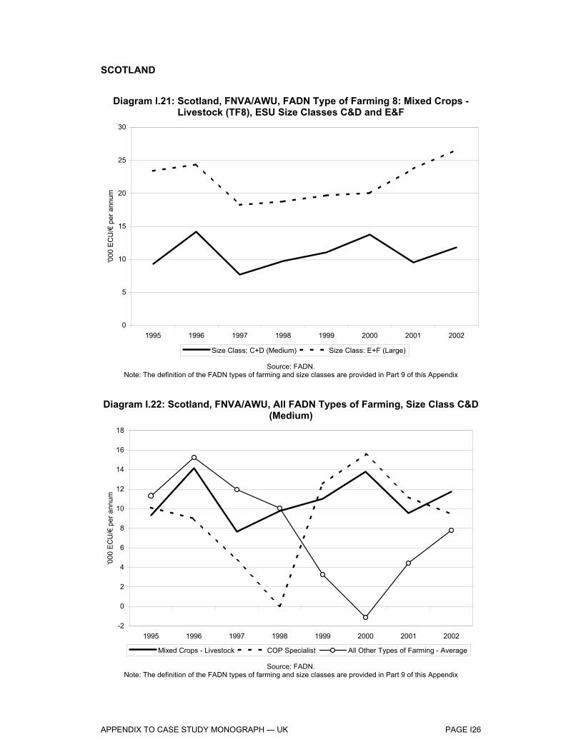
APPENDIX TO CASE STUDY MONOGRAPH — UK PAGE I26
SCOTLAND
Diagram I.21: Scotland, FNVA/AWU, FADN Type of Farming 8: Mixed Crops - Livestock (TF8), ESU Size Classes C&D and E&F
0
5
10
15
20
25
30
1995 1996 1997 1998 1999 2000 2001 2002
'000
EC
U/€
per
ann
um
Size Class: C+D (Medium) Size Class: E+F (Large)
Source: FADN. Note: The definition of the FADN types of farming and size classes are provided in Part 9 of this Appendix
Diagram I.22: Scotland, FNVA/AWU, All FADN Types of Farming, Size Class C&D (Medium)
-2
0
2
4
6
8
10
12
14
16
18
1995 1996 1997 1998 1999 2000 2001 2002
'000
EC
U/€
per
ann
um
Mixed Crops - Livestock COP Specialist All Other Types of Farming - Average
Source: FADN. Note: The definition of the FADN types of farming and size classes are provided in Part 9 of this Appendix

APPENDIX TO CASE STUDY MONOGRAPH — UK PAGE I27
Diagram I.23: Scotland, FNVA/AWU, All FADN Types of Farming, Size Class E&F (Large)
0
5
10
15
20
25
30
35
40
1995 1996 1997 1998 1999 2000 2001 2002
'000
EC
U/€
per
ann
um
Mixed Crops - Livestock General Field CroppingCOP Specialist All Other Types of Farming - Average
Source: FADN. Note: The definition of the FADN types of farming and size classes are provided in Part 9 of this Appendix
ENGLAND
Diagram I.24: England, FNVA/AWU, FADN Type of Farming 13: Specialist COP Crops (TF14), ESU Size Classes C&D and E&F
0
10
20
30
40
50
60
1995 1996 1997 1998 1999 2000 2001 2002
'000
EC
U/€
per
ann
um
Size Class: C+D (Medium) Size Class: E+F (Large)
Source: FADN. Note: The definition of the FADN types of farming and size classes are provided in Part 9 of this Appendix

APPENDIX TO CASE STUDY MONOGRAPH — UK PAGE I28
Diagram I.25: England, FNVA/AWU, FADN Type of Farming 14: General Field Cropping (TF14), ESU Size Classes C&D and E&F
0
10
20
30
40
50
60
1995 1996 1997 1998 1999 2000 2001 2002
'000
EC
U/€
per
ann
um
Size Class: C+D (Medium) Size Class: E+F (Large)
Source: FADN. The definition of the FADN types of farming and size classes are provided in Part 9 of this Appendix
Diagram I.26: England, FNVA/AWU, FADN Type of Farming 8: Mixed Crops – Livestock (TF8), ESU Size Classes C&D and E&F
0
5
10
15
20
25
30
35
40
45
1995 1996 1997 1998 1999 2000 2001 2002
'000
EC
U/€
per
ann
um
Size Class: C+D (Medium) Size Class: E+F (Large)
Source: FADN. Note: The definition of the FADN types of farming and size classes are provided in Part 9 of this Appendix

APPENDIX TO CASE STUDY MONOGRAPH — UK PAGE I29
Diagram I.27: England, FNVA/AWU, All FADN Types of Farming, Size Class C&D (Medium)
0
5
10
15
20
25
30
35
40
1995 1996 1997 1998 1999 2000 2001 2002
'000
EC
U/€
per
ann
um
Mixed Crops - Livestock General Field CroppingCOP Specialist All Other Types of Farming - Average
Source: FADN. Note: The definition of the FADN types of farming and size classes are provided in Part 9 of this Appendix
Diagram I.28: England, FNVA/AWU, All FADN Types of Farming, Size Class E&F (Large)
0
10
20
30
40
50
60
1995 1996 1997 1998 1999 2000 2001 2002
'000
EC
U/€
per
ann
um
Mixed Crops - Livestock General Field CroppingCOP Specialist All Other Types of Farming - Average
Source: FADN. Note: The definition of the FADN types of farming and size classes are provided in Part 9 of this Appendix
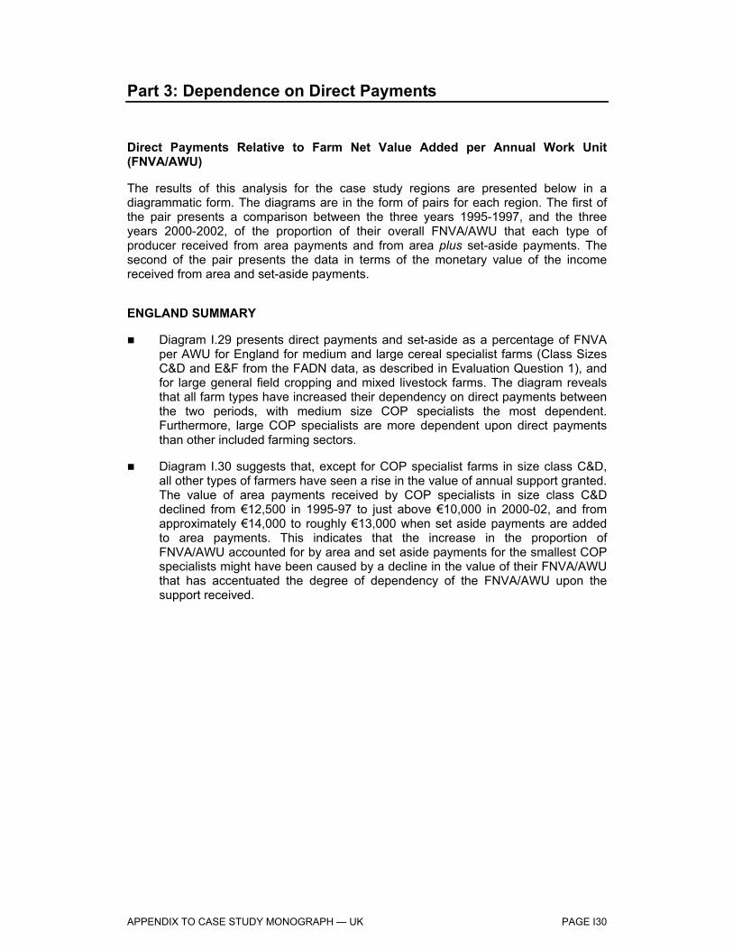
APPENDIX TO CASE STUDY MONOGRAPH — UK PAGE I30
Part 3: Dependence on Direct Payments
Direct Payments Relative to Farm Net Value Added per Annual Work Unit (FNVA/AWU)
The results of this analysis for the case study regions are presented below in a diagrammatic form. The diagrams are in the form of pairs for each region. The first of the pair presents a comparison between the three years 1995-1997, and the three years 2000-2002, of the proportion of their overall FNVA/AWU that each type of producer received from area payments and from area plus set-aside payments. The second of the pair presents the data in terms of the monetary value of the income received from area and set-aside payments.
ENGLAND SUMMARY
Diagram I.29 presents direct payments and set-aside as a percentage of FNVA per AWU for England for medium and large cereal specialist farms (Class Sizes C&D and E&F from the FADN data, as described in Evaluation Question 1), and for large general field cropping and mixed livestock farms. The diagram reveals that all farm types have increased their dependency on direct payments between the two periods, with medium size COP specialists the most dependent. Furthermore, large COP specialists are more dependent upon direct payments than other included farming sectors.
Diagram I.30 suggests that, except for COP specialist farms in size class C&D, all other types of farmers have seen a rise in the value of annual support granted. The value of area payments received by COP specialists in size class C&D declined from €12,500 in 1995-97 to just above €10,000 in 2000-02, and from approximately €14,000 to roughly €13,000 when set aside payments are added to area payments. This indicates that the increase in the proportion of FNVA/AWU accounted for by area and set aside payments for the smallest COP specialists might have been caused by a decline in the value of their FNVA/AWU that has accentuated the degree of dependency of the FNVA/AWU upon the support received.

APPENDIX TO CASE STUDY MONOGRAPH — UK PAGE I31
Diagram I.29: England, The Proportions of FNVA/AWU Accounted for by Area and Set-Aside Payments by Farm Type, 1995-97 and 2000-02
0%
20%
40%
60%
80%
100%
120%
140%
COP - C&D COP - E&F GEN - E&F MIX - E&F
% o
f FN
VA
/AW
U in
Are
a &
Set
-asi
de P
aym
ents
1995-1997 (Area) 1995-1997 (+ Set-aside) 2000-2002 (Area) 2000-2002 (+ Set-aside)
Source: Derived from analysis of FADN data Note: The definition of FADN farm types and size classes are in Part 9 of this Appendix. For each period two values are
shown, one depicts only the impact of area payments, the other adds set-aside payments.
Diagram I.30: England, Comparison of the Value of Area and Set-Aside Payments per AWU by Farm Typology, 1995-97 and 2000-02
0
5
10
15
20
25
30
35
COP - C&D COP - E&F GEN - E&F MIX - E&F
Are
a &
Set
-asi
de P
aym
ents
, '00
0 E
uros
per
AW
U
1995-1997 (Area) 1995-1997 (+ Set-aside) 2000-2002 (Area) 2000-2002 (+ Set-aside)
Source: Derived from analysis of FADN data Note: The definition of FADN farm types and size classes are in Part 9 of this Appendix. For each period two values are
shown, one depicts only the impact of area payments, the other adds set-aside payments.

APPENDIX TO CASE STUDY MONOGRAPH — UK PAGE I32
SCOTLAND SUMMARY
Diagram I.31 presents direct payments and set-aside as a percentage of NFVA per AWU for Scotland for large cereal specialist farms and for large mixed livestock and crop farms. The diagram reveals that COP specialists have increased their dependency very slightly between the two periods, while mixed farms have actually reduced dependency. COP specialists are again the most dependent farm sector. Furthermore, large Scottish COP specialists are now less dependent than their English counterparts upon direct payments.
Diagram I.32 indicates that the value of support received as area payments by COP producers has risen from just above €12,000 per AWU per annum in 1995-97 to approximately €13,500 in 2000-02, and from roughly €14,000 per AWU per annum to €15,500 when the set aside payments are added to the area payments. The diagram also shows that the value of area payments for Mixed crops-livestock specialist farmers dropped from €6,500 per AWU per annum in 1995-97 to €6,000 in 2000-02, and the total values of the two measures combined fell from €7,500 per AWU per annum to €7,000.

APPENDIX TO CASE STUDY MONOGRAPH — UK PAGE I33
Diagram I.31: Scotland, The Proportions of FNVA/AWU Accounted for by Area and Set-Aside Payments by Farm Type, 1995-97 and 2000-02
0%
10%
20%
30%
40%
50%
60%
70%
COP - E&F MIX - E&F
% o
f FN
VA
/AW
U in
Are
a &
Set
-asi
de P
aym
ents
1995-1997 (Area) 1995-1997 (+ Set-aside) 2000-2002 (Area) 2000-2002 (+ Set-aside)
Source: Derived from analysis of FADN data Note: The definition of FADN farm types and size classes are in Part 9 of this Appendix. For each period two values are
shown, one depicts only the impact of area payments, the other adds set-aside payments.
Diagram I.32: Scotland, Comparison of the Value of Area and Set-Aside Payments per AWU by Farm Typology, 1995-97 and 2000-02
0
2
4
6
8
10
12
14
16
18
COP - E&F MIX - E&F
Are
a &
Set
-asi
de P
aym
ents
, '00
0 E
uros
per
AW
U
1995-1997 (Area) 1995-1997 (+ Set-aside) 2000-2002 (Area) 2000-2002 (+ Set-aside)
Source: Derived from analysis of FADN data Note: The definition of FADN farm types and size classes are in Part 9 of this Appendix. For each period two values are
shown, one depicts only the impact of area payments, the other adds set-aside payment

APPENDIX TO CASE STUDY MONOGRAPH — UK PAGE I34
Table I.17 presents an example of the derivation of the gross margin for winter wheat. This calculation of gross margin excludes the cost of land rent, which to some degree reflects the gross margin available.
Table I.17: UK, Calculation of Gross Margin for Winter Wheat, 2004/05 (€ per hectare unless stated) Calculation Method 2004/05
Revenues Main Crop Yield (t/ha) A 7.8 Main Crop Price (€/t) B 103 By-Product Yield (t/ha) C 3.0 By-Product Price (€/t) D 22 Output E=(AxB)+(CxD) 864
Direct/Area Payments F 357 Other Subsidies G 0 Total Revenue H = E+F+G 1,221
Direct Costs Seed I 60 Fertilisers J 149 Chemicals K 161 Irrigation L 0 Sundries M 0 Total Direct Costs N = I+J+K+L+M 370
GROSS MARGIN I O = H-N 851
Overhead Costs Labour P 147 Power & Machinery Q 226 General Overheads R 175 Total Overhead Costs S = P+Q+R 548
GROSS MARGIN II T = O-S 303
Direct Payment as Proportion of Gross Margin U = F/T 118% Sources: LMC database G. Brookes, European Arable Crop Profit Margins, various years. Cambridge University, Rural Business Unit, Farming in the Eastern Counties of England, various years Note: This Calculation of Gross Margin Excludes the Cost of Land Rent.

APPENDIX TO CASE STUDY MONOGRAPH — UK PAGE I35
Part 4: Production Structures on Holdings
Farm Size
Defra data on farm size is collated according to Economic Size Units (ESU), as is the case for the FADN data. Firstly, when considering the number of farms in each classification of farm size (defined by ESU), it is worth noting that the number of holdings overall in all three categories has decreased 12% from 1992/93 to 2003/04 (8% decrease since 1995/96). Diagram UK.3.1 presents the number of farm holdings by ESU for each farm type from 1992/93 to 2003/04. The diagram reveals that cereal specialists account for the majority of holdings, and, while cereal farm holdings have increased slightly over the period, both general cropping, in particular, and mixed farm holdings have declined.
Diagram I.33: UK, Number of Farm Holdings, 1992/93-2003/04
5,000
10,000
15,000
20,000
25,000
1992
/93
1993
/94
1994
/95
1995
/96
1996
/97
1997
/98
1998
/99
1999
/00
2000
/01
2001
/02
2002
/03
2003
/04
Num
ber o
f Hol
ding
s
Cereal Specialists General Cropping Mixed Farming
Source: Defra
Against this background of more cereal farm holdings overall, we present Diagram I.34, which presents the number of cereal farm holdings by ESU from 1992/93. The diagram reveals similar general trends in each farm size category to the overall impression from Diagram I.33, with a relatively slight increase in number of holdings in each size category. Thus, in terms of cereal farms, there is no strong evidence of increasing farm size over the featured period.

APPENDIX TO CASE STUDY MONOGRAPH — UK PAGE I36
Diagram I.34: UK, Number of Cereal Specialist Farm Holdings by Economic Size Unit, 1992/93-2003/04
0
2,000
4,000
6,000
8,000
10,000
1992/93 1994/95 1996/97 1998/99 2000/01 2002/03
Num
ber o
f Hol
ding
s
< 8 hectares 8-40 hectares 40-100 hectares100-240 hectares > 240 hectares
Source: Defra
Diagram I.35: Scotland, Average Farm Size, 1993/94-2003/04
50
60
70
80
90
100
110
1993/94 1994/95 1995/96 1996/97 1997/98 1998/99 1999/00 2000/01 2001/02 2002/03 2003/04
hect
ares
General Cropping Cereal Specialists
Source: SEERAD

APPENDIX TO CASE STUDY MONOGRAPH — UK PAGE I37
Farm Practices
Diagram I.36: Scotland, Value of Seed per Hectare, 1993/94-2003/04
50
100
150
200
250
1993/94 1994/95 1995/96 1996/97 1997/98 1998/99 1999/00 2000/01 2001/02 2002/03 2003/04
€ pe
r hec
tare
General Cropping Cereal Specialists
Source: SEERAD
Diagram I.37: Scotland, Value of Fertiliser per Hectare, 1993/94-2003/04
150
170
190
210
230
250
270
1993/94 1994/95 1995/96 1996/97 1997/98 1998/99 1999/00 2000/01 2001/02 2002/03 2003/04
€ pe
r hec
tare
General Cropping Cereal Specialists
Source: SEERAD

APPENDIX TO CASE STUDY MONOGRAPH — UK PAGE I38
Organic Farming
Organic farming has become established since 1995 following the introduction of the Organic Farming Scheme in the UK. Nevertheless, recent data shows a slight decline in area under organic management in 2003 for all organically managed land (Diagram I.38). Organically managed land now represents approximately 4% of the UK agricultural land area. Of the total, 259,000 hectares are in England, and 360,000 in Scotland.
Diagram I.38: UK, Organically Managed Land, 1993 –2003
0
100
200
300
400
500
600
700
800
Apr-93 Apr-94 Apr-95 Apr-96 Apr-97 Apr-98 Apr-99 Apr-00 Apr-01 Apr-02 Apr-03
'000
hec
tare
s
Source: Defra
However, of this organically managed land, a relatively small proportion is dedicated to cereals, with the three-quarters of the area permanent pasture (Diagram I.39).

APPENDIX TO CASE STUDY MONOGRAPH — UK PAGE I39
Diagram I.39: UK, Organically Managed Land by Sector, 2003
Cereals6%
Temporary Pasture11%
Set Aside1%
Permanent Pasture76%
Woodland1%
Vegetables2%
Other Crops3%
Source: Defra
Among the reasons proposed by farmers and other sector participants for the relatively small uptake of organic cereal farming were:
Lack of Markets: Almost all organic cereals are grown under direct contracts with processors and marketers of the produce. Thus, organic cereal farming is effectively limited by the market size.
Strict Conditionality: Although contracts offered remunerative price premia for organically produced cereals, many farmers felt the difficulties in meeting conditions of production were overtly burdensome, particularly regarding avoiding cross-contamination. These conditions were commonly felt to present substantial hidden costs to the farmer.
Rotational Considerations: Because of the constraints on inputs in growing organically, many farmers felt unable to convert cereal crops to organic production where they were unable market to other crops from the same rotation (such as oilseeds and protein crops) as organic.
Chemical Plant Protection
The Pesticide Usage Survey has been in existence since 1965, and, since 1998, has been carried out every two years on arable crops. Overall figures for arable crops, and a breakdown for the different cereals, oilseeds, proteins and root crops are covered.
Diagram I.40 examines the detailed trends for winter wheat, which accounts for a third of the UK cropped area, and a significant amount of pesticide use. It is based on the use per hectare of crop grown to remove bias between years in crop area. The background level of pesticide use has changed relatively little although, in 1996,

APPENDIX TO CASE STUDY MONOGRAPH — UK PAGE I40
favourable autumn weather conditions resulted in an increase in the use of higher-dose autumn applied herbicides.
These data indicate some seasonal variations in insecticide and herbicide use, with a general downward trend in fungicide inputs, but increase in growth regulator inputs over time. The marked reduction in fungicide use in recent surveys appears to be attributable largely to the use of lower dose rates, partly resulting from the introduction of more active molecules.
Evidence from the survey for weed control suggests that new products and formulations have been introduced for a wide range of weeds and situations over the past ten years, including blackgrass and cleavers. The new products have a better environmental profile compared with many of the old chemistry, some of which has now had approval withdrawn, such atrazine.
In terms of disease control, new triazoles were followed by introduction of strobilurins in late 1990’s. Recently these have run into disease resistance problems in wheat and there is now a return to triazoles, but newer chemistry with potentially lower environmental impact, although evidence is at an early stage.
Lastly, an interesting overall conclusion from Diagram I.40 is that a trend of increased input use (intensification) prior to 1995/96, and decreased use after 1995/96 (extensification), is again apparent.
Diagram I.40: Pesticide Use on Winter Wheat in Great Britain, 1992-2002, (kilograms active ingredient per hectare)
0
1
2
3
4
5
1992 1994 1996 1998 2000 2002
kilo
gram
s pe
r hec
tare
Seed Treatments Molluscicides Growth Regulators Herbicides Fungicides Insecticides
Source: Defra Pesticide Usage Surveys

APPENDIX TO CASE STUDY MONOGRAPH — UK PAGE I41
Environmental Considerations
Environmentally Sensitive Areas (ESA) and Countryside Stewardship (CS)
At present, around 15% of the total ESA area is under arable crops, with 25% of the CS area in arable reversion.
There has been a significant expansion in both schemes from 1987 to 2003. The number of agreement holders has risen steadily from 1,300 with the introduction of the first ESAs in 1987 to 27,500 in 2003. Of these, 12,500 are now in ESAs and 15,000 are in CS. Diagram I.41 presents these trends, showing the total land held under each scheme.
Diagram I.41 reveals that the area under both schemes has increased significantly, and this increase has been particularly marked under CS since the introduction of the Rural Development Programme in 2000. There are now over one million hectares under agreement, with 615,000 hectares under ESAs and over 400,000 ha under CS.
The Farm Practices Survey includes responses on the degree to which environmental and conservation practices are affecting farming methods. The first survey was carried out in 2001 with the second in 2004. As an example of the extent to which cereal farmers in the UK have embraced environmental practices into their farm management systems, we present Table I.18, which represents responses to the question, “if you grow cereal crops, do you limit the spraying of pesticides/fertilisers on headlands to encourage wildlife?” The table reveals that almost half of all cereal farmers responding to the question answered that they do limit spraying on headlands to encourage wildlife.
Pesticide Legislation
Evidence from interviews conducted for this report suggests that LERAPS (Local Environmental Risk Assessment for Pesticides), introduced in 1998, has had some effect in altering use of agrochemicals adjacent to watercourses towards less-harmful chemicals without a LERAPS buffer zone requirement.
Voluntary Initiative on Pesticides
The Voluntary Initiative was accepted by the UK government on the 1st April 2001, in place of a proposed tax on pesticides used in agriculture and horticulture. The initiative was put forward by seven signatory organisations led by the Crop Protection Association. It will last for five years and the estimated annual cost to the crop protection industry will be approximately £2.1 million (€3.1 million). In addition, it has been estimated that it will cost farmers in the UK £11 million (€16 million) per year to implement the package of measures on individual farms.
An independent Steering Group directs the implementation process and reports progress to the Minister for Rural Affairs and Local Environmental Quality. The Chancellor of the Exchequer also reports progress to Parliament in the Budget and pre-budget statements.
Industry participants for this report felt that the Voluntary Initiative is having a strong impact upon farm management practices as regards pesticides usage, both in terms of reducing pesticide usage in environmentally sensitive areas, and altering the types of

APPENDIX TO CASE STUDY MONOGRAPH — UK PAGE I42
pesticides used. In March 2005, 19,000 farmers were members of the Initiative, representing 75% of the UK arable area.
Diagram I.41: UK, Area in Environmentally Sensitive Areas and Countryside Stewardship Schemes, 1987-2002
0
200
400
600
800
1,000
1,200
1987 1988 1989 1990 1991 1992 1993 1994 1995 1996 1997 1998 1999 2000 2001 2002
'000
hec
tare
s
Environmentally Sensitive Area Schemes Countryside Stewardship Schemes

Table I.18: UK, Farm Practices Survey Results, 2004: “If you grow cereal crops, do you limit the spraying of pesticides/fertilisers on headlands to encourage wildlife?”
Farm Type
Cereals General Cropping and Horticulture
Pigs and Poultry
Dairy Cattle and Sheep (Upland)
Cattle and Sheep (Lowland)
Mixed and other types
All types CI
Yes 47 45.5 18.9 23.2 2.3 16 38.9 30.6 ± 3.0No 49.1 42.6 14.9 25.5 5.9 13.4 33.8 30.3 ± 3.1Don't use pesticides 1.4 1.9 14 11 17.2 9.5 6.4 7.2 ± 1.6Not applicable 2.4 10 52.3 40.3 74.6 61.1 20.9 31.9 ± 2.4Number of records used 140 121 98 415 123 212 191 1,300 Source: UK Farm Practices Survey, 2004
AP
PE
ND
IX TO
CA
SE
STU
DY
MO
NO
GR
AP
H —
UK
P
AG
E I44
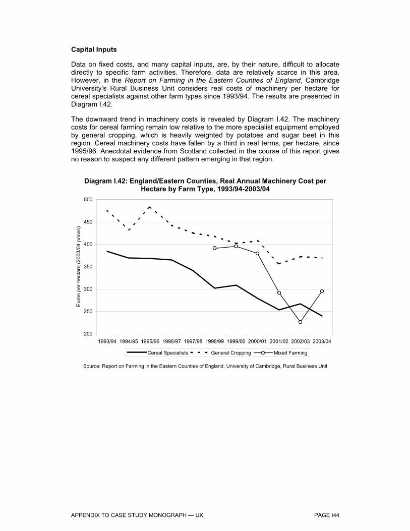
APPENDIX TO CASE STUDY MONOGRAPH — UK PAGE I44
Capital Inputs
Data on fixed costs, and many capital inputs, are, by their nature, difficult to allocate directly to specific farm activities. Therefore, data are relatively scarce in this area. However, in the Report on Farming in the Eastern Counties of England, Cambridge University’s Rural Business Unit considers real costs of machinery per hectare for cereal specialists against other farm types since 1993/94. The results are presented in Diagram I.42.
The downward trend in machinery costs is revealed by Diagram I.42. The machinery costs for cereal farming remain low relative to the more specialist equipment employed by general cropping, which is heavily weighted by potatoes and sugar beet in this region. Cereal machinery costs have fallen by a third in real terms, per hectare, since 1995/96. Anecdotal evidence from Scotland collected in the course of this report gives no reason to suspect any different pattern emerging in that region.
Diagram I.42: England/Eastern Counties, Real Annual Machinery Cost per Hectare by Farm Type, 1993/94-2003/04
200
250
300
350
400
450
500
1993/94 1994/95 1995/96 1996/97 1997/98 1998/99 1999/00 2000/01 2001/02 2002/03 2003/04
Eur
os p
er h
ecta
re (2
003/
04 p
rices
)
Cereal Specialists General Cropping Mixed Farming
Source: Report on Farming in the Eastern Counties of England, University of Cambridge, Rural Business Unit

APPENDIX TO CASE STUDY MONOGRAPH — UK PAGE I45
Labour Inputs
Diagram I.43: England/Eastern Counties, Real Labour Cost per Hectare by Farm Type, 1993/94-2003/04
100
150
200
250
300
350
400
450
1993/94 1994/95 1995/96 1996/97 1997/98 1998/99 1999/00 2000/01 2001/02 2002/03 2003/04
Eur
os p
er h
ecta
re (2
003/
04 p
rices
)
Cereal Specialists General Cropping Mixed Farming
Source: Report on Farming in the Eastern Counties of England, University of Cambridge, Rural Business Unit
Diagram I.44: Scotland, Real Labour Cost per Hectare by Farm Type, 1993/94-2003/04
0
100
200
300
400
500
600
1993/94 1994/95 1995/96 1996/97 1997/98 1998/99 1999/00 2000/01 2001/02 2002/03 2003/04
€ pe
r hec
tare
General Cropping Cereal Specialists
Source: SEERAD
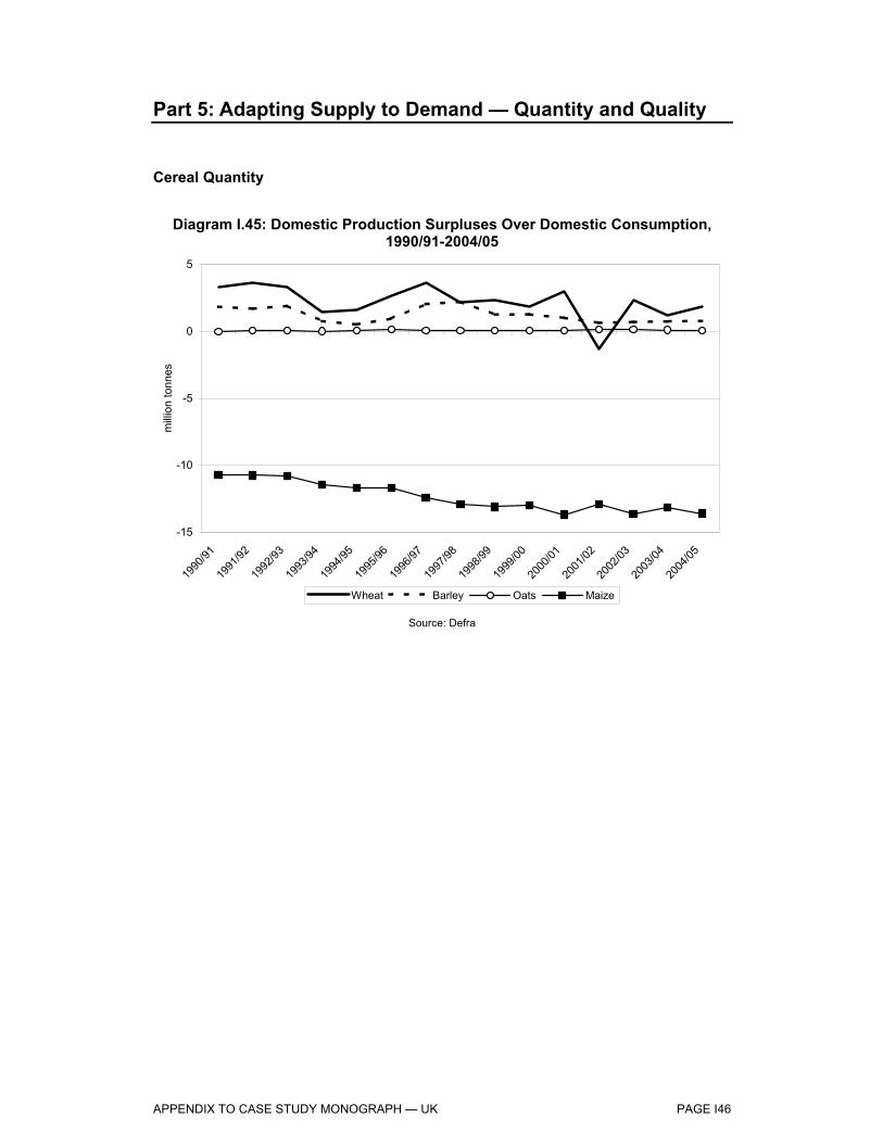
APPENDIX TO CASE STUDY MONOGRAPH — UK PAGE I46
Part 5: Adapting Supply to Demand — Quantity and Quality
Cereal Quantity
Diagram I.45: Domestic Production Surpluses Over Domestic Consumption, 1990/91-2004/05
-15
-10
-5
0
5
1990
/91
1991
/92
1992
/93
1993
/94
1994
/95
1995
/96
1996
/97
1997
/98
1998
/99
1999
/00
2000
/01
2001
/02
2002
/03
2003
/04
2004
/05
milli
on to
nnes
Wheat Barley Oats Maize
Source: Defra

APPENDIX TO CASE STUDY MONOGRAPH — UK PAGE I47
Diagram I.46: UK, End-of-Year Cereal Stocks, 1990/91-2004/05
0.0
0.5
1.0
1.5
2.0
2.5
1990/91 1992/93 1994/95 1996/97 1998/99 2000/01 2002/03 2004/05
milli
on to
nnes
Wheat (Intervention) Barley (Intervention) Barley (Commercial)Wheat (Commercial) Oats (Commercial)
Source: Defra
Wheat Quality
In Diagram I.47, we present the percentage of total UK wheat production accounted for by each quality group, where Group 1 represents bread-making quality and Group 4 represents feed wheat quality. The diagram reveals that there has been a move to growing more quality wheats, predominantly Group 2 and 3 varieties at the expense of Group 4 feed wheat.

APPENDIX TO CASE STUDY MONOGRAPH — UK PAGE I48
Diagram I.47: UK, Wheat Production by Quality Group, 1995/96-2004/05
0%
20%
40%
60%
80%
100%
1995/96 1996/97 1997/98 1998/99 1999/00 2000/01 2001/02 2002/03 2003/04 2004/05
Per
cent
age
of W
heat
Pro
duct
ion
Group 1 Group 2 Group 3 Group 4
On-Farm Feed, Barley and Wheat
Diagram I.48 considers presents output of compound feeds and feed wheat and feed barley prices from 1992/93 to 2003/04.
The diagram reveals that compound feed production has declined by 1.3 million tonnes since its peak in 1995/96, broadly in parallel with the decline in feed wheat and barley prices. The relationship has held since the onset of the MacSharry reforms, with rises in cereal (barley in particular) prices in 1995/96, 1998/99 and 2003/04 coinciding with increases in compound feed production.
As compound feed production is almost exclusively demand-driven, declining compound feed demand suggests that more farmers are producing feed on-farm. In this respect, therefore, the reduction in cereal intervention prices appears to have persuaded producers to increase on-farm cereal feed production.
This is only part of the picture; however, as compound feed production is determined fundamentally by livestock herds. Over the period in question, livestock herds have declined in the UK, though at a slightly slower rate than the decline in compound feed production. This leaves room for an increase in on-farm feed production as a response to falling cereal prices and rising transport costs. Diagram I.49 considers this further, presenting the proportion of UK barley and wheat fed on-farm against barley and wheat sold to feed mills, from 1995/96 to 2002/038.
Diagram I.49 confirms that on-farm feed use of both wheat and barley has broadly increased over the period. In the case of both wheat and barley, the 2002/03 on-farm retention rate has grown 61% from the 1995/96 rate (expressed as a percentage of the 8 Defra suspended this data series in 2002/03.

APPENDIX TO CASE STUDY MONOGRAPH — UK PAGE I49
original figure), although wheat has increased its on-farm retention rate from a far lower level9. The temporary troughs in both series around 2000/01 are due to the foot and mouth outbreak in the UK, which greatly reduced on-farm consumption in that year. Feed mills, however, continued to purchase cereals as a store for future sales.
The decline in intervention prices since 1995/96 has, therefore, altered the balance of the feed sector towards an increase in on-farm feed use of cereals. In the past couple of years, this trend has been accelerated by the increasing cost of delivering cereals to feed mills for sale, and also the rising land freight element in the delivered price of compound feed. This “double-counting“ of transport costs has altered the economics towards on-farm feed production recently, as evidence by Diagram I.48.
A further crucial impact upon the feed sector, adjudged by most participants in feed mills and mixed farming enterprises as more important than the Cereals CMO, is the institutional support system for livestock. On mixed farms, it was felt that the SFP system could threaten livestock production, and by extension make cereal production unprofitable in all but the years with highest cereal prices, where sales could be made off-farm.
In response to some of these situations, feed mills are increasingly entering into direct arrangements with producers whereby compound feeds are delivered to farms and cereals are collected at the same, thus passing on the backhaul rate transport savings to the farm. Whether this response is sufficient to tip the balance back towards the buying-in of compound feeds remains to be seen at the aggregate level.
9 Feed wheat is generally preferred by compound mills to feed barley, and consequently typically trades at
a premium to feed barley. This explains the far higher proportion of feed wheat sold off-farm when compared with feed barley.

APPENDIX TO CASE STUDY MONOGRAPH — UK PAGE I50
Diagram I.48: UK, Compound Feed Production and Feed Wheat / Barley Prices, 1992/93-2003/04
9.0
10.0
11.0
12.0
13.0
14.0
1992/93 1994/95 1996/97 1998/99 2000/01 2002/03
Com
poun
d Fe
ed O
utpu
t (m
illion
tonn
es)
100
120
140
160
180
200
Feed Wheat/Feed Barley Price (€ per tonne)
Compound Feed Production Feed Barley Price Feed Wheat Price
Source: Defra
Diagram I.49: On-Farm Cereal Consumption as Percentage of Cereal Sales to Compound Feed Mills, 1995/96-2002/03
0%
50%
100%
150%
200%
250%
300%
350%
1995/96 1996/97 1997/98 1998/99 1999/00 2000/01 2001/02 2002/03
per c
ent
Wheat Barley
Source: Defra

APPENDIX TO CASE STUDY MONOGRAPH — UK PAGE I51
Part 6: Effects of the Drop in Institutional Prices
Institutional Prices
Diagram: I.50: UK, Intervention Prices, 1990/91-2003/04
80
90
100
110
120
130
140
Jul-9
5
Jan-
96
Jul-9
6
Jan-
97
Jul-9
7
Jan-
98
Jul-9
8
Jan-
99
Jul-9
9
Jan-
00
Jul-0
0
Jan-
01
Jul-0
1
Jan-
02
Jul-0
2
Jan-
03
Jul-0
3
Jan-
04
Jul-0
4
Jan-
05
Ecu/
€ pe
r ton
ne
40
60
80
100
120
140
160
£ per tonne
Intervention Price (€) Intervention Price (£)
Source: Home Grown Cereals Authority (HGCA)

APPENDIX TO CASE STUDY MONOGRAPH — UK PAGE I52
Competitiveness on the Export Market
Diagram I.51: UK, Total Cereal Exports, 1990-2004
0
1
2
3
4
5
1990 1991 1992 1993 1994 1995 1996 1997 1998 1999 2000 2001 2002 2003 2004
Milli
on T
onne
s
Barley Wheat Oats
Source: HM Customs and Excise
Diagram I.52: EU, Average Export Refunds, 1996/97-2003/04
0
10
20
30
40
50
60
70
1996/97 1997/98 1998/99 1999/00 2000/01 2001/02 2002/03 2003/04
€ pe
r ton
ne
Common Wheat Barley Oats
Source: DG Agriculture

APPENDIX TO CASE STUDY MONOGRAPH — UK PAGE I53
Diagram I.53: UK, Intervention Year-End Stocks, 1995/96-2003/04
0
200
400
600
800
1,000
1,200
1,400
1995/96 1996/97 1997/98 1998/99 1999/00 2000/01 2001/02 2002/03 2003/04
'000
tonn
es
Barley Wheat Rye
Source: HGCA
Competitiveness on the Domestic Market
Diagram I.54: UK, Total Cereal Imports, 1990-2004
0
200
400
600
800
1,000
1,200
1,400
1,600
1,800
1990 1991 1992 1993 1994 1995 1996 1997 1998 1999 2000 2001 2002 2003 2004
'000
tonn
es
Barley Wheat Oats Maize
Source: HM Customs and Excise

APPENDIX TO CASE STUDY MONOGRAPH — UK PAGE I54
Diagram I.55: UK, Horse Feed Consumption, 1992-2004
120
140
160
180
200
1992 1993 1994 1995 1996 1997 1998 1999 2000 2001 2002 2003 2004
'000
tonn
es
Source: Defra
Feed Usage
An important indicator of the competitiveness of UK cereals is the compound animal feed sector, where UK cereals compete with cereal imports and alternative feedstocks. Cereal usage has increased significantly since 1992/93, while oilseeds usage has been relatively stable. (Diagram I.56)
In addition to the increasing prevalence of cereals over oilseeds in the feed sector, other major alternatives to domestic cereals have also declined in usage. Maize gluten feed and citrus pulp demand in the UK animal feed sector have both declined over the featured period (Diagram I.57).

APPENDIX TO CASE STUDY MONOGRAPH — UK PAGE I55
Diagram I.56: UK, Total Cereal and Oilseed Meal Usage in Compound Animal Feed, 1992/93-2003/04
0
1
2
3
4
5
6
7
1992/93 1994/95 1996/97 1998/99 2000/01 2002/03
Milli
on T
onne
s
Total Cereals Total Oilseeds
Source: Defra
Diagram I.57: UK, Maize Gluten Feed and Citrus Pulp Usage in Compound Animal Feed, 1992/93-2003/04
0
100
200
300
400
500
600
1992/93 1994/95 1996/97 1998/99 2000/01 2002/03
'000
tonn
es
Citrus Pulp Maize Gluten Feed
Source: Defra
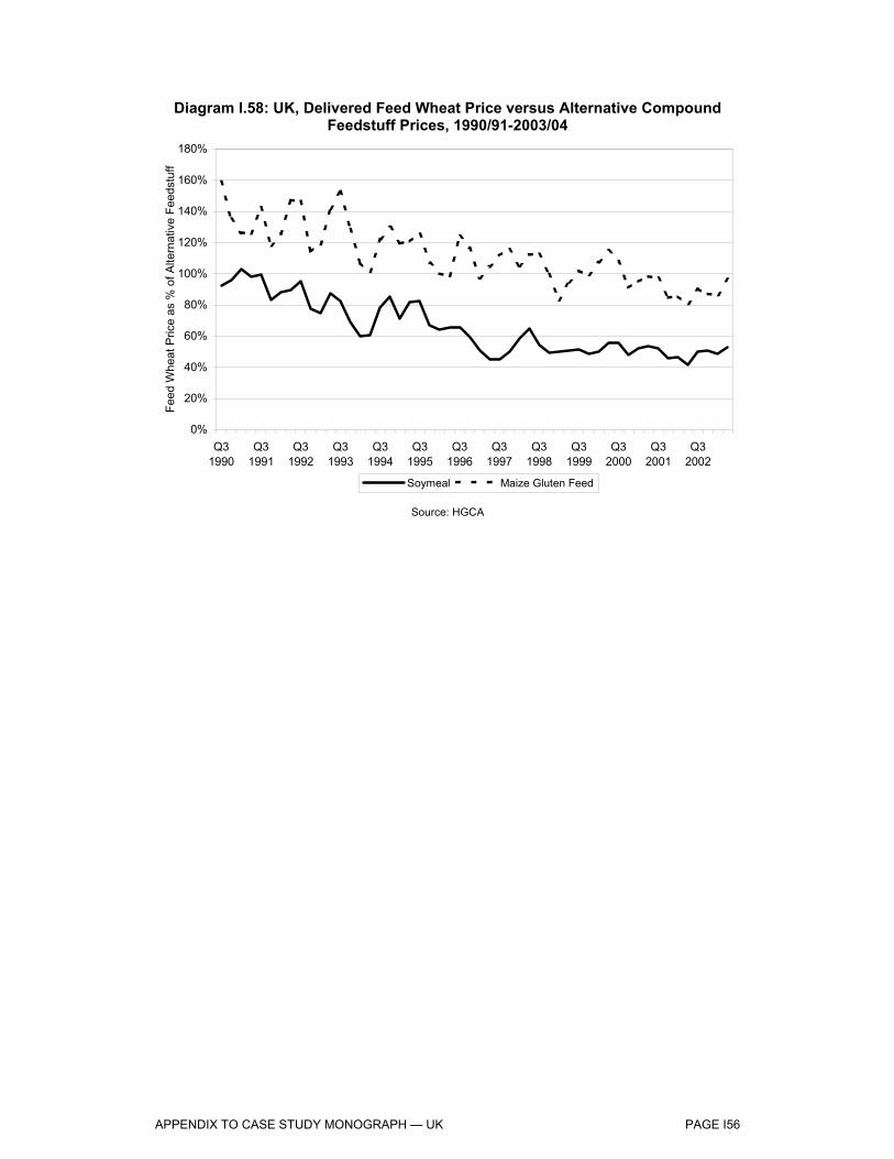
APPENDIX TO CASE STUDY MONOGRAPH — UK PAGE I56
Diagram I.58: UK, Delivered Feed Wheat Price versus Alternative Compound Feedstuff Prices, 1990/91-2003/04
0%
20%
40%
60%
80%
100%
120%
140%
160%
180%
Q31990
Q31991
Q31992
Q31993
Q31994
Q31995
Q31996
Q31997
Q31998
Q31999
Q32000
Q32001
Q32002
Feed
Whe
at P
rice
as %
of A
ltern
ativ
e Fe
edst
uff
Soymeal Maize Gluten Feed
Source: HGCA

APPENDIX TO CASE STUDY MONOGRAPH — UK PAGE I57
Part 7: Effects Restriction Competition
Monthly Sales into Intervention
Table I.19: Monthly Increments in Intervention Price, 1995/96-2004/05 (€ per tonne) Monthly Increment
1995/96 1.30 1996/97 1.10 1997/98 1.00 1998/99 1.00 1999/00 1.00 2000/01 1.00 2001/02 0.93 2002/03 0.93 2003/04 0.93 2004/05 0.46
Diagram I.59: UK, Average Total Monthly Cereal Sales into Intervention, 1997/98-2003/041 (Barley, Wheat and Rye)
0
2
4
6
8
10
12
14
July
August
Septem
ber
October
Novem
ber
Decem
ber
January
February
March
April
May
June
'000
tonn
es
Source: Rural Payments Agency Note: 1. Data unavailable prior to this period.

APPENDIX TO CASE STUDY MONOGRAPH — UK PAGE I58
Diagram I.60: UK, Average Monthly Feed Barley Sales Off-Farm, 1997/98-2003/04
0
20
40
60
80
100
120
140
July
August
Septem
ber
October
Novem
ber
Decem
ber
January
February
March
April
May
June
'000
tonn
es
Source: HGCA
Diagram I.61: UK, Average Monthly Feed Wheat Sales Off-Farm
0
50
100
150
200
250
300
350
400
450
500
July
August
Septem
ber
October
Novem
ber
Decem
ber
January
February
March
April
May
June
'000
tonn
es
Source: HGCA

APPENDIX TO CASE STUDY MONOGRAPH — UK PAGE I59
Market Structure
Table I.20: Member State Agricultural Production Sold Through Cooperatives, 1997 (%)
Member States Cereals Pigmeat Beef/Veal Poultry Meat Eggs Milk Sugar beet All Fruit All Vegetables
Belgique/België 30 20 0 53 75 85 Danmark 60 91 66 0 52 94 0 80 80 Deutschland 50 27 28 52 80 40 28 Elláda 49 3 2 15 2 20 57 3 España 22 8 9 25 28 30 23 45 20 France 68 85 30 30 25 47 16 40 25 Ireland 57 66 20 20 100 14 18 Italia 20 13 12 35 8 40 7 43 8 Luxembourg 79 37 38 81 Nederland 65 34 16 9 14 83 63 76 73 Österreich 60 15 5 70 90 100 18 28 Portugal Suomi/Finland 46 68 65 81 54 97 Sverige 75 78 73 0 32 100 0 20 50 United Kingdom 24 28 25 67 67 26
Source: Agricultural Situation in the EU

APPENDIX TO CASE STUDY MONOGRAPH — UK PAGE I60
Part 8: Analysis of Questionnaire Submitted to Producers
In order to collect primary data for the study on the effect of the measures taken under the Cereals CMO on the producers, a questionnaire survey was undertaken of cereal producers in England and Scotland. In addition, a smaller number of farmers were interviewed in depth, and the notes from these interviews are attached in the Interview Notes prepared for the report.
The questionnaire contained a range of questions that addressed the main aspects to be considered when answering several of the specific Evaluation Questions.
The template of the questionnaire was drafted by LMC, forwarded to the regional partner and the sent to a sample of farmers in England and Scotland. The farmers had been selected to provide a representative sample of the typology of producers present in the region (For a detailed description of the procedure for the selection of the sample please refer to Chapter 2).
Up to 200 questionnaires were sent out in each region. Over a period of approximately six weeks the questionnaires were returned to the author of the regional report and the data collected analysed at a regional level.
When the questionnaires were returned to the author of the monograph, it was noticed that some of the respondents had failed to provide crucial background information that would have allowed us to assign them to one of the specialist classes selected for the analysis. Therefore, to make use of the information they had provided a fourth “spurious” class of cereal producers called “Other Cereal Specialists” was created and included in the analysis of the questionnaire results. Furthermore, we realised that due to the small number of respondents it was not possible to achieve in all sub-samples a size large enough to yield statistically significant results. Given these constraints the results of the analysis shown in this Appendix should only be interpreted as an indication of the behaviour of the respondents with respect to the measures taken under the Cereals CMO. These results are not representative in any way of the general behaviour of the population of farmers in England and Scotland that can be stratified according to the same criteria.

APPENDIX TO CASE STUDY MONOGRAPH — UK PAGE I61
ENGLAND
Table I.21: Number of Respondents in Each Farm Type
N of respondents ESU Size Class: Large
General Field Cropping 5 Other Cereal Specialists 11
The questionnaire responses for case study region of England highlight the following observations:
Background Information
The first place in the rotation is occupied exclusively by wheat for both types of producers. General field cropping specialists mainly grow rapeseed as second crop, followed by wheat. Among other cereal specialists the second place in the rotational cycle is destined to a range of crops such as rapeseed, linseed, barley, potatoes, and sugar beet. With respect to the third crop in the rotation both types of farmers tend to grow a variety of different crops such as legumes, triticale, sugarbeet, rapeseed and potatoes.
Producers’ Income Levels
Generally the producers do not tend to diversify away from farming activities, and, apart from few exceptions, they depend upon farming for over 80% of their household income.
Comparison between the distribution of the percentage of farm income currently derived from cereal production and the distribution of the percentage of income derived from cereal production ten years ago, suggests that general field cropping farmers, in particular, have become less dependent upon cereal production with respect to their income.
All producers have experienced increases in both farm rents and farmland values over the past ten years, typically between 25% and 50%. However, rental values appear to have increased more than farmland values, rising more than 50%.
Dependence on Direct Payments
Both types of producers appear to rely upon direct payments for variable proportions of their income, ranging from 20% to 50%. More than 40% of the farmers in both classes have experienced an increase in the degree of the dependency upon direct payments over the past 10 years. However, it is not clear whether a reduction in the amount of direct payments would lead the producers to diminish their involvement in faming activities.

APPENDIX TO CASE STUDY MONOGRAPH — UK PAGE I62
Production Structures on Holdings
Nearly 60% of producers in both categories have not experienced significant changes in the area planted to cereal crops over the past 10 years. However, 40% of general field cropping producers report a reduction in area planted to cereals between 25% and 50%. This change appears to be influenced by the price support measures adopted under the Cereals CMO.
Overall, the amount and type of capital investment in machinery and labour use per hectare appear to have slightly diminished over the past 10 years. On the other hand, fertiliser and irrigation use has seen an increase, whereas no apparent change is visible in the amount and type of seed use since 1995. Although there has been a reduction in the use of some inputs, this does not appear to have been driven by environmental considerations.
Adapting Supply to Demand: Quality and Quantity
General field cropping specialists appear to mostly rely upon traders as a source of price on which to base cereal planting decisions, whereas other cereal specialists refer to a wider range of sources.
The crops that have been mostly affected by changes in the area planted to cereals are pulses, rapeseed and potatoes for general field cropping producers, and barley, linseed and wheat for other cereal specialists. In general, direct payments and set aside directives do not seem to have had a crucial role in planting decisions over the past 10 years.
The demands of customers and the quality price premium on cereals were felt to have a significant influence with respect to the choice of crops, whereas the change in minimum quality standard of cereals sold to intervention had only a marginal effect on the planting decisions.
Cereal production destined to on-farm feed has not changed for mixed crops-livestock specialists, whereas other cereal specialists have increased the on farm feed production, largely in response to changes in the cereal regime.
Land Use: Choice of Crop
The profitability of cereals vis-à-vis alternative non cereal crops appears to have fallen by more than 50% for 50% of general field cropping farmers, whereas 60% of the other cereal specialists reported a drop between 25% and 50%. On the other hand, the change in the relative profitability of cereals against voluntary set aside is less clear.
Overall the producers have not been affected by measures such as direct payments and the rules on set aside with respect to the choice of crops. The main role in influencing the choice of crops for both classes of farmers is played by agronomic constraints, whereas environmental constraints only seem to influence other cereal specialists.
Effects of the Drop in Institutional Prices
Cereal production destined to on-farm feed use has increased over the past ten years, largely in response to changes in the cereal regime.

APPENDIX TO CASE STUDY MONOGRAPH — UK PAGE I63
For both categories of producers the requirements of end users (e.g. processors and exporters) appear to greatly influence the quality and type of cereals grown, whereas the markets for cereals for biofuels and the minimum quality standards for cereals sold to intervention do not seem to have a major influence on cereal production.
Effects Restricting Competition
Approximately 80% of general field cropping producers and 60% of other cereal specialists have felt that transport costs greatly reduced their ability to supply local or external markets.
In general, the farmers interviewed do not appear to employ forward sales of cereals or use cereals futures markets.
Most of the producers have indicated that on farm storage use plays a significant role in controlling the release of the crop over the year.

APPENDIX TO CASE STUDY MONOGRAPH — UK PAGE I64
Diagram I.62: Percentage of Farm Household Income Derived from Farm
Activities
0%
20%
40%
60%
80%
100%
0-20% 20-40% 40-60% 60-80% Over 80%
% o
f ove
rall
resp
onde
nts
in e
ach
farm
type
General field Cropping Other Cereal Specialists
Note: FADN. The definition of the FADN types of farming and size classes are provided in Part 9 of this Appendix.
Diagram I.63: Percentage of Farm Income Derived from 1st Cereal
Production — Wheat
0%
20%
40%
60%
80%
100%
0-20% 20-40% 40-60% 60-80% Over 80%
% o
f ove
rall
resp
onde
nts
in e
ach
farm
type
General field Cropping Other Cereal Specialists
Note: FADN. The definition of the FADN types of farming and size classes are provided in Part 9 of this Appendix.
Diagram I.64: Percentage of Farm Income Derived from Total Cereal Production 10 Years Ago
0%
20%
40%
60%
80%
100%
0-20% 20-40% 40-60% 60-80% Over 80%
% o
f ove
rall
resp
onde
nts
in e
ach
farm
type
General field Cropping Other Cereal Specialists
Note: FADN. The definition of the FADN types of farming and size classes are provided in Part 9 of this Appendix.
Diagram I.65: Percentage of Farm Income Derived from Total Cereal
Production
0%
20%
40%
60%
80%
100%
0-20% 20-40% 40-60% 60-80% Over 80%
% o
f ove
rall
resp
onde
nts
in e
ach
farm
type
General field Cropping Other Cereal Specialists
Note: FADN. The definition of the FADN types of farming and size classes are provided in Part 9 of this Appendix.
Diagram I.66: Percentage of Farm Income Derived from 2nd Cereal
Production — Rapeseed
0%
20%
40%
60%
80%
100%
0-20% 20-40% 40-60% 60-80% Over 80%
% o
f ove
rall
resp
onde
nts
in e
ach
farm
type
General field Cropping Other Cereal Specialists
Note: FADN. The definition of the FADN types of farming and size classes are provided in Part 9 of this Appendix.
Diagram I.67: Percentage of Farm Income Derived from 1st Cereal Production 10 Years Ago — Wheat
0%
20%
40%
60%
80%
100%
0-20% 20-40% 40-60% 60-80% Over 80%
% o
f ove
rall
resp
onde
nts
in e
ach
farm
type
General field Cropping Other Cereal Specialists
Note: FADN. The definition of the FADN types of farming and size classes are provided in Part 9 of this Appendix.

APPENDIX TO CASE STUDY MONOGRAPH — UK PAGE I65
Diagram I.68: Percentage of Farm Income Derived from 2nd Cereal Production 10 Years Ago —
Rapeseed
0%
20%
40%
60%
80%
100%
0-20% 20-40% 40-60% 60-80% Over 80%
% o
f ove
rall
resp
onde
nts
in e
ach
farm
type
General field Cropping Other Cereal Specialists
Note: FADN. The definition of the FADN types of farming and size classes are provided in Part 9 of this Appendix.
Diagram I.69: Change in Asset Value of Farmland Over the Past 10 Years
0%
20%
40%
60%
80%
100%
Rose>50%
Rose 25-50%
Rose orfell<25%
Fell 25-50%
Fell >50%% o
f ove
rall
resp
onde
nts
in e
ach
farm
type
General field Cropping Other Cereal Specialists
Note: FADN. The definition of the FADN types of farming and size classes are provided in Part 9 of this Appendix.
Diagram I.70: Reduction of Involvement in Farming, Without Direct Payments
0%
20%
40%
60%
80%
100%
by at least50%
30-50% 15-30% 5-15% 0-5%% o
f ove
rall
resp
onde
nts
in e
ach
farm
type
General field Cropping Other Cereal Specialists
Note: FADN. The definition of the FADN types of farming and size classes are provided in Part 9 of this Appendix.
Diagram I.71: Change in Rental Value of Farmland Over the Past 10 Years
0%
20%
40%
60%
80%
100%
Rose>50%
Rose 25-50%
Rose orfell<25%
Fell 25-50%
Fell >50%% o
f ove
rall
resp
onde
nts
in e
ach
farm
type
General field Cropping Other Cereal Specialists
Note: FADN. The definition of the FADN types of farming and size classes are provided in Part 9 of this Appendix.
Diagram I.72: Farm Income From Direct Payments
0%
20%
40%
60%
80%
100%
0-10% 10-20% 20-30% 30-40% 40-50% Over50%
% o
f ove
rall
resp
onde
nts
in e
ach
farm
type
General field Cropping Other Cereal Specialists
Note: FADN. The definition of the FADN types of farming and size classes are provided in Part 9 of this Appendix.
Diagram I.73: Changes in the Dependence on Direct Payments Over the Past 10 Years
0%
20%
40%
60%
80%
100%
Greatly Slightly Not at all
% o
f ove
rall
resp
onde
nts
in e
ach
farm
type
General field Cropping Other Cereal Specialists
Note: FADN. The definition of the FADN types of farming and size classes are provided in Part 9 of this Appendix.

APPENDIX TO CASE STUDY MONOGRAPH — UK PAGE I66
Diagram I.74: Changes in Cereal Area Since 1995
0%
20%
40%
60%
80%
100%
Rose>50%
Rose 25-50%
Rose orfell<25%
Fell 25-50%
Fell >50%% o
f ove
rall
resp
onde
nts
in e
ach
farm
type
General field Cropping Other Cereal Specialists
Note: FADN. The definition of the FADN types of farming and size classes are provided in Part 9 of this Appendix.
Diagram I.75: Changes in the Amount and Type of Capital Investment in Machinery Since 1995
0%
20%
40%
60%
80%
100%
Rose>100%
Rose 50-100%
Rose 25-50%
Rose orfell <25%
Fell >25%% o
f ove
rall
resp
onde
nts
in e
ach
farm
type
General field Cropping Other Cereal Specialists
Note: FADN. The definition of the FADN types of farming and size classes are provided in Part 9 of this Appendix.
Diagram I.76: Changes in the Amount and Type of Seed Use for Cereal Production on Farms Since
1995
0%
20%
40%
60%
80%
100%
Rose>50%
Rose 25-50%
Rose orfell<25%
Fell 25-50%
Fell >50%% o
f ove
rall
resp
onde
nts
in e
ach
farm
type
General field Cropping Other Cereal Specialists
Note: FADN. The definition of the FADN types of farming and size classes are provided in Part 9 of this Appendix.
Diagram I.77: Influence of Price Support on Cereal Farming Practices Since 1995
0%
20%
40%
60%
80%
100%
Greatly Slightly Not at all
% o
f ove
rall
resp
onde
nts
in e
ach
farm
type
General field Cropping Other Cereal Specialists
Note: FADN. The definition of the FADN types of farming and size classes are provided in Part 9 of this Appendix.
Diagram I.78: Changes in the Use of Labour per Hectare in Cereal Production Since 1995
0%
20%
40%
60%
80%
100%
Rose>50%
Rose 25-50%
Rose orfell<25%
Fell 25-50%
Fell >50%% o
f ove
rall
resp
onde
nts
in e
ach
farm
type
General field Cropping Other Cereal Specialists
Note: FADN. The definition of the FADN types of farming and size classes are provided in Part 9 of this Appendix.
Diagram I.79: Changes in the Amount and Type of Fertiliser Use for Cereal Production on Farms
Since 1995
0%
20%
40%
60%
80%
100%
Rose>50%
Rose 25-50%
Rose orfell<25%
Fell 25-50%
Fell >50%% o
f ove
rall
resp
onde
nts
in e
ach
farm
type
General field Cropping Other Cereal Specialists
Note: FADN. The definition of the FADN types of farming and size classes are provided in Part 9 of this Appendix.
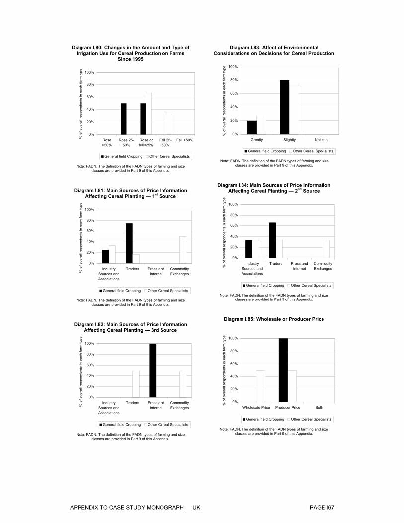
APPENDIX TO CASE STUDY MONOGRAPH — UK PAGE I67
Diagram I.80: Changes in the Amount and Type of Irrigation Use for Cereal Production on Farms
Since 1995
0%
20%
40%
60%
80%
100%
Rose>50%
Rose 25-50%
Rose orfell<25%
Fell 25-50%
Fell >50%% o
f ove
rall
resp
onde
nts
in e
ach
farm
type
General field Cropping Other Cereal Specialists
Note: FADN. The definition of the FADN types of farming and size classes are provided in Part 9 of this Appendix.
Diagram I.81: Main Sources of Price Information Affecting Cereal Planting — 1st Source
0%
20%
40%
60%
80%
100%
IndustrySources andAssociations
Traders Press andInternet
CommodityExchanges%
of o
vera
ll re
spon
dent
s in
eac
h fa
rm ty
pe
General field Cropping Other Cereal Specialists
Note: FADN. The definition of the FADN types of farming and size classes are provided in Part 9 of this Appendix.
Diagram I.82: Main Sources of Price Information Affecting Cereal Planting — 3rd Source
0%
20%
40%
60%
80%
100%
IndustrySources andAssociations
Traders Press andInternet
CommodityExchanges%
of o
vera
ll re
spon
dent
s in
eac
h fa
rm ty
pe
General field Cropping Other Cereal Specialists
Note: FADN. The definition of the FADN types of farming and size classes are provided in Part 9 of this Appendix.
Diagram I.83: Affect of Environmental Considerations on Decisions for Cereal Production
0%
20%
40%
60%
80%
100%
Greatly Slightly Not at all
% o
f ove
rall
resp
onde
nts
in e
ach
farm
type
General field Cropping Other Cereal Specialists
Note: FADN. The definition of the FADN types of farming and size classes are provided in Part 9 of this Appendix.
Diagram I.84: Main Sources of Price Information Affecting Cereal Planting — 2nd Source
0%
20%
40%
60%
80%
100%
IndustrySources andAssociations
Traders Press andInternet
CommodityExchanges%
of o
vera
ll re
spon
dent
s in
eac
h fa
rm ty
pe
General field Cropping Other Cereal Specialists
Note: FADN. The definition of the FADN types of farming and size classes are provided in Part 9 of this Appendix.
Diagram I.85: Wholesale or Producer Price
0%
20%
40%
60%
80%
100%
Wholesale Price Producer Price Both
% o
f ove
rall
resp
onde
nts
in e
ach
farm
type
General field Cropping Other Cereal Specialists
Note: FADN. The definition of the FADN types of farming and size classes are provided in Part 9 of this Appendix.

APPENDIX TO CASE STUDY MONOGRAPH — UK PAGE I68
Diagram I.86: Other Crops Affected by Expansions/Contractions in Cereal Area — 1st
Crop
0%
20%
40%
60%
80%
100%
Pulses
Rape s
eed
Potatoe
sBarl
ey
Linse
ed
Whe
at% o
f ove
rall
resp
onde
nts
in e
ach
farm
type
General field Cropping Other Cereal Specialists
Note: FADN. The definition of the FADN types of farming and size classes are provided in Part 9 of this Appendix.
Diagram I.87: Effect of direct payments on cereal planting decisions — 1st Crop
0%
20%
40%
60%
80%
100%
Greatly Slightly Not at all
% o
f ove
rall
resp
onde
nts
in e
ach
farm
type
General field Cropping Other Cereal Specialists
Note: FADN. The definition of the FADN types of farming and size classes are provided in Part 9 of this Appendix.
Diagram I.88: Influence of Quality Price Premium on Cereal Quality
0%
20%
40%
60%
80%
100%
Greatly Slightly Not at all
% o
f ove
rall
resp
onde
nts
in e
ach
farm
type
General field Cropping Other Cereal Specialists
Note: FADN. The definition of the FADN types of farming and size classes are provided in Part 9 of this Appendix.
Diagram I.89: Other Crops Affected by Expansions/Contractions in Cereal Area — 2nd
Crop
0%
20%
40%
60%
80%
100%
Rape seed Barley
% o
f ove
rall
resp
onde
nts
in e
ach
farm
type
General field Cropping Other Cereal Specialists
Note: FADN. The definition of the FADN types of farming and size classes are provided in Part 9 of this Appendix.
Diagram I.90: Influence of the Rules on Set Aside Since 1992 on Cereal Planting Decisions
0%
20%
40%
60%
80%
100%
Greatly Slightly Not at all
% o
f ove
rall
resp
onde
nts
in e
ach
farm
type
General field Cropping Other Cereal Specialists
Note: FADN. The definition of the FADN types of farming and size classes are provided in Part 9 of this Appendix.
Diagram I.91: Influence of Quality Needs of Customers on Cereal Quality
0%
20%
40%
60%
80%
100%
Greatly Slightly Not at all
% o
f ove
rall
resp
onde
nts
in e
ach
farm
type
General field Cropping Other Cereal Specialists
Note: FADN. The definition of the FADN types of farming and size classes are provided in Part 9 of this Appendix.

APPENDIX TO CASE STUDY MONOGRAPH — UK PAGE I69
Diagram I.92: Change in Cereal Quality Since 1995 — 1st Cereal — Wheat
0%
20%
40%
60%
80%
100%
Increased Unchanged Decreased
% o
f ove
rall
resp
onde
nts
in e
ach
farm
type
General field Cropping Other Cereal Specialists
Note: FADN. The definition of the FADN types of farming and size classes are provided in Part 9 of this Appendix.
Diagram I.93: Change in the Volume of Feed Produced On-Farm, since 1995
0%
20%
40%
60%
80%
100%
Rose>50%
Rose 25-50%
Rose orFell<25%
Fell 25-50%
Fell>50%% o
f ove
rall
resp
onde
nts
in e
ach
farm
type
General field Cropping Other Cereal Specialists
Note: FADN. The definition of the FADN types of farming and size classes are provided in Part 9 of this Appendix.
Diagram I.94: Sequence of Crops Over the Rotational Cycle — Crop 2
0%
20%
40%
60%
80%
100%
Rapeseed
Wheat Sugarbeet
Barley Potatoes% o
f ove
rall
resp
onde
nts
in e
ach
farm
type
General field Cropping Other Cereal Specialists
Note: FADN. The definition of the FADN types of farming and size classes are provided in Part 9 of this Appendix.
Diagram I.95: Effects of Changed Minimum Quality Standards for Cereals Sold to Intervention on
Cereal Production
0%
20%
40%
60%
80%
100%
Greatly Slightly Not at all
% o
f ove
rall
resp
onde
nts
in e
ach
farm
type
General field Cropping Other Cereal Specialists
Note: FADN. The definition of the FADN types of farming and size classes are provided in Part 9 of this Appendix.
Diagram I.96: Influence of the New Cereals Regime on the Volume of Feed Produced On-Farm
0%
20%
40%
60%
80%
100%
Greatly Slightly Not at all
% o
f ove
rall
resp
onde
nts
in e
ach
farm
type
General field Cropping Other Cereal Specialists
Note: FADN. The definition of the FADN types of farming and size classes are provided in Part 9 of this Appendix.
Diagram I.97: Sequence of Crops Over the Rotational Cycle — Crop 3
0%
20%
40%
60%
80%
100%
Pulses Rapeseed
Peas Wheat Triticale Barley% o
f ove
rall
resp
onde
nts
in e
ach
farm
type
General field Cropping Other Cereal Specialists
Note: FADN. The definition of the FADN types of farming and size classes are provided in Part 9 of this Appendix.

APPENDIX TO CASE STUDY MONOGRAPH — UK PAGE I70
Diagram I.98: Sequence of Crops Over the Rotational Cycle — Crop 4
0%
20%
40%
60%
80%
100%
Sugar
beet
Potatoe
sOats
Beans
Whe
atGras
s
Rape s
eed
% o
f ove
rall
resp
onde
nts
in e
ach
farm
type
General field Cropping Other Cereal Specialists
Note: FADN. The definition of the FADN types of farming and size classes are provided in Part 9 of this Appendix.
Diagram I.99: Main Sources of Price Information Affecting Cereal Planting — 2nd Source
0%
20%
40%
60%
80%
100%
IndustrySources andAssociations
Traders Press andInternet
CommodityExchanges%
of o
vera
ll re
spon
dent
s in
eac
h fa
rm ty
pe
General field Cropping Other Cereal Specialists
Note: FADN. The definition of the FADN types of farming and size classes are provided in Part 9 of this Appendix.
Diagram I.100: Change in the Relative Profitability of Cereals Since 1995 Against the Main Alternative
Crops
0%
20%
40%
60%
80%
100%
Rose>50%
Rose 25-50%
Rose orFell<25%
Fell 25-50%
Fell>50%% o
f ove
rall
resp
onde
nts
in e
ach
farm
type
General field Cropping Other Cereal Specialists
Note: FADN. The definition of the FADN types of farming and size classes are provided in Part 9 of this Appendix.
Diagram I.101: Main Sources of Price Information Affecting Cereal Planting — 1st Source
0%
20%
40%
60%
80%
100%
IndustrySources andAssociations
Traders Press andInternet
CommodityExchanges%
of o
vera
ll re
spon
dent
s in
eac
h fa
rm ty
pe
General field Cropping Other Cereal Specialists
Note: FADN. The definition of the FADN types of farming and size classes are provided in Part 9 of this Appendix.
Diagram I.102: Main Sources of Price Information Affecting Cereal Planting — 3rd Source
0%
20%
40%
60%
80%
100%
IndustrySources andAssociations
Traders Press andInternet
CommodityExchanges
% o
f ove
rall
resp
onde
nts
in e
ach
farm
type
General field Cropping Other Cereal Specialists
Note: FADN. The definition of the FADN types of farming and size classes are provided in Part 9 of this Appendix.
Diagram I.103: Change in the Relative Profitability of Cereals Since 1995 Against Voluntary Set Aside
0%
20%
40%
60%
80%
100%
Rose>50%
Rose 25-50%
Rose orFell<25%
Fell 25-50%
Fell>50%% o
f ove
rall
resp
onde
nts
in e
ach
farm
type
General field Cropping Other Cereal Specialists
Note: FADN. The definition of the FADN types of farming and size classes are provided in Part 9 of this Appendix.

APPENDIX TO CASE STUDY MONOGRAPH — UK PAGE I71
Diagram I.104: Crop Affected by Changes in the Cereal Area 1
0%
20%
40%
60%
80%
100%
Rapeseed
Potatoes Barley Wheat CiderApples
% o
f ove
rall
resp
onde
nts
in e
ach
farm
type
General field Cropping Other Cereal Specialists
Note: FADN. The definition of the FADN types of farming and size classes are provided in Part 9 of this Appendix.
Diagram I.105: Crop Affected by Changes in the Cereal Area 3
0%
20%
40%
60%
80%
100%
Oats
% o
f ove
rall
resp
onde
nts
in e
ach
farm
type
General field Cropping Other Cereal Specialists
Note: FADN. The definition of the FADN types of farming and size classes are provided in Part 9 of this Appendix.
Diagram I.106: Influence of the Rules on Set Aside on Cereal Planting Decisions
0%
20%
40%
60%
80%
100%
Greatly Slightly Not at all
% o
f ove
rall
resp
onde
nts
in e
ach
farm
type
General field Cropping Other Cereal Specialists
Note: FADN. The definition of the FADN types of farming and size classes are provided in Part 9 of this Appendix.
Diagram I.107: Crop Affected by Changes in the Cereal Area 2
0%
20%
40%
60%
80%
100%
Maize Barley Grass
% o
f ove
rall
resp
onde
nts
in e
ach
farm
type
General field Cropping Other Cereal Specialists
Note: FADN. The definition of the FADN types of farming and size
classes are provided in Part 9 of this Appendix.
Diagram I.108: Influence of the Introduction of Direct Payments on Cereal Planting Decisions
0%
20%
40%
60%
80%
100%
Greatly Slightly Not at all
% o
f ove
rall
resp
onde
nts
in e
ach
farm
type
General field Cropping Other Cereal Specialists
Note: FADN. The definition of the FADN types of farming and size classes are provided in Part 9 of this Appendix.
Diagram I.109: Extent of Agronomic Constraints on the Optimal Planting Decision
0%
20%
40%
60%
80%
100%
Greatly Slightly Not at all
% o
f ove
rall
resp
onde
nts
in e
ach
farm
type
General field Cropping Other Cereal Specialists
Note: FADN. The definition of the FADN types of farming and size classes are provided in Part 9 of this Appendix.

APPENDIX TO CASE STUDY MONOGRAPH — UK PAGE I72
Diagram I.110: Extent of Environmental Constraints on the Optimal Planting Decision
0%
20%
40%
60%
80%
100%
Greatly Slightly Not at all
% o
f ove
rall
resp
onde
nts
in e
ach
farm
type
General field Cropping Other Cereal Specialists
Note: FADN. The definition of the FADN types of farming and size classes are provided in Part 9 of this Appendix.
Diagram I.111: Changes Labour Use per Hectare in Cereal Production Since 1995
0%
20%
40%
60%
80%
100%
Rose>50%
Rose 25-50%
Rose orfell<25%
Fell 25-50%
Fell >50%% o
f ove
rall
resp
onde
nts
in e
ach
farm
type
General field Cropping Other Cereal Specialists
Note: FADN. The definition of the FADN types of farming and size classes are provided in Part 9 of this Appendix.
Diagram I.112: Changes in the Amount and Type of Fertiliser Use Since 1995
0%
20%
40%
60%
80%
100%
Rose>50%
Rose 25-50%
Rose orfell<25%
Fell 25-50%
Fell >50%% o
f ove
rall
resp
onde
nts
in e
ach
farm
type
General field Cropping Other Cereal Specialists
Note: FADN. The definition of the FADN types of farming and size classes are provided in Part 9 of this Appendix.
Diagram I.113: Changes in the Amount and Type of Capital Investment In Machinery Since 1995
0%
20%
40%
60%
80%
100%
Rose>100%
Rose 50-100%
Rose 25-50%
Rose orfell <25%
Fell >25%% o
f ove
rall
resp
onde
nts
in e
ach
farm
type
General field Cropping Other Cereal Specialists
Note: FADN. The definition of the FADN types of farming and size classes are provided in Part 9 of this Appendix.
Diagram I.114: Changes in the Amount and Type of Seed Use Since 1995
0%
20%
40%
60%
80%
100%
Rose>50%
Rose 25-50%
Rose orfell<25%
Fell 25-50%
Fell >50%% o
f ove
rall
resp
onde
nts
in e
ach
farm
type
General field Cropping Other Cereal Specialists
Note: FADN. The definition of the FADN types of farming and size classes are provided in Part 9 of this Appendix.
Diagram I.115: Changes in the Amount and Type of Irrigation Use Since 1995
0%
20%
40%
60%
80%
100%
Rose>50%
Rose 25-50%
Rose orfell<25%
Fell 25-50%
Fell >50%% o
f ove
rall
resp
onde
nts
in e
ach
farm
type
General field Cropping Other Cereal Specialists
Note: FADN. The definition of the FADN types of farming and size classes are provided in Part 9 of this Appendix.

APPENDIX TO CASE STUDY MONOGRAPH — UK PAGE I73
Diagram I.116: Influence of the Cereal Regime Since 1995
0%
20%
40%
60%
80%
100%
Greatly Slightly Not at all
% o
f ove
rall
resp
onde
nts
in e
ach
farm
type
General field Cropping Other Cereal Specialists
Note: FADN. The definition of the FADN types of farming and size classes are provided in Part 9 of this Appendix.
Diagram I.117: Effect of the Intervention Prices on the Area Planted to Cereals — Cereal 1 — Wheat
0%
20%
40%
60%
80%
100%
Greatly Slightly Not at all
% o
f ove
rall
resp
onde
nts
in e
ach
farm
type
General field Cropping Other Cereal Specialists
Note: FADN. The definition of the FADN types of farming and size classes are provided in Part 9 of this Appendix.
Diagram I.118: Effect of the Intervention Prices on the Area Planted to Cereals — Cereal 3 —
Rapeseed
0%
20%
40%
60%
80%
100%
Greatly Slightly Not at all
% o
f ove
rall
resp
onde
nts
in e
ach
farm
type
General field Cropping Other Cereal Specialists
Note: FADN. The definition of the FADN types of farming and size classes are provided in Part 9 of this Appendix.
Diagram I.119: Influence of Environmental Consideration on Decisions for Cereal Production
0%
20%
40%
60%
80%
100%
Greatly Slightly Not at all
% o
f ove
rall
resp
onde
nts
in e
ach
farm
type
General field Cropping Other Cereal Specialists
Note: FADN. The definition of the FADN types of farming and size classes are provided in Part 9 of this Appendix.
Diagram I.120: Effect of the Intervention Prices on the Area Planted to Cereals — Cereal 2 — Barley
0%
20%
40%
60%
80%
100%
Greatly Slightly Not at all
% o
f ove
rall
resp
onde
nts
in e
ach
farm
type
General field Cropping Other Cereal Specialists
Note: FADN. The definition of the FADN types of farming and size classes are provided in Part 9 of this Appendix.
Diagram I.121: Change in On-Farm Feed Practice, in Relation to Purchases of Feed Off-Farm, since
1995
0%
20%
40%
60%
80%
100%
Rose>50%
Rose 25-50%
Rose orFell<25%
Fell 25-50%
Fell>50%% o
f ove
rall
resp
onde
nts
in e
ach
farm
type
General field Cropping Other Cereal Specialists
Note: FADN. The definition of the FADN types of farming and size classes are provided in Part 9 of this Appendix.
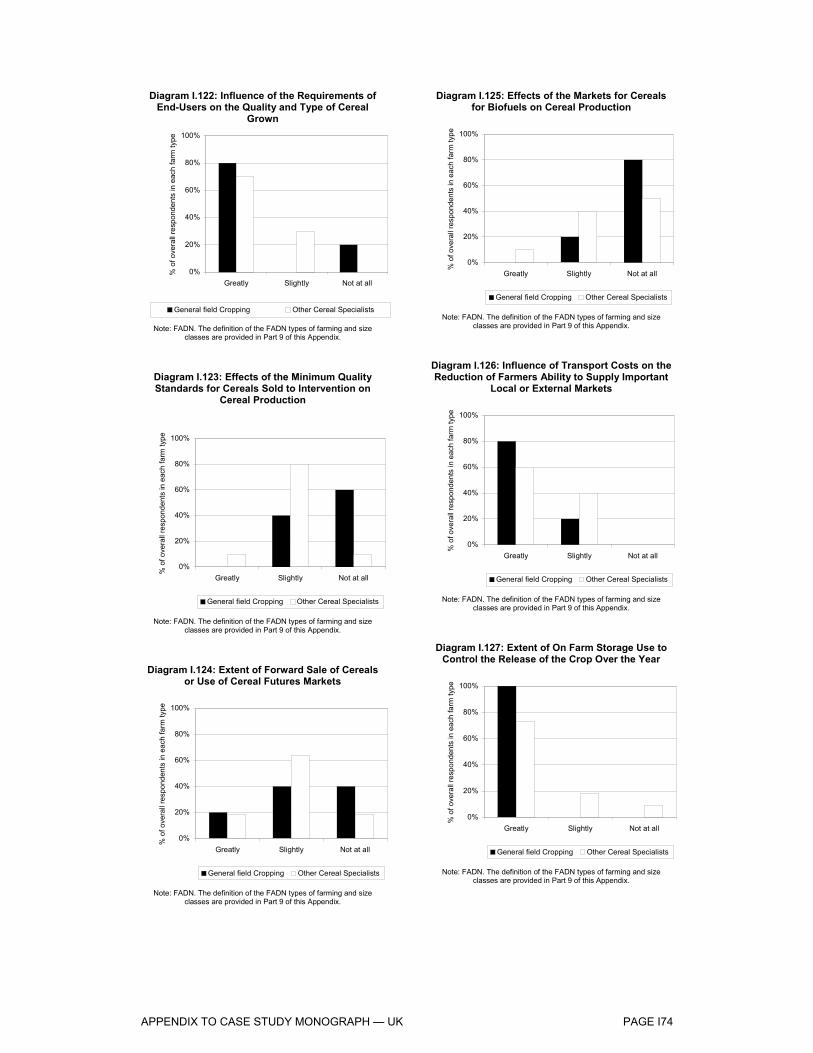
APPENDIX TO CASE STUDY MONOGRAPH — UK PAGE I74
Diagram I.122: Influence of the Requirements of End-Users on the Quality and Type of Cereal
Grown
0%
20%
40%
60%
80%
100%
Greatly Slightly Not at all
% o
f ove
rall
resp
onde
nts
in e
ach
farm
type
General field Cropping Other Cereal Specialists
Note: FADN. The definition of the FADN types of farming and size classes are provided in Part 9 of this Appendix.
Diagram I.123: Effects of the Minimum Quality Standards for Cereals Sold to Intervention on
Cereal Production
0%
20%
40%
60%
80%
100%
Greatly Slightly Not at all
% o
f ove
rall
resp
onde
nts
in e
ach
farm
type
General field Cropping Other Cereal Specialists
Note: FADN. The definition of the FADN types of farming and size classes are provided in Part 9 of this Appendix.
Diagram I.124: Extent of Forward Sale of Cereals or Use of Cereal Futures Markets
0%
20%
40%
60%
80%
100%
Greatly Slightly Not at all
% o
f ove
rall
resp
onde
nts
in e
ach
farm
type
General field Cropping Other Cereal Specialists
Note: FADN. The definition of the FADN types of farming and size classes are provided in Part 9 of this Appendix.
Diagram I.125: Effects of the Markets for Cereals for Biofuels on Cereal Production
0%
20%
40%
60%
80%
100%
Greatly Slightly Not at all
% o
f ove
rall
resp
onde
nts
in e
ach
farm
type
General field Cropping Other Cereal Specialists
Note: FADN. The definition of the FADN types of farming and size classes are provided in Part 9 of this Appendix.
Diagram I.126: Influence of Transport Costs on the Reduction of Farmers Ability to Supply Important
Local or External Markets
0%
20%
40%
60%
80%
100%
Greatly Slightly Not at all
% o
f ove
rall
resp
onde
nts
in e
ach
farm
type
General field Cropping Other Cereal Specialists
Note: FADN. The definition of the FADN types of farming and size classes are provided in Part 9 of this Appendix.
Diagram I.127: Extent of On Farm Storage Use to Control the Release of the Crop Over the Year
0%
20%
40%
60%
80%
100%
Greatly Slightly Not at all
% o
f ove
rall
resp
onde
nts
in e
ach
farm
type
General field Cropping Other Cereal Specialists
Note: FADN. The definition of the FADN types of farming and size classes are provided in Part 9 of this Appendix.
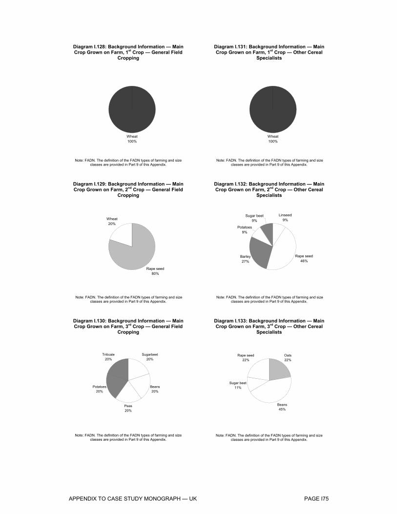
APPENDIX TO CASE STUDY MONOGRAPH — UK PAGE I75
Diagram I.128: Background Information — Main Crop Grown on Farm, 1st Crop — General Field
Cropping
Wheat100%
Note: FADN. The definition of the FADN types of farming and size classes are provided in Part 9 of this Appendix.
Diagram I.129: Background Information — Main Crop Grown on Farm, 2nd Crop — General Field
Cropping
Rape seed80%
Wheat20%
Note: FADN. The definition of the FADN types of farming and size classes are provided in Part 9 of this Appendix.
Diagram I.130: Background Information — Main Crop Grown on Farm, 3rd Crop — General Field
Cropping
Sugarbeet20%
Beans20%
Peas20%
Potatoes20%
Triticale20%
Note: FADN. The definition of the FADN types of farming and size
classes are provided in Part 9 of this Appendix.
Diagram I.131: Background Information — Main Crop Grown on Farm, 1st Crop — Other Cereal
Specialists
Wheat100%
Note: FADN. The definition of the FADN types of farming and size classes are provided in Part 9 of this Appendix.
Diagram I.132: Background Information — Main Crop Grown on Farm, 2nd Crop — Other Cereal
Specialists
Linseed9%
Rape seed46%
Barley27%
Potatoes9%
Sugar beet9%
Note: FADN. The definition of the FADN types of farming and size classes are provided in Part 9 of this Appendix.
Diagram I.133: Background Information — Main Crop Grown on Farm, 3rd Crop — Other Cereal
Specialists
Oats22%
Beans45%
Sugar beet11%
Rape seed22%
Note: FADN. The definition of the FADN types of farming and size
classes are provided in Part 9 of this Appendix.

APPENDIX TO CASE STUDY MONOGRAPH — UK PAGE I76
Diagram I.134: Background Information — Main Crop Grown on Farm, 4th Crop — General Field
Cropping
Peas34%
Sugar beet33%
Potatoes33%
Note: FADN. The definition of the FADN types of farming and size classes are provided in Part 9 of this Appendix.
Diagram I.135: Background Information — Main Crop Grown on Farm, 5th Crop — General Field
Cropping
Sugarbeet50%
Cider Apples50%
Note: FADN. The definition of the FADN types of farming and size classes are provided in Part 9 of this Appendix.
Diagram I.136: Background Information — Main Crop Grown on Farm, 4th Crop — Other Cereal
Specialists
Potatoes50%
Beans50%
Note: FADN. The definition of the FADN types of farming and size classes are provided in Part 9 of this Appendix.
Diagram I.137: Background Information — Main Crop Grown on Farm, 5th Crop — Other Cereal
Specialists
Sugarbeet100%
Note: FADN. The definition of the FADN types of farming and size classes are provided in Part 9 of this Appendix.

APPENDIX TO CASE STUDY MONOGRAPH — UK PAGE I77
SCOTLAND
Table I.22.: Number of Respondents in Each Farm Type
N of respondents
COP Specialists 5 Mixed Crops - Livestock 2 Other Cereal Specialists 12
The questionnaire responses for case study region of Scotland highlight the following observations:
Background Information
Among both COP specialists and other cereal specialists the main crop grows are wheat and barley. Other cereal specialists also grow rapeseed and oats as first crops. No information is available on first crops for mixed-crops livestock producers. The second place in the rotational cycle is mainly destined to cereals crops, these are barley and wheat for COP and other cereal specialists, and wheat and oats for mixed producers. The third place in the rotation is generally occupied by non cereal crops such as rapeseed, beans, grass for all three types of producers.
Producers’ Income Levels
Generally the producers do not tend to diversify away from farming activities, with more than 50% of producers in each type class depending upon farming for over 80% of their household income. The producers rely upon cereal production for at least 40% of their income and, although this situation does not appear to have changed significantly over the past 10 years, barley and wheat production seem to represent a larger share of their income now than it had 10 years ago.
Both farm rents and farmland values do not appear to have increased significantly, however farmland values appear to have increased more than rental values, with some producers experiencing a rise of more than 50%.
Dependence on Direct Payments
More than 40% of the farmers in each class have experienced an increase in the degree of the dependency upon direct payments over the past 10 years, and some producers, particularly other cereal specialists, would diminish their involvement in farming activities by at least 30% if direct payments were reduced. All producers interviewed reported minimal changes in the overall area planted to cereals in the past 10 years.
Production Structures on Holdings
The measures taken under the cereal CMO to support cereal prices do not appear to have affected significantly the producers interviewed, indeed nearly all

APPENDIX TO CASE STUDY MONOGRAPH — UK PAGE I78
of them reported minimal changes in the overall area planted to cereals in the past 10 years.
The amount and type of input use appears to have remained fairly stable over the past 10 years for all types of producers. However, a large proportion of other cereal specialists reported a fall of at least 25% in capital investment in machinery and labour use. This reduction appears to have been driven by environmental considerations.
Adapting Supply to Demand: Quality and Quantity
The producers do not appear to favour a specific source of price information or a specific price basis with respect to their cereal planting decisions.
The crops that have been mostly affected by changes in the area planted to cereals are rapeseed, potatoes, grass and beans. In general, direct payments and set aside directives do not seem to have had a crucial role in planting decisions over the past ten years.
The demands of customers and the quality price premium on cereals were felt to have a significant influence with respect to the choice of crops over the past 10 years and this has resulted in a better quality of the crops produced. On the other hand, the change in minimum quality standard of cereals sold to intervention and the rules on set aside had only a marginal effect on the planting decisions.
Other cereal specialists have increased their on farm feed production, largely in response to changes in the cereal regime.
Land Use: Choice of Crop
The profitability of cereals vis-à-vis alternative non cereal crops appears to have fallen by more than 50% for more than 40% of other cereal specialists, whereas COP crops producers and mixed specialists appear to have been less affected by changes in the relative profitability of cereals. On the other hand, voluntary set aside appears to have only marginally impacted on the profitability of cereals.
Overall the producers have not been largely affected by measures such as direct payments and the rules on set aside with respect to the choice of crops, and environmental and agronomic constraints appear to have only blandly influenced the producers’ optimal planting decisions.
Effects of the Drop in Institutional Prices
Falling intervention prices appear to have slightly affected the area planted to cereals.
Cereal production destined to on-farm feed use has increased over the past ten years, largely in response to changes in the cereal regime.
For all three categories of producers the requirements of end users (e.g. processors and exporters) appear to greatly influence the quality and type of cereals grown, whereas the effect of minimum quality standards for cereals sold to intervention is only marginal and the effect of the presence of markets for cereals for biofuels is not felt at all.

APPENDIX TO CASE STUDY MONOGRAPH — UK PAGE I79
Effects Restricting Competition
The producers have felt that transport costs limited to some extent their ability to supply local or external markets.
In general, the farmers interviewed make a large use of forward sales of cereals or cereals futures markets.
Most of the producers have indicated that on farm storage use plays a significant role in controlling the release of the crop over the year.

APPENDIX TO CASE STUDY MONOGRAPH — UK PAGE I80
Diagram I.138: Percentage of Farm Household Income Derived from Farm Activities
0%
20%
40%
60%
80%
100%
0-20% 20-40% 40-60% 60-80% Over 80%
% o
f ove
rall
resp
onde
nts
in e
ach
farm
type
COP Specialists Mixed Crops Other Cereal Specialists
Note: FADN. The definition of the FADN types of farming and size classes are provided in Part 9 of this Appendix.
Diagram I.139: Percentage of Farm Income Derived from 1st Cereal
Production — Wheat
0%
20%
40%
60%
80%
100%
0-20% 20-40% 40-60% 60-80% Over 80%
% o
f ove
rall
resp
onde
nts
in e
ach
farm
type
COP Specialists Mixed Crops Other Cereal Specialists
Note: FADN. The definition of the FADN types of farming and size classes are provided in Part 9 of this Appendix.
Diagram I.140: Percentage of Farm Income Derived from 2nd Cereal
Production — Barley
0%
20%
40%
60%
80%
100%
0-20% 20-40% 40-60% 60-80% Over 80%
% o
f ove
rall
resp
onde
nts
in e
ach
farm
type
COP Specialists Mixed Crops Other Cereal Specialists
Note: FADN. The definition of the FADN types of farming and size classes are provided in Part 9 of this Appendix.
Diagram I.141: Percentage of Farm Income Derived from Total Cereal Production
0%
20%
40%
60%
80%
100%
0-20% 20-40% 40-60% 60-80% Over 80%
% o
f ove
rall
resp
onde
nts
in e
ach
farm
type
COP Specialists Mixed Crops Other Cereal Specialists
Note: FADN. The definition of the FADN types of farming and size classes are provided in Part 9 of this Appendix.
Diagram I.142: Percentage of Farm Income Derived from 1st Cereal
Production — Barley
0%
20%
40%
60%
80%
100%
0-20% 20-40% 40-60% 60-80% Over 80%
% o
f ove
rall
resp
onde
nts
in e
ach
farm
type
COP Specialists Mixed Crops Other Cereal Specialists
Note: FADN. The definition of the FADN types of farming and size classes are provided in Part 9 of this Appendix.
Diagram I.143: Percentage of Farm Income Derived from 2nd Cereal
Production — Wheat
0%
20%
40%
60%
80%
100%
0-20% 20-40% 40-60% 60-80% Over 80%
% o
f ove
rall
resp
onde
nts
in e
ach
farm
type
COP Specialists Mixed Crops Other Cereal Specialists
Note: FADN. The definition of the FADN types of farming and size classes are provided in Part 9 of this Appendix.

APPENDIX TO CASE STUDY MONOGRAPH — UK PAGE I81
Diagram I.144: Percentage of Farm Income Derived from Total Cereal Production 10 Years Ago
0%
20%
40%
60%
80%
100%
0-20% 20-40% 40-60% 60-80% Over 80%
% o
f ove
rall
resp
onde
nts
in e
ach
farm
type
COP Specialists Mixed Crops Other Cereal Specialists
Note: FADN. The definition of the FADN types of farming and size classes are provided in Part 9 of this Appendix.
Diagram I.145: Percentage of Farm Income Derived from 1st Cereal Production 10 Years Ago — Barley
0%
20%
40%
60%
80%
100%
0-20% 20-40% 40-60% 60-80% Over 80%
% o
f ove
rall
resp
onde
nts
in e
ach
farm
type
COP Specialists Mixed Crops Other Cereal Specialists
Note: FADN. The definition of the FADN types of farming and size classes are provided in Part 9 of this Appendix.
Diagram I.146: Percentage of Farm Income Derived from 2nd Cereal Production 10 Years Ago —
Wheat
0%
20%
40%
60%
80%
100%
0-20% 20-40% 40-60% 60-80% Over 80%
% o
f ove
rall
resp
onde
nts
in e
ach
farm
type
COP Specialists Mixed Crops Other Cereal Specialists
Note: FADN. The definition of the FADN types of farming and size classes are provided in Part 9 of this Appendix.
Diagram I.147: Percentage of Farm Income Derived from 1st Cereal Production 10 Years Ago — Wheat
0%
20%
40%
60%
80%
100%
0-20% 20-40% 40-60% 60-80% Over 80%
% o
f ove
rall
resp
onde
nts
in e
ach
farm
type
COP Specialists Mixed Crops Other Cereal Specialists
Note: FADN. The definition of the FADN types of farming and size classes are provided in Part 9 of this Appendix.
Diagram I.148: Percentage of Farm Income Derived from 2nd Cereal Production 10 Years Ago —
Barley
0%
20%
40%
60%
80%
100%
0-20% 20-40% 40-60% 60-80% Over 80%
% o
f ove
rall
resp
onde
nts
in e
ach
farm
type
COP Specialists Mixed Crops Other Cereal Specialists
Note: FADN. The definition of the FADN types of farming and size classes are provided in Part 9 of this Appendix.
Diagram I.149: Change in Rental Value of Farmland Over the Past 10
Years
0%
20%
40%
60%
80%
100%
Rose>50%
Rose 25-50%
Rose orfell<25%
Fell 25-50%
Fell >50%% o
f ove
rall
resp
onde
nts
in e
ach
farm
type
COP Specialists Mixed Crops Other Cereal Specialists
Note: FADN. The definition of the FADN types of farming and size classes are provided in Part 9 of this Appendix.

APPENDIX TO CASE STUDY MONOGRAPH — UK PAGE I82
Diagram I.150: Change in Asset Value of Farmland Over the Past 10 Years
0%
20%
40%
60%
80%
100%
Rose>50%
Rose 25-50%
Rose orfell<25%
Fell 25-50%
Fell >50%% o
f ove
rall
resp
onde
nts
in e
ach
farm
type
COP Specialists Mixed Crops Other Cereal Specialists
Note: FADN. The definition of the FADN types of farming and size classes are provided in Part 9 of this Appendix.
Diagram I.151: Reduction of Involvement in Farming, Without Direct Payments
0%
20%
40%
60%
80%
100%
by at least50%
30-50% 15-30% 5-15% 0-5%% o
f ove
rall
resp
onde
nts
in e
ach
farm
type
COP Specialists Mixed Crops Other Cereal Specialists
Note: FADN. The definition of the FADN types of farming and size classes are provided in Part 9 of this Appendix.
Diagram I.152: Changes in Cereal Area Since 1995
0%
20%
40%
60%
80%
100%
Rose>50%
Rose 25-50%
Rose orfell<25%
Fell 25-50%
Fell >50%% o
f ove
rall
resp
onde
nts
in e
ach
farm
type
COP Specialists Mixed Crops Other Cereal Specialists
Note: FADN. The definition of the FADN types of farming and size classes are provided in Part 9 of this Appendix.
Diagram I.153: Farm Income From Direct Payments
0%
20%
40%
60%
80%
100%
0-10% 10-20% 20-30% 30-40% 40-50% Over50%
% o
f ove
rall
resp
onde
nts
in e
ach
farm
type
COP Specialists Mixed Crops Other Cereal Specialists
Note: FADN. The definition of the FADN types of farming and size classes are provided in Part 9 of this Appendix.
Diagram I.154: Changes in the Dependence on Direct Payments Over the Past 10 Years
0%
20%
40%
60%
80%
100%
Greatly Slightly Not at all
% o
f ove
rall
resp
onde
nts
in e
ach
farm
type
COP Specialists Mixed Crops Other Cereal Specialists
Note: FADN. The definition of the FADN types of farming and size classes are provided in Part 9 of this Appendix.
Diagram I.155 Influence of Price Support on Cereal Farming Practices Since 1995
0%
20%
40%
60%
80%
100%
Greatly Slightly Not at all
% o
f ove
rall
resp
onde
nts
in e
ach
farm
type
COP Specialists Mixed Crops Other Cereal Specialists
Note: FADN. The definition of the FADN types of farming and size classes are provided in Part 9 of this Appendix.

APPENDIX TO CASE STUDY MONOGRAPH — UK PAGE I83
Diagram I.156: Changes in the Amount and Type of Capital Investment in Machinery Since 1995
0%
20%
40%
60%
80%
100%
Rose>100%
Rose 50-100%
Rose 25-50%
Rose orfell <25%
Fell >25%% o
f ove
rall
resp
onde
nts
in e
ach
farm
type
COP Specialists Mixed Crops Other Cereal Specialists
Note: FADN. The definition of the FADN types of farming and size classes are provided in Part 9 of this Appendix.
Diagram I.157: Changes in the Amount and Type of Seed Use for Cereal Production on Farms Since
1995
0%
20%
40%
60%
80%
100%
Rose>50%
Rose 25-50%
Rose orfell<25%
Fell 25-50%
Fell >50%% o
f ove
rall
resp
onde
nts
in e
ach
farm
type
COP Specialists Mixed Crops Other Cereal Specialists
Note: FADN. The definition of the FADN types of farming and size classes are provided in Part 9 of this Appendix.
Diagram I.158: Changes in the Amount and Type of Irrigation Use for Cereal Production on Farms
Since 1995
0%
20%
40%
60%
80%
100%
Rose>50%
Rose 25-50%
Rose orfell<25%
Fell 25-50%
Fell >50%% o
f ove
rall
resp
onde
nts
in e
ach
farm
type
COP Specialists Mixed Crops Other Cereal Specialists
Note: FADN. The definition of the FADN types of farming and size classes are provided in Part 9 of this Appendix.
Diagram I.159: Changes in the Use of Labour per Hectare in Cereal Production Since 1995
0%
20%
40%
60%
80%
100%
Rose>50%
Rose 25-50%
Rose orfell<25%
Fell 25-50%
Fell >50%% o
f ove
rall
resp
onde
nts
in e
ach
farm
type
COP Specialists Mixed Crops Other Cereal Specialists
Note: FADN. The definition of the FADN types of farming and size classes are provided in Part 9 of this Appendix.
Diagram I.160: Changes in the Amount and Type of Fertiliser Use for Cereal Production on Farms
Since 1995
0%
20%
40%
60%
80%
100%
Rose>50%
Rose 25-50%
Rose orfell<25%
Fell 25-50%
Fell >50%% o
f ove
rall
resp
onde
nts
in e
ach
farm
type
COP Specialists Mixed Crops Other Cereal Specialists
Note: FADN. The definition of the FADN types of farming and size classes are provided in Part 9 of this Appendix.
Diagram I.161: Affect of Environmental Considerations on Decisions for Cereal Production
0%
20%
40%
60%
80%
100%
Greatly Slightly Not at all
% o
f ove
rall
resp
onde
nts
in e
ach
farm
type
COP Specialists Mixed Crops Other Cereal Specialists
Note: FADN. The definition of the FADN types of farming and size classes are provided in Part 9 of this Appendix.

APPENDIX TO CASE STUDY MONOGRAPH — UK PAGE I84
Diagram I.162: Main Sources of Price Information Affecting Cereal Planting — 1st Source
0%
20%
40%
60%
80%
100%
IndustrySources andAssociations
Traders Press andInternet
CommodityExchanges%
of o
vera
ll re
spon
dent
s in
eac
h fa
rm ty
pe
COP Specialists Mixed Crops Other Cereal Specialists
Note: FADN. The definition of the FADN types of farming and size classes are provided in Part 9 of this Appendix.
Diagram I.163: Main Sources of Price Information Affecting Cereal Planting — 3rd Source
0%
20%
40%
60%
80%
100%
IndustrySources andAssociations
Traders Press andInternet
CommodityExchanges%
of o
vera
ll re
spon
dent
s in
eac
h fa
rm ty
pe
COP Specialists Mixed Crops Other Cereal Specialists
Note: FADN. The definition of the FADN types of farming and size classes are provided in Part 9 of this Appendix.
Diagram I.164: Other Crops Affected by Expansions/Contractions in Cereal Area — 1st
Crop
0%
20%
40%
60%
80%
100%
Rapeseed Potatoes Grass Beans
% o
f ove
rall
resp
onde
nts
in e
ach
farm
type
COP Specialists Mixed Crops Other Cereal Specialists
Note: FADN. The definition of the FADN types of farming and size classes are provided in Part 9 of this Appendix.
Diagram I.165: Main Sources of Price Information Affecting Cereal Planting — 2nd Source
0%
20%
40%
60%
80%
100%
IndustrySources andAssociations
Traders Press andInternet
CommodityExchanges%
of o
vera
ll re
spon
dent
s in
eac
h fa
rm ty
pe
COP Specialists Mixed Crops Other Cereal Specialists
Note: FADN. The definition of the FADN types of farming and size classes are provided in Part 9 of this Appendix.
Diagram I.166: Wholesale or Producer Price
0%
20%
40%
60%
80%
100%
Wholesale Price Producer Price Both
% o
f ove
rall
resp
onde
nts
in e
ach
farm
type
COP Specialists Mixed Crops Other Cereal Specialists
Note: FADN. The definition of the FADN types of farming and size classes are provided in Part 9 of this Appendix.
Diagram I.167: Effect of Direct Payments on Cereal Planting Decisions — 1st Crop
0%
20%
40%
60%
80%
100%
Greatly Slightly Not at all
% o
f ove
rall
resp
onde
nts
in e
ach
farm
type
COP Specialists Mixed Crops Other Cereal Specialists
Note: FADN. The definition of the FADN types of farming and size classes are provided in Part 9 of this Appendix.

APPENDIX TO CASE STUDY MONOGRAPH — UK PAGE I85
Diagram I.168: Other Crops Affected by Expansions/Contractions in Cereal Area — 2nd
Crop
0%
20%
40%
60%
80%
100%
Beans
% o
f ove
rall
resp
onde
nts
in e
ach
farm
type
COP Specialists Mixed Crops Other Cereal Specialists
Note: FADN. The definition of the FADN types of farming and size classes are provided in Part 9 of this Appendix.
Diagram I.169Influence of the Rules on Set Aside Since 1992 on Cereal Planting Decisions
0%
20%
40%
60%
80%
100%
Greatly Slightly Not at all
% o
f ove
rall
resp
onde
nts
in e
ach
farm
type
COP Specialists Mixed Crops Other Cereal Specialists
Note: FADN. The definition of the FADN types of farming and size classes are provided in Part 9 of this Appendix.
Diagram I.170: Change in Cereal Quality Since 1995 — 1st Cereal — Wheat
0%
20%
40%
60%
80%
100%
Increased Unchanged Decreased
% o
f ove
rall
resp
onde
nts
in e
ach
farm
type
COP Specialists Mixed Crops Other Cereal Specialists
Note: FADN. The definition of the FADN types of farming and size classes are provided in Part 9 of this Appendix.
Diagram I.171: Influence of Quality Price Premium on Cereal Quality
0%
20%
40%
60%
80%
100%
Greatly Slightly Not at all
% o
f ove
rall
resp
onde
nts
in e
ach
farm
type
COP Specialists Mixed Crops Other Cereal Specialists
Note: FADN. The definition of the FADN types of farming and size classes are provided in Part 9 of this Appendix.
Diagram I.172: Influence of Quality Needs of Customers on Cereal Quality
0%
20%
40%
60%
80%
100%
Greatly Slightly Not at all
% o
f ove
rall
resp
onde
nts
in e
ach
farm
type
COP Specialists Mixed Crops Other Cereal Specialists
Note: FADN. The definition of the FADN types of farming and size classes are provided in Part 9 of this Appendix.
Diagram I.173: Change in Cereal Quality Since 1995 — 1st Cereal — Barley
0%
20%
40%
60%
80%
100%
Increased Unchanged Decreased
% o
f ove
rall
resp
onde
nts
in e
ach
farm
type
COP Specialists Mixed Crops Other Cereal Specialists
Note: FADN. The definition of the FADN types of farming and size classes are provided in Part 9 of this Appendix.

APPENDIX TO CASE STUDY MONOGRAPH — UK PAGE I86
Diagram I.174: Change in Cereal Quality Since 1995 — 2nd Cereal — Barley
0%
20%
40%
60%
80%
100%
Increased Unchanged Decreased
% o
f ove
rall
resp
onde
nts
in e
ach
farm
type
COP Specialists Mixed Crops Other Cereal Specialists
Note: FADN. The definition of the FADN types of farming and size classes are provided in Part 9 of this Appendix.
Diagram I.175: Effects of Changed Minimum Quality Standards for Cereals Sold to Intervention
on Cereal Production
0%
20%
40%
60%
80%
100%
Greatly Slightly Not at all
% o
f ove
rall
resp
onde
nts
in e
ach
farm
type
COP Specialists Mixed Crops Other Cereal Specialists
Note: FADN. The definition of the FADN types of farming and size classes are provided in Part 9 of this Appendix.
Diagram I.176: Influence of the New Cereals Regime on the Volume of Feed Produced On-Farm
0%
20%
40%
60%
80%
100%
Greatly Slightly Not at all
% o
f ove
rall
resp
onde
nts
in e
ach
farm
type
COP Specialists Mixed Crops Other Cereal Specialists
Note: FADN. The definition of the FADN types of farming and size classes are provided in Part 9 of this Appendix.
Diagram I.177: Change in Cereal Quality Since 1995 — 2nd Cereal — Wheat
0%
20%
40%
60%
80%
100%
Increased Unchanged Decreased
% o
f ove
rall
resp
onde
nts
in e
ach
farm
type
COP Specialists Mixed Crops Other Cereal Specialists
Note: FADN. The definition of the FADN types of farming and size classes are provided in Part 9 of this Appendix.
Diagram I.178: Change in the Volume of Feed Produced On-Farm, since 1995
0%
20%
40%
60%
80%
100%
Rose>50%
Rose 25-50%
Rose orFell<25%
Fell 25-50%
Fell>50%% o
f ove
rall
resp
onde
nts
in e
ach
farm
type
COP Specialists Mixed Crops Other Cereal Specialists
Note: FADN. The definition of the FADN types of farming and size classes are provided in Part 9 of this Appendix.
Diagram I.179: Sequence of Crops Over the Rotational Cycle — Crop 1
0%
20%
40%
60%
80%
100%
Beans
Wint
er W
heat
Barley
Rapes
eed
Wheat
Grass
% o
f ove
rall
resp
onde
nts
in e
ach
farm
type
COP Specialists Mixed Crops Other Cereal Specialists
Note: FADN. The definition of the FADN types of farming and size classes are provided in Part 9 of this Appendix.

APPENDIX TO CASE STUDY MONOGRAPH — UK PAGE I87
Diagram I.180: Sequence of Crops Over the Rotational Cycle — Crop 2
0%
20%
40%
60%
80%
100%
Wheat SummerBarley
Rapeseed Oats Barley% o
f ove
rall
resp
onde
nts
in e
ach
farm
type
COP Specialists Mixed Crops Other Cereal Specialists
Note: FADN. The definition of the FADN types of farming and size classes are provided in Part 9 of this Appendix.
Diagram I.181: Sequence of Crops Over the Rotational Cycle — Crop 4
0%
20%
40%
60%
80%
100%
Oats Rapeseed Barley
% o
f ove
rall
resp
onde
nts
in e
ach
farm
type
COP Specialists Mixed Crops Other Cereal Specialists
Note: FADN. The definition of the FADN types of farming and size classes are provided in Part 9 of this Appendix.
Diagram I.182: Main Sources of Price Information Affecting Cereal Planting — 2nd Source
0%
20%
40%
60%
80%
100%
IndustrySources andAssociations
Traders Press andInternet
CommodityExchanges%
of o
vera
ll re
spon
dent
s in
eac
h fa
rm ty
pe
COP Specialists Mixed Crops Other Cereal Specialists
Note: FADN. The definition of the FADN types of farming and size classes are provided in Part 9 of this Appendix.
Diagram I.183: Sequence of Crops Over the Rotational Cycle — Crop 3
0%
20%
40%
60%
80%
100%
Barley
Wint
er Barl
ey
Whe
atOats
Rapes
eed
Potatoe
s
% o
f ove
rall
resp
onde
nts
in e
ach
farm
type
COP Specialists Mixed Crops Other Cereal Specialists
Note: FADN. The definition of the FADN types of farming and size classes are provided in Part 9 of this Appendix.
Diagram I.184: Main Sources of Price Information Affecting Cereal Planting — 1st Source
0%
20%
40%
60%
80%
100%
IndustrySources andAssociations
Traders Press andInternet
CommodityExchanges%
of o
vera
ll re
spon
dent
s in
eac
h fa
rm ty
pe
COP Specialists Mixed Crops Other Cereal Specialists
Note: FADN. The definition of the FADN types of farming and size classes are provided in Part 9 of this Appendix.
Diagram I.185: Main Sources of Price Information Affecting Cereal Planting — 3rd Source
0%
20%
40%
60%
80%
100%
IndustrySources andAssociations
Traders Press andInternet
CommodityExchanges
% o
f ove
rall
resp
onde
nts
in e
ach
farm
type
COP Specialists Mixed Crops Other Cereal Specialists
Note: FADN. The definition of the FADN types of farming and size classes are provided in Part 9 of this Appendix.

APPENDIX TO CASE STUDY MONOGRAPH — UK PAGE I88
Diagram I.186: Wholesale or Producer Price
0%
20%
40%
60%
80%
100%
Wholesale Price Producer Price Both
% o
f ove
rall
resp
onde
nts
in e
ach
farm
type
COP Specialists Mixed Crops Other Cereal Specialists
Note: FADN. The definition of the FADN types of farming and size classes are provided in Part 9 of this Appendix.
Diagram I.187: Change in the Relative Profitability of Cereals Since 1995 Against Voluntary Set Aside
0%
20%
40%
60%
80%
100%
Rose>50%
Rose 25-50%
Rose orFell<25%
Fell 25-50%
Fell>50%% o
f ove
rall
resp
onde
nts
in e
ach
farm
type
COP Specialists Mixed Crops Other Cereal Specialists
Note: FADN. The definition of the FADN types of farming and size classes are provided in Part 9 of this Appendix.
Diagram I.188: Crop Affected by Changes in the Cereal Area 2
0%
20%
40%
60%
80%
100%
Potatoes Grass Beans Barley
% o
f ove
rall
resp
onde
nts
in e
ach
farm
type
COP Specialists Mixed Crops Other Cereal Specialists
Note: FADN. The definition of the FADN types of farming and size classes are provided in Part 9 of this Appendix.
Diagram I.189: Change in the Relative Profitability of Cereals Since 1995 Against the Main Alternative
Crops
0%
20%
40%
60%
80%
100%
Rose>50%
Rose 25-50%
Rose orFell<25%
Fell 25-50%
Fell>50%% o
f ove
rall
resp
onde
nts
in e
ach
farm
type
COP Specialists Mixed Crops Other Cereal Specialists
Note: FADN. The definition of the FADN types of farming and size classes are provided in Part 9 of this Appendix.
Diagram I.190: Crop Affected by Changes in the Cereal Area 1
0%
20%
40%
60%
80%
100%
Rapeseed Beans Grass Wheat
% o
f ove
rall
resp
onde
nts
in e
ach
farm
type
COP Specialists Mixed Crops Other Cereal Specialists
Note: FADN. The definition of the FADN types of farming and size classes are provided in Part 9 of this Appendix.
Diagram I.191: Crop Affected by Changes in the Cereal Area 3
0%
20%
40%
60%
80%
100%
peas
% o
f ove
rall
resp
onde
nts
in e
ach
farm
type
COP Specialists Mixed Crops Other Cereal Specialists
Note: FADN. The definition of the FADN types of farming and size classes are provided in Part 9 of this Appendix.
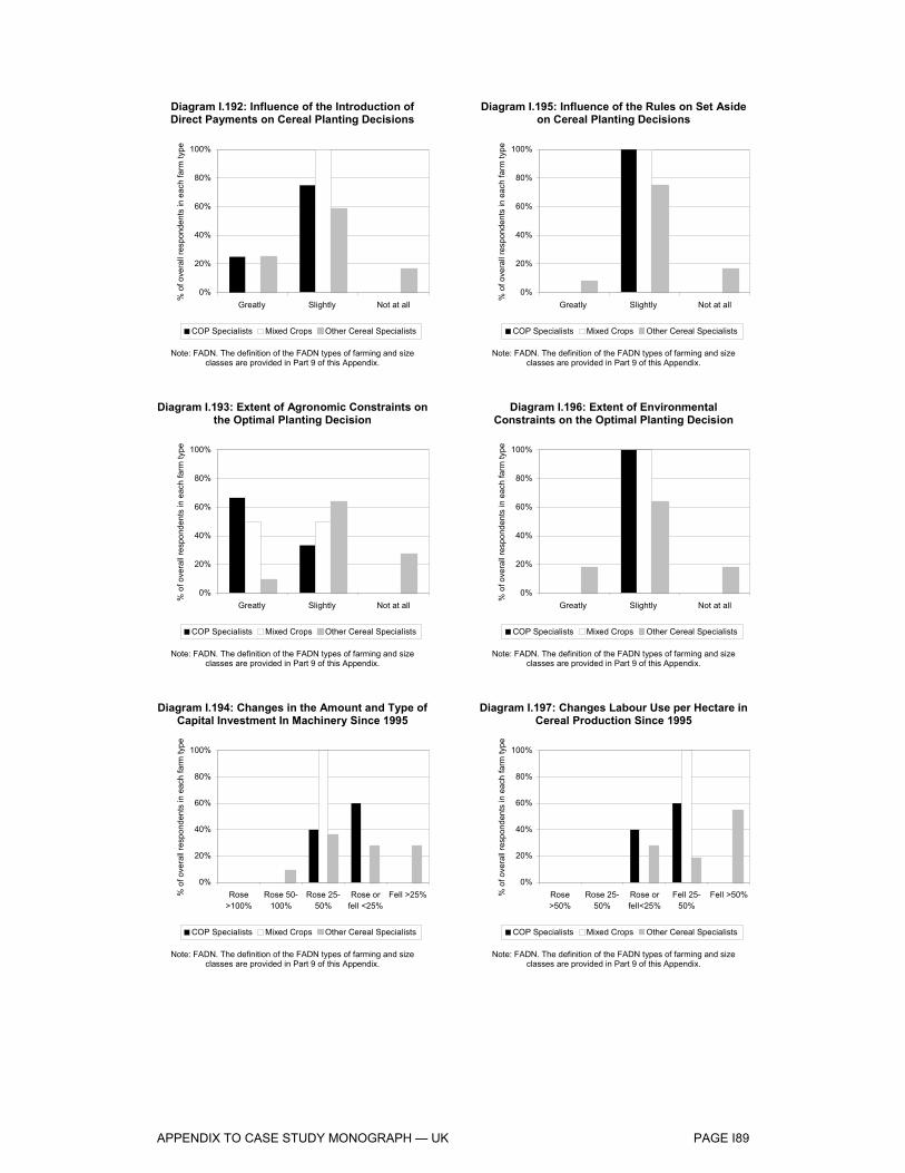
APPENDIX TO CASE STUDY MONOGRAPH — UK PAGE I89
Diagram I.192: Influence of the Introduction of Direct Payments on Cereal Planting Decisions
0%
20%
40%
60%
80%
100%
Greatly Slightly Not at all
% o
f ove
rall
resp
onde
nts
in e
ach
farm
type
COP Specialists Mixed Crops Other Cereal Specialists
Note: FADN. The definition of the FADN types of farming and size classes are provided in Part 9 of this Appendix.
Diagram I.193: Extent of Agronomic Constraints on the Optimal Planting Decision
0%
20%
40%
60%
80%
100%
Greatly Slightly Not at all
% o
f ove
rall
resp
onde
nts
in e
ach
farm
type
COP Specialists Mixed Crops Other Cereal Specialists
Note: FADN. The definition of the FADN types of farming and size classes are provided in Part 9 of this Appendix.
Diagram I.194: Changes in the Amount and Type of Capital Investment In Machinery Since 1995
0%
20%
40%
60%
80%
100%
Rose>100%
Rose 50-100%
Rose 25-50%
Rose orfell <25%
Fell >25%% o
f ove
rall
resp
onde
nts
in e
ach
farm
type
COP Specialists Mixed Crops Other Cereal Specialists
Note: FADN. The definition of the FADN types of farming and size classes are provided in Part 9 of this Appendix.
Diagram I.195: Influence of the Rules on Set Aside on Cereal Planting Decisions
0%
20%
40%
60%
80%
100%
Greatly Slightly Not at all
% o
f ove
rall
resp
onde
nts
in e
ach
farm
type
COP Specialists Mixed Crops Other Cereal Specialists
Note: FADN. The definition of the FADN types of farming and size classes are provided in Part 9 of this Appendix.
Diagram I.196: Extent of Environmental Constraints on the Optimal Planting Decision
0%
20%
40%
60%
80%
100%
Greatly Slightly Not at all
% o
f ove
rall
resp
onde
nts
in e
ach
farm
type
COP Specialists Mixed Crops Other Cereal Specialists
Note: FADN. The definition of the FADN types of farming and size classes are provided in Part 9 of this Appendix.
Diagram I.197: Changes Labour Use per Hectare in Cereal Production Since 1995
0%
20%
40%
60%
80%
100%
Rose>50%
Rose 25-50%
Rose orfell<25%
Fell 25-50%
Fell >50%% o
f ove
rall
resp
onde
nts
in e
ach
farm
type
COP Specialists Mixed Crops Other Cereal Specialists
Note: FADN. The definition of the FADN types of farming and size classes are provided in Part 9 of this Appendix.
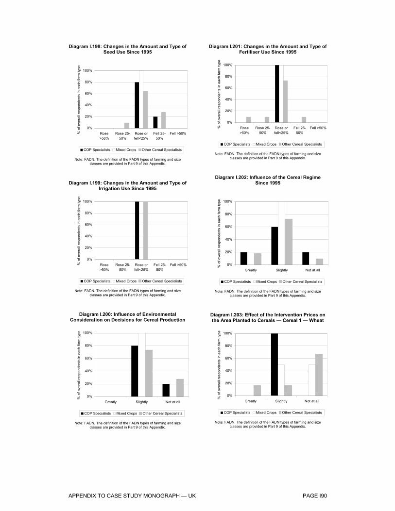
APPENDIX TO CASE STUDY MONOGRAPH — UK PAGE I90
Diagram I.198: Changes in the Amount and Type of Seed Use Since 1995
0%
20%
40%
60%
80%
100%
Rose>50%
Rose 25-50%
Rose orfell<25%
Fell 25-50%
Fell >50%% o
f ove
rall
resp
onde
nts
in e
ach
farm
type
COP Specialists Mixed Crops Other Cereal Specialists
Note: FADN. The definition of the FADN types of farming and size classes are provided in Part 9 of this Appendix.
Diagram I.199: Changes in the Amount and Type of Irrigation Use Since 1995
0%
20%
40%
60%
80%
100%
Rose>50%
Rose 25-50%
Rose orfell<25%
Fell 25-50%
Fell >50%% o
f ove
rall
resp
onde
nts
in e
ach
farm
type
COP Specialists Mixed Crops Other Cereal Specialists
Note: FADN. The definition of the FADN types of farming and size classes are provided in Part 9 of this Appendix.
Diagram I.200: Influence of Environmental Consideration on Decisions for Cereal Production
0%
20%
40%
60%
80%
100%
Greatly Slightly Not at all
% o
f ove
rall
resp
onde
nts
in e
ach
farm
type
COP Specialists Mixed Crops Other Cereal Specialists
Note: FADN. The definition of the FADN types of farming and size classes are provided in Part 9 of this Appendix.
Diagram I.201: Changes in the Amount and Type of Fertiliser Use Since 1995
0%
20%
40%
60%
80%
100%
Rose>50%
Rose 25-50%
Rose orfell<25%
Fell 25-50%
Fell >50%% o
f ove
rall
resp
onde
nts
in e
ach
farm
type
COP Specialists Mixed Crops Other Cereal Specialists
Note: FADN. The definition of the FADN types of farming and size classes are provided in Part 9 of this Appendix.
Diagram I.202: Influence of the Cereal Regime Since 1995
0%
20%
40%
60%
80%
100%
Greatly Slightly Not at all
% o
f ove
rall
resp
onde
nts
in e
ach
farm
type
COP Specialists Mixed Crops Other Cereal Specialists
Note: FADN. The definition of the FADN types of farming and size classes are provided in Part 9 of this Appendix.
Diagram I.203: Effect of the Intervention Prices on the Area Planted to Cereals — Cereal 1 — Wheat
0%
20%
40%
60%
80%
100%
Greatly Slightly Not at all
% o
f ove
rall
resp
onde
nts
in e
ach
farm
type
COP Specialists Mixed Crops Other Cereal Specialists
Note: FADN. The definition of the FADN types of farming and size classes are provided in Part 9 of this Appendix.

APPENDIX TO CASE STUDY MONOGRAPH — UK PAGE I91
Diagram I.204: Effect of the Intervention Prices on the Area Planted to Cereals — Cereal 1 — Barley
0%
20%
40%
60%
80%
100%
Greatly Slightly Not at all
% o
f ove
rall
resp
onde
nts
in e
ach
farm
type
COP Specialists Mixed Crops Other Cereal Specialists
Note: FADN. The definition of the FADN types of farming and size classes are provided in Part 9 of this Appendix.
Diagram I.205: Effect of the Intervention Prices on the Area Planted to Cereals — Cereal 2 — Wheat
0%
20%
40%
60%
80%
100%
Greatly Slightly Not at all
% o
f ove
rall
resp
onde
nts
in e
ach
farm
type
COP Specialists Mixed Crops Other Cereal Specialists
Note: FADN. The definition of the FADN types of farming and size classes are provided in Part 9 of this Appendix.
Diagram I.206: Effect of the Intervention Prices on the Area Planted to Cereals — Cereal 3 — Oats
0%
20%
40%
60%
80%
100%
Greatly Slightly Not at all
% o
f ove
rall
resp
onde
nts
in e
ach
farm
type
COP Specialists Mixed Crops Other Cereal Specialists
Note: FADN. The definition of the FADN types of farming and size classes are provided in Part 9 of this Appendix.
Diagram I.207: Effect of the Intervention Prices on the Area Planted to Cereals — Cereal 2 — Barley
0%
20%
40%
60%
80%
100%
Greatly Slightly Not at all
% o
f ove
rall
resp
onde
nts
in e
ach
farm
type
COP Specialists Mixed Crops Other Cereal Specialists
Note: FADN. The definition of the FADN types of farming and size classes are provided in Part 9 of this Appendix.
Diagram I.208: Effect of the Intervention Prices on the Area Planted to Cereals — Cereal 3 —
Rapeseed
0%
20%
40%
60%
80%
100%
Greatly Slightly Not at all
% o
f ove
rall
resp
onde
nts
in e
ach
farm
type
COP Specialists Mixed Crops Other Cereal Specialists
Note: FADN. The definition of the FADN types of farming and size classes are provided in Part 9 of this Appendix.
Diagram I.209: Change in On-Farm Feed Practice, in Relation to Purchases of Feed Off-Farm, since
1995
0%
20%
40%
60%
80%
100%
Rose>50%
Rose 25-50%
Rose orFell<25%
Fell 25-50%
Fell>50%% o
f ove
rall
resp
onde
nts
in e
ach
farm
type
COP Specialists Mixed Crops Other Cereal Specialists
Note: FADN. The definition of the FADN types of farming and size classes are provided in Part 9 of this Appendix.

APPENDIX TO CASE STUDY MONOGRAPH — UK PAGE I92
Diagram I.210: Influence of the Requirements of End-Users on the Quality and Type of Cereal
Grown
0%
20%
40%
60%
80%
100%
Greatly Slightly Not at all
% o
f ove
rall
resp
onde
nts
in e
ach
farm
type
COP Specialists Mixed Crops Other Cereal Specialists
Note: FADN. The definition of the FADN types of farming and size classes are provided in Part 9 of this Appendix.
Diagram I.211: Effects of the Minimum Quality Standards for Cereals Sold to Intervention on
Cereal Production
0%
20%
40%
60%
80%
100%
Greatly Slightly Not at all
% o
f ove
rall
resp
onde
nts
in e
ach
farm
type
COP Specialists Mixed Crops Other Cereal Specialists
Note: FADN. The definition of the FADN types of farming and size classes are provided in Part 9 of this Appendix.
Diagram I.212: Extent of Forward Sale of Cereals or Use of Cereal Futures Markets
0%
20%
40%
60%
80%
100%
Greatly Slightly Not at all
% o
f ove
rall
resp
onde
nts
in e
ach
farm
type
COP Specialists Mixed Crops Other Cereal Specialists
Note: FADN. The definition of the FADN types of farming and size classes are provided in Part 9 of this Appendix.
Diagram I.213: Effects of the Markets for Cereals for Biofuels on Cereal Production
0%
20%
40%
60%
80%
100%
Greatly Slightly Not at all
% o
f ove
rall
resp
onde
nts
in e
ach
farm
type
COP Specialists Mixed Crops Other Cereal Specialists
Note: FADN. The definition of the FADN types of farming and size classes are provided in Part 9 of this Appendix.
Diagram I.214: Influence of Transport Costs on the Reduction of Farmers Ability to Supply Important
Local or External Markets
0%
20%
40%
60%
80%
100%
Greatly Slightly Not at all
% o
f ove
rall
resp
onde
nts
in e
ach
farm
type
COP Specialists Mixed Crops Other Cereal Specialists
Note: FADN. The definition of the FADN types of farming and size classes are provided in Part 9 of this Appendix.
Diagram I.215: Extent of On Farm Storage Use to Control the Release of the Crop Over the Year
0%
20%
40%
60%
80%
100%
Greatly Slightly Not at all
% o
f ove
rall
resp
onde
nts
in e
ach
farm
type
COP Specialists Mixed Crops Other Cereal Specialists
Note: FADN. The definition of the FADN types of farming and size classes are provided in Part 9 of this Appendix.

APPENDIX TO CASE STUDY MONOGRAPH — UK PAGE I93
Diagram I.216: Background Information — Main Crop Grown on Farm, 1st Crop — COP Specialists
Wheat60%
Barley40%
Note: FADN. The definition of the FADN types of farming and size classes are provided in Part 9 of this Appendix.
Diagram I.217: Background Information — Main Crop Grown on Farm, 2nd Crop — COP Specialists
Wheat40%
Barley60%
Note: FADN. The definition of the FADN types of farming and size classes are provided in Part 9 of this Appendix.
Diagram I.218: Background Information — Main Crop Grown on Farm, 2nd Crop — Other Cereal
Specialists
Barley33%
Wheat42%
Oats8%
Rape seed17%
Note: FADN. The definition of the FADN types of farming and size classes are provided in Part 9 of this Appendix.
Diagram I.219: Background Information — Main Crop Grown on Farm, 1st Crop — Other Cereal
Specialists
Wheat51%
Barley33%
Oats8%
Rape seed8%
Note: FADN. The definition of the FADN types of farming and size classes are provided in Part 9 of this Appendix.
Diagram I.220: Background Information — Main Crop Grown on Farm, 2nd Crop — Mixed Crops
Livestock
Barley50%
Oats50%
Note: FADN. The definition of the FADN types of farming and size classes are provided in Part 9 of this Appendix.
Diagram I.221: Background Information — Main Crop Grown on Farm, 3rd Crop — COP Specialists
Rape seed60%
Beans20%
Grass20%
Note: FADN. The definition of the FADN types of farming and size classes are provided in Part 9 of this Appendix.

APPENDIX TO CASE STUDY MONOGRAPH — UK PAGE I94
Diagram I.222: Background Information — Main Crop Grown on Farm, 3rd Crop — Mixed Crops
Livestock
Rape seed100%
Note: FADN. The definition of the FADN types of farming and size classes are provided in Part 9 of this Appendix.
Diagram I.223: Background Information — Main Crop Grown on Farm, 4th Crop — COP Specialists
Oats50%
Potatoes50%
Note: FADN. The definition of the FADN types of farming and size classes are provided in Part 9 of this Appendix.
Diagram I.224: Background Information — Main Crop Grown on Farm, 4thCrop — Other Cereal
Specialists
Rapeseed33%
Potatoes67%
Note: FADN. The definition of the FADN types of farming and size classes are provided in Part 9 of this Appendix.
Diagram I.225: Background Information — Main Crop Grown on Farm, 3rd Crop — Other Cereal
Specialists
Oats18%
Rape seed28%
Grass18%
Barley27%
Wheat9%
Note: FADN. The definition of the FADN types of farming and size classes are provided in Part 9 of this Appendix.
Diagram I.226: Background Information — Main Crop Grown on Farm, 4th Crop — Mixed Crops
Livestock
Grass100%
Note: FADN. The definition of the FADN types of farming and size classes are provided in Part 9 of this Appendix.
Diagram I.227: Background Information — Main Crop Grown on Farm, 5th Crop — Mixed Crops
Livestock
Barley100%
Note: FADN. The definition of the FADN types of farming and size classes are provided in Part 9 of this Appendix.

APPENDIX TO CASE STUDY MONOGRAPH — UK PAGE I95
Diagram I.228: Background Information — Main Crop Grown on Farm, 5th Crop — Other Cereal
Specialists
Grass100%
Note: FADN. The definition of the FADN types of farming and size classes are provided in Part 9 of this Appendix.

APPENDIX TO CASE STUDY MONOGRAPH — UK PAGE I96
Part 9: Typology of Farms
The main source of harmonised microeconomic data on agricultural holdings is the Farm Accountancy Data Network (FADN). The FADN classifies types of producers in terms of the relative proportions of each enterprise’s total gross margin that derive from particular agricultural activities and also according to their size, defined in European Size Units. One ESU is defined as a fixed number of Euros of the Farm Gross Margin, it has changed over time to reflect inflation and now corresponds to 1200 Euros.
Starting from the framework provided by the FADN typology, a simplified typology of farms was created for the purpose of this study. The producers were classified according to the degree of specialisation in cereal production as follows:
FADN Type of farming 13: “Specialist cereals, oilseeds and protein (COP) crops” FADN Type of farming 14: “General field cropping” FADN Type of farming 8:”Mixed crops-livestock”
These represent those categories of producers that account for the predominant share of cereal output, with the COP specialists dependent upon COP crops (in practice, these were predominantly cereal crops) for at least two thirds of their holdings’ total gross margins.
The types of farming were further classified according to their economic size. Three ESU size classes, Small, Medium and Large, based on the original six FADN size classes, were obtained, as shown in Table I.23.
Table I.23. : Aggregation of FADN ESU Size Classes into New ESU Size Classes
New ESU classes FADN ESU classes
Small (0 -<8 ESU) A (0-<4 ESU) +B (4-<8 ESU) Medium (8-<40 ESU) C (8-<16 ESU) +D (16-<40 ESU) Large (>=40 ESU) E (40-<100 ESU) +F (>=100 ESU)
A detailed description of the methodology employed in the definition of the farm typology used in the Evaluation, together with further analysis of the FADN data and observations on the limitations on the use of these data for this study may be found in Appendix 2 to Chapter 2 of the Core Report.