Embed Size (px)
DESCRIPTION
evaluation for meida
Citation preview

Evaluation Part 3
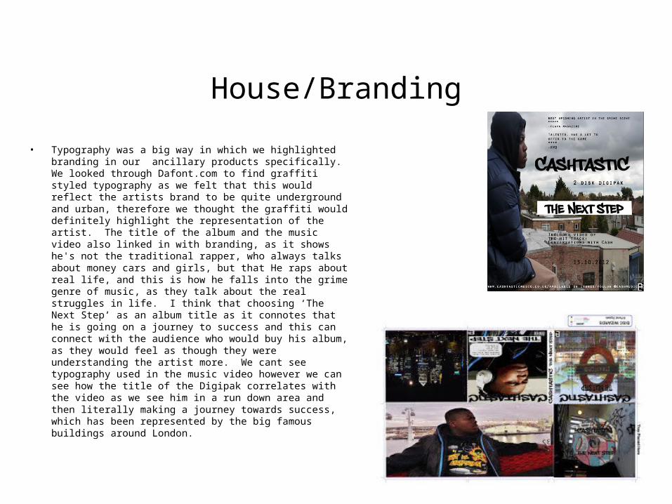
House/Branding
• Typography was a big way in which we highlighted branding in our ancillary products specifically. We looked through Dafont.com to find graffiti styled typography as we felt that this would reflect the artists brand to be quite underground and urban, therefore we thought the graffiti would definitely highlight the representation of the artist. The title of the album and the music video also linked in with branding, as it shows he's not the traditional rapper, who always talks about money cars and girls, but that He raps about real life, and this is how he falls into the grime genre of music, as they talk about the real struggles in life. I think that choosing ‘The Next Step’ as an album title as it connotes that he is going on a journey to success and this can connect with the audience who would buy his album, as they would feel as though they were understanding the artist more. We cant see typography used in the music video however we can see how the title of the Digipak correlates with the video as we see him in a run down area and then literally making a journey towards success, which has been represented by the big famous buildings around London.
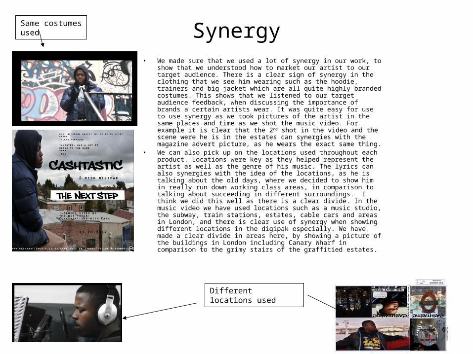
Synergy• We made sure that we used a lot of synergy in our work, to show that
we understood how to market our artist to our target audience. There is a clear sign of synergy in the clothing that we see him wearing such as the hoodie, trainers and big jacket which are all quite highly branded costumes. This shows that we listened to our target audience feedback, when discussing the importance of brands a certain artists wear. It was quite easy for use to use synergy as we took pictures of the artist in the same places and time as we shot the music video. For example it is clear that the 2nd shot in the video and the scene were he is in the estates can synergies with the magazine advert picture, as he wears the exact same thing.
• We can also pick up on the locations used throughout each product. Locations were key as they helped represent the artist as well as the genre of his music. The lyrics can also synergies with the idea of the locations, as he is talking about the old days, where we decided to show him in really run down working class areas, in comparison to talking about succeeding in different surroundings. I think we did this well as there is a clear divide. In the music video we have used locations such as a music studio, the subway, train stations, estates, cable cars and areas in London, and there is clear use of synergy when showing different locations in the digipak especially. We have made a clear divide in areas here, by showing a picture of the buildings in London including Canary Wharf in comparison to the grimy stairs of the graffitied estates.
Same costumes used
Different locations used
Mode Of Address
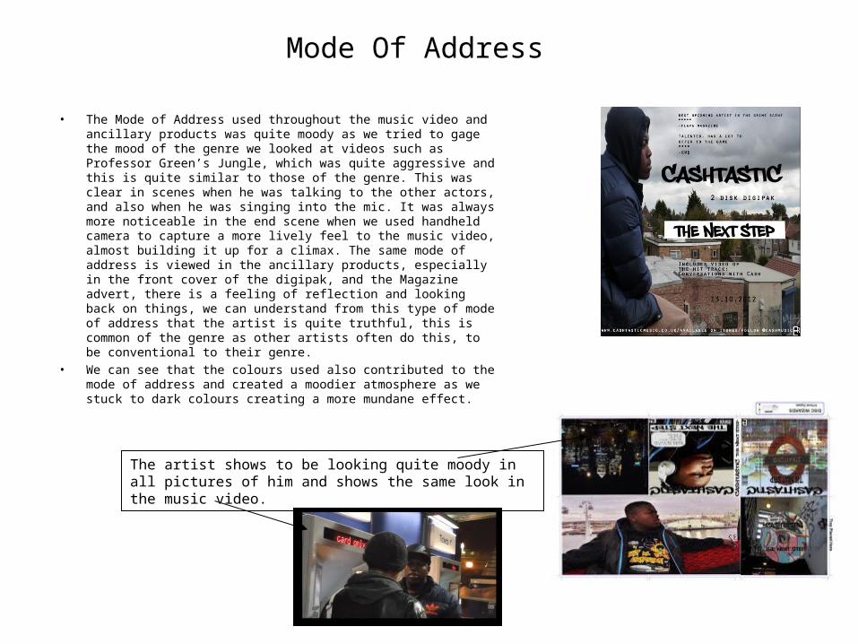
• The Mode of Address used throughout the music video and ancillary products was quite moody as we tried to gage the mood of the genre we looked at videos such as Professor Green’s Jungle, which was quite aggressive and this is quite similar to those of the genre. This was clear in scenes when he was talking to the other actors, and also when he was singing into the mic. It was always more noticeable in the end scene when we used handheld camera to capture a more lively feel to the music video, almost building it up for a climax. The same mode of address is viewed in the ancillary products, especially in the front cover of the digipak, and the Magazine advert, there is a feeling of reflection and looking back on things, we can understand from this type of mode of address that the artist is quite truthful, this is common of the genre as other artists often do this, to be conventional to their genre.
• We can see that the colours used also contributed to the mode of address and created a moodier atmosphere as we stuck to dark colours creating a more mundane effect.
The artist shows to be looking quite moody in all pictures of him and shows the same look in the music video.
Themes
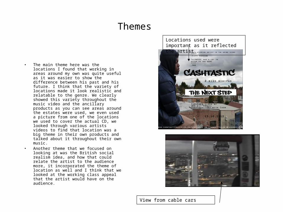
• The main theme here was the locations I found that working in areas around my own was quite useful as it was easier to show the difference between his past and his future. I think that the variety of locations made it look realistic and relatable to the genre. We clearly showed this variety throughout the music video and the ancillary products as you can see areas around the estates were used, we even used a picture from one of the locations we used to cover the actual CD, we looked through various artists videos to find that location was a big theme in their own products and talked about it throughout their own music.
• Another theme that we focused on looking at was the British social realism idea, and how that could relate the artist to the audience more, it incorporated the theme of location as well and I think that we looked at the working class appeal that the artist would have on the audience.
Locations used were important as it reflected the artist.
View from cable cars