Embed Size (px)
Citation preview

EvaluationBY ELLA CABRERA-QUINN
CONVENTIONSIn a magazine it should have on the front cover it should include a bar code, mast head, photograph, price and date , different fonts , sub
headings and sell lines. Most magazines also coordinate colours throughout the front page into the main pages of the magazine. The photograph on the front is also coordinated into the magazine through colour to give it a classic look I used the colours red and purple as I believe red connotates passion and danger and purple connotates power and wealth, I also believe both colours appeal to female
and male audiences. I used purple eye make up on the models and used red lipstick to link in to the purple and red used throughout my magazine. The photo can either be a close up , medium shot , long shot or extreme long shot. As it is rare to have any other shots as
they are the preferred. A photo can make or break an appeal to read a magazine according to its chosen audience as it may not have a celebrity they like who are being shown in a magazine that week. I also used smaller photos at the top, this way the audience can see there are four different posters they can have in the magazine. The main image is eye catching or interesting pictured urges people on
to wanting to carry on reading it. I used a photo of “The Rebellion” , who are lighting a cigarette as it shows they are more interested in smoking than the photo shoot showing why they are called “The Rebellion”.

THE PRICE & DATEIn my magazine front cover it includes conventions like a price for the magazine its written
small at the top of the front cover as it isn't the most important convention I want to show when selling to particular audience. Its in a similar font to the rest of the fonts I'm
using, the fonts I used thought the magazine were ones I found on the internet and BODONI MT BLACK and ROCKWELL EXTRA BLACK. I noticed on magazines the price was written small normally located in corners of the magazine or near the barcode and sometimes even under the mast head. The date is generally underneath the master
head in small print just to show how up to date each edition is. I placed mine underneath the mater head , but instead of saying an a exact date I put the “October issue” , showing
my magazine was exclusive and only came out every month.
Price + Date placed under the master head

BAR CODEThe bar code is always in a corner of a front page. As it is only a required thing , for buying
the magazine it is placed in a spot to move it away from the more important conventions. I put my bar code in the bottom right hand corner , where it was least
attractive to the reader. But as it is a necessity I still included it in my magazine to show full understanding of all the magazine conventions.
Bar code is at the corner of the magazine.

MAST HEADThe mast head is the most important convention of a magazine , it is the first thing a
reader is most likely to see , not only because they want to read a certain favourite , but it also distinguishes it into a category . For example a rock magazine would have a name relating to that genre of music. Some master head which are widely known sometimes let other conventions cross over it. Mast heads are always the biggest
and boldest of all conventions.
This shows well known magazines having famous people covering the master head.

SELL LINE & SUB HEADINGSSub headings are either small or big depending on what is being shown as an important factor in the magazine. For
example on my front cover it has a big sub heading saying “THE REBELLION ARE BACK” , in capital letters and white print to stand out in the darker coloured background. I used black a lot as the main colour used a lot in
association with the rock genre. The part that says “ARE BACK” is in red print to make it stand out to the darker colours in the background (black leggings). Furthermore, red connotates danger. In contrast white connotates
innocence. I put my sell lines on the outsides of the long shot of the two girls as I wanted the photo to stand out more. I made sure there wasn't “white space” as magazines never have blank spaces on the front cover. I also used a camera as I believe it looked eye catching and gave more intuition on what the magazine was going to
include. I used the sell line “ Free” as the chosen audience would want to see what was on offer and was including in buying the magazine. At the top of the page I used a small slogan to show what my magazine was all about . For example “ The first UKS rock magazine !” . This makes readers want to read it as it implies it is the first and most
exclusive magazine out on the shelves. On another sell line I have chosen the colour gold as I used the word “GOLDEN” , to make it look exclusive and important to show old classic music.
Sell lines and sub headings are in different styled fonts as well as different sized prints, not blocking the main photograph whatsoever.
Just like my front cover this one has a large sub heading talking about the featured artist in the magazine.
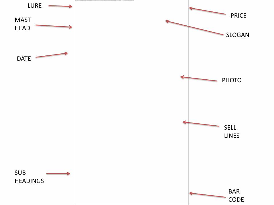
PRICEMAST HEAD
SLOGAN
DATE
SELL LINES
SUB HEADINGS
BAR CODE
LURE
PHOTO

CONTENTS
“Features” is commonly used in contents pages as the font cover has different sell lines but doesn't have everything that will be in the whole magazine.
“On The Front” , showing each feature and the page its on.
I took inspiration from this magazine and used it in my own contents.
I used a background image which is in low key lighting so the writing would stand out. I also used three images near the bottom.

DOUBLE PAGE SPREADA quote on the top of the page , making the interview seem more attractive and interesting. It gives the reader an insight into the interview and what's expected.
The page number and magazine sign is normally in the bottom corner.
The word “Exclusive” is used to make the reader feel they are reading unique material.
There are always a photo of the artist or artists. Mine has a few not just one like this magazines interview.
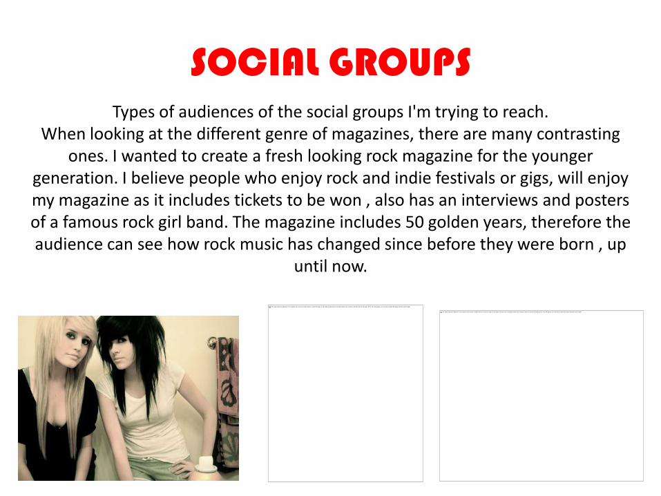
SOCIAL GROUPSTypes of audiences of the social groups I'm trying to reach.
When looking at the different genre of magazines, there are many contrasting ones. I wanted to create a fresh looking rock magazine for the younger
generation. I believe people who enjoy rock and indie festivals or gigs, will enjoy my magazine as it includes tickets to be won , also has an interviews and posters of a famous rock girl band. The magazine includes 50 golden years, therefore the audience can see how rock music has changed since before they were born , up
until now.

TYPES OF MUSICThe music genre I have chosen to reach to a particular audience
is people who listen to bands like Paramore and The Pretty Reckless , as they are female bands like my all female band The Rebellion. I noticed that the females are portrayed in a sexual
way also in a strong manner, most seem rebels also. My magazine can be portrayed negatively to audiences as they are smoking and drinking in the pictures I have used. My lifestyle it
promotes is a “rock and roll” one which is normally showed very negatively as they are known to take drugs and stay up until late
at night also they are known to be very moody and seem negative not enthusiastic and happy people. My magazine isn't
very mainstream as it is classic/punk rock which would be known as sub cultures this normally is promoted to niche
audiences. My magazine gives the audience I'm reaching a way of belonging as there is a magazine reached out to them.
This picture is used on my double page spread as it shows the power and rebellion of the band I created, For example they are holding down a security guard whilst Kez has a cigarette in her mouth also keliah is holding him and laughing.

MEDIA INSTITUION
IPC Media produces over 60 iconic media brands, with print alone reaching almost two thirds of UK women and 42% of UK men almost 26 million UK adults.
Kerrang! TV is a digital television station owned by Box Television, which is loosely connected to the magazine, Kerrang!.
The best media institute to develop and distribute my magazine as they already distributes music magazines such as “NME”, which is similar to mine as mine is associated with the
rock is IPC. As it already distributes well known music magazines means that they have the most experience and have regular consumers who might be interested in a new branch of
music magazines. Distributors get the magazines to their audience by distributing them out to different shops all over the country, such as places like news agents, airports, train stations, supermarkets and even promoted on the internet.
KERRANG! Is a well known magazine and radio station, I want my magazine to compete with other top magazines like this one
, but mine may have a unique gap in the market as it is also associated with 80’s classic rock.

TECHNOLOGIESThroughout creating my music magazine cover, contents and double page spread. I have used
Windows publisher to create all three types of products for my music magazine. As I took a night to take my pictures, I took a range of pictures in different mise en scenes and angles,
also different shot sizes ranging from close ups to extreme long shots. I edited my photos on Photoshop were I changed the colour on some to sepia to make the photos look mysterious
and seem more important and exclusive. I used a Nikon camera to take my pictures. I also edited them so the models looked “picture perfect” and where able to stand out to my
chosen audience. I also used the internet to help me find unique font styles to show a better understanding of the convention of a individual master head. Throughout the creating of my product I used the internet to find a bar code for my front cover as every magazine has one and needs one to sell there magazine. When creating this evaluation I used PowerPoint to
make my evaluation seem fun and exciting to read. All my media work is on the internet site blogger where I made my own page to my taste and put all my research and contents of all my drafts and completed work. Finally I used a memory stick to help me transfer work from
home to school so I could always work on the course.
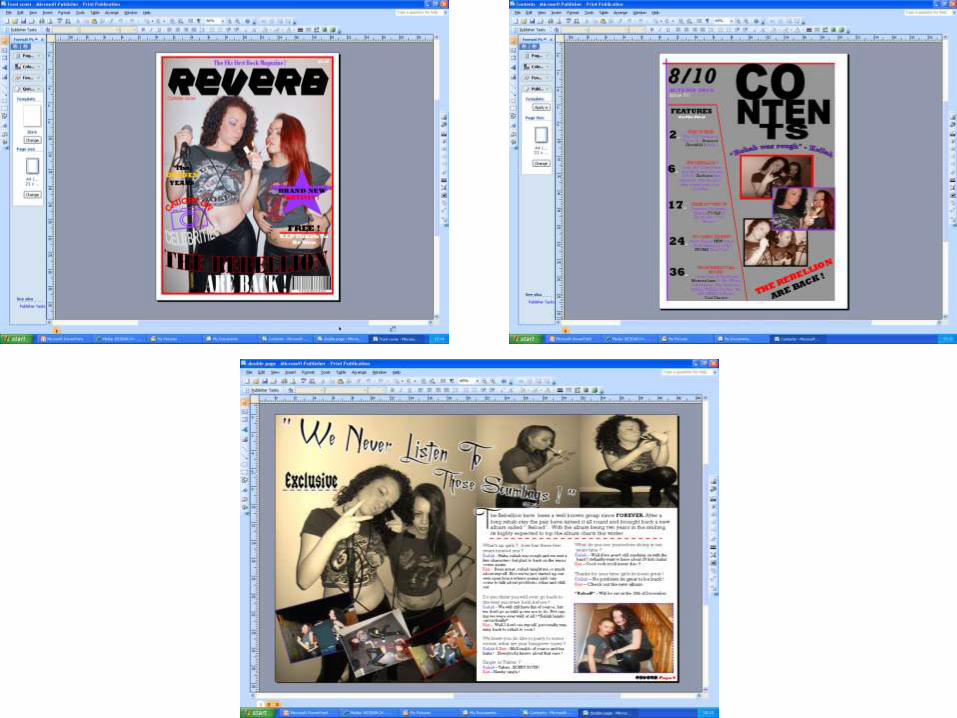

PROPS I USEDA Lighter & Cigarette –I used a lighter lighting a cigarette to add rebellion to my band showing audiences negative role models and showing a “care free” lifestyle.
A Microphone stand & Microphone - I used a microphone to show audiences what type of magazine it is I'm promoting , as its a rock magazine bands are known for touring and doing gigs more than being in the recording studio. A band and instruments are a convention for rock music.Champagne &
Tobacco – Again I wanted to show why they are called “The Rebellion” , I want to show the audience what they are like on tour. This can also give them a negative image.
A Security guard - I used a male model to show how “The Rebellion” our with an authority figure showing and how the act with him, this picture shows they do not care who he is and they will do as they wish. They are both laughing at him trying to remove them from a club.

PRELIMINARY TASKMy school magazine which is for 6th form students at my school. I took my experience from creating this to help me to
create my music magazine.
At the start of the course I created a school magazine relating to 6th form students. When I created the front coverand contents page I used the colours yellow and purple as they seemed colours that would relate to my choice inaudience.
When I created my music magazine I found using the colours purple and red were more grown up and worked betteras they looked more professional and can relate to a wider audience compared to the “childish” colours I usedbefore.
At the start of the preliminary task I hadn't explored enough examples of products on the market so I couldn'texpand my ideas. Although I used a few codes and conventions in my school magazine I didn't use them to my bestadvantage , For example the date on my school magazine is quite large were as on my music magazine it is smallerand more discrete as it isn't such an important convention.
I also found the picture I used on the front cover of the school magazine was slightly stretched and I didn't edit it atall, the photos for my music magazine were edited and were not stretched at all. I made the colours in the photosvibrant so they would stand out, compared to the school magazine the image on that is dull and it has mutecolours. On the contents the image in the background has a mute colour , forcing the writing to stand out.
On the school magazine I played with lots of font styles and colours which lead me to choose appropriate styles formy rock magazine. I used shapes as backgrounds for my sell lines , which I found later on in creating my musicmagazine childish and made the magazine look unprofessional.
Another thing I took from when creating my school magazine is the word “Exclusive” , I believe it makes themagazine look more important and unique and intrigue someone to buy it. When I created the school magazine Ifound I left a lot of “white space” which is not a usual for a magazine as they are meant to be full and have nospace left. In my music magazine I made sure there was hardly any “white space” and used images to take up a lotof space.
On my school magazine I sectioned it out into three parts, one part had a picture of someone whose interview itwas going to have in the magazine. Another part had the front page sub lines on it and page numbers. On my musicmagazine I took the idea I used in the school magazine by having subheadings over a paragraph of what theaudience was going to be reading.
On my music magazine I added a quote in what was going to be in the interview to make the reader carry onreading on to that page. As I used sections in the school magazine I believed it made the contents easy and straightforward to read so I applied it to my music magazine.

AUDIENCE FEED BACK
Here I have created a questionnaire where I have asked two people what they thought about my magazine, to give me an idea of if I have to change anything to make it
better.

QUESTIONAIRES FOR MY MAGAZINES

DEVELOPMENT
When creating my front cover , contents and double page spread I changed my mind frequently. At first I tried to challenge codes and conventions , but ended up sticking to the regular ones. I added small images on to the front cover and a different bar code. On the contents I completely changed the layout by adding a background image and repositioned my three images. I removed the quote also as I had a quote on the double page spread.

THE END