Embed Size (px)
Citation preview
Alice Spencer
How effective is the combination of your main media text and subsidiary
tasks?
Links Within Texts
It is important for the combination of media texts to be coherent, as this allows for each product to be identifiable as for a specific function, audience and purpose.
Successful media combinations will link together using subtle connections, creating the subconscious associations.
Purpose
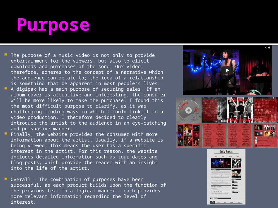
The purpose of a music video is not only to provide entertainment for the viewers, but also to elicit downloads and purchases of the song. Our video, therefore, adheres to the concept of a narrative which the audience can relate to; the idea of a relationship is something that be apparent in most people’s lives.
A digipak has a main purpose of securing sales. If an album cover is attractive and interesting, the consumer will be more likely to make the purchase. I found this the most difficult purpose to clarify, as it was challenging finding ways in which I could link it to a video production. I therefore decided to clearly introduce the artist to the audience in an eye-catching and persuasive manner.
Finally, the website provides the consumer with more information about the artist. Usually, if a website is being viewed, this means the user has a specific interest in the artist. For this reason, the website includes detailed information such as tour dates and blog posts, which provide the reader with an insight into the life of the artist.
Overall – The combination of purposes have been successful, as each product builds upon the function of the previous text in a logical manner – each provides more relevant information regarding the level of interest.
Colour
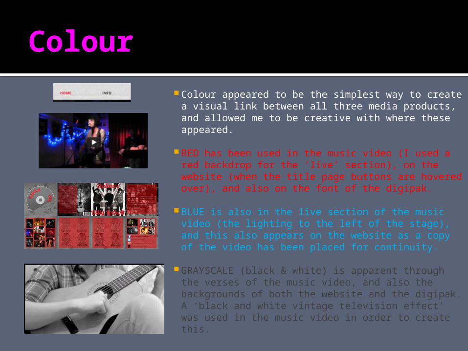
Colour appeared to be the simplest way to create a visual link between all three media products, and allowed me to be creative with where these appeared.
RED has been used in the music video (I used a red backdrop for the ‘live’ section), on the website (when the title page buttons are hovered over), and also on the font of the digipak.
BLUE is also in the live section of the music video (the lighting to the left of the stage), and this also appears on the website as a copy of the video has been placed for continuity.
GRAYSCALE (black & white) is apparent through the verses of the music video, and also the backgrounds of both the website and the digipak. A ‘black and white vintage television effect’ was used in the music video in order to create this.
Reasons for Colour choices... I wanted my media products to avoid any gender bias, which is
why I chose the colours RED and BLUE. These appeal to both genders, without causing any explicit stereotyping.
Also, the colours RED and BLUE create a British sense, which links to the desires of the artist to break into the British music business. It develops the idea of a patriotic society, establishing familiarity and a rapport with the consumer.
Black and White is commonly seen in indie videos of a similiar tone. I believe it creates a nostalgic, vintage feel, suggesting the concept of treasured memories. The background to the Digipak is personally hand drawn, as this also links with the Indie genre; the genre establishes itself as being inexpensive, relatable and artistic, therefore drawings seemed the logical choice.
Overall, I believe the combination of colours throughout my media products has been very successful, as they are eye-catching, without being overpowering, and are subtle enough to be recognisable throughout.
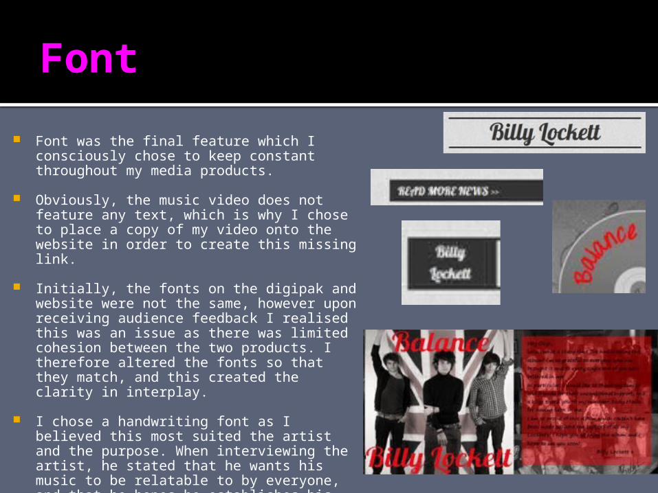
Font
Font was the final feature which I consciously chose to keep constant throughout my media products.
Obviously, the music video does not feature any text, which is why I chose to place a copy of my video onto the website in order to create this missing link.
Initially, the fonts on the digipak and website were not the same, however upon receiving audience feedback I realised this was an issue as there was limited cohesion between the two products. I therefore altered the fonts so that they match, and this created the clarity in interplay.
I chose a handwriting font as I believed this most suited the artist and the purpose. When interviewing the artist, he stated that he wants his music to be relatable to by everyone, and that he hopes he establishes his personality through doing this. For this reason, a handwriting font clarifies this personal tone, representing words he has written himself.
In Conclusion...
I believe the combination of my main media text and subsidiary texts is extremely effective as each product is individually identifiable as well as containing subtle links between each one. The links help to clarify the purpose, as well as the audience and function.
Subconscious connotations are also established, for example the patriotic feel of the colour schemes.