Embed Size (px)
Citation preview
My method of audi-
ence research didn‟t really change between
the tasks. For the
preliminary task it was
questionnaires, for
the production it was
also questionnaires. I
feel that question-
naires are a good way of getting audience
feedback and finding
out what they want
though because their
answering a set of
questions which is
asked by you because
that is what you want
to know.
Overall I feel my ap-
proach to research
improved from the
preliminary task to
the production as
audience research has
evidently influenced
my production (price
and content).
When I did the pre-
liminary task I didn‟t think audience re-
search was an im-
portant part of pro-
ducing a magazine. I
originally thought that
as long as I made it
look like a real maga-
zine it would be okay. Because of this I de-
cided not to spend
much time on my
audience research
which I feel was a big
mistake because I
understand now,
thanks to my research
into magazine institu-
tions, that making a
magazine that suits
your audience is im-
portant because a
magazine wants as
many sales as possible
so therefore it does
need to be appropri-
ate to the audience
because they‟re the
ones who buy it.
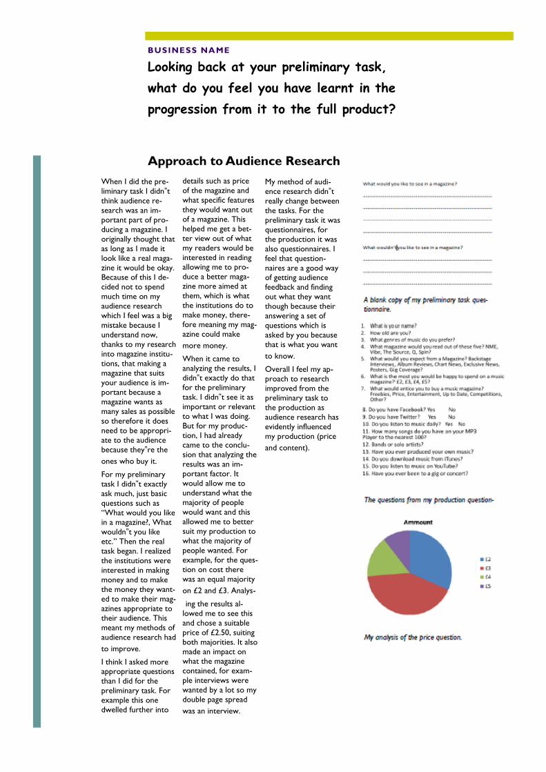
For my preliminary
task I didn‟t exactly
ask much, just basic
questions such as
“What would you like
in a magazine?, What
wouldn‟t you like
etc.” Then the real
task began. I realized
the institutions were
interested in making
money and to make
the money they want-
ed to make their mag-
azines appropriate to
their audience. This
meant my methods of
audience research had
to improve.
I think I asked more appropriate questions
than I did for the
preliminary task. For
example this one
dwelled further into
details such as price
of the magazine and
what specific features
they would want out
of a magazine. This
helped me get a bet-
ter view out of what
my readers would be
interested in reading allowing me to pro-
duce a better maga-
zine more aimed at
them, which is what
the institutions do to
make money, there-
fore meaning my mag-
azine could make
more money.
When it came to
analyzing the results, I
didn‟t exactly do that
for the preliminary
task. I didn‟t see it as
important or relevant
to what I was doing.
But for my produc-
tion, I had already
came to the conclu-
sion that analyzing the
results was an im-
portant factor. It
would allow me to
understand what the
majority of people
would want and this
allowed me to better
suit my production to
what the majority of
people wanted. For
example, for the ques-
tion on cost there
was an equal majority
on £2 and £3. Analys-
ing the results al-
lowed me to see this
and chose a suitable
price of £2.50, suiting
both majorities. It also
made an impact on what the magazine
contained, for exam-
ple interviews were
wanted by a lot so my
double page spread
was an interview.
Approach to Audience Research
BUSINESS NAME
Looking back at your preliminary task,
what do you feel you have learnt in the
progression from it to the full product?
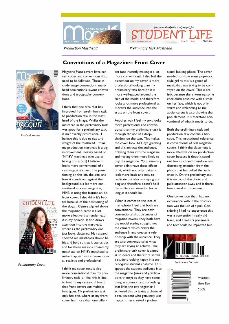
Magazine front covers have cer-
tain codes and conventions that
need to be followed. These in-
clude image conventions, mast-
head conventions, layout conven-
tions and typography conven-
tions.
I think that one area that has
improved from preliminary task
to production task is the mast-
head of the image. Whilst the
masthead in the preliminary task
was good for a preliminary task,
it isn‟t exactly professional. I
believe this is due to size and
weight of the masthead. I think
my production masthead is a big
improvement. Heavily based on
„NME‟s‟ masthead (the use of
having it in a box) I believe it
looks more conventional of a
real magazine cover. The posi-
tioning on the left, the size, and
how it stands out against the
background is a lot more con-
ventional as a real magazine,
NME, is using this feature on it‟s
front cover. I also think it‟s bet-
ter because of the positioning of
the slogan. Centre aligned above
the magazine‟s name is a lot
more effective than underneath
it in my opinion. It also draws
attention into the masthead,
where as the preliminary one
just looks cluttered. My research
showed me mastheads should be
big and bold so that it stands out
and for those reasons I based my
masthead on NME‟s masthead to
make it appear more convention-
al, realistic and professional.
I think my cover text is also
more conventional than my pre-
liminary task is. I feel this is due
to font. In my research I found
that front covers use multiple
font types. My preliminary task
only has one, where as my front
cover has more than one differ-
ent font instantly making it a lot
more conventional. I also feel the
placement on my cover is more
professional looking than my
preliminary task because it is
more well-spaced around the
face of the model and therefore
looks a lot more professional as
it draws the audience into the
artist on the front cover.
Another way I feel my text looks
more professional and conven-
tional than my preliminary task is
through the use of a drop-
shadow on the text. This makes
the cover look 3-D, eye grabbing
and this attracts the audience,
drawing them into the magazine
and making them more likely to
buy the magazine. My preliminary
cover didn‟t have these effects
on it, which not only makes it
look more basic and easy to
replicate but also isn‟t eye grab-
bing and therefore doesn‟t hold
the audience‟s attention for as
long as it should be.
When it comes to the idea of
main-photo I feel that both are
conventional. They are both
conventional shot distances of
magazine covers, they both have
the model staring straight into
the camera which draws the
audience in and creates a rela-
tionship with the audience. They
are also conventional at what
they are trying to achieve. The
preliminary task cover is aimed
at students and therefore shows
a student looking happy in a ste-
reotypical student costume. This
appeals the student audience into
the magazine (uses and gratifica-
tions theory) as they have some-
thing in common and something
that links the two together. I
achieved this by taking a photo of
a real student who genuinely was
happy. It has created a profes-
sional looking photo. The cover
needed to show some pop-rock
style girl as this is a genre of
music that was trying to be con-
veyed on the cover. This is real-
istic because she is wearing some
rock-chick costume with a smile
on her face, which is not only
warm and welcoming to the
audience but is also showing the
pop element. It is therefore con-
ventional of what it needs to do.
Both the preliminary task and
production task contain a bar-
code. This institutional reference
is conventional of real magazine
covers. I think the placement is
more effective on my production
cover because it doesn‟t stand
out too much and therefore isn‟t
distracting attention from the
photo that has pulled the audi-
ence in. On the preliminary task
it is on top of the photo and
pulls attention away and is there-
fore a weaker placement.
One convention that I had no
experience with in the produc-
tion was the use of a pull. Con-
sidering I had no experience this
was a convention I really did
learn, and I feel it‟s placement
and text could be improved but
Conventions of a Magazine– Front Cover
Production Masthead Preliminary Task Masthead
Production cover
Preliminary Cover Preliminary Barcode
Produc-
tion Bar
Code
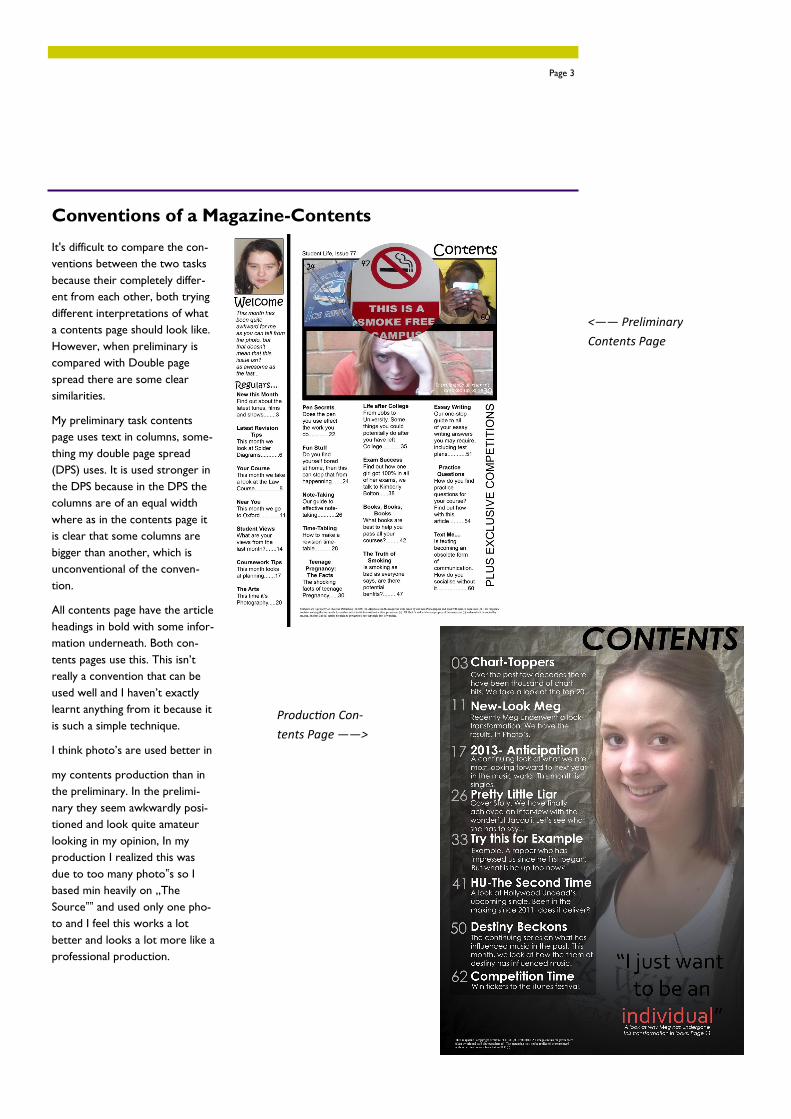
It's difficult to compare the con-
ventions between the two tasks
because their completely differ-
ent from each other, both trying
different interpretations of what
a contents page should look like.
However, when preliminary is
compared with Double page
spread there are some clear
similarities.
My preliminary task contents
page uses text in columns, some-
thing my double page spread
(DPS) uses. It is used stronger in
the DPS because in the DPS the
columns are of an equal width
where as in the contents page it
is clear that some columns are
bigger than another, which is
unconventional of the conven-
tion.
All contents page have the article
headings in bold with some infor-
mation underneath. Both con-
tents pages use this. This isn‟t
really a convention that can be
used well and I haven‟t exactly
learnt anything from it because it
is such a simple technique.
I think photo‟s are used better in
my contents production than in
the preliminary. In the prelimi-
nary they seem awkwardly posi-
tioned and look quite amateur
looking in my opinion, In my
production I realized this was
due to too many photo‟s so I
based min heavily on „The
Source‟‟ and used only one pho-
to and I feel this works a lot
better and looks a lot more like a
professional production.
Conventions of a Magazine-Contents
Page 3
<—— Preliminary
Contents Page
Production Con-
tents Page ——>
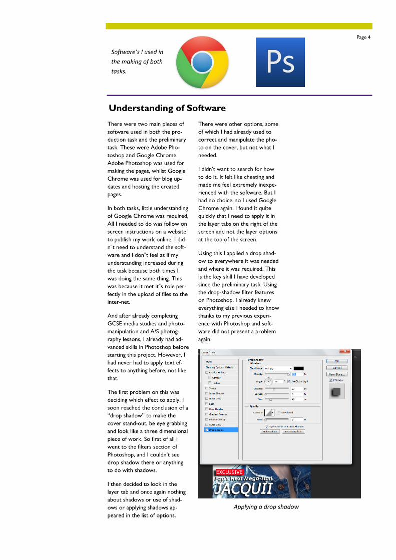
There were two main pieces of
software used in both the pro-
duction task and the preliminary
task. These were Adobe Pho-
toshop and Google Chrome.
Adobe Photoshop was used for
making the pages, whilst Google
Chrome was used for blog up-
dates and hosting the created
pages.
In both tasks, little understanding
of Google Chrome was required,
All I needed to do was follow on
screen instructions on a website
to publish my work online. I did-
n‟t need to understand the soft-
ware and I don‟t feel as if my
understanding increased during
the task because both times I
was doing the same thing. This
was because it met it‟s role per-
fectly in the upload of files to the
inter-net.
And after already completing
GCSE media studies and photo-
manipulation and A/S photog-
raphy lessons, I already had ad-
vanced skills in Photoshop before
starting this project. However, I
had never had to apply text ef-
fects to anything before, not like
that.
The first problem on this was
deciding which effect to apply. I
soon reached the conclusion of a
“drop shadow” to make the
cover stand-out, be eye grabbing
and look like a three dimensional
piece of work. So first of all I
went to the filters section of
Photoshop, and I couldn‟t see
drop shadow there or anything
to do with shadows.
I then decided to look in the
layer tab and once again nothing
about shadows or use of shad-
ows or applying shadows ap-
peared in the list of options.
There were other options, some
of which I had already used to
correct and manipulate the pho-
to on the cover, but not what I
needed.
I didn‟t want to search for how
to do it. It felt like cheating and
made me feel extremely inexpe-
rienced with the software. But I
had no choice, so I used Google
Chrome again. I found it quite
quickly that I need to apply it in
the layer tabs on the right of the
screen and not the layer options
at the top of the screen.
Using this I applied a drop shad-
ow to everywhere it was needed
and where it was required. This
is the key skill I have developed
since the preliminary task. Using
the drop-shadow filter features
on Photoshop. I already knew
everything else I needed to know
thanks to my previous experi-
ence with Photoshop and soft-
ware did not present a problem
again.
Understanding of Software
Page 4
Applying a drop shadow
Software’s I used in
the making of both
tasks.
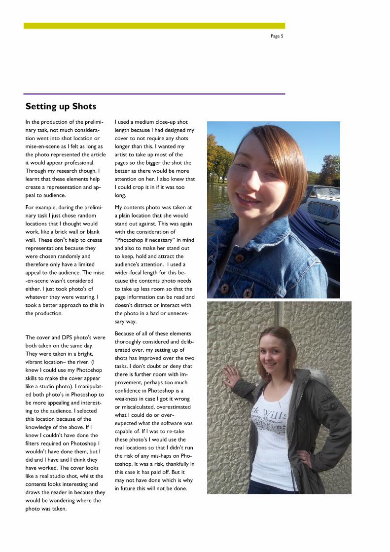
In the production of the prelimi-
nary task, not much considera-
tion went into shot location or
mise-en-scene as I felt as long as
the photo represented the article
it would appear professional.
Through my research though, I
learnt that these elements help
create a representation and ap-
peal to audience.
For example, during the prelimi-
nary task I just chose random
locations that I thought would
work, like a brick wall or blank
wall. These don‟t help to create
representations because they
were chosen randomly and
therefore only have a limited
appeal to the audience. The mise
-en-scene wasn't considered
either. I just took photo's of
whatever they were wearing. I
took a better approach to this in
the production.
The cover and DPS photo‟s were
both taken on the same day.
They were taken in a bright,
vibrant location– the river. (I
knew I could use my Photoshop
skills to make the cover appear
like a studio photo). I manipulat-
ed both photo‟s in Photoshop to
be more appealing and interest-
ing to the audience. I selected
this location because of the
knowledge of the above. If I
knew I couldn‟t have done the
filters required on Photoshop I
wouldn‟t have done them, but I
did and I have and I think they
have worked. The cover looks
like a real studio shot, whilst the
contents looks interesting and
draws the reader in because they
would be wondering where the
photo was taken.
I used a medium close-up shot
length because I had designed my
cover to not require any shots
longer than this. I wanted my
artist to take up most of the
pages so the bigger the shot the
better as there would be more
attention on her. I also knew that
I could crop it in if it was too
long.
My contents photo was taken at
a plain location that she would
stand out against. This was again
with the consideration of
“Photoshop if necessary” in mind
and also to make her stand out
to keep, hold and attract the
audience‟s attention. I used a
wider-focal length for this be-
cause the contents photo needs
to take up less room so that the
page information can be read and
doesn‟t distract or interact with
the photo in a bad or unneces-
sary way.
Because of all of these elements
thoroughly considered and delib-
erated over, my setting up of
shots has improved over the two
tasks. I don‟t doubt or deny that
there is further room with im-
provement, perhaps too much
confidence in Photoshop is a
weakness in case I got it wrong
or miscalculated, overestimated
what I could do or over-
expected what the software was
capable of. If I was to re-take
these photo‟s I would use the
real locations so that I didn‟t run
the risk of any mis-haps on Pho-
toshop. It was a risk, thankfully in
this case it has paid off. But it
may not have done which is why
in future this will not be done.
Setting up Shots
Page 5
Critical Evaluation Skills
It has been important for
me to develop evaluation
skills through-out this task
for two reasons. The first
is to allow me to see
where I went wrong and
make improvements and
the second being how the-
se can help me in future
projects.
One of the evaluation skills
I think improved during
this task was me helping
others. By this I mean a
peer evaluation thing
where we were asked
what we think of
someone's work and sug-
gest improvements. I have
always found it difficult to
be harsh, mean or critical
about other people‟s work
but for this I had to so that
I could help them get
marks. The skill I found
was a way to do it without
being mean. I suggested
improvements and tweaks
instead of criticizing which
not only allowed me to
evaluate their work and
help them get more marks
but also allowed me to
develop a new evaluation
skill which could help me
in later life.
One skill I already had
though was evaluating my
own work. I
am very good at identifying
my strengths and weak-
nesses quickly during an
evaluation process and am
able to point these out
quite quickly. I think I
could improve this skill
though, if I was able to
identify these during pro-
duction instead of evalua-
tion then I would be able
to make a much better
production and would then
be able to get more marks.