Embed Size (px)
Citation preview
1
EUSurvey Quickstart Guide (v6)
2
Contents Step 1: Connecting to the application ..................................................................................................... 3
Step 2: Creating a new survey ................................................................................................................. 4
Step 3: Adding form elements to your survey ........................................................................................ 5
Step 4: Editing form elements ................................................................................................................. 8
Selecting an element ....................................................................................................................... 8
Copying an element ......................................................................................................................... 8
Adding or removing possible answers in question elements .......................................................... 9
Make a question mandatory ......................................................................................................... 10
Moving elements within the questionnaire .................................................................................. 10
The visibility feature (dependencies) ............................................................................................ 10
Step 5: Publishing your Survey .............................................................................................................. 11
3
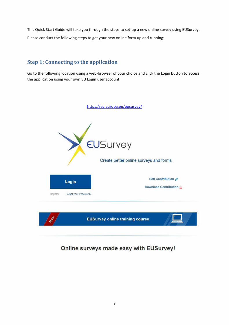
This Quick Start Guide will take you through the steps to set-up a new online survey using EUSurvey.
Please conduct the following steps to get your new online form up and running:
Step 1: Connecting to the application
Go to the following location using a web-browser of your choice and click the Login button to access
the application using your own EU Login user account.
https://ec.europa.eu/eusurvey/
4
Step 2: Creating a new survey
From the Welcome screen, click the "Create new Survey NOW!" button that will open the creation
dialogue.
5
The survey creation process asks you to enter basic information.
Be assured that any information you type in here can be changed later on at the "Properties" page of
your survey.
Available settings in this dialogue are:
Alias: An abbreviation of your survey, used for identification. Will become a part of the URL
that participants will use to access your survey
Title: Your survey's full title
Security: Open or secured
o Choose "Open" for a survey that can be accessed by all participants knowing your
survey's URL.
o Choose "Secured" for protected surveys that cannot be accessed without a global
password or individual access links (to be configured in the application).
Expected answers: The expected number of answers is only for information for the EUSurvey
team and does not have any consequences on the real number of replies.
Pivot Language: The primary language of the survey you are about to create
Contact: A personal email address, functional mailbox or web page that can be contacted by
your participants on emerging questions regarding your survey. It will be integrated
automatically in the published survey.
Confirm your choice by clicking "Create". It creates your survey and opens the editor screen right
away, ready for you to add form elements to your newly created survey.
Please note that by default all surveys save "User and connection related data". If you want to create
a fully anonymous survey, please configure this setting at the survey's "Properties" page.
Step 3: Adding form elements to your survey
In the Editor, you can design your questionnaire by adding questions and other elements to your
survey. You can drag form elements from your survey's toolbox on the left of the screen and drop
them into your form that is visualized in the middle of the screen. Each element is displayed as it will
be shown later on your published survey.
Use section elements to structure your content, media elements to add media content at every
position of your form and special elements for advanced survey interaction.
Don't forget to save your work from time to time using the "Save" button on the top left of the
screen.
6
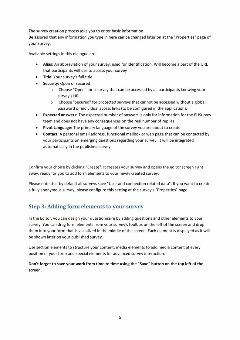
The editor consists of five main areas:
Navigation pane (1): Provides a structured view of the questionnaire
Toolbox pane (2): Contains the different element types that can be added to the
questionnaire
Form area (3): A preview of the questionnaire where the elements can be added and
selected for editing
Element properties pane (4): Contains all available options for the selected element(s)
Toolbar (5): Contains buttons for basic tasks
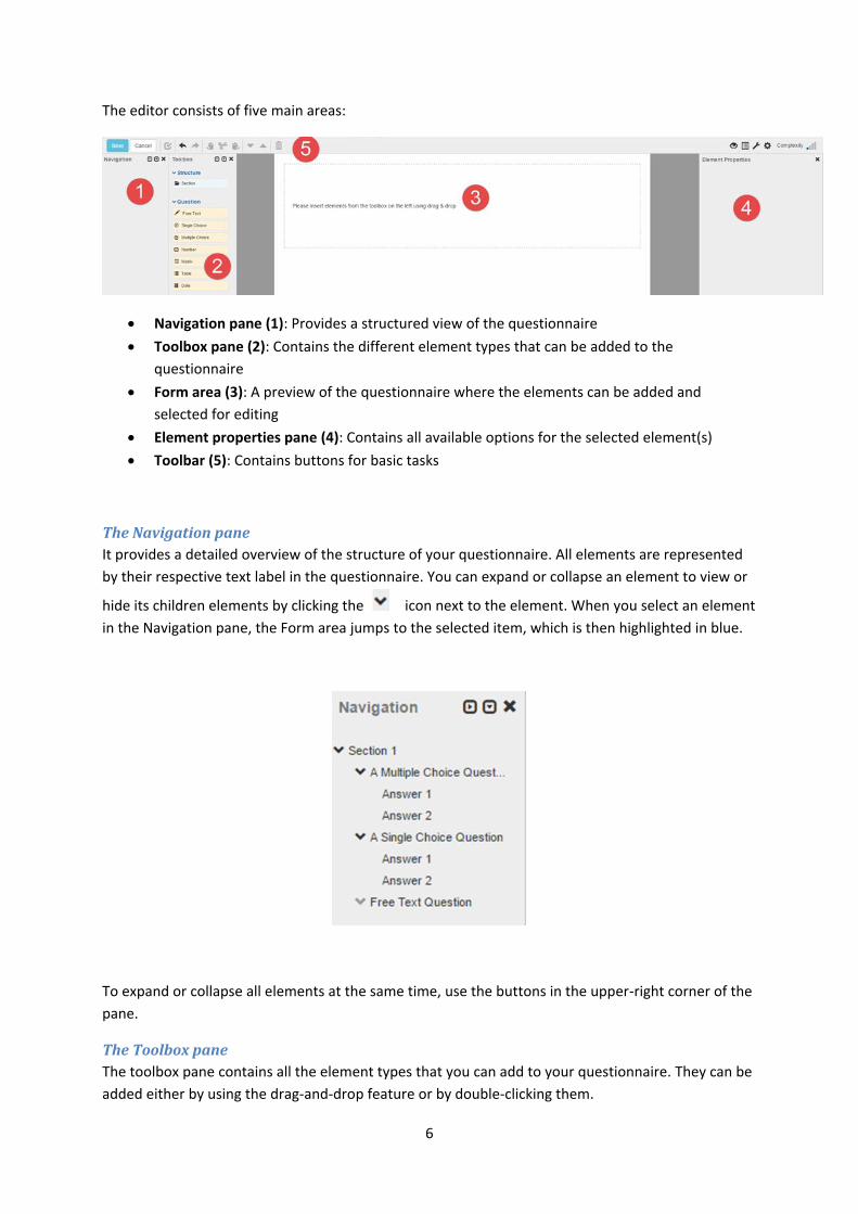
The Navigation pane
It provides a detailed overview of the structure of your questionnaire. All elements are represented
by their respective text label in the questionnaire. You can expand or collapse an element to view or
hide its children elements by clicking the icon next to the element. When you select an element
in the Navigation pane, the Form area jumps to the selected item, which is then highlighted in blue.
To expand or collapse all elements at the same time, use the buttons in the upper-right corner of the
pane.
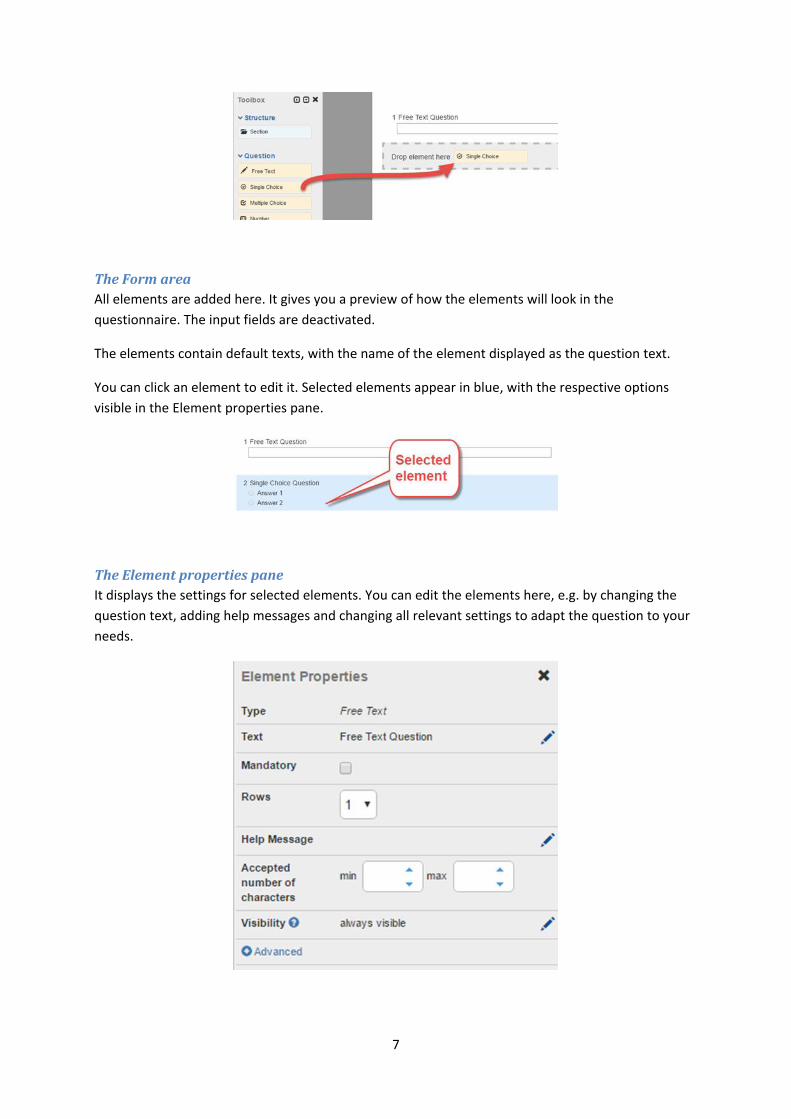
The Toolbox pane
The toolbox pane contains all the element types that you can add to your questionnaire. They can be
added either by using the drag-and-drop feature or by double-clicking them.
7
The Form area
All elements are added here. It gives you a preview of how the elements will look in the
questionnaire. The input fields are deactivated.
The elements contain default texts, with the name of the element displayed as the question text.
You can click an element to edit it. Selected elements appear in blue, with the respective options
visible in the Element properties pane.
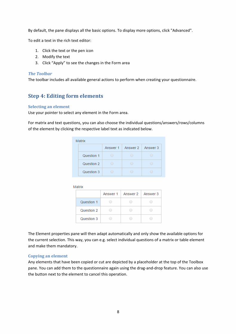
The Element properties pane
It displays the settings for selected elements. You can edit the elements here, e.g. by changing the
question text, adding help messages and changing all relevant settings to adapt the question to your
needs.
8
By default, the pane displays all the basic options. To display more options, click "Advanced".
To edit a text in the rich text editor:
1. Click the text or the pen icon
2. Modify the text
3. Click “Apply” to see the changes in the Form area
The Toolbar
The toolbar includes all available general actions to perform when creating your questionnaire.
Step 4: Editing form elements
Selecting an element
Use your pointer to select any element in the Form area.
For matrix and text questions, you can also choose the individual questions/answers/rows/columns
of the element by clicking the respective label text as indicated below.
The Element properties pane will then adapt automatically and only show the available options for
the current selection. This way, you can e.g. select individual questions of a matrix or table element
and make them mandatory.
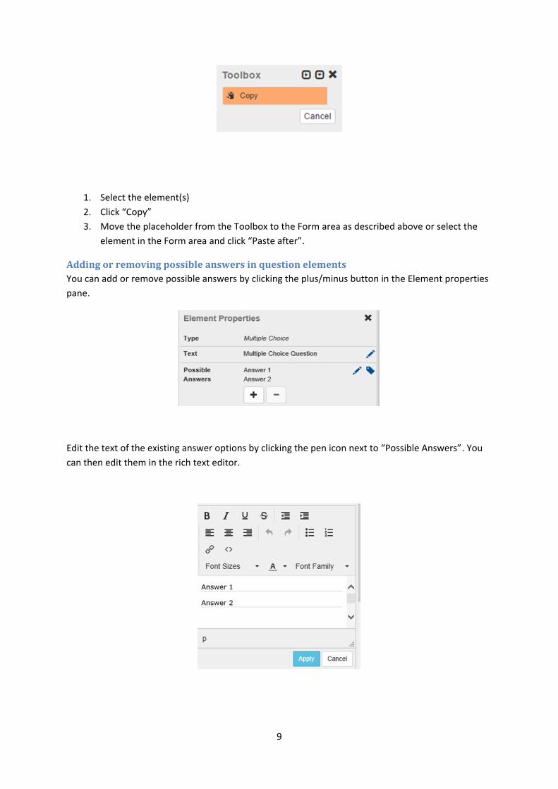
Copying an element
Any elements that have been copied or cut are depicted by a placeholder at the top of the Toolbox
pane. You can add them to the questionnaire again using the drag-and-drop feature. You can also use
the button next to the element to cancel this operation.
9
1. Select the element(s)
2. Click “Copy”
3. Move the placeholder from the Toolbox to the Form area as described above or select the
element in the Form area and click “Paste after”.
Adding or removing possible answers in question elements
You can add or remove possible answers by clicking the plus/minus button in the Element properties
pane.
Edit the text of the existing answer options by clicking the pen icon next to “Possible Answers”. You
can then edit them in the rich text editor.
10
Make a question mandatory
Select the check box in the Element properties pane after selecting the respective element.
Mandatory questions will be marked using a red asterisk on the left side of the question text.
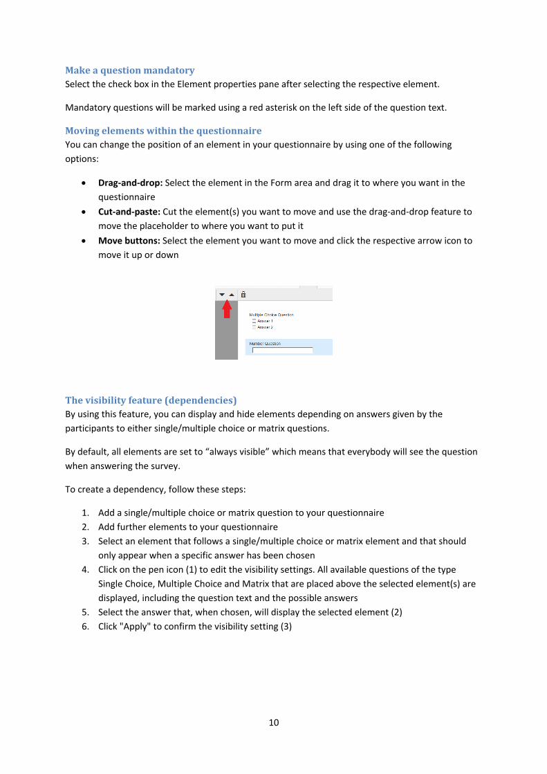
Moving elements within the questionnaire
You can change the position of an element in your questionnaire by using one of the following
options:
Drag-and-drop: Select the element in the Form area and drag it to where you want in the
questionnaire
Cut-and-paste: Cut the element(s) you want to move and use the drag-and-drop feature to
move the placeholder to where you want to put it
Move buttons: Select the element you want to move and click the respective arrow icon to
move it up or down
The visibility feature (dependencies)
By using this feature, you can display and hide elements depending on answers given by the
participants to either single/multiple choice or matrix questions.
By default, all elements are set to “always visible” which means that everybody will see the question
when answering the survey.
To create a dependency, follow these steps:
1. Add a single/multiple choice or matrix question to your questionnaire
2. Add further elements to your questionnaire
3. Select an element that follows a single/multiple choice or matrix element and that should
only appear when a specific answer has been chosen
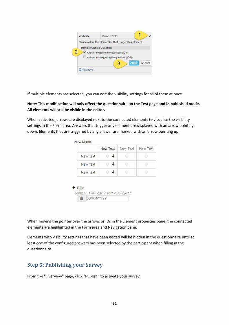
4. Click on the pen icon (1) to edit the visibility settings. All available questions of the type
Single Choice, Multiple Choice and Matrix that are placed above the selected element(s) are
displayed, including the question text and the possible answers
5. Select the answer that, when chosen, will display the selected element (2)
6. Click "Apply" to confirm the visibility setting (3)
11
If multiple elements are selected, you can edit the visibility settings for all of them at once.
Note: This modification will only affect the questionnaire on the Test page and in published mode.
All elements will still be visible in the editor.
When activated, arrows are displayed next to the connected elements to visualise the visibility
settings in the Form area. Answers that trigger any element are displayed with an arrow pointing
down. Elements that are triggered by any answer are marked with an arrow pointing up.
When moving the pointer over the arrows or IDs in the Element properties pane, the connected
elements are highlighted in the Form area and Navigation pane.
Elements with visibility settings that have been edited will be hidden in the questionnaire until at
least one of the configured answers has been selected by the participant when filling in the
questionnaire.
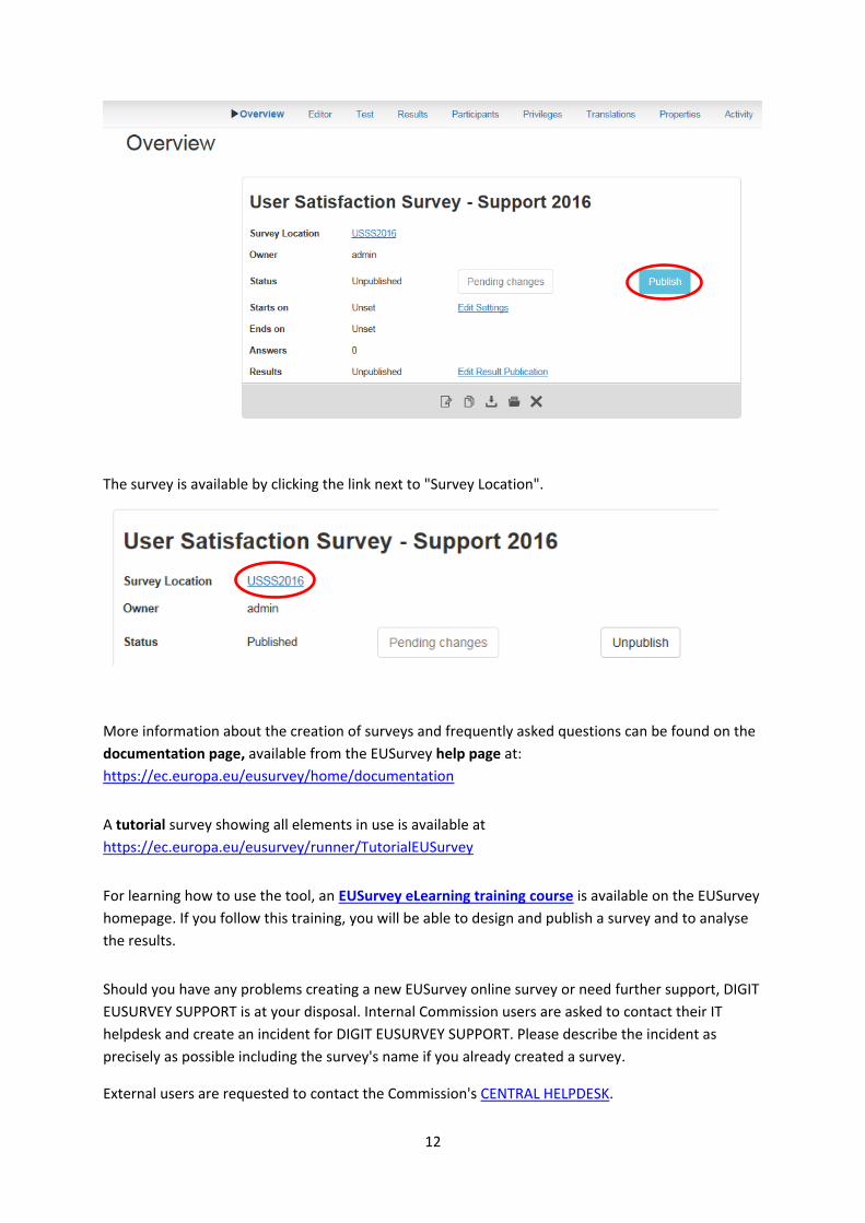
Step 5: Publishing your Survey
From the "Overview" page, click "Publish" to activate your survey.
12
The survey is available by clicking the link next to "Survey Location".
More information about the creation of surveys and frequently asked questions can be found on the
documentation page, available from the EUSurvey help page at:
https://ec.europa.eu/eusurvey/home/documentation
A tutorial survey showing all elements in use is available at
https://ec.europa.eu/eusurvey/runner/TutorialEUSurvey
For learning how to use the tool, an EUSurvey eLearning training course is available on the EUSurvey
homepage. If you follow this training, you will be able to design and publish a survey and to analyse
the results.
Should you have any problems creating a new EUSurvey online survey or need further support, DIGIT
EUSURVEY SUPPORT is at your disposal. Internal Commission users are asked to contact their IT
helpdesk and create an incident for DIGIT EUSURVEY SUPPORT. Please describe the incident as
precisely as possible including the survey's name if you already created a survey.
External users are requested to contact the Commission's CENTRAL HELPDESK.