Embed Size (px)
Citation preview
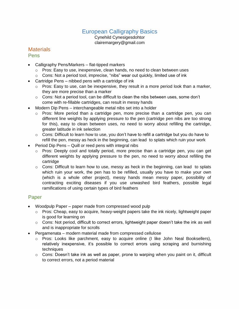
European Calligraphy Basics Cynehild Cynesigesdohtor
Materials Pens
Calligraphy Pens/Markers – flat-tipped markers
o Pros: Easy to use, inexpensive, clean hands, no need to clean between uses
o Cons: Not a period tool, imprecise, “nibs” wear out quickly, limited use of ink
Cartridge Pens – nibbed pens with a cartridge of ink
o Pros: Easy to use, can be inexpensive, they result in a more period look than a marker,
they are more precise than a marker
o Cons: Not a period tool, can be difficult to clean the nibs between uses, some don’t
come with re-fillable cartridges, can result in messy hands
Modern Dip Pens – interchangeable metal nibs set into a holder
o Pros: More period than a cartridge pen, more precise than a cartridge pen, you can
different line weights by applying pressure to the pen (cartridge pen nibs are too strong
for this), easy to clean between uses, no need to worry about refilling the cartridge,
greater latitude in ink selection
o Cons: Difficult to learn how to use, you don’t have to refill a cartridge but you do have to
refill the pen, messy as heck in the beginning, can lead to splats which ruin your work
Period Dip Pens – Quill or reed pens with integral nibs
o Pros: Deeply cool and totally period, more precise than a cartridge pen, you can get
different weights by applying pressure to the pen, no need to worry about refilling the
cartridge
o Cons: Difficult to learn how to use, messy as heck in the beginning, can lead to splats
which ruin your work, the pen has to be refilled, usually you have to make your own
(which is a whole other project), messy hands mean messy paper, possibility of
contracting exciting diseases if you use unwashed bird feathers, possible legal
ramifications of using certain types of bird feathers
Paper
Woodpulp Paper – paper made from compressed wood pulp
o Pros: Cheap, easy to acquire, heavy-weight papers take the ink nicely, lightweight paper
is good for learning on
o Cons: Not period, difficult to correct errors, lightweight paper doesn’t take the ink as well
and is inappropriate for scrolls
Pergamenata – modern material made from compressed cellulose
o Pros: Looks like parchment, easy to acquire online (I like John Neal Booksellers),
relatively inexpensive, it’s possible to correct errors using scraping and burnishing
techniques
o Cons: Doesn’t take ink as well as paper, prone to warping when you paint on it, difficult
to correct errors, not a period material
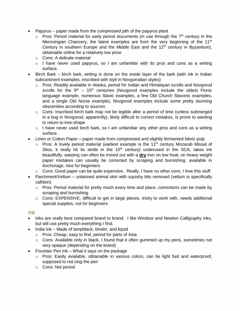
Papyrus – paper made from the compressed pith of the papyrus plant
o Pros: Period material for early period documents (in use through the 7th century in the
Merovingian Chancery, the latest examples are from the very beginning of the 11th
Century in southern Europe and the Middle East and the 12th century in Byzantium),
obtainable online for a relatively low price
o Cons: A delicate material
o I have never used papyrus, so I am unfamiliar with its pros and cons as a writing
surface.
Birch Bark – birch bark, writing is done on the inside layer of the bark (with ink in Indian
subcontinent examples, inscribed with styli in Novgorodian styles)
o Pros: Readily available in Alaska, period for Indian and Himalayan scrolls and Novgorod
scrolls for the 9th – 15th centuries (Novgorod examples include the oldest Finnic
language example, numerous Slavic examples, a few Old Church Slavonic examples,
and a single Old Norse example), Novgorod examples include some pretty stunning
obscenities according to sources
o Cons: Inscribed birch bark may not be legible after a period of time (unless submerged
in a bog in Novgorod, apparently), likely difficult to correct mistakes, is prone to wanting
to return to tree-shape
o I have never used birch bark, so I am unfamiliar any other pros and cons as a writing
surface.
Linen or Cotton Paper – paper made from compressed and slightly fermented fabric pulp
o Pros: A lovely period material (earliest example is the 11th century Mozarab Missal of
Silos, it really hit its stride in the 15th century) underused in the SCA, takes ink
beautifully, warping can often be ironed out with a dry iron on low heat, on heavy weight
paper mistakes can usually be corrected by scraping and burnishing, available in
Anchorage, nice for beginners
o Cons: Good paper can be quite expensive. Really, I have no other cons, I love this stuff.
Parchment/Vellum – untanned animal skin with squishy bits removed (vellum is specifically
calfskin)
o Pros: Period material for pretty much every time and place, corrections can be made by
scraping and burnishing
o Cons: EXPENSIVE, difficult to get in large pieces, tricky to work with, needs additional
special supplies, not for beginners
Ink Inks are really best compared brand to brand. I like Windsor and Newton Calligraphy inks,
but will use pretty much everything I find.
India Ink – Made of lampblack, binder, and liquid
o Pros: Cheap, easy to find, period for parts of Asia
o Cons: Available only in black, I found that it often gummed up my pens, sometimes not
very opaque (depending on the brand)
Fountain Pen Ink – What it says on the package
o Pros: Easily available, obtainable in various colors, can be light fast and waterproof,
supposed to not clog the pen
o Cons: Not period
Calligraphy Ink – Ibid.
o Pros: Designed for calligraphy to keep pens from clogging, available in a wide variety of
colors, acrylic metallic inks can be quite pretty
o Cons: Not period
(Iron) Oak Gall Ink – Caustic ink made from wasp growths on oak trees
o Pros: Lovely period material, can be bought online
o Cons: Don’t get it anywhere near your mouth or open wounds, pretty much only
available in brown, difficult to erase, doesn’t work as well on paper
Other Natural Inks – ink made from berries, black walnuts, etc.
o Pros: Some inks are period (do your research), lovely colors can be obtained
o Cons: may not be lightfast, you need to make it yourself, some ingredients can be
slightly poisonous (don’t eat your ink), efficacy may depend on writing surface
Other Decorative Materials Metal Leaf
o Can be applied to a size that has been painted over (or in place of) inked letters. This is
particularly effective on dark surfaces, consider the 6th century Gothic (Germanic tribe
not artistic movement) Codex Argenteus (silver and gold on dark purple).
Pigments
o Can be painted over (or in place of) inked letters. A particularly nice effect is white or
metallic letters on a black surface.
Other Useful Tools Metal 18” Ruler with metric and imperial units
T-Square
Clear plastic drafting triangles
Good mechanical pencils
Grid paper
White gloves or illustrator’s bridge (keeps your arm off the paper)
o The goal of these tools is to keep your hand from picking up pencil marks or ink and
spreading it across the paper.
o You can also use paper towels or something similar (that you replace regularly) under
your arm and/or hand.
A dusting brush
Light table/board
o Very thin LED light tables are amazing; I have a Huion LED Artcraft Tracing Light Pad
that I LOVE.
A writing table or scribe’s box
o I wants one.
A selection of good art erasers
A hard-sided paper case for storing paper flat
An exacto knife
o For scraping away mistakes
A flat, smooth burnisher, preferably made of unpainted metal or stone.
o I use the cap end of an old mascara tube
Types of Hands Minuscule – scripts with letters that have longer ascenders (lines extending above the core
of the letter, like in ‘d’, ‘b’, and ‘k’) and descenders (lines extending below the core of the
letter, like in ‘g’ and ‘q’). These evolved into lower case letters. Most hands fall in the
minuscule type.
Majuscule – scripts with letters that have very few or very short ascenders and descenders
(or none at all). These evolved into upper case letters.
Pictures in this section come from http://medievalwriting.50megs.com/ (this is an amazing
resource, use it.)
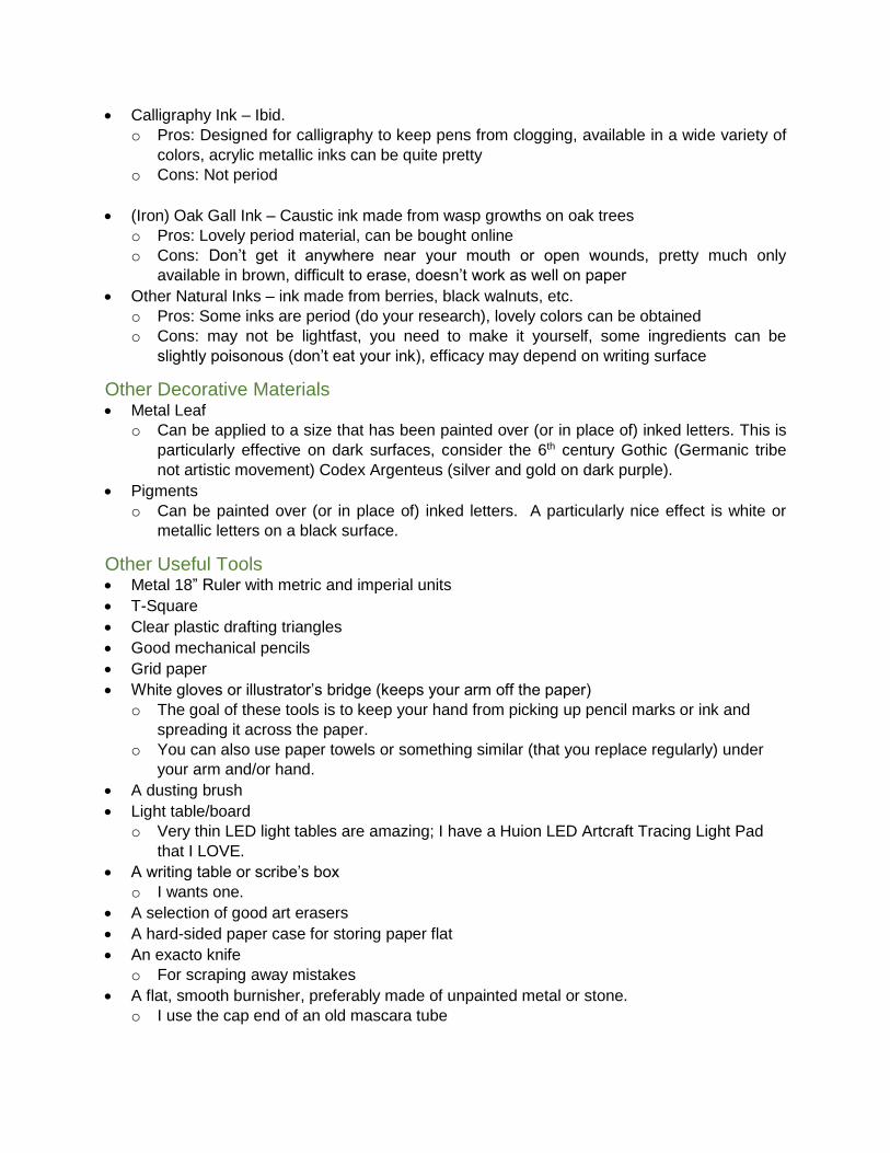
Functions of Hands Book Hand – Hands used in the manufacture of books. These tend to be more formal and
rigid in appearance and because of this are often the most difficult to master.
o Examples include:
Uncial
6th Century Italian Gospel (BL Harley 1775)
Protogothic
12th Century French copy of Suetonius’ De Vita Caesarum (BL Egerton 3055)
.
Gothic Textura Precissa
1340 Luttrell Psalter (BL Add. MS 42130)
Humanistic Display Script
1451 Italian copy of Politics and Economics of Aristotle, from a private collection
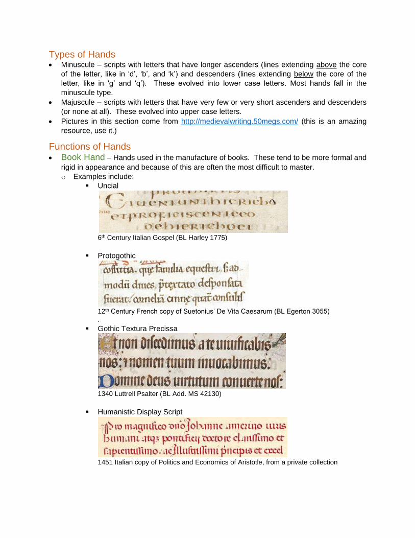
Document Hand – Document Hands were used to produce legal and administrative
documents and tend to be less formal and rigid than Book Hands, making them easier to
learn. Document hands can be broken up into two types:
o Chancery Hand – Chanceries, led by a chancellor, developed from the late Roman
diplomatic institutions and were administrative offices responsible for the production of
documents in royal courts. In England, the royal chancery kept a successive series of
rolls called the Charter Roll (begun in 1199), Patent Roll (begun in 1201), and the Close
Role (begun in 1204) which are an invaluable cache of not only lovely hands, but also
language for scrolls. Chanceries tended to develop a unique style of hand depending on
the time and physical location of the office (i.e. a Westminster hand is distinct from a
York hand).
Informal Chancery Hand – England
Part of a 1234 writ of Henry III (BL Add. Charter 28402)
Chancery Hand – Anglo-French
Part of a 1349 warrant of Edward III (London, National Archives C.81/339/20343)
Chancery Hand - England
Part of a 1449 petition of the Abbot of Tewksbury (London, National Archives E.28/79/30)
o Charter Hand/Diploma Hand – Charter Hand is a term used to describe scripts used
to write charters (wow, that’s confusing right?) its use largely restricted to describing
hands coming out of England. On the continent, a comparative term is Diploma Hand.
Diploma Hands differ from Charter Hands in that they tend to be a bit fancier. The
difference between a Charter/Diploma Hand and a Chancery Hand is the audience.
Chancery clerks were writing for other chancery clerks, diplomatic and charter clerks
were sometimes writing for a wider audience and so were more legible.
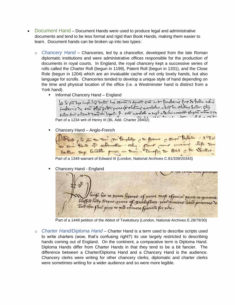
Insular Charter Hand
Clip of Latin text from a 1003 charter from the court of Æthelred unræd
Clip of the Old English text from the same charter
Clip of the witness block from the same charter (BL Stowe Ch. 35, S. 905)
Imperial Minuscule
Segment of an 1139 diploma of the Holy Roman Emperor Conrad III
Calligraphic Charter Hand – English
Private charter of the 13th Century (BL Add. Charter 20592)
Papal Minuscule
Section of a 1441 Papal Bull (BL Add. Charter 15570)
Non-Latin Scripts The Latin alphabet was not the only option for the medieval scribe, here are some other choices
courtesy of http://omniglot.com/ and Wikipedia:
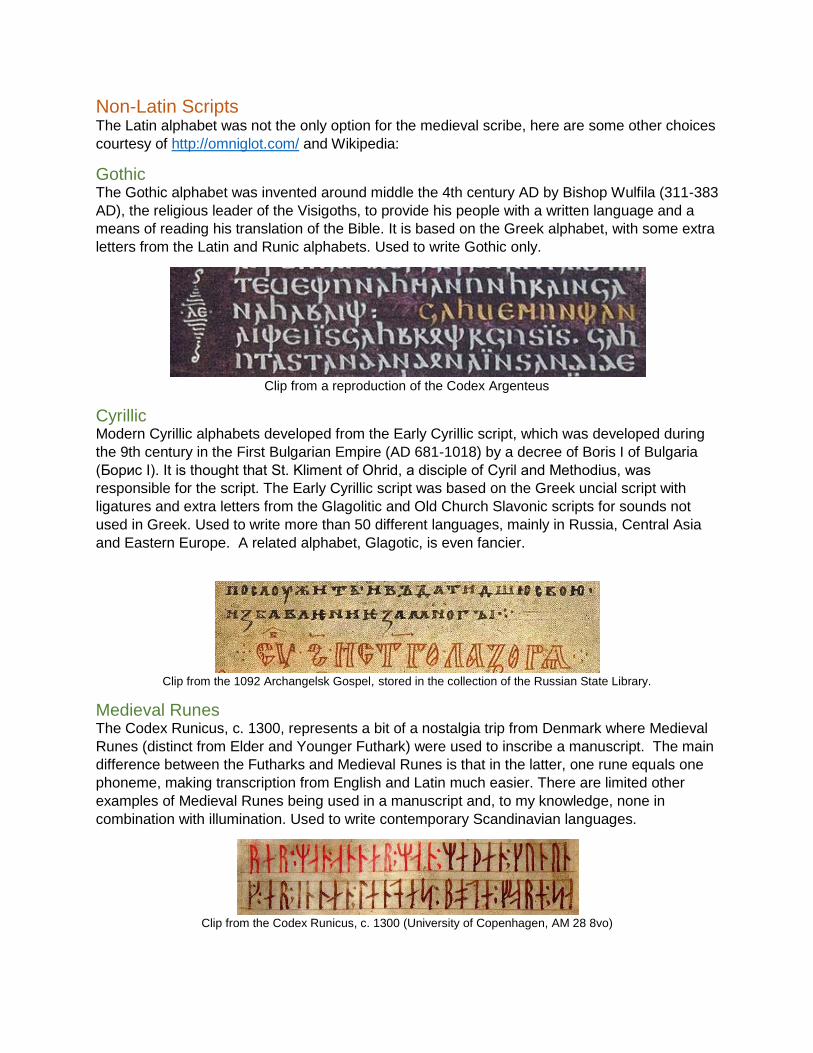
Gothic The Gothic alphabet was invented around middle the 4th century AD by Bishop Wulfila (311-383
AD), the religious leader of the Visigoths, to provide his people with a written language and a
means of reading his translation of the Bible. It is based on the Greek alphabet, with some extra
letters from the Latin and Runic alphabets. Used to write Gothic only.
Clip from a reproduction of the Codex Argenteus
Cyrillic Modern Cyrillic alphabets developed from the Early Cyrillic script, which was developed during
the 9th century in the First Bulgarian Empire (AD 681-1018) by a decree of Boris I of Bulgaria
(Борис I). It is thought that St. Kliment of Ohrid, a disciple of Cyril and Methodius, was
responsible for the script. The Early Cyrillic script was based on the Greek uncial script with
ligatures and extra letters from the Glagolitic and Old Church Slavonic scripts for sounds not
used in Greek. Used to write more than 50 different languages, mainly in Russia, Central Asia
and Eastern Europe. A related alphabet, Glagotic, is even fancier.
Clip from the 1092 Archangelsk Gospel, stored in the collection of the Russian State Library.
Medieval Runes The Codex Runicus, c. 1300, represents a bit of a nostalgia trip from Denmark where Medieval
Runes (distinct from Elder and Younger Futhark) were used to inscribe a manuscript. The main
difference between the Futharks and Medieval Runes is that in the latter, one rune equals one
phoneme, making transcription from English and Latin much easier. There are limited other
examples of Medieval Runes being used in a manuscript and, to my knowledge, none in
combination with illumination. Used to write contemporary Scandinavian languages.
Clip from the Codex Runicus, c. 1300 (University of Copenhagen, AM 28 8vo)
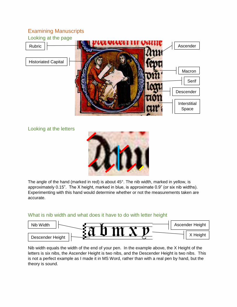
Examining Manuscripts
Looking at the page
Looking at the letters
The angle of the hand (marked in red) is about 45°. The nib width, marked in yellow, is
approximately 0.15”. The X height, marked in blue, is approximate 0.9” (or six nib widths).
Experimenting with this hand would determine whether or not the measurements taken are
accurate.
What is nib width and what does it have to do with letter height
a b m x y Nib width equals the width of the end of your pen. In the example above, the X Height of the
letters is six nibs, the Ascender Height is two nibs, and the Descender Height is two nibs. This
is not a perfect example as I made it in MS Word, rather than with a real pen by hand, but the
theory is sound.
Ascender Height
X Height Descender Height
Nib Width
Historiated Capital
Ascender
Descender
Serif
Rubric
Macron
Interstitial
Space
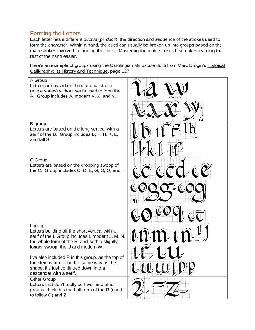
Forming the Letters Each letter has a different ductus (pl. ducti), the direction and sequence of the strokes used to
form the character. Within a hand, the ducti can usually be broken up into groups based on the
main strokes involved in forming the letter. Mastering the main strokes first makes learning the
rest of the hand easier.
Here’s an example of groups using the Carolingian Minuscule ducti from Marc Drogin’s Histoical
Calligraphy: Its History and Technique, page 127.
A Group Letters are based on the diagonal stroke (angle varies) without serifs used to form the A. Group includes A, modern V, X, and Y.
B group Letters are based on the long vertical with a serif of the B. Group includes B, F, H, K, L, and tall S.
C Group Letters are based on the dropping swoop of the C. Group includes C, D, E, G, O, Q, and T
I group Letters building off the short vertical with a serif of the I. Group includes I, modern J, M, N, the whole form of the R, and, with a slightly longer swoop, the U and modern W. I’ve also included P in this group, as the top of the stem is formed in the same way as the I shape, it’s just continued down into a descender with a serif.
Other Group Letters that don’t really sort well into other groups. Includes the half form of the R (used to follow O) and Z
Tips for Making it Look “More Period” There are small things you can do to make a script look a little more period. I wouldn’t go
overboard with these, as they may render the scroll illegible to modern readers, but, like a
strong spice, a little sprinkling will liven any dish.
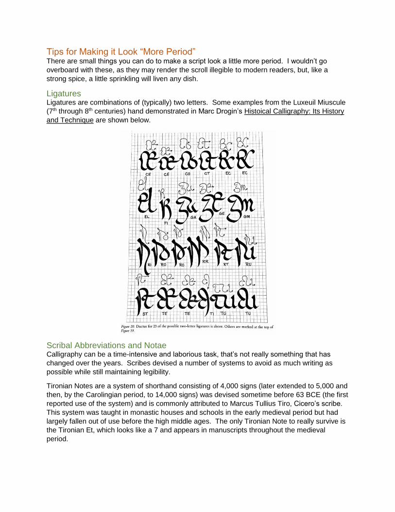
Ligatures Ligatures are combinations of (typically) two letters. Some examples from the Luxeuil Miuscule
(7th through 8th centuries) hand demonstrated in Marc Drogin’s Histoical Calligraphy: Its History
and Technique are shown below.
Scribal Abbreviations and Notae Calligraphy can be a time-intensive and laborious task, that’s not really something that has
changed over the years. Scribes devised a number of systems to avoid as much writing as
possible while still maintaining legibility.
Tironian Notes are a system of shorthand consisting of 4,000 signs (later extended to 5,000 and
then, by the Carolingian period, to 14,000 signs) was devised sometime before 63 BCE (the first
reported use of the system) and is commonly attributed to Marcus Tullius Tiro, Cicero’s scribe.
This system was taught in monastic houses and schools in the early medieval period but had
largely fallen out of use before the high middle ages. The only Tironian Note to really survive is
the Tironian Et, which looks like a 7 and appears in manuscripts throughout the medieval
period.
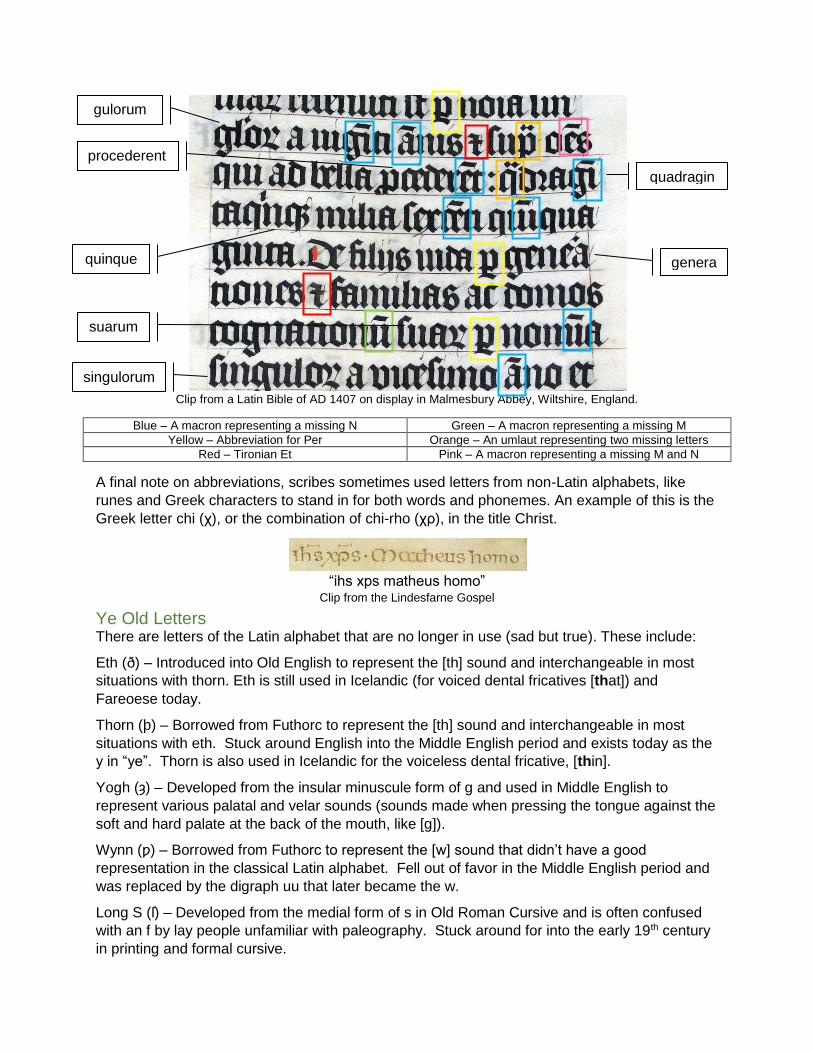
Clip from a Latin Bible of AD 1407 on display in Malmesbury Abbey, Wiltshire, England.
Blue – A macron representing a missing N Green – A macron representing a missing M
Yellow – Abbreviation for Per Orange – An umlaut representing two missing letters
Red – Tironian Et Pink – A macron representing a missing M and N
A final note on abbreviations, scribes sometimes used letters from non-Latin alphabets, like
runes and Greek characters to stand in for both words and phonemes. An example of this is the
Greek letter chi (χ), or the combination of chi-rho (χρ), in the title Christ.
“ihs xps matheus homo”
Clip from the Lindesfarne Gospel
Ye Old Letters There are letters of the Latin alphabet that are no longer in use (sad but true). These include:
Eth (ð) – Introduced into Old English to represent the [th] sound and interchangeable in most
situations with thorn. Eth is still used in Icelandic (for voiced dental fricatives [that]) and
Fareoese today.
Thorn (þ) – Borrowed from Futhorc to represent the [th] sound and interchangeable in most
situations with eth. Stuck around English into the Middle English period and exists today as the
y in “ye”. Thorn is also used in Icelandic for the voiceless dental fricative, [thin].
Yogh (ȝ) – Developed from the insular minuscule form of g and used in Middle English to
represent various palatal and velar sounds (sounds made when pressing the tongue against the
soft and hard palate at the back of the mouth, like [g]).
Wynn (ƿ) – Borrowed from Futhorc to represent the [w] sound that didn’t have a good
representation in the classical Latin alphabet. Fell out of favor in the Middle English period and
was replaced by the digraph uu that later became the w.
Long S (ſ) – Developed from the medial form of s in Old Roman Cursive and is often confused
with an f by lay people unfamiliar with paleography. Stuck around for into the early 19th century
in printing and formal cursive.
gulorum
genera quinque
suarum
singulorum
procederent quadragin
General Tips and Tricks Practice makes perfect.
o Dopy but true. Start by practicing the core forms of your chosen hand. Work on keeping
ascenders and descenders straight (if that’s what the hand requires), regularity of the
core forms, and keeping the spacing of words and letters regular.
Learn how your pen works.
o Start with diagonal strokes, get used to how your pen works and practice smooth and
easy movements.
o Move from there onto straight strokes. Start with vertical lines and then move on to
horizontal lines. Use both the broad and narrow edge of the pen.
o Next, work on forming Os. Start at 11 o’clock and move the pen down and around to 5
o’clock. Begin again at 11 o’clock and bring it over and down to join up with the base of
the O.
o Finally, work on curved strokes. I like using a piece of scrap paper to draw sine waves.
Figure out how the pen reacts depending on the angle you hold it at.
Try a bunch of different materials until you find ones that make you happy.
o Don’t always go for the most expensive options, sometimes it’s the cheap seats that are
the best.
o My favorite pen is a $3 Schaeffer that does what I want, when I want.
o You may also find that not all pens and inks work with all surfaces. I hate pergamenata
because it never works right for me.
Learn how to correct your mistakes.
o Some mistakes can be corrected by turning a letter into another letter. For example, Cs
make good As, Ds, and Es.
o Other mistakes can be corrected by scraping and burnishing.
This works best on thick surfaces.
First, use a pen knife or exacto knife to scrape away the error. Be careful to
avoid punching a hole in the surface.
Next, burnish the rough surface with your burnisher (a smooth piece of metal or
stone) until it matches the surface around it.
Finally, continue your scribing. It’s awesome and so are you.
Learn how to live with your mistakes.
o Some things can’t be corrected, it’s okay.
Do your calligraphy before any illumination.
o Calligraphy is a lot more of a pain to correct than illumination.
Just like any other activity, it’s a good idea to warm up ahead of time.
o Practice a few lines so that you get the muscle memory engaged.
To learn a new hand off of a manuscript, I like using my light pad to trace the hand with a
calligraphy pen.
o It gives me a chance to figure out the ductus and then determine how it matches up with
the original sample.
On Making Mistakes The Book of Kells (c. 800) includes an extra ancestor (named Iae) in the genealogy of Jesus at
Luke 3:26.
The Book of Deer (c. 10th C.) gives Adam a grandfather named Seth (also in the genealogy of
Jesus in Luke).
A monk who edited the 172 page Anatomy of the Mass in 1561 had to add a fifteen page errata
to record all the mistakes.
Pope Sixtus V (r. 1585-1590), issued a papal bull automatically excommunicating any printer
who made an error or alteration in the text of an authorized printing of the Vulgate Bible.
Because of the number of errors in the resulting books, he ordered the return and destruction of
every copy.
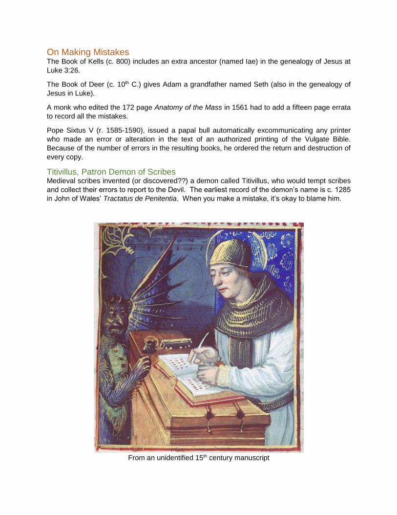
Titivillus, Patron Demon of Scribes Medieval scribes invented (or discovered??) a demon called Titivillus, who would tempt scribes
and collect their errors to report to the Devil. The earliest record of the demon’s name is c. 1285
in John of Wales’ Tractatus de Penitentia. When you make a mistake, it’s okay to blame him.
From an unidentified 15th century manuscript
Further Reading
Practical Books: Brown, Michelle P. The British Library Guide to Writing and Scripts: History and Techniques.
Toronto, ON: University of Toronto Press, 1998.
Brown, Michelle P., and Patricia Lovett. The Historical Sourcebook for Scribes. London: The
British Library, 1999.
Drogin, Marc. Calligraphy of the Middle Ages and How to Do It. New York, NY: Dover
Publications, 1998.
—. Historical Calligraphy: Its History and Technique. New York, NY: Dover Publications, 1989.
If you only buy one book, buy this one. It’s fantastic and only costs about $17.
Harris, David. The Calligrapher's Bible: 100 Complete Alphabets and How to Draw Them.
Hauppauge, NY: Barron's Educational Series, 2003.
Morgan, Margaret. The Bible of Illuminated Letters: A Treasury of Decorative Calligraphy.
Hauppauge, NY: Barron's Educational Series, 2006.
Noble, Mary. Calligraphy Alphabets for Beginners: The Easy Way to Learn Lettering and
Illumination Techniques. Hauppauge, NY: Barron's Educational Series, 2008.
Books about Scribes, Manuscripts, and Manuscript Culture: Bischoff, Bernhard, Dáibhí Ó Cróinin (trans.), and David Ganz (trans). Latin Palaeography:
Antiquity and the Middle Ages. Cambridge: Cambridge University Press, 1990.
Brown, Michelle P. A Guide to Western Historical Scripts from Antiquity to 1600. Toronto, ON:
University of Toronto Press, 1993.
—. Manuscripts from the Anglo-Saxon Age. Toronto, ON: University of Toronto Press, 2007.
—. Understanding Illuminated Manuscripts: A Guide to Technical Terms. Los Angeles, CA: J.
Paul Getty Museum, 1994.
de Hamel, Christopher. Scribes and Illuminators. Toronto, ON: University of Toronto Press,
1992.
Derolez, Albert. The Palaeography of Gothic Manuscript Books: From the Twelfth to the Early
Sixteenth Century. Cambridge: Cambridge University Press, 2006.
Knight, Stan. Historical Scripts: from Classical Times to the Renaissance. New Castle, DE: Oak
Knoll Press, 1998.
Kwakkel, Erik. Writing in Context: Insular Manuscript Culture 500-1200. Leiden: Leiden
University Press, 2013.
O’Neill, Timothy. The Irish Hand: Scribes and their Manuscripts from the Earliest Times. Cork:
Cork University Press, 2014.
Parkes, M. B. The Medieval Manuscripts of Keble College Oxford. London: Scolar Press, 1979.
Whitley, Kathleen P. The Gilded Page: The History and Technique of Manuscript Gilding.
London: The British Library, 2000.
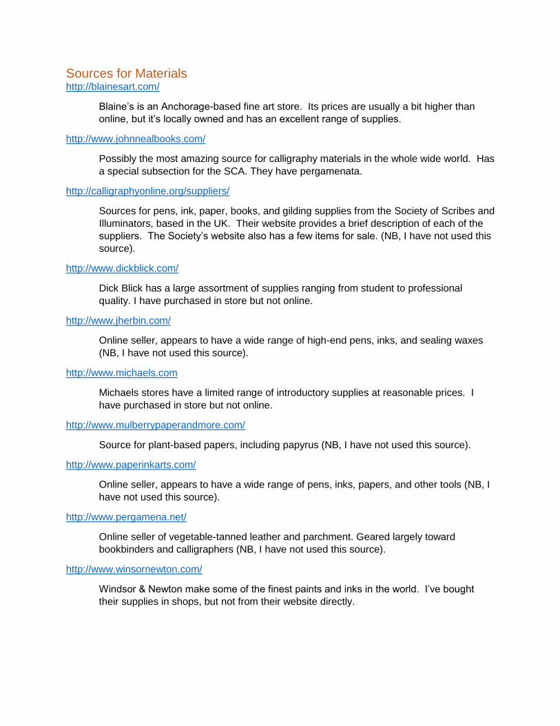
Sources for Materials http://blainesart.com/
Blaine’s is an Anchorage-based fine art store. Its prices are usually a bit higher than
online, but it’s locally owned and has an excellent range of supplies.
http://www.johnnealbooks.com/
Possibly the most amazing source for calligraphy materials in the whole wide world. Has
a special subsection for the SCA. They have pergamenata.
http://calligraphyonline.org/suppliers/
Sources for pens, ink, paper, books, and gilding supplies from the Society of Scribes and
Illuminators, based in the UK. Their website provides a brief description of each of the
suppliers. The Society’s website also has a few items for sale. (NB, I have not used this
source).
http://www.dickblick.com/
Dick Blick has a large assortment of supplies ranging from student to professional
quality. I have purchased in store but not online.
http://www.jherbin.com/
Online seller, appears to have a wide range of high-end pens, inks, and sealing waxes
(NB, I have not used this source).
http://www.michaels.com
Michaels stores have a limited range of introductory supplies at reasonable prices. I
have purchased in store but not online.
http://www.mulberrypaperandmore.com/
Source for plant-based papers, including papyrus (NB, I have not used this source).
http://www.paperinkarts.com/
Online seller, appears to have a wide range of pens, inks, papers, and other tools (NB, I
have not used this source).
http://www.pergamena.net/
Online seller of vegetable-tanned leather and parchment. Geared largely toward
bookbinders and calligraphers (NB, I have not used this source).
http://www.winsornewton.com/
Windsor & Newton make some of the finest paints and inks in the world. I’ve bought
their supplies in shops, but not from their website directly.
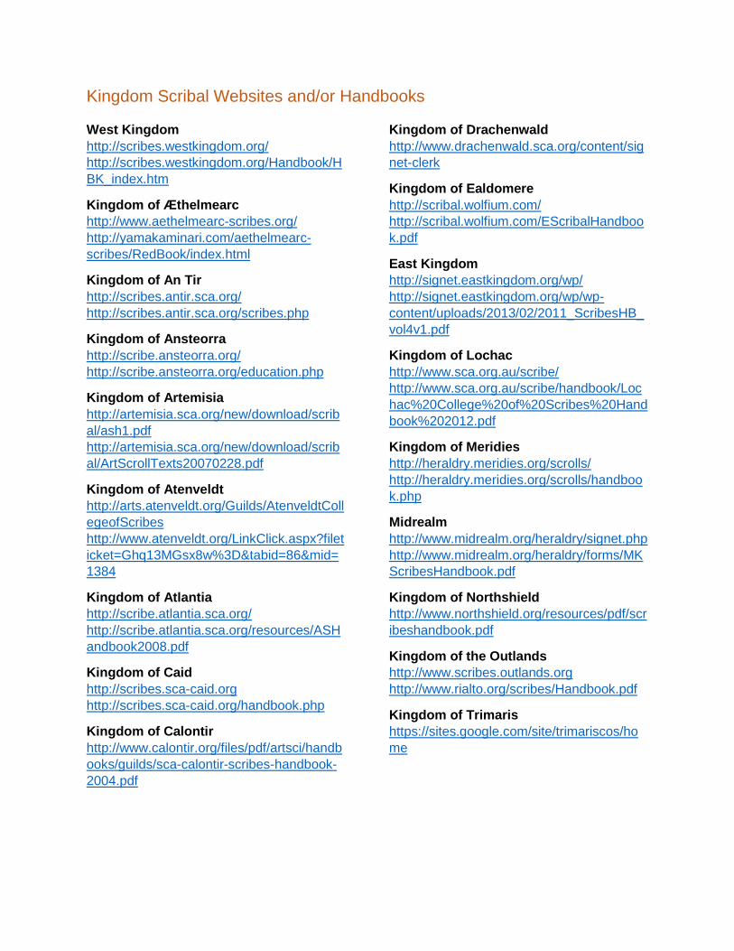
Kingdom Scribal Websites and/or Handbooks
West Kingdom
http://scribes.westkingdom.org/
http://scribes.westkingdom.org/Handbook/H
BK_index.htm
Kingdom of Æthelmearc
http://www.aethelmearc-scribes.org/
http://yamakaminari.com/aethelmearc-
scribes/RedBook/index.html
Kingdom of An Tir
http://scribes.antir.sca.org/
http://scribes.antir.sca.org/scribes.php
Kingdom of Ansteorra
http://scribe.ansteorra.org/
http://scribe.ansteorra.org/education.php
Kingdom of Artemisia
http://artemisia.sca.org/new/download/scrib
al/ash1.pdf
http://artemisia.sca.org/new/download/scrib
al/ArtScrollTexts20070228.pdf
Kingdom of Atenveldt
http://arts.atenveldt.org/Guilds/AtenveldtColl
egeofScribes
http://www.atenveldt.org/LinkClick.aspx?filet
icket=Ghq13MGsx8w%3D&tabid=86&mid=
1384
Kingdom of Atlantia
http://scribe.atlantia.sca.org/
http://scribe.atlantia.sca.org/resources/ASH
andbook2008.pdf
Kingdom of Caid
http://scribes.sca-caid.org
http://scribes.sca-caid.org/handbook.php
Kingdom of Calontir
http://www.calontir.org/files/pdf/artsci/handb
ooks/guilds/sca-calontir-scribes-handbook-
2004.pdf
Kingdom of Drachenwald
http://www.drachenwald.sca.org/content/sig
net-clerk
Kingdom of Ealdomere
http://scribal.wolfium.com/
http://scribal.wolfium.com/EScribalHandboo
k.pdf
East Kingdom
http://signet.eastkingdom.org/wp/
http://signet.eastkingdom.org/wp/wp-
content/uploads/2013/02/2011_ScribesHB_
vol4v1.pdf
Kingdom of Lochac
http://www.sca.org.au/scribe/
http://www.sca.org.au/scribe/handbook/Loc
hac%20College%20of%20Scribes%20Hand
book%202012.pdf
Kingdom of Meridies
http://heraldry.meridies.org/scrolls/
http://heraldry.meridies.org/scrolls/handboo
k.php
Midrealm
http://www.midrealm.org/heraldry/signet.php
http://www.midrealm.org/heraldry/forms/MK
ScribesHandbook.pdf
Kingdom of Northshield
http://www.northshield.org/resources/pdf/scr
ibeshandbook.pdf
Kingdom of the Outlands
http://www.scribes.outlands.org
http://www.rialto.org/scribes/Handbook.pdf
Kingdom of Trimaris
https://sites.google.com/site/trimariscos/ho
me