Embed Size (px)
Citation preview

EOCT Review
Unit 4: Describing Data

Key IdeasSummarize, represent, and interpret data on a single count or measurable variable (dot plots, histograms and box plots)Center (mean or median)Shape (uniform, skew left,
skew right, normal, bimodal)Spread (range or IQR),
outliers

Key IdeasSummarize, represent, and interpret data on two categorical and quantitative variables (two way tables)
Joint, marginal and conditional relative freq.

Key IdeasFit data to models
ScatterplotsLinear –
Understand slopeIntercept (constant)Correlation Coefficient
ExponentialAsymptotesRangeDomain
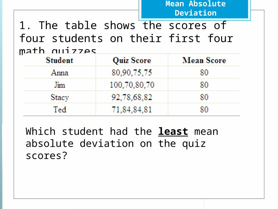
Mean Absolute Deviation
1. The table shows the scores of four students on their first four math quizzes.
Which student had the least mean absolute deviation on the quiz scores?

Measures of Central Tendency
Ray’s scores on his mathematics tests were 70, 85, 78, 90, 84, 82, and 83. Analyze his scoresCreate a box plotCompare mean and median

Josh and Richard each earn tips at their part-time job. This table shows their earnings from tips for five days.
Total Tips by DayDay Josh’s Tips Richard’s TipsMonday $40 $40Tuesday $20 $45Wednesday $36 $53Thursday $28 $41Friday $31 $28 Who had the greatest median earnings from tips?
What is the difference in the median of Josh’s earnings from tips and the median of Richard’s earnings from tips?
What is the difference in the interquartile range for Josh’s earnings from tips and Richard’s earnings from tips?

Histograms and Shape
Mr. Storer, the physical education teacher, measured the height of the students in his first period class. He organized his data in this chart.
Height (in inches) Frequency42 143 244 445 546 447 248 1
Make a histogram for the data.
Does the distribution of heights appear normal/bell shaped?

Two Way Tables
A fast food restaurant wants to determine if the season of the year affects the choice of soft drink size purchased. They surveyed 278 customers and the table below shows their results. The drink sizes were small, medium, large, and jumbo. The seasons of the year were spring, summer, and fall. In the body of the table, the cells list the number of customers that fit both row and column titles. On the bottom and in the right margin are the totals.
Spring Summer Fall TOTALSSmall 24 22 18 64Medium 23 28 19 70Large 18 27 29 74Jumbo 16 21 33 70TOTALS 81 98 99 278
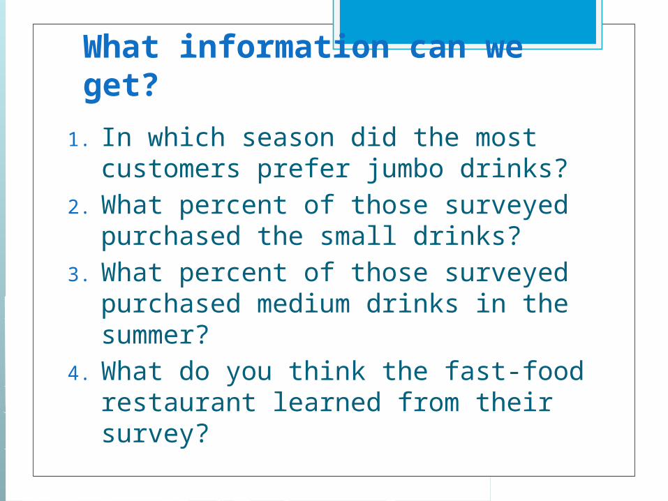
What information can we get?
1. In which season did the most customers prefer jumbo drinks?
2. What percent of those surveyed purchased the small drinks?
3. What percent of those surveyed purchased medium drinks in the summer?
4. What do you think the fast-food restaurant learned from their survey?

Residual Plots and Linear Models

Correlation Coefficient

Examples
Questions?
1. What type of a relationship is suggested by the scatter plot (positive/negative, weak/strong)?
2. What is the domain of ages considered by the researchers?
3. What is the range of incomes?4. Do you think age causes income level
to increase? Why or why not?

How would you describe the correlation of the two variables based on the scatter plot?

Which model is best for a linear model?

Comment and compare the two graphs